Nashville-based Sam Smith, who works under the moniker Sam’s Myth, is an acclaimed graphic designer and artist who has worked with multiple independent film distributors on official posters for films as diverse as the brilliant 1977 Japanese cult oddity House (for a 2010 re-release) and the sprawling biopic Carlos. In addition, Sam has designed and illustrated screen prints and unofficial posters for film screenings at the likes of Nashville’s celebrated Belcourt Theatre and San Francisco’s famous Castro Theatre.
A true cineaste, Sam’s portfolio overtly reflects his taste in movies since he’ll often elect to work on a poster for a cult, independent or little-seen film of his own choosing, plus he regularly works on packaging and disc menus for the much-loved video label Criterion. On top of this, Sam is an accomplished musician who has drummed for the likes of Ben Folds, Tristen and My So Called Band, and when not working on design projects he can be found on the road with one of these bands. Work on record covers, gig posters and other music-related projects also feature in Sam’s folio.
I first became aware of Sam when I purchased the superb re-release one sheets for House (see below) and Rainer Werner Fassbinder’s sci-fi epic World on a Wire in 2011, and I’ve been following his work ever since then. I wanted to interview Sam for the site at the same time as adding those two posters to my site and the resultant article is below.
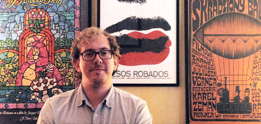
The designer, artist and musician Sam Smith, June 2013
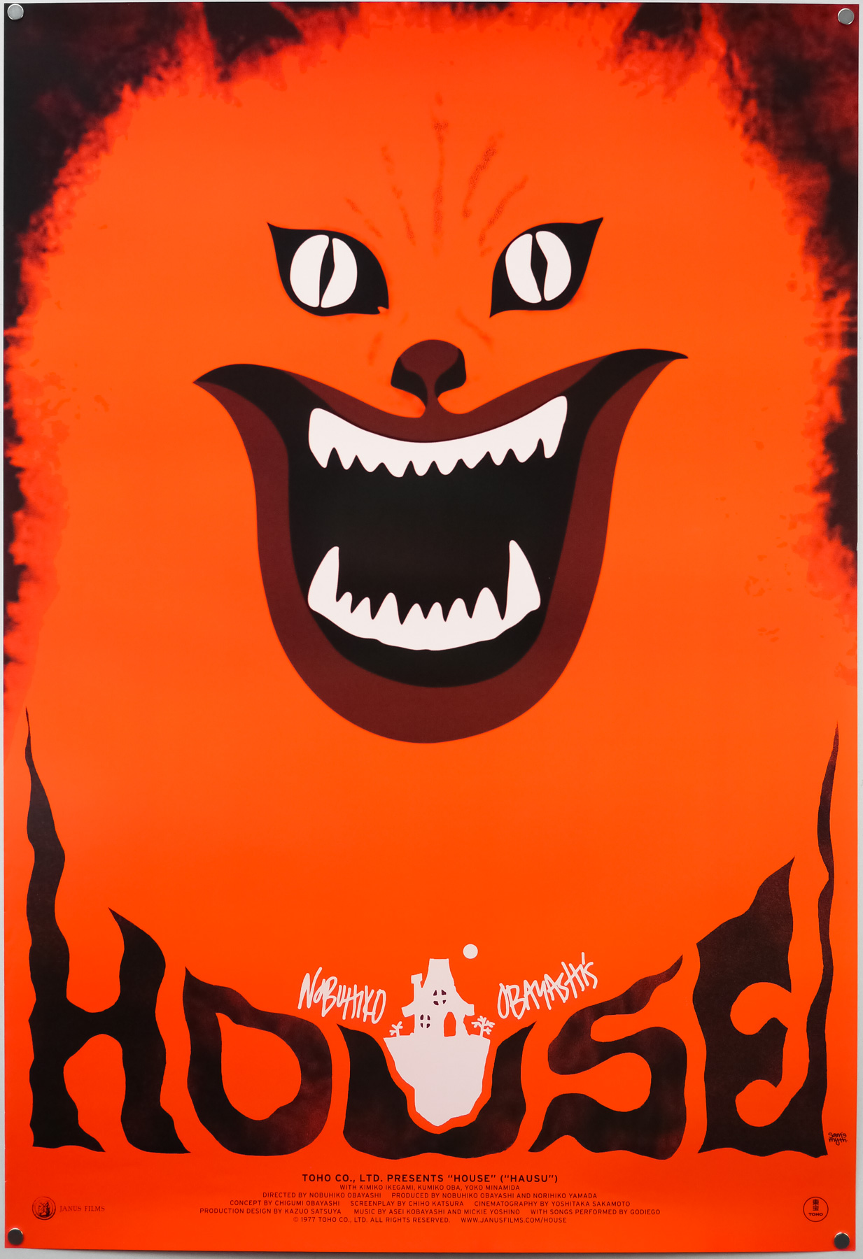
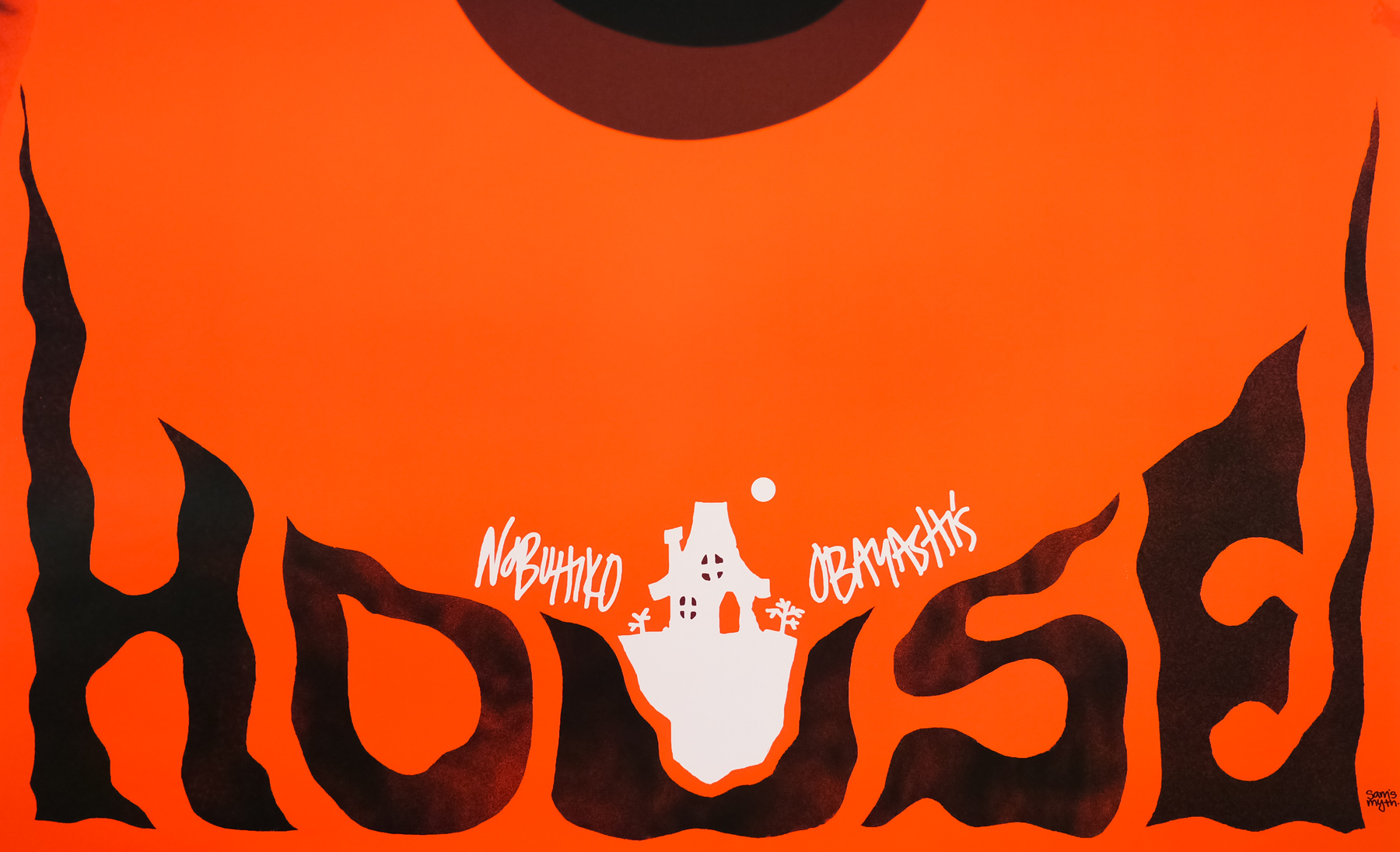
The US one sheet for the 2010 re-release of Nobuhiko Obayashi’s House, designed by Sam’s Myth
I’ve split the interview up into six parts and you can use the links below to jump directly to a section, should you wish.
Part 1 – Origins and starting out
Part 2 – Film and music
Part 3 –
Working methods
Part 4 – Criterion
Part 5 – Posters in detail
Part 6 – Influences, advice and future plans
Part 1 – Origins and starting out
I’d like to start with your origins, if I may? When and where were you born?
I was born in 1981 in Nashville, TN. I’ve lived in Nashville for the bulk of my life, aside from going to school in New York City and touring around the world off and on for the several years after that.
I understand your father is also a designer? Can you talk about his work?
He was and still is an artist who has worked in different mediums, never as a designer per se, but a painter and woodworker and found object artist… All kinds of things. For a period in the 80’s he worked with airbrush creating large, colorful abstract landscapes, patterns and conceptual imagery. His drawing and illustration style has always had an enormous influence on my art. He fostered my obsession with all things visual. Now he lives in the country and makes furniture and things out of reclaimed wood, writes novels and short stories, and draws from time to time.
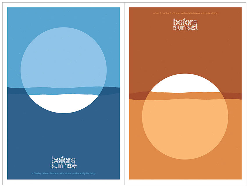
Before Sunrise and Before Sunset screen prints by Sam’s Myth
How did you start out designing? Did you study it at university?
I’ve always just made art on my own, due in large part most likely to my dad and I working on creative projects all the time when I was a child. I would draw all of the characters and things I was obsessed with– Teenage Mutant Ninja Turtles, Batman, Dick Tracy, Roger Rabbit… By the time The Simpsons hit, I had been cartooning and drawing my own comics for several years. In high school, my love for posters began I guess, as I would draw and paste-up posters and flyers for all of my bands’ shows as well as all major school events. I “designed” the album art for my band’s releases, combining art I made, found images and photographs with type, and I found this very enjoyable. I went to New York University for the Cinema Studies program, went on tour after that, and literally stopped making visual art for several years.
What was your first real break into the world of professional design? Was there a first major client?
My first real break was the House poster. After touring for about four years, I had a long break and decided to do something about the fact that I had let my art skills atrophy so severely from not drawing or designing anything for years while I focused on other things. My mom had just built a small art studio in the back yard of the house I grew up in, and I holed up for a week there and forced myself to just crank out some posters. My love for film had grown so much at college, where I earned a degree in writing about film from an academic perspective.
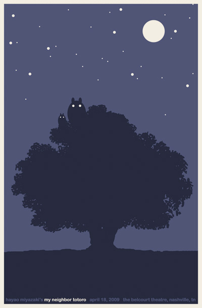
My Neighbor Totoro screen print by Sam’s Myth for the Belcourt Theatre, Nashville. 2009
While touring my writing also declined and I didn’t have a lot of interest in being a film critic. So I figured that making film posters would be a great way to channel my love for films (and for reading and interpreting films) into a visual art project. I made eight to ten designs during those several days that are still some of my favorite things I’ve done. I took them to my friends at the Belcourt Theatre, Nashville’s historic art-house, and showed them what Mondo was doing with collectible movie screen prints in Austin, thinking we could try something similar.
Testing the waters, they agreed to print up some posters for a couple upcoming films– I made screen prints for My Neighbor Totoro and The Human Condition, which was being re-released by Janus Films. Janus also had a digital version of House booked at the Belcourt as a midnight movie and I made a poster. I knew that Janus was supportive of what we were doing at the Belcourt and I’d always dreamed of working with them and with Criterion, their home video wing. My initial goal was to create 25 different posters for HOUSE just to increase my odds of landing on something great that might catch Janus’ attention, but I only made it through a few ideas, and the cat poster was the best. People really responded to it, and the midnight screenings at the Belcourt were a smashing success, so much so that Janus went ahead and planned to strike a new 35mm print and give HOUSE the full run in other theaters.
Janus asked if they could use my poster design as their official one-sheet. That led naturally to a relationship working with Criterion and Janus on an ongoing basis. So I feel I owe everything to the Belcourt and to Janus for giving me that opportunity to see myself as a professional designer of posters.
Have you always been freelance or have you worked in an agency?
I’ve always been freelance. I enjoy the challenge of maintaining a steady stream of professional work but doing so on my own schedule. I do fantasise sometimes about combining powers with other artist friends and forming a sort of collective, all working out of the same studio and sharing gear and tools, helping each other out and, most importantly, playing ping pong. I’ve never really considered working for an agency but wouldn’t rule it out, particularly if it were a movie poster agency which would have its own interesting challenges.

Artwork for Hammer Chillers, created by Sam’s Myth for the legendary Hammer studio, 2013
Who or what were your biggest design inspirations when you were starting out?
When I was a kid I was obsessed with Ed Emberley. His books taught me how to draw in a graphic way, how to see the fundamental shapes and forms and lines in everything in the world, plus his books were playful and colorful and incredibly designed. I loved movie posters back then and, when I made my own movies with my puppets and stuffed animals I would make posters for them too. Almost like poster parodies for movies I loved — Bearman, Bunnyjuice, La-La Scissorhands. So I guess I was subconsciously picking up some things about movie poster design back then.
Fast forwarding to college and touring after that: I was just absorbing as much visual information as I could. For years I amassed art and design books while not putting forth any creative output of my own. Of course I always admired the design of Criterion’s releases and fantasized about doing work like that one day. Some switch went off when I looked through one particular book of Cuban poster art. I made a connection between the poster art I loved and the possibilities that I could imagine myself creating. When I started making posters I really dove into the history of poster movements and traditions that appealed to me, becoming obsessed with Cuban, Czech and Polish posters, Japanese design, mid-century American modern art and design.
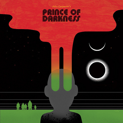
The album cover artwork for Death Waltz Recordings‘ release of John Carpenter’s Prince of Darkness, by Sam’s Myth, 2012
I studied the posters of Saul Bass, Tadanori Yokoo, the book covers of Paul Rand, Alvin Lustig and the entire history of Penguin and Puffin book design. I also took much inspiration from talented friends of mine like Mike Davis of Burlesque of North America and other designers I met online like Olly Moss; I wanted to follow in their footsteps while creating work that was specifically inspired by my love for these older poster traditions that appealed most to me. I have too many influences to count or name. I’m still way behind in matching my output to the amount of inspirational input that I take in. I often feel like I’m drowning in inspiration.
Part 2 – Film and music
You only have to look at the kind of titles you create posters for to realise you’re a serious cinephile. When did your love affair with film begin?
I loved movies as a kid (see the aforementioned Tim Burton obsession), and in high school. Around the age of 17 I saw my first Kubrick film and that changed everything. It was the opening of 2001: A Space Odyssey, on VHS at William Tyler’s house one night falling asleep on his couch. I watched and studied every Kubrick film obsessively after that, and that set me off down the path of studying film from a serious but impassioned academic perspective. There happened to be a handful of great films that came out right when I was graduating high school too, in 1999– American Beauty, Magnolia, Fight Club, Being John Malkovich, Eyes Wide Shut– and that kinda pushed me over the edge. Some friends were in the Cinema Studies program at NYU and encouraged me to come and get a degree in watching movies. At NYU I was exposed to whole new worlds of cinema and I’m still falling down the rabbit hole.
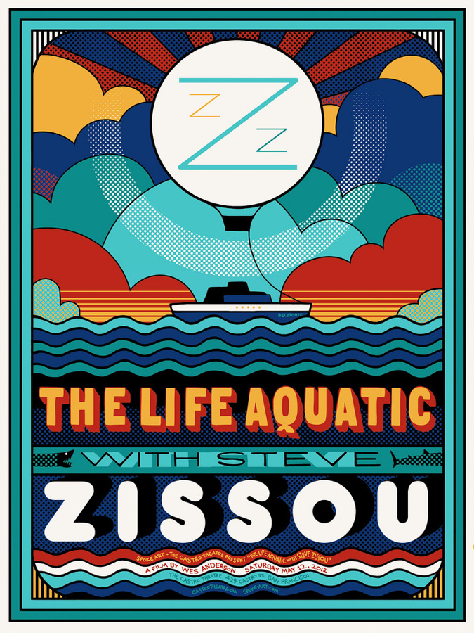
The Life Aquatic screen print by Sam’s Myth designed for Spoke Art and the Castro Theatre in San Francisco, 2012
If pushed could you choose your top five films (in no particular order)?
Narrowing it to only five is downright impossible, but maybe 2001: A Space Odyssey, My Neighbor Totoro, Koyaanisqatsi, Stalker, and Man With a Movie Camera.
Are there are any (official) film posters, whether vintage or recent, that you’d single out as being particularly great? I know you’re a big fan of the Polish designers, for example.
I was asked to make a list for Adrian Curry’s Movie Poster of the Week column, so I’ll point you there, but the ones that stood out for me are the Cuban Stolen Kisses by René Azcuy Cardenas, Swierzy’s first Blow-Up poster, the French Willy Wonka poster by Basha, Frankfurt & Gips’ Rosemary’s Baby one sheet, and anything by Hans Hillmann, who is probably my favorite poster designer. And a recent discovery: Lee Reedy’s Donkey Skin poster for Janus Films.
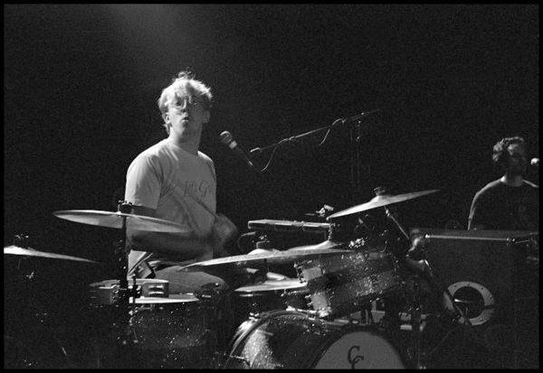
Sam playing drums for the Ben Folds band, 2011
Not only are you a talented designer but you’re also an accomplished musician. Was music your first love? Do you find it hard juggling your two careers?
It wasn’t my first love necessarily, just one of the things I love. I toured with friends for years and also had the chance to tour professionally, and during those times it was difficult to focus on creating artwork. You don’t have a lot of alone time on tour, or time when you wouldn’t rather be out experiencing the places you’re in with the people you’re with. In the music industry one can often find themselves having a year or two without work. In my case, this has worked out well so far as I’ve had periods of time at home to really focus on my design and art career. Ideally this kind of pattern could continue and I would be lucky enough to keep doing both.
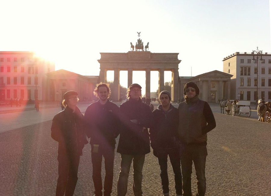
The Ben Folds Band on tour, Berlin 2011 (Sam Smith in the centre)
Can you talk about working on film posters versus gig posters? Do you find one easier than the other?
I haven’t done a lot of gig posters, though I have lots of friends who are part of that community– and it’s a very tight-knit community. But it is, of course, very different in many ways. I think with a gig poster you can almost get away with any kind of imagery you want to marry to the music. The best gig poster artists really take inspiration from the themes of their subjects though, much like the Polish and Czech film poster artists would, and create their own abstract interpretation of their subject. Andy Vastagh (Boss Construction) is great with this, for example.
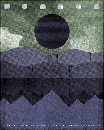
A gig poster for the band Dungen by Sam’s Myth, 2010
Working professionally in today’s film industry though, it’s important to be able to work closely with imagery from the films when necessary, even using photography and stills from the films in ways that are creative and graphically successful and intriguing. In other words, working more literally with the content than you would with a gig poster. The extreme and ugly end of this spectrum is the typical shit Hollywood poster, a Photoshop orgy of stars, explosions and over-literalization. But working as a film poster artist, I have taken pride in trying to strike a balance between exploring abstract, psychological interpretations and working with imagery that is appropriate for the film at hand and that attracts the audience that a client might be seeking.
Part 3 – Working methods
How do you usually start out once the brief has been received? Do you do a lot of sketching of ideas before starting up your computer?
If I get a brief for a film poster, the first thing I do is immerse myself in the world of the film. I watch it, I watch other films by that director to get myself in a certain headspace, and when I’m walking about the house I’ll often be listening to music from the film. If any graphic ideas are already coming to mind, I’ll sketch them out or even flesh them out to near-completion. Sometimes that initial idea remains the best idea. But more often than not I’m trying to provide my client with different options. I sketch pretty thoroughly in my sketchbook before laying things out on the computer. Sometimes, the computer is the main arena for experimentation. Other times, it’s just a tool to execute an idea that is already fully formed in my head or in my sketchbook.
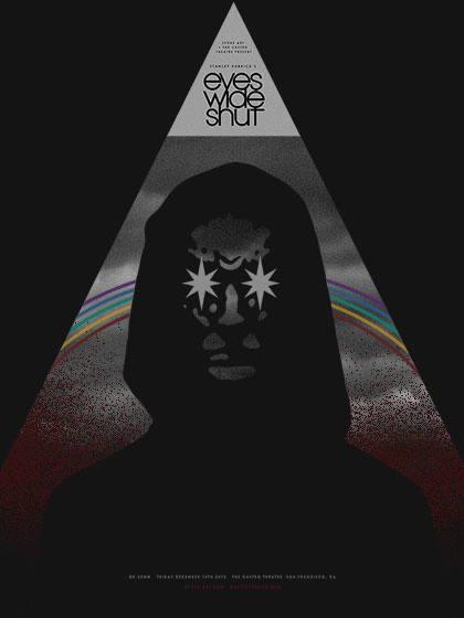
A screen print for Eyes Wide Shut by Sam’s Myth for the Castro Theatre in San Francisco, 2012
What programs do you typically use?
For some reason I started working in Photoshop and stayed there. I don’t know much about Illustrator or creating vector art, though I would like to train myself sometime soon. I use InDesign for delivering projects to clients. But I mainly just use my sketchbook and paper, a camera, a scanner, and Photoshop.
Would you say you have a standard process or is each job approached differently?
Differently, depending on the needs of the client I’m working with. If I’m doing a gig poster or my own self-initiated project, I approach it however I want to in that moment. For bigger clients I’m trying to provide a spread of different styles, or different facets of my own style. Sometimes a client wants me to just do my thing, and I do something and they love it. Other times it’s a long, long process with dozens and dozens of comps and iterations, and that long, in-depth process leads to a great solution and lots of other ideas are born out of it along the way.
You seem just as content using photography as you do illustration. Do you try to quickly work out what’s going to be best for any given project?
My art teacher in middle school criticised me for not having a set style, and it infuriated me so much that sometimes I think I’ve tried to maintain that stylistic diversity ever since just to spite him. Working with clients professionally, it has benefitted me I think to not have one set style that people by which identify me, although maybe I do have a style and just can’t see it. Honestly, in recent years I’ve tried to force myself to be a little more stylistically consistent and see what comes of that. But yes, I pride myself on offering different stylistic solutions based on what feels appropriate for a given project.
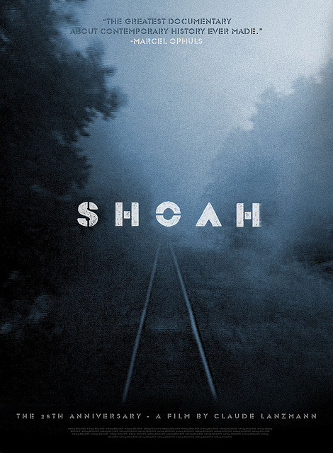
A concept poster for Shoah by Sam’s Myth for the 2011 re-release of the film by IFC
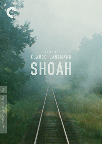
The cover for the Criterion collection release of Shoah, designed by Sam’s Myth, 2013
I believe and hope that this approach would yield a more diverse body of work and roster of clients and collaborators. I’m shocked at how maligned photography is in the movie poster world, particularly the idea of using a star’s face. It’s nearly absurd to think of a poster for an Anna Karina film that would be better without Anna Karina’s face on it. Photography is beautiful. Illustration is great too, but some of the best posters of all time have been designed around photography and images of a film’s stars. I love coming up with creative ways to use imagery and photography taken directly from a film, when appropriate.
Mario World screen print by Sam’s Myth for Gallery 1988’s Nintendo show in 2011
Typography is something that all graphic designers need to have a working knowledge of but your designs always feature excellent and often inventive use of typography. Have you studied type design or is it just something you’ve always had a passion for?
Thanks. I don’t consider myself a type expert. I do love working with type, with old letterforms and typefaces, and with hand-created title treatments. I’ve studied type only informally. With film posters, I particularly love the point at which one decides to either celebrate and honor an existing title treatment or to create something original, re-branding the film in a new way. In the cases of the latter option, I feel a great amount of pressure as often the type and title on a poster is one of the things we remember most about a poster when we see it. A lot of great posters endure for their title treatments alone.
The ‘process’ posts on your blog are always a fascinating read as it’s not often you get to see how designs evolve from initial brief to final product. What made you decide to share your working methods?
Probably the need for feedback and affirmation? Ha… I don’t know, I’ve always found it interesting to read other people’s explorations of the design process and I selfishly assume that people might find mine just as interesting. It’s also somewhat liberating to put it all out there and expose all the warts and flaws.
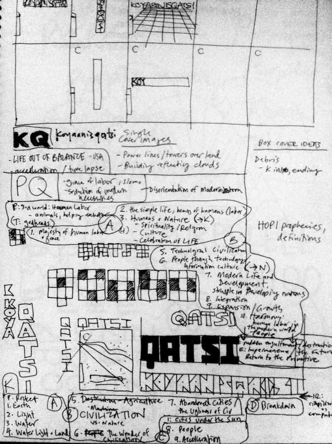
Concept sketches for the cover and packaging for the Criterion release of the Qatsi Trilogy by Sam’s Myth, 2012
One of the things I love about your work is that it feels like it’s constantly evolving and you’re clearly not afraid to experiment with design methods and styles. Is that fair to say?
Thank you– I do try to do this, yes. It goes back to my feeling that I don’t have a set style. There’s a push and pull in me to find my own style and stick to it, while also wanting to never settle into a predictable stylistic pattern and always wanting to try new methods and techniques. There are entire styles and techniques that I’d like to experiment with that I haven’t yet gotten to… a long list! I often feel like I’m just getting started, and everything I’ve done so far has been a process of just working out kinks.
Concept sketches for the cover and packaging for the Criterion release of the Qatsi Trilogy by Sam’s Myth, 2012
Part 4 – Criterion
How did you first get involved with Criterion?
After the Janus connection was made with the House poster, they gave me a shot at designing a cover and package. My art director, Sarah Habibi, was looking for the right title for me and she chose Jan Troell’s Everlasting Moments, which is interesting in that the design would require something completely different from what I did for House. It was the perfect assignment for me to experiment with styles and understand how the whole process works, finding the right cover and then carrying the design through the rest of the DVD package and its menus.
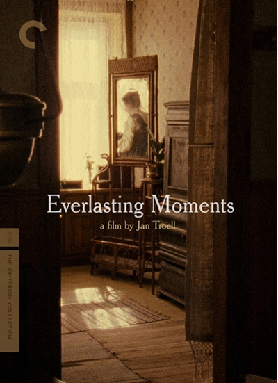
The cover for the Criterion release of Everlasting Moments, by Sam’s Myth
Can you talk about your usual design process for a Criterion project? Who are you dealing with and how many stages to the project are there typically?
I work with the art director exclusively, who represents Criterion’s interests for the project. They will give me a brief after deciding what their goals are for the artwork, and I will work with that brief to show them a spread of explorations and ideas (comps). We are focusing on the cover first, but I’m also keeping in mind ideas for the overall package design. There is usually feedback on the cover comps, then I hone in on an idea or two, some more dialogue, sometimes some last minute new ideas, and eventually the cover is settled upon. I then move immediately to the DVD menus which I design and then hand off to Criterion’s DVD production manager for authoring. Finally I design the DVD and Blu-ray packages, which includes the cases and spines, the booklet and the disc labels.
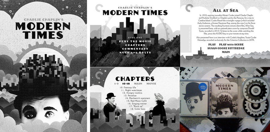
Booklet, menu and packaging designs for the Criterion release of Charlie Chaplin’s Modern Times, by Sam’s Myth
How long are you normally given to work on a release?
I usually have a few weeks to work on the cover, but sometimes it takes longer to find the right solution and the schedule is adjusted. Then I usually have a couple more weeks to design the menus, then a couple more for the package. A couple months in total, for each project.
What kind of materials are you usually able to access for a project?
It depends on the project and what masters they have access to at the time. Sometimes we know we want to use a still, but we only have a few hi-res stills available. Other times I have a plethora of screenshots to work with and other fun production photos. On a couple of projects we’ve elected to use an existing poster as the cover, and sometimes it’s trickier than you would think to track down an original, clean copy!
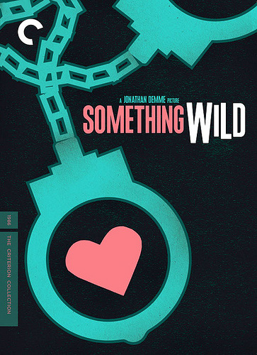
The cover of the Criterion release of Something Wild, designed by Sam’s Myth, 2012
Do you and fellow Criterion designer Eric Skillman get to compare notes often? Have you had chance to work together on any projects?
Eric is great, and on a couple of occasions when Sarah has been on leave, Eric fills in and works with me in her absence. He worked with me some on the Kuroneko poster, and it was he who came up with the idea of the Kuroneko cover which would use silver inks that would disappear when viewed at certain angles.
The Criterion release of the Qatsi trilogy looks like it was a bit of a labour of love for you. Can you talk about the process you went through designing that?
I wrote about the process on my blog, but in summary it was a unique situation in which I pitched a concept to Criterion on my own initiative. I knew they were working on these films, and I had a vision in my head of what I would do with the package, so I quickly mocked something up and showed it to them. My enthusiasm and the general direction was convincing enough to get me the job, but we worked on refining the designs from there and it ended up being a pretty in-depth process that changed drastically from beginning to end.
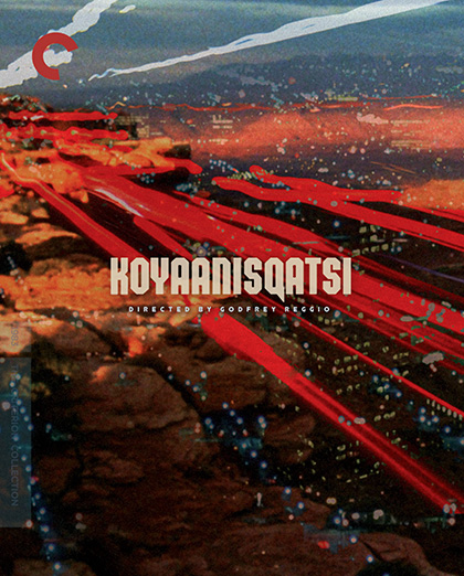
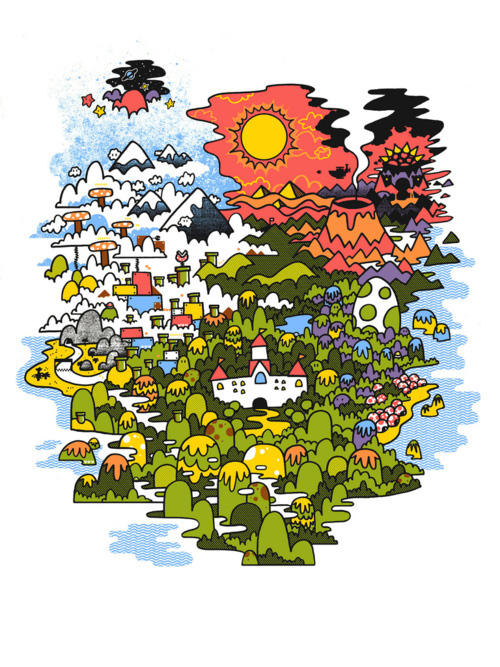
The final design for the cover of the Koyaanisqati Criterion release by Sam’s Myth, 2012
You talk on the Criterion website about how it was your dream project. Why is that?
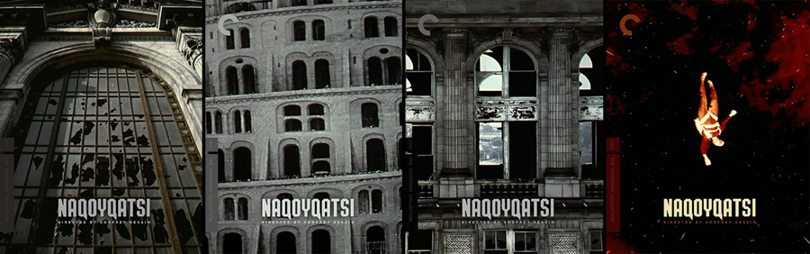
As I mentioned, Koyaanisqatsi is a film I’d put on my all time list– not just of favorite films, but films that I feel represent or embody the full potential of cinema as an art form. My dad was interested in these films, and in the work of Philip Glass, when I was growing up and I sponged off of that at some point; when I re-watched the film in college, it came flooding back to me and I realized how much it meant to me. It’s pure cinema, and it has the reputation of not being a narrative film. Well, it is a narrative film, just a different kind of narrative than we’re used to after a century of industrial filmmaking. Powaqqatsi is just as great a film to me, and Naqoyqatsi, while I don’t love the formal qualities of the images quite as much, has just as much to say as a part of the trilogy’s overarching narrative: civilization’s war on nature.
Which of your Criterion releases are you particularly proud of?
I’m proud of The Qatsi Trilogy, as I had to turn away from my original ideas and push myself to explore new, less comfortable styles– in this case, photographic collage– and come up with something that Criterion and director Godfrey Reggio also loved, for films I so greatly admire. I’m also really proud of the covers for Modern Times and Solaris, two more great films that I’m so humbled to have had as subjects.
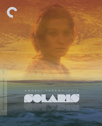
The cover for the Criterion release of Tarkovsky’s Solaris by Sam’s Myth
Part 5 – Posters in detail
House
How quickly did you arrive at using the image of Blanche the cat as the poster image?
Almost instantly actually. In fact, my friend Zack Hall who is a manager at the Belcourt sent me some images and we were brainstorming, and that image of Blanche just jumped out at me and seemed like something I could use. But I wanted to transform it from the screenshot into a graphic piece. The angle of that shot isn’t quite straight on, so I manipulated that, and I gave the cat’s face the entire frame of the poster, removed from the picture frame. I touched the image up and blew it out in black and white, and I just saw this field of red-orange over the whole thing, thinking it could really transform that image into something iconic. The lettering and everything else– the little house illustration– all came very quickly, in a single pass. It’s by far the fastest any poster design has ever come together for me. I didn’t really think much about it and don’t really remember it happening.
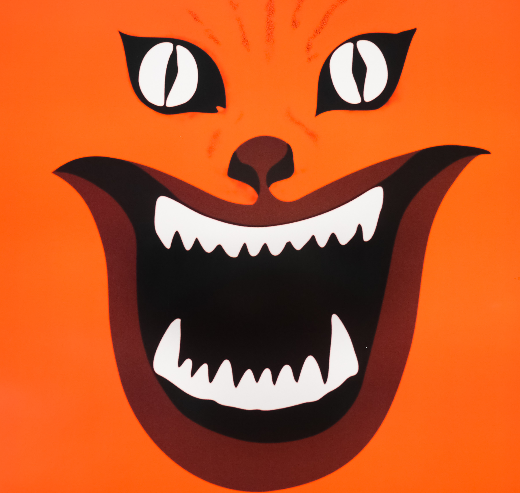
Close-up detail of the House poster by Sam’s Myth, 2010
Were you surprised at how iconic the Blanche image has ended up being?
A little bit, but I must give credit to Obayashi who came up with this image in the first place. It’s not like I drew it or created it out of my own imagination. I feel that I just plucked it out of the film and tried to transform it graphically into something iconic that represented the insane, exciting, colorful energy of the film, while adding my own touches with the lettering and accoutrements. People loved it though. I suggested making t-shirts and stickers, and I still see people wearing them when I’m at a festival or traveling somewhere. It really taught me that in this day and age, the most important quality of a poster is for its design to feel iconic and eye-catching, above all else. The goal is to get people talking about the film and going to see the film and telling their friends about it, and it’s cool to hear people say “you know, the movie with the poster of the red cat face” and realize you had a role in the film finding its audience.
Close-up detail of the House poster by Sam’s Myth, 2010
Poster – World on a Wire
The World on a Wire cover, which was printed as a poster too, is a fantastic design that had the film’s titles as it’s starting point. The final poster came about thanks to the client suggesting a simple iconic image would be better suited for the film. Can you talk about that project and what it meant to you?
Janus entrusted me with this poster design after we did House and Kuroneko together. I remember being very concerned with topping my previous work and trying to come up with my best poster yet. I was also pursuing a very misguided impulse to try to create something visually complex that could compete with what Mondo artists like Tyler Stout and Ken Taylor were doing. I built some comps around this idea, using my translated and modified version of Fassbinder’s original title treatment as a framing device.
A concept poster for the 2011 re-release of World on a Wire, by Sam’s Myth
Ultimately Janus suggested that it would be great to see me try something simple and iconic, and they referred to two designs I did for Before Sunrise and Before Sunset where a more minimal arrangement of shape and color suggested something deeply about the film and its themes. This is kind of feedback designers dream about at night! I threw two overlapping circles down and studied them as symbol of the multiple worlds/realities in the film. From there, this poster came together quite quickly too.
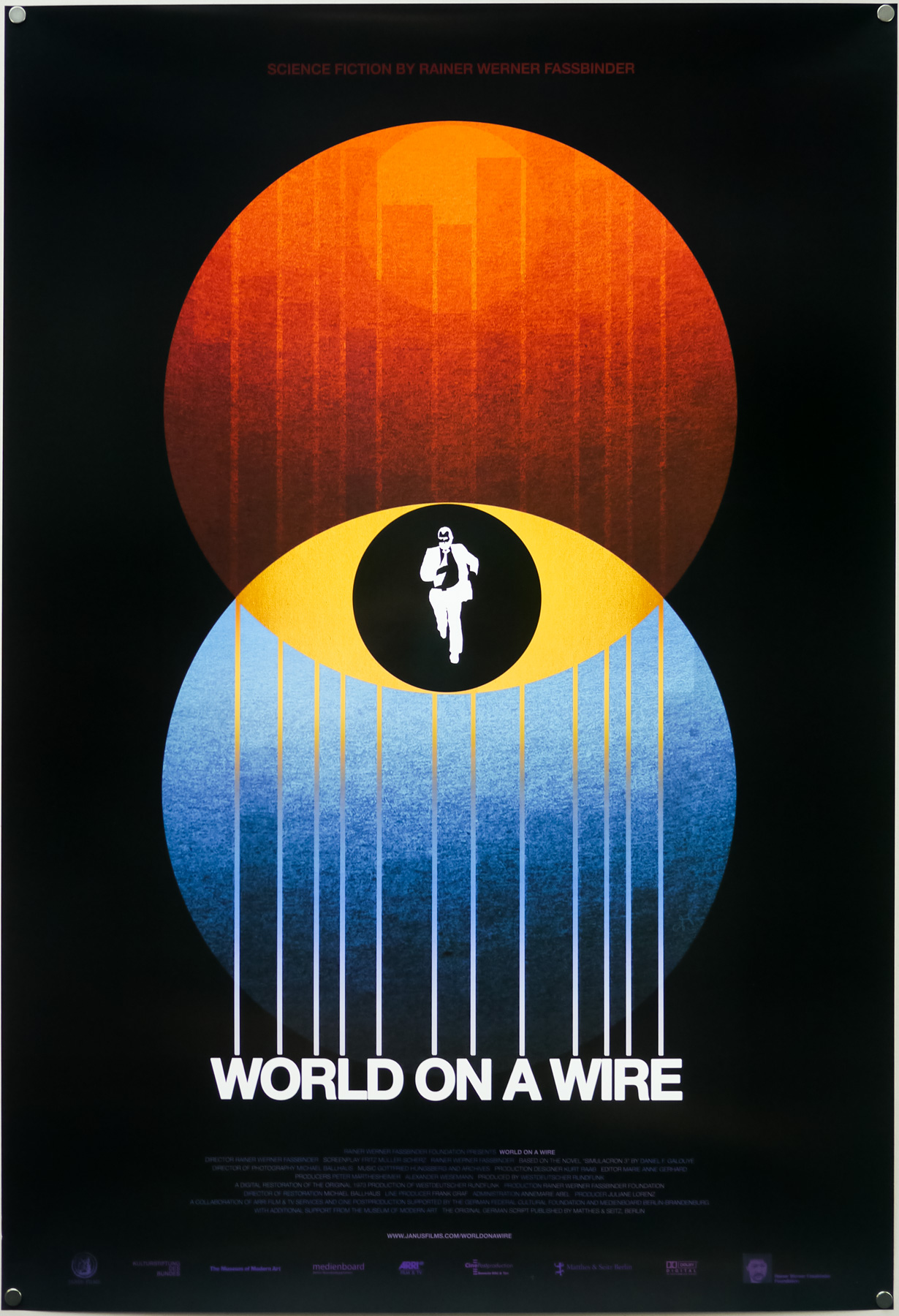
The World on a Wire poster for Janus Films’ re-release of the film in 2011, by Sam’s Myth
Post Tenebras Lux
Can you talk about your recent design for Post Tenebras Lux?
ICO got in touch with me to do the poster and gave me free reign to do whatever I wanted in my own illustration style, which was kind of a first, at least for an official poster. They liked what I did for the soundtrack cover for John Carpenter’s Prince of Darkness (for Death Waltz Records) and suggested I do something in that vein. I took inspiration from some of the scenery and imagery in the film and just created my own kind of dreamscape to promote the film and its world. But before I arrived at this I wanted to try an extremely minimalist treatment (see below) that was based on the type from the opening credits and a field of color representing the meaning of the title (“after darkness, light”).
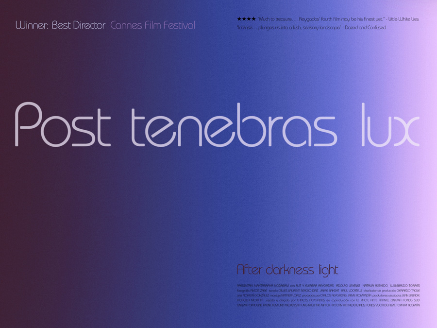
An early concept poster for the poster of Post Tenebras Lux, by Sam’s Myth, 2013
It was my first time working on a quad poster, in the landscape/horizontal frame, and this early version was inspired directly by a poster Hans Hillmann did for L’avventura. ICO liked it but felt I should give an illustration a try that reflected more of the daring nature and surreal imagery of the film, and in the end I’m glad they pushed me in that direction. One interesting side note about this is that after doing the horizontal quad poster, which up until that point had never interested me but which really proved to be a fun challenge, I had to adapt the poster for the US poster for Strand, in the vertical, portrait style (and for the forthcomhttps://www.filmonpaper.com/site/media/2013/06/DasAbenteuer_German_HansHillman.jpging DVD and Blu-ray as well). It was disappointing in one sense, given that I’d designed it to be horizontal and really tried to embrace that. But I wanted the poster to get used here if Strand wanted to use it. It was a more successful migration than I imagined, though I did have to cheat in a few places and alter the illustration. I still prefer the quad poster, as it’s how I originally envisioned the piece.
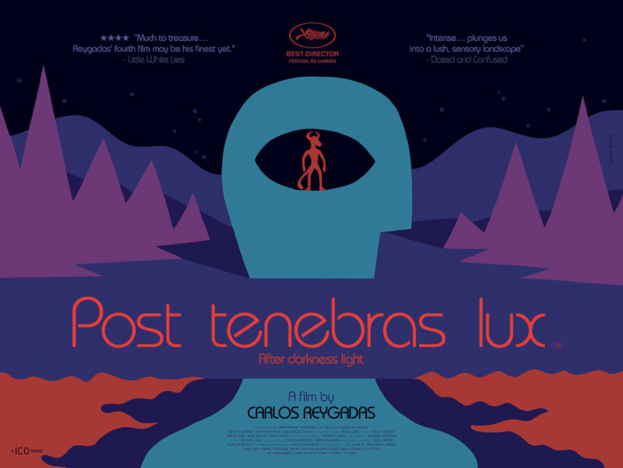
The final quad poster for the release of Post Tenebras Lux, designed by Sam’s Myth, 2013
A question from a collector: other than Carlos, House and World on a Wire are there any of your other posters that were printed as one sheets?
Kuroneko for Janus Films, Elena for Zeitgeist Films, plus The Shoah 25th anniversary poster for IFCFilms, and the one-sheet for their release of How to Survive a Plague last year. I just finished the UK quad poster for Post Tenebras Lux as well as a modified version of the same design for the US one-sheet. There have been a few others that fell victim to marketing considerations by studios and thus didn’t make their way to my portfolio…
Part 6 – Influences, advice and future plans
Are there any other graphic designers and illustrators working on film and gig posters that you’d single out as being particularly good or whose work you admire?
There are so many peers and colleagues of mine whose work I greatly admire. I love the work of painter and designer Akiko Stehrenberger. The work produced by Kellerhouse is always great and keeps today’s designers on their toes and ready to up their game. Jay Shaw is a personal favorite of mine; I’ve always loved his work. Mark Giglio doesn’t make posters, but is one of my favorite arists working today. Olly Moss, Brandon Schaefer, We Buy Your Kids, Mike Davis, Crowded Teeth, Little Friends of Printmaking, Methane, Tom Whalen, Daniel Danger, Kevin Tong… all inspire me on a daily basis. Not to mention all of my talented peers in Nashville: Andy Vastagh, Bryce McCloud, Ryan Nole, Shelby Rodeffer, Julian Baker and Rachel Briggs just to name a few.
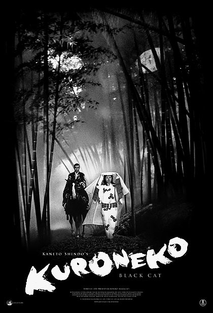
The poster for the 2010 re-release of Kuroneko, designed by Sam’s Myth
Are there any films or directors you’d love to design a poster for that you haven’t had chance to yet?
I have a lots of ideas for posters that I haven’t had time to work up… L’Orme, Gattaca, The Future, Godzilla, the Mister Rogers operetta Spoon Mountain. I could easily enjoy doing a whole series of posters for childrens films… Zazie dans le metro, The Black Stallion, The Secret of Roan Inish, The Spirit of the Beehive. I did Labyrinth and Phenomena, but I’ve always wanted to continue a Jennifer Connelly series (Dark City, Etoile, The Rocketeer, Requiem for a Dream, etc). A Kubrick series would be fun.
Do you have any tips for any aspiring designers who want to get into working on film posters today?
Just create work. If you don’t have a style, look to designs and styles that inspire you and study and mimic them. Try to understand what you could bring to those stylistic approaches that would be your own, something you haven’t seen before exactly. But above all, create work and put it out into the world. When it comes to film posters, try to engage with something fundamental about the film, its themes, its ideas, and play with ways to represent those things visually. Experiment with film stills and see how much you can do with them. There’s so much fan-made film poster art on the internet… and I admit that some of this stuff inspired me early on and that I was just a fan myself. Now there’s so much out there that it’s easy to look at it and pick up a few obvious things NOT to do.
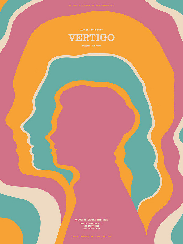
A screen print for a showing of Hitchcock’s classic thriller, Vertigo, designed by Sam’s Myth for the Castro Theatre in San Francisco, 2012
I don’t know if I’m doing this successfully yet, but I have to believe that there’s a small niche that my style of art and design might fill, that isn’t being covered by anyone else. I’m still working towards that goal which is always in front of me. My advice would be to visualize and fantasize about what your role as a designer might be, and what your work would ideally look like, and about what function your work might serve. Then, get to work while there’s no one telling you what to do, while you can explore the idea of creating work just the way you envision it. Create work that you would love to see created.
Can you talk about your plans for 2013?
I’m finishing a new theatrical poster for Janus Films that I’m really excited about. I’ll likely be doing some more screenprints for the Belcourt Theatre for some upcoming festivals and screenings. I have a lot of ideas I’d like to explore in some new areas, like products, characters and books for children, and I’d also love to just work on illustrations of my own that don’t serve any specific purpose or product. But I will continue to be excited about film posters, awaiting my next assignment.
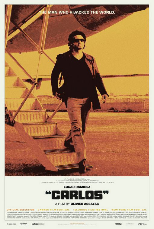
The final poster for the release of Carlos, designed by Sam’s Myth, 2010
Are there any images you could tease us with as to what we’ll see from you next?
You already know the HOUSE image, but I’ve never had the chance to make nice, silkscreen prints of the design in its original colors (an extremely limited run in hot pink, blue and green was printed for Belcourt patrons when HOUSE made its first return engagement in 2010). I’m excited to say that it looks like that will likely happen this month when HOUSE comes back again at the end of June. I’ll make sure to print more than 30 copies this time!
Thanks so much for your time Sam, it’s greatly appreciated.
You’re very welcome, thanks.
—————————-
Sam’s official website, including portfolio, can be viewed here.
Check out the Sam’s Myth blog here.
If you’re on Twitter I’d strongly advise following Sam on there.
Sam’s Myth is on Facebook and can be found by clicking here.
Finally, check out Sam’s Tumblr here.