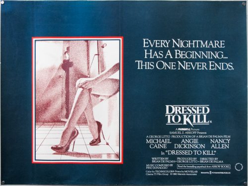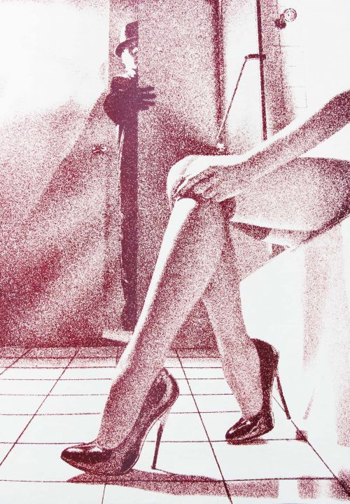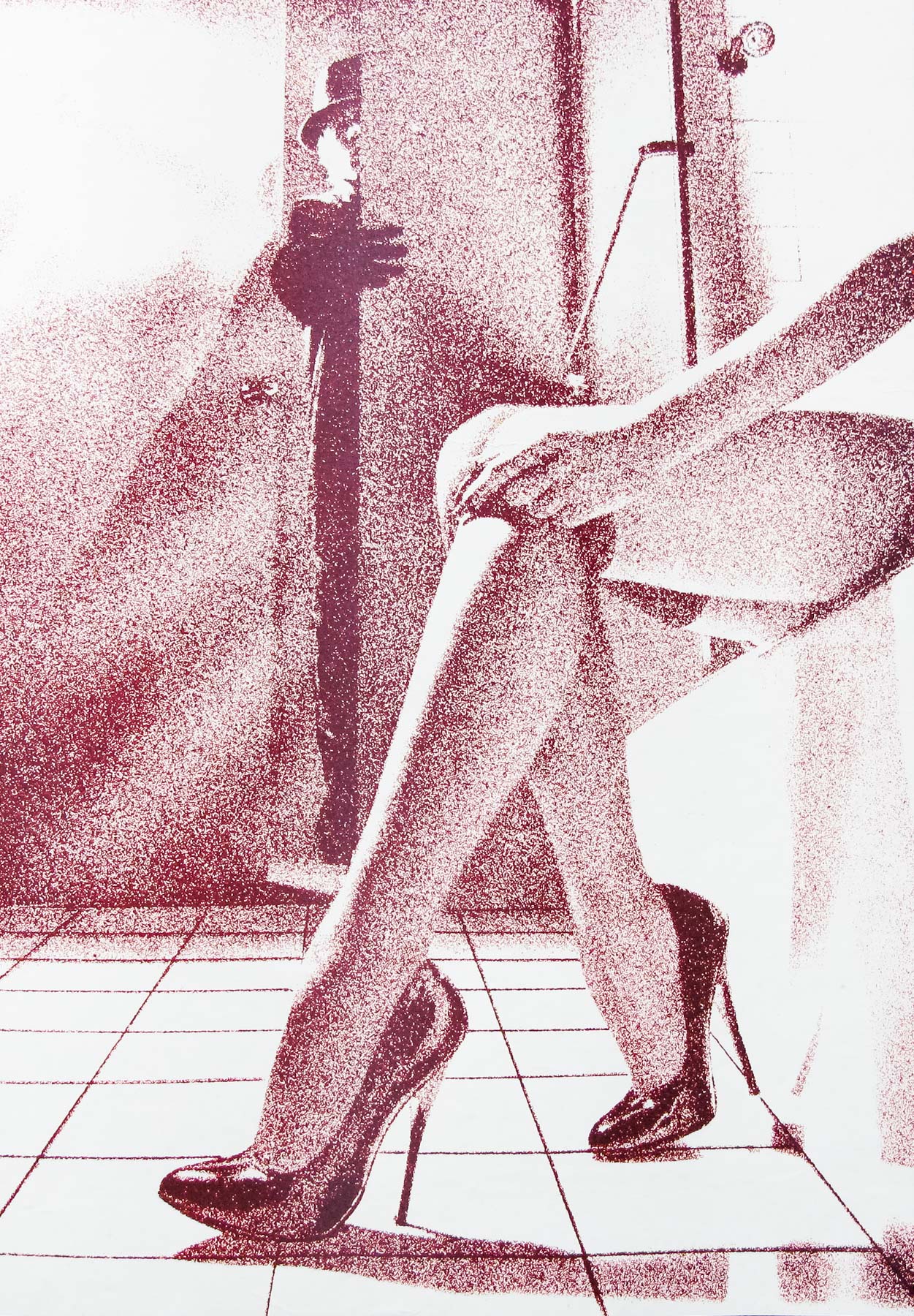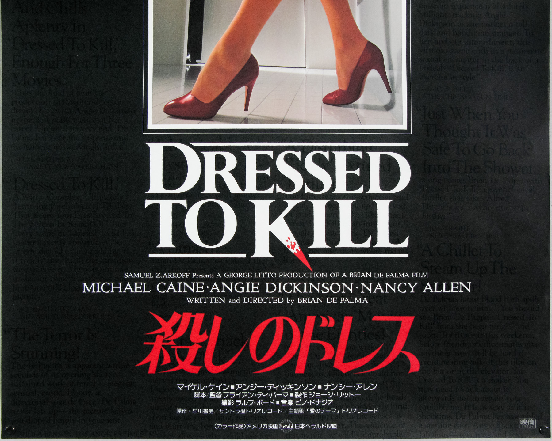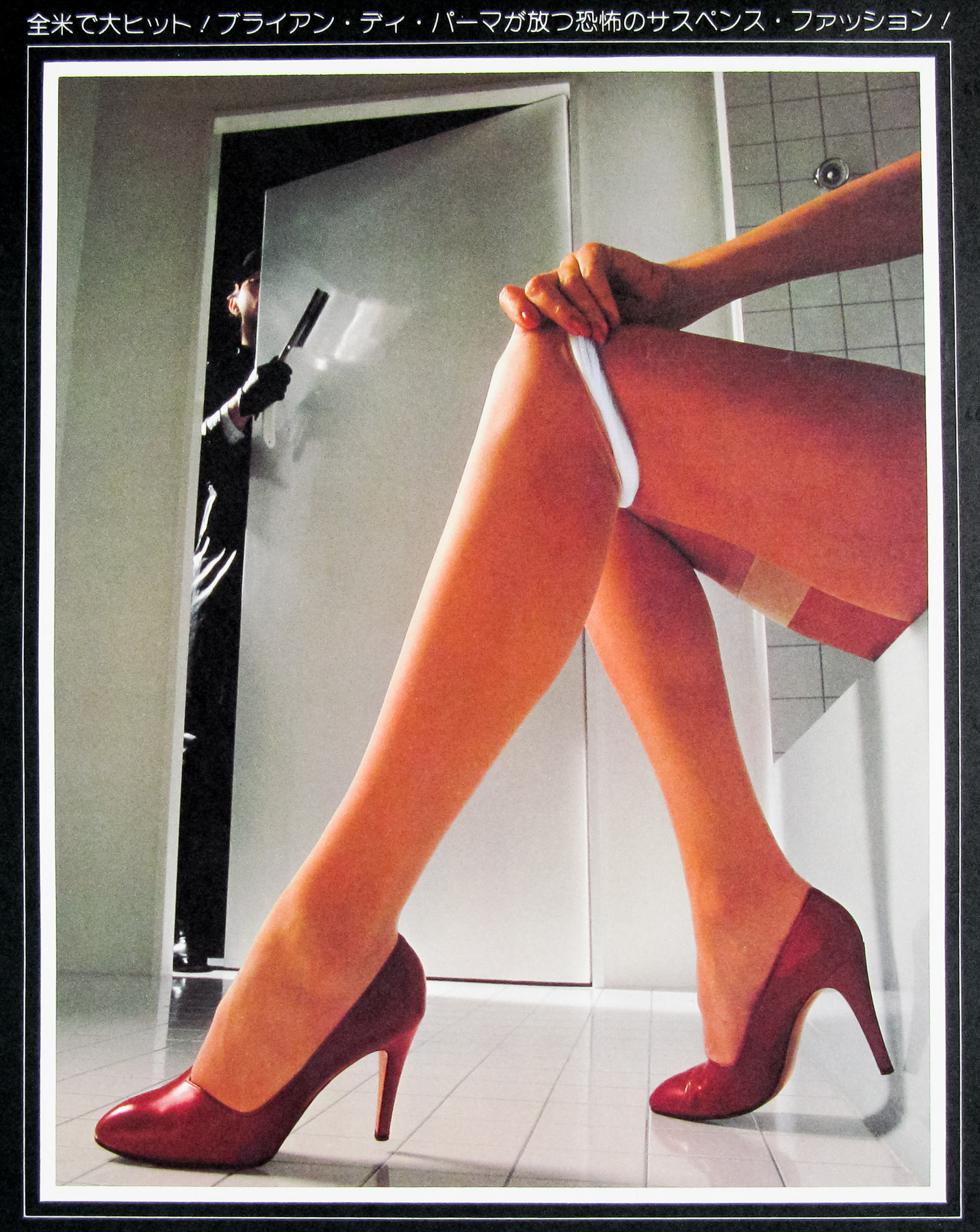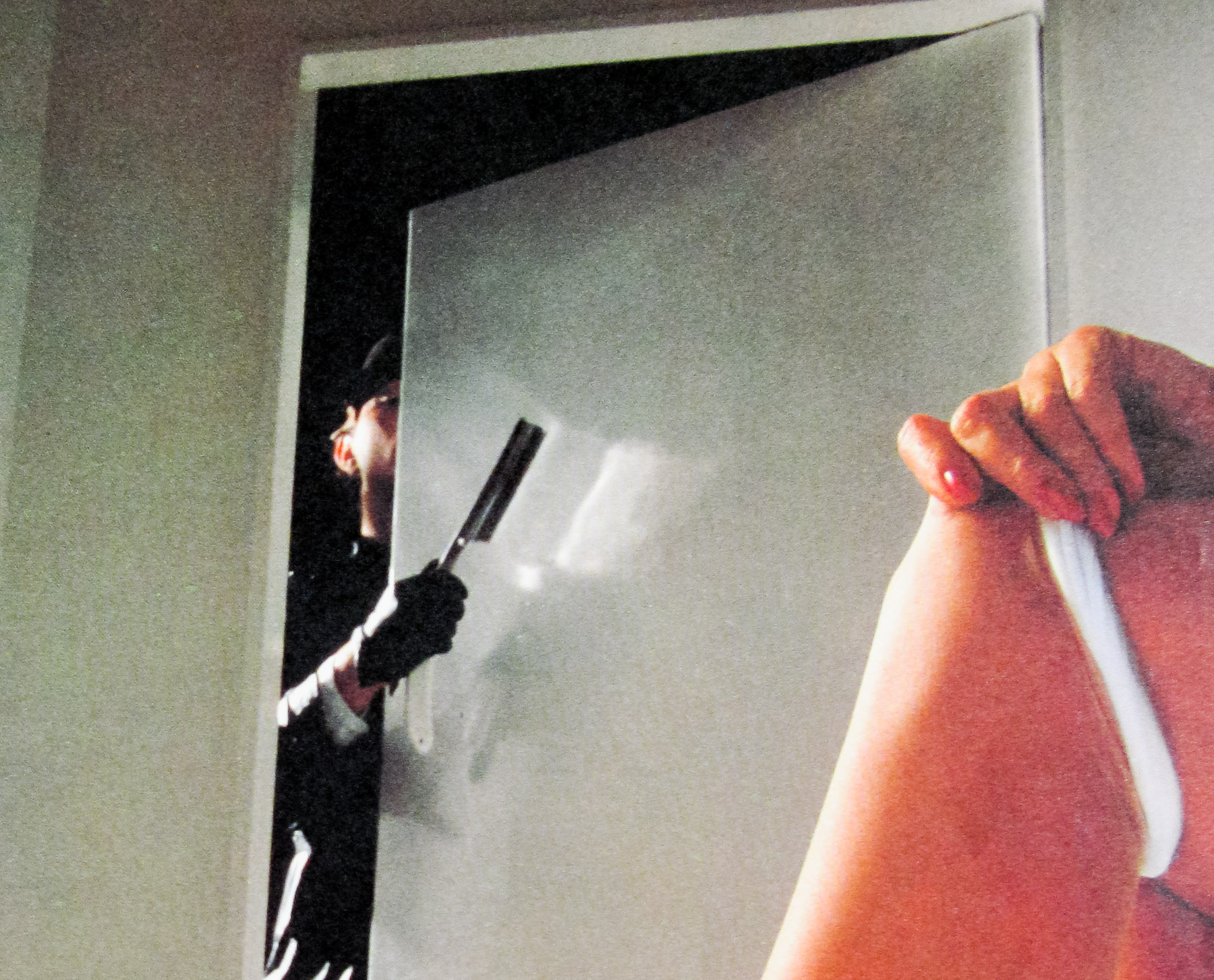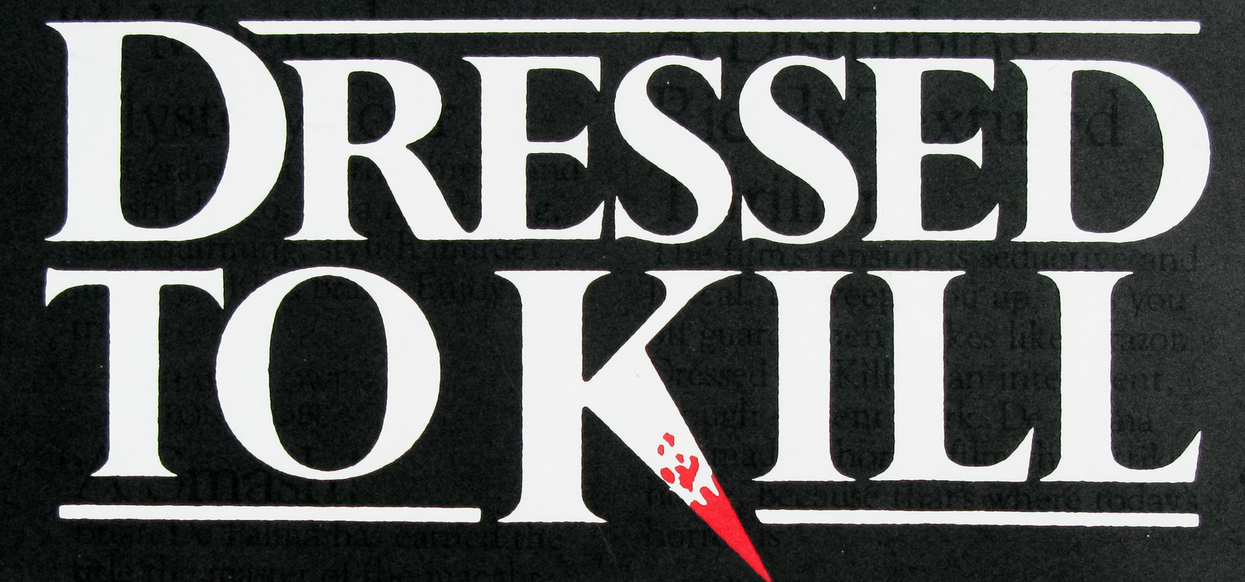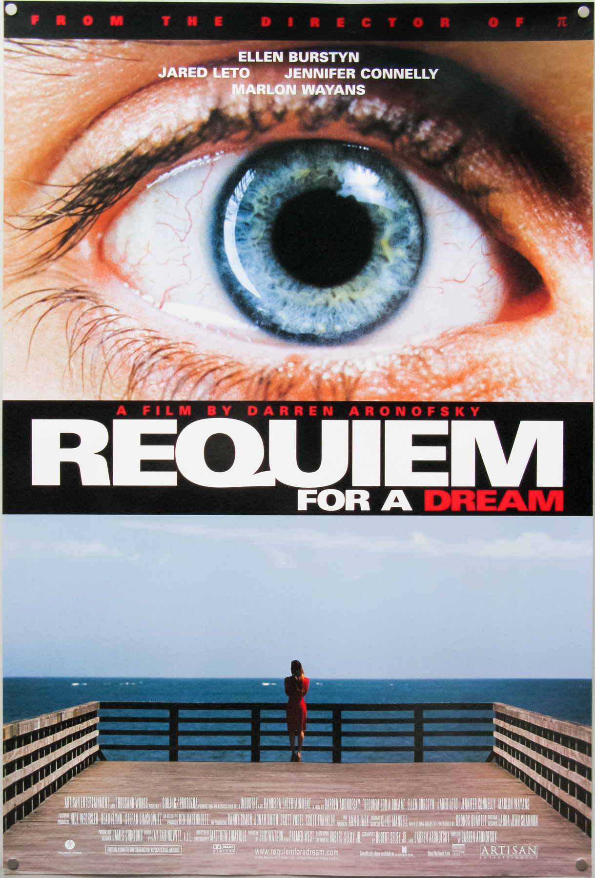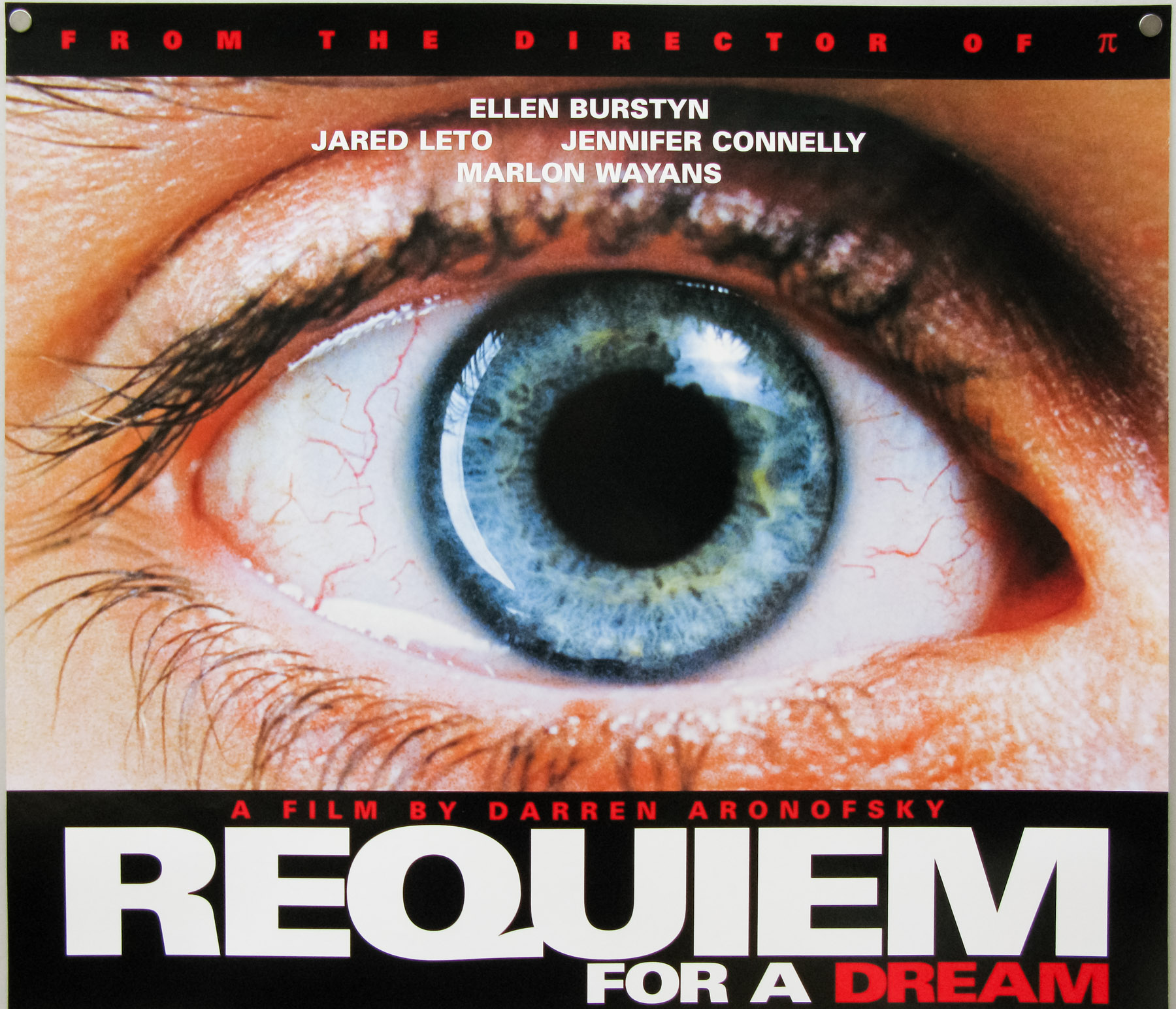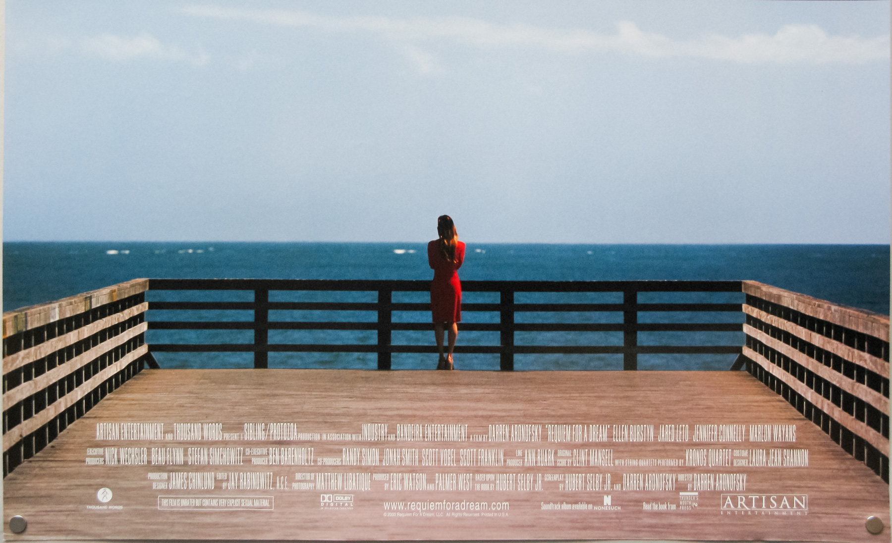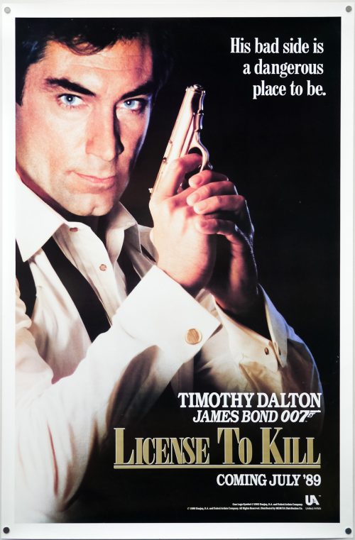
Poster detail
1-5

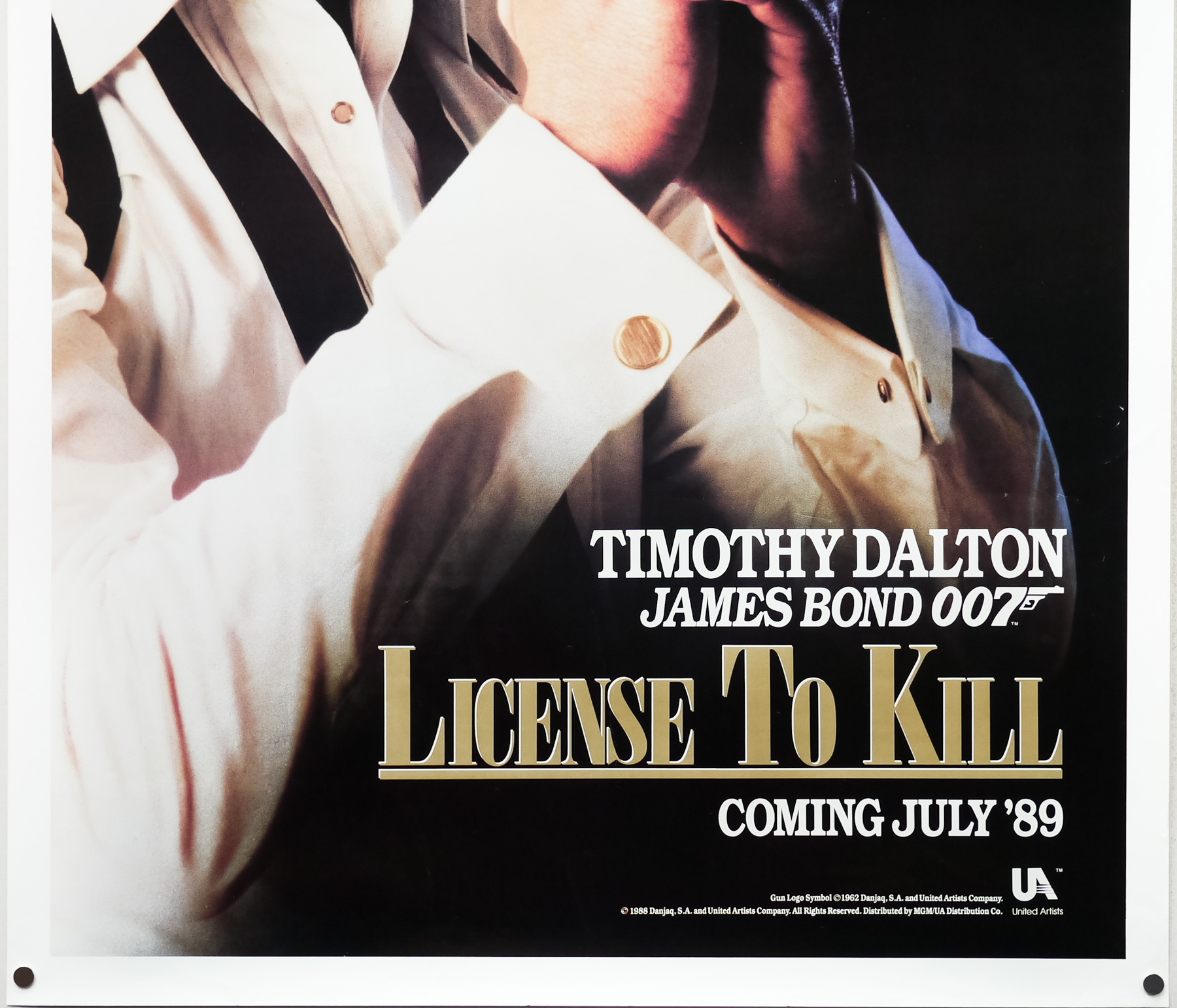

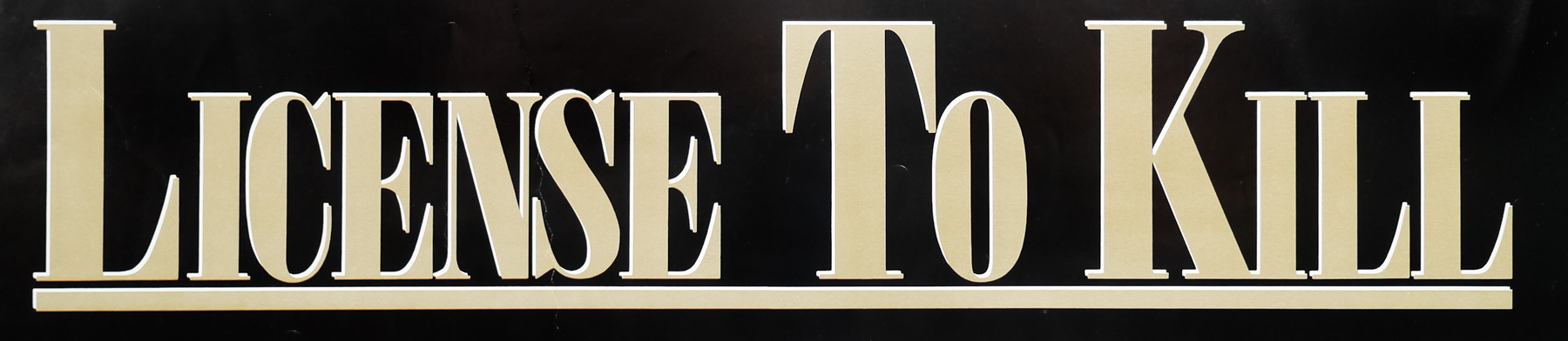
- Title
- Licence to Kill
- AKA
- License to Kill (alternative, pre-release spelling)
- Year of Film
- 1989
- Director
- John Glen
- Starring
- Timothy Dalton, Carey Lowell, Robert Davi, Talisa Soto, Anthony Zerbe, Frank McRae, David Hedison, Wayne Newton, Benicio Del Toro, Anthony Starke, Everett McGill, Desmond Llewelyn
- Origin of Film
- UK | USA
- Genre(s) of Film
- Timothy Dalton, Carey Lowell, Robert Davi, Talisa Soto, Anthony Zerbe, Frank McRae, David Hedison, Wayne Newton, Benicio Del Toro, Anthony Starke, Everett McGill, Desmond Llewelyn,
- Type of Poster
- One sheet
- Style of Poster
- Teaser - 'License' version
- Origin of Poster
- USA
- Year of Poster
- 1989
- Designer
- Steven Chorney
- Artist
- Keith Hamshere (photography)
- Size (inches)
- 27 1/16" x 41 1/16"
- SS or DS
- SS
- NSS #
- --
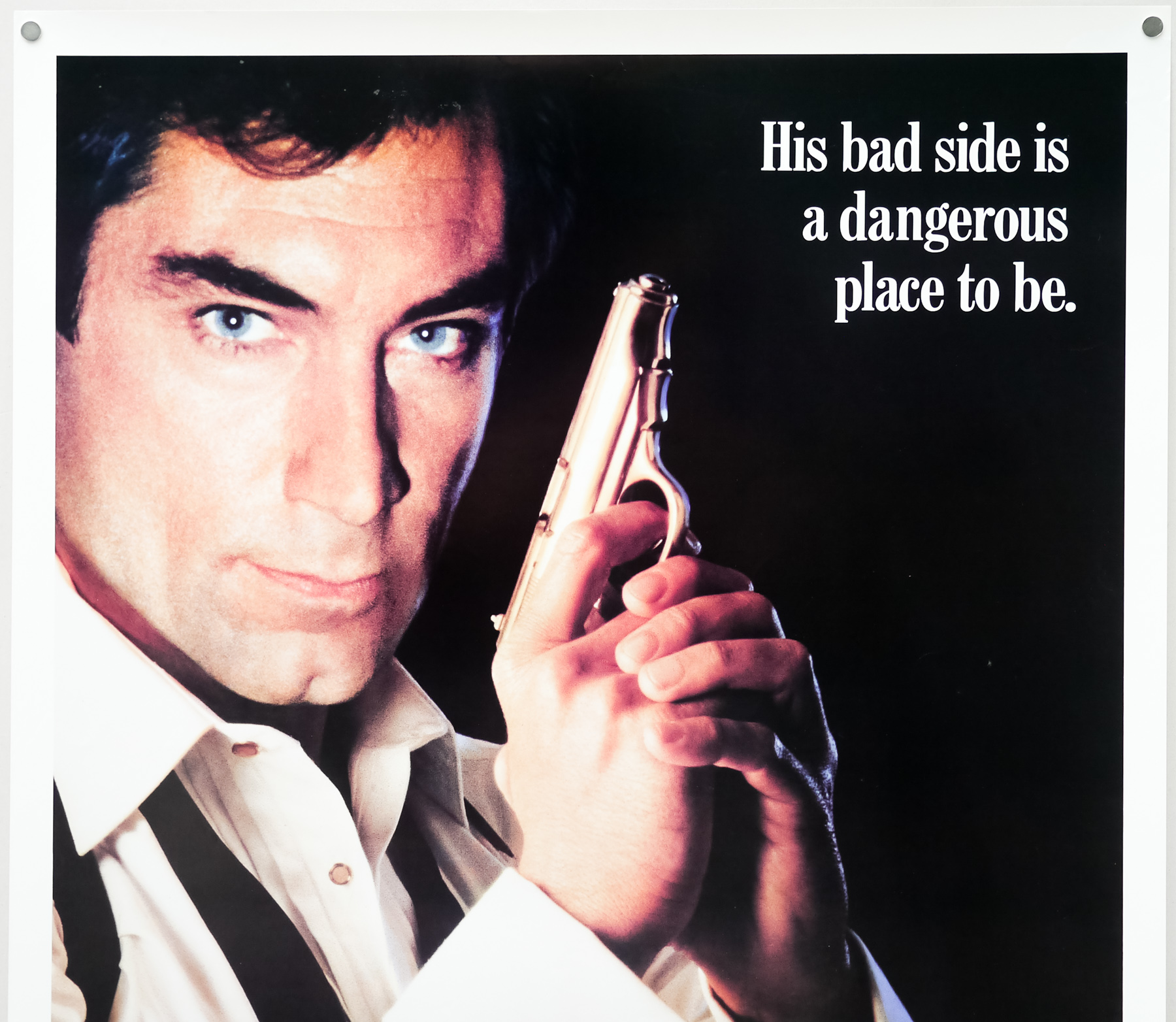
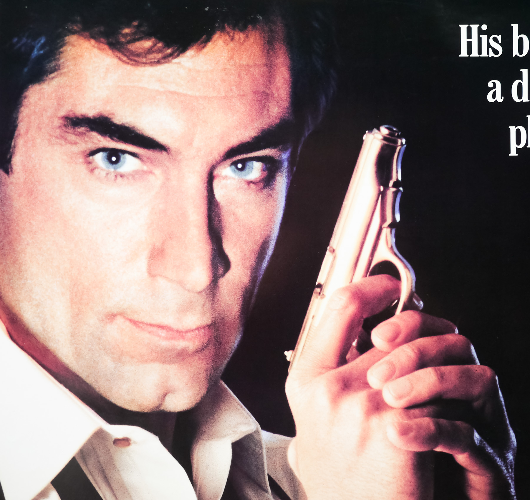
- Tagline
- His bad side is a dangerous place to be.
Celebrating its 25th anniversary this year, Licence to Kill, the sixteenth James Bond adventure, marked the end of an era in the franchise. Whilst certainly not in the running for best Bond film, it’s nevertheless a solid entry with excellent use of locations (actually forced due to budgetary constraints), a memorable bad guy in Robert Davi‘s drug kingpin Sanchez and a number of impressive stunt sequences. Fans of the original Ian Fleming novels often rate Licence to Kill as the film that’s closest to the original source material’s harder-edged action. Licence to Kill marked the last Bond film for director John Glen who had been involved in the series since 1969 and also saw legendary producer Albert R. Broccoli effectively retire from the reigns of a franchise he had begun with producing partner Harry Saltzman back in 1958.
The story is significantly darker and grittier than anything that had come before in the series, particularly those films released during the Roger Moore era. It opens with Bond and old friend CIA agent Felix Leiter on the way to the latter’s wedding ceremony in Key West (Florida) when they’re informed that Sanchez, a wanted drug lord, has been spotted in the area. The pair manage to apprehend the kingpin after an exciting chase that ends with them parachuting out of a helicopter and landing in front of the church, just in time for the ceremony. After the title sequence (with the excellent Gladys Knight theme tune) things take a dark turn as Sanchez escapes and takes revenge on Felix and his new bride.
When Bond discovers a badly mutilated Leiter and his dead bride he vows revenge, but when his superiors deny his request and order him on another mission to Turkey, Bond flees and has his licence to kill revoked. With the help of one of Leiter’s friends, he follows a trail leading him from the Bahamas to the fictional Republic of Isthmus where Davi’s plan for global drugs domination is revealed. The film ends with a thrilling chase involving several tanker trucks along a dangerous highway, which is easily one of the most memorable action sequences in the series’ history. The film was Welsh actor Timothy Dalton‘s second appearance as 007 and would ultimately prove to be his last after a protracted legal wrangle meant that no Bond film was put into production until 1995’s Goldeneye, by which time the actor had moved on and was replaced by Pierce Brosnan.
The marketing of the film went through a number of iterations, designers and artists and, crucially, marked the first time that painted artwork gave way to a photographic montage. Despite some initial sketches and concepts by the legendary artist Bob Peak, MGM decided to commission a number of designers and artists to work on the posters, including American Steven Chorney who designed this particular advance one sheet, and British design firm FEREF (led by Robin Behling) which designed a montage that was used on the international one sheet, the British quad and for some other posters around the globe. Although initially produced under the title ‘Licence Revoked’, MGM feared that American audiences wouldn’t understand the second word and changed it to the title we know today. Note that there was some wrangling over whether to go with the American spelling ‘License’ or the British-English ‘Licence’. Eventually the latter won out, but not before these posters had been printed with the American spelling (the same poster also exists with ‘Licence’ too).