British designer and illustrator Graham Humphreys is responsible for some of the best film posters of the 1980s and has an incredible body of work behind him, including record and CD covers, packaging design and editorial illustrations. He’s one of the last great film poster designers still active in the industry today and continues to lend his unique style to the work of The Creative Partnership, a design studio based in Soho, London. He’s also responsible for many classic VHS covers and has illustrated the poster for the UK horror festival Frightfest since the year it began.
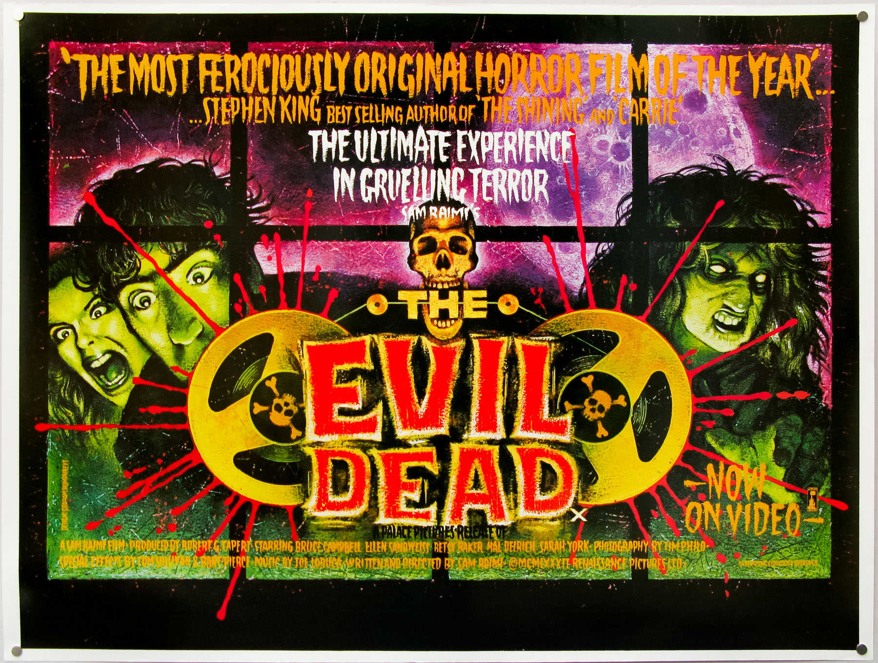
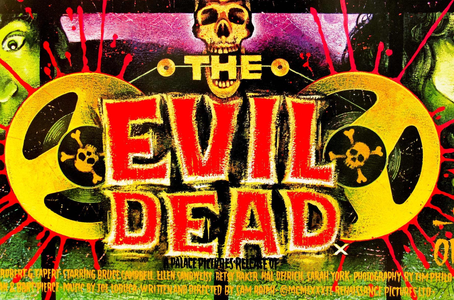
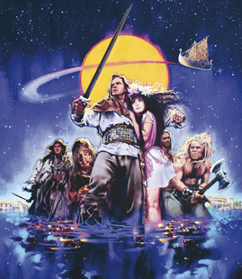
The Evil Dead – British quad poster painted by Graham Humphreys

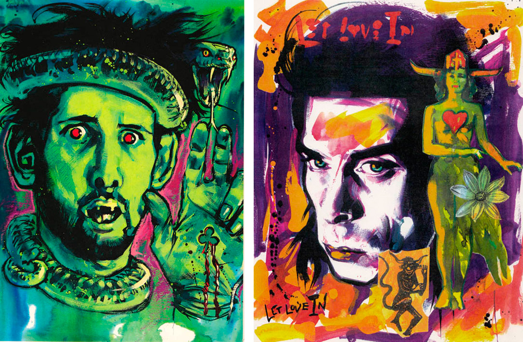
Graham Humphreys, 2011
I recently sat down with Graham at the Phoenix Artists Club in Soho and we talked for almost three hours about his career, including his move to London, his early work, the film posters, as well as the VHS covers and the projects he’s working on today. Graham has also supplied me with several exclusive images of his work, some of which have never been seen before, and these are included throughout the interview. I’ve split the interview into six sections and you can jump to each part using the links below:
Part 1 – Starting out and early work
Part 2 – Working with Richard Stanley
Part 3 – The Creative Partnership, Tartan and more
Part 4 – The film posters
Part 5 – VHS covers and Frightfest
Part 6 – Current work and the future
Part 1 – Starting out and early work
So, Graham, first of all I’d like to say thanks so much for agreeing to meet me. It’s a real honour.
It’s a pleasure for me too.
I’ve been aware of your work for the best part of twenty five years. I used to visit the video shop when I was a kid and my dad would hire me things like Goonies, D.A.R.Y.L. and Wargames and I’d see the [VHS] covers for things like The Evil Dead, The Kindred and Evil Dead II and all those lurid designs. I used to think ‘if only I could persuade him to hire those’! It was only later that I found out that the artwork was by you and I’m certain I’m not the only person who has been affected by your work in this way.
I’d like to start from the beginning and discuss how you got into designing and illustrating and how you got your big break. Researching on your site I spotted that you started out doing a course called Graphic Design and Illustration at Salisbury College.
That’s right, yes.
That was 1976, so could you tell me a bit about that? What was the course like?
I think I was lucky because Salisbury had a quite a good reputation at the time and it had a good mixture of lecturers there with the emphasis on the commercial side of graphic design. There was another part of the college that dealt with fine art and there was definitely some rivalry going on with some of the lecturers. There was the consideration that the BA fine art section was very ‘arty-farty’ and the graphic design was much more realistic and you’d likely get a job at the end of it.
You could also tell there was a difference with the students as well. Generally those doing graphic design were a bit more grounded and those doing fine art, although they looked colourful and interesting, were definitely from a different background and had very different aspirations. We had lecturers coming from London every week and they had a huge influence on me in terms of the work they were doing for [record] covers and the rock aesthetic at the time. So it was out with, you know, Roger Dean and in with people like Russell Mills. One of the lecturers we had was a guy called Mike Litherland who was doing work for a band called Punishment of Luxury. He had worked with lots of other bands too and really it was his influence that started shaping what I was doing, particularly his use of colour.
Graham: These are postcard size illustrations, painted whilst I was at college. They are my first earnest attempt at serious horror illustration. Also the first experiment with a technique I eventually used on the original Evil Dead poster.
So the guest lecturers were the thing that you really found great about the course, because it was a line into what was happening in the London design scene at the time?
Completely, because being in Salisbury you were removed from the epicentre of design, as such, and so they were a line into the real world. Basically they were people earning money in what I wanted to do and so you could see that you could do it, that it was achievable.
You made the decision to do the graphic design course because there was likely to be a job at the end of it?
That was the idea because it was commercial art, but then it was obvious that my skill was in illustration and so the final year was tailored towards that.
Yeah, there’s a quote on your website that I love where you say you’d always been sketching Daleks and skulls.
That’s right, yep
From a young age you’d been fascinated by the dark side of things and while some kids were drawing houses and puppies you were drawing that kind of stuff?
Yep, it’d all gone wrong!
Once the course was over you made the decision that you had to move to London?
Absolutely, there was no choice; that’s where the work was. I knew that film poster design was something I wanted to get into, but I also knew that the music side of things was very important too. I was heavily into music and so it was straight to places like NME and Sounds, whoever would be willing to see me.

Graham: This is a promotional card printed for my first agent ‘Fig 1’. 1983
The move to London was in 1980?
Yes, it was more or less a month after the course finished that I moved down. I was lucky because I already had some friends who were living in Blackheath so I could move in with them. It was great because it was very cheap rent.
How much was it, can you remember?
Yep, it was nine pounds a month. Thought that was still a struggle.
Wow, nine pounds a month? Incredible. So you immediately started approaching design studios?
That was all I was doing all the time, taking my portfolio around to different offices and studios. It was on the advice of lecturers who would tell me the various people I should go and speak to when I was starting out. Also, because I had friends who’d already moved to London, I had contacts in different design studios who I could go and see too.
Was it an in-house role you were after or freelance?
Oh, definitely freelance. It was always going to be like that.
You didn’t want to tie yourself to one place?
No, and also, doing what I did, there wasn’t really anywhere that had a permanent position for me. I was still trying to formulate a style that was quite experimental at the time, even though there were these illustrators that had emerged out of the punk rock thing. I had this great love for the design that had come from that scene, the early seventies stuff, particularly when you look back now and see the kind of rebellion that was going on at the time.
Are there any specific designers that really influenced your work?
Russell Mills, in particular, and Mike Litherland. They were the two main ones. Mills was doing stuff for several bands, including Penetration (Moving Targets) and he was doing illustration work for magazines. He had an exhibition in the Thumb Gallery in D’Arbaly street (Soho) and that influenced me quite a lot.
LINK: Some of Russell Mills’ most famous album covers can be seen here.
Can you remember what your first job was?
I can and in fact I’m revisiting it right now. I had a friend whose brother had a design studio and they were working on an educational book called ‘Handling Language’. It was aimed at kids from eight through to the teenage years and it was all about the use of vowels and the various intricacies of the English language. They wanted a comic book style to make it more palatable.
I did about eighty to a hundred black and white illustrations, which took me about three months. Interestingly, the daughter of the guy who wrote the books originally (he’s since passed away) got back in touch with me thirty years later and asked me if I’d be interested in doing some more illustrations. They’re updating the book now and wanted me to add some new sketches to it.
It’s really brilliant that they thought of you.
I know, well I didn’t think she’d ever be able to find me, but I think she had some friends who advised her on the use of the Internet and pointed her in my direction!

Graham: This is a leaflet for London Transport (with deliberate off-register printing to keep the old poster feel).198-
I wanted to talk about Palace Pictures, or Palace Video as it would have been at the time. I recently watched a documentary that can be found on various ‘Evil Dead’ DVDs, which is called ‘Discovery of the Dead’ and features Steven Woolley and Nik Powell from Palace. They talk about how they discovered the film at the Cannes film festival and how they subsequently marketed the film to the UK public. There’s a section where they talk about how they took a chance on working with you after you’d contacted them?
That was through a friend of a friend who had seen my work and suggested I go and speak to the folks at the Scala cinema. I’d heard they were setting up a video-releasing company and thought that’s where my illustration work might fit in. Steven Woolley wasn’t in but I left a couple of colour photocopies of my work and they landed on his desk. On the basis of those he got in touch with me. He liked my style, the colours and the energy. I think he felt it was completely appropriate for the film.
Can you recall what the couple of pieces were?
Yes, bizarrely they were two pieces focused on Joan Crawford. One was her as a Vamp with bats in her hair and the other was based on a B-52 song ‘Planet Claire’, so that was of her in a space helmet with a rocket in the background.
Another thing I’m keen to clarify is the timeline of the Evil Dead release and the marketing around it. On IMDb the film is credited as being released in 1981. When was it that the Palace guys discovered it at Cannes and you started work?
I did my work in 1983 and since all the credits were hand painted I remember writing 1983 at one point, possibly not on the poster, but it was certainly on the video cover.
When would you have actually had the first meeting with Palace?
It was certainly that year, maybe the end of 1982. I think it was a swift process – it was about a month after I’d left my work there that they called me.

Graham: ‘This is the front of an A4 brochure promoting the Palace Horror video range. 1988?’
I want to get into talking about the film posters in more detail shortly, but for now I’d like to move onto your music work. You started doing work for the NME?
I had a friend of a friend who had just taken over as Art Director and they invited me in so I could show my work to the editor, Neil Spencer. He really liked it, even though I’d sent some work in before – it had obviously just not reached his desk before.
I can imagine the office was pretty chaotic at that time?
Oh completely, but in a good way. It was in the middle of Carnaby Street, which was very exciting, even though the area was pretty disgusting at the time. It was great to go into the office as you’d see exciting people wandering in and out.
You also did work for Sounds?
Well it’s interesting because there were these two rival music papers, Sounds and NME. The NME had a slightly more intellectual journalist base, whereas Sounds was much more visceral. So Sounds veered towards the heavy metal stuff initially whereas the NME was more cerebral and championed prog rock bands, certainly before the punk stuff. It was actually the NME who were the first band to do an article on the Sex Pistols and that scene.
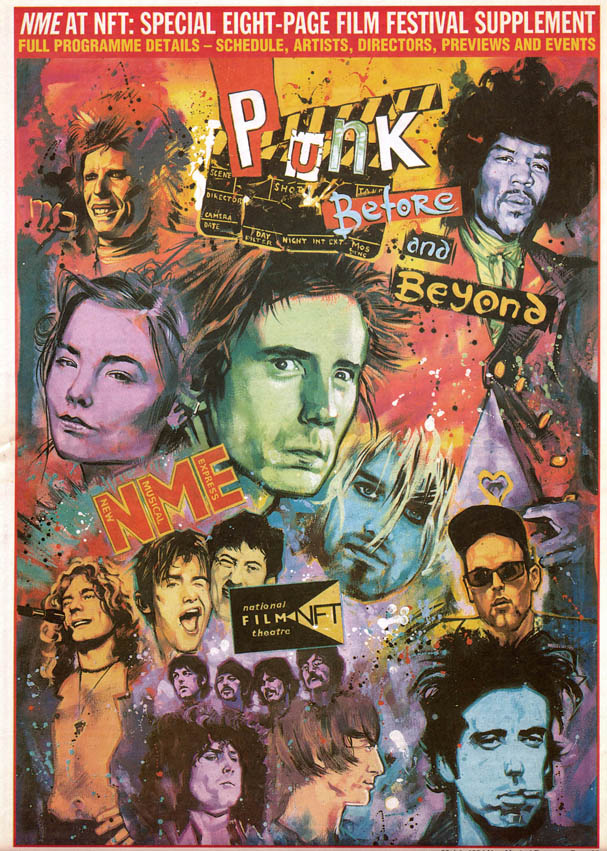
NME at the NFT – brochure cover by Graham
So that’s where your heart lies, with punk rock?
Absolutely, yes. It was completely transforming at the time. It’s hard to imagine how something could do that now because we’re completely overloaded with information. With the internet you know what’s going on anywhere at any time, but back then punk just popped up and was suddenly on the national news – what is there in pop music today that could warrant 10 o’clock news bulletins?
We had two people in the art college in Salisbury who were the first punks in the West Country and they were terrifying to look at. I was absolutely petrified the first time I saw them, then I got to be friends with one of them and realised they were lovely people, probably the nicest people in the whole of the art college. My whole perspective changed – I was a very naive 16-year-old!
Then the son of my Spanish teacher at school, who was also at college with me, suddenly popped up with red spiky hair and also looked terrifying. Because I was always the geeky outsider it really appealed to me – we realised that we didn’t fit into many things but this thing we did fit into.
When you moved to London it must have been fantastic to see the punk scene that was going on at that time?
Oh, completely!
Graham: These were some of my illustrations that were used for NME features
Did working on punk stuff happen as a result of the contacts you had at the NME and Sounds?
Yes, it was thanks to some work I did for the letters page in the NME, a generic illustration that did have skulls in it! That was spotted by a lovely person called Vermillion Sands who was working at Eagle Records, which was part of I.R.S. Records. It was Miles Copeland’s company and they’d made a lot of money through managing The Police, who his brother Stewart was a member of.
What kind of bands did they look after?
They had this new project, a band called ‘The Lords of the New Church’ and their imagery was very much in the vein of the stuff I was doing at the time. Vermillion had shown them some of my illustration and they were very keen to get me in to talk about working with them.

The Lords of the New Church – album covers by Graham
So you met them and got do their first album cover?
I did their first and second album covers. I have to say that Stiv [Bators] the lead singer was the creative vision man in the band and had pretty much created their image. He had very strong ideas which were not really where I’d have taken things myself if I’d been able to do it.
He was forceful? Because it was his band?
Not forceful, he was actually quite inspiring. He made me see things in a different way and opened up possibilities, but at the same time he had something very specific in mind. It was this kind of Salvador Dali-esque image and he’d shown me one idea that had colours that I’d have never thought of using myself. He was an amazingly intelligent man, very intellectual, despite how he looked and behaved. He was a complete rebel, but just fiercely intelligent and had met Gore Vidal a few times; he turned me onto Vidal’s writing actually. Yet, he just couldn’t help himself!
In the end their third album cover was a simple photographic design so they got someone else to do that one.
Graham: These portraits of Shane McGowan and Nick Love were done for separate NME features
There were other bands that you worked with off the back of that – The Cramps for example?
Yes, I didn’t actually work with them directly, but it was a cover for a compilation of their greatest hits (at that time) and it was given to me as a project because I really wanted to work on it. Being my favourite band at the time it was a great thing to get.
Were there other bands you’d have liked to have worked with?
Yes, I’d love to have done a project for Siouxie and the Banshees, for instance, and The Gun Club as well. They all had their record company deals that locked them into working with the in-house design departments. That worked to my advantage in the end because I met a guy called Rob O’Connor who founded a company called Stylorouge. They did lots of work for Polydor, including cover work for Siouxie and the Banshees and through him I was able to do lots of other work. The Brother From Another Planet poster that I did was thanks to Rob.

Blood and Kisses – one of Graham’s posters that was featured on the front of Routemaster buses
Can you talk about the NME posters that ended up on Routemaster buses?
They had an advertising company in to try and boost sales and they’d had this idea of putting three different posters on the buses displaying three threads of music [that they covered] to try and broaden the appeal of the paper. The posters were on the two front panels and they were fly-posted too. In the end they were on there for several months and even though the colours faded you’d still see them drive by, so that was cool.
Part Two – Working with Richard Stanley
Another thing I wanted to talk about was your collaboration with [director] Richard Stanley. I’m a huge fan of the film Hardware and I read on your site that you got involved in storyboarding that film, Dust Devil and then The Island of Dr Moreau, which I believe was something of a …
Yeah, it all went pear-shaped! In a very big and expensive way. I also did storyboarding for two other projects that never came to fruition; one called The Season of Soft Rains and the other was going to be a remake of a Russian film called Viy. This was based on a Russian folk-tale, but Richard had updated it to reflect the strife that was happening in Ex-Yugoslavia at the time and it was going to involve the U.N. There was going to be a supernatural creature at the end, which is Viy.
What happened to that project?
Ultimately, nobody would put the money forward for it.
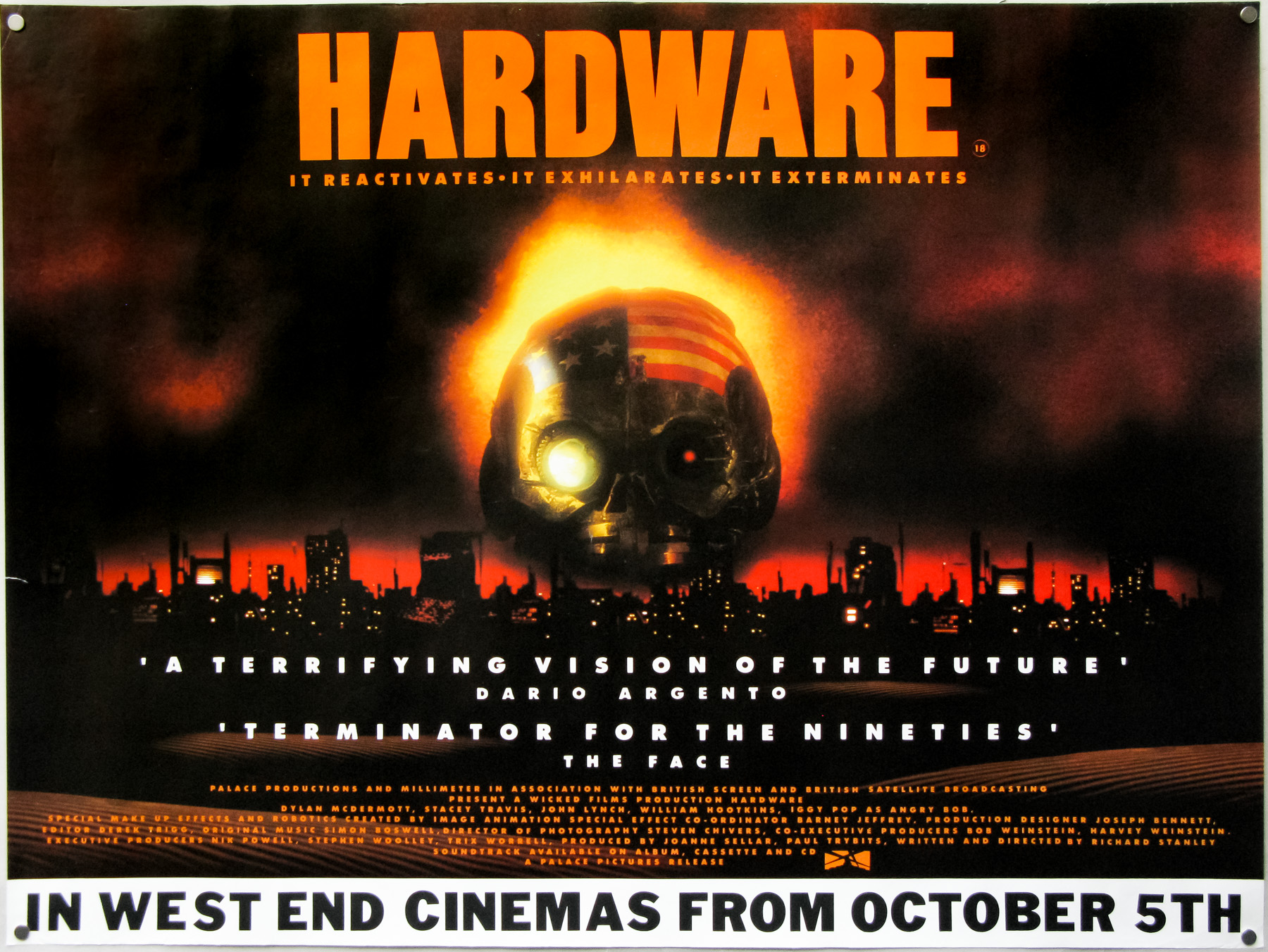
The British quad for Hardware which wasn’t designed by Graham
How did you first get involved with Richard Stanley?
Through Steven Woolley at Palace Pictures. Richard had just come back from Afghanistan where he’d shot a film called Voice of the Moon and he’d come up with the script for Hardware. He’d gone to Palace because he’d already found a company called Wicked Films who would produce it but not fund it. Steve really loved the script and they thought they could make the film for less than one million pounds. They got a good team together and had some funding from Miramax films (the Weinsteins). They gave me a call and said “we’ve got this great script and we’re looking for someone to do the storyboards”. I remember just saying “Ok, what’s the fee?”, and they said “we’d rather pay nothing at all”.
Had you worked on storyboards before this?
Never. It was fascinating and I learned so much in the first week just working with Richard, who’s the complete filmmaker and is so passionate about his films.
So your involvement was in the pre-production phase?
The idea was to storyboard every single scene in the film and thus not waste money on footage that wouldn’t end up being used. The whole point was to get all the framing done, lock down the locations and get every pose and position done so it could be shot quickly.
You were on the set during shooting then?
Yeah, at the point when they started shooting and I sat with Richard, still storyboarding for a few days.
One thing to confirm is that you didn’t do the poster for Hardware?
No, that was done by some friends of mine. They got this expensive photographer to shoot the robot’s skull and comped it together with the city-scape from the film. They managed to get a Dario Argento quote on there, which was good because he’s Richard’s favourite director.

This is the British quad poster for Dust Devil by Graham
Dust Devil was next. Was that a similar deal as with Hardware?
Yep, I think Richard liked working with me, well he didn’t like working with other people, so by default that meant me. We started off by working on the effects scenes because they’re always more expensive and you really need to know where things are going to be. This was in the days before computers so everything was built and shot for real.
You also did the poster for Dust Devil?
Yes, on the cheap; in fact the cheapest poster I’ve ever done. It’s a comp of two pictures from the film. It was one of the first computer generated items I’d ever worked with. The Creative Partnership had just acquired their first ever computer, well actually it was owned by the junior designer in the studio, a chap called Stephen Burdge who later went onto found Empire Design. He had the cash to buy one of the early Macs, which would have been a few thousand pounds and had the memory of a mobile phone at the time. So we had to actually take the design to a facility house where they could handle something the size of a poster – Stephen controlled it when we there and that took about a day!
Then it was on to The Island of Dr Moreau?
This was very soon after Dust Devil and it was around the time that Palace Pictures went down the pan – they were going to release that film but ran out of money and I never got paid.
With Dr Moreau, you were going to have the same deal as on the previous two films?
Well Richard [Stanley] had the script which he’d been touting around for about a year and the reason anything happened at all is because he’d managed to get it to Marlon Brando. I think Marlon saw himself as the lead character because he’d just bought himself an island, being a bit of a recluse, and he was very passionate about the whole ecology thing. He really wanted to do the project so suddenly it went from a low budget production, as planned by Richard, to being this massive film. As soon as Brando became involved Miramax got very excited and of course Marlon’s fee was going to be pretty significant!
So it wasn’t that it was a passion project for him?
No, he wanted a multi-million pound fee and also they were looking for equally big names to come in as well. Richard had his own option on some of the characters. John Cusack actually wanted to play the main hero character.
I can imagine when someone like Brando gets involved he wields a lot of influence over the rest of the casting?
Well there were suddenly lots of actors who wanted to get involved, not because they liked the project, but because they wanted to work with Marlon Brando. As far as I’m concerned [REDACTED] was the person who killed the project in the end.
In what way?
Oh ego, just a monstrous ego. At one point Brando had to turn around to [REDACTED] and say “I think you’re confusing the size of your talent with the size of your pay packet”. Also, [REDACTED] suddenly decided he didn’t want to play the character he’d signed on to play. The character was originally called Prendick and Richard used to joke that it would end up sounding like Prawn dick.

USA one sheet for The Island of Dr Moreau – taken from IMPAwards.com
At one point you were working in LA and Richard was at a jungle location near Cairns (Australia)?
In LA they were still at the early stages of the storyboarding and the other thing was that they had a short cameo from Barbara Steele as Dr Moreau’s wife, playing an orangutan. They shot that whilst I was there. In Cairns they were busy building the jungle sets and they’d finished by the time I got there.
So the main thing that killed the project was the rampant egos?
What happened is that they can only fire the director if he’s not fulfilling his role and Richard already knew that he was going to be taken off the project, but he didn’t know how or when. In the end he was removed in the first week and it was claimed that the initial rushes weren’t great, the lighting was bad, the scenes had been badly put together and so on.
Which, if you’ve ever seen a Richard Stanley film, you’ll know is total rubbish. He definitely knows how to direct.
Absolutely, yeah. He was removed and John Frankenheimer stepped into his place. He ceremoniously burned all of my storyboards and the existing scripts. Bill Hootkins, who had starred in Hardware and Dust Devil, had a role in Dr Moreau (as a bear character) and he was talking about how his role had been diminished to the point where he was just a background extra. He’d signed contracts and was there throughout the filming, so he was reporting back to Richard Stanley who actually wasn’t supposed to be there but was hiding around the set in the jungle. Bill told Richard that he’d never worked on a film where the script had so many different coloured sheets indicating a new revision – he said it was like a rainbow.
He talked about the fantastic moment with the ice bucket, which is in the final film, and said that he’d been sneaking around trying to work out Marlon Brando’s acting technique and he caught him behind his trailer reciting his lines with this ice bucket over the head. He thought ‘oh, wow, genius. He’s obviously going to play this character as kind of a Nebuchadnezzar, a biblical person with a giant headdress’, but of course it was only later that on the set he realised that Marlon was actually just going to play the scene with the same ice bucket on his head.
Once Richard had been removed Marlon lost all interest in the project. His role had been re-written as well, once the new director arrived. He had to fulfill the role otherwise he wouldn’t get his paycheck so he stuck around.
The film is noted as being one of the great disasters. I don’t want to think about how much money they sank into it.
Well it was worth it just to see [REDACTED] make a dick of himself!

Graham: An A4 script cover for a proposed musical film. 1987?
The other two projects you mentioned, Viy and …
The Season of Soft Rains, which was going to be set in Britain and shot partly in Wales (Richard had worked out all of the locations) and was also set in the future. The last heir to the throne was going to be assassinated and [the character] was going to protect them. I think Richard didn’t mean it to be representative of the Royal Family we have today, but something far more heroic – kind of like times gone by. It takes place where global warming has caused the River Thames to essentially flood London and people had to go around on boats and there’s a whole big sequence which was going to be shot at Nunhead cemetery in Dulwich. We actually went there to storyboard and plan the shots.
It sounds like you weren’t only involved in the storyboarding, but were also planning effects shots and sequences?
Well I think that happens when you’re a storyboard artist working with a director. I mean they have a vision but sometimes they’re looking for other input and they trust you sufficiently and understand that you share a common interest.
For some reason I always imagined storyboard artists are brought in and just sit in the production office sketching away on the directors orders
Well it probably does happen like that but on a low-budget film you get involved in lots of things.
What happened to the film then?
The money just wasn’t there to make it. Interestingly the script was revised by Eski Thomas, the wife of producer Jeremy Thomas, and they were both interested in the project. It looked like it might get the green light at a certain point, but it didn’t happen.
Richard had already started working on other things. He did a documentary on Voodoo in Haiti and that’s where his use of the UN in his script for Viy came in. He’d interviewed these UN soldiers and he thought they were barking mad. He interviewed them and they were claiming it was actually a battle between good and evil, literally a battle with the devil. The only people that came out with any dignity were the witch doctors!
Part Three – The Creative Partnership, Tartan and more
I wanted to talk about your work with The Creative Partnership. You sit in their office but you’re freelance?
Yes, I’d been doing a lot of work with them and obviously with Palace Pictures, who were their biggest client at the time. Chris Fowler was working on the Evil Dead films but I didn’t know him. He was working on the copy and I’d do the artwork so I didn’t know who he was at the time.
So when did you actually start working there?
It started off with a few visuals I did for them. I did a few illustrations for use at the Cannes Film Festival. It doesn’t happen so much now but there used to be a lot of flyers and posters produced to sell the films. One of the first jobs I did for them was an illustration for a film called Rage in Harlem before it had even been completed. They took it to Cannes and I’d done a kind of nostalgic illustration based on a Frank Sinatra poster I think. That was in the late 1980s, maybe 89/90.
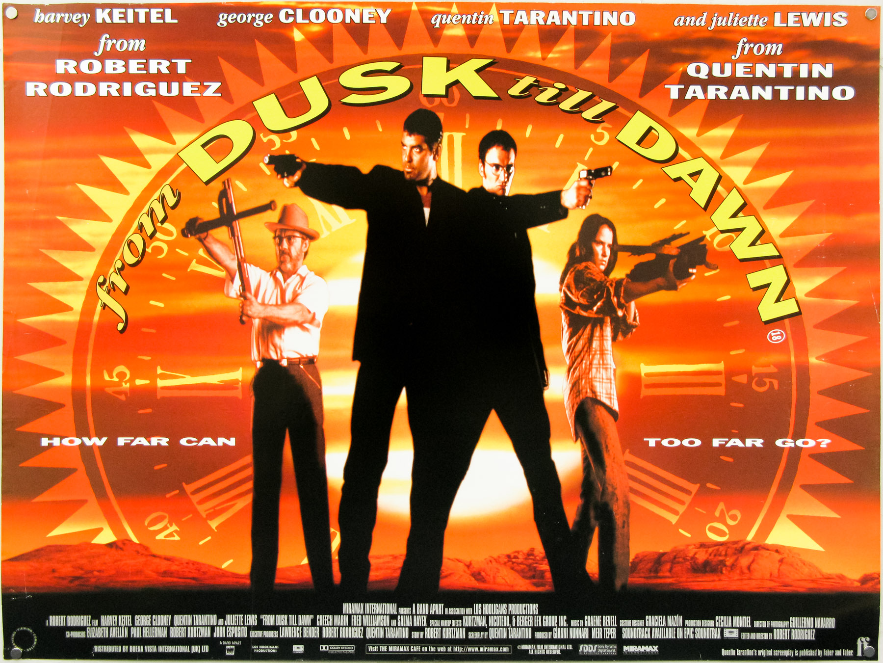
From Dusk Til Dawn – quad poster by Graham Humphreys
On my site I have the poster for From Dusk Til Dawn that you did.
Yes and that was the first poster I designed on computer myself.
So you’ve essentially been working with The Creative Partnership ever since then?
Yes.

HMV advert by Graham Humphreys
As well as the film-related stuff you’ve done an incredible amount of other work, including editorial, packaging, calendars, as well as the record and CD covers. You also worked with Tartan Films?
Yes, I was first aware of Tartan around the time that The Creative Partnership did the campaign for Reservoir Dogs because shortly after that Tartan released a film that completely ripped off the designs, which created a bit of hoo-har at the time.
So Creative Partnership designed the British poster for Reservoir Dogs?
Yes and I actually did the blood splats on the poster.
So for Tartan you worked on posters like Audition?
Yes that was the first one I did for them. And I did Rob Zombie’s House of 1000 Corpses.
What about the work for Alejandro Jodorowsky’s El Topo re-release?
I did do an illustration that was going to be the DVD cover but at the last minute they decided to go with the original campaign and I ended up having to recreate it using the original stills.

El Topo re-release poster by Graham Humphreys
There’s a design on your site with the legs hanging down – that wasn’t used?
No, although it popped up as a postcard and a free pull-out poster in a magazine. I actually got to meet Jodorowsky and he said that it was the best image he’d ever seen for the film and so that was very flattering. He’d come over to do a Q&A at a cinema screening of the re-release because the film had been in litigation for decades.
Part Four – Film posters
Now I’d like to dive into the film posters. I wanted to start with what I probably think is your greatest piece and that’s the quad poster for The Evil Dead. Many folks rate it as the best poster for the film and one of the best posters of the 1980s. I wondered if you could tell me about how that came about. Once you’d left the examples of work with Palace Pictures how quickly did they get in touch?
It was very quick because they called and said come and see this film, we’d like you to do the poster. I went to a screening at the Scala cinema and there was one other person there, but they quickly left the cinema!
They were scared?
Yes, well it was quite an experience because it was a low budget film and you just didn’t know how far it would go. It was quite a challenge. At that point it was the pre-certification, uncut version of the film and so it was quite extreme.
The thing is that now audiences are so used to films like the Saw series that push the gore envelope and I can’t imagine what it must have been like [seeing The Evil Dead] back then…
Sitting in a darkened cinema on your own!
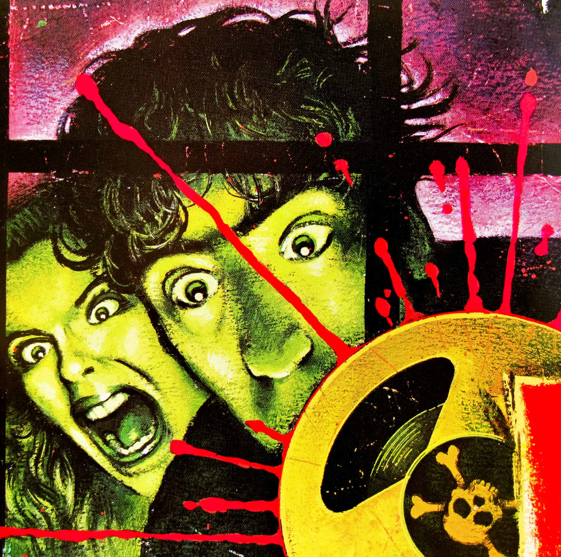
The Evil Dead quad – detail
Steven Woolley just left you in the cinema and that was it?
Yep, he didn’t even say goodbye to me at the end and I just had to leave on my own.
I envy you having seen it at the Scala, it must have been quite an experience. So you saw the film and then?
Oh, I loved it. So then I started with a sketch of an idea I had.
Could you tell me about the sketch you did? Was it pretty much the poster we see now?
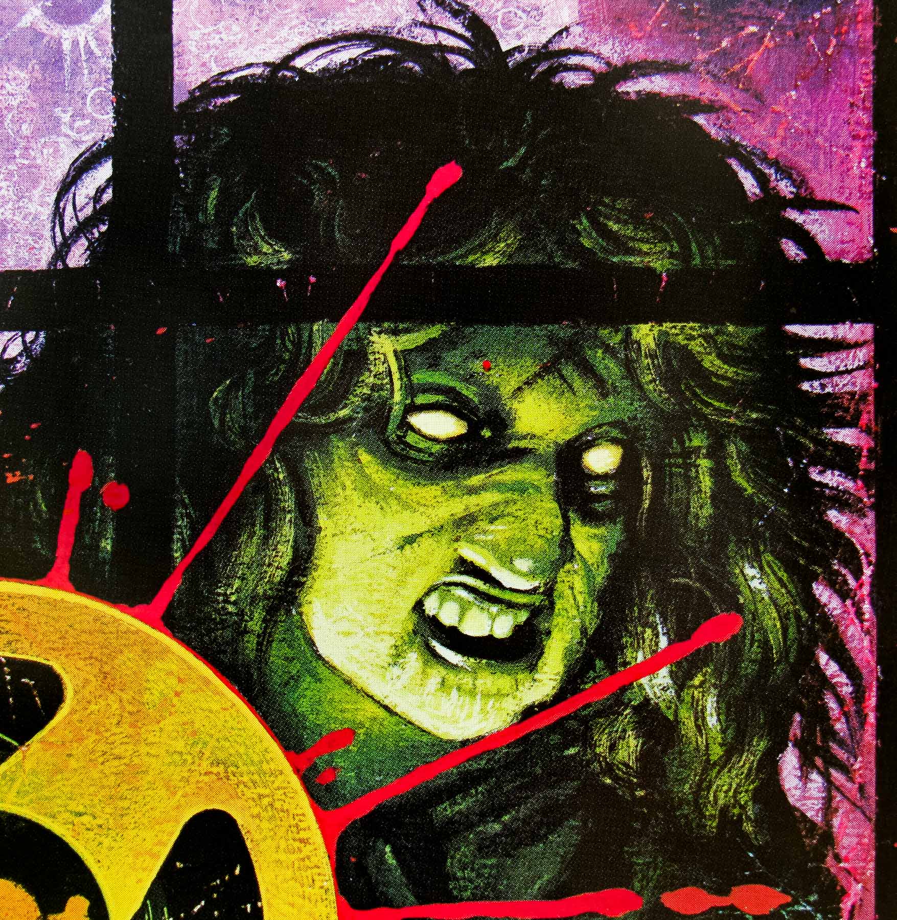
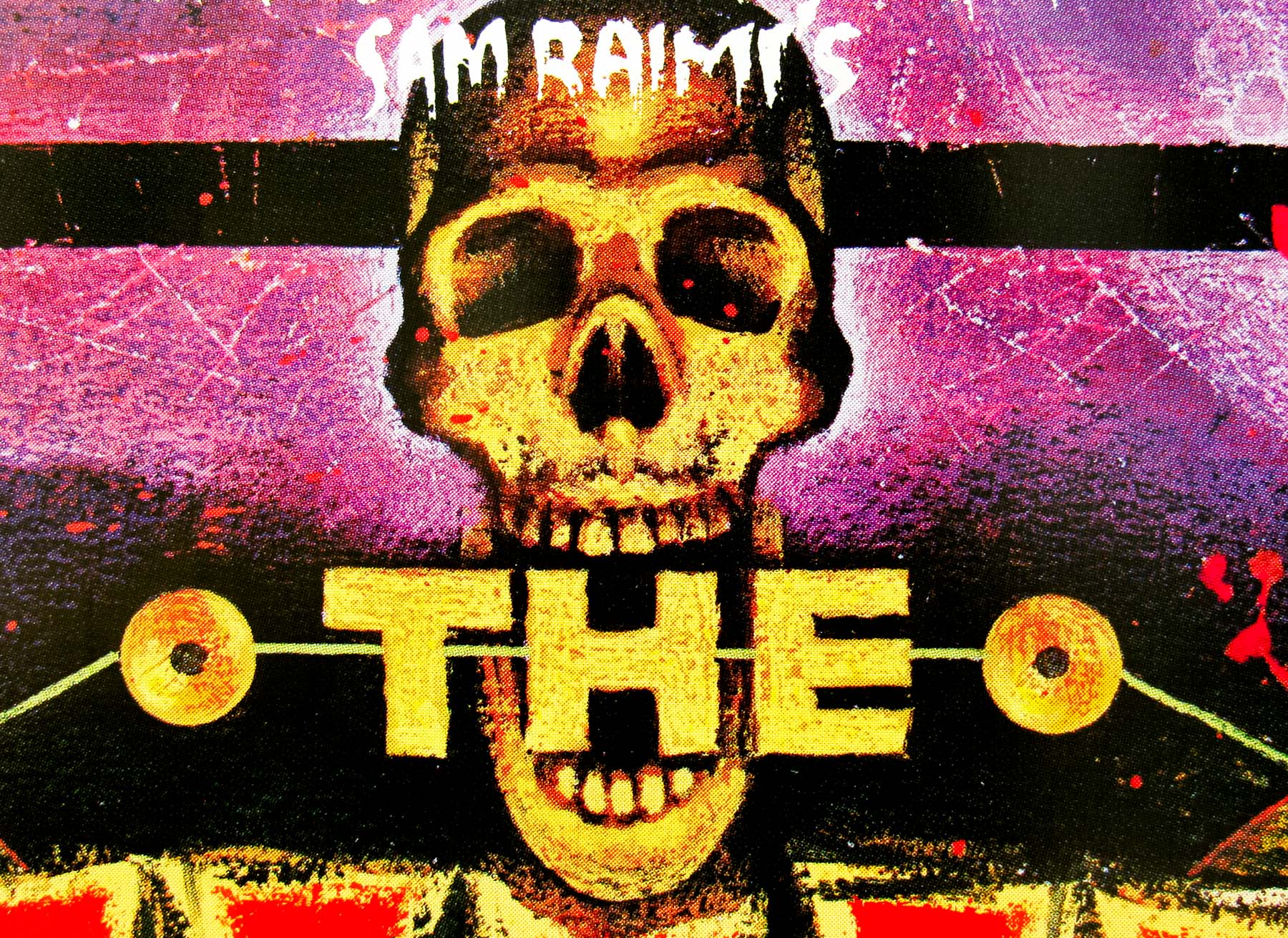
It was, I had about four black and white stills from the film – Bruce [Campbell] and the lady screaming and then Cheryl the deadite on the right. I was influenced by the film posters from the 1950s and quite often they had a large title, like this one, and I wanted to have these reel to reels in the centre with the skull as the play head.
What happened once you’d done the sketch?
I showed it to Steve Woolley. Paul Webster was actually my main contact for this work.
To clarify, who’s Paul Webster?
He was working alongside Steve and he’s since gone on to produce his own films. He directed Dream Demon and he did Drop Dead Fred as well. So I’d deal with him on a daily basis.
Is it fair to call him the design director of the poster?
No, because Palace wasn’t big enough for that. My training was in graphic design and I could illustrate as well so I was given quite a bit of freedom. It makes more sense if one person is taking care of the poster.
Once you’d presented the concept sketch to Paul Webster he liked it and said go for it?
He said ‘how soon can you have it ready?’
The Evil Dead quad – detail
What was the next step?
First of all, it was ‘ok, how am I going to do this?’ – then it was ‘how much am I going to get paid for this?’. We agreed a price, which was £300. I also knew at that point that I was going to hand paint all the text.
So every bit of text was done by hand?
Painted, yes, including all of the spelling mistakes that had to be redone! Everything apart from the text was painted in one piece, at about 30x40cm. The lettering was on strips of watercolour paper.
What were you painting on to?
The cheapest watercolour paper! I had no money, you know? Nobody’s going to buy this bit of artwork; it’s going to be photographed and printed and then that’s it, so the paper could be really cheap as long as it had some texture to it. That was the essential thing because I was always using a lot of texture.
You mention in one of the Evil Dead documentaries that you wanted the texture to be really distressed to make the poster appear older?
Absolutely, it was a complete reaction against the gloss and shine of the work of the 1970s. Proficient as he is, and as much as I probably should really respect him, Philip Castle’s work on that one particular picture of Farah Fawcett and her chrome breasts was something that everyone absolutely adored when I was at college, and for that reason alone I hated it. The whole point was to get as far away from that as possible.
Yes, there’s no question that you started a style with this poster.
It’s more of a mission than a style!
How long was the process from start finish?
It was about three days to paint it from start to finish. I remember spending a huge amount of time on the moon because I wanted it to be accurate. I had a photograph and a book I’d found and I made sure all the craters were accurate. I spent some time on Cheryl’s face too.
The Evil Dead quad – detail
One thing I wanted to clarify: a lot of collectors get confused and think this is a re-release poster because it says ‘Now on Video’.
Well this was completely unique because it was the first simultaneous release in the cinema and on video. It was unprecedented. There used to be deals with a five year hold back before it would be on video, sometimes even 8, 10, 12 years! The minimum it would be was 2 years.
Incredible, since now it’s 2 months! So it was quite brave of Palace to do that?
Well Palace didn’t know at the time how popular the film was going to be. Even for me it was just a low budget horror film that I thought maybe half a dozen people would see at the Prince Charles Cinema. It was a good thing for me to work on and that was it. I got my fee and was very happy.
Could you talk about the printing process? In that documentary you mention how you used colours that would still look good even if the printing was bad.
Yes, the posters I really loved myself were the B-movie posters that were printed cheaply with badly registered colours and crap paper stock that was only designed to be used for a few days outside a cinema. They’re fantastic posters.
That’s the thing that people have to remember. These posters were never meant to be kept – they were literally there to be used for the two-week window that the film was in the cinema and then they were supposed to have been thrown away.
Exactly, they were pasted onto board and they’d get covered up and pasted over or ripped down.
What was the process of getting it printed?
In those days you’d actually get it photographed first. You’d use large format transparencies, usually ten by eight inches, to get the highest quality possible. You could then do the mechanical reproduction from that. You’d overlay tracing paper with instructions for the printer and you might colour in certain bits. You’d have something saying ‘this bit 100% yellow’ and ‘this 30% red’, ‘this would be white out’, etc.
Can you talk about the use of the quote from Stephen King?
I can say that what I was lead to believe is that very often if you wanted a fantastic quote for the poster and one wasn’t available you’d actually write one and then okay it with the agents of that particular person. So for instance if you wanted a Dario Argento quote, you’d write one, bung him a bit of money and check it was okay – it’s a good bit of publicity for them too.
So there’s a possibility that this quote may not actually belong to Mr King?
Yes, though I don’t know that for a fact. It certainly happened a lot, I know that.
The Evil Dead quad – detail
You’re also given clear credit on the poster.
Yes, and because it was done so small originally, I had no idea how huge it would be when it was blown up! I got really embarrassed when I saw it.
It’s good because very often with British posters the artists name or signature is nowhere to be found.
Oh, it happened very often. I remember doing a poster for a gentleman called Alan Wheatley who had a design company that did a lot of posters for the Entertainment company. I did a poster for a film called Fantastic Planet, which was an experimental film in 3D. I didn’t see the film and I was just given the title and they said do what you want. I did a flying saucer and some other stuff and I did quite like the poster in the end. Then I put a tiny little signature in the bottom, thinking he wouldn’t mind and Alan came back and said ‘it’s great, can you just paint out your signature?’
NOTE: Fantastic Planet was actually called ‘Fantastic Invasion Of Planet Earth’ AKA ‘The Bubble’
And the reason given?
He said ‘we don’t promote artists’. I think it’s to do with ownership – they’re paying for the work and it’s their name on there, not the designers.
Can you remember how many of the Evil Dead quads would have been printed?
I think it was about five hundred, or thereabouts.

Graham: This Iggy Pop image was commissioned for his single ‘Cold Metal’ (the video was directed by Sam Raimi – so the idea was to tie it in with the Evil Dead artwork). It was never used.
Where would the film have actually been shown first?
I believe they premiered in Scotland. They’d decided that it was the home of horror and so they’d show these kinds of films up there to get great press and quotes and then release it in London. I think the Prince Charles cinema was where it was first shown in London?
Not the Scala? I read that Sam Raimi came over here and they held the world premiere in London.
Yeah, they definitely had a press thing where they had brought over one of the special effects guys. He did some stuff to Paul Webster where they simulated cutting off his hand and slitting his throat. Sam Raimi was bowled over by the film’s success in the UK – he had no idea it would be that popular. We’re obviously darker over here than in the US!
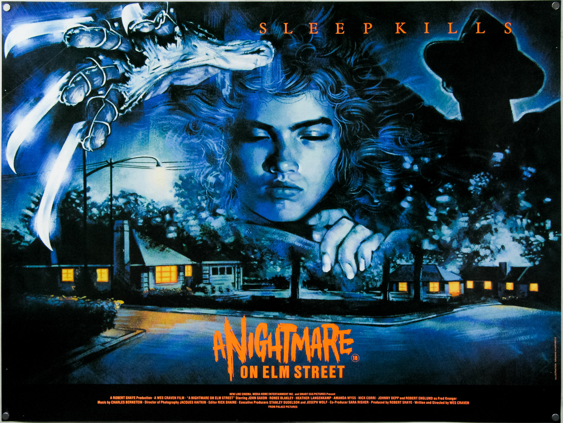
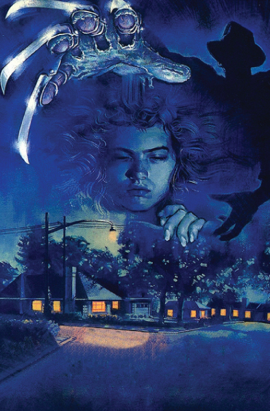
A Nightmare on Elm Street – quad – by Graham
I wanted to move onto another poster that’s many people’s favourite for the film, and that’s your design for A Nightmare on Elm Street. That was another one for Palace Pictures?
It was shortly after the Evil Dead. I wasn’t commissioned directly, it was through a couple of friends of mine who had set up a design company and they were working with Palace. The company was called Red Ranch. I’d been at college with one of the guys. They got on very well with Palace Pictures and they were given this project. They realised it was going to be an illustration and they were very happy to use me. I was able to do the logo for the poster as well.
Can you talk about the design of the poster?
There was an American flyer for the film that was essentially the street with four tears through it. I saw the film and knew what I was going to do. I’d actually gone along to a screening with my friend, Phil Nutman, who I’ve since given this to [Graham points at the Evil Dead artwork] so I’d already seen it at the cinema before I was given a VHS copy. Anyway, I paused the VHS and took a photograph of Nancy’s face so I could draw that easily.
Freddy [Krueger] himself is actually silhouetted in the background. In the later posters he’s more prominent but on this first quad you don’t see anything, just the shadow and his glove.
I think they wanted the poster to look fairly classy, in comparison to the Evil Dead quad which shows exactly the type of film it is. Obviously the glove became iconic but at the time people had no clue who Freddy was. To me, it was the glove and the whole dreaming thing that was the interesting thing about the film. You’ve got the pretty girl, the glove and the dream-like urban setting, you don’t need the big ugly face leering at you. I hand lettered the title too.
There’s also a second painting which is in portrait format and features Freddy’s other hand reaching down below Nancy’s face.
Yes, I think I prefer this one. This was used for fly posting and was the VHS cover too. For some reason at that time no one would think about the whole different format thing. Everyone was always focusing on quad posters for underground advertising and cinema fronts. The 40×60 inches or bus stop format was very much an American thing, but then when cinema became more commercial we found we had to start doing that size and format.
A Nightmare on Elm Street – portrait format
It’s often hard to work out which British films had a one sheet printed as well as a quad poster.
Well today they would Photoshop the designs to fit the two formats but back then we’d do paintings. If you were cunning, you’d know that they’d need two formats and do the first painting in such a way that it couldn’t easily be adapted and they’d be forced to pay you to do another one.
You managed to get your credit on there too.
Yes, Palace were very good at making sure the artists were properly recognised.
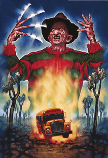
A Nightmare on Elm Street 2 – portrait format
Next let’s move onto the design for A Nightmare on Elm Street 2.
This is a reverse case, the only time it’s happened, where I did the portrait format first and then they later said they needed a quad too. To me, the portrait design is the way it should have always been. The quad was done painfully and I’m not really happy with it. There was no way to turn the portrait design into a quad. This was designed with Red Ranch and for Freddy’s pose I got one of the guys to tape some cheap rulers to his fingers to simulate the glove. The portrait format appeared outside the Odeon cinema in Leicester Square [London] but they had to remove the school bus.
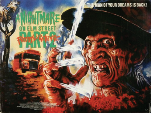
A Nightmare on Elm Street 2 – quad poster
Why was that?
They were worried it would promote violence against children, I don’t know. Or maybe it was the relationship between the bus and an 18-certificate film with horror violence. They also removed the knives from the poster so then it was just a man waving his hand around!
The most ridiculous thing is that the school bus is an American-style yellow school bus and so it means nothing to British folks.
The Brother From Another Planet was next in 1985 and you mentioned that there was a music connection with that one?
Yes, Rob O’Connor from Stylorouge who I went to see had liked the stuff I’d done for the NME and was quite keen to use me for a few things. I think I’d done a couple of previous jobs for him. One of them was the poster for Mel Brooks’ ‘History of the World Part 1’.
What happened with the Brother From Another Planet quad?
That was a situation where it’s a designer hiring an illustrator to do that one function. The designer did everything else. He’d prepared for it to be usable for more than one format – I think it was used for the VHS too.

The Brother From Another Planet – quad poster
You also did the quad for Baby It’s You with Stylorouge. It’s quite unique in your canon of work…
It doesn’t have any leering monsters! It’s pleasant.That was painted from a single black and white still.
Baby It’s You
For A Nightmare on Elm Street 3 they went with a photographic image and you designed the poster. Was there a reason they didn’t have an illustration?
No idea at all. They might have been cheap-skating. I think they thought the photographs were quite good from the session they’d had so why not use one of them. I redid the logo and drew the number 3, which took ages!
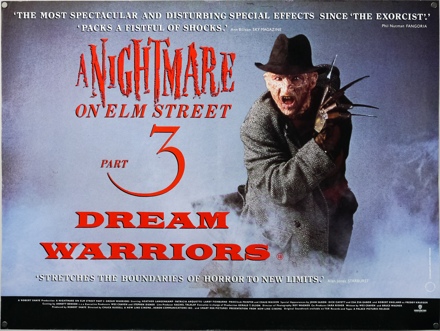
How easy was it working with photographs at this time, before computers?
Well given a computer this poster would have been so different. I mean I would have used the same photograph but so much more could have been done to make it more sinister and far more exciting. In those days all I could do was play around with the lettering.
Did you actually ask if you could do an illustration or suggest an idea for one?
No, the decision was made that it would be a photo and that was that.
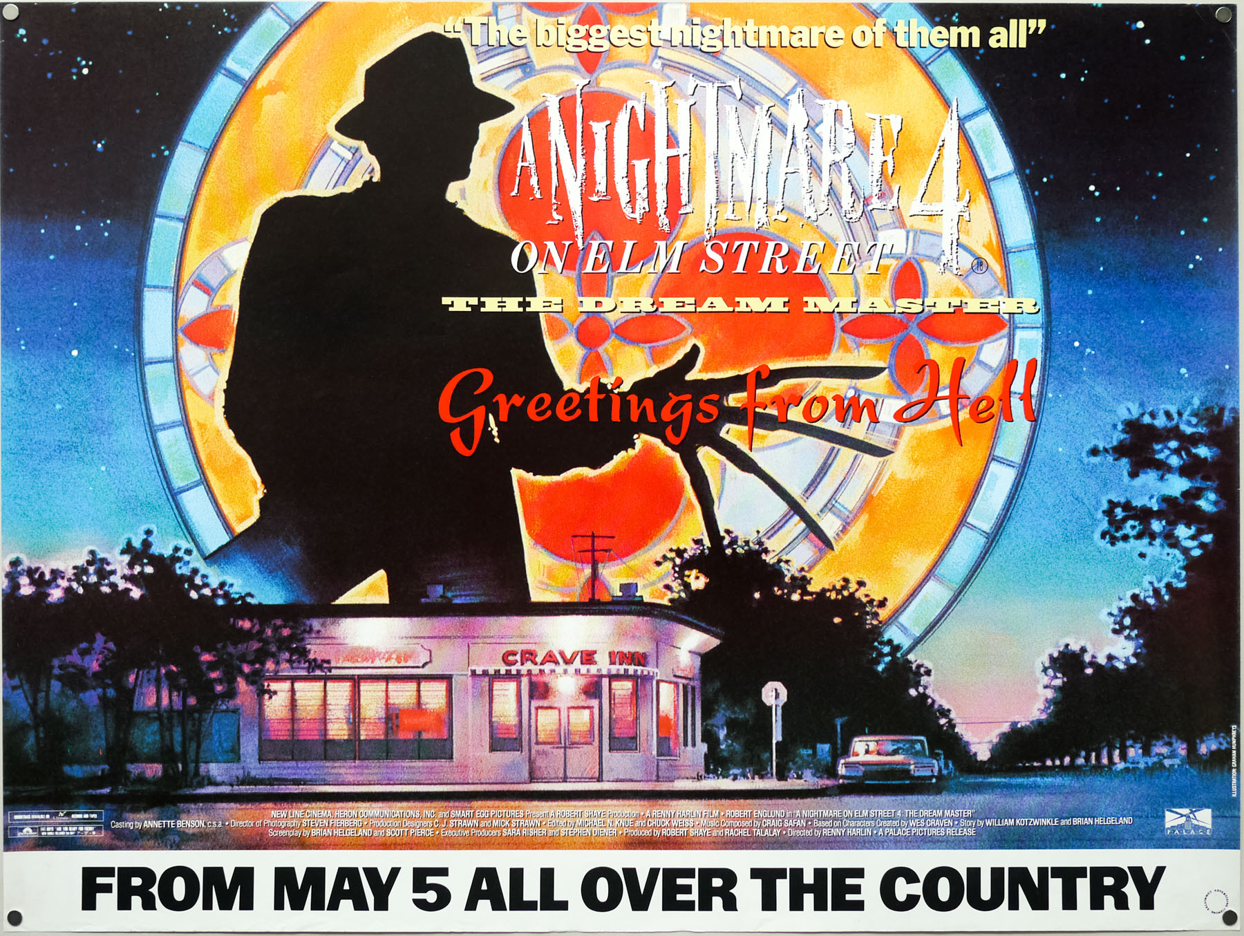
A Nightmare on Elm Street 4 – quad poster by Graham Humphreys
In 1987 it was back to an illustration for A Nightmare on Elm Street 4. It’s a great image with the ‘Craven Diner’ and the stained glass featuring Freddy in silhouette. Can you remember why they went back to illustration for this?
I think by that time they just felt that they were flogging a dead horse with the Nightmare on Elm Street films. They said ‘take a look at the film and do what you want’. My idea was to do a postcard idea, ‘Greetings from hell’, and unfortunately without a computer it’s very hard to understand how stuff’s going to look when it’s actually printed. So for example with the Evil Dead you’ll notice that the copy line at the top is very hard to read because, tonally, the orange disappears against the purple. Given a computer there are all sorts of things I could have done, like a drop shadow or a glow behind it.
So it was often the case that you wouldn’t know what it was going to look like until you printed it?
No, everything was an experiment. This poster could have been so much different as well though. The stained glass from the final scene in the church was good for me because it was a lovely device that meant I could use the large silhouette [of Freddy]. I also thought it was interesting because at that point the face was so familiar so we could take it dark again; we know who he is. We also did the cheeky James Bond spoof poster.
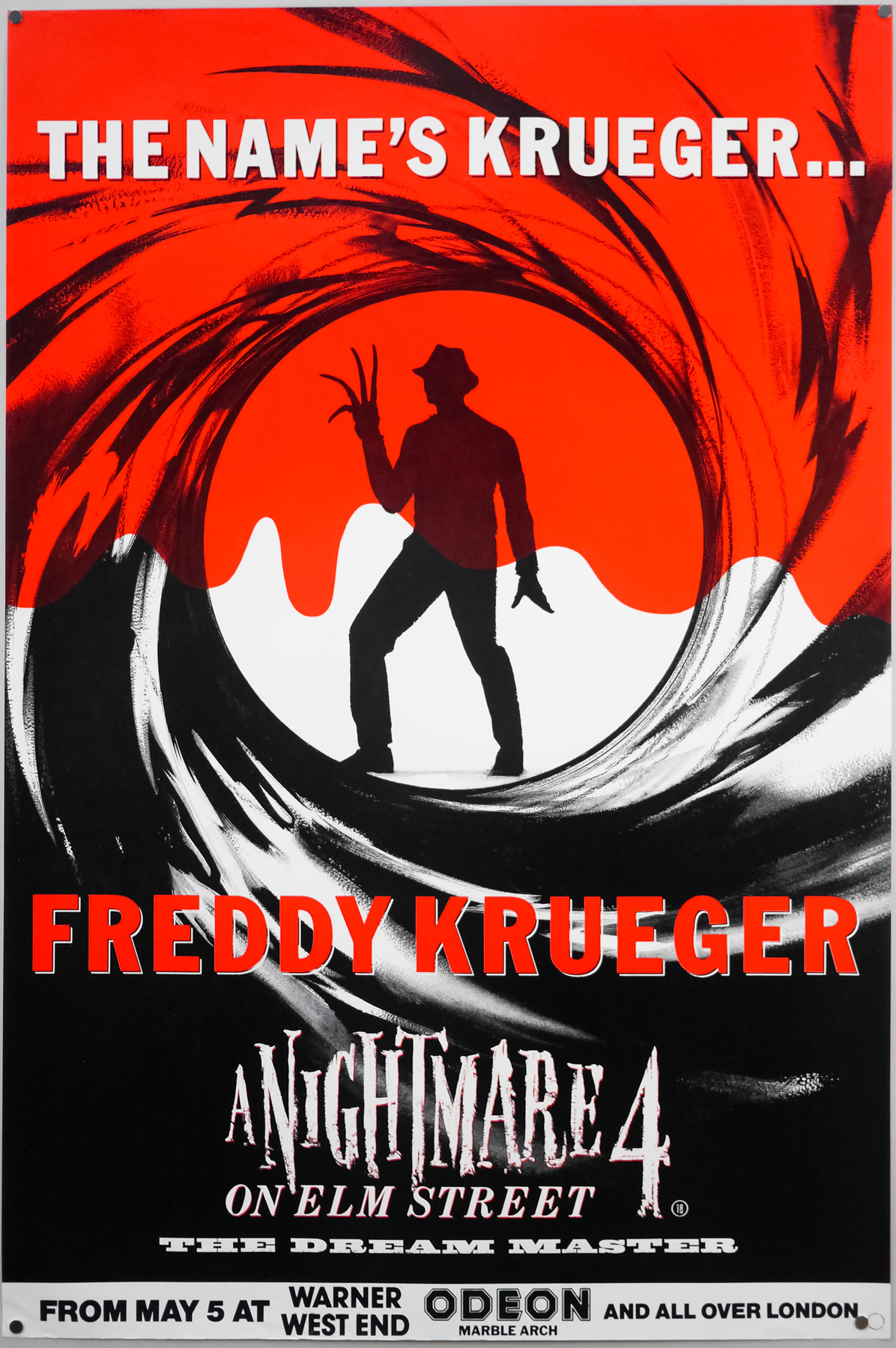
A Nightmare on Elm Street 4 – withdrawn teaser – English double crown
Ah, you were involved with that?
I was, it was my idea.
For folks who haven’t seen it it’s the classic James Bond silhouette from the title sequence where he shoots and the blood drips down, but with Freddy in Bond’s place. The tag-line is ‘The name’s Krueger…Freddy Krueger’. There was some talk of that poster being withdrawn?
It was, within a week. The new James Bond film was about to come out and that was why we did it anyway. They’re very protective of that image, of course, and they said they’d sue if we didn’t take it down. It was fly-posted on the underground for a little while. I’d gone to the folks at Palace and said I’ve got this great idea for a teaser for Elm Street 4 and brought along a VHS tape [of a Bond film] which I put on and freeze-framed at that moment where he turns around and fires the gun. They said ‘great!’ and that was that.
Was that always the case with Palace, that they’d be happy to try things like that?
Oh yes, completely.
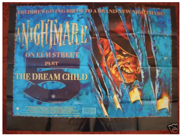
A Nightmare on Elm Street 5 – quad poster – image taken from Google images
I may as well finish the Freddy series, with number 5. This was the last illustrated Nightmare on Elm Street poster?
Yes and that was done through The Creative Partnership. We came up with the idea between us, which wasn’t much of an idea at all really, but we went back to the original flyer designs with the knives tearing through the paper. The main thrust of this was the Dream Child thing, as seen on the American poster.
Freddy looks pretty gnarly on the quad.
Yeah, I think there’s a bit of Jaz Coleman from the band Killing Joke in there. I wanted him to look really satanic. This was one illustration with the text and the five laid over the top.
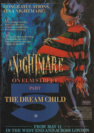
A Nightmare on Elm Street 5 – Time out London advert
There’s another image, which I think was by you, of Freddy holding his pregnant belly.
That was used for the fly poster and the large portrait format. Again, at the Odeon Leicester Square the knives were painted out so it was just a pregnant man.
What happened with the quad for Evil Dead II?
It was the same situation at Palace but I think Steve and Nik Powell were at the helm with this one, since the first film had been so successful. They figured why change the formula. I guess the point was that the film was almost a remake of the first one, plus a bit extra and so that’s what going on here. A re-imagining of the first one.
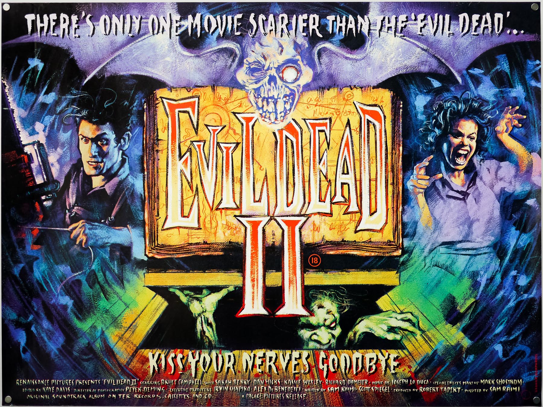
The UK quad for Evil Dead II, by Graham Humphreys
In that documentary you talk about how you’d had another idea involving a clock.
Yeah, that was the whole thing about ‘dead by dawn’ and I had this pendulum and a blood-covered clock that looked fantastic. I was particularly influenced by Werner Herzog’s Nosferatu film because there’s a great clock in that, which is beautifully designed with a little skull. That’s really what I wanted to do. The idea was actually to build a physical clock, but I never got to make it. The guys thought it was a bit obscure. There was also going to be a ‘Pit and the Pendulum’-style swishing blade covered in blood and the title was going to be on that.
The feedback was to keep things simple and use the characters?
Yeah, we had the reel to reels on the first one and for this we had the book of the dead as the key element. There was some contention over whether we do the Roman numerals or the big number 2. To me it felt it should be classic looking with the numerals. I used a colour slide-set for the characters with only a few adjustments. I think I took a Polaroid of my hand to get the position right and a girl I was working with did the pose for me onto which I added the actresses head.
Do you prefer this one or the first film’s quad better?
I like the first one because it’s so raw and it captures the mood and music of the time for me. They’re two different animals really.
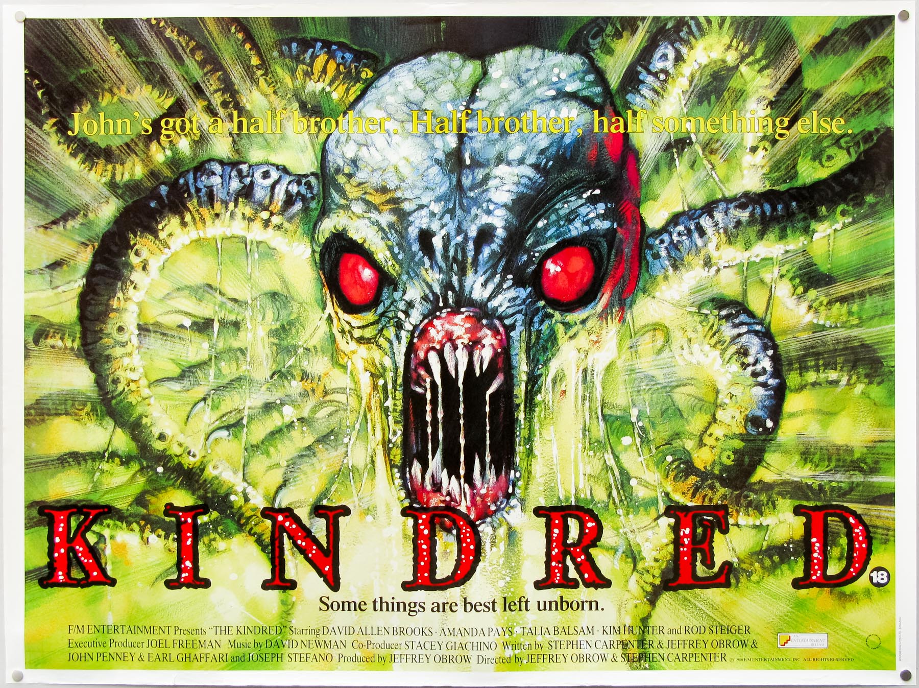
Kindred – quad poster by Graham Humphreys
The quad for Kindred, which is also from 1987, is pretty outrageous.
You’re left in no doubt as to what kind of film it’s going to be!
It was one of those VHS covers that stood out as soon as you went in the rental shop.This was for Entertainment?
This was through a design company and they’d been instructed to use me because of the work I’d done on Evil Dead. They gave me the layout and design and just told me to illustrate it. I remember at the time I’d showed somebody my portfolio and they’d said “well it’s interesting, but there are lots of screaming faces with dribbly bits!”
Talking of dribbly bits there’s Deep Space, which is 1988.
Yeah, the big scary vagina with teeth. I think that was for the same client as Kindred, hence the similar design.
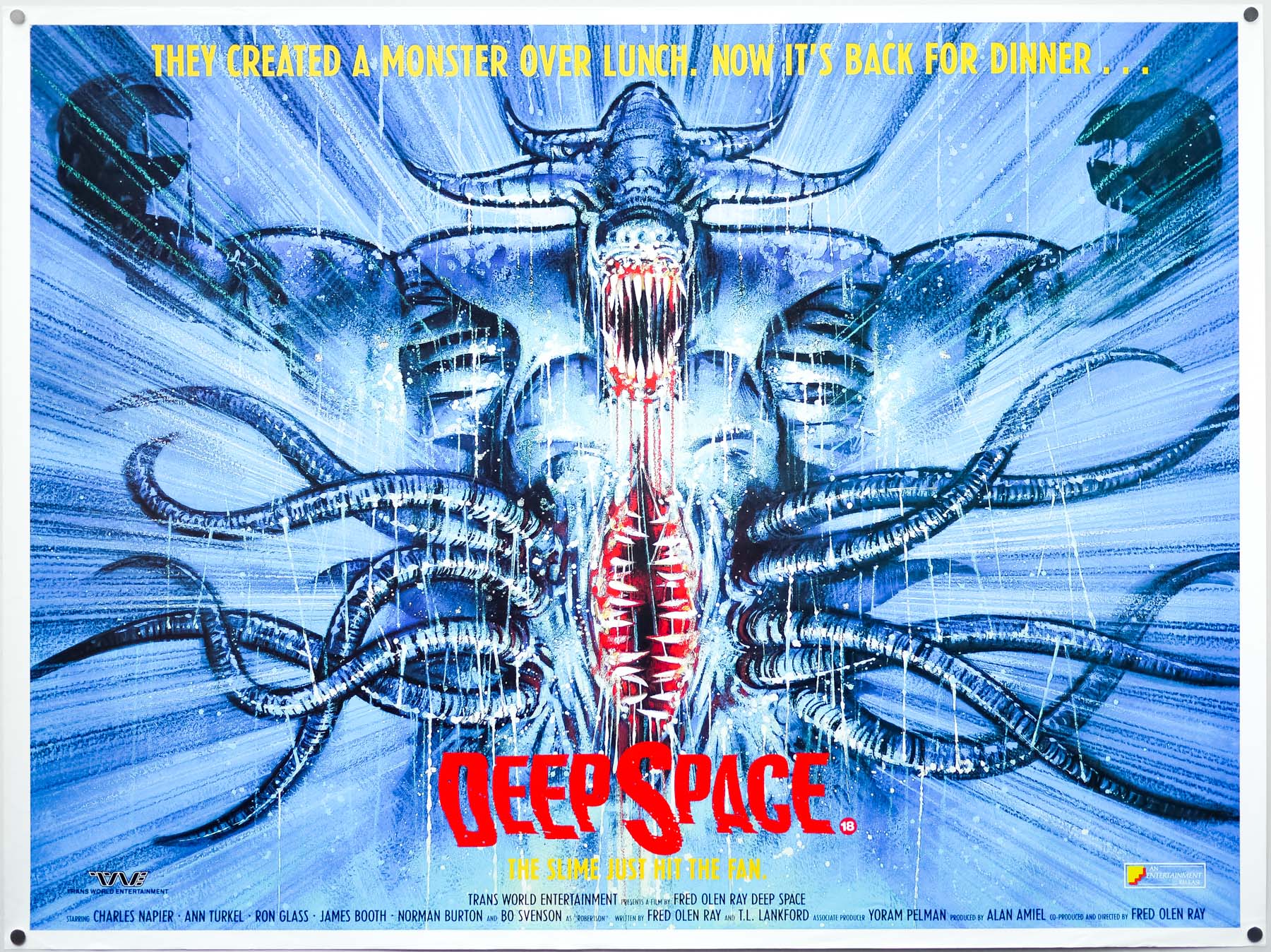
The British quad for Deep Space, by Graham Humphreys – 1988
You’ve managed to keep a lot of your artwork?
A lot of it was lost, but I do still have things like the Nightmare on Elm Street quad, actually all of the Palace stuff.
Part Five – VHS and Frightfest
If folks haven’t seen your film posters it’s very likely that they’ll have seen one of your many VHS covers. I’d wager that most British film fans between the age of 20 and 50 will have picked up a case featuring your artwork and been enticed to hire it. You’ve done some absolutely classic covers, including: Santa Sangre, Frank Henenlotter’s Basket Case and Brain Dead, Return of the Living Dead, Crawlspace, The Stuff, Scared Stiff, Creepers.
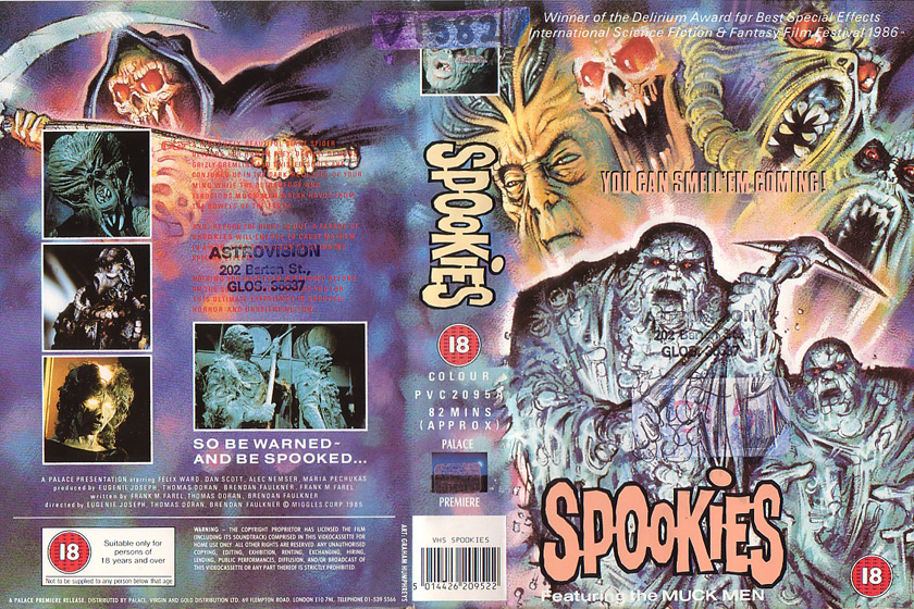
Spookies – VHS cover – Thanks to Dale at VivaVHS.co.uk for the scan
NOTE> See list at the end of the article for more VHS covers.
Basket Case was a Palace release. The quad had been a photo?
Yeah, and I can’t remember why they asked me to do the illustration, I think it might have been a re-release at some point.
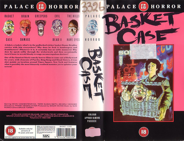
Basket Case – VHS cover – thanks to Dale at VivaVHS.co.uk for the scan
How long after the cinema release would this have been?
Oh at least a couple of years. It was probably one of those films that they felt wouldn’t be particularly lucrative – I doubt they thought they’d make that much money from the VHS.
You ended up doing a lot of work for Palace, obviously they were Palace Video at the time and they had a huge catalogue that they were distributing. There’s a great bit of artwork you did for Dario Argento’s Creepers (AKA Phenomena) – the psychotic chimp.
Yep, the cheeky chimp. They told me that they had this Dario Argento film and at that time I was quite naive and didn’t know who Argento was, having not seen Suspiria or any of those great films. I had the full uncut VHS copy of Creepers, or Phenomena, and it just blew me away. I thought it was fantastic and thoroughly distasteful, plus Donald Pleasance’s awful accent made it quite funny as well. They said ‘do something, whatever you want’ and I showed them the sketch – I had one idea – and they said ‘yep, this is it. Go for it.’
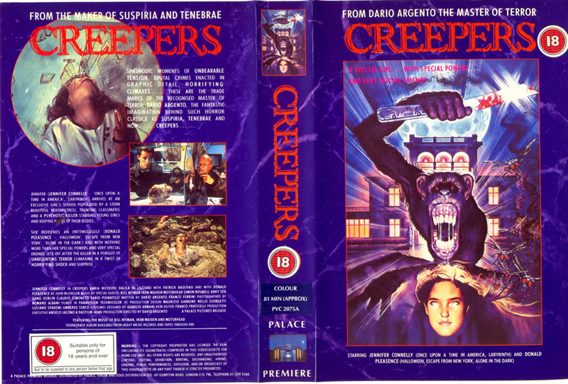
Creepers – VHS cover – thanks to Dale at VivaVHS.co.uk for the scan
The blade-wielding chimp was an image that had stuck in your mind from the film?
Yes. They used it for a poster as well, for a limited cinema release of the film. If you were releasing a film on VHS you’d give it more kudos if you could say that it had been released theatrically. It would be a big selling point on the sales sheet if it said ‘released in cinemas’ and all you had to do was show it one screen for a couple of days and that was enough.
Ah, so it might have been that this was actually the first release of Creepers in the UK, direct onto VHS with a quick cinema release?
The VHS was released and for one week only it appeared in one or two cinemas, only in London. Actually, it might have just been the Prince Charles Cinema. The chimp design would have been fly-posted as well.
With the Evil Dead, the VHS was released heavily cut with about two minutes removed?
Yep, it was cut, I think there were thirteen major cuts. At the time it was shockingly censored.
There was the whole Video Nasties situation where a bunch of films were taken off the shelves and seized. You could no longer legally watch them and The Evil Dead fell victim to that.
Yep, and it was mostly because of the titles.
That’s the thing, Evil Dead is entertaining and it’s not a nasty film, I don’t think.
It’s a cartoon!
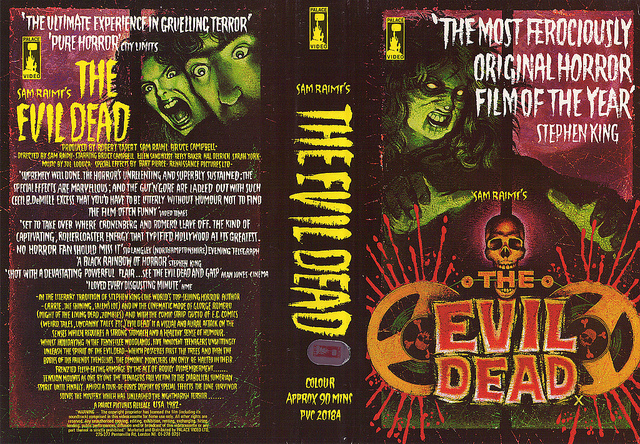
The Evil Dead – VHS cover – thanks to Cheesebrush for the scan
On the list there were some pretty grim films.
Yeah, pretty heavy stuff, lots of rape. There were films attempting to recreate real-life nasty situations.
I’m against censorship, as I’m sure you are, but there were some films that were lumped in with the Video Nasties that didn’t deserve to be there
Well, I’m against censorship, but I’m also against really badly made films. Their ultimate crime is the lack of artistry – the lack of imagination is criminal. You’ve obviously enjoyed Jake West’s definitive guide to Video Nasties?
Yep, it’s great and well worth picking up.
Video Nasties – DVD cover
You did the VHS cover for The Evil Dead at the same time as the film poster?
Yes, and I think I had about two days to turn it around. I ended up doing it twice because of it being withdrawn. When it was re-released after the Video Nasties stuff had died down I was asked to redraw the original. I had to move Cheryl’s face so the title could be swapped from the bottom to the top. It was decided that film titles had to be at the top of the VHS cover at a certain point – something to do with displaying them in racks – and I didn’t mind because I was essentially paid to copy my own work.
Other VHS covers you did include the one for Night of the Creeps and a great one for The Return of the Living of the Dead.
That was for Vestron Video and was through Roz Kidd who was working with them at the time. I did Crawl Space with them too.
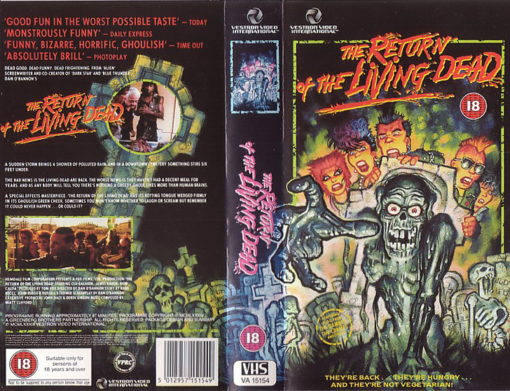
The Return of the Living Dead – VHS cover – thanks to Dale at VivaVHS.co.uk
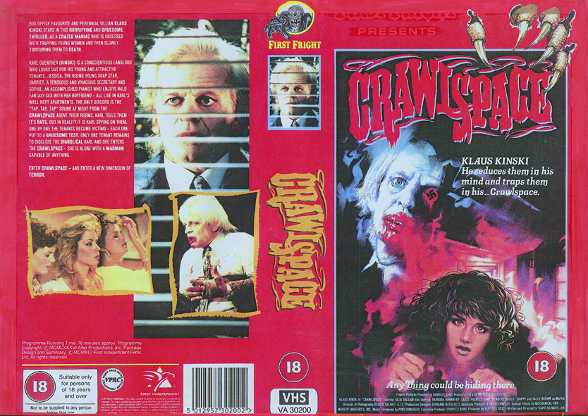
Crawlspace – VHS cover – thanks to Dale at VivaVHS.co.uk
At a certain point, as with film posters, there was a change from using illustrations to photographs for VHS covers. Most video releases today have really crap covers. It’s good that Anchor Bay used your illustration for the blu-ray release of Evil Dead II.
Yes, and of course there’s Arrow Films who are making a point of using illustration for their covers. I’ve done The Kentucky Fried Movie for them recently and they used my Phenomena artwork for their recent blu-ray release of the film. I’m about to do three more for them and funnily enough one of them is for Erik the Viking. With that I hadn’t seen the film, but I had a few stills so I based the design on them.
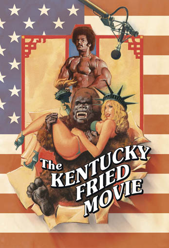
The Kentucky Fried Movie – by Graham Humphreys
There’s an older Erik the Viking poster on your site.
Yeah, that was a promotional poster that was taken to Cannes, I’m not sure it was used again since the film had a limited release anyway. I saw the film for the first time a couple of weeks ago and liked it. I thought it was surprisingly dark. What’s funny is that Arrow is going to release it as a ‘son of the director’s cut’ because [director] Terry Jones’ son has re-edited the film, under Terry’s directions – bringing it back to what he’d originally wanted it to be.
Erik the Viking poster – taken from Graham’s site
That’s the world’s first ‘son of the director’s cut’ then I think. Have you seen the recut?
That’s the one I saw. There is the original version on there, but I’ve not watched that yet. Maybe there’s more of his dad in the son’s version, I don’t know?
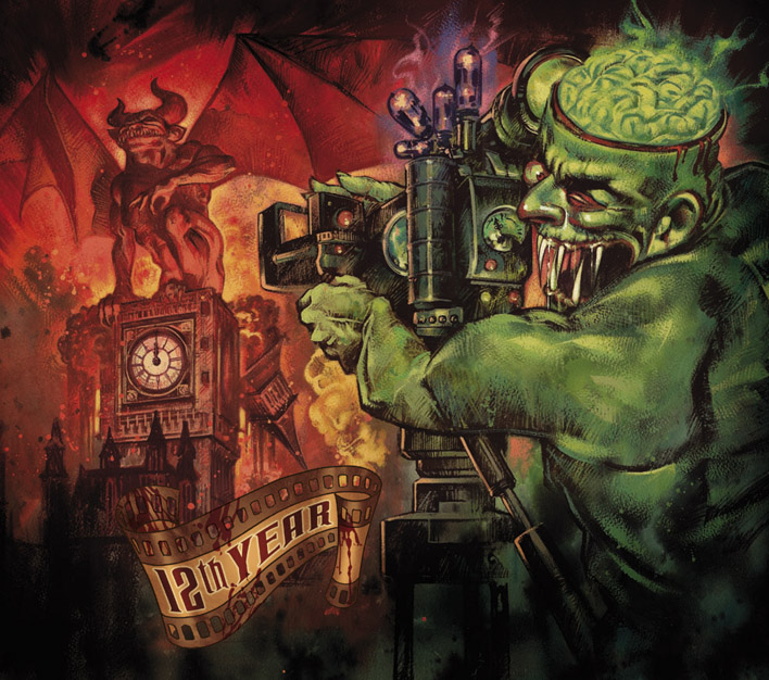
Frightfest – 12th year – poster
We’re in the Phoenix Artists Club and this is the official bar for Frightfest and you’ve done the poster each year since the festival started. In fact, many of them are hanging on the walls in here. Can you talk about how you got involved?
That was through Christopher Fowler who was working at The Creative Partnership at the time and also I’ve known Alan Jones one of the organisers for many years. Alan used to work at Forbidden Planet in its early days and I was introduced to him then. When Frightfest first started they approached Chris because he still had a lot of connections within the film industry and he could help secure a few screenings. He helped facilitate a number films for the first few years. As part of this, Chris suggested me to do the logo and the poster as well.
You’ve done it pretty much from the start?
Yep, it’s on the twelfth one this year and I’m working on it at the moment. It’s half painted already and I’ve got paint under my fingernails right now.
Is that something you’d work on at home?
No, I do that in the studio. For the first few years The Creative Partnership were one of the sponsors for the festival.
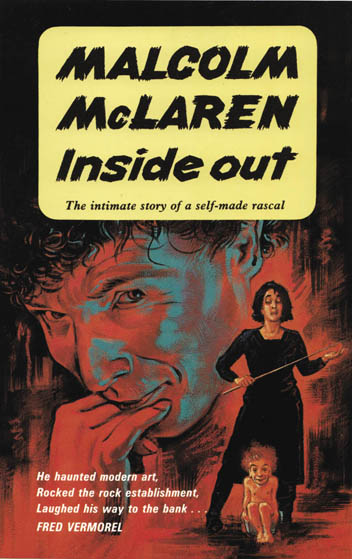
Graham: This ‘Malcolm McLaren’ book cover was commissioned by Virgin, the cover proofed, but the book contents were never delivered, therefore the book got cancelled! The Vermorels showed me an old pulp cover called ‘The Joker’ and this was based on that.
Were there any film poster artists that you really admired in the era of illustrated posters?
Yeah, Tom Chantrell, Drew Struzan and also Frank Frazetta were all influences I have to say, but, of course, I’ve since seen that they were influenced by a lot of people before them as well. I was also into stuff beyond that, for example artists like Henri de Toulouse-Lautrec and Jules Chéret. All very graphic in their feel, colours and compositions.
Are you still an avid cinema goer?
Oh, completely. I still go, even though there’s a lot of rubbish out there and most films aren’t films any more, they’re products. That being said there are filmmakers who still care and continue to push the medium. My favourite director, on account of two films, which I’ll happily say are my two favourite films – Irreversible and Enter the Void – is Gaspar Noé. I thought Irreversible was the best thing I’d ever seen in my life until I saw Enter the Void.
What is about those two films?
They dare to do something that goes beyond … it’s taking cinema and doing something quite brutal. It’s an assault on the senses and forces you to confront the stuff on the screen. I’ve seen Irreversible about fifteen times and I’m still finding it quite unfathomable. In my mind I think I’ve worked out what’s going on there, I know there’s the Kubrick references, there are the ‘2001’ bits and I like how these things start to gel over a period of different viewings. It’s intelligent filmmaking.
So Gaspar Noe is one of the directors who you’d see anything by?
Well I’m yet to see the film previous to Irreversible [Seul Contre Tous] but I know the beginning of Irreversible is the end of that film. I keep meaning to watch it.
Do you like the work of Christopher Nolan?
I do. I really enjoyed Inception and I wasn’t expecting to. I had some resistance to seeing it because it’s a big commercial film and some of the members of the cast need a slap around, but in the end I found it quite engaging, surprisingly so. It dared to baffle as most American films don’t. There is a future!
Part Six – Current work and the future
When you go to the cinema today do you ever see any film posters that stand out in terms of design?
Occasionally I do, yes. Plus, The Creative Partnership do a lot of film poster work and I get to see the great designs don’t make it. The studio will ask to see a range of ideas and more often than not they’ll go with one that the designer is most embarrassed about. I remember once we had a big team design session for the poster design for one particular film, Buddy’s Song starring Chesney Hawkes, and we produced a whole load of designs for it.
One of the guys who was leading the project came up with this one particular idea and he said ‘I know this is rubbish, but I have to do it and if this gets chosen I’ll buy you all dinner’, and, of course, it was chosen and he had to buy us all dinner! He was sure that it was so crap that it would never get picked, but it ended up as the quad that was printed!
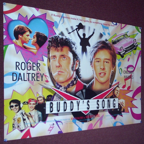
The infamous Buddy’s Song quad poster by The Creative Partnership
So what kind of work are you given at The Creative Partnership?
I’ve just been given three jobs in the past week that are all very different, but very interesting projects.
I’ve just done the cover for the Witchfinder General blu-ray release – a big picture of Vincent price, which is lovely. Then something called The Castle of the Living Dead, from 1964 I think. It’s a black and white film with Christopher Lee and Donald Sutherland. I’ve never seen it but the screener disc is on its way. That’s for July.
Then there’s a film called Atrocious, which is Spanish and has shades of The Blair Witch Project and The Ring. I saw that and I was quite terrified actually.
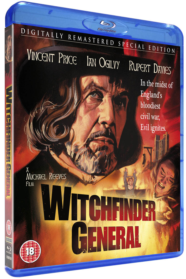
Witchfinder General – blu-ray cover
I still do DVD covers and magazine work, but for them it’s mainly the illustration work. I have my desk there because then I’m on tap to do sketch work. Tomorrow I’ll be sketching some kids and a dog for the Famous Five movie that’s coming out soon. The sketches are done as a guide for the photography, so it’s working out the poses and positions of the characters. It’s good for me because I’m getting to draw every day. I have a very messy corner of the office covered in pencil lead and putty erasers!
What involvement do you have in the film poster work?
Once the project has been commissioned by the studio there’s always an initial meeting, in which the creative team may not even be involved, where the general direction of the marketing will be decided. The point is to get going with the project before the film is finished shooting so that all the talent are going to be around for the necessary photo shoot. They’ll have a day when everyone is together and they’ll get a photographer in there, or possibly the unit photographer, but preferably The Creative Partnership’s photographer of choice. You’d come up with ideas as to how they should be positioned for the poster.
What’s a typical direction from the studio?
They might say, for example, we want three characters at a minimum and that already limits what you can do because then you have to work out how they’re going to interact in the shot – are they looking at each other, in profile, face on or even something using a prop. It’s really limiting and means you can’t get conceptual with the design. The fact is that now most studios expect to see their talent on the poster and that’s what they think is going to sell the film.
So that’s how you end up with the dreaded floating heads posters – cramming all the lead actors into the design?
Yep, and increasingly it’s full bodies too. They just end up looking like they’re waiting for a bus. Often the bodies aren’t even those of the actors – lots of Photoshopping!
The posters that are given a bit of design attention nowadays are those for smaller, independent films.
Yes, definitely. I quite like the poster for Submarine – the face of the actor with the blue colour suggesting him being underwater – very simple but well done.
The guys at The Creative Partnership seem to try to keep their work as interesting as possible, given the studio restrictions.
They try to bring some dignity to the work, it’s true. They do strive to do very creative and interesting work and the truth is that most studios out there are trying very hard to do interesting poster designs and to try and change that studio marketing mindset. At the end of the day, with a lot of studios the designs will get fed back to America and they’ll choose the direction. It seems like a lot of the people working here feel they have to get the sign off from the bosses over there.
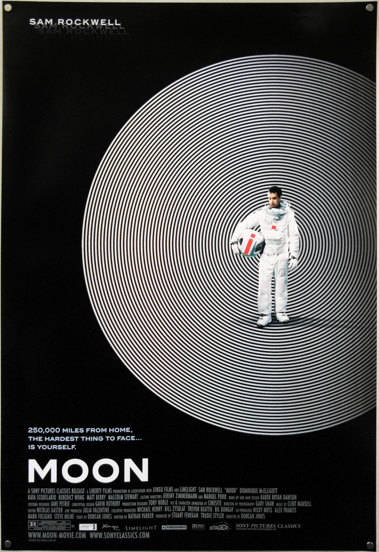
Moon – one sheet – designed by Cardinal Communications USA
I really loved the poster for Duncan Jones’ Moon. It’s a clear example of how trying something different leads to a poster that really stands out and gets people responding to it. Imagine if they’d just used a Sam Rockwell head shot…
I think sometimes when a film doesn’t have enormous commercial potential it opens up the possibility for interesting designs.
One thing that’s funny about studio posters are the ‘contractuals’. These are the lists of names and the order in which they must be displayed on a poster. You end up with names that don’t correspond to the order of the heads. The agents make sure that their egos are represented. It’s not so much of a problem with low budget films. You’ll also have situations where the names of the actors have to be set in type that’s at a percentage of the main title, so you’ll have two names that are 50%, for example and then two that are 30% of the height.
Do you work on film campaigns where the director gets involved?
They are generally politely listened to by distributors, but they know that once they’ve finished filming they have to relinquish control of it and release it to the folks who have put up the money for it. They have to to trust the distributors to market the film as best as they see fit to get the returns from it. At the end of the day, a lot of directors have already moved onto other projects and their minds are off it. Of course they want to make sure things are okay and they will step in if things are going really badly wrong.
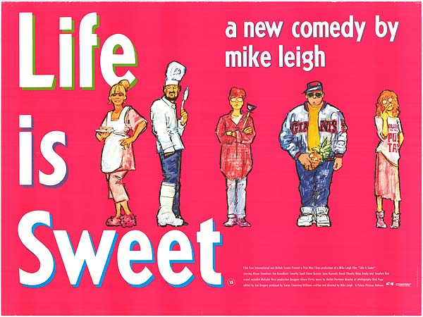
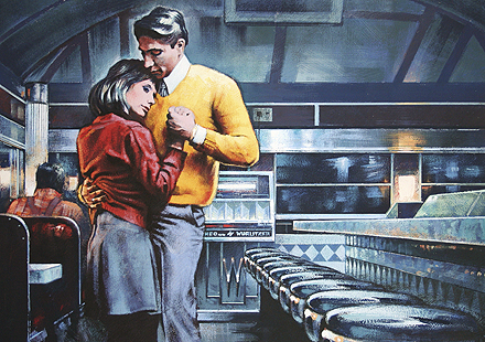
Life is Sweet – quad poster
One person that was really passionate about watching the whole process was Mike Leigh. His recent film, Another Year, had a great poster and I’m certain he will have had some input into that. Flatteringly, he really liked the Life is Sweet poster that I did and said that it was the only poster that had really captured Alison Steadman, his wife, so that was really nice. When we did that for Palace Pictures I pretty much took over the project and insisted on having the fluorescent pink background. Everyone was really happy with it because it was playing with the whole ‘sweet’ thing. I remember a couple of days before it was released someone from the studio said “I’m worried we’ve made a massive mistake with the poster”. It was too late and in the end the film did phenomenally well. It was one of his most successful releases.
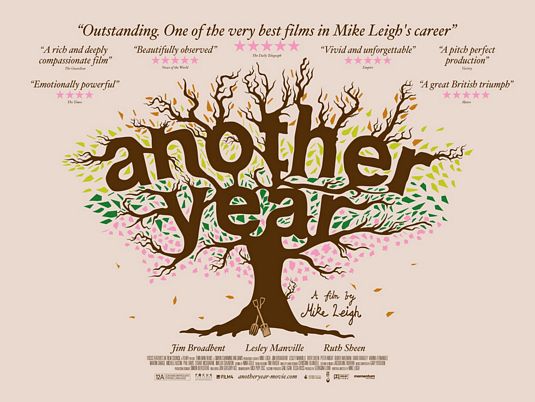
Another Year – quad poster – designed by All City Media
I do like the Another Year quad, but it’s loaded with press quotes. Do you ever have any control over that kind of thing?
I think it’s often to do with paranoia – they’re worried that the film is not going to do well so they plaster the poster with quotes and stars. I make a point of looking who’s made the quote and often they’re from publications that have nothing to do with film – why should they be on there? ‘Gardening weekly – five stars!’
To finish up, I’d like to ask if there are any projects or designs that you’d love to get chance to work on?
Not particularly, but I think things often just unfold. It comes down to luck – life is like that. It’s random and chaotic!
Well Graham, thanks so much for meeting me. It’s been great to talk to you about your phenomenal body of work and I encourage folks to go and check out Graham’s website where you can see all of the fantastic work he’s done and read his full bio.
You’re very welcome. Keep checking the site. It will be updated!
List of VHS covers by Graham (incomplete)
The Night of the Creeps
Creepers
Vamp
The Stuff
Spookies
Scared Stiff
The Return of the Living Dead
Kindred
The Evil Dead
Crawlspace
Brain Damage
Basket Case (Palace special set)
Santa Sangre
Uforia
Six Million Dollar Man and the Bionic Woman
Death Warmed Up
Hide and Shriek (AKA American Gothic)
Huge thanks to Dale at VivaVHS.co.uk for most of these scans.
List of film posters by Graham (incomplete)
The Evil Dead
A Nightmare on Elm Street
A Nightmare on Elm Street 2
A Nightmare on Elm Street 3: Dream Warriors
A Nightmare on Elm Street 4: The Dream Master
A Nightmare on Elm Street 4: The Dream Master – English double crown (James Bond spoof)
A Nightmare on Elm Street 5: The Dream Child
The Brother From Another Planet
Baby It’s You
The Evil Dead II
Kindred
Dream Demon
Deep Space
Death Warmed Up
Creepers (AKA Phenomena)
From Dusk Til Dawn
Dust Devil
Audition
The House of 1000 Corpses
Thanks! He’s a great artist and I’m hoping, like you, that we’ll see more illustrated posters. He recently ‘remastered’ his ROTLD artwork for a screening here in London next month.
Great interview! I am a huge fan of Graham’s artwork and was astonished that he did so many famous video and film posters. I also had no idea that he painted ‘The Stuff’, ‘Return of The Living Dead’ or ‘Vamp’. I hope there are more illustrated posters in the future. They kick the asses of the photo manipulated stuff!!
Wow. That was an absolutely fantastic interview. I feel like I just sat through a fascinating class on film history. Thank you very much for such a wealth of information and inspiration.
great interview and article. thanks.
It’s a good time for Graham Humphrey’s fans at the moment – there’s a new article on the BBC website about movie poster artists, where he is mentioned and gets a few quotes.
http://www.bbc.co.uk/news/entertainment-arts-14065082
Cheesebrush: I’ll check with Graham and let you know. I’ll update the poster list if it is one of his.
James: Thanks for those links – I’ll add them to the article asap. I’ll also check with Graham about the Brain Damage cover and the other titles you mention.
Also! That Palace Horror line that Basket Case was included in had a few different covers by Graham, iirc: Vampire At Midnight, Brain Damage (not sure the one you’ve linked is correct?), Carnival Of Souls and Night Of The Demons. Outside that line, the Palace VHS of Big Meat Eater may also be a Graham cover.
You can see scans of Death Warmed Up and Hide & Shriek at It’s Only A Movie:
http://itsonlyamovie.co.uk/cover%20scans/death%20warmed%20up.jpg
http://itsonlyamovie.co.uk/COVERS%209/HIDE%20AND%20SHRIEK%20BIG%20BOX.jpg
Here’s an Amazon link for the DWU quad, you can probably find a better pic on eBay or elsewhere:
Also seem to remember that Graham did the following for Blue Monkey (under a different title here):
http://itsonlyamovie.co.uk/cover%20scans/invasion%20of%20the%20bodysuckers.jpg
Did Graham also do the quad poster for I Bought a Vampire Motorcycle? (it’s not on your list) I’ve always thought it was him and it certainly looks like his style, albeit with some photos of the cast added. I have it on Flickr here: http://www.flickr.com/photos/cheesebrush/4375294627/
Thanks for the heads up – I’ll add those two to the list.
Brilliant interview! Count me in as another huge fan of Graham’s work – the old exhibition catalogue (“Out Of The Box”?) you can order from his website is a thing of beauty.
You’ve missed a couple of films in the VHS/poster lists at the bottom; Graham illustrated the VHS cover and quad poster for Death Warmed Up, and the video cover for Hide & Shriek (aka American Gothic).
What a fantastic interview. Made even better by your inclusion of my Deep Space poster from Flickr! Just a shame my pictures taken on the living room carpet don’t quite stack up compared to your high quality images – I’m going to have to start making more of an effort I think!
I’ve loved Graham’s artwork since I first saw it. To me it represents a classic era of horror (the mid to late 80s) especially his output for Palace Pictures. One of my ambitions is to own some original artwork of his. Unfortunately I could do with a new house first…
He really, really needs to create a luxury coffee table book of his paintings. I’m sure it’s not just me who’d be more than interested in a copy.