There are few film poster artists as prolific as Italian-born Renato Casaro whose work featured on thousands of posters advertising films around the globe for over 40 years. From his beginnings as a cinema-obsessed youth in Treviso, northern Italy, Renato forged a career that saw him join the famous Studio Favalli in Rome aged 19 before becoming a freelance artist and designer just over a year later. By the time of his retirement at the end of the millennium he had worked on memorable posters for some of the biggest films of the past 50 years whilst forming close friendships with the likes of Dino De Laurentiis, Sergio Leone and Bernardo Bertolucci. For many years Renato was the go-to artist for both Italian and German distributors wanting to release their films with a striking poster design.
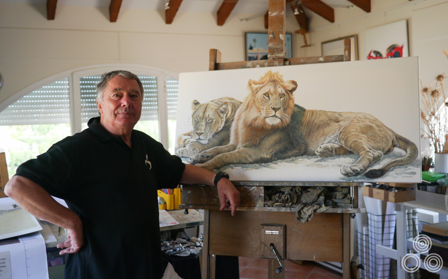
Renato Casaro stands next to his latest wildlife painting inside his home studio near Marbella, Spain. Photo taken in June 2013.
Unusually, especially in comparison to other film poster artists, Renato has retained and carefully archived almost all of the original sketches and artwork for his posters dating back to the 1960s, with only some of his very earliest work no longer surviving. In the summer of 2013 I was privileged to be able to meet Renato at his home near the Spanish town of Marbella and spend an afternoon discussing his life and career. I was also granted a brief but memorable look at the archive of his work and some photos are included below.
The following article contains many images of Renato’s work with a larger focus on the film posters he worked on during the 1970s and 1980s since this is the era of his work that is found in the Film on Paper collection and means the most to me personally. However, it’s important to stress that the images displayed here are just the tip of the iceberg and I encourage you to follow the links displayed at the end of the article to see many more of Renato’s great posters.
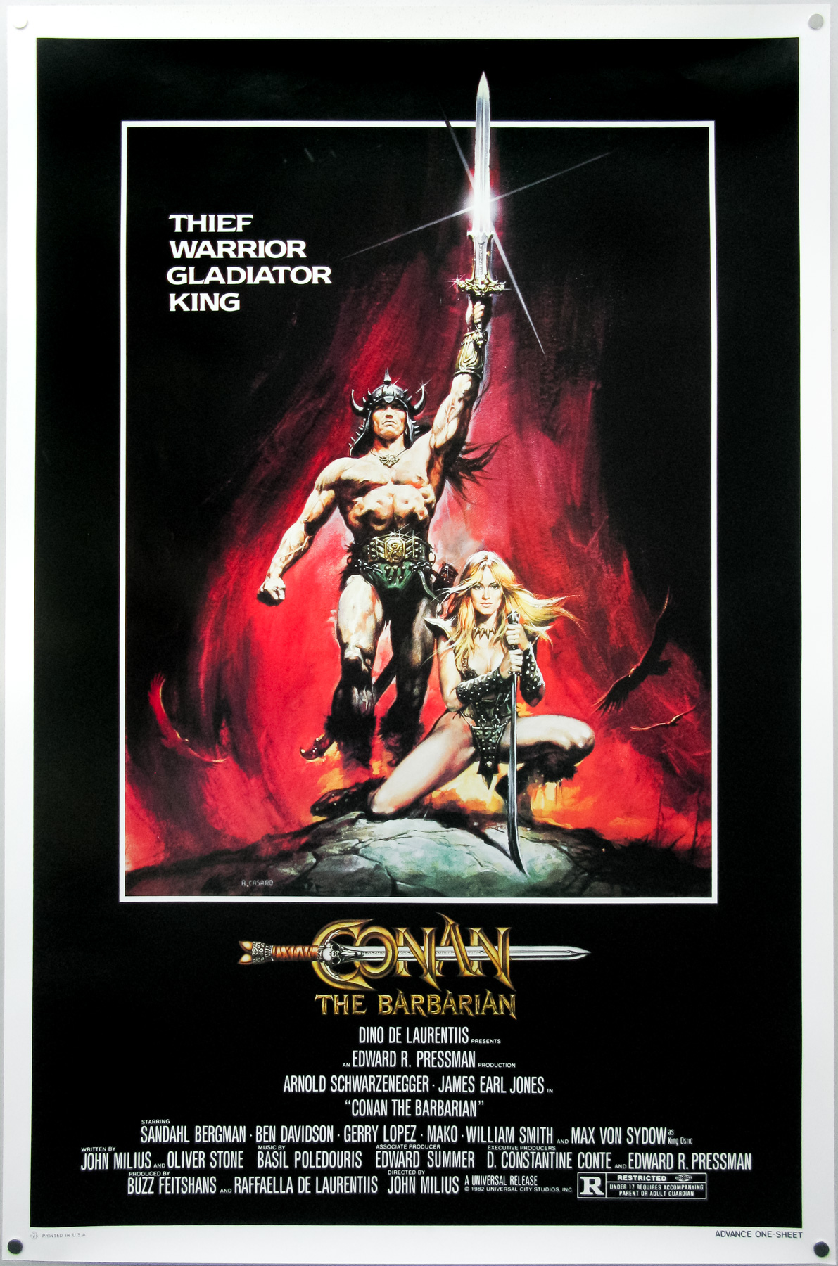
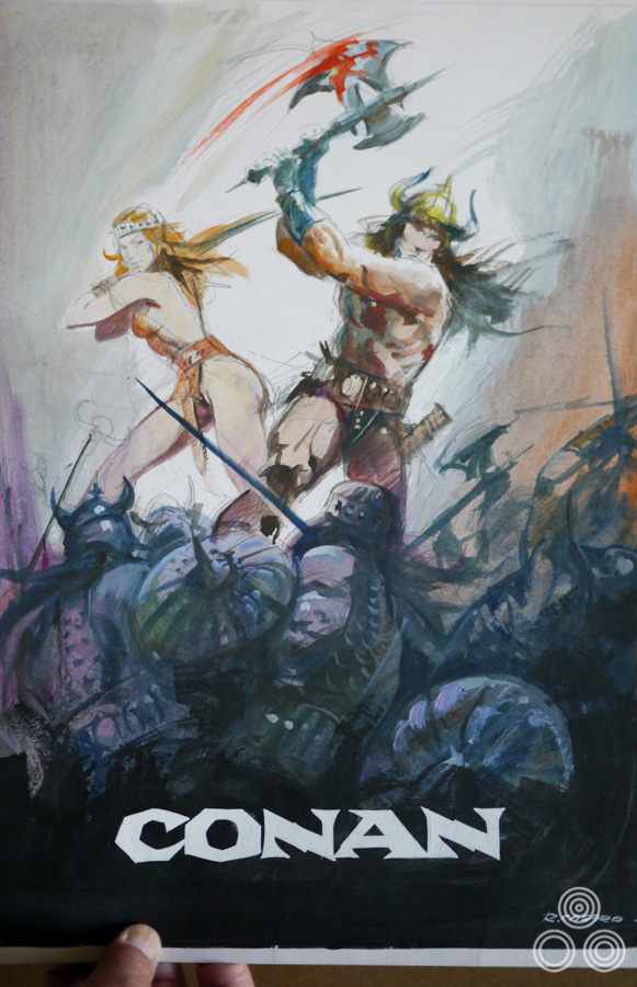
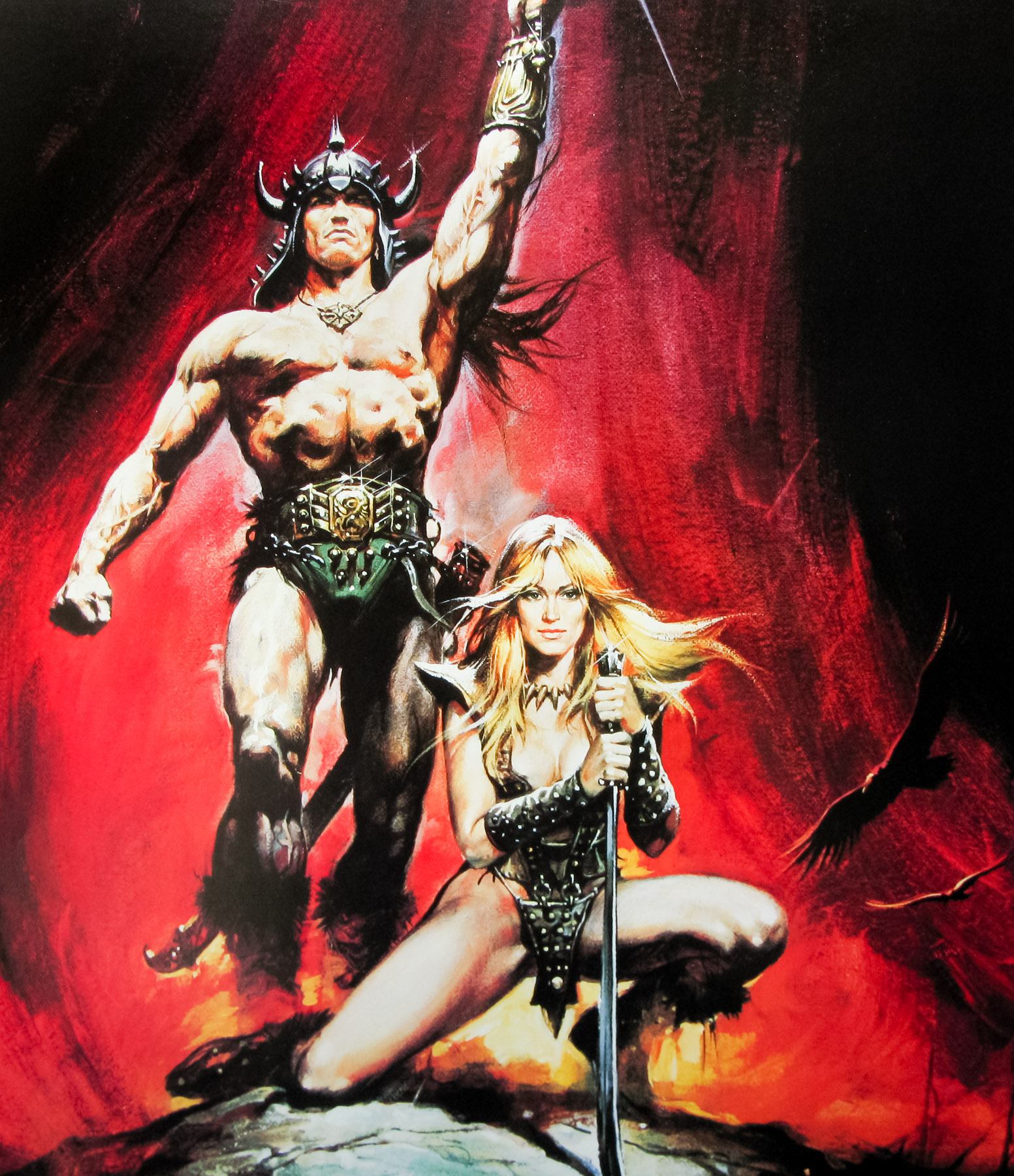
The American one sheet for Conan the Barbarian, painted by Renato Casaro in 1982 after the artist made a memorable visit to the film’s Almeria set. The artwork was used around the world to promote the film and is arguably Renato’s most famous work.
Renato, thanks for welcoming me here. I thought we could start with your early life and you were born in 1935?
Yes, that’s correct. I was born in Treviso, Northern Italy.
Can you tell me about your childhood?
I was lucky because I went to a school near Treviso that was really respected for the way it taught the pupils about art and design. I had a teacher that encouraged me and helped me to understand how to draw and paint. I remember that I had a notebook that I would carry with me everywhere and I would continue to draw sketches and caricatures of other students and teachers, even when I wasn’t in art class. My mother used to get annoyed because I’d be drawing in books that were meant for other subjects!
Did your mother and father have an artistic background?
No, there were no members of my immediate family who were artists and I don’t really know of any relatives who were particularly skilled either.
What about cinema? Was that a passion from a very early age?
Oh, absolutely! I was at the cinema to see a film almost every day. As well as enjoying the films themselves, I fell immediately in love with the posters that were displayed when a new film was showing. I used to go by the cinema every day to see if they were changing the posters and when they were I would ask if I could take them home. I was usually in luck and would run home with the poster and go into my bedroom to study it before attempting to paint a copy of it. I always did this because it helped me to understand how the artist had achieved the finished result.
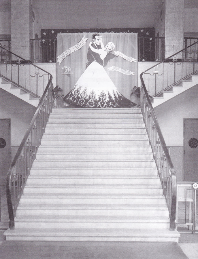
The central staircase of Treviso’s Cinema Garibaldi in the 1950s.
I repeated this over and over with many different posters and I guess that’s how I taught myself various techniques that would later serve me well for my career as an illustrator. There were no colleges or courses that specifically taught illustration around Treviso so it was the best way for me to learn. My art teachers were good but they weren’t really interested in teaching us commercial illustration skills like those I’d need if I were to become a professional.
Some of the posters were so incredibly well painted and, try as I might, I just couldn’t emulate the way that the artist had done it. It was like a mystery to me how they had achieved it and I was hungry to understand. I realised that if I was to learn more I would have to leave Treviso and go to Rome.
Did you know the names of the artists at that time?
Yes, most of the posters had signatures on them or credits in the bottom corner so I began to learn the styles of the different artists, like Angelo Cesselon and Averado Ciriello. For me, however, the best in the world at that time was the American artist Norman Rockwell – I just thought he was the master!
Every week I used to go to have a look at the new issue of The Saturday Evening Post that was imported from the States by a newsagent in Treviso. Rockwell’s artwork would be on the cover or inside the magazine illustrating different scenarios. Of course I tried and tried to capture his wonderful images, but it was not easy. Don’t get me wrong, I did really like many of the Italian artists but for me nobody could match Rockwell.
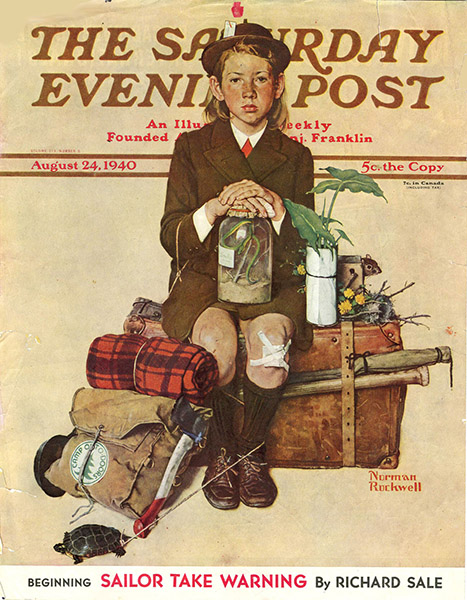
The cover of The Saturday Evening Post, August 24 1940, which was illustrated by Norman Rockwell.
What was life like for you during the Second World War?
It was not too bad because I was so young at the time and my family and I lived in a small village called Sant’Antonino that was in the countryside outside Treviso, so we didn’t have to worry too much about the bombing that was hitting the city. Because we were in the country we also had no worries about food since there was plenty of space to grow vegetables and we had livestock and chickens too. When the war finished it was really easy for me to return to studying, so I felt very lucky.
A few years before the war started I had gone with my parents to Libya to live in Benghazi because my father was a shipbuilder and he had been offered a job there working to build huge boats. We returned to Sant’Antonino when I was about six years old.
What did you do after you finished school?
Well, thanks to me having been constantly sketching and painting since a young age, both in school and at home, I had become pretty good at technical drawing – the kind of detailed images that were used by engineers as a basis to build machines and vehicles. My father had recognised that I had a talent for it and had helped me to nurture the skill with the thought that I would join him at the place where he worked and help to design ships.
It could have been a good career possibility for me as I might have ended up working for one of the car manufacturers like Ferrari or somewhere like that. The problem was that I was still too obsessed with film and the idea that I might have a career as a poster artist. My parents were very keen that I at least try working in what they considered to be a ‘normal’ career first so I got a job as a logo and type designer at a company called Longo & Zoppelli in Treviso. They handled the publicity for many companies all over the Veneto region, including for things like food and drink companies.
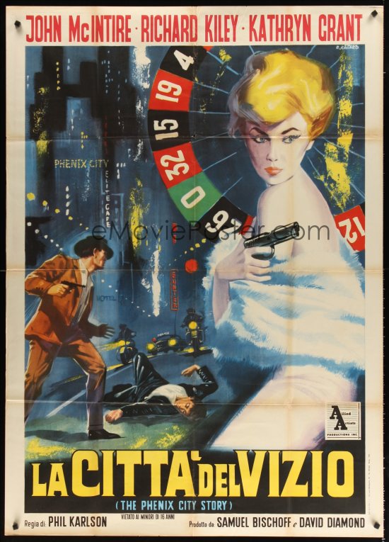
The Italian one panel (2-fogli) poster for La Citta Del Vizio (AKA The Phenix City Story, designed and painted by Renato Casaro, circa 1961.
I was based in the design studio and was working on things like labels for wine bottles and I remember doing a poster for an advertisement for a brand of panettone [an Italian cake sold at Christmas], which was one of the first of my designs to be printed. I recall it being a really great feeling to see my work on paper and hanging on the wall. All the while I was spending my spare time painting copies of film posters and continuing to hone my skills in that area. I was still living with my family at the time and they let me set up a small studio space in my bedroom. I had even bought different canvases and types of paints trying to improve my capabilities. It was an intense obsession of mine.
Whilst working at Longo & Zoppelli, I used to visit the big cinema in Treviso, which was called Cinema Garibaldi, and in there they had this huge wall onto which an artist would paint an advert for upcoming films that were due to be shown there. The cinema would change this painting every few weeks and so I asked them if I could work for them and was thrilled when they said yes. I remember working on these huge paintings for films like Latin Lovers with Lana Turner, Burt Lancaster in Apache and Marilyn Monroe in River Without Return.
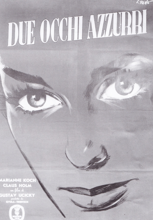
The Italian poster for Two Blue Eyes, painted by Renato Casaro circa 1956. This was the artist’s first ever printed poster.
When I turned 20 I decided it was time to travel to Rome and I told my parents that I had to go. Back then Rome felt a long way from Treviso; now it’s only a few hours by fast train, but 50 years ago it was a big deal to move there and was seen as a quite an adventure. My mother was of course very worried for me and was telling me how dangerous the big city could be, but I was determined to go and promised her that I would be fine. I knew that if I wanted any chance of becoming a film poster artist then that’s where I had to be.
I had taken photographs of all the paintings I’d done for the Cinema Garibaldi as well as plenty of illustrations and paintings I had done at home whilst I was perfecting my style and sent these to Studio Favalli, which was a really famous design and art studio working for the Rome film industry. They liked what they saw and invited me for an interview, which went well and I was invited to join the studio by the boss Augusto Favalli. I felt very lucky, as it was a small but strong team.
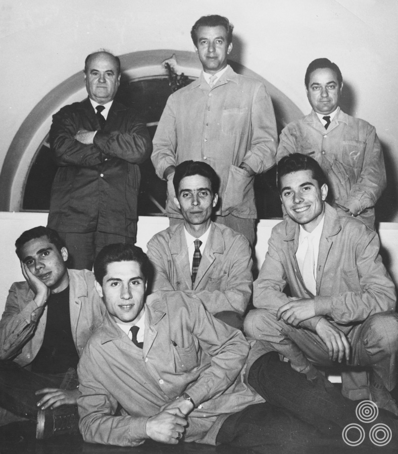
Studio Favalli, circa 1960, with Augusto Favalli in the centre at top, Renato Casaro bottom right, and Renato Fratini bottom left.
At that time the artist Renato Fratini was working there and I had around a year of working directly with him and learning tips and tricks before he left to go and work in London. It was a strong partnership and we were roughly the same age, he a little bit older, but we did some good work together during that time. I was very happy being in Rome and you can only imagine how much fun I was having as a young man, both at work and in my spare time! There was so much to see, experience and learn. I was truly full of life at that time. I also got to meet other artists that I’d admired before.
Ah, so you met some of the people responsible for the poster paintings you’d admired when you were growing up?
Yes, eventually I got to meet artists like Angelo Cesselon and others and I would tell them that I used to copy their art to understand how they achieved the finished result and to try and improve my own work.
What was Augusto Favalli like to work for?
He was a great boss and I learnt a lot from him. In addition to running Studio Favalli he was also the official art director for the big Italian distribution company Lux Film so he was a very busy man. He was always running in and out of our office and when he wasn’t with us he’d be dealing with requests from Lux.
The original artwork for the Italian poster of Pochi Dollari for Django (Few Dollars for Django), painted by Renato Casaro in 1966.
Fratini and me were the only artists at Studio Favalli but there was also a type illustrator who worked on the titles and credits for all the posters we did. You have to remember that this is years before we had computers to do that kind of thing so it was quite a skill. He could carefully write all the tiny text across the poster without making a mistake. His name was Ventura. There were also a couple of people who worked in administration and dealt with all the requests from the clients.
One of the good things about Augusto being the creative director for Lux was that he was free to choose any of the big artists to work on projects, so he might ask Cesselon to paint a poster for one of their films and that would mean I had contact with the other more established artists.
How did they behave towards you?
Most of the time they were very pleasant but I could tell that some of them were a bit suspicious of me or perhaps slightly threatened. I guess they were worried that I was fresh on the scene and might take away some of their work. I remember one time I was in an elevator with the artist Enzo Nistri and he had some original art under his arm. When he saw me looking he turned it away from me so I couldn’t see it, which I thought was a bit strange. It was like he was worried I would copy it or something.
It’s worth saying that there wasn’t one of the artists who was getting paid more than another. All of the major studios had their standard prices that they were willing to pay for a finished poster artwork. I remember it was around 60,000 lire, which is equivalent to about 30 Euros if you were to exchange it today, but 45 years ago it was quite a decent figure. To give you an idea, the classic Fiat Cinquecento was 400,000 lire brand new so you only had to do 7 or 8 posters to be able to buy a car.
Did you buy one yourself?
No, but I did eventually buy a Fiat 1500 that had a bi-colour body, so the bottom part was white, including the wheels, and the top part was blue. I had a friend who worked in the garage and he sorted me out with the colours I wanted.
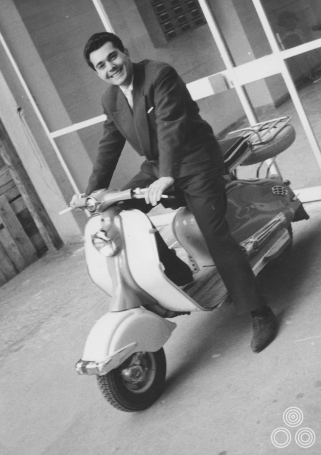
Renato Casaro sits astride a Vespa in Rome, circa 1965.
Can you remember some of the films you worked on at Studio Favalli?
There were several, but one poster I did during this time that was definitely printed was for the Sophia Loren film Attila, which was about the infamous leader of the barbarian Huns. I was quite pleased with how that one turned out and I think the client was too.
When did you decide to leave studio Favalli?
After a year of working at the studio Augusto told me, “Renato, I think you are ready to become a freelancer.” So I prepared a portfolio of all of the work I’d done up until that point and began to show it to different distributors and film producers who were looking for artwork for new films. I was very fortunate because at that time many of the artists who were painting film posters had been around for years and their style of artwork was seen as quite old fashioned by that time.
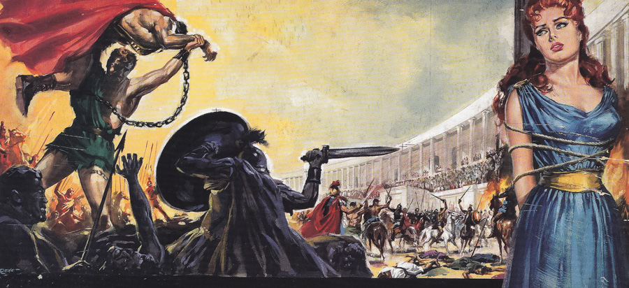
Artwork painted for the Italian release of La Rivolta Degli Schiavi (The Revolt of the Slaves) by Renato Casaro, 1960
When I showed my folio to the different clients they could see that I was young and was trying to develop my own personal style. A lot of the people I went to see took a chance on me because they wanted their film’s marketing material to seem fresh and unlike the posters that had been done by the established, big name artists. Gradually I built up my reputation and began to take on more and more work, which was a relief of course. I was also quick to complete projects that were given to me whilst still making sure the work was of the best possible quality, and for this reason I was given the nickname ‘Renato fa presto’, which translates to ‘does quickly’.
So at this time the Renato Casaro studio was established?
Yes, and one thing that really helped me was that I was doing work for many of the small and medium sized distributors and production companies, rather than trying to get jobs with the big studios. I wasn’t working on campaigns for what might be seen as ‘important’ films but rather on the medium and smaller films, which was still a very sizeable market at that time. It wasn’t just B-movies, but also what are known as independent films today. They might have been made by smaller studios and featured less well-known stars but many of them were still good films, and they were happy for me to try new design ideas for the posters.
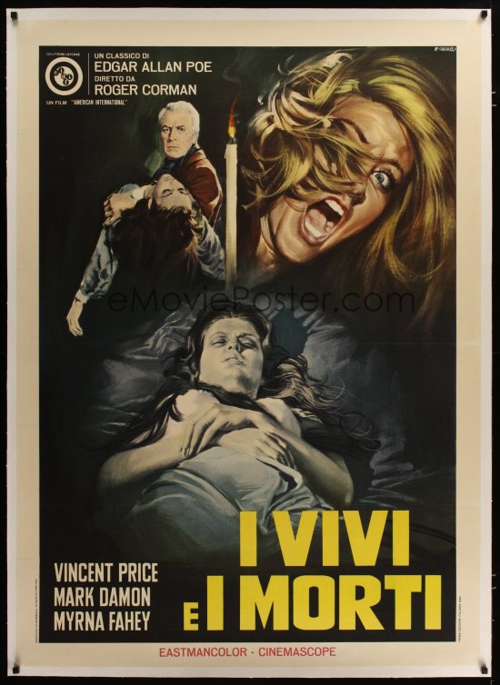
The Italian one-panel (2 fogli) poster for The House of Usher (1960), designed and painted by Renato Casaro.
I look back now at the work I did during this period and I don’t like it that much. A lot of the time I didn’t have enough time to perfect the illustrations and I worked so quickly – sometimes I would have only one day to work on a poster! I just had to stop when the job had to be delivered. I remember one client kept phoning me and was asking every 10 minutes; “Is it ready?” He called several times and eventually I just said ‘Okay come and get it now.’ It wasn’t my best piece of work but the client was so desperate for it I just had to surrender it to him so he could go and get it printed.
Around this time, aged 21, I was called up to do my military service, which was compulsory for Italians back then. I was incredibly lucky because I was asked to work on the posters that were used by the armed forces to promote themselves around the country. What was great was that I was given a studio inside the main headquarters for the Italian Air Force and I was able to work on posters for them during the day but continue to paint film posters during the evenings and at the weekend so my film work didn’t suffer. I also worked on illustrations for the military newspaper and they even paid me to do the work, so I was earning two wages at once!
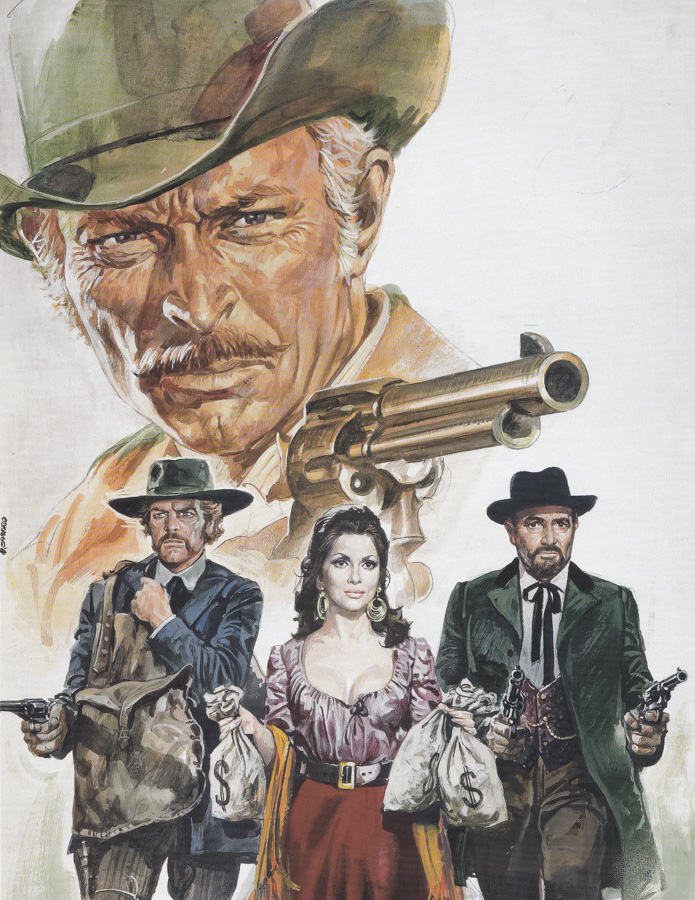
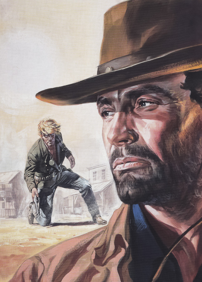
The original artwork for Bad Man’s River by Renato Casaro, 1970.
I remember that thirty plus years after I finished my military service I was at the Cannes Film Festival and had a gallery show there. This elderly gentleman came into the exhibition and when he saw me he said ‘You are Renato Casaro!’ It turned out that he was the general that I had worked under all those years ago. I remember really enjoying working for him so that was a nice surprise to meet him again after such a long time. My service was complete after 18 months and I could return to working full time on the film work.
I got the chance to work on the poster for The Magnificent Seven for United Artists for the Italian market, which was a dream come true. I worked on two versions for them but I was only 25 at the time and too young to do a top job for such an important film. I look at the horses today and wish I’d done a better job. One thing that’s worth mentioning is that at that time I signed my works as C. René. This was because my mother was a big Francophile who loved everything about France and for a while she called me René. When I started out as a commercial artist I decided to sign my work with that nickname but later changed it to my actual name.
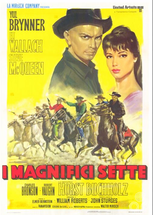
The Italian poster for The Magnificent Seven (style A), painted by Renato Casaro, 1960.
One of your big breaks was working for the Italian producer Dino De Laurentiis?
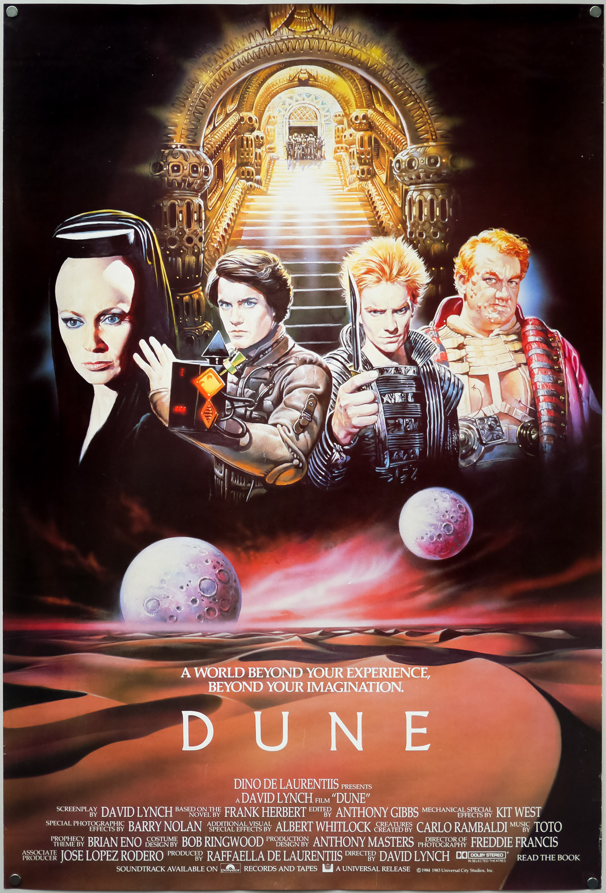
Yes, that was with a poster I did for the film he was producing called The Bible (1966). He liked what I did for him and that was the start of a good working relationship, and friendship, with him. I remember that The Bible artwork was also used in America for a huge billboard that was displayed on Sunset Boulevard in Los Angeles for several months. After that I worked on many films with De Laurentiis, including Waterloo, Flash Gordon, Dune and Conan the Barbarian, which was possibly the most important for me in many ways as it was used across the world and really helped to get my name out there as an artist.
Very often Dino would invite me over to the set of the film he was working on and I remember coming over to London a few times for this reason. One of the more memorable visits was for Flash Gordon in 1979 when I got to stay in London for several weeks working on concepts illustrations for the film as well as ideas for the poster. He would always make sure I was staying in a nice hotel with a large room so that I could work there in the evening if I wanted. I would do sketches and illustrations in London but would always wait until I returned to Rome before I would paint the final artwork.
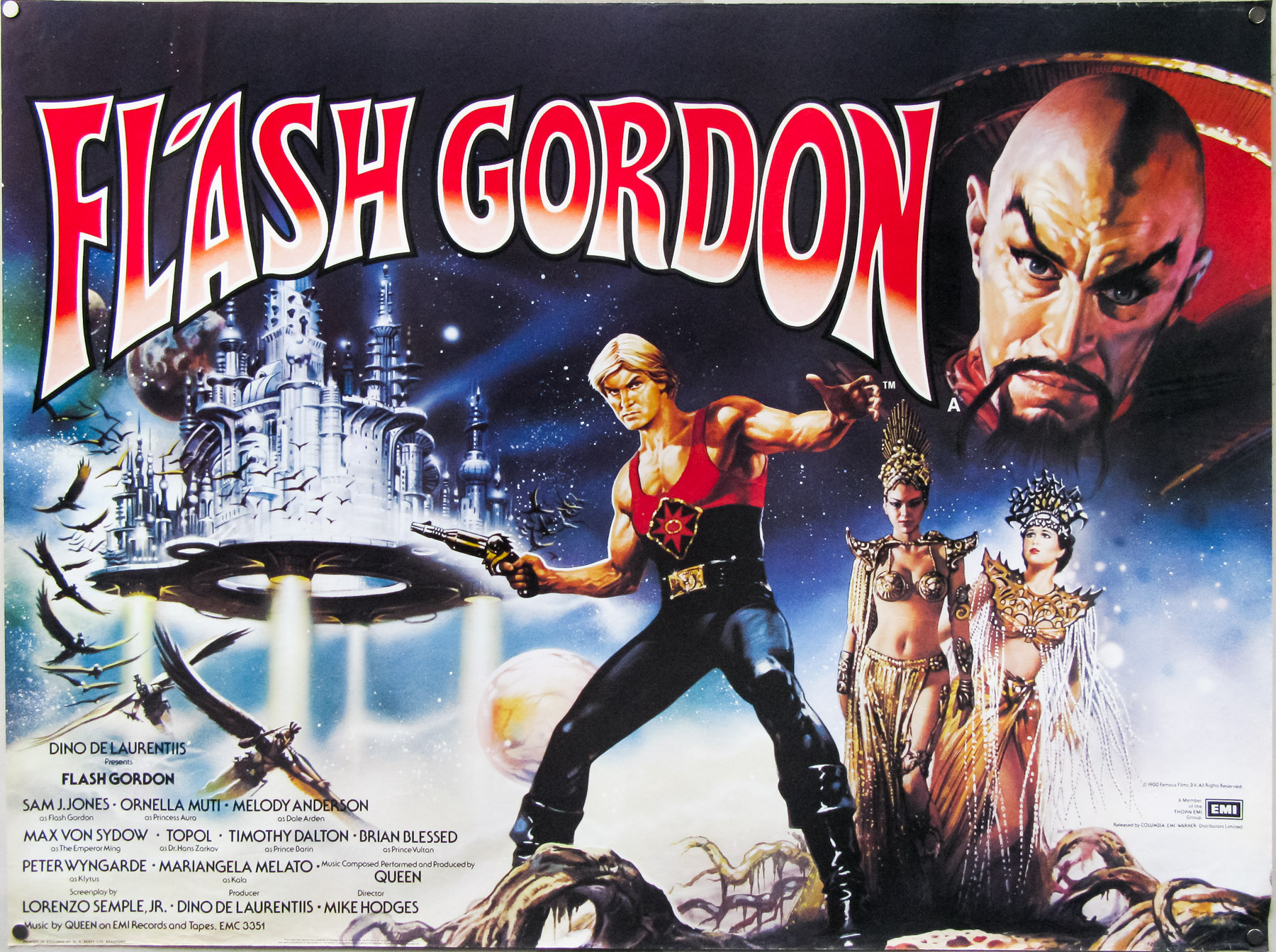
One time I recall that he telephoned me whilst I was still in Rome and asked me to bring him a sack of fresh yellow peppers from Italy because there weren’t any available in London at that time, or at least if they were he didn’t feel they were of good Italian quality! So I had two suitcases with me on the plane: one full of clothes and art equipment and one full of peppers!
Did you paint more than one version of the poster for Flash Gordon?
Yes, I ended up doing one large format version and two other smaller posters and these ended up being used in different markets across the world.

The Japanese B2 for Flash Gordon, with artwork by Renato Casaro, 1980
How did you originally meet Dino De Laurentiis?
I can’t recall exactly how it happened but it was in Rome. Dino was almost like a god at that time in the Italian film industry. He had this incredible house and studio in the countryside outside of Rome and it had a helicopter-landing pad on top of this tower, plus he had this beautiful Rolls Royce that he would be driven around in.
One thing about Dino was that he was very faithful to the people he worked with over the years, so much so that even when he was working in America after he grew tired of the Italian system he would still hire people from his home country to work on his films. They might be filming in another country but the lighting crew would have been Italian as well as the makeup people, the production designer and so forth. He liked to maintain the kind of relationships that meant he knew who to trust to make the films he was producing. The same thing happened with my studio and he brought me back many times because he continued to be happy with my work and trusted me to deliver it.
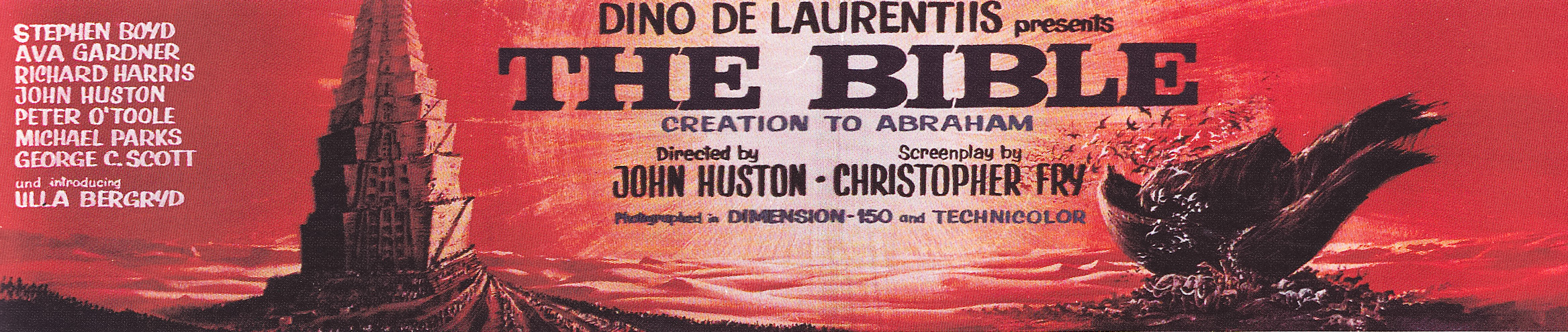
A billboard for John Huston’s The Bible (1966), painted by Renato Casaro. The billboard spent many months in place overlooking Sunset Boulevard in Los Angeles.
Going back to Studio Casaro, after your work on The Bible, did the workload really begin to increase?
Yes, at the beginning of the 1970s I was taking on even more work from many different studios, and not only from Italy either. As I mentioned, I was fortunate because at that time the older established artists like Cesselon were beginning to decline in terms of their ideas and their desire to try new painting styles. It was also around this time that I began to use the airbrush as a tool in my work. It was the Japanese artists who had really embraced it as a tool for commercial art, but I realised that it was really good at making artwork seem more photo-realistic.
I think that’s what helped me during my career the most; my willingness to try new tools and styles of painting because it meant I didn’t become stale and only associated with one way of creating film art. Of course, the movies themselves were changing and what was popular in the 1950s was no longer selling cinema tickets in the 1970s, therefore the art to sell these films had to change too.
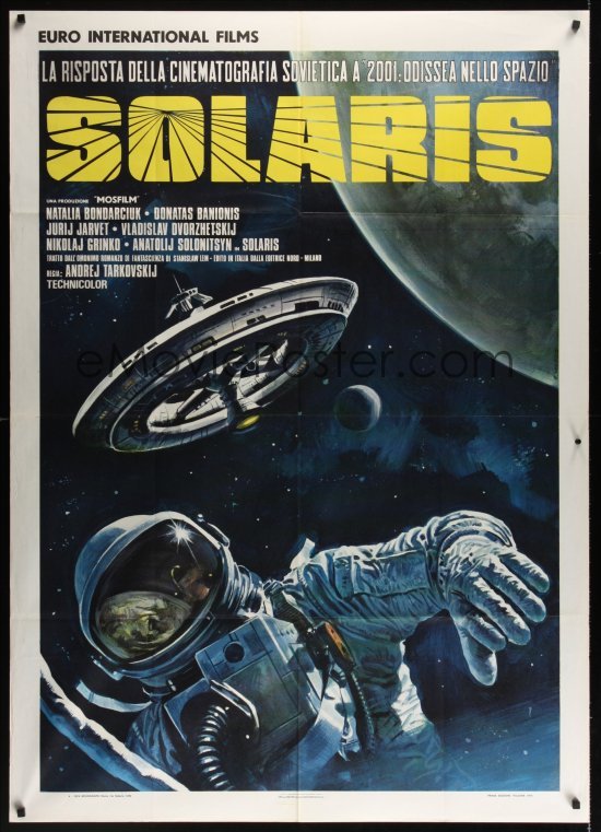
The style B Italian poster for Andrei Tarkovsky’s Solaris, designed and painted by Renato Casaro, 1974. Image taken from Emovieposter.com
One other thing that’s important to say is that I was generally not beholden to an art director and usually I was the designer and the artist on every film poster I worked on. One exception was a pleasant collaboration that I had with the British designer Vic Fair for a poster for The Adventures of Baron Munchausen. He had designed a one sheet intended for international use and I worked on the painting for it. I would always make sure to watch the film first, or if that wasn’t possible receive stills from the production, or in some cases even visit the set whilst they were filming, as I mentioned. But I was never working to someone else’s design direction – at Studio Casaro I always made sure I had complete creative control on movie jobs.
That’s quite unusual as many artists would work together with a designer or be forced to paint exactly what the client wanted to see. Every poster painted by you was from your original design?
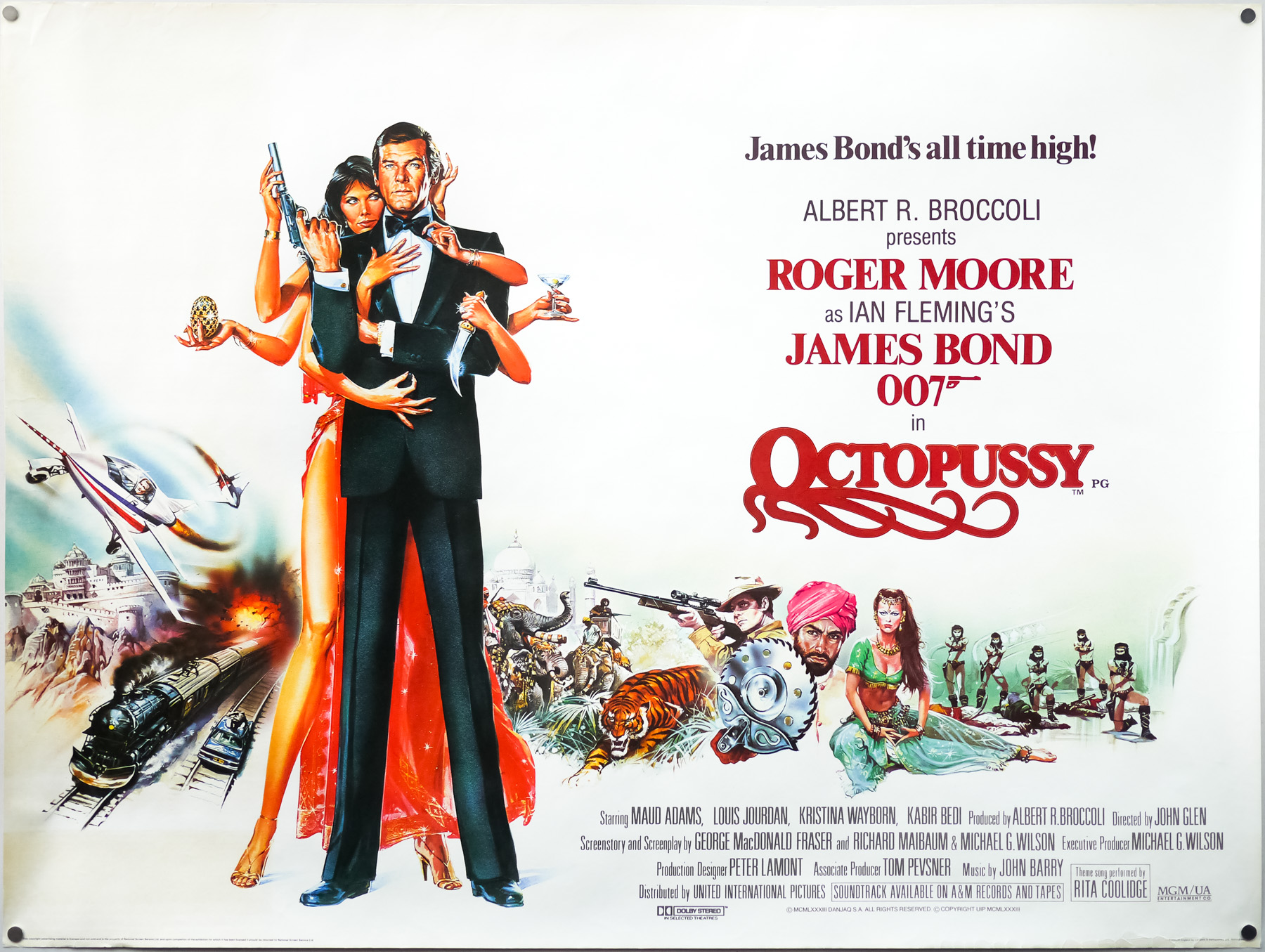
Almost every single one I worked on. Very occasionally I would adapt some posters for American films from the artwork that had been used over there. For example, for the British poster for Octopussy I painted an action montage around the central figures that had already been painted by the American artist Dan Goozee. When they wanted the same montage for the Japanese poster it was in a portrait format so I was able to repaint the figures myself and then adapt my original action montage around them. That was a very unusual case though and if it were an Italian production I would always retain complete creative control.
Did you have a manager who would control exactly what Studio Casaro was working on every day?
No, it was down to me to do that because the studio had only four people, including myself. There was a graphic designer who would do things like Photobustas, the mini posters that were used in addition to the larger formats, and another designer who would take care of things like the small film adverts in newspapers that the studio would ask us to do. There was also a title designer who worked on logos for the posters. That meant I could give the client the complete package: a poster, photobustas, newspaper adverts and anything else they needed to promote the film.
The one downside of doing this was that I was working sometimes seven days a week, maybe 12 hours a day. I was really bad at turning down jobs and would accept one after another. I’m sad to say it caused the breakup of my first marriage because I was working too much. The thing is that the work was my life; it was never about the money, it was like an obsession for me trying to improve on what I had done before. I saw each new job as a challenge and wanted to always do the very best work I could. The money came in, sure, but that wasn’t my motivation for working all those long days.
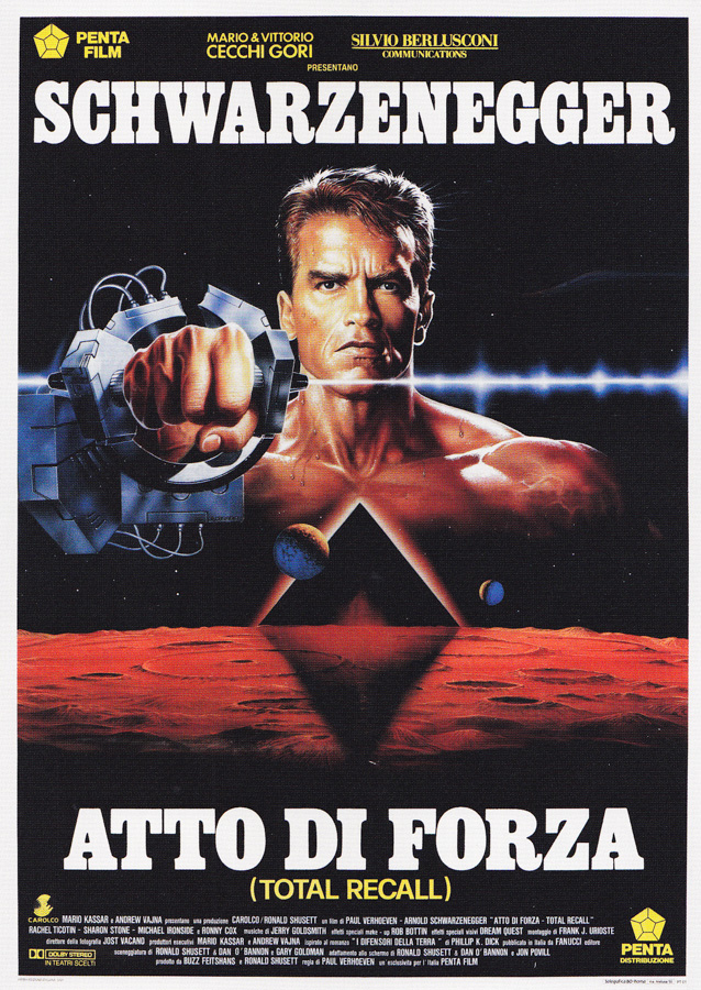
The Italian poster for Total Recall, designed and painted by Renato Casaro, 1990.
Every time you worked on a poster you were trying to do something new with your painting style?
Yes, I didn’t want to just recycle the same designs over and over, or paint in the same colours just because it had worked for one poster. I used the airbrush carefully because I didn’t want that to be what I was known for, plus used exclusively it created very cold, artificial artwork. I would always paint the base of any artwork with gouache oils and then use the airbrush to add little bits of texture, like shadows or highlights that would really help to make the original painting that little bit more exciting and realistic. Two posters that I used airbrush almost entirely for were those for Bernardo Bertolucci’s The Sheltering Sky and Luc Besson’s Nikita. I’m proud of how both of those turned out, particularly the first one.
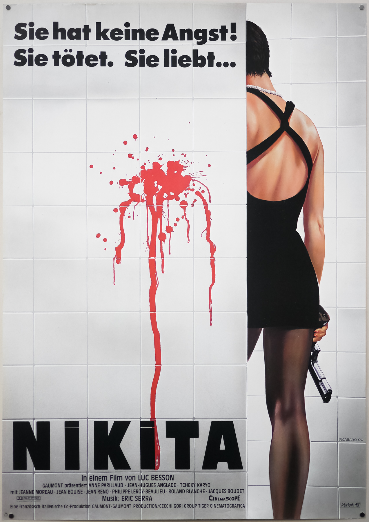
I really like the design for Nikita.
Yes, that just came to me one day whilst I was thinking of ideas. I decided that you shouldn’t see her face or what she had done to cause this bright red blood splash onto clean white tiles. The film was quite complex and focused on this woman in crisis so I knew that the poster had to be a sympathetic image to sell it to cinemagoers.
You became quite well known for the posters that depicted masculine images, featuring the hero holding guns and smoking a cigarette and so forth.
Yes, I knew how to capture the right pose for a male hero, but I really didn’t want to depict too much violence on a poster so I was careful to do something interesting with the designs. The Italian poster artist Sandro Symeoni would always paint the guy with the pistol held up and pointing directly at you and that was successful for a while. What I liked to do was depict a scene just before the action happened – so the hero might be preparing for battle or in a situation minutes before the violence happened. I wanted to give a sense of pathos to my illustrations so that the public going to the cinema would see my posters and hopefully find some appeal in what I had depicted and want to see the film because of that.
When I was doing video covers later in my career I was often asked to try and depict as much action as possible but always tried to do something interesting with the designs and painting, not just violent images. Nowadays a lot of DVD covers are covered in explosions and action and there’s no subtlety at all. The audience knows exactly what they will see if they decide to watch it.
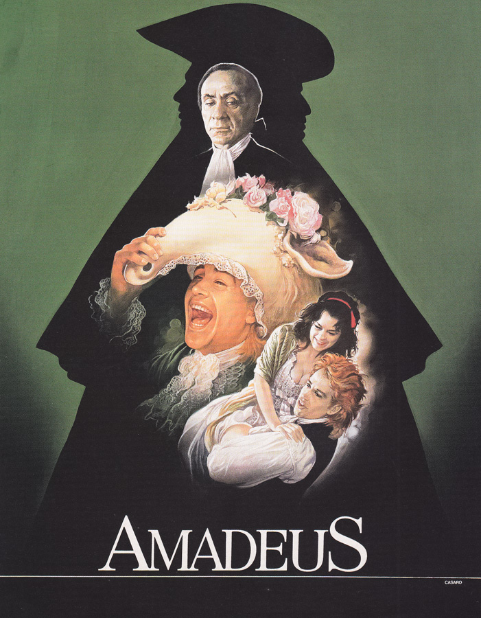
The original artwork that was used on the Italian poster for Amadeus (1984), painted by Renato Casaro
Even though Studio Casaro was based in Rome you were doing lots of work for other countries?
Yes, I did posters for America, Germany, the UK, France, Japan and many other countries. In fact, over the years I worked on the worldwide marketing campaign for numerous films.
One of your most important relationships was with Terence Hill and Bud Spencer.
Ah yes, they are still very good friends and I loved to work on the marketing for their films. I think we all feel that we were very lucky to have met each other because I really enjoyed working on their films and they were very happy with the artwork I painted for them. They told me that they felt the posters had really helped the popularity of their films. I worked on the marketing for almost every single film that they starred in together, and there were about twenty in total.
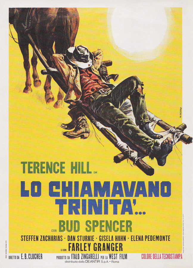
The Italian poster for La Chiamavano Trinita (They Call Me Trinity), designed and painted by Renato Casaro in 1970.
I remember that the artwork I did for their film ‘La Chiamavano Trinita’ [My Name is Trinity, 1970] even influenced them whilst they were working on the film and they changed the opening scene to feature the horse dragging Terence Hill’s character behind it. They changed everything in the scene just so it would match my painting; his hat, the way his trousers were torn, everything was matched.
How did you first meet Terence Hill and Bud Spencer?
If I remember correctly I had been asked to visit the set of one of the films where they were first working together. I was taking photographs as references for the posters and we got to know each other. From then onwards they always got me involved with every film that they acted in.
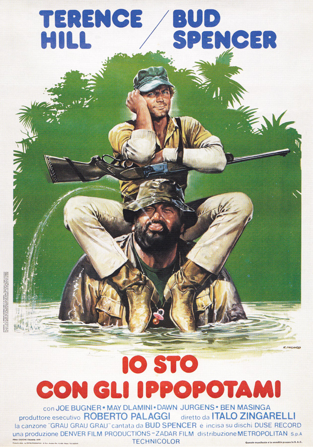
The Italian poster for Io Sto Con Gli Ippopotami, starring Terence Hill and Bud Spencer. Designed and painted by Renato Casaro, 1979.
You also got to know Sergio Leone?
Yes, I visited the set of ‘Il mio nome è Nessuno’ [My Name is Nobody, 1973] that Leone was co-directing because Terence Hill was starring in it and I was asked to work on the publicity. I later worked on the posters for Once Upon A Time in the West and his other Western films, not only for the Italian market, but also for other countries, including Germany and France. Some of the more established Italian artists worked on his posters in the 1960s because they were still working on the ‘big’ films at that time, as I mentioned.
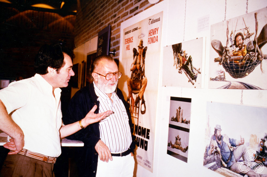
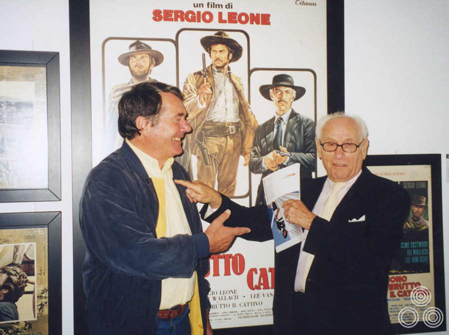
Renato Casaro stands with Sergio Leone talking about his work for the film ‘My Name is Nobody’, circa 1984
What happened when it came to painting the re-release posters?
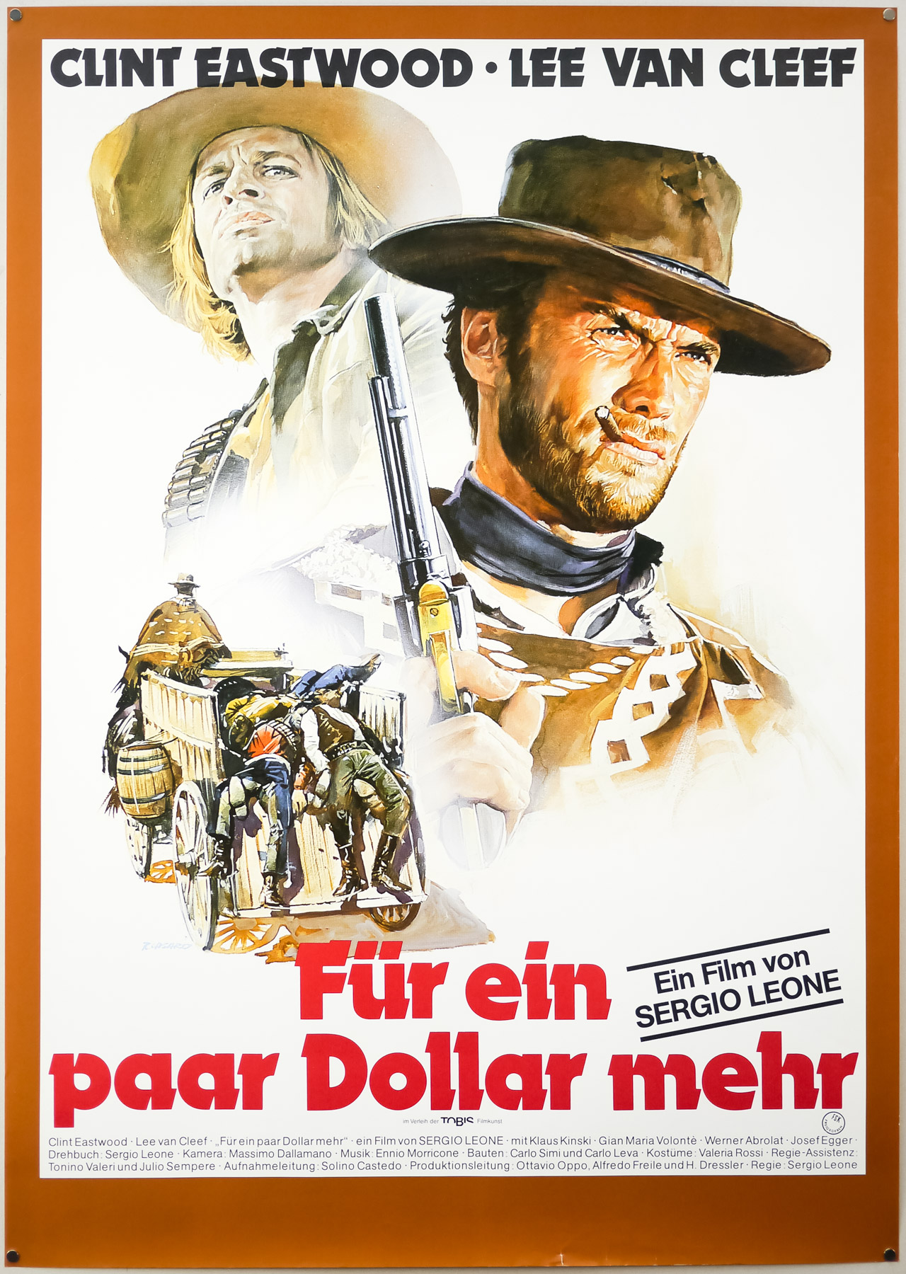
Sandro Symeoni had painted the original Italian poster for A Fistful of Dollars and at that time Clint Eastwood wasn’t the big name star he was a few years later so his face wasn’t painted accurately and the poster just depicts an action scene. When the film was re-released in Germany at the end of the 1970s, Leone asked me to make sure I focused the poster on Eastwood and make it a recognisable portrait of him.
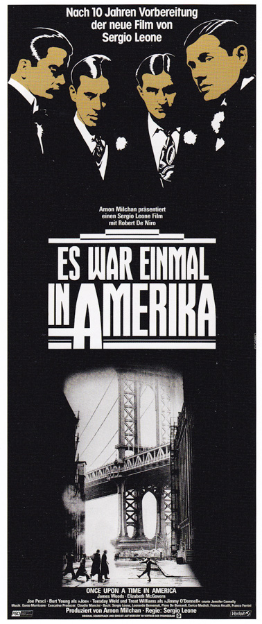
Later I designed two German posters for Once Upon a Time in America, which was a project that Leone worked on for many years before finally filming it – it took him years to organise the financing for the film and I was told about it before that process begun. The artwork for both posters was later used for several other countries. The work I did on that film had a story behind it, which I’ll tell you about.
The Italian company Titanus was going to distribute it in Italy and they had their own publicity office that was run by a man called Balestrazzi. When it came to produce the posters for Once Upon a Time in America they didn’t have a good feeling about what was being produced by their own office so Leone suggested that they ask me to work on some sketches.
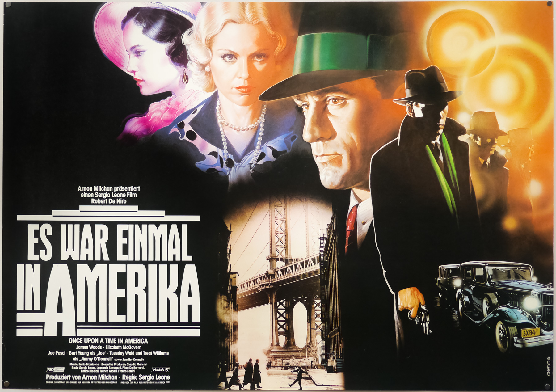
The style A German poster for the release of Sergio Leone’s Once Upon A Time in America, designed and painted by Renato Casaro, 1984
They called me up and asked me to try out some ideas, but the problem was that they wanted me to start working immediately without having seen the film or receiving any kind of publicity materials. I had nothing to work with so I had no choice but to turn them down for that job. Later, the German distributor called me and asked me to work for them, which I was happy to do because by then I had plenty of material from the production to work with, such as film clips, photographs of the characters in costume and so forth.
Then a funny thing happened. I was called to see Leone in Rome and when I arrived at his office he was with the general manager of Titanus, as well as the German distributor, plus Balestrazzi was there too. They had lots of sketches for poster ideas and also my artwork on the table. I had done two styles for the German market, one of which was the more colourful art style and that was for the cinemas in smaller towns and villages and then a more refined one that was aimed at the supposed sophisticated audiences of the major cities.
The alternate style B German poster for Sergio Leone’s Once Upon A Time in America, designed and painted by Renato Casaro in 1984.
Leone loved my posters and kept saying, “These are beautiful! Bravo, bravo!” but Balestrazzi kept very quiet, not saying a word. The German distributor said, “I like the golden heads of the poster for the big cities, but I think it needs one of the female characters inserted into it.” Leone said no and explained that whenever there are powerful looking men wearing smart suits “you can presume that somewhere behind them there is a woman”. Everyone said okay.
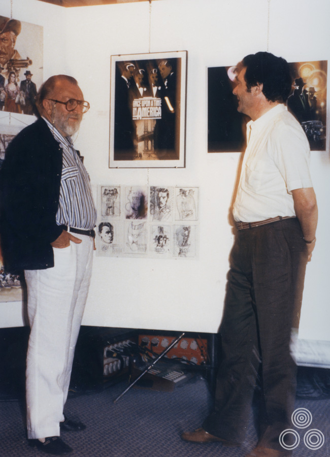
Renato Casaro talks to Sergio Leone about the poster designs for Once Upon A Time in America, 1984
Even though Leone and the others there liked my posters for Germany, Balestrazzi decided to go with a completely different photographic poster that they’d developed in the agency for the Italian campaign, which was pretty poor in my opinion! Before he died he was working on a new project that was based on the story of the American revolver, called the Colt. He asked me to start working on conceptual sketches and ideas for it to give the project some visuals to work to. It was a good experience when a filmmaker like Leone asked me to work on that kind of thing. Sadly, the project never came to fruition for one reason or another and he died not long after I finished working on the ideas for it.
What was he like to work with?
He was very Romano, which means he was very welcoming, very kind and always had time for you. He valued relationships that he had with people behind the scenes on his movies, which included artists like me.
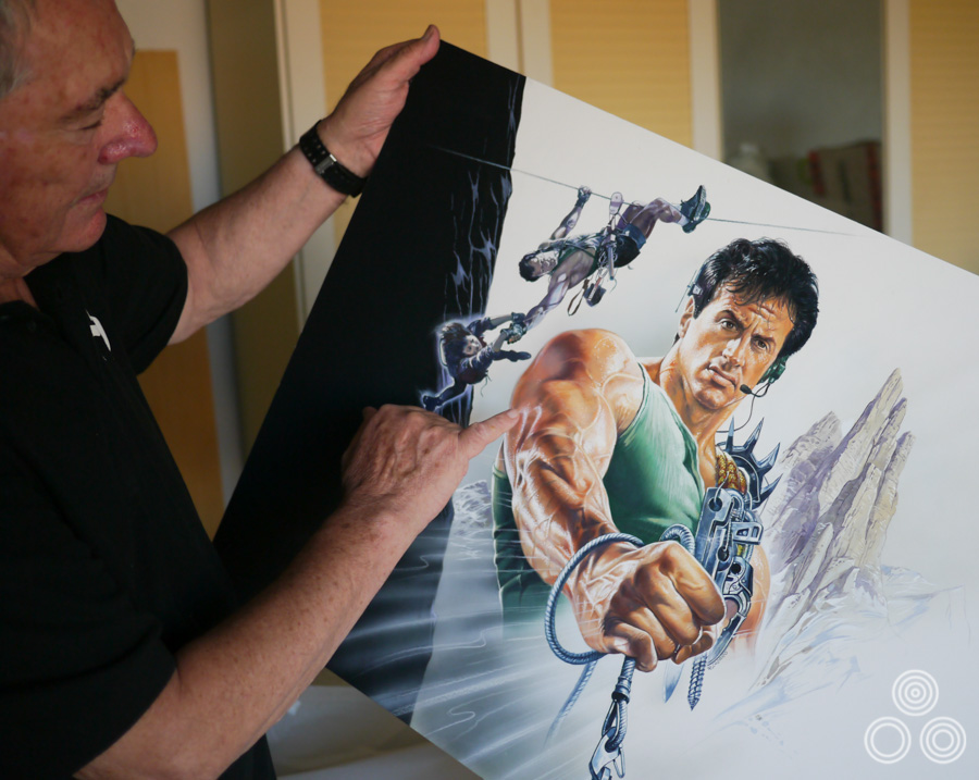
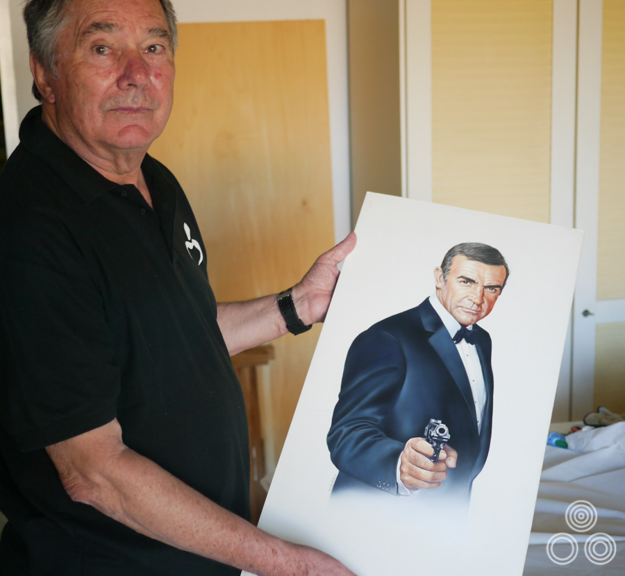
Renato Casaro holds the artwork he painted that was printed as the Italian poster for the release of Cliffhanger (1993). Photo taken in 2013.
You visited many different countries at this time?
Yes, one week I might be in the UK, the next in France or Germany or Spain, and then I might be over to the States for one week before returning home. I would visit the set of the film or perhaps the production office to meet the various people involved with it.
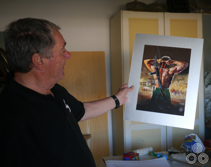
A coloured concept sketch for Conan the Barbarian, by Renato Casaro, 1980. © Copyright the artist.
One of the most memorable trips I had was over here to Almeria, Spain to visit the set of Conan the Barbarian, which was a Dino De Laurentiis production. I remember the set was stupendous. It was like a piece of old America had been reconstructed in Spain. The village set was here and it was brilliantly done with lots of detail. I recall that the light and ambience over here really fascinated me and I promised myself then that I would return. Years later, I hadn’t forgotten about it and decided that it was time to return here and that’s when I built this house and decided to live most of the year in Spain.
Renato Casaro stands with a coloured concept painting for Rambo III that he painted for the film in 1988. Photo taken in 2013.
I had another really good trip to the production office of Rambo III, which was in Los Angeles. I was friends with Mario Kassar who was a Lebanese producer that had worked for some time in Italy before setting up the company Carolco with a partner called Andrew Vajna. I had worked on the marketing for both previous films in the Rambo series so they wanted me back to do the poster for the third film.
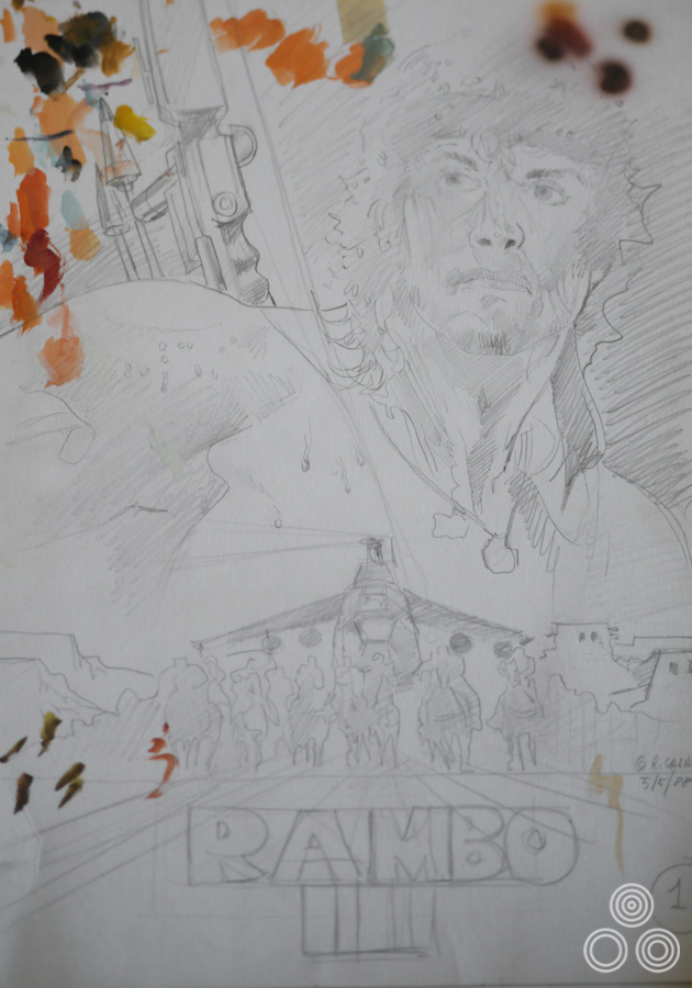
A concept sketch for Rambo III by Renato Casaro, 1988. © Copyright the artist.
Anyway, I arrived in Los Angeles and stayed in this incredible villa in Malibu next to the sea. We watched other films as well as clips from the editing of Rambo III, which was great. I spent days sketching ideas and I met and had dinner with Sylvester Stallone too. I became friends with him and saw him several times over the years. That was a really memorable trip that I can’t forget.
For Flesh + Blood I went over to New York to meet with Paul Verhoeven who was a nice guy but a bit strange. I enjoyed working on that campaign quite a lot.
Renato Casaro with the original artwork used for the German poster of Never Say Never Again (1983). Photo taken 2013
I also spent time in the UK for several poster projects, including Octopussy, and around the same time I also worked on the German poster for Never Say Never Again, with Sean Connery as Bond.
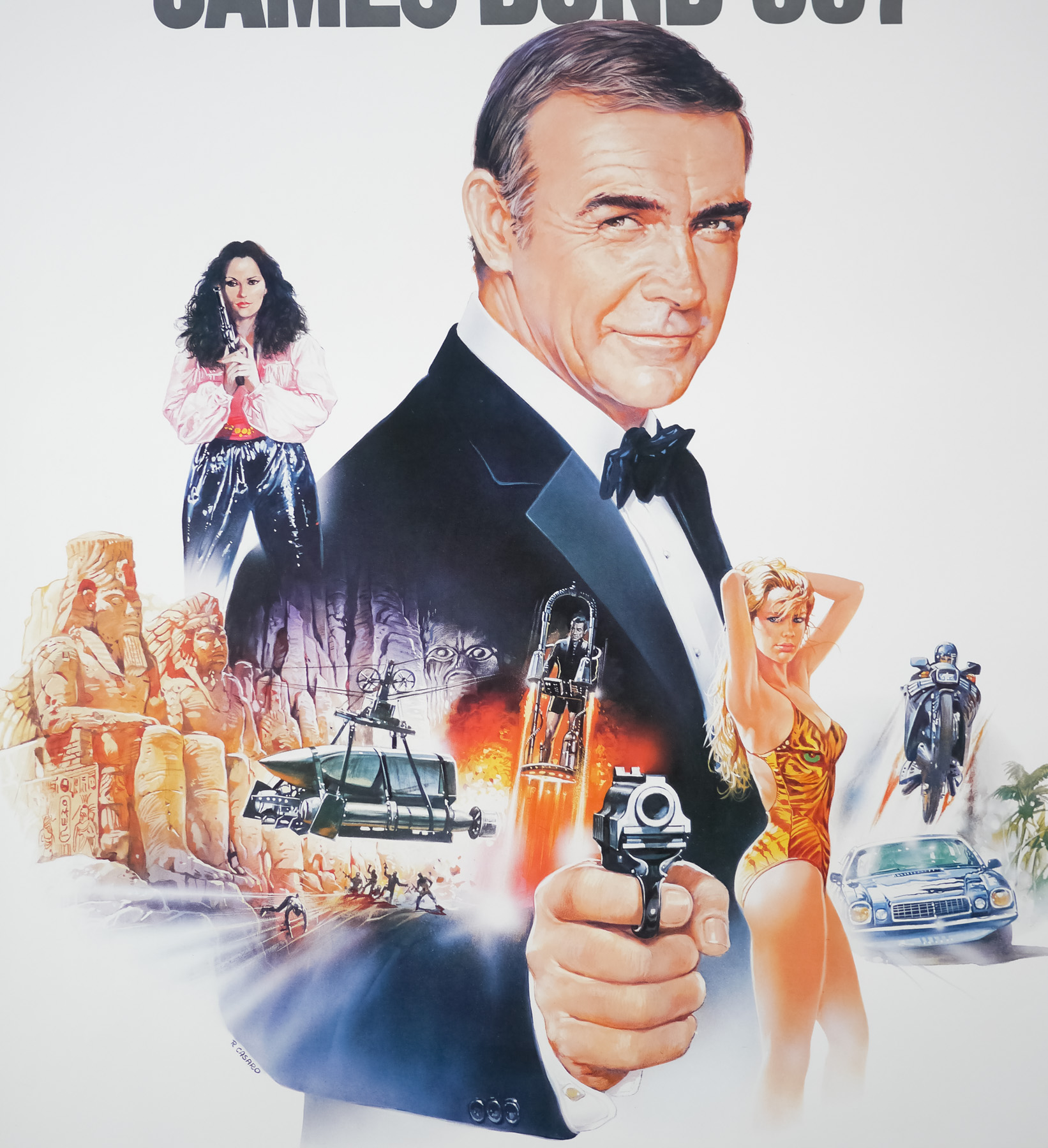
Detail of the style B German poster for the release of Never Say Never Again, designed and painted by Renato Casaro, 1983.
Did you ever work on poster ideas without having seen the film or visiting the set?
Very occasionally yes, but I usually made sure I spoke to people involved to have a good idea of the plot and the characters before I’d start doing anything. I did do several sketches for Nikita without good results, but once I’d seen the film it was quite easy to find the right essence for the poster. In the early days of working there were situations where the producers would call me up and tell me they needed something two days later and there was no time for me to see the film. I’d be told the title and maybe given some photos but that would be it.
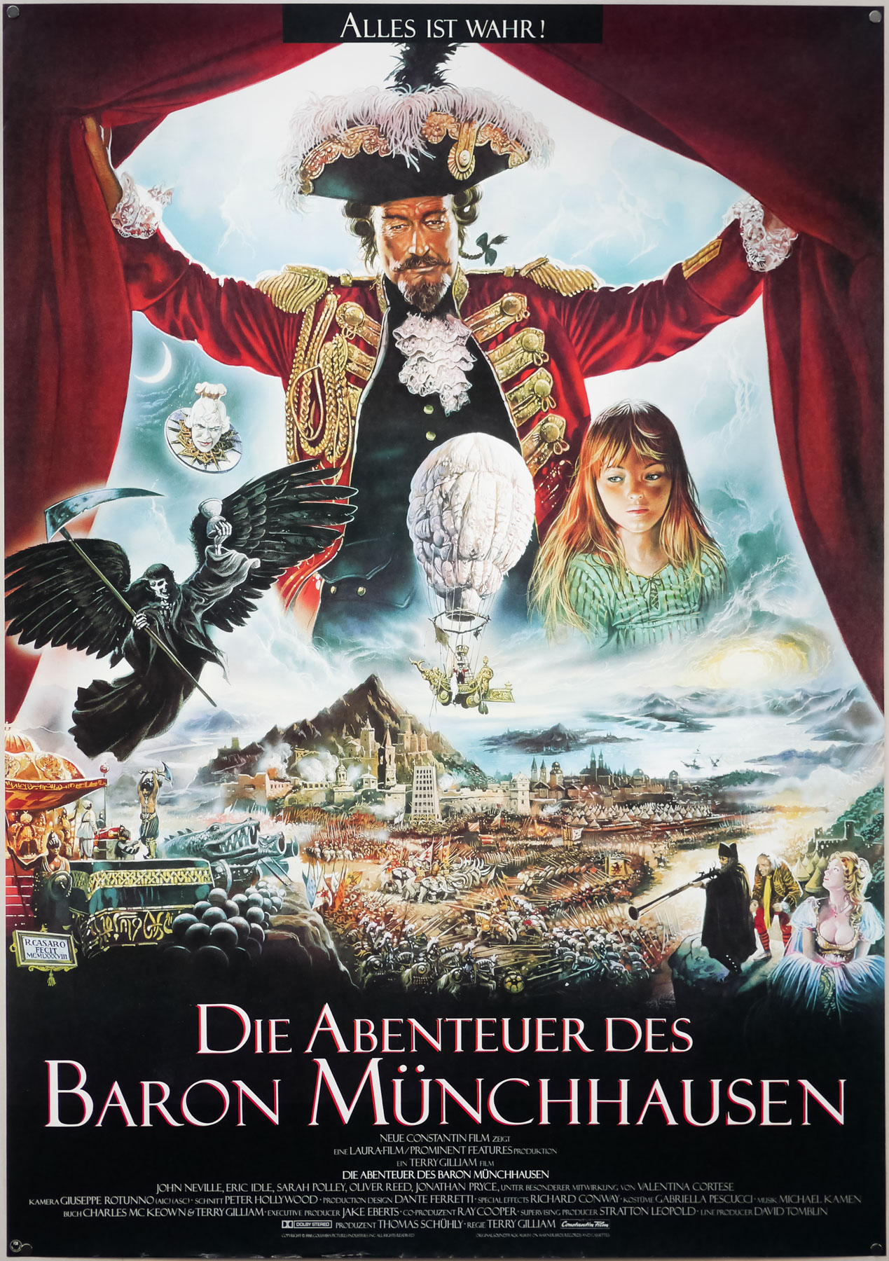
The German poster for Terry Gilliam’s The Adventures of Baron Munchausen (1988), designed and painted by Renato Casaro. The artist also painted an international one sheet that was designed by Vic Fair.
You worked on many posters for the German market. Was there a reason for that?
Yes, Germany didn’t really have many posters designers and artists working during the 1970s and 1980s and I certainly didn’t have much in the way of competition. In the 1950s and 60s they had several good artists working on film posters but after that they all retired or died, so there was a gap. I was really fortunate with that whole situation because I was able to work with most of the distributors over there and I was able to choose to work on some really great projects. My work was in demand so Studio Casaro was very busy, especially in the 1980s. Even when some other markets might have been quiet, there was always a project to do for a German client.
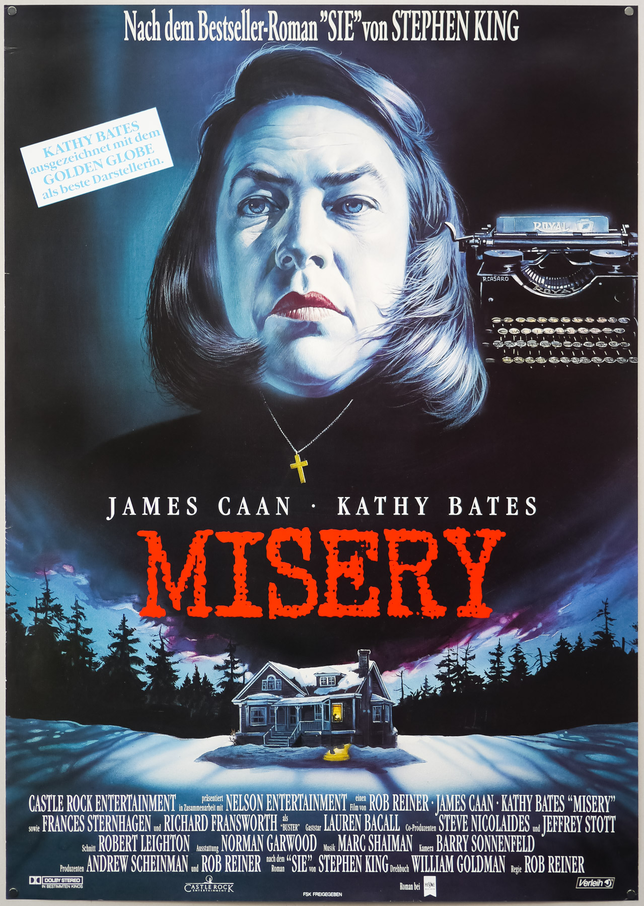
The German poster for Misery, designed and painted by Renato Casaro, 1990
You lived there for a little while too?
Yes, for a couple of years when I married Gabriele, my second wife, and we lived together in Munich before we moved here. It was there that I finished my career in terms of working on movie posters. That was when I started working on my series of artwork depicting film stars but that wasn’t tied to a particular film, which I called Painted Movies.
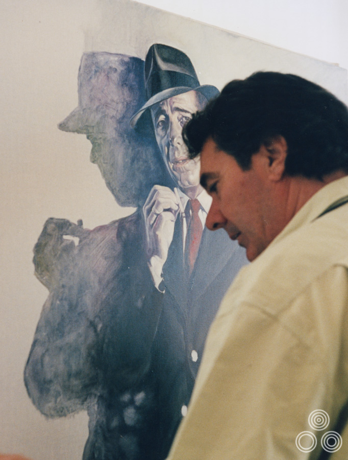
Renato Casaro works on a portrait of Humphrey Bogart in The Maltese Falcon as part of his Painted Movies series, 1992. For more examples from the series click here.
The reason I started the series was because there were many films and actors that I wish I’d been able to paint during my career but that I wasn’t able to do because I was too young when the film was released, or one of the more established artists was given the job. It was a great feeling to be able to work on an image of these actors I admired without having the pressure of a delivery deadline. I was free to choose the way they were depicted and I had a lot of fun doing it.
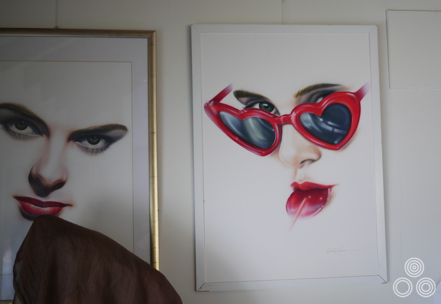
Two paintings that were done by Renato Casaro as part of the Painted Movies series. Ingrid Bergman on the left and Sue Lyon (Lolita) on the right. These currently hang in Renato’s home studio.
All of the images I worked on for Painted Movies were my revisions and recreations of moments of cinema that I loved from my life. I wanted to do a version of High Noon because that meant a lot to me too, so I created my vision of how I would have painted that. It was great to not have to work to a brief from the distributor or director and just have freedom to realise the painting exactly how I wanted. It was no longer ‘Renato fa presto’ with Painted Movies!
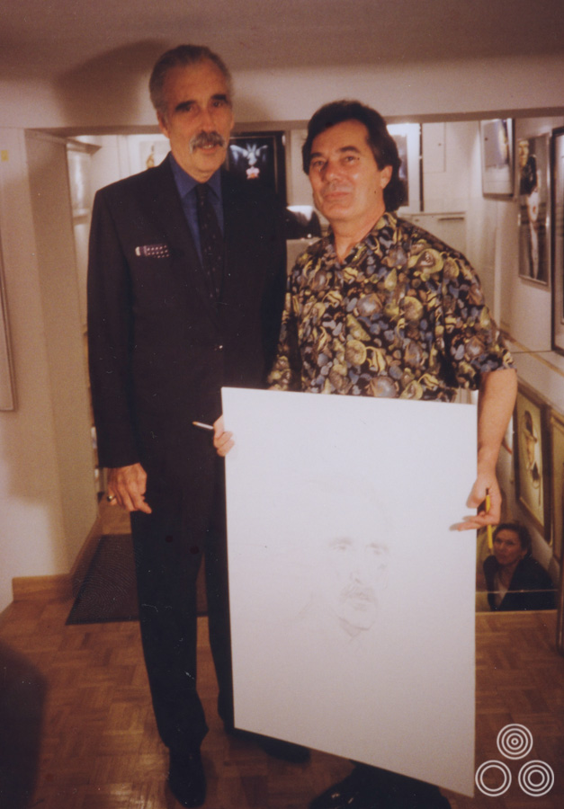
Renato Casaro stands next to an imposing Christopher Lee holding a sketch the artist had made of the legendary British actor, circa 1997.
I hired a gallery in Cannes during the famous film festival, which was opposite the Palais on the Promenade de la Croisette and displayed many of the paintings I had been working on. In the evening all of the people who were attending the festival would pass by the gallery on the way to see films or to the restaurants. Many of my old friends and people I’d worked with over the years came into see me and have a drink. It was great because I sold most of the paintings.
I went back and occupied the same gallery three or four times but by the final year a new generation of filmmakers and distributors were starting to emerge and there weren’t as many interested clients asking me to work on certain paintings for them.
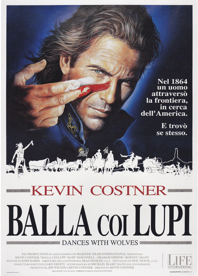
The Italian poster for Kevin Costner’s Dances With Wolves (1990), designed and painted by Renato Casaro.
Two of my favourite posters by you are the ones you did for Dances with Wolves. What was that like to work on?
I was very happy with the design that was used on the Italian poster with Kevin Costner wiping the paint across his face. The composition and colours I used worked well to sell the film. I’m also pleased with my painting that was used for the German poster too.
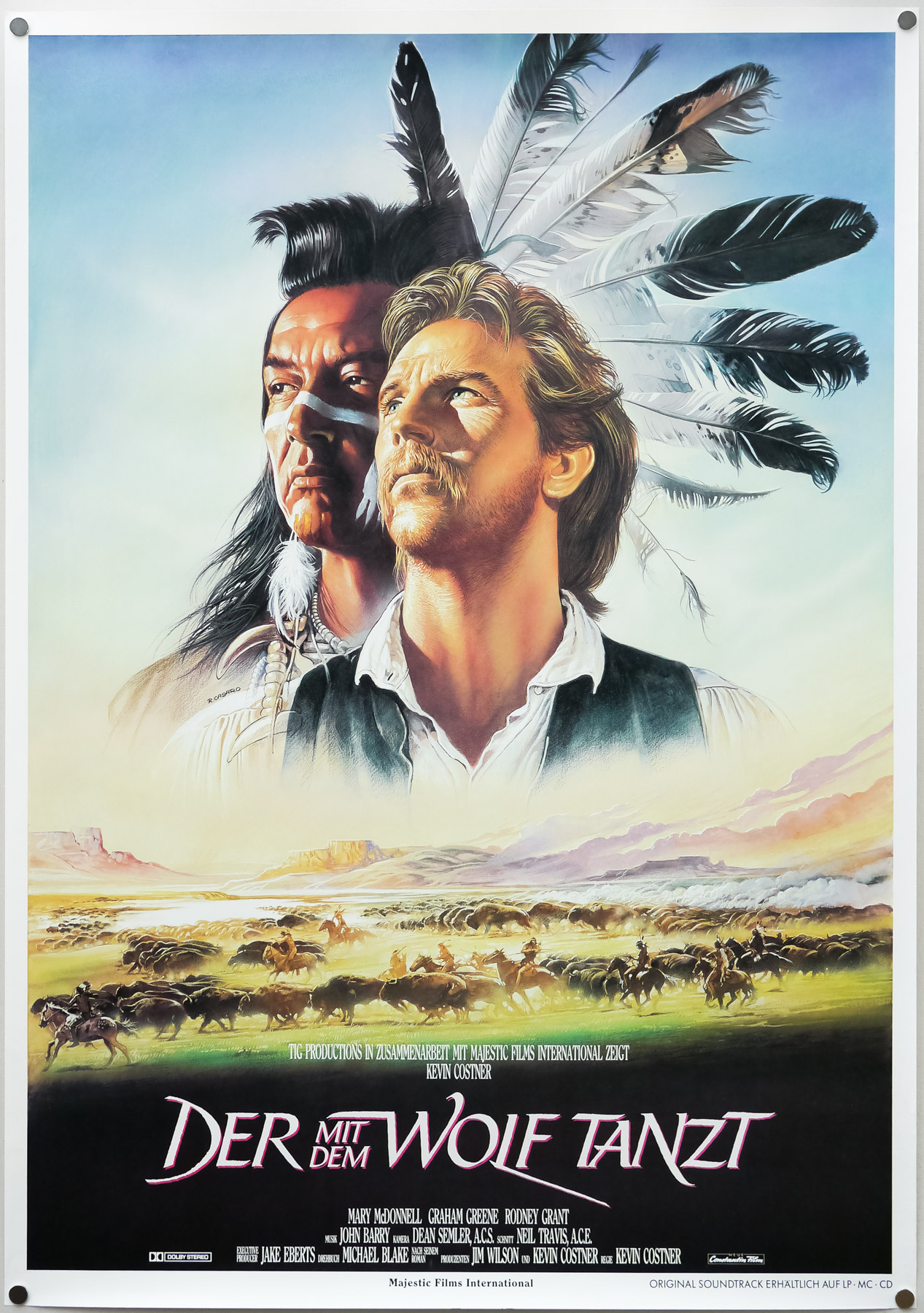
The German poster for Dances With Wolves, designed and painted by Renato Casaro, 1990
In the 1970s and 1980s did you have much competition in terms of other artists?
Well, as I mentioned earlier, most of the older artists had retired by the mid-1970s or were just not that much in demand anymore. I was taking on more and more work every month. There were some younger artists emerging at this time, like Enzo Sciotti, but I felt their work was very similar to mine. It was flattering, I suppose, and don’t forget I had copied the work of the artists that I had admired when I was younger too.
One thing that was good for me was that my artwork worked across the whole of Italy. Back in the 1960s and 70s there would be different distributors for the different regions, so Sicily might have one company releasing films there and they would be completely different to the company who released the same film in Rome. I often used to hear from these different companies that they were all really happy with the artwork I’d painted. It was confirmation for me that my work was being appreciated across the country and wasn’t just good for one area, or audience.
In Germany I would still often do two posters for the same film; one that was considered more sophisticated for the cities and one that would work better and might be more colourful and striking for the provincial cinemas. It was a good time for me, as you can imagine.
Did you meet Arnold Schwarzenegger when you worked on posters for his films?
Ah, yes, sure. We first met on the set of Conan in Almeria and it was strange because back then no one on the set knew who he was, just that he had this powerful body and a handsome face. Nobody working on the film had any idea how famous he would eventually become! He was a nice guy and I enjoyed working on the poster for the film. I took lots of photographs on the set whilst they were filming and John Milius, the director, was very helpful. I spent some time with him to understand the vision of the film.
Were you told what they wanted to see for the poster?
No, that was my vision again which was inspired by the work of Frank Frazetta. They might have suggested some ideas but I was given free reign to paint the image that ended up being used.
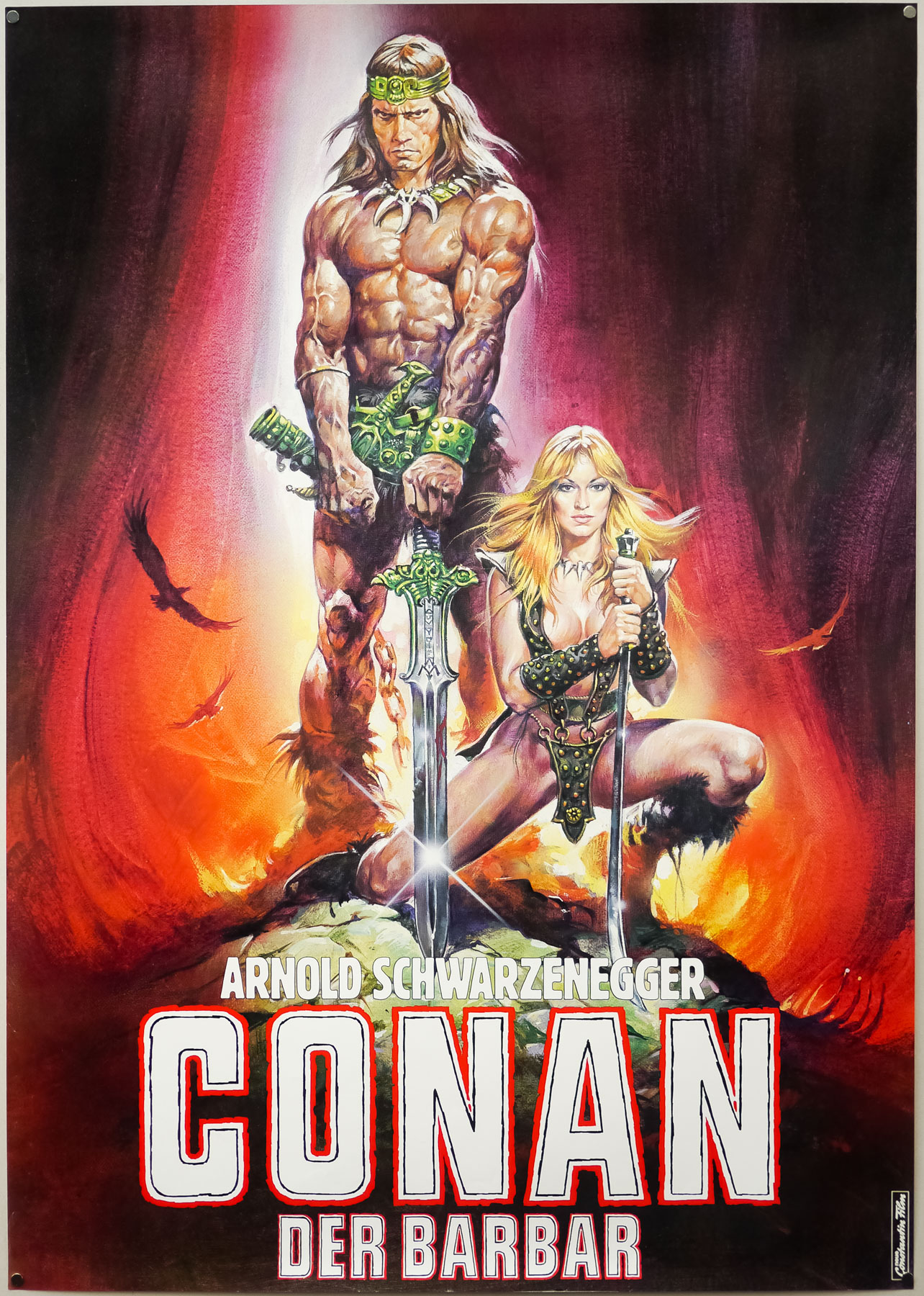
The German teaser poster for Conan the Barbarian, designed and painted by Renato Casaro, 1982. The German distributors asked Renato to adapt the poster slightly from his original artwork used on the American one sheet.
You changed your painting style several times during your working career?
Yes, I always wanted to try new techniques and I think that’s what helped me stay popular with many different producers and studios for a forty year career. When computers started to be used for artwork towards the end of the 1980s that’s when I decided that I should probably stop and retire on top of my game, as it were. I’m sure I could have done some good posters with the design software that was available, but I just felt that the moment had come to stop working on marketing for film.
The problem now is that many posters end up looking practically identical because they reuse similar layout ideas and colours. The worst thing is that the studio will often use the same image to sell the film around the world, without trying to create posters that suit one country better than another. I really despair when I see the state of film posters nowadays because they’re all so boring. There’s no imagination being used anymore and most of them look near identical with the big heads of the actors and maybe an explosion or two. I think they’re scared to try something different.
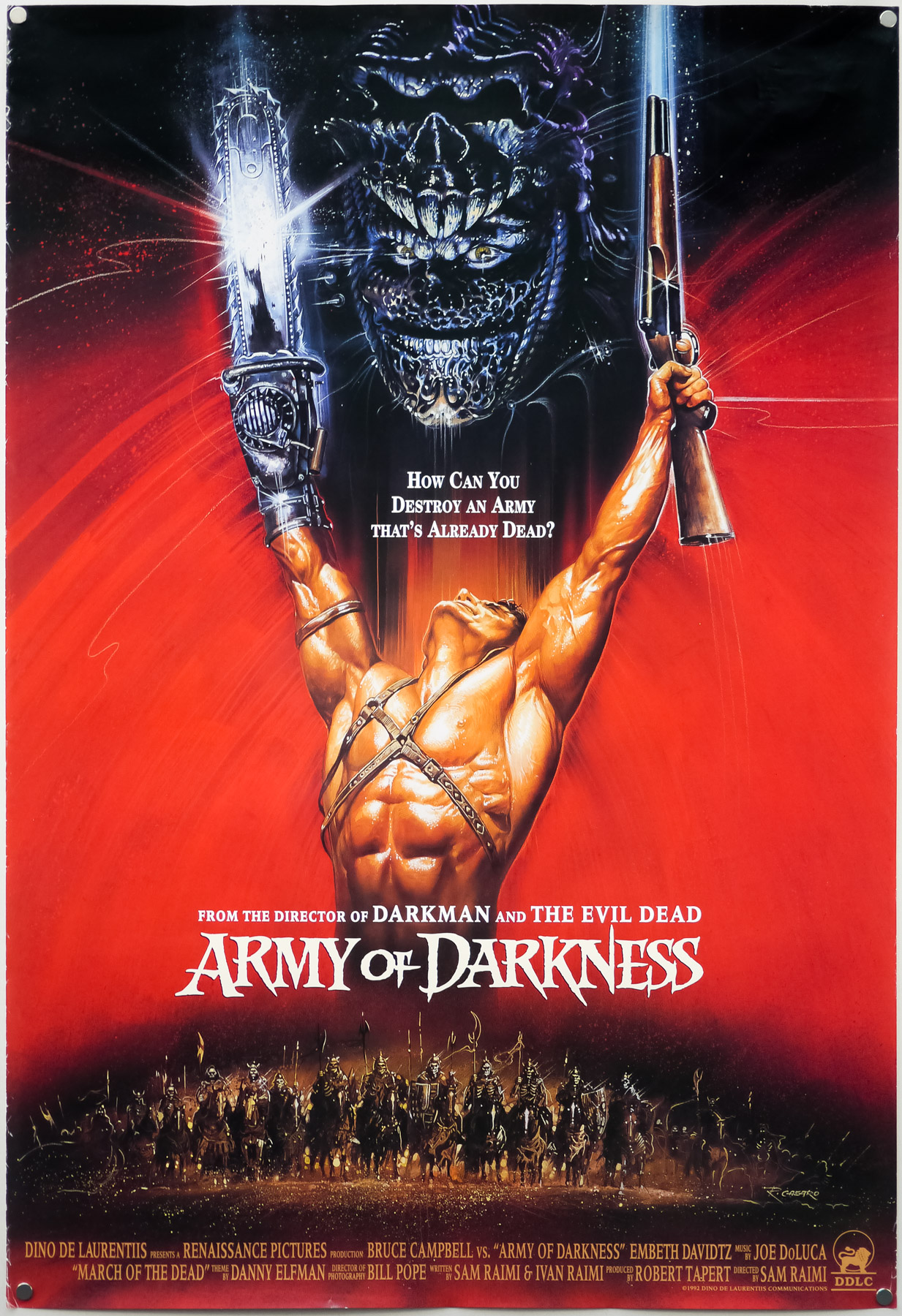
The international one sheet for Sam Raimi’s Army of Darkness, designed and painted by Renato Casaro (1992)
Was there a genre of film that you enjoyed painting posters for the most?
Not really, I liked working on all of them but of course I worked on many posters for action films, for sci-fi and for westerns. I suppose I was fortunate because I was versatile in that I was able to paint people just as well as animals and machines. My special talent is to paint movement, never static scenes. Some artists struggled with animals but were great at human portraits, or vice versa. Cesselon, for example, was incredibly good at painting people, but struggled when it came to horses [for westerns]. He just didn’t know how to paint them well, whereas that came easily for me after a few years of working.
One thing that I remember was painting the large format 24-sheets which were the giant billboards that would be all around the big cities. They’d be painted in my studio and then blown up to that gigantic size. It was always a thrill to see my work that big on the side of a building. I remember one crazy week where all of the billboards in one square in Rome had my artwork on them!
You also worked on posters for Dario Argento?
Yes, I did a couple of things for him but I never had any personal contact with the man himself, although I did meet his brother a few times as he was often the person you spoke to when working on posters for an Argento film. I enjoyed working on the poster for Opera, which is the image of the two eyes with pins in front of them. It’s obviously a scene in the film but it ended up making a pretty striking poster!
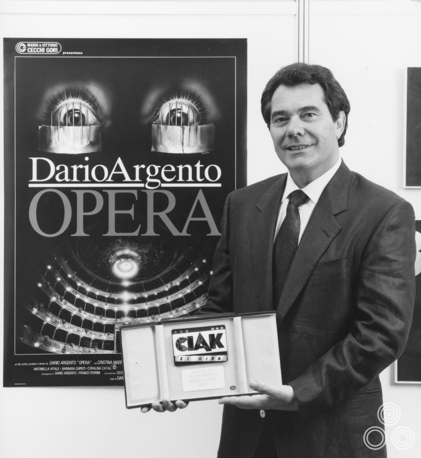
Renato Casaro stands proudly holding the Ciak D’Oro advertising award which he won for the Italian poster for Dario Argento’s Opera, 1987.
When you were working on the campaign for a film how did you deal with the different characters like the producers, actors and the director?
I usually tried not to speak to the actors too much as many of them didn’t really know much about the story of the film beyond their part in it so they weren’t much use to me whilst I was coming up with ideas for the concept art or the poster. It was usually best to speak to the director, as they were typically the ones that held the vision for the film, but often the producers were just as important to talk to, even if their motivation was often the profit that the film would hopefully make.
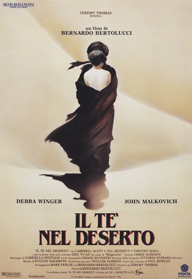
The Italian poster for The Sheltering Sky (1990), designed and painted by Renato Casaro.
I had a funny situation with the poster for Bertolucci’s film The Sheltering Sky where the agent for John Malkovich was insisting by contract that his client must not be depicted any lower or to the right of Debra Winger on the poster. You can see that I ended up painting the two figures in exactly the same spot but of course you don’t see the actors faces and that way I definitely wasn’t going to get into trouble! The artwork ended up being used around the world as well as for the cover of the book that the film was based on. I think Bertolucci himself had wanted to see a poster with both of the actors’ faces but the English producer was very happy, as I’d painted it.
I enjoyed working with Bertolucci and thought The Last Emperor was brilliant. It was a real thrill to work on the poster for that film and I remember that his brief to me was to design a poster that didn’t feature anything that was overtly political, including the bright red of the Communist party, which of course features heavily in the film. I did a few early sketches that featured the red star but it was decided that the final poster should just focus on the young emperor and steer clear of the politics. I was very proud to see that it was also later used in China.
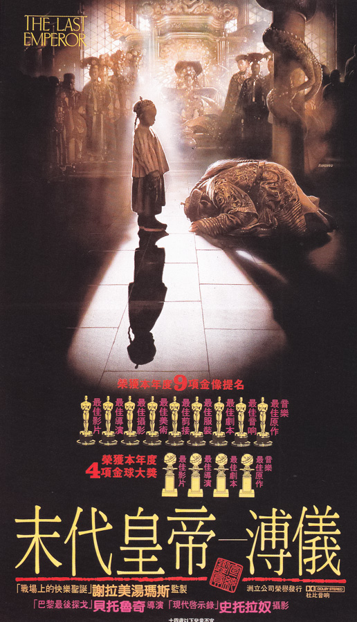
The Chinese poster for Bernardo Bertolucci’s The Last Emperor (1987), featuring artwork by Renato Casaro. The same artwork had originally appeared on the Italian poster.
Are there any other film poster artists that you admired whilst you were still working?
Yes, I really like the work of Drew Struzan and was always impressed by his designs. I also liked the posters that Bob Peak worked on and he was technically incredibly good. I remember his poster for Excalibur very well, which I thought was wonderful. The one he did for Apocalypse Now was simple but brilliant too.
Can you talk about your trips to Monument Valley in the States?
America for me was this great dream because I spent most of my childhood watching all of these Hollywood films with actors like John Wayne and imagining what it must have been like to be in the Wild West, riding across the country on horseback. One day I decided that it was time to visit the sites where films like The Searchers had been filmed, so I flew out to Arizona and spent two weeks riding around all of these incredible places in Monument Valley and around. It was a magical trip and the only thing that was missing was a Colt revolver on my hip so I could feel a little bit like John Wayne!
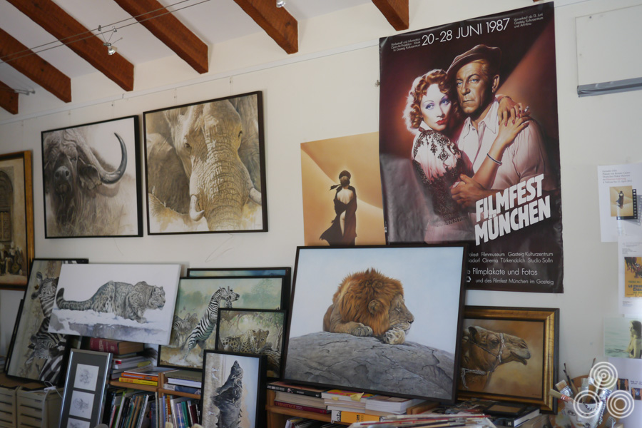
One wall of Renato Casaro’s home studio in Spain showing several of his wildlife paintings.
You’ve also been on several safari trips to Africa and painted the animals out there?
Yes, this is another great passion of mine. In my opinion the animals are like a kind of living film because they have these incredible faces with such varied expressions and I just love watching them move around in the wild. They’re so much more interesting to me than a beautiful landscape that you might see on another type of sightseeing holiday. Animals are like actors to me and it’s a joy to paint them.
When it came to retiring from the poster business what was it that made you decide that you’d had enough?
The last poster I did was for the film Asterix and Obelix vs Caesar (1999). I just had this feeling that it was time to stop. I could see the computer coming in as a tool that was being used by more and more studios and distributors to market their projects and I decided that it wasn’t a future I was interested in being part of. In my mind creating something on the computer just isn’t the same as creating an original piece of artwork with a paintbrush.
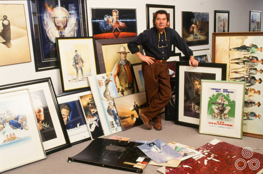
Renato Casaro stands with a large selection of his own work, framed and ready to display as part of an exhibition, circa 1998
Is there one poster that you’re most proud of?
Not really, I’m pleased with how different many of my posters are, both in terms of the style with which I painted them and for the layouts and concepts I used. There are posters like the one I did for Conan that really bring back good memories when I look at them or that were a really important milestone in my career, but there are many other posters I’m also proud to have worked on.
Is there anything you wish you’d done differently during your career or that you wish you’d tried to do?
I can say that I’m content. My life has been like a film! I’ve had a very good time and I enjoyed more or less every moment. Maybe I worked a bit too much but I have lived my childhood dreams and I made sure I enjoyed myself!
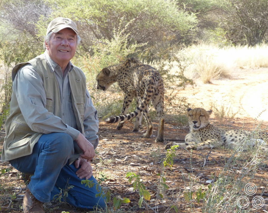
Renato Casaro with a pair of Cheetahs whilst on safari in Africa.
Do you miss living in Rome?
I have many friends there and I love to visit them. I also remember hearing that the studios and distributors missed me after I’d retired, which was nice to know. The thing for me is that the city is not the one I remember from when I had Studio Casaro and it’s no longer the time of ‘La Dolce Vita’. It wouldn’t be the same if I moved back there so I prefer to visit occasionally and keep the good memories in my mind. Everything has it’s time.
Renato Casaro stands with the actor Eli Wallach whom the artist depicted on the 1969 Italian re-release poster for The Good, The Bad and The Ugly, which can be seen behind them.
The place that means the most to me is Treviso, and that’s where I love to return to when I visit Italy. My brother is there and some other relatives, plus I bought the house that I’d grown up in and where my parents lived, so I always have a place to stay there. Maybe one day I’ll return and stay there, who knows!
Thanks so much for your time Renato, I really appreciate it.
You’ve very welcome, thank you.
——————————————————
Check out Renato’s official website which features hundreds of images of his work, including Painted Movies, his more recent wildlife work and both film poster concepts (which are for sale) and final painted artwork.
To see the other posters I’ve collected that were designed and painted by Renato click here.
Emovieposter.com’s auction history section features many images of Renato’s work, including plenty of his earlier posters.
The Greatest Painter of all Time! I love his Artworks since i was a Kid. He inspired me to paint for myself and will never stop painting!
you find my artworks on www.facebook.com/theportraitpainter
Thank You Mr. Casaro !
My Best Regards Manuel Scholz
Dear Renato
I have the two prints of Lady in the Desert. I would love to tell you the story of how I came by them as they are deeply meaningful in my life. I would love to chat to you about them. Do you have an email address. I live in Australian and my email address is: [email protected]
I so much appreciate your works.
Blessings
Josephine
You’re welcome and I’m glad you all liked it. He’s definitely one of the best film poster artists of all time and it was a privilege to shake his hand and spend an afternoon with him.
Thank you for this wonderful interview. Casaro’s artworks had always a human touch. They never looked “cold”. And many posters with sleeping and lying actors (especially the Hill/Spencer and Celentano posters with a white background) gave comfort to a lot of moviegoers saying: “Take life easy. Enjoy it.”
Excellent interview, so many wonderful pieces of great art from a master of his trade.
Fantatsic Interview Eddie. Casaro’s my personal favourite and it’s so great to get an in depth interview like this in English. I’ve been trying to compile a complete catalogue of his posters for a year now and have over 1600 at last count but of course it increases every week as I discover more. I can fully appreciate how he must have worked 12 hours a day, 7 days a week.