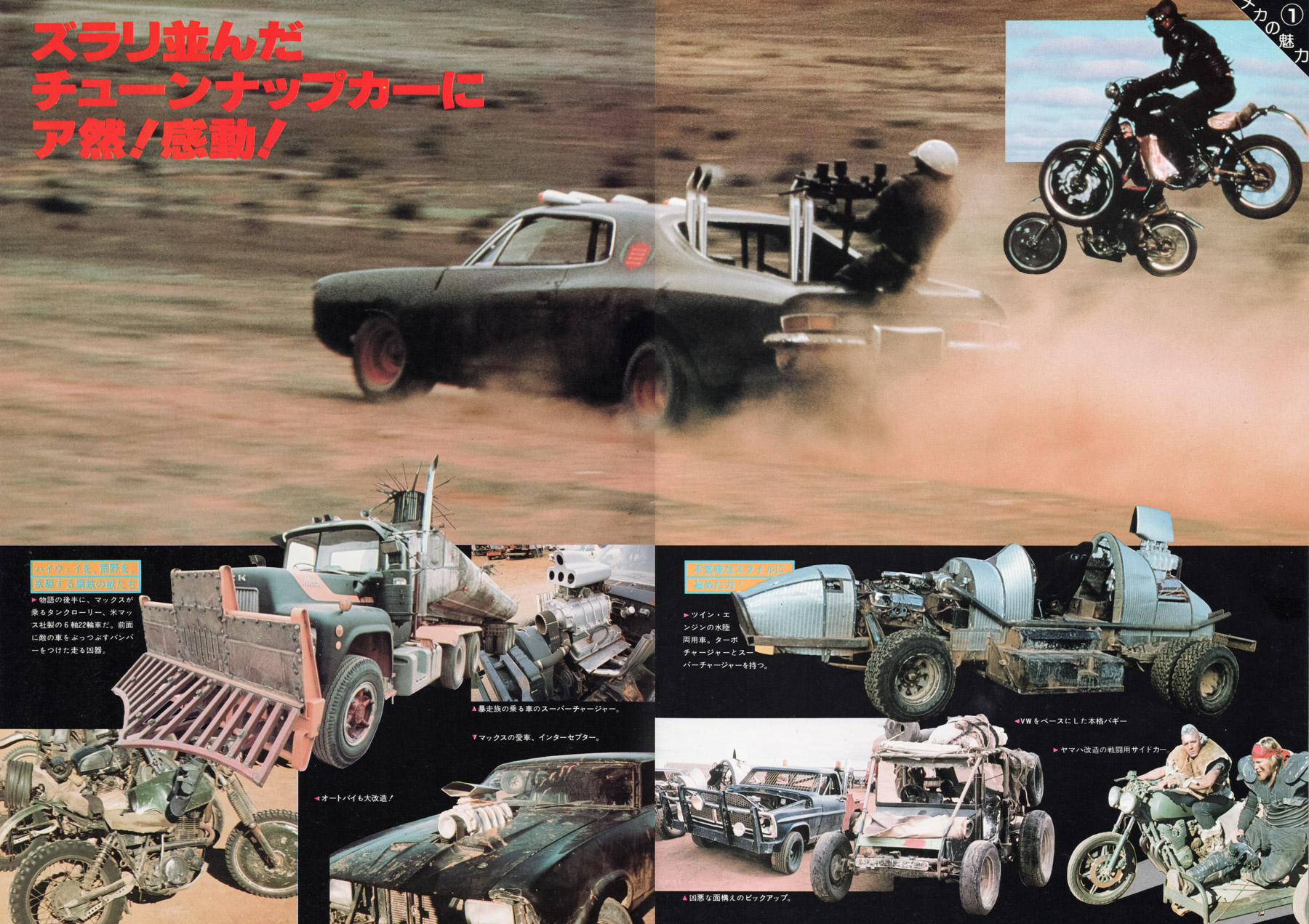
Poster details
Select to view
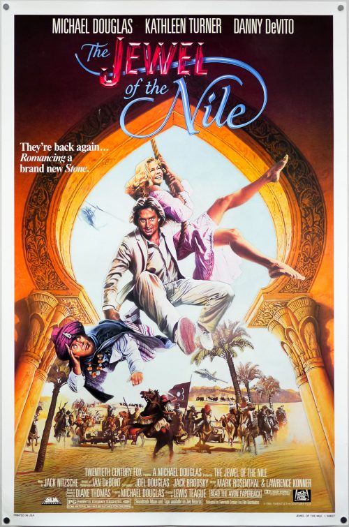
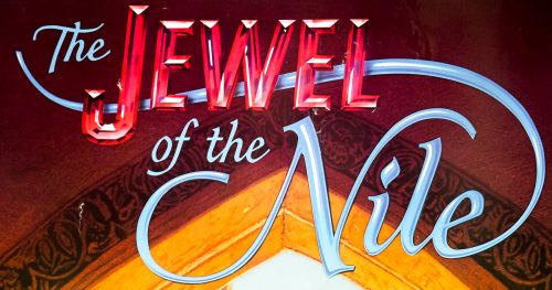
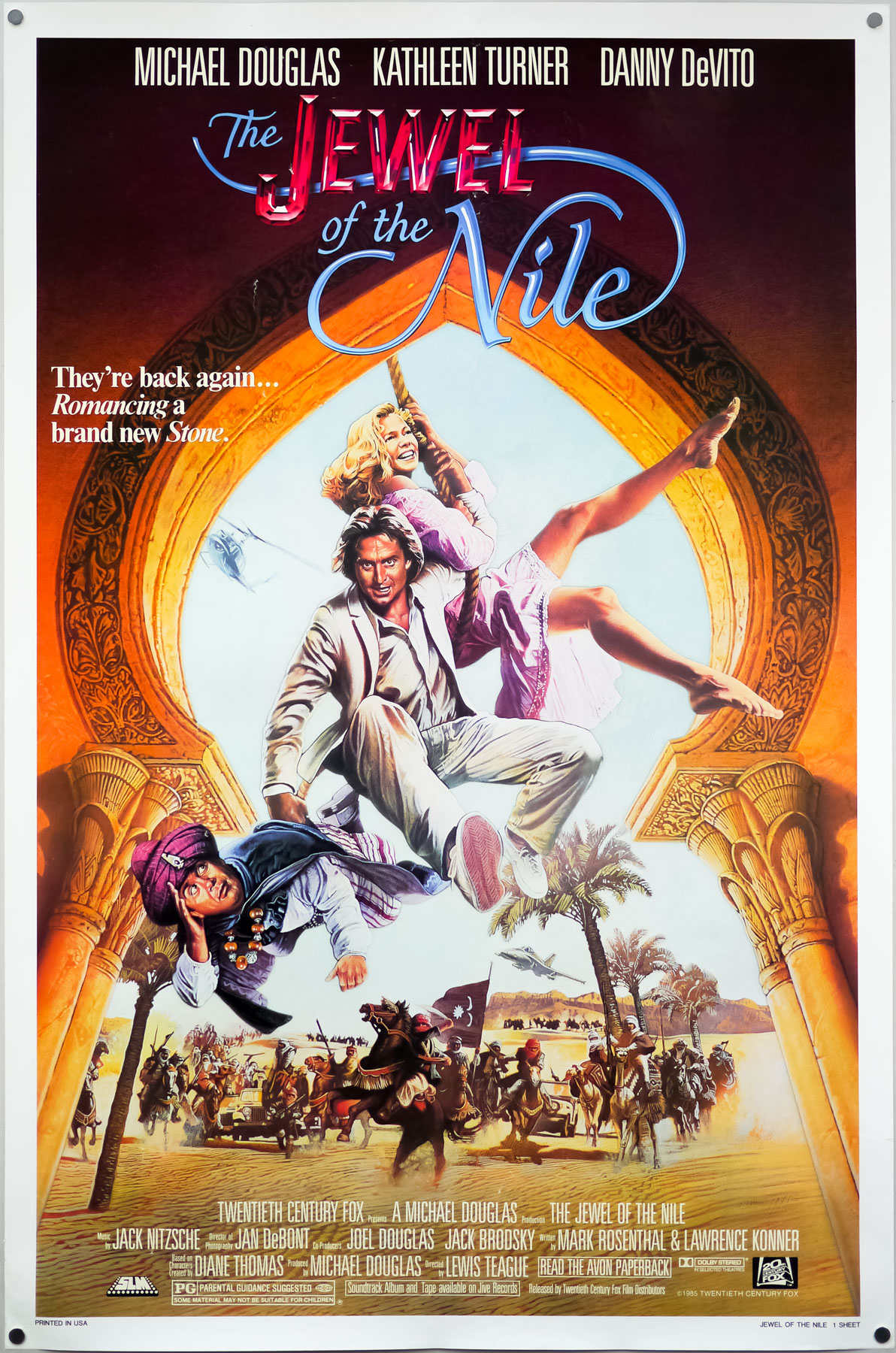
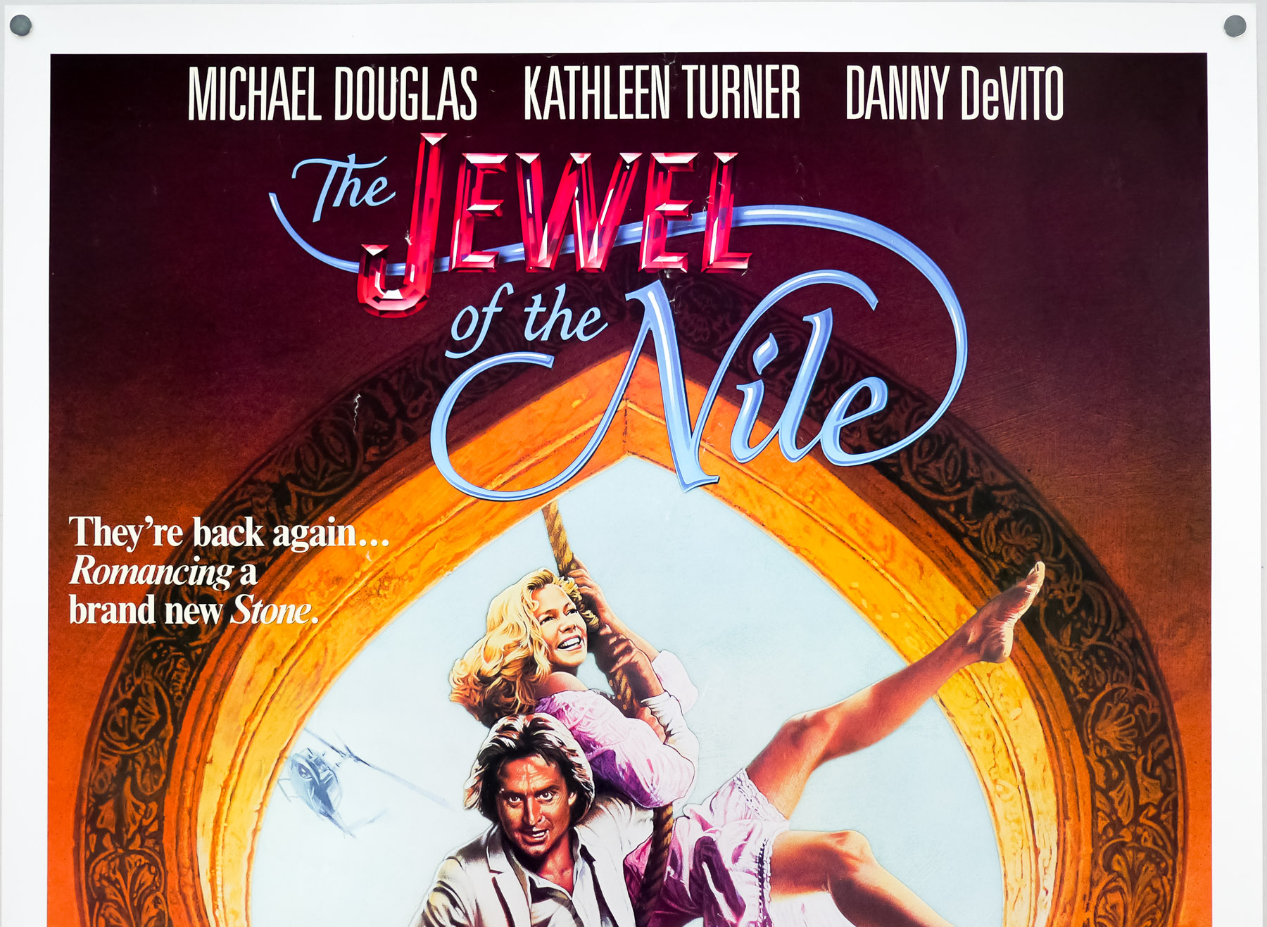
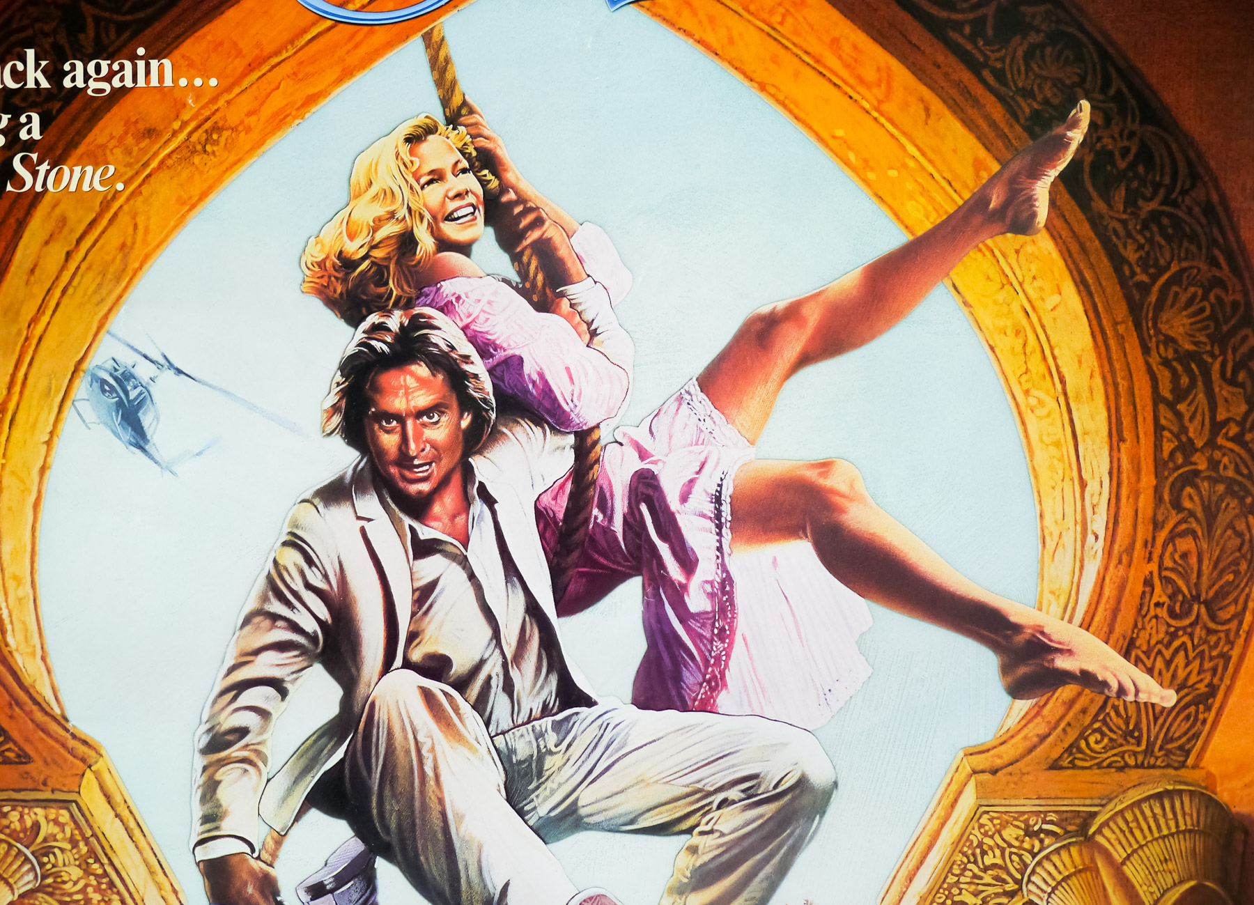
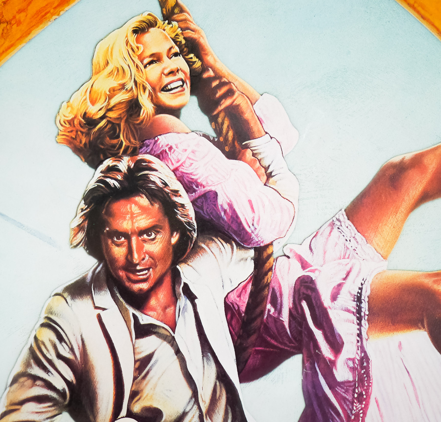
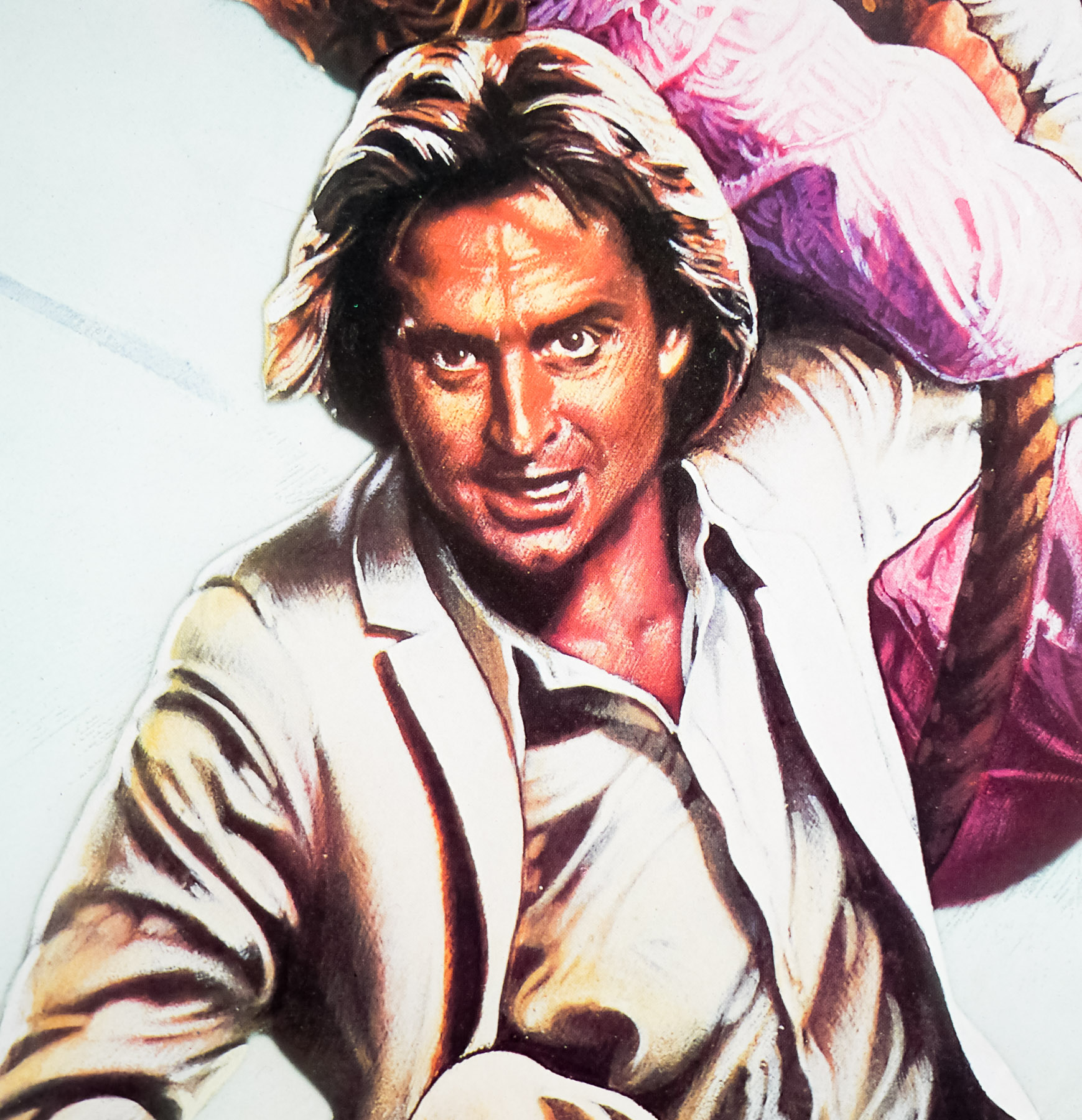
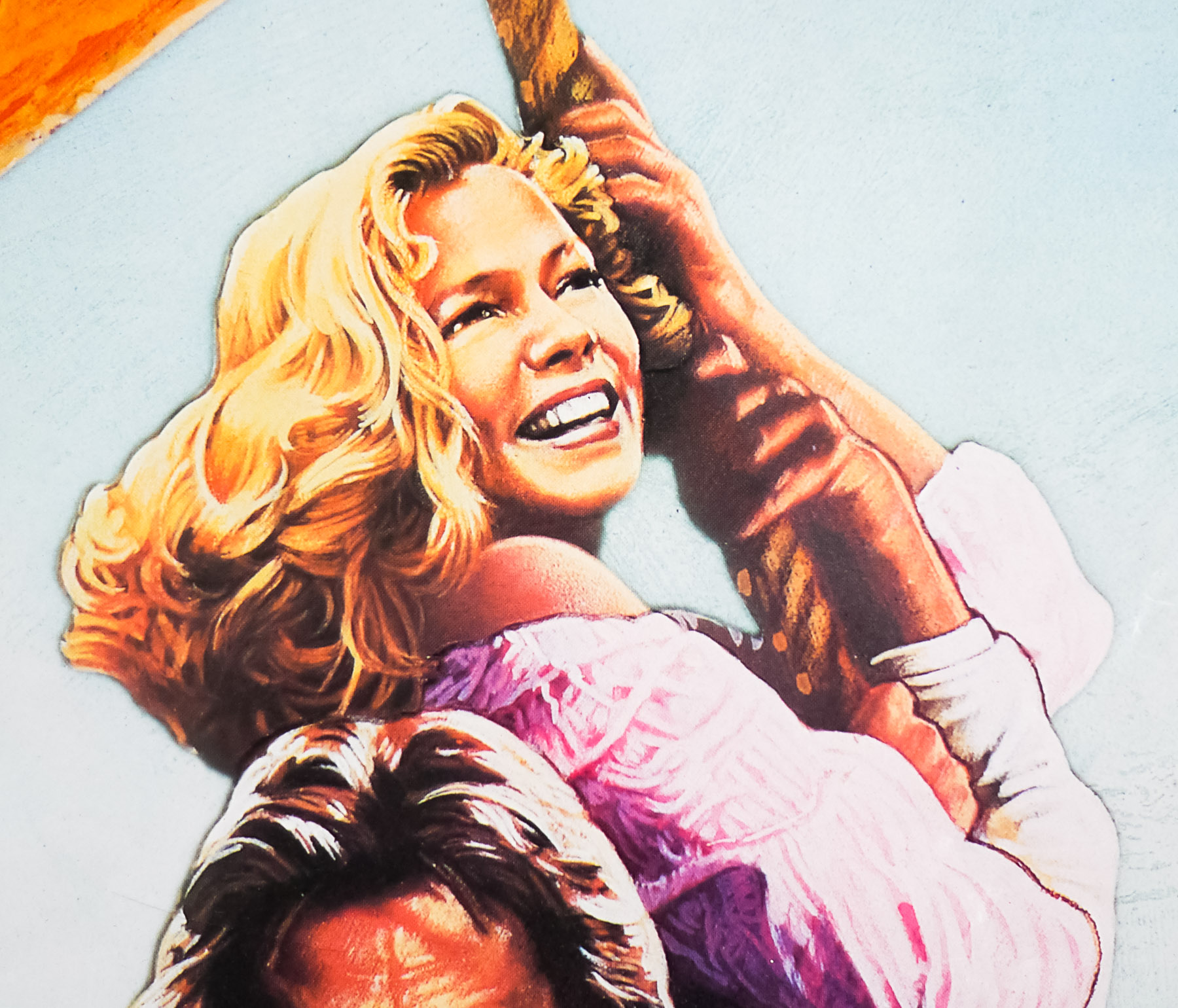
Colourful artwork, and a nicely stylised logo, feature on this one sheet for the 1985 action-adventure sequel, The Jewel of the Nile. It followed only a year after the original film, Romancing the Stone, which was directed by Robert Zemeckis and had been a worldwide box-office hit, launching the career of star Kathleen Turner and cementing Michael Douglas‘ leading-man credentials. The sequel was apparently rushed into production, with both leads contractually tied to making it, but Zemeckis declined to return to the director’s chair. Douglas and Turner were apparently both unsure about returning, although the former was onboard as producer and the latter threatened to leave the project until Douglas intervened and had the script rewritten to assuage her worries. Danny DeVito also reprises his comedic role from the first film.
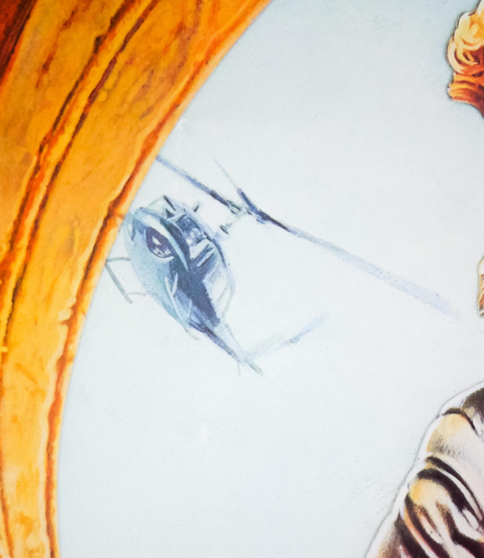
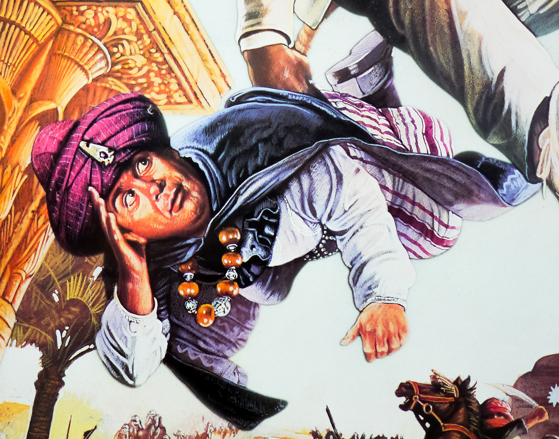
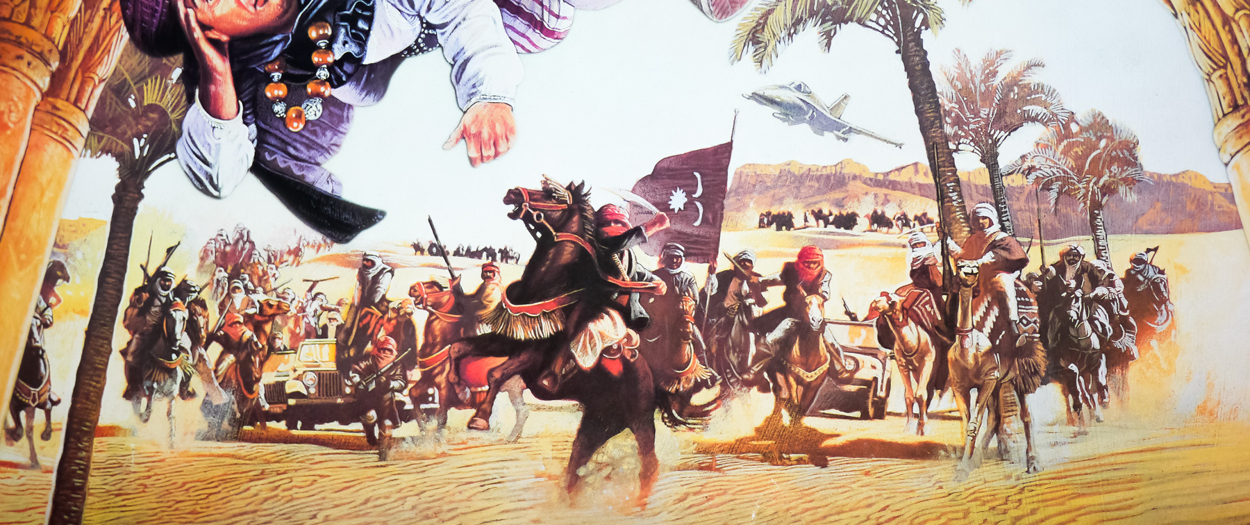
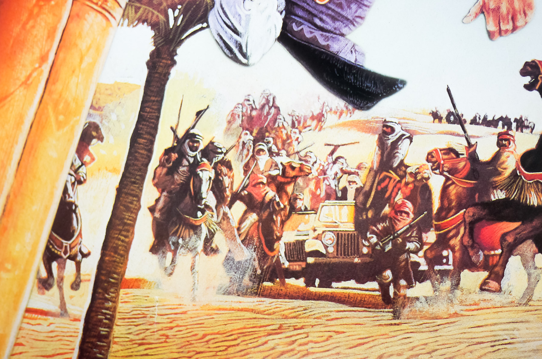
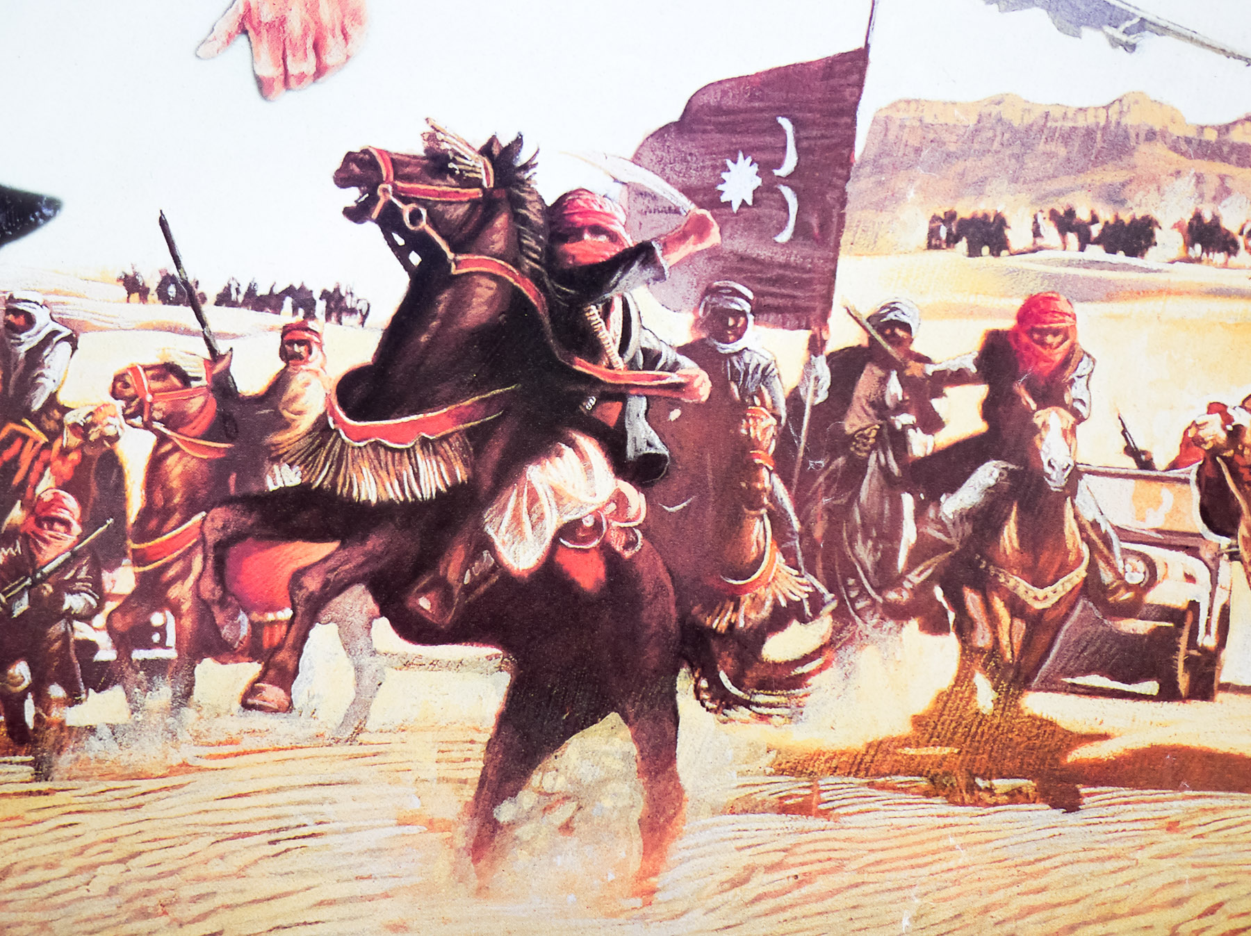
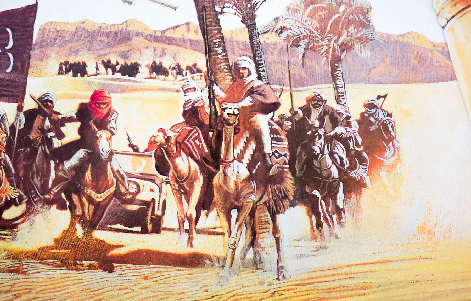
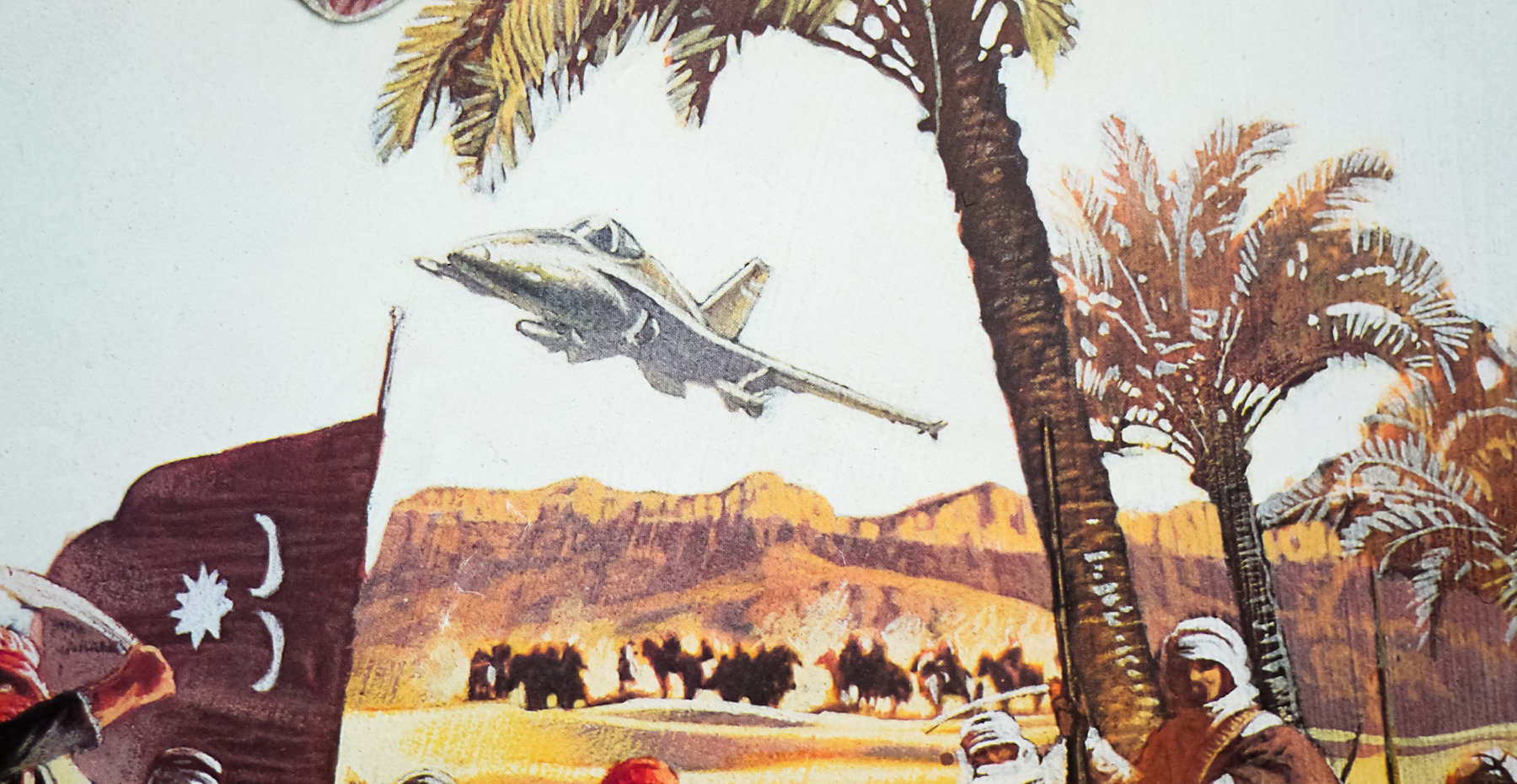
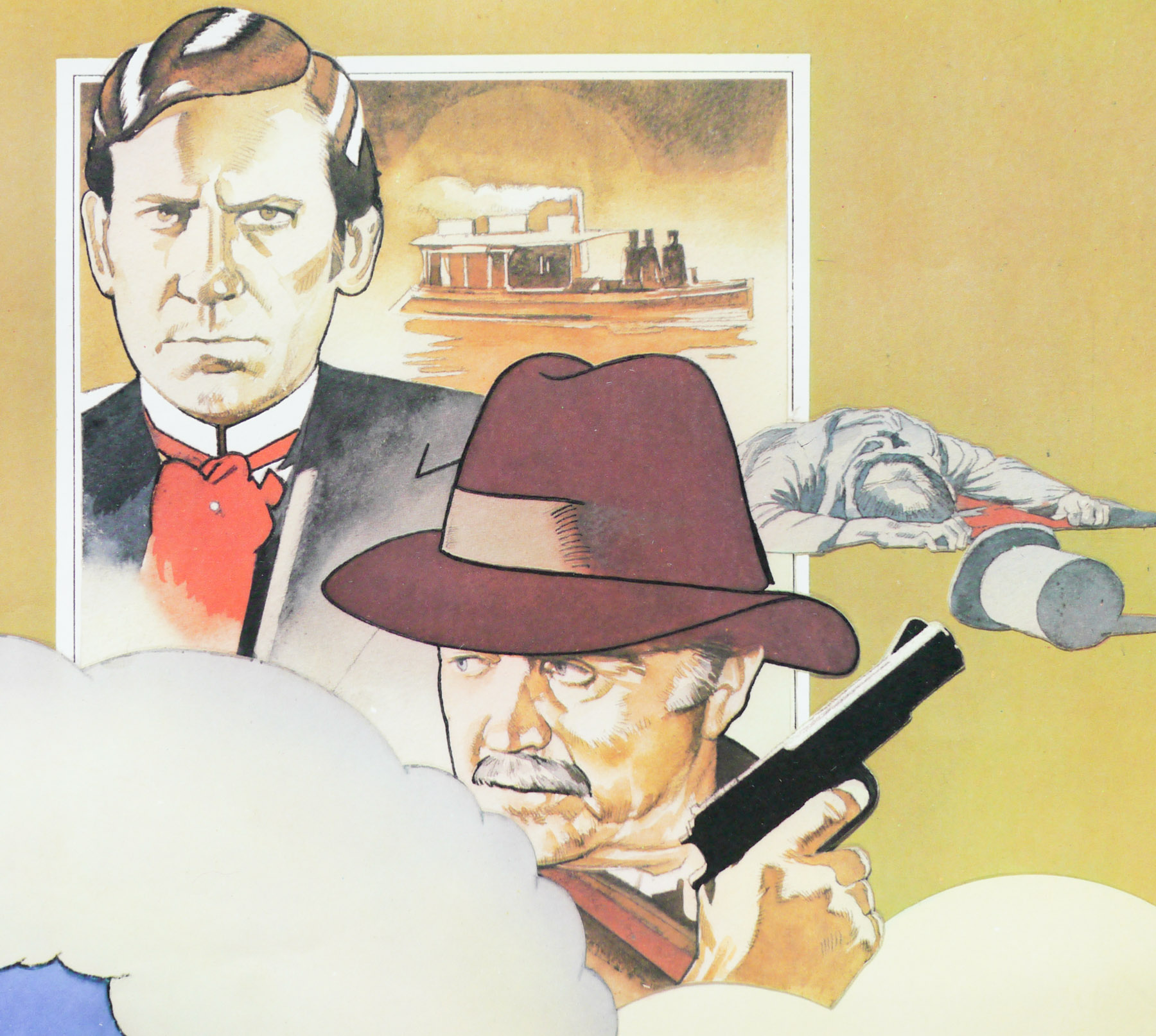
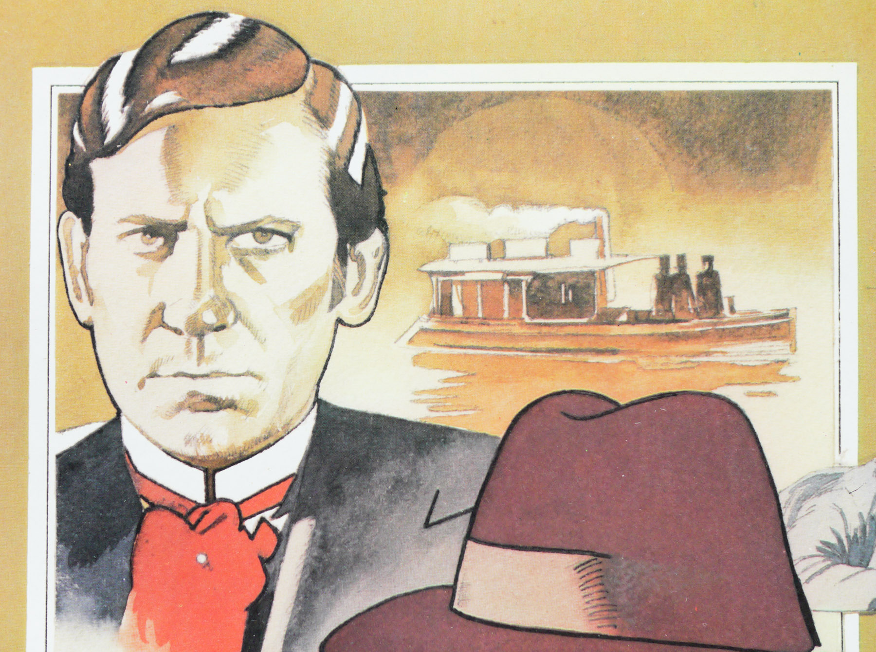
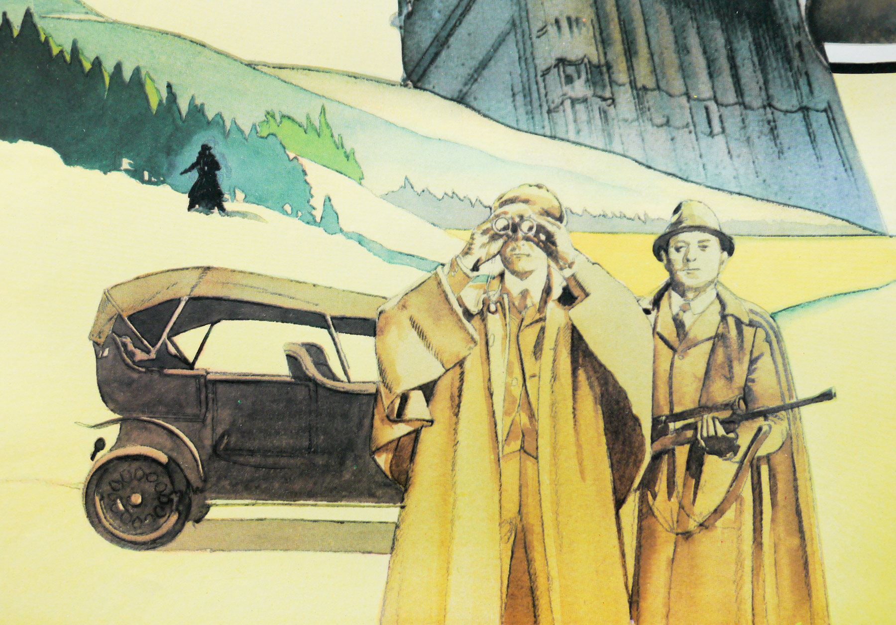
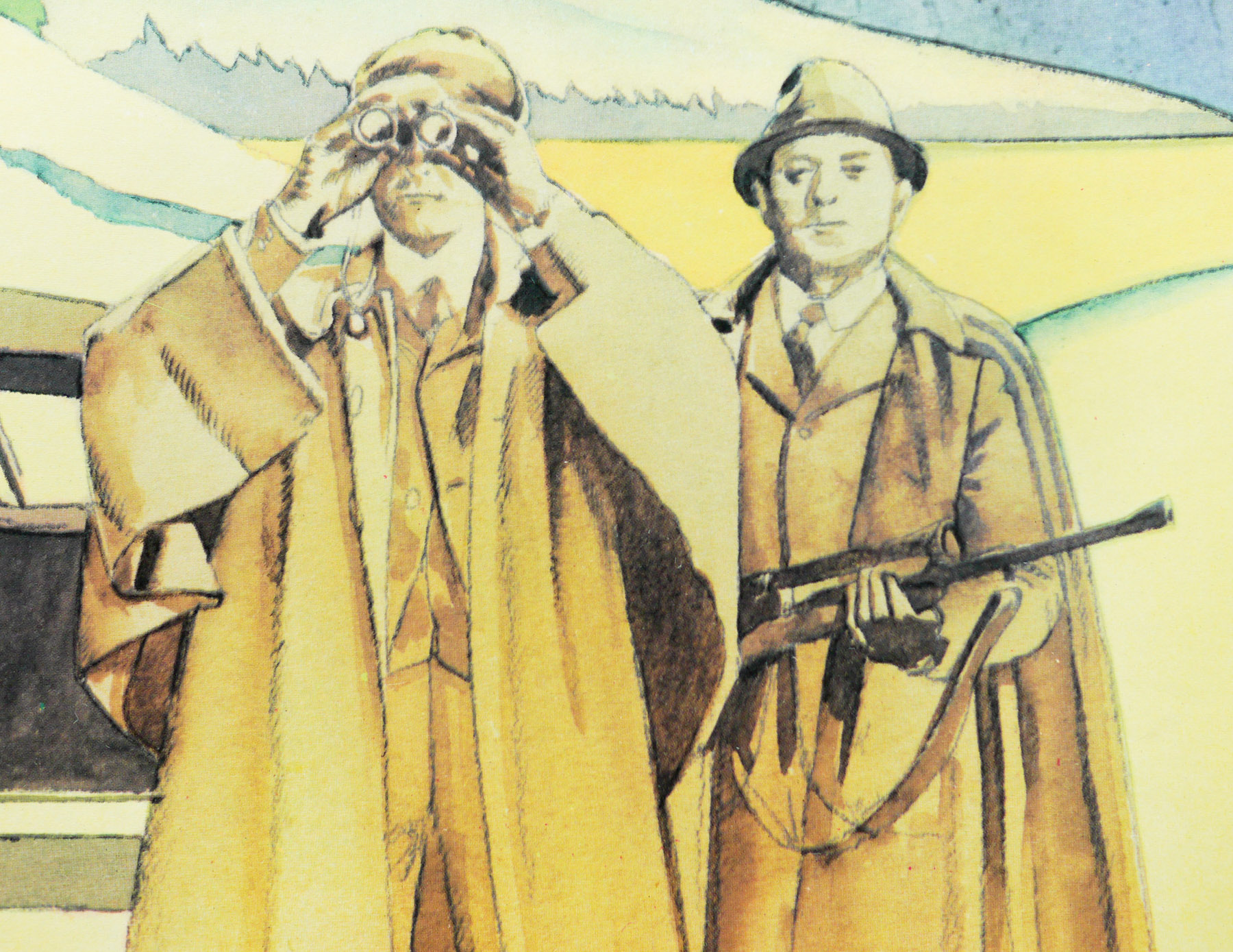
Jewel was helmed by Lewis Teague, who is perhaps best known for a pair of animal-themed Stephen King adaptations; Cujo (1983) and Cat’s Eye (also 1985). Reports during filming painted a poor picture of the director who was apparently struggling with the location shooting and action scenes. The plot finds ex-smuggler Jack (Douglas) and novelist Joan (Turner) onboard their yacht, moored off a sleepy town in the South of France. The love affair that started during ‘Romancing…’ is growing stale as Joan finds the easy life too boring. At a book signing event she meets Omar (Spiros Focás), a charming Arab ruler, and is invited to travel with him back to his country to write his biography. Despite Jack’s protestations, she takes up the offer.
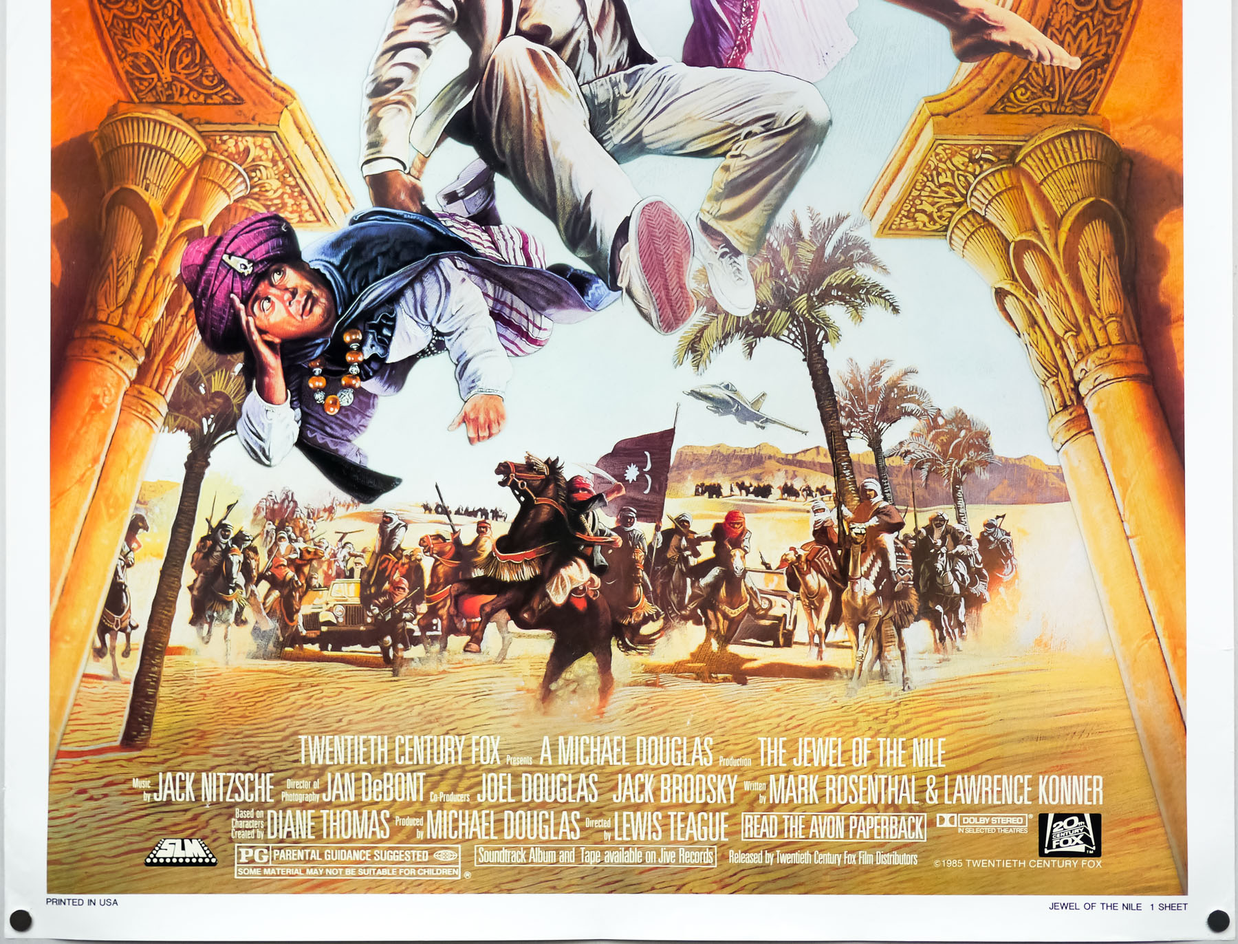
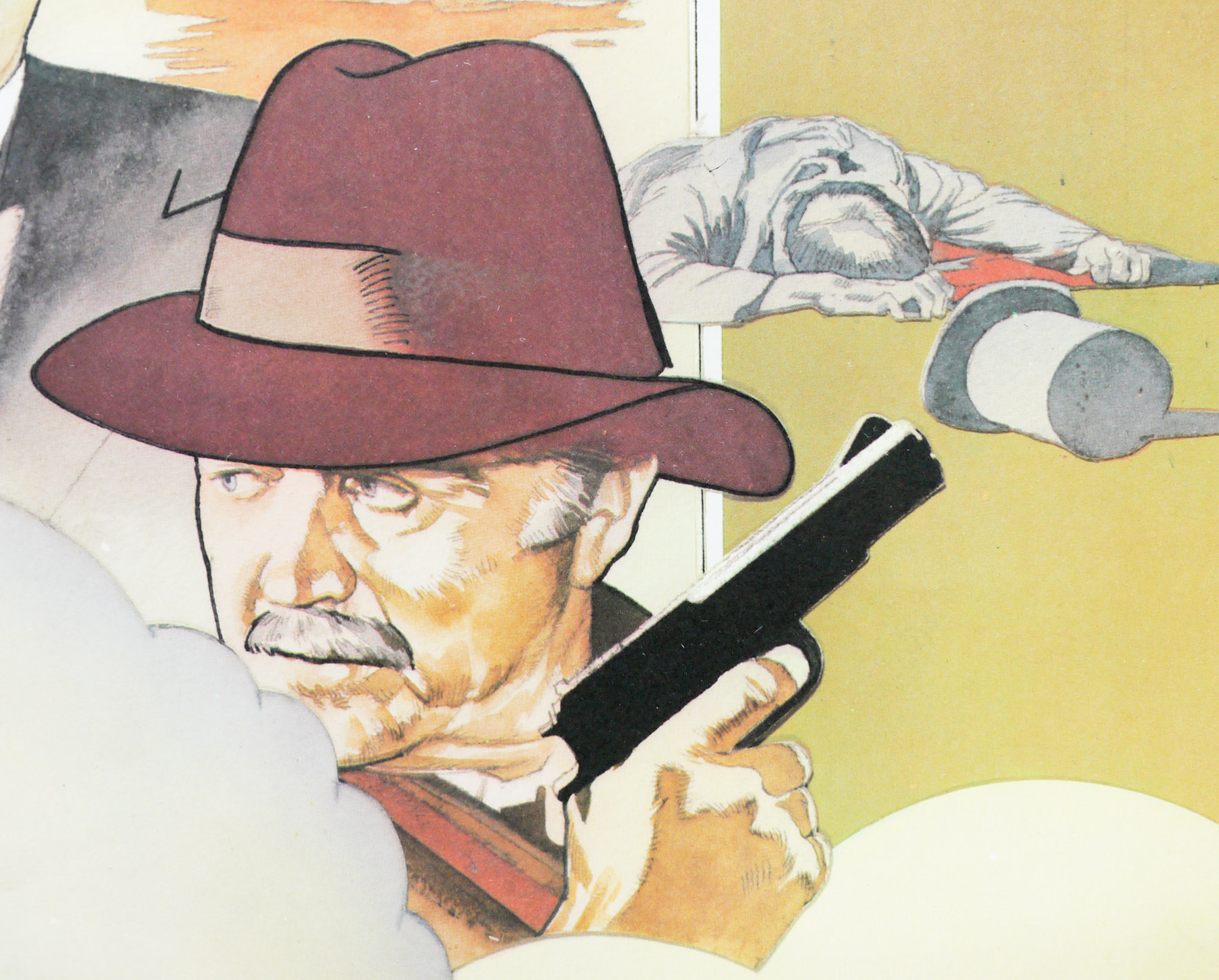
Soon after Joan leaves Jack meets up with Ralph (DeVito), the swindler who is still after the titular stone from the first film. He’s then visited by another arab called Tarak (Paul David Magid) who warns Jack that Omar is not the benevolent ruler he claimed to Joan and that she’s in danger. He also informs him that Omar is in possession of “The Jewel of the Nile”. As Tarak finishes his explanation the yacht mysteriously explodes and so Jack and Ralph set off to track down Joan and see if they can’t get their hands on the “Jewel”. Despite less than favourable critical notices, the film was another box-office success, earning even more than the original film.
With thanks to readers of the site, the artist of the poster has been identified as Robert Rodriguez, an American artist not to be confused with the Texas-based film director of the same name. I own at least two other posters that were painted by Rodriguez, the US one sheet for the Jack Nicholson-starring Two Jakes (1990) and the US one sheet for a 1994 re-release of The Day The Earth Stood Still (1951)
His own website, which can be seen here, features a biography which I’ll reproduce in its entirety in case the site ever disappears:
Chances are you’ve been having breakfast with Robert Rodriguez for years and never knew it….If you’ve ever fixed yourself a bowl of Quaker Oatmeal, his painting of the old Quaker has probably been watching over you as you ate.
After graduating from Chouinard Art Institute (now CalArts), he embarked on a career as an illustrator, picking up awards and medals along the way. From being a Grammy Award finalist for best album cover art, to gold and silver medals, to receiving a platinum award for his “Cowboys of the Silver Screen” postage stamps this last year. From doing Broadway theater posters for plays like, “Anything Goes”, “Nice Work If You Can Get It”, “Sister Act” and “Lend Me A Tenor”, to a SuperBowl poster, a half dozen Ringling Bros. Circus posters, several movie posters, and creating the poster art over the last four years for the Tales of the Cocktail event held in New Orleans every summer, he is finally finding time to do some gallery work, exploring new directions and larger paintings.