An interview with Renato Casaro

06.03.14

There are few film poster artists as prolific as Italian-born Renato Casaro whose work featured on thousands of posters advertising films around the globe for over 40 years. From his beginnings as a cinema-obsessed youth in Treviso, northern Italy, Renato forged a career that saw him join the famous Studio Favalli in Rome aged 19 before becoming a freelance artist and designer just over a year later. By the time of his retirement at the end of the millennium he had worked on memorable posters for some of the biggest films of the past 50 years whilst forming close friendships with the likes of Dino De Laurentiis, Sergio Leone and Bernardo Bertolucci. For many years Renato was the go-to artist for both Italian and German distributors wanting to release their films with a striking poster design.
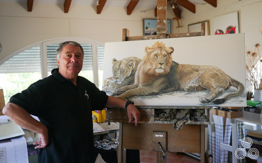
Renato Casaro stands next to his latest wildlife painting inside his home studio near Marbella, Spain. Photo taken in June 2013.

Renato Casaro stands next to his latest wildlife painting inside his home studio near Marbella, Spain. Photo taken in June 2013.

Unusually, especially in comparison to other film poster artists, Renato has retained and carefully archived almost all of the original sketches and artwork for his posters dating back to the 1960s, with only some of his very earliest work no longer surviving. In the summer of 2013 I was privileged to be able to meet Renato at his home near the Spanish town of Marbella and spend an afternoon discussing his life and career. I was also granted a brief but memorable look at the archive of his work and some photos are included below.

The following article contains many images of Renato’s work with a larger focus on the film posters he worked on during the 1970s and 1980s since this is the era of his work that is found in the Film on Paper collection and means the most to me personally. However, it’s important to stress that the images displayed here are just the tip of the iceberg and I encourage you to follow the links displayed at the end of the article to see many more of Renato’s great posters.
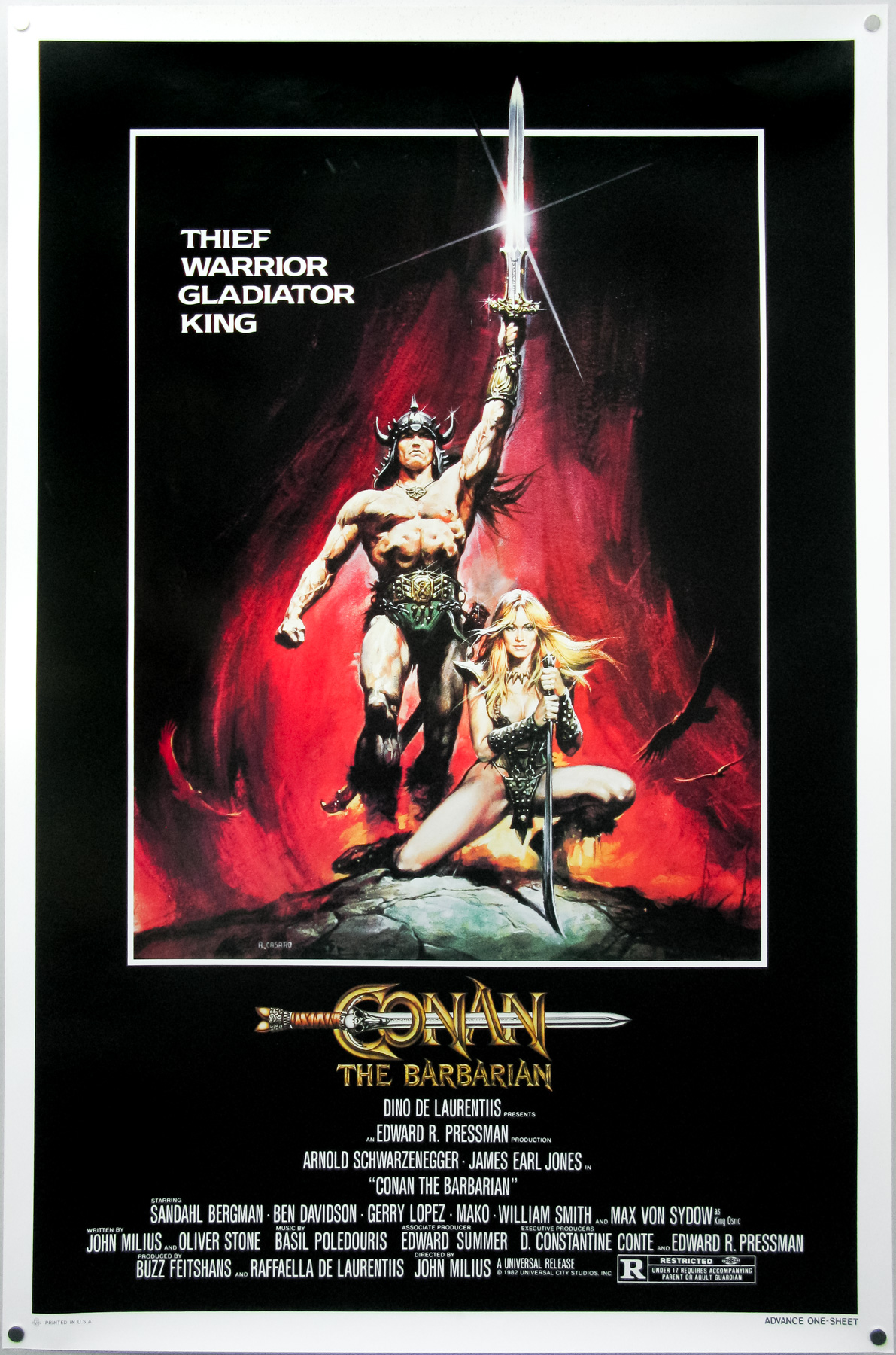
The American one sheet for Conan the Barbarian, painted by Renato Casaro in 1982

The American one sheet for Conan the Barbarian, painted by Renato Casaro in 1982 after the artist made a memorable visit to the film’s Almeria set. The artwork was used around the world to promote the film and is arguably Renato’s most famous work.

Renato, thanks for welcoming me here. I thought we could start with your early life and you were born in 1935?
Yes, that’s correct. I was born in Treviso, Northern Italy.

Can you tell me about your childhood?
I was lucky because I went to a school near Treviso that was really respected for the way it taught the pupils about art and design. I had a teacher that encouraged me and helped me to understand how to draw and paint. I remember that I had a notebook that I would carry with me everywhere and I would continue to draw sketches and caricatures of other students and teachers, even when I wasn’t in art class. My mother used to get annoyed because I’d be drawing in books that were meant for other subjects!

Did your mother and father have an artistic background?
No, there were no members of my immediate family who were artists and I don’t really know of any relatives who were particularly skilled either.

What about cinema? Was that a passion from a very early age?
Oh, absolutely! I was at the cinema to see a film almost every day. As well as enjoying the films themselves, I fell immediately in love with the posters that were displayed when a new film was showing. I used to go by the cinema every day to see if they were changing the posters and when they were I would ask if I could take them home. I was usually in luck and would run home with the poster and go into my bedroom to study it before attempting to paint a copy of it. I always did this because it helped me to understand how the artist had achieved the finished result.

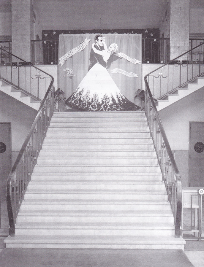
The central staircase of Treviso's Cinema Garibaldi in the 1950s.

The central staircase of Treviso’s Cinema Garibaldi in the 1950s.

I repeated this over and over with many different posters and I guess that’s how I taught myself various techniques that would later serve me well for my career as an illustrator. There were no colleges or courses that specifically taught illustration around Treviso so it was the best way for me to learn. My art teachers were good but they weren’t really interested in teaching us commercial illustration skills like those I’d need if I were to become a professional.

Some of the posters were so incredibly well painted and, try as I might, I just couldn’t emulate the way that the artist had done it. It was like a mystery to me how they had achieved it and I was hungry to understand. I realised that if I was to learn more I would have to leave Treviso and go to Rome.

Did you know the names of the artists at that time?
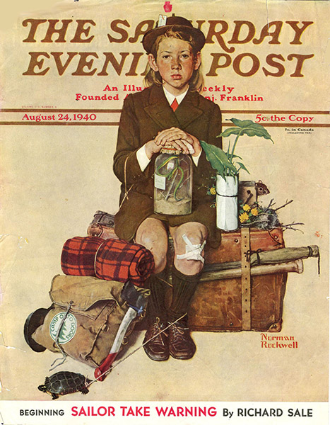
Yes, most of the posters had signatures on them or credits in the bottom corner so I began to learn the styles of the different artists, like Angelo Cesselon and Averado Ciriello. For me, however, the best in the world at that time was the American artist Norman Rockwell – I just thought he was the master!

Every week I used to go to have a look at the new issue of The Saturday Evening Post that was imported from the States by a newsagent in Treviso. Rockwell’s artwork would be on the cover or inside the magazine illustrating different scenarios. Of course I tried and tried to capture his wonderful images, but it was not easy. Don’t get me wrong, I did really like many of the Italian artists but for me nobody could match Rockwell.

The cover of The Saturday Evening Post, August 24 1940, which was illustrated by Norman Rockwell.

The cover of The Saturday Evening Post, August 24 1940, which was illustrated by Norman Rockwell.

What was life like for you during the Second World War?
It was not too bad because I was so young at the time and my family and I lived in a small village called Sant’Antonino that was in the countryside outside Treviso, so we didn’t have to worry too much about the bombing that was hitting the city. Because we were in the country we also had no worries about food since there was plenty of space to grow vegetables and we had livestock and chickens too. When the war finished it was really easy for me to return to studying, so I felt very lucky.

A few years before the war started I had gone with my parents to Libya to live in Benghazi because my father was a shipbuilder and he had been offered a job there working to build huge boats. We returned to Sant’Antonino when I was about six years old.

What did you do after you finished school?
Well, thanks to me having been constantly sketching and painting since a young age, both in school and at home, I had become pretty good at technical drawing – the kind of detailed images that were used by engineers as a basis to build machines and vehicles. My father had recognised that I had a talent for it and had helped me to nurture the skill with the thought that I would join him at the place where he worked and help to design ships.

It could have been a good career possibility for me as I might have ended up working for one of the car manufacturers like Ferrari or somewhere like that. The problem was that I was still too obsessed with film and the idea that I might have a career as a poster artist. My parents were very keen that I at least try working in what they considered to be a ‘normal’ career first so I got a job as a logo and type designer at a company called Longo & Zoppelli in Treviso. They handled the publicity for many companies all over the Veneto region, including for things like food and drink companies.
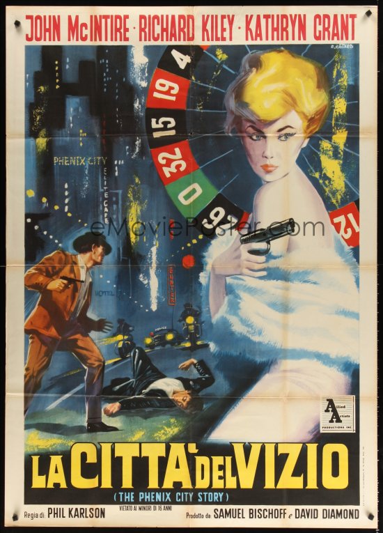
The Italian one panel (2-fogli) poster for La Citta Del Vizio (AKA The Phenix City Story, designed and painted by Renato Casaro, circa 1961.

The Italian one panel (2-fogli) poster for La Citta Del Vizio (AKA The Phenix City Story, designed and painted by Renato Casaro, circa 1961.

I was based in the design studio and was working on things like labels for wine bottles and I remember doing a poster for an advertisement for a brand of panettone [an Italian cake sold at Christmas], which was one of the first of my designs to be printed. I recall it being a really great feeling to see my work on paper and hanging on the wall. All the while I was spending my spare time painting copies of film posters and continuing to hone my skills in that area. I was still living with my family at the time and they let me set up a small studio space in my bedroom. I had even bought different canvases and types of paints trying to improve my capabilities. It was an intense obsession of mine.

Whilst working at Longo & Zoppelli, I used to visit the big cinema in Treviso, which was called Cinema Garibaldi, and in there they had this huge wall onto which an artist would paint an advert for upcoming films that were due to be shown there. The cinema would change this painting every few weeks and so I asked them if I could work for them and was thrilled when they said yes. I remember working on these huge paintings for films like Latin Lovers with Lana Turner, Burt Lancaster in Apache and Marilyn Monroe in River Without Return.
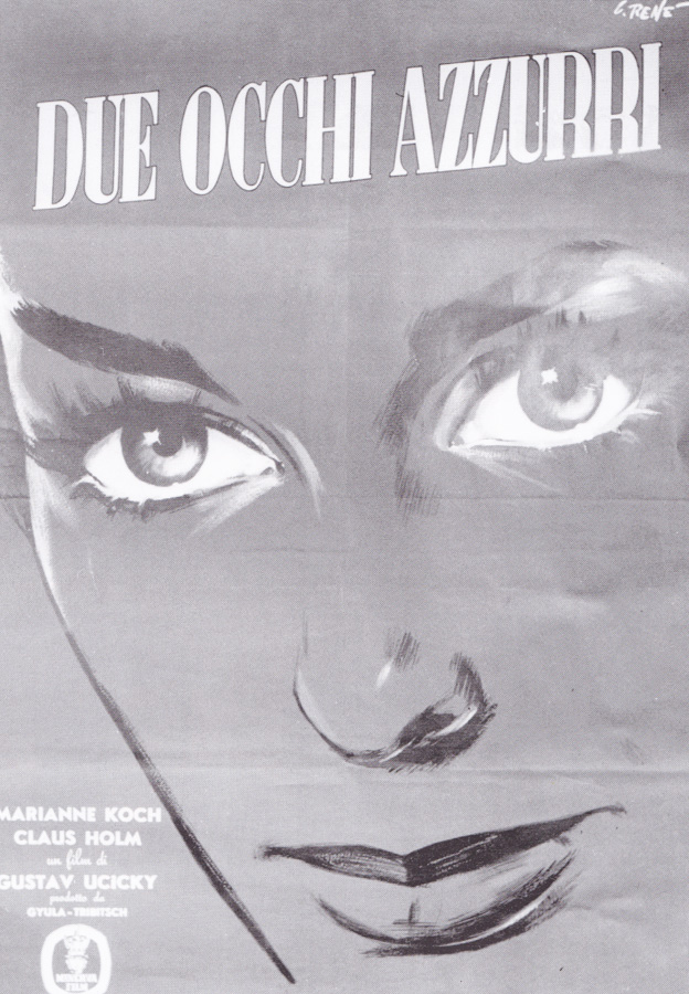
The Italian poster for Two Blue Eyes, painted by Renato Casaro circa 1956. This was the artist's first ever printed poster.

The Italian poster for Two Blue Eyes, painted by Renato Casaro circa 1956. This was the artist’s first ever printed poster.

When I turned 20 I decided it was time to travel to Rome and I told my parents that I had to go. Back then Rome felt a long way from Treviso; now it’s only a few hours by fast train, but 50 years ago it was a big deal to move there and was seen as a quite an adventure. My mother was of course very worried for me and was telling me how dangerous the big city could be, but I was determined to go and promised her that I would be fine. I knew that if I wanted any chance of becoming a film poster artist then that’s where I had to be.

I had taken photographs of all the paintings I’d done for the Cinema Garibaldi as well as plenty of illustrations and paintings I had done at home whilst I was perfecting my style and sent these to Studio Favalli, which was a really famous design and art studio working for the Rome film industry. They liked what they saw and invited me for an interview, which went well and I was invited to join the studio by the boss Augusto Favalli. I felt very lucky, as it was a small but strong team.
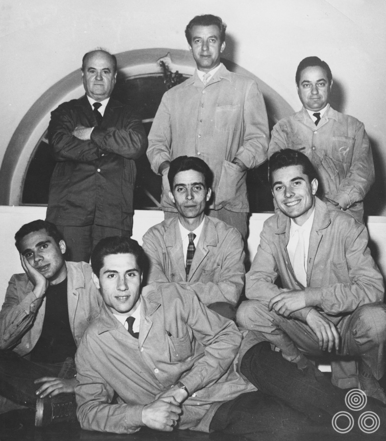
Studio Favalli, circa 1960, with Augusto Favalli in the centre at top, Renato Casaro bottom right, and Renato Fratini bottom left.

Studio Favalli, circa 1960, with Augusto Favalli in the centre at top, Renato Casaro bottom right, and Renato Fratini bottom left.

At that time the artist Renato Fratini was working there and I had around a year of working directly with him and learning tips and tricks before he left to go and work in London. It was a strong partnership and we were roughly the same age, he a little bit older, but we did some good work together during that time. I was very happy being in Rome and you can only imagine how much fun I was having as a young man, both at work and in my spare time! There was so much to see, experience and learn. I was truly full of life at that time. I also got to meet other artists that I’d admired before.

Ah, so you met some of the people responsible for the poster paintings you’d admired when you were growing up?
Yes, eventually I got to meet artists like Angelo Cesselon and others and I would tell them that I used to copy their art to understand how they achieved the finished result and to try and improve my own work.
Continue reading

An interview with Vic Fair

02.12.13

In the history of British film posters there are few characters as significant and influential as the designer and artist Vic Fair. During a career that spanned close to forty years, many of them spent as part of the same ever-evolving agency, Vic lent his inimitable style to several of the most iconic British posters ever printed. He designed marketing campaigns for most of the big film studios and distributors, including for the likes of Hammer Films and all of the posters for the very British ‘Confessions…’ series of bawdy comedies. Over the years, Vic also developed a strong working relationship with many of the British film industry’s leading directors, including Nic Roeg, Terry Gilliam and Michael Winner.

One of the things that really set Vic apart from his contemporaries were his skills at developing concepts that were unique and stood out from what was often a sea of other ideas, depending on how many design agencies a distributor might have been working with. He had a natural talent for concepts that used ingenious juxtaposition of elements to create surprising layouts and he wasn’t one to shy away from risqué concepts, many of which unfortunately never made it onto a printing press. Many of these designs did, however, proceed through to the end of the process and clearly demonstrate his cheeky sense of humour.

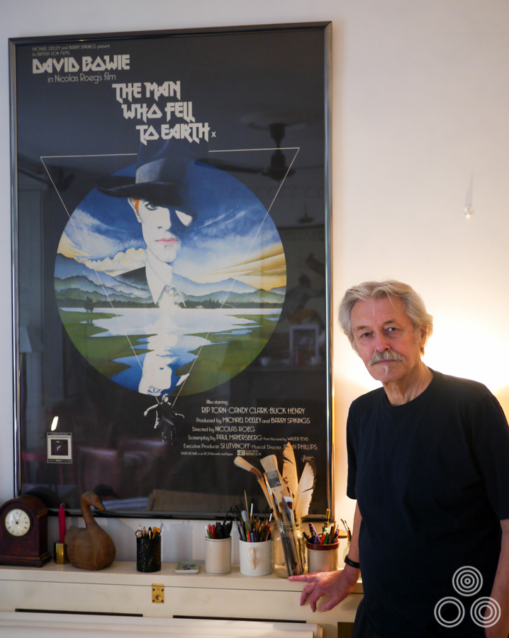
Vic Fair with Man Who Fell to Earth poster, 2013

Vic Fair stands next to the large format (40″ x 60″) poster for The Man Who Fell to Earth, which he both designed and painted in 1976. Photo taken in 2013.

Over the past couple of years I’ve been fortunate enough to befriend and spend several occasions with Vic where we discussed his life and career. We also took a look at the hundreds of concept roughs (sketches), original artwork and printed posters that he has saved and stored over the years. I wanted this interview article to tell the story of his life from his beginnings as a messenger boy in a design office through to his retirement as one of the most prominent designers working for the British film industry. This article features pictures of many never-before-seen concepts, unused artwork and photos of Vic over the years which I hope the reader will enjoy.

—————————-

Hello Vic, thanks for agreeing to talk to me today. I’d like to start with your origins, if I may? You were born in Chadwell Heath, Essex in March 1938. I understand your father was an industrial designer?
He was, yes. He worked for Ford and designed tractors; the ones with the giant metal wheels without tyres that were in use around then. He would make the models that were used to decide what designs the company would put into production. I have some photographs of some of the ones he worked on and they’re pretty good actually.

He died just before my fifth birthday so I can’t remember much about him, but his name was William and he’d originally come from Stratford in London. He was also a good athlete and a musician with a jazz band. I must have picked up some of his artistic and design skills because I can remember that I was always building something in the back garden, whether it was a fort, a boat, or other vehicles. I was always constructing something and just loved tinkering away.

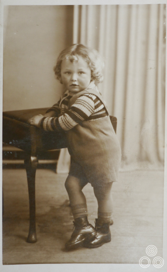
Vic Fair as a young boy, aged around 3, in 1941.

Vic Fair as a young boy, aged around 3, in 1941.

Because my father worked at Ford we owned a Model C Ten, which was one of the first cars they sold to the public and it was also the first car on our street.

May I ask how he passed away?
It was really bad luck because he’d had blood poisoning and within a year of his death they had found a way to prevent that from being an illness that would usually always kill you.

My mother was incredibly attractive and she looked like a film star. She used to take me to school and the other kids used to think she was my glamorous older sister! I lived with my mother and sister and had become the man of the house, doing repair jobs and keeping the bungalow in good order. The problem was that my mother had become very possessive and was jealous of any girlfriend that I brought back to the house, which was very awkward.

In the end I decided to go and do my National Service to get away from the house. I could have actually escaped doing it because I’d previously had a few illnesses like Tuberculosis, but I realised it was a way of spending time away from the situation I was stuck in at home.

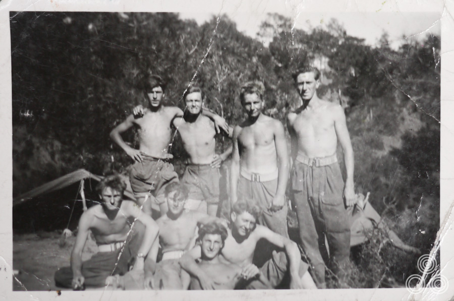
Vic Fair (second left, top row) with fellow National Service enlistees on an Army base in Cyprus, circa 1955.

Vic Fair (second left, top row) with fellow National Service enlistees on an Army base in Cyprus, circa 1955.

Had you realised you had a gift for sketching and painting whilst you were at school?
Yes, I was always sketching and I got on really well with the art teacher. I was often asked to do illustrations for the school magazine and the people who ran it were always after the work I was doing during my art classes to put in the next issue. I was also good at carpentry and that was definitely thanks to my father.

I’ve always loved making things and there are actually a few pieces of furniture in my house that I made myself. I’ve still got the tools that I had inherited from my father when he died. Making stuff was definitely an extension of my artistry and I enjoy it just as much as painting.  I was always coming up with ideas for things to make and paint and fortunately that served me well when it came to my later career.

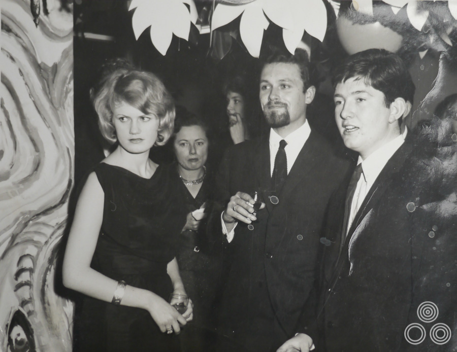
Vic Fair (centre) stands with colleagues, including Richard Vaughan (right) and David Till (behind Vic), at a party, circa 1964.

Vic Fair (centre) stands with colleagues, including Richard Vaughan (right) and David Till (behind Vic), at a party, circa 1964.

From Secondary school you went to join an agency in London?
I ended up as one of only two kids from my school that left Chadwell Heath and got a job in London. I secured a job at a design agency called Hector Hughes and it was on Southampton Row in London. I started out doing a lot of messenger work for the company, but the office manager had given me a table on which I could practice designing and illustrating. There were a couple of decent artists who allowed me to watch over their shoulder as they worked.

There was one chap called Philip Happé who was a talented typesetter and was a good friend to me whilst I was there. He actually put a good word in for me when I wanted to move on and he recommended me to someone at the next agency I went to. We later ended up working together again later in our careers.

Continue reading

An interview with Shirley Chantrell

27.09.13

In the history of British film posters there are few figures as significant and popular as the late, great designer and illustrator Tom Chantrell. After working on his first piece of poster art in 1938, Tom spent most of the next 50 years designing and painting many of the most iconic British posters for films ranging from Hollywood blockbusters like Star Wars to European cult oddities like Andrzej Zulawski’s Possession. As Sim Branaghan, the author of British Film Posters (and a good friend of Tom) notes in his biography on the official Tom Chantrell website, the artist had an instinctive grasp of how to sell films to a mass-audience. Combined with his undeniable talent for painting dynamic, colourful images and capturing star likenesses, Tom found his talents in great demand from most of the production companies and distributors that had their offices in the bustling Soho area of central London. It is estimated that Tom worked on in excess of 7000 designs during his career (although not all of these would have seen the inside of a printing press).

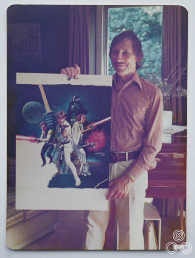
Tom Chantrell stands holding the near-finished artwork for Star Wars, arguably his most famous work. Photo taken by his wife Shirley in 1977.

Tom Chantrell stands holding the near-finished artwork for Star Wars, arguably his most famous work. Photo taken by his wife Shirley in 1977.

It’s hard to believe today but it took over two decades before Tom accepted that his work was of any significance, having spent many years feeling that he was ‘just’ a commercial artist moving from job to job. It took the encouragement and dedication of one woman to make Tom realise that his artwork was something worth treasuring. That woman was Shirley Chantrell, his second wife, the mother of his twin daughters, Jaqui and Louise, and his constant companion for just shy of 40 years. Shirley herself has had something of a remarkable life from her beginnings as the daughter of a horticulturist in Singapore, with a brave and fateful voyage to London just shy of her 18th birthday that eventually resulted in a chance meeting with Tom, altering the course of their lives forever.

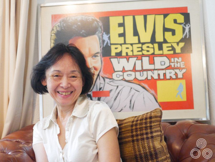
Shirley Chantrell sitting in front of the original artwork for the Elvis Presley film Wild in the Country, which was painted by her late husband, Tom Chantrell. Photo taken August 2012.

Shirley Chantrell sitting in front of the original artwork for the Elvis Presley film Wild in the Country, which was painted by her late husband, Tom Chantrell. Photo taken August 2012.

Although Tom passed away in 2001, Shirley’s insistence that his work had value beyond just the payment he received for it meant that the Chantrells had amassed an archive consisting of over 40 years worth of material, including original artwork, sketches, posters and plenty of reference items that Tom used to create his work. Having carefully preserved this material since Tom’s death, Shirley decided it was time to share the archive and allow fans of his work to view and purchase select pieces. Last year Chantrellposter.com was launched in collaboration with the respected memorabilia dealer Michael Bloomfield and the result is a treasure trove of Chantrell artefacts that is well worth a visit.

Over the past two years I’ve had the privilege of spending time with Shirley and from our very first meeting it became clear that her life story was intrinsically linked with that of her husband’s and that hers had been no less remarkable. Furthermore, I knew that it was a story worth sharing with others and this resulting article is intended to give the reader an insight into Shirley’s life and the four decades she spent with Tom. I have included plenty of never-before-seen photographs, including some amusing reference images that Tom used to create his work.

Shirley, I’d like to start with your early life, if I may. You were born in Singapore?
Yes, in 1944, the year before peace!

What did your parents do?
They were originally from China and my father worked in horticulture and he used to grow seasonal flowers for wholesale. My mum helped with the business and together they would tend to the plants all year round. If there were a big festival coming up they would be calculating how long it would take each flower to get ready for the show and plan everything meticulously. They were growing flowers like Dahlias and Gladiolis and I remember the bulbs were from countries like Holland. Even at a young age I was keen to know all about these other places that seemed so mysterious to me.

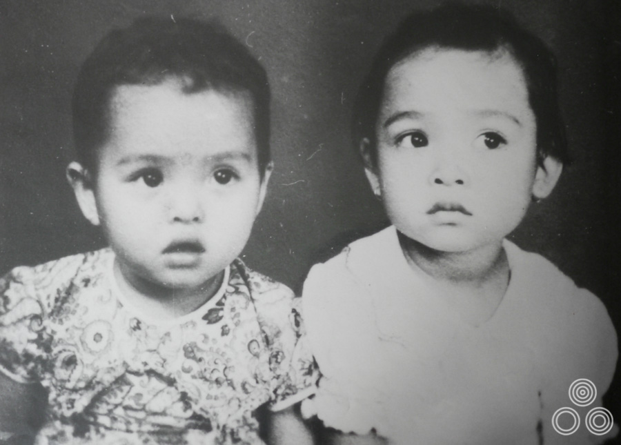
Shirley Chantrell (right) and her sister Wai-Chee, aged around 2 years old in 1946.

Shirley Chantrell (right) and her sister Wai-Chee, aged around 2 years old in 1946.

My father used to look after European family houses and he used to grow these lovely flowers in the gardens. He would enter competitions by sending them off to exhibitions and he was so good at it that he actually won several Silver Cups, which he was really proud of.

I remember that when my father was making deliveries around the city he would place me in this big basket that was full of all these flowers, and he would cycle it around with me sat there in the middle of these beautiful colours. I have this vivid memory of a time he passed by the Singapore River to show me these huge boats and we rested and had a coffee together by the waterside.

Shirley Chantrell sitting in front of the original artwork for the Elvis Presley film Wild in the Country, which was painted by her late husband, Tom Chantrell. Photo taken August 2012.

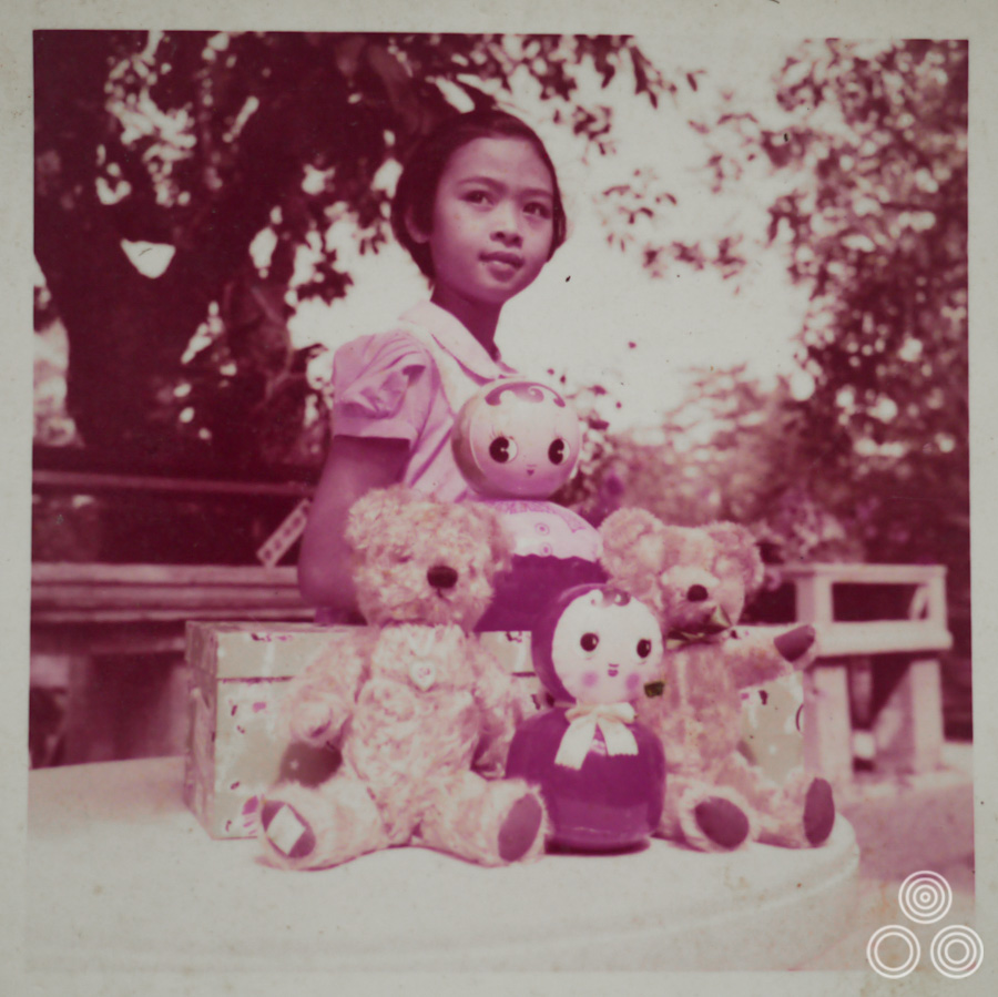
Shirley Chantrell stands with a selection of toys, aged around 6. Shirley: ‘These weren’t even my toys – I think they belonged to the children of one of the houses that my father looked after!’

You were one of how many children?
I was number six and my mum actually had nine in total. My brother is the eldest and then there are two sisters above me but there were originally two boys who sadly didn’t live past the era of the Japanese occupation of Singapore; they perished because of a wartime epidemic. Below me I have three sisters.

So you were born at the end of the war? Did you understand how tough things had been during it?
Well my mum made it clear that food was scarce. I think they were lucky though because my brother was already eight or nine years old whilst the Japanese were there and he was clever enough to learn to speak their language. They really liked that and used to give him bags of rice, which really helped our family.

When the Japanese came my family were really worried that they’d see we had a connection with those European families – especially the English – so my father actually hid the trophies he’d won in a pond because he’d have been punished if they’d found them. After the war he couldn’t find the trophies again so they must have been taken or gone rotten maybe.

Continue reading

An interview with Sam Smith, AKA Sam’s Myth

19.06.13

Nashville-based Sam Smith, who works under the moniker Sam’s Myth, is an acclaimed graphic designer and artist who has worked with multiple independent film distributors on official posters for films as diverse as the brilliant 1977 Japanese cult oddity House (for a 2010 re-release) and the sprawling biopic Carlos. In addition, Sam has designed and illustrated screen prints and unofficial posters for film screenings at the likes of Nashville’s celebrated Belcourt Theatre and San Francisco’s famous Castro Theatre.

A true cineaste, Sam’s portfolio overtly reflects his taste in movies since he’ll often elect to work on a poster for a cult, independent or little-seen film of his own choosing, plus he regularly works on packaging and disc menus for the much-loved video label Criterion. On top of this, Sam is an accomplished musician who has drummed for the likes of Ben Folds, Tristen and My So Called Band, and when not working on design projects he can be found on the road with one of these bands. Work on record covers, gig posters and other music-related projects also feature in Sam’s folio.

I first became aware of Sam when I purchased the superb re-release one sheets for House (see below) and Rainer Werner Fassbinder’s sci-fi epic World on a Wire in 2011, and I’ve been following his work ever since then. I wanted to interview Sam for the site at the same time as adding those two posters to my site and the resultant article is below.

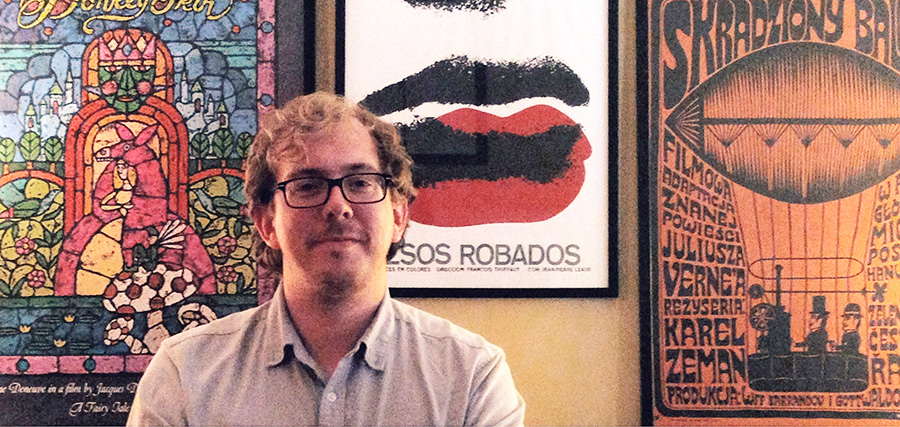
The designer, artist and musician Sam Smith, June 2013

The designer, artist and musician Sam Smith, June 2013

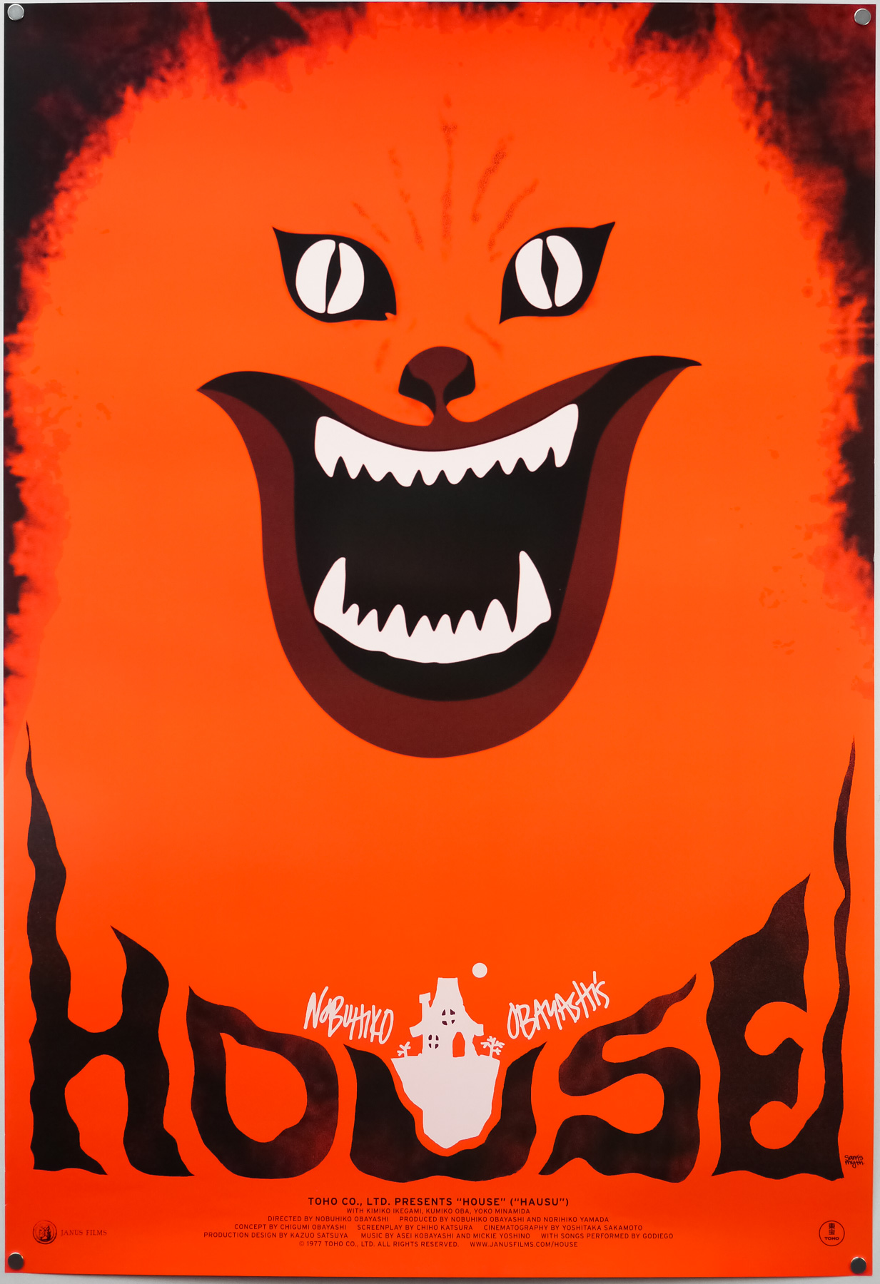
The US one sheet for the 2010 re-release of Nobuhiko Obayashi's House, designed by Sam's Myth

The US one sheet for the 2010 re-release of Nobuhiko Obayashi’s House, designed by Sam’s Myth

I’ve split the interview up into six parts and you can use the links below to jump directly to a section, should you wish.

Part 1 – Origins and starting out
Part 2 – Film and music
Part 3 – 
Working methods
Part 4 – Criterion
Part 5 – Posters in detail
Part 6 – Influences, advice and future plans

Part 1 – Origins and starting out

I’d like to start with your origins, if I may? When and where were you born?
I was born in 1981 in Nashville, TN. I’ve lived in Nashville for the bulk of my life, aside from going to school in New York City and touring around the world off and on for the several years after that.


I understand your father is also a designer? Can you talk about his work?
He was and still is an artist who has worked in different mediums, never as a designer per se, but a painter and woodworker and found object artist… All kinds of things. For a period in the 80’s he worked with airbrush creating large, colorful abstract landscapes, patterns and conceptual imagery. His drawing and illustration style has always had an enormous influence on my art. He fostered my obsession with all things visual. Now he lives in the country and makes furniture and things out of reclaimed wood, writes novels and short stories, and draws from time to time.

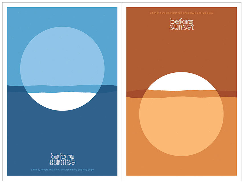
Before Sunrise and Before Sunset screen prints by Sam's Myth

Before Sunrise and Before Sunset screen prints by Sam’s Myth


How did you start out designing? Did you study it at university?
I’ve always just made art on my own, due in large part most likely to my dad and I working on creative projects all the time when I was a child. I would draw all of the characters and things I was obsessed with– Teenage Mutant Ninja Turtles, Batman, Dick Tracy, Roger Rabbit… By the time The Simpsons hit, I had been cartooning and drawing my own comics for several years. In high school, my love for posters began I guess, as I would draw and paste-up posters and flyers for all of my bands’ shows as well as all major school events. I “designed” the album art for my band’s releases, combining art I made, found images and photographs with type, and I found this very enjoyable. I went to New York University for the Cinema Studies program, went on tour after that, and literally stopped making visual art for several years.

What was your first real break into the world of professional design? Was there a first major client?
My first real break was the House poster. After touring for about four years, I had a long break and decided to do something about the fact that I had let my art skills atrophy so severely from not drawing or designing anything for years while I focused on other things. My mom had just built a small art studio in the back yard of the house I grew up in, and I holed up for a week there and forced myself to just crank out some posters. My love for film had grown so much at college, where I earned a degree in writing about film from an academic perspective.

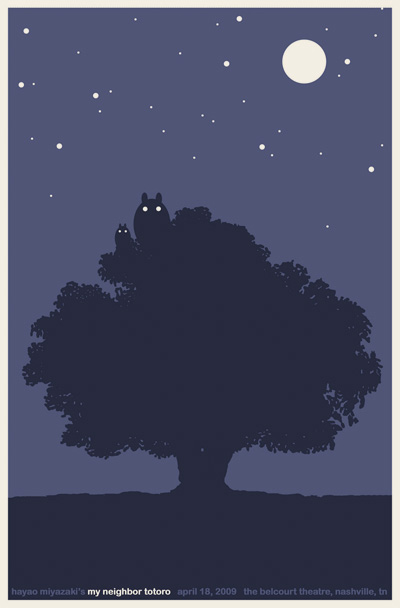
My Neighbor Totoro screen print by Sam's Myth for the Belcourt Theatre, Nashville. 2009

My Neighbor Totoro screen print by Sam’s Myth for the Belcourt Theatre, Nashville. 2009

While touring my writing also declined and I didn’t have a lot of interest in being a film critic. So I figured that making film posters would be a great way to channel my love for films (and for reading and interpreting films) into a visual art project. I made eight to ten designs during those several days that are still some of my favorite things I’ve done. I took them to my friends at the Belcourt Theatre, Nashville’s historic art-house, and showed them what Mondo was doing with collectible movie screen prints in Austin, thinking we could try something similar.

Testing the waters, they agreed to print up some posters for a couple upcoming films– I made screen prints for My Neighbor Totoro and The Human Condition, which was being re-released by Janus Films. Janus also had a digital version of House booked at the Belcourt as a midnight movie and I made a poster. I knew that Janus was supportive of what we were doing at the Belcourt and I’d always dreamed of working with them and with Criterion, their home video wing. My initial goal was to create 25 different posters for HOUSE just to increase my odds of landing on something great that might catch Janus’ attention, but I only made it through a few ideas, and the cat poster was the best. People really responded to it, and the midnight screenings at the Belcourt were a smashing success, so much so that Janus went ahead and planned to strike a new 35mm print and give HOUSE the full run in other theaters.

Janus asked if they could use my poster design as their official one-sheet. That led naturally to a relationship working with Criterion and Janus on an ongoing basis. So I feel I owe everything to the Belcourt and to Janus for giving me that opportunity to see myself as a professional designer of posters.


Have you always been freelance or have you worked in an agency?
I’ve always been freelance. I enjoy the challenge of maintaining a steady stream of professional work but doing so on my own schedule. I do fantasise sometimes about combining powers with other artist friends and forming a sort of collective, all working out of the same studio and sharing gear and tools, helping each other out and, most importantly, playing ping pong. I’ve never really considered working for an agency but wouldn’t rule it out, particularly if it were a movie poster agency which would have its own interesting challenges.

Continue reading

Tyler Stout on the making of his Star Trek II – The Wrath of Khan screen print

29.04.13

When Mondo, the incomparable limited-edition screen print outfit, announced they were opening a gallery in their hometown of Austin, anticipation quickly reached fever pitch, with fans desperate to see what artwork would be on the walls when the doors opened for the first time. The answer was kept secret until the evening of March the 10th, 2012 when the opening night was held and the theme of their first show was revealed to be that of classic sci-fi. Most of Mondo’s premier artists turned in some incredible pieces for the show, as can be seen on this recap blog post on their website and on this SlashFilm post.

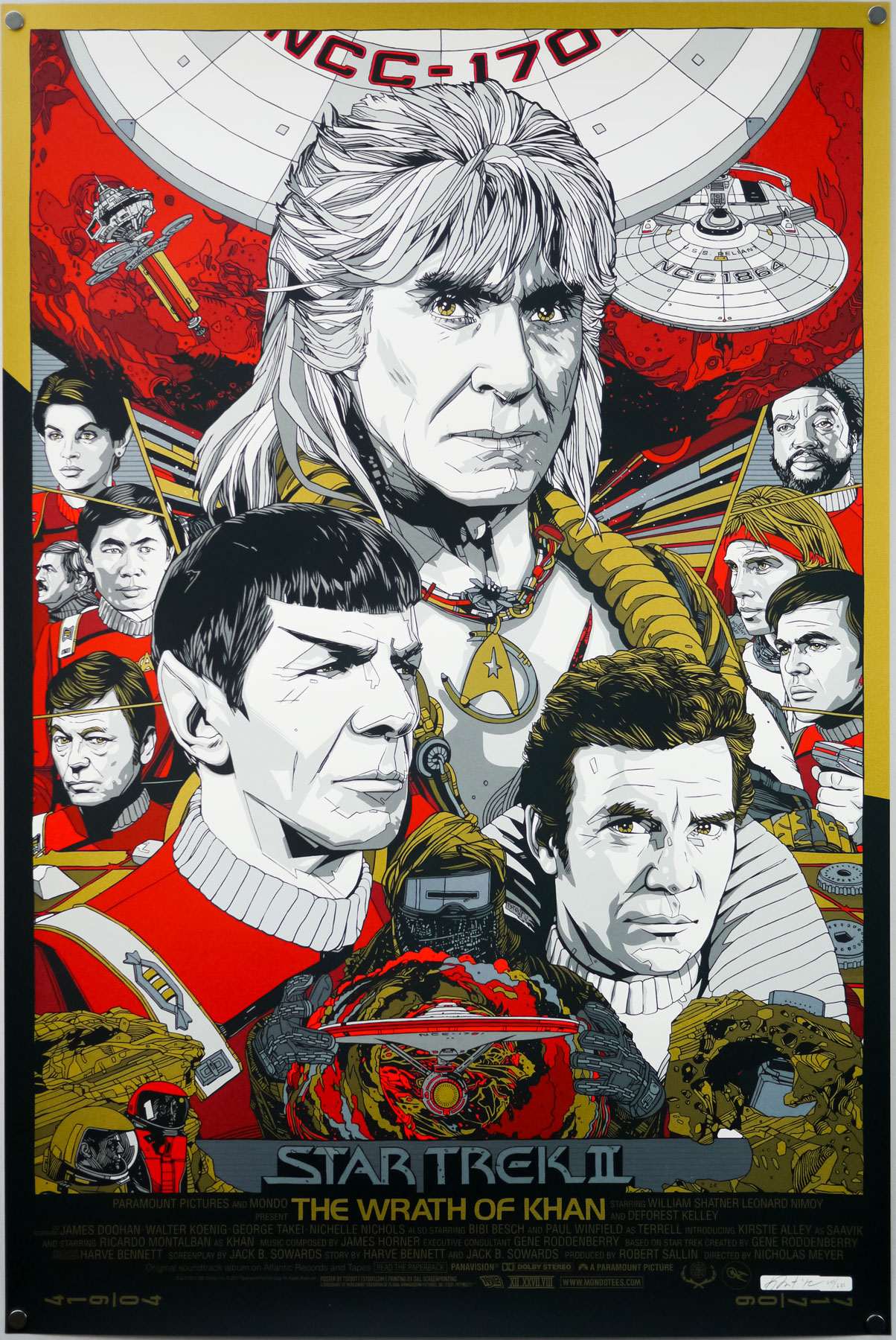
One of the highlights of the show was fan-favourite artist Tyler Stout’s print for arguably the best Star Trek film of all time, 1982’s The Wrath of Khan. A brilliantly composed image featuring Ricardo Montalban‘s unforgettable, titular bad guy, the poster was printed in two flavours; a red and gold regular and a silver and gold variant. Whilst adding the regular version to the Film on Paper collection I wanted to interview the man himself about the creation of the poster.

Tyler Stout’s screen print for Star Trek II The Wrath of Khan (1982). This is the regular version.

Tyler Stout’s screen print for Star Trek II The Wrath of Khan (1982). This is the regular version.

Tyler, thanks for agreeing to talk about the creation of this fantastic print. Firstly, I wanted to ask if you were you given free rein to choose the film you wanted to work on for Mondo’s gallery opening show?
I’d actually had Wrath of Khan on my schedule for a while and it just takes me forever to do things sometimes. It ended up getting done around the time of that show I think. I could be completely mis-remembering it.

Is The Wrath of Khan your favourite Star Trek film?
I like many of them, including The Voyage Home with the whales and I really liked The Undiscovered Country with Christopher Plummer as a Klingon. I also enjoyed First Contact since I’m a big Next Generation fan.

Can you talk about your initial design ideas for the poster? Did you always intend to have Khan as the most prominent figure?
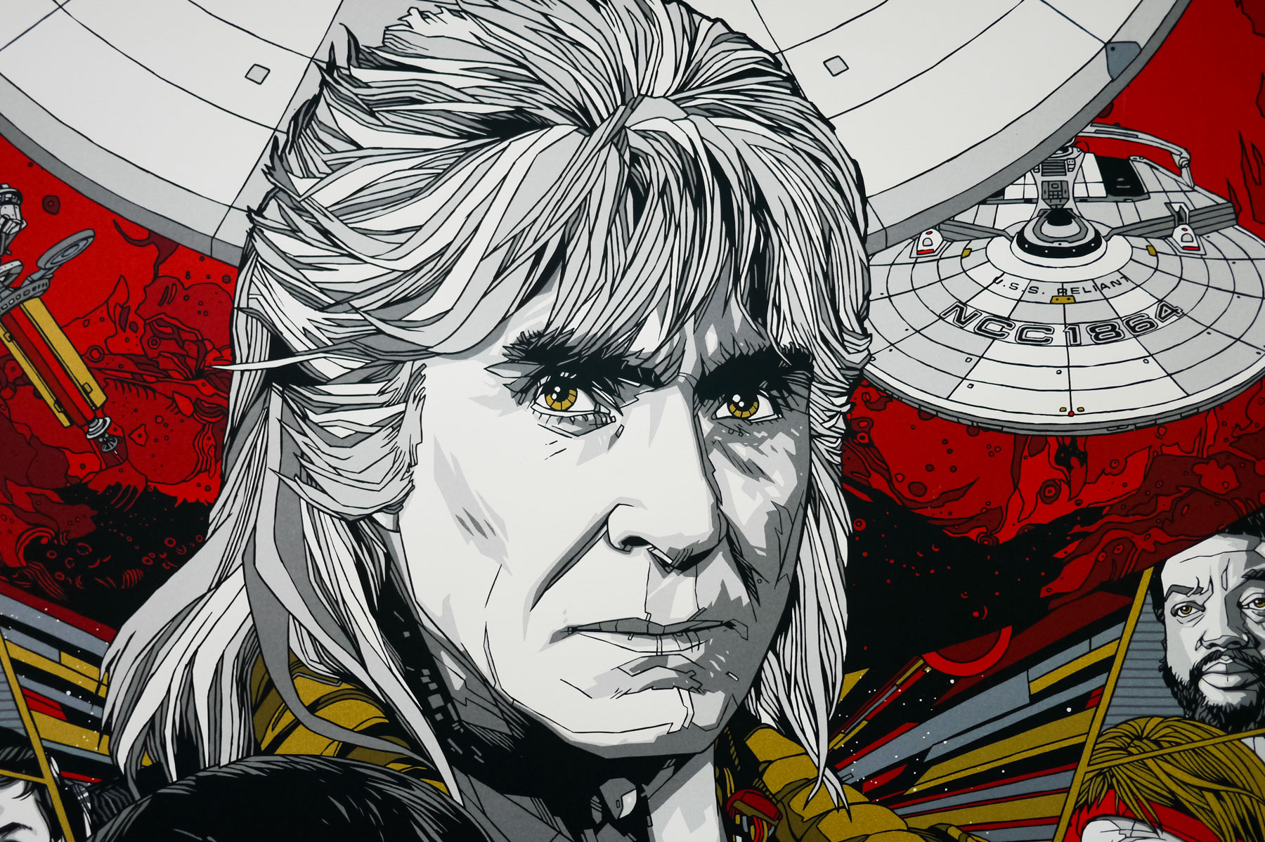
For me, and probably most people, Ricardo Montalban’s the standout of the film. I believe I started with him and then kinda designed the poster around his portrait.

A close-up view of Tyler Stout's portrait of Ricardo Montalban's bad guy Khan.

A close-up view of Tyler Stout’s portrait of Ricardo Montalban’s bad guy Khan.

Was the composition something you arrived at quickly? Were there certain elements or characters you knew had to sit next to each other?
It went through a couple versions, mainly the smaller side figure versions, but the overall look stayed pretty consistent.

Continue reading