When Mondo, the incomparable limited-edition screen print outfit, announced they were opening a gallery in their hometown of Austin, anticipation quickly reached fever pitch, with fans desperate to see what artwork would be on the walls when the doors opened for the first time. The answer was kept secret until the evening of March the 10th, 2012 when the opening night was held and the theme of their first show was revealed to be that of classic sci-fi. Most of Mondo’s premier artists turned in some incredible pieces for the show, as can be seen on this recap blog post on their website and on this SlashFilm post.
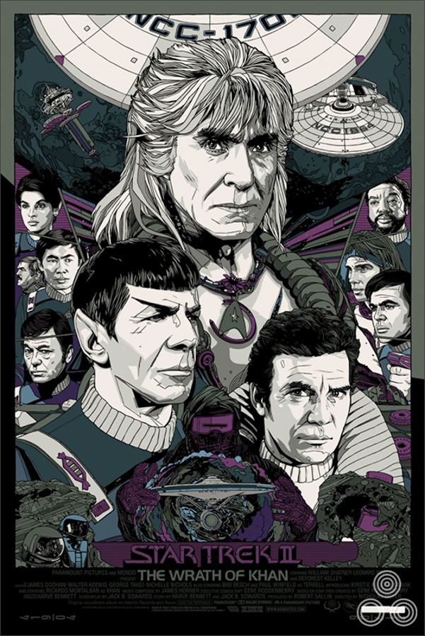
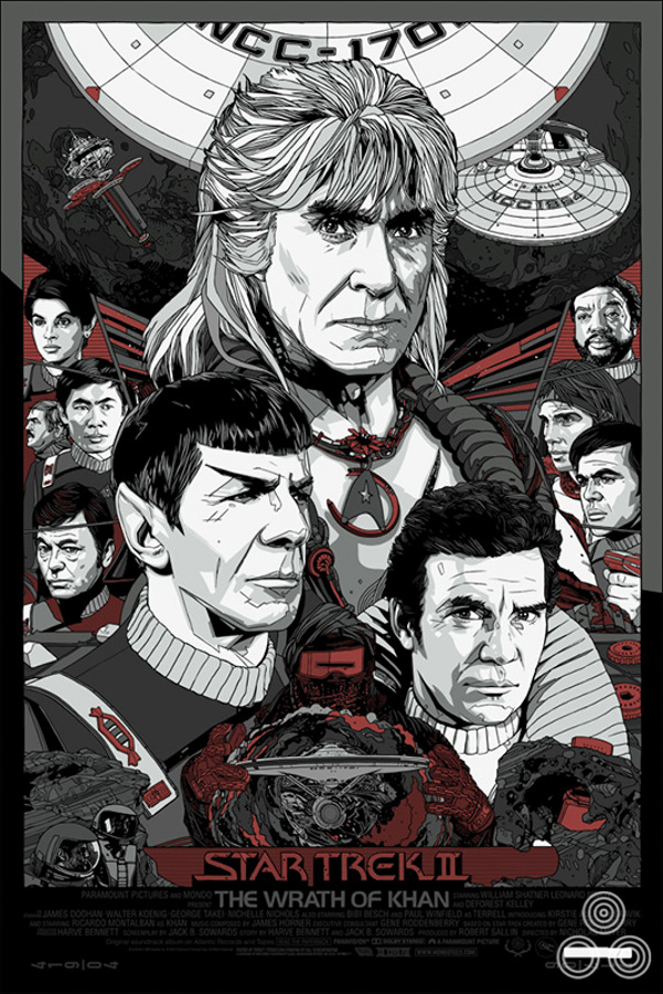
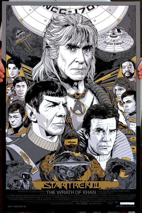
One of the highlights of the show was fan-favourite artist Tyler Stout’s print for arguably the best Star Trek film of all time, 1982’s The Wrath of Khan. A brilliantly composed image featuring Ricardo Montalban‘s unforgettable, titular bad guy, the poster was printed in two flavours; a red and gold regular and a silver and gold variant. Whilst adding the regular version to the Film on Paper collection I wanted to interview the man himself about the creation of the poster.
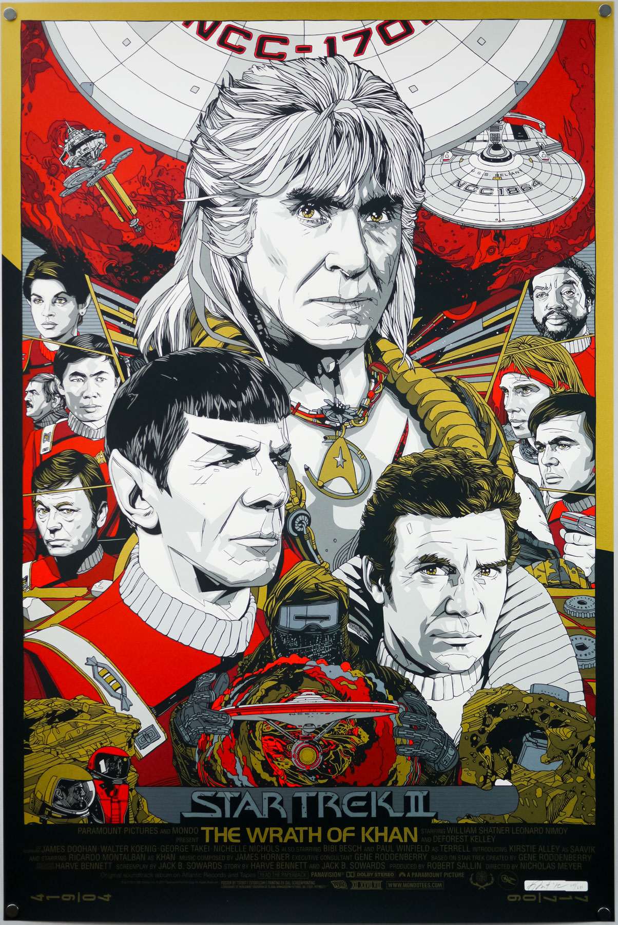
Tyler Stout’s screen print for Star Trek II The Wrath of Khan (1982). This is the regular version.
Tyler, thanks for agreeing to talk about the creation of this fantastic print. Firstly, I wanted to ask if you were you given free rein to choose the film you wanted to work on for Mondo’s gallery opening show?
I’d actually had Wrath of Khan on my schedule for a while and it just takes me forever to do things sometimes. It ended up getting done around the time of that show I think. I could be completely mis-remembering it.
Is The Wrath of Khan your favourite Star Trek film?
I like many of them, including The Voyage Home with the whales and I really liked The Undiscovered Country with Christopher Plummer as a Klingon. I also enjoyed First Contact since I’m a big Next Generation fan.
Can you talk about your initial design ideas for the poster? Did you always intend to have Khan as the most prominent figure?
For me, and probably most people, Ricardo Montalban’s the standout of the film. I believe I started with him and then kinda designed the poster around his portrait.
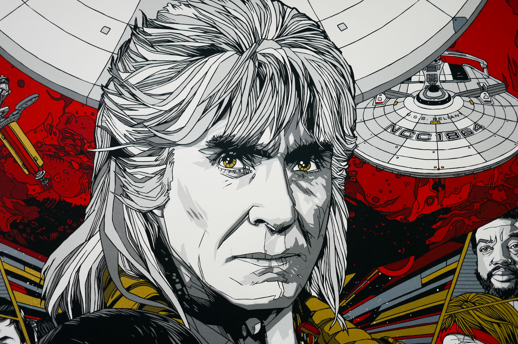
A close-up view of Tyler Stout’s portrait of Ricardo Montalban’s bad guy Khan.
Was the composition something you arrived at quickly? Were there certain elements or characters you knew had to sit next to each other?
It went through a couple versions, mainly the smaller side figure versions, but the overall look stayed pretty consistent.
Some fans wondered why you’d left off a portrait of Uhura – can you talk about that?
I remember watching the film and realising she wasn’t in it that much. While she’s a big part of the Trek series as a whole, she’s not a huge part of this movie, and in the end I left her out. I probably should have put her in. Ah well…
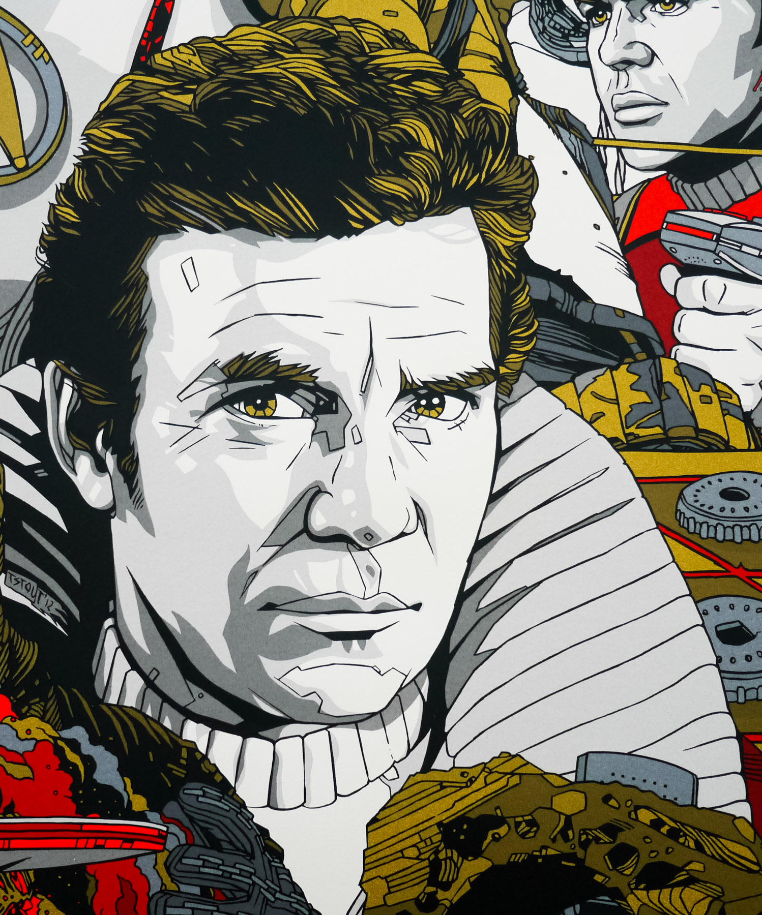
William Shatner’s Captain James T Kirk depicted in his ‘popped collar’ outfit as seen in The Wrath of Khan, by Tyler Stout.
I like the ‘popped collar’ version of Kirk. Did you feel that had to be his outfit on the poster from the start?
It definitely appeals to me more than the usual Starfleet uniforms as it’s a bit more extravagant. Plus, whenever you have the opportunity to give a hint of a halo around a main character it’s good as it works to highlight their face.
Are there any elements you illustrated but that didn’t make it into the final version?
I drew David, Kirk’s son, a couple times. His death made an impression on me in Star Trek III. But in the end I couldn’t make it work. I also drew a few versions of Khan holding up his gloved hand, but, again, it wasn’t working for me so I took it out. The space it occupied felt weird.
An earlier version of the print featuring Khan holding up a gloved hand and several alternative character portraits.
Did you alter any elements of the poster before arriving at the final version?
Sure, I always change things. Nothing critical, I didn’t think. In retrospect, I might change how I handled the type at the bottom, but there’s no use dwelling on things.
A portrait of Captain Kirk’s son David that ended up being removed from the poster entirely.
An alternative version of the portrait of the character Chekhov that would alter significantly by the time the final poster was printed.
How did you go about choosing the colour-way you went with for the regular? And the variant?
I usually go with colours I can easily picture in my head, how they’ll print and look in real life. So golds and reds are dependable for me, as is gold and silver. I had a few variant colour-ways that were a bit more early 80’s feeling, but in the end we changed it to something a bit safer. Would have been interesting to see how those other colour-ways would have looked in person.
An alternative, unused colour-way for the print.
Another unused alternative colour-way for the print.
Once you’d submitted the poster were you given any directions by the Mondo guys for things to add or remove?
I go back and forth with Rob Jones on things during the process. Mitch has color inputs and they all have suggestions with nothing set in stone (unless it’s set in stone by the client). But usually they’re just trying to get it printed in time since I usually turn it in a few days before the actual event.
Did Paramount or anyone associated with Star Trek have any input into the poster?
Not to me, not that I can think of.
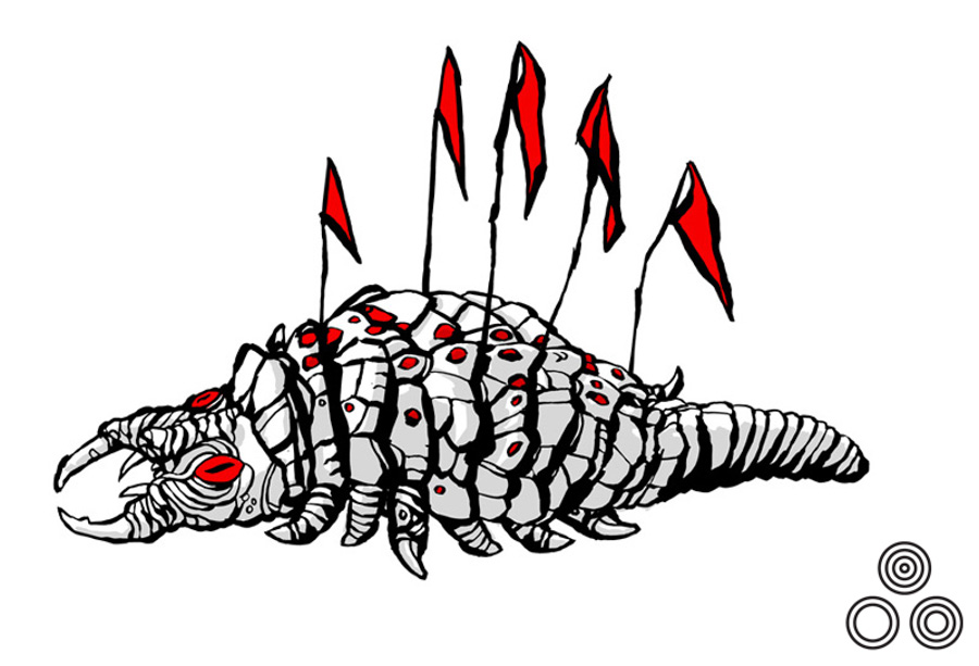
An illustration of the infamous Ceti Eel that featured in the film and was drawn by Tyler Stout and used by Mondo to promote the gallery show.
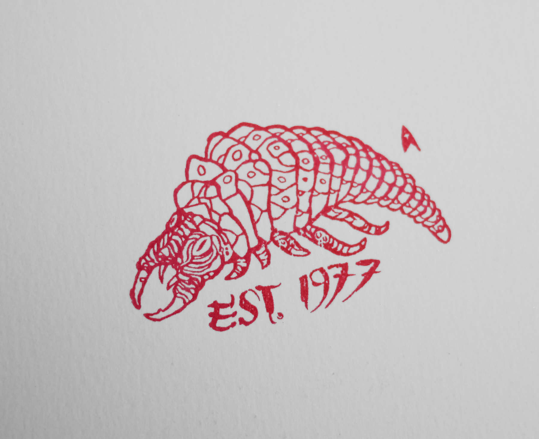
The stamp of the Ceti Eel as found on the back of the print itself.
What about the Ceti eel? You designed one as one of your rubber stamps (and marked the back of the poster) but why did you decide to leave it off the main image?
It just didn’t end up fitting in anywhere, plus I figured I could just put it on a stamp and put that on the back. I tried to fit it on, but it wasn’t working anywhere else.
Would you like to tackle any of the other films?
Never say never. I grew up watching Trek films in theaters, probably more so than Star Wars, since the 80’s and 90’s were full of Trek films. The Wrath of Khan was the benchmark that got me into the series.
The variant version of the Wrath of Khan print by Tyler Stout.
Do you rate the original Bob Peak posters for the earlier Trek films? Is there a favourite of the bunch if so?
Its certainly not my place to give a design critique of anything Bob Peak has done, that’s not even borderline blasphemy! I do really like his The Search for Spock piece though; it’s a big floating head without being obnoxious about it and a really good rendition of Spock that I envy.
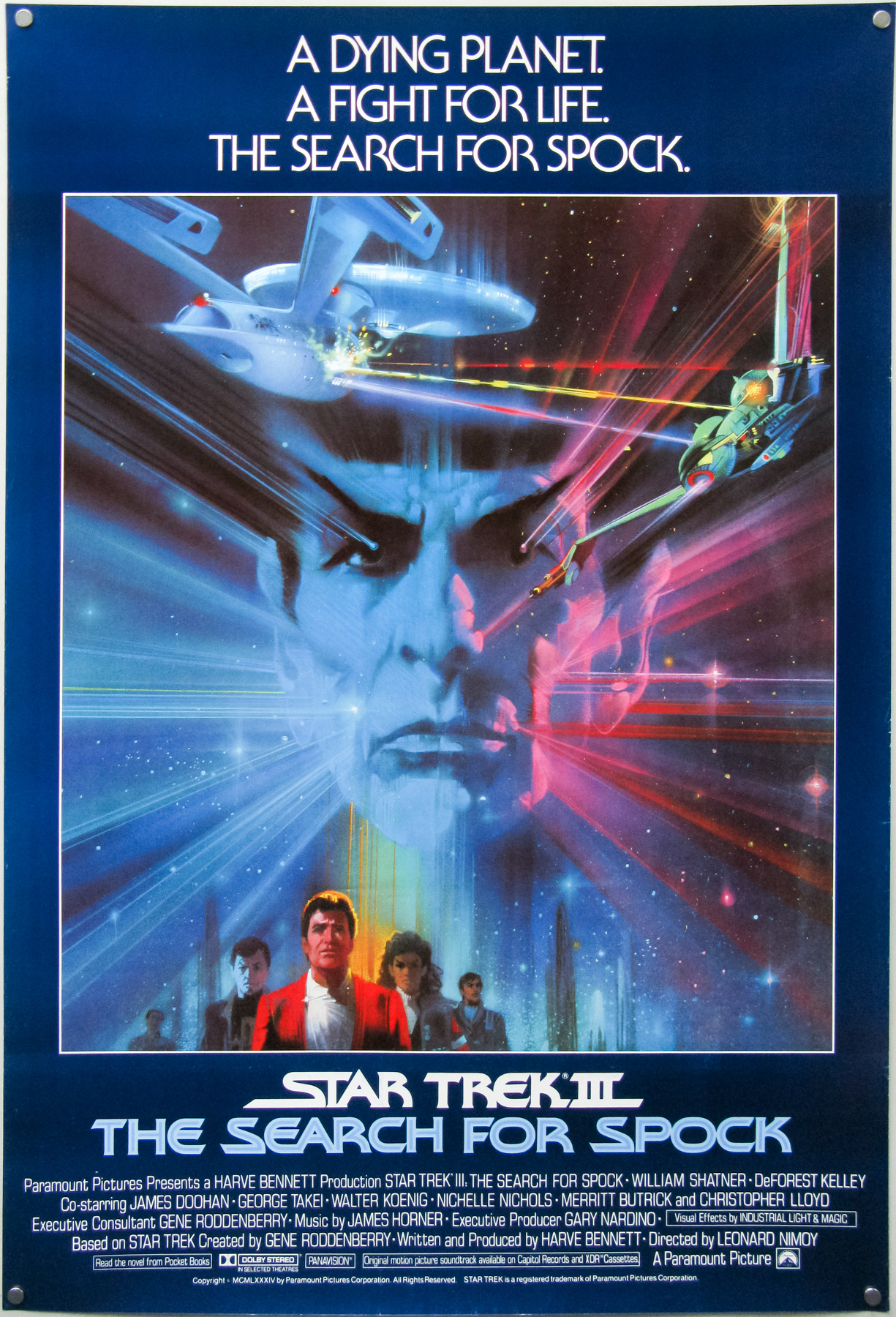
The international one sheet for Star Trek III – The Search For Spock with artwork by the late Bob Peak.
What do you reckon to JJ Abrams’ reboot of the franchise? Are you excited about ‘Into Darkness’?
I’m always hopeful that a movie will be good. I enjoyed the first one, so fingers crossed that the second one takes it further. It’s a bit disappointing that JJ Abrams has decided to leap over to Star Wars films and I hope someone continues making Trek Films with this current cast, although I’d watch another next generation film in a heartbeat as Picard is still the captain for me.
Finally, this year has started out extremely well for us Tyler Stout fans in terms of poster releases. Can you give us a hint as to what else you have lined up for the rest of 2013?
Good to hear that both you and my other fan are happy with the posters so far. As for future work, it literally changes week to week, but hopefully some things work out and I get some new stuff done. In terms of clues, let’s see… Alternate World War II timelines? Ax-wielding maniacs? Prehistoric monsters lurking deep below the earth’s crust? I’ve probably given it all away.
Thanks for your time, Tyler. As always it’s greatly appreciated.
Sure, no worries at all.
—————————————————-
+ Check out Tyler’s own website here.
+ The Mondo site is also well worth a visit.
+ If you’re on Facebook and are a fan of Tyler’s work I highly recommend becoming a member of the excellent Fans of Tyler Stout page.
The other posters by Tyler that I’ve collected can be viewed here. Also check out my interviews with Tyler on the making of both his Akira print and his Kill Bill print.
I’ve always wondered about copyright infringement issues, does this apply to fan art? Because you could argue that he is profiting off someone else’s artistic endeavours. I’m curious because there seems to be so many fan made posters out there, and I doubt the studios are getting a cut.
Thanks!