Having been lucky enough to acquire one of Tyler Stout’s fantastic Akira screen prints I wanted to hear a bit more from the man himself about the creation of the poster. Tyler was kind enough to not only answer my questions but also send through a handful of images showing the evolution of the poster.
Tyler, Akira was the first Mondo Mystery Movie and was shown on your birthday at your request. Can you talk about why you chose it and what the film means to you?
It’s just one of those movies that I’ve loved since I was a kid. I remember seeing the dubbed version on TV many, many years ago and then seeking it out on VHS, then DVD etc. I had two Akira shirts in high school and I wore them until they fell apart. It just had such a unique voice and vision and at the time it was the greatest animated film I had ever seen. It’s still up there with the best of them.
The poster is one of my very favourite designs by you and you can really tell that a lot of love went into it. Having chosen the film did you feel the pressure to come up with something extra special?
Well…I felt pressure from myself, doing something that lived up to the greatness of the film and my own expectations, sure, but not from Mondo, they’re not very pressure-oriented. When you’re working with something as great as Akira you really have to try hard to screw it up, plus I stuck close to the illustrations by the creator Katsuhiro Otomo. In the end it felt more like I was the designer, just working with somone else’s artwork. All compliments are due to Mr. Otomo, not myself.
How long before the event were you given a choice of film? Did you set to work straight away?
I can’t really remember, probably 3 or 4 months, but I only started it about 2 weeks before the event due to procrastination on my part and other jobs.
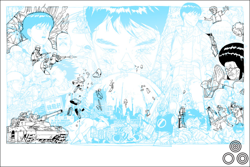
Tyler: ‘This is a work in progress shot where I’m trying out a layout option.’ – Image copyright © Tyler Stout, 2011
Can you talk about your initial design ideas for the poster? Were there certain scenes and characters that you knew had to be given more prominence than others?
The explosion always figured prominently in my vision, since the movie is kinda post-nuclear Tokyo, plus the bike is a big part of what I associate with Akira.
Yeah, Kaneda’s bike is almost given it’s own pedestal at the bottom – I’m guessing that’s an element of the film that means a lot to you?
Well, I’m sure it’s what a lot of people associate with Akira and its just such a strong, unique element. It plays a big part in the film as well.
As I understand it, from reading previous interviews with you, you’ll often create the elements separately and then work to combine them into the final design. Are there any elements you illustrated but that didn’t make it into the final version?
Not really, whilst I do draw them in pieces, they’re drawn more like a puzzle so that hopefully each piece clicks into its perfect place if I do my job right. In this case it pretty much worked out. There were probably a few things that didn’t look right so I switched them out, but nothing comes to mind. Again, visually, all the work was done by Katsuhiro Otomo in creating the world, so it took the stress off me to come up with a completely new creation.
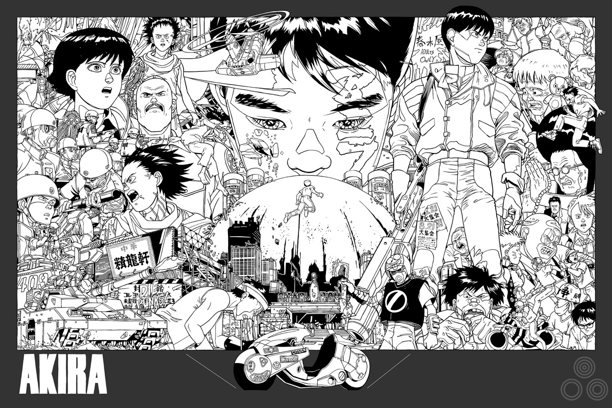
Tyler: ‘Another layout test, further into the creation of the poster’ – Image copyright © Tyler Stout, 2011
How quickly did you arrive at the final layout? Were there certain elements you knew had to sit next to each other?
I had an idea but things change during execution so I’m usually not sure what the final piece will truly look like until I send it off to the printer. As for elements, I knew the bike had to have special placement.
Were there any elements that were altered before the poster was printed?
The boys face in the middle had some problems and I went back to that quite a few times. I kept revising the eyes and the nose. Plus, the colour scheme for the whole design took some figuring out.
Am I correct in thinking this poster has the highest number of print colours you’ve worked with for Mondo? What was it like to work with that many?
Yes, I believe so. It was fun and I tried to make all the colors count. I pride myself on working with as few colors as possible, or at least I used to, just for financial printing reasons. Now Mondo has given me the freedom to use as many colors as I want (within reason) so it’s definitely fun. The thing is, unless you really use them all you feel a bit wasteful, so I tried to get the most bang for my buck.
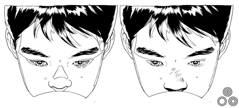
Tyler: ‘Here you can see a couple of variations on the nose and eyes of the boy above the explosion’ – Image copyright © Tyler Stout, 2011
Once you’d submitted the poster were you given any directions by the Mondo guys for things to add or remove?
Not that i can think of. Justin [Ishmael] is a big Akira fan as well so I’m sure we talked about it, but I can’t remember anything major. I actually sent it to the printers the day before I left for Austin, so only 3 days before the event. It was down to the wire; the posters arrived by plane about 10 minutes before the movie started. It was nuts!
The screening also marked the first time you visited the Mondo crew in Austin. What was that experience like?
It was a lot of fun. I’ve talked to them on the phone so much over the years that I feel like I know them but seeing them in person was a pleasure and they went out of the their way to make it a very special event, which was pretty cool. It lived up to my expectations and I even got a Bigfoot costume out of the deal!
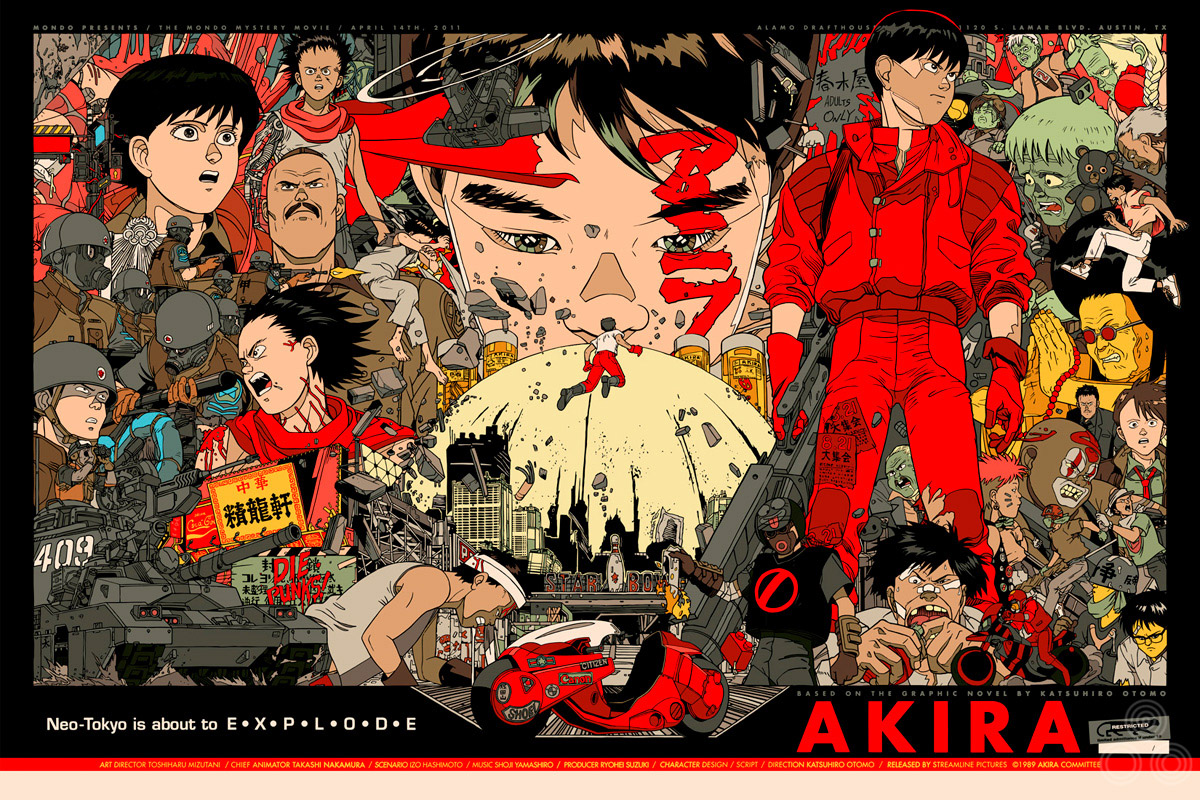
Tyler: ‘This is one of the alternative color schemes I tried out’ – Image copyright © Tyler Stout, 2011
Finally, I know you’re often asked this, but what other films would you love to design a poster for if you were given another situation like this, where the choice was yours?
That’s a hard one. Since Justin envisioned these posters as ‘at the event only’, with none to be sold afterwards, we had to come up with a movie that people wouldn’t be devastated to miss (I’ve since found out there are more Akira fans than i realized). We talked about Jaws, Escape From New York and many others, but figured it would be kinda unfair to do such a big movie and not let people have a shot to pick it up. Sooo… I dunno, maybe Vampire Hunter D or Ninja Scroll or My Neighbour Totoro if we’re talking anime. If we’re talking live-action then maybe Deep Rising or Night of the Comet or Night of the Creeps.
Thanks so much for answering these questions for me, it’s very much appreciated.
Sure, I’m happy to help out.
Check out Tyler’s own website here.
A big thanks to the Mondo crew, without whom this poster (and interview) would not have happened.
Here are the other posters I have which were done by Tyler.
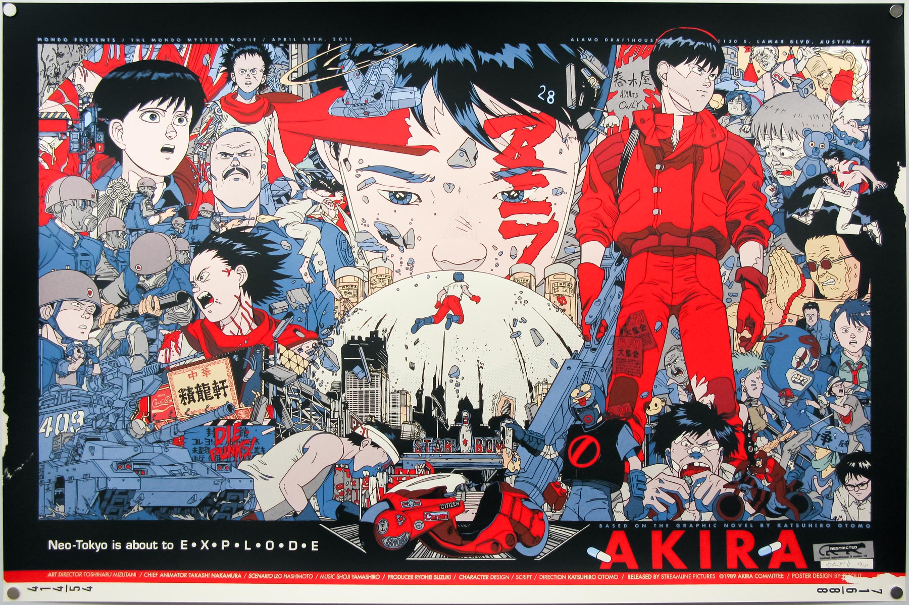
Some day I will own this poster. It is so awesome.
I’d love to see Tyler’s vision of “Ninja Scroll” and “Night of the Comet” too.