Poster detail
1-5

- AKA
- --
- Year of Film
- 2010
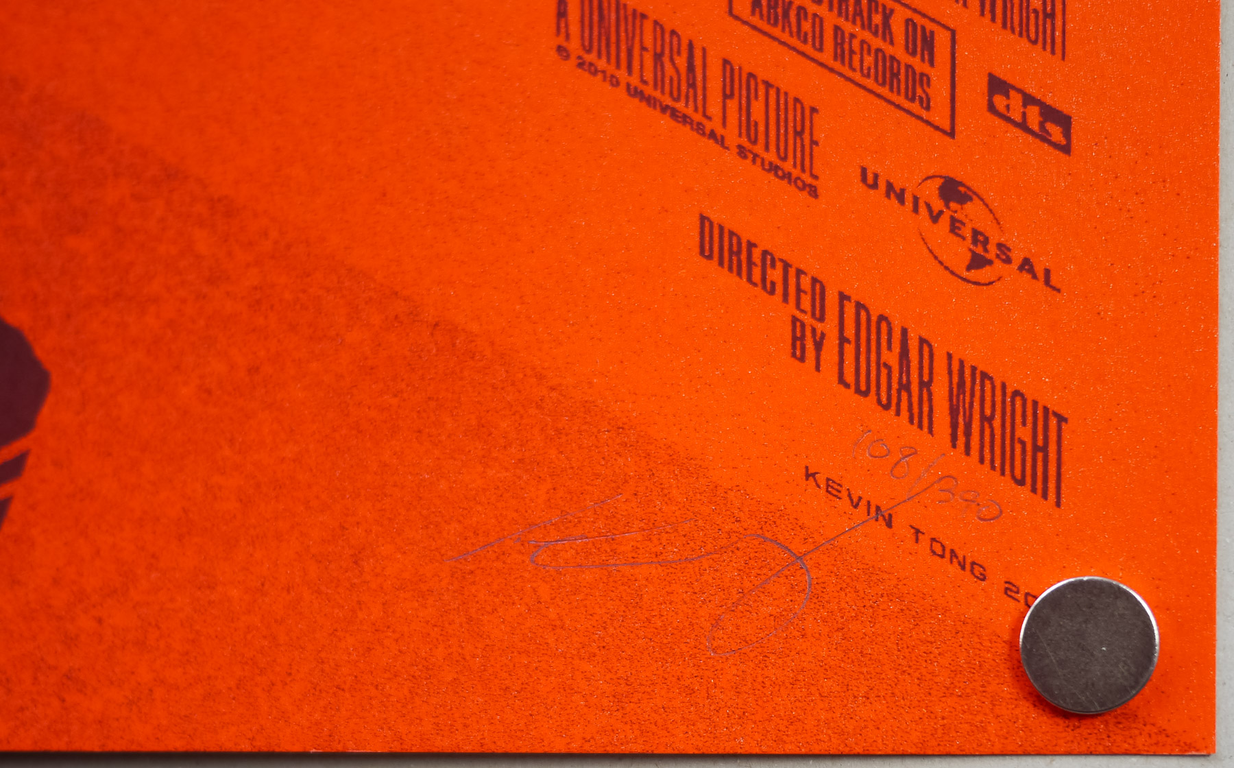
- Director
- Edgar Wright
- Starring
- Michael Cera, Mary Elizabeth Winstead, Jason Schwartzman, Brandon Routh, Anna Kendrick, Kieran Culkin, Aubrey Plaza, Alison Pill, Mark Webber, Johnny Simmons, Ellen Wong, Satya Bhabha
- Origin of Film
- USA | UK | Canada | Japan
- Genre(s) of Film
- Michael Cera, Mary Elizabeth Winstead, Jason Schwartzman, Brandon Routh, Anna Kendrick, Kieran Culkin, Aubrey Plaza, Alison Pill, Mark Webber, Johnny Simmons, Ellen Wong, Satya Bhabha,
- Type of Poster
- Screen print
- Style of Poster
- Regular
- Origin of Poster
- USA
- Year of Poster
- 2010
- Designer
- Martin Ansin
- Artist
- Martin Ansin
- Size (inches)
- 24" x 35 15/16"
- SS or DS
- SS
- Tagline
- --
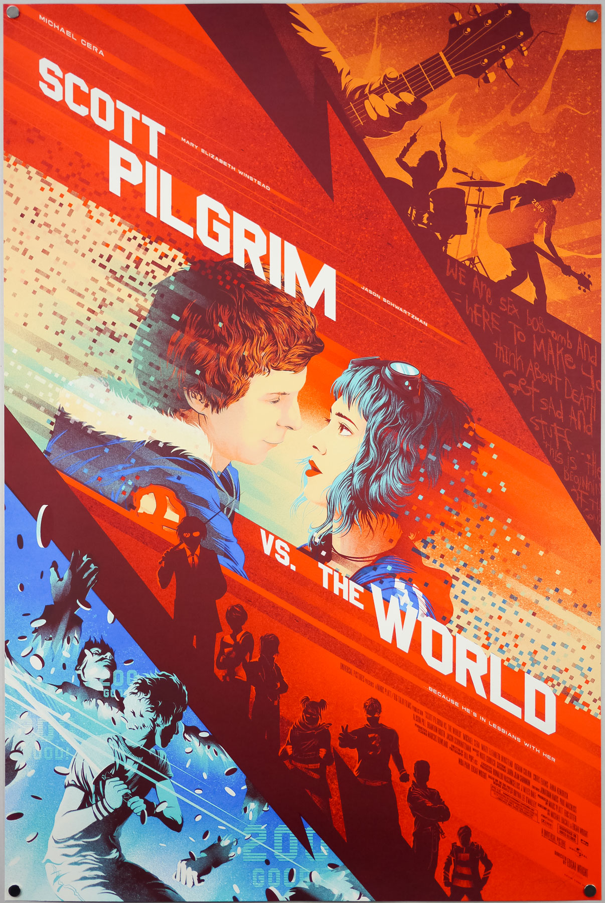
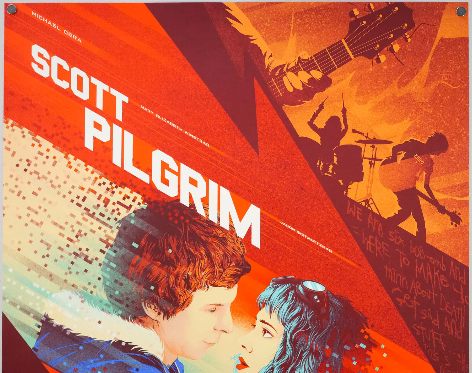
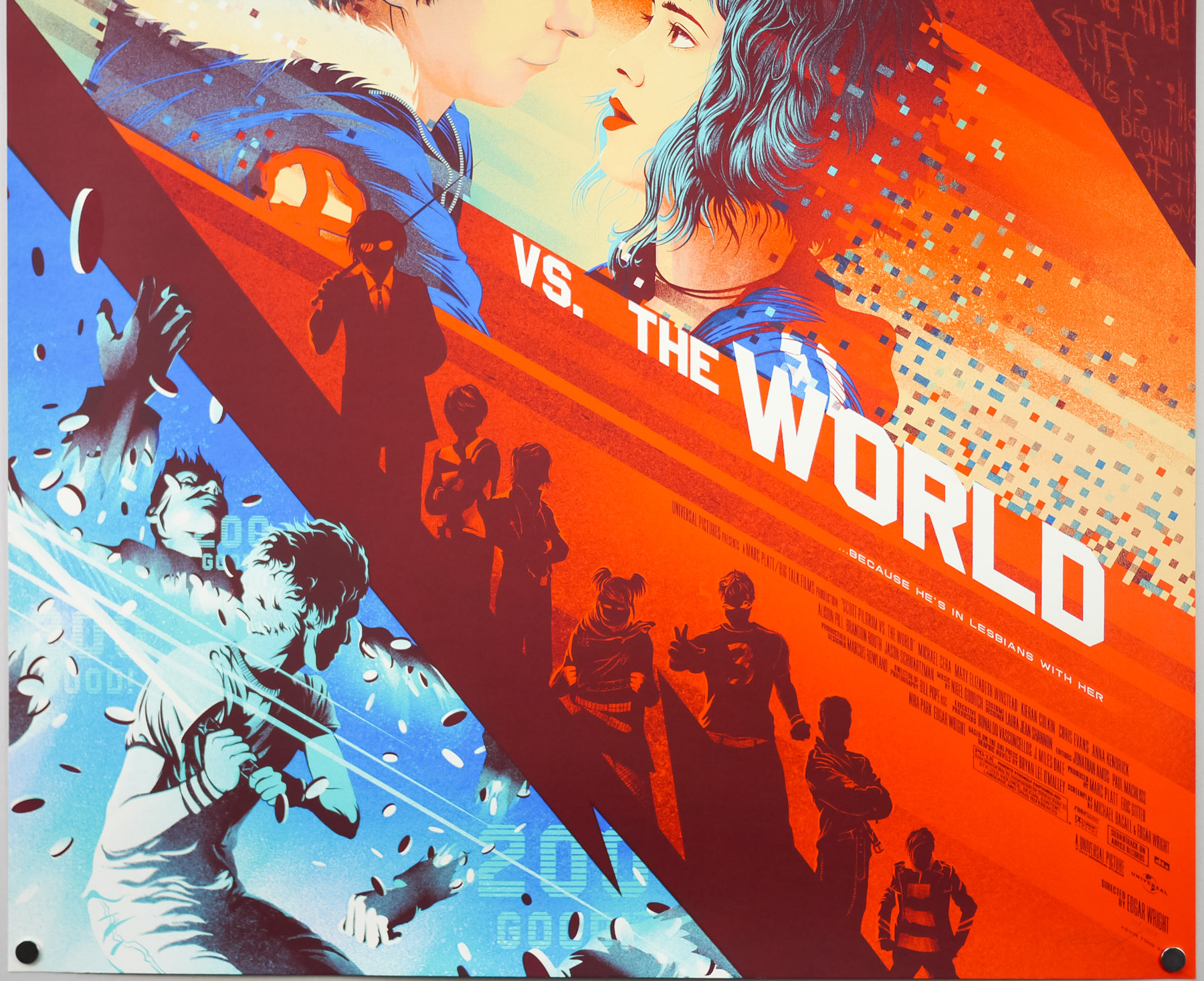
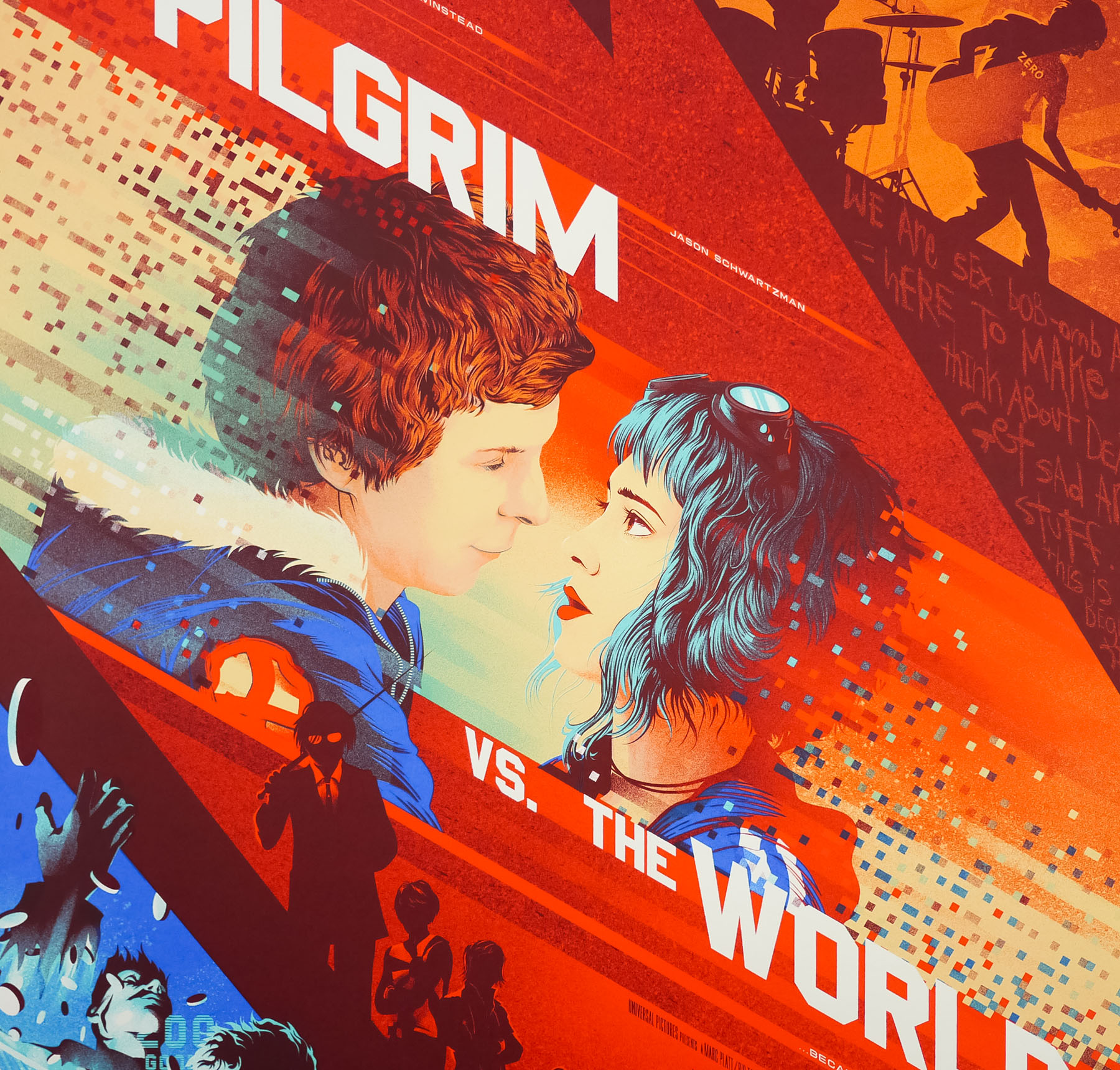
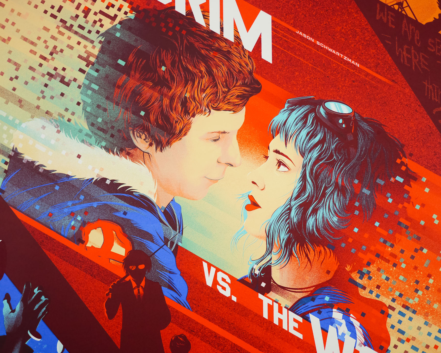
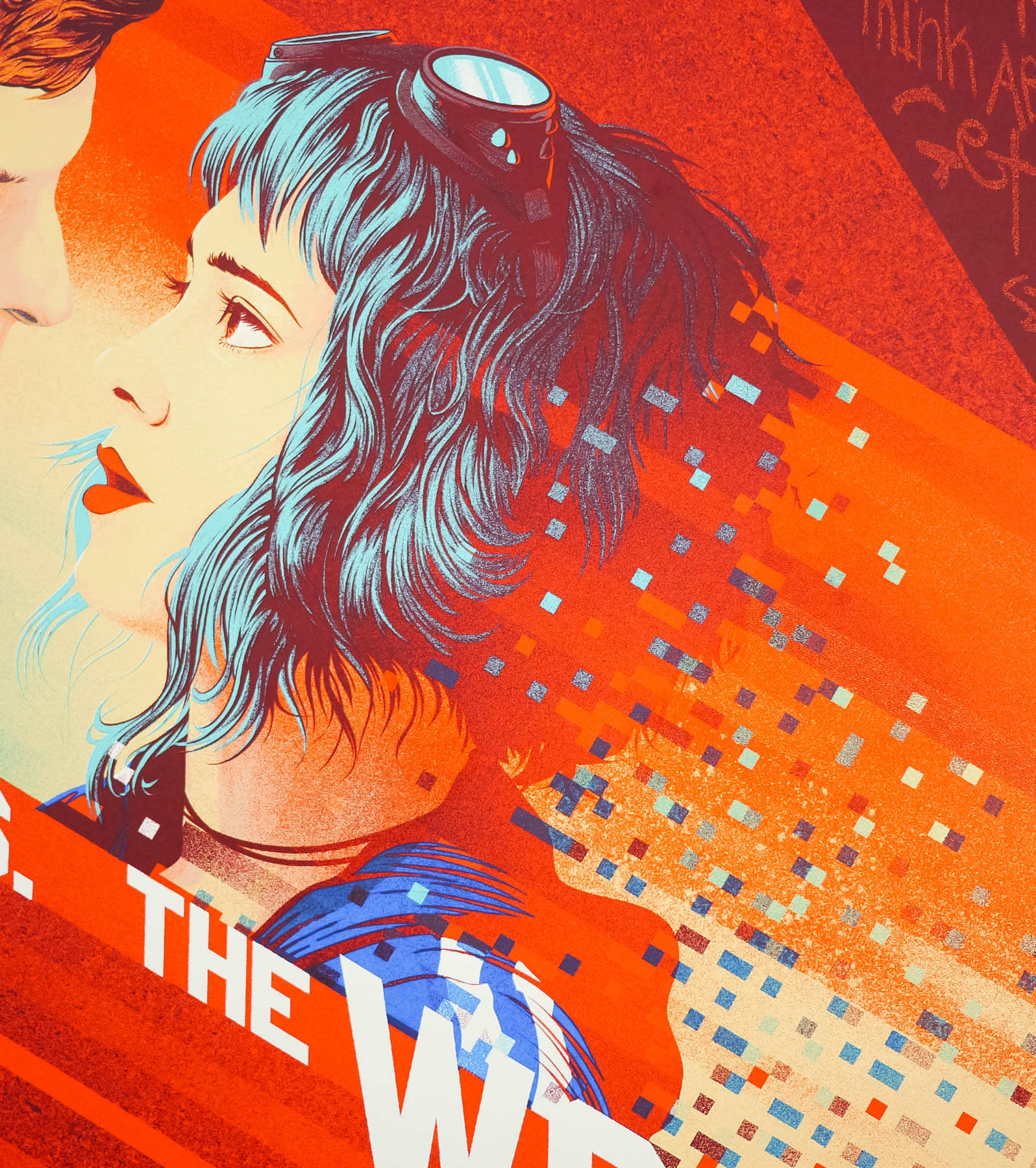
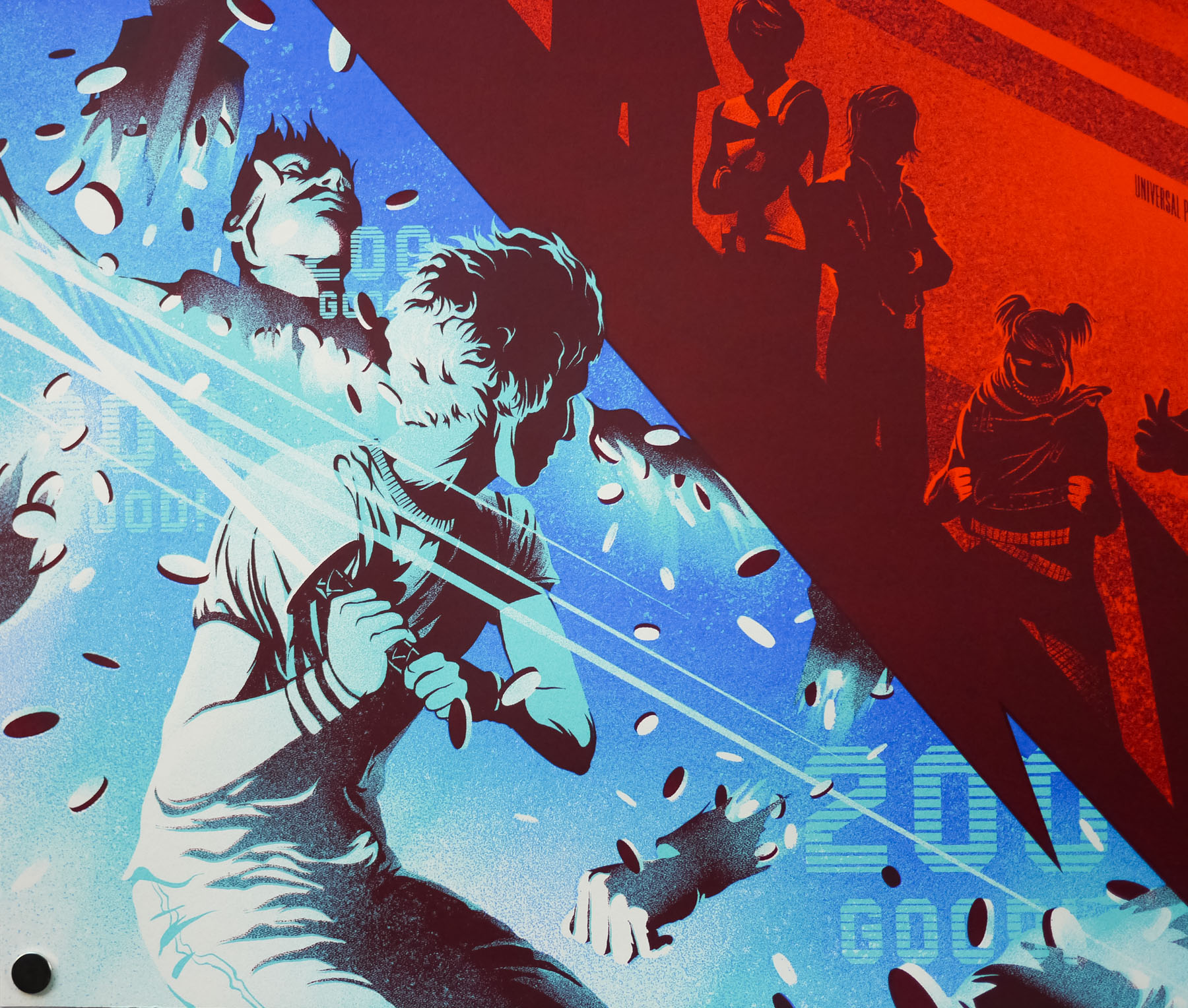
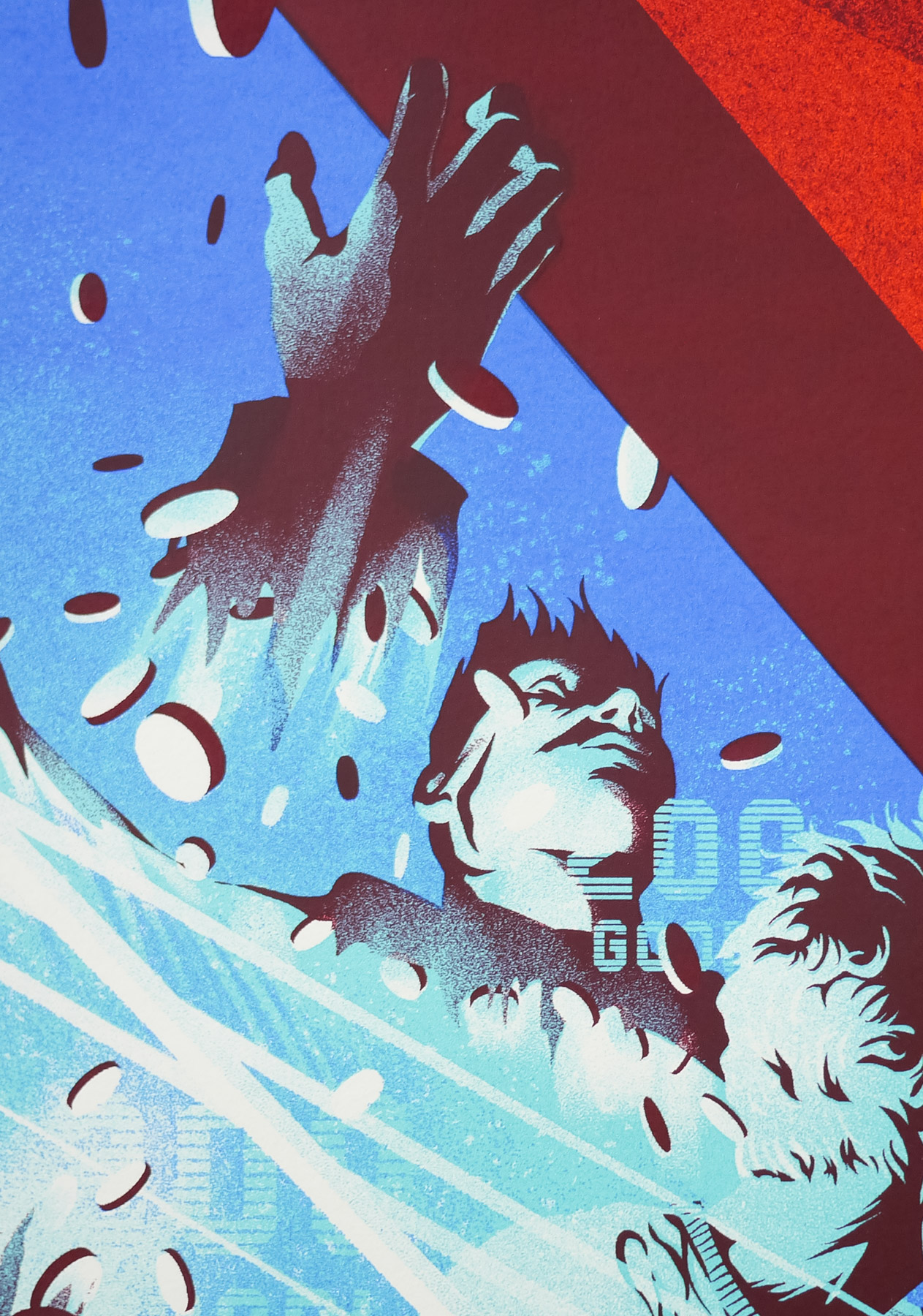
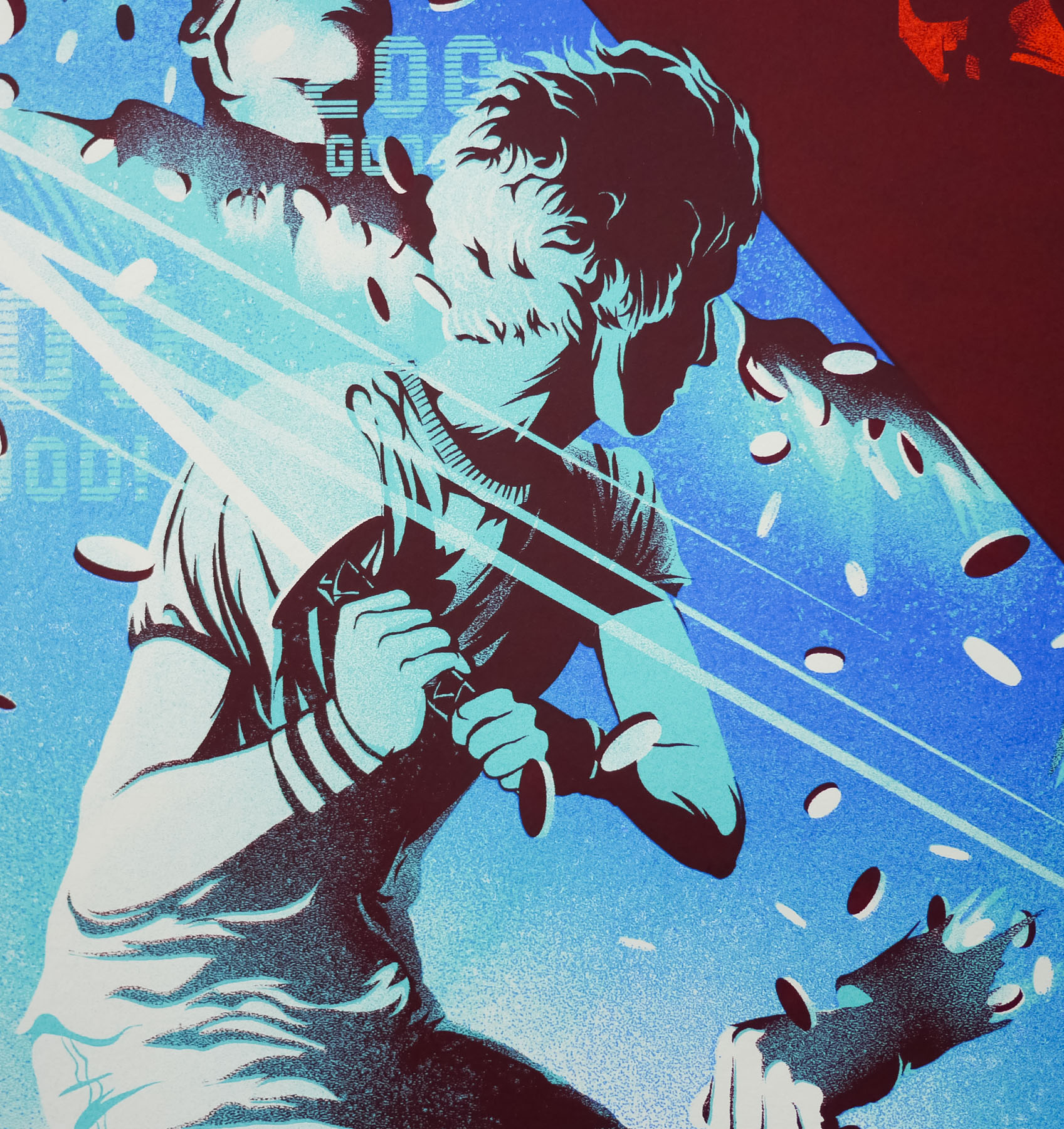
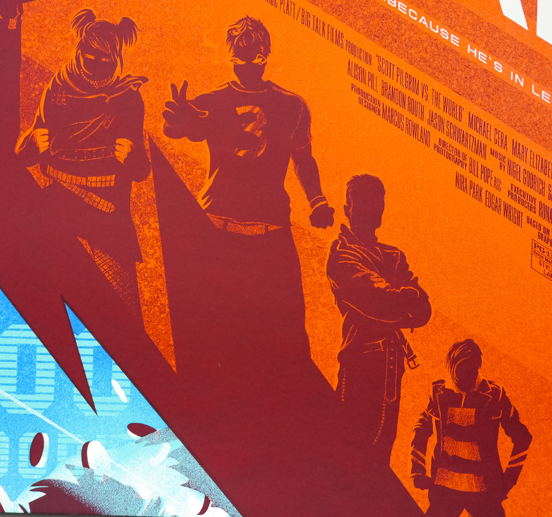
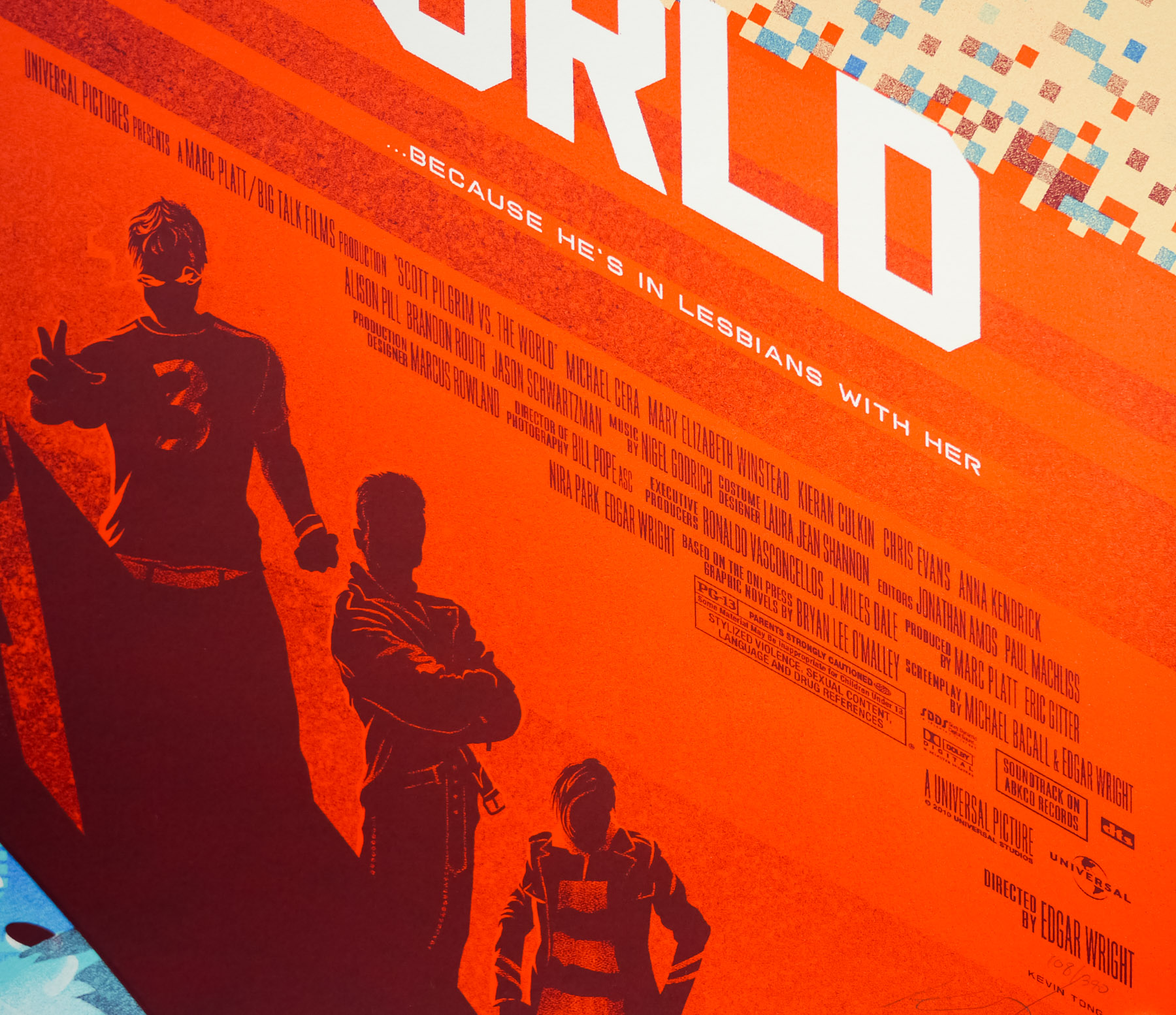
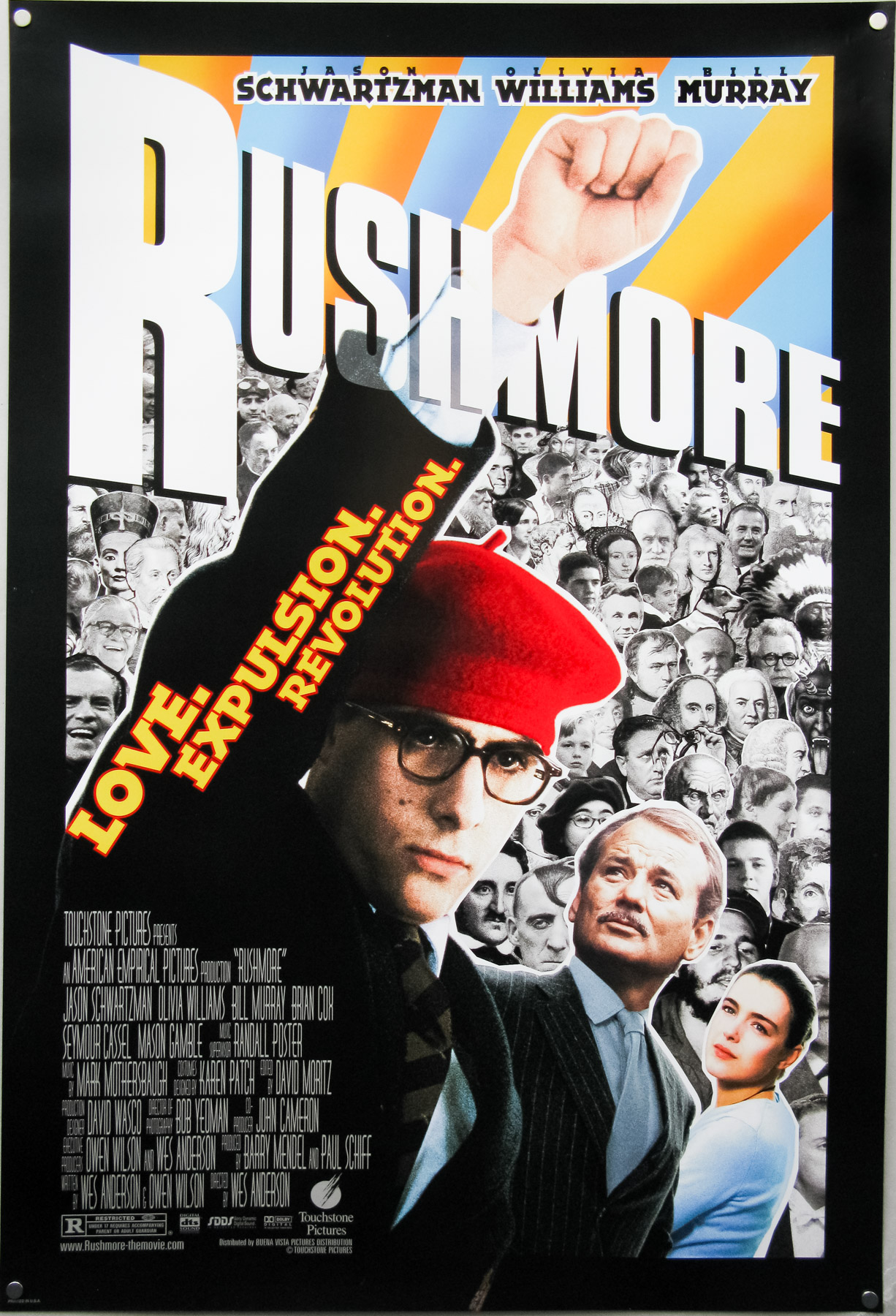
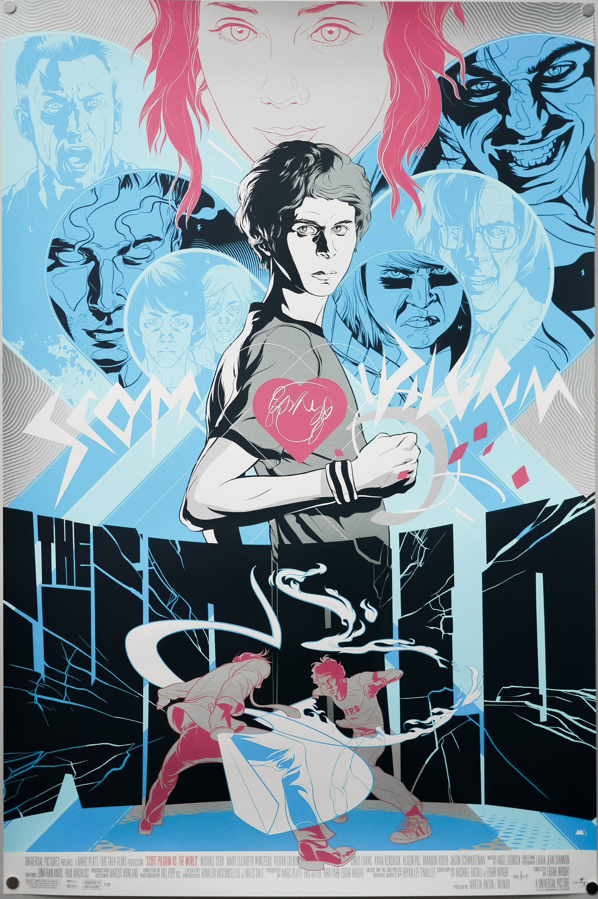
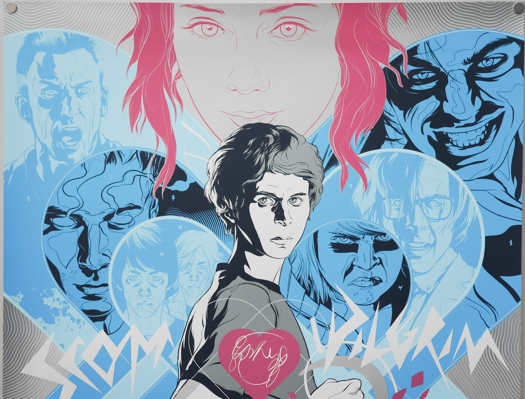
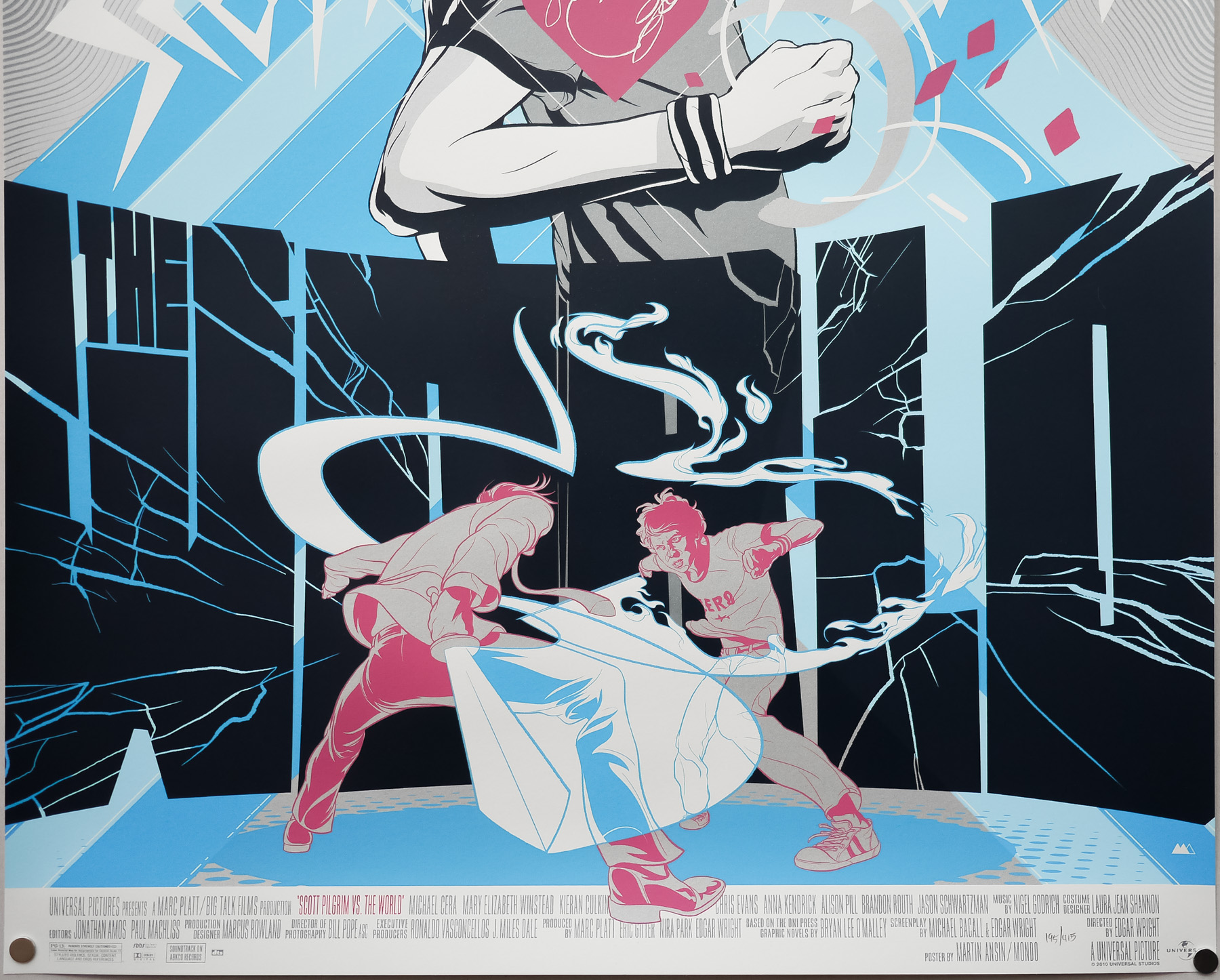
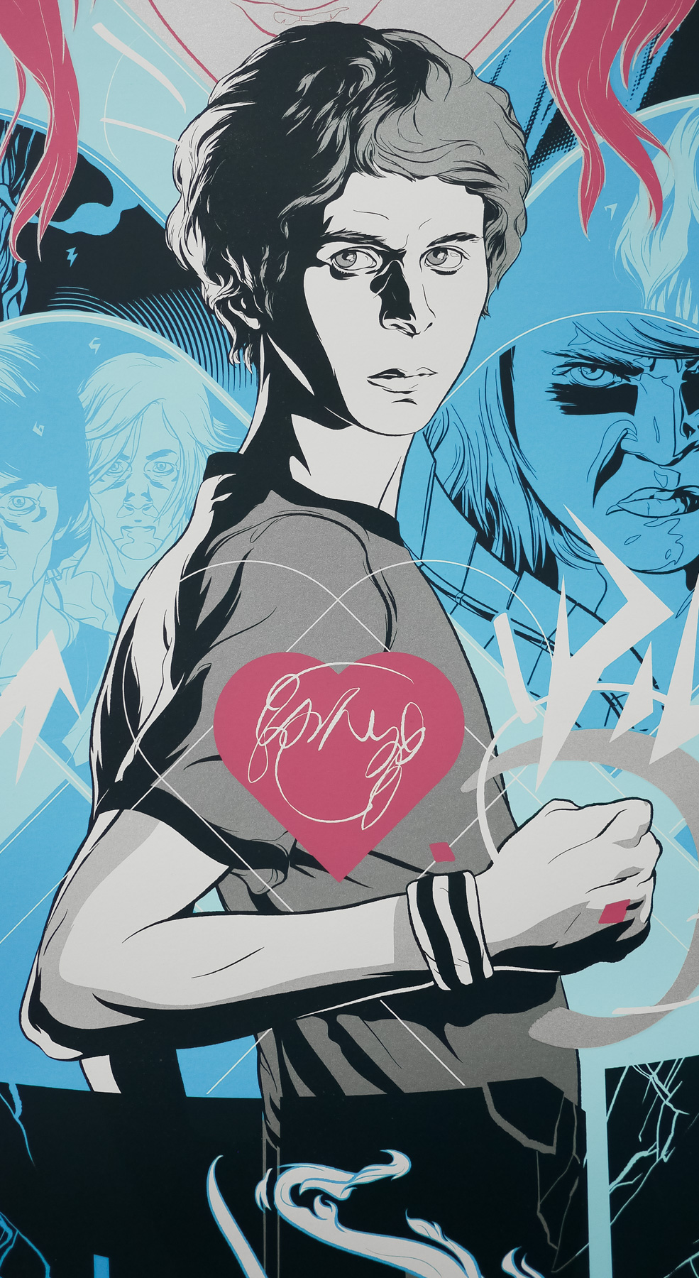
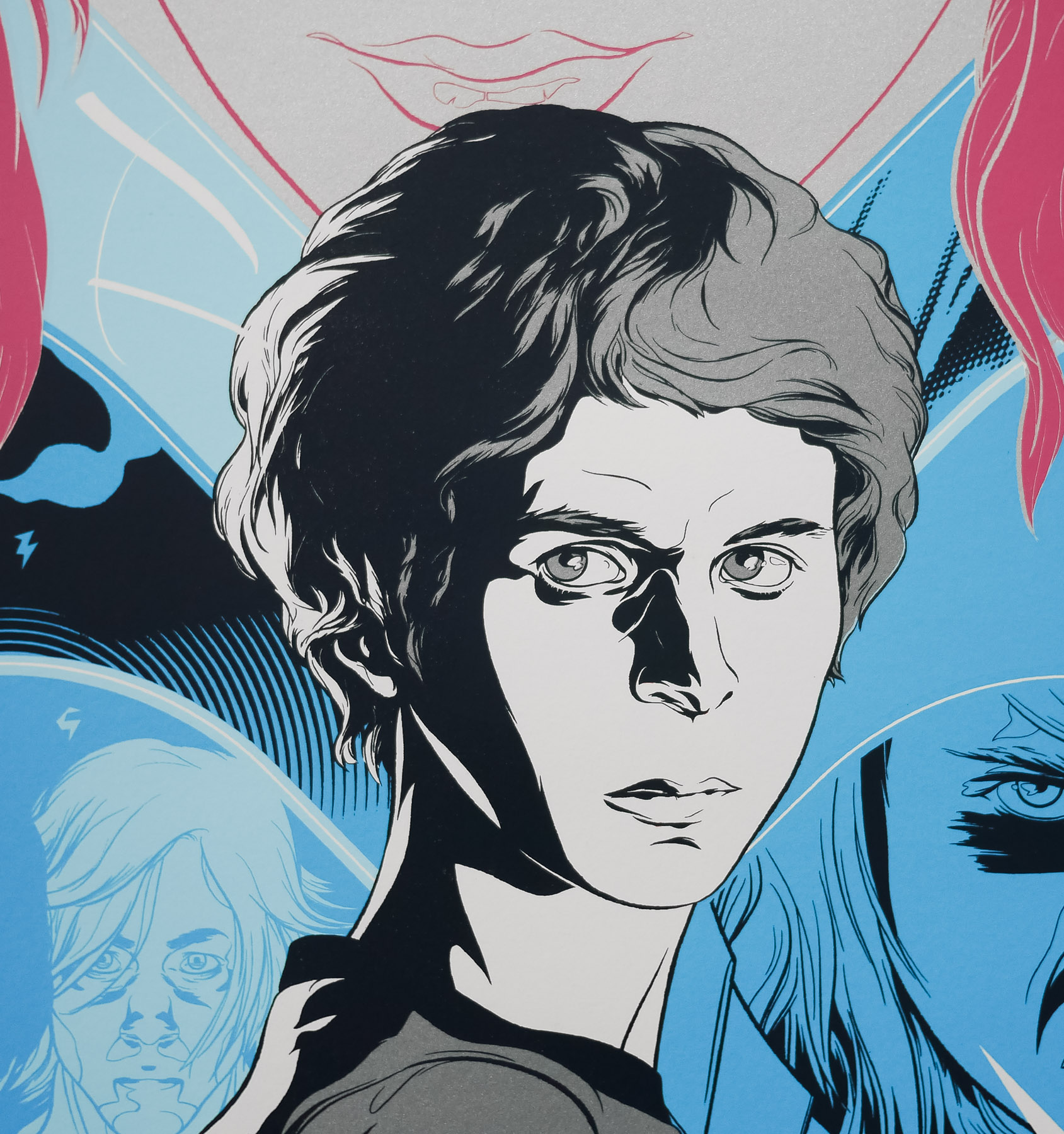
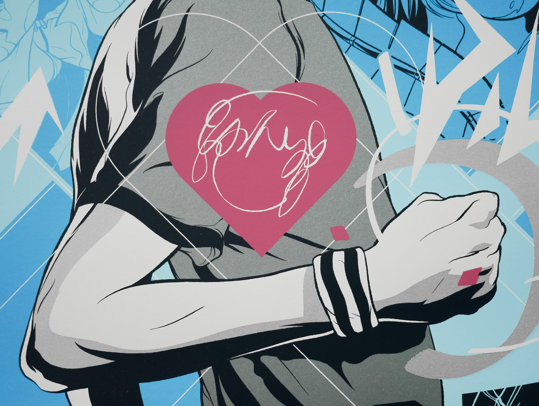
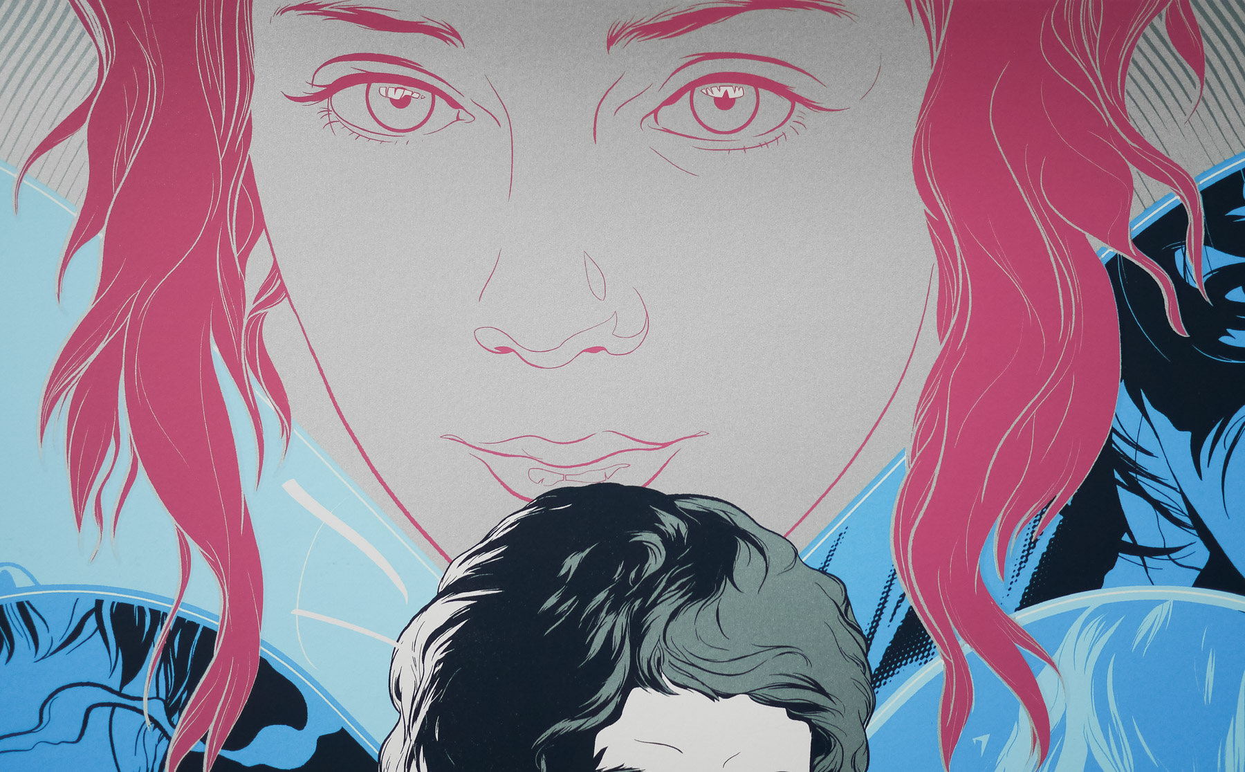
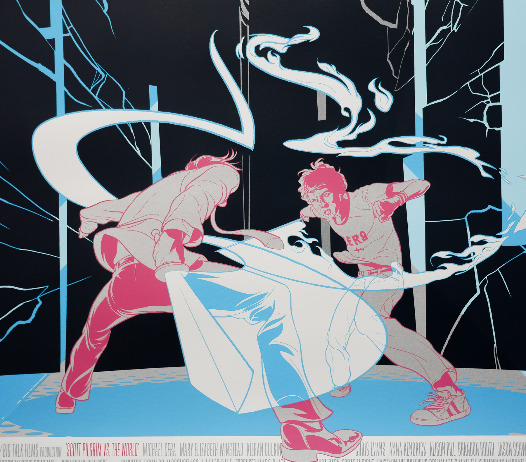
Ace director Edgar Wright‘s Scott Pilgrim vs The World was my favourite film of 2010 and is one of the most carefully crafted, brilliantly realised and wonderfully energetic films ever released. Based on a series of graphic stories created by Canadian cartoonist Bryan Lee O’Malley, the film tells the story of the eponymous character, played in the film by Michael Cera, who falls for the alluring Ramona Flowers (Mary Elizabeth Winstead) and must then battle her seven evil exes in order to win her heart. The actors playing the exes are perfectly cast and include Brandon Routh, Chris Evans and Jason Schwartzman.
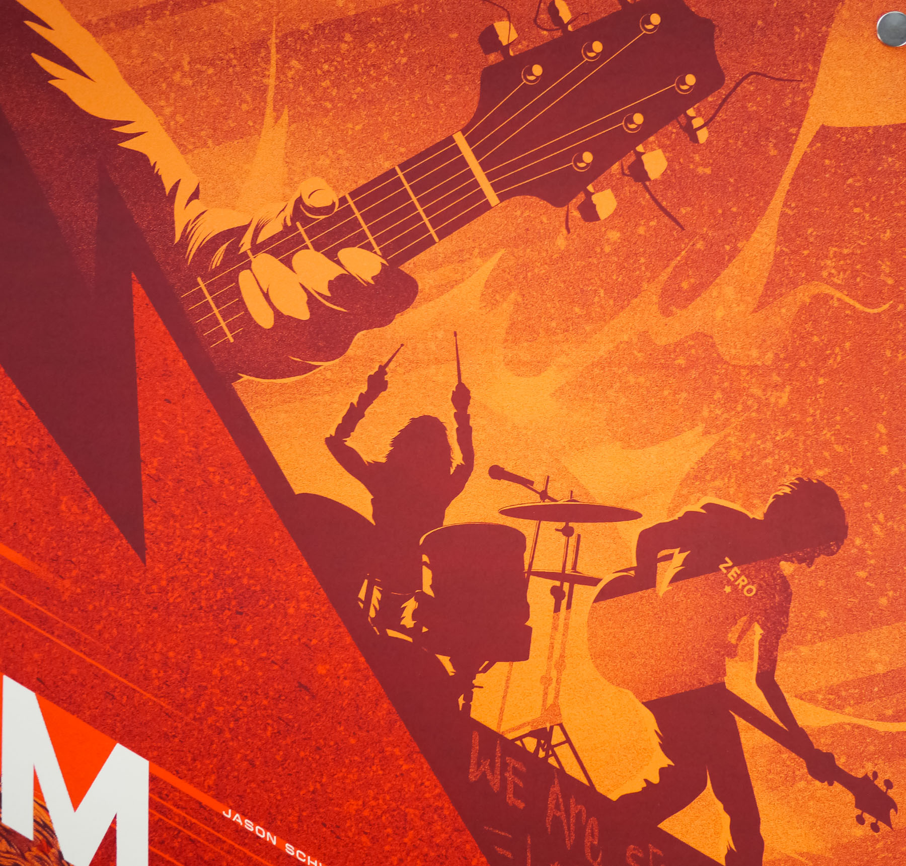
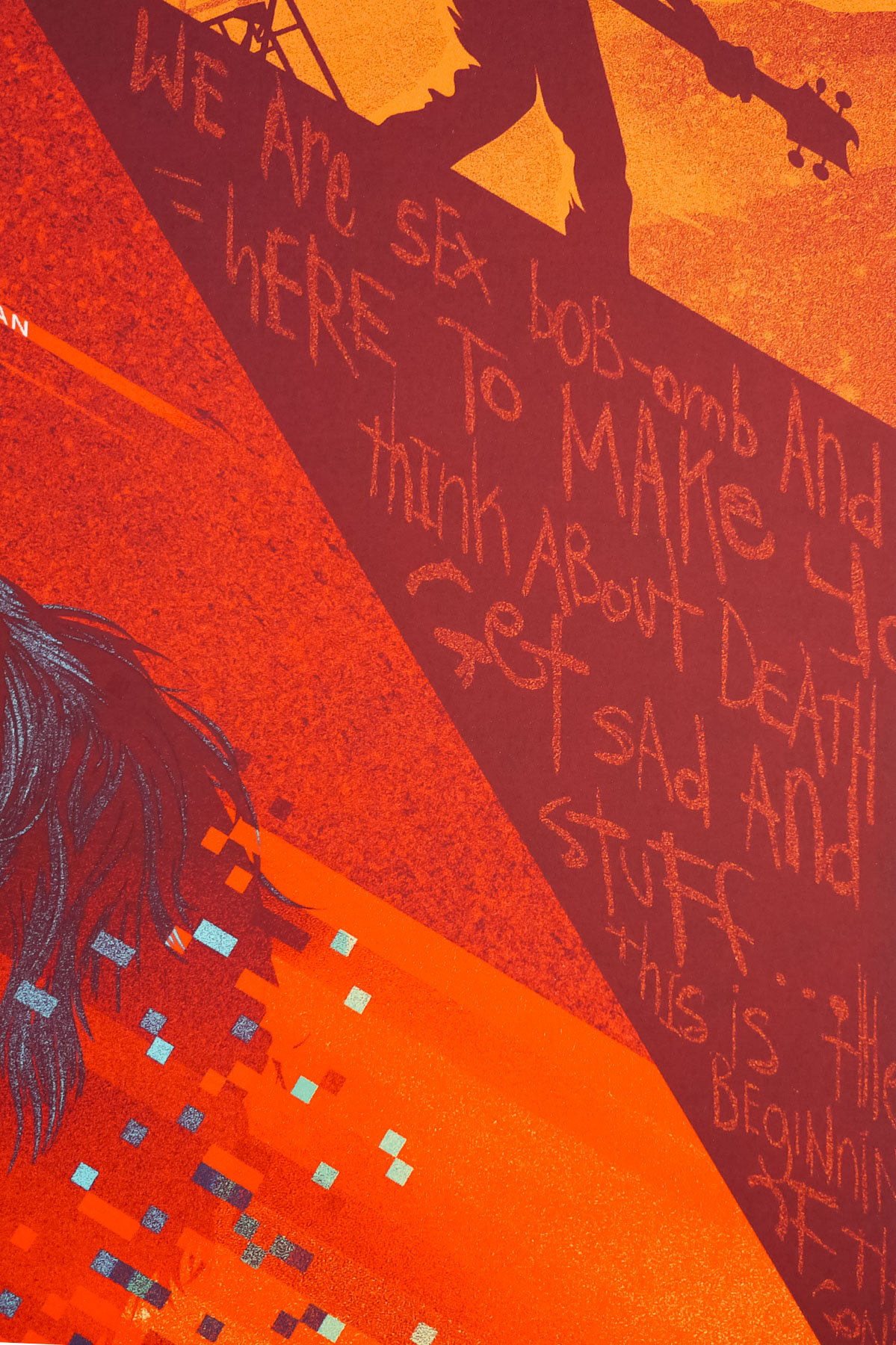
The film is a visual treat and rewards multiple viewings thanks to the brilliant script, kinetic editing and careful inclusion of hidden elements (look out for the many ‘X’s secreted throughout the film, for example). Some of the effects have to be seen to be believed, including an amazing battle of the bands sequence featuring two building-sized dragons and one angry gorilla beast. Much was made of the fact that the film was a critical success but was unable to make much of a box-office impact on release, but there’s no question that the film has found, and will continue to find, an appreciative audience on home video.
The official film posters for the film were slightly disappointing considering the level of craft put into the film itself and I felt at the time that, despite an interesting advance poster, so much more could have been done.
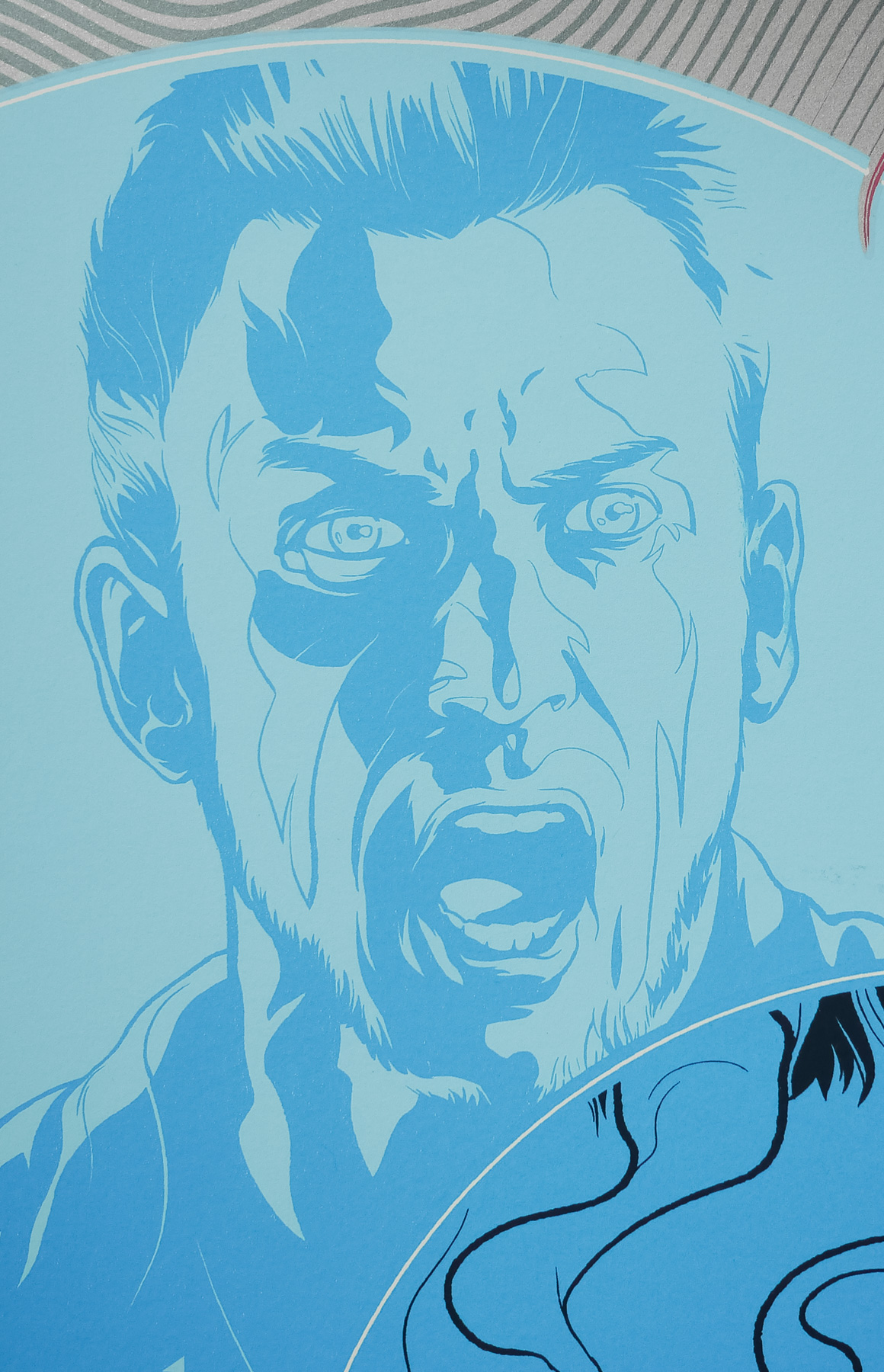
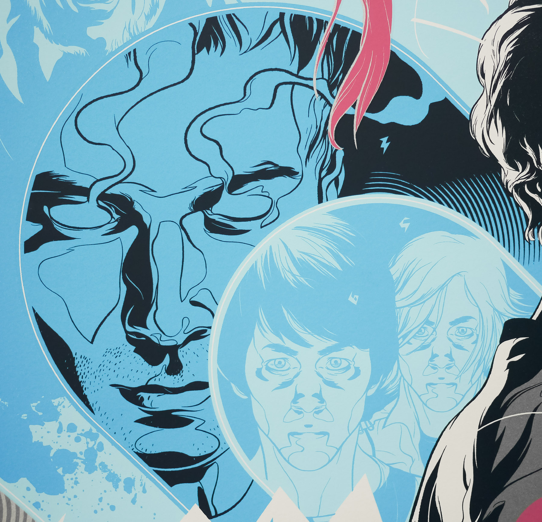
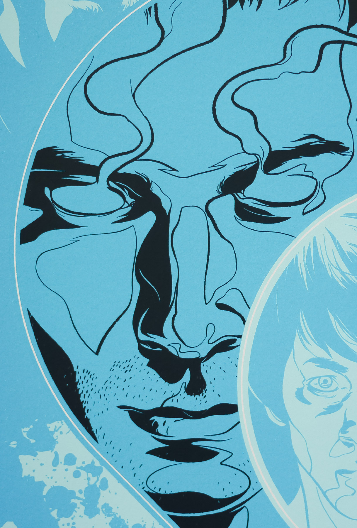
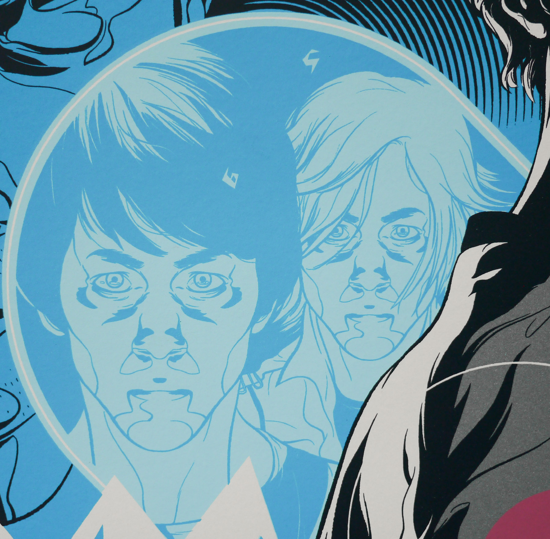
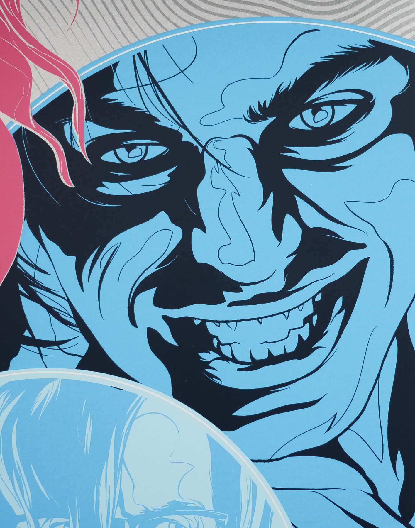
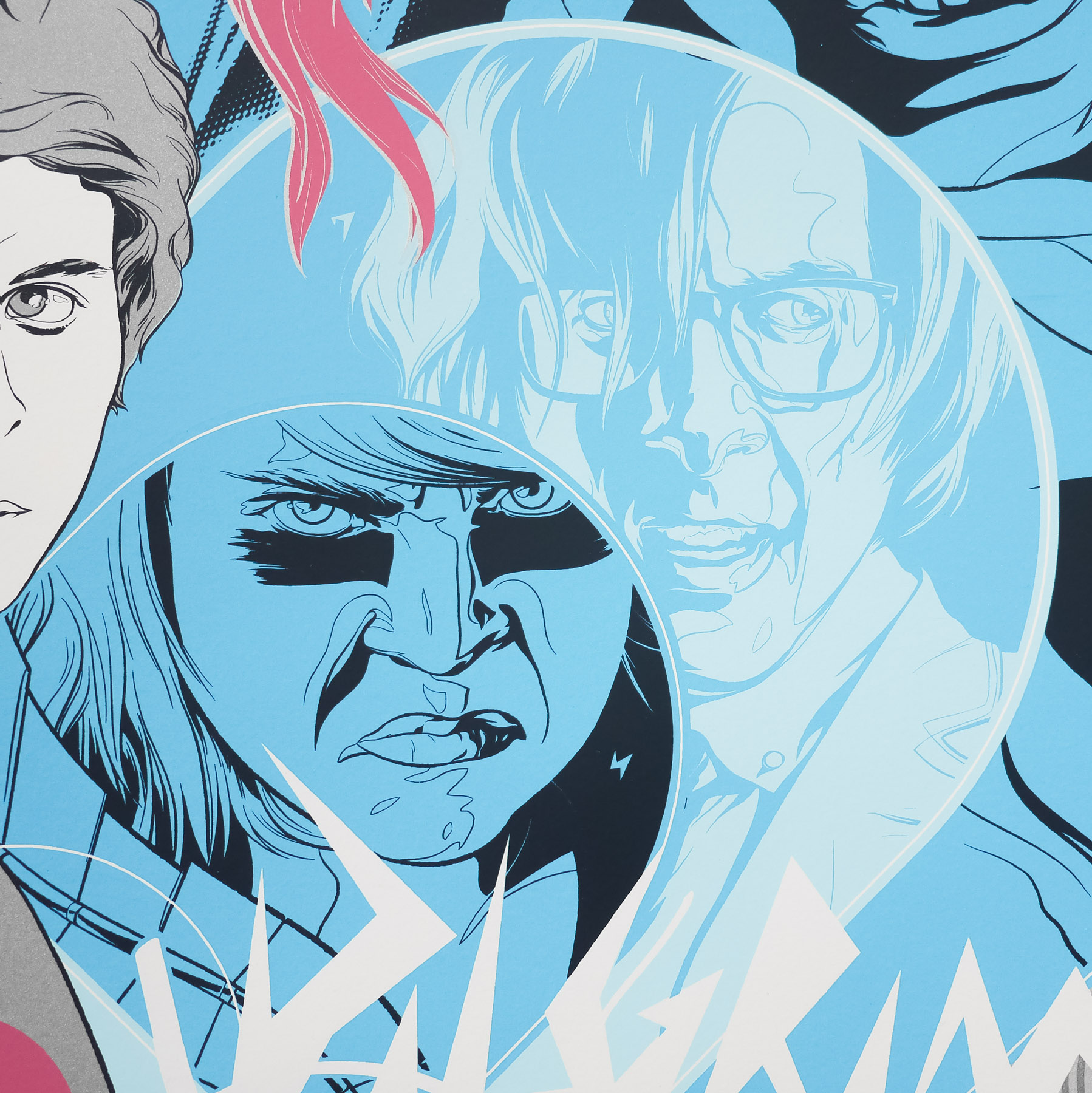
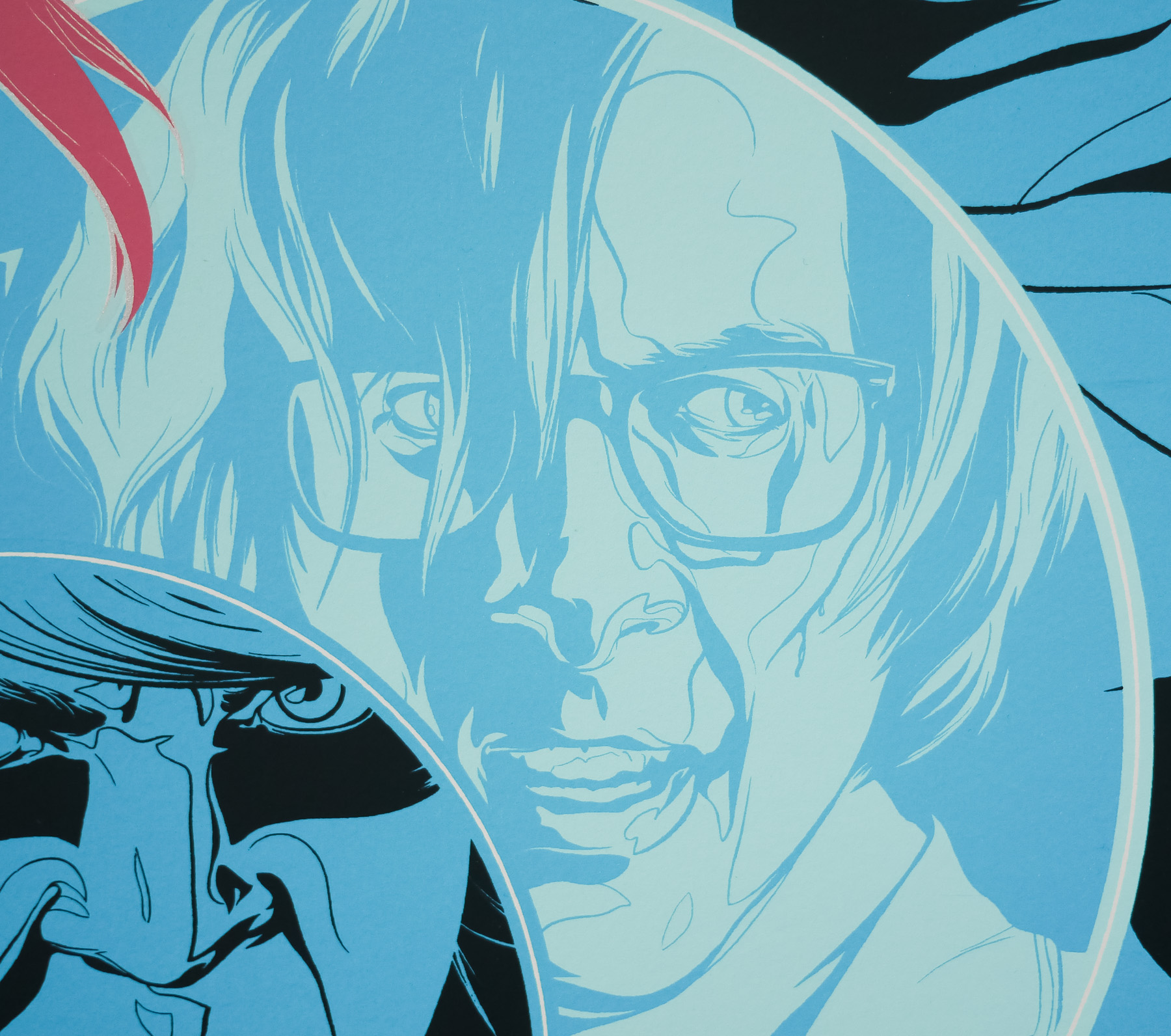
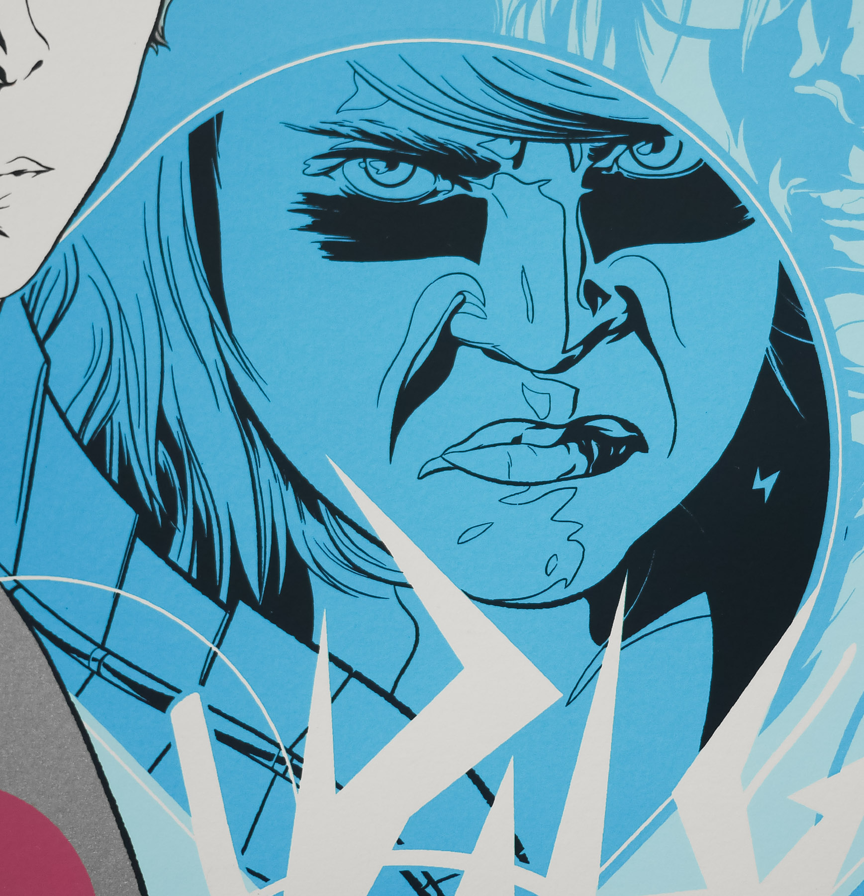
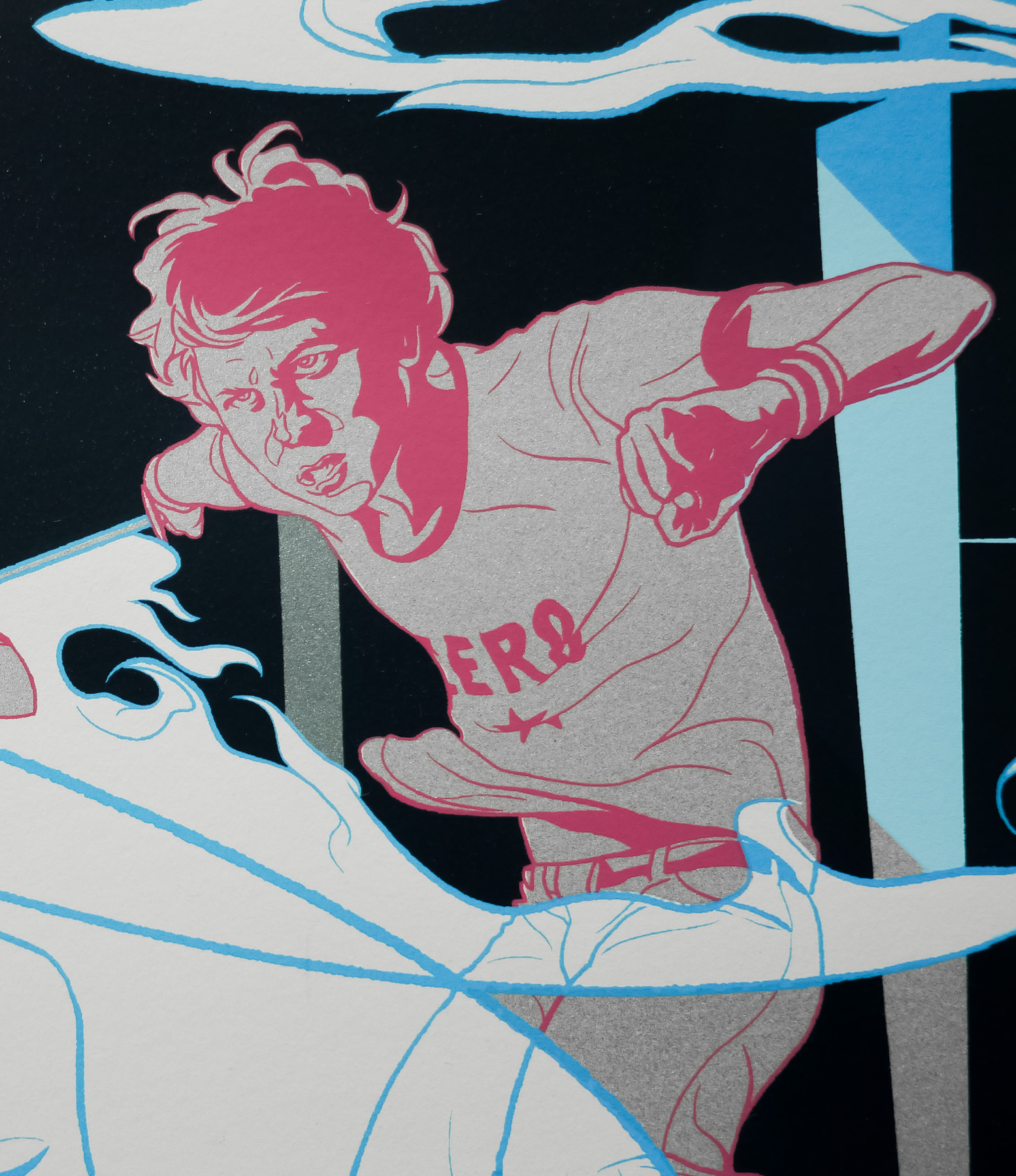
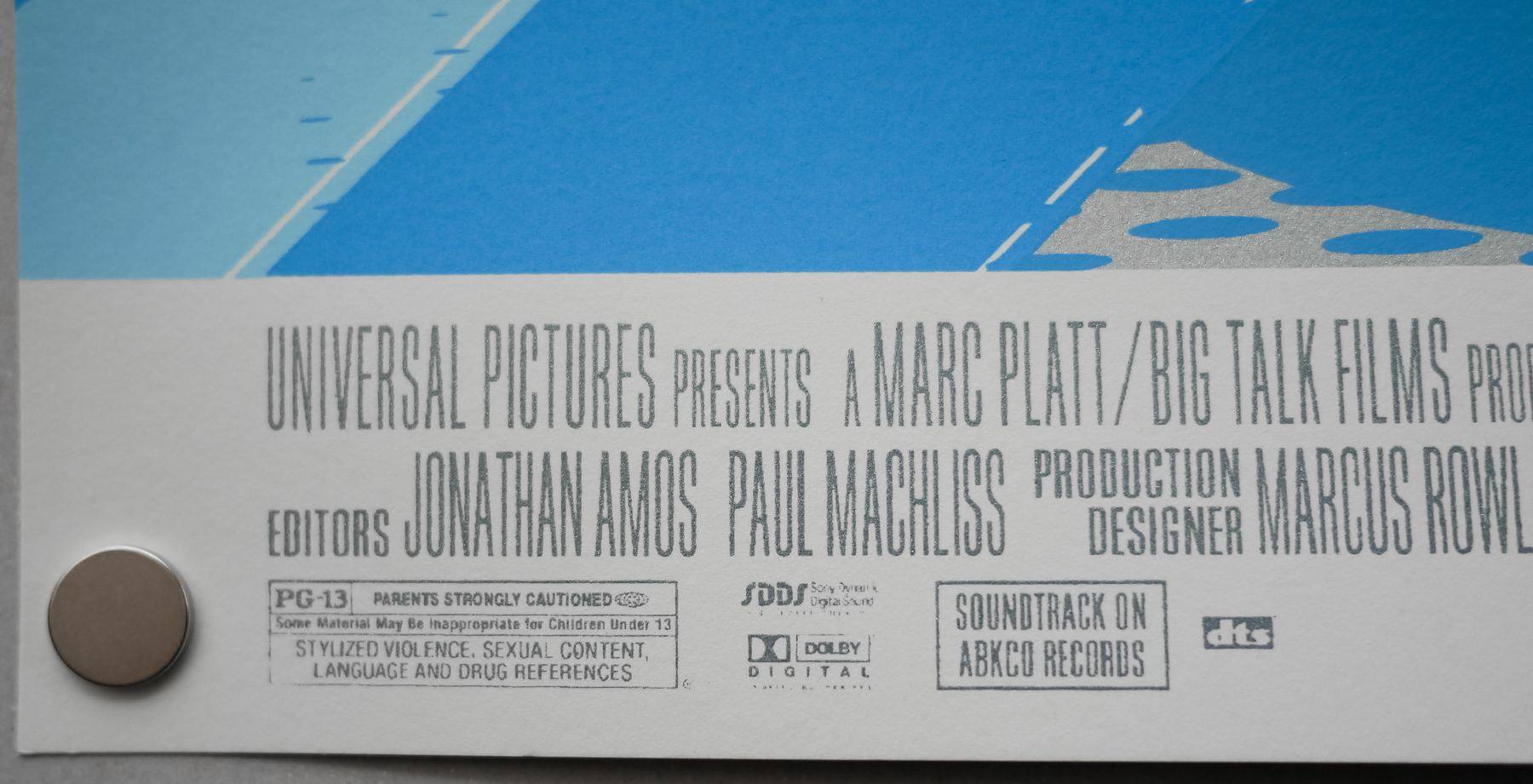
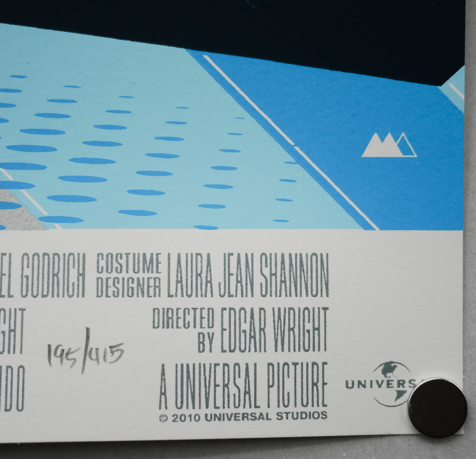
This screen print was commissioned by the limited edition poster outfit Mondo for the Alamo Drafthouse premiere of the film. It was created by the incredibly talented Uruguayan designer and artist Martin Ansin, whose work has graced many of the best posters released by Mondo, including several in the Universal Monsters series, like this amazing Phantom of the Opera one. He perfectly captures the kinetic energy of the film and the title treatment is absolutely spot on, echoing as it does the use of type in the film itself. The artist also worked on a variant of the poster that features Nega Scott, seen briefly at the end of the film.
The other posters I’ve collected by Ansin can be seen here. His official website is well worth a browse.