


Poster details
Select to view
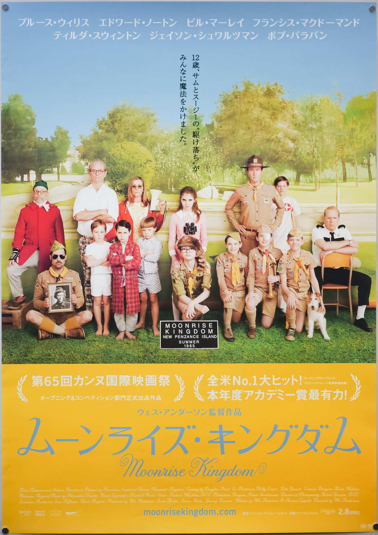


- Title
- Moonrise Kingdom
- AKA
- --
- Year of Film
- 2012
- Director
- Wes Anderson
- Starring
- Bruce Willis, Edward Norton, Bill Murray, Frances McDormand, Tilda Swinton, Jared Gilman, Kara Hayward, Jason Schwartzman, Bob Balaban
- Origin of Film
- USA
- Type of Poster
- B1
- Style of Poster
- --
- Origin of Poster
- Japan
- Year of Poster
- 2012
- Designer
- Unknown
- Size (inches)
- 28 12/16" x 40.5"
- SS or DS
- SS
- NSS #
- --
- Tagline
- --
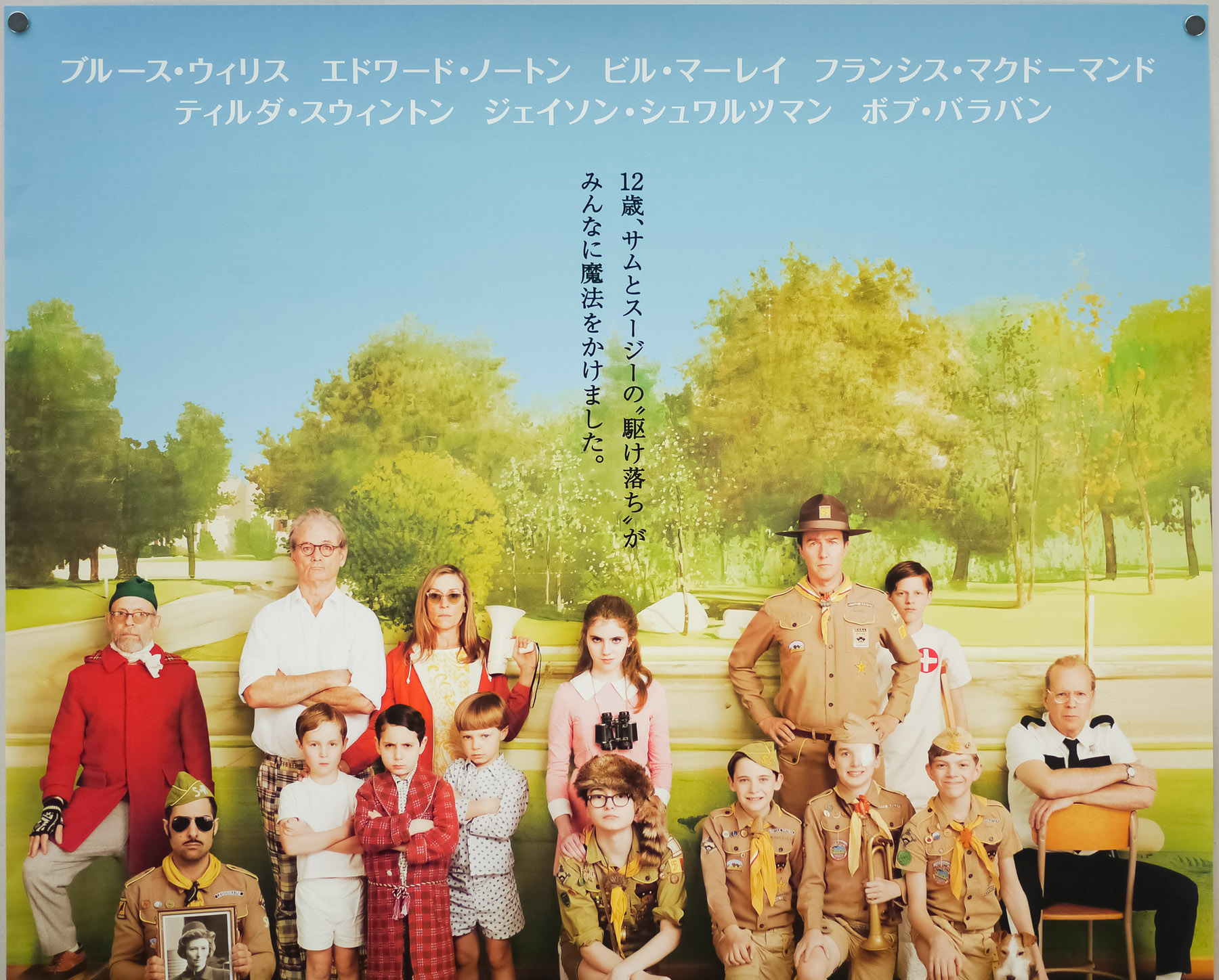
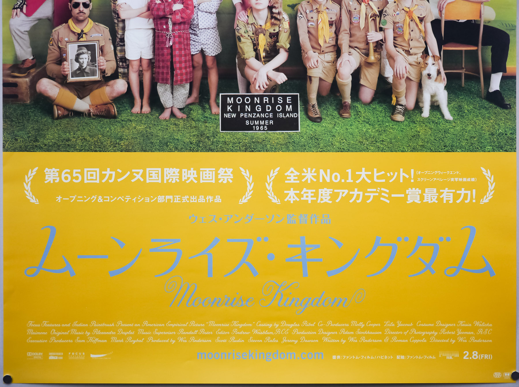
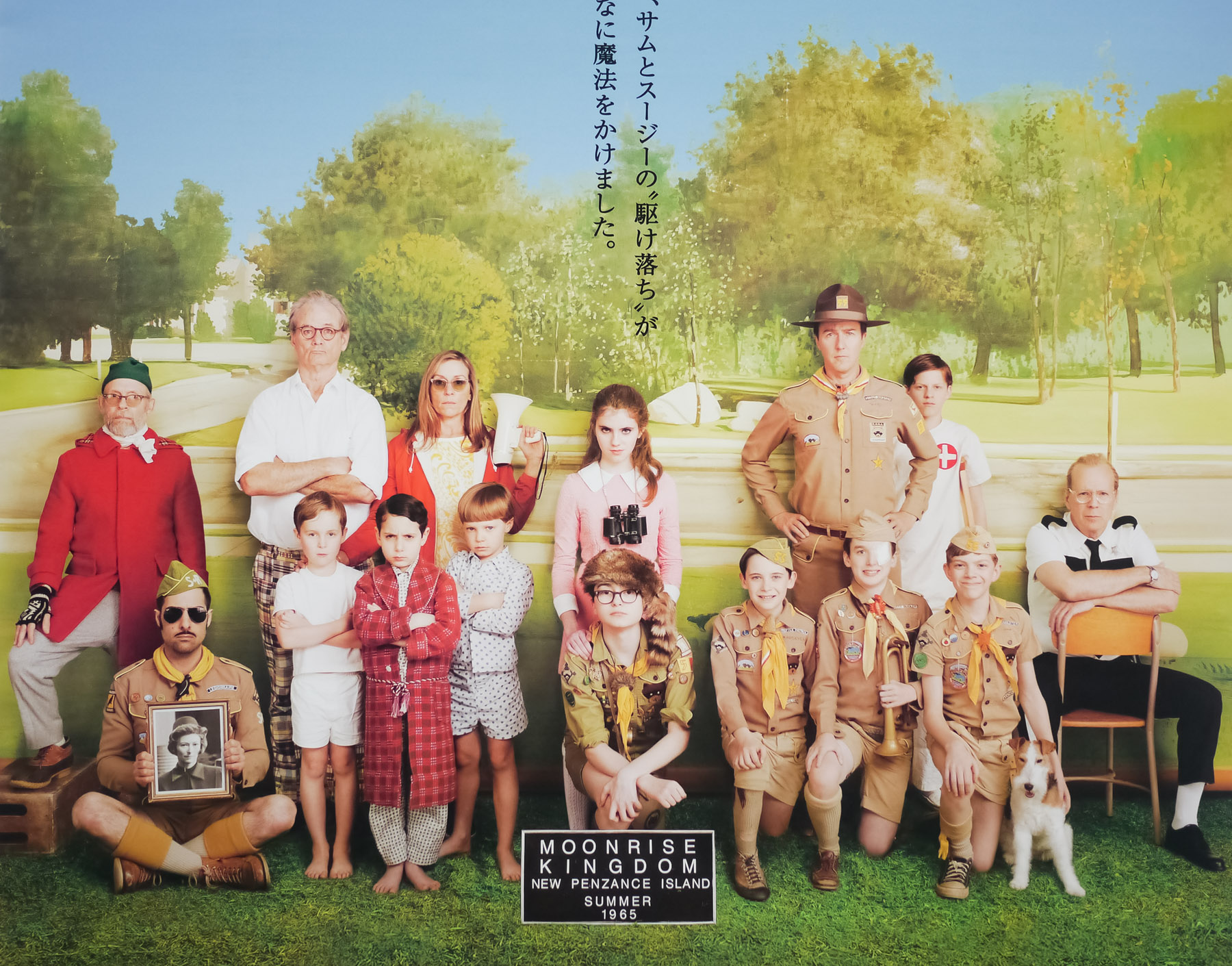
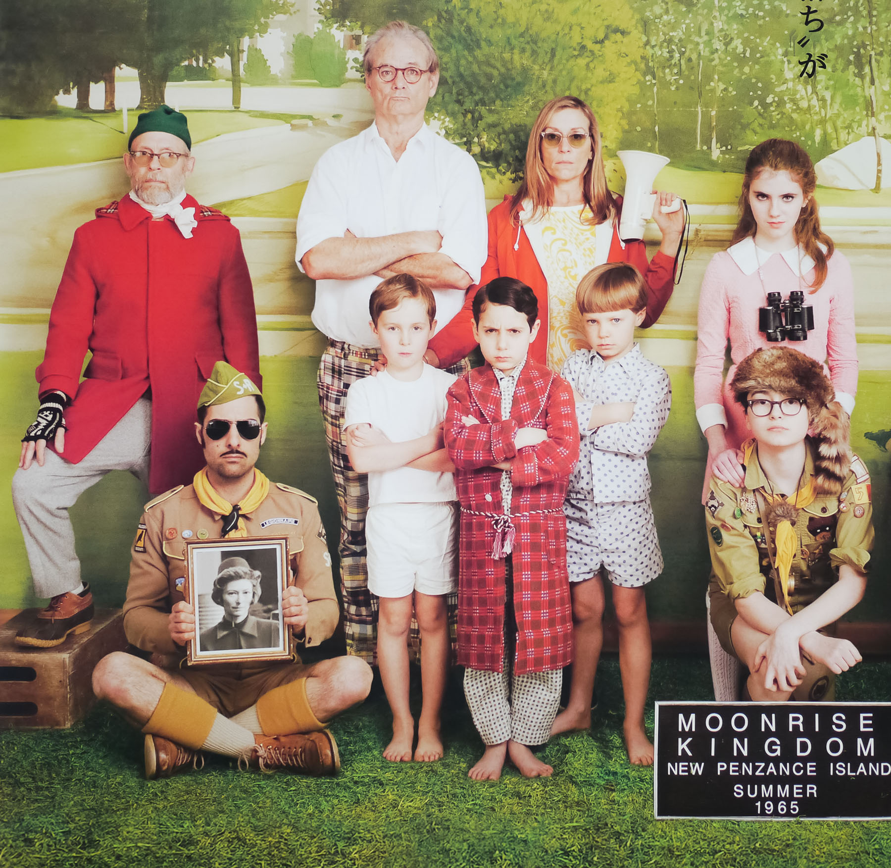
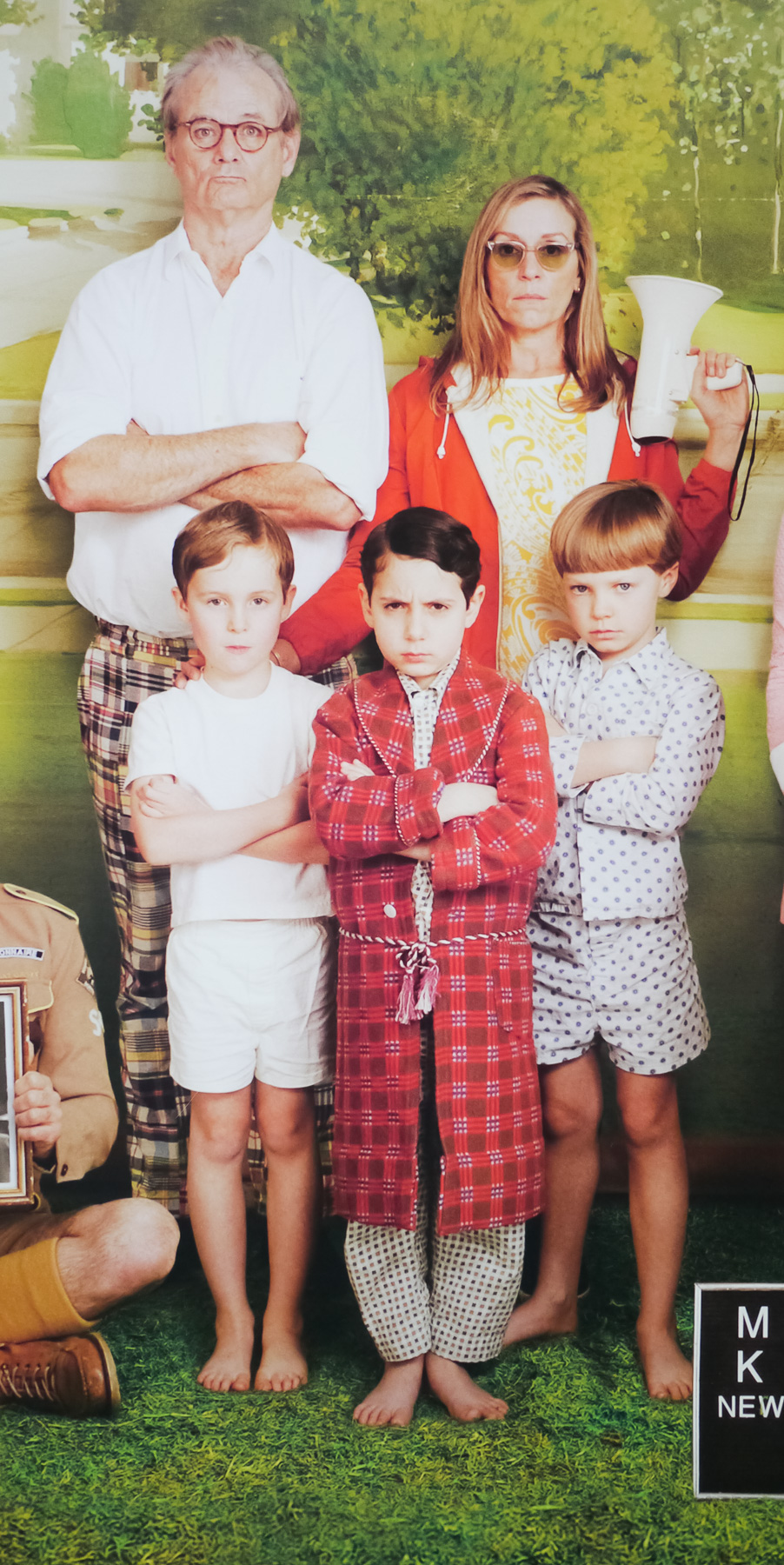
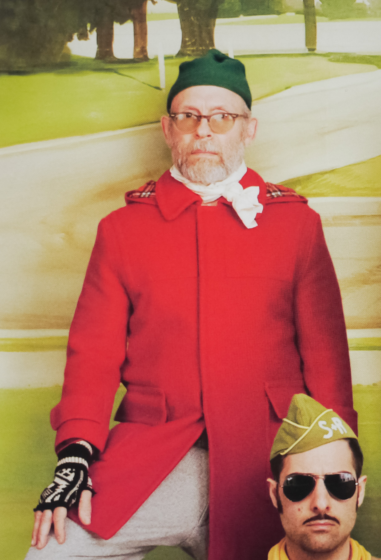
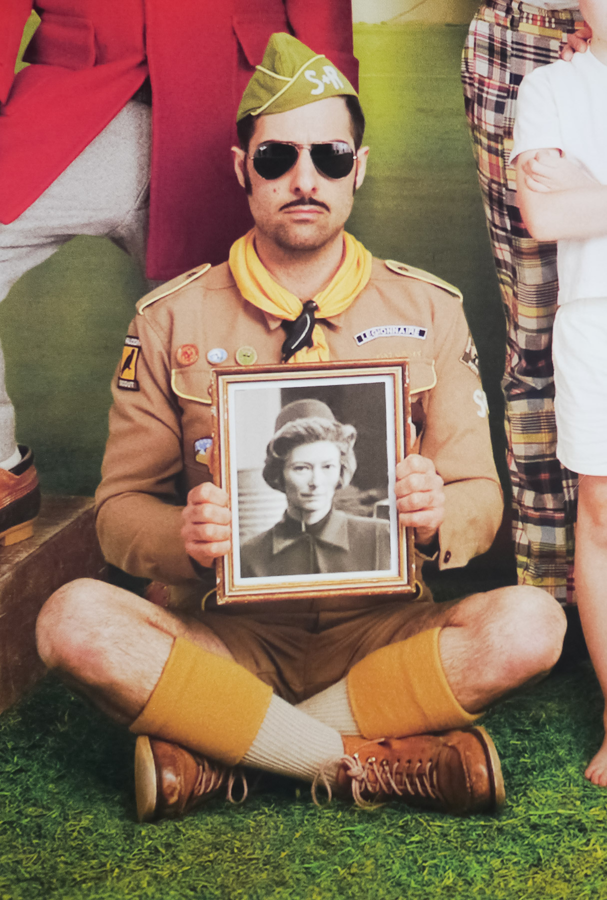
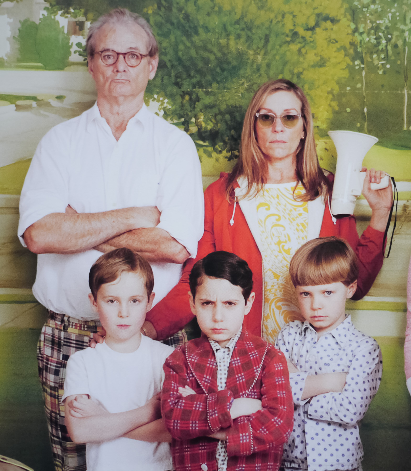
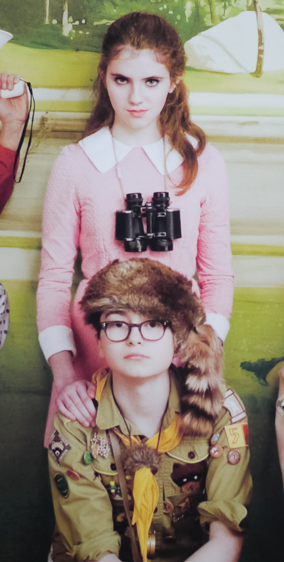
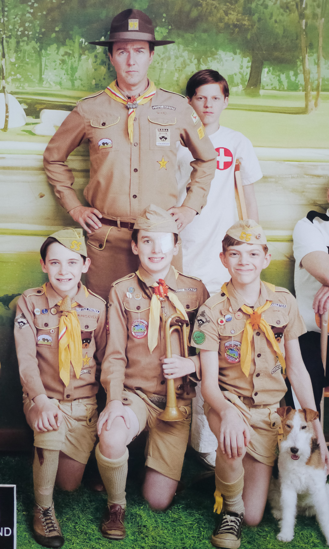
Wes Anderson‘s superb Moonrise Kingdom was my favourite film of 2012 and is arguably the director’s best to date (although I’d have a hard time justifying picking this over Rushmore). The film is set on a fictional New England island in the 1960s and follows the exploits of a pair of young lovers who decide to elope (her from home, him from scout camp) and trigger a series of events as the islanders set out on the hunt for them. The pair at the centre of the film (as depicted on this poster) are played by two unknowns, Kara Hayward and Jared Gilman, and are surrounded by Anderson regulars, including Bill Murray and Jason Schwartzman, as well as a handful of first-time collaborators like Bruce Willis and Edward Norton.
This Japanese B1 poster is markedly different from the American one sheet but this posed image of the characters, created especially for the marketing campaign, was also used on several other international posters, including the British quad.
Jessica Hische is responsible for the design of the typography that was used on the posters (only the title of which features on this B1) as well as the credits during the film itself. Hische is a multi-talented letterer and illustrator who has worked on projects for advertising, editorial, branding and books. Her official website features a biography as well as an extensive portfolio of her work. The site used to have a page on which the designer wrote about her involvement in the project:
“I worked directly with Wes and his small team of co-producers to bring his vision to life. […] The initial direction was based on Ed Benguiat’s Edwardian Script, but the direction shifted toward something more hand-hewn looking and lightly referencing titles from a Chabrol film. I was hired to create the 20 or so credits in the beginning of the movie, and a typeface to be used for the end credits. I ended up creating two fonts—a display and a text weight of the same typeface. […] Working with Wes was an absolute dream and I was amazed and impressed at just how involved he is with every aspect of his films.”
The trailer for the film is on YouTube and if you’re yet to see the film I strongly urge you to hunt down a copy of it ASAP, with the only caveat being that if you’re not a fan of Wes Anderson’s output then this film will not convert you!