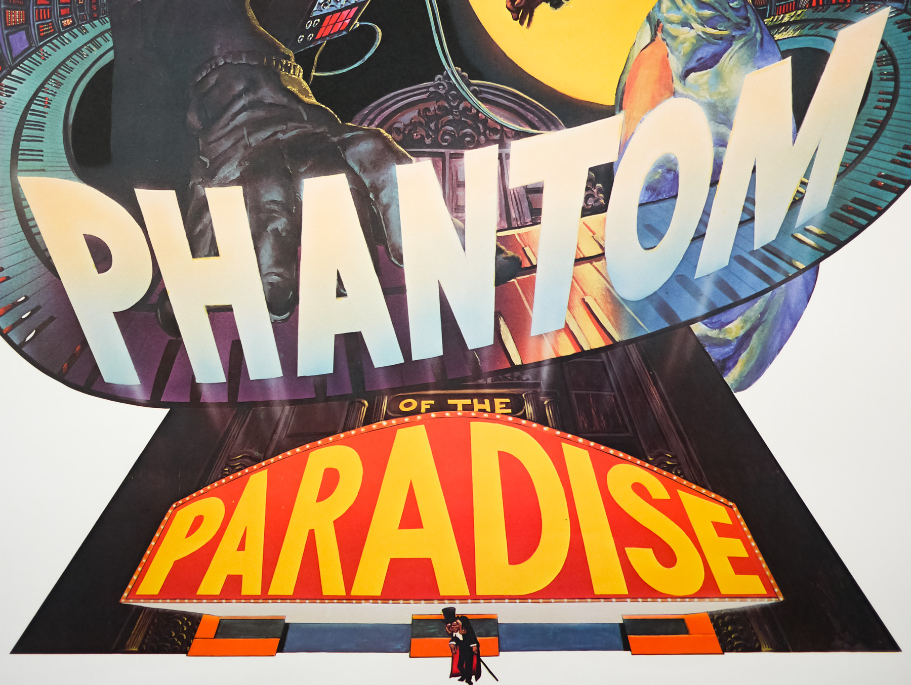
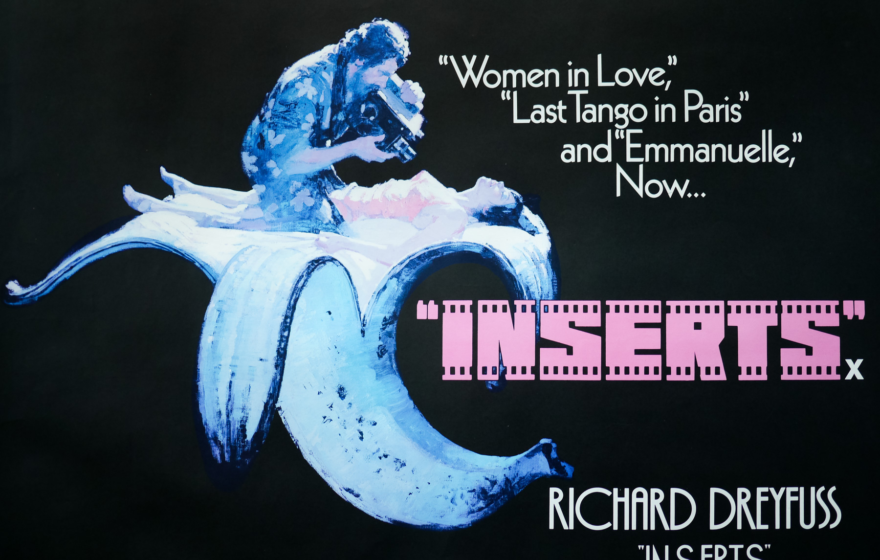
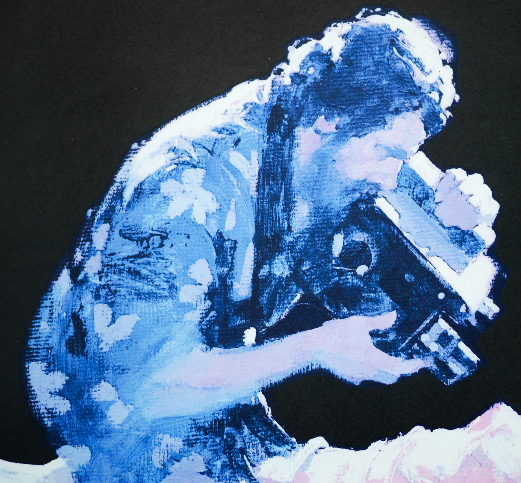
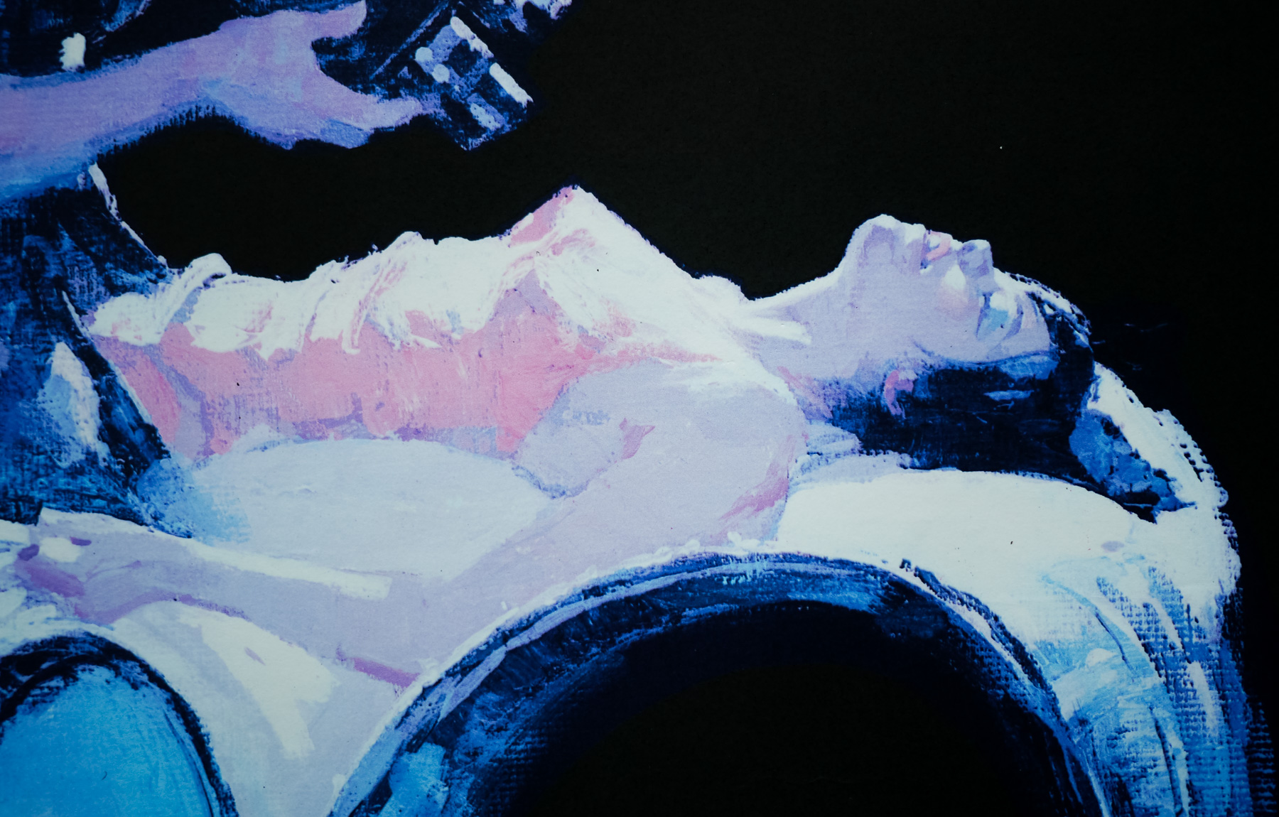
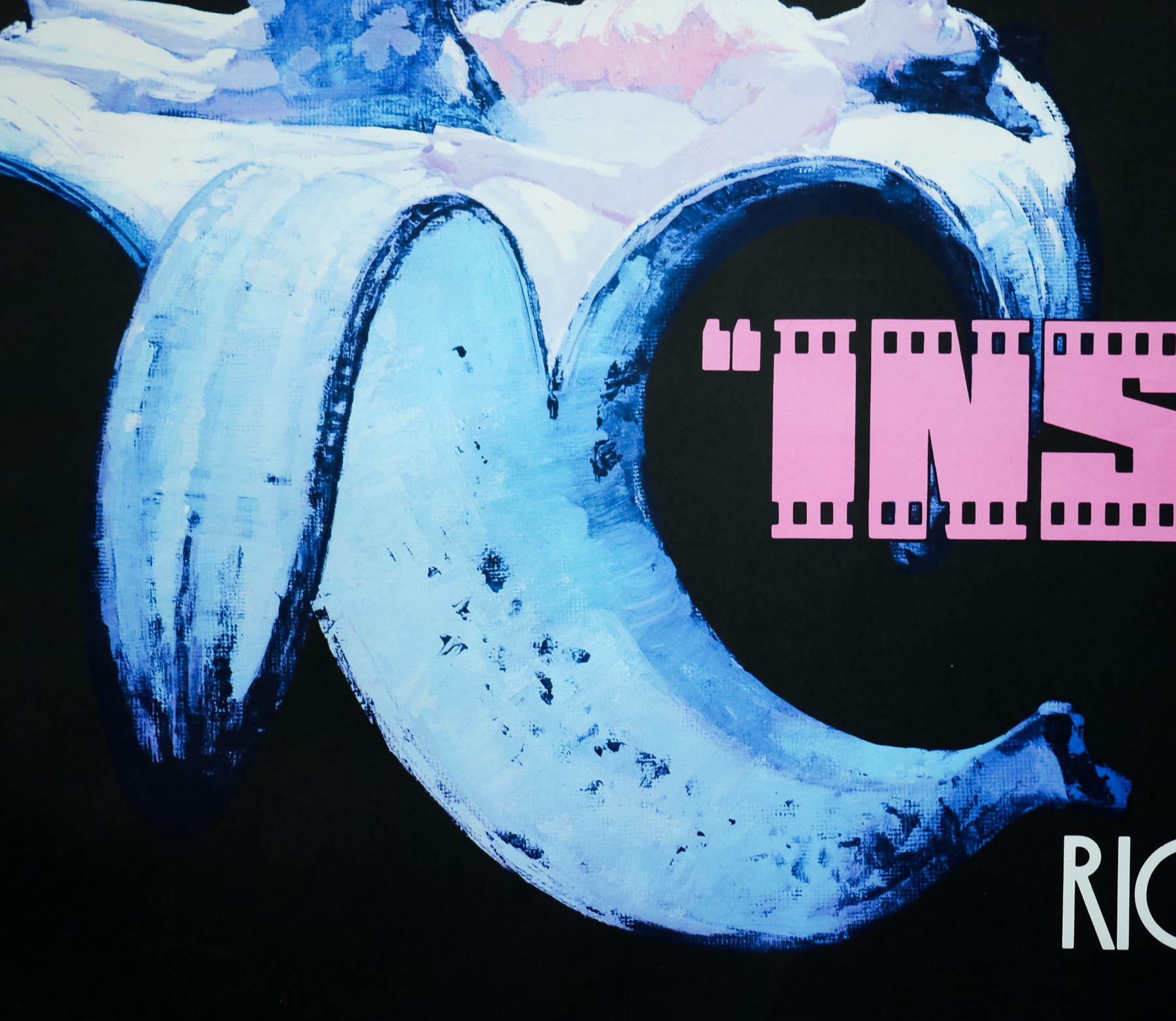
Poster detail
1-5


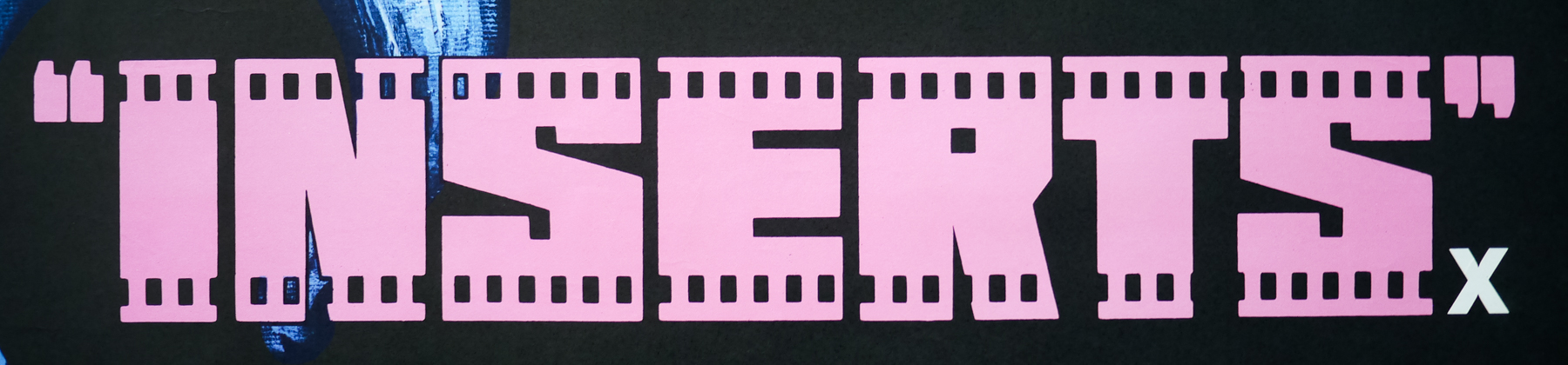
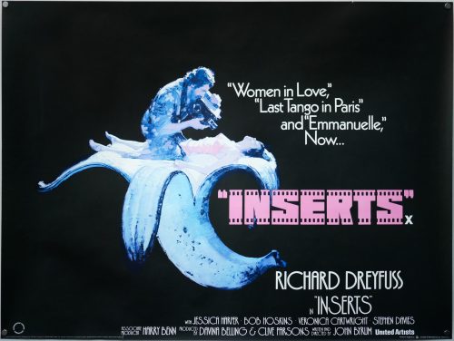
- Title
- Inserts
- AKA
- --
- Year of Film
- 1975
- Director
- John Byrum
- Origin of Film
- UK
- Genre(s) of Film
- Richard Dreyfuss, Jessica Harper, Bob Hoskins, Veronica Cartwright, Stephen Davies,
- Type of Poster
- Quad
- Style of Poster
- Style A
- Origin of Poster
- UK
- Year of Poster
- 1975
- Designer
- Vic Fair
- Artist
- Vic Fair
- Size (inches)
- 30" x 39 14/16"
- SS or DS
- SS
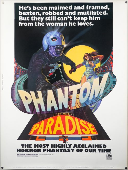
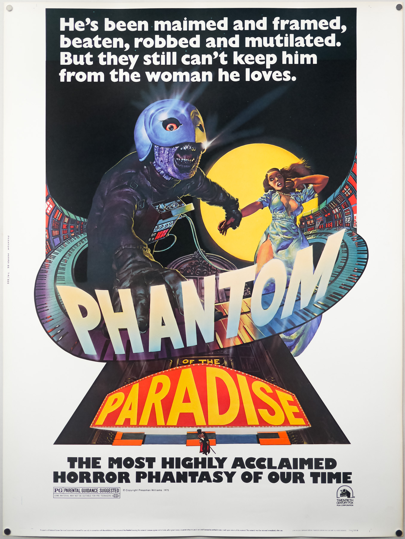
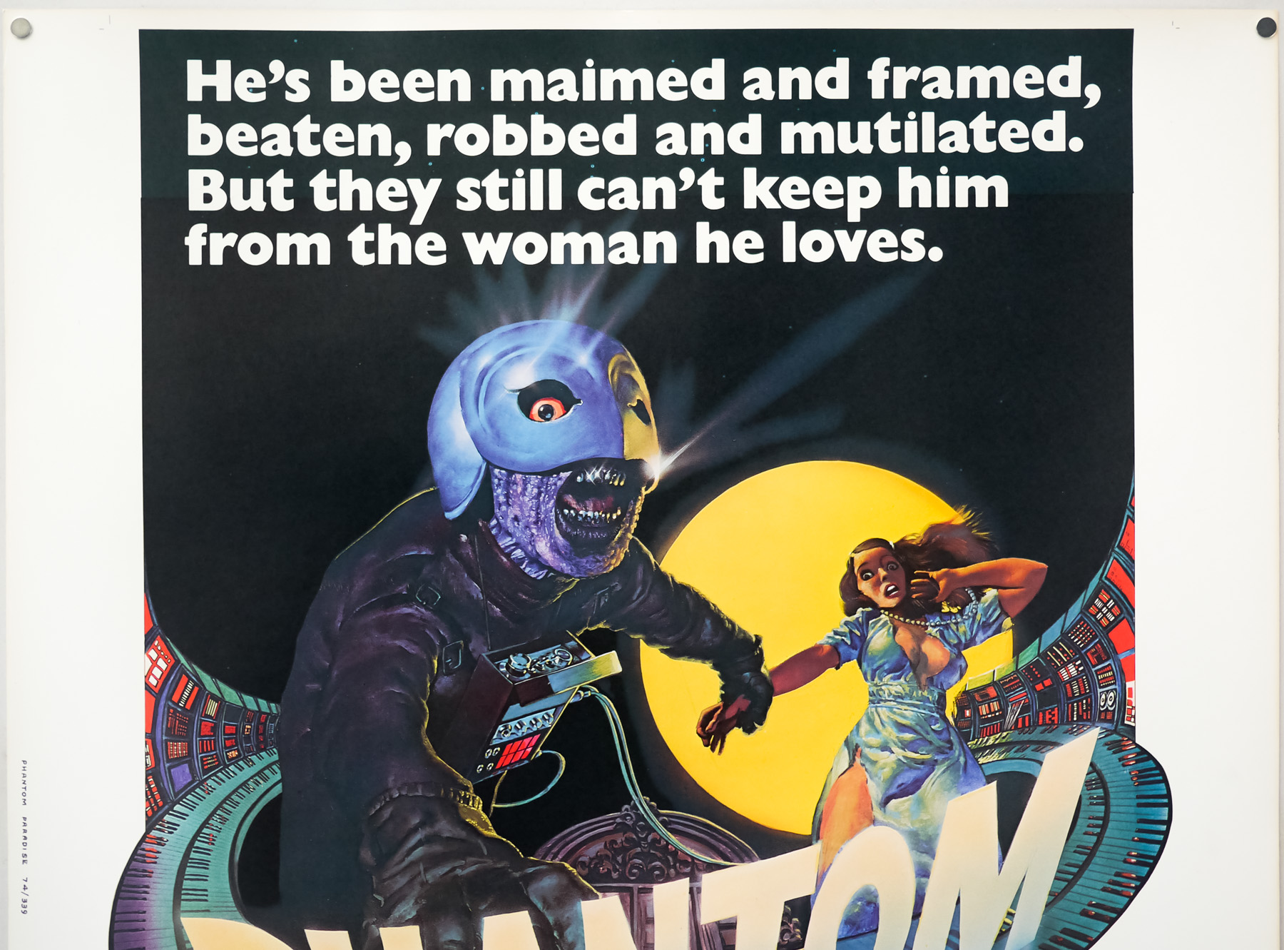
- Tagline
- "Women in Love", "Last Tango in Paris" and "Emmanuelle" - Now...
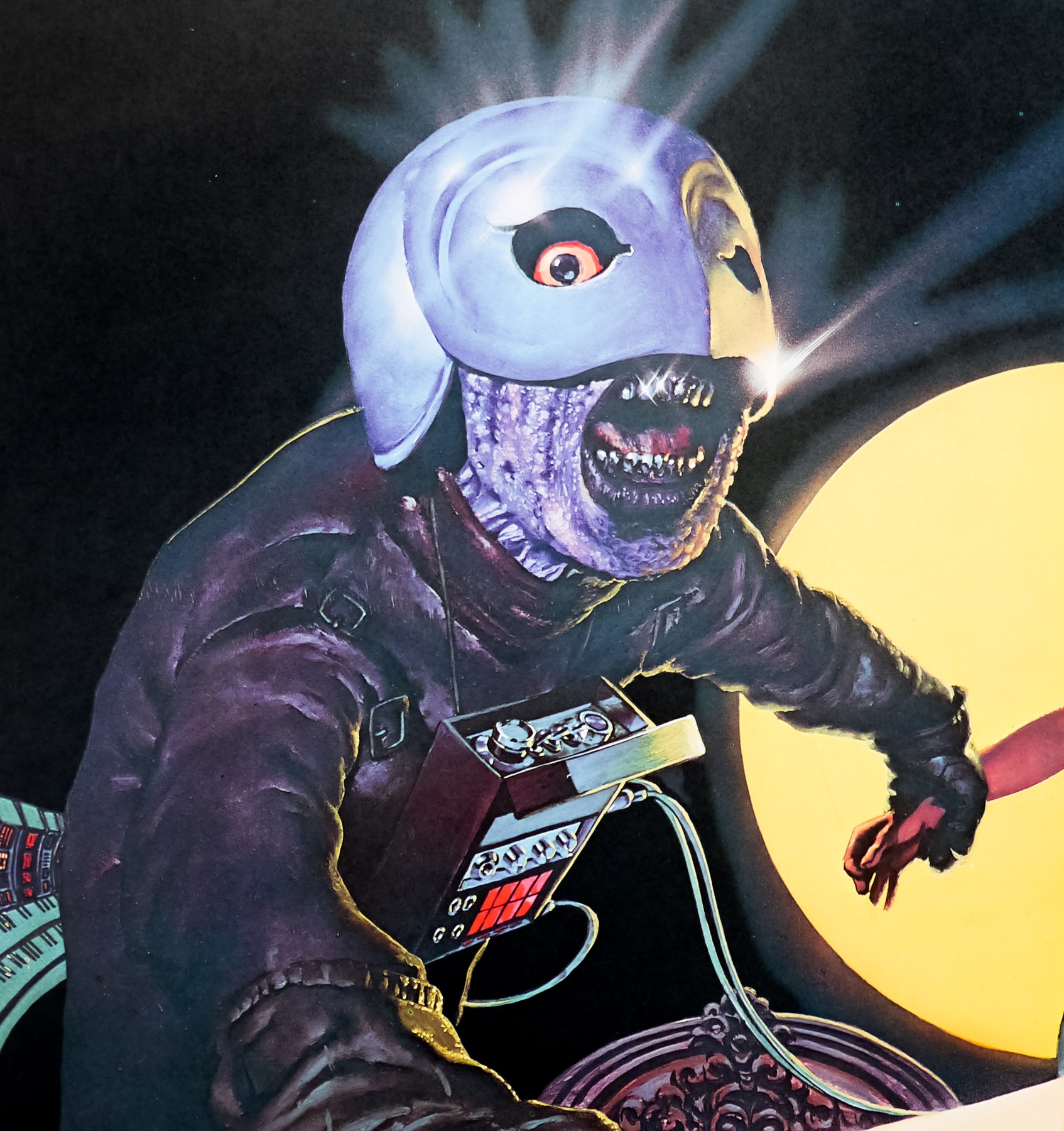
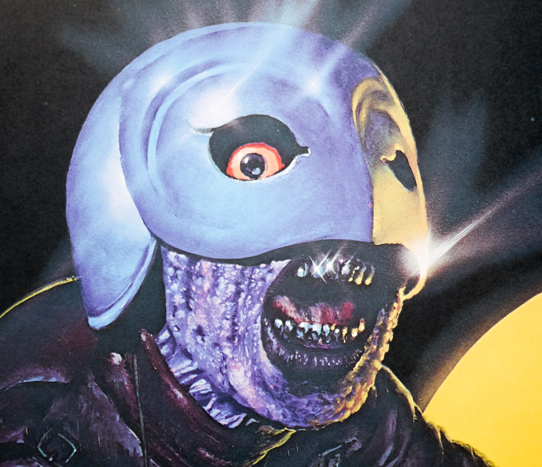
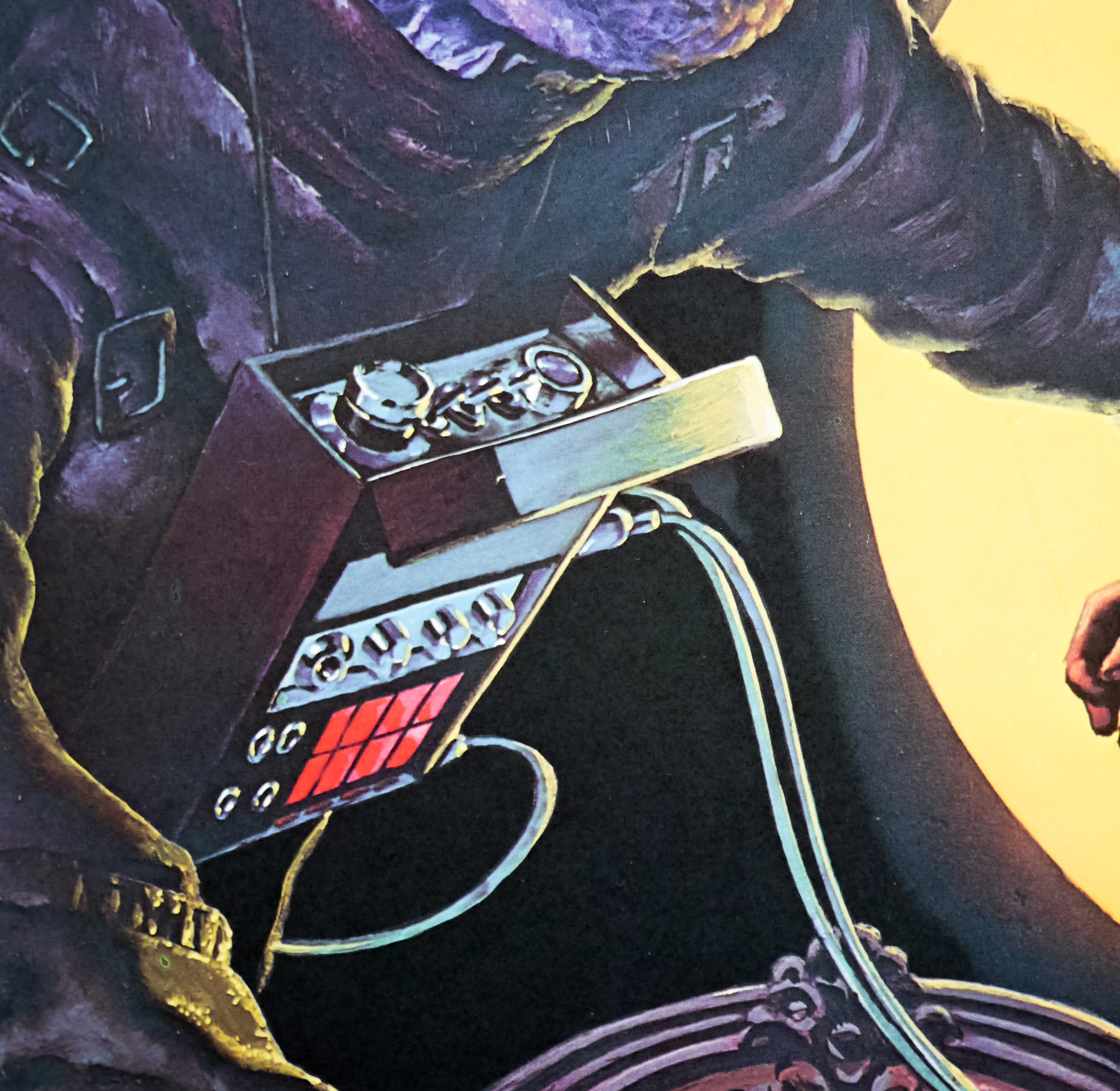
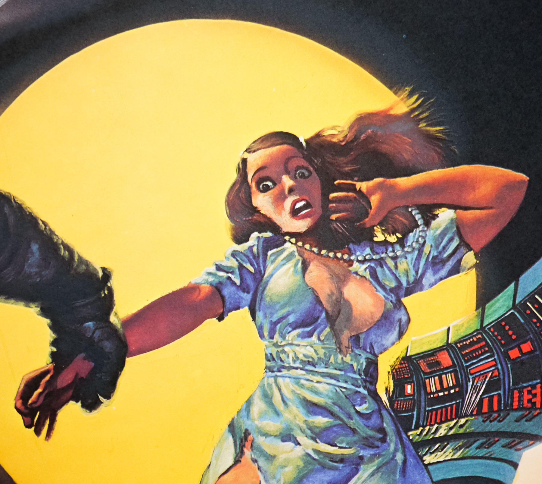
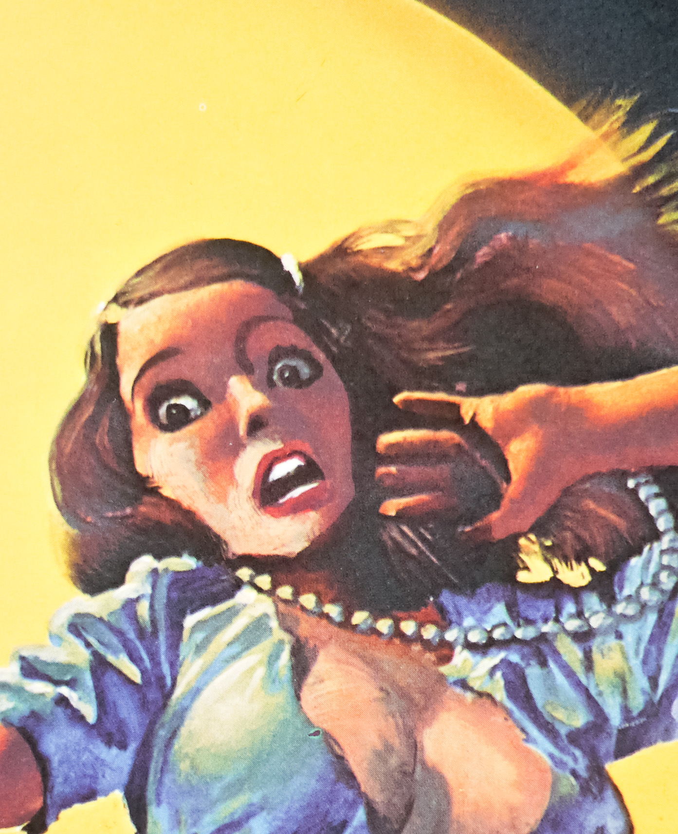
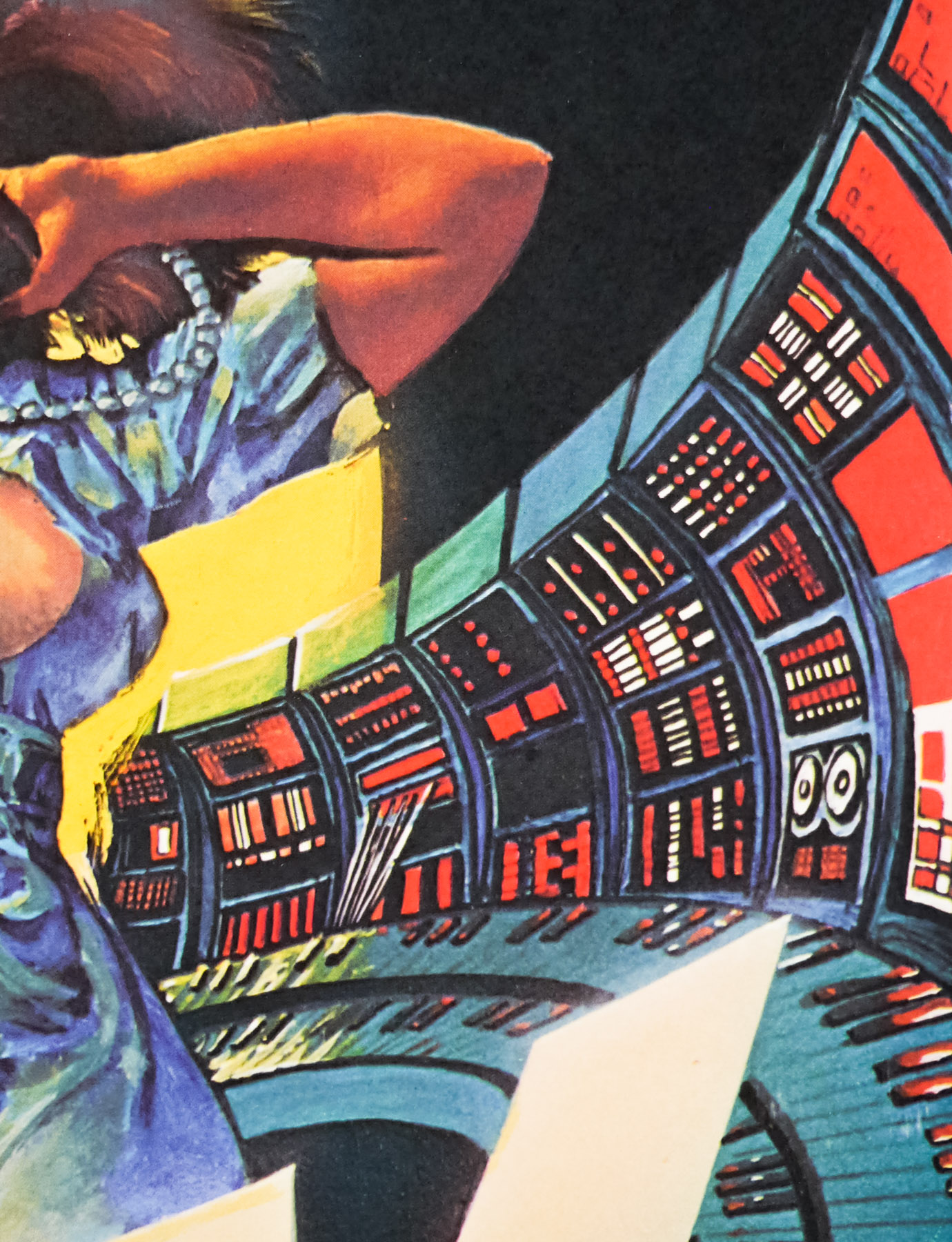
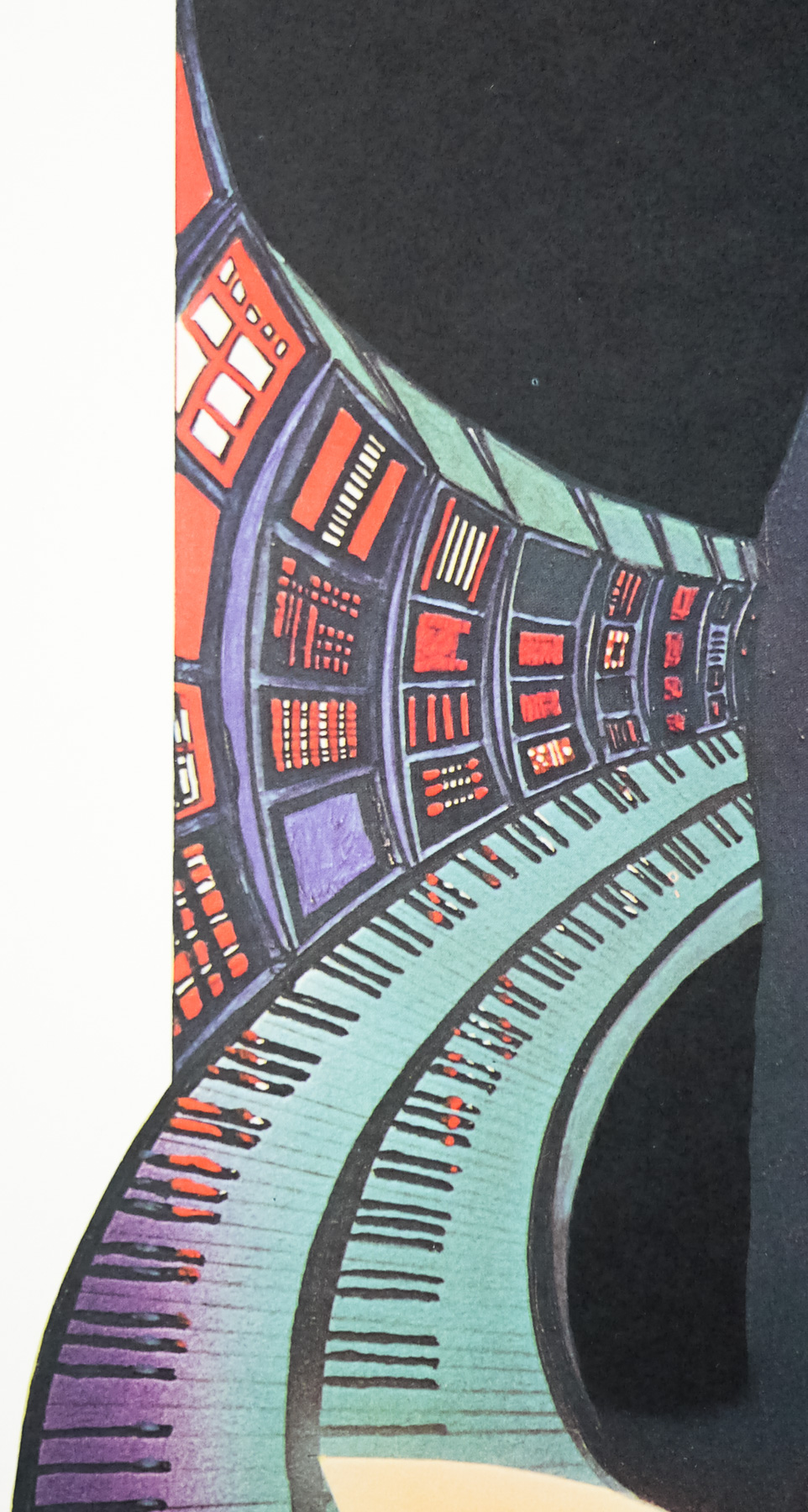
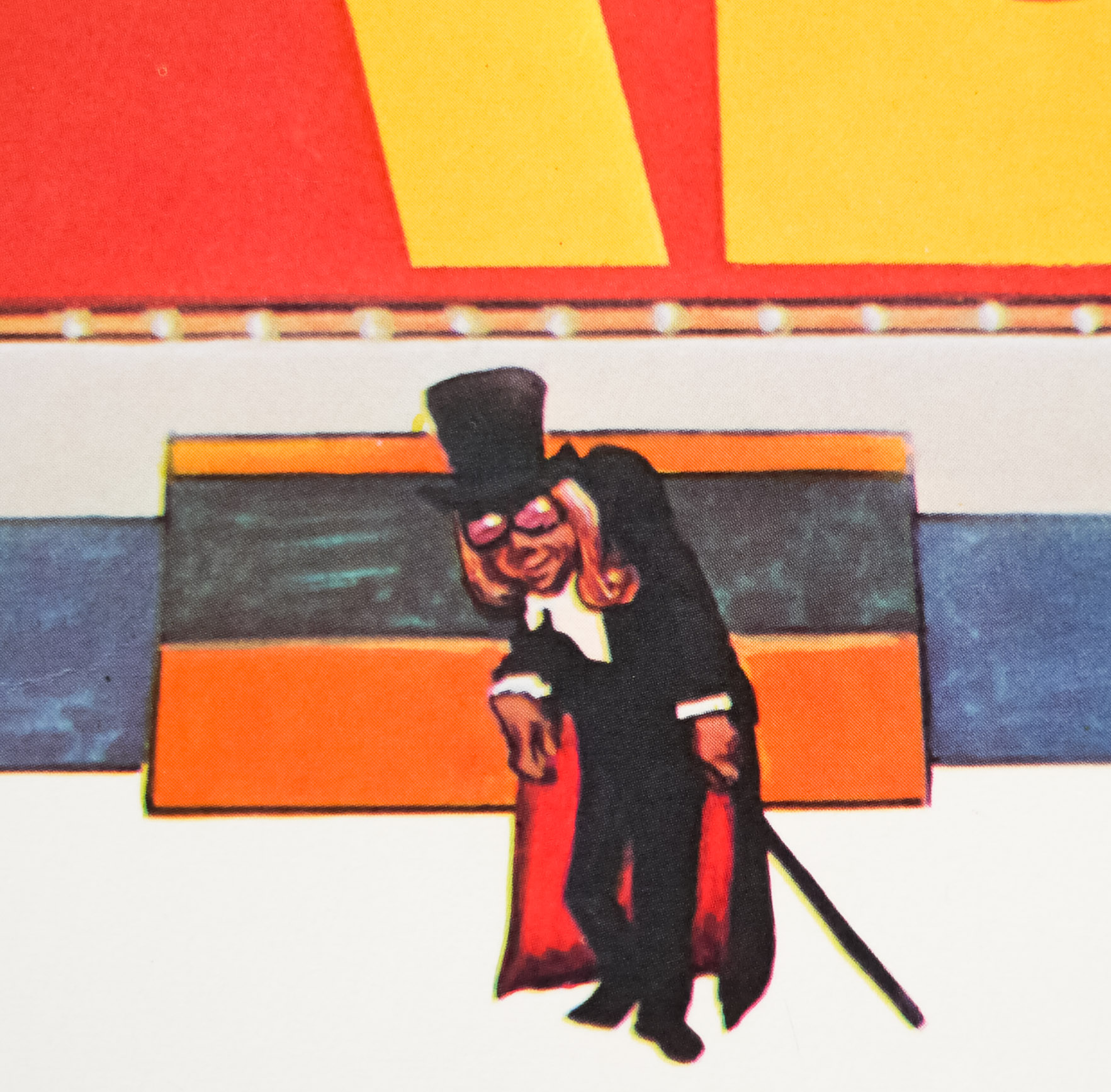
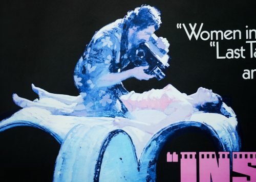
Striking artwork by the British artist Vic Fair on this quad poster for the release of the 1975 film Inserts. The film was the debut film of writer/director John Byrum, an American who appears to have spent quite a lot of time writing, producing and directing TV shows, although his last credit was for Duets (2000). The film is set in Hollywood in the 1930s and deals with actors and directors who were struggling to make the transition from silent films into ‘talkies’ so instead turned to making pornography for a living. Rather unusually the film was shot in the style of a stage play, on one set and in real time, with only five actors in total. The cast is rather impressive and features Richard Dreyfuss (the same year that Jaws was released), Jessica Harper (Suspiria) and the late Bob Hoskins in one of his first major film roles. The plot is described thusly on IMDb:
A once-great silent film director, unable to make the transition to the new talkies, lives as a near-hermit in his Hollywood home, making cheap, silent sex films, and suffering in the knowledge of his sexual impotence, and apathetic about the plans to demolish his home to make way for a motorway. His producer and his producer’s girlfriend come by to see how he is doing (and to supply heroin to the actress as her payment). The girlfriend stays to watch them filming, and is deeply impressed by his methods. When the actress goes to the bathroom, and dies there of an overdose, the girlfriend takes her place in the film. Then the producer returns…
Sadly the film was a critical and commercial failure on its release, not helped by the fact that it was given a very prohibitive X certificate in the US, which was later downgraded to NC-17 after a battle with the sensors that Dreyfuss himself was involved in. The user reviews on IMDb are a little less damning than the professional critics were at the time of its cinema release.
This quad poster was both designed and painted by Vic Fair who is one the most important characters ever to work in British film marketing. He is responsible for several iconic posters, including The Man Who Fell To Earth, posters for Hammer horrors like Vampire Circus, and the withdrawn advance one sheet for A View to a Kill. I interviewed Vic for this site and that article can be viewed by clicking here.
Note that there are also at least two other styles of British quads for the release of Inserts, including this style B one (image taken from Moviepostermem.com) which was based on Vic’s design but was painted by the celebrated Italian artist Arnaldo Putzu.