British designer and artist Tom Beauvais is the man behind several classic British posters, including the quads for Fantastic Voyage (1966), Butch Cassidy & the Sundance Kid (1969) and the cult horror film Zombie Flesh Eaters (pictured below). In a career that lasted over forty years, and continued for twenty more after his ‘retirement’, Tom applied his considerable talents to working on marketing for many of the biggest film studios and collaborated directly with filmmakers such as the late, great Stanley Kubrick. In addition, Tom is also a highly skilled architectural illustrator and it’s this area of work that he concentrated on since leaving the design studio that bore his name, Chapman Beauvais Ltd, in 1992.
Last year I was lucky enough to be able to meet and interview the man himself about his life and career and this article is the result. It contains many exclusive images of Tom and his work, including a handful of never-before-seen concept designs for films such as Star Wars and Blade Runner. I have also included images of his detailed architectural illustrations and other relevant photos which I hope the reader will enjoy.
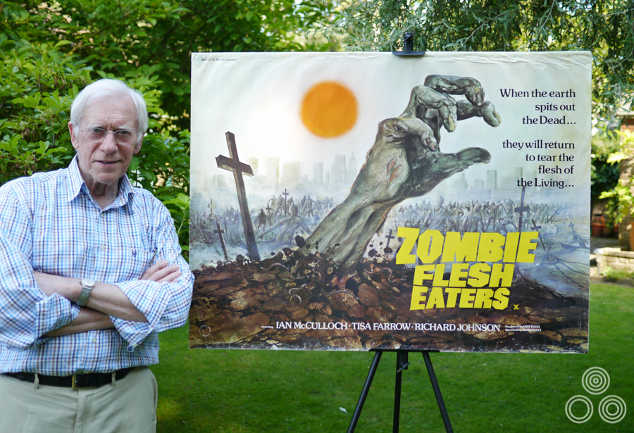
Tom Beauvais stands with the quad poster for Lucio Fulci’s Zombie Flesh Eaters, which he both designed and painted in 1979. Photo taken in 2012.
The UK one sheet for Mad Max, designed and illustrated by Tom Beauvais, 1979
I’ve split the interview up into seven parts and you can use the links below to jump directly to each part, should you wish.
Part 1 – Origins and starting out at Bateman Artists
Part 2 – The art of film marketing
Part 3 – Time for Change: Chapman Beauvais Ltd.
Part 4 – Working with Stanley Kubrick
Part 5 – Architectural illustration and the genetics of artistry
Part 6 – Iconic posters and unused concepts
Part 7 – A kind of retirement
Part 1 – Origins and starting out at Bateman Artists
To begin, you were born in 1932 in Belsize Park, North London?
Yes, that’s correct. In 1939 I was evacuated with my sister and we went with our school to Hertfordshire for a couple of years to avoid the blitz. After that our family moved to Egham in Surrey, so I came back from the evacuation to join them and that’s where I had my schooling. I was only about 10 at the time and, well, I failed the exam for the secondary school. I blame the war because I’d missed several years of education.
I ended up going to Kingston Technical School and I did an engineering course for a couple of years there, which was not a great help for an artist but it did give me a really good grounding, and I enjoyed a lot of the practical side of it, which included woodwork, metalwork and that sort of thing. I did reasonably well there and when I left I imagined that I’d become a draughtsman.
Is that what you’d hoped to become when you first chose the course?
Yes, well drawing was always my strongest subject but when I left the college my father, who was a commercial artist himself, told me that there was a potential job going in London. Somebody he knew was on the look out for a junior to join a studio called Bateman Artists that was part of the Allardyce Palmer advertising agency. I remember going along there with specimens of my work and meeting the boss, Bill Bateman. I recall him saying that I shouldn’t worry about drawing and illustration as they had ‘plenty of people who can do that.’ He told me I should learn to do lettering, how to work with typography and practice designing layouts for adverts and posters. ‘With those skills…’ he told me ‘you’ll never be without a job,’
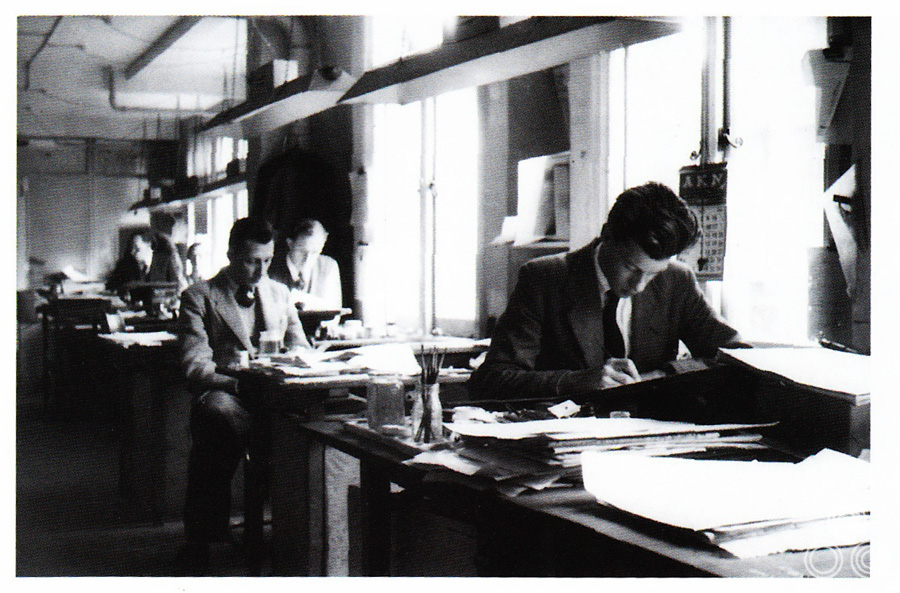
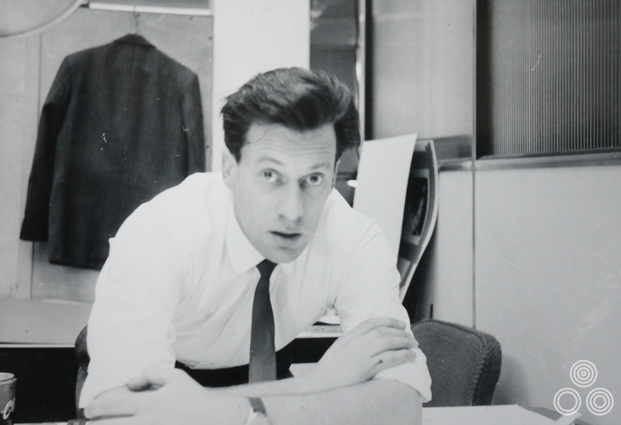
Tom Beauvais (front) working at his desk in the Bateman Artists studio, circa 1955. Behind him sits Tom Chantrell (left), Sid Townsend (right) and Les Coggins in the far back.
I started the job as an apprentice and in the beginning I was making cups of tea and buying cigarettes, as well as running studio errands all over London. After a while I was given jobs like trimming out bits of artwork and I was learning all the time about the business of creating graphic art. I recall there were about twelve artists working there and before I had started my father had told me that they were a clever crowd. True enough, you’d look over the shoulder of one of them working, perhaps doing some lettering or retouching a photograph, and it’s amazing how quickly you could learn just by following their example.
After a year there I was called up into the National Service.
What year was that?
That was in 1950 and I was taken into the Royal Air Force. At a certain point they did discover I was good at drawing and so I was given a job signwriting, which kept me busy. It helped me for when I ended up returning to work afterwards because I hadn’t forgotten anything and I was able to slip straight back into working at the agency. I started doing more and more film advertising. All the other artists were working on what were considered prestige accounts like British Aluminium, for example. Working on film campaigns was considered lowly and was sniffed at by a lot of them.
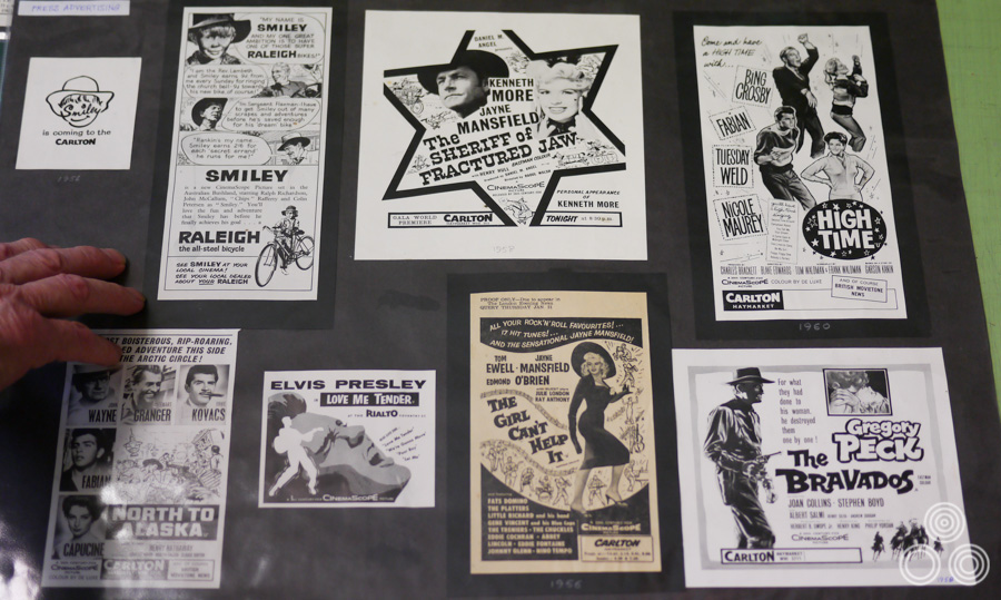
A selection of film-related newspaper adverts designed by Tom Beauvais and printed during the 1950s. That’s Tom’s hand to the left of the picture!
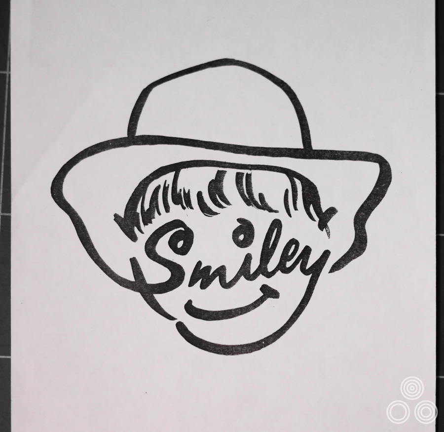
A logo used to promote the upcoming release of the film Smiley, illustrated by Tom Beauvais, 1956. This was a teaser image and would eventually be printed with the phrase ‘coming soon to The Carlton’ below it, as can be seen in the image of several adverts above this one.
Why do you think that was?
I suppose because it was popular art ‘for the masses’, who are generally considered to be undiscriminating in their taste. Therefore, it was felt, the work to attract them didn’t have to be particularly sophisticated. The campaigns for companies like car manufacturers were thought to be ripe for ‘intelligent’ advertising.
In 1957 I was sent over to Wardour Street to a building called Screen House, which was where they’d set up the film advertising work, and me and a couple of other chaps formed a studio to do the press ads for films, particularly those that were being designed and painted by one of the studios key artists, Tom Chantrell, or Chan, as we called him. It was great to be suddenly in the heart of Soho and surrounded by all the offices of the film studios and working on some of the biggest film releases.
We were working with a fellow called Johnny Halson who was the advertising director and the main contact with the film studios. There was also Stan Heudebourck who was the account executive and was dealing with 20th Century Fox and Warner Bros. There were a lot of jobs coming in and it was always very, very rushed. We used to have a saying; ‘do they want this good, or do they want it Wednesday?’
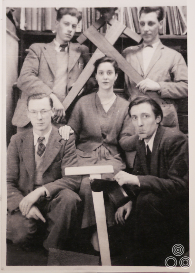
Some of the Bateman Artists crew, 1955. Top left: Tom Beauvais, Top right: Tom Chantrell, Bottom left: Ken Dalzell, Bottom Right: Dennis Joy
Part 2 – The art of film marketing
How long did it take before you were allowed to start working on illustration for film posters?
All the time I was working on press ads for both 20th Century Fox and Warner Bros. I became very familiar with Tom Chantrell’s poster work and must have learned a great deal from him. There were occasions when they needed another artist to call on when Chan was not available, or too busy! This is how I got my chance to work as an illustrator.
How long would you typically have for a poster job?
Well if there was a fixed release date you’d just have to work overtime to get it finished. Chan would often hang about chatting about things during the daytime and go home with a bundle of stills and reference materials, and then he’d come back in the morning with a wonderful bit of artwork. He would work like that a lot and I tended to do the same when I could. There was this feeling that if you hadn’t completed something worthwhile by the end of the day you were considered a bit of a failure, and so you’d go home and do your best to finish it. Usually the managers would come in and grab it in the morning and rush off to the clients to share it with them.
What were some of the first posters you illustrated?
The very first one was for a film called Hatful of Rain starring Eva Marie-Saint in 1957. Later on I worked on a 1958 re-release for Alfred Hitchcock’s Strangers on a Train but I also continued to work on press adverts and anything that needed to be done for film campaigns.
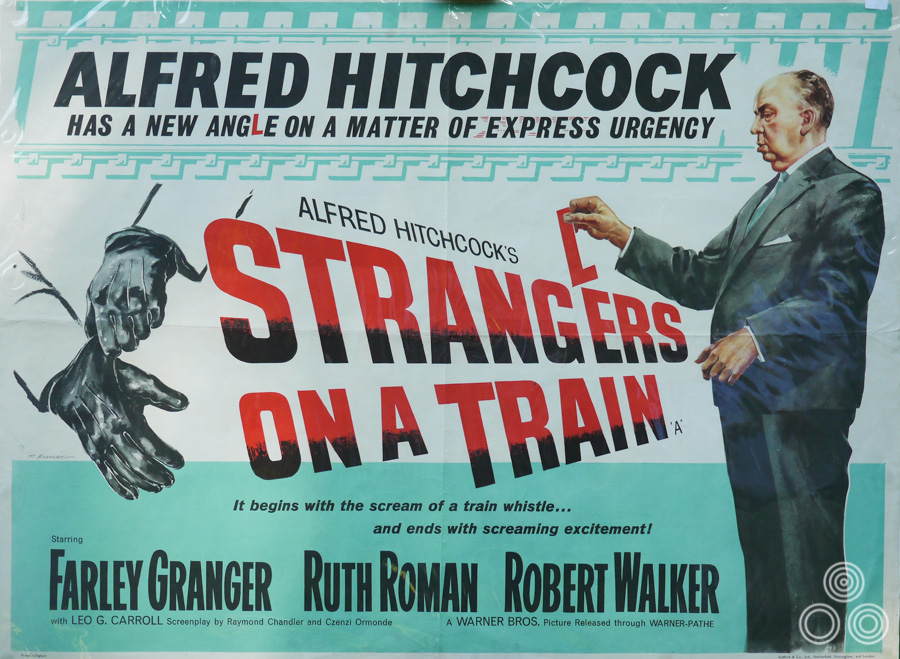
Alfred Hitchock’s Strangers on a Train, a re-release quad illustrated by Tom Beauvais, 1958. This is Tom’s own copy and is wrapped in protective cellophane, hence the slight glare.
I did like working in Wardour Street but eventually we moved to a place just off of Dean Street in Soho where we merged with another agency that brought a few more designers and illustrators with it. At that point the film work was pushed even further to one side.
Those kinds of mergers seemed to happen a lot and many of the film poster-related ones are detailed in Sim Branaghan’s book ‘British Film Posters’
Oh yes, absolutely. I also remember there were occasions where the company directors would hold parties and invite potential clients to show them around and they would use the analogy of a ship to explain that their office was like the bridge and where we worked was like the engine room that powered the whole thing. Despite the attitude from some quarters it was always the film work that really attracted these visitors and they always wanted to see the latest campaigns we were working on.
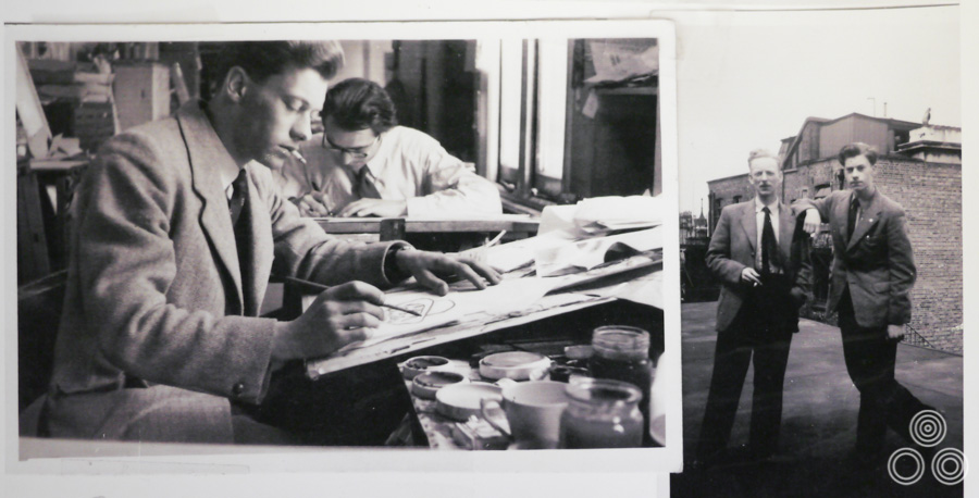
Left: Tom Beauvais sits at his desk in the Bateman Artists studio. A fellow illustrator sits to his left (Tom is unable to recall his name). Right: Tom Beauvais (right) and lettering artist Alan Aldershaw stand on the roof of the Bateman Artists studio building, 1956.
We used to have actors and directors coming through the studio too; I remember when Lindsay Anderson visited when we were working on the campaign for his film ‘O’ Lucky Man!’ I recall him being quite difficult. They’d laid on a big spread of food and drink and all of the top artists and designers were told to be there, even if they had nothing to do with the film stuff.
When Lindsay or one of his entourage asked a sticky question all of the others would turn to look at me and I’d be sat there trying to justify a certain design decision! In the end the actual type used for the credits on the poster is actually his own handwriting as he was never happy with anything we’d done in the studio. I remember him bringing out this felt-tip from his pocket and starting to write over the top of our design, and that ended up being printed.
Can you talk about some of the other posters you worked on at Allardyce?
There was one for a film called The Third Secret (1964), which was a kind of psychological thriller. The poster is quite lurid. I remember I got a board and painted with this particular colour we’d often use called Carthamus pink. I then mixed up this blood red paint and dripped it onto the pink and letting it wash down. It made quite an effective background onto which I then put the figures to finish it off.
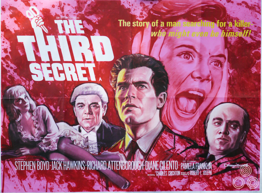
The UK quad for The Third Secret, designed and illustrated by Tom Beauvais, 1964
In 1969 you worked on one of your most famous posters, the quad for Butch Cassidy and the Sundance Kid.
Ah yes, I remember the job came into the studio and it fell to me. The decision had been made that the poster should be based on the famous image of the two leads with their guns drawn and so I did a layout drawing based on that. It was in a finished style; I hadn’t wanted to do it too rough because that gave the wrong impression to the client. Luckily they responded well to my painting and decided that they wanted to use it as the finished artwork.
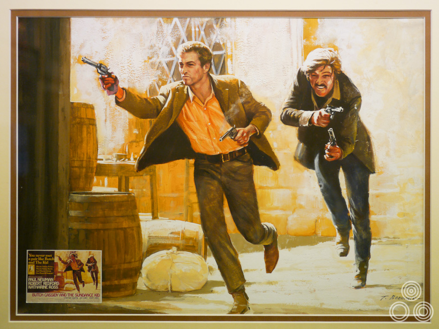
The original artwork for the UK quad of Butch Cassidy and the Sundance Kid, by Tom Beauvais, 1969. The artwork is framed and hangs in Tom’s home studio.
It wasn’t completely suitable so I tweaked a few things like background colours and the angle of the guns by simply painting over the original version. It was done in gouache so it wasn’t too difficult to make the amendments. We were given the style of the title typeface and other pieces from the American advertising agency so we composited it all together and it went off to print. It seemed to be a success and the client responded well to it.
Most of the time when I’d finished a piece of artwork for a poster and it was sent off to the printers I’d never actually see it again. For some reason, however, the Butch Cassidy art was returned to me and I was fond of it so I decided to keep it and get it framed up. So much original artwork was simply thrown away after the posters had been printed.
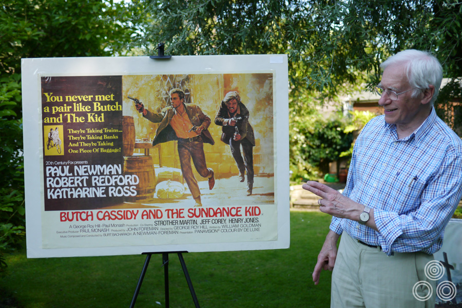
Tom Beauvais poses with the quad for Butch Cassidy and the Sundance Kid, which he designed and illustrated, 2012. This is actually an undersized reprint; Tom doesn’t own a final printed quad.
Another one of the really striking posters by you was the quad for Fantastic Voyage (1966).
That was done for John Fairbairn who was the publicity man at Fox at the time. He wanted me to make sure I depicted the ship inside what was meant to be an artery, which is why you can see things that look like blood vessels around the edge. I was quite pleased with that one.
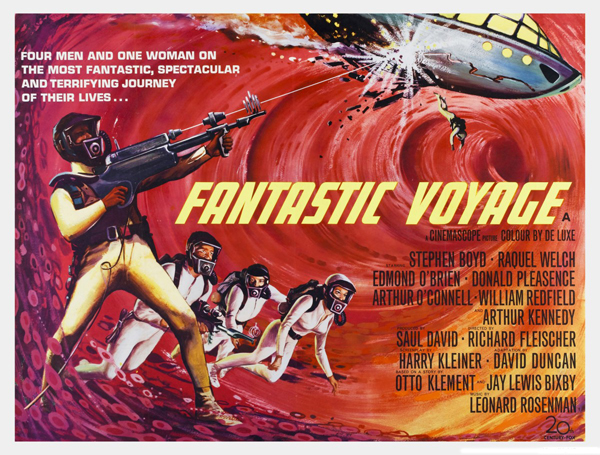
Fantastic Voyage – British quad poster with artwork by Tom Beauvais (1966) – image taken from moviepostercollectors.com
What was daily life like in the film department?
Oh, you wouldn’t believe some of the banter that went on! There was whistling and singing and banging about all the time. We used to get these offcuts of cardboard and they’d be skimmed right across the office at people. I remember we went through one stage where there was a competition to see who could build the best paper airplane. Some of them were really carefully designed and they flew pretty well. We’d launch them out of our fourth floor window and I remember watching one that circled round and round and landed on the pavement right in front of an elderly woman. She didn’t even look up and simply reached down, grabbed it, put it in her basket and walked off!
It was a good time and I imagine it could never happen these days as designers spend their entire working day staring at a computer screen.
Which other artists did you work with, aside from Tom Chantrell?
There was a chap called Pinyon who was a senior artist and I can remember him as a very clever artist, but he wasn’t really cut out to be a commercial illustrator. He was more worried about the roses in his garden at home than the work tasks he was given each day. There was one time that he was given the task of doing a portrait of the managing director, H.E. Palmer, and he worried himself sick over it. He went off to buy special brushes and a high-quality canvas but he didn’t enjoy painting it at all, although the resulting portrait was superb.
Is it true that Tom Chantrell would never attempt to illustrate a figure without good photographic reference?
Chan would often set up a little photographic studio and hire a couple of female models to pose and then he’d get one of us to stand with them as the male lead holding a gun, or whatever it was. Invariably it involved carrying the girl upstairs or rescuing them from an imaginary river or whatever. Sometimes the girl would be half naked and it was all good fun, but it did make your arms ache a bit!
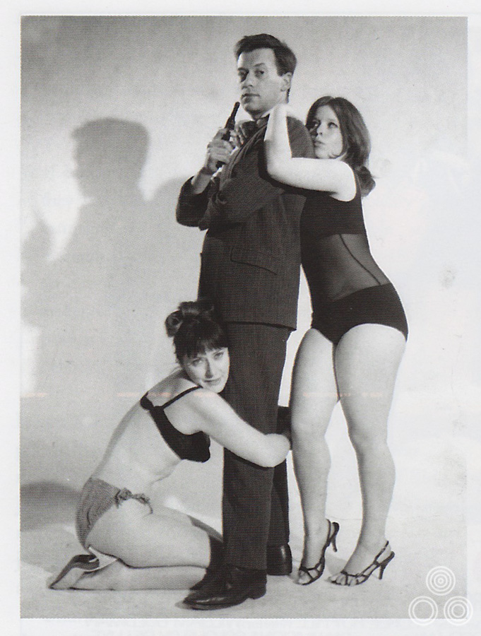
Tom Beauvais poses with a pair of models for a photo reference shot, for a long-forgotten James Bond rip-off circa 1965. Image scanned from Sim Branaghan’s British Film Posters book.
Part 3 – Time for Change: Chapman Beauvais Ltd.
How did you end up forming the agency that bore your name: Chapman Beauvais?
Well John Chapman had been the studio manager at Allardyce Palmer but in 1970 the studio had been acquired by a rival agency called KMP and merged with another of their subsidiaries called Hampshire House, making Allardyce Hampshire. They brought with them a number of new designers and artists and this triggered a few of the old crew, including the likes of Tom Chantrell, to leave the studio [Chantrell would later work for them on a freelance basis]. John Chapman left in 1971 to go and work for his cousin Derek Parnell and he persuaded me to join them a couple of years later. They wanted an illustrator and so that’s when I first started to work on architectural drawings.
Tom Beauvais looking dapper in the Chapman Beauvais office, circa 1972
Can you talk about why you think things went downhill at Allardyce before you left?
When a new film came out from an independent producer or from another studio, other than Fox or Warners, the new creative team that we’d merged with would always take it for themselves and not let me and Tom Chantrell have a look-in. Sometimes the results were quite abysmal. They had no idea how to sell a film and it would always end up coming back to Chan or me to try and fix it. I remember with Stanley Kubrick’s A Clockwork Orange they were coming up with the most inane ideas. One designer had literally sketched an orange with mechanical gears around it, that type of thing.
I know that Chan was sick of working under quite a lot of pressure and was tired of not being able to do designs that he knew would be best for the film and that the client would respond well to. I think the new managers in the team were too restrictive with him and always thought they knew best.
Is that how you felt too?
Well, to a degree. John Chapman had left and he was now driving around in his own company car, which seemed quite good so I didn’t take much persuading to join them.
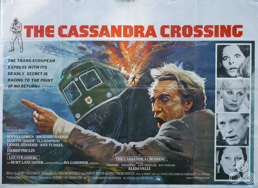
The UK quad for The Cassandra Crossing, designed and illustrated by Tom Beauvais, 1976.
When did you leave Allardyce?
It would be about 1973 when I started working with Derek Parnell, John Chapman and Mike Sparling. Derek then left in 1975 so we had to form the new company ‘Chapman Beauvais Ltd’ and moved to Percy Street. John and I were still on good terms with Julian Senior, the publicity director for Warner Bros in the UK. This meant that the film work came our way once more. After moving to Percy Street we expanded our workforce by poaching our old colleagues, Ray Youngs and Colin Leary – both experts on film publicity. We later invited a designer called Keith Fowles and some other freelance artists.
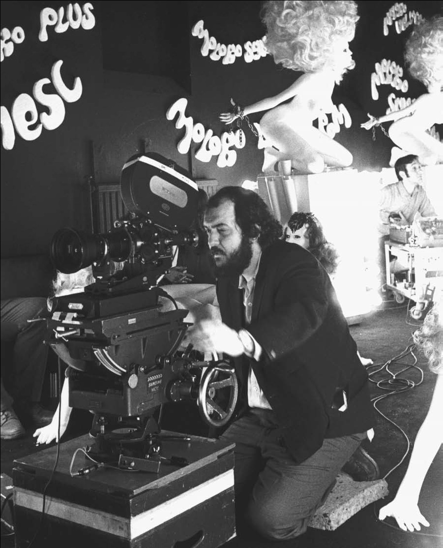
Director Stanley Kubrick on the set of his film A Clockwork Orange, circa 1970.
Part 4 – Working with Stanley Kubrick
I understand you also had a working relationship with Stanley Kubrick?
Yes, my first meeting with him was for A Clockwork Orange. It had been released in America and he had gathered together all of the press quotes from the critics over there and had selected a few of his favourites. He booked a double-page spread in the trade press and my job that afternoon was to lay these quotes out using the photocopies he’d made of them. I sweated a bit over that because I was in his office and I’d heard he could be very particular about things. It was the first time I’d met him and knew about his attention to every detail.
How did you first get involved with working for him?
Because Warner Bros, the distributor of his films, were clients of our agency and they had informed us that they wanted one of the art directors to be available to Stanley Kubrick at all times. Either myself or John Chapman were often called out to see him at his house and in the end we worked with him on his films A Clockwork Orange, Barry Lyndon, The Shining and Full Metal Jacket.
I remember once he’d asked me to sketch out an idea for a particular advertisement and I went out to see him at his place in Abbots Mead [where the Kubrick family lived from 1965 until 1979]. He was very fond of animals and I think he had about four Persian cats and about the same number of dogs; Labradors I believe. He was working in several rooms of the house and the cats had free roam of course. When I arrived he was on the phone so I waited in one of the rooms and I had one of the dogs coming up to give me a good sniffing first. I then placed the drawing I’d done on top of his desk and one of the cats promptly sat right onto it, completely covering it.
Stanley finished his call and came over to speak to me about the advert and asked me if I’d drawn it to his specifications, “Yes”, I replied, “but it’s under the cat!” He laughed and started stroking the cat. “Come on Freddy!” he said, picking up the cat, grabbing the piece of paper and walking off, leaving me anxiously waiting for his reaction to my layout. Instead, he simply called out to one of his staff, “Has Freddy had his medication today?”
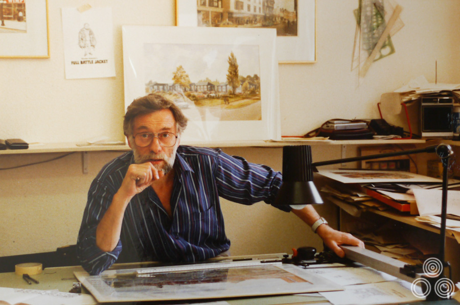
Tom Beauvais in the Chapman Beauvais studio, circa 1987. In the background is an illustration of Stanley Kubrick wearing a jacket covered in pockets filled with all manner of film-related objects underneath the caption
What was it like working at his place?
When you went to work at the house you’d always be there until he no longer needed you. It was usually when his assistant Leon Vitali, who had acted in Barry Lyndon, would tell you it was okay to go home. As I say he was very exacting about everything we did for his films and he wanted to be involved in every single decision. Everyone who worked for him had to be prepared to work overtime or on weekends. This obsession extended to all aspects of his films, including, of course, the actors on set. There’s the famous story during the making of The Shining where he forced Shelley Duvall to redo the scene where she’s screaming at the axe smashing through the door over a hundred times!
He used to ask for our advice on typefaces and would be extremely precise over the setting of any advertisement. He’d even make us typeset the cinema program times at the bottom of the advert to his specifications. I recall we spent a long time working on the end credits for Barry Lyndon. Normally the crawl of text at the end of a film would be done by an agency that specialised in things like that but he asked us to take care of it and we had to use white Letraset transferred onto a special black card. I recall we had to do it three times because of the different aspect ratios that the film might be shown at; Stanley wanted to make sure it was consistent however it ended up being projected. If you look at the end of the end crawl you’ll see that we’re given the credit for it, which is nice.
Did you design any film posters for Kubrick?
He was working with a number of different designers and illustrators at the time and, as you know, Philip Castle painted the artwork that was used for A Clockwork Orange and later for Full Metal Jacket.
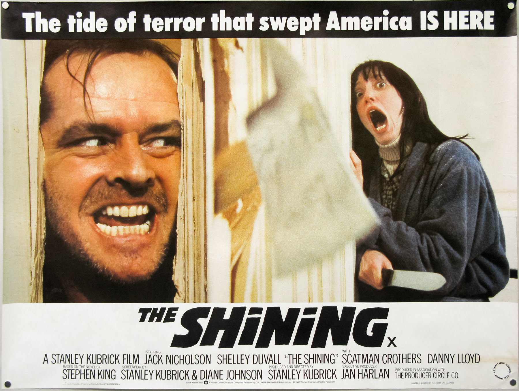
The UK quad for Stanley Kubrick’s The Shining, designed by Chapman Beauvais in close collaboration with the director, 1980.
I did wonder if you were behind the photographic design for the British quad for The Shining, with the axe smashing through the door scene we talked about earlier.
Yes, well I suppose we did help with that but really it was Stanley’s idea and we executed a design he had carefully detailed, down to the tiny credits at the bottom that I mentioned. As I say, he was super exacting about everything and there was barely any room for manoeuvre. We used to hear stories of him sending assistants around cinemas to go into the projection booths with binoculars to confirm that his film was perfectly in focus and that the quality of the lighting was spot on.
What sort of things were you doing from 1975 onwards, aside from working with Kubrick?
I remember doing a lot of work for ITC studios, which was producing a lot of TV series spin-offs at that time. It was things like Porridge, Rising Damp and George and Mildred. The great thing for me was that I was able to take care of the design as well as the artwork itself, which I really enjoyed. There were always ideas coming in from the client or from other agencies they were working with but I always got to paint the final artwork.
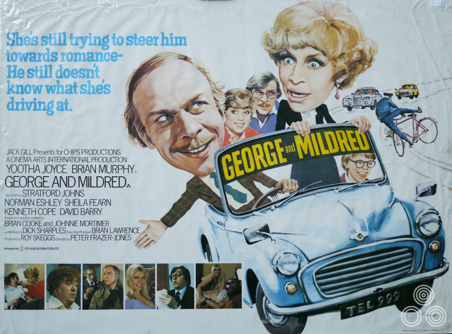
The UK quad for the George and Mildred film, designed and illustrated by Tom Beauvais, 1980. This is Tom’s own copy and is wrapped in protective cellophane, hence the slight glare.
John Chapman was a really good letterer and had typeset a lot of Chan’s posters in the past but he also had a solid business brain and I was happy to leave him to take care of that side of the business. We did have some accountants that advised us on how much to charge for certain jobs and that kind of thing, but mostly John took care of it.
Part 5 – Architectural illustration and the genetics of artistry
What would a typical job at that time involve in terms of your creative output?
Well, I remember that the film Far From the Madding Crowd (1967) was given to us to work on we ended up doing about seventeen or eighteen layout proposals for it. It would depend on how confident they were about marketing the film – sometimes they’d know exactly what sort of thing was needed and other times we’d really have to work through ideas before we arrived at the final design.
Towards the end of the 1970s I was doing a lot more architectural illustration. We did a lot of work for the frozen foods company Bejam [since bought and rebranded by Iceland] and I would be asked to paint an artist’s impression of what one of their new stores would be. Something like ‘Bejam comes to Marlow’ and the company would take a full-page advert in the local newspaper. I would do a black and white painting of the forthcoming store surrounded by the other existing shop fronts. Someone else would then do all of the copy and other details on the advert.
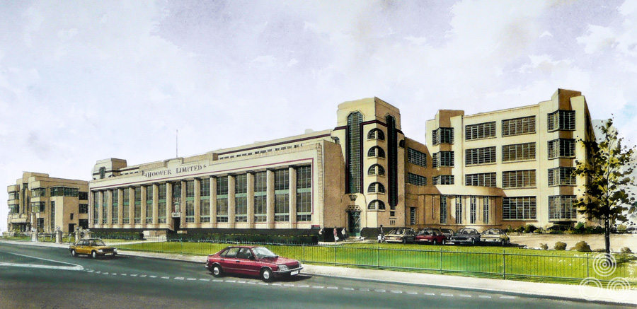
An illustration of the Hoover Building in Perivale, London, by Tom Beauvais, 1990. The building was to be converted into a Tesco store and this illustration was commissioned by the architects responsible.
Having seen some of your architectural drawings it’s clear that it takes a lot of skill to accurately portray the buildings with the right perspective and details. How did you learn to work on them?
Well, I think I just always had a natural knack for drawings of that type. Somewhere I have a drawing of a steamroller I’m told I drew it when only two and a half years old, and my father had kept it. I was very influenced by my father [Tom’s father Arnold was also an accomplished painter and illustrator] because if I asked him how to draw something in particular he’d always reach for a piece of paper and quickly show me the tricks needed to draw all kinds of things. My father was such a wonderful painter and talented commercial artist – someone I always looked up to and admired.
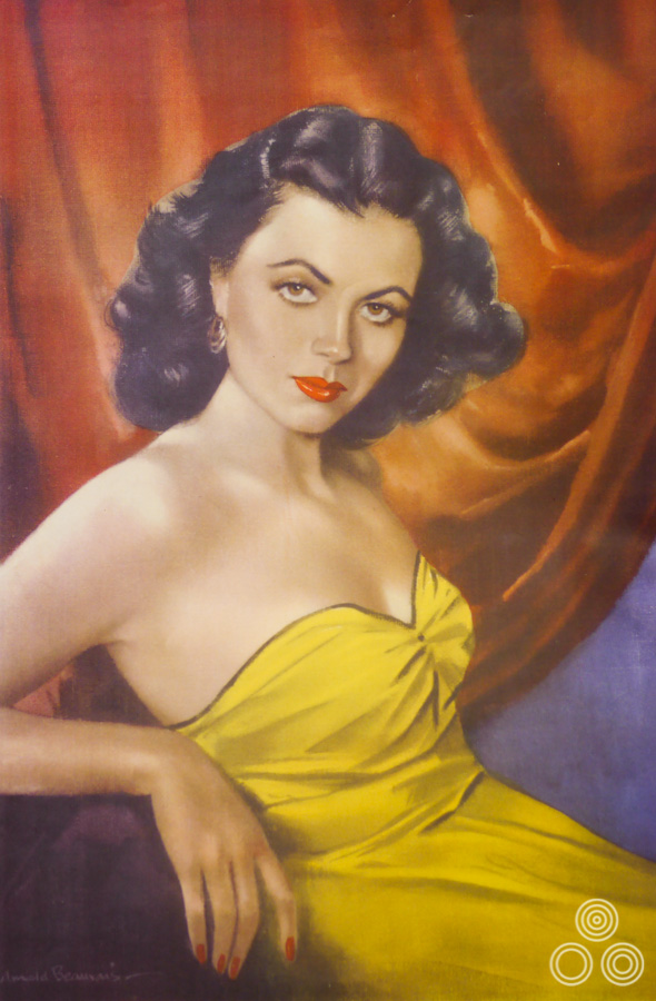
A portrait of the actress Faith Domergue that was painted by Arnold Beauvais (Tom’s father) in 1952. This was commissioned by RKO Pictures to be printed and hung inside cinema foyers promoting their new star.
Your grandfather was also an artist?
Yes, he became a lithographer after coming over to this country from France when he was a young man; about eighteen I think he was. He got a job at a company in London and stayed there for a good number of years but his health deteriorated in his early 40s and his doctor advised him that it might be wise for him to return to live in the South of France where the climate was certainly better than here. He ended up moving the whole family, which included my father and four siblings, back to Marseille.
By the time they did move there my own father had learned enough about lithography that he could pretty much take over, particularly when his father died. He carried on the business there for a while but then decided to return to London and he took up freelance work. This was the 1920s and he was working for companies like Joe Lyons and RKO Radio Pictures. He did a lot of advertising for films, including some of the early Disney pictures in the 1930s and other things like Charles Laughton in The Hunchback of Notre Dame.
My mother died when I was only two but she had studied art at a Camden school and then had taken a job as an art teacher and her work was also around in our house. One of my uncles was a car designer and my aunt was a decent painter. Being surrounded by art and artists from day one, I guess it was inevitable that some of their skills rubbed off on me. I’m very thankful that they did!
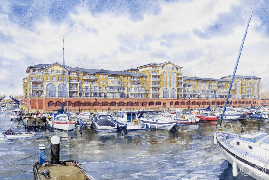
An illustration of Sovereign Harbour, Eastbourne, by Tom Beauvais, commissioned by the architects responsible, 2005.
Did you have any particular preference for the kinds of work you did, whether it be film promotion or architectural drawings?
I did find the architectural work more challenging and interesting to be honest. It sounds almost boastful but when I used to have clients telling me a particular painting was marvellous I always felt that I wanted to improve even further for the next one. It used to keep me on my toes. Whereas when it was a press advert that you had to get done quickly you’d do it and then it was gone.
Part 6 – Iconic posters and unused concepts
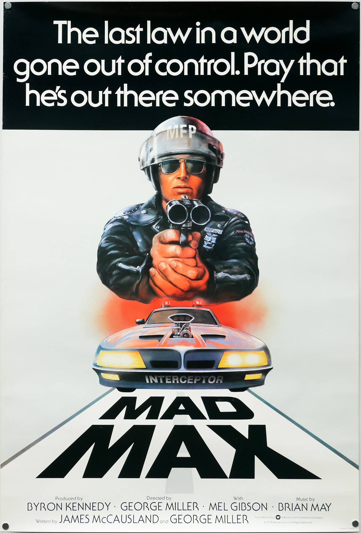
You worked on one of my favourite film posters at the end of the 1970s, which is the one for Mad Max. Could you talk about designing that?
On that one we were working to a brief from Julian Senior at Warner Bros and he told us he wanted a policeman looking down the twin-barrels of a shotgun. I did an initial sketch of the figure with the car below and he responded really well to it. The praise was generous and I think it was probably because it had been his idea originally. I actually think that Mike Sparling, who I mentioned earlier, was used as a reference model for the policeman.
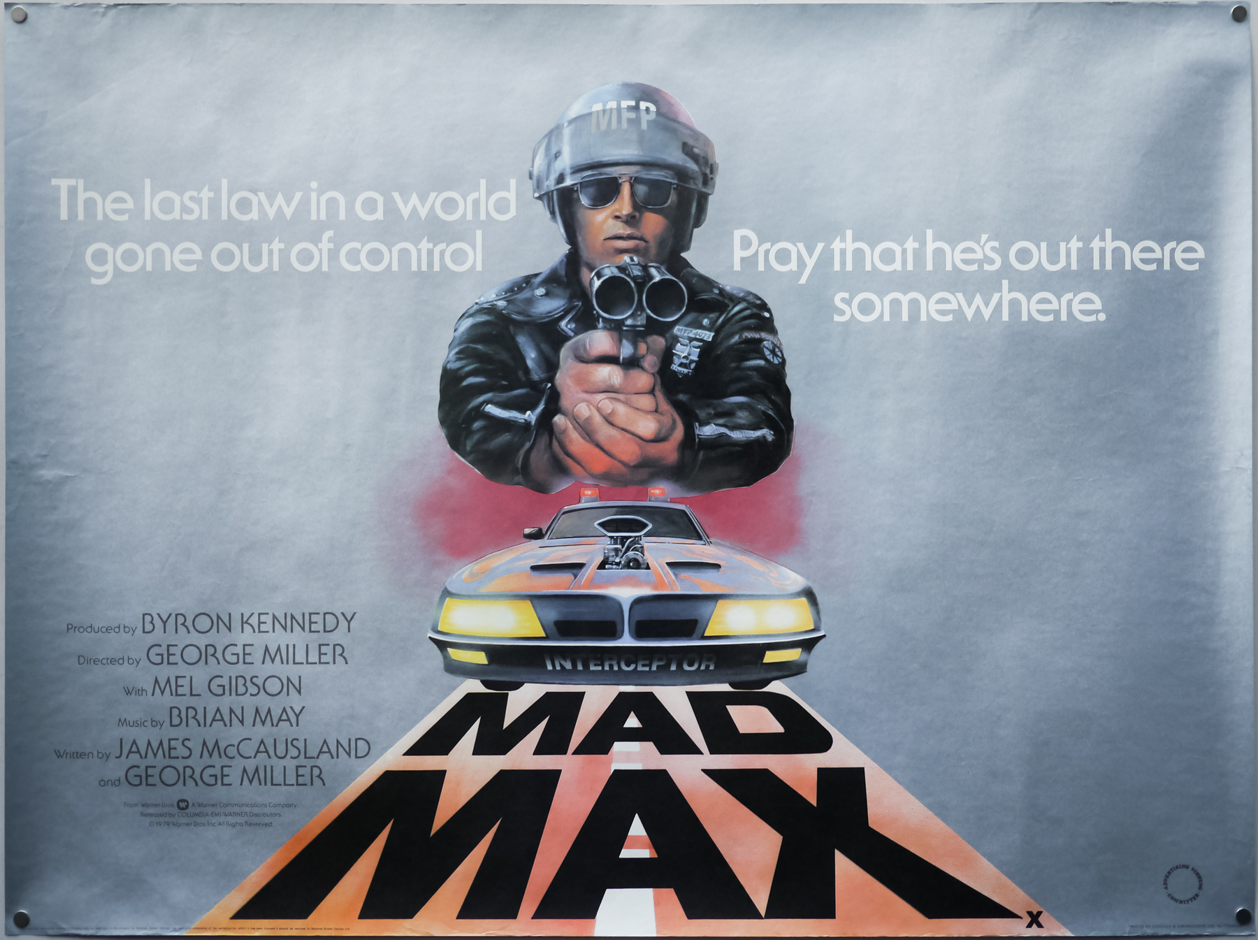
The UK quad for Mad Max, designed and illustrated by Tom Beauvais, 1980
It’s a striking poster and made even more impressive by the fact that the illustration isn’t crowded out by too much text. It’s effective partly because it’s so minimal.
Can I ask if you worked on the British poster for Mad Max 2, which is an enlarged still from the film?
No, I didn’t work on the main design but I did work on the poster for a double-bill re-release of both films. I think the designer Ray Youngs, who had joined Chapman-Beauvais by then, helped me to piece that one together.
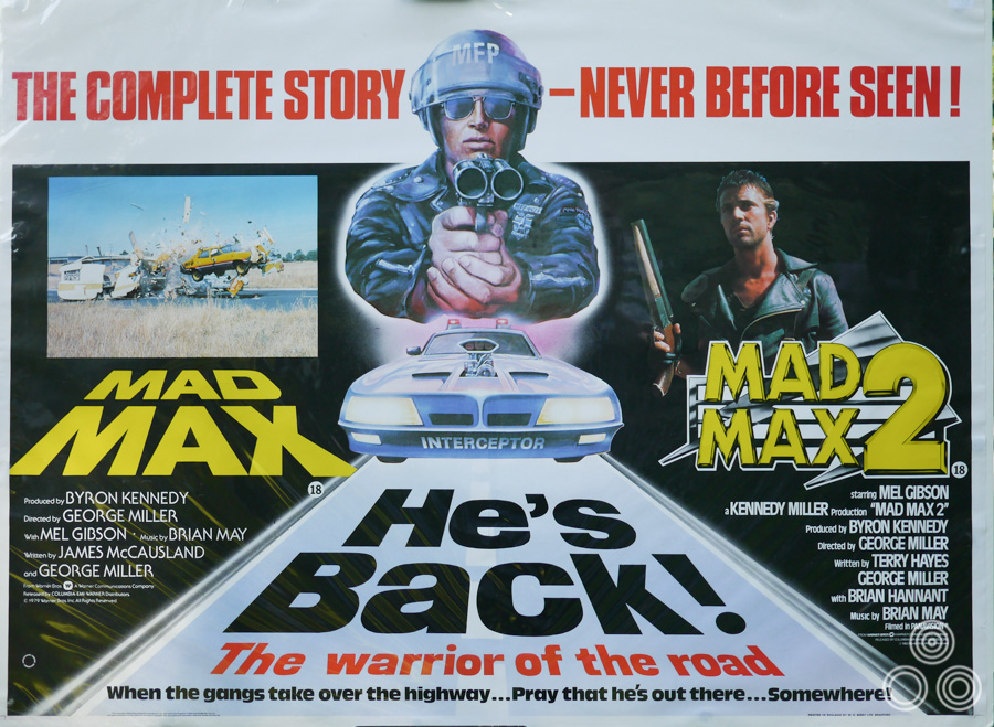
The UK quad for the double-bill re-release of the first two Mad Max films, designed by Ray Youngs and Tom Beauvais and (partially) illustrated by the latter, circa 1983. This is Tom’s own copy and is wrapped in protective cellophane, hence the slight glare.
A year after Mad Max came the striking poster you painted for Lucio Fulci’s much-loved horror Zombie Flesh Eaters.
I remember the funny moment when we were first briefed on what the distributor wanted from us. This fellow from the distribution company came in and he was a well-spoken, Army officer type who strode into our office and said ‘Right chaps, here’s what I’m looking for…’ and he proceeded to tell us that he wanted to see ‘bodies coming out of the earth’ and New York in the background. He then said ‘I don’t want to see any blood at all but you can paint plenty of worms and slime!’
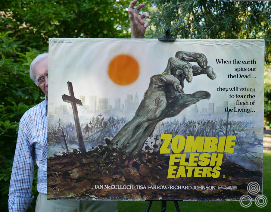
Tom Beauvais stands behind his quad for Lucio Fulci’s Zombie Flesh Eaters (1979) mimicking the iconic gnarled zombie hand. Tom both designed and illustrated the poster in 1980.
There was little in the way of press material and no stills to work from so I did what I thought he’d respond well to, with a large putrefied hand bursting out of the ground. I actually painted it by holding my own hand up to a mirror and making sure I captured the right anatomical details before making it more ghastly. Most of the figures I just drew from my imagination.
I wasn’t sure how to paint the light on the poster, as I didn’t want the sun to be too bright yellow so I decided to make it a bit more orange, and I airbrushed around it to give it a bit of a corona. I wanted it to have a hazy look.
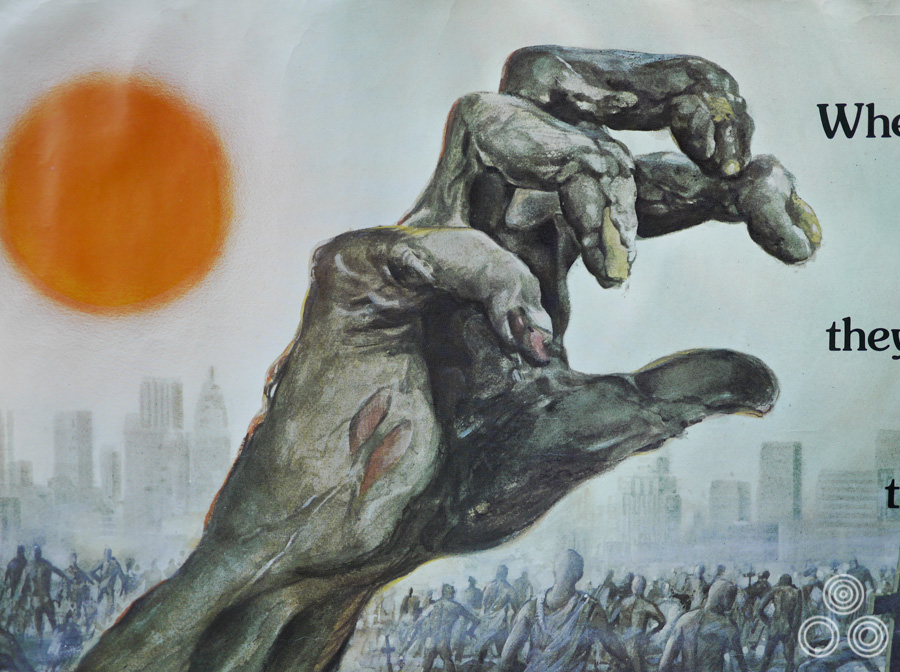
A close-up detail of the Zombie Flesh Eaters quad by Tom Beauvais, 1980
I never actually saw the film in the end! Around the same time, I also worked on the posters for two other horrors called Blood Beach and Killer Fish and I reused the same device of the hand on those, since it had been so successful.
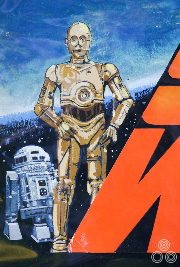
I hadn’t realised this but you also painted a concept for a Star Wars quad in 1977?
The job came into the office and we all had a go at designing for it, but obviously Tom Chantrell’s version was eventually chosen. I think he had waited until the last moment to present his idea and rather than it be a rough sketch or a half-done piece it was a perfect finished artwork. For my design I used day-glo paper to really make the title of the film pop with bright colour. I started by putting ordinary yellow paint on the lightsaber but it looked too much like custard so I ended up using more day-glo on that to give it the right feel.
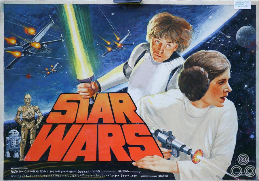
A concept design for the UK quad for Star Wars, designed and illustrated by Tom Beauvais in 1977. This was one of several concepts prepared to market the film by Chapman Beauvais. In the end it was Tom Chantrell’s now iconic illustration that was chosen to market the film.
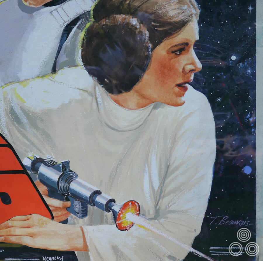
A close up detail of the concept design for the UK quad for Star Wars, designed and illustrated by Tom Beauvais in 1977. This is the original design and It is wrapped in cellophane to protect it hence the ripple reflections.
A close up detail of the concept design for the UK quad for Star Wars, designed and illustrated by Tom Beauvais in 1977.
Was there often competition between the artists for a particular job?
Oh yes, absolutely. As an office we would sometimes work on dozens of sketches and ideas for a poster campaign and we’d wait to see whose idea the client might choose. I remember doing several designs for the film Julia (1977) and none of those ended up being used.
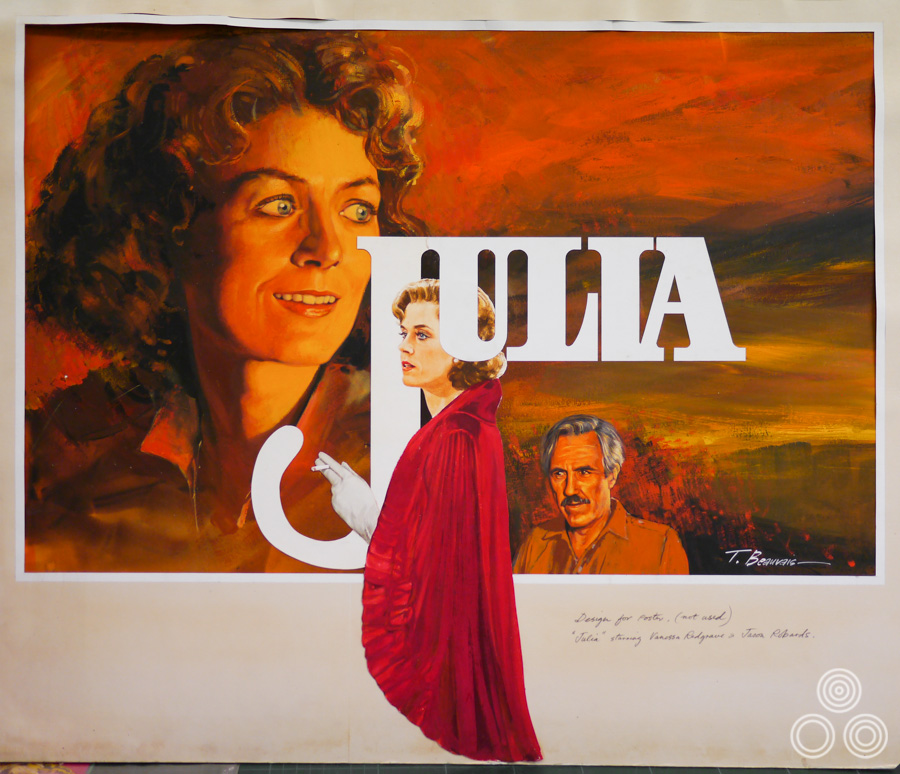
An unused concept painting for the film Julia (1977) by Tom Beauvais. The studio decided to go with another completely different design.
There was also an incident where Allardyce got into trouble for a design for Carry on Cleo (1964) that Fox claimed was too close to the poster for the original Cleopatra (1963)?
Yes, I designed a poster for the film that paid homage to the original artwork on the American poster for Cleopatra. Tom Chantrell’s painting substituted Elizabeth Taylor, Richard Burton and Rex Harrison with the stars of the Carry On film and we added a funny tagline too. 20th Century Fox, the distributor of Cleopatra, obviously didn’t see the funny side and decided to take Warner Pathe [the Carry on Cleo distributors] to court claiming plagiarism.
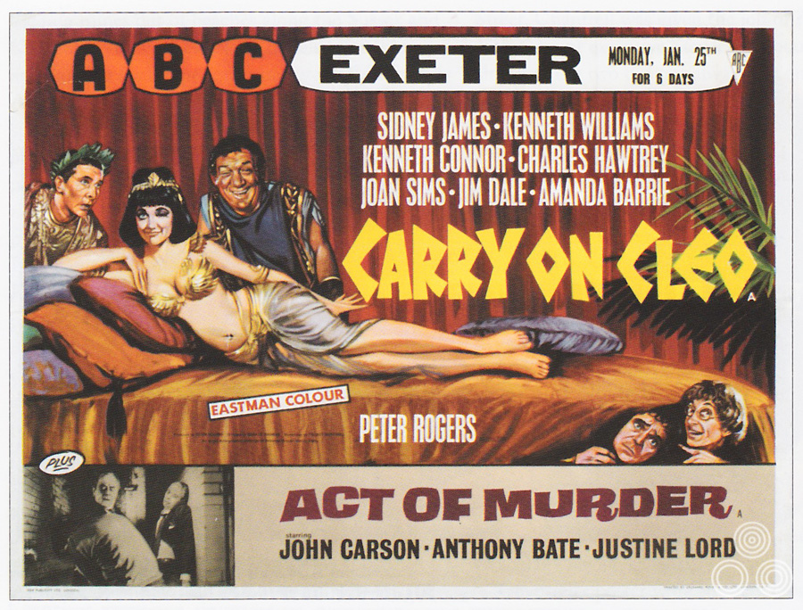
The first version of the UK quad for Carry on Cleo that was designed by Tom Beauvais and illustrated by Tom Chantrell in 1964. This poster was withdrawn following a court case brought about by 20th Century Fox who claimed the first version was too close to the illustration on their poster for Cleopatra (1963). This image was scanned from Sim Branaghan’s ‘British Film Posters’ book.
Quentin Hogg, who was also known as Lord Hailsham, had been a well-regarded barrister before serving as a Conservative MP and when he returned to the bar afterwards this case happened to be the first thing he took on as the defence for Warners. The upshot of it all was that Fox were allowed to put an injunction on the Carry On poster and it was thus hurriedly withdrawn, but that was as far as they could go. All that then happened was that Ray Youngs and Colin Leary, another artist, quickly put together a replacement quad in a couple of days and that was sent out to cinemas that were still showing Carry On Cleo.
At the end of the day I think the court case was actually good publicity for both parties and helped to keep the films in the public spotlight.
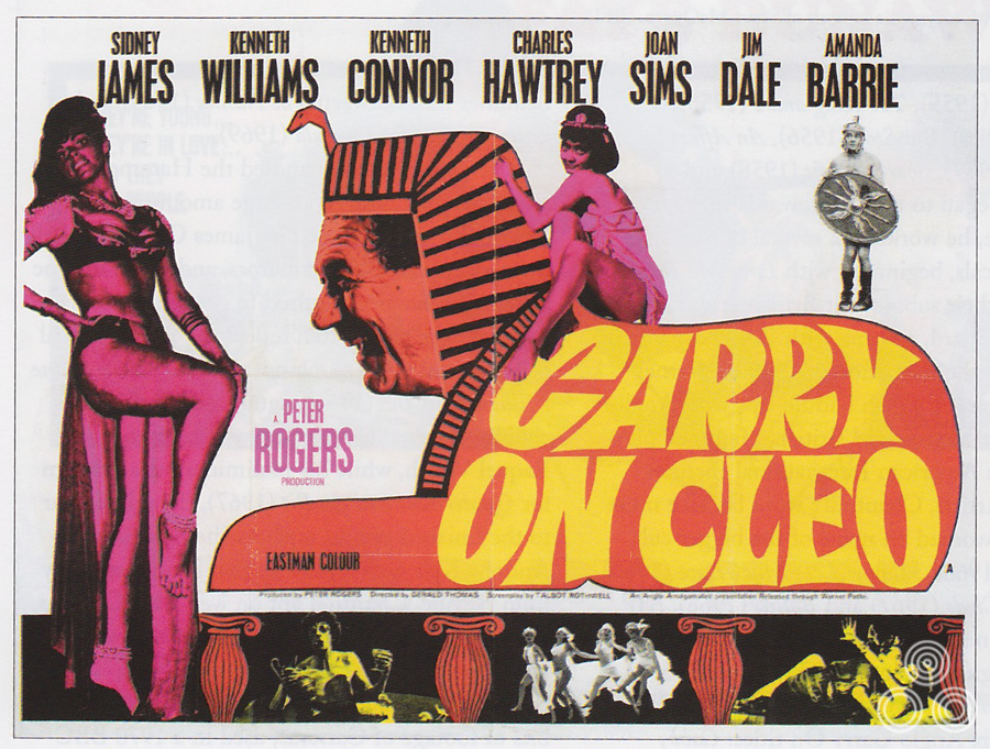
The hastily designed second version of the Carry on Cleo quad that was printed soon after the court case brought about by 20th Century Fox who claimed the first version was too close to the illustration on their poster for Cleopatra (1963). This image was scanned from Sim Branaghan’s ‘British Film Posters’ book.
I wondered if I could ask you about the two posters you painted featuring Clint Eastwood, Bronco Billy and The Honkytonk Man?
With Bronco Billy, the bit that was on the left of the giant circus advert was taken from the American poster but the British distributor felt that it wasn’t enough and they requested a close-up of Clint Eastwood holding guns. I painted the portrait from a still and then married it together with the American art.
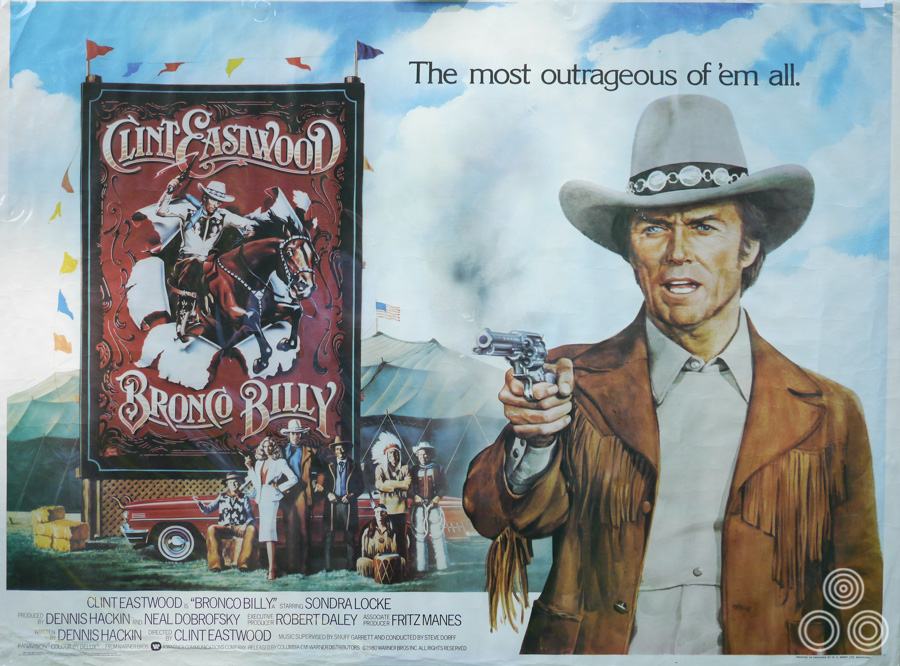
The UK quad for Bronco Billy, designed and illustrated by Tom Beauvais, 1980.
The figure of the boy on the Honkytonk Man poster is actually based on a reference pose by my son Keith. There was a still of Clint in the bathtub and also a still of Kyle Eastwood, who played the son in the film, but it was only a headshot so I got Keith to pose with his elbows on the back of a chair.
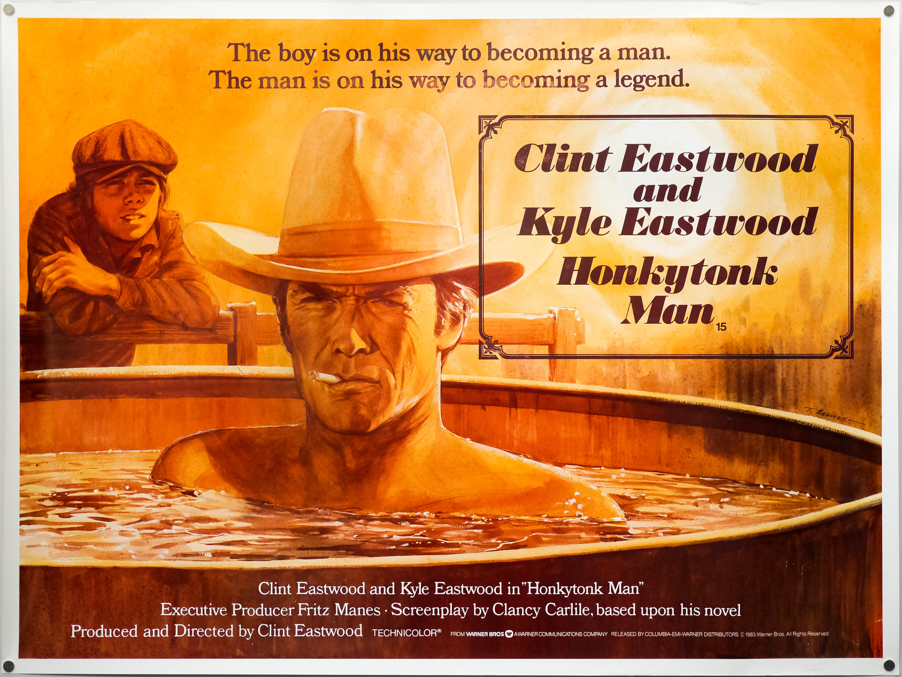
The UK quad for Clint Eastwood’s Honkytonk Man, designed and illustrated by Tom Beauvais in 1982. Tom’s son Keith was used as a reference double to capture the pose of Eastwood’s own son Kyle.
You also worked on a poster for the science-fiction film Android [1982]?
Yes, that was actually in conjunction with a chap called Keith Fowles who used to work with us. He was very skilled with an airbrush and he modelled up the head of the main character, as well as the arm and the background. I then painted in the figures along the bottom.
What was it like to work on the posters you designed and painted for ITC Entertainment, like Rising Damp and Porridge?
I can’t remember the name of the agency that was handling the publicity for those films but there was somebody who worked there who was also a designer and I met with him a few times and he and I would thrash out the ideas together, so a lot of the posters were designed in a collaborative way. Once the designs were established it was always down to me to paint the finished artwork and during that time I often found ways to tweak and improve the initial design.
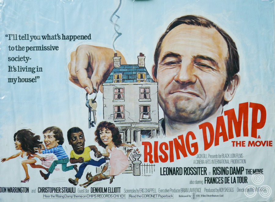
The UK quad for the Rising Damp film, designed and illustrated by Tom Beauvais, 1980.
Were you aware at the time you were working on the film posters of other agencies and artists and what they were up to?
Well, sometimes, but I think really I am my own harshest critic and I don’t think I was ever truly satisfied with a piece of my work. I’d always want to improve things if I had the time. Some artists can get it right first time, every time, which is almost like a circus trick where they’ve practiced and practiced to the point that they can create something successful in short order. But for many artists, including myself, there’s something of you that goes into every piece of work and the outcome depends on your mood or outside influences and it doesn’t always succeed.
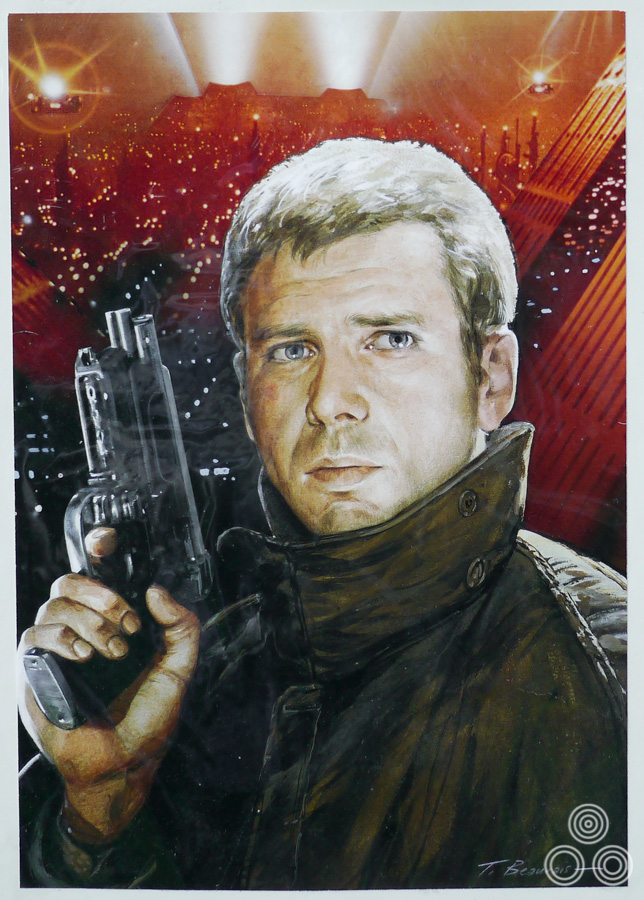
A portrait of Harrison Ford that was painted as part of an unused concept design for the UK poster of Ridley Scott’s classic Blade Runner. The portrait was painted by Tom Beauvais and pasted over the Los Angeles futurescape as seen during the opening sequence of the film. 1982.
Can you talk about how you felt when computers started to be more prevalently used in the design of commercial art?
Well the nature of the film work started to change quite significantly and by that time I’d been working on the architectural drawings for several years and, to be honest, I wasn’t really interested in working on anything else apart from those. Design is something that you can’t keep up forever; things fall out of fashion and it’s almost impossible to stay on top of the latest trends year after year. I’d look at designs that I had worked on and was proud of at the time, and just think they were already so old-fashioned. Commercial art is just like any other creative arena, such as fashion or product design; it’s a constantly changing environment.
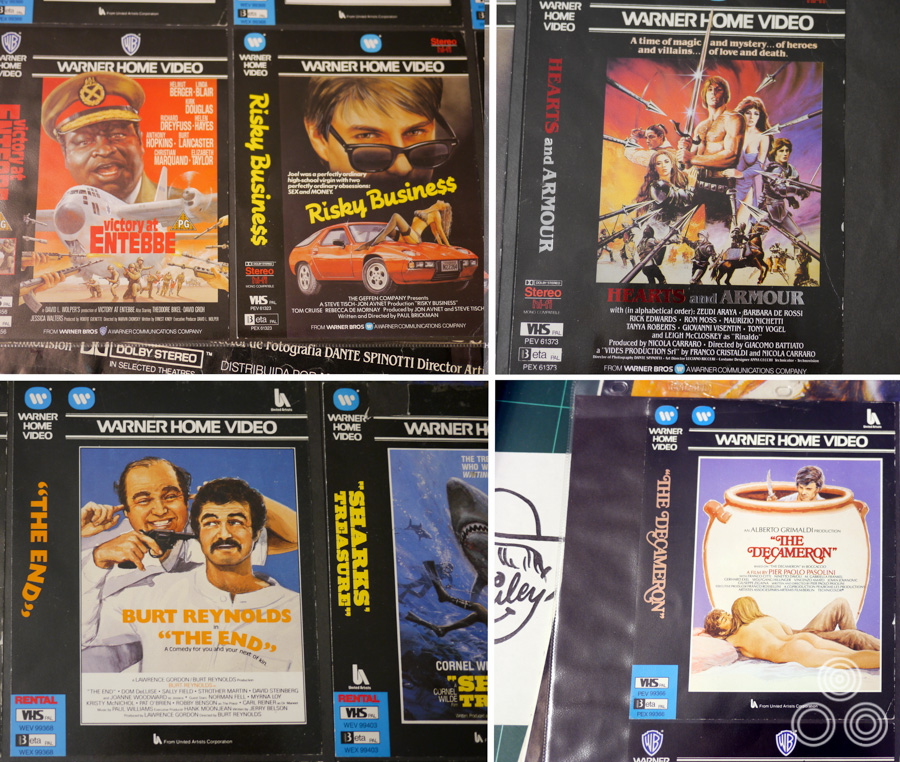
A selection of video covers that were painted by Tom Beauvais during the 1980s.
Part 7 – A kind of retirement
You retired from Chapman-Beauvais in 1992?
That’s right, yes. I can’t believe it was so long ago! The funny thing is that I’ve worked on hundreds of architectural drawings since then. My yearly output has been much higher than it was before I left the agency.

The day of Tom Beauvais’ retirement from Chapman Beauvais in 1992. From left: Robb Mepham, John Chapman, Ray Youngs, Tom Beauvais, Tim Canadine, Penny Tidd, Colin Leary and Keith Fowles. Image scanned from Sim Branaghan’s ‘British Film Posters’ book.
So you didn’t really retire then?
No, well I suppose not! I kept having people phoning me up with a new job that they needed doing, say a new housing development was being built or a refurbished property, and I’d go over to the site to take reference photos and chat about the project. I’ve slowed down with that kind of work recently, but I think I’ll probably end up like my dad who stopped the commercial work completely but carried on painting. He folded away his large work desk and just left a couple of easels and his oil paints out. He always had a painting on the go, right up until he died aged 98.
Incredible! Can I ask if you’d prefer to be remembered for your architectural or film work?
I suppose the former does carry a bit more prestige perhaps, but there’s definitely more interest in film posters today. Although you could make a case that my architectural work had a bit more artistic importance, the truth is that not many people are interested in that area, whereas there are so many more film fans out there.
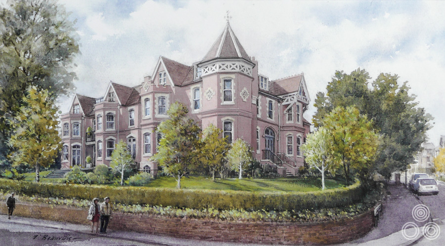
An illustration of Turret House on Jenna Road, Guildford. This was a commission from the developers responsible to give an artists impression of how the completed development would look. 2011.
Thanks so much Tom, I really appreciate the time you’ve spent with me.
You’re very welcome. It was a pleasure.
————————-
To see more of Tom’s architectural drawings click here.
To see the posters I’ve collected by Tom Beauvais click here.
Hi Jenny, thanks for your message. I’ll pass it onto Tom.
I used to know Tom in the nineteen fifties when he lived in Grange Rosd Egham with his family, and I met his dad Arnold when I went to call for him on a few occasions. I was at a tech college, studying dress design at the time – this college later became the London College of Fashion. We didn’t see each other much after this; and then we both married other people and that was that, until we met up again briefly in later life, for some reason that I can’t remember!
A very talented artist. I own one of his prints of Egham, where I still live.
Memories from Jenny. June 2021
What a GREAT, informative and truly entertaining interview! The ‘Bond rip off poster’ is 1967’s ‘Somebody’s Stolen Our Russian Spy’. The film wasn’t released until 1975.
I’m so amazed and intrigued…are we related? I’m Den Beauvais and I’ve been a commercial artist for 40 years and this is the first time I’ve come across Tom’s work! Very impressive!
Such a talented and genuine man that was able to create some memorable movie posters
Fantastic profile of an unsung hero!
Brilliant. Thank you, Mr. Shannon.
Thanks for your message Neil. I’ll pass it on to Tom.
Lovely article on Tom. I was with the design agency that commissioned the Sovereign Harbour illustration (among many others), and worked closely with Tom on several similar projects. He was always charming, happy to share many a story, and I was lucky enough to attend one of his talks on his career (not to mention having him sign various books on film posters for me!!!). A true inspiration and huge talent.
Thanks! Glad you liked it.
This is a fantastic interview! I was planning on just skimming through it but ended up reading it start to finish!
A stunning article – keep ’em coming!