To celebrate the release of 2012’s hugely anticipated superhero team-up The Avengers, Marvel, the studio behind what was unquestionably the biggest cinematic event of the year, once again worked with Austin-based Mondo to release a series of screen prints based on characters from the film. The incomparable Austin-based geek culture outfit has worked on prints for all of the standalone Marvel releases, starting with Iron Man in 2008 and only skipping the same year’s The Incredible Hulk.
The team at Mondo assembled a roster of its most celebrated artists to work on prints for each of the main characters and these were released over the period of a week in April 2012, beginning with Olly Moss‘ portrait of Black Widow and ending with Thor by Martin Ansin and Iron Man by Kevin Tong. A few weeks later, on the eve of the film’s release, Mondo then revealed a print featuring all of the characters that was designed and illustrated by arguably their most popular artist, Tyler Stout.
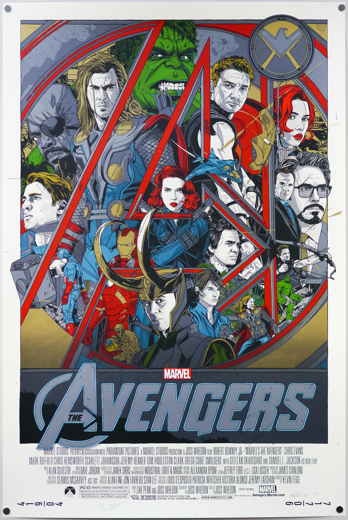
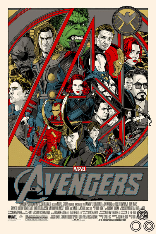
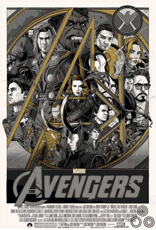
The regular version of Tyler Stout’s screen print for The Avengers, 2012
As usual, the print came in both regular and variant versions and, despite each having relatively high print runs, the poster sold out within seconds of going on sale on Mondo’s site. I was lucky to snag a copy of the print via Tyler’s own lottery, which he now holds on his own site shortly after each print release sells out via Mondo.
Whilst adding the regular version to the Film on Paper collection I wanted to interview the man himself about the creation of the print as I’ve done previously with his work on Akira, Kill Bill and Star Trek II: The Wrath of Khan. The interview can be read in full below:
—————
Hey Tyler, can I start by asking if you were keen to work on a poster for The Avengers after the prints you’d done for Iron Man 2 and Captain America? Did you ask the guys at Mondo if you could get involved?
Well, bear in mind that I did this poster over two years ago so it’s hard for me to remember the exact conversation, but it probably was something similar to the Mondo guys asking me, “Hey do you want to do a poster for Avengers?” and me going “Sure”, and then several emails from them saying “Is it done yet?” then me finishing it at the last minute.
Did you get to see the film before you worked on the print? What did you think?
I didn’t. I don’t know if I’ve ever seen a film before it’s released officially. Actually, Best Worst Movie – I saw that one. For the rest though, if it’s a new film, I don’t usually get into screenings. I really liked The Avengers a lot and it’s my second favourite Marvel film, after the first Iron Man. Since then I would probably add Captain America 2 up there as I really enjoyed that, plus Iron Man 3.
How long were you given to work on the design?
I can’t really say for sure. I’m certain they gave me at least a month’s heads-up, probably more like three months heads-up. Not that it does much good as I’m a last minute man.
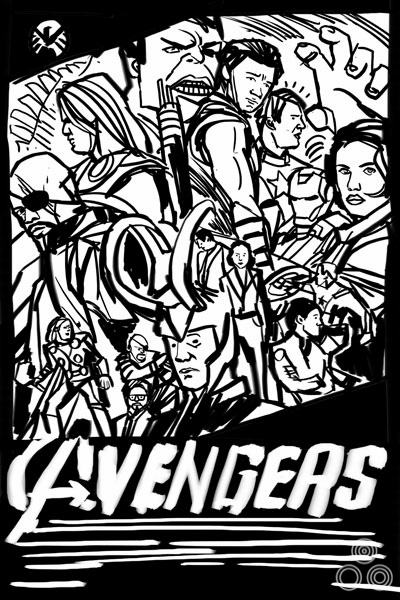
An early thumbnail sketch for the poster that Tyler submitted to Mondo for approval before beginning work.
Can you talk about your initial design ideas for the poster?
We were required to submit a thumbnail sketch of our design ideas early on in the process. As you can see I stuck pretty close to mine and just had to tweak a few colors and voila. Done. It was in my head the entire time.
Were there certain elements or characters you knew had to sit next to each other?
My posters are the very definition of happy accidents. Looking at this one, I think I deliberately made Captain America and Iron Man/Tony Stark smaller and less central to the piece because I’d already done posters for their individual films, so those two characters had already had their day to shine. Having seen the film, I realise now that maybe Hawkeye isn’t as main of a character as Cap or Stark (who’s a huge part of the film), but thats life. I let personal bias get in the way.
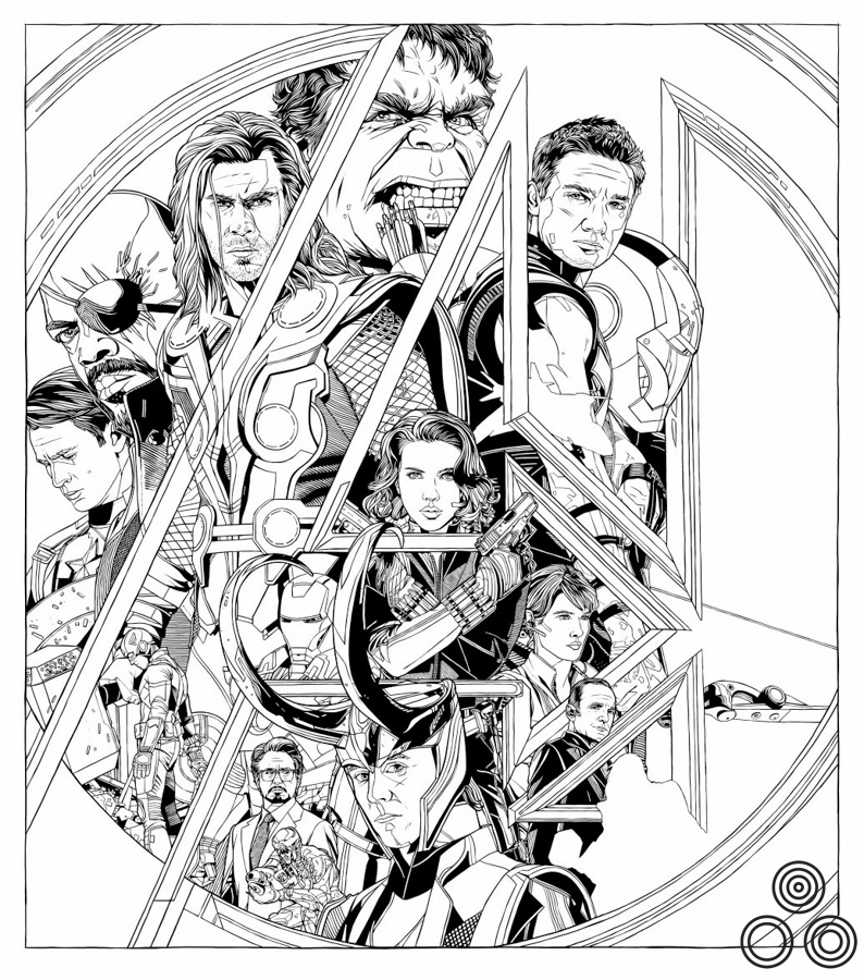
An early, colourless version of the print with a few notable differences.
What about the idea of having each character with a portrait and an alternative pose?
I like drawing faces up close and I like kinda showing them in action. I just like repeating things for some reason. It gives it the feeling of movement, for me anyway.
One small note of interest is that, due to a lack of time, I used the city portion of a discarded design for a Drive poster as the background for this print. Later we ended up doing a letterpress of that same Drive design. This is known in the TStout industry as ‘double-dipping’.
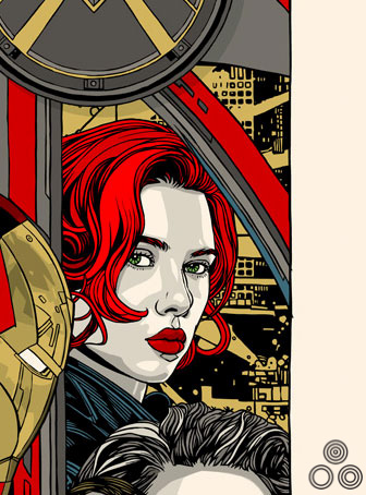
A close-up of an earlier version of the poster, featuring Black Widow and a cityscape ‘borrowed’ from an unused poster for Drive (as detailed above and featured below).
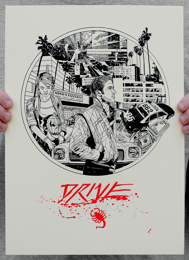
A letterpress of an earlier, unused poster for Drive (2011) that was designed by Tyler and from which he ‘borrowed’ the background cityscape for the Avengers print.
Was the composition and framing using the ‘A’ something you arrived at rapidly?
Having looked back at earlier versions it seems like the A feature was always pretty central to the design, there wasn’t any layout that didn’t involve it actually. So that’s good that I stuck to my guns.
Are there any elements or characters you illustrated but that didn’t make it into the final version?
I sent Mondo an ‘in process’ image and they requested Agent Coulson be made bigger, saying his part was significant in this film, whereas I was assuming he was more a bit player like he’d been in Iron Man.
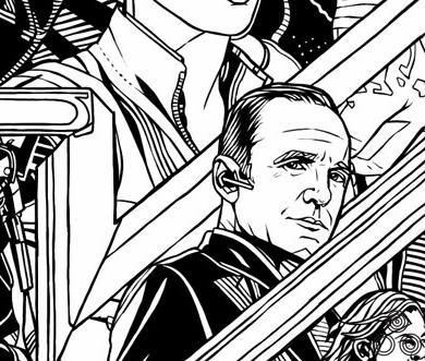
An early version of Agent Coulson who was made more prominent in the final design after Marvel gave feedback that his part in the film was more prominent than Tyler had first assumed.
Did you alter any elements of the poster before arriving at the final version?
The black and white image is an early version and you can see some elements that were altered over time. I had the small Tony Stark figure down at the front and they wanted a bigger one. The same with Agent Coulson. There was also a different image of Captain America and a few other minor tweaks.
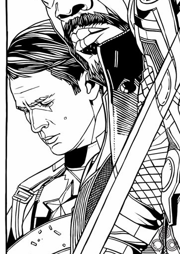
An earlier version of Steve Rogers (Captain America) which was altered during the design process. Tyler: ‘I wasn’t very happy with him after he was drawn, so I was keen to alter his pose to make him appear more courageous, instead of downcast.
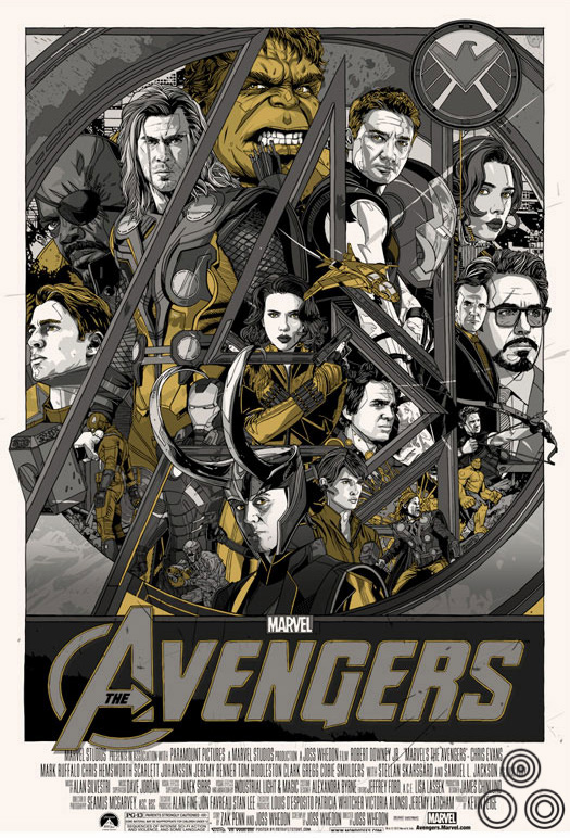
Was the regular version always going to be recognisable Avengers colours (Hulk green, Iron Man red etc)?
I think someone said I should not be afraid to use more colors on this one. In hindsight, I think the less-color option of the variant works better, so more colors might not be my thing!
Tyler ‘This is an early pass at the regular colorway and you can see that I pretty much stuck with it for the final version’
Can you talk about your choice of colourway for the variant as it’s predominantly grey and red?
I was trying things out and had a go with my patented gold and silver metallic combo but wasn’t feeling it. I then decided to try red instead of gold and started feeling it. Less is more as they say, or I have heard some people say.
Were there any alternate colorways you tried out?
On all posters, I try out all the colorways. But really, I try out so many it would make your head spin. I try out so many that Mitch and Rob at Mondo get sick of me emailing them saying, ‘what about this?’ or ‘this is better.’ It’s just days and days of me trying to find the best colorway. Which is probably surprising to some people who probably think I make my color choices in ten minutes. Shame on those people.
Another alternative colourway that Tyler tried out for the print
Which do you prefer out of the regular and variant and why?
Some people love the regular and some people love the variant. If I come out and say I prefer one over the other it might bum some people out. I do like the simpleness of the variant, but some things get lost like Hulk’s shape behind Thor, and Nick Fury, so it’s give and take.
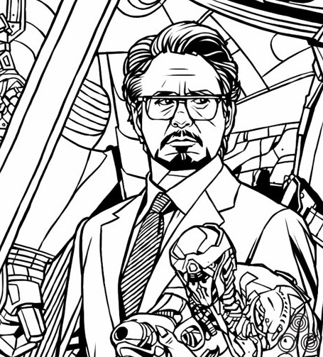
An early version of Tony Stark that was altered for the final print after Marvel gave feedback to the artist that he should be more prominent on the poster.
Did Marvel have any input into the poster?
They did and their suggestions probably made the poster better, because they included notes like ‘don’t make Agent Coulson too small’ and ‘make Tony Stark’s face bigger.’ All of them were obviously because of the intimate knowledge they had of the film before me and the guys at Mondo had had chance to see it.
A second alternate, unused variant colourway.
Which of the new Marvel Universe films are you looking forward to seeing?
I’m curious about Guardians of the Galaxy and I’ve been hearing good things. Fingers crossed.
Although you’ve been releasing several music and self-initiated posters recently, things were quiet on the film-related poster front, until last weekend’s Guardian of the Galaxy reveal at the San Diego Comic Con. I’m looking forward to see what else you have planned for this year. Any hints?
My hints are terrible and usually completely false, but here they are:
Possibly some other movie that has a good guy and bad guy, actually two bad guys. Or was it good girl? And space is involved? Or a being from another world? And a car chase? Man, I am mixing up all sorts of movies on my schedule. Lets just say I hope I have more prints coming out.
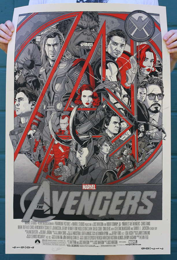
This is the final variant version of the print, available in an edition of 350
Thanks so much Tyler, as always your time is greatly appreciated.
Thanks to you, good sir.
—————————-
+ Check out Tyler’s own website here.
+ The Mondo website is here and I’d advise following them on Twitter here.
+ The other posters I’ve collected by Tyler can be viewed here.
+ My interview with Tyler on the creation of his Akira print is here. See here for the Kill Bill print interview and here for his print for Star Trek 2: The Wrath of Khan.