You searched for: Blade%2520Runner%3A%2520The%2520Director%5C%27s%2520Cut

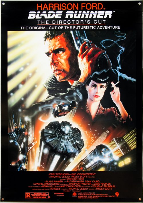
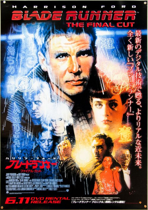
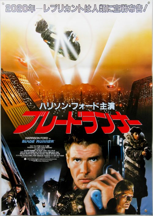
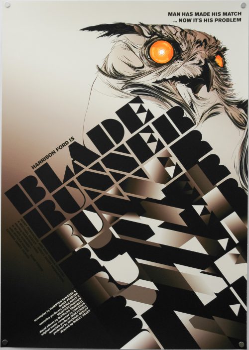
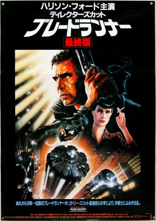
Blade Runner: The Director’s Cut / B2 / Japanese text / Japan

17.05.11

Poster Poster

Blade Runner: The Director’s Cut / B2 / English text / Japan

17.05.11

Poster Poster

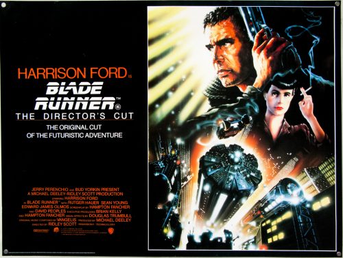
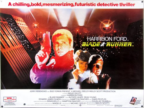
Blade Runner: The Director’s Cut / quad / UK

18.05.11

Poster Poster

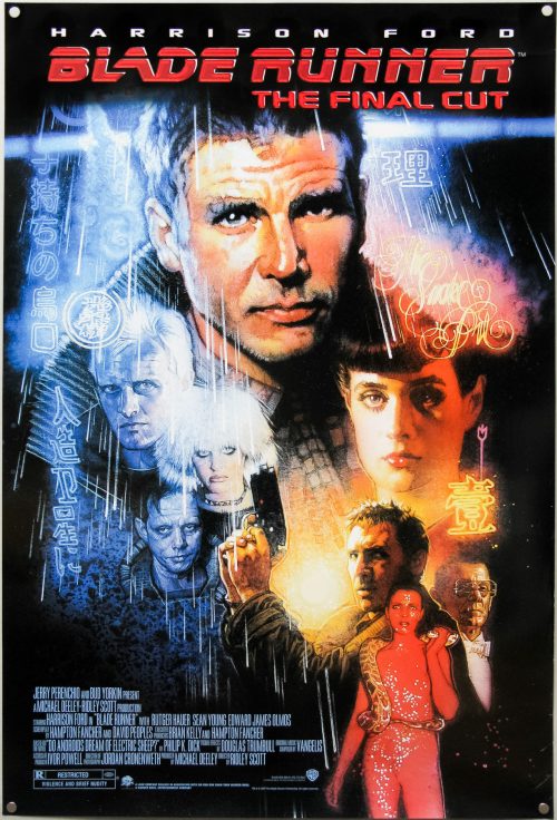
Blade Runner: The Final Cut / B2 / DVD release / Japan

17.05.11

Poster Poster

Blade Runner: The Final Cut / one sheet / USA

17.05.11

Poster Poster

Blade Runner / one sheet / studio version / USA

15.09.14

Poster Poster
Title
Blade Runner
AKA
Blade Runner - Metropolis 2020 (Finland)
Year of Film
1982
Director
Ridley Scott
Starring
Harrison Ford, Rutger Hauer, Sean Young, Edward James Olmos, M. Emmet Walsh, Daryl Hannah
Origin of Film
USA | Hong Kong
Genre(s) of Film
Harrison Ford, Rutger Hauer, Sean Young, Edward James Olmos, M. Emmet Walsh, Daryl Hannah,
Type of Poster
One sheet
Style of Poster
Studio version
Origin of Poster
USA
Year of Poster
1982
Designer
Intralink Film Graphic Design
Artist
John Alvin
Size (inches)
27" x 41"
SS or DS
SS
NSS #
820007
Tagline
Man Has Made His Match... Now It's His Problem

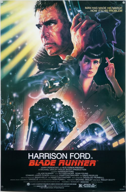
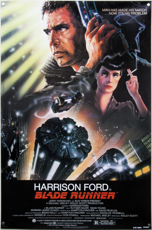
One of my top five films of all time, Blade Runner was released with easily one of the most iconic sci-fi one sheets ever printed. The design and artwork is by the late, great John Alvin, a man responsible for several of the most memorable film posters of the past 40 years. This is perhaps his most well known piece since it featured on posters across the globe, was reused for the 1992 Director’s cut release and has been on the cover of home video releases for many years.

In August 2014 a book entitled The Art of John Alvin was released after four years of preparation by his wife and studio partner Andrea. An absolute must-own for any fan of film posters and the art of cinema, the book features almost all of John’s most memorable posters which are each given their own section. As well as images of the printed poster, there are also early sketches, painted concepts and pictures of the original artwork itself, plus Andrea has provided fascinating commentary detailing the creation of each piece.

Blade Runner is given six pages and the section features a look at the original graphite sketches done by Alvin to show to Ridley Scott and the studio’s marketing department. Elements of these were then combined to create the painting we know today. Andrea notes that the posters for the film were originally conceived to focus on the relationship with the characters and the futuristic city, but by the time of release Harrison Ford was a global star so Alvin was asked to make him more prominent in the artwork.

John apparently always regretted not featuring Rutger Hauer’s android Roy Batty so when he was asked to revisit the design for a 25th anniversary print he reworked several elements, including the two portraits of Harrison Ford and Sean Young and added the face of Roy Batty looming large over them. The print was called ‘I’ve Seen Things’ by John and can be viewed here.

There are known reprints of this poster and this particular version is one of three known variants. LAMP has a guide to all three here. To summarise:

Variation 1 – NSS Version
This version has NOTHING in the bottom left corner; Litho in U.S.A. (AND) the NSS tag in the center; BLADE RUNNER 820007 in the bottom right

Variation 2 – Studio Version
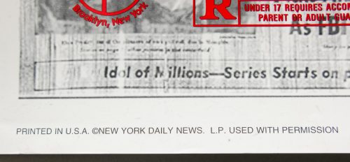
This variation has “PRINTED IN U.S.A.” in the bottom left corner; NOTHING in the center; and “NSS 820007” in the bottom right.

Variation 3 – Odd NSS Version
In the bottom left corner has “PRINTED IN U.S.A.”; in the center ‘IN SMALLER PRINT’ has “LITHO IN U.S.A.” (AND) the NSS tag; In the bottom right has “BLADE RUNNER NSS 820007” in ‘UNEVEN’ print.

This is the second variation (studio version) but I also have the ‘Odd NSS Version’, which can be viewed here. A dealer in London once told me he believes all NSS versions of this poster are reprints/restrikes. If this is the case then the poster has fooled both respected dealers and collectors alike.

Blade Runner / one sheet / ‘odd NSS’ version / USA

18.05.11

Poster Poster
Title
Blade Runner
AKA
Blade Runner - Metropolis 2020 (Finland)
Year of Film
1982
Director
Ridley Scott
Starring
Harrison Ford, Rutger Hauer, Sean Young, Edward James Olmos, M. Emmet Walsh, Daryl Hannah
Origin of Film
USA | Hong Kong
Genre(s) of Film
Harrison Ford, Rutger Hauer, Sean Young, Edward James Olmos, M. Emmet Walsh, Daryl Hannah,
Type of Poster
One sheet
Style of Poster
'Odd NSS'
Origin of Poster
USA
Year of Poster
1982
Designer
Intralink Film Graphic Design
Artist
John Alvin
Size (inches)
27" x 41"
SS or DS
SS
NSS #
820007
Tagline
Man Has Made His Match... Now It's His Problem

One of my top five films of all time, Blade Runner was released with easily one of the most iconic sci-fi one sheets ever printed. The design and artwork is by the late, great John Alvin, a man responsible for several of the most memorable film posters of the past 40 years. This is perhaps his most well known piece since it featured on posters across the globe, was reused for the 1992 Director’s cut release and has been on the cover of home video releases for many years.

In August 2014 a book entitled The Art of John Alvin was released after four years of preparation by his wife and studio partner Andrea. An absolute must-own for any fan of film posters and the art of cinema, the book features almost all of John’s most memorable posters which are each given their own section. As well as images of the printed poster, there are also early sketches, painted concepts and pictures of the original artwork itself, plus Andrea has provided fascinating commentary detailing the creation of each piece.

Blade Runner is given six pages and the section features a look at the original graphite sketches done by Alvin to show to Ridley Scott and the studio’s marketing department. Elements of these were then combined to create the painting we know today. Andrea notes that the posters for the film were originally conceived to focus on the relationship with the characters and the futuristic city, but by the time of release Harrison Ford was a global star so Alvin was asked to make him more prominent in the artwork.

John apparently always regretted not featuring Rutger Hauer’s android Roy Batty so when he was asked to revisit the design for a 25th anniversary print he reworked several elements, including the two portraits of Harrison Ford and Sean Young and added the face of Roy Batty looming large over them. The print was called ‘I’ve Seen Things’ by John and can be viewed here.

There are known reprints of this poster and this particular version is one of three known variants. LAMP has a guide to all three here. To summarise:

Variation 1 – NSS Version
This version has NOTHING in the bottom left corner; Litho in U.S.A. (AND) the NSS tag in the center; BLADE RUNNER 820007 in the bottom right

Variation 2 – Studio Version
This variation has “PRINTED IN U.S.A.” in the bottom left corner; NOTHING in the center; and “NSS 820007” in the bottom right.

Variation 3 – Odd NSS Version
In the bottom left corner has “PRINTED IN U.S.A.”; in the center ‘IN SMALLER PRINT’ has “LITHO IN U.S.A.” (AND) the NSS tag; In the bottom right has “BLADE RUNNER NSS 820007” in ‘UNEVEN’ print.

As is clear from my photos, the version I have is the ‘Odd NSS Version’. I bought this particular example about five years ago from a very reputable and established dealer who has been in business over 25 years. I have also seen this version sold by the major auction houses on a number of occasions and have seen it in the collections of several long-time collectors.

A dealer in London once told me he believes all NSS versions of this poster are reprints/restrikes. If this is the case then the poster has fooled both respected dealers and collectors alike.

Blade Runner / quad / UK

28.11.11

Poster Poster
Title
Blade Runner
AKA
Blade Runner - Metropolis 2020 (Finland)
Year of Film
1982
Director
Ridley Scott
Starring
Harrison Ford, Rutger Hauer, Sean Young, Edward James Olmos, M. Emmet Walsh, Daryl Hannah
Origin of Film
USA | Hong Kong
Genre(s) of Film
Harrison Ford, Rutger Hauer, Sean Young, Edward James Olmos, M. Emmet Walsh, Daryl Hannah,
Type of Poster
Quad
Style of Poster
--
Origin of Poster
UK
Year of Poster
1982
Designer
Jouineau Bourduge
Artist
Jouineau Bourduge
Size (inches)
29 14/16" x 39 14/16"
SS or DS
SS
NSS #
--
Tagline
A chilling, bold, mesmerizing, futuristic detective thriller.

Ridley Scott‘s seminal sci-fi classic needs no introduction and is on many people’s ‘top 10 films of all-time’ list, including my own.

This British quad is based on the French poster credited to Jouineau Bourduge which is the combined surnames of two French poster designers/artists (both with the first name Guy) who were responsible for many classic posters from 1960s through to the 1980s. MoviePostersGallery.com has a gallery of posters by him, as does cinemaffiche.com. I’ve been unable to find anything in the way of a biography online so please get in touch if you have more information.

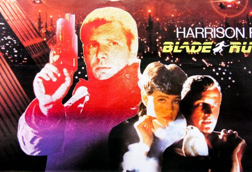
I’ve always found it interesting that Deckard (Harrison Ford) is given a very stylistic representation on the poster whilst the other two characters are displayed using photographs. It’s also slightly bizarre that the studio decided to promote a tie-in to win a Volkswagen Polo – talk about a mismatch of content and product!

One interesting thing to note is that the book tie-in shown in the bottom right corner features artwork by Drew Struzan. The design was proposed for the American one sheet but the production team ultimately went with John Alvin’s illustration instead. Drew would later be asked to design the poster for the release of the final cut in 2007.

The other Blade Runner posters I have collected can be seen here.

Blade Runner / B2 / Japan

17.05.11

Poster Poster

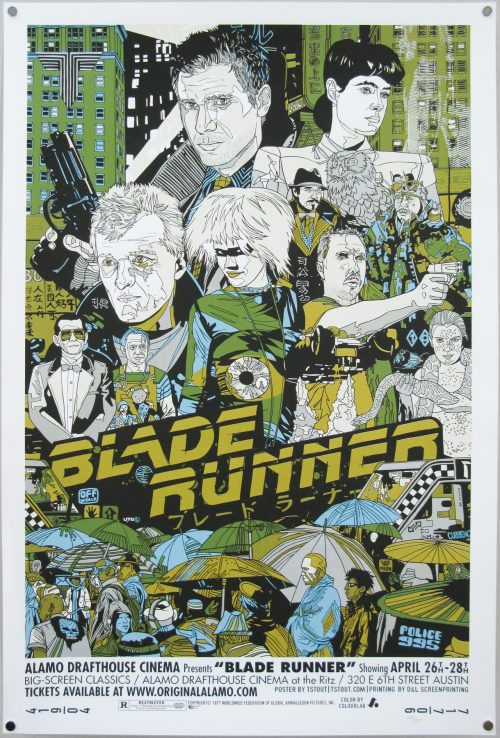
Blade Runner / screen print / Tyler Stout / regular / USA

17.05.11

Poster Poster

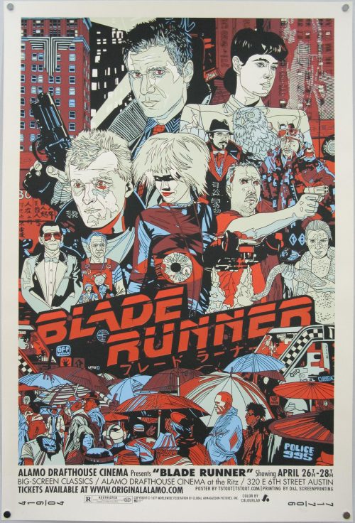
Blade Runner / screen print / Tyler Stout / variant / USA

17.05.11

Poster Poster

Blade Runner / Giclee / Carlos Bêla & Kako / UK

17.05.11

Poster Poster
Title
Blade Runner
AKA
Blade Runner - Metropolis 2020 (Finland)
Year of Film
1982
Director
Ridley Scott
Starring
Harrison Ford, Rutger Hauer, Sean Young, Edward James Olmos, M. Emmet Walsh, Daryl Hannah
Origin of Film
USA | Hong Kong
Genre(s) of Film
Harrison Ford, Rutger Hauer, Sean Young, Edward James Olmos, M. Emmet Walsh, Daryl Hannah,
Type of Poster
Giclee
Style of Poster
--
Origin of Poster
UK
Year of Poster
2008
Designer
Carlos Bêla
Artist
Kako
Size (inches)
23 1/4" x 33"
SS or DS
SS
Tagline
Man Has Made His Match... Now It's His Problem

This poster was created by Carlos Bêla and Kako for the Now Showing exhibition at the Cosh Gallery in Soho, London in 2008. It’s a giclée print on Da Vinci archival art paper and only 25 were printed. It comes with a certificate of authenticity confirming that it will not be reprinted. I happened to be passing by just before the exhibition opened and was able to reserve one.

Photos from the exhibition can be found on Flickr here

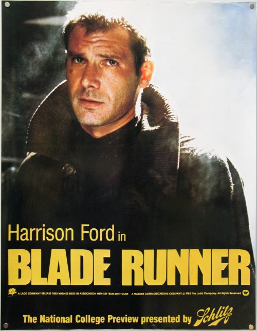
Blade Runner / special / Schlitz College Preview / USA

17.05.11

Poster

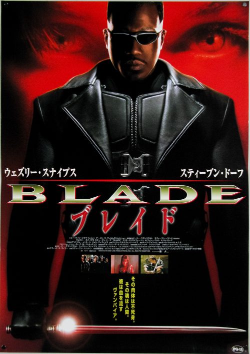
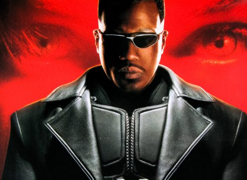
Blade / B2 / Japan

17.05.11

Poster Poster

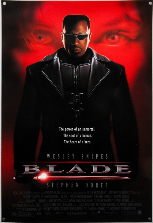
Blade / one sheet / USA

17.05.11

Poster Poster

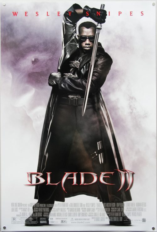
Blade II / one sheet / USA

17.05.11

Poster Poster

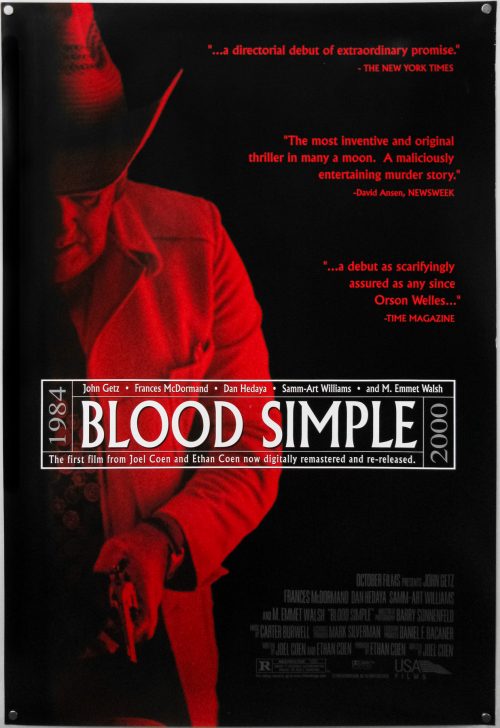
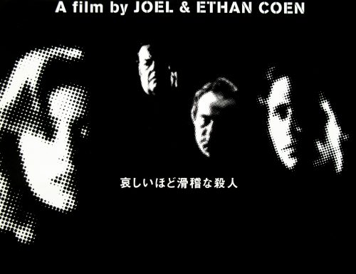
Blood Simple / one sheet / Director’s cut re-release / USA

17.05.11

Poster Poster
Title
Blood Simple
AKA
Blood Simple: The Thriller (Japan - director's cut - English title)
Year of Film
1985
Director
Joel Coen & Ethan Coen
Starring
John Getz, Frances McDormand, Dan Hedaya, M. Emmet Walsh
Origin of Film
USA
Genre(s) of Film
John Getz, Frances McDormand, Dan Hedaya, M. Emmet Walsh,
Type of Poster
One sheet
Style of Poster
Director's Cut re-release
Origin of Poster
USA
Year of Poster
2000
Designer
Unknown
Artist
Unknown
Size (inches)
27" x 39 15/16"
SS or DS
SS
NSS #
--
Tagline
--

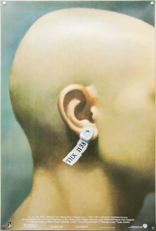
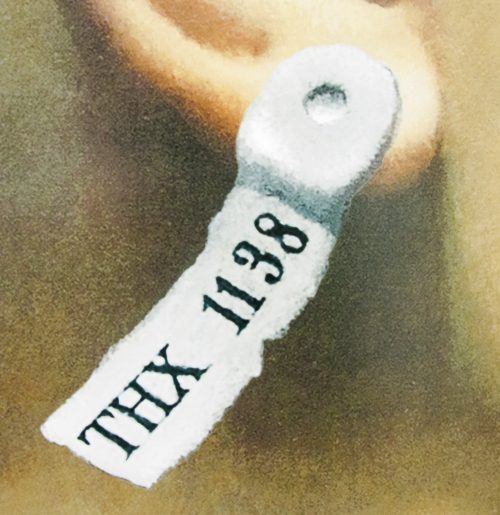
THX 1138: Director’s Cut / one sheet / 2004 re-release / USA

17.05.11

Poster Poster

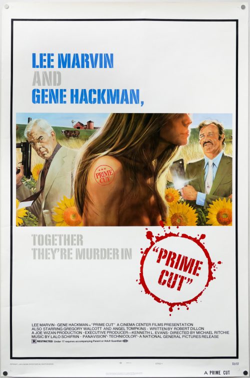
Prime Cut / one sheet / style A / USA

27.06.17

Poster Poster
Title
Prime Cut
AKA
Carnage (France)
Year of Film
1972
Director
Michael Ritchie
Starring
Lee Marvin, Gene Hackman, Angel Tompkins, Gregory Walcott, Sissy Spacek, Janit Baldwin, William Morey, Clint Ellison, Howard Platt, Les Lannom
Origin of Film
USA
Genre(s) of Film
Lee Marvin, Gene Hackman, Angel Tompkins, Gregory Walcott, Sissy Spacek, Janit Baldwin, William Morey, Clint Ellison, Howard Platt, Les Lannom,
Type of Poster
One sheet
Style of Poster
Style B
Origin of Poster
USA
Year of Poster
1972
Designer
Tom Jung
Artist
Tom Jung
Size (inches)
27 3/16" x 41"
SS or DS
SS
NSS #
72/57
Tagline
Together They're Murder In...

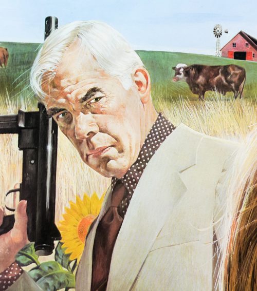
A painting by the American artist Tom Jung, who is best known for his work on the style A poster for the release of the first Star Wars film, features on this one sheet for the 1972 crime-drama, Prime Cut. The film was directed by the late Michael Ritchie (Fletch, Downhill Racer) and stars two heavyweight actors of the time in Lee Marvin and Gene Hackman. The former had a string of box-office hits playing tough guys in films such as Point Blank and The Dirty Dozen, and the latter had just starred in the unforgettable The French Connection and was to appear in The Poseidon Adventure in the same year as Prime Cut. It also marked the acting debut of Sissy Spacek who would appear in her most famous role four years later in Brian De Palma’s Carrie.

The plot sees Nick Devlin (Marvin), a Chicago mob enforcer, sent with a crew of men to Kansas City to track down Mary Ann (Hackman) and recover a $500,000 debt. Previous men sent by the mob have disappeared and we witness one being ‘processed’ through Mary Ann’s meat factory, ending up as the filling in a string of sausages that are then sent to the mob boss as a taunt. After driving to Kansas, Devlin first attacks Mary Ann’s brother and warns him that the group are there to collect the debt. The following day they find Mary Ann in a barn where he is the ringleader of a white-slave auction in which young girls are being auctioned off to older men. The women are kept naked in pens like livestock and drugged up so they don’t try to escape. Devlin threatens Mary Ann and rescues one of the women called Poppy (Spacek) “on account”. The rest of the film sees him attempting to secure the missing money and avoiding Mary Ann’s gang of denim-wearing, shotgun-toting farm boys.

The film is fairly brisk at just under 90 minutes and both leads are entertaining to watch throughout. Spacek is also excellent as Poppy and it’s not hard to see why her career took off quickly following her appearance in Prime Cut. There are several memorable scenes in the film, including one faintly ridiculous one where Devlin and Poppy are chased through a wheatfield by a combine harvester, which then goes onto chew up an entire car!

As well as the iconic one sheet for Star Wars, Tom Jung is also known for the style B one sheet for The Empire Strikes Back. He was a prolific designer and illustrator for film campaigns from the 1950s through to the 1980s. IMPAwards features a gallery of his work and his Wikipedia article has a selected list of the many posters he worked on. Rather unusually, at least in comparison to other film poster artists, Jung was also a designer of his posters as well as the artist. The other posters I’ve collected by him can be seen here.

Note that this is the Style A one sheet and style B is photographic. Rather unusually, the decision was taken to insert ‘A’ in next to the title at the bottom of the poster which makes it look like the title is ‘A Prime Cut’.

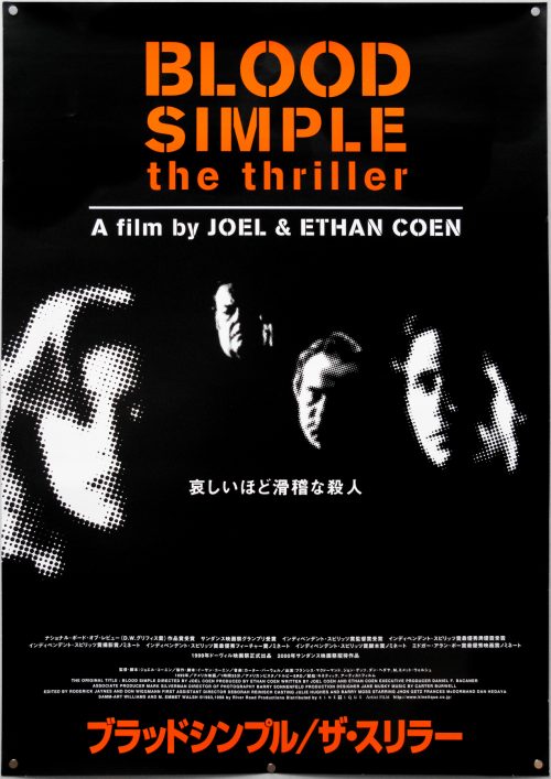
Blood Simple / B2 / 2000 re-release / Japan

17.05.11

Poster Poster
Title
Blood Simple
AKA
Blood Simple: The Thriller (Japan - director's cut - English title)
Year of Film
1985
Director
Joel Coen & Ethan Coen
Starring
John Getz, Frances McDormand, Dan Hedaya, M. Emmet Walsh
Origin of Film
USA
Genre(s) of Film
John Getz, Frances McDormand, Dan Hedaya, M. Emmet Walsh,
Type of Poster
B2
Style of Poster
Director's Cut re-release
Origin of Poster
Japan
Year of Poster
2000
Designer
Unknown
Artist
Unknown
Size (inches)
20 6/16" x 28 14/16"
SS or DS
SS
Tagline
--

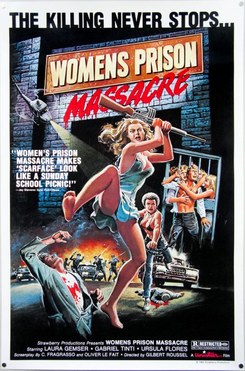
Women’s Prison Massacre / one sheet / USA

17.05.11

Poster Poster

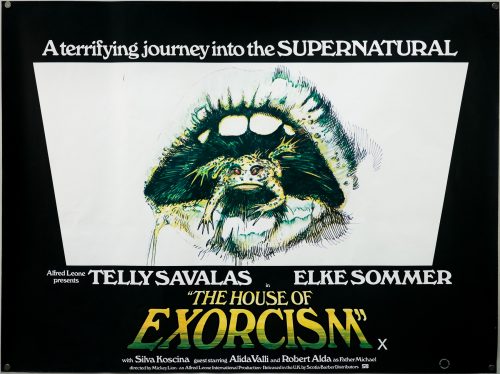
The House of Exorcism / quad / UK

02.06.14

Poster Poster
Title
The House of Exorcism
AKA
Lisa and the Devil (original cut)
Year of Film
1975
Director
Mario Bava (as Mickey Lion)
Starring
Telly Savalas, Elke Sommer, Robert Alda, Sylva Koscina, Eduardo Fajardo, Alessio Orano, Alida Valli, Gabriele Tinti
Origin of Film
Italy
Genre(s) of Film
Telly Savalas, Elke Sommer, Robert Alda, Sylva Koscina, Eduardo Fajardo, Alessio Orano, Alida Valli, Gabriele Tinti,
Type of Poster
Quad
Style of Poster
--
Origin of Poster
UK
Year of Poster
1977
Designer
Unknown
Artist
Mike Vaughan (unconfirmed)
Size (inches)
30" x 39 15/16"
SS or DS
SS
Tagline
A terrifying journey into the SUPERNATURAL

Over the years a number of films have been subjected to various cuts and re-edits that alter the filmmakers’ original vision for both good and bad. This has included Apocalypse Now with its ‘Redux‘ cut in 2001, the multiple versions of Blade Runner that culminated with 2003’s ‘Final Cut’ and the strange case of Superman II. None of these revisions were quite as ill-judged as the fate that befell Italian director Mario Bava‘s 1974 horror Lisa and the Devil when it flopped at the European box-office.

An entertaining if somewhat bizarre horror set in Spain, the original film focused on Lisa (Elke Sommer) a tourist in Toledo who becomes separated from her group and winds up at a crumbling old mansion on the edge of town. There she meets the eccentric inhabitants and becomes embroiled in a series of strange and often murderous situations involving the family and the house’s mysterious butler (Telly Savalas in one of his more quirky roles).

When the film failed to perform in Italy and the few other European countries in which it was released, the producer Alfredo Leone convinced Bava to retool the film as an Exorcist clone to capitalise on the success of the then recently released American classic. New scenes were shot featuring a demonically possessed Elke Sommer and a priest played by Robert Alda, and the original film was heavily edited so these new flashback scenes could be incorporated.

Leone and Bava clashed heavily over the style of the new scenes and the latter eventually walked away from the project (the director was credited as the fictional Mickey Lion, the surname being English for Leone), which was released in the UK and US as The House of Exorcism to instant critical derision (many reviewers calling it an Exorcist rip-off) and poor commercial performance. All in all the project was a total waste of time for all concerned. Recently the UK video label released Lisa and the Devil on blu-ray in its original version and included the House of Exorcism on the same disc.

Although not confirmed for definite, the artwork on this quad is likely to be by the British designer and artist Mike Vaughan. As detailed in Sim Branaghan’s must-own British Film Posters: An Illustrated History, Vaughan was born in 1940 and joined a London advertising agency aged 16, having skipped art school but learning on the job as he rose through the ranks from tea boy to working on accounts for the likes of British Airways and American Express. He started working on film posters at the end of the 1960s and his most famous are the ones he painted for Hammer, which included The Vampire Lovers and Lust For a Vampire.

Sim believes one of Vaughan’s last posters was for the clunker Arabian Adventures in 1979. The artist stopped commercial work altogether at the end of the 1980s and started producing fine artworks, focused on racing yachts and sporting events, that were sold through several prestigious London galleries. Sadly the artist passed away suddenly in July 2003 from a blood clot on the brain. The Hammer Horror Posters website features several of his pieces in a large gallery.

Rosemary’s Baby / quad / UK

07.12.12

Poster Poster

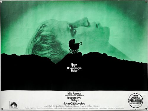
Roman Polanski’s 1968 horror masterpiece Rosemary’s Baby was released with one of the most iconic posters of all time that, like many of the most memorable designs, features a striking image in conjunction with an intriguing tagline. There is a fascinating, newly-filmed documentary on the recently released Criterion blu-ray of the film, which features many of the people involved in its making, including the legendary producer Robert Evans who recounts the story of how this poster came to be:

“When we finished the film the front office [of Paramount], which was in New York at the time, didn’t want to release it. They didn’t know how to sell it. I went to a friend of mine [Stephen Frankfurt] who was president at Young & Rubicam, a very large advertising agency, and I told him my problem; I can’t release the movie because the whole of our advertising team doesn’t know how to sell it, and the picture’s brilliant! He goes to see it and then he said to be ‘Bob, I’m going to tell it you straight; it’s not an easy picture to sell and I’m not going to take one dime from you to give you a whole campaign for it.’ He then said ‘But if you buy what I give you I want one hundred thousand dollars’.

I walked in to the chairman of the board Charles Bluhdorn‘s office and said ‘take a look at this and you tell me if you want to write a cheque for one hundred thousand dollars’ and I turned the artboard around and there it is; there’s a mountain and a carriage and it says ‘Pray for Rosemary’s Baby’, that’s all. And he looks at it and he becomes so pale that he’s as white as these shoes that I’m wearing and he said ‘I have to pay him one hundred thousand dollars for three [four] words?!’ and I said that’s right, and he did! Pray for Rosemary’s Baby became the ad of the year. It made the picture and without that image people wouldn’t know what it is and they still didn’t know but they were intrigued. It opened to the biggest business Paramount had done in years.”

After a bit of research it seems that although Stephen Frankfurt should be credited as the creative director for the poster, it was actually designed by Philip Gips in conjunction with Richard Danne. I’ve been attempting to figure out exactly where each of these designers worked and I have to confess it has left me slightly confused. Stephen Frankfurt is profiled in this excellent piece by Adrian Curry on Mubi.com that details his involvement in several seminal film posters of the 1960s and 70s, including Downhill Racer and the first Emmanuelle movie. He also worked on opening titles (To Kill a Mockingbird) and trailers for several films, including the one for Rosemary’s Baby. According to the article Frankfurt’s thing ‘was to see the packaging of movies as a totality—designing the titles, posters, trailers and ads with one common look and theme.’ The article also notes that the baby carriage on the crag was shot on the outcrops of rocks in Manhattan’s Central Park.

Frankfurt died earlier this year and in this article in Adweek it mentions that he was also a partner in an agency he set up with Philip Gips and Aubrey Balkind (named simply Frankfurt Gips Balkind), where he worked on over 55 film marketing campaigns. It’s not totally clear but I believe that he must have worked on this poster whilst also serving as president at Young and Rubicam, hence the fact that Robert Evans mentions the larger agency in the interview above.

Note that in the comments of that article someone with the username ‘Villafranca’ writes the following:
“In the mid-90’s, I worked for Philip Gips’s the small agency that he started after he left Frankfurt, Gips Balkind. In his office, he had framed prints of both the “Rosemary’s Baby” and “Alien” posters hanging in his office because, well, he designed them. And one other small tidbit: his wife, Barbara, wrote the line “In space no one can hear you scream” (not Stephen Frankfurt). Phil told me this personally.”

Further on in the comments another poster called ‘danagips’ writes:
“This should absolutely be retitled the movie posters of Phil Gips. And my mother did indeed write, ‘In Space No One Can Hear You Scream’ for Alien.”

In addition to this, the website of AIGA (American Institute of Graphic Arts) features a page on the poster that also credits Richard Danne as a co-designer of the poster. Danne appears to have had a lengthy and lauded career in the New York advertising industry and his official website features a biography that indicates he served as president of AIGA as well as a several other organisations. The Rosemary’s Baby poster features on his website where another agency ‘Gips and Danne’ is mentioned (the AIGA website has examples of that agency’s work).

The agency for the poster is credited as Gips and Danne so does that mean that Philip Gips was also working as a partner in a second design firm in addition to the one he founded with Frankurt and Balkind? Was this job given to Gips and Richard Danne’s firm by Frankfurt who was working for Paramount? I intend to contact Richard Danne to try and clarify but I’d appreciate any other information that people may have so I can accurately credit the poster.

This is the original British quad for the release of the film over here and I was utterly thrilled to find it in excellent, rolled condition. Note the circular snipe in the bottom corner which ties it to the Paramount cinema in London’s Piccadilly Circus. The building was opened in 1921 as the large and luxurious cinema known as the Plaza Theatre that was designed and built for Paramount Pictures to be their showcase venue in London. The Arthur Lloyd ‘music hall and theatre history’ website features a page on the cinema that details its history and has several excellent pictures included. Finally, I’m unsure who will have done the design work to adapt the original portrait one sheet design to the landscape quad format.
Summer Of Sam / one sheet / USA

17.05.11

Poster Poster