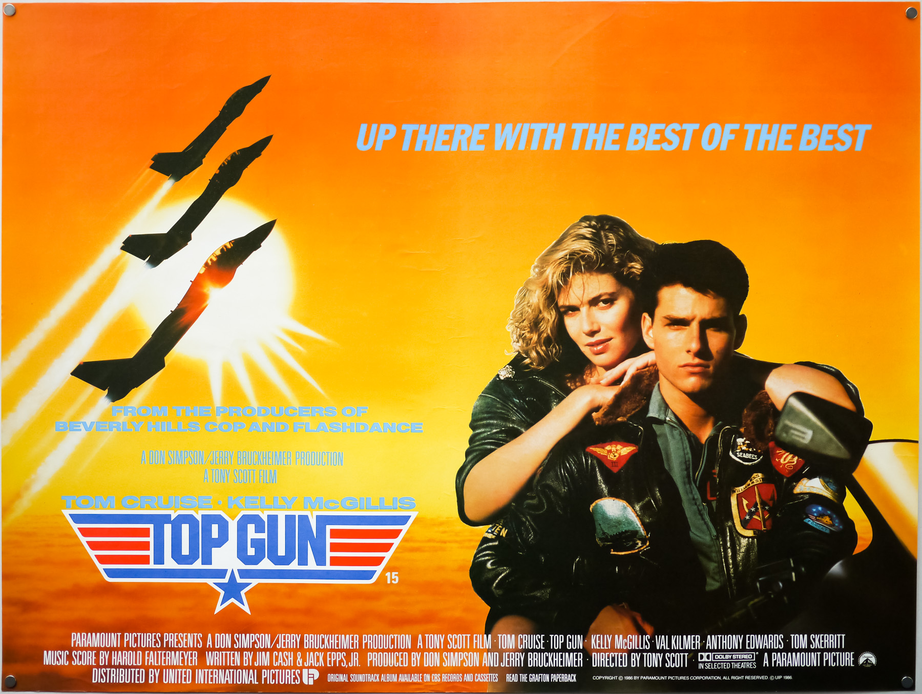
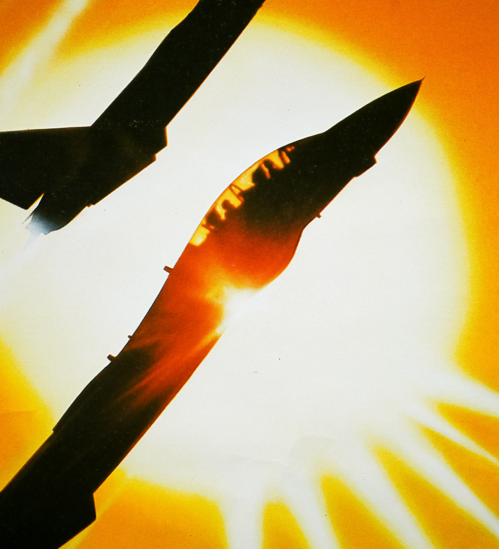
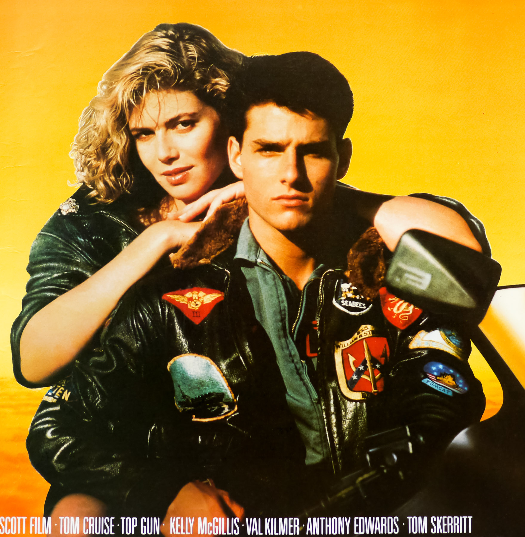
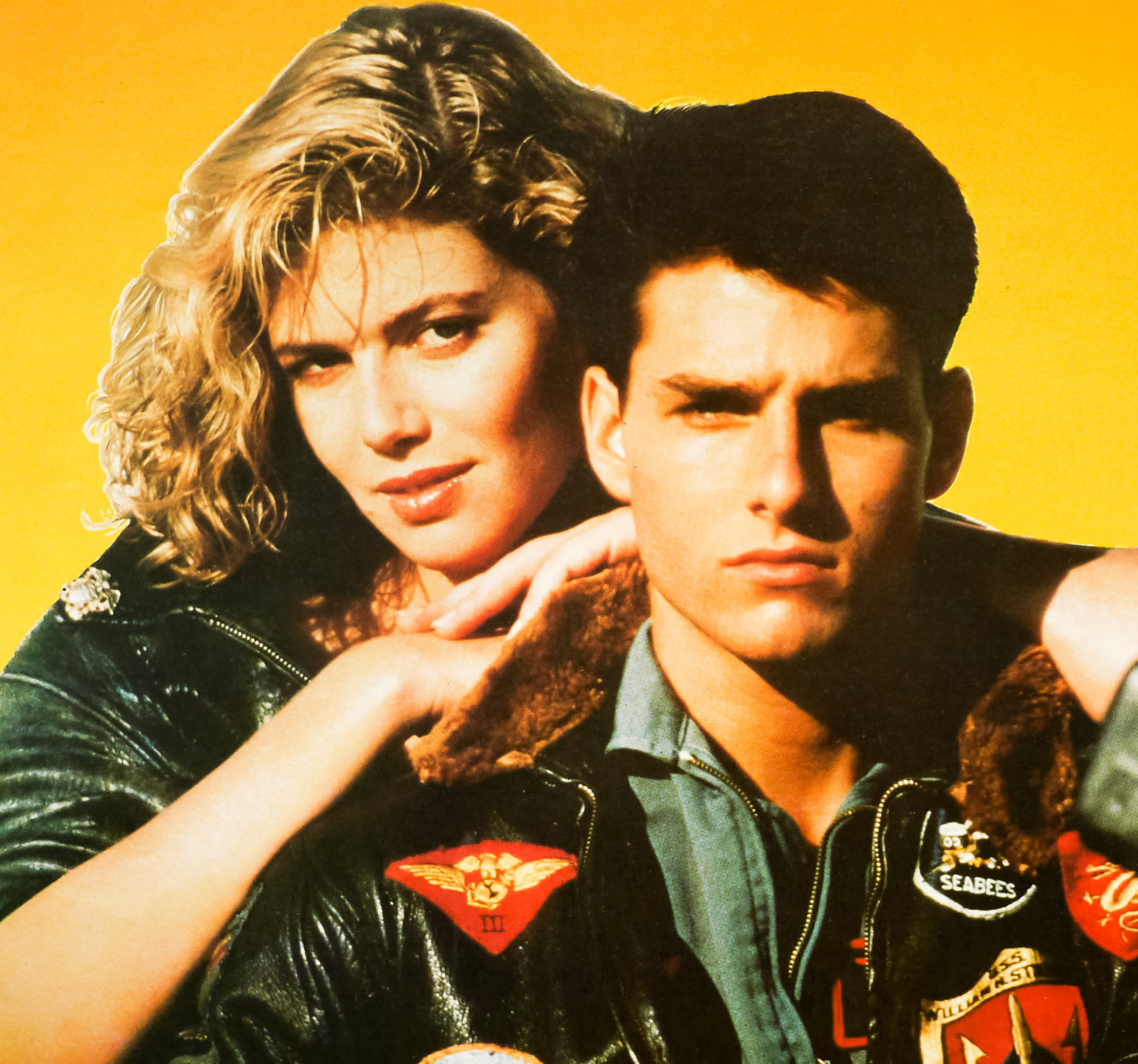
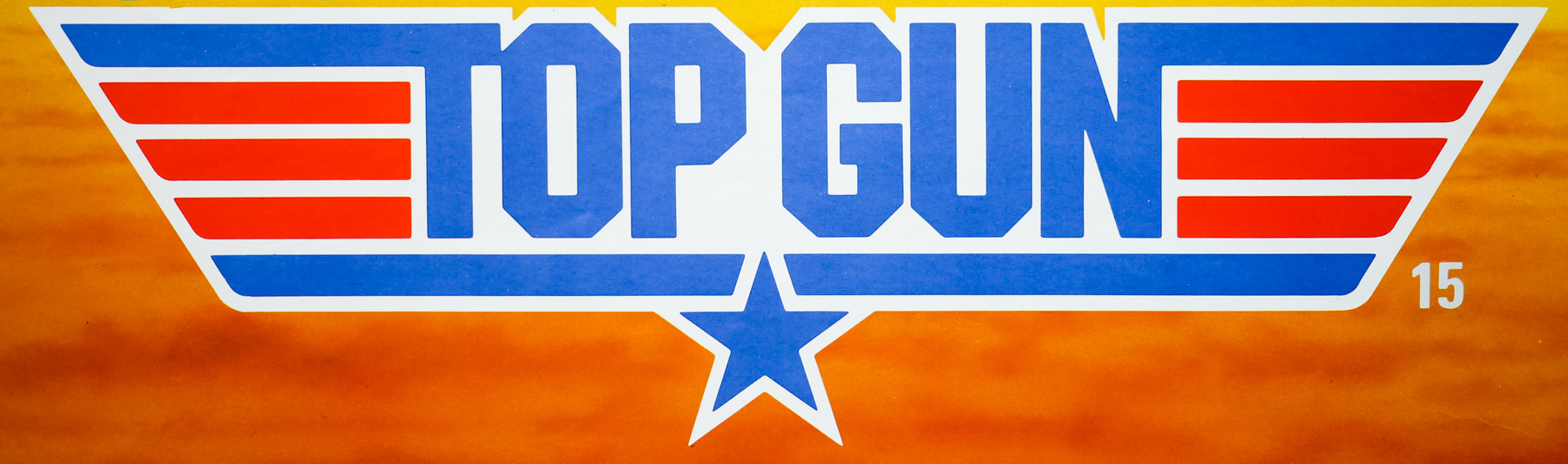
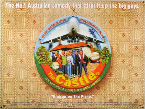
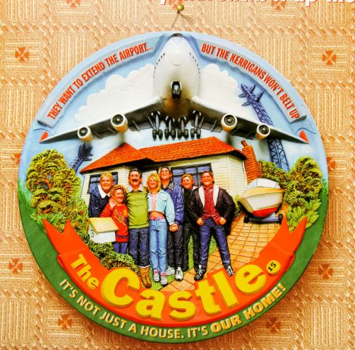
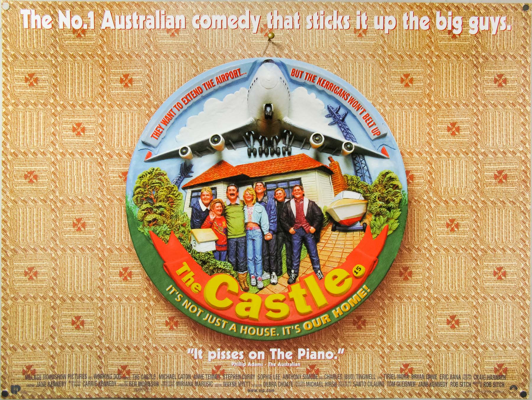
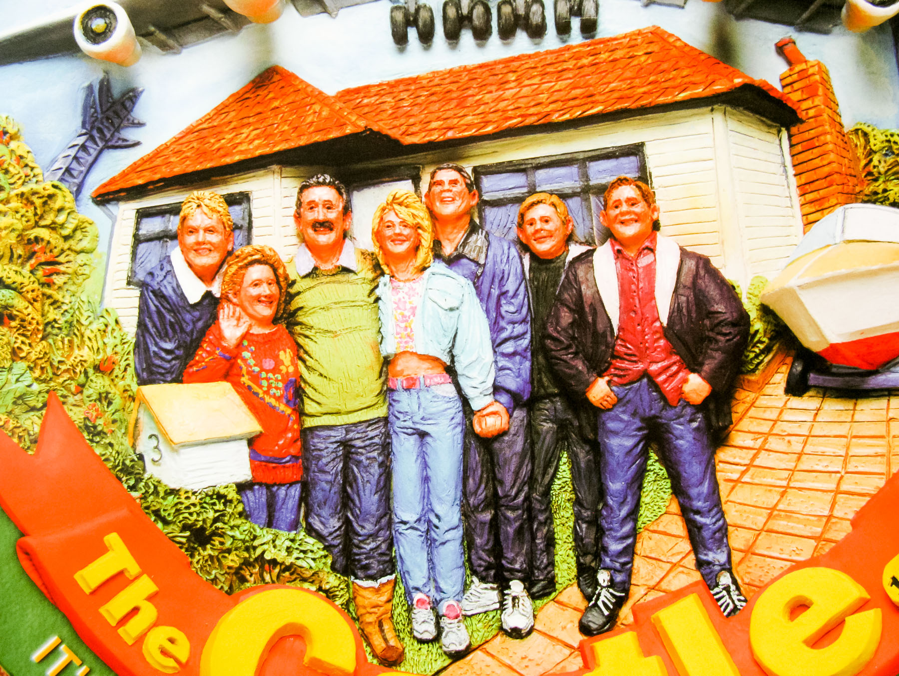
- Title
- Top Gun
- AKA
- --
- Year of Film
- 1986
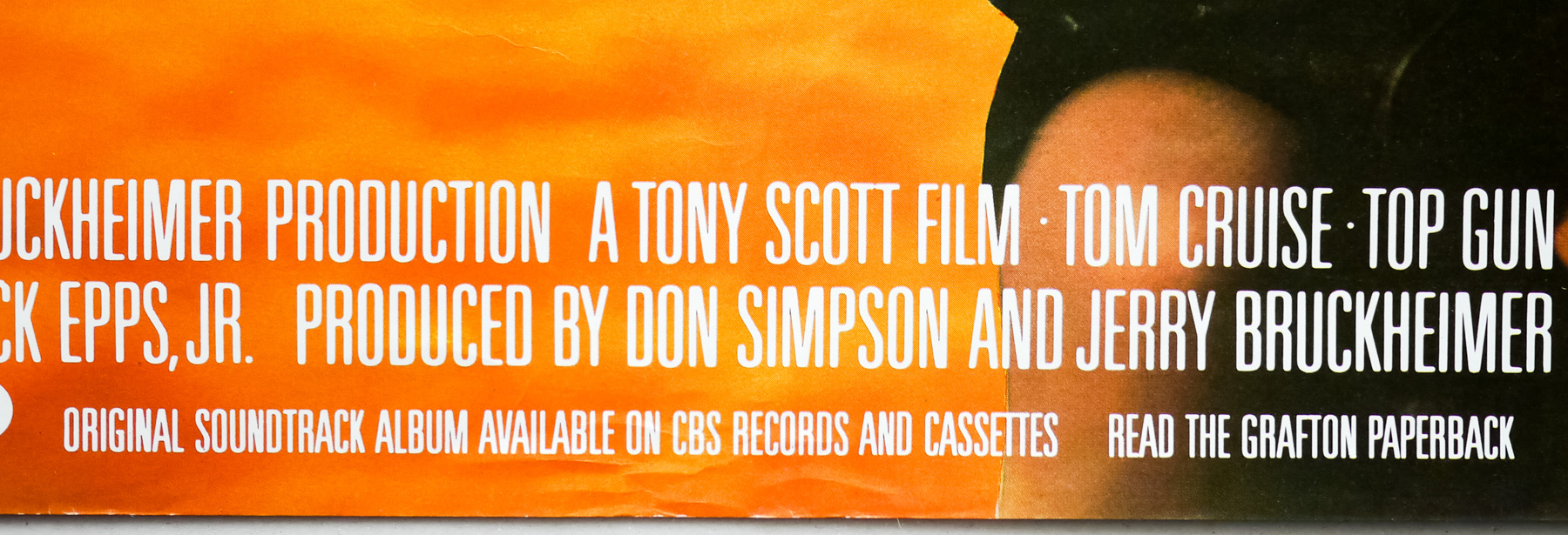
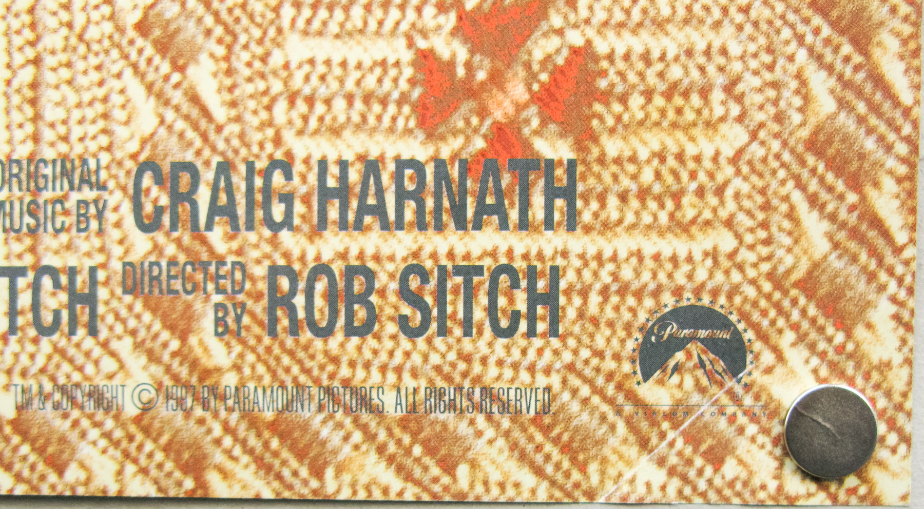
- Director
- Tony Scott
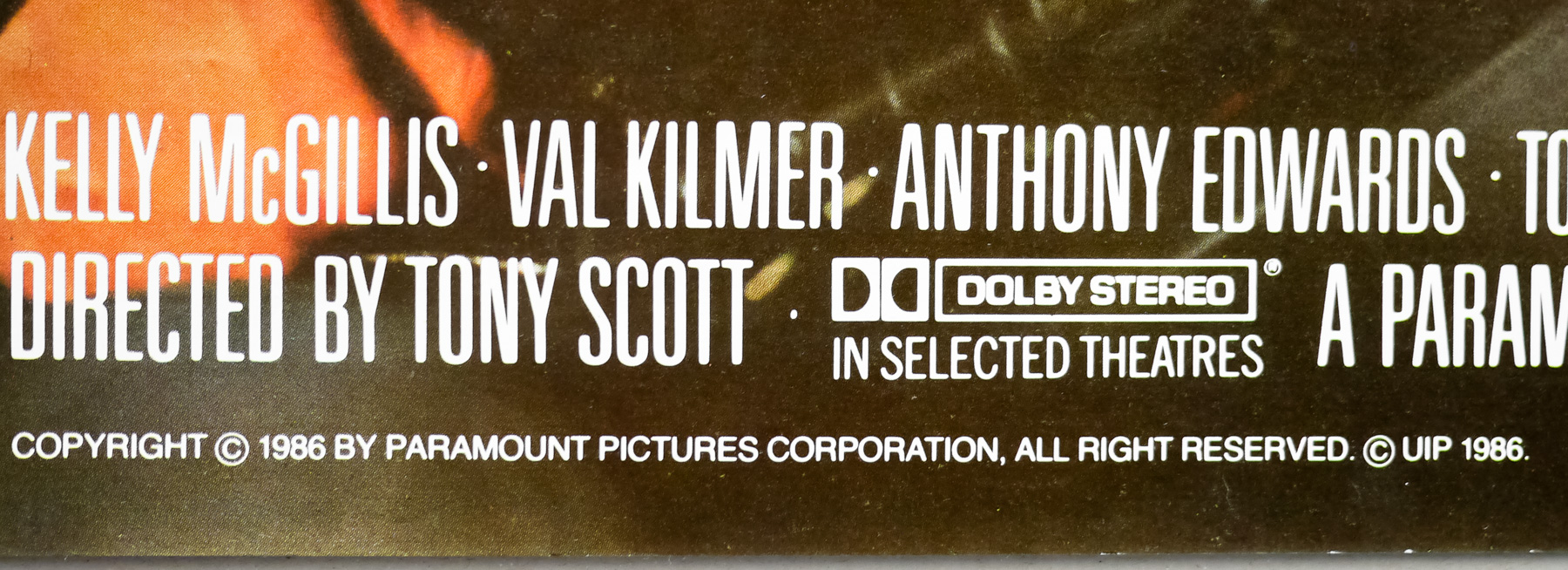
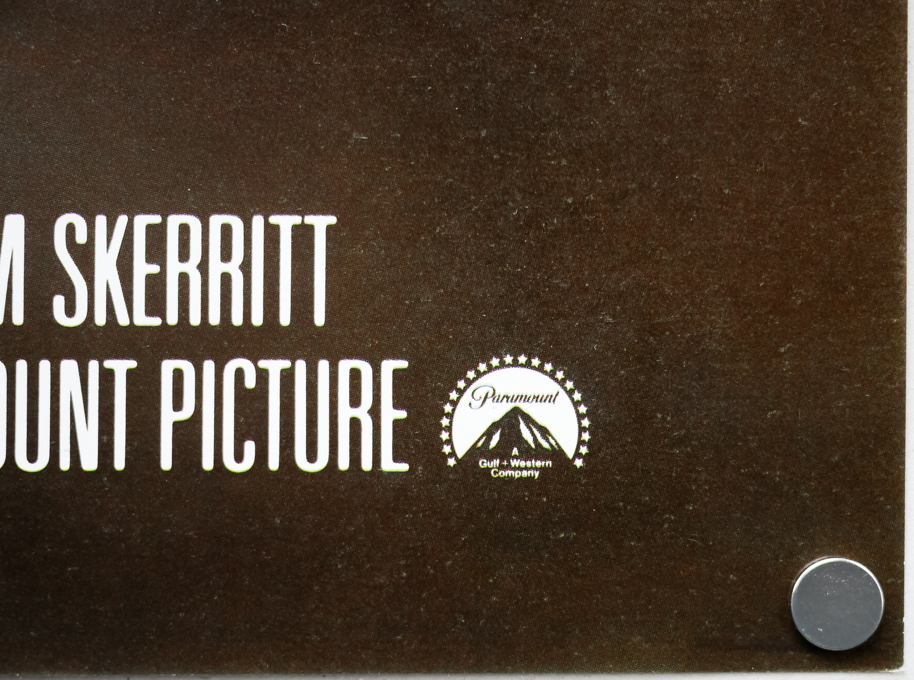
- Starring
- Tom Cruise, Kelly McGillis, Val Kilmer, Anthony Edwards, Tom Skerritt, Michael Ironside, John Stockwell, Barry Tubb, Rick Rossovich, Tim Robbins, Clarence Gilyard Jr., Whip Hubley, James Tolkan, Meg Ryan, Adrian Pasdar
- Origin of Film
- USA
- Genre(s) of Film
- Tom Cruise, Kelly McGillis, Val Kilmer, Anthony Edwards, Tom Skerritt, Michael Ironside, John Stockwell, Barry Tubb, Rick Rossovich, Tim Robbins, Clarence Gilyard Jr., Whip Hubley, James Tolkan, Meg Ryan, Adrian Pasdar,
- Type of Poster
- Quad
- Style of Poster
- --
- Origin of Poster
- UK
- Year of Poster
- 1986
- Designer
- Brian Bysouth. FEREF
- Artist
- --
- Size (inches)
- 30" x 39 14/16"
- SS or DS
- SS
- Tagline
- Up there with the best of the best
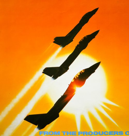
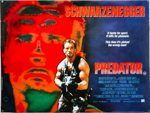
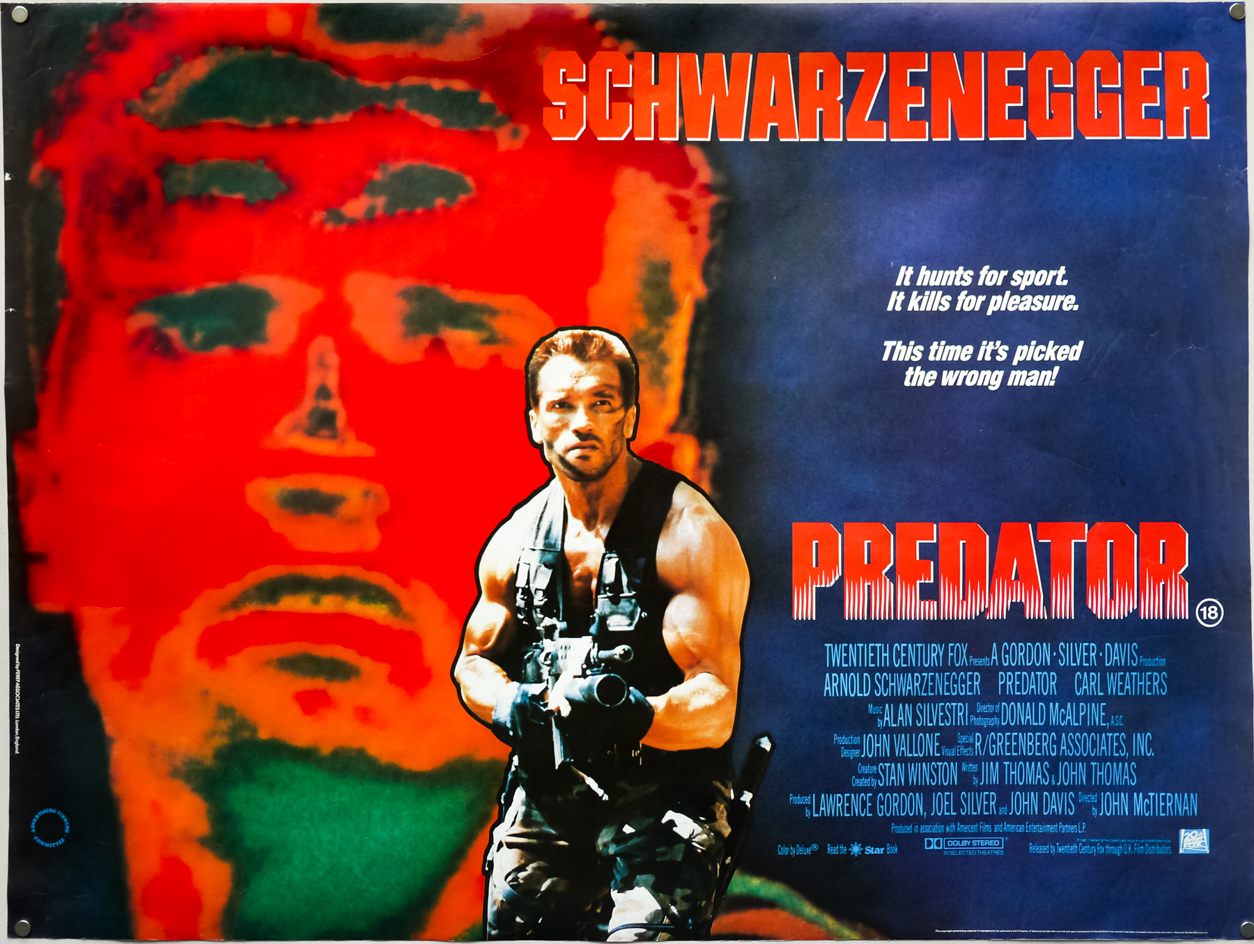
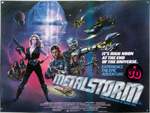
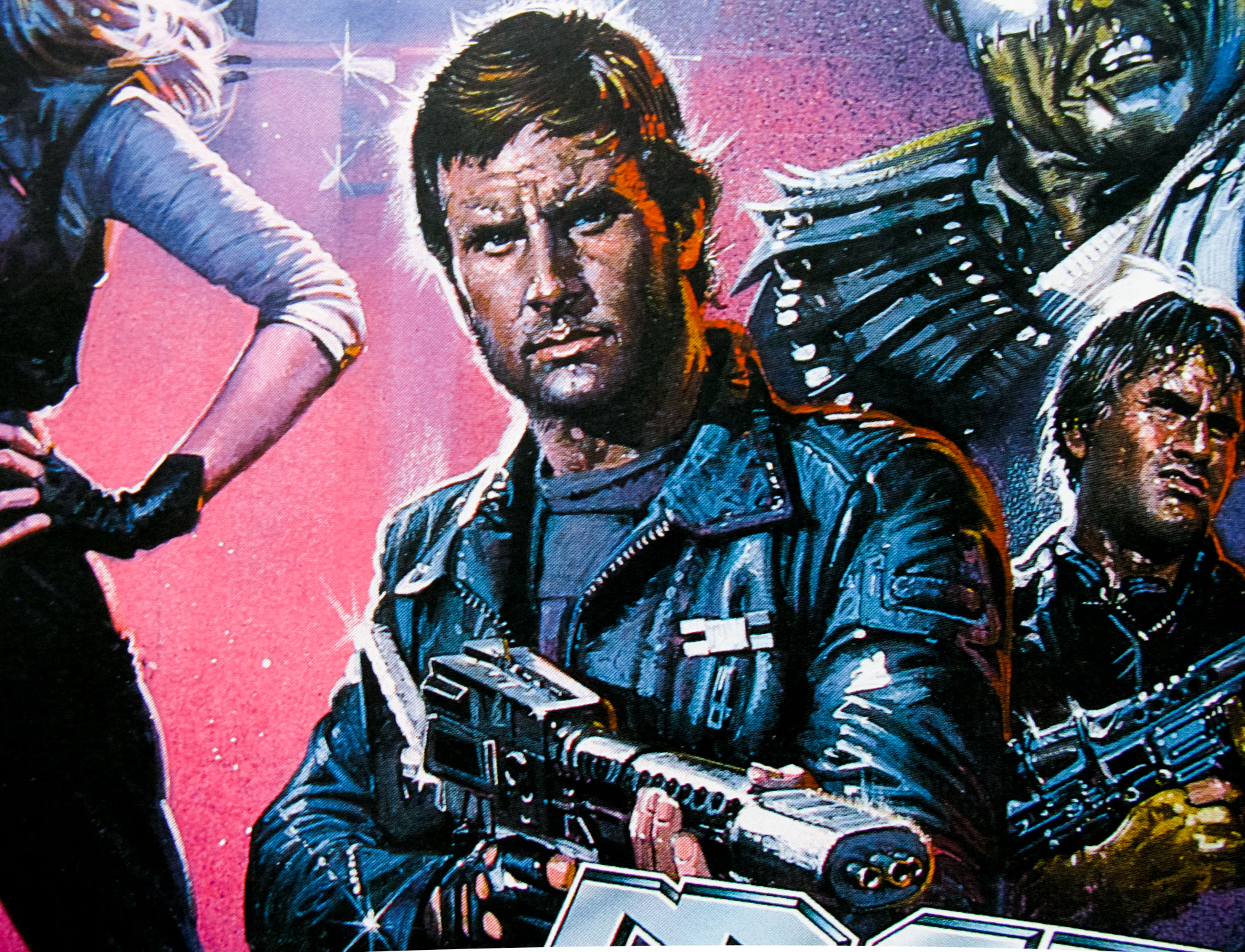
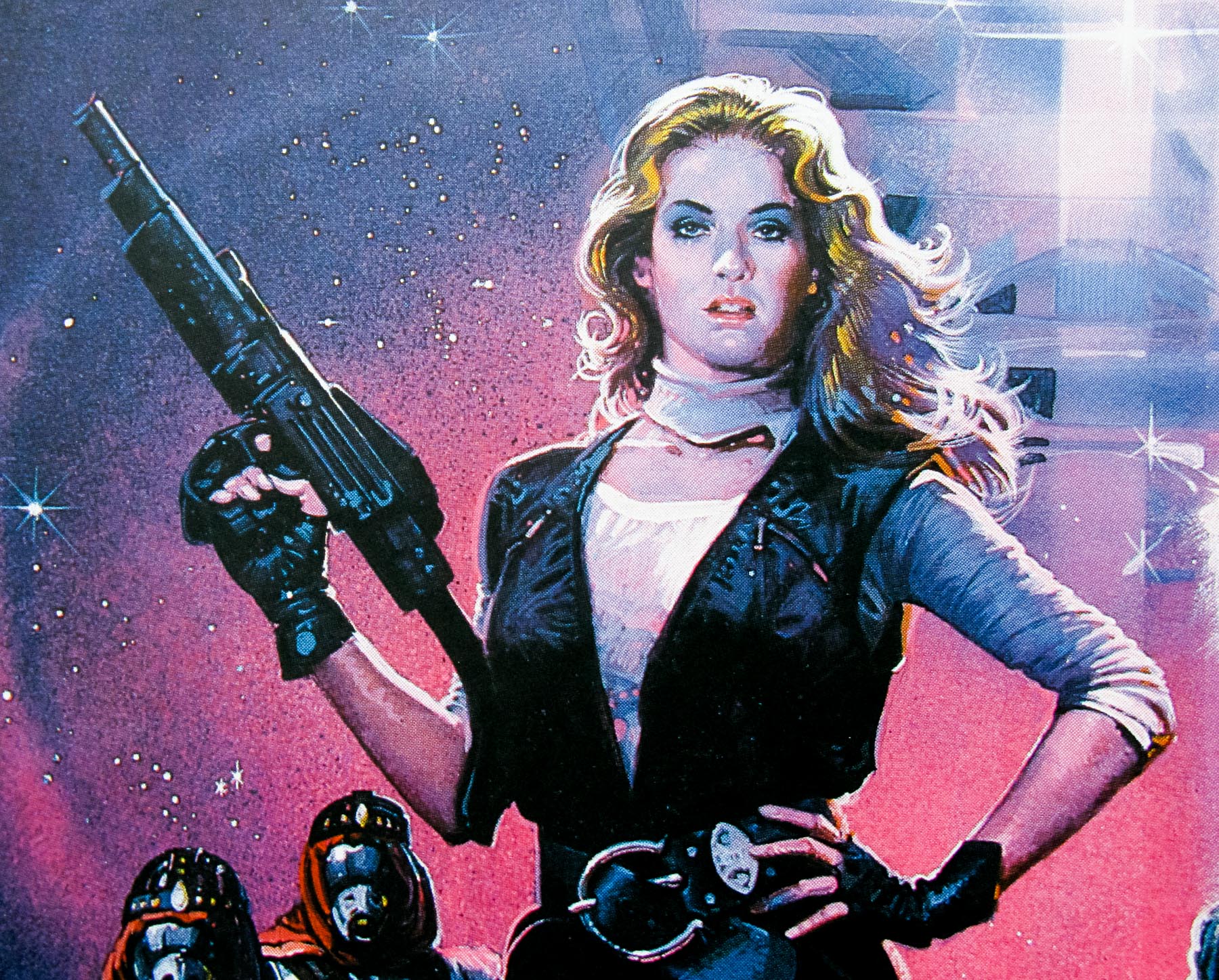
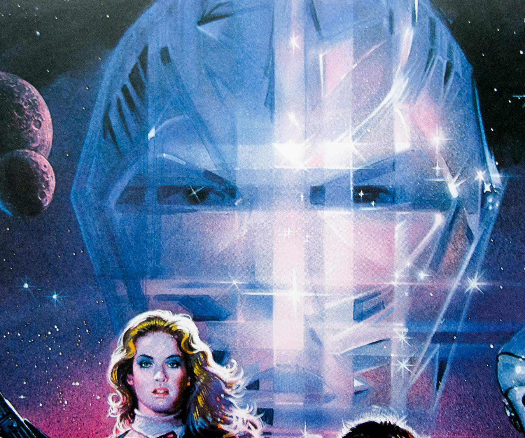
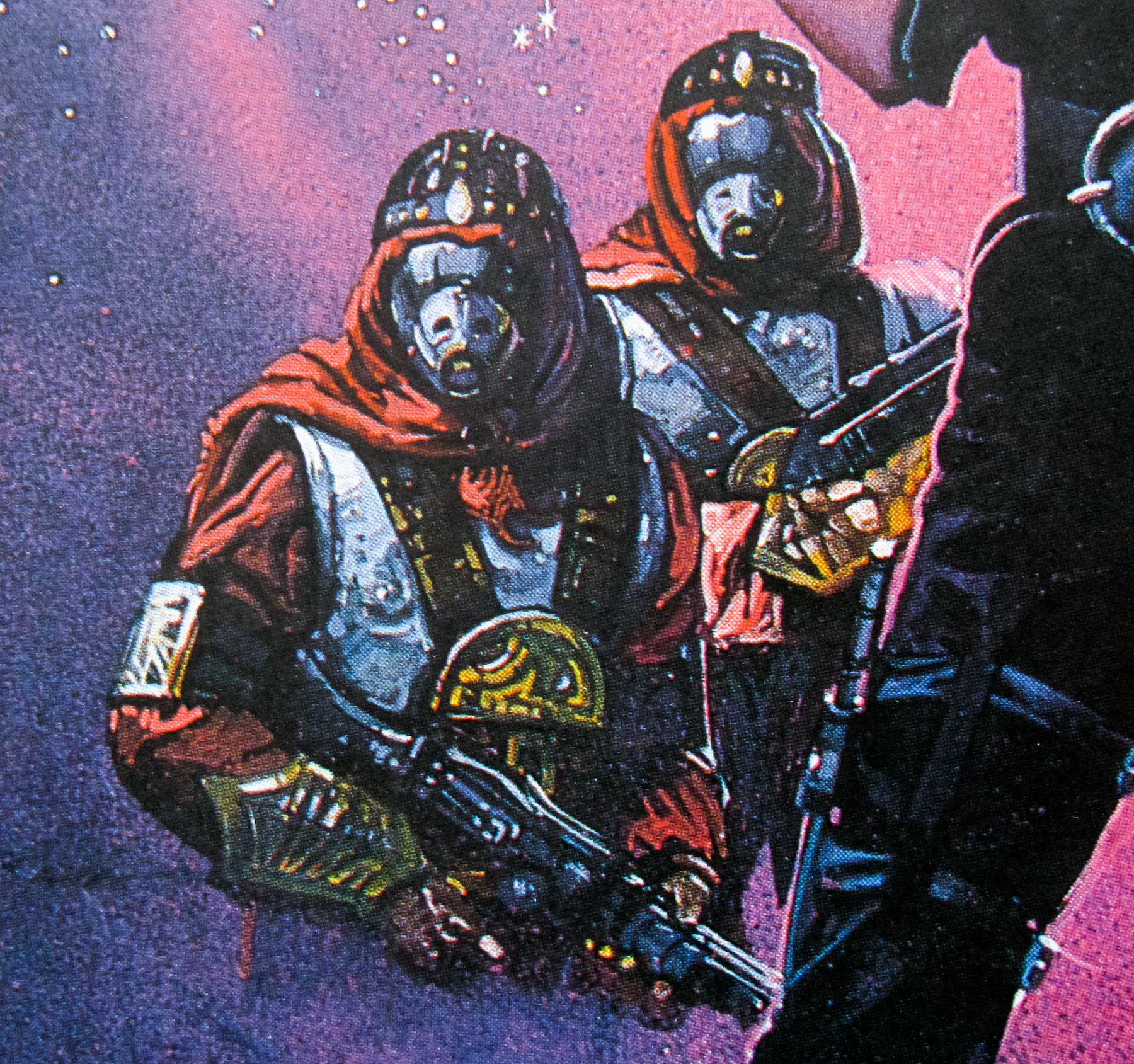
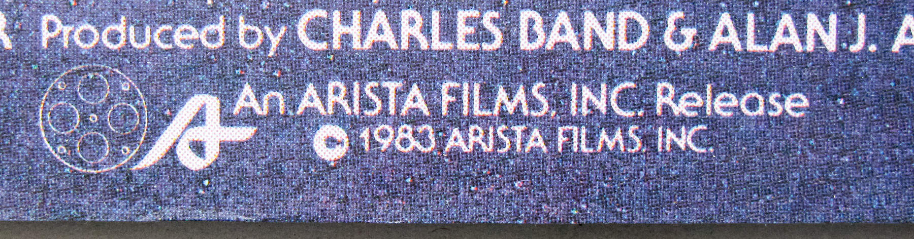
Top Gun is one of the quintessential popcorn films of the 1980s and certainly the one that launched and boosted several Hollywood careers, including that of its director, the late Tony Scott, star Tom Cruise and producing partners Jerry Bruckheimer and the late Don Simpson who were responsible for some of the biggest box-office successes of the 80s and 1990s. The film’s script was based on a magazine article about a top Navy fighter pilot training school, Cruise plays pilot Maverick who is bumped up the ranks and sent to the Top Gun training school after he successfully aids a fellow pilot in distress. There his reckless flying draws the attention of the school’s instructors and disdain from fellow trainees, including top student Iceman (Val Kilmer) who considers his methods dangerous and unsafe. At the same time, Maverick chases after a civilian contractor called Charlie (Kelly McGillis) who is initially wary of his advances. The film features corny dialogue and cheesy acting but is never anything but entertaining and its soundtrack, by Harold Faltermeyer, is one of the most successful of all time in terms of sales.
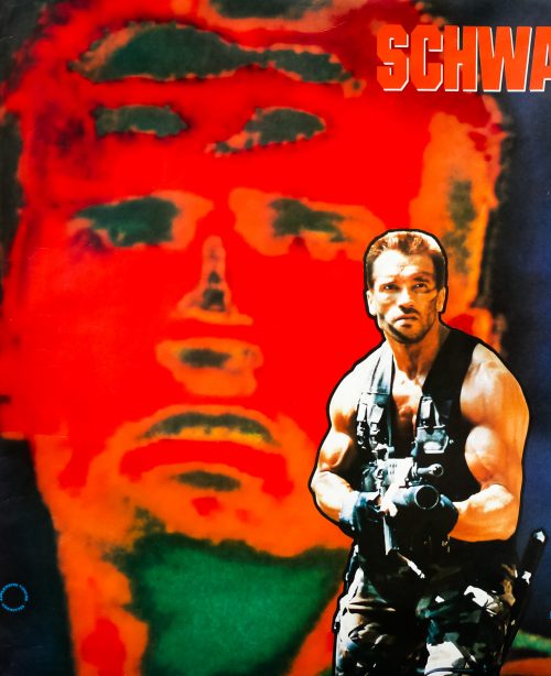
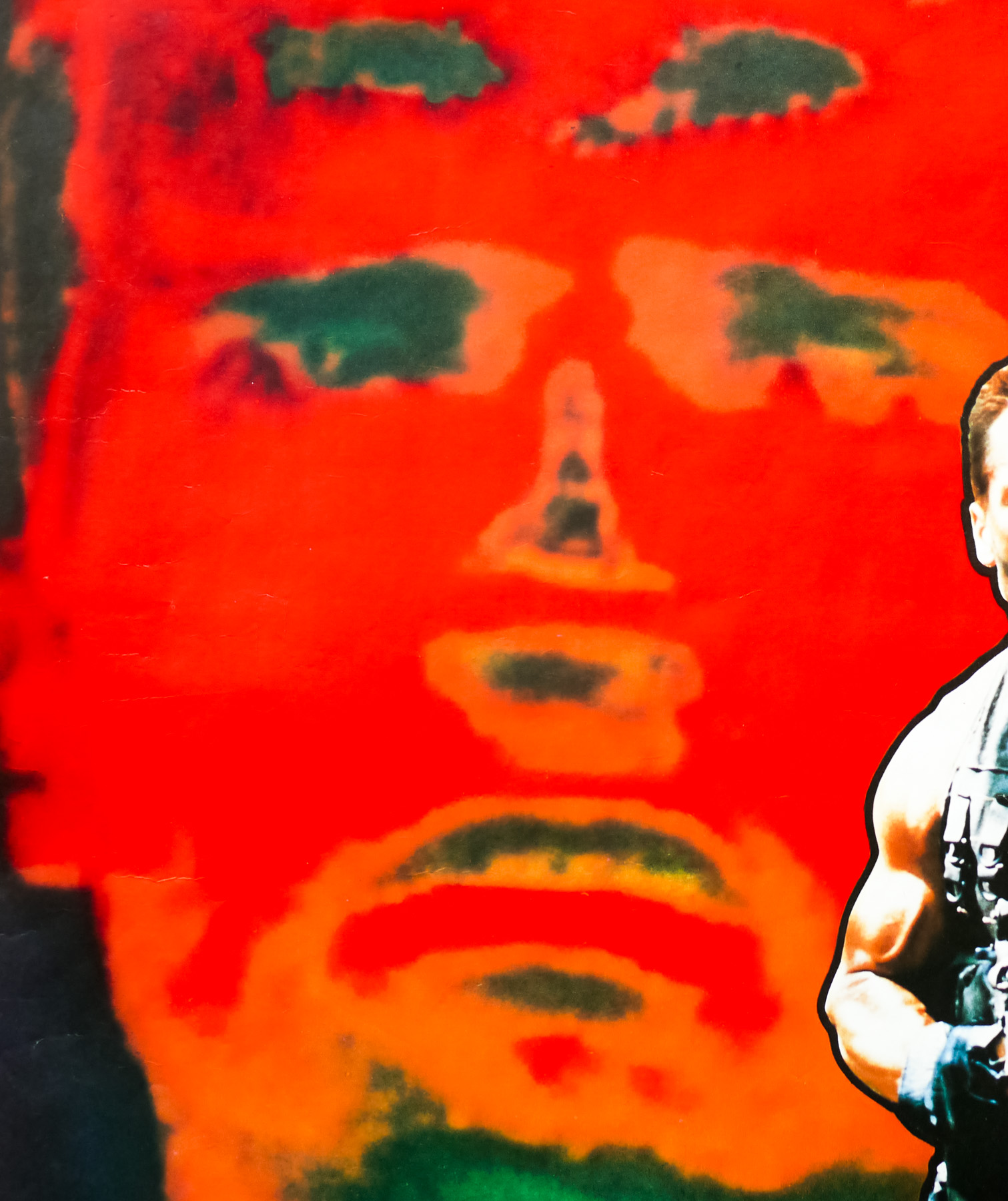
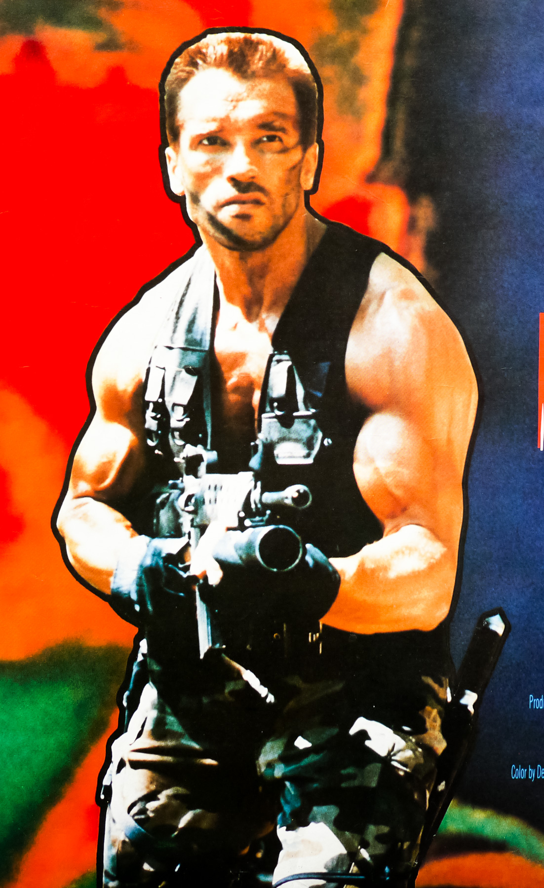
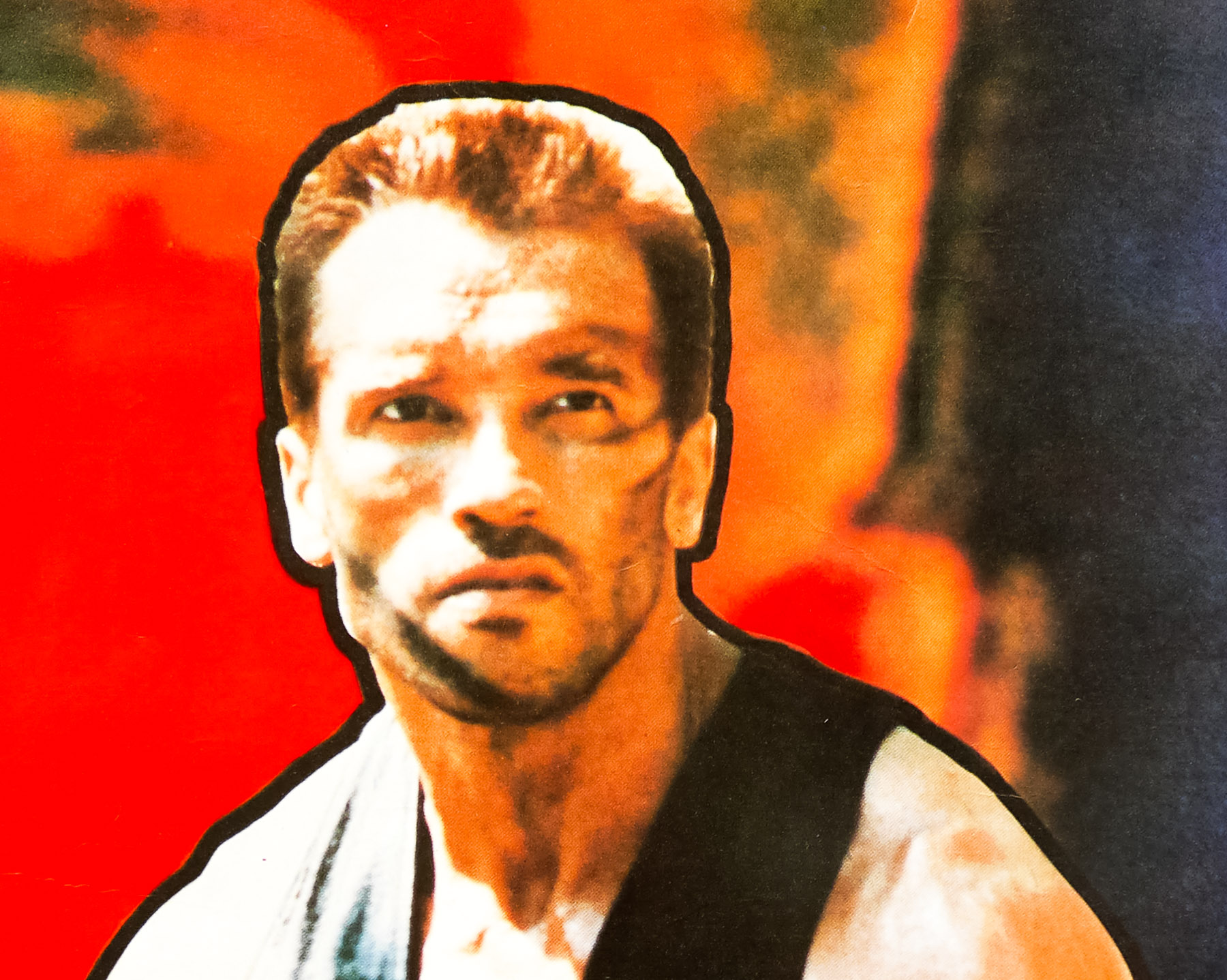
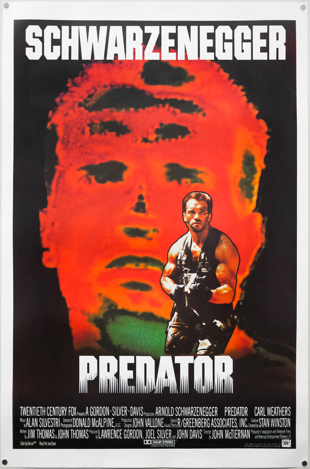
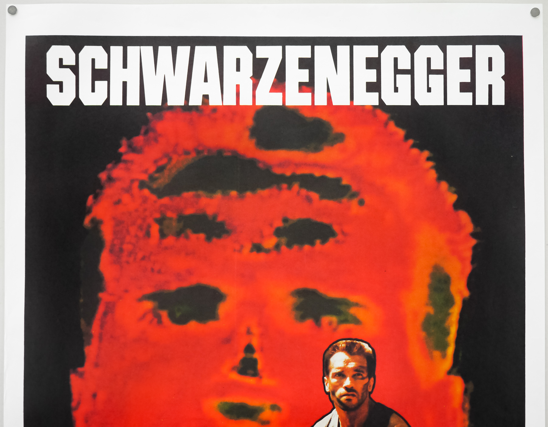
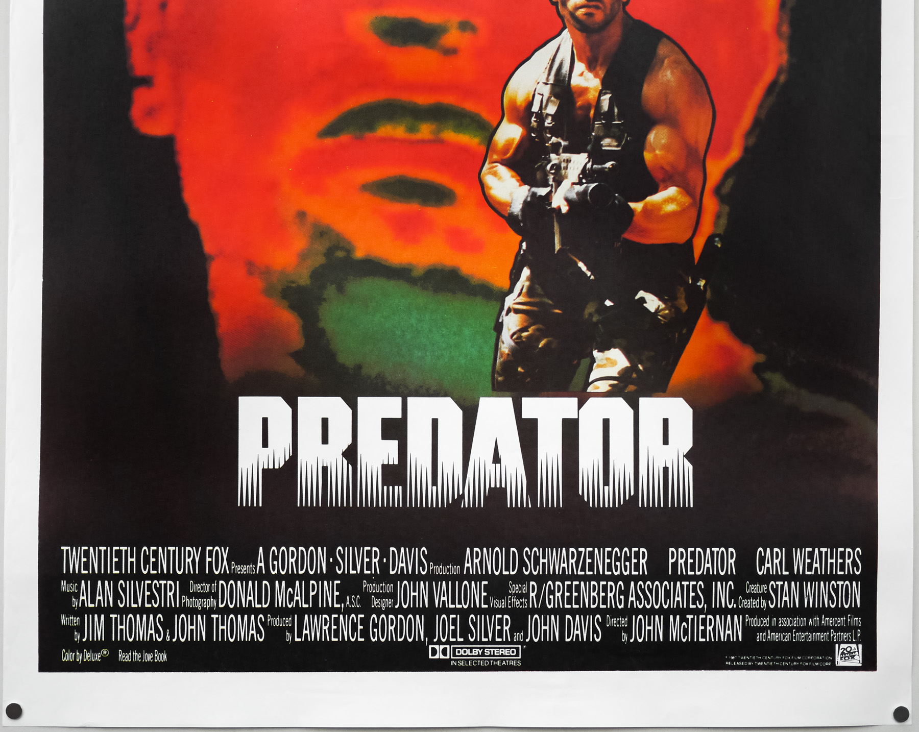
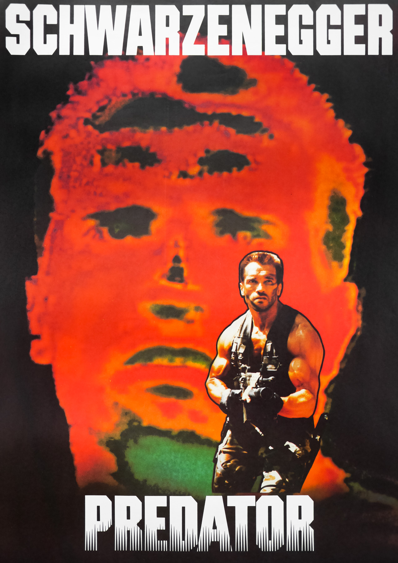
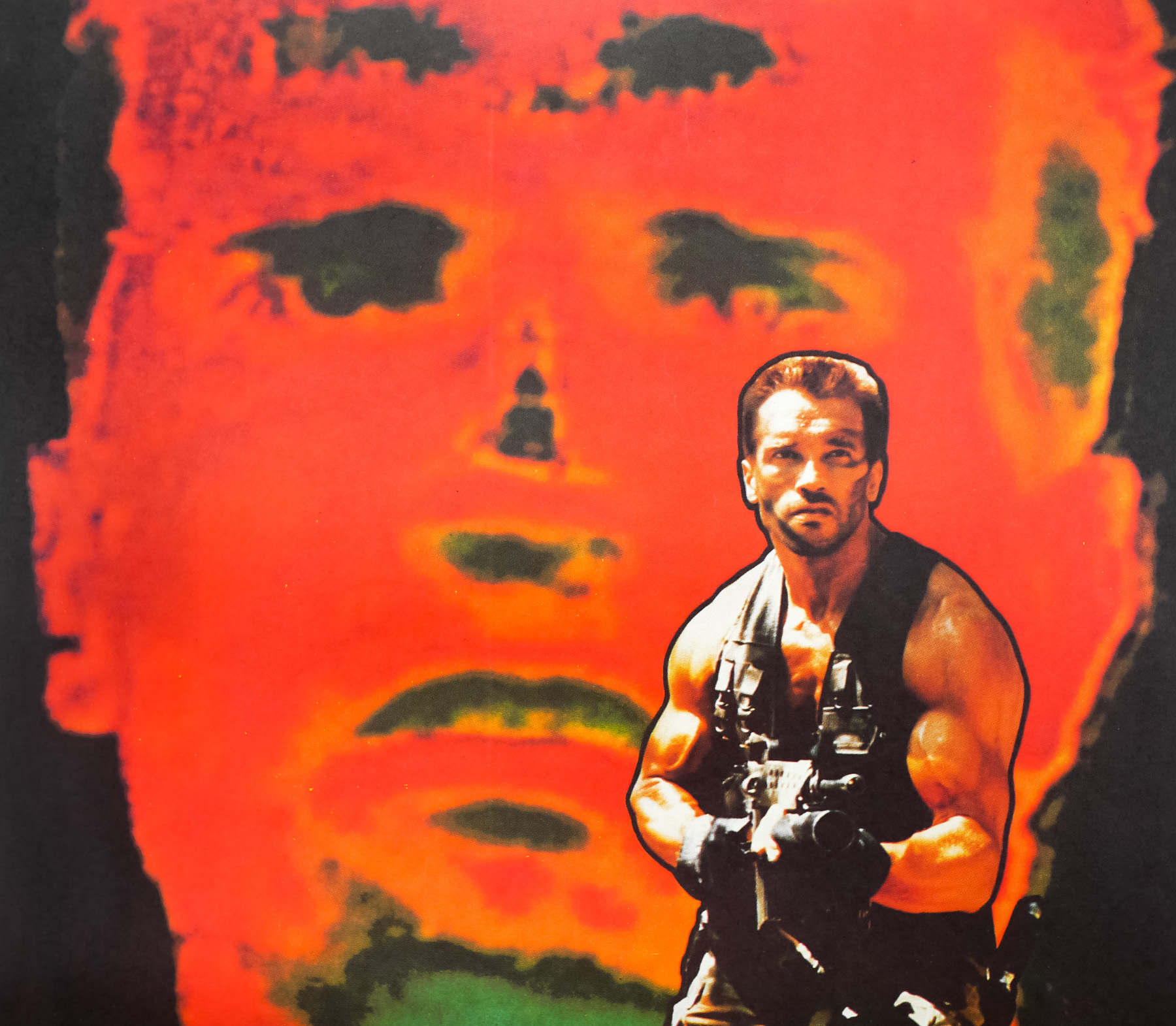
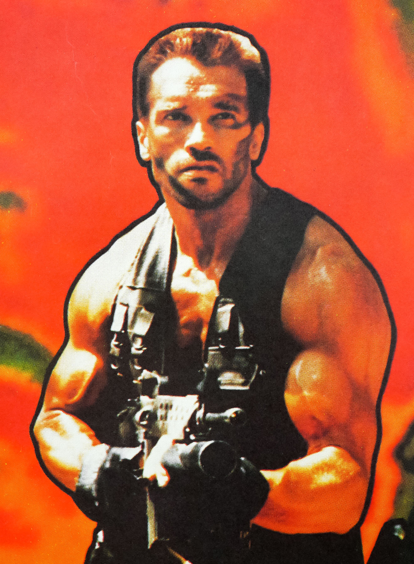
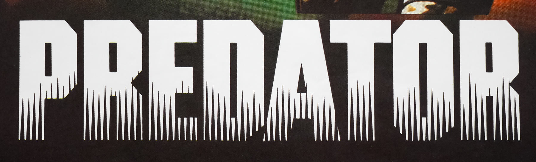
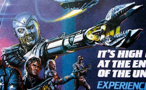
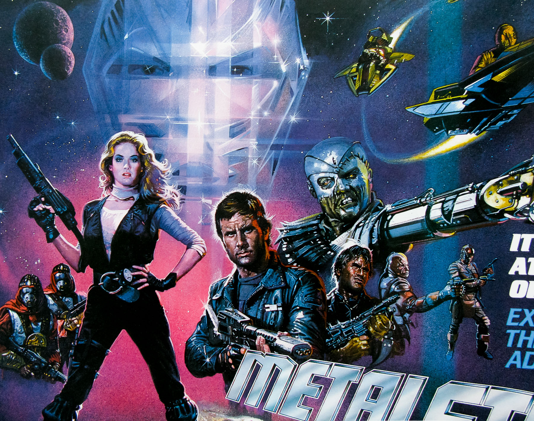
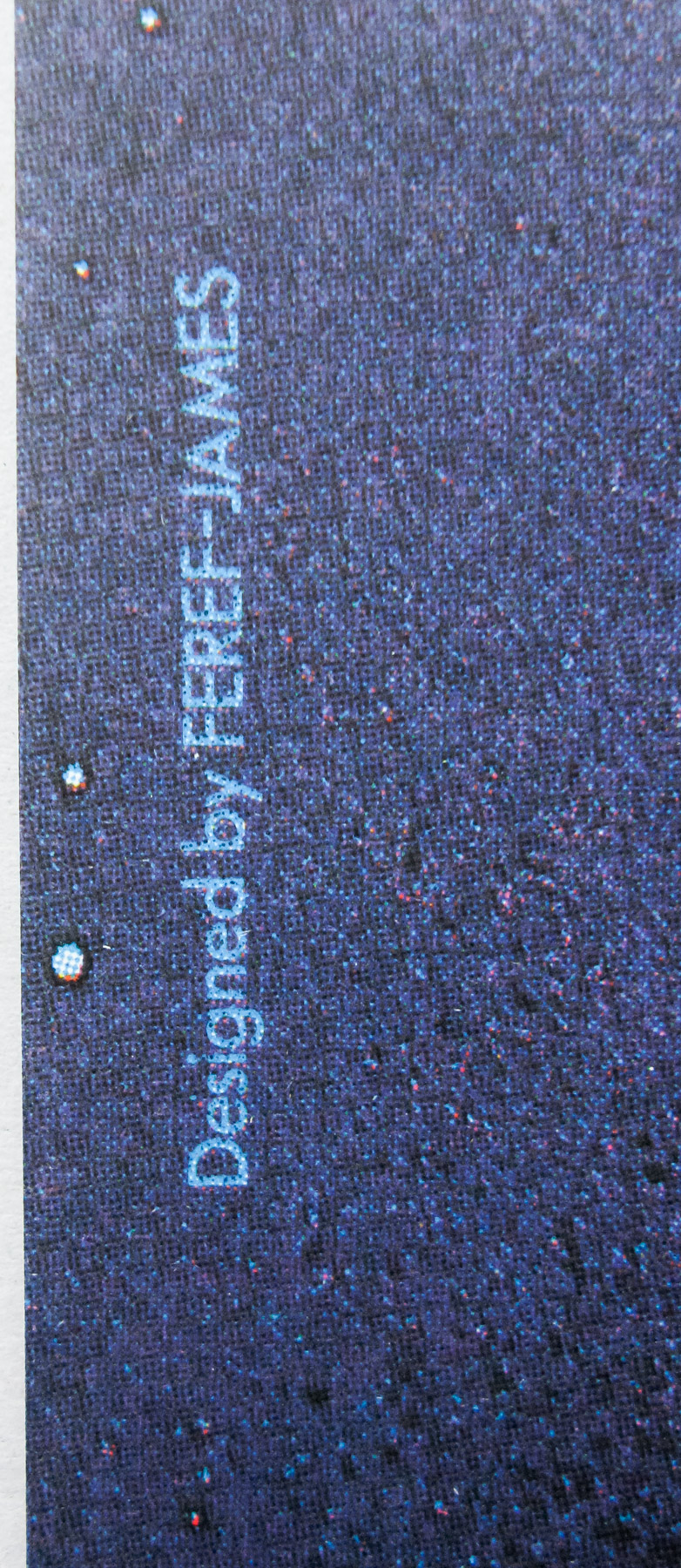
This British quad was created by the British designer and artist Brian Bysouth who I interviewed for this site in 2012. In the mid-1980s the requests for painted artwork, of which Brian was a renowned specialist, were drying up so Brian realised it was time to learn how to use computers to create photographic posters, as detailed below. This Top Gun quad is likely to have been one of the first computer-generated posters that the designer worked on (see also the Predator quad)
——————————
Computers as an art tool came in during the time you were at FEREF. What was it like making that transition? Was it easy for the company?
Yes, luckily Steve Laws, the studio manager at the time and also a good designer, managed to persuade the upper management that desktop publishing was coming and that we had to embrace it. I can’t remember exactly when this was, but it was clear that the Apple Macintosh was the best computer. At that time they were very expensive but gradually the studio was equipped with the new technology.
Unfortunately, the computers replaced the jobs of paste up artists and it soon became apparent that unless they were capable of making the transition they were no longer needed. One machine and an operator could add all the text and details to an advert or illustration, ready for it to be sent to the printer. To keep their jobs our paste up artists had to learn how to use a Mac.
In the beginning the computers couldn’t handle very large files so things went very slowly, especially with complex designs. But when Macs started to get a lot faster the way forward was firmly established and we began to recruit skilled computer designers and operators.
I realised when my illustration work was drying up that I needed to become more of an art director. I was interested in helping out the Mac designers and I was able to use my experience to help them. I always found it easy to suggest ways to improve a design, which they came to appreciate; gradually it became usual for me to be asked to help if a design was proving troublesome. I wasn’t as quick on the Macs as the operators but I realised that I had to learn Photoshop to enable me to art direct them properly. Learning the correct commands was essential, so I read the manual of Photoshop 3, (which I think was the version at that time), and learned the various key-commands and technical terms.
Eventually I asked for a Mac of my own and I was given use of one that had become surplus. When I wasn’t painting I was practicing. Looking back now, it was instrumental in helping me when I was asked to work on the Star Trek DVD covers.
——————————-
To see the other posters in the Film on Paper collection that were designed and/or painted by Brian Bysouth click here.