This year marks the 25th anniversary of the release of Quentin Tarantino’s incredible debut feature, Reservoir Dogs. Often cited as one of the greatest independent films ever made, the depiction of the events leading up to, and the aftermath of, a botched diamond heist remains as powerful today as it was a quarter of a century ago. Back in 2012, Tarantino celebrated the 20th anniversary of the film by screening a 35mm print of the film at the New Beverly Cinema in Los Angeles, which he owns.
Held in late October, the screening was apparently attended by a ‘raucous and electrified crowd’. As the credits rolled, folks from the incomparable limited-edition geek culture outfit Mondo were there to unveil a special screen print created especially for the event. The print was designed and illustrated by Tyler Stout, the celebrated artist who had worked on the Mondo-released print for Tarantino’s event screening of Kill Bill: The Whole Bloody Affair (also at the New Beverley).
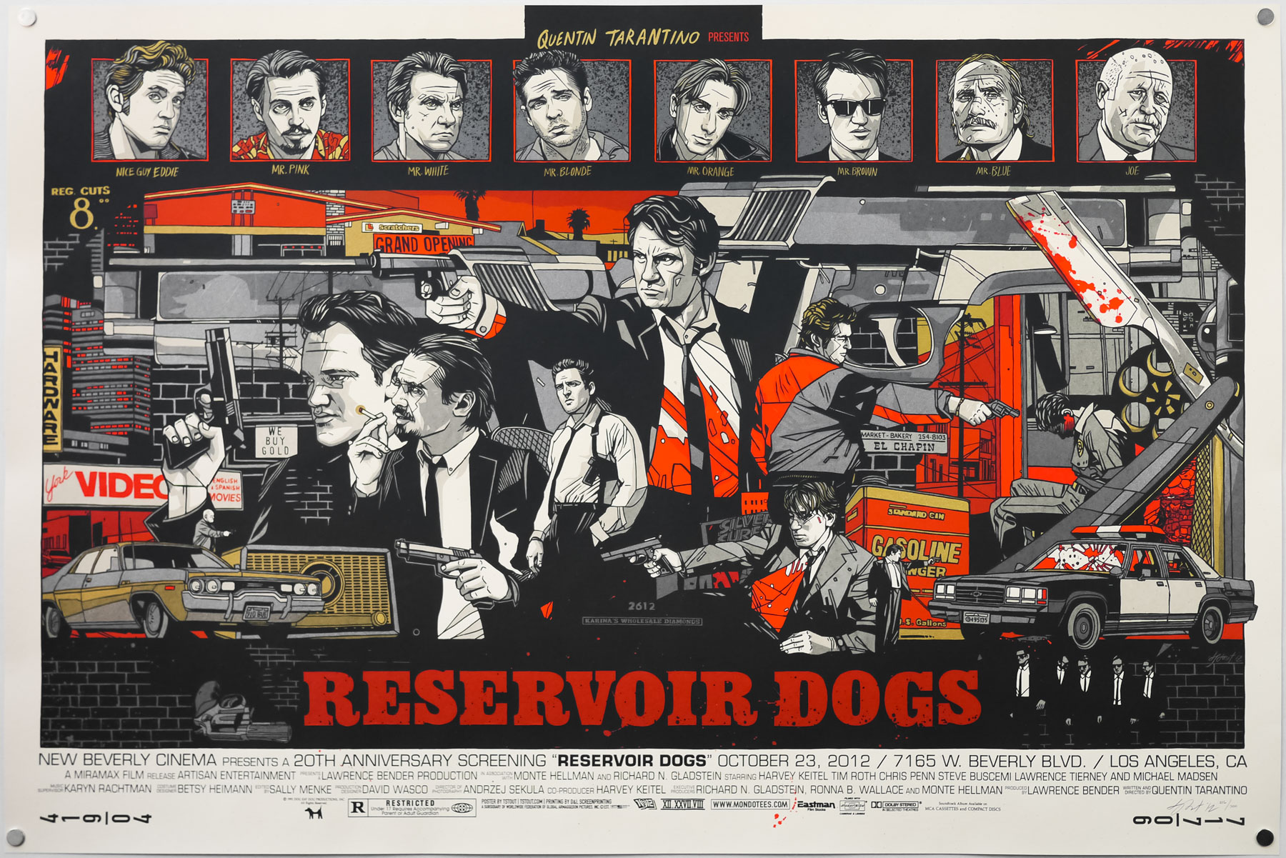
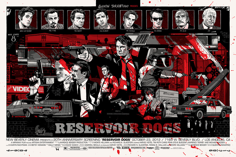
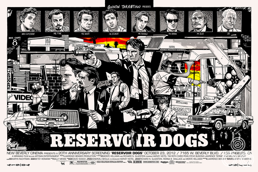
The regular style of Tyler Stout’s screen print for Reservoir Dogs, created in 2012
As is typical for Tyler’s work, the print came in both regular and variant versions and when Mondo put the remaining posters onto their online store they both sold out within seconds.
Whilst adding the regular version to the Film on Paper collection I wanted to interview the man himself about the creation of the print as I’ve done previously with his designs for Avengers, Akira, Kill Bill and Star Trek II: The Wrath of Khan. The interview can be read in full below:
———————
Tyler, thanks for agreeing to talk about this excellent print. Am I right in thinking that Tarantino himself made a request for you to work on it?
I believe his people did. Its been a while so my memory is pretty spotty on the specifics, but it came after Kill Bill so we had a good relationship with his people.
Did you ever deal with him directly?
Nope, alas.
An early version of the design for Tyler’s Reservoir Dogs in a portrait format.
Is Reservoir Dogs one of your favourites of the director’s films?
For some reason early Tarantino films just have a special place in my heart. From Reservoir Dogs through to Jackie Brown, all captured an era of my life that I remember fondly; working at a video store, hanging with my high school friends.
How long were you given to work on the design before the screening date?
I recall it was no more than a month.
Were you given any specific directions before starting?
Nope, none at all. Make it fun, basically.
A later version of the portrait format featuring a sunset sky that Tyler tried before settling on another colour scheme.
Can you talk about your initial design ideas for the print? Was the composition and landscape format something you arrived at quickly?
Interestingly enough, the poster started out as portrait instead of landscape, but it just wasn’t working, so I switched it to landscape to see if it would work better and luckily it did. As with a lot of my prints, I just start drawing elements I know I’ll want to include on the print, and sometimes leave the layout to kinda come together later. Sometimes it works, sometimes it doesn’t.
Were there certain elements or characters you knew had to sit next to each other?
I like when things have a connection and when you can visually follow certain things throughout the print. The idea is not to have the viewers eye fall off the print but rather kinda keep circling it. So if you read it left to right, you kinda get trapped in the print.
An early version of the landscape format of the print before the portraits moved to the top.
Were the portraits along the top always there from the start of the process?
In one form or another, they were there. Originally they were below the action but it ended up changing in the final piece.
Was it tough selecting which poses the portraits are in?
Some of these actors (Mr. Blue, for instance) aren’t even in the film that much, so it was hard to get an idea of what they looked like fully. And some people are just hard to draw, like Michael Madsen. I remember going around and around drawing him. But eventually I came up with something I was happy with.
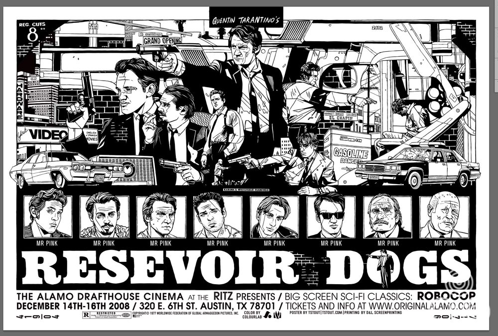
Are there any elements or characters you illustrated but that didn’t make it into the final version?
There were some top portraits that weren’t super spot on that we ended up ditching. Overall I think it was the right call. As Rob Jones (Mondo’s Creative Director) said, it really came together right at the very end. The process pics I sent him probably didn’t fill him (or me) with confidence.
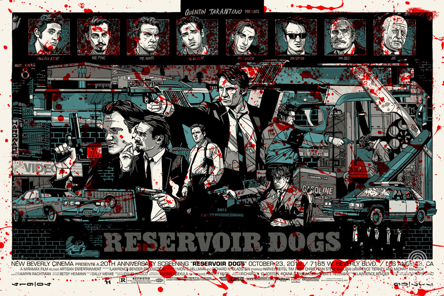
The variant colourway of the screen print featuring a ‘bloody’ theme.
Can you talk about the variant colourway? Was the blood splatter idea something you arrived at quickly?
It was an easy solution without needing to change a lot of things. It was fun to see what it would look like with the blood turned up to 11.
Were there ever any alternate colourways you tried out?
Originally I had a sunset color in there that really looked cool, yellow going into red, I kinda regret losing that. But I’m pleased with the final print.
An alternative colourway that Tyler worked on for the print. It’s similar to the colours used for his Robocop print.
Which do you prefer out of the regular and variant and why?
99% of the time I prefer the regular and it drives me crazy when the variant is better since that would mean we’d be printing more of a version I preferred less. This time it was no different and, as much as I like the variant, the regular is my preferred version.
One of the things I love about the print are all the details you added, like the Silver Surfer logo and The Thing. Were they decided on early?
Not early on, mostly I save details like that until the end, putting them in spaces that need a bit more stuff in them. But when I’m watching the film I make notes on little things that are cool, and once the prints done I can go back and see what else I can add in just as a cool easter egg.
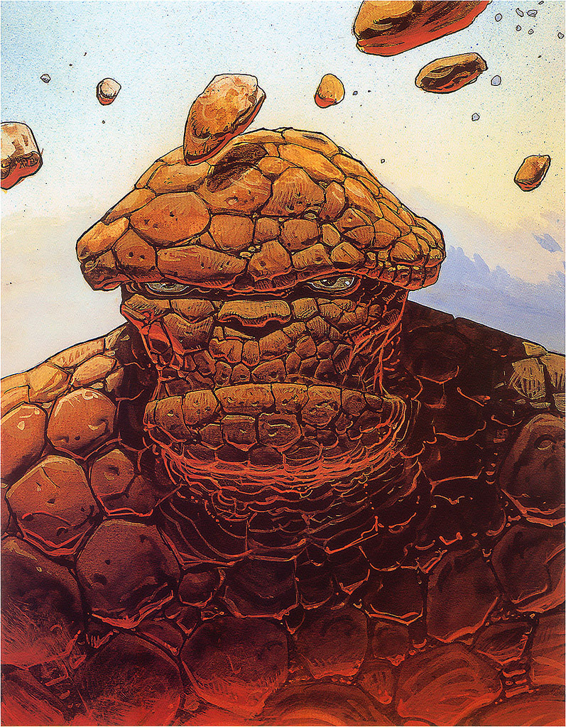
The Marvel character The Thing illustrated by the great French artist Moebius, as featured in the film and hidden in Tyler’s print.
Are there any details you think people might have missed?
I’m not sure, I assume people notice everything. With those two items that you just mentioned, Silver Surfer and The Thing from Fantastic Four, I think some people seemed to think I was just adding them in because the characters reference them in the movie. But the truth is, these exact pieces are both in film itself, on Mr. Orange’s apartment walls. I know the Thing poster was done by Moebius, as part of a Marvel series of wall posters.
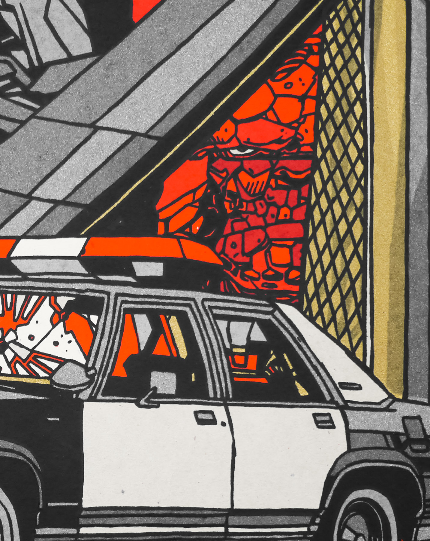
The Marvel character The Thing hidden in the right corner of the print.
Once you’d submitted the design were you given any directions by Tarantino’s people for things to add or remove?
Not that I can remember, it was pretty easy. Nowadays you can’t have any characters pointing guns at other characters on posters due to it ‘promoting violence.’ But back when we did this, it went really smoothly. Times have changed, ha.
Were you able to attend the actual showing itself?
Alas, I was not. I heard it was awesome.
A later version of the print in landscape after the character portraits had move to the top and Tyler was trying out the sunset sky colours.
What did you think to The Hateful Eight?
I really enjoyed it and it was one of my favorite films of that year. Of course it really helps when you read that Tarantino was kinda doing an homage to John Carpenter’s ‘The Thing’. A flawless story.
Is there a chance we might see a poster for it by you?
Someday, someday.
One of the grails for many of us collectors is a Stout Pulp Fiction. Are we any nearer to that happening?
Someday, someday.
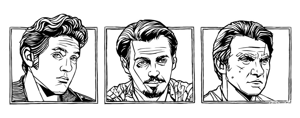
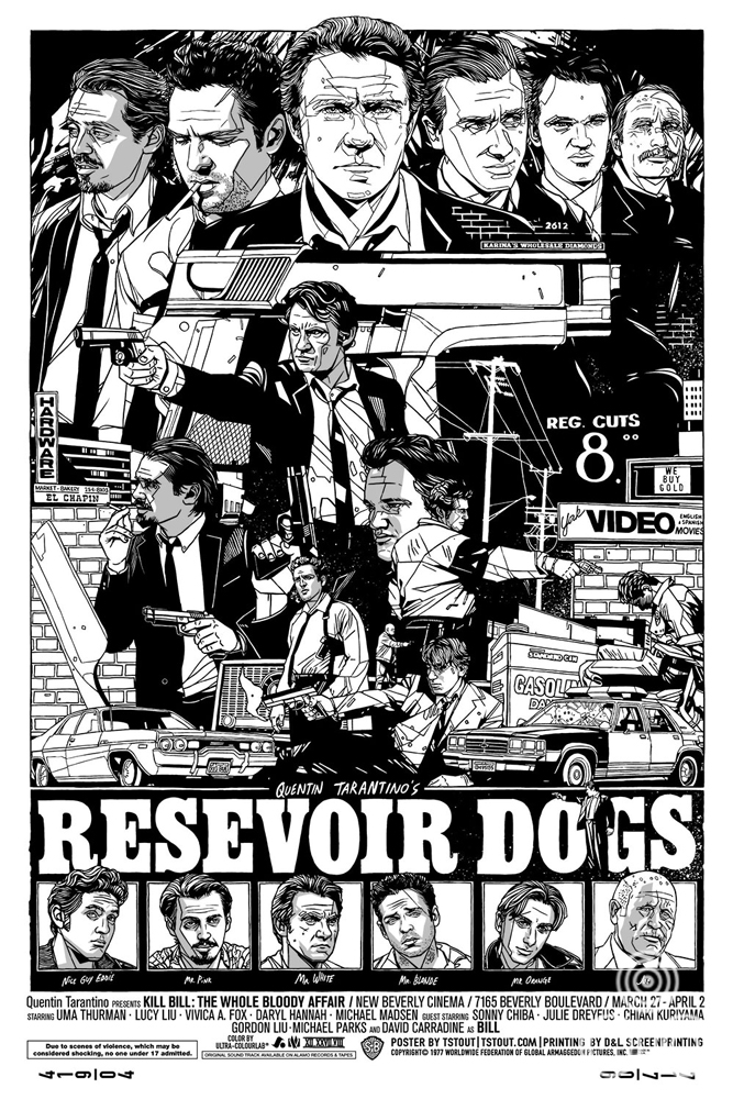
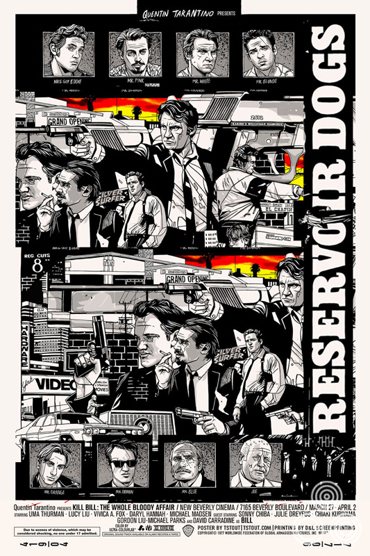
Black and white versions of three of the character portraits.
Would you like to tackle Jackie Brown one day as well?
Definitely. Someday.
I really like the style of your latest release, Fantastic Mr Fox. Do you have any other film-related prints in progress?
I do have a bunch in the works, some are just agreements for me to do them, some are in progress, some are winding their way through approvals. I can’t say if anyone will like them, but they are happening.
I’m a big Wes Anderson fan so I’m secretly hoping that we might see more Stout / Anderson prints. Are there any of his films you’d like to work on in particular?
I’d do a poster for every single Wes Anderson film ever made, for sure. Bottle Rocket is in my top ten favorite films of all time. Man, so good. And Grand Budapest, just a visual feast for the eyes, so incredible. I anxiously await each of his new films.
Thanks so much for your time Tyler.
You’re welcome, thank you.
—————————————————
+ Check out Tyler’s own website here.
+ The Mondo website is here and I’d advise following them on Twitter here.
+ The other posters I’ve collected by Tyler can be viewed here.
+ My interview with Tyler on the creation of his Akira print is here. See here for the Kill Bill print interview, here for his print for Star Trek 2: The Wrath of Khan and here for the Avengers interview.