British designer and artist Tom Beauvais is the man behind several classic British posters, including the quads for Fantastic Voyage (1966), Butch Cassidy & the Sundance Kid (1969) and the cult horror film Zombie Flesh Eaters (pictured below). In a career that lasted over forty years, and continued for twenty more after his ‘retirement’, Tom applied his considerable talents to working on marketing for many of the biggest film studios and collaborated directly with filmmakers such as the late, great Stanley Kubrick. In addition, Tom is also a highly skilled architectural illustrator and it’s this area of work that he concentrated on since leaving the design studio that bore his name, Chapman Beauvais Ltd, in 1992.
Last year I was lucky enough to be able to meet and interview the man himself about his life and career and this article is the result. It contains many exclusive images of Tom and his work, including a handful of never-before-seen concept designs for films such as Star Wars and Blade Runner. I have also included images of his detailed architectural illustrations and other relevant photos which I hope the reader will enjoy.
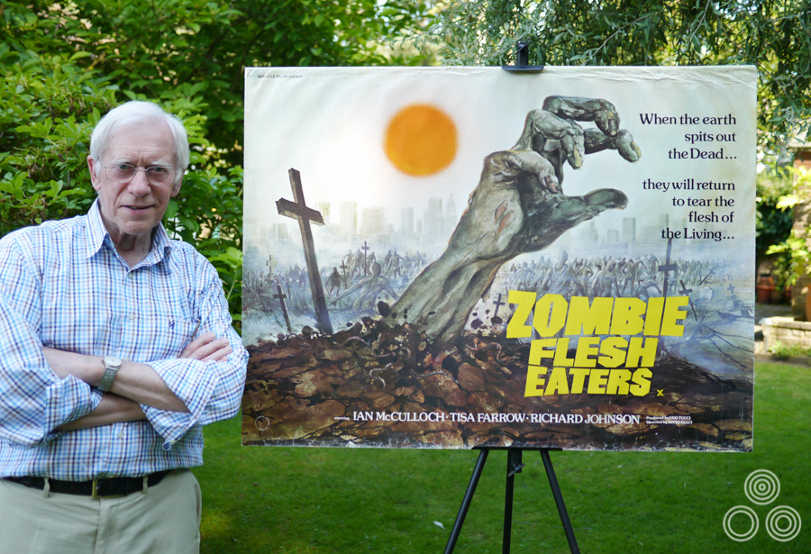
Tom Beauvais stands with the quad poster for Lucio Fulci’s Zombie Flesh Eaters, which he both designed and painted in 1979. Photo taken in 2012.
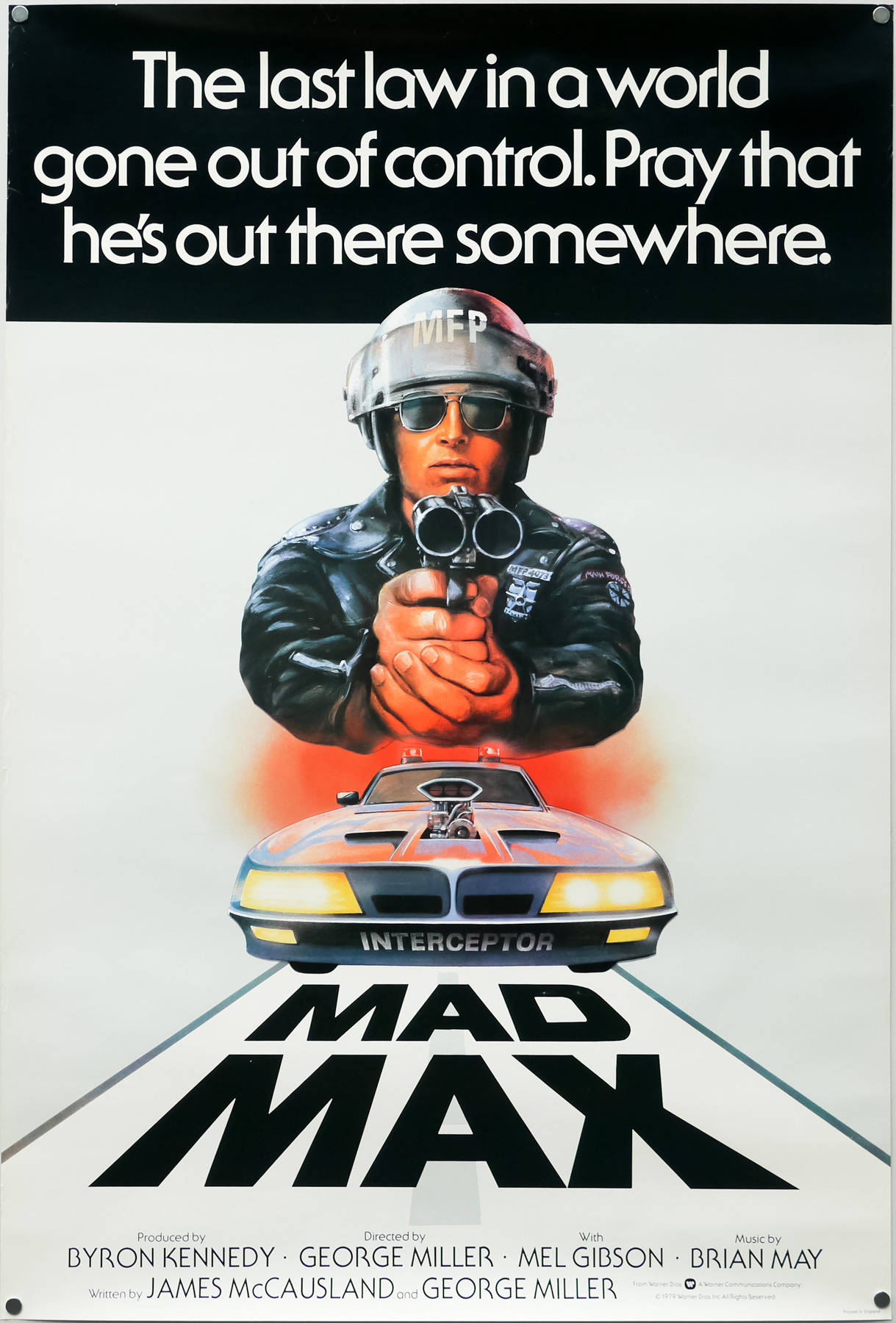
The UK one sheet for Mad Max, designed and illustrated by Tom Beauvais, 1979
I’ve split the interview up into seven parts and you can use the links below to jump directly to each part, should you wish.
Part 1 – Origins and starting out at Bateman Artists
Part 2 – The art of film marketing
Part 3 – Time for Change: Chapman Beauvais Ltd.
Part 4 – Working with Stanley Kubrick
Part 5 – Architectural illustration and the genetics of artistry
Part 6 – Iconic posters and unused concepts
Part 7 – A kind of retirement
Part 1 – Origins and starting out at Bateman Artists
To begin, you were born in 1932 in Belsize Park, North London?
Yes, that’s correct. In 1939 I was evacuated with my sister and we went with our school to Hertfordshire for a couple of years to avoid the blitz. After that our family moved to Egham in Surrey, so I came back from the evacuation to join them and that’s where I had my schooling. I was only about 10 at the time and, well, I failed the exam for the secondary school. I blame the war because I’d missed several years of education.
I ended up going to Kingston Technical School and I did an engineering course for a couple of years there, which was not a great help for an artist but it did give me a really good grounding, and I enjoyed a lot of the practical side of it, which included woodwork, metalwork and that sort of thing. I did reasonably well there and when I left I imagined that I’d become a draughtsman.
Is that what you’d hoped to become when you first chose the course?
Yes, well drawing was always my strongest subject but when I left the college my father, who was a commercial artist himself, told me that there was a potential job going in London. Somebody he knew was on the look out for a junior to join a studio called Bateman Artists that was part of the Allardyce Palmer advertising agency. I remember going along there with specimens of my work and meeting the boss, Bill Bateman. I recall him saying that I shouldn’t worry about drawing and illustration as they had ‘plenty of people who can do that.’ He told me I should learn to do lettering, how to work with typography and practice designing layouts for adverts and posters. ‘With those skills…’ he told me ‘you’ll never be without a job,’
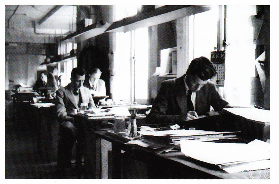
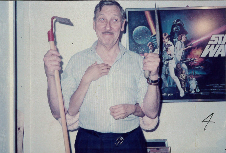
Tom Beauvais (front) working at his desk in the Bateman Artists studio, circa 1955. Behind him sits Tom Chantrell (left), Sid Townsend (right) and Les Coggins in the far back.
I started the job as an apprentice and in the beginning I was making cups of tea and buying cigarettes, as well as running studio errands all over London. After a while I was given jobs like trimming out bits of artwork and I was learning all the time about the business of creating graphic art. I recall there were about twelve artists working there and before I had started my father had told me that they were a clever crowd. True enough, you’d look over the shoulder of one of them working, perhaps doing some lettering or retouching a photograph, and it’s amazing how quickly you could learn just by following their example.