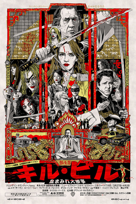
Collecting film posters is often a very confusing, esoteric and mysterious hobby to be involved in. Despite the fact that the artefacts themselves are typically less than a few decades old, so much information on their origins, design and distribution has been lost to time. This has lead to plenty of misinformation, incorrect assumptions and simple frustration for a lot of collectors. It applies to film posters from all over the world, with some countries fairing worse than others.
Luckily for collectors of British posters a book exists that is the result of years of painstaking research, first hand interviews and an abiding, life-long passion for the subject. British Film Posters: An Illustrated History by Sim Branaghan was released in 2006 and immediately eclipsed any book that has ever been written on the subject and is unequivocally the bible for all collectors of posters from the UK.
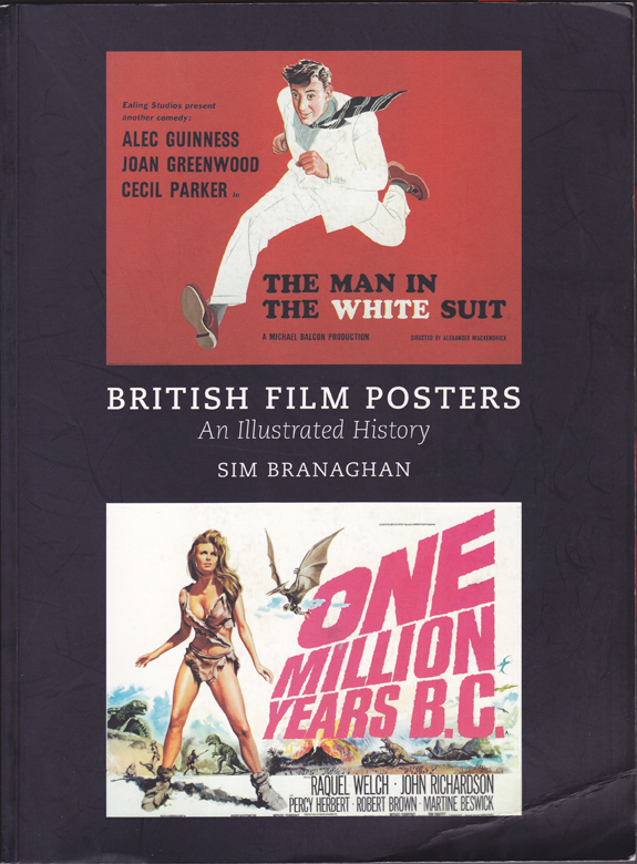
The cover of British Film Posters by Sim Branaghan – this is my own copy and the creases indicate how well-used it is.
Having spent thousands of hours researching and actively seeking out the people involved in the commissioning, design, illustration, printing and distribution of these wonderful pieces of paper, Sim was able to eventually publish a book that is a unique and important achievement, with an abundance of rich and rewarding content. It features interviews with several important figures in the story of British film posters who are no longer with us, and this is only thanks to Sim’s canny realisation that not only was it a story worth telling but that time was of the essence.
On its release in 2006 the book was given nothing in the way of a marketing push by its publisher, despite the fact that it was (and still is) the most expensive book they had ever put together. Frustratingly this meant it hasn’t had the success it so clearly deserves. I’ll add links to where you can buy the book at the end of this article, but I will stress this now; if you have even a passing interest in the subject of film posters, this is quite simply an essential purchase and you will not regret the outlay.
Over the past few months I’ve been lucky enough to get to know Sim and every meeting with him has seen me come away with my head reeling from the sheer amount of information that he’s shared with me. I’d argue there are few folks alive today who are as knowledgable on the subject of British film history, never mind the posters themselves. Sim agreed to let me interview him as I felt it important that other folks were able to hear the story of the man behind this great book and how it came to be released. The following interview was conducted in November 2011 in a North London pub.
Hi Sim, thanks for meeting me. I’d like to start by asking what was the trigger that got you into collecting?
Well I’ve loved films since I was a boy and in those days there were a lot more films on TV. So BBC2 was always showing old Laurel and Hardy stuff, there was a program called Saturday night at the movies and the ITV Thursday movie show. They also used to show a double-bill of horror on the BBC every weekend. There were all these films on TV that were on at a reasonable time, not like it is now where, if you’re lucky, it’s on at one in the morning, so I guess I just grew up loving cinema.
I was really into horror films by the time I was eight or nine and I used to ask my mum and grandma to buy books about the films I went to see. They always contained images of the film posters and I used to think they were really cool. I would also buy horror magazines like Famous Monsters of Filmland and House of Hammer. There was a magazine published in the 1970s called Film Review, which was sold in the lobby of the ABC cinema in Walsall where I used to go with my gran.
I remember at the beginning of 1980 there was an advert for a film fair in Birmingham and I thought it looked interesting so I persuaded my mum to take me along.
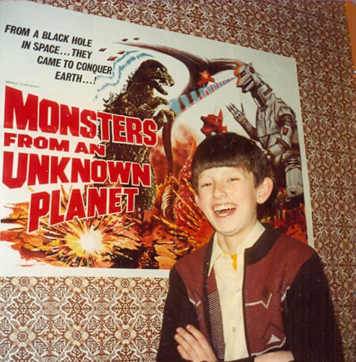
Sim: ‘Me aged 13 on the evening of Saturday 10th February 1980, having just pinned up my first ever film-poster, bought earlier that afternoon at a Birmingham Film Fair. Note the subject’s attractive brown cardigan, brown wallpaper, and (out of sight) brown duvet, clearly indicating that the 1970s had only just ended six weeks previously. Bowl-haircuts were also very fashionable then, as is now widely acknowledged.’
How old were you at that point?
I was just over thirteen. The thing that really impressed me about the fair was that there were loads of posters pinned up on every wall. There were James Bond posters, cowboy films starring the likes of John Wayne and sci-fi posters like Star Wars and The Day of the Triffids. There were all these great posters up on the wall but they were all reasonably priced and even the good titles were about three to four pounds each. The cheaper ones were about fifty pence or one pound mostly.
There was one guy in particular who had a large pile of posters on his stall and they were all open flat. It was about six or seven inches tall this pile of posters and they were all British quads and were all either one or two pounds each. It was here that I bought my first film poster, which was the Godzilla film released over here as Monsters From and Unknown Planet. It’s a stupid, colourful design of Godzilla fighting Mecha-Godzilla – it’s a great piece of artwork.
I started visiting other fairs around Birmingham whenever they were on. In the entrance to the halls there would always be flyers advertising film shops in London, mail-order businesses (where they’d send you a catalogue of what they had available), and other fairs around the country in cities like Manchester. There was a network at that point, and this is obviously pre-dating the Internet by several years, so I started getting involved in it slowly but surely.
Initially I bought anything I could get on a given film really, so as well as posters I was picking up stills, press books, lobby cards and even soundtracks.
Initially you didn’t really have a direction to your collecting?
No, in the beginning I’d buy anything, but I always like the posters the best, there was something intrinsically exciting about a big colourful poster for a film that you’d seen at the cinema. This is at a time when the artwork really captured the ambience of the film – they were really great.
Were you displaying these posters?
Oh yeah, they were just tacked up onto the wall. If they didn’t fit the space I’d just cut them to make them work. There’s a Hammer poster called Legend of the Seven Golden Vampires and I wanted to display that to the left of the bookcase in my room. There was a light switch underneath so I just cut a square into the poster so the switch could poke through. If I bought a double-bill poster and I didn’t like the film I’d just cut it up and keep the one I cared about. These are posters like the Hammer double-bills and stuff that now I definitely regret destroying, but at the time I didn’t think anything of it. When I was paying two or three quid for them it didn’t matter.
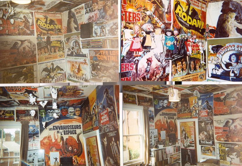
Sim: ‘A multi-view shot of my room soon after I’d left home, circa April 1992. Note the face-masks, Pelham Puppets, Aurora monster-kits and assorted other crap scattered everywhere. Note also the “Flesh Eaters” double-bill quad up on the ceiling, sliced open along its width to accommodate the light-fitting.’
Was it the films themselves that influenced the purchase of a poster or was it more about the artwork back then?
Initially, for any collector it’s about the films and even if the artwork is nice, it’s the films that really matter. When I started out I was buying the films that I’d seen on TV or at the cinema. So I bought things like Renato Casaro’s quad for Flash Gordon, Josh Kirby’s Warlords of Atlantis and a lot of things by Tom Chantrell, like The Land That Time Forgot. Of course, at the time I had no idea who the artists were.
After a while I started to really focus on the posters. I’d started out buying them from all over the world; Belgian posters were cheap at the time so I’d always pick a few of those up at fairs. I thought the artwork was exquisite.
They were easily available at fairs then?
One of the biggest Belgian dealers was a chap called George Coune and he had a massive collection, including loads of British quads too. He’d actually started buying posters in the late 1960s so he’d a very clear run at it and back then. He was often over in the UK at these fairs so I bought a lot of stuff from him.
In the 1980s I used to go to other events such as toy and postcard fairs and they always had that same kind of ambience. It’s a very British thing I think. There’d be the couple behind the stall and the woman would be sat knitting and the bloke would be smoking a pipe. It had a really traditional English feel to it and at that time the only people who were really into films were the middle-aged men – of the post-war generation – and at that point British cinema-going was practically at rock bottom. It wasn’t a young person’s thing at all.
This is way before businessmen became involved in the hobby?
Yes, these people were all fans and collectors who had acquired duplicates over the years and wanted to sell them on to make money to buy more for their own collections. There was no business element to it really. Obviously they were making a profit otherwise they wouldn’t have bothered doing it.
By the late 1980s I was mostly focused on collecting British posters because I thought they were best really.
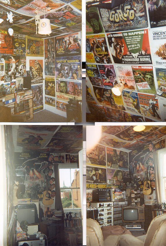
Another shot of Sim’s Room, April 1992. Multiple British horror posters abound.
As well as the British posters what else had you been collecting before then?
Well I had German stuff, American one sheets, Spanish one sheets, but really anything that had good artwork. It had to have monsters or car crashes. My cinematic tastes are as lowbrow as it’s possible to get.
Did you ever go down to your local cinema and ask for the posters from there?
No, I wouldn’t have had the nerve to do that when I was younger as I was very shy. I do remember when the Walsall ABC closed in 1993 I went down when they were stripping the interior because they just left the front doors wide open. All the posters were still in their frames and I took some of my dad’s Allen keys and walked in with a donkey jacket, so I looked like one of the workmen. I took every single poster, including a display board that was mounted on the walls to point to the screens. I’ve still got that at home! I practically grew up in that cinema so I had a huge sentimental attachment to it.
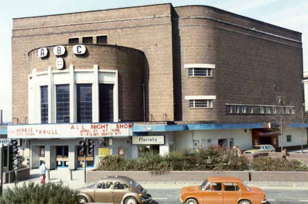
The Walsall ABC, April 1984
Can you remember what the first film you saw there was?
It was probably Mary Poppins, which my mum took me to when I was four, at Christmas in 1971. A terrible film, but you’ve got to start somewhere. The ABC was the main cinema in Walsall but, unlike today, there were cinemas all over the Birmingham area showing a wide range of films. Now it’s all multiplexes showing the same stuff. I could grumble all evening about that but I won’t!
I’d like to know when it became serious for you – when did it turn from a casual thing into a full-blown obsession?
I think the key turning point would be 1995 when I moved to London and shortly afterwards I went to a film fair up in Nottingham as I have some friends there. A guy called Steve Moore had a stall at the fair and we were chatting away about the artist Tom Chantrell as I’d just bought a poster featuring his work. I remember mentioning to Steve that it was a pity that people like Tom were dead and gone and Steve said ‘well he’s not dead; he’s living down in London’. That was a great surprise to me.
When I got back to London I found Tom in the phone book and I called him up one night and asked if he was ‘Tom Chantrell the film poster artist’ and I remember him saying ‘Yeah, who wants to know?’ I explained who I was, that I was a fan of his work and talked through the posters of his that I’d collected up to that point and then asked him if he’d mind meeting for a drink to discuss his work.
We met for a drink in Kensington and got on pretty well so I started to see him quite regularly. My day off work was Monday and we used to meet at a pub every few weeks and just chat. Once he decided that I was trustworthy he invited me to his flat to see the artwork and posters he’d kept.
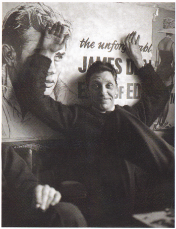
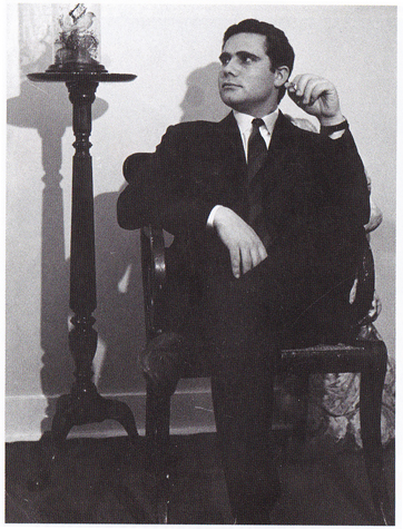
Tom Chantrell in 1961 in front of his reissue quad for East of Eden.
By that time Tom had already retired?
Yes. His last bits of work were video covers and a handful of quad posters in about 1991, so he’d been retired for about four years. I got to know him very well and for a long time I didn’t think about our friendship as being of any historical significance. I just enjoyed spending time with him and I didn’t know many people in London so he was just a good friend. He was extremely good company and an amusing person to spend time with.
It’s fantastic that you sought him out and made the effort to spend time with him. There are so many people who wouldn’t think to just try and contact one of their ‘heroes’ like that.
It’s a terrible cliché but it did change my life to an extent. There were a few people sniffing around Tom by the late 1980s who were trying to buy his artwork, and he did sell some, but nobody seemed to take any actual interest in his career. The people who were contacting him at this point were there purely from a financial point of view and had no interest in the man himself, as far as I could tell.
Tom died suddenly in summer 2001. Because I’d seen quite a lot of him over the years his wife Shirley invited me to speak at his funeral, which was quite an honour. I’d written an eulogy that expressed how much I had appreciated his friendship and company. It was a very moving day. That was also the first time I met some of his old colleagues; Ray Youngs, John Chapman and Tom Beauvais who were all fellow artists at Allardyce Palmer, which was the company he worked for right from the end of the second World War.
At the wake we sat in a pub and went through a scrapbook that Tom had assembled in the last few years of his life. It was full of poster artwork and images from when they all worked together. The difference was that Tom Beauvais and Ray and John were able to look at these images and recall these interesting stories behind each one. There were all these recollections of when they worked on certain posters and what the images were based on and loads of little anecdotes and jokes and one-liners that Tom Chantrell hadn’t really talked about with me. It’s funny but he never really wanted to talk about his career when we met up. He’d rather talk about things like the latest shenanigans with the London mayor, for example, and he loved talking about politics and current affairs.
It was a great experience to be with these blokes who were able to go through a long sequence of posters and tell these great stories. That was really an eye opener. Not only was it an extremely emotional day anyway, because funerals are always intense things to go to if you really care about the person and what they represent, but to be there talking about his artwork in detail was incredible. It occurred to me that there was this great story behind these posters that hadn’t been told and there was no question that it was definitely worth telling.
Sim with the artist Eric Pulford at Pulford’s house in Poole, May 2003.
There was also the sense that these guys were well into their retirement and if someone didn’t sit down and try and tell this story a lot of significant folks would no longer be around to tell their part, in their own words. I was cautious about it to begin with so purely as an intellectual exercise I started to write little bits about the history of the film poster in Britain. I’d also written Tom Chantrell’s obituary for the newspapers and had also begun to look at the history of poster collecting in the UK.
I established contact with the printers of the posters that were still around. At the same time I started to speak with the account executives of the poster companies who were critical in helping to determine who was painting for which company and which companies had the different accounts with the film studios at different times.
You only have to read your book to realise how much movement there was with artists and accounts over the years.
Yes, exactly. I had to figure out the framework of the whole thing first. I hadn’t really grasped that in the early days of Tom Chantrell’s career he’d mainly being doing work for only two studios; Fox and Warner Bros. That’s all he did for a long time.
So that was really the genesis of the book?
I started writing purely for my own enjoyment and the thing just kind of grew from there. There was a certain point when it achieved critical mass and I sort of felt that it was going somewhere worthwhile. I’d talked a lot with the folks who were on the production side of things, so the printers and the account directors, but I realised that it was now time to talk to the artists.
I wasn’t hugely confident because I was worried that they were going to be a snotty bunch of pseudo-intellectuals who wouldn’t give me the time of day, but I couldn’t have been more wrong. Ray Youngs and Tom Beauvais put me onto people connected with Allardyce, including Stan Burke who was able to put me onto other people who had been contemporaries with him at other agencies. Everybody knew everyone else and eventually I had contact details for most of the surviving artists. The real delight was that they were all lovely people and very genuine. They were all so helpful and for every person I met I was able to establish contact with two others.
It was a huge book by the time I’d got the first draft finished and I remember it was about 140,000 words.
How many interviews had you carried out by that point?
Not all were sit down interviews and a lot of the minor characters I spoke to on the phone. I visited Eric Puilford, who was one of the most significant artists once Tom had passed away, at his home in Poole and I went to Rome to visit Arnaldo Putzu, which was a fantastic trip. Most of it was done around London pubs having a chat over a beer. In the end I’d say I probably spoke to around seventy people. I tracked down anyone who I thought would have something useful to add to the book.
A talk on the history of film posters Sim gave at his library (in Mill Hill), May 2005. Left to right: Brian Bysouth, Vic Fair. Lena (daughter #1), Sam Peffer, Shirley Chantrell, Sim, Rowan (daughter #2), Tom Beauvais.
Did you have a vision for the book?
By this point the way I was looking at film posters had completely flipped. Almost any film poster collector starting out would buy a poster on the strength of whether they’d liked the film or not. For me this was now almost a secondary thing because it was much more to do with the artwork and folks behind them. I’d finally grasped that the story was not about the films themselves, but it was the fact that it was a very unique period in British popular art that had a distinct beginning, a clear artist peak and then an obvious end. It was the perfect story.
What’s the beginning of the story then?
I’d say it’s 1910 because this is when the first purpose built cinemas were opened and the earliest film distributors began to organize themselves and you were seeing exclusivity deals with the Hollywood studios. You had advertising agencies beginning to handle their accounts, which means that you’ve got particular artists working on the posters.
In 1927 you had the British Quota Act [Cinematograph Films Act], which was a legal rule that meant that British cinemas had to show a minimum number of British films. There were very few films being made here because the sheer number being imported from Hollywood had made it impractical to do so. Along with the films, most of the advertising material was coming from the States.
The quota act helped to stimulate the film industry and thus the advertising companies were able to really start creating British-oriented posters. This becomes particularly urgent after 1936 when the quad format was introduced. The notion is that American film posters are in the portrait, vertical format and up until then British posters had used the same layout. If the posters hadn’t been imported from Hollywood then they were simply adaptations of the American artwork.
Gaumont, a British distributor, introduced this new quad format, which is landscape and is the same shape as the cinemas screen. It meant that the American art could no longer easily be adapted to British posters. New designs were needed and that’s the point that people like Tom Chantrell got involved. I think most people would tend to agree that the artist peak for British posters would be the 1960s. You’ve got artists like Vic Fair, at the Downton agency, who was starting to produce fantastic designs. Also at Downton, Eric Pulford was beginning to import work from Italian artists, so you’ve got the likes of Renato Fratini and Arnaldo Putzu who are over here working full time. All these amazingly gifted illustrators coming over to Britain to work on film posters. It was an incredible time for the industry.
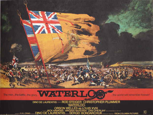
Waterloo quad poster with artwork by Renato Fratini from a design by Eric Pulford, 1970
Can you talk about what triggered the import of Italian artists?
That was effectively Eric Pulford who ran the Downton agency and held the Rank account and most of the other major studio accounts. He was a hugely powerful and influential figure. Rank was tied up with the Cinecitta studios in Rome and they had their own publicity studio over there that was called Studio Favali. Inevitably Downton became involved with their Rome counterparts who were employing a large number of truly gifted artists. These guys were all classically trained, many from the Rome academy, and were hugely skilful and exciting painters.
The irony was they weren’t getting paid well over in Rome so Eric was able to offer them better pay and thus they came over here to work on Rank posters. Often they would produce a rough design, called a scamp [a pencil sketch], and if this seemed promising you’d get a layout, which is comparatively more finished so the illustration would be better finished and it might include some painting. The layouts that Eric was getting from the Italian artists were so good that he could frequently just print them without paying them for the finished art, which he often did. It was slightly dubious but it was saving them money and still giving them these incredible bits of artwork out of it.
The crux of it was in 1958 when Eric decided to bring across Renato Fratini who was one of the younger artists working at Studio Favali, and ultimately proved to be the most gifted of all. Fratini was here in London for about thirteen years and was painting film posters almost continually.
Renato Fratini – circa 1970, around the time he left England for Mexico City
I almost don’t want to further spoil the great chapter in your book that focuses on Fratini, but you had some contact with his ex-wife Gina?
Yeah, I did have contact with her and Colin Holloway, who was a great friend of Renato’s and was his best man at their wedding. He was also the account executive at Downton who was handling the accounts. Between the two of them I was able to piece together a very good account of what he was like.
I’d say Fratini is the one artist who most embodies that that stereotype of the doomed Bohemian genius. He lived life to the fullest and he was an incredibly self-indulgent character. He ate too much, drank too much, smoked huge cigars, went to clubs and got lucky with hundreds of incredibly attractive women He had more sex than you and I could possibly dream of, which is obviously why Gina eventually divorced him!
The dark side is that at some point in the late 1960s his drinking became a problem and I suppose he was a bit of an alcoholic in the end. He was paying a fortune in tax and so he got fed up of England and left to go and work in Mexico.
Do you know why he chose to move there, of all places?
It’s hard to say really. I know that he’d remarried by this point so perhaps it was that the new wife, about whom I know very little, had a connection there? Or maybe he just fancied somewhere exotic, who knows? Anyway, he ended up there and in summer 1973 he was at a beach party and was dancing around having fun when he suddenly collapsed on the sand. He died from a massive heart attack and he was only forty years old, which is no age at all.
That’s the doomed bohemian genius – nobody was as talented and gifted as he was, and you can talk to all of his contemporaries who’ll confirm that, but he’d burnt himself out by the time he was forty.
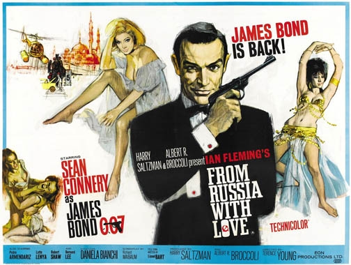
From Russia With Love – quad poster with artwork by Renato Fratini from a design by Eddie Paul. Sim: ‘By some way the best of the Bond posters, with a top-drawer combination of stylish design and casually brilliant execution.’
Fratini is one of the reasons you think the 1960s is the peak of British poster artwork?
The 1970s has some interesting posters too, but in the 1960s there was just this explosion of creativity that was happening in all areas of culture, not just in poster artwork. I think by the 1970s things were starting to stagnate, you’ve got industrial strife and the perception was that things were going down hill.
I will say that Vic Fair’s designing was probably reaching a peak in the 1970s and Vic is another name I’d personally single out as one the key names in the story. He was doing some absolutely incredible designs. People like Brian Bysouth and Tom Beauvais were also painting some fantastic posters. Tom Chantrell is doing loads of over the top sex posters, which are wonderful in their own way.
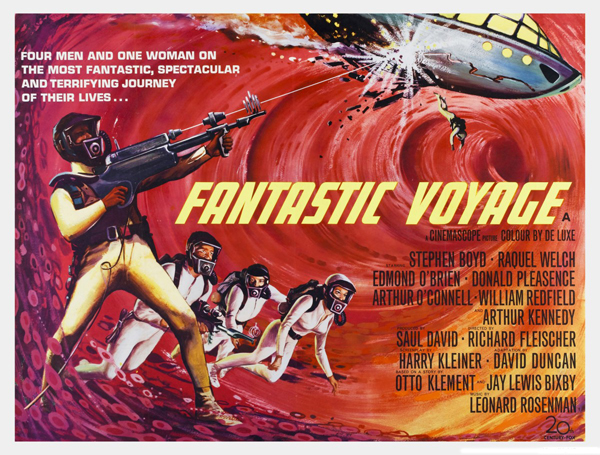
Fantastic Voyage – British quad poster with artwork by Tom Beauvais (1966) – image taken from moviepostercollectors.com
The Italian imports helped to up the game for British designers and artists in the 1960s?
Yep, the British illustrators had no choice but to try and compete on some level so that definitely made things interesting.
It’s important to note that we’re talking about hand drawn illustrations here. Most of the posters featured in your book were done decades before computers were available as a tool for designing.
Yes, clearly there’s a huge difference between an artist sitting at a board with a pencil and illustrating something from scratch, and then painting in the details, versus someone sitting at a computer using software and a mouse. I’m not saying that creating something on a computer is devoid of merit, just that there’s a big difference and anyone who tries to pretend there isn’t is kidding themselves.
The thing is that posters up until the mid-1980s had obvious personalities behind them and the illustrations clearly belong to individual artists and their various unique styles. This became even clearer to me once I met them.
The fact is that you’d be hard pressed to pick a poster in a cinema lobby today and say that’s the work of a particular designer. It’s just not like that anymore. There’s no personality and that’s something that I feel is critical. Vic Fair’s designs are very unique and left field. He likes juxtapositions, elements melting into others and things reflected in interesting ways. These designs reflect Vic’s very visual way of thinking about things.
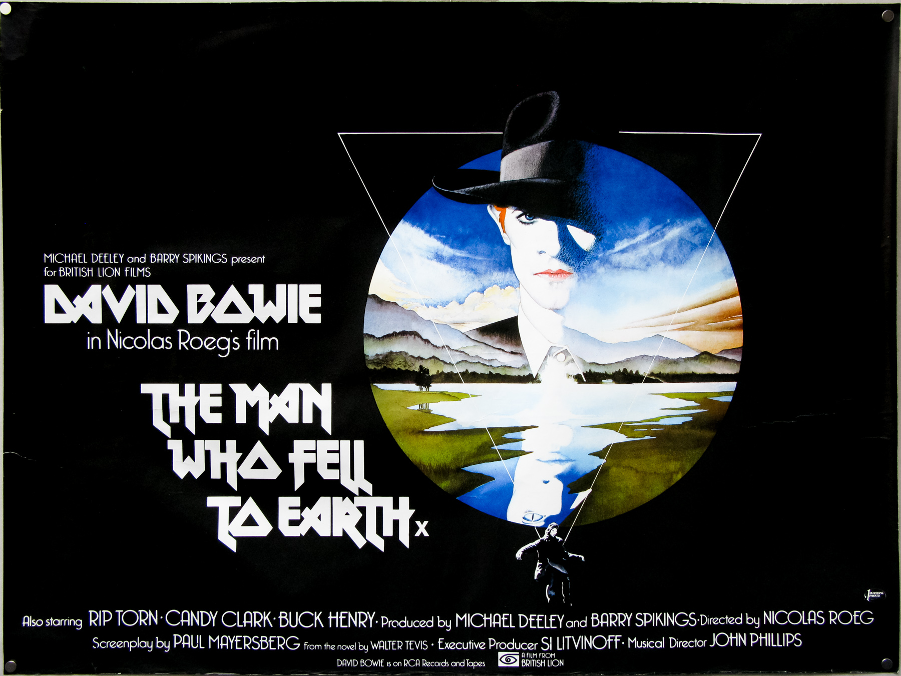
The Man Who Fell to Earth (1976)- quad poster with design and illustration by Vic Fair. Sim: ‘Probably the best known of Fair’s posters, and the only one regularly credited to him, since he liked it so much at the time he actually signed it.’
You can also look at Brian Bysouth’s painting style, which is exquisitely detailed and finished. Again, that reflects Brian’s temperament, as he’s very focused with a clinical attention to detail. Tom Chantrell is to some extent now remembered for his outrageously sexy posters and he had an eye for the female figure that he was able to use to create these wonderful pieces of art. All of these blokes had different sorts of gifts and abilities that are reflected in their posters
Posters today don’t have a personality because they’re not the product of a human being, but that of a human mediated through a computer.
There’s more pressure on the designers now to fulfil the wishes of the studio. Certain obligations to have the heads of the stars are given more prominence.
Yes and this ties into why the 1960s were important because back then there was so much optimism and freedom and desire to experiment in our culture in general. We now live in a very conservative age, I feel, in terms of commercial art where people aren’t willing to take any kind of risks at all.
When you look at some of Vic Fair’s designs from the 1970s you’re really quite impressed that they ever got printed because some of them are so odd and left field.
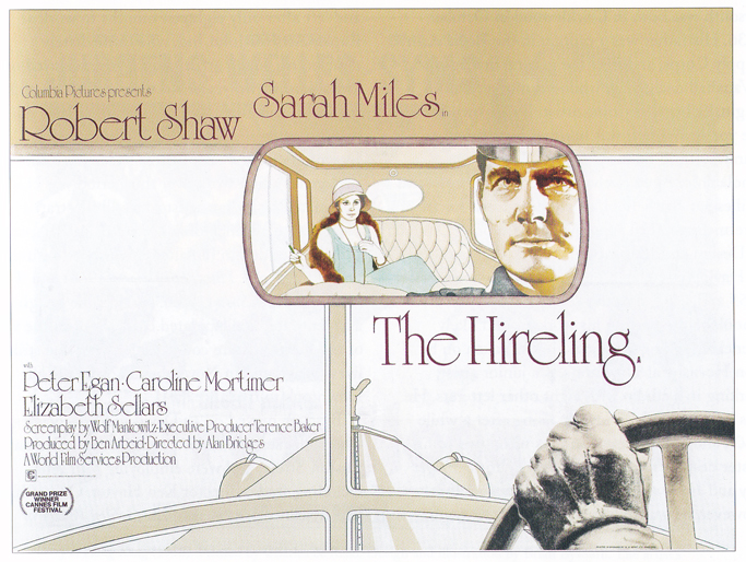
The Hireling – quad poster with artwork by Vic Fair. Sim: ‘Another strikingly imaginative design, and one of the artist’s own favourites.’
Can you cite any specific designs?
Well, there’s a good one called The Hireling, which is a period film based in the 1920s. The poster is an illustration of the interior of a car and you’ve got Robert Shaw’s face in the rear-view mirror and his menacing, gloved hand on the steering wheel. It’s a very claustrophobic, oppressive poster, but it’s such an original striking design and it’s very hard to imagine a poster like that being commissioned today. It’s not commercial; it’s an artistic piece of design.
The same happened in the 1960s and a lot of Renato Fratini’s posters were clearly artistically exquisite but in terms of their commercial appeal some of them are clearly lacking. They are so tied into their time I think and that’s the crux of it. Fratini in particular has a painting style that is definitively 1960s. He did everything short hand; he’d suggest detail by splodging a few bits of paint around. Often his figures aren’t even completed and just trail away at the bottom. Vic worked with Renato and has often said that he was the master at giving the impression of detail but once you get up close you realise that there’s nothing there. It’s lots of splodges and dots and blips and it’s only when you stand back and look at it that you see this wonderful image.
Lots of people love Brian Bysouth’s work, including me, and you can get your nose right up to the poster and see lots of wonderful details but you could argue that that amount of detail isn’t necessary for something that’s meant to capture your attention for a moment. Film posters were meant to be instant attention grabbers, not intricate works of art. They were sales tools to attract a particular audience at a certain moment. That’s why they often so vividly reflect the period in which they were drawn and illustrated.
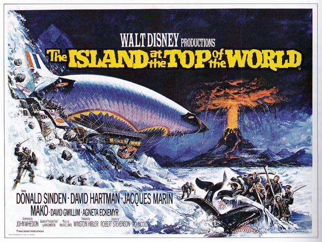
The Island at the Top of the World – quad poster with artwork by Brian Bysouth from a design by Eric Pulford.
In the book you talk about how Tom Chantrell had a real knack for knowing what design would work to sell a particular film.
I think Tom was one of the oldest and most experienced of the poster artists working in the 1960s through to the 1980s, and he was also one of the most shamelessly commercial. He had a real instinct for what would work both visually and thematically. He told me that he could easily work from synopsis and a bunch of promotional stills, and in fact I remember him saying that after sitting through the Mary Millington film Come Play With Me, he begged the distributor not to make him watch any more of those kinds of films.
He was so effective and by the 1960s he’d got it absolutely nailed. He was great at central figures where their eye line would be bang on with yours. You look at something like his poster for Carry on Cleo where you’ve got Sid James leaning over Amanda Barrie, gurgling away with mirthful lust and he’s looking you directly in the eye. Another good is example is his quad for Star Wars where Mark Hamill is bang on with your eye line. There’s that extremely skilful, instant, magnetic attraction with the way Tom could design. I don’t think he was any kind of artistic genius and I think it would be doing him an injustice to try and sell his designs on that basis, but he was a commercial genius.
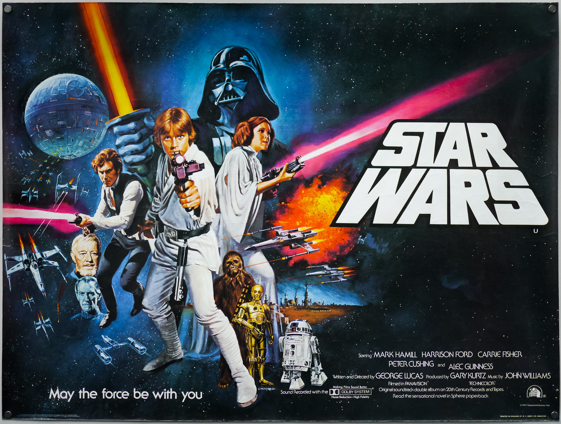
Star Wars – British quad poster with design and artwork by Tom Chantrell (1977)
Where do you think Chantrell learned to hone that side of his design?
Well if you want to get incredibly sentimental and clichéd I think it’s interesting that his father worked in the music hall. His dad was a trapeze artist in ‘The Fabulous Chantrells’ and was also a jazz musician. I get the impression, from speaking to his family, that Tom grew up at the tail end of that kind of musical variety show thing where he was of the working class and he just had that intuitive grasp of what the popular mass audience wanted to see.
Commercial art was, by definition, commercial but almost all of the artists we’re talking about come from the working class. Some had parents who were creative; Tom Beauvais’ father was a poster artist and Vic Fair’s father was an industrial designer. I think the critical thing is that most of them come from the class of people that they were designing for and they just knew what would work to sell the film.
There’s a very distinctive humour and cheekiness to a lot of the work, particularly with Chantrell’s copy lines, which were just these atrocious puns. So you had posters for things like the terrible Val Guest film ‘The Au Pair girls’ and that tagline was ‘Oh what a pair girls’, which is about as bad as puns get, but he loved that kind of stuff. Another one he did was for this rather dreadful comedy called Crooks and Coronets that starred Telly Savalas and the poster had him sitting in a bi-plane with a speech bubble saying ‘It’s a Fokker’. You can’t get much more British than that!
I think there is something about British posters, particularly from the decades that we’re talking about that is wholly unique.
Definitely, there’s an element of patriotism of course; we both love the British poster, but there’s something else going on too. The illustrative side of American posters was slowly fizzling out towards the end of the 1960s but it continued for much longer over here. It could be for purely commercial reasons in that it was in the interest of British design agencies to argue that British audiences were different from American ones and we couldn’t just reuse their campaigns. Unique designs would have to be created, of course with the financial benefits that would bring.
I do think it’s true that British posters have superior art over time. There are fewer interesting American poster illustrators in the 1970s, particularly after artists like Reynold Brown retired. There are folks like John Alvin who I think is good and Richard Amsel who did some great stuff, but sadly died too young. I know you’re a fan of Drew Struzan but I personally think he’s a pile of shite and you can print that. I think it must be a personal thing, as I know that Brian Bysouth rates Drew so it must just be me who doesn’t like his work.
I guess I’m biased when it comes to British artists because it really makes a difference when you get to know the people behind these posters and understand their individual personalities.
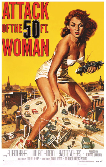
Attack of the 50ft Woman – USA one sheet with artwork by Reynold Brown
Tell me about why 1986 is your cut off point in terms of when you believe the last truly great British illustrated poster was done.
Well originally I had 1983 in one of the early versions of the book and that was purely because that was the year when almost all the artists stopped getting commissions for illustrated work, but in the end I felt that it was a bit tenuous. You could pick a few years from the 1980s and make a case for them being the last year of note.
What about Brian Bysouth’s work on the poster for The Living Daylights in 1987?
It’s a great poster in terms of being a solid piece of dramatic illustration, but in my opinion it’s far from the best thing Brian has painted. The poster was really the end of an era because it was the last big British illustration that was used around the world.
The thing with the illustrated posters was that it was getting increasingly expensive, as the artists had begun to ask for more and more money. So, for example, Brian was paid £3000 for his work on the Living Daylights, which I’m pretty certain is the biggest single payment for a piece of poster artwork that there had ever been. But that was really the last time you saw that kind of price being paid for a film poster illustration.
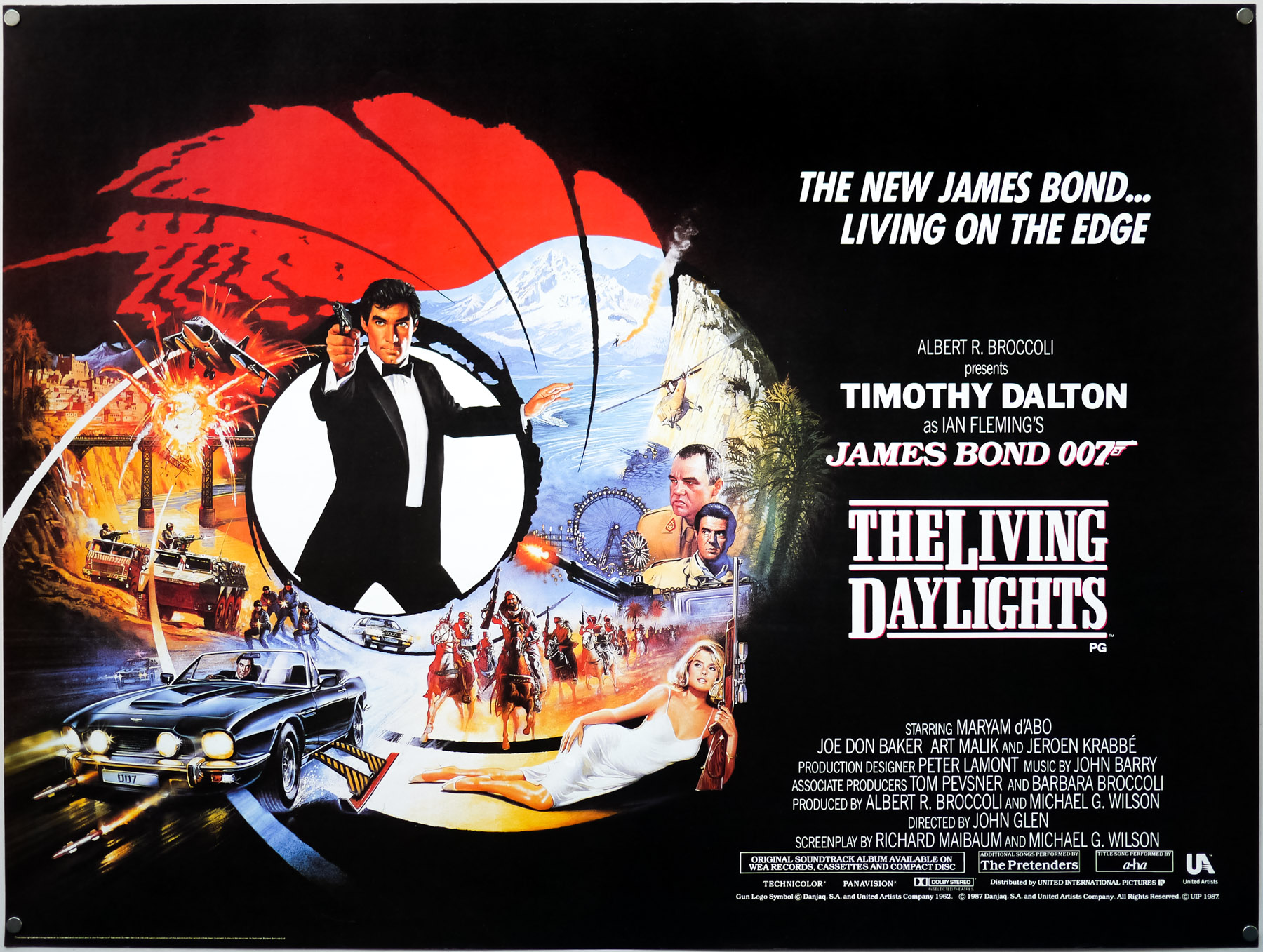
The Living Daylights (1987) – UK quad, by Brian Bysouth
1986 saw the then Tory government remove the support of the Quota Act for British film that meant the support for home grown films wasn’t there any more. Our contribution fell to about 10% or less, which is pretty much still the case today. That’s just the market and there’s little we can do to compete with the output from Hollywood. Obviously this drop in the number of British films had a clear effect on the number of unique marketing campaigns that were being created over here and had the knock on affect of American designs being used instead.
You also started to see the rise of affordable desktop computers with all the impact that had on the design industry. At the same time you were seeing the rise of the American owned Multiplex cinemas and the decline of the ABC and Odeon cinema chains. As an industry British cinema was on the rocks for a while with low attendances that were obviously impacted by the advent of home video.
The kinds of films that would have required an illustration to sell them in the past were no longer getting a cinema release. I’m talking about low-budget exploitation, Italian horror films and bizarre Australian imports; the distributors could no longer make it profitable to pay for a British cinema release.
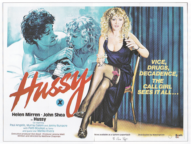
Hussy – quad – with design and illustration by Sam Peffer. Sim: ‘One of Peffer’s best posters, with a fine portrait of call-girl Helen Mirren mixed up in Soho’s gangland.’
These were the films that had kept artists like Tom Chantrell and Sam Peffer working throughout the early 1980s and suddenly there just wasn’t the need for the designs any more. Sam let me take a photocopy of his job book and the absolute top payment he was getting was something like £230 in about 1981, which was good money for him, but they were for crap films like Caligula and Wild Cats on Heat and things like that.
The impact of the rise in use of computers is clearly not something that can be understated.
No, you’re right and there were some folks who were canny enough to see this change coming. There was a chap at the Feref design agency, called Gareth Shepherd, who latched onto Apple Macs and what they were capable of doing very quickly. He told the management that they should be investing in more of the computers and he was bang on the money because, unfortunately, it was so much cheaper to design using them, versus paying an illustrator.
There was this complete domino effect in the 1980s; Tom’s last poster commission was 1983, Sam Peffer retires in 1985, Arnaldo Putzu goes back to Rome the same year. Vic Fair and Brian Bysouth were still working but mostly doing photographic stuff by that point. In terms of artwork it just ended very quickly over a couple of years.
Apparently what also happened was that there was a public backlash against illustrated video covers because many of these artists were doing fantastic, striking designs but they weren’t representative of the terrible quality of the films themselves. It was almost like the people renting them started to feel that the covers were false advertising so the distributors decided that they had no choice but to start using photographic covers. Fifteen years earlier it was almost a given that the cinema poster would be more exciting than the film itself, but audiences by the mid 1980s were much more discerning and you could no longer get away with overselling a film.
The impact on video covers from this lack of trust had a knock on effect on cinema posters and film studios no longer felt that illustration was a viable and suitable way to sell films to the cinema-going public. It didn’t help that teenagers, who by then were probably the key audience, perceived illustrated posters as old fashioned.
Collectors and fans of these illustrated posters often wonder if we’ll ever see the return of hand-drawn artwork to major marketing campaigns in the future.
I can’t see it happening because the cost of paying an illustrator is likely to be too costly for the distributors when they can just have another photographic design knocked out for next to nothing. Plus there are so many other ways to sell films today, particularly with the advent of the Internet and all the marketing possibilities that brings. The posters are now far less significant in terms of the overall marketing campaign than they used to be. I can’t see any of the big film studios commissioning a poster artist purely as a philanthropic thing of encouraging film posters as artistic movement. They’re not interested in anything other than making money.
The other thing about painted artwork is that it has personality and it has a romantic element. I think it also encourages a sense of anticipation that modern film posters, at least to me, aren’t able to achieve.
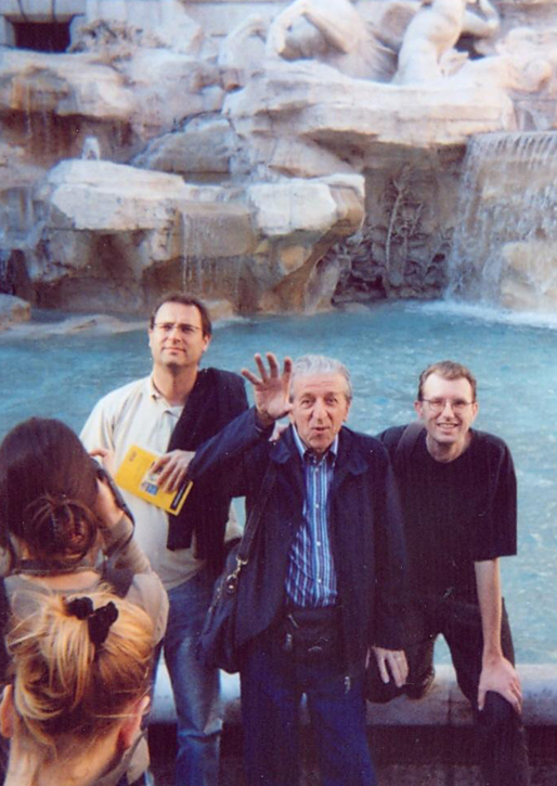
Sim with Arnaldo Putzu at the Trevi Fountain, Rome, in 2006
I’d like to return to the making of your book. Can you talk about any of the other meetings with artists that had an impression on you?
Traveling to Rome to meet Arnaldo Putzu was quite an experience. We only had about three hours together but I just felt that we both made this immediate connection on a very personal level. I know that sounds really clichéd or cheesy and I don’t care. It was as though we’d known each other for years and he talked about what it was like to get old and about his wife and their relationship. He also had these fragmented but very vivid memories of his time living and working in London and how exciting it was to be there at that time. It was this really magical and powerful encounter for me.
I’d always loved Arnaldo’s artworks from when I used to see them at the cinema as a child, even though I had no idea they were his work.
Which of Arnaldo’s pieces were you a fan of?
Well everyone likes his Get Carter and I do think that’s fantastic. I asked him why he’d put Michael Caine in a floral dressing-gown and he couldn’t remember why he’d done it, but at that point in time, in the early 70s, he was going through a bit of a hippy period and putting flowers in lots of his work. There was a poster he did for a Yul Brynner film called Return of the Horseman and he was a fan of sunflowers so he put loads of them in the background. It’s kind of a Van Gogh thing with a wall of sunflowers behind the portrait of the star and it worked. He thought that for Get Carter he might have added the flowers just to cheer the poster up!
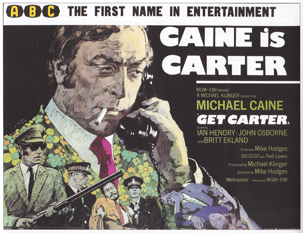
Get Carter – quad with artwork by Arnaldo Putzu from a design by Eddie Paul. Sim: ‘One of the most iconic of all British film posters, from one of our most uncompromising thrillers.’
It was a short meeting but it was hugely resonant for me. I was extremely aware that there was a very good chance that I’d never see meet him again. I was with this guy whose work has meant so much to me since I was a child and even if he’d turned out to be a loathsome character it would have still meant a lot just to meet him. In the end he was just an honest, straightforward, humble and lovable man. The missus and I were only in Rome for a few days but it was a magical little break. We met Arnaldo at the Trevi fountain and if anything in your life truly means something then that was one of those moments.
So that was clearly one of your highlights of meeting the artists?
Yes, but I enjoyed meeting all of them because they’ve all got such distinct and interesting personalities. Vic Fair is one of the funniest guys you’ll ever speak to. He can barely remember anything at all and if you’re trying to get specifics out of him you’ll struggle because he can’t recall many of the dates, locations and people involved at the time. Trying to nail him down is hard work but he’s such a fun character and is incredibly funny. Brian Bysouth is also one of the kindest, most generous spirited and supportive people you’ll ever meet. They were all incredibly nice and helpful in the making of my book.
Would it be fair to say that Tom Chantrell is the artist that means the most to you?
Well, Tom was the catalyst for the book and he was also the artist I used to love the most as a kid, even though, again, I didn’t know the posters were by him. He was very good at painting all the things that any red-blooded young man is interested in; so he could paint excellent monsters and vampires, ladies with large boobs, car crashes, gun fights and punch-ups. As a person he was intensely likeable and helpful. I don’t think he was the best artist to have worked on British posters; in terms of illustration most folks would probably say the best was Renato Fratini, and the best designer would probably be Vic Fair.
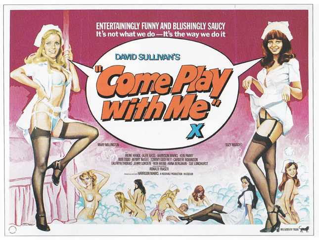
Come Play With Me – quad with design and illustration by Tom Chantrell.
All of them had their own unique characteristics but Tom was the person who got me into collecting posters. His is the work that will survive the longest, partly because he was working on cult films that will always have a level of popularity and partly because his work is intuitively commercial. He just knew how to design an interesting layout and use contrasting colours to great effect.
You got to the point where you had a first draft of the book?
I typed it all up and printed it out so it was just an incredibly long document of about 140,000 words. At that point it wasn’t in chronological order because I thought it made more sense to organize it by themes. I started with a section on advertising agencies, and then I moved into the printers and then the National Screen Service. It wasn’t chronological to begin with anyway.
I had about two years where I was trying to sell it to a publisher. I knew it had potential but it was just an enormous stack of text and because the subject matter is inherently visual I suppose it was quite a hard sell. Eventually what I did was visit the Vintage Magazine shop in Soho because at that time they used to sell postcard-sized reproductions of British quads. I bought a load of those and did colour photocopies with four on one page and then annotated each of them with the artists and any stories that I’d heard during the interviews. I attached those to the front of the manuscript and it definitely made it work better.
When I was shopping it around they were all saying that it was an interesting subject and that it hadn’t been done before, but that it was incredibly niche and it would be very expensive to print. They didn’t think it was a commercial proposition and that they wouldn’t have made enough sales to recoup the production costs.
I’d been dealing with the BFI on and off for a couple of years and it hadn’t seemed it would go anywhere with them, but then a new head of publishing called Rebecca Barden joined the company. She saw the book and immediately realised the potential. She felt it was doable and got in touch with me very quickly. By this point it had been almost two years since I finished the book and I was just about ready to stick it in a box and put it in the loft so it was a great bit of news. It all happened very quickly; the book was signed and the manuscript was given to a man called Steve Chibnall who is an experienced editor.
First he asked me to chop it down to about 100,000 words and arrange it chronologically. Once I’d done that Steve created a second draft by taking out quite a bit of detail and the anecdotal stuff and putting it in the footnotes. Eventually we ended up with about 85,000 words and that was called the finished edit.
How did it work with the images? Were you given a maximum number of posters you could feature?
I was given a figure of 350, which was fine. I went to the BFI archives in Berkhamstead that is run by a really helpful guy called Mike Caldwell and had a couple of long days there photographing some great posters. You’ll notice that there are only two credited contributors in terms of images in the book; there’s my stuff that is designated AC – Author’s Collection – and then the stuff from the BFI archives. I reckon I supplied 90% of the posters that are from the 1960s onwards and the BFI supplied most of the rest, certainly the pre-war stuff.
Sim: ‘This is a photo from when I was working in the BFI’s Berkhamstead poster-archive with curator Mike Caldwell, August 2005. Plan chests in background, Mike’s laptop on the table next to my rough scribbled list of titles and a vintage 1913 poster retrieved (via the laptop catalogue) for quick reference snap in foreground.
It was an amazingly painstaking two days where I had to figure out exactly what the BFI archives held, where it was and how it could be used.
The phrase ‘kid in a candy shop’ comes to mind!
Well it wasn’t as fun as you’d think because the archives are in an area the size of a tennis court made up of three avenues of plan chests to the ceiling, about 8 or 9 feet tall. Everything is catalogued with a serial number, which means the posters are in no fixed order whatsoever; they’re simply put into the drawers in the order that they were acquired. I had a catalogue that was printed in 1982 that listed every title they had in their archives so what I had to do was go around with Mike and call out a listing and he’d consult a laptop that told him which plan chest to delve into. I’d be climbing up a step ladder and opening a drawer to go through each poster one by one on the hunt for a particular title. It was unbelievably laborious but it was still interesting.
You’d have the most bizarre mix of titles sitting next to each other in the drawer, so you might lift up a quad of Teenage Mutant Ninja Turtles and find an original Hammer Dracula quad. At the time distributors were giving the BFI proof copies of everything they were running; it was an informal arrangement but it meant they had all kinds of weird and wonderful titles filed in no order. It was a bizarre experience.
The breakdown in the end was about 100 posters from the BFI and the rest from mine.
How did you photograph the items from your own collection?
Well I went back to the BFI archive to use their equipment. I packed them all in a large suitcase and Vic Fair generously drove me all the way to Berkhamstead. Mike Caldwell photographed them in his little studio and we managed to do them all in one day. It was like a production line where I was getting the poster out of the case, unfolding it and putting it onto this vacuum frame setup so Mike could quickly snap a photo. Vic would then take it out of the frame and begin folding the poster whilst I was already preparing the next one to be photographed. We whipped through them all like clockwork.
I then had to write informative and/or witty comments for each image and once this was done I sent it all to Tom Cabot who was the production manager of the book and he assembled it in about two months. The finished book appeared in November 2006.
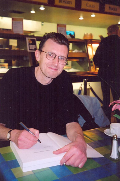
Sim signing copies of the book, August 2006
Can you talk about what happened around the release date?
Well there was an unfortunate set of circumstances in that Rebecca Barden, who had commissioned the book and seen it all the way through production, went on maternity leave a couple of months before release. Her temporary replacement did their best but I do think it possibly affected the amount of publicity the book was given. In fact the book appeared with no push at all, that I’m aware of.
It didn’t get any kind of newspaper coverage or reviews. It got a brief mention in Empire magazine but that was it. It was selling on word of mouth so all of the poster collectors bought it and hopefully enjoyed it but that was pretty much it.
It’s ridiculous because it’s the only book that covers film posters in a lot of detail and talks about the designers and the artists in any meaningful way.
Well, there’s certainly nothing similar. During the two years I was trying to shop the book around I started to get a bit paranoid and was convinced that someone else had the same idea and was beavering away on a similar project. In the early 2000s film posters were still very trendy and lots of the artists were still around to talk to. But here we are six years down the line and nothing else has appeared, certainly nothing that goes into the same level of detail.
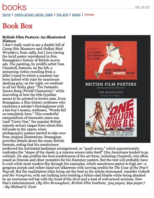
A review of the book that was featured on the MetroActive website in August 2007.
I’d argue that no one would dream of trying to write about British posters or better what you’ve done.
Someone could have a go but I think it would be quite hard. In my mind I felt that the book was a framework that other people could build upon. I wanted to talk to all of these guys before they passed away and then gather a minimum base of information from everybody and link it all together so that future generations who get interested in this stuff have got the chance to take it further. At least there are clues and starting points to carry it onwards.
I just think it’s great that you took the time to speak to these folks, many of who are no longer with us.
Well Tom Chantrell’s funeral was the catalyst for that. I realise now how many questions that I should have asked him and didn’t. Stuff that literally nobody could answer now. There was far more in Tom’s head that was never extracted because no one ever thought to ask him.
It’s a big shame that there wasn’t more of a push around the release of the book because I definitely think it’s one that everyone who is even vaguely interested in film posters needs to have on their shelf.
Well it was just unfortunate timing and wasn’t really anyone’s fault. As I said, it was a shame that the person who had commissioned it and seen it all the way through the production process wasn’t there at launch, which would have helped. I don’t really understand why the BFI didn’t promote it more because the book was the most expensive one they’d put together. I can’t see the BFI ever attempting a project like that again today.
I believe they have made their money back on the investment they made printing it because I’ve gone into profit on my royalties to a very small extent. I get a tiny amount of every book sold, something like 60p per book. According to my last royalty statement the book has sold about 1700 copies, which is about half of its total run. I don’t care about the money, but if I’ve earned a very small profit it means that the BFI must have at least broken even.
Ultimately I just hope the book is interesting to at least a few people and encourages them to start their own research and investigation of film posters in general, not just British ones. The thing I like about the book is that it’s original material with content that hasn’t been seen before. Nobody had thought to interview these folks before and so it’s a book filled with unique content that tells a complicated story in what I think is an easy to read way.
I’d like to talk about your poster collection now, if we may? We talked earlier about how you started out with a range of memorabilia and then eventually fixed on the British quad. What were the criteria for you adding a poster to the stack?
It’s partly the artwork but mostly because they were all bits of the bigger puzzle that I was working on; they have historical significance in some way. The more you understand about a subject the more appreciation of what you’re buying.
For example, in the beginning I had no idea what a hand-drawn lithograph was but as I began to research I realised the amount of craftsmanship that goes into one. Now if I see a reasonably priced hand-drawn litho I’ll buy it because it’s a great example of a particular piece of British craftsmanship that is now completely gone and forgotten.
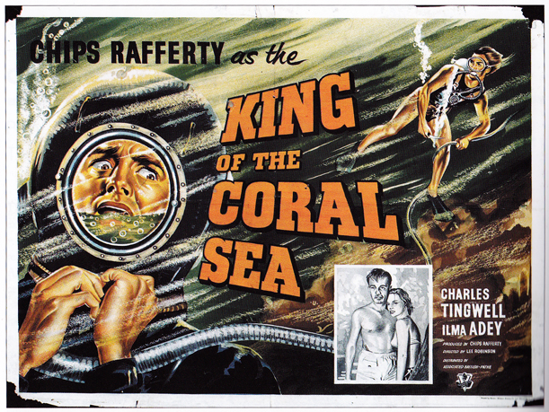
King of the Coral Sea – quad – designer unknown. Sim: ‘A marvellously dramatic hand-drawn litho for this picturesque Aussie adventure.’
I’m not hung up on the condition of posters and I will, and have, bought posters that are falling to bits and incredibly tatty. I have no objection to posters that have been written on and one of my posters that I bought years ago at the Westminster film fair was the quad for The Enforcer, designed by Bill Gold. The poster is a close up of Clint Eastwood with his hand through a smashed car windscreen holding a revolver. At some point when it was hanging up someone has written ‘Man U’ on his forehead and ‘MUM’ on his knuckles, which I think is fantastic. Most collectors would be appalled at the fact that a Clint Eastwood poster has been defaced but to me that just says ‘1976’ and a football fan who has gone to see the film and thought the poster would be better like that.
If you assemble enough film posters they will tell you a story. I started looking at my collection in a whole different way when I began work on the book. Up until then they’d just been a collection of images that I’d enjoyed since I was a kid. I started to realise that you could actually figure out a certain artist just from their painting style. Folks like Brian Bysouth and Fred Atkins have got trademarks and styles that you can easily look out for. You can train yourself to look at a pile of twenty posters and spot a Fratini among them and when you can do that it becomes incredibly rewarding.
You have to be careful sometimes because these artists were very versatile and could all paint in many different styles. Someone like Bysouth is a great example because he was able to do pastiches of other artists, so he could do sex comedy posters in the 1970s that were in the style of Arnaldo Putzu. If you had asked me to pin a name on one of these posters I would have said that there’s no question it was the work of Putzu, so it’s not infallible.
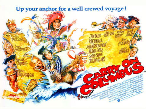
Carry on Columbus – quad poster by Brian Bysouth
It’s one of the things I love about the hobby. There are posters from the 1980s where the artists haven’t been identified. There’s still a certain mystery to it.
Sometimes you can make an educated guess and sometimes other artists might have a clue whose work it was. But there are many British posters where we’ll simply never know who painted them. There are no records surviving. If they were freelance then there might be a job book but those would almost certainly have been thrown away with their papers when they died. None of Tom Chantrell’s job books survived, for example. It’s just inevitable I suppose.
Is there one poster in your collection that stands out amongst all the others – one you’d run back into save if your house was burning down?
Well being a curmudgeonly bastard my answer is that I wouldn’t save anything because if my house were on fire I would simply accept that they were going to burn. That’s fine because it’s a period of my life and the achievement is the book. If you want a straight answer it would probably be the posters that I asked the artists to sign. I got Tom Chantrell to sign Comancheros and Carry on Cowboy and I got Vic Fair to sign Vampire Circus and Countess Dracula. Brian Bysouth signed Carry on Columbus and The Golden Voyage of Sinbad. These were posters that I’d loved as a kid so it was great to take them along to be signed when I met and interviewed them. Those are the posters that mean the most to me.
If I had to pick just one it would be Arnaldo Putzu’s design on Satan’s Skin, which he signed for me when I went to meet him in Rome. It’s the one poster that ticks every single box for me.
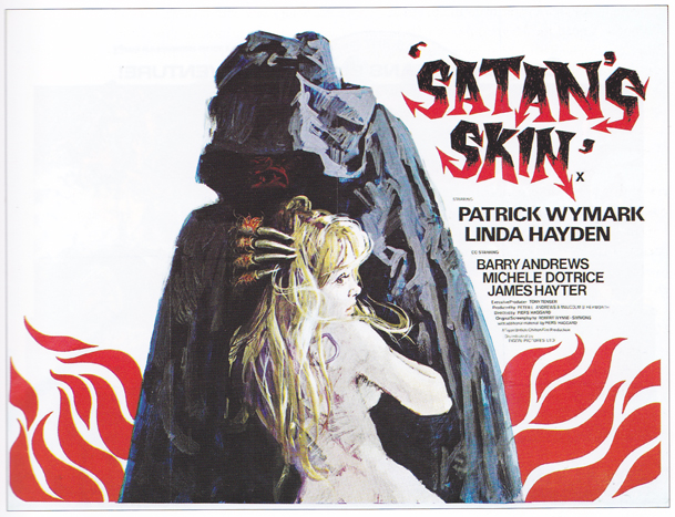
Satans Skin – quad with artwork by Arnaldo Putzu, probably from a design by Eddie Paul. Sim: ‘This classic British horror poster, and the others in this introductory section of the book, were among the author’s first purchases in his early teens.’
Are there any posters in your collection that are particularly rare or unique?
I’m reasonably confident that I’ve got a few posters where it’s likely that I have the only one, or one of a tiny handful of surviving copies in the world. But these are for films and posters that are of no interest to anyone at all. They’re scarce simply because they are for crap films and every other copy was thrown away or destroyed. I’ve got posters that are really special to me that would mean nothing to anyone else, such as a Godzilla double-bill poster that’s one of the crappiest posters you’ll ever see. I saw it at the cinema when I was 10 and thought it was the best thing I’d ever seen so the poster has a huge emotional resonance for me. Nobody in the world would want to buy it but I have it and it means something to me.
I have a few pieces of original artwork that some of the artists very kindly gave to me when I went to visit them.
Are you still collecting posters today?
Yes, but to a very limited extent. I have very little money to spend on posters today because like everyone else I’ve got very little funds to spend on luxury items and I’ve got two young girls who will be going to college one day so I’ve got to think about that. I also find it extremely difficult to buy posters in an environment that I like. I grew up in a generation where there were still film fairs where the posters would be on a stall in front of you and you’d haggle with the stall holder before parting with your money. That’s the way I like buying posters; I like having the item in front of me and dealing with another person. That side of the hobby has almost completely died; the fairs are still going on but they’re really on their last legs.
The alternative now is websites where you’ll pay a premium from a dealer but you’re reasonably guaranteed to get a decent item or eBay where you can get a bargain but never be entirely certain that you won’t be ripped off or receive a smashed up ruin of a poster. I only buy stuff now if the price is cheap and it’s something I don’t have already.
Are there any artists or designers that are working today that you admire?
I don’t know many of them to be honest, but I obviously like Graham Humphreys, who doesn’t? Marcus Silversides continues to do little bits of film work and he’s a great designer but it’s very difficult to make a living from film work.
The one designer of the new generation that I do like is John Pennington who works for the Hoo-Ha Agency and used to be at Feref for a little while. The thing about him is that he’s a proper designer. He’s usually given films to work with where there are no stars and no obvious visual motifs, which means that he’s forced to think creatively. So few designers now are in the position of needing to think creatively; they’ll just bash a few star portraits together and that’s it.
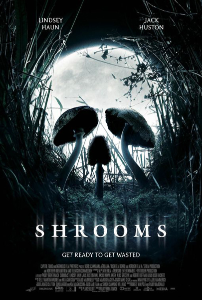
Shrooms – one sheet – designed by John Pennington at Ho-Ha
John did a poster for a film called Shrooms, which is a skull that’s made up of three mushrooms growing against a full moon, and is a great piece of design. It’s very reminiscent of Vic Fair’s work from the 1970s where he’d use juxtaposition. It’s a striking, very clever image. John told me a bit about how he did the poster and it’s based upon a photograph he took in the studio of some clay mushrooms that he’d made. He put them in load of foliage that he’d taken from his garden and then tweaked that in Photoshop. I’d single him out as doing some excellent work because he’s being forced to think creatively and not just rely on star power.
It’s not fair to say that all posters created today are rubbish?
No, there are still good posters being designed, but it’s to do with the medium and the opportunities to be creative and they are extremely limited I think. Using a computer to design a poster does not encourage creativity in the first place and most campaigns now are so generic and uniform and based on previous successful templates, it’s difficult.
The shame of it is that there are so many talented illustrators out there who grew up loving these hand drawn posters and would clearly love to illustrate film posters for a living, but there just isn’t the work.
To finish off I wanted to ask if you have another book in you or if you’d ever revisit the first one?
There are themes in the book that could be developed. There’s a fantastic story that could be told about the Italian poster artists working in Britain in the 1960s. It’s an obvious one and is still doable because several of them are still around. To be honest, I don’t feel any great drive to do that and would rather do something completely different that had nothing to do with film posters. Who knows what it is though.
I wouldn’t want to be the sort of person that milks his small bit of success by rehashing the same theme over and over again. I’m just happy that I was able to tell the story at all.
Well thanks so much Sim, it was really kind of you to spend this time with me.
________________________________________________________________
I can’t stress enough how essential this book is for anyone even remotely interested in film posters. It’s available from several sources, including:
Amazon.co.uk (delivery worldwide)
Amazon.com
The BFI Filmstore
These links are not affiliated and don’t generate any money for me or the site.
![2001: A Space Odyssey V1 - design by James White [Signalnoise]](https://www.filmonpaper.com/wp-content/uploads/2012/01/2001_Signalnoise.jpg)
![2001: A Space Odyseey V2 - poster by James White [Signalnoise]](https://www.filmonpaper.com/wp-content/uploads/2012/01/2001_V2_Signalnoise.jpg)
![Hobo With a Shotgun - poster by James White [Signalnoise]](https://www.filmonpaper.com/wp-content/uploads/2012/01/HoboWithAShotgun_Signalnoise.jpg)
![Yer Dead Productions - logo design by James White [Signalnoise]](https://www.filmonpaper.com/wp-content/uploads/2012/01/yerdeadlogo_Signalnoise1.jpg)
![Drive poster - design by James White [Signalnoise]](https://www.filmonpaper.com/wp-content/uploads/2012/01/Drive_Signalnoise.jpg)
![Drive concept sketches - by James White [Signalnoise]](https://www.filmonpaper.com/wp-content/uploads/2012/01/DriveSketch_Signalnoise.jpg)
![Drive poster - digital studies - designed by James White [Signalnoise]](https://www.filmonpaper.com/wp-content/uploads/2012/01/Drive_progress_Signalnoise.jpg)
![Drive - the texture - designed by James White [Signalnoise]](https://www.filmonpaper.com/wp-content/uploads/2012/01/Drive_closeup_Signalnoise.jpg)
")