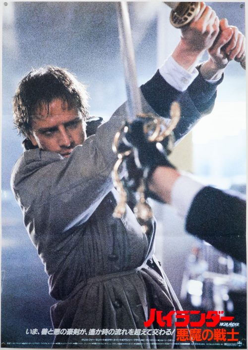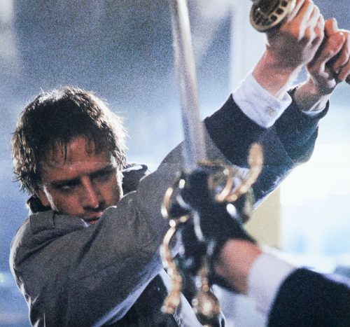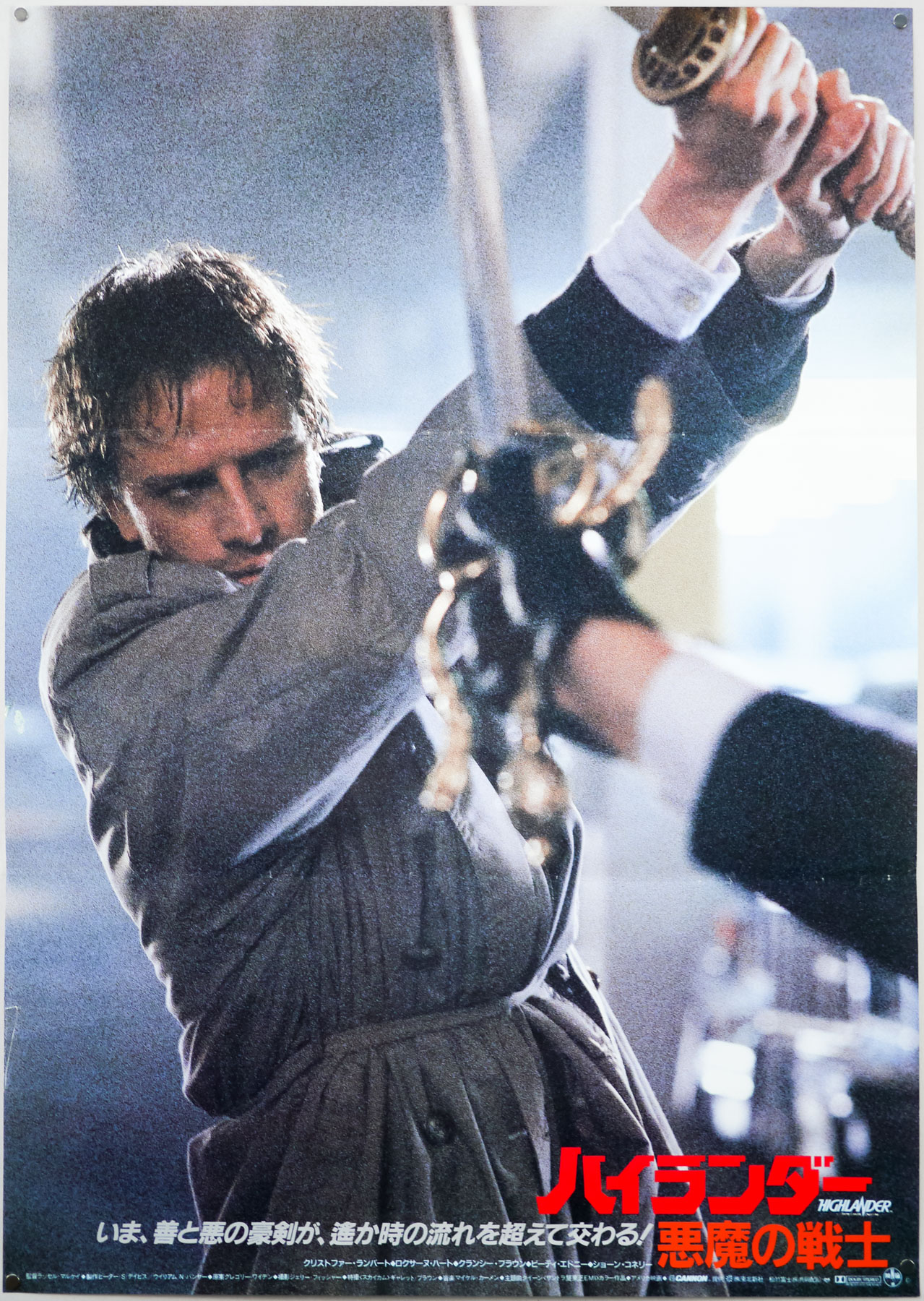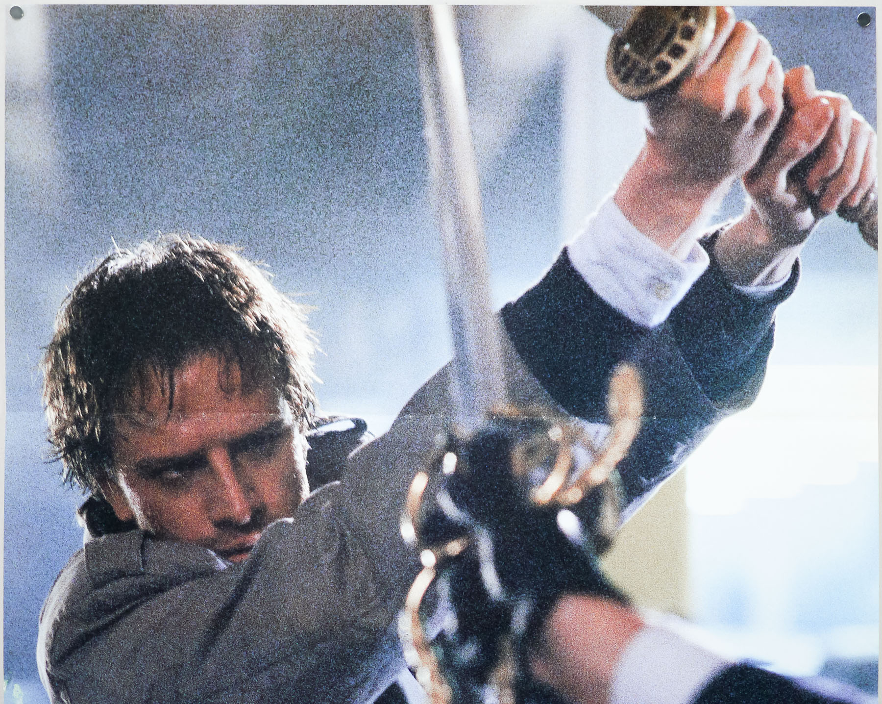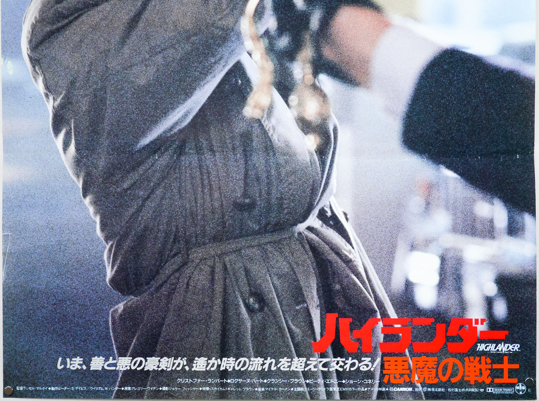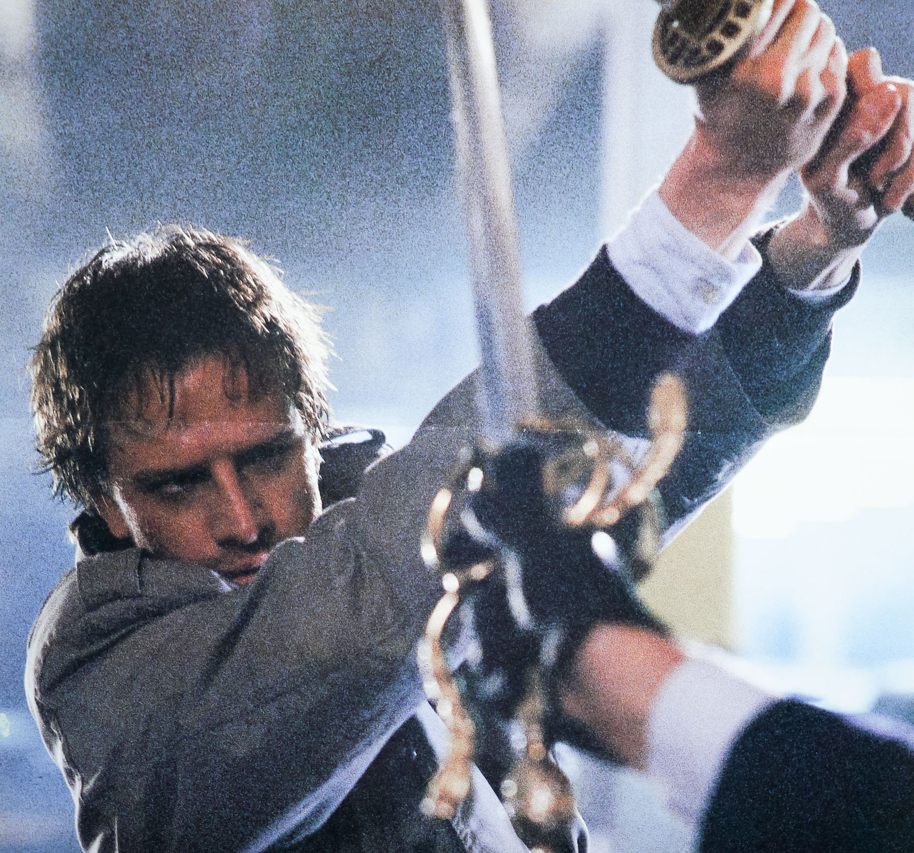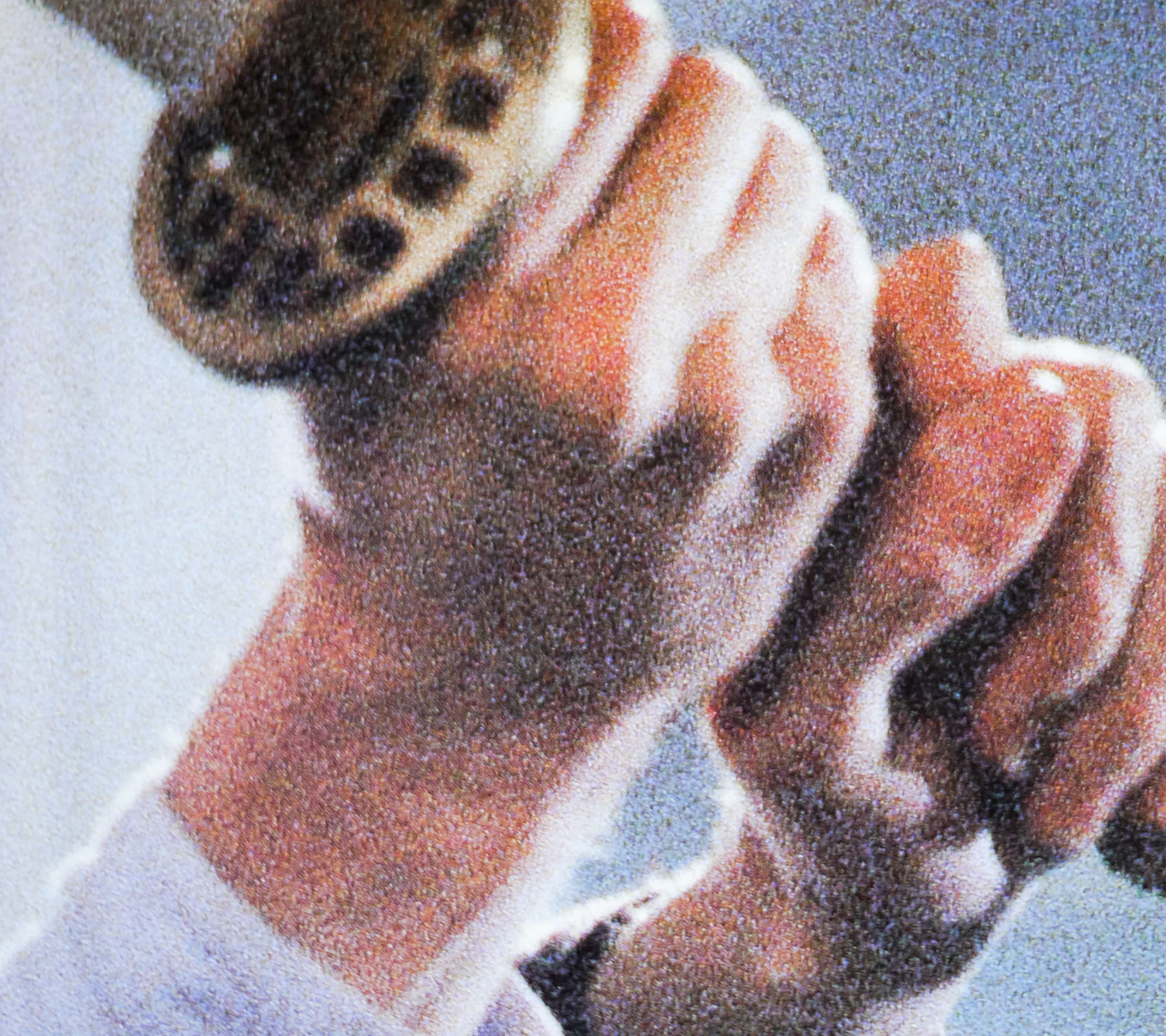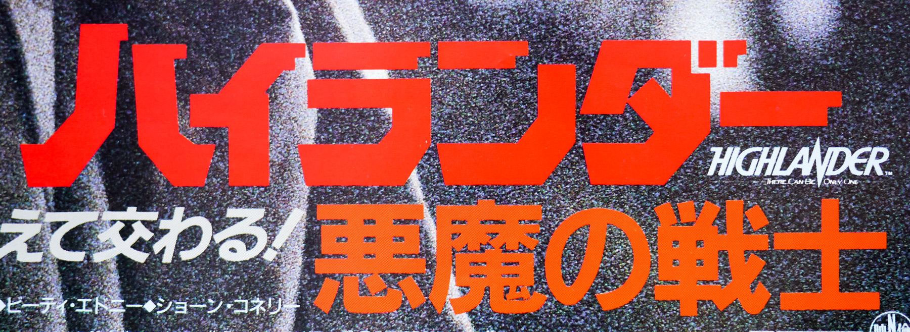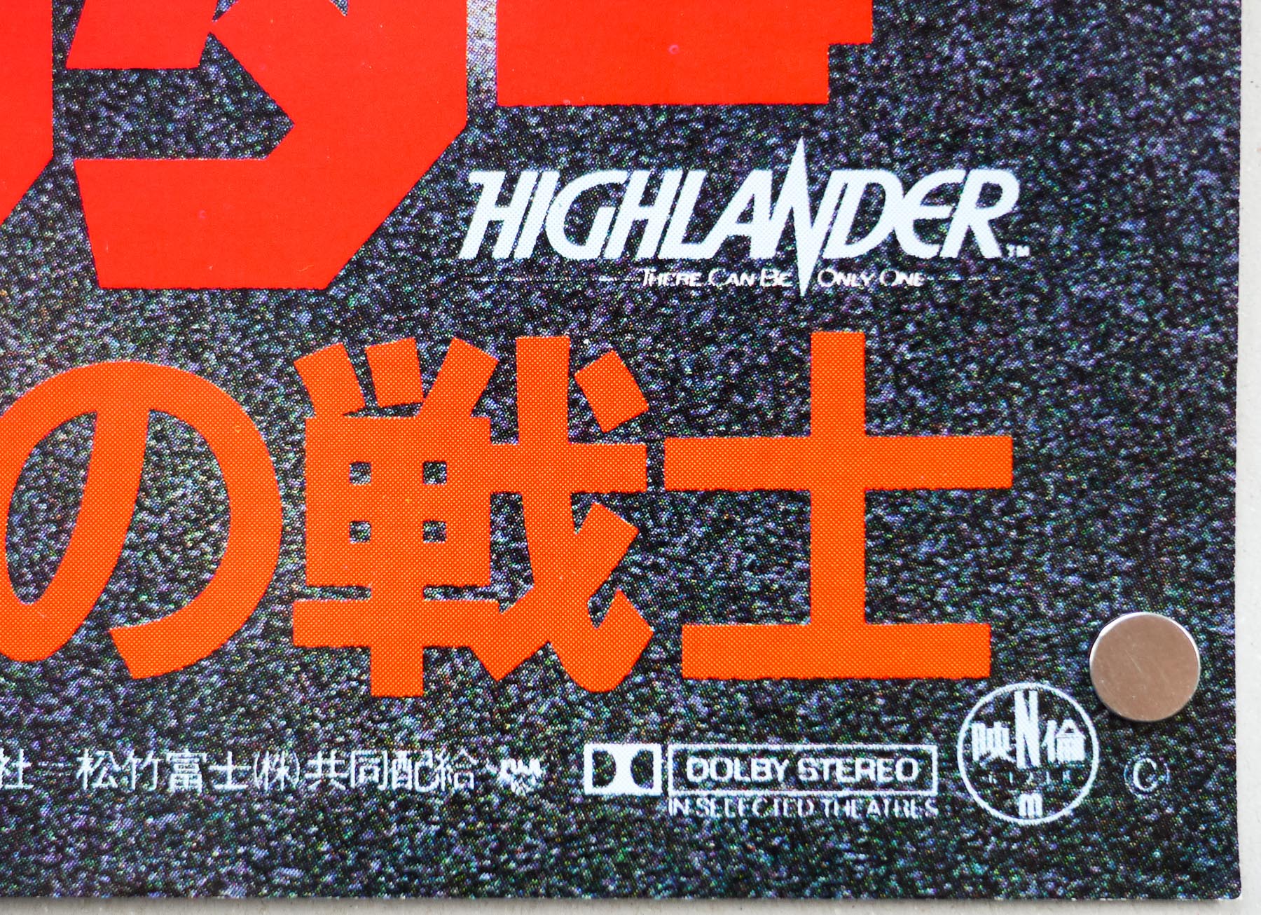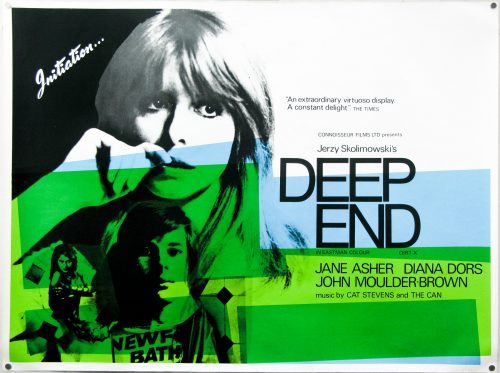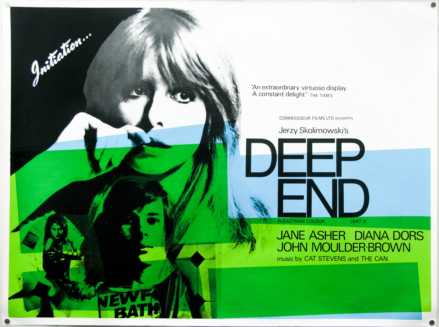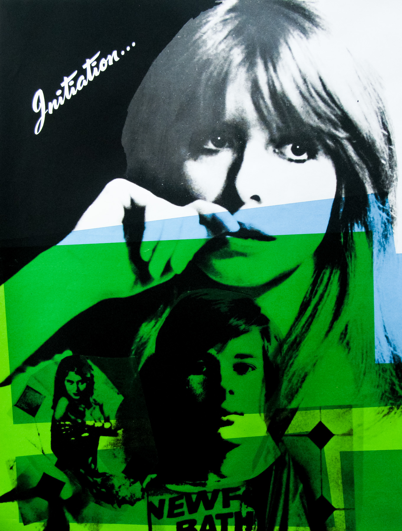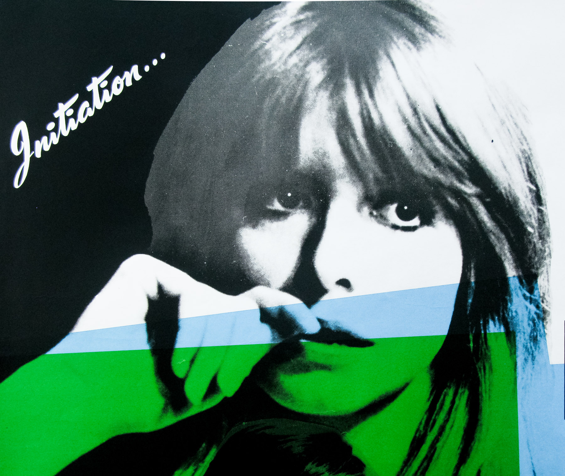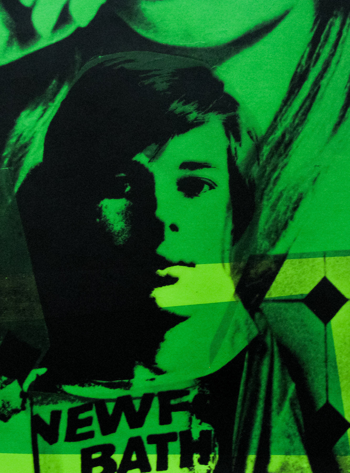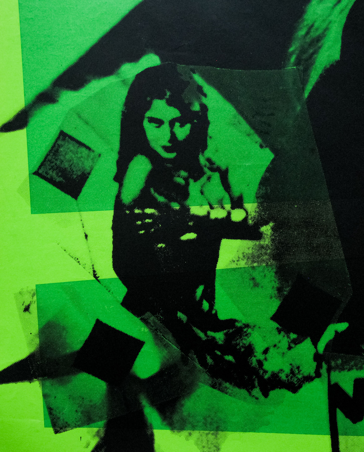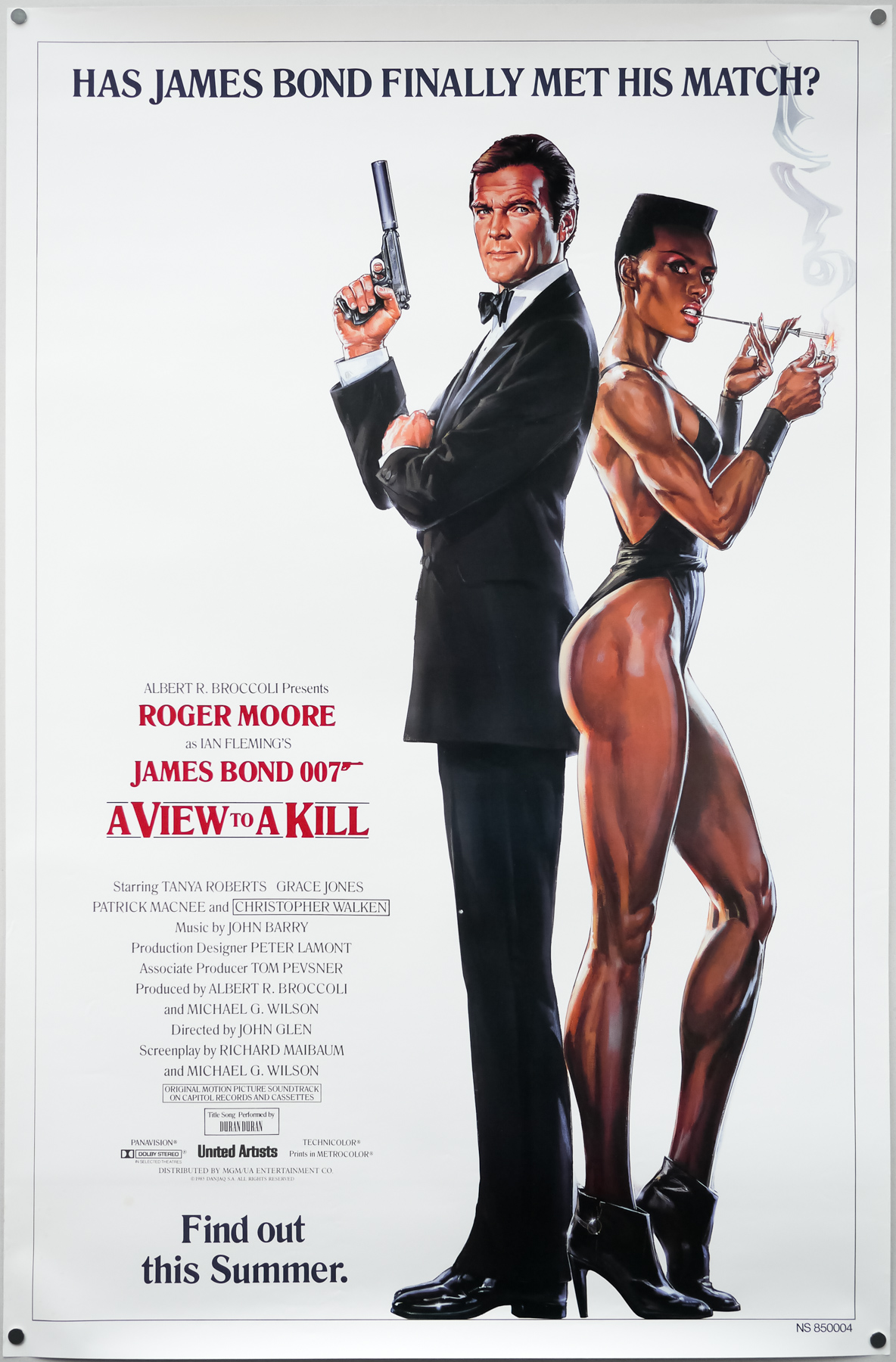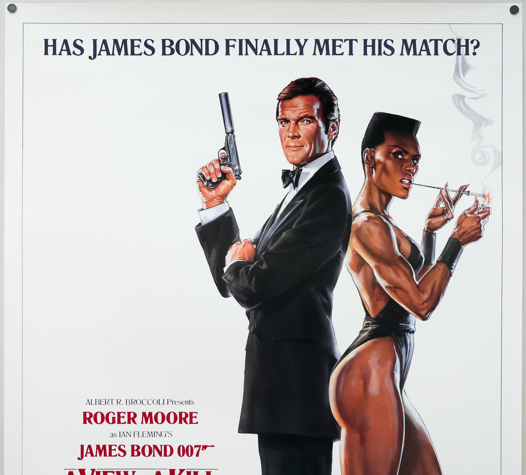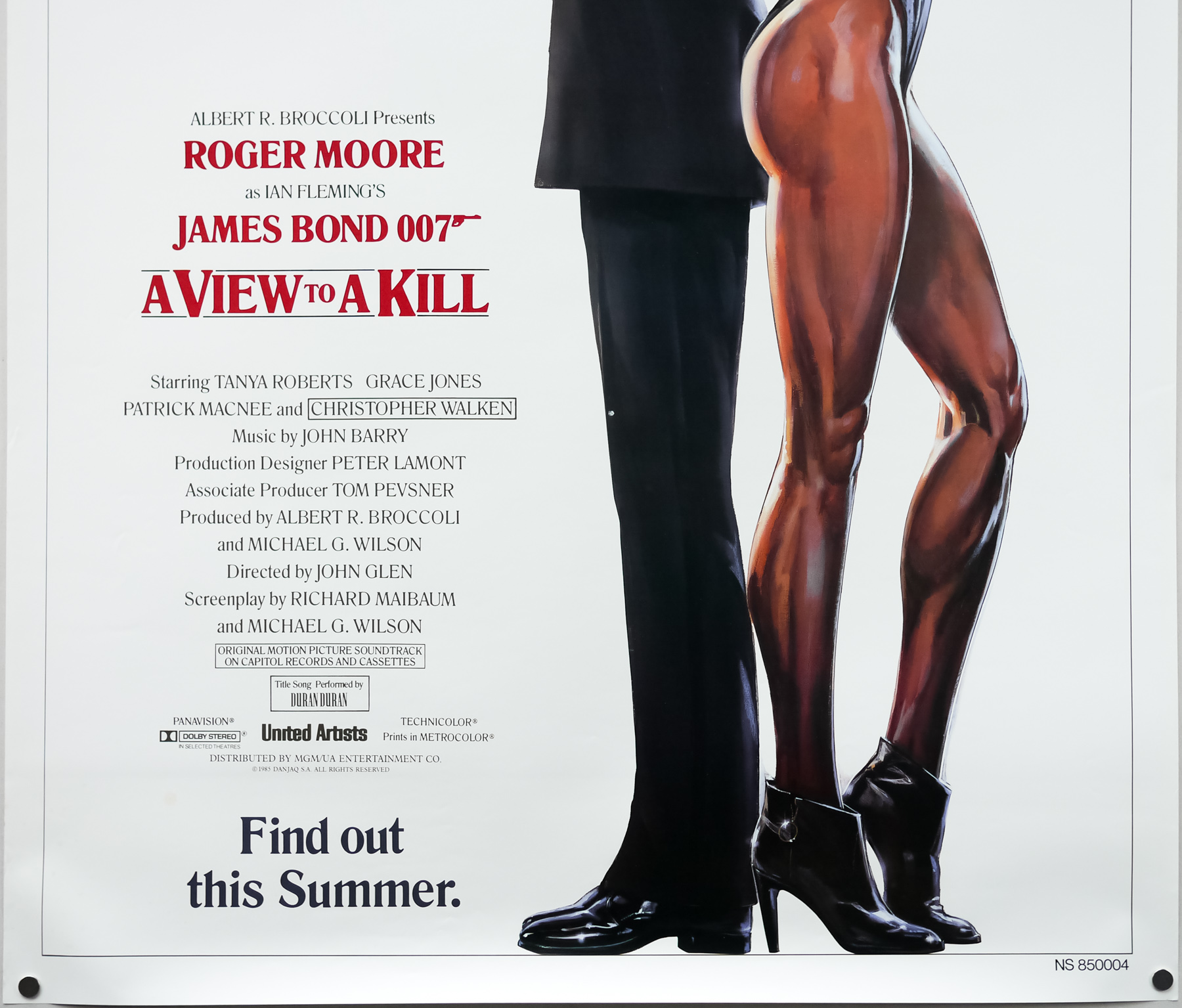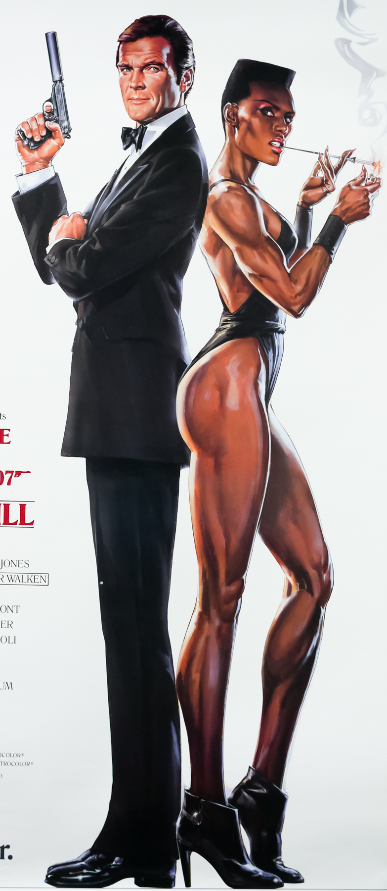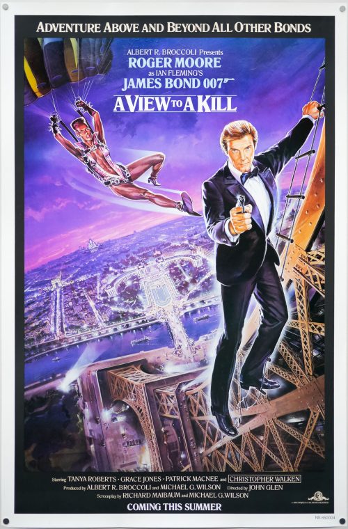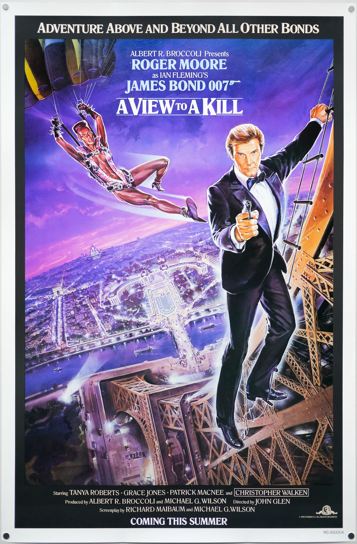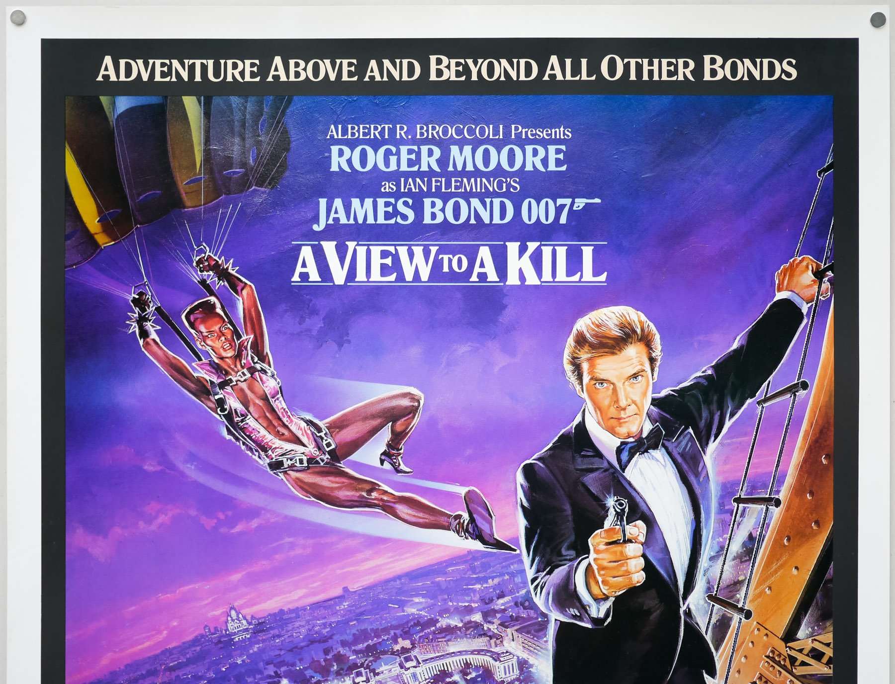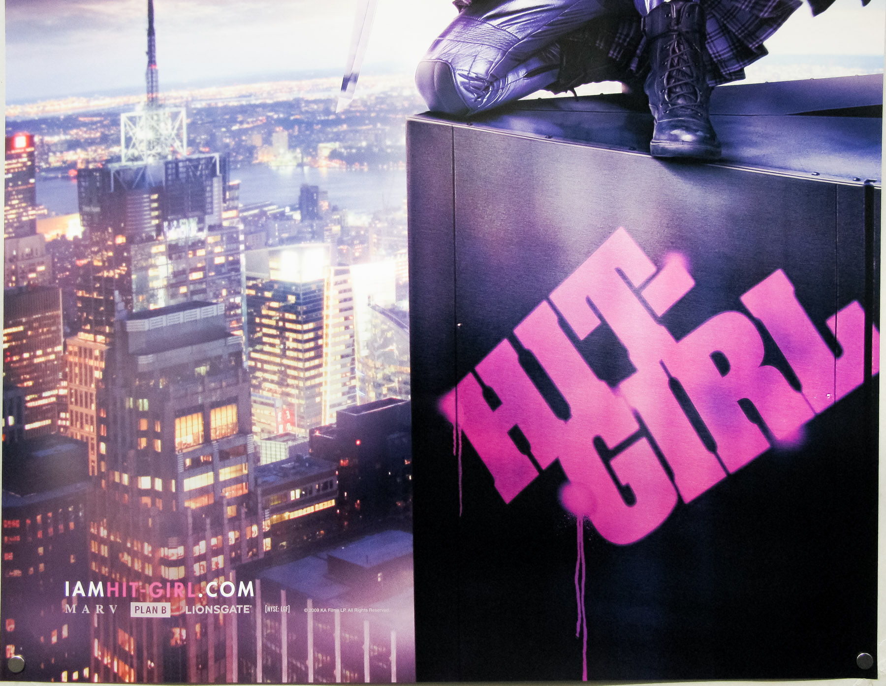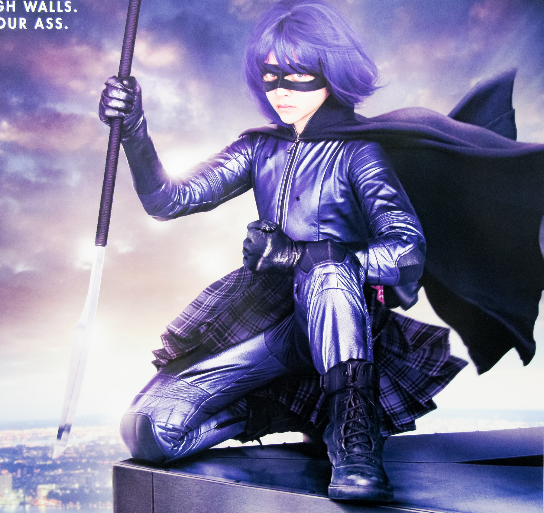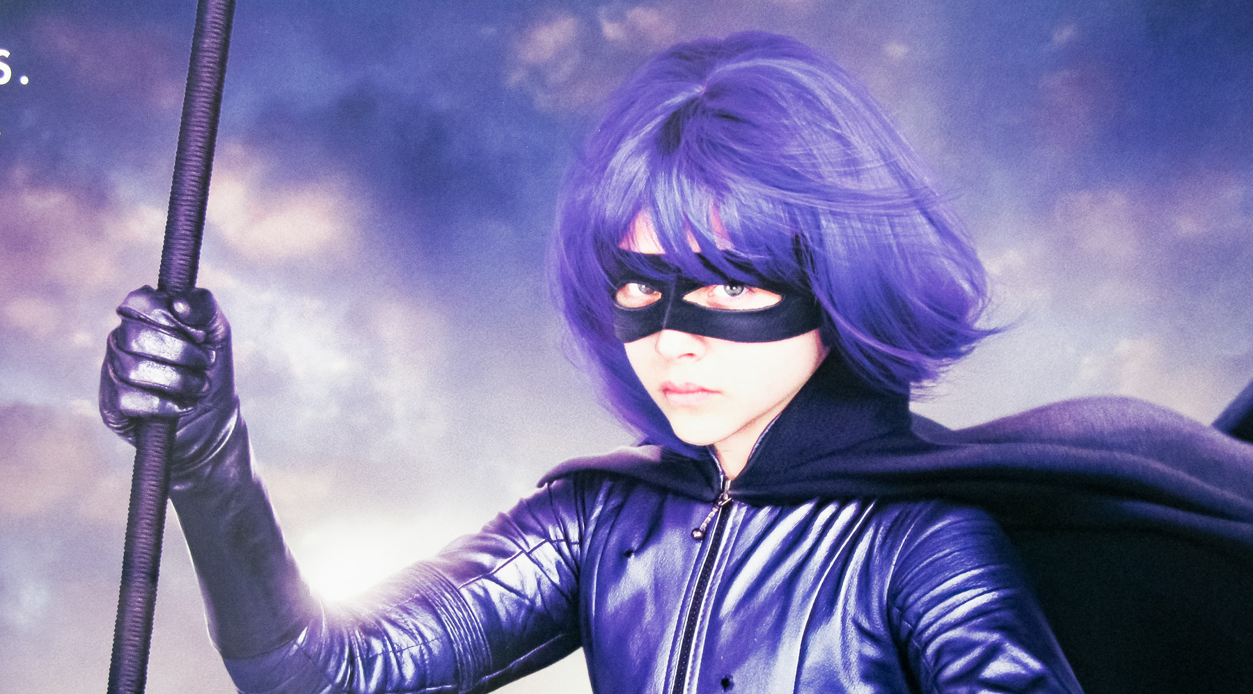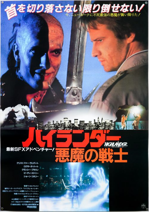

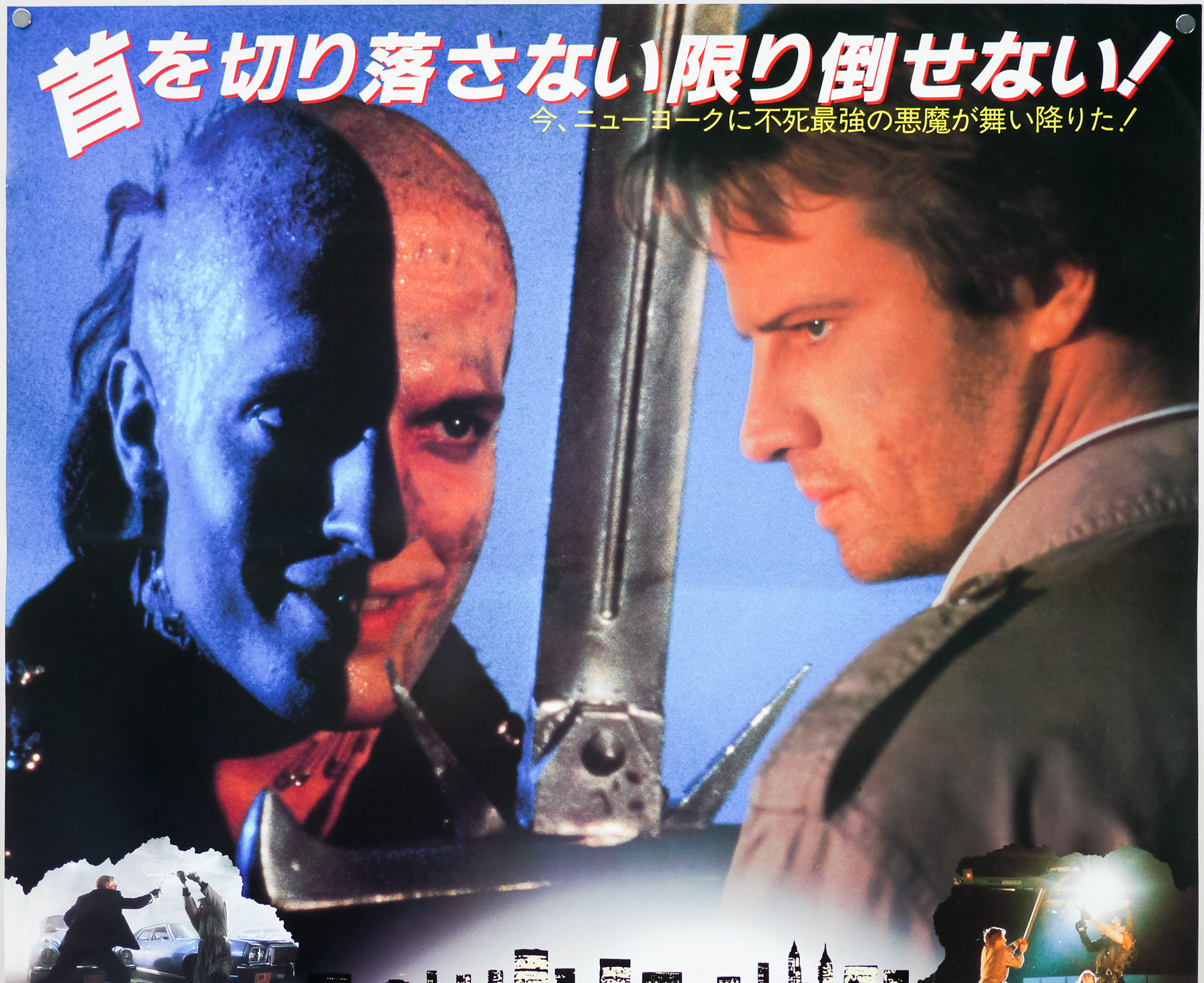
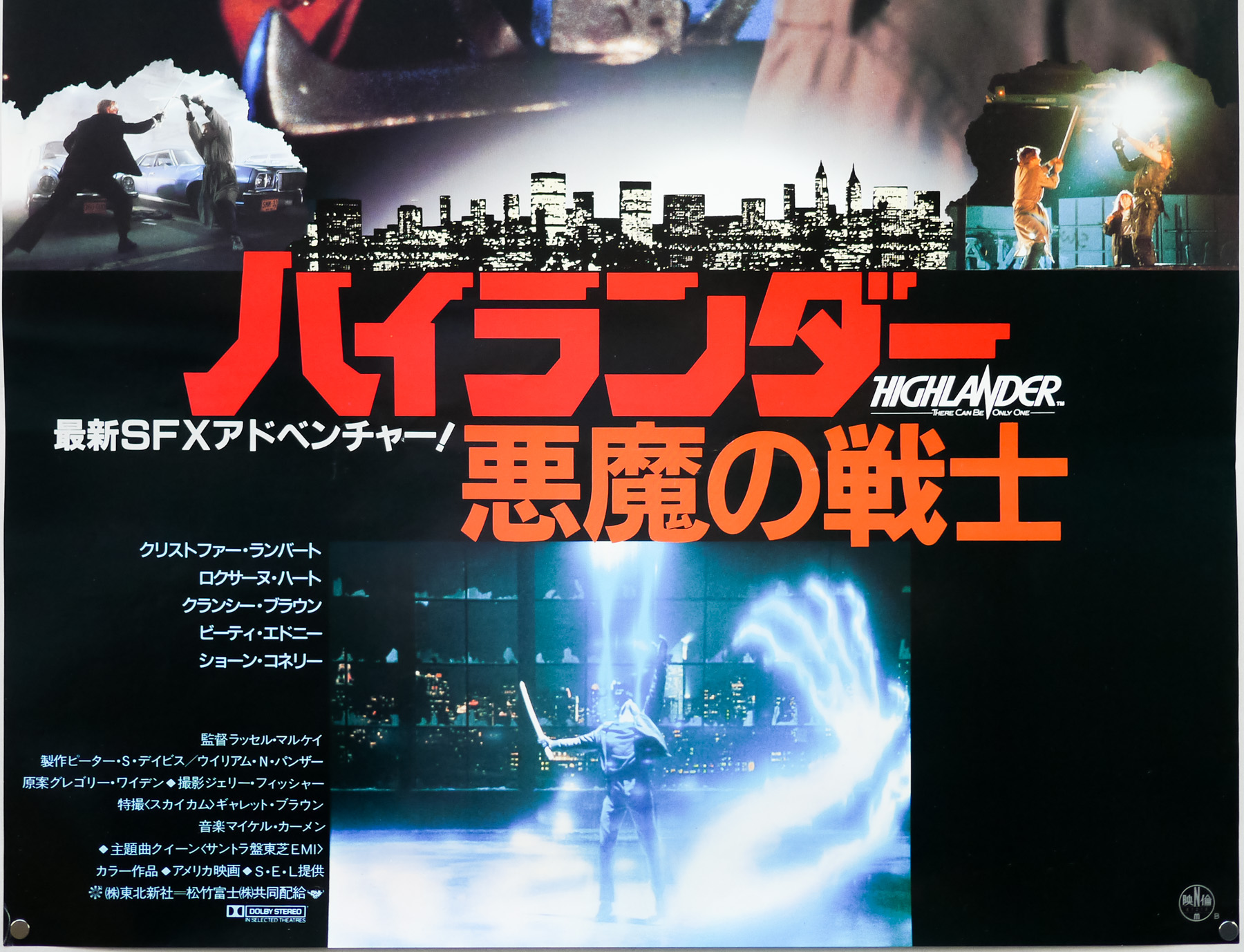
Poster detail
1-5


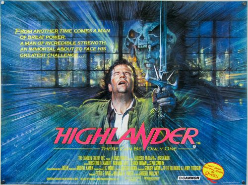
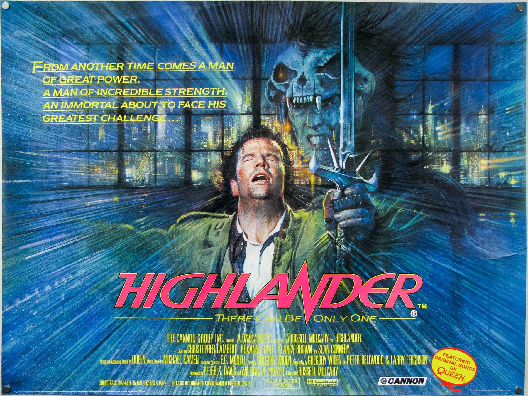
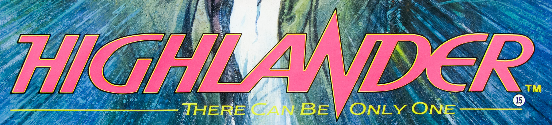
- Title
- Highlander
- AKA
- --
- Year of Film
- 1986
- Director
- Russell Mulcahy
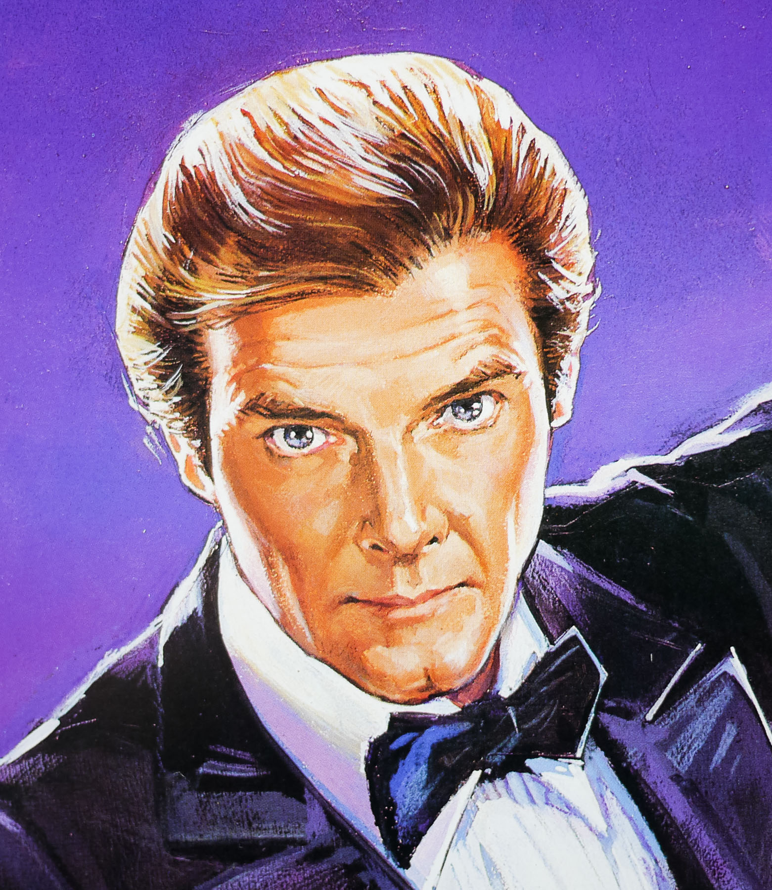
- Starring
- Christopher Lambert, Roxanne Hart, Clancy Brown, Sean Connery, Beatie Edney, Alan North, Jon Polito, Sheila Gish, Hugh Quarshie, Christopher Malcolm
- Origin of Film
- USA | UK
- Genre(s) of Film
- Christopher Lambert, Roxanne Hart, Clancy Brown, Sean Connery, Beatie Edney, Alan North, Jon Polito, Sheila Gish, Hugh Quarshie, Christopher Malcolm,
- Type of Poster
- B2
- Style of Poster
- Style B
- Origin of Poster
- Japan
- Year of Poster
- 1986
- Designer
- Unknown
- Artist
- --
- Size (inches)
- 20 6/16" x 28 14/16"
- SS or DS
- SS
- Tagline
- --
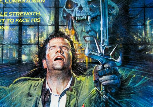
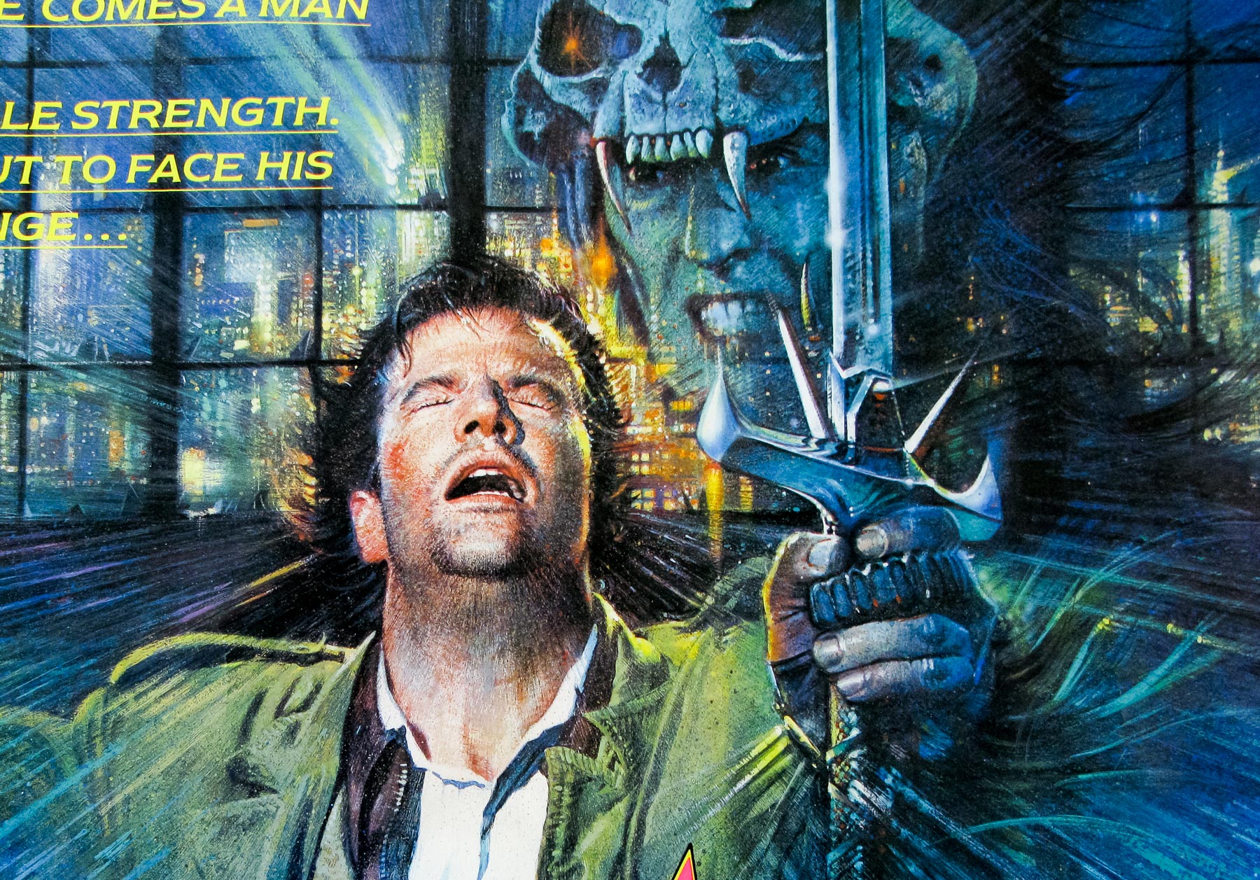
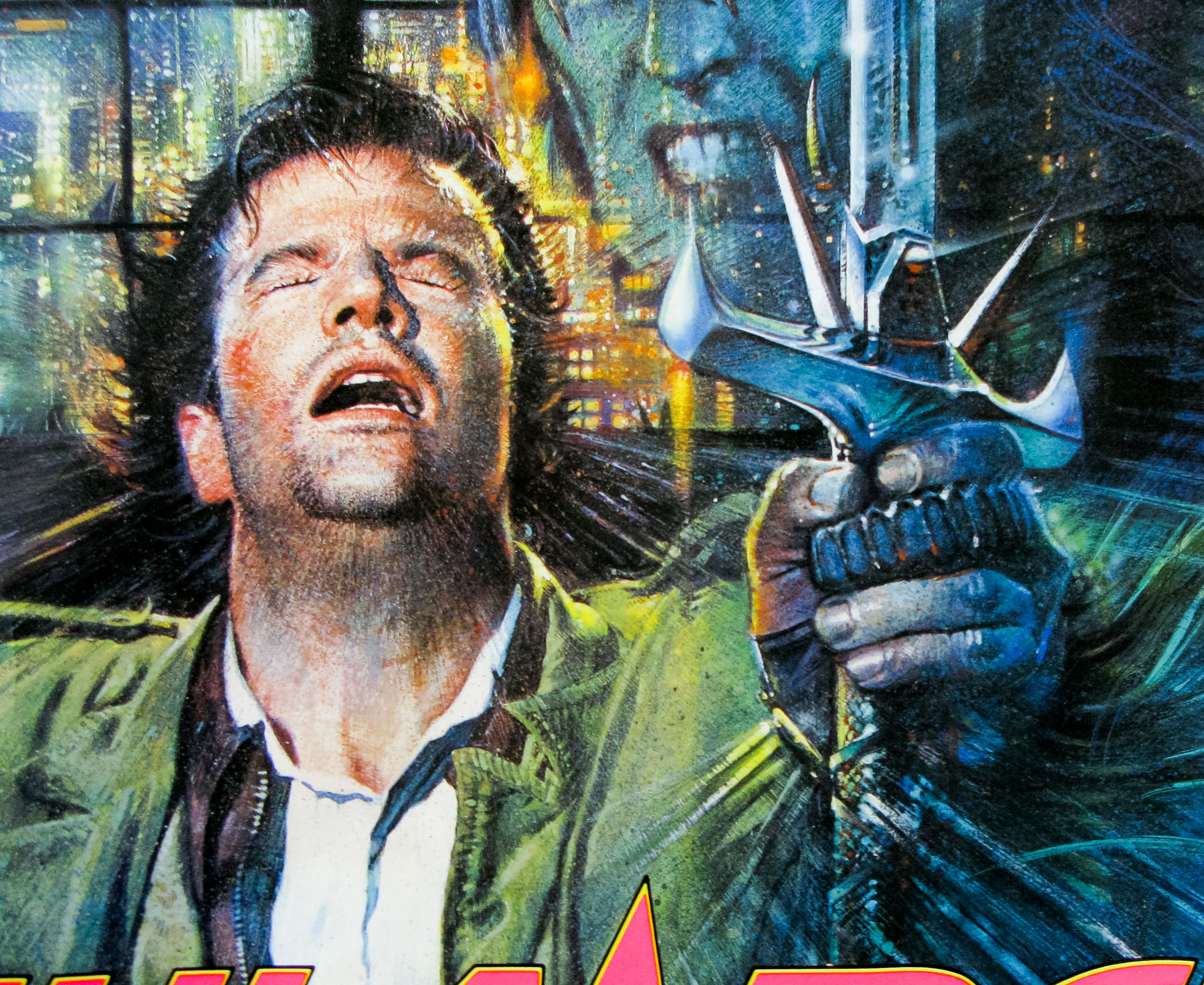
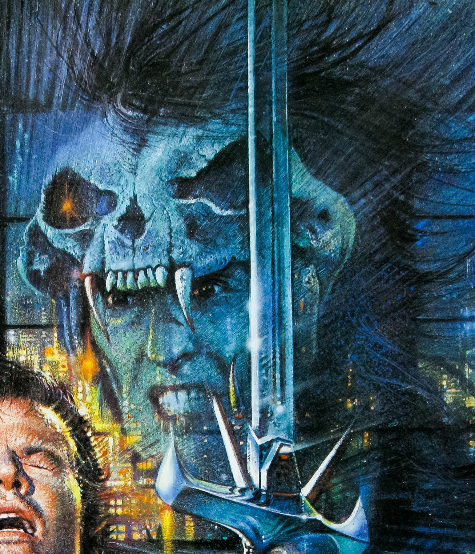
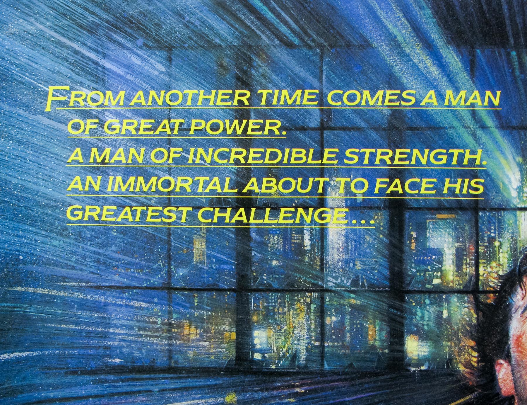
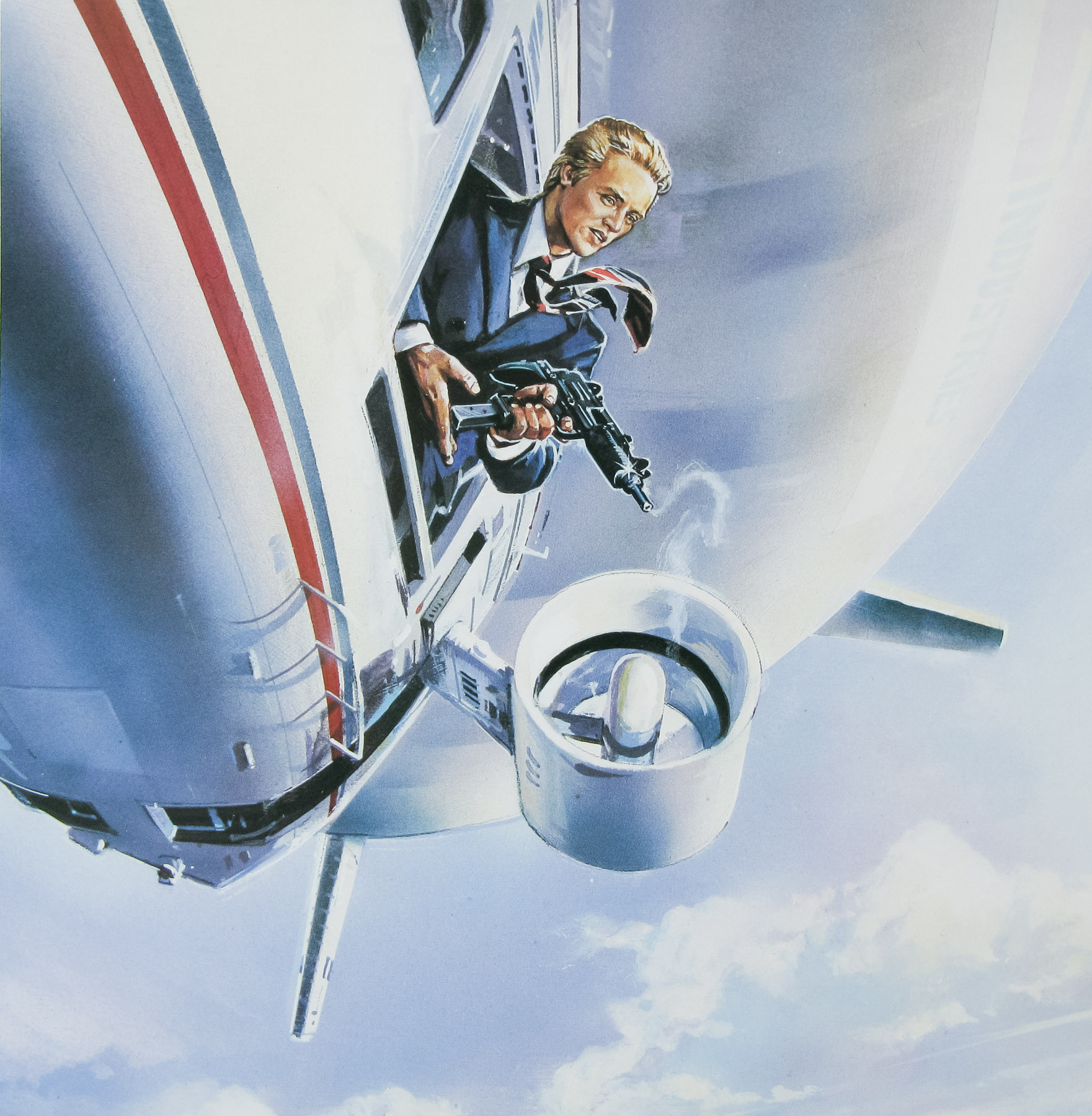
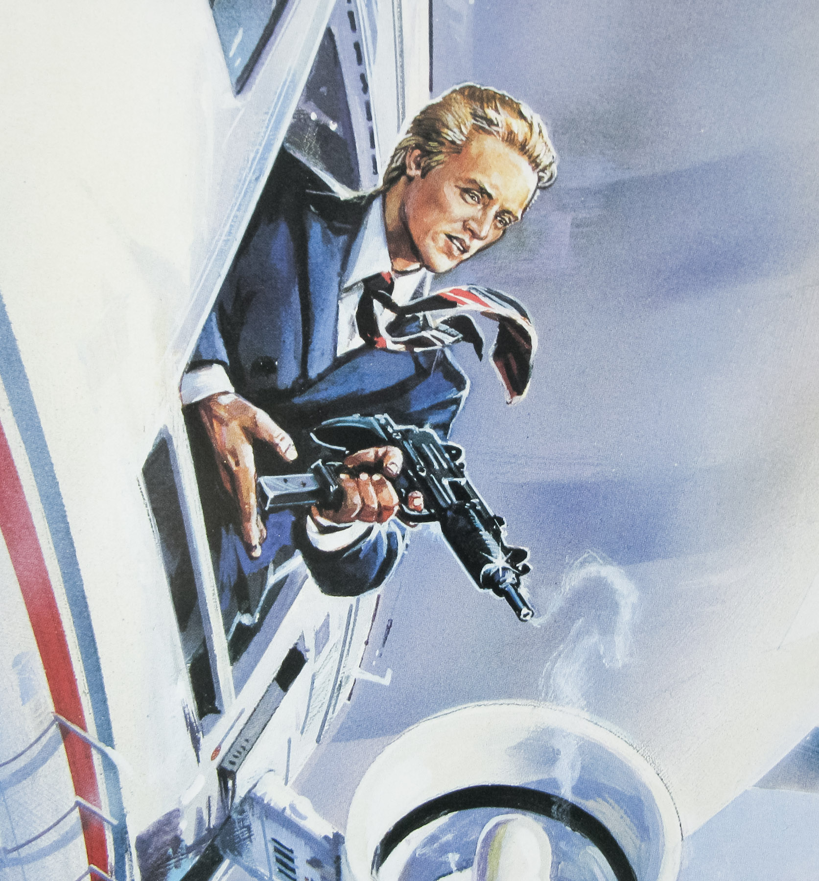
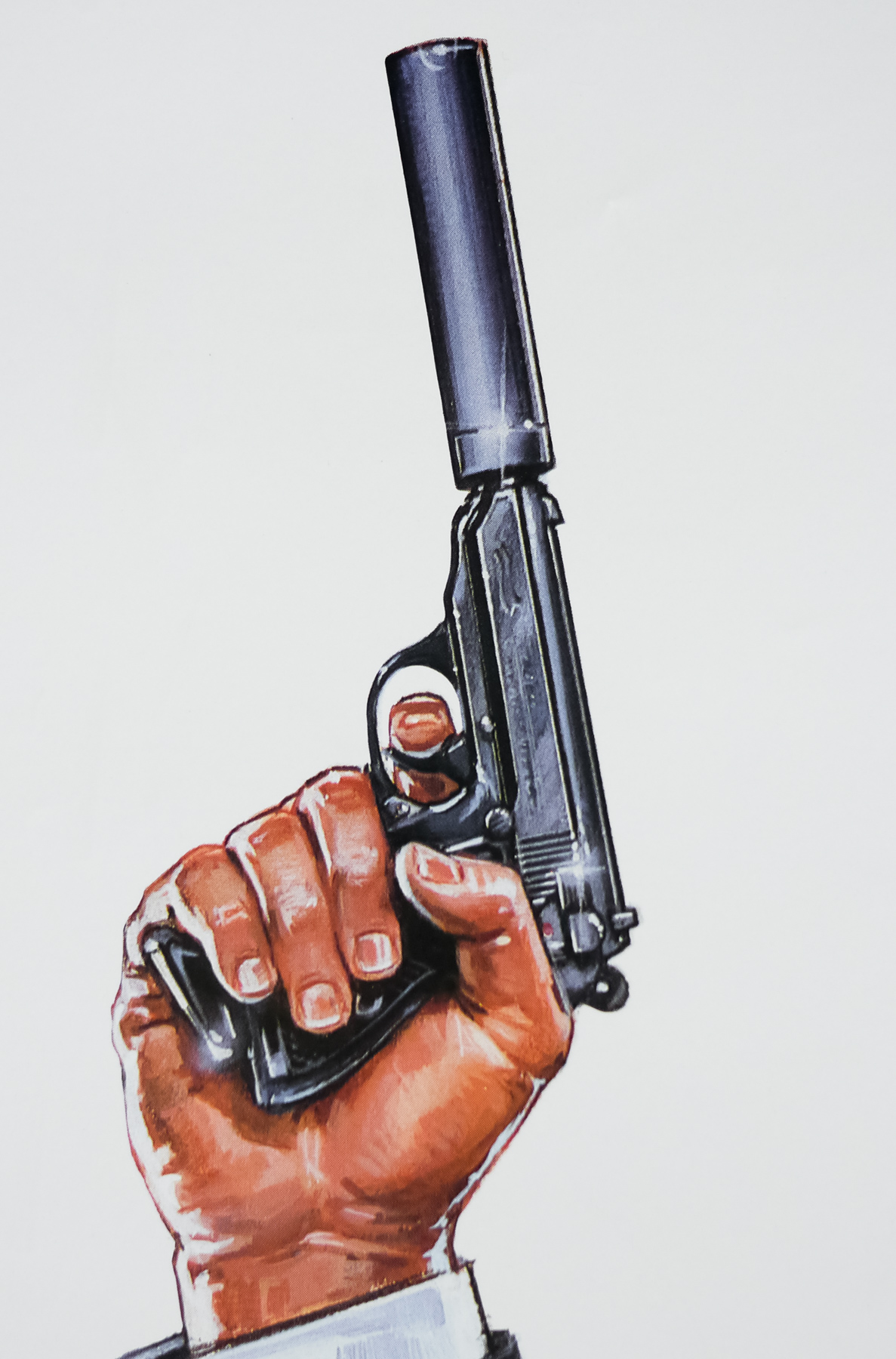
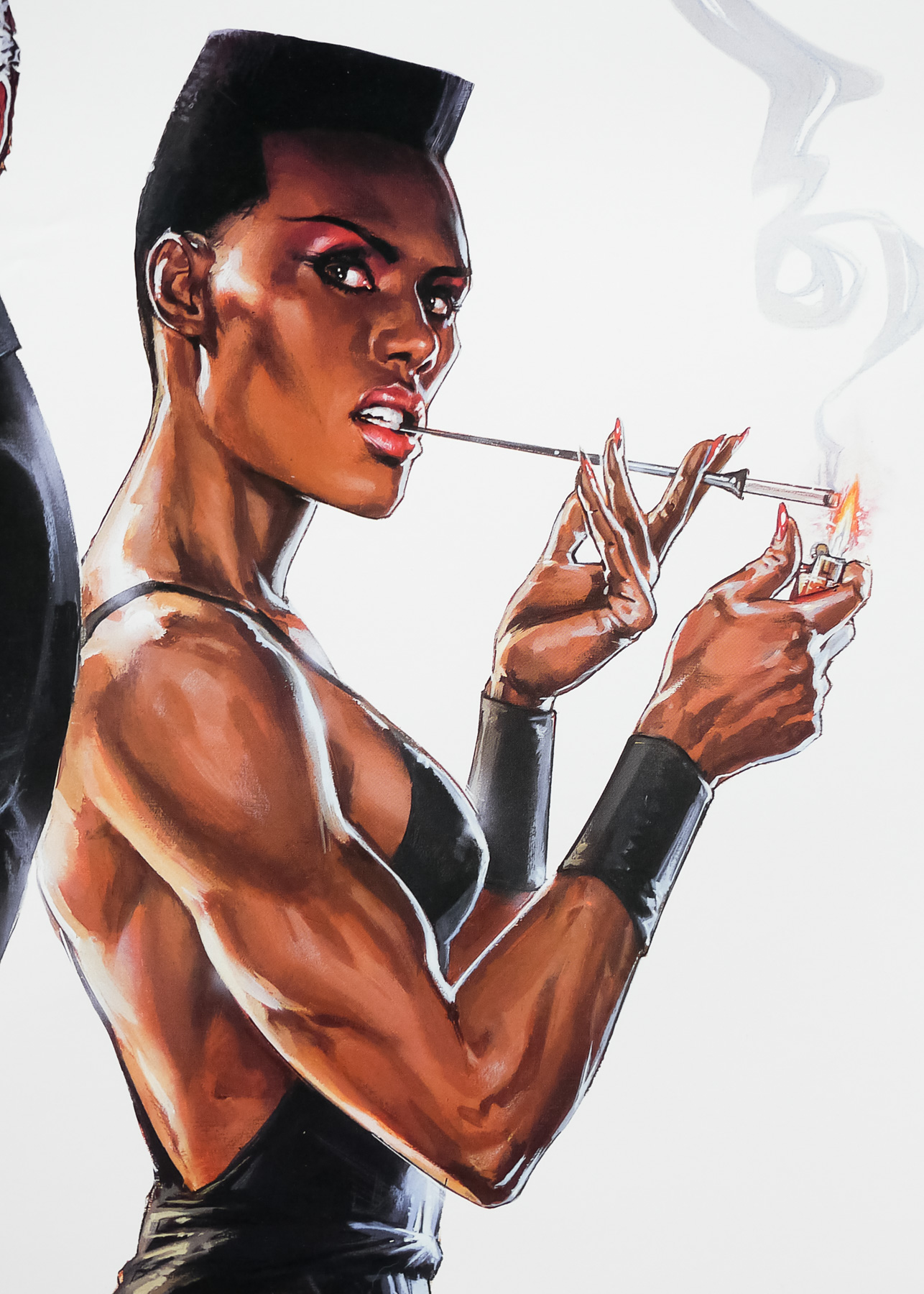
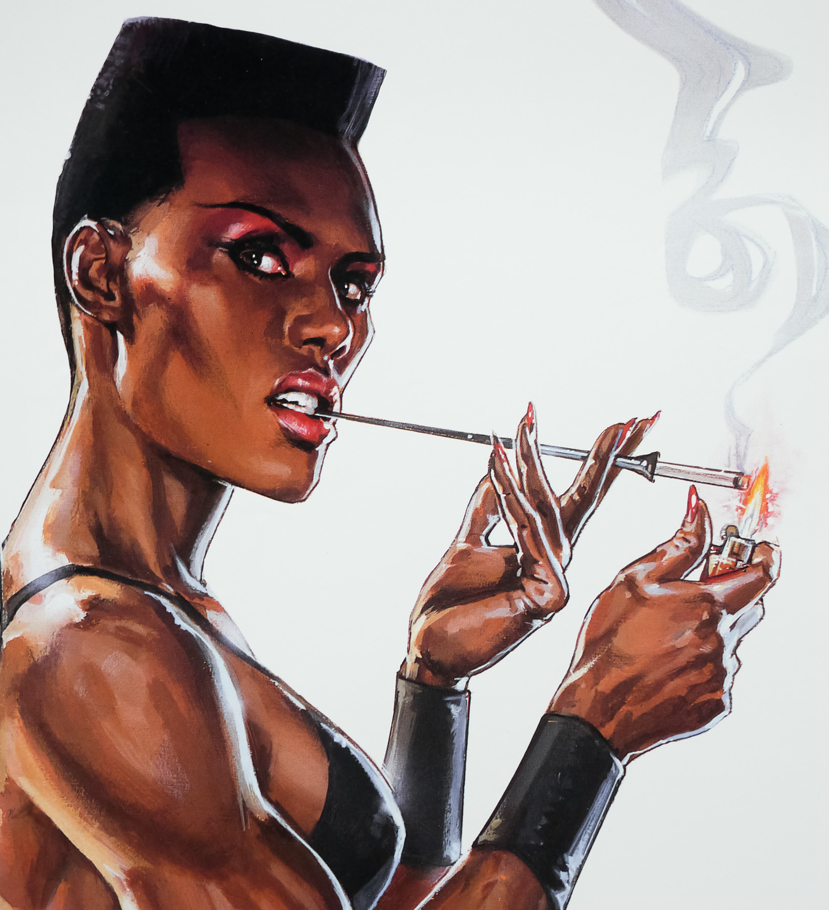
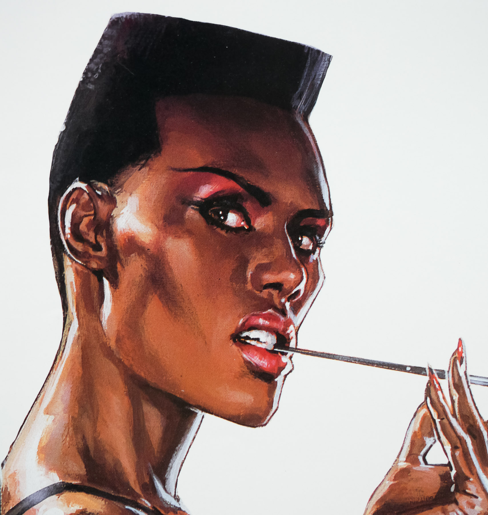
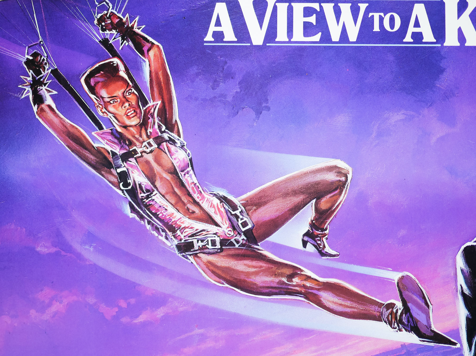
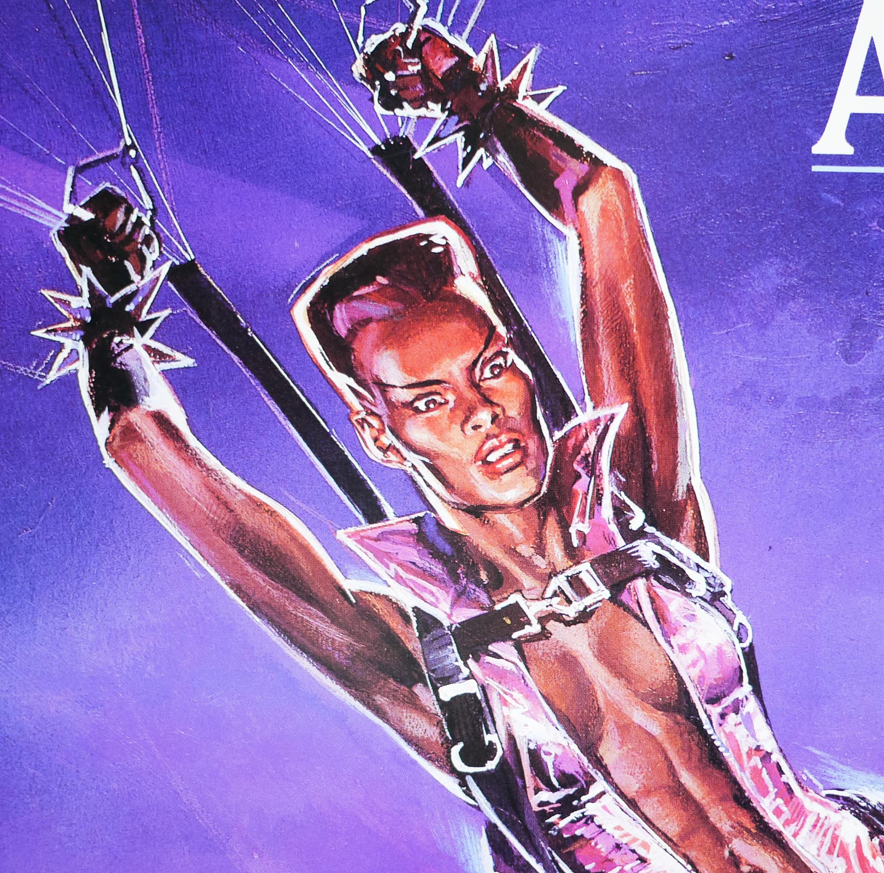
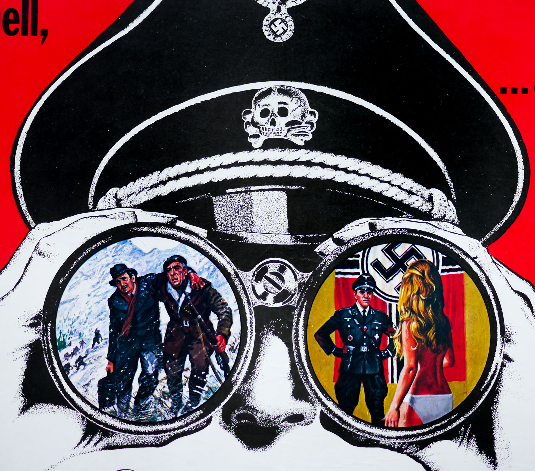
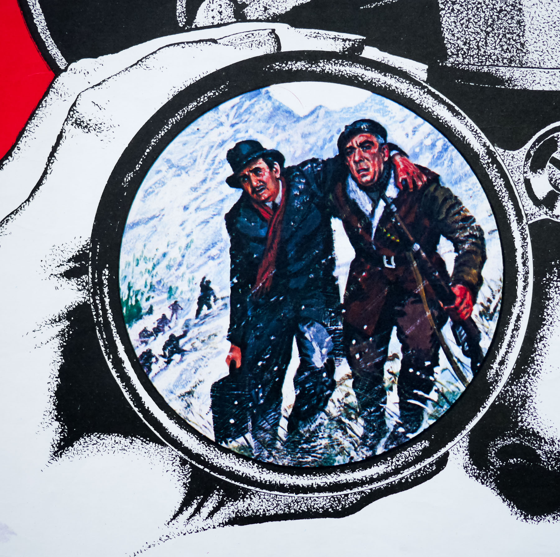
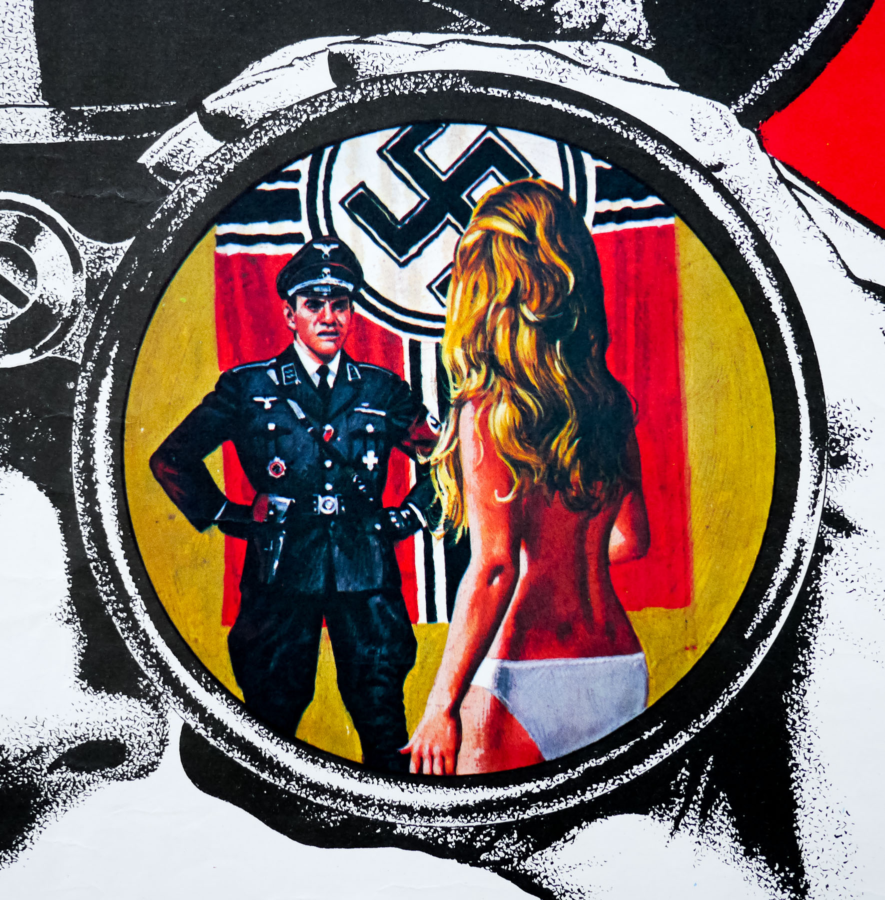
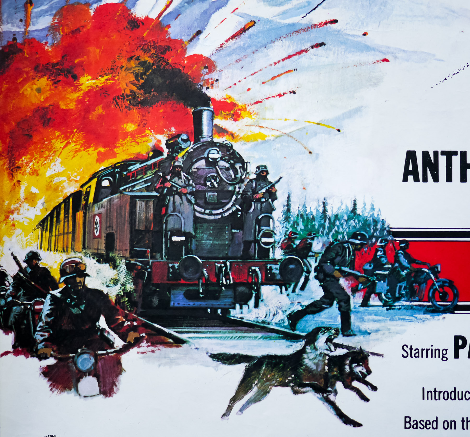
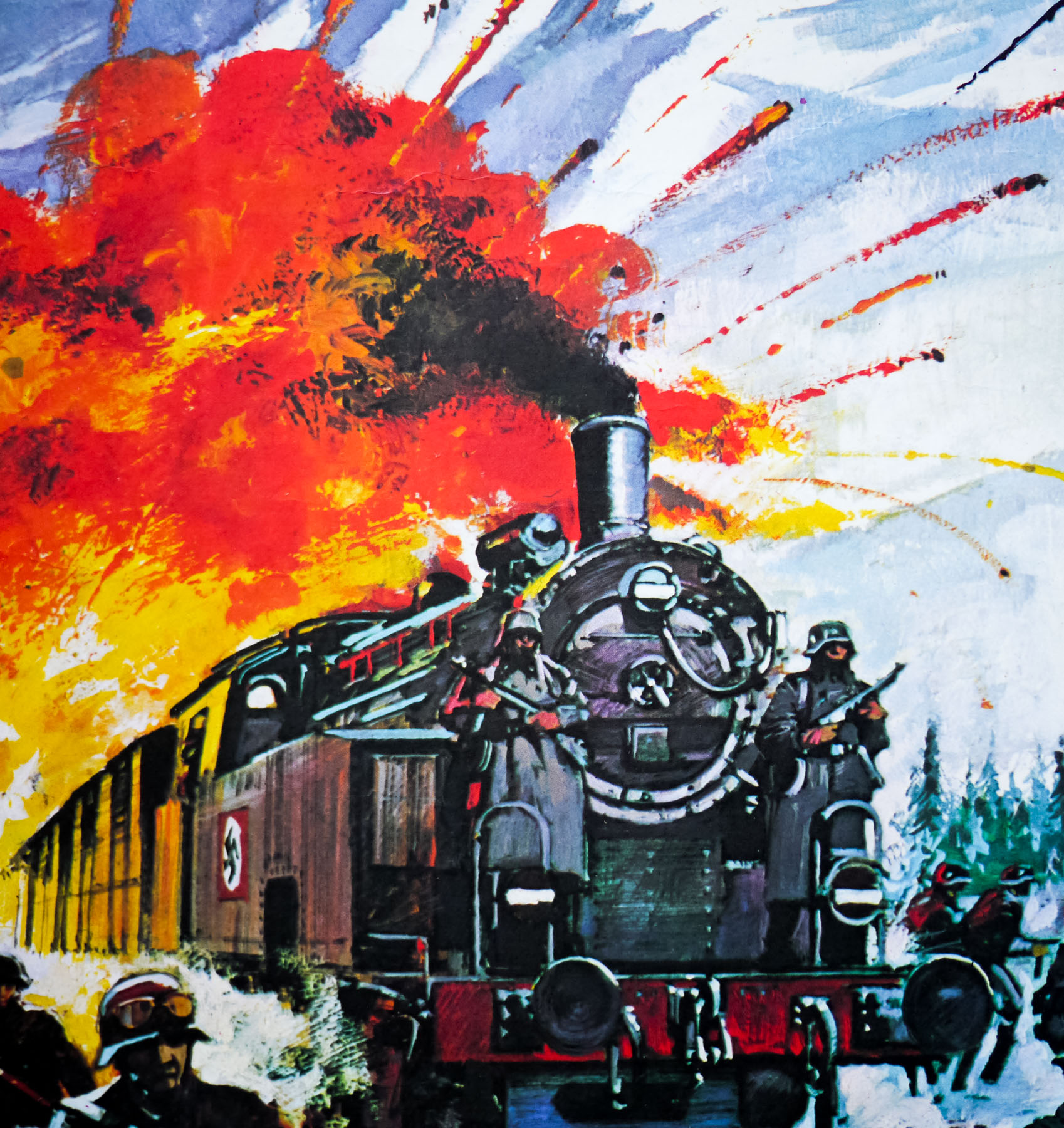
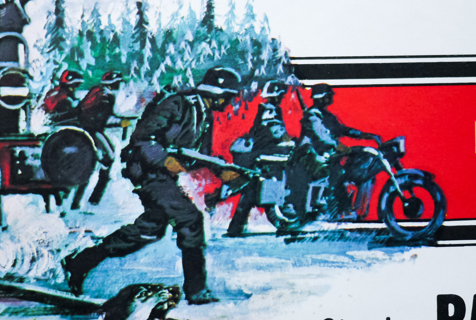
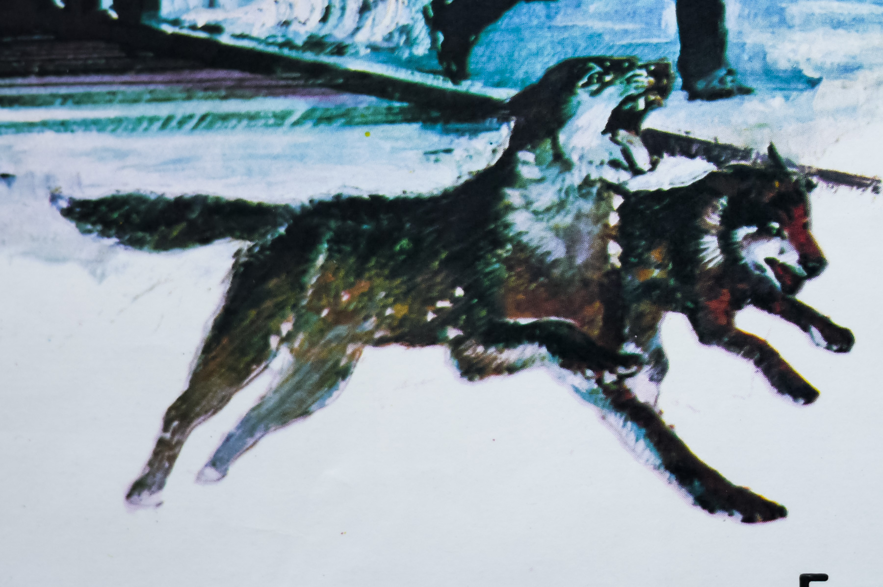
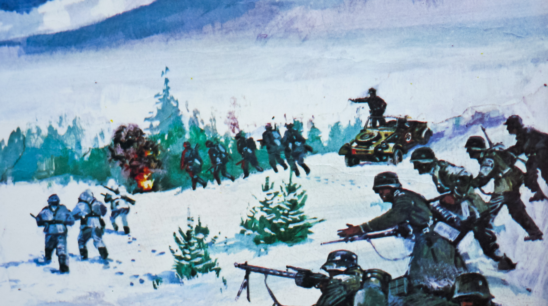
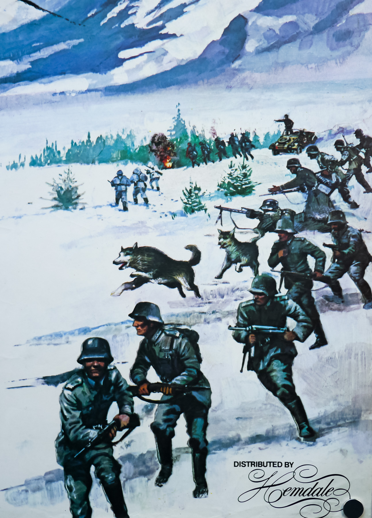
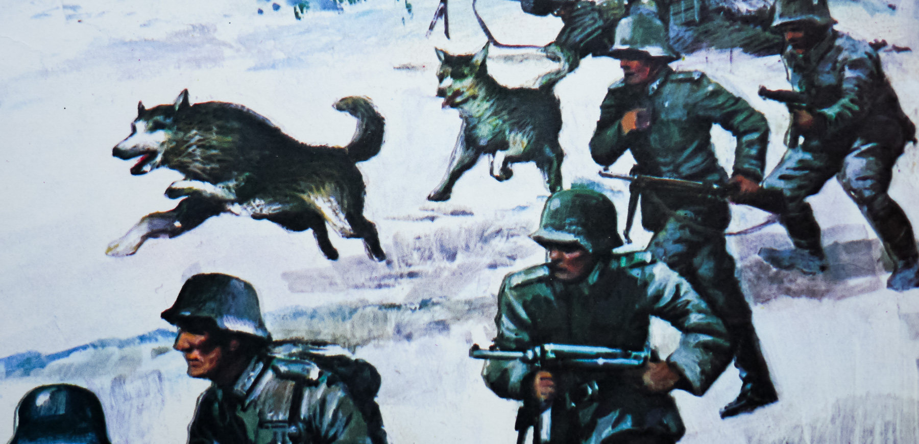
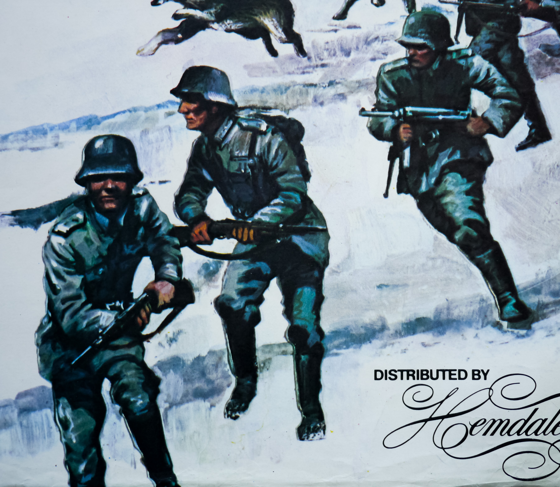
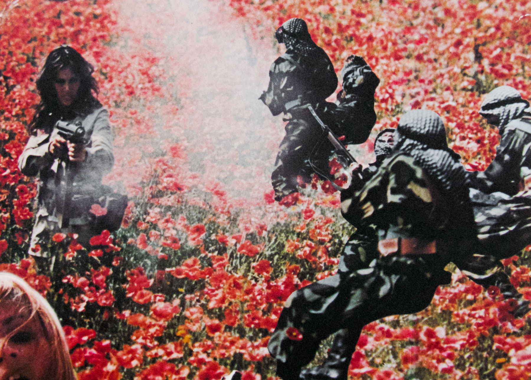
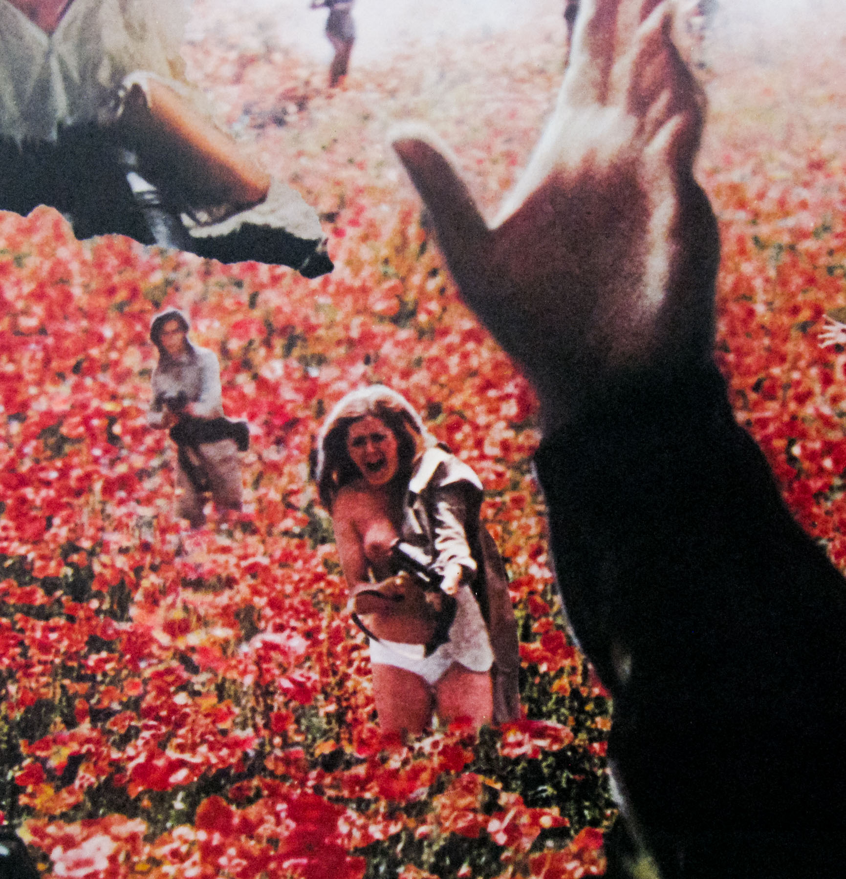
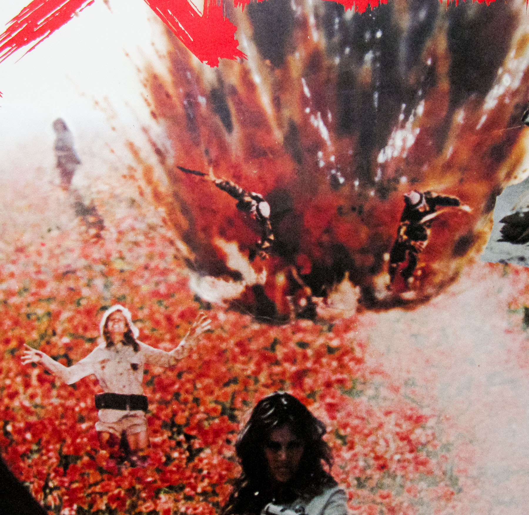
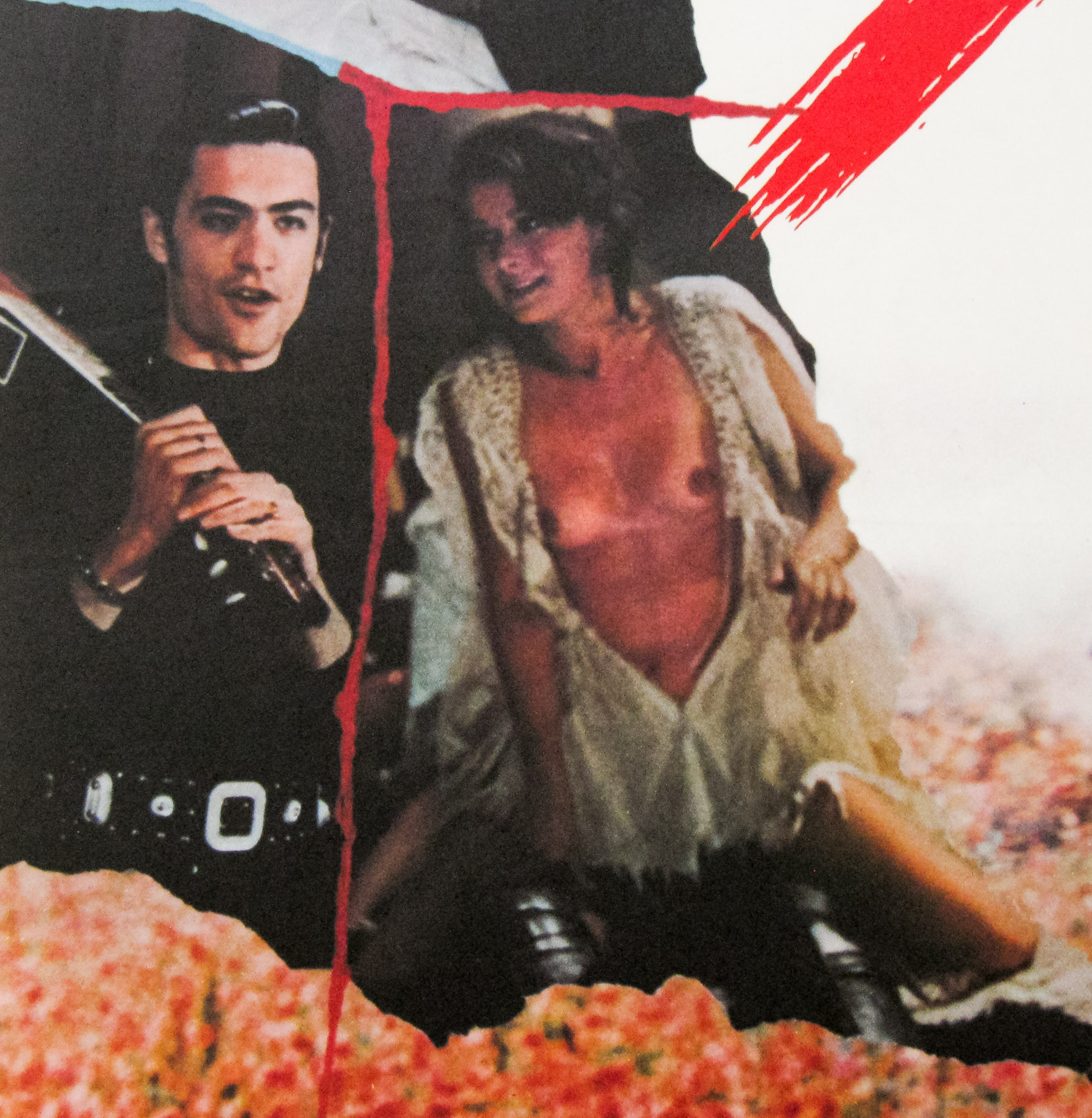
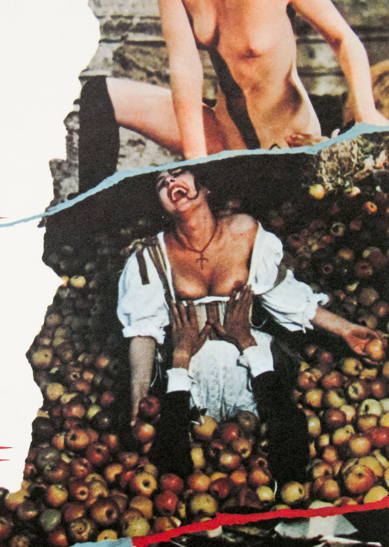
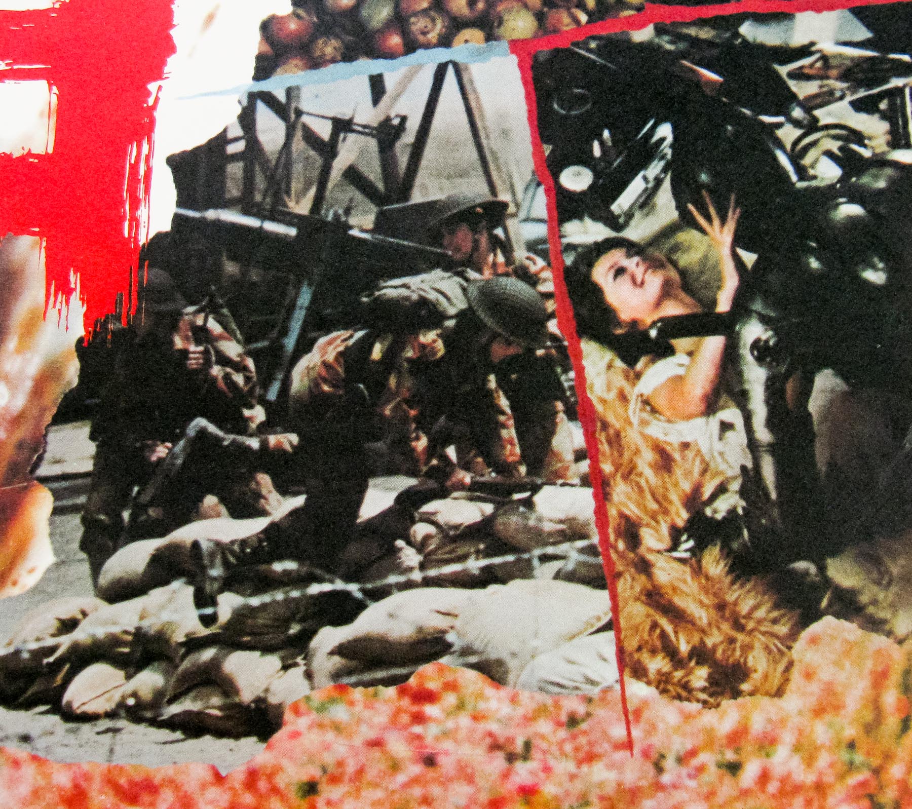
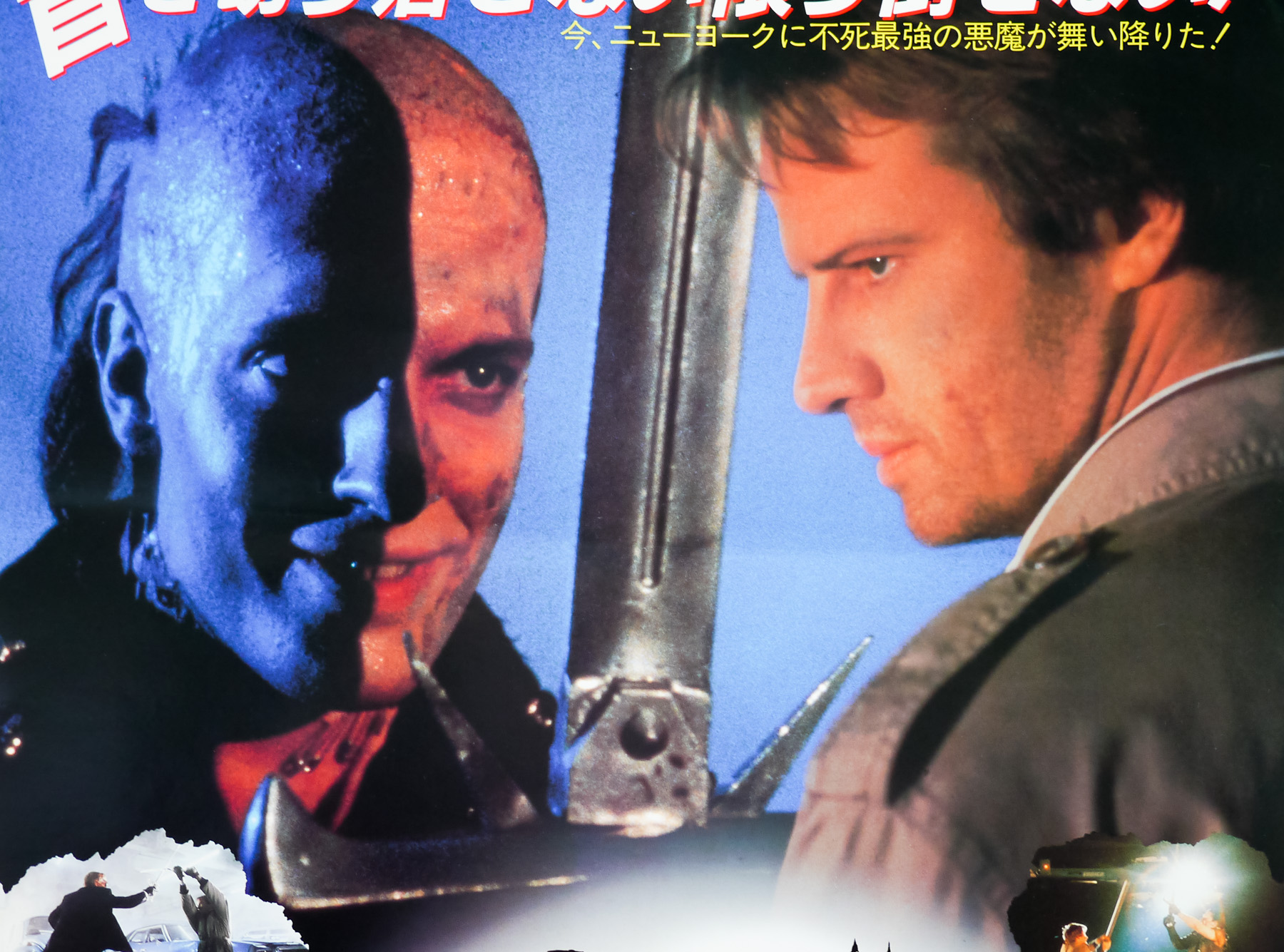
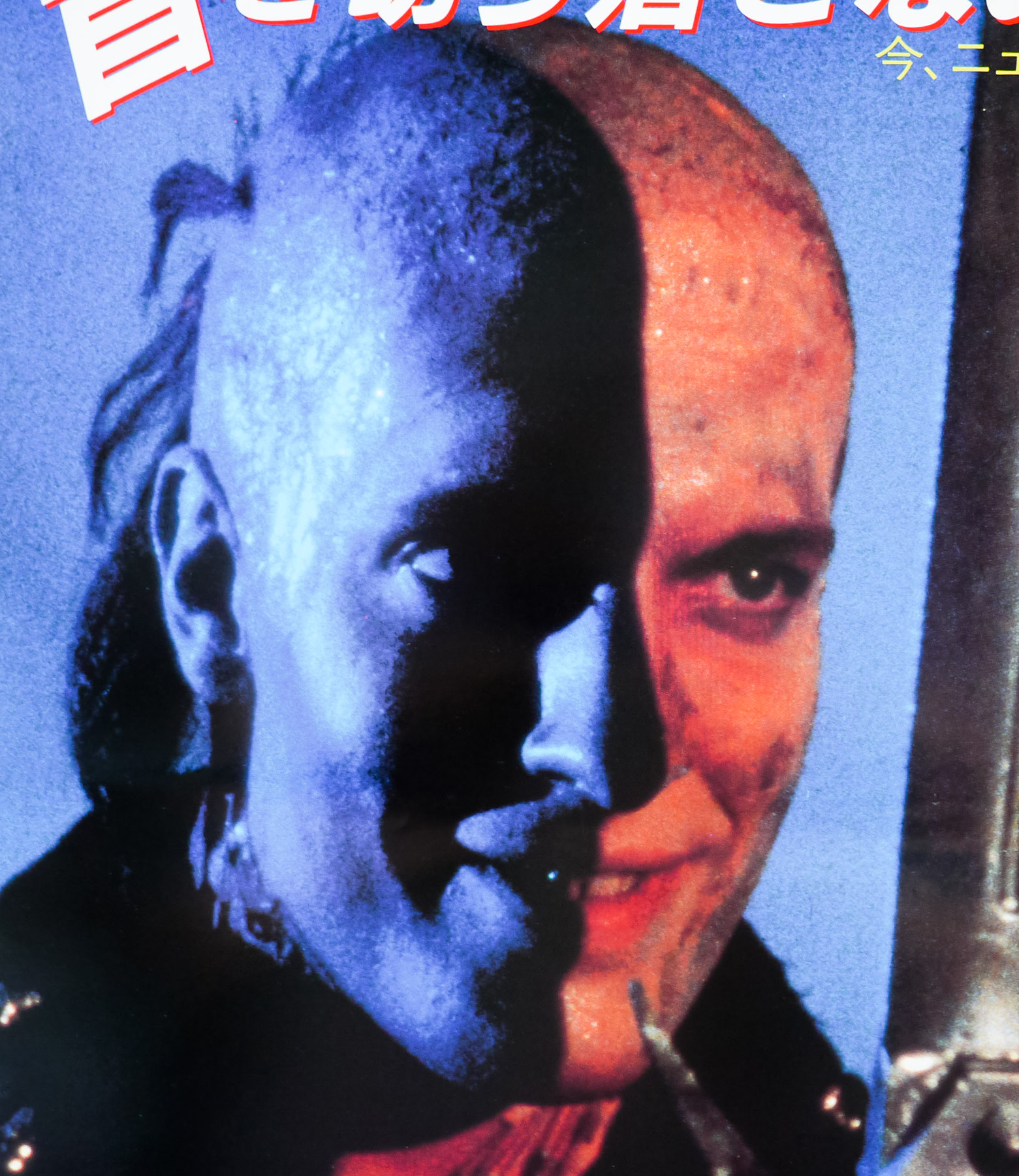
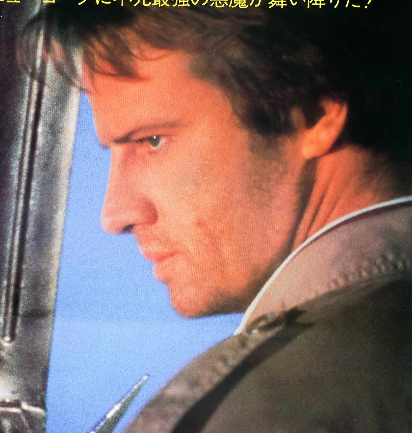
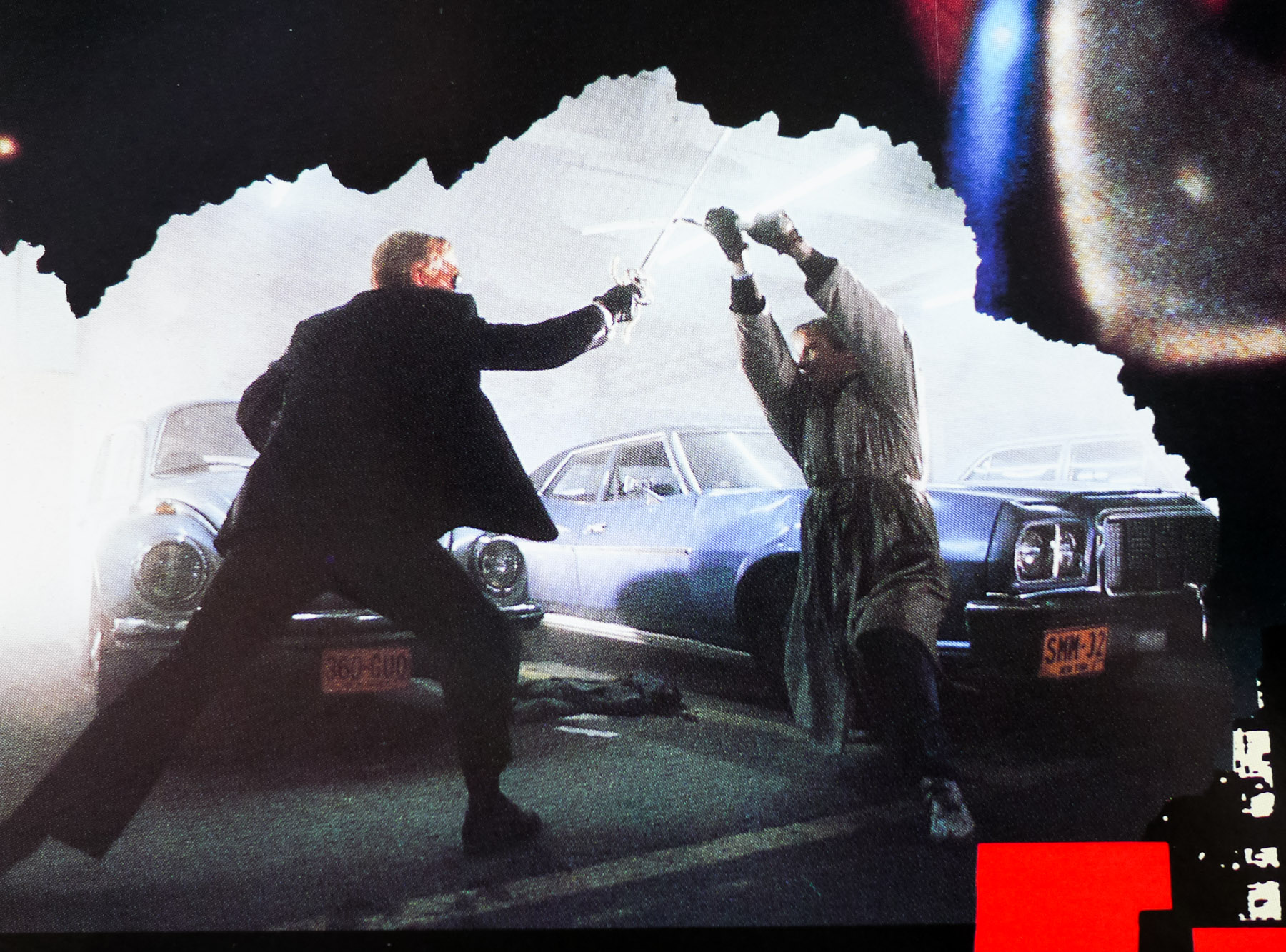
This is one of three B2 posters printed for the Japanese release of the cult fantasy Highlander. The film started life as a story by Gregory Widen which he penned whilst studying screenwriting at UCLA and it was sold to the film’s producers for $200k before undergoing several re-writes. Directed by Australian Russell Mulcahy, who had made a name with a series of music videos, the film is set in two time periods and tells the story of a Connor Macleod (a career-making turn from Christopher Lambert) who is born in Scotland in 1518 and discovers he is immortal when he is seemingly killed in a battle with a rival clan, later waking with no injuries. Believing him to be cursed, he is banished by his fellow clans people and is forced to live in a remote castle.
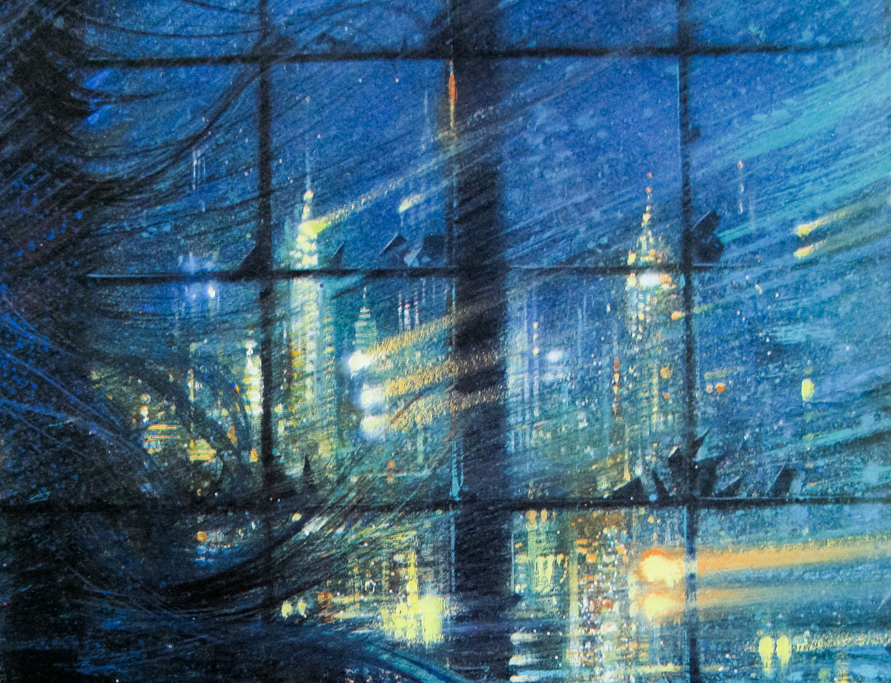
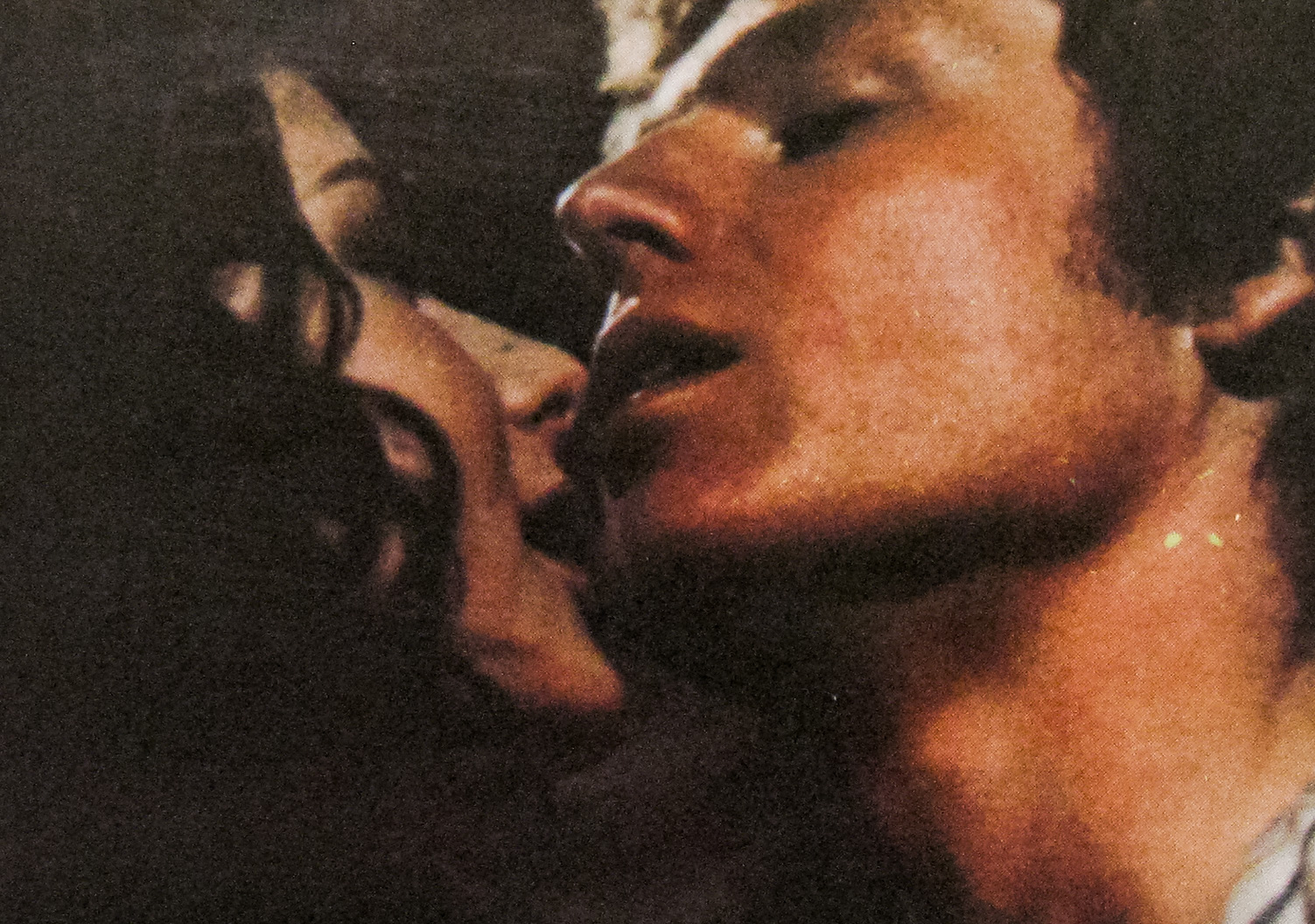
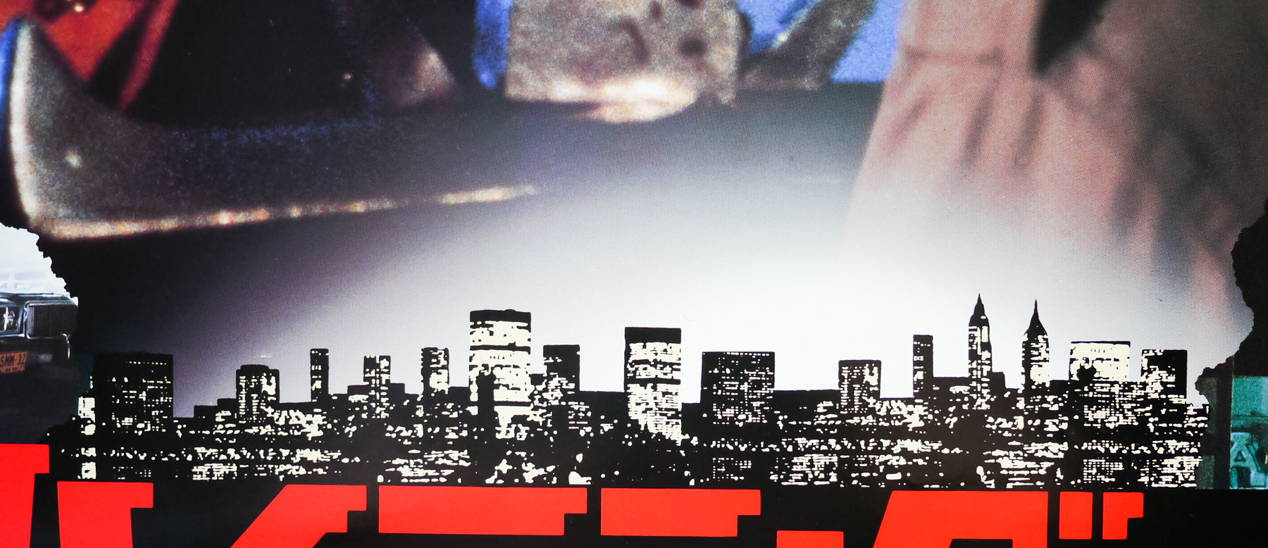
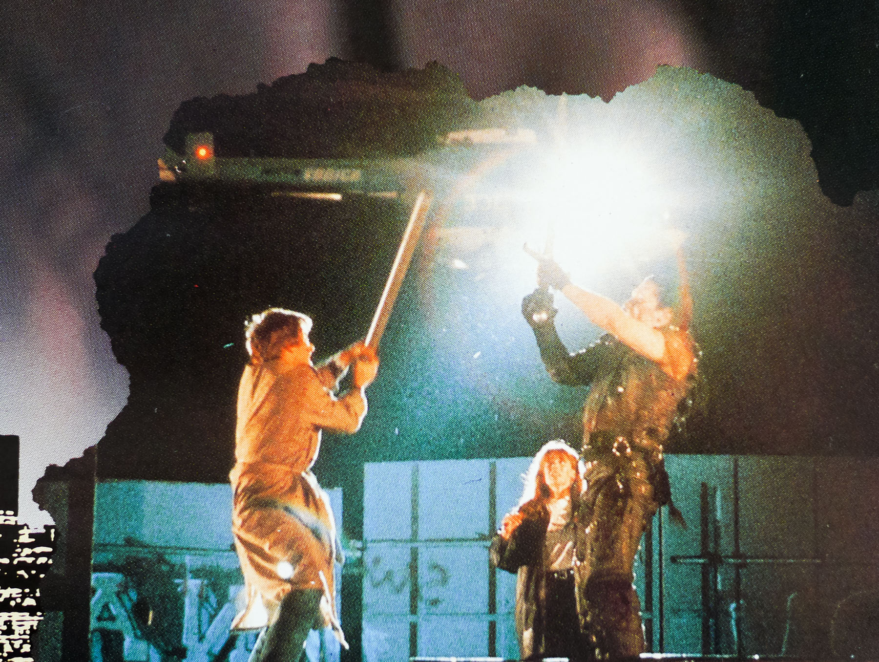
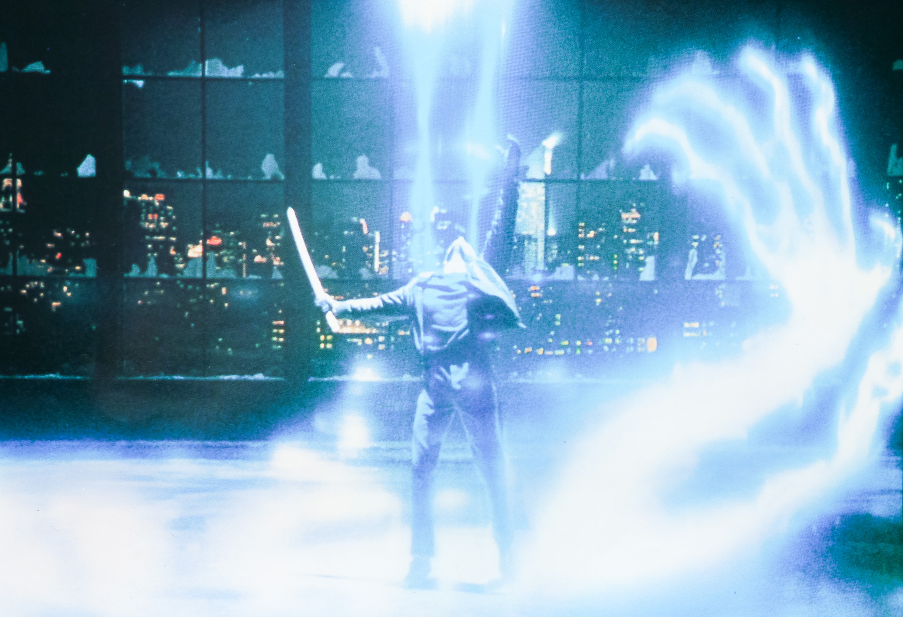
Eventually, after marrying a woman called Heather (Beatie Edney), he is visited by another immortal called Ramirez (Sean Connery) who teaches him how to sword fight and explains that the only way to kill another immortal is to remove his head. Ramirez also urges Connor to leave Heather, explaining that immortals are sterile and always end up causing hurt to any mortals that they fall in love with. In present day, Connor is shown to be living and working as an antique dealer in New York City and dealing with attacks from other immortals who are taking part in ‘The Gathering’ in which the remaining immortals from around the world fight to be the last one alive (“There can be only one!”). The psychotic Kurgan (Clancy Brown in a memorable turn), who first met Connor on the battlefield in Scotland, is determined to win the prize and will stop at nothing to do so.
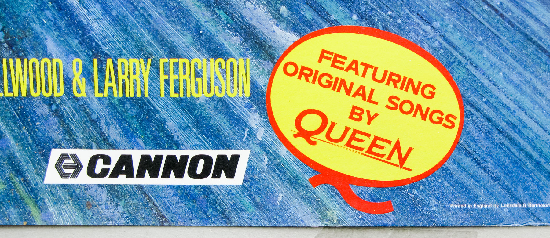
Mulcahy injects great energy into the film, clearly using many of the tricks he learned making music videos and the performances of the three main actors all help to elevate the film beyond what could have been a very schlocky fantasy. Some of the scenes involving Connor and Heather are genuinely touching and force the viewer to imagine the downsides of living as an immortal. Michael Kamen’s orchestral score is excellent and is embellished by several memorable songs by the British band Queen, including ‘A Kind of Magic‘. Although not initially a box-office success in the US, the film was an international hit and would gain a cult following, which later saw the release a series of iffy film sequels and a popular TV series that lasted for six seasons. The franchise also includes comic books, novels and animated shows.
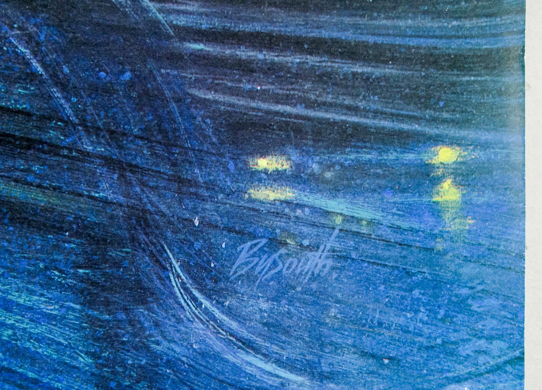
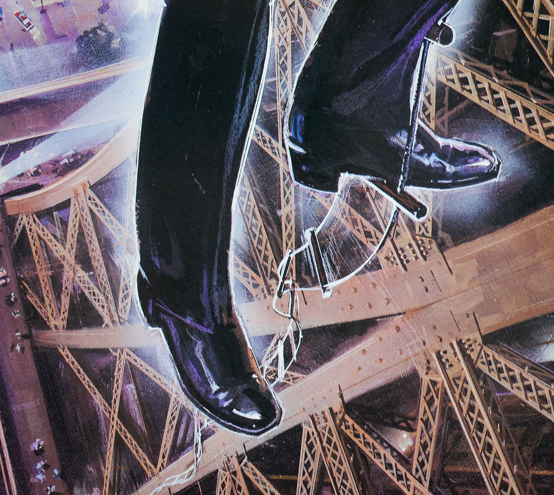
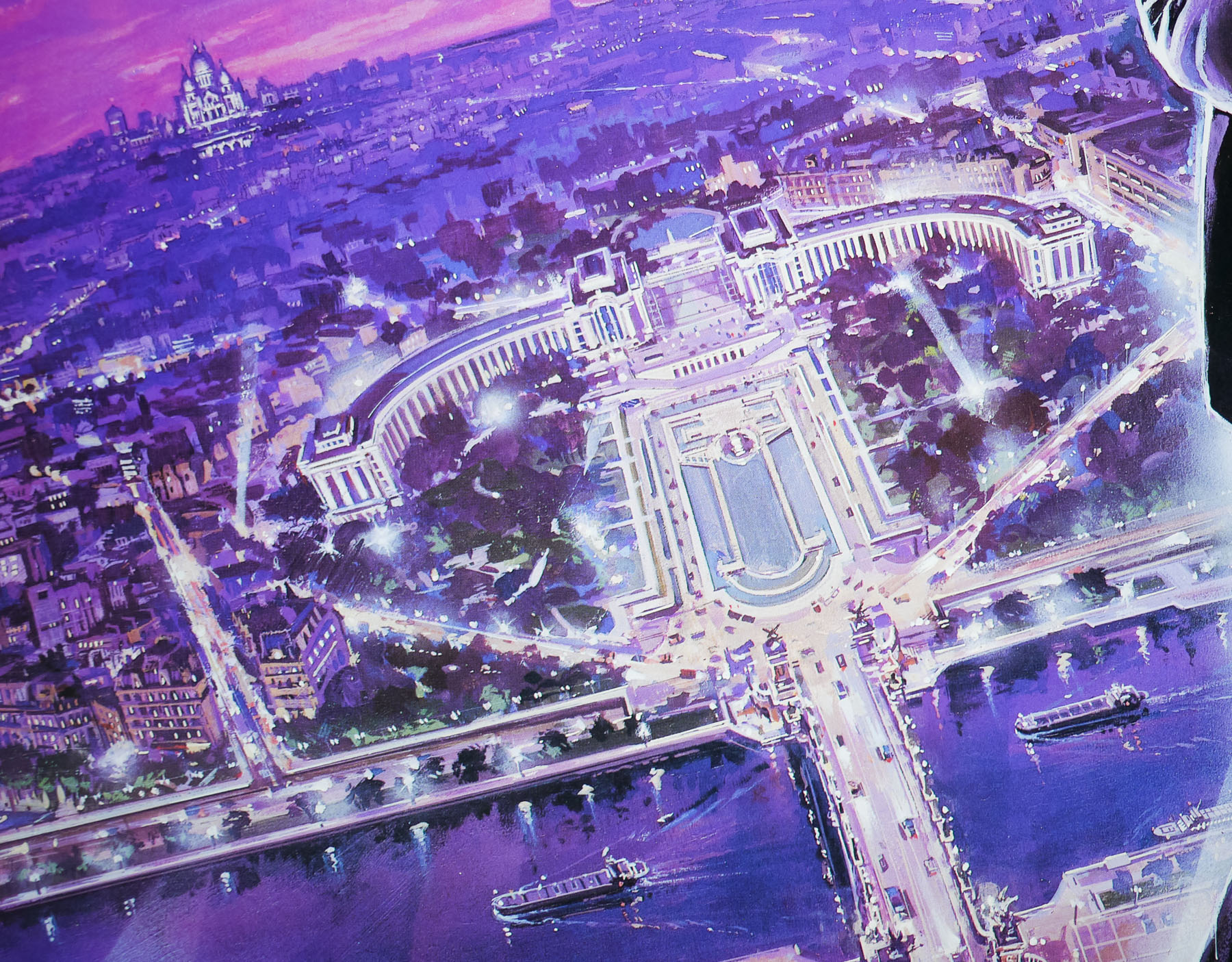
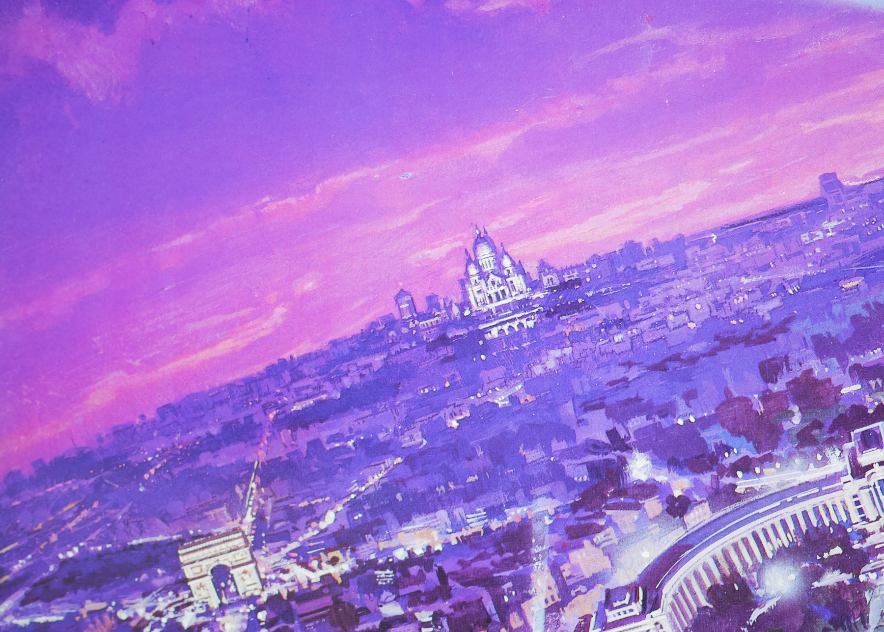
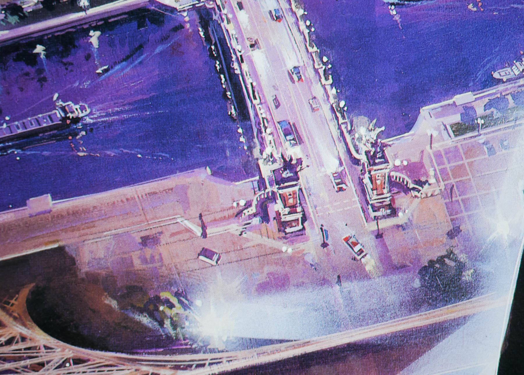
This is the style B Japanese B2 but I also have the style C one too. The British quad, painted by Brian Bysouth is by far the best of the international Highlander posters.
The trailer for the film can be seen on YouTube.