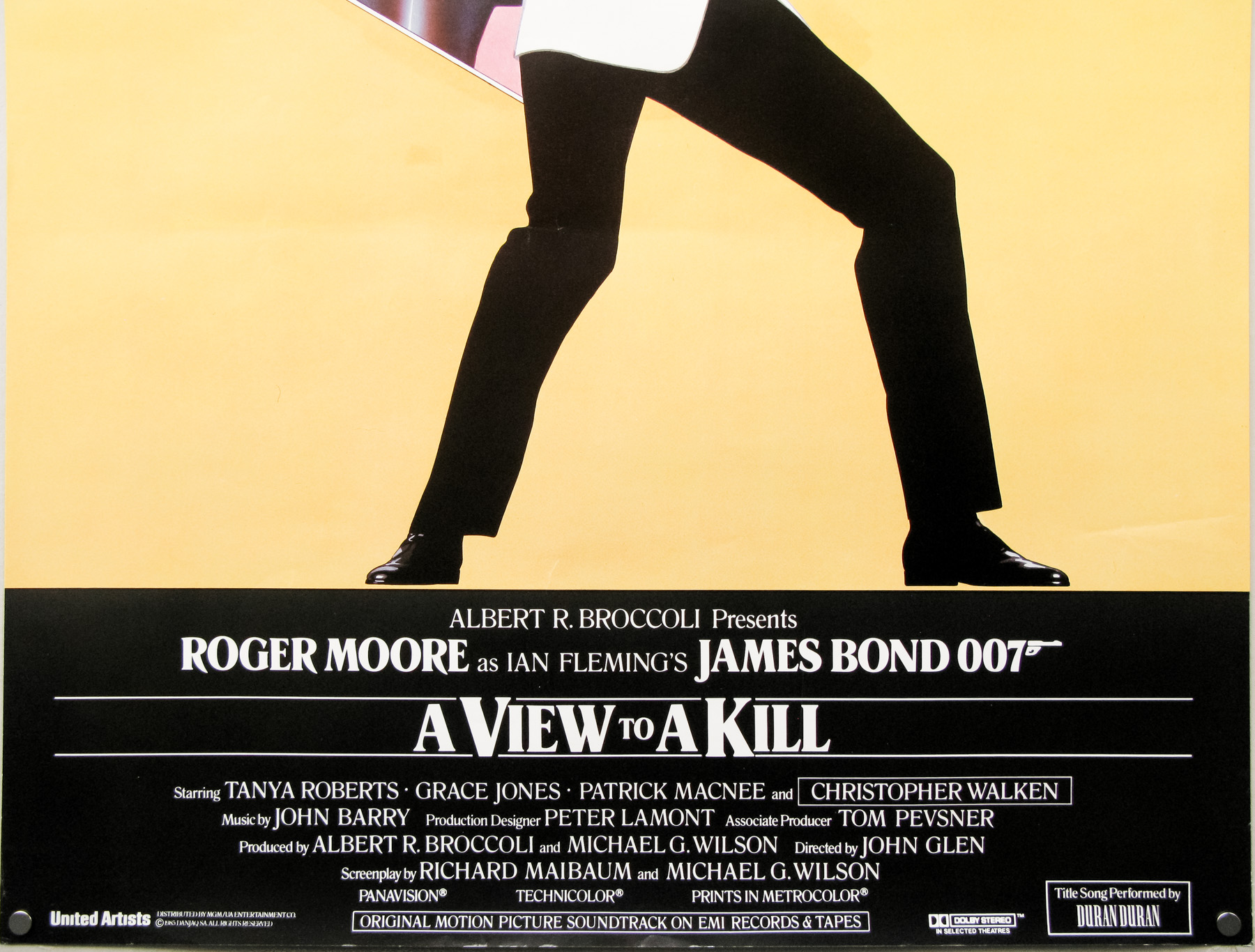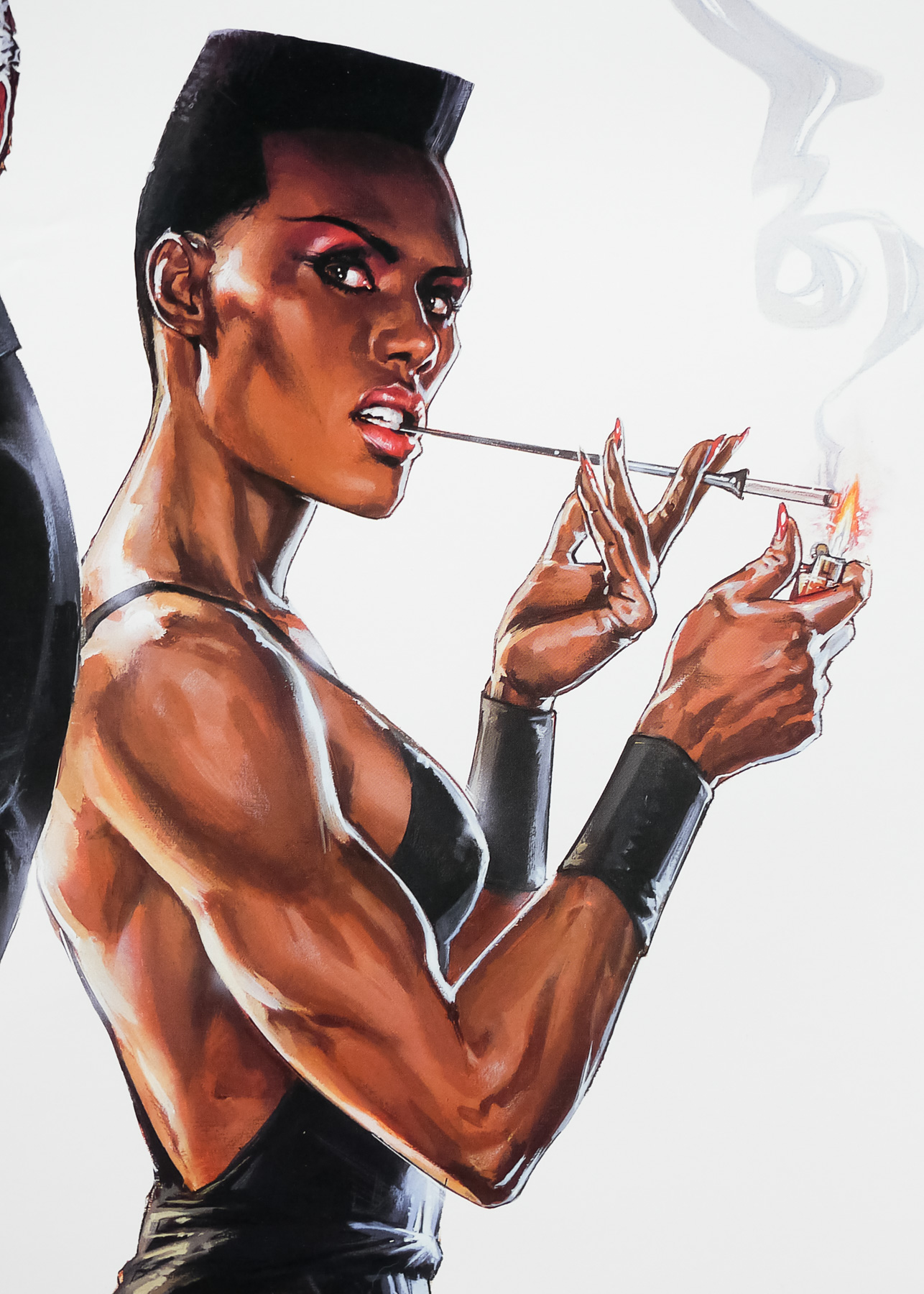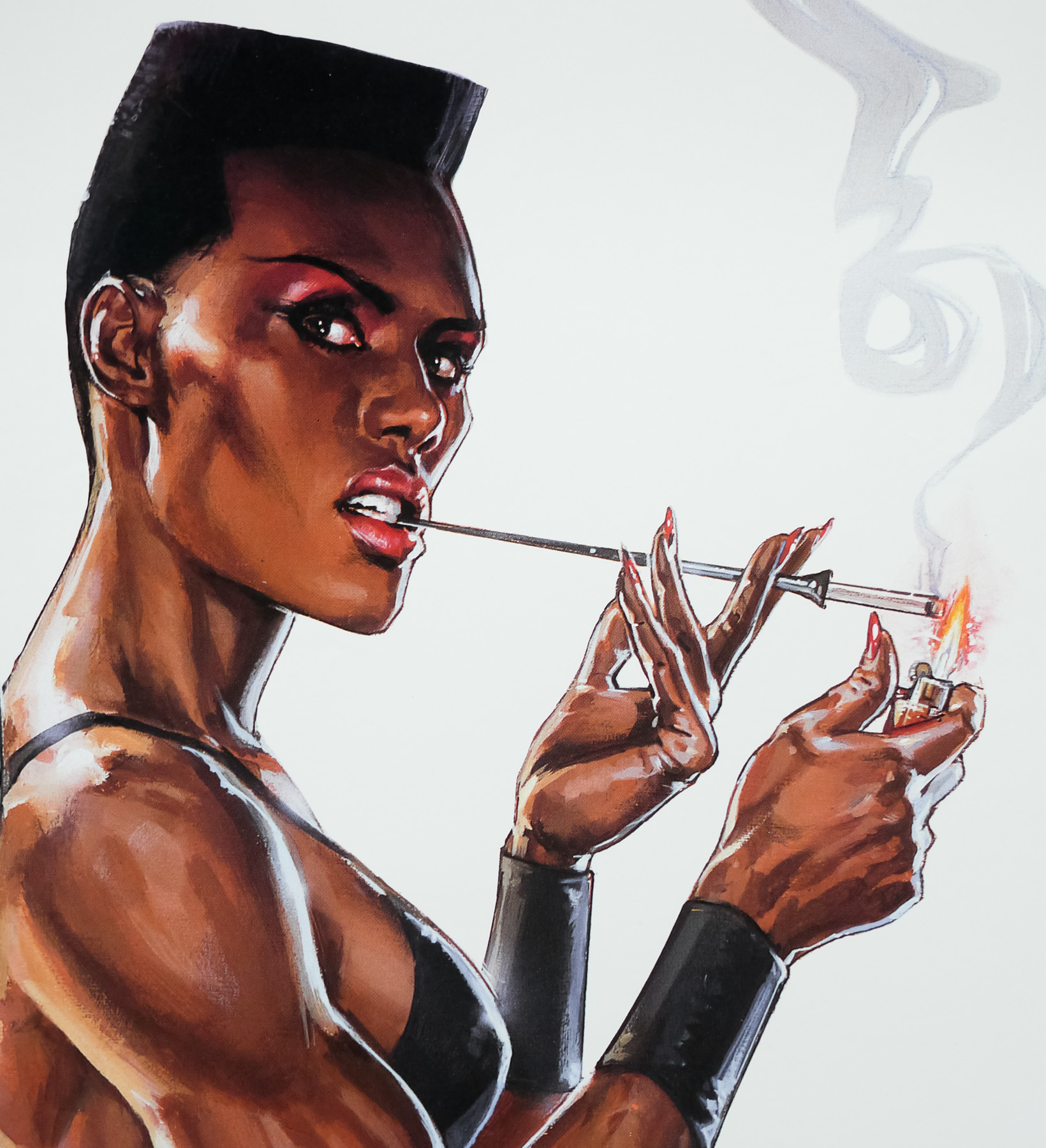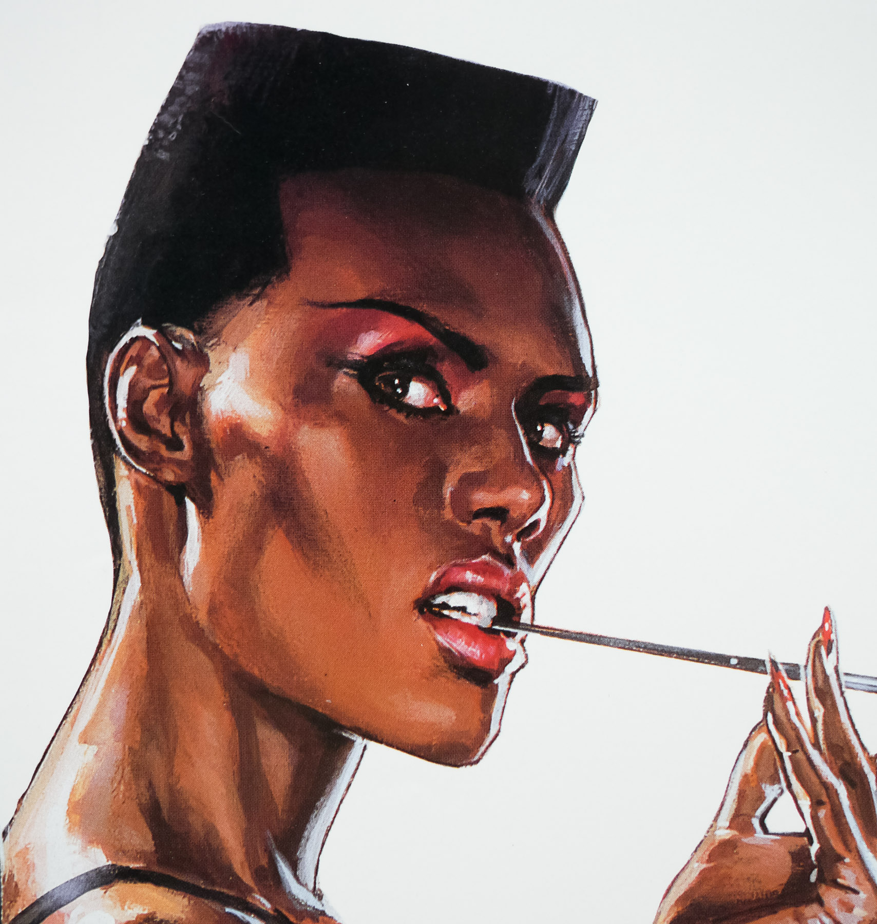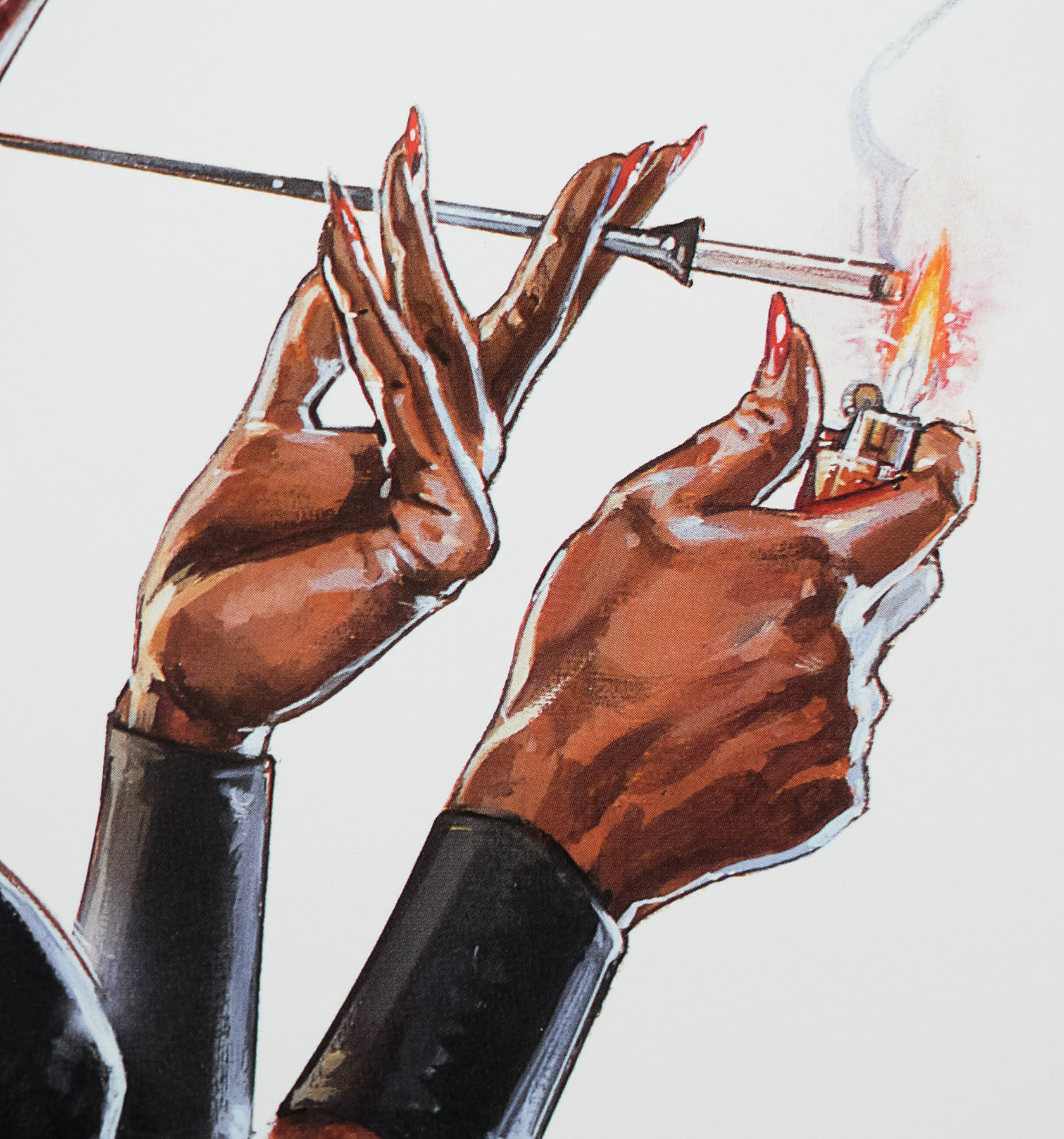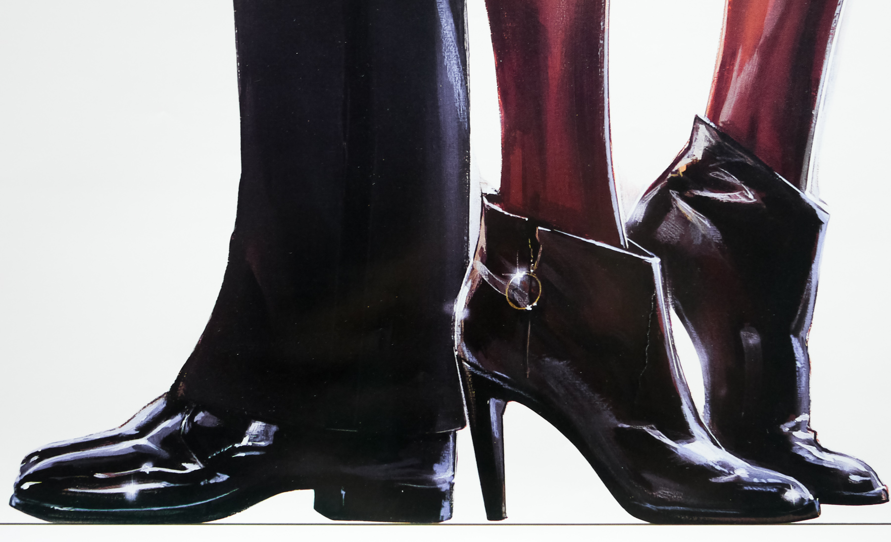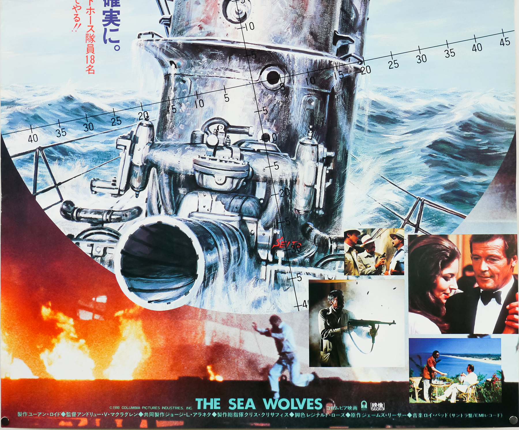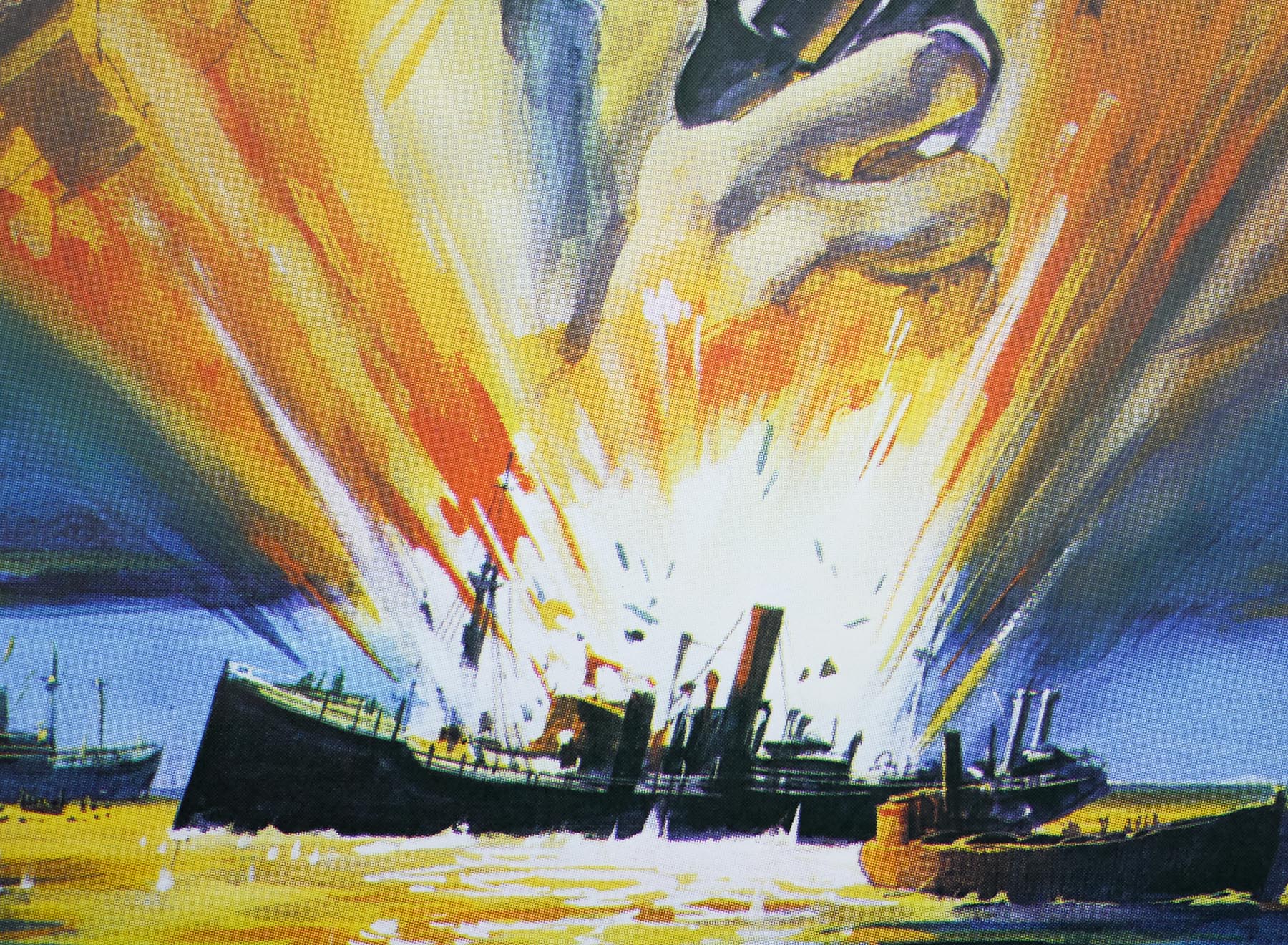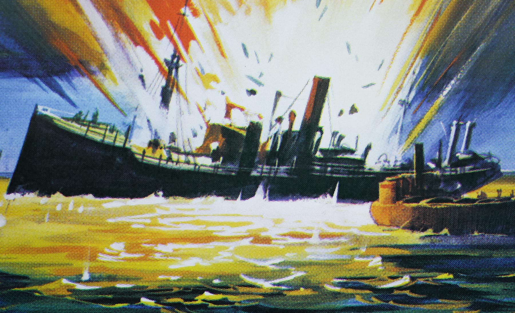
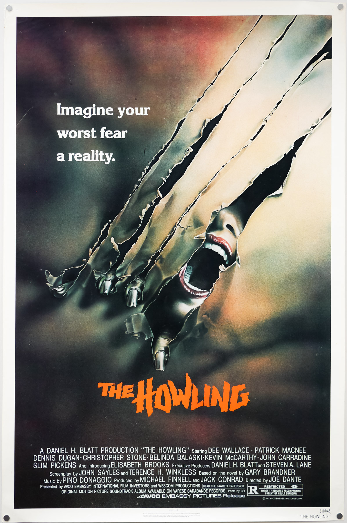
Poster detail
1-5
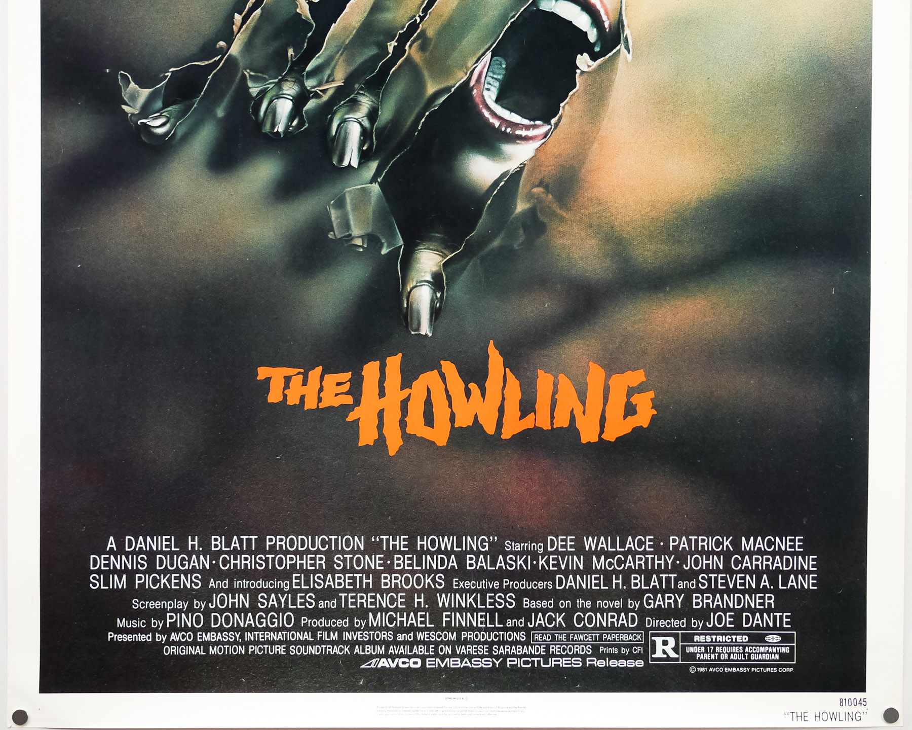

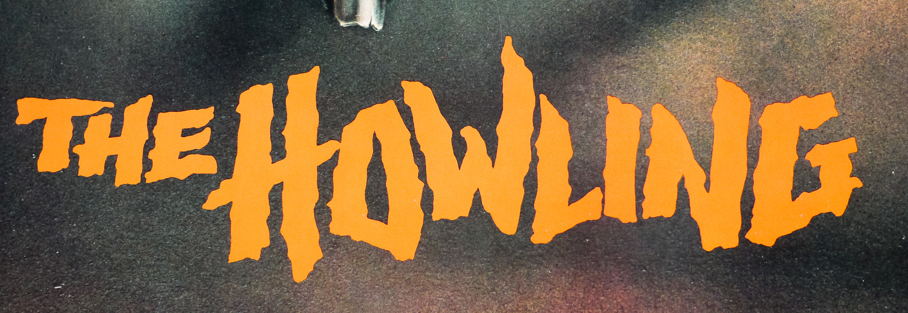
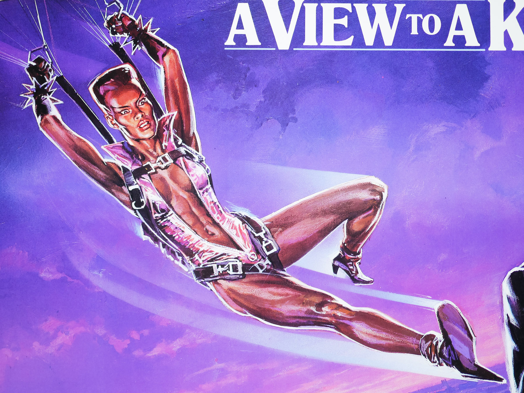
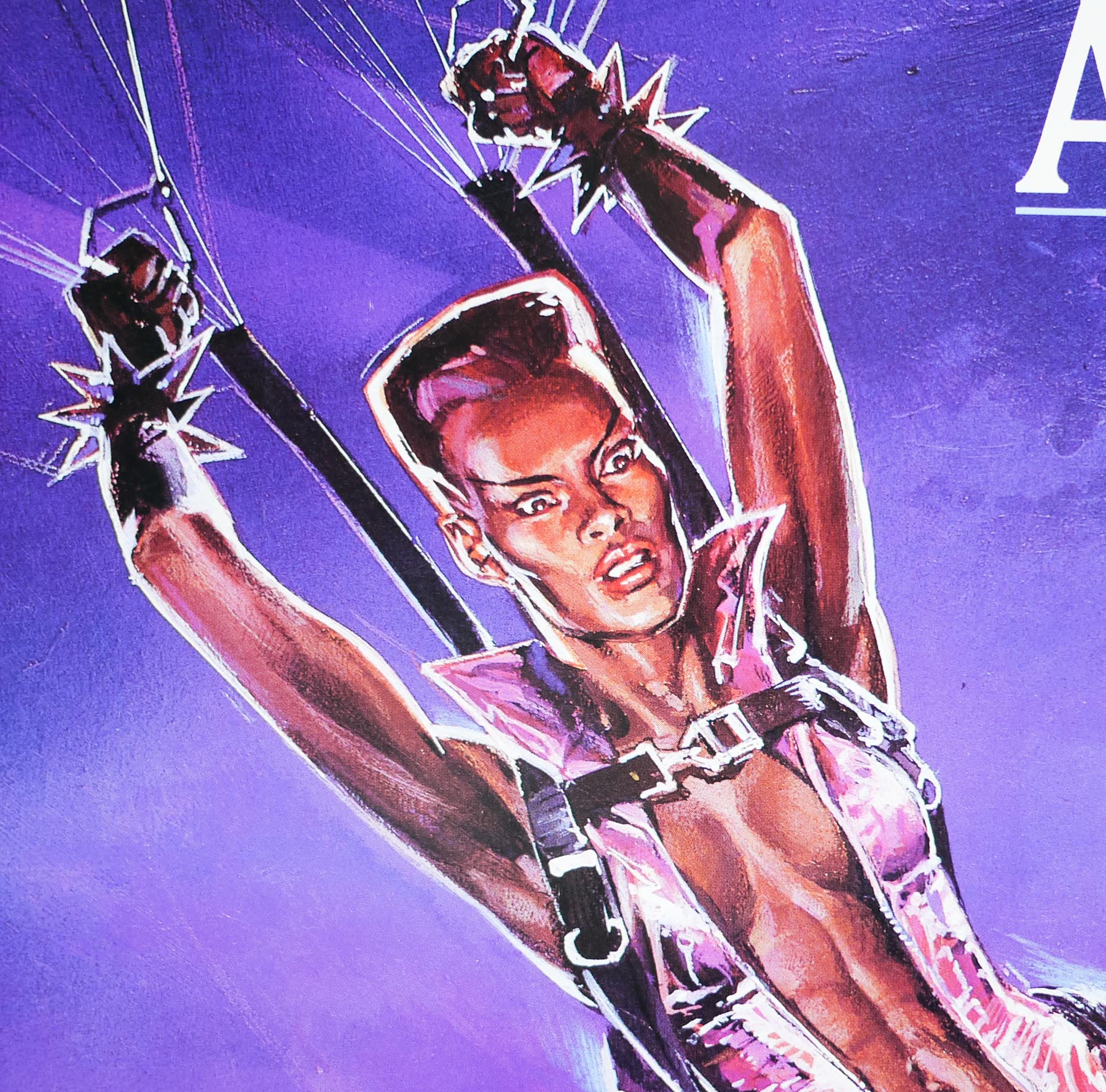
- Title
- The Howling
- AKA
- --
- Year of Film
- 1981
- Director
- Joe Dante
- Starring
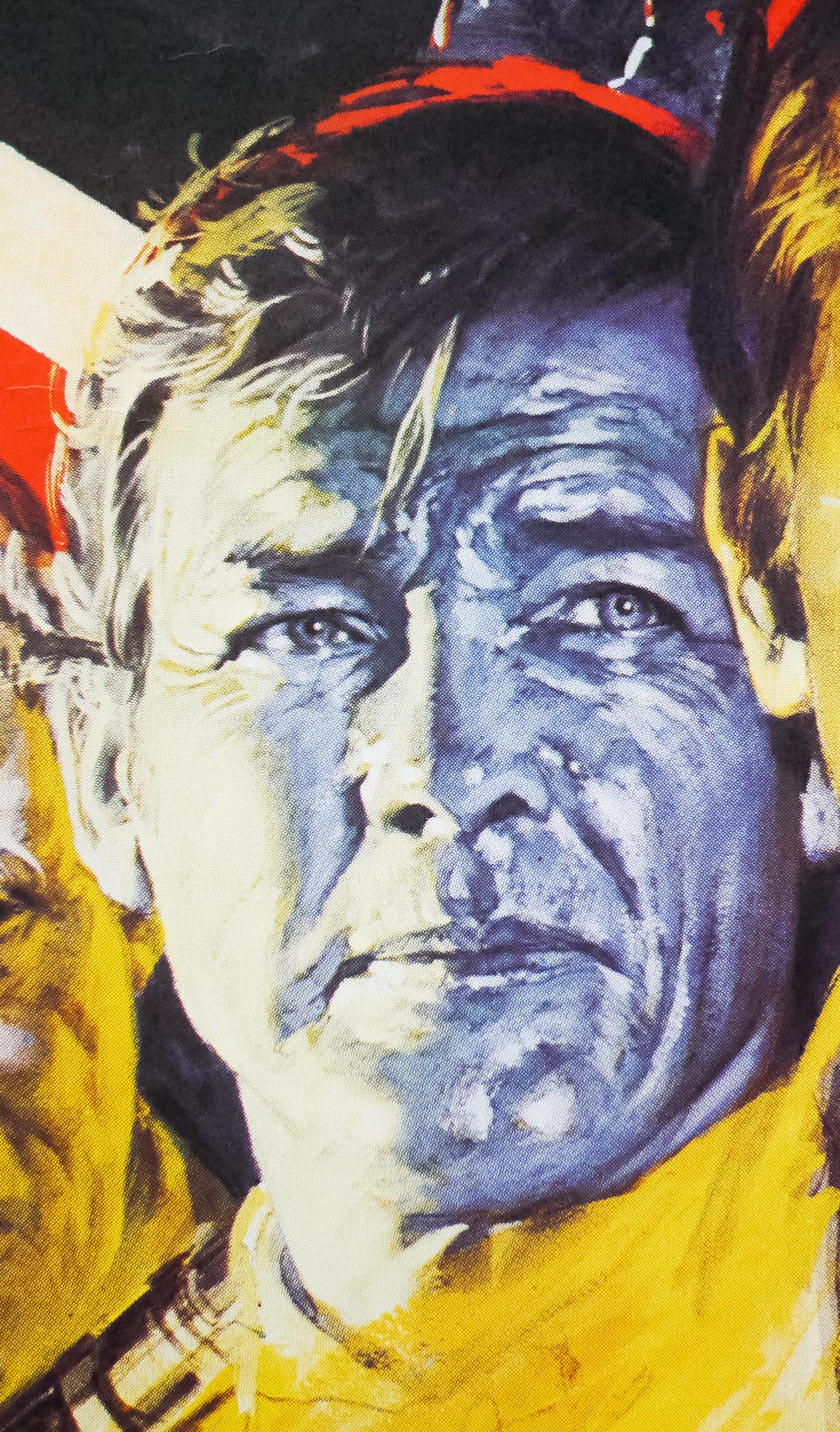
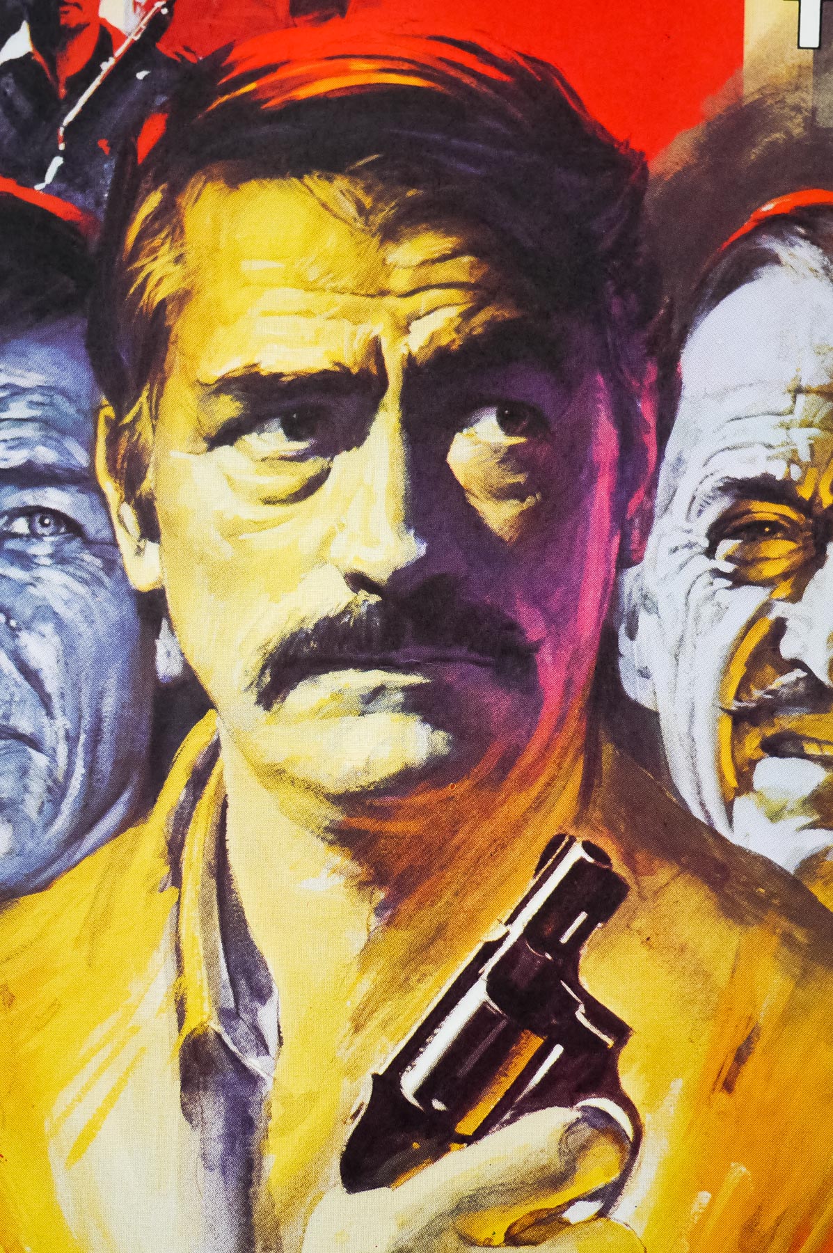
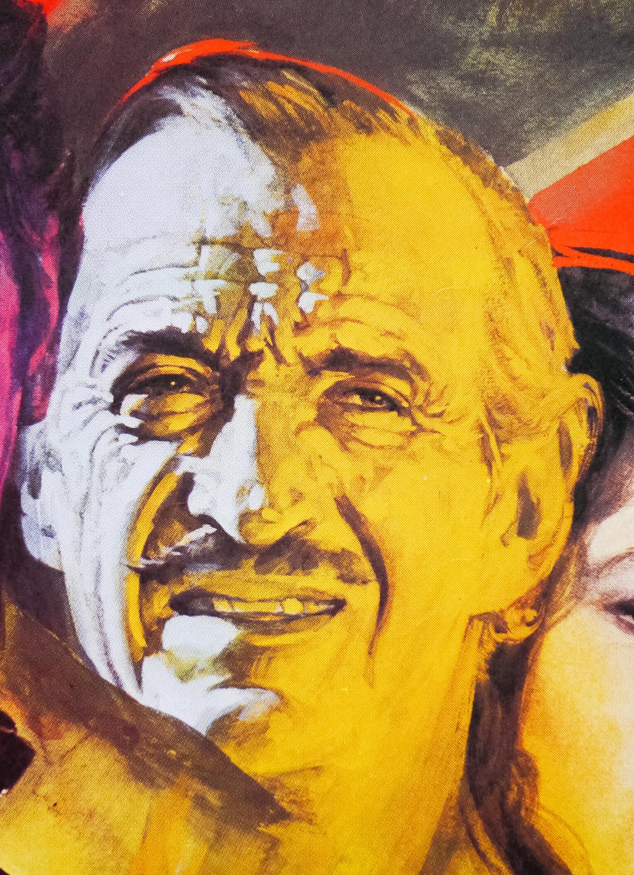
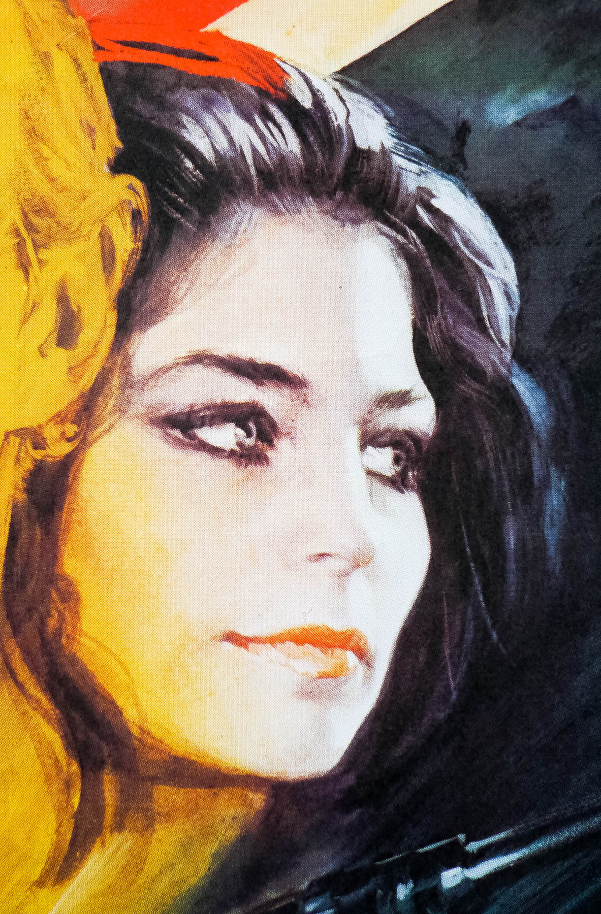
- Dee Wallace, Patrick Macnee, Dennis Dugan, Christopher Stone, Belinda Balaski, Kevin McCarthy, John Carradine, Slim Pickens, Elisabeth Brooks, Robert Picardo, Dick Miller
- Origin of Film
- USA
- Genre(s) of Film
- Dee Wallace, Patrick Macnee, Dennis Dugan, Christopher Stone, Belinda Balaski, Kevin McCarthy, John Carradine, Slim Pickens, Elisabeth Brooks, Robert Picardo, Dick Miller,
- Type of Poster
- One sheet
- Style of Poster
- --
- Origin of Poster
- USA
- Year of Poster
- 1981
- Designer
- Unknown
- Artist
- Unknown
- Size (inches)
- 27 2/16" x 41"
- SS or DS
- SS
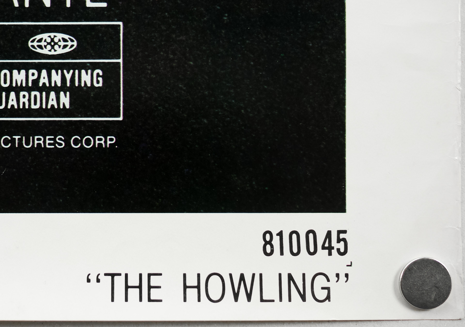
- NSS #
- 810045
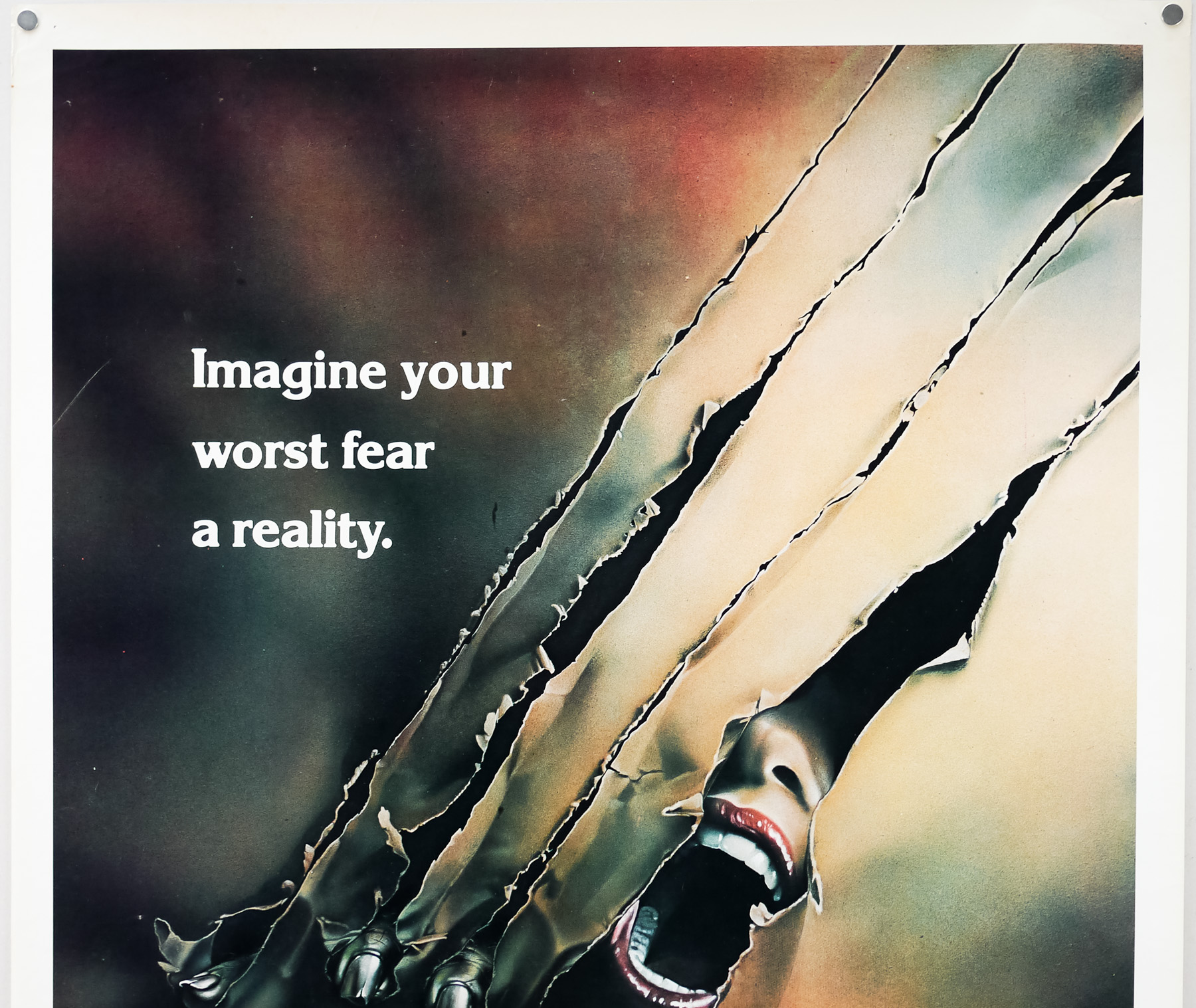
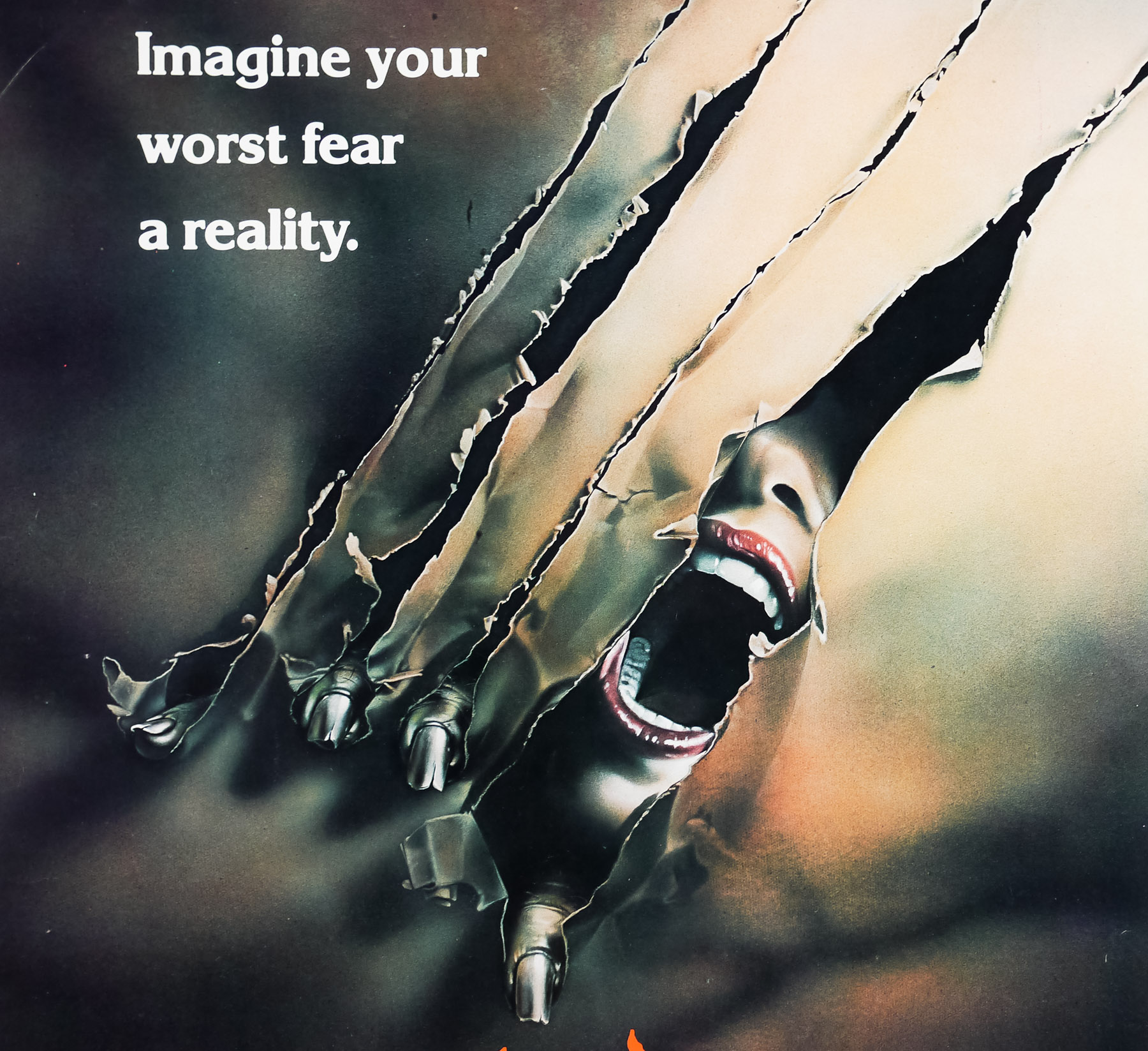
- Tagline
- Imagine your worst fear a reality.
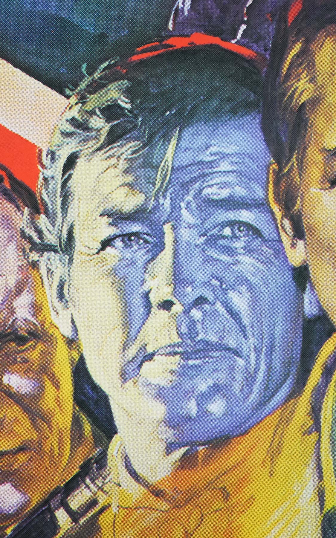
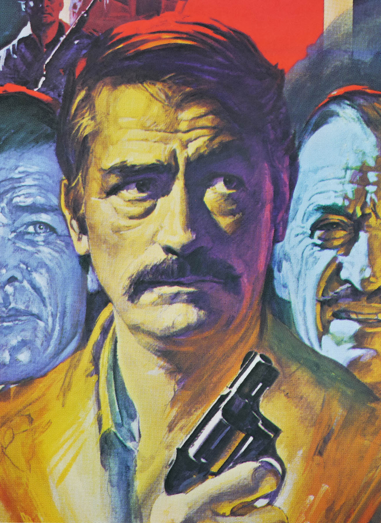
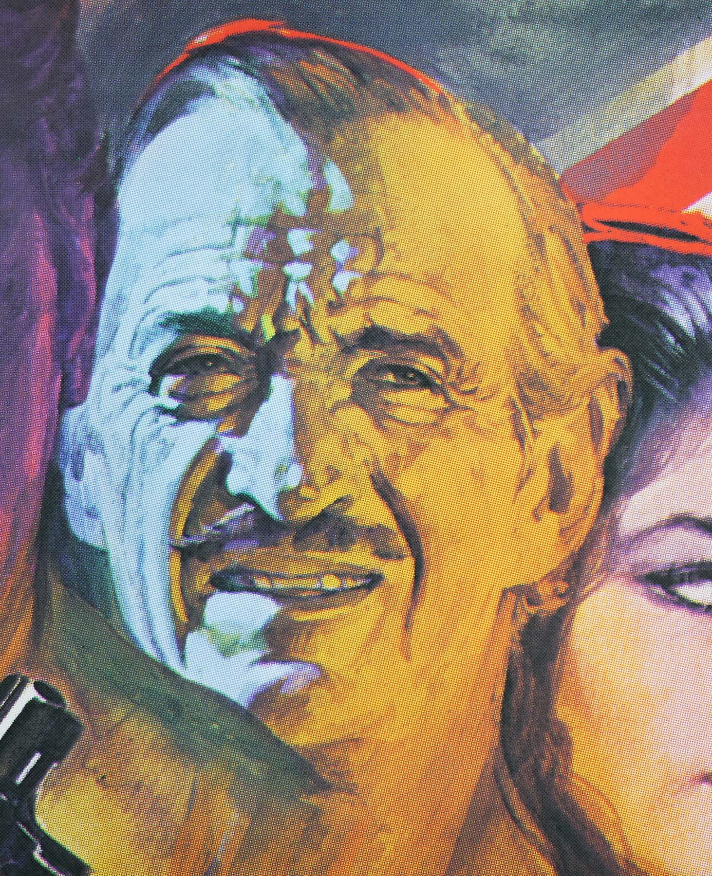
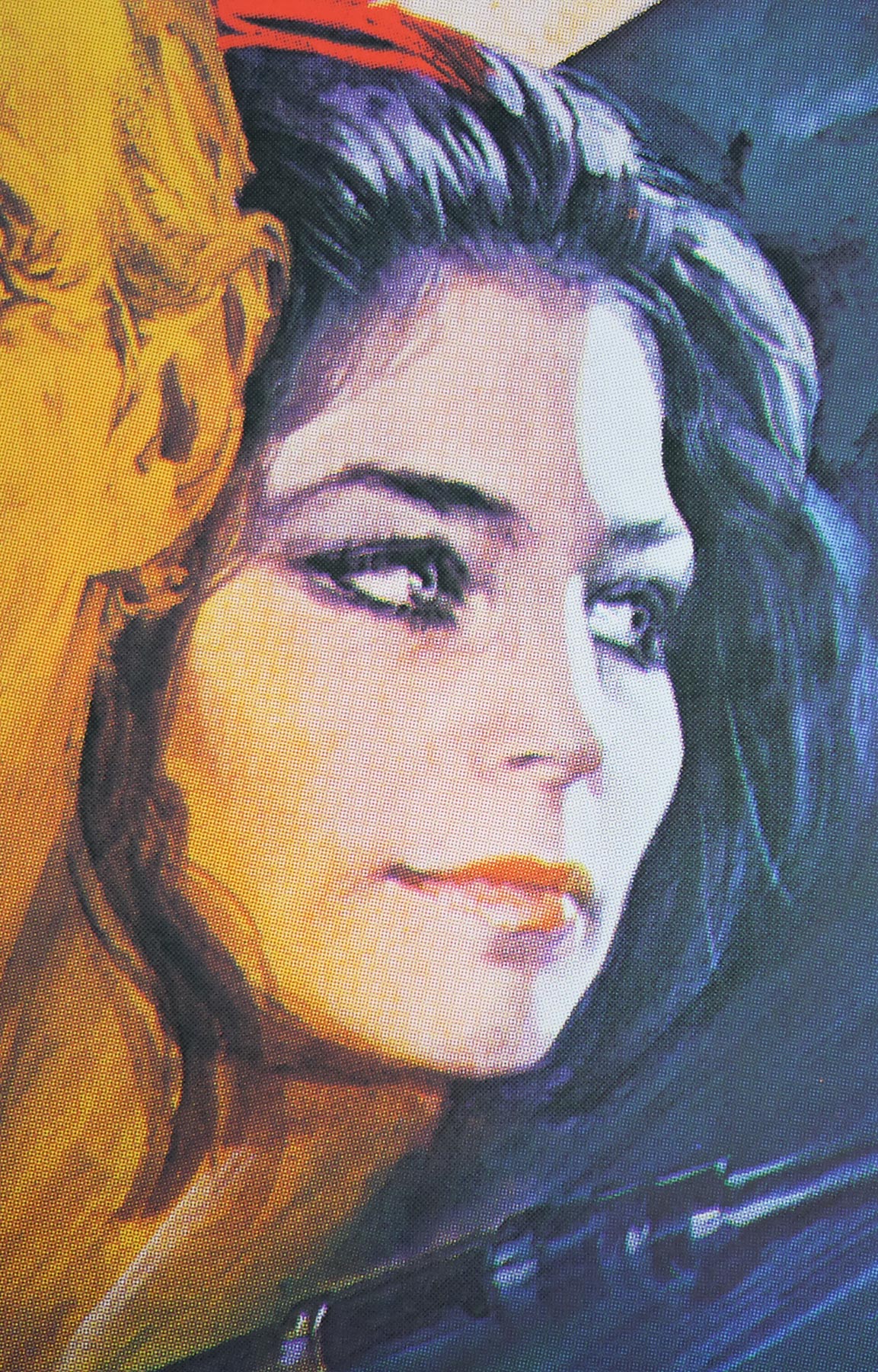
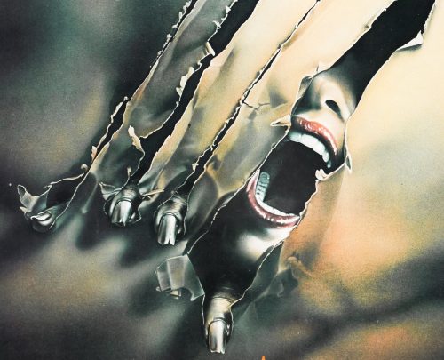
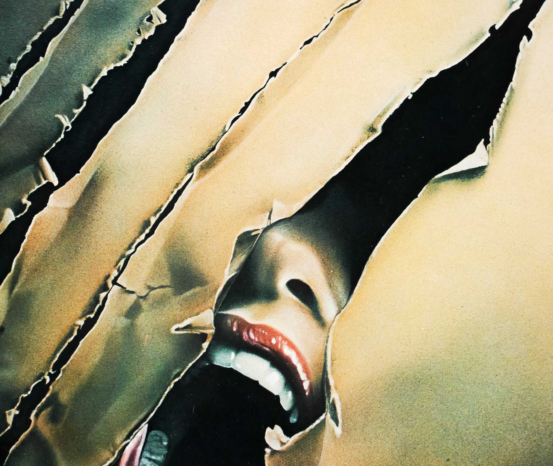
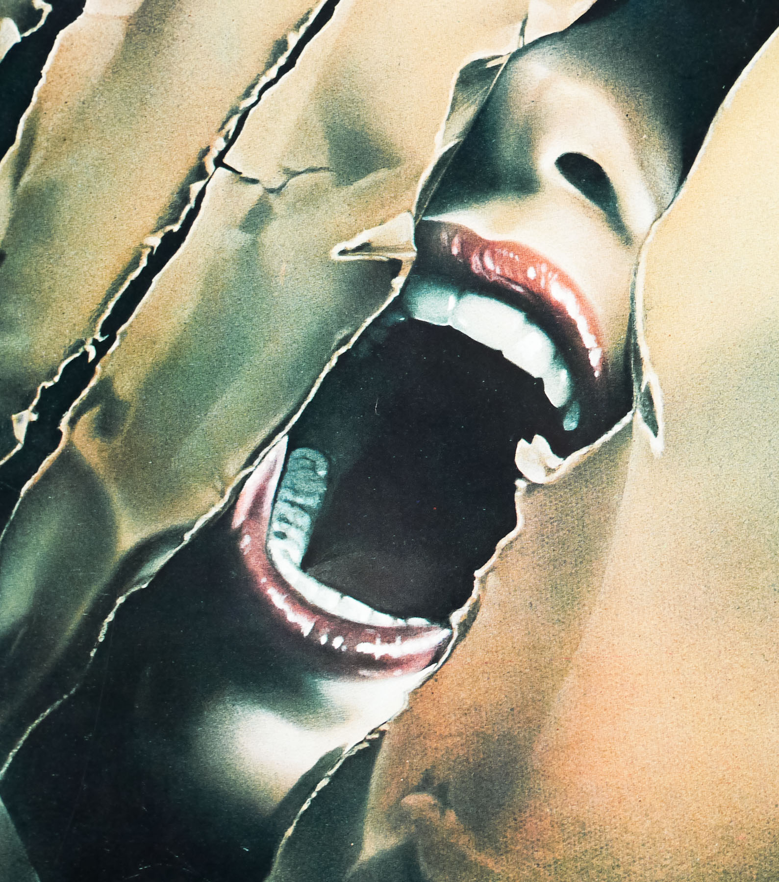
One of two werewolf themed horrors to be released in 1981, Joe Dante‘s The Howling beat John Landis’ An American Werewolf in London to cinemas by a few months, but both would go on to be cult classics of the genre, even if the latter film won more critical plaudits at the time of its release. Despite hugely different storylines each film features a memorable werewolf transformation scene and The Howling’s one was created by noted practical effects specialist Rob Bottin (The Thing, Robocop), which was his first solo effort away from his mentor Rick Baker. Although he had initially started work on The Howling, Baker had decided to leave the production to work on Landis’ film and handed the reigns over to Bottin. The results are definitely impressive and were certainly groundbreaking for the time, however Baker’s handiwork on AWIL is unforgettable and impressed the judges of the Academy Awards so much that he won the Outstanding Achievement in Makeup in its inaugural year.
Very loosely based on the novel of the same name by Gary Brandner, The Howling’s script was worked on by two screenwriters before Dante brought in John Sayles, with whom he collaborated on 1978’s Piranha to write a third draft. The film begins as the investigative TV report Karen White (Dee Wallace) is on her way to meet the serial murderer Eddie Quist (Robert Picardo) at a sleazy LA porn store as part of a police sting operation. After entering a booth, Karen is surprised by Eddie who is standing behind her and forces her to watch a porno of a young woman being attacked. Karen turns to look at Eddie and her screams attract nearby police officers who shoot and apparently kill him. Severely traumatised by the event and suffering from hallucinatory flashbacks, Karen’s therapist Dr Waggner (Patrick Macnee) refers her to a secluded retreat on the Californian coast called The Colony.
Karen travels there with her boyfriend Bill played by the late Christopher Stone, who was Dee Wallace’s boyfriend at the time and later married her (Stone sadly passed away from a heart attack in 1995), and the pair are welcomed by the residents of the camp, which is made up of several log cabins in a forest near the coast. One night Bill is out for a walk and is attacked and bitten by a werewolf, which is actually Marsha Quist (Elisabeth Brooks) a sultry nymphomaniac who has been at the Colony for months. Later she accosts Bill and the pair make love in the forest as they transform into werewolves together. Karen suspects all is not right and invites her friend Teri (Belinda Balaski), another reporter who is looking into Eddie Quist and has discovered that his body is missing from the morgue, out to visit her. Soon after arriving Teri is attacked and killed by Eddie whom she watches transform into a wolf (with Rob Bottin’s help) and before long Karen discovers the true secret of the Colony. Teri’s partner Chris (Dennis Dugan) comes to Karen’s rescue clutching a rifle loaded with silver bullets.
The film was made on a low budget (circa $1m) and was a commercial success around the globe, making tens of millions of dollars. It inevitably spawned a number of significantly less interesting sequels, starting with 1985’s ‘Howling II: Your Sister is a Werewolf’. Joe Dante believes that Steven Spielberg saw the film at the cinema and subsequently offered him the directorial job on the cult classic Gremlins (1984).
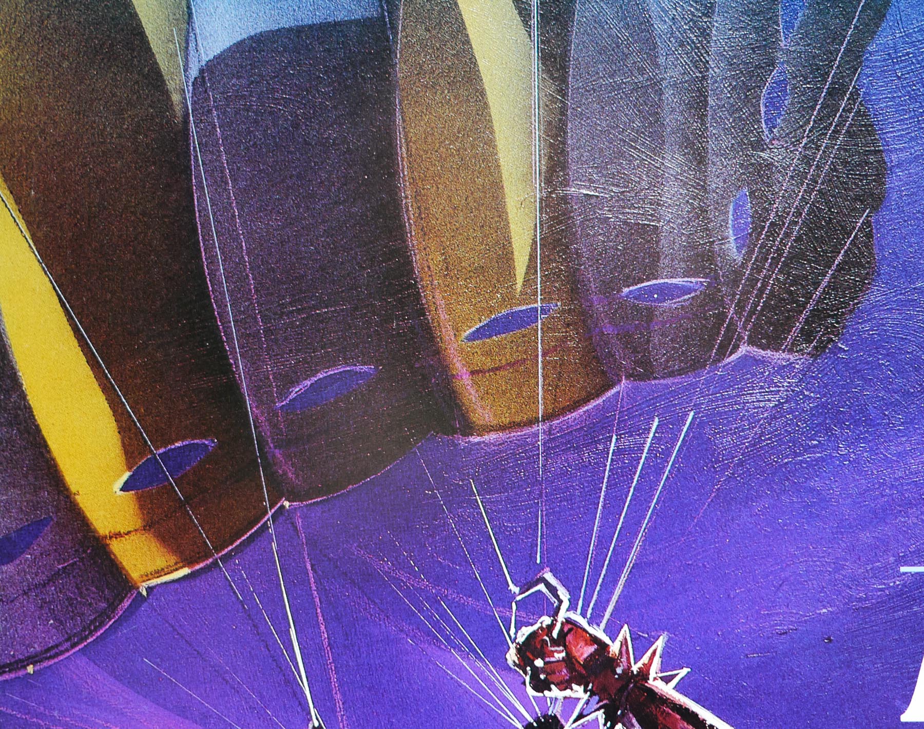
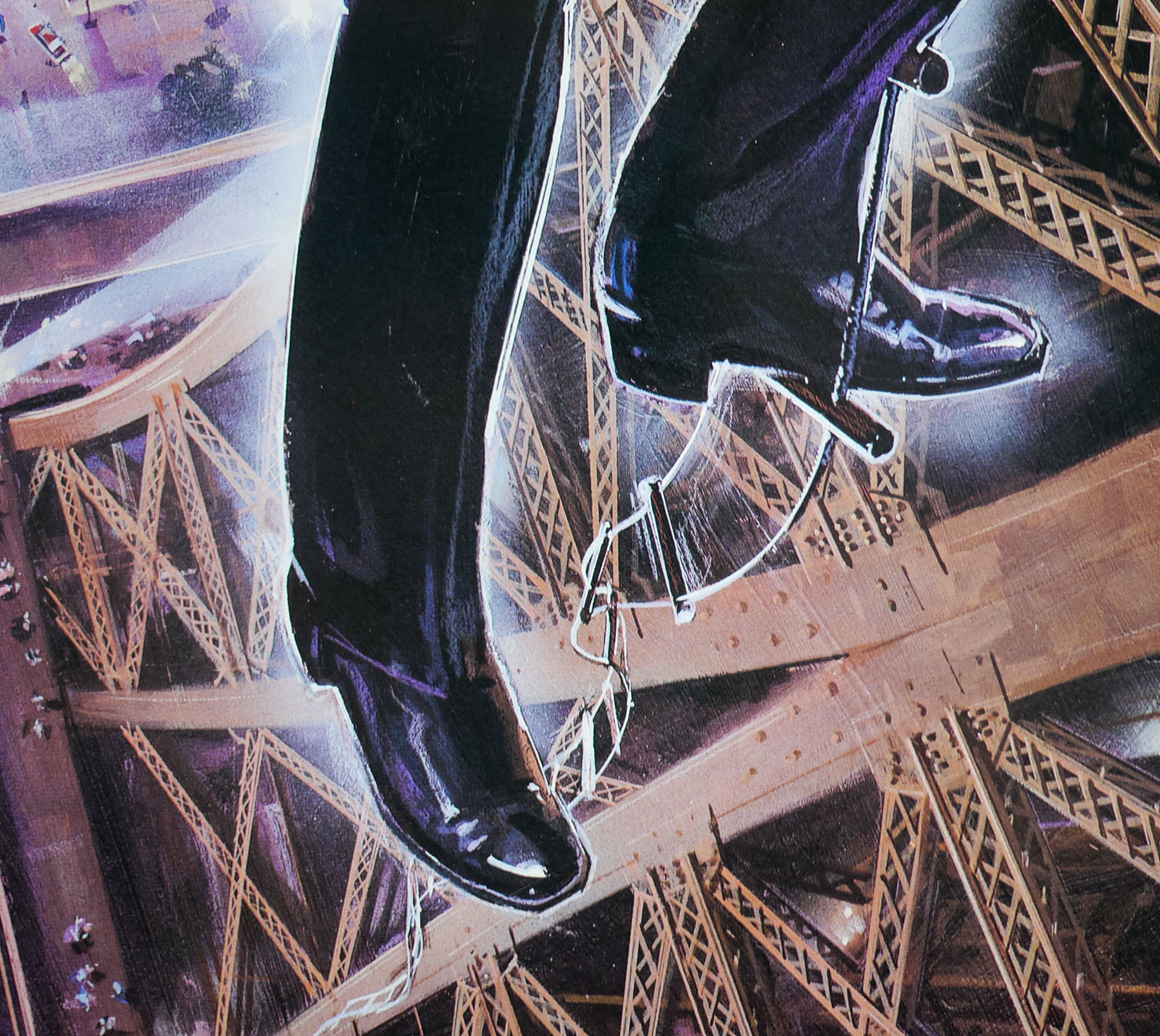
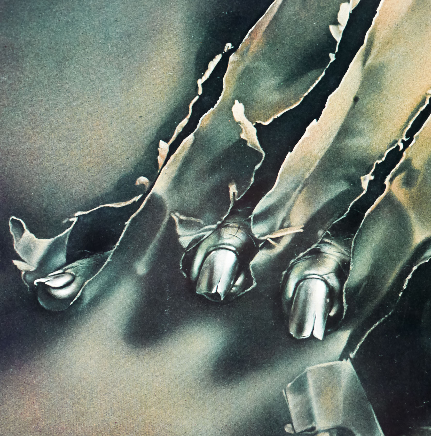
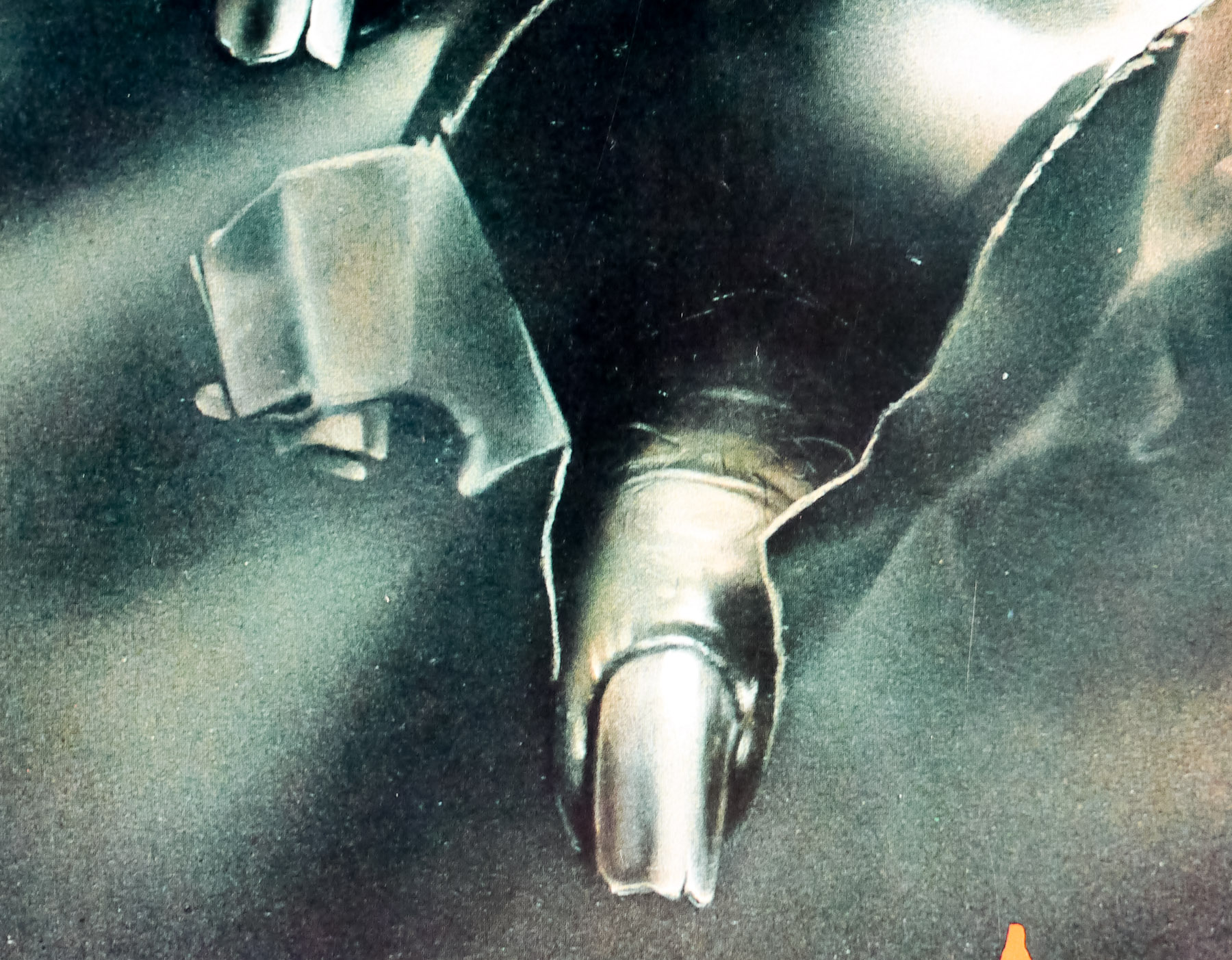
Despite The Howling’s relatively high profile I’ve been unable to identify the artist responsible for the artwork on this US one sheet, which was also used as the marketing art in several other countries. If anyone has any ideas please get in touch. Note that this particular poster is discoloured somewhat as it is meant to be more orange/yellow in tone, and I believe it’s the result of an error during printing. It’s not the first one sheet for the Howling that I’ve seen with this discolouration and at least three can be seen in emovieposter’s past sales history of the poster. I suspect that a batch of the posters fell victim to an issue with blue/green inks at the time of printing.