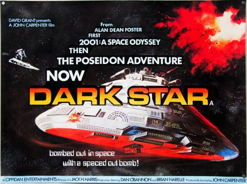
You searched for: Quad%2520
18.05.11
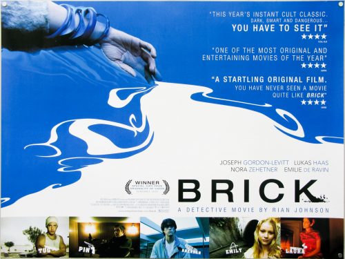
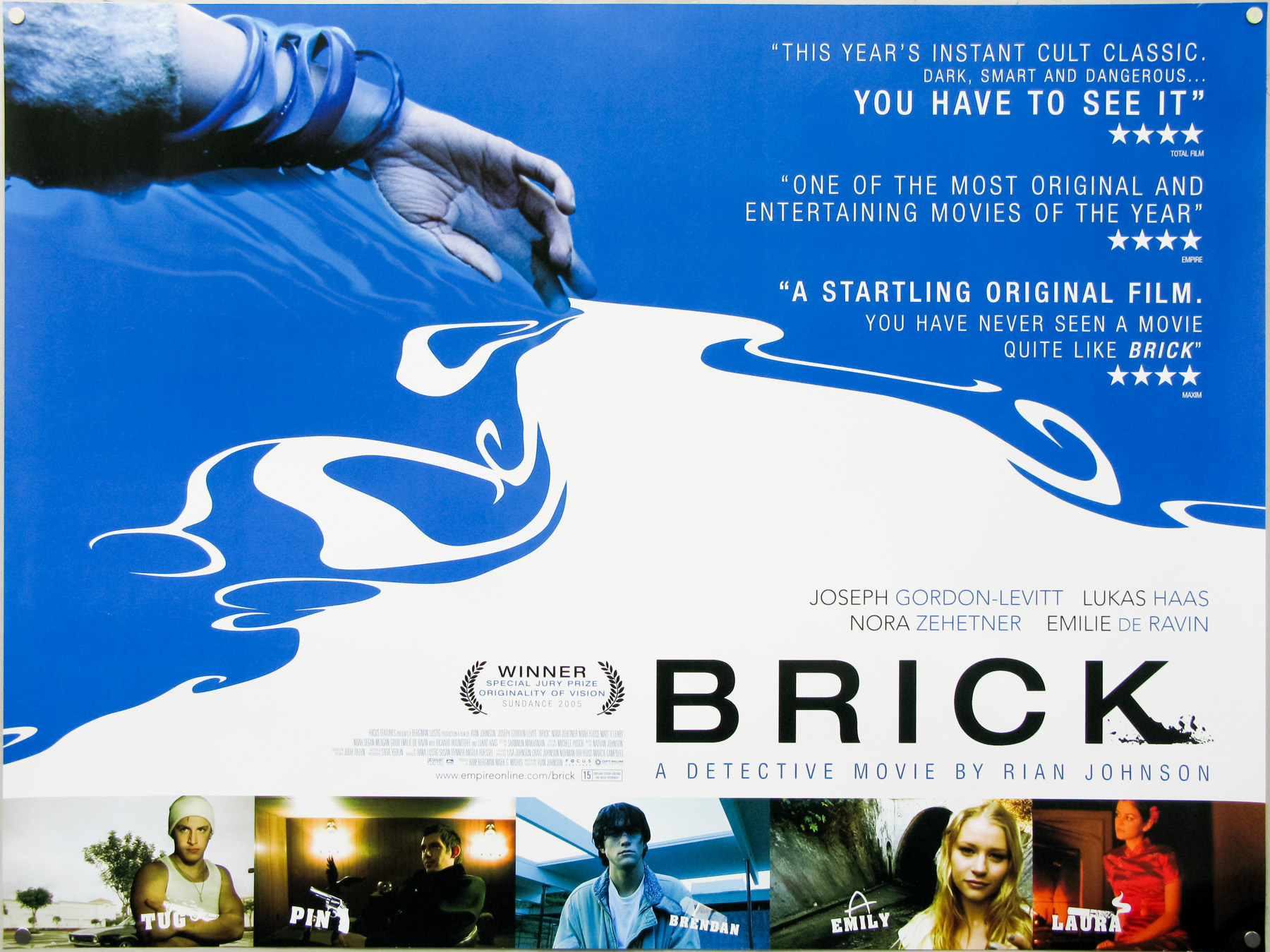
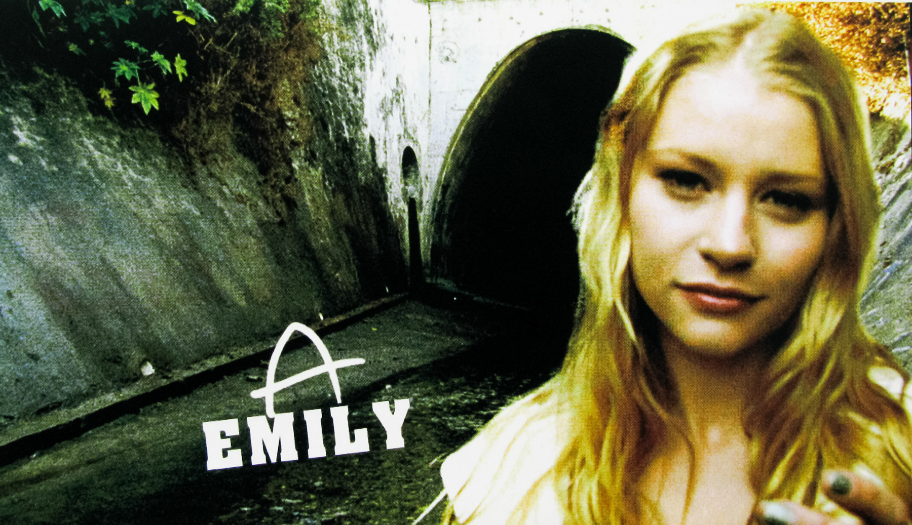
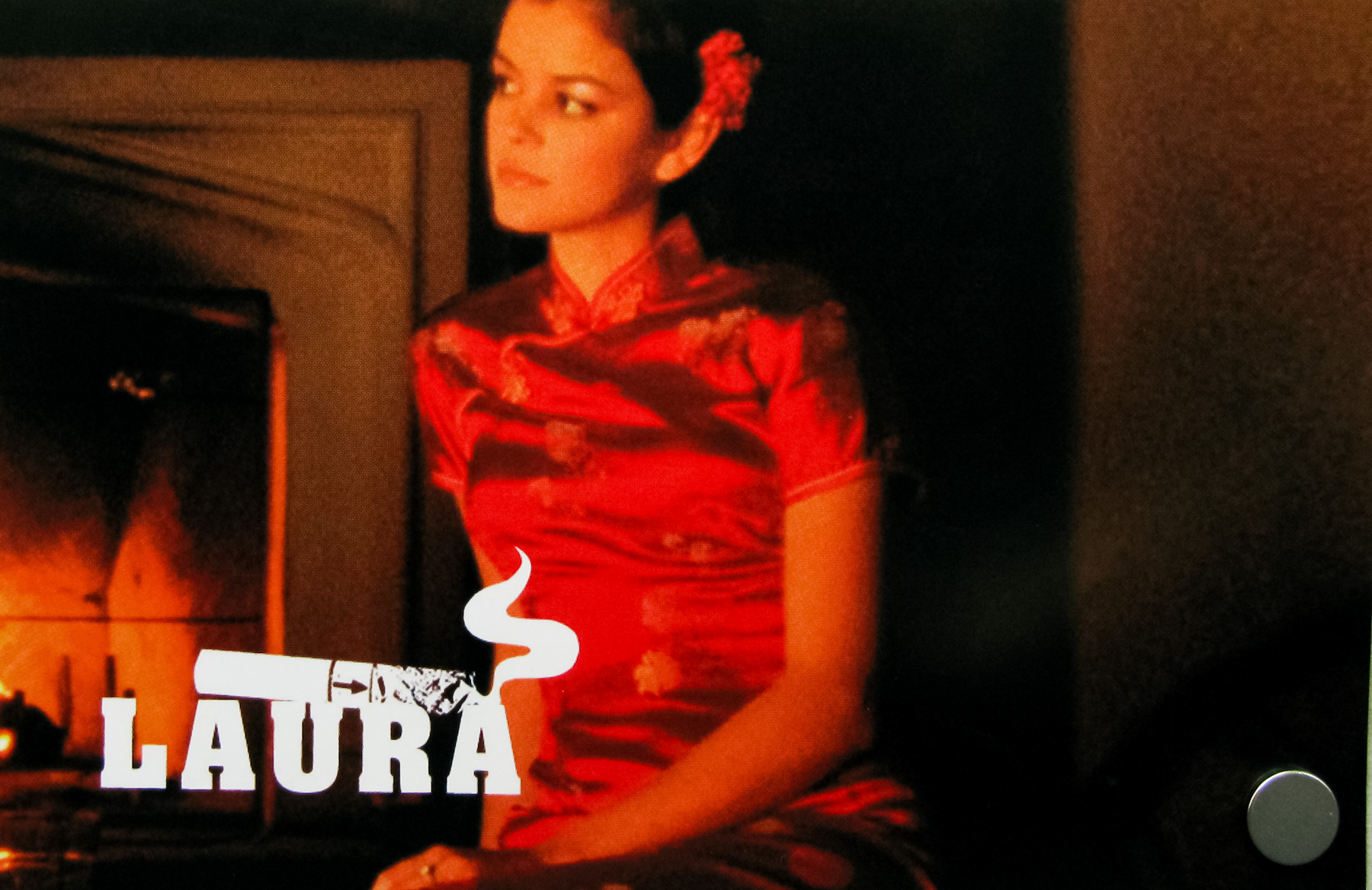
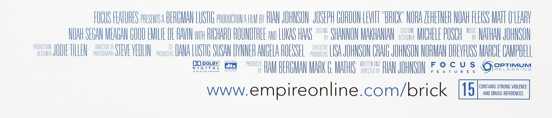
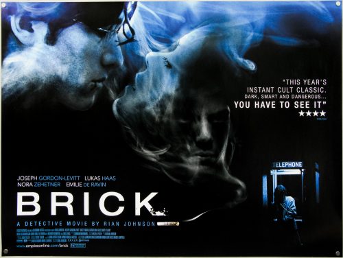
- Title
- Brick
- AKA
- --
- Year of Film
- 2005
- Director
- Rian Johnson
- Starring
- Joseph Gordon-Levitt, Emilie de Ravin, Nora Zehetner, Matt O'Leary, Noah Fleiss, Brian J. White, Meagan Good, Noah Segan, Lukas Haas, Richard Roundtree
- Origin of Film
- USA
- Genre(s) of Film
- Joseph Gordon-Levitt, Emilie de Ravin, Nora Zehetner, Matt O'Leary, Noah Fleiss, Brian J. White, Meagan Good, Noah Segan, Lukas Haas, Richard Roundtree,
- Type of Poster
- Quad
- Style of Poster
- Blue and white
- Origin of Poster
- UK
- Year of Poster
- 2005
- Designer
- Unknown
- Artist
- --
- Size (inches)
- 30" x 40"
- SS or DS
- SS
- Tagline
- --
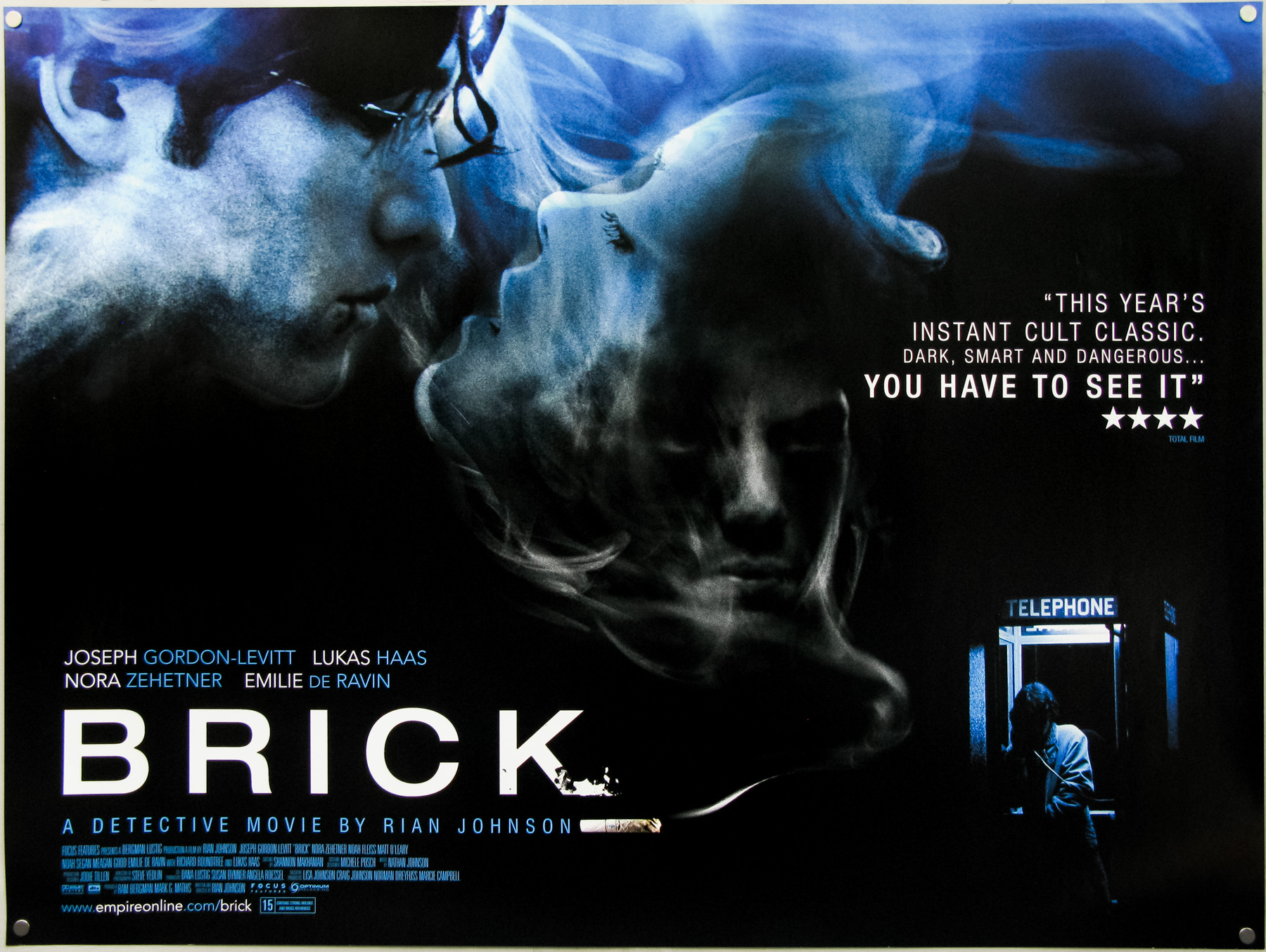
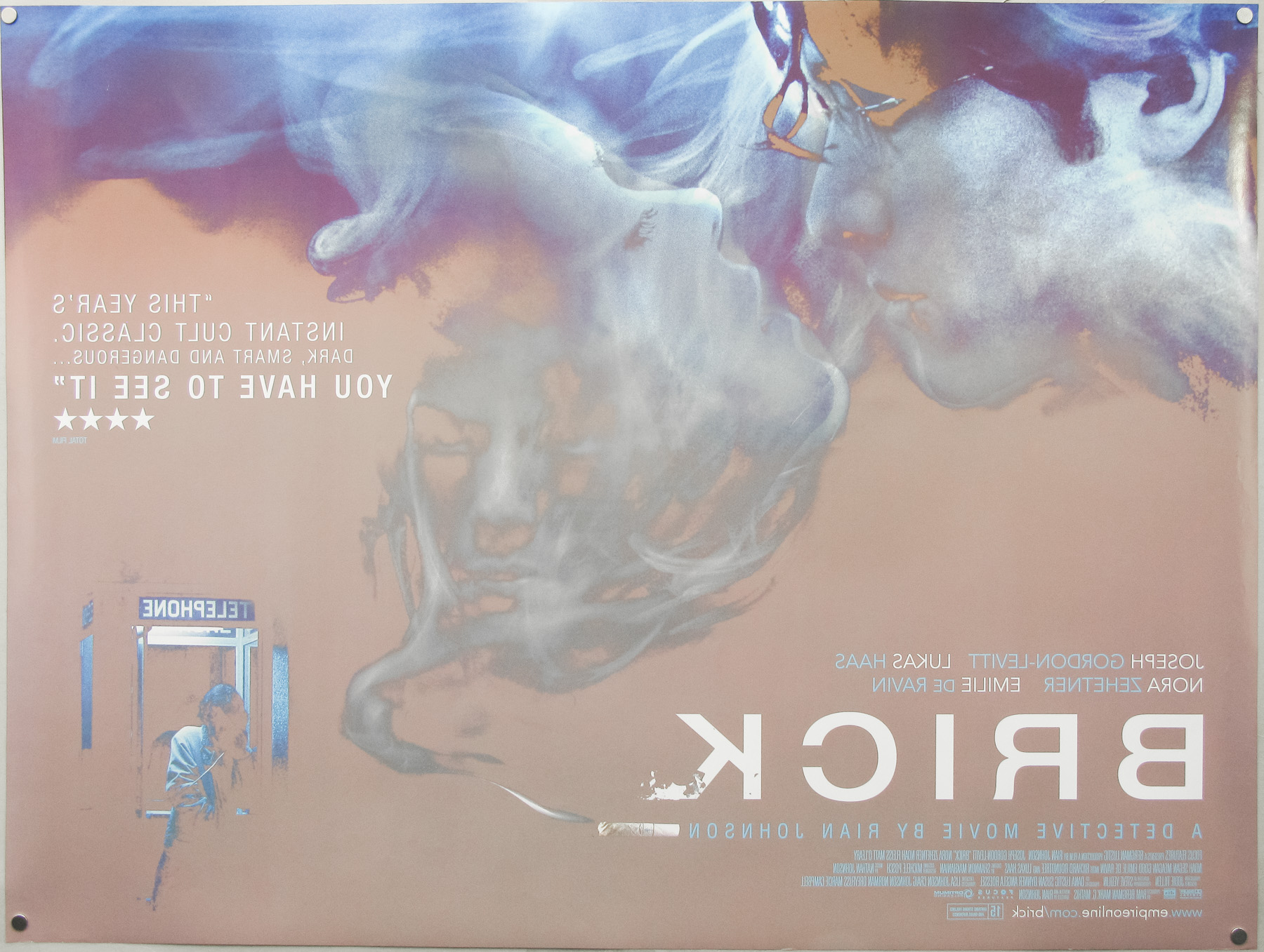
18.05.11
- Title
- Brick
- AKA
- --
- Year of Film
- 2005
- Director
- Rian Johnson
- Starring
- Joseph Gordon-Levitt, Emilie de Ravin, Nora Zehetner, Matt O'Leary, Noah Fleiss, Brian J. White, Meagan Good, Noah Segan, Lukas Haas, Richard Roundtree
- Origin of Film
- USA
- Genre(s) of Film
- Joseph Gordon-Levitt, Emilie de Ravin, Nora Zehetner, Matt O'Leary, Noah Fleiss, Brian J. White, Meagan Good, Noah Segan, Lukas Haas, Richard Roundtree,
- Type of Poster
- Quad
- Style of Poster
- Black and blue style
- Origin of Poster
- UK
- Year of Poster
- 2005
- Designer
- AllCity Media
- Artist
- --
- Size (inches)
- 30" x 40"
- SS or DS
- DS
- Tagline
- --
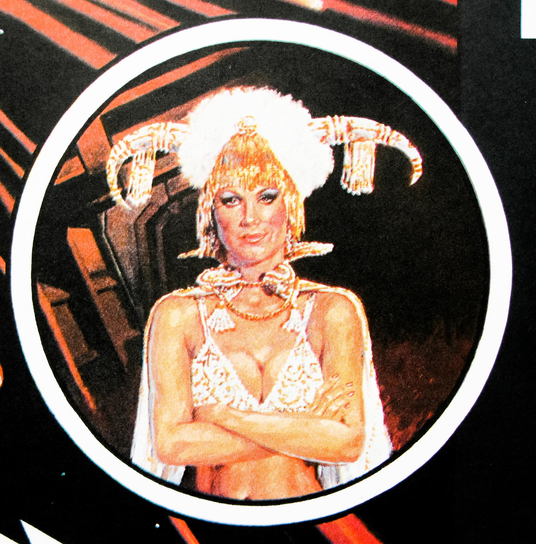
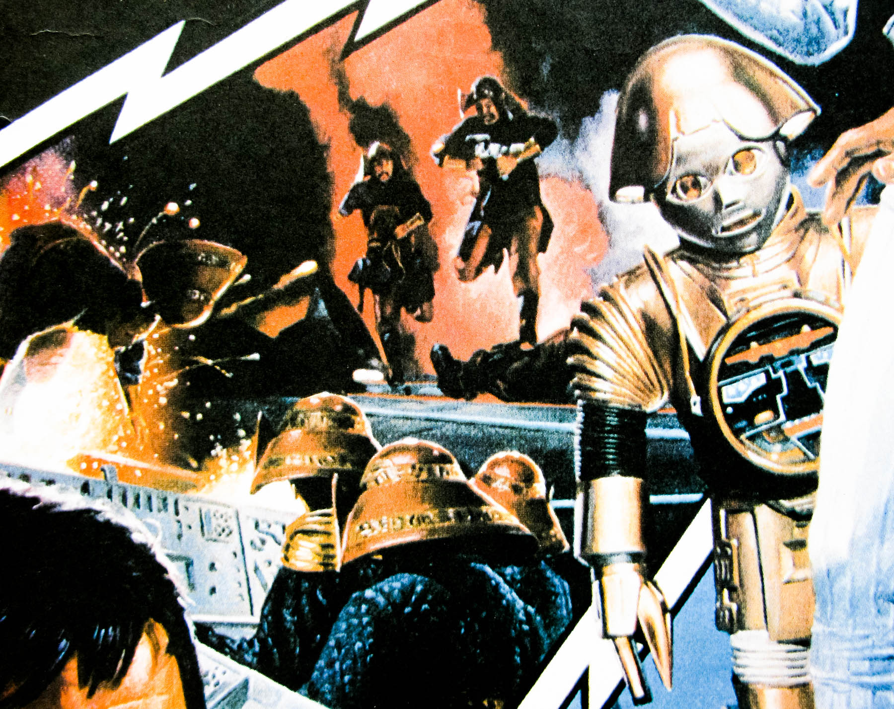
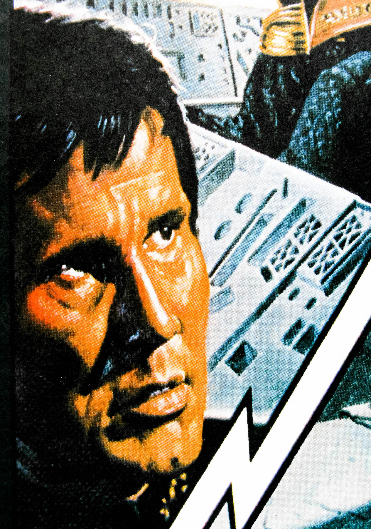
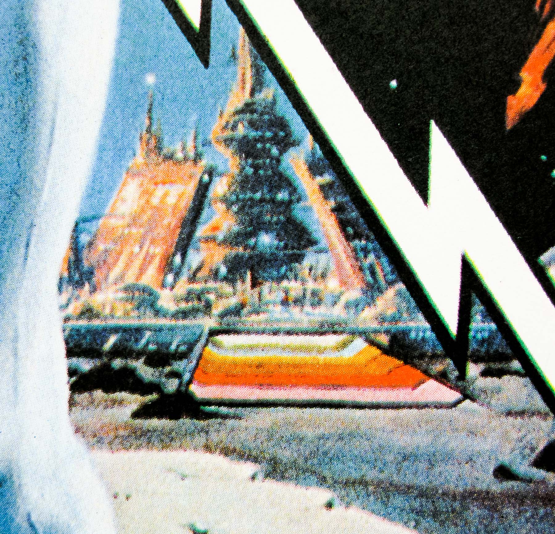
18.05.11
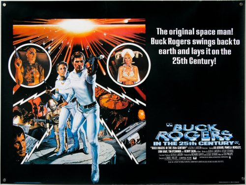
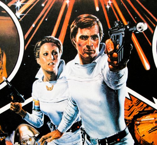
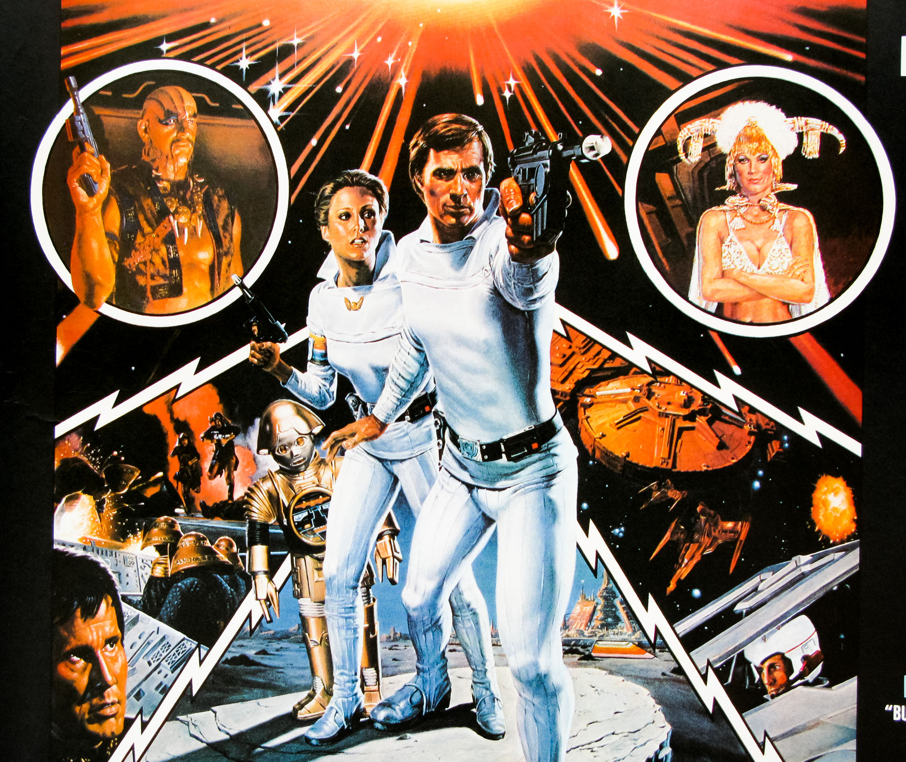
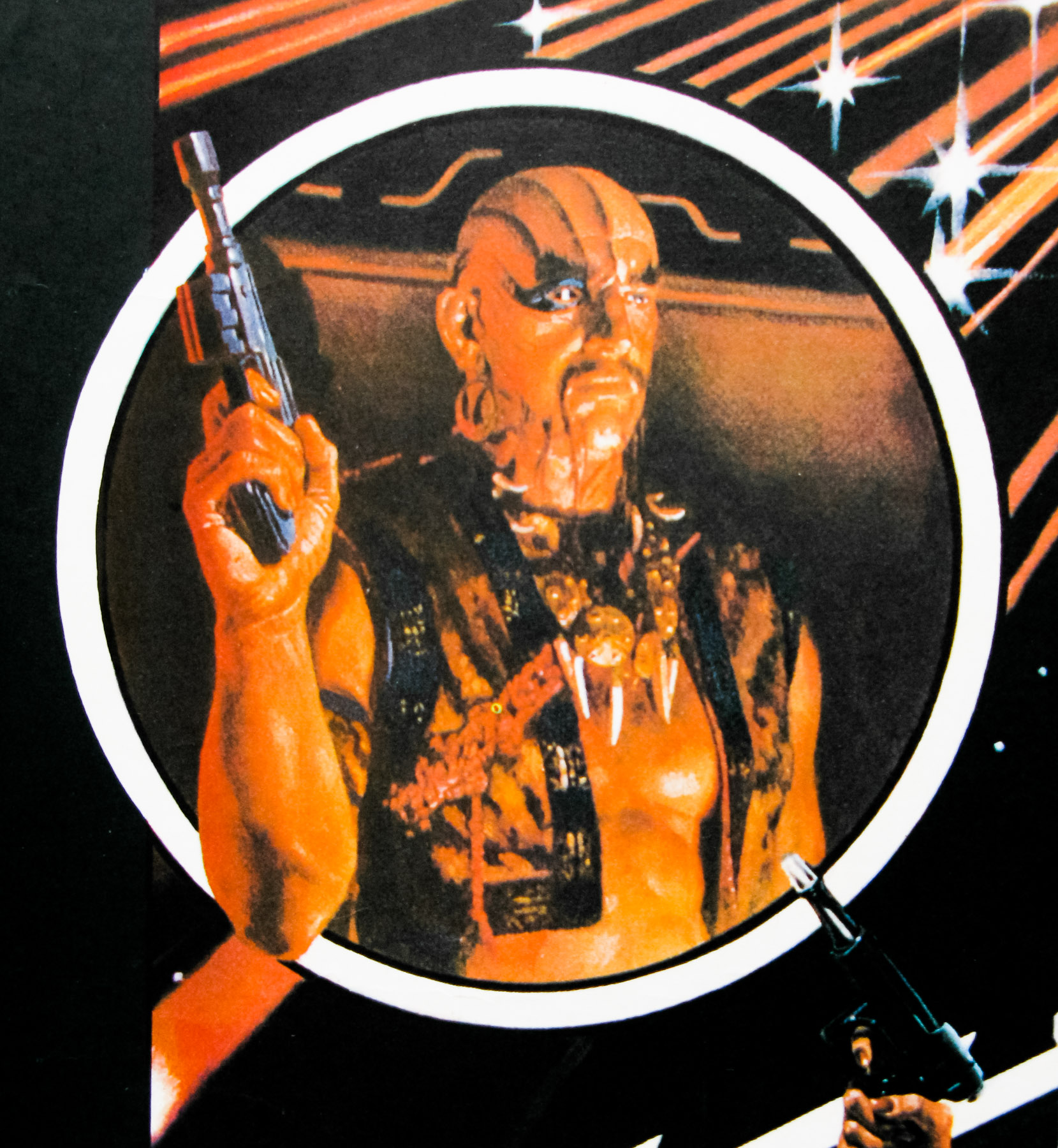
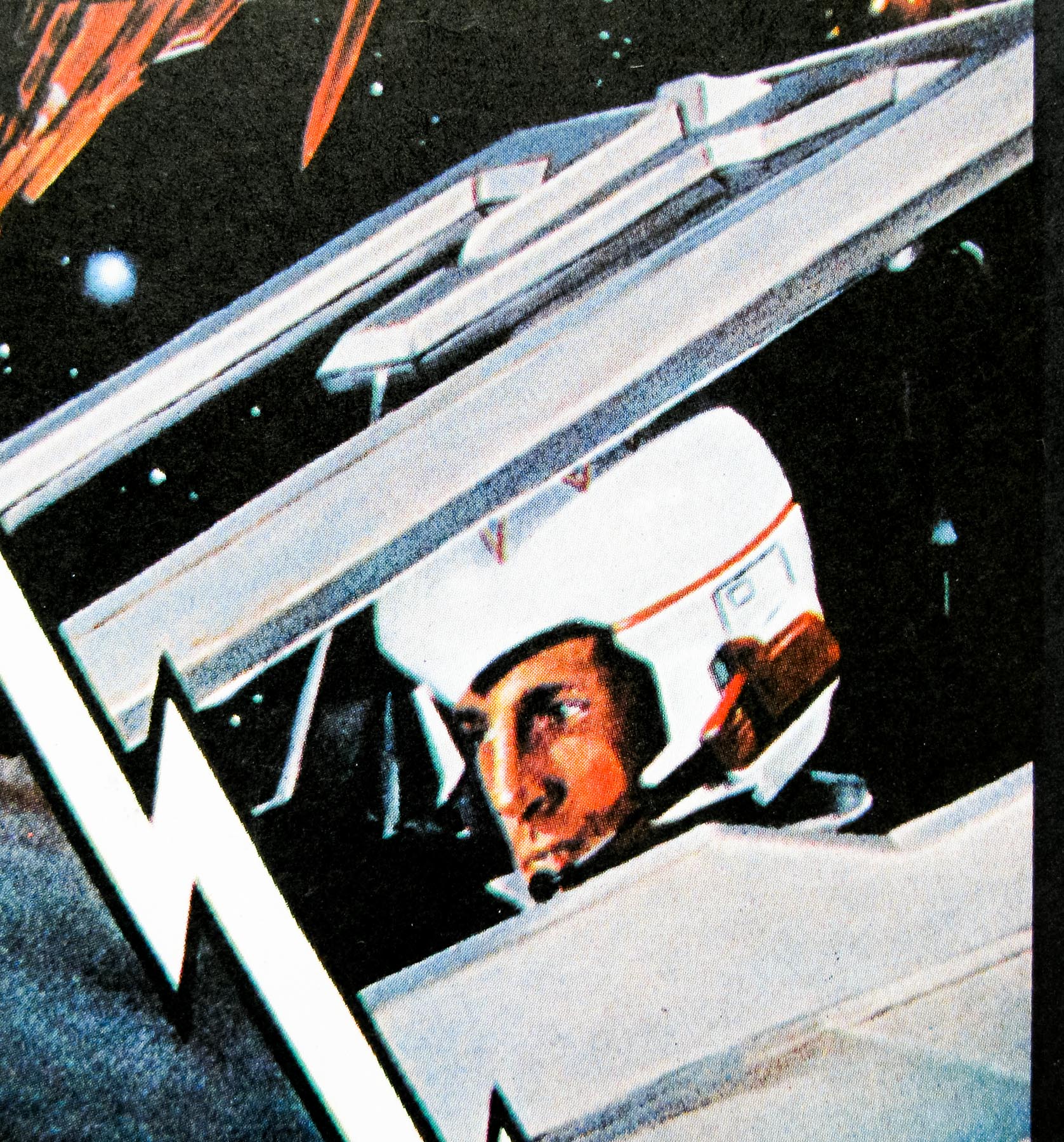
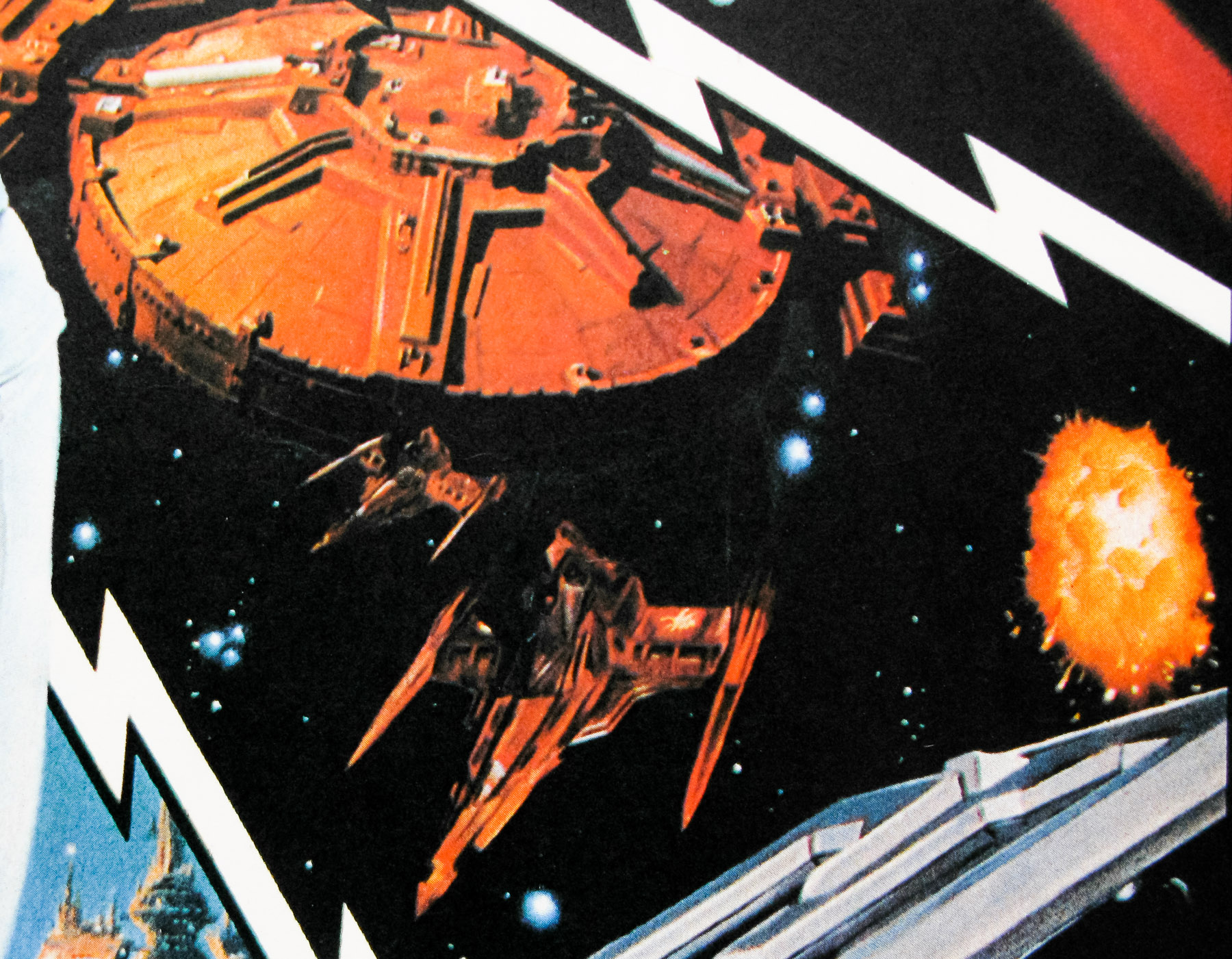
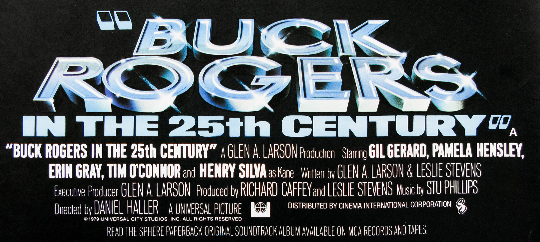
- Title
- Buck Rogers in the 25th Century
- AKA
- --
- Year of Film
- 1979
- Director
- Daniel Haller
- Starring
- Gil Gerard, Mel Blanc (voice), Duke Butler, Howard F. Flynn (voice), Erin Gray, Pamela Hensley, Tim O'Connor, Felix Silla, Henry Silva
- Origin of Film
- USA
- Genre(s) of Film
- Gil Gerard, Mel Blanc (voice), Duke Butler, Howard F. Flynn (voice), Erin Gray, Pamela Hensley, Tim O'Connor, Felix Silla, Henry Silva,
- Type of Poster
- Quad
- Style of Poster
- --
- Origin of Poster
- UK
- Year of Poster
- 1979
- Designer
- Unknown
- Artist
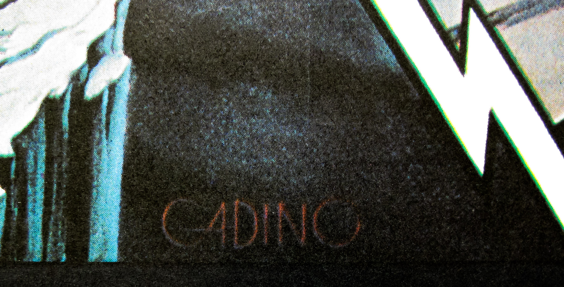
- Victor Gadino
- Size (inches)
- 30" x 39 13/16"
- SS or DS
- SS
- Tagline
- The original space man! The ultimate trip! Buck Rogers swings back to earth and lays it on the 25th Century!
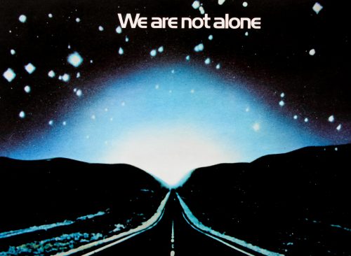
18.05.11
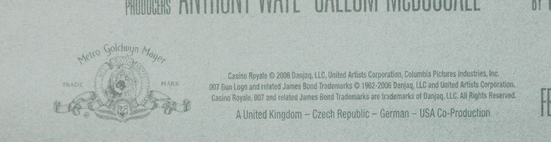
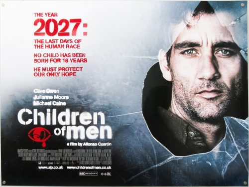
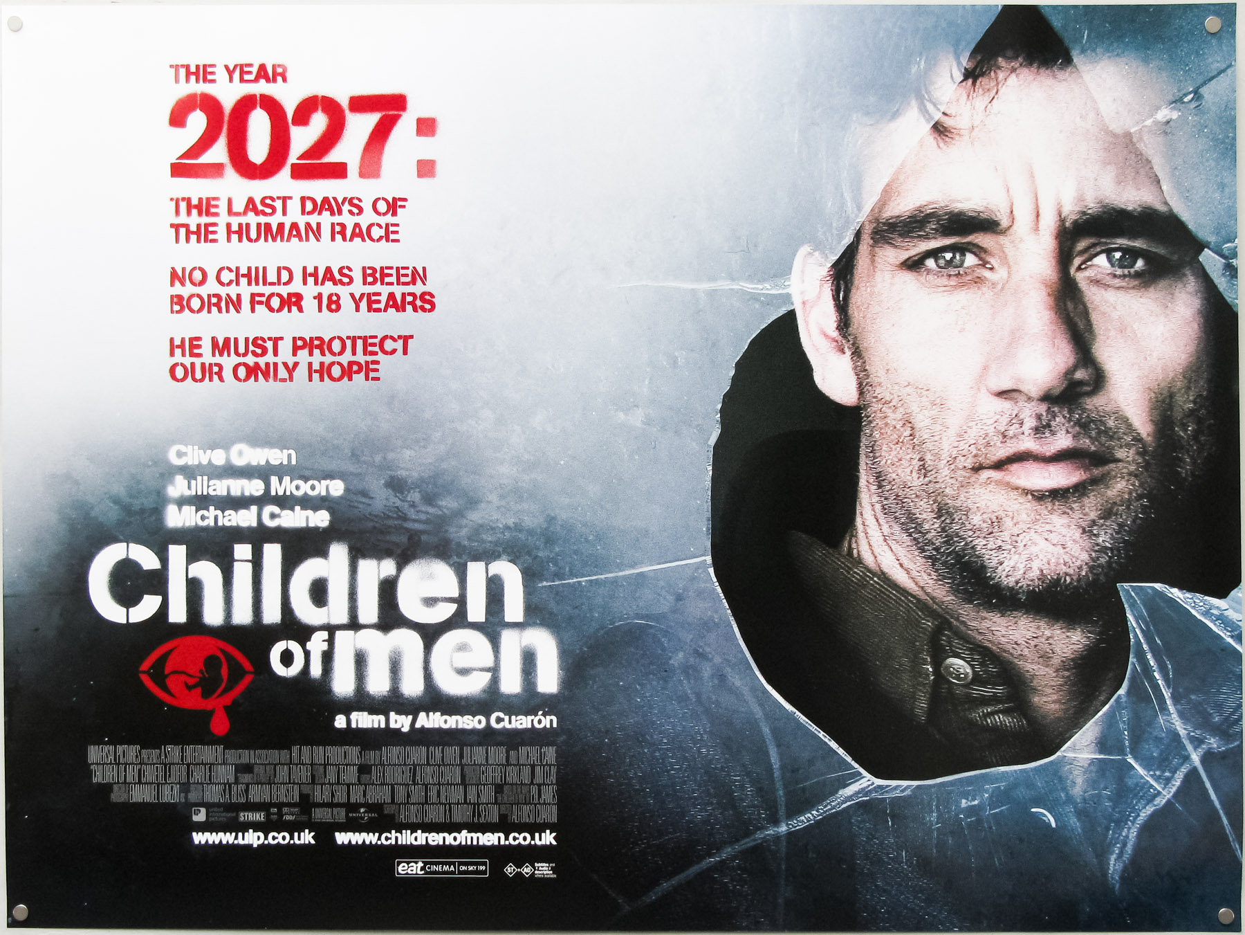
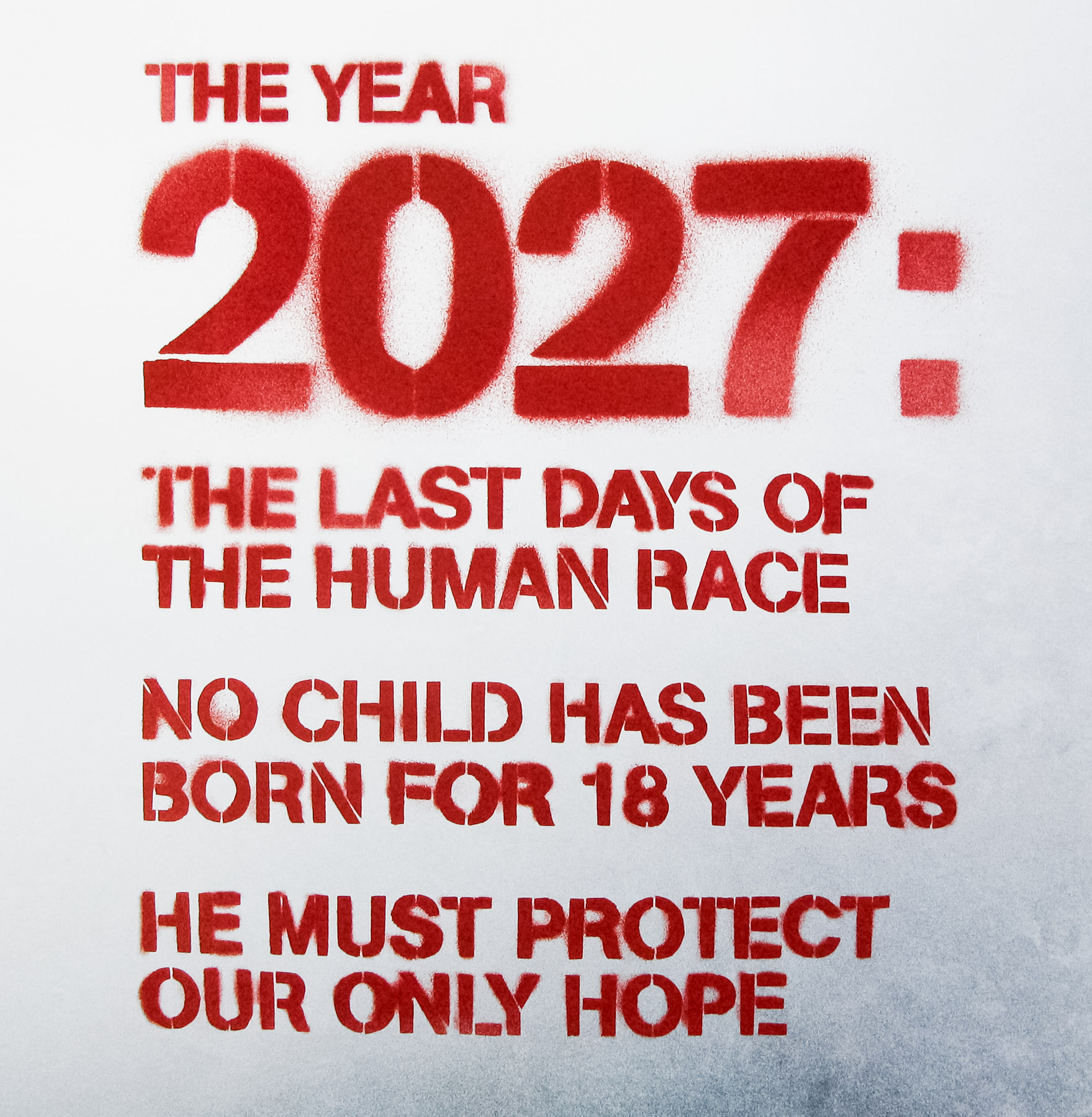
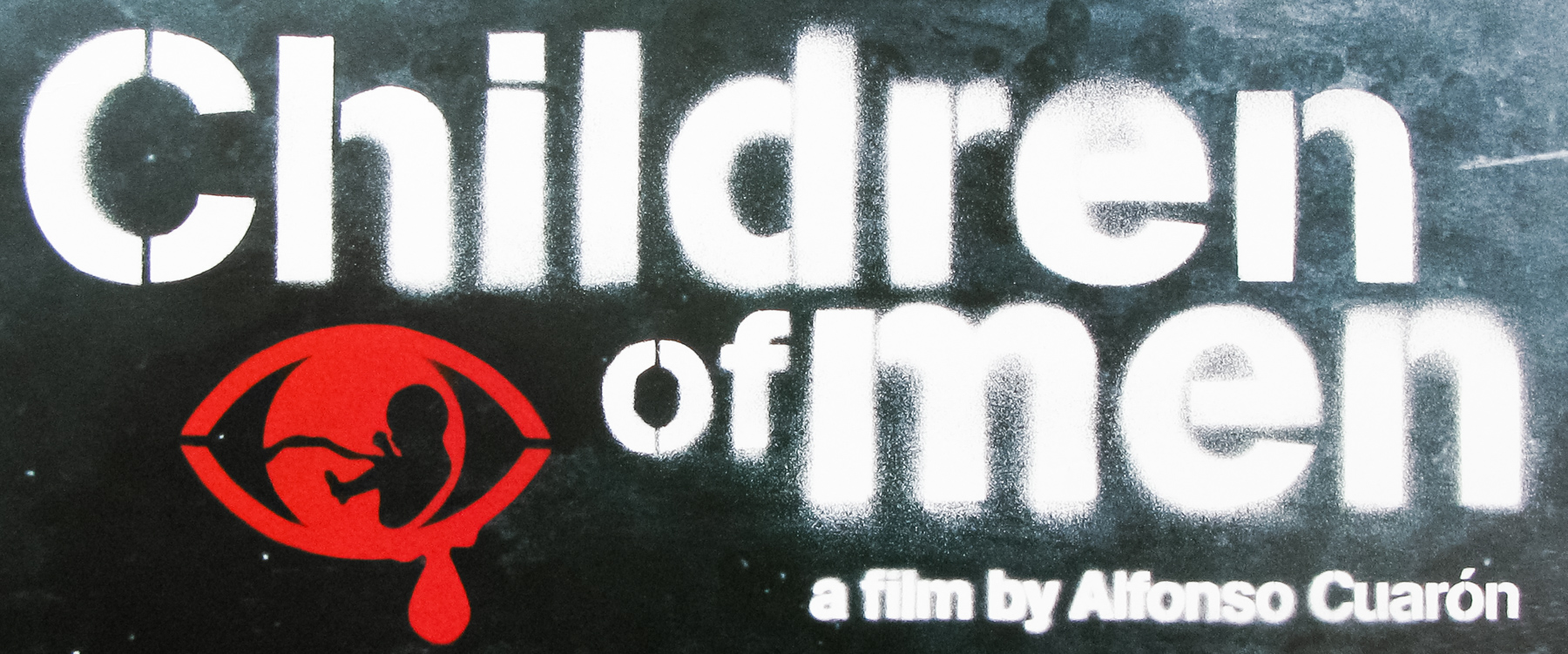
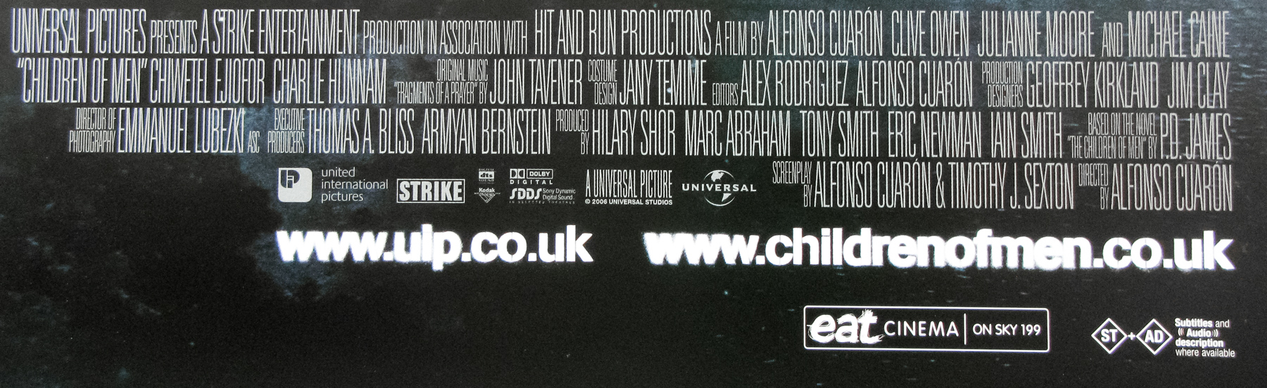
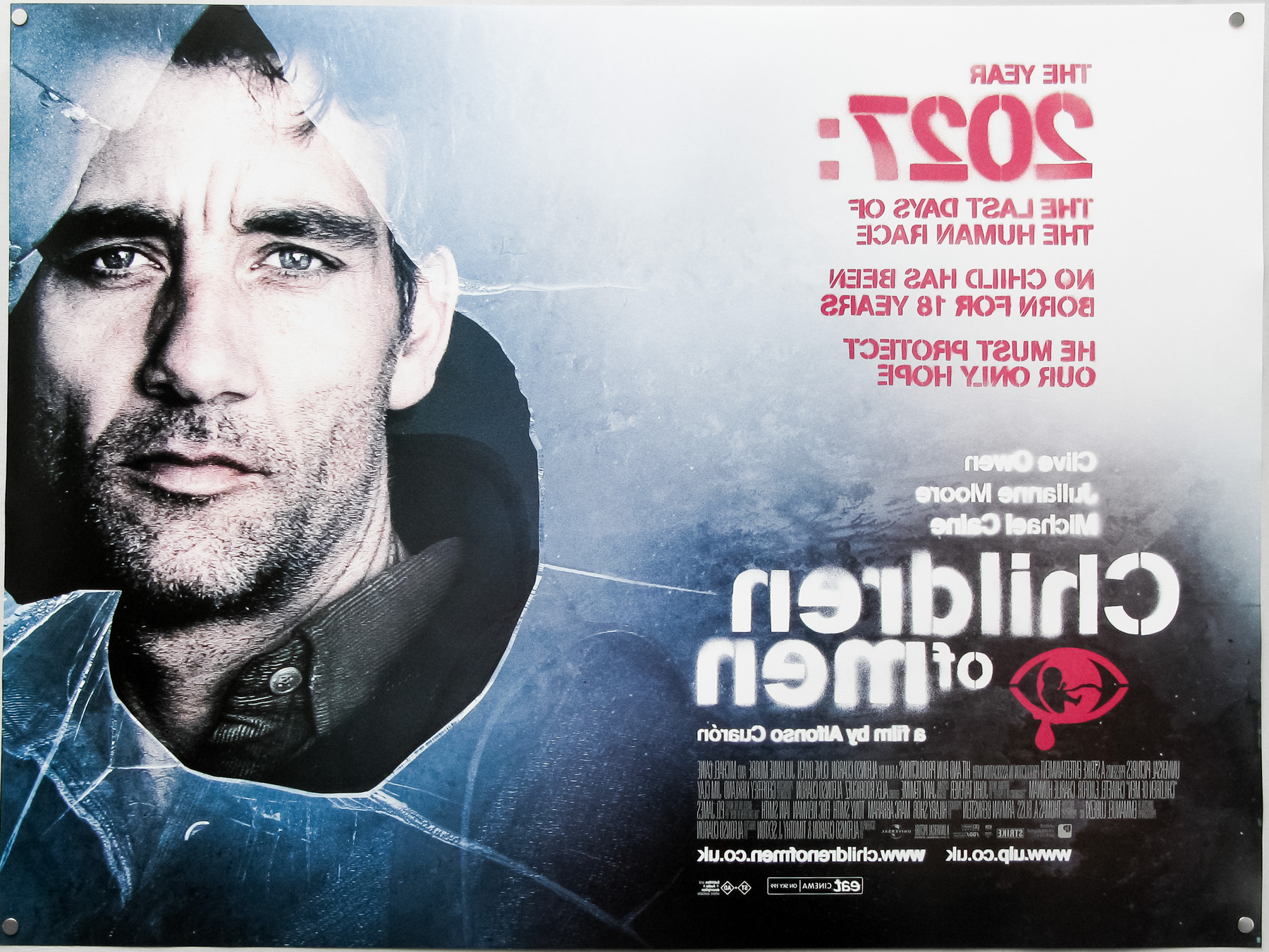
- Title
- Children Of Men
- AKA
- --
- Year of Film
- 2006
- Director
- Alfonso Cuarón
- Starring
- Clive Owen, Julianne Moore, Michael Caine, Claire-Hope Ashitey, Chiwetel Ejiofor, Pam Ferris, Danny Huston
- Origin of Film
- Japan | UK | USA
- Genre(s) of Film
- Clive Owen, Julianne Moore, Michael Caine, Claire-Hope Ashitey, Chiwetel Ejiofor, Pam Ferris, Danny Huston,
- Type of Poster
- Quad
- Style of Poster
- --
- Origin of Poster
- UK
- Year of Poster
- 2006
- Designer
- Creative Partnership
- Artist
- --
- Size (inches)
- 30" x 40"
- SS or DS
- DS
- Tagline
- The year 2027: The last days of the human race. No child has been born for 18 years. He must protect our only hope.
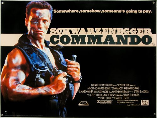
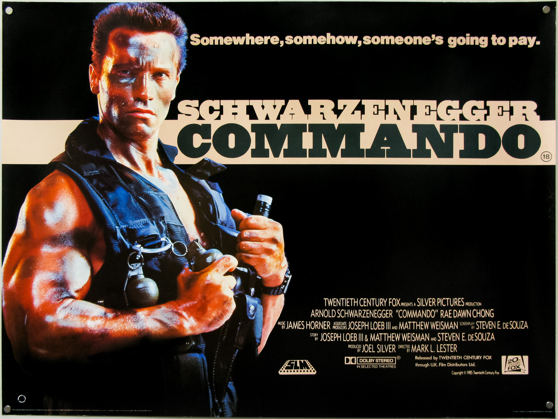
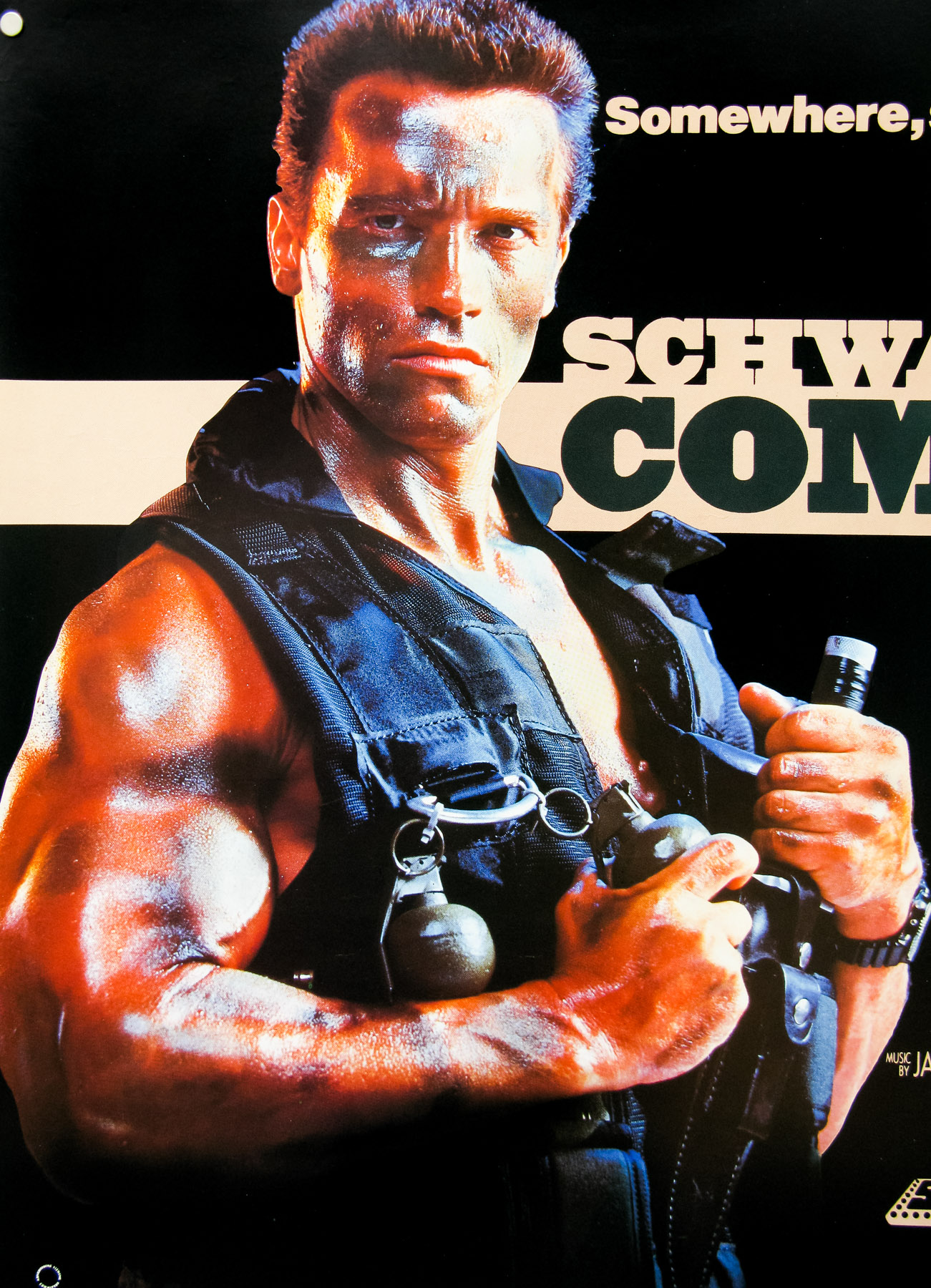
18.05.11
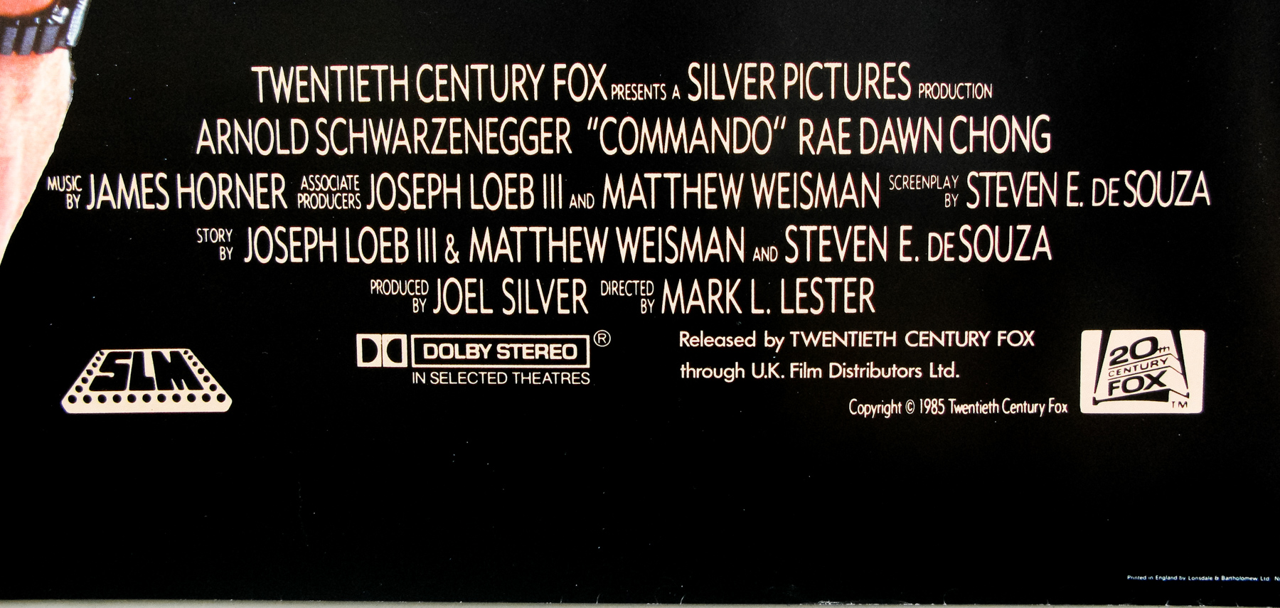
- Title
- Commando
- AKA
- Das Phantom Kommando (West Germany)
- Year of Film
- 1985
- Director
- Mark L. Lester
- Starring
- Arnold Schwarzenegger, Rae Dawn Chong, Alyssa Milano, Vernon Wells, Bill Duke, Dan Hedaya, James Olson, Michael Delano, David Patrick Kelly
- Origin of Film
- USA
- Genre(s) of Film
- Arnold Schwarzenegger, Rae Dawn Chong, Alyssa Milano, Vernon Wells, Bill Duke, Dan Hedaya, James Olson, Michael Delano, David Patrick Kelly,
- Type of Poster
- Quad
- Style of Poster
- --
- Origin of Poster
- UK
- Year of Poster
- 1985
- Designer
- Unknown
- Artist
- --
- Size (inches)
- 30" x 40"
- SS or DS
- SS
- Tagline
- Somewhere... somehow... someone's going to pay
18.05.11
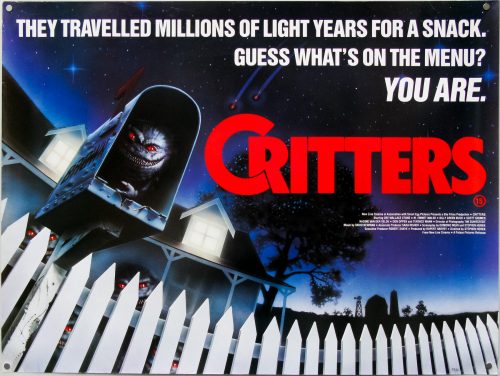
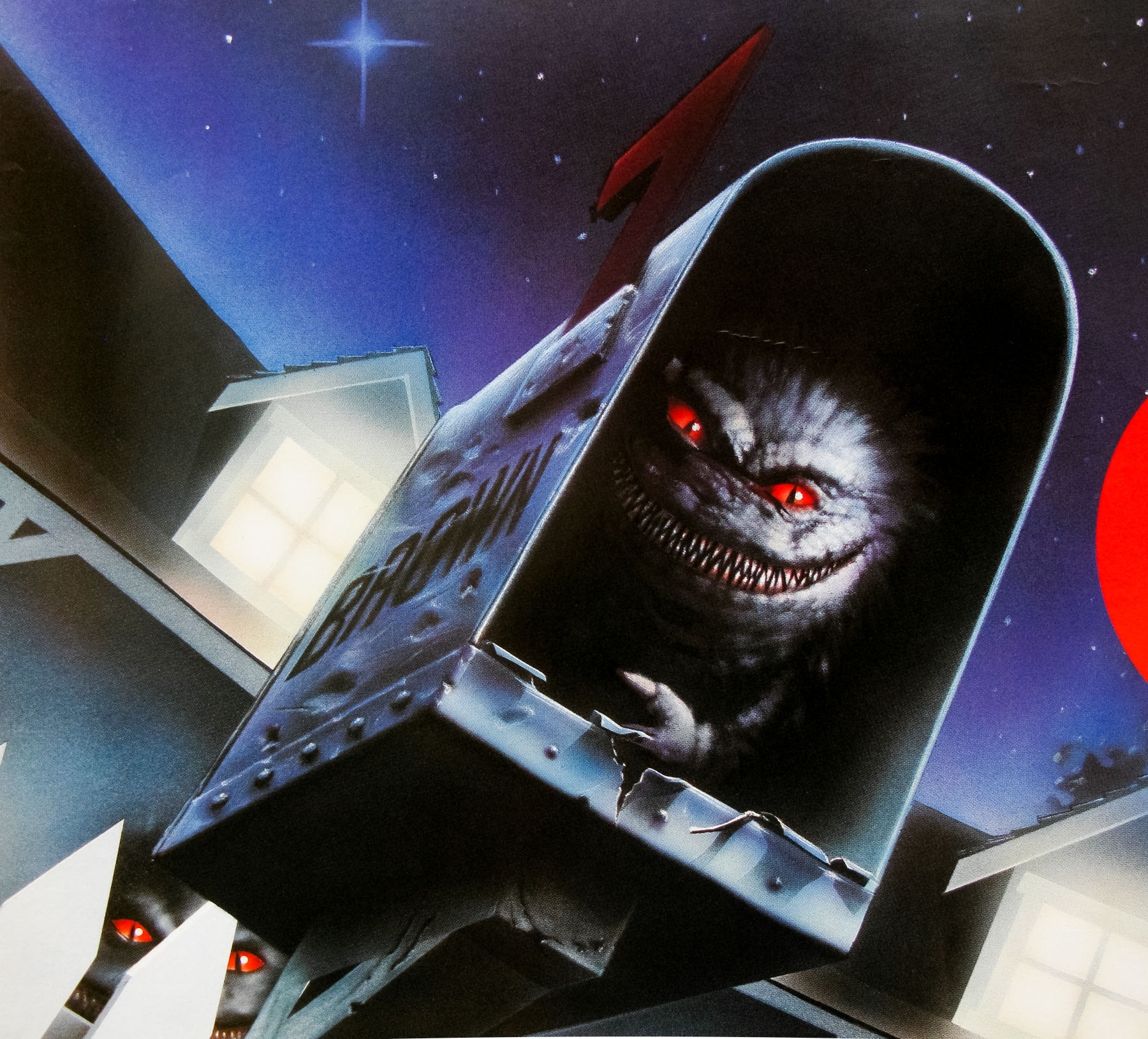
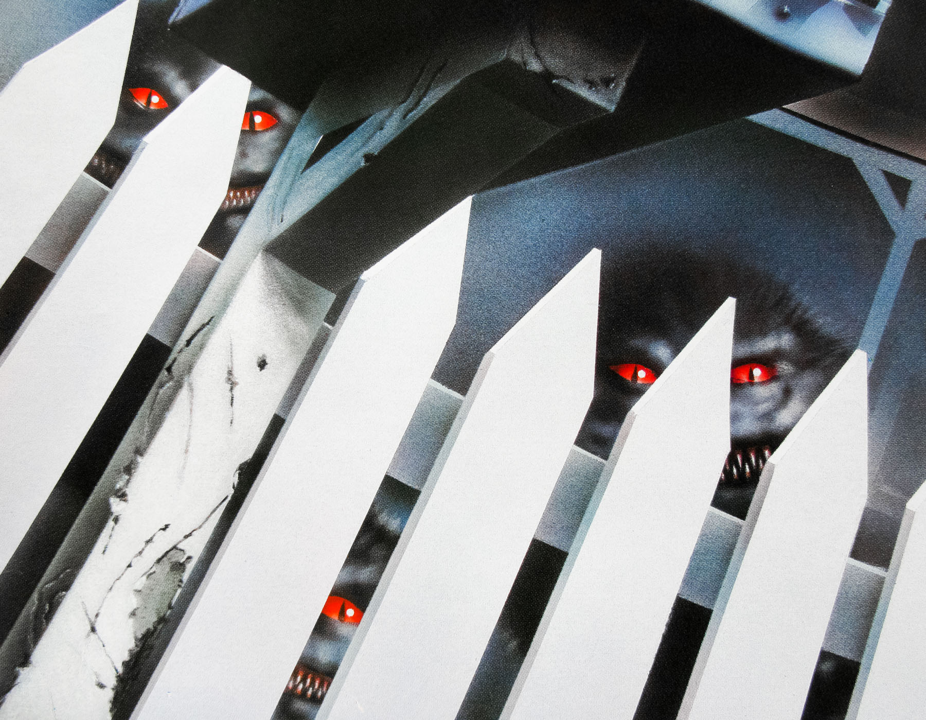
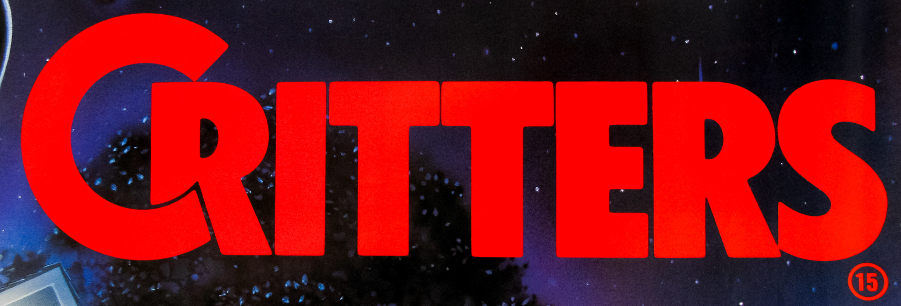
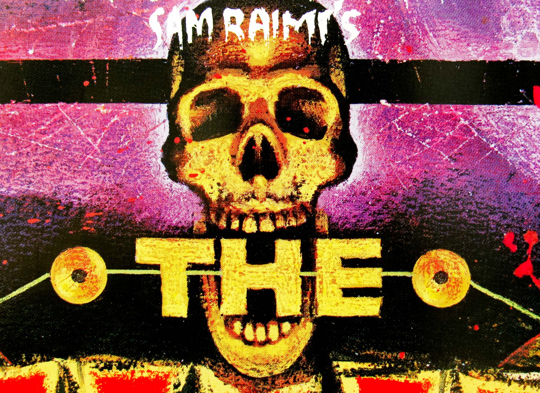
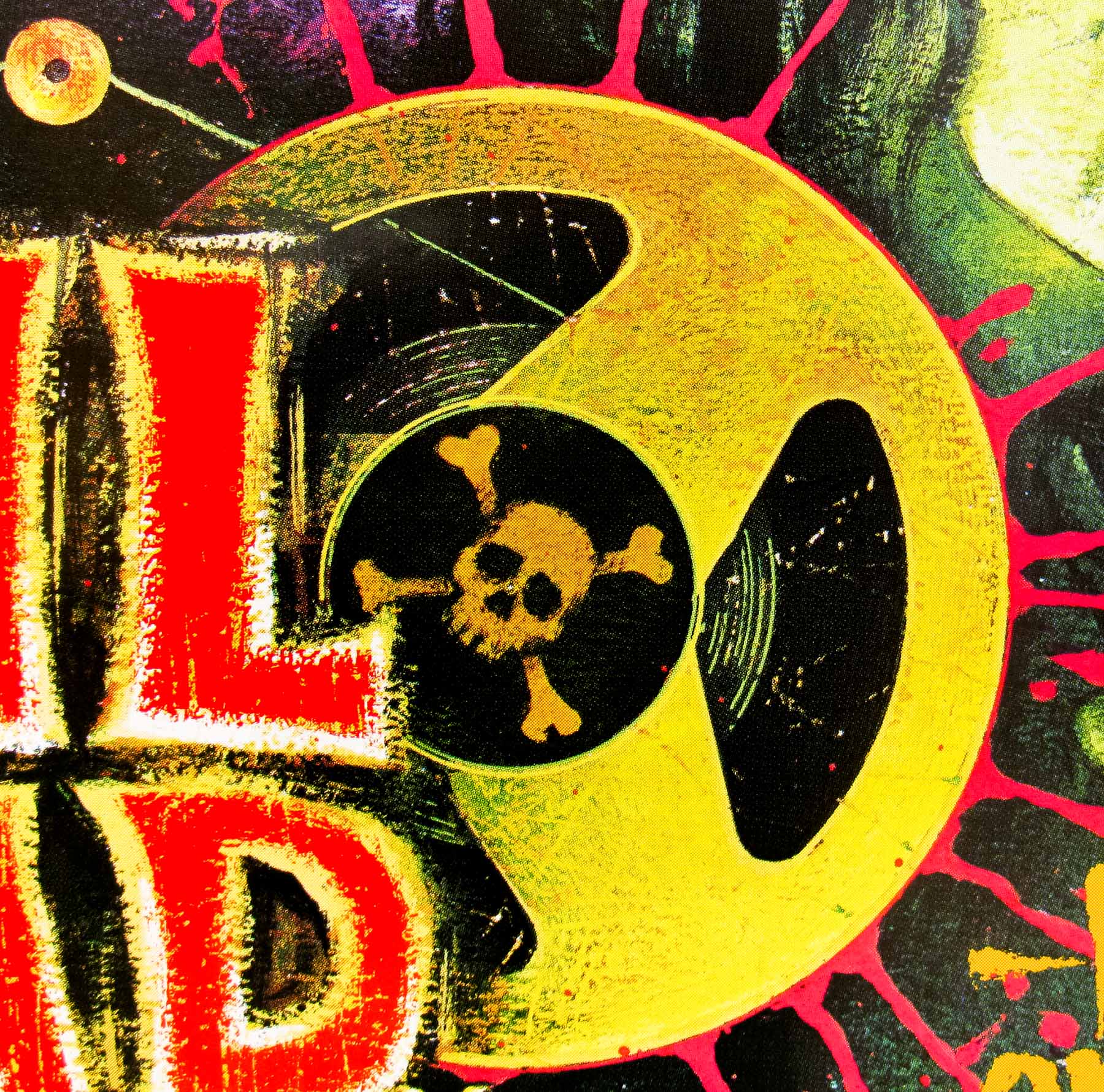
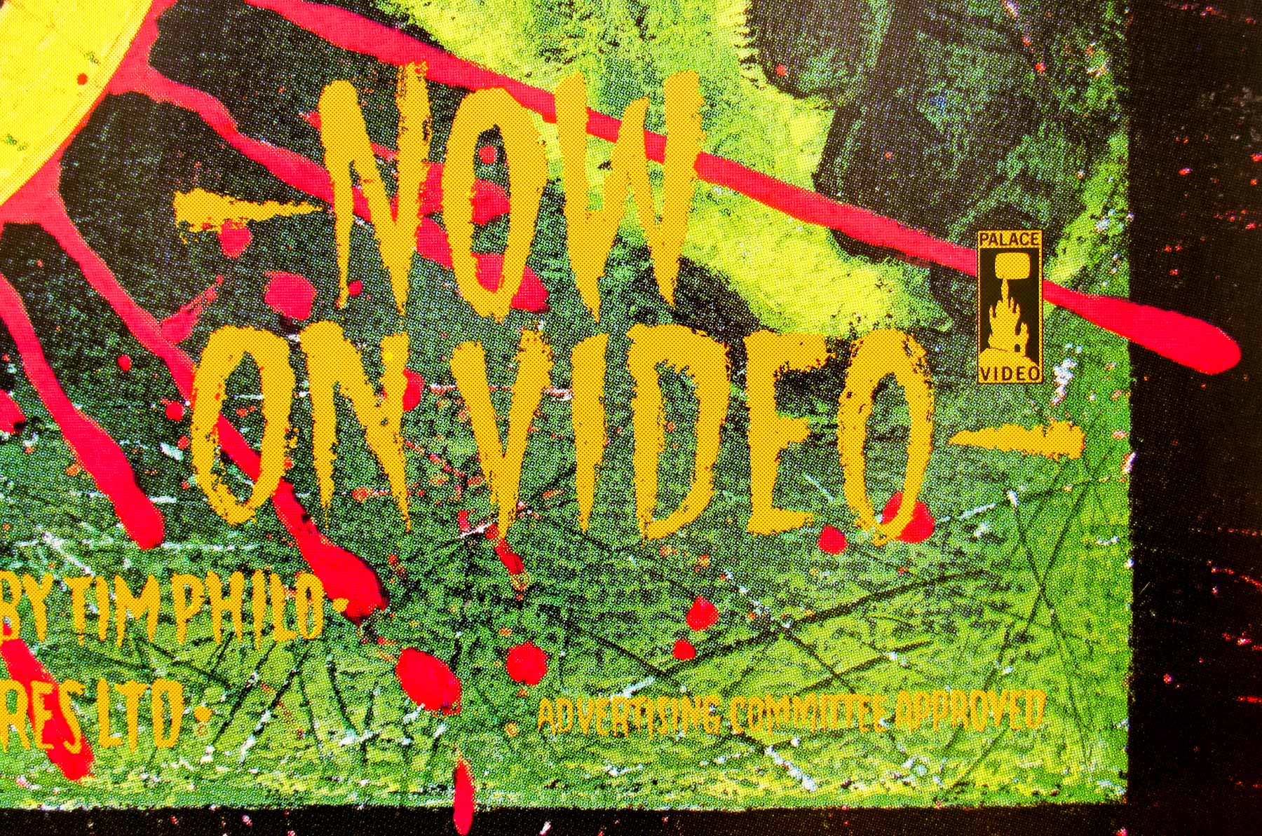
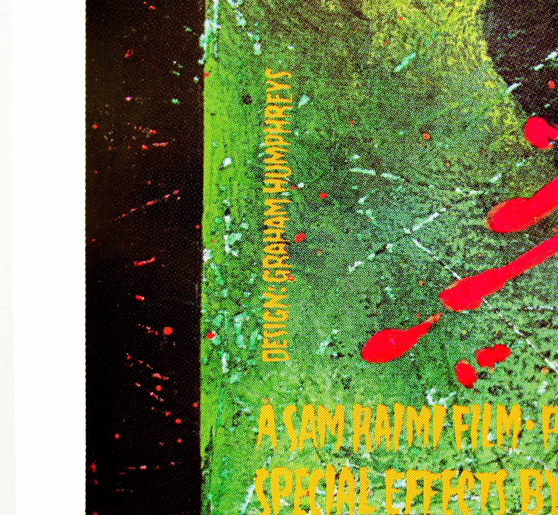
- Title
- Critters
- AKA
- --
- Year of Film
- 1986
- Director
- Stephen Herek
- Starring
- Scott Grimes, Dee Wallace-Stone, M. Emmet Walsh, Don Keith Opper, Billy Green Bush, Terrence Mann, Ethan Phillips, Billy Zane
- Origin of Film
- USA
- Genre(s) of Film
- Scott Grimes, Dee Wallace-Stone, M. Emmet Walsh, Don Keith Opper, Billy Green Bush, Terrence Mann, Ethan Phillips, Billy Zane,
- Type of Poster
- Quad
- Style of Poster
- --
- Origin of Poster
- UK
- Year of Poster
- 1986
- Designer
- Unknown
- Artist
- Unknown
- Size (inches)
- 30" x 40"
- SS or DS
- SS
- Tagline
- They travelled millions of light years for a snack. Guess what's on the menu? YOU ARE.
18.05.11
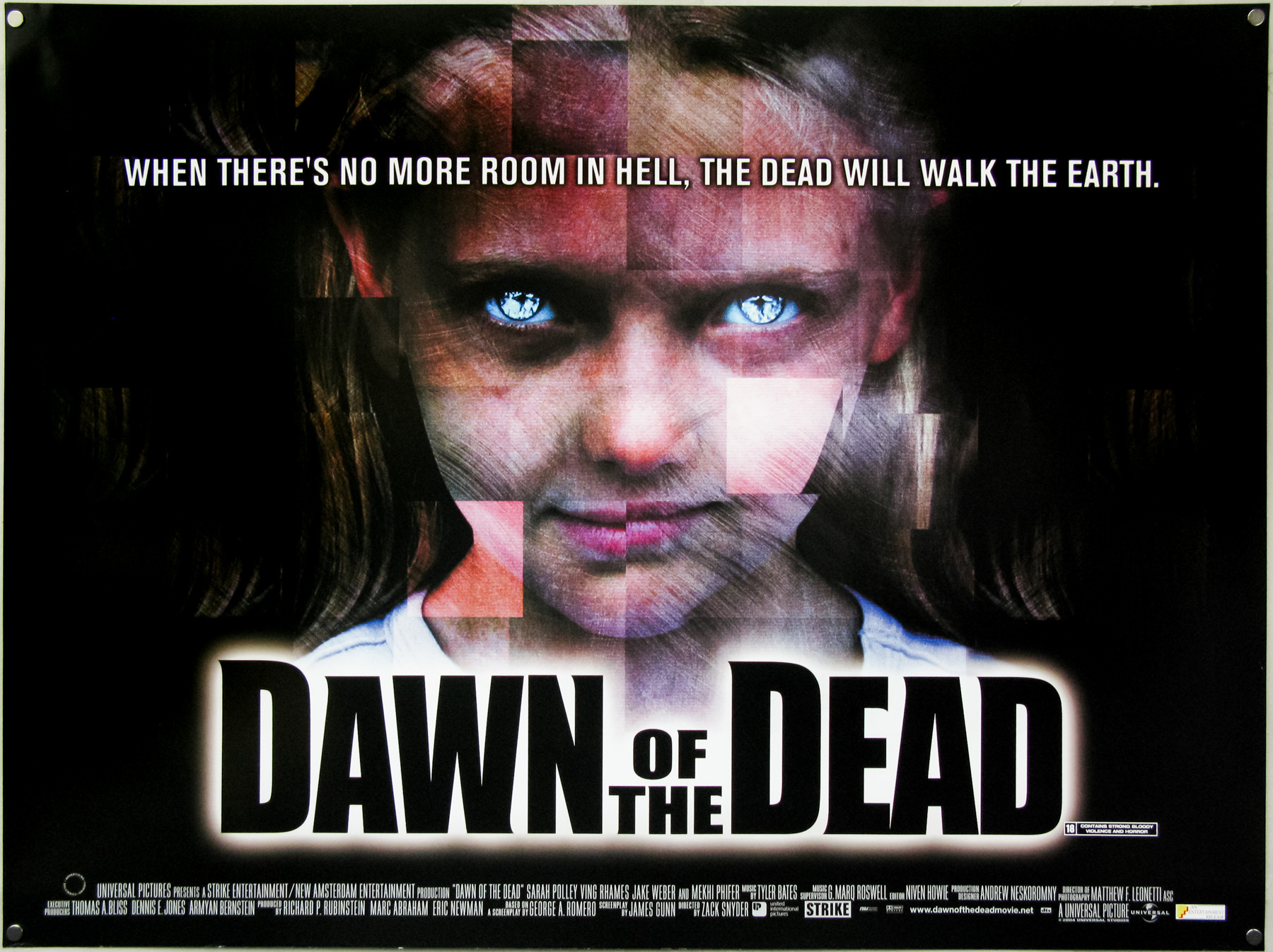
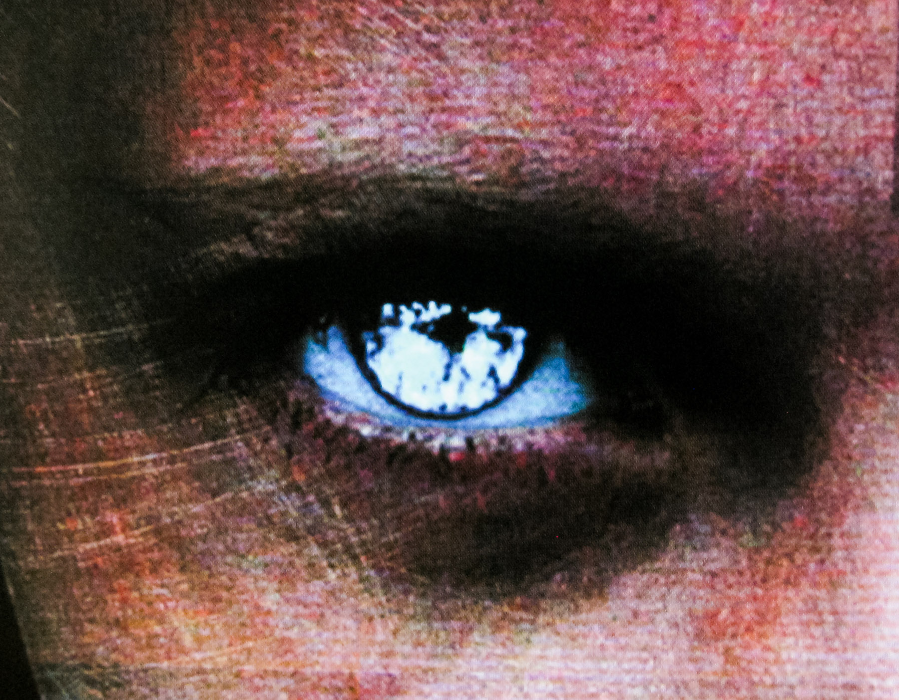
- Title
- Dawn Of The Dead
- AKA
- --
- Year of Film
- 2004
- Director
- Zack Snyder
- Starring
- Sarah Polley, Ving Rhames, Jake Weber, Michael Kelly, Kevin Zegers, Lindy Booth
- Origin of Film
- USA | Canada | Japan | France
- Genre(s) of Film
- Sarah Polley, Ving Rhames, Jake Weber, Michael Kelly, Kevin Zegers, Lindy Booth,
- Type of Poster
- Quad
- Style of Poster
- --
- Origin of Poster
- UK
- Year of Poster
- 2004
- Designer
- Unknown
- Artist
- --
- Size (inches)
- 30 1/16" x 40"
- SS or DS
- DS
- Tagline
- When there's no more room in hell, the dead will walk the earth.
18.05.11
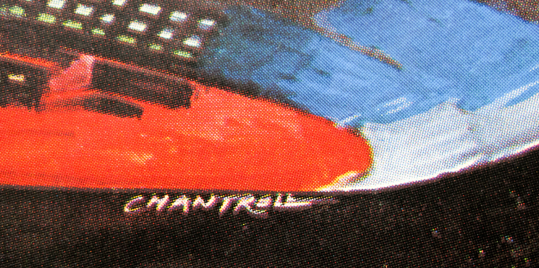
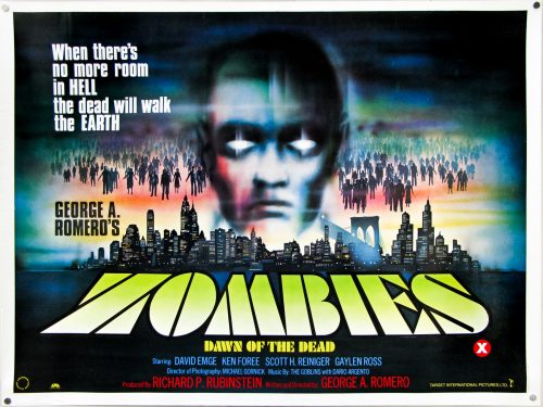
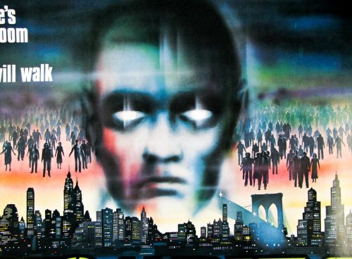
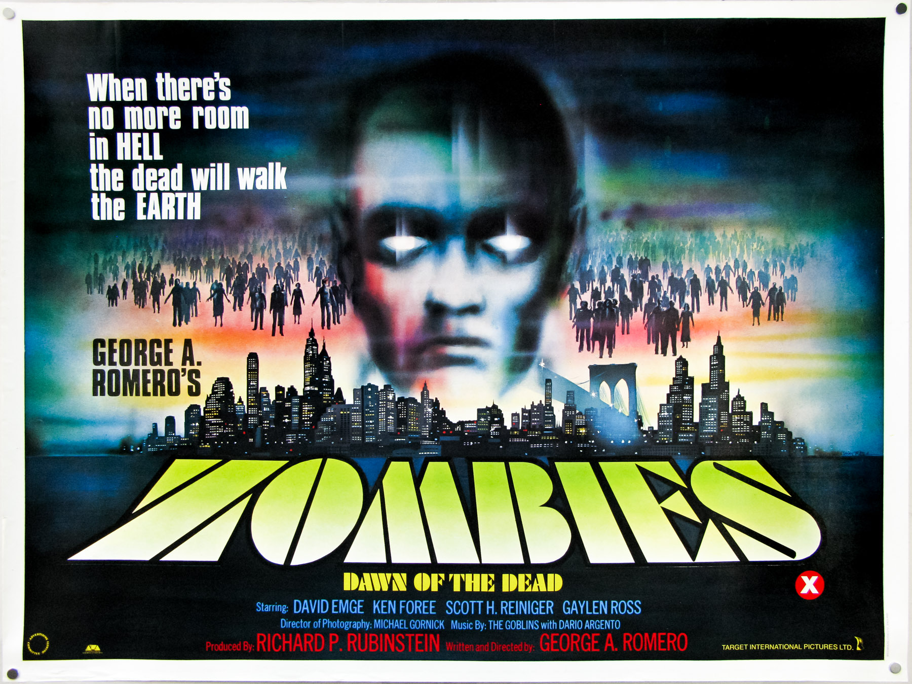
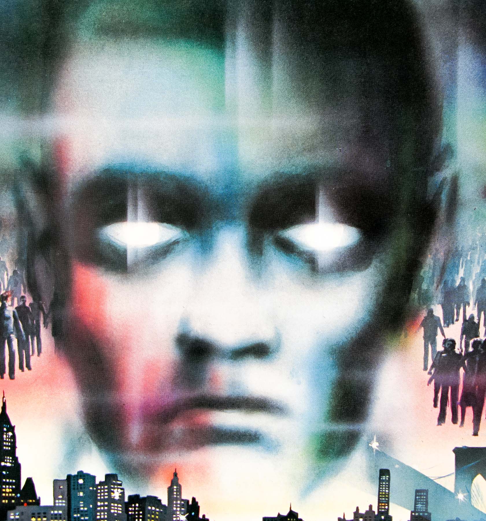
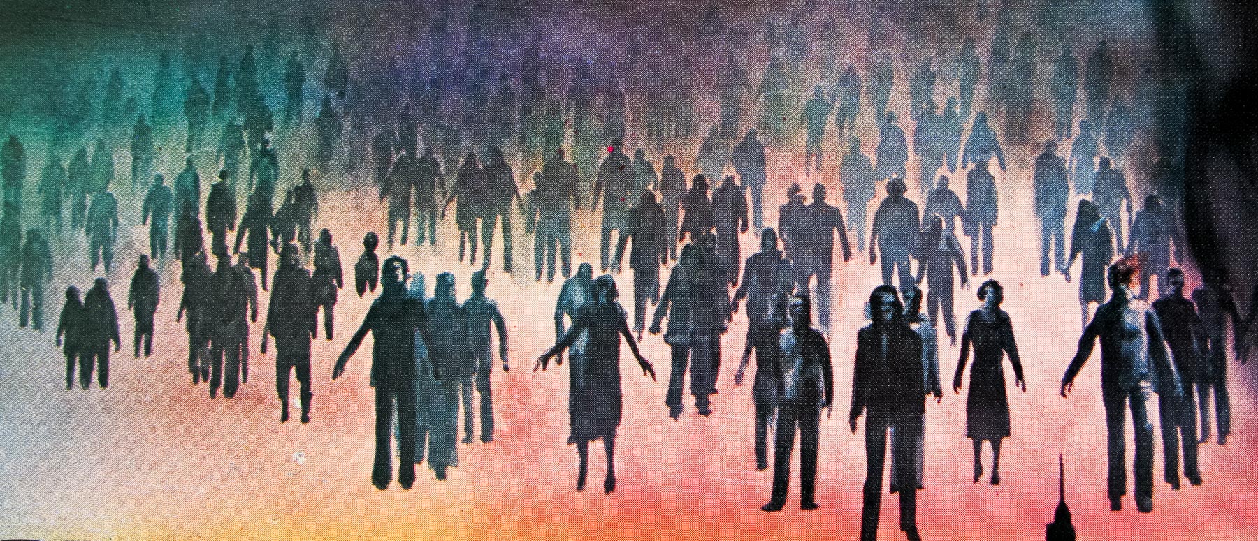
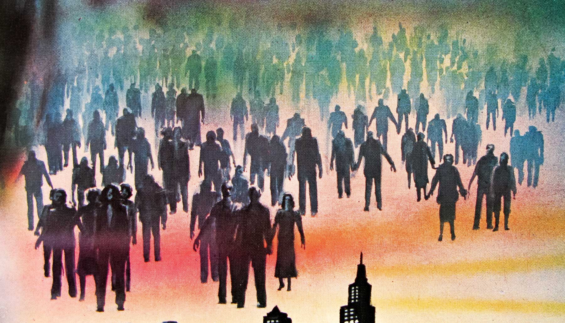
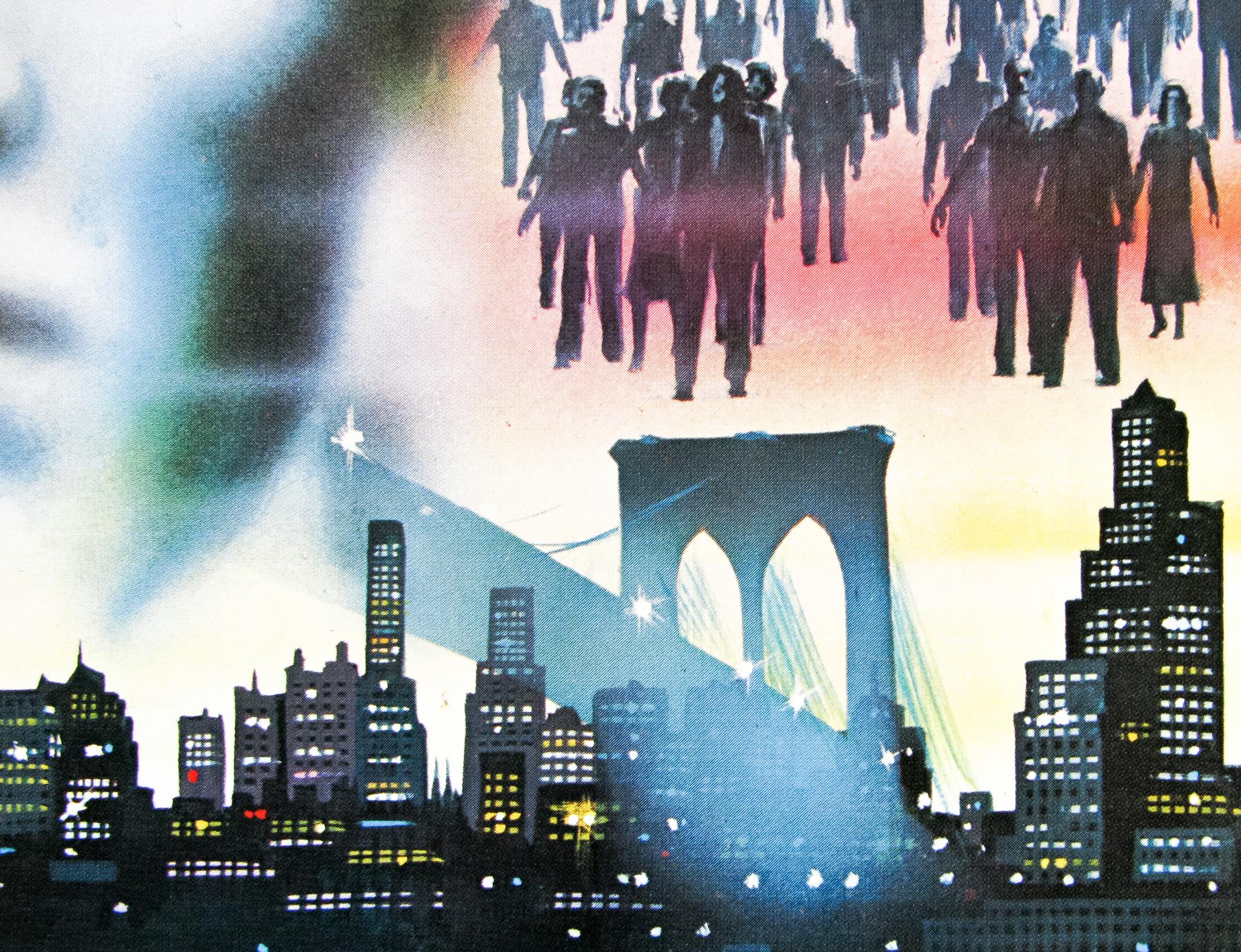
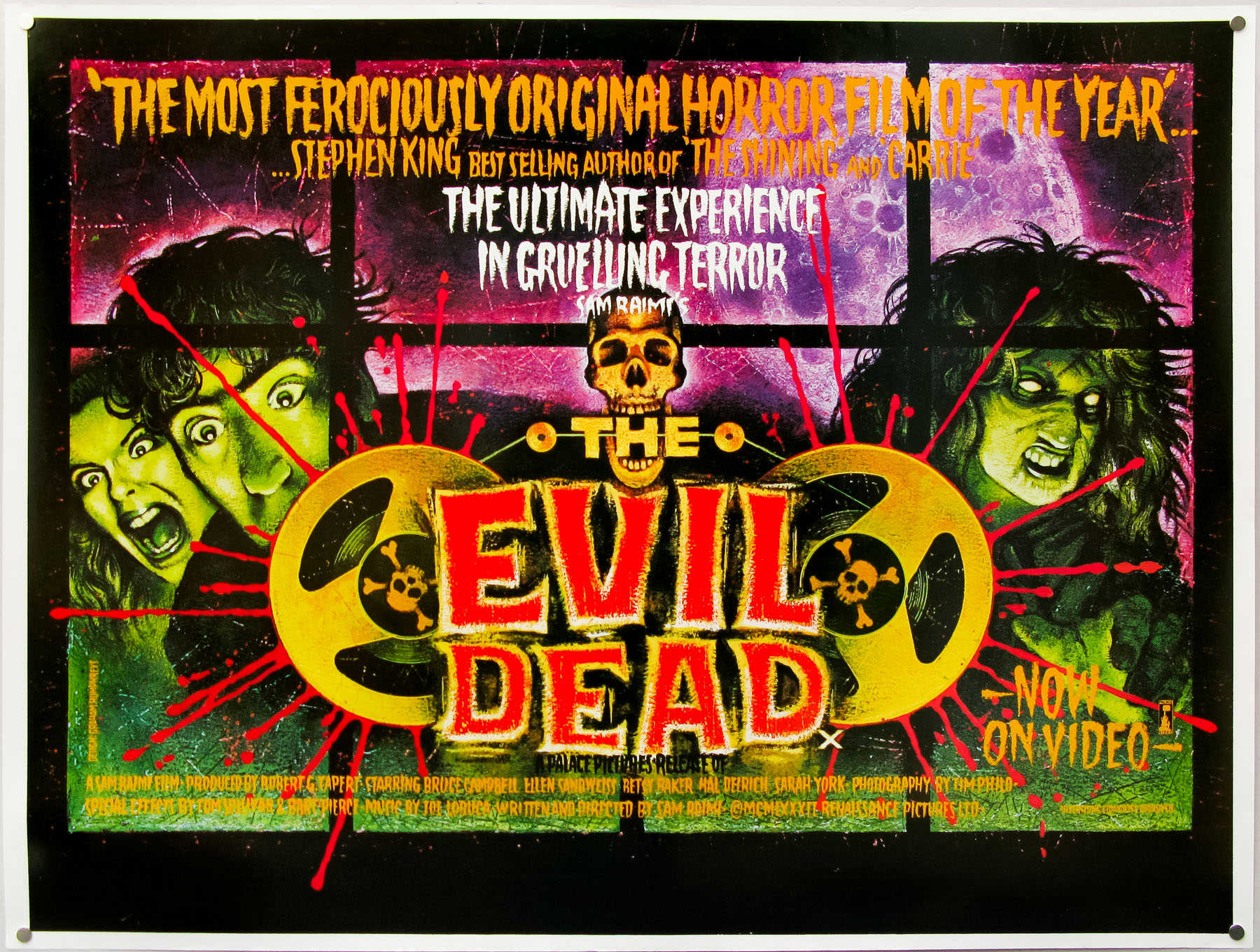
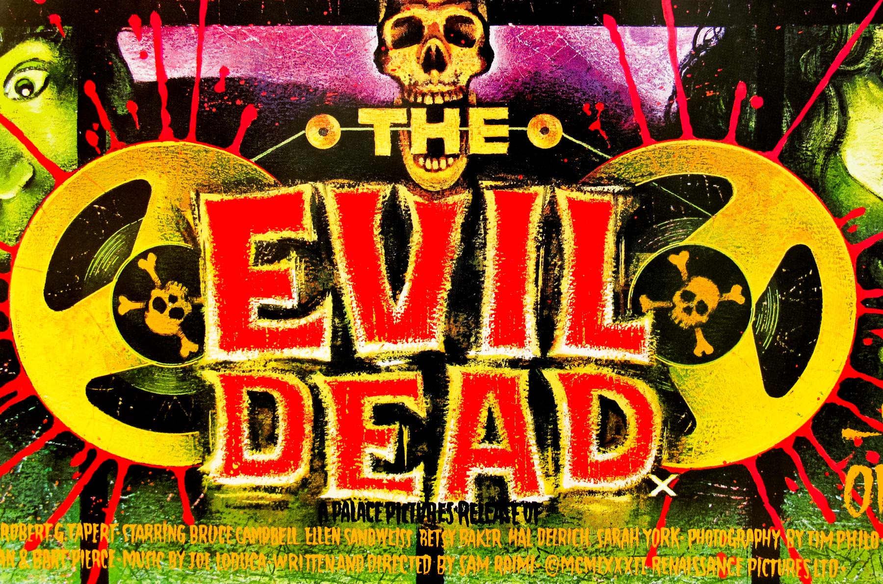
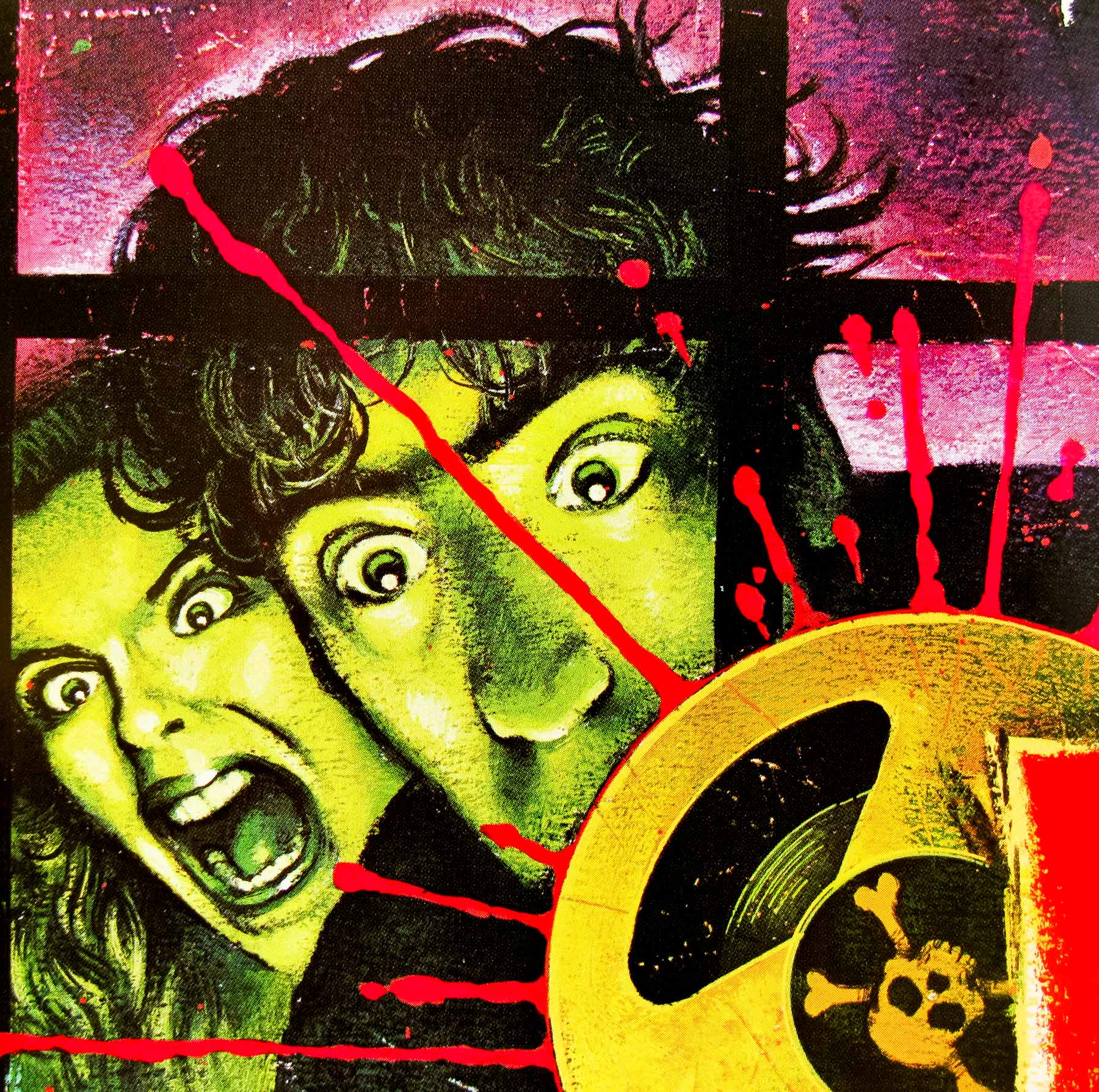
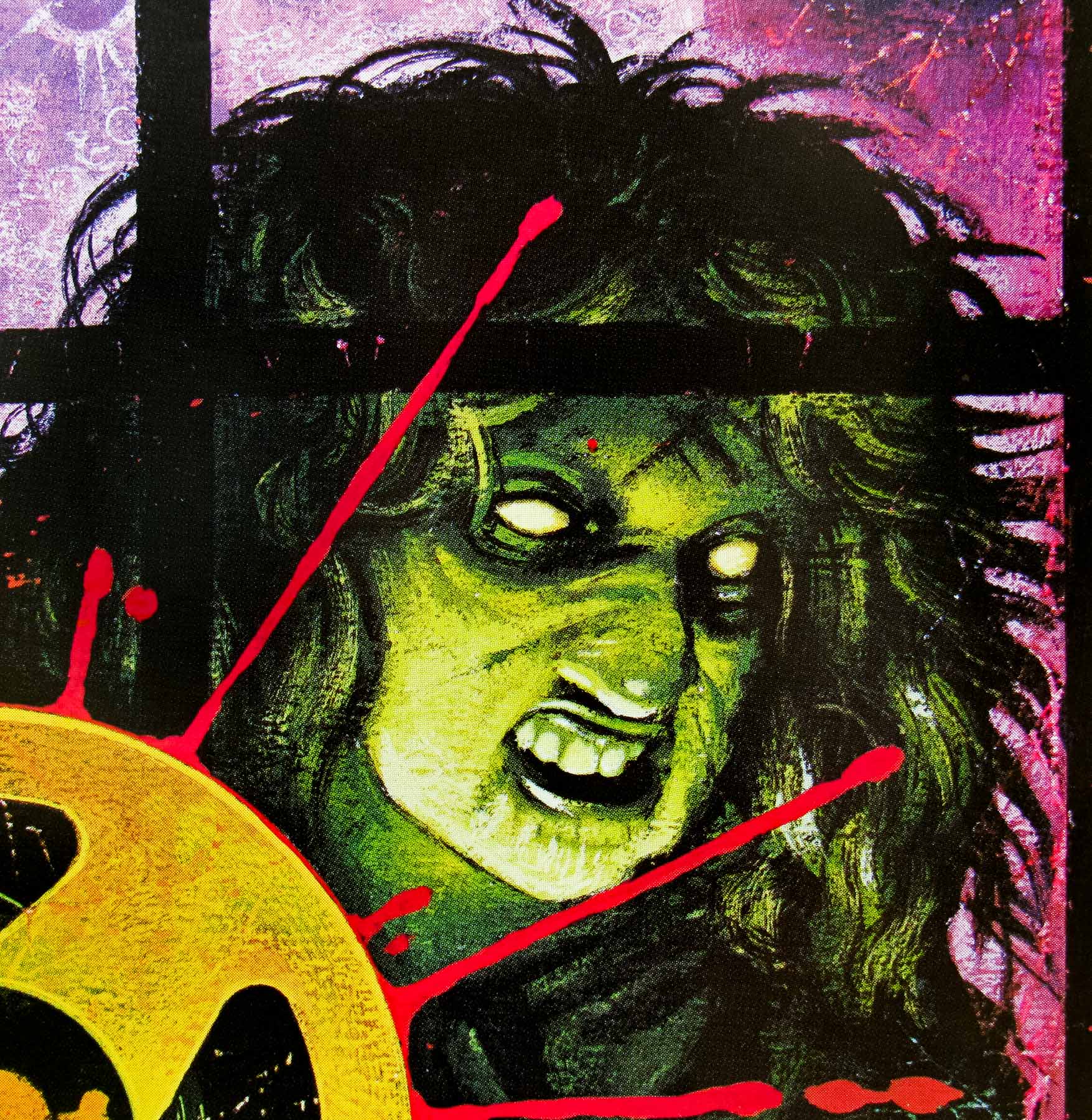
- Title
- Zombies
- AKA
- Dawn of the Dead (USA / International) | Zombi (Italy / Spain / Turkey) | Zombie - Dawn of the Dead (West Germany)
- Year of Film
- 1978
- Director
- George A. Romero
- Starring
- David Emge, Ken Foree, Scott H. Reiniger, Gaylen Ross, Tom Savini
- Origin of Film
- Italy | USA
- Genre(s) of Film
- David Emge, Ken Foree, Scott H. Reiniger, Gaylen Ross, Tom Savini,
- Type of Poster
- Quad
- Style of Poster
- --
- Origin of Poster
- UK
- Year of Poster
- 1980
- Designer
- Tom Chantrell
- Artist
- Tom Chantrell
- Size (inches)
- 30" x 40"
- SS or DS
- SS
- Tagline
- When there's no more room in hell, the dead will walk the earth.
18.05.11
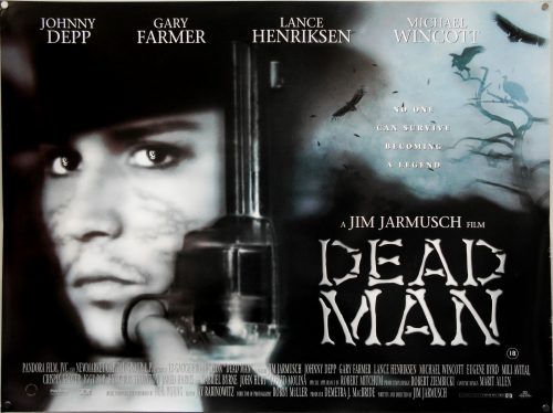
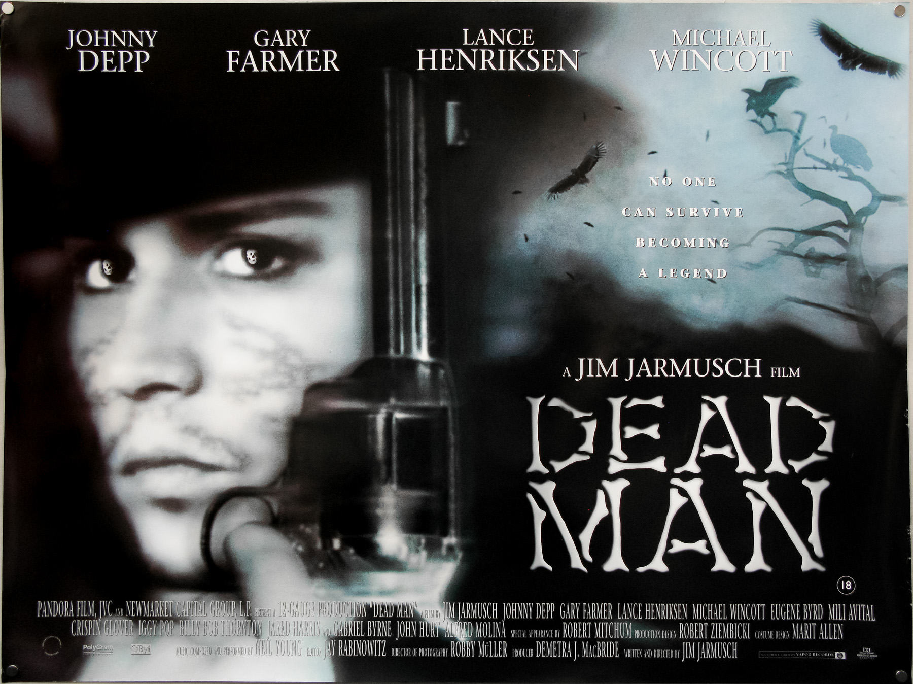
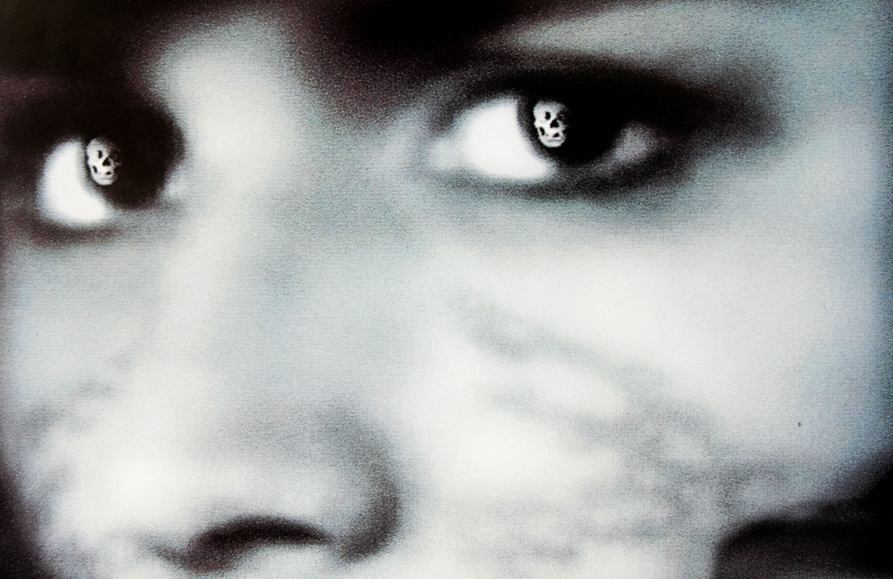
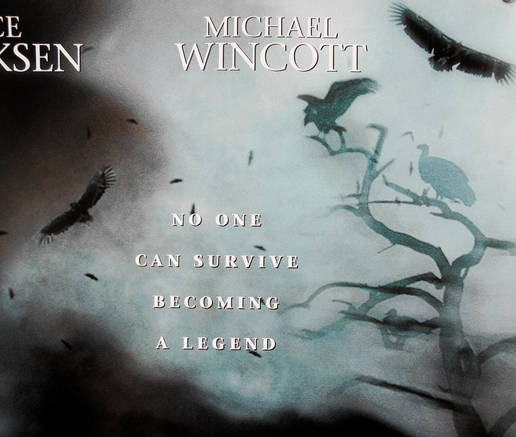
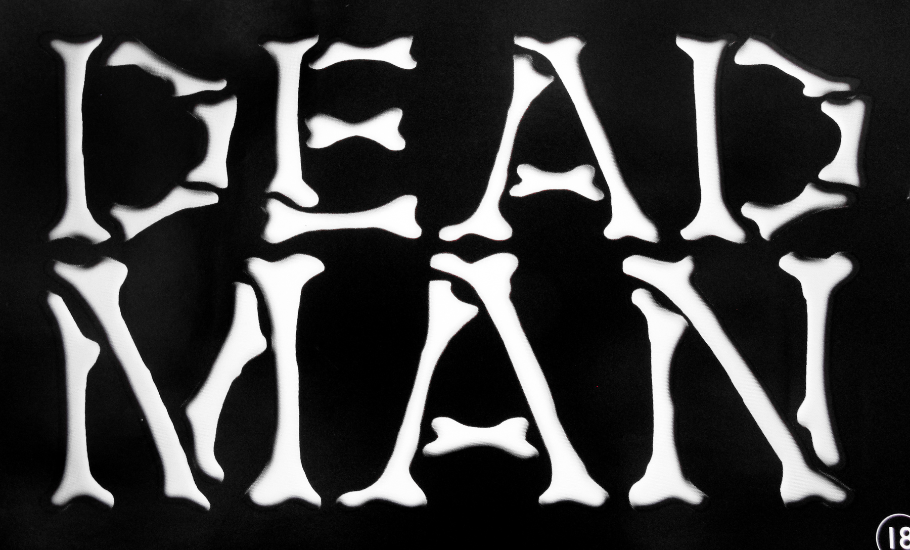
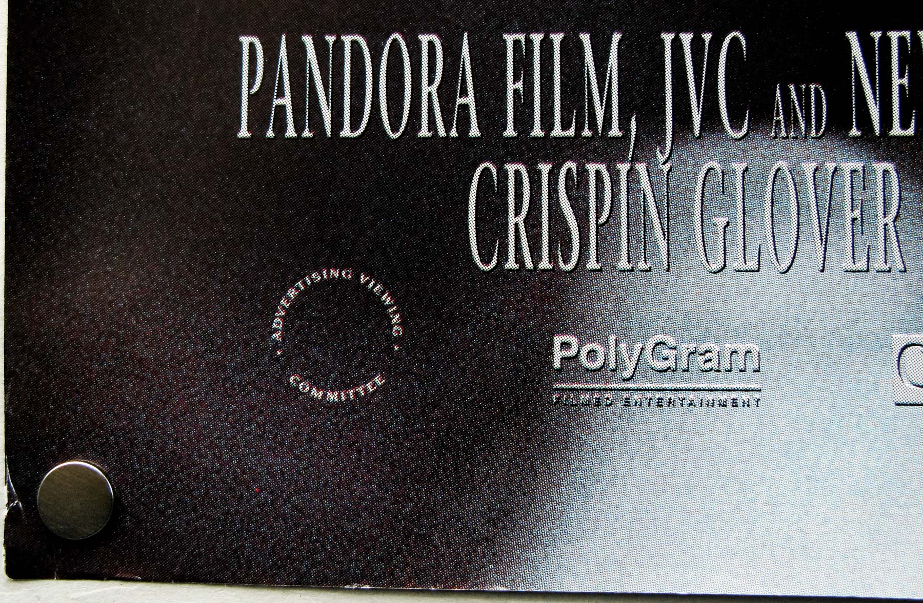
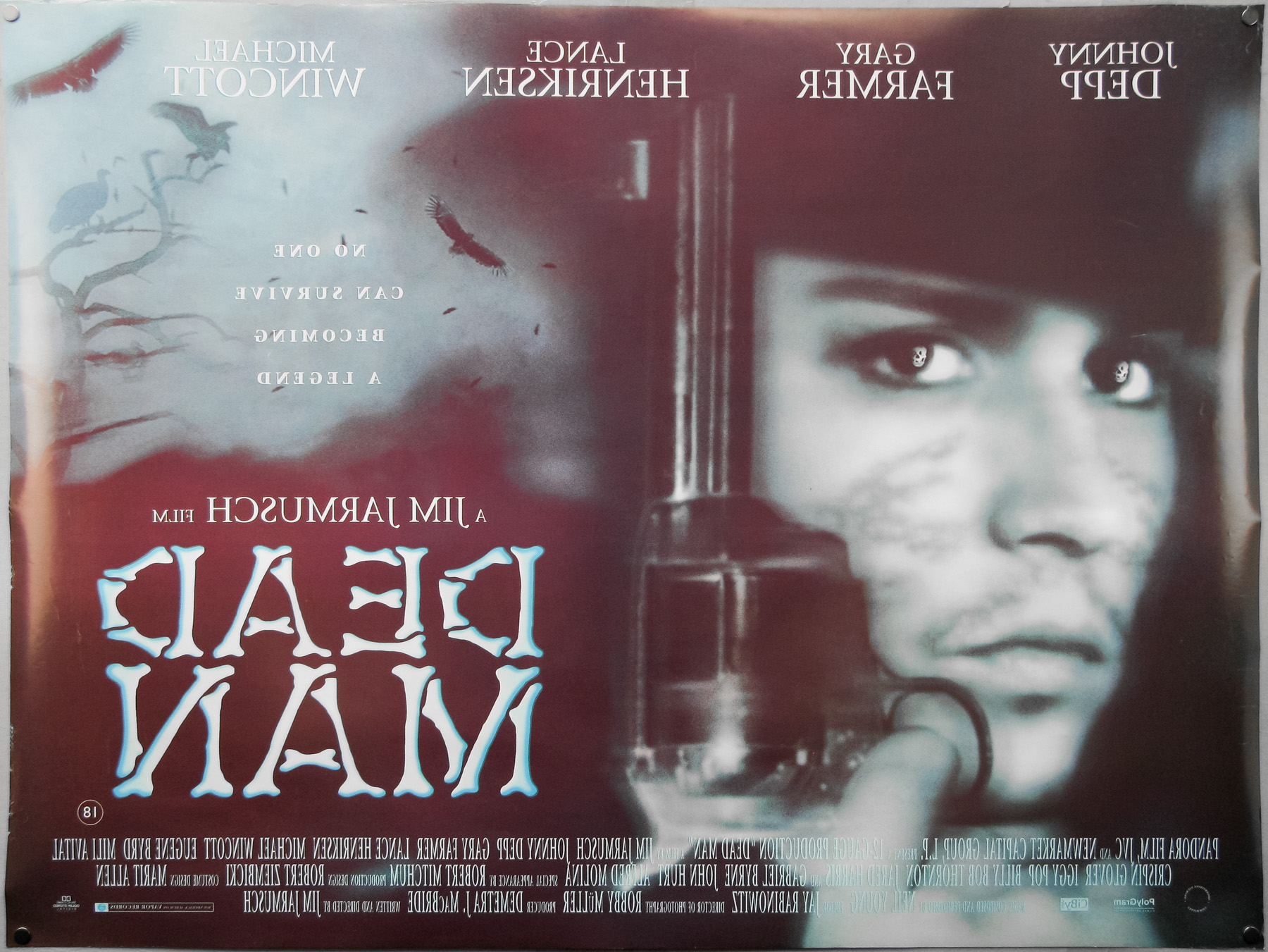
- Title
- Dead Man
- AKA
- --
- Year of Film
- 1995
- Director
- Jim Jarmusch
- Starring
- Johnny Depp, Gary Farmer, Crispin Glover, Lance Henriksen, Michael Wincott, Eugene Byrd, John Hurt, Robert Mitchum, Iggy Pop, Gabriel Byrne
- Origin of Film
- USA | Germany | Japan
- Genre(s) of Film
- Johnny Depp, Gary Farmer, Crispin Glover, Lance Henriksen, Michael Wincott, Eugene Byrd, John Hurt, Robert Mitchum, Iggy Pop, Gabriel Byrne,
- Type of Poster
- Quad
- Style of Poster
- --
- Origin of Poster
- UK
- Year of Poster
- 1996
- Designer
- Unknown
- Artist
- --
- Size (inches)
- 30 1/16" x 40"
- SS or DS
- DS
- Tagline
- No one can survive becoming a legend
18.05.11
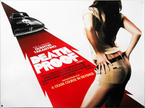
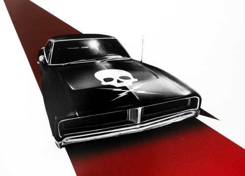
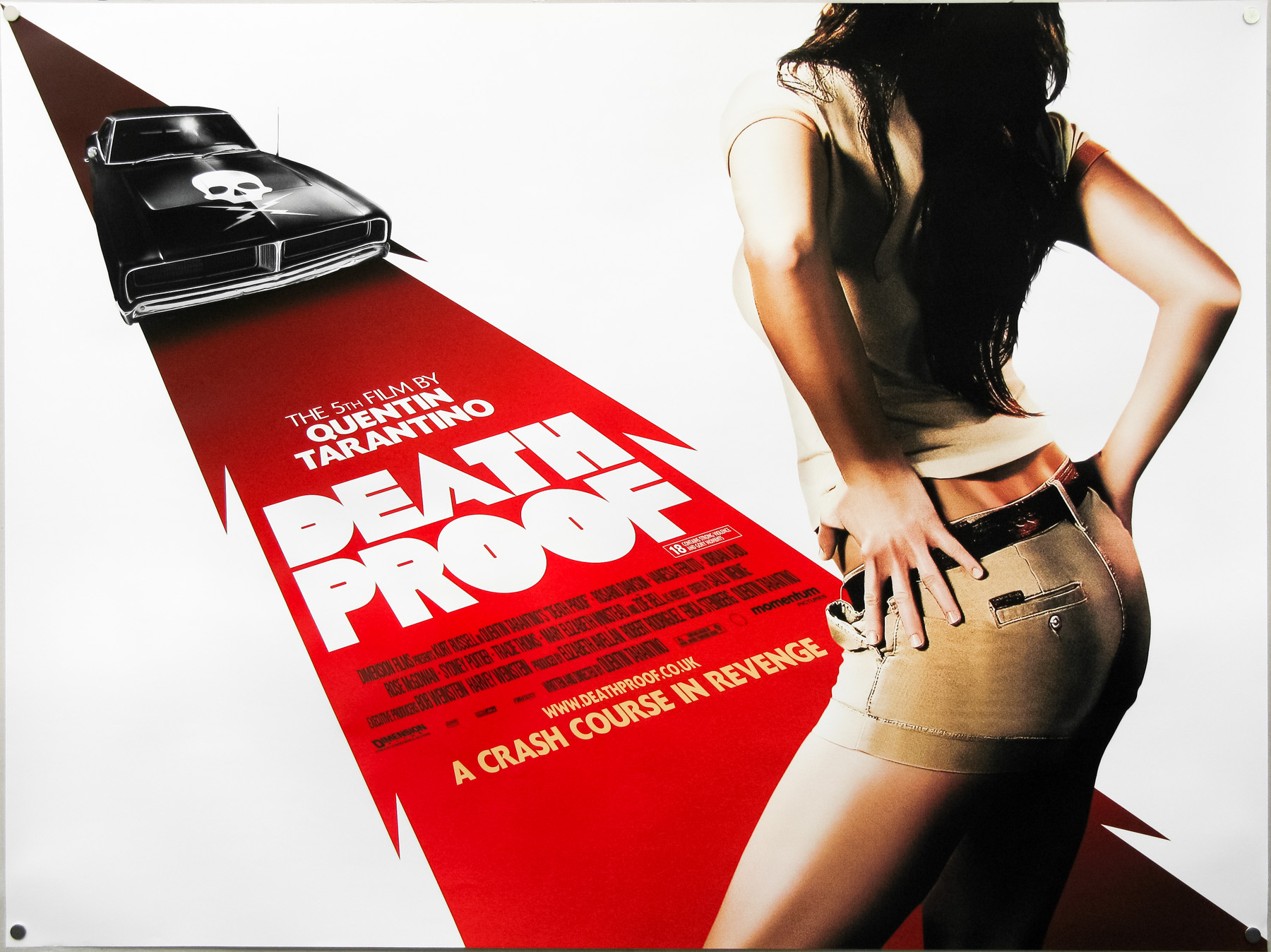
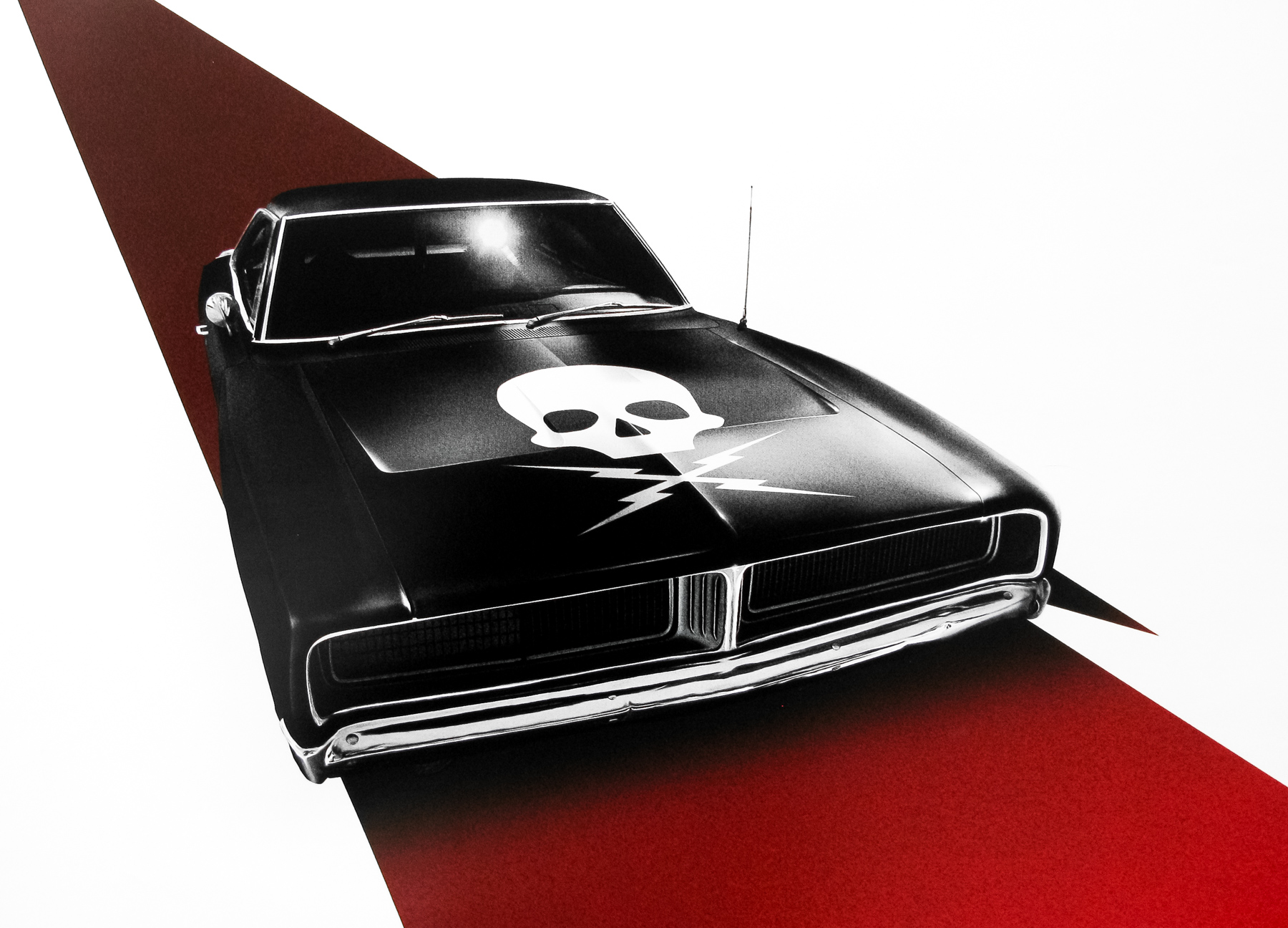
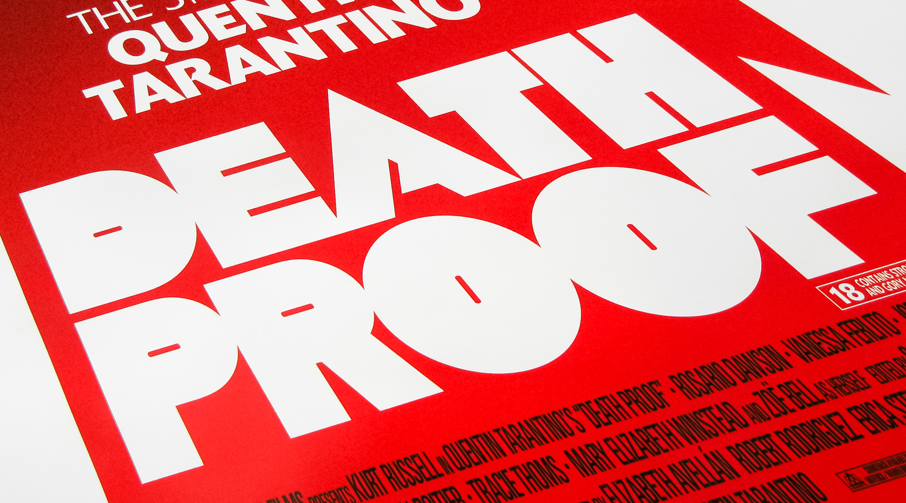
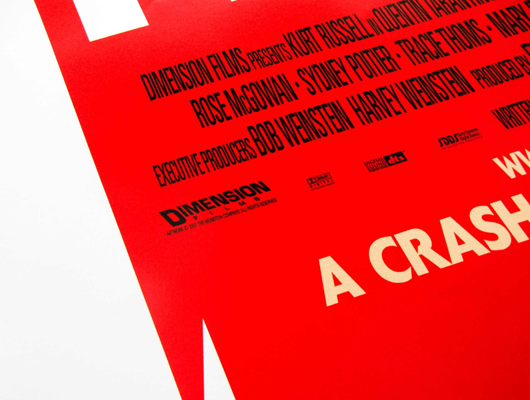
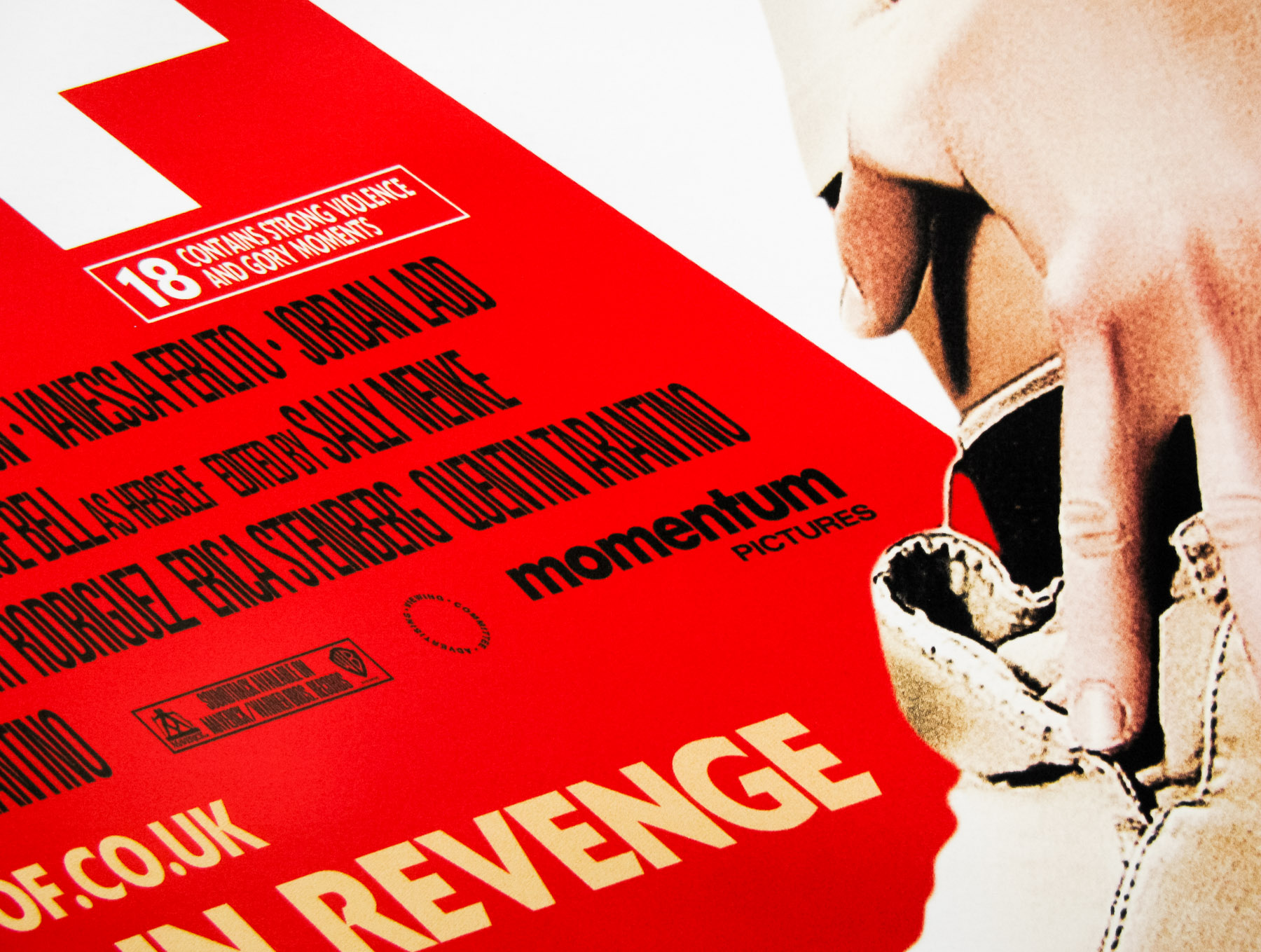
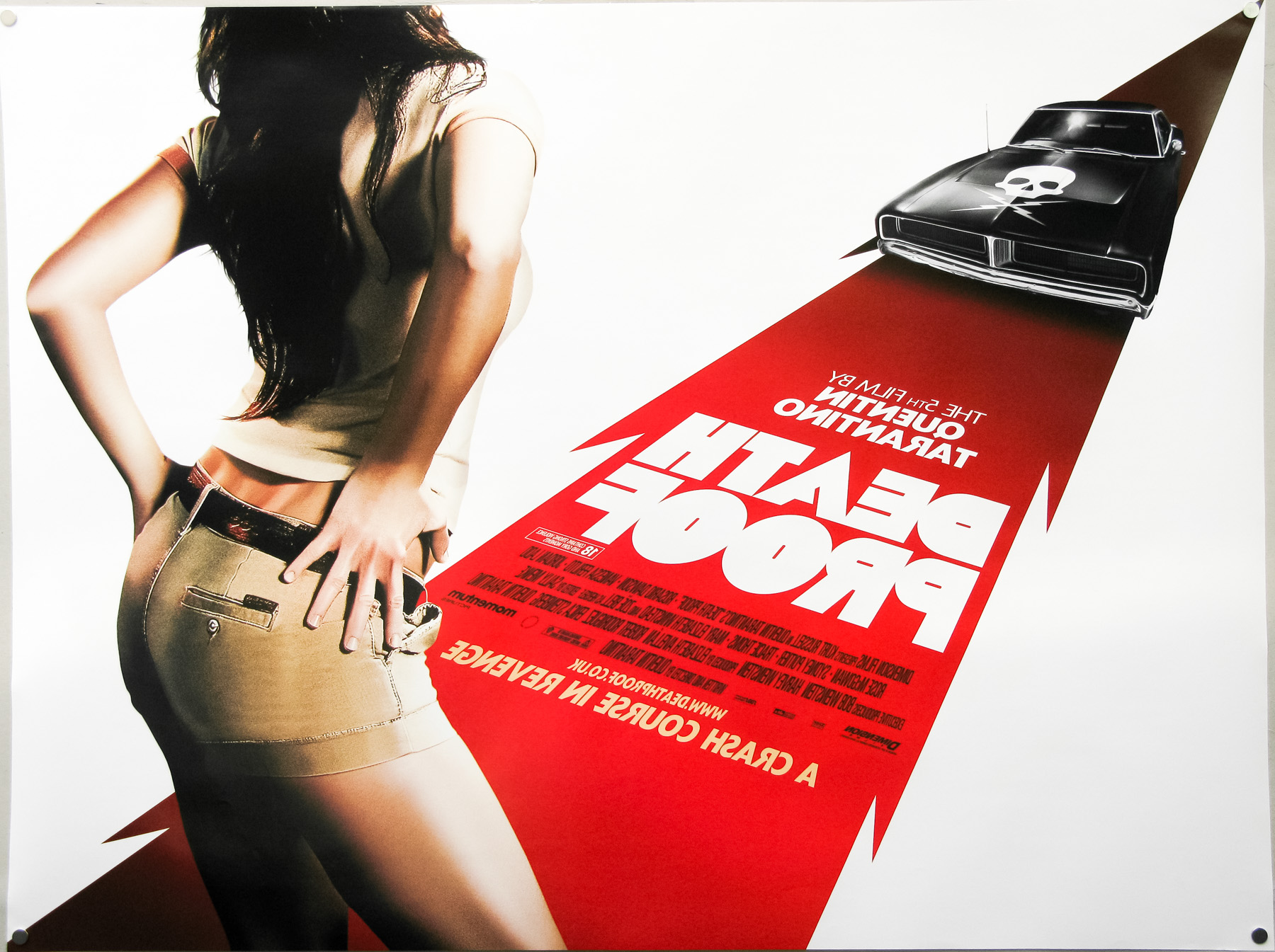
- Title
- Death Proof
- AKA
- --
- Year of Film
- 2007
- Director
- Quentin Tarantino
- Starring
- Kurt Russell, Zoë Bell, Rosario Dawson, Vanessa Ferlito, Jordan Ladd, Sydney Tamiia Poitier, Tracie Thoms, Mary Elizabeth Winstead, Rose McGowan, Marley Shelton, Marcy Harriell, Eli Roth
- Origin of Film
- USA
- Genre(s) of Film
- Kurt Russell, Zoë Bell, Rosario Dawson, Vanessa Ferlito, Jordan Ladd, Sydney Tamiia Poitier, Tracie Thoms, Mary Elizabeth Winstead, Rose McGowan, Marley Shelton, Marcy Harriell, Eli Roth,
- Type of Poster
- Quad
- Style of Poster
- --
- Origin of Poster
- UK
- Year of Poster
- 2007
- Designer
- Empire Design
- Artist
- --
- Size (inches)
- 30" x 40"
- SS or DS
- DS
- Tagline
- A crash course in revenge
18.05.11
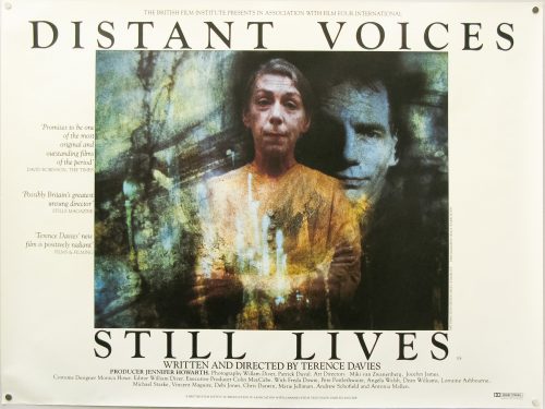
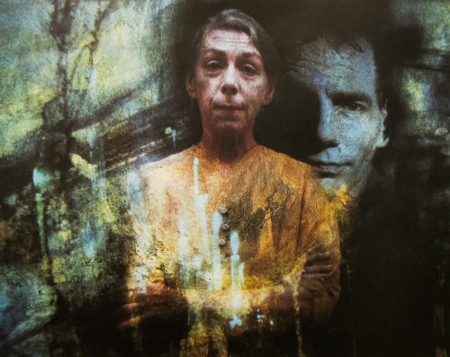
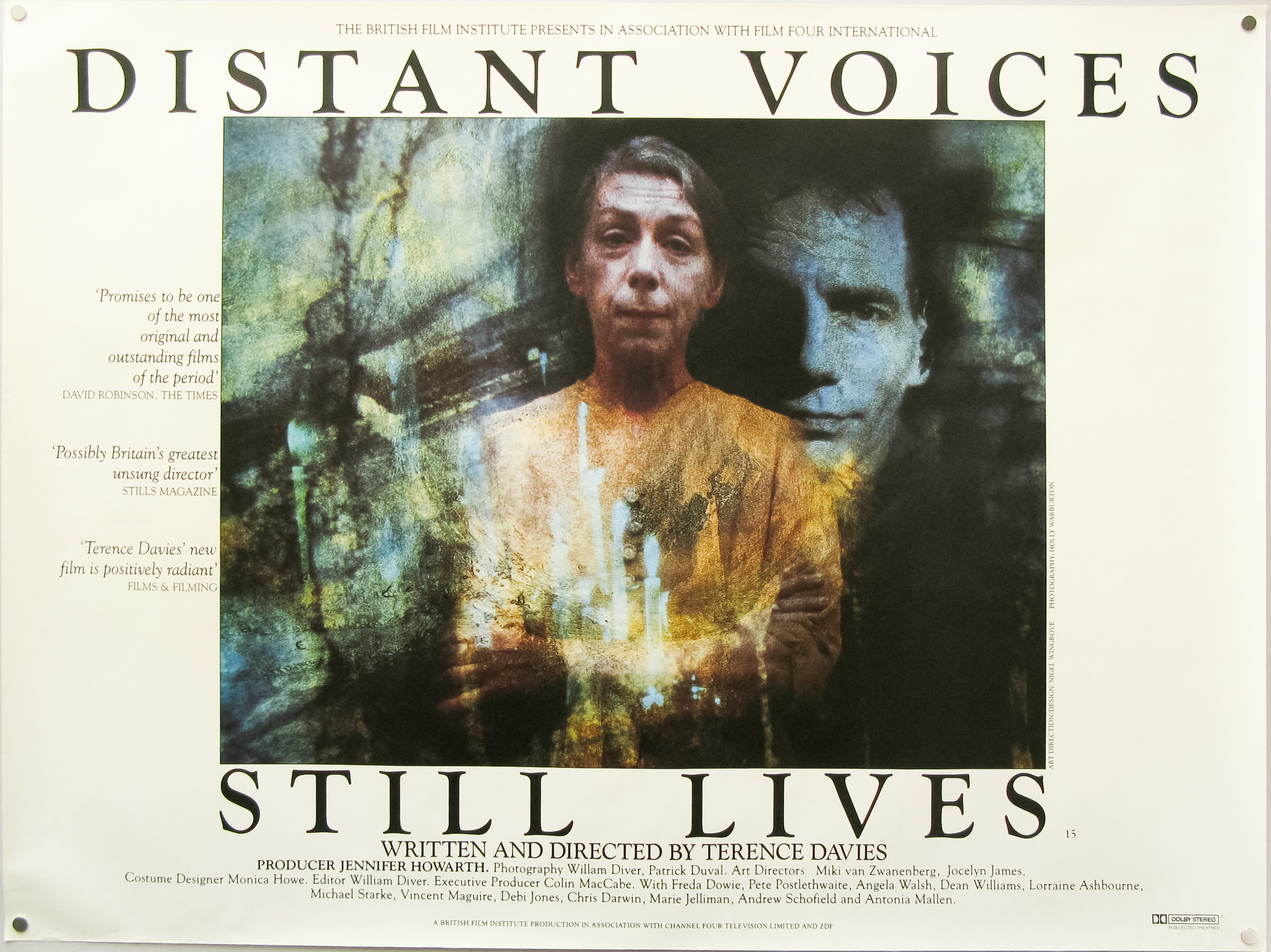
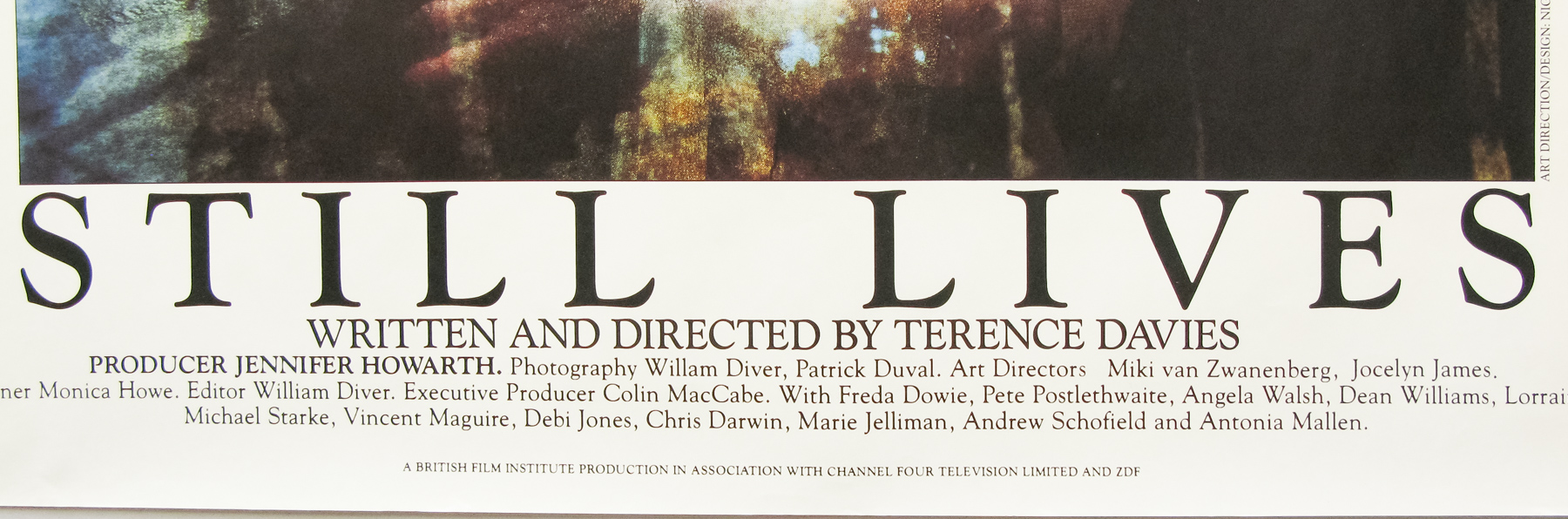
- Title
- Distant Voices, Still Lives
- AKA
- --
- Year of Film
- 1988
- Director
- Terence Davies
- Starring
- Pete Postlethwaite, Freda Dowie, Lorraine Ashbourne, Angela Walsh, Dean Williams, Jean Boht
- Origin of Film
- UK
- Genre(s) of Film
- Pete Postlethwaite, Freda Dowie, Lorraine Ashbourne, Angela Walsh, Dean Williams, Jean Boht,
- Type of Poster
- Quad
- Style of Poster
- --
- Origin of Poster
- UK
- Year of Poster
- 1988
- Designer
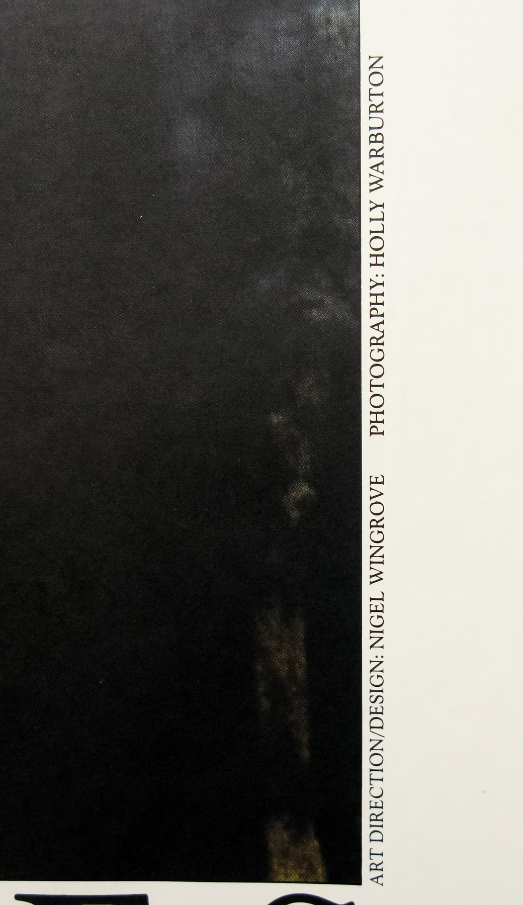
- Nigel Wingrove
- Artist
- Photography by Holly Warburton
- Size (inches)
- 29 15/16" x 39 7/8"
- SS or DS
- SS
- Tagline
- --
18.05.11
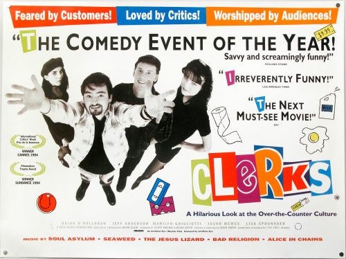
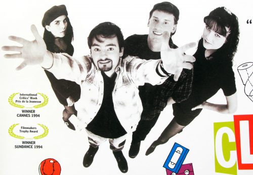
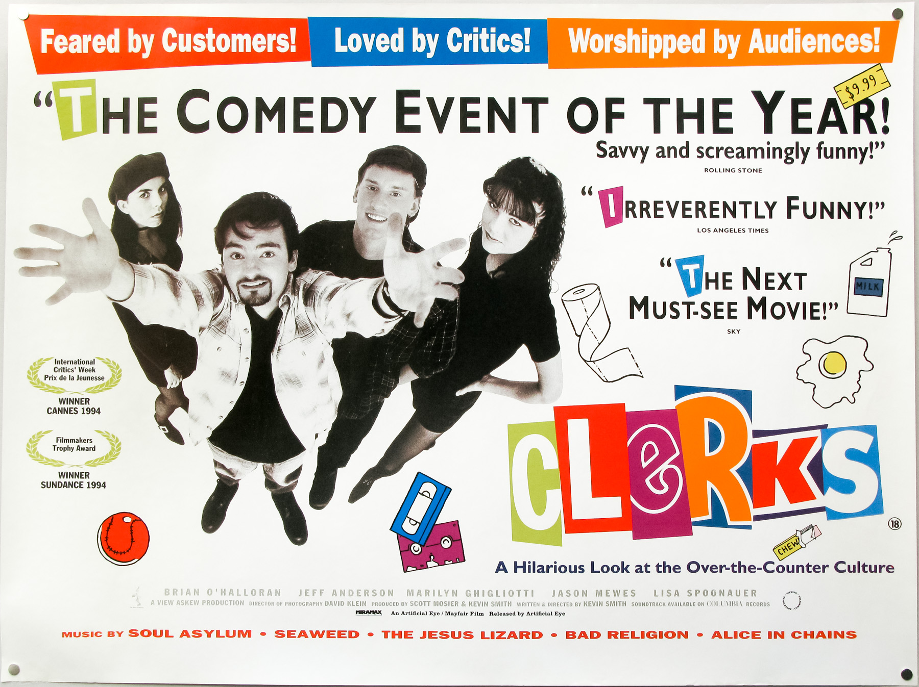
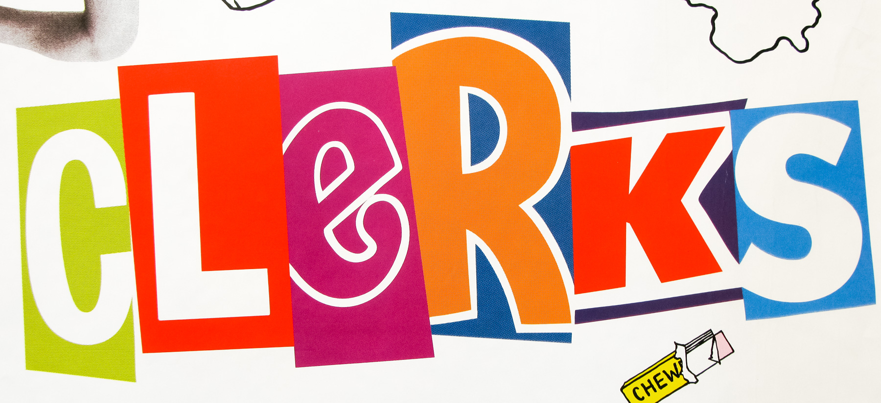
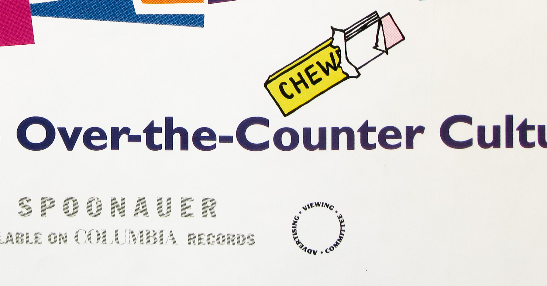
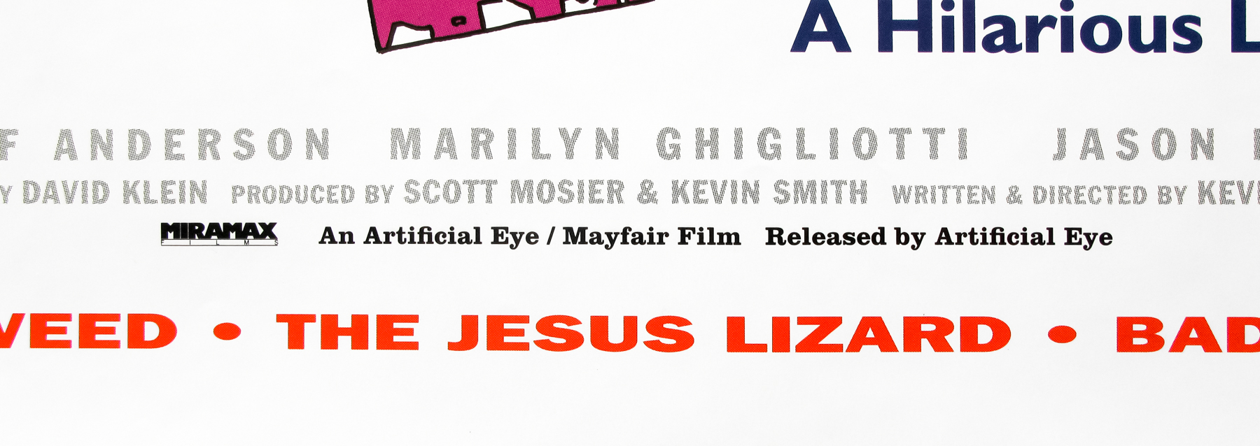
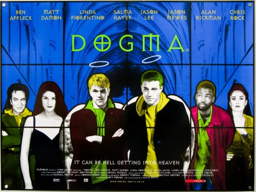
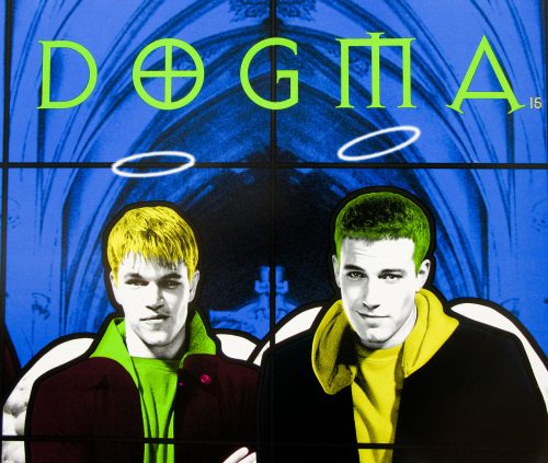
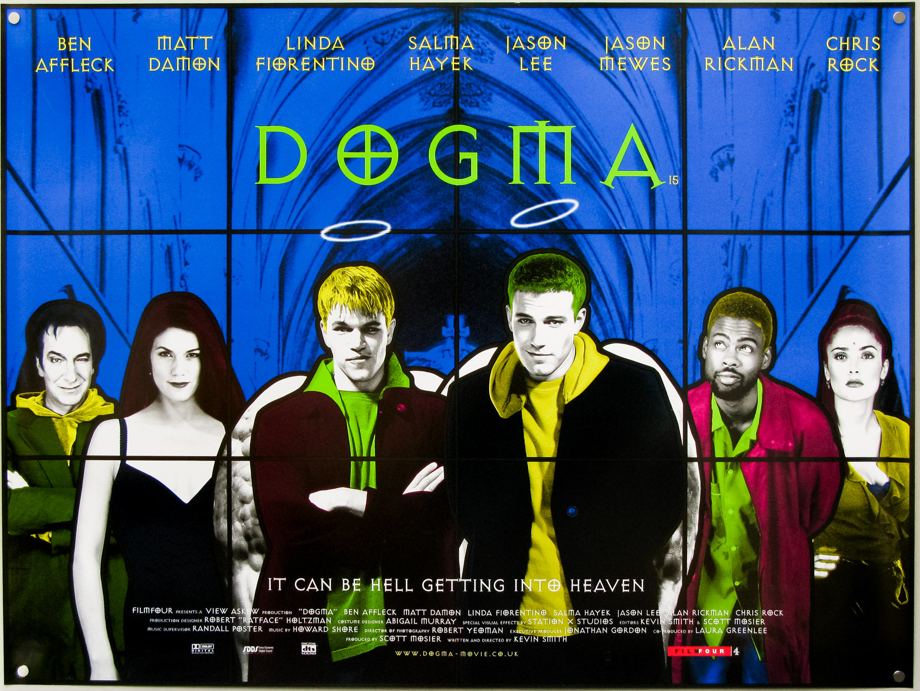
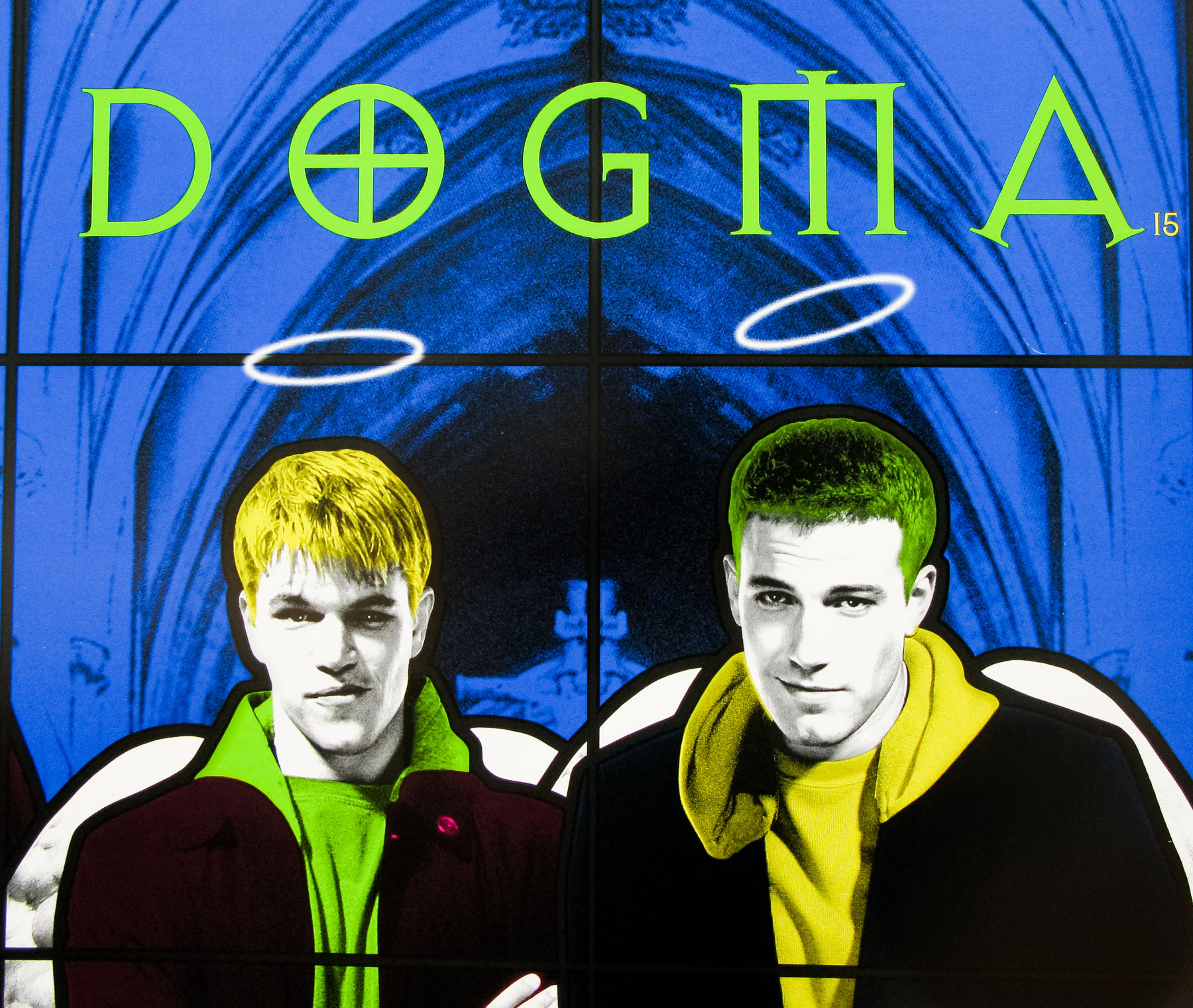
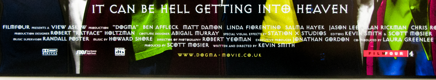
- Title
- Dogma
- AKA
- Bearclaw (USA - fake working title)
- Year of Film
- 1999
- Director
- Kevin Smith
- Starring
- Ben Affleck, George Carlin, Matt Damon, Linda Fiorentino, Salma Hayek, Jason Lee, Jason Mewes, Alan Rickman, Chris Rock
- Origin of Film
- USA
- Genre(s) of Film
- Ben Affleck, George Carlin, Matt Damon, Linda Fiorentino, Salma Hayek, Jason Lee, Jason Mewes, Alan Rickman, Chris Rock,
- Type of Poster
- Quad
- Style of Poster
- --
- Origin of Poster
- UK
- Year of Poster
- 1999
- Designer
- Empire Design
- Artist
- --
- Size (inches)
- 30" x 40"
- SS or DS
- DS
- Tagline
- It Can Be Hell Getting Into Heaven
18.05.11
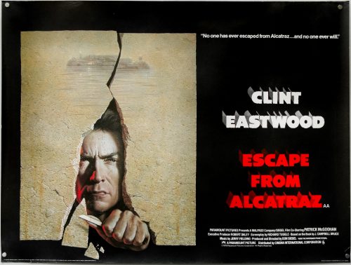
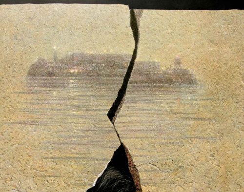
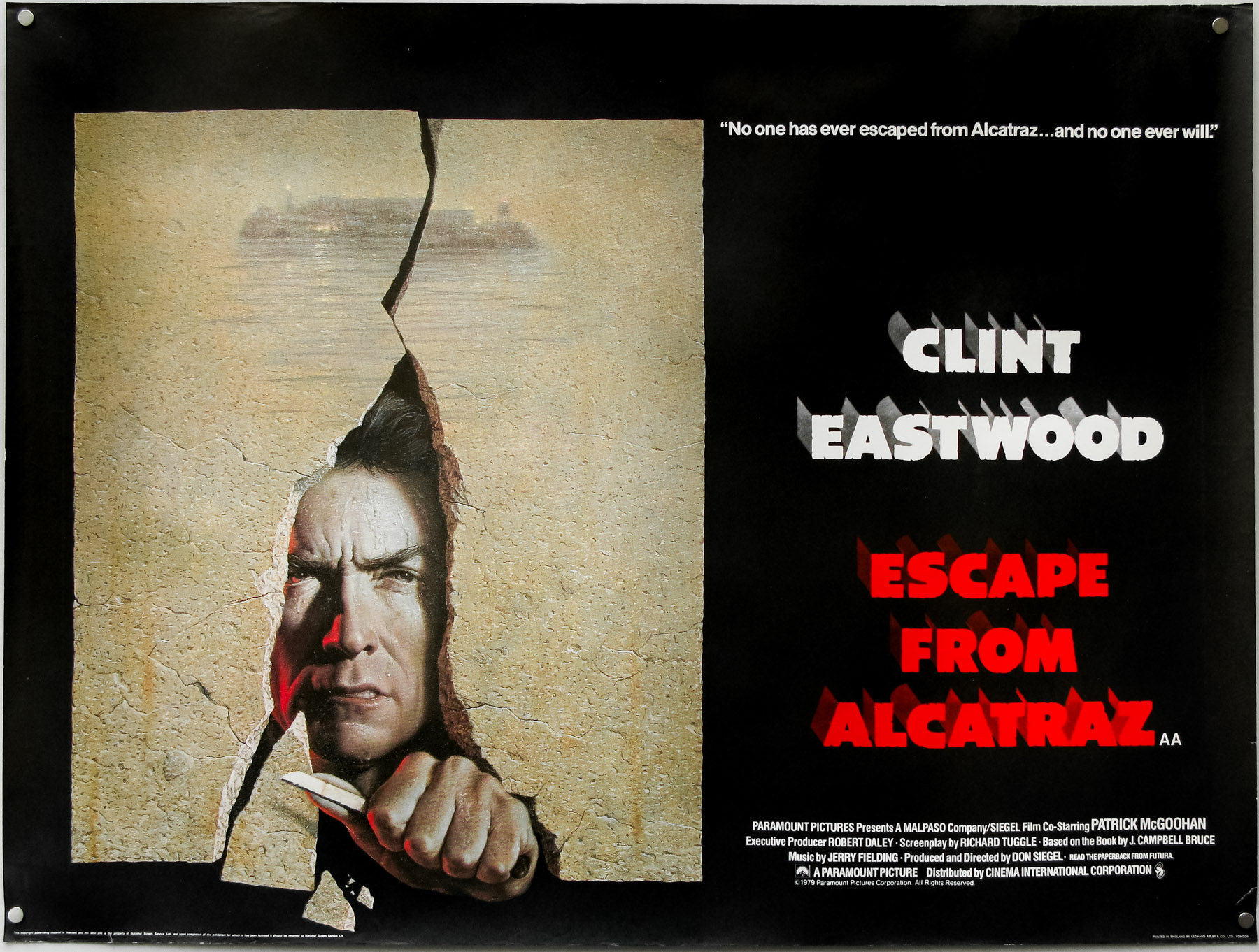
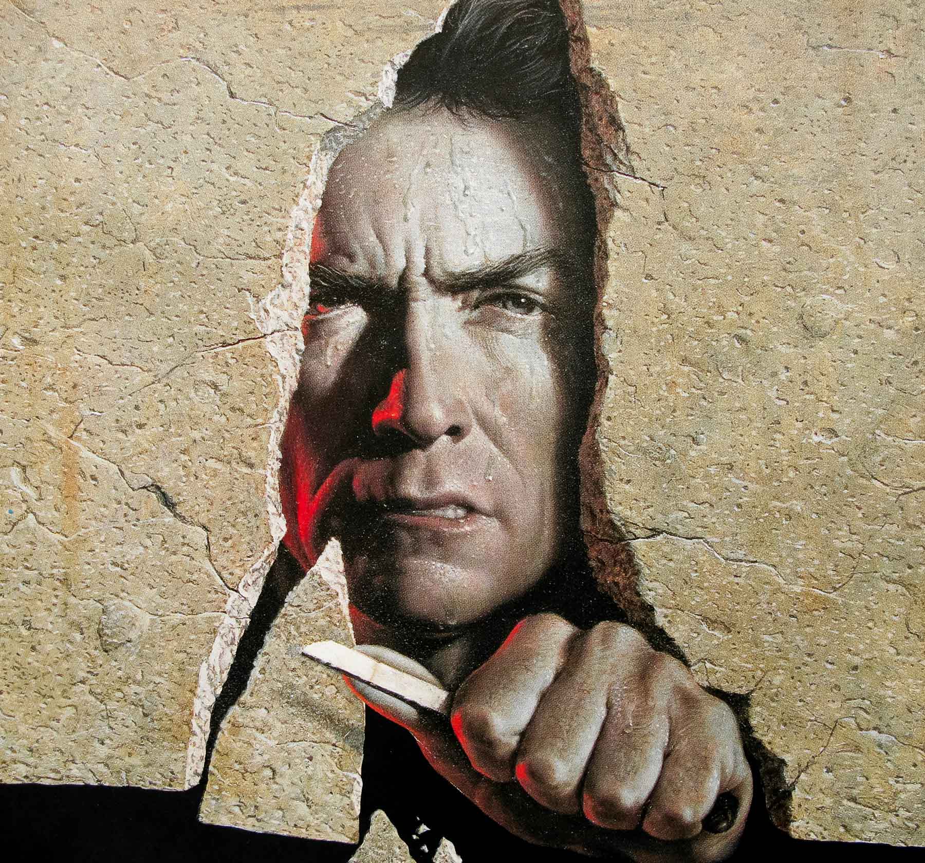
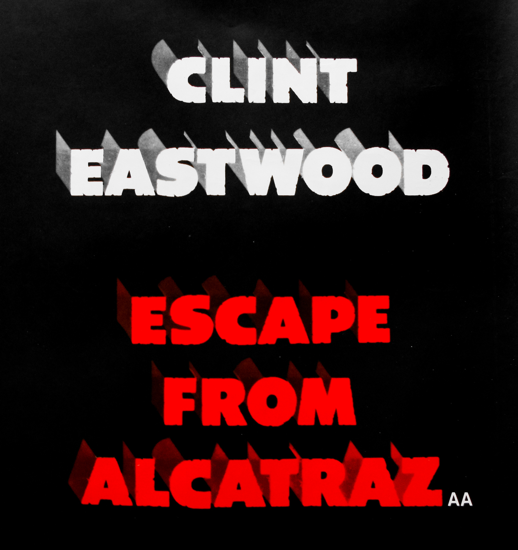
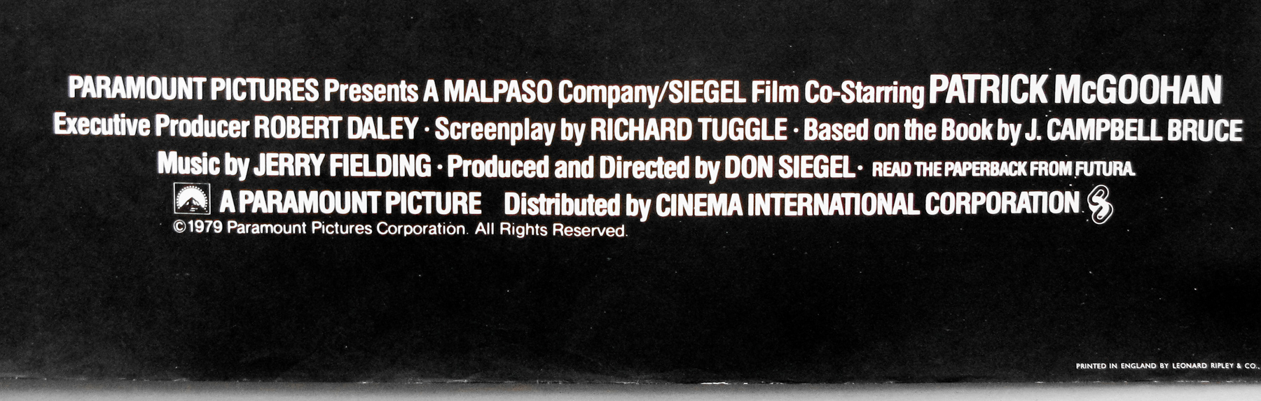
- Title
- Escape From Alcatraz
- AKA
- --
- Year of Film
- 1979
- Director
- Don Siegel
- Starring
- Clint Eastwood, Larry Hankin, Jack Thibeau, Fred Ward, Patrick McGoohan, Paul Benjamin, Frank Ronzio, Roberts Blossom
- Origin of Film
- USA
- Genre(s) of Film
- Clint Eastwood, Larry Hankin, Jack Thibeau, Fred Ward, Patrick McGoohan, Paul Benjamin, Frank Ronzio, Roberts Blossom,
- Type of Poster
- Quad
- Style of Poster
- 'AA' version
- Origin of Poster
- UK
- Year of Poster
- 1979
- Designer
- Unknown
- Artist
- Birney Lettick
- Size (inches)
- 30" x 39 15/16"
- SS or DS
- SS
- Tagline
- No one has ever escaped from Alcatraz... And no one ever will!
18.05.11
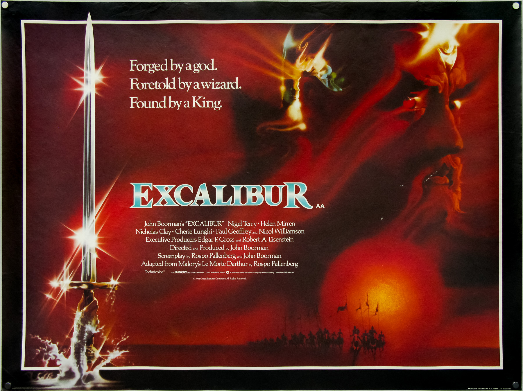
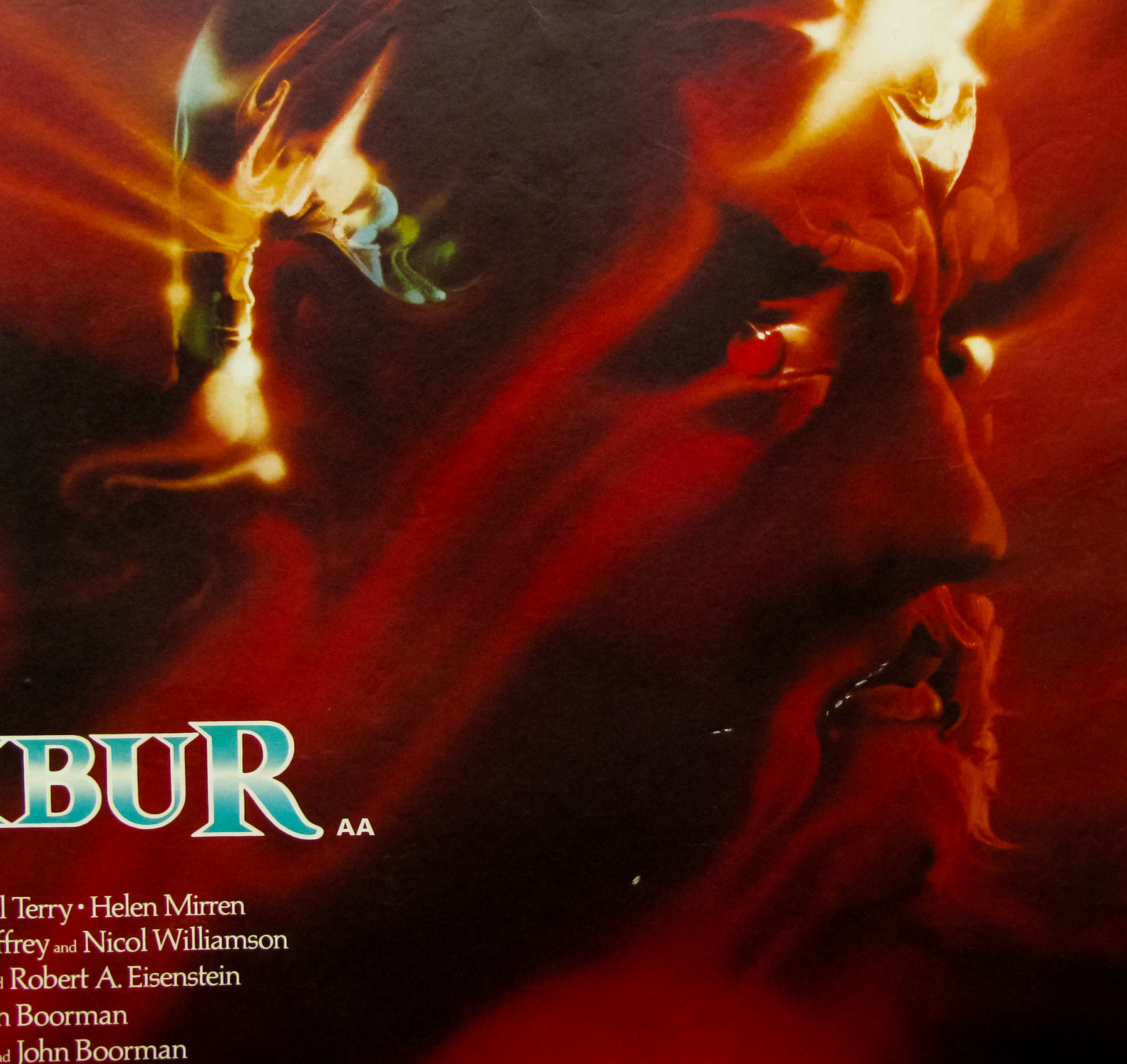
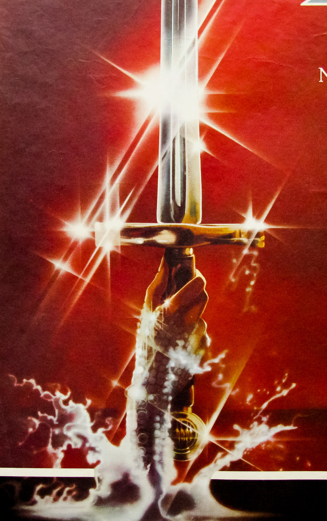
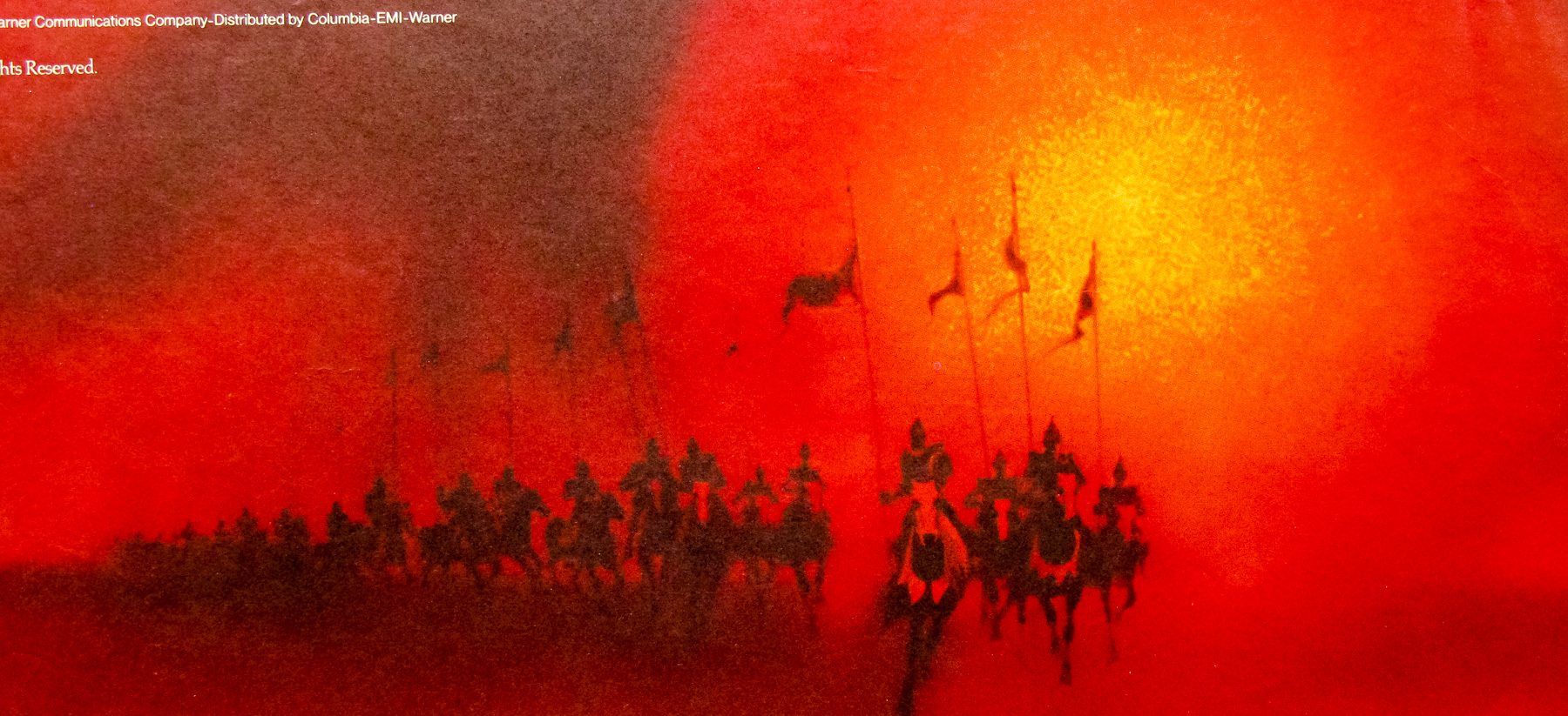
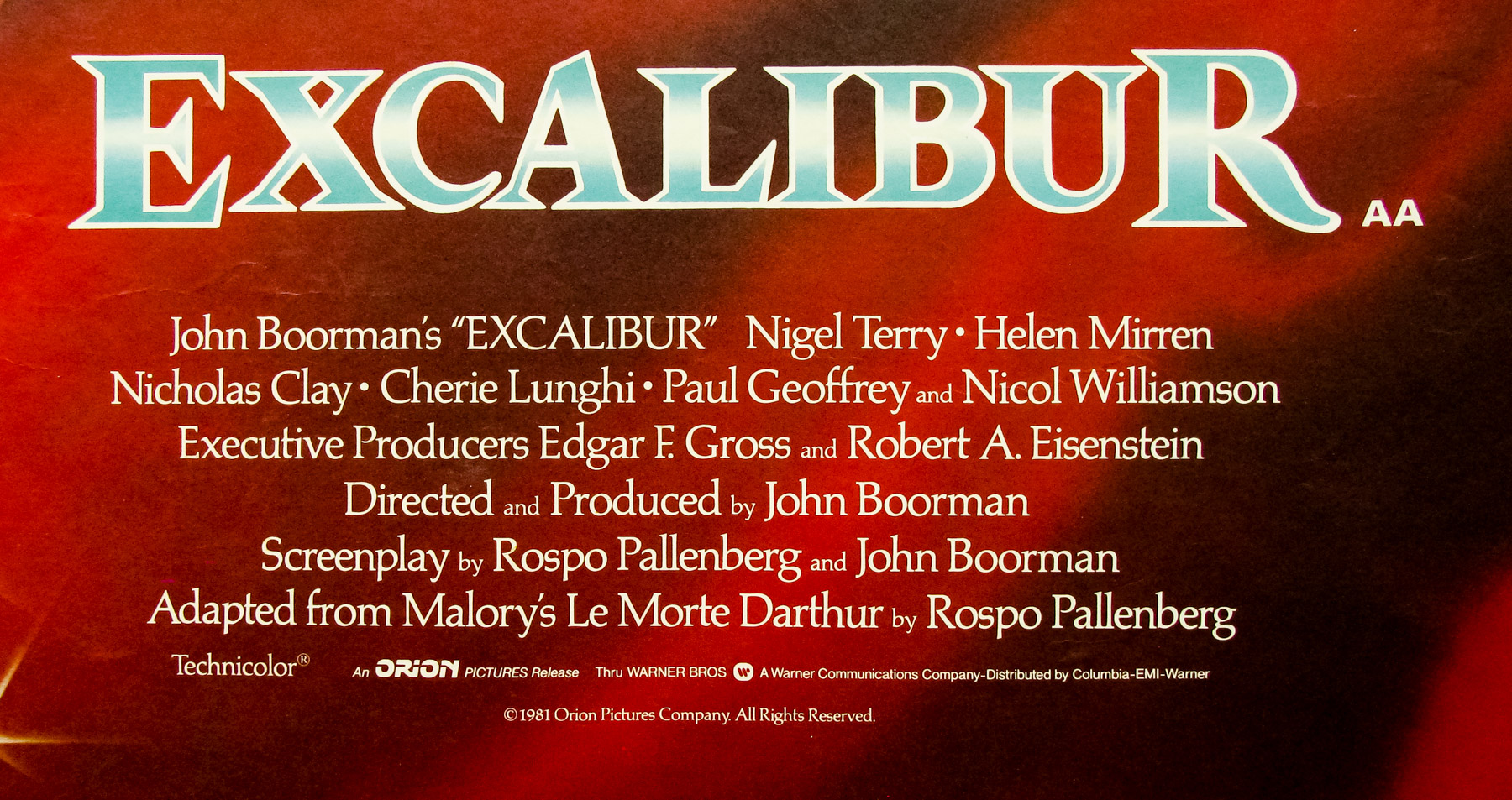
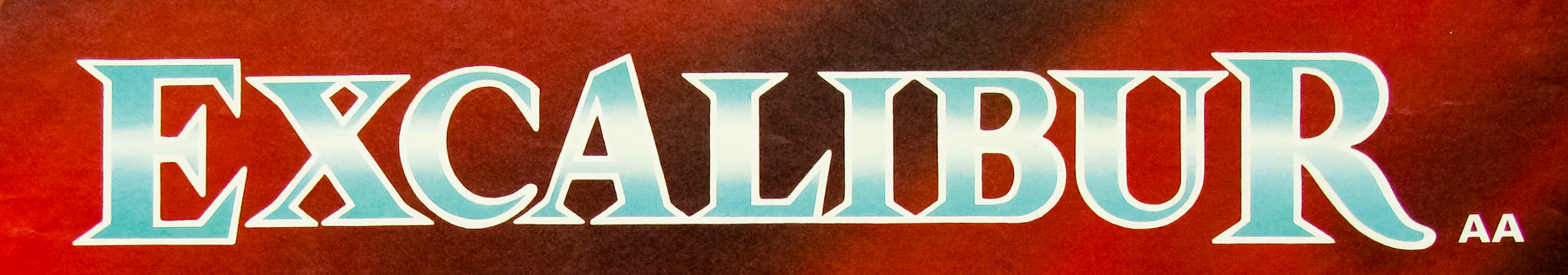
- Title
- Excalibur
- AKA
- The Knights (USA - working title)
- Year of Film
- 1981
- Director
- John Boorman
- Starring
- Nigel Terry, Helen Mirren, Nicol Williamson, Nicholas Clay, Cherie Lunghi, Liam Neeson, Patrick Stewart, Clive Swift, Gabriel Byrne
- Origin of Film
- USA | UK
- Genre(s) of Film
- Nigel Terry, Helen Mirren, Nicol Williamson, Nicholas Clay, Cherie Lunghi, Liam Neeson, Patrick Stewart, Clive Swift, Gabriel Byrne,
- Type of Poster
- Quad
- Style of Poster
- --
- Origin of Poster
- UK
- Year of Poster
- 1981
- Designer
- Unknown
- Artist
- Bob Peak
- Size (inches)
- 29 15/16" x 39 14/16"
- SS or DS
- SS
- Tagline
- Forged by a god. Foretold by a wizard. Found by a king.
18.05.11
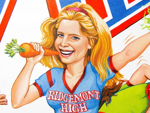
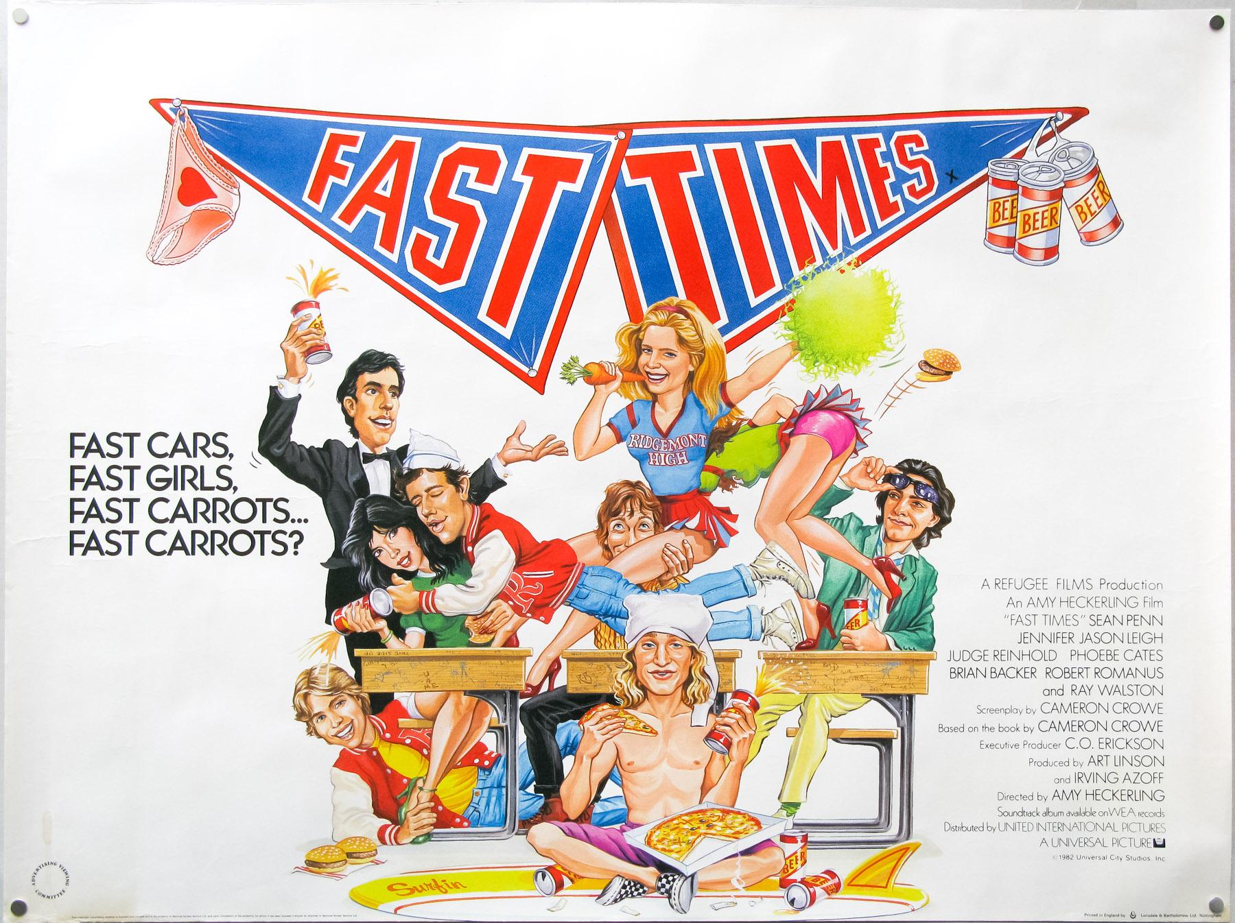
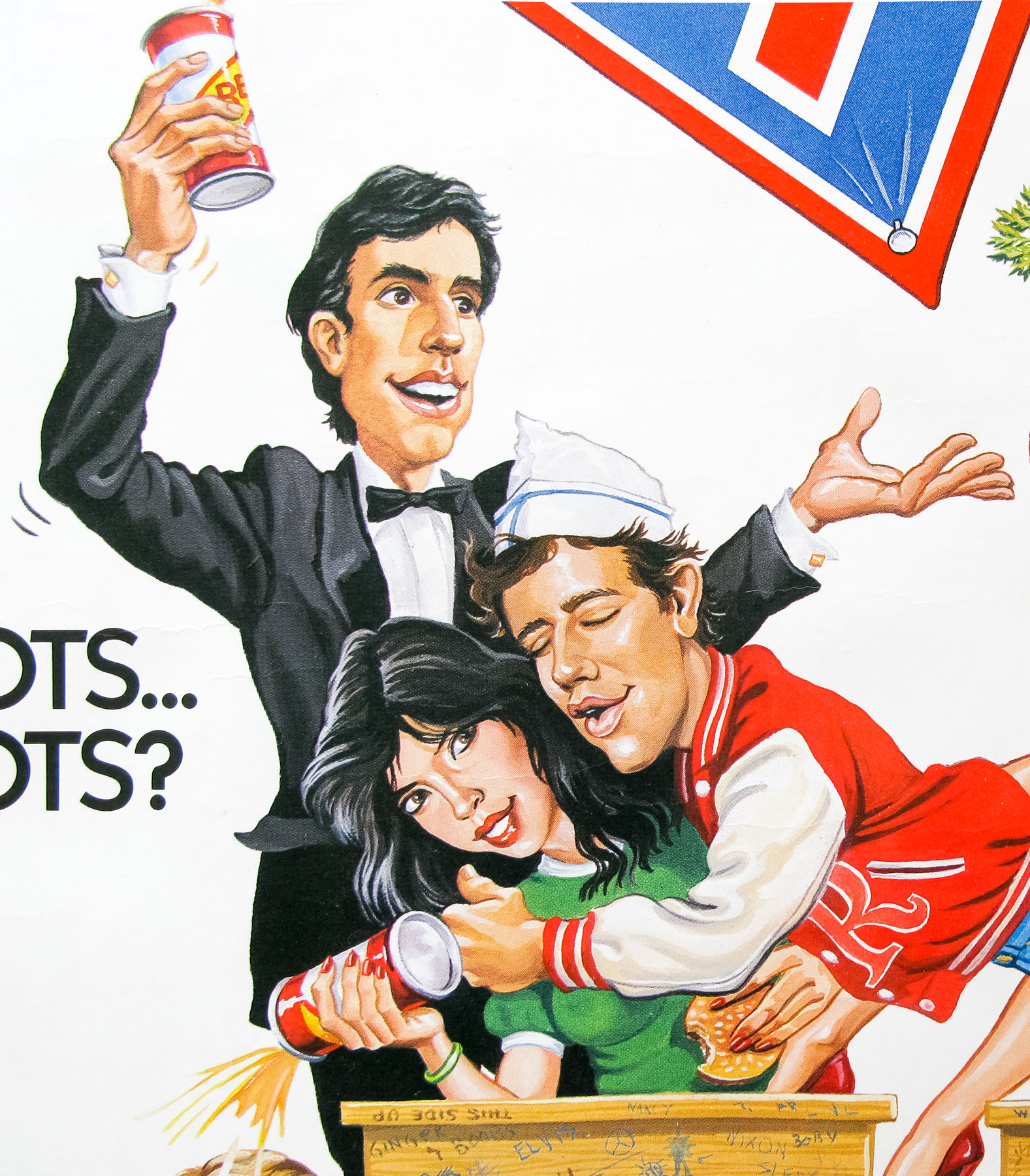
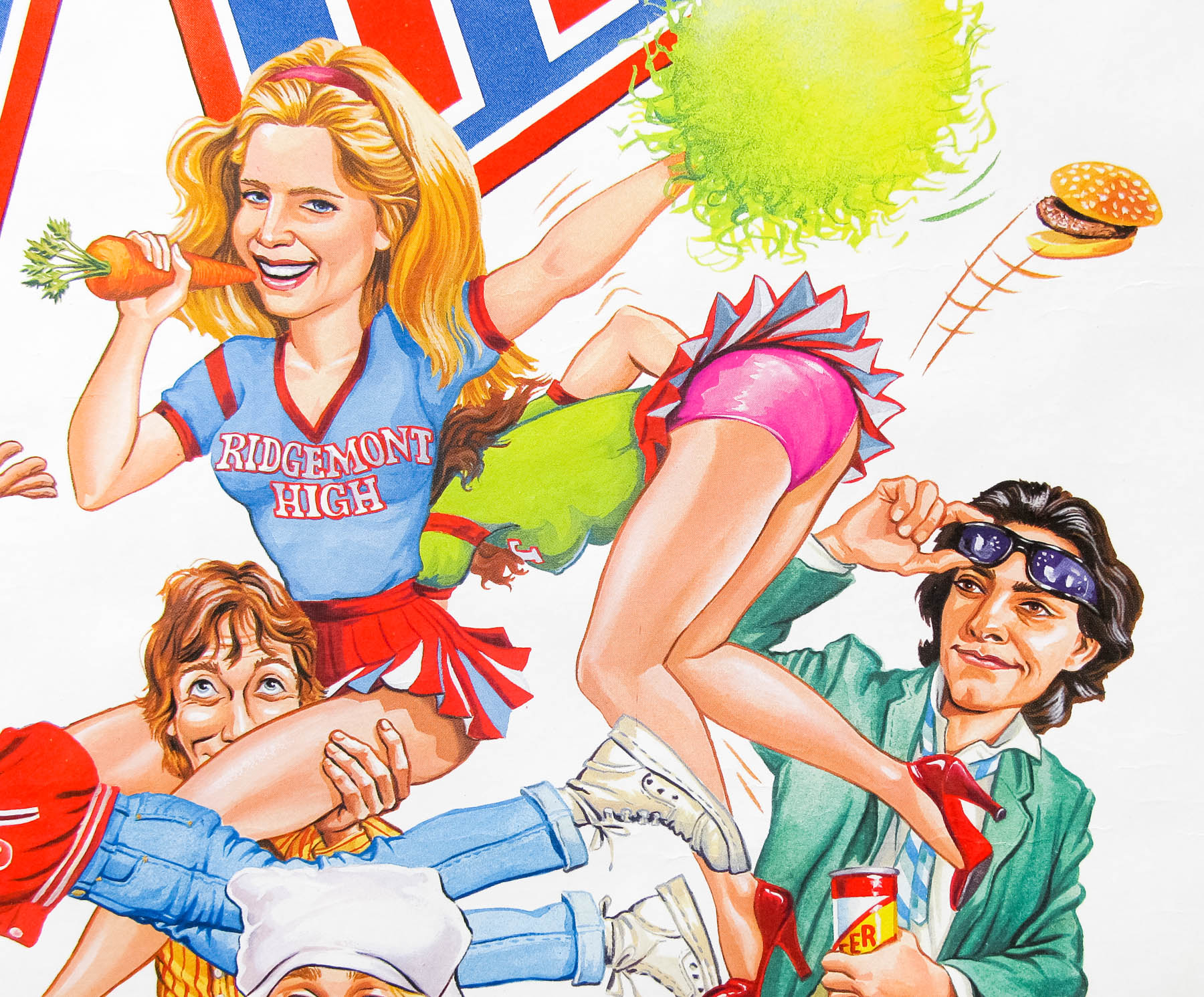
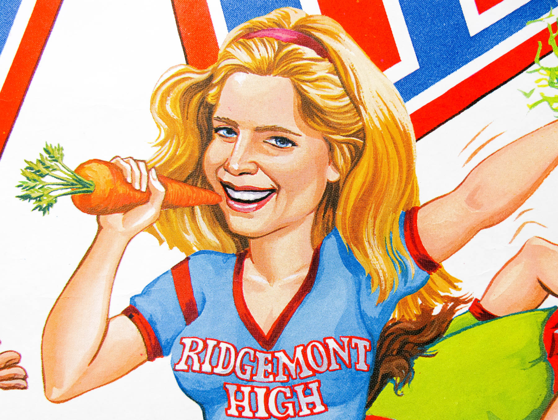
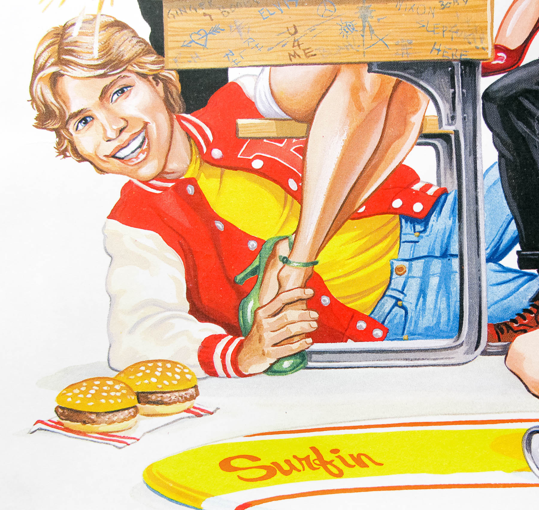
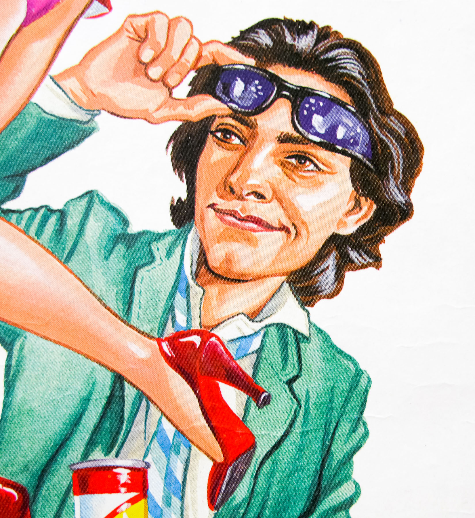
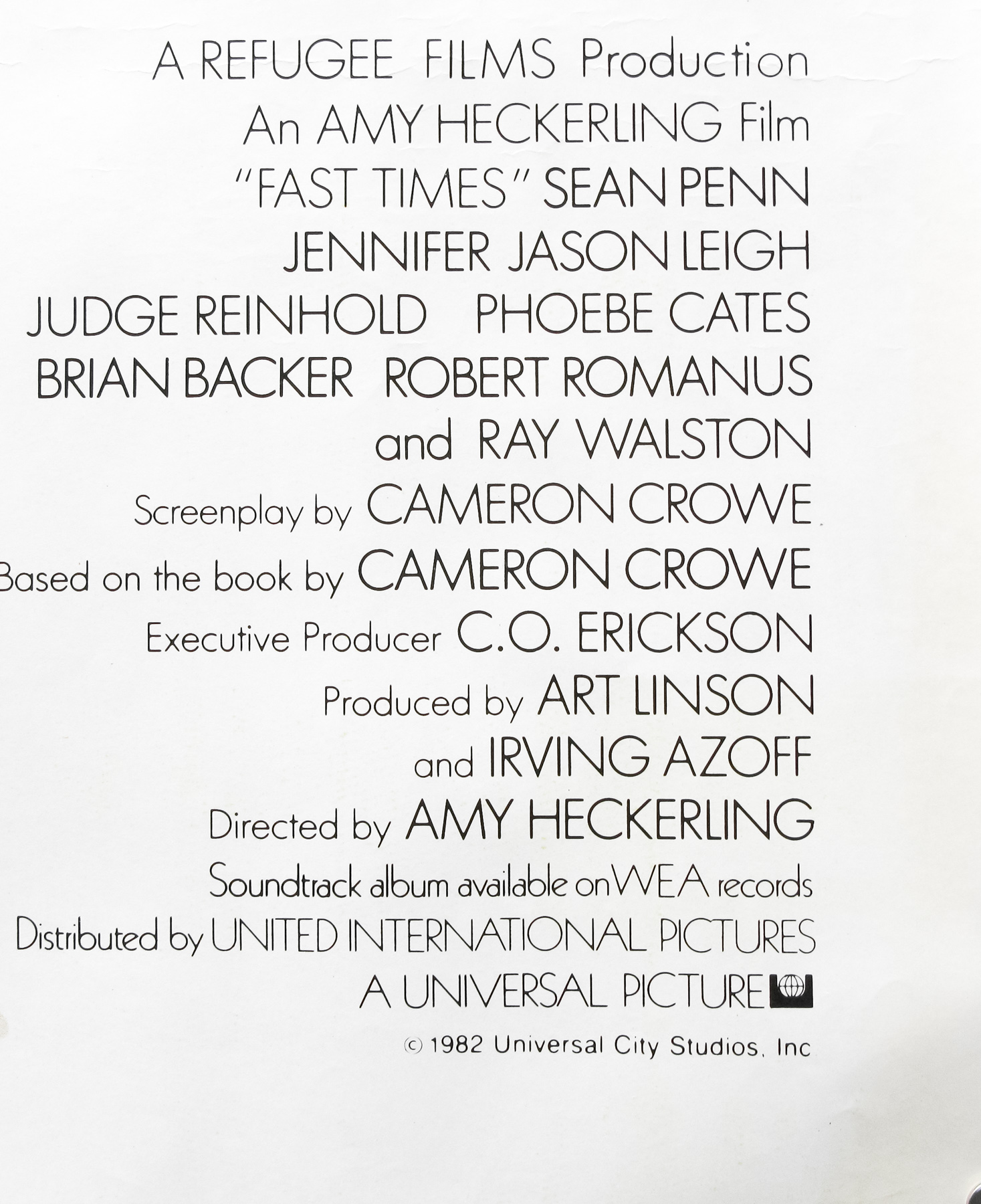
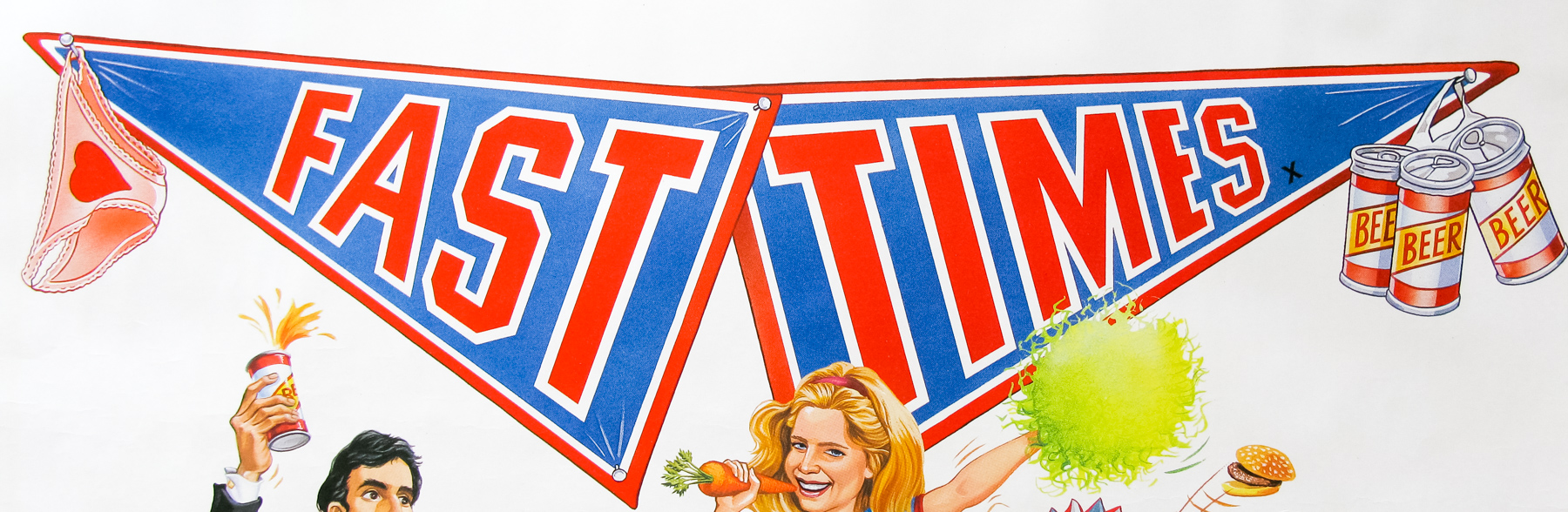
- Title
- Fast Times
- AKA
- Fast Times At Ridgemont High (USA) | Viver Depressa [Live fast] (Portugal)
- Year of Film
- 1982
- Director
- Amy Heckerling
- Starring
- Sean Penn, Jennifer Jason Leigh, Judge Reinhold, Phoebe Cates, Brian Backer, Robert Romanus, Lana Clarkson, Ray Walston, Forest Whitaker, Nicolas Cage
- Origin of Film
- USA
- Genre(s) of Film
- Sean Penn, Jennifer Jason Leigh, Judge Reinhold, Phoebe Cates, Brian Backer, Robert Romanus, Lana Clarkson, Ray Walston, Forest Whitaker, Nicolas Cage,
- Type of Poster
- Quad
- Style of Poster
- --
- Origin of Poster
- UK
- Year of Poster
- 1983
- Designer
- Unknown
- Artist
- Unknown
- Size (inches)
- 30" x 39 15/16"
- SS or DS
- SS
- Tagline
- Fast girls, Fast cars, Fast carrots.... Fast carrots?
18.05.11
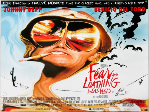
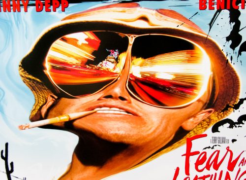
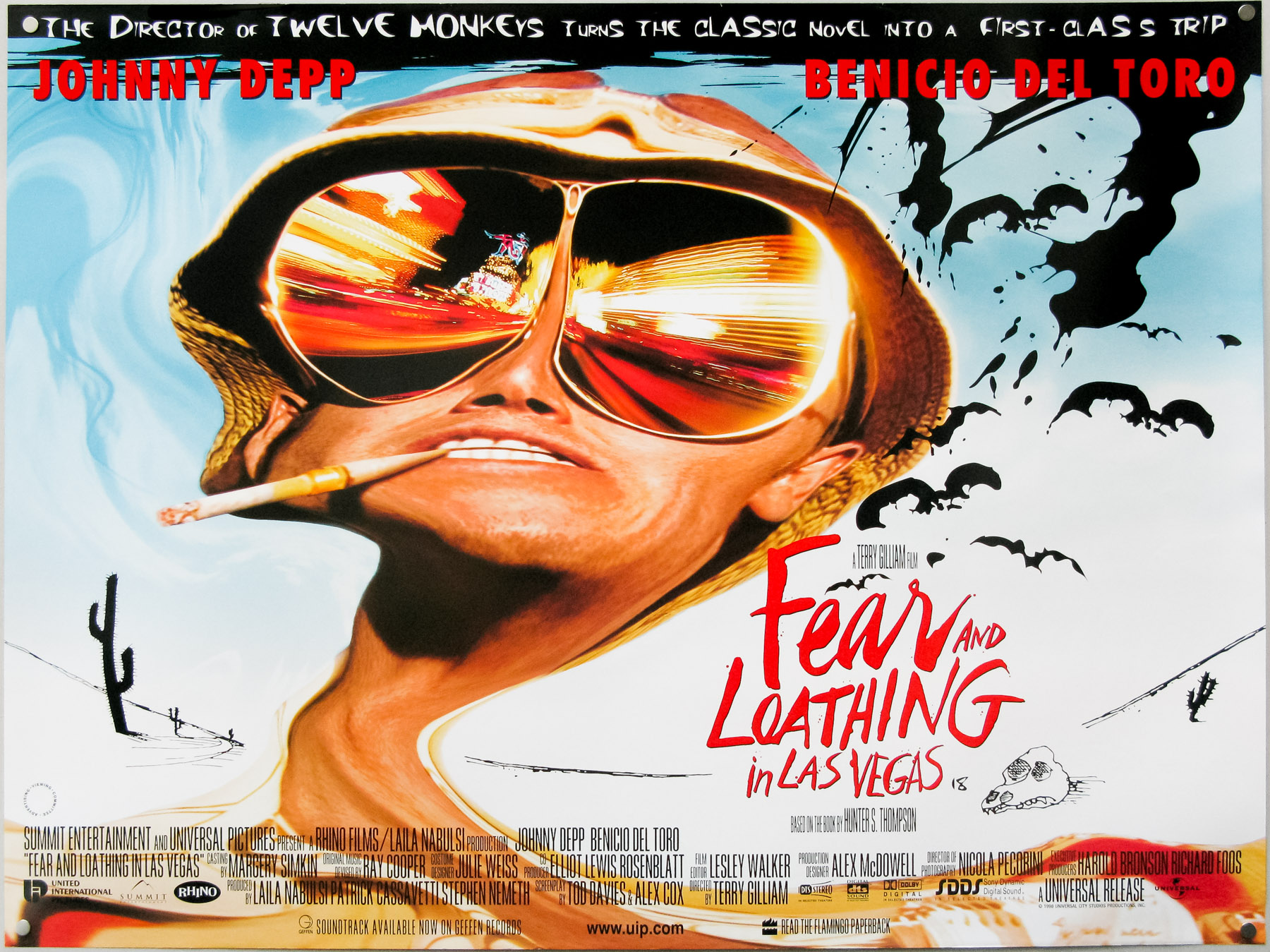
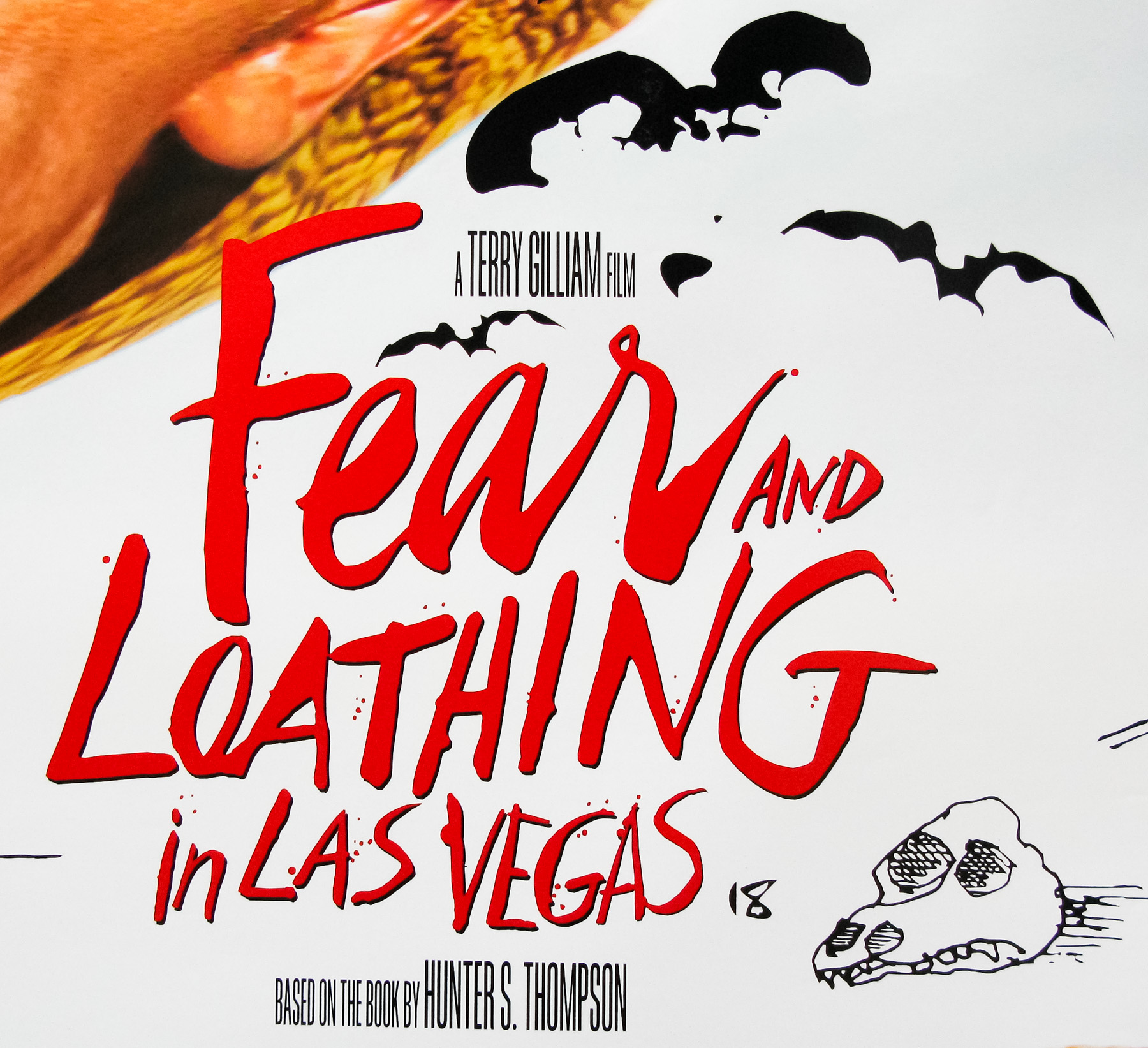
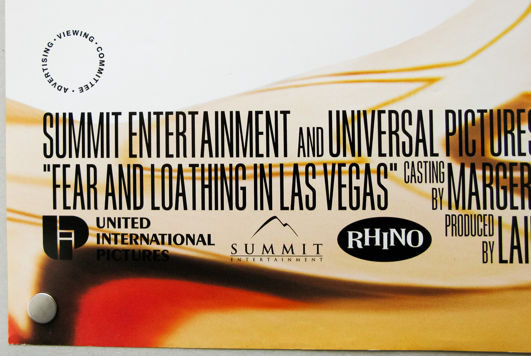
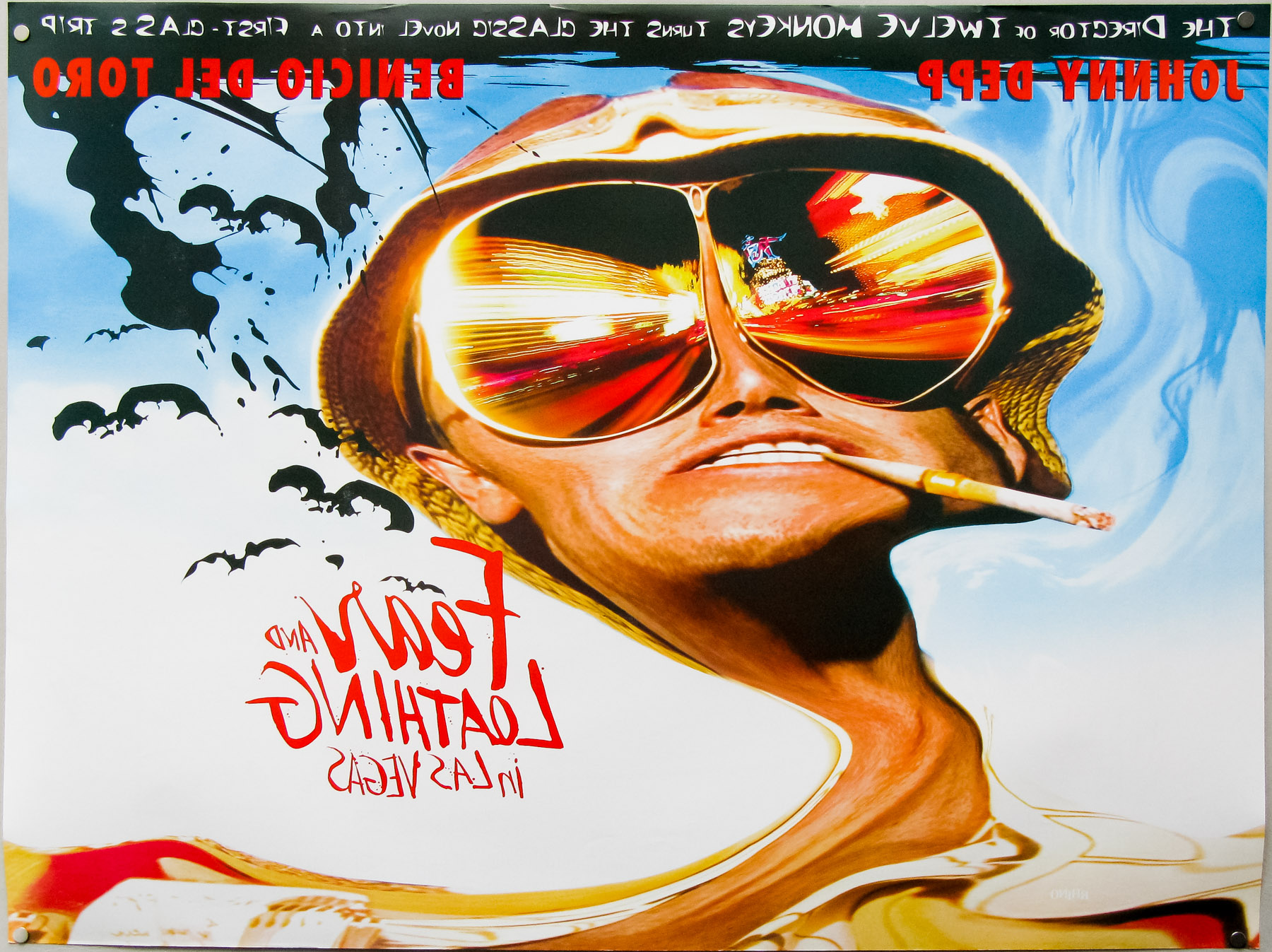
- Title
- Fear And Loathing In Las Vegas
- AKA
- --
- Year of Film
- 1998
- Director
- Terry Gilliam
- Starring
- Johnny Depp, Benicio del Toro, Tobey Maguire, Ellen Barkin, Gary Busey, Christina Ricci, Mark Harmon, Cameron Diaz
- Origin of Film
- USA
- Genre(s) of Film
- Johnny Depp, Benicio del Toro, Tobey Maguire, Ellen Barkin, Gary Busey, Christina Ricci, Mark Harmon, Cameron Diaz,
- Type of Poster
- Quad
- Style of Poster
- --
- Origin of Poster
- UK
- Year of Poster
- 1998
- Designer
- Unknown
- Artist
- Ralph Steadman
- Size (inches)
- 30" x 40"
- SS or DS
- DS
- Tagline
- The director of Twelve Monkeys turns the classic novel into a first class trip
18.05.11
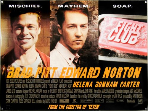
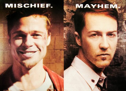
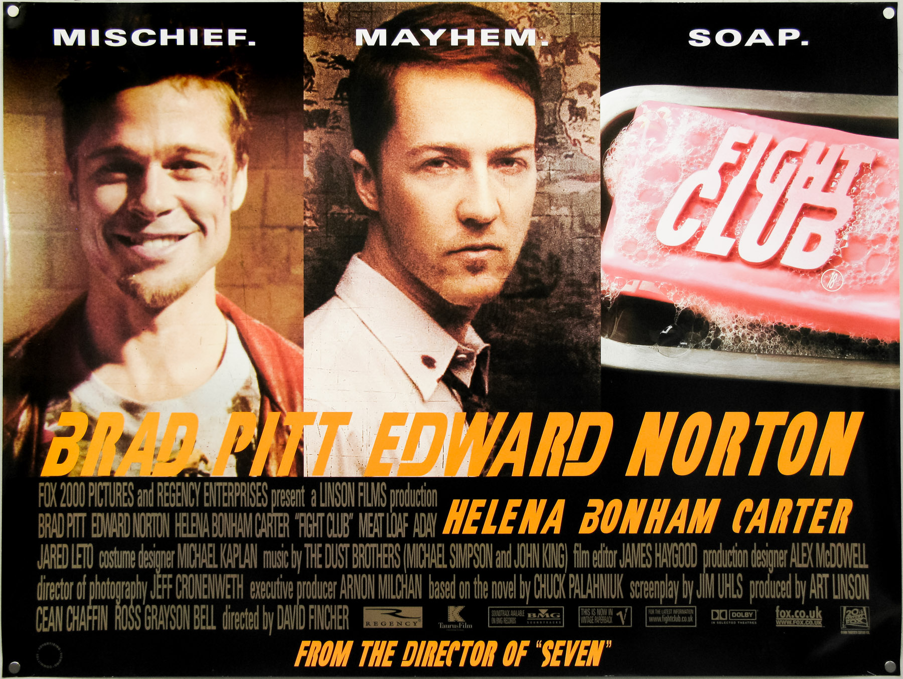
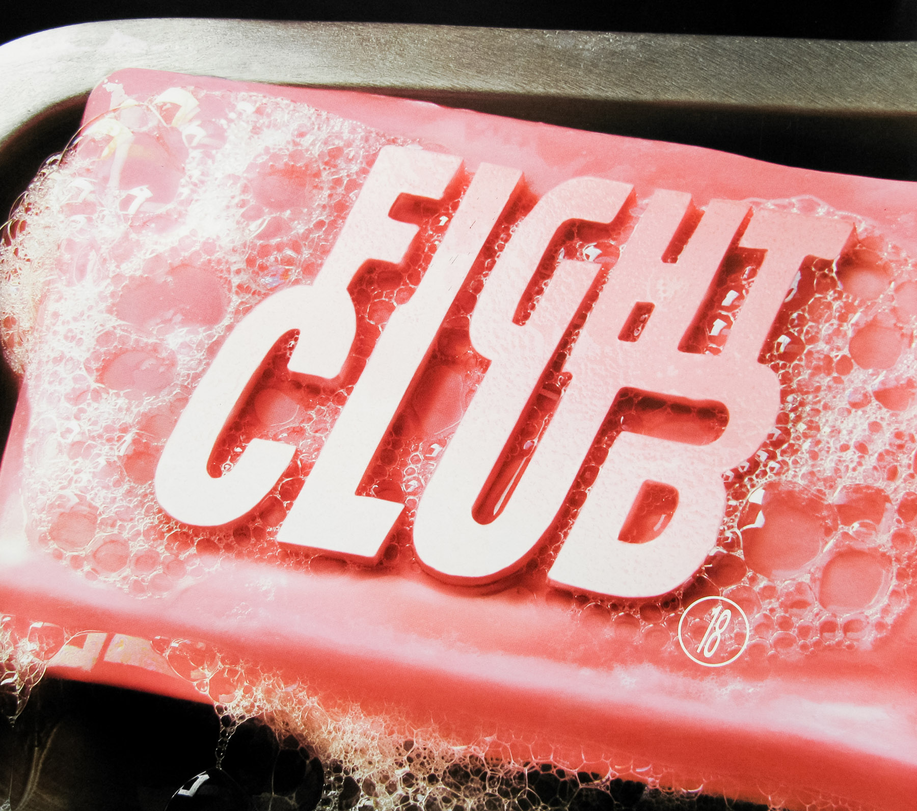
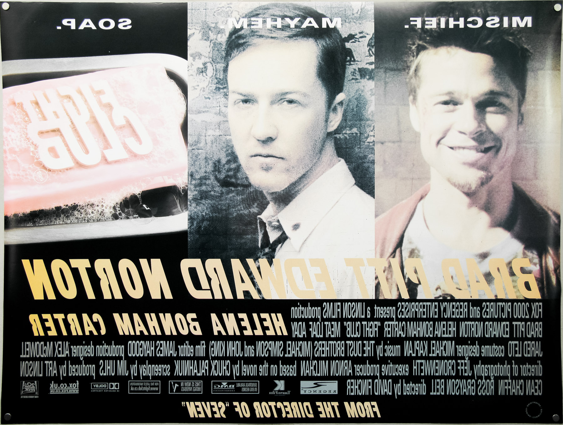
- Title
- Fight Club
- AKA
- --
- Year of Film
- 1999
- Director
- David Fincher
- Starring
- Edward Norton, Brad Pitt, Helena Bonham Carter, Meat Loaf, Zach Grenier, Richmond Arquette, David Andrews, George Maguire
- Origin of Film
- USA | Germany
- Genre(s) of Film
- Edward Norton, Brad Pitt, Helena Bonham Carter, Meat Loaf, Zach Grenier, Richmond Arquette, David Andrews, George Maguire,
- Type of Poster
- Quad
- Style of Poster
- --
- Origin of Poster
- UK
- Year of Poster
- 1999
- Designer
- Unknown
- Artist
- --
- Size (inches)
- 30" x 40"
- SS or DS
- DS
- Tagline
- Mischief. Mayhem. Soap.