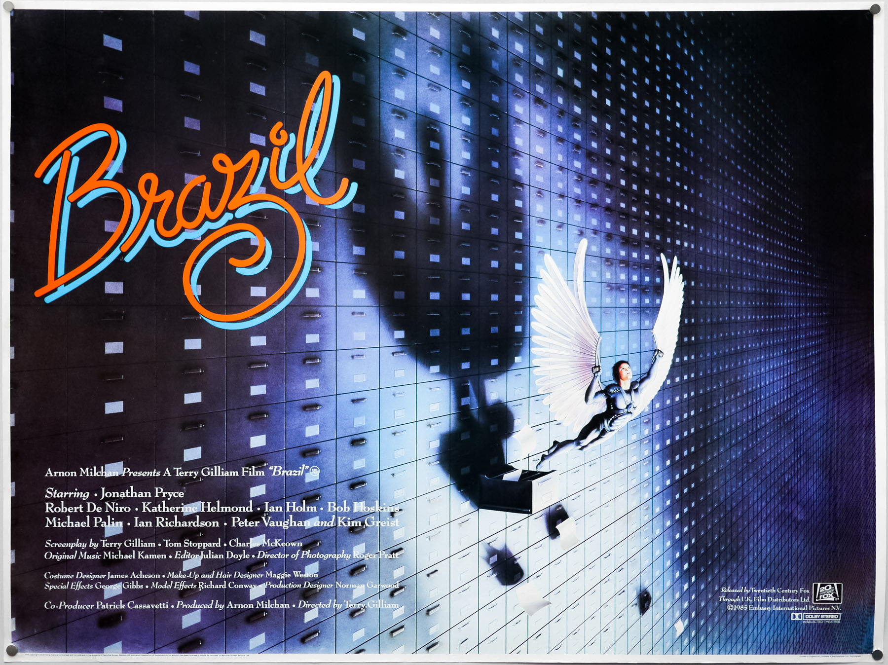
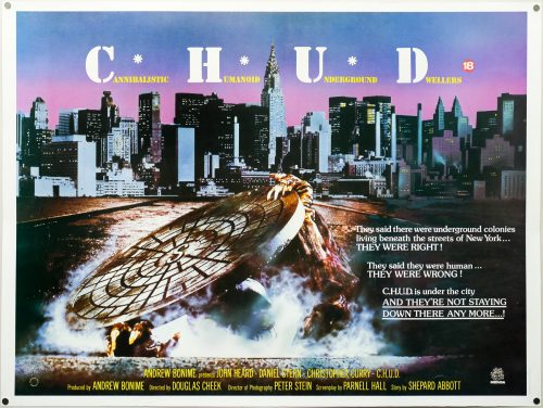
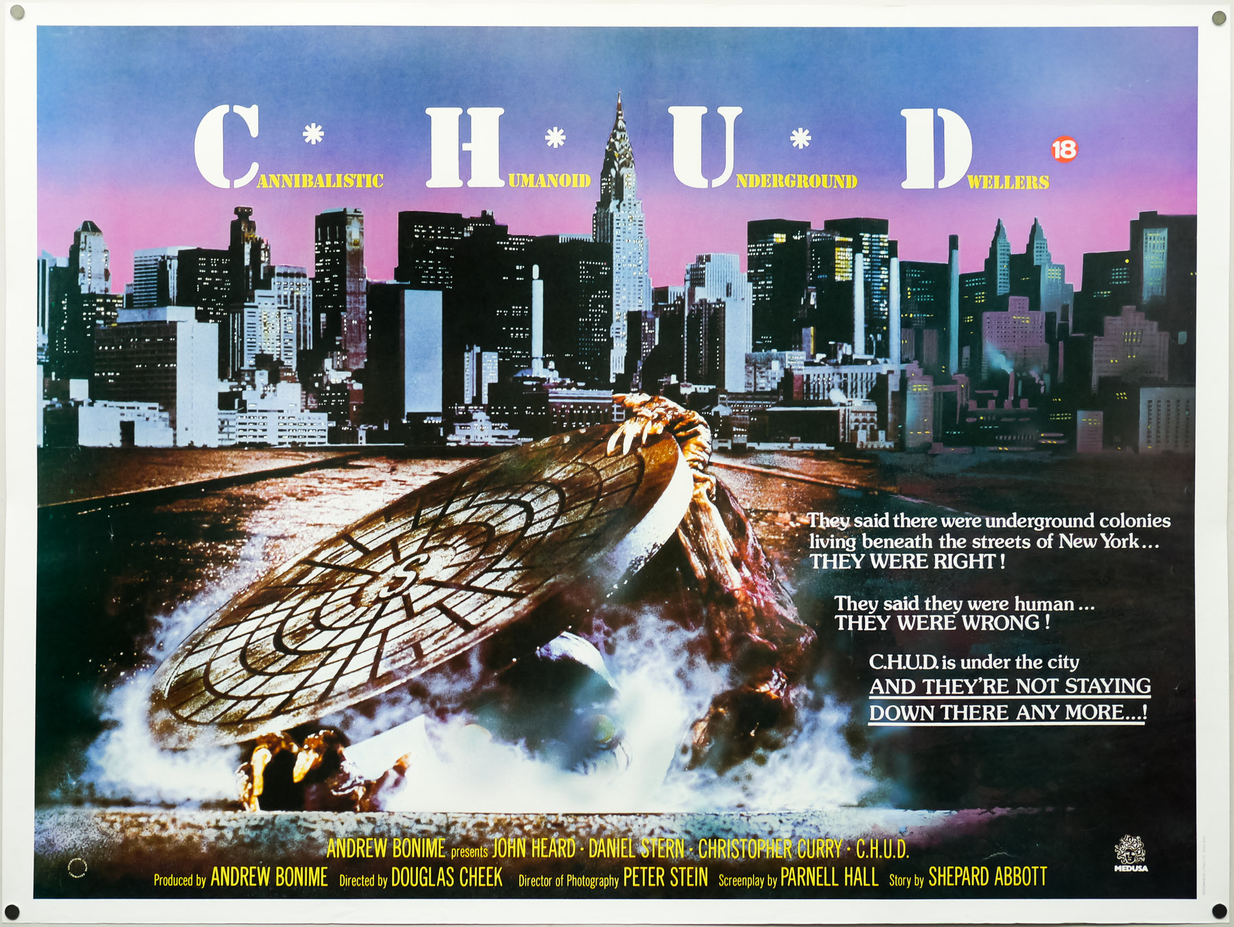
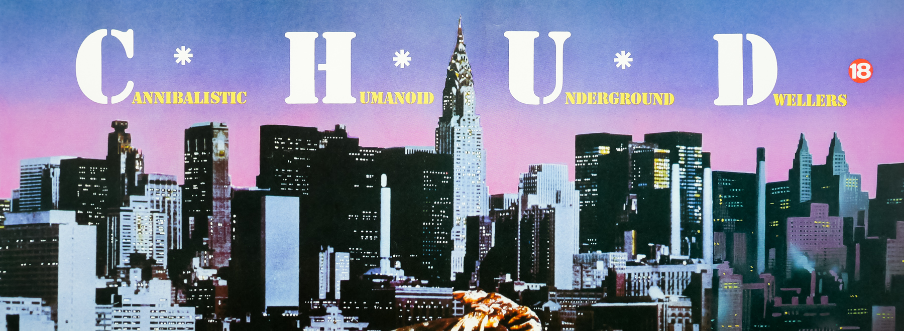
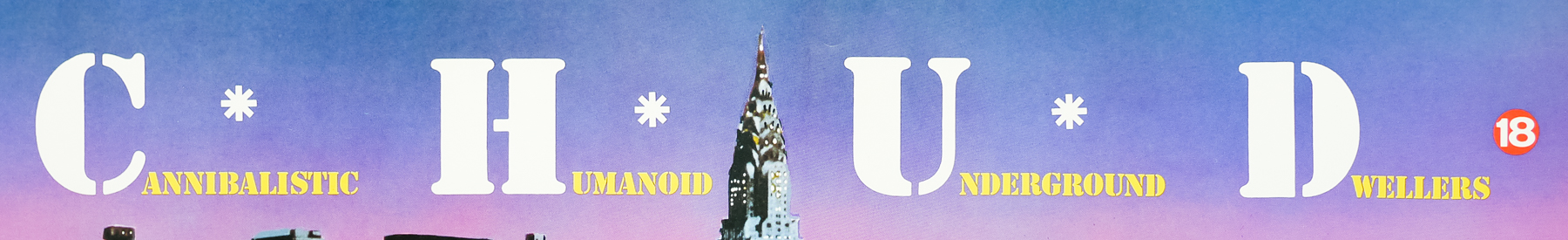
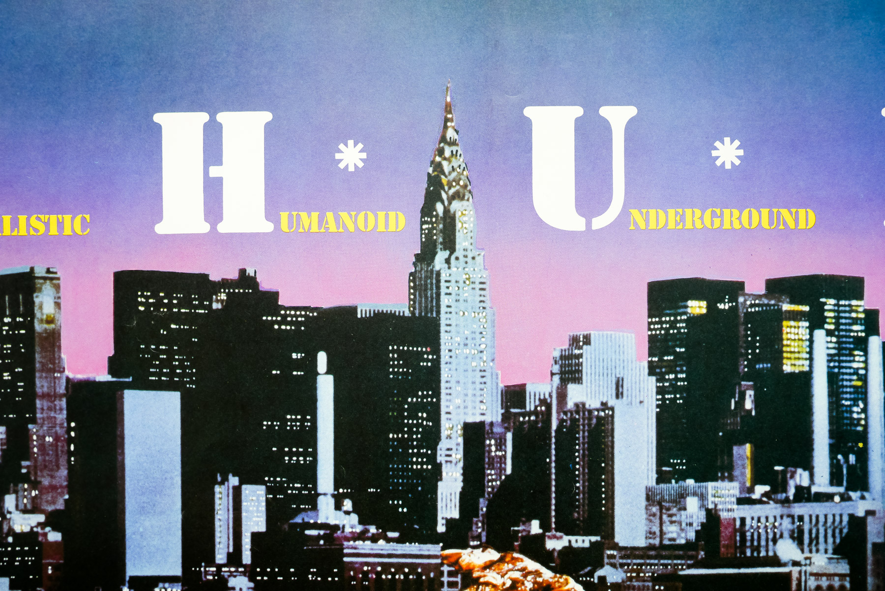
- Title
- Brazil
- AKA
- --
- Year of Film
- 1985
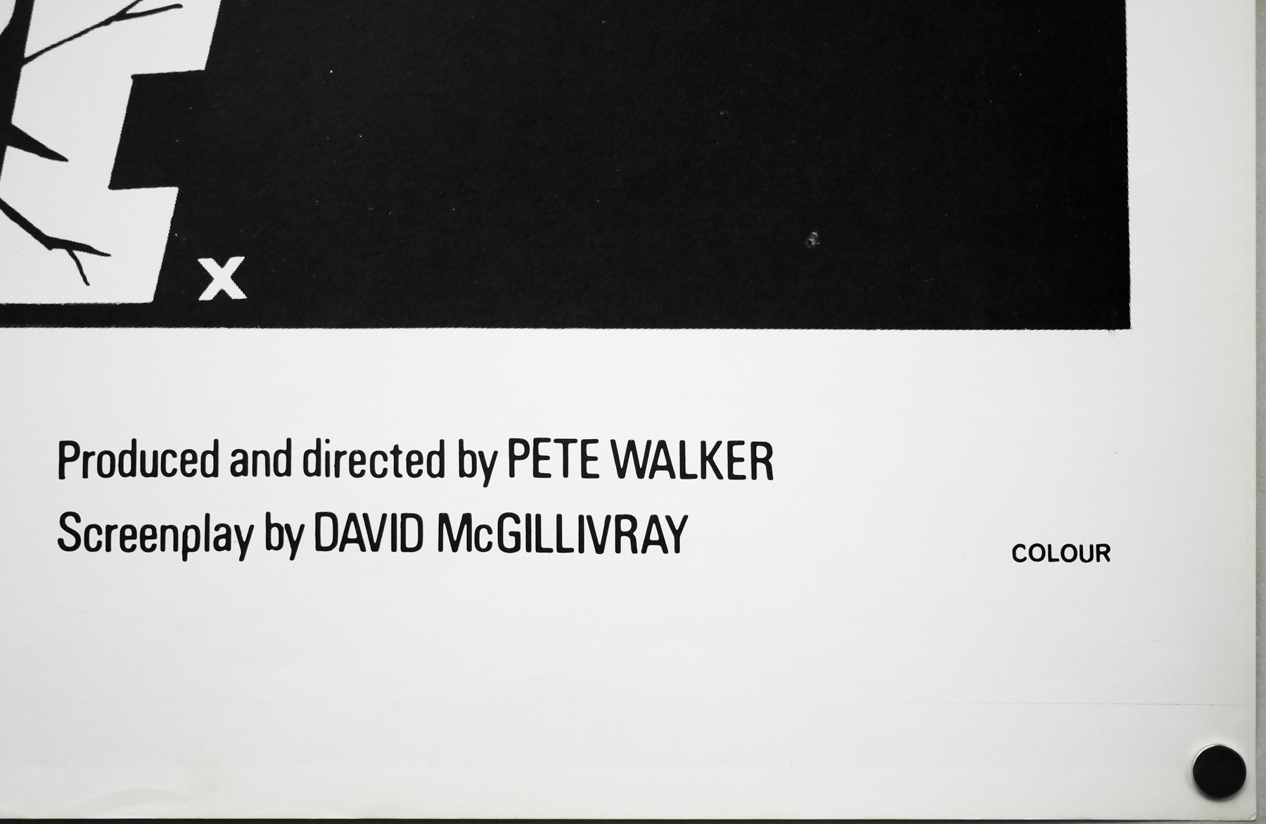
- Director
- Terry Gilliam
- Starring
- Jonathan Pryce, Robert De Niro, Katherine Helmond, Ian Holm, Bob Hoskins, Michael Palin, Ian Richardson, Peter Vaughan, Kim Greist, Jim Broadbent
- Origin of Film
- UK
- Genre(s) of Film
- Jonathan Pryce, Robert De Niro, Katherine Helmond, Ian Holm, Bob Hoskins, Michael Palin, Ian Richardson, Peter Vaughan, Kim Greist, Jim Broadbent,
- Type of Poster
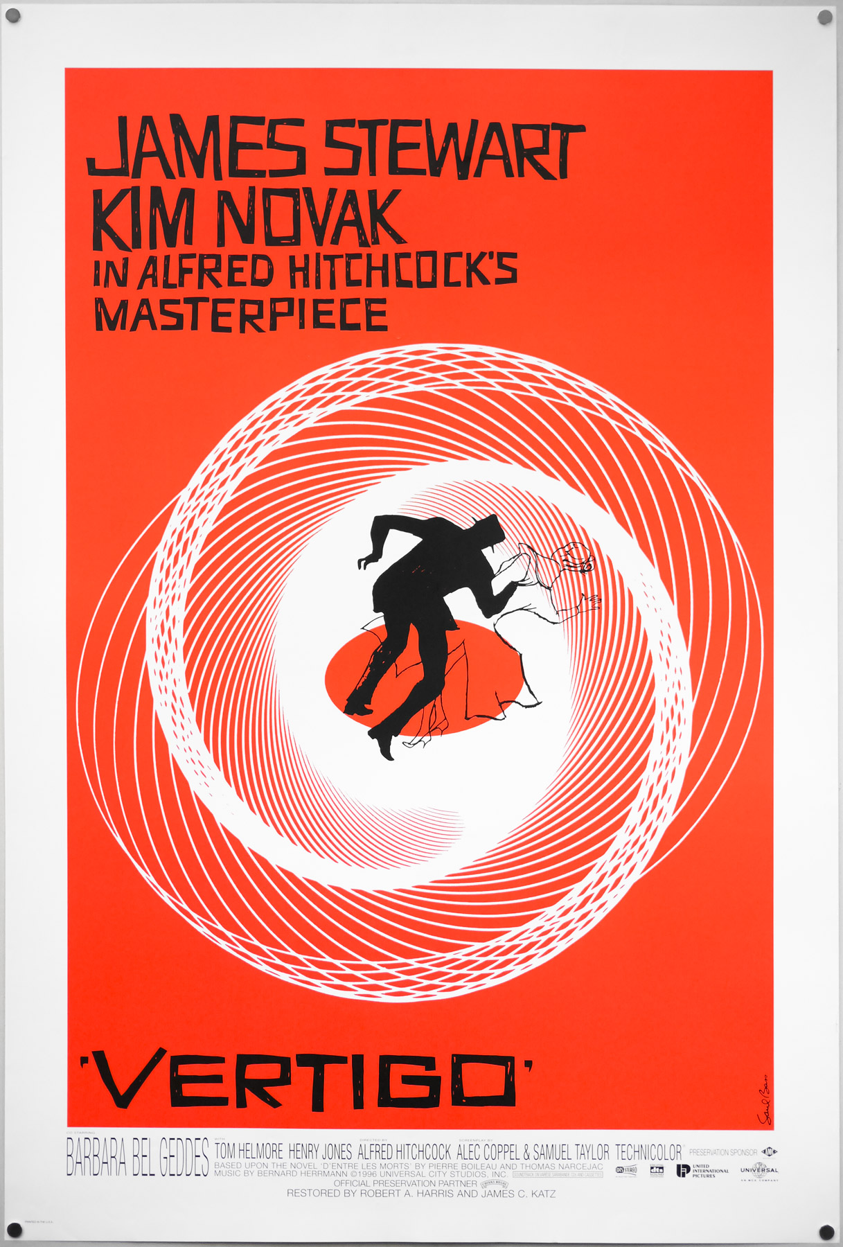
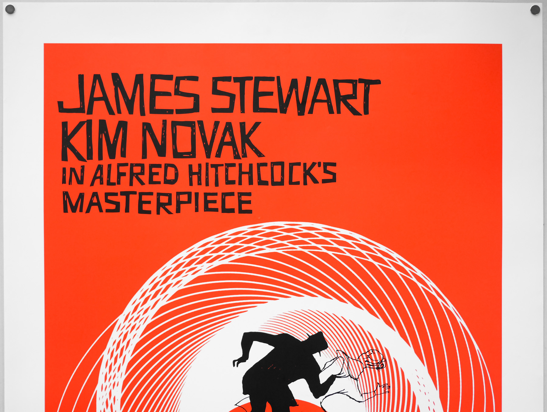
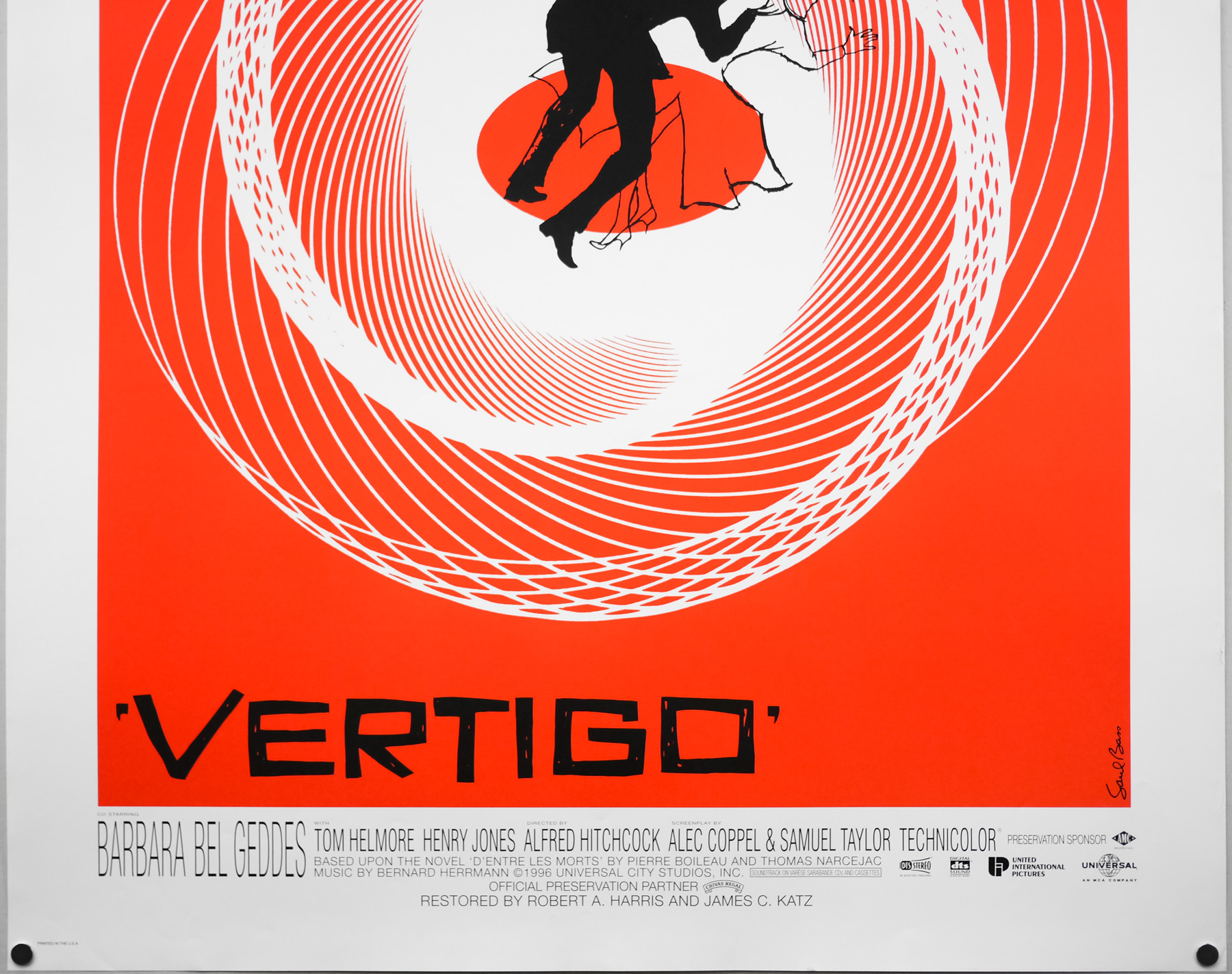
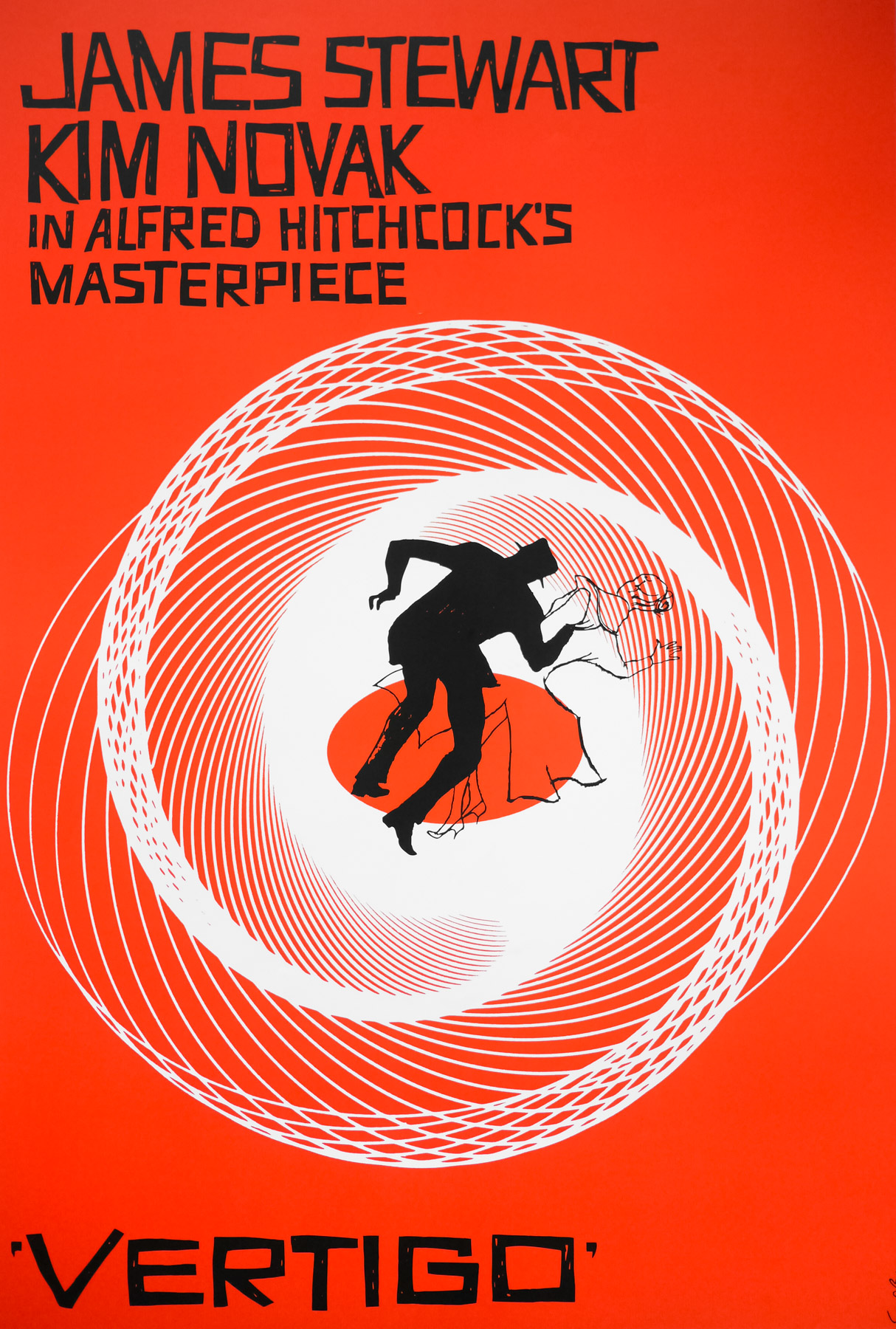
- Quad
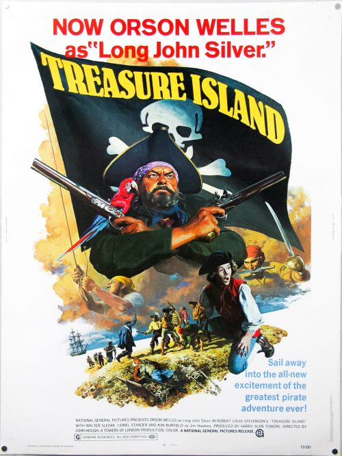
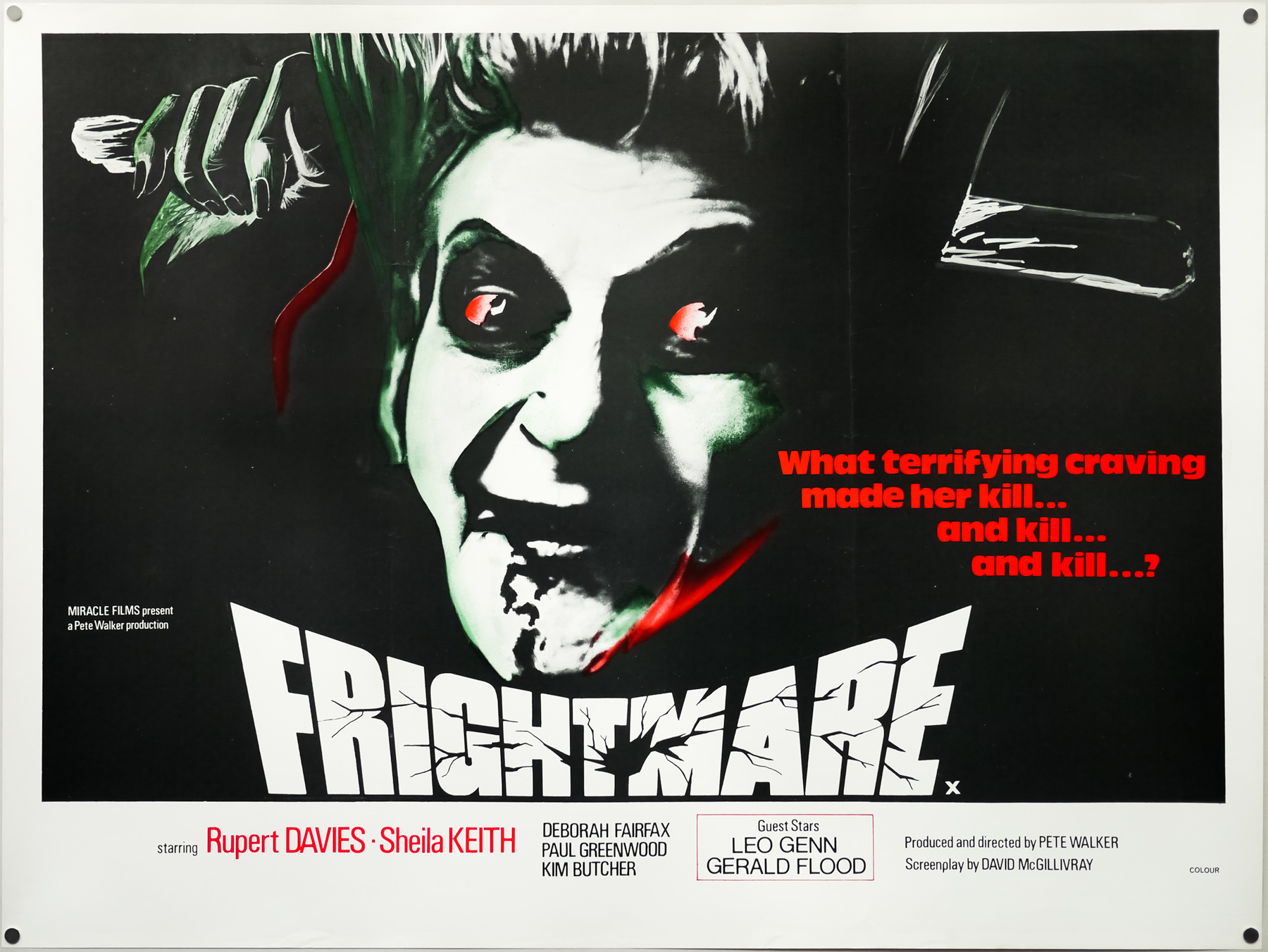
- Style of Poster
- Withdrawn 'dream cabinets' version
- Origin of Poster
- UK
- Year of Poster
- 1985
- Designer
- Unknown
- Artist
- Unknown
- Size (inches)
- 30 1/16" x 39 15/16"
- SS or DS
- SS
- Tagline
- --
One of my favourite British posters of all time, this is the supposedly withdrawn quad for Terry Gilliam‘s 1985 masterpiece Brazil. A film that is near impossible to categorise, the story is a heady mix of dystopian sci-fi, surreal dark fantasy and anarchic satirical comedy set in an alternative universe in which an overbearing government has practically strangled society with its mixture of paranoia, crippling bureaucracy and unreliable technology. That one of the film’s working titles was ‘1984 and 1/2’ gives you some idea of the Orwellian overtones that Gilliam and his fellow screenwriters Tom Stoppard and Charles McKeown intended to evoke.
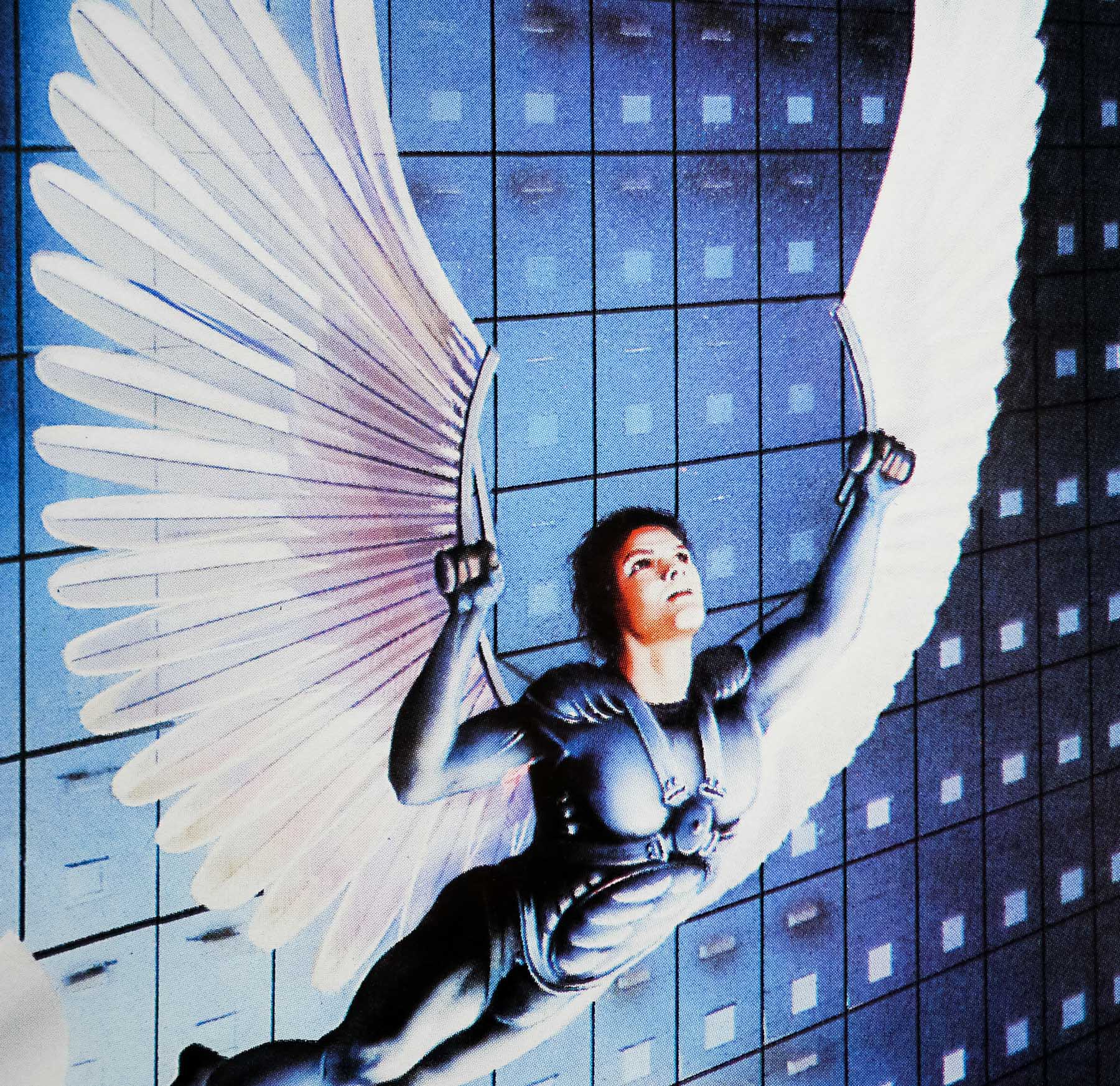
Jonathan Pryce stars as Sam Lowry, a low-level employee at the ‘Ministry of Information’ who is seemingly content with his role as a cog in the giant machine, but at night he escapes in dreams where he is a knight is shining armour with giant wings strapped to his back, often rescuing the same damsel in distress from malicious forces. When a clerical error caused by a dead beetle falling into a printer causes the wrong man to be rounded up, tortured and killed by government forces (“we didn’t know he had a weak heart!”), Sam is given the task of correcting the error. Whilst visiting the wife of the deceased man, Sam meets Jill Layton (Kim Greist) a neighbour who bears a striking resemblance to the girl in his dreams.
Naturally he is instantly smitten and sets in motion a series of events that ends up with Sam and Jill pitched against his employer and on the run. The film features several memorable appearances from the likes of Ian Holm as Sam’s bumbling, inefficient boss, Michael Palin as an ambitious and ultimately ruthless friend within the Ministry, and Robert De Niro in a cameo role as Harry Tuttle, a rogue heating engineer who was meant to be the original target for the government round-up.
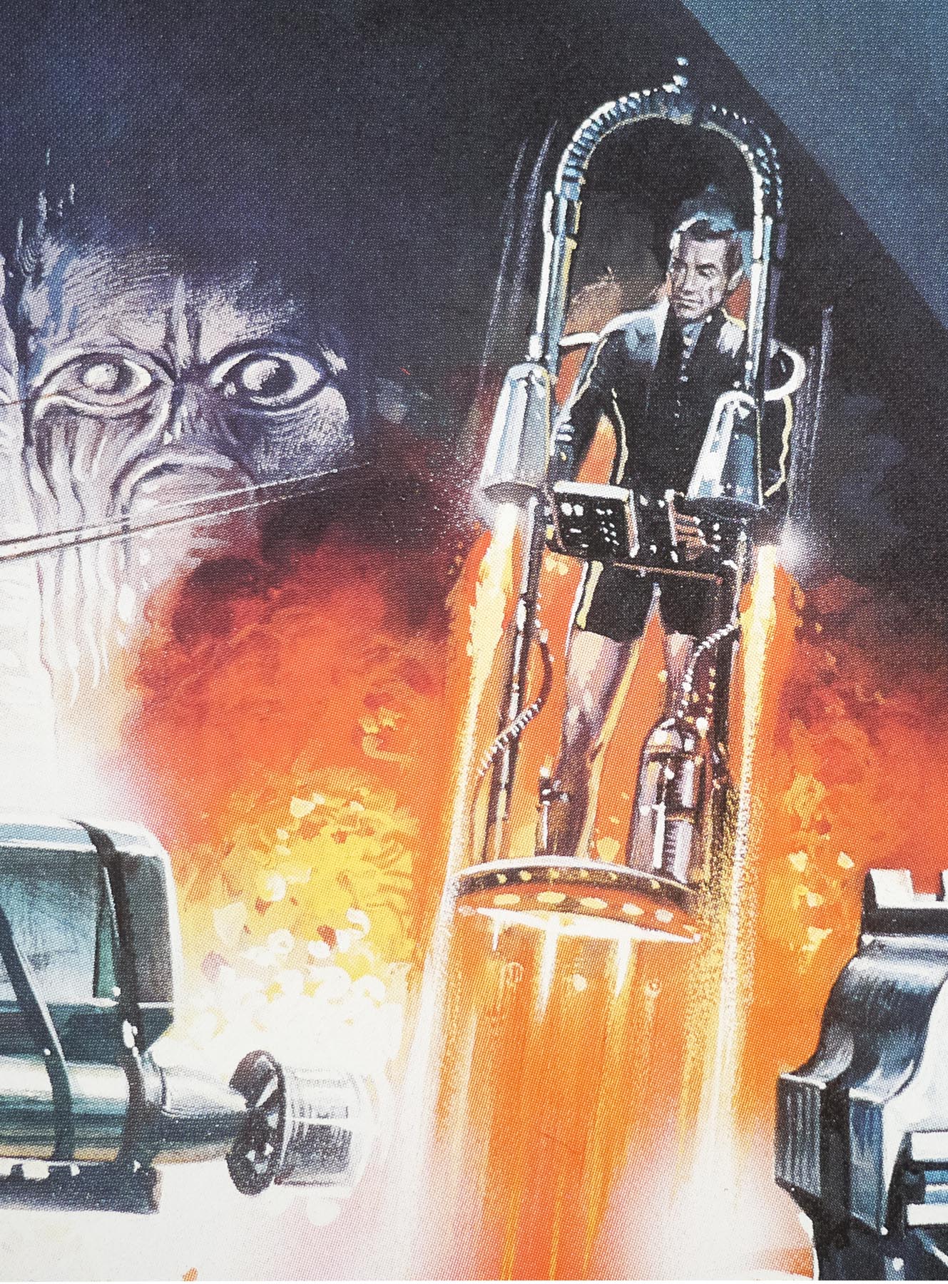
The film is visually stunning with some of the most incredible production design ever committed to celluloid. Gilliam and his skilled crew of technicians stretched every penny of the modest budget and created countless memorable sets, brilliantly realised props and entirely believable environmental details that all add up to something unforgettable. The special effects are also top notch, with the dream sequences deserving special mention, particularly Sam’s battle with a giant Samurai warrior and the literal flights of fantasy in his winged suit.
Infamously, Gilliam would end up in a bitter wrangle with the American distributors Universal after they decided his final cut was overlong, confusing and the ending was too depressing. The then Universal president Sid Sheinberg ordered a small team of editors to cut the film down from its original length of 2 hours and 20 minutes to just over 90 minutes for a version unofficially dubbed ‘The Love Conquers All’ cut. Most of the dream sequences were excised, the opening scenes completely chopped around and many scenes were horribly truncated. Worst of all, the original darker ending was replaced with a bizarre ‘happy’ denouement that completely ruined the tone of Gilliam’s film.
Understandably furious, the director refused to have anything to do with the new cut and actually began a campaign to get his original version seen by as many American film fans and critics as possible, much to the chagrin of Universal’s management. Eventually this culminated in the Los Angeles Film Critics Association awarding the original cut their prize for Best Film and this led to Universal relenting and agreeing to release a near complete version to cinemas (minus around 10 minutes from the European cut). The bastardised ‘Love Conquers All’ version never saw the inside of a cinema.
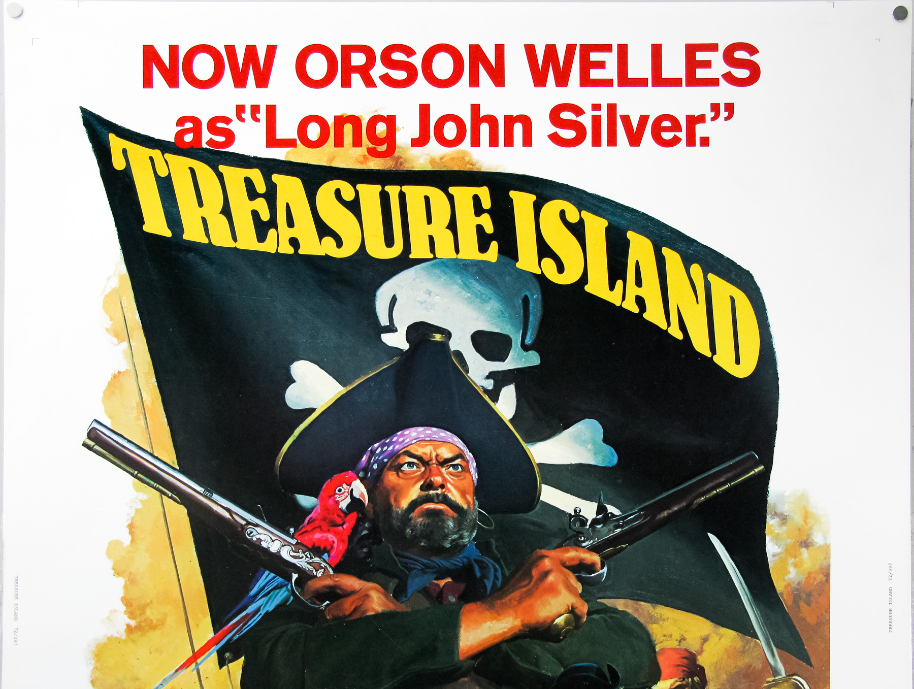
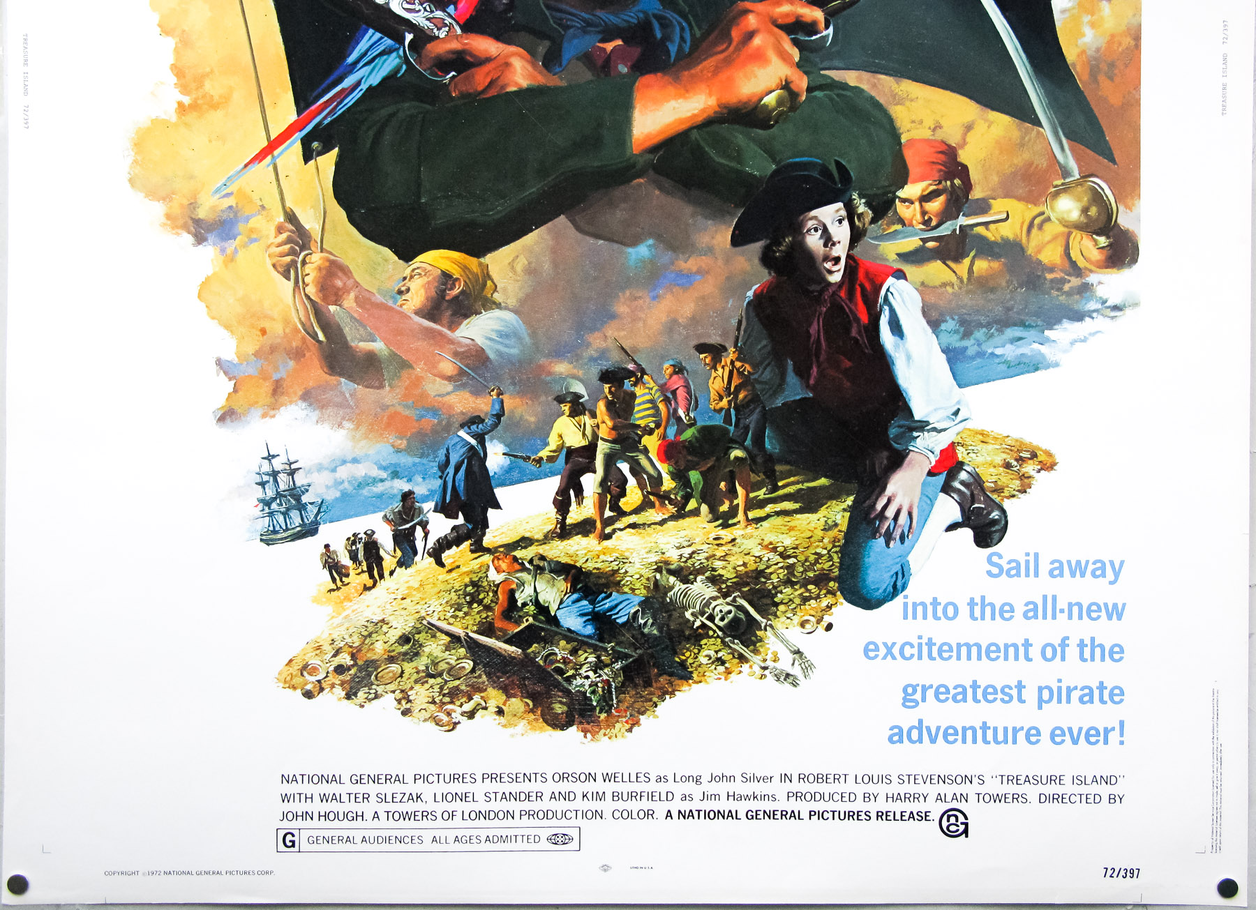
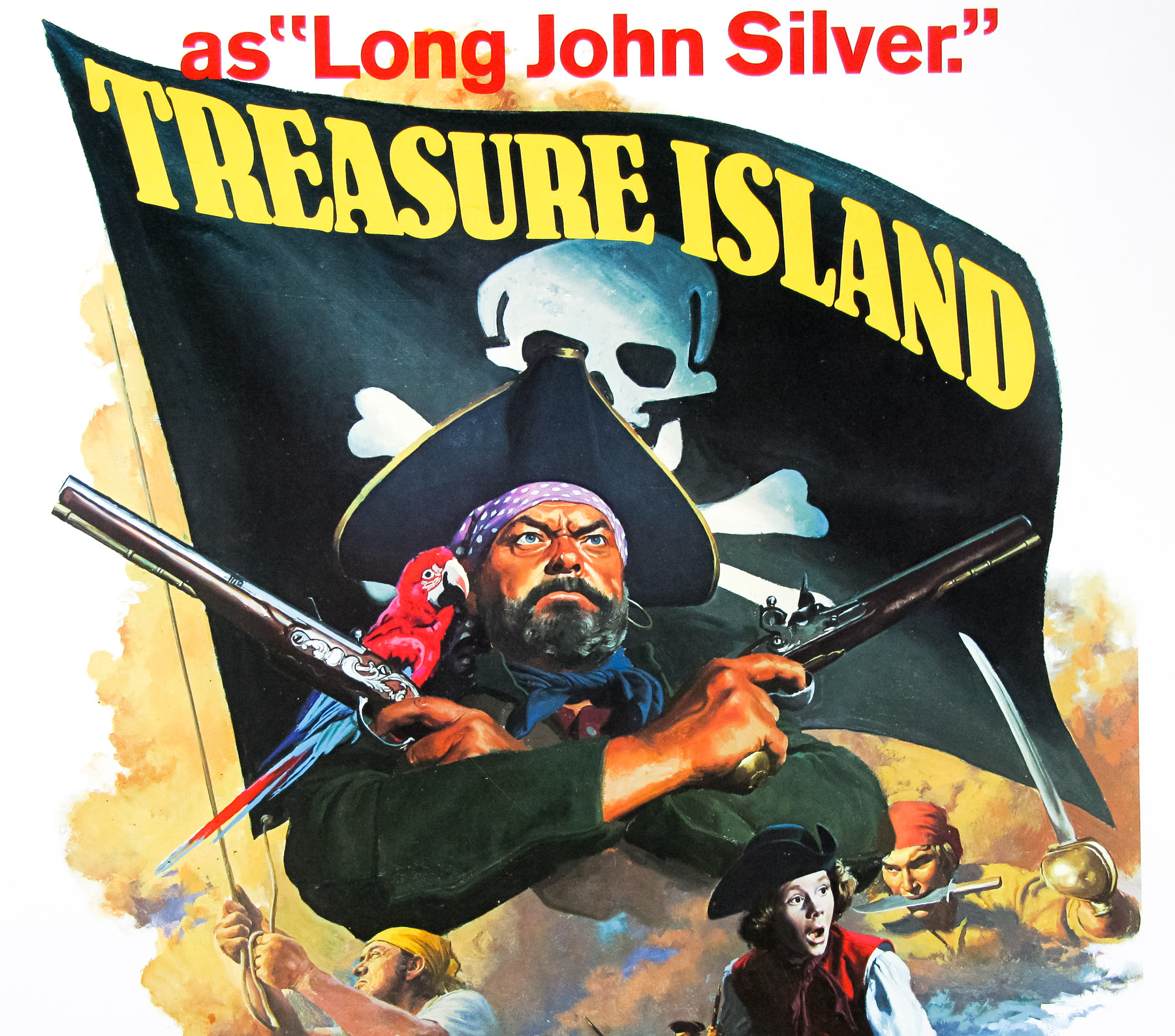
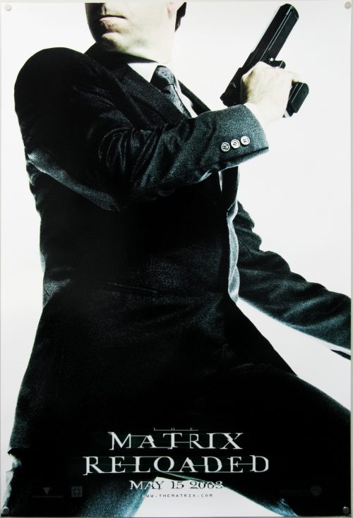
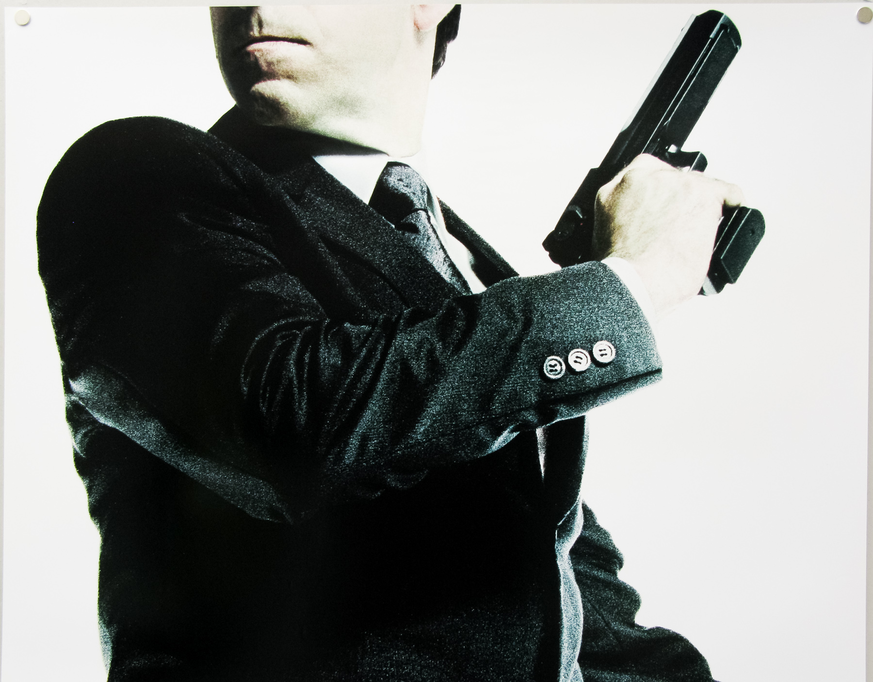
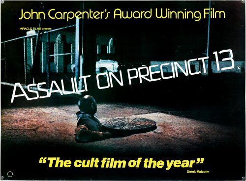
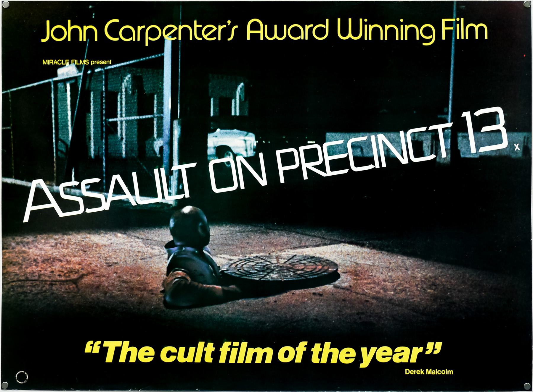
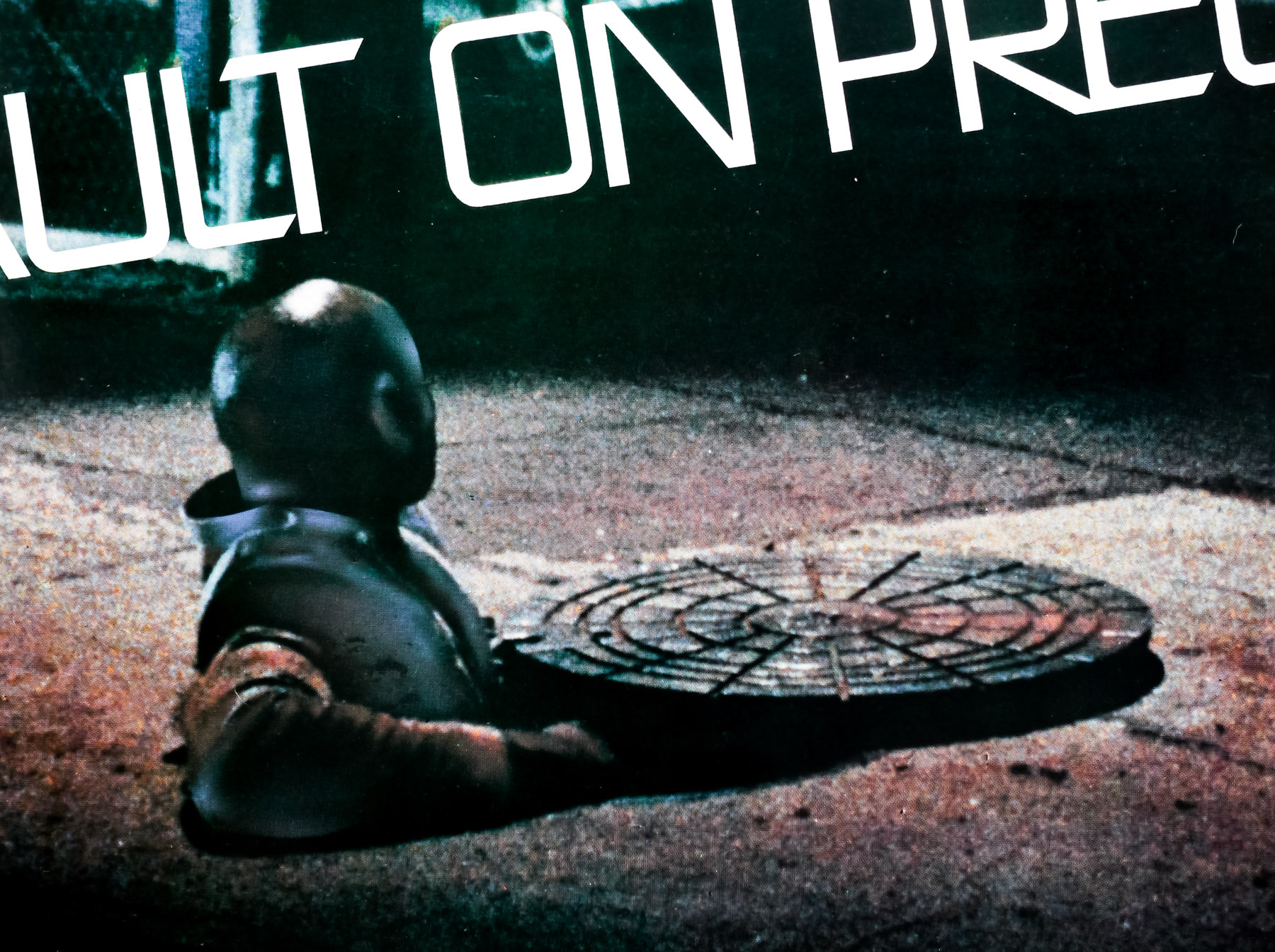
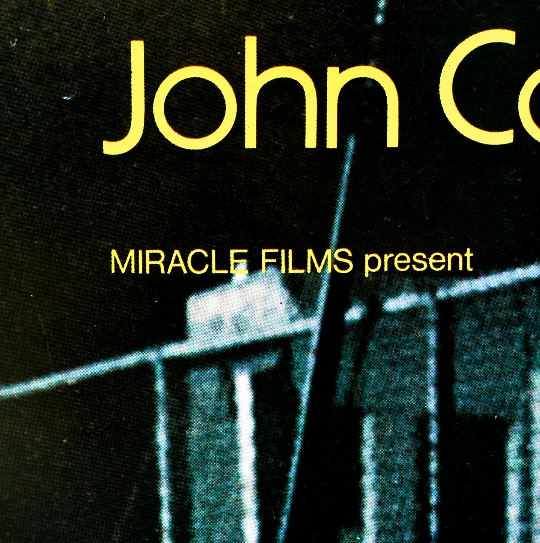
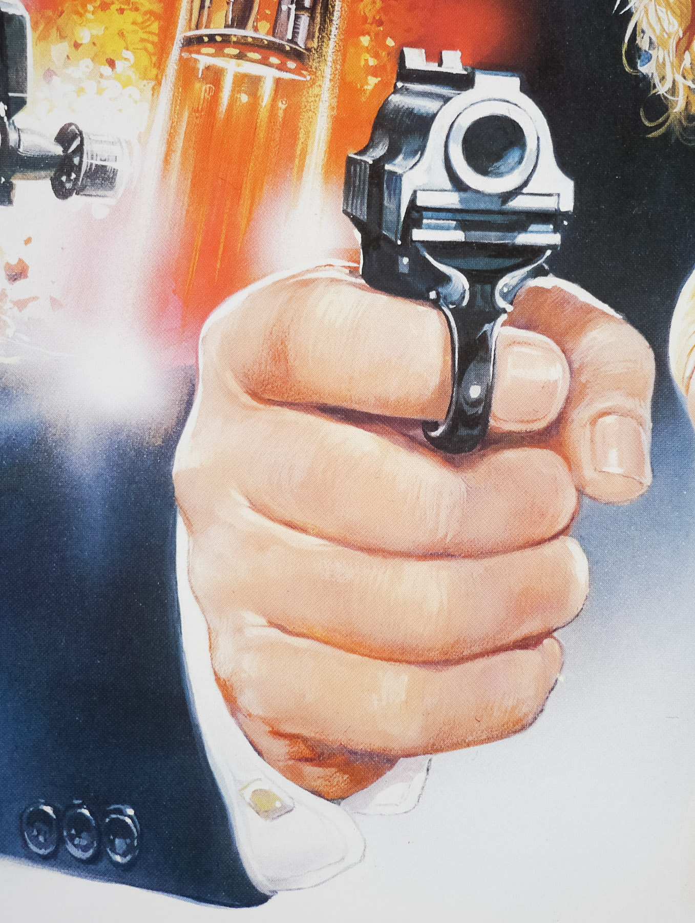
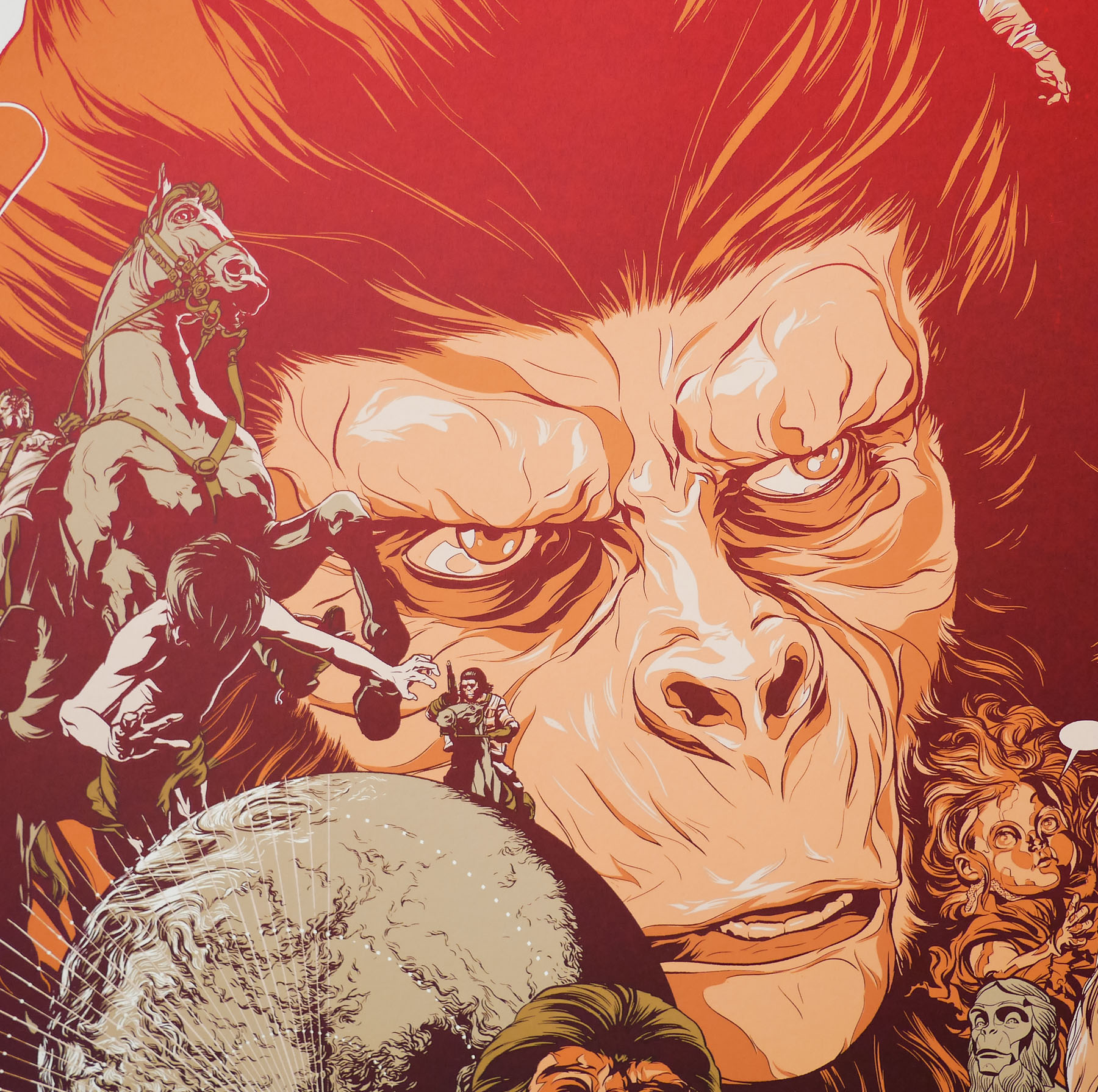
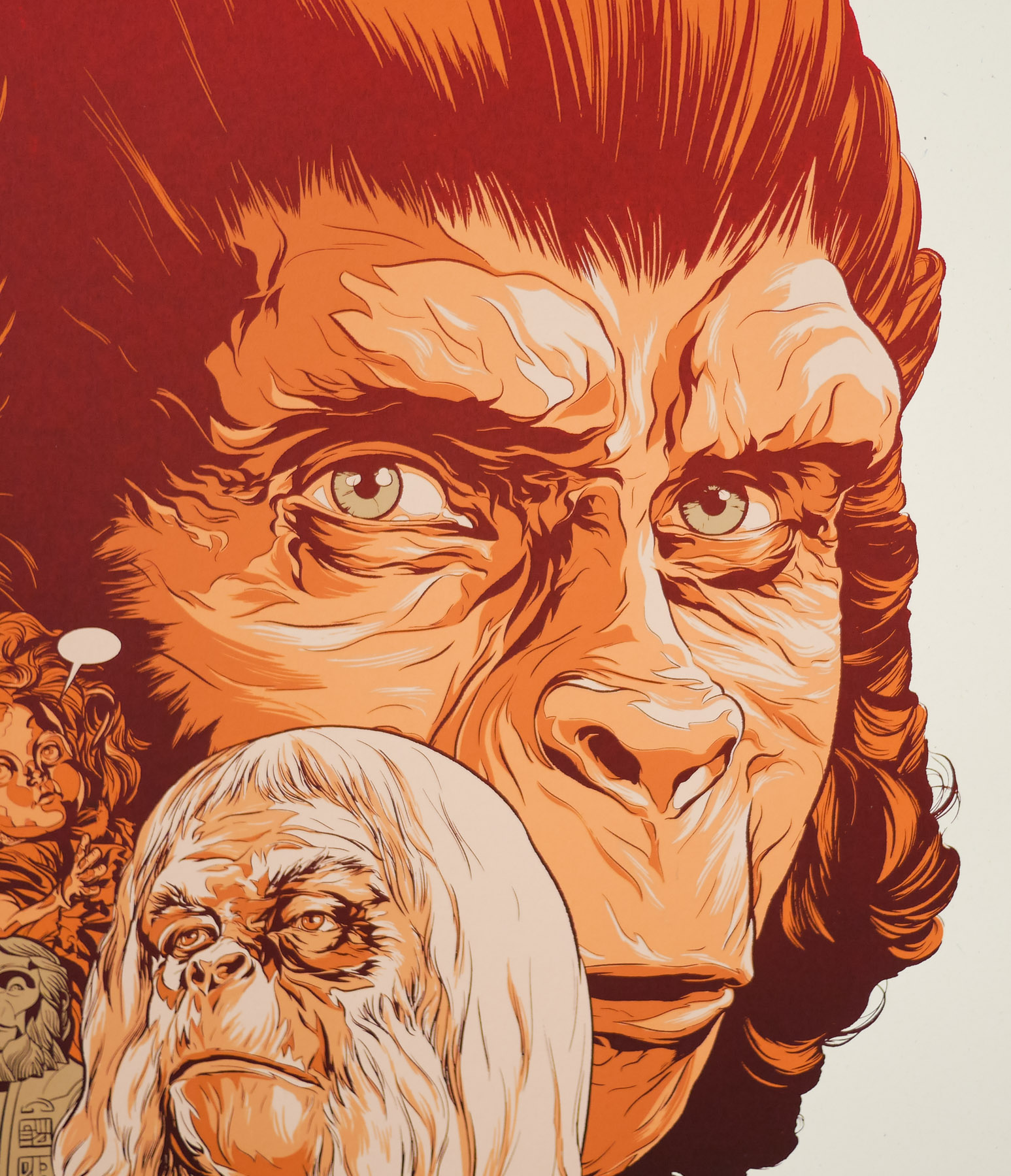
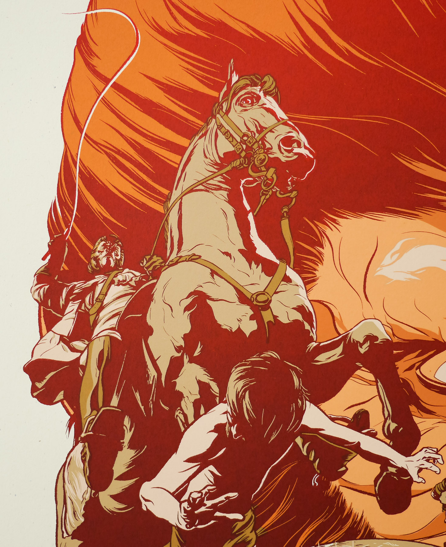
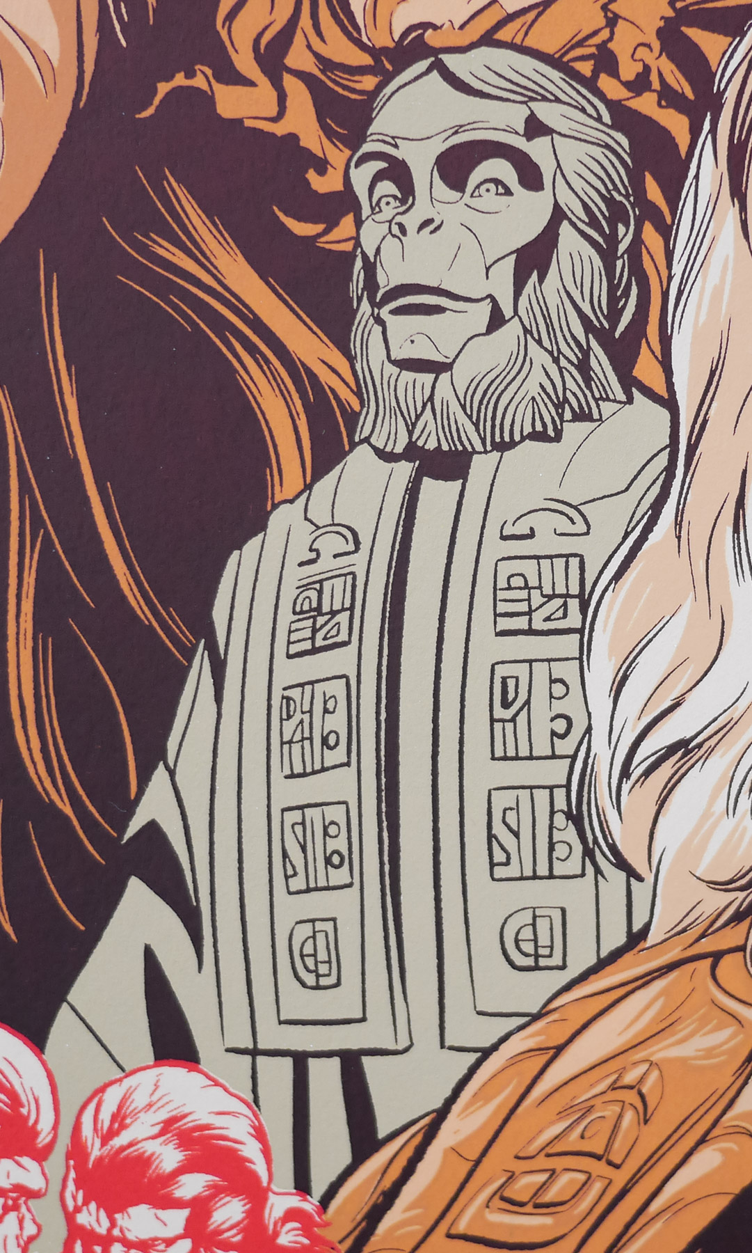
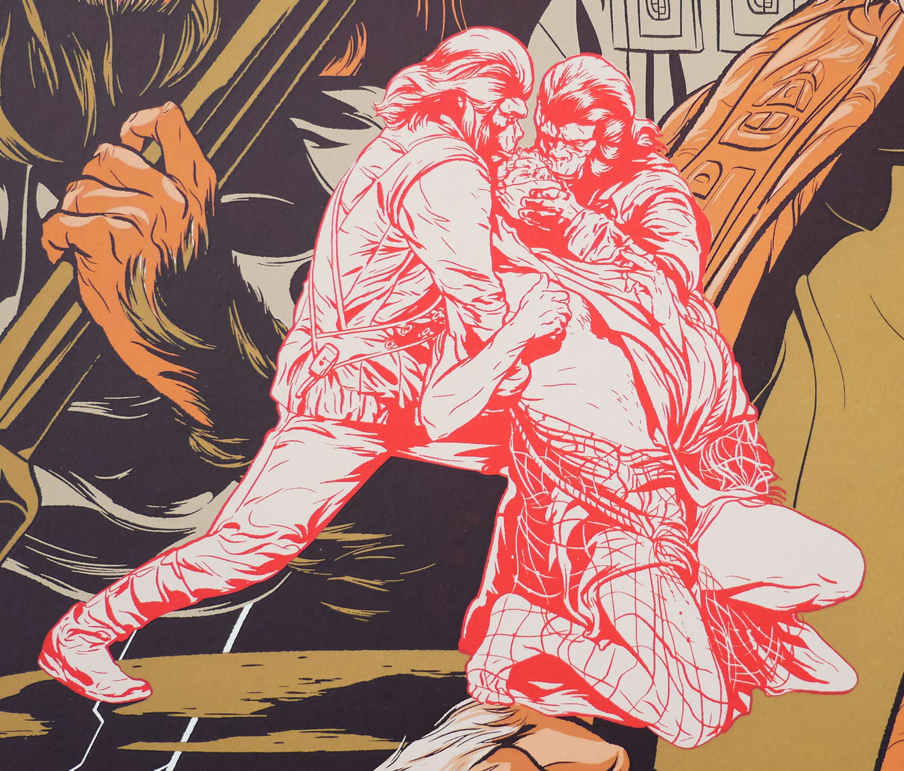
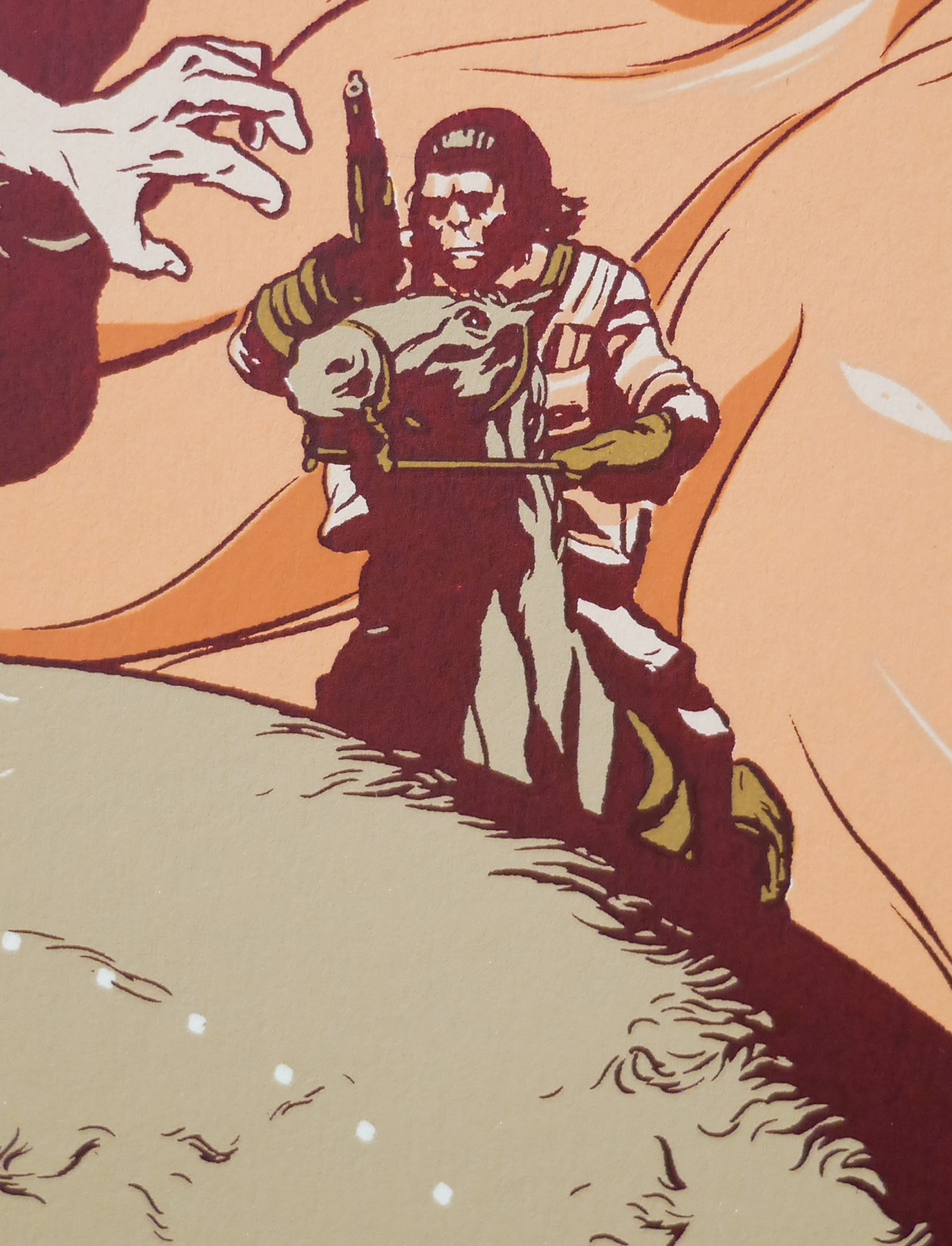
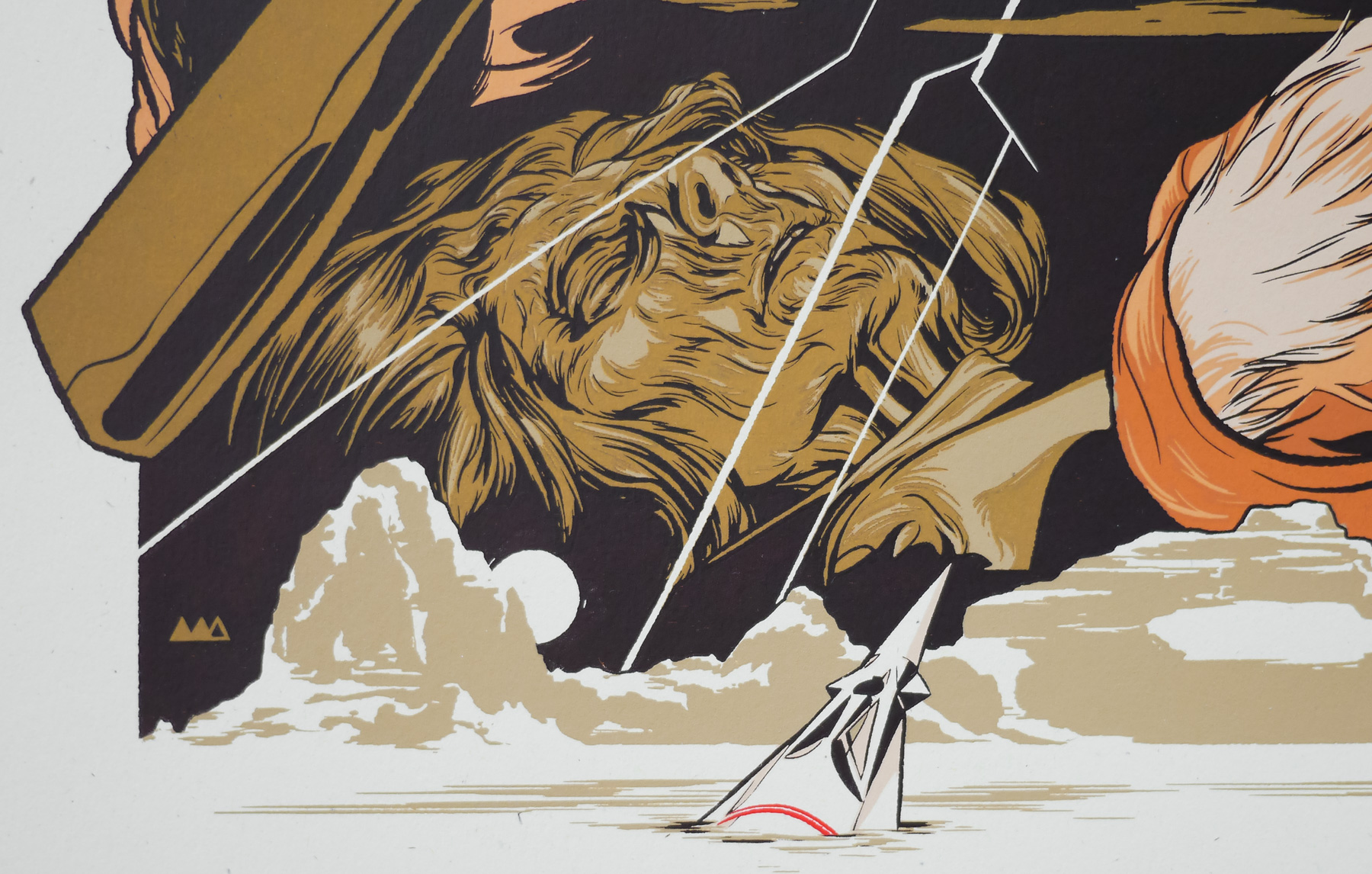
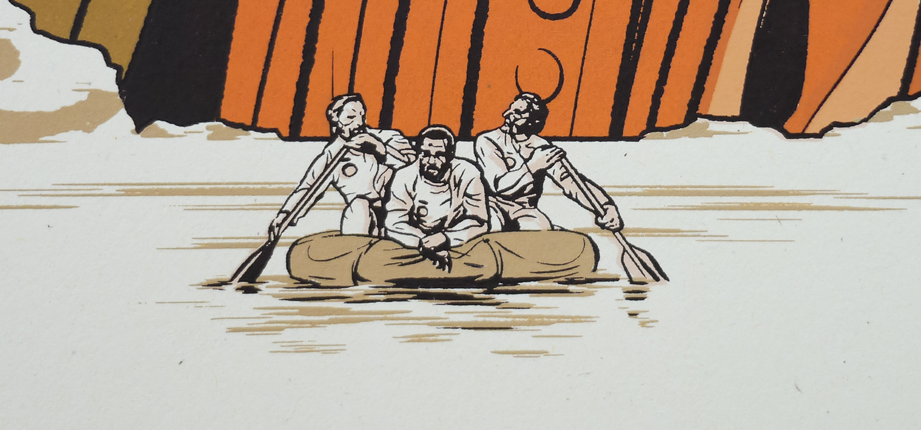
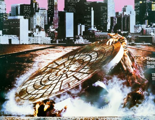
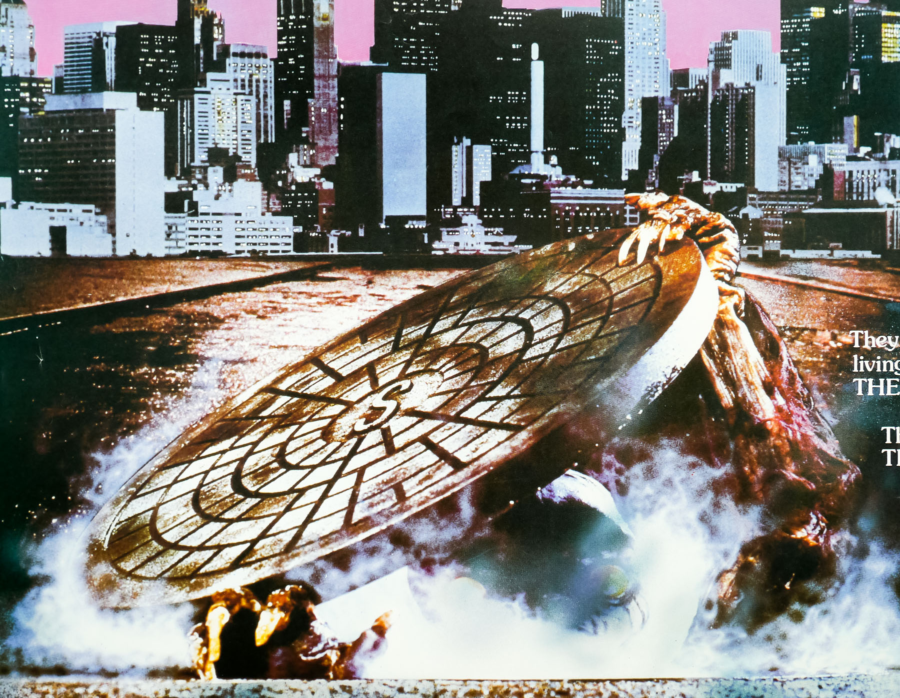
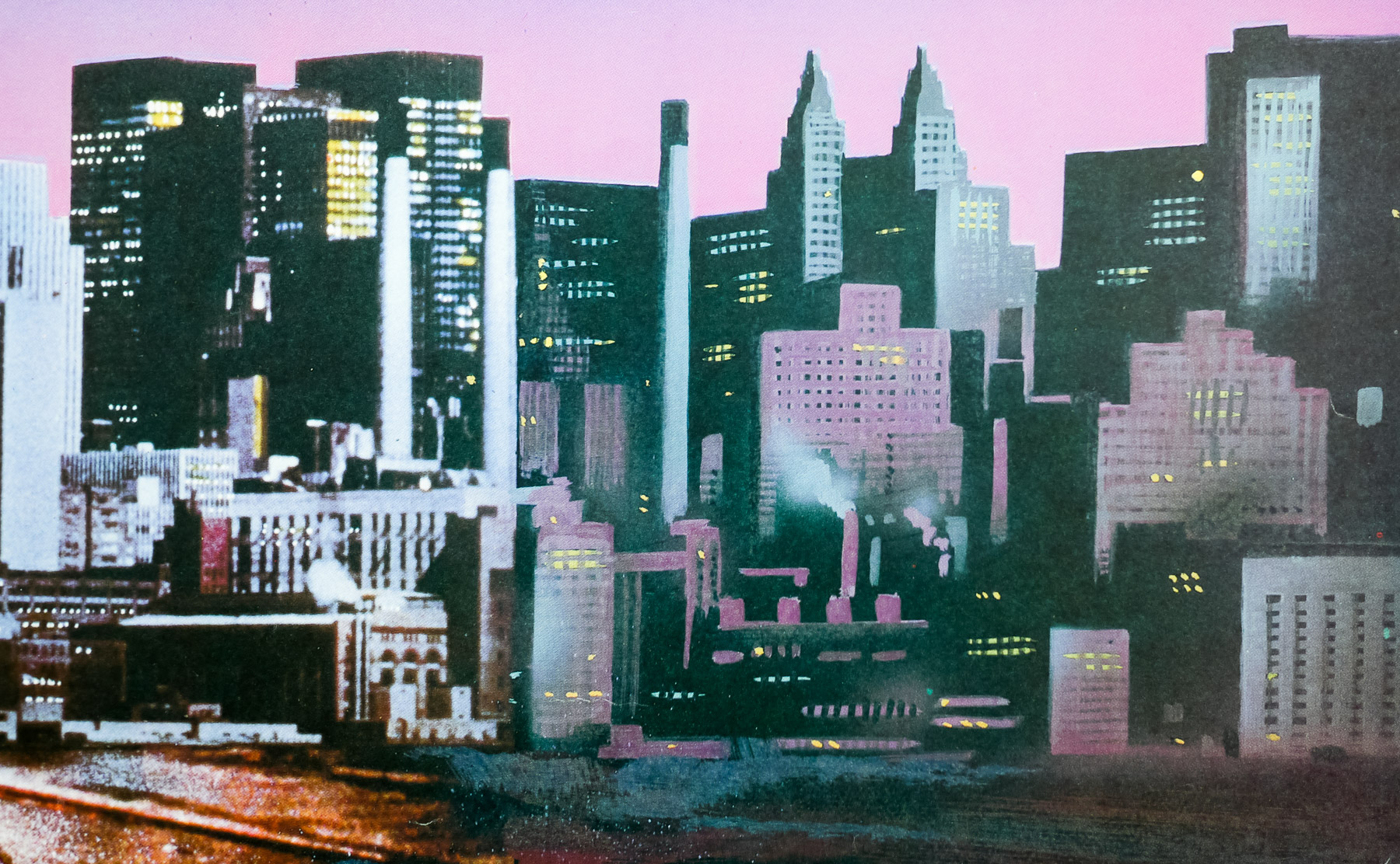
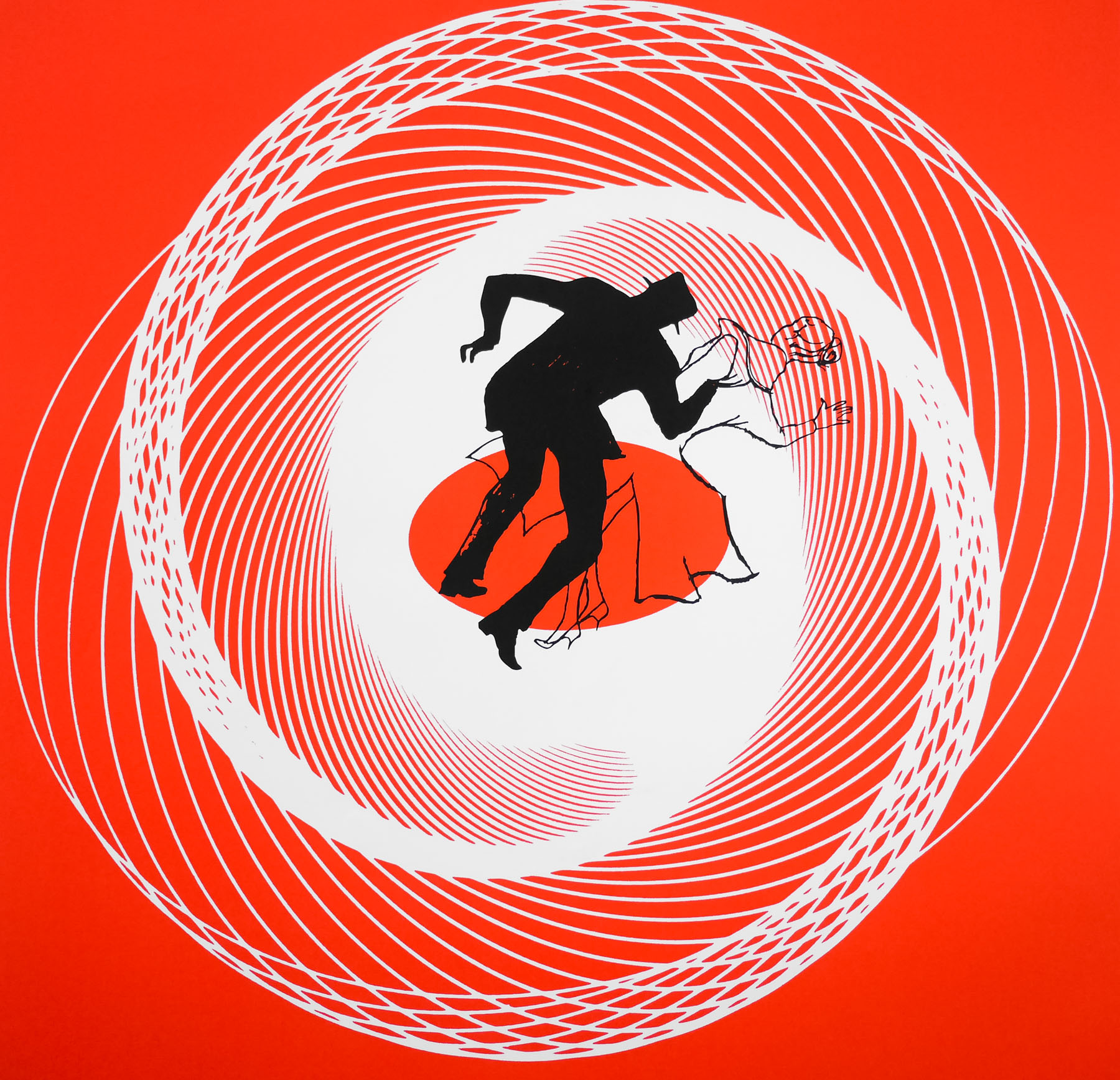
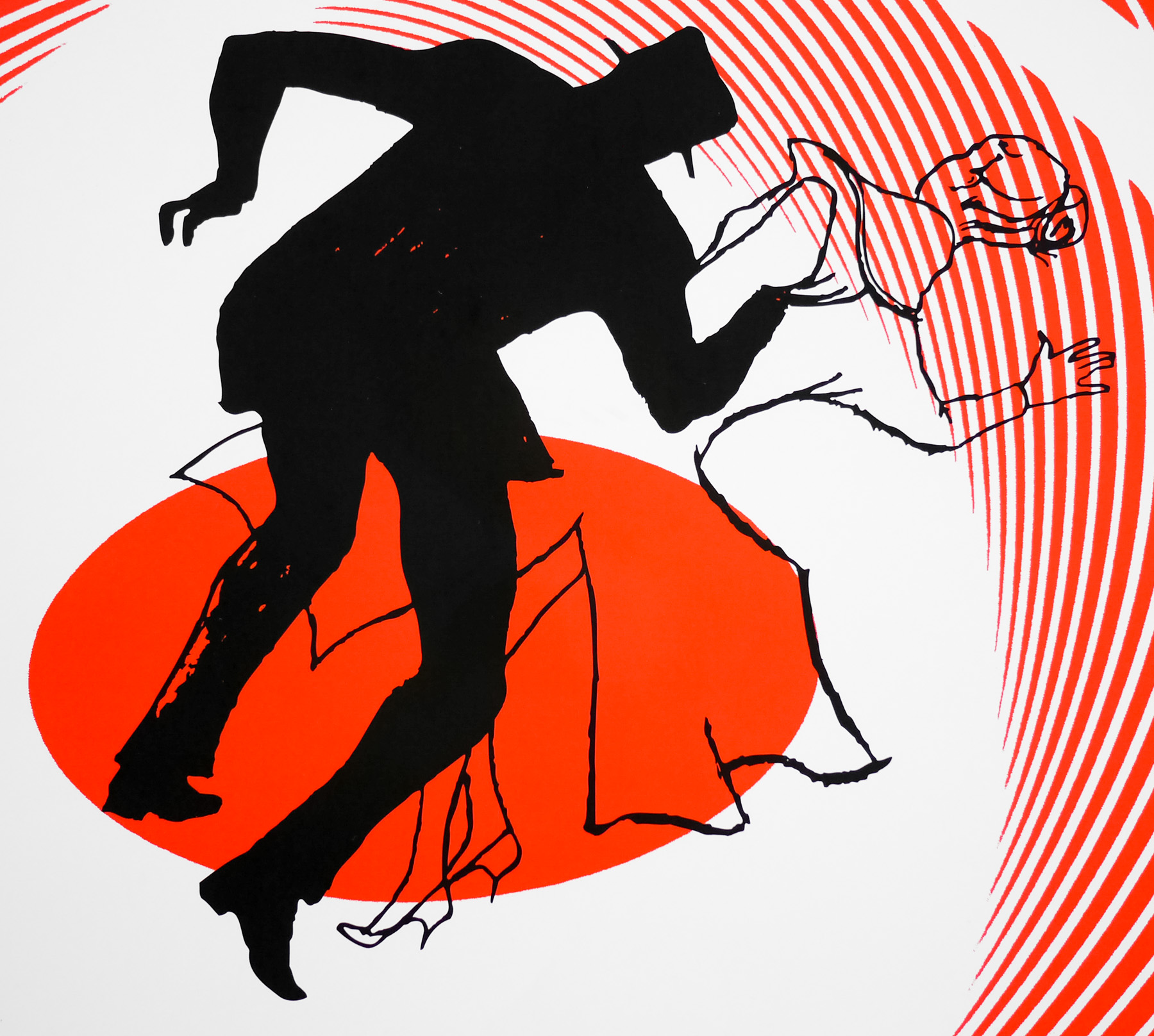
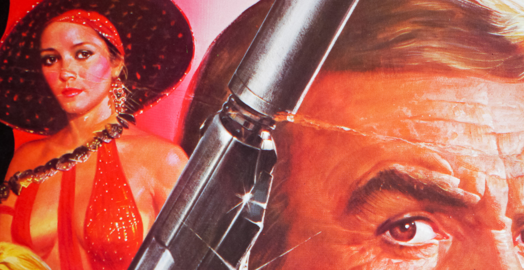
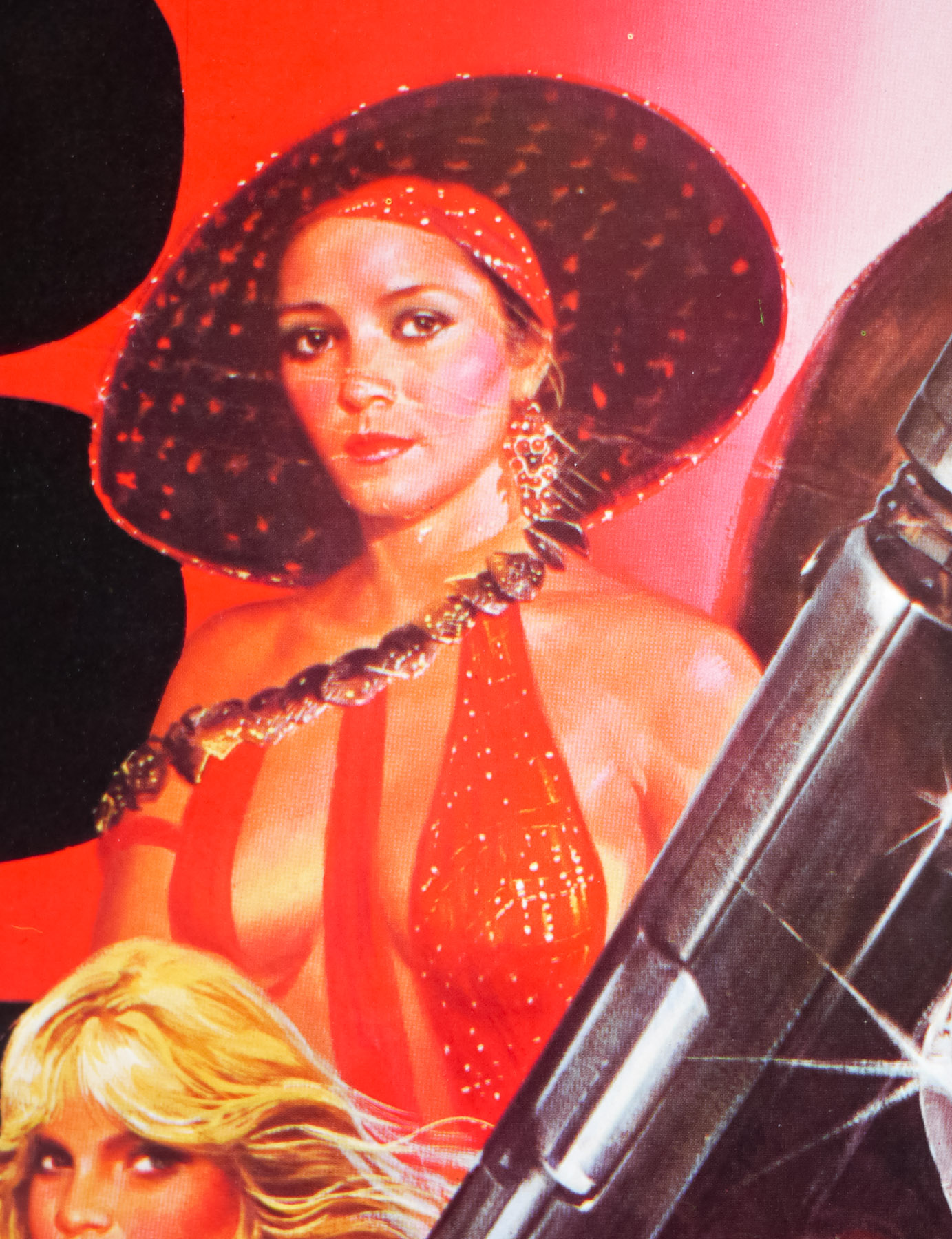
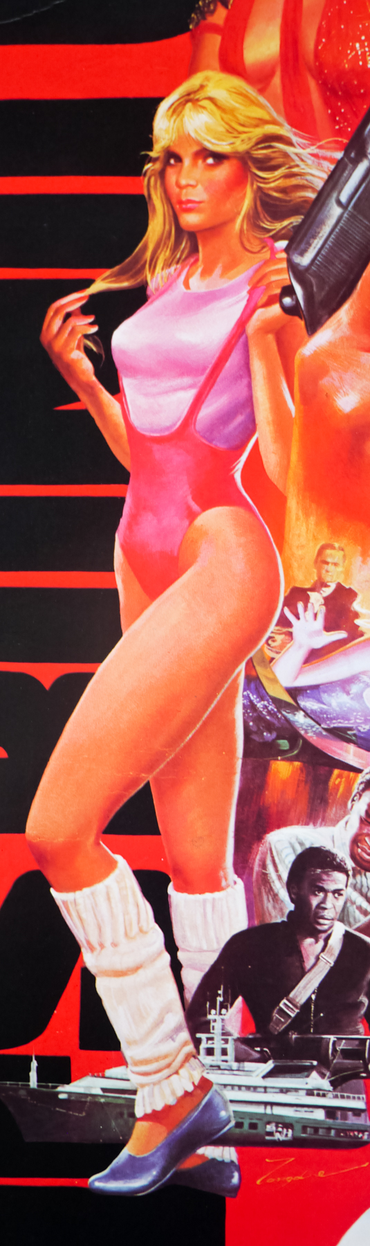
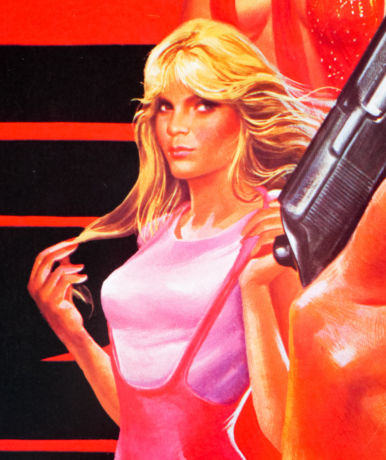
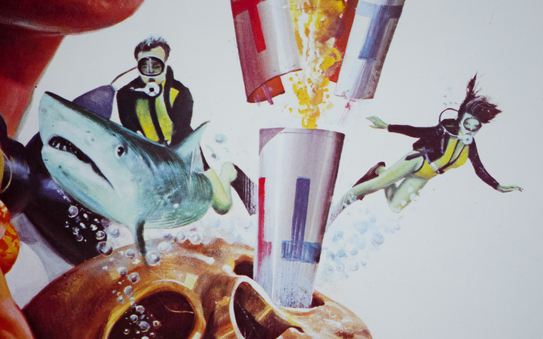
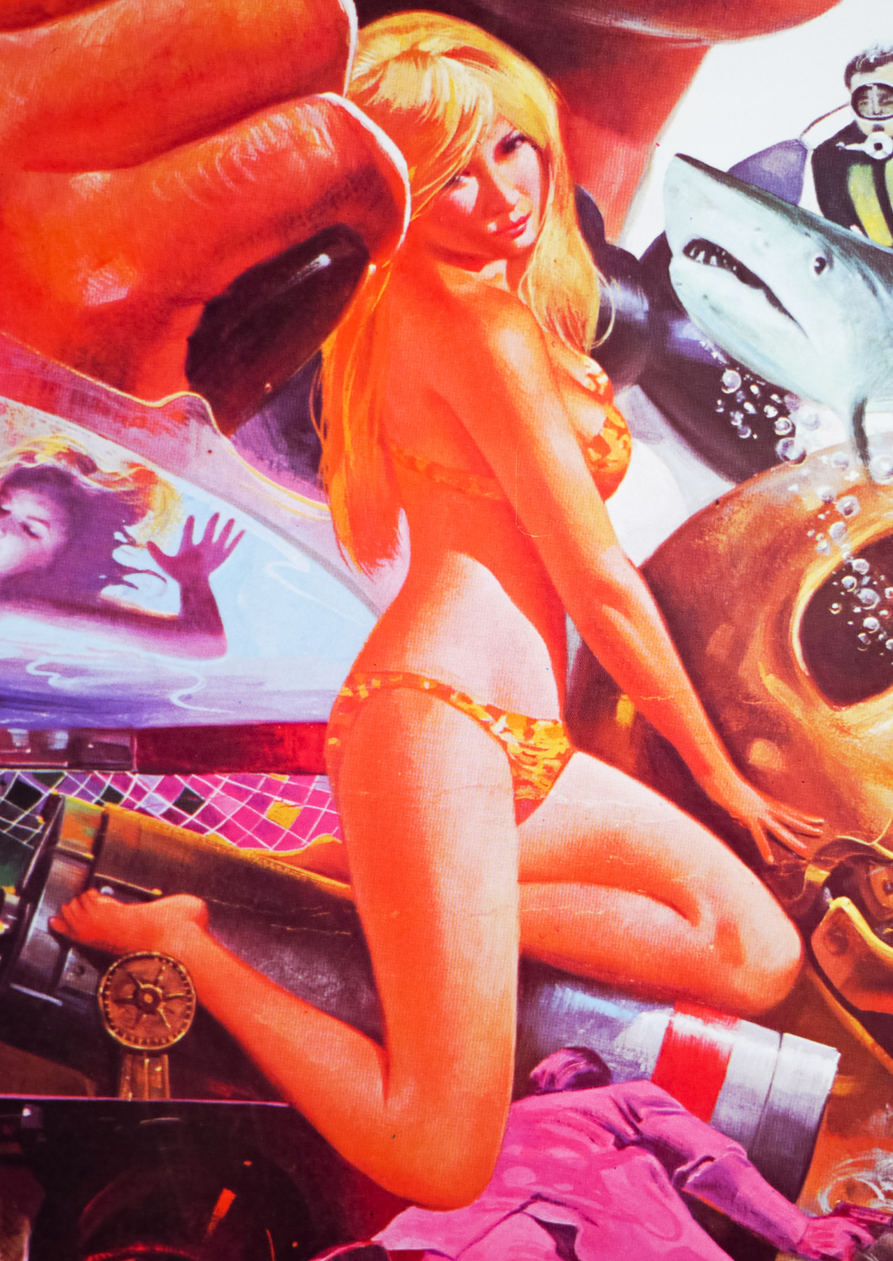
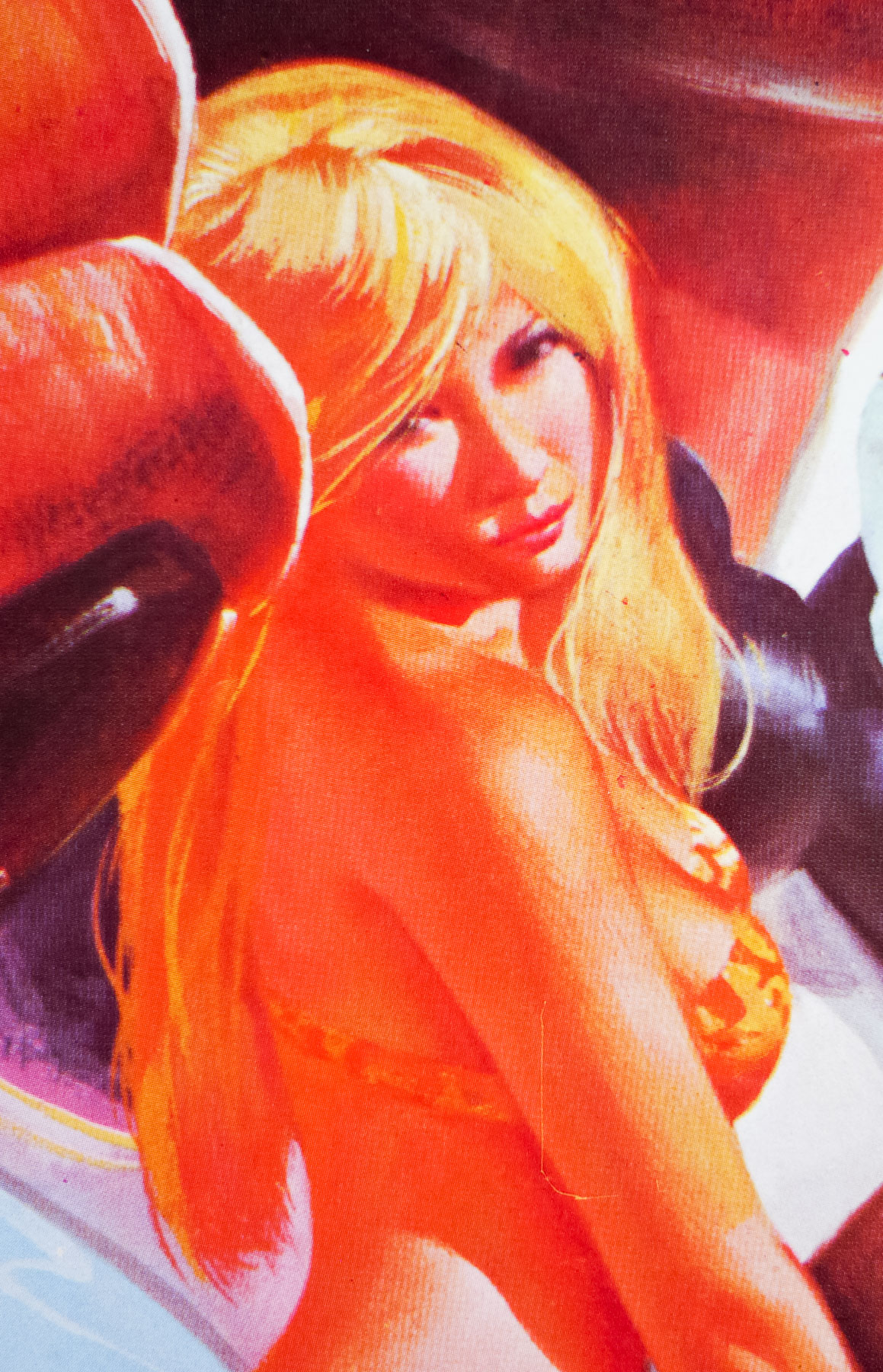
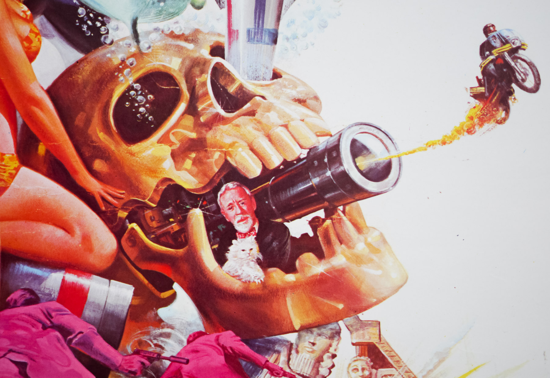
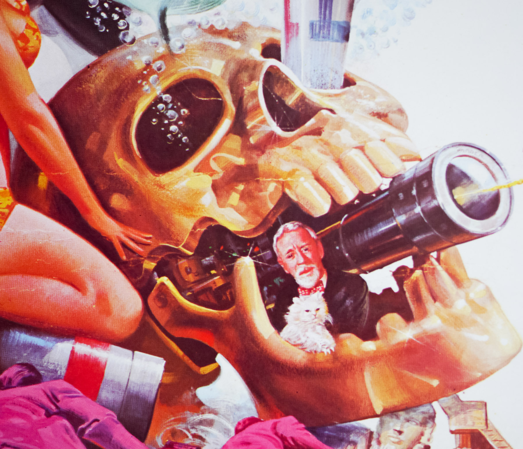
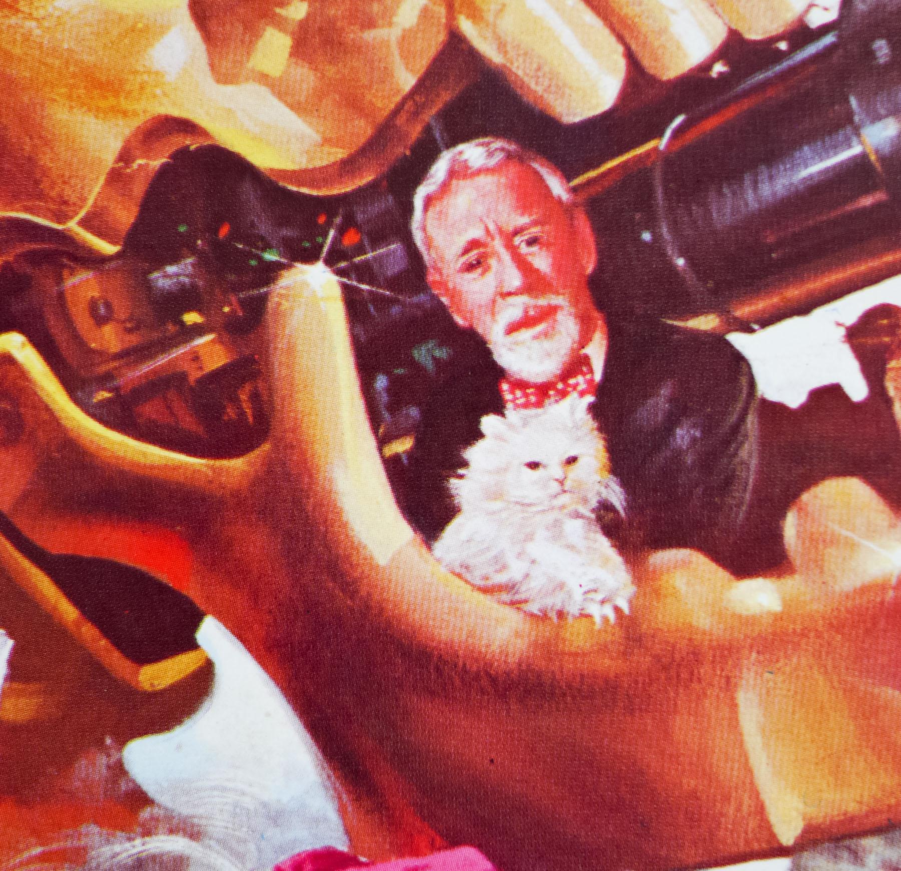
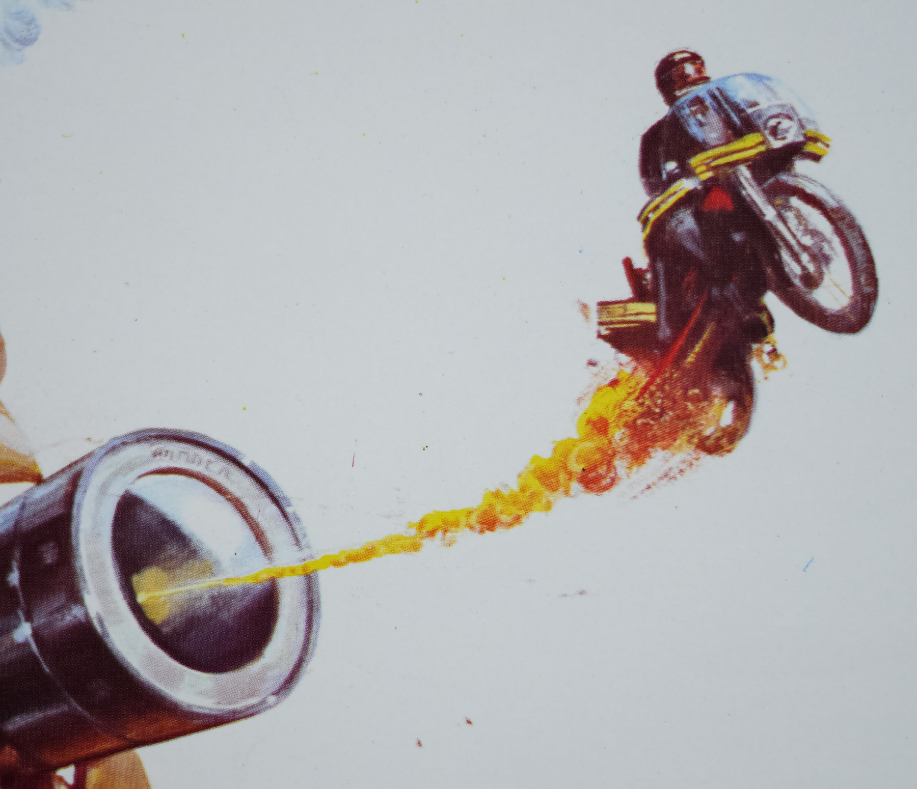
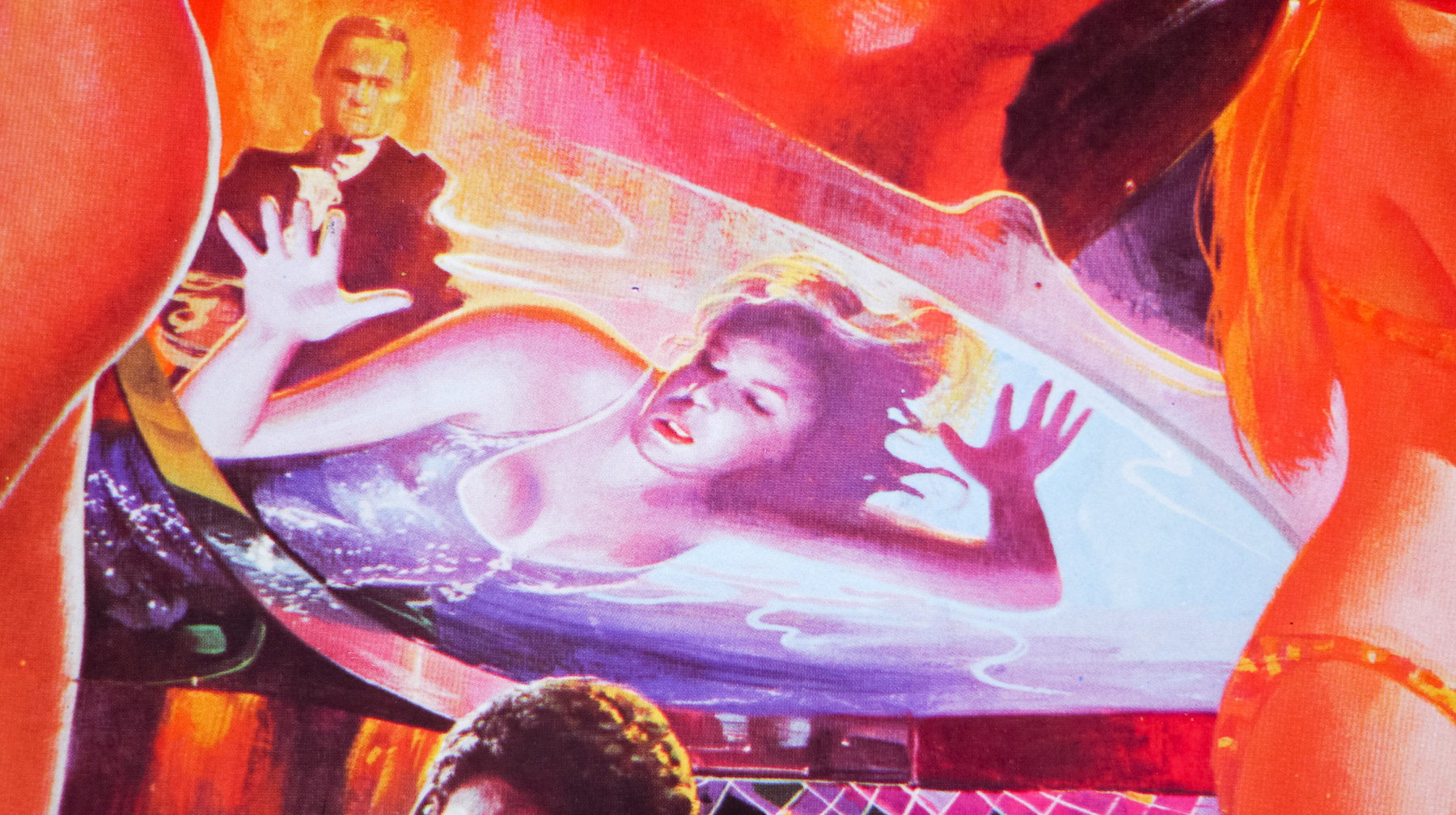
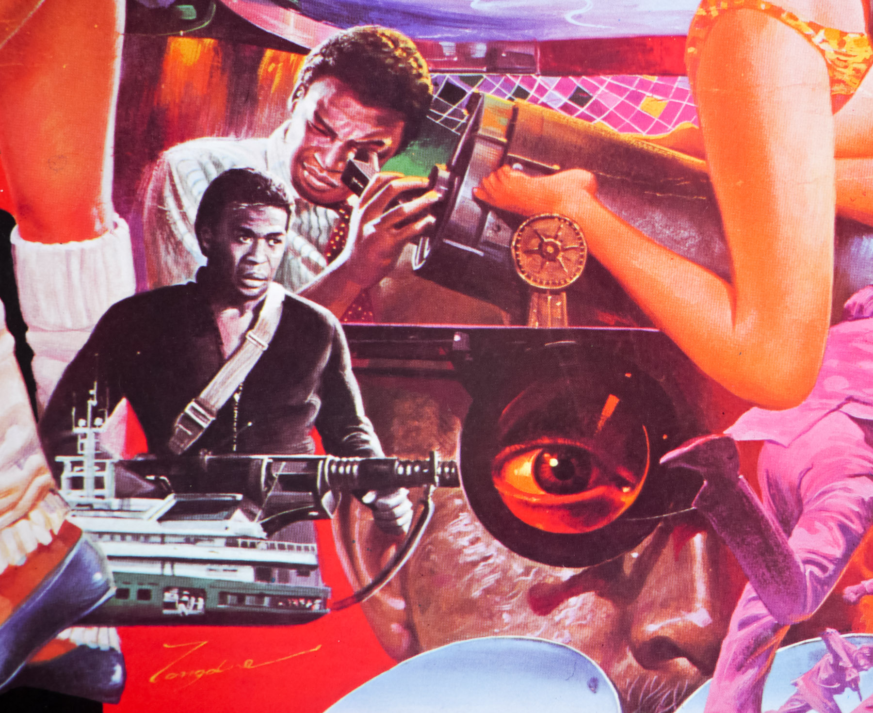
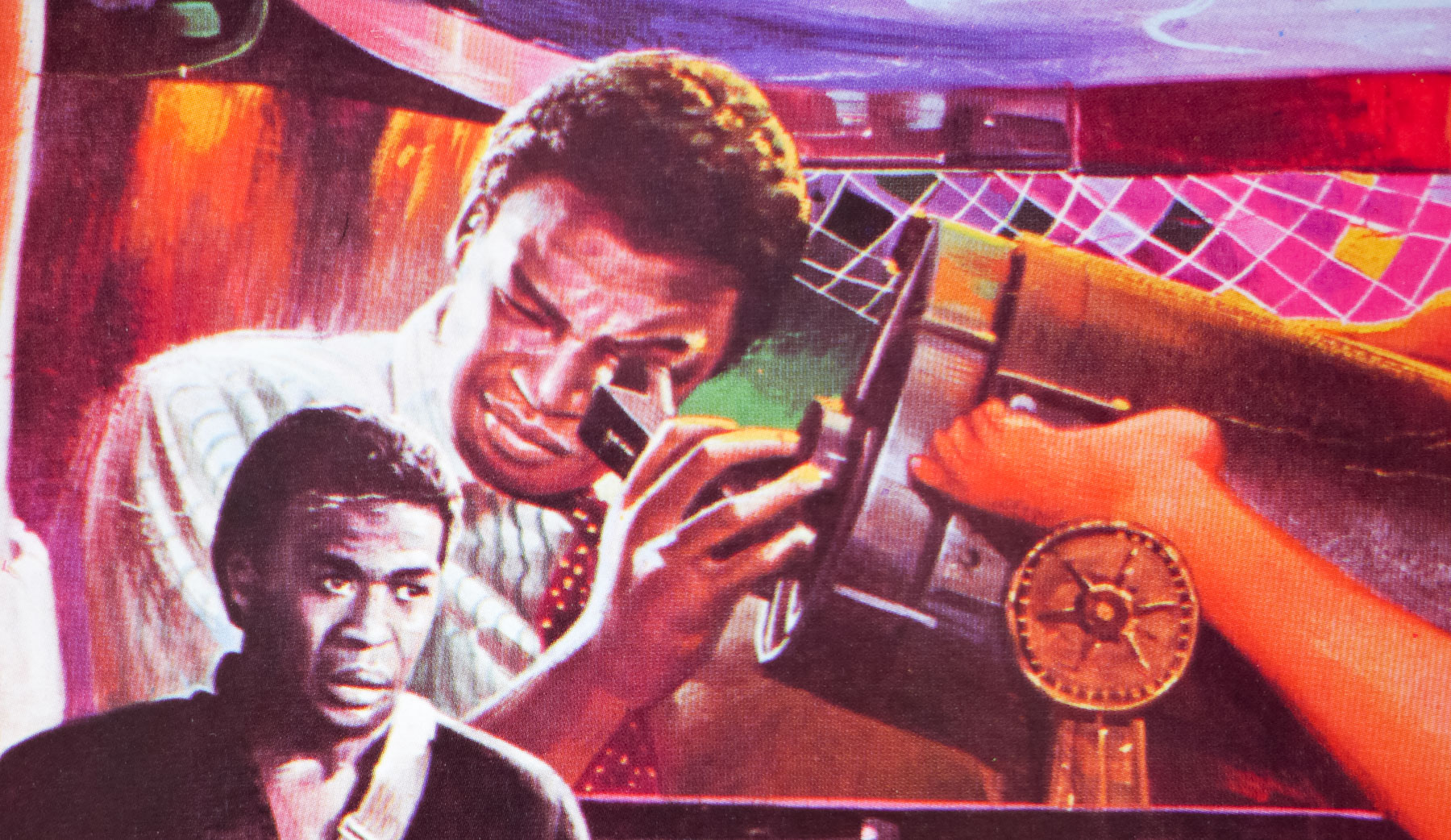
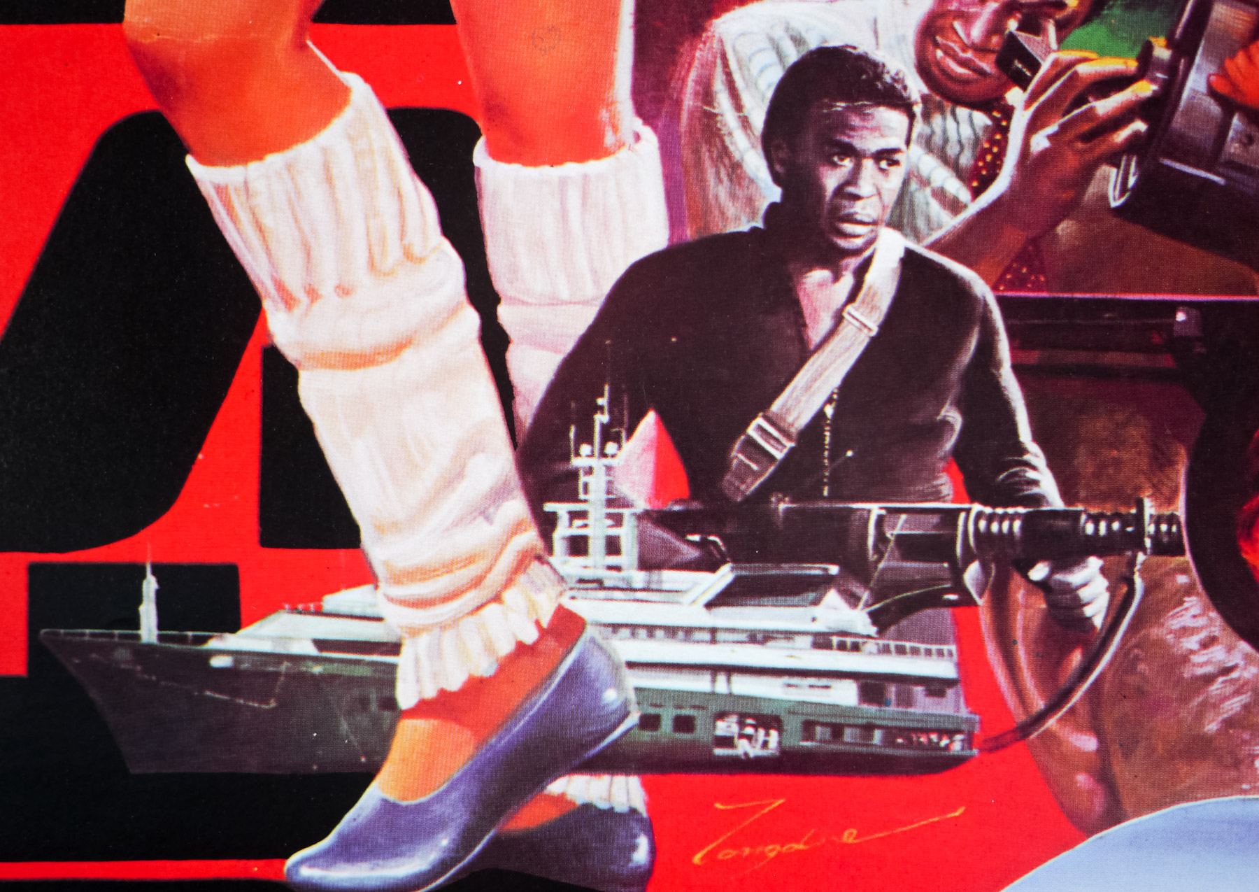
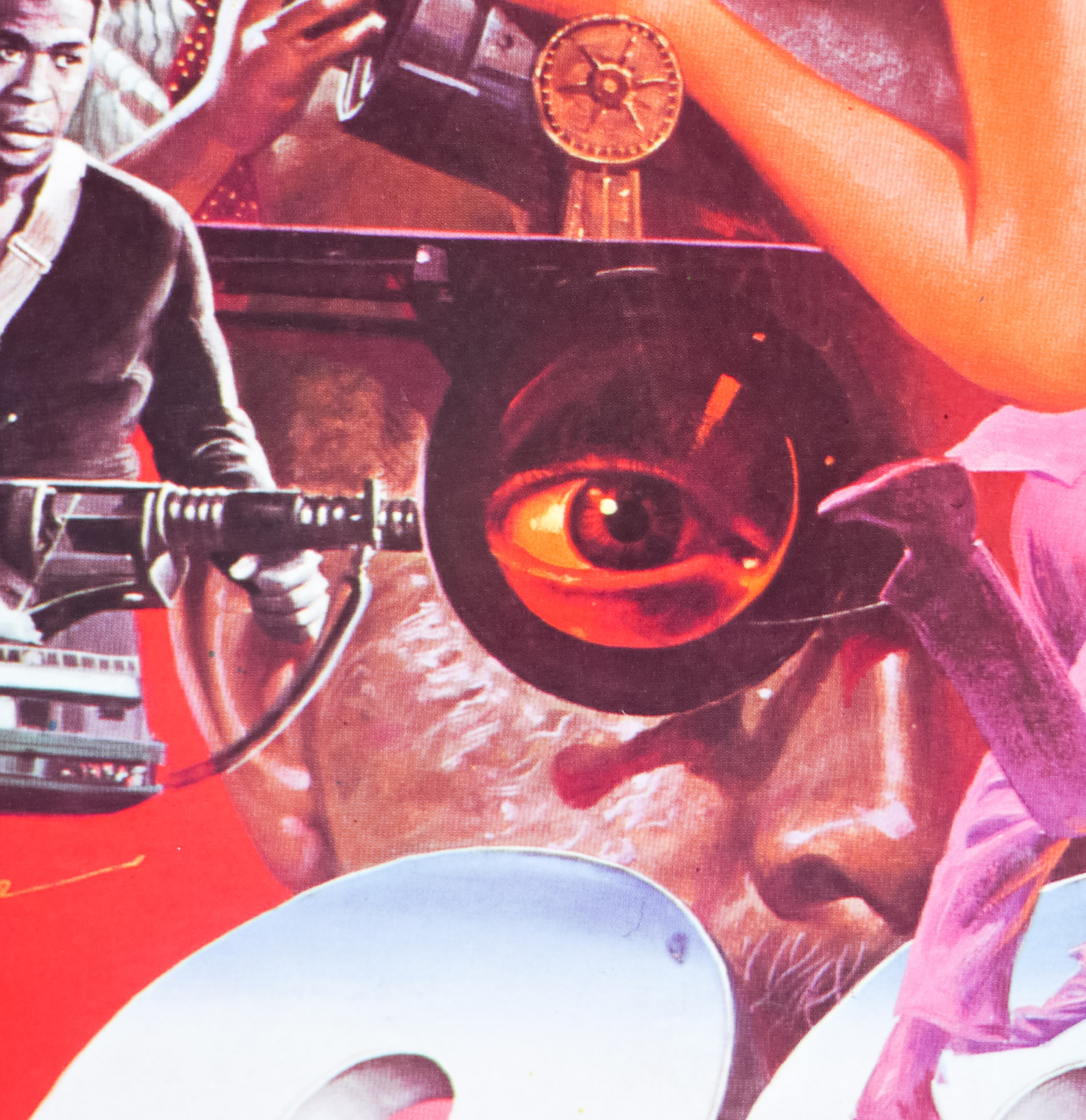
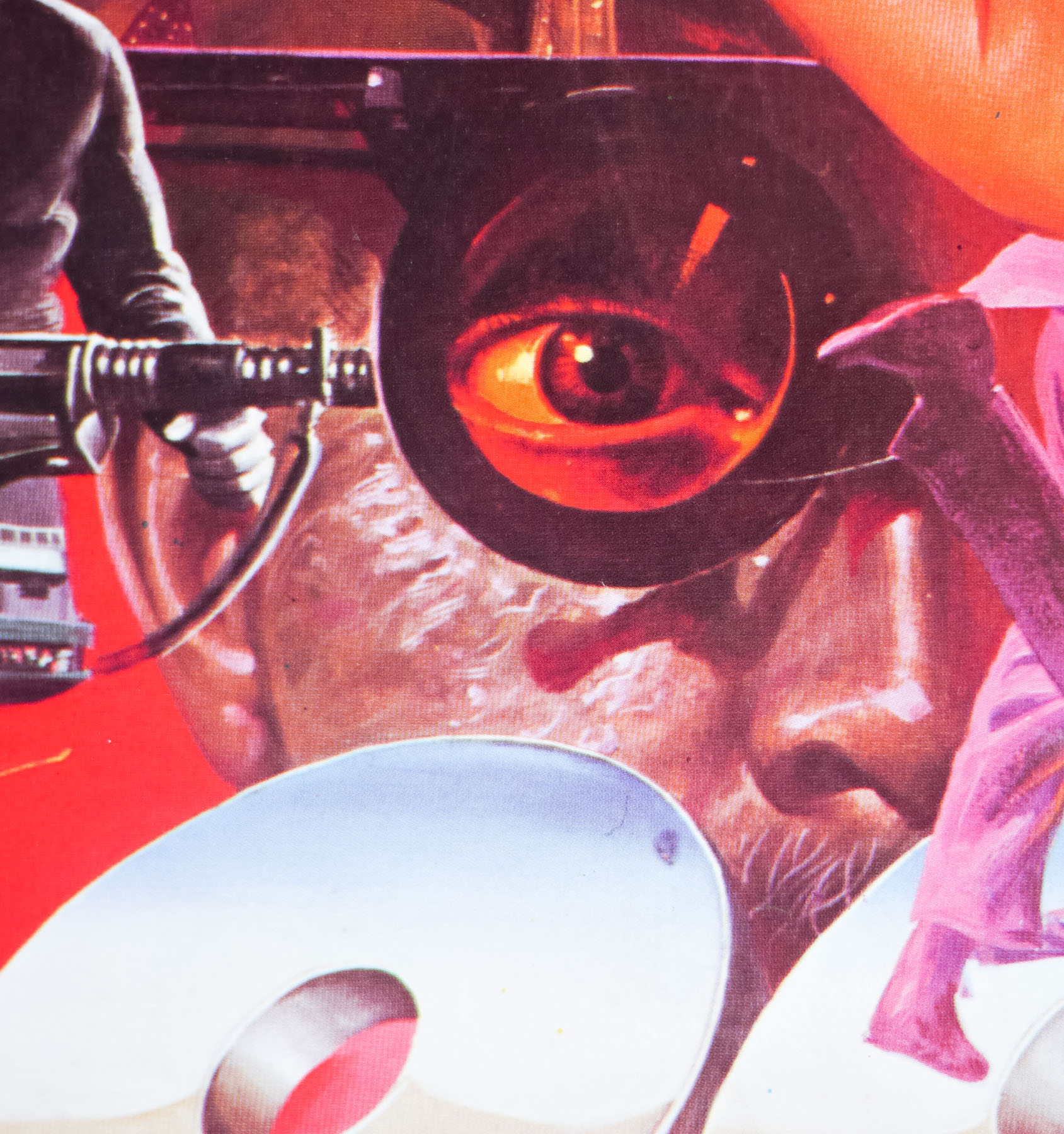
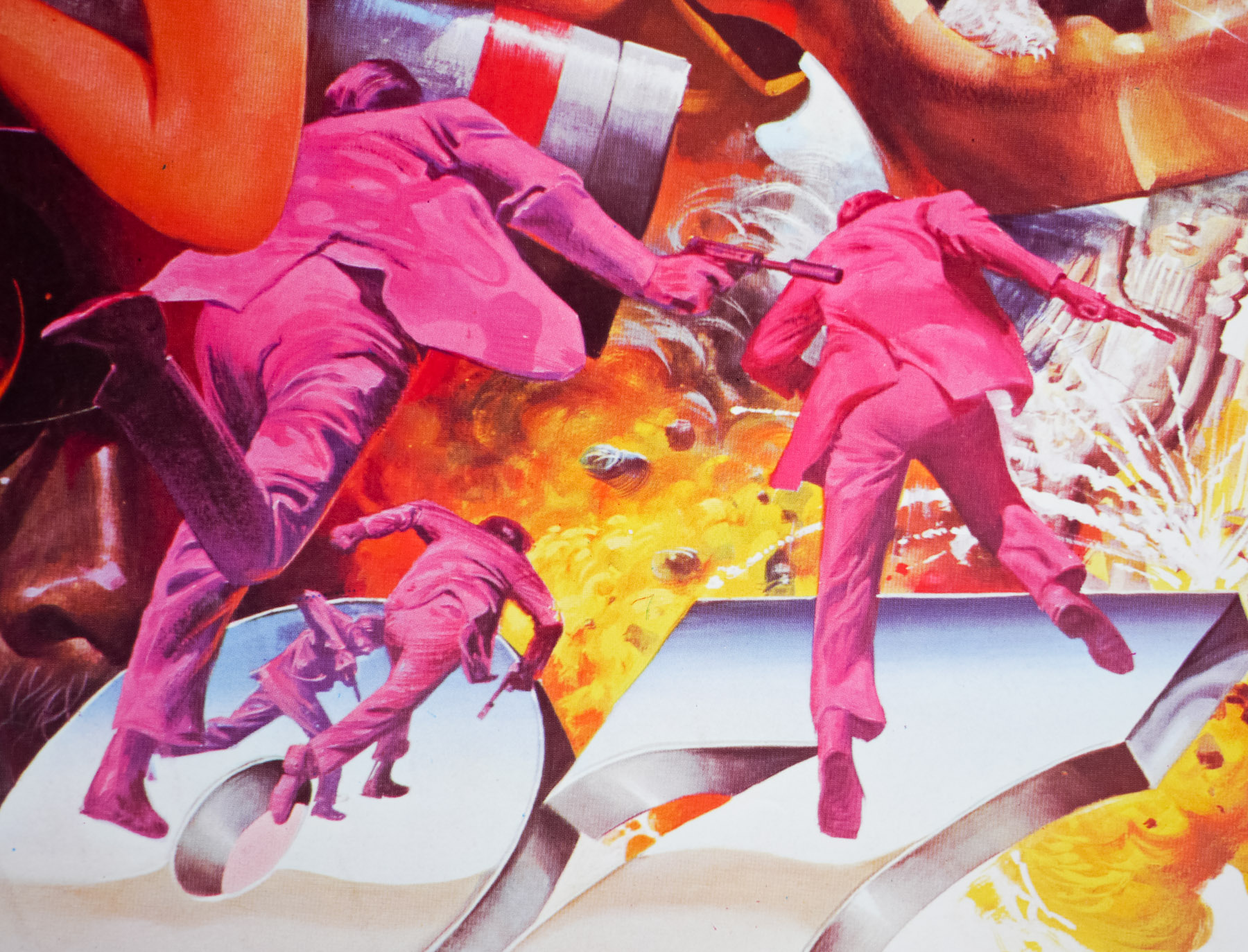
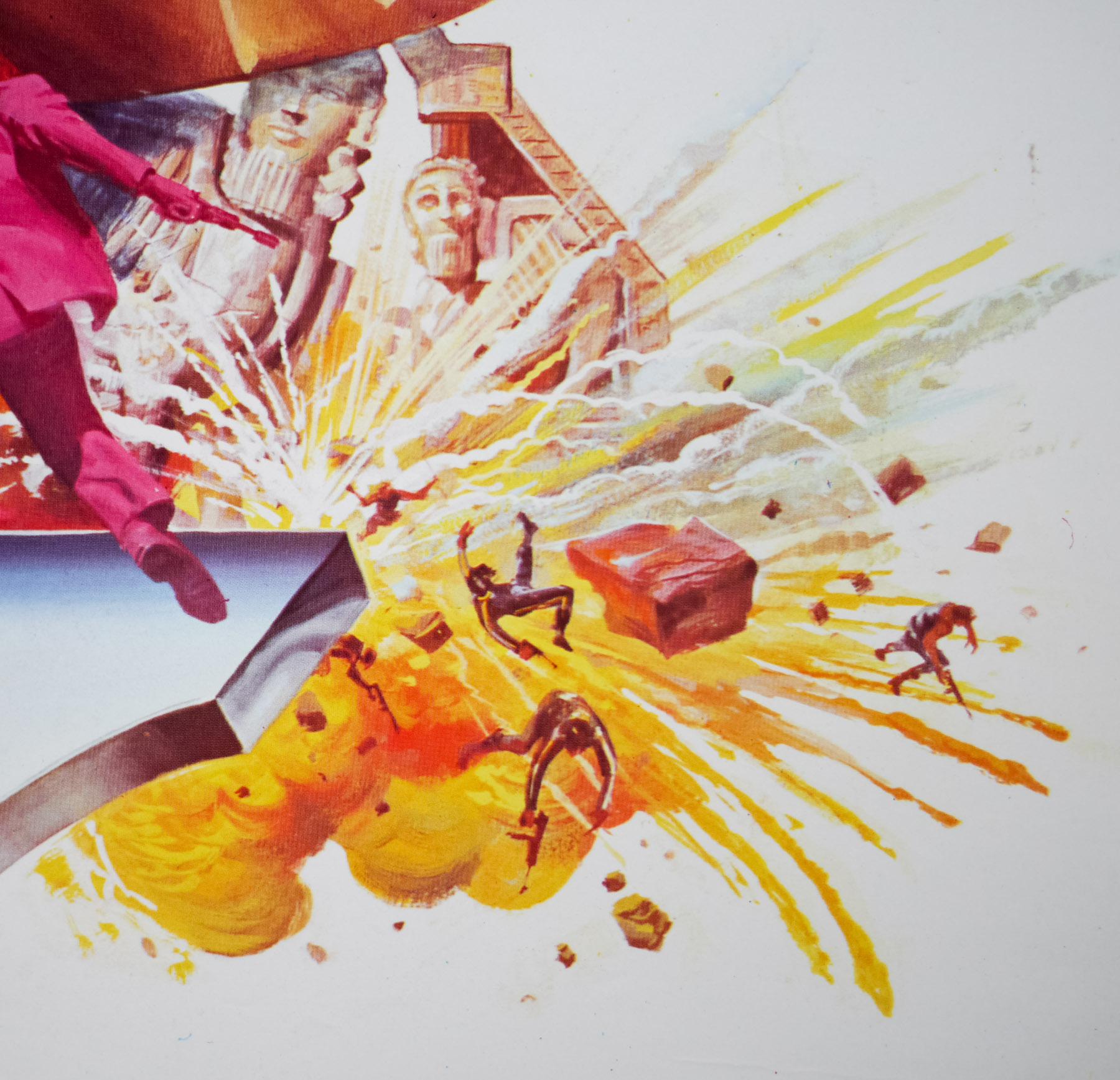
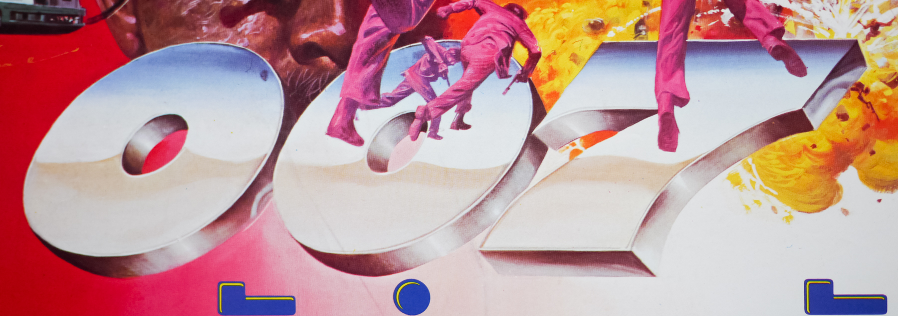
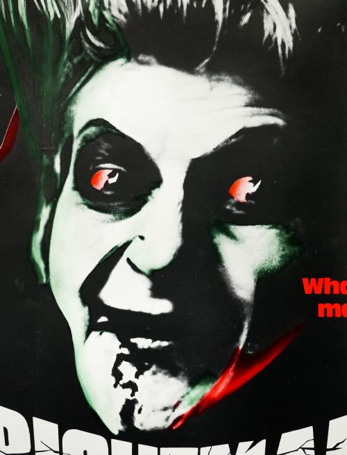
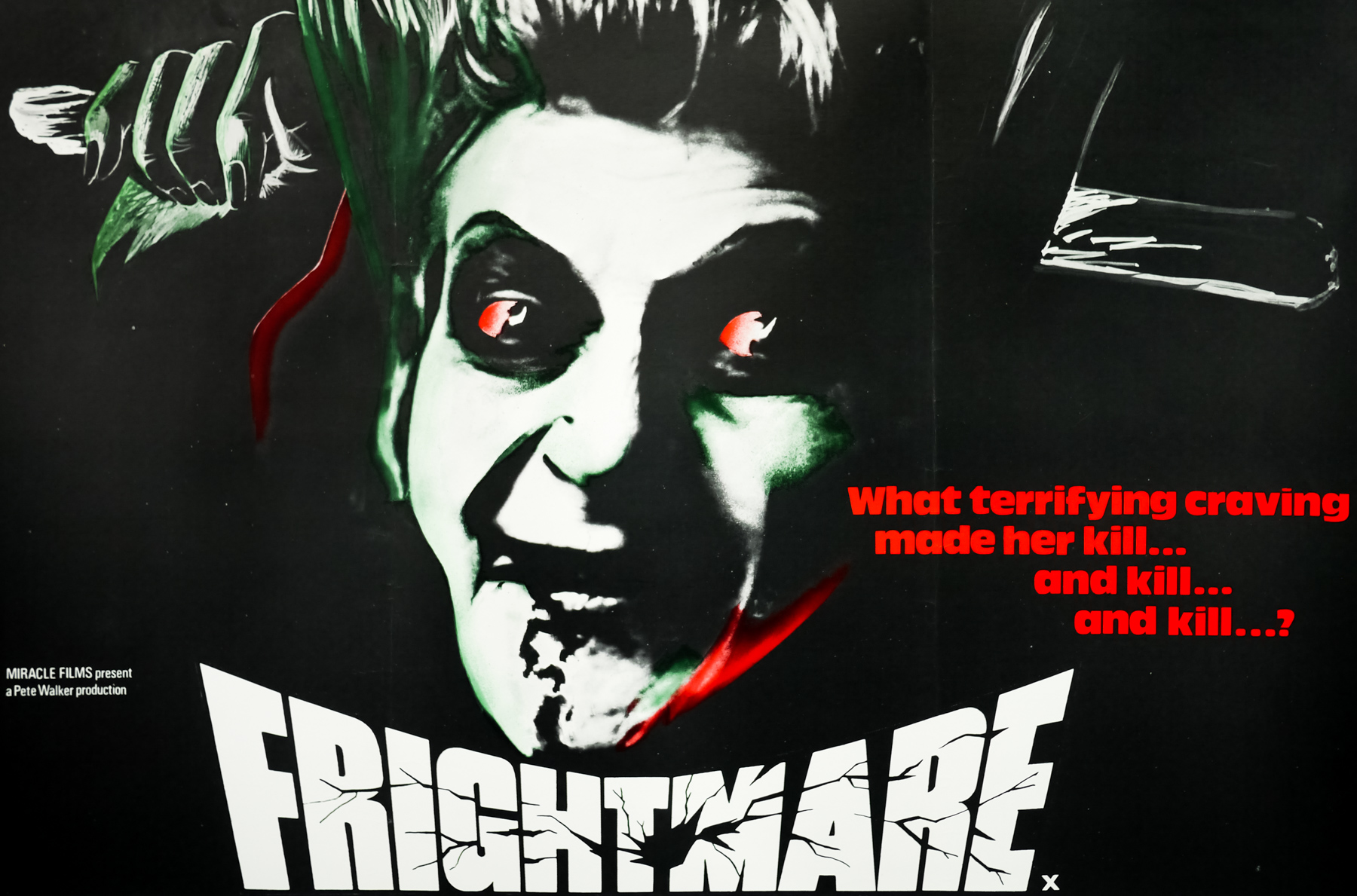
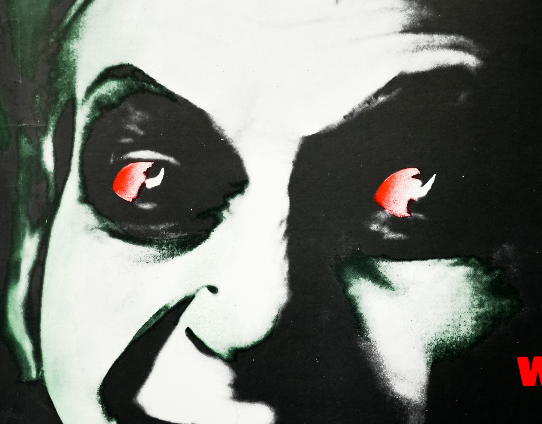
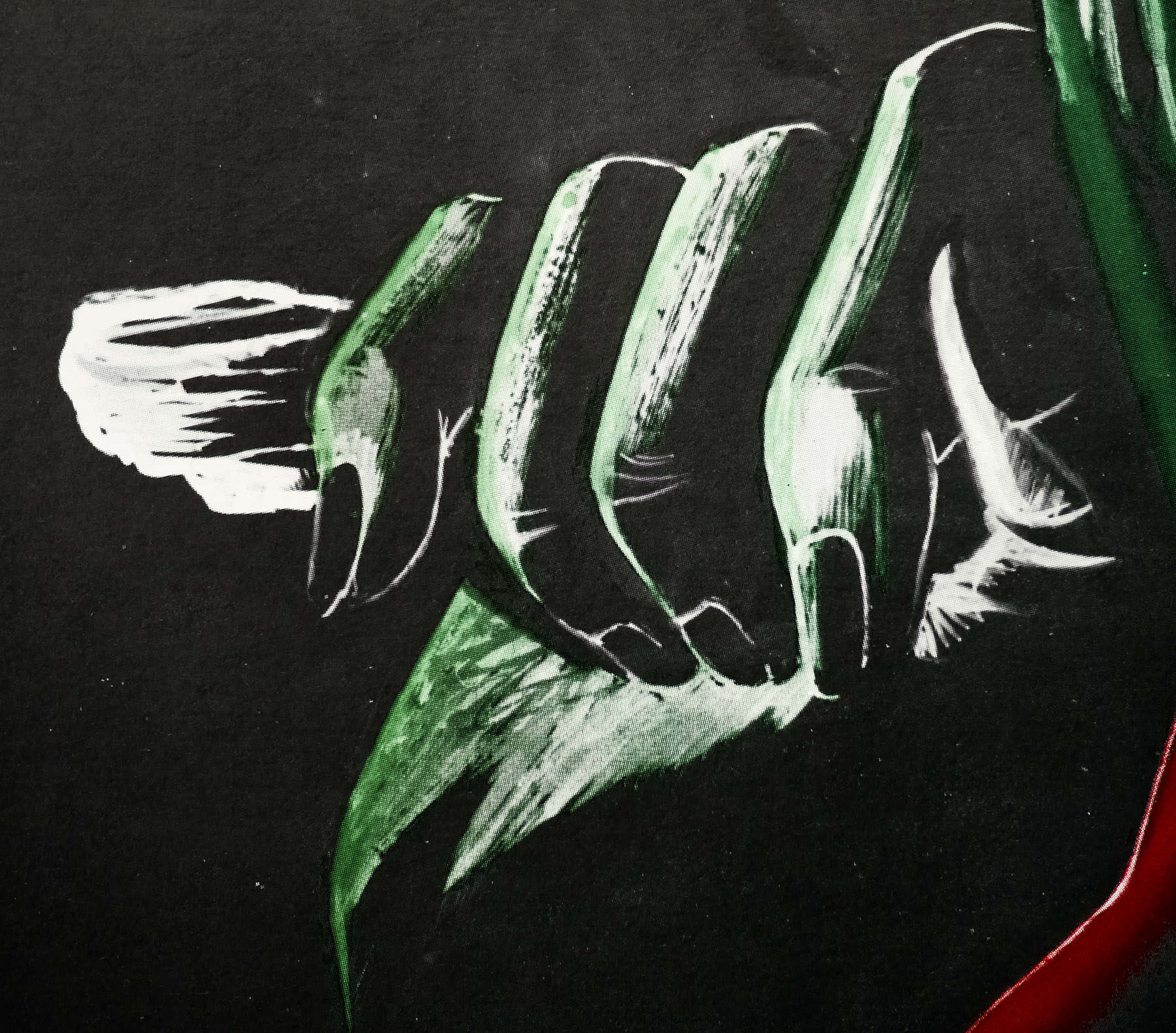
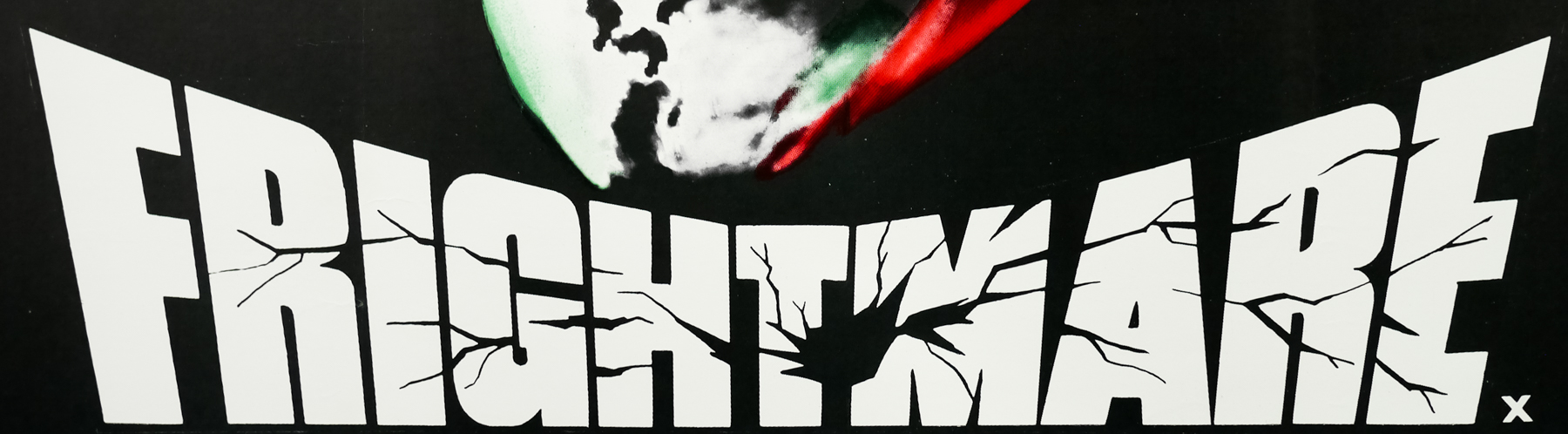
The image on this poster is actually a combination of imagery from the flying sequences and a deleted scene that was only ever storyboarded by Gilliam in which a dreaming Sam finds himself at a vast wall of filing cabinets. The title treatment is taken directly from the opening title of the film itself, which is an actual neon signage that falls away from the camera to the accompaniment of Michael Kamen’s excellent score.
I have heard from at least three independent sources that this particular quad was withdrawn from cinemas by the distributor 20th Century Fox because it was felt the image wasn’t the right one to sell the film to UK audiences and was replaced by this bizarre ‘flying bed’ quad that is a world away from this striking design. If anyone knows for sure that this quad was withdrawn or any more details about it, please get in touch.