Noriyoshi Ohrai is one of my favourite poster artists, responsible for many iconic pieces of art used to advertise films including The Empire Strikes Back, The Goonies and several fantastic posters for the Heisei series of Godzilla films. Until recently the artist was almost a complete enigma to me since there was little information about him online beyond the basics and there are certainly no English-language books that have been written about his life and career.
When it was announced that an exhibition featuring practically all of Ohrai’s original artwork would be held in Japan during February/March 2014, which was to be the first time any of Ohrai’s art had been seen in public since his last exhibition in 1981, I knew that I had to make every effort to attend.
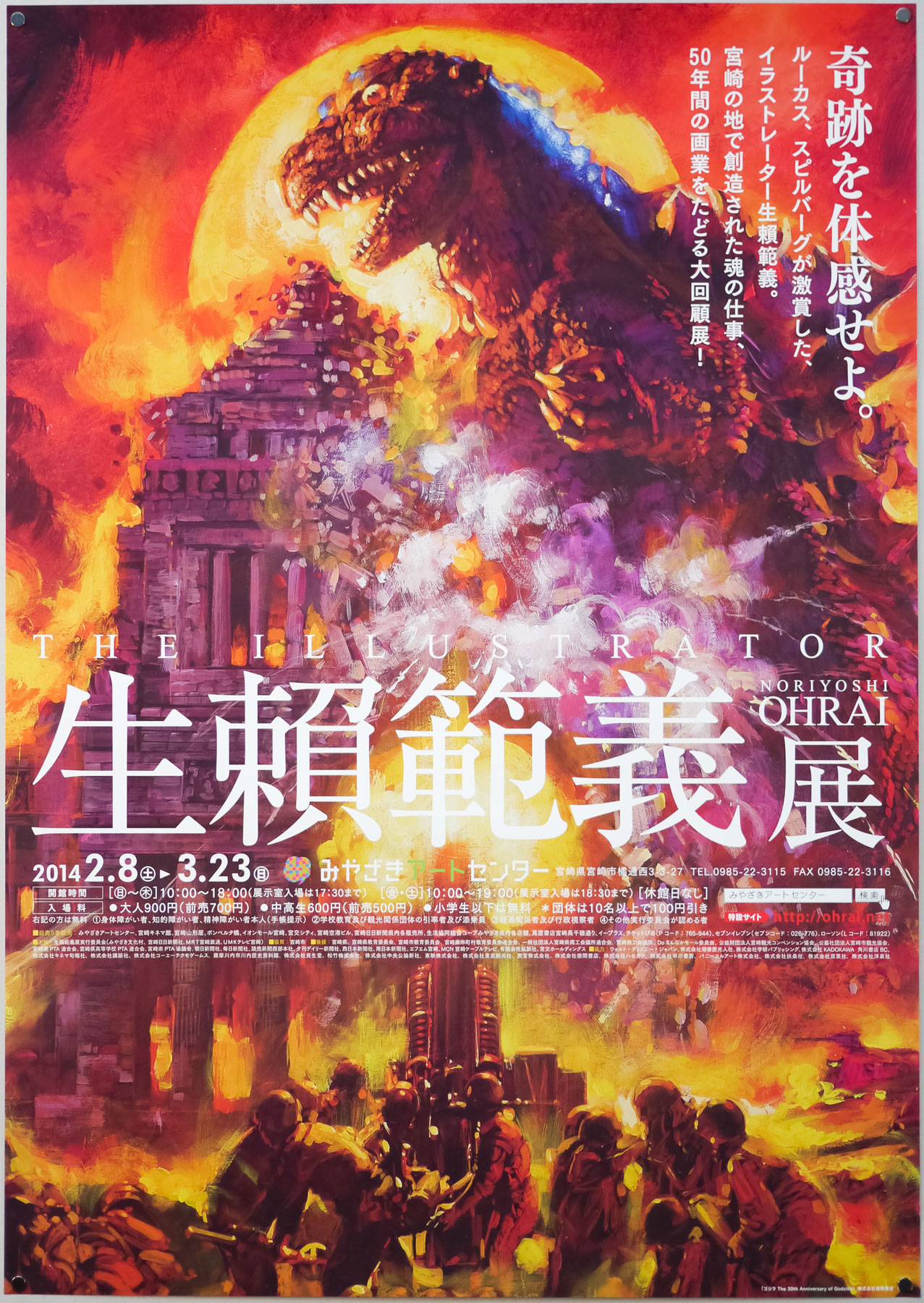
One of four B2 posters used to advertise the Noriyoshi Ohrai exhibition, featuring one of many paintings that the artist did of the King of the Kaiju, Godzilla.
In March 2014 I flew over to Tokyo and then a few days later took an internal flight down to the Island of Kyushu with my friend and fellow poster collector Toru Onozatu (AKA Poster-man). The exhibition was located in the Art Center in downtown Miyazaki, which is the city that Ohrai has called home since 1973. We were very lucky to have been given a personal tour by the curator Tatsuya Ishida who kindly guided us around the exhibition’s multiple rooms that were spread over two floors. I recorded his comments as we walked and they are featured throughout this article.
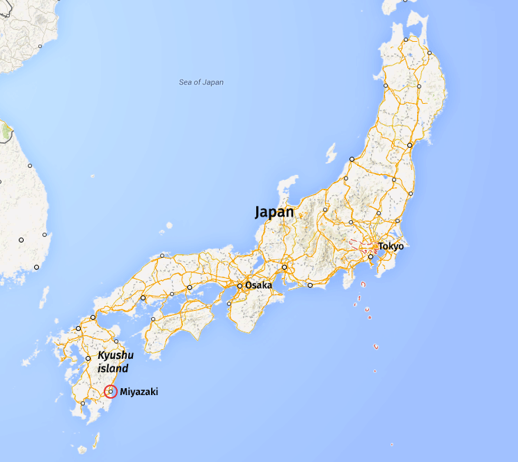
A map of Japan showing the location of Miyazaki on the Island of Kyushu at the bottom of the country.
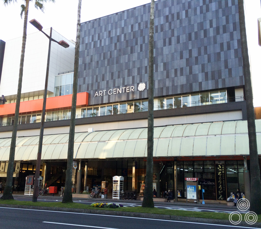
The Art Center in Miyazaki, location of the Noriyoshi Ohrai exhibition
The exhibition featured almost all of Ohrai’s original art for film, book covers, video games, editorial work, biology text books and more, with only a tiny handful of the film art missing (some with their current location unknown). A lot of the art still belongs to Ohrai himself but some of it had been flown to Miyazaki from collectors including George Lucas (for some of the Star Wars pieces), as well as the Japanese studio Toho who lent several of the Godzilla artworks to the exhibition. It was certainly a unique situation that all of these paintings were gathered together under one roof.
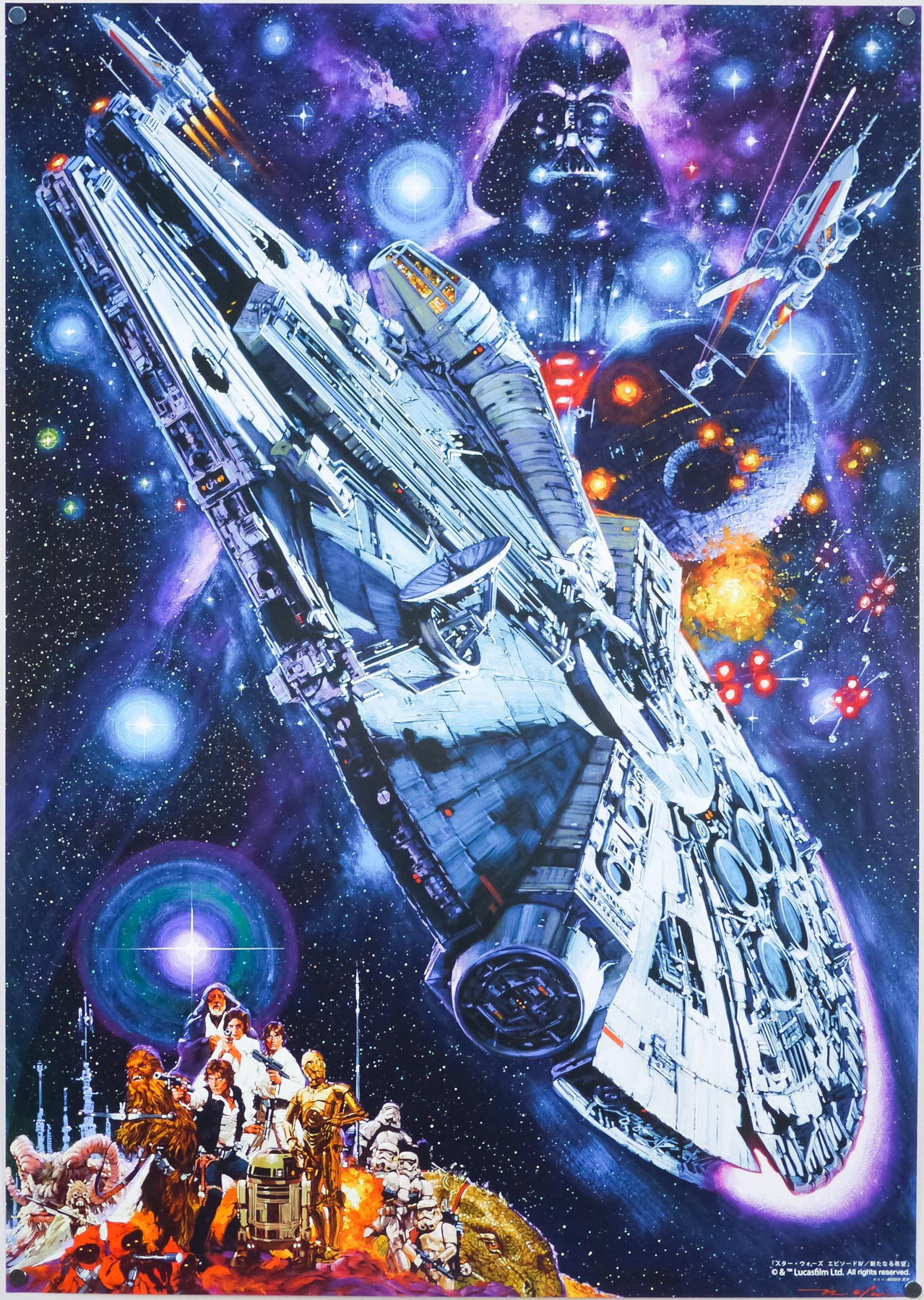
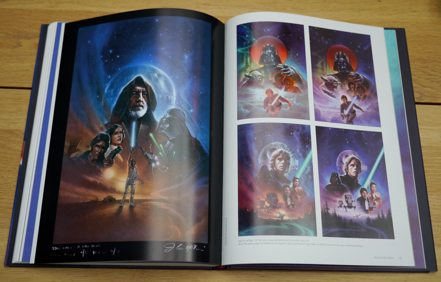
A Star Wars poster printed in Japan to commemorate the release of a dubbed version of the original film in 1982, painted by Noriyoshi Ohrai. The huge (around A1 size) original art was on display at the exhibition and this small print was available to buy in the shop.
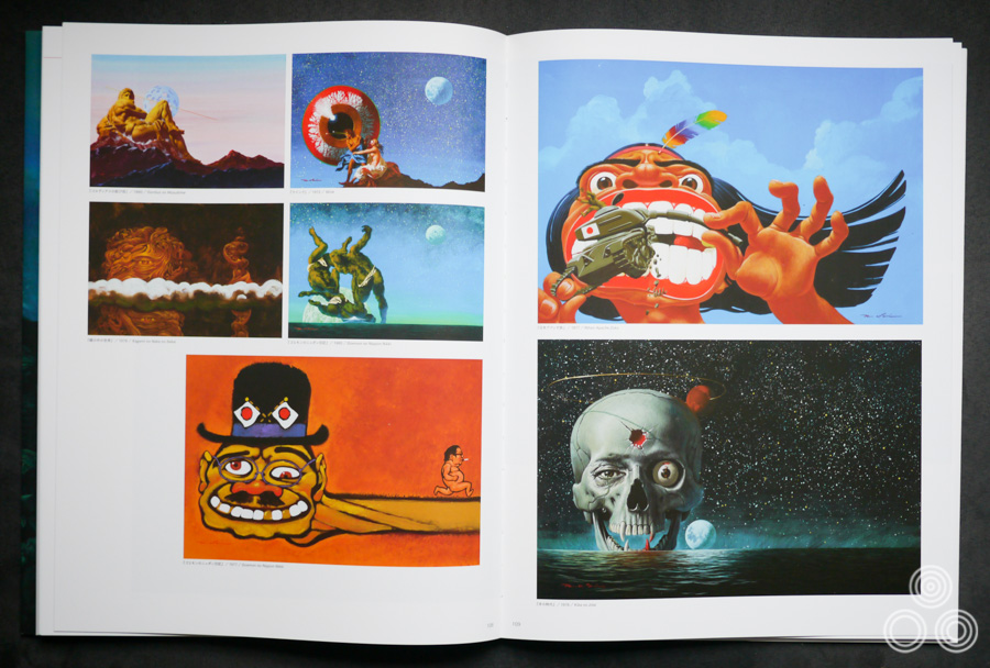
The exhibition began with a room containing a floor-to-ceiling pyramid of paperback novels and magazine covers that Ohrai worked on over a 30 year period, and this was surrounded by walls covered in framed posters of Ohrai’s film and commercial work. It was certainly a thrill to see them all together like that. The rest of the exhibition, in which photography was not permitted (I’ve included a handful of cheeky snaps), went through themes, beginning with Godzilla, moving onto book and magazine covers and a display of gigantic, incredibly detailed video game cover artworks. Also featured were some incredibly impressive portraits of famous figures, plus a room featuring Ohrai’s ‘Beauties in Myths covers for SF Adventure magazine. The last room contained posters for the Star Wars franchise, plus more film posters and several war-related paintings.
I wanted to share the visit with Film on Paper readers and the following pictures will hopefully give you an idea of what this memorable experience was like, plus I’ve also had the biography from the back of the exhibition catalogue translated into English and that is included at the end. Also featured are several photographs of pages from the catalogue since I was unable to actually photograph the artwork.
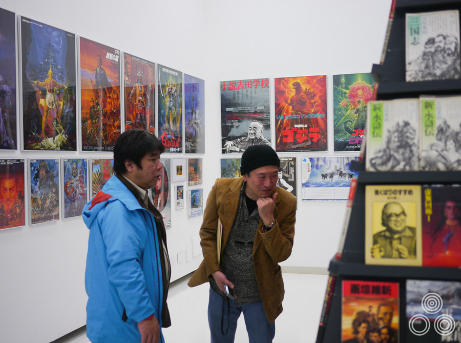
Exhibition director Tatsuya Ishida (left) and my friend, and fellow collector, Toru Onozato examine some of the many book covers painted by Ohrai in the first room of the exhibition.
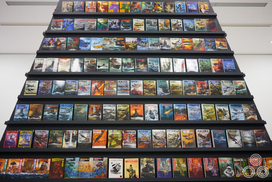
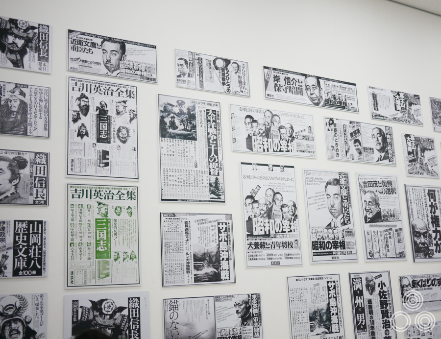
One side of the book covers pyramid in first room of the exhibition, these being mainly war related imagery.
Mr Ishida explained to Toru and I that Ohrai worked on about 1300 book covers during his career and that the pyramid of books contained only about a third of his total output. In 1986 alone he worked on 130 book covers and he was completing a new illustration every 3 days or so.
A close-up of three of the hundreds of book covers that Ohrai painted during his career.
For each book he would read it first and then think about what would make the best cover. He wasn’t just being given a title and then making something up. Mr Ishida explained that Master Ohrai did quite a lot of work for a few specific book authors and he developed a particular style for each one so that their books became instantly recognisable. In the 1970s he would get paid about 150000 Yen for each book cover.
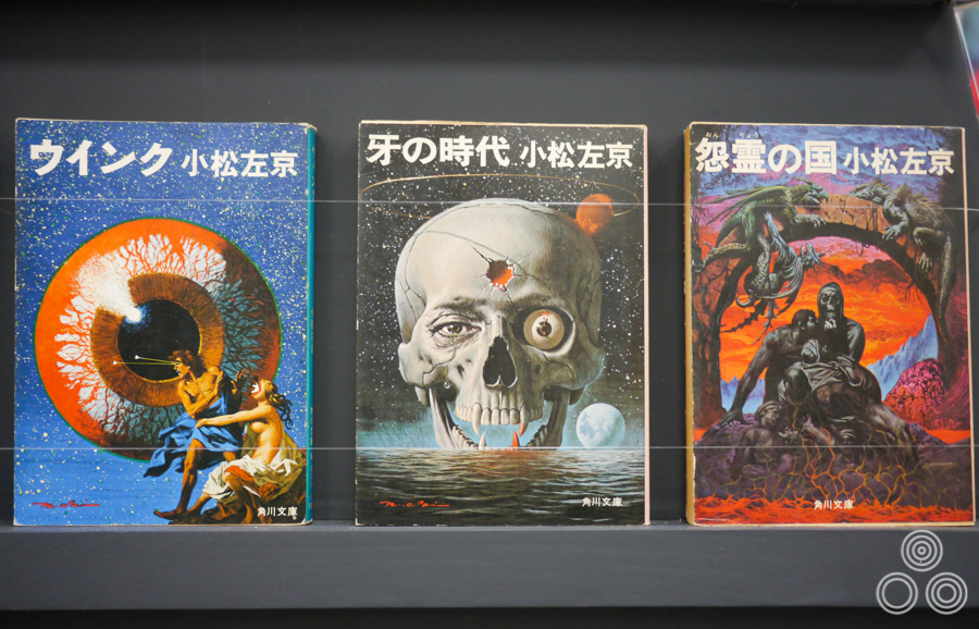
Some of the book covers that Ohrai painted for the novels of the Japanese author Sakyo Komatsu.
Some of the book covers that Ohrai painted for the novels of the Japanese author Sakyo Komatsu.
Noriyoshi Ohrai was born in Akashi City, Hyogo prefecture in 1935. His family was evacuated to Sendai City, Kagoshima Prefecture after their house was bombed during the war and Mr Ishida told us that Ohrai went to an art university in Tokyo but dropped out after a while. Mr Ishida said, “he told me that the reason why was because he felt he had nothing more to learn from the teacher”.
Ohrai moved to Miyazaki from Tokyo in 1973 because it’s his wife’s hometown. He bought an old farmhouse and converted part of it into a studio.
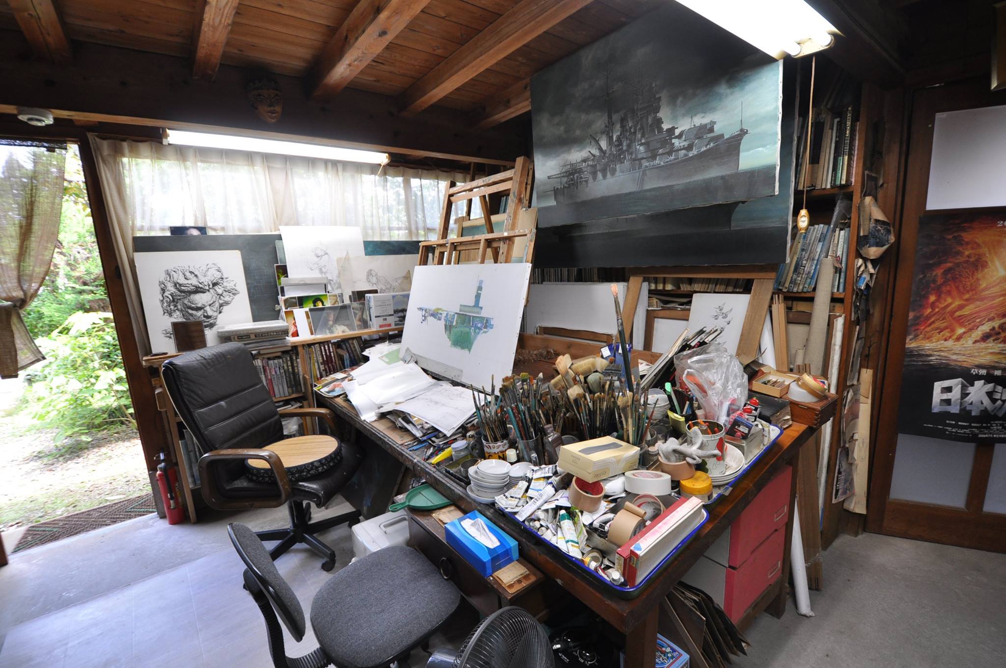
A view inside Ohrai’s studio in Miyazaki. This photo was on display in the exhibition and I’ve taken this from the Facebook page for the exhibition.
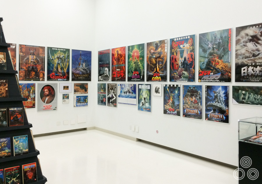
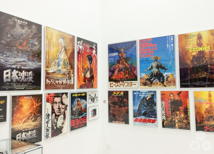
One side of the room of the exhibition that contained printed posters of Ohrai’s work, including several Godzilla ones.
Ohrai started out doing illustrations for newspapers then moved onto book covers and eventually started doing more and more posters after the huge success of the one he painted for The Empire Strikes Back.
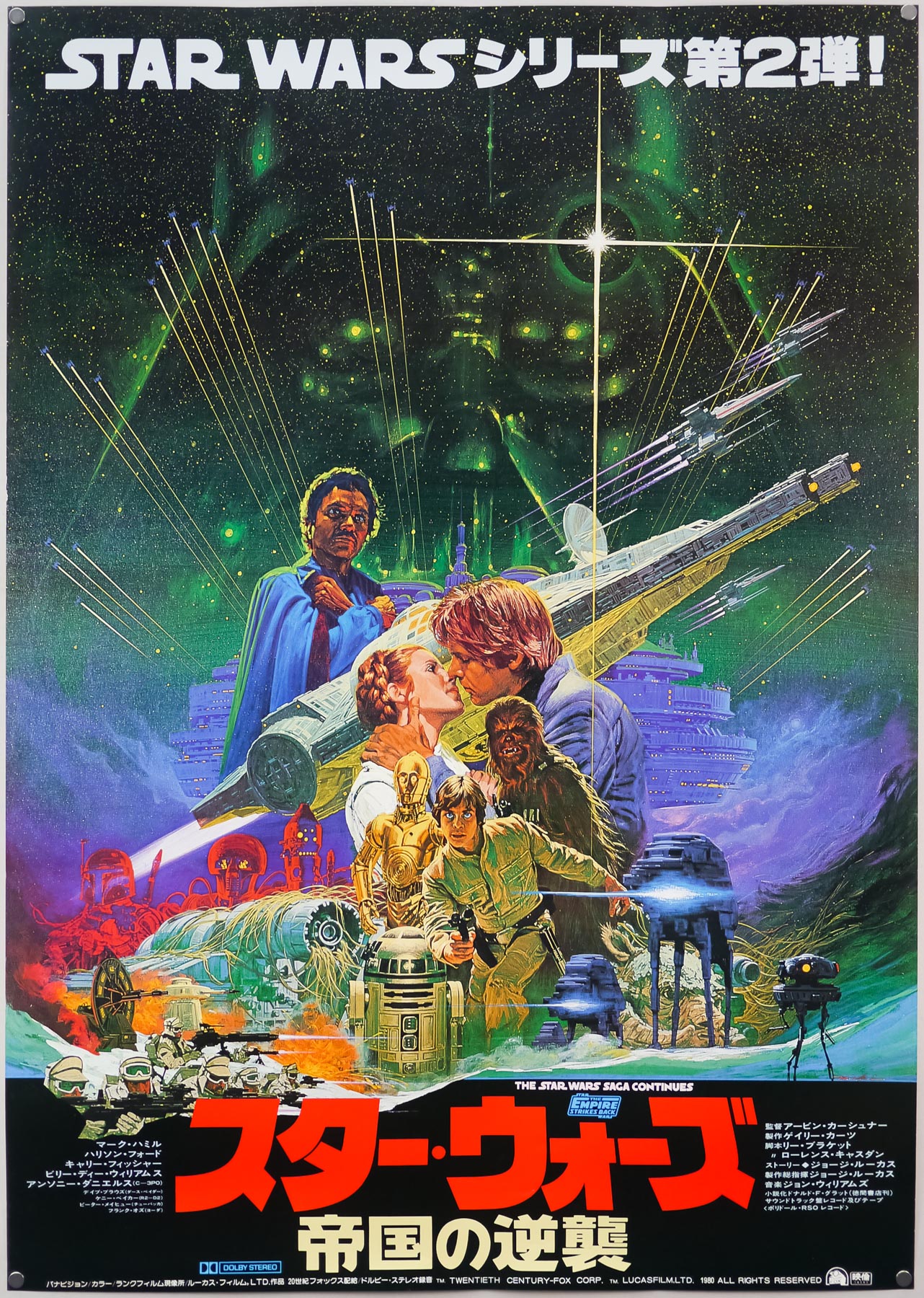
The gorgeous Japanese B1 poster for The Empire Strikes Back, painted by Ohrai. This poster led to many more film-related commissions.
Large reproductions on the newspaper adverts that Ohrai painted during the early part of his career. These were displayed in the first room of the exhibition.
A corner of the first room in the exhibition that contained printed posters of Ohrai’s work.
Continue reading