- Title
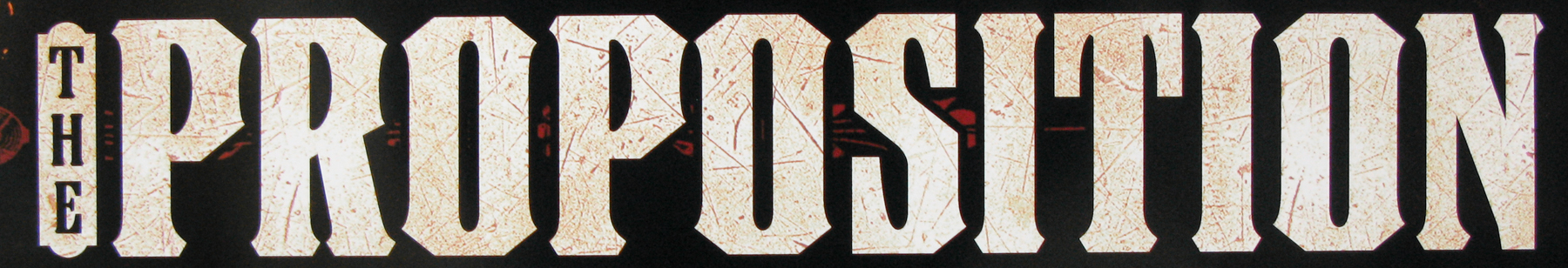
- Vertigo
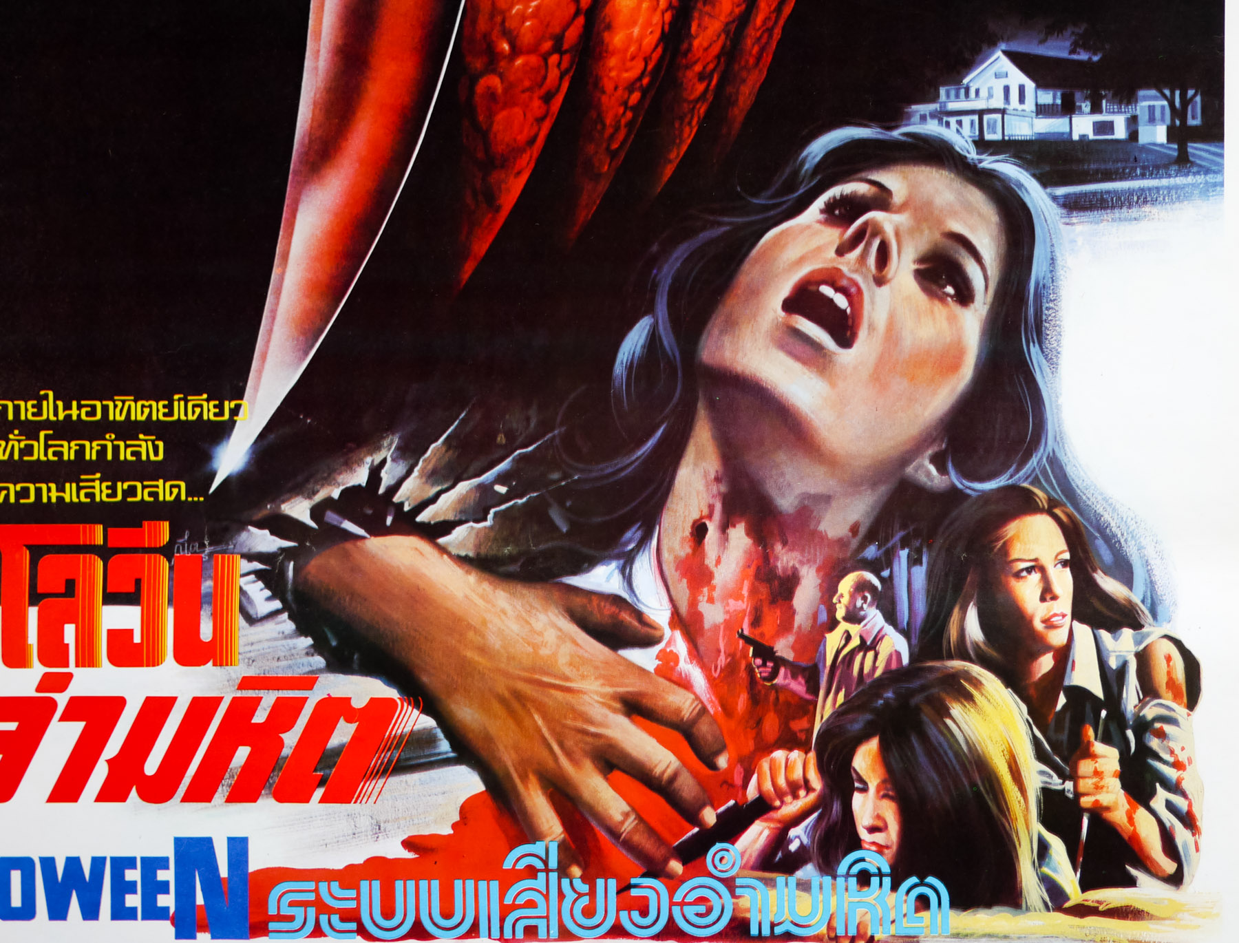
- AKA
- La donna che visse due volte [The woman who lived twice] (Italy)
- Year of Film
- 1958
- Director
- Alfred Hitchcock
- Starring
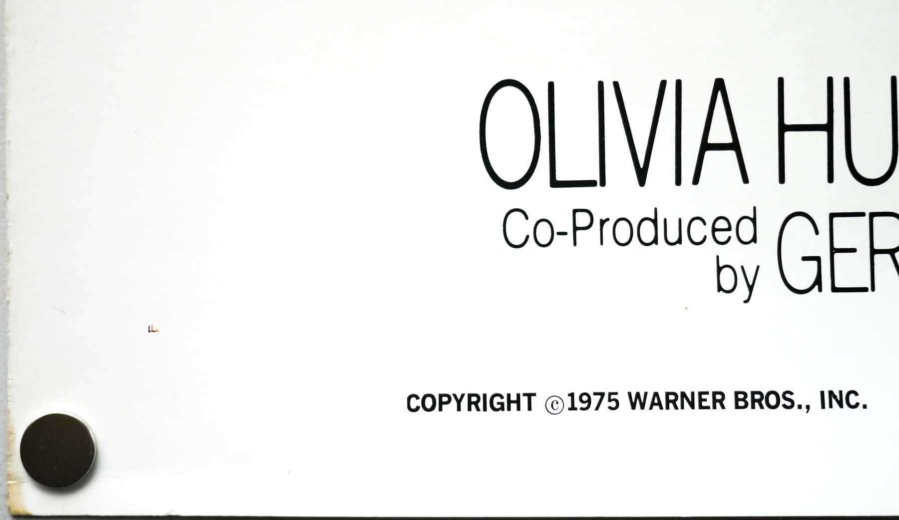
- James Stewart, Kim Novak, Barbara Bel Geddes, Tom Helmore, Henry Jones, Raymond Bailey, Ellen Corby
- Origin of Film
- USA
- Genre(s) of Film
- James Stewart, Kim Novak, Barbara Bel Geddes, Tom Helmore, Henry Jones, Raymond Bailey, Ellen Corby,
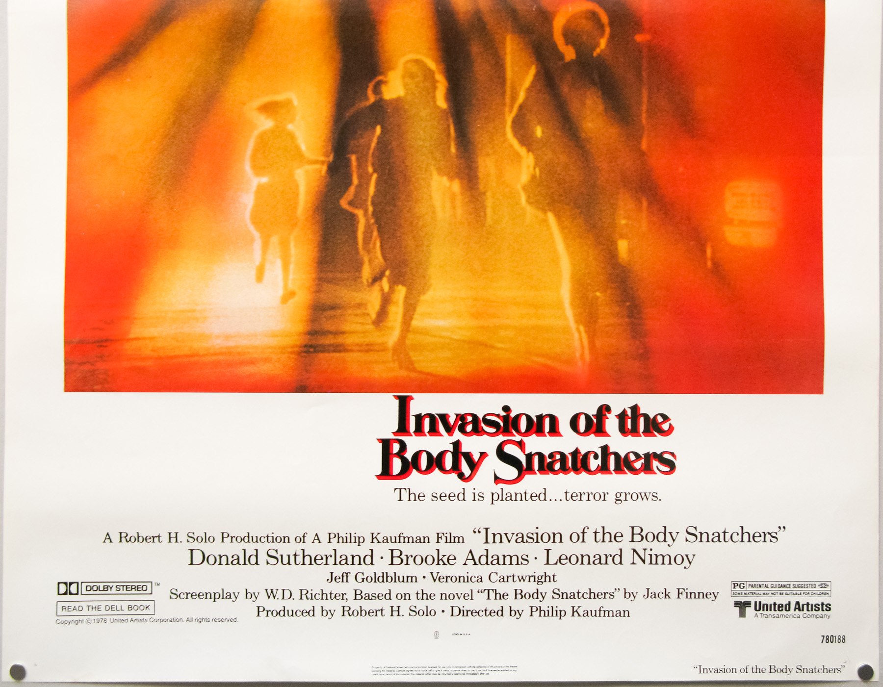
- Type of Poster
- One sheet
- Style of Poster
- Re-release
- Origin of Poster
- USA
- Year of Poster
- 1996
- Designer
- Saul Bass
- Artist
- Saul Bass | Art Goodman (figures)
- Size (inches)
- 27" x 40"
- SS or DS
- DS
- NSS #
- --
- Tagline
- --
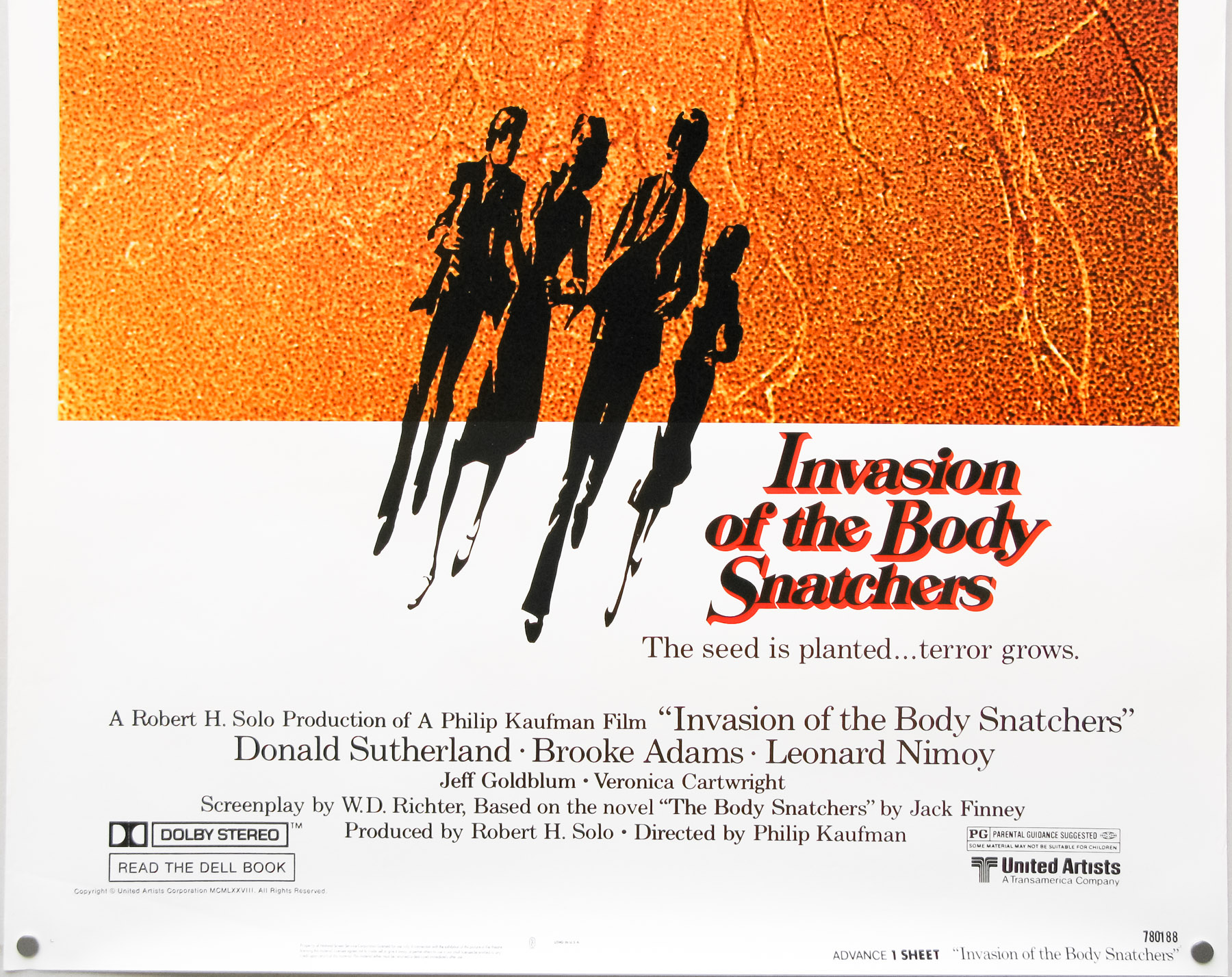
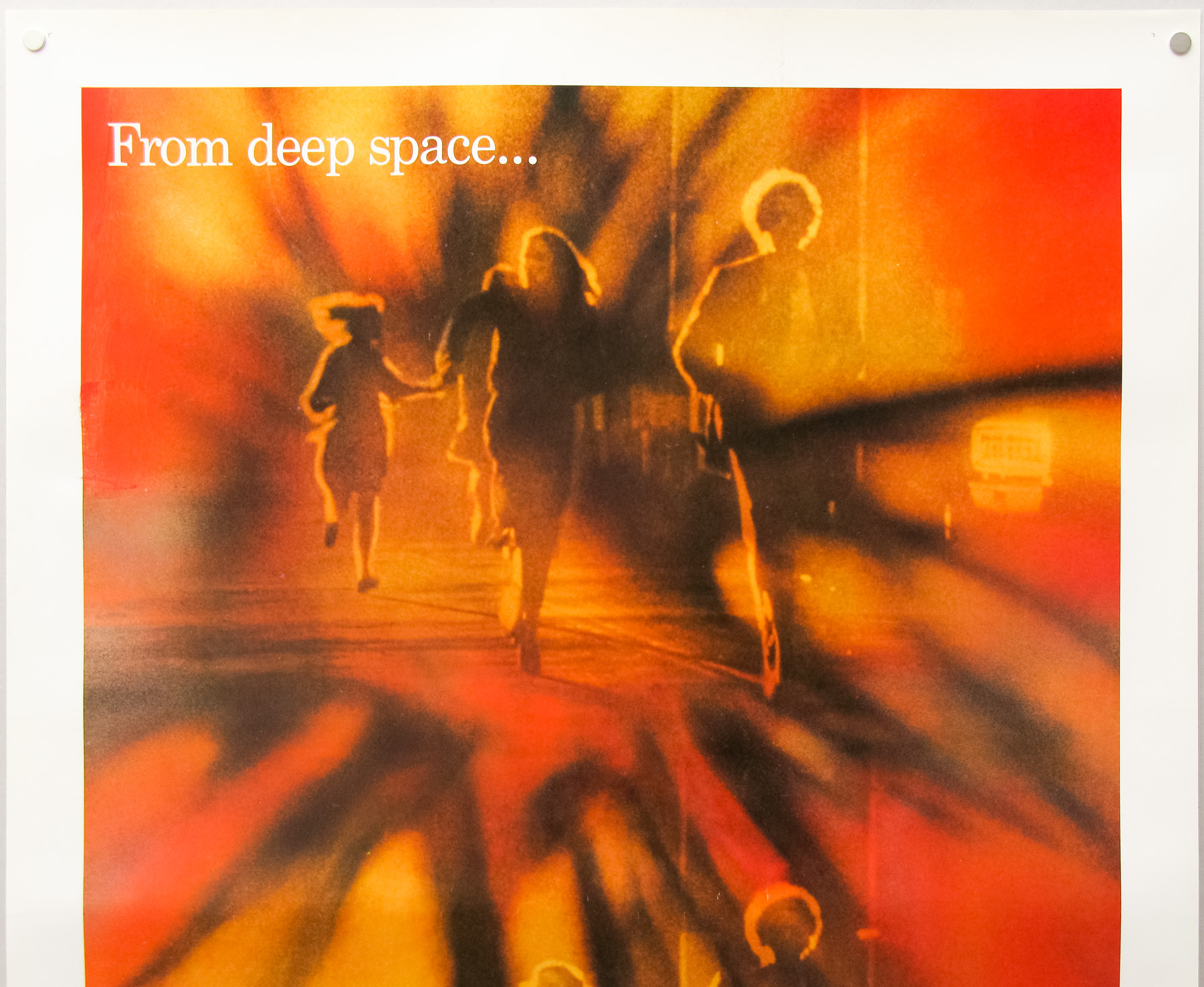
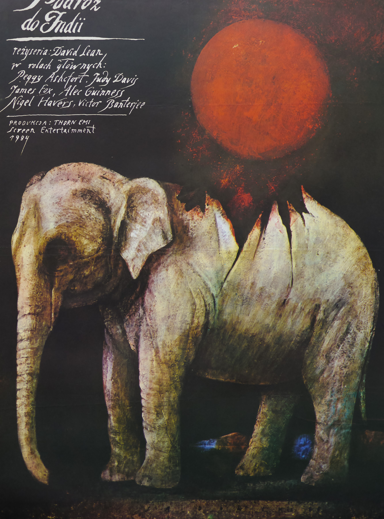
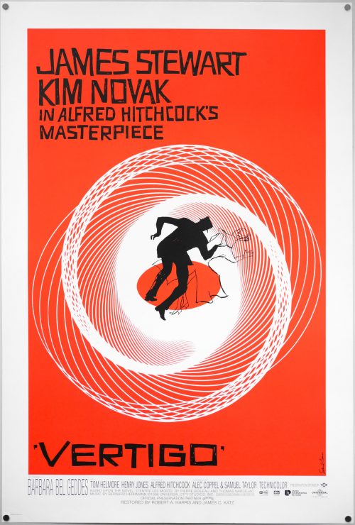
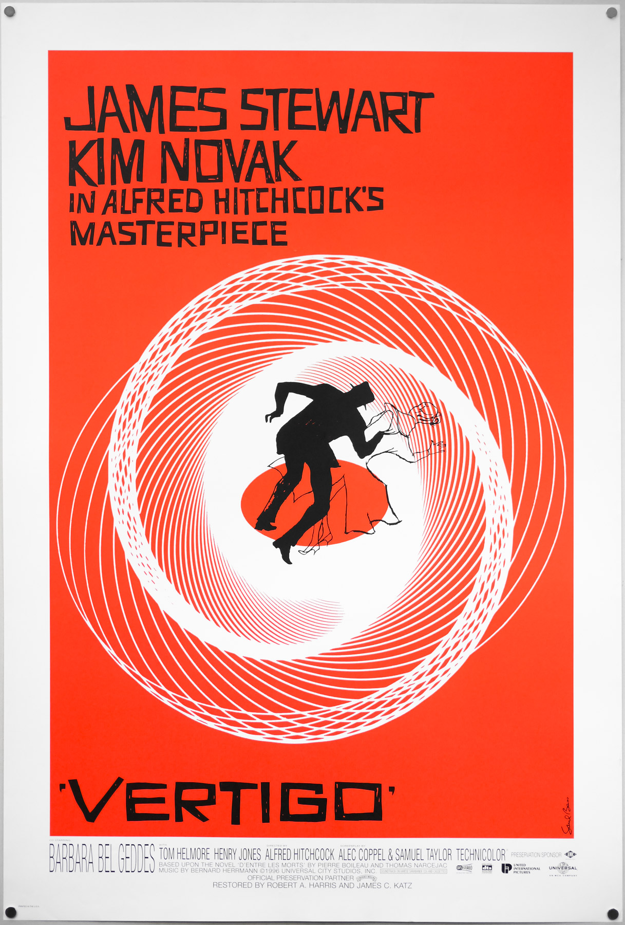
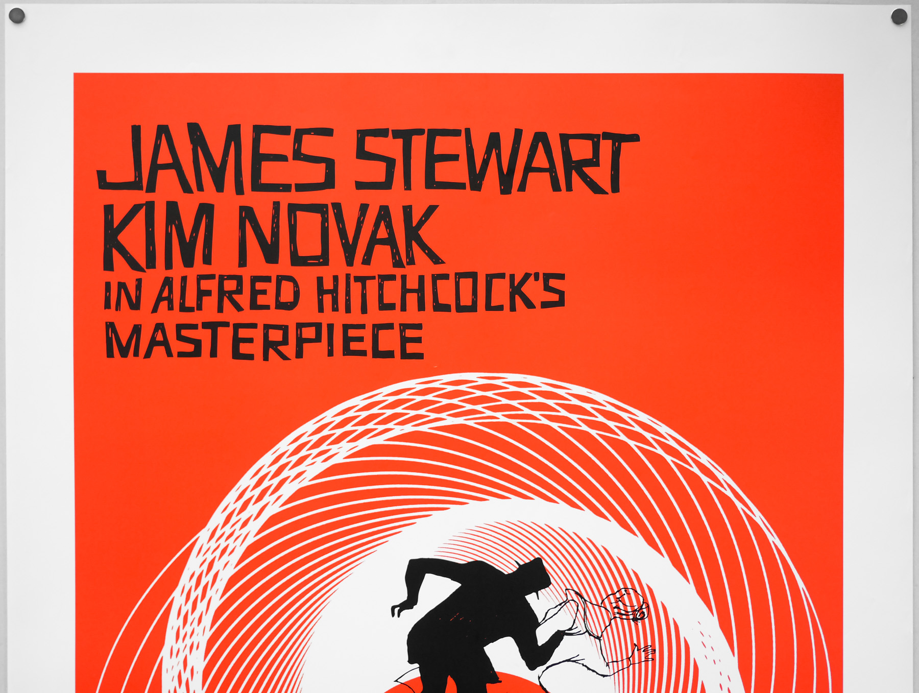
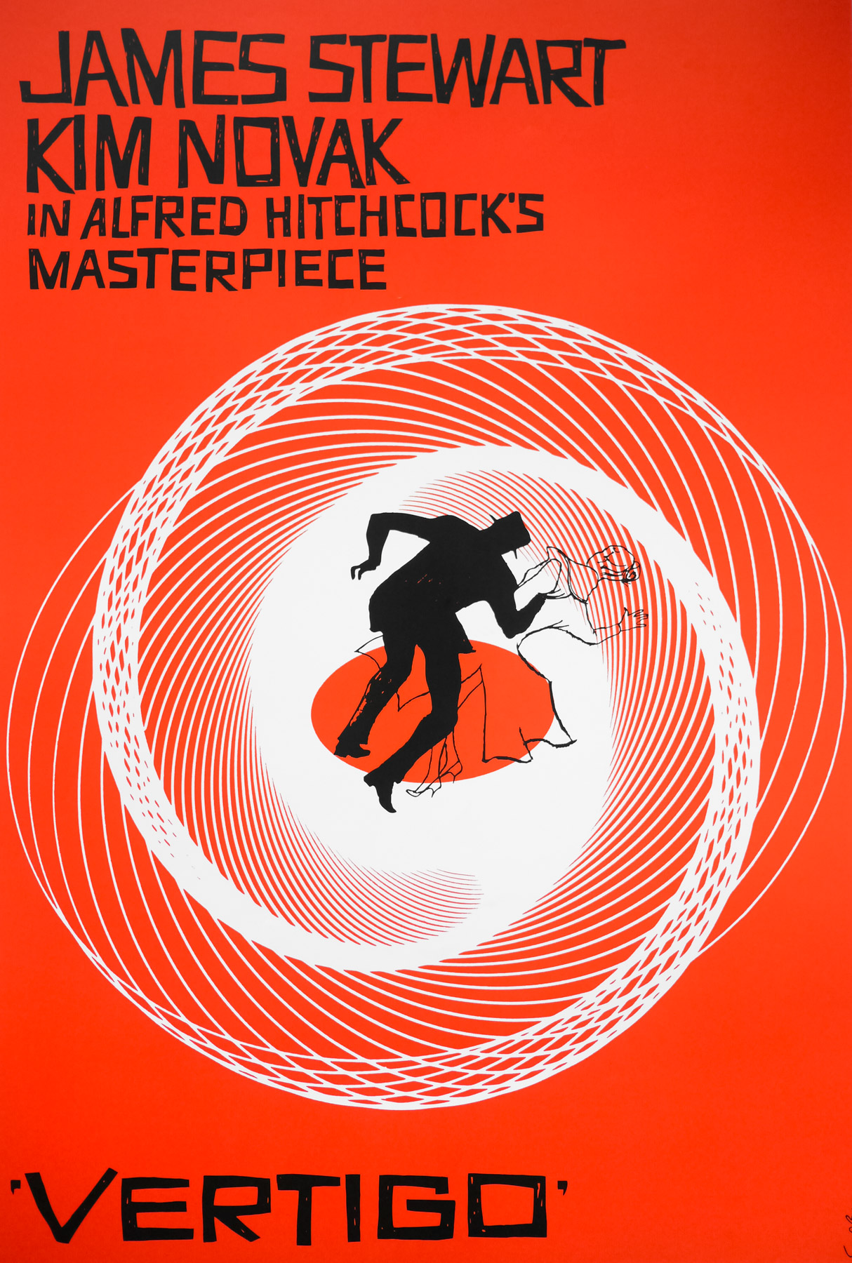
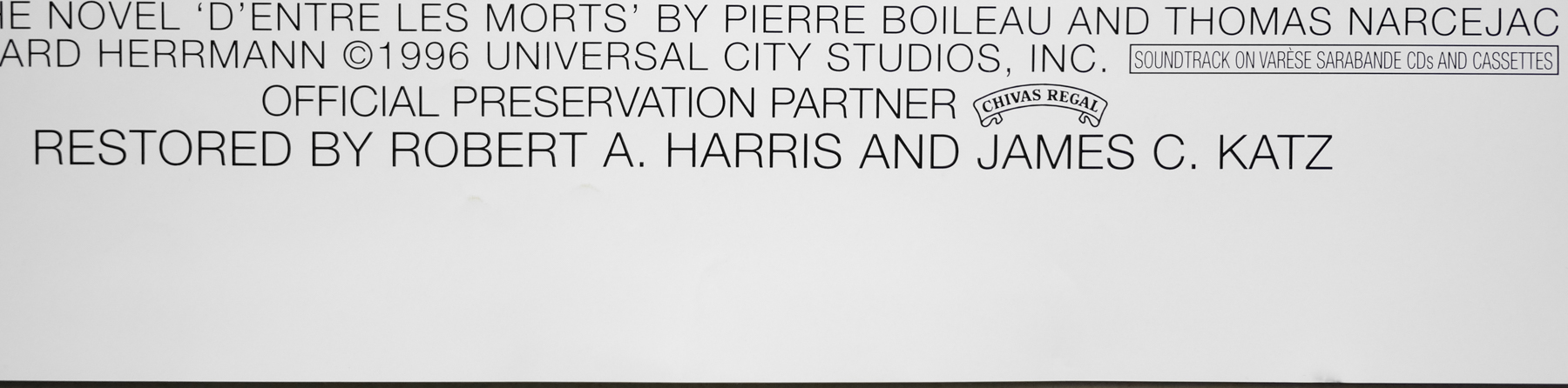
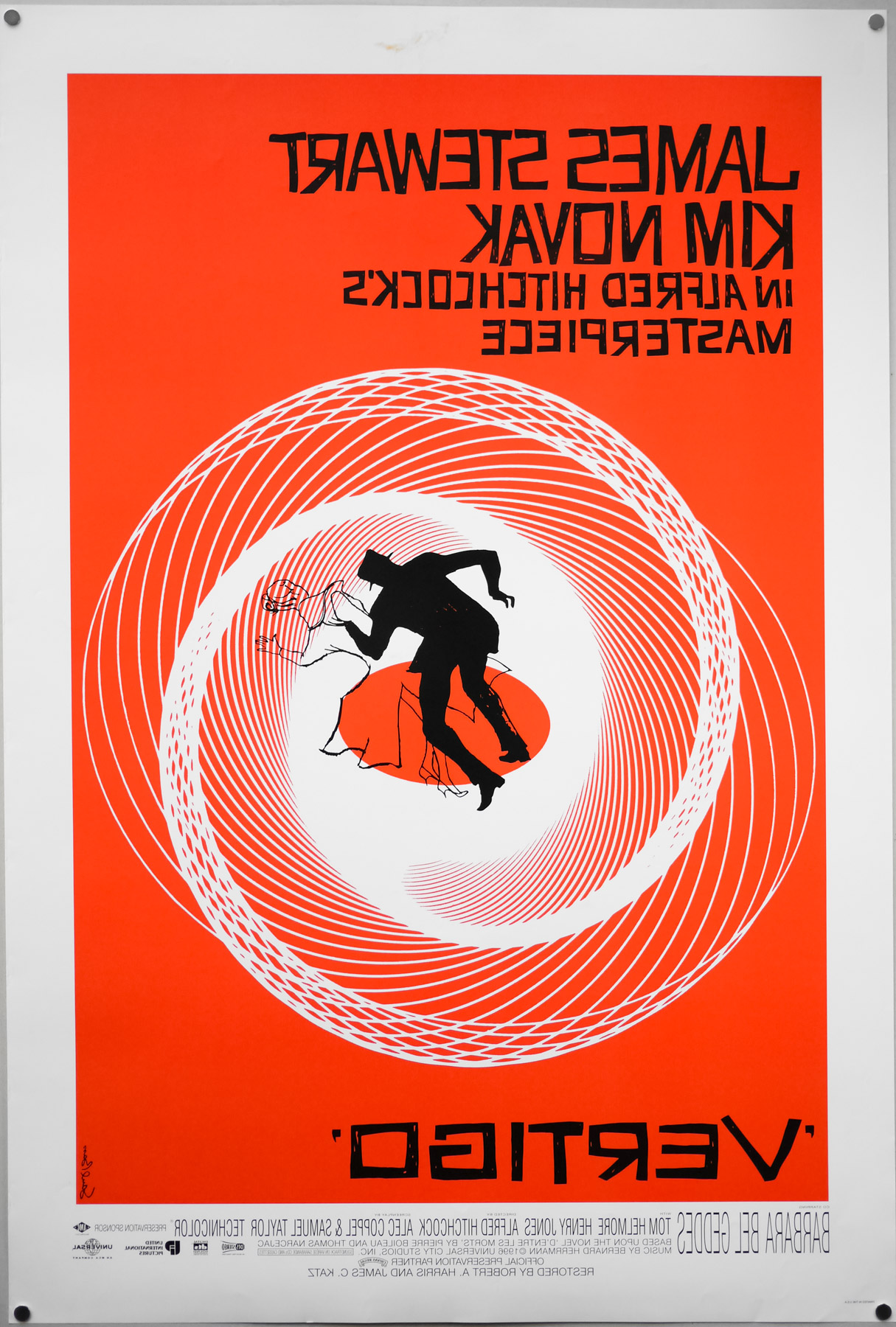
This US one sheet was printed to mark the 1996 re-release of a restored print of director Alfred Hitchcock‘s classic thriller Vertigo. The film marked the first time Hitchcock worked with the celebrated American designer Saul Bass and the pair would collaborate on two further films together. Hitchcock had himself started his film career developing inter-title cards for silent movies and he commissioned Bass to create the title sequences for Vertigo, North by Northwest and Psycho. As detailed in the must-own book ‘Saul Bass: A Life in Film & Design’ (designed by Bass’ daughter Jennifer), the director knew of Bass’ work well before the commission as he kept a close eye on movie graphics and was a subscriber to Graphis, a print journal that had featured Saul’s work.
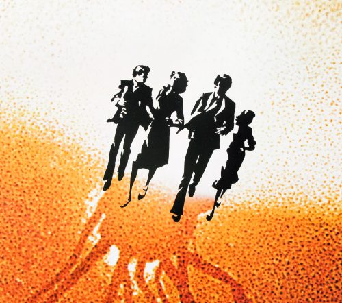
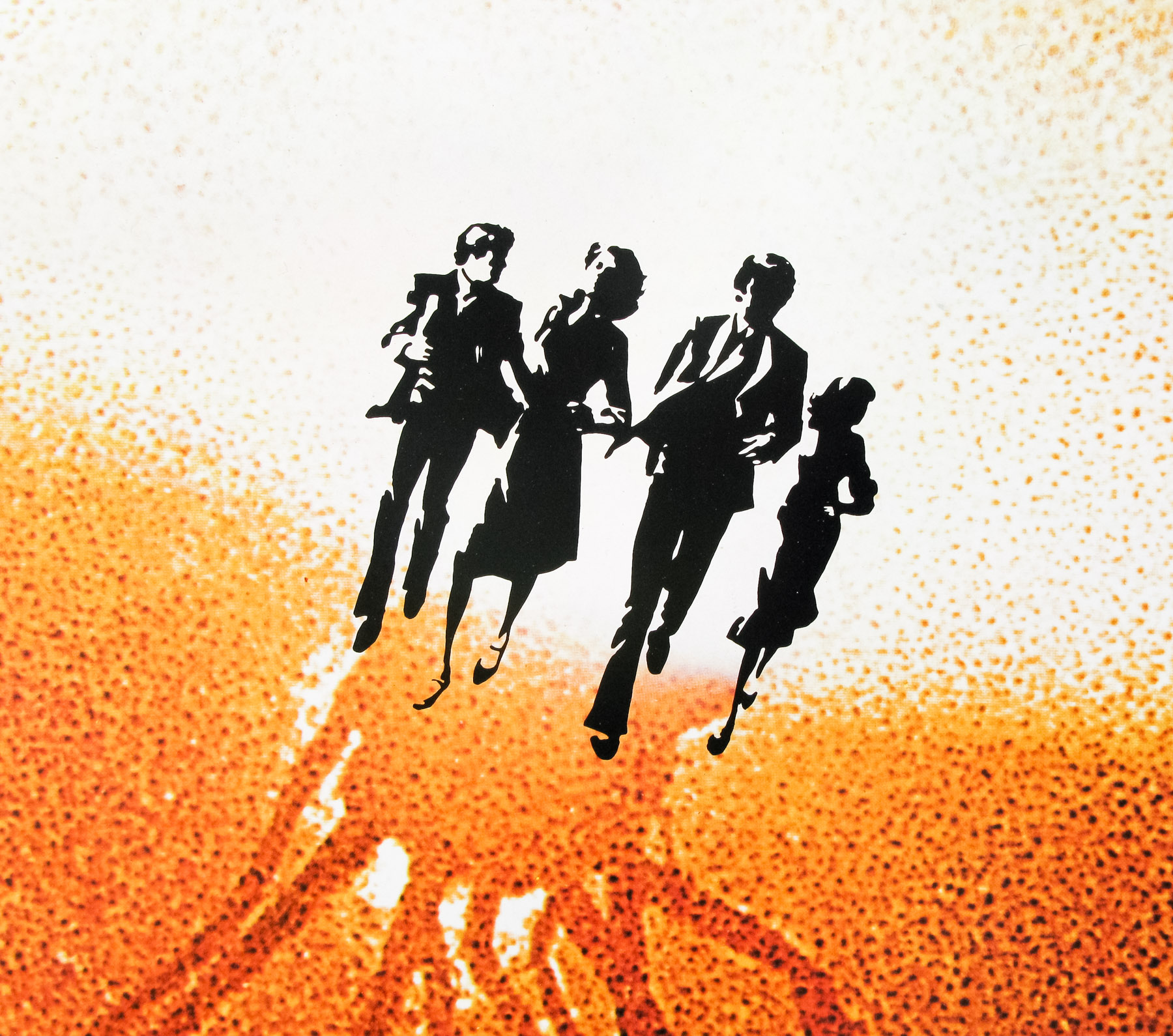
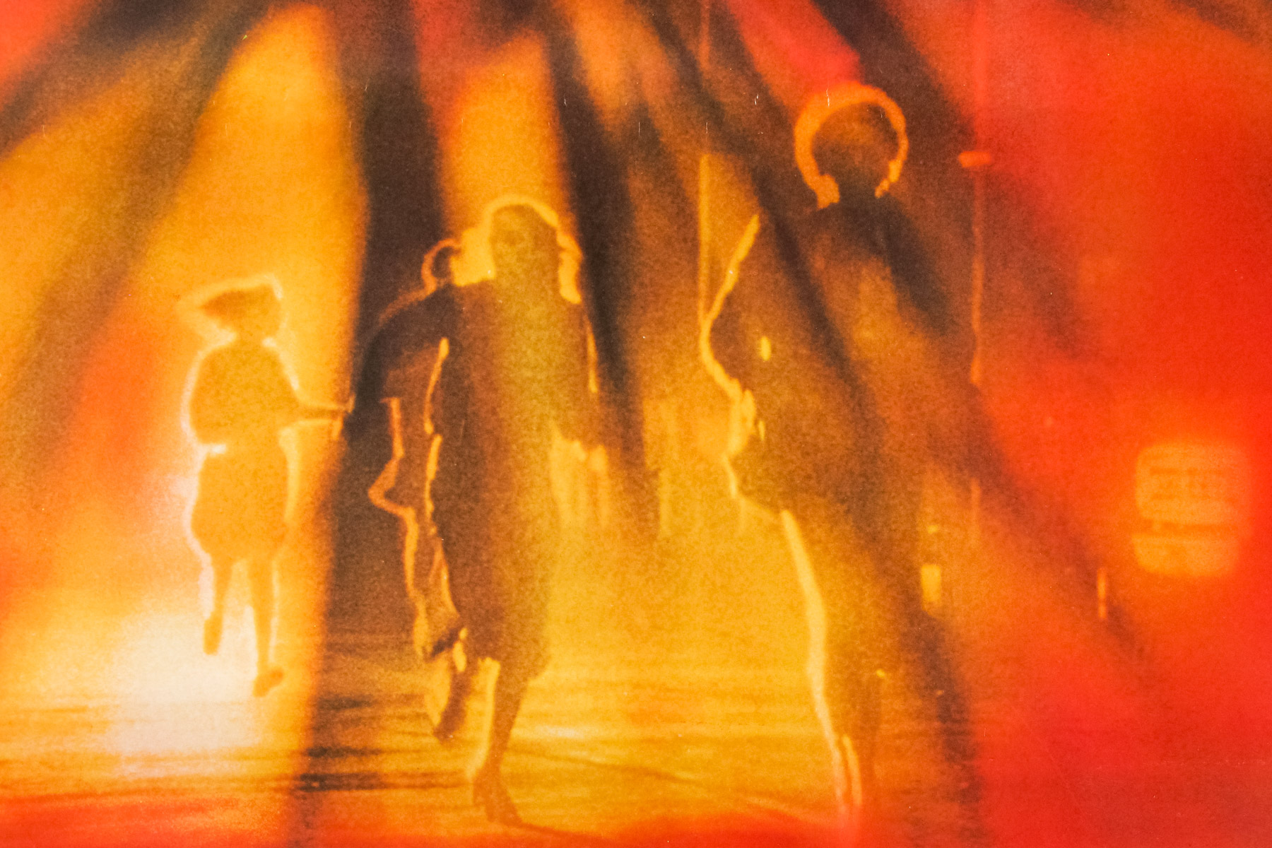
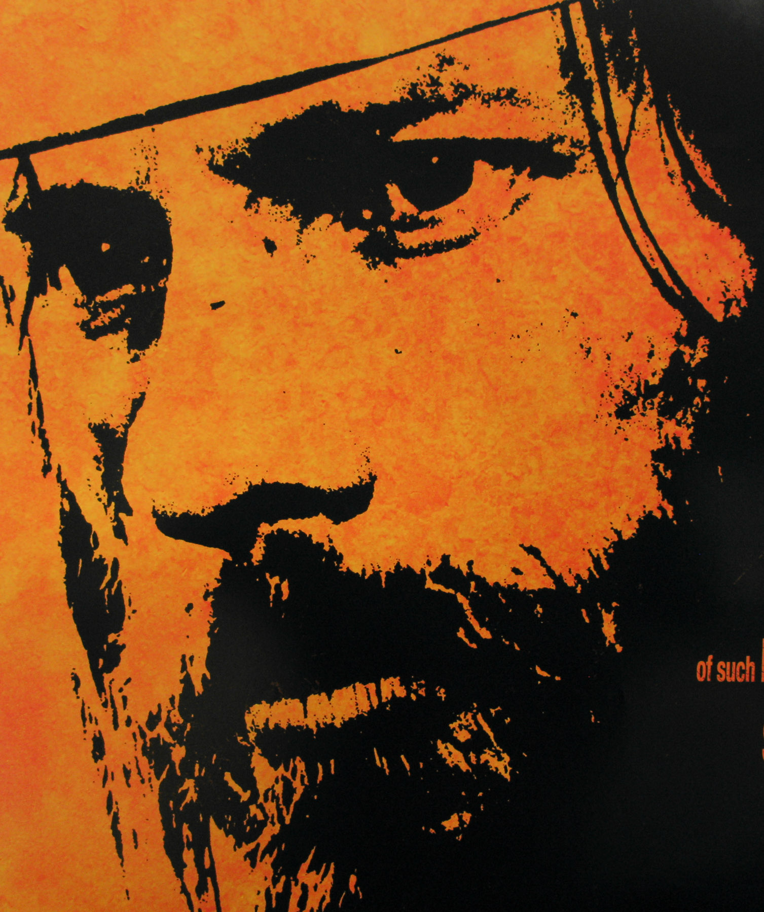
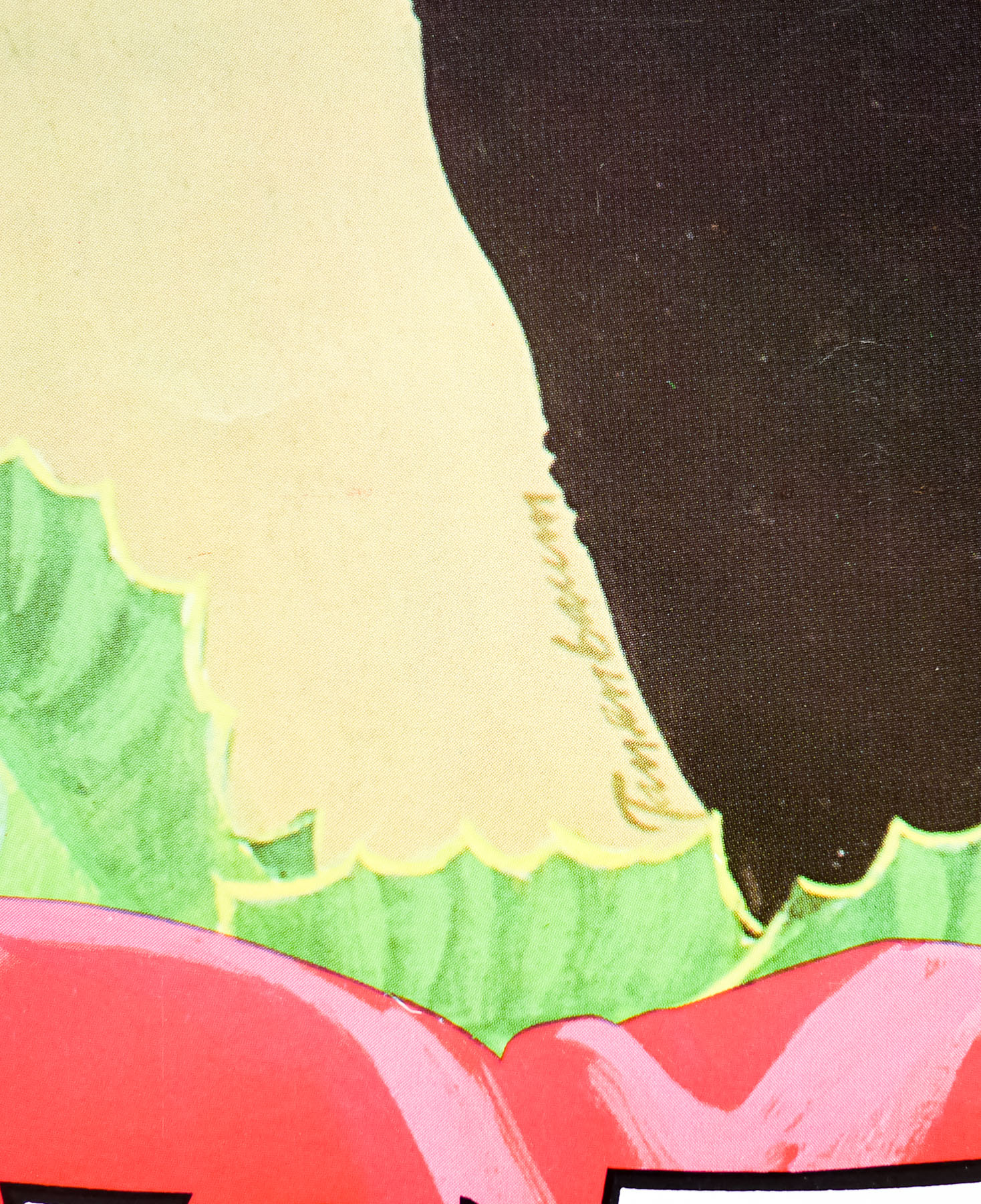
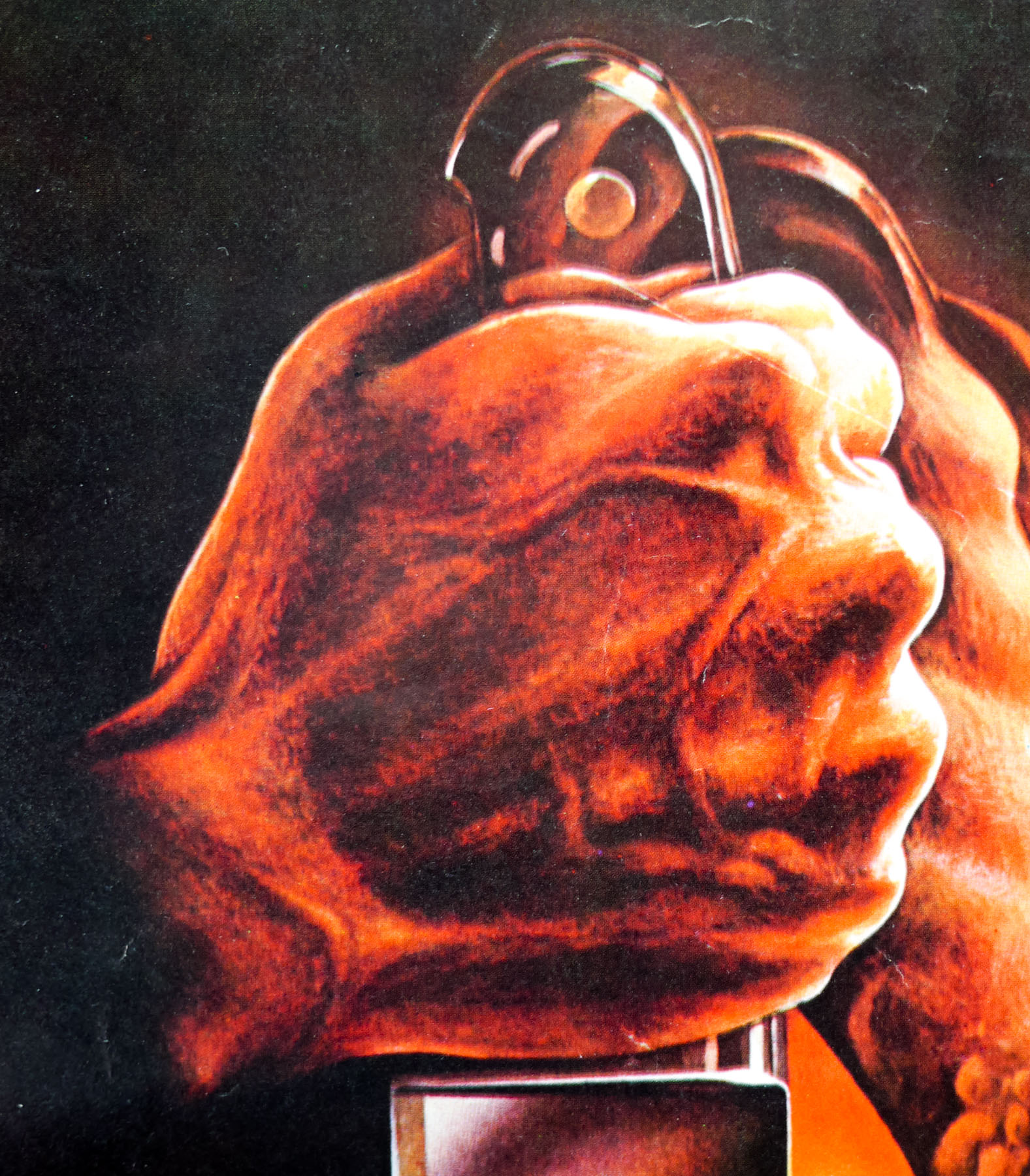
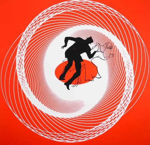
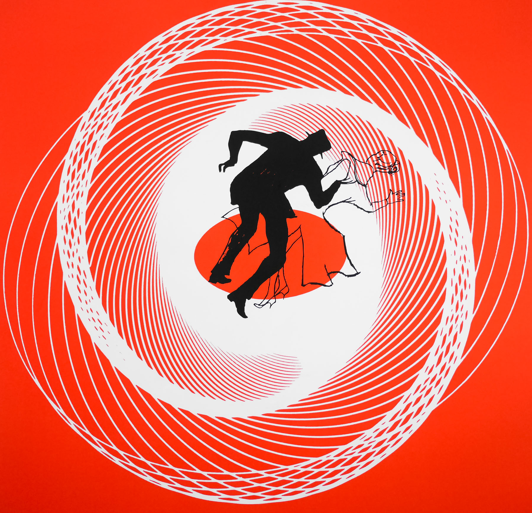
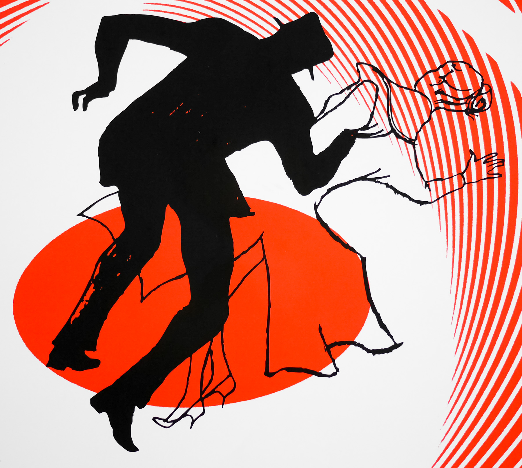
As well as creating the influential title sequences for each film, Bass was also commissioned to design the advertising campaign for Vertigo. He created the central motif of two figures swirling in a vortex, which is detailed in ‘A Life in Film & Design’:
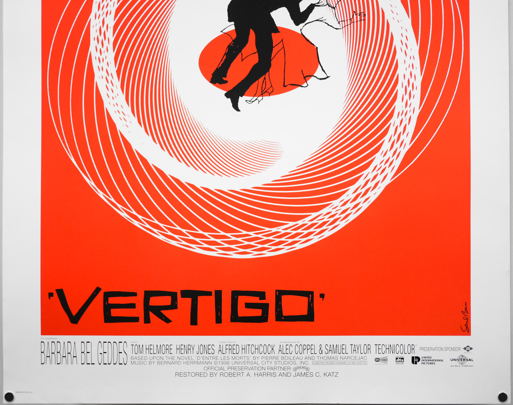
‘The main poster also captures the sensation of vertigo by having a couple sucked into a vortex. The slightly off-kilter, irregular capitals further hint at the vertiginous. The figures were drawn by Art Goodman, who recalled Saul specifying and sketching out a black silhouette for the man and a light outline, like an apparition, for the woman of his obsessions.’
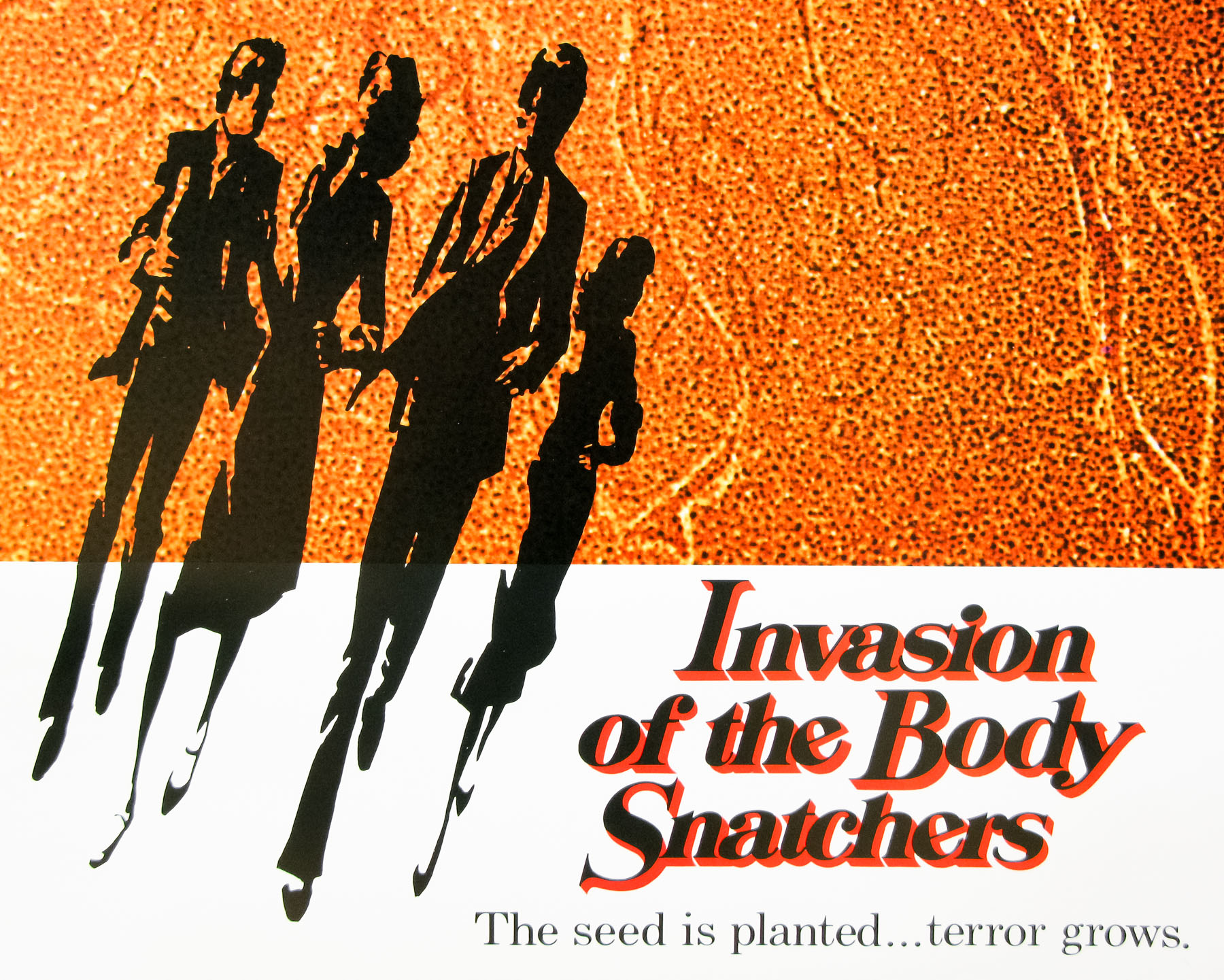
Several different colours and variations were utilised for the various elements of the ad campaign (trade ads, large posters, brochures, etc) with the concept that the variation of colour and design around a central theme ‘was spinning the viewer in another direction’. Some of these alternatives can be seen in this excellent blog post.
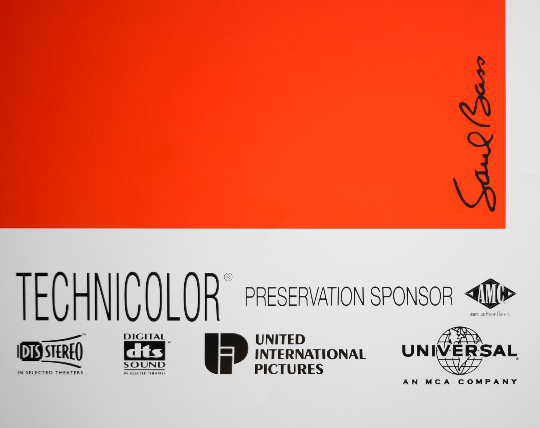
Even if the film wasn’t a great box-office and critical triumph during its initial release, with a reappraisal and celebration not happening until several years later, the title sequence advertising campaign was declared an immediate success and was to win Bass several awards. This one sheet is practically identical to the original 1958 poster with the exception of an altered credits block at the bottom and slightly darker shade of orange (note that this poster is also double-sided, for use in lightboxes)
The film’s Wikipedia article details how the 1996 restoration proved quite controversial since the experts charged with the task were forced to alter the soundtrack (during the creation of a new 6 channel track) and restore the colour as best as they could since the original negatives had faded over the years.
This article on Mubi.com by Adrian Curry does a thorough job of detailing all the various posters printed for Vertigo around the world.
For more on Bass I thoroughly recommend picking up ‘Saul Bass: A Life in Film & Design’ and also check out the extensive page about him on the brilliant Art of the Title