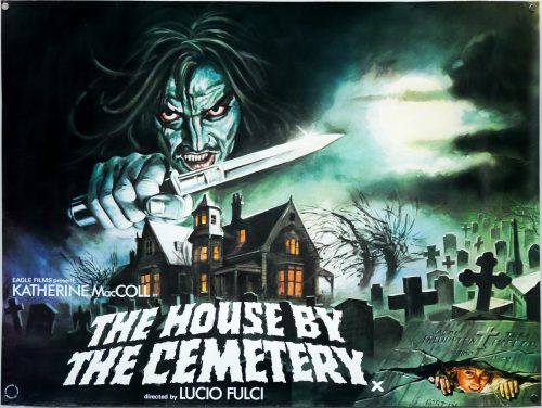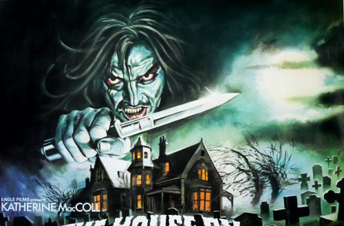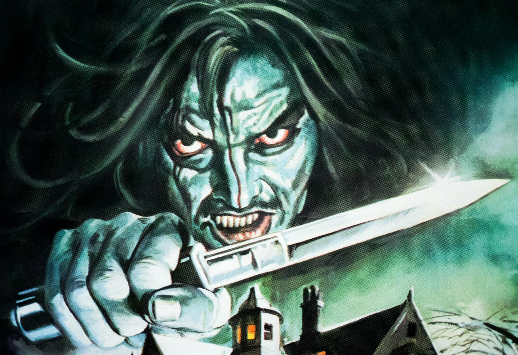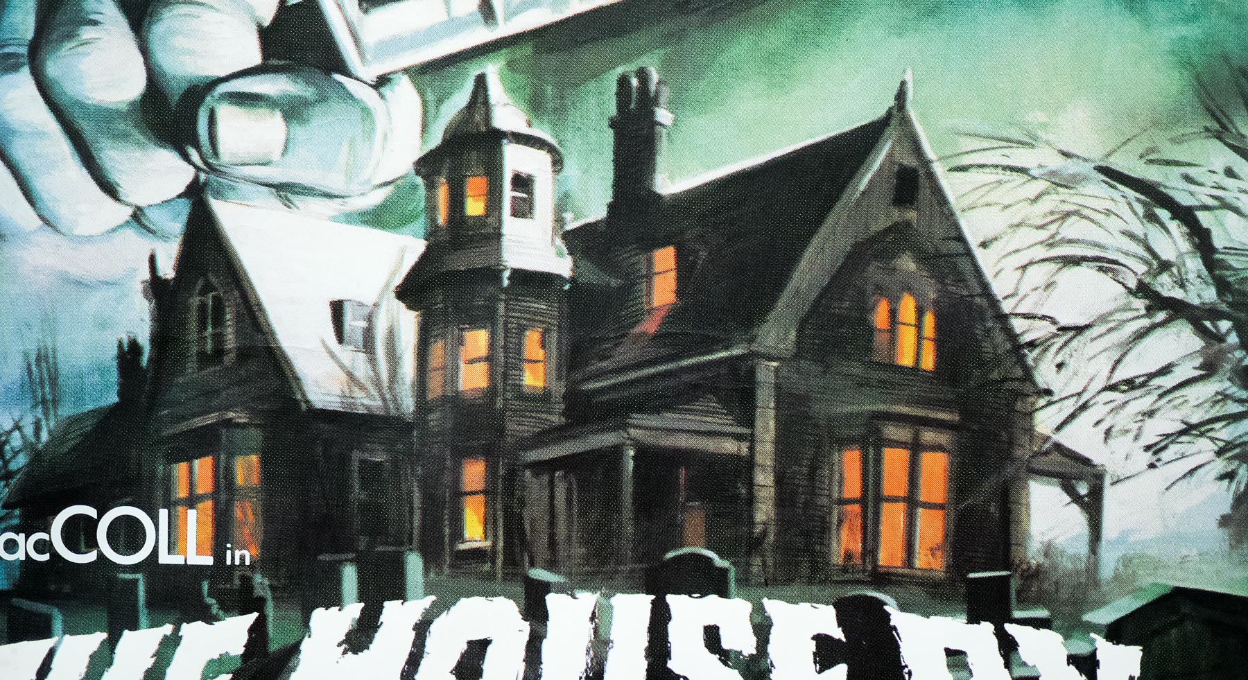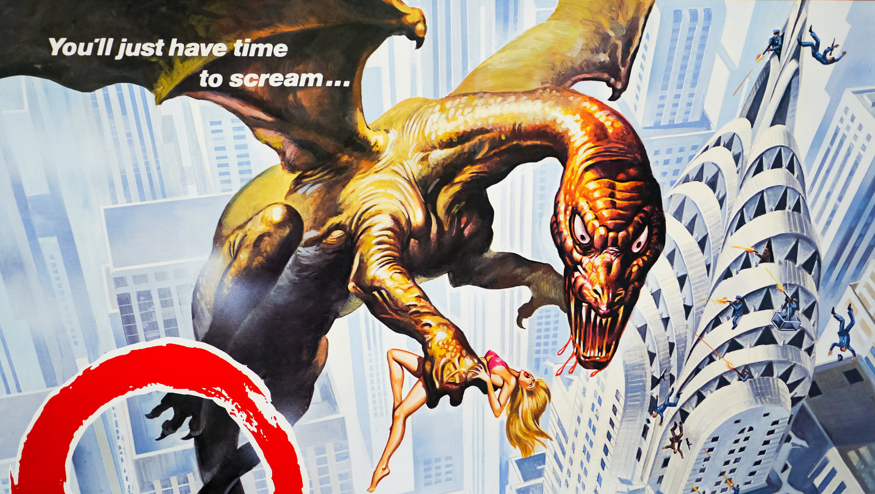

Poster detail
1-5
- AKA
- Nightmare dal profondo della notte [Nightmare from the depths of the night] (Italy)
- Year of Film
- 1984
- Director
- Wes Craven
- Starring
- John Saxon, Ronee Blakley, Heather Langenkamp, Amanda Wyss, Nick Corri, Johnny Depp, Robert Englund
- Origin of Film
- USA
- Genre(s) of Film
- John Saxon, Ronee Blakley, Heather Langenkamp, Amanda Wyss, Nick Corri, Johnny Depp, Robert Englund,
- Type of Poster
- Quad
- Style of Poster
- --
- Origin of Poster
- UK
- Year of Poster
- 1985
- Designer
- Graham Humphreys
- Artist
- Graham Humphreys
- Size (inches)
- 30 1/16" x 39 14/16"
- SS or DS
- SS
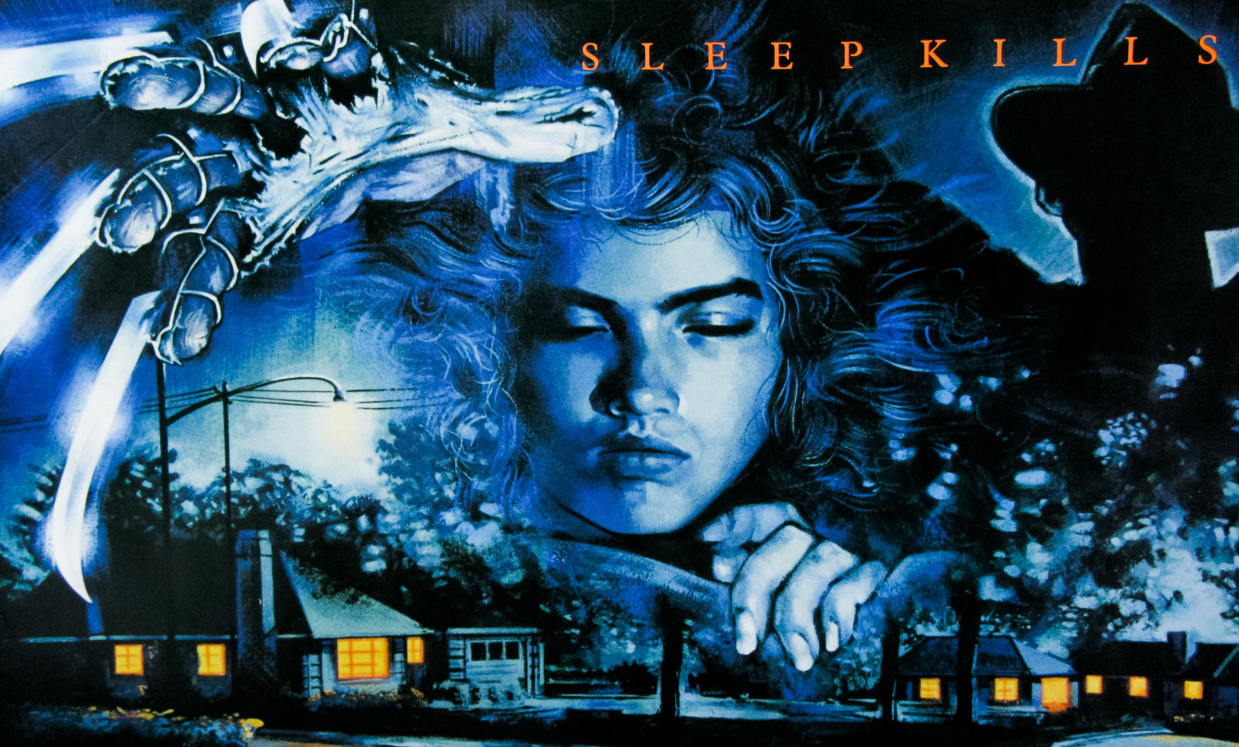
- Tagline
- Sleep kills
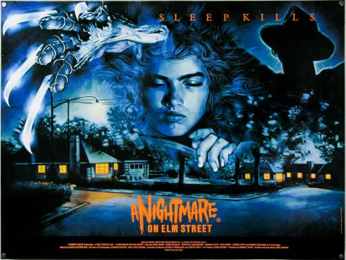
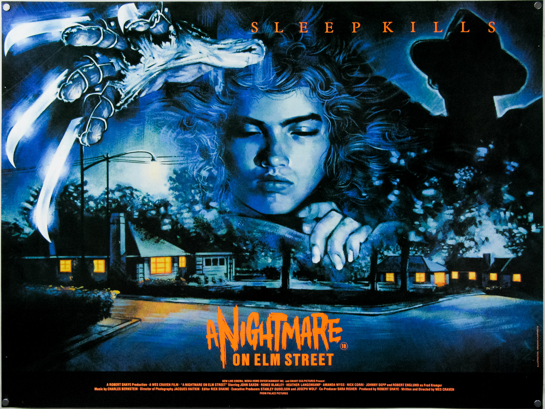
Iconic design and illustration on this UK quad for the film that started the successful Freddy Krueger franchise, featuring artwork by the British designer and artist Graham Humphreys. When I interviewed him about his career in 2011 I asked about the design for the poster and the excerpt from the interview is below:
I wanted to move onto another poster that’s many people’s favourite for the film, and that’s your design for A Nightmare on Elm Street. That was another one for Palace Pictures?
It was shortly after the Evil Dead. I wasn’t commissioned directly, it was through a couple of friends of mine who had set up a design company and they were working with Palace. The company was called Red Ranch. I’d been at college with one of the guys. They got on very well with Palace Pictures and they were given this project. They realised it was going to be an illustration and they were very happy to use me. I was able to do the logo for the poster as well.
Can you talk about the design of the poster?
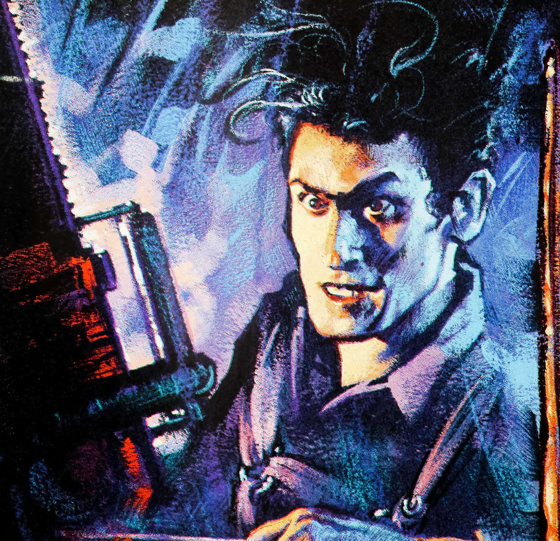
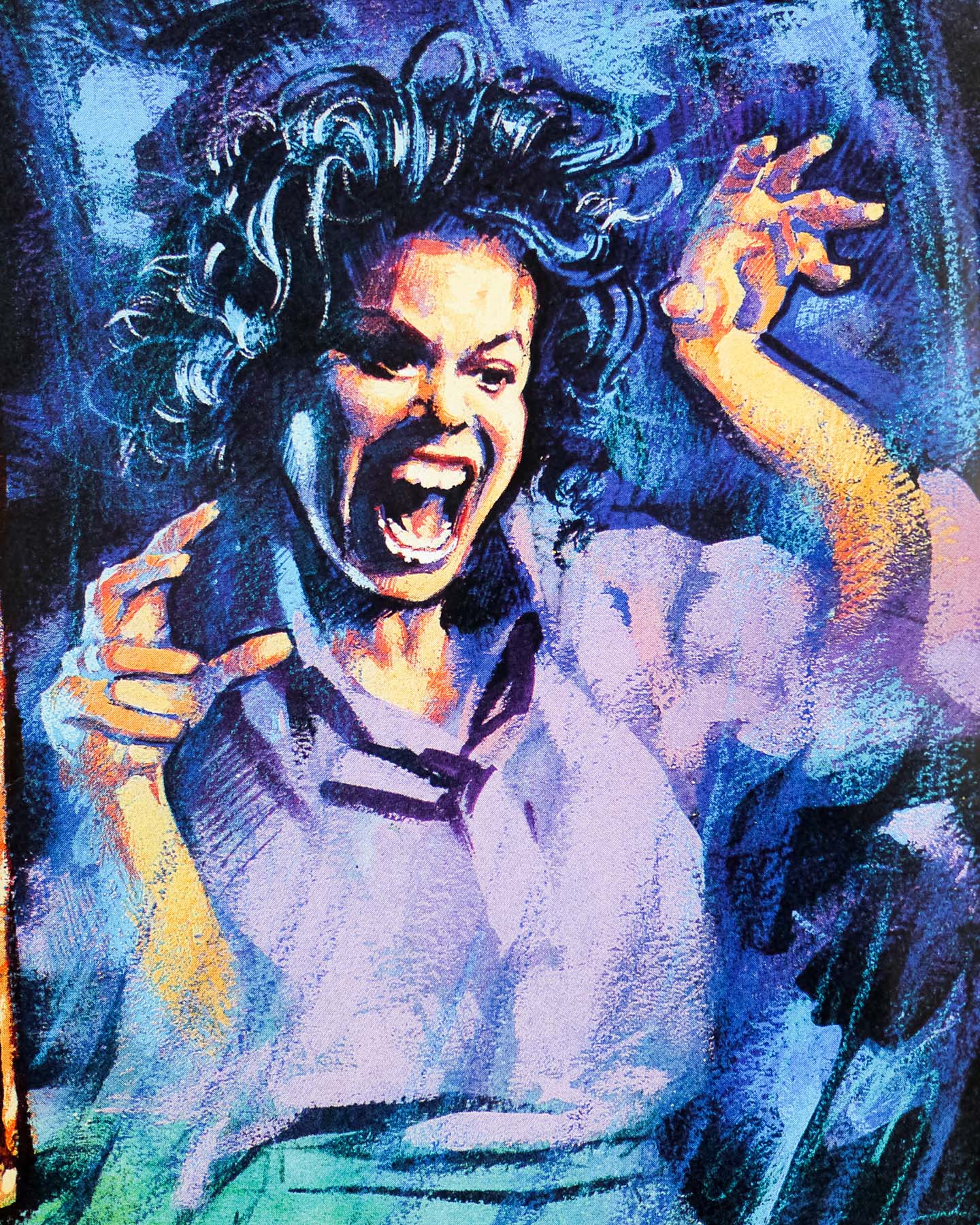
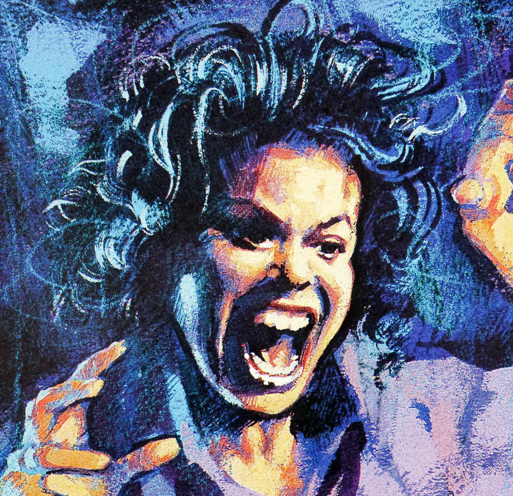
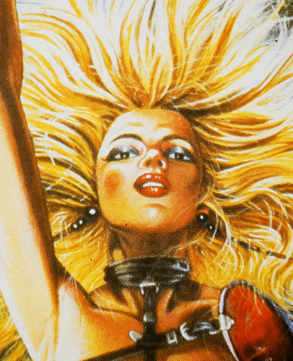
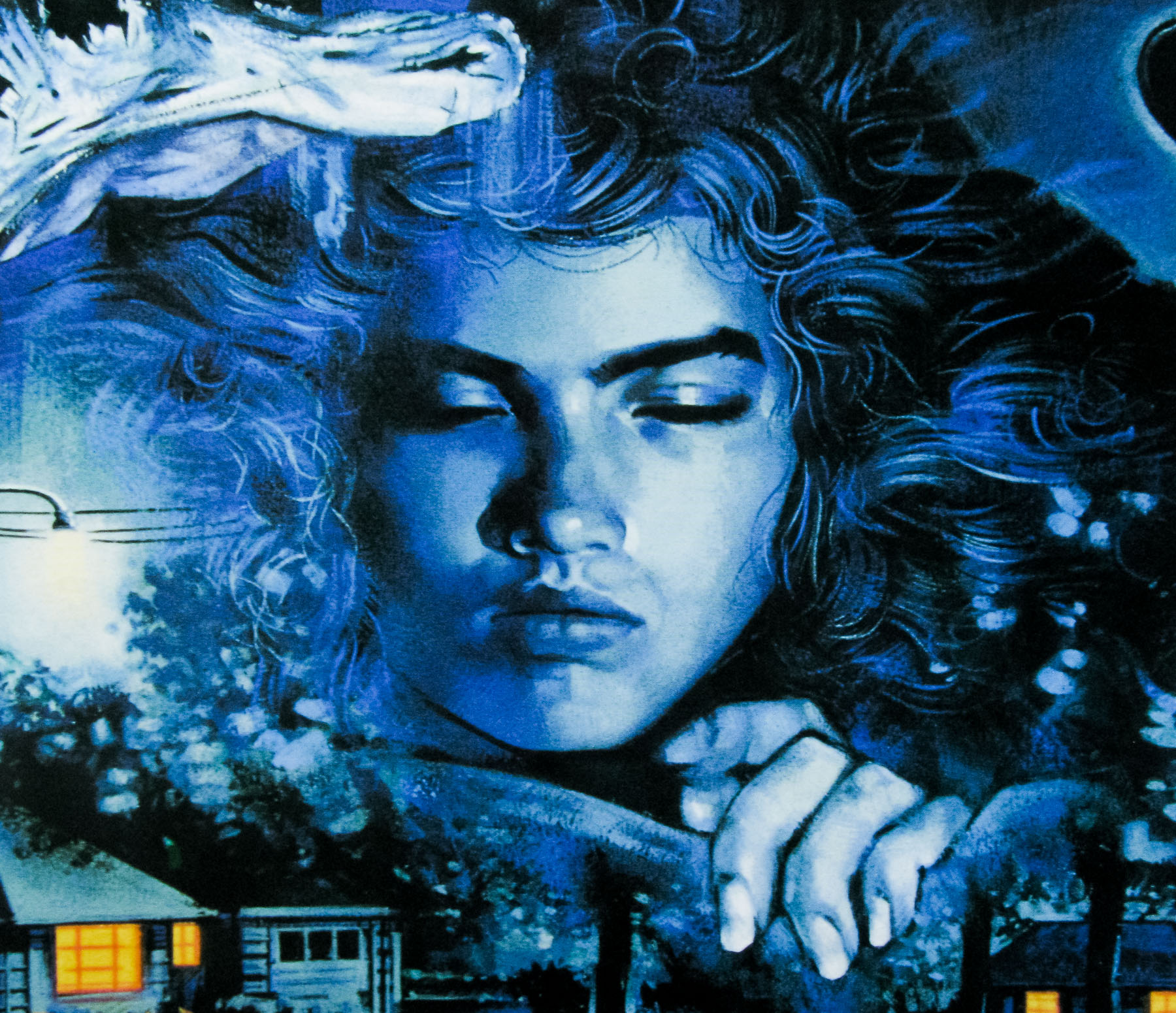
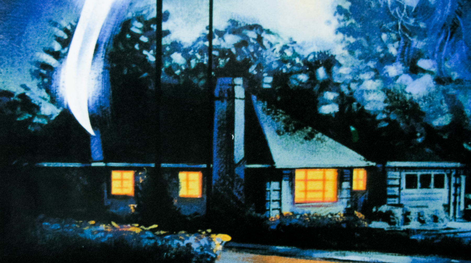
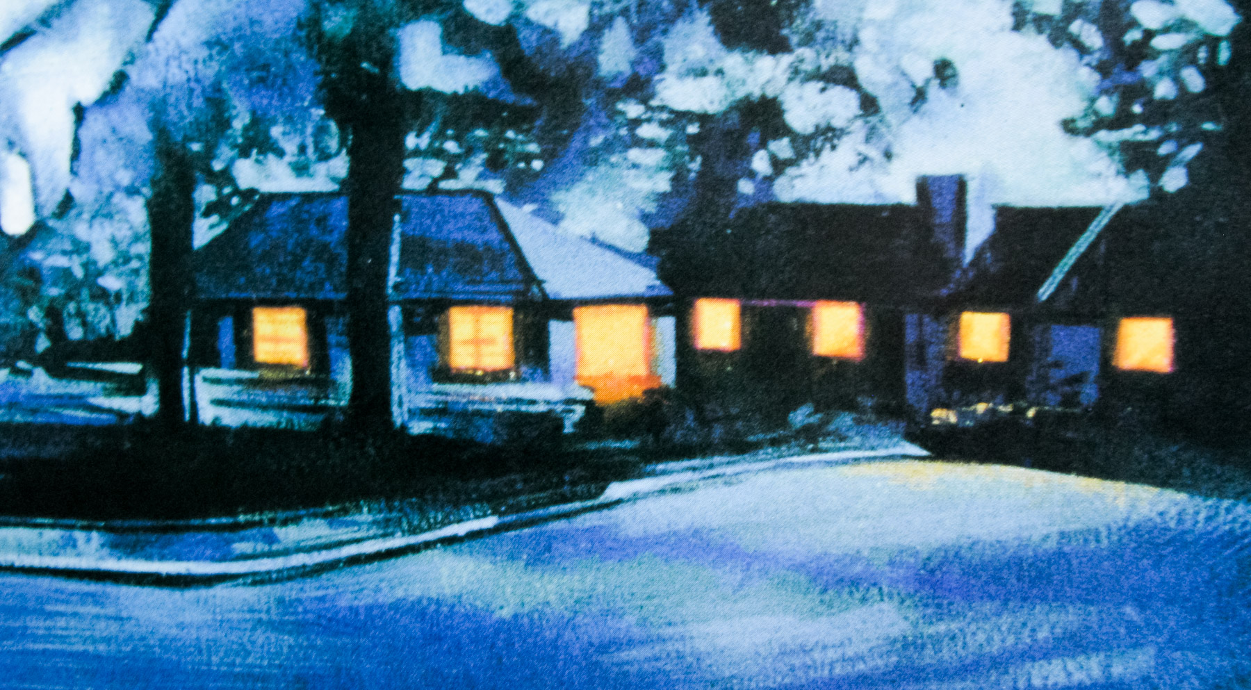
There was an American flyer for the film that was essentially the street with four tears through it. I saw the film and knew what I was going to do. I’d actually gone along to a screening with my friend, Phil Nutman, who I’ve since given this to [Graham points at the Evil Dead artwork] so I’d already seen it at the cinema before I was given a VHS copy. Anyway, I paused the VHS and took a photograph of Nancy’s face so I could draw that easily.
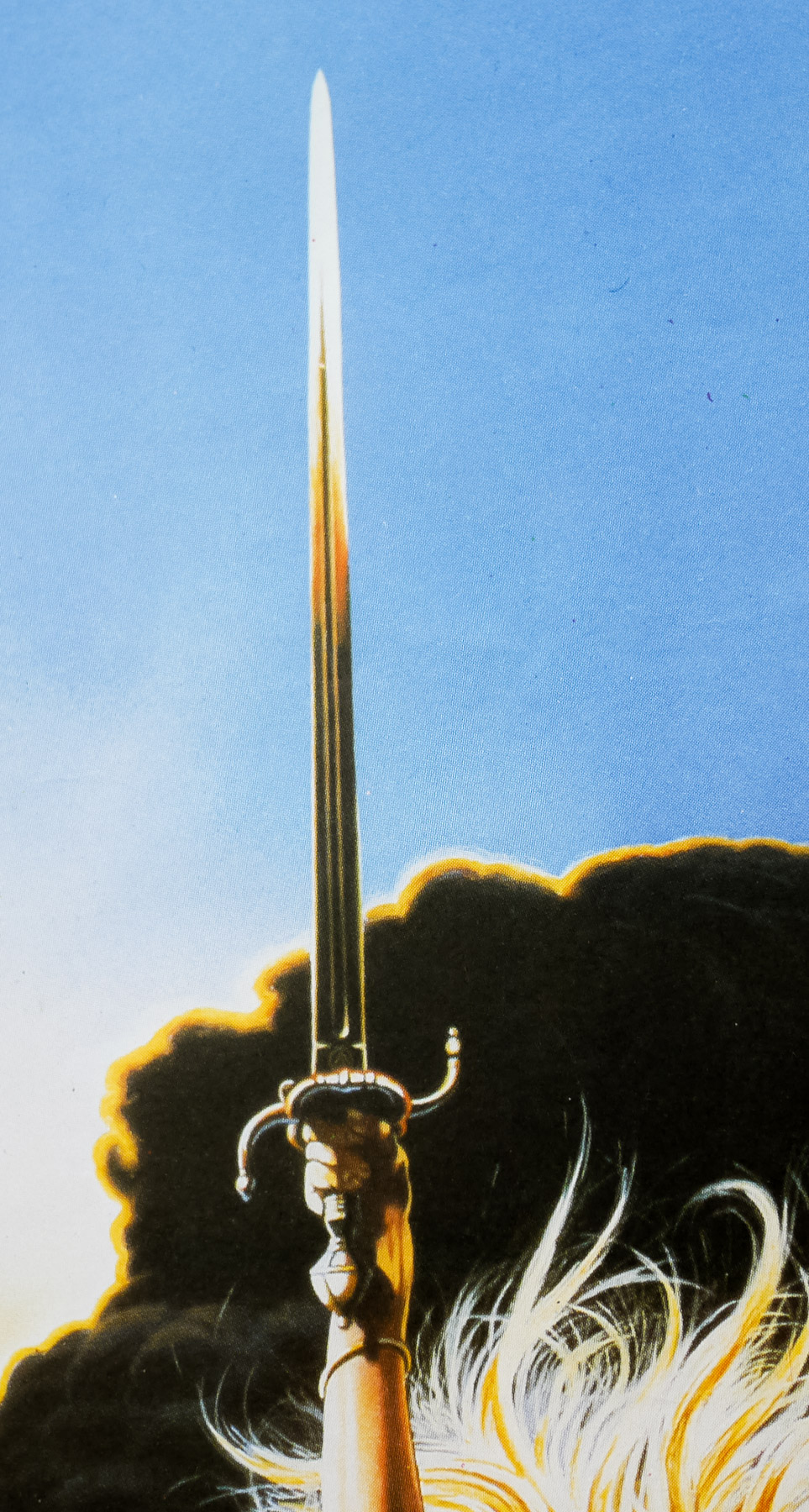
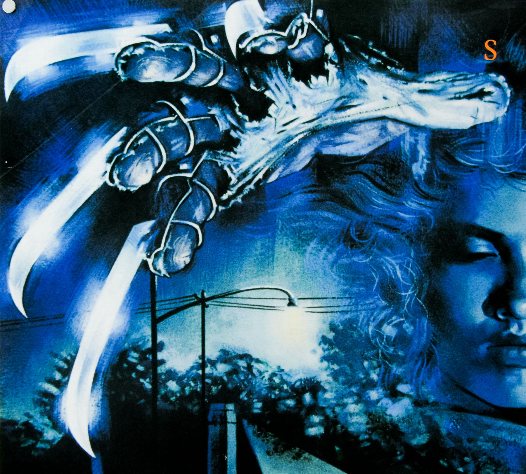
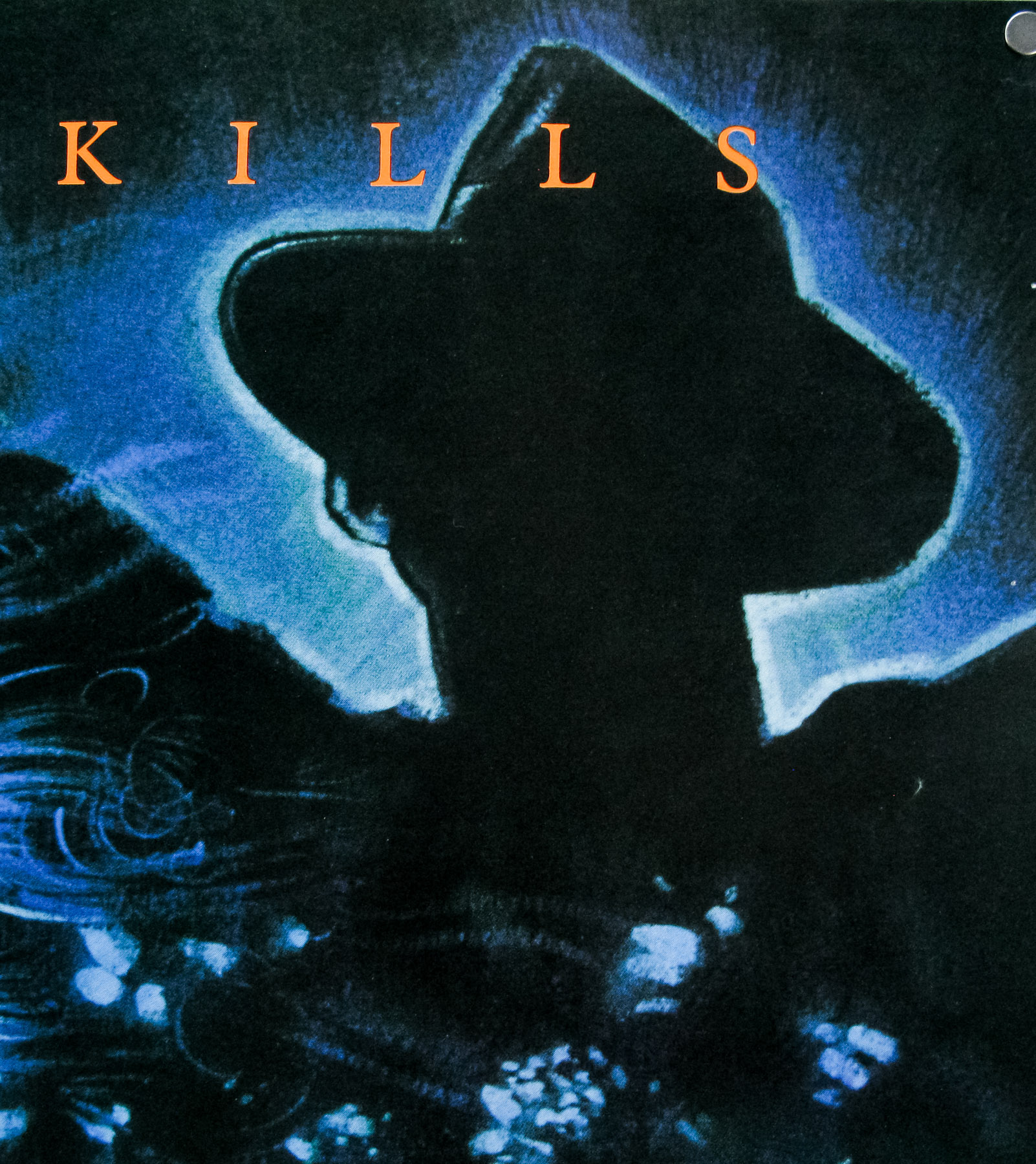
Freddy [Krueger] himself is actually silhouetted in the background. In the later posters he’s more prominent but on this first quad you don’t see anything, just the shadow and his glove.
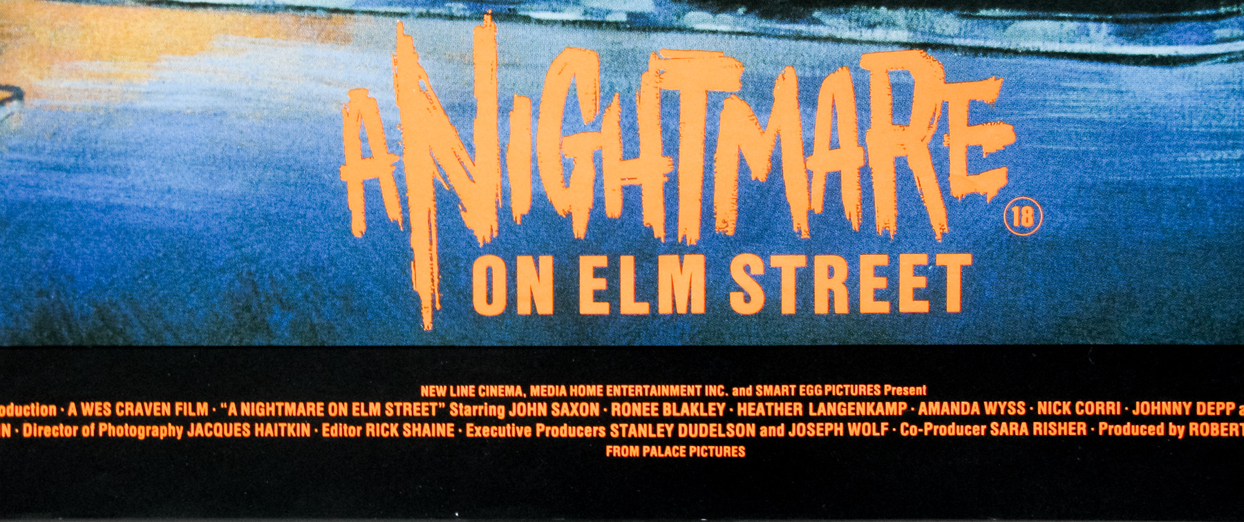
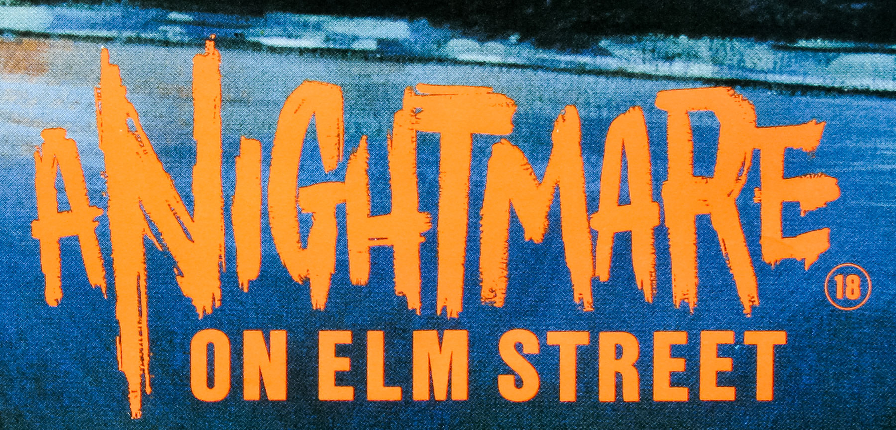
I think they wanted the poster to look fairly classy, in comparison to the Evil Dead quad which shows exactly the type of film it is. Obviously the glove became iconic but at the time people had no clue who Freddy was. To me, it was the glove and the whole dreaming thing that was the interesting thing about the film. You’ve got the pretty girl, the glove and the dream-like urban setting, you don’t need the big ugly face leering at you. I hand lettered the title too.
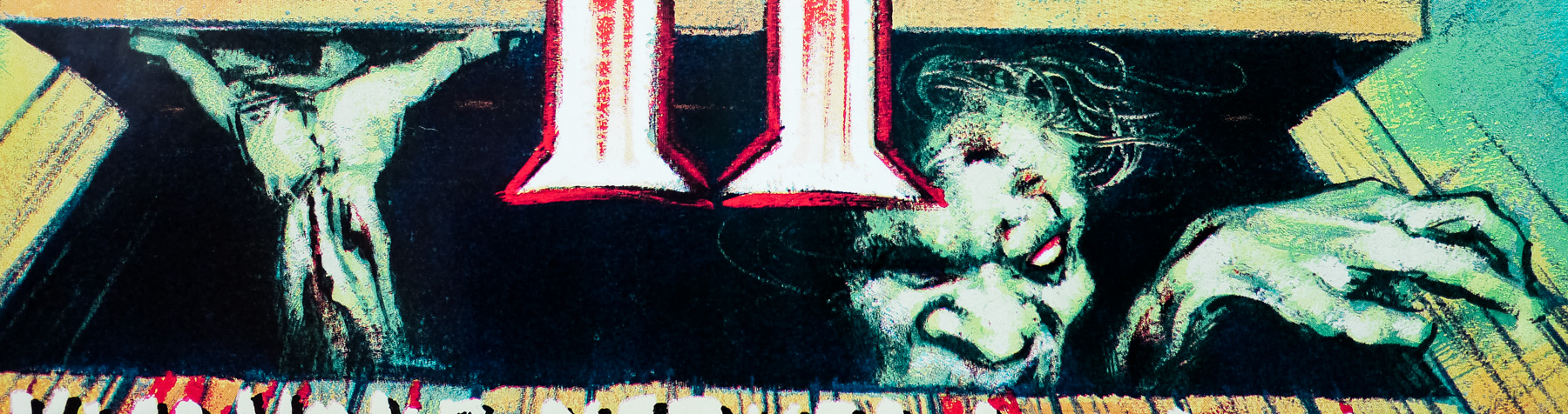
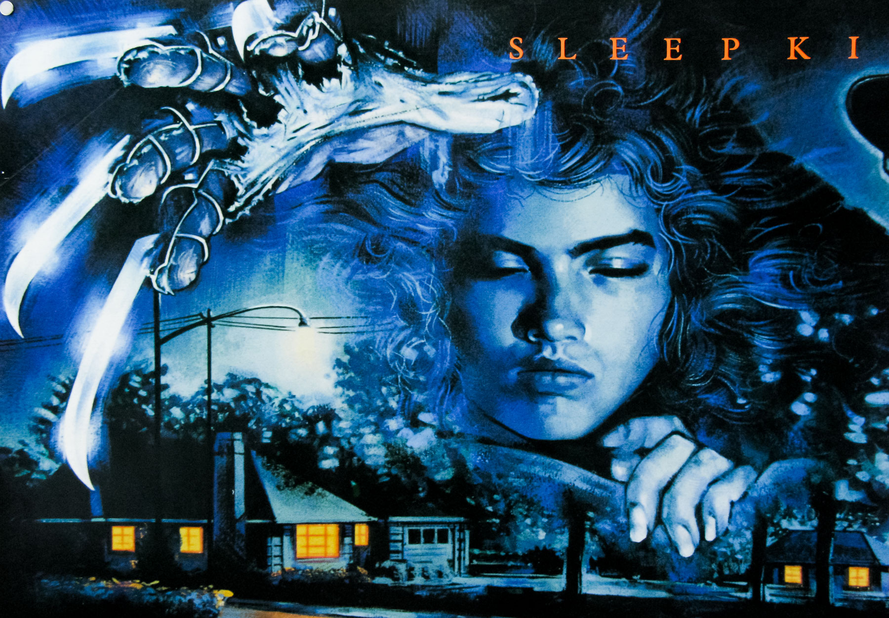
There’s also a second painting which is in portrait format and features Freddy’s other hand reaching down below Nancy’s face.
Yes, I think I prefer this one. This was used for fly posting and was the VHS cover too. For some reason at that time no one would think about the whole different format thing. Everyone was always focusing on quad posters for underground advertising and cinema fronts. The 40×60 inches or bus stop format was very much an American thing, but then when cinema became more commercial we found we had to start doing that size and format.