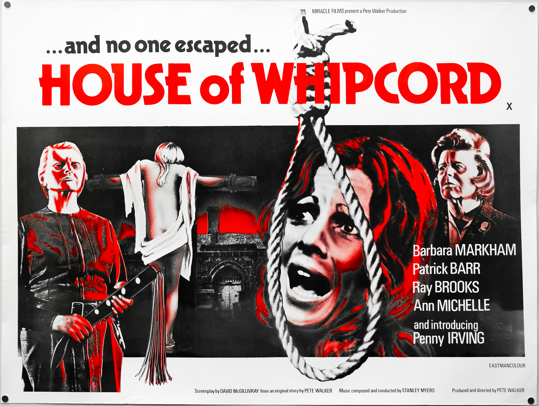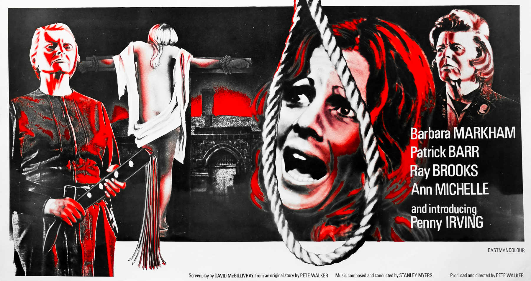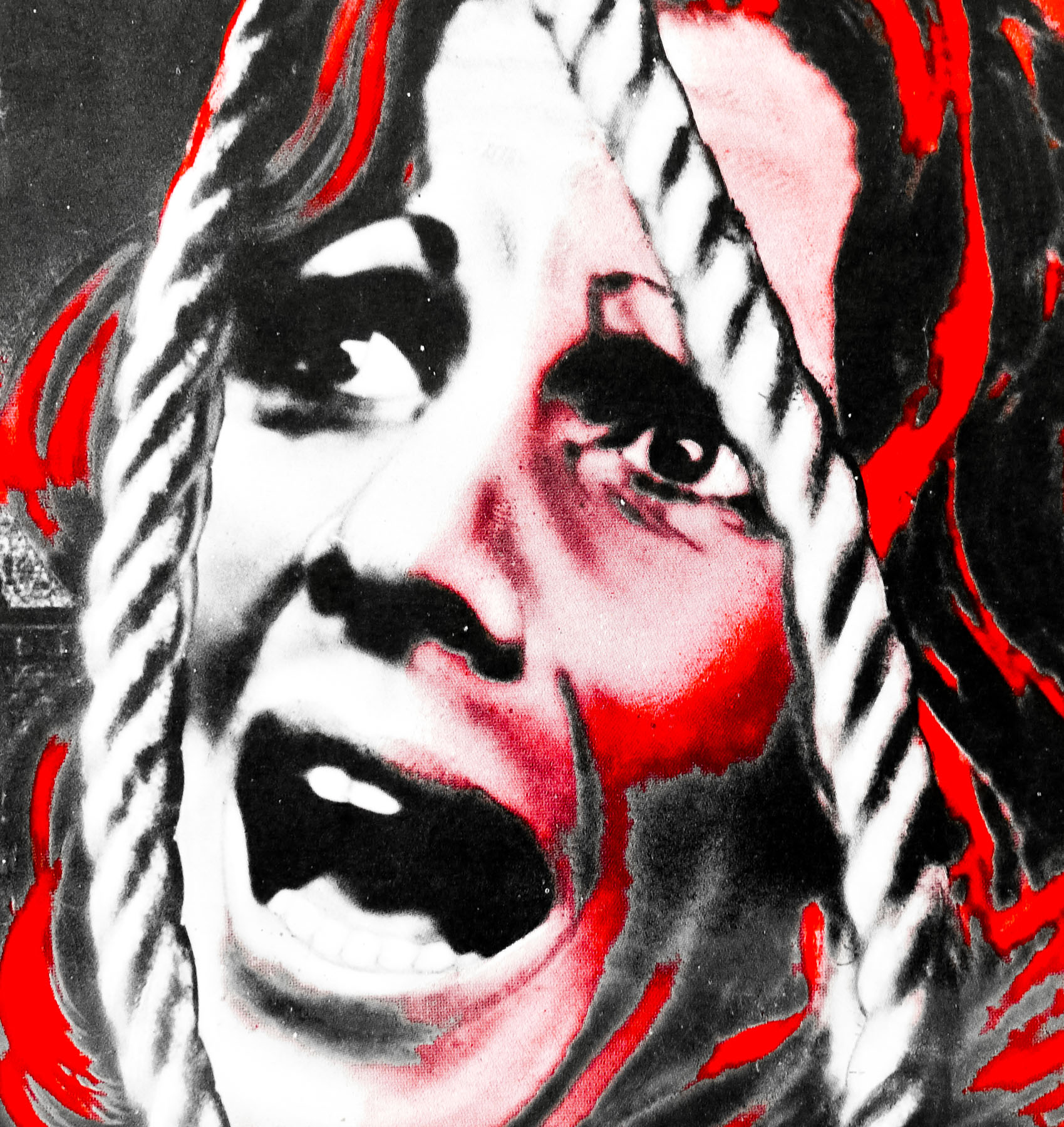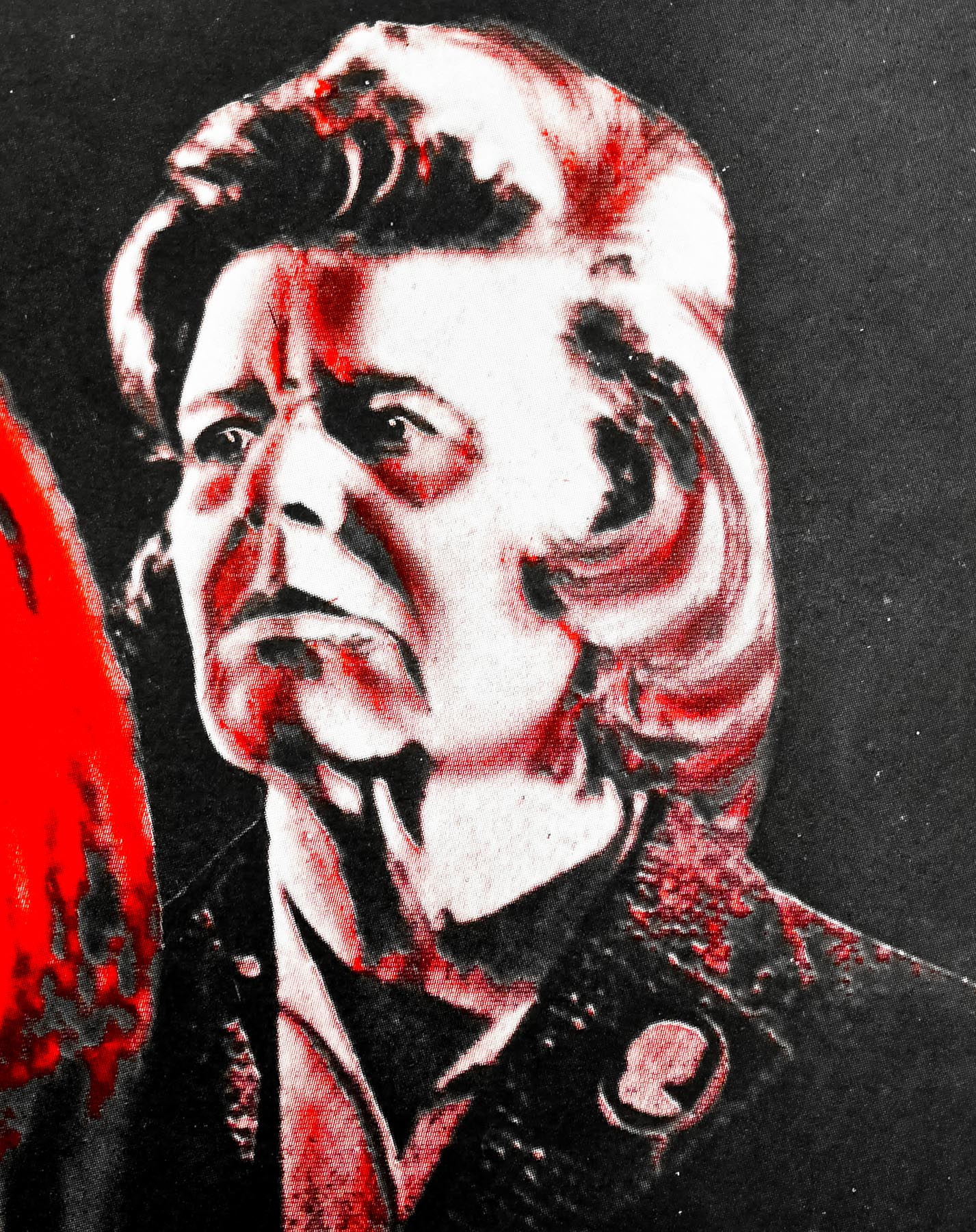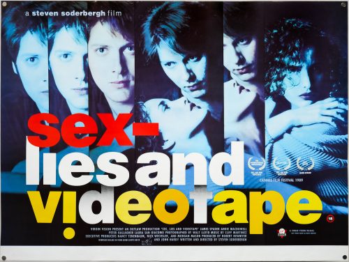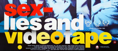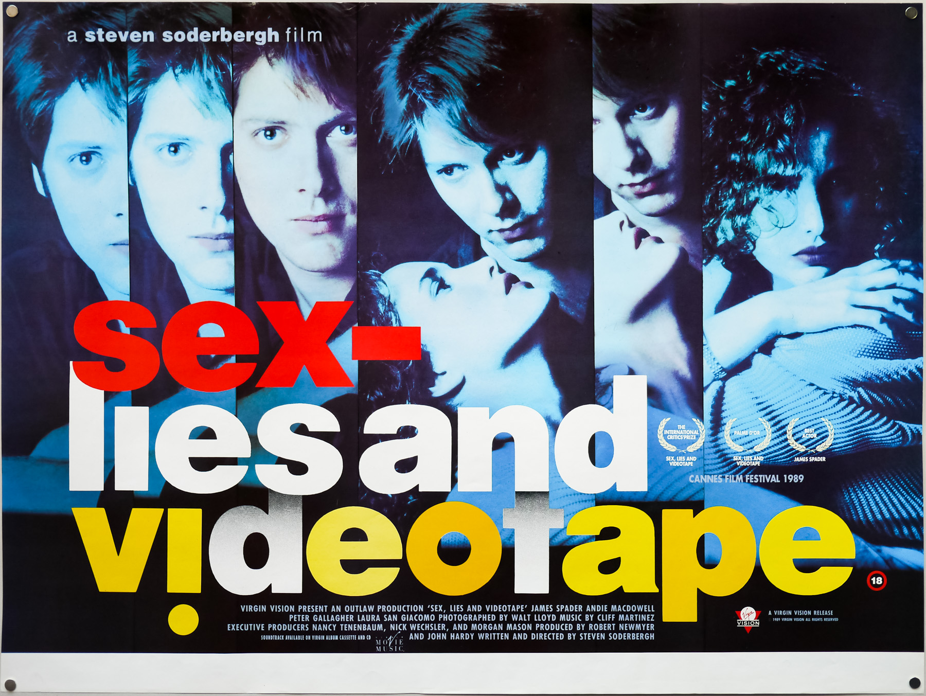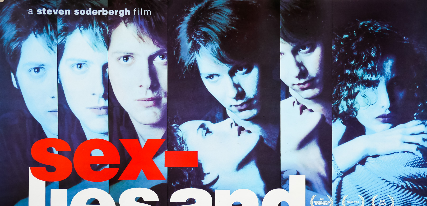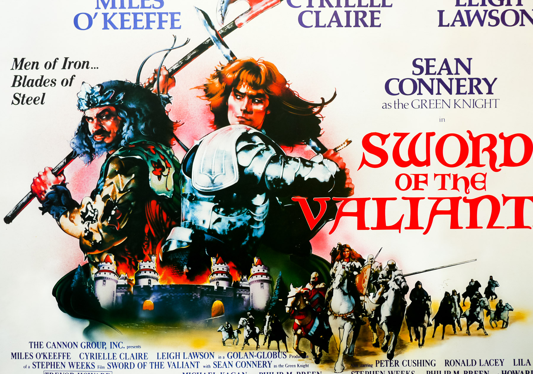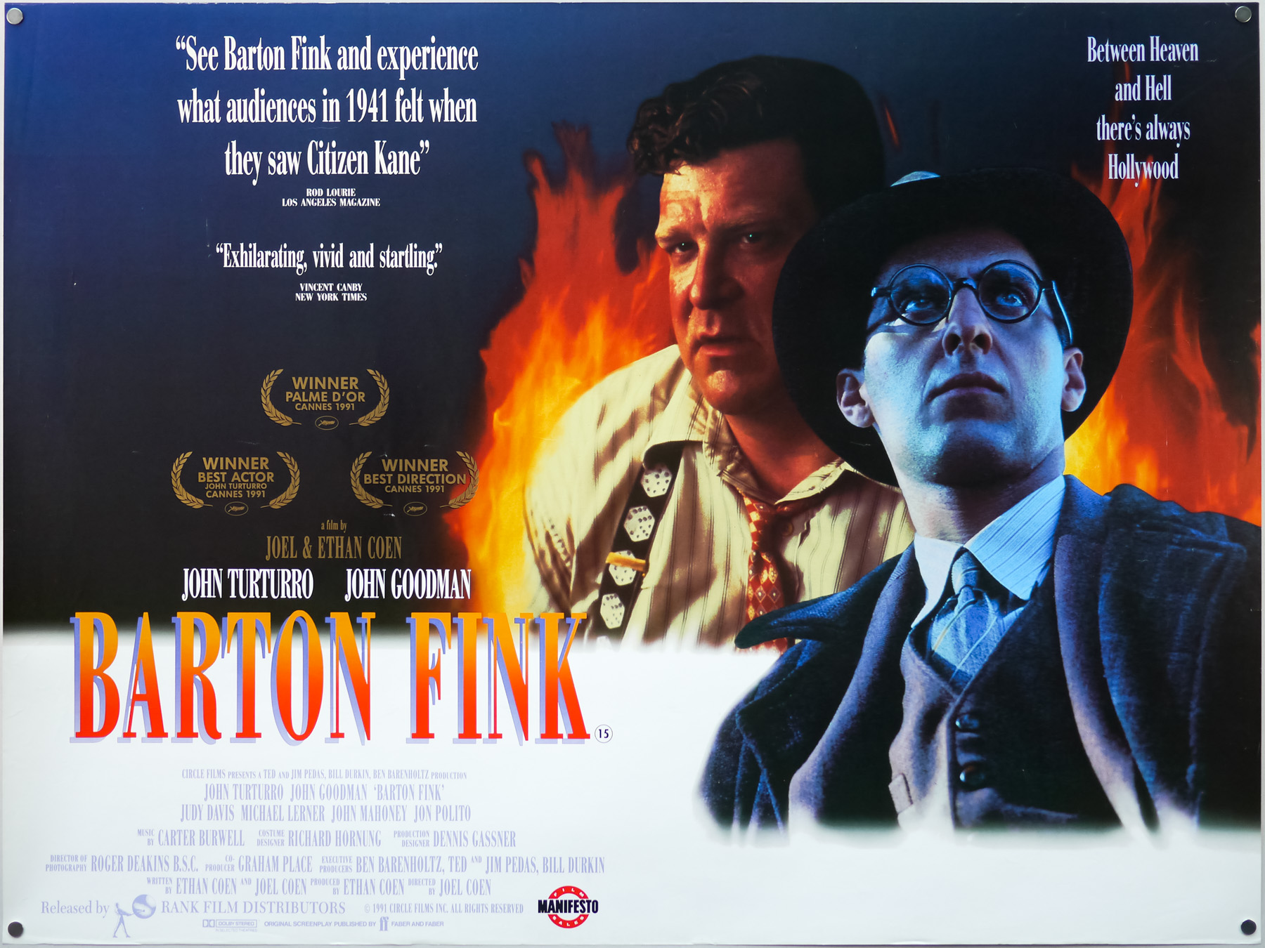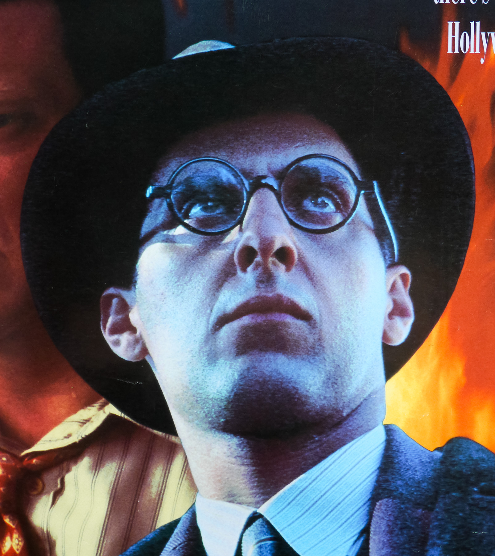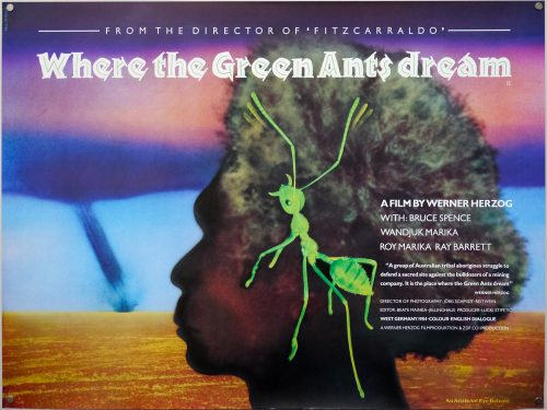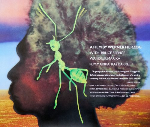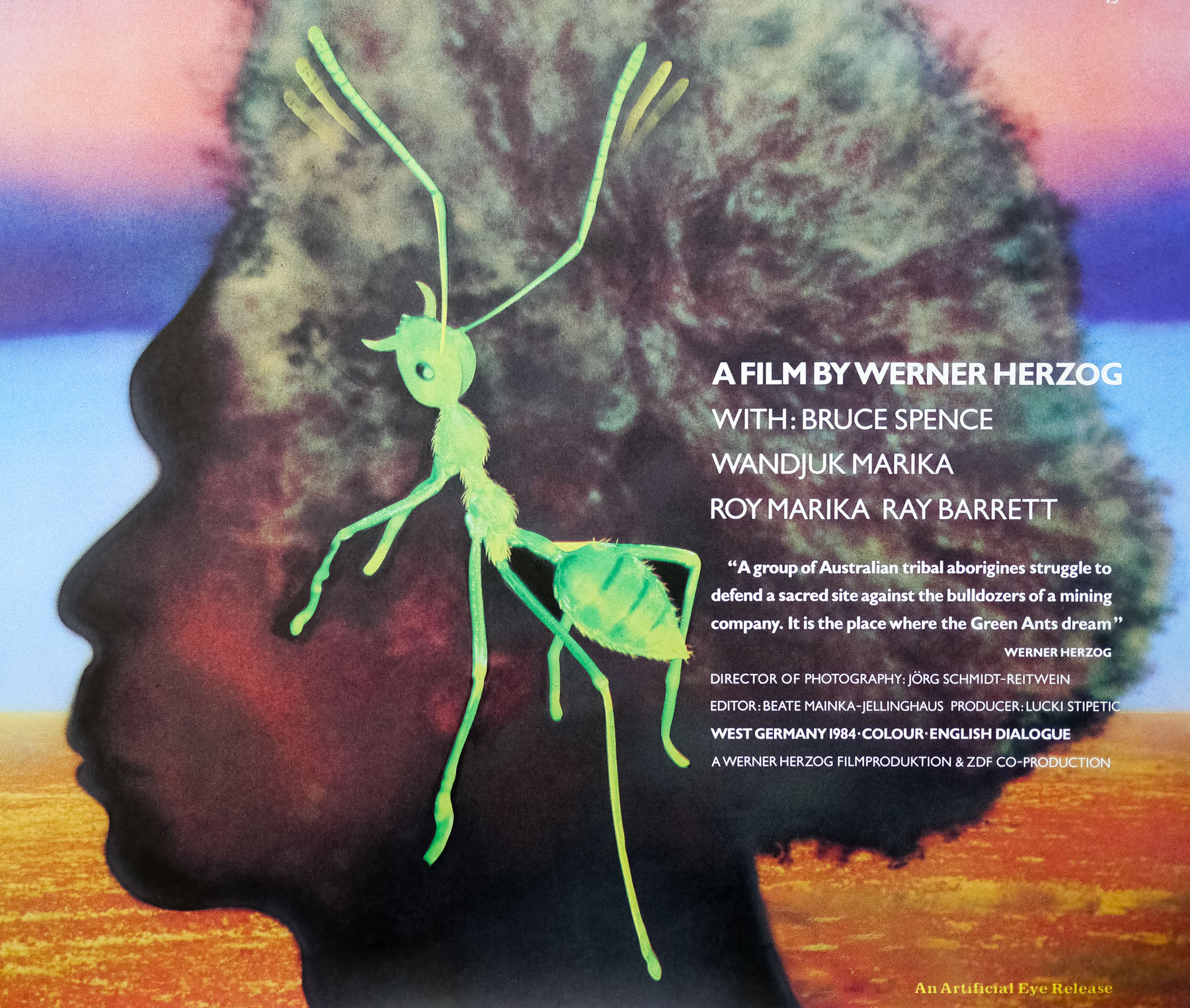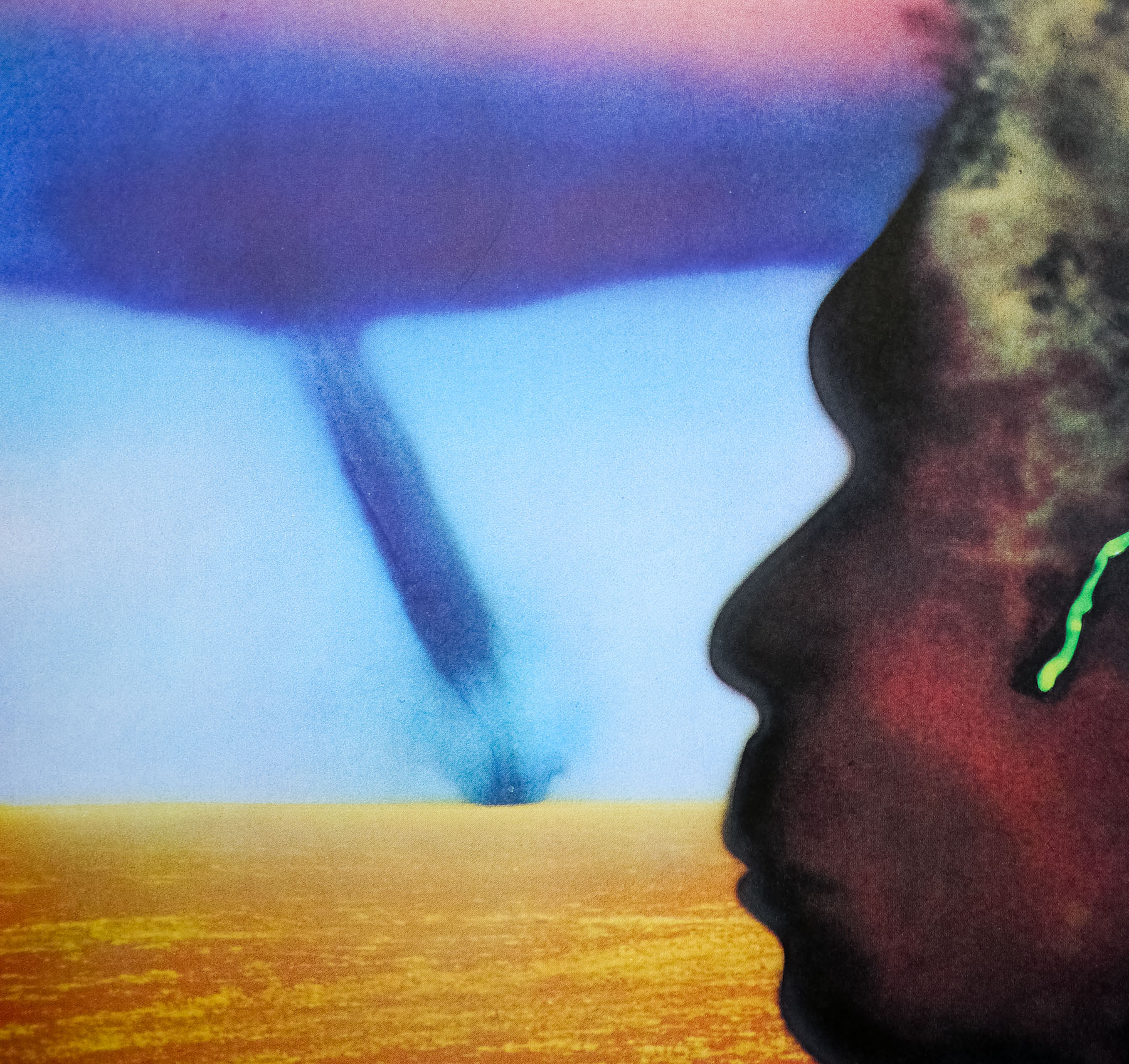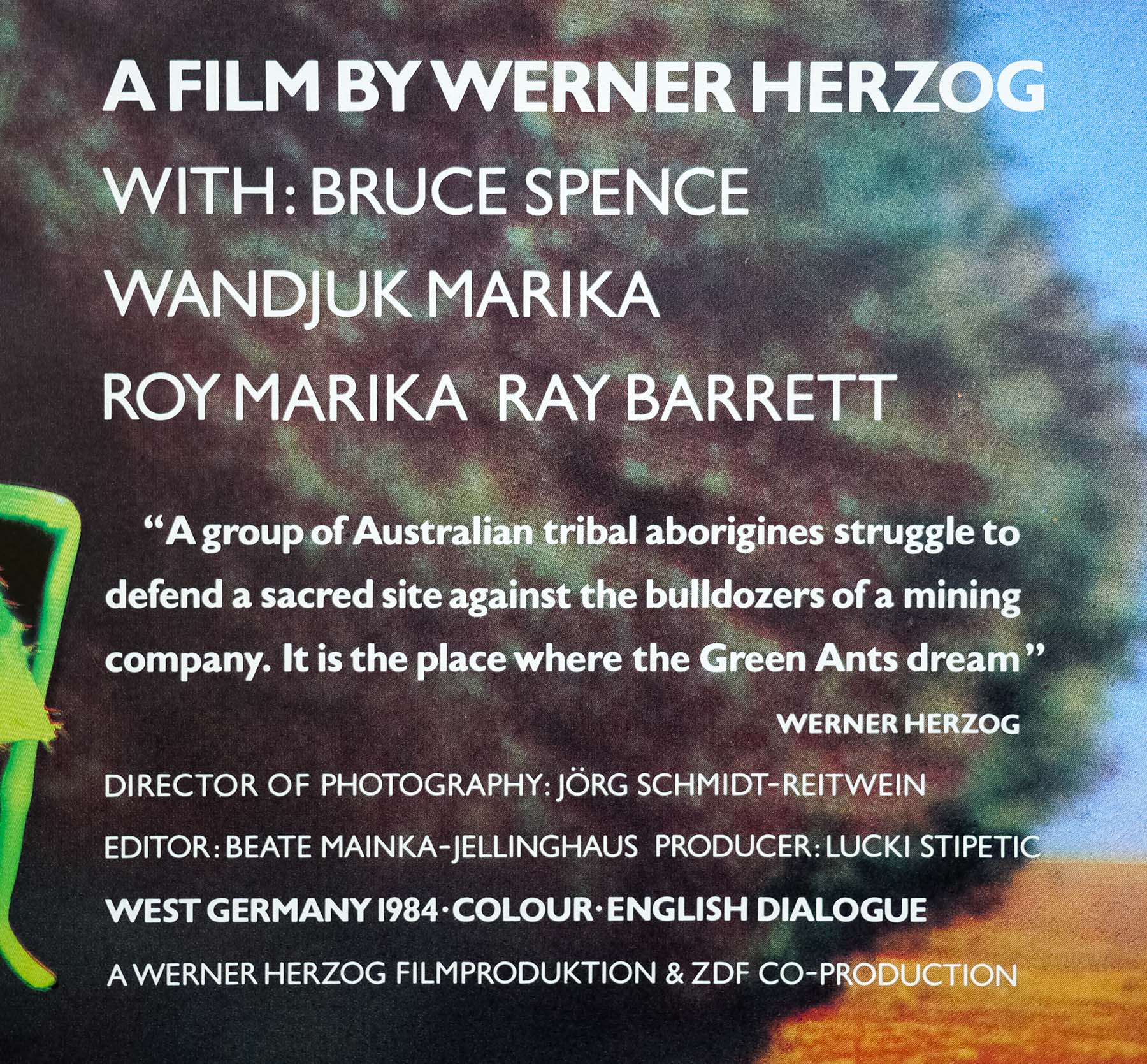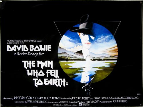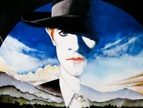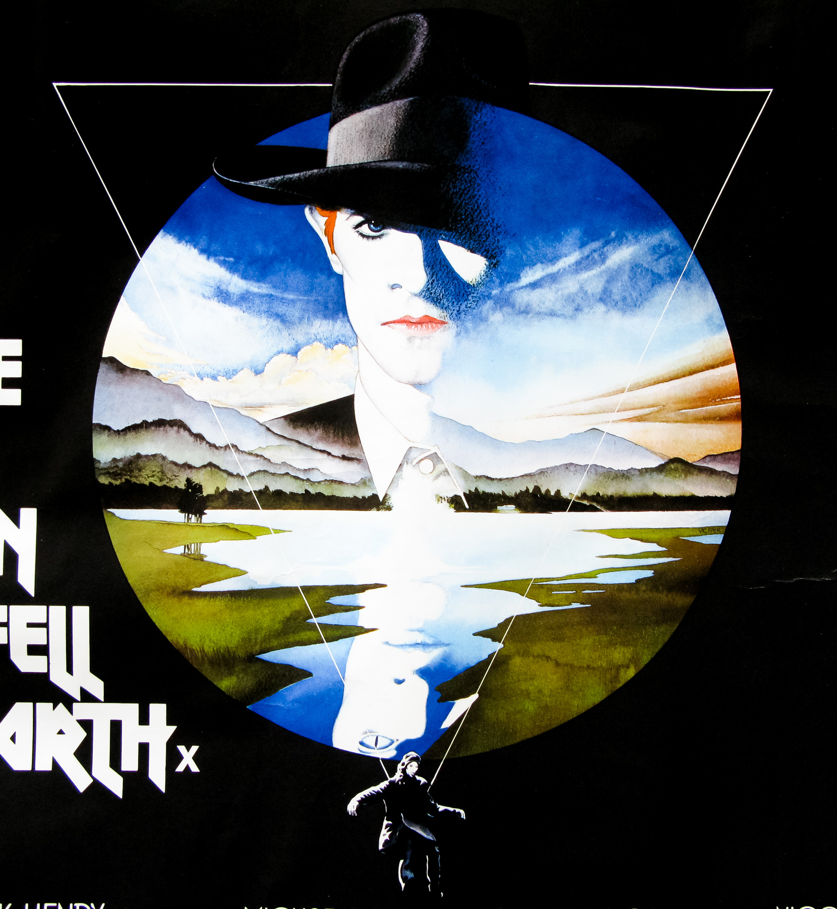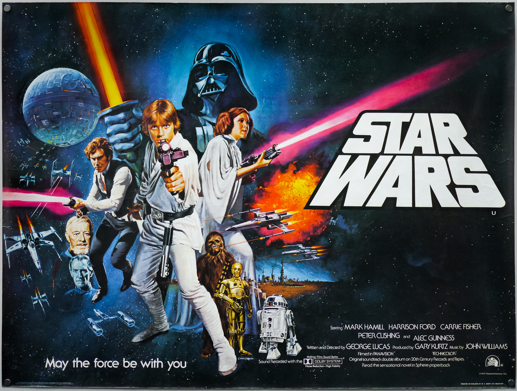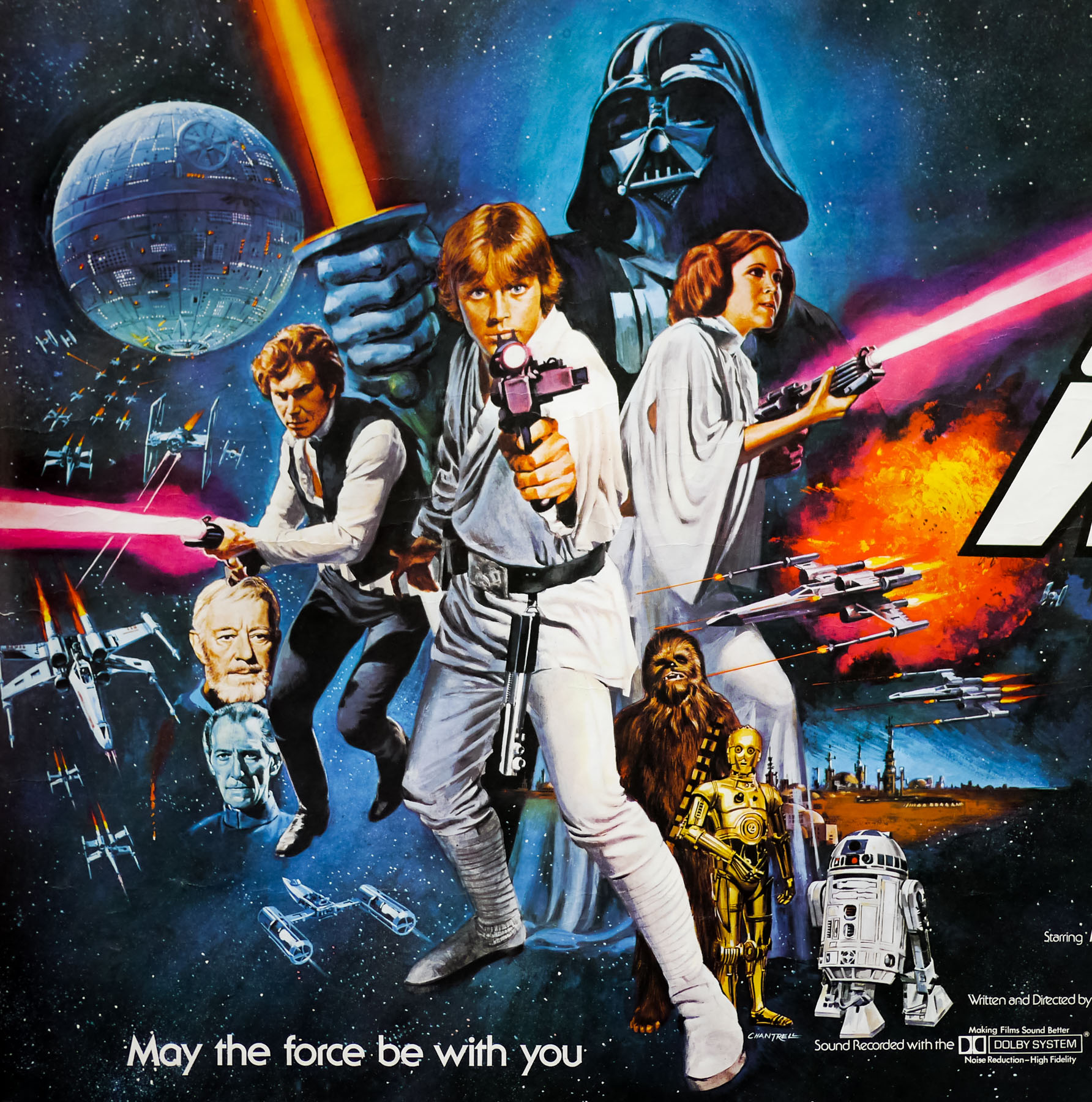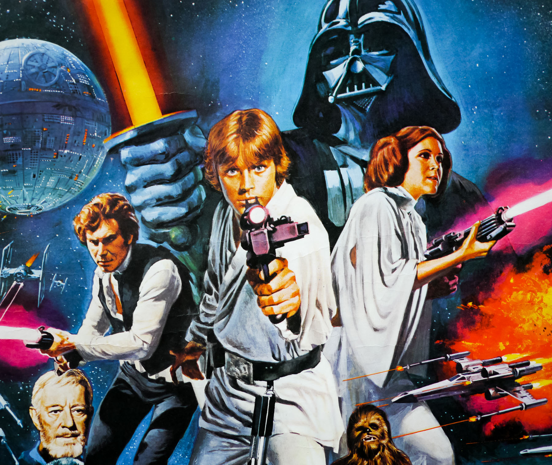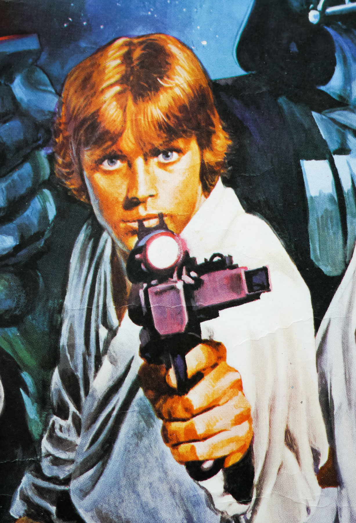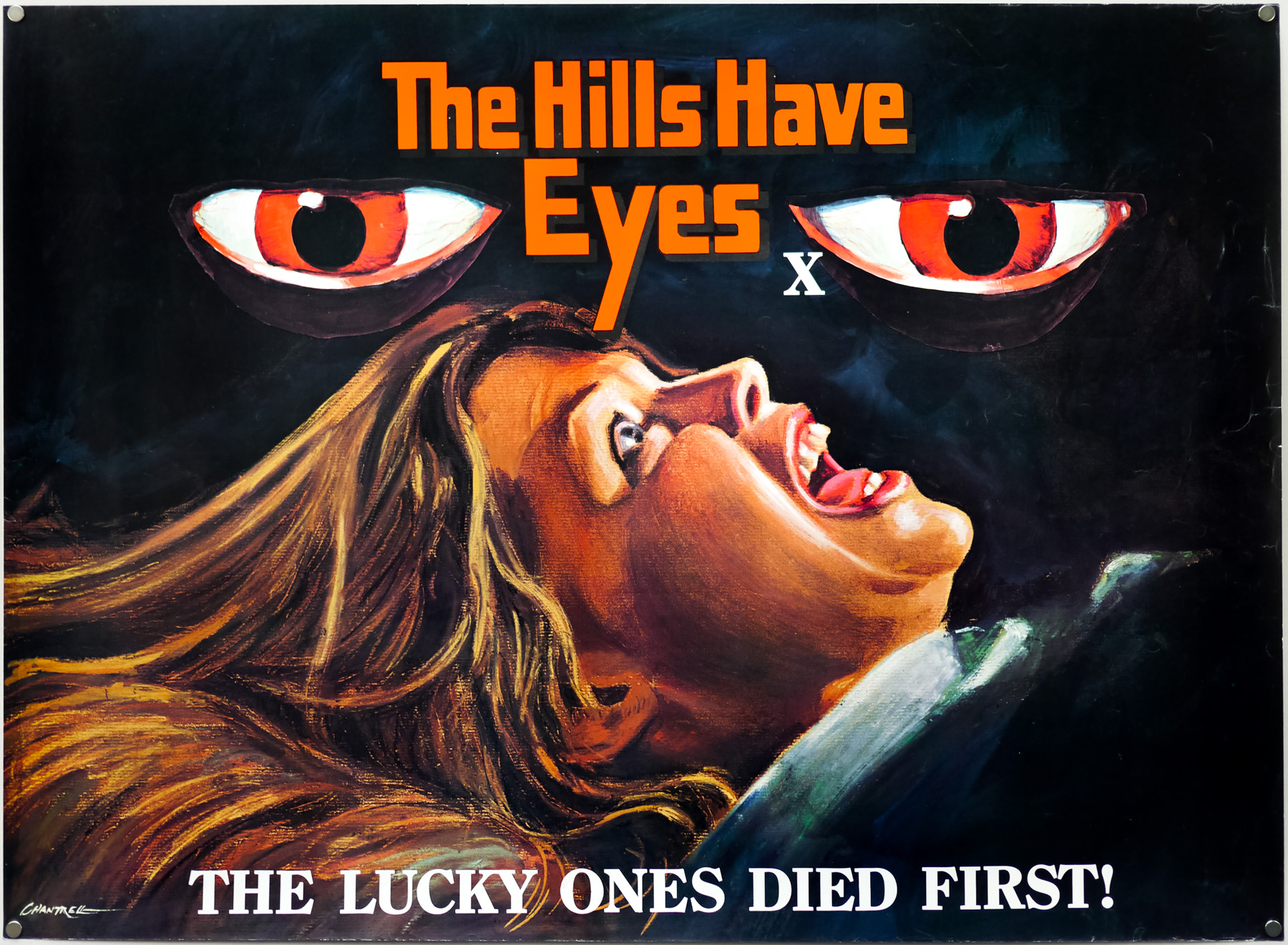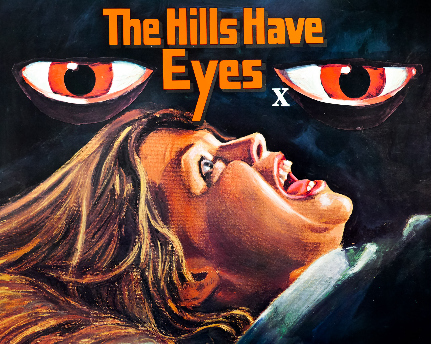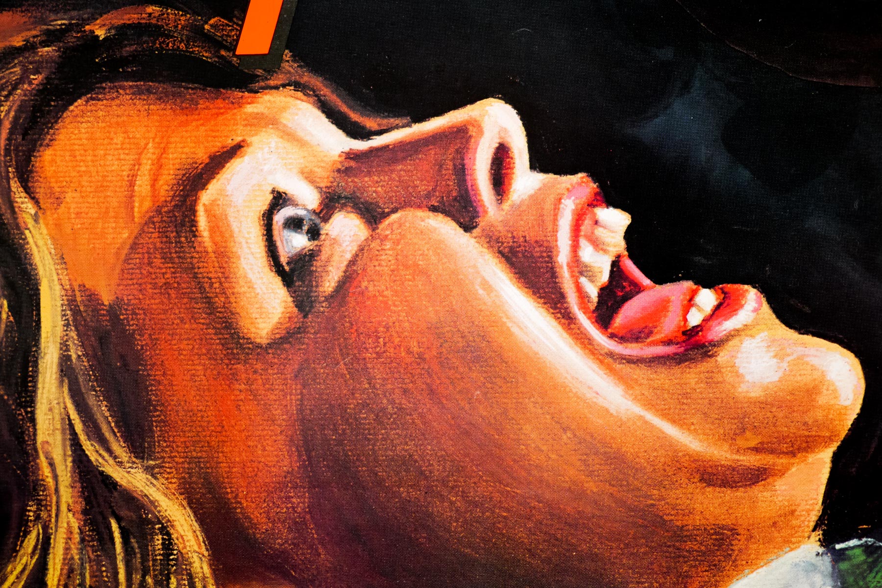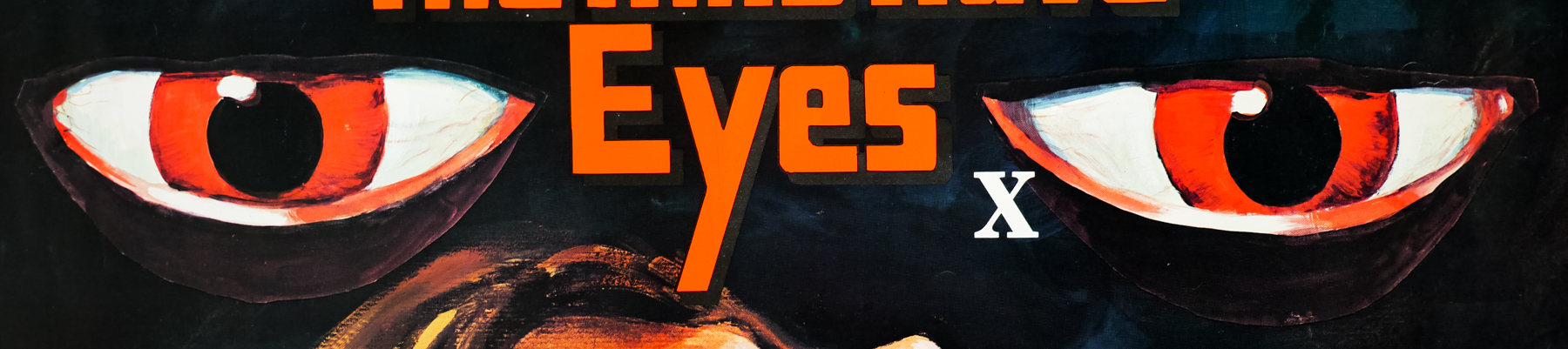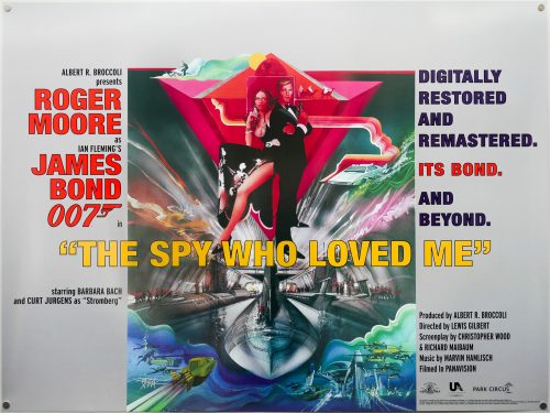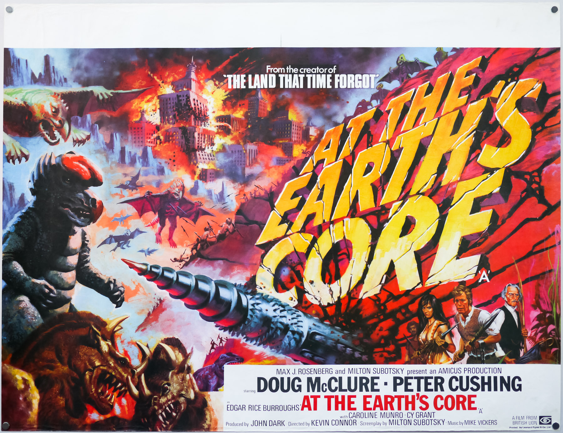
Poster detail
1-5


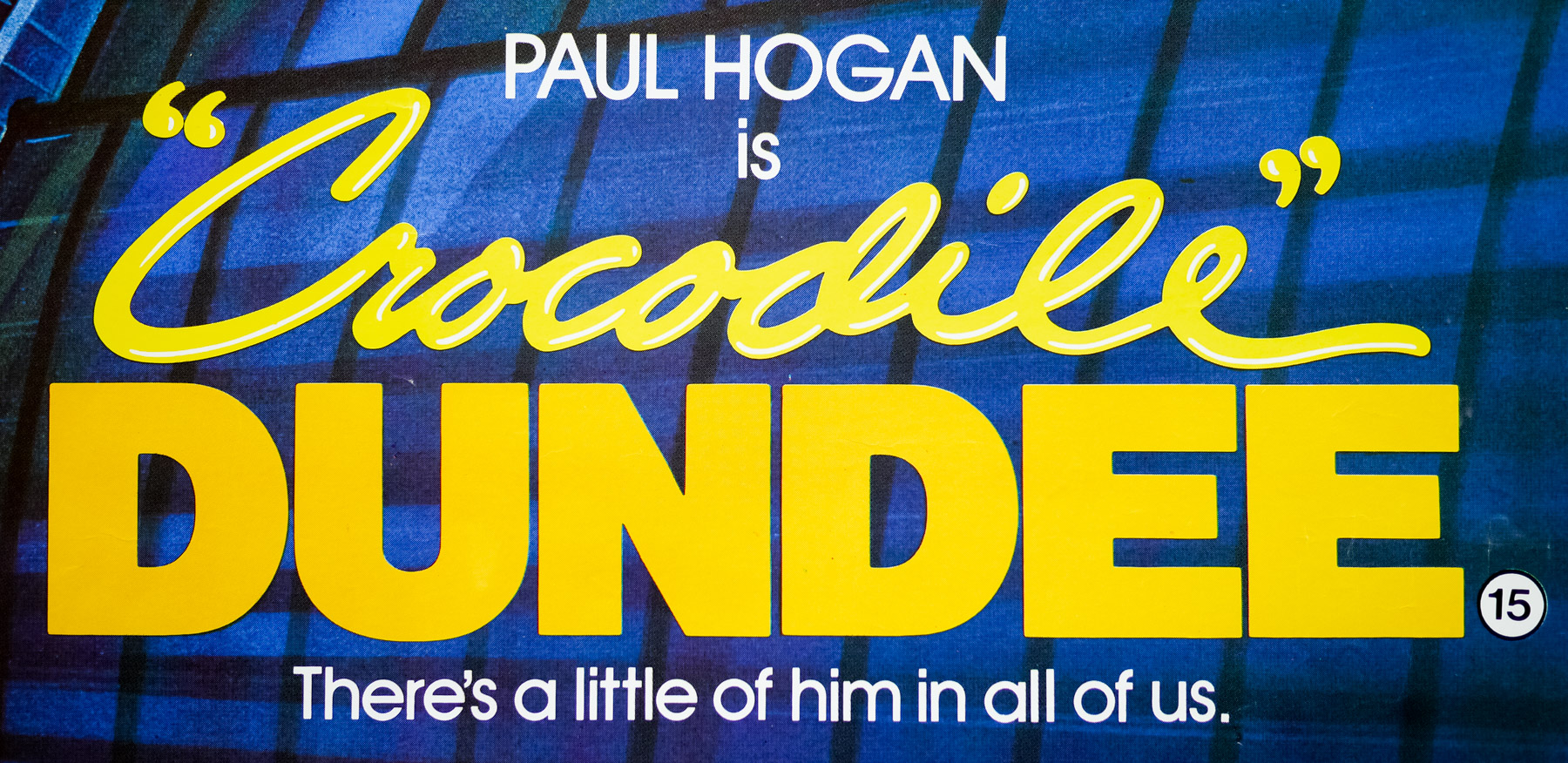
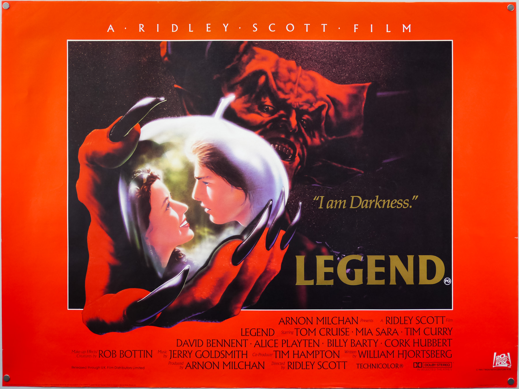
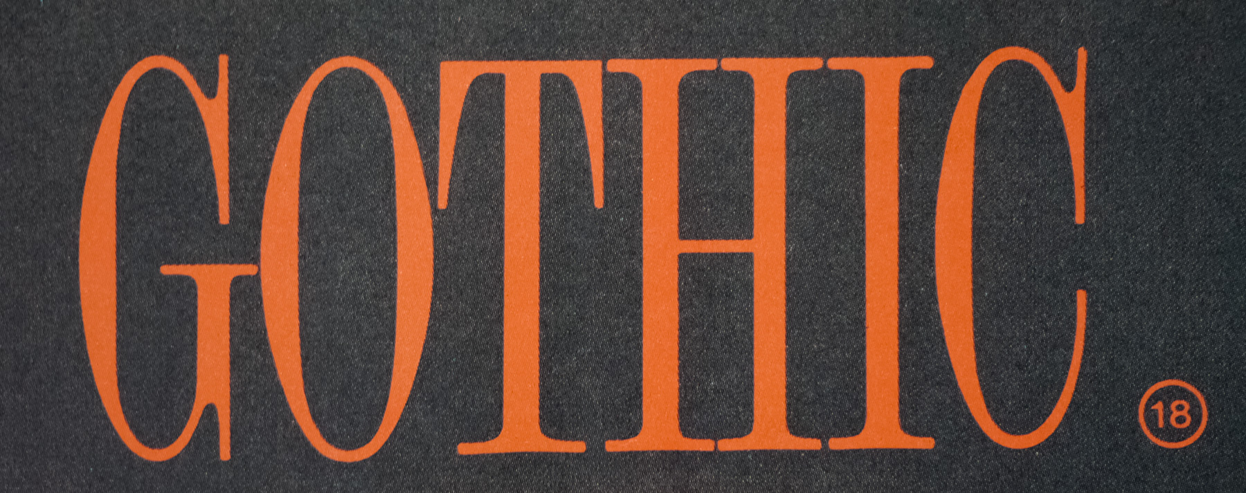
- Title
- Crocodile Dundee
- AKA
- --
- Year of Film
- 1986
- Director
- Peter Faiman
- Starring
- Paul Hogan, Linda Kozlowski, John Meillon, David Gulpilil, Ritchie Singer, Maggie Blinco, Steve Rackman, Gerry Skilton
- Origin of Film
- Australia
- Genre(s) of Film
- Paul Hogan, Linda Kozlowski, John Meillon, David Gulpilil, Ritchie Singer, Maggie Blinco, Steve Rackman, Gerry Skilton,
- Type of Poster
- Quad
- Style of Poster
- --
- Origin of Poster
- UK
- Year of Poster
- 1986
- Designer
- Unknown
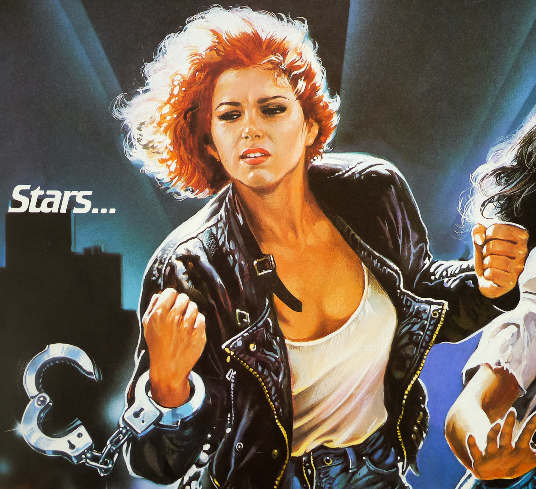
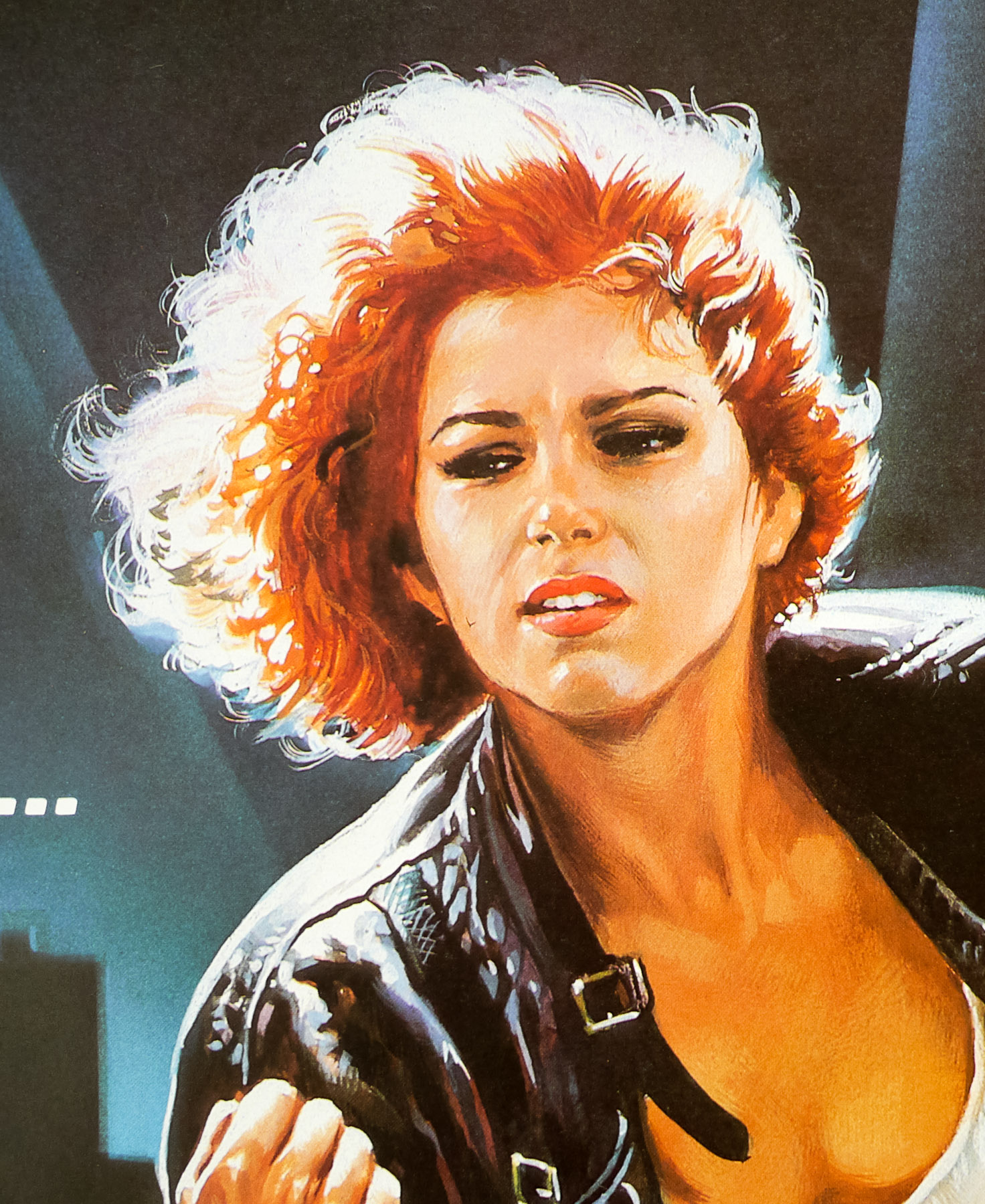
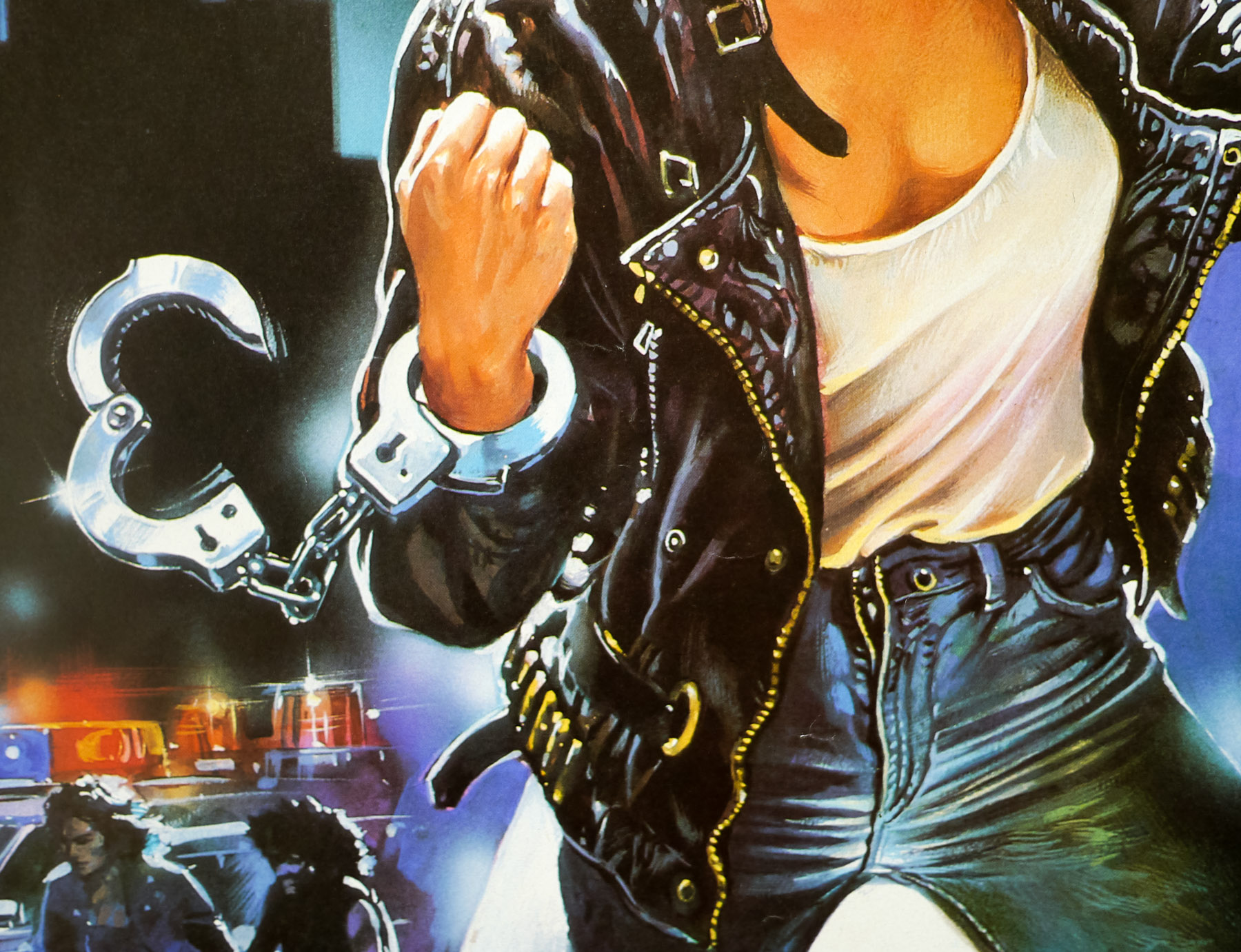
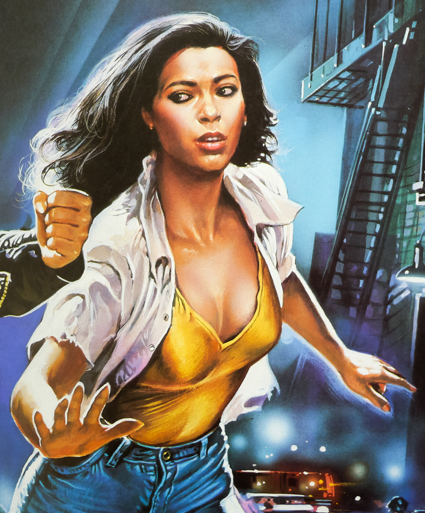
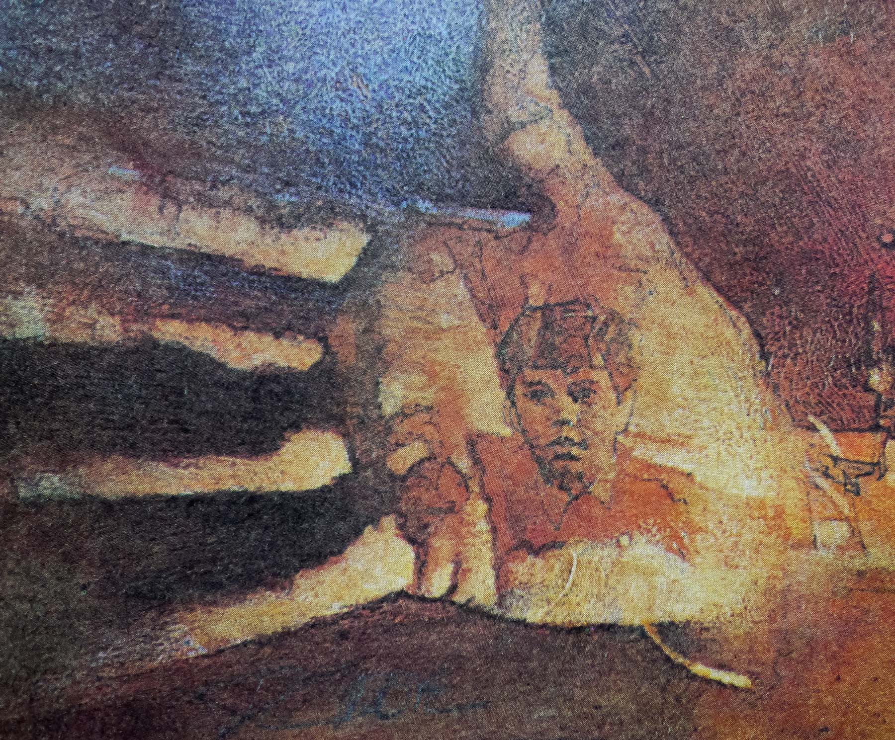
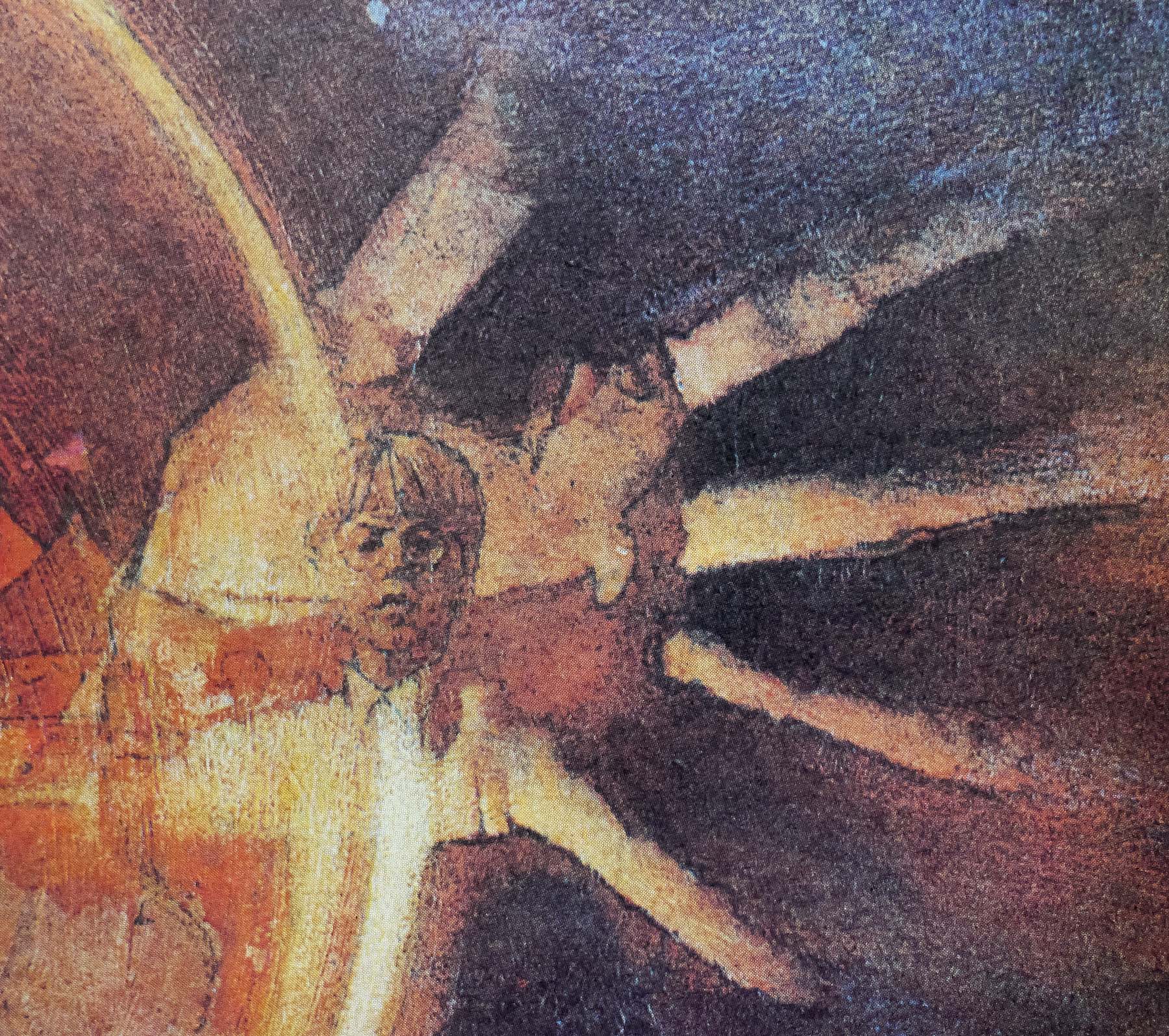
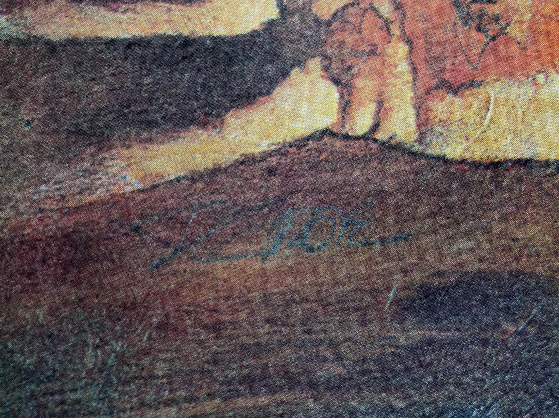
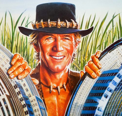
- Artist
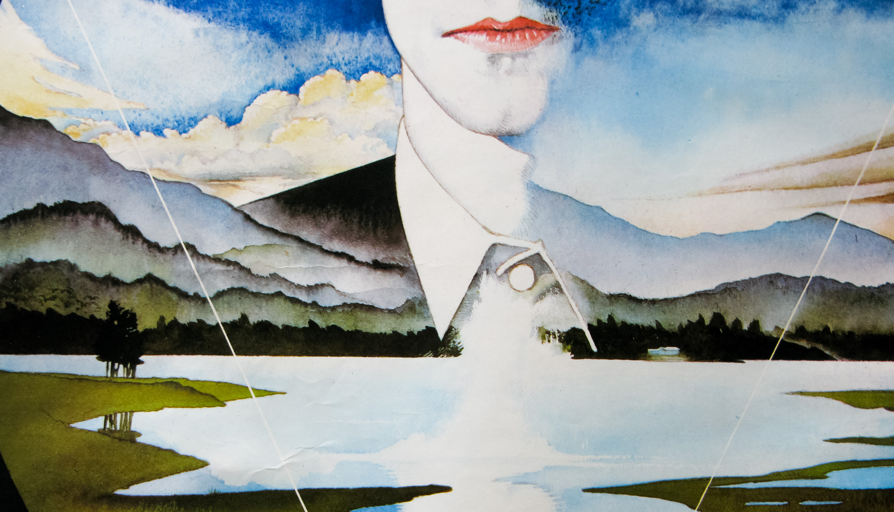
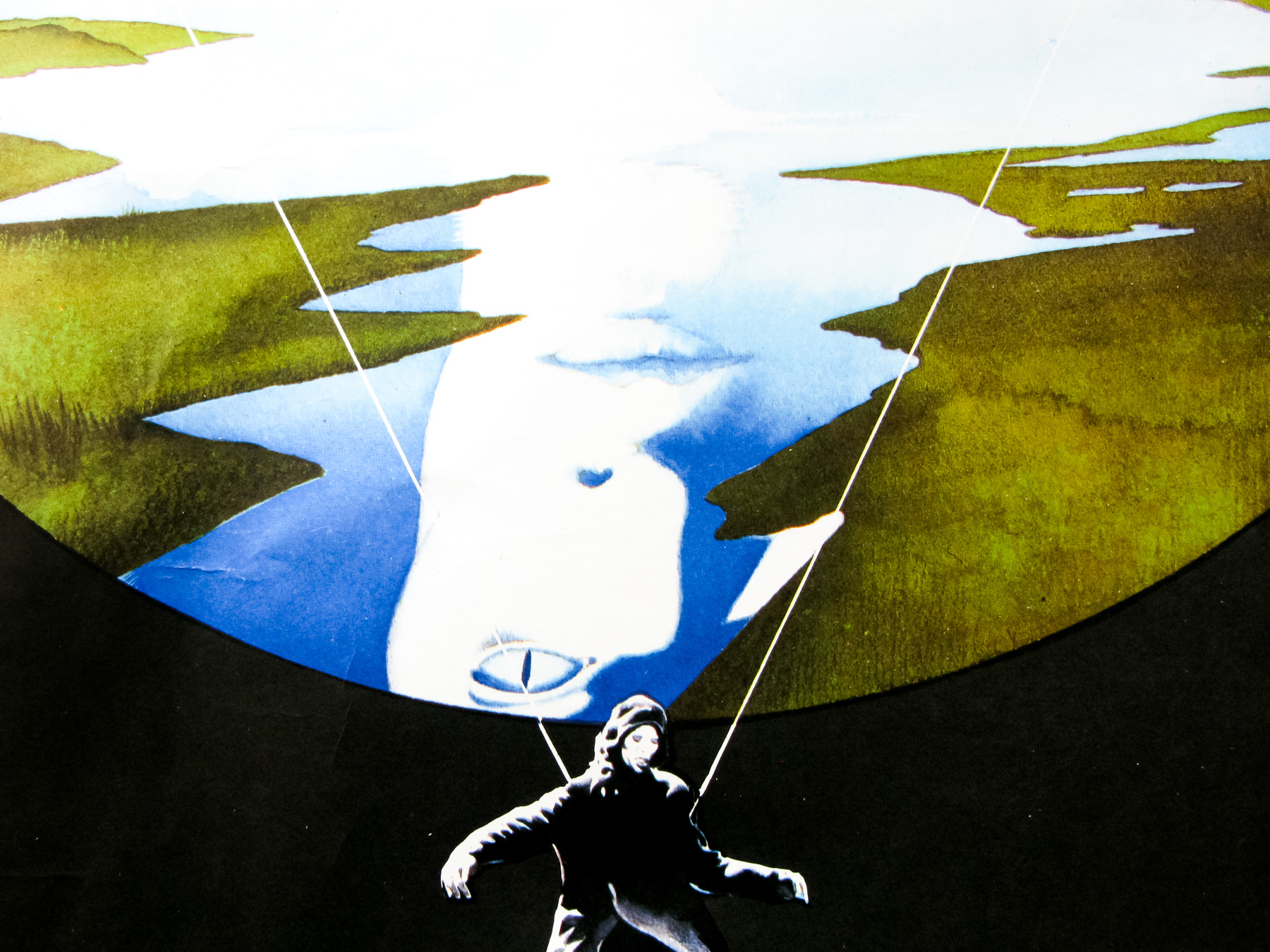
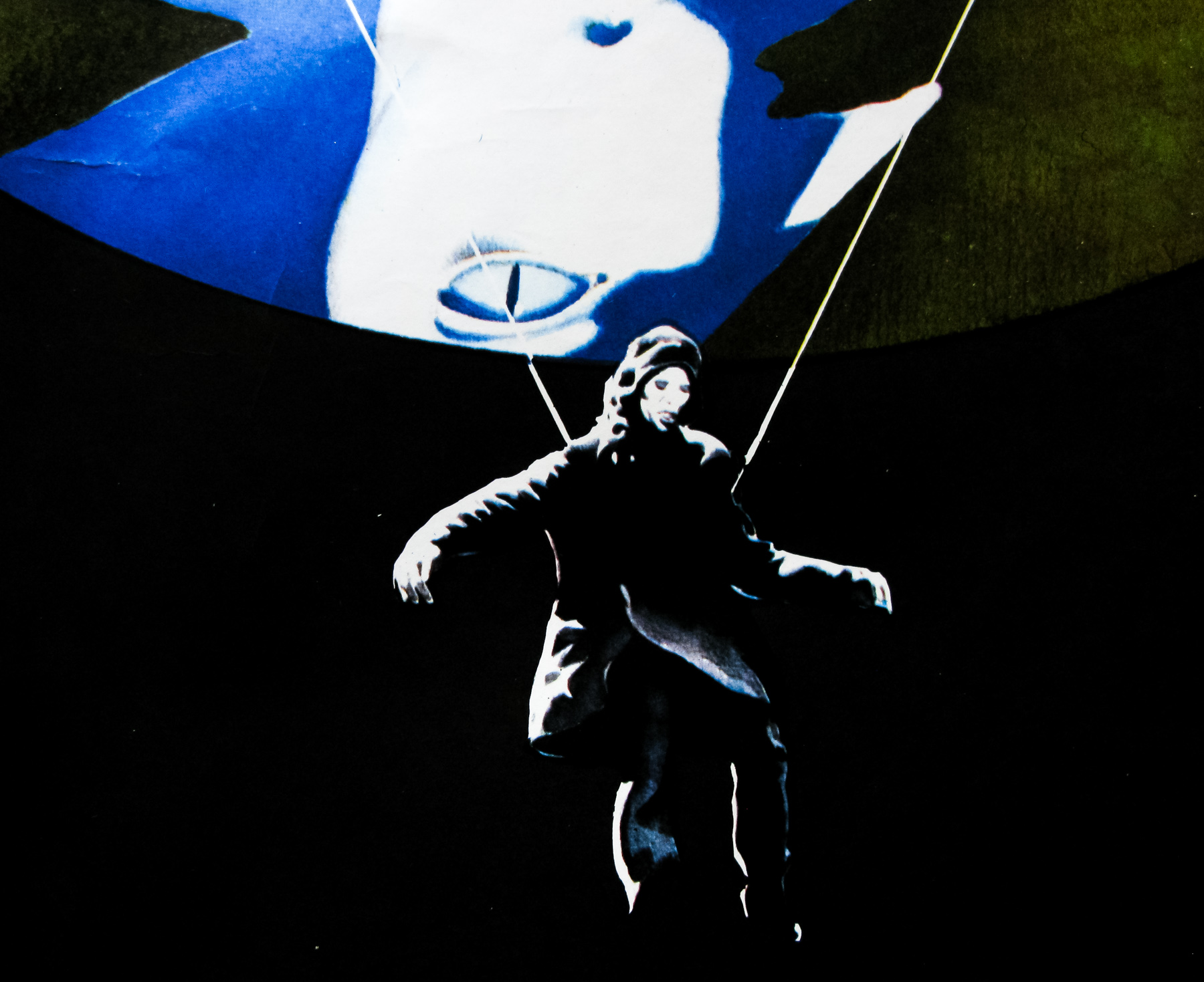
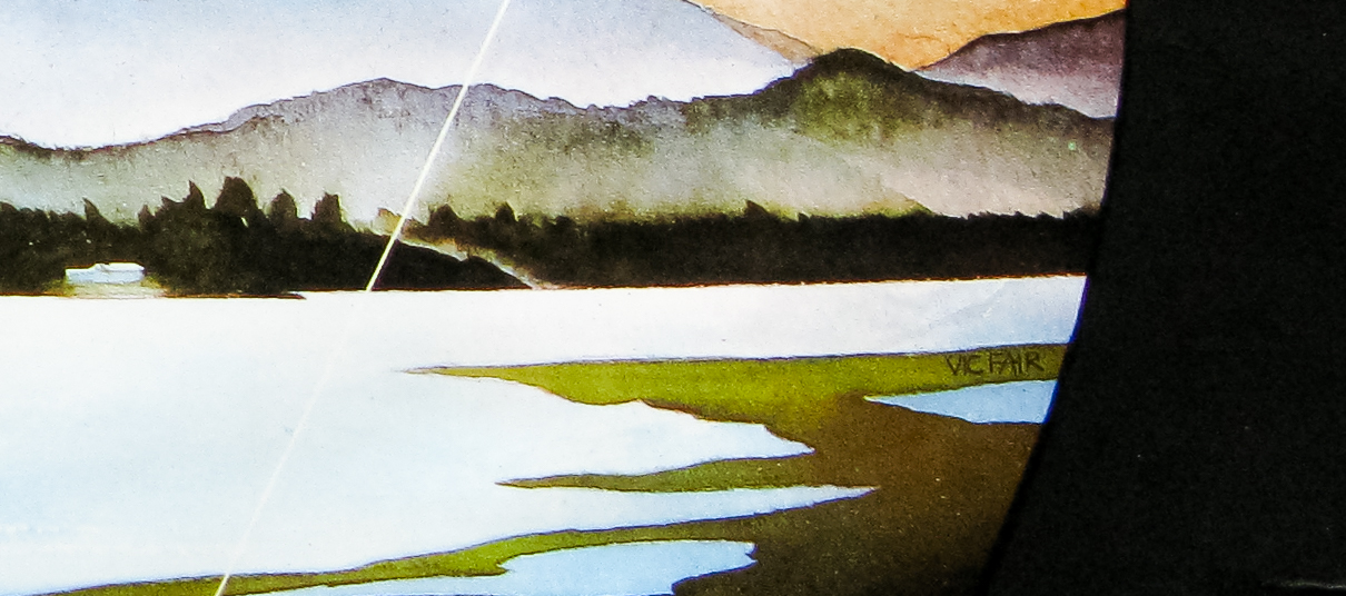
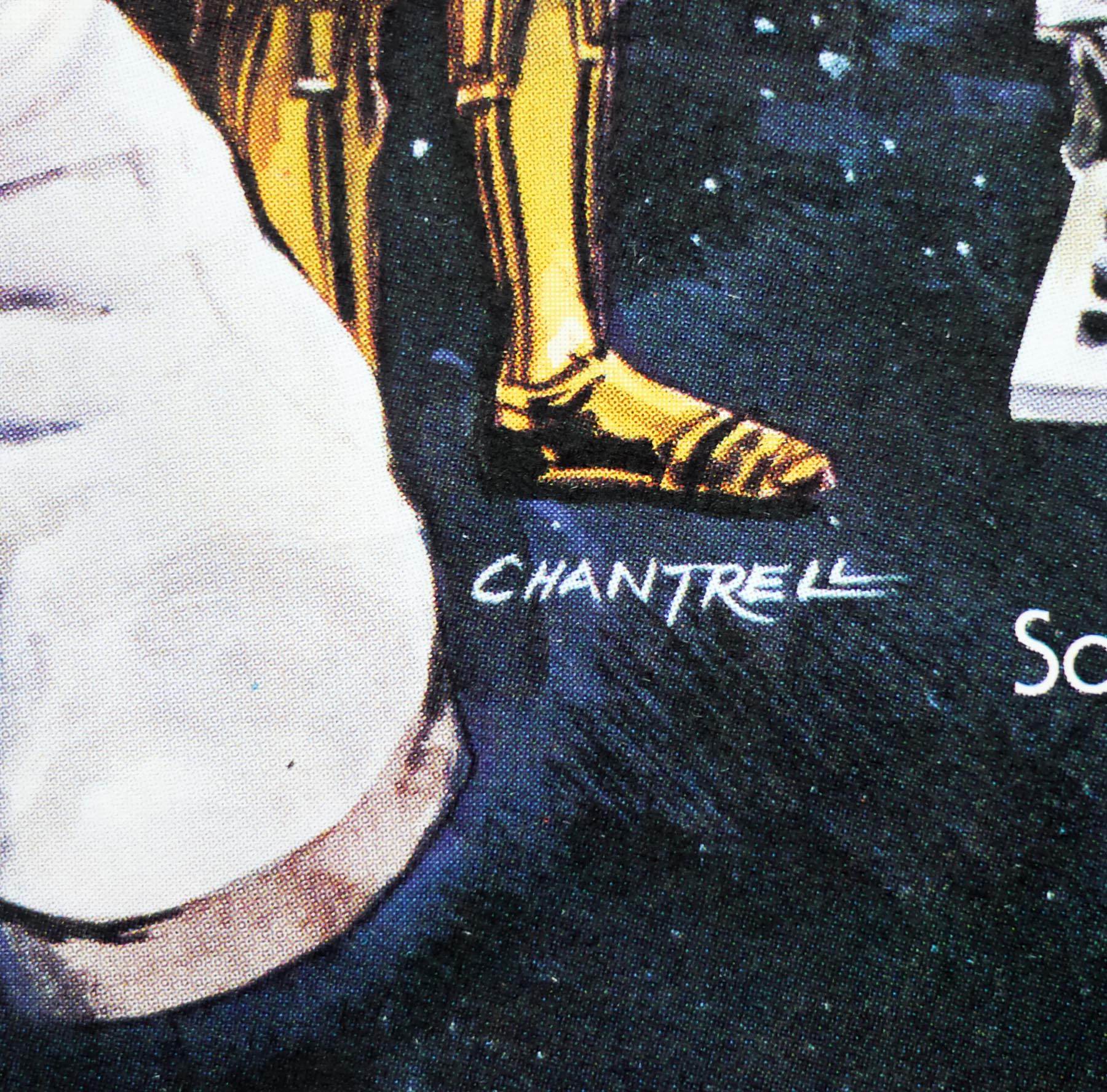
- Dan Goozee
- Size (inches)
- 30 1/16" x 40"
- SS or DS
- SS
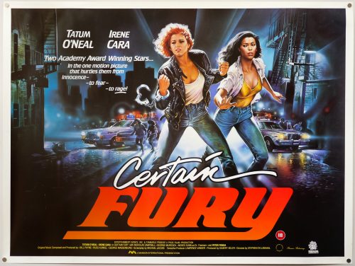
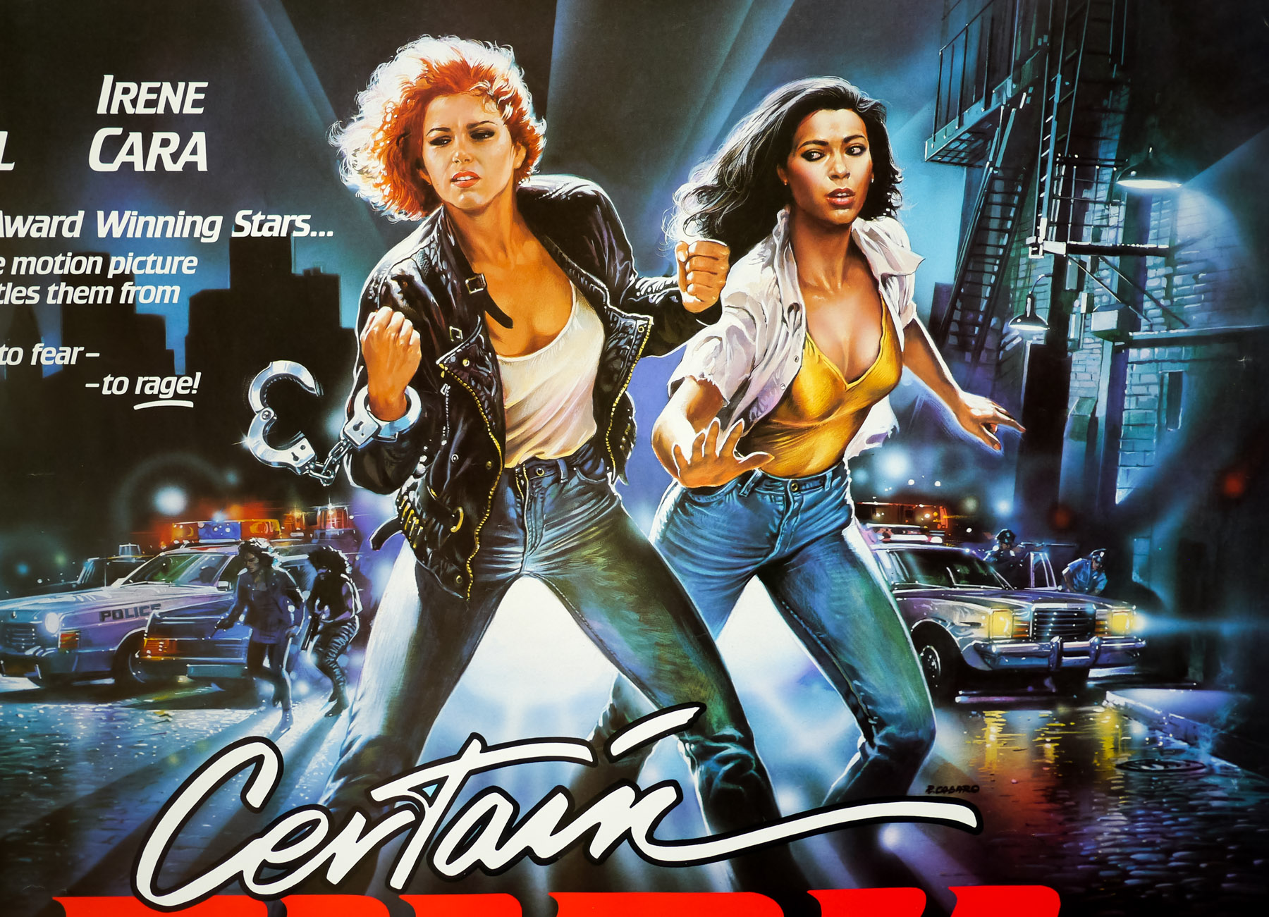
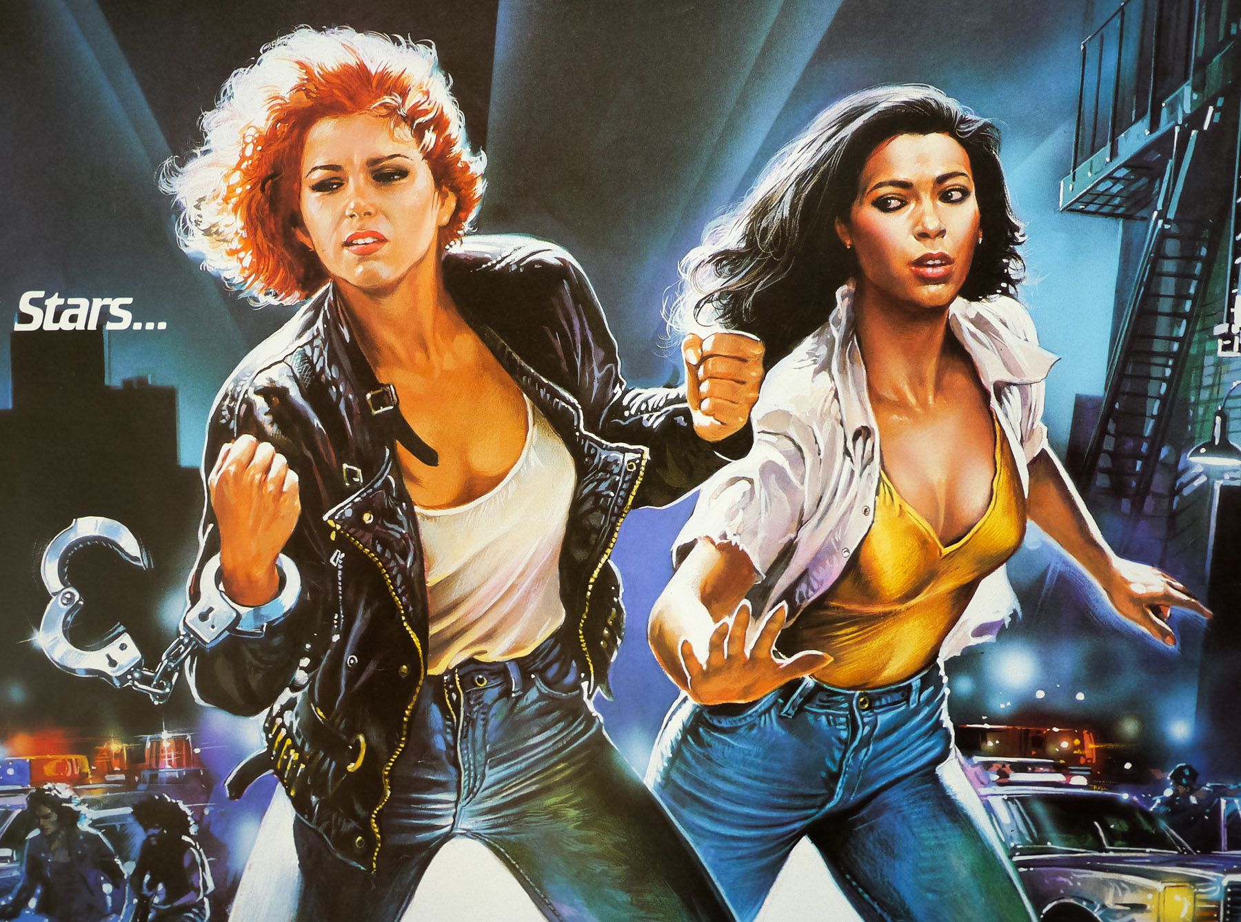
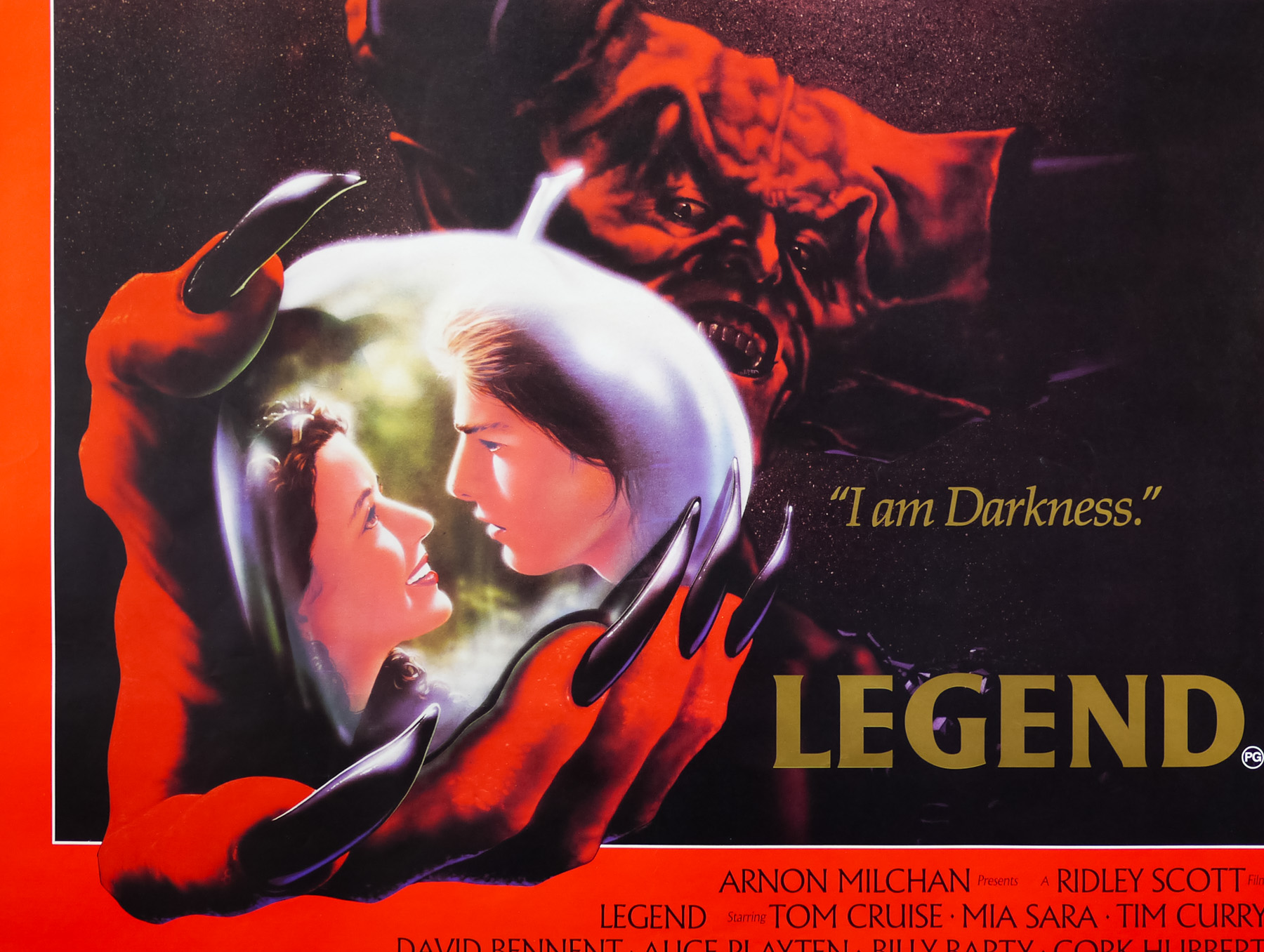
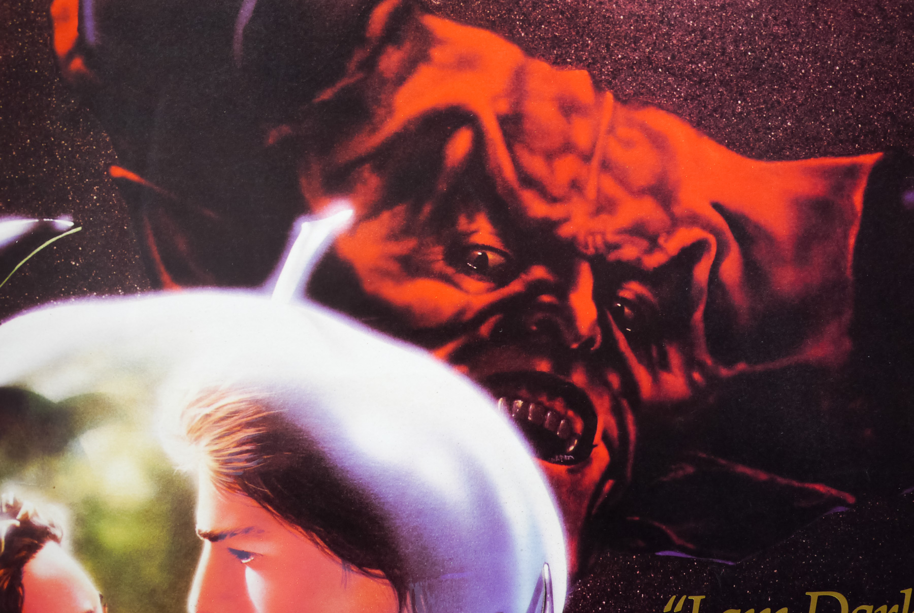
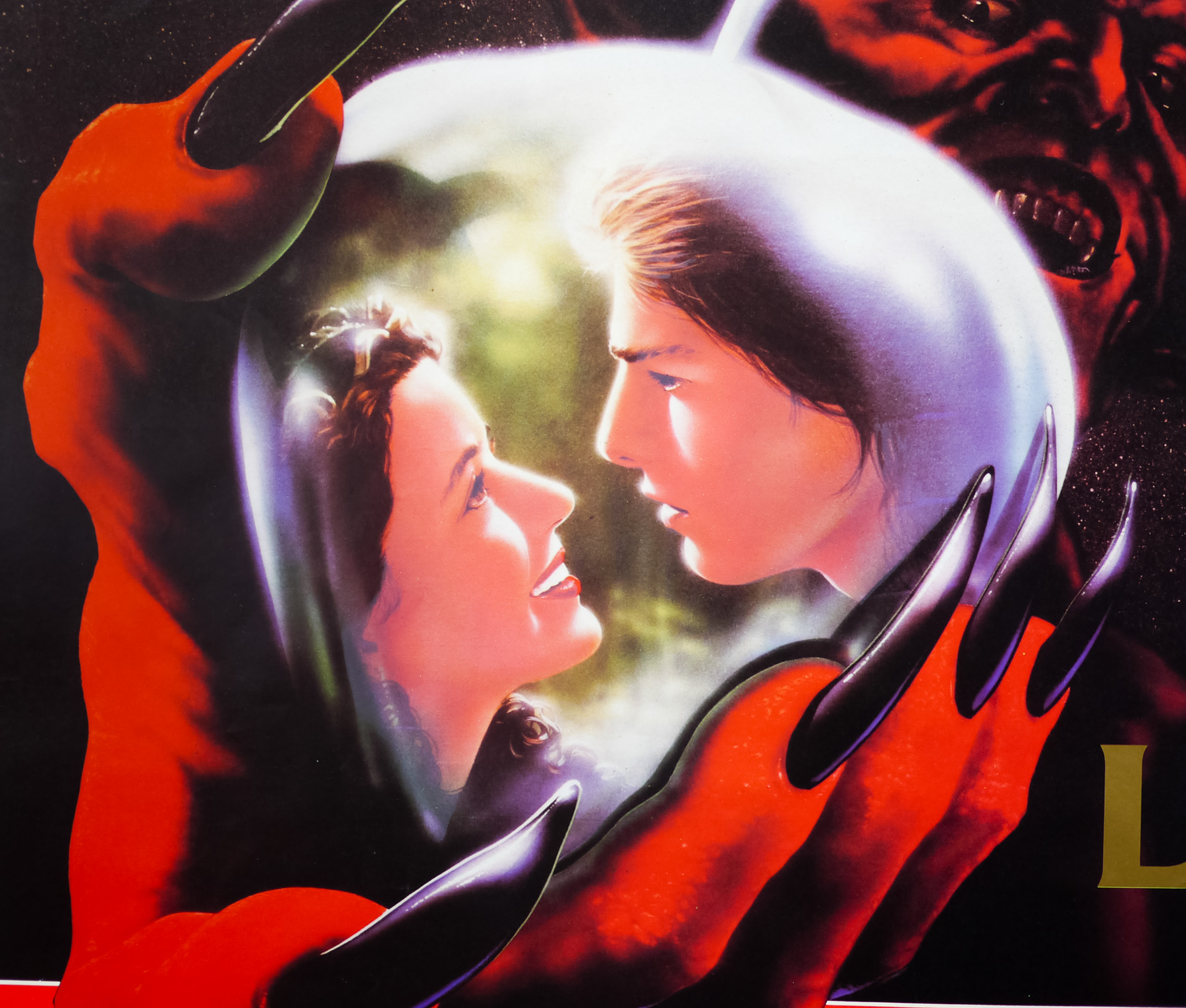
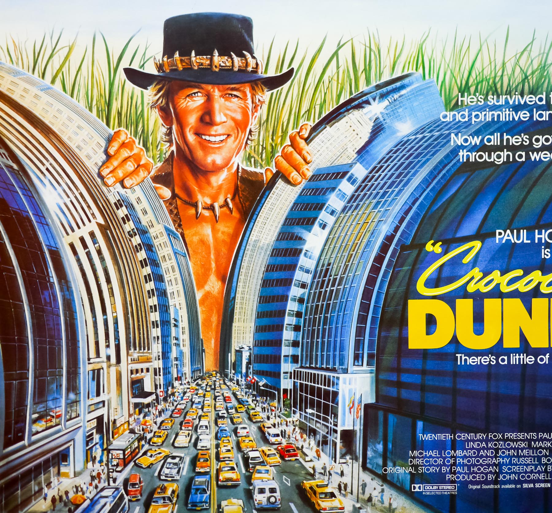
- Tagline
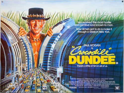
- He's survived the most hostile and primitive land known to man. Now all he's got to do is make it through a week in New York. | There's a little of him in all of us.
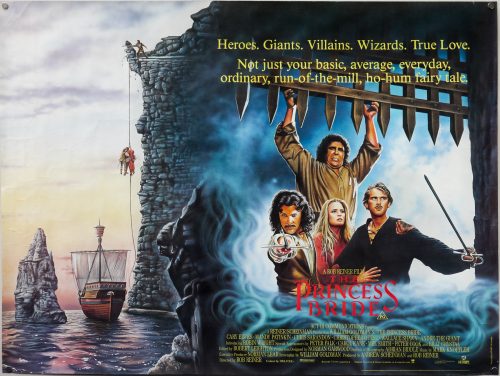
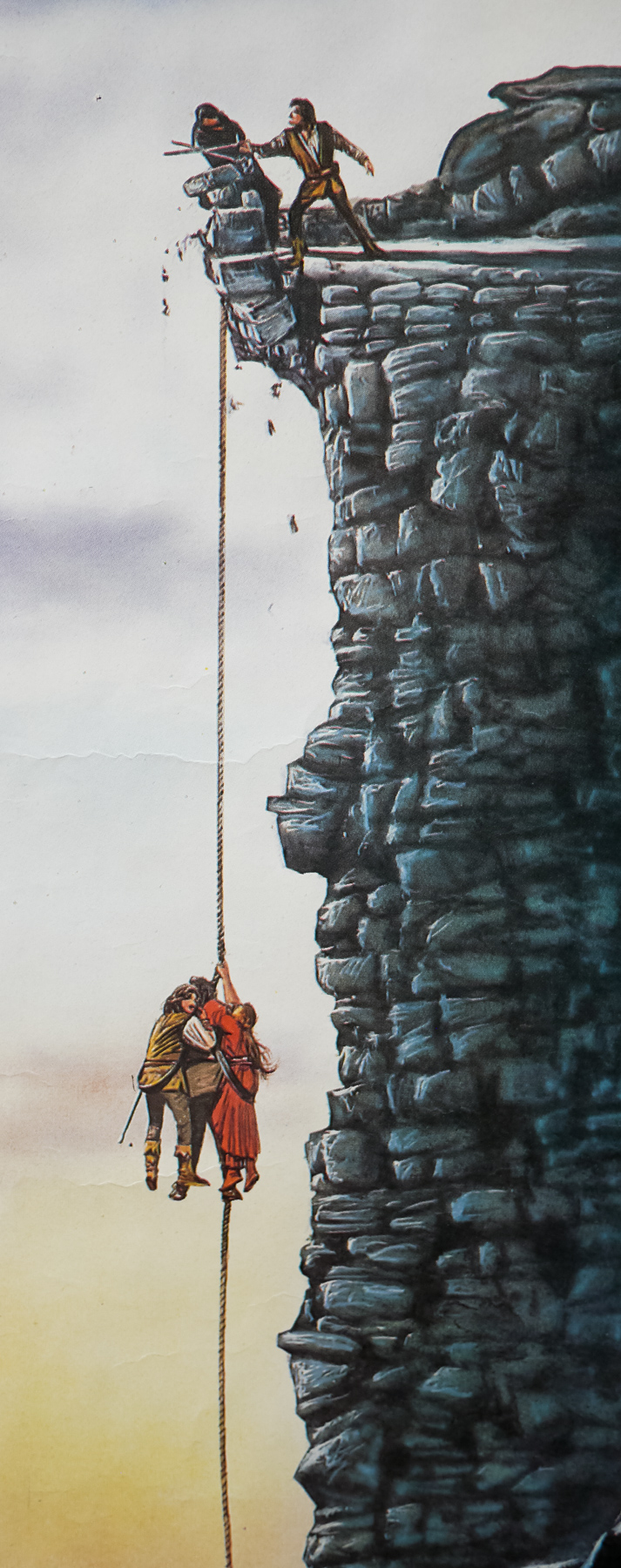
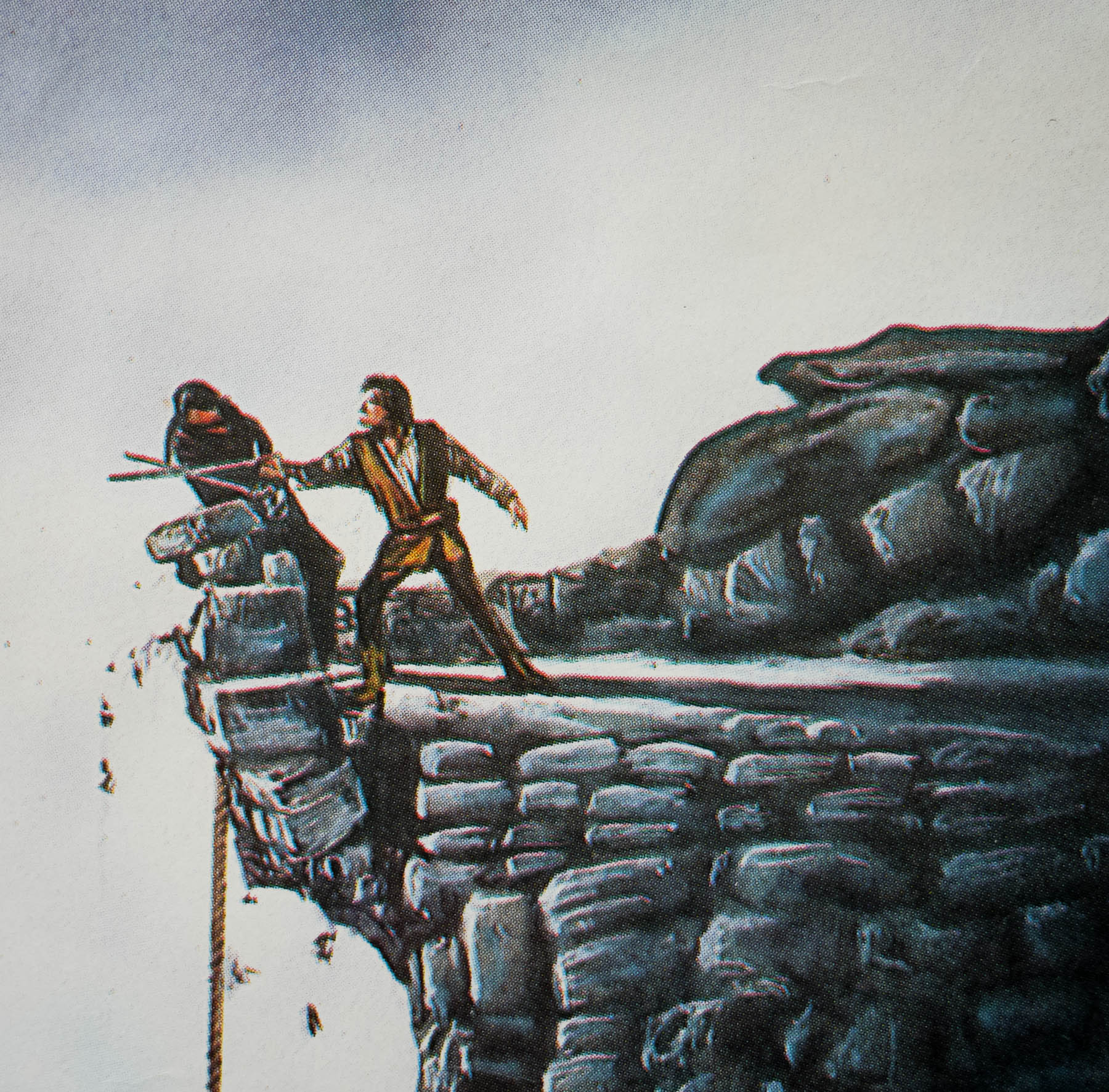
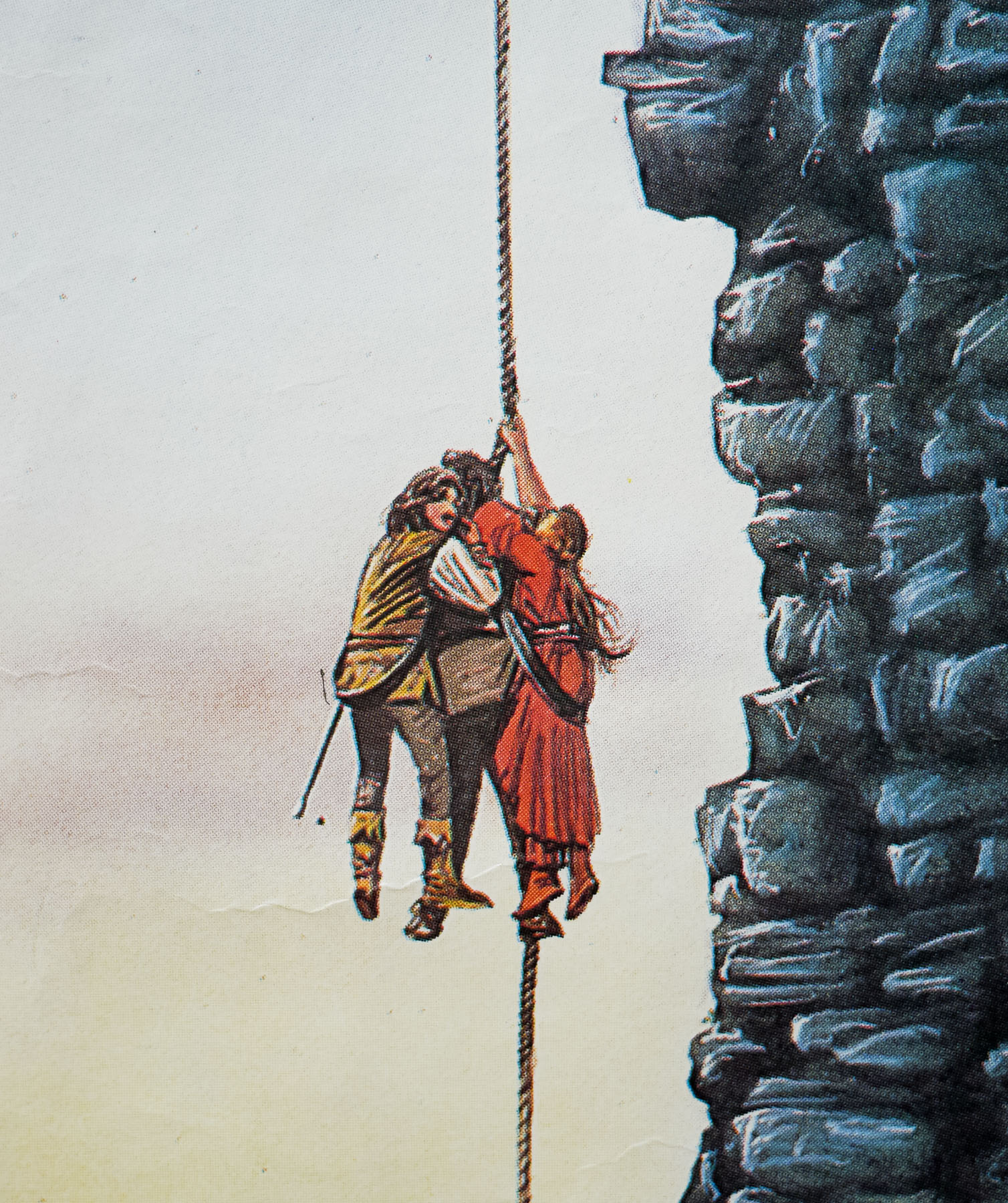
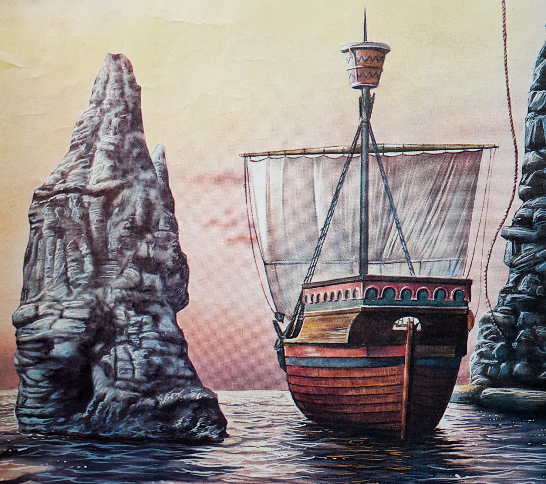
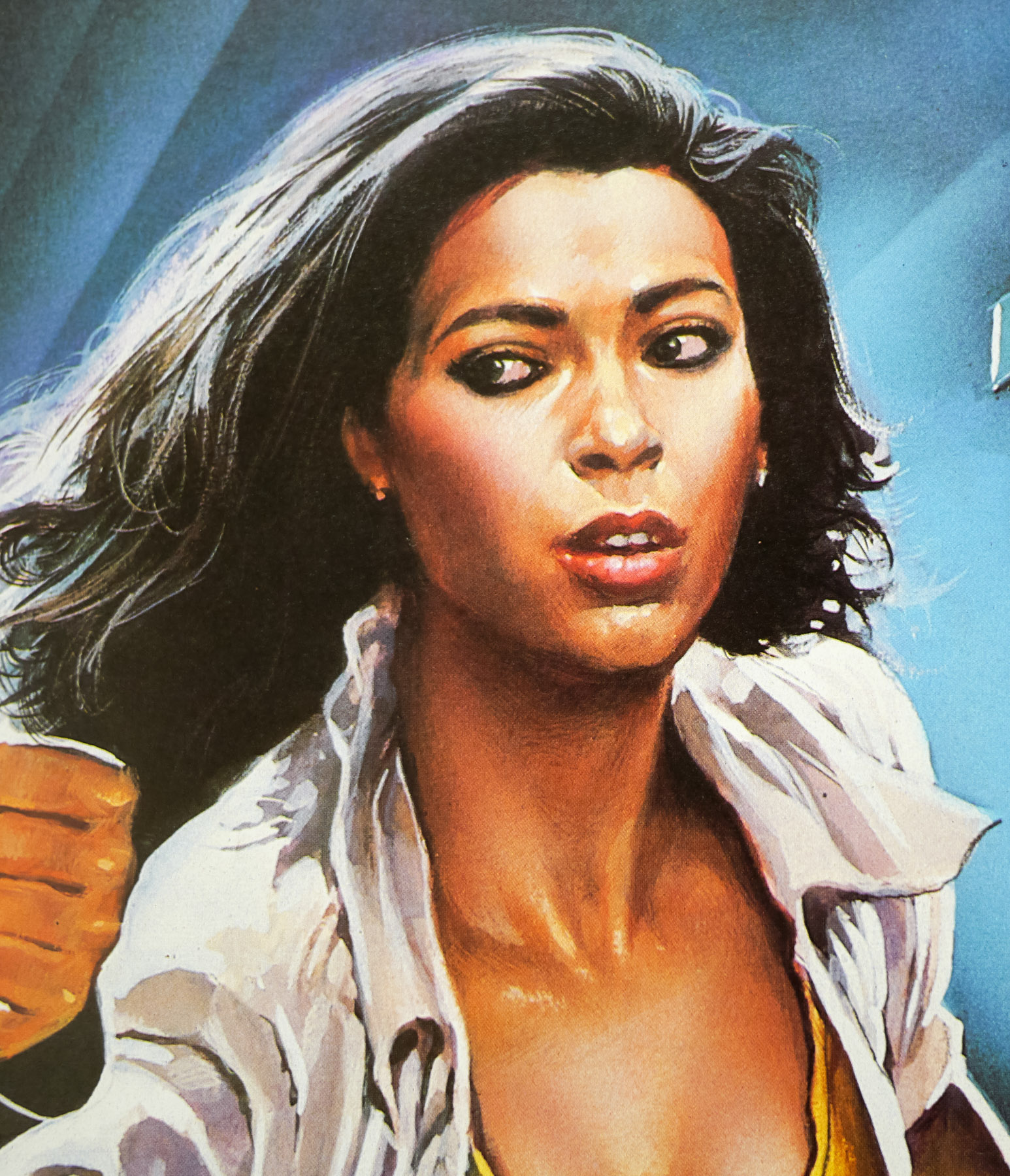
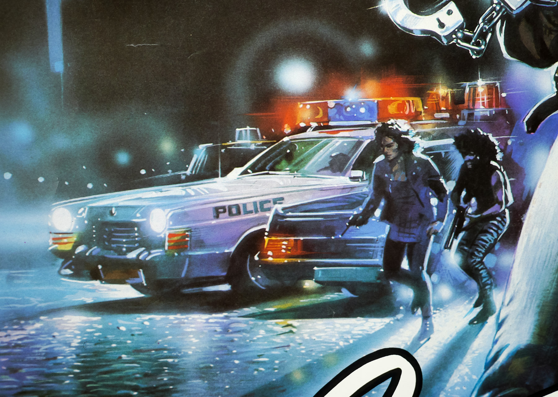
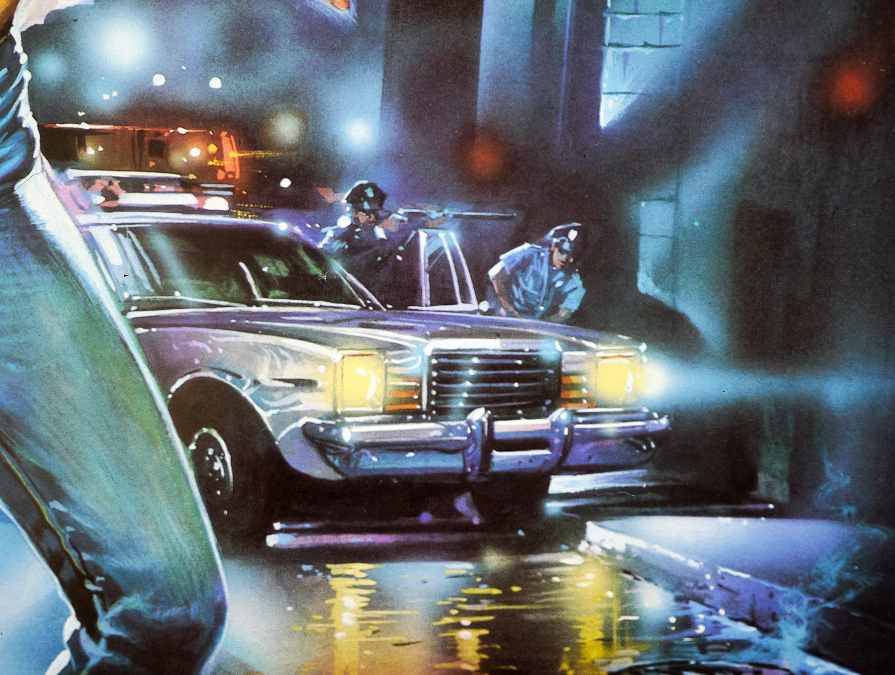
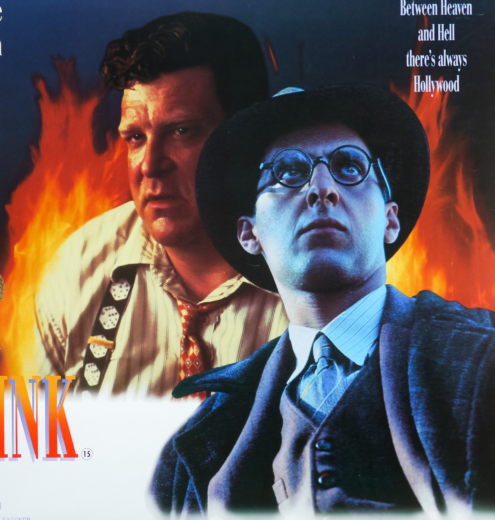
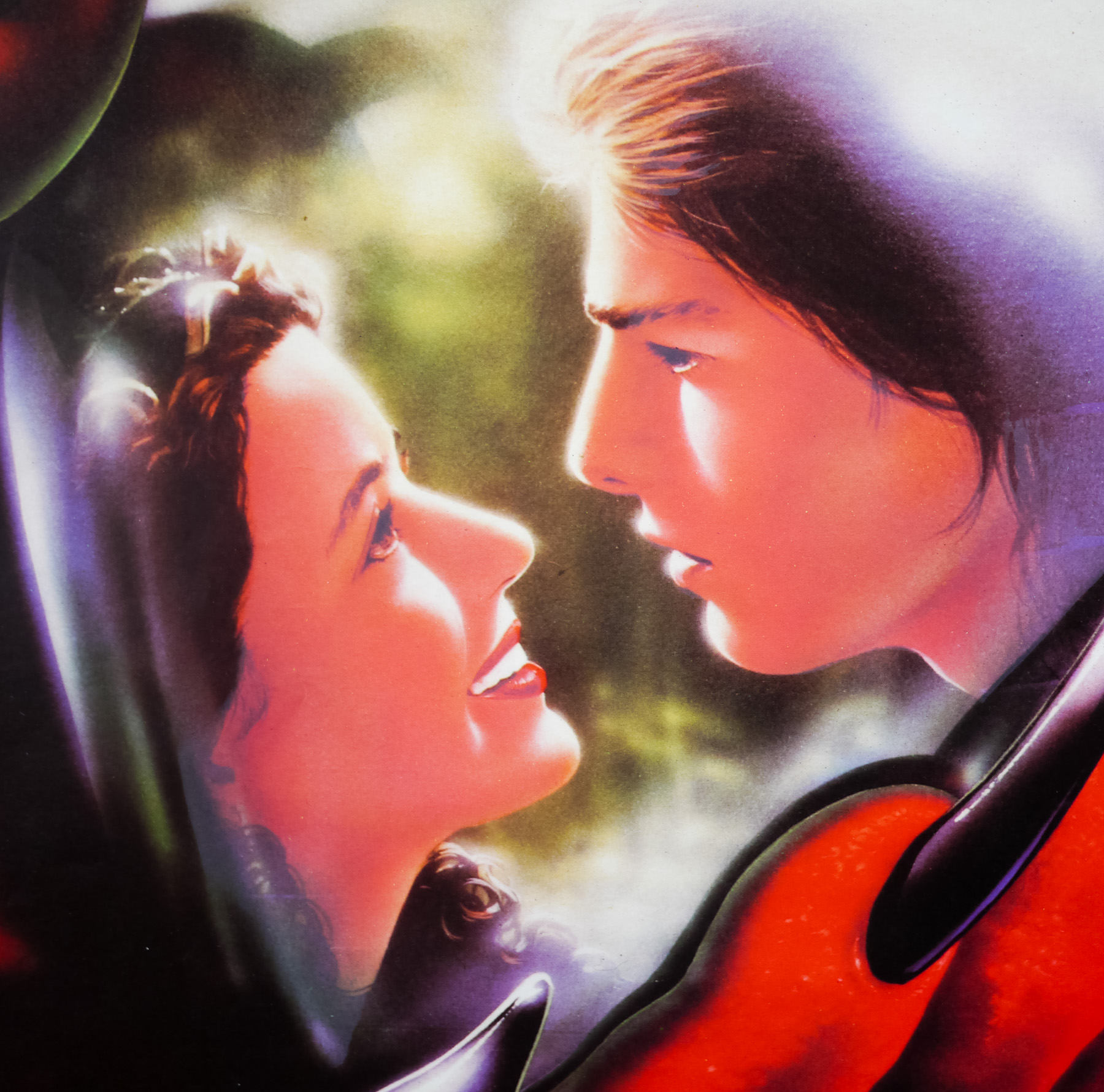
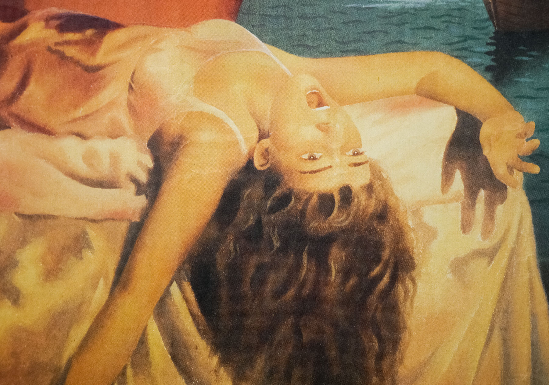
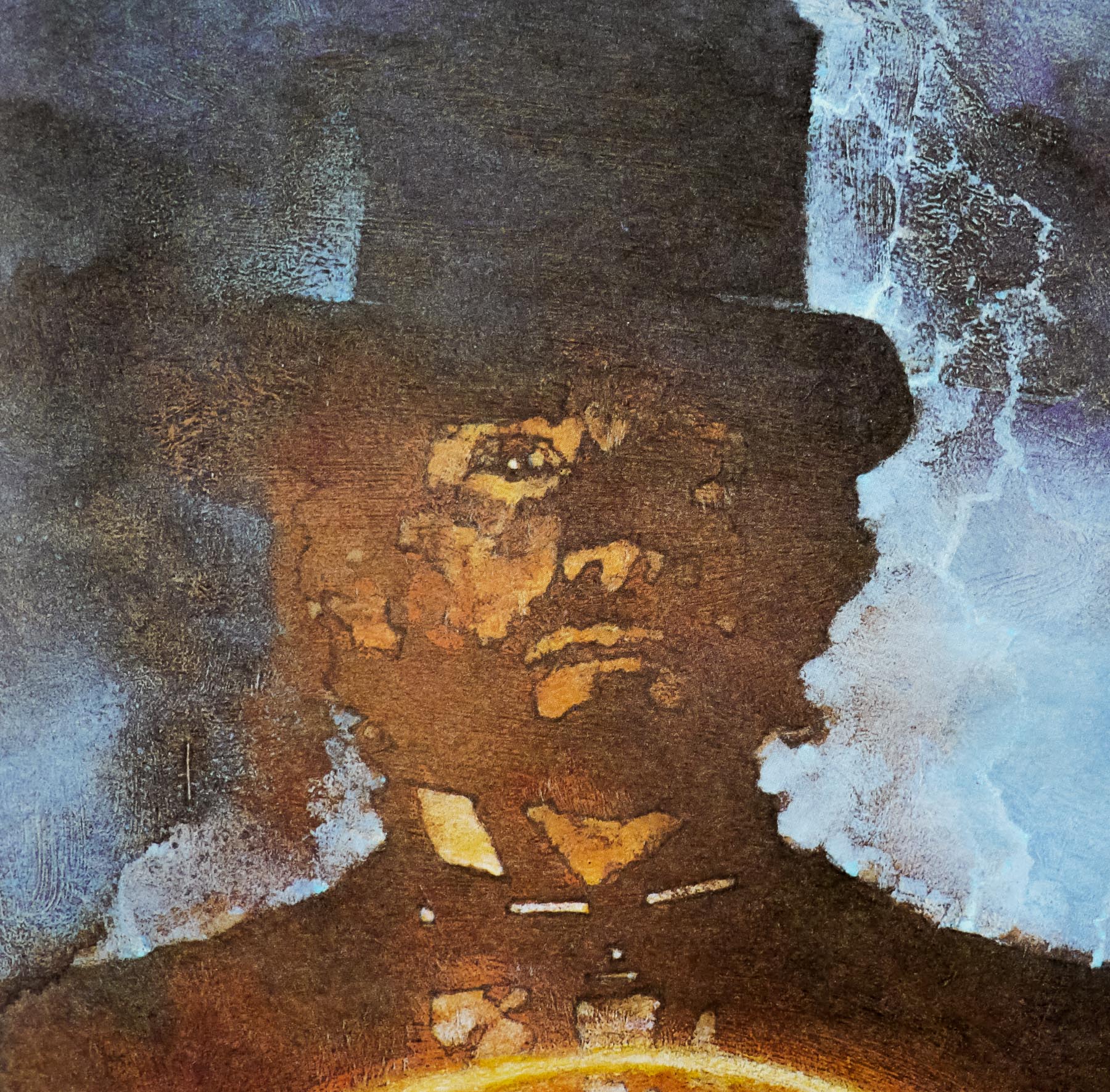
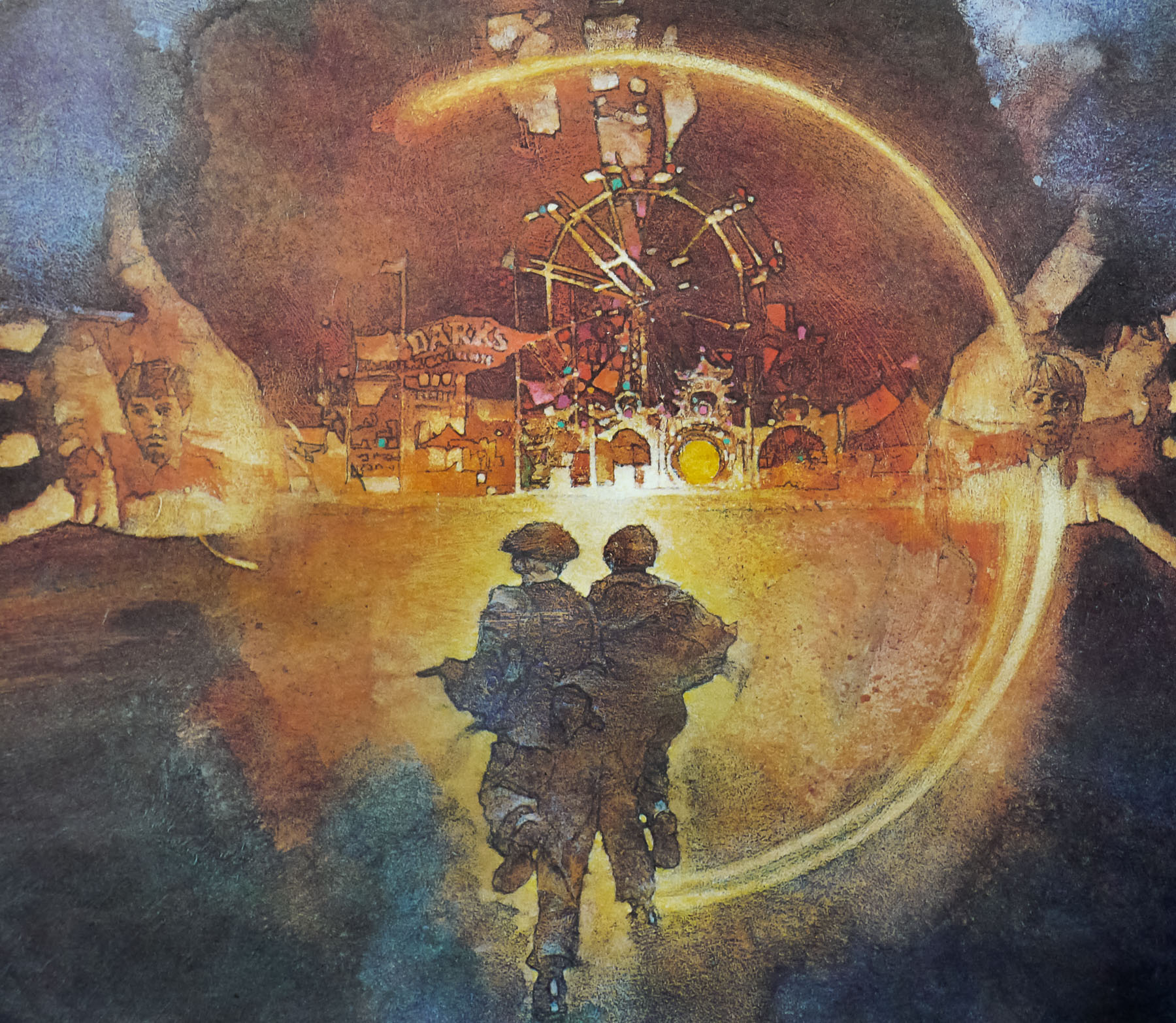
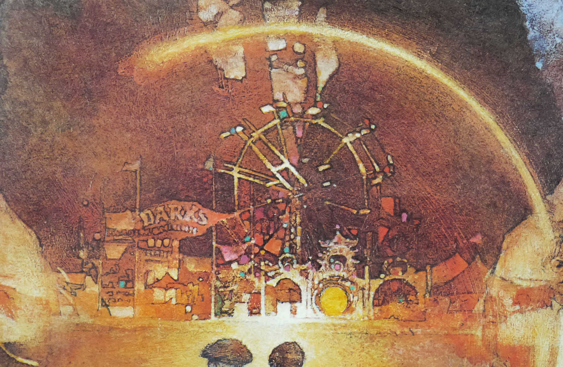
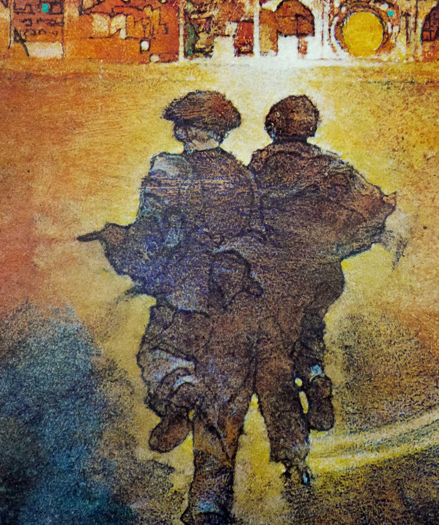
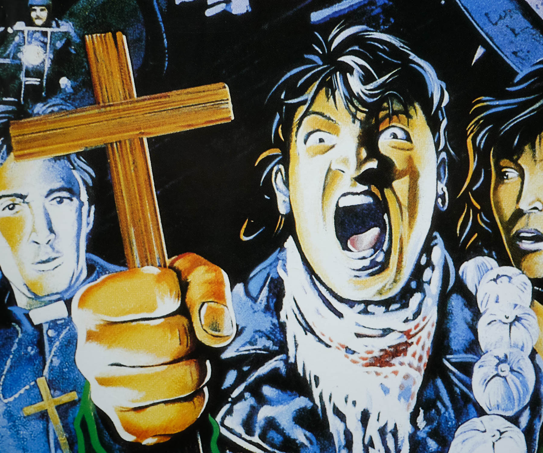
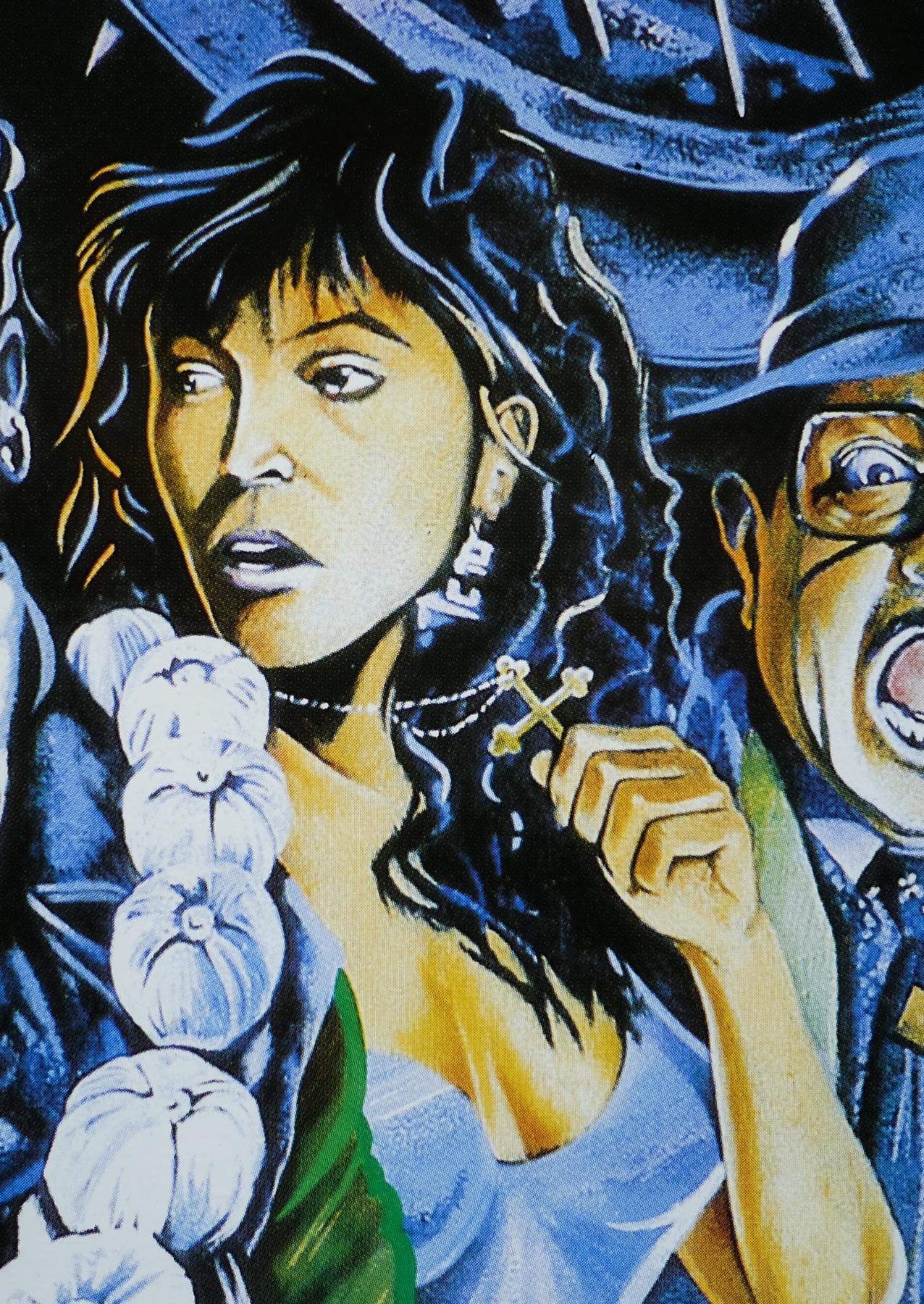
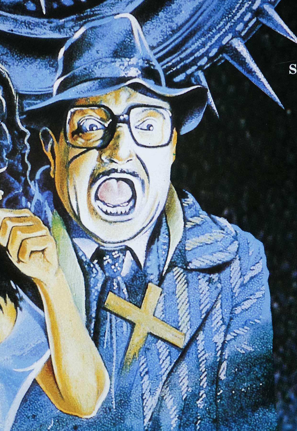
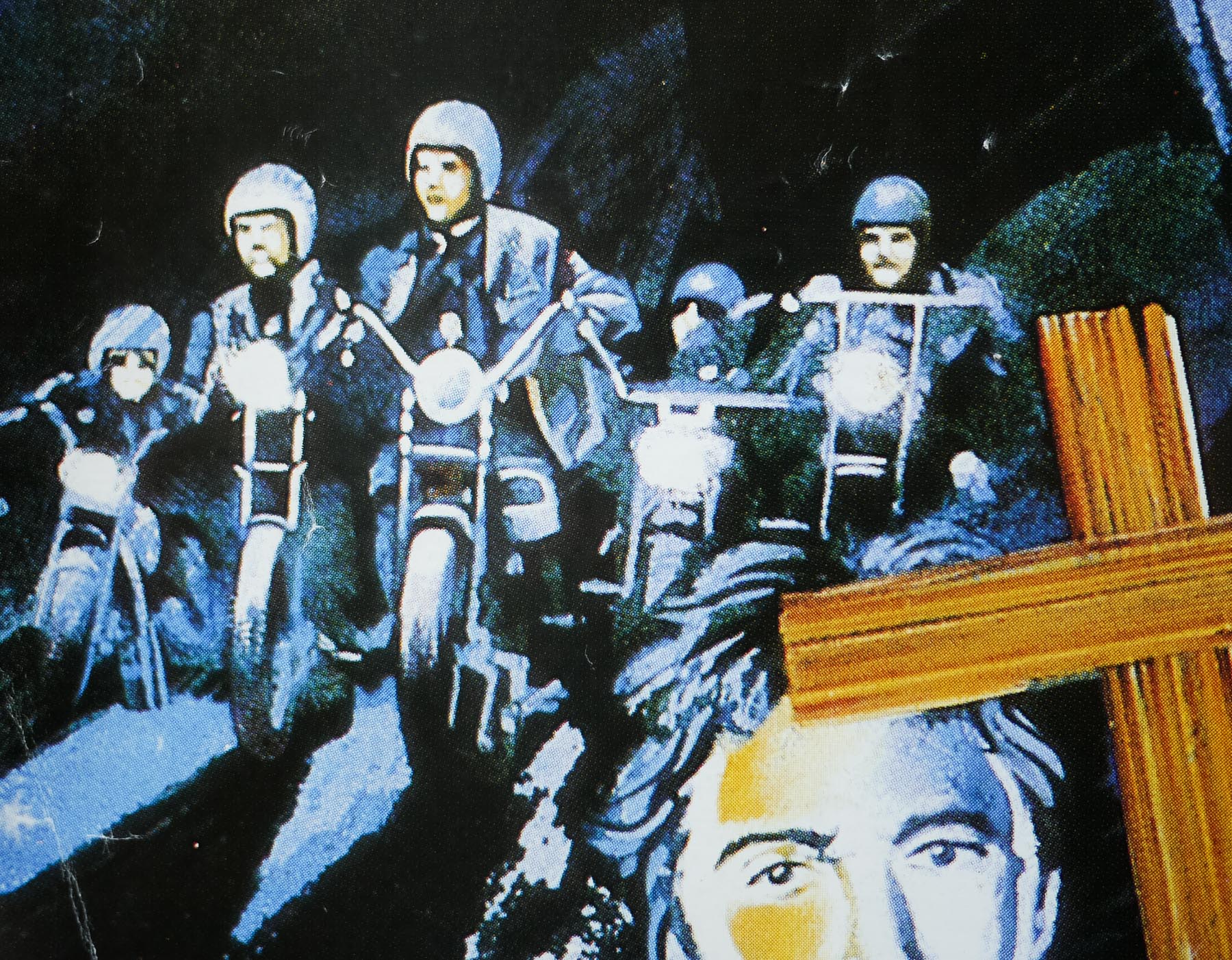
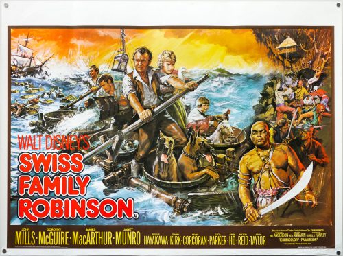
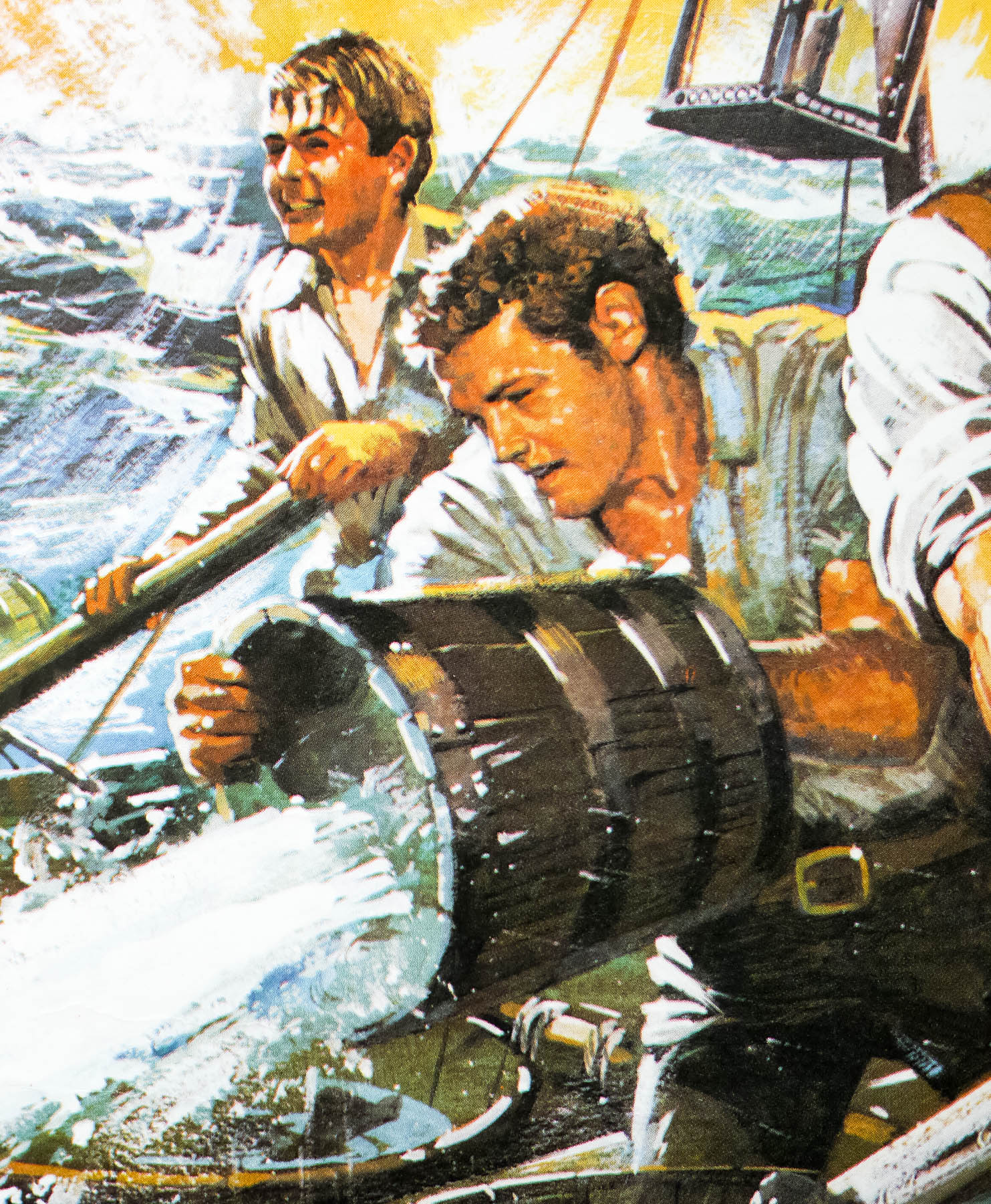
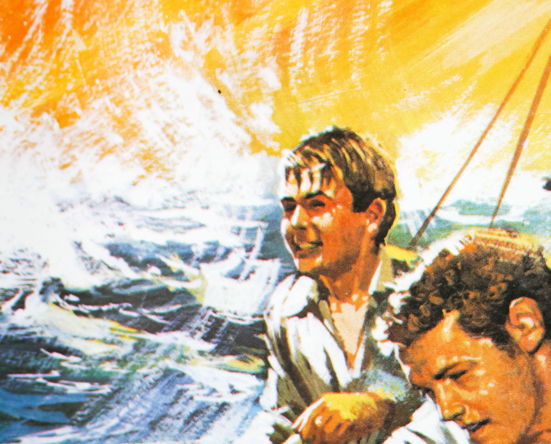
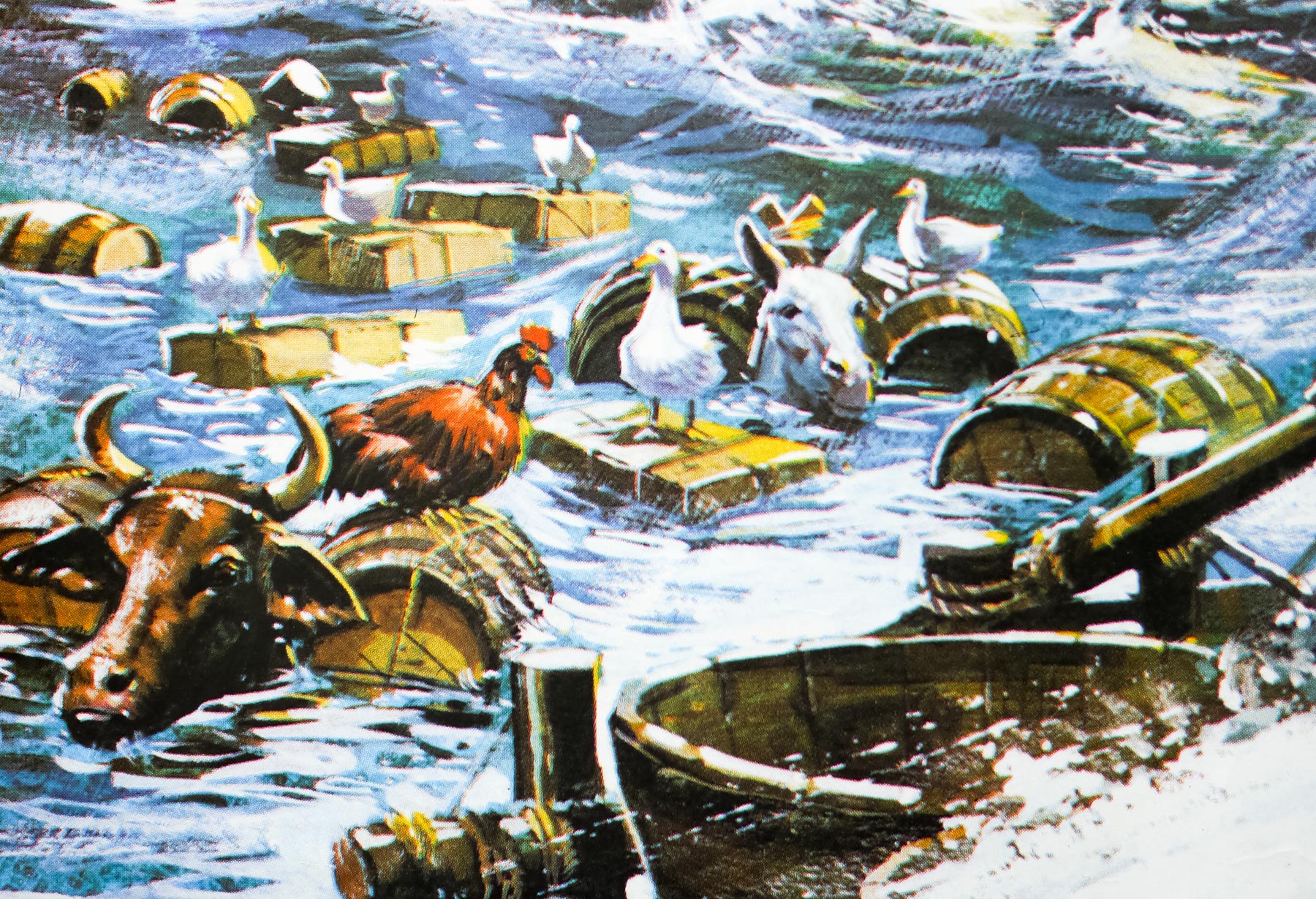
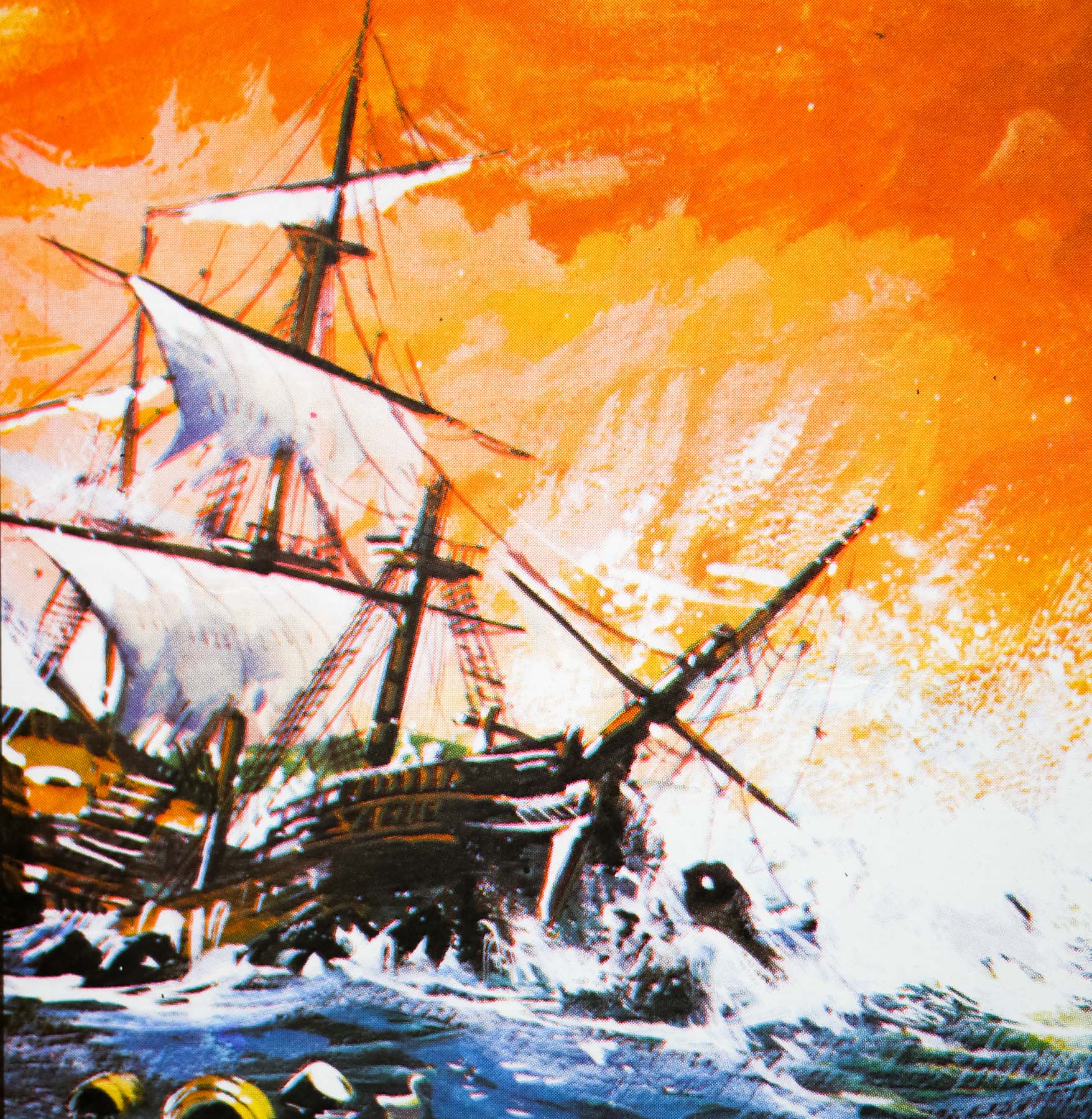
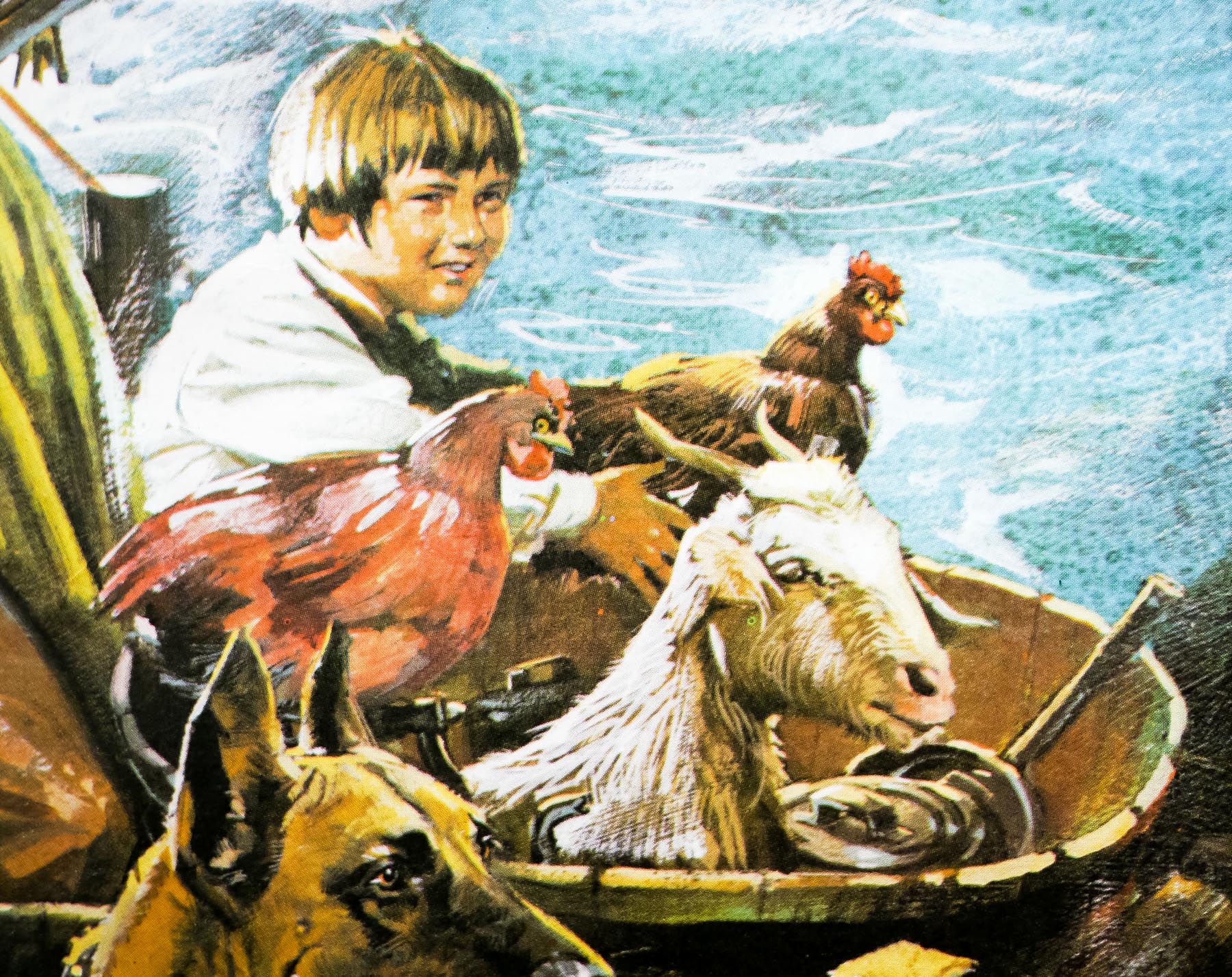
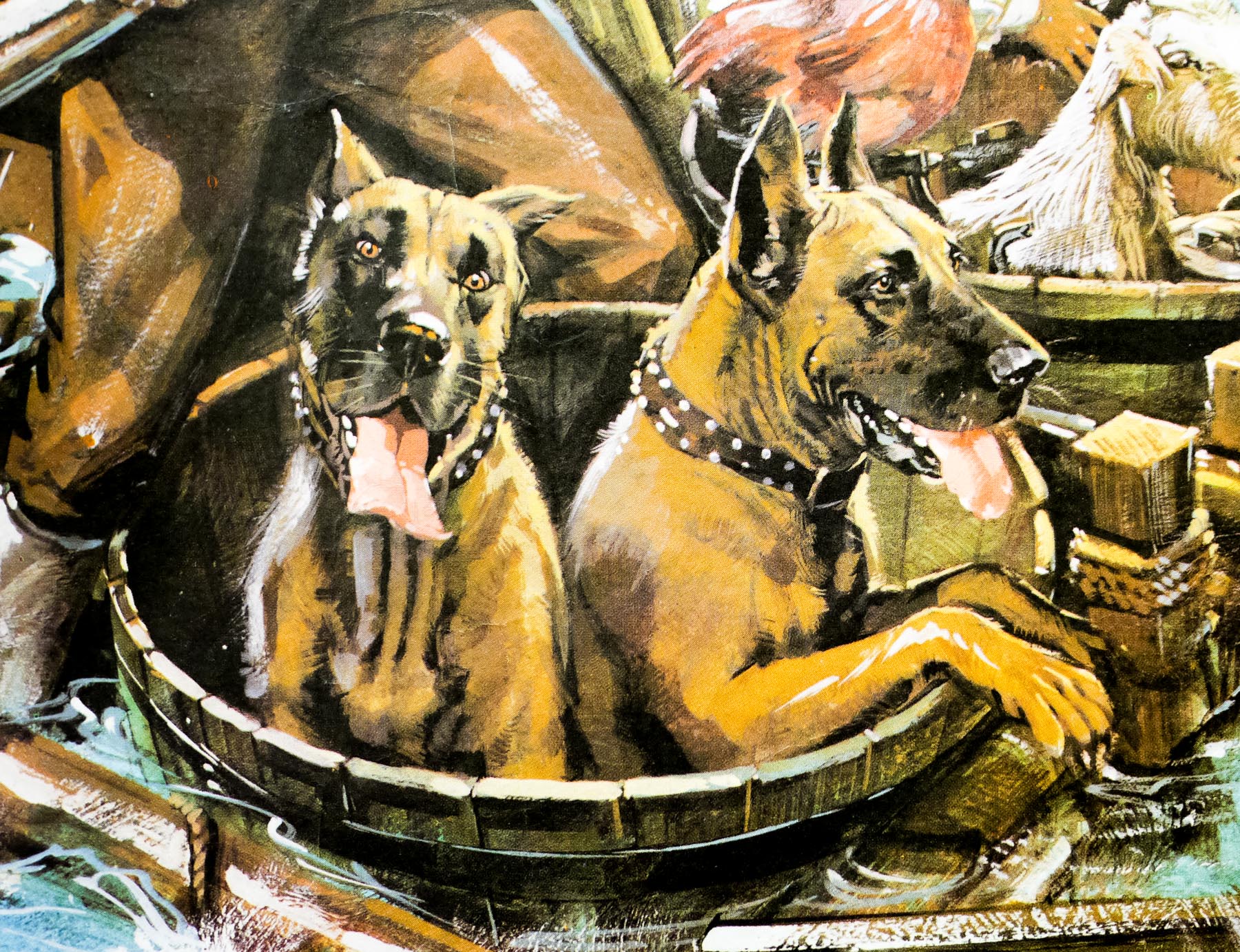
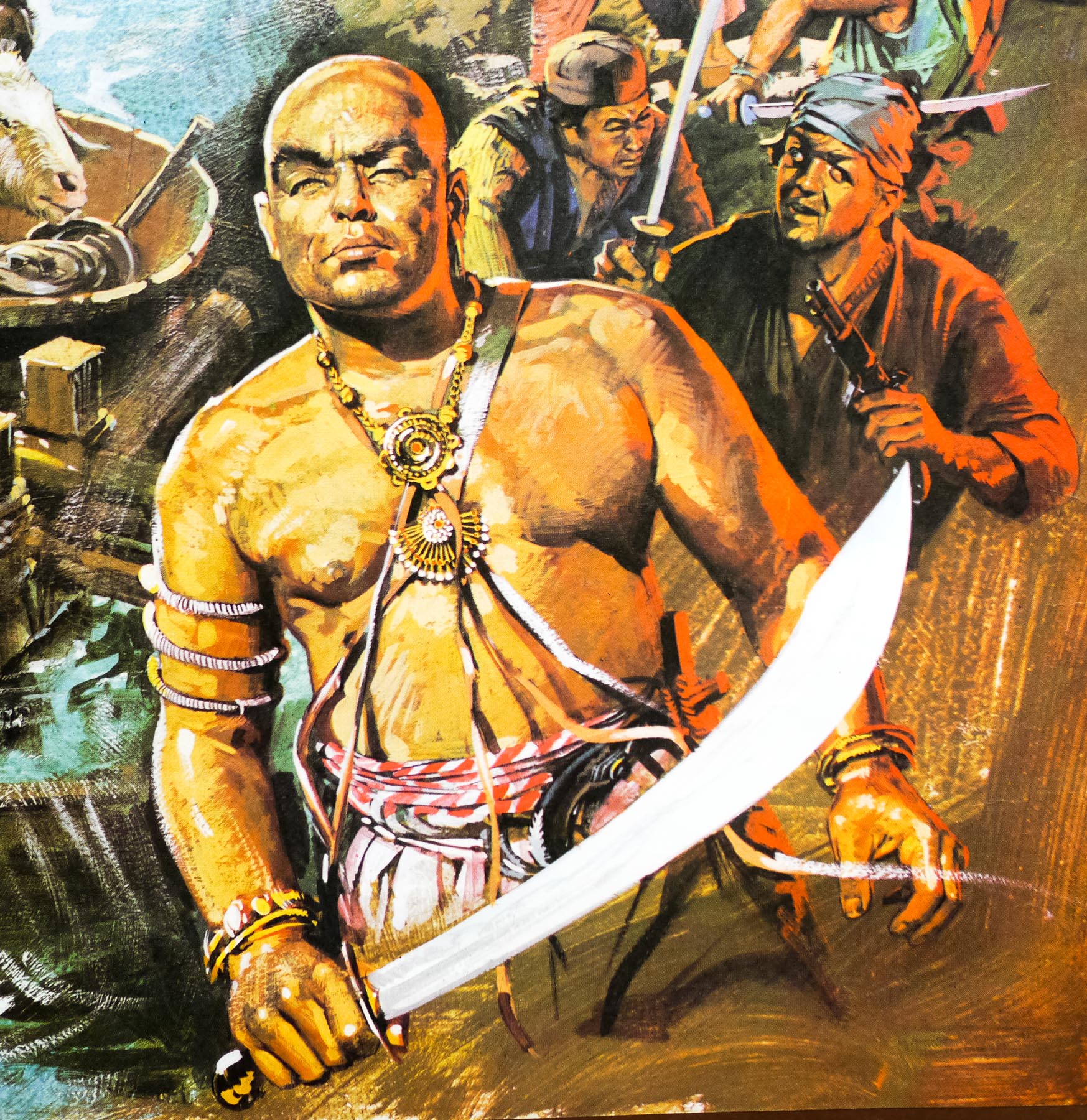
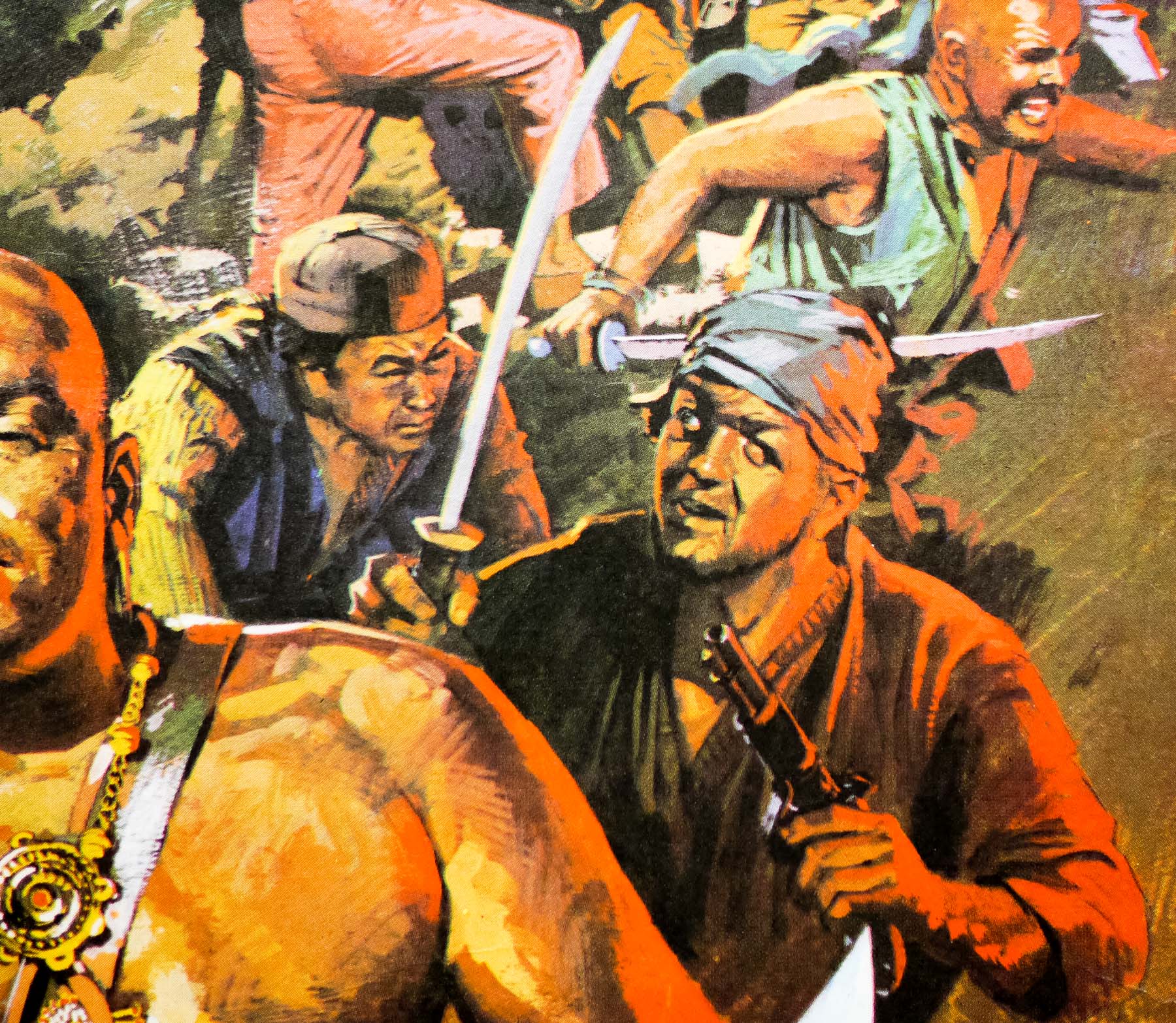
This is the UK quad for the release of arguably the most famous Australian film ever released, Crocodile Dundee. The film took its inspiration from the real life exploits of an Australian hunter called Rodney Ansell who was stranded for 56 days in the remote outback with limited supplies and managed to survive and stay alive by living off the land. The film’s story sees Sue Charlton (Linda Kozlowski), a New York reporter, travel to Australia to try and meet Mick Dundee (a memorable turn by Paul Hogan) a legendary bushman who is reported to have lost his leg in a battle with a crocodile. What she finds is an uncouth, less than legendary figure who makes several clumsy advances towards her. She starts to warm to him as they travel into the wilderness and she witnesses first hand his survival skills, ability to interact with dangerous creatures and his ease with the native aborigines.
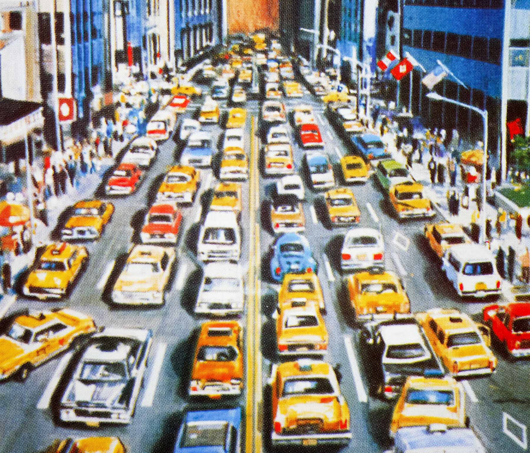
When Mick teases her that she’d be unable to survive on her own she sets off to prove him wrong, but is soon almost killed by a crocodile before Mick intervenes. Eventually Sue invites the bushman back to New York under the pretext of continuing the story and comedy ensues as Mick has to adjust to life in one of the busiest cities on earth. The film was made on a relatively low budget, specifically tailored for American audiences and was a runaway success at the box office and ended up as a worldwide phenomenon as the second-highest grossing film of 1986. It spawned another sequel soon afterwards and a third (forgettable) entry in 2001.
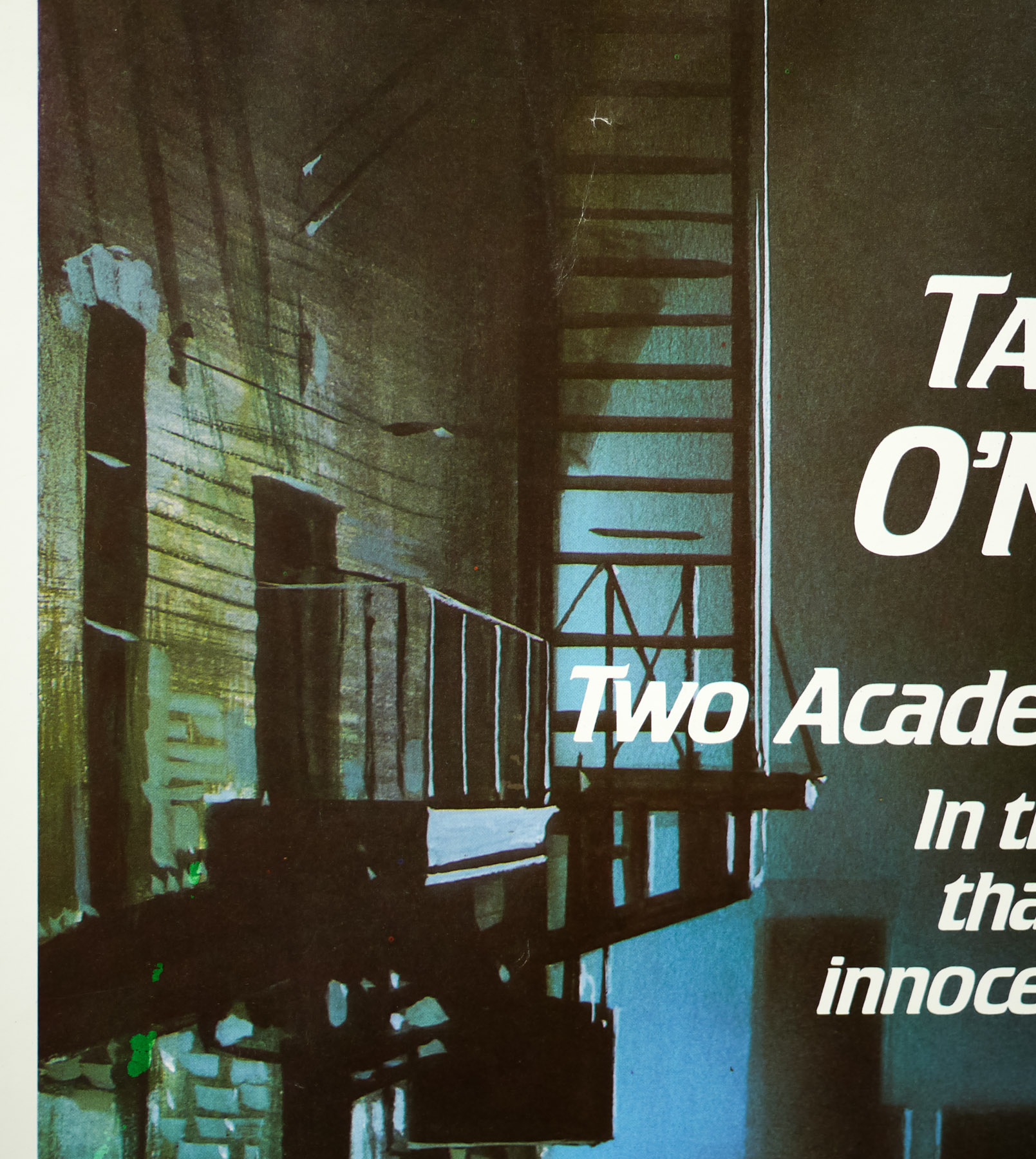
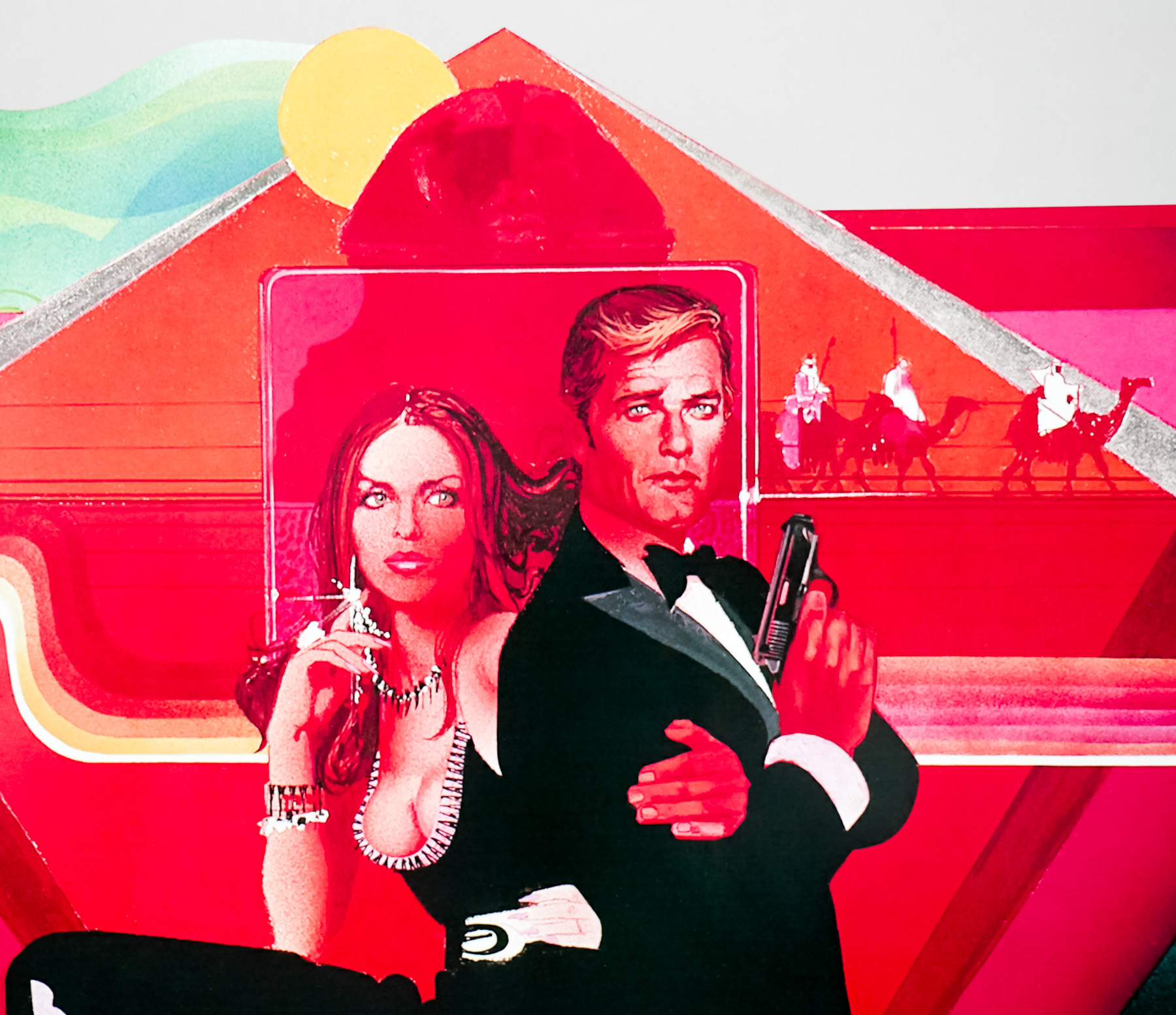
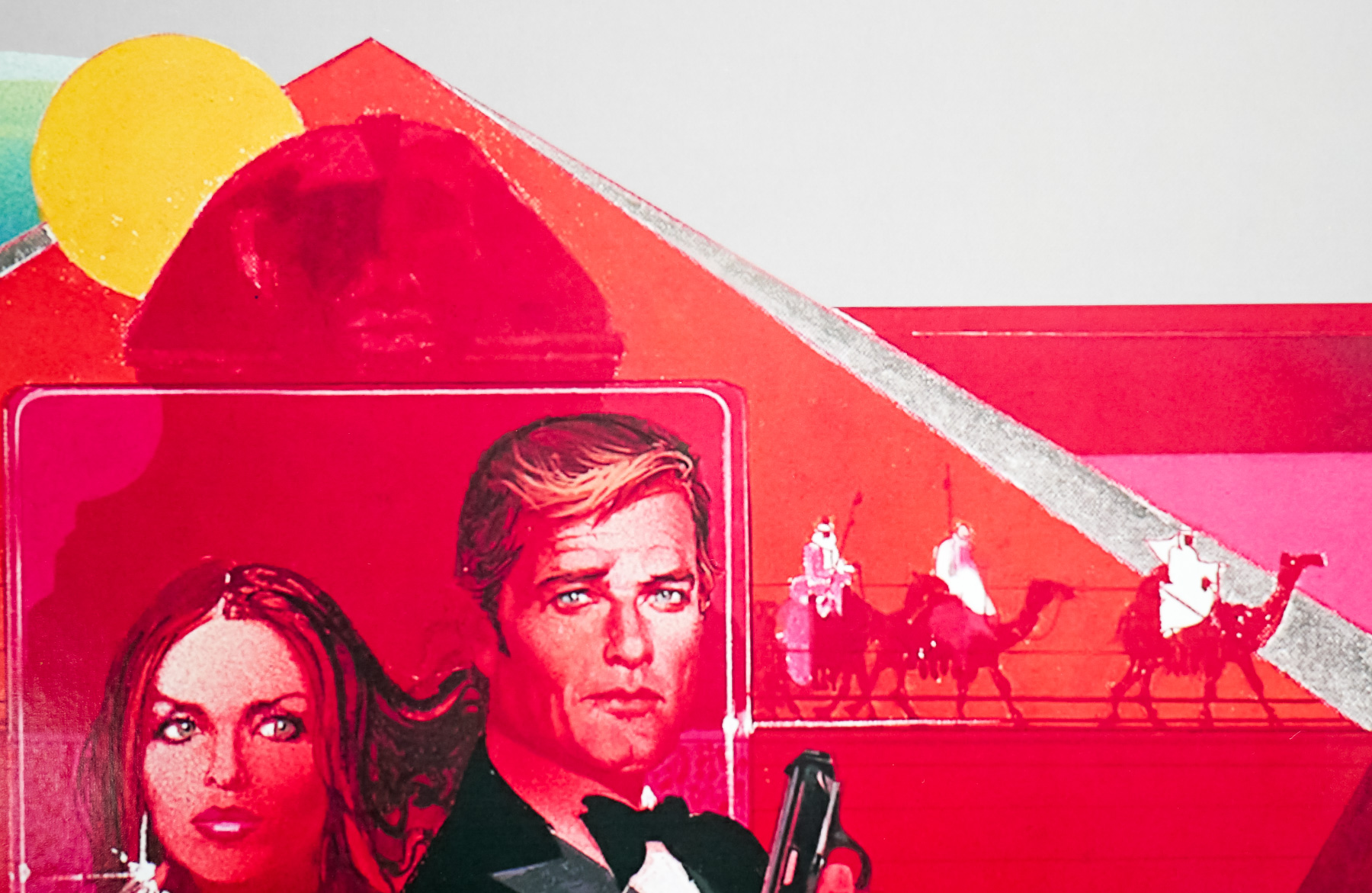
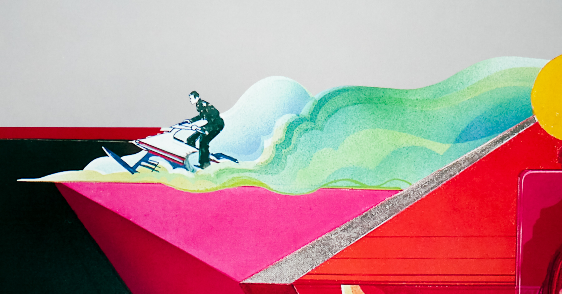
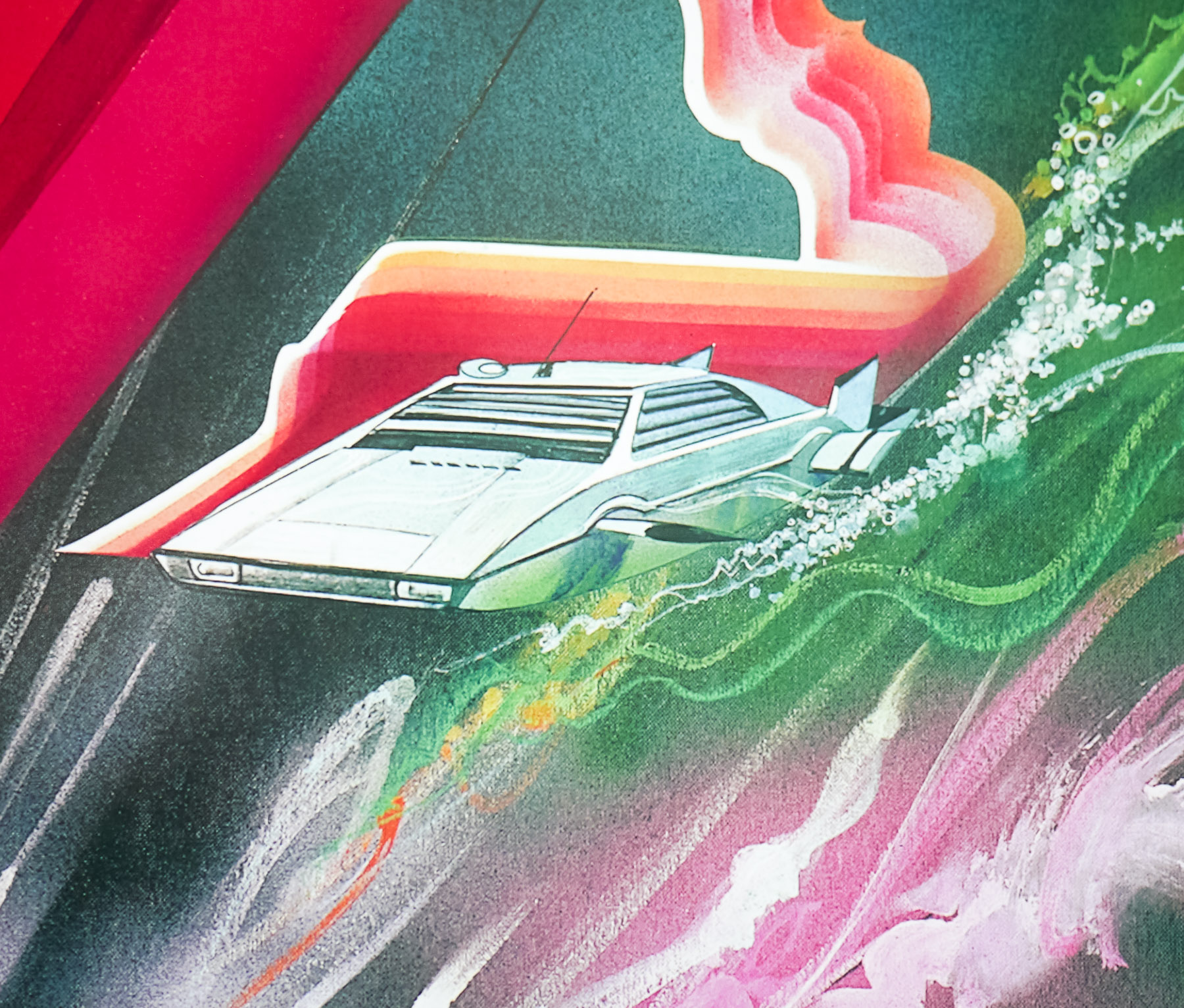
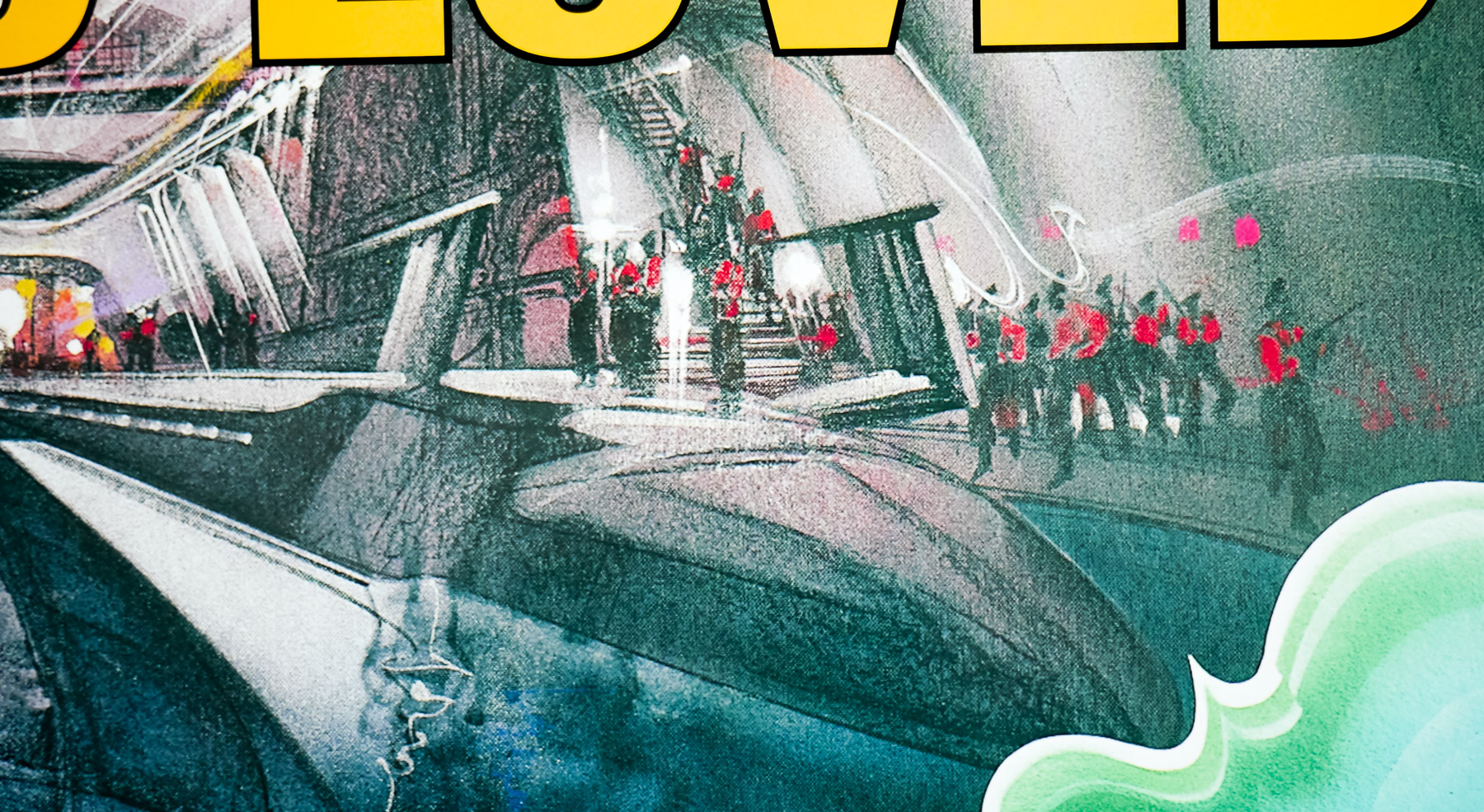
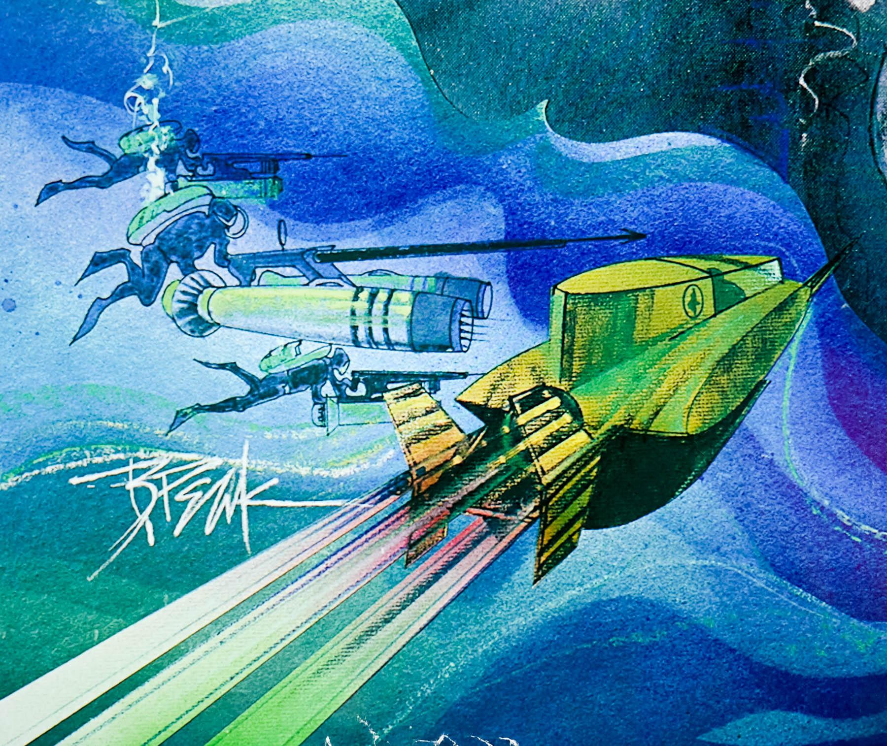
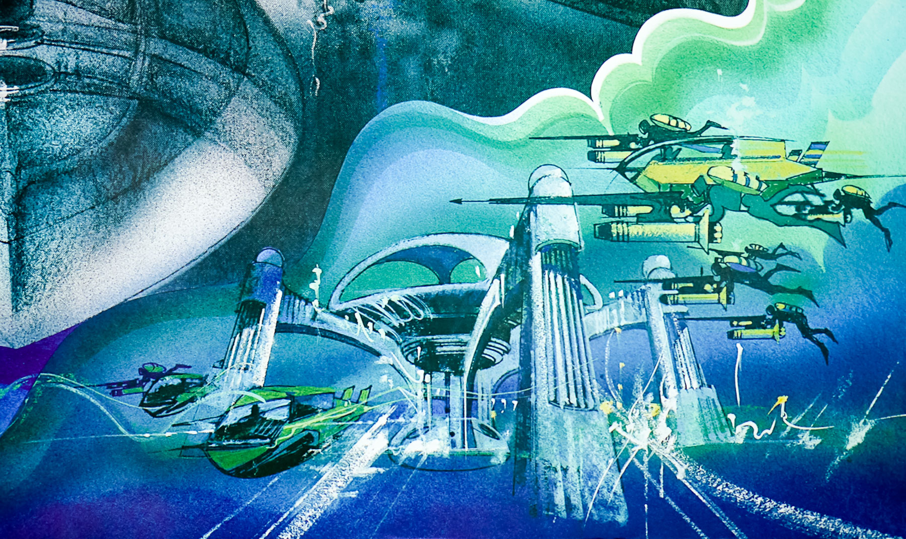
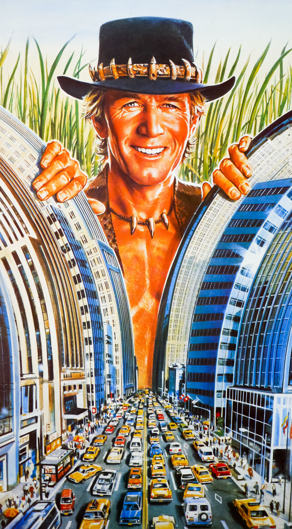
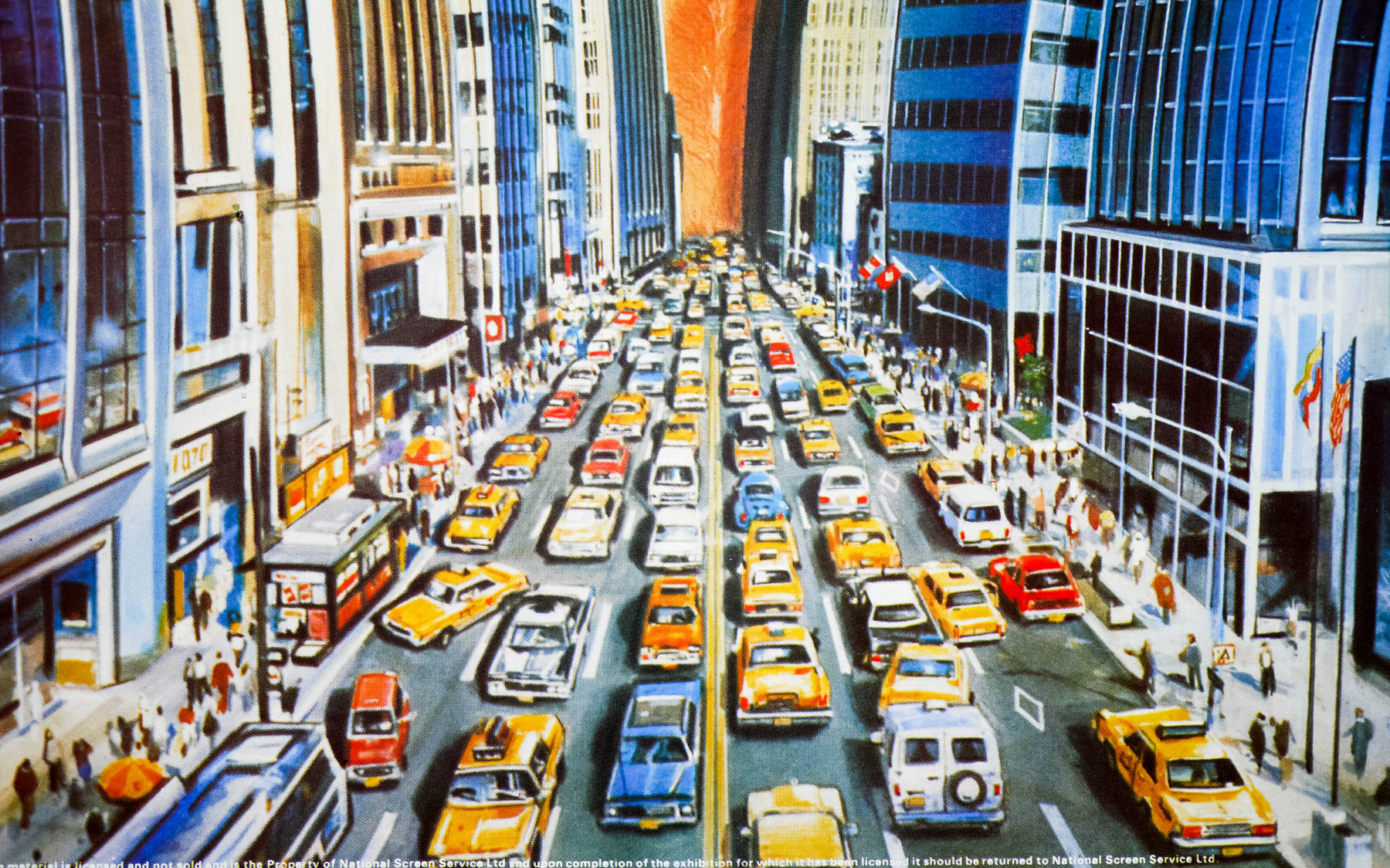
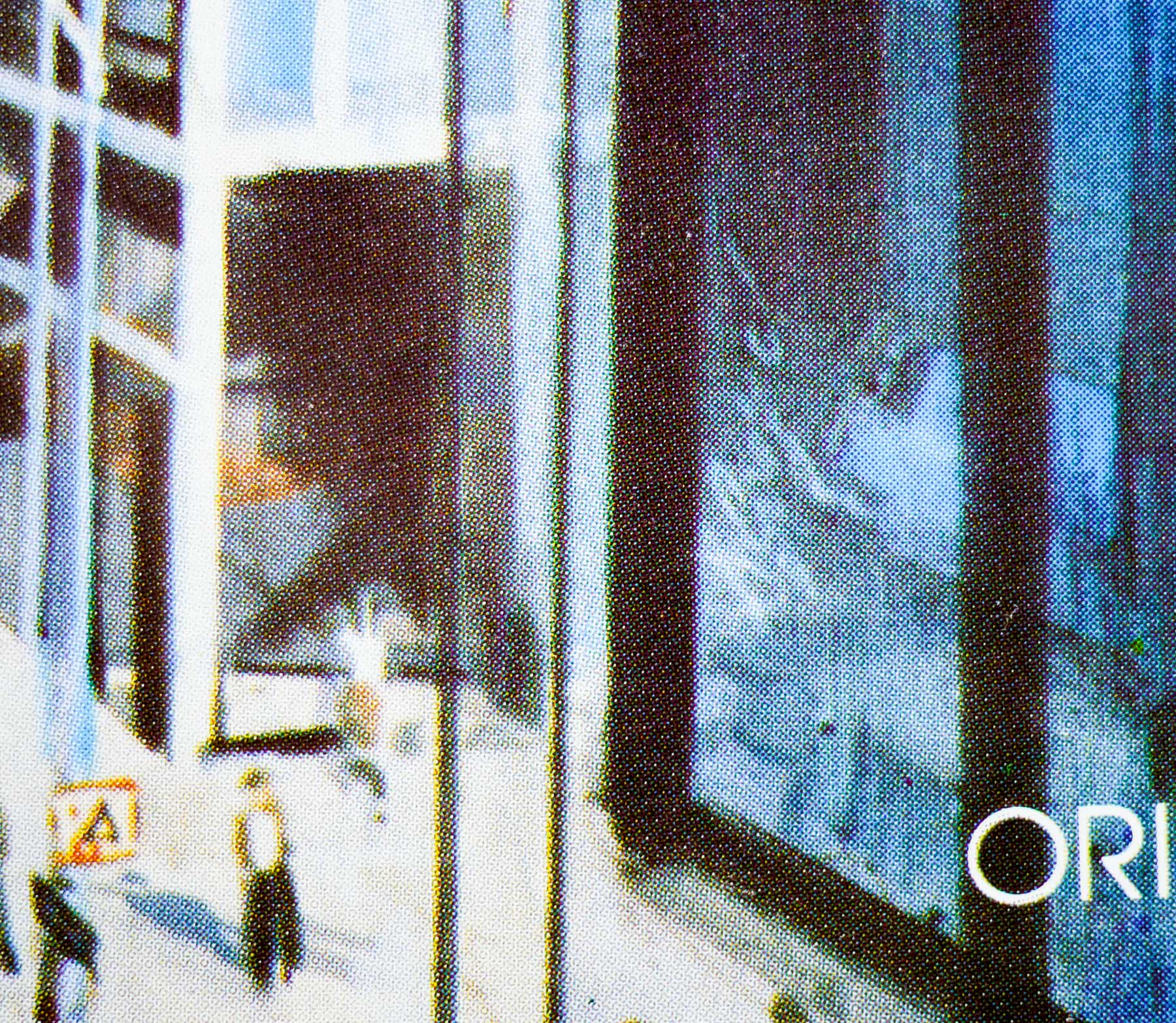
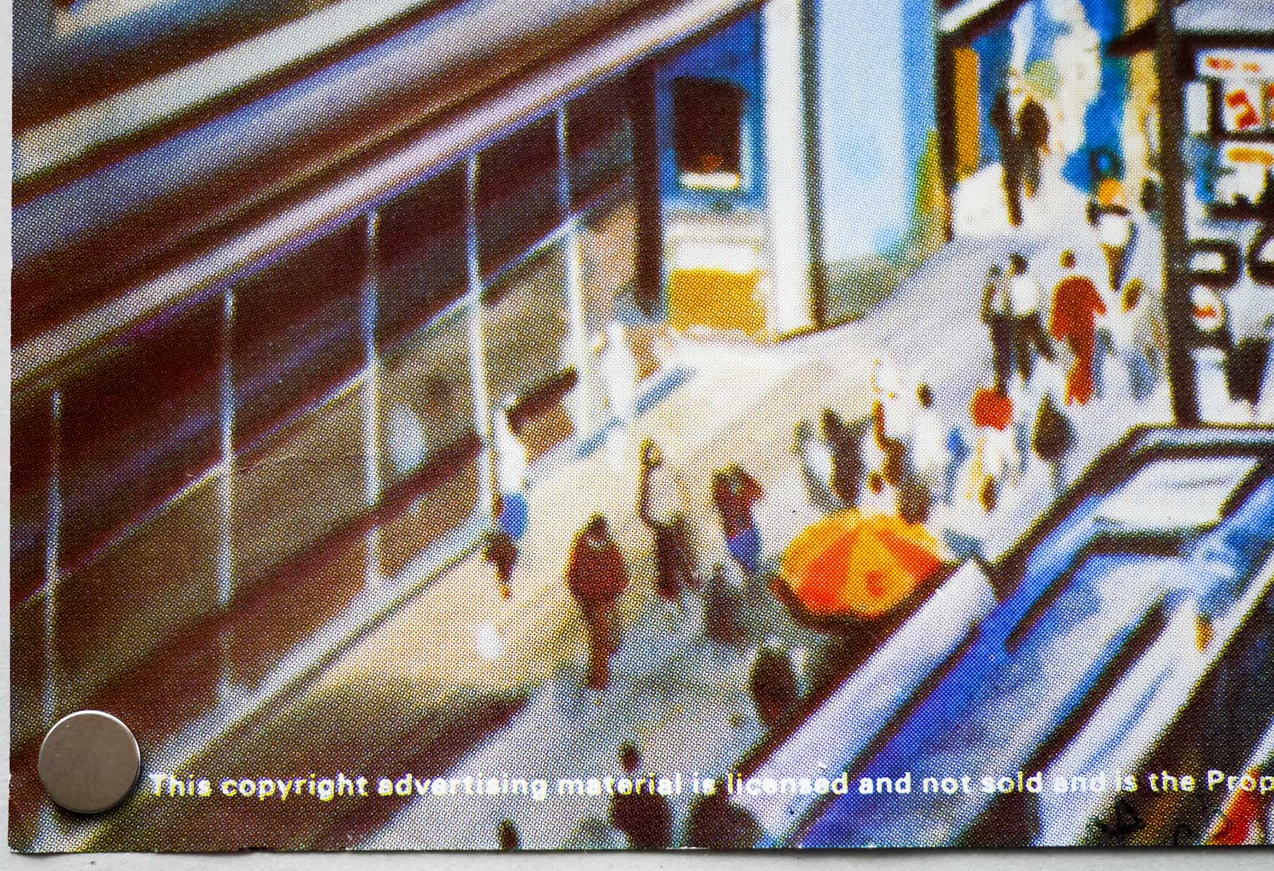
The artwork, which also featured on posters around the world, including the US one sheet, is by American poster artist Dan Goozee. An unknown UK artist is likely to have painted the extra windows on the right side to adapt the artwork to a landscape format. Goozee is perhaps best known for his work on several Bond posters, including Moonraker and Octopussy, as well as several other classic posters from the 1980s. The other designs I’ve collected by him can be seen here.