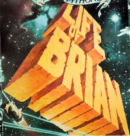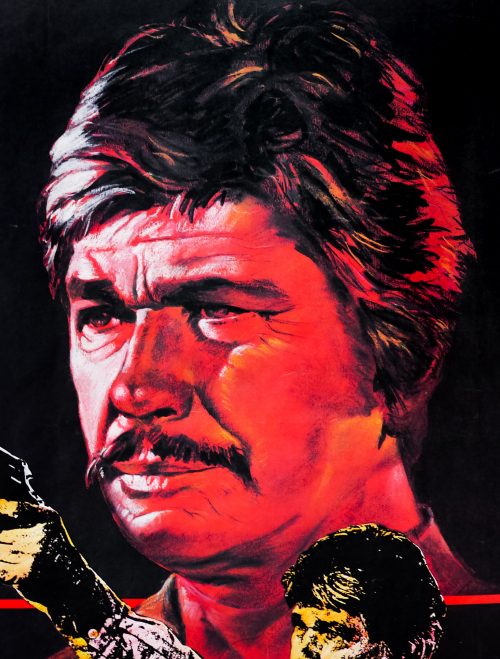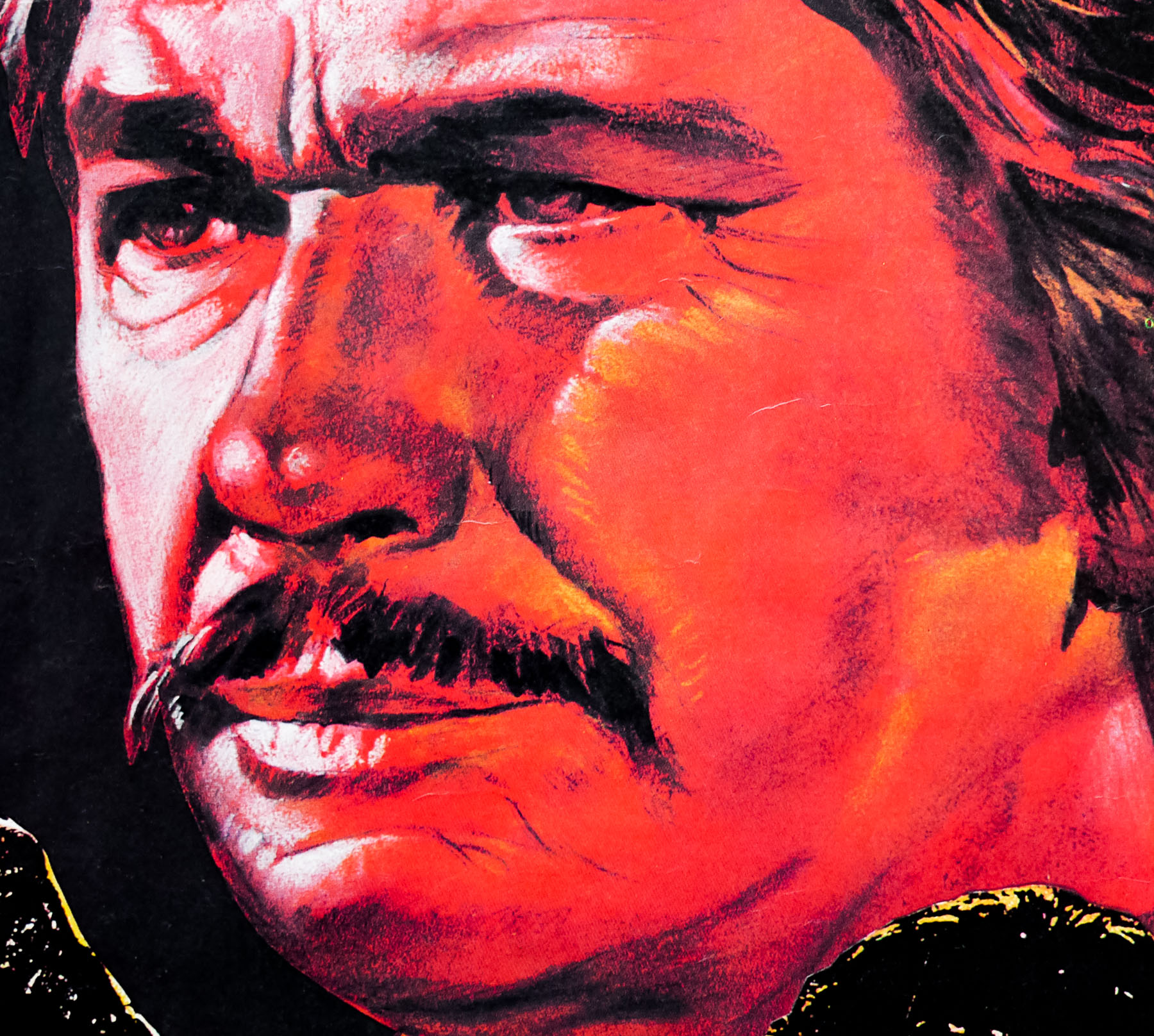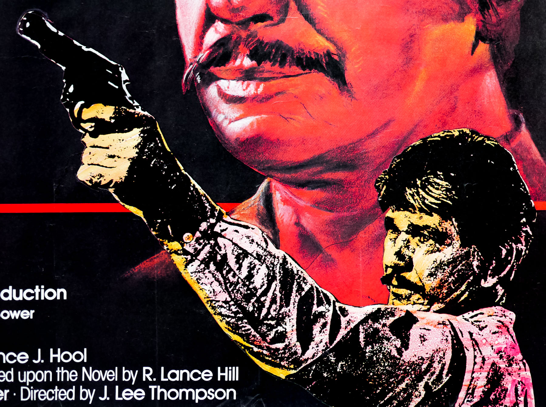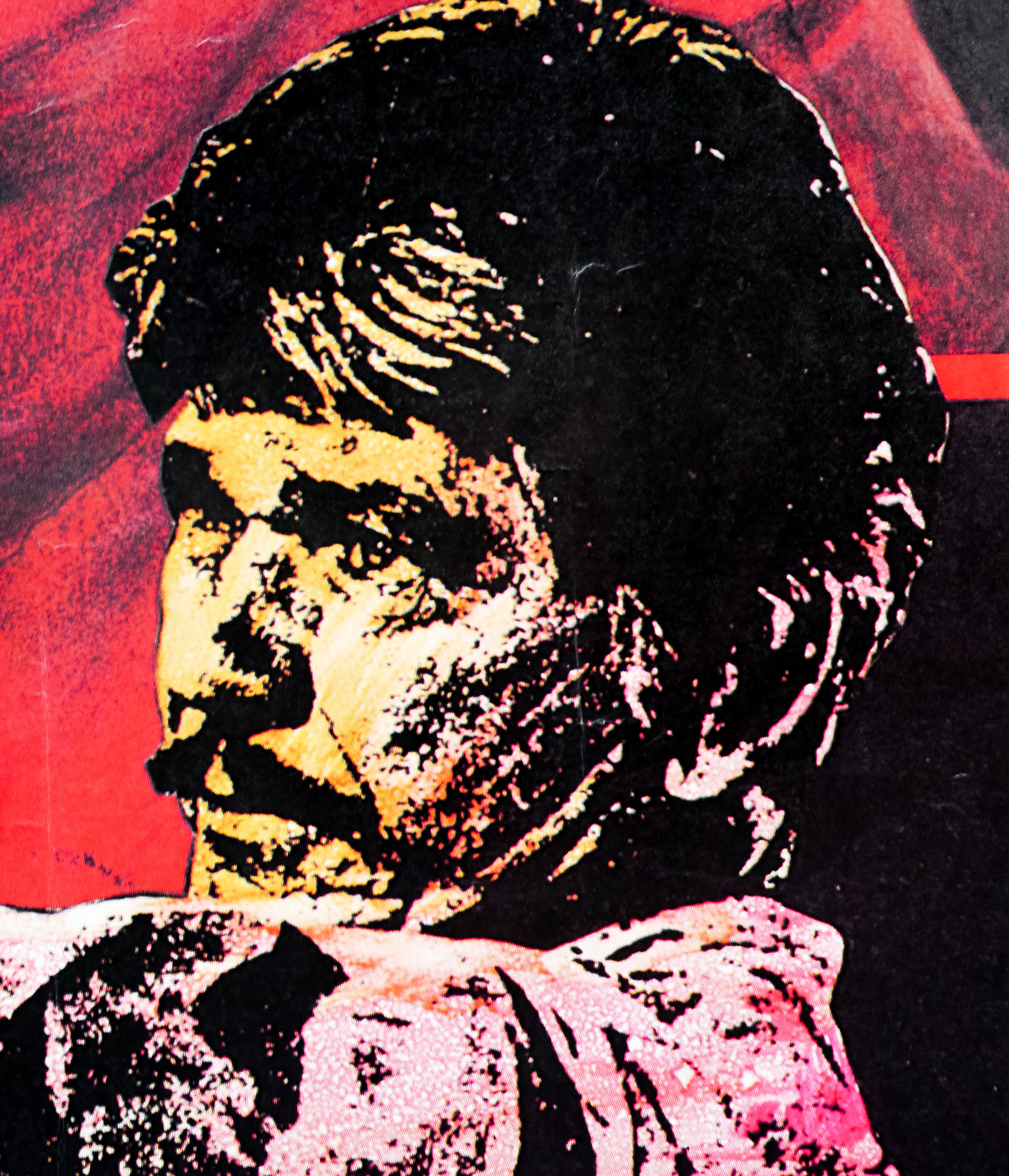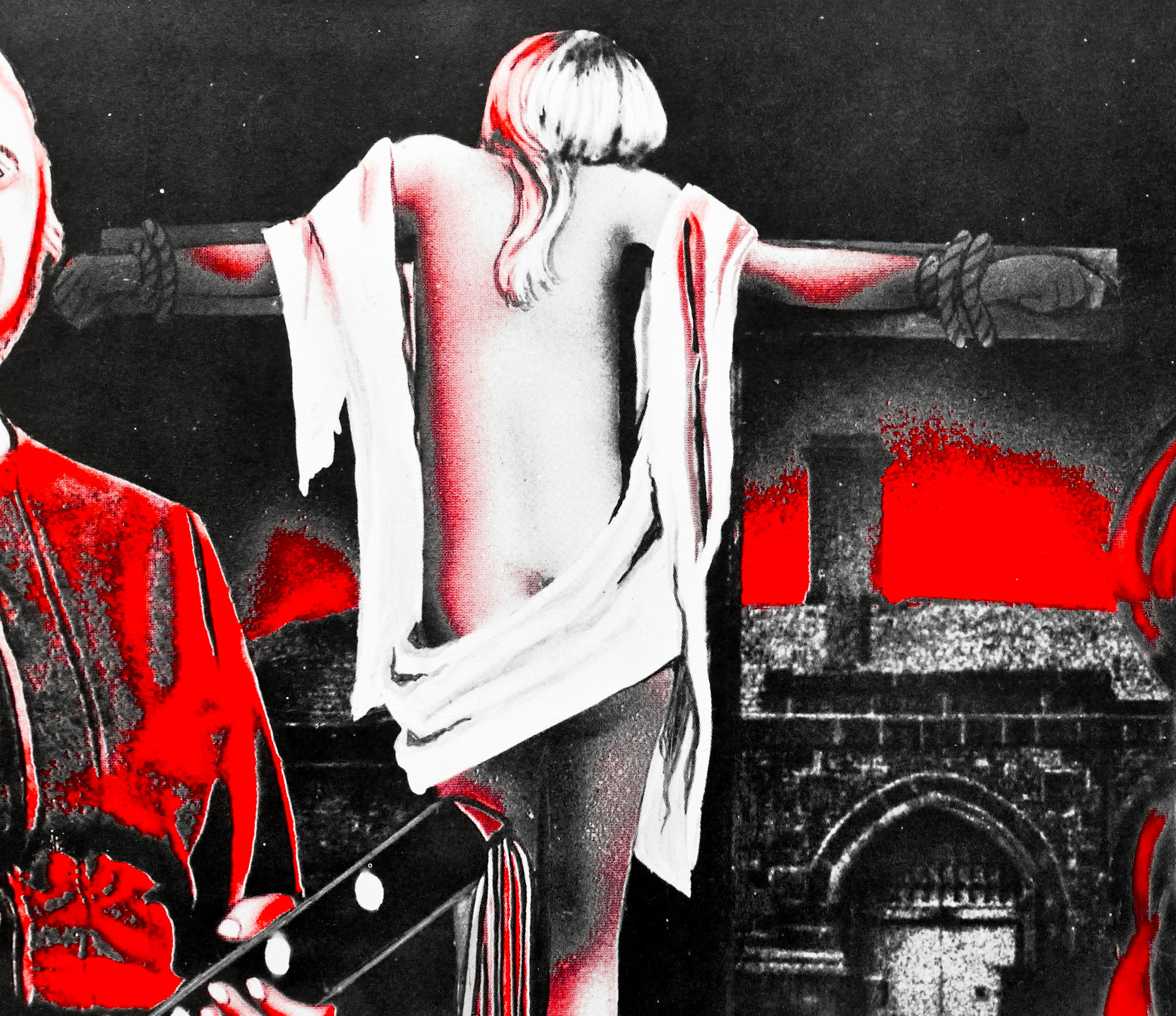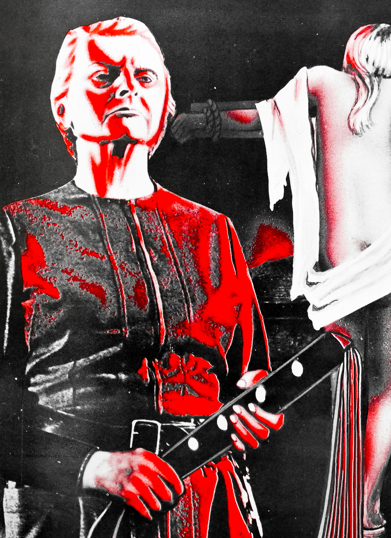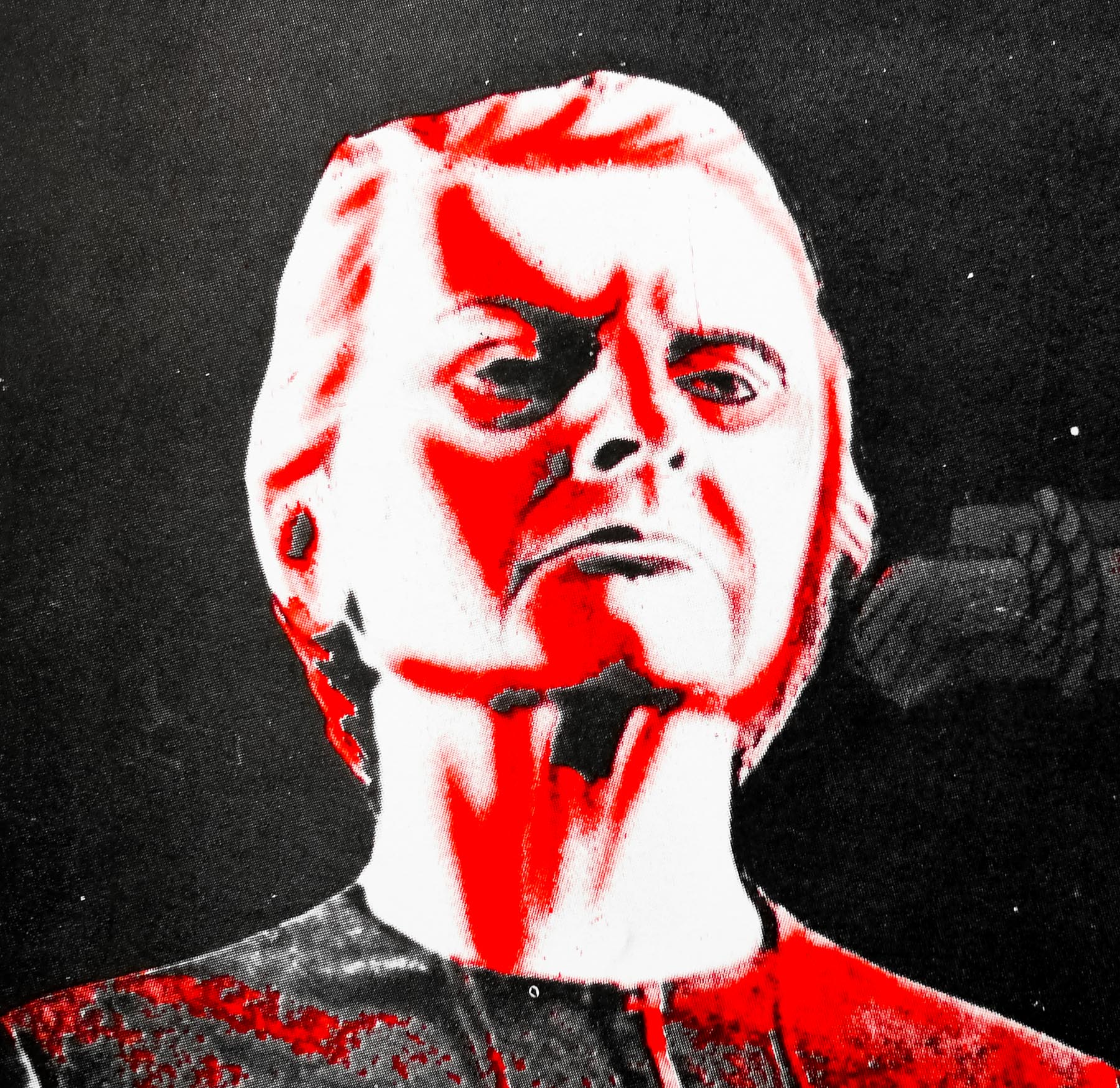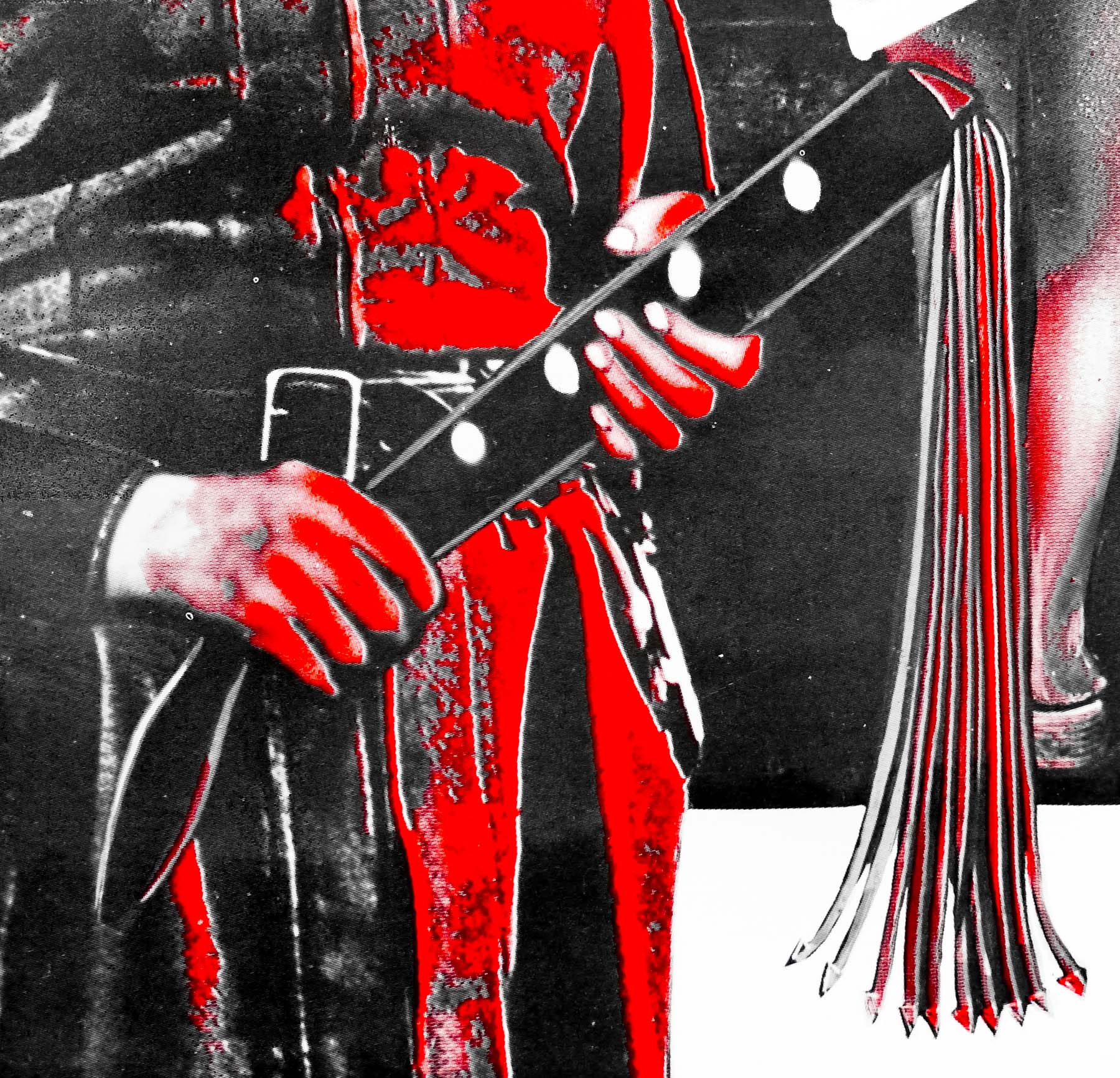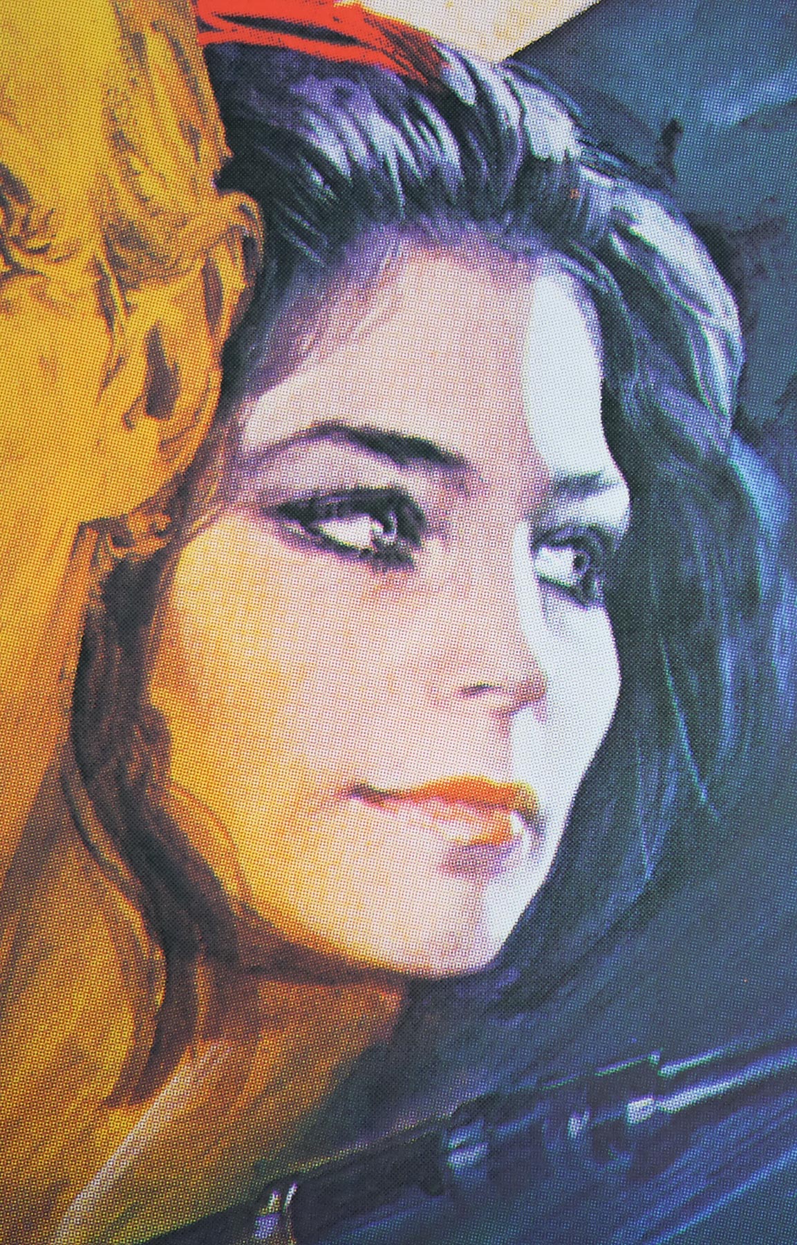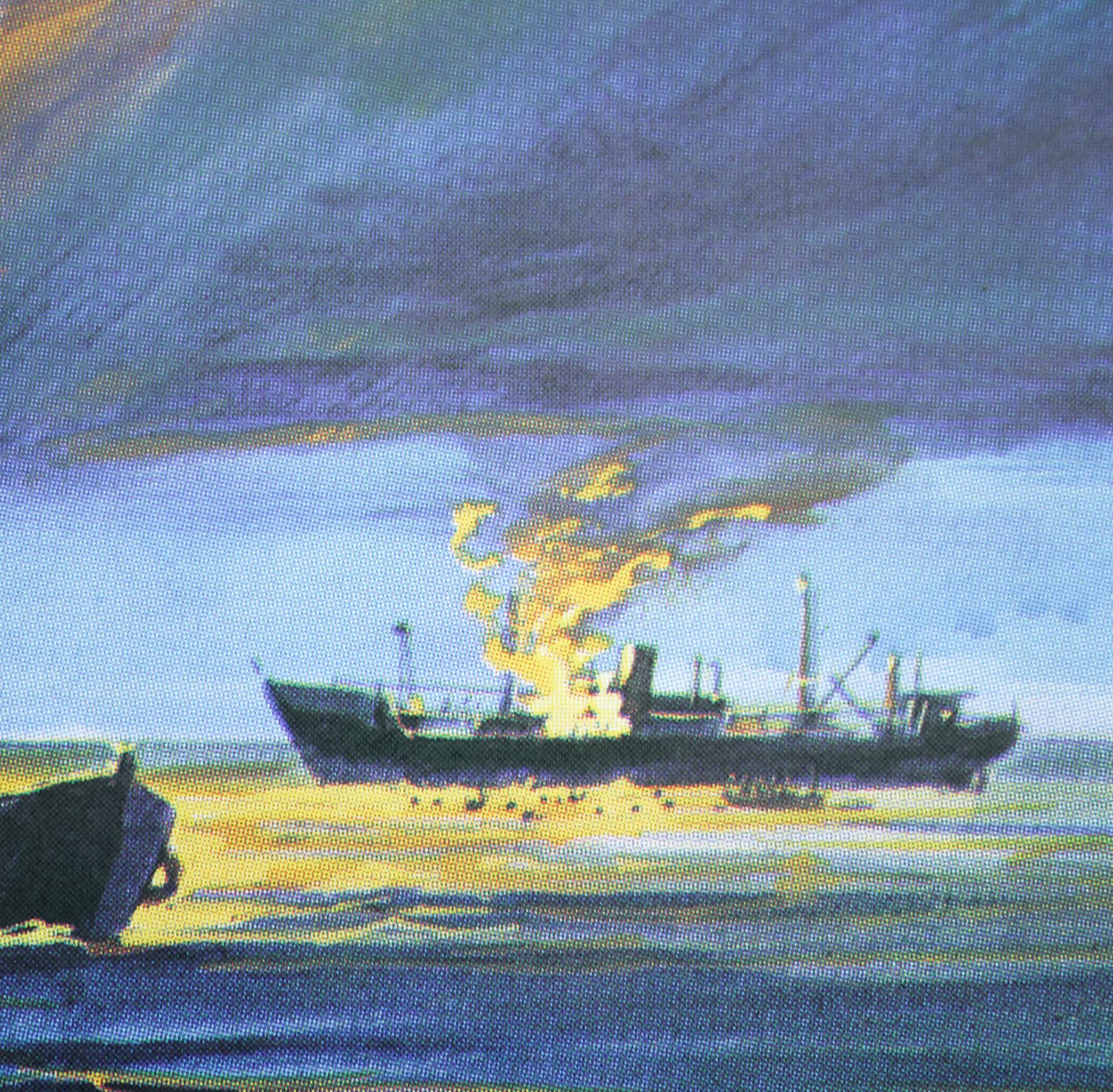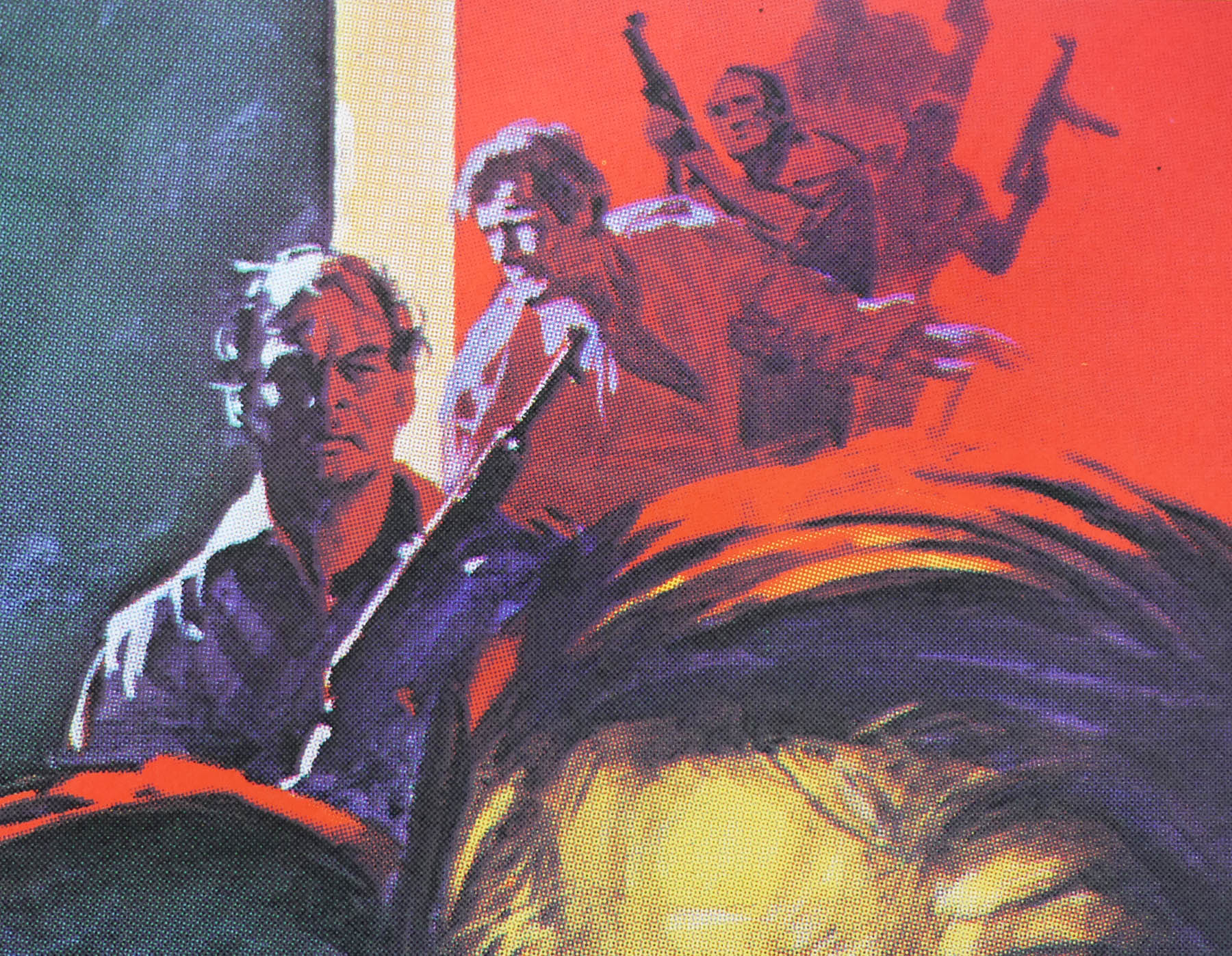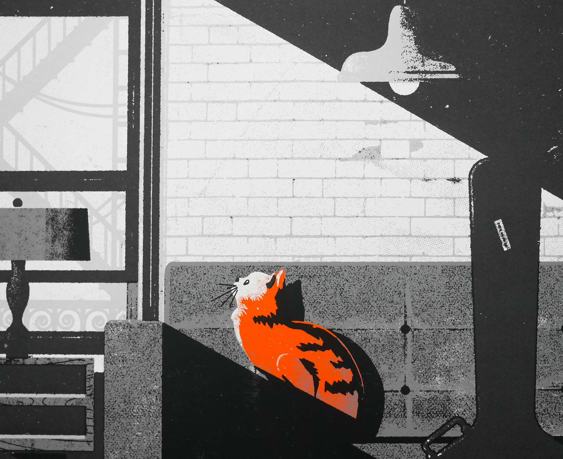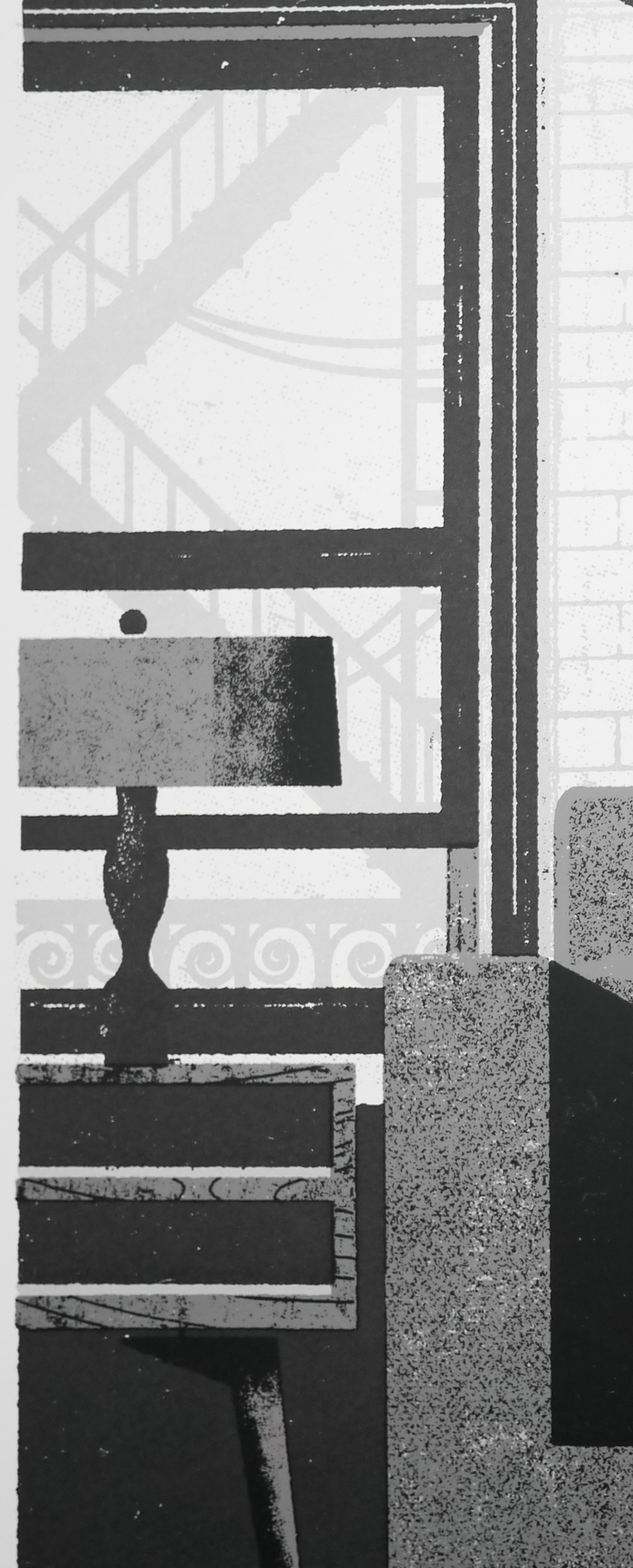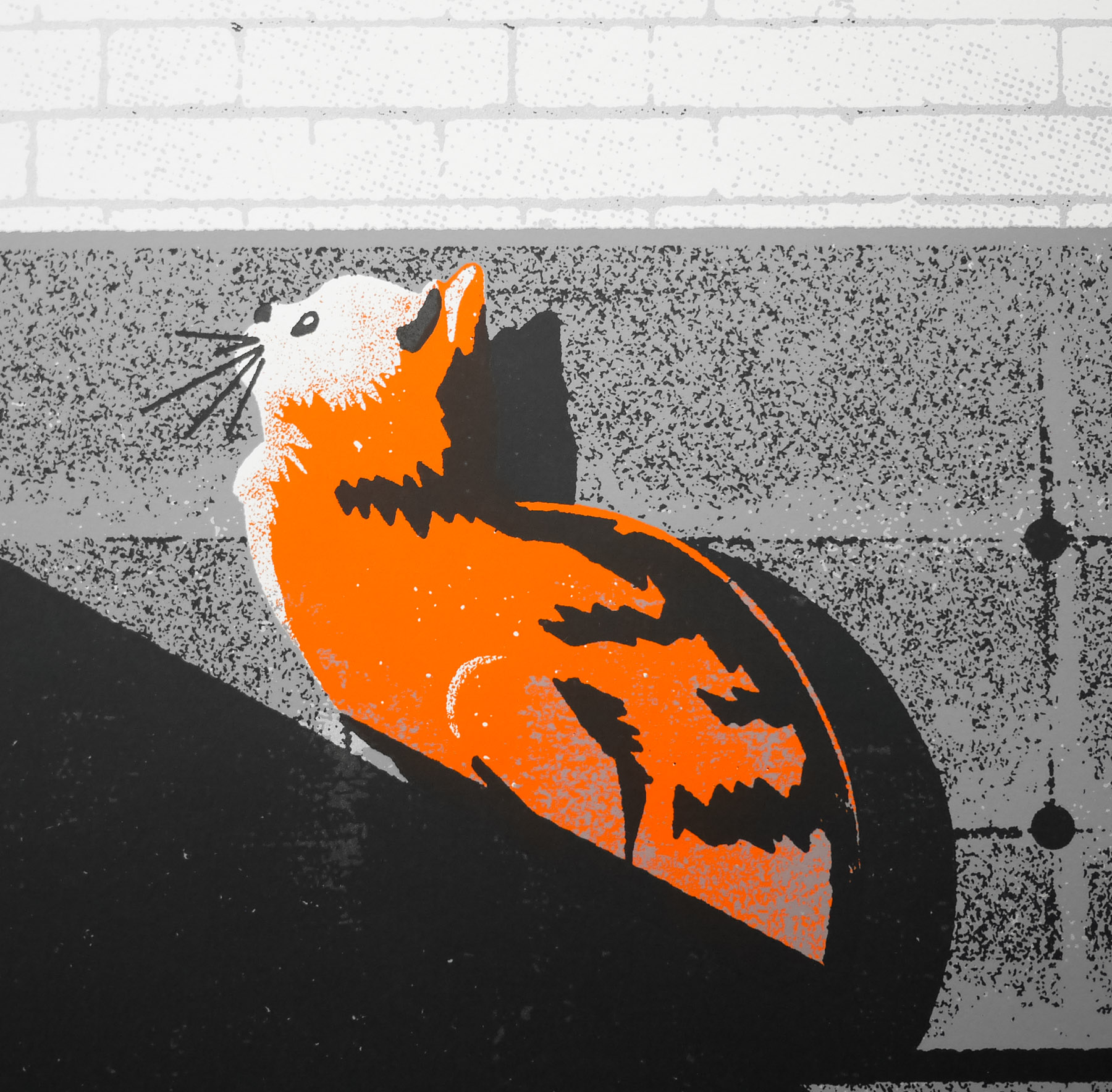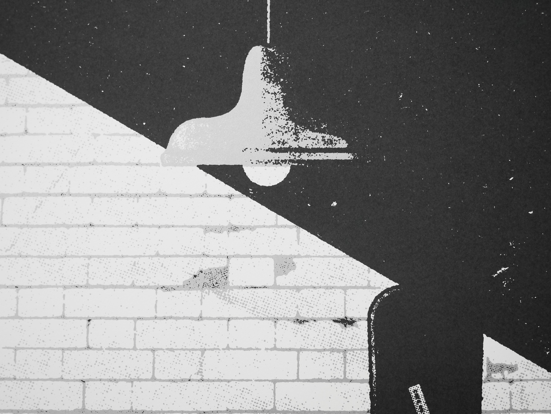
Poster detail
1-5

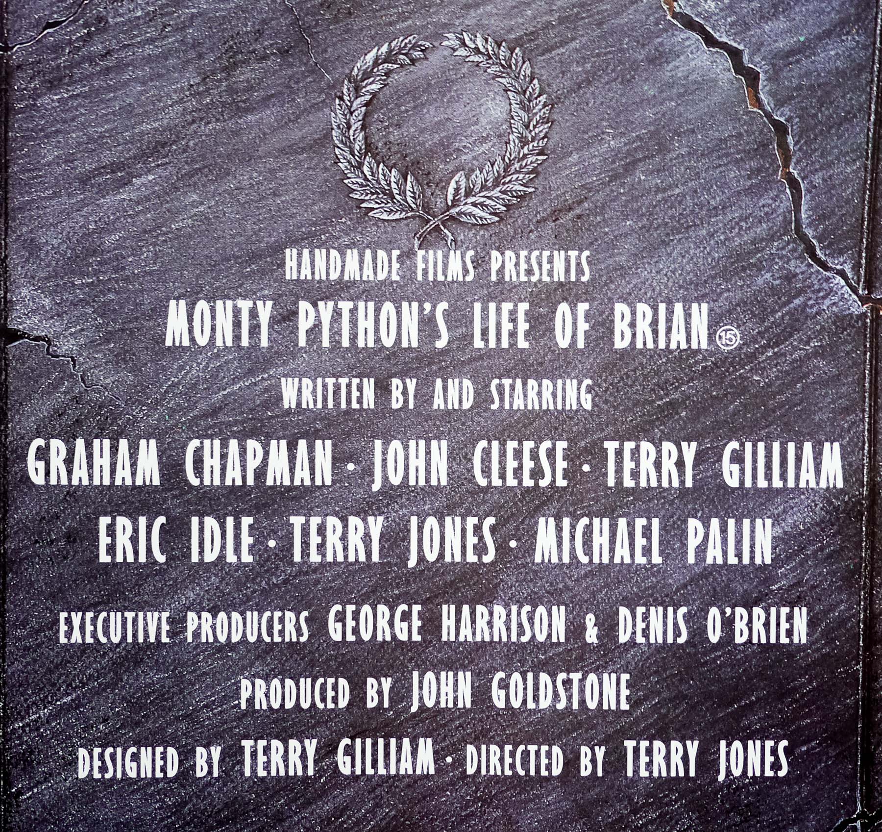
- Title
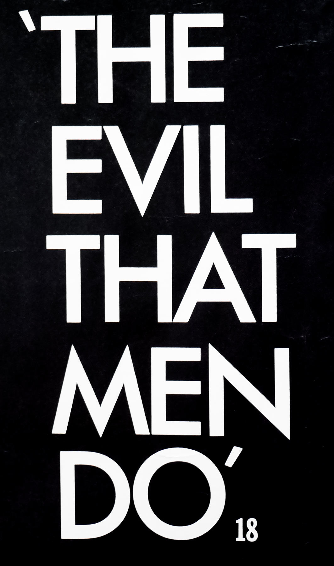
- Assault on Precinct 13
- AKA
- --
- Year of Film
- 1976
- Director
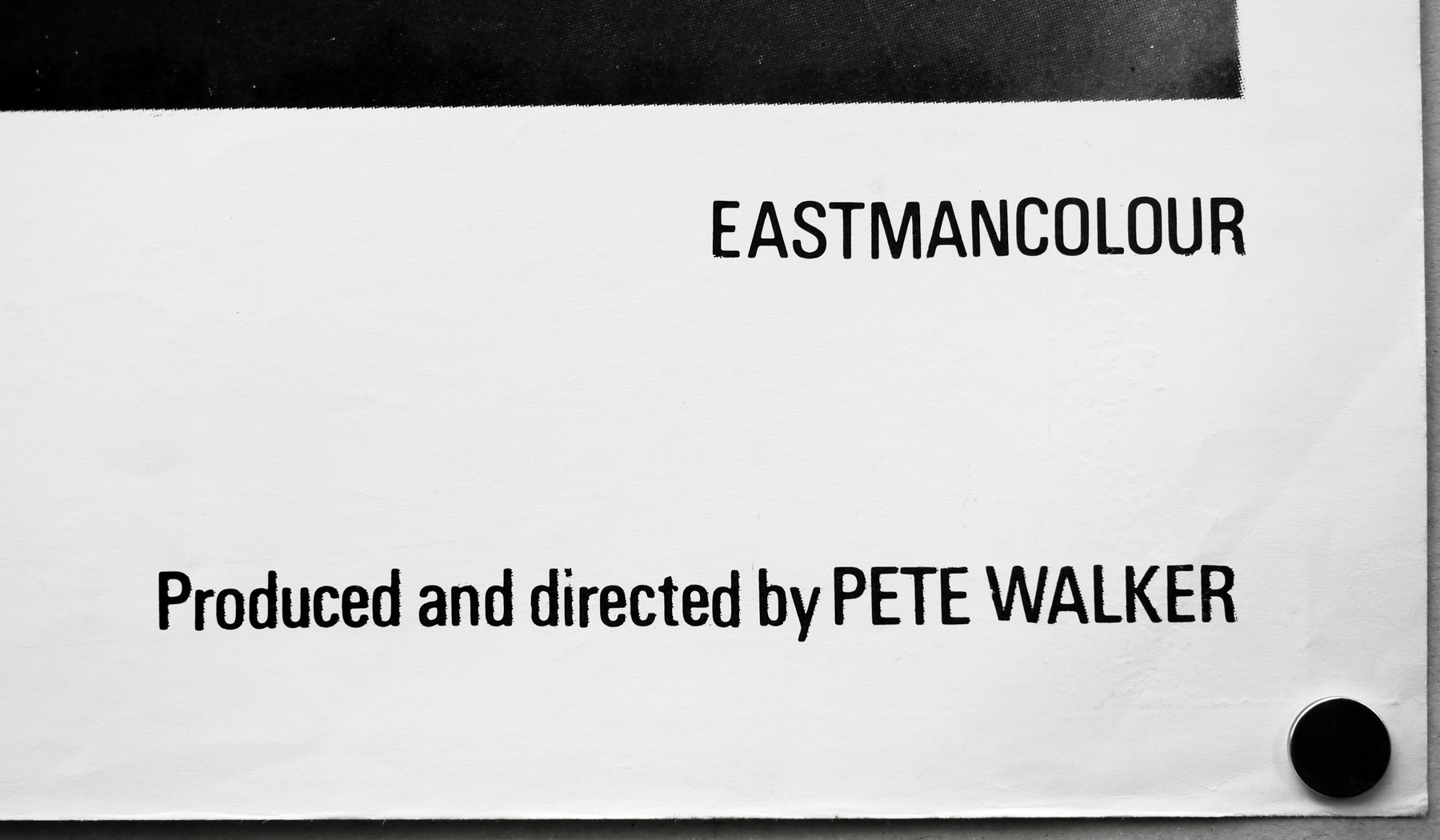
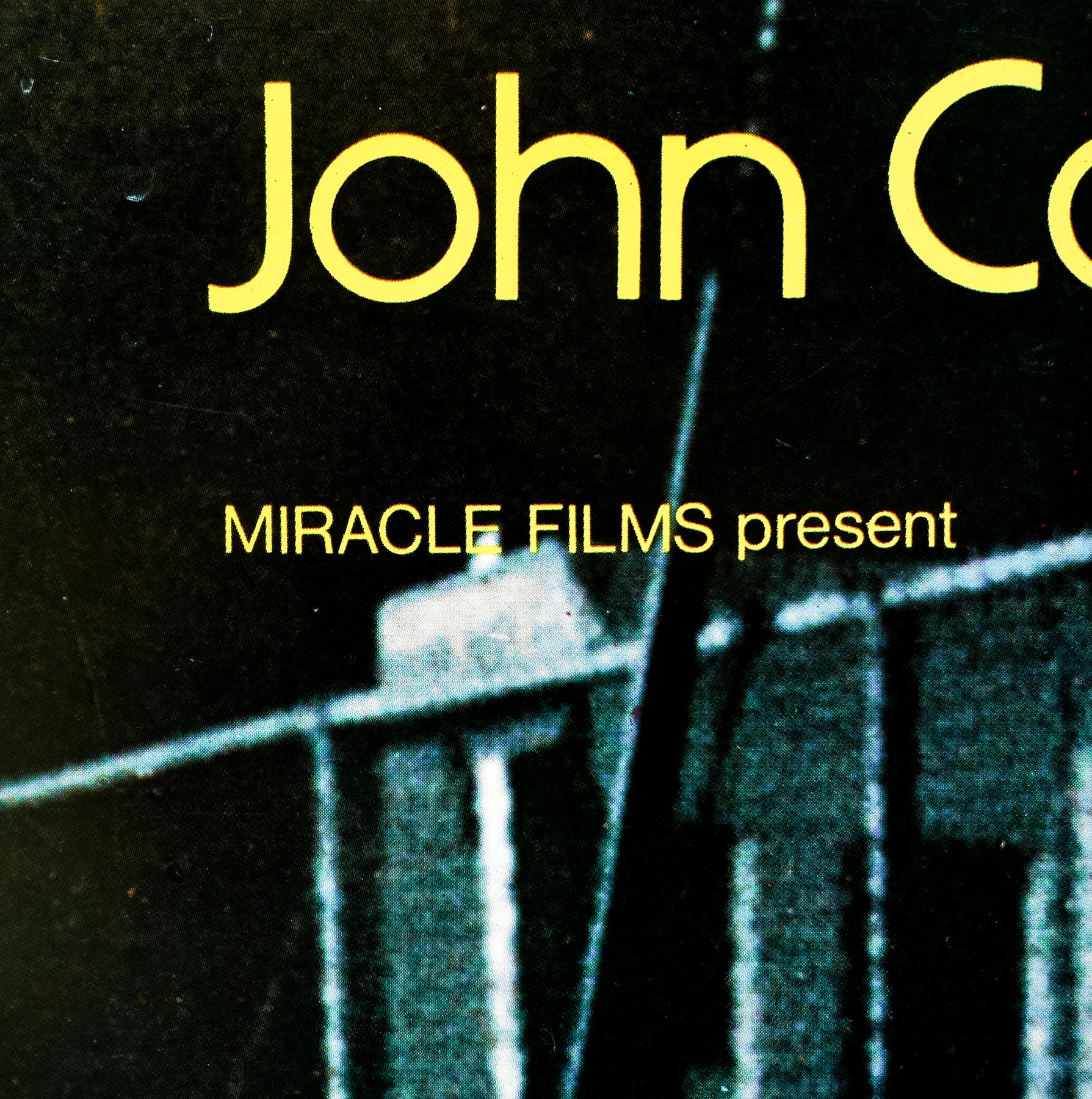
- John Carpenter
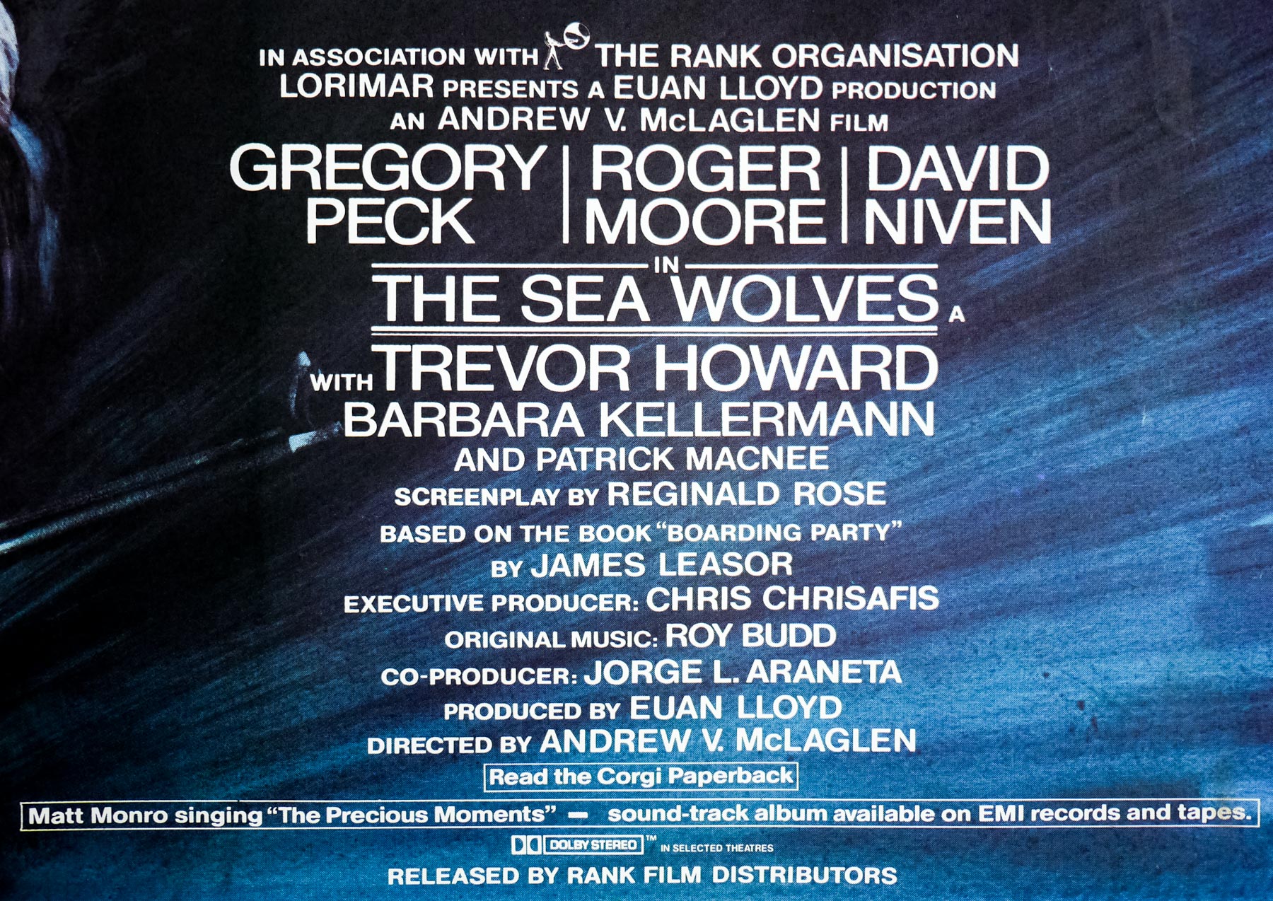
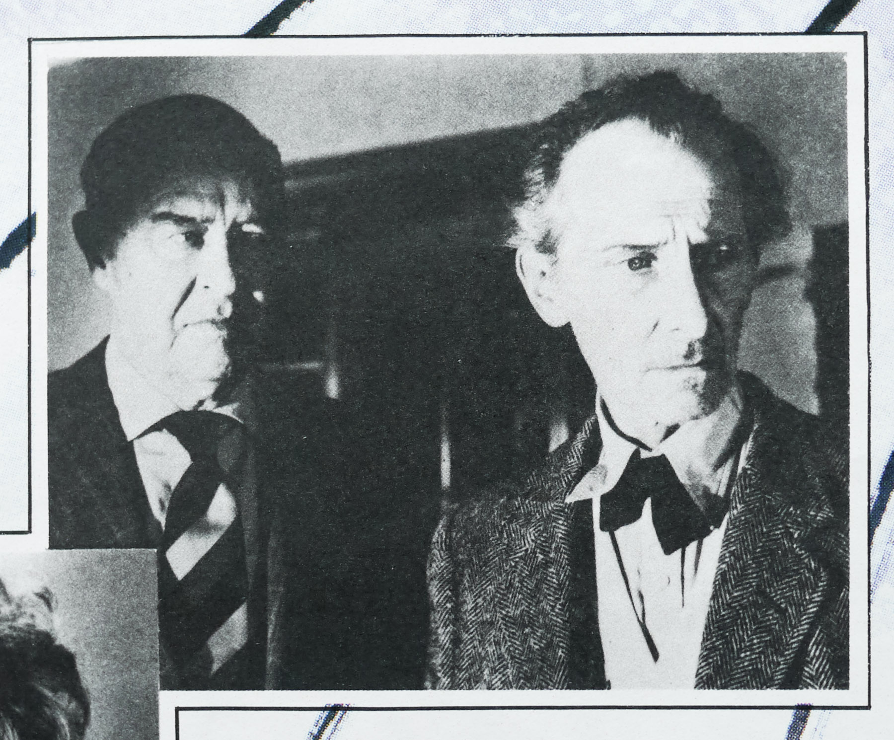
- Starring
- Austin Stoker, Darwin Joston, Laurie Zimmer, Martin West, Tony Burton, Charles Cyphers, Nancy Kyes, Peter Bruni, John J. Fox, Marc Ross, Alan Koss, Henry Brandon, Kim Richards
- Origin of Film
- USA
- Genre(s) of Film
- Austin Stoker, Darwin Joston, Laurie Zimmer, Martin West, Tony Burton, Charles Cyphers, Nancy Kyes, Peter Bruni, John J. Fox, Marc Ross, Alan Koss, Henry Brandon, Kim Richards,
- Type of Poster
- Quad
- Style of Poster
- --
- Origin of Poster
- UK
- Year of Poster
- 1977
- Designer
- Unknown
- Artist
- --
- Size (inches)
- 29.5" x 39 15/16"
- SS or DS
- SS
- Tagline
- --
Director John Carpenter followed his debut sci-fi film Dark Star (1974) with the action thriller Assault on Precinct 13. Carpenter had originally hoped to create a Howard Hawks style western, but when the $100k budget organised by his producer friends Joseph Kaufman and J. Stein Kaplan prohibited the kinds of sets and production design needed, he retooled the script to work in a modern day setting. With strong echoes of Hawks’ Rio Bravo, Carpenter completed his script in just eight days and peppered it with multiple references to classic westerns.
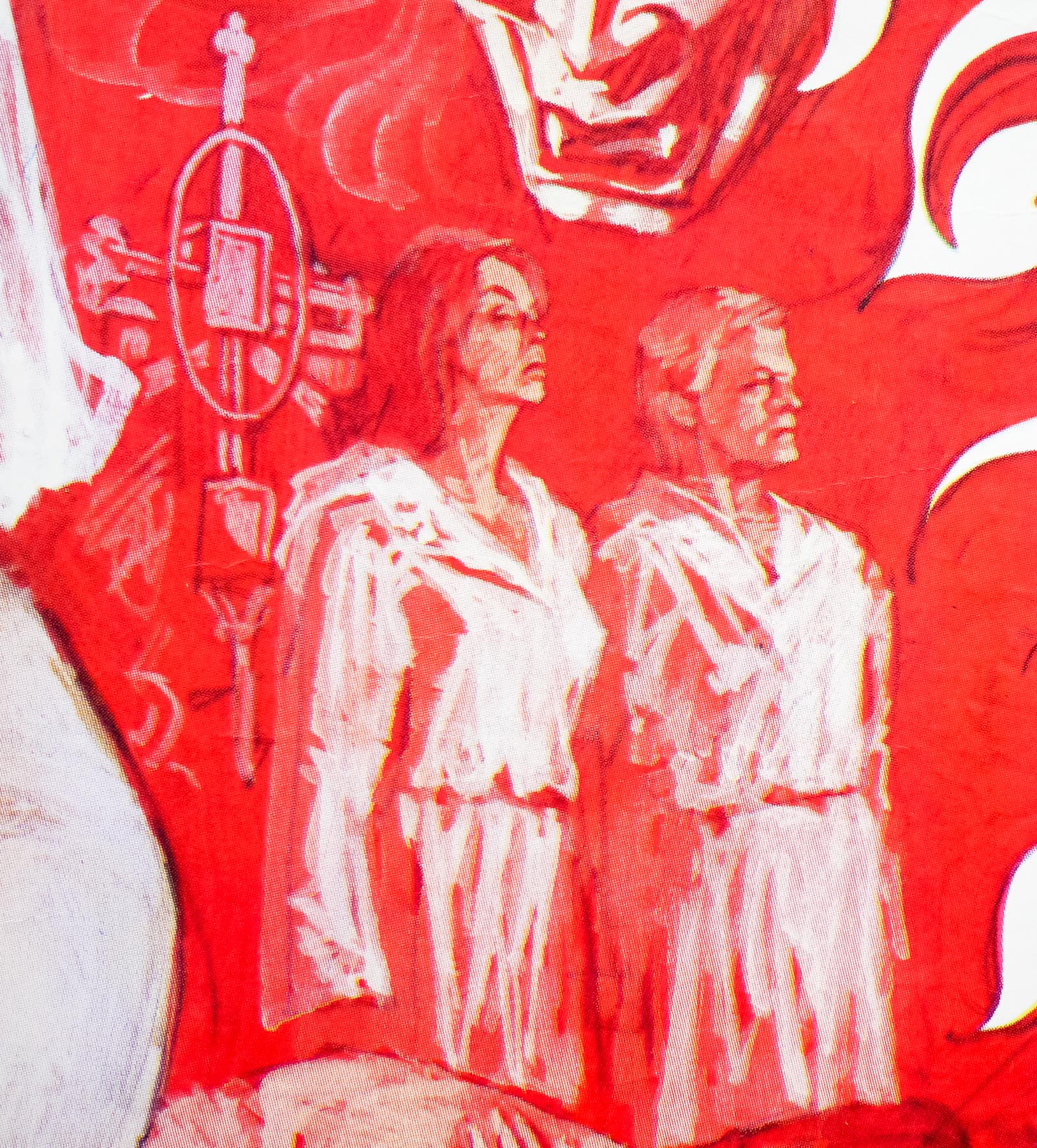
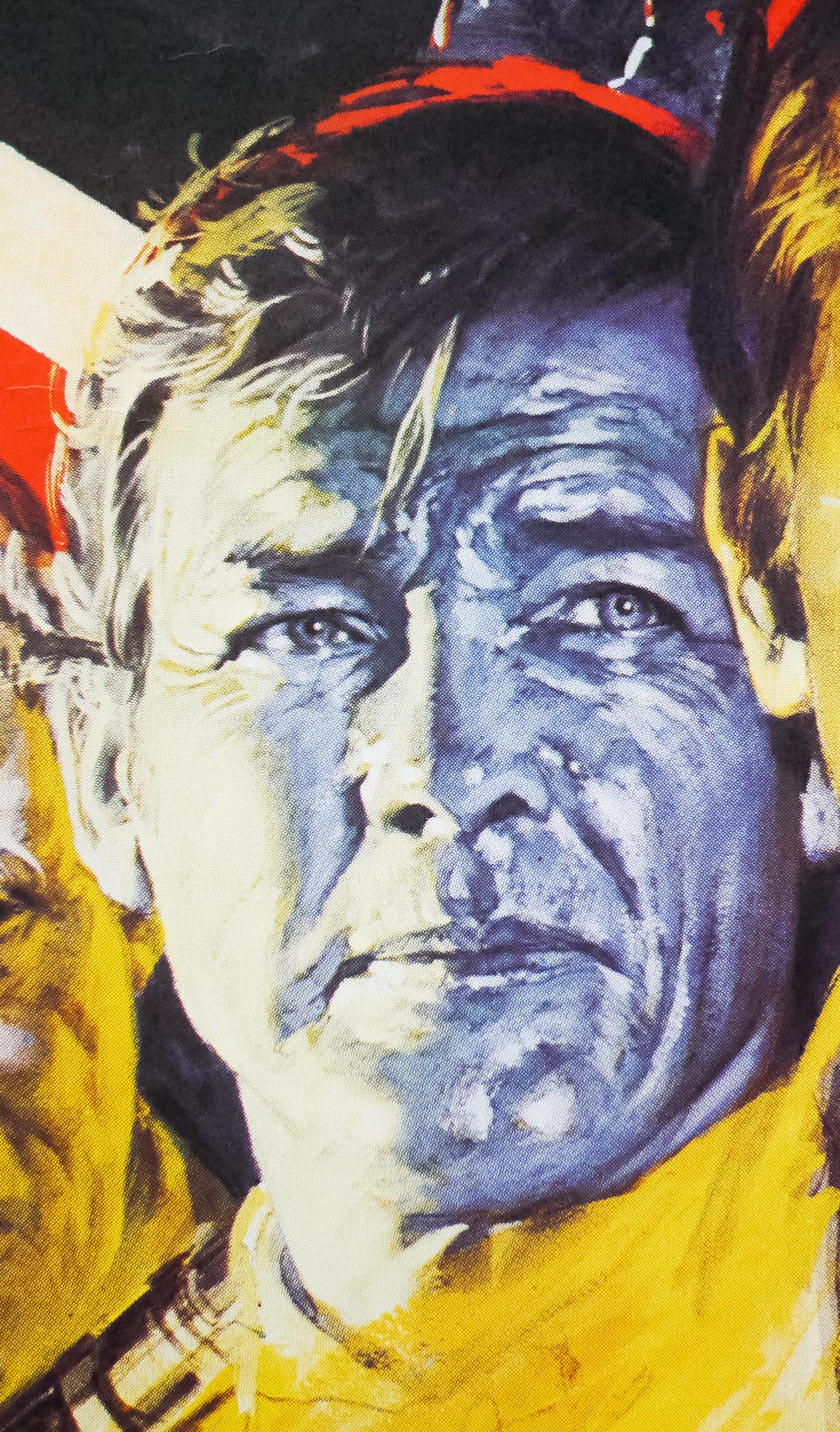
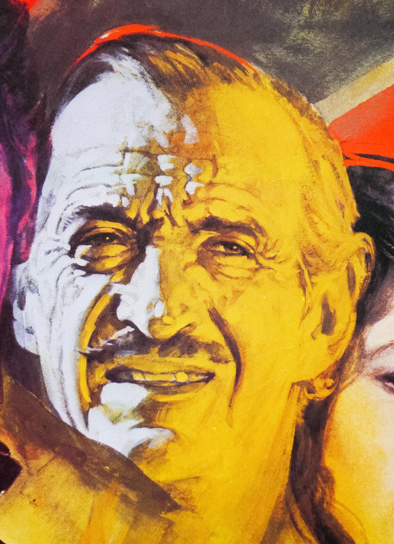
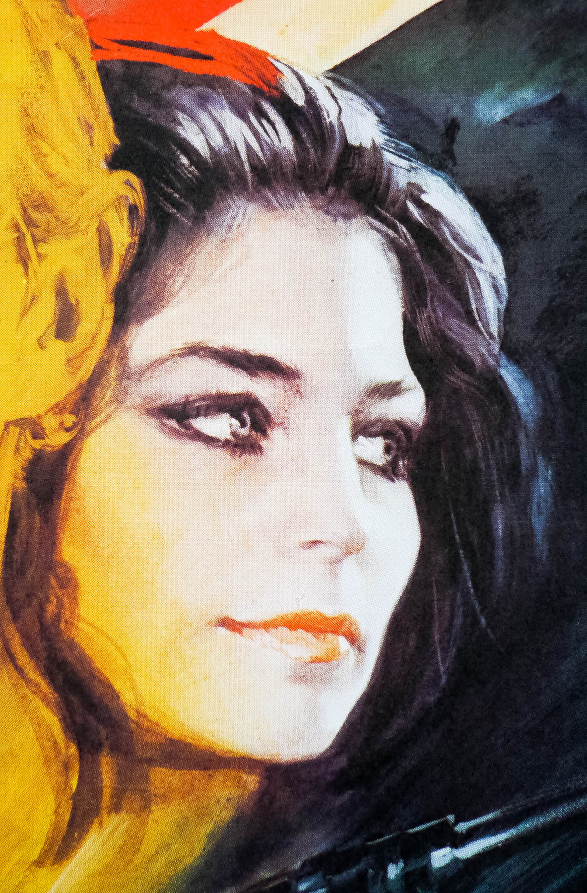
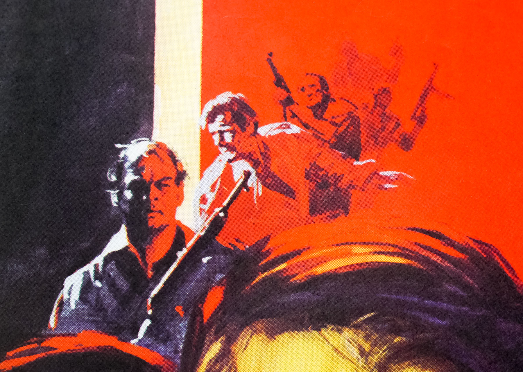
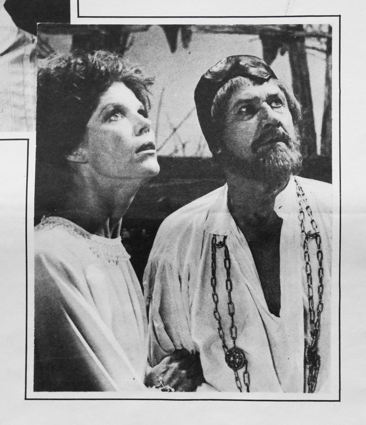
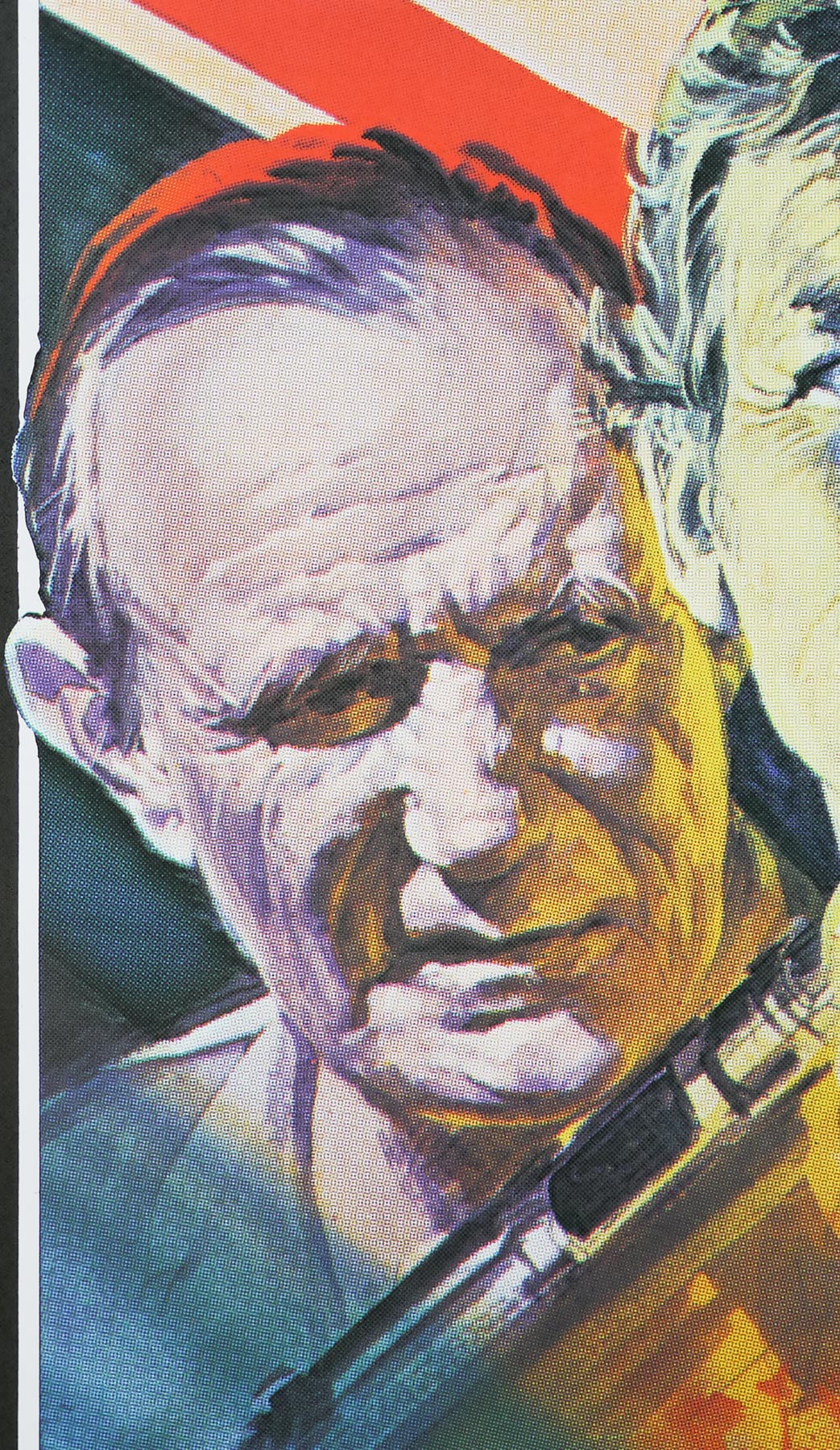
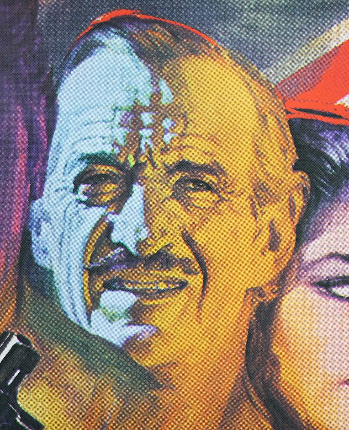
Taking place over the course of one Saturday (a number of time and location cards are displayed throughout) the story is set in a crime-infested Los Angeles ghetto and begins at 3.00am as six members of a gang called Street Thunder are ambushed and killed by the LAPD. Soon afterwards the warlords of the gang swear a blood oath of revenge against the whole city. Later that day, Lieutenant Ethan Bishop (Austin Stoker) arrives at the local Anderson police precinct in order to help the remaining skeleton staff, including Captain Chaney (Henry Brandon) and two secretaries, close the building for good.
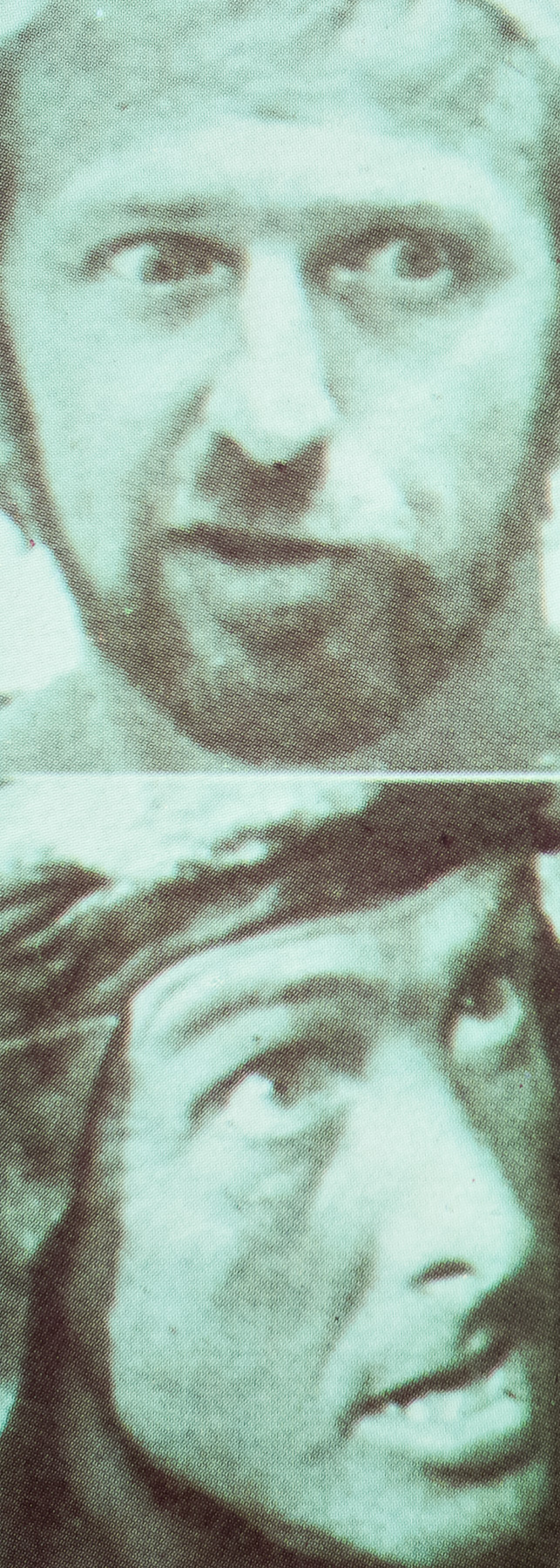
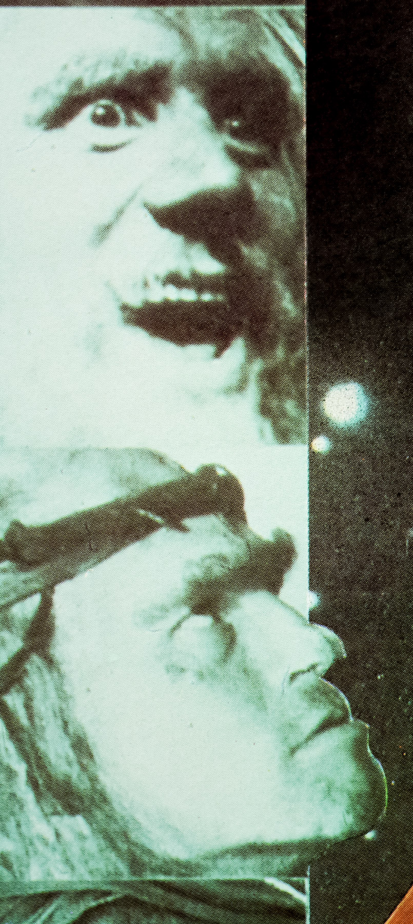
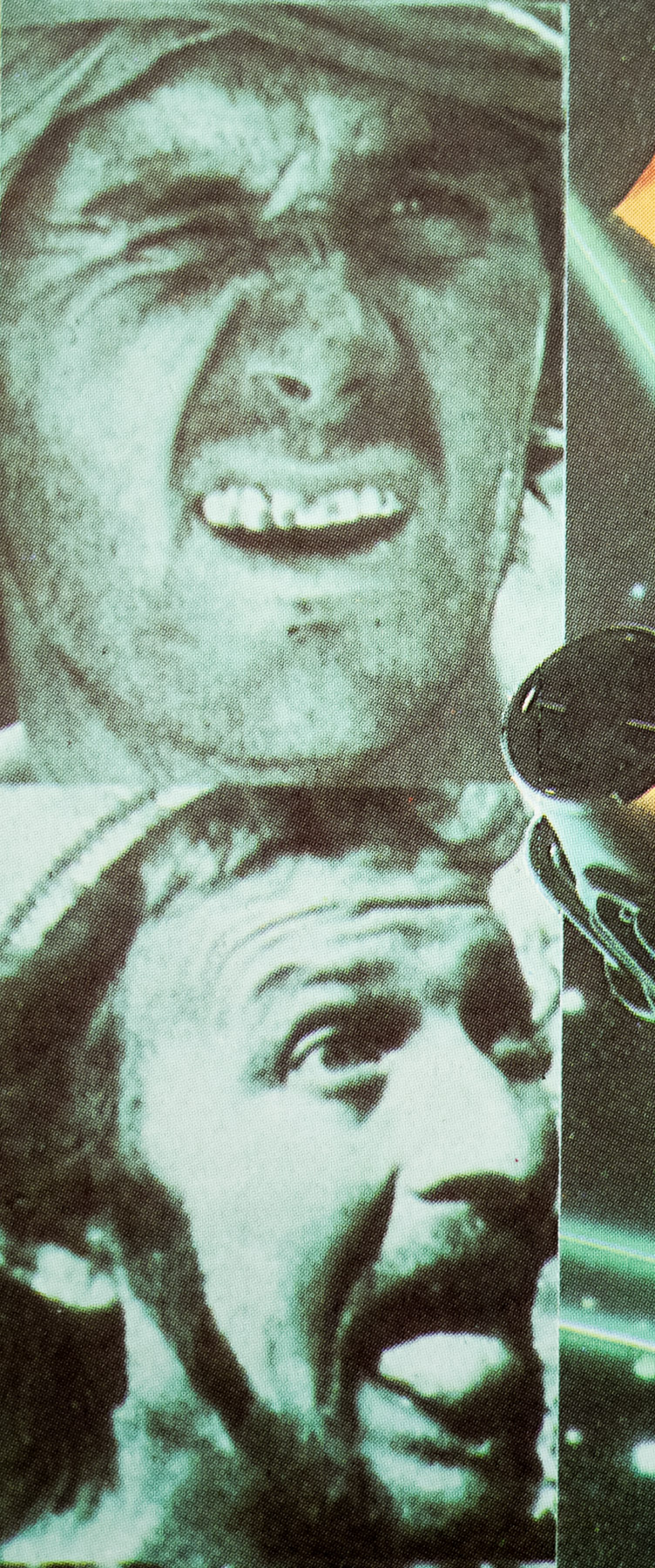
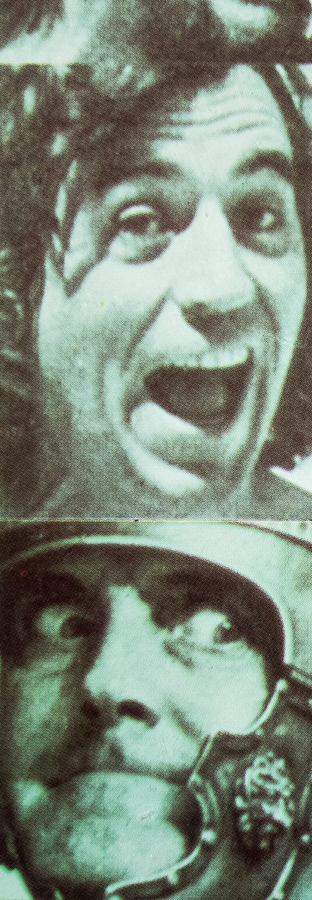
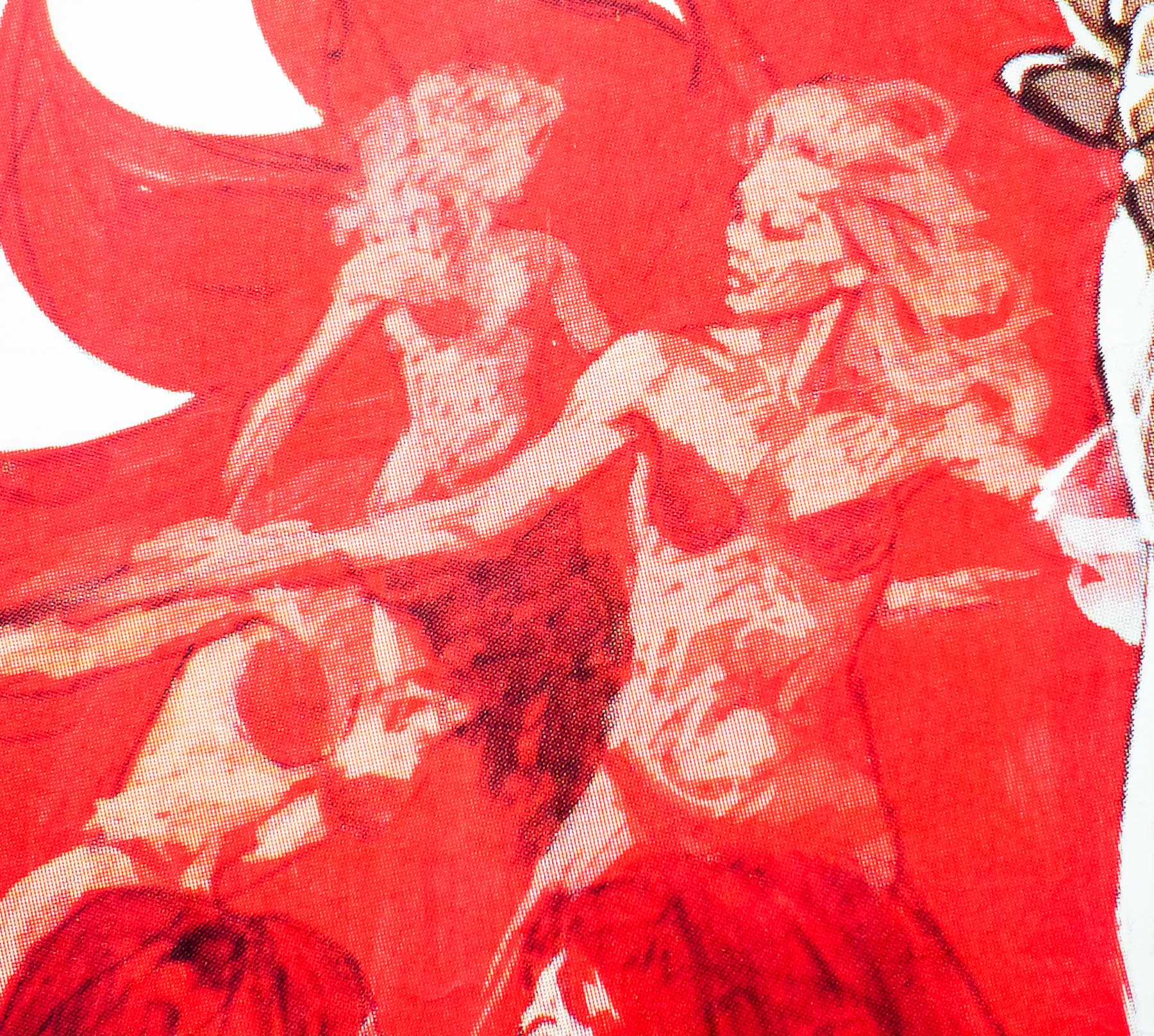
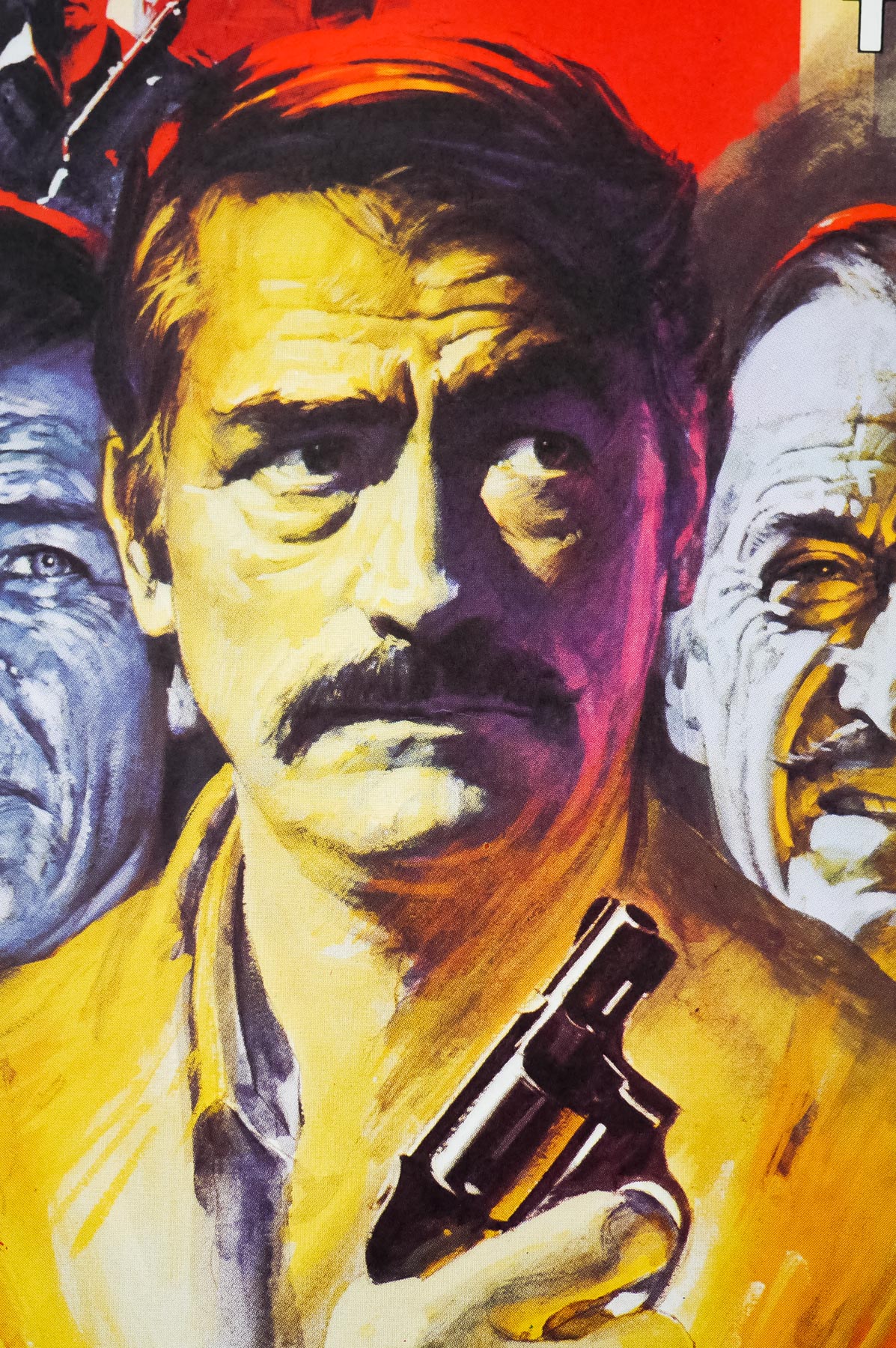
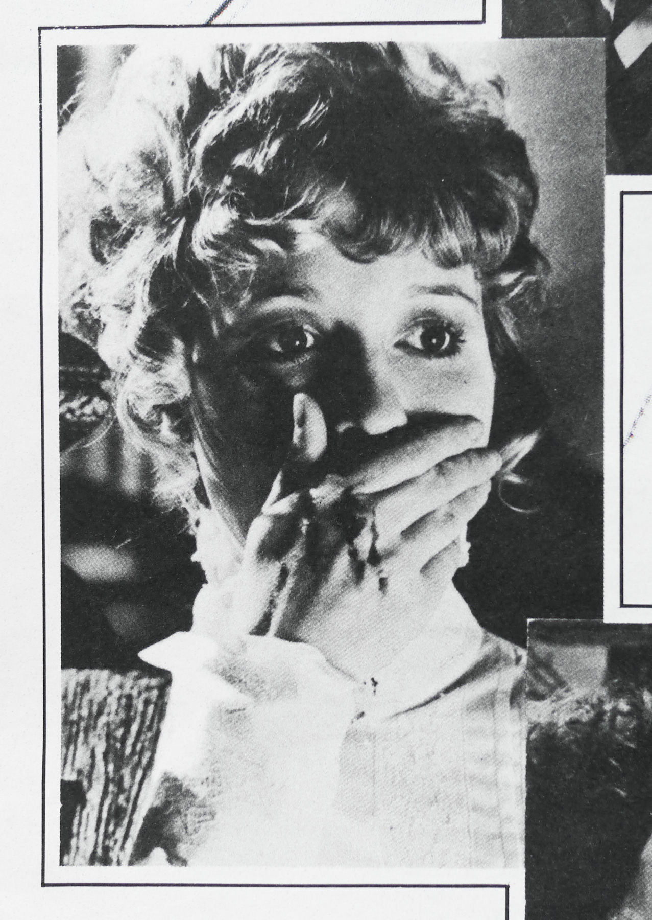
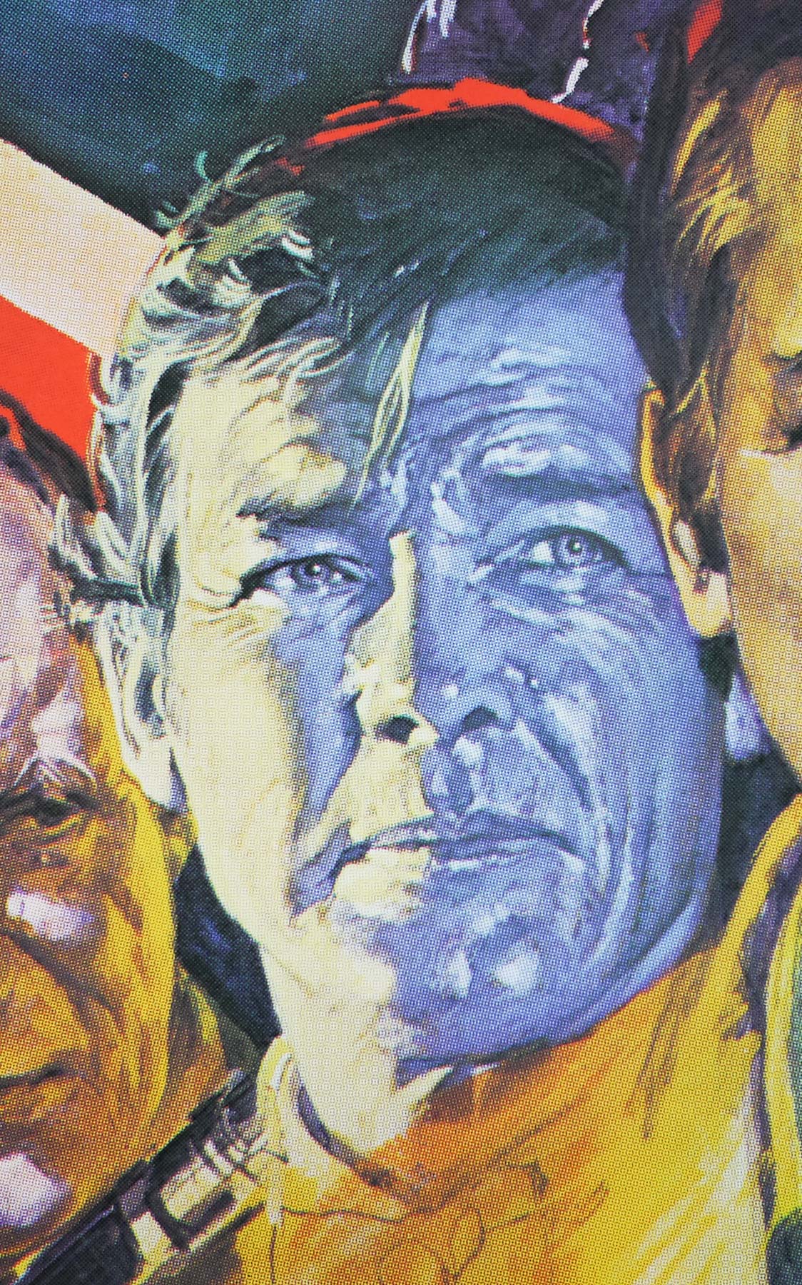
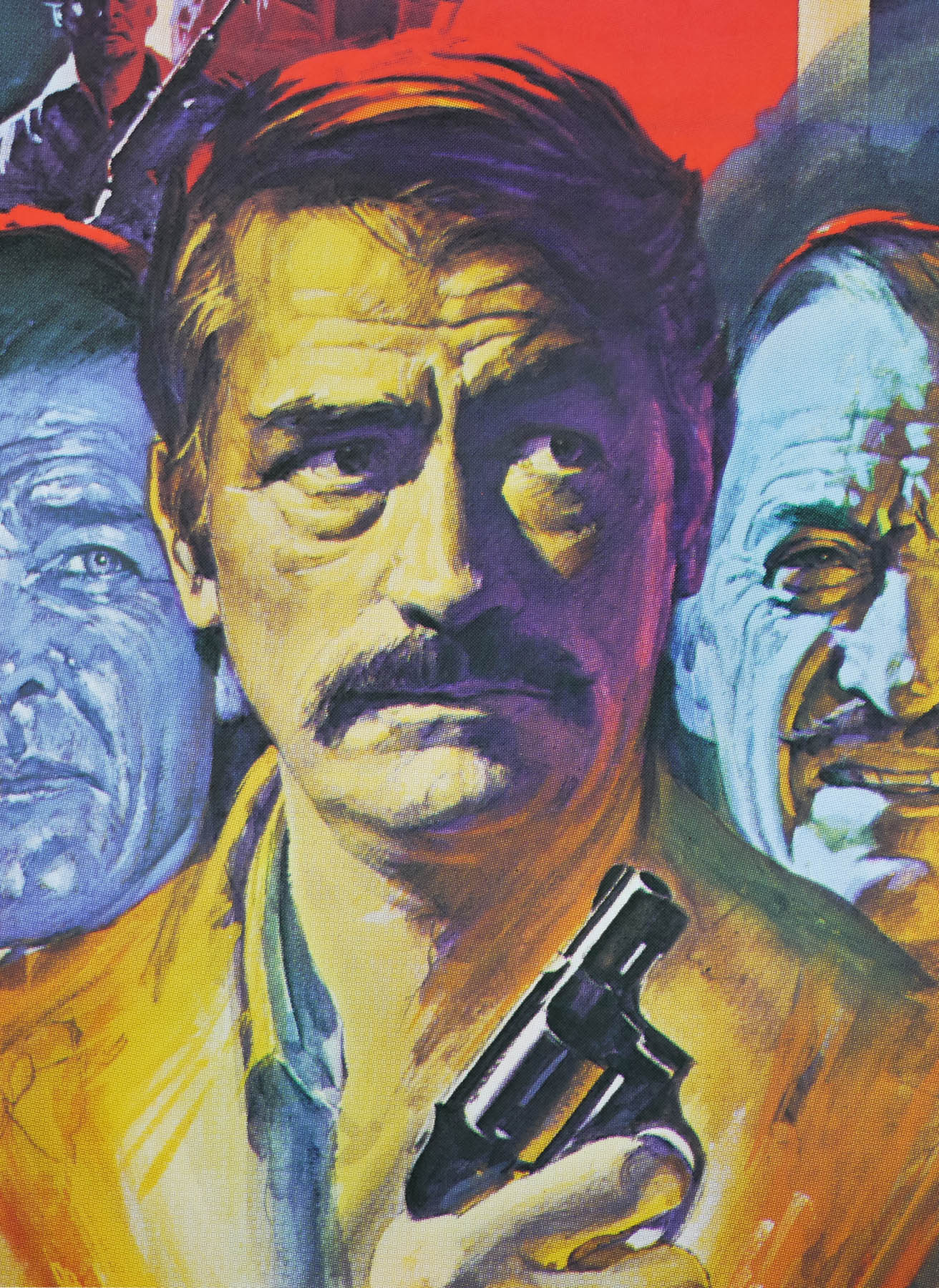
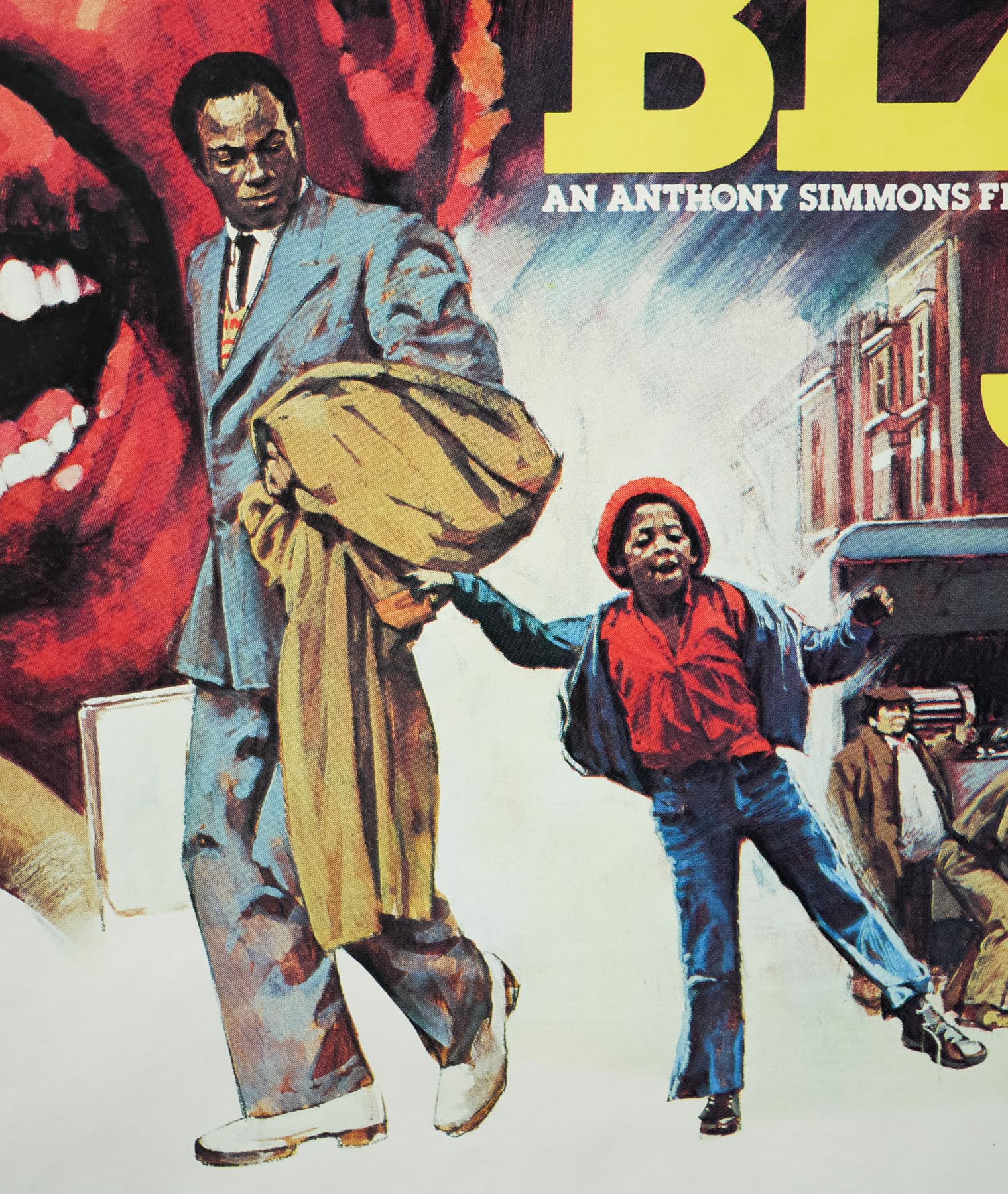
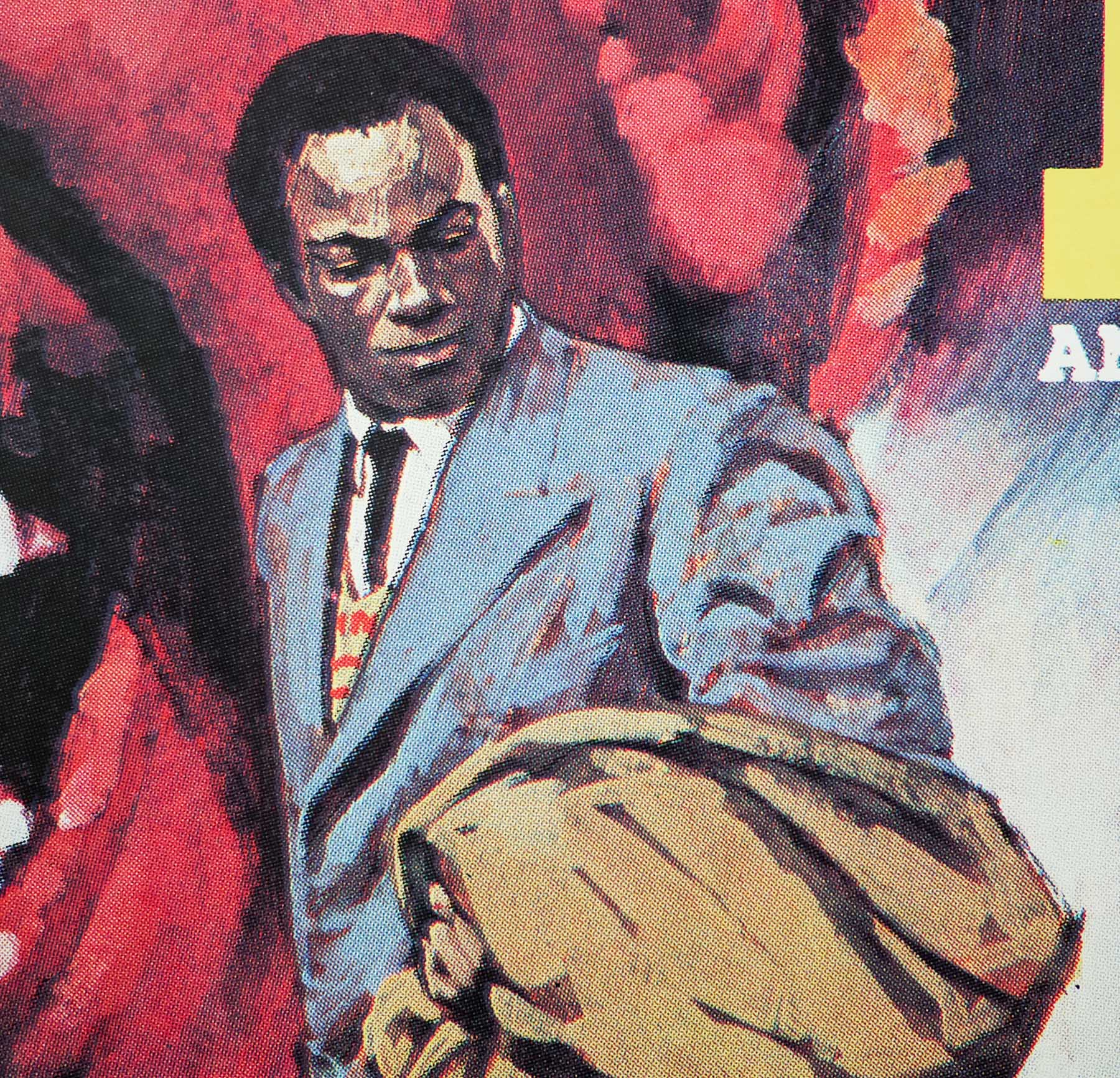
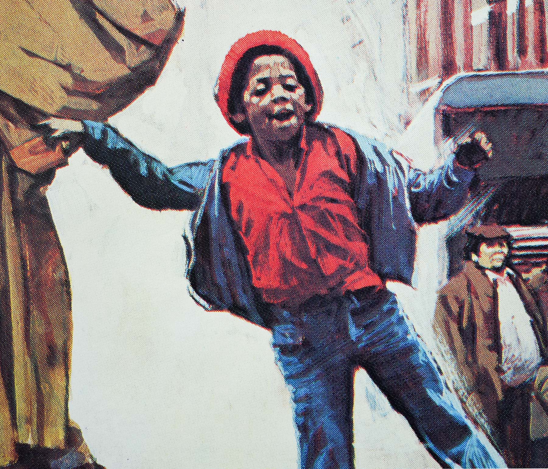
A bus carrying three convicts, including Napoleon Wilson (Darwin Joston), makes an unscheduled stop at the precinct seeking medical help for one of the men. At the same time across town, a gang of the warlords shoot and kill a young girl and an ice cream seller (a shocking sequence that Carpenter almost had to remove at the request of the MPAA) and the girl’s father, Lawson (Martin West) immediately retaliates and kills one of the warlords. The rest of the gang chases Lawson through the streets and into the Anderson police precinct. Before they know it, the inhabitants of the station are under assault from the gang and must fight for their very survival.
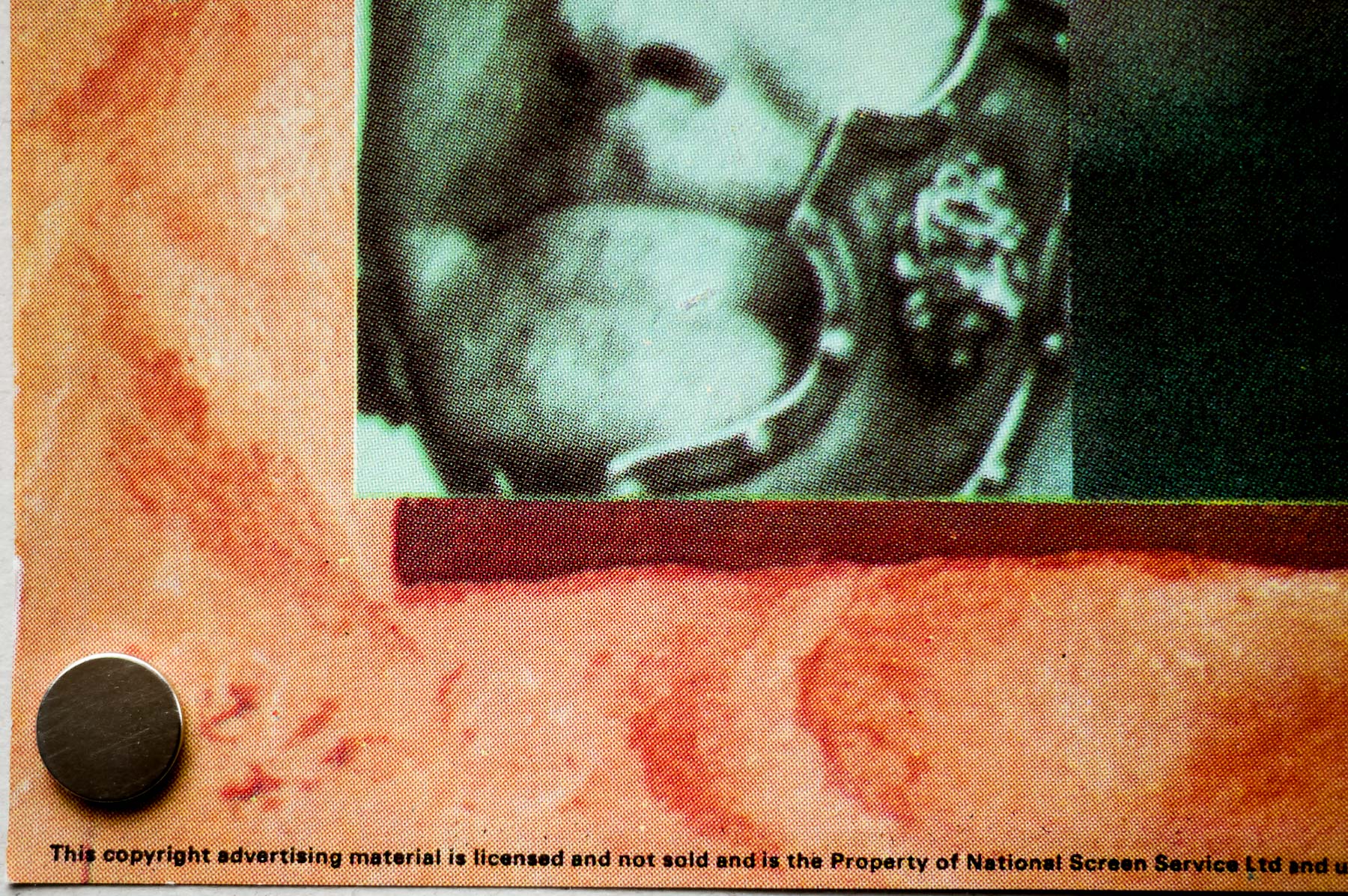
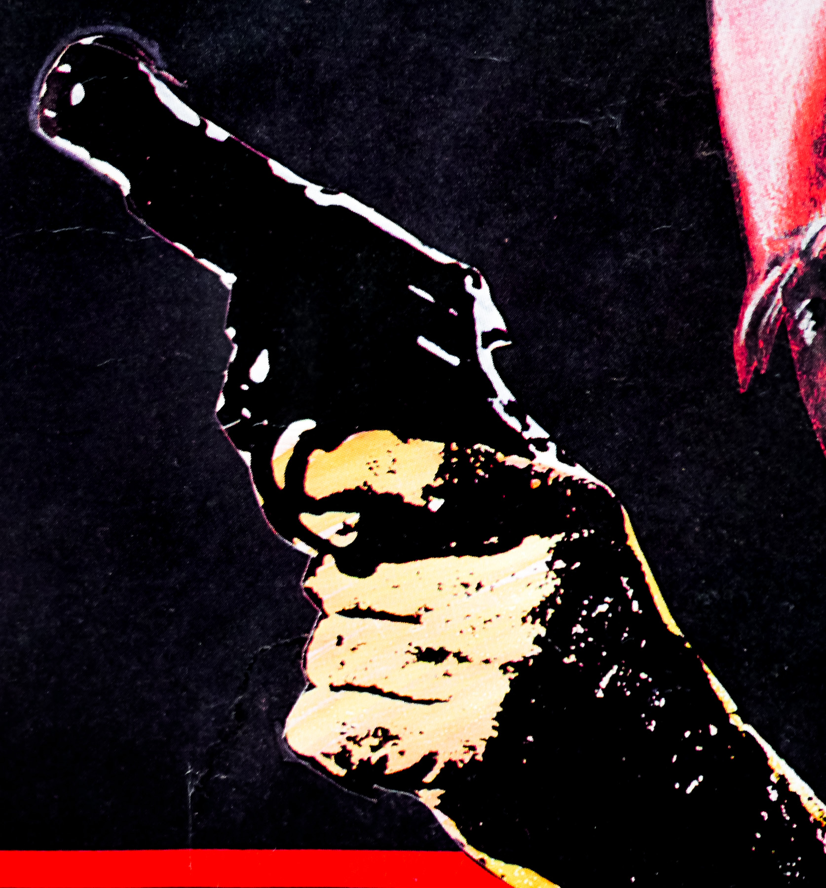
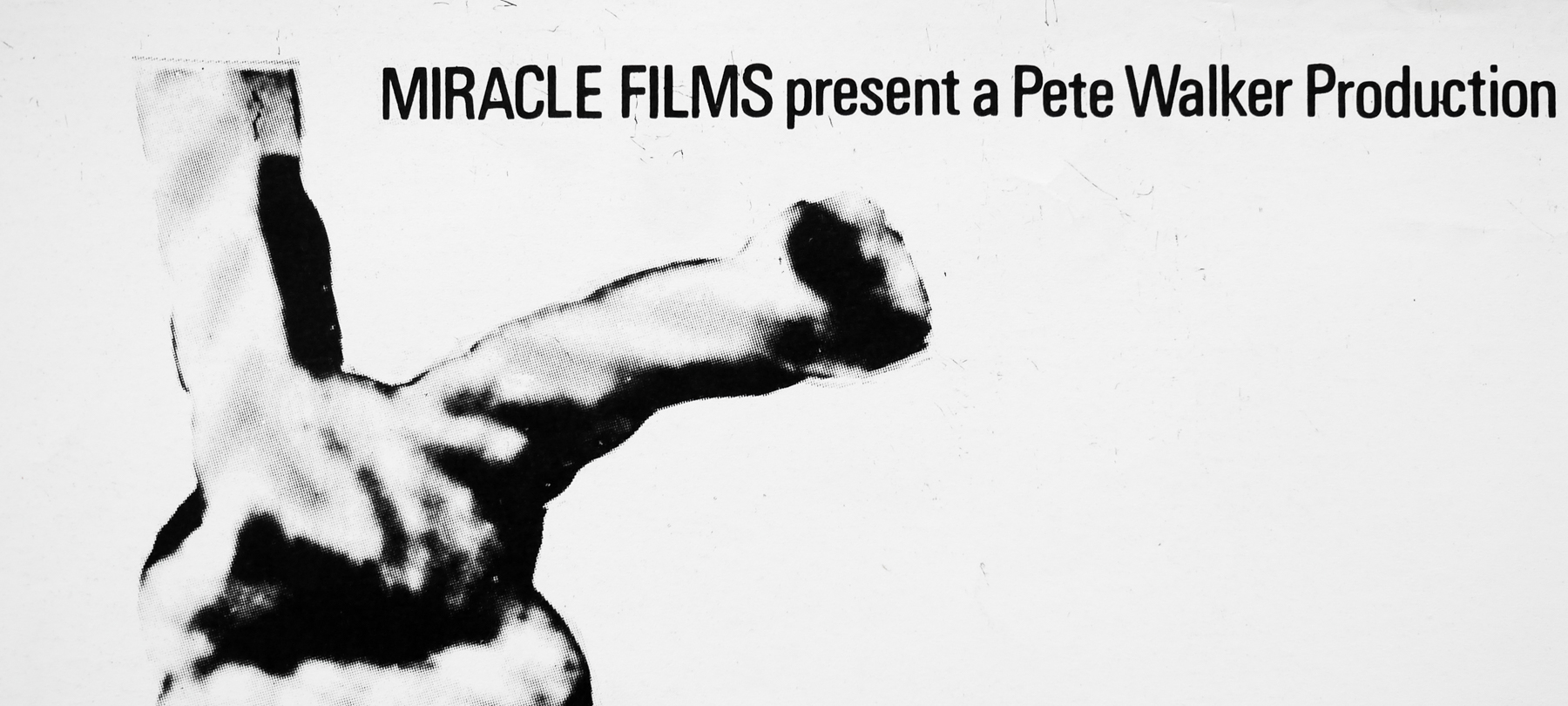
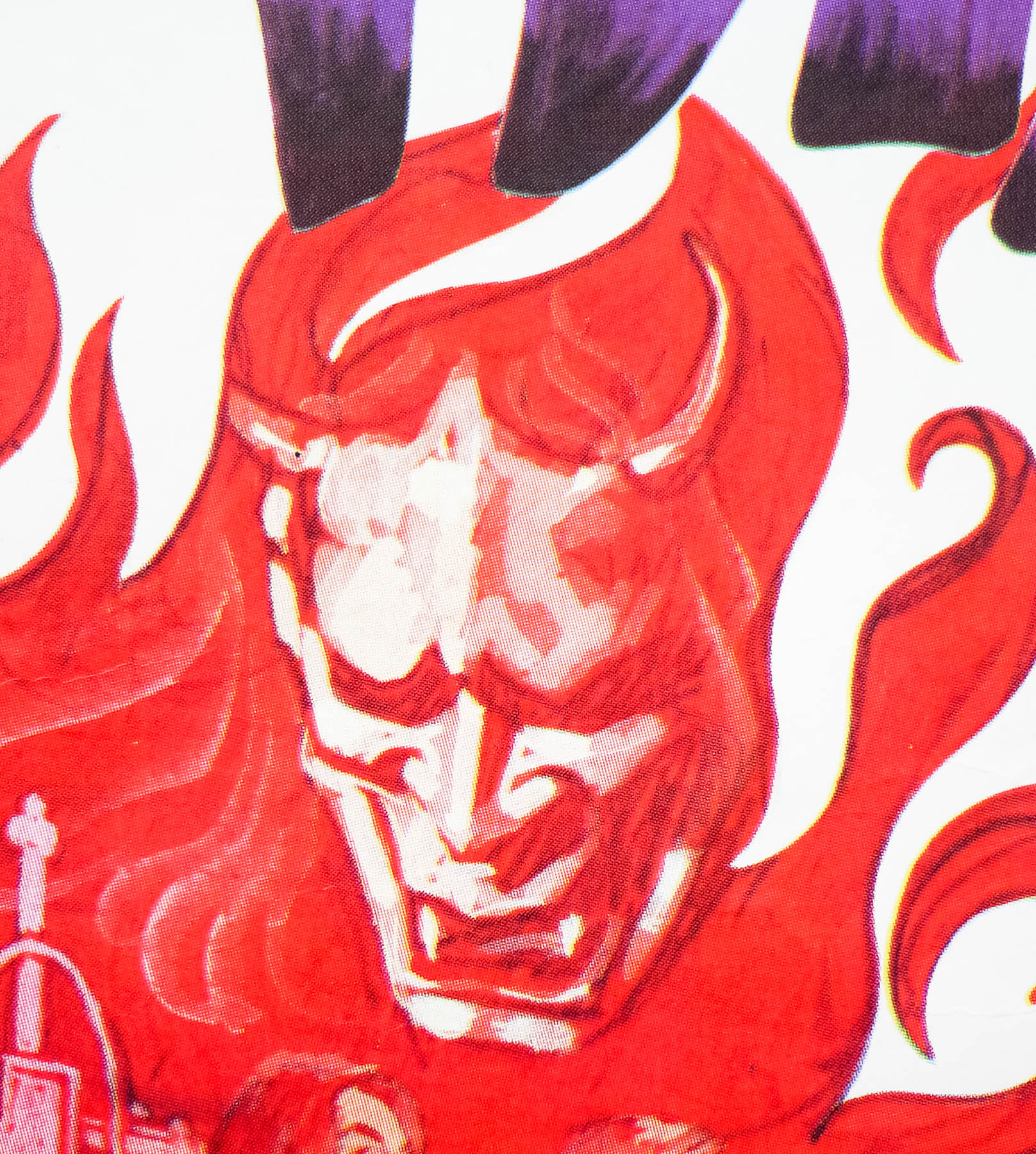
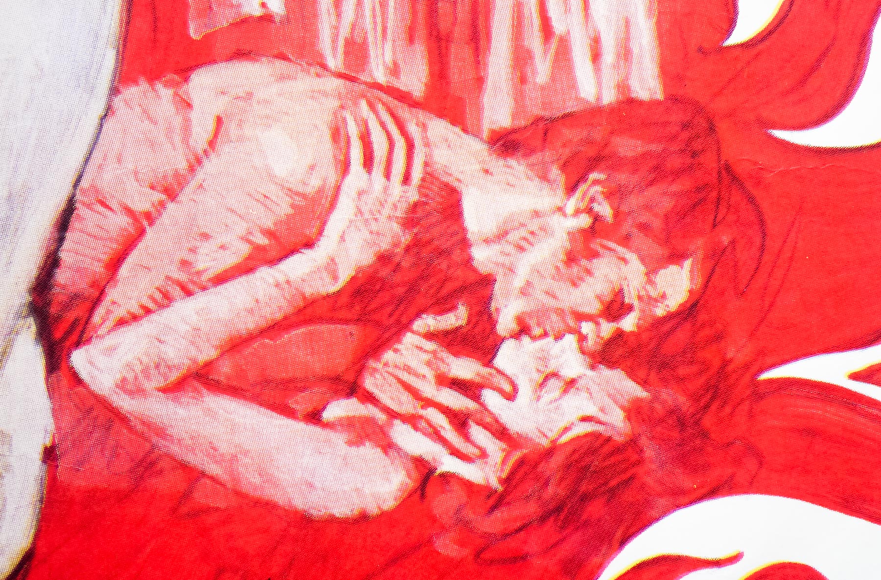
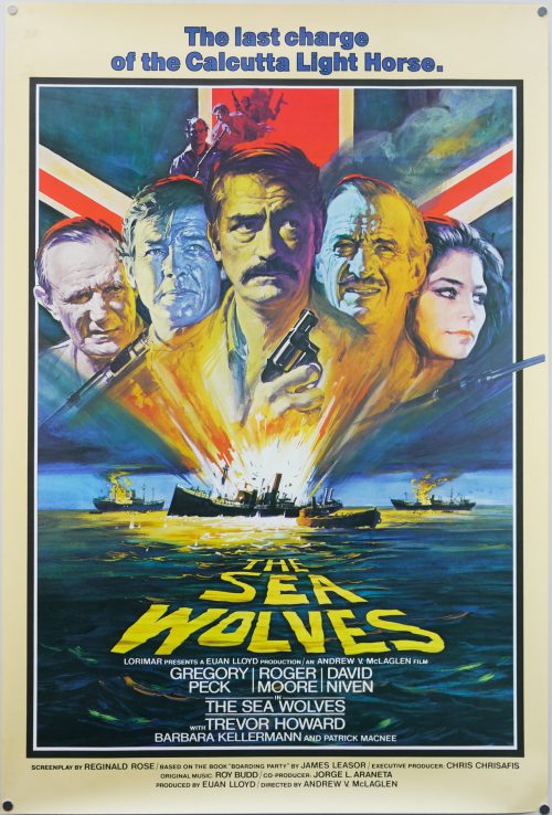
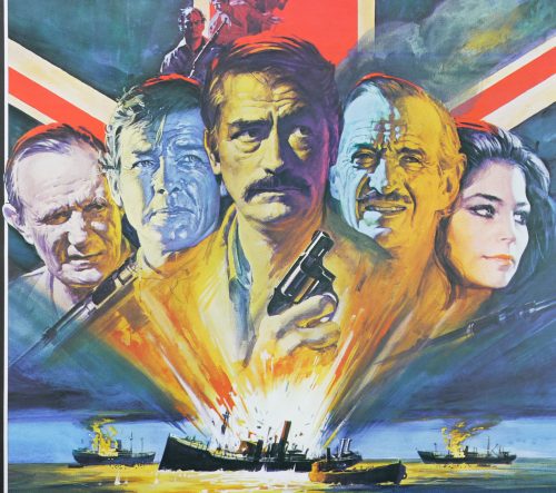
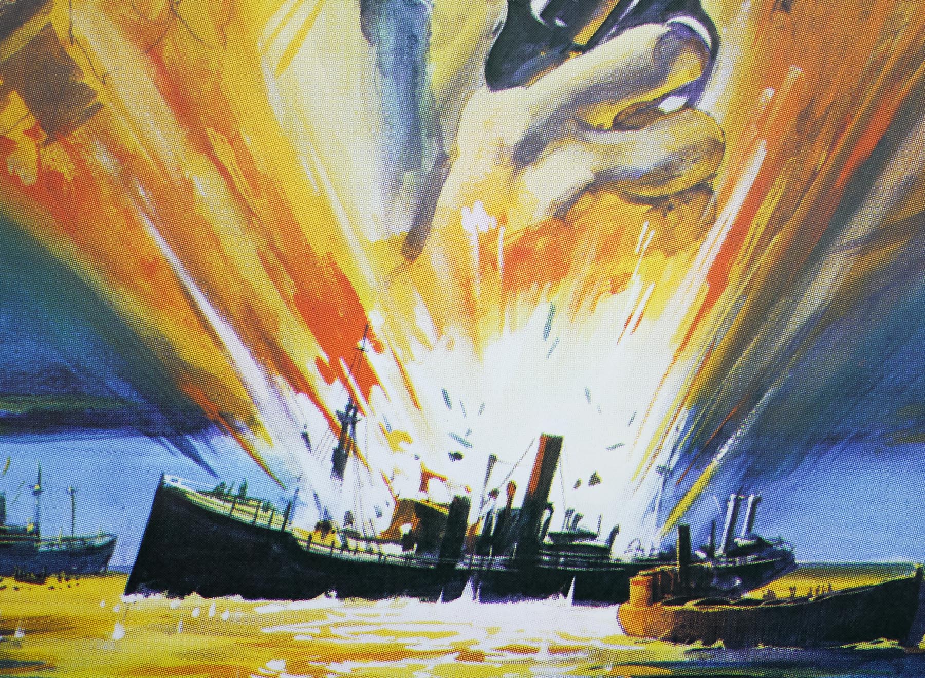
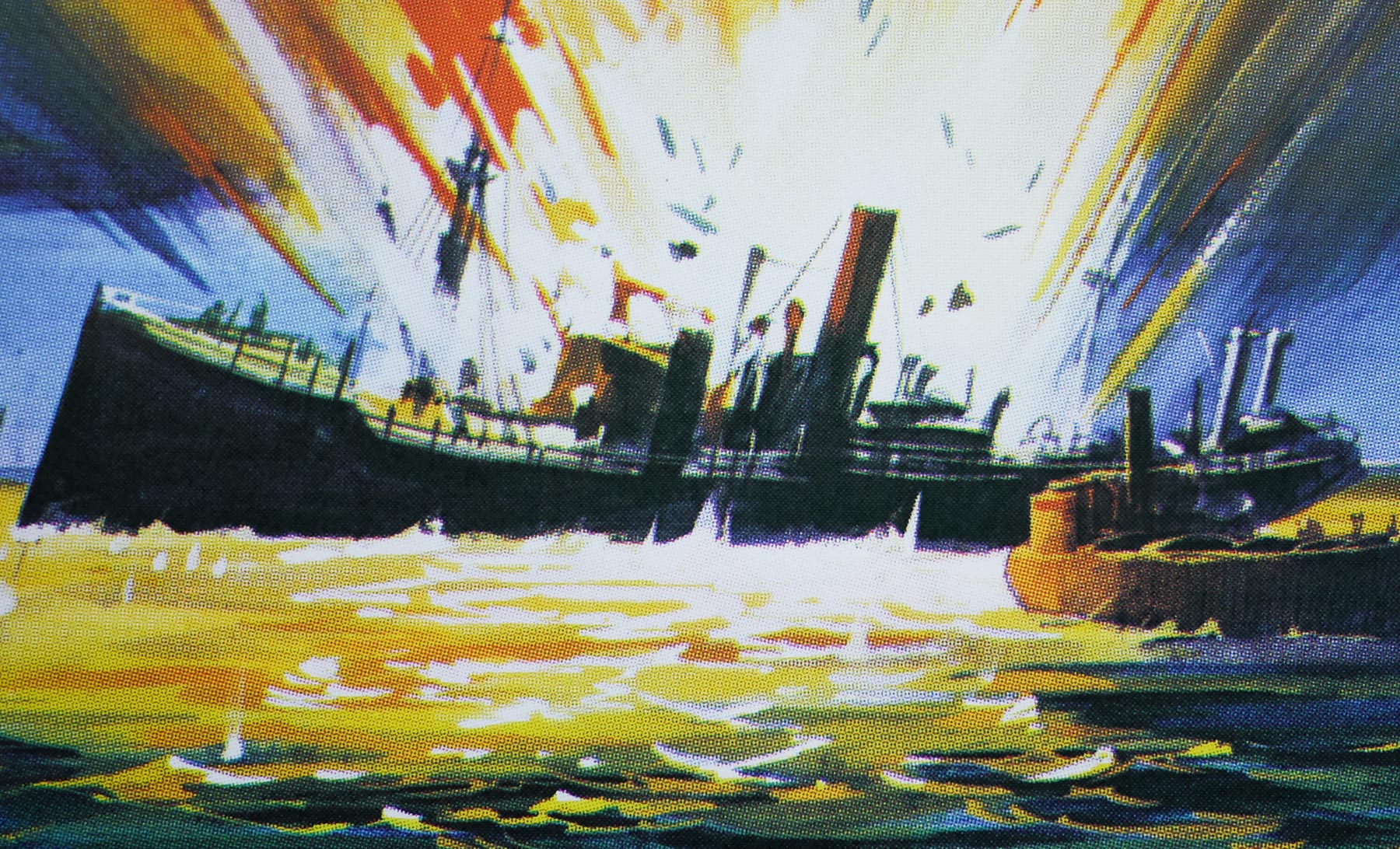
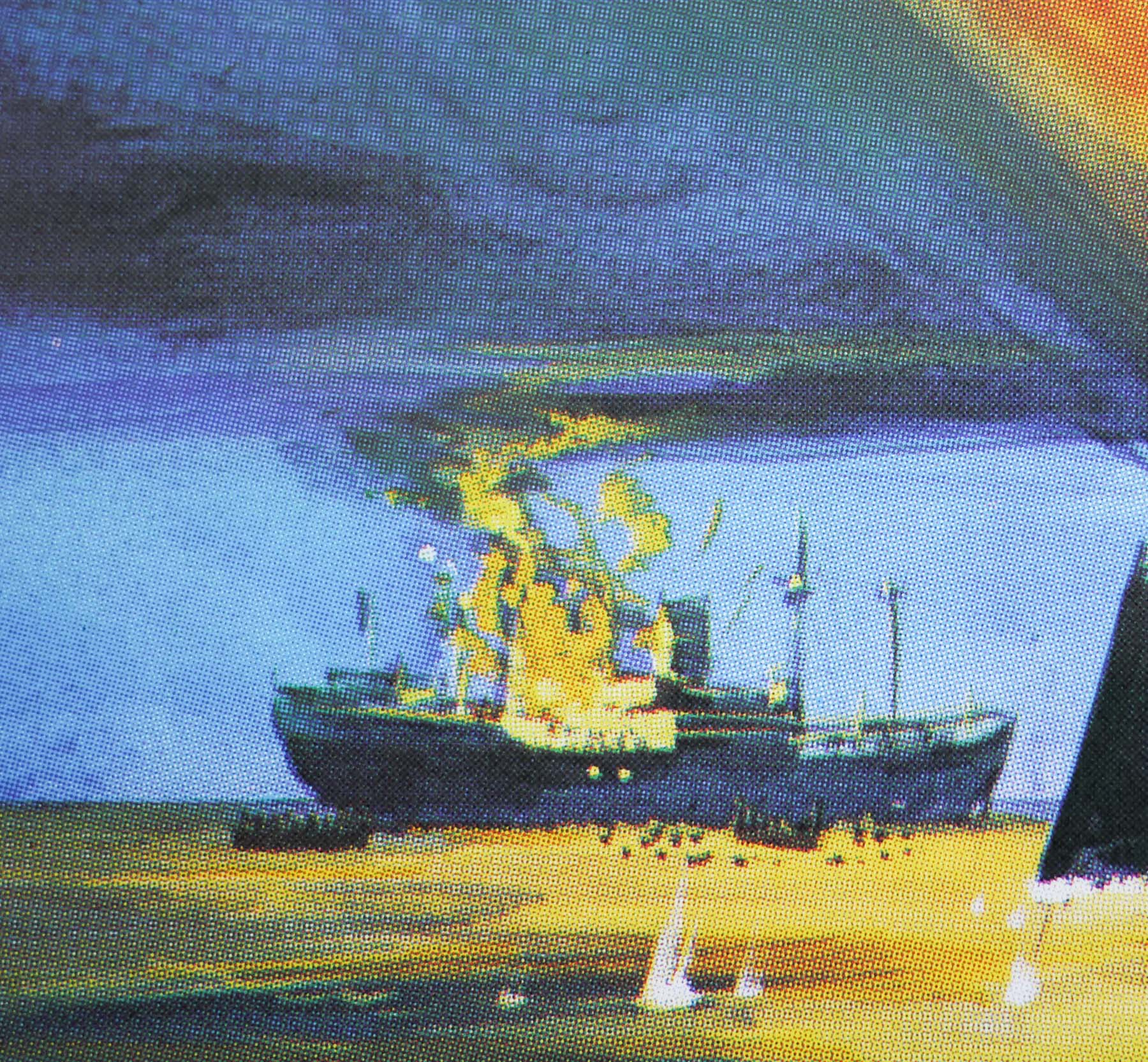
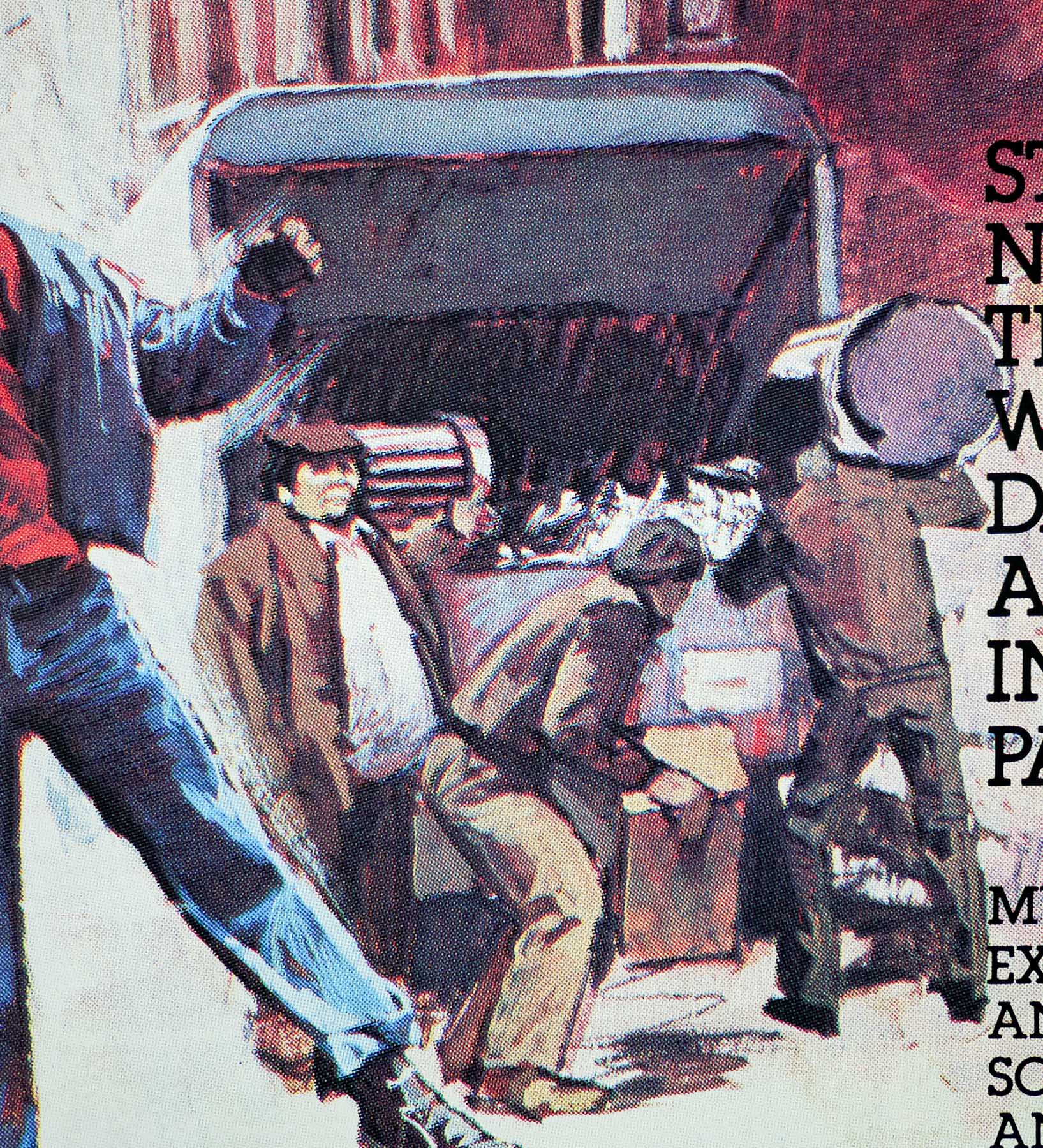
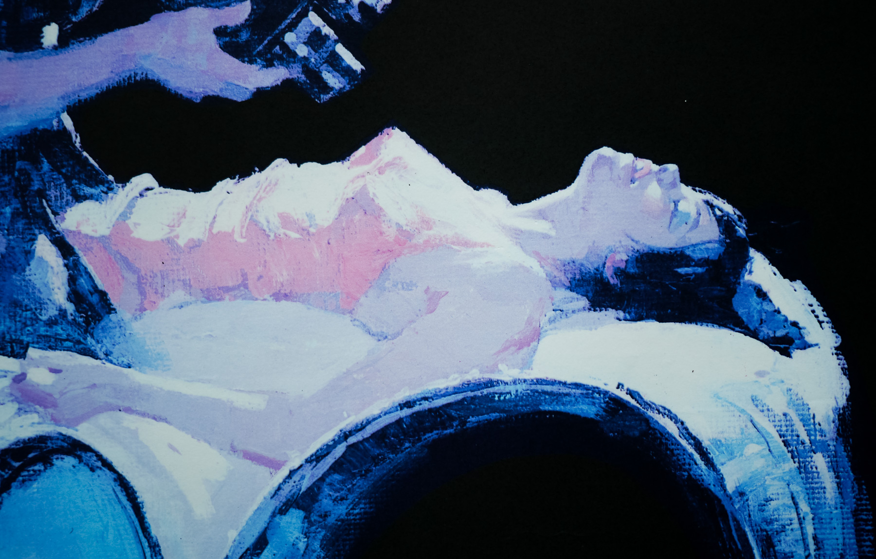
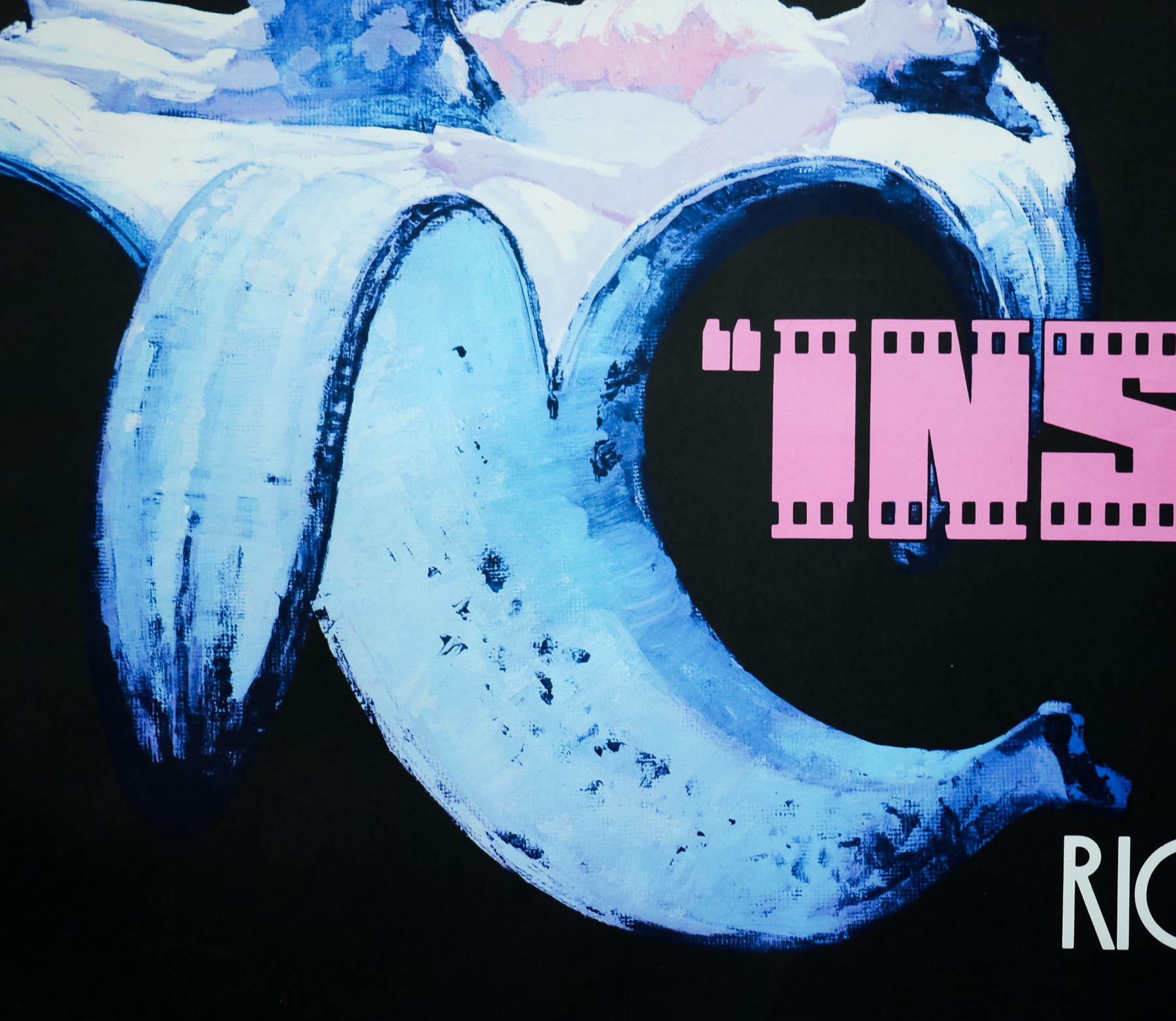
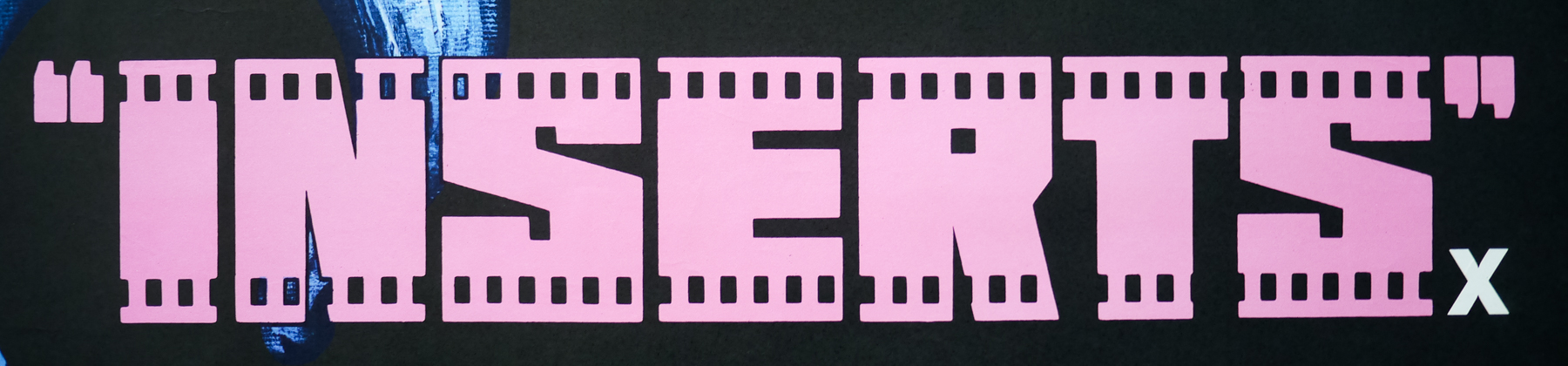
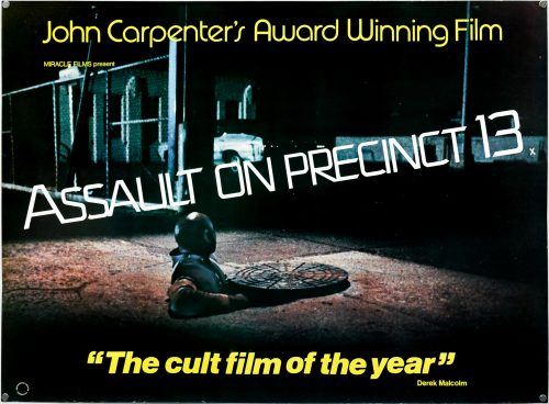
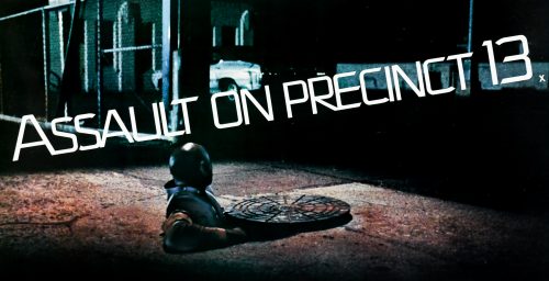
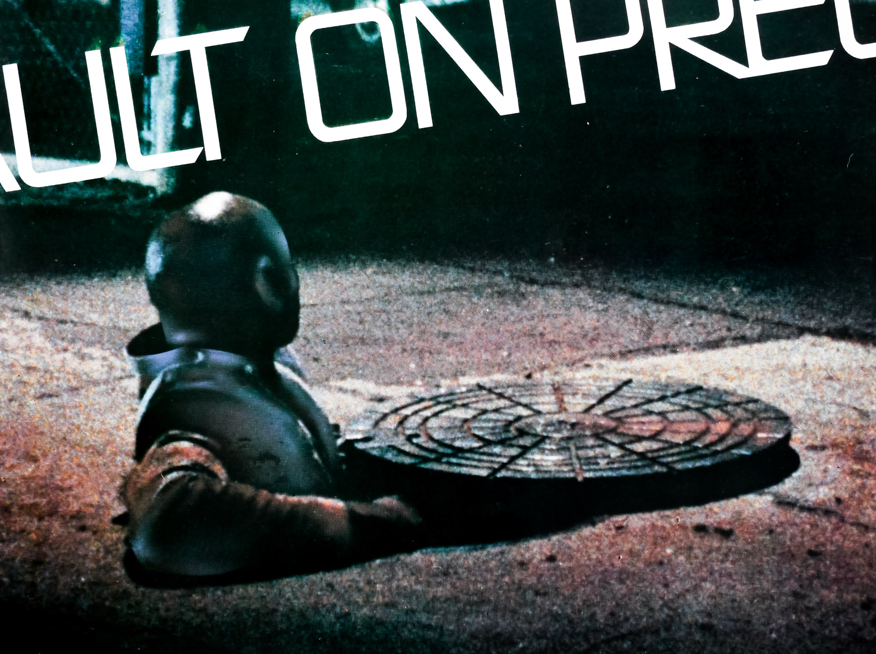
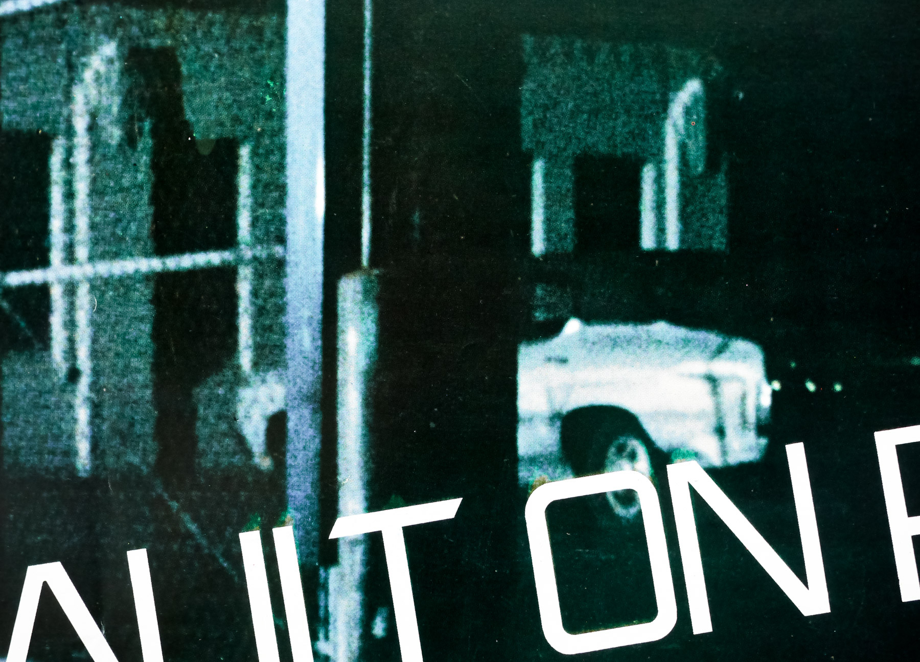
The film failed to make much impact in terms of box office takings or critical reception on its original American release in 1976, but when the film was shown at the 1977 Cannes Film Festival it received very favourable reviews from several critics, particularly those from Britain. After being invited to show the film at the 1977 London Film Festival, Carpenter was delighted by the positive critical and audience reaction. Derek Malcolm, the then film critic of the Guardian newspaper (whose quote graces this poster), reported that the film’s screening was greeted with deafening applause. On the back of the strong reception, Michael Myers (a Carpenter coincidence!), the head of Miracle Films, purchased the British distribution rights. This quad was printed for the film’s UK release and features a stylised title laid over the top of an image from the scene in which one of the convicts attempts to escape through the sewers. The ‘award-winning’ line refers to the fact that Carpenter won the 1978 annual British Film Institute award for the “originality and achievement of his first two films”, Dark Star and Assault, at the 1977 London Film Festival.