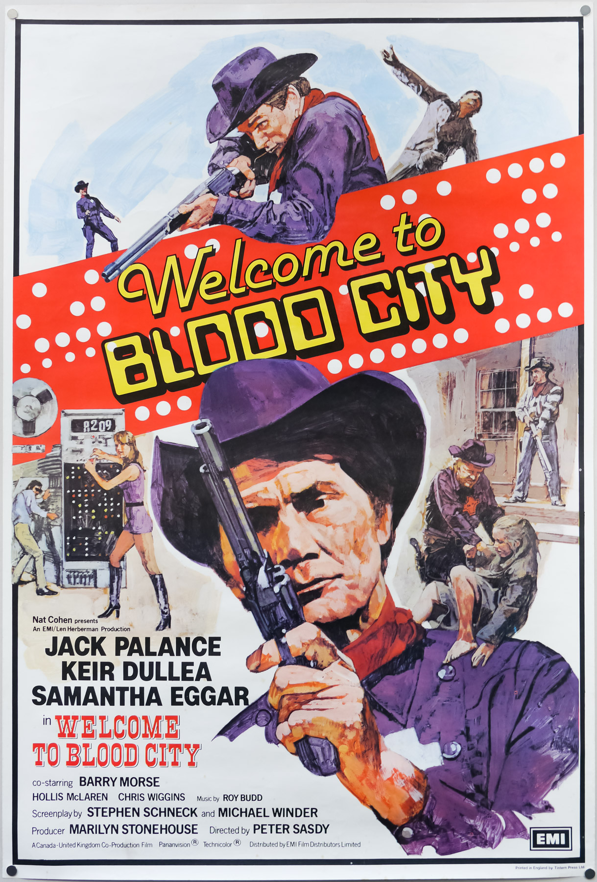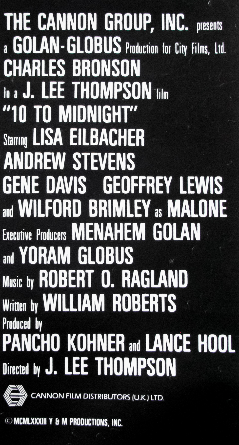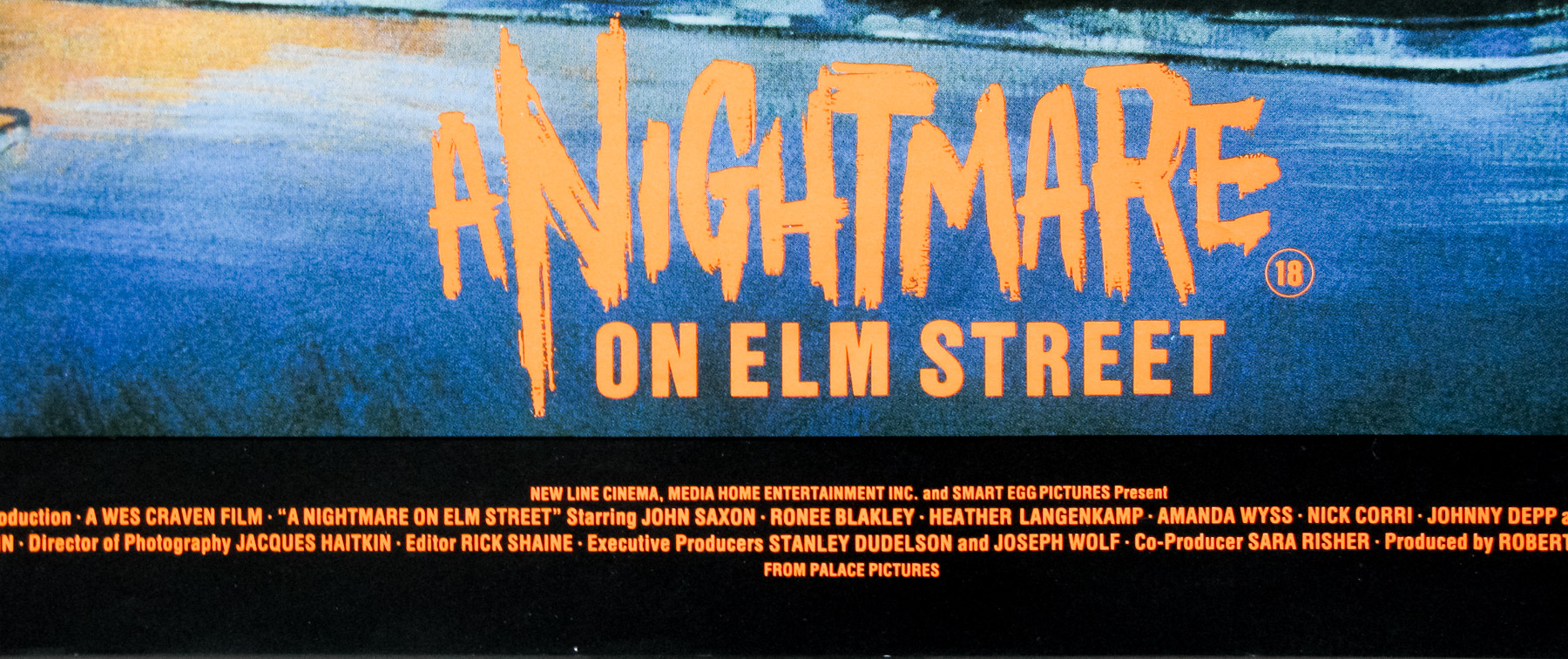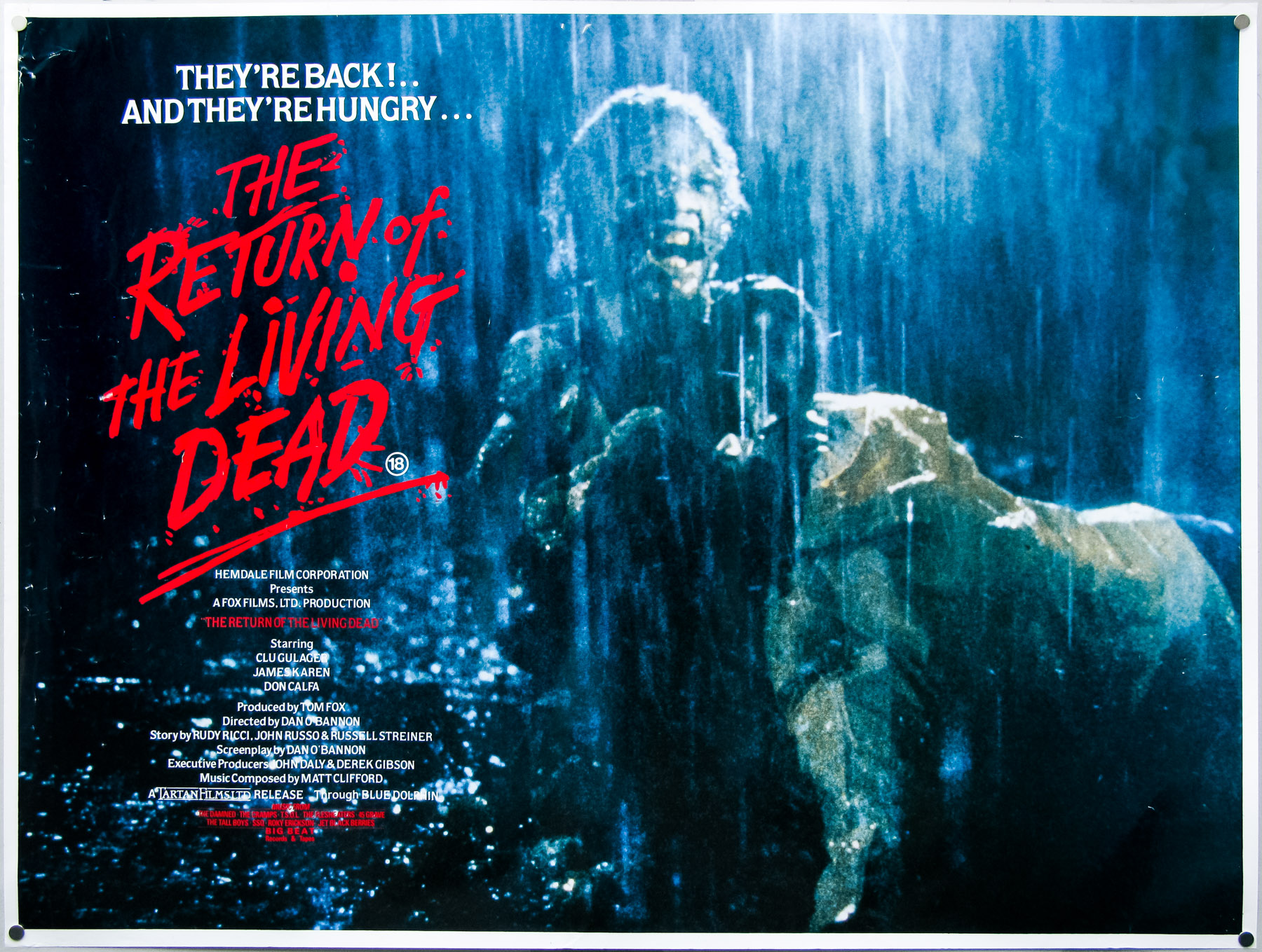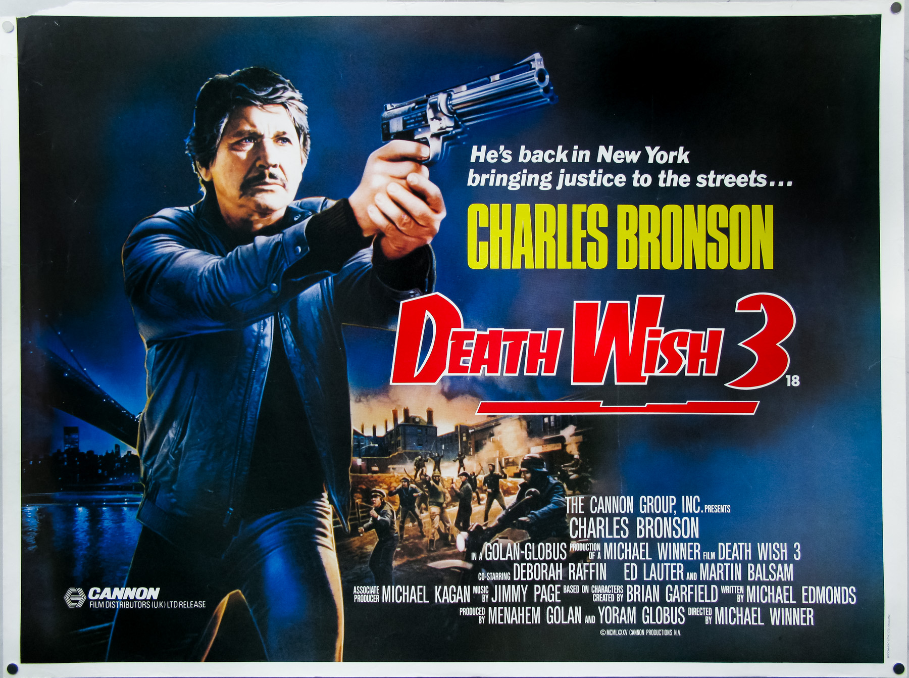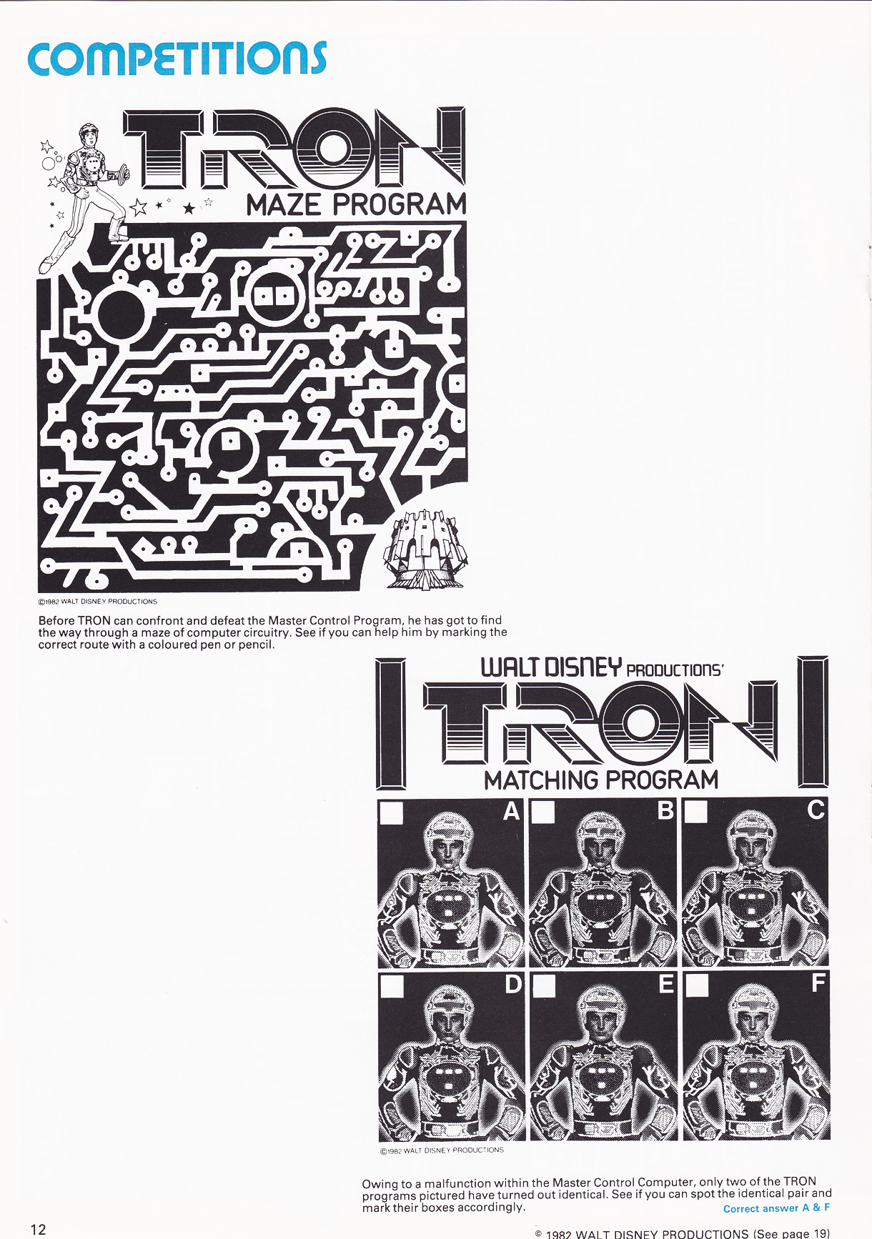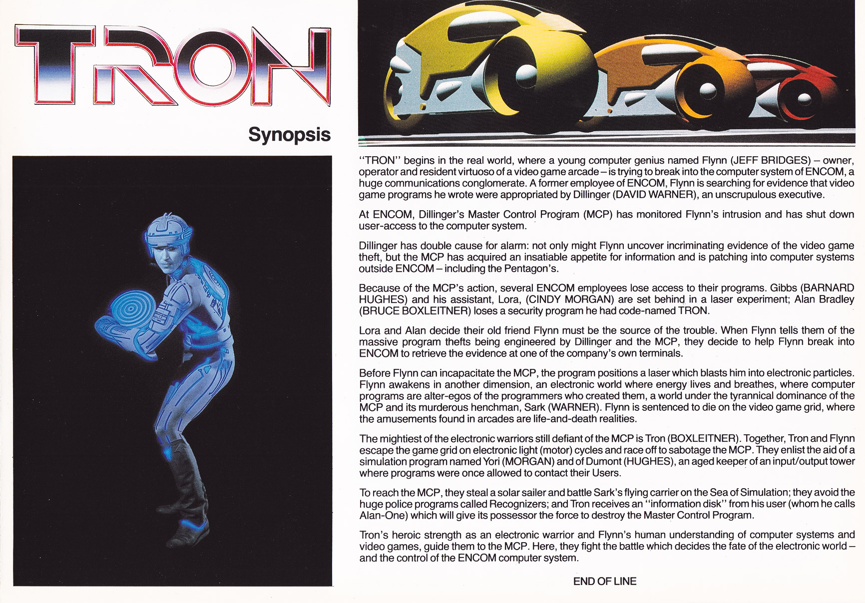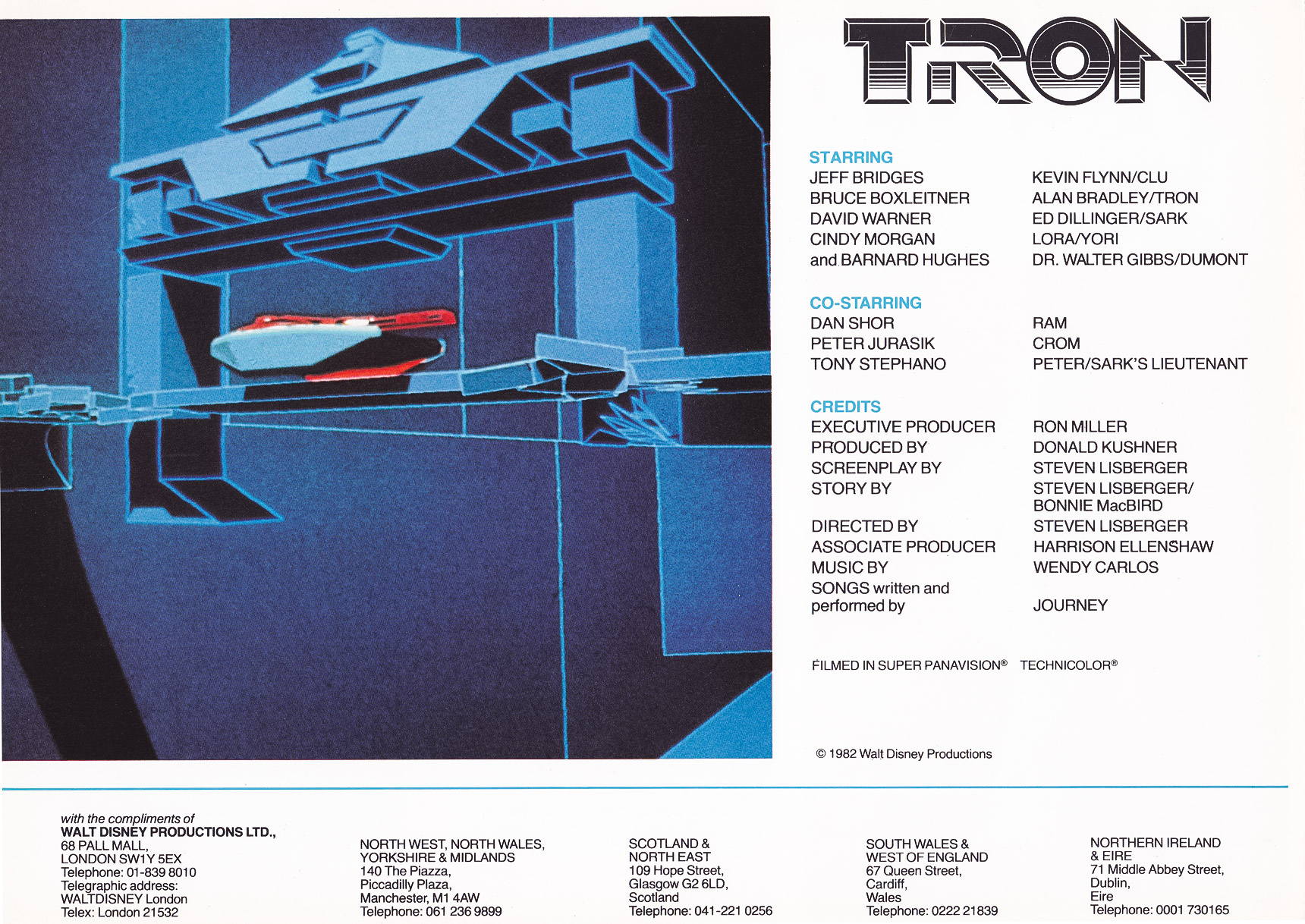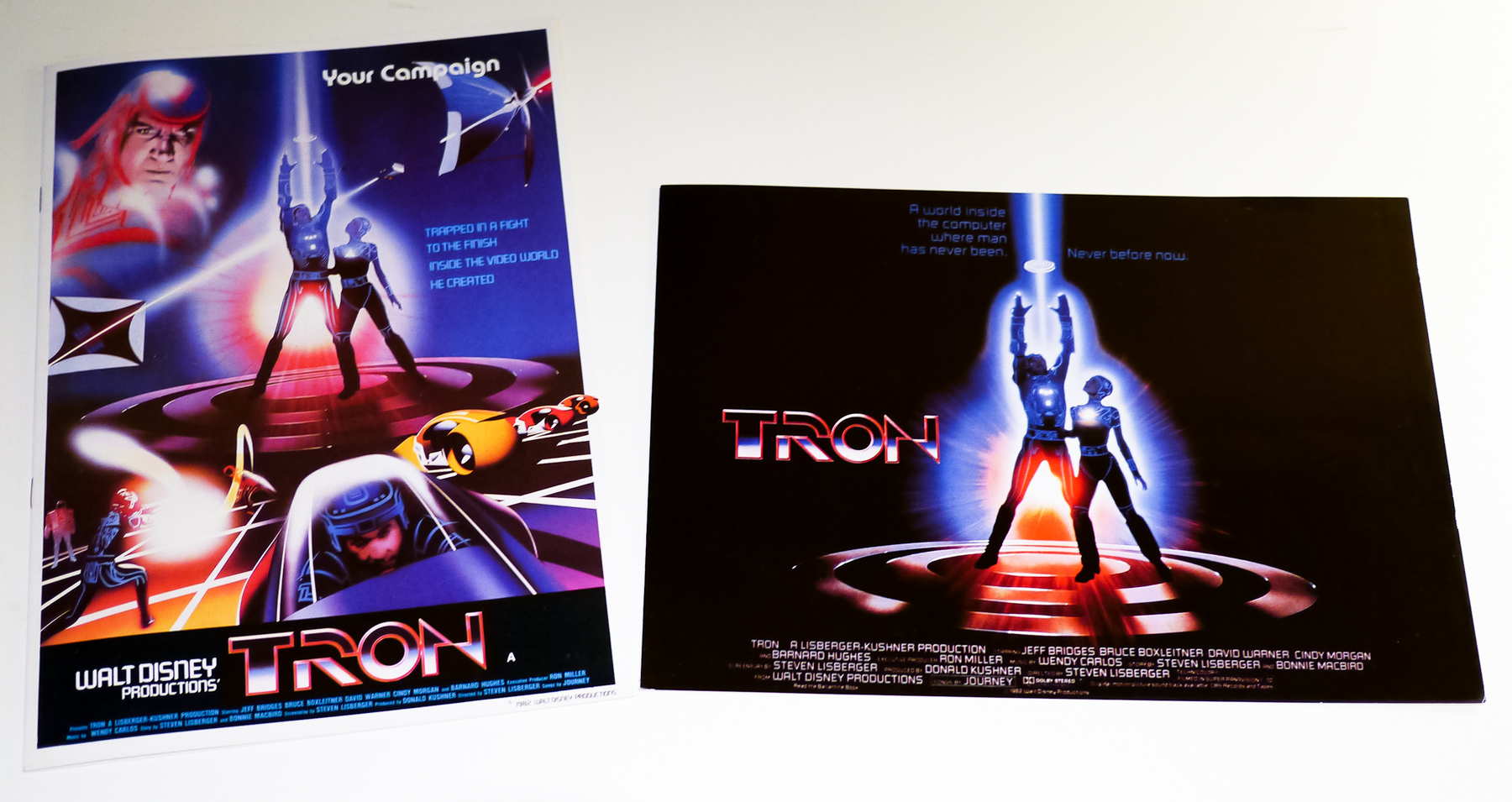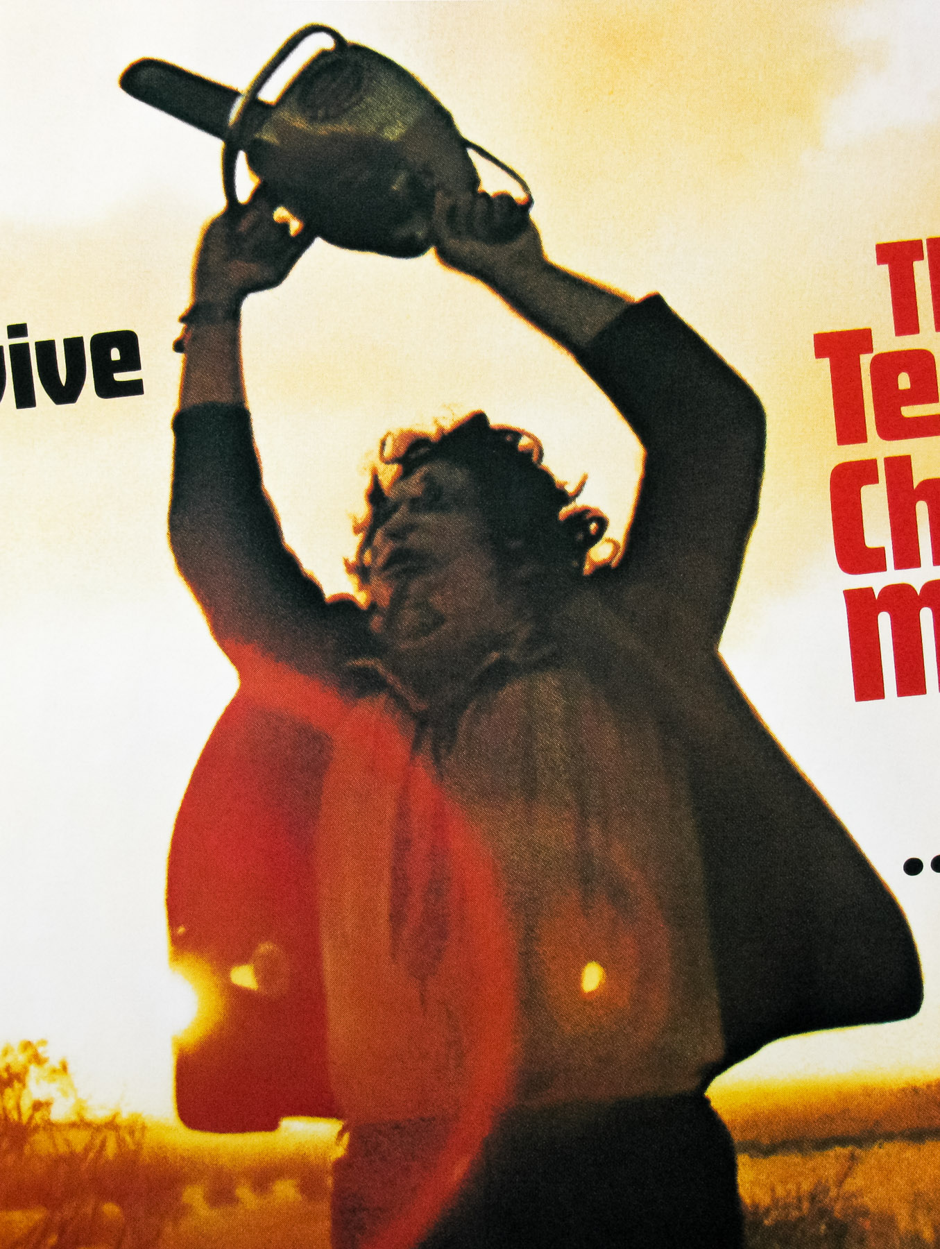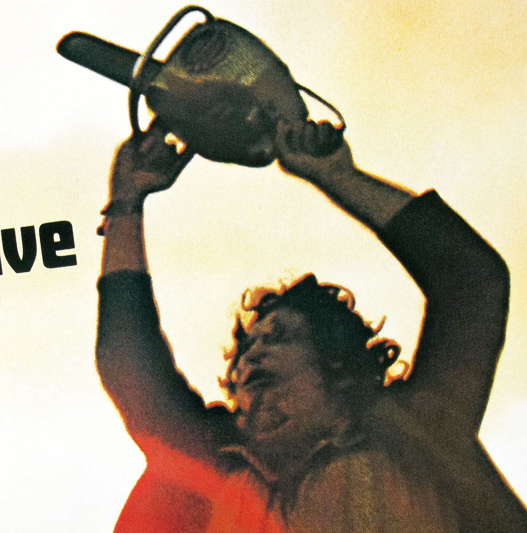
Poster detail
1-5
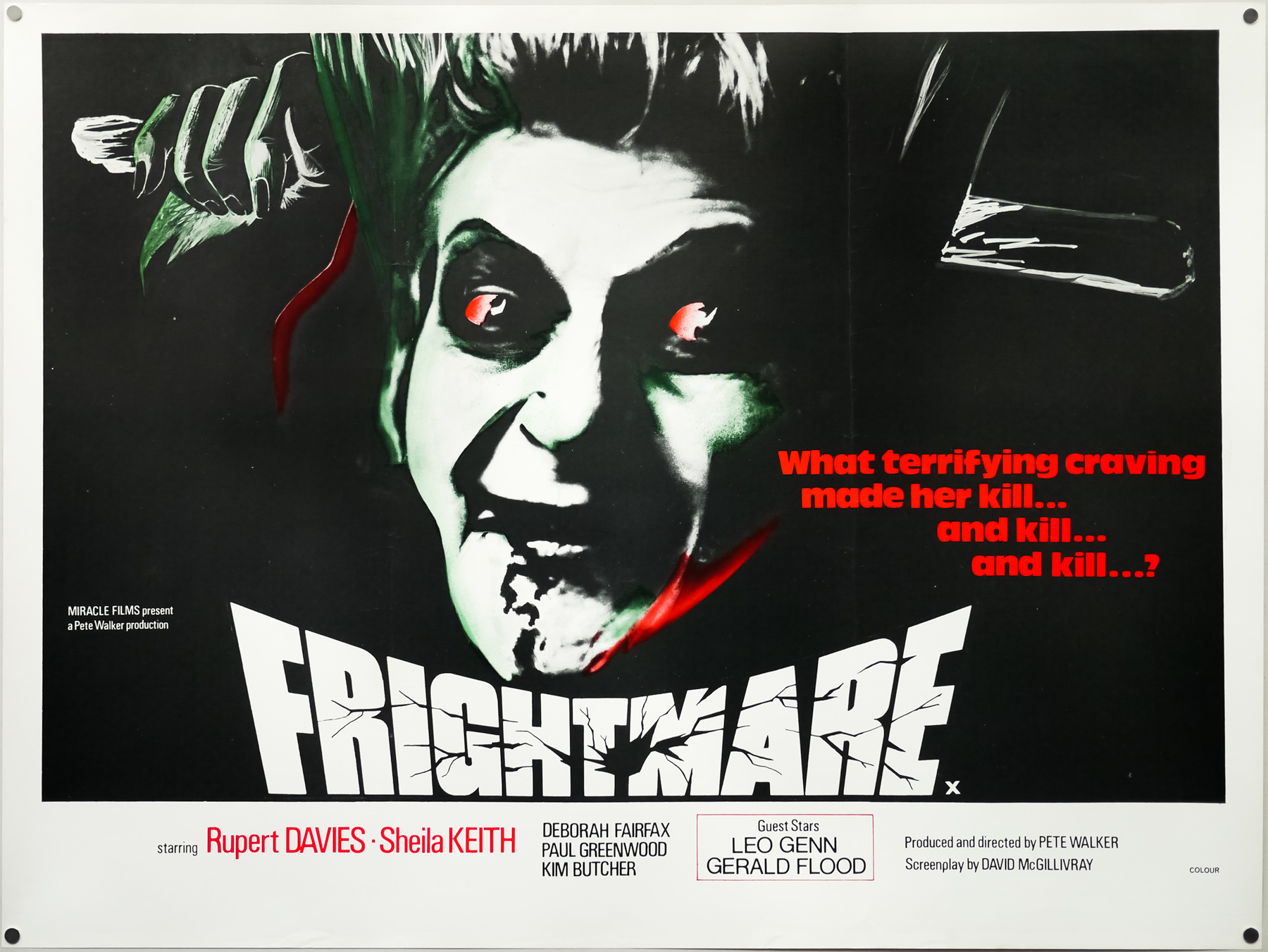

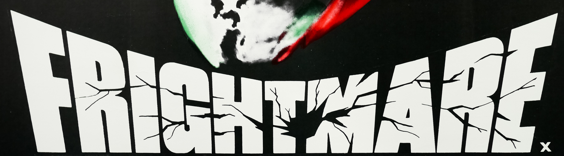
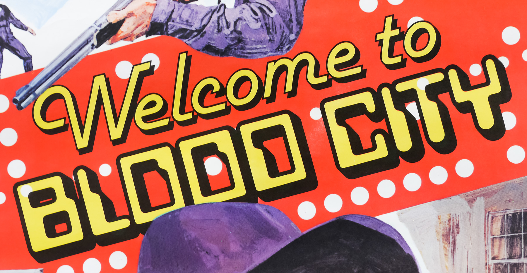
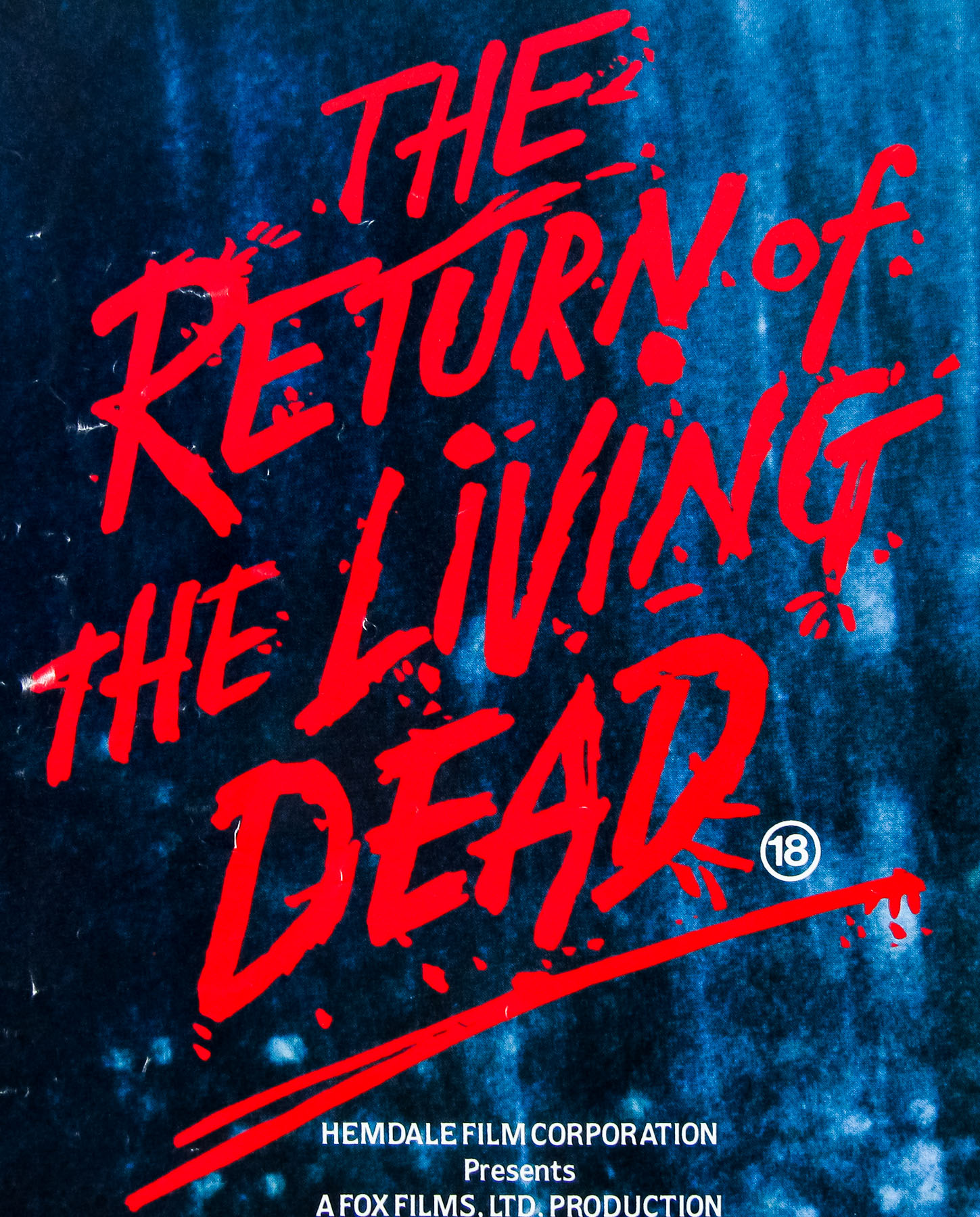
- Title
- Frightmare
- AKA
- Cover Up (USA)
- Year of Film
- 1974
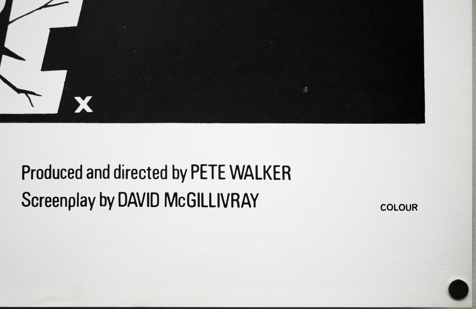
- Director
- Pete Walker
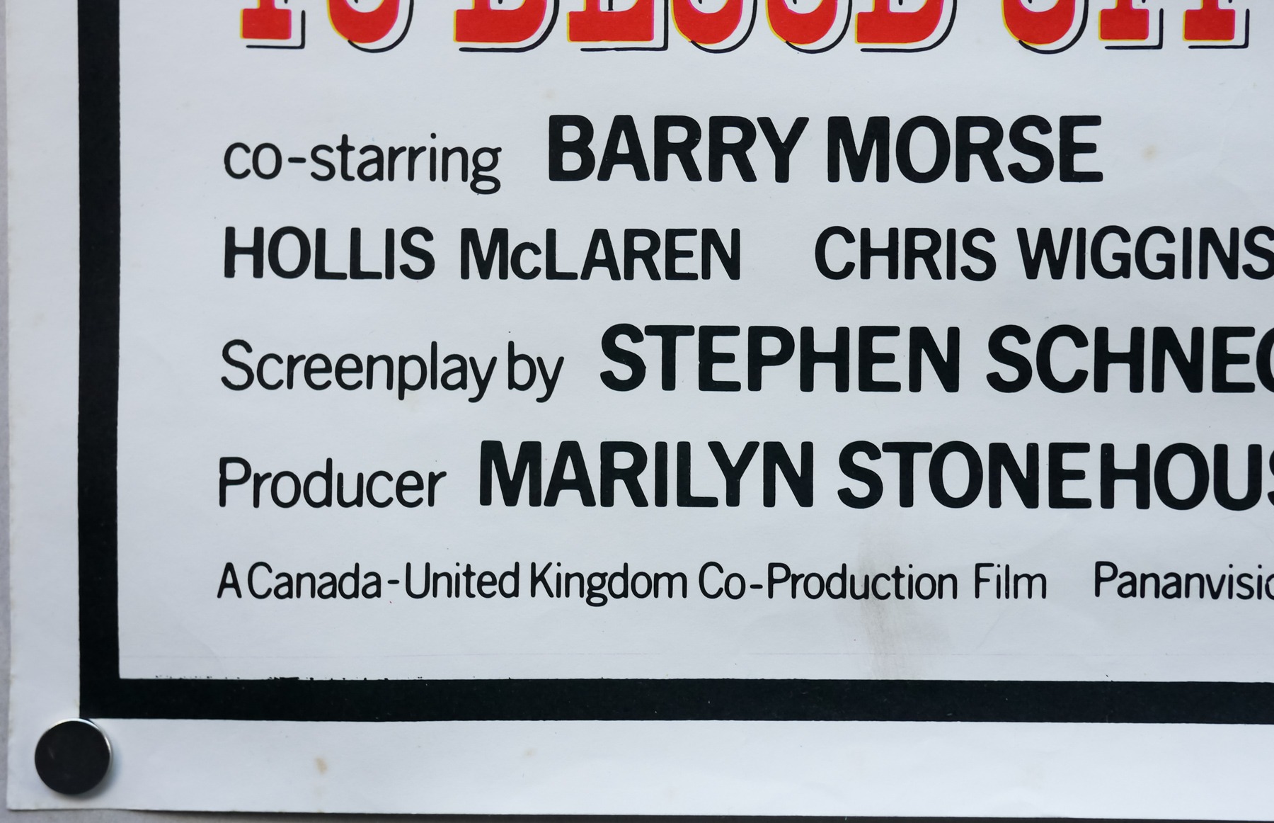
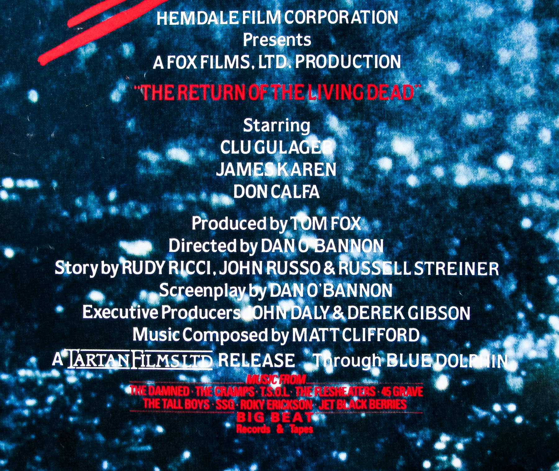
- Starring
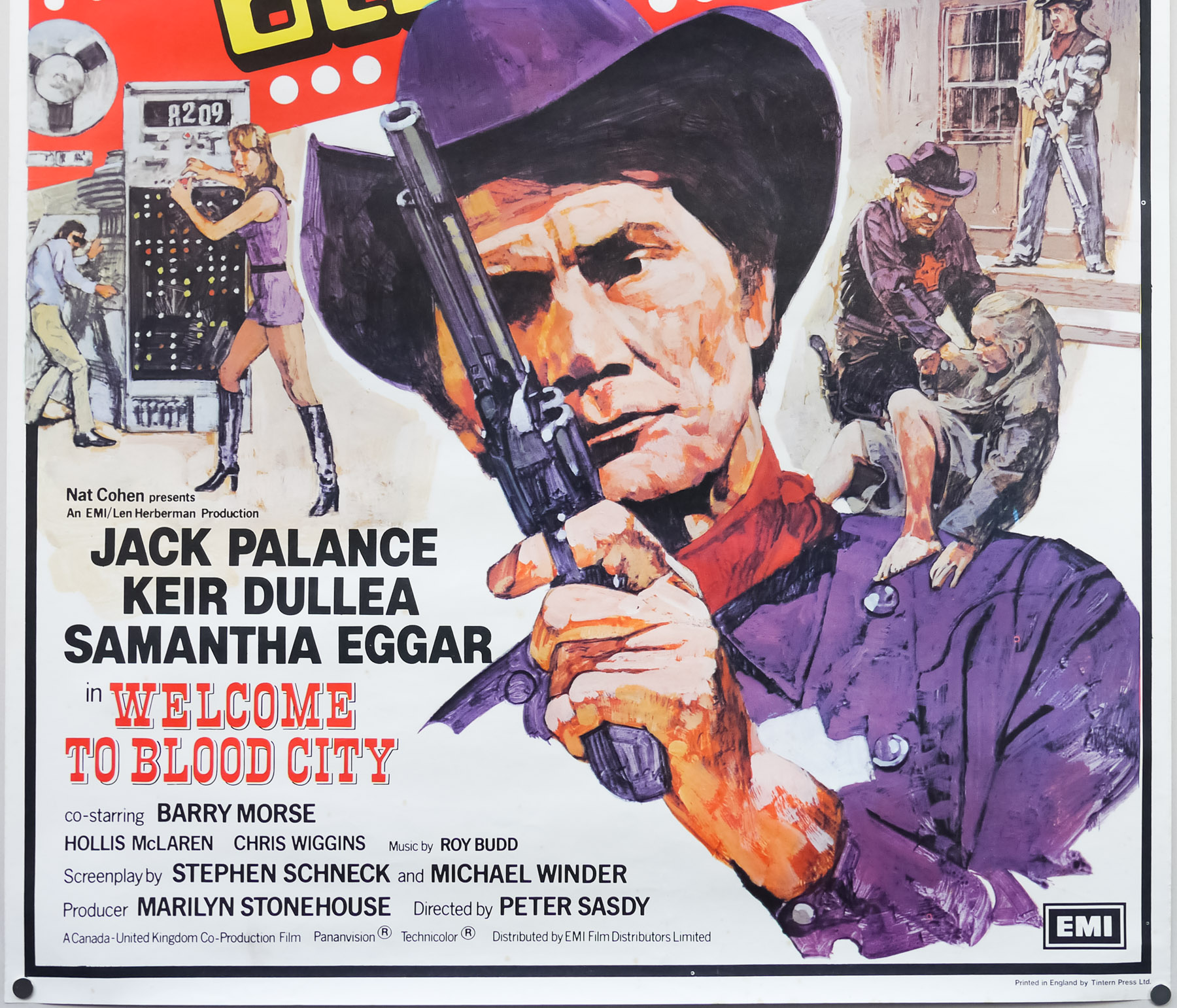
- Rupert Davies, Sheila Keith, Deborah Fairfax, Paul Greenwood, Kim Butcher, Fiona Curzon, John Yule, Trisha Mortimer
- Origin of Film
- UK
- Genre(s) of Film
- Rupert Davies, Sheila Keith, Deborah Fairfax, Paul Greenwood, Kim Butcher, Fiona Curzon, John Yule, Trisha Mortimer,
- Type of Poster
- Quad
- Style of Poster
- --
- Origin of Poster
- UK
- Year of Poster
- 1974
- Designer
- Unknown
- Artist
- Unknown
- Size (inches)
- 30" x 39 14/16"
- SS or DS
- SS
- Tagline
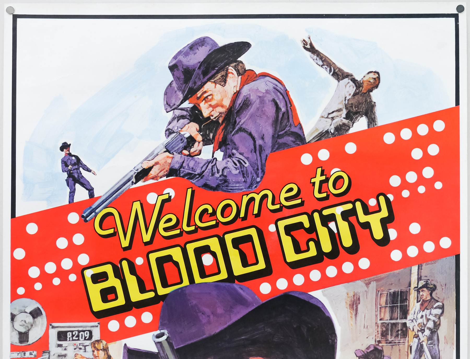
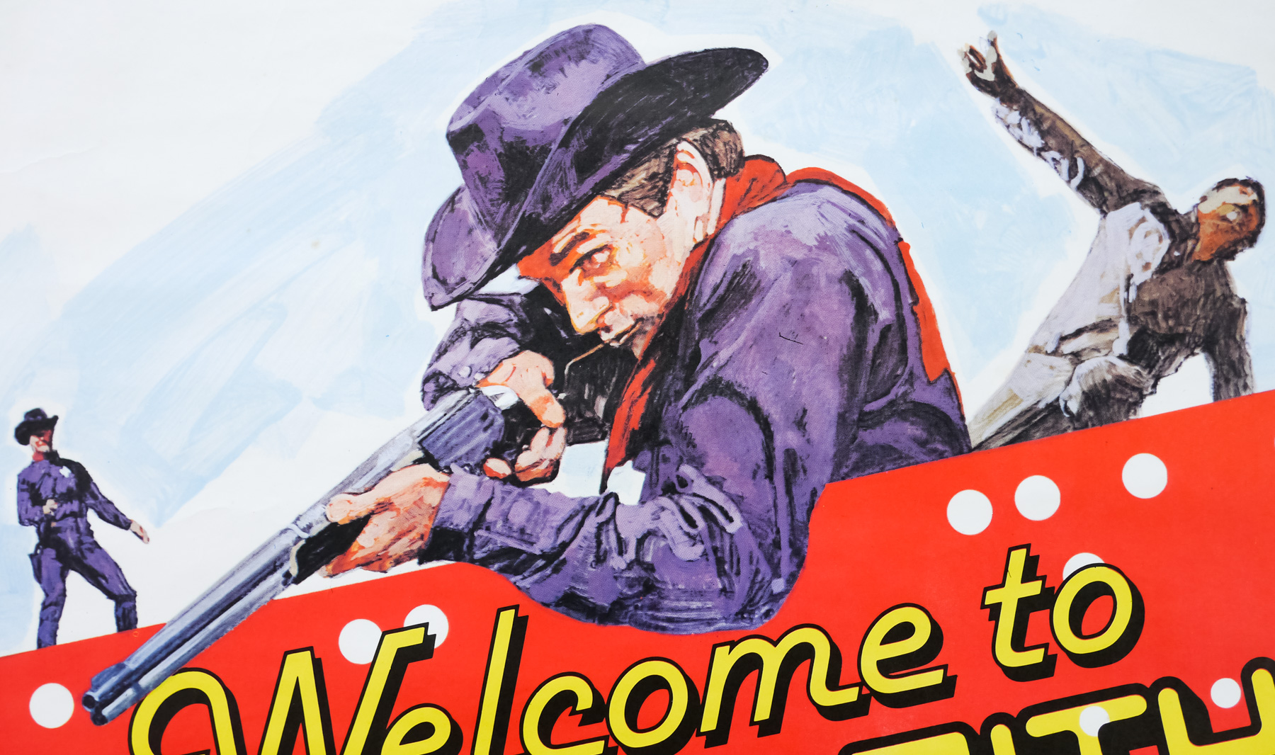
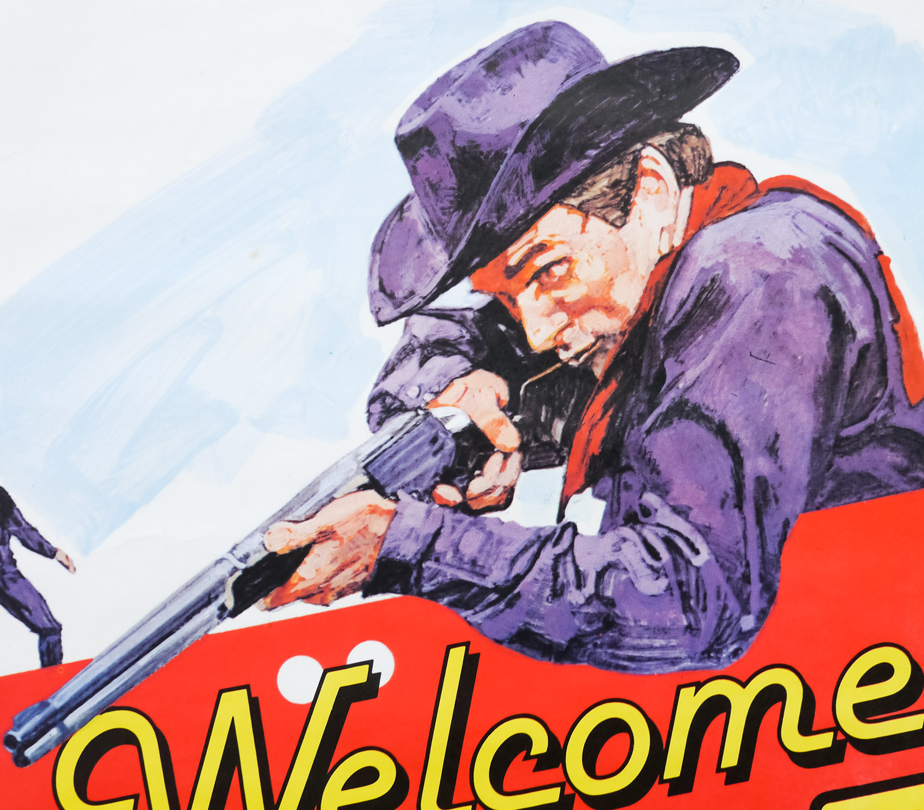
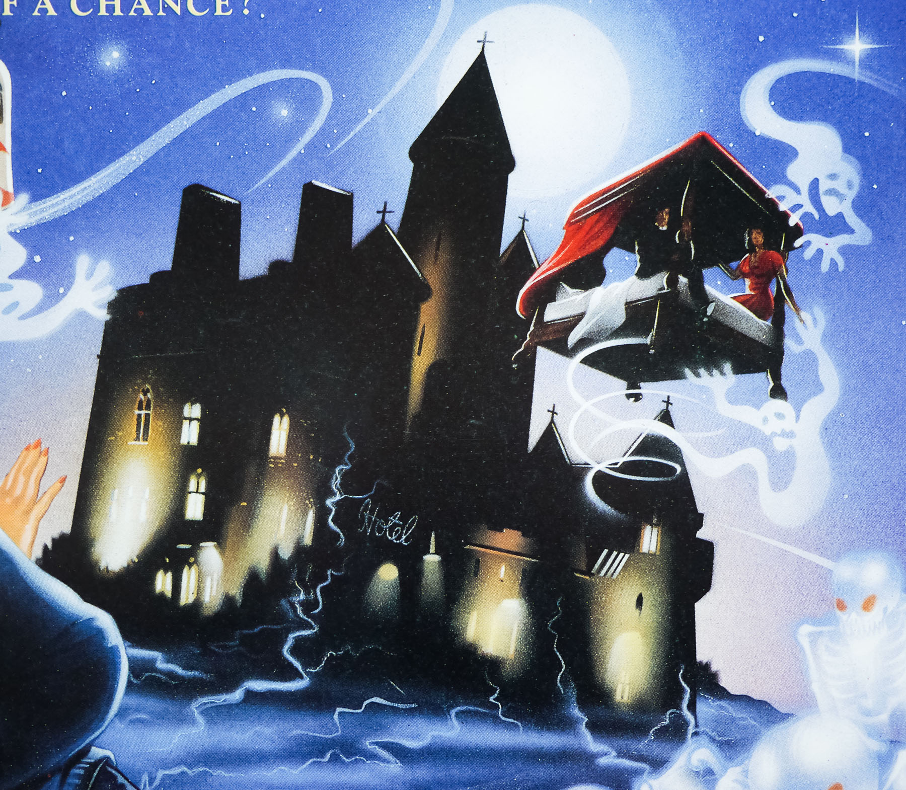
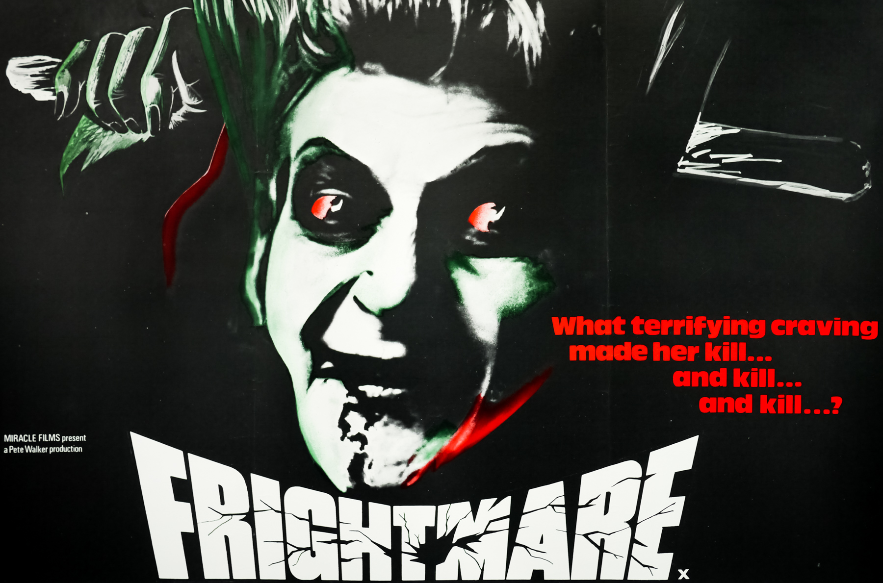
- What terrifying craving made her kill... and kill... and kill...?
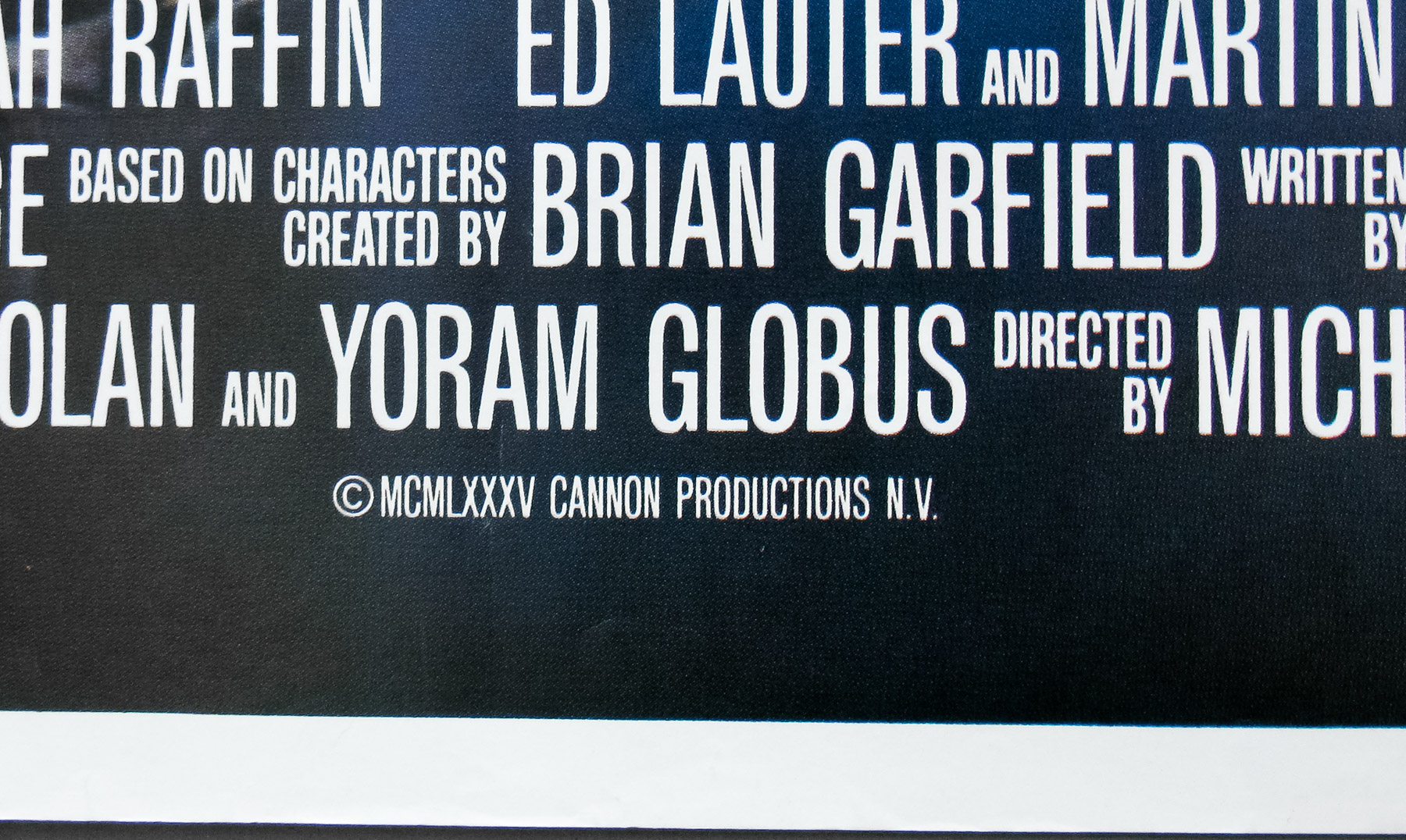
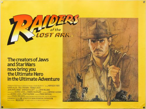
This is the original UK quad for the release of Frightmare, a 1974 film by the British director, producer and writer Pete Walker, who specialised in exploitation pictures during the 1960s and 1970s. Walker started out making shoestring budget sexploitation pictures, including School for Sex that were often relative hits in the UK. This worked out well for him since his films were almost always self-financed and thus most of the profits were his to keep and plough into the next feature. In the early 1970s, Walker grew tired of feeding the ‘dirty mack brigade’ and turned his hand to horror.
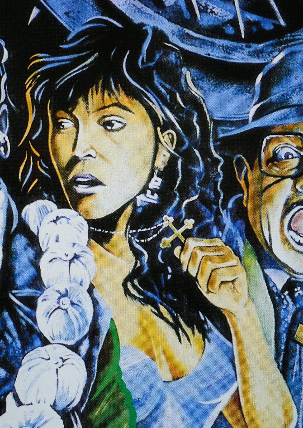
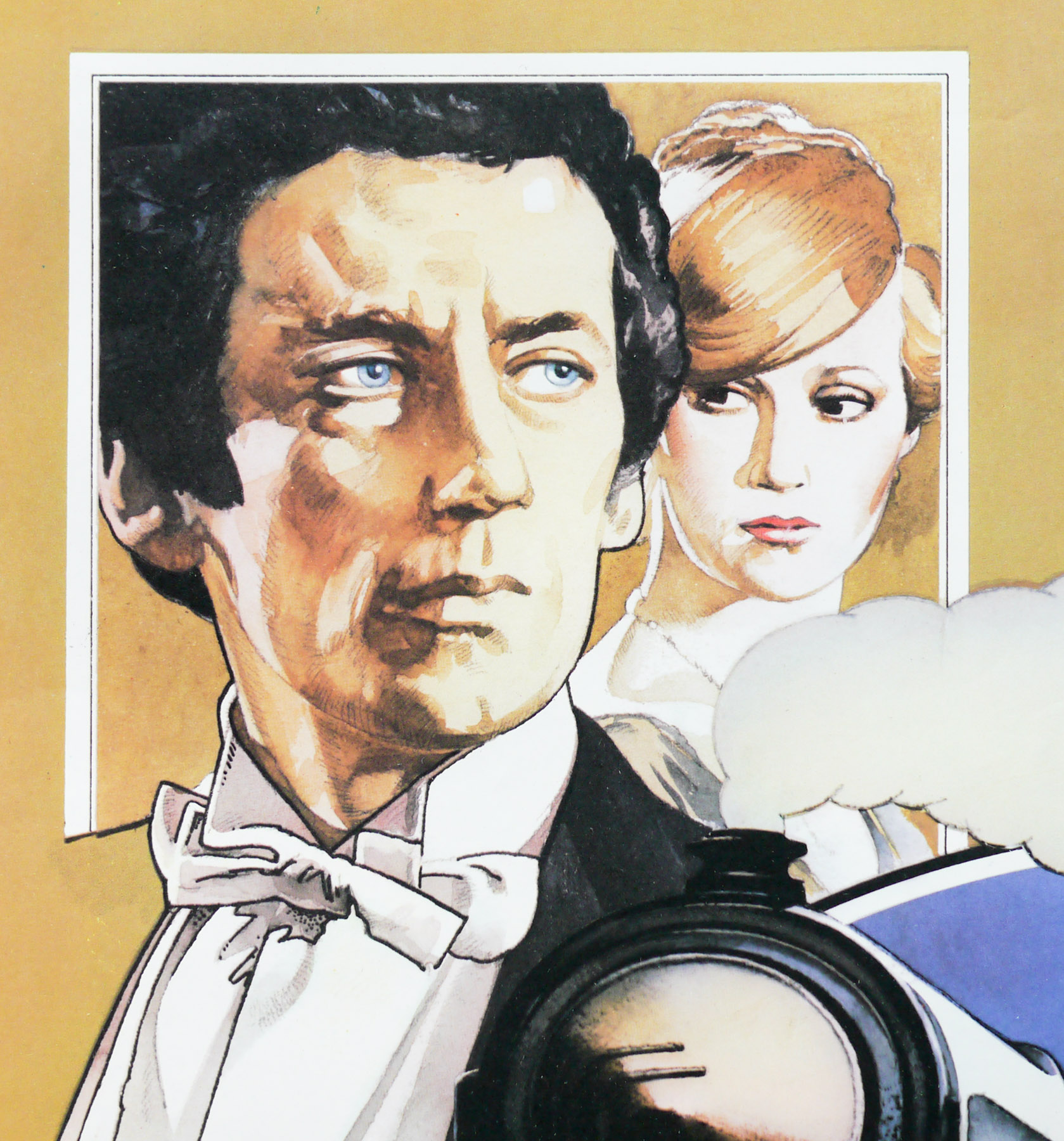
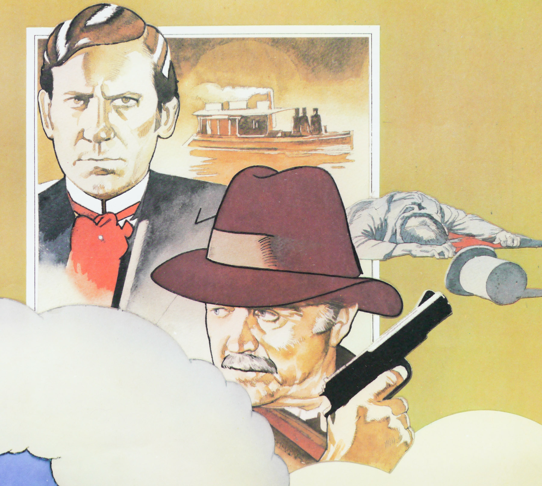
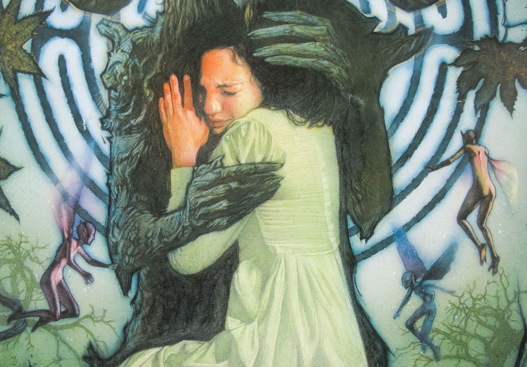
Frightmare, released in the US as Cover Up, was one of two horror films that Walker directed in 1974, with the other being the private-prison set House of Whipcord. Both films saw Walker reuniting with his regular screenwriting partner David McGillivray, and both feature memorable appearances by Sheila Keith, who would become another regular. In this film she plays Dorothy Yates, a cannibalistic killer who at the start of the film is sentenced to 15 years in prison. She is sent down along with her husband Edmund (Rupert Davies) who chose to take the punishment with her, even though he had nothing to do with the killings. The film picks up after their release and we find that their adopted daughter Jackie (Deborah Fairfax) is living in London and struggling to care for their biological daughter Debbie (Kim Butcher) a wayward 15-year-old who doesn’t realise her parents are still alive.
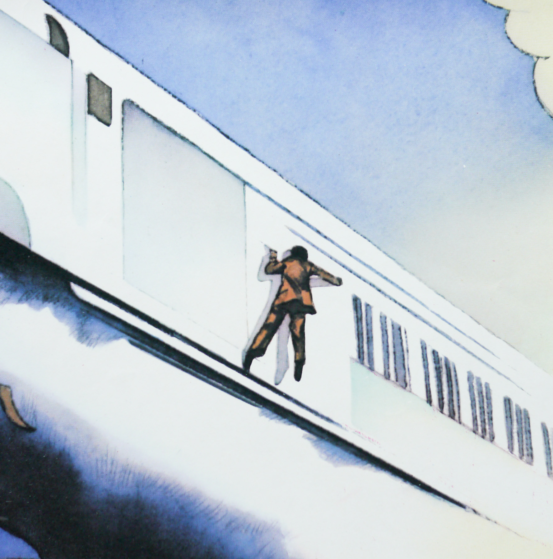
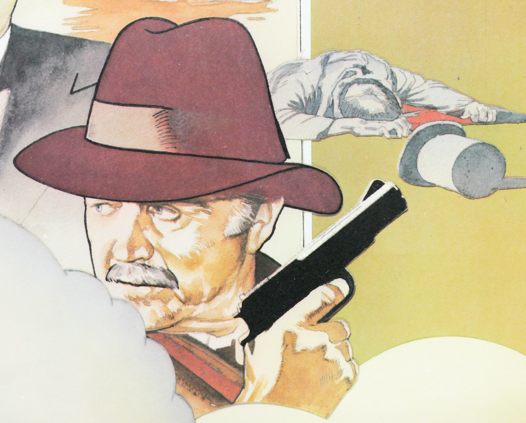
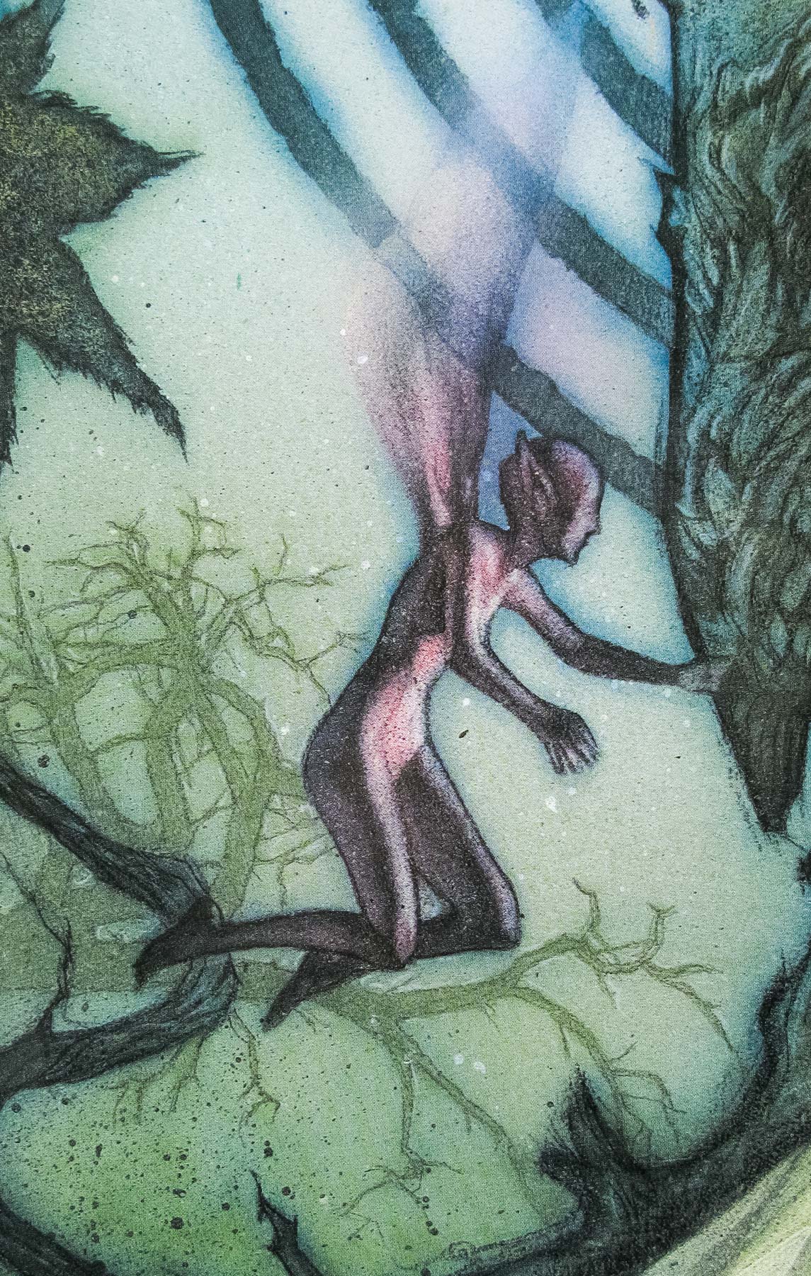
We follow Jackie as she leaves London to visit her parents, now living in a remote farmhouse. There she delivers a mysterious package to her mother who appears frail and innocent. Edmund fears that his wife is up to her old tricks but Jackie isn’t convinced and returns back to London. Soon we discover that Dorothy has put an advert in a magazine offering Tarot Card readings and willing customers are visiting the farmhouse. When she begins by checking that they have no close family or friends, or indeed anyone that would miss them, it’s fair to say that things aren’t looking up for her clueless customers. At the same time, Jackie struggles to control Debbie who is beginning to show signs that she has inherited her mother’s habits.
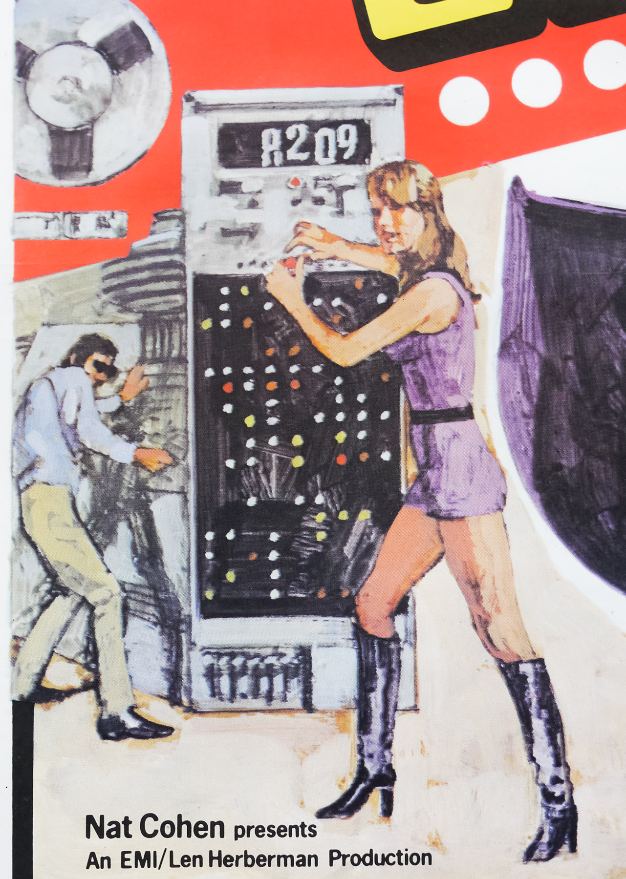
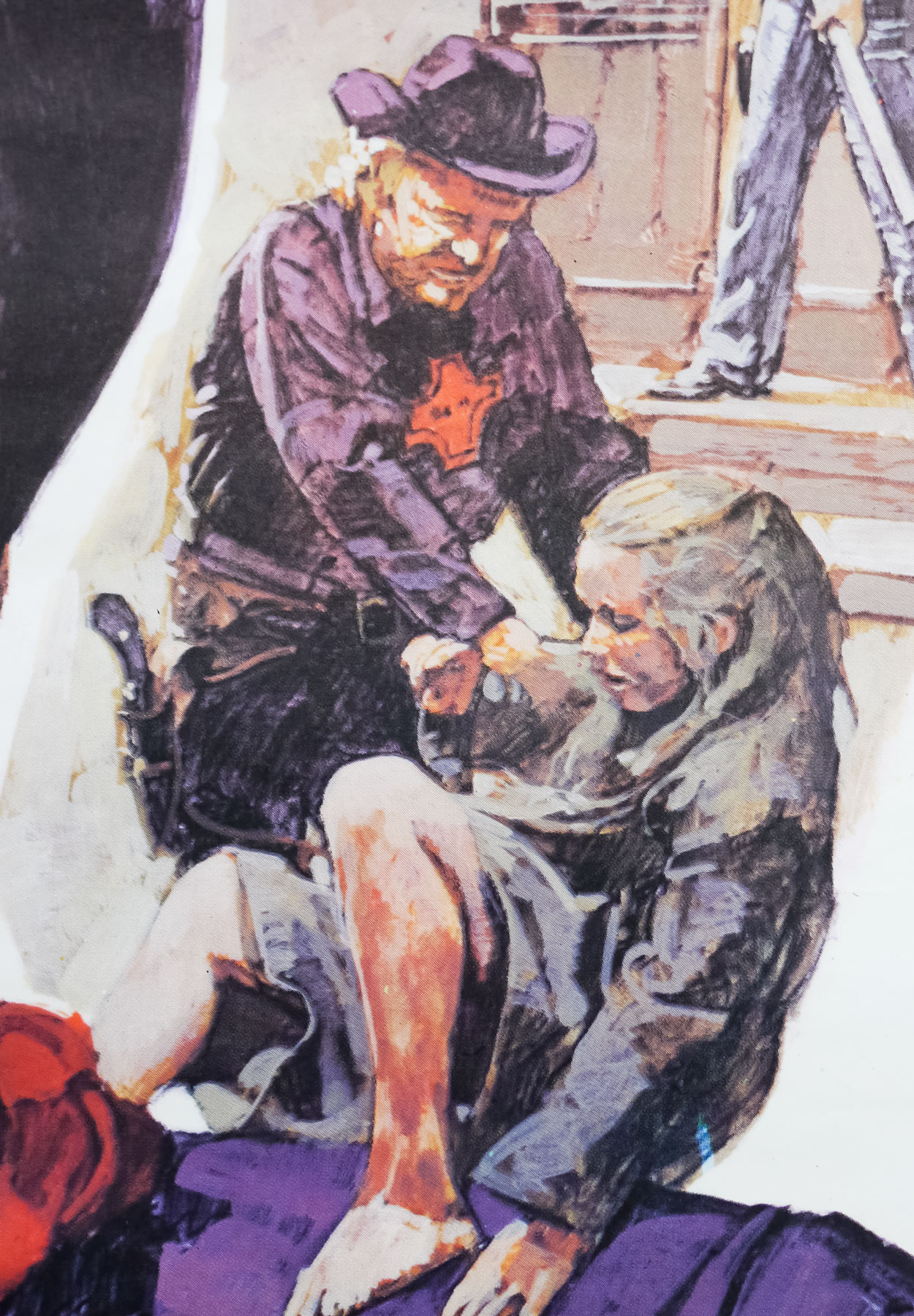
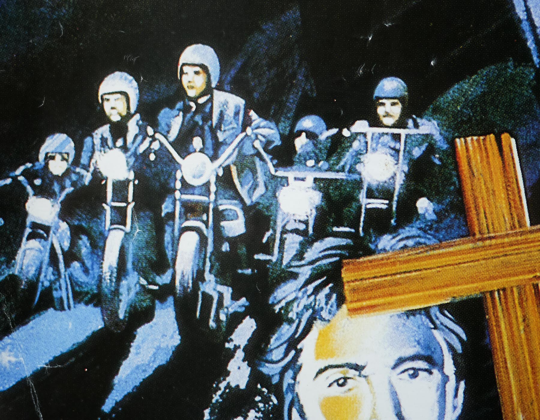
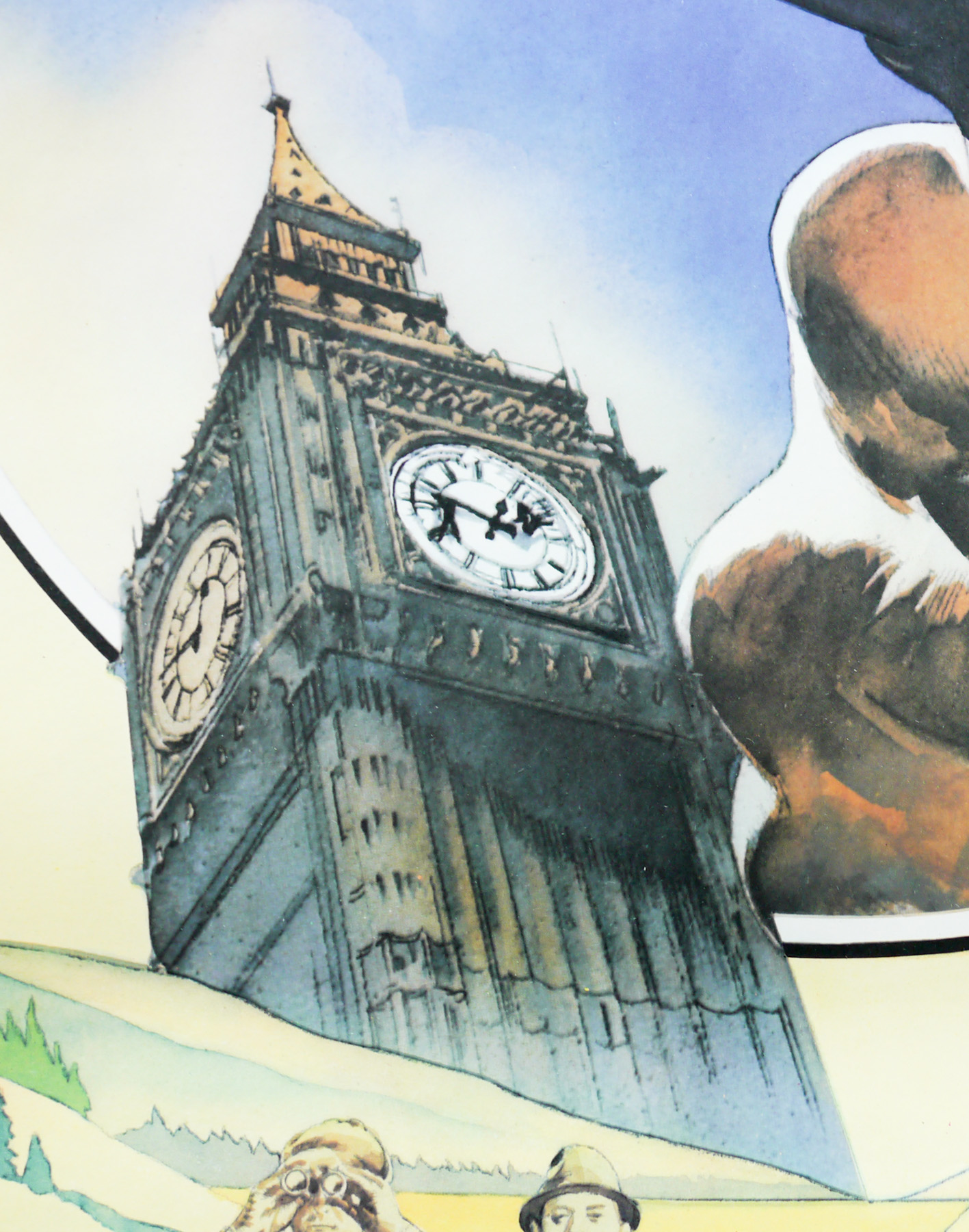
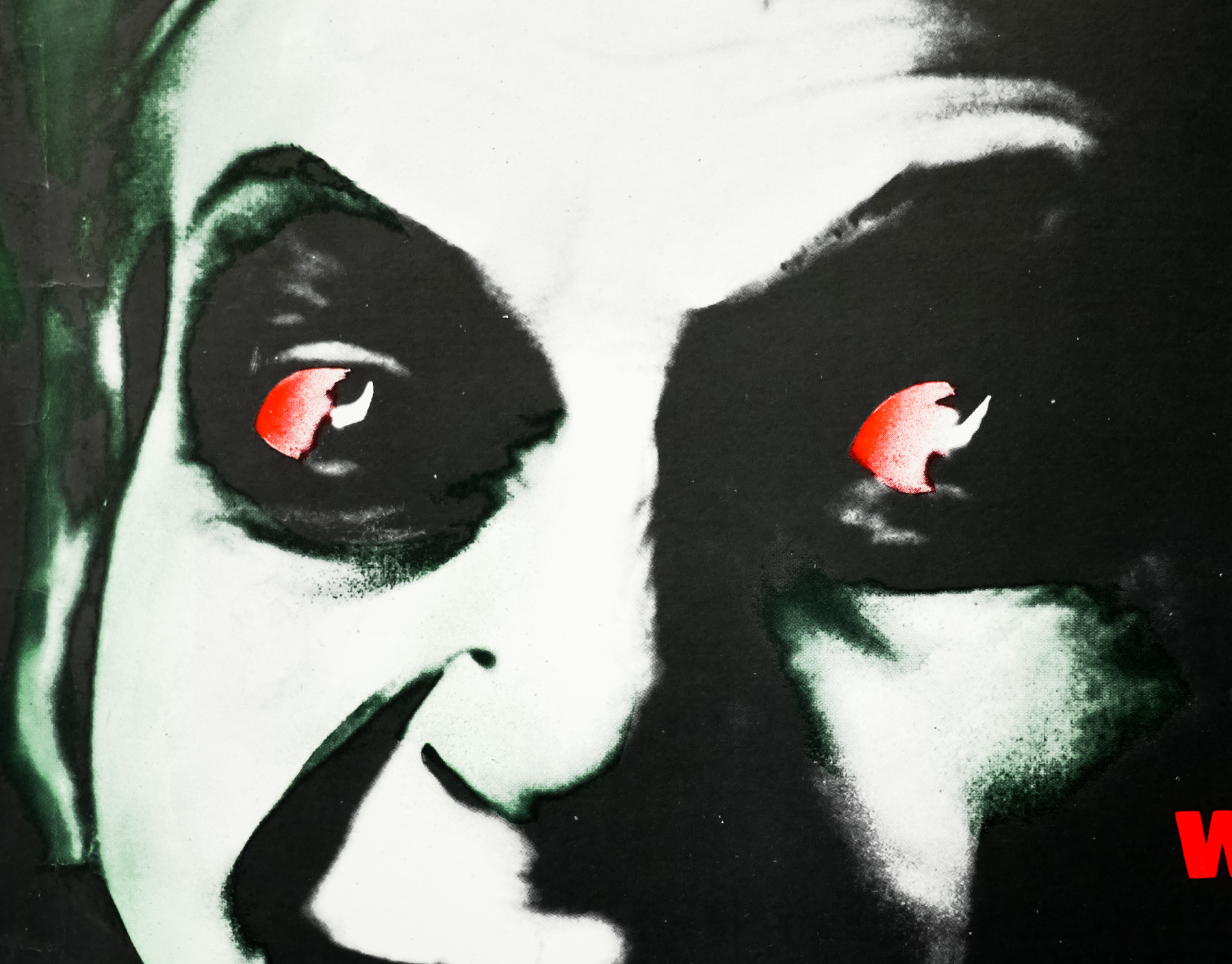
Arguably the best of Walker’s feature films, Frightmare is a masterclass in building tension and working towards a shocking final act. The film makes great use of various locations, including several in a London which looks barely recognisable today. Sheila Keith’s performance, in particular, is hugely memorable and her ability to portray frail innocence in one scene followed by genuinely disturbing menace in another has to be seen. In this Guardian article about Walker and his films, he describes his working relationship with Keith and how her on screen presence definitely didn’t match her off screen one; “Sheila Keith was a lady who lived a quiet life with her dogs and her cats and came into work to do, brilliantly, whatever was asked of her,” says Walker. “She was like your nice old aunt who would serve you cucumber sandwiches before ripping into a dismembered limb – without complaining.”
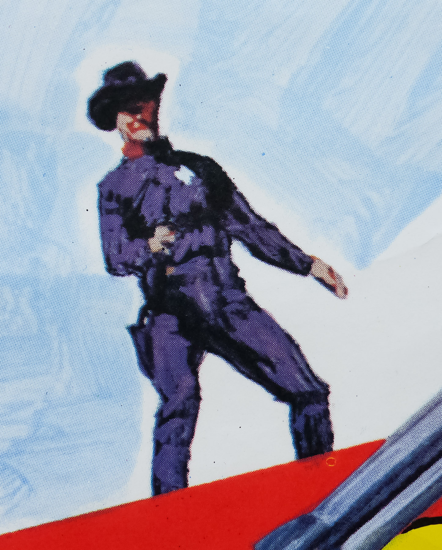
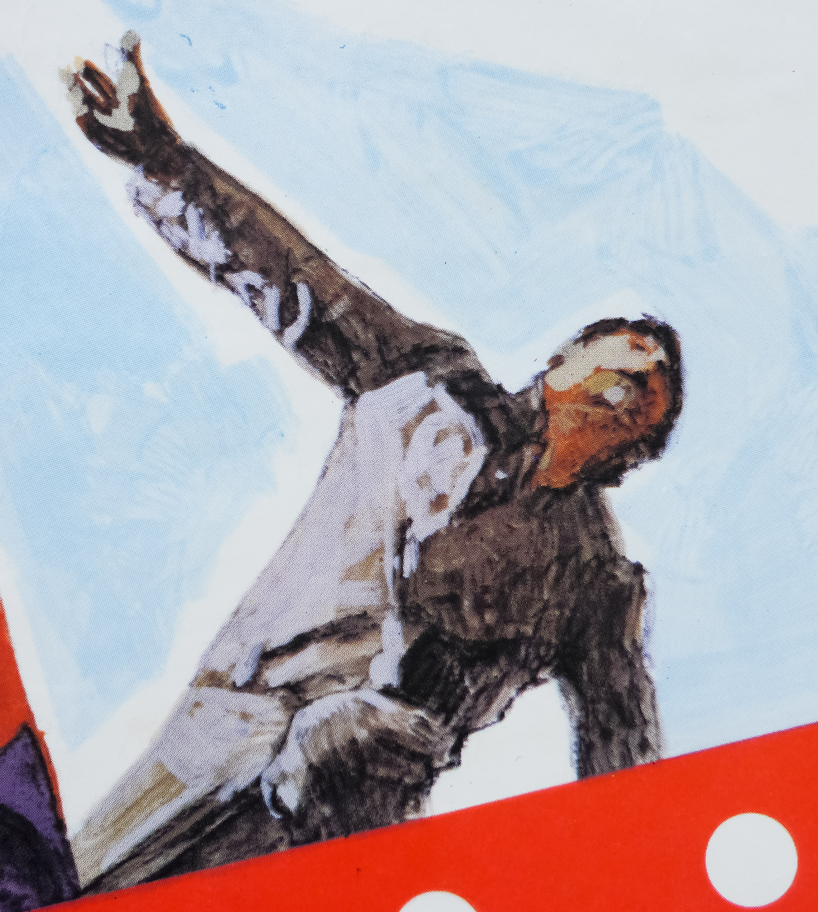
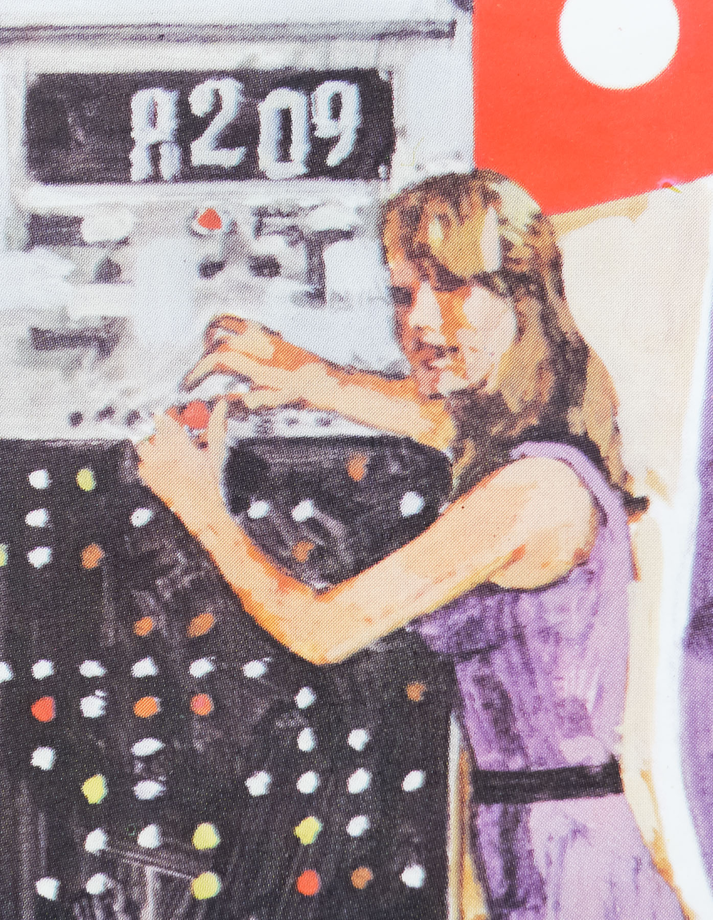
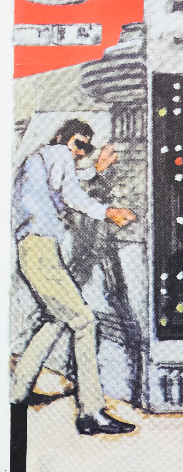
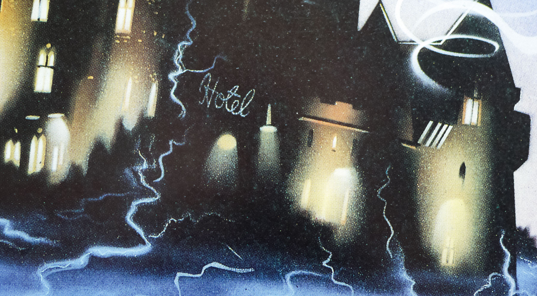
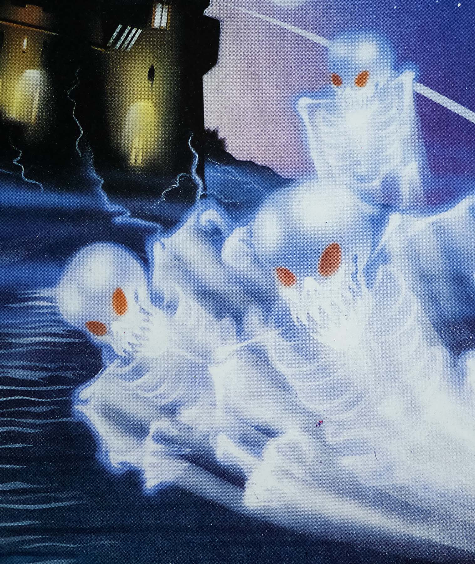
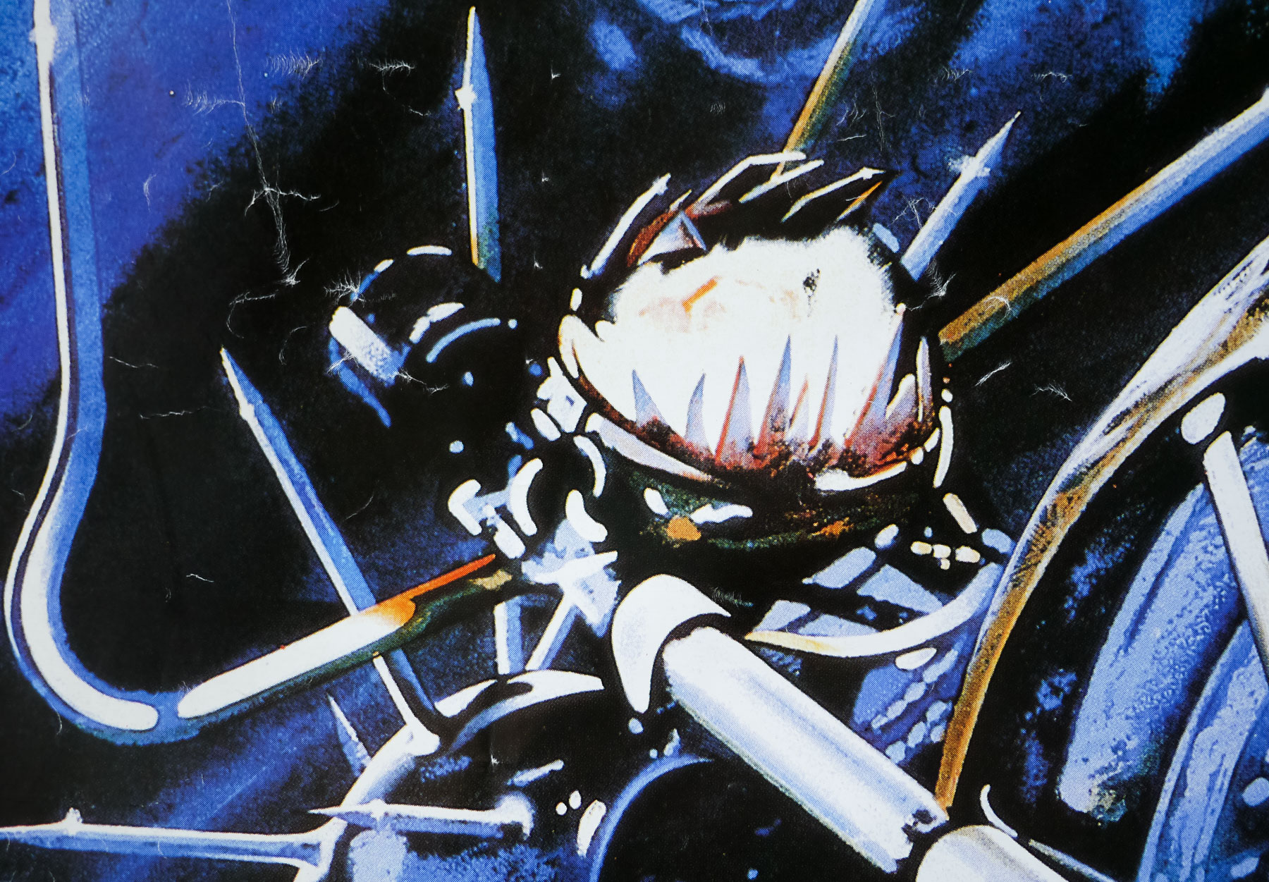
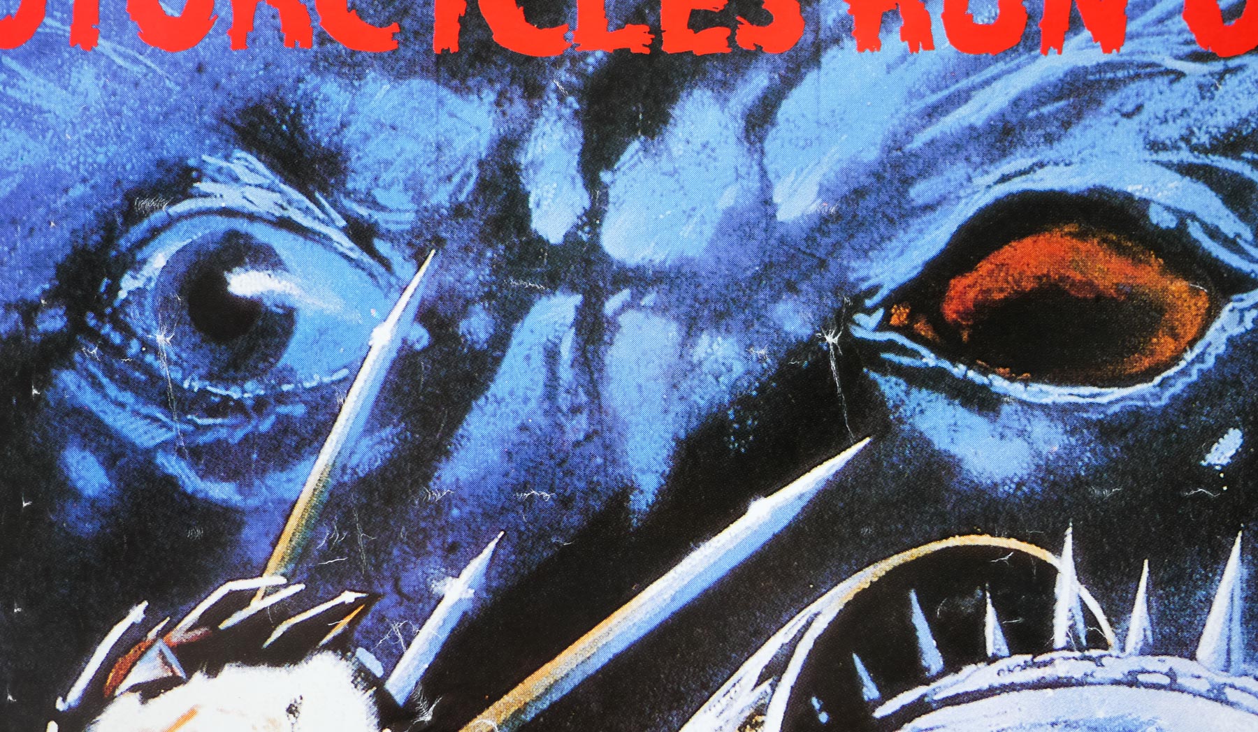
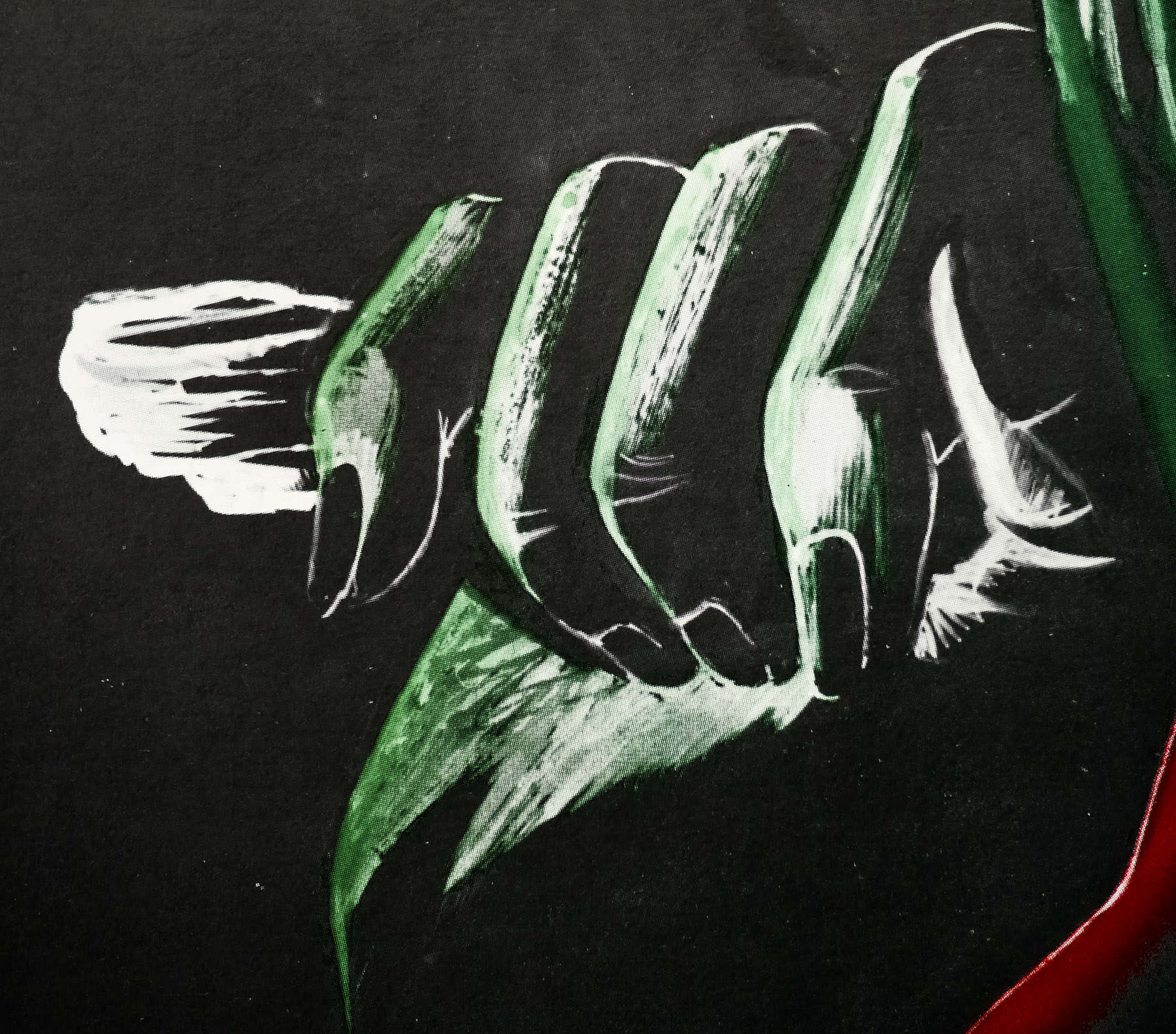
This British quad, which features crude artwork of a menacing Sheila Keith, was clearly designed by the team responsible for the quad for House of Whipcord (see here) and I feel fairly certain that the same artist or artists were involved too. If anyone knows who was responsible please get in touch.