
- Title
- Never Say Never Again
- AKA
- Sag Niemals Nie (Germany)
- Year of Film
- 1983
- Director
- Irvin Kershner
- Starring
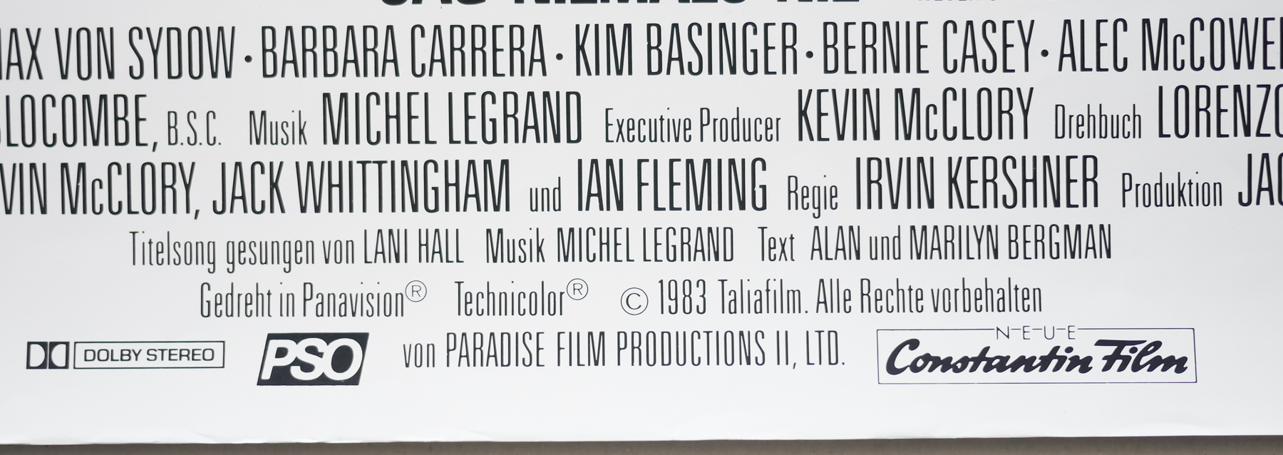
- Sean Connery, Klaus Maria Brandauer, Max von Sydow, Barbara Carrera, Kim Basinger, Bernie Casey, Alec McCowen, Edward Fox, Pamela Salem, Rowan Atkinson
- Origin of Film
- UK | USA | West Germany
- Genre(s) of Film
- Sean Connery, Klaus Maria Brandauer, Max von Sydow, Barbara Carrera, Kim Basinger, Bernie Casey, Alec McCowen, Edward Fox, Pamela Salem, Rowan Atkinson,
- Type of Poster
- A1
- Style of Poster
- Full artwork
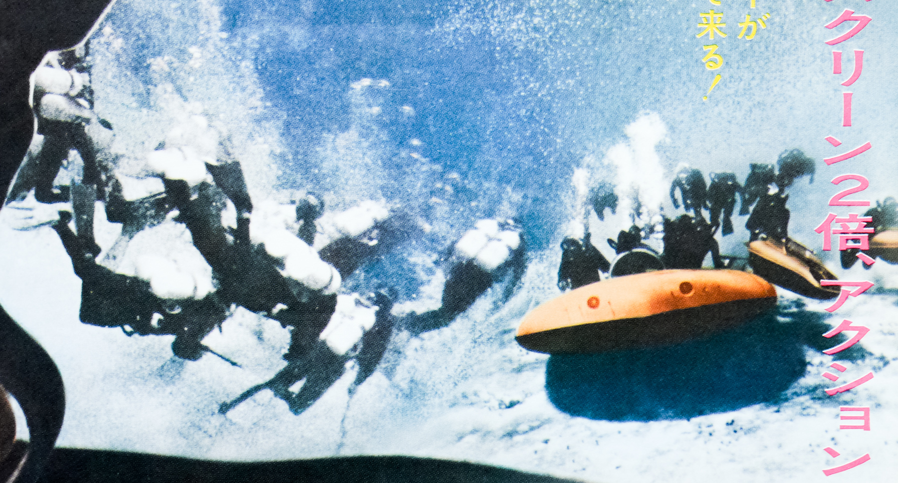
- Origin of Poster
- Germany
- Year of Poster
- 1983
- Designer
- Renato Casaro
- Artist
- Renato Casaro
- Size (inches)
- 23 6/16" x 33 1/16"
- SS or DS
- SS
- Tagline
- --
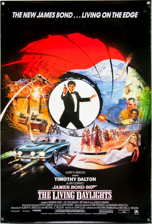
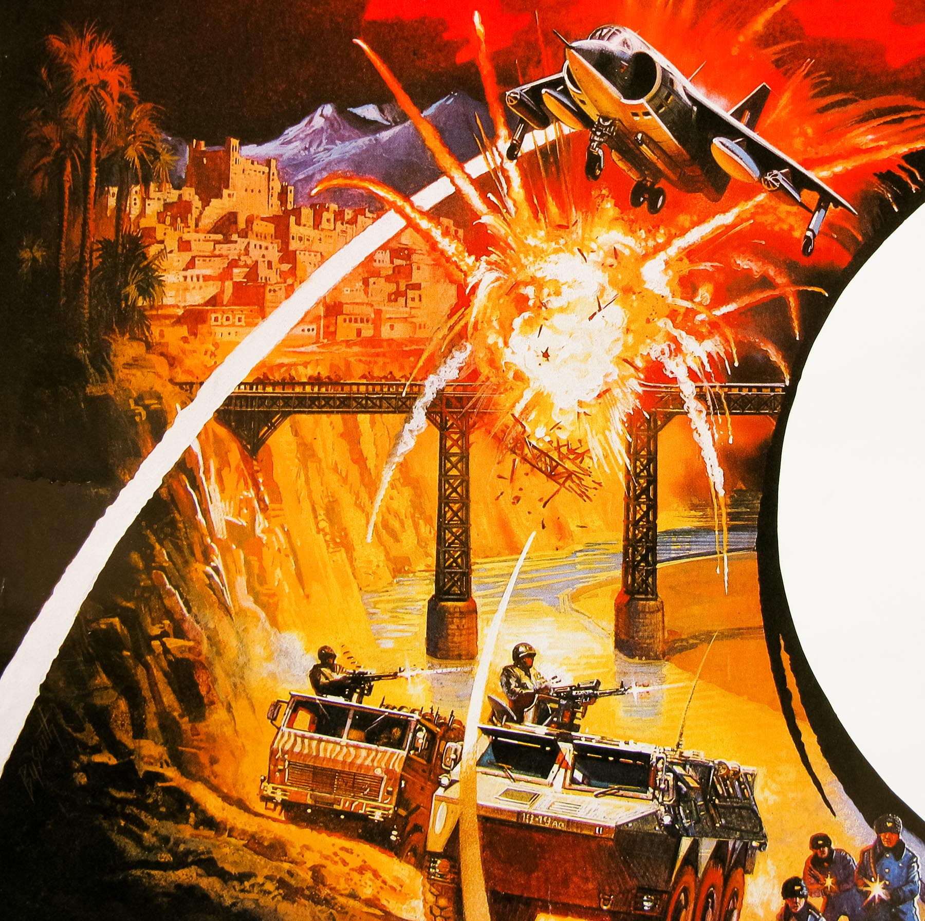
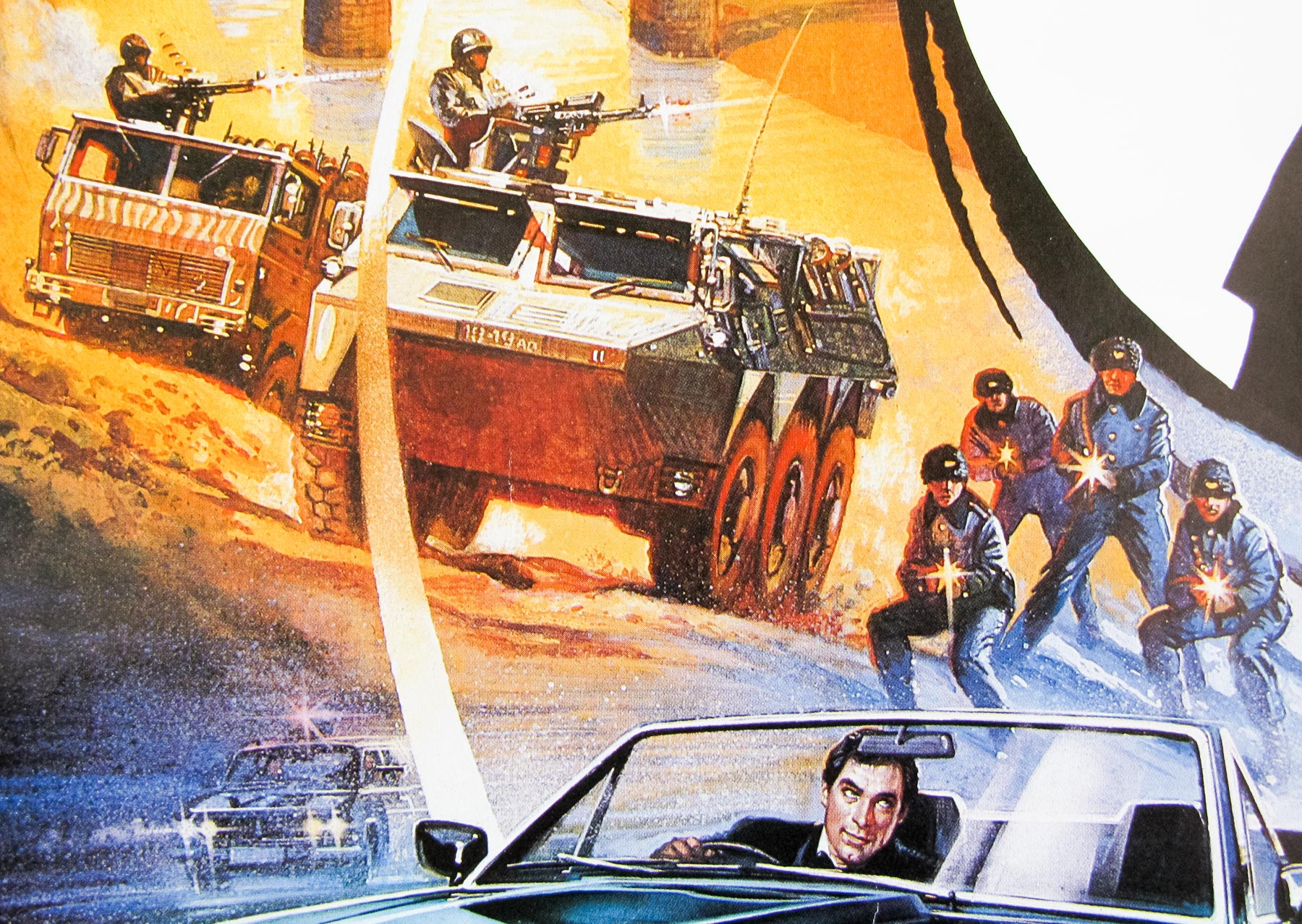
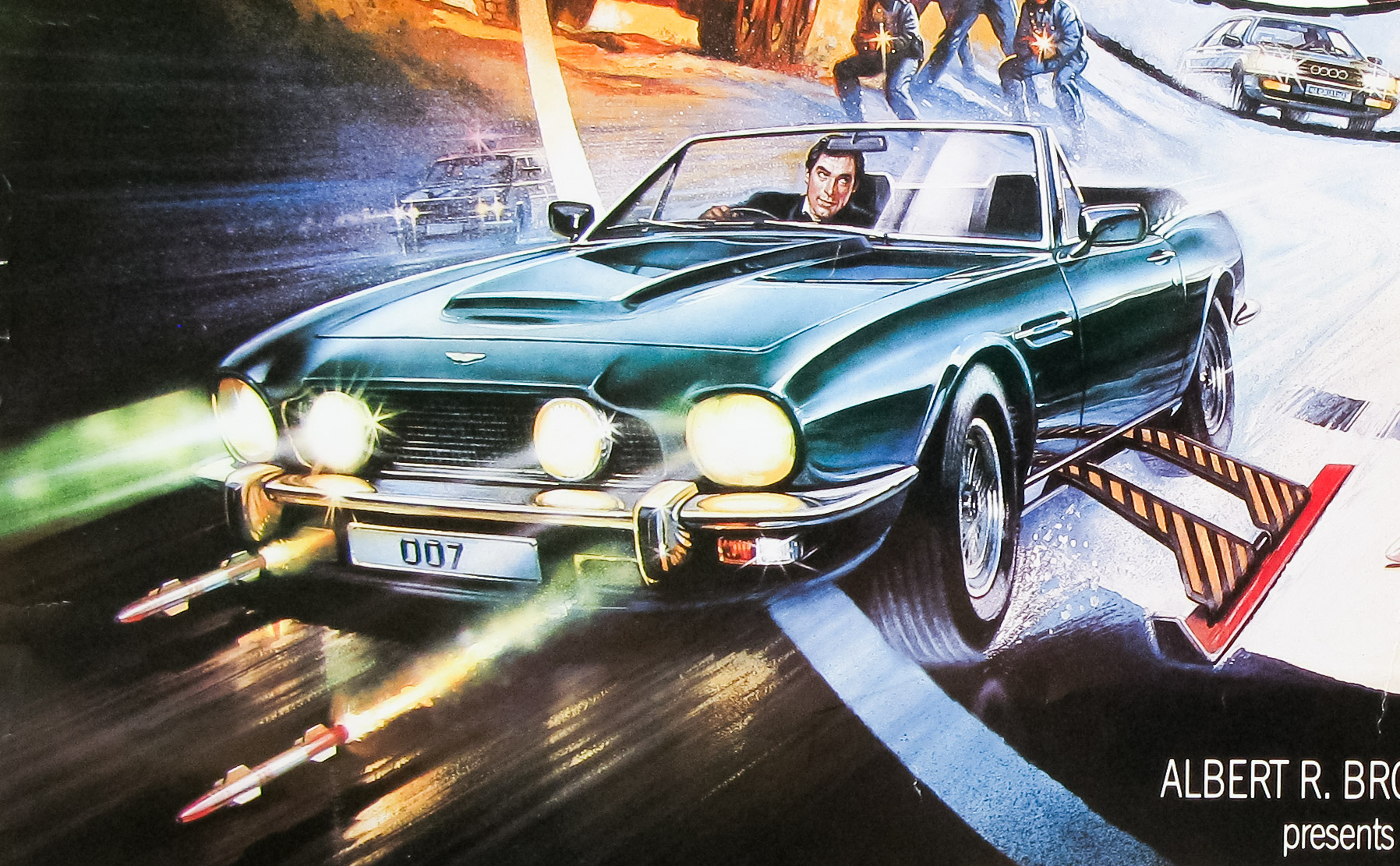
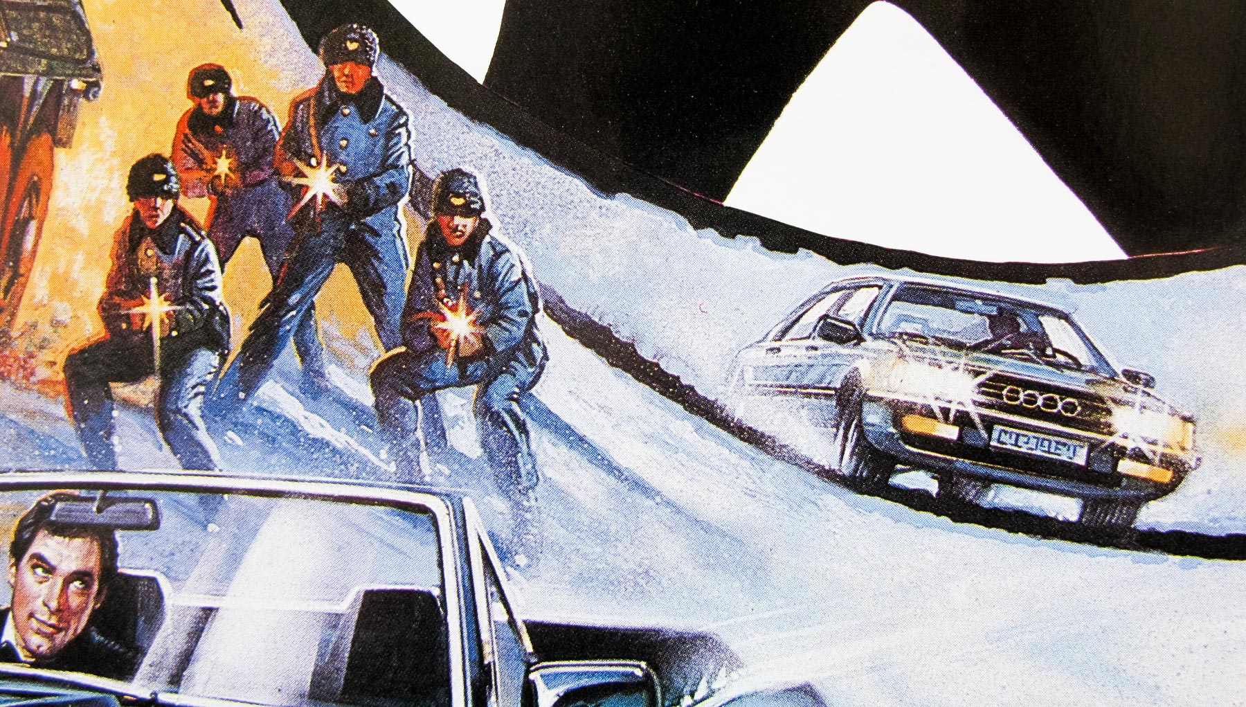
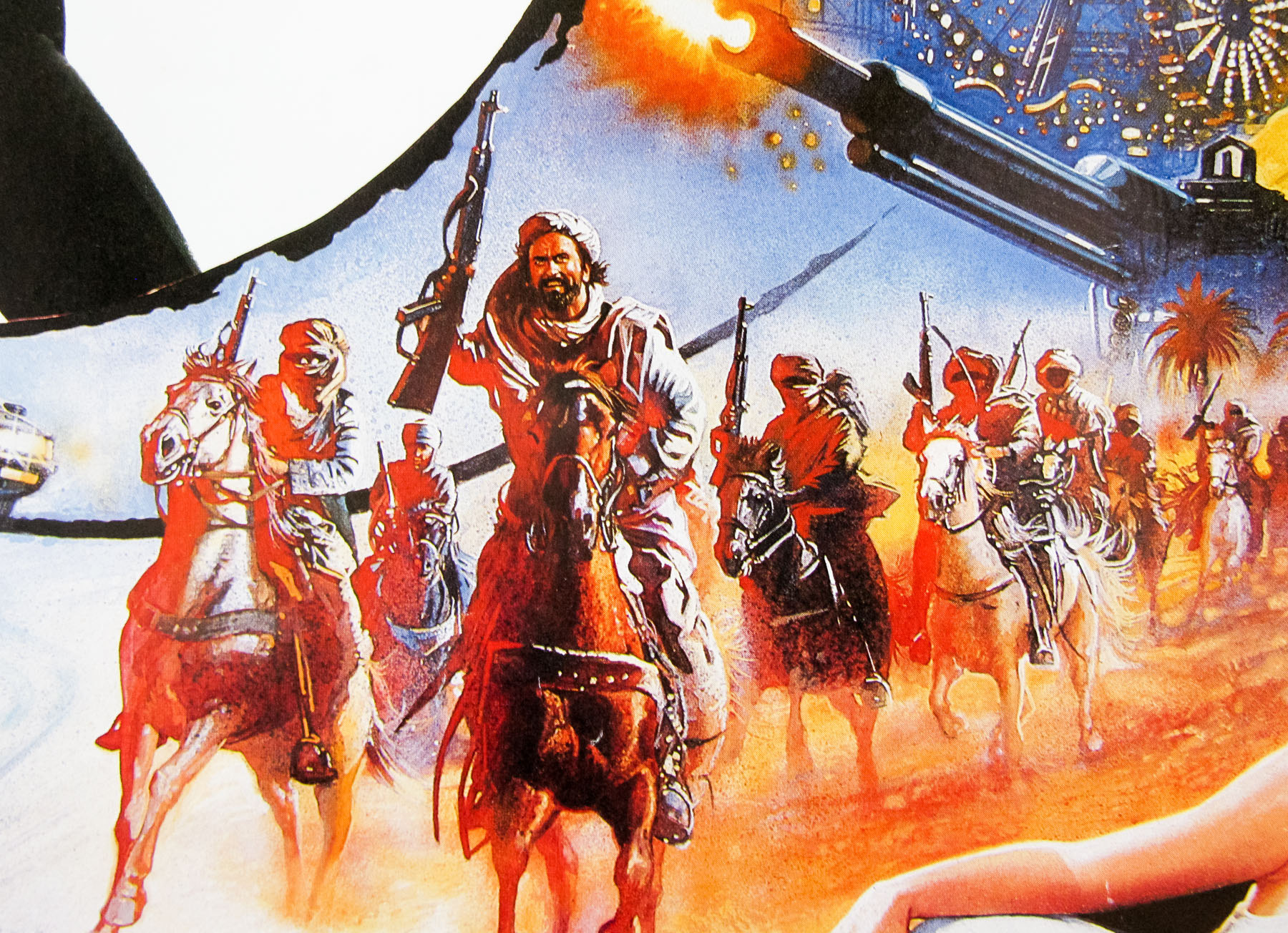
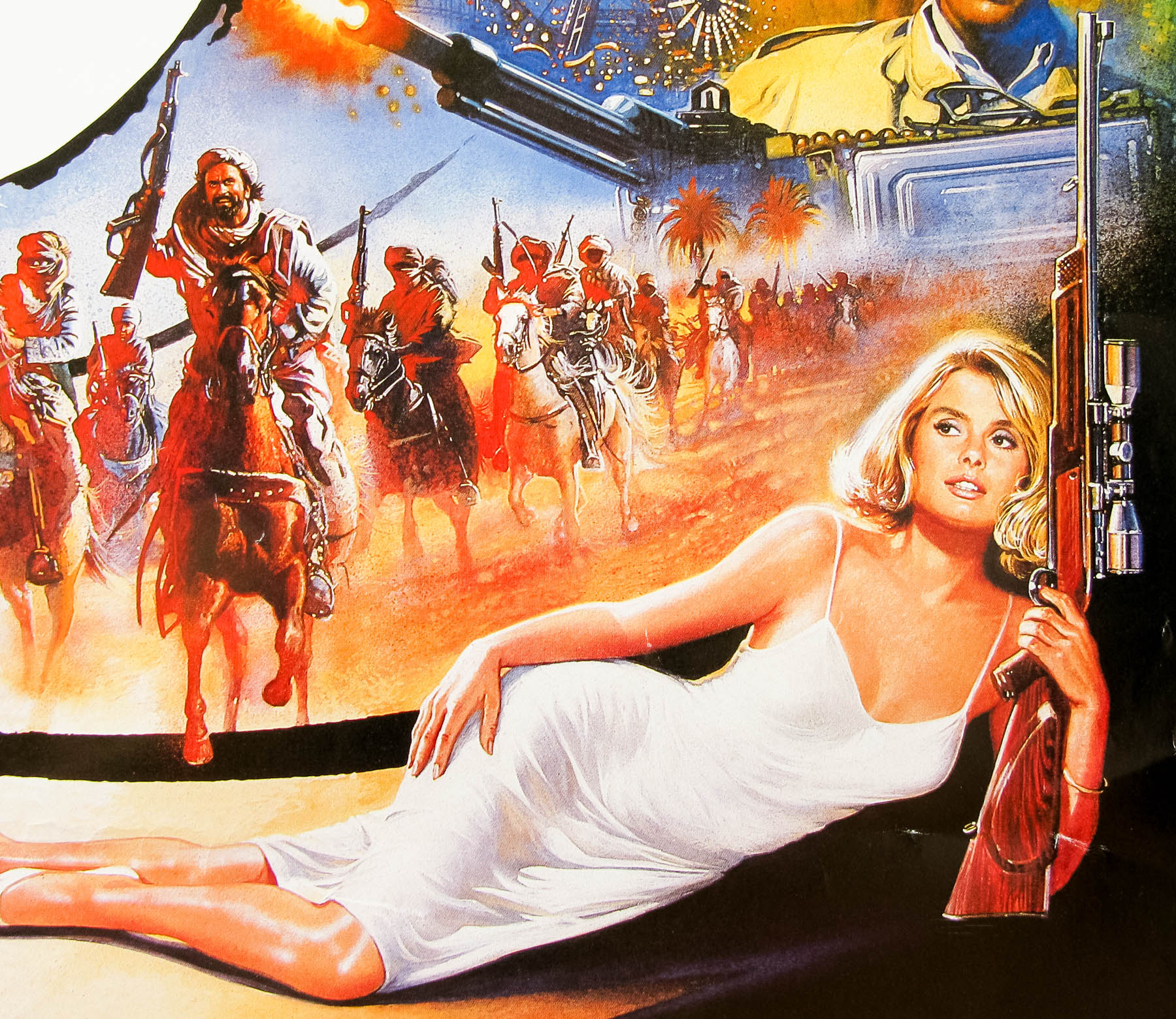
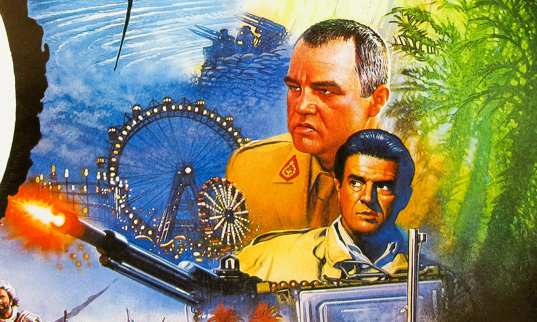
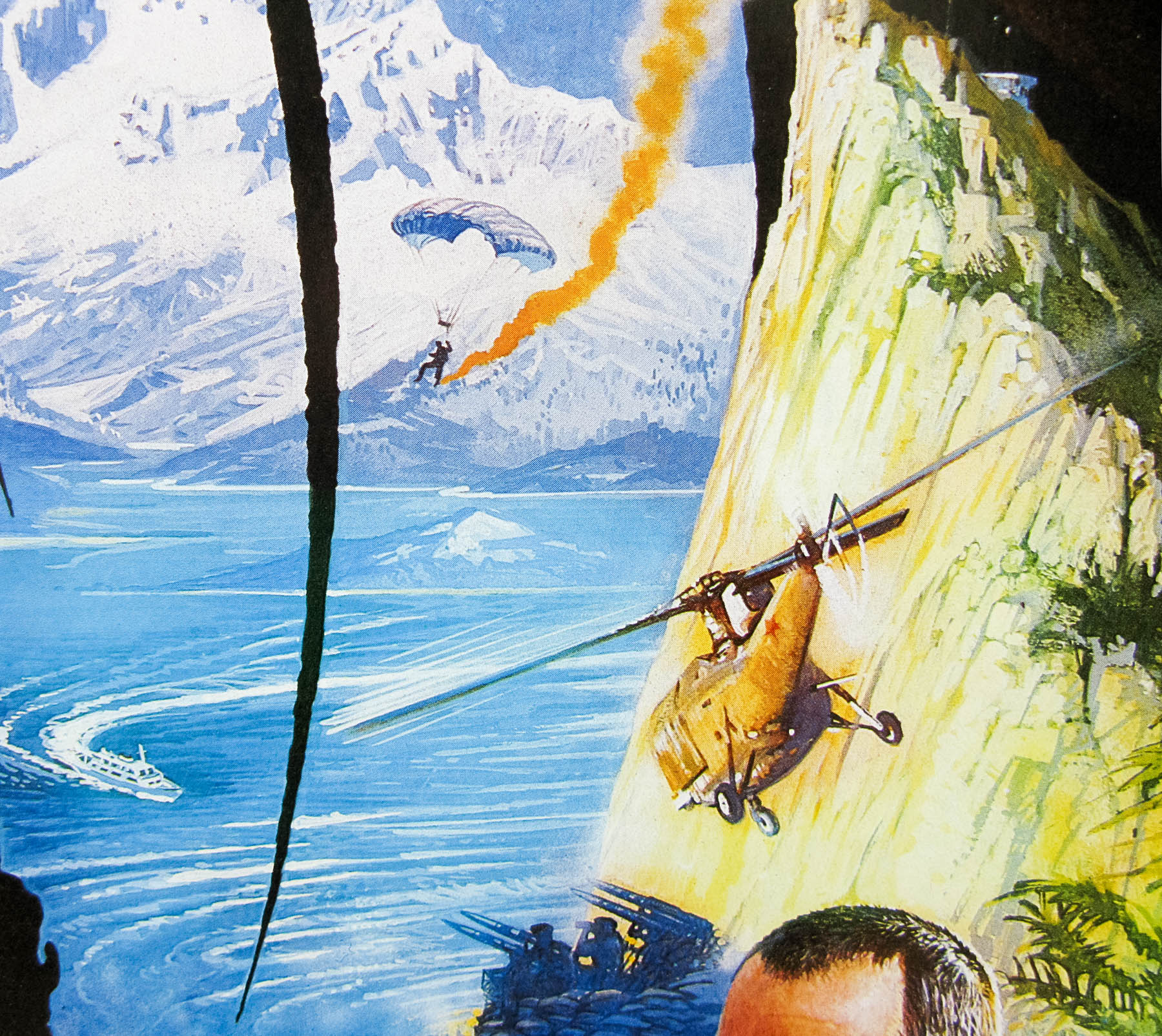
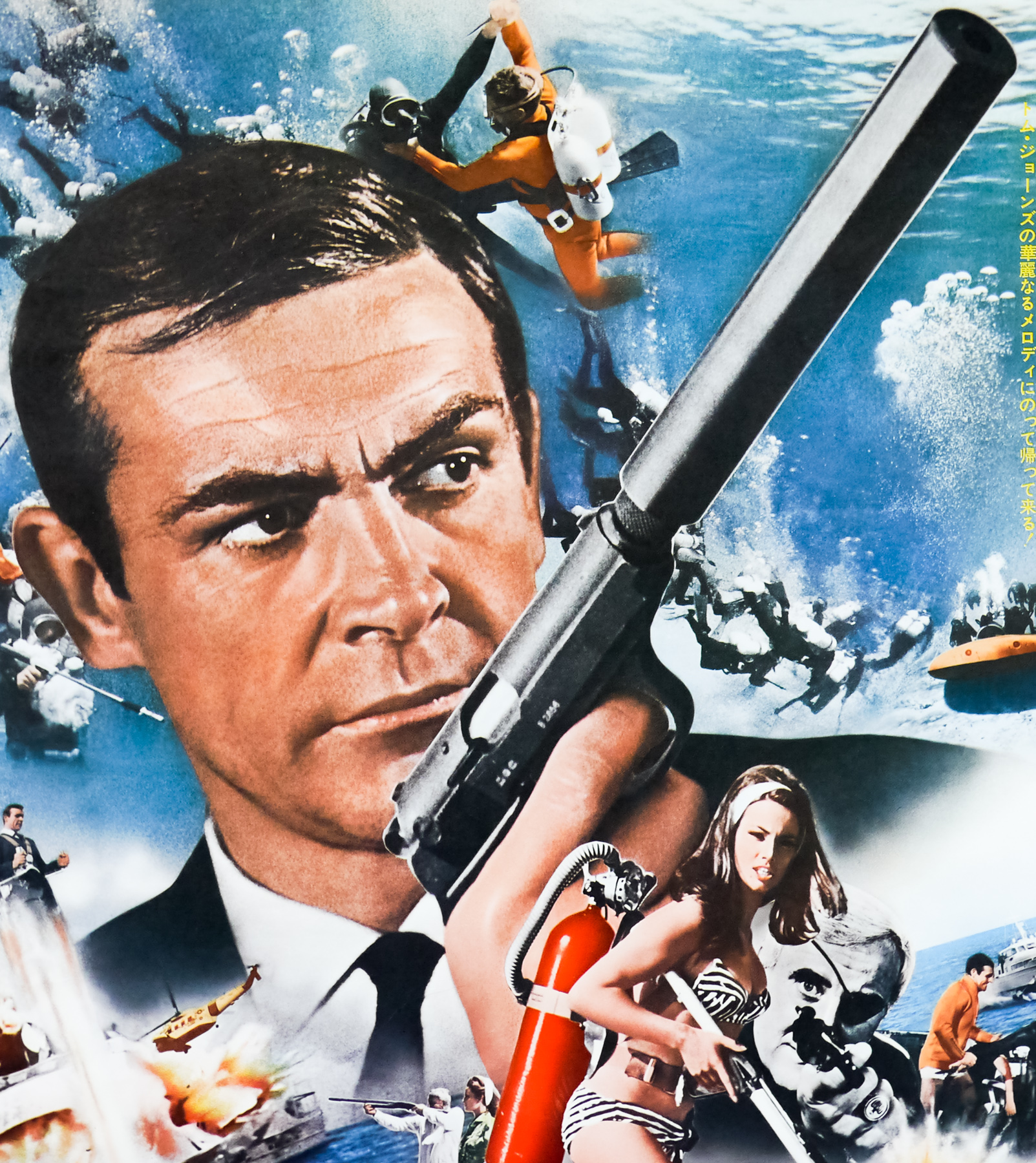
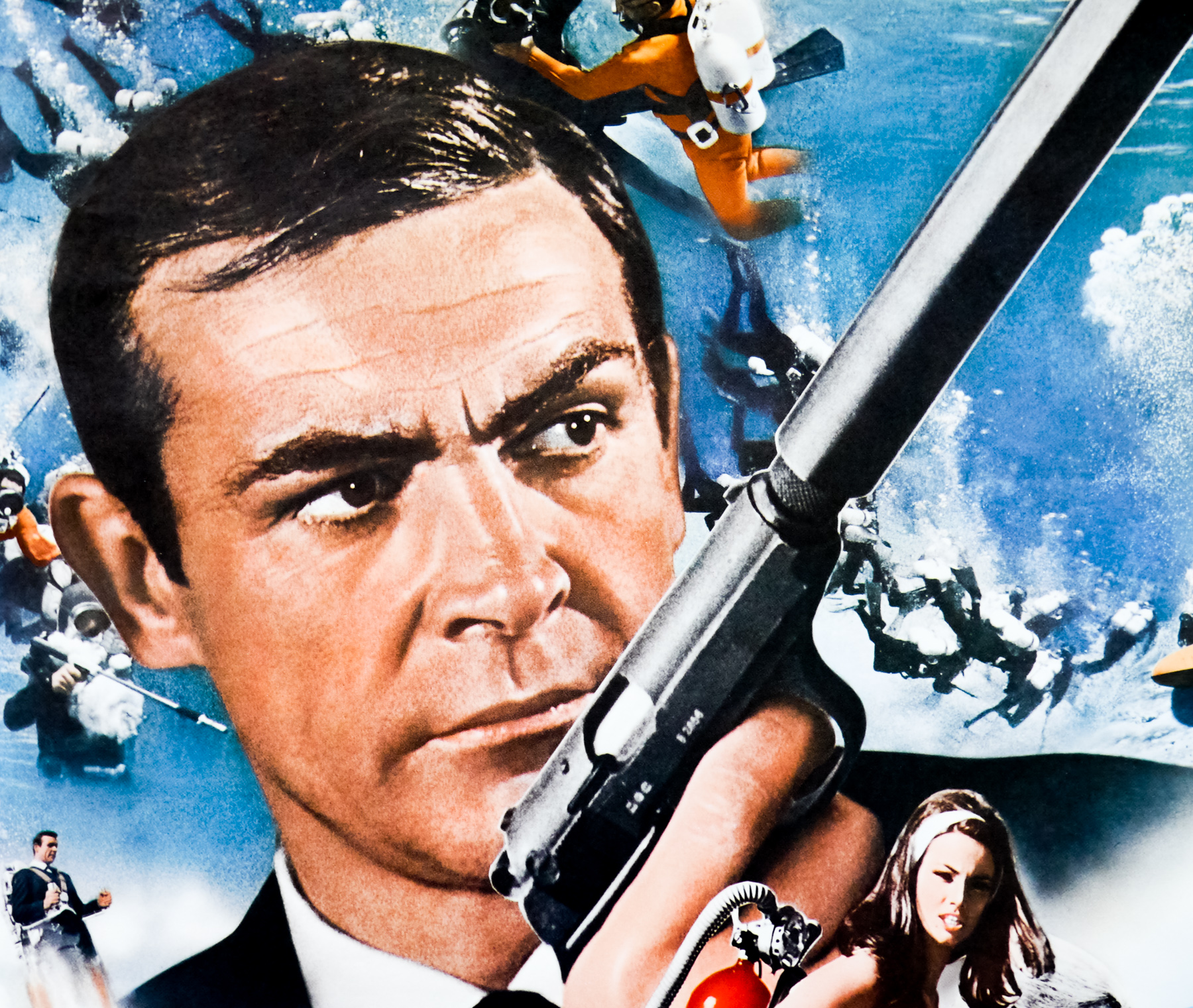
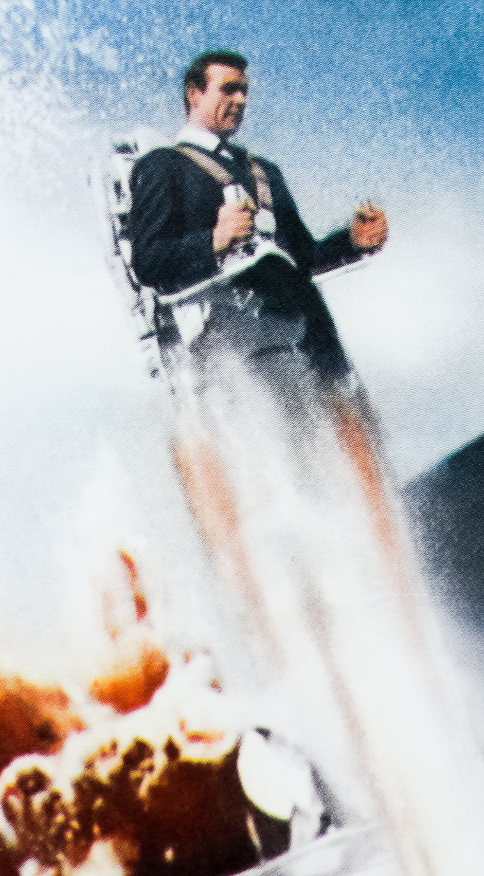
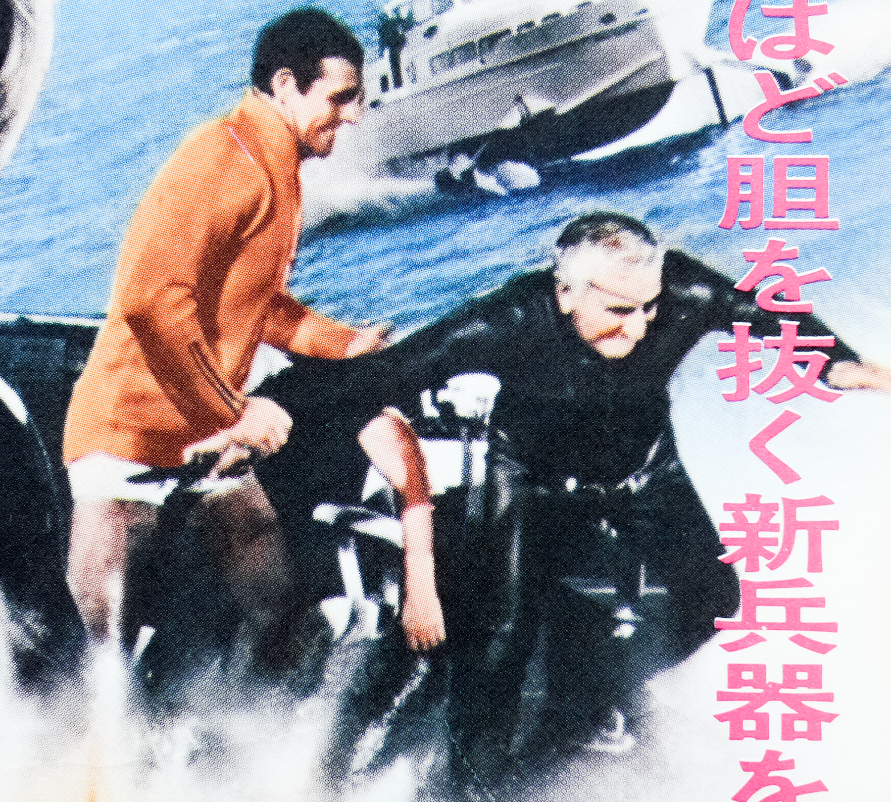
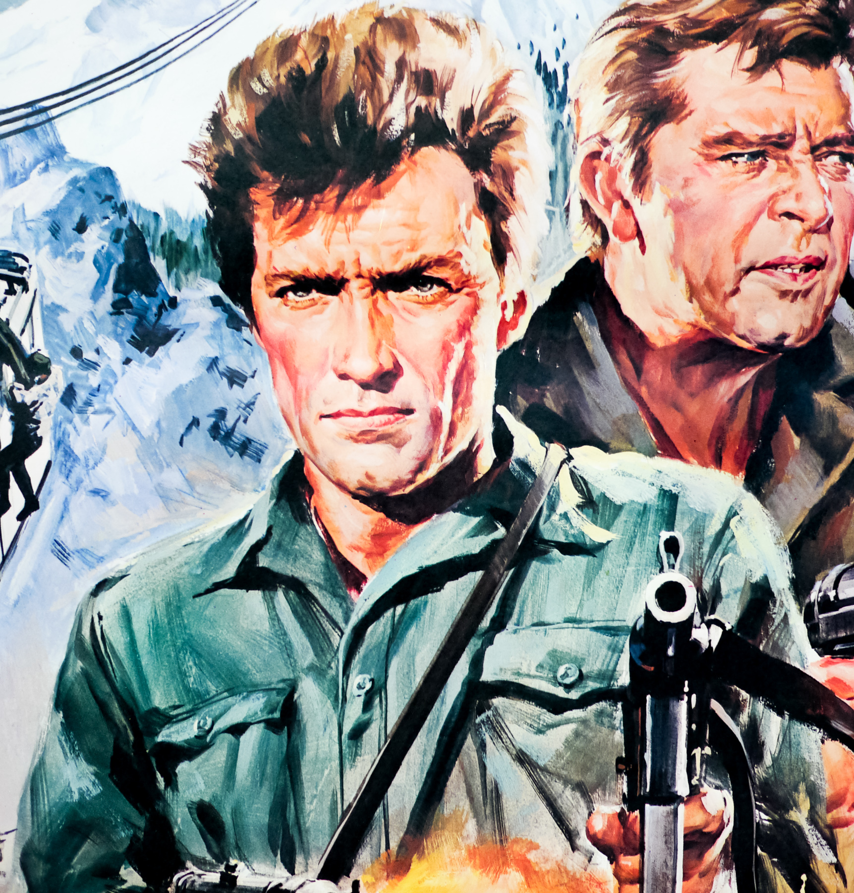
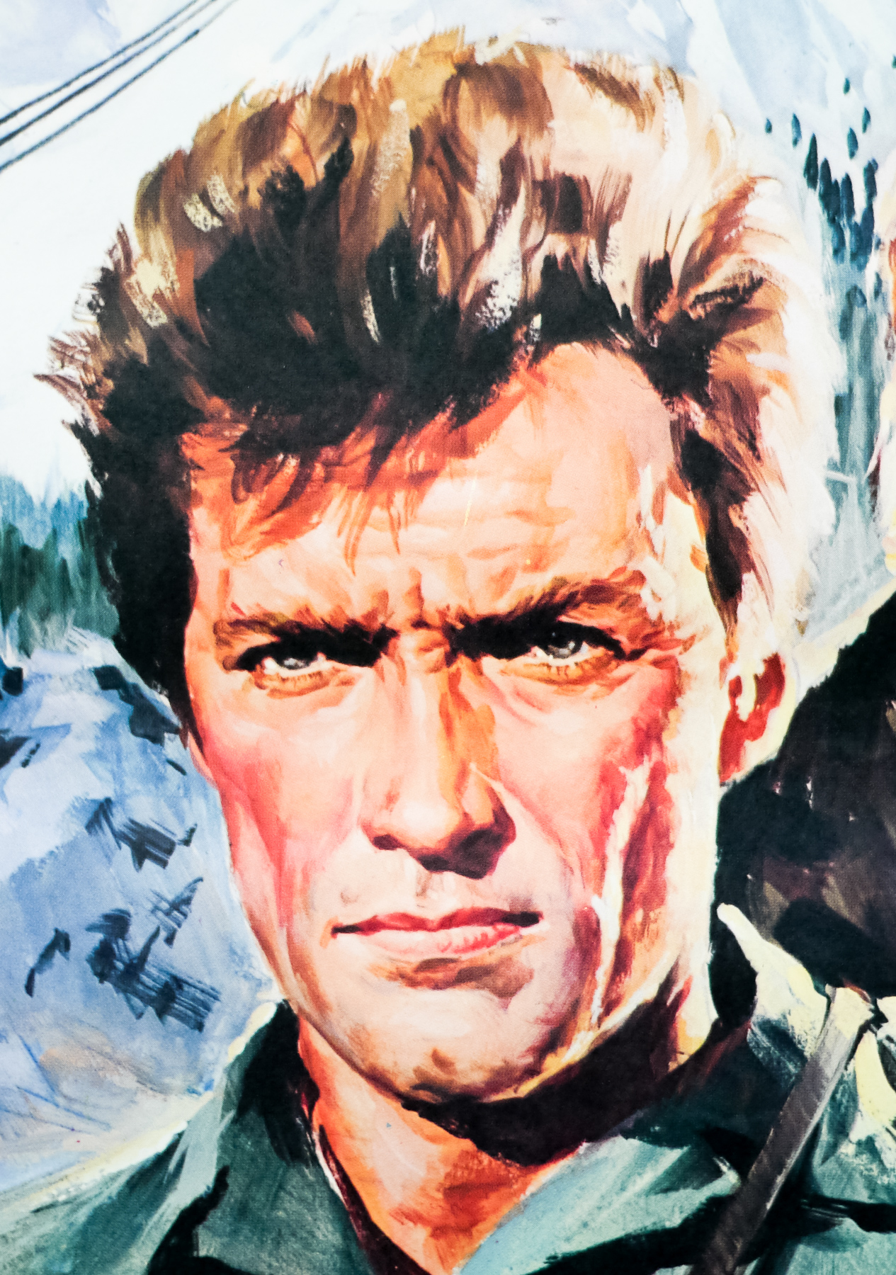
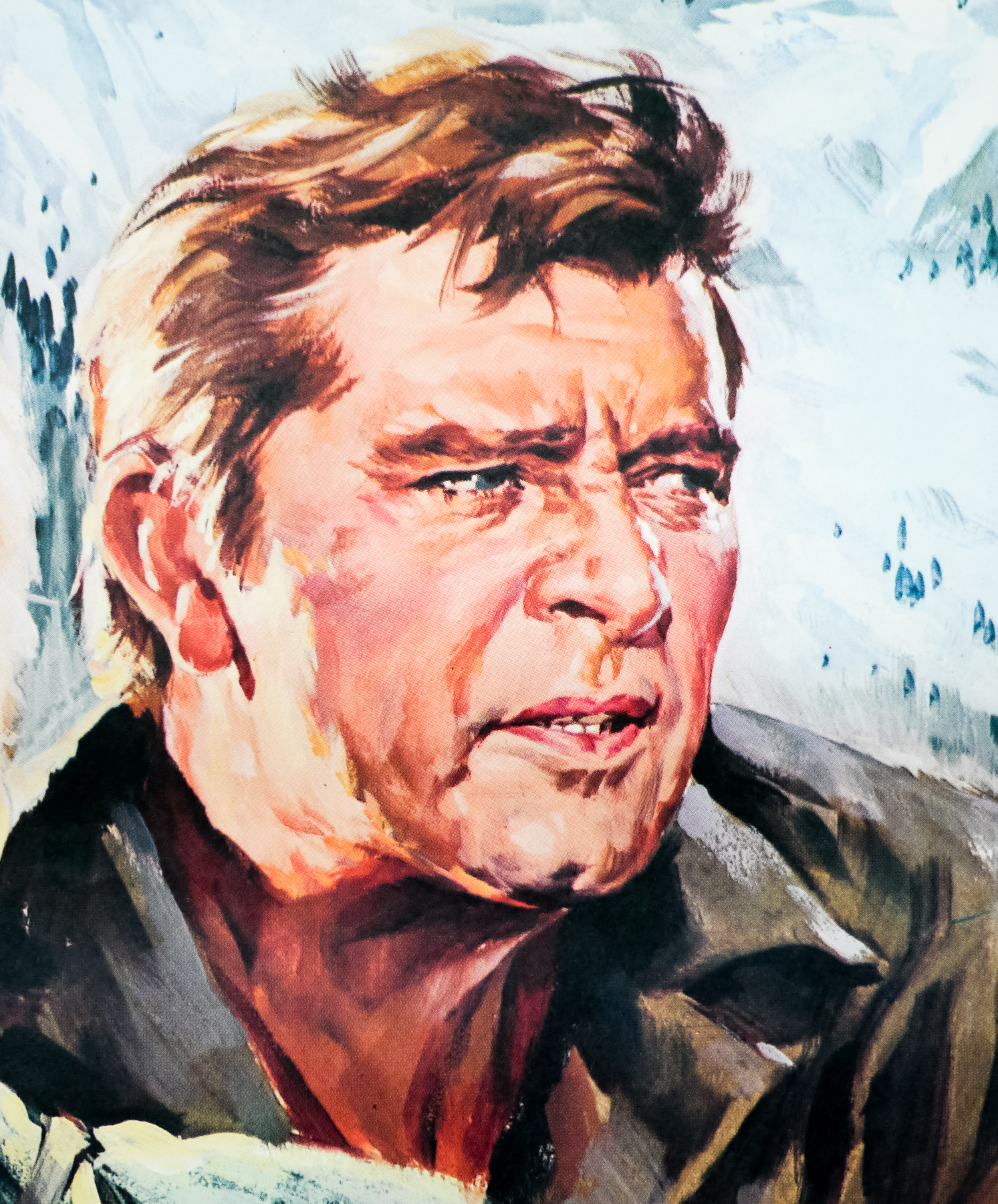
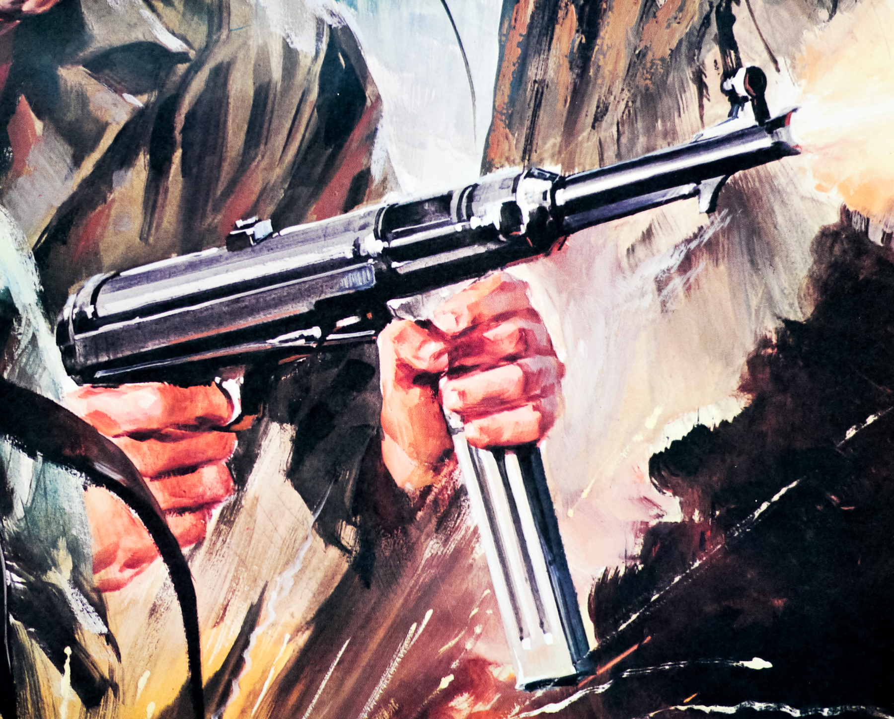
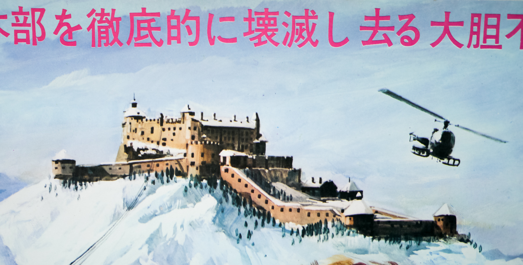
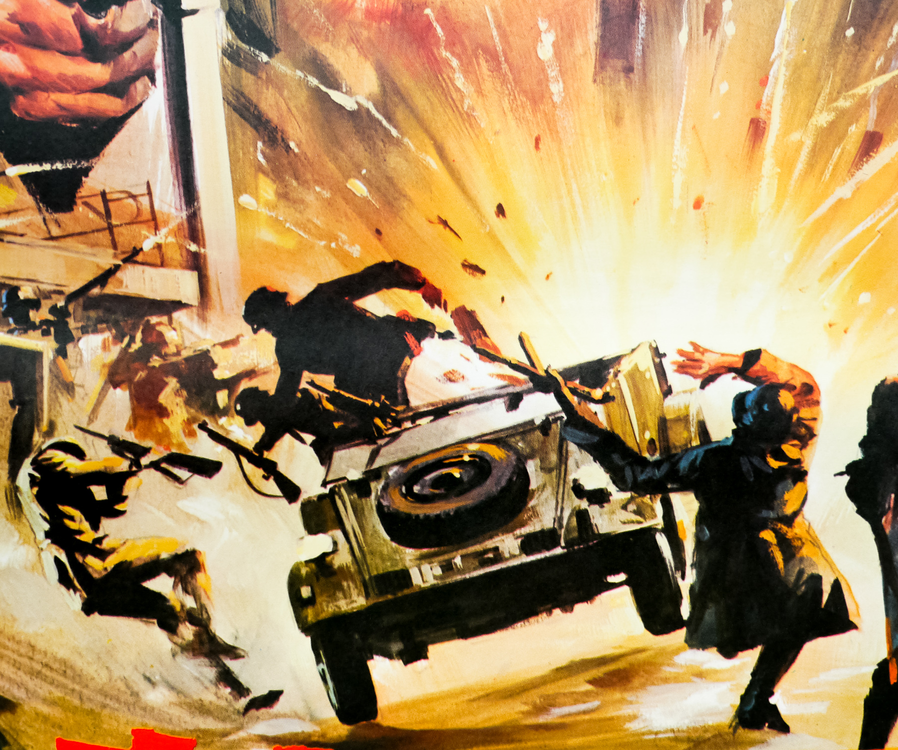
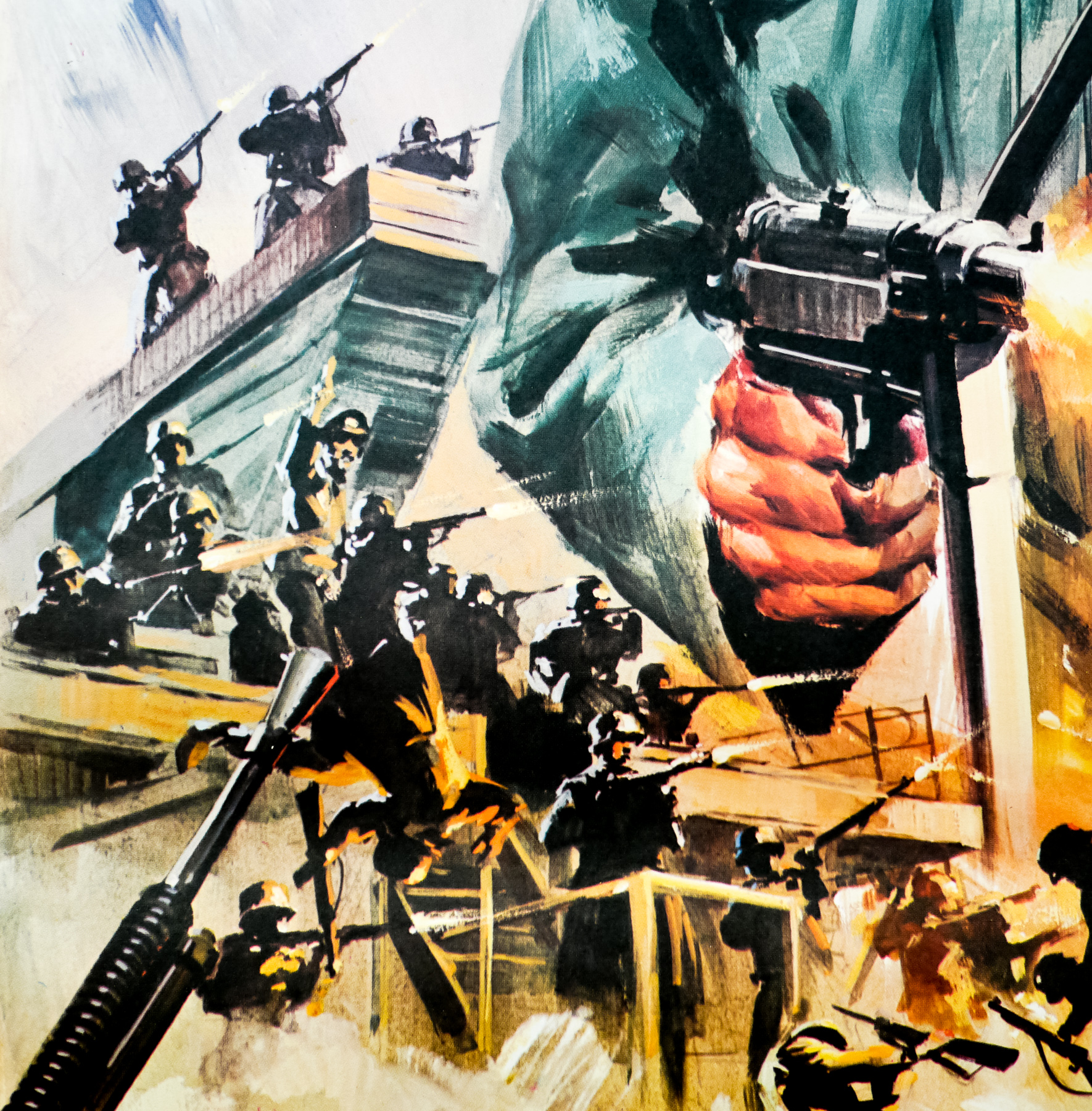
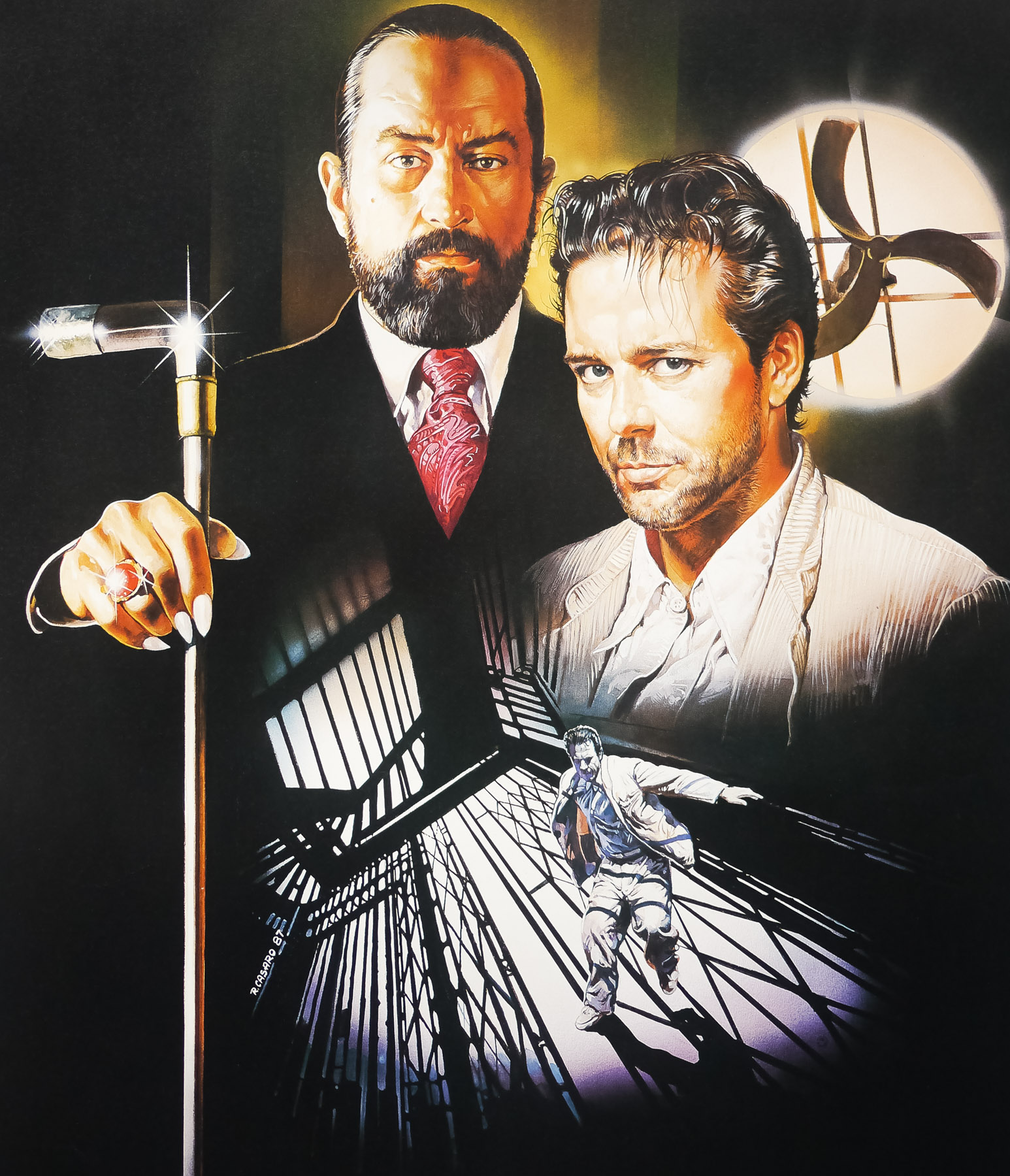
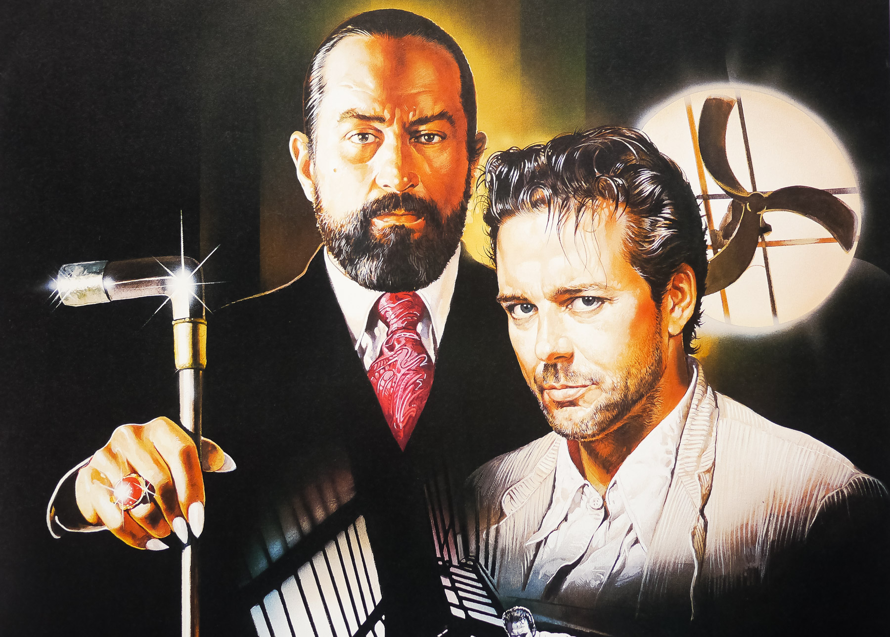
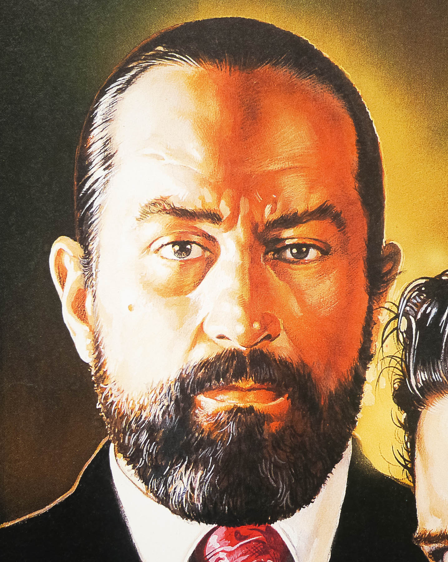
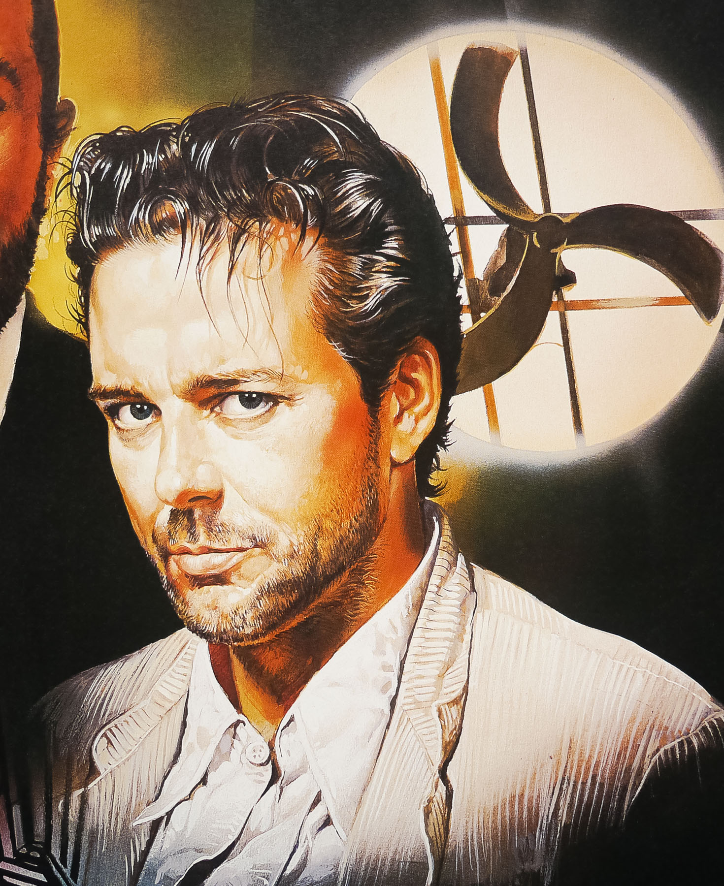
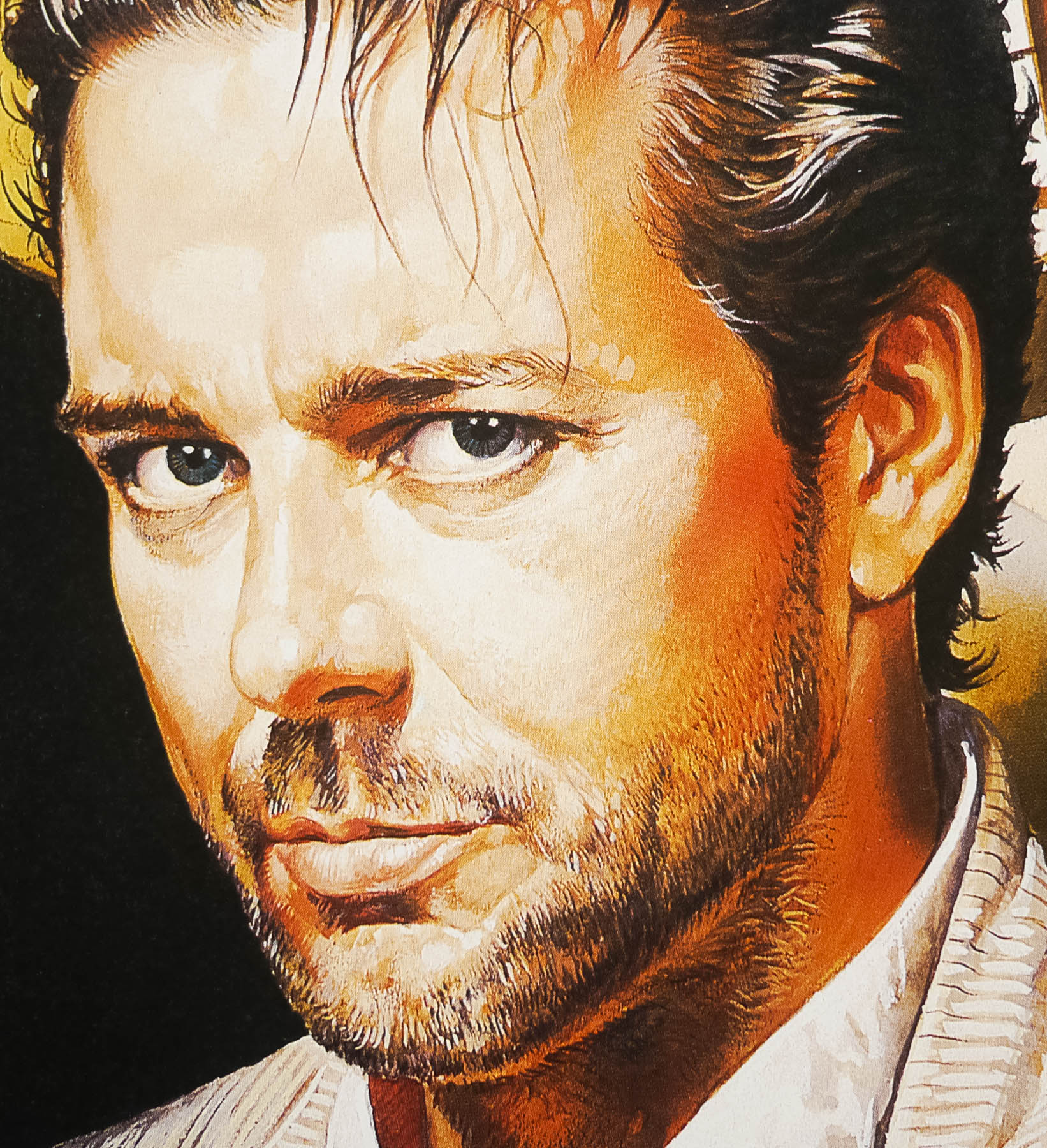
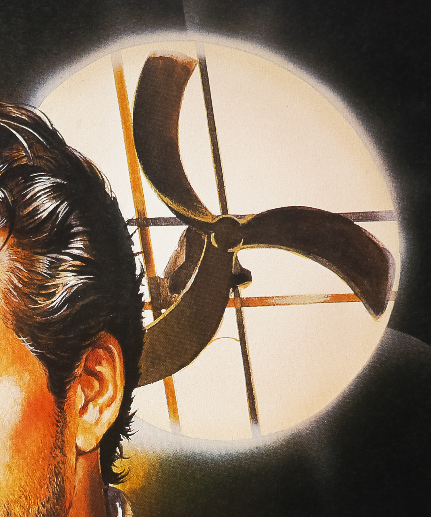
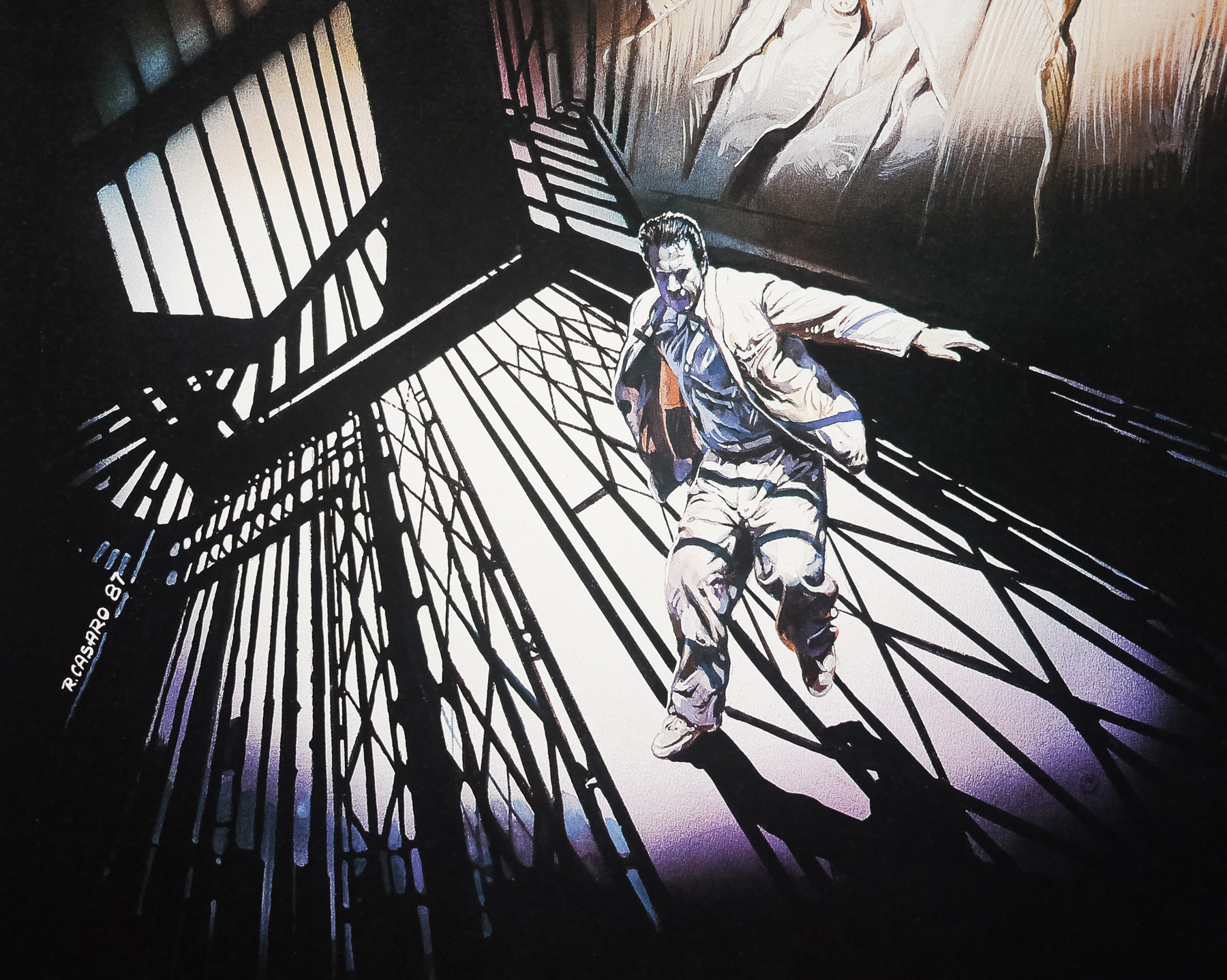
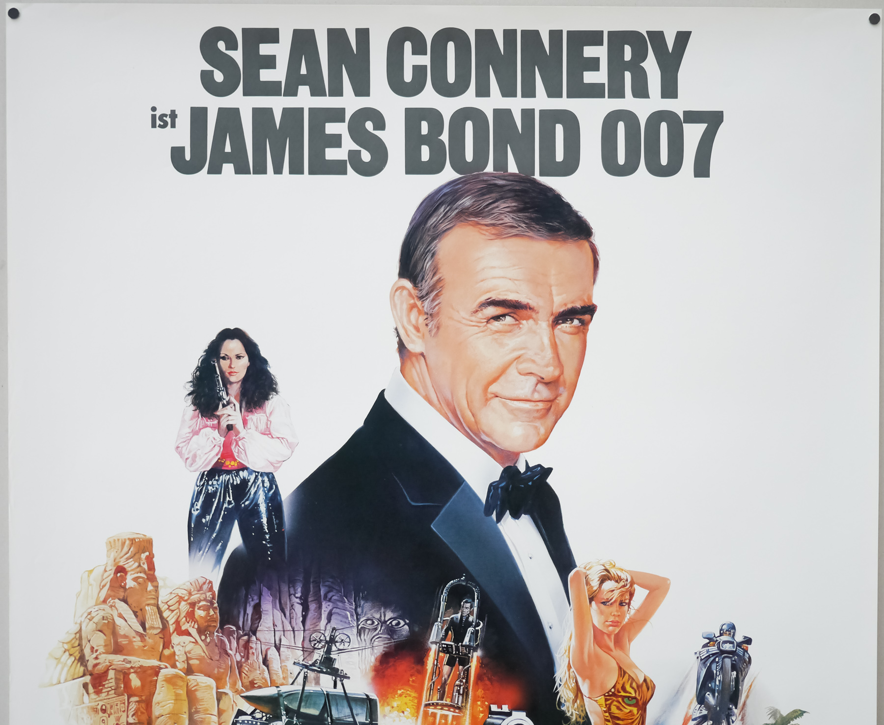
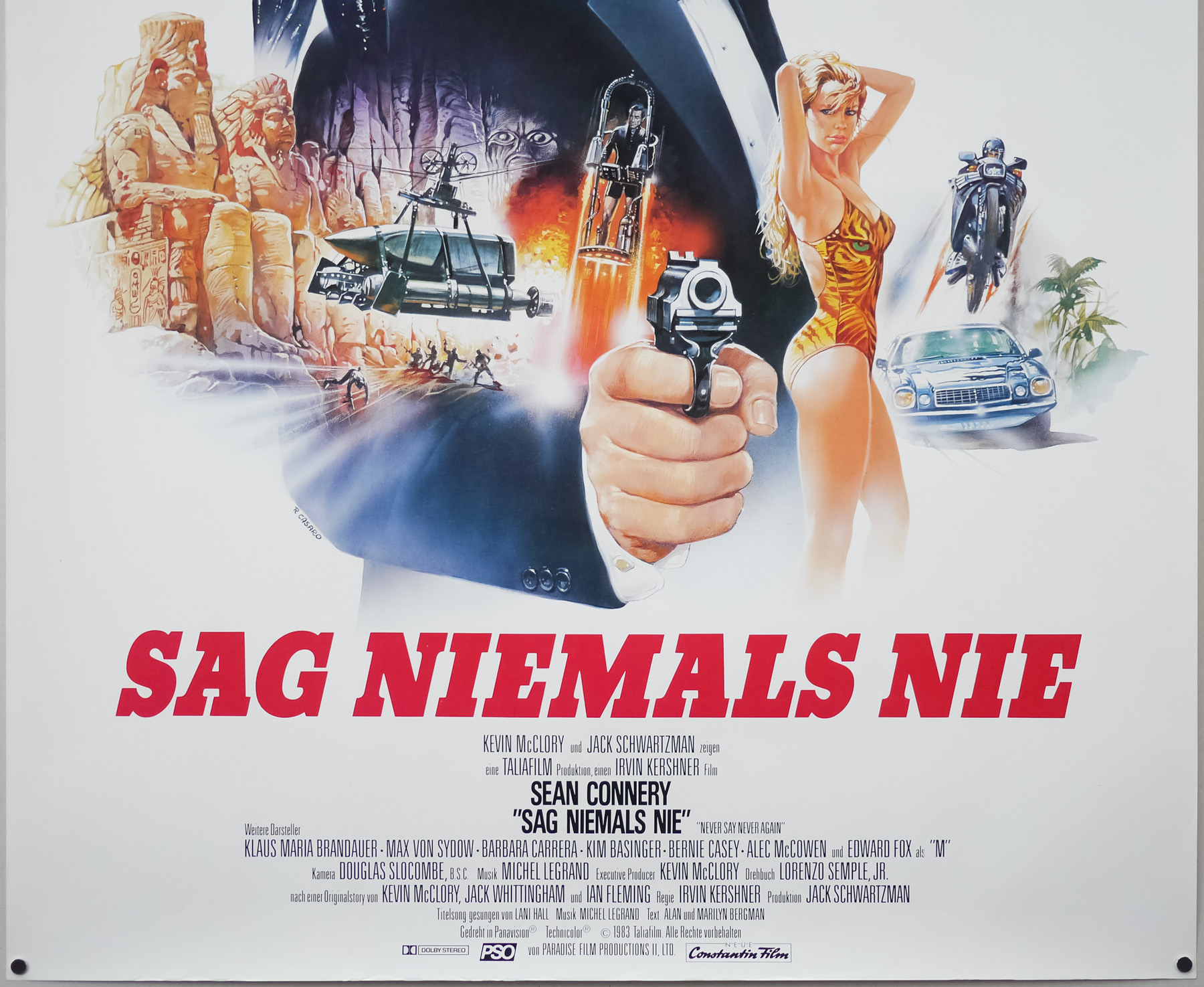
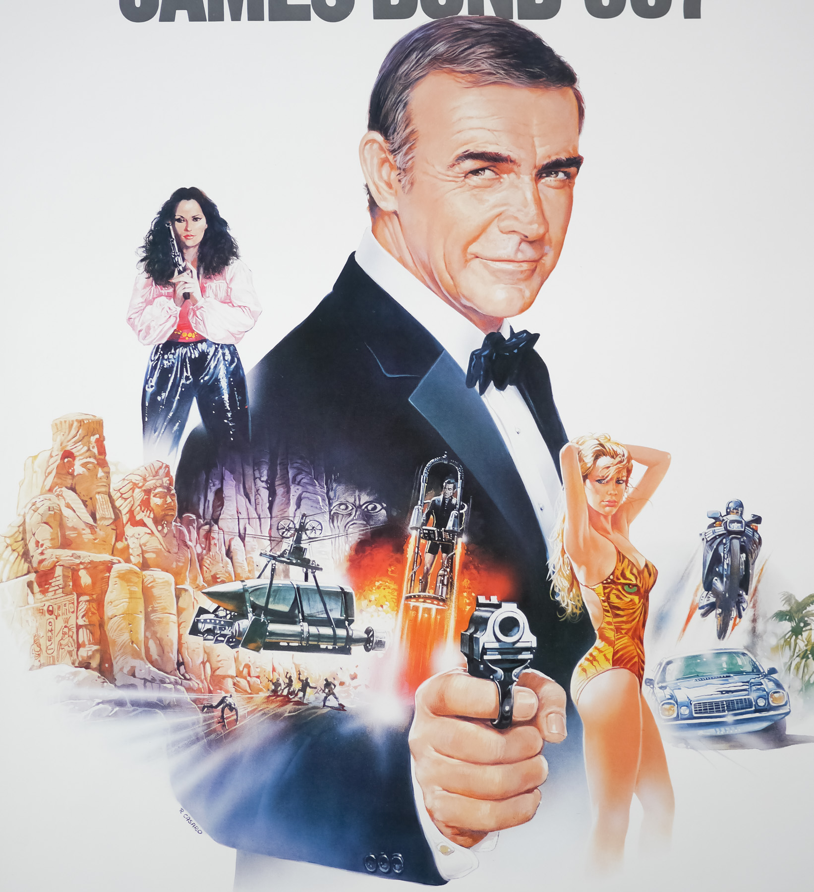
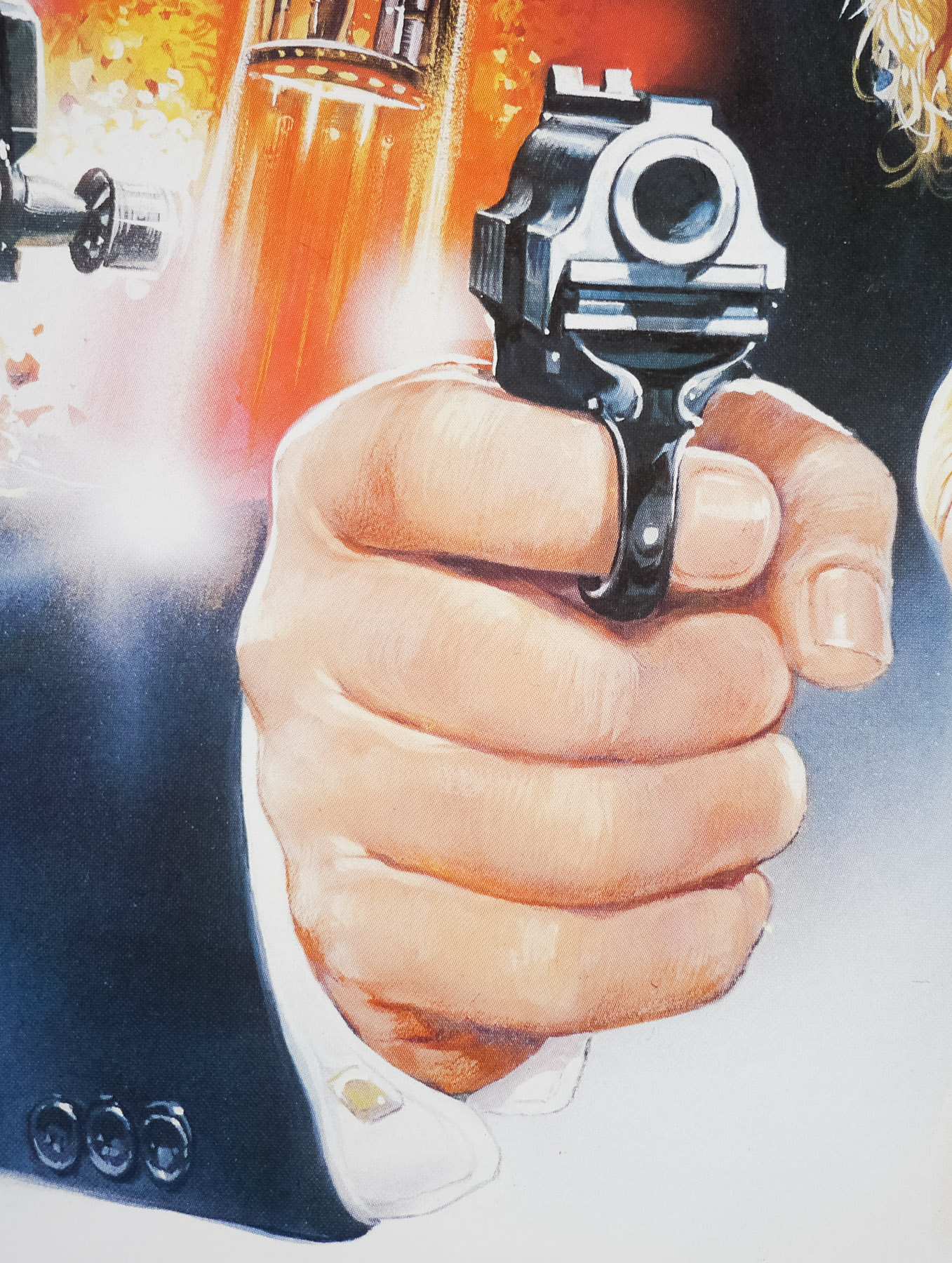
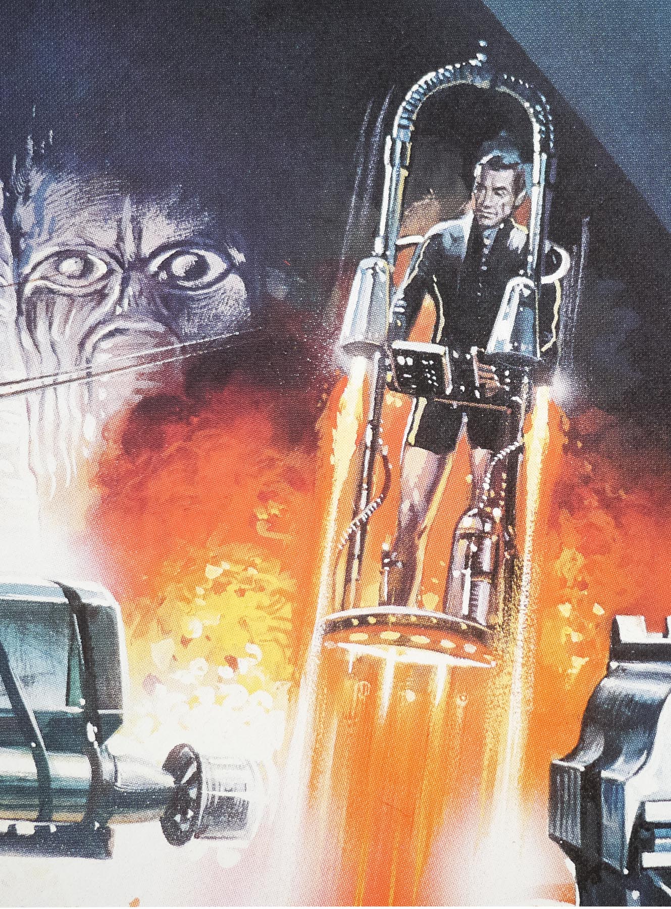
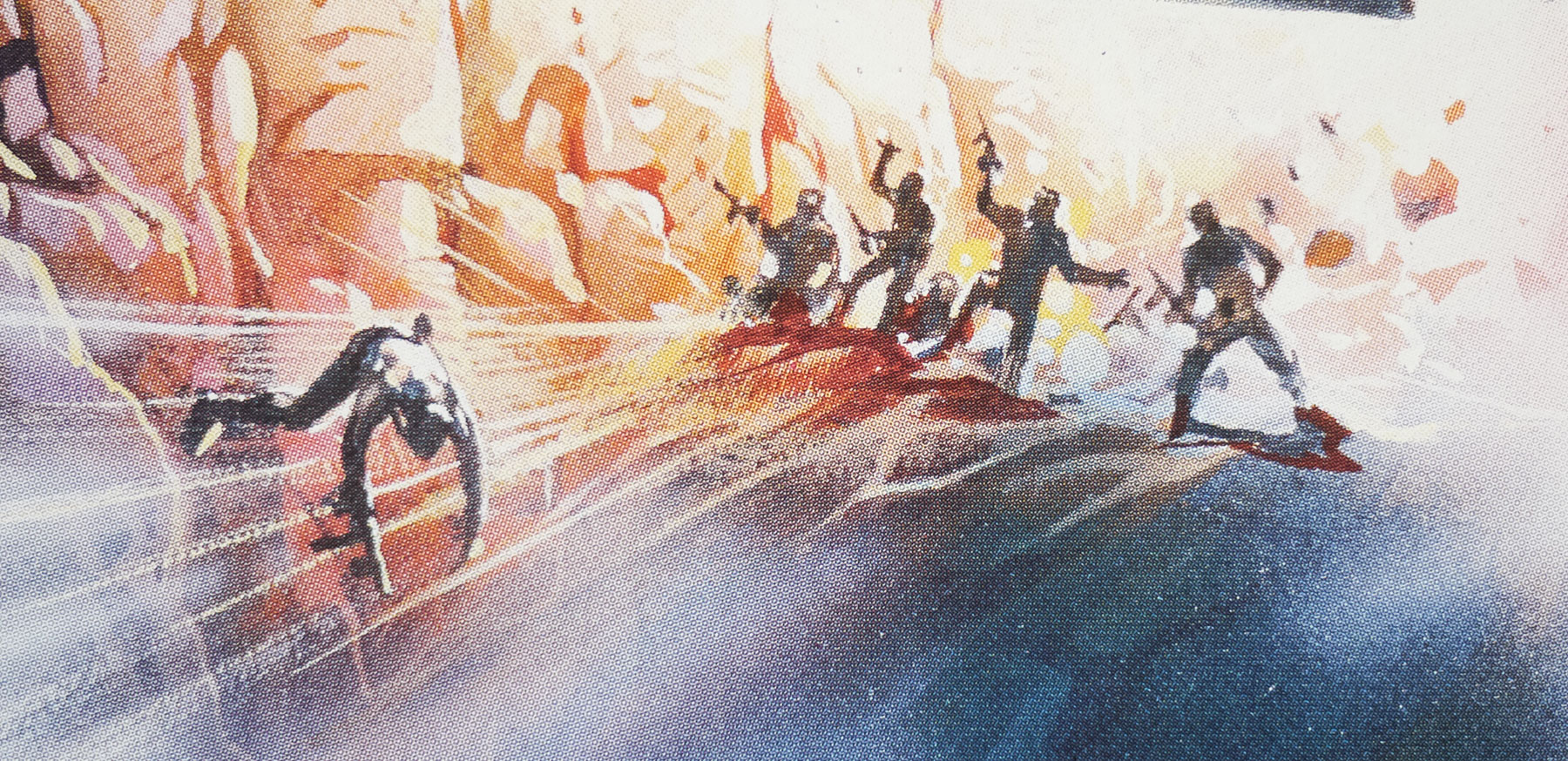
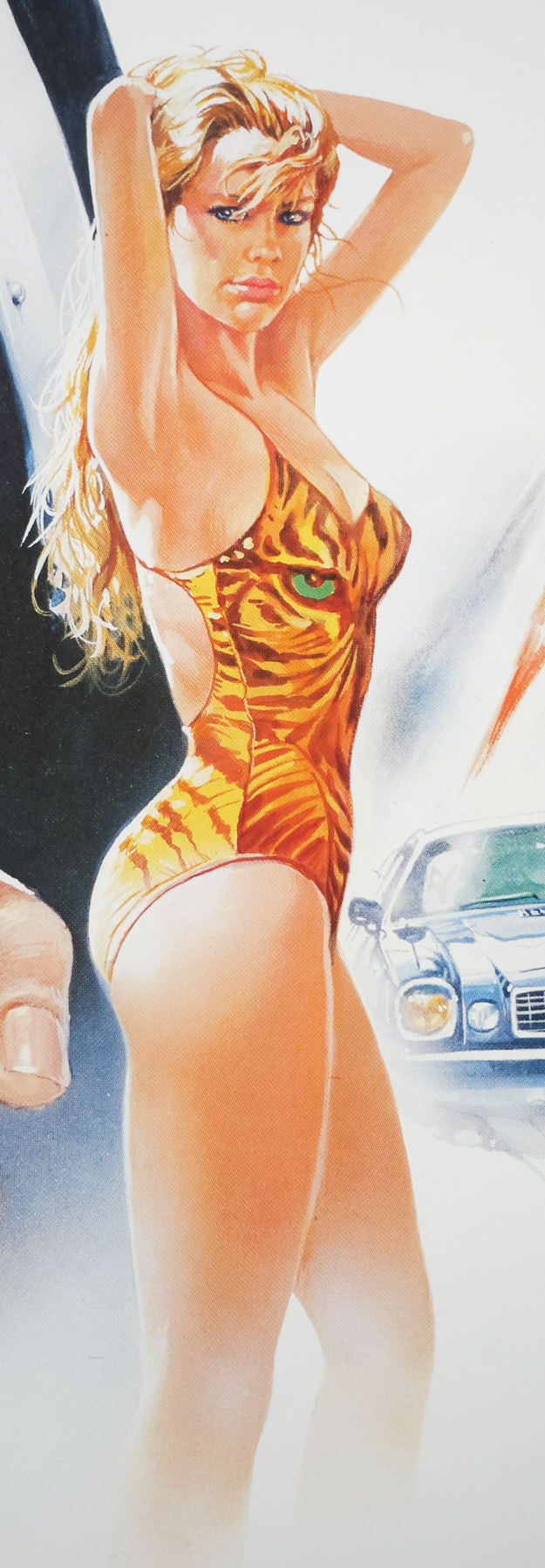
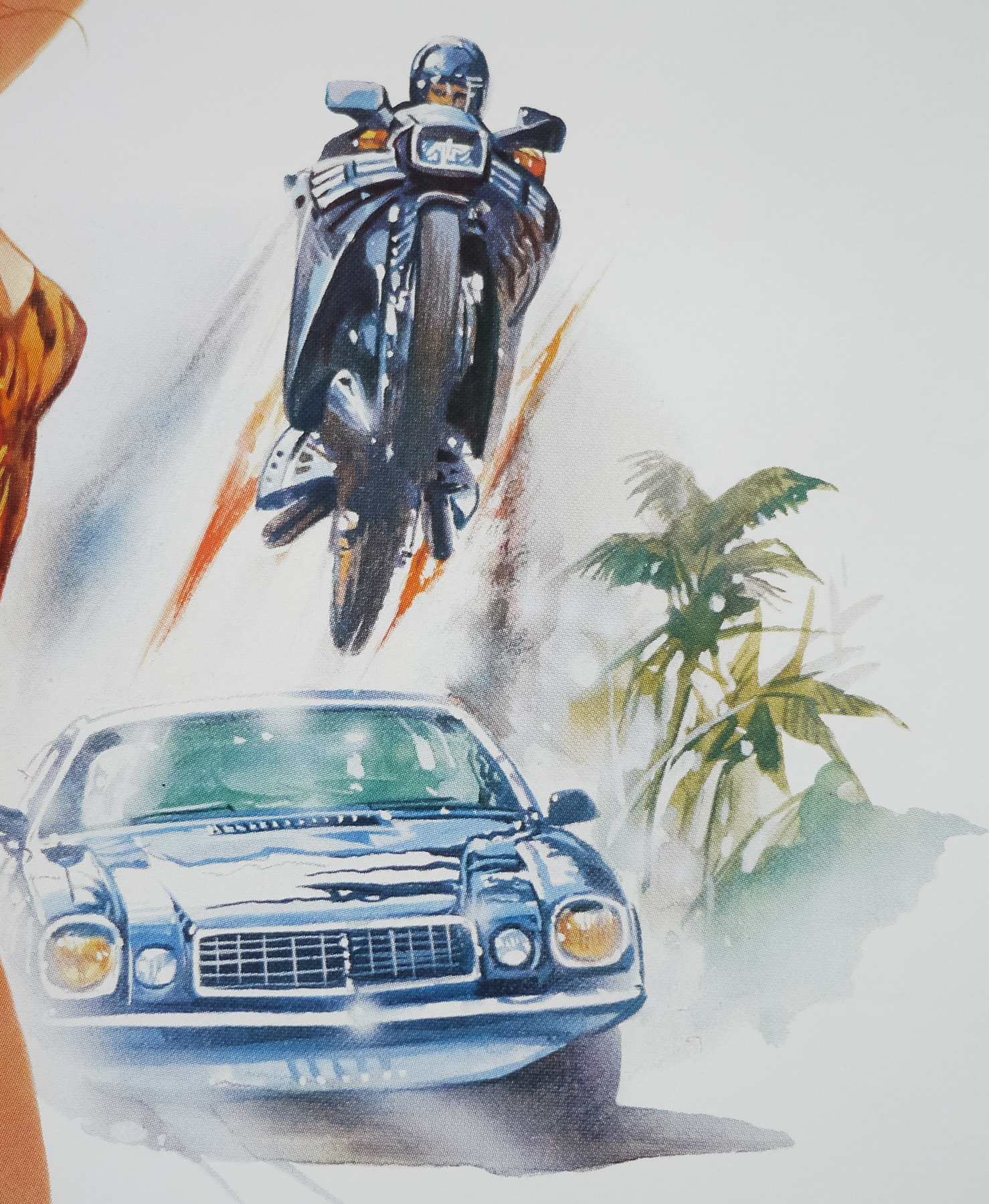
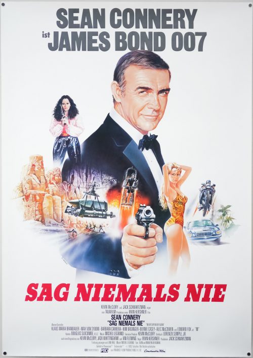
An excellent portrait of Sean Connery surrounded by an action montage features on this German poster for Never Say Never Again, a non-canon James Bond film. The existence and status of the film is due to a long-running legal issue involving Bond creator Ian Fleming and a film producer called Kevin McClory. The pair had worked together on an abandoned Bond project called Longitude 78 that Fleming later turned into the novel Thunderball without crediting the producer or another writer who worked on the project. The case went to the high court and McClory was then given the right to produce the resultant Thunderball film in 1965 as well as the ability to remake the novel turned film after 10 years had elapsed. It took a bit longer than that but eventually McClory brought the same story to the screen in 1983, which happened to be the year that Octopussy, an official entry into the series starring Roger Moore, was released.
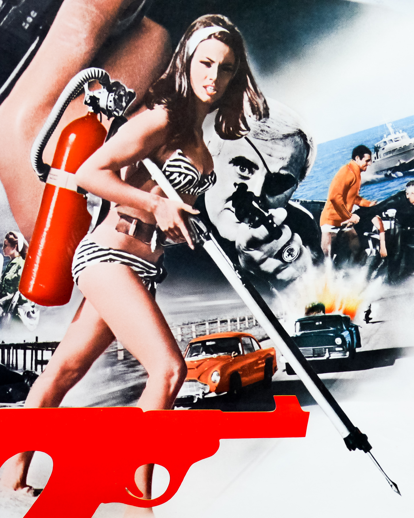
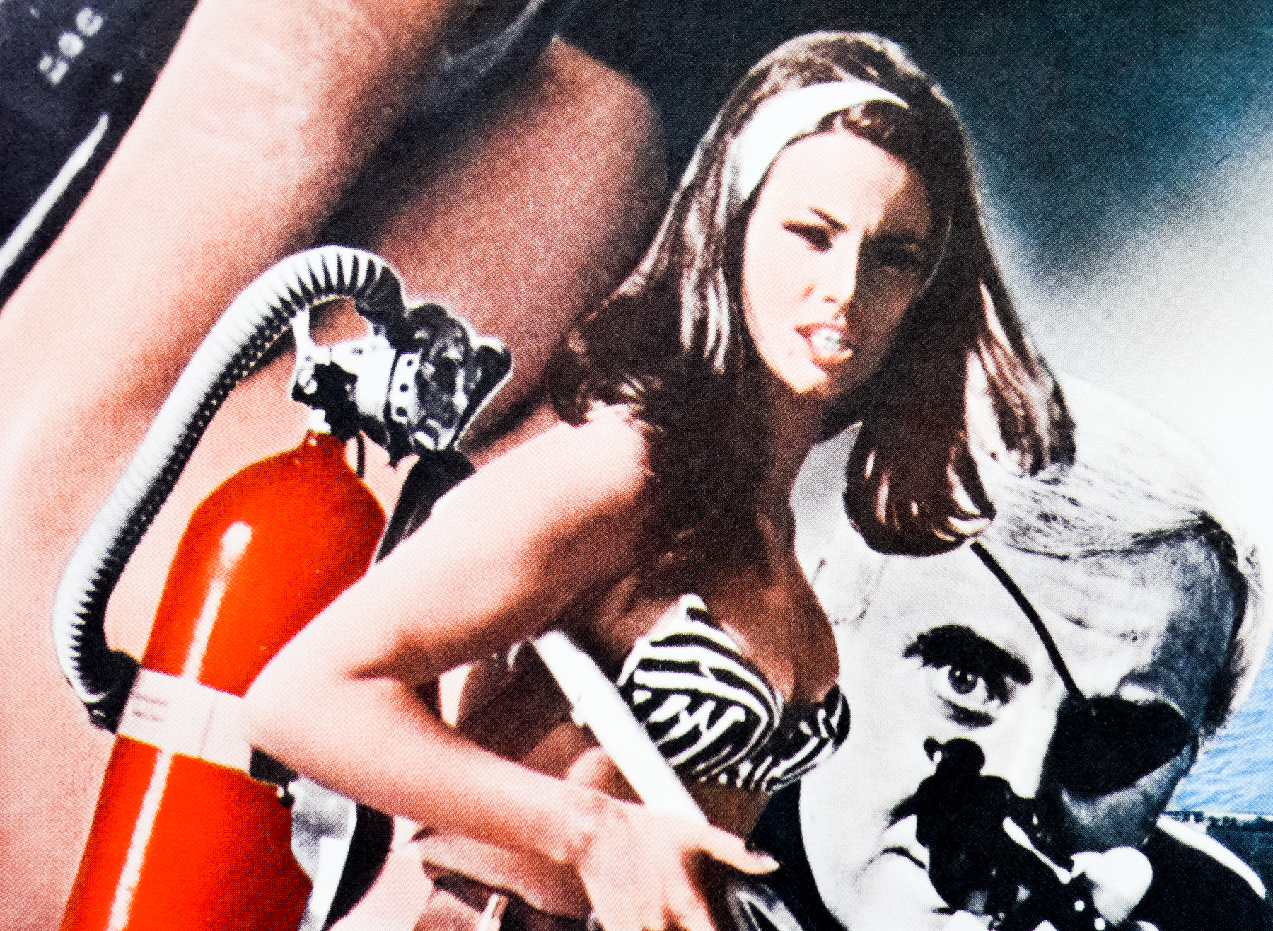
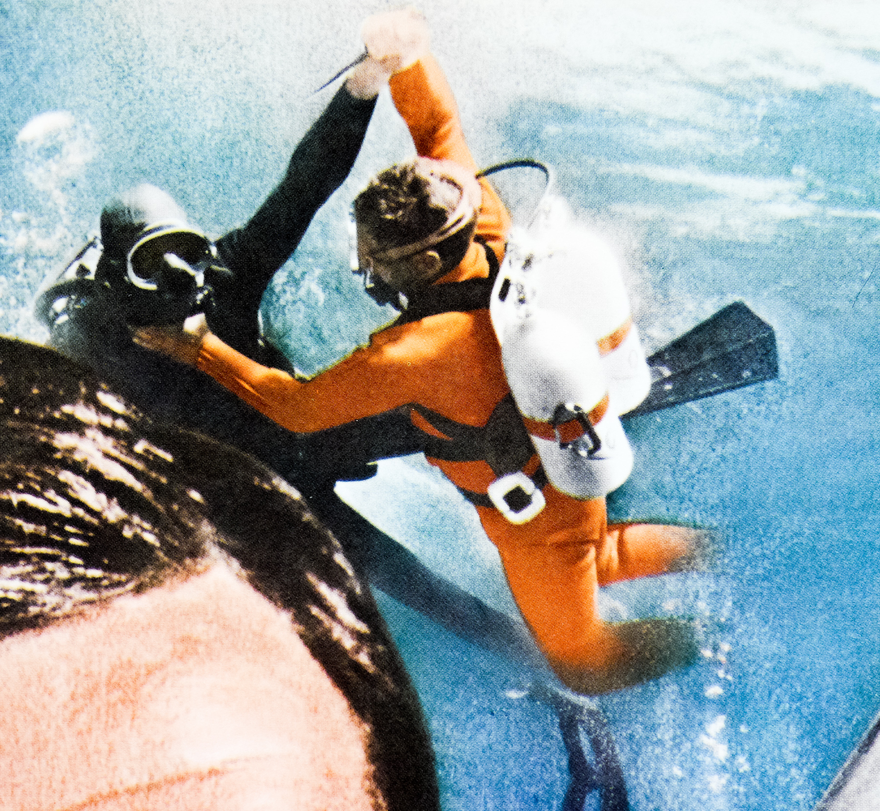
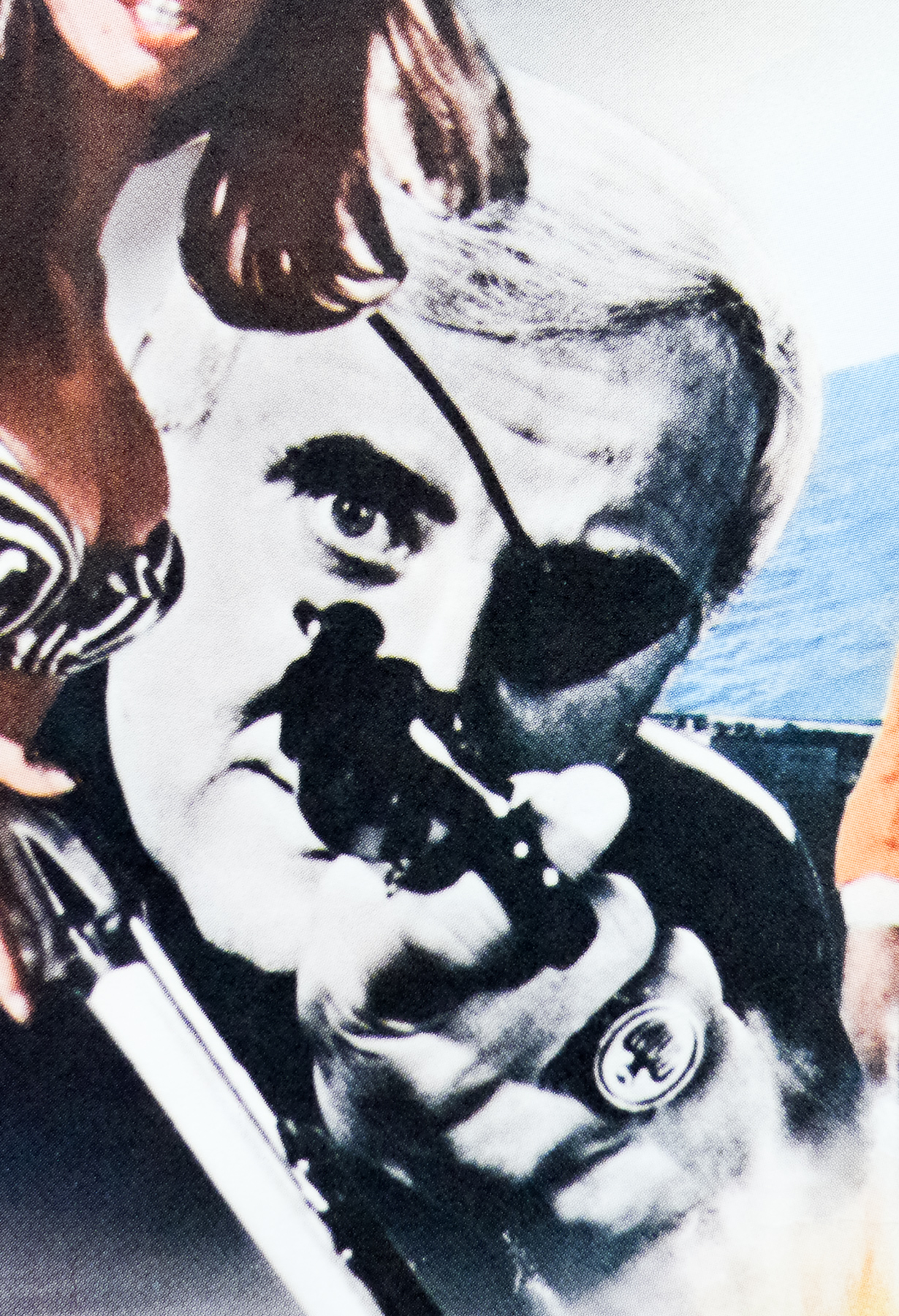
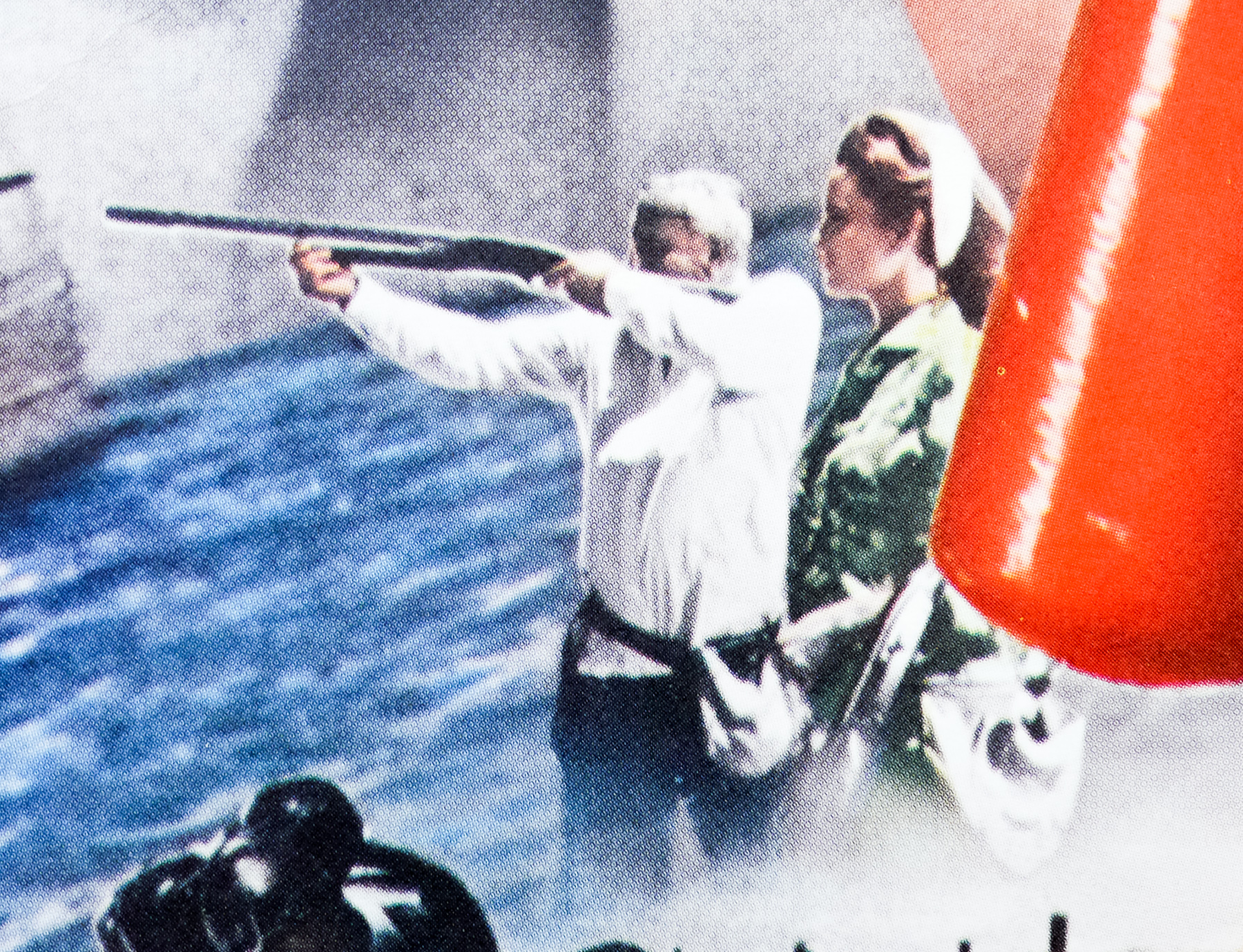
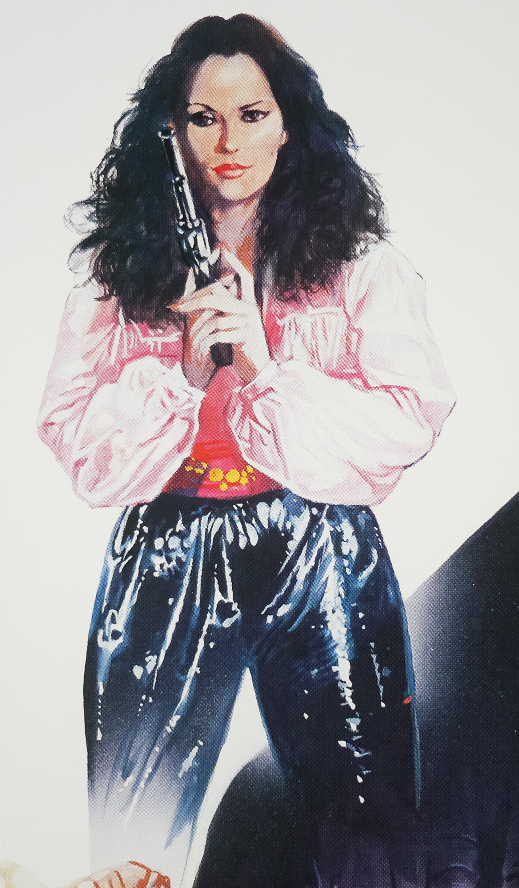
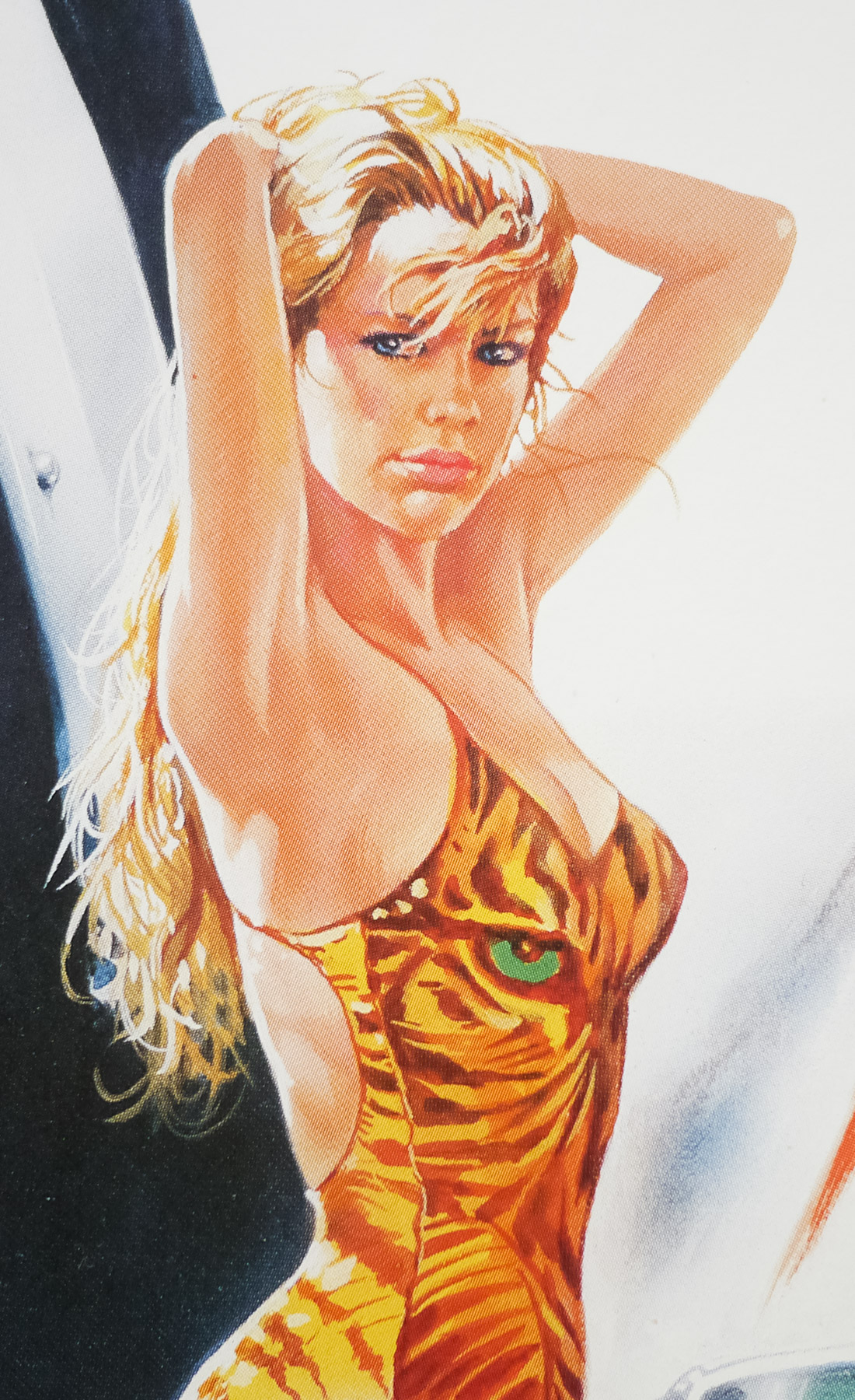
Connery wasn’t always in the frame to return as Bond, but after he developed an initial draft of the script with novelist Len Deighton in the 1970s, his name became attached to the project and he was eventually persuaded to star thanks to a significant fee as well as a share of the profits and the ability to veto script and casting decisions. Irvin Kershner came onboard to direct and the rest of the cast was filled with the likes of Max von Sydow as the arch-villain Blofeld and Klaus Maria Brandauer as Maximilian Largo (key villain in Thunderball). A young Kim Basinger appears as Domino, the partner of Largo and later a love interest for Bond.
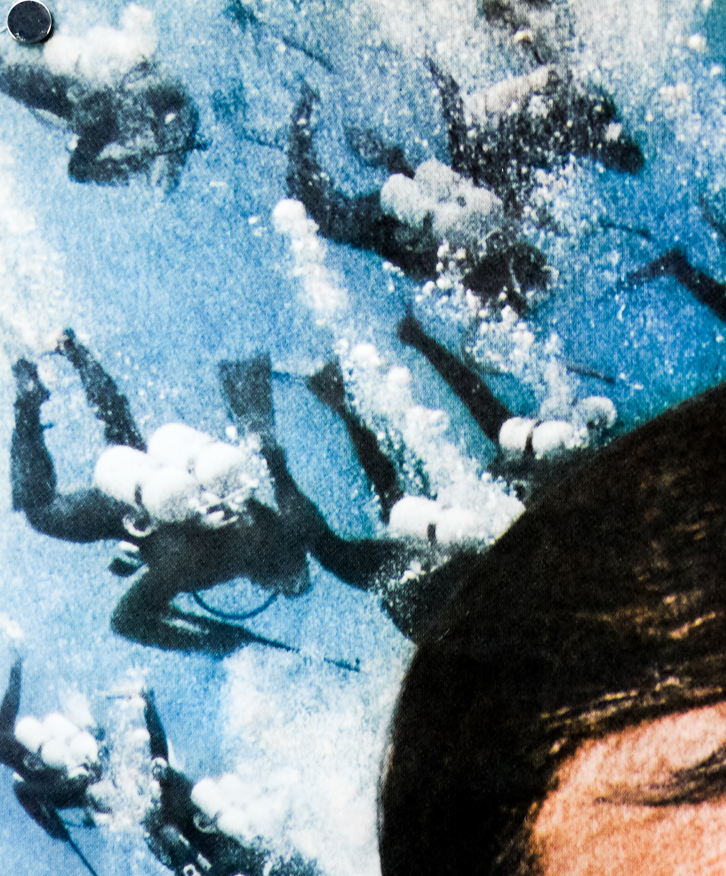
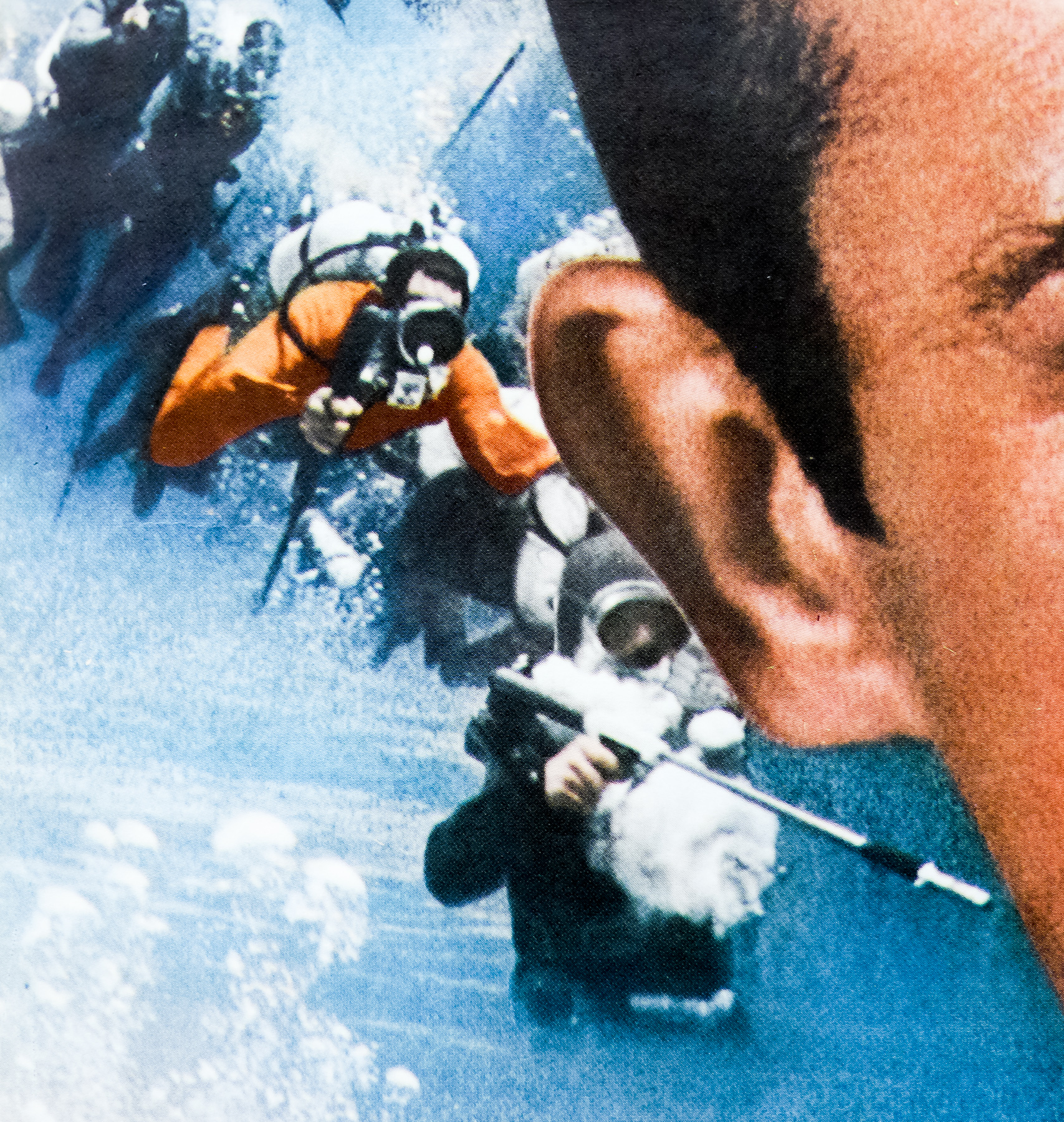
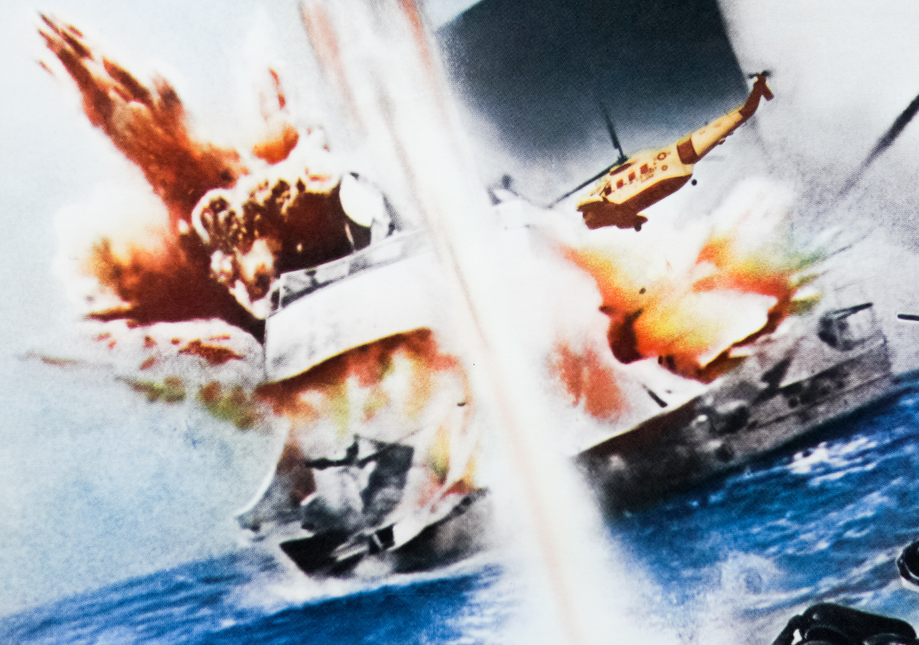
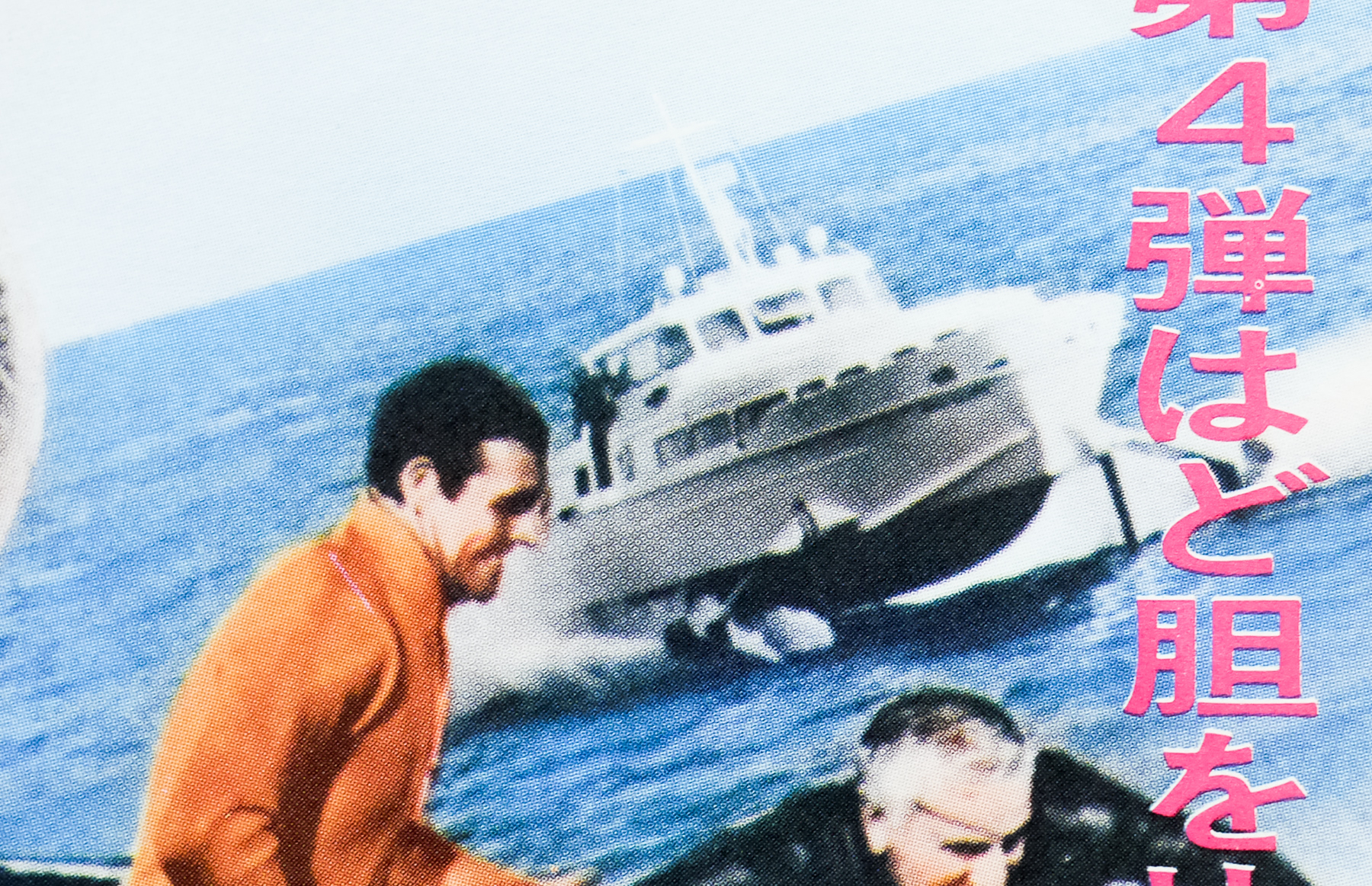
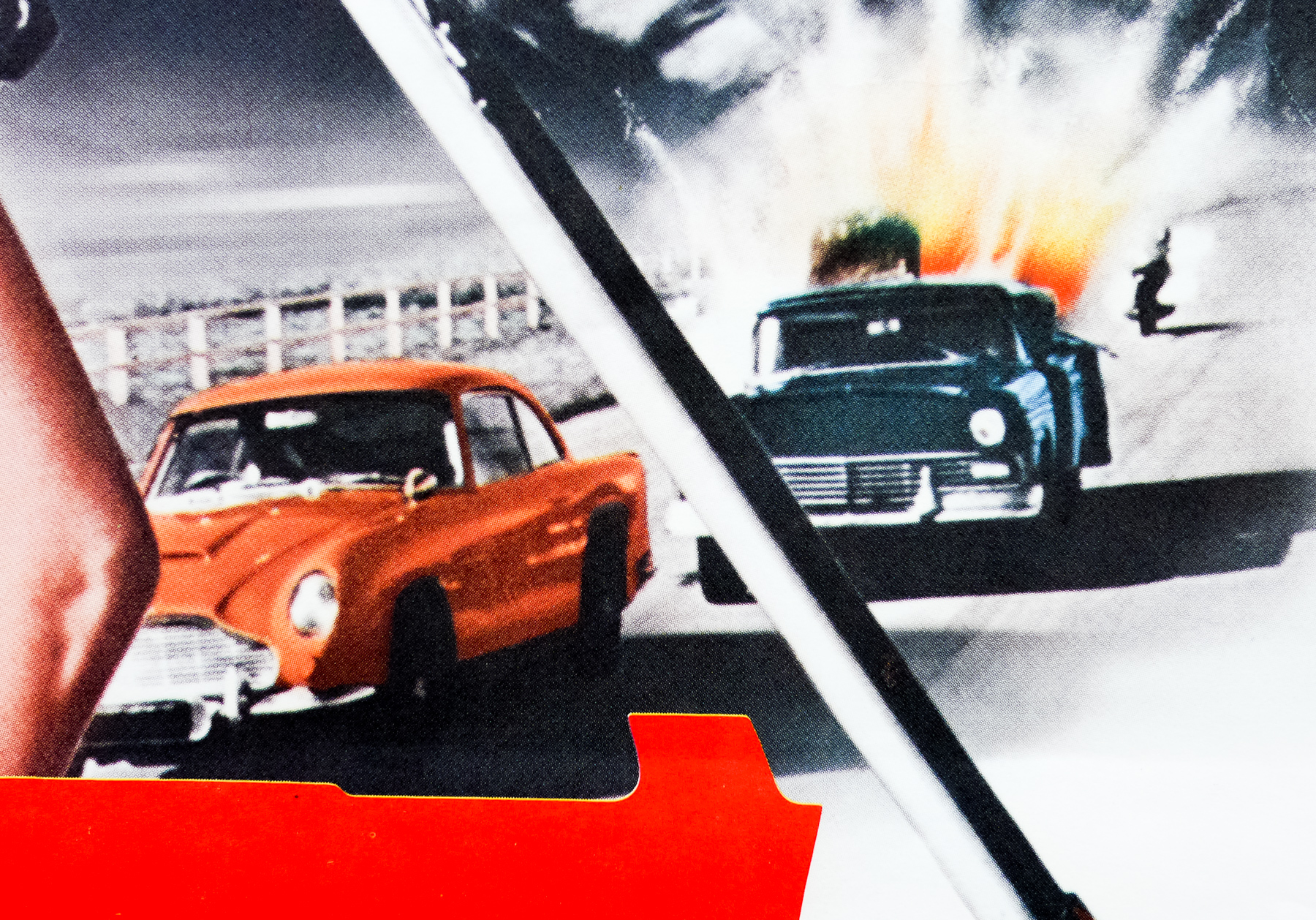
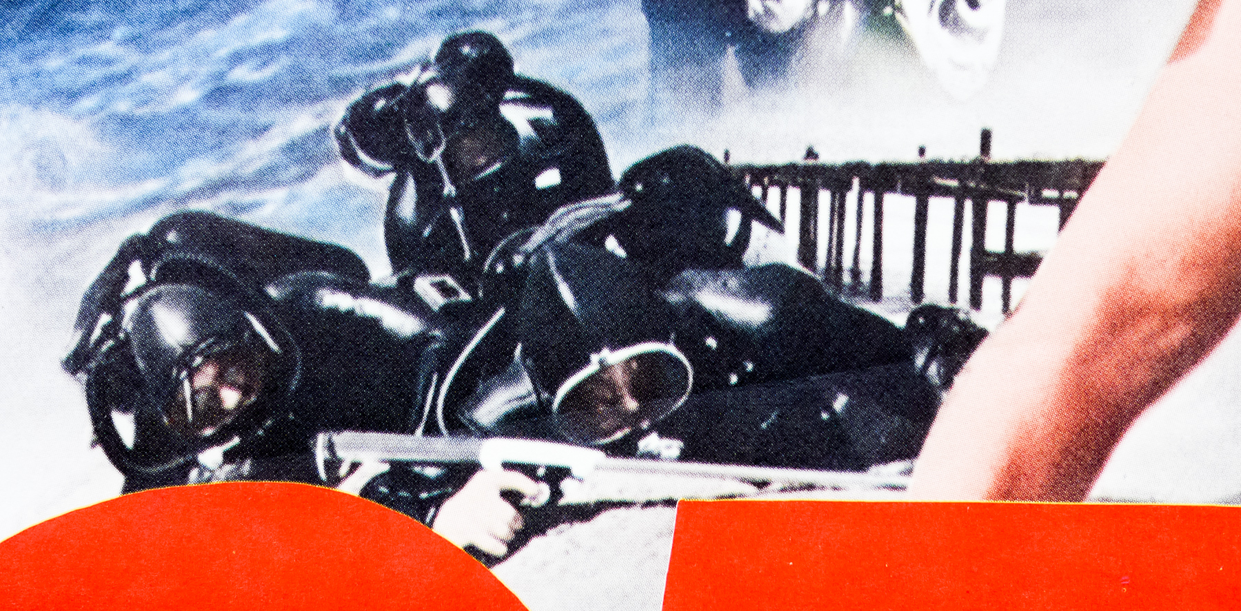
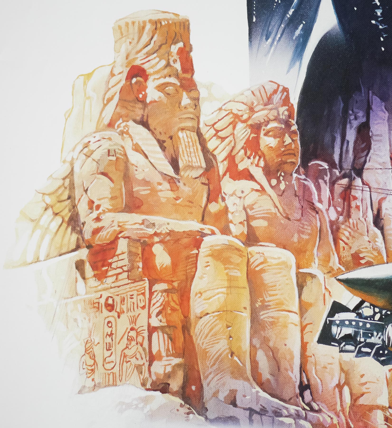
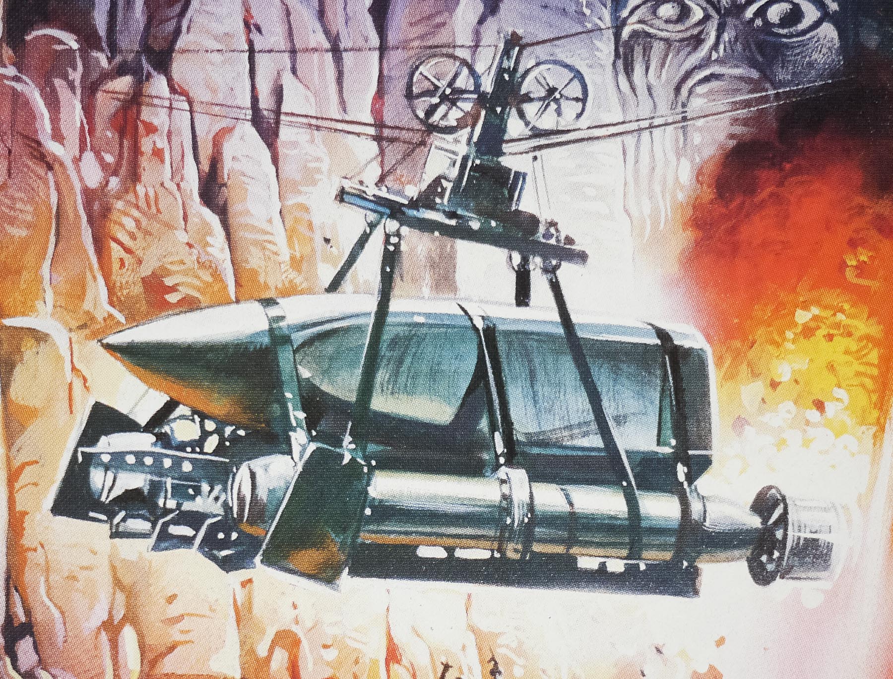
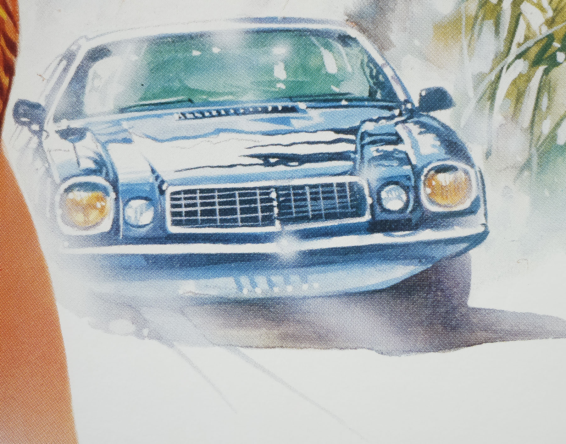
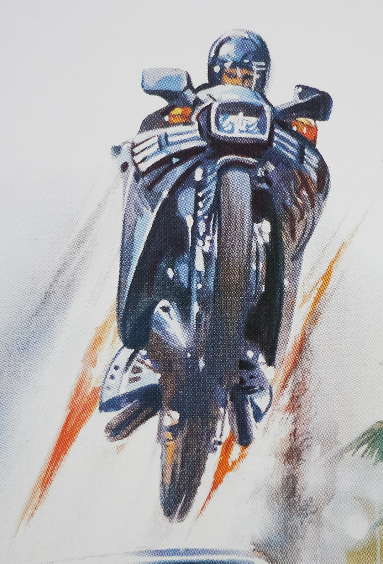
The film’s plot about the hunt for stolen nuclear warheads features a great deal of similarities with Thunderball, given that it is effectively a remake, but there are significant stylistic differences and also several references made to the fact that Connery is playing an older Bond (he was 52 at the time). The ending is hugely different from Thunderball and ditches the now embarrassing sequence on the out-of-control ship and replaces it with a bit of an anticlimactic showdown underwater. The rest of the film is entertaining enough with excellent use of locations and some thrilling action and stunt sequences, although it’s certainly no match for the best of the canonical series. It was favourably received critically at the time of release and supposedly went on to outperform Octopussy at the box office in 1983, which no doubt annoyed the folks at Eon Productions
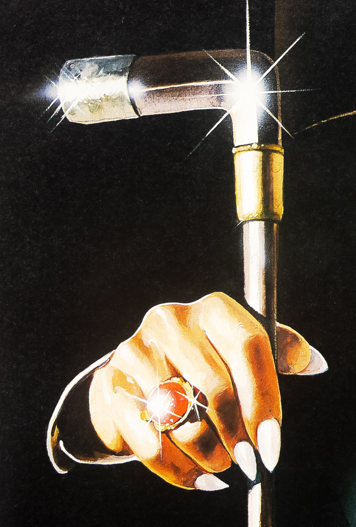
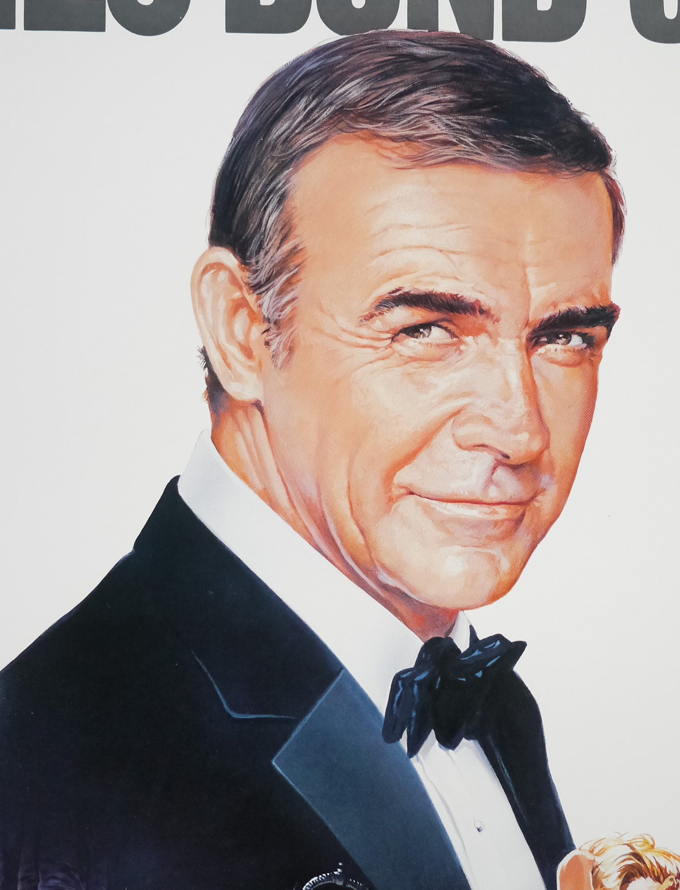
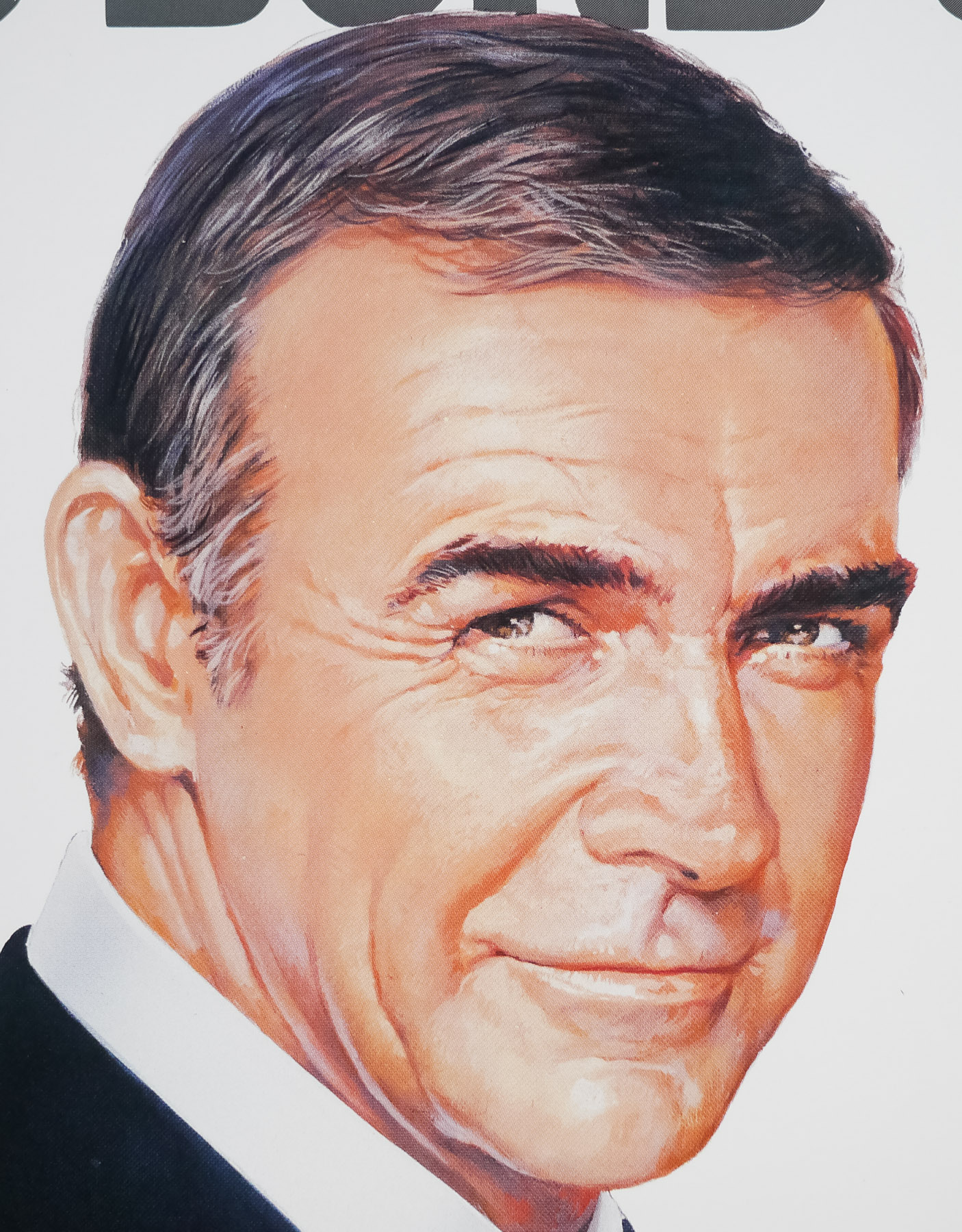
The poster was designed and painted by one of my favourite artists, Renato Casaro, an Italian with a prolific movie poster output that lasted over 35 years. He began his career in 1953, aged 19, at the famous Studio Favalli in Rome and would go on to design and paint posters for many of the biggest directors in the world. His skill at accurately portraying actors and his brilliant use of colour and composition saw him much in demand from studios and actors alike. His artwork has featured on posters used in multiple countries, including Japan, Germany, USA as well as in his native Italy.
Check out the incredible amount of work on his official website here, which also features a biography of the artist. In March 2014 I published an exclusive interview with Renato and it can be read by clicking here. In it he mentions working on this poster and he showed me the original art for the version of the poster where it’s just Connery alone (the advance poster).
The other posters I’ve collected by Renato Casaro are here.