Quentin Tarantino‘s Kill Bill was originally planned and filmed with the intention of releasing it as one long movie. At a certain point in post-production the decision was taken to release it as two separate films, which allowed Tarantino to include more material in each one rather than be forced to make cuts to shorten the running time at the studio’s request.
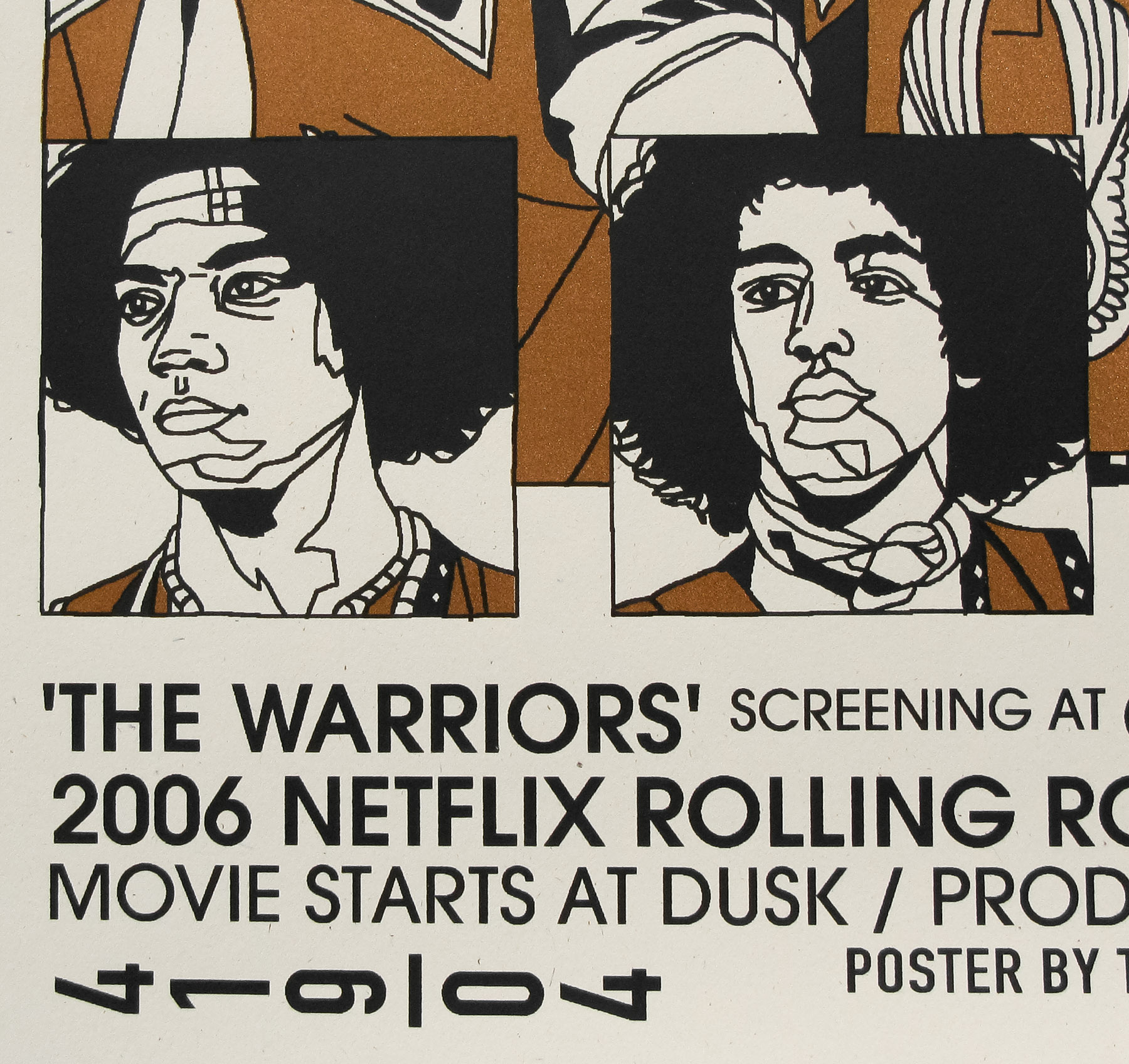
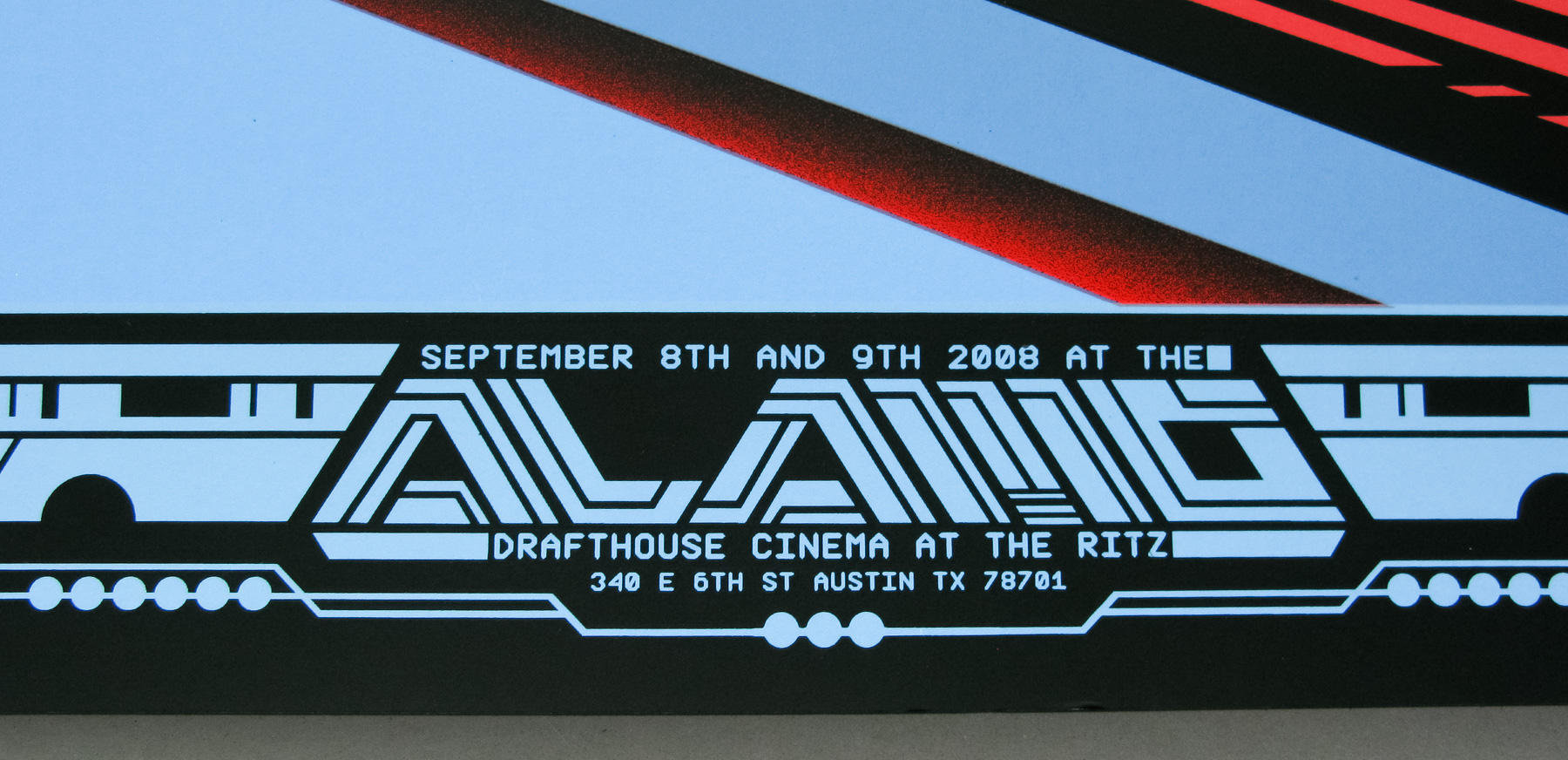
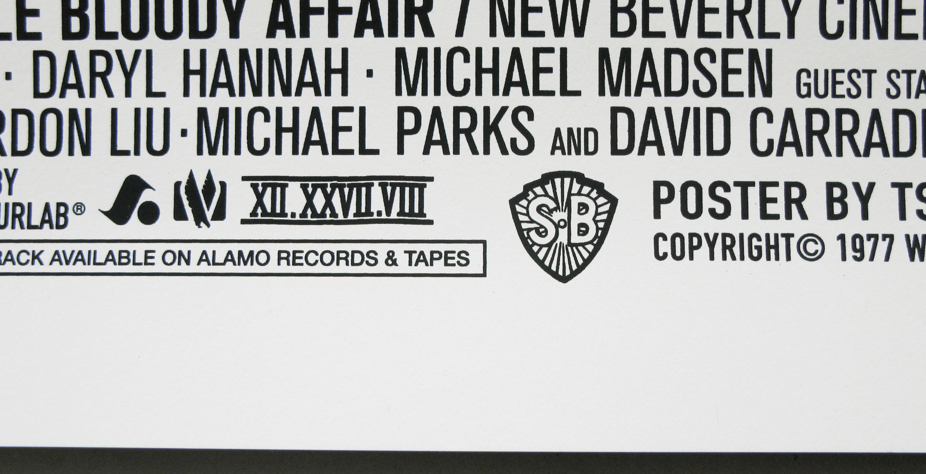
The longer cut, known as The Whole Bloody Affair, has long been on many film fans’ wish-lists of ‘unreleased alternative cuts of films they’d love to see’ and until last year it had only been screened once, at the Cannes Film Festival in 2006. In March 2011 the New Beverly Cinema in Los Angeles (check the billboard), which is owned by Tarantino, screened TWBA and allowed fans of the film to finally catch this elusive version. A report from that screening can be read here.
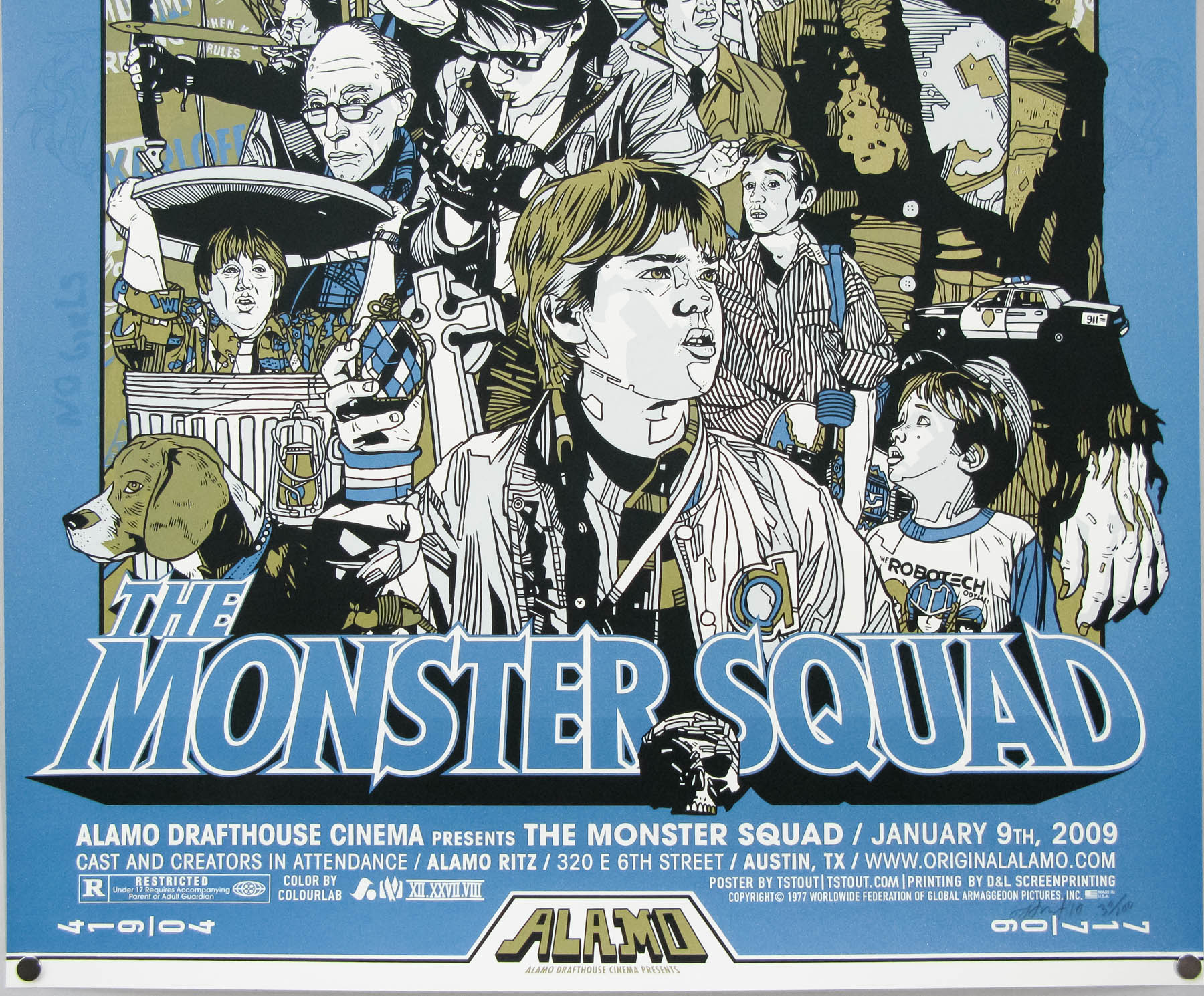
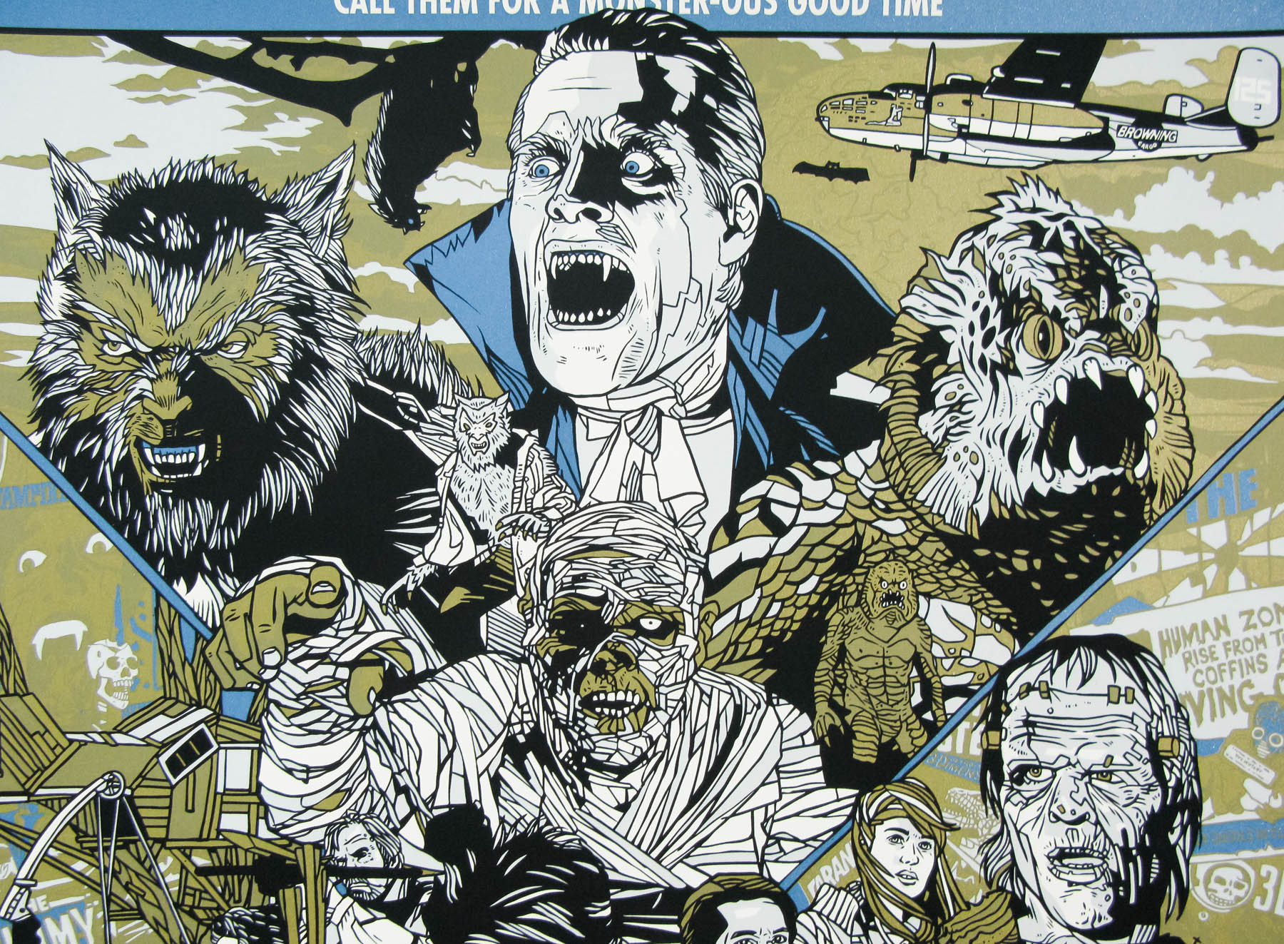
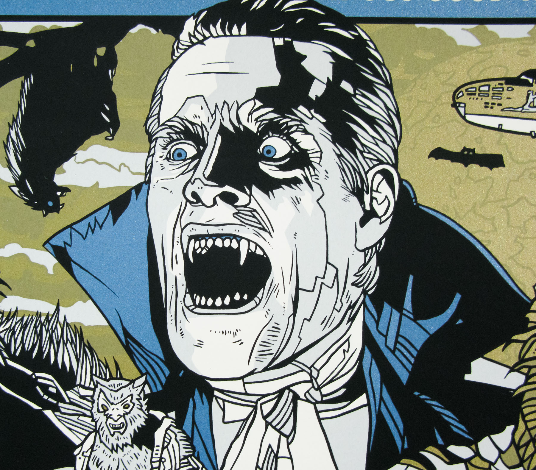
The first showing coincided with Tarantino’s birthday and people on his production team decided they’d put together a secret present for him in the form of a specially commissioned poster by the team at Mondo. Ace artist Tyler Stout was given the opportunity to illustrate his take on the film and the result is one of his best posters yet, in my opinion. As with his Akira print I wanted to interview Tyler about its production. He kindly agreed to answer my questions and also sent along a series of alternative images that were changed during production.
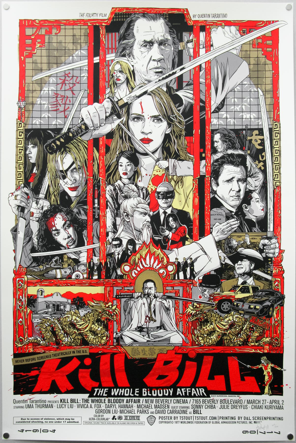
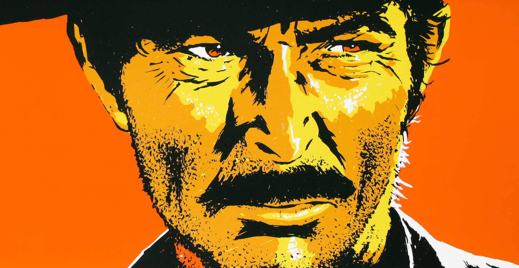
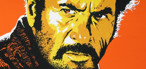
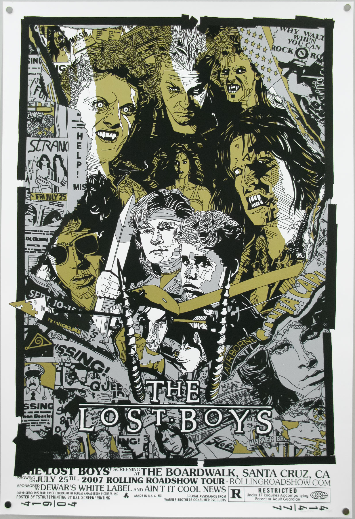
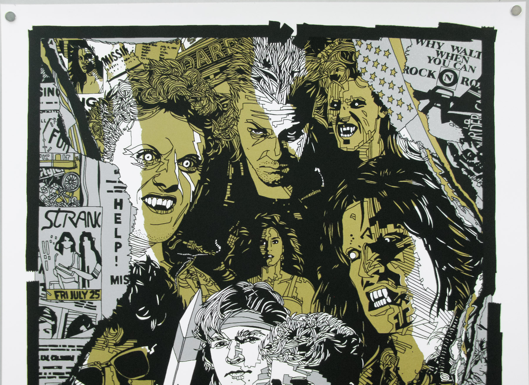
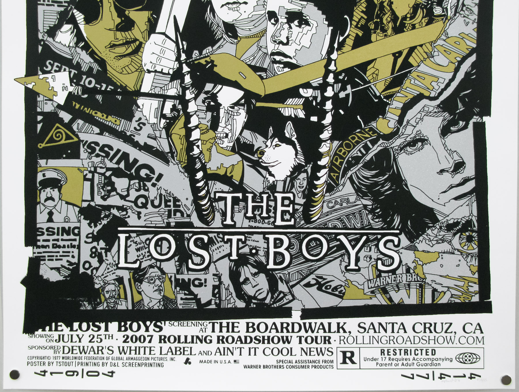
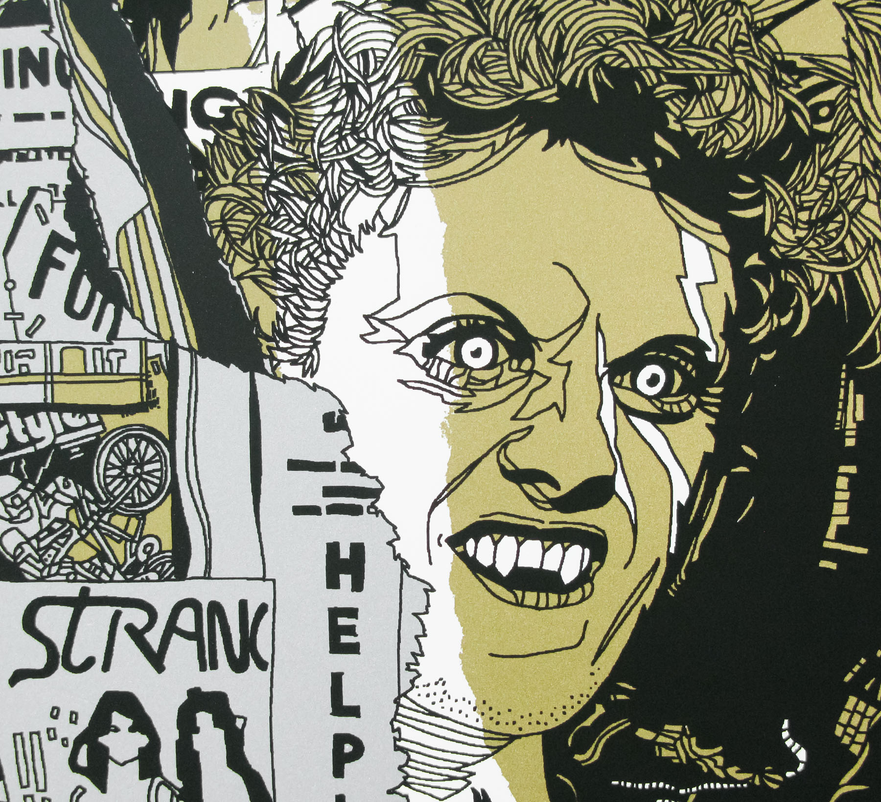
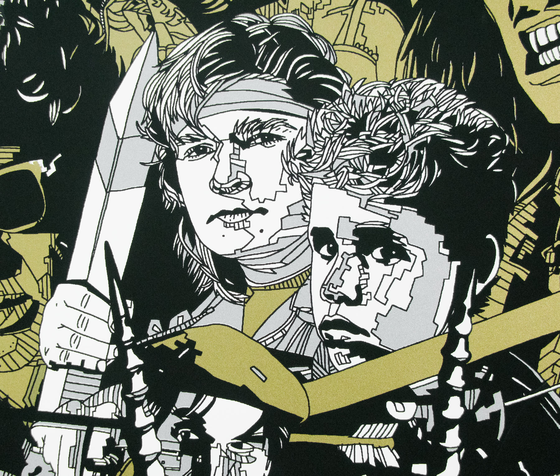
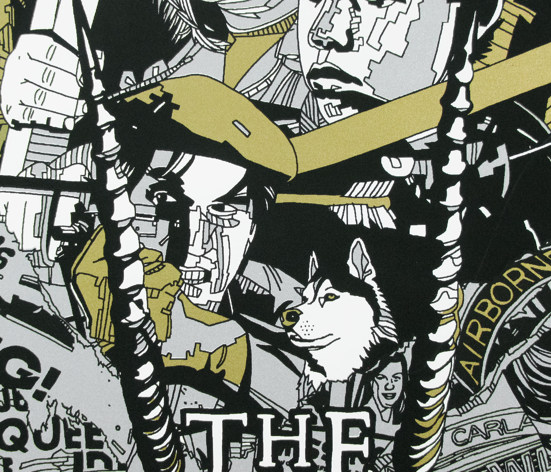
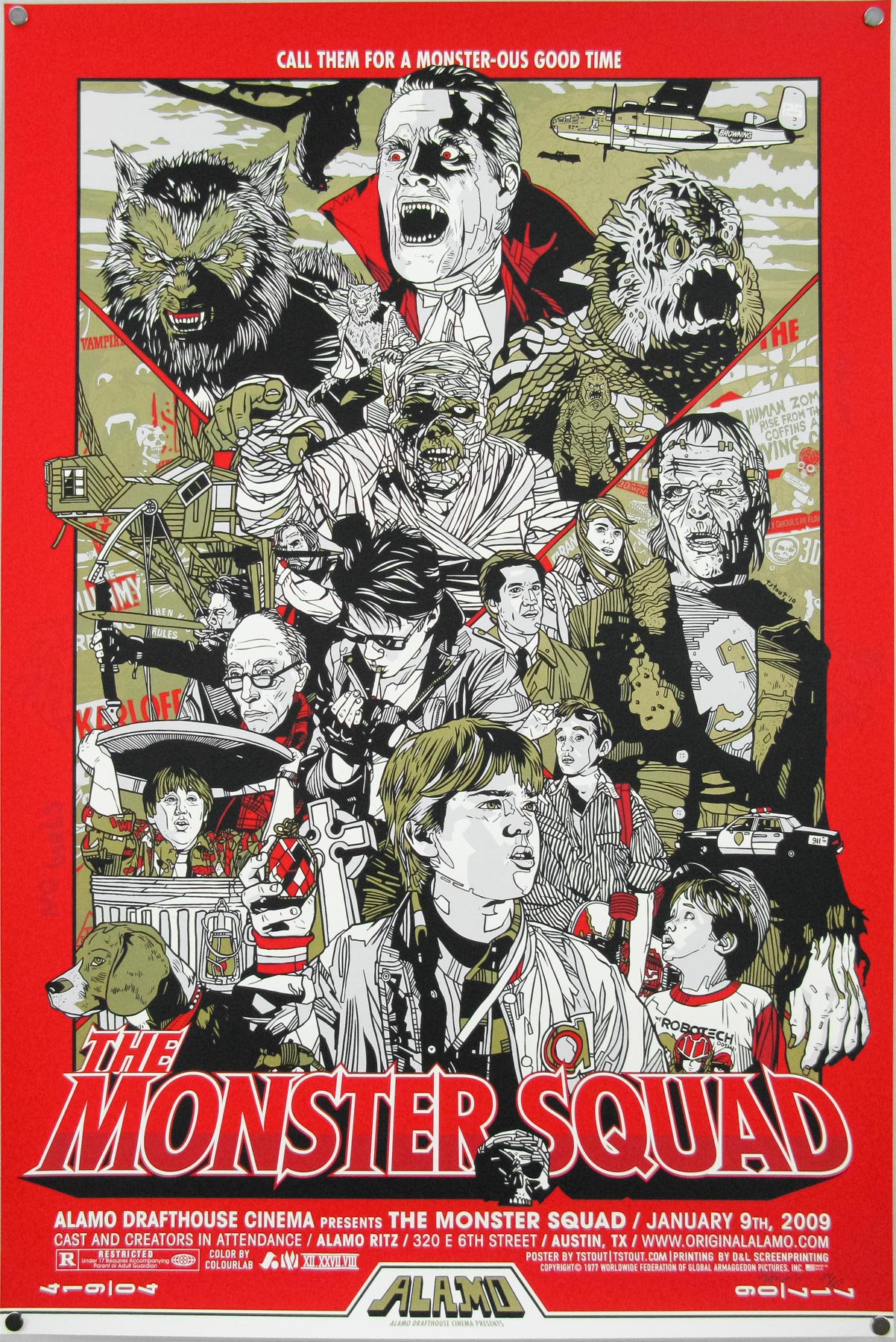
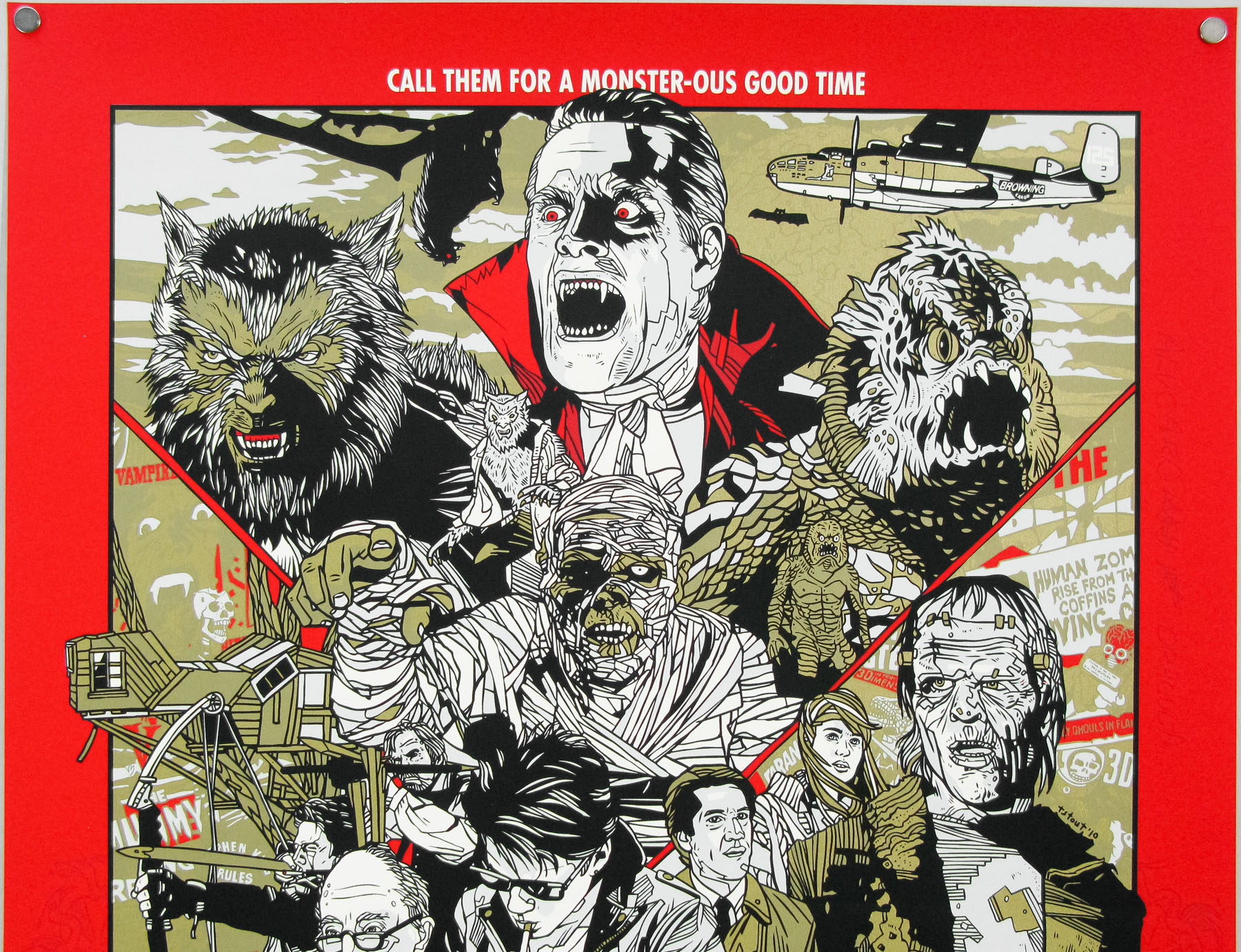
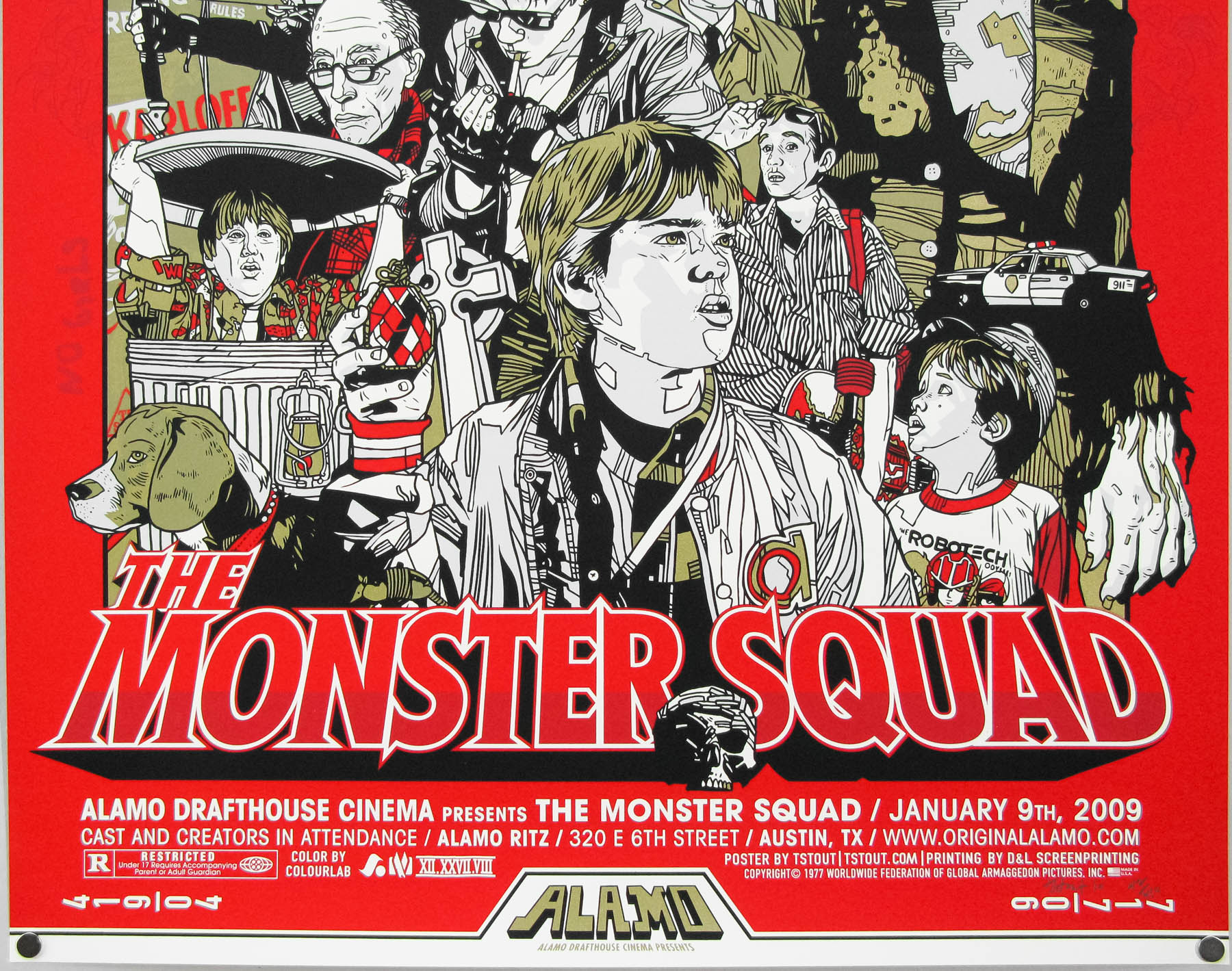
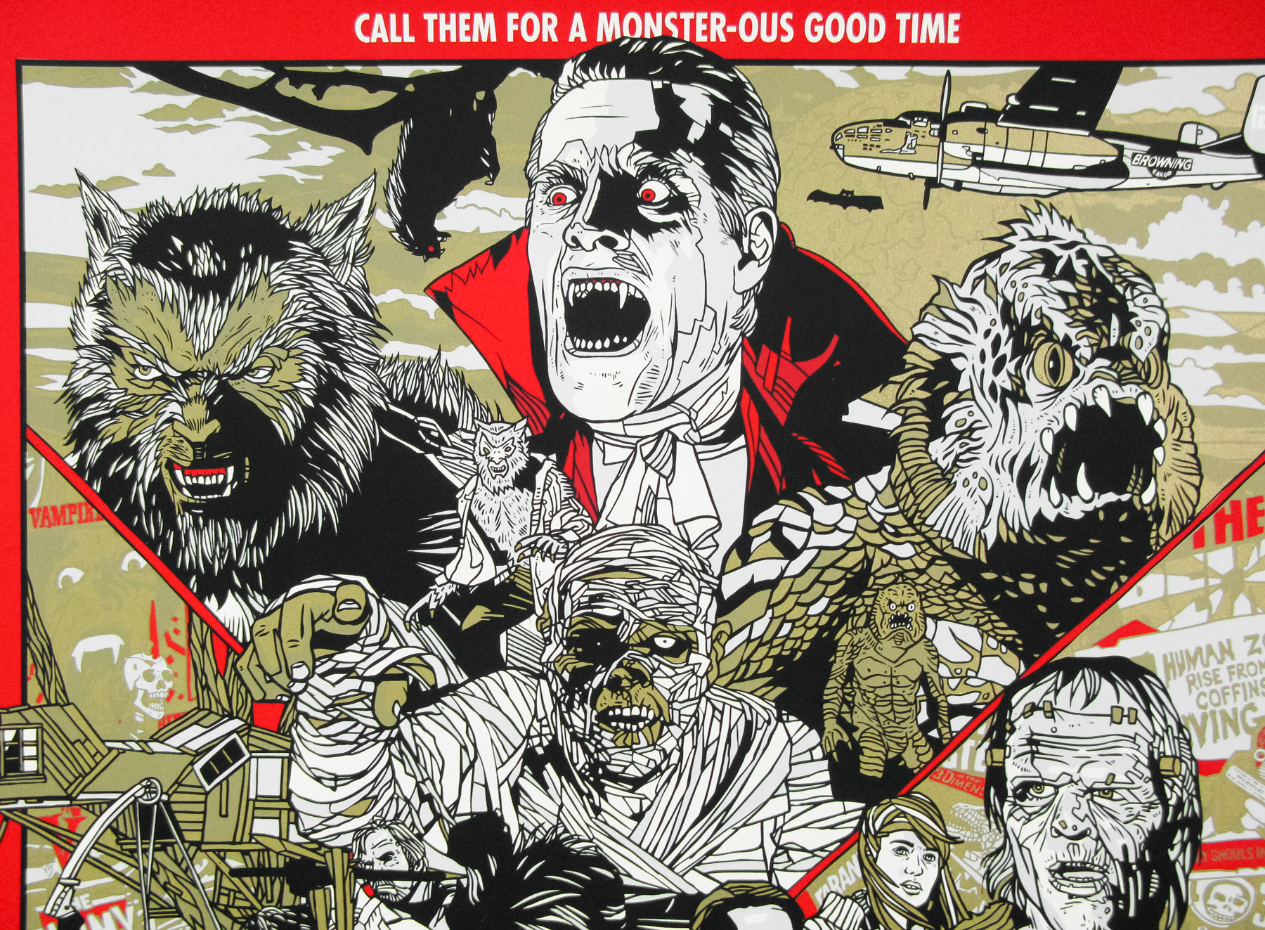
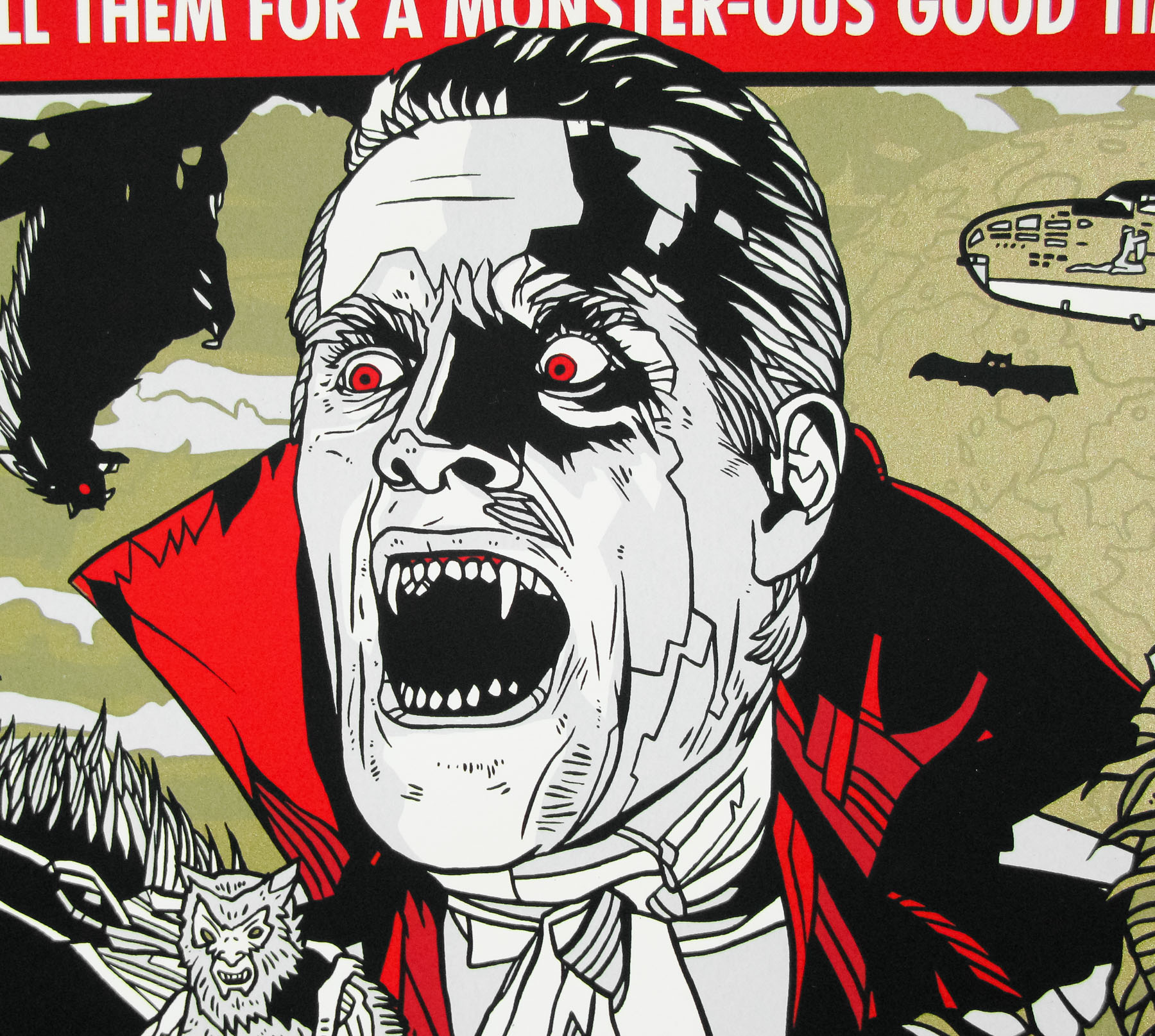
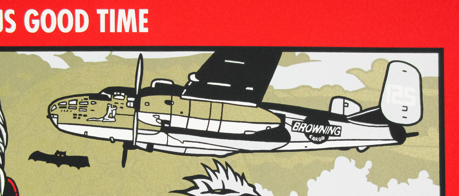
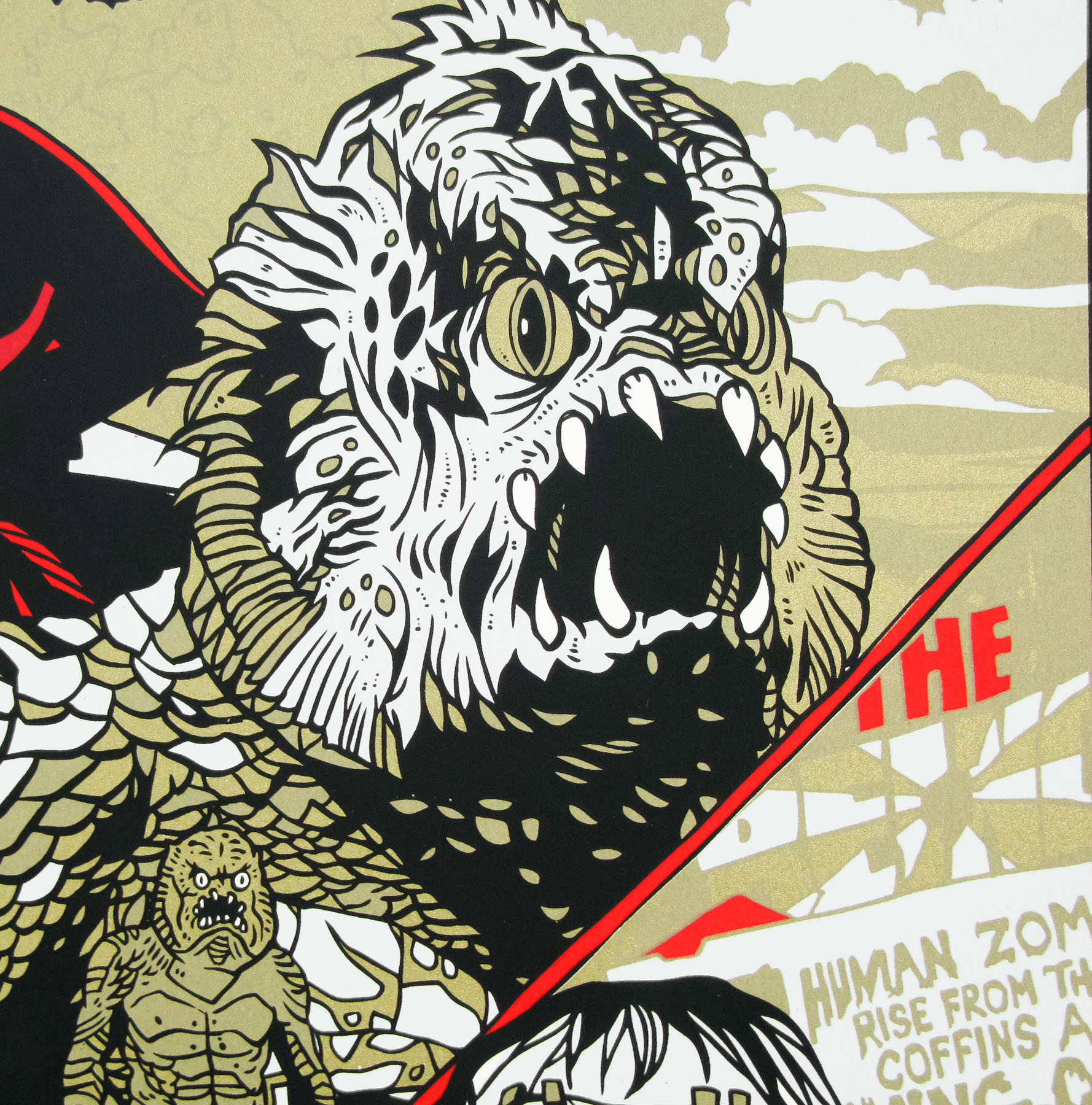
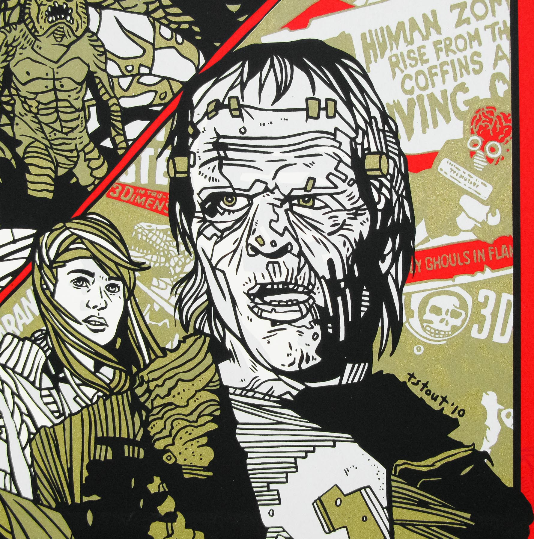
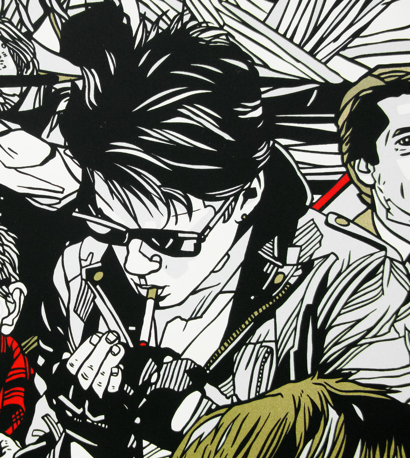
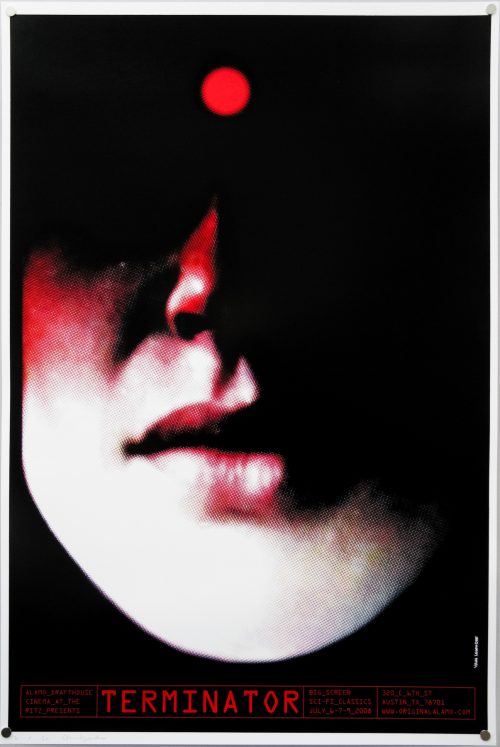
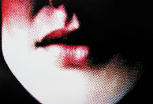
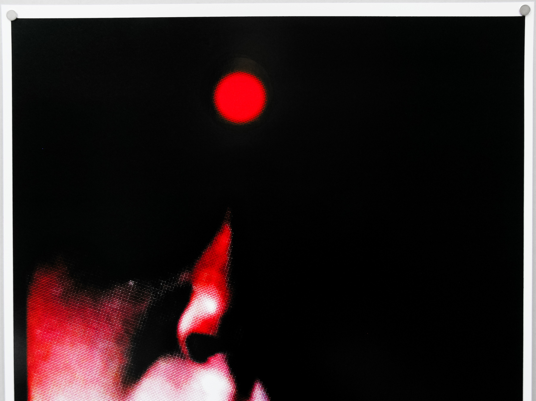
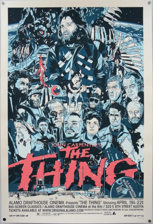
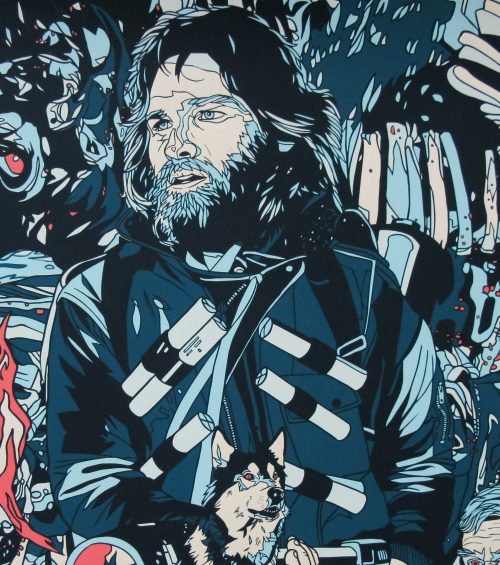
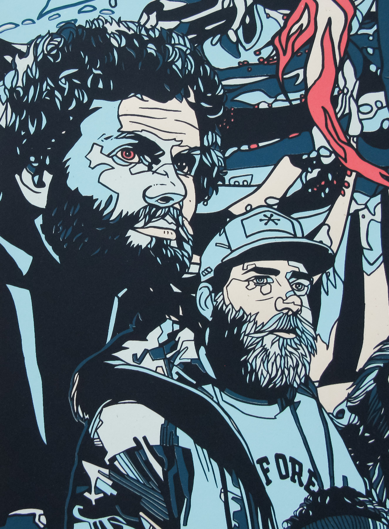
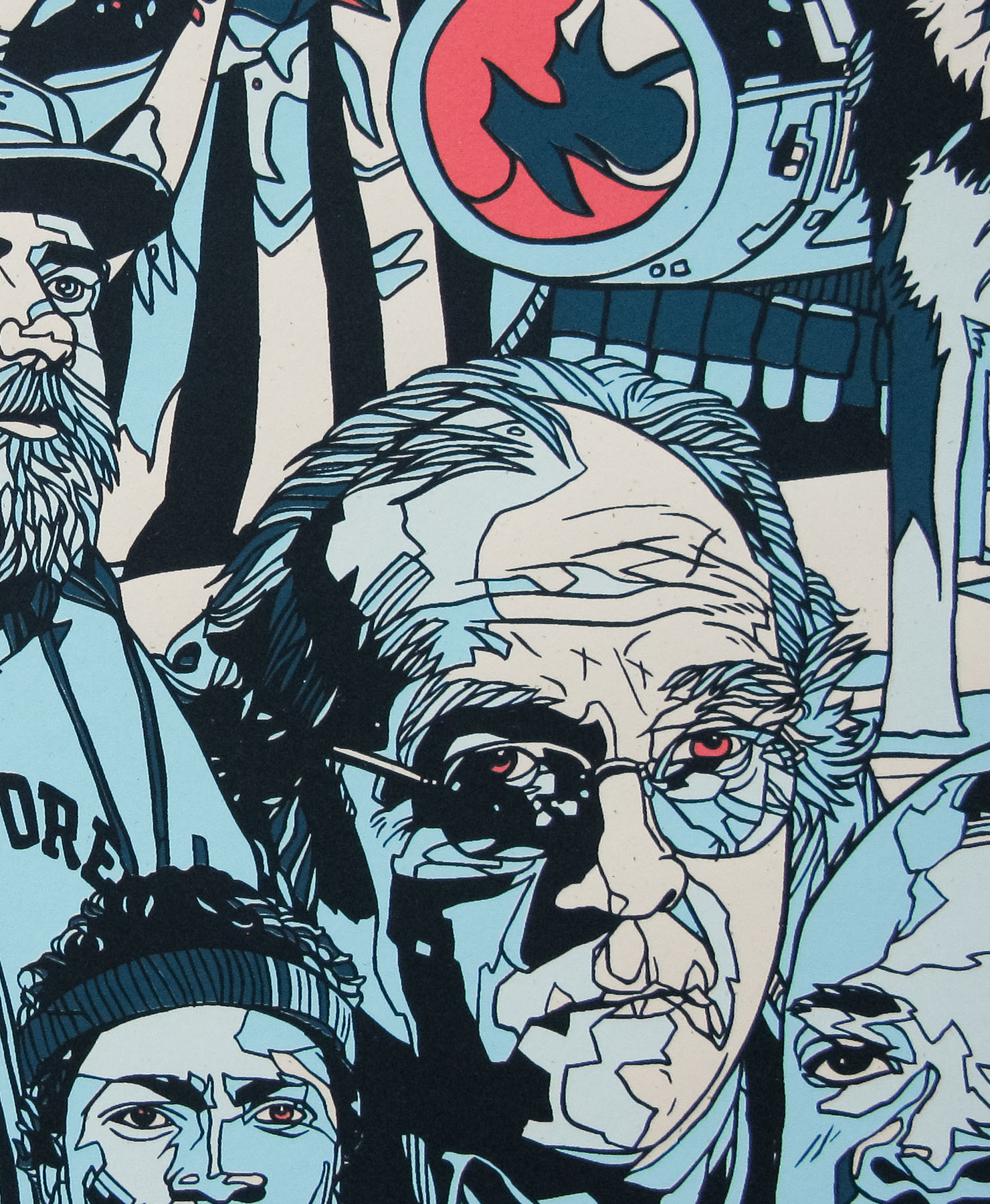
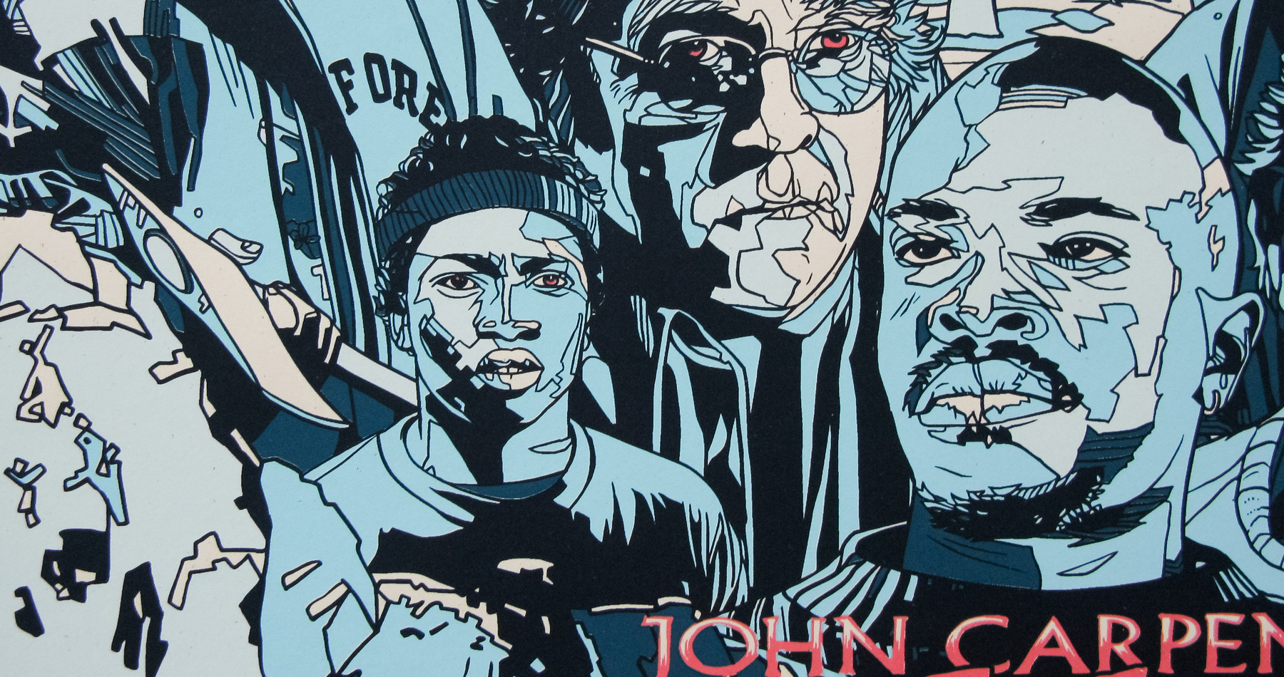
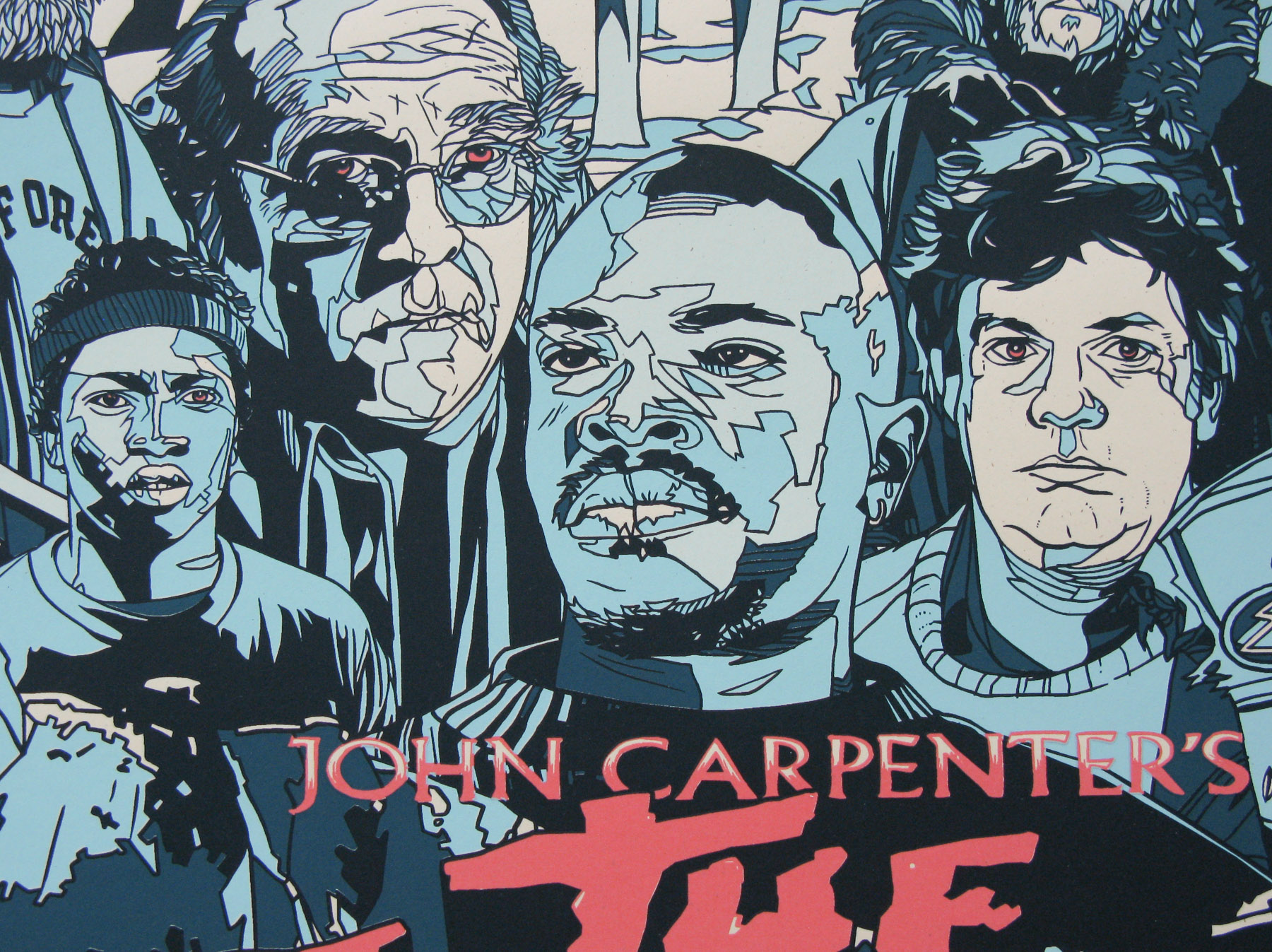
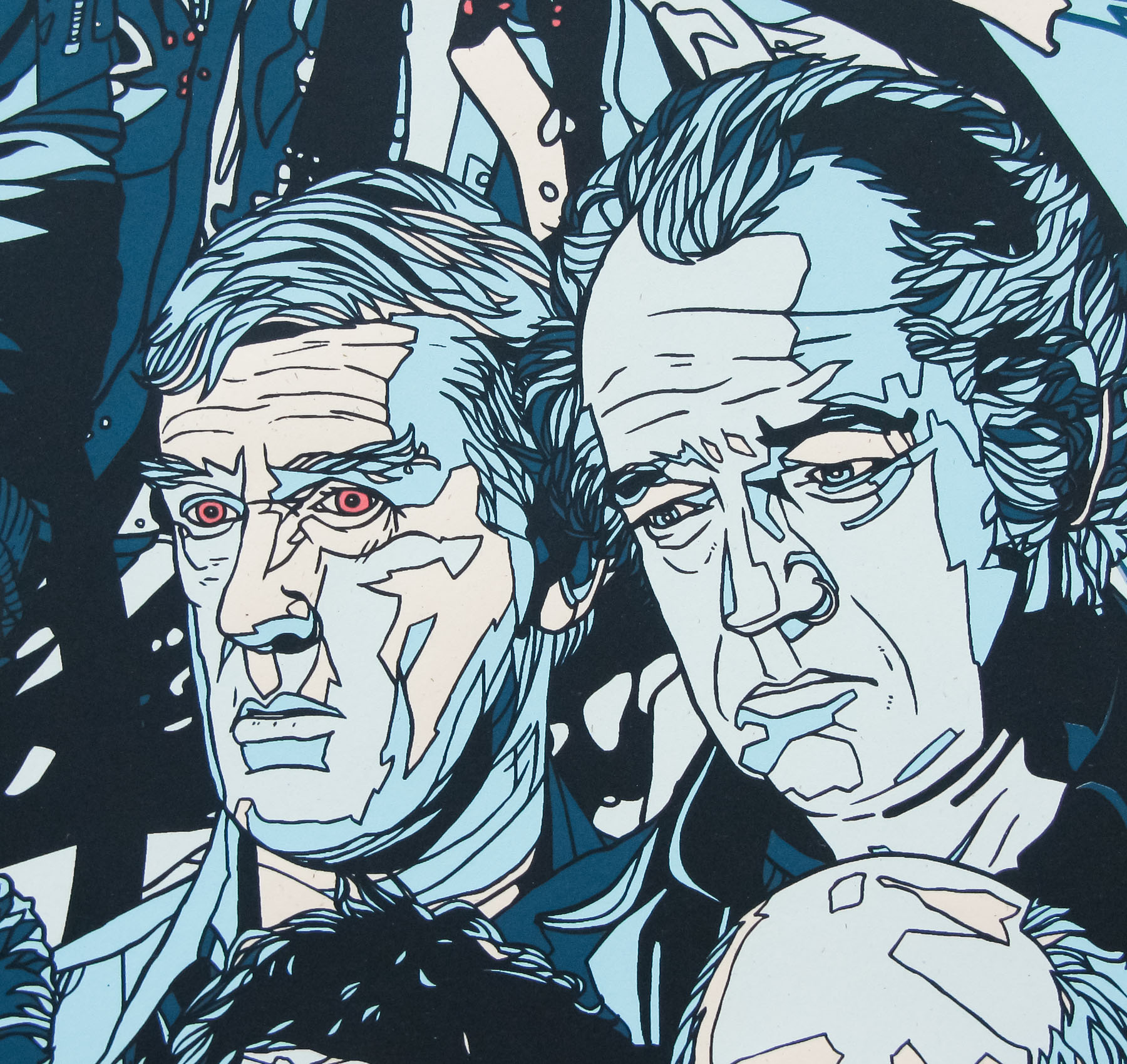
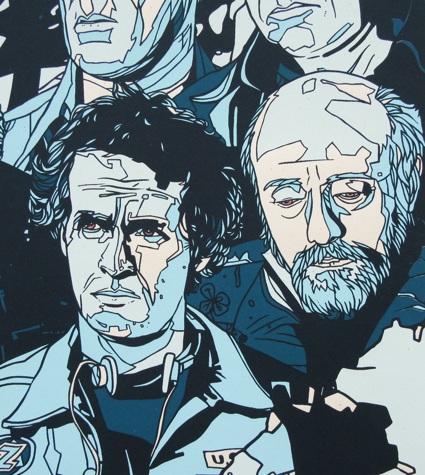
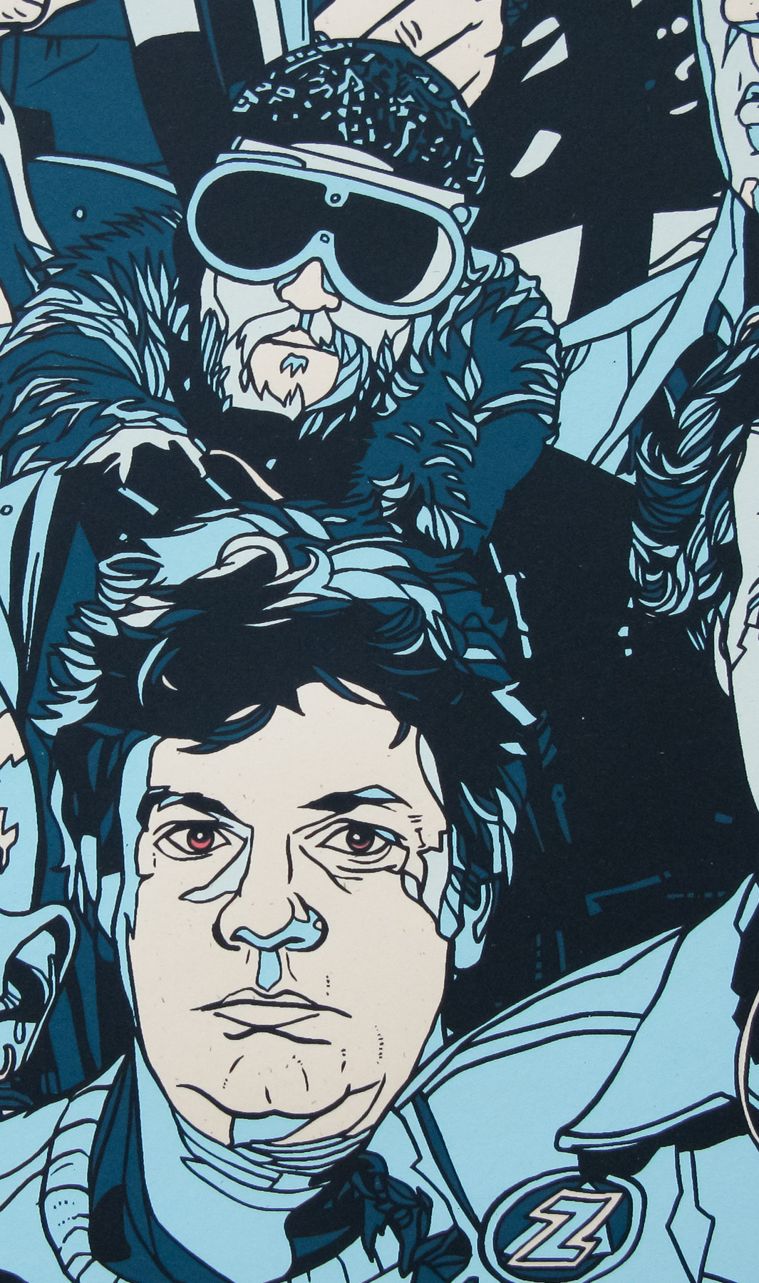
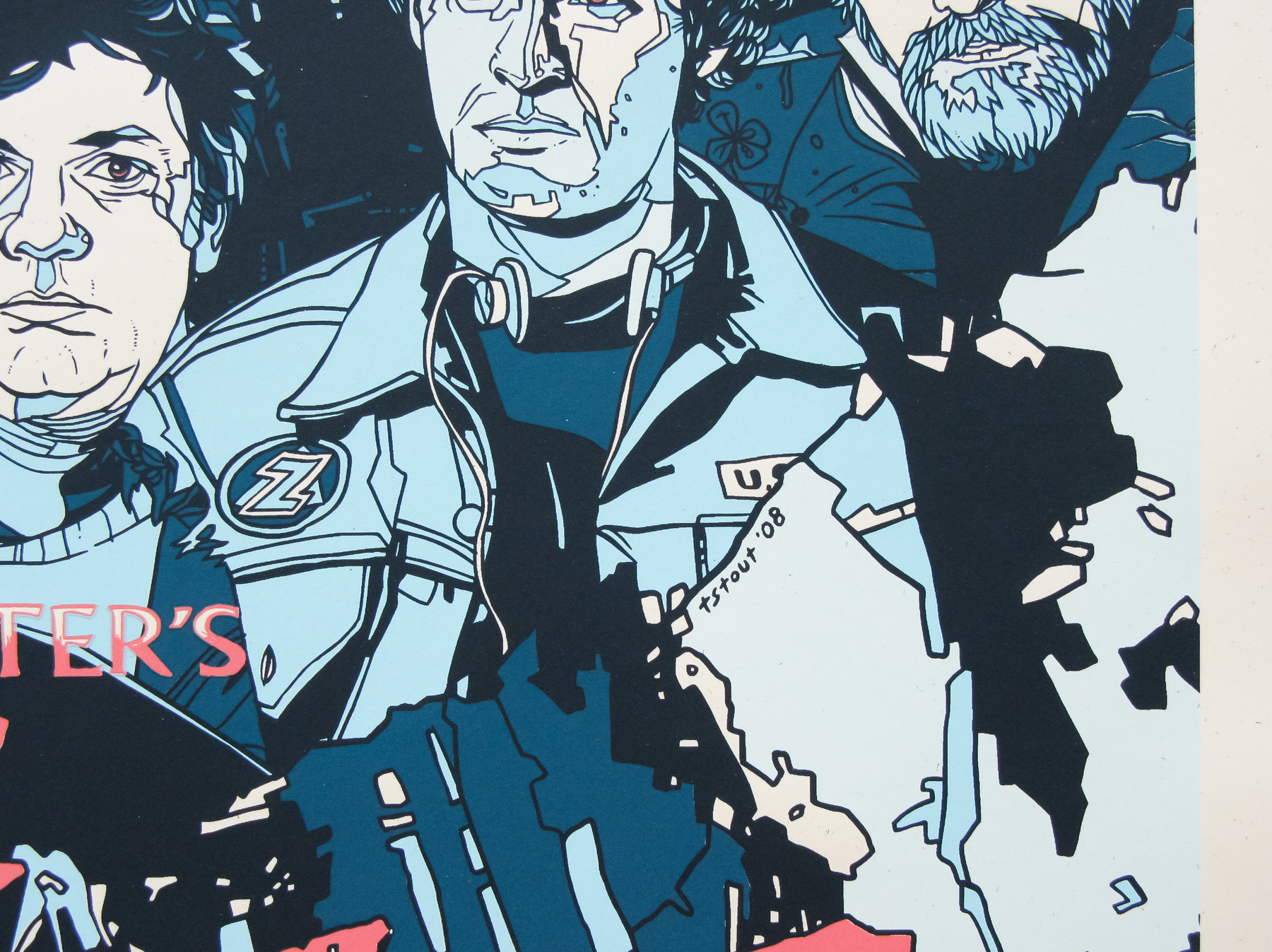
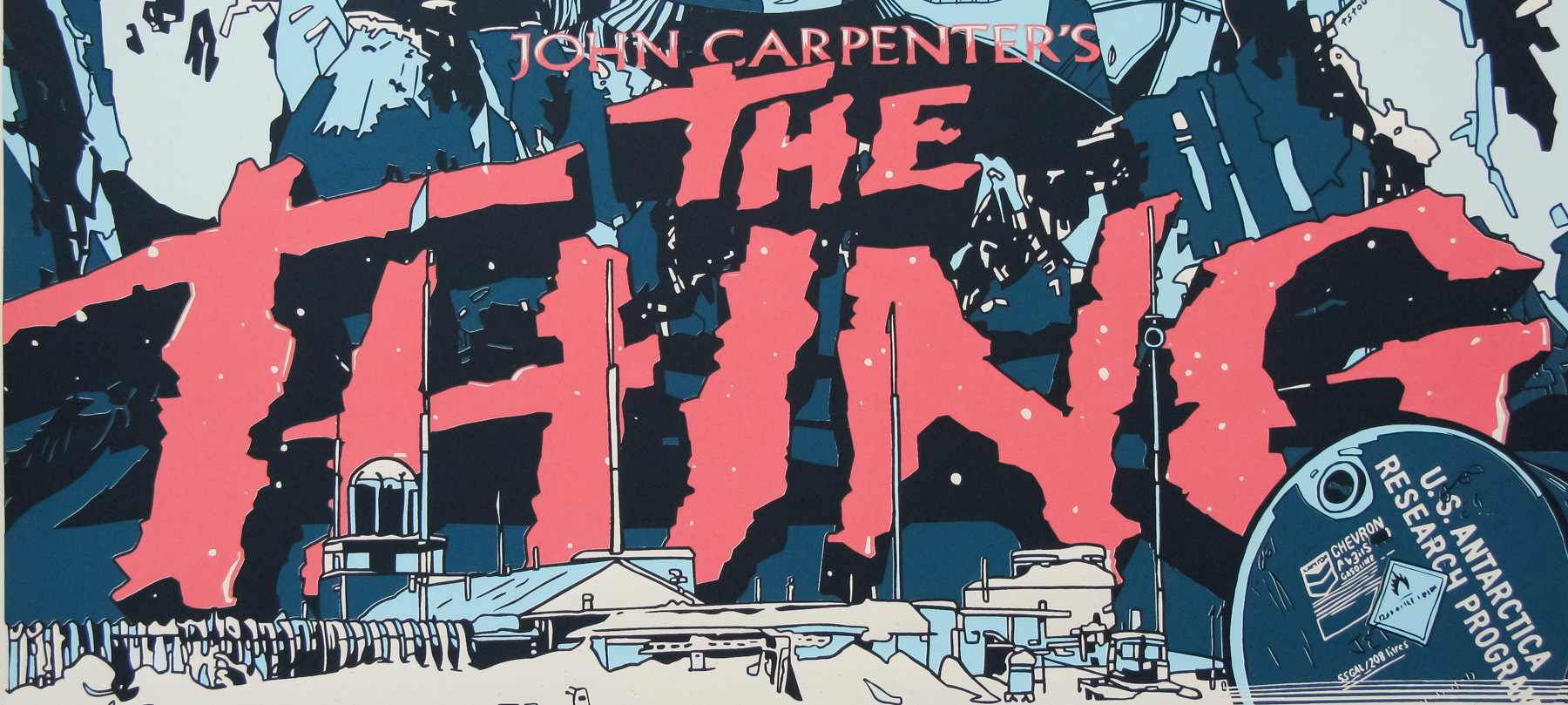
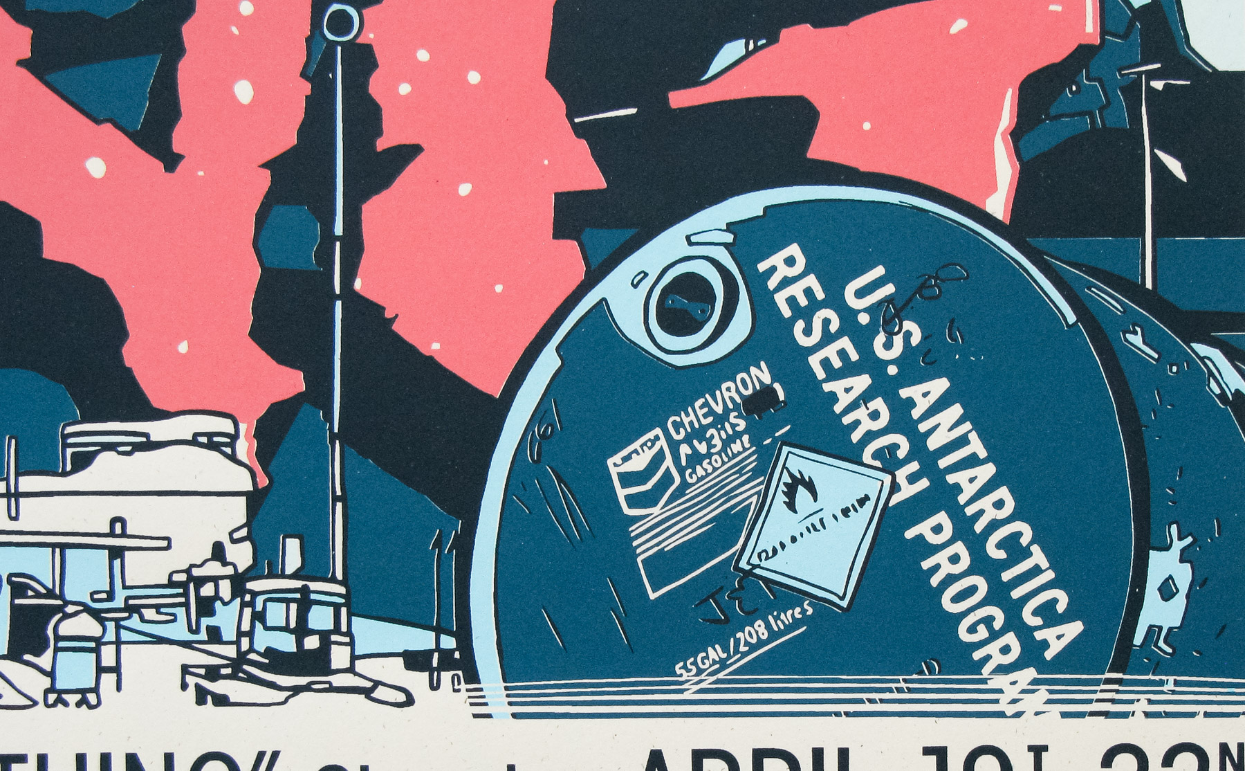
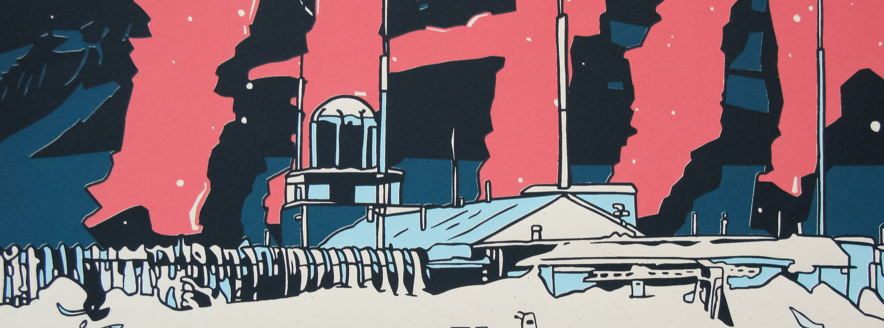
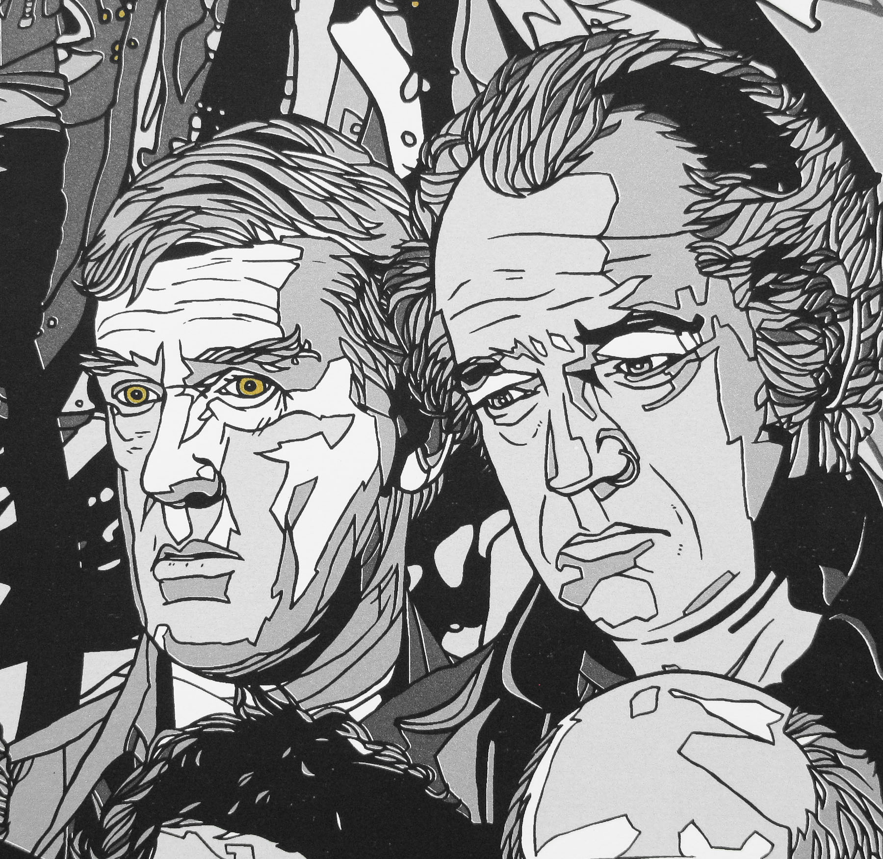
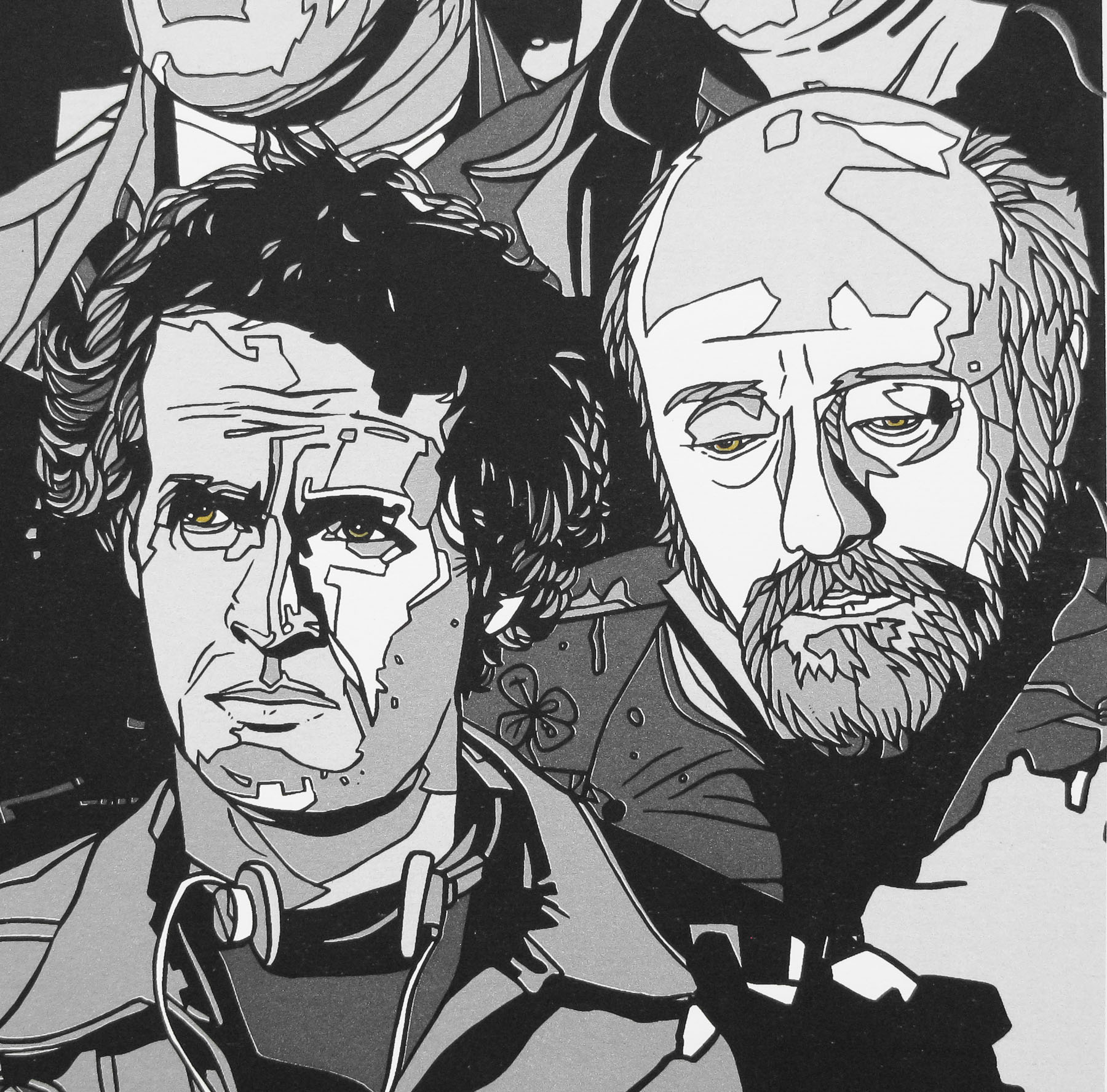
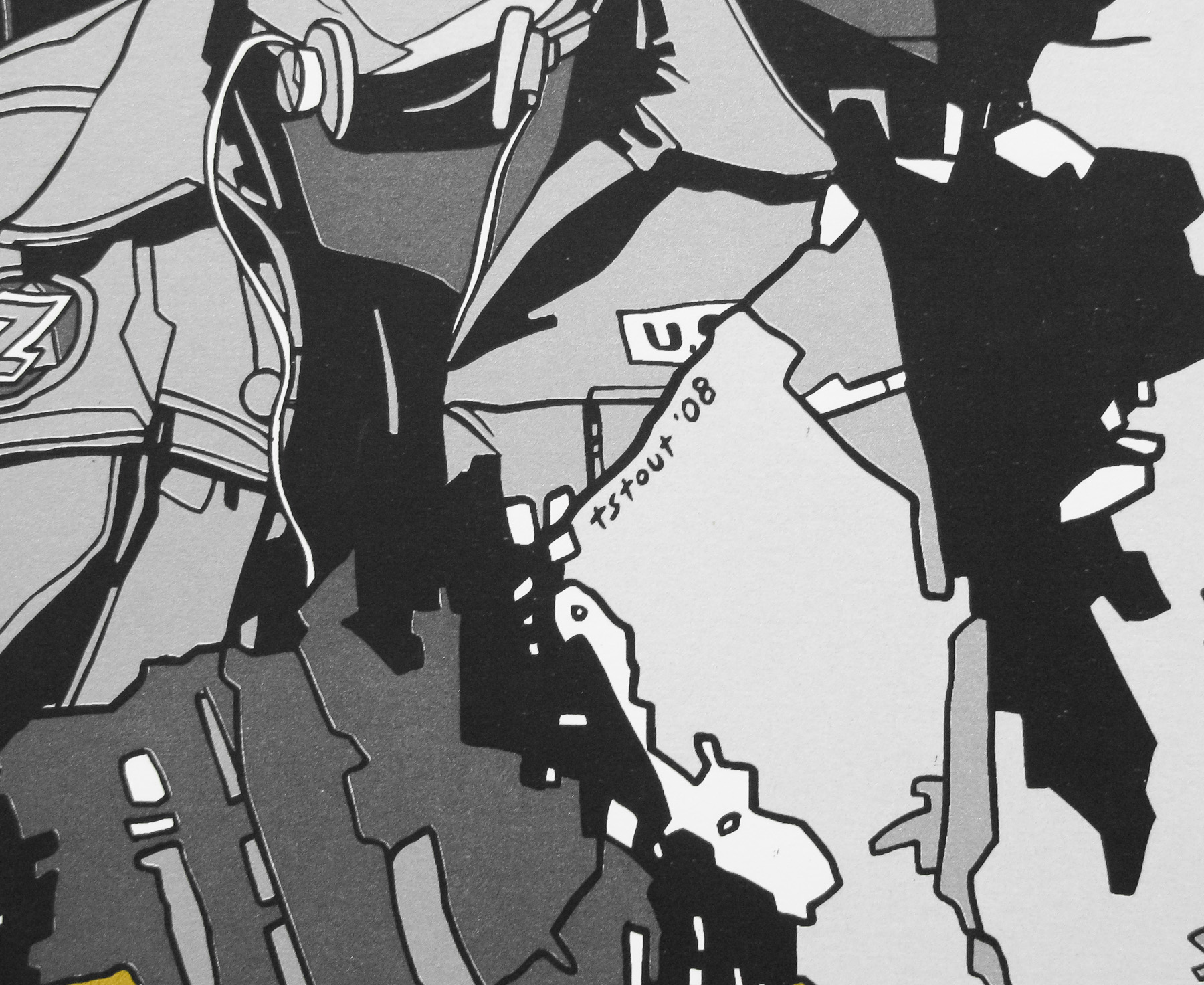
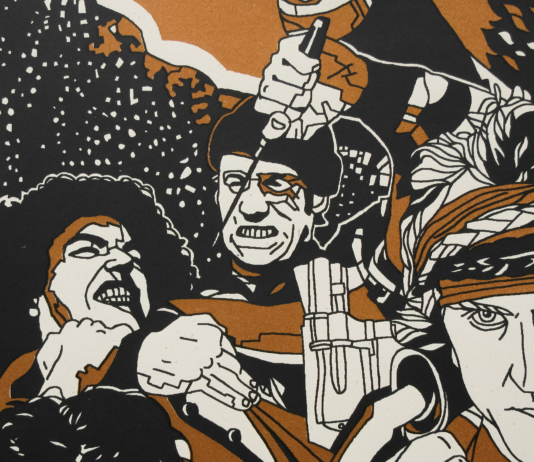
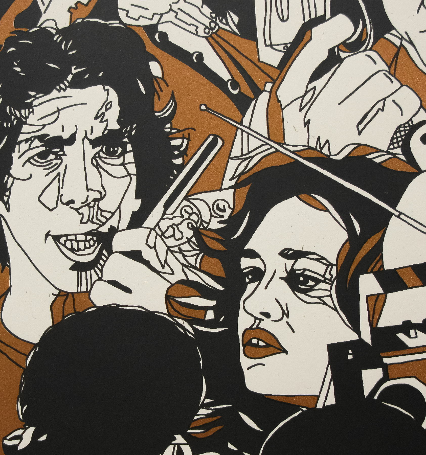
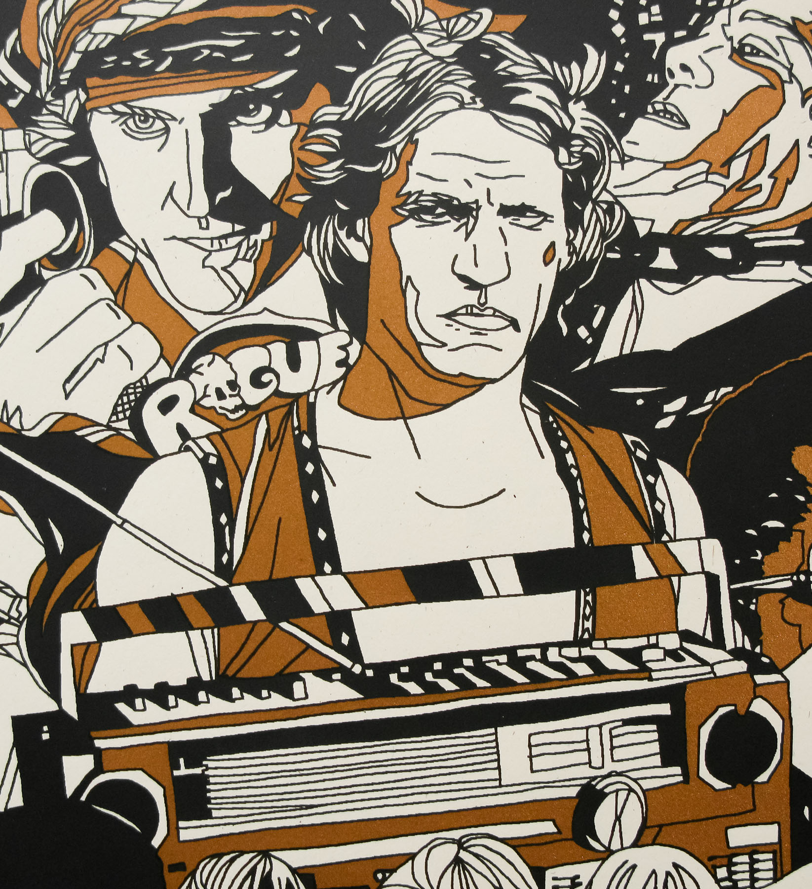
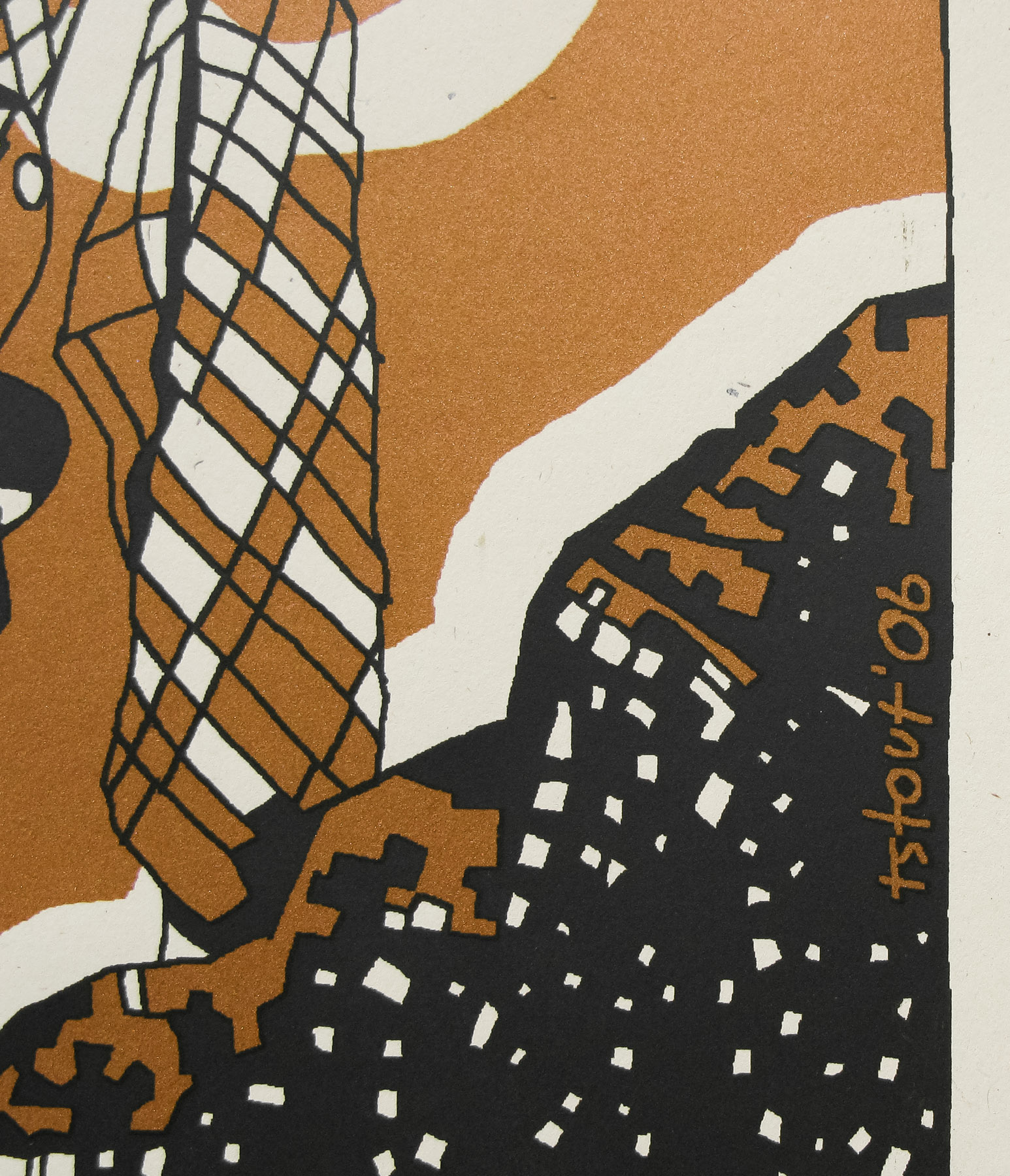
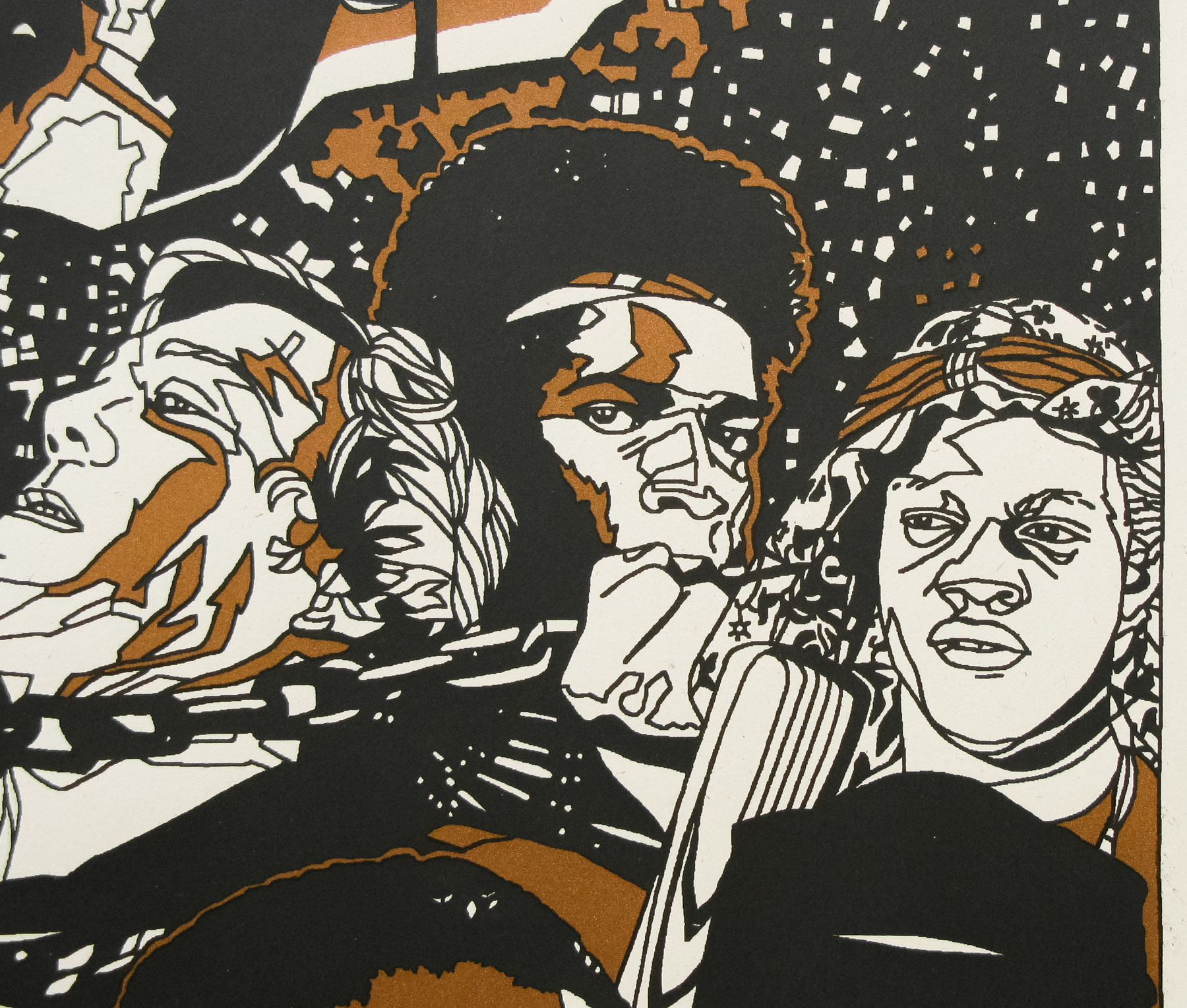
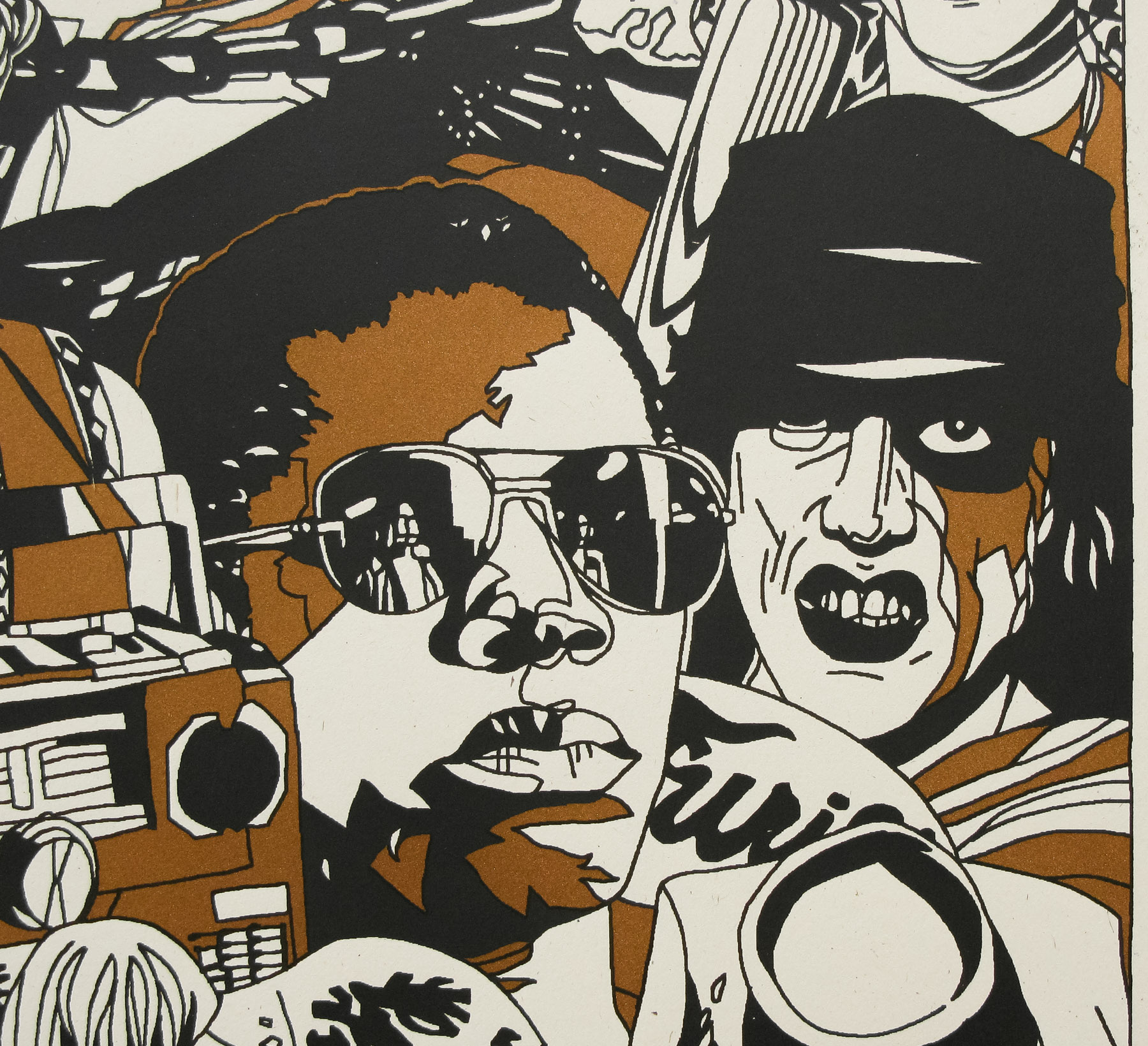
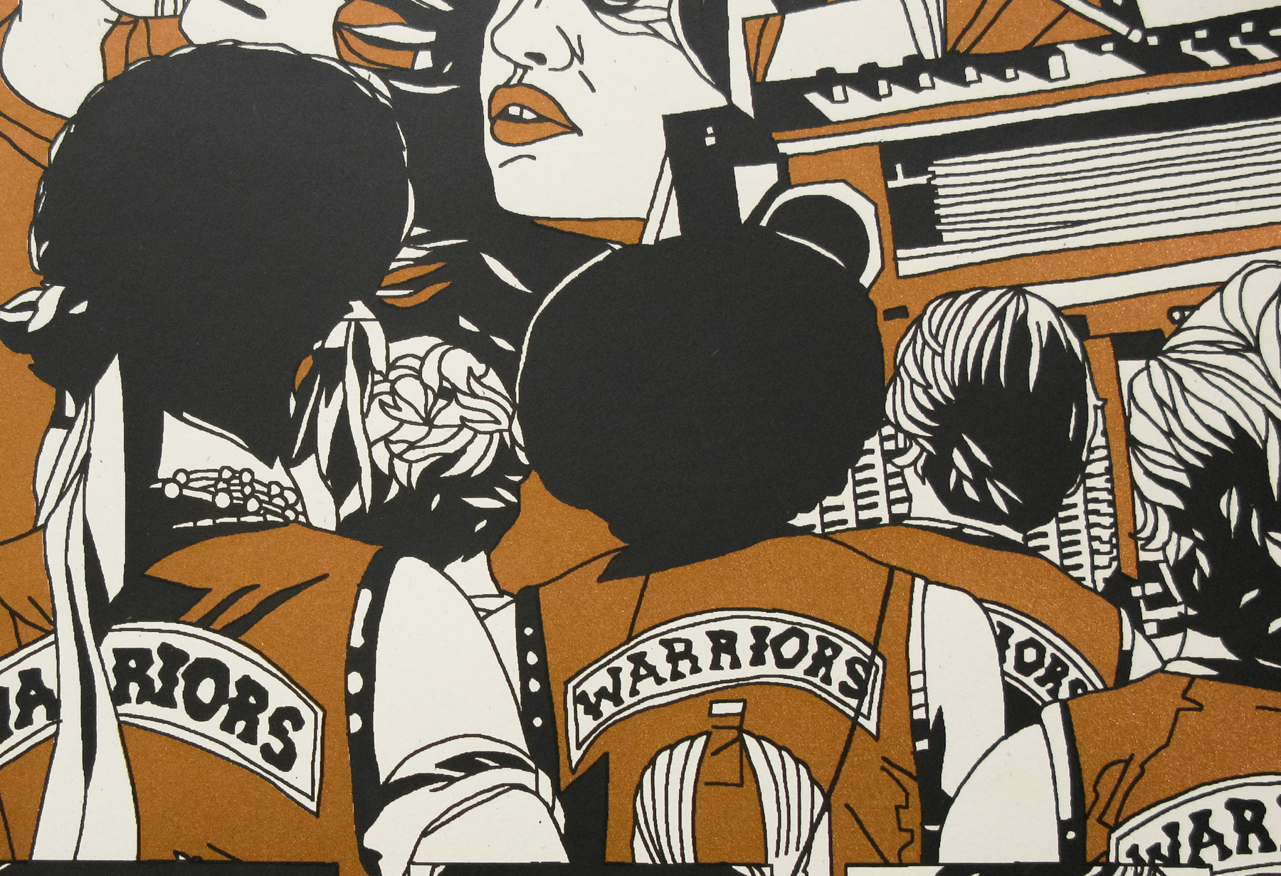
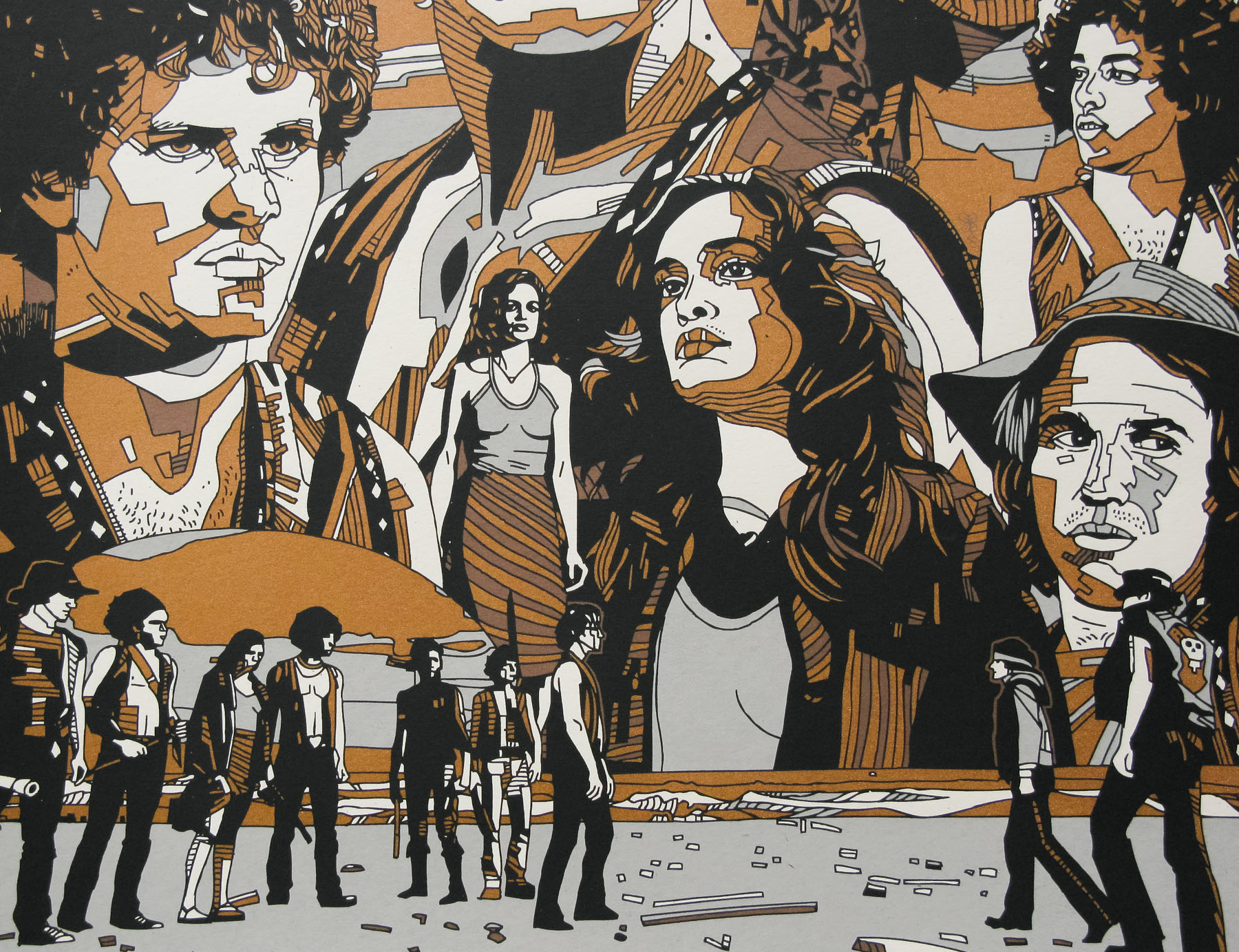
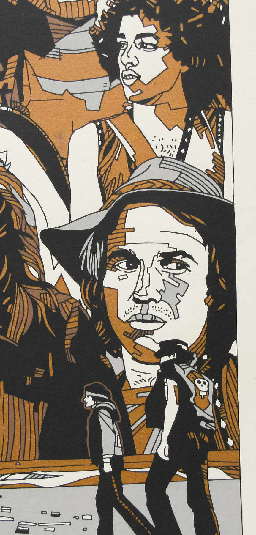
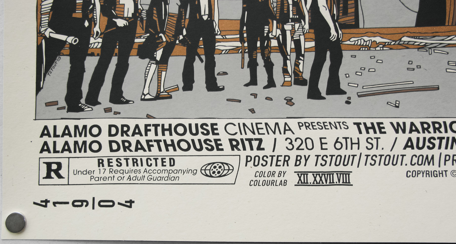
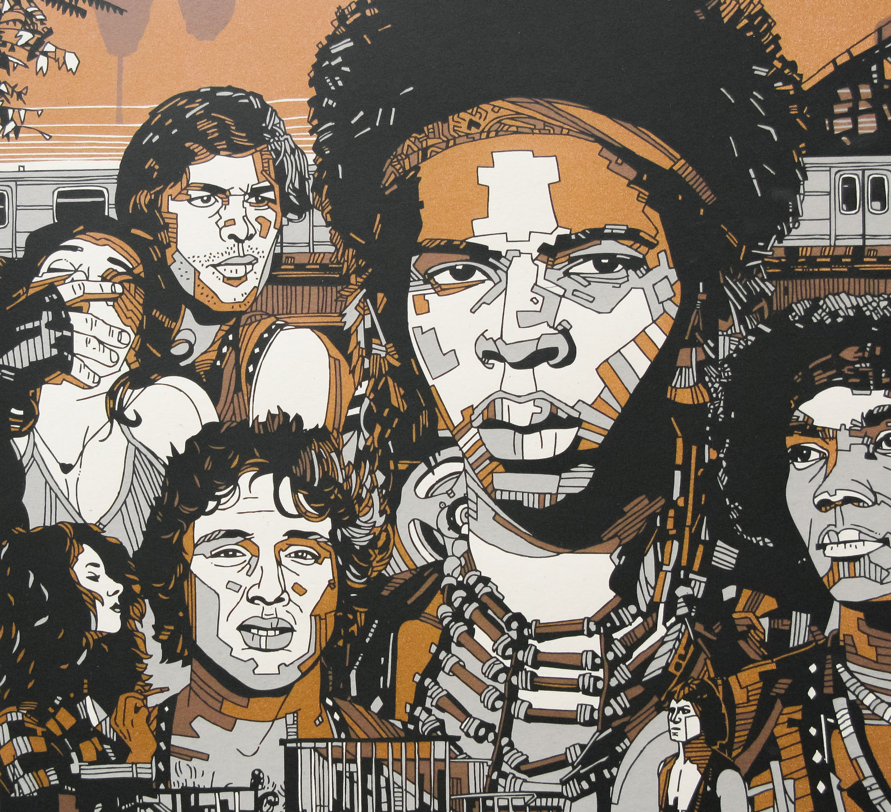
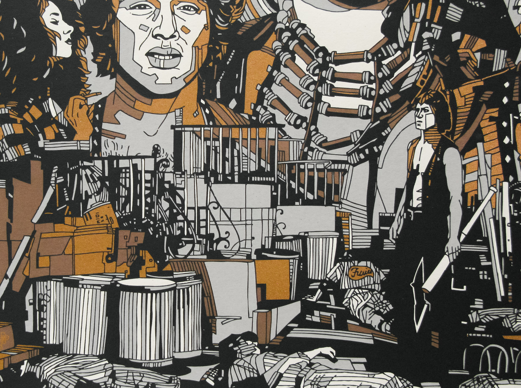
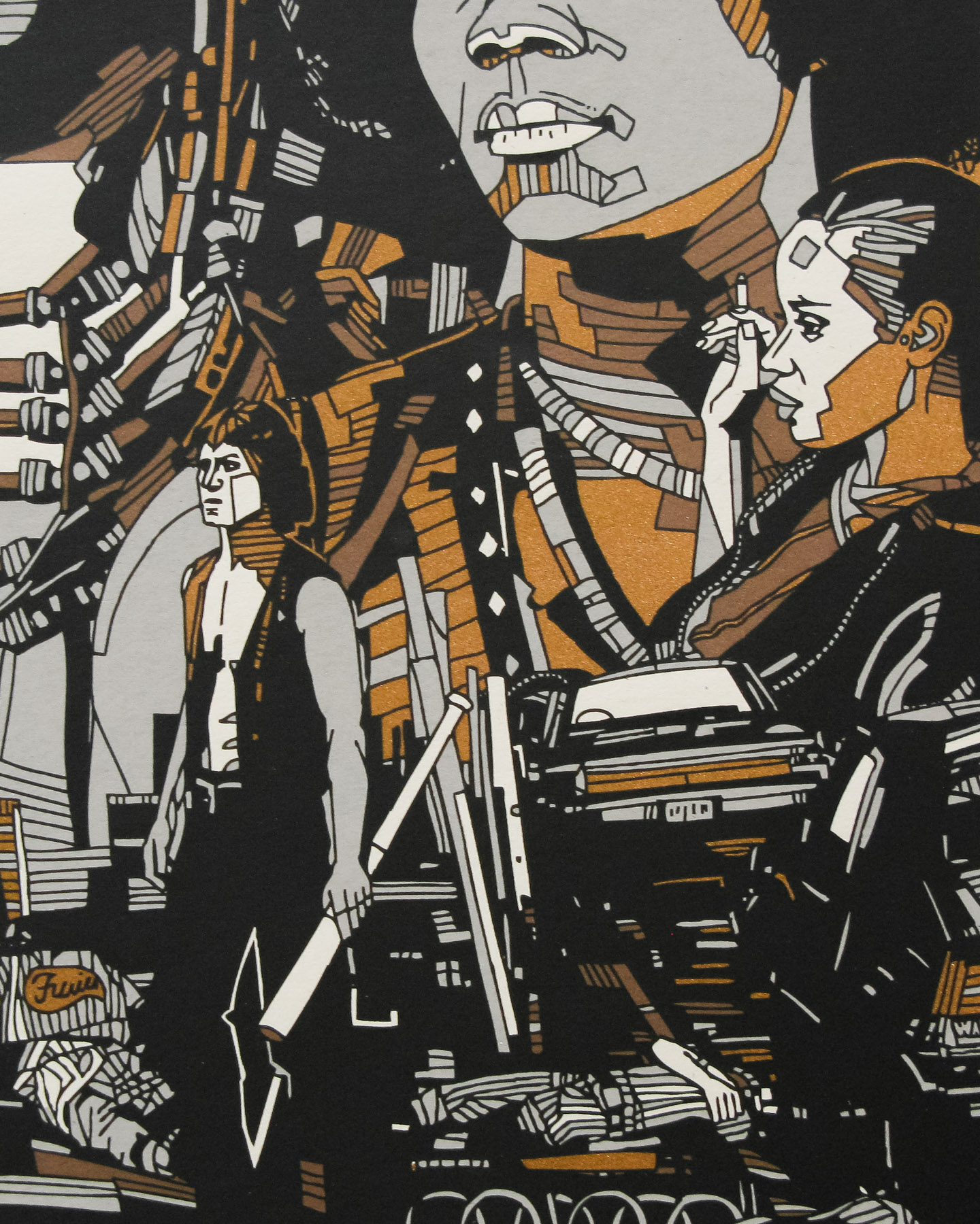
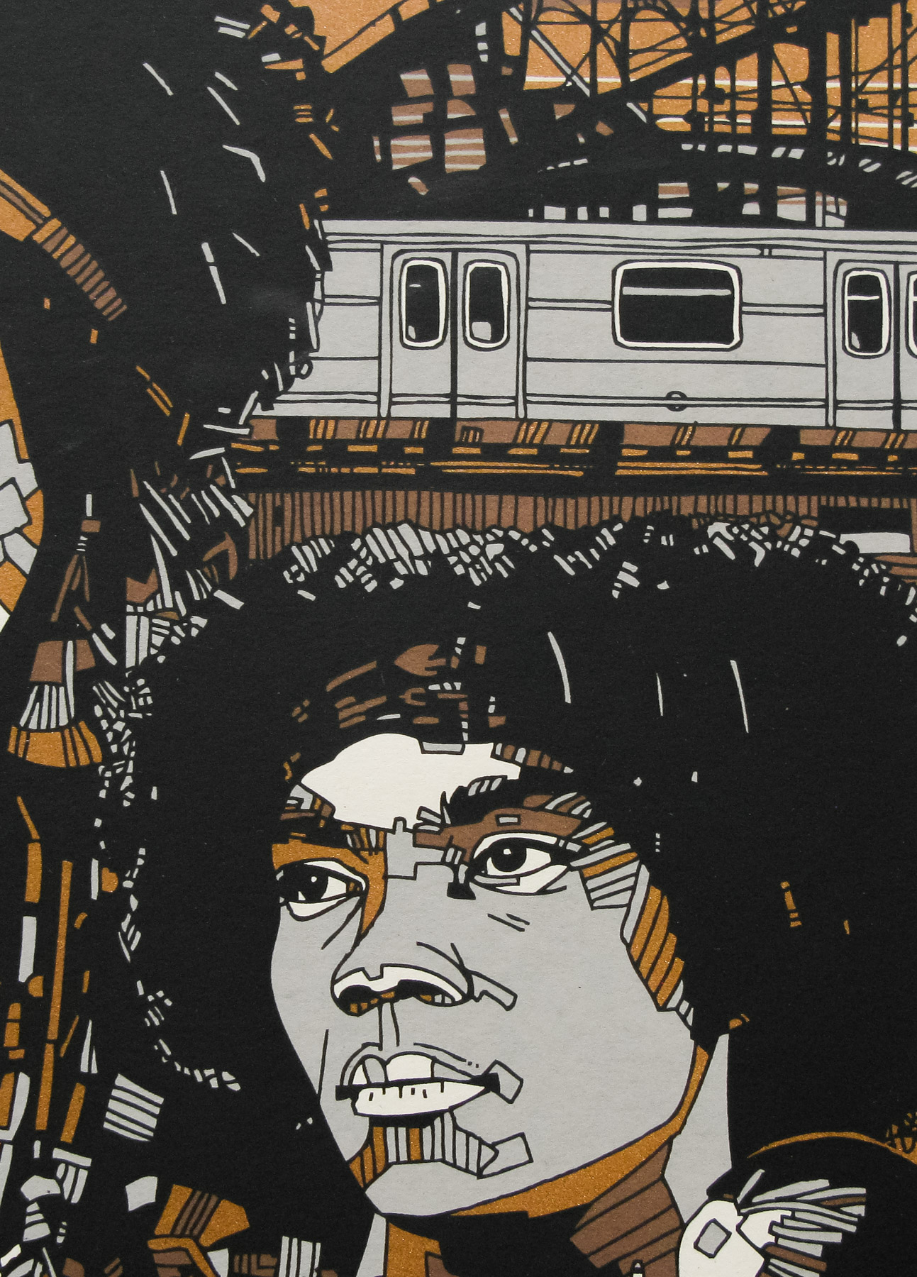
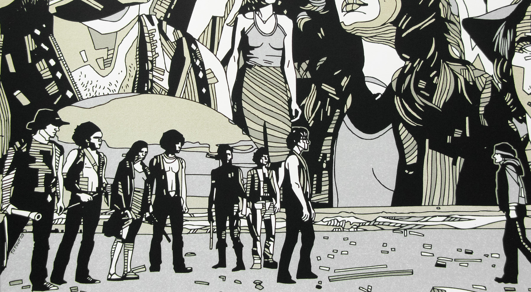
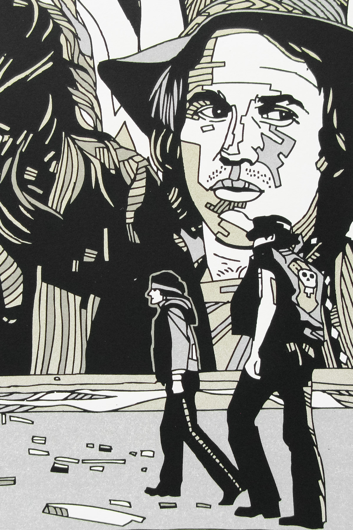
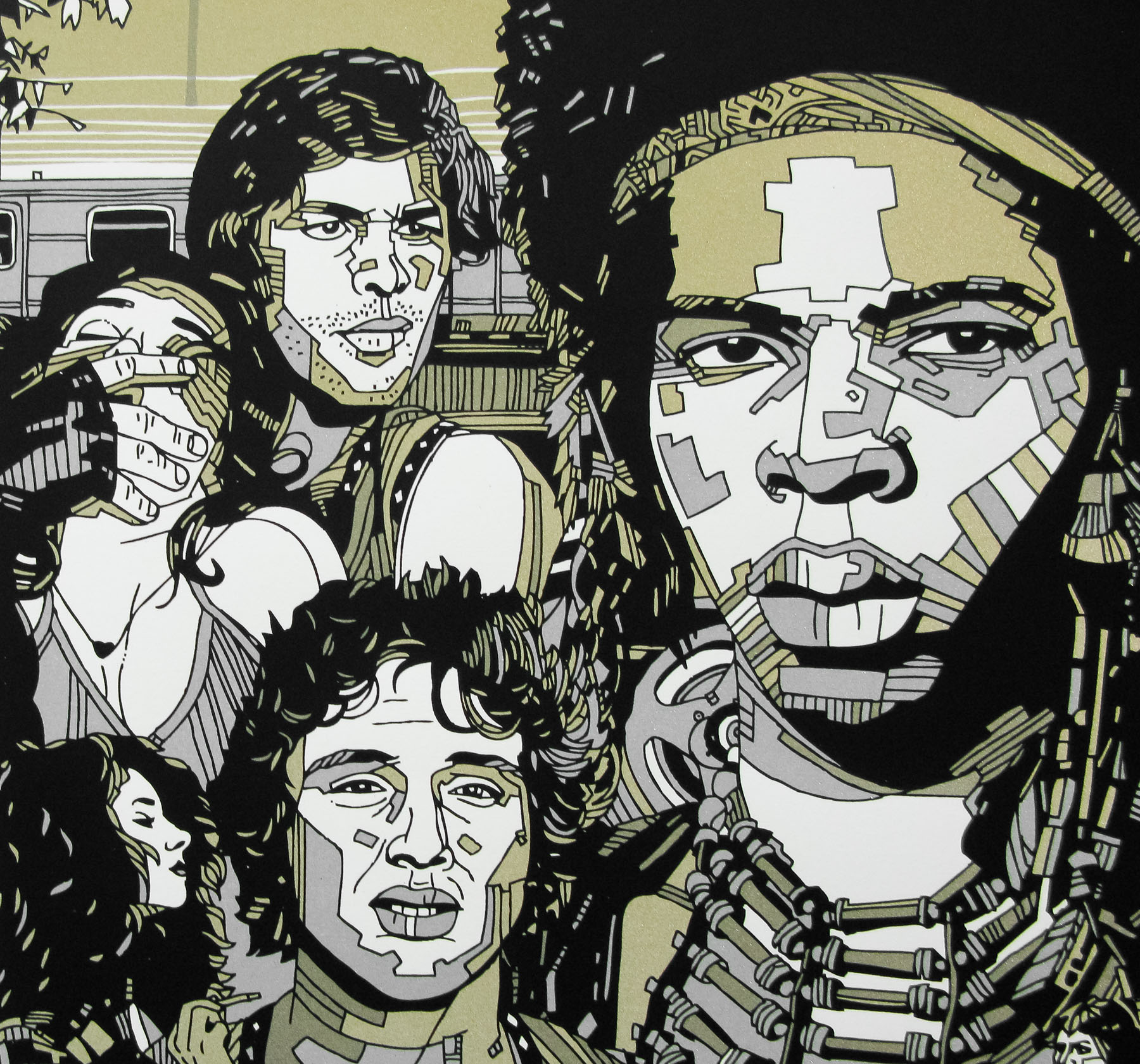
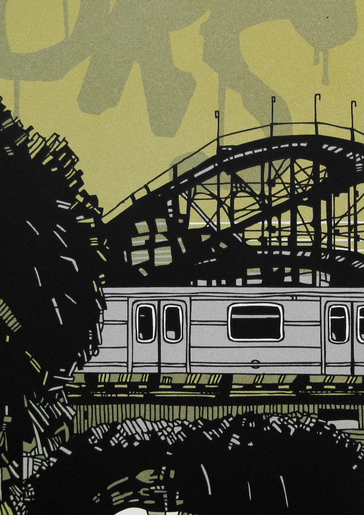
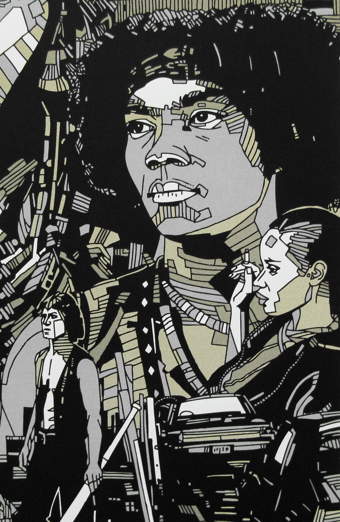
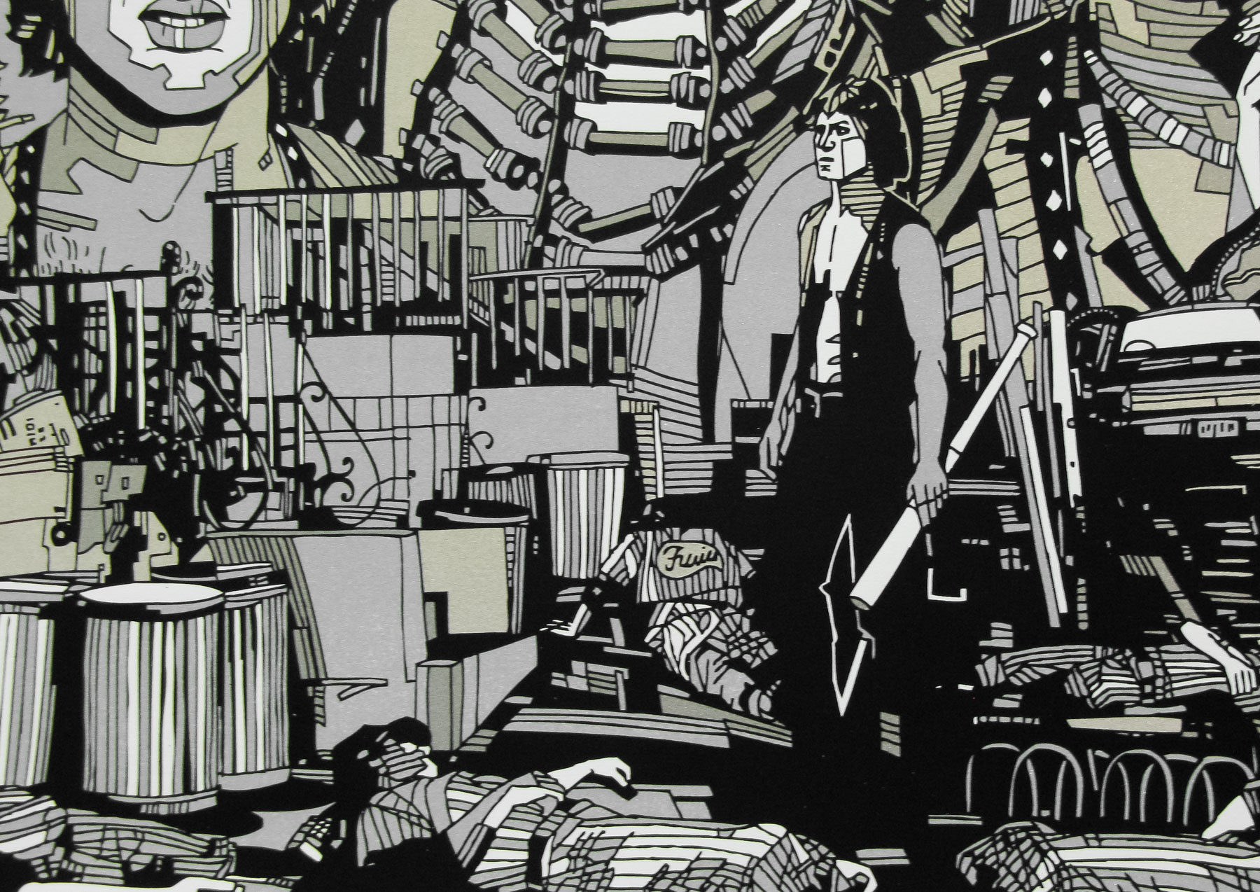
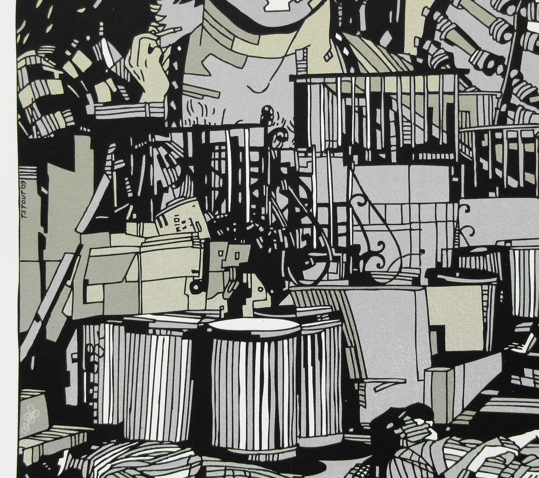
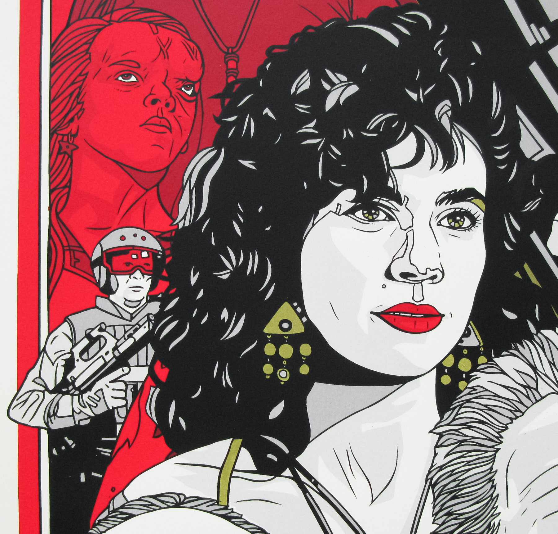
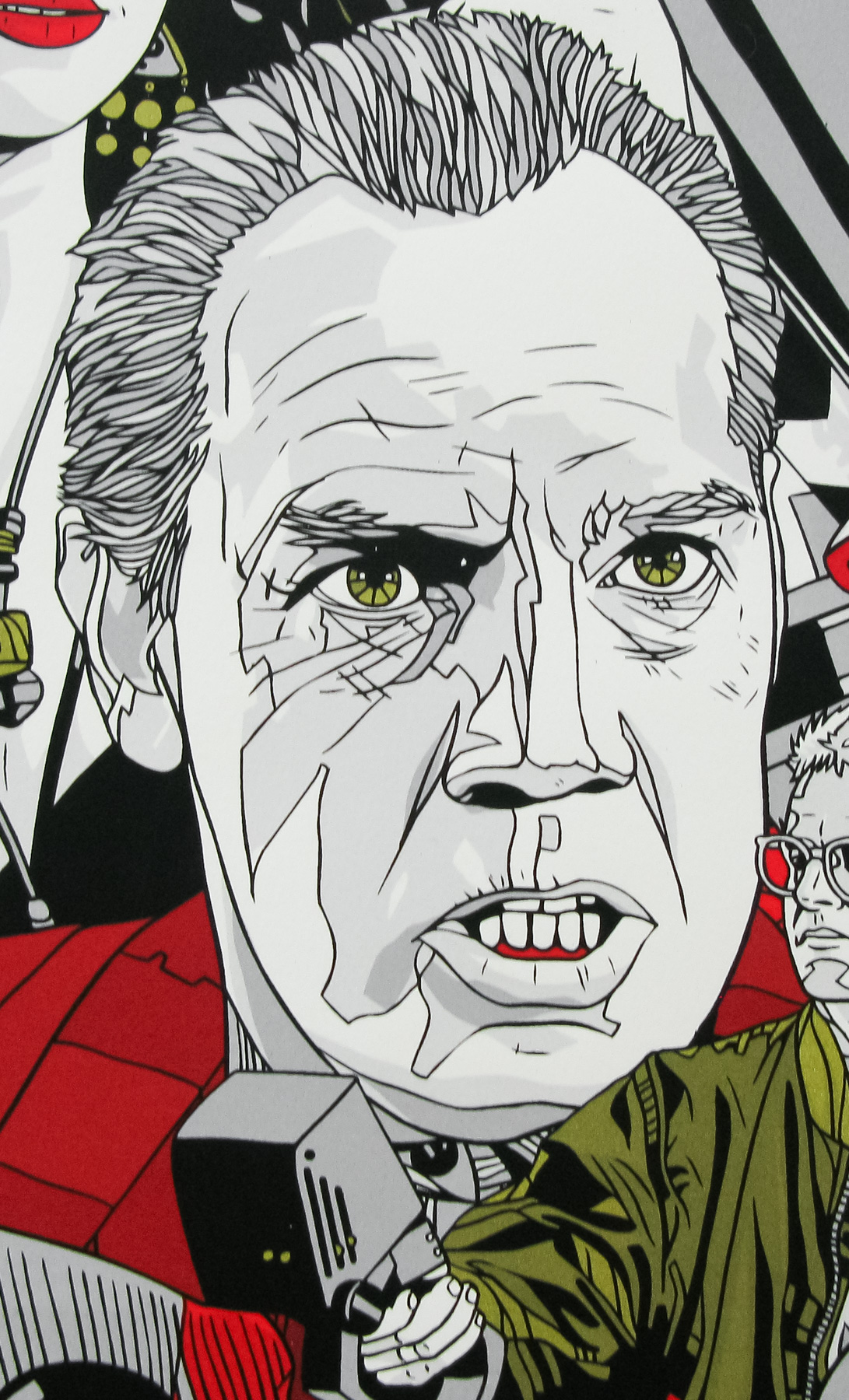
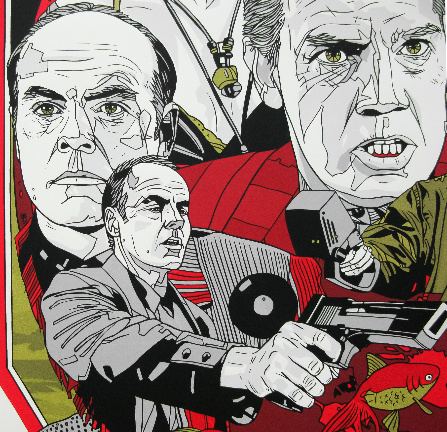
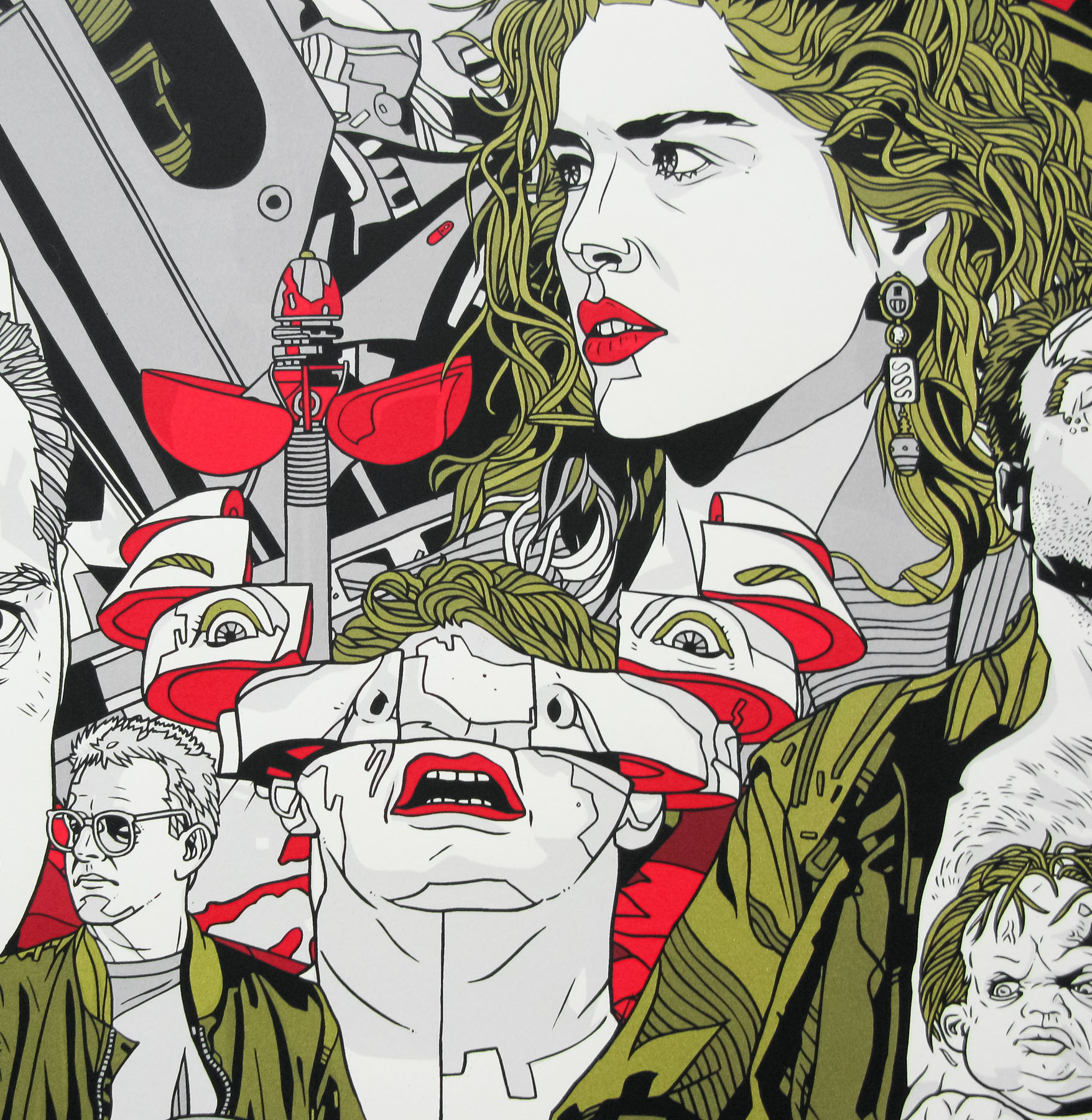
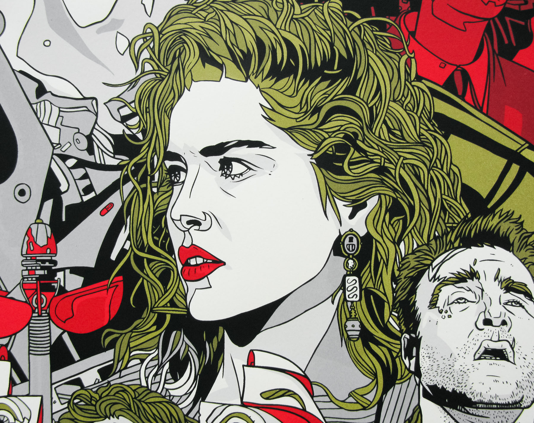
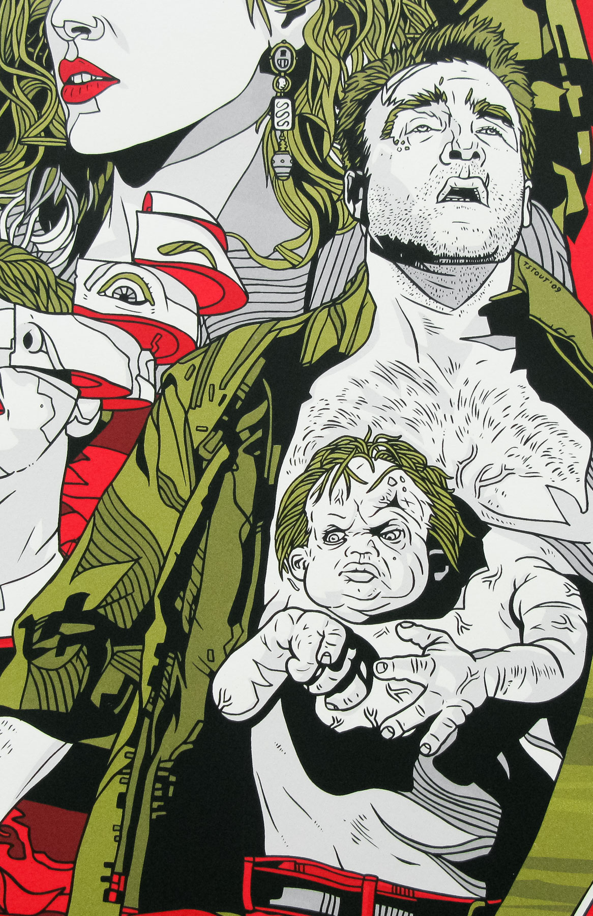
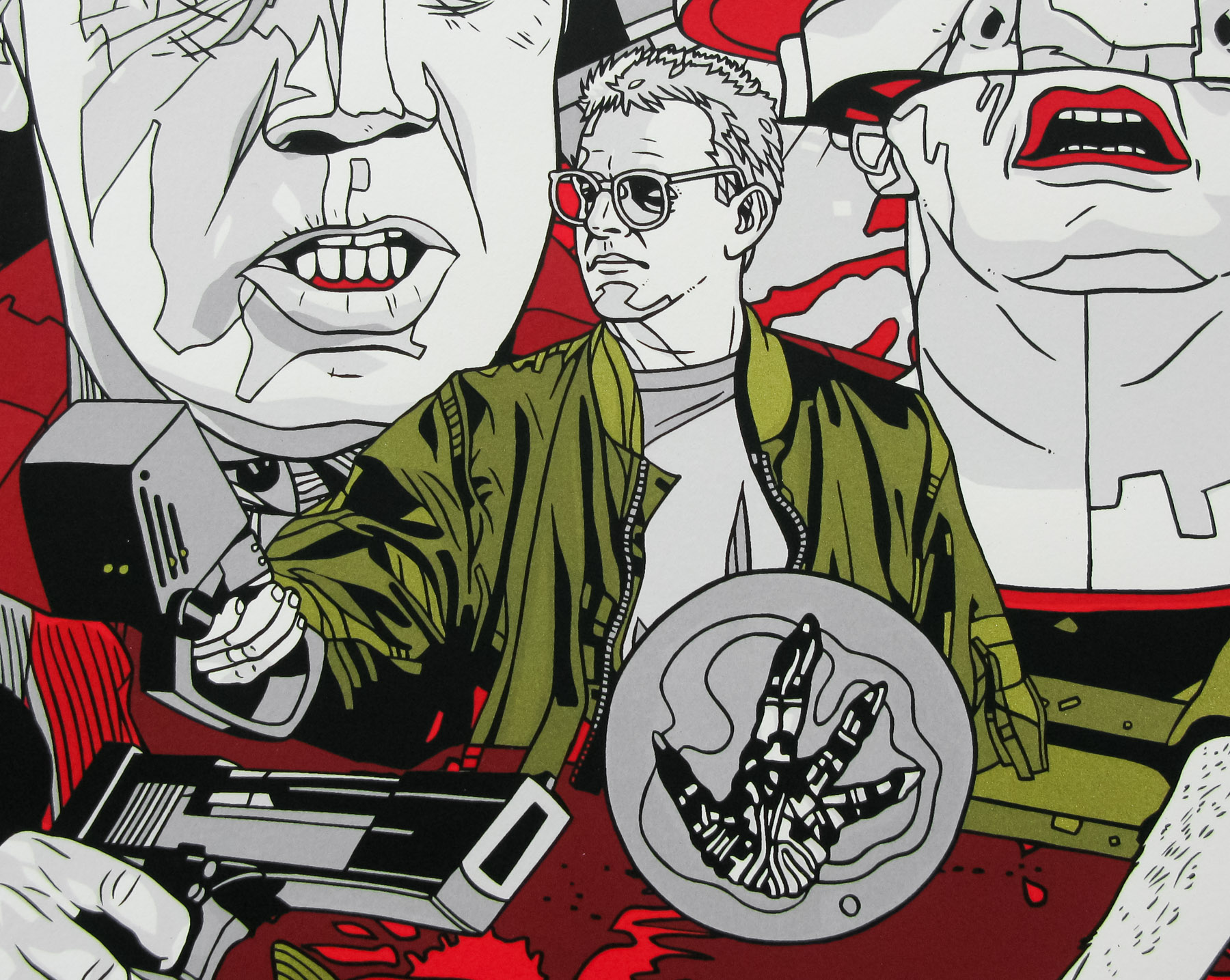
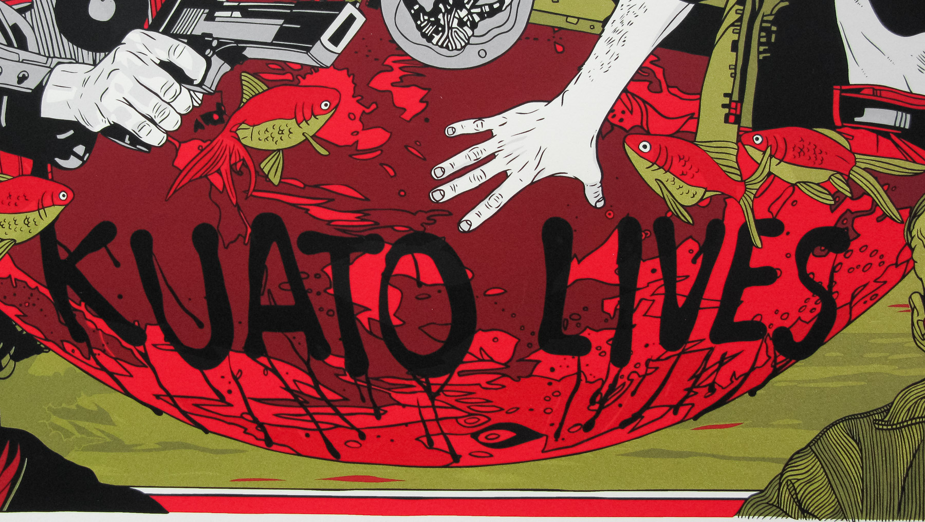
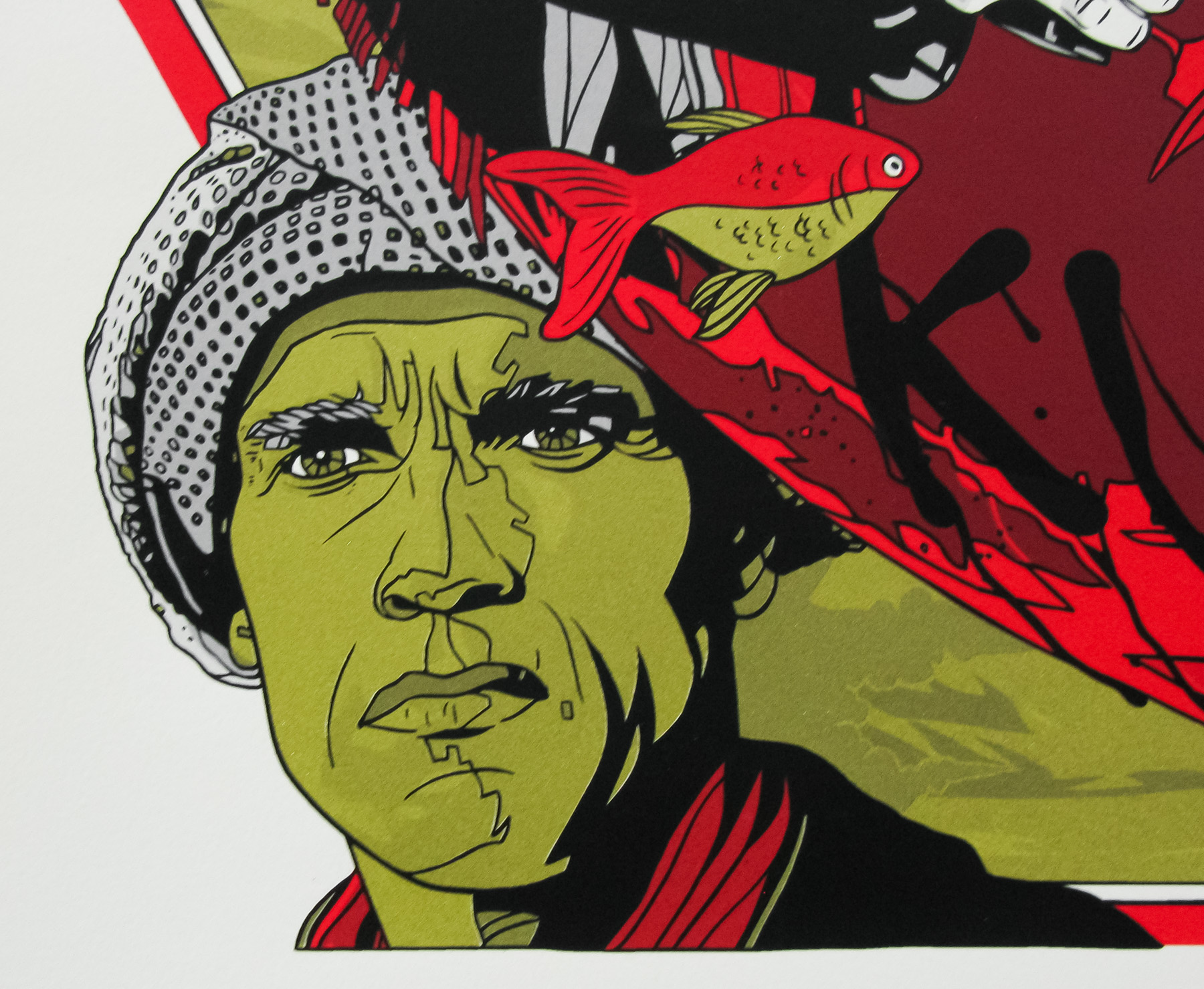
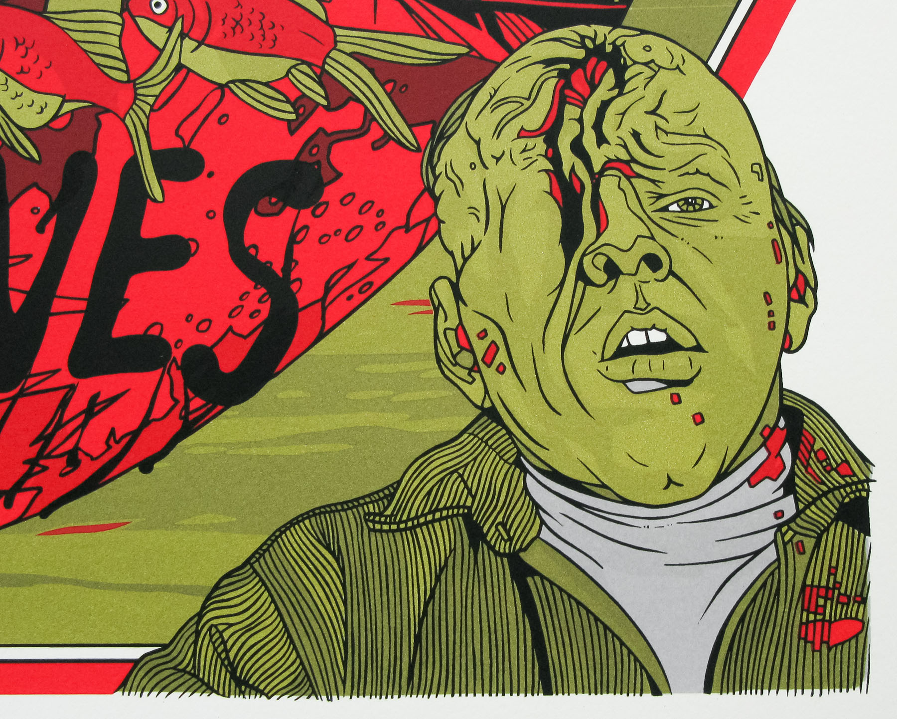
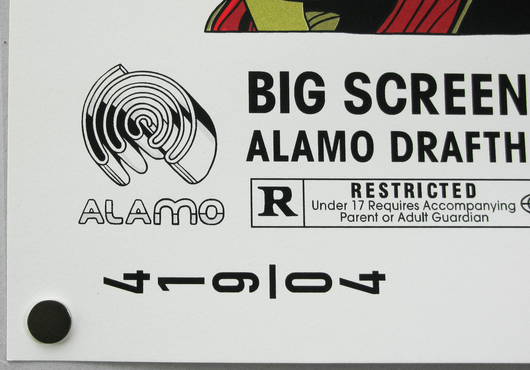
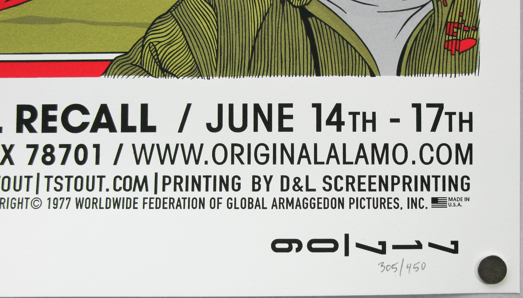
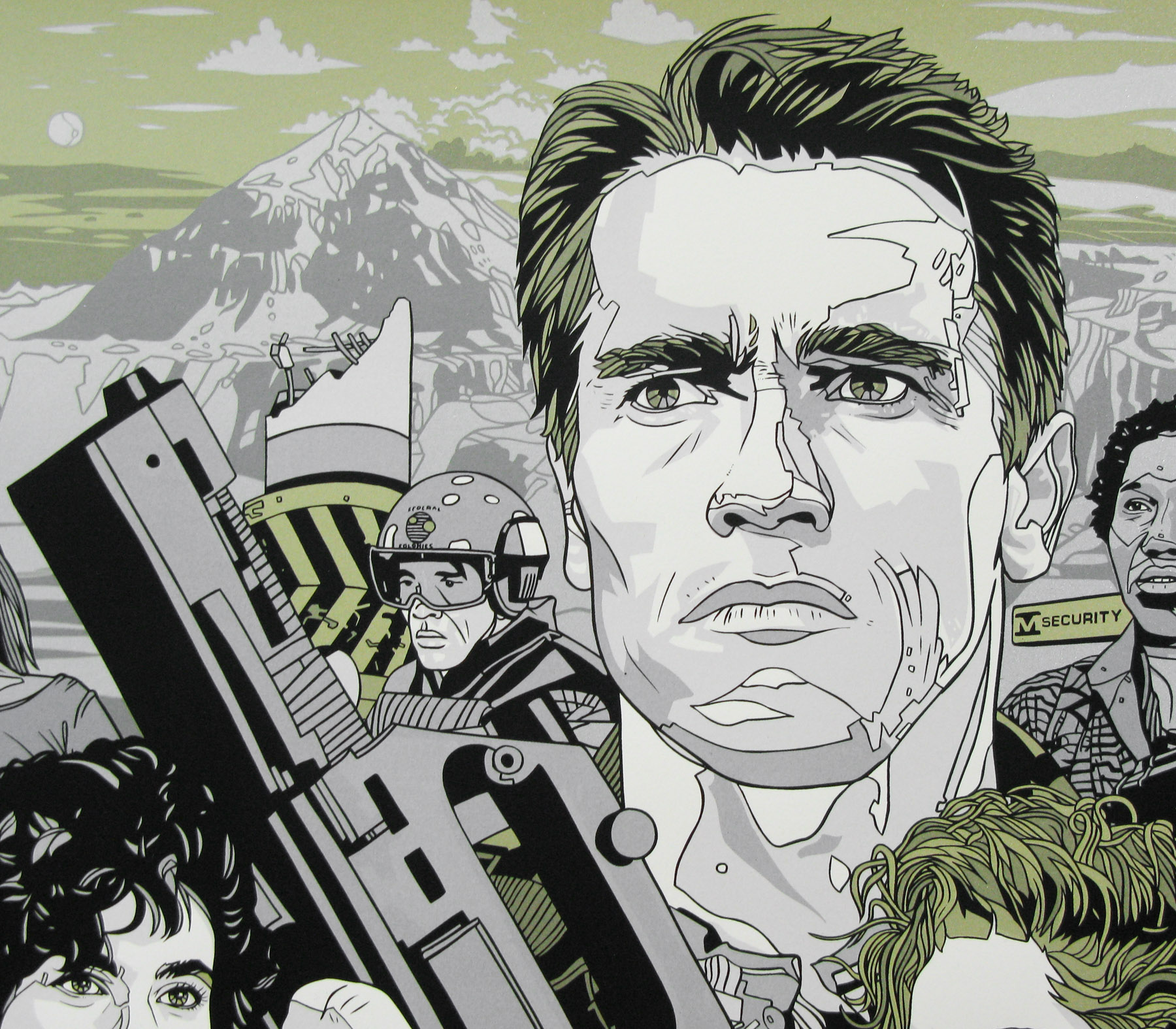
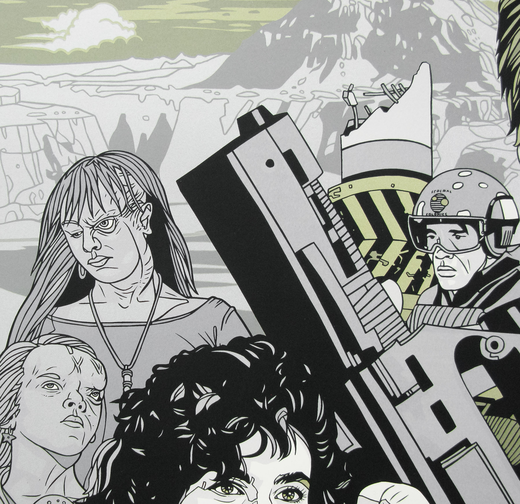
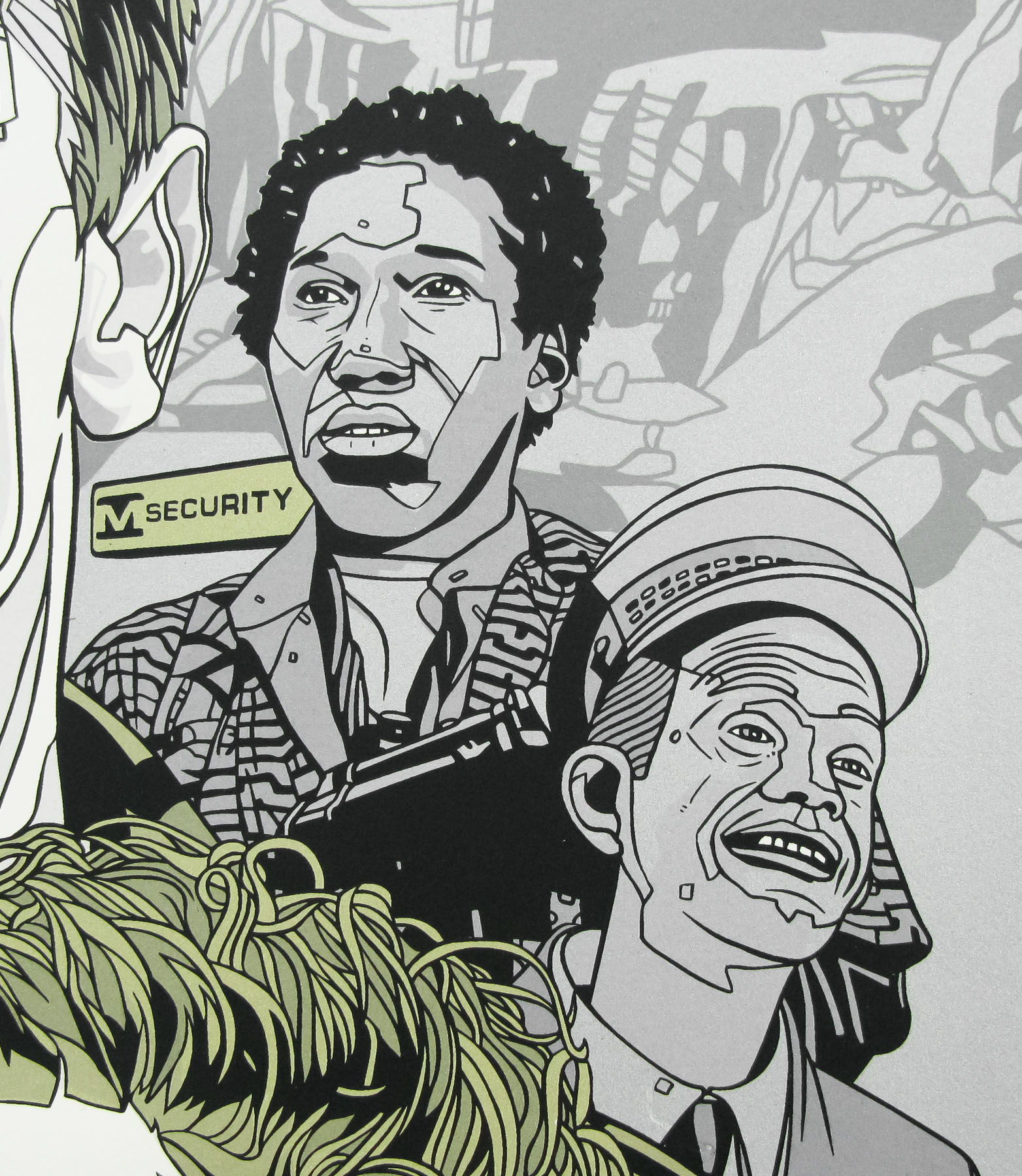
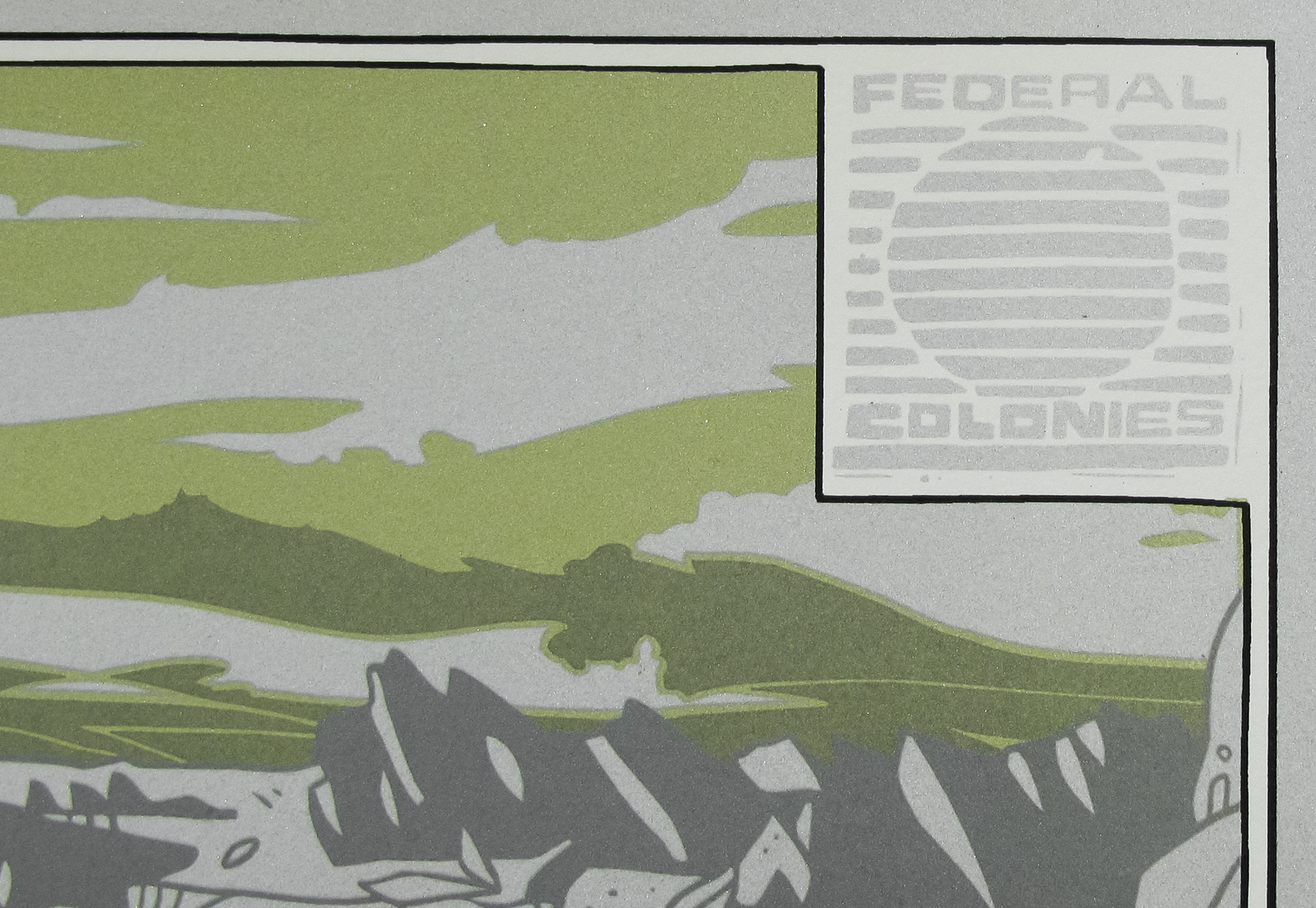
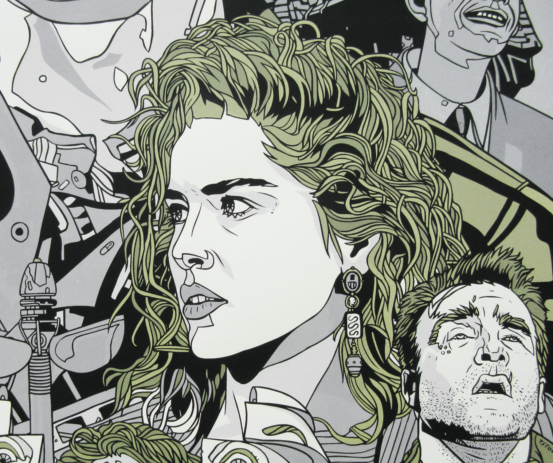
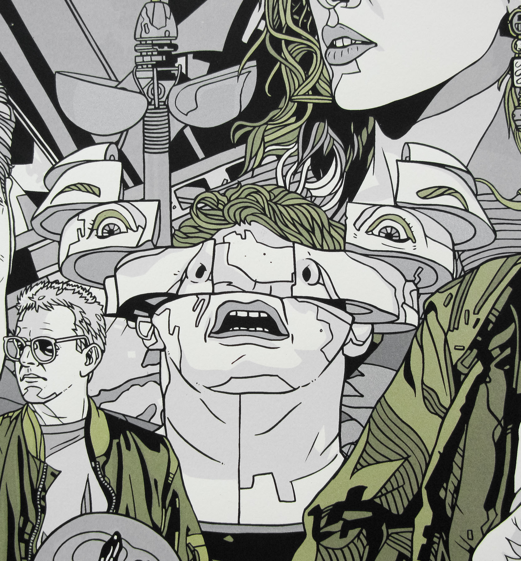
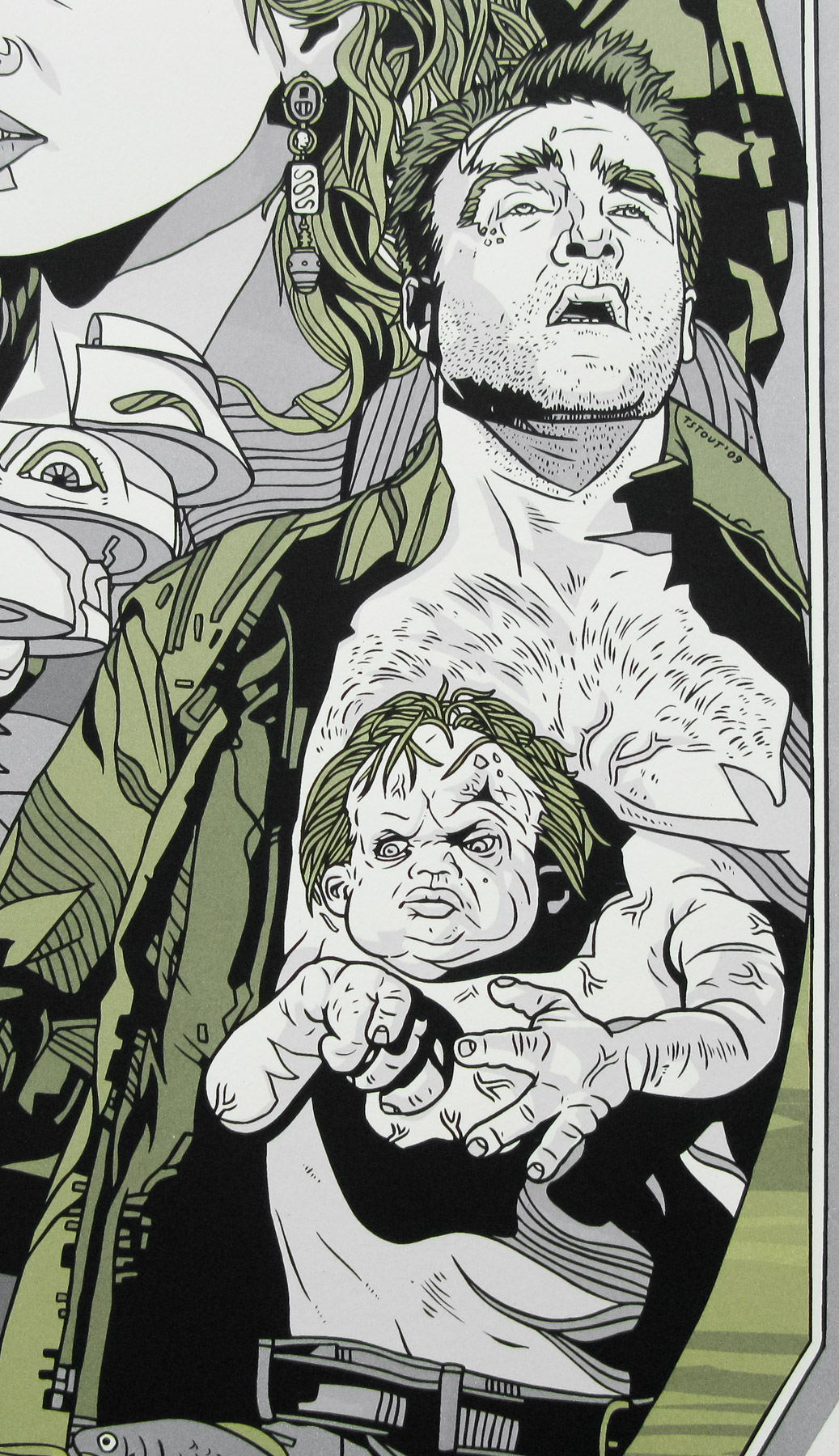
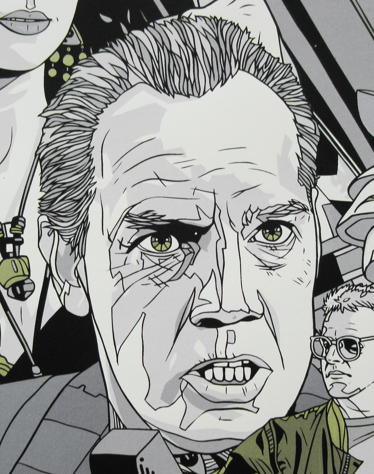
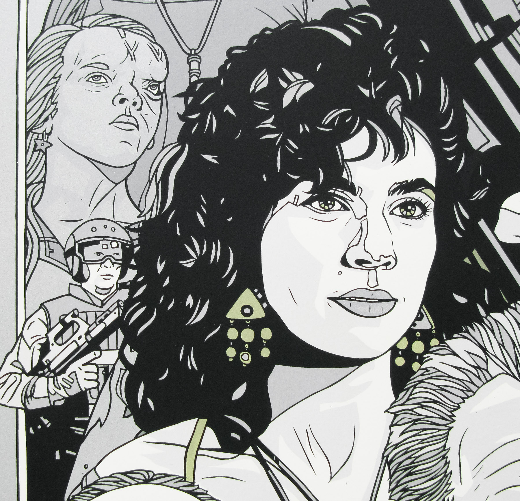
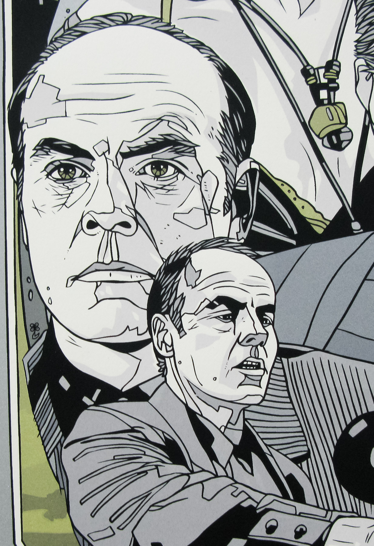
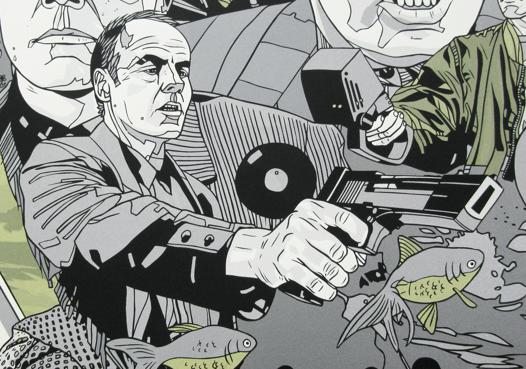
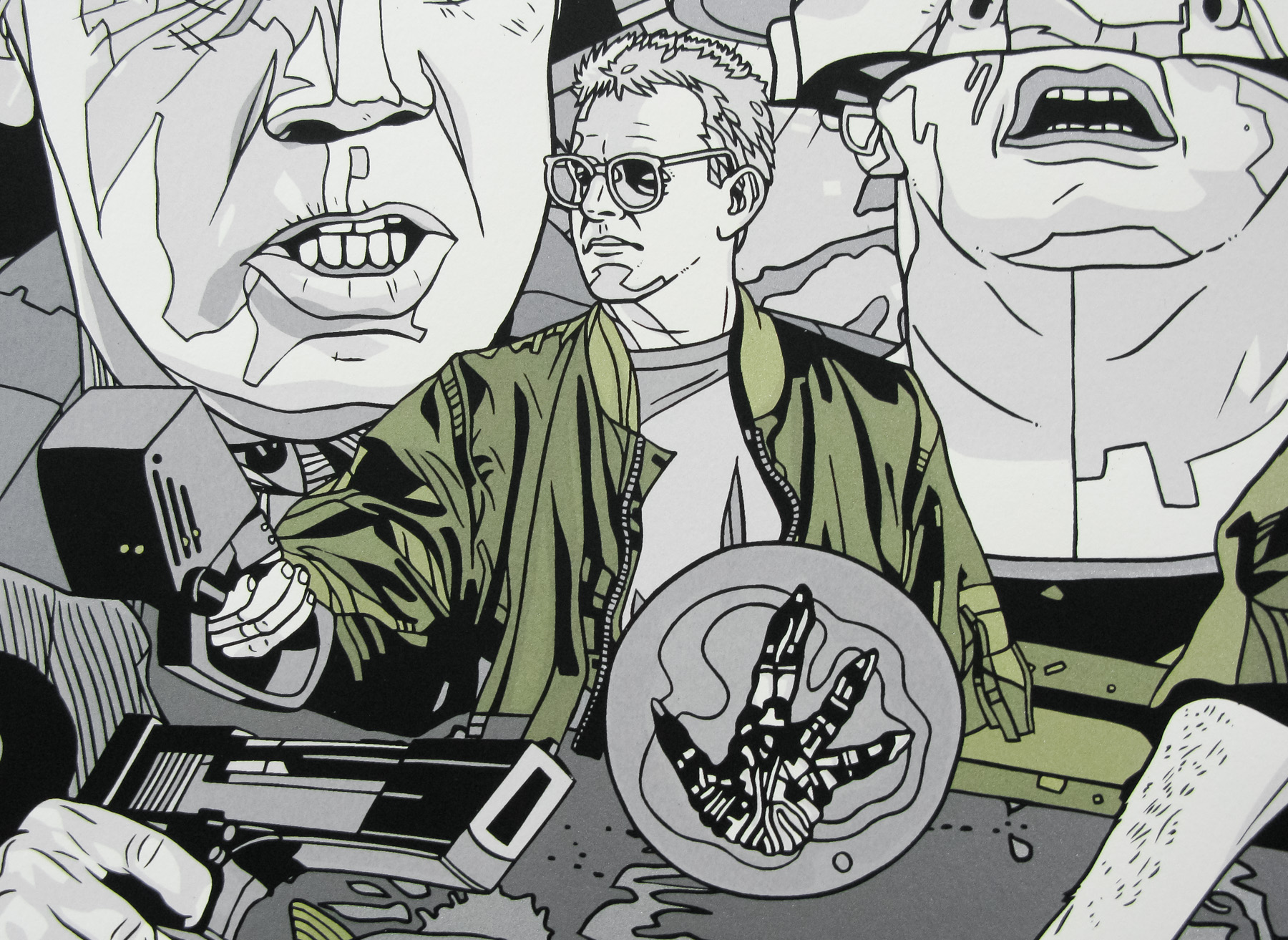
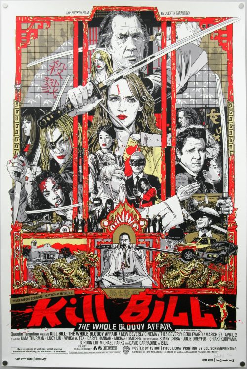
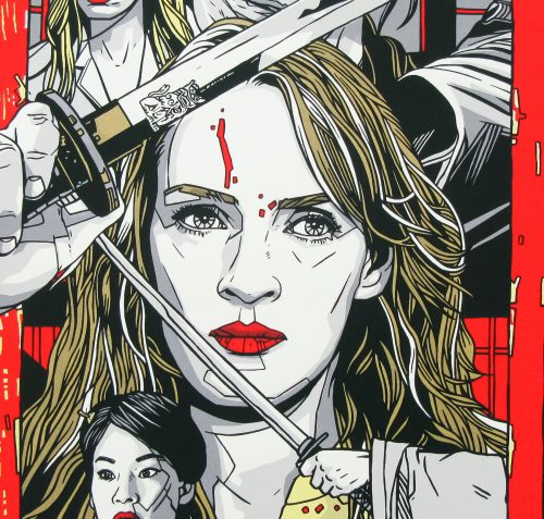
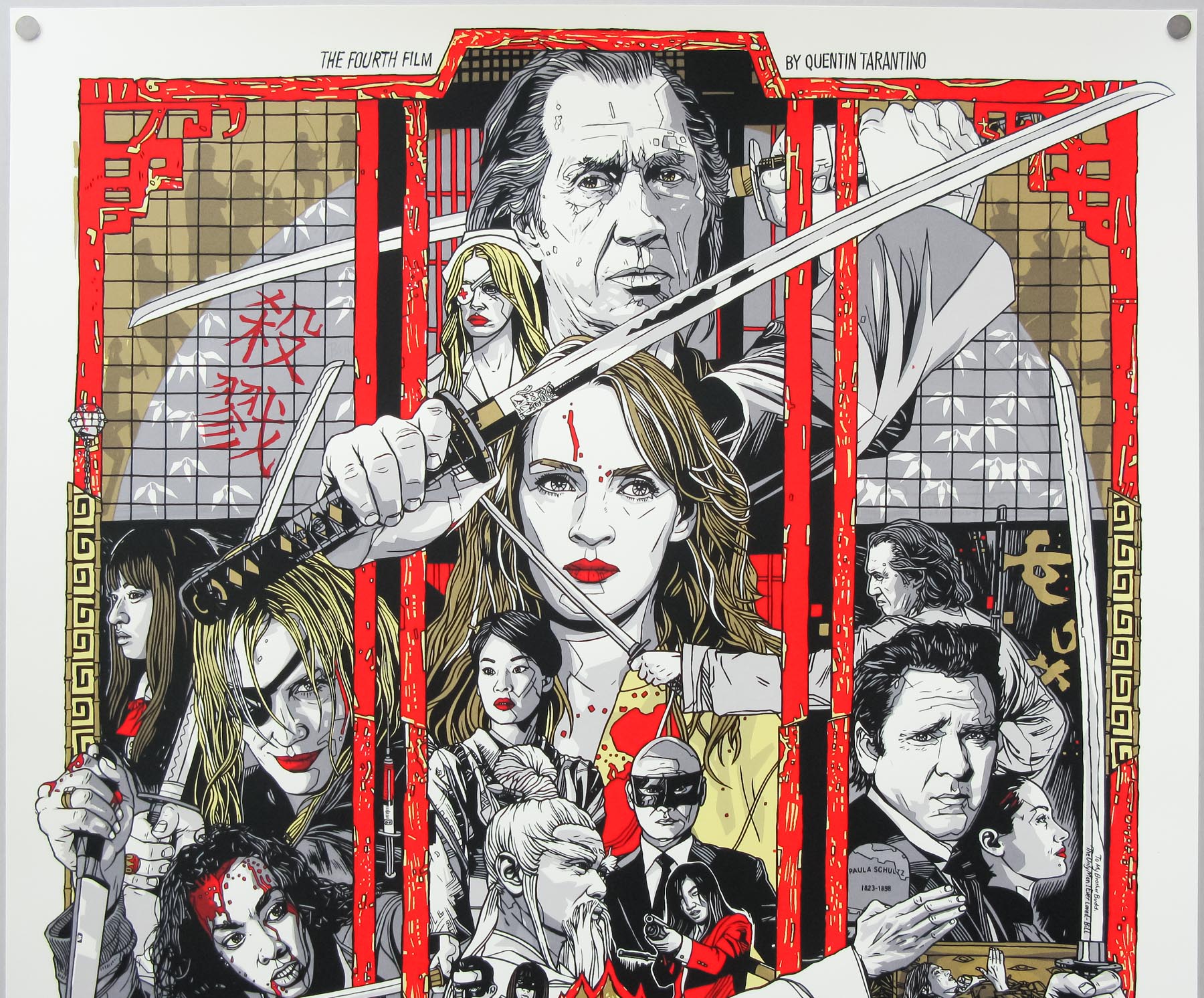
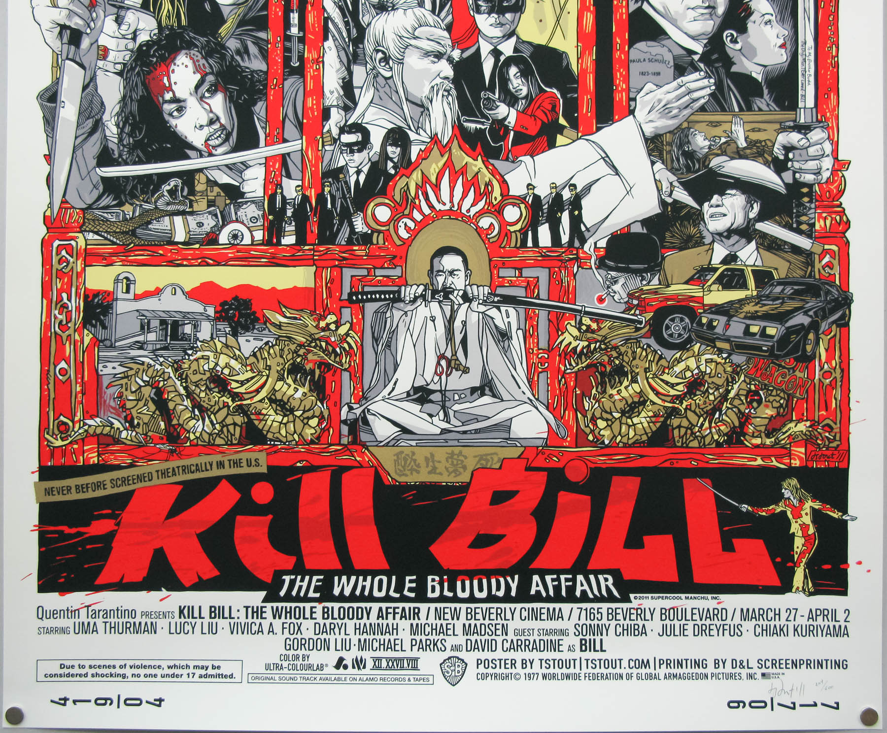
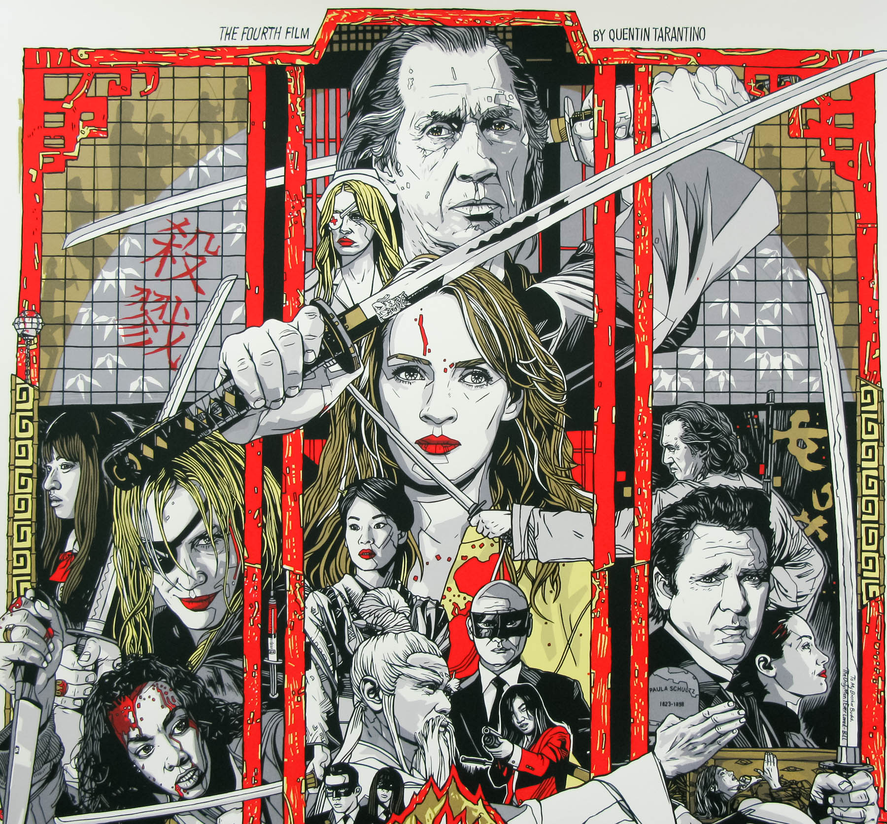
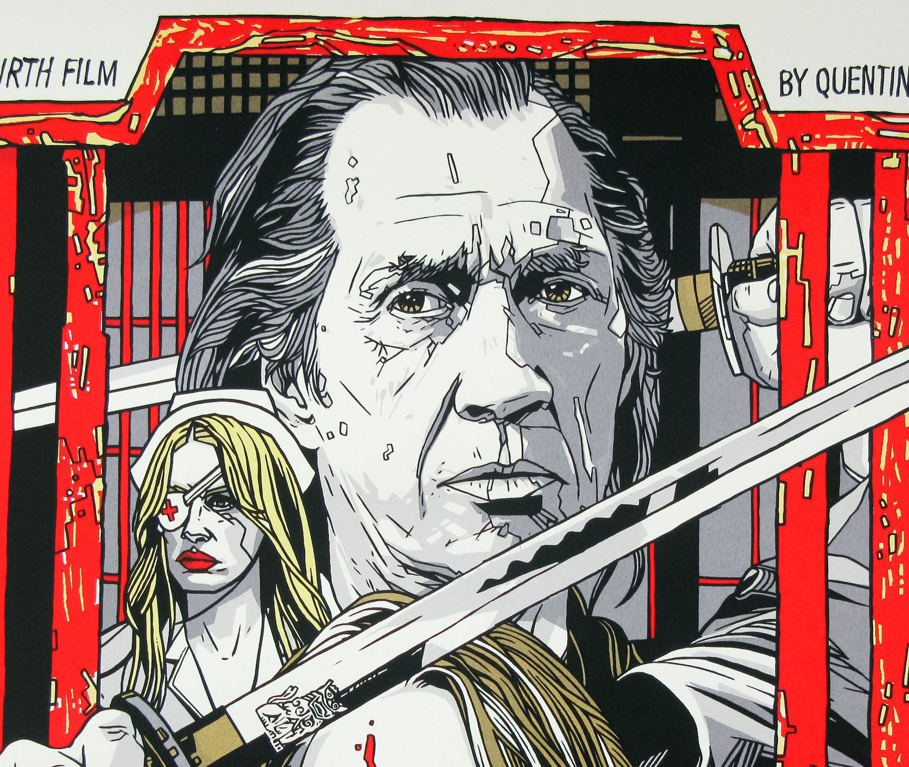
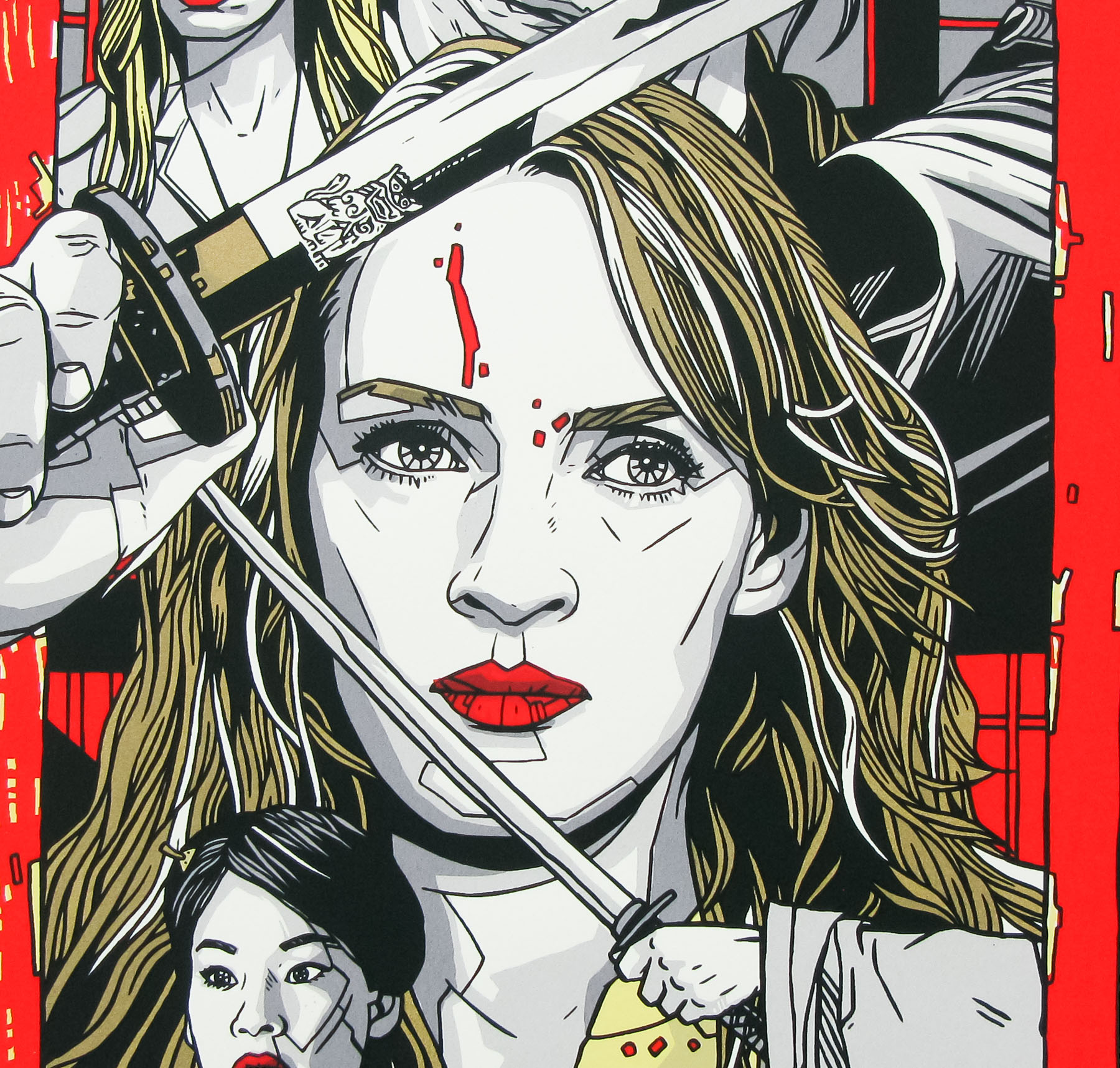
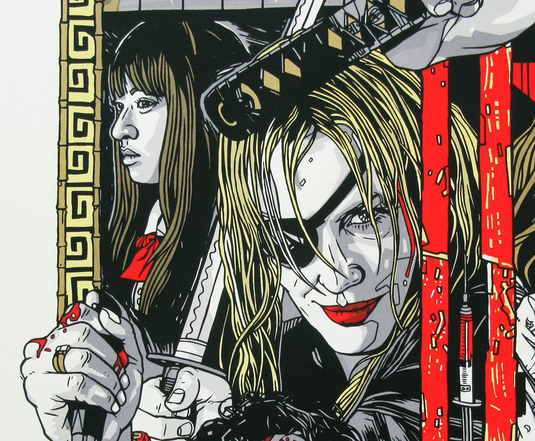
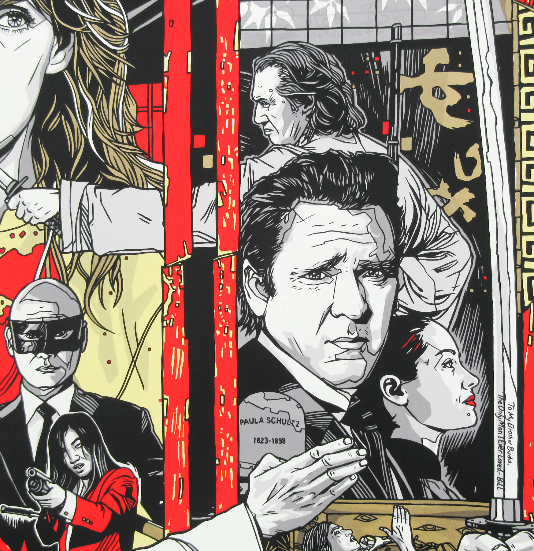
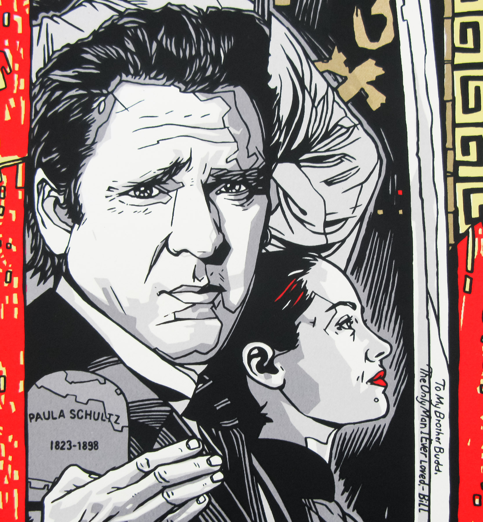
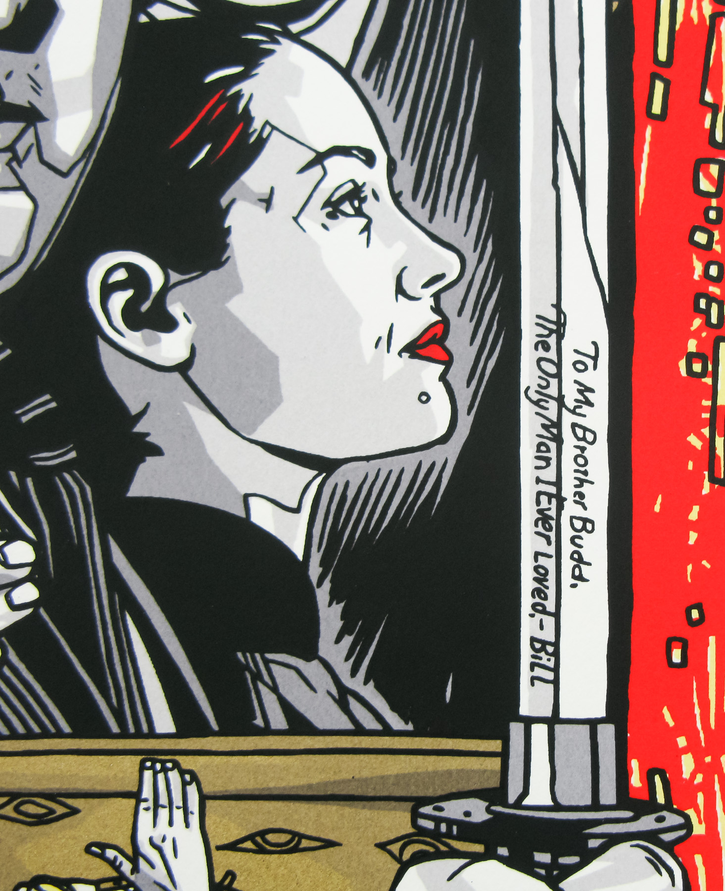
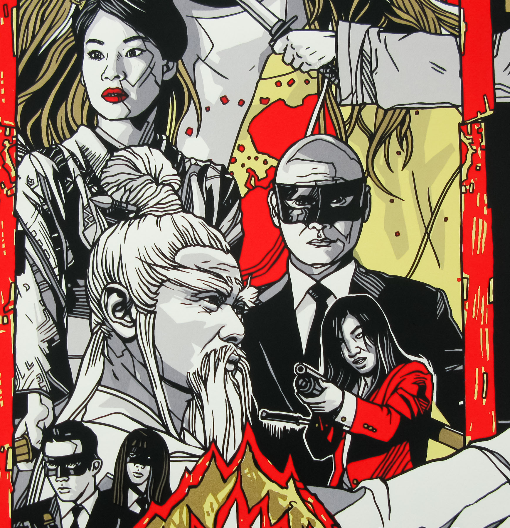
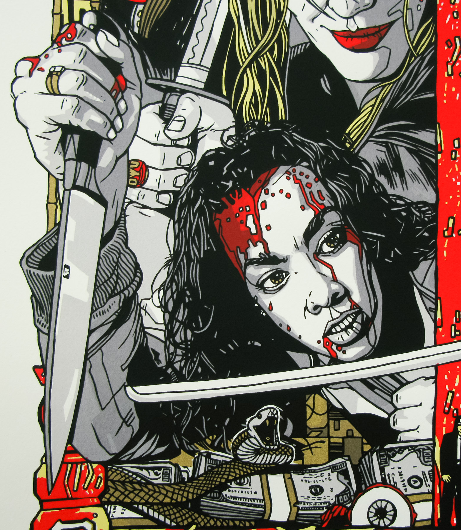
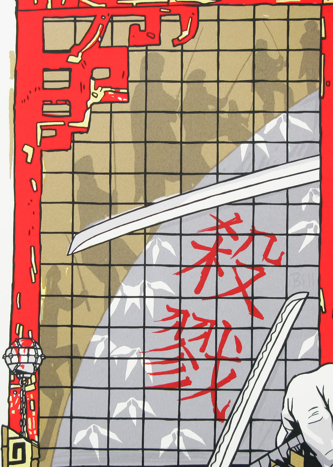
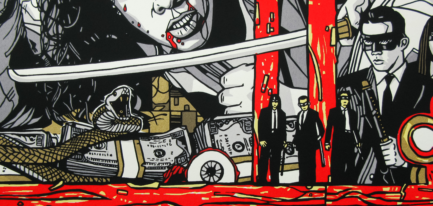
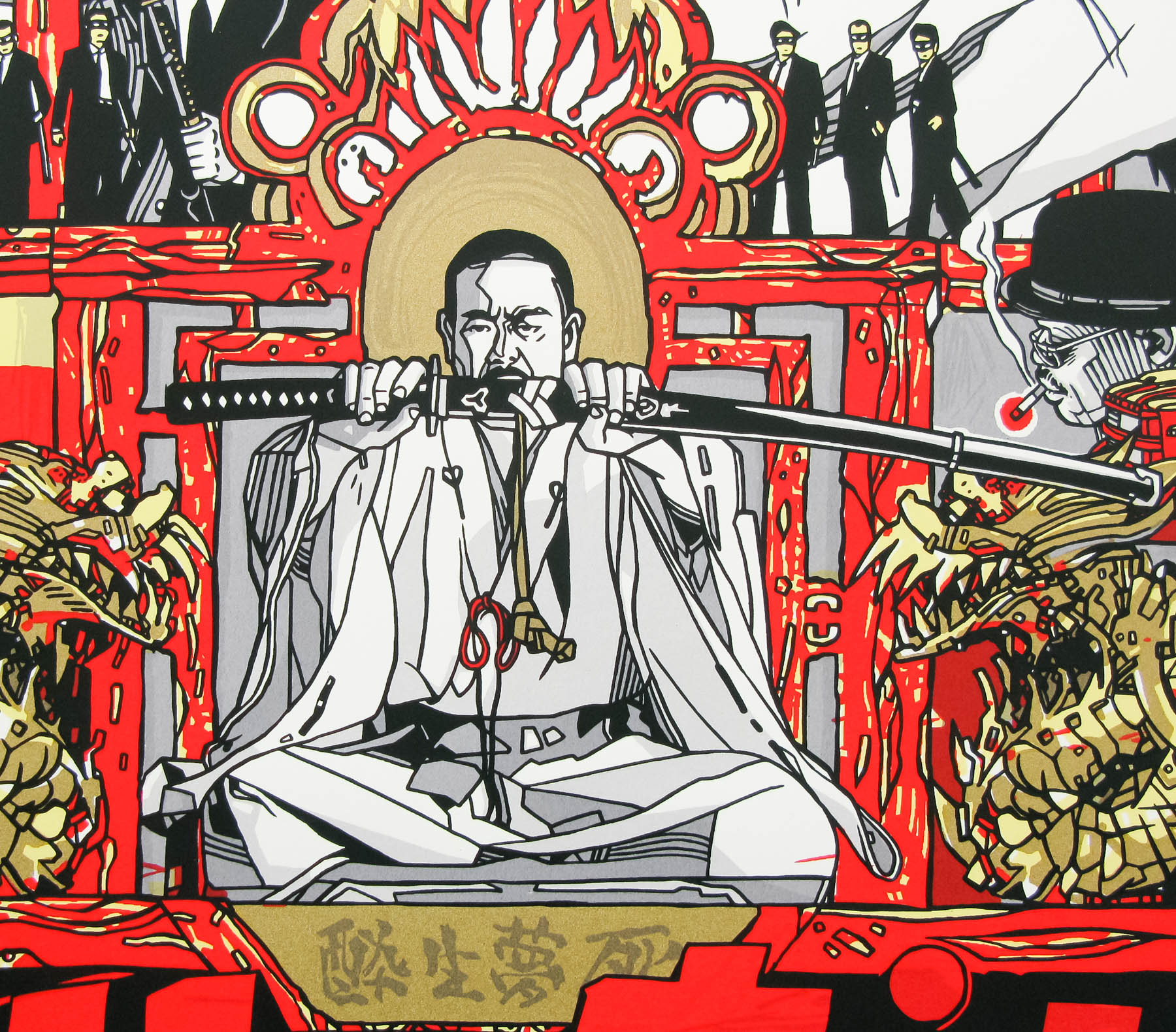
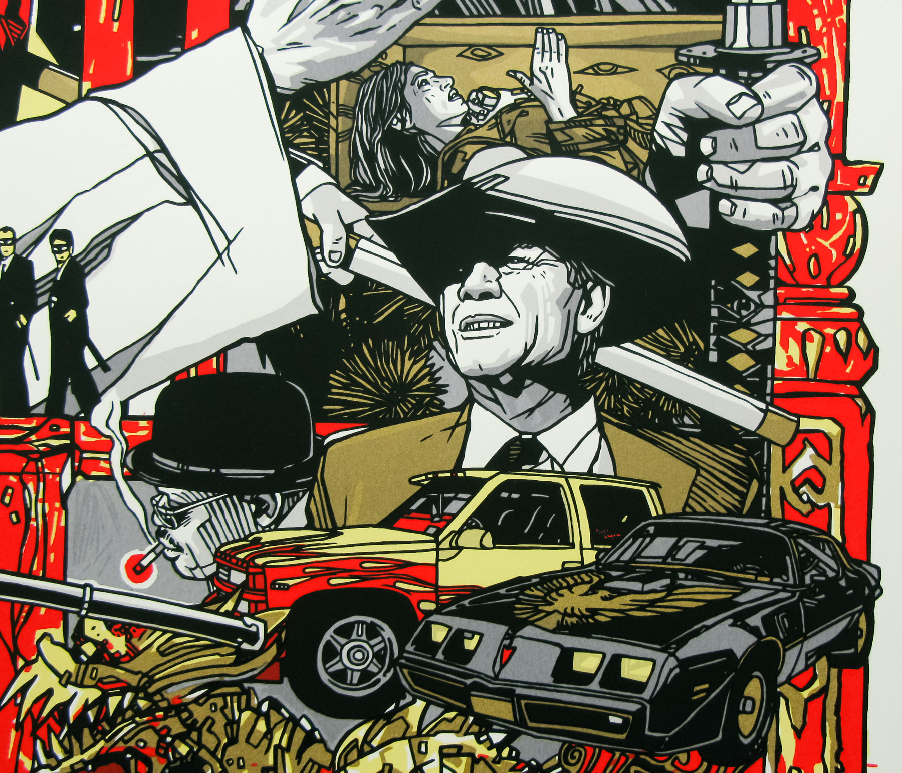
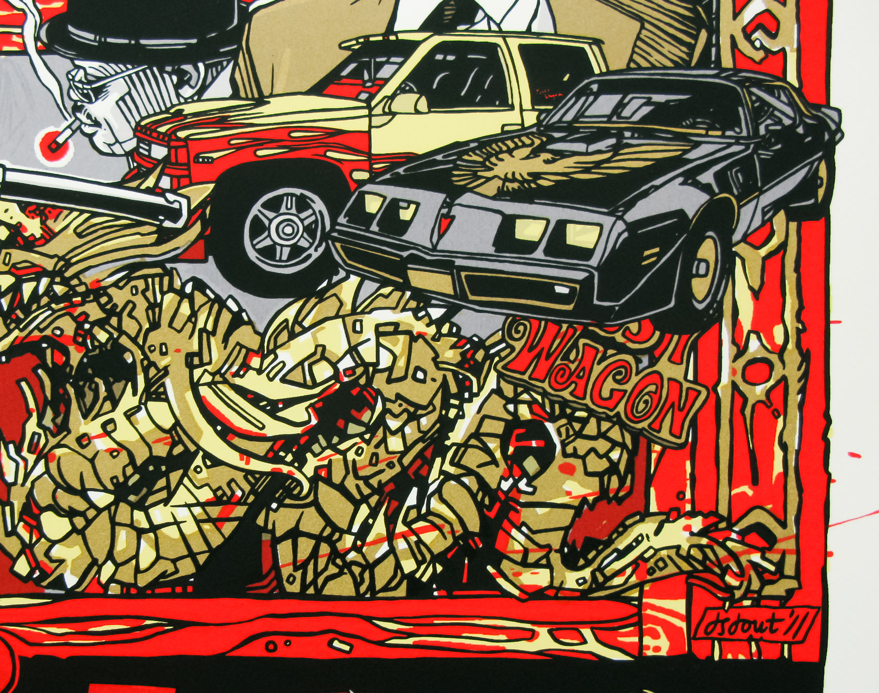
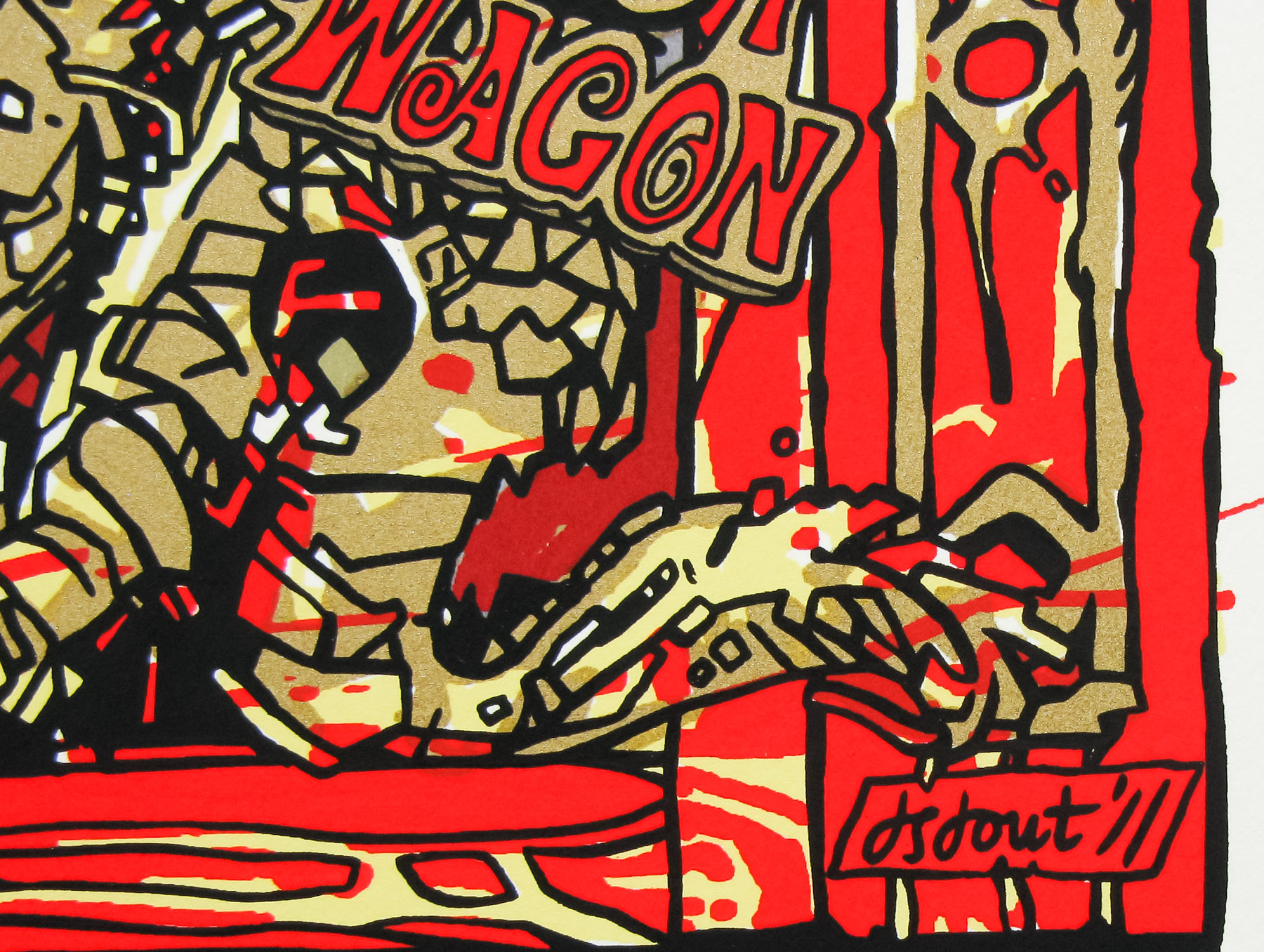
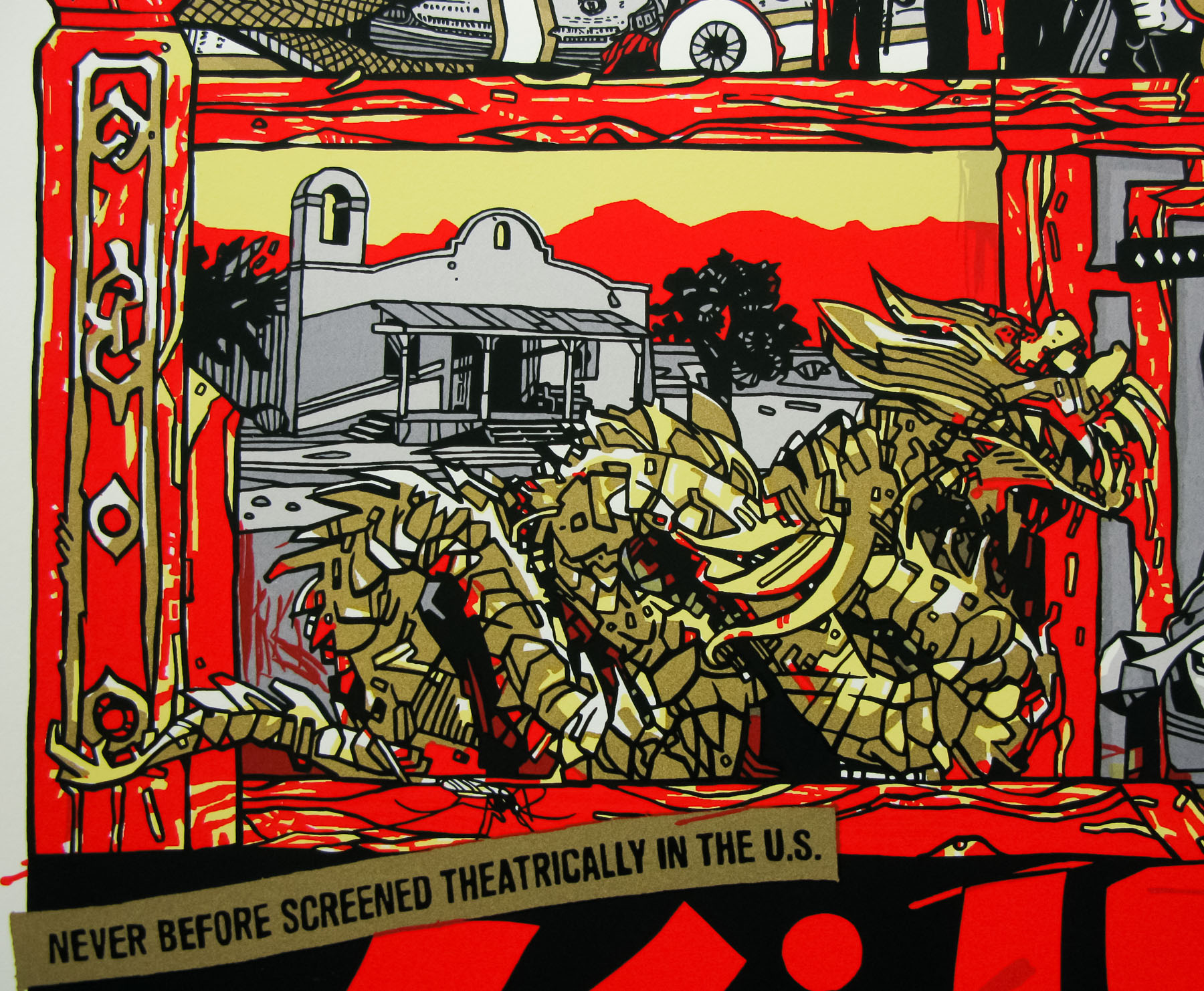
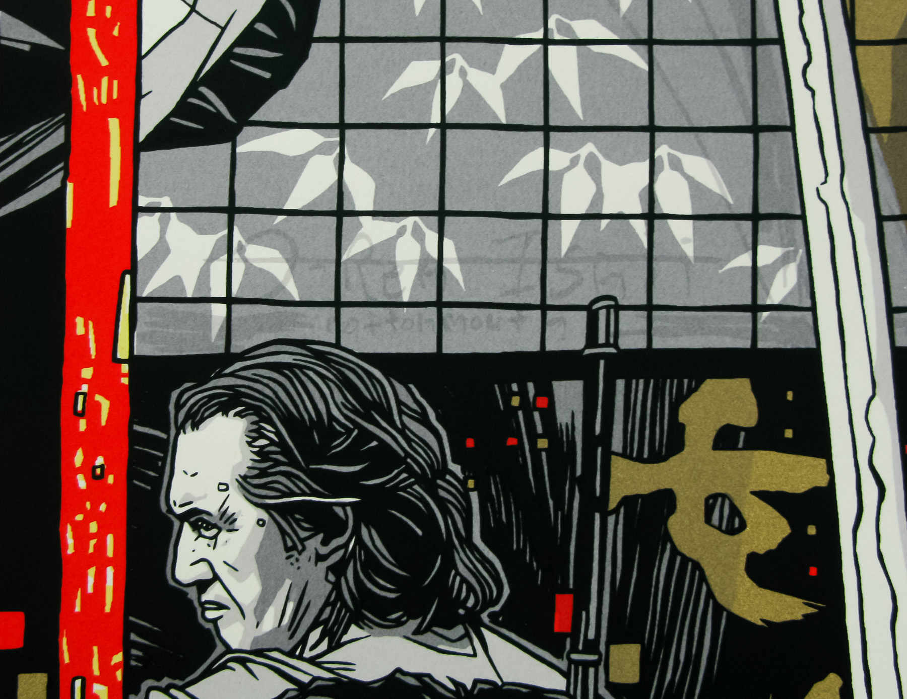
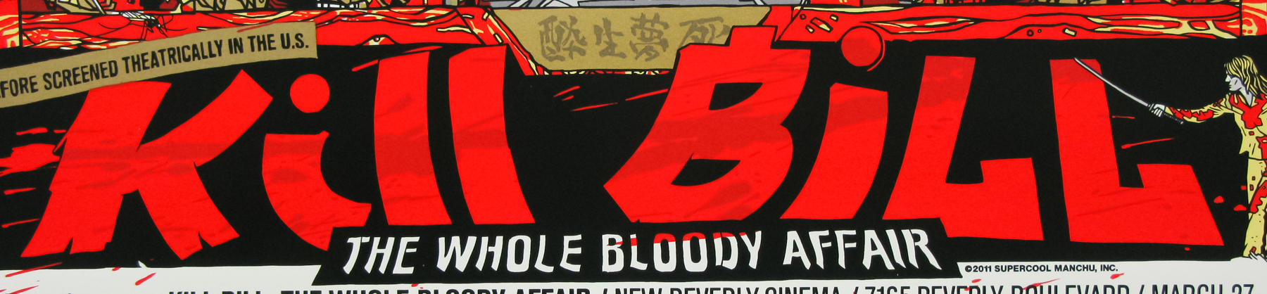
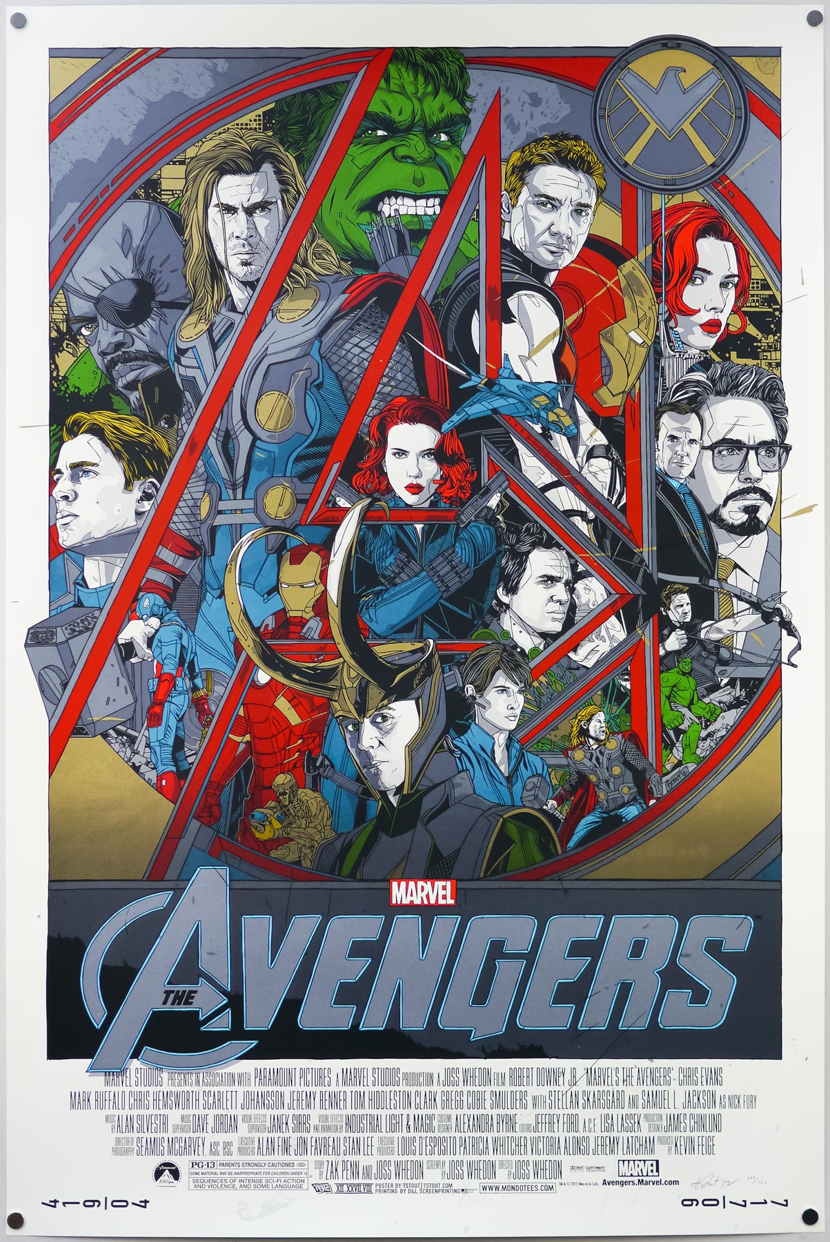
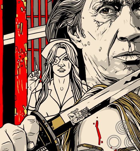
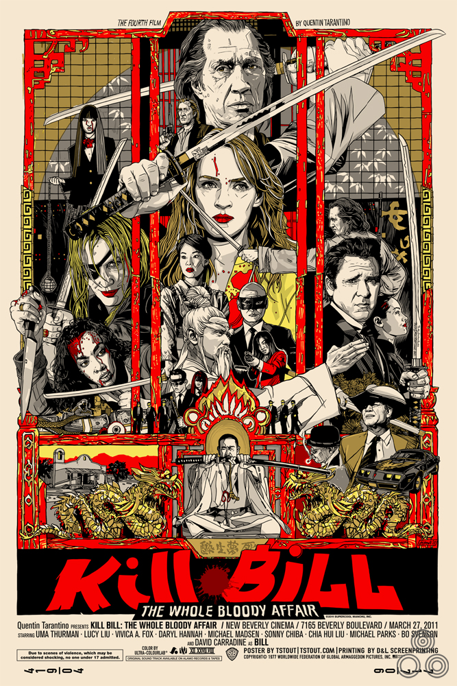
Tyler Stout’s screen print for Kill Bill: TWBA – this is a photograph of the regular version from my collection.
Hi Tyler, thanks for agreeing to talk about the print. Is it right that Mondo were approached by Tarantino’s people to do a poster for the screening of the full cut?
That is correct. His assistant [Julie McLean) asked Mondo if they would help to do a poster to commemorate the event, as well as kind of a birthday present to Quentin.
The screening was a surprise for Tarantino but I’ve heard he’s a huge fan of yours. Were you specifically requested when Mondo were approached?
I know he’s a huge Mondo fan, so I think he would have loved anything they would have done for the event, but mondo approached me about it and it worked out and that was awesome.
Like most folks, I’ve yet to see the two films as one. Were you able to see the new cut before starting work on the print or were you working from viewings of the two separate films?
I haven’t seen The Whole Bloody Affair cut yet, sadly, so I was just going off of what I’d heard etc.
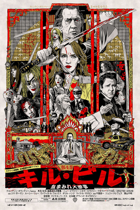
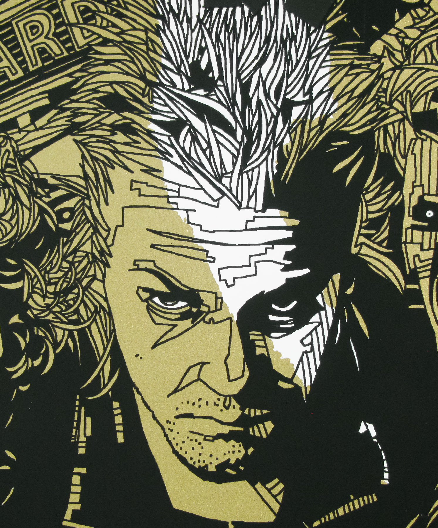
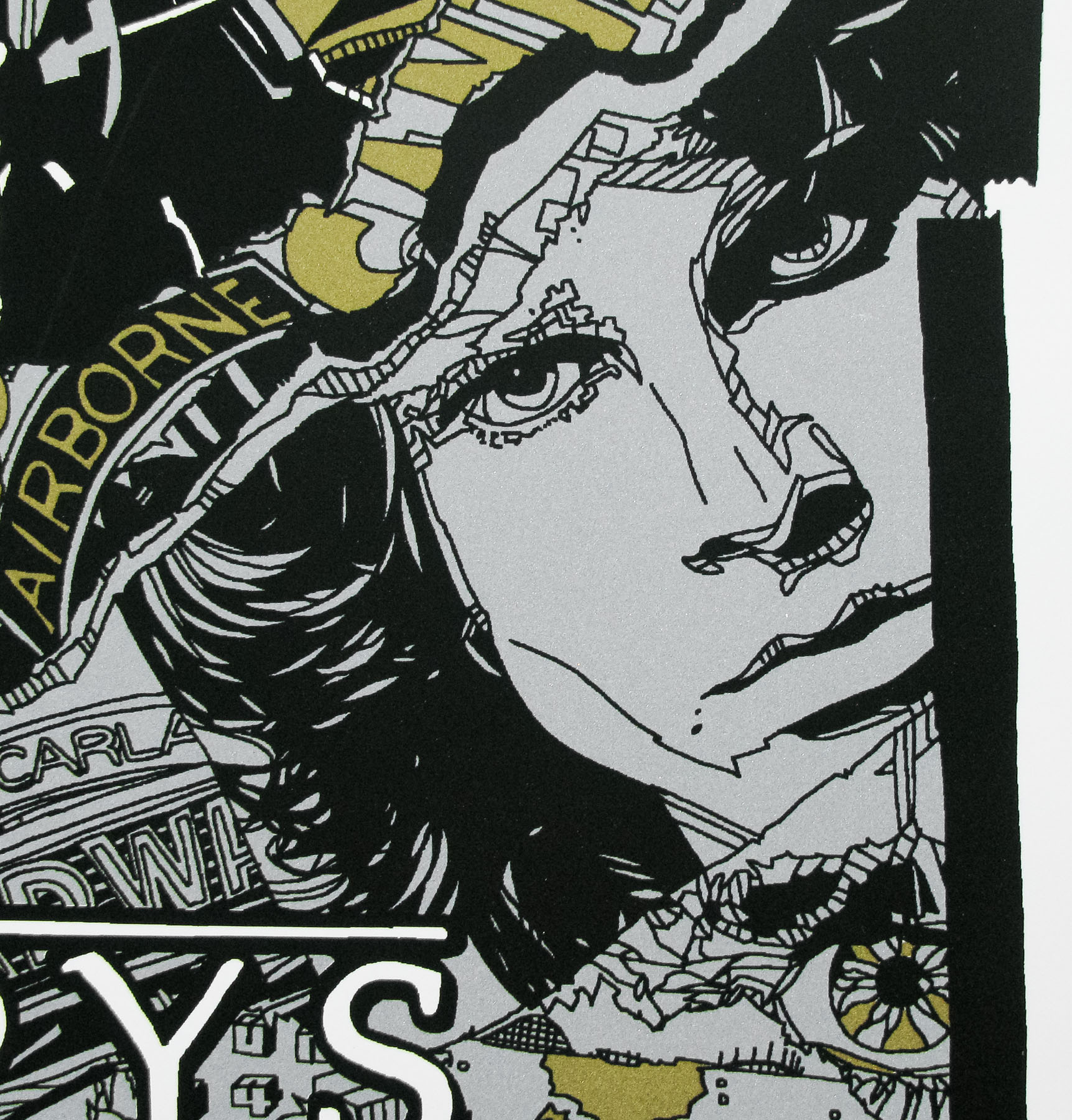
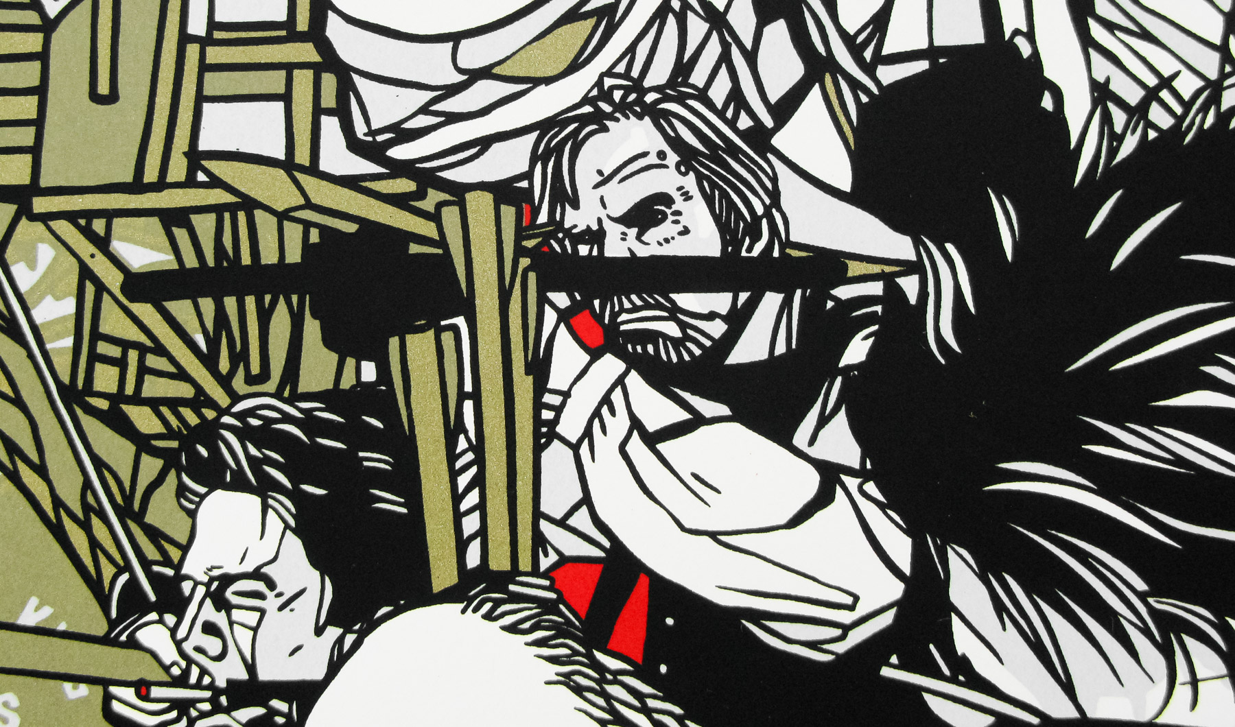
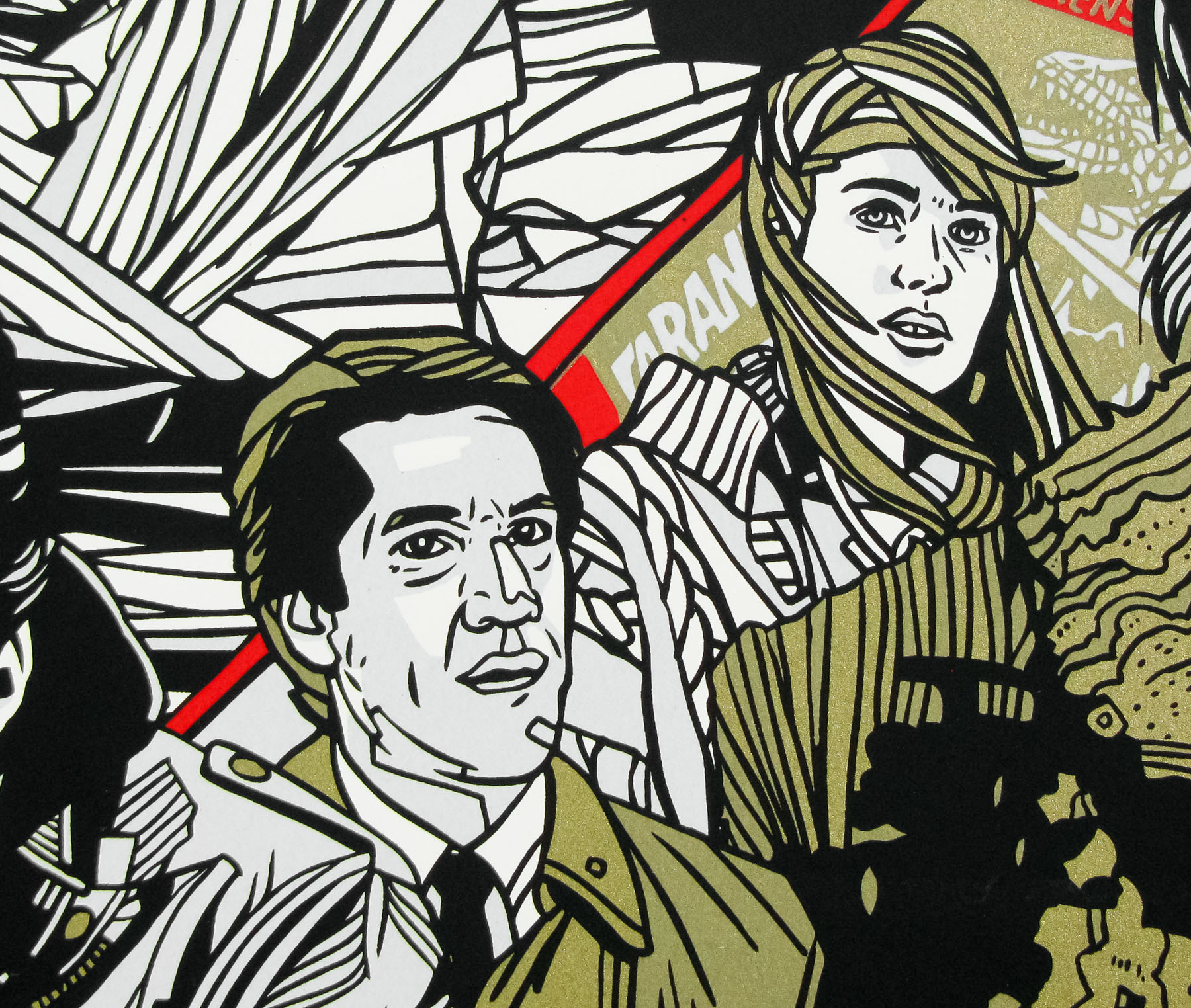
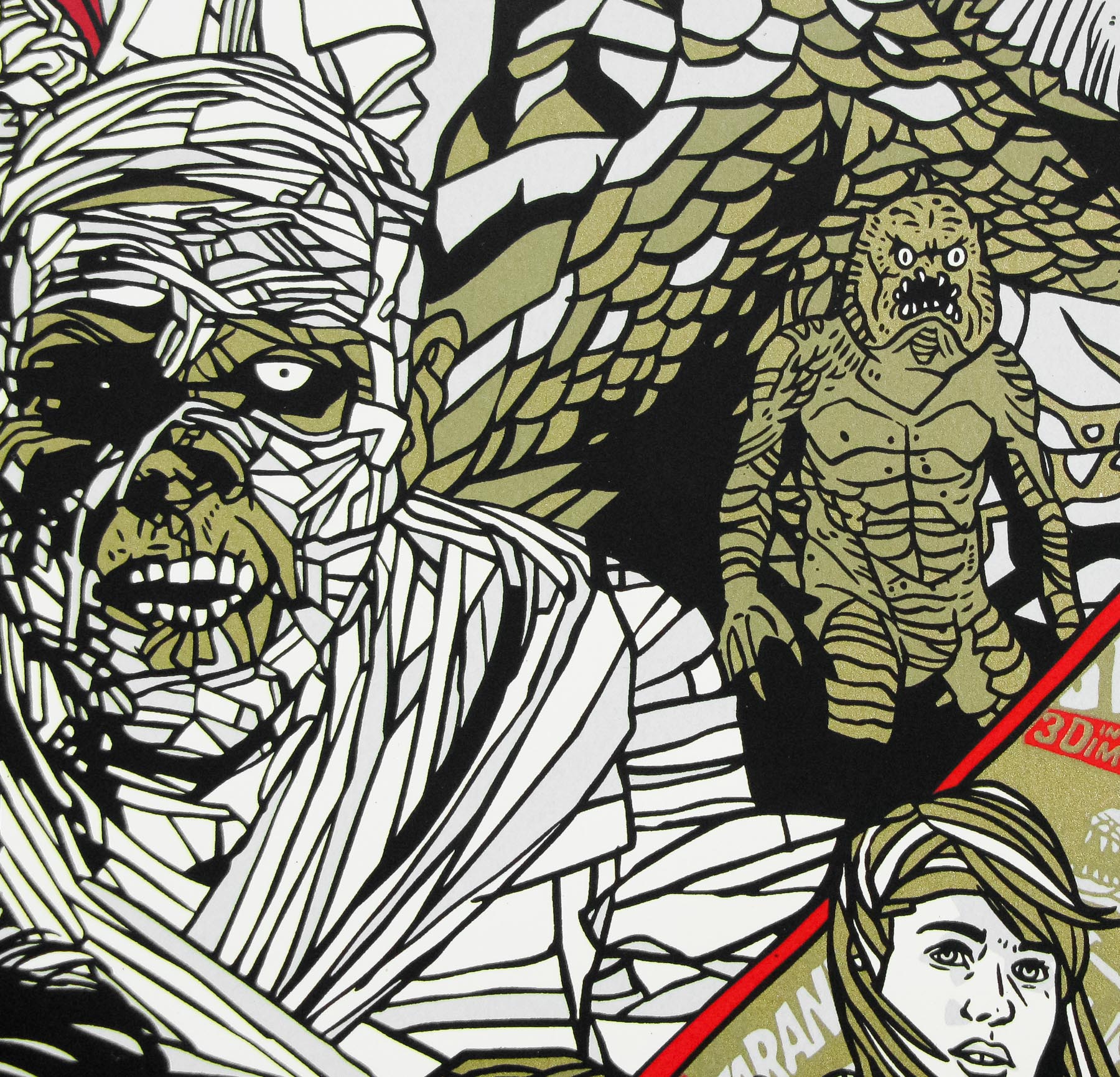
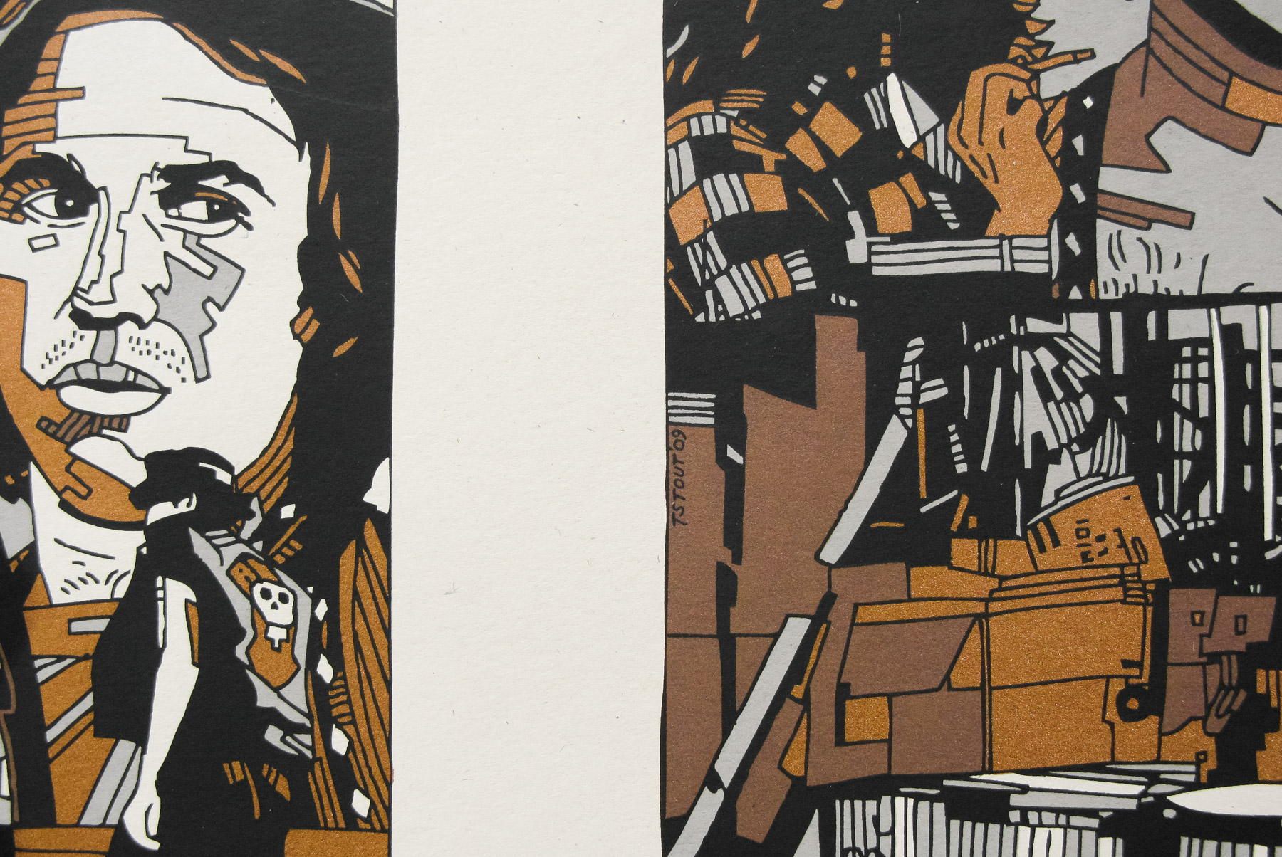
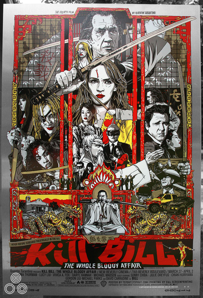
The variant version of the poster – aside from the obvious addition of the Japanese title there are several other differences to be found.
It must have been good knowing you had all the characters to choose from, as opposed to only doing one of the films and being limited in that way?
That was indeed awesome; two great films that feel like one film. It definitely would have been more limiting to just have one to deal with.
Is it true that you only had three weeks to put this poster together? Do you enjoy working under that kind of time pressure?
I wish we’d had three weeks to put this together! It was a bit shorter than that, but I do like working with time constraints and I seem to work best under them actually. Otherwise I’ll just keep revising and revising the poster.
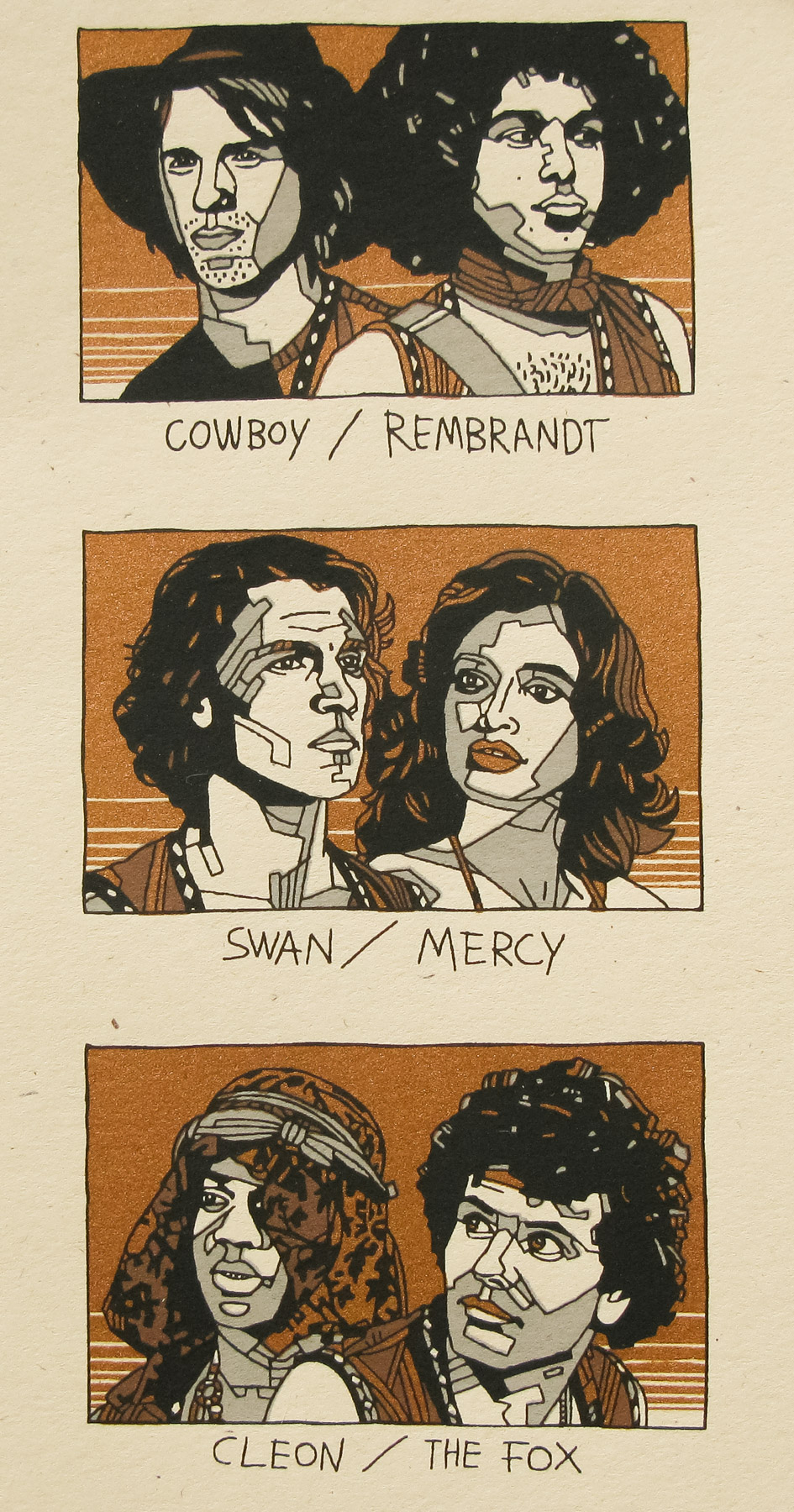
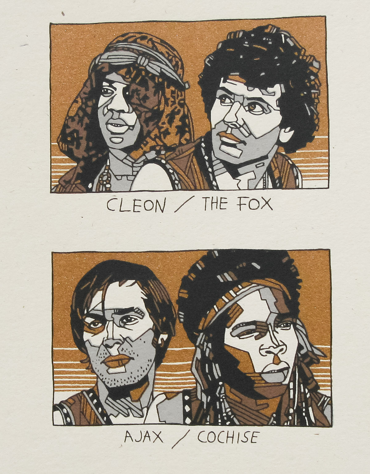
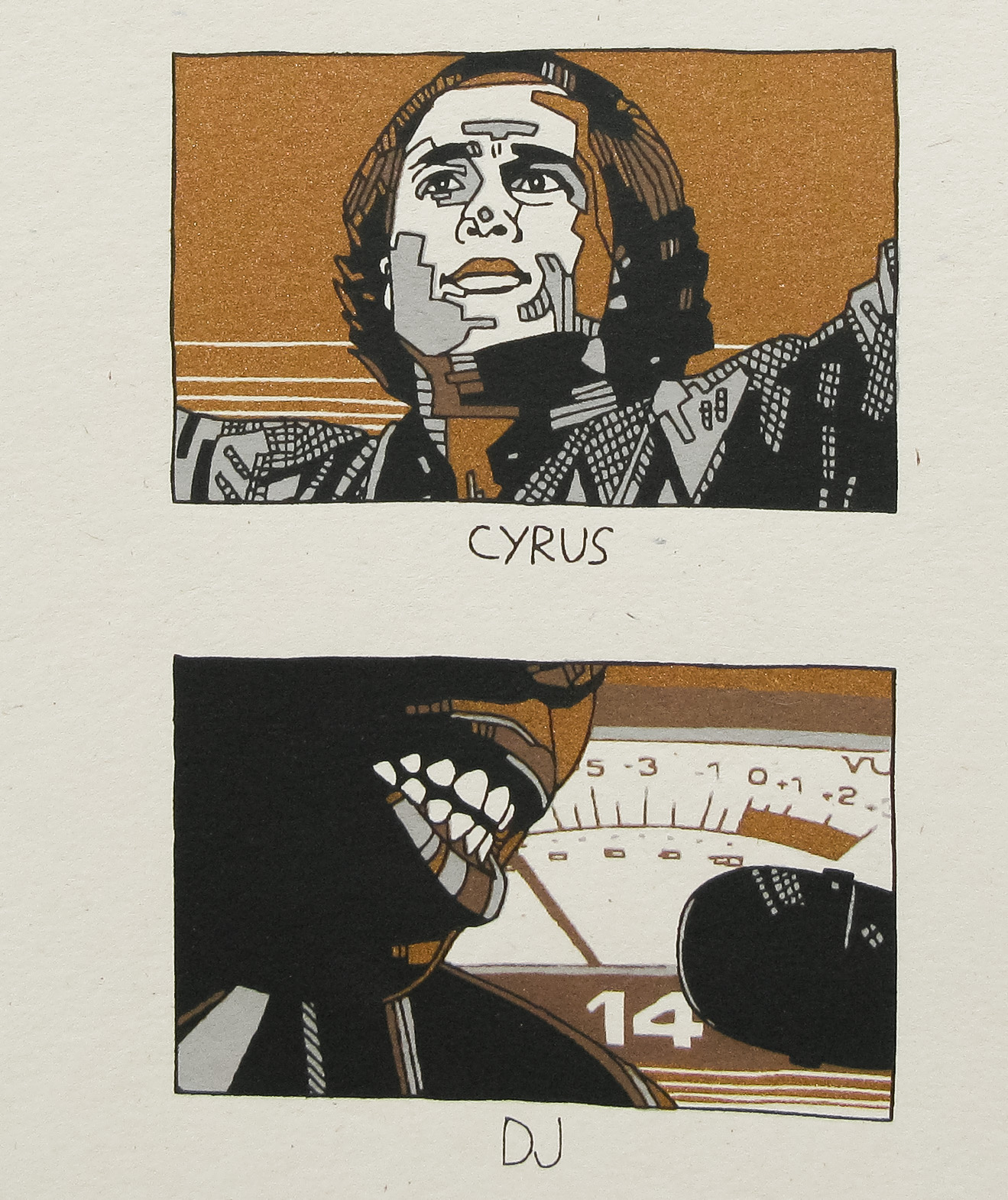
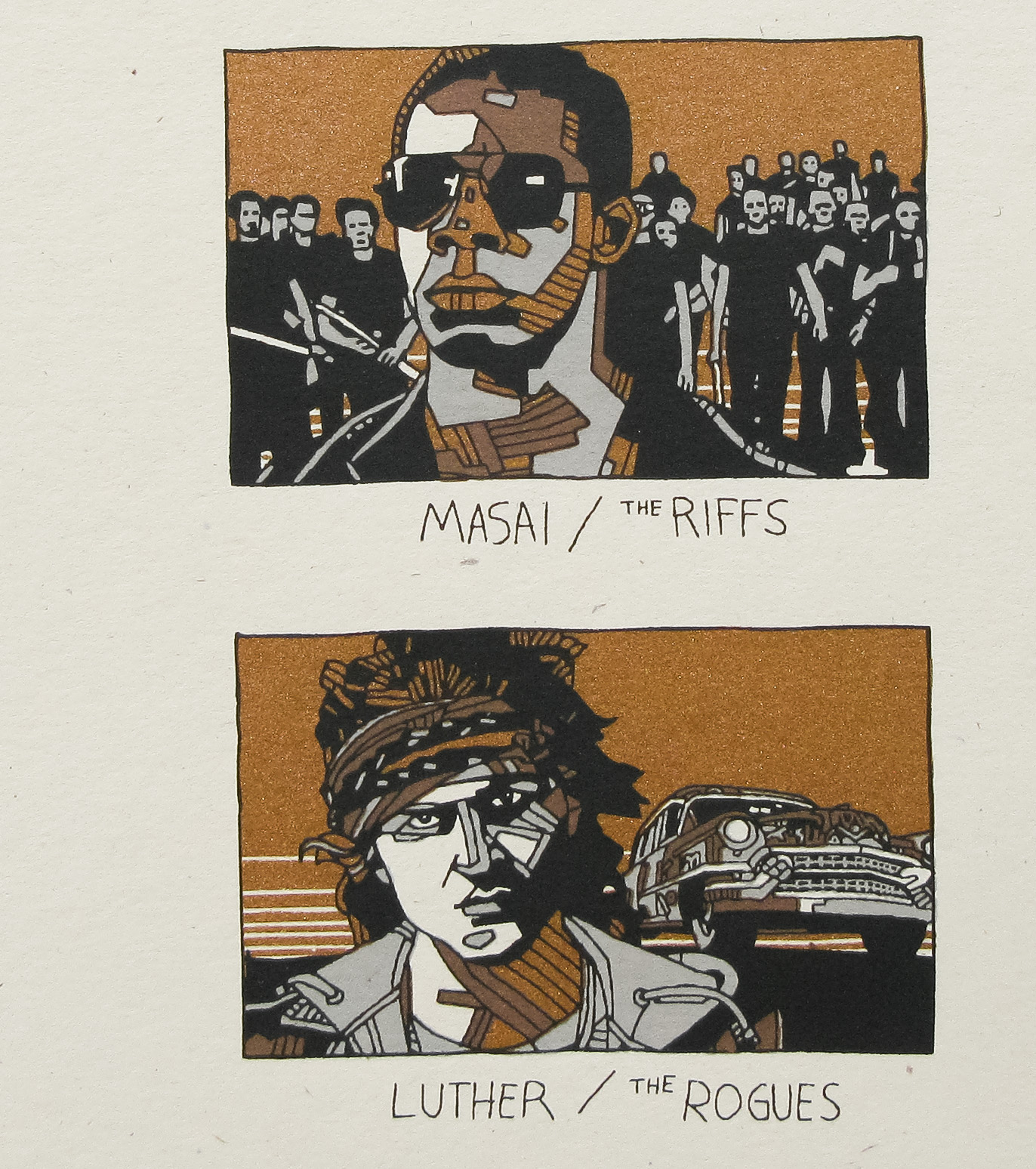
Can you talk about your initial design ideas for the poster? Were there certain characters that you knew had to be given more prominence than others?
It was pretty organic, the way it kinda came together. I just gave prominence to the characters I felt strongest about and kinda went from there.
Was the composition something you arrived at quickly? Were there certain elements you knew had to sit next to each other?
The initial idea for the poster came pretty quickly after being asked to do it. Like anything, you start thinking about it and then come up with an idea and go from there, but as for certain elements….not really.
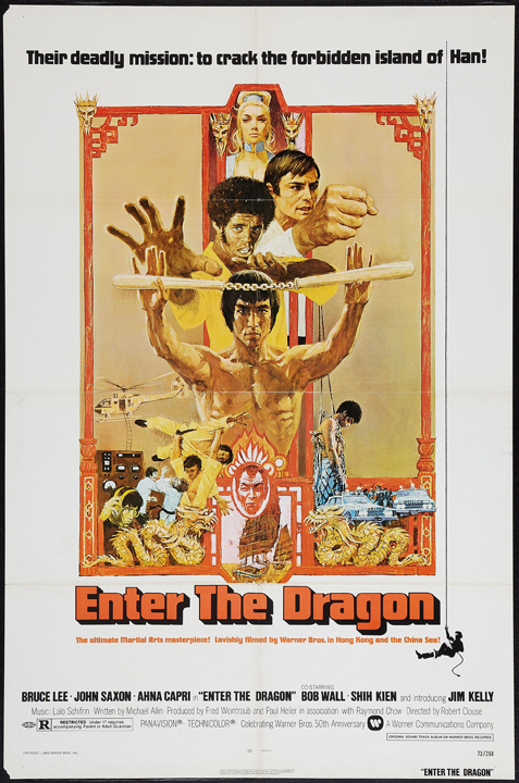
The US one sheet for Bruce Lee’s Enter the Dragon
Am I correct in thinking that you’re slightly homaging the original Enter the Dragon one sheet with the layout?
Ha! I wouldn’t say slightly, I’d say wholesale lift! It was definitely the starting and ending point of my original idea, which was referencing one of my favourite martial arts movie posters of all time. I tried to do it in an obvious way to avoid any confusion.
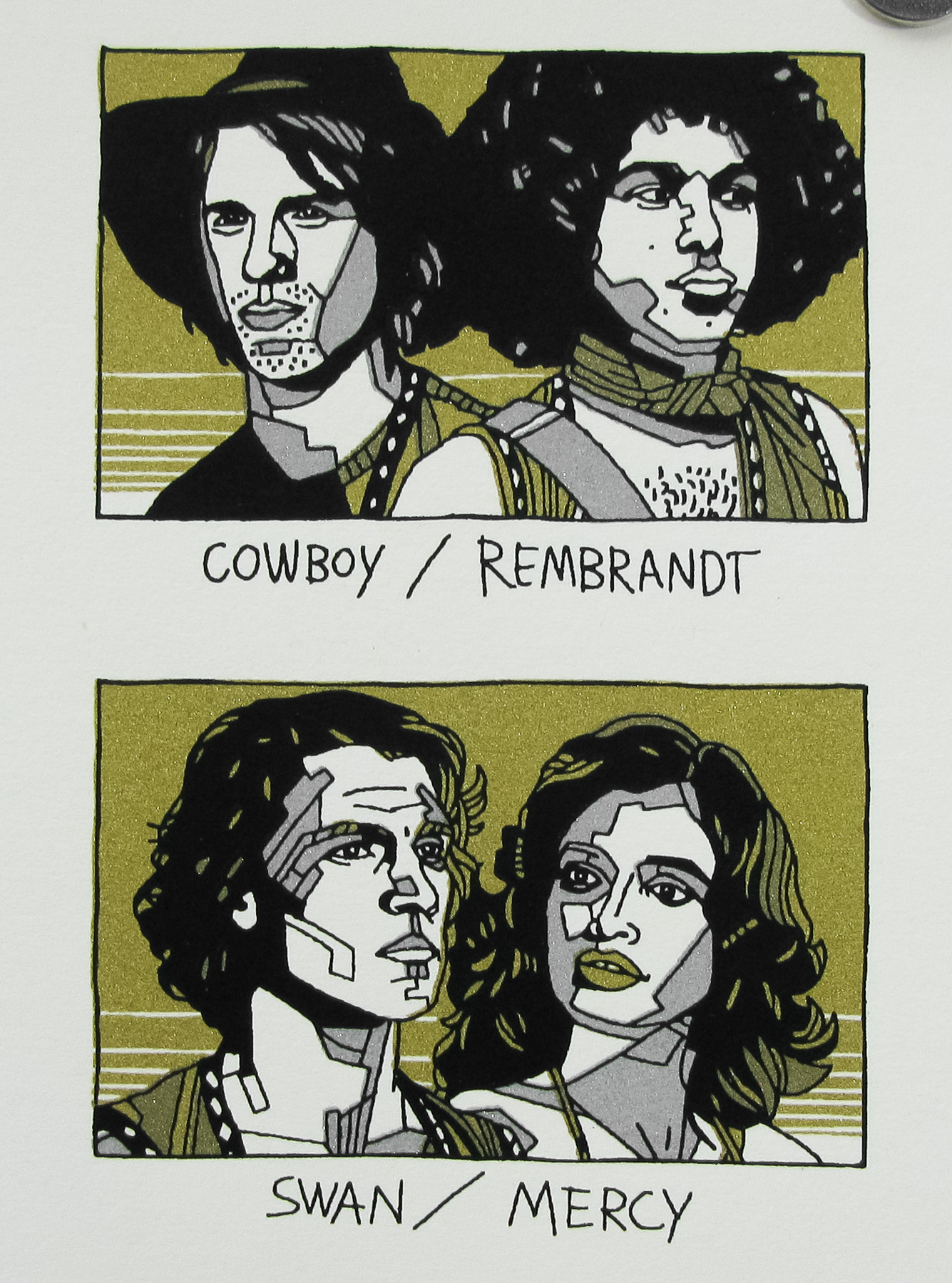
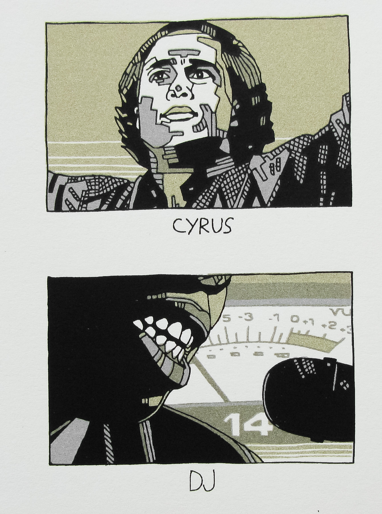
Are there any elements you illustrated but that didn’t make it into the final version?
There were actually quite a few things that didn’t make it. I’d drawn a bunch of Bucks but I just couldn’t find a way to make it work. We all made the call to drop him. I don’t think I had included him originally so the pieces I drew with him were all after the fact, and it can be hard to add stuff and make it look natural after the poster is more or less done.
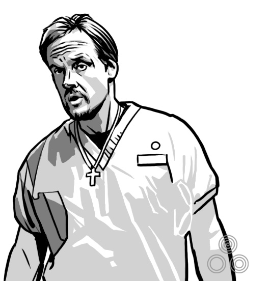
An illustration of the character Buck (Michael Bowen) that was dropped from the final poster
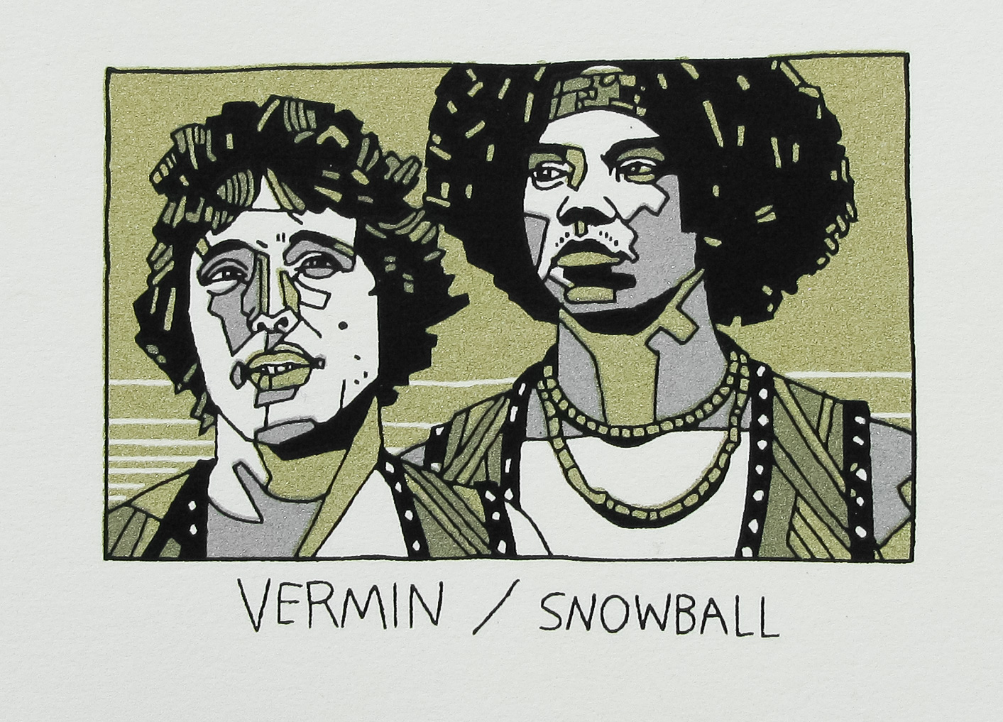
I’d also drawn a different pose for Gogo Yubari, but in the end I felt it worked better as you see it in the final version. A lot of the changes were me not feeling someting and trying to improve it.
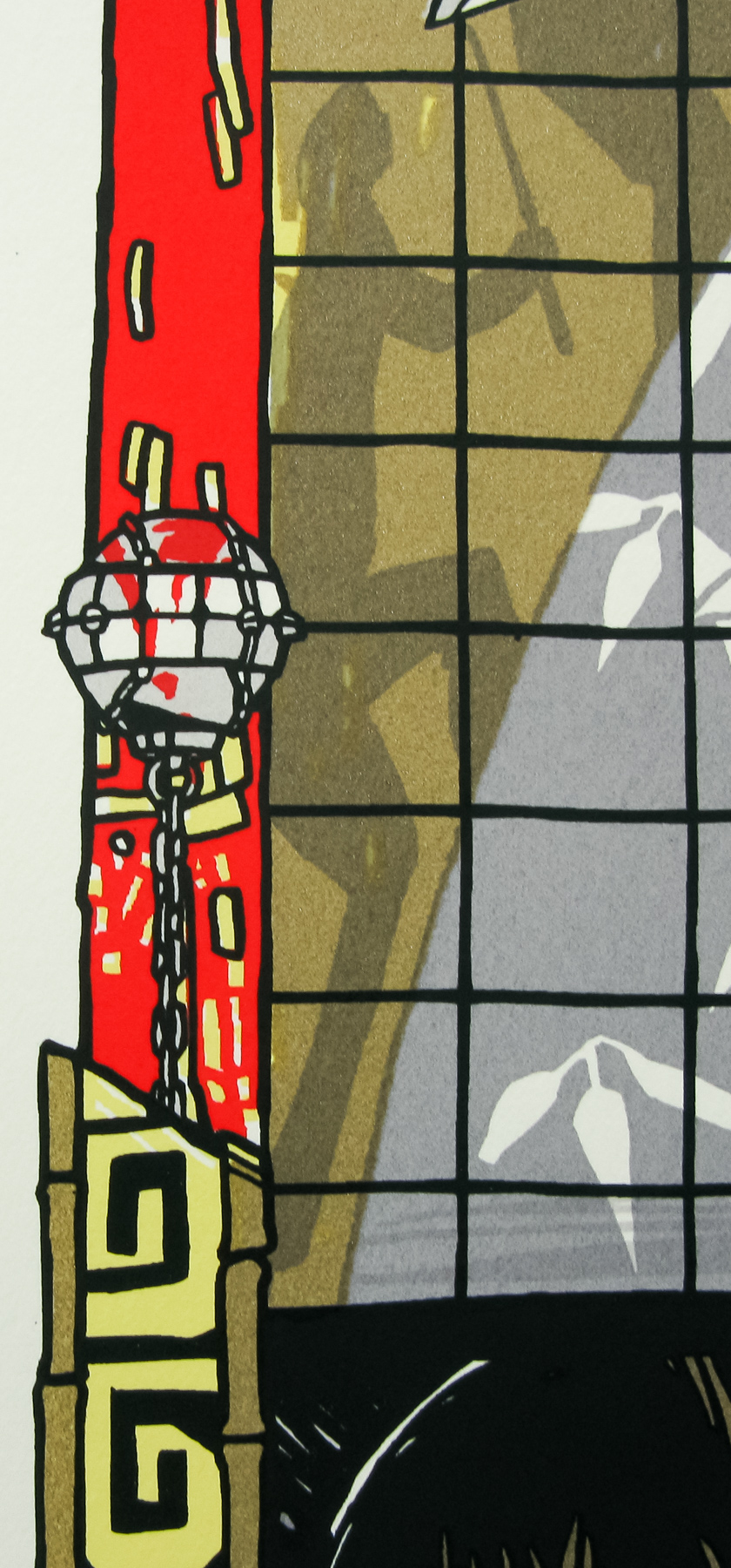
An alternative version of Gogo Yubari (Chiaki Kuriyama) that was dropped in favour of the portrait version seen on the final printing. Note the chain-ball weapon’s placement versus the printed version.
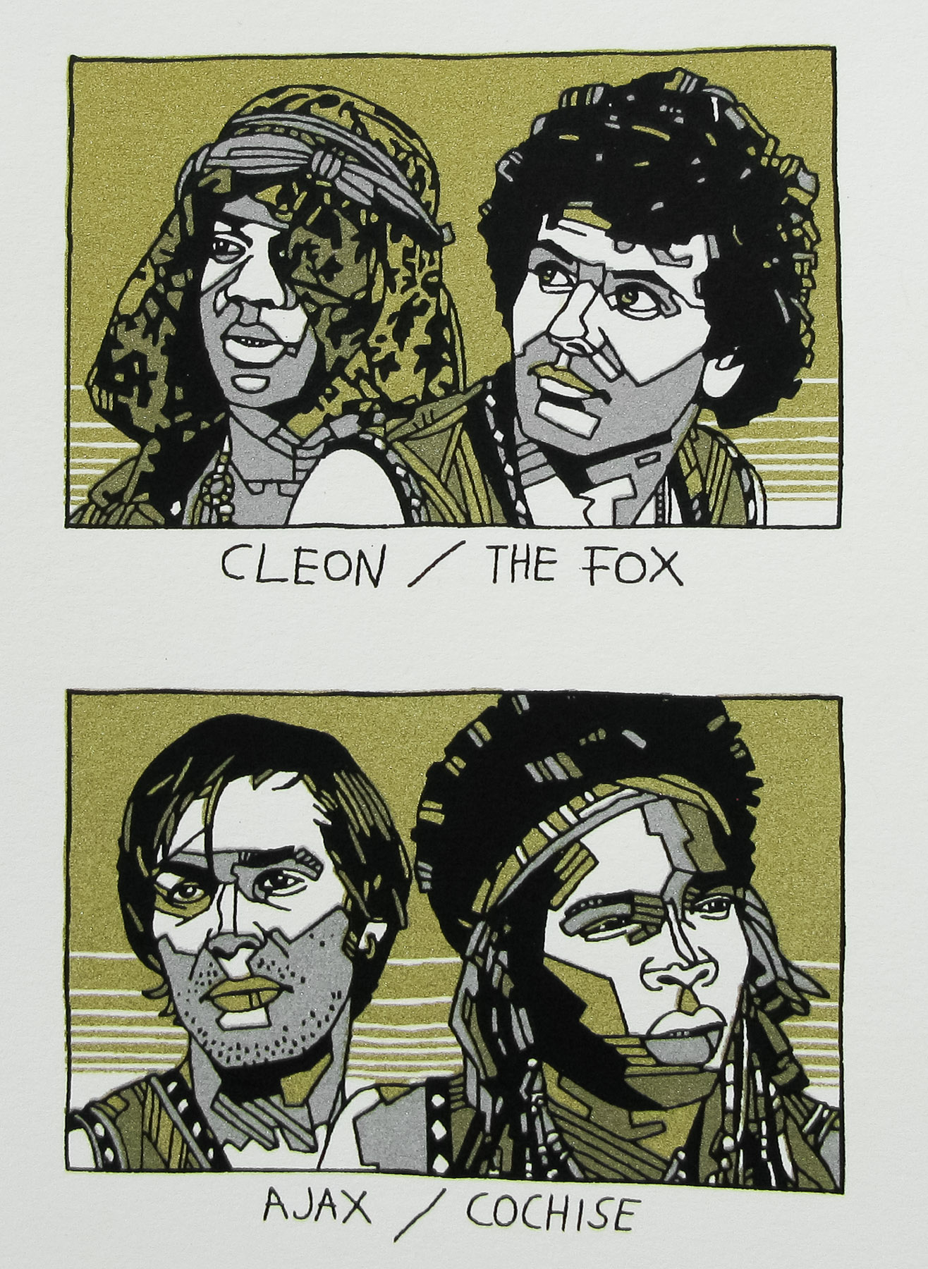
There were drawings of Larry Bishop and Sid Haig that didn’t make the final cut and they were kind of corner portraits that you’d sometimes see in posters with ornate borders. They didn’t get much beyond the concept stage before they were nixed.
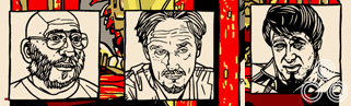
Small character portraits that were dropped from the poster, including Jay (Sid Haig) and Larry Gomez (Larry Bishop)
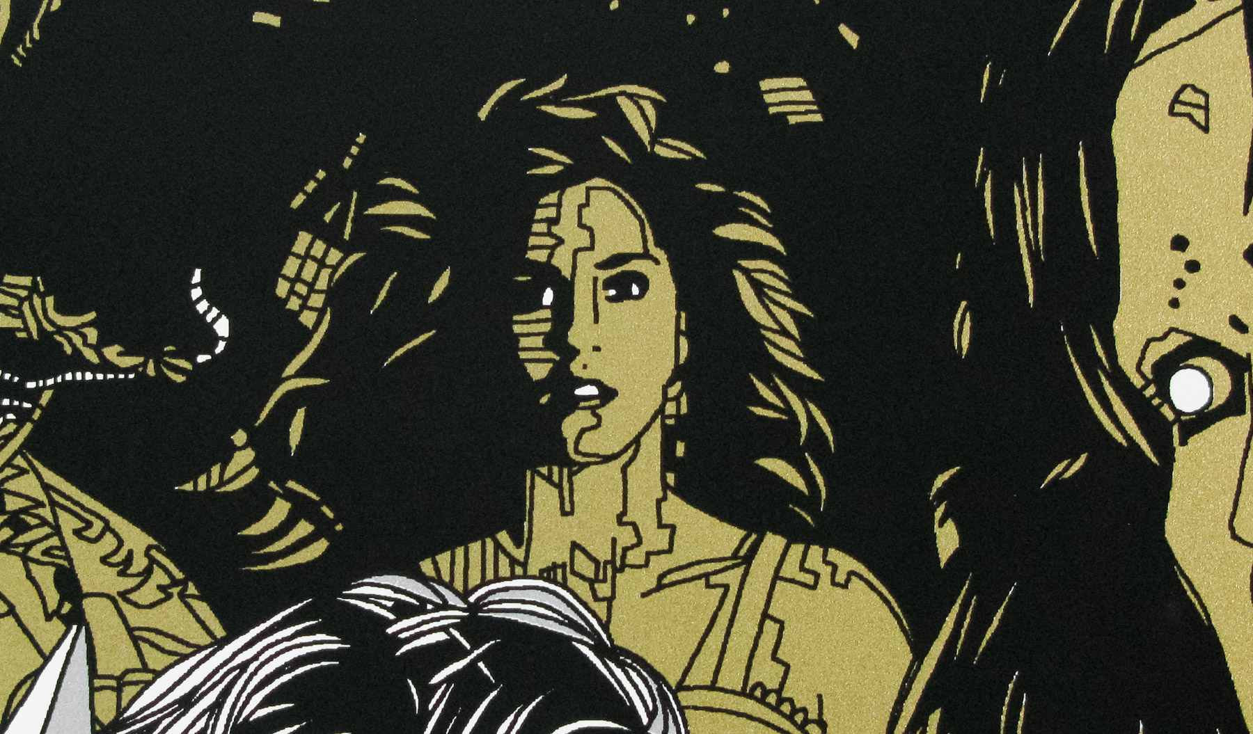
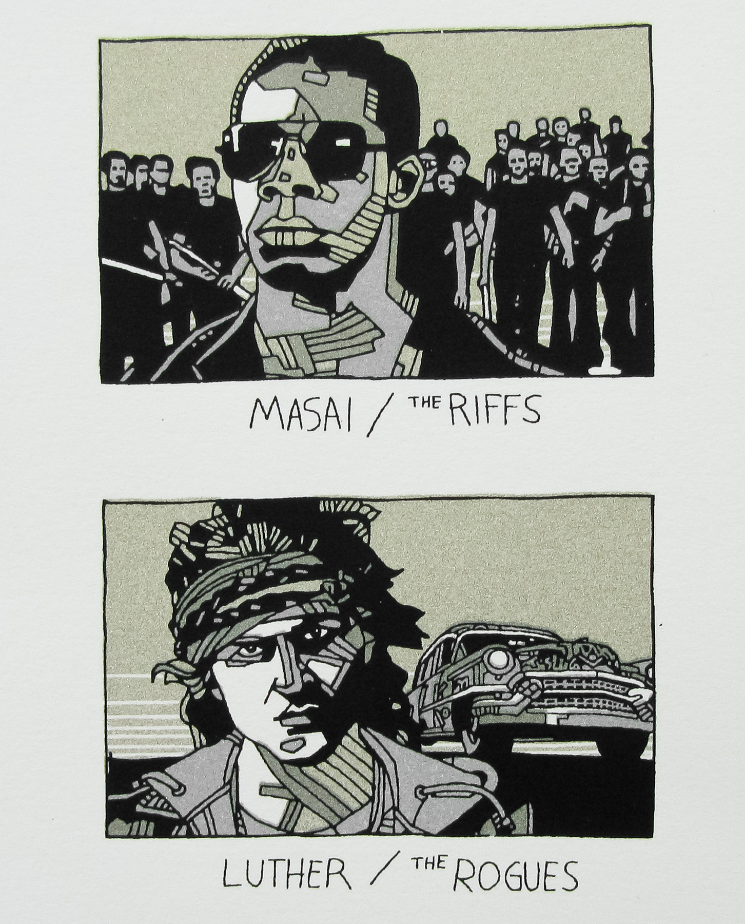
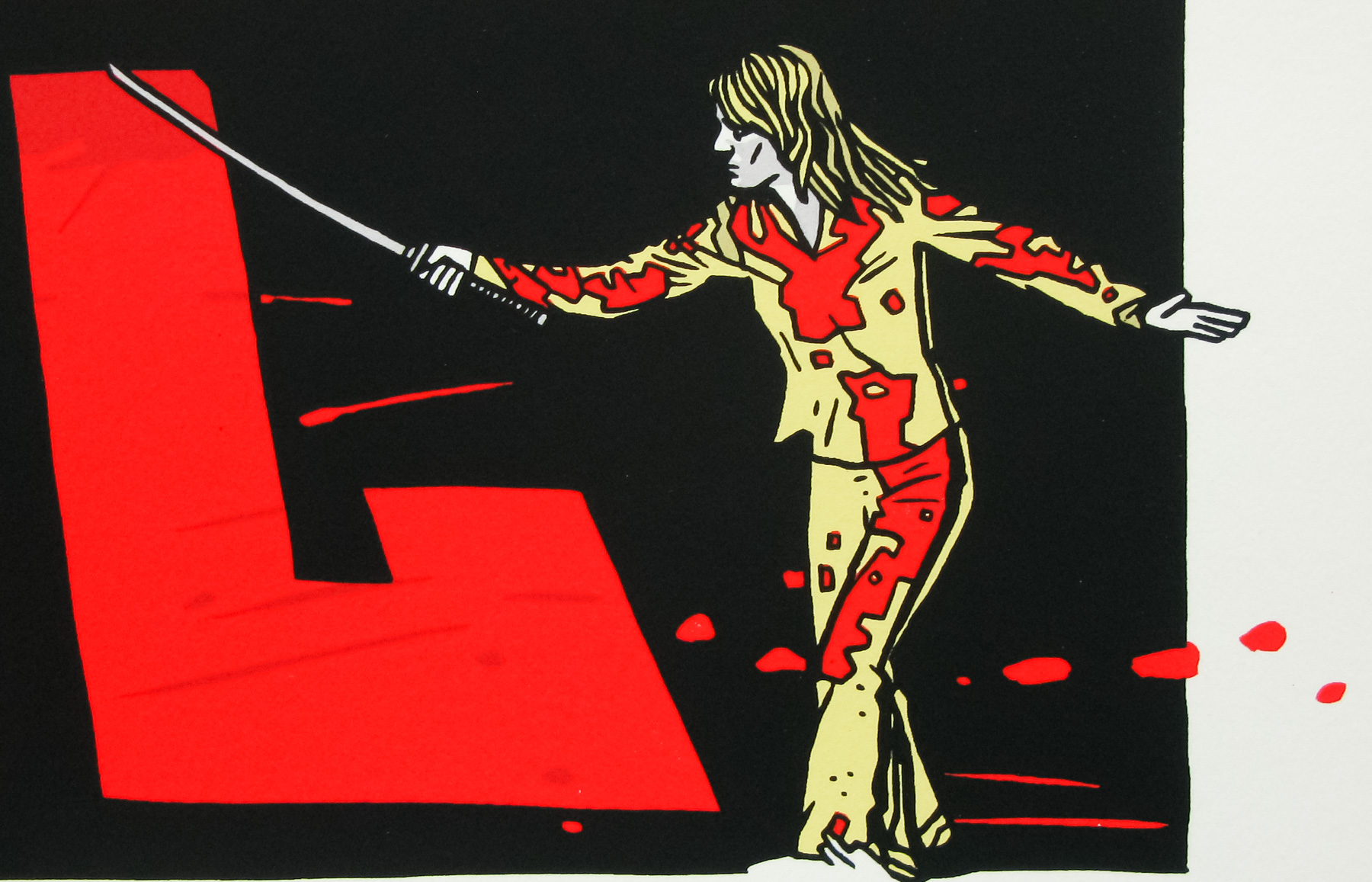
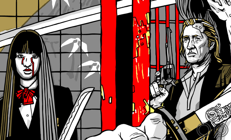
Finally, I had a couple different versions of Elle Driver but I much preferred the version we went with.
An alternative version of Elle Driver (Daryl Hannah) that was replaced with a different pose in the final version
The variant has a few alterations beyond the colour palette swap, can you talk about the changes you made and why?
We presented the original version and Quentin’s assistant had some ideas to make it better, so we did those, and in the end we kinda had two different posters with unique elements. We liked both and we hated to lose some of the pieces that were changed from the original design, so we included those on the variants, which made everybody happy.
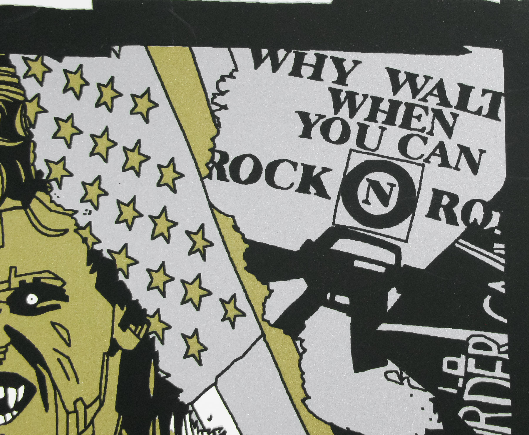
The addition of the coffin scene is probably the most significant one, aside from the Japanese text. What made you add that image to the variant?
That was a suggestion of Quentin’s assistant. She really liked that scene and wanted to add it, so we did. As I say, we also liked it without so left it off the variant. I like it both ways, but it certainly tells a bit more of the story.
Were there any challenges with designing the variant to be printed on rice paper in terms of colours etc?
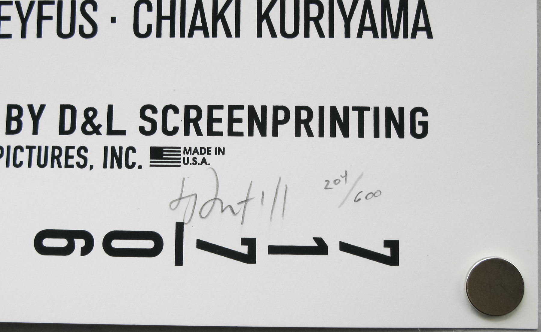
The challenges were certainly faced by my printer, but not directly by me. Rice paper is more waxy so they have to make sure the ink doesn’t rub off. I actually had a stamp made for the back of all my copies, but I could only stamp the backs of the regulars since on the variants it would just smear all over the place, never quite drying. I lost a few variants before I figured that out!
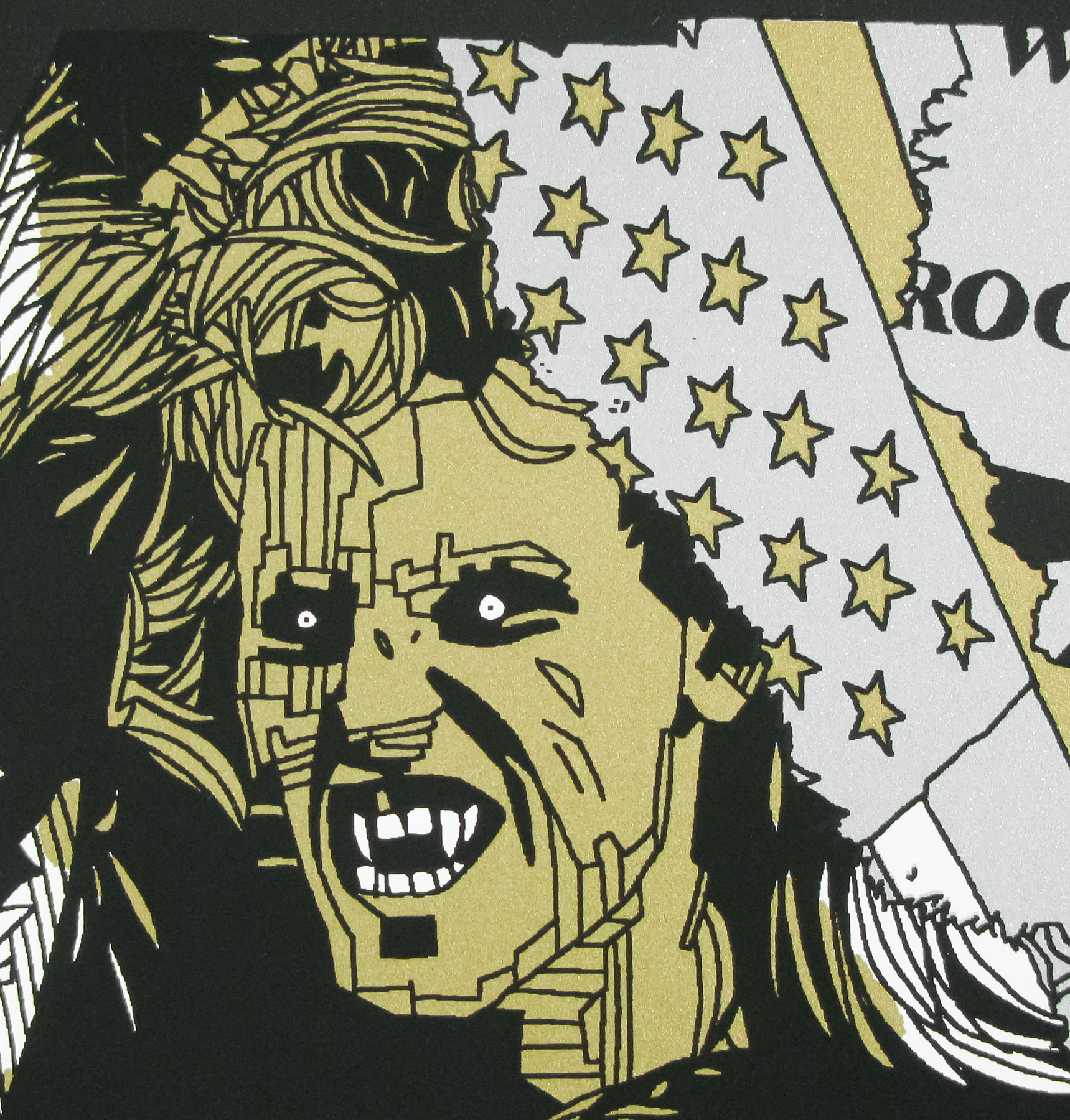
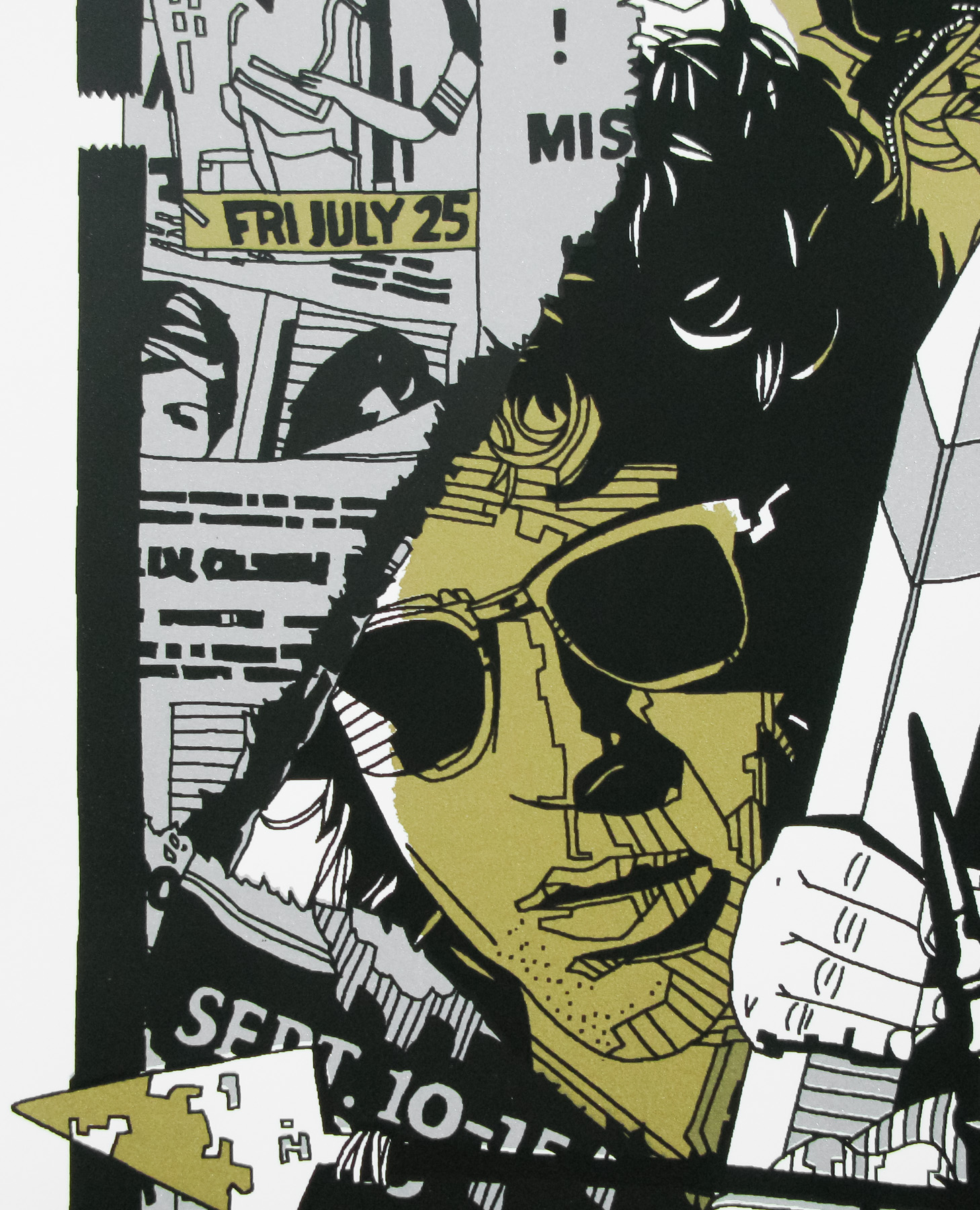
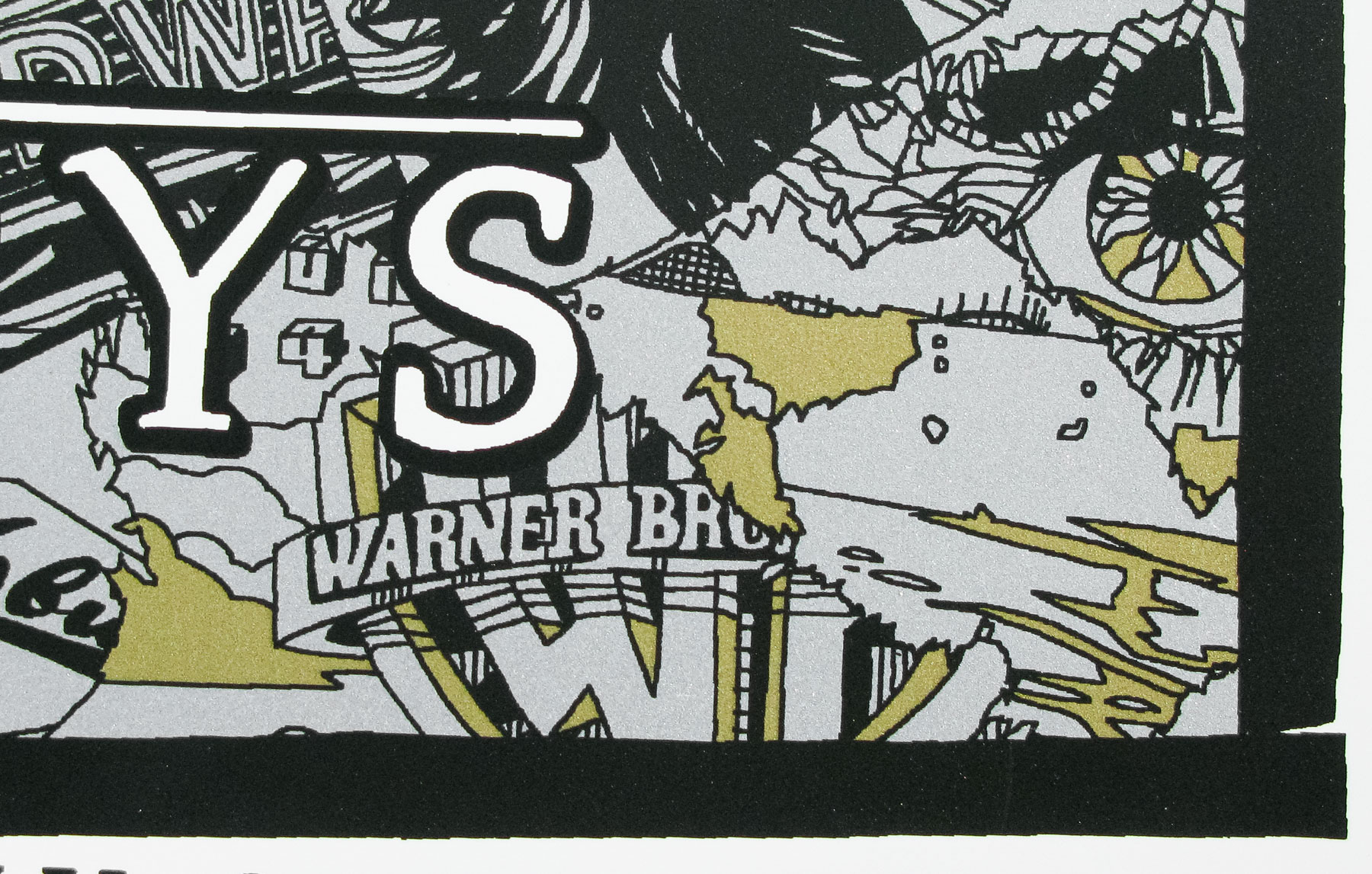
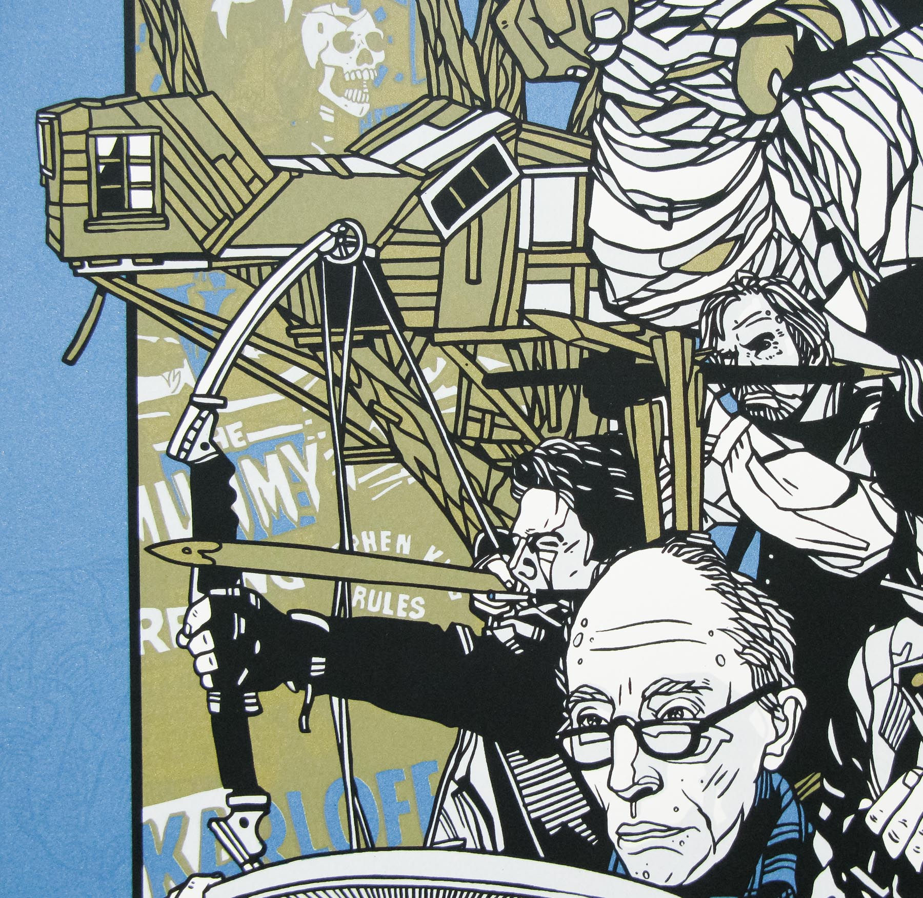
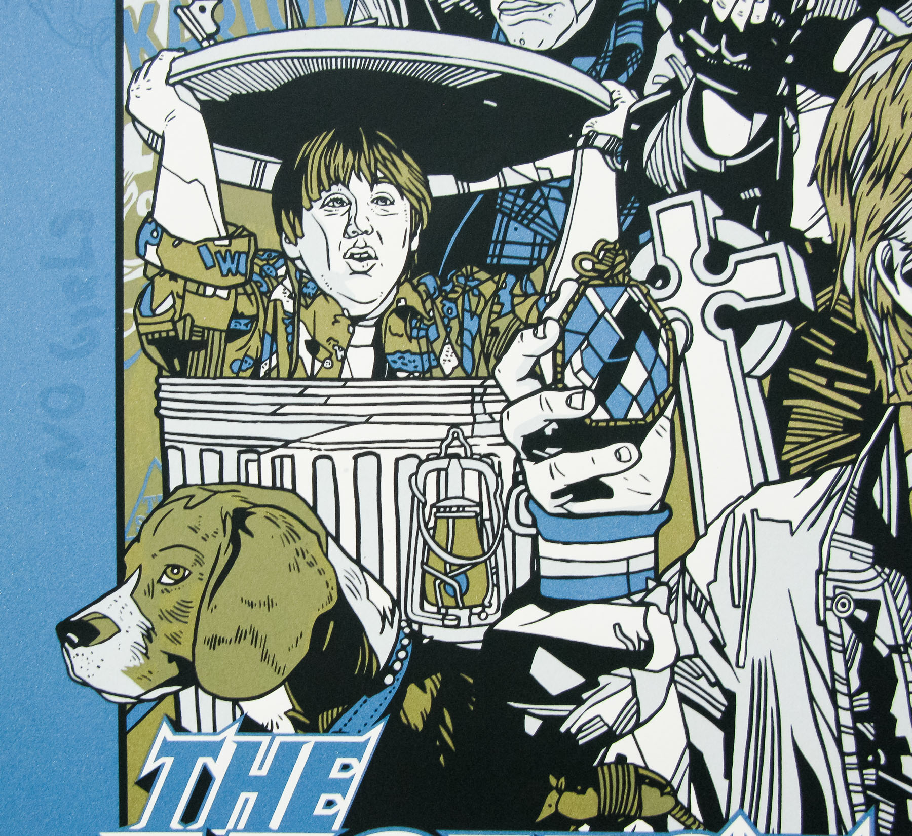
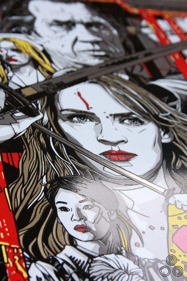
An alternative version of the poster, featuring several details that were eventually changed by the final printing.
Once you’d submitted the poster were you given any directions by the Mondo guys for things to add or remove?
Again, most of them were from Quentin’s assistant and she had some suggestions that she thought he would appreciate. I know she wanted us to make a reference to Bruce Lee’s Game of Death instead of Enter the Dragon, but it was too late in the process to make that switch, plus Game of Death’s poster isn’t as iconic.
Were there ever any alternate colourways?
I think pretty early on Rob Jones [at Mondo] mentioned the rice paper type paper and we focused on that being the variant. There was a single one-off version on metal that was done especially for Quentin to take home as a birthday present.
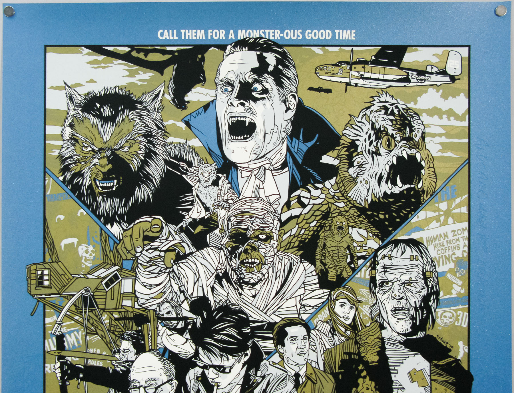
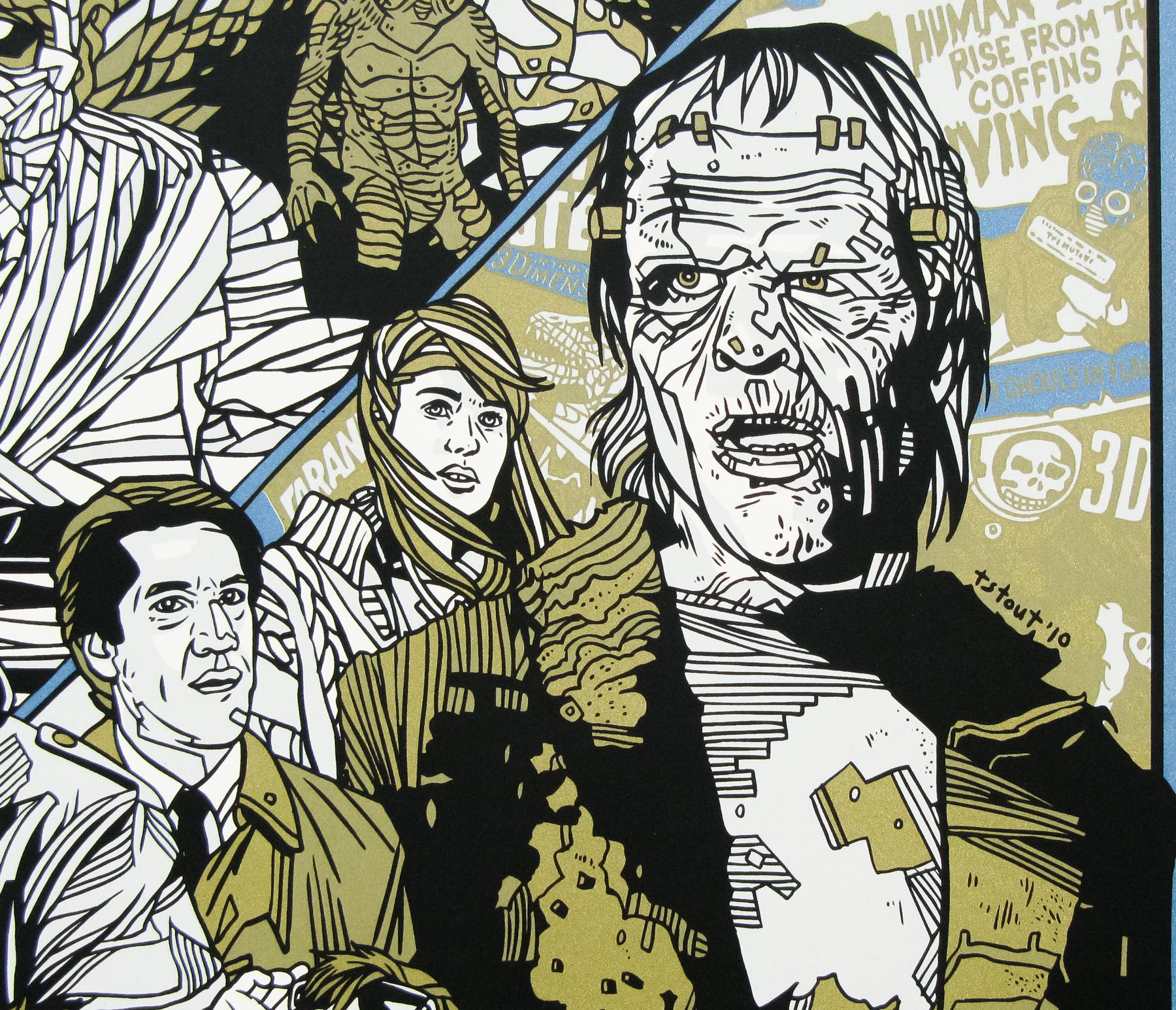
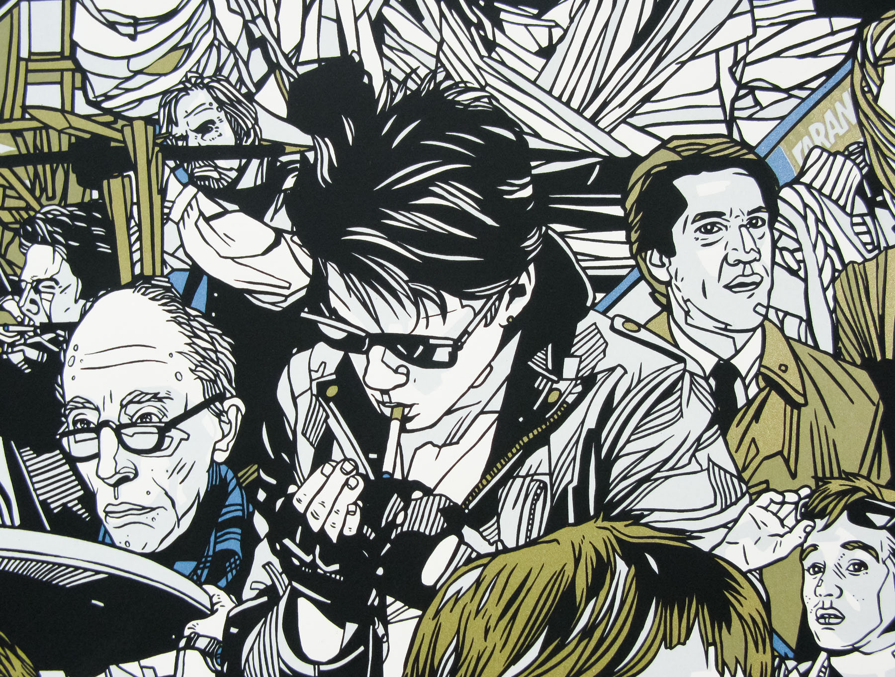
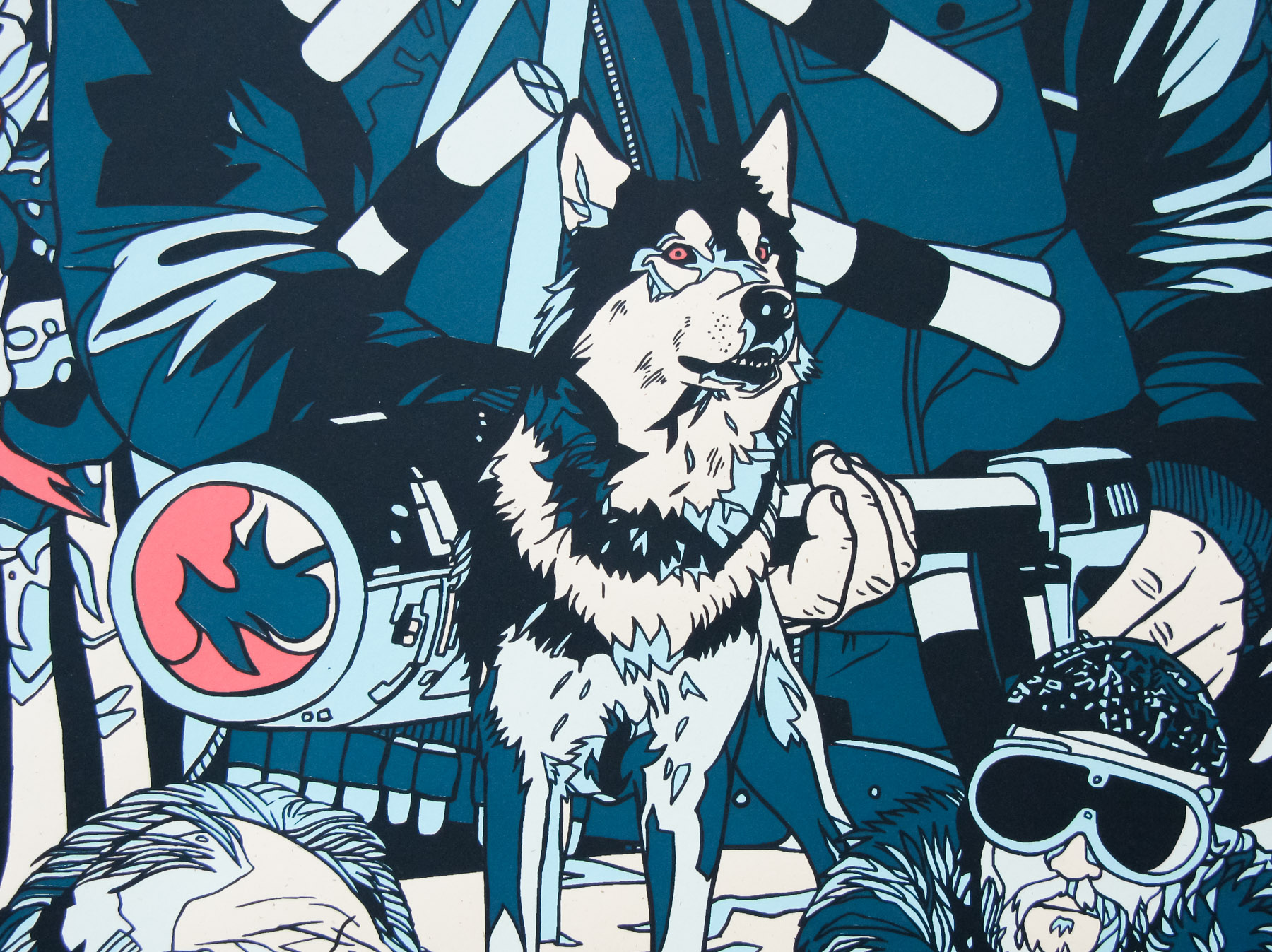
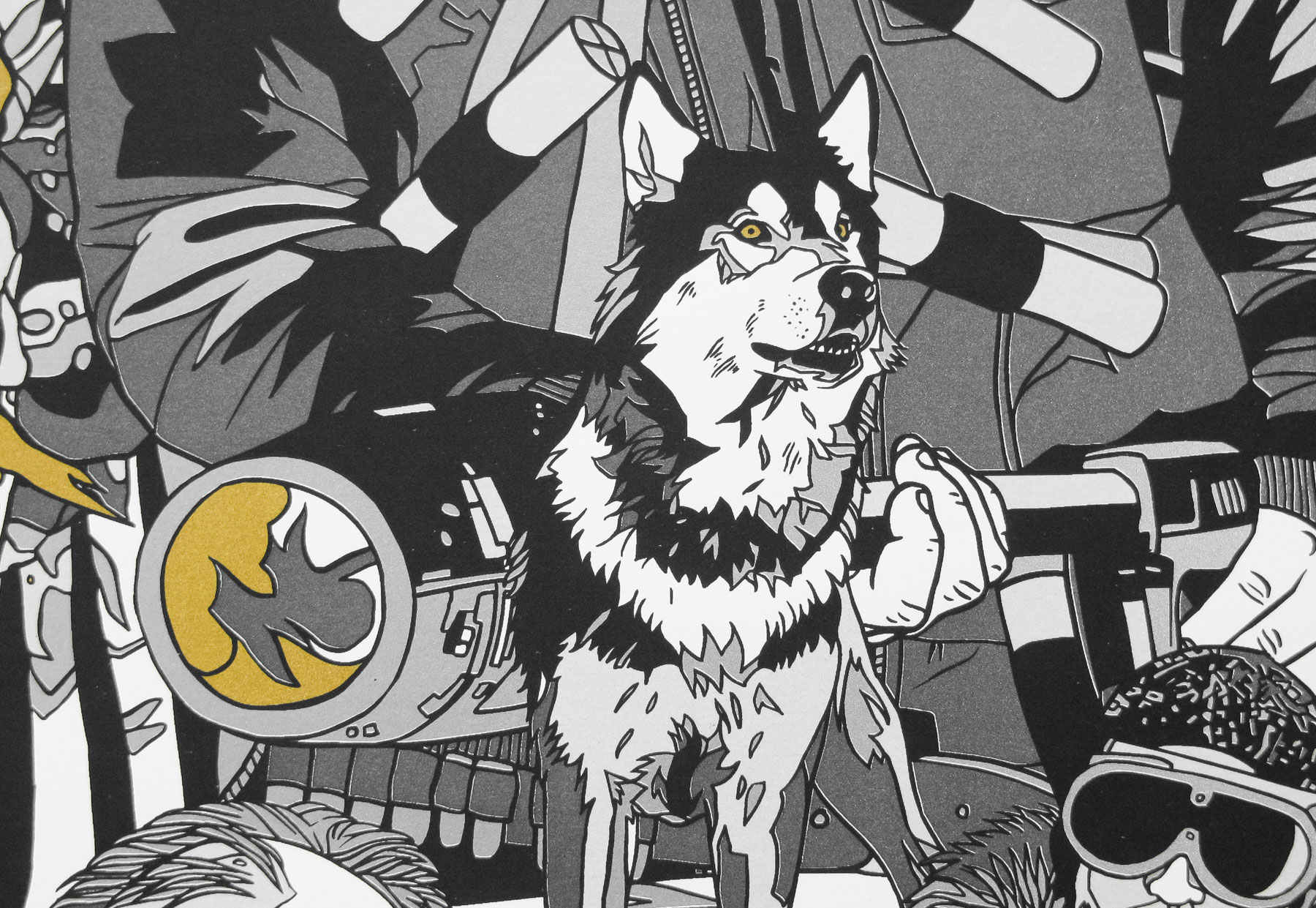
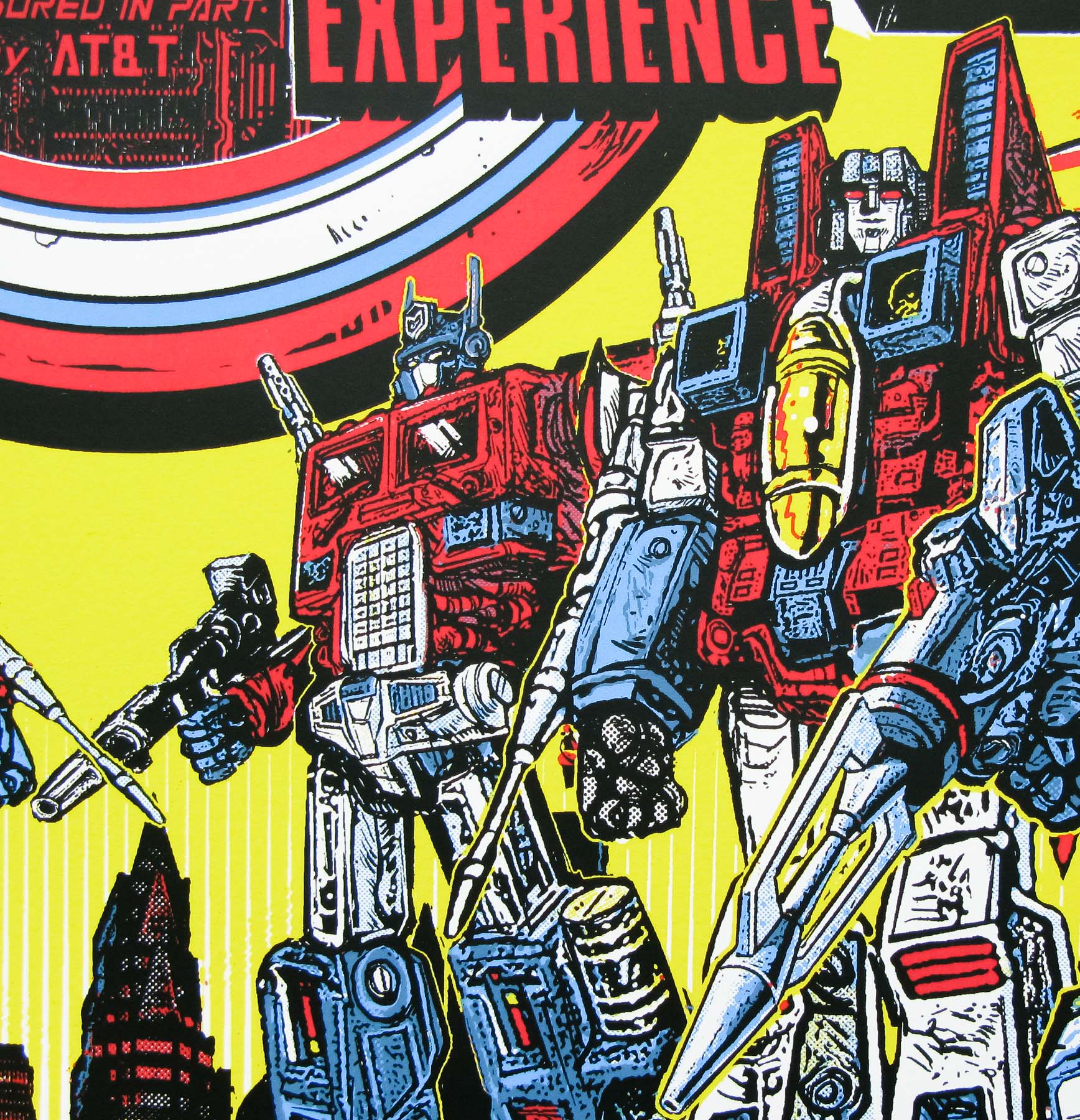
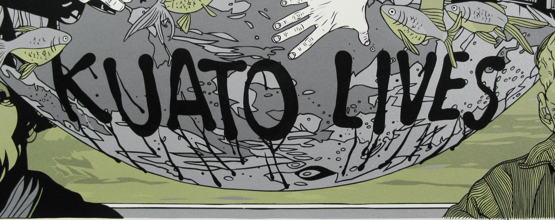
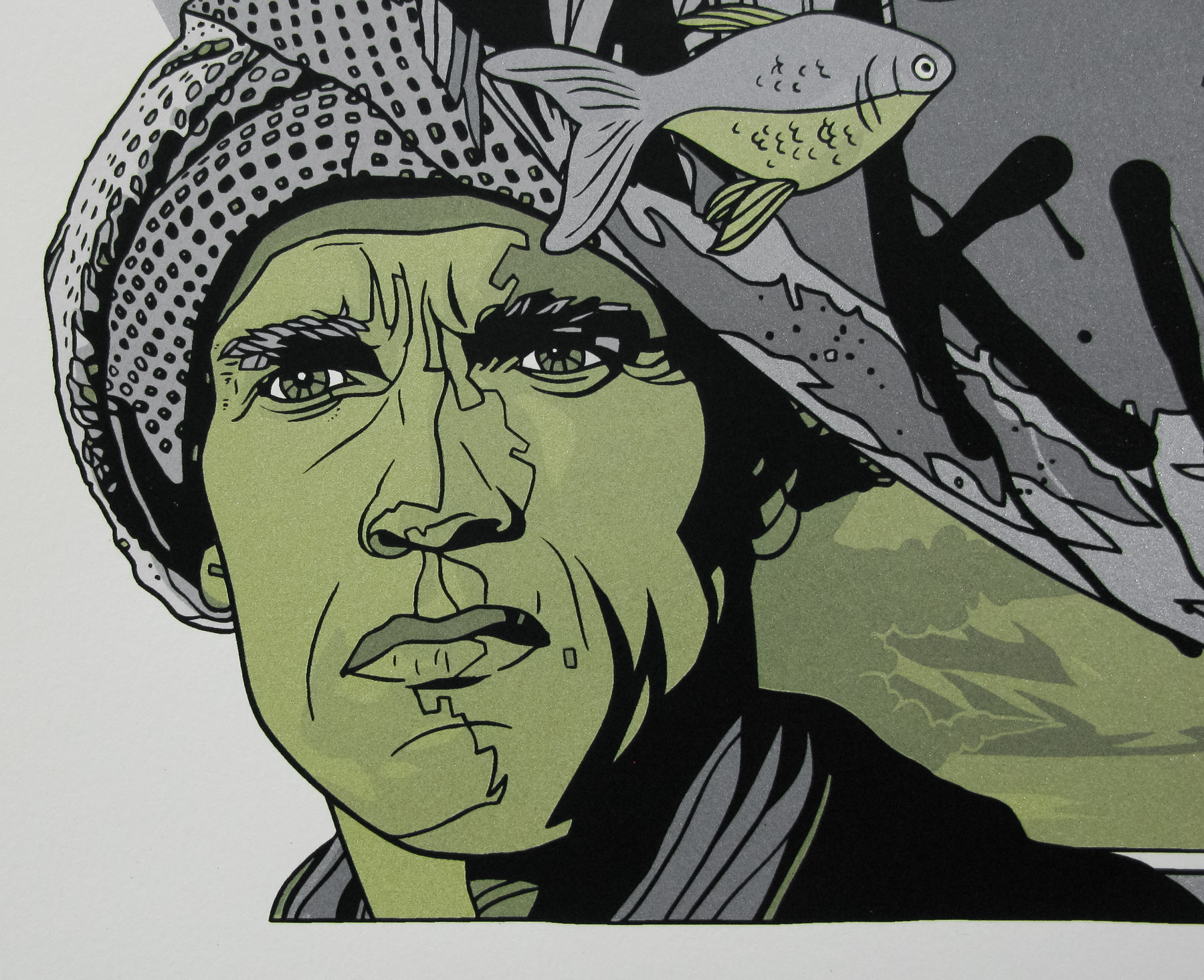
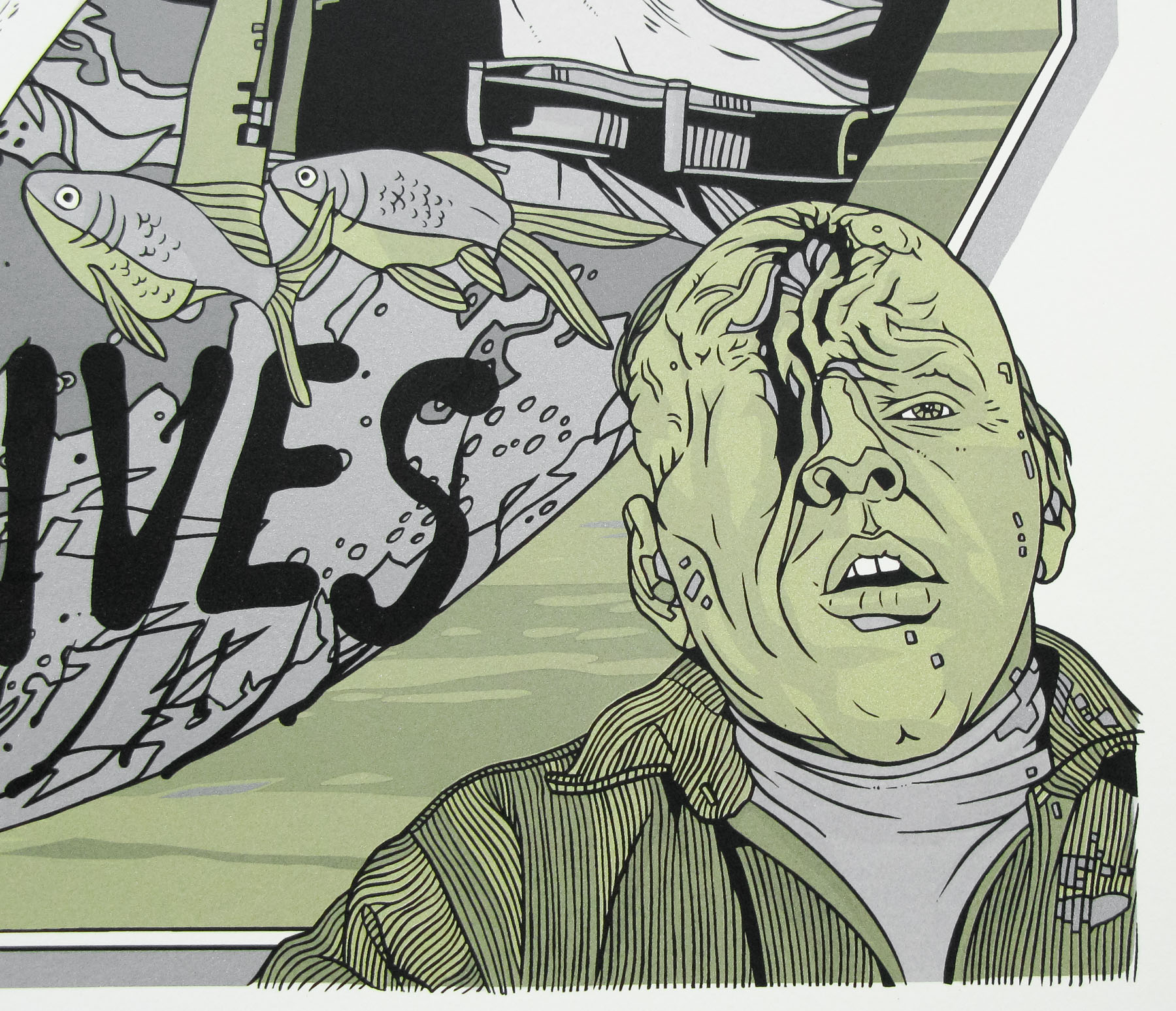
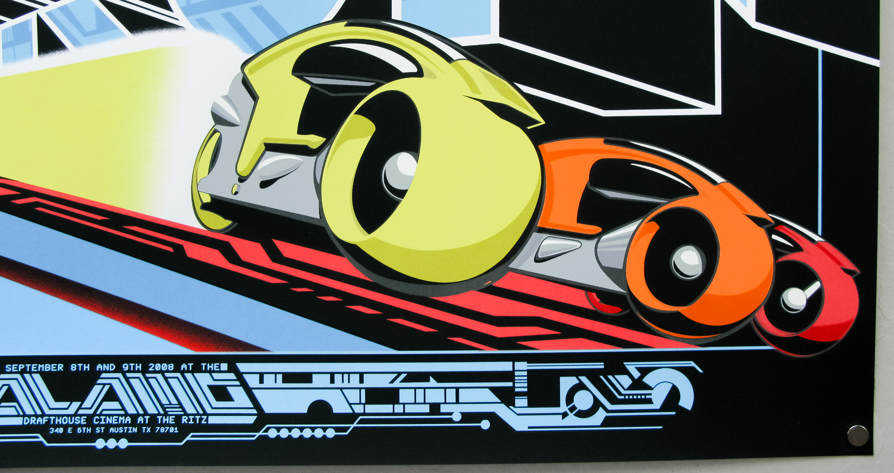
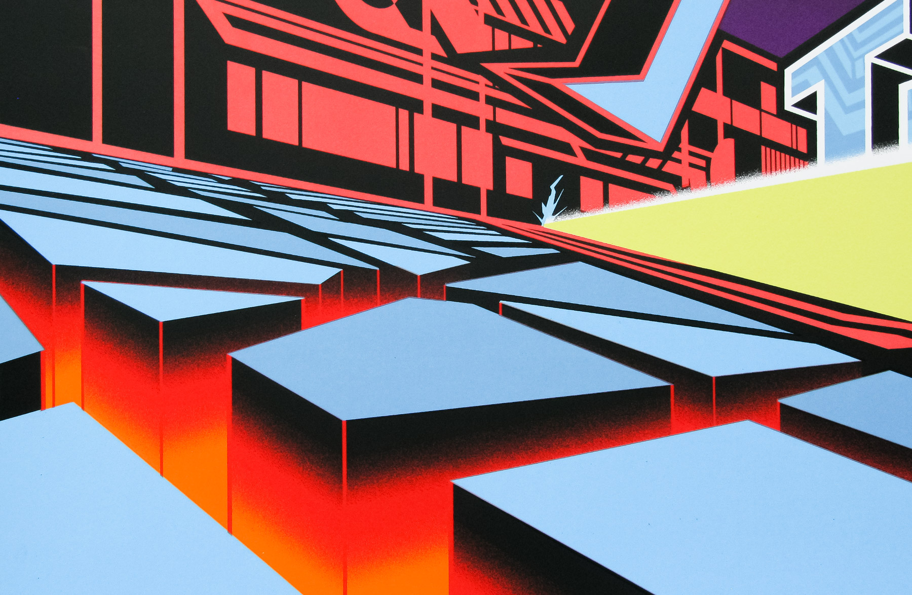
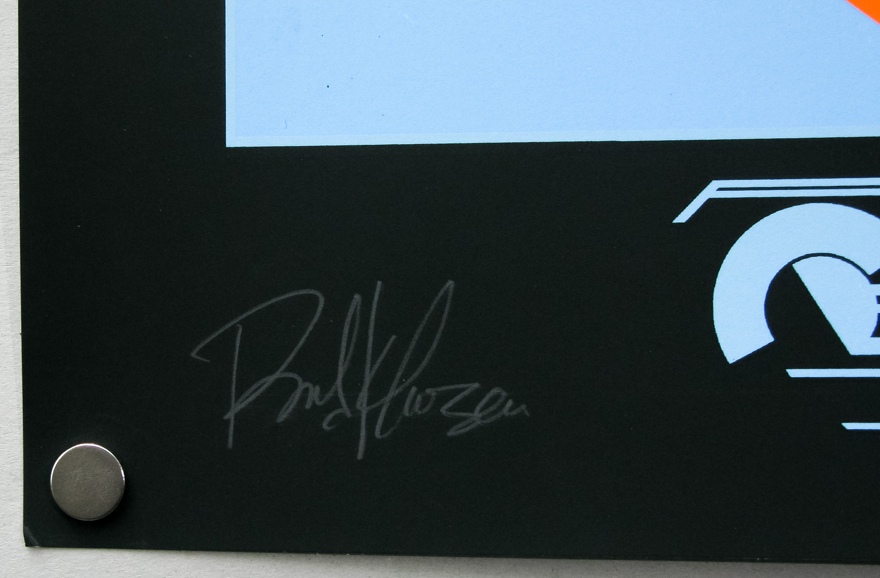
The special one of metal variant of the poster that was given to Quentin Tarantino as a birthday present. There is a unique inscription in the bottom left which reads ‘Q HAPPY BIRTHDAY AND CONTINUED ADVENTURES. WITH LOVE, UNRULY JULIE.’ 01/01
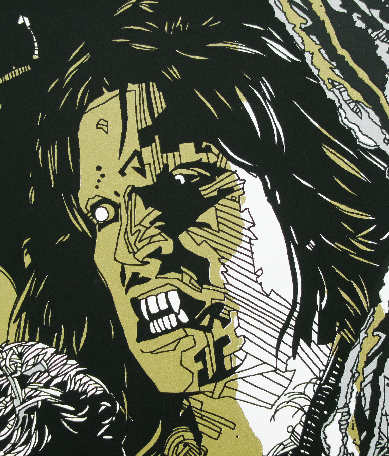
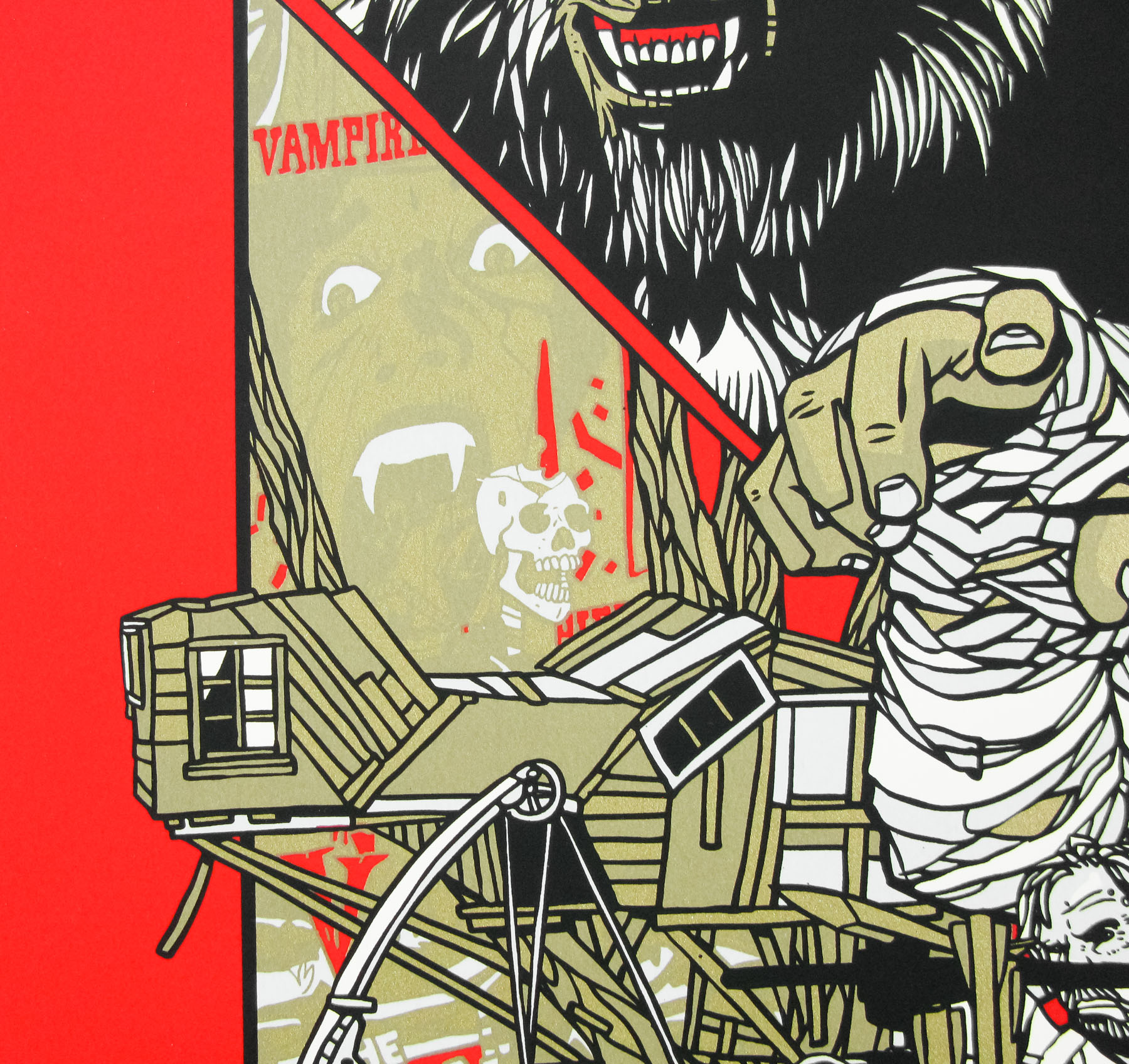
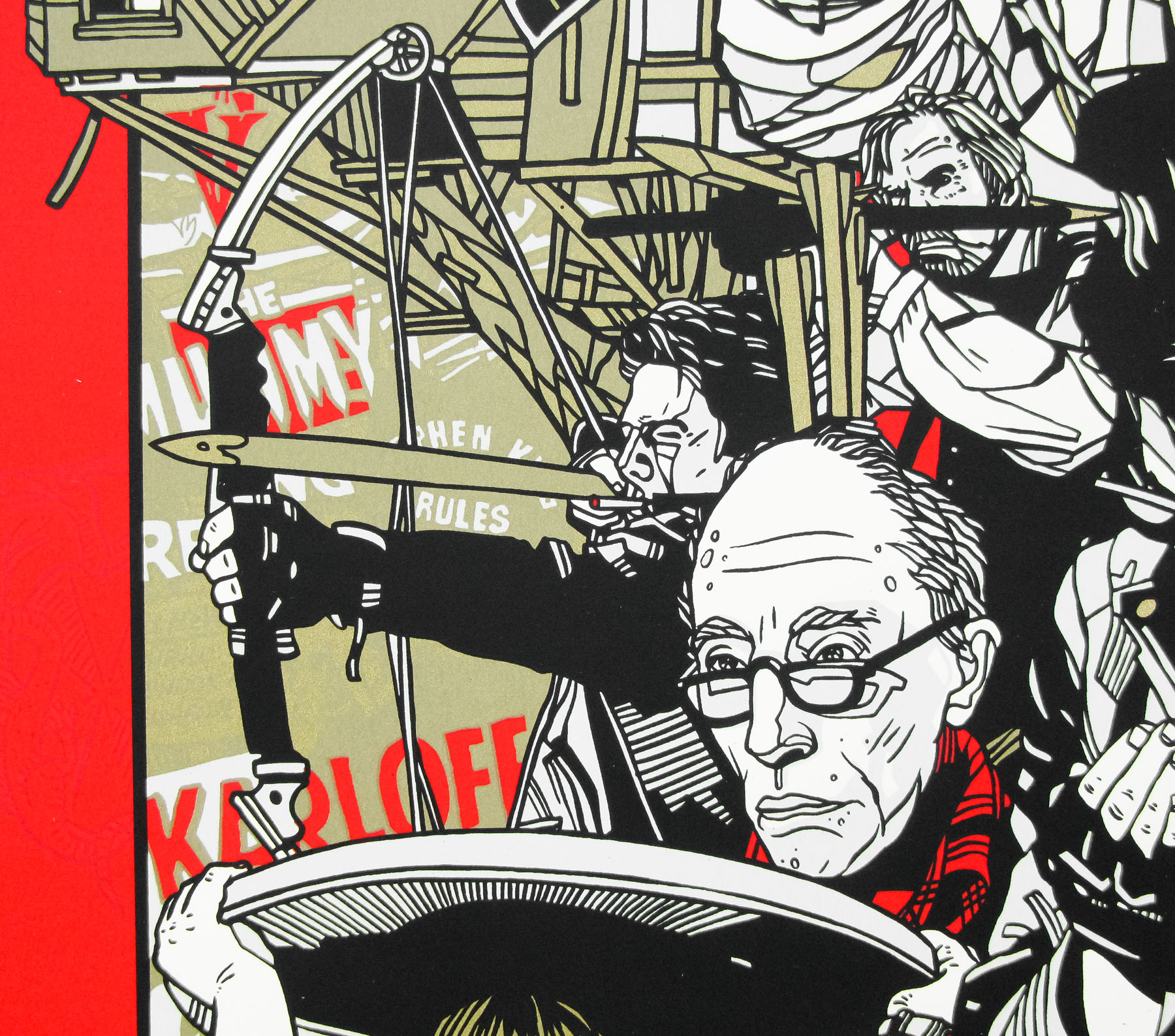
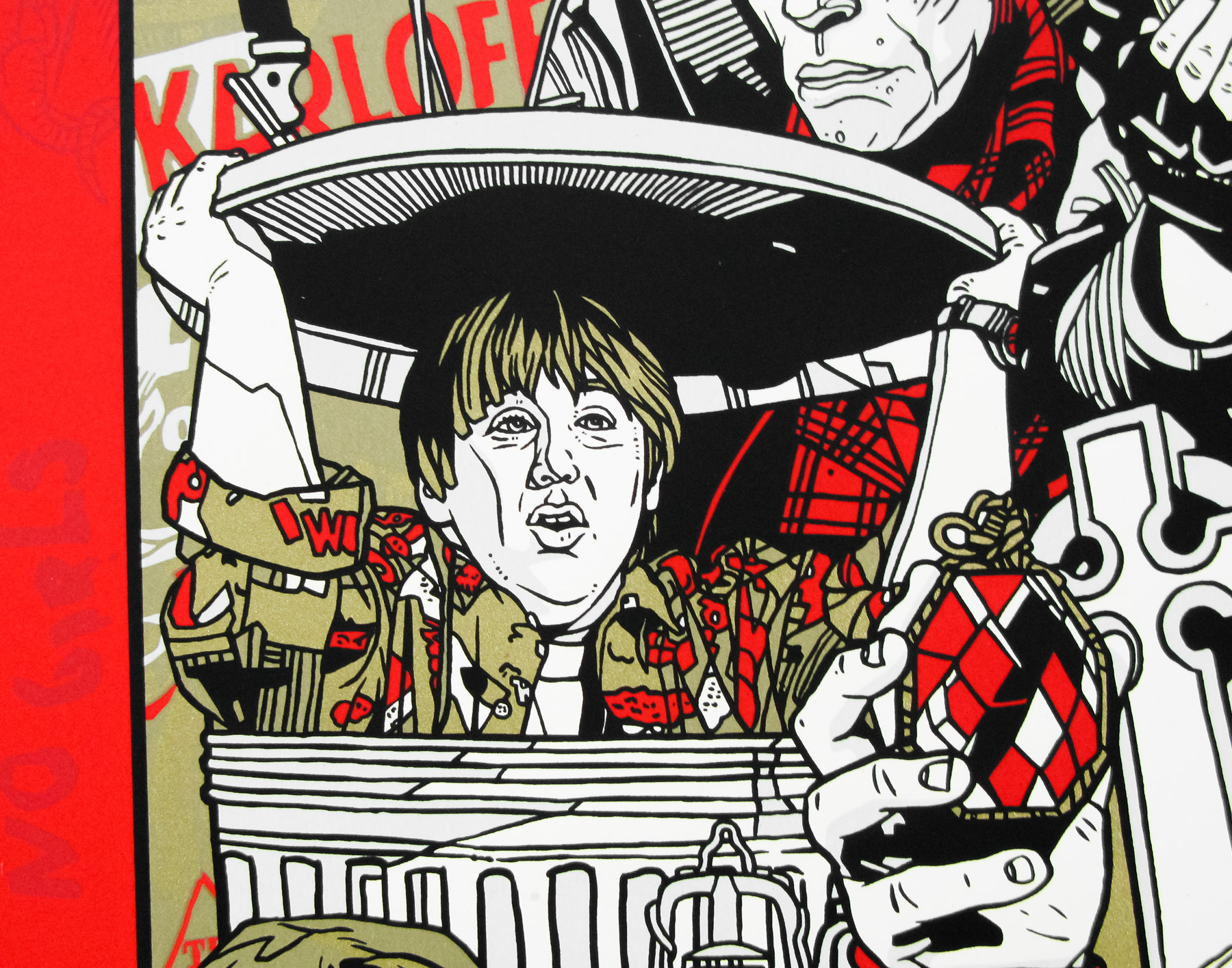
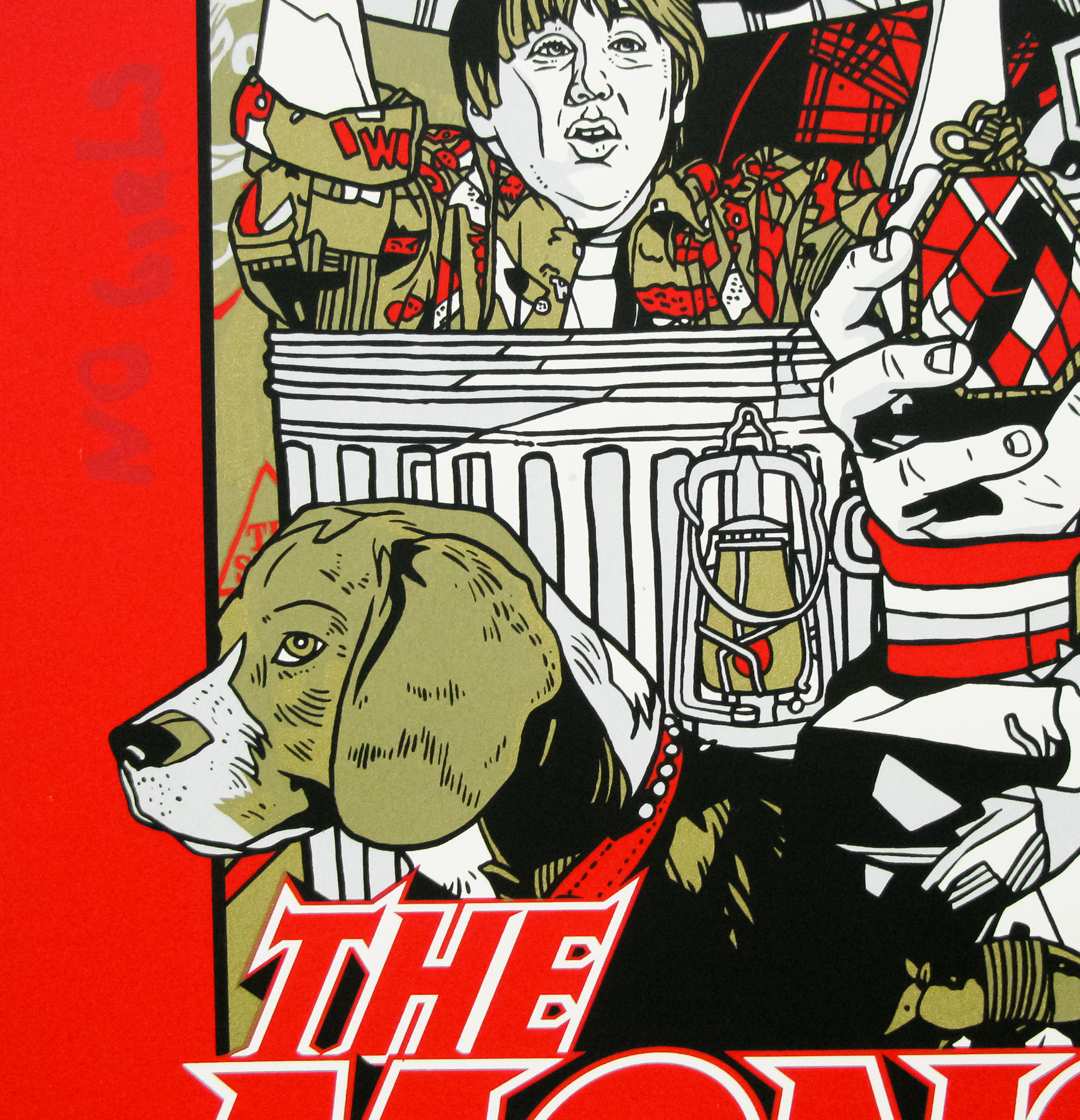
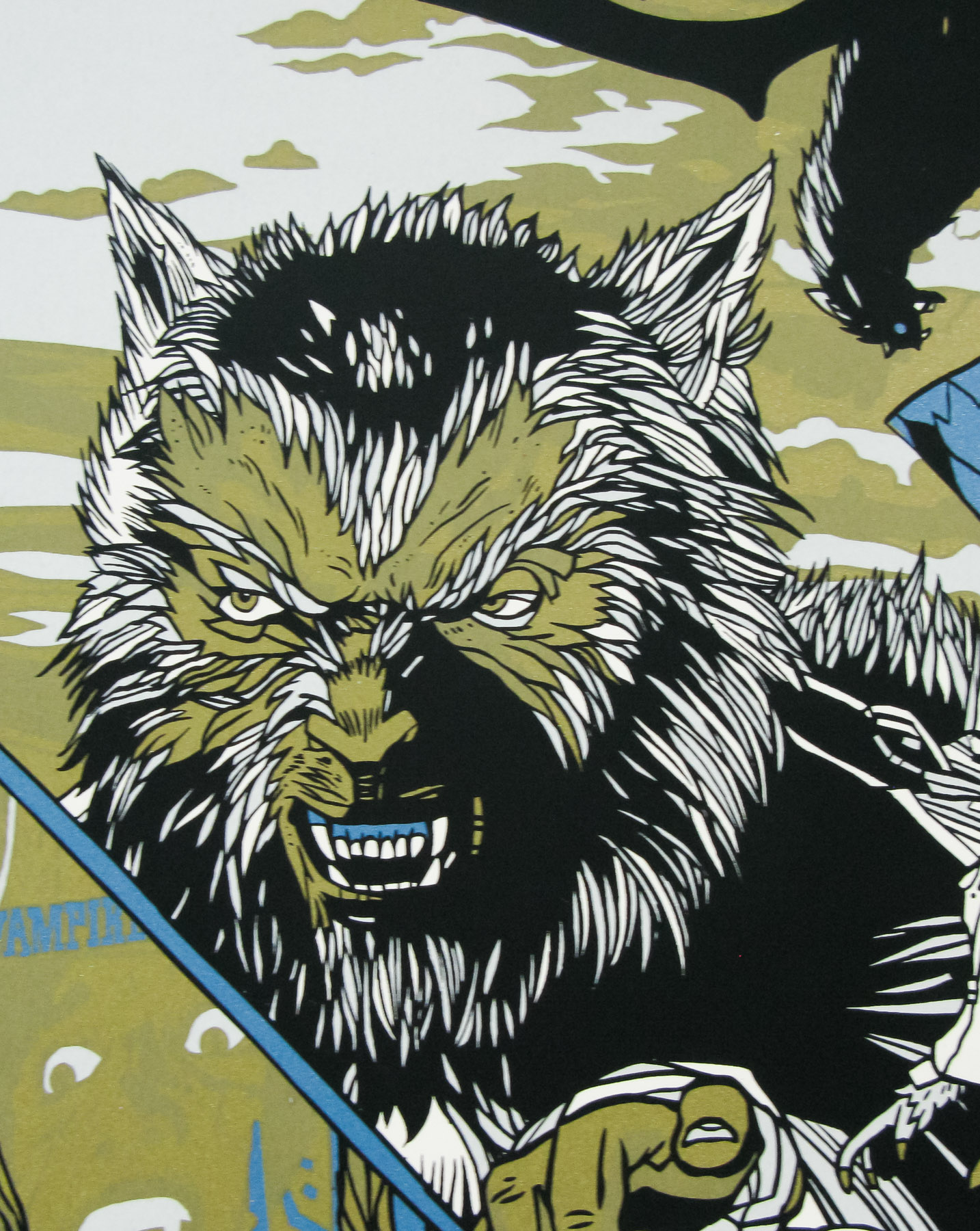
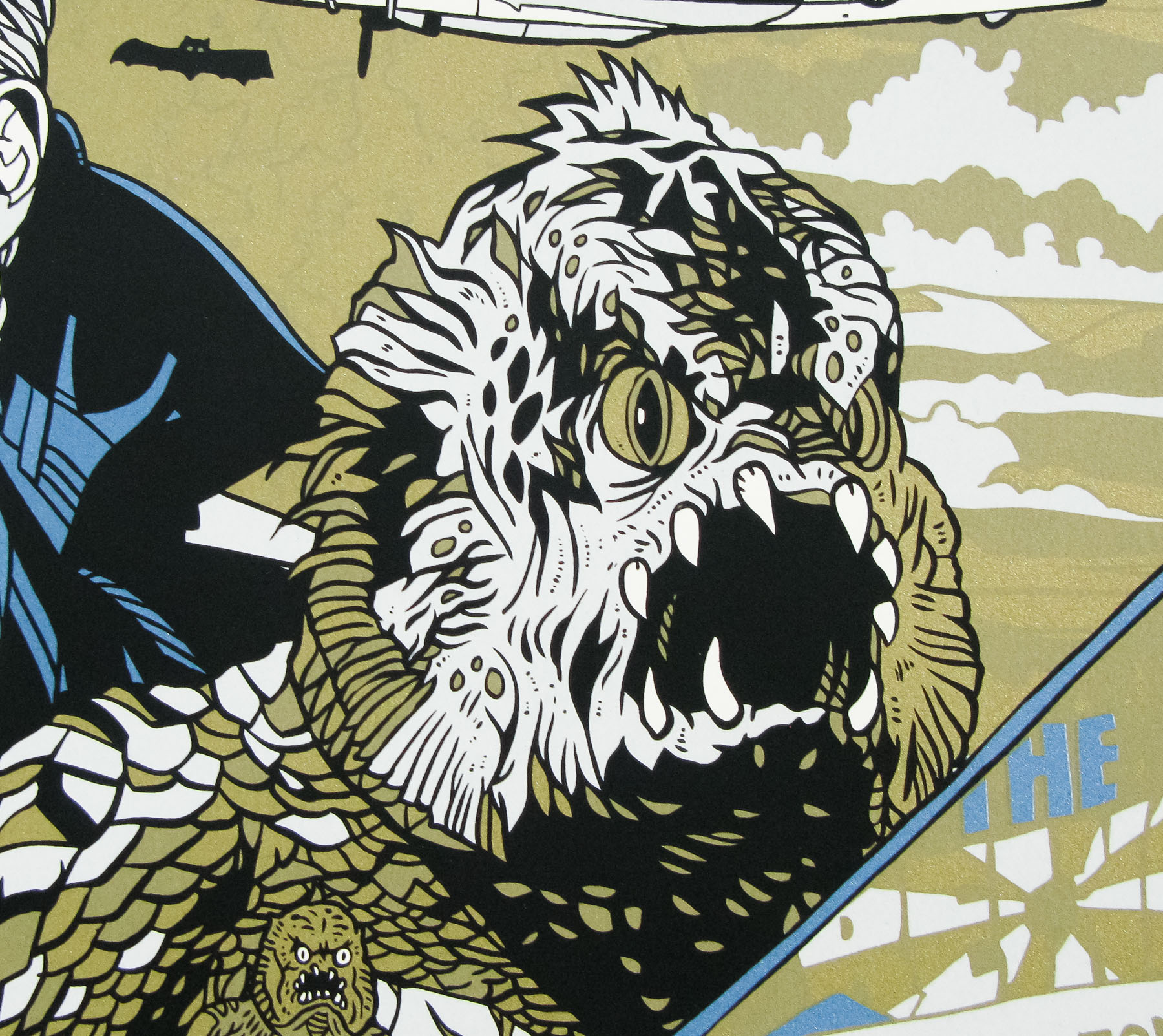
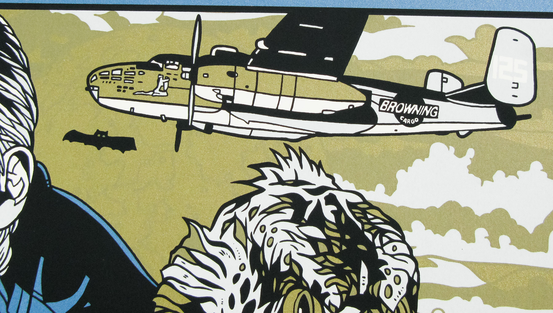
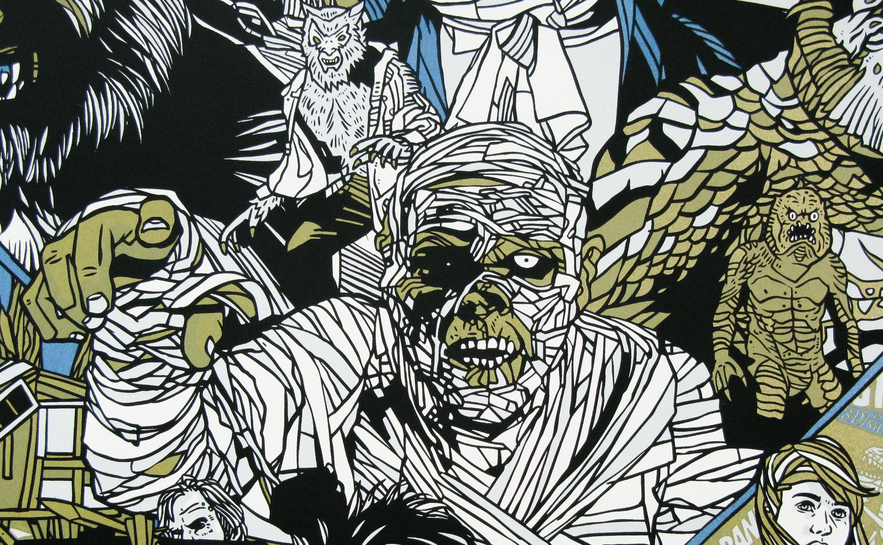
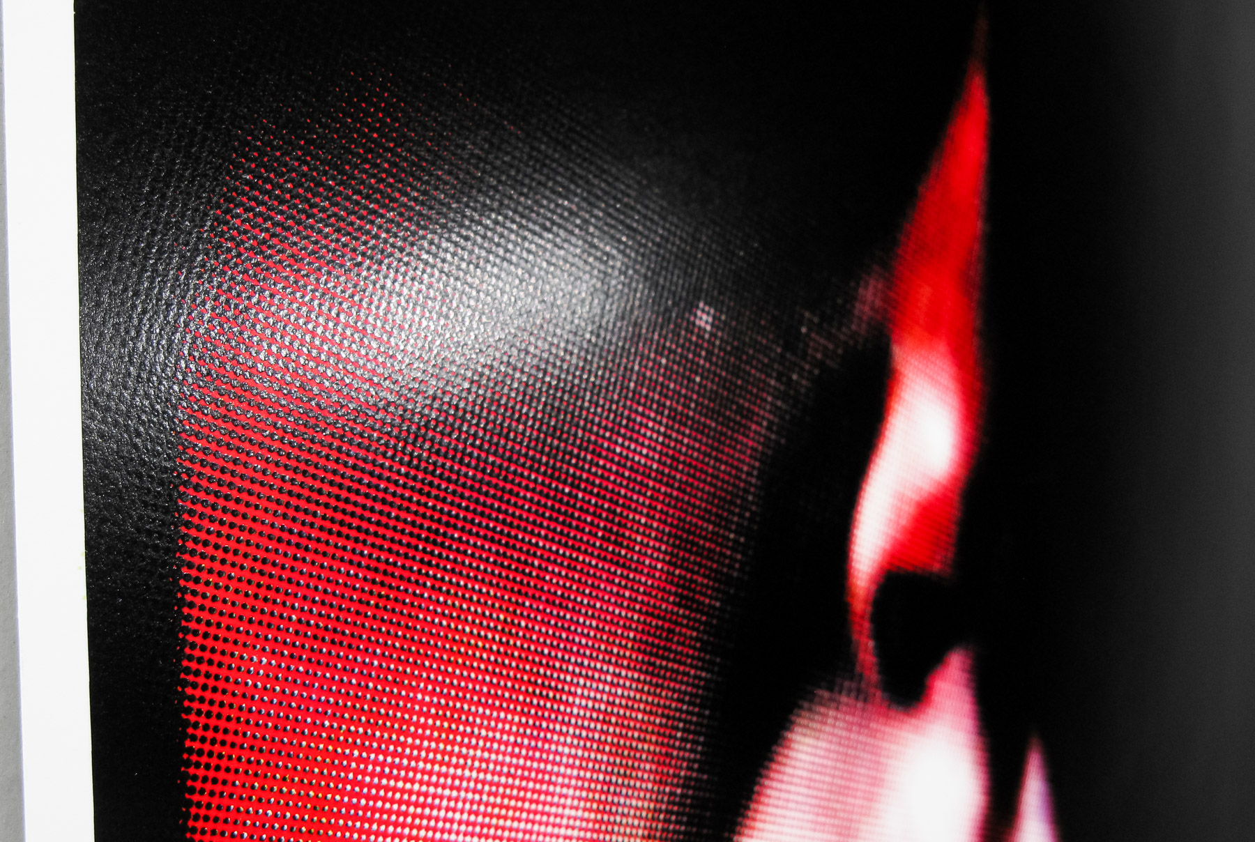
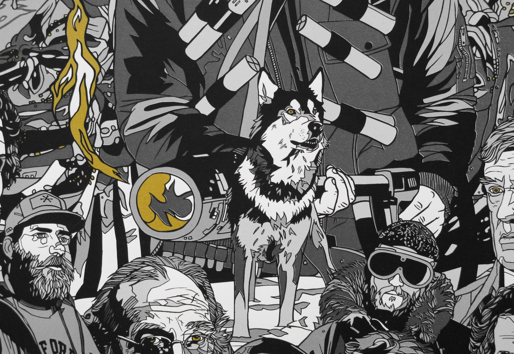
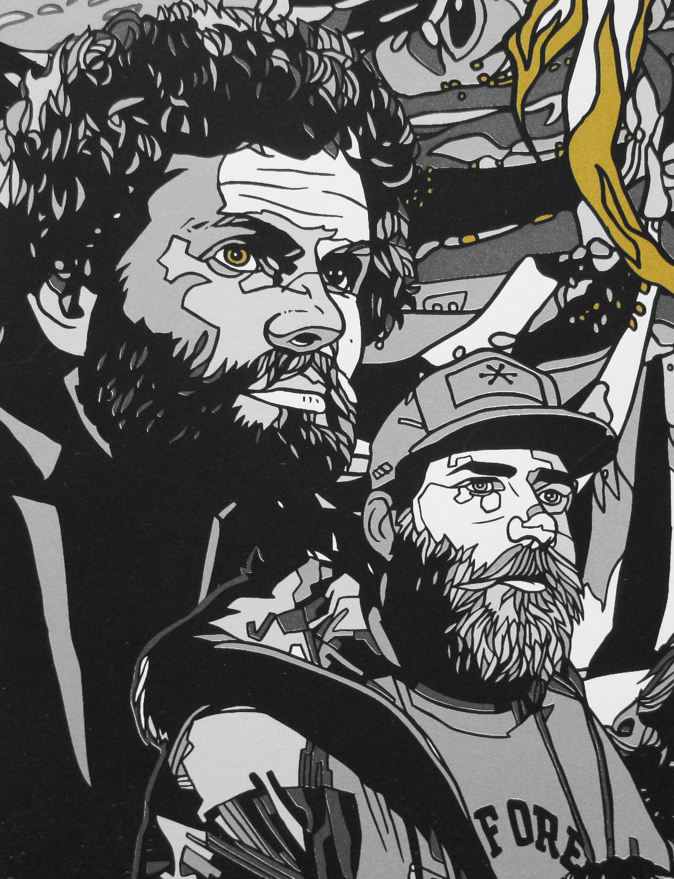
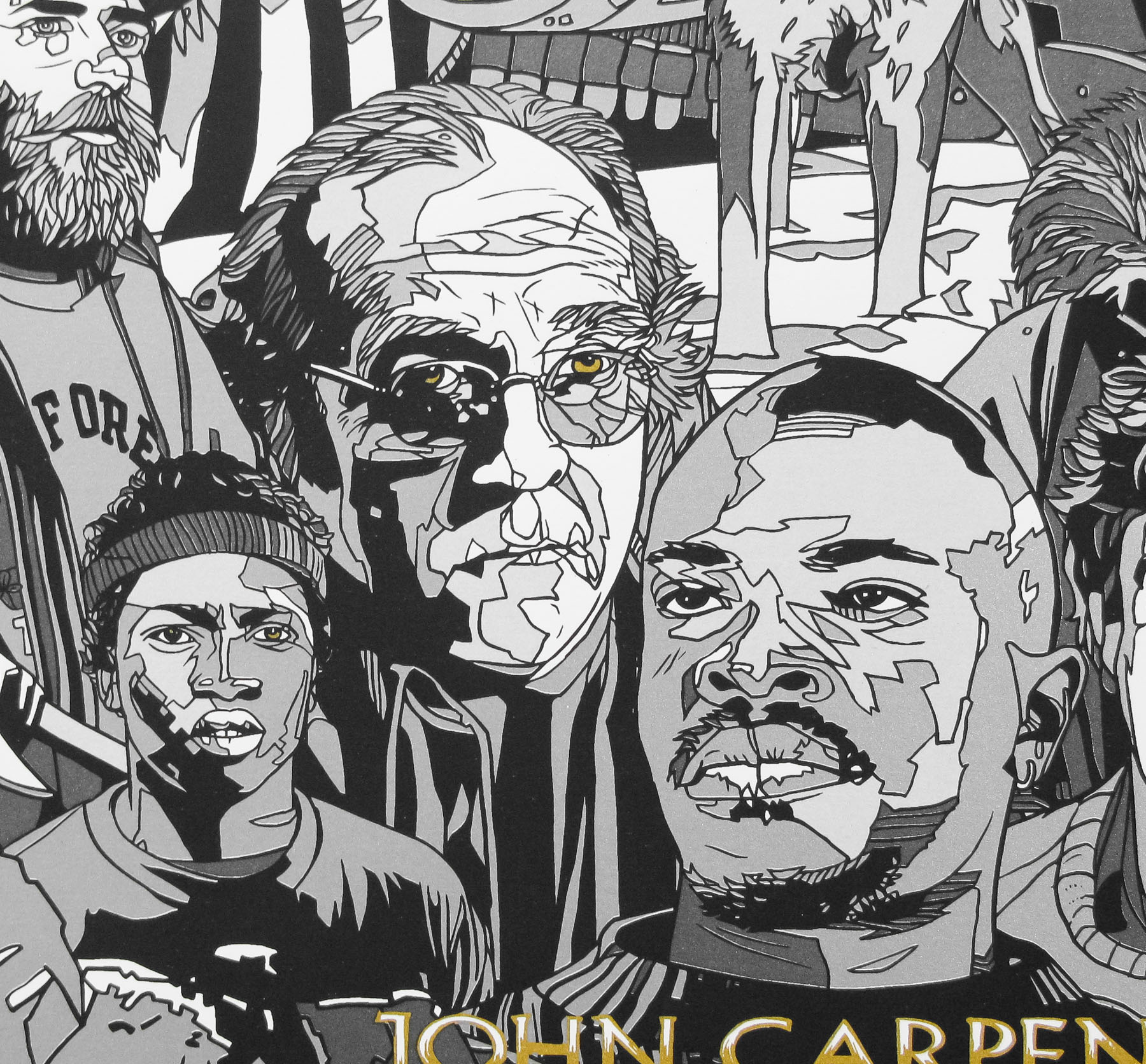
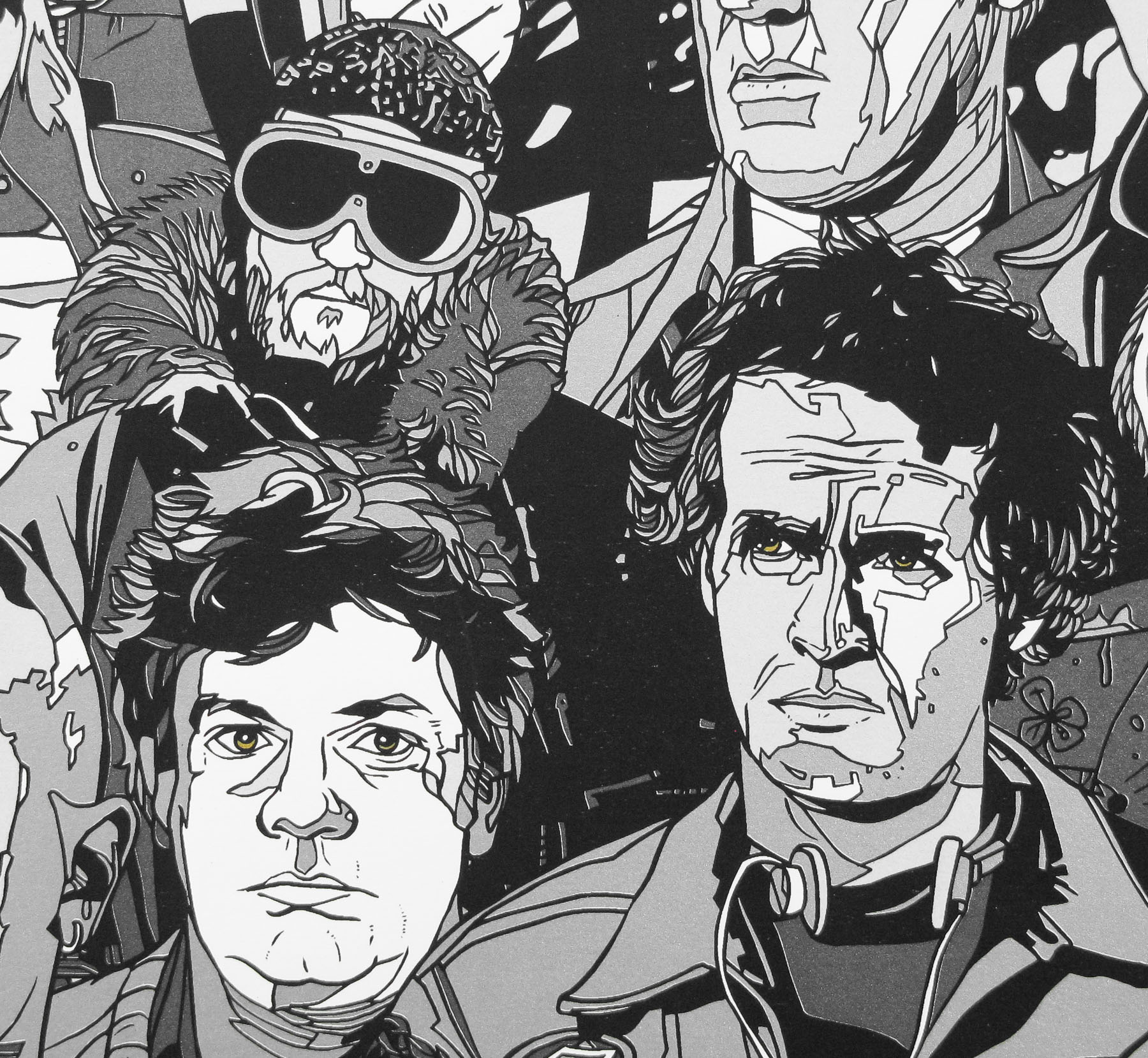
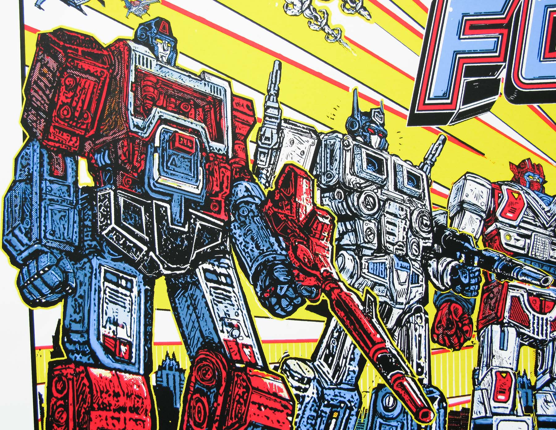
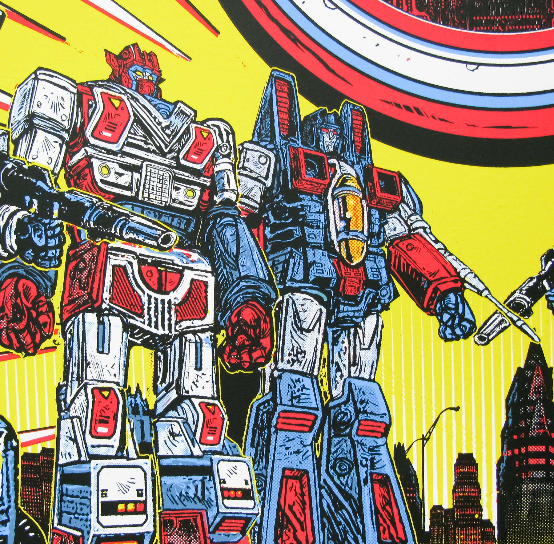
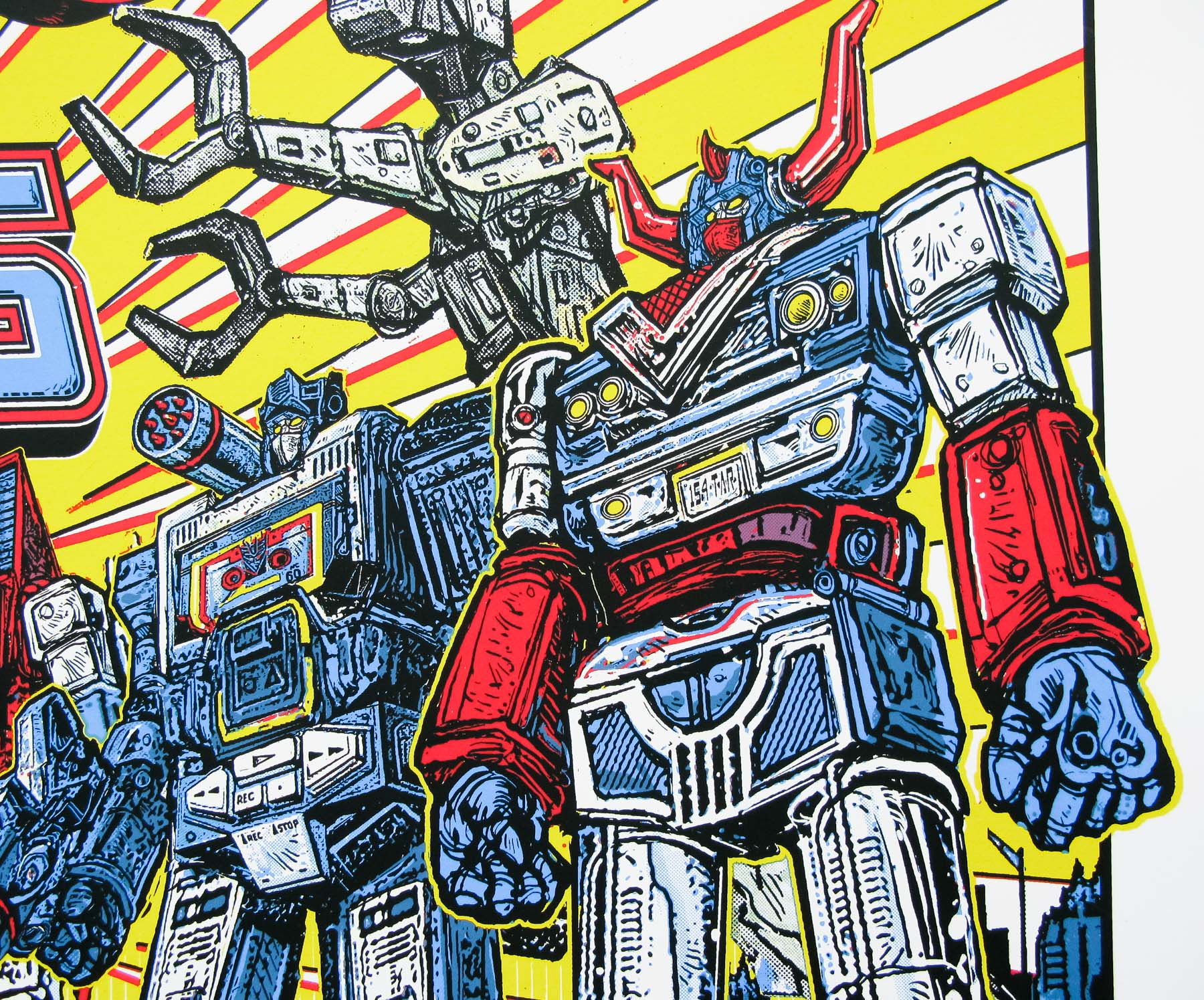
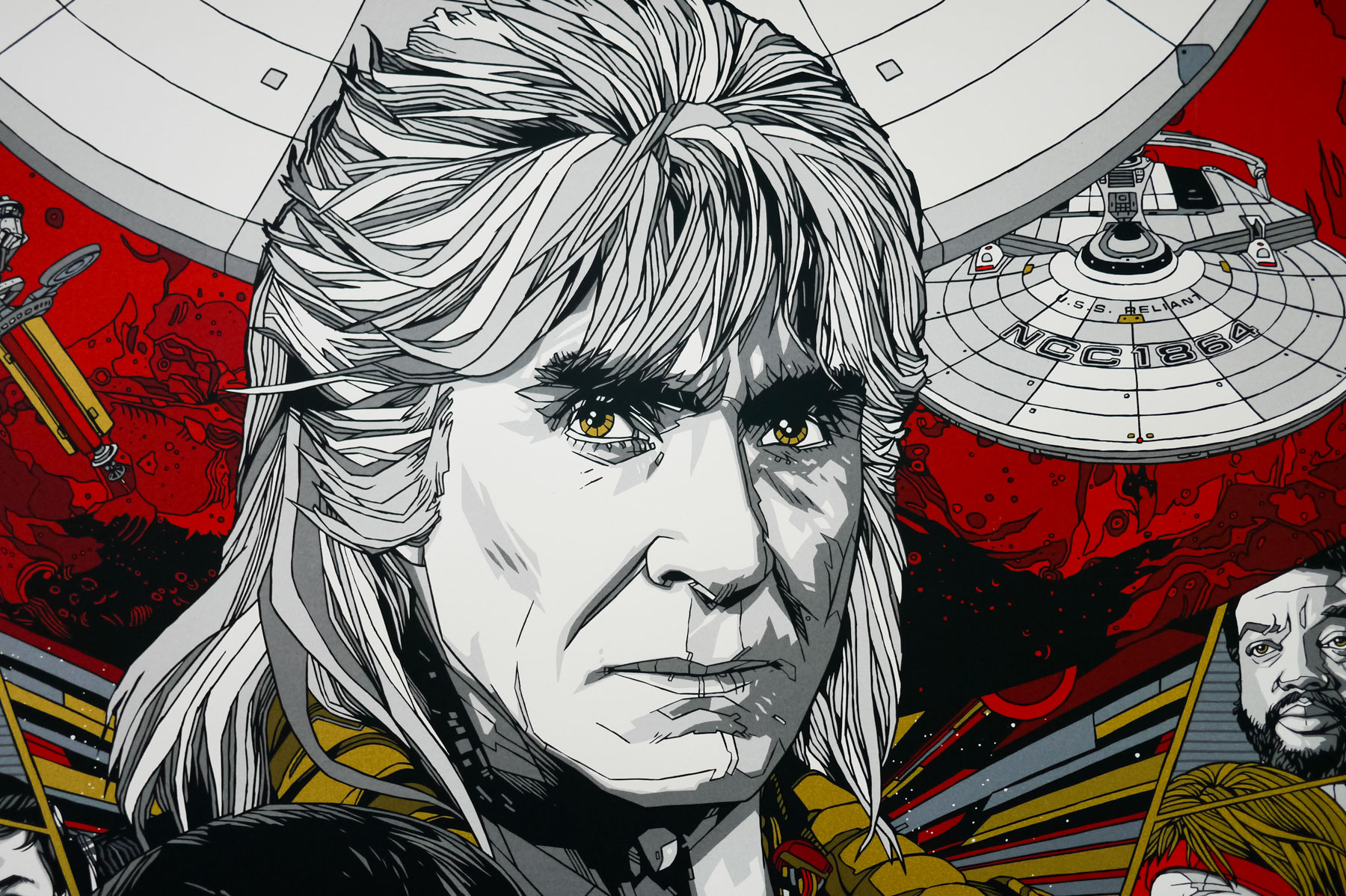
Close up detail of the metal variant
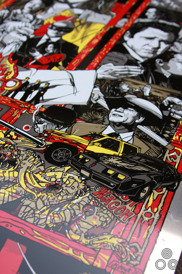
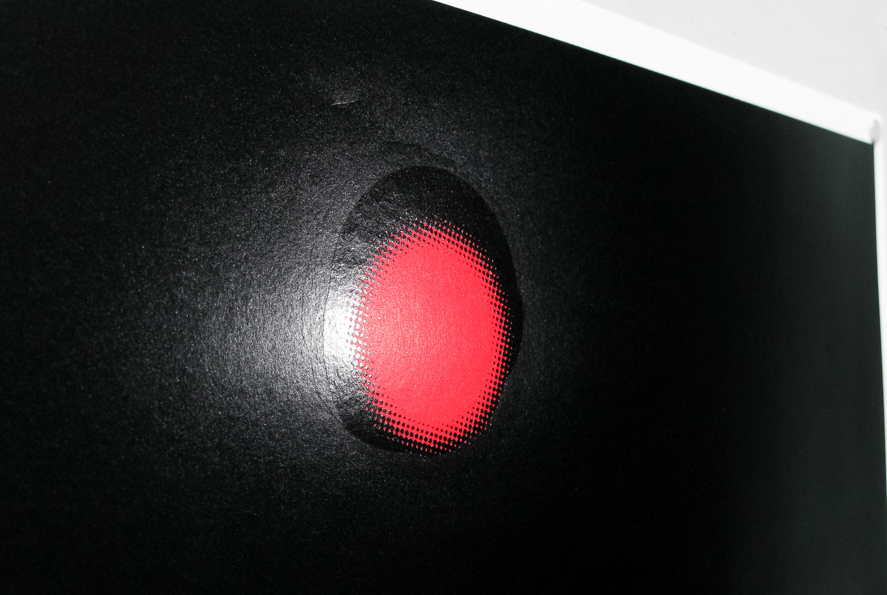
More details of the metal variant
Were you given any feedback from Tarantino yourself?
Just that he was happy with the poster. He seems like a pretty easy going guy to deal with and doesn’t complain to Mondo much.
Are there other Tarantino films you’d like to do a poster for?
Sure, all of them.
I’m keeping my fingers crossed that you get to do a poster for Django Unchained.
That would be pretty sweet.
Finally, can you give us even a tiny hint as to what we might see from you in the coming months?
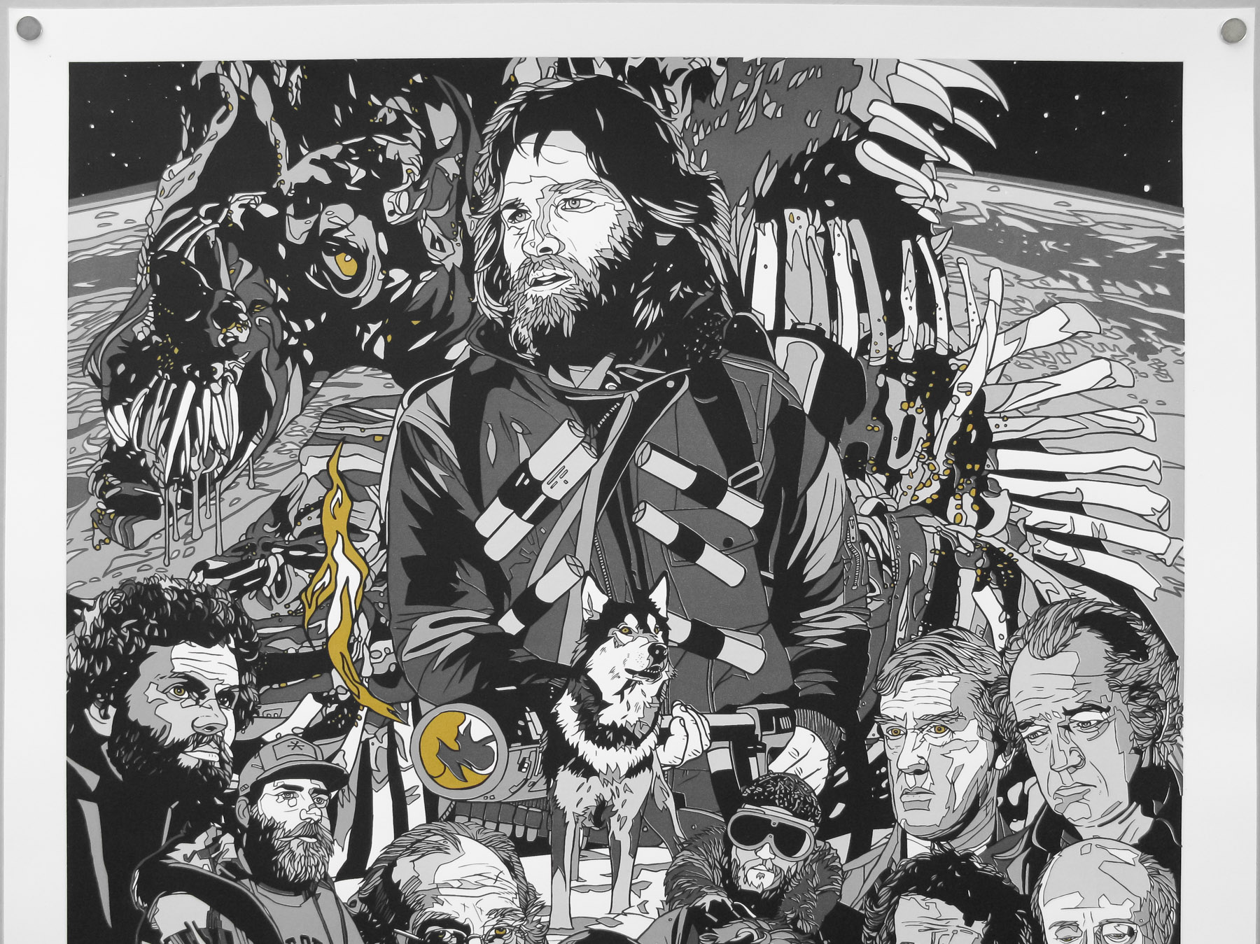
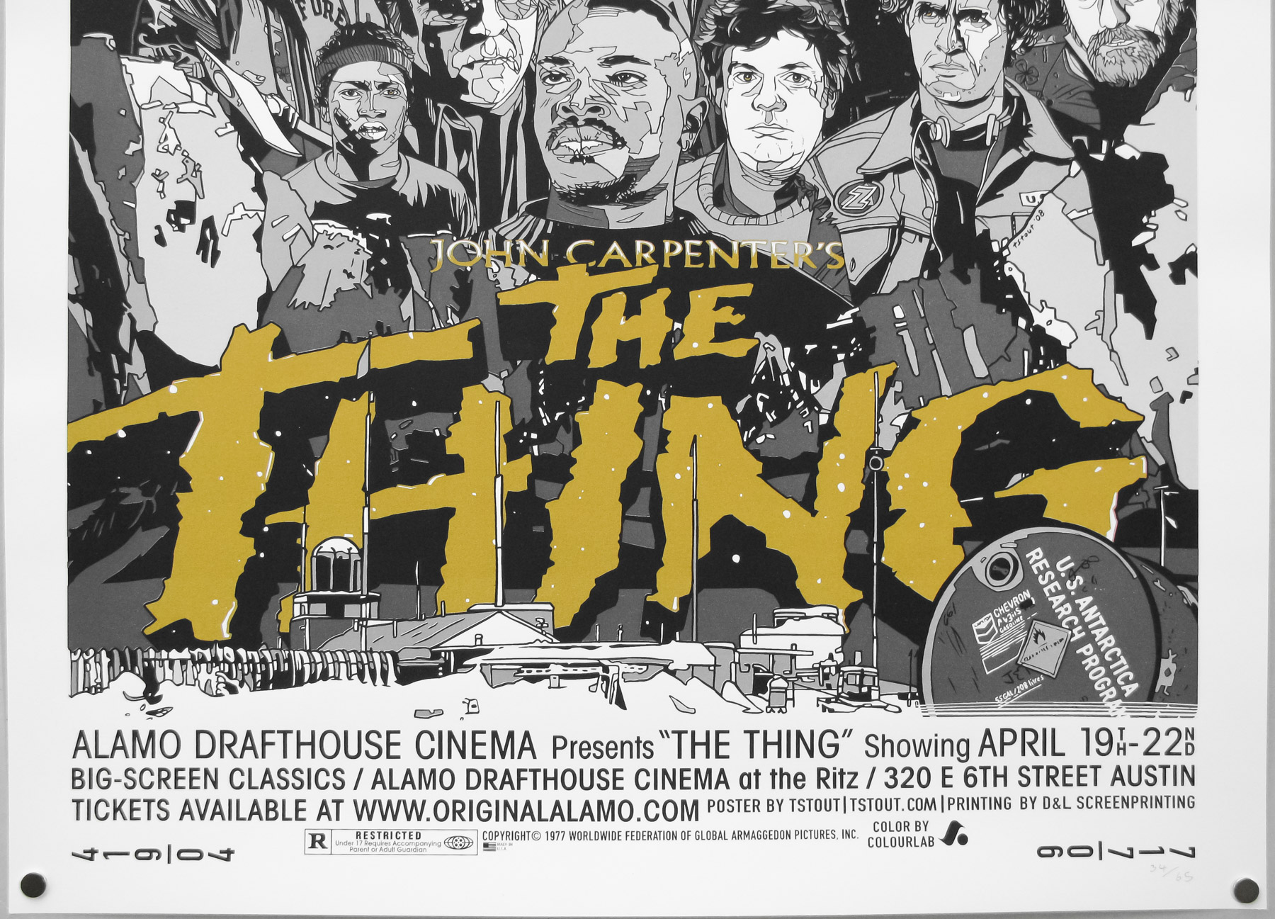
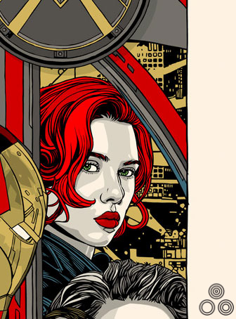
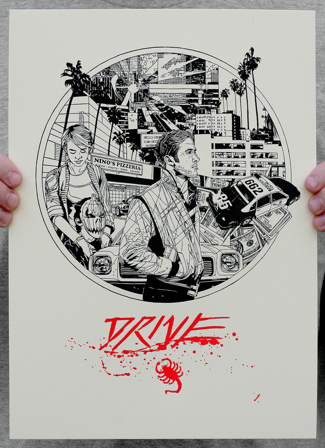
I think I’m working on something for the movie Drive, and possibly something involving aliens from outer space and the duality of man. I’ve probably given too much away.
Thanks so much Tyler. As always, I hugely appreciate the time you give to these interviews.
Thank you sir!
————————————————-
Check out Tyler’s website here.
The Mondo website is here and I’d advise following them on Twitter here.
The other posters I’ve collected by Tyler can be viewed here.
My interview with Tyler on the creation of his Akira print is here.