
Poster details
Select to view

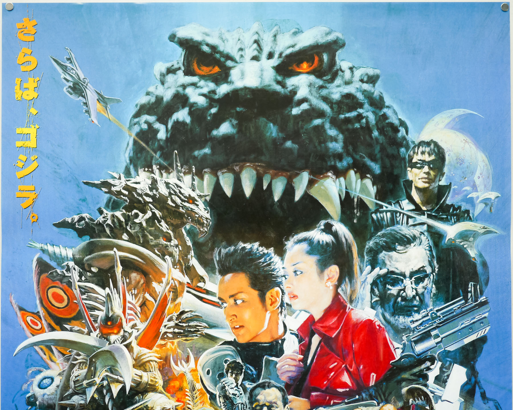


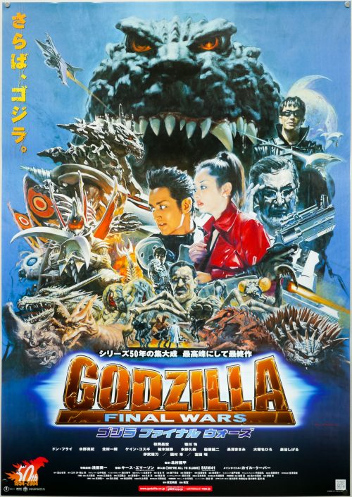
- Title
- Godzilla: Final Wars
- AKA
- Gojira: Fainaru uôzu (Japan - original title)
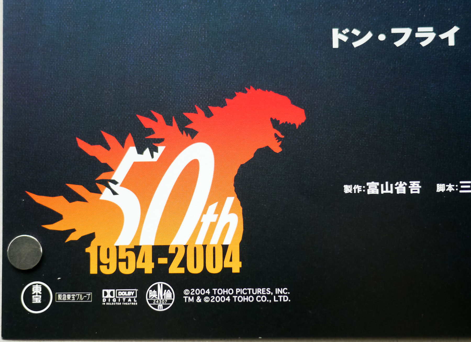
- Year of Film
- 2004
- Director
- Ryûhei Kitamura
- Starring
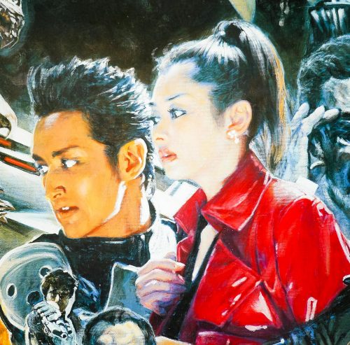
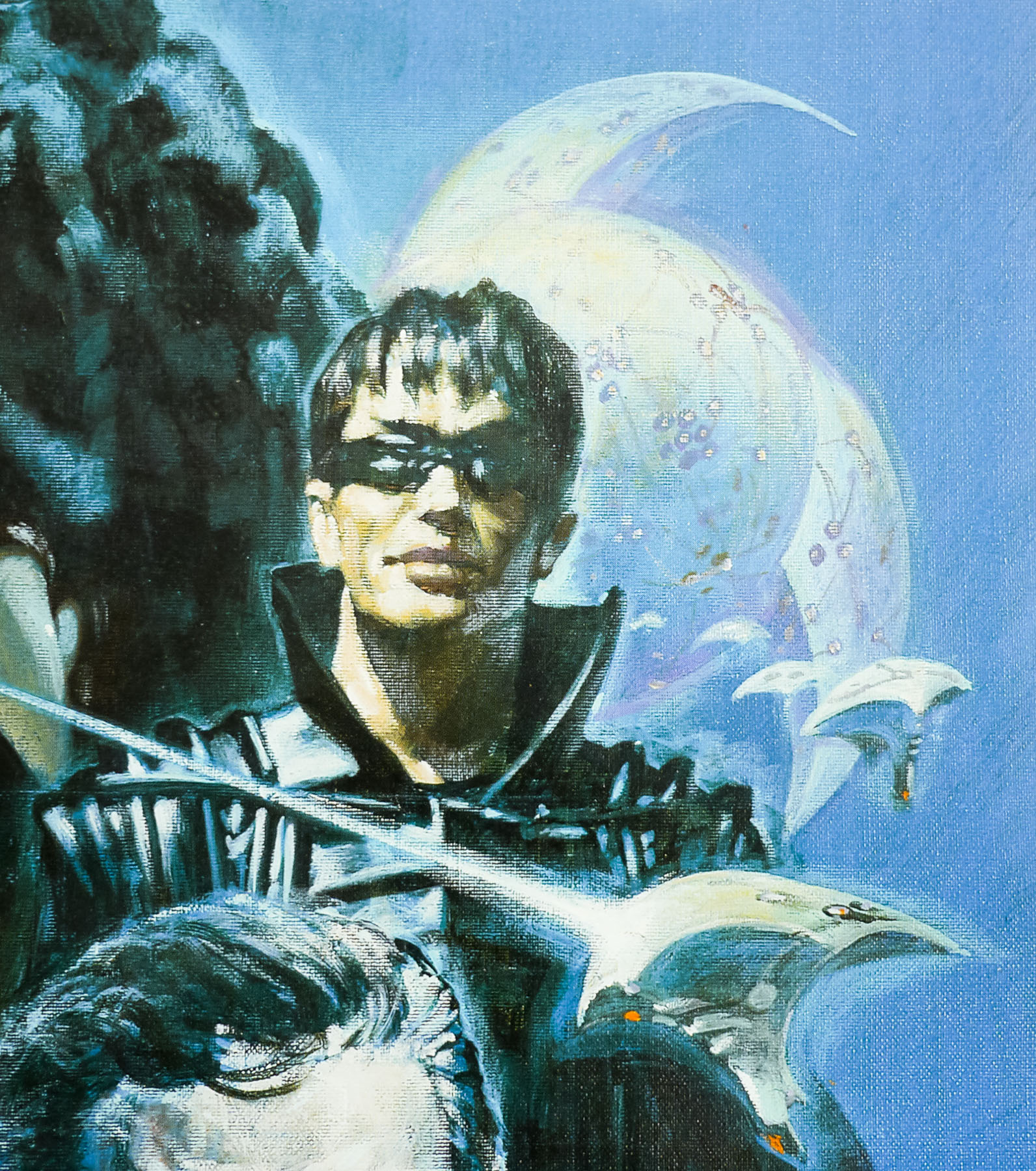
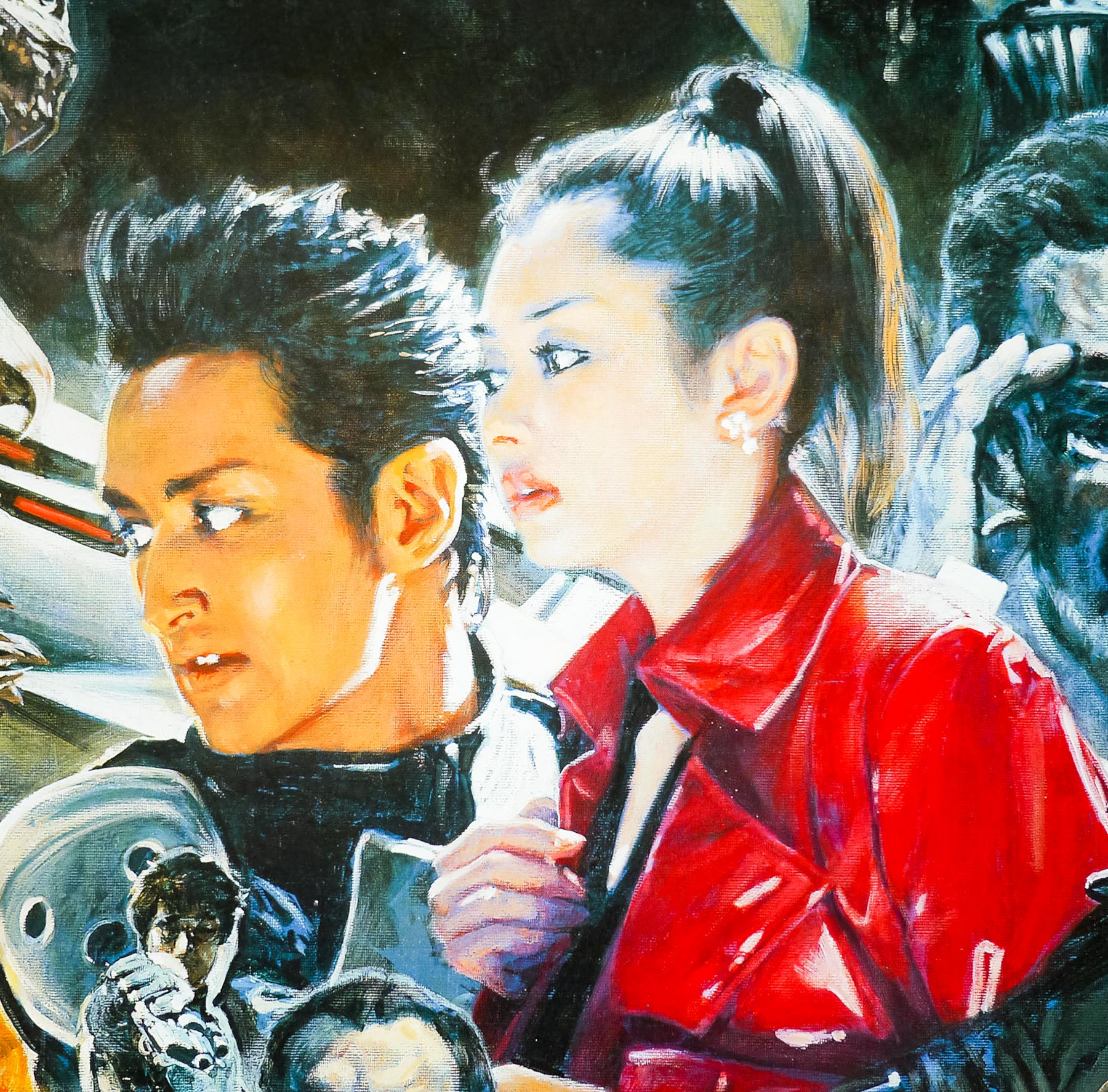
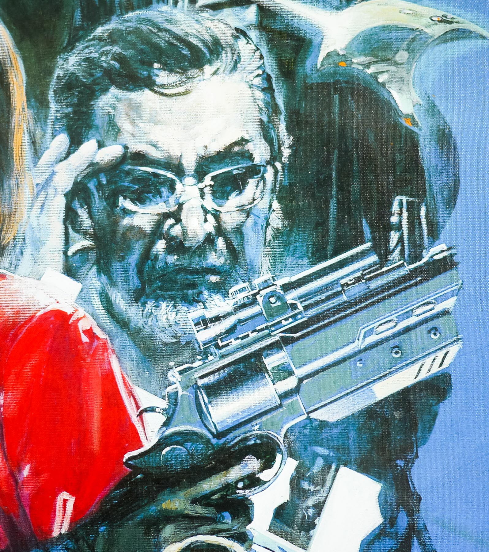
- Masahiro Matsuoka, Rei Kikukawa, Don Frye, Maki Mizuno, Kazuki Kitamura, Kane Kosugi, Kumi Mizuno, Akira Takarada, Kenji Sahara, Masakatsu Funaki, Masami Nagasawa, Chihiro Ohtsuka
- Origin of Film
- Japan
- Type of Poster
- B2
- Style of Poster
- Montage style
- Origin of Poster
- Japan
- Year of Poster
- 2004
- Designer
- Unknown
- Artist
- Noriyoshi Ohrai
- Size (inches)
- 20 6/16" x 28 13/16"
- SS or DS
- SS
- Tagline
- --
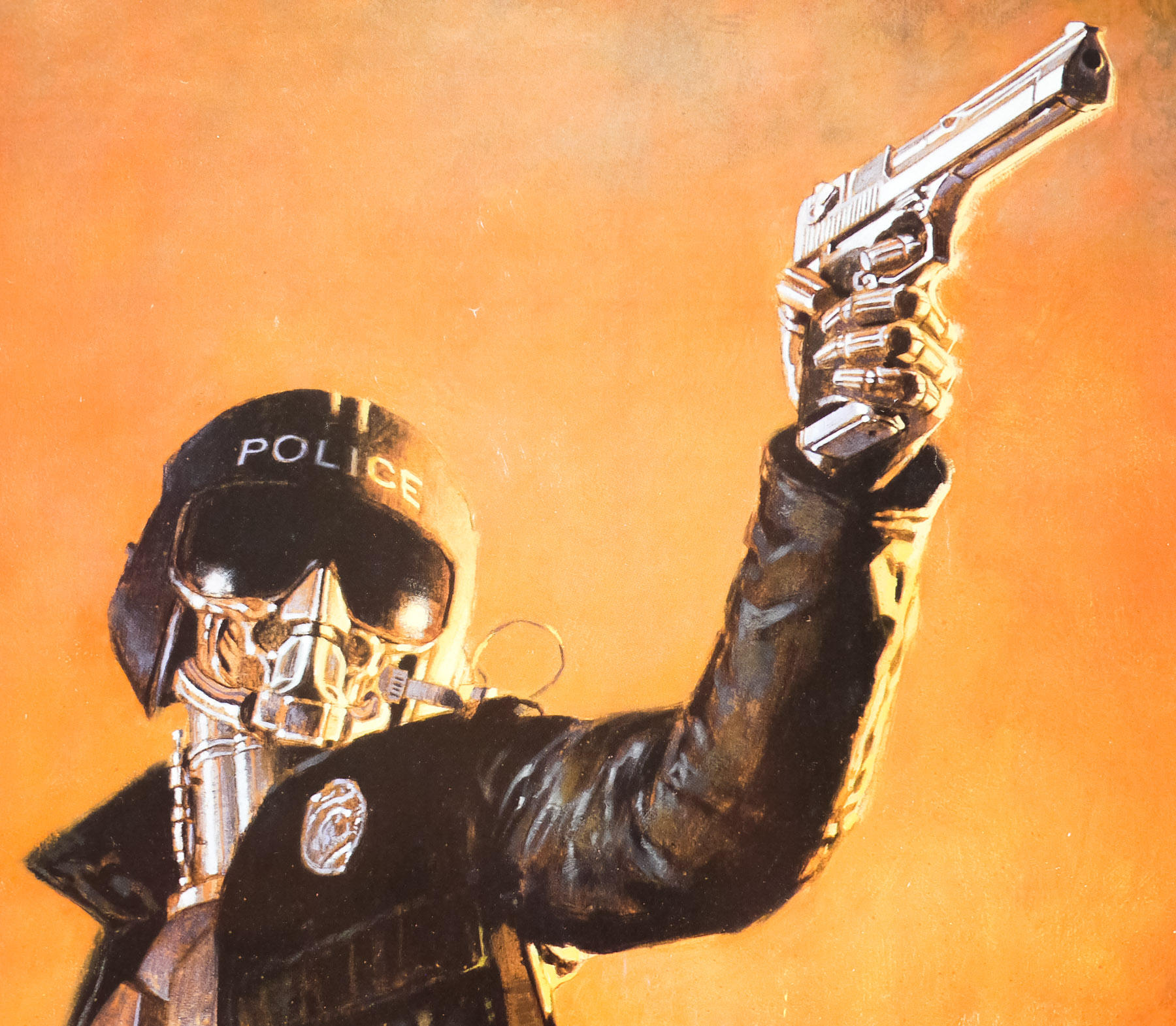
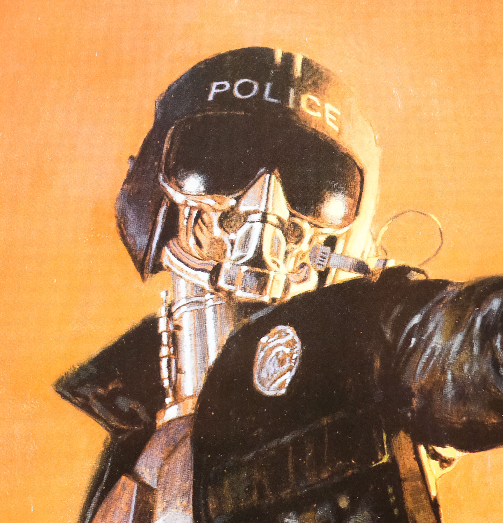
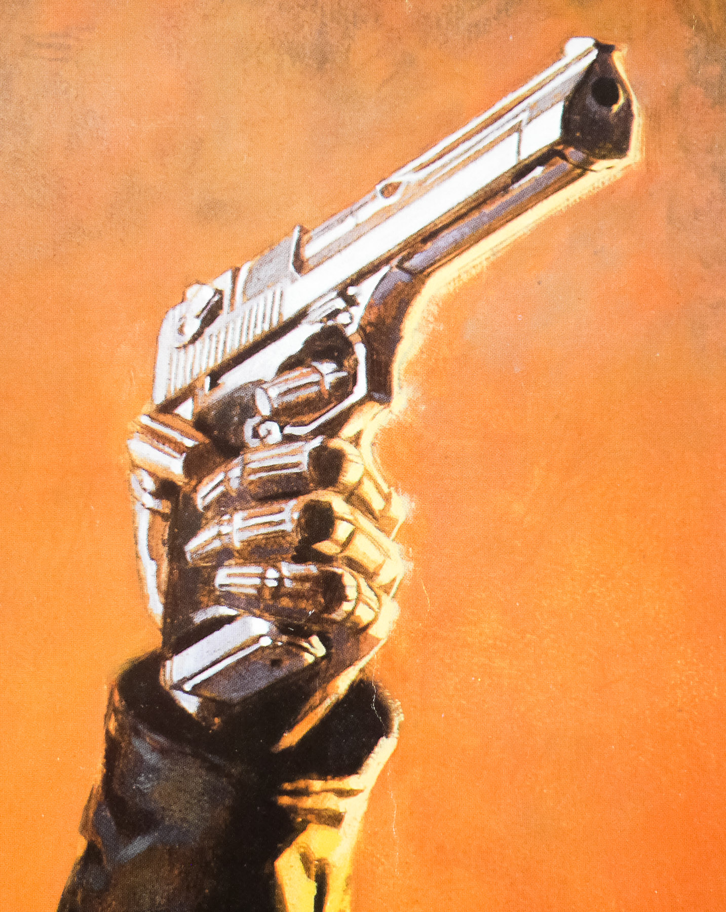
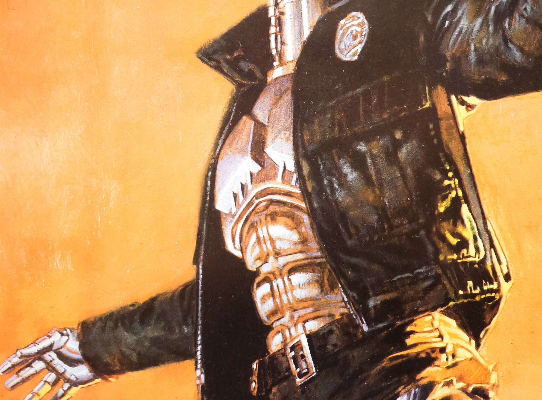
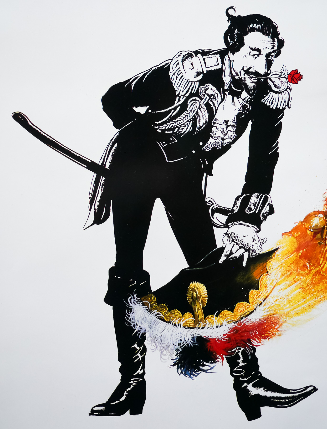
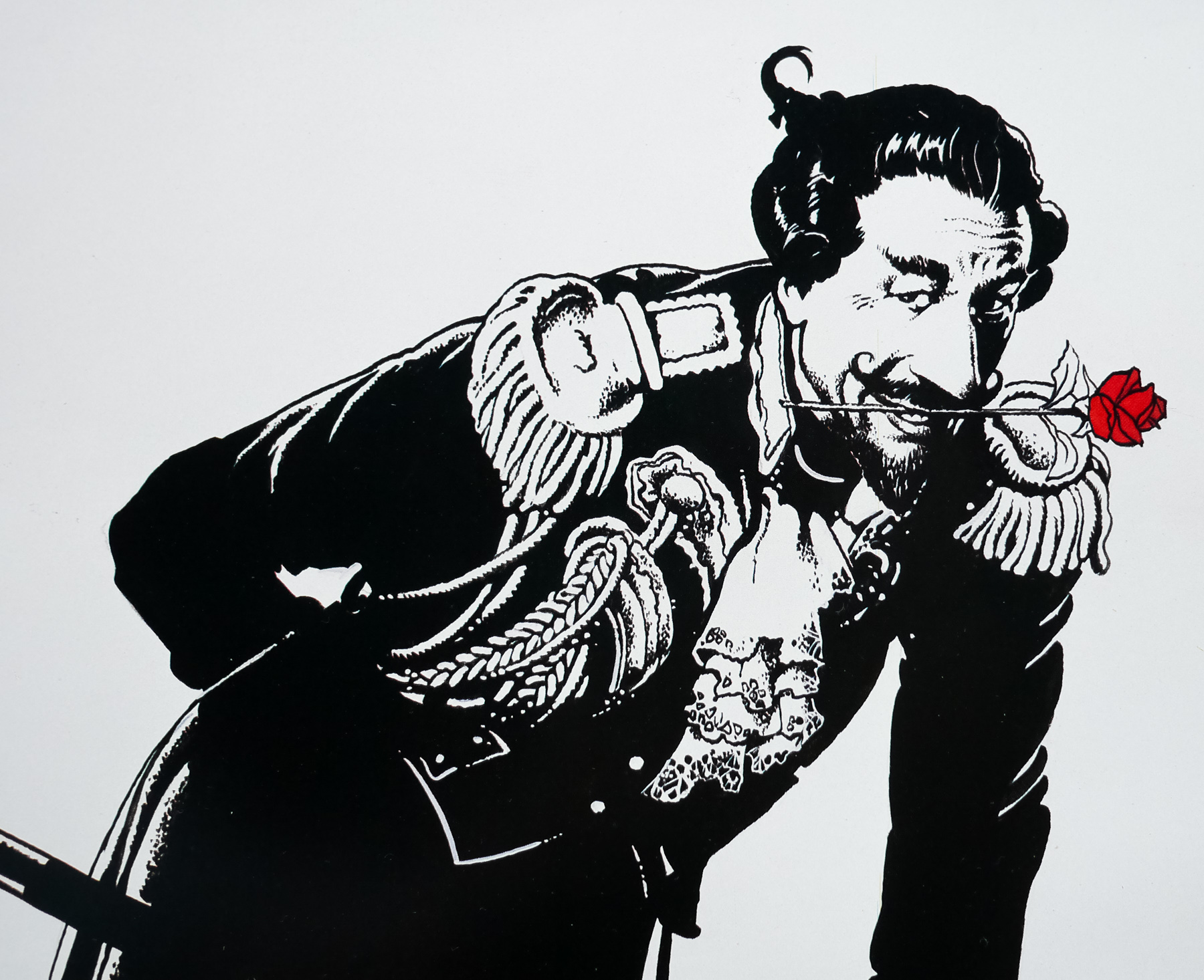
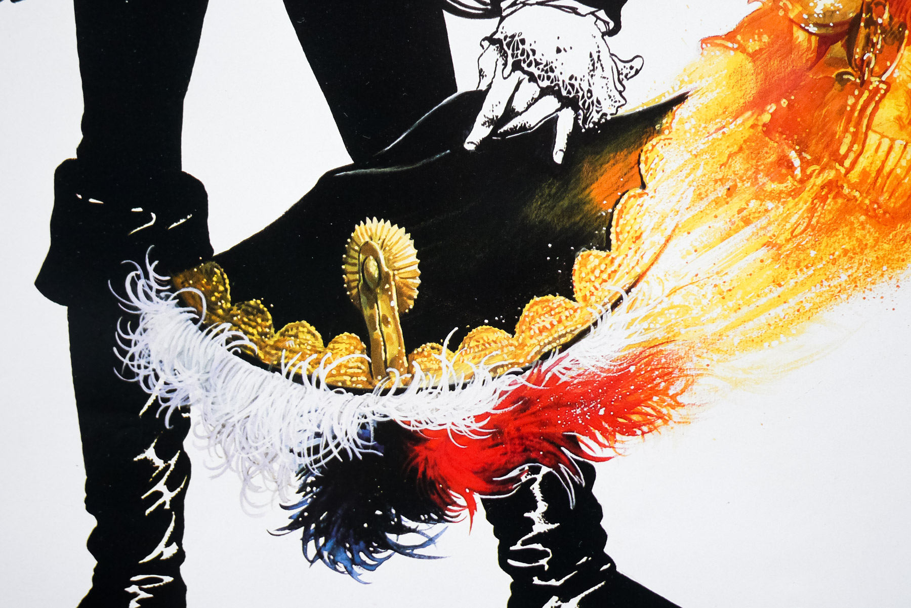
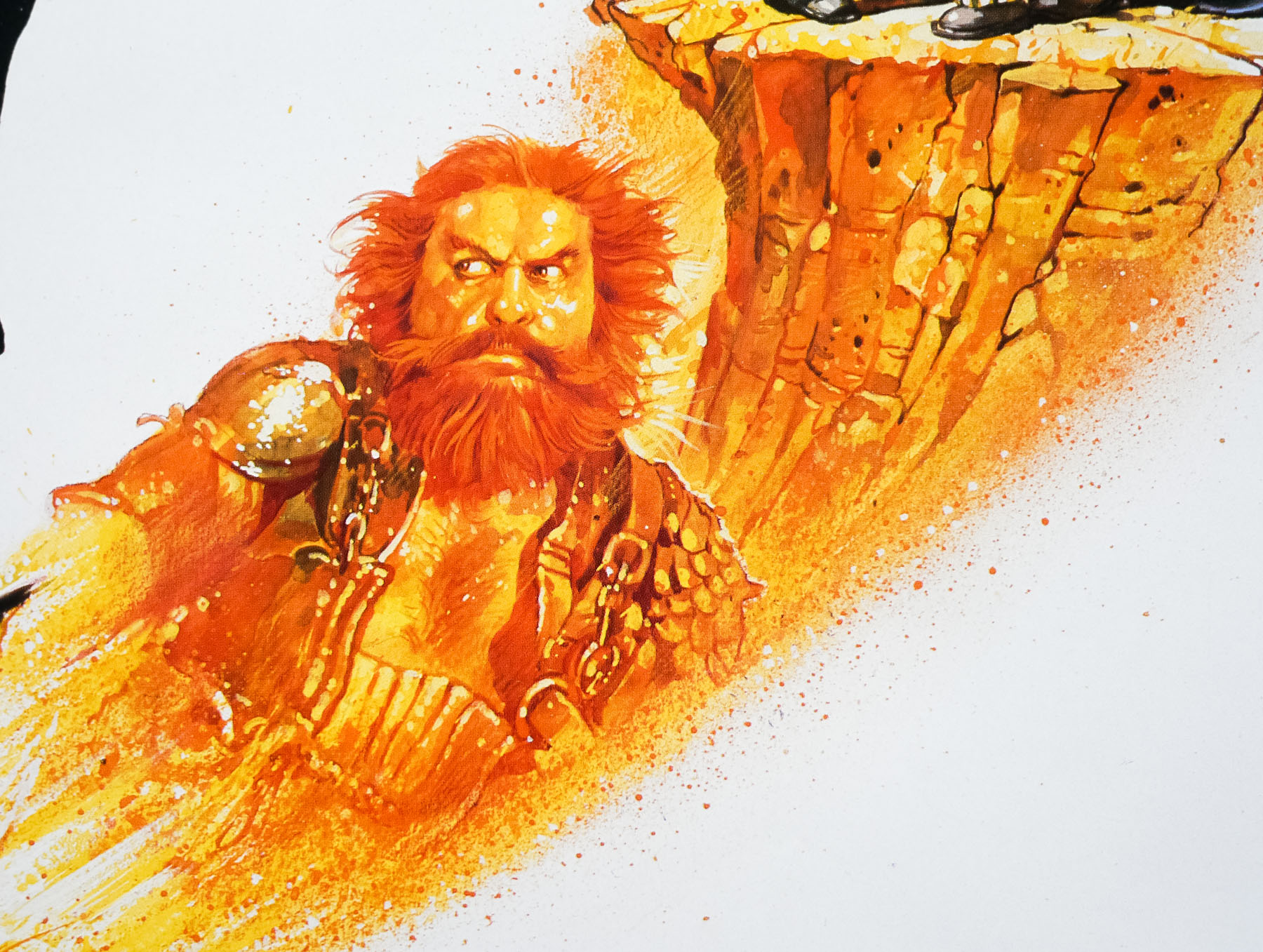
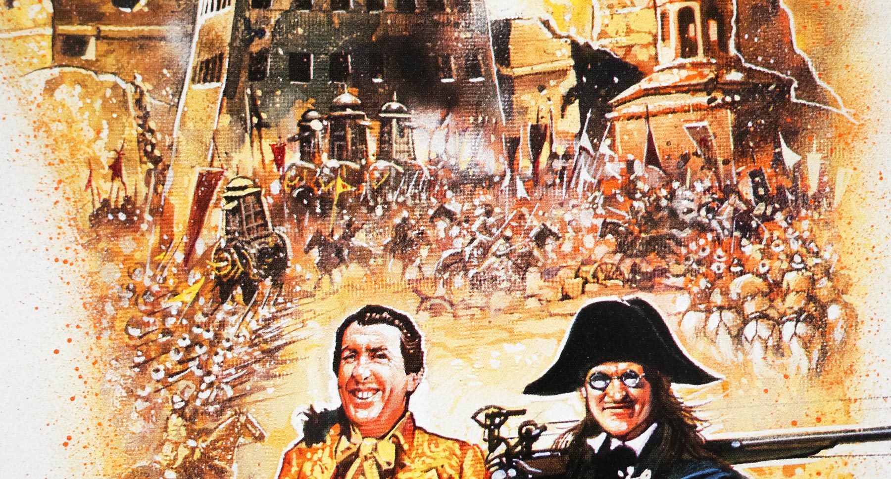
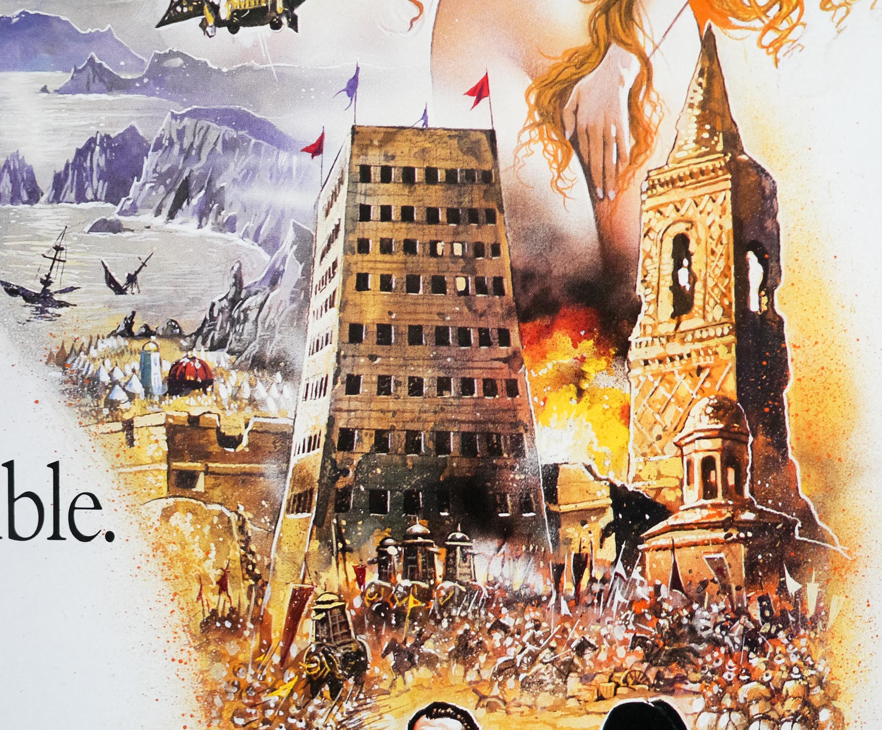
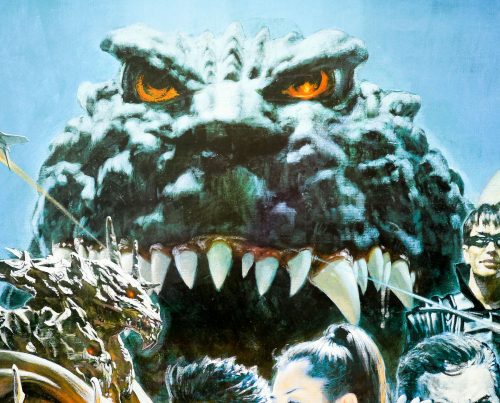
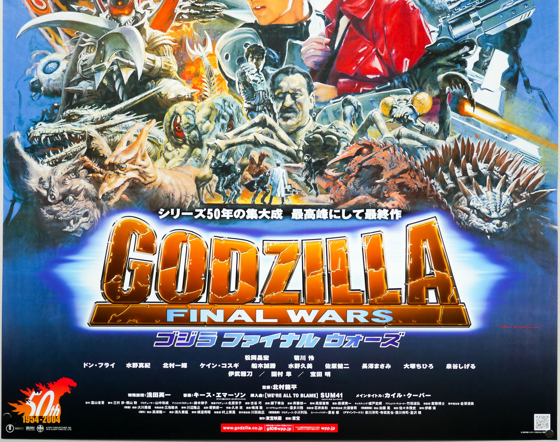
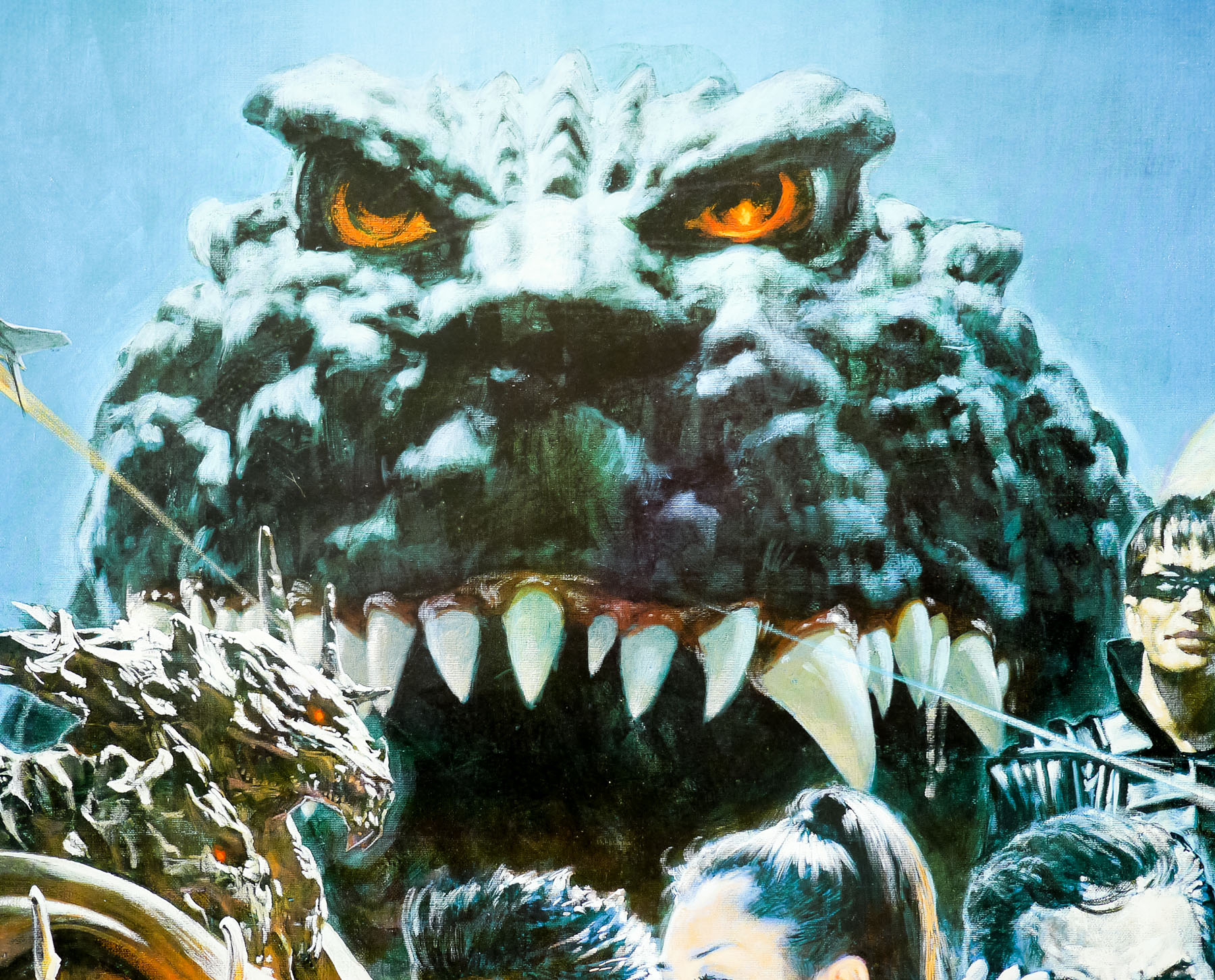
This is the B2 poster for the Japanese release of Godzilla: Final Wars, which was the 28th film in the long-running franchise featuring the King of the Kaiju (giant monsters). The film was also the sixth release in the third generation of Godzilla films (known as the Millennium Series). Final Wars was something of a milestone for the film’s production company Toho Company Ltd as it marked 50 years since the release of the original film that started it all and also marked a break in the production of Godzilla films, with Toho declaring they wouldn’t film another Japanese entry in the franchise for at least 10 years and then dismantling the stage used for most entries.
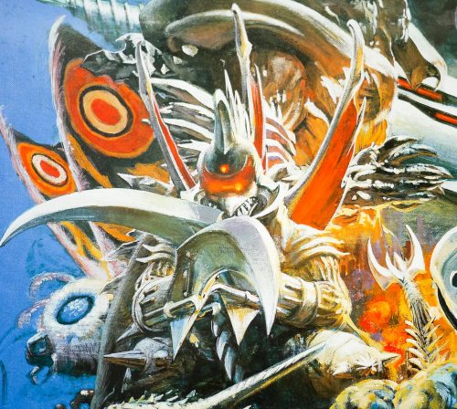
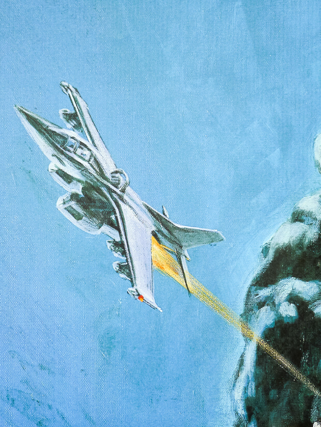
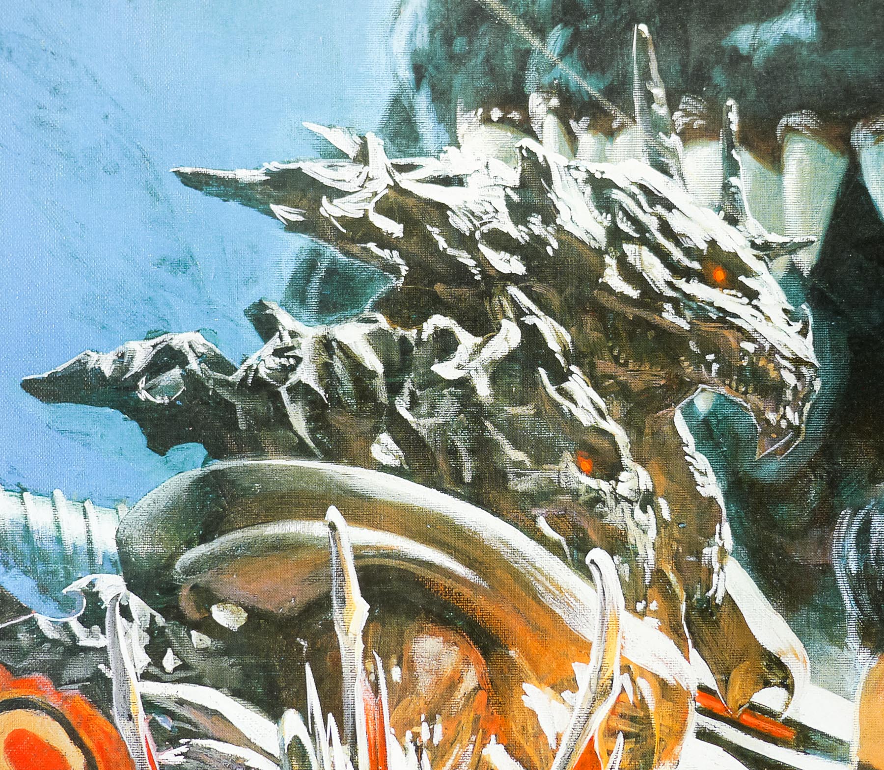
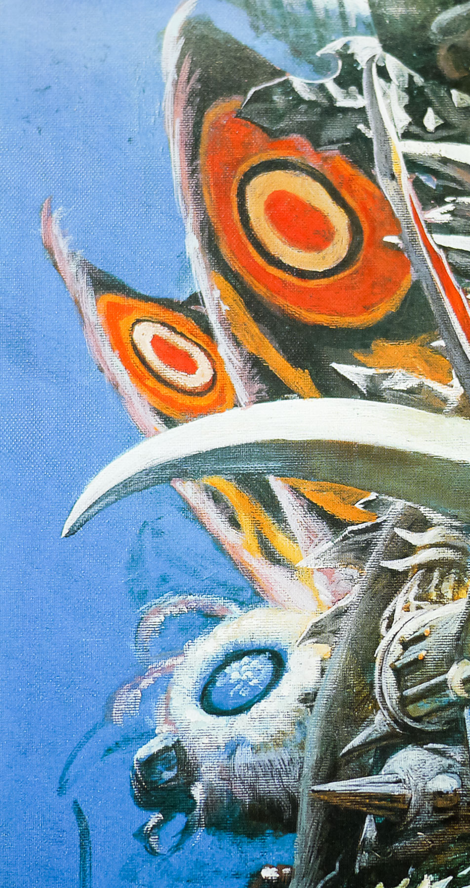
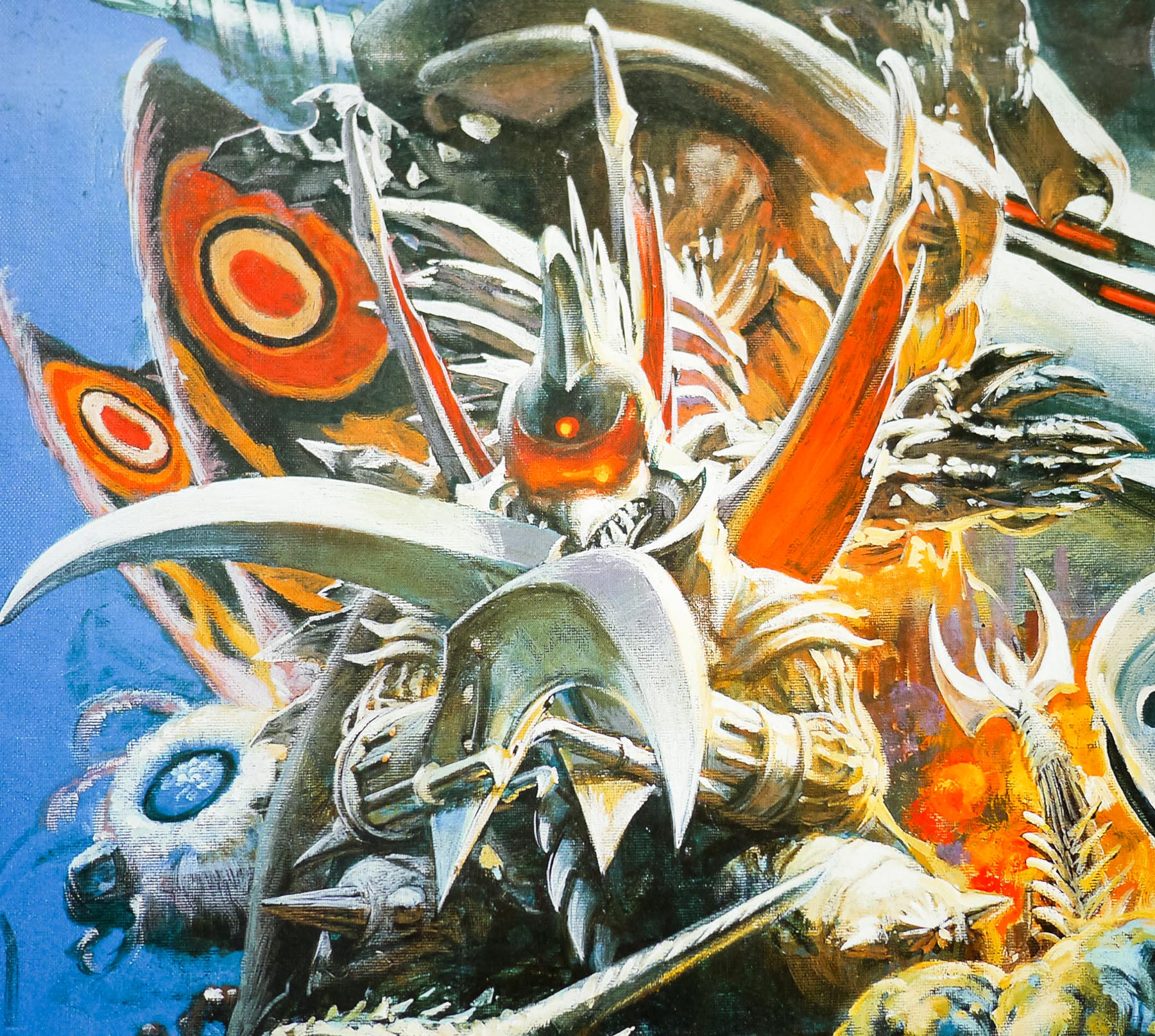
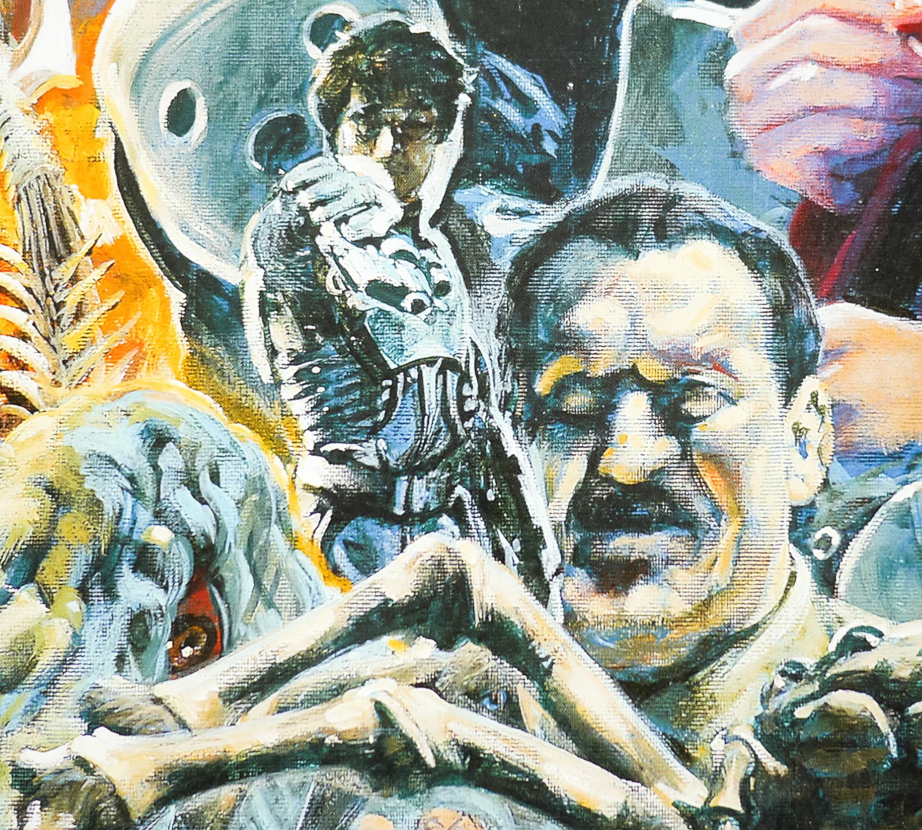
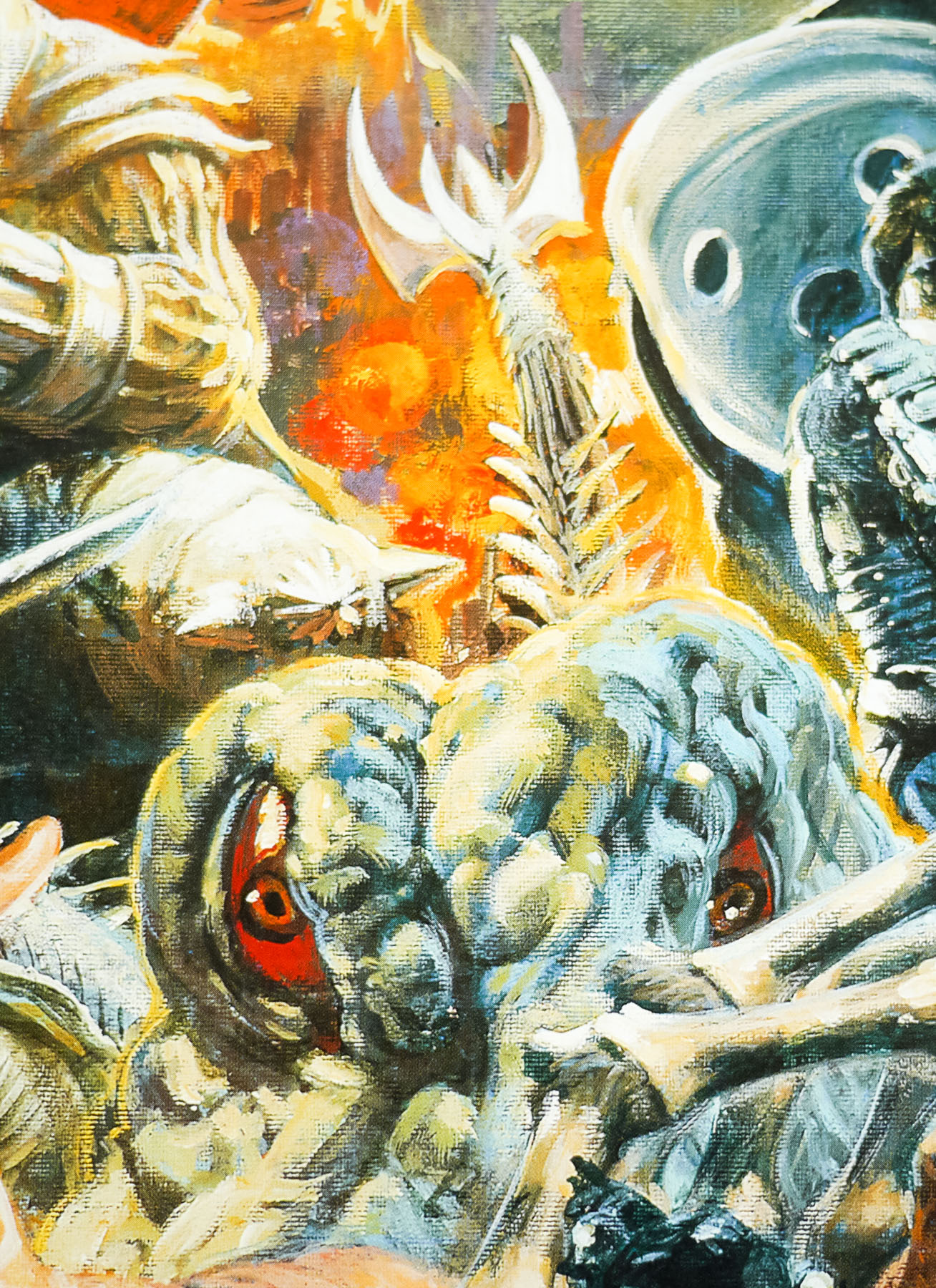
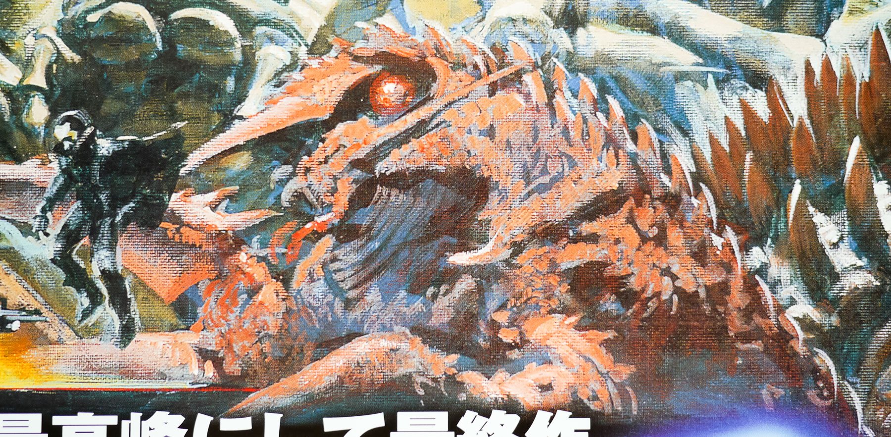
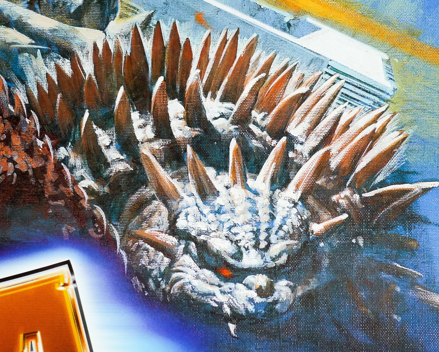
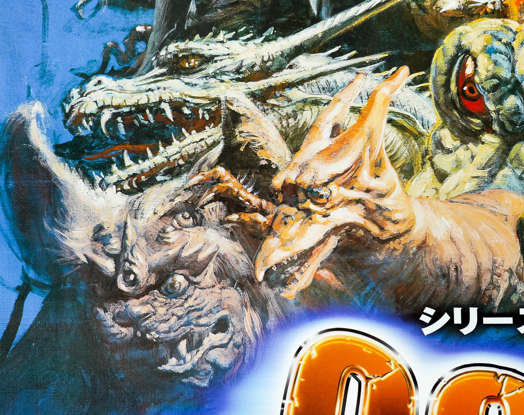
Final Wars is set in 2044 and sees the Earth Defence Force dealing with an alien threat in the from of the Xiliens who secretly unleash Kaiju across the planet, including Rodan, Ebirah and Anguirus. After cities like Sydney, Shanghai and Paris are almost destroyed the aliens remove the Kaiju in an act of supposed benevolence and warn the earth about an impending impact from an asteroid called Gorath. The UN is disbanded and an alliance called the Space Nations is formed to tackle the new threat. A few members of the Earth Defence Force distrust the aliens’ intentions and discover that they were responsible for unleashing the Kaiju and that they really intend to harvest humanity for food. The group hatch a plan to unleash Godzilla from his frozen tomb in Antarctica where he’s lain for 40 years to help them tackle the threat.
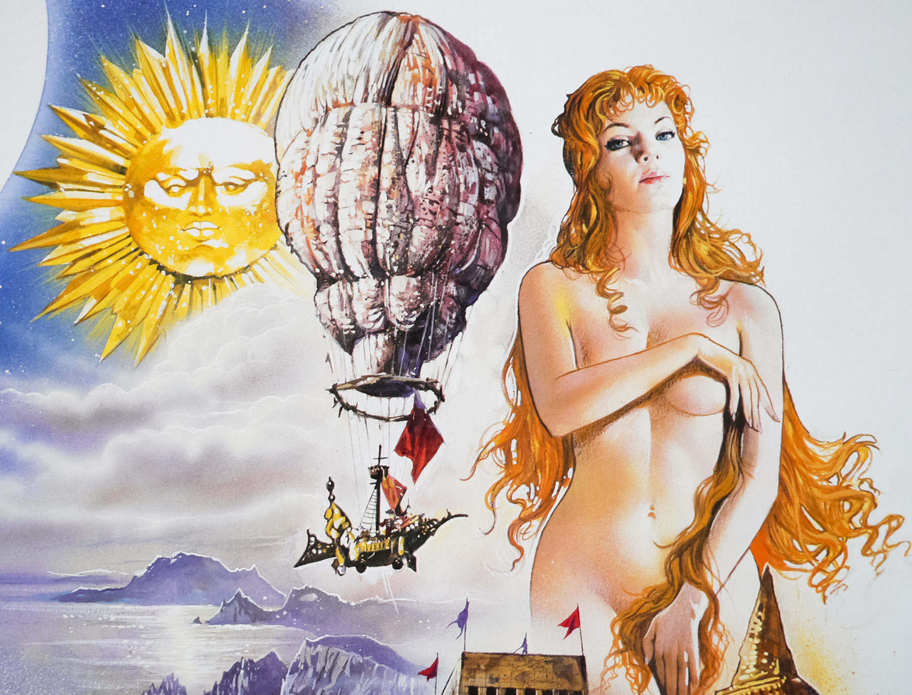
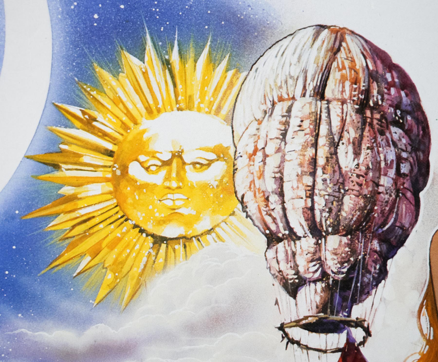
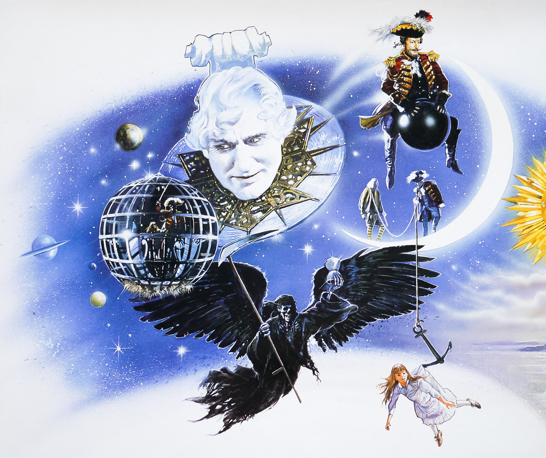
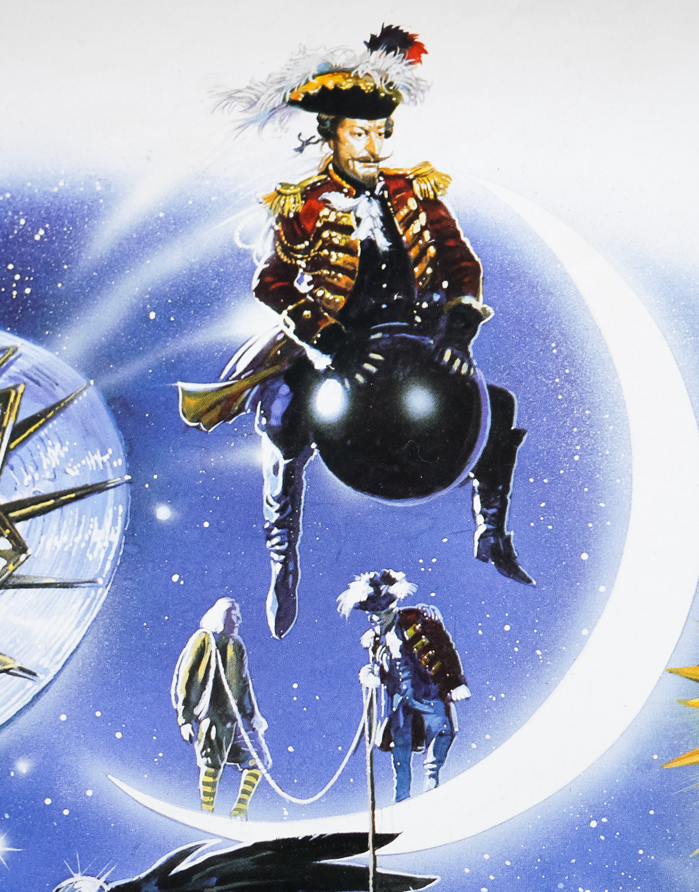
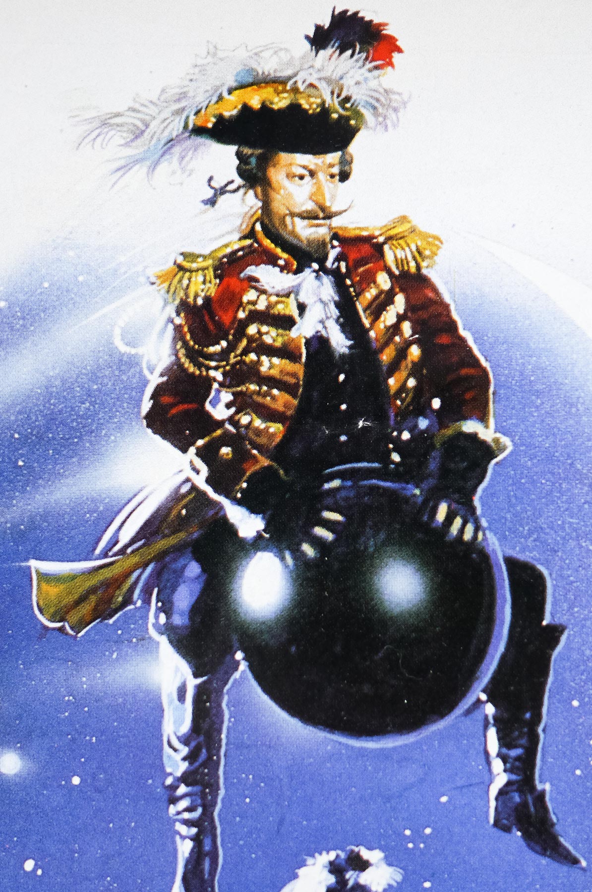
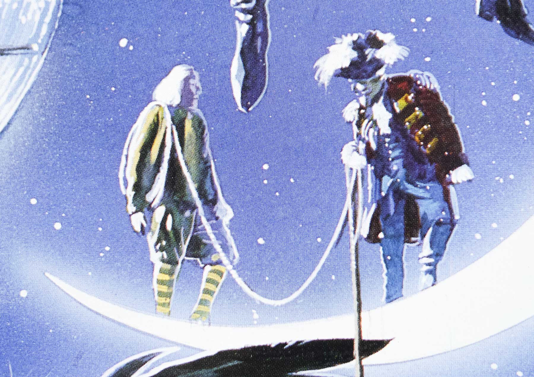
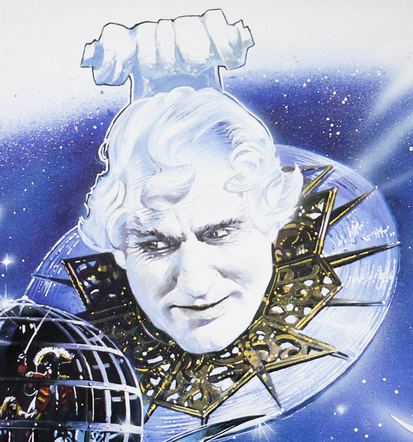
The film is something of a greatest hits compilation, featuring as it does monsters and human characters from the franchise’s past, and the montage nature of this poster suits it well. Toho spent almost $20 million producing the film, which was the highest budget in the franchise to date, but unfortunately the medley of monsters and anniversary tag didn’t help it’s critical or commercial performance. It’s eventual box-office takings totalled just $12 million and made it the worst performing film in the series for 27 years.
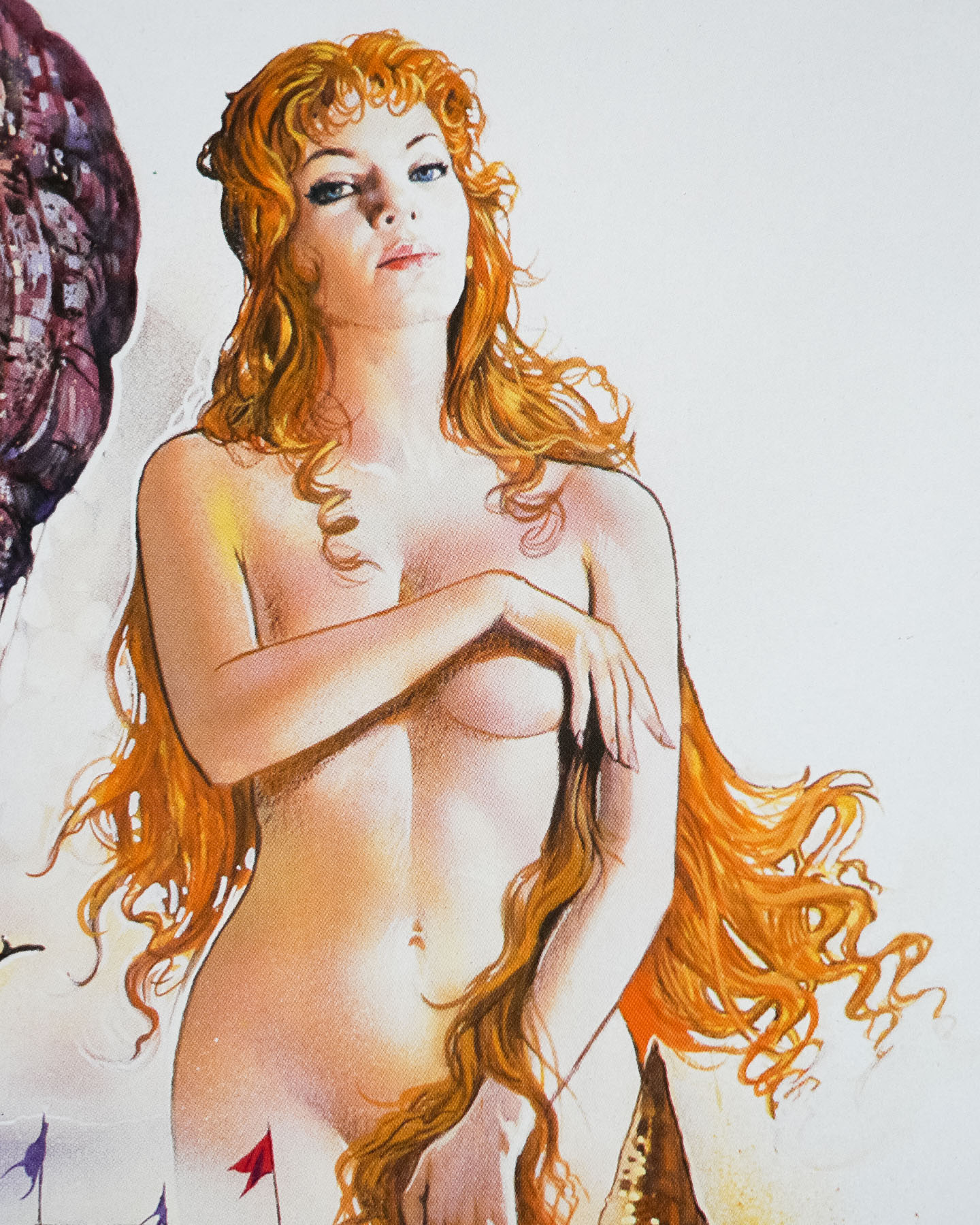
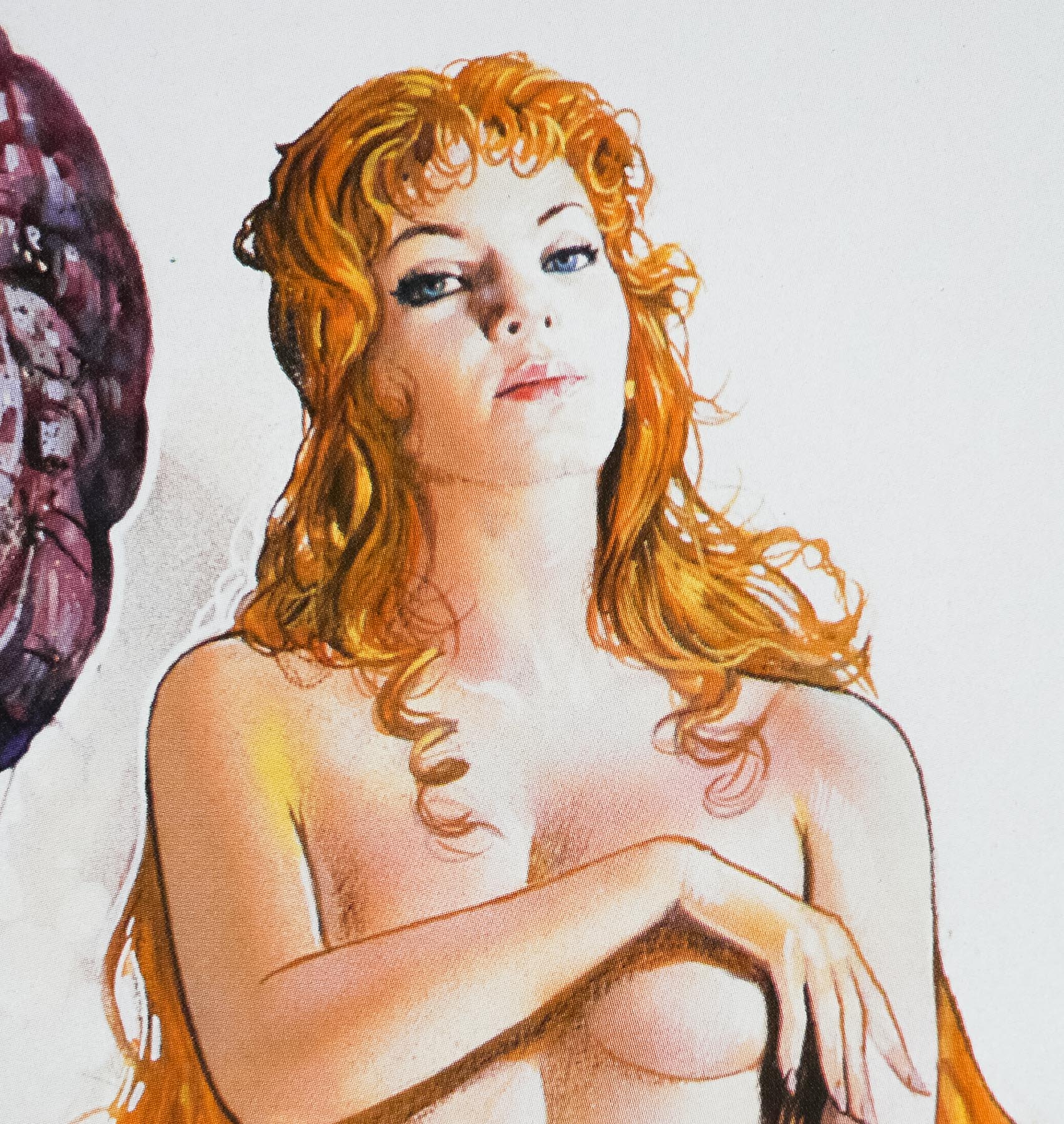
The artwork on this poster is by Noriyoshi Ohrai, my favourite Japanese artist and certainly in my top five greatest film poster illustrators of all time. He’s responsible for a number of other Star Wars related posters, including this lovely 1982 B2 to celebrate the release of the Japanese dubbed version of the original film. He also worked on other posters in the Godzilla franchise, some of which can be seen here. In March 2014 a retrospective exhibition was held in Japan of Ohrai’s work and I made the trip over to Miyazaki to see the exhibition. I’m very glad I did as it featured most of his original artwork and a whole array of posters and book covers. A full report will follow soon.
The posters I’ve managed to collect by Noriyoshi Ohrai can be seen by clicking here.