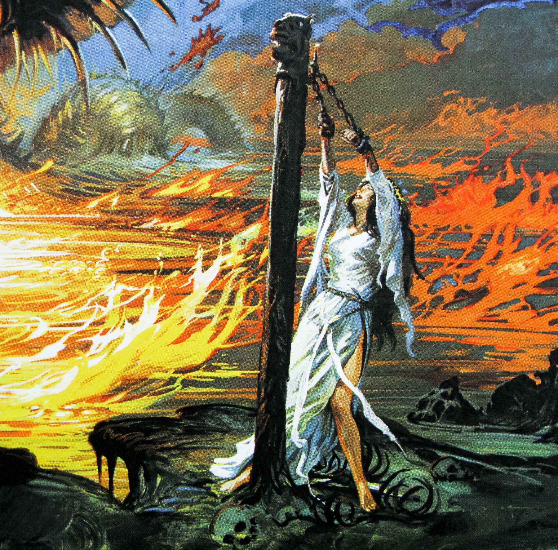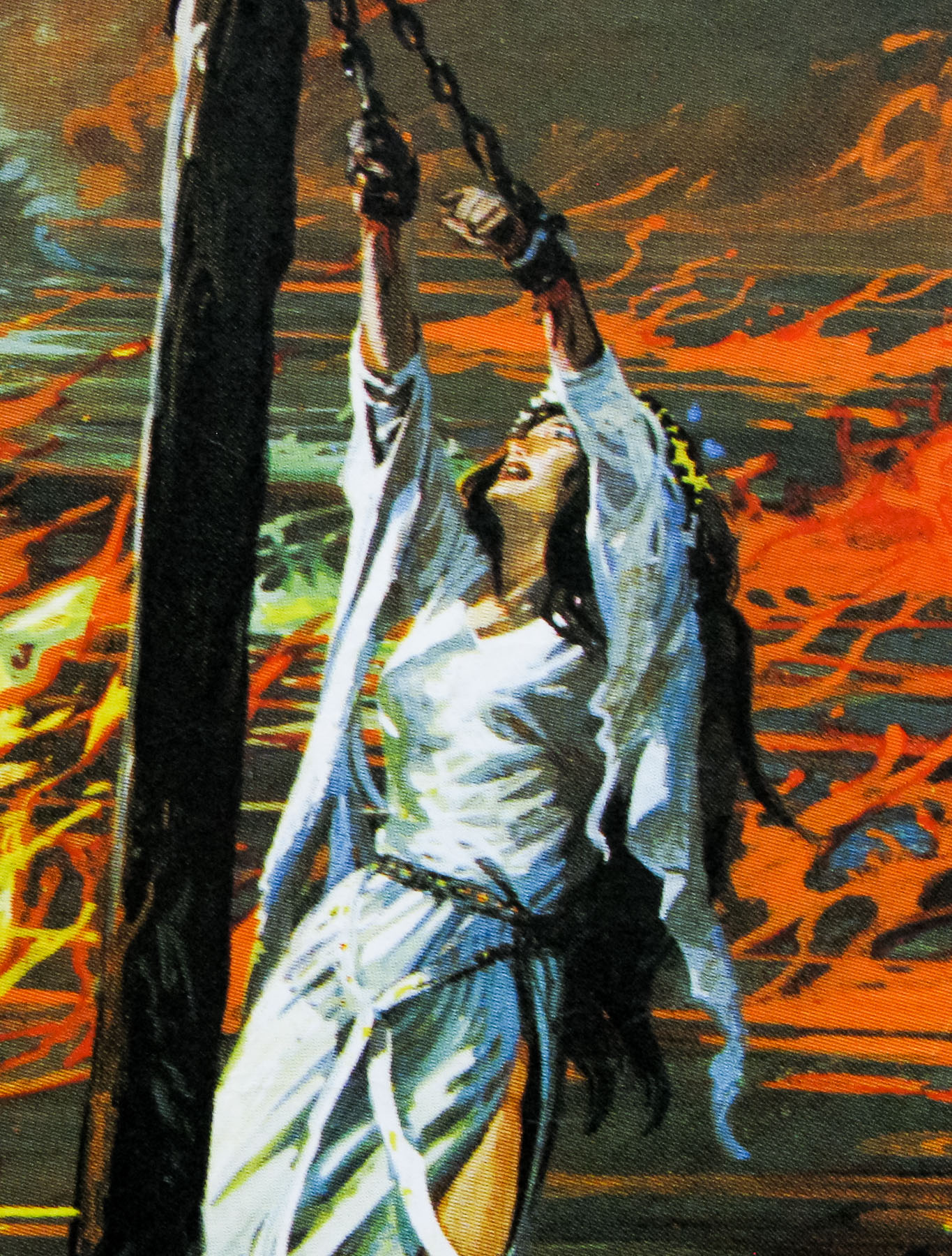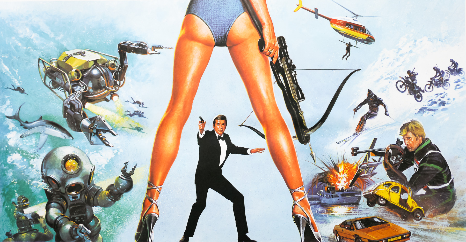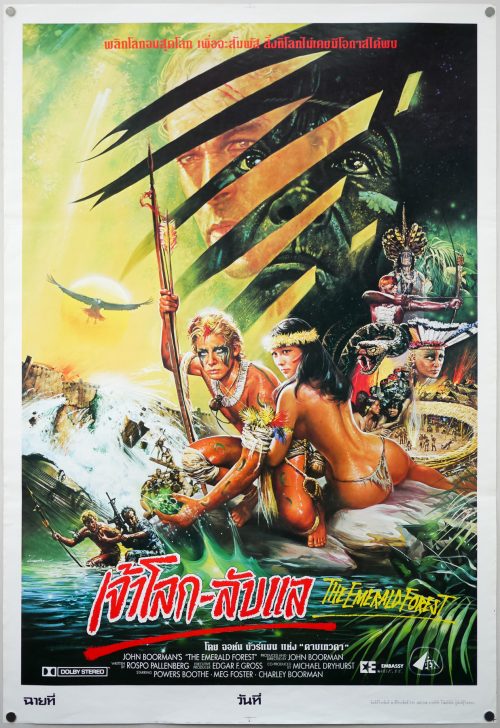
Poster detail
1-5

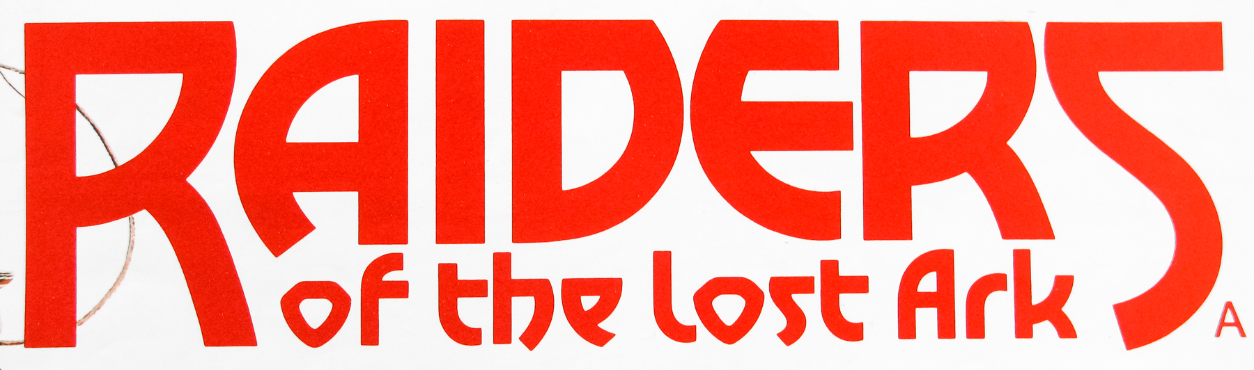
- Title
- Raiders of the Lost Ark
- AKA
- --
- Year of Film
- 1981
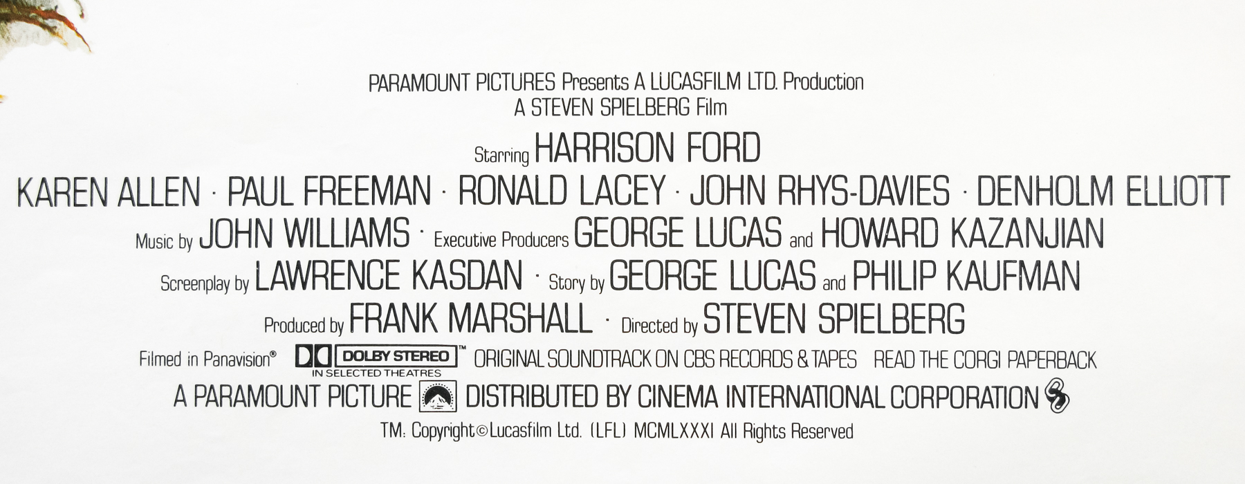
- Director
- Steven Spielberg
- Starring
- Harrison Ford, Karen Allen, Paul Freeman, Ronald Lacey, John Rhys-Davies, Denholm Elliott, Alfred Molina
- Origin of Film
- USA
- Genre(s) of Film
- Harrison Ford, Karen Allen, Paul Freeman, Ronald Lacey, John Rhys-Davies, Denholm Elliott, Alfred Molina,
- Type of Poster
- Quad
- Style of Poster
- Style B
- Origin of Poster
- UK
- Year of Poster
- 1981
- Designer
- Unknown
- Artist
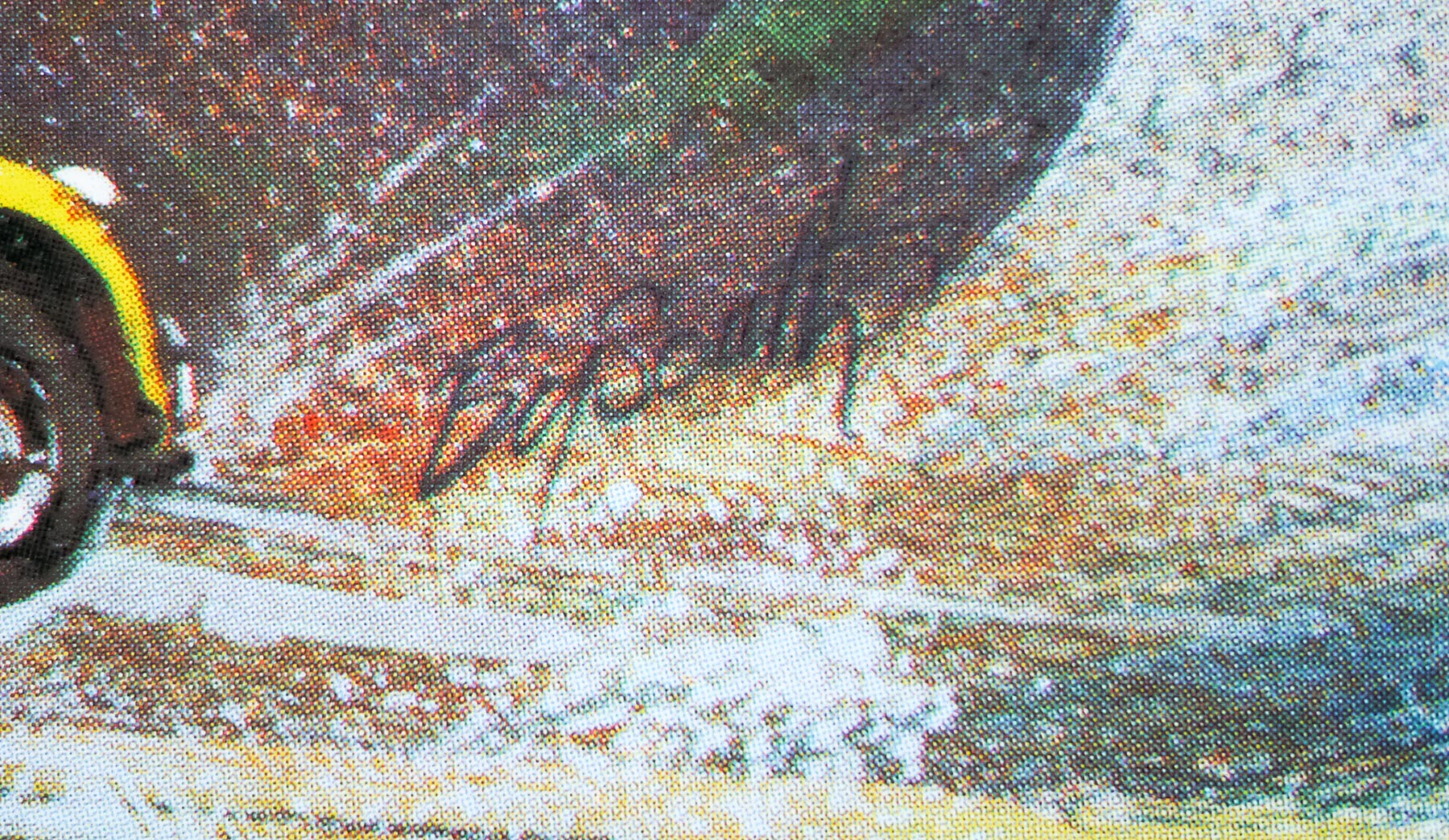
- Brian Bysouth
- Size (inches)
- 30" x 40"
- SS or DS
- SS
- Tagline
- --
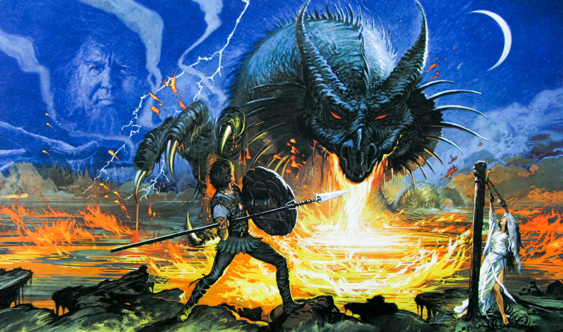
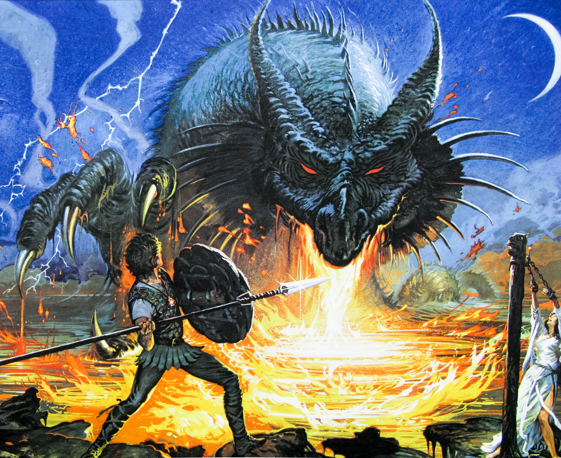
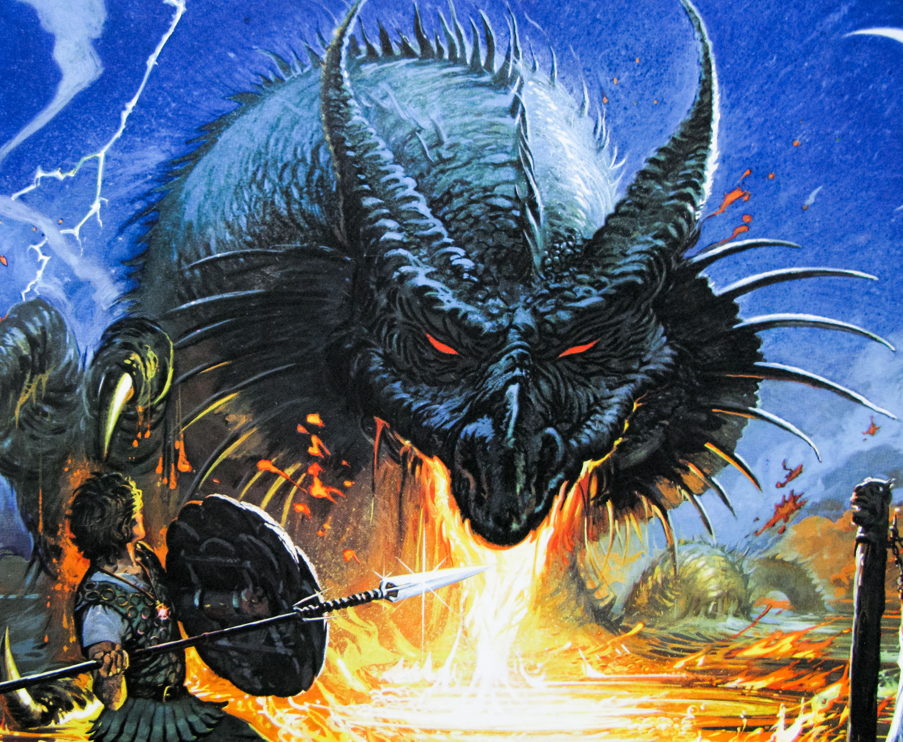
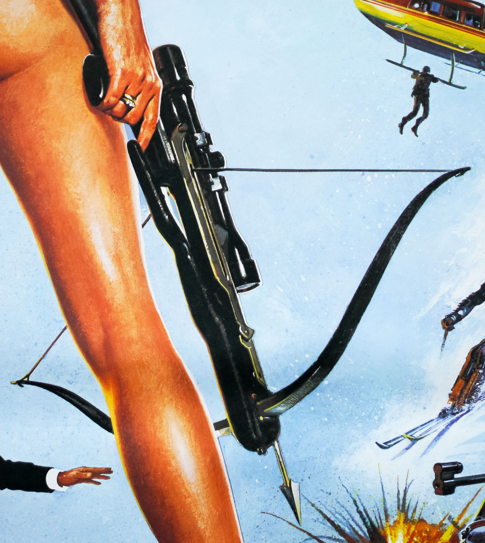
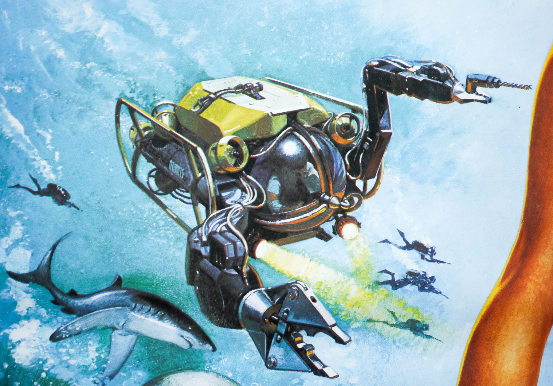
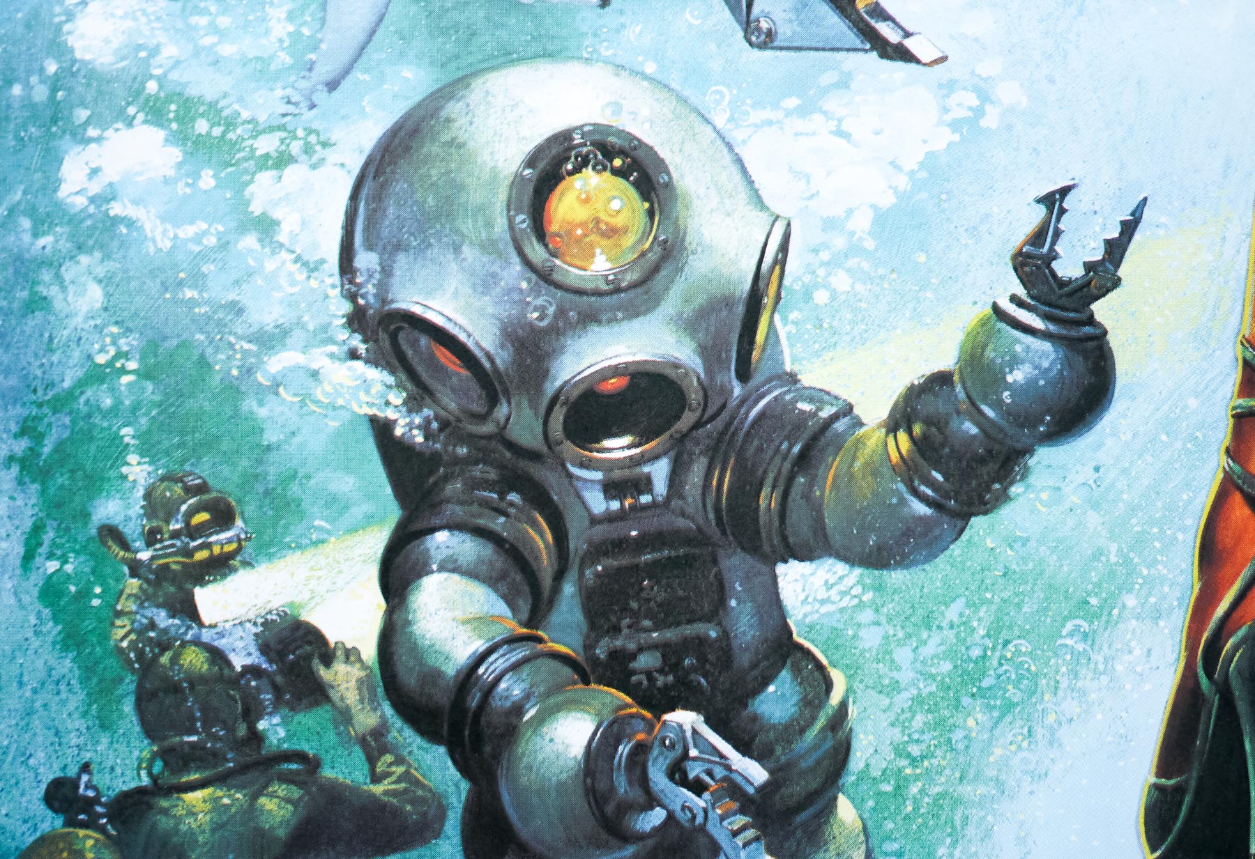
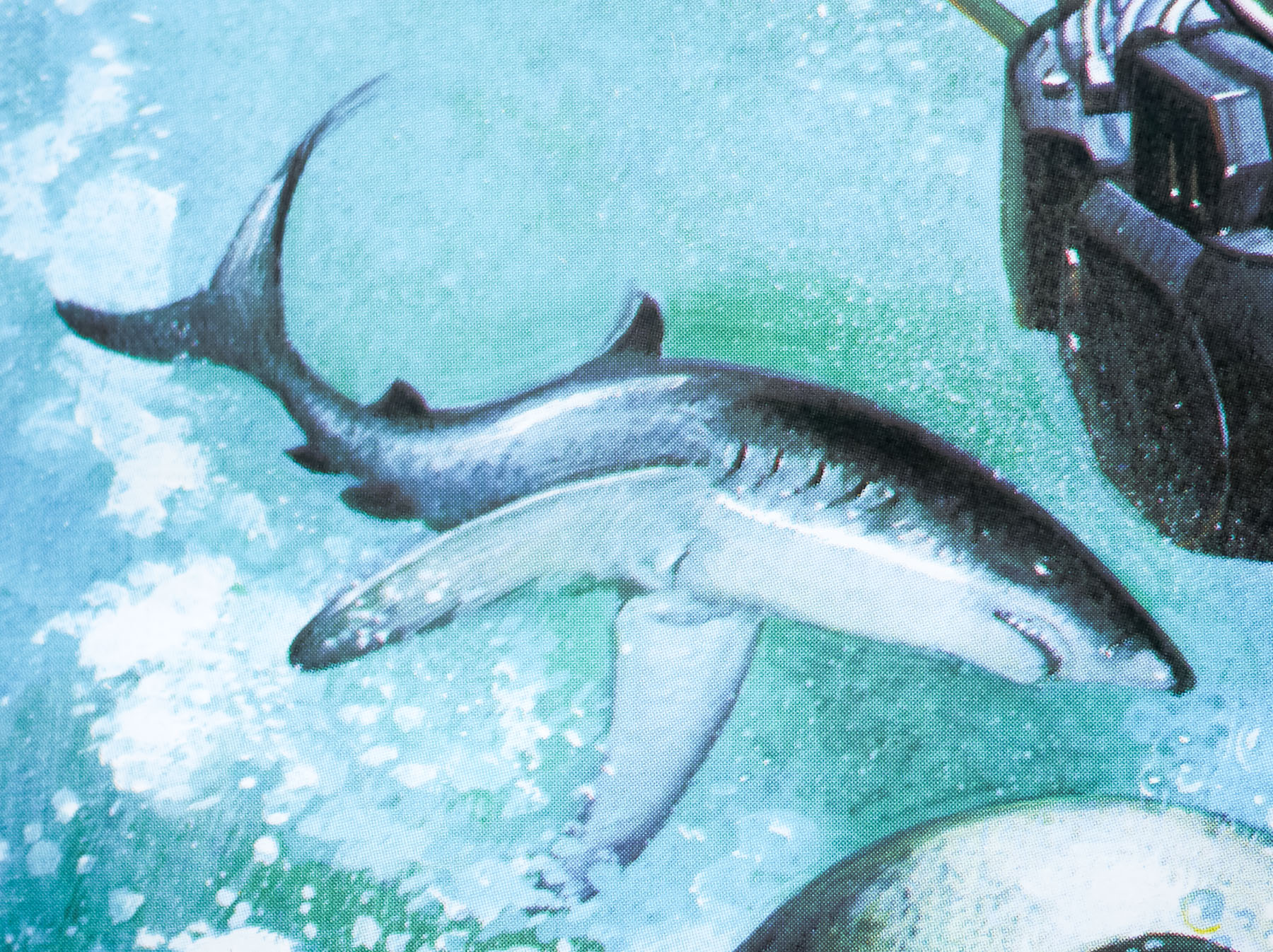
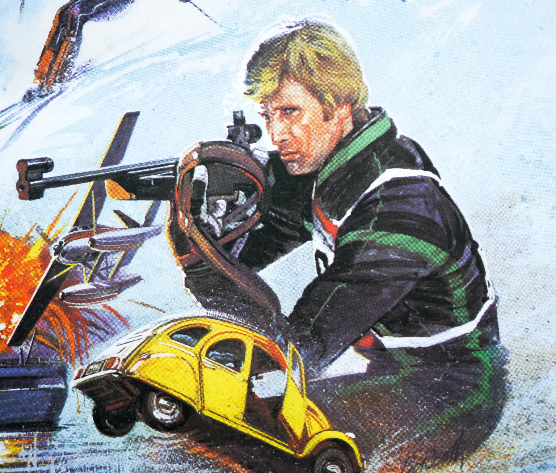
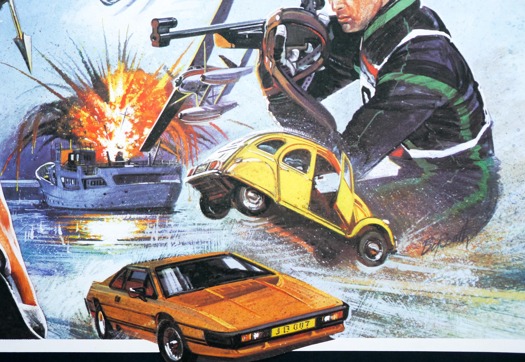
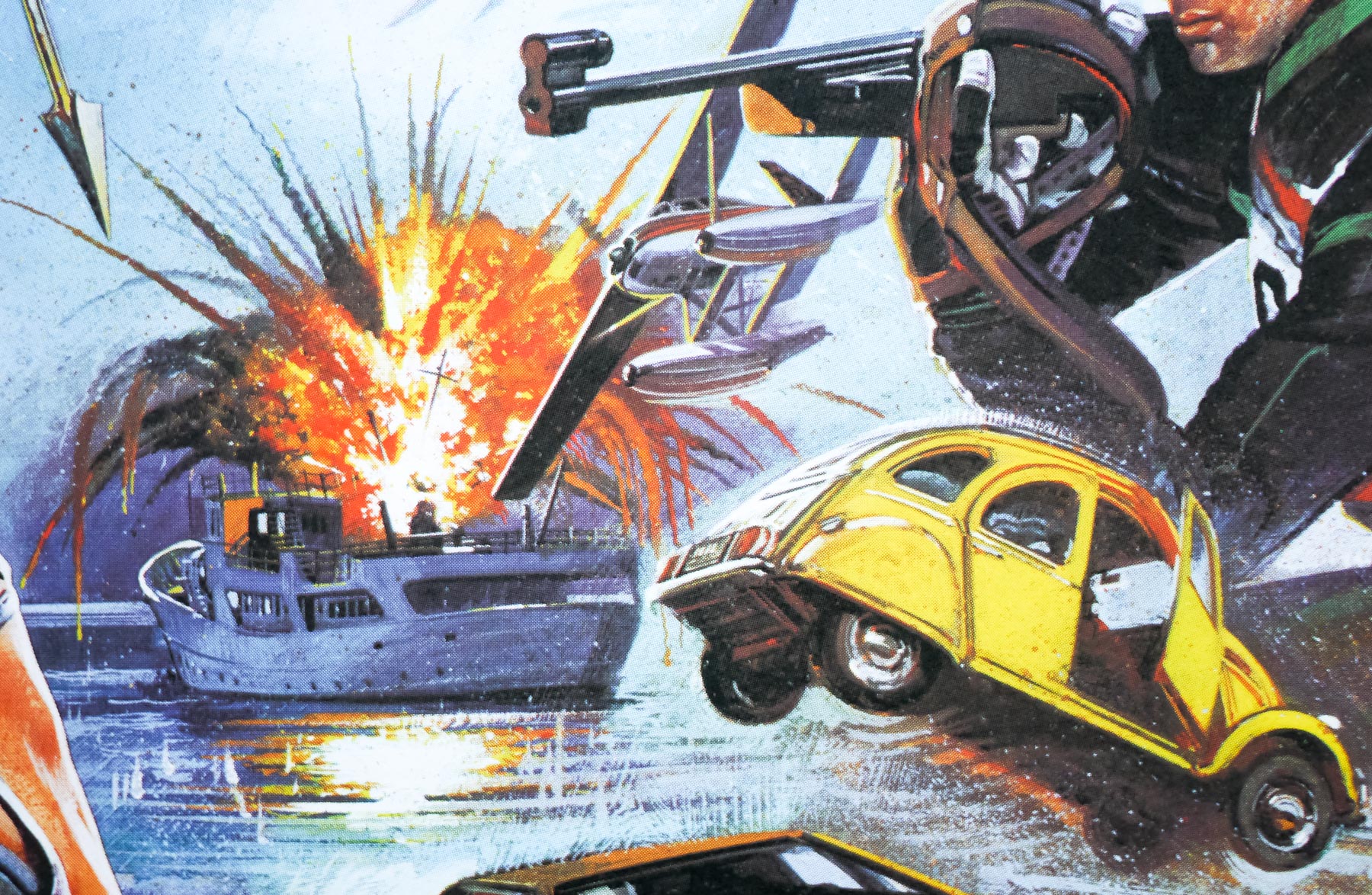
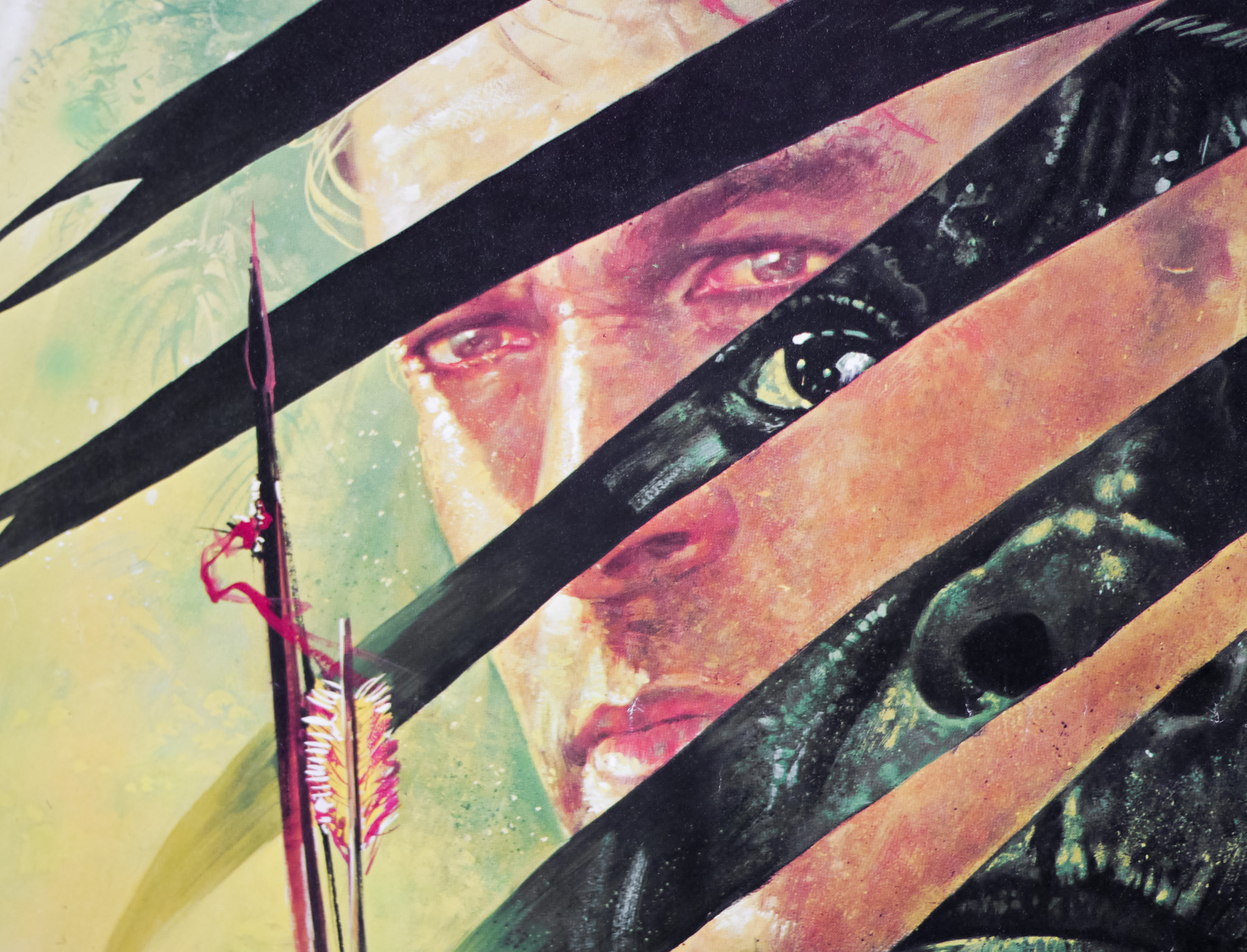
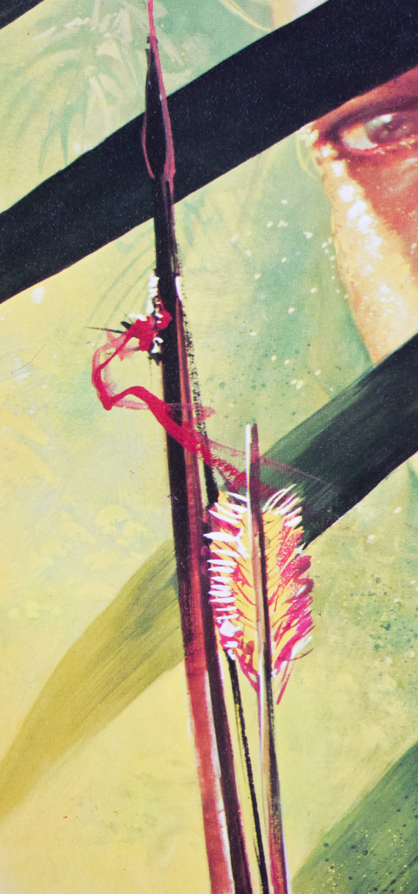
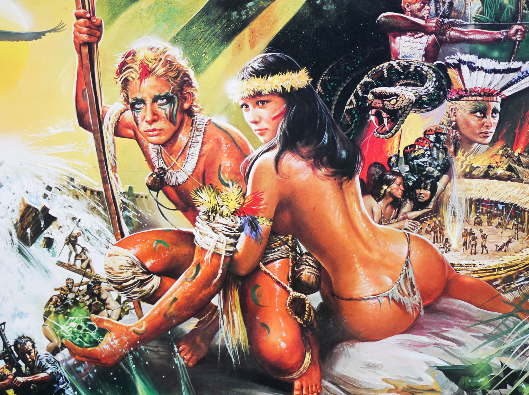
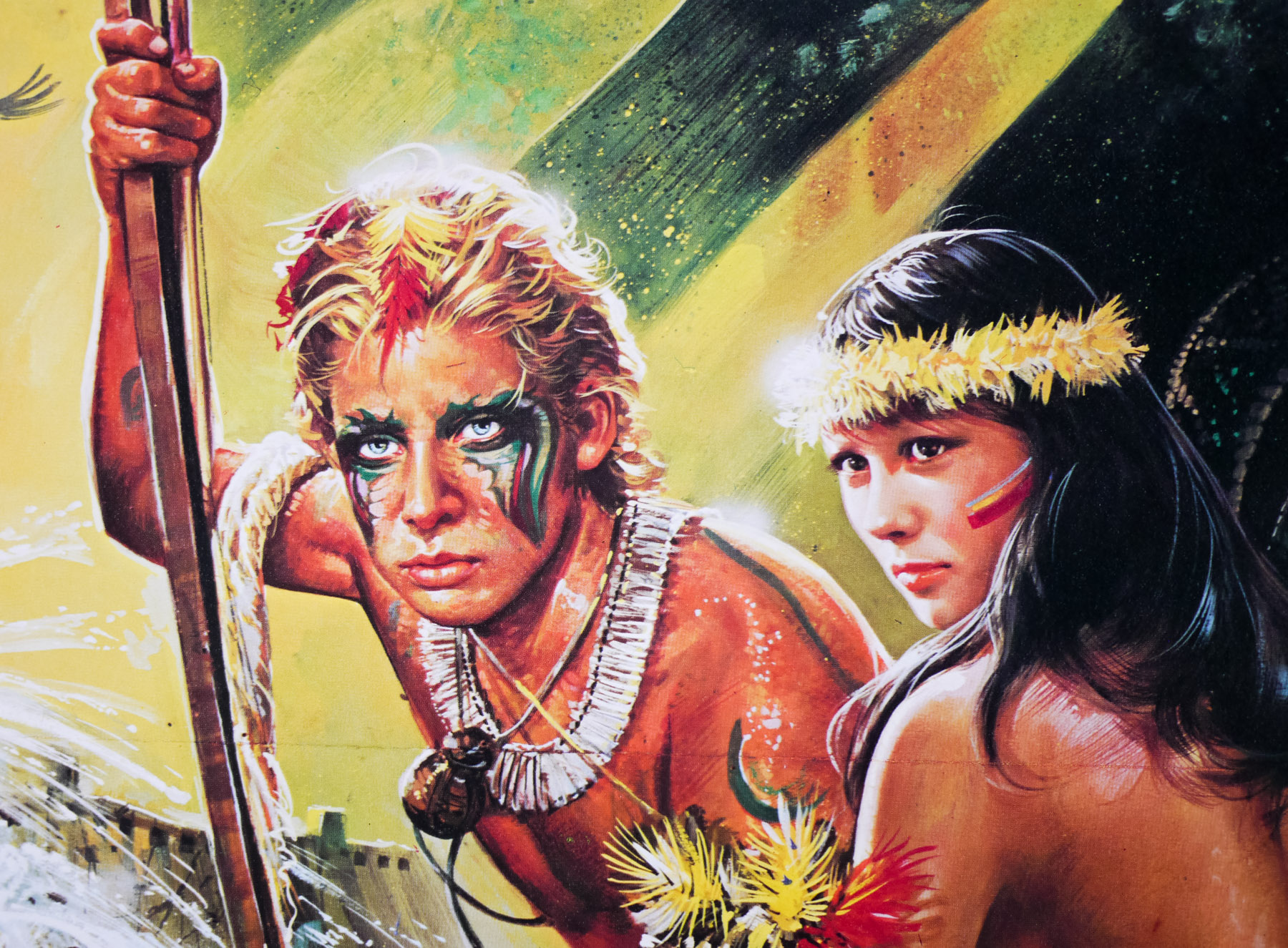
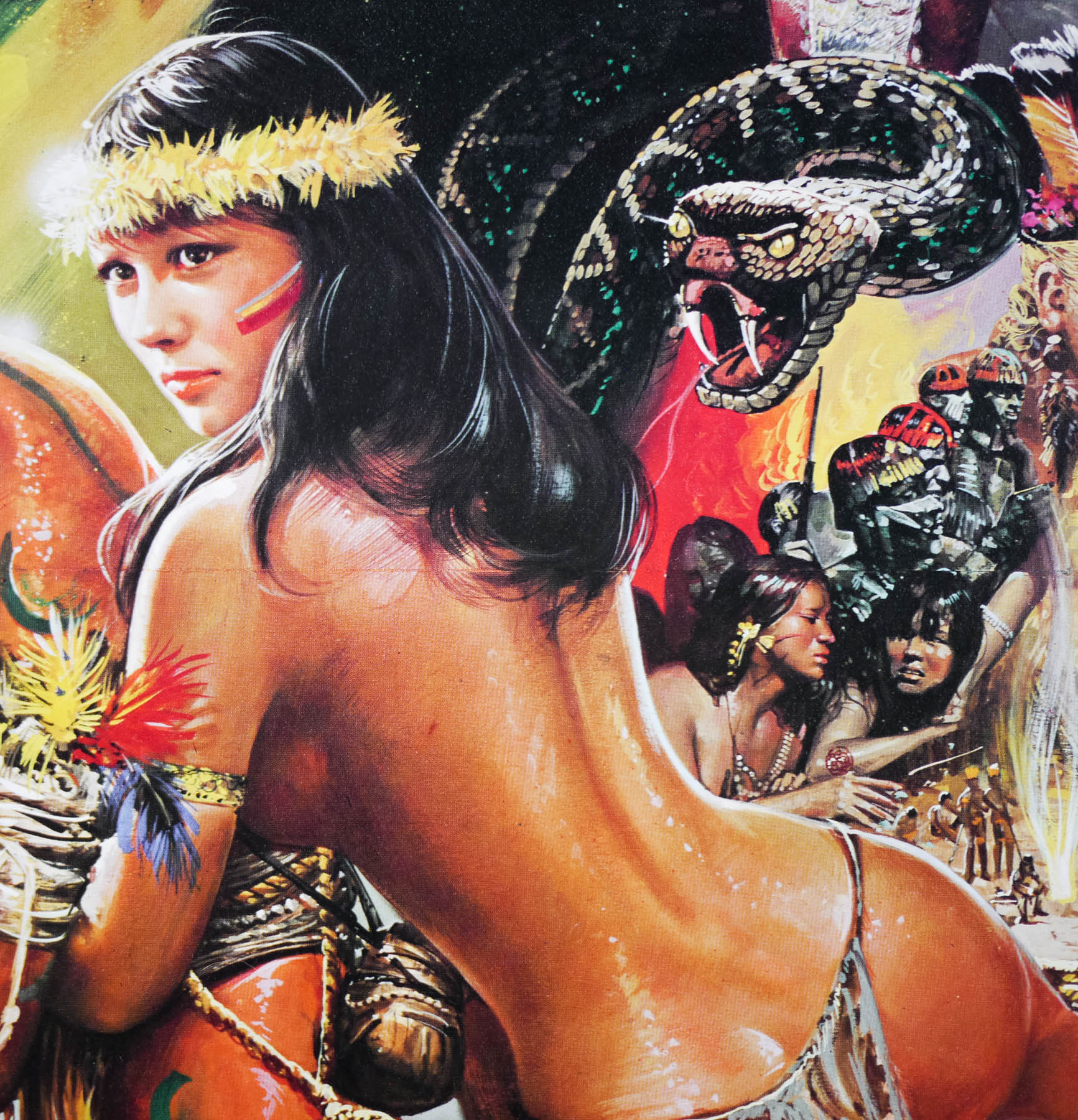
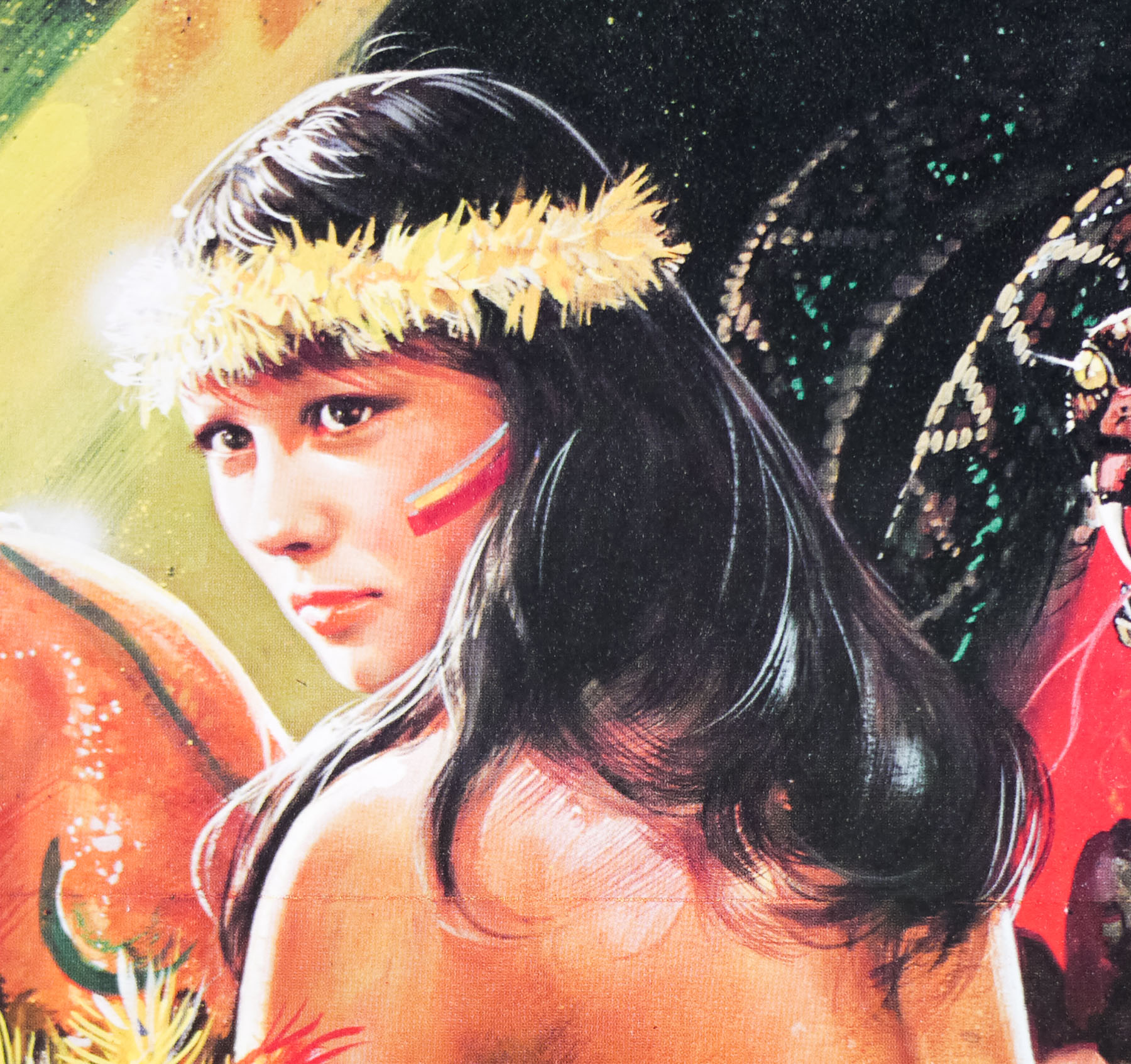
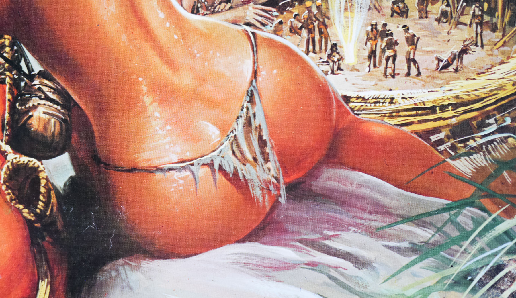
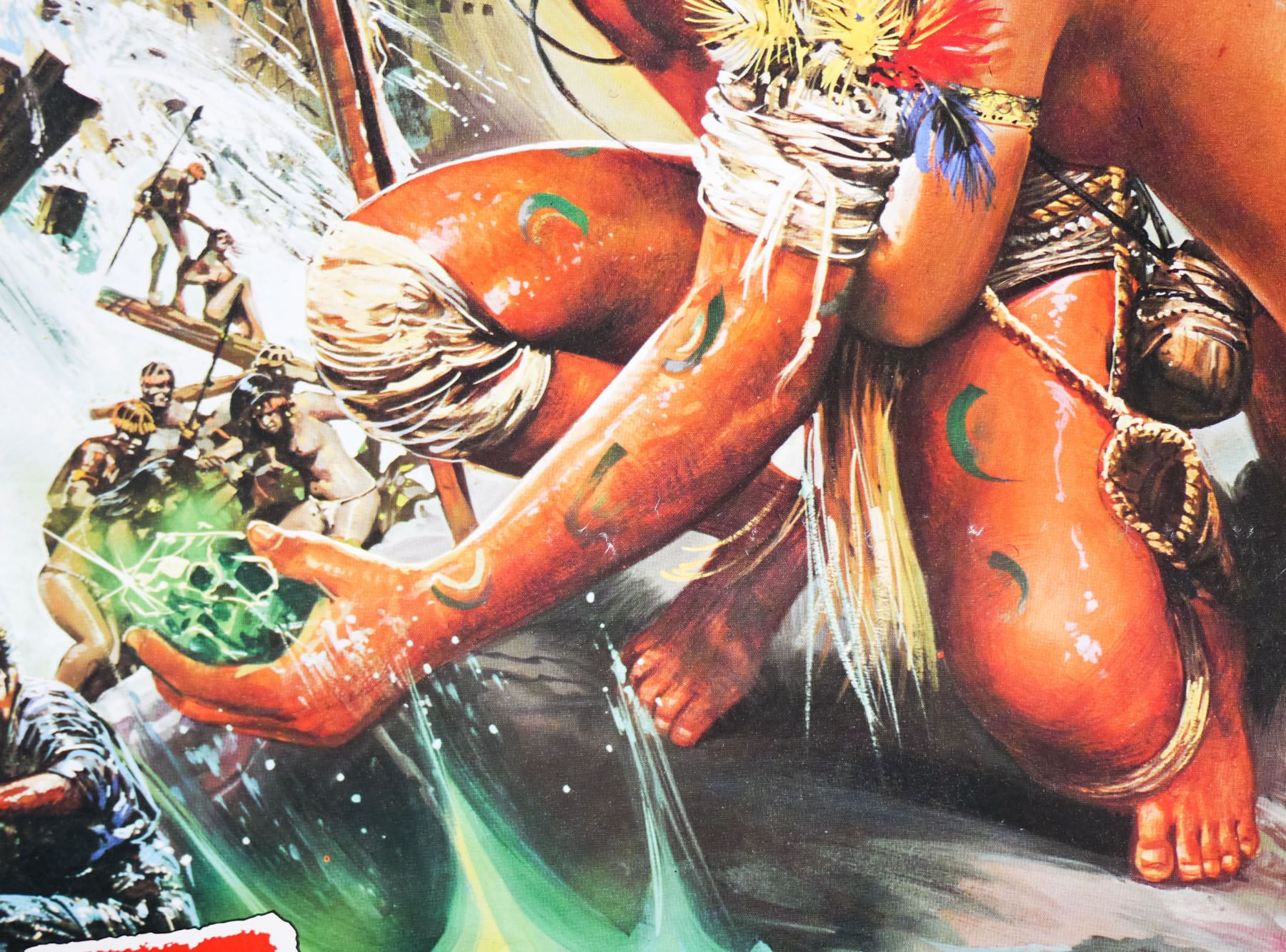
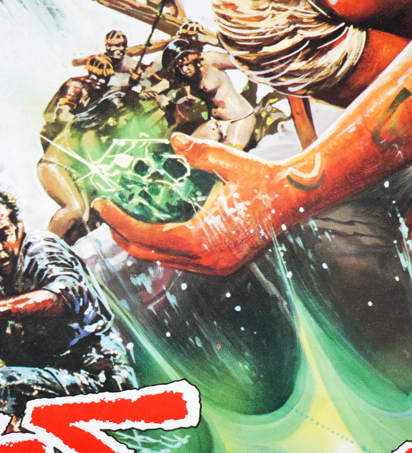
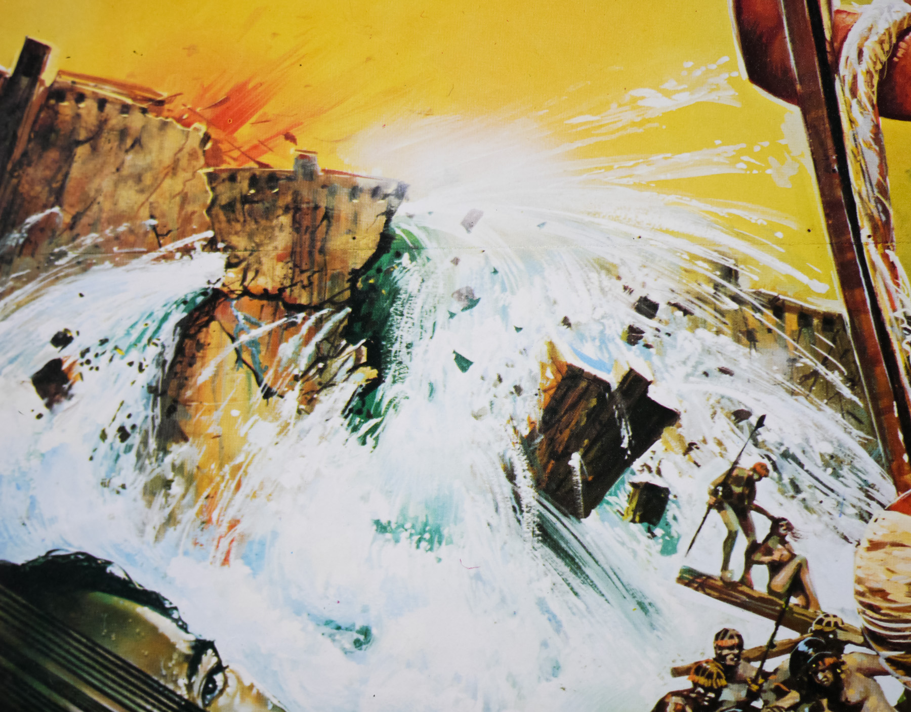
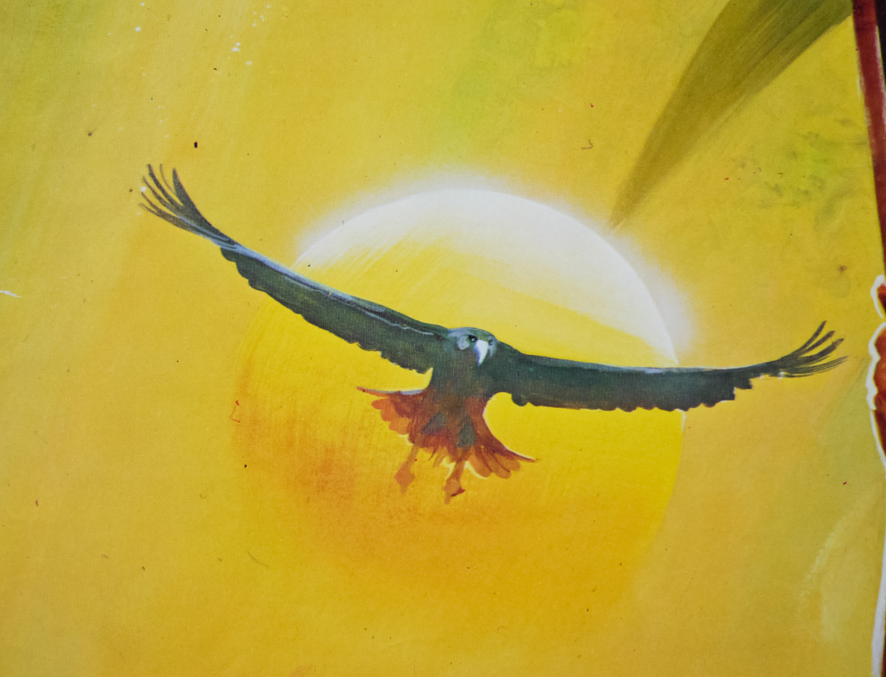
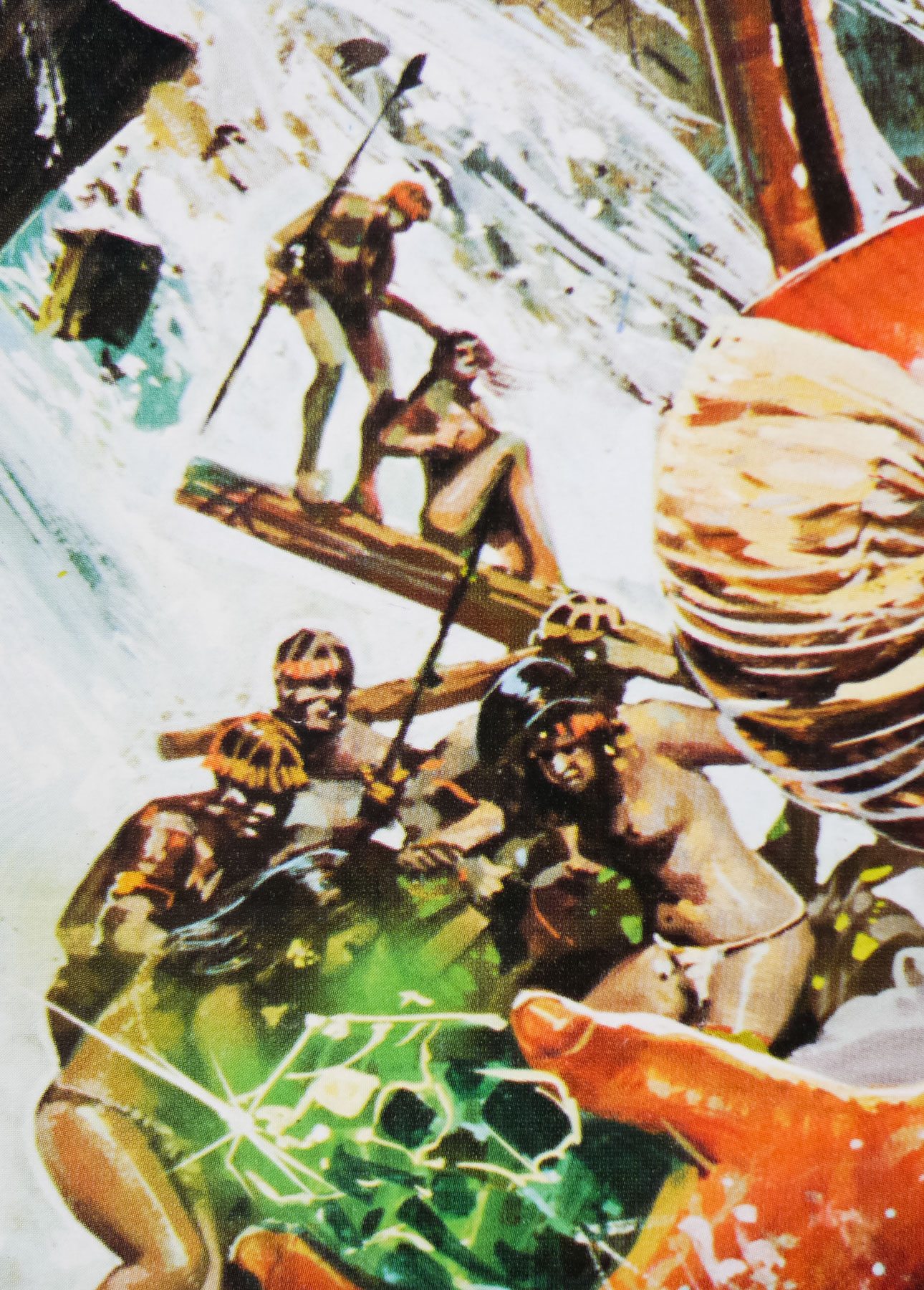
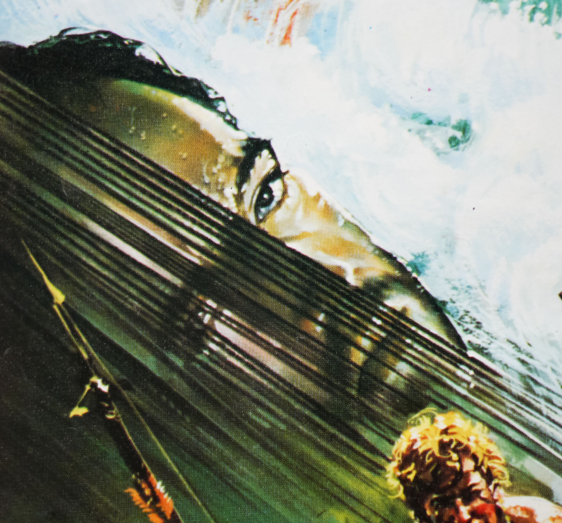
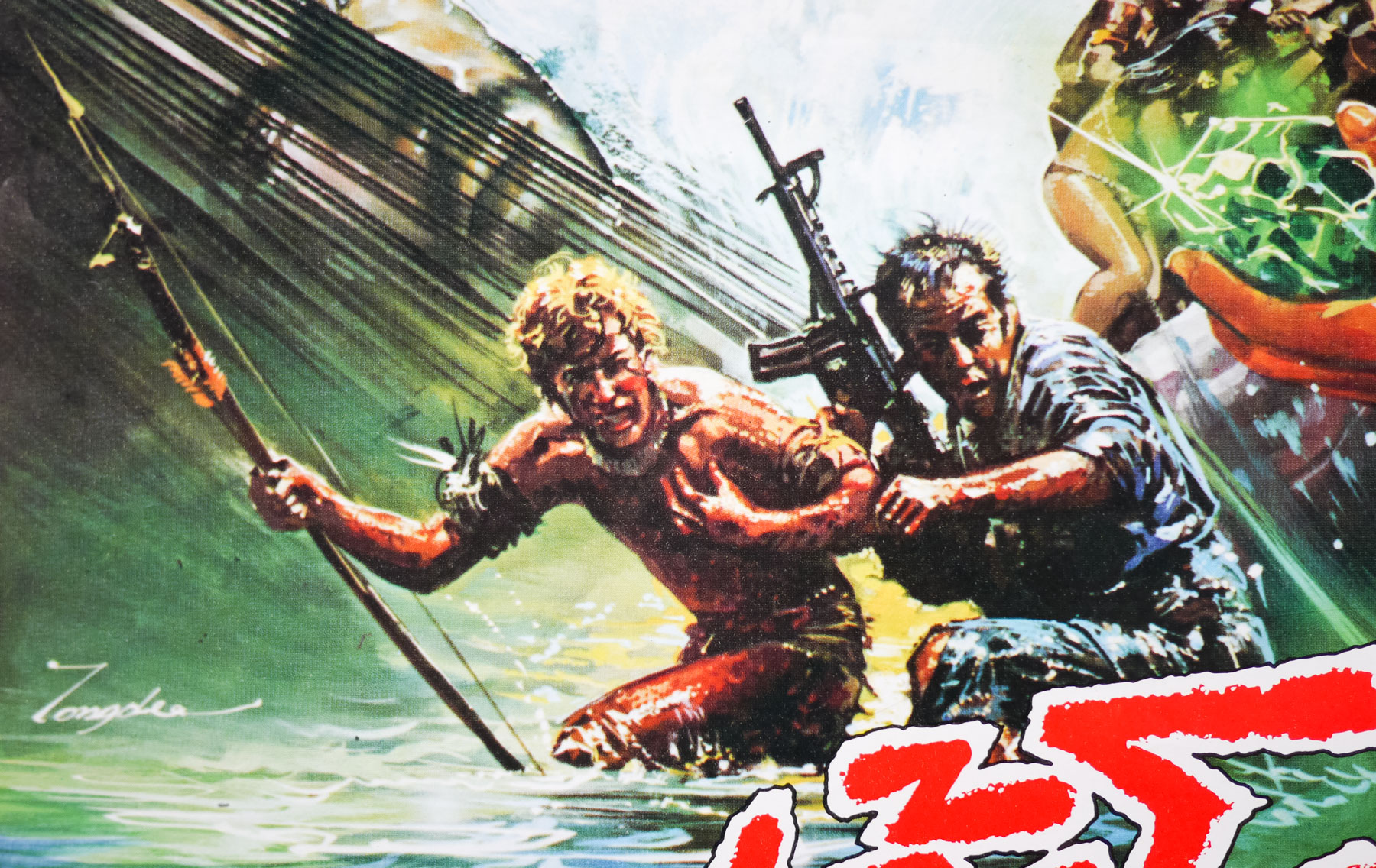
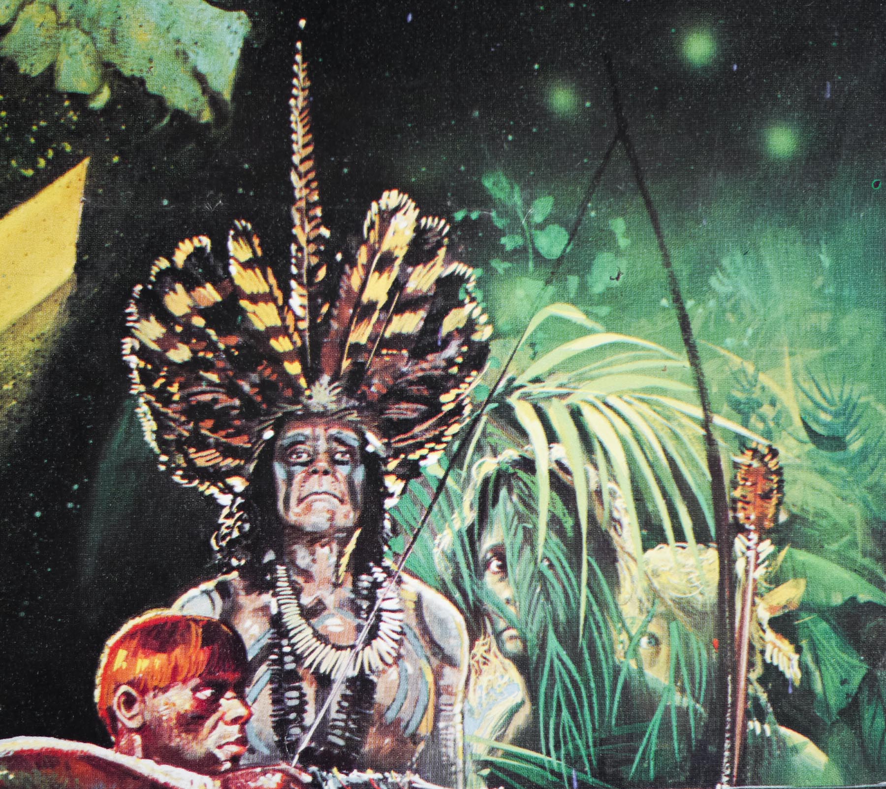
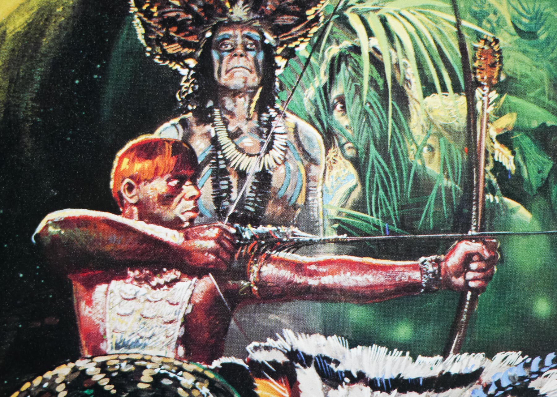
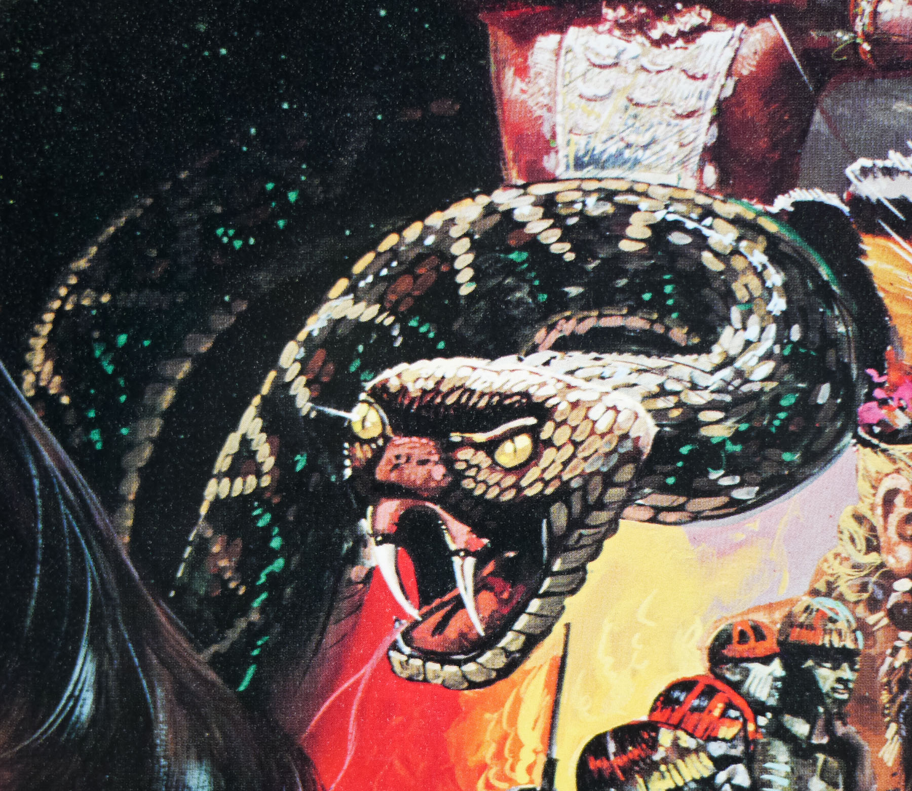
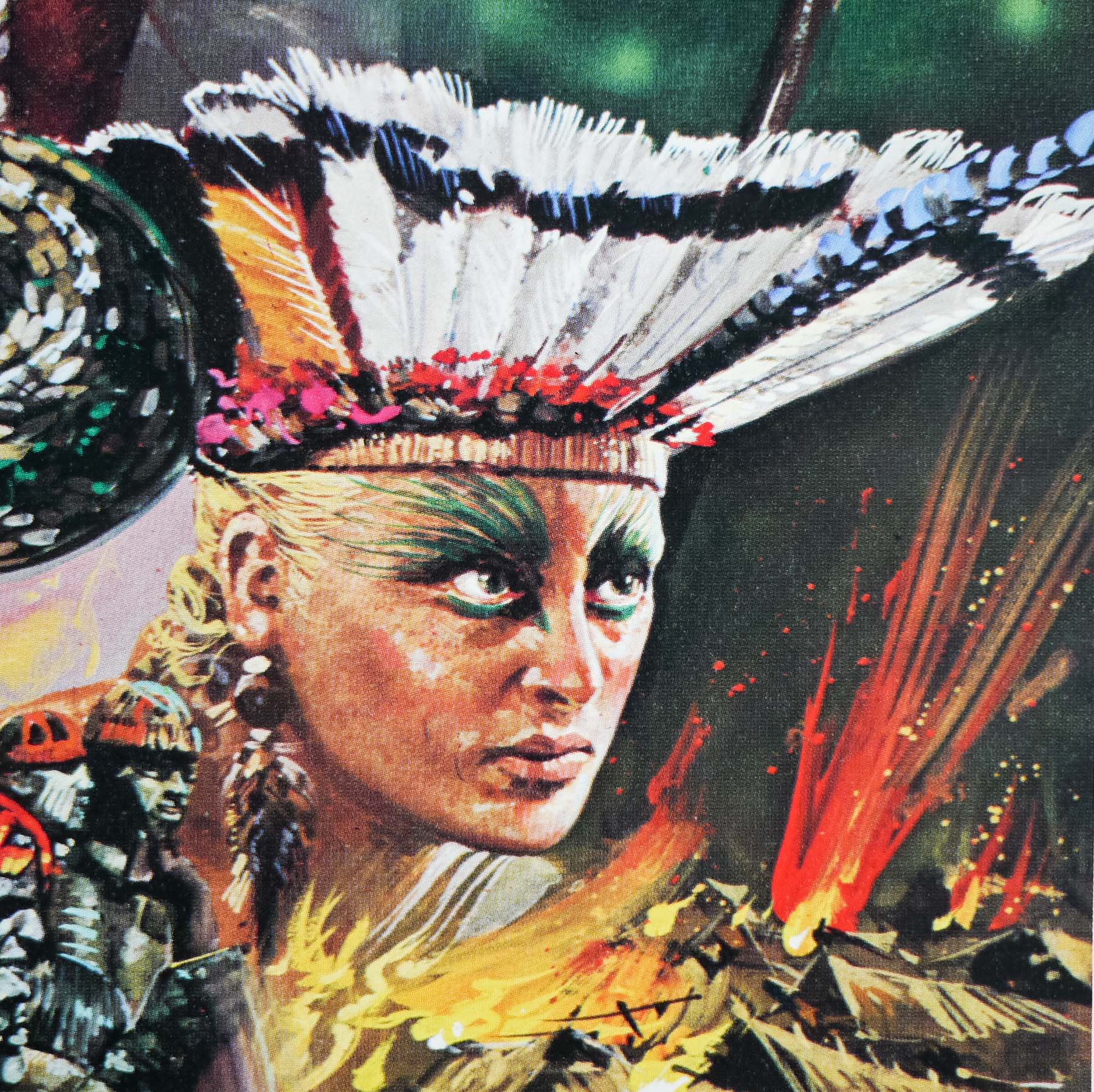
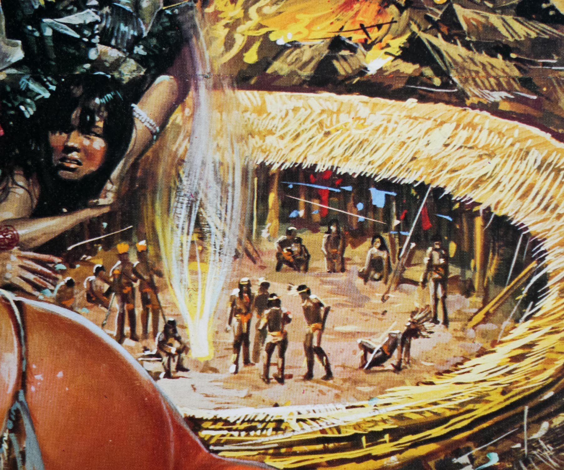
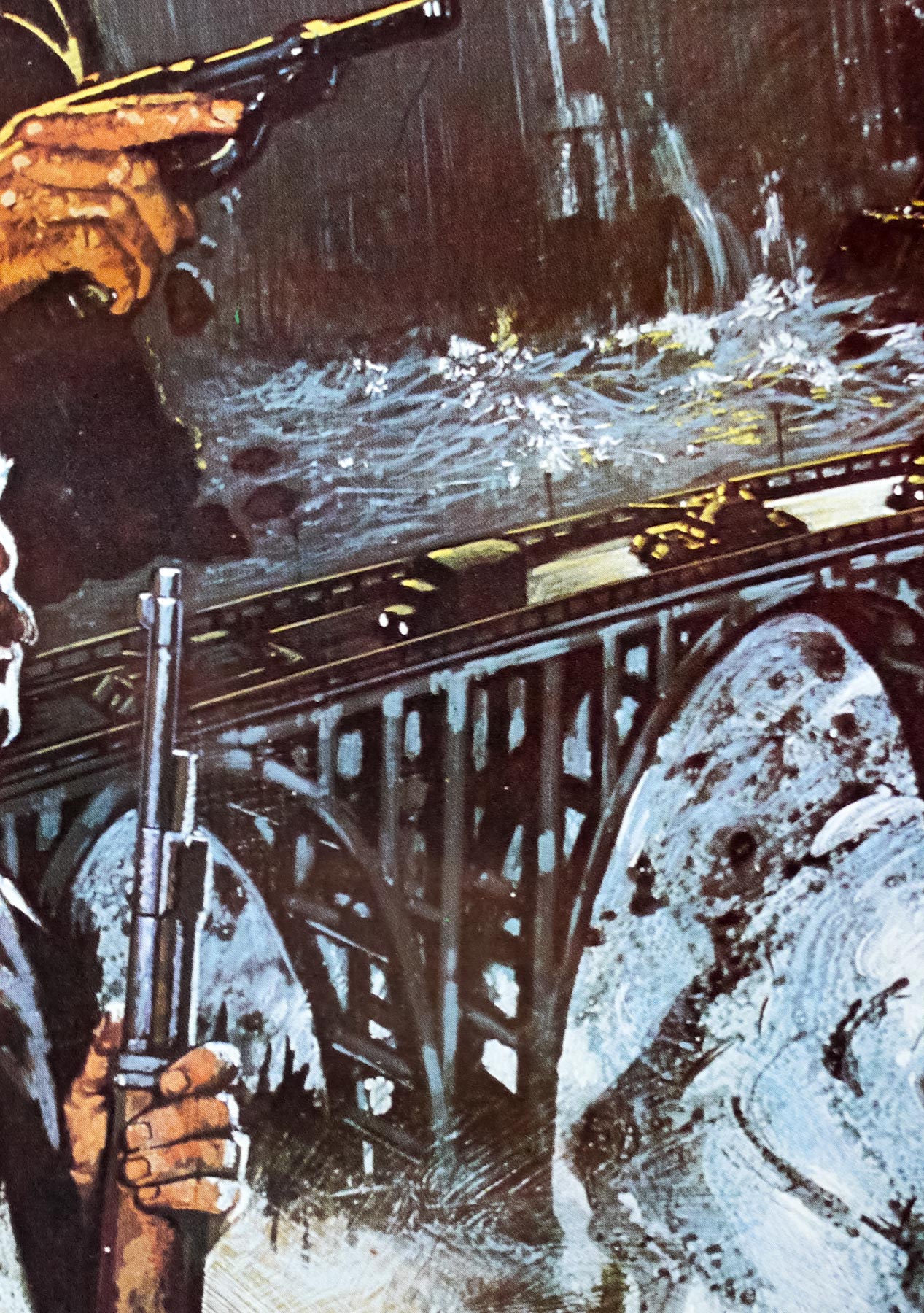
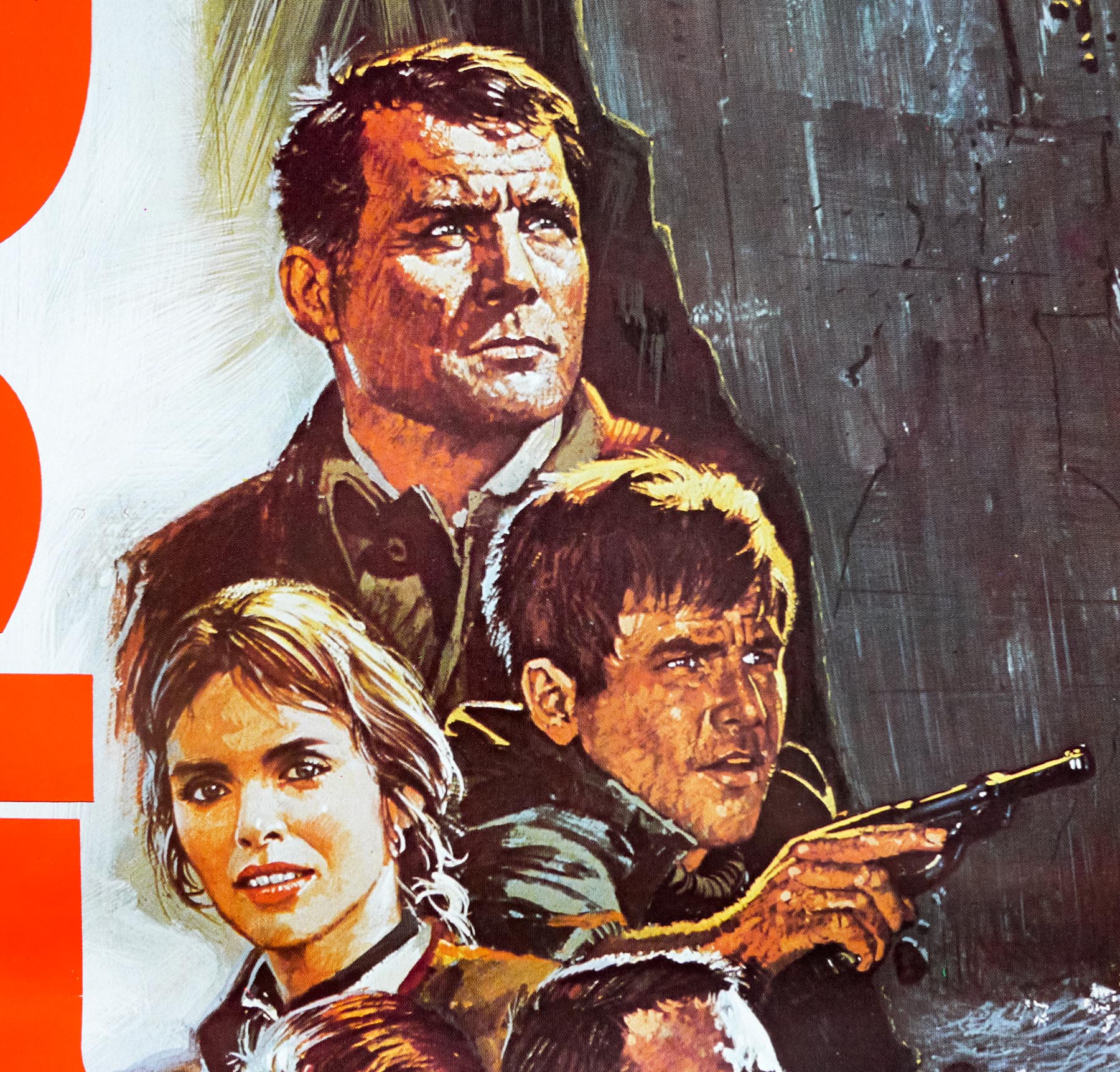
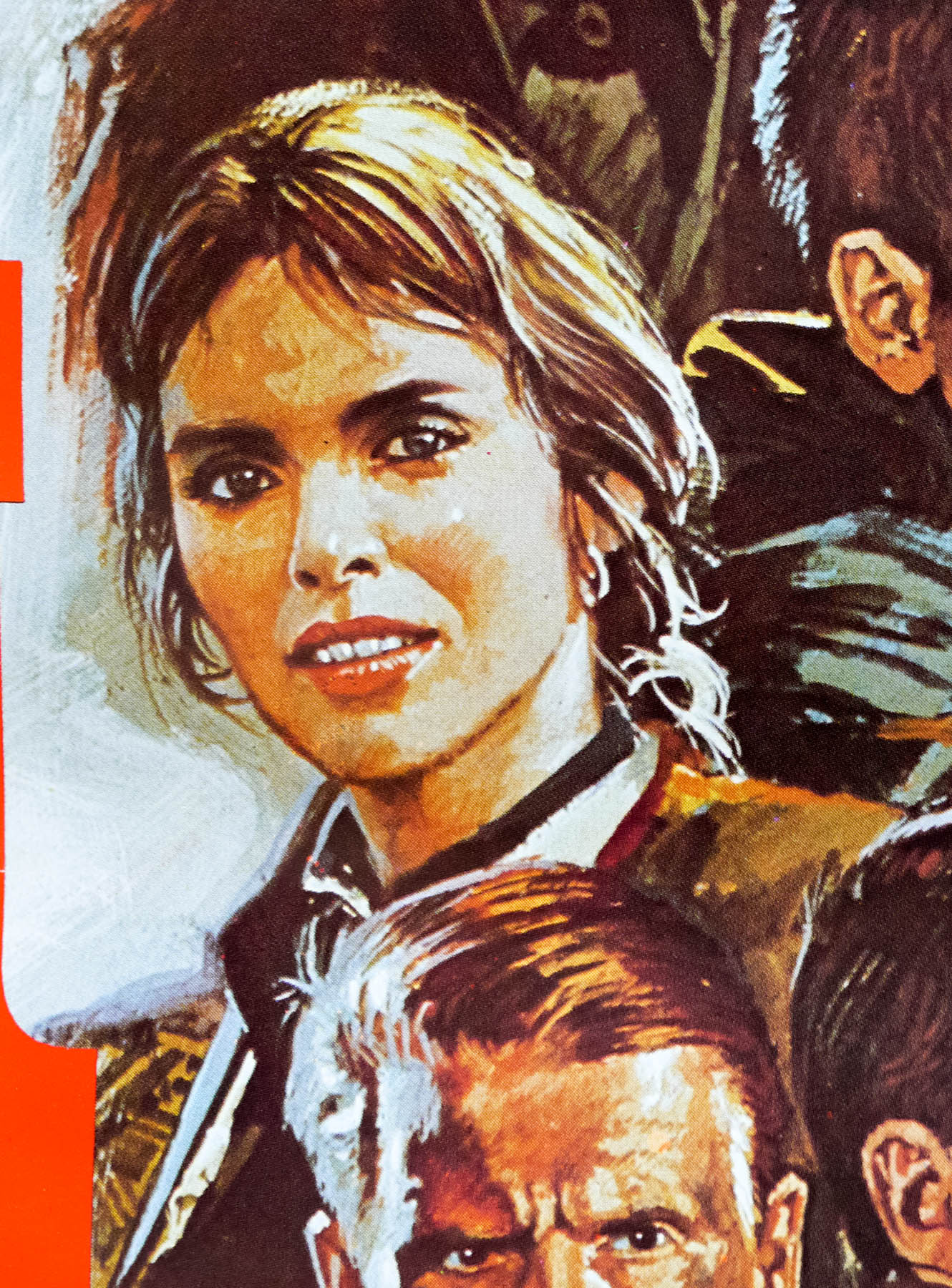
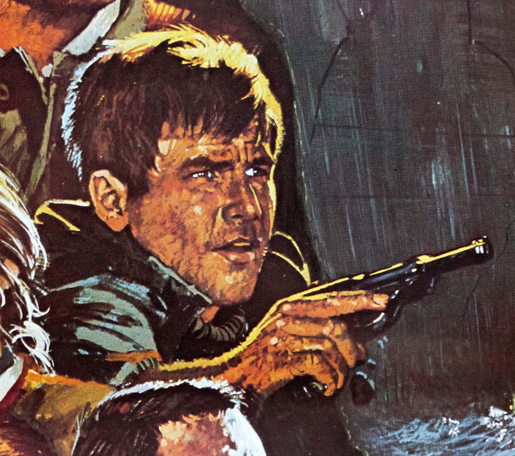
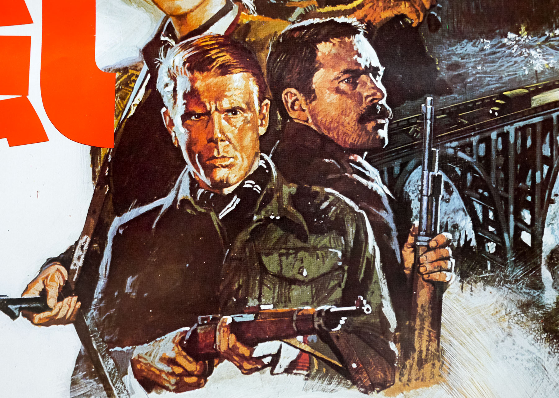
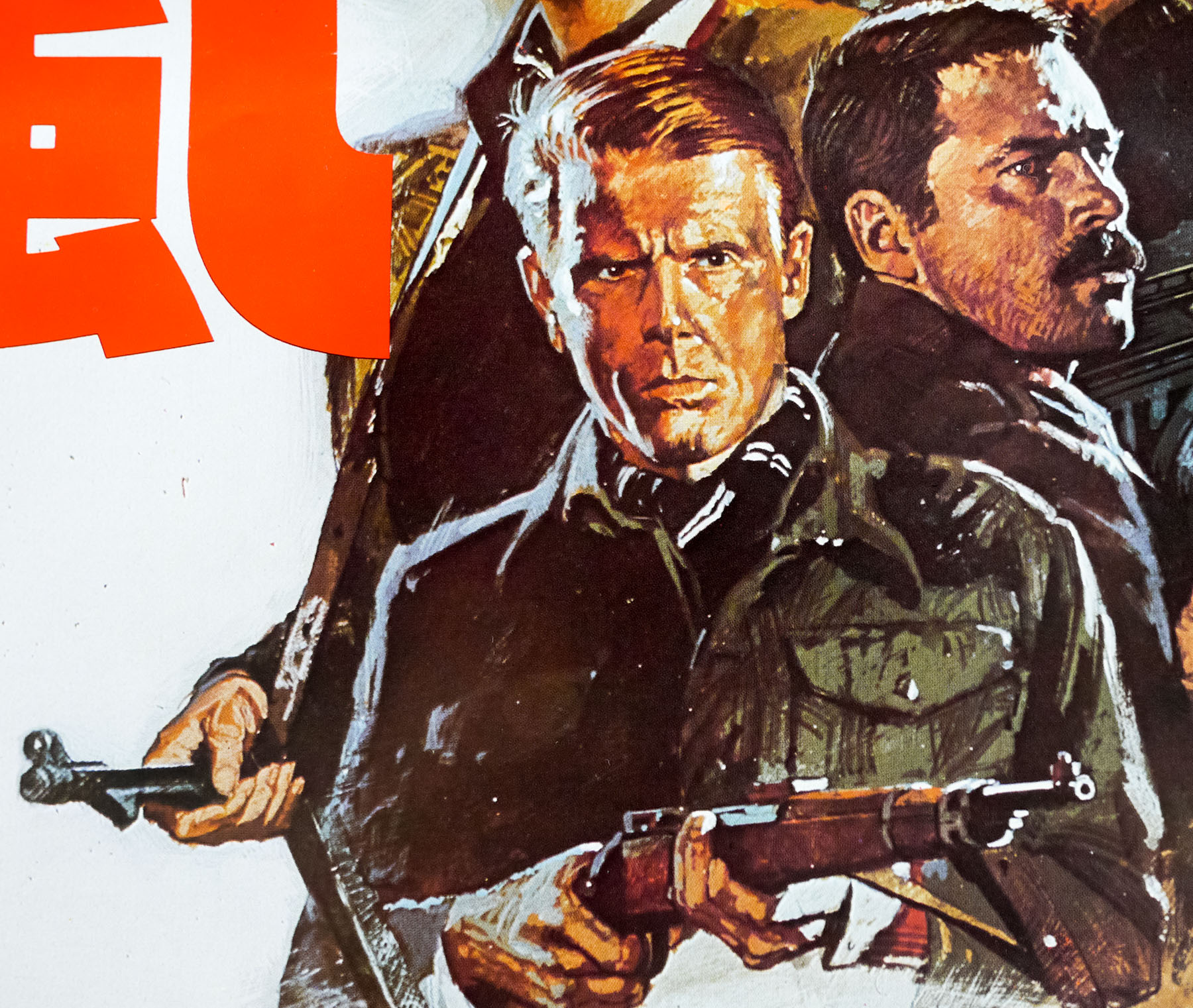
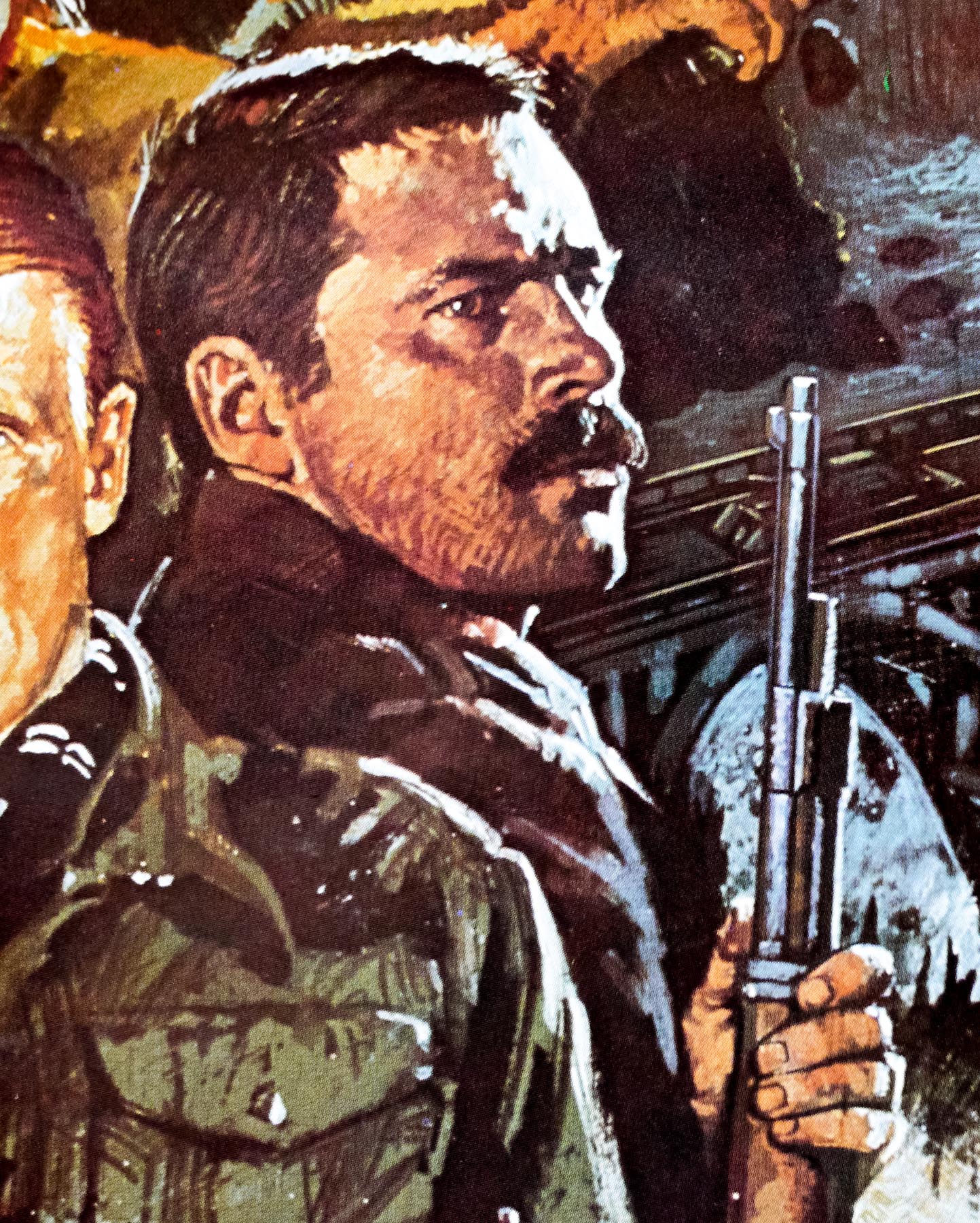
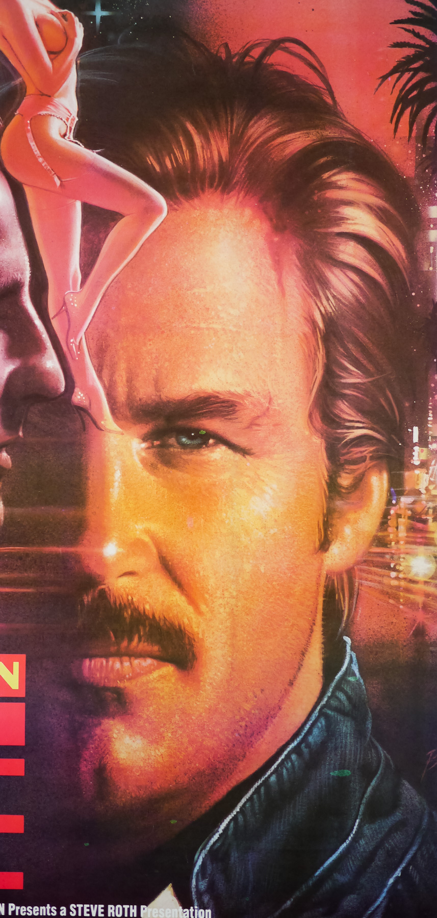
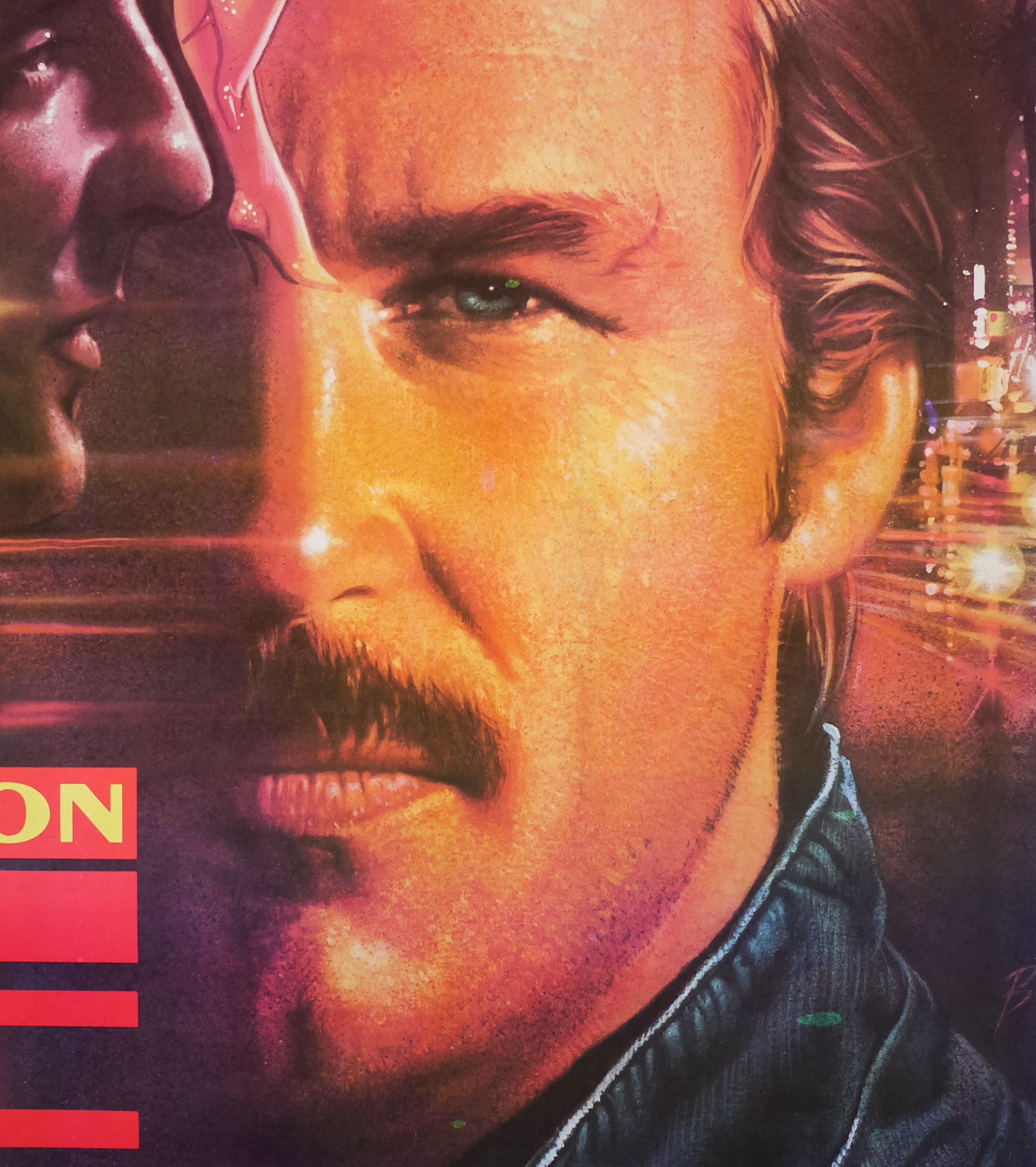
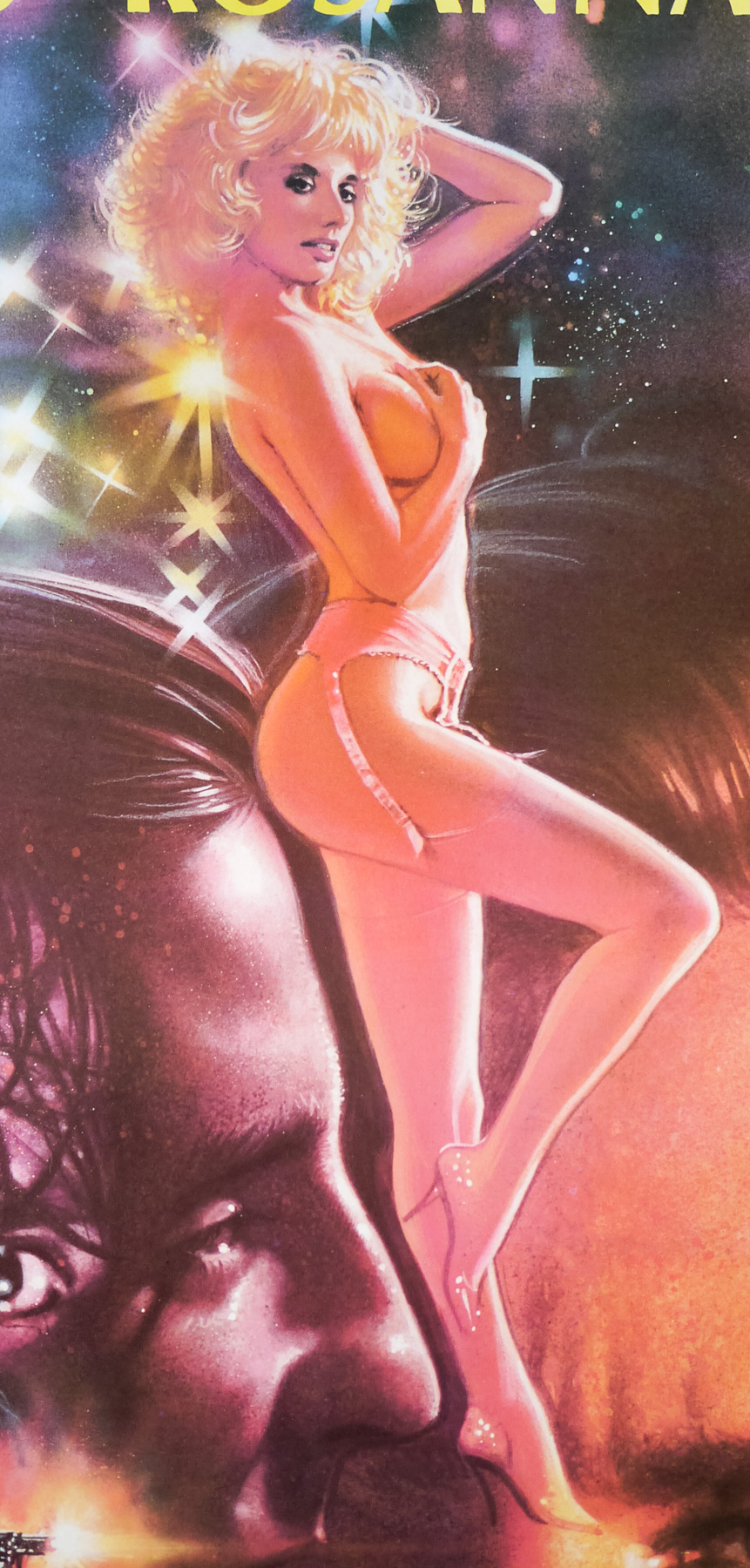
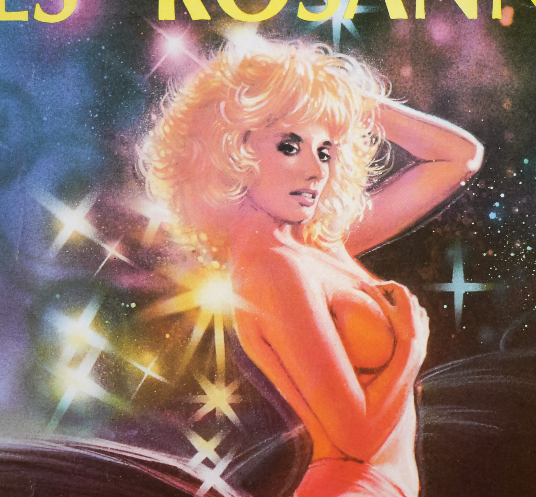
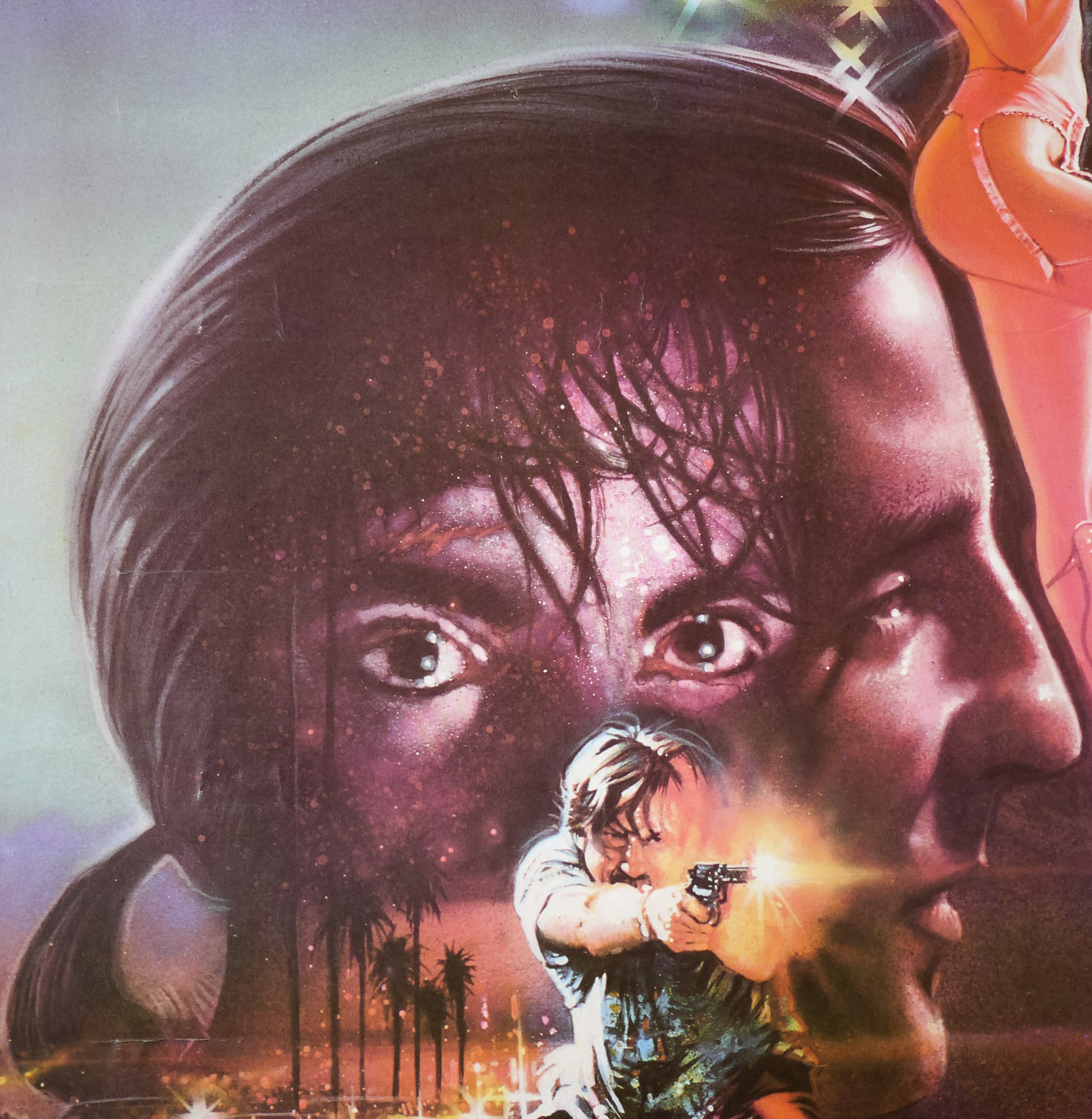
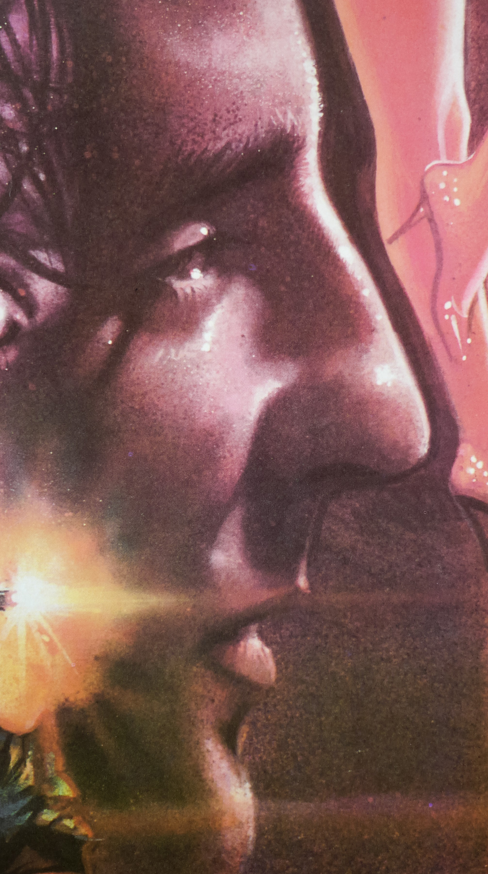
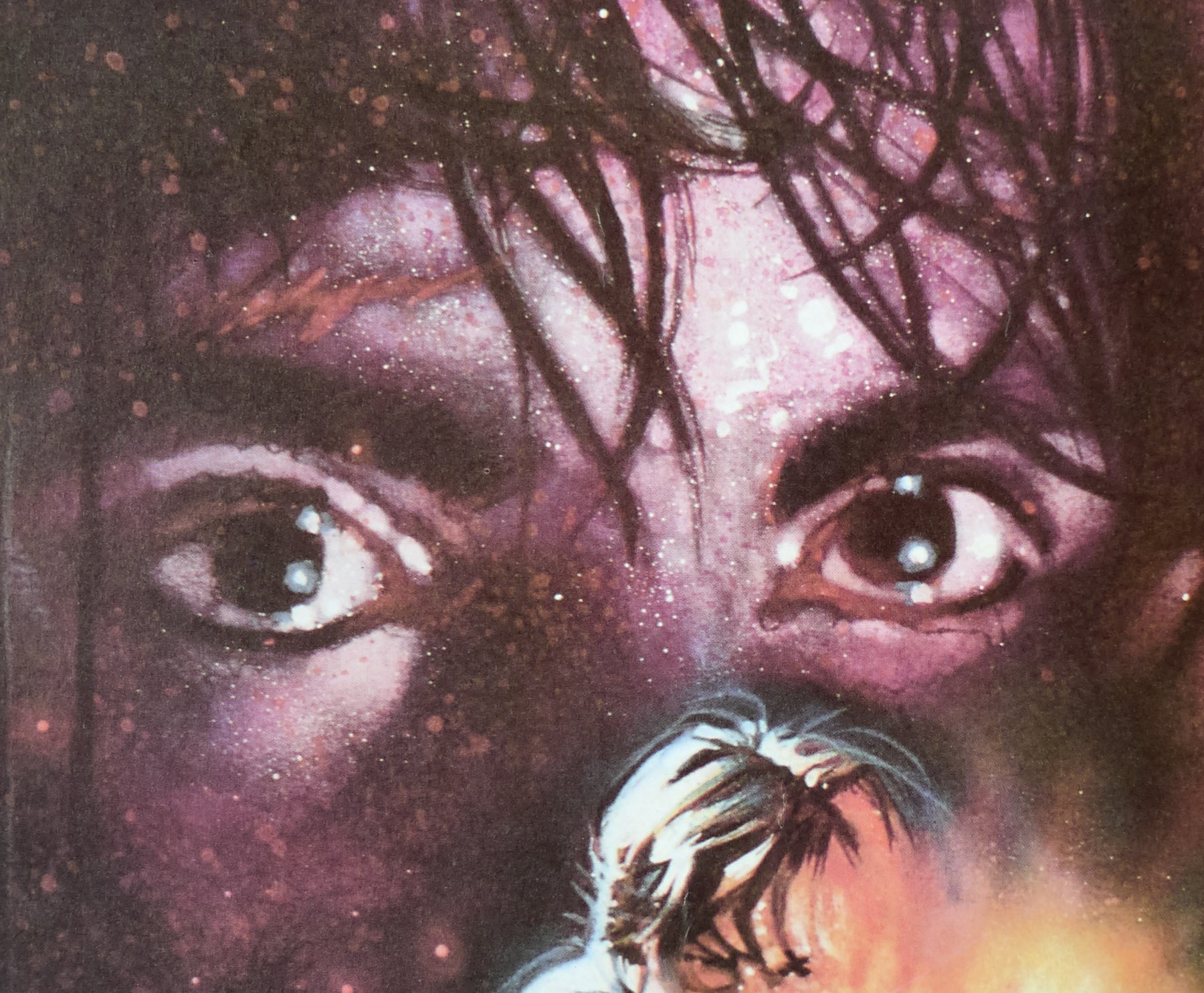
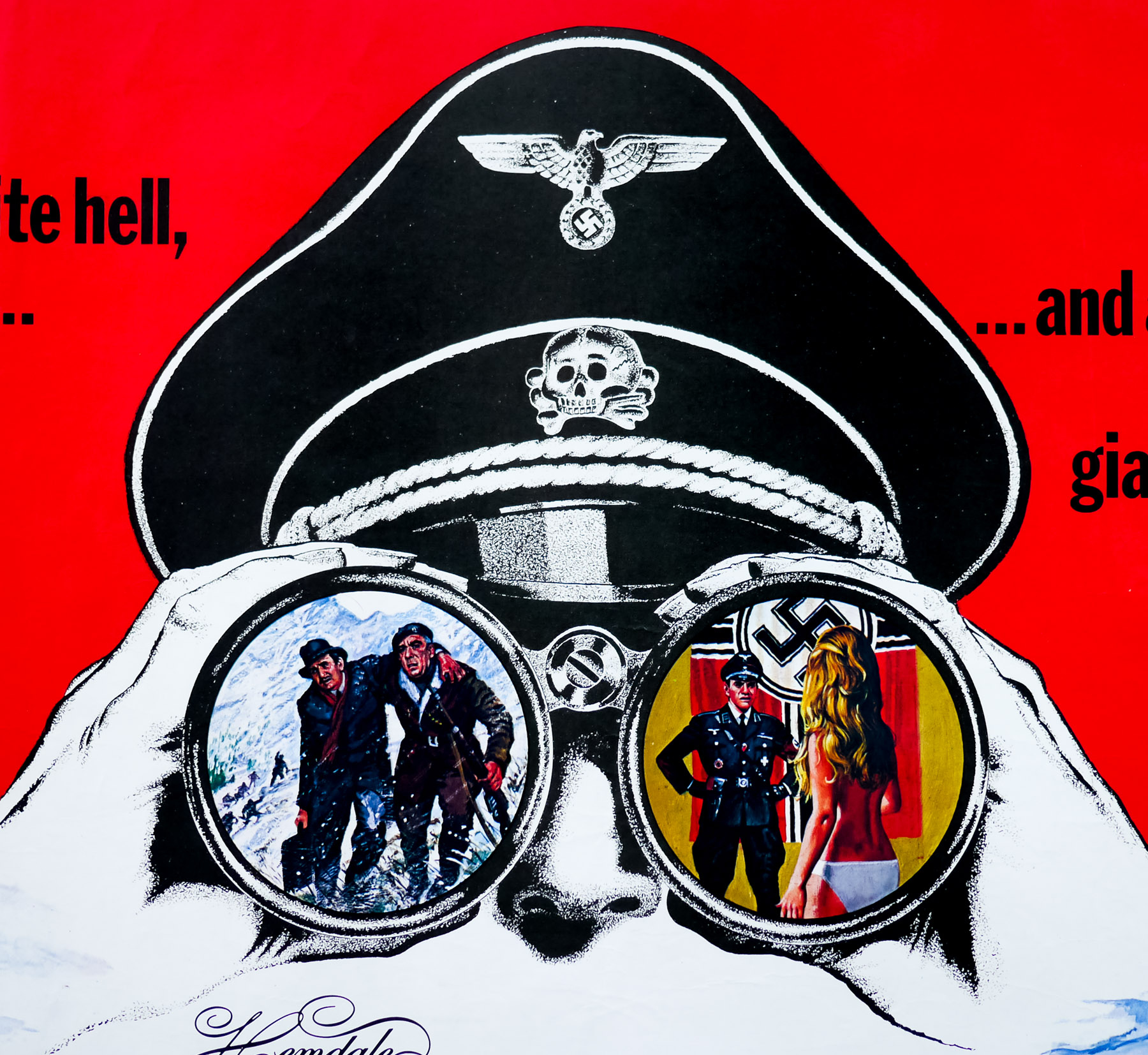
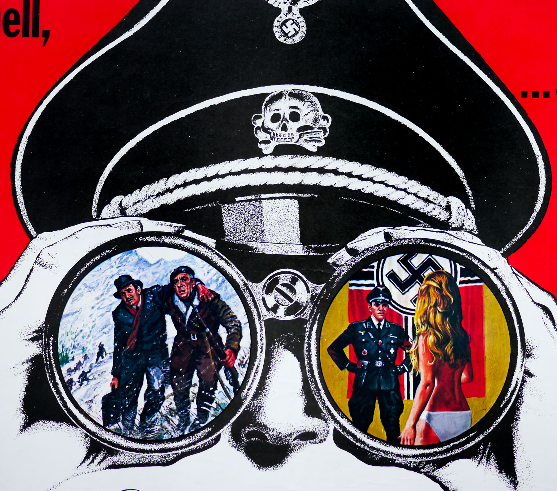
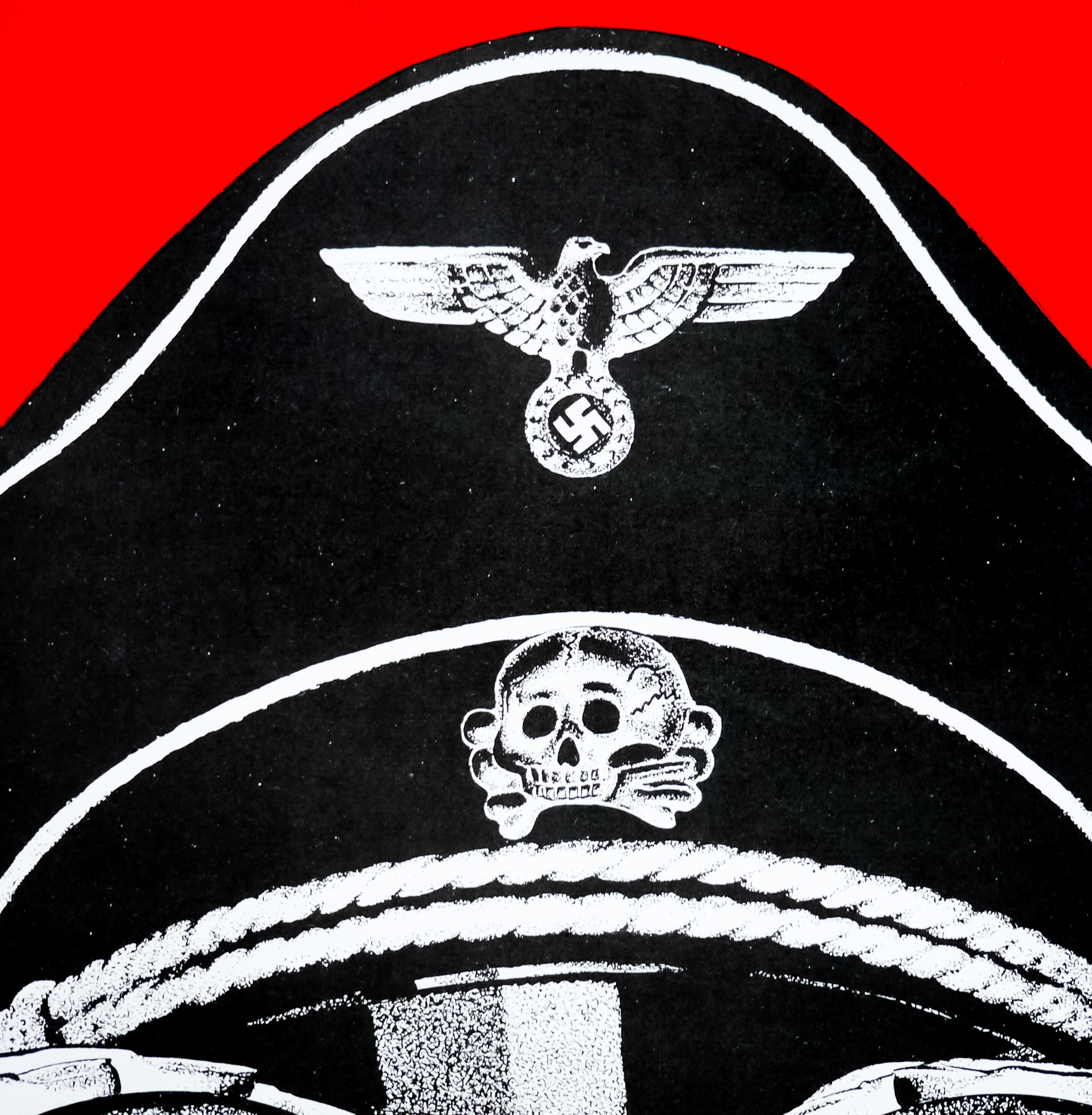
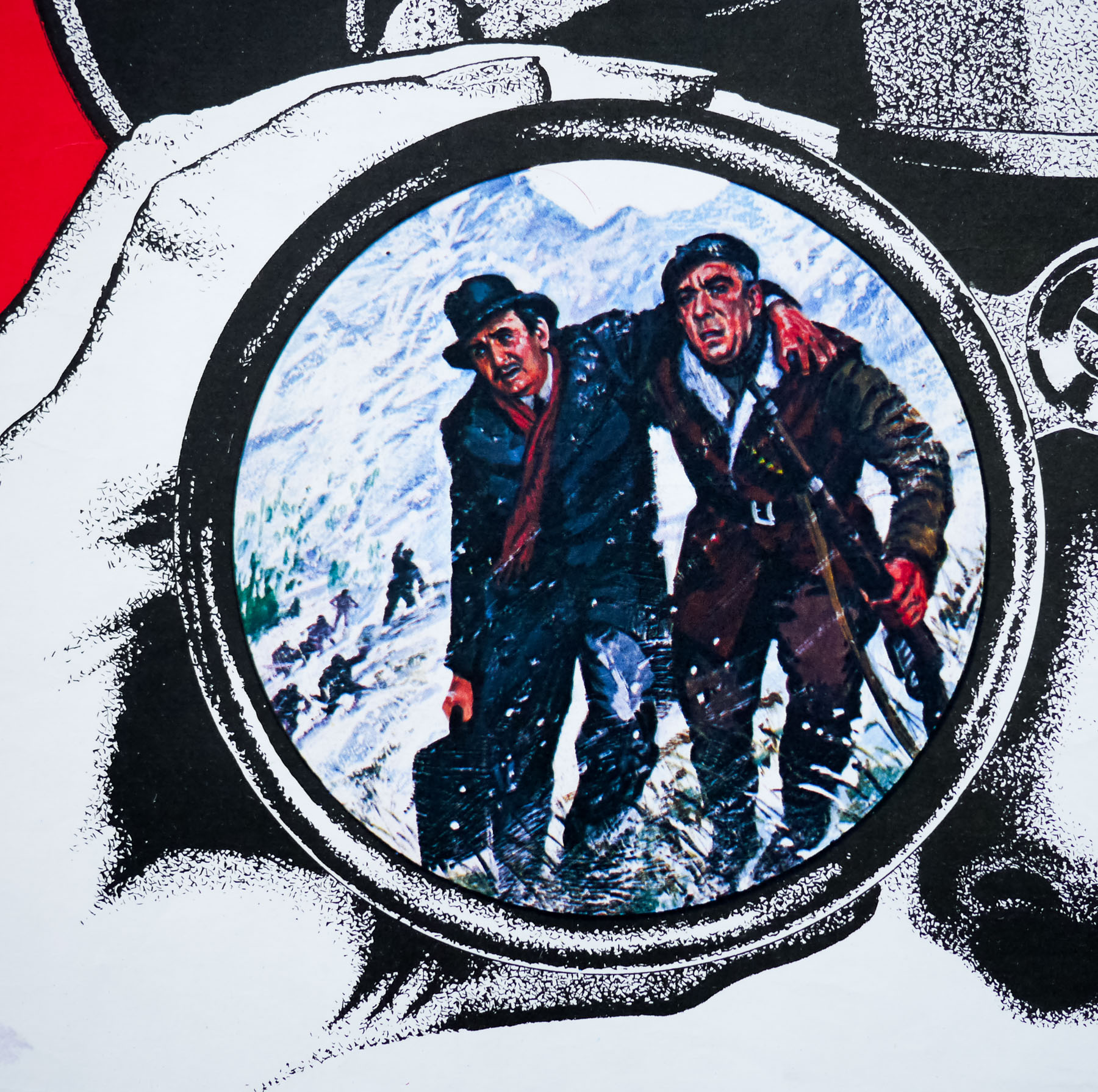
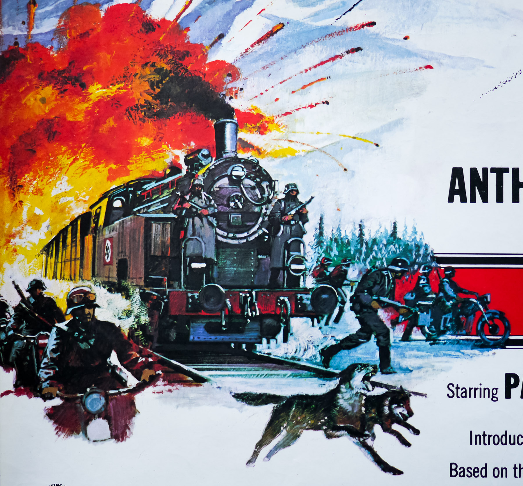
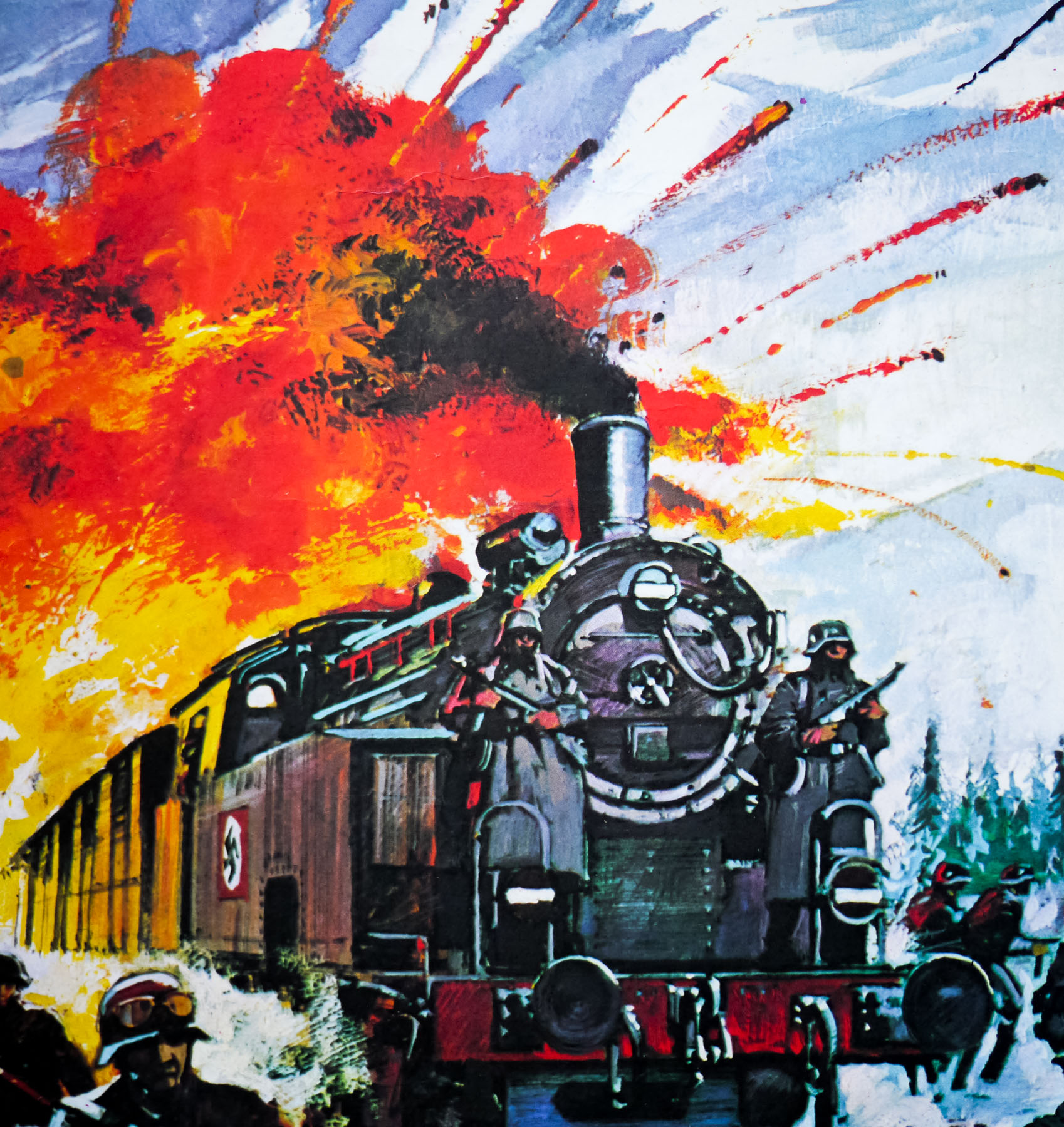
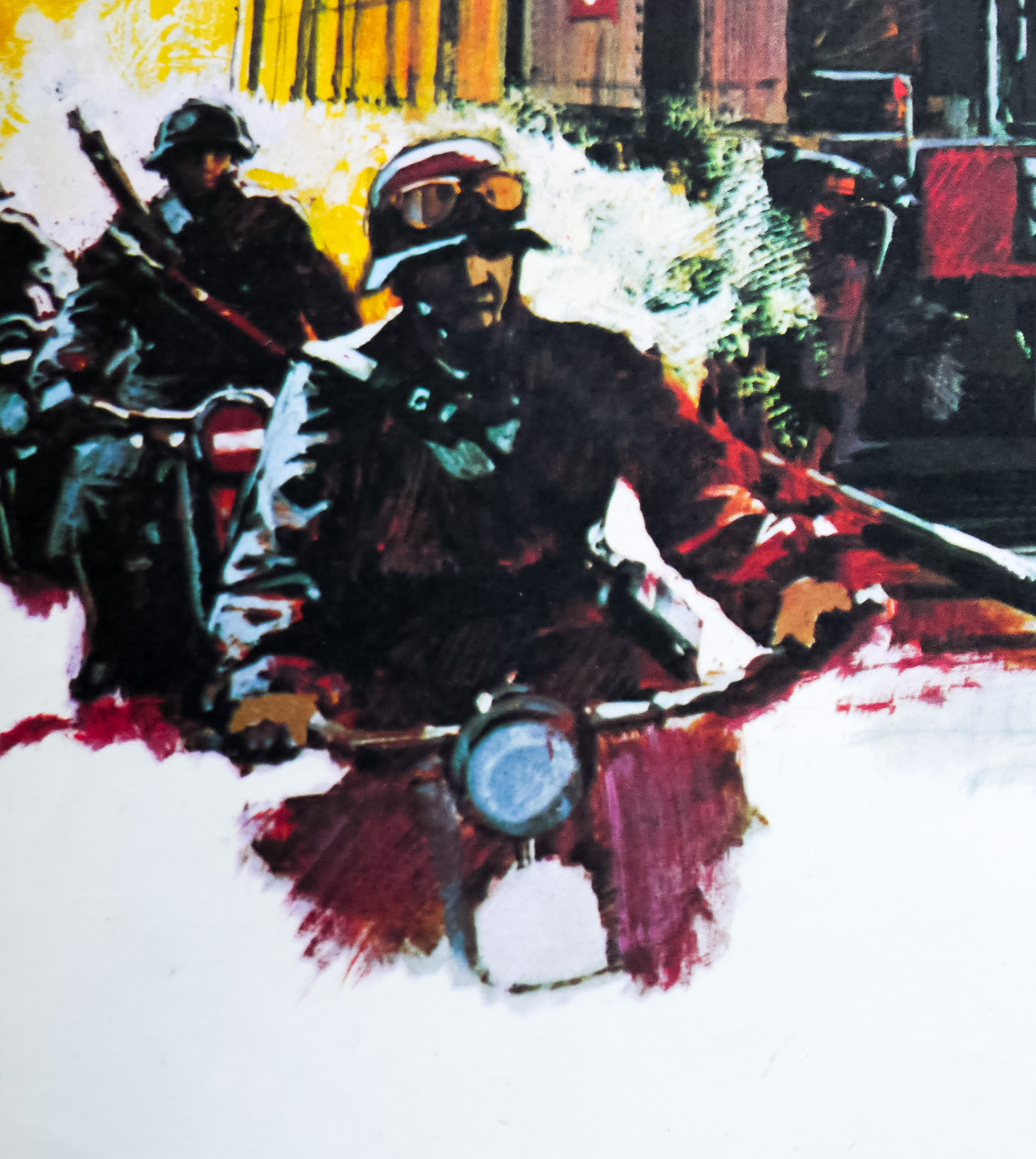
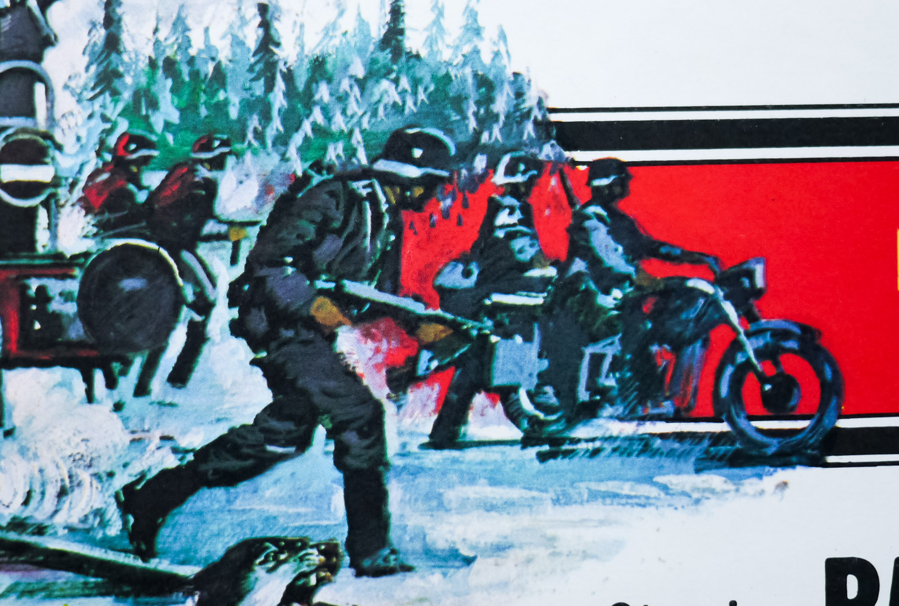
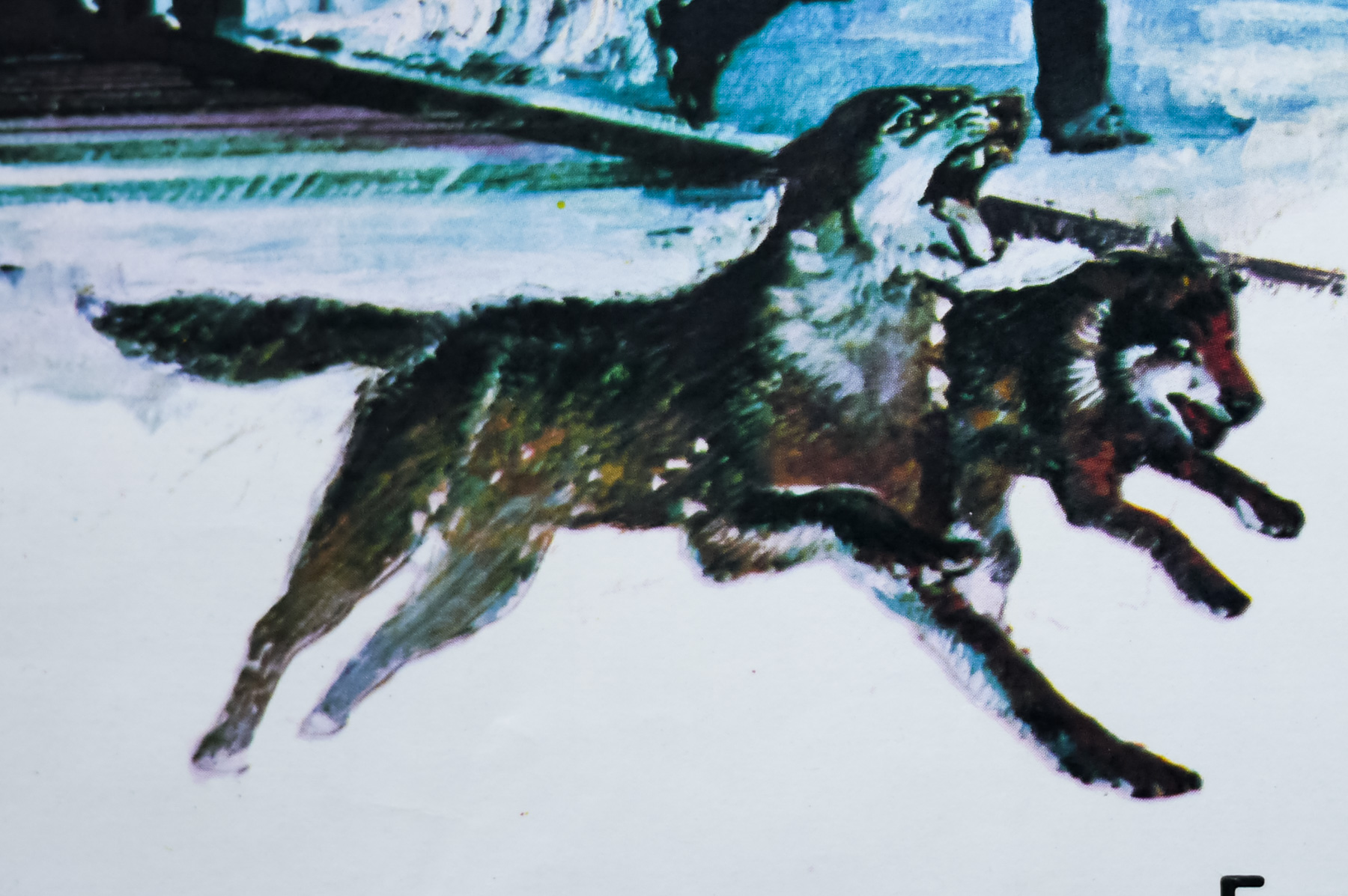
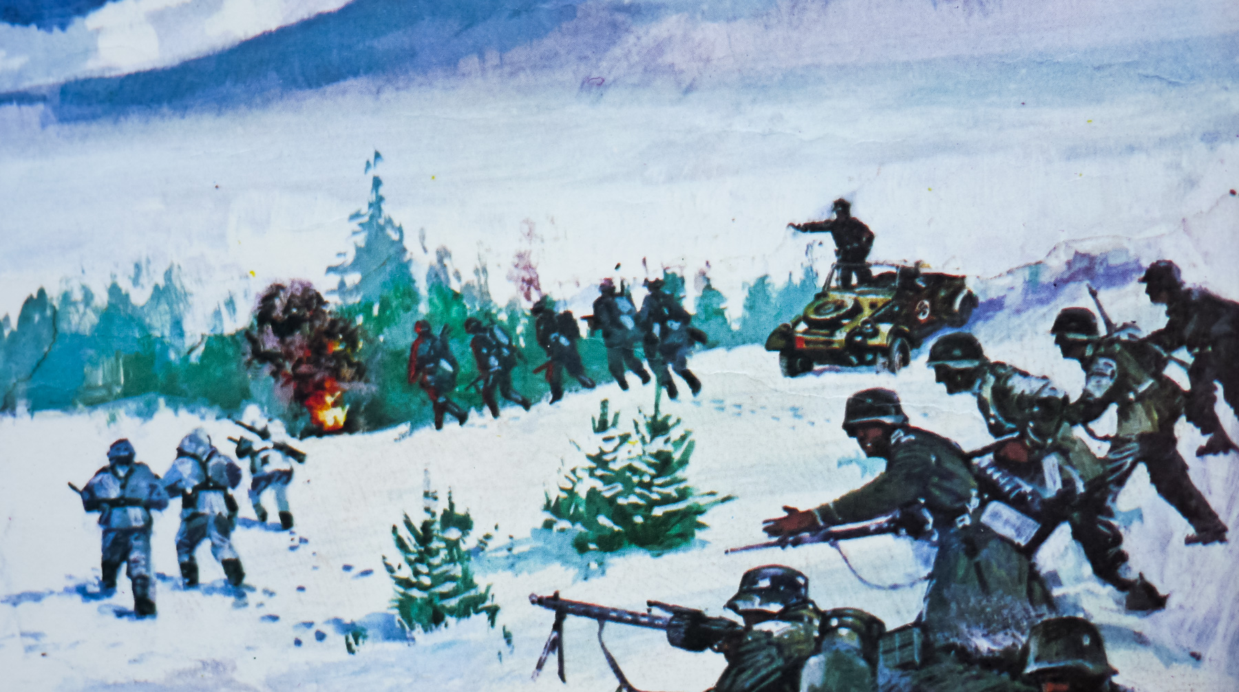
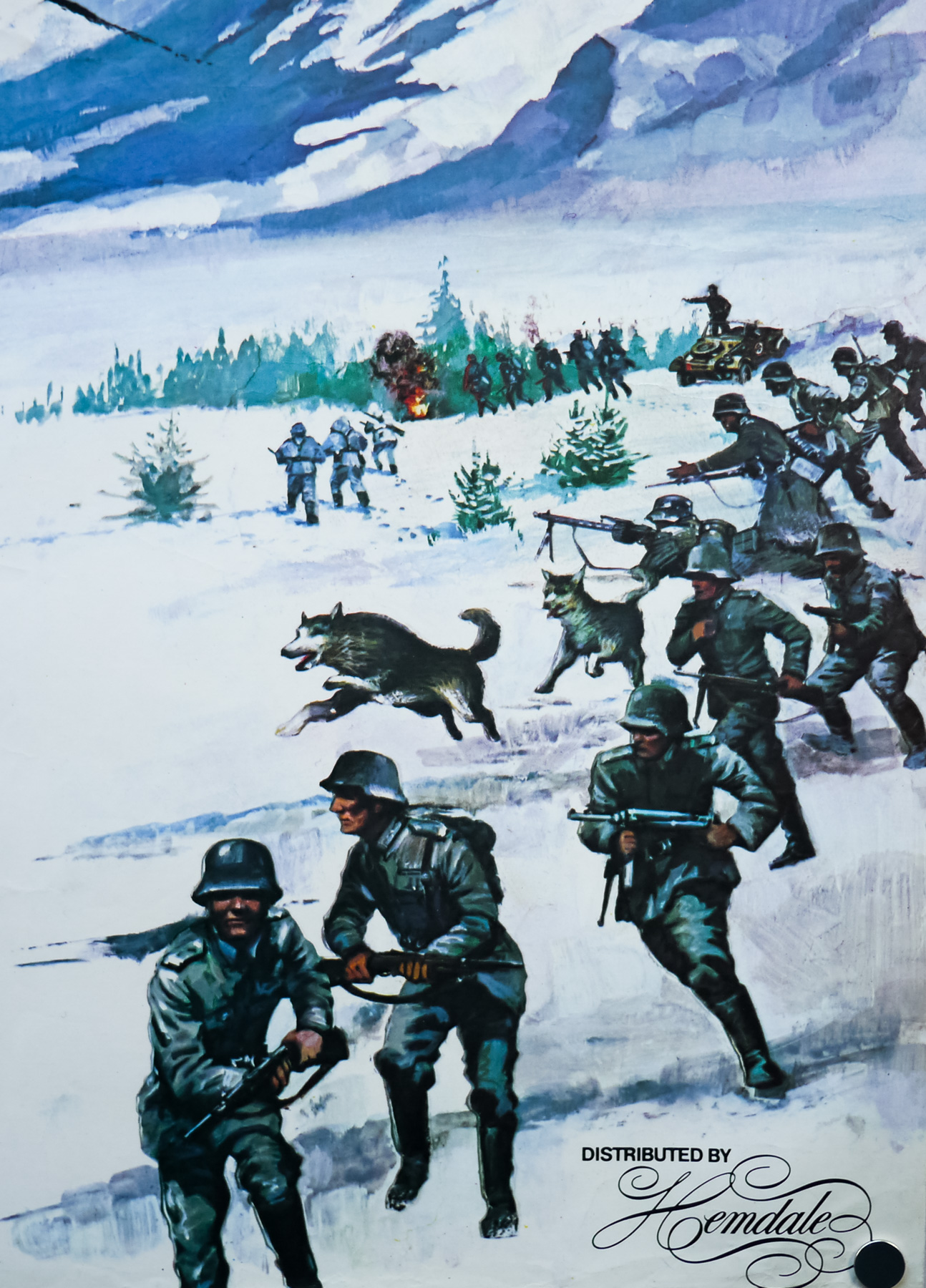
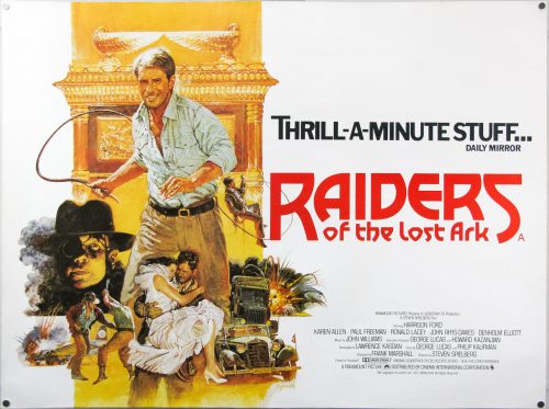
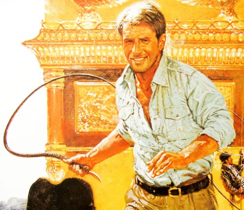
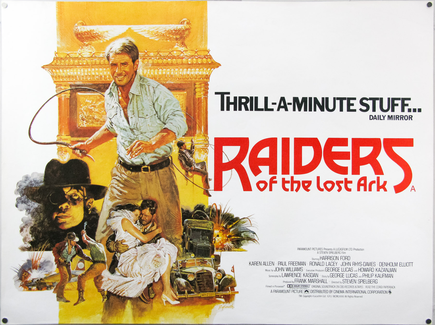
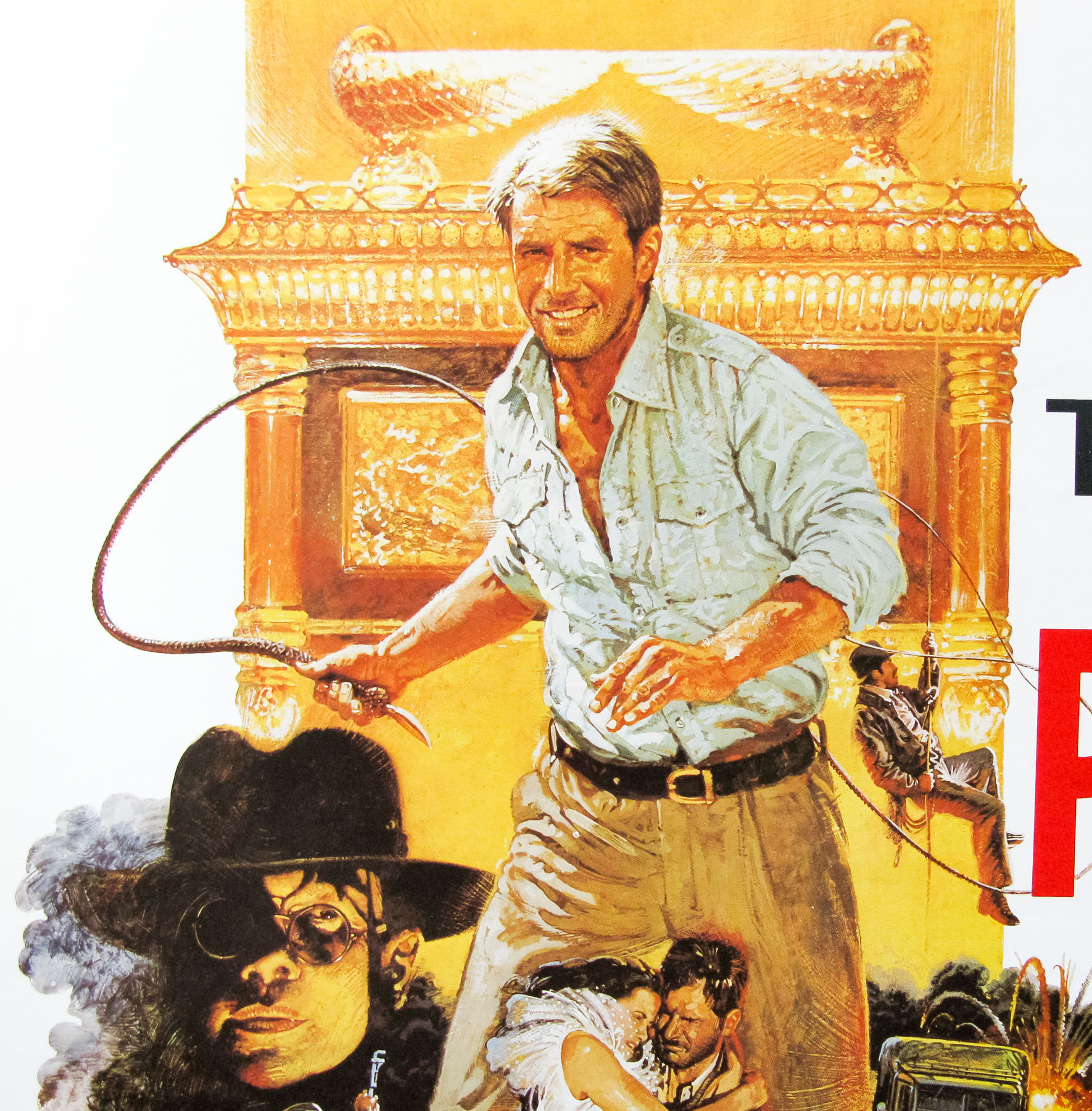
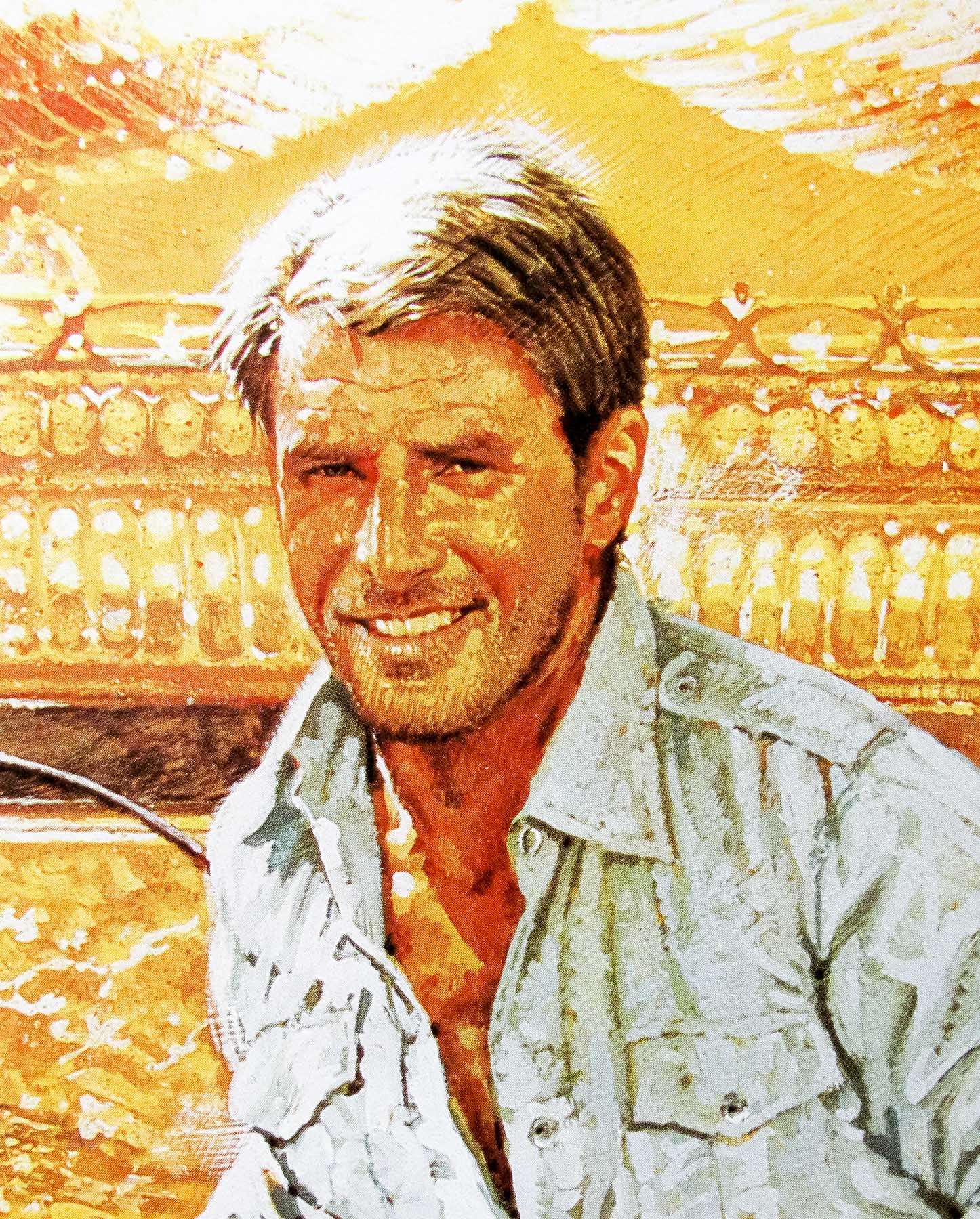
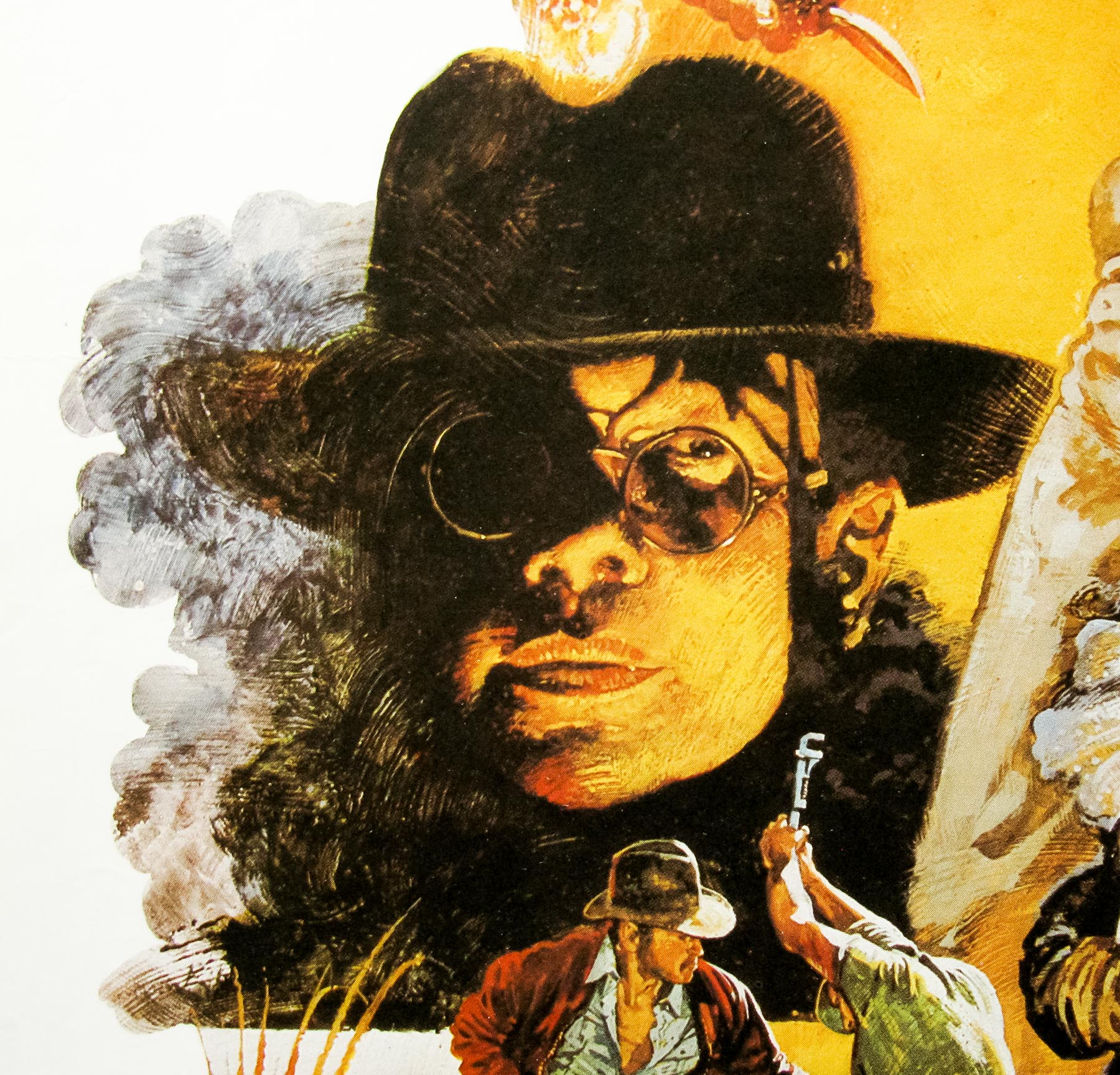
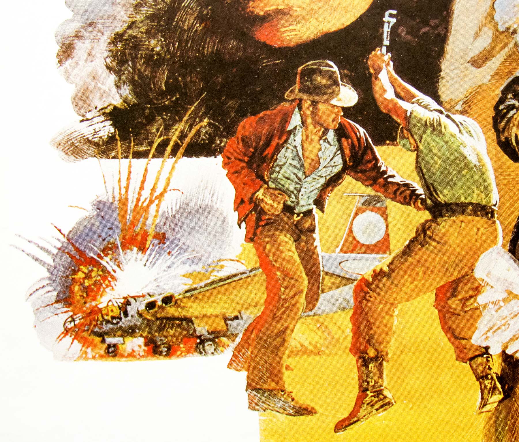
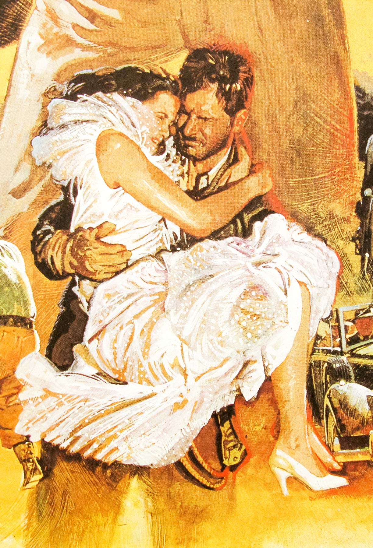
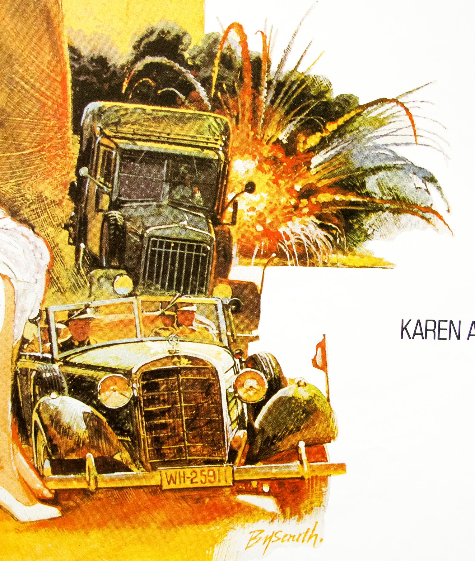
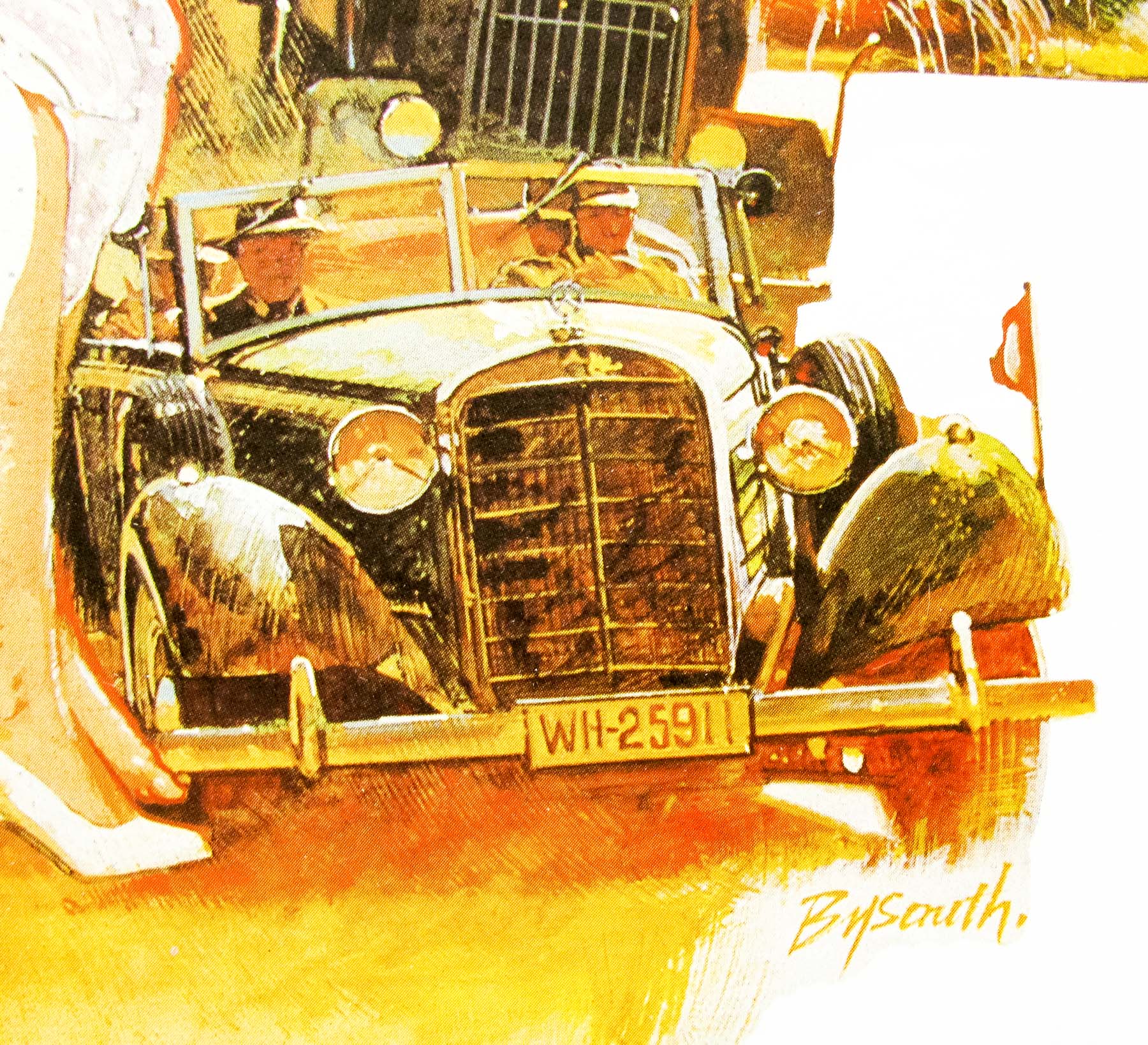
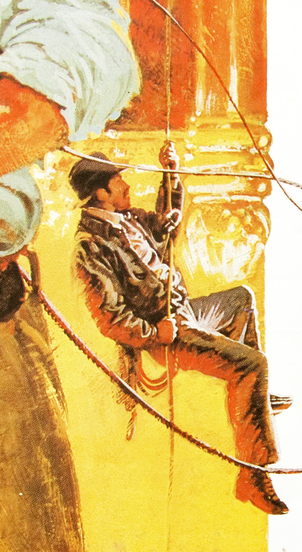
A superb montage by the great British artist Brian Bysouth for the first film in Steven Spielberg‘s legendary Indiana Jones series. This is technically the Style B quad because, as I understand it, the British distributors (Paramount UK?) decided that the artwork on the first quad (Style A) was too dark and Indy looks too dour and thus commissioned a second poster to be designed and printed.
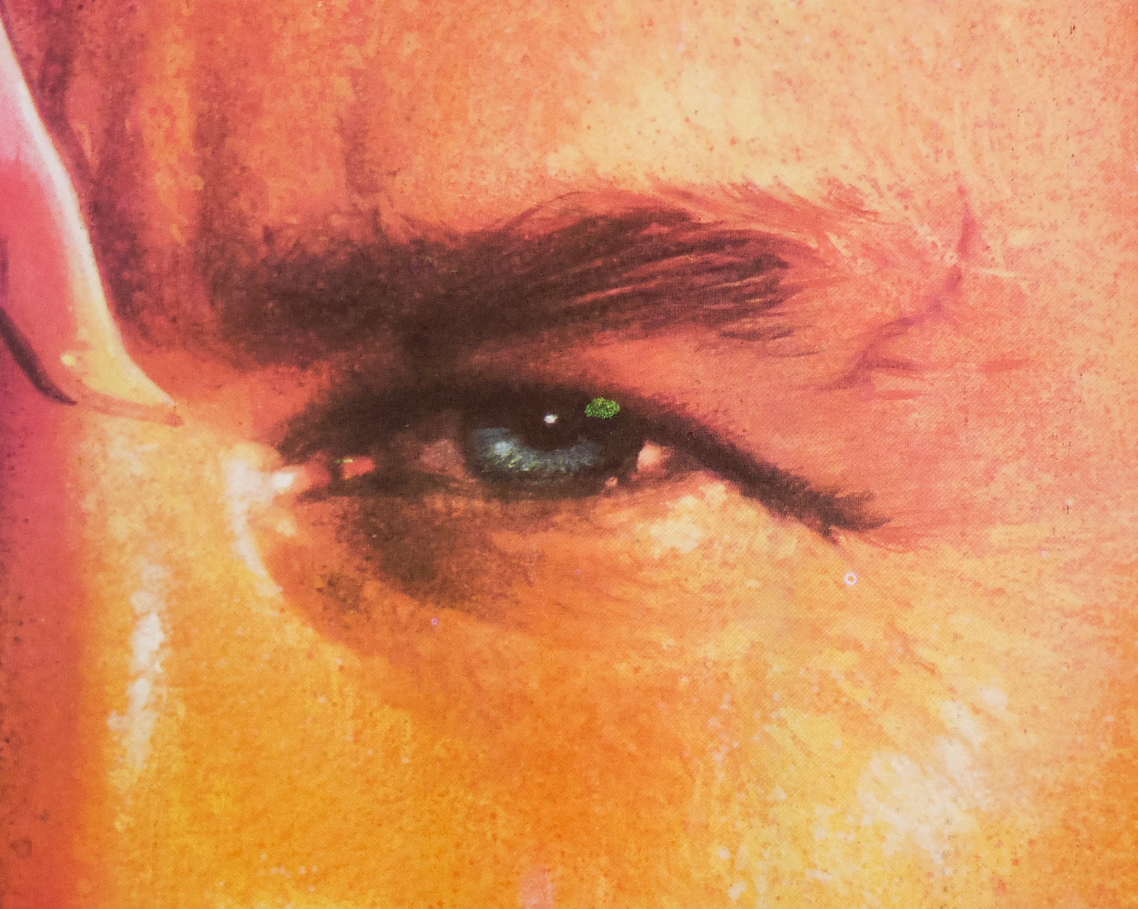
The artwork on this replacement quad is definitely more exciting and leaves no question that the film contains plenty of action and adventure. It does ditch the now classic Indiana Jones logo, and some balk at the fact that Indy is depicted without his fedora and leather jacket, but it does a much better job of selling the film than the first poster, in my opinion.
In my 2012 interview with Brian this poster was discussed:
What about the Raiders of the Lost Ark quad? You must have done that whilst still with Ken [Hayter]?
Yes, that was done for the Lonsdale Advertising agency. They showed me their revised pencil visual and the first poster that had been done by Richard Amsel. They said that they didn’t like it because it didn’t show anything of what the film was about; it was a very dark poster, and the film isn’t like that, is it? It’s an absolutely classic, boys-own thriller and a very colourful film. Whilst the Amsel version is a great piece of art I think my painting does a better job of showing what the film is really about.
Were you given any directions for the re-design?
No. I knew I had to make it more exciting and if you look at the poster you’ll notice that the free brushwork helps to give it movement. I had to paint it quickly because the first quad was already up on the Underground and all over the country. Lonsdales wanted the new poster to replace the Amsel one as quickly as possible.
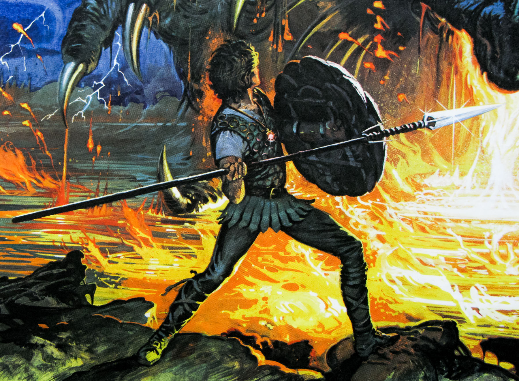
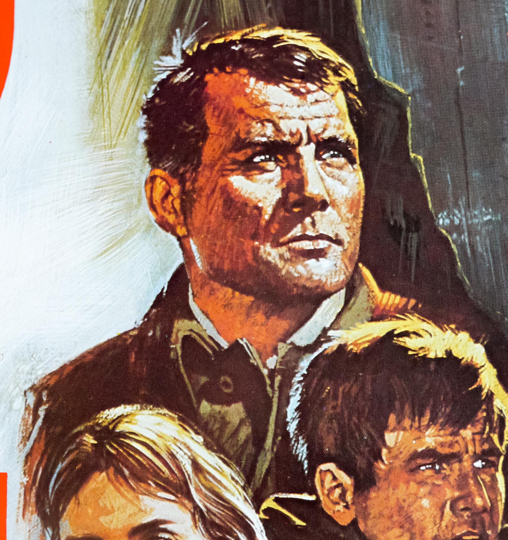
One thing that people often remark about in your Raiders quad is that Indy is missing his Fedora and leather jacket, which later became his trademarks.
I was given a headshot of Harrison Ford with no body reference to paint from. I struck the likeness from the reference I was given. I didn’t think the original reference photo was the best image of Harrison Ford but I did my best with what I was given. At that time the jacket and fedora had not become iconic and were not considered a requirement.
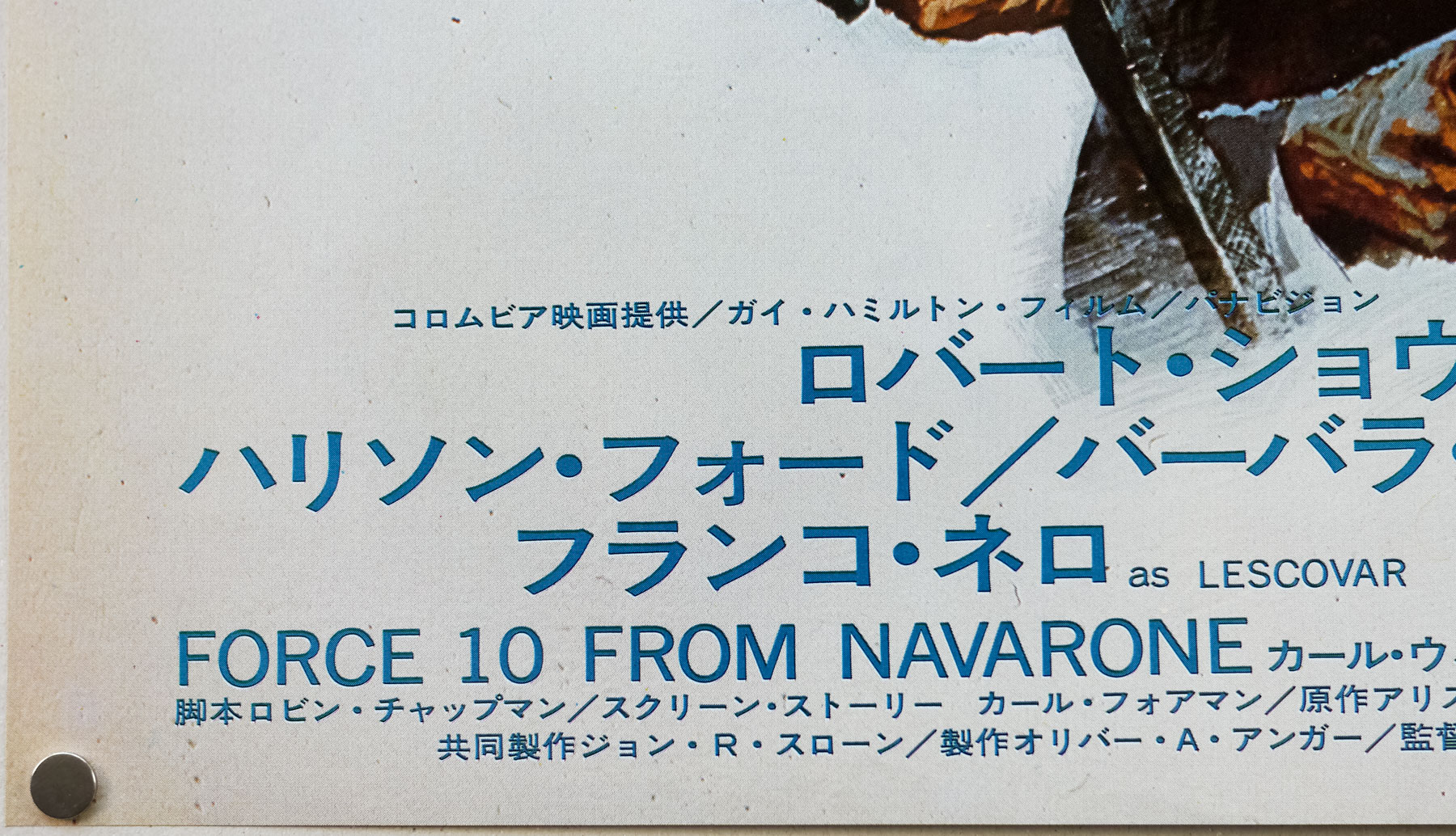
It’s interesting to note that the decision was taken to drop the text referencing two previous hit films from Spielberg (Jaws) and George Lucas (Star Wars). This artwork was later re-used when the film was re-released at cinemas (the press-quote was replaced) and was also printed as a UK one sheet.
My overall favourite Indiana Jones poster is by Richard Amsel and was for the 1982 re-release of the film in the US. It can be seen here.
Other posters by Brian Bysouth I’ve collected can be seen by clicking here.