You searched for: John%2520Young

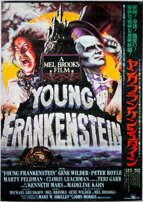
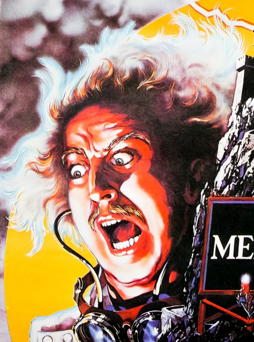
Young Frankenstein / B2 / Japan

17.05.11

Poster Poster

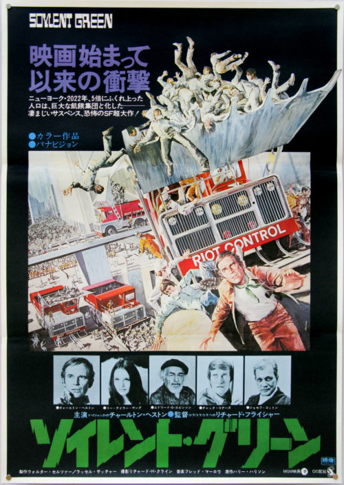
Soylent Green / B2 / Japan

17.05.11

Poster Poster

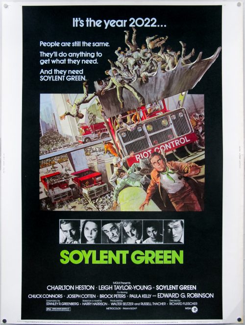
Soylent Green / 30×40 / USA

23.11.11

Poster Poster
Title
Soylent Green
AKA
Soirento geriin (Japan) | 2022: i sopravvissuti [2022: The Survivors] Italy
Year of Film
1973
Director
Richard Fleischer
Starring
Charlton Heston, Leigh Taylor-Young, Chuck Connors, Joseph Cotten, Brock Peters, Paula Kelly, Edward G. Robinson, Stephen Young, Mike Henry, Lincoln Kilpatrick
Origin of Film
USA
Genre(s) of Film
Charlton Heston, Leigh Taylor-Young, Chuck Connors, Joseph Cotten, Brock Peters, Paula Kelly, Edward G. Robinson, Stephen Young, Mike Henry, Lincoln Kilpatrick,
Type of Poster
30x40
Style of Poster
--
Origin of Poster
USA
Year of Poster
1973
Designer
Unknown
Artist
John Solie
Size (inches)
30 3/16" x 40 1/16"
SS or DS
SS
NSS #
73/30
Tagline
It's the year 2022... People are still the same. They'll do anything to get what they need. And they need SOYLENT GREEN.

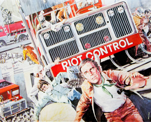
Wonderfully detailed artwork by American artist John Solie for this 1973 dystopian sci-fi in which a police detective (Charlton Heston) finds his life is in danger after investigating the secrets behind a revolutionary new foodstuff called Soylent Green. You’d be hard pressed to find a film fan worth their salt who doesn’t know the secret ingredient.

John Solie has been working as an illustrator for over 40 years and film posters are just one aspect of his output, which also includes book and magazine covers, sculptures, portraits and work for NASA. He continues to paint today in Tucson, Arizona.

Here are the posters by John Solie I have collected to date.

Here’s the great original trailer.


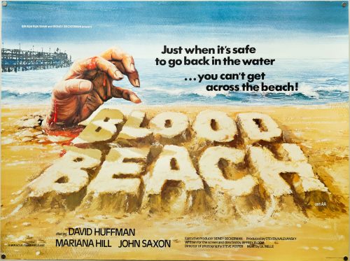
Blood Beach / quad / UK

04.02.13

Poster Poster
Title
Blood Beach
AKA
--
Year of Film
1980
Director
Jeffrey Bloom
Starring
David Huffman, Marianna Hill, Burt Young, Otis Young, Lena Pousette, John Saxon, Darrell Fetty, Stefan Gierasch, Eleanor Zee, Pamela McMyler, Harriet Medin, Mickey Fox
Origin of Film
USA
Genre(s) of Film
David Huffman, Marianna Hill, Burt Young, Otis Young, Lena Pousette, John Saxon, Darrell Fetty, Stefan Gierasch, Eleanor Zee, Pamela McMyler, Harriet Medin, Mickey Fox,
Type of Poster
Quad
Style of Poster
--
Origin of Poster
UK
Year of Poster
1981
Designer
Tom Beauvais
Artist
Tom Beauvais
Size (inches)
30" x 40"
SS or DS
SS
Tagline
Just when it's safe to go back in the water... you can't get across the beach!

Something lurks beneath the surface of Santa Monica beach and it’s hungry for flesh – can it be stopped? That’s pretty much the elevator pitch for the 1980 horror film Blood Beach, which was directed by Jeffrey Bloom and features genre stalwart John Saxon and prolific character actor Burt Young (perhaps best known for his role as Paulie in Rocky) as two local policemen assigned to discover the truth behind a number of mysterious disappearances (and a dog with a missing head).

For a film with such a simple premise Blood Beach is surprisingly boring and features several limp sequences involving the other two names mentioned on this poster. David Huffman and Marianna Hill play two locals with a muddily explained backstory and any pretence of them being the film’s leads is abandoned halfway through. There are a handful of effective scenes featuring victims being dragged beneath the sand (I’d actually like to know how the effect was achieved) and one moment where an unlucky gentlemen (well, technically, would-be rapist) has his privates removed by the creature. When it is finally revealed, the beast is so terribly realised that any fear that might have built up immediately evaporates – perhaps the budget ran out by that point but the rubber monstrosity on show is beyond laughable.

Currently the film is very hard to track down if you do want to subject yourself to it, and I actually ended up watching it on a German DVD, which is the only digital release available worldwide and is the slightly modified R-rated version.

The poster was designed and illustrated by Tom Beauvais, a British artist with a lengthy career working in film marketing which saw him design and/or illustrate several notable posters, including the quad for Butch Cassidy and the Sundance Kid and Mad Max. He was also responsible for the infamous ‘rotten hand bursting from the ground’ image for Lucio Fulci’s Zombie Flesh Eaters, a device Tom was clearly happy reusing for this poster! In 2012 I was lucky enough to meet and interview Tom and the article can be read here.

Life of Brian / one sheet / style A / USA

18.04.12

Poster Poster

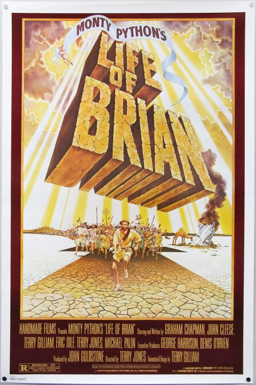
Probably my favourite of the five cinematic outings by the Monty Python crew, Life of Brian is one of the funniest films ever made and the brilliant satirical humour hasn’t diminished at all in the thirty plus years since its release. Infamously causing an uproar with various religious groups, it also saw EMI, the original financial backers, pulling out during production claiming the script was blasphemous. Luckily, George Harrison stepped in with the finance, apparently after realising it may have been the last chance to see another Python film in cinemas. His company HandMade Films was formed as a result of this deal.

The film’s religion-baiting story sees a man called Brian (Graham Chapman) born at the same time as Jesus Christ and initially mistaken for the Messiah, who ends up living an unremarkable life under the Roman occupation of Judea. Things take a fateful turn when his infatuation with a young rebel called Judith (Sue Jones-Davies) leads him to join the People’s Front of Judea, a bickering group who have decided to take a stand against the emperor.

The film raised the ire of several religious groups who were outraged at the concept, despite most of them having never even seen the film, and it was only given a general release once several cuts had been made. Despite the edits, several local UK councils banned the film from being shown at cinemas within their boroughs. Apparently some of these bans lasted until very recently, with the Welsh town of Aberystwyth finally lifting its one in 2009, which then saw a screening of the film attended by Jones, Michael Palin and Sue Jones-Davies, who was the then mayor of the town.

One of the more infamous bans was carried out by the Norwegians who refused to allow the film to be screened at all, which lead some of the international marketing material for the film to be emblazoned with the proclamation ‘So funny it was banned in Norway!’

This is the American one sheet for the release of the film featuring illustration by an artist I have been unable to identify. William Stout had previously provided an illustration for an alternative one sheet, which can be seen here.

The original American trailer can be seen on YouTube.

Vampire Circus / 30×40 / USA

29.07.13

Poster Poster

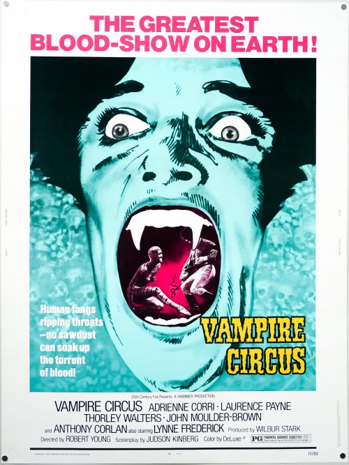
The taglines on this US 30×40 left cinema-goers in no doubt as to the kind of film they were in for with Hammer Films‘ 1972 horror Vampire Circus. Released at a time when the popularity of British gothic horror tales was on the wane, particularly when compared against the more explicit, contemporary horrors coming out of Hollywood (Rosemary’s Baby and later The Exorcist), the film nevertheless managed to stand out from a glut of other films produced by the studio around the same time. A decent script, typically excellent production design and a raft of quality British thespians all help to make Vampire Circus one of the more memorable films to be produced by the House of Horror before its first demise picked up pace a couple of years later

Set in a small village in the studio’s customary ‘mittel-Europe’ sometime in the 19th century, a lengthy pre-credits sequence shows a young girl being led into the castle of vampire Count Mitterhaus by Anna (Domini Blythe), the wife of local schoolmaster Albert Müller (Laurence Payne). Soon after the girl is murdered by the vampire, a group of villagers led by Müller storm the castle, stake the Count and burn the castle to the ground. Anna manages to drag the dying vampire to the crypt beneath the castle and before he perishes he curses the villagers and promises that their children will die to give him back his life. Fast-forward fifteen years, the village is beset by a plague and blockaded by the authorities with the miserable villagers fearing that this is the Count’s doing.

One day the eponymous travelling troupe arrives, having apparently snuck past the blockades, led by a mysterious gypsy woman (Adrienne Corri) and containing a ragtag bunch of performers, including a mischievous clown dwarf, a set of flying twins, an erotic tiger dancer (as depicted on this poster) and Emil, a shape-shifting artiste. At first the villagers are happy to be entertained by the circus as it gives them a reprieve from their misery, but it soon becomes clear that the gang have an ulterior motive for being there. Before long the Count’s dying promise is being kept by Emil, who it turns out is a ‘kinsman’ of Mitterhaus, and the leaders of the village must battle to try to stop the murder of their children and the resurrection of the cursed Count. It’s a well-paced film and certainly a stand-out feature in Hammer’s output of the early 1970s, only let down by some dodgy special effects, which can be explained by a curtailed production period and the dwindling budgets of the time.

I’m unsure who is responsible for the artwork on this American poster, which depicts Emil in all his fang-baring glory, so if you have any ideas please get in touch.

Vampire Circus / quad / UK

06.02.14

Poster Poster

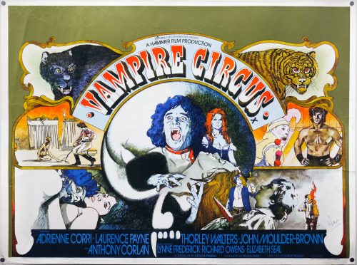
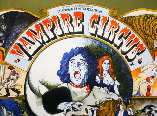
Iconic Vic Fair artwork graces this UK quad for the release of Hammer Films‘ 1972 horror Vampire Circus. Released at a time when the popularity of British gothic horror tales was on the wane, particularly when compared against the more explicit, contemporary horrors coming out of Hollywood (Rosemary’s Baby and later The Exorcist), the film nevertheless managed to stand out from a glut of other films produced by the studio around the same time. A decent script, typically excellent production design and a raft of quality British thespians all help to make Vampire Circus one of the more memorable films to be produced by the House of Horror before its first demise picked up pace a couple of years later

Set in a small village in the studio’s customary ‘mittel-Europe’ sometime in the 19th century, a lengthy pre-credits sequence shows a young girl being led into the castle of vampire Count Mitterhaus by Anna (Domini Blythe), the wife of local schoolmaster Albert Müller (Laurence Payne). Soon after the girl is murdered by the vampire, a group of villagers led by Müller storm the castle, stake the Count and burn the castle to the ground. Anna manages to drag the dying vampire to the crypt beneath the castle and before he perishes he curses the villagers and promises that their children will die to give him back his life. Fast-forward fifteen years, the village is beset by a plague and blockaded by the authorities with the miserable villagers fearing that this is the Count’s doing.

One day the eponymous travelling troupe arrives, having apparently snuck past the blockades, led by a mysterious gypsy woman (Adrienne Corri) and containing a ragtag bunch of performers, including a mischievous clown dwarf, a set of flying twins, an erotic tiger dancer (as depicted on this poster) and Emil, a shape-shifting artiste. At first the villagers are happy to be entertained by the circus as it gives them a reprieve from their misery, but it soon becomes clear that the gang have an ulterior motive for being there. Before long the Count’s dying promise is being kept by Emil, who it turns out is a ‘kinsman’ of Mitterhaus, and the leaders of the village must battle to try to stop the murder of their children and the resurrection of the cursed Count. It’s a well-paced film and certainly a stand-out feature in Hammer’s output of the early 1970s, only let down by some dodgy special effects, which can be explained by a curtailed production period and the dwindling budgets of the time.

During my interview with Vic Fair that was published at the end of 2013 I asked the artist about his work on the poster and this is an excerpt from that article (which also features an image of the original sketch created for the poster):

‘I enjoyed working on the quad I designed for Vampire Circus. I’d wanted to design something that might have been used to advertise an actual circus. The animals on there were pretty much copied directly from a children’s book, as I really didn’t have that much time to work on it. I thought they looked quite amusing, since they’re not exactly anatomically correct portraits of tigers and lions! I also had fun sneaking in the hidden male members, which was really just meant as a bit of a tease towards certain people behind the scenes. I can’t believe I got away with it really.’

To see the other posters I’ve collected that were designed by Vic click here.

Note that this copy came from Vic’s personal archive and it is signed in the bottom right-hand corner.

Life of Brian / quad / 1988 re-release / UK

11.04.14

Poster Poster

Probably my favourite of the five cinematic outings by the Monty Python crew, Life of Brian is one of the funniest films ever made and the brilliant satirical humour hasn’t diminished at all in the thirty plus years since its release. Infamously causing an uproar with various religious groups, it also saw EMI, the original financial backers, pulling out during production claiming the script was blasphemous. Luckily, George Harrison stepped in with the finance, apparently after realising it may have been the last chance to see another Python film in cinemas. His company HandMade Films was formed as a result of this deal.

The film’s religion-baiting story sees a man called Brian (Graham Chapman) born at the same time as Jesus Christ and initially mistaken for the Messiah, who ends up living an unremarkable life under the Roman occupation of Judea. Things take a fateful turn when his infatuation with a young rebel called Judith (Sue Jones-Davies) leads him to join the People’s Front of Judea, a bickering group who have decided to take a stand against the emperor.

The film raised the ire of several religious groups who were outraged at the concept, despite most of them having never even seen the film, and it was only given a general release once several cuts had been made. Despite the edits, several local UK councils banned the film from being shown at cinemas within their boroughs. Apparently some of these bans lasted until very recently, with the Welsh town of Aberystwyth finally lifting its one in 2009, which then saw a screening of the film attended by Jones, Michael Palin and Sue Jones-Davies, who was the then mayor of the town.

One of the more infamous bans was carried out by the Norwegians who refused to allow the film to be screened at all, which lead some of the international marketing material for the film to be emblazoned with the proclamation ‘So funny it was banned in Norway!’

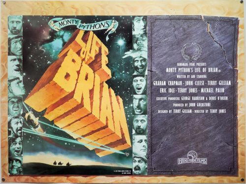
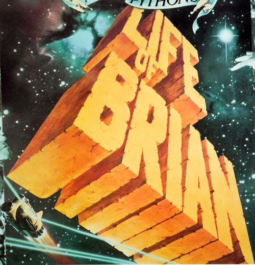
This is a scarce, alternate style UK quad which differs from the other somewhat confusing design, which is simply the logo doubled up. A reader of the site got in touch to confirm that this quad was designed in house at HandMade films. To quote their informative email:

HandMade and the Pythons decided to re-submit the film to Irish Film Board to have the original ban overturned. The submission was successful and with the censor certification under our belt plans to release the film moved ahead and the Life of Brian was finally released in Ireland  I recall in the summer of 1988 as I recall eight years after original release. One of the unsung heroes of HandMade was freelance artist/designer George Rowbottom.

George was closely involved in many HMF posters over the years along with Ray Cooper and it was George who re-worked Life of Brian poster and came up with the “tablet” design for the quad used for the Irish release and also the superior amended 1-sheet. In both cases these were printed by National Screen who printed all our posters for domestic and international.

The original American trailer can be seen on YouTube.

The Klansman / B2 / style B / Japan

18.03.15

Poster Poster

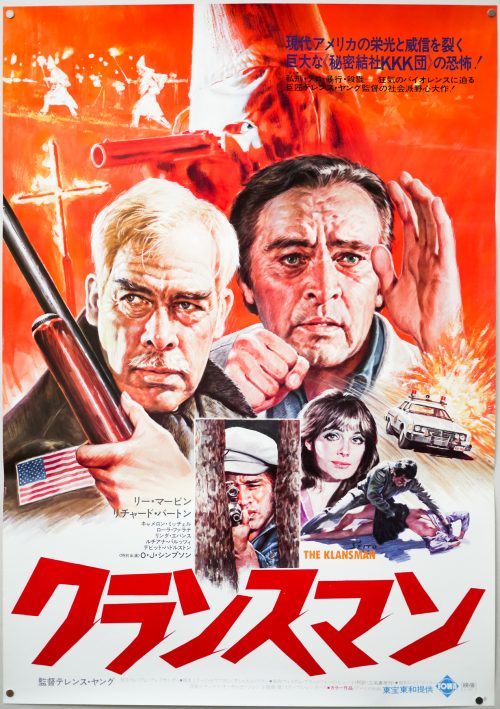
This is one of two Japanese B2 posters for the release of the 1974 drama The Klansman that marks a low point in the careers of the main participants involved and, in my opinion, deserves to be consigned to the dustbin of film history. British director Terence Young (best known for his work on the first two James Bond films and Thunderball) helms this tale of racial tension in a small Southern town that has a large Ku Klux Klan contingent. Lee Marvin plays the lone Sheriff of the town who has to deal with the fallout when a white woman is raped, apparently by a black man. Tensions are escalated when a lone gunman (played by O.J. Simpson) decides to stir things up with the Klan by shooting white townsfolk with a sniper rifle. Richard Burton plays a local landowner who has long opposed the views of the Klan and harboured black people on his land but he gets drawn into the conflict with deadly consequences.

There are many issues with the film, including a confusing script that was clearly trying to imbue the film with something of a social justice message but bungles it badly, and all scenes involving the Klan are cringeworthy and obviously massively politically incorrect. The performances from the two leads are also pretty terrible with Lee Marvin mumbling and drawling through all of his scenes looking like a man who wishes he was elsewhere. Richard Burton also phones his performance in, with an accent that attempts Southern American but ends up sounding altogether wrong, and he also affects a limp in some scenes that disappears in others. Legend has it that the two men were both drunk during the entire shoot and that might explain things. It also doesn’t help that the only version of the film available on home video has been badly cut to remove a lot of the violence and a pivotal rape scene.

This Japanese poster features artwork unique to the Japanese campaign. Seito is one of my favourite Japanese artists who was responsible for several fantastic illustrated posters during the 1970s and 1980s. Little is known about the man himself, even in his native country.

To see the other posters I’ve collected by Seito click here.

The Klansman / B2 / style A / Japan

28.08.15

Poster Poster

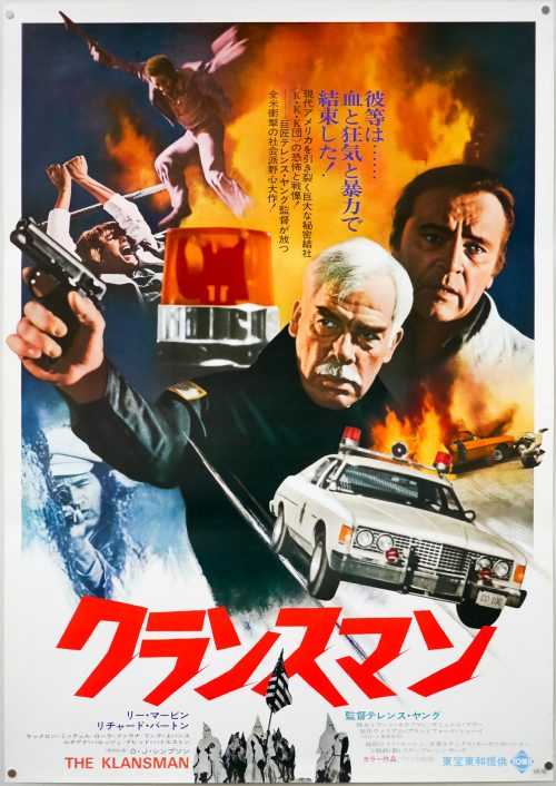
This is one of two Japanese B2 posters for the release of the 1974 drama The Klansman that marks a low point in the careers of the main participants involved and, in my opinion, deserves to be consigned to the dustbin of film history. British director Terence Young (best known for his work on the first two James Bond films and Thunderball) helms this tale of racial tension in a small Southern town that has a large Ku Klux Klan contingent. Lee Marvin plays the lone Sheriff of the town who has to deal with the fallout when a white woman is raped, apparently by a black man. Tensions are escalated when a lone gunman (played by O.J. Simpson) decides to stir things up with the Klan by shooting white townsfolk with a sniper rifle. Richard Burton plays a local landowner who has long opposed the views of the Klan and harboured black people on his land but he gets drawn into the conflict with deadly consequences.

There are many issues with the film, including a confusing script that was clearly trying to imbue the film with something of a social justice message but bungles it badly. All scenes involving the Klan are cringeworthy and obviously massively politically incorrect. The performances from the two leads are also pretty terrible with Lee Marvin mumbling and drawling through all of his scenes looking like a man who wishes he was elsewhere. Richard Burton also phones his performance in, with an accent that attempts Southern American but ends up sounding altogether wrong, and he also affects a limp in some scenes that disappears in others. Legend has it that the two men were both drunk during the entire shoot and that might explain things. It also doesn’t help that the only version of the film available on home video has been badly cut to remove a lot of the violence and a pivotal rape scene.

This is the style A Japanese B2 poster but I also have the style B that features artwork unique to the Japanese campaign by Seito.

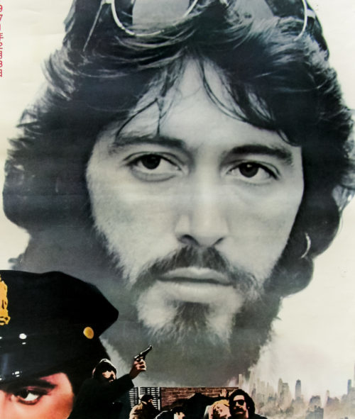
Serpico / B2 / Japan

17.05.11

Poster Poster

Blade Runner / one sheet / ‘odd NSS’ version / USA

18.05.11

Poster Poster
Title
Blade Runner
AKA
Blade Runner - Metropolis 2020 (Finland)
Year of Film
1982
Director
Ridley Scott
Starring
Harrison Ford, Rutger Hauer, Sean Young, Edward James Olmos, M. Emmet Walsh, Daryl Hannah
Origin of Film
USA | Hong Kong
Genre(s) of Film
Harrison Ford, Rutger Hauer, Sean Young, Edward James Olmos, M. Emmet Walsh, Daryl Hannah,
Type of Poster
One sheet
Style of Poster
'Odd NSS'
Origin of Poster
USA
Year of Poster
1982
Designer
Intralink Film Graphic Design
Artist
John Alvin
Size (inches)
27" x 41"
SS or DS
SS
NSS #
820007
Tagline
Man Has Made His Match... Now It's His Problem

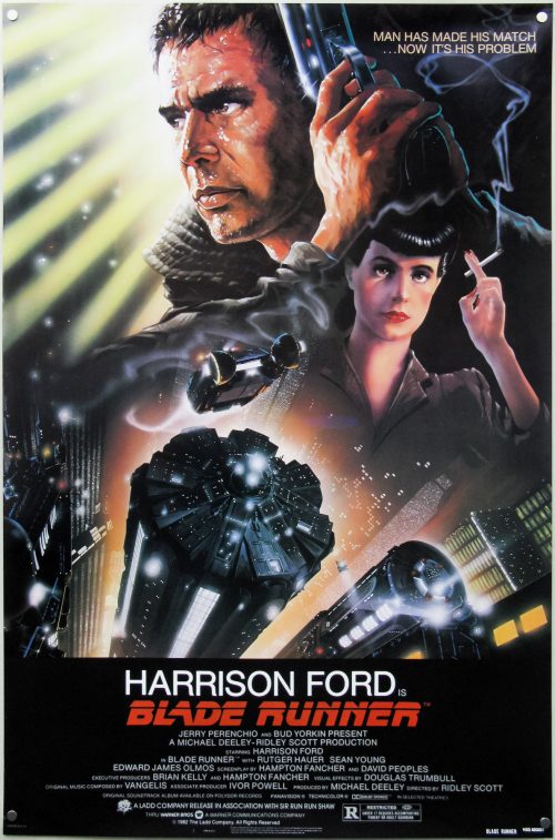
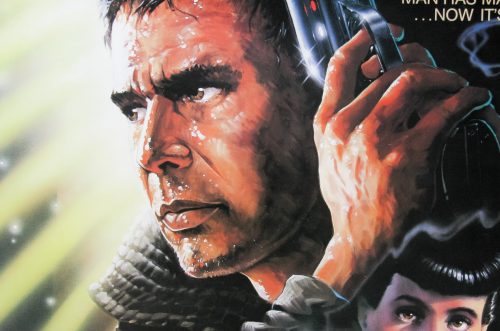
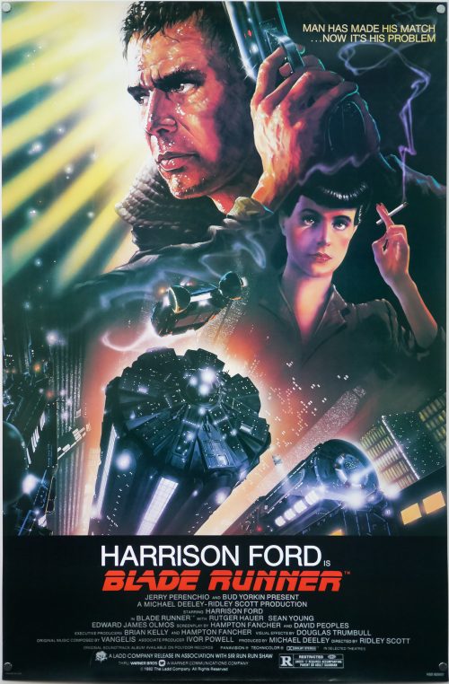
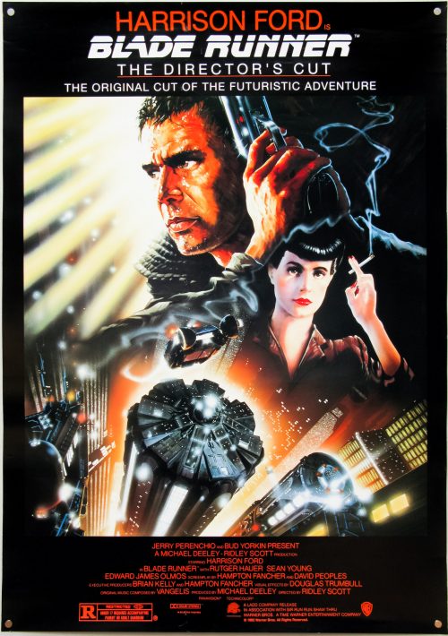
One of my top five films of all time, Blade Runner was released with easily one of the most iconic sci-fi one sheets ever printed. The design and artwork is by the late, great John Alvin, a man responsible for several of the most memorable film posters of the past 40 years. This is perhaps his most well known piece since it featured on posters across the globe, was reused for the 1992 Director’s cut release and has been on the cover of home video releases for many years.

In August 2014 a book entitled The Art of John Alvin was released after four years of preparation by his wife and studio partner Andrea. An absolute must-own for any fan of film posters and the art of cinema, the book features almost all of John’s most memorable posters which are each given their own section. As well as images of the printed poster, there are also early sketches, painted concepts and pictures of the original artwork itself, plus Andrea has provided fascinating commentary detailing the creation of each piece.

Blade Runner is given six pages and the section features a look at the original graphite sketches done by Alvin to show to Ridley Scott and the studio’s marketing department. Elements of these were then combined to create the painting we know today. Andrea notes that the posters for the film were originally conceived to focus on the relationship with the characters and the futuristic city, but by the time of release Harrison Ford was a global star so Alvin was asked to make him more prominent in the artwork.

John apparently always regretted not featuring Rutger Hauer’s android Roy Batty so when he was asked to revisit the design for a 25th anniversary print he reworked several elements, including the two portraits of Harrison Ford and Sean Young and added the face of Roy Batty looming large over them. The print was called ‘I’ve Seen Things’ by John and can be viewed here.

There are known reprints of this poster and this particular version is one of three known variants. LAMP has a guide to all three here. To summarise:

Variation 1 – NSS Version
This version has NOTHING in the bottom left corner; Litho in U.S.A. (AND) the NSS tag in the center; BLADE RUNNER 820007 in the bottom right

Variation 2 – Studio Version
This variation has “PRINTED IN U.S.A.” in the bottom left corner; NOTHING in the center; and “NSS 820007” in the bottom right.

Variation 3 – Odd NSS Version
In the bottom left corner has “PRINTED IN U.S.A.”; in the center ‘IN SMALLER PRINT’ has “LITHO IN U.S.A.” (AND) the NSS tag; In the bottom right has “BLADE RUNNER NSS 820007” in ‘UNEVEN’ print.

As is clear from my photos, the version I have is the ‘Odd NSS Version’. I bought this particular example about five years ago from a very reputable and established dealer who has been in business over 25 years. I have also seen this version sold by the major auction houses on a number of occasions and have seen it in the collections of several long-time collectors.

A dealer in London once told me he believes all NSS versions of this poster are reprints/restrikes. If this is the case then the poster has fooled both respected dealers and collectors alike.
The Hunger / quad / UK

01.06.12

Poster Poster

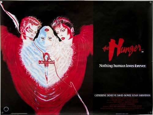
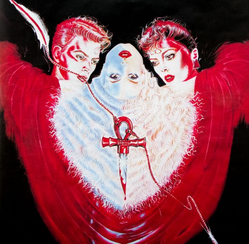
Director Tony Scott‘s feature film debut was this stylish vampire tale starring pop legend David Bowie, Catherine Deneuve and Susan Sarandon. Miriam Blaylock (Deneuve) is a centuries old Egyptian vampire who feeds upon the blood of her young lovers, both male and female, and as a result the victims don’t age; that is until she has had enough of them. John (Bowie) is one such unlucky soul who seeks the help of the scientist Dr. Sarah Roberts (Sarandon) who, after investigating John’s claims, is also caught in the vampire’s trap.

The film displays many of the characteristics that mark out a Tony Scott film, including several brilliantly shot and very stylish sequences, multiple inventive camera tricks and excellent use of classical music, although this it’s notably more subdued in tone than some of his later films. Despite the strong cast, the film failed to win over many critics on its release and was not much of a box office draw, although it has since garnered something of a cult following, particularly from the goth community.

This artwork was used on the American one sheet and I believe it has simply been cut down to fit this UK quad. Attempts to discover the identity of the artist have so far proved fruitless so please get in touch if you have an idea.

The original trailer is on YouTube.


Blade Runner / one sheet / studio version / USA

15.09.14

Poster Poster
Title
Blade Runner
AKA
Blade Runner - Metropolis 2020 (Finland)
Year of Film
1982
Director
Ridley Scott
Starring
Harrison Ford, Rutger Hauer, Sean Young, Edward James Olmos, M. Emmet Walsh, Daryl Hannah
Origin of Film
USA | Hong Kong
Genre(s) of Film
Harrison Ford, Rutger Hauer, Sean Young, Edward James Olmos, M. Emmet Walsh, Daryl Hannah,
Type of Poster
One sheet
Style of Poster
Studio version
Origin of Poster
USA
Year of Poster
1982
Designer
Intralink Film Graphic Design
Artist
John Alvin
Size (inches)
27" x 41"
SS or DS
SS
NSS #
820007
Tagline
Man Has Made His Match... Now It's His Problem

One of my top five films of all time, Blade Runner was released with easily one of the most iconic sci-fi one sheets ever printed. The design and artwork is by the late, great John Alvin, a man responsible for several of the most memorable film posters of the past 40 years. This is perhaps his most well known piece since it featured on posters across the globe, was reused for the 1992 Director’s cut release and has been on the cover of home video releases for many years.

In August 2014 a book entitled The Art of John Alvin was released after four years of preparation by his wife and studio partner Andrea. An absolute must-own for any fan of film posters and the art of cinema, the book features almost all of John’s most memorable posters which are each given their own section. As well as images of the printed poster, there are also early sketches, painted concepts and pictures of the original artwork itself, plus Andrea has provided fascinating commentary detailing the creation of each piece.

Blade Runner is given six pages and the section features a look at the original graphite sketches done by Alvin to show to Ridley Scott and the studio’s marketing department. Elements of these were then combined to create the painting we know today. Andrea notes that the posters for the film were originally conceived to focus on the relationship with the characters and the futuristic city, but by the time of release Harrison Ford was a global star so Alvin was asked to make him more prominent in the artwork.

John apparently always regretted not featuring Rutger Hauer’s android Roy Batty so when he was asked to revisit the design for a 25th anniversary print he reworked several elements, including the two portraits of Harrison Ford and Sean Young and added the face of Roy Batty looming large over them. The print was called ‘I’ve Seen Things’ by John and can be viewed here.

There are known reprints of this poster and this particular version is one of three known variants. LAMP has a guide to all three here. To summarise:

Variation 1 – NSS Version
This version has NOTHING in the bottom left corner; Litho in U.S.A. (AND) the NSS tag in the center; BLADE RUNNER 820007 in the bottom right

Variation 2 – Studio Version
This variation has “PRINTED IN U.S.A.” in the bottom left corner; NOTHING in the center; and “NSS 820007” in the bottom right.

Variation 3 – Odd NSS Version
In the bottom left corner has “PRINTED IN U.S.A.”; in the center ‘IN SMALLER PRINT’ has “LITHO IN U.S.A.” (AND) the NSS tag; In the bottom right has “BLADE RUNNER NSS 820007” in ‘UNEVEN’ print.

This is the second variation (studio version) but I also have the ‘Odd NSS Version’, which can be viewed here. A dealer in London once told me he believes all NSS versions of this poster are reprints/restrikes. If this is the case then the poster has fooled both respected dealers and collectors alike.

Blade Runner: The Director’s Cut / quad / UK

18.05.11

Poster Poster

Blade Runner: The Director’s Cut / B2 / English text / Japan

17.05.11

Poster Poster

Blade Runner: The Director’s Cut / B2 / Japanese text / Japan

17.05.11

Poster Poster

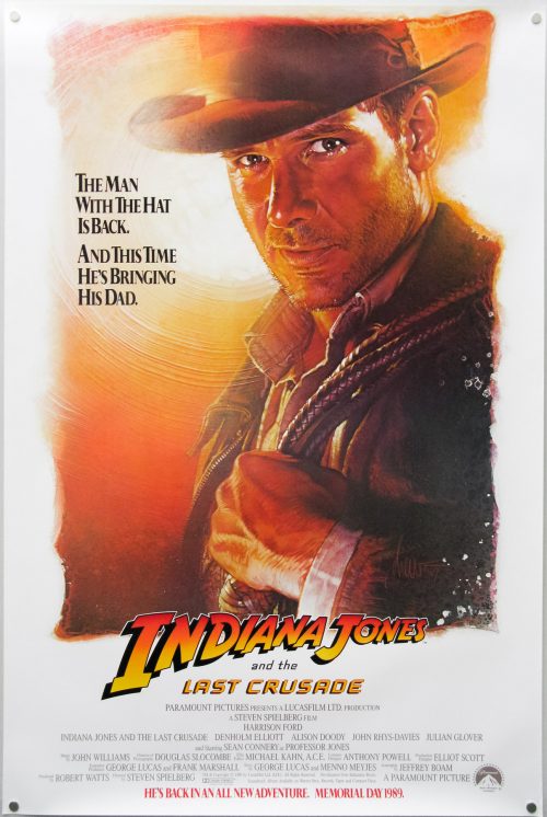
Indiana Jones and the Last Crusade / one sheet / advance / white style / USA

17.05.11

Poster Poster

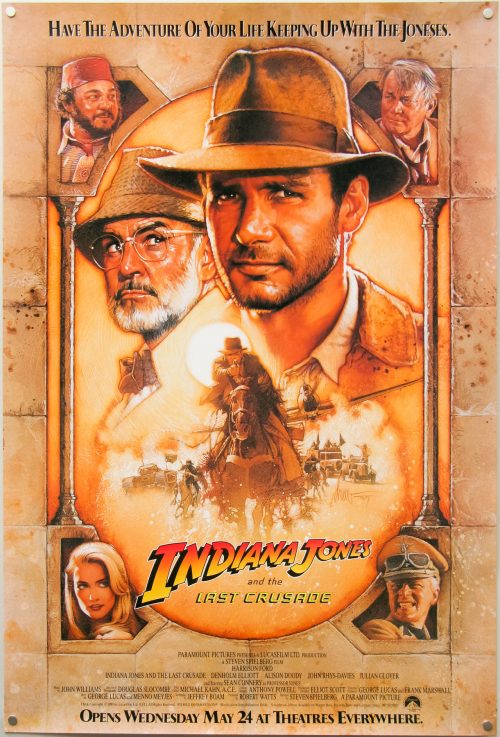
Indiana Jones and the Last Crusade / one sheet / advance / brown style / USA

17.05.11

Poster Poster

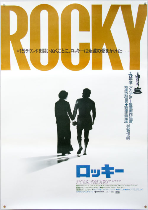
Rocky / B2 / Japan

17.05.11

Poster Poster

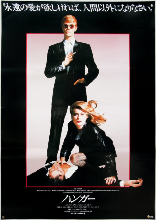
The Hunger / B2 / Japan

17.05.11

Poster Poster