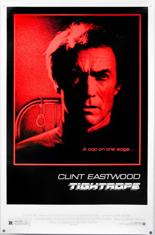
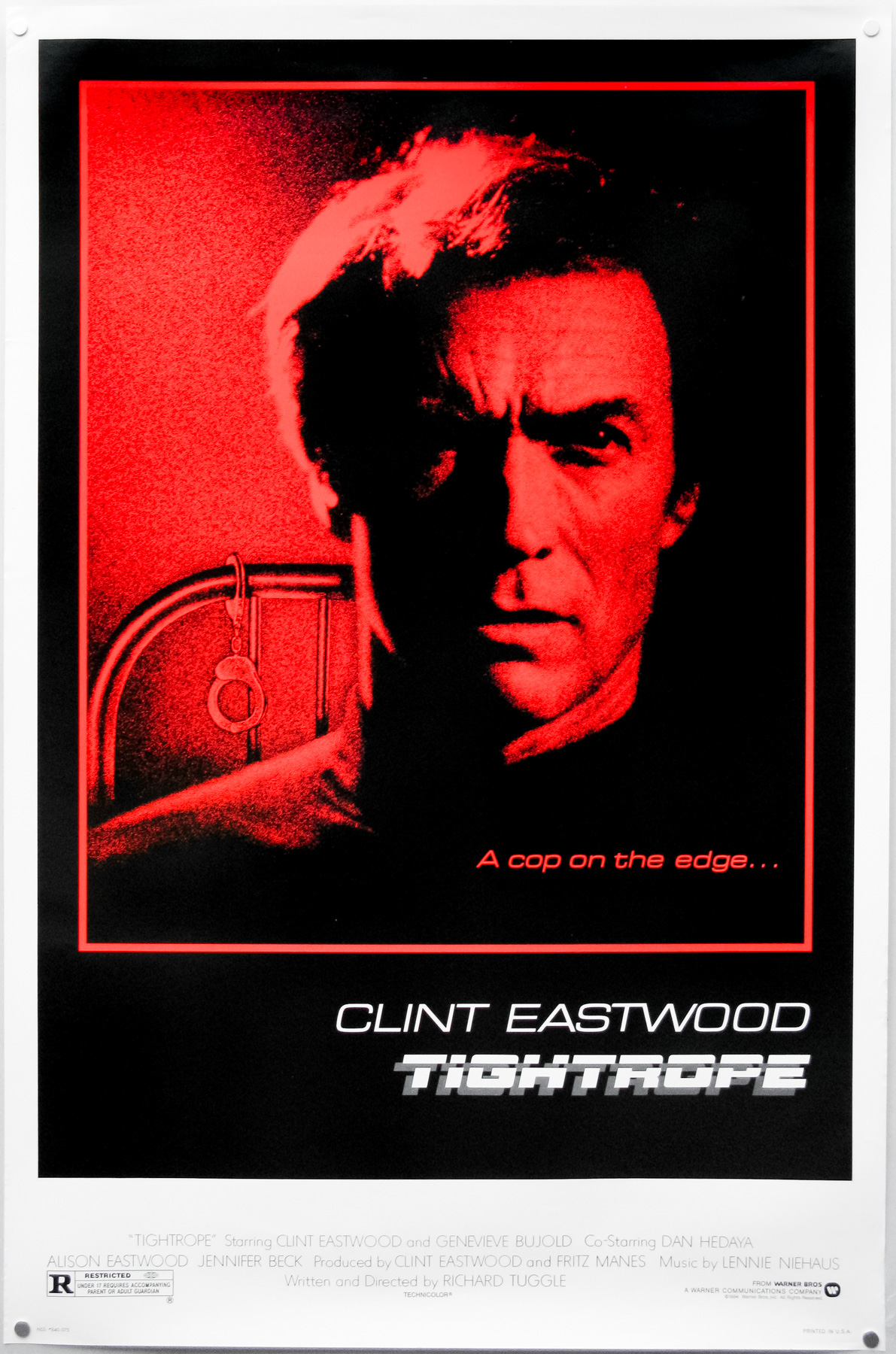
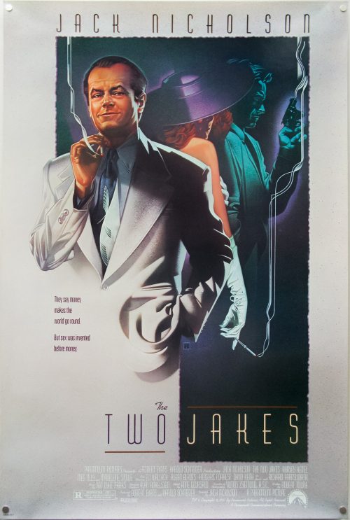
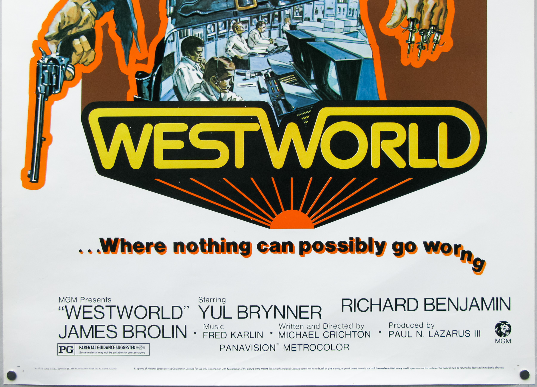
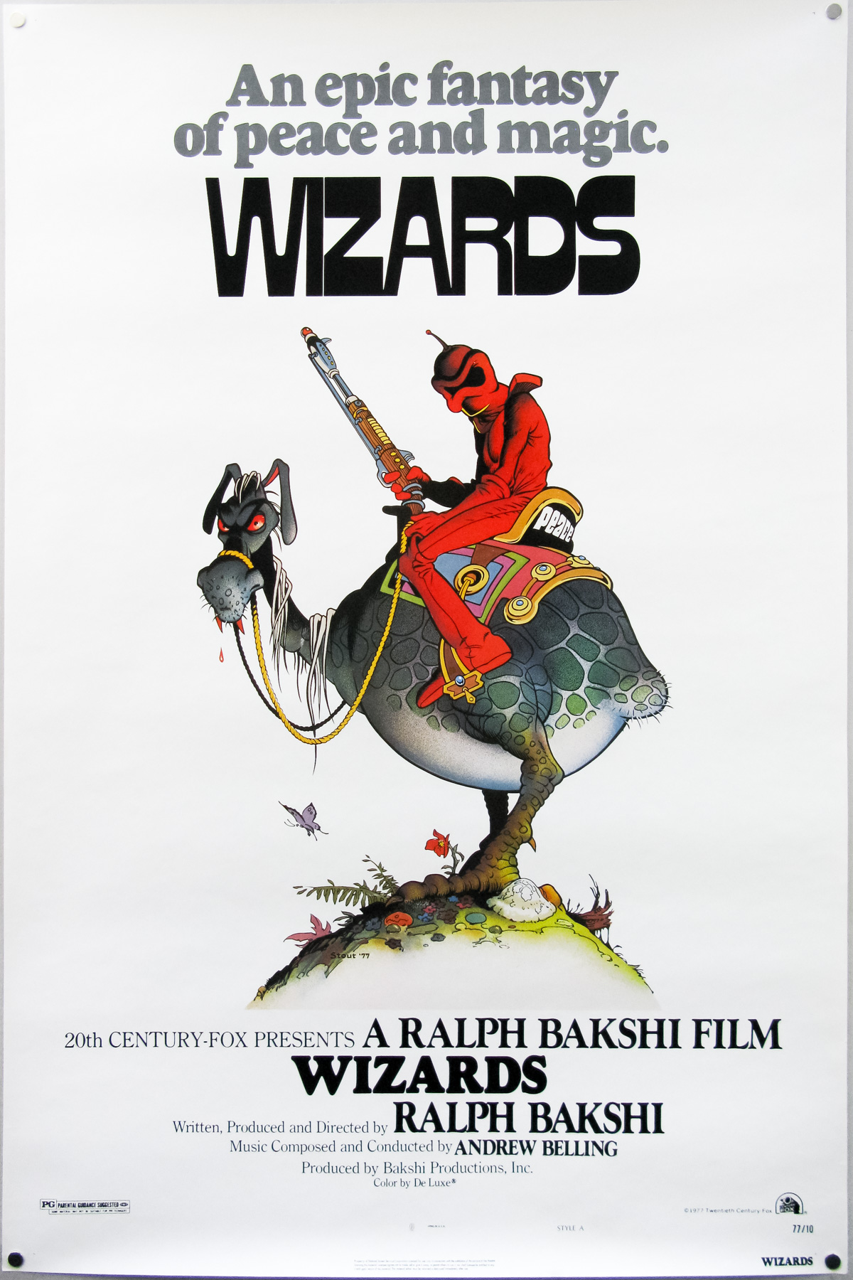
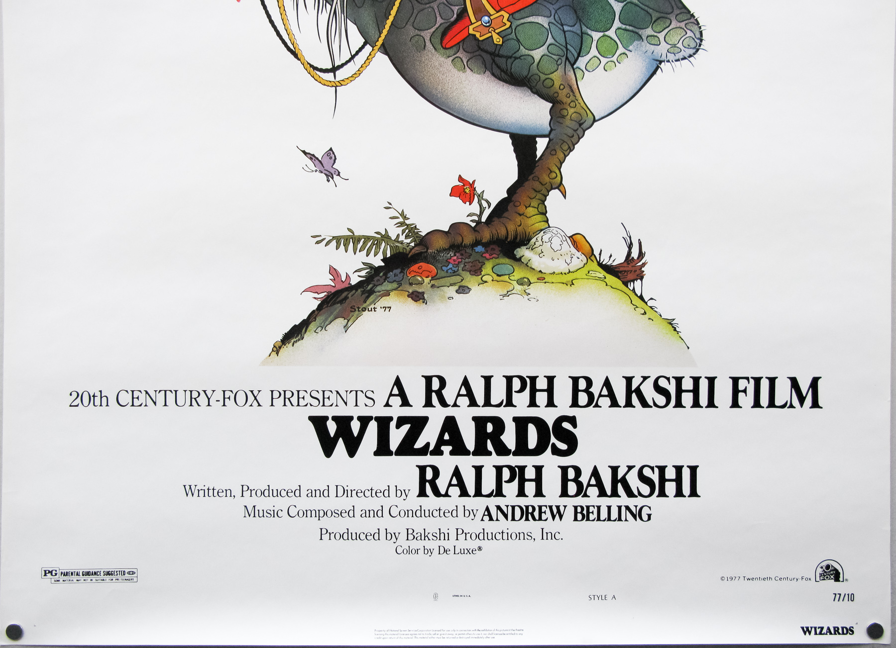
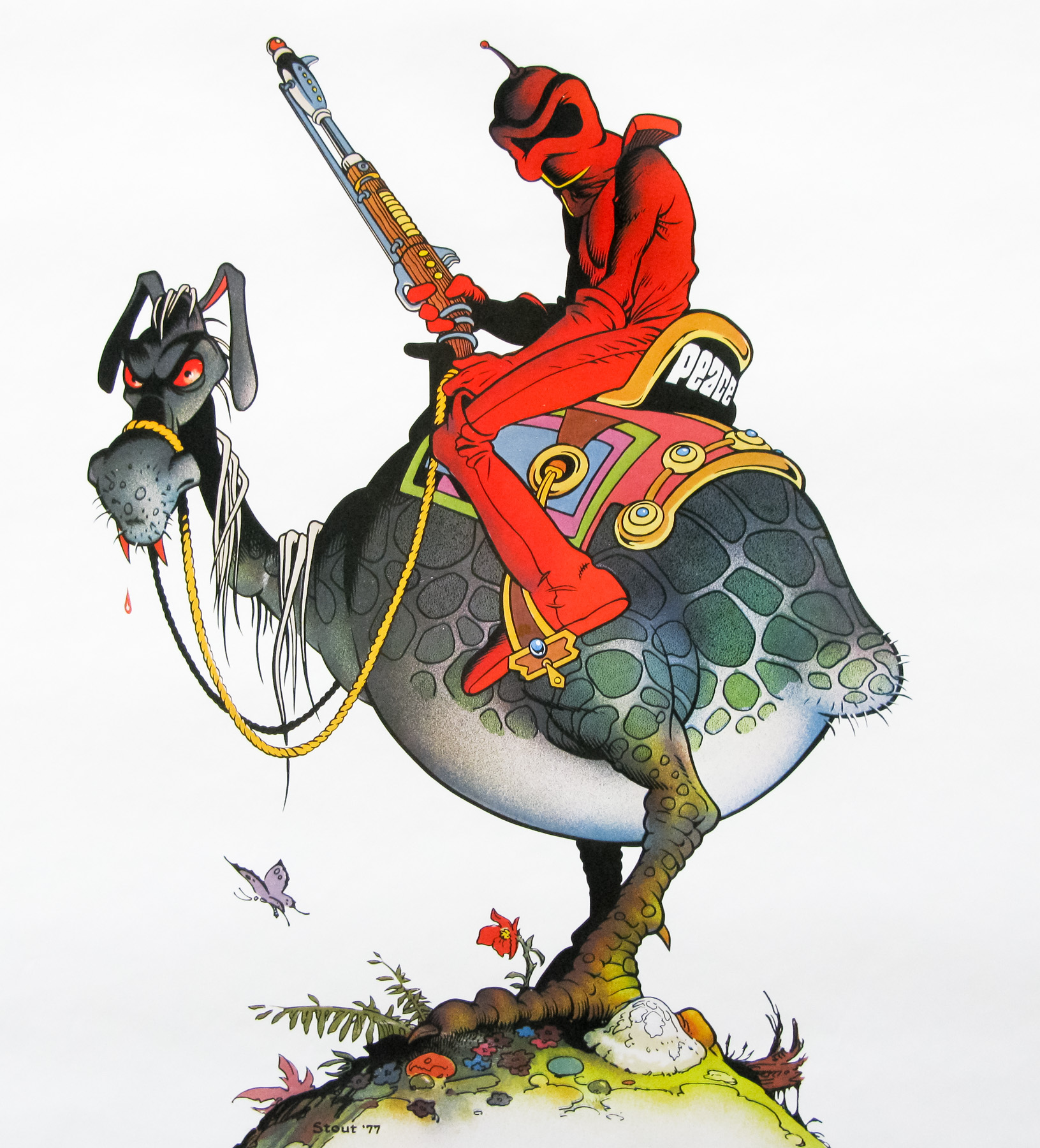
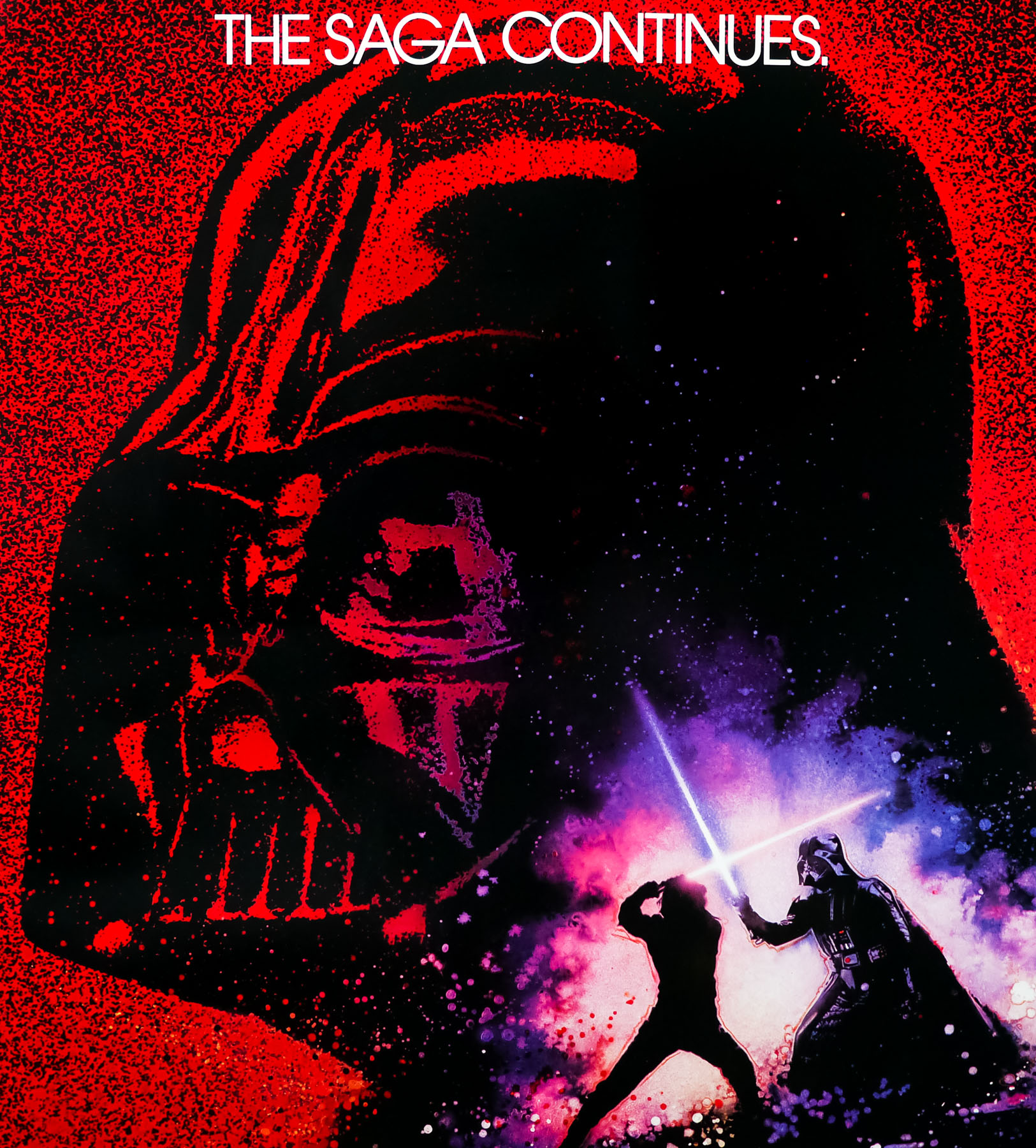
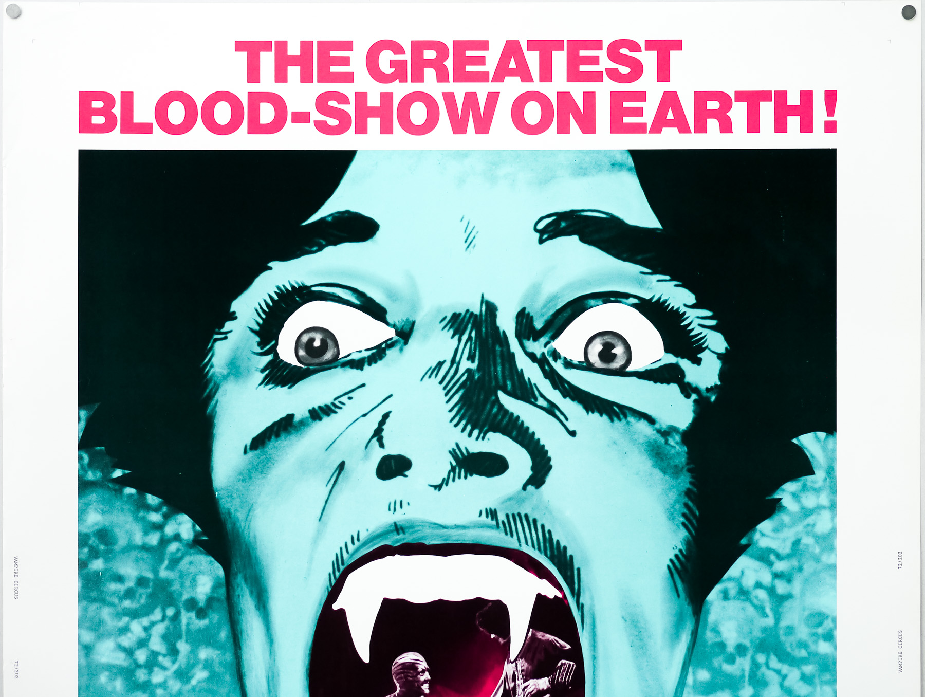
- Title
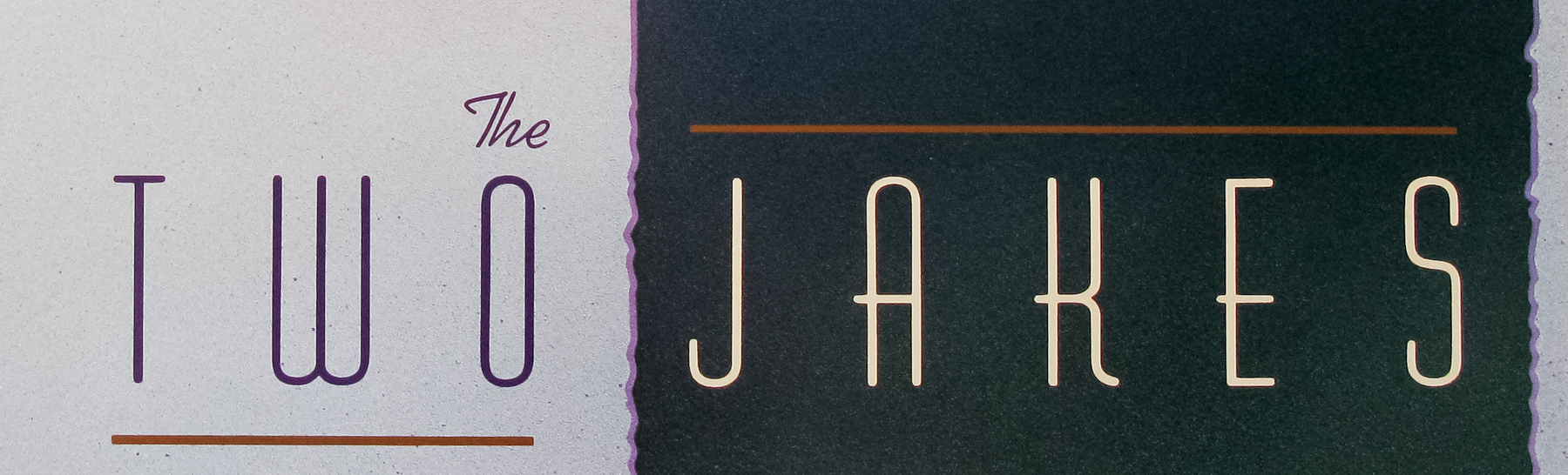
- The Two Jakes
- AKA
- Chinatown II (Finland)
- Year of Film
- 1990
- Director
- Jack Nicholson
- Starring
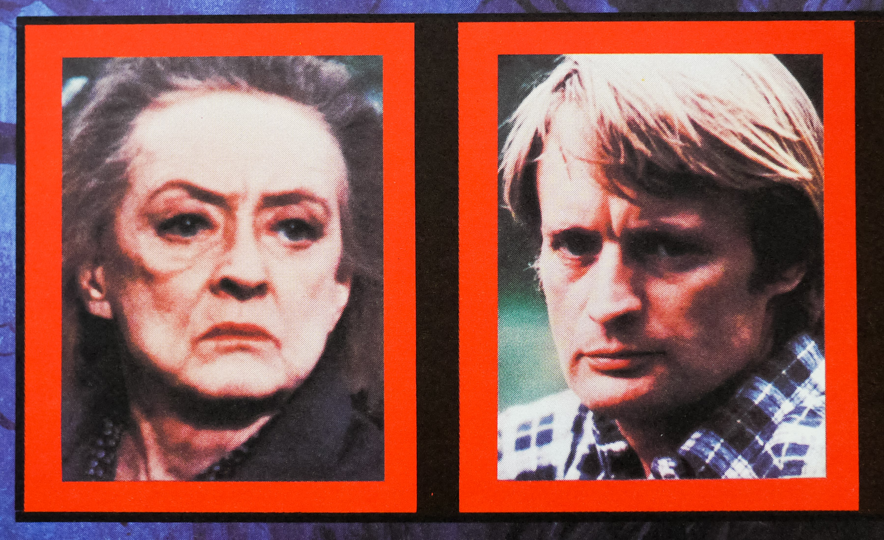
- Jack Nicholson, Harvey Keitel, Meg Tilly, Madeleine Stowe, Eli Wallach, Rubén Blades, Frederic Forrest, David Keith, Richard Farnsworth, Tracey Walter, Joe Mantell, James Hong
- Origin of Film
- USA
- Genre(s) of Film
- Jack Nicholson, Harvey Keitel, Meg Tilly, Madeleine Stowe, Eli Wallach, Rubén Blades, Frederic Forrest, David Keith, Richard Farnsworth, Tracey Walter, Joe Mantell, James Hong,
- Type of Poster
- One sheet
- Style of Poster
- --
- Origin of Poster
- USA
- Year of Poster
- 1990
- Designer
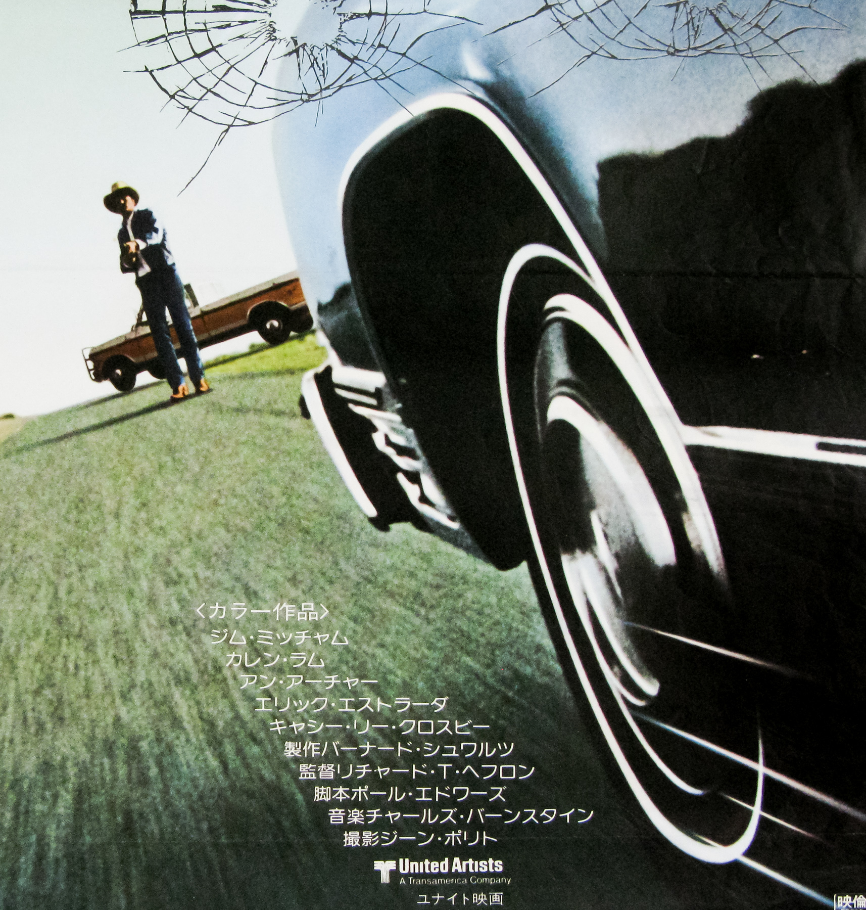
- Seiniger Advertising | Steven Chorney
- Artist
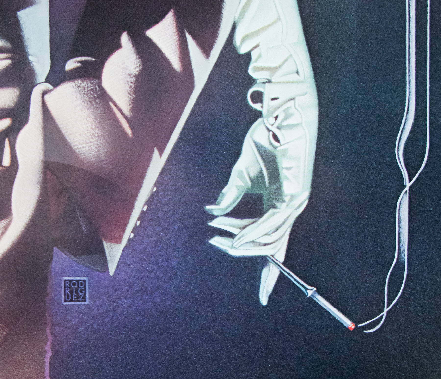
- Robert Rodriguez
- Size (inches)
- 27" x 40 1/4"
- SS or DS
- SS
- NSS #
- --
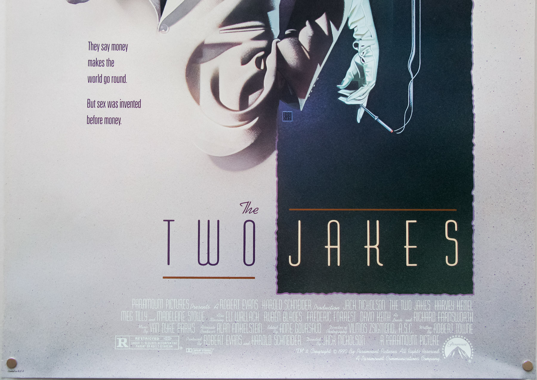
- Tagline
- They say money makes the world go round. But sex was invented before money.
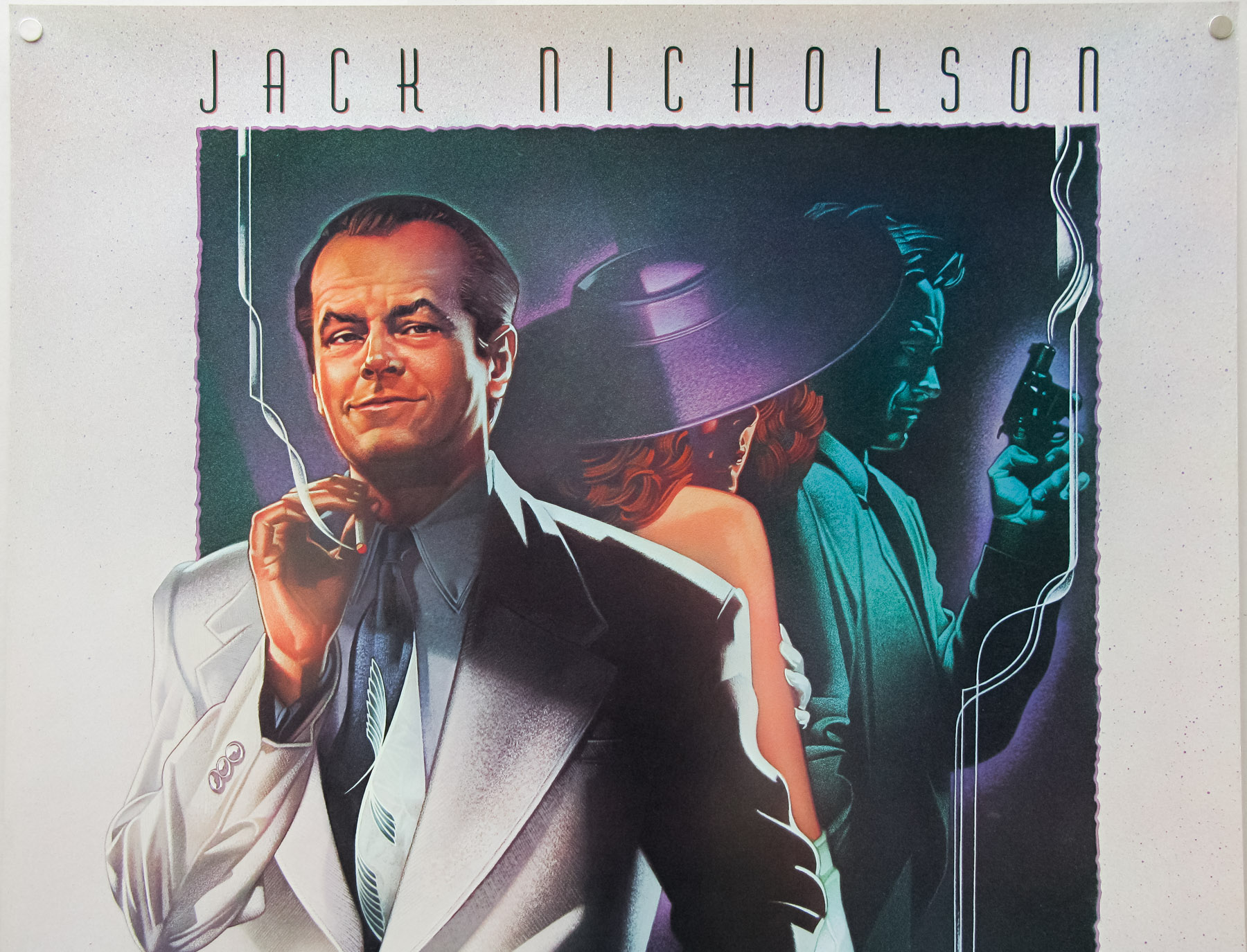
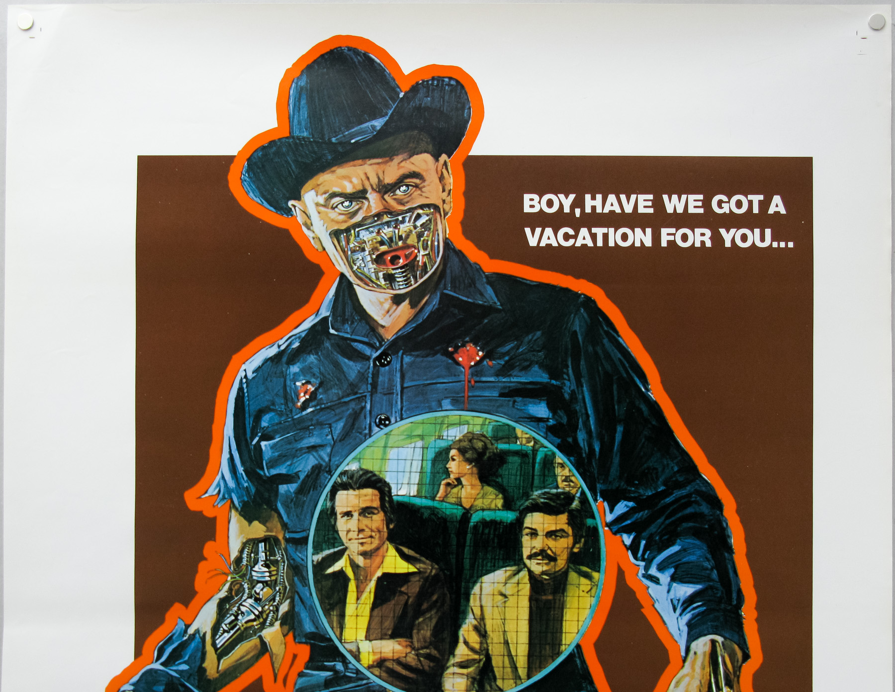
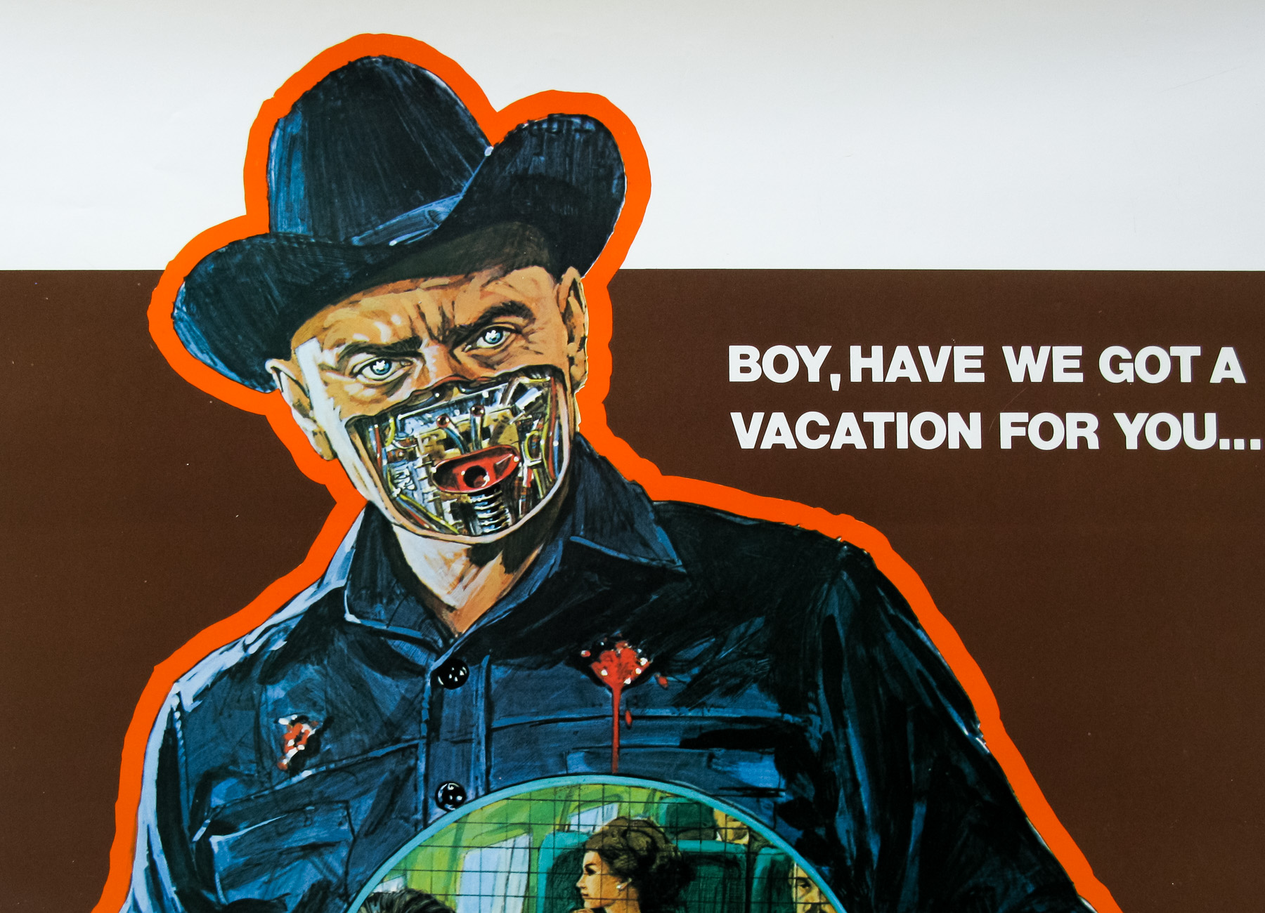
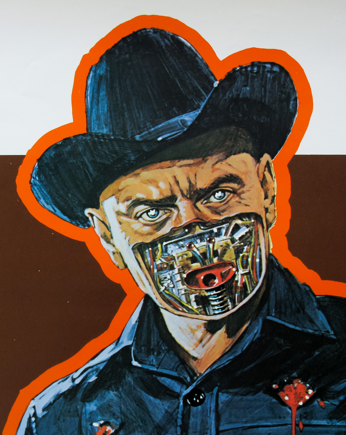
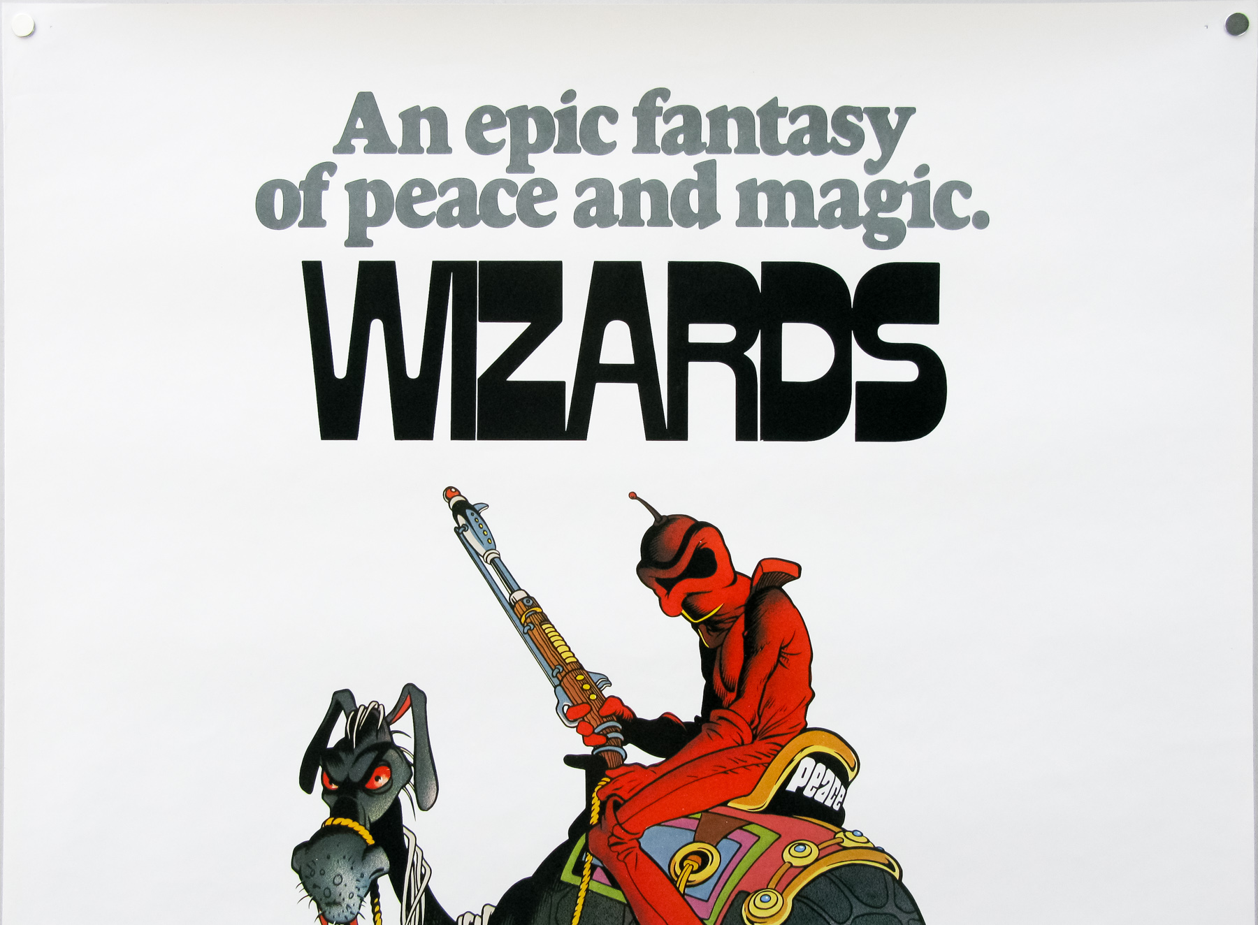
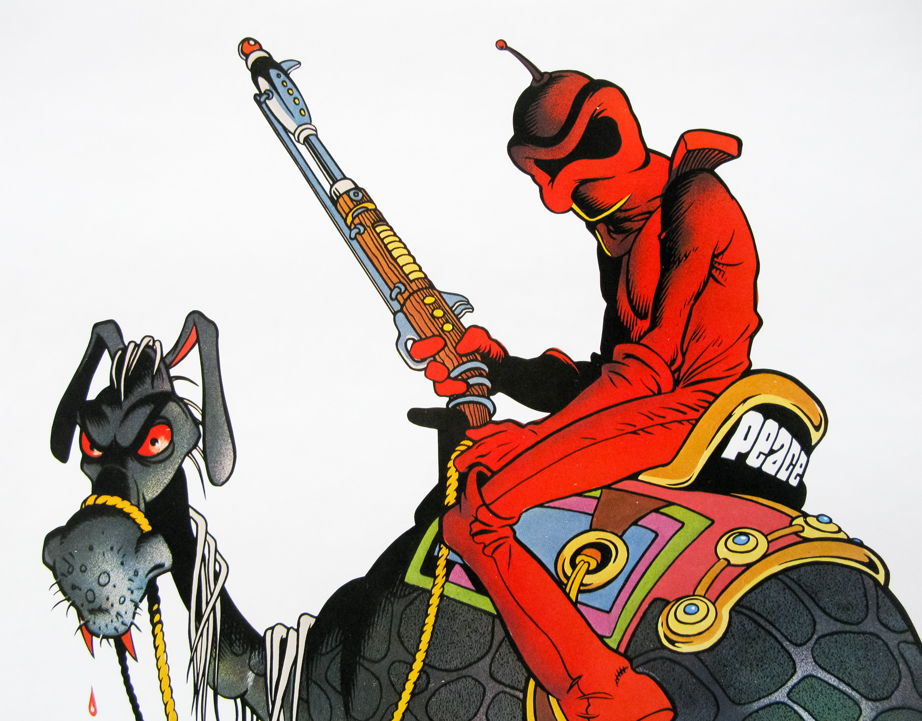
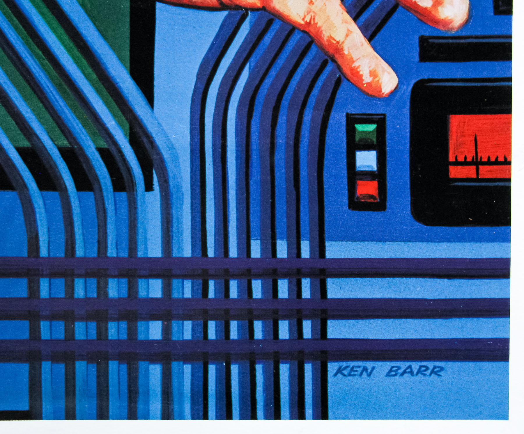
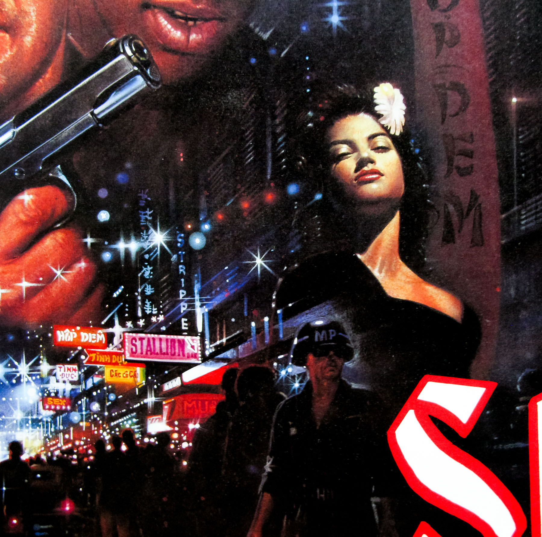
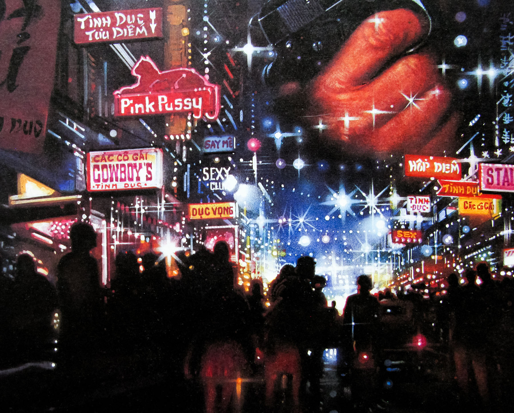
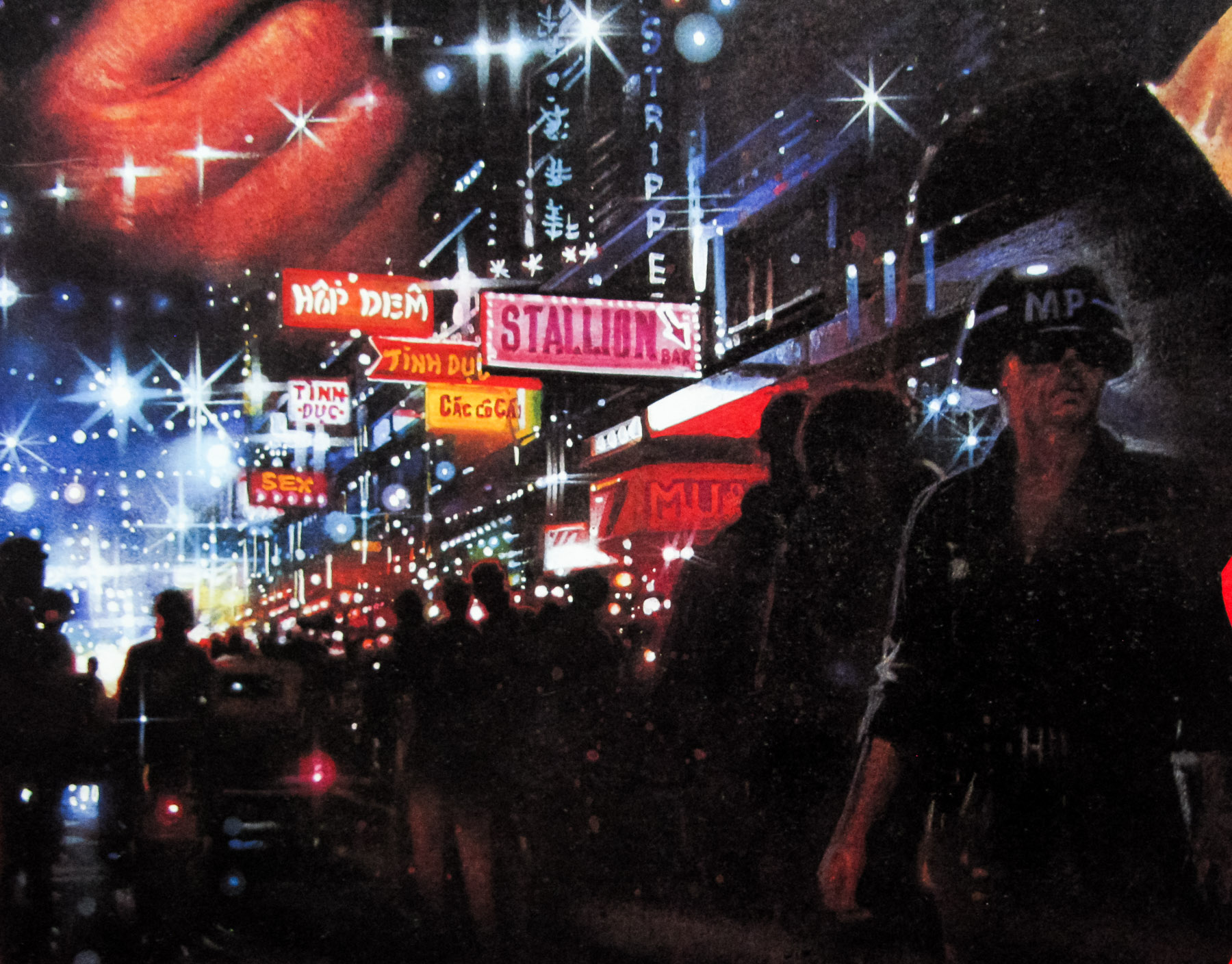
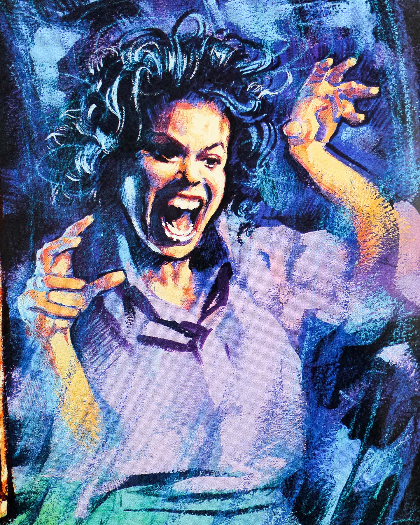
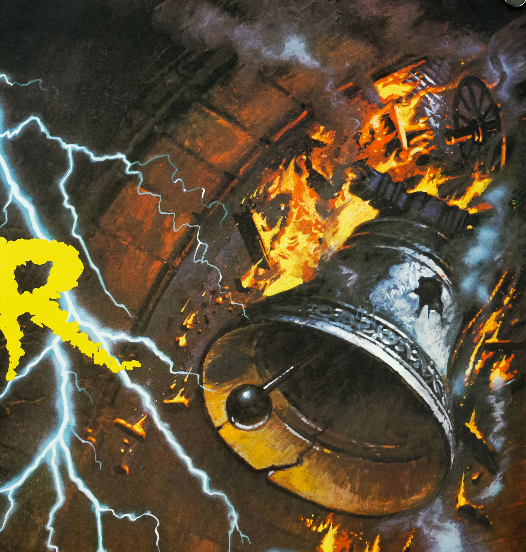
The artwork for Two Jakes, a quasi-sequel to the classic 1974 crime-thriller Chinatown, was painted by the American artist Robert Rodriguez (not to be confused with the Texan film director of the same name). He has his own website which can be seen here and on one of the blog posts he talks about his work on Two Jakes. I’m reproducing it here in case his site ever disappears:
Sherman, set the WABAC machine to March 1990…. That would take us to about the time that I was pulling all-nighters in order to finish the poster for “The Two Jakes”. Originally Steve Chorney had done a series of small watercolor sketches for the movie. They were fast sketches, but the colors were beautiful. Seiniger Advertising was about the hottest movie poster design studio at that time, and they were doing the poster. I had never seen so many concepts for one movie before. I know they took Steve’s sketches and gave them out to five illustrators to develop into comps. Later they had each of us do a completely different image, but I can’t even remember what those looked like. These were all very finished comps, but done at about half size. Everyone was really happy with what I did for the original comp and from the beginning it was in the running. I went off on vacation for a few weeks and when I got back, they told me that my art was still the top choice, only they had revised it and I would need to repaint it at full size.
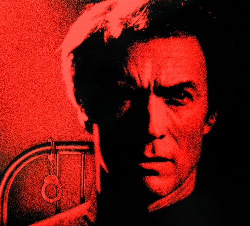
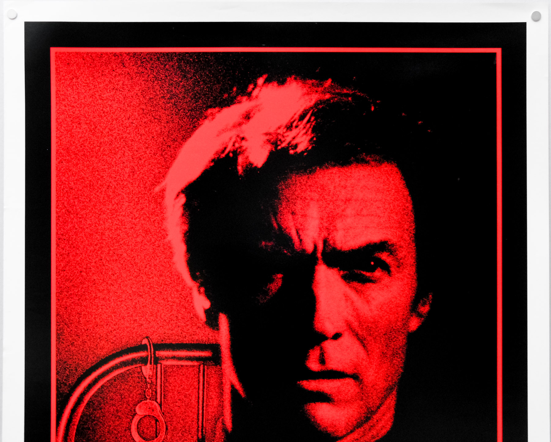
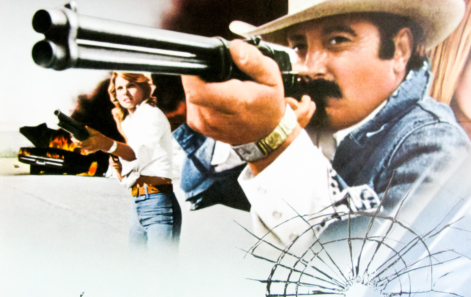
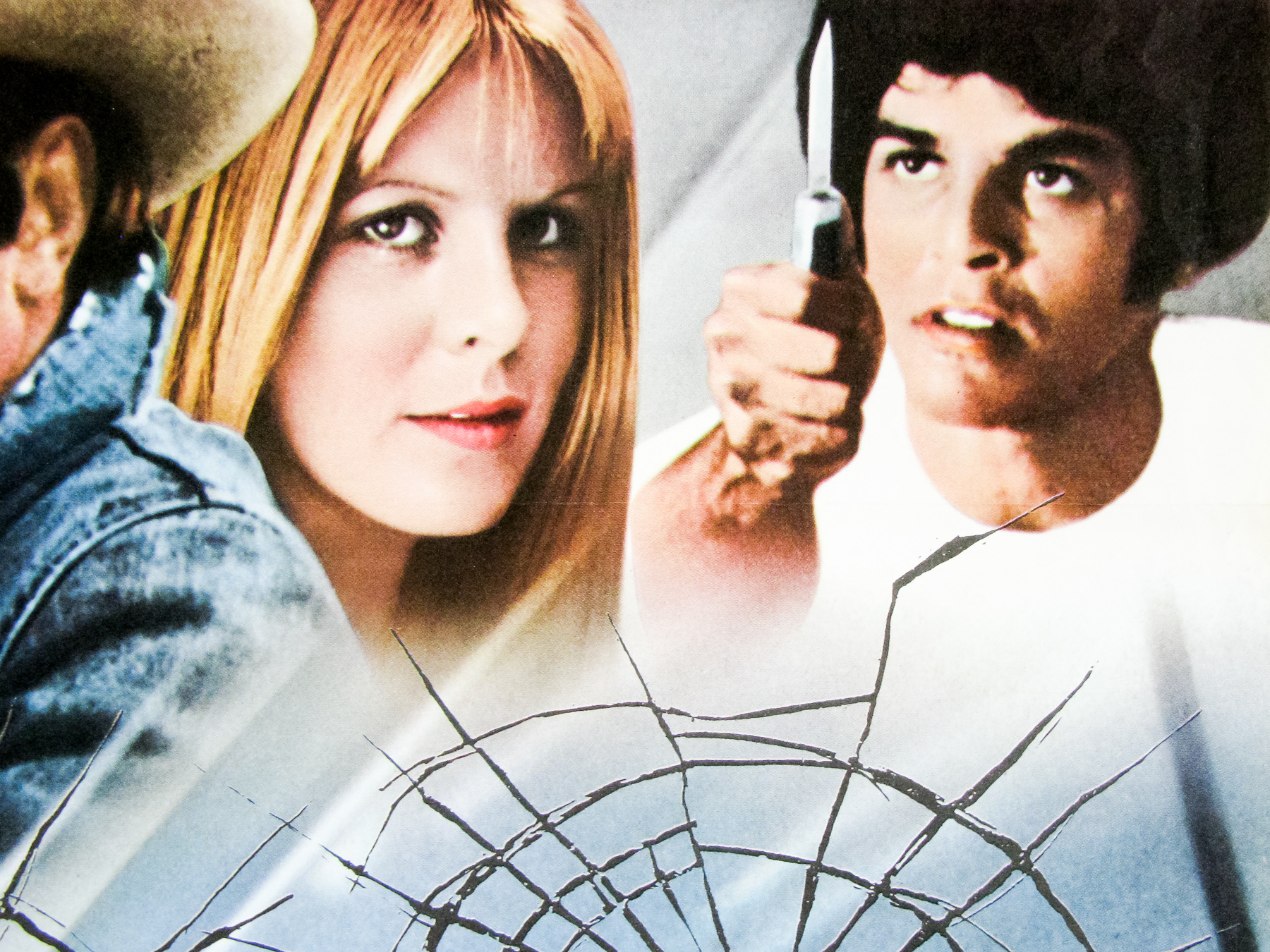
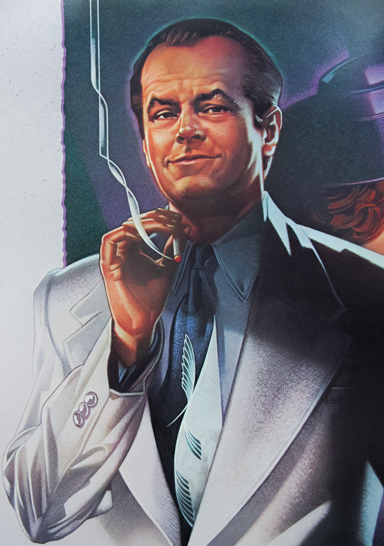
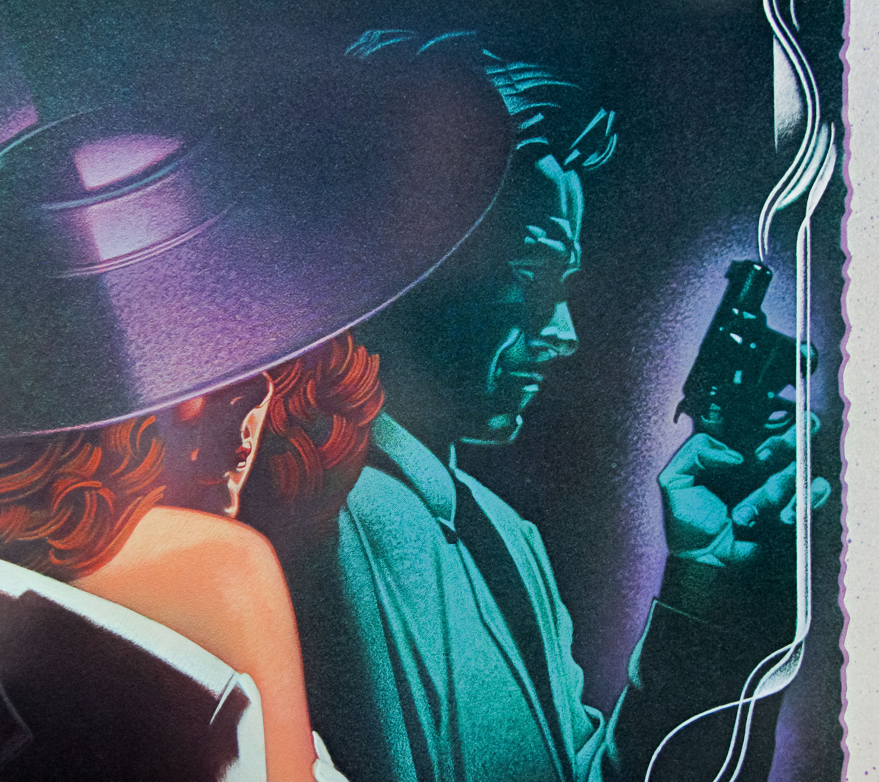
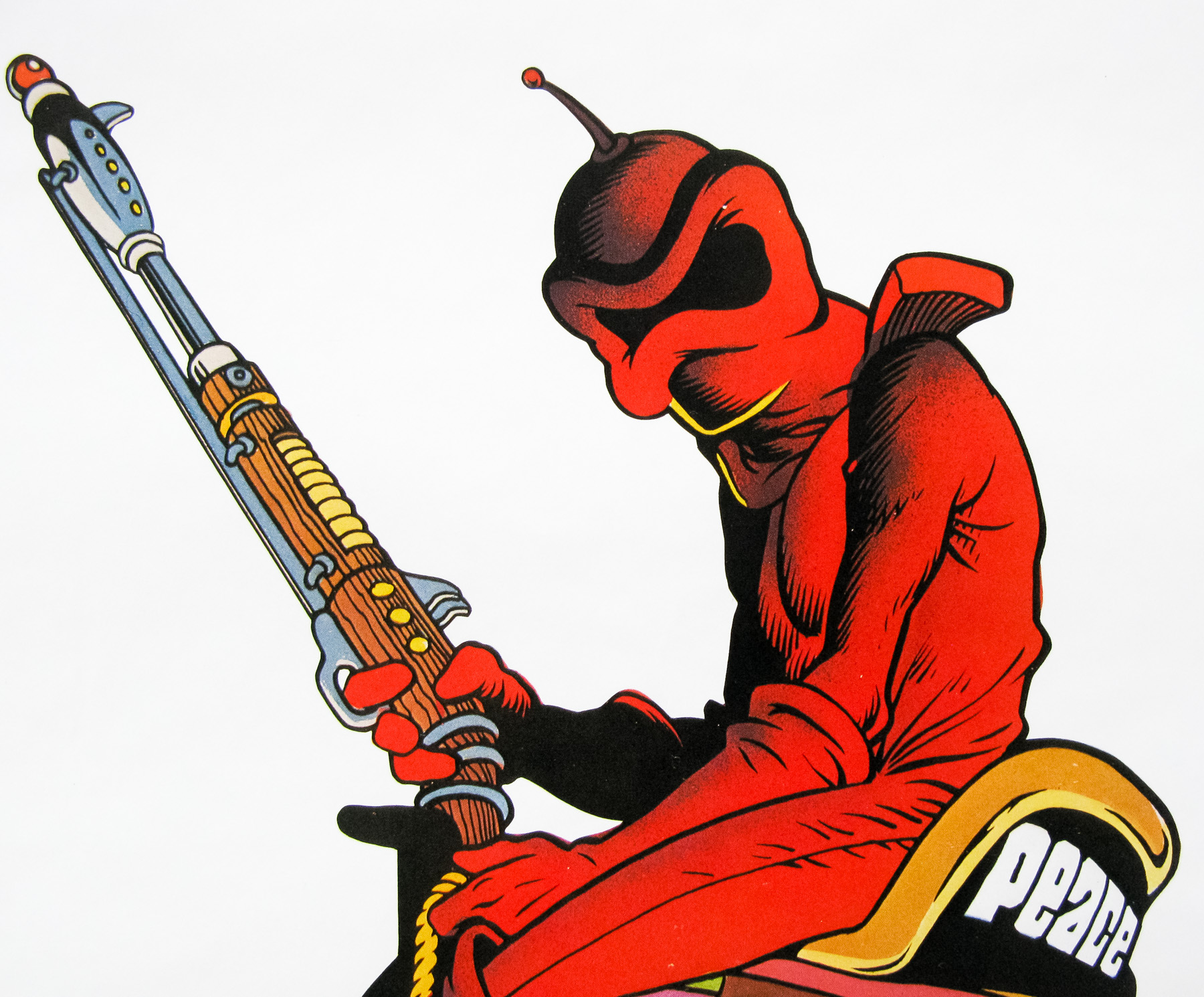
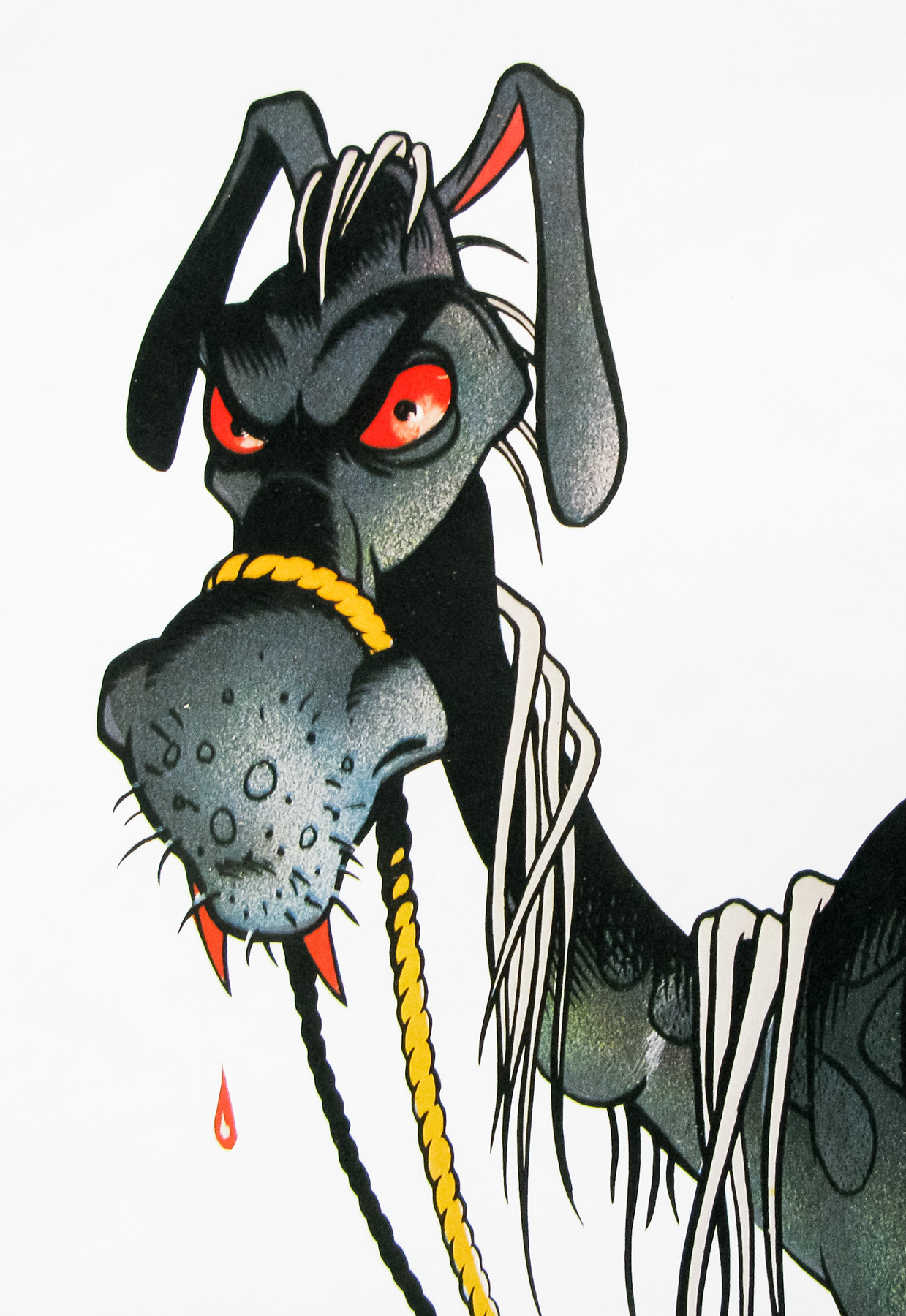
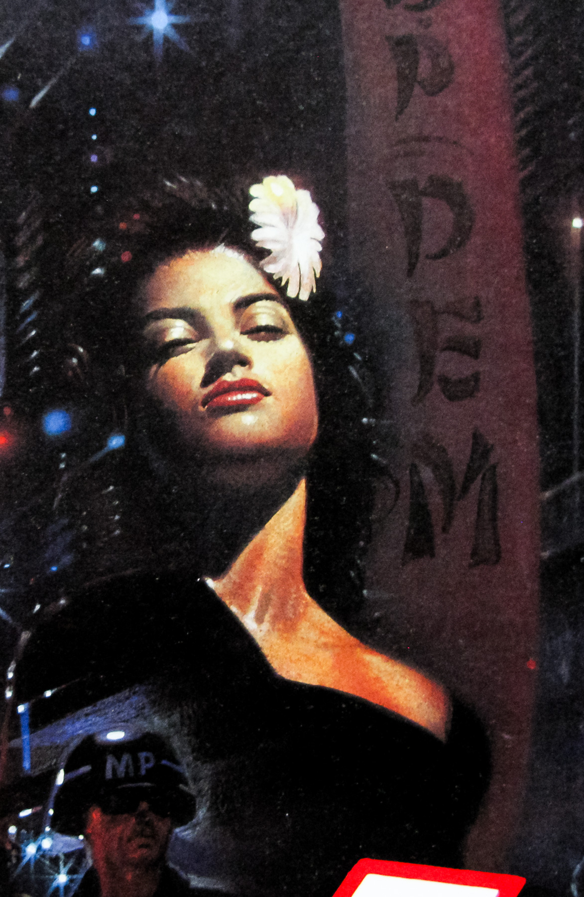
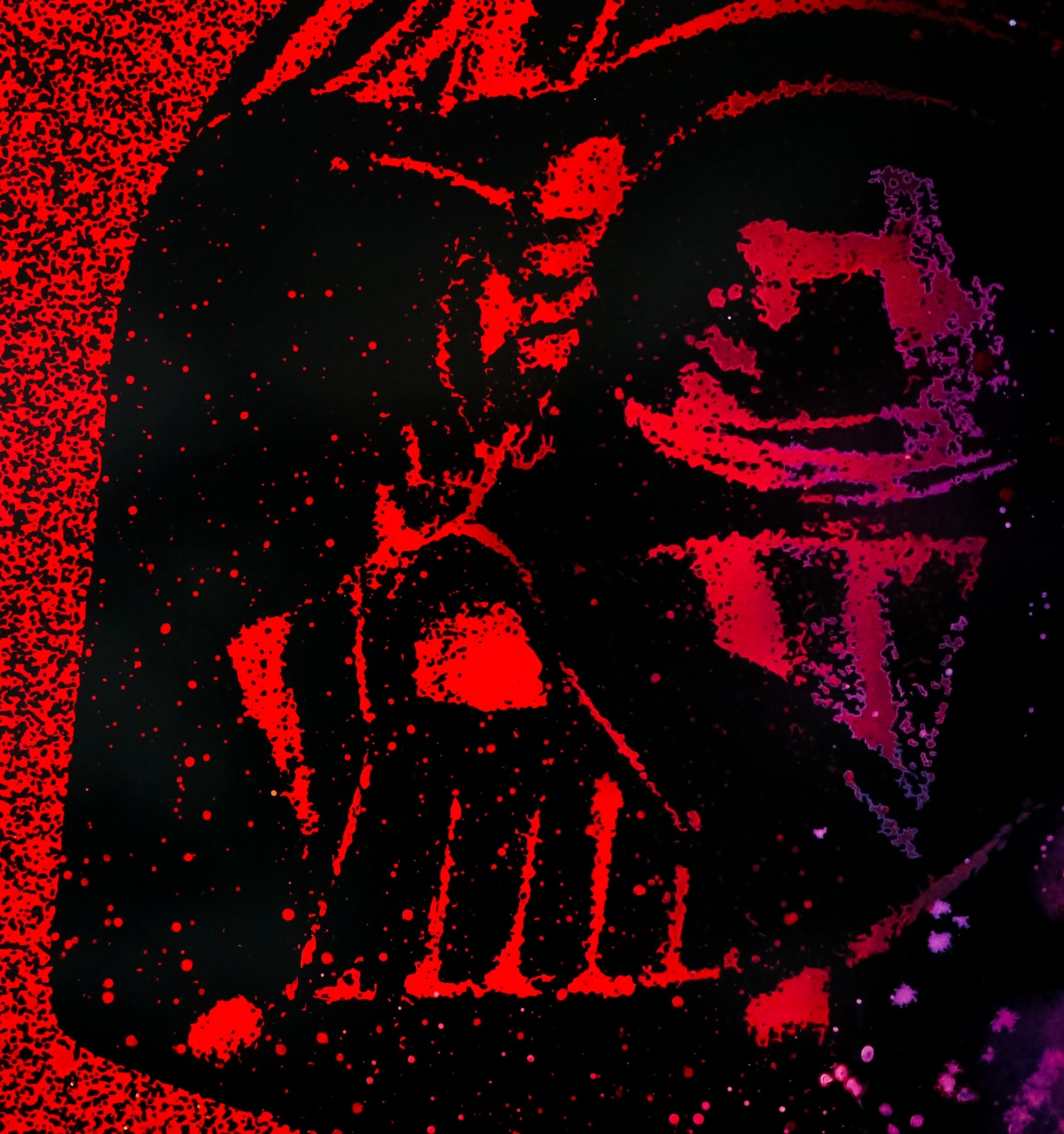
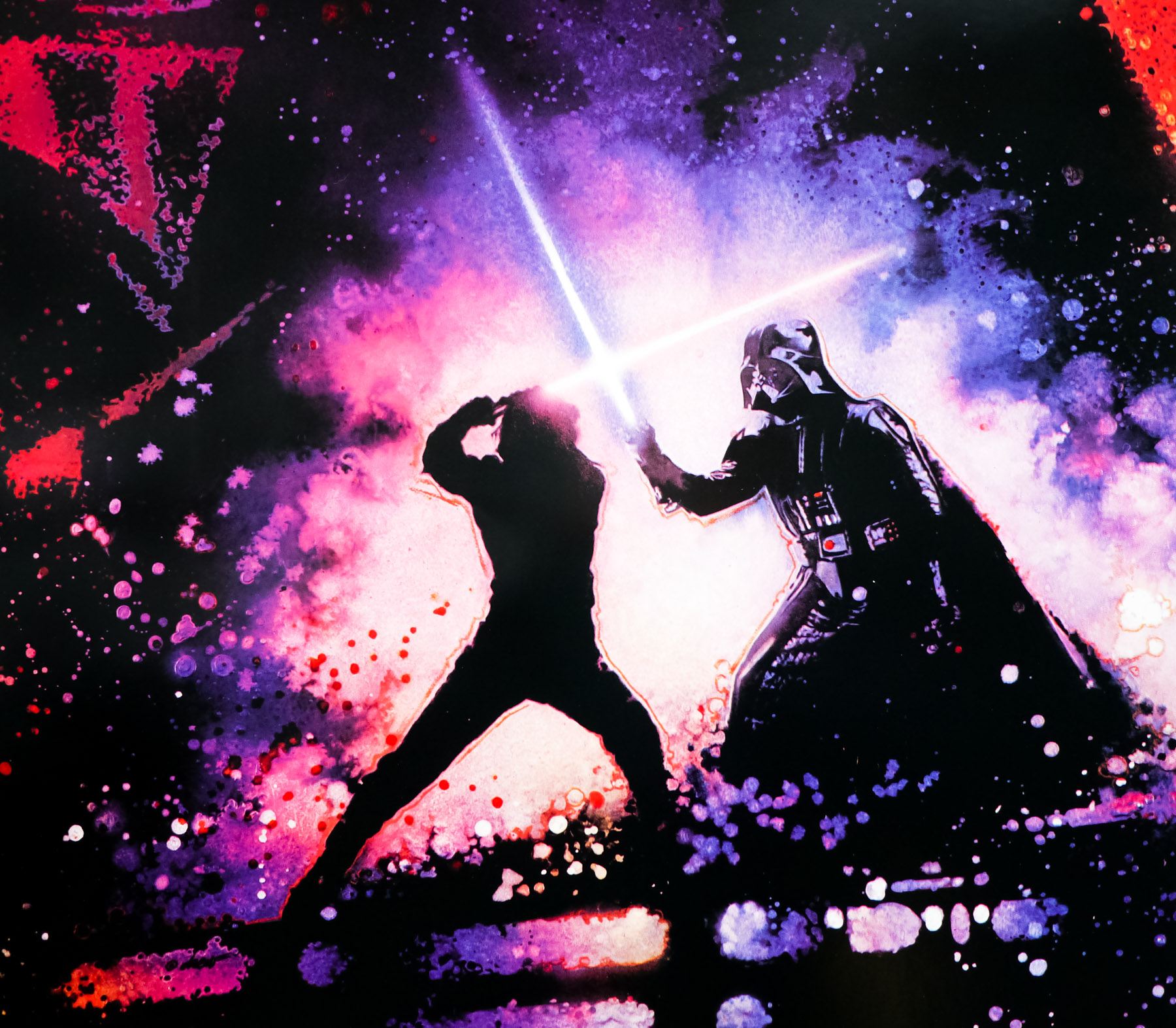
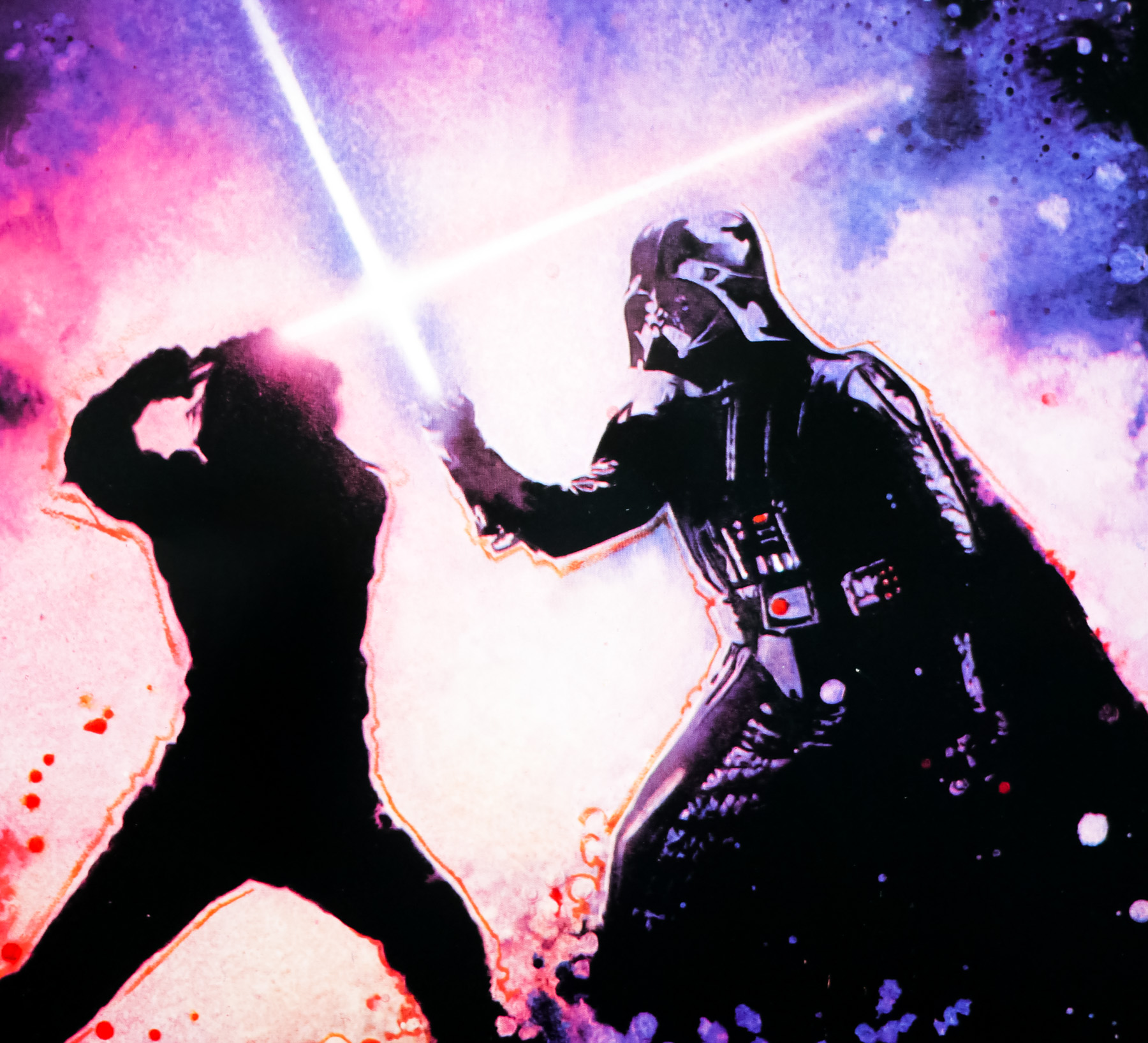
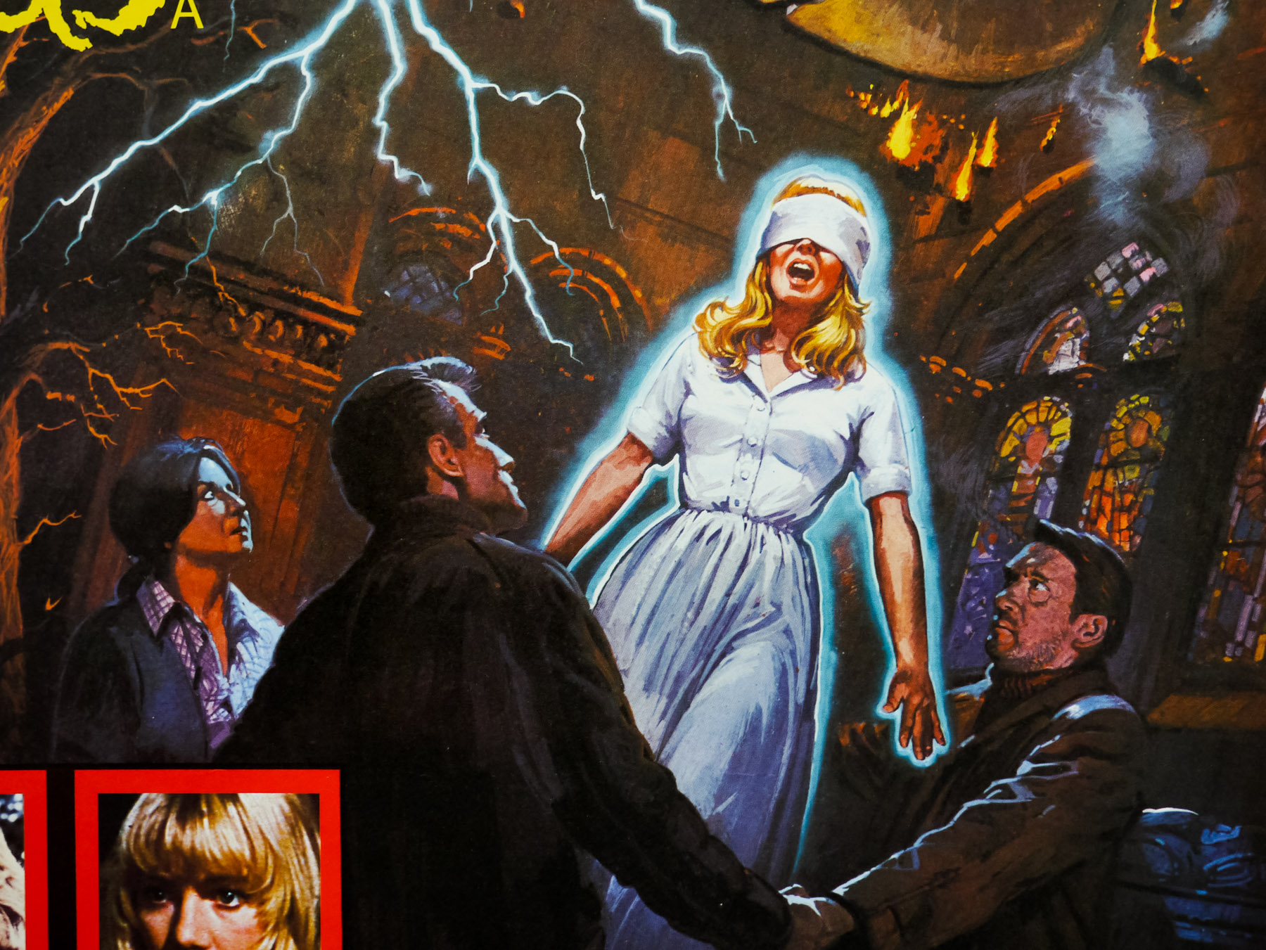
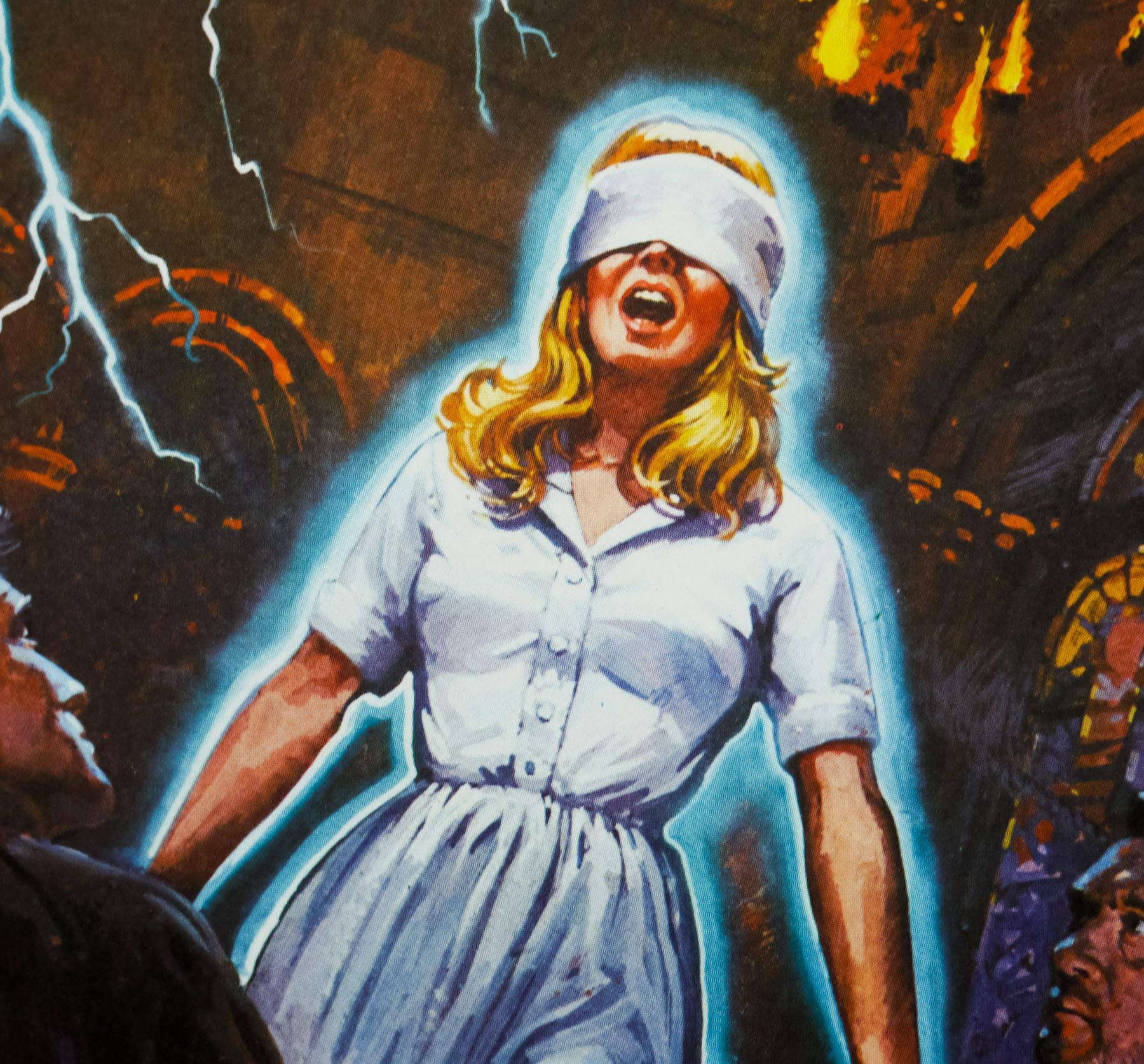
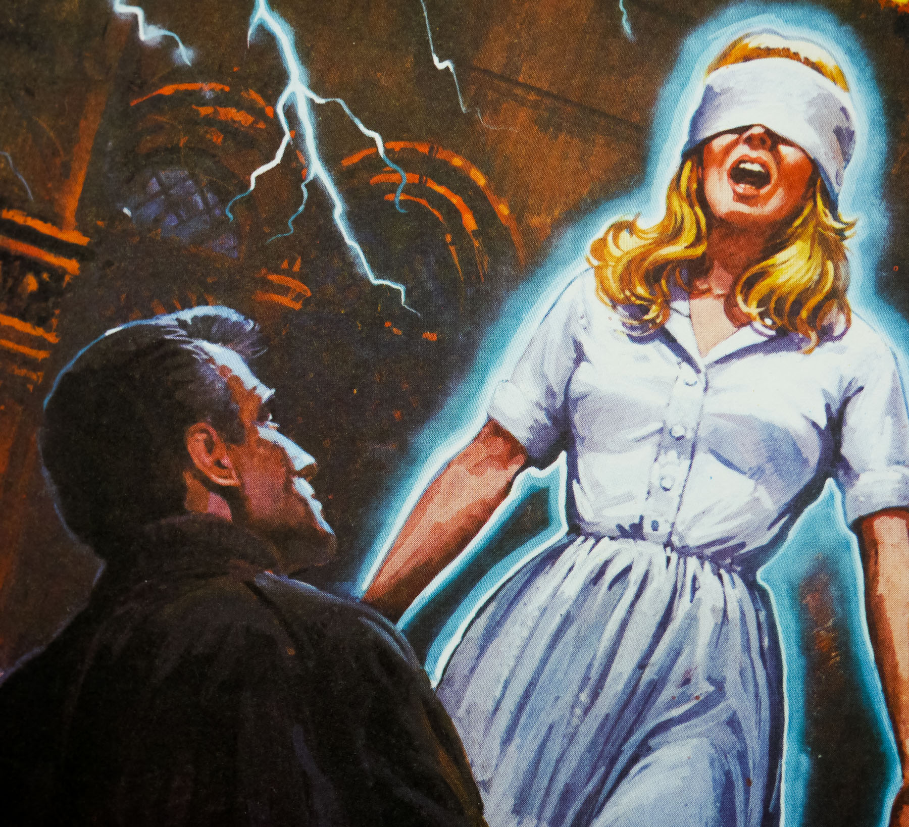
They had made Jack Nicholson larger, made his shoulders wider, made Meg Tilly’s hat cover her face almost completely, and changed Steve’s beautiful yellow/green color scheme to a grey/teal blue combination. Even with those revisions I still loved the art, so I was very happy to proceed with the finish. I feel like it was the best movie poster I ever did.
They told me at the time that with movie posters, the poster that was the top choice when they ran out of money or ran out of time, was the one that would become the poster. Until one of those things happened, they would just keep doing new art. I think all illustrators miss those days of Illustrated Movie Posters.
One other interesting story connected with that poster…I was told that the night before the art was to be delivered to the printer, Jack Nicholson called Frank Mancuso, Sr., the CEO of Paramount to say he had changed his mind about the poster. Nicholson wanted to use a different painting that had been done. Mancuso took both posters over to Nicholson’s house and they met until midnight to talk about which way to go. Basically Mancuso said, “We have been through more than a hundred movie posters and all along, this was the one everyone agreed on. In the meeting yesterday, we again looked at the top runners and everyone decided this was the strongest image. What do we have to do in order to make you happy with this version?” Nicholson said that he liked the colors of his face better in the other poster. So it was agreed that if I could repaint his face to one that he was happy with, they would proceed with my poster art. They gave me four days to repaint the head, and I remember the day I delivered it, the art director gave me a fistful of colored pencils and had me sit on her floor and paint out some additional wrinkles. But in the end, everyone was happy with the art. My first major film poster!
His website also features another blog post about his work with Steven Chorney on the poster (see here):
Steven Chorney is the wonderful movie poster artist and illustrator who did the concept sketches for The Two Jakes [see here too] in the very beginning. I remember there were five of us who took these and developed them as comps, and even came up with other designs too. I was assigned the first one he laid out.
I asked him if he still had the comps, and this morning he sent them along so I could post them. I think Thomas Blackshear did a comp using a variation of the second design, which Steven said was his favorite concept because of the tension in Nicholson’s face.
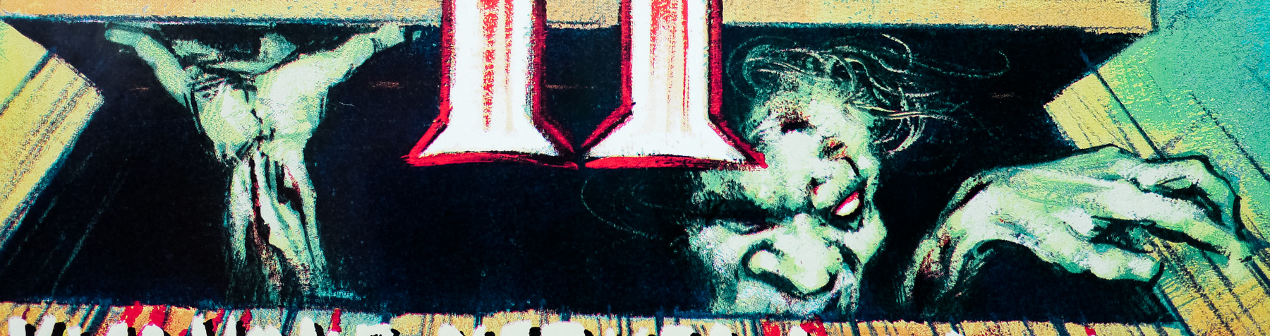
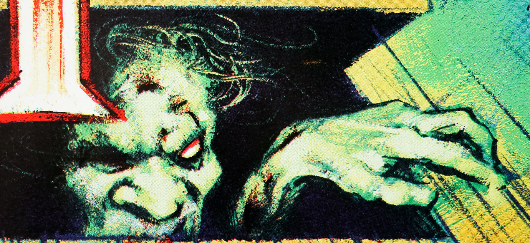
Steven said he was thinking about the Scarface movie poster in his design. Based on his days doing illustrations for TV Guide, he felt there was something missing from his sketch. We needed the girl! “…we need 2 guys, a girl, and a gun!” He must have mentioned that to the art director, because by the time I got the job, they were asking for me to add the girl in there.
This was done back before color xeroxes were very accurate. Steven had done the grey background version, but they had made a color copy for me, and it had turned a sort of acid yellow. I loved it, so I tried to match the color. It reminded me of that Van Gogh painting of the pool hall interior with the yellow lights and the green felt. Van Gogh wrote “In my picture of the Night Café I have tried to express the idea that the café is a place where one can ruin oneself, go mad or commit a crime.”
But even though they liked my Two Jakes art, they wanted to go with the grey of Steven’s original version (which I had never seen). They had me hide Meg Tilly’s face with her hat, make Nicholson larger, and make his coat and lapels oversized.
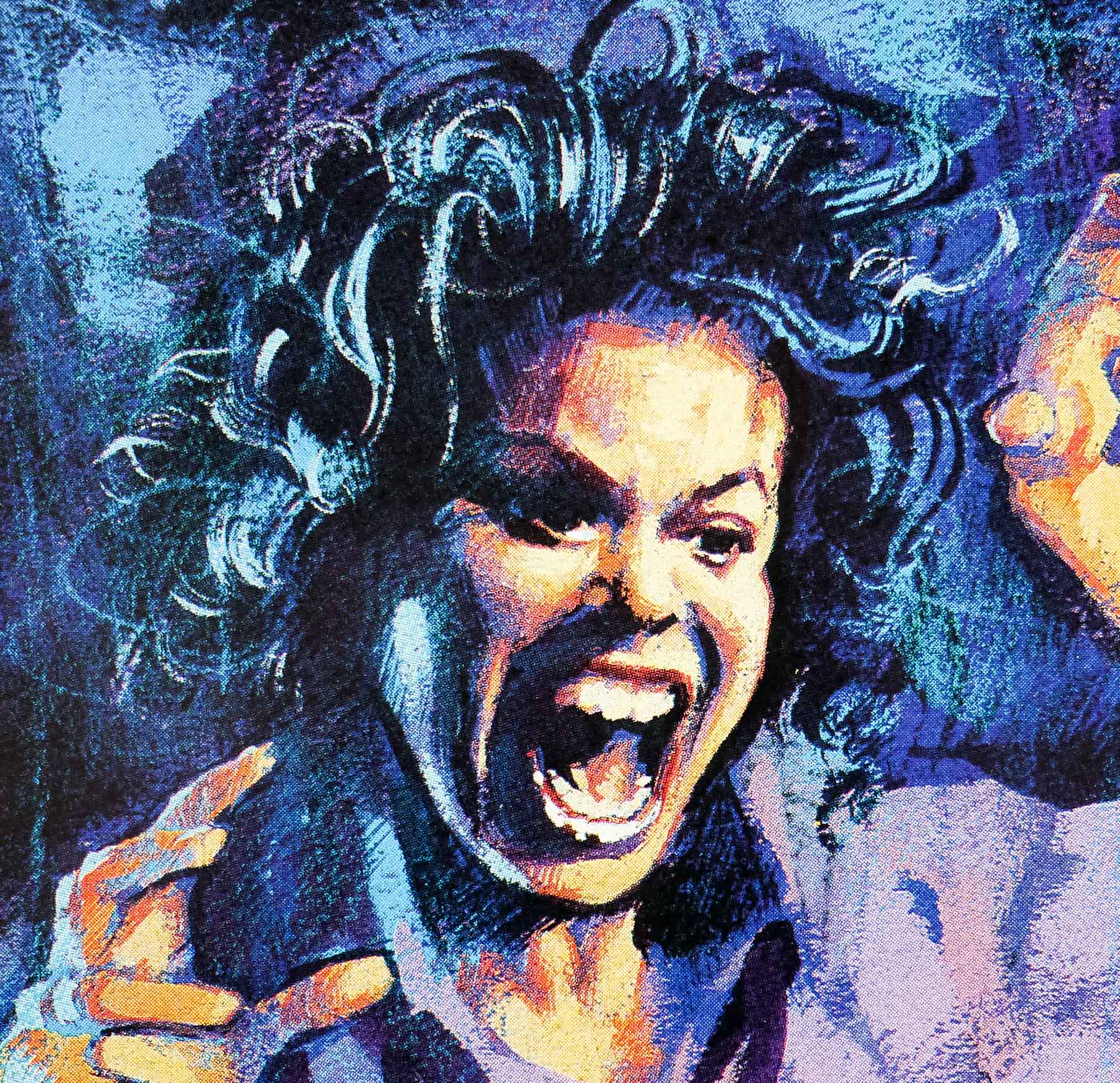
The only bad experience with the whole project was the reference they gave me for Jack Nicholson’s face. It was a blurry, two inch tall, b&w photo from The Witches of Eastwick. I kept asking, “Seriously? Jack Nicholson, and this is the best reference you have?” I think I painted his head about 9″ tall on my poster. And as it turned out, his face was the only problem anyone had with my image.
The artist’s website also features a biography which I’ll also reproduce in its entirety:
Chances are you’ve been having breakfast with Robert Rodriguez for years and never knew it….If you’ve ever fixed yourself a bowl of Quaker Oatmeal, his painting of the old Quaker has probably been watching over you as you ate.
After graduating from Chouinard Art Institute (now CalArts), he embarked on a career as an illustrator, picking up awards and medals along the way. From being a Grammy Award finalist for best album cover art, to gold and silver medals, to receiving a platinum award for his “Cowboys of the Silver Screen” postage stamps this last year. From doing Broadway theater posters for plays like, “Anything Goes”, “Nice Work If You Can Get It”, “Sister Act” and “Lend Me A Tenor”, to a SuperBowl poster, a half dozen Ringling Bros. Circus posters, several movie posters, and creating the poster art over the last four years for the Tales of the Cocktail event held in New Orleans every summer, he is finally finding time to do some gallery work, exploring new directions and larger paintings.