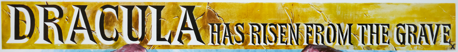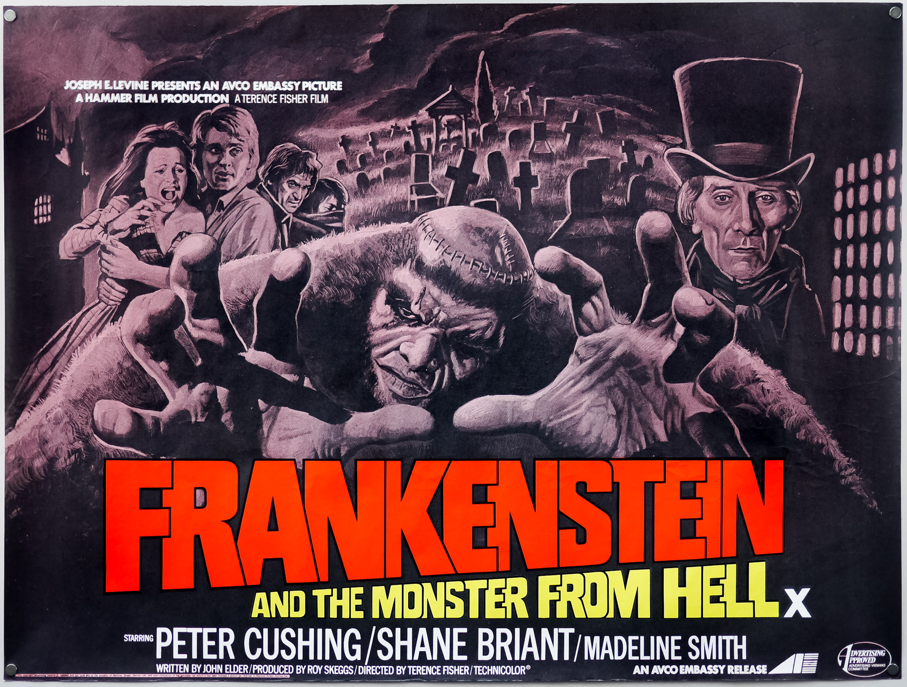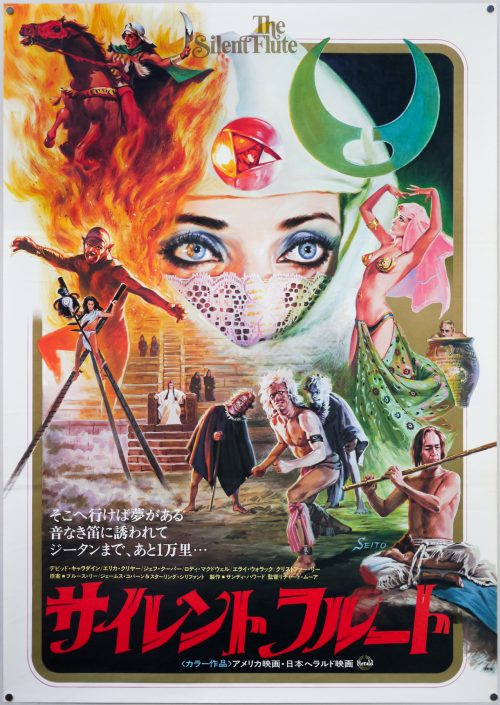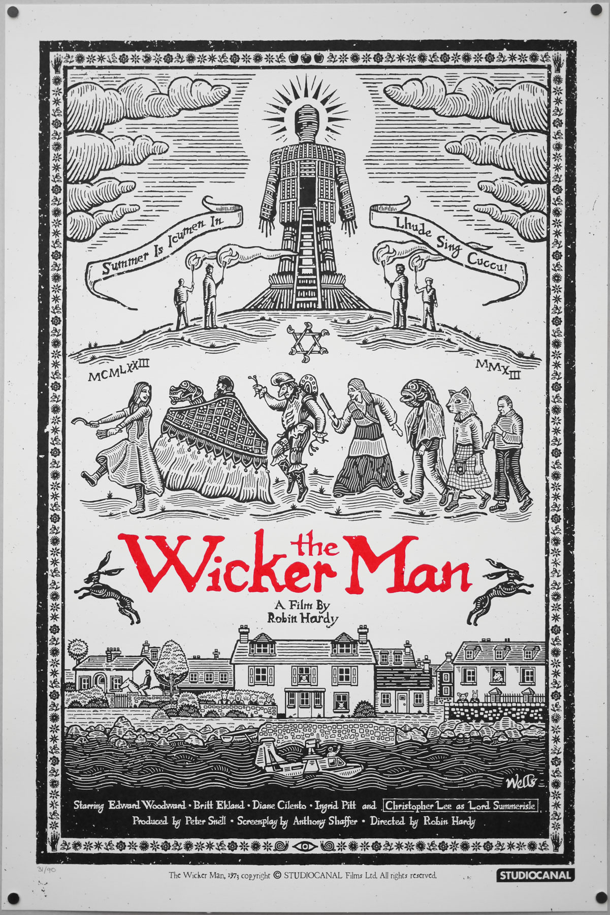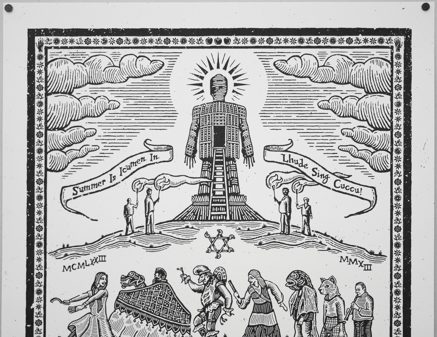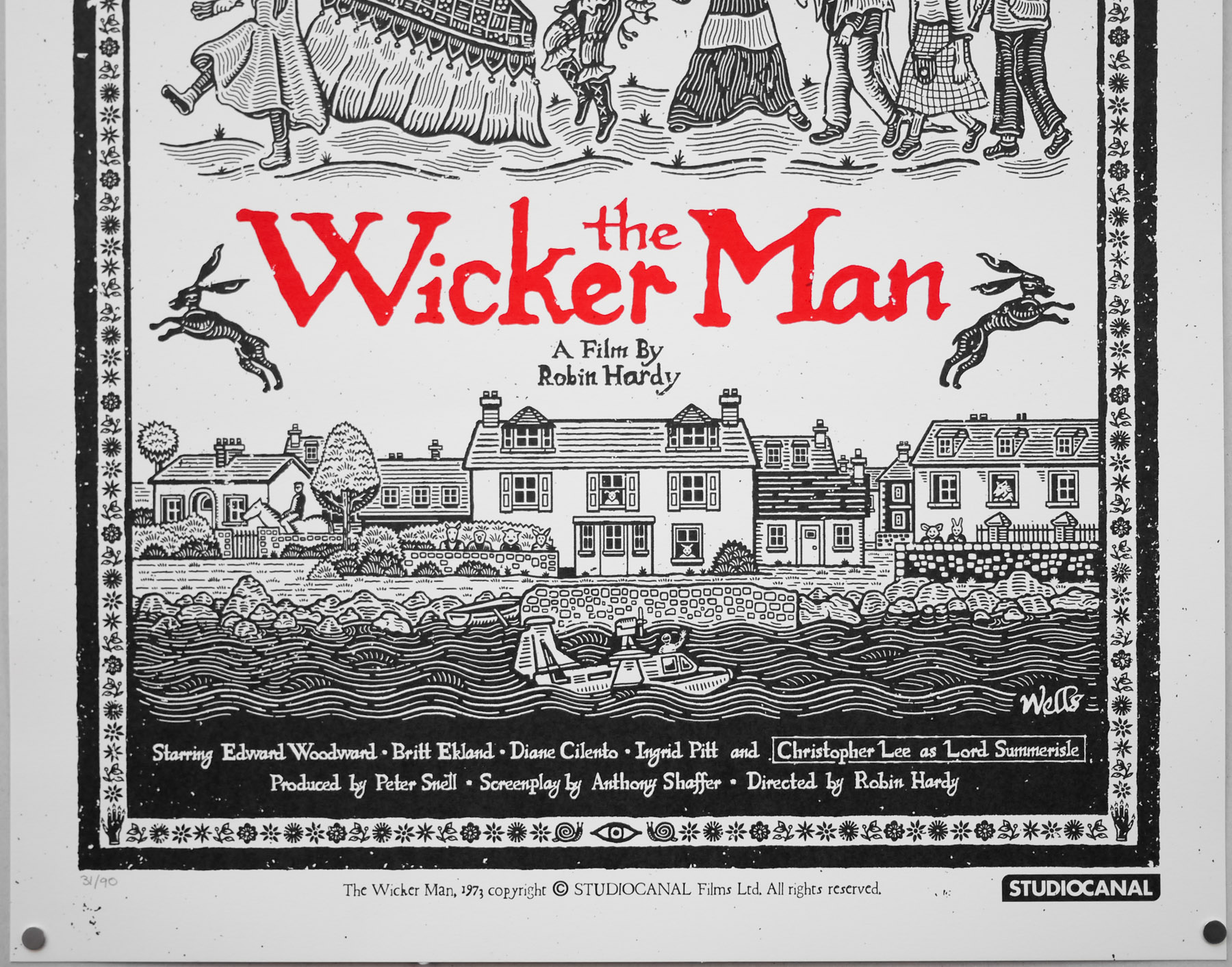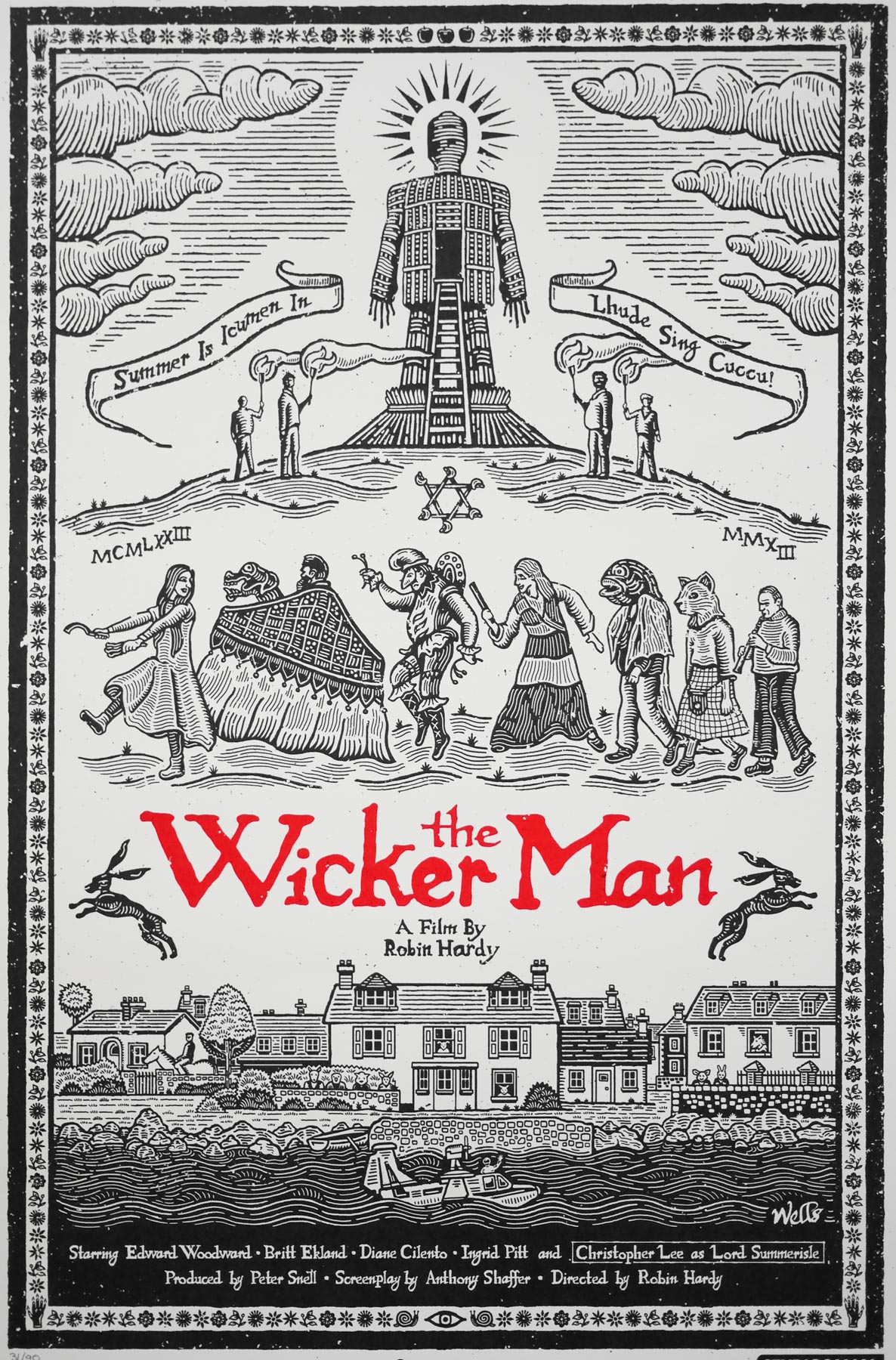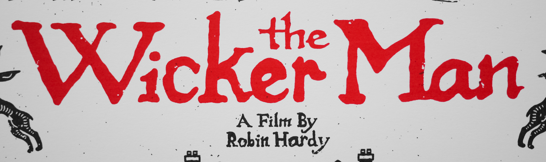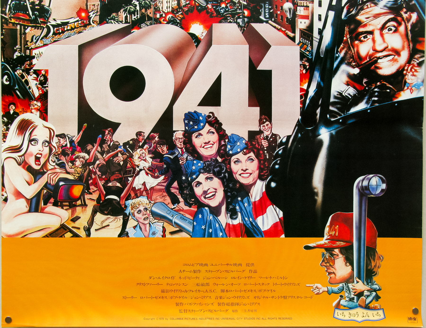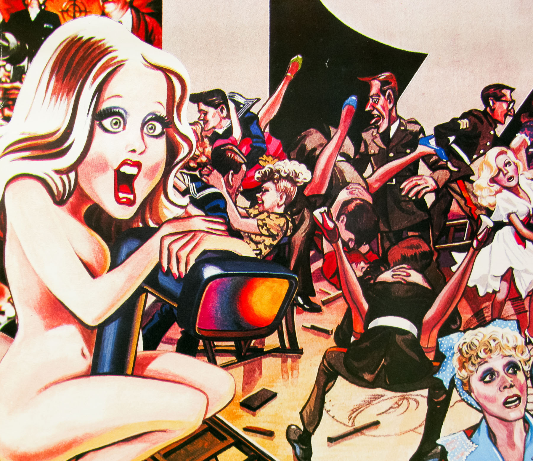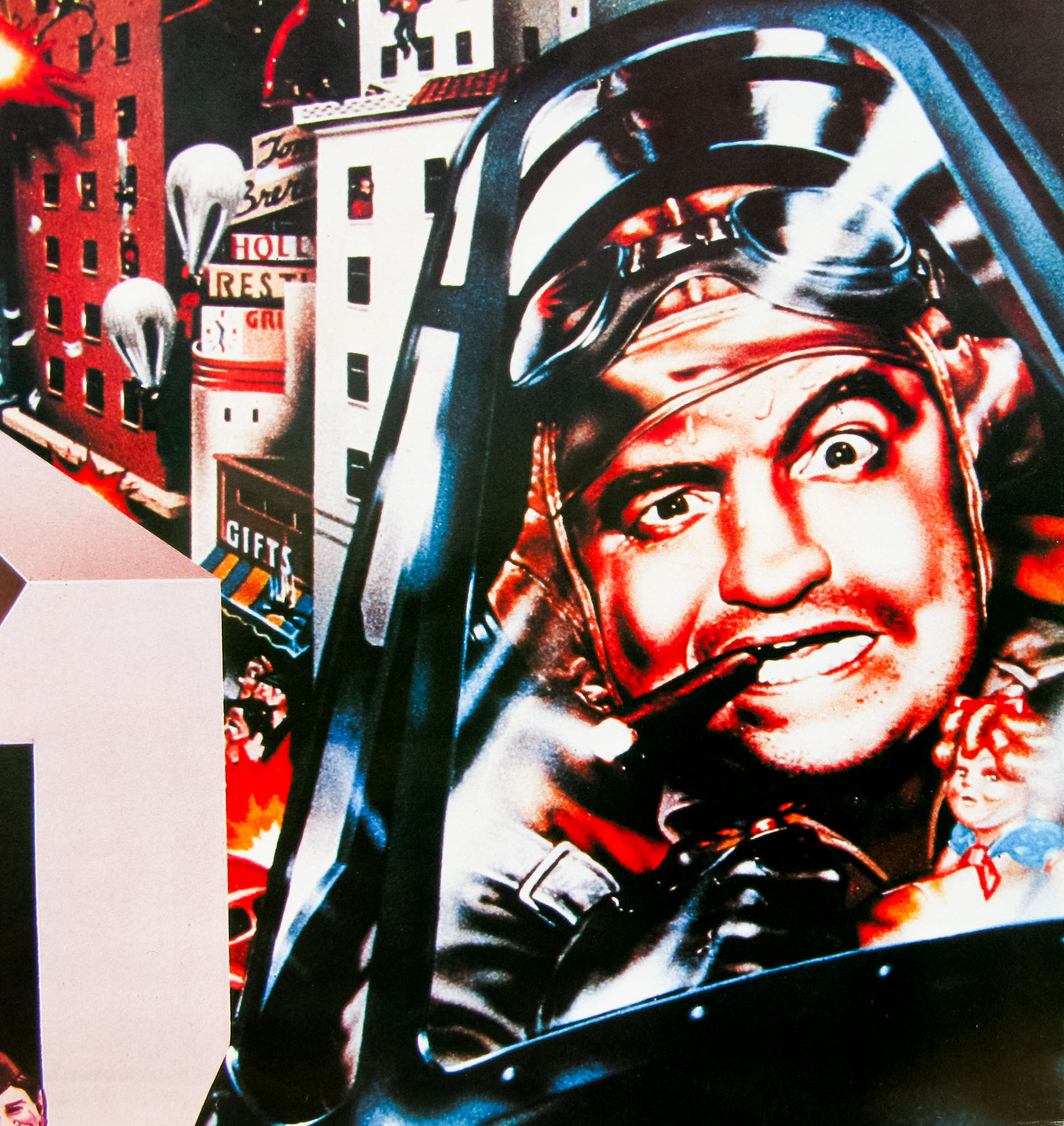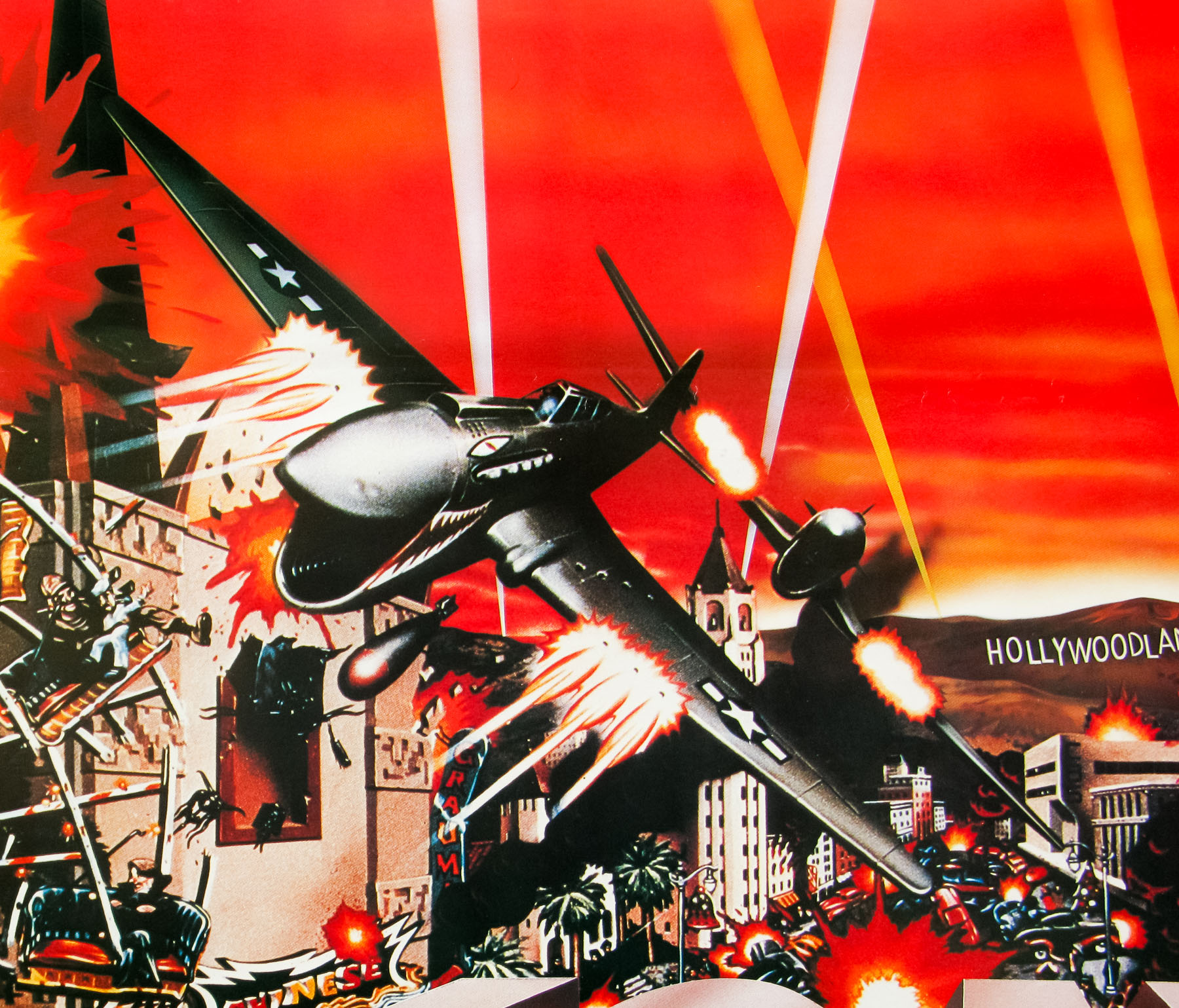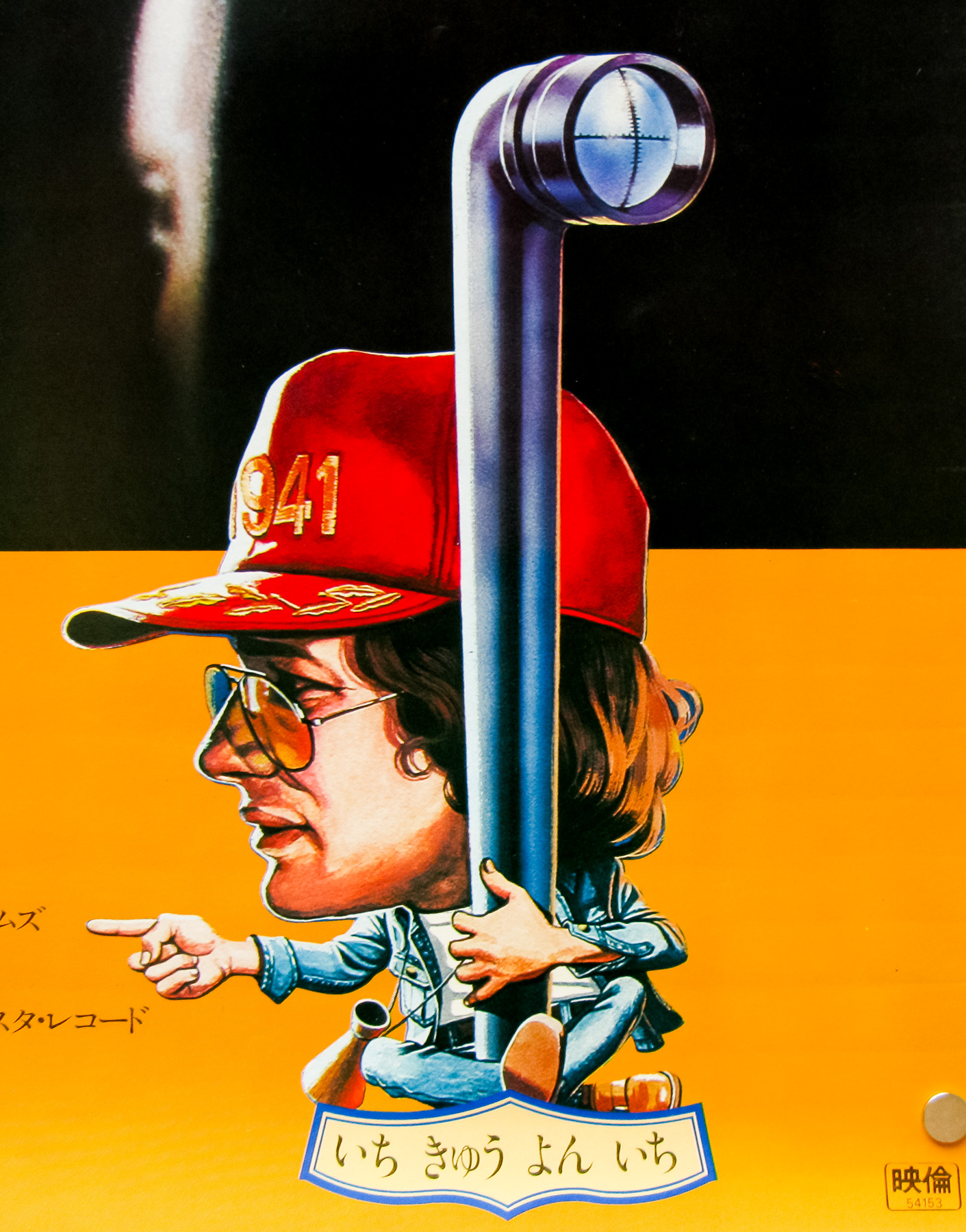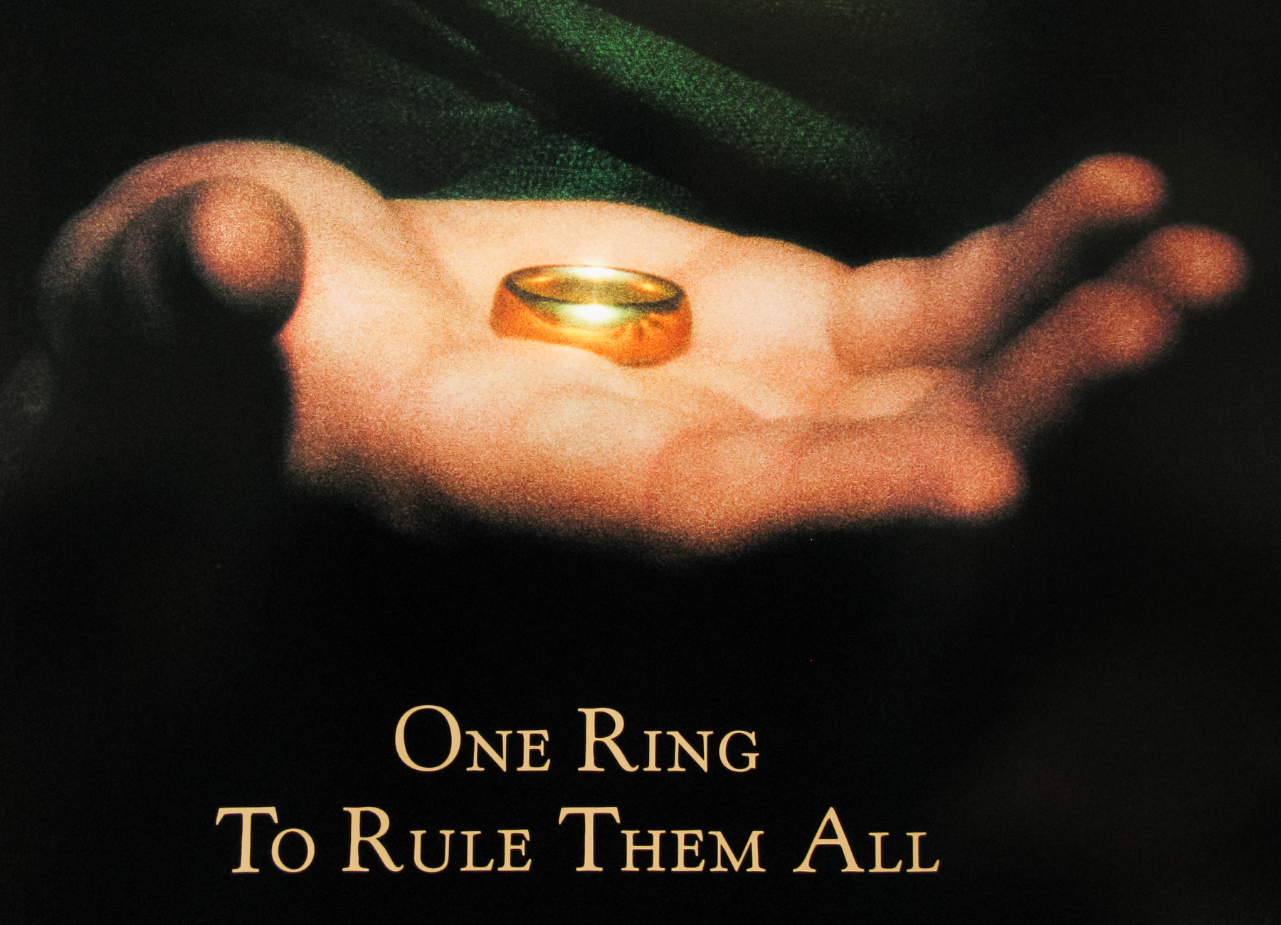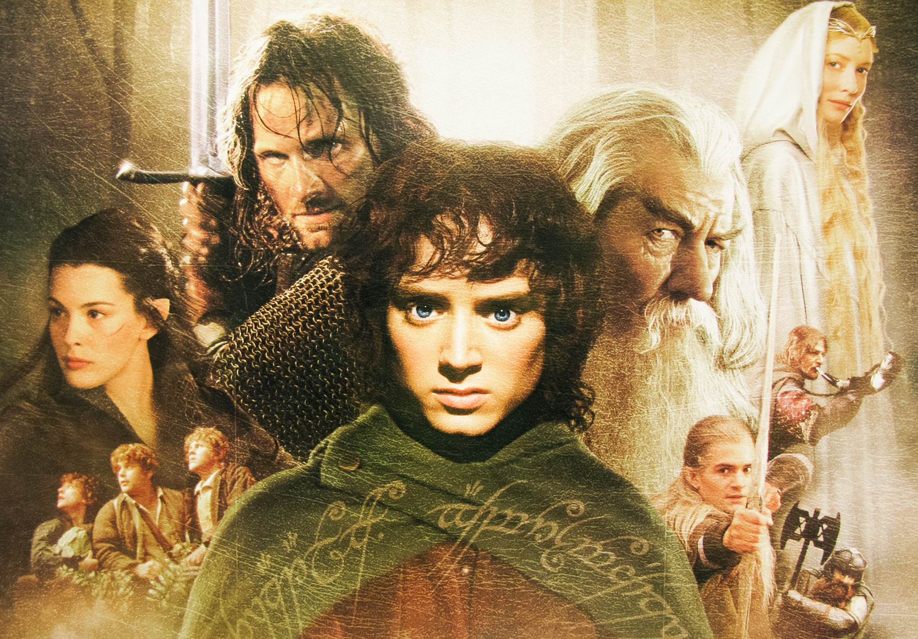
Poster detail
1-5

- AKA
- --
- Year of Film
- 1974
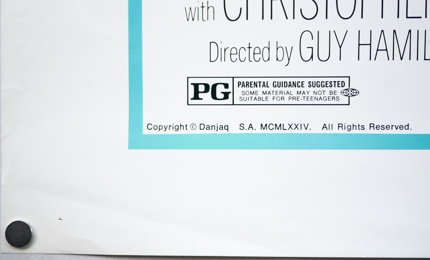
- Director
- Guy Hamilton
- Starring
- Roger Moore, Christopher Lee, Britt Ekland, Maud Adams, Hervé Villechaize, Clifton James, Richard Loo, Soon-Tek Oh, Marc Lawrence, Bernard Lee, Lois Maxwell, Marne Maitland, Desmond Llewelyn
- Origin of Film
- UK
- Genre(s) of Film
- Roger Moore, Christopher Lee, Britt Ekland, Maud Adams, Hervé Villechaize, Clifton James, Richard Loo, Soon-Tek Oh, Marc Lawrence, Bernard Lee, Lois Maxwell, Marne Maitland, Desmond Llewelyn,
- Type of Poster
- B2
- Style of Poster
- --
- Origin of Poster
- Japan
- Year of Poster
- 1974
- Designer
- Unknown
- Artist
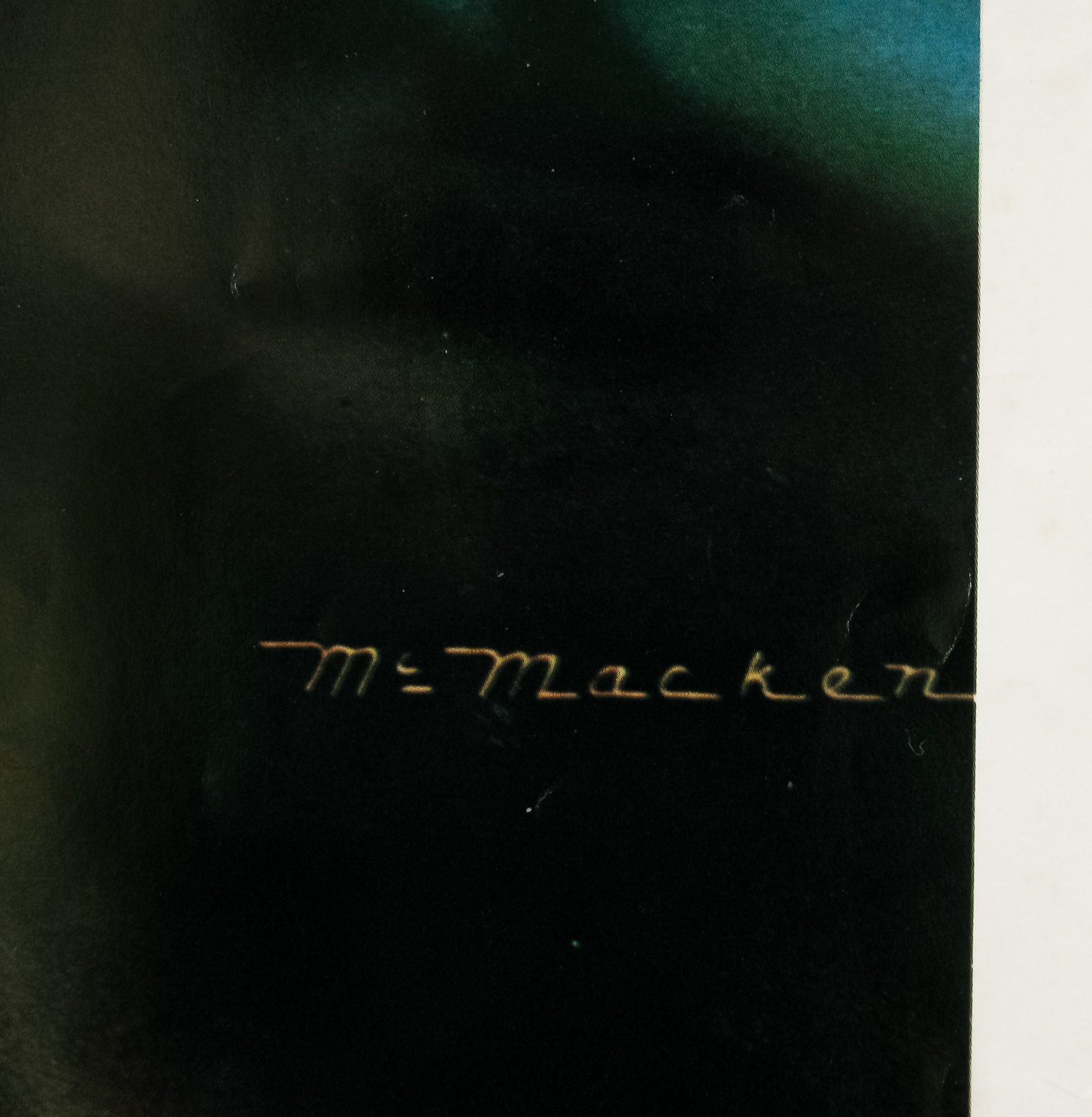
- Robert McGinnis
- Size (inches)
- 20 6/16" x 28 14/16"
- SS or DS
- SS
- Tagline
- --
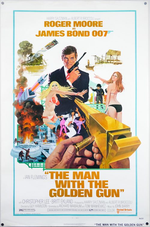
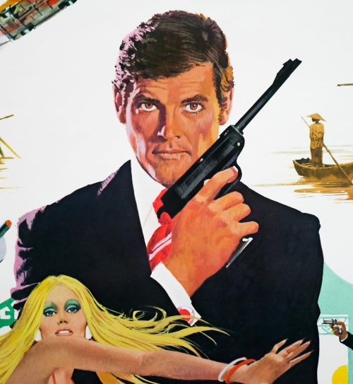
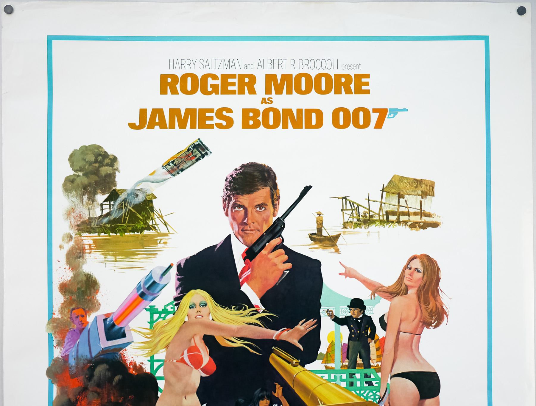
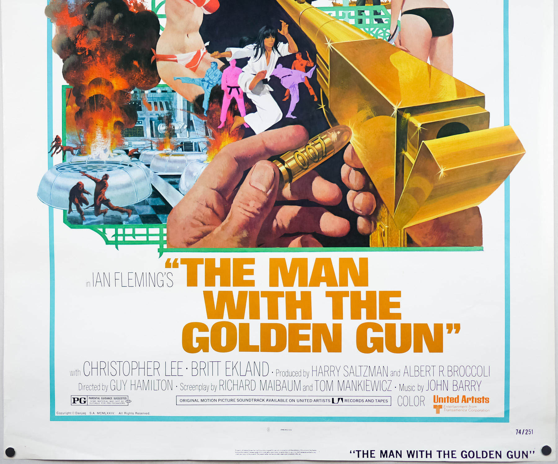
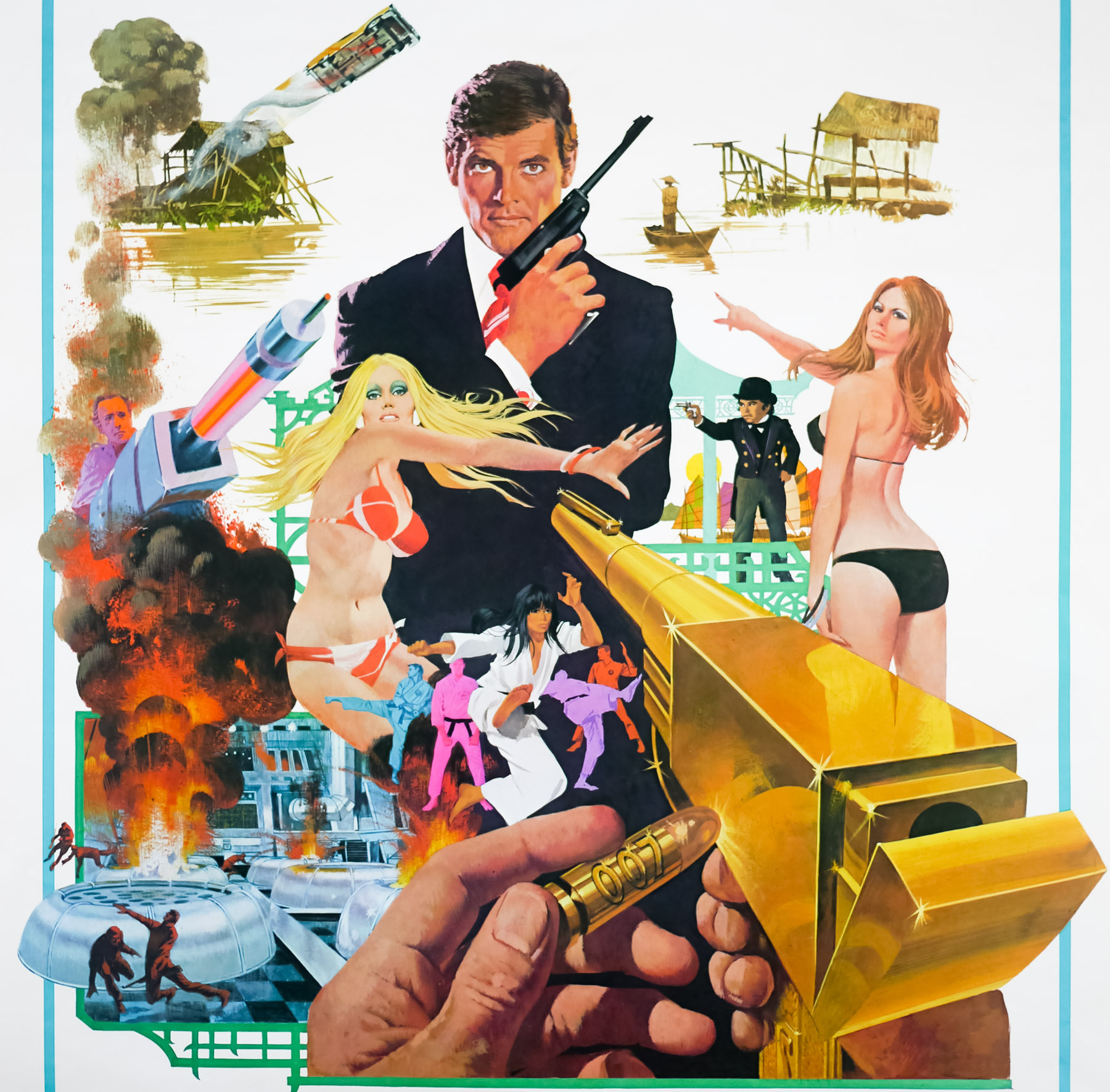
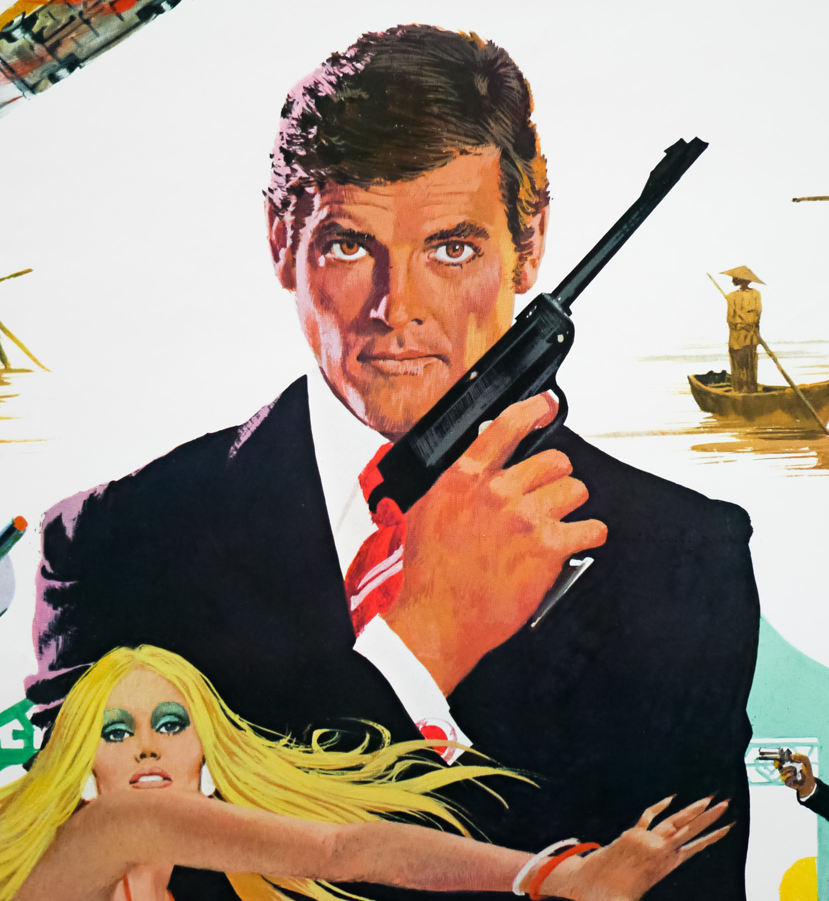
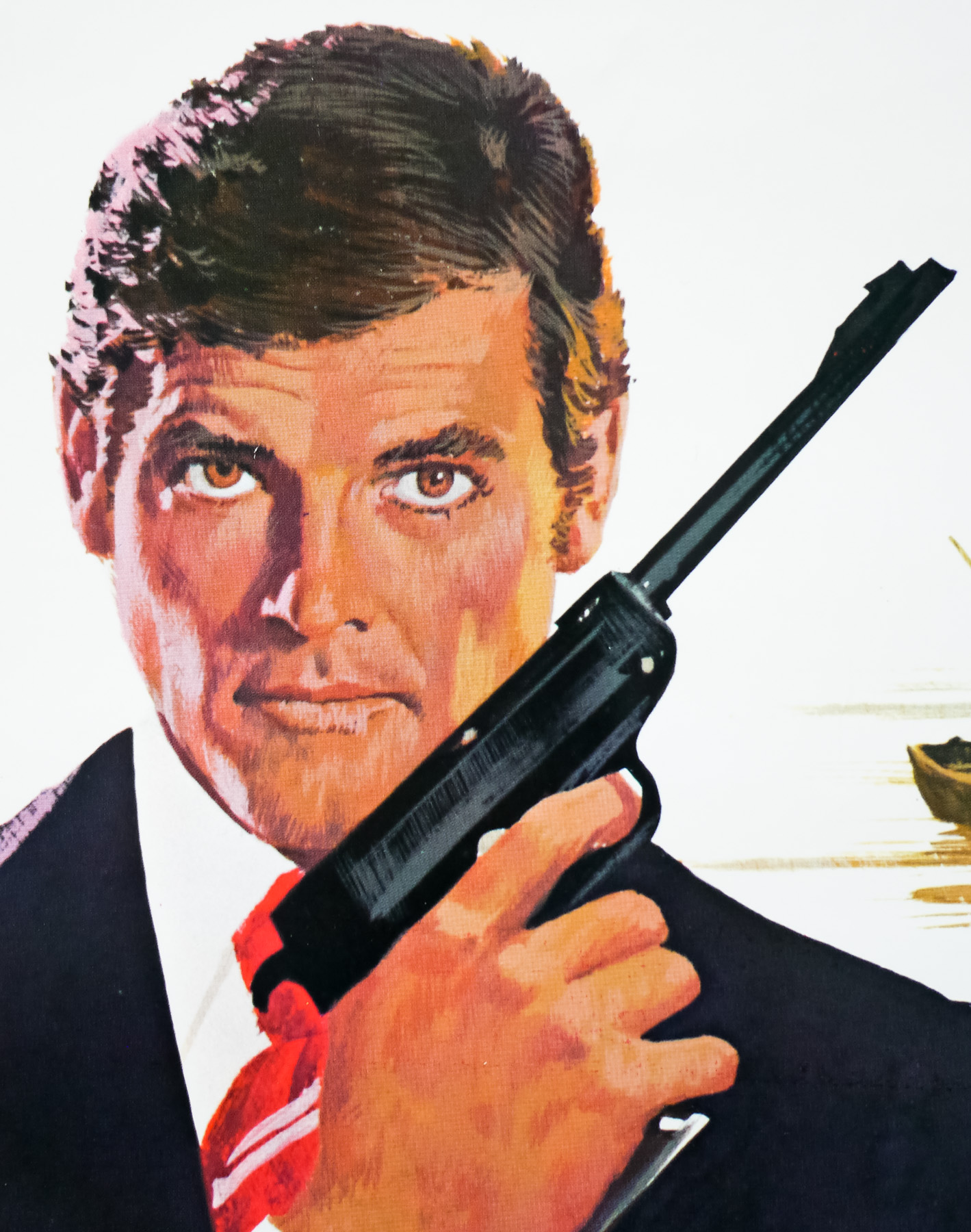
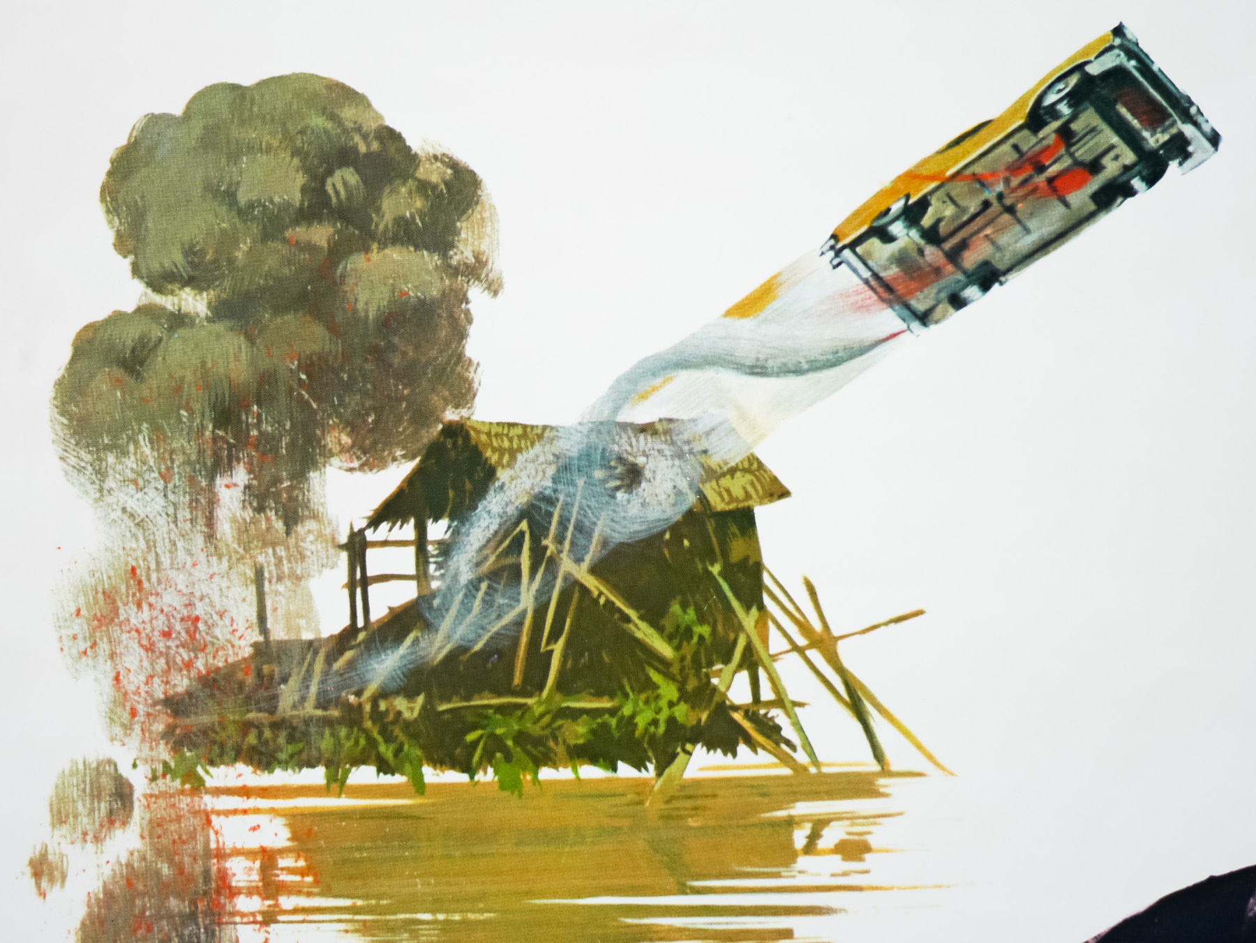
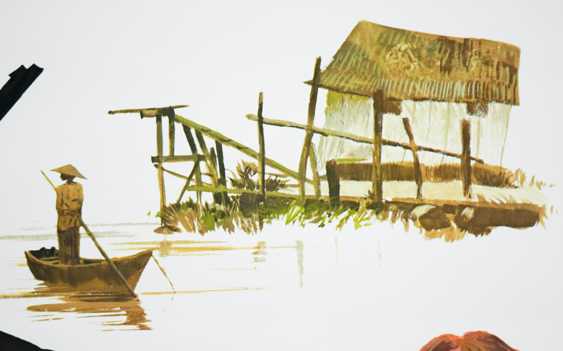
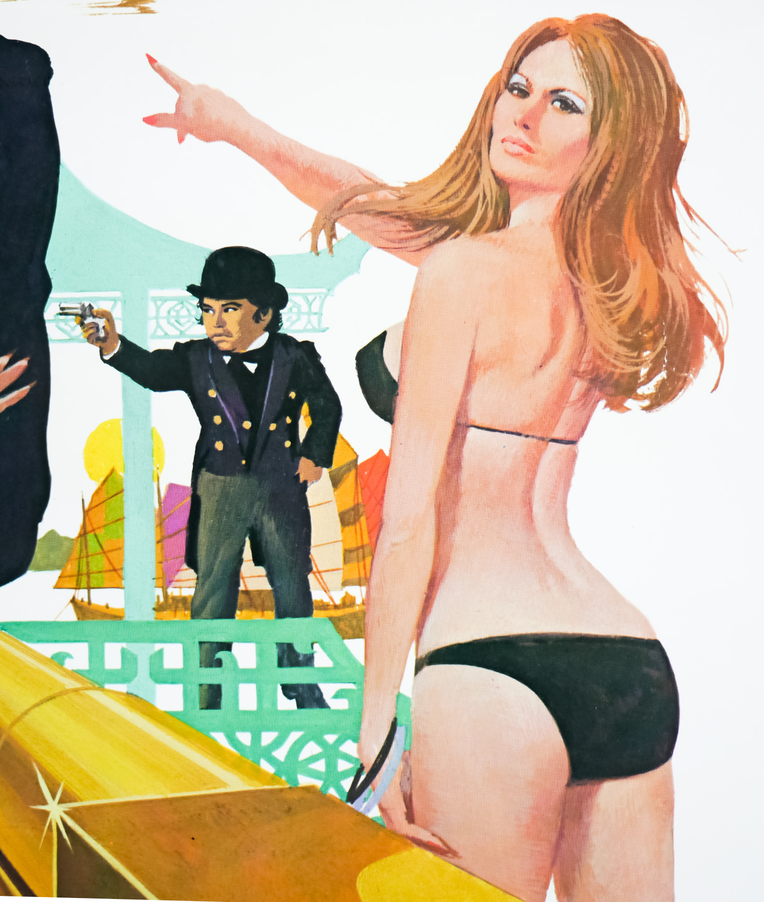
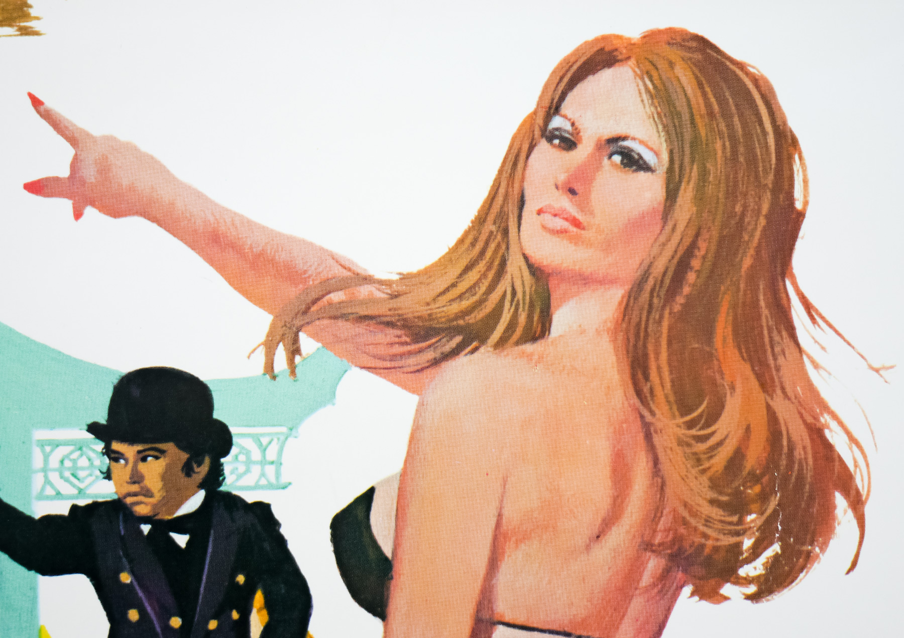
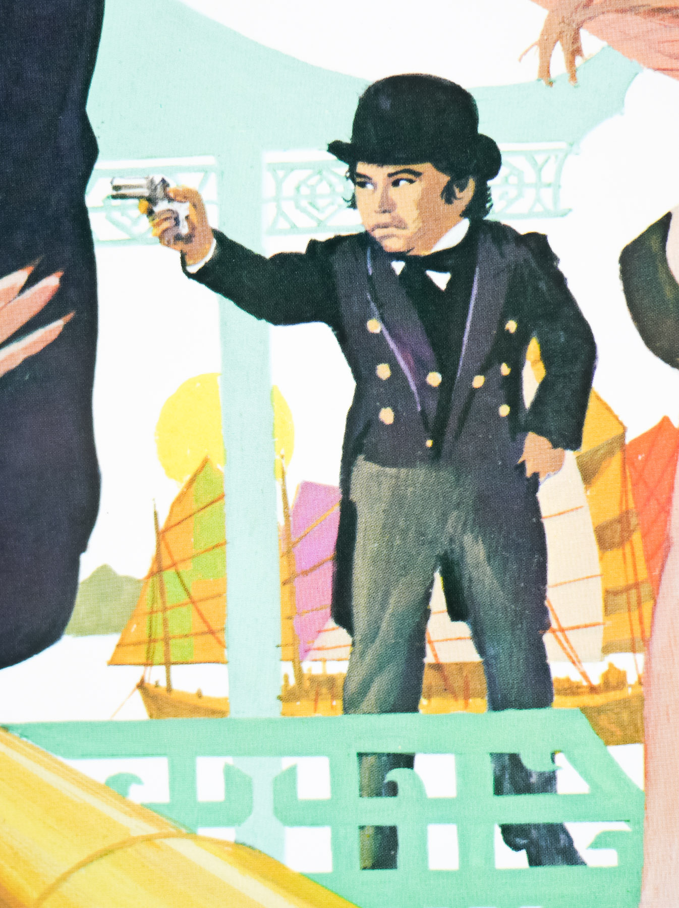
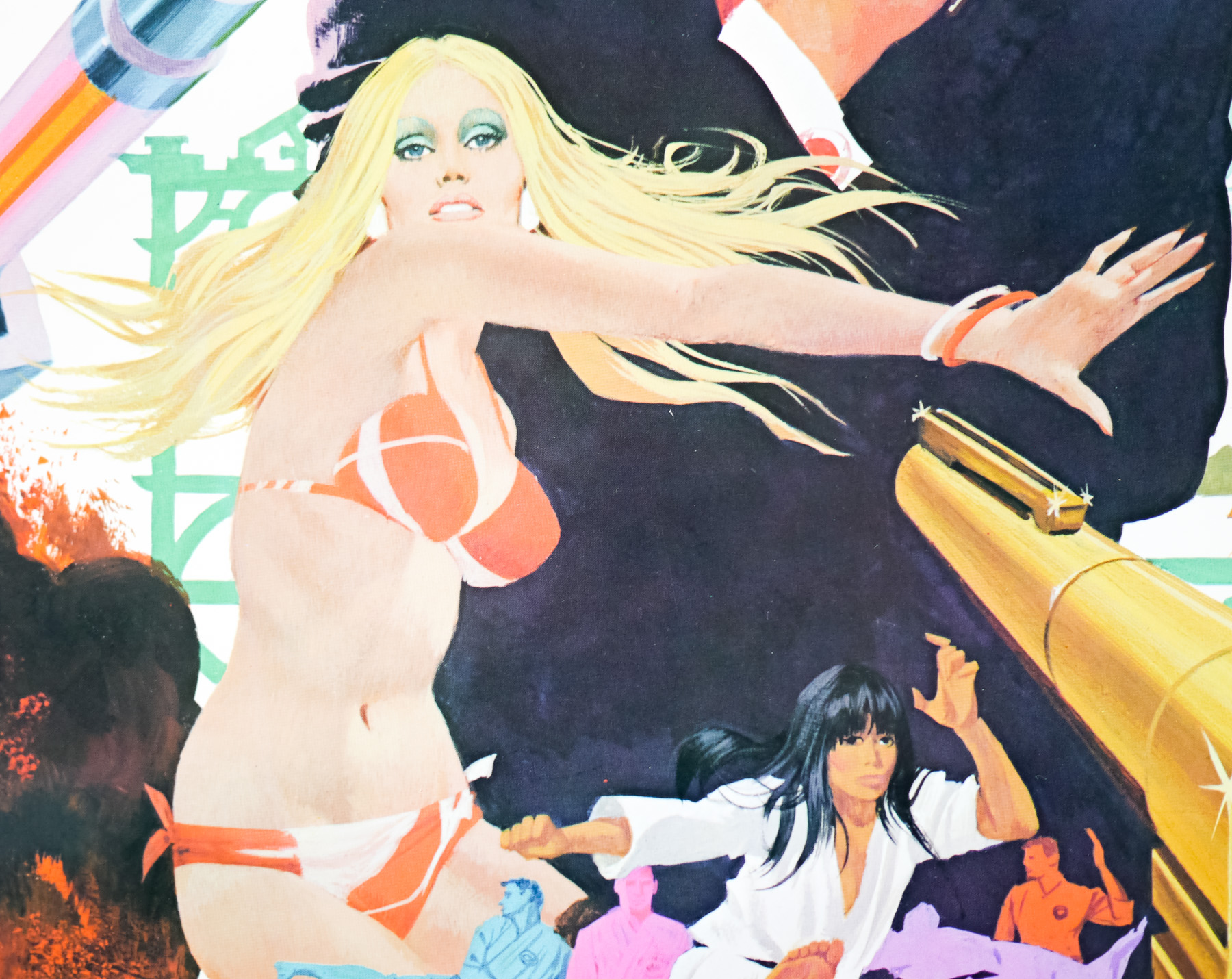
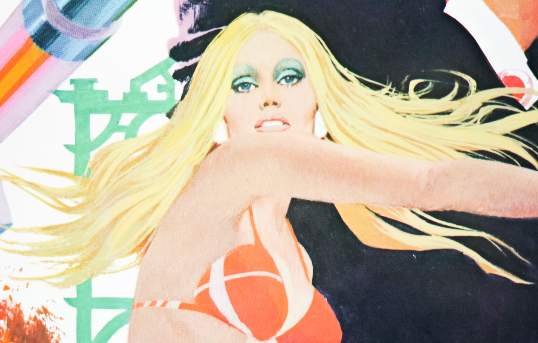
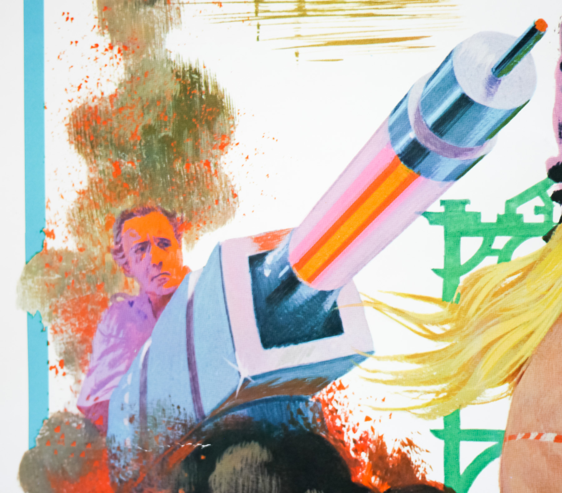
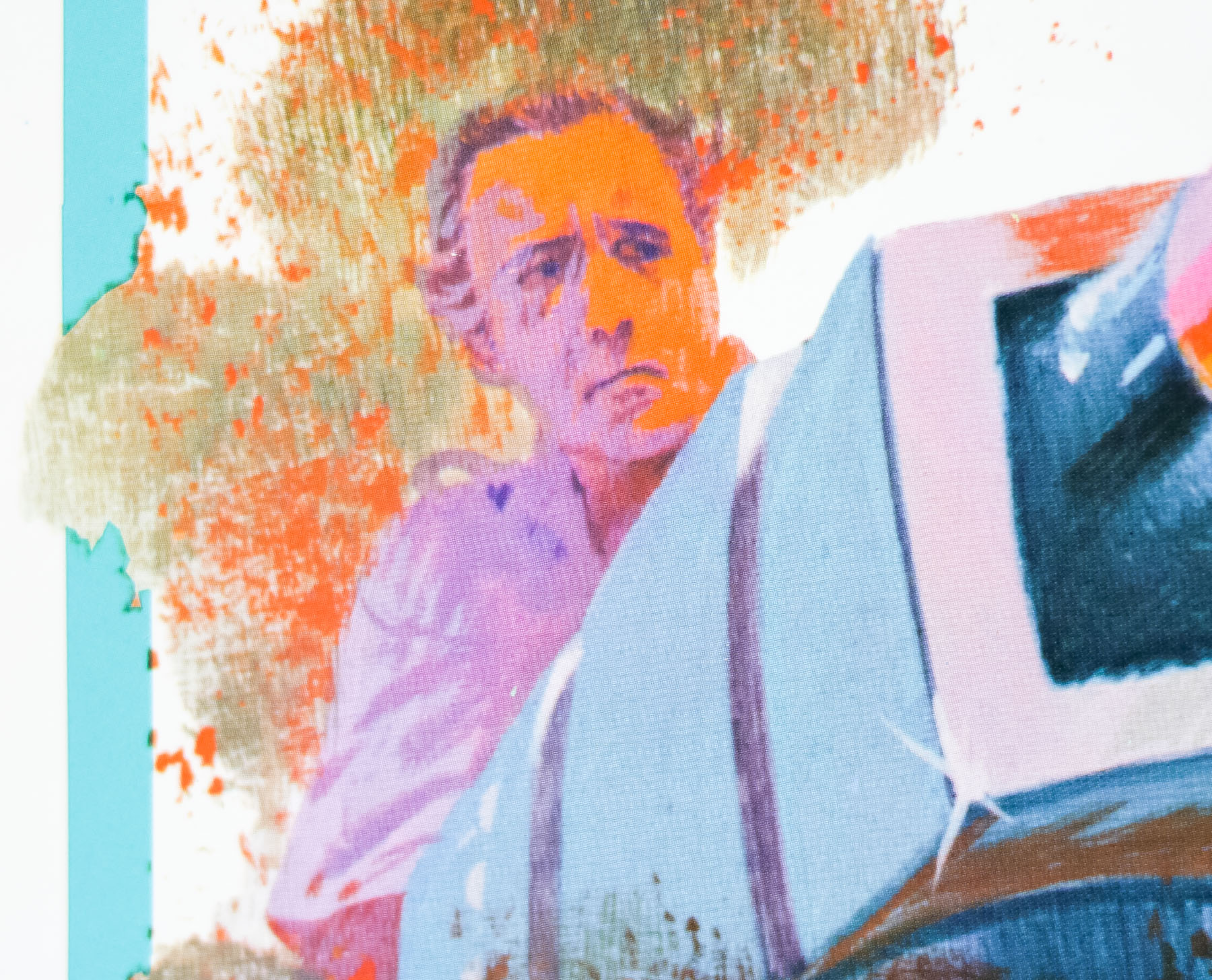
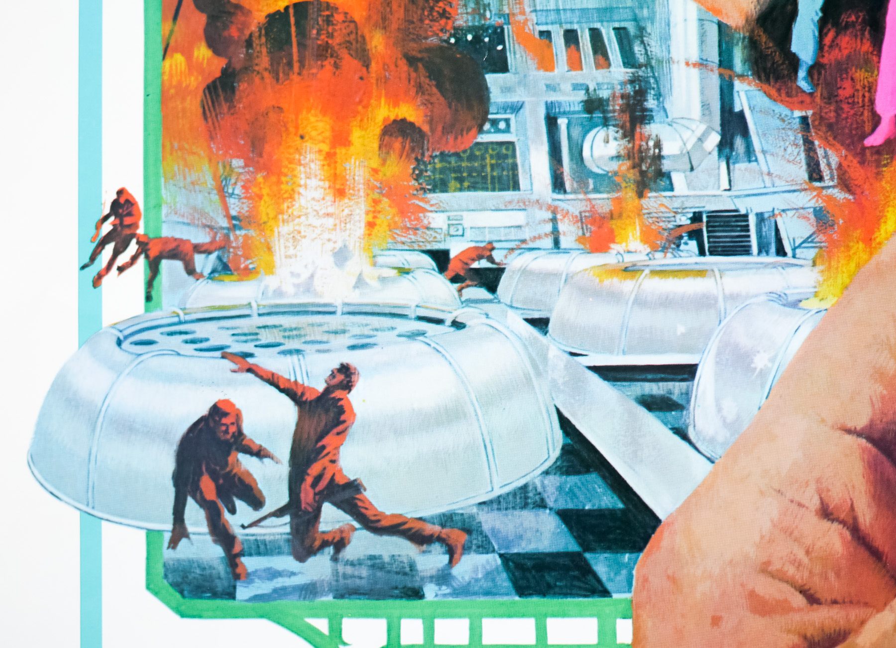
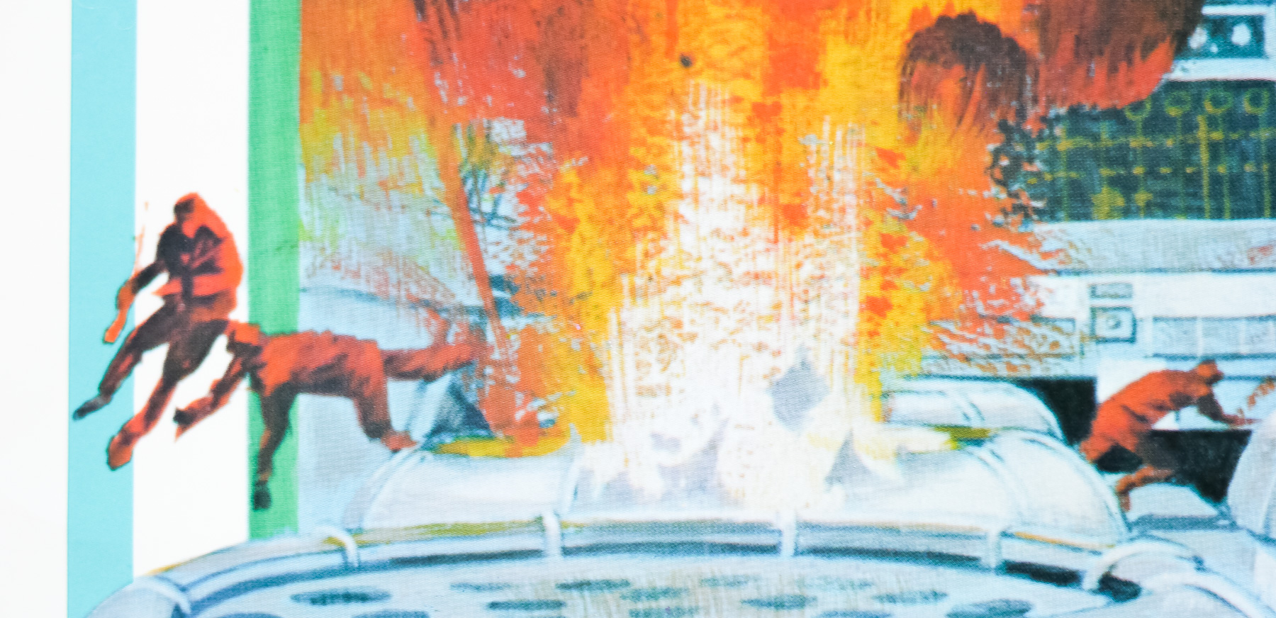
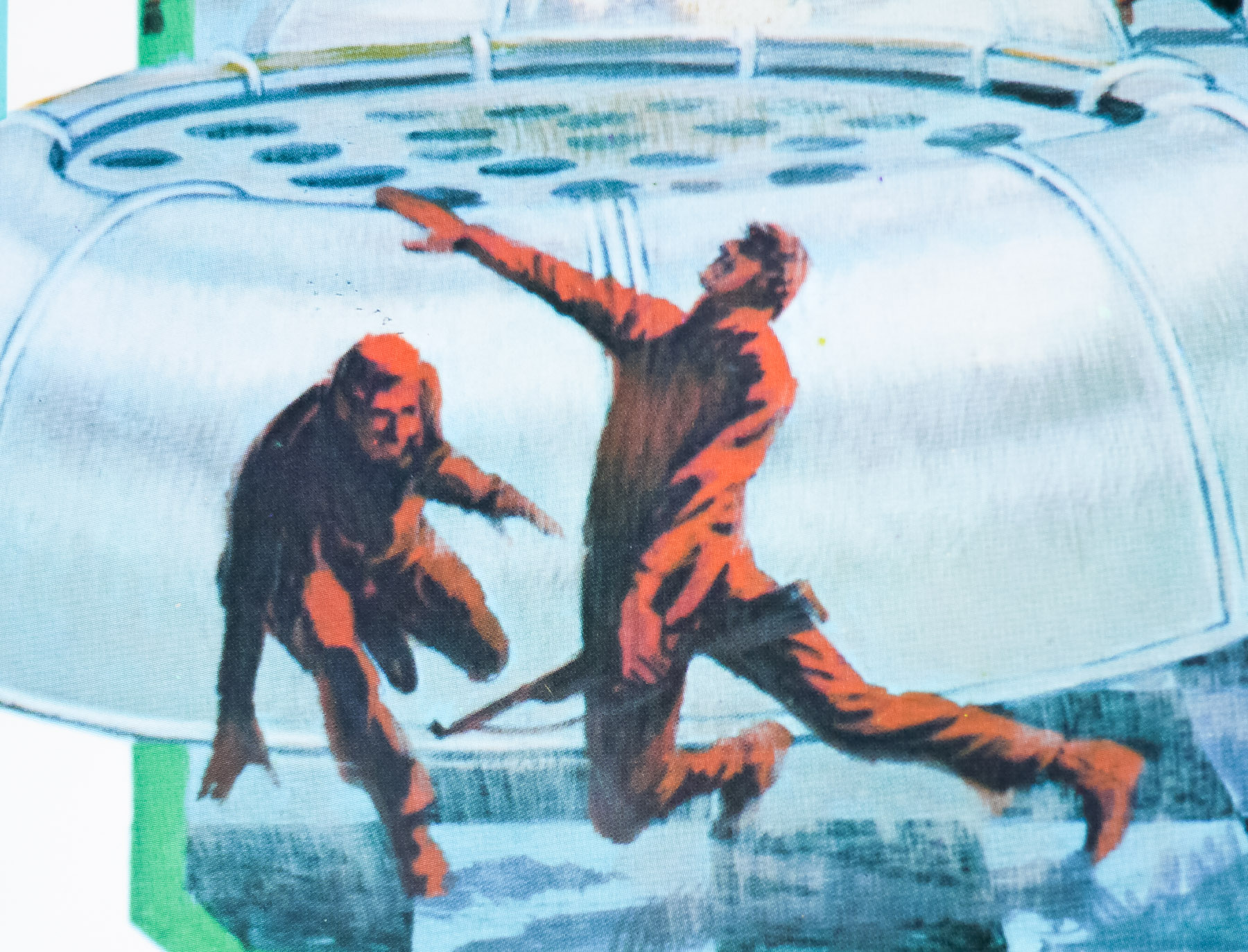
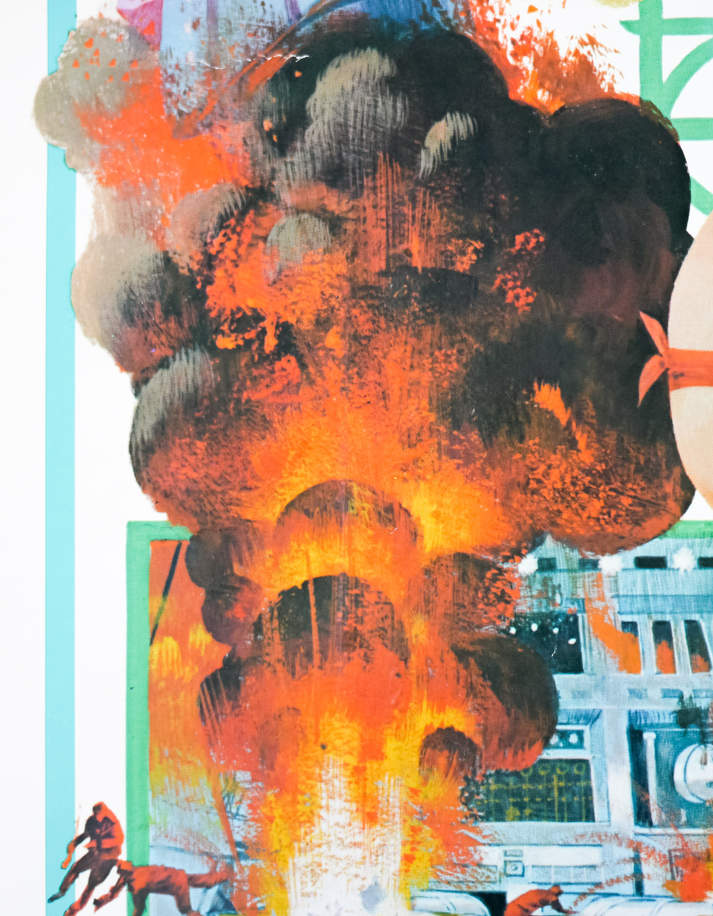
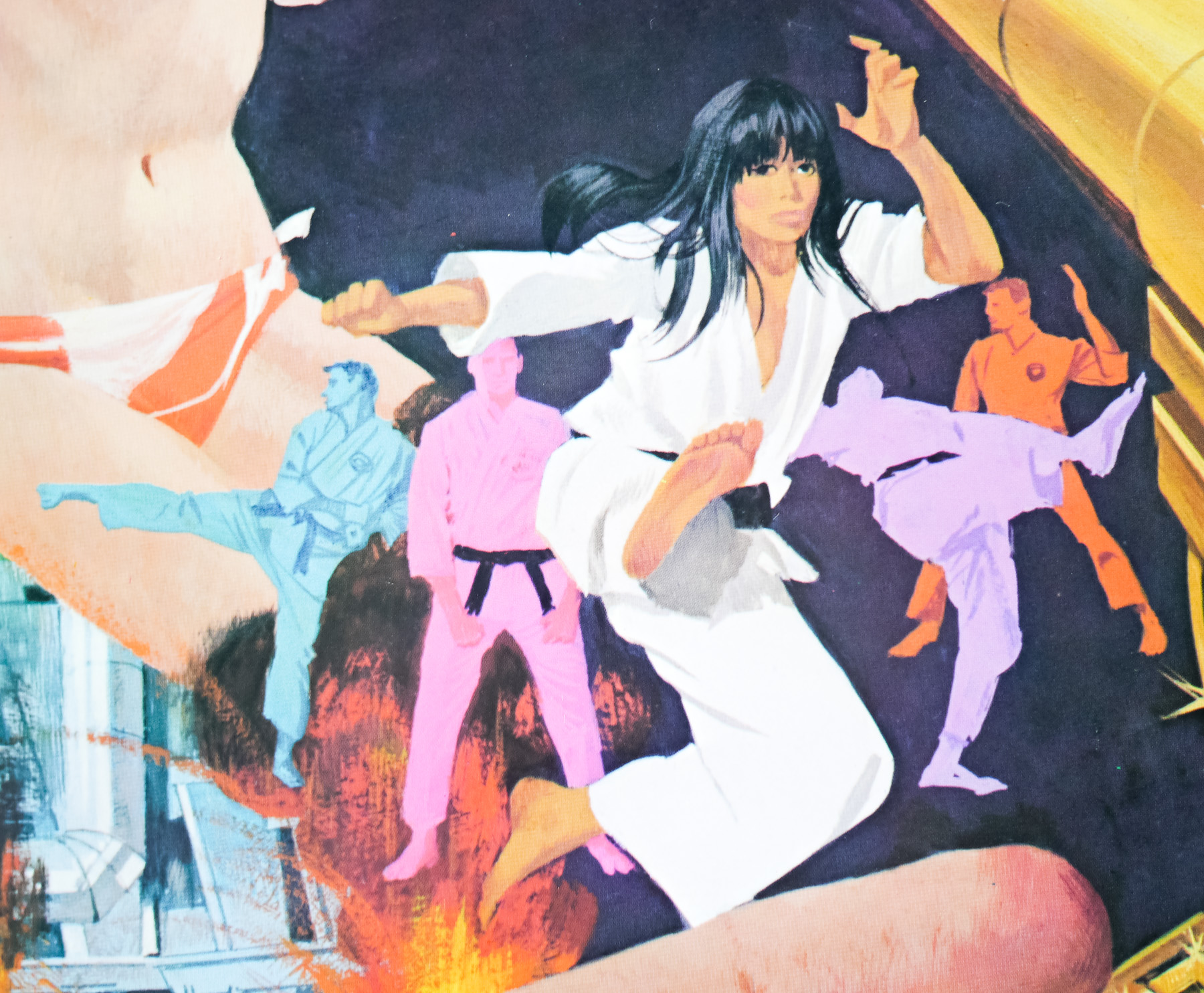
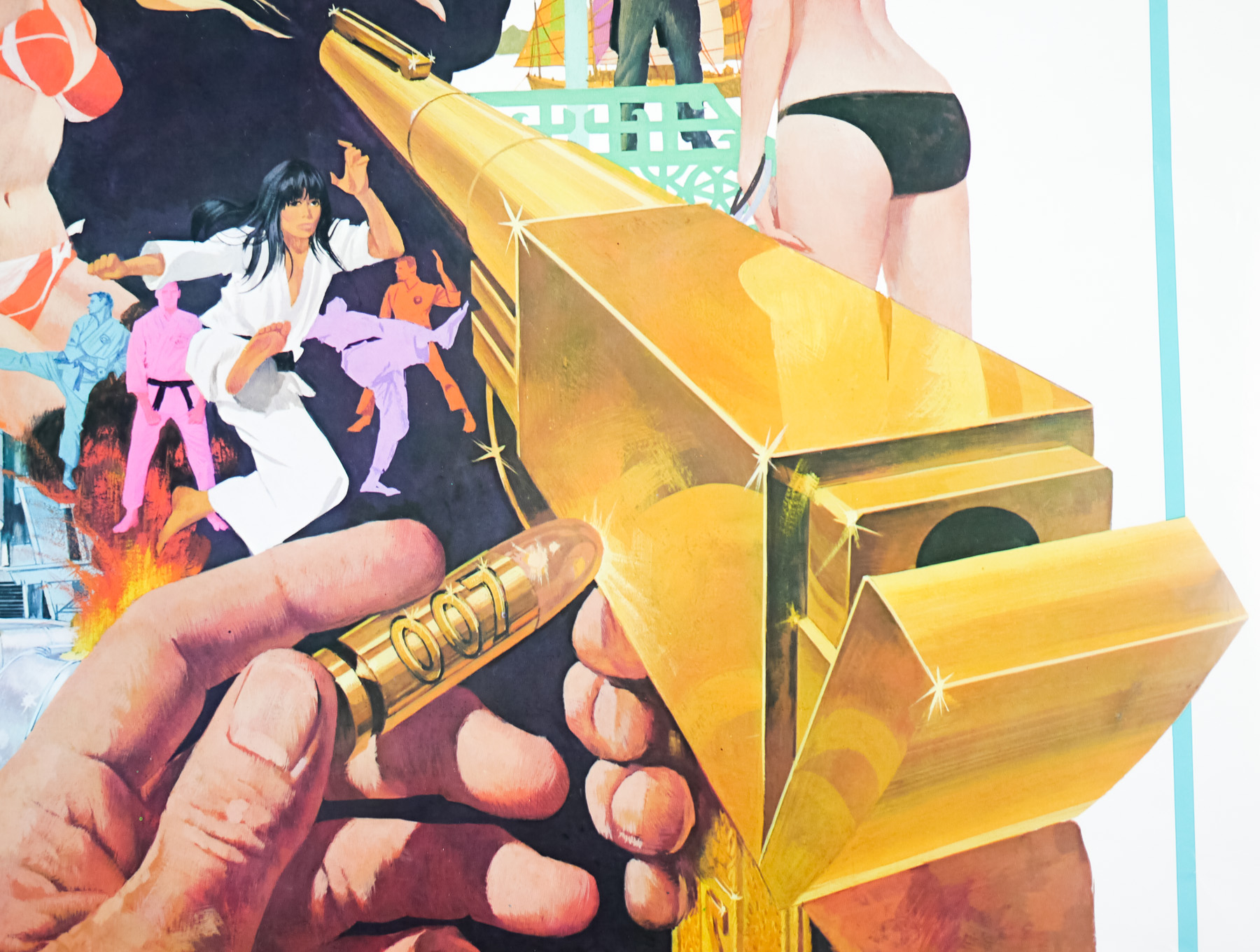
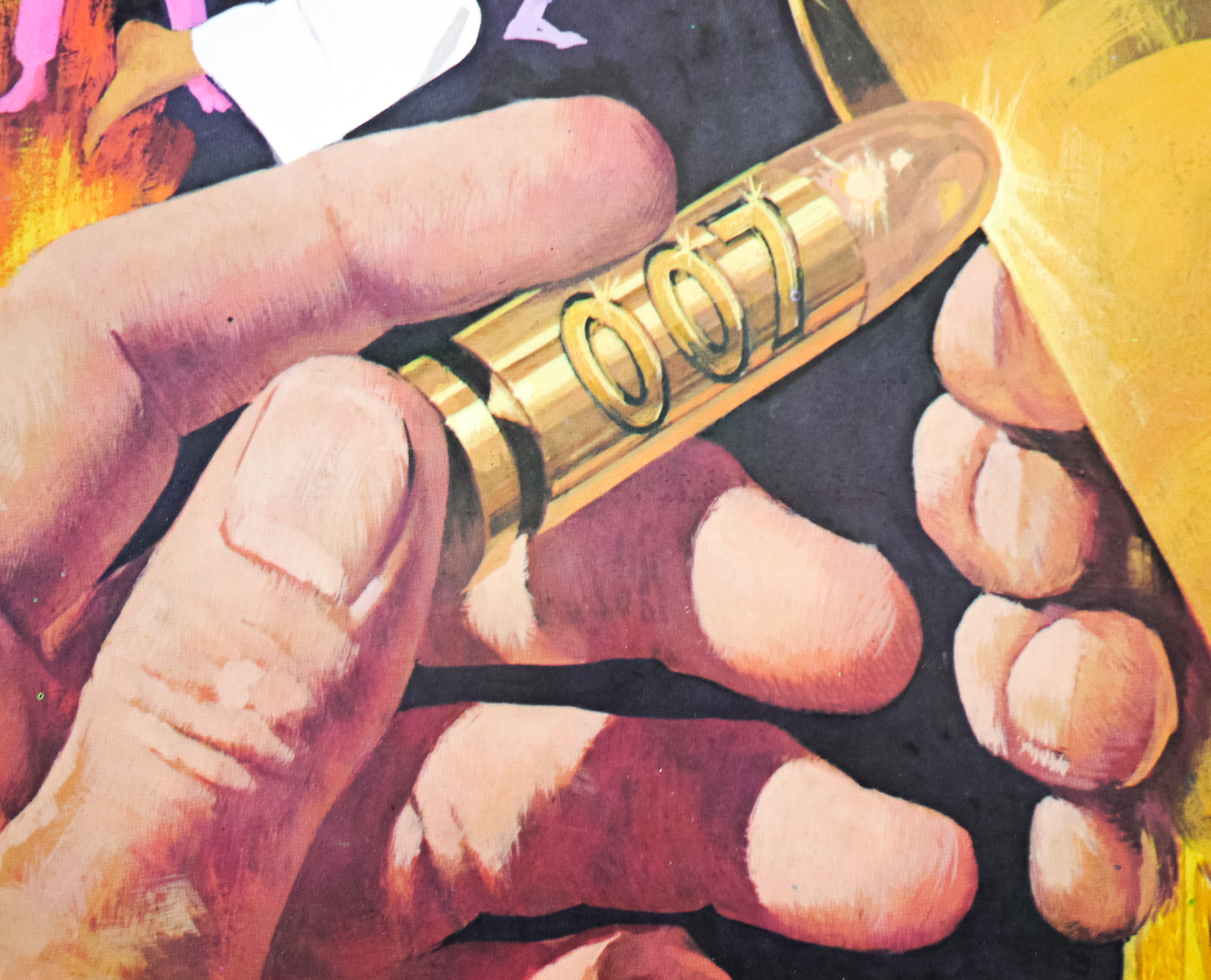
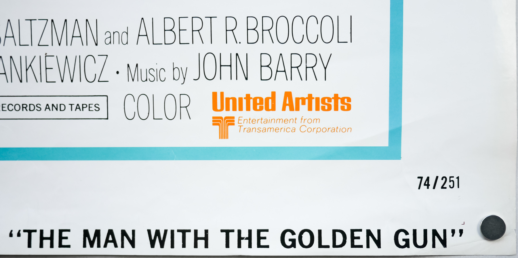
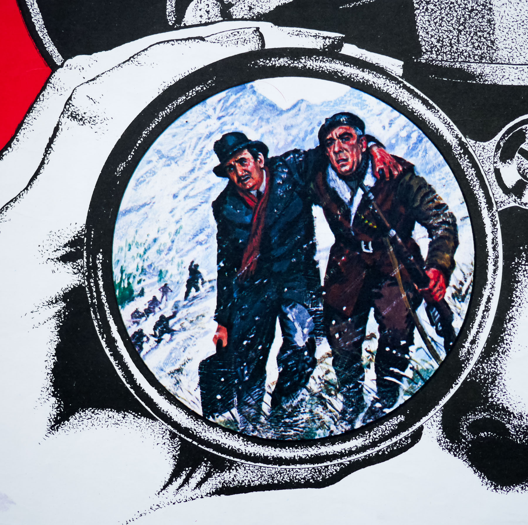
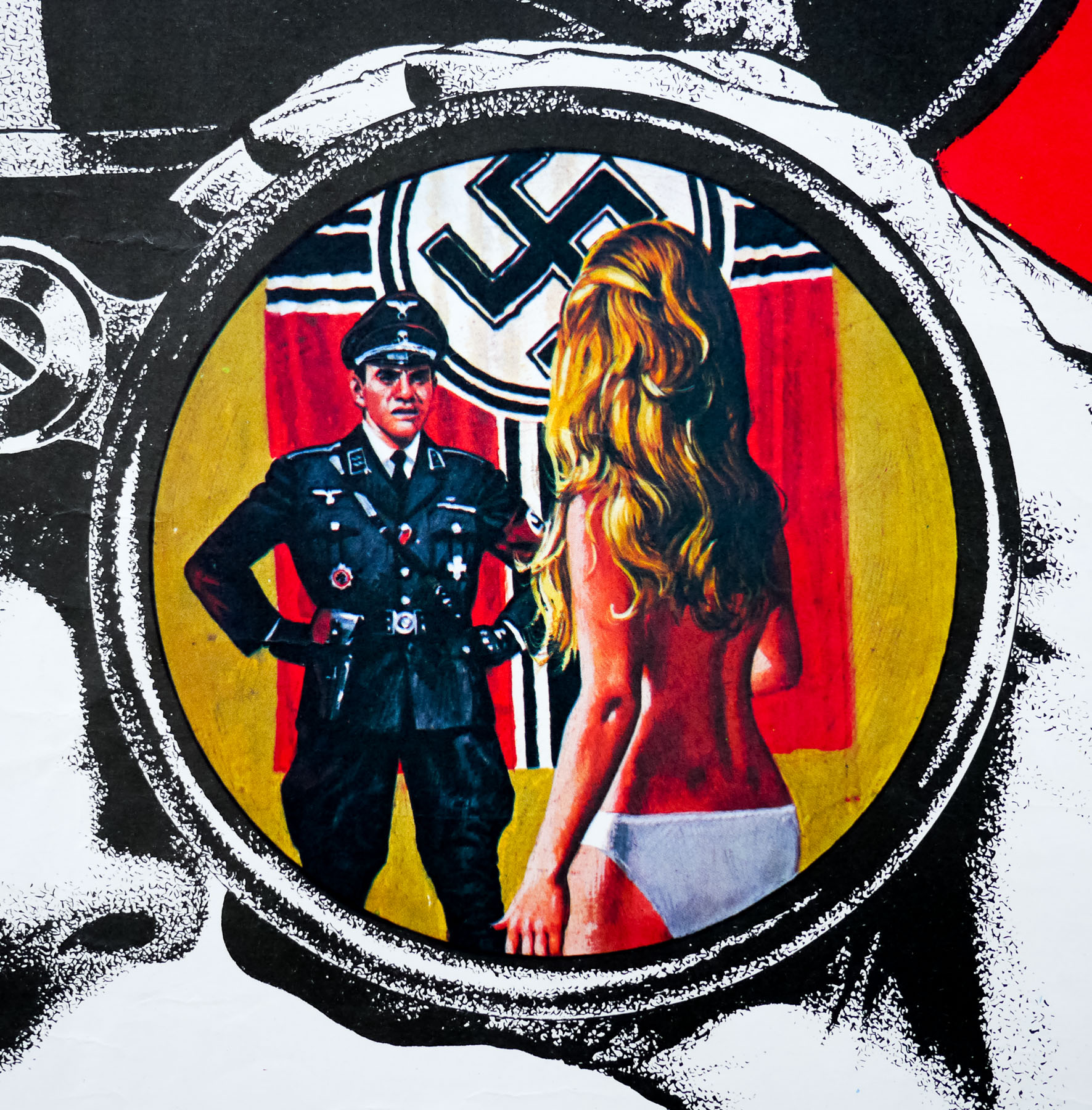
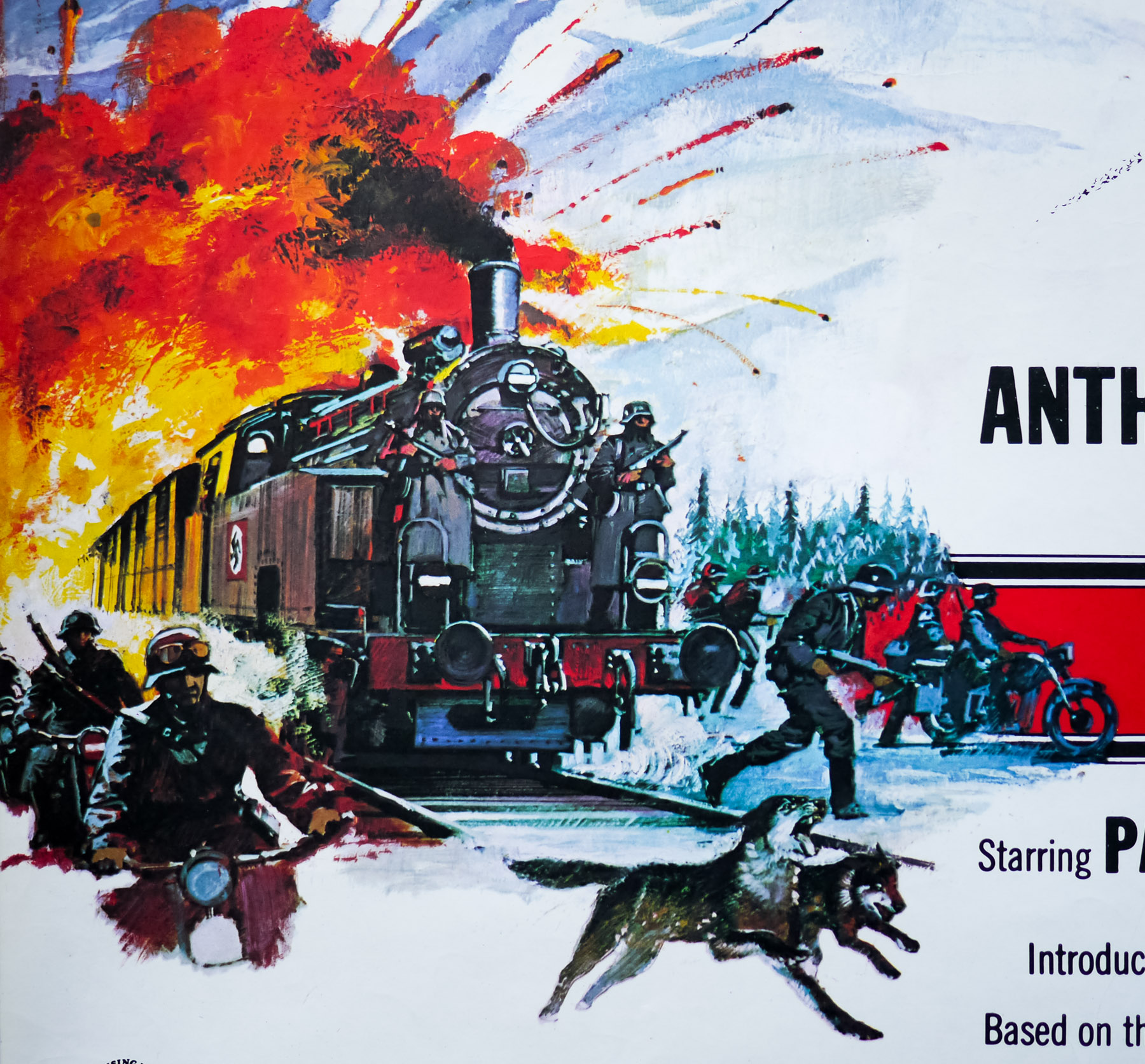
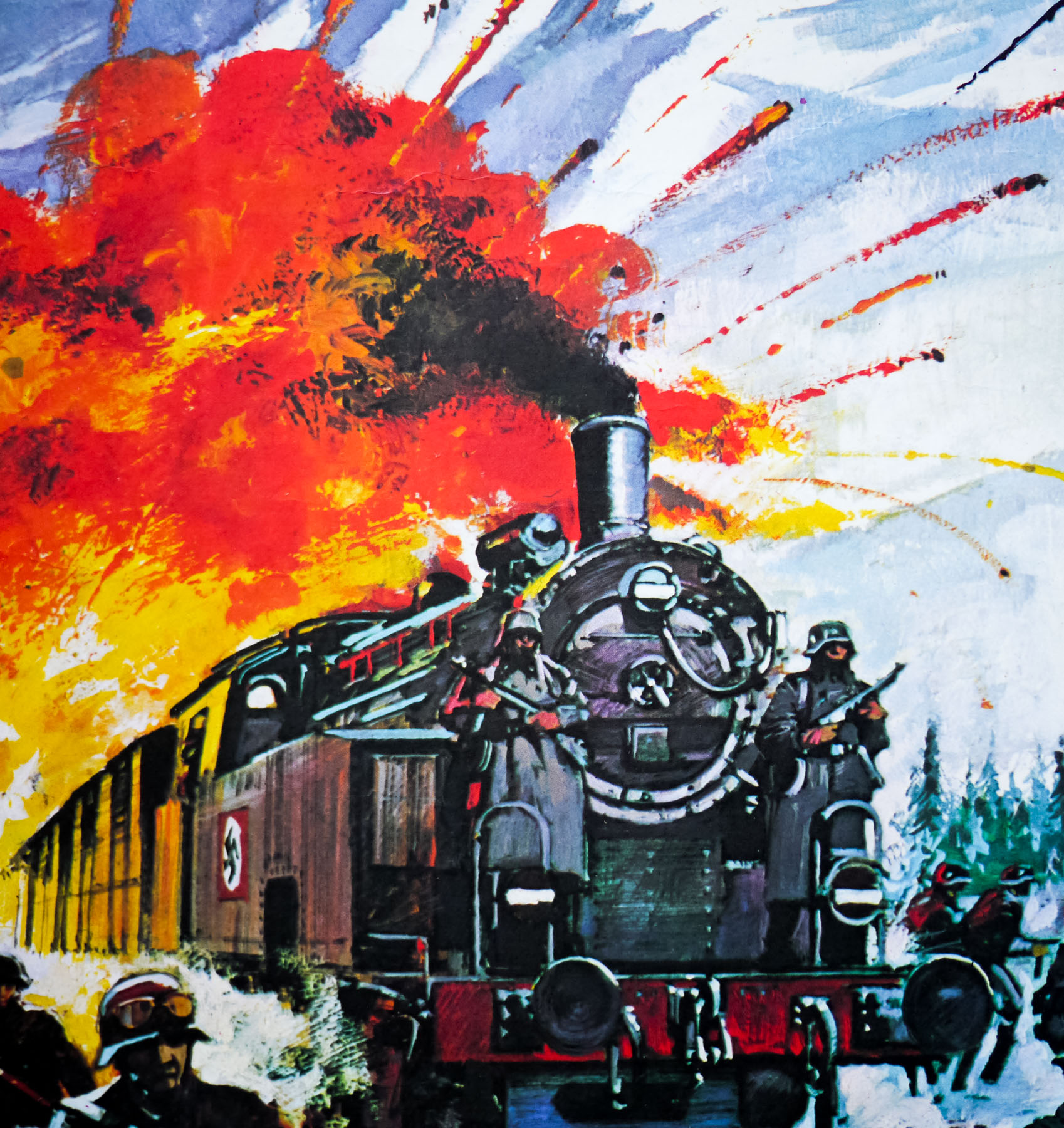
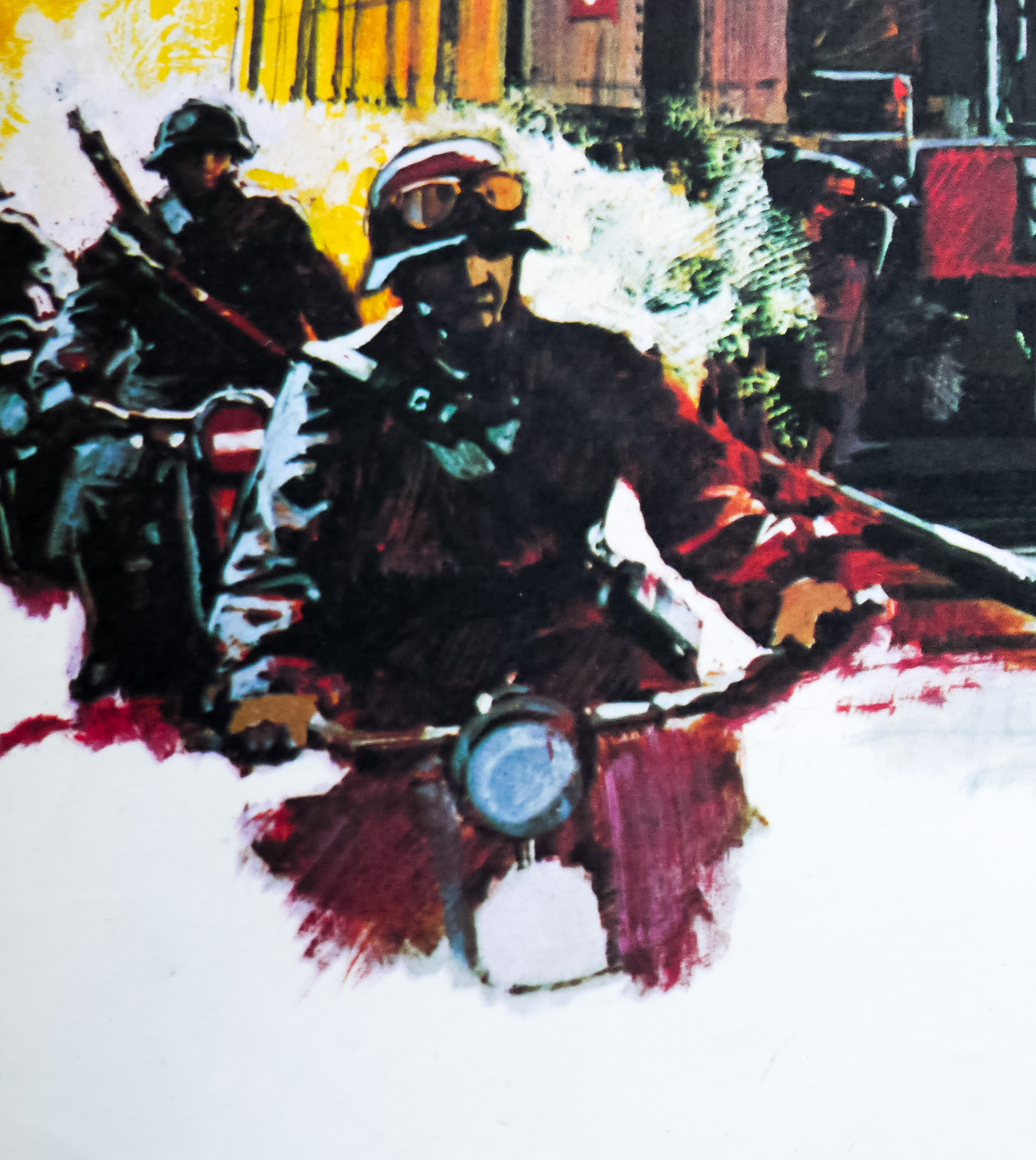
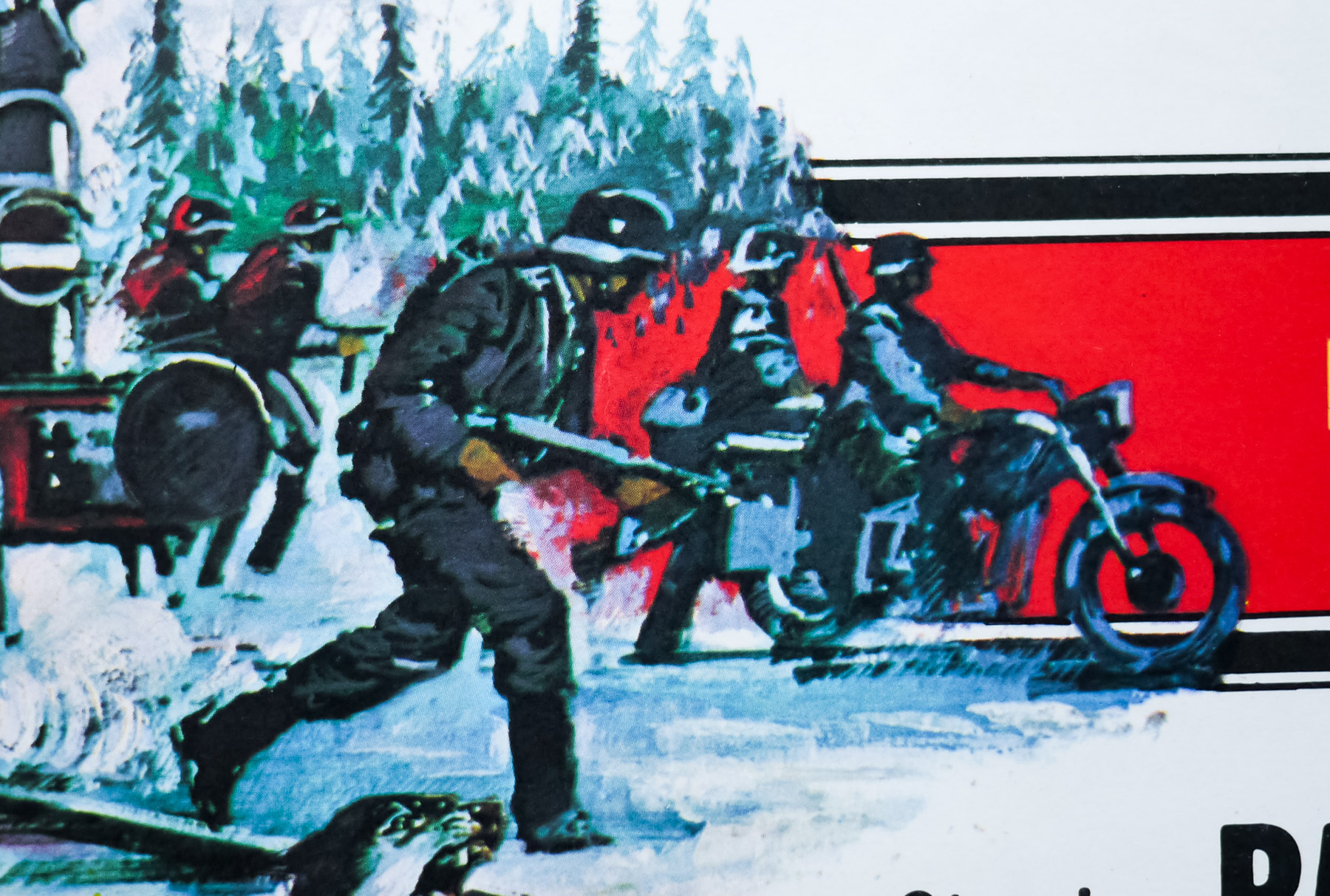
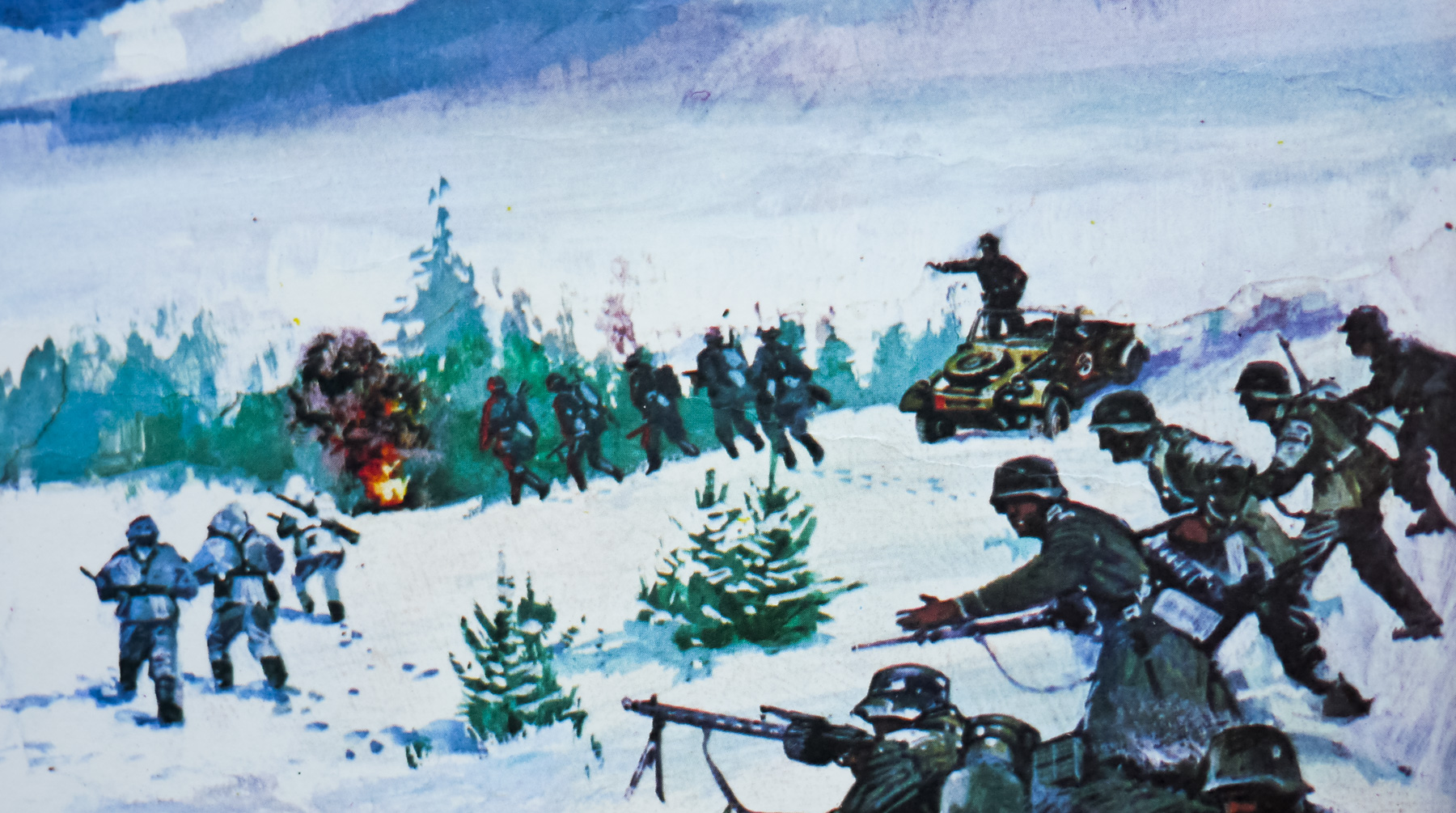
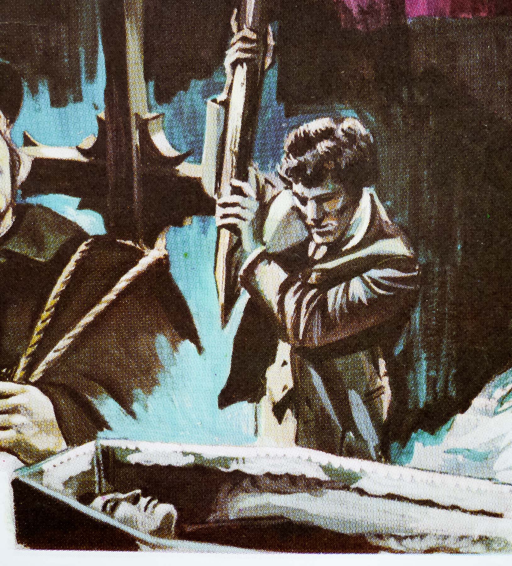
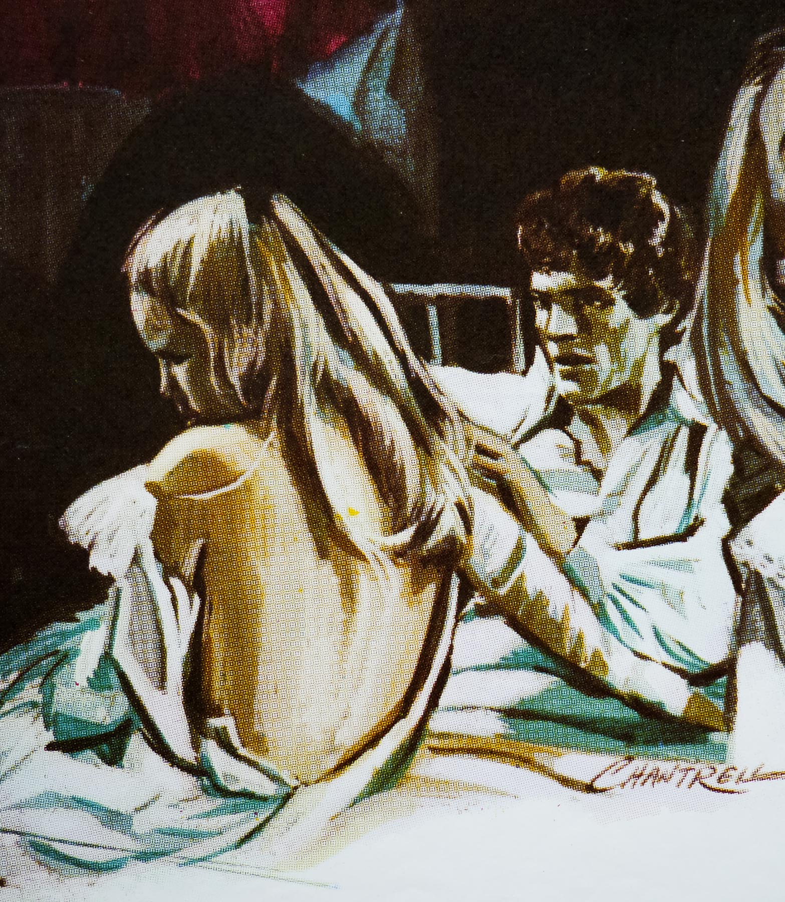
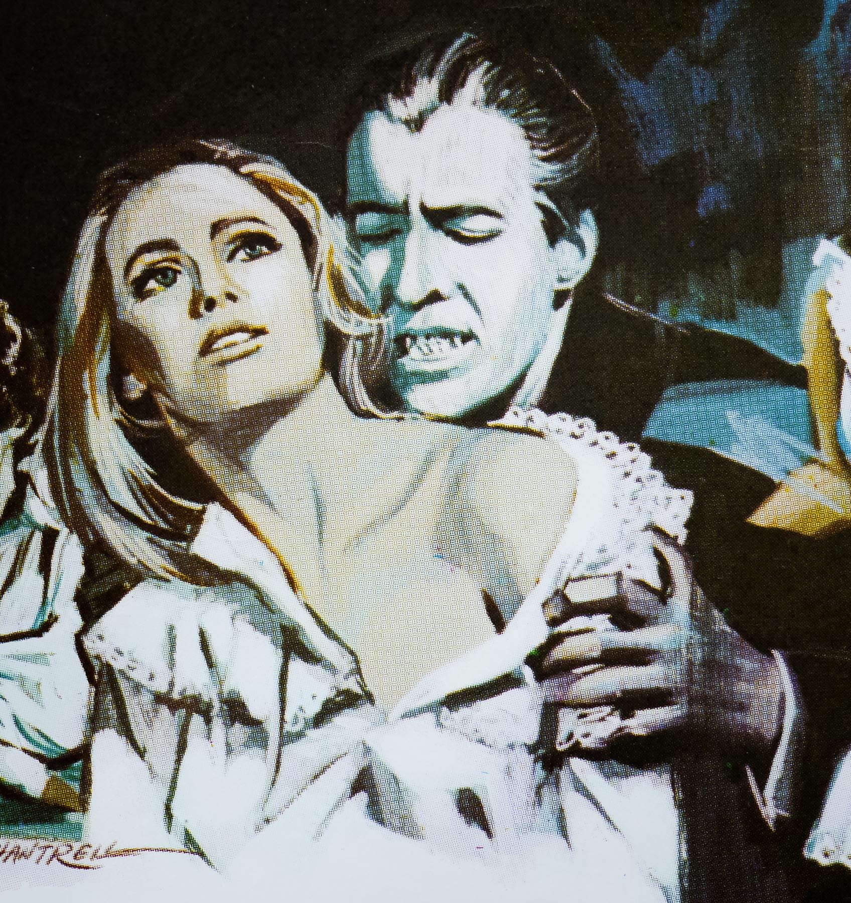
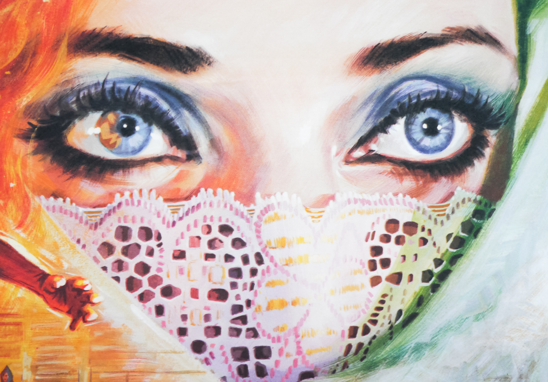
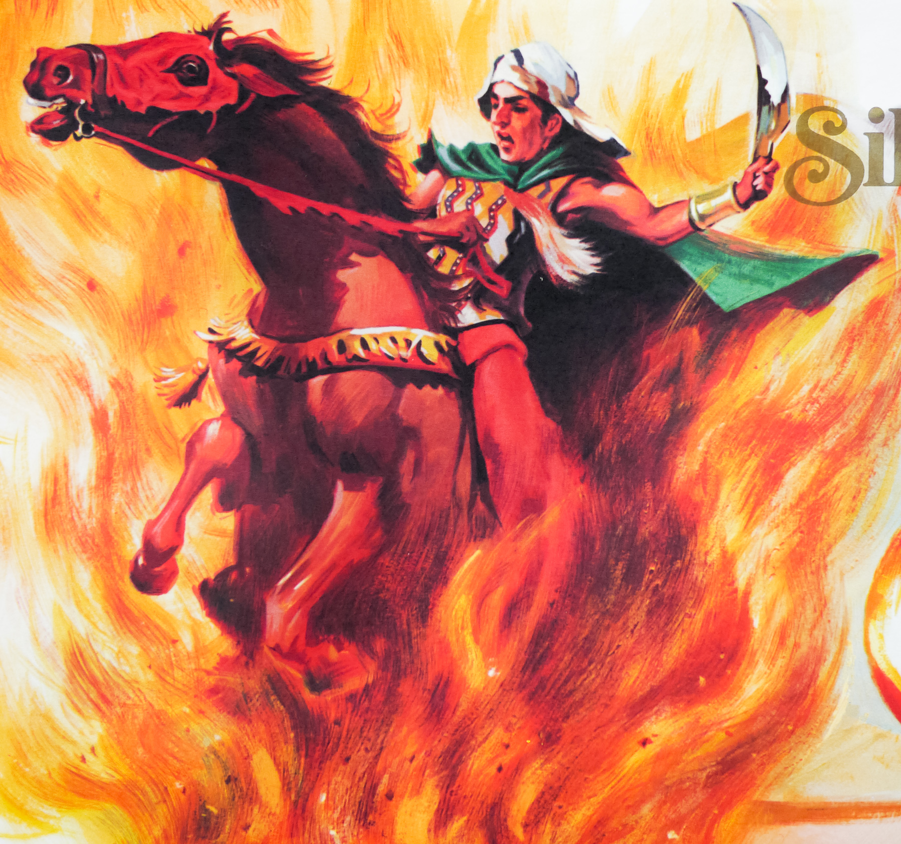
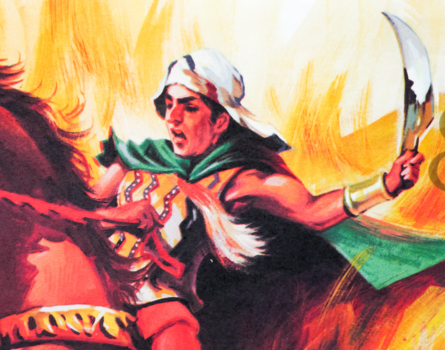
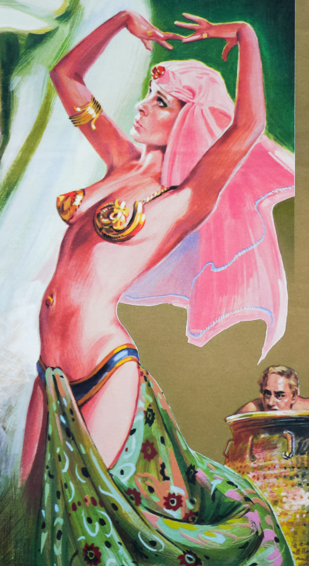
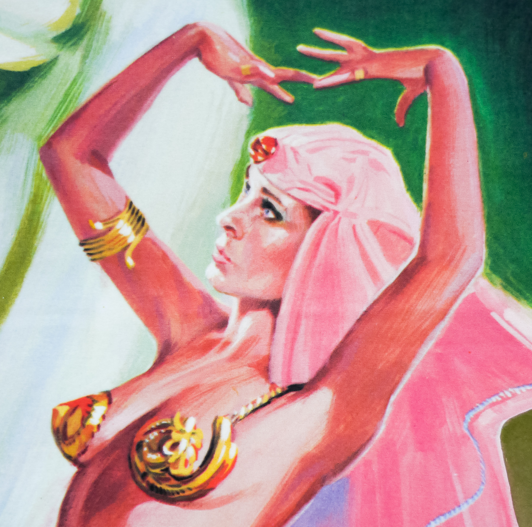
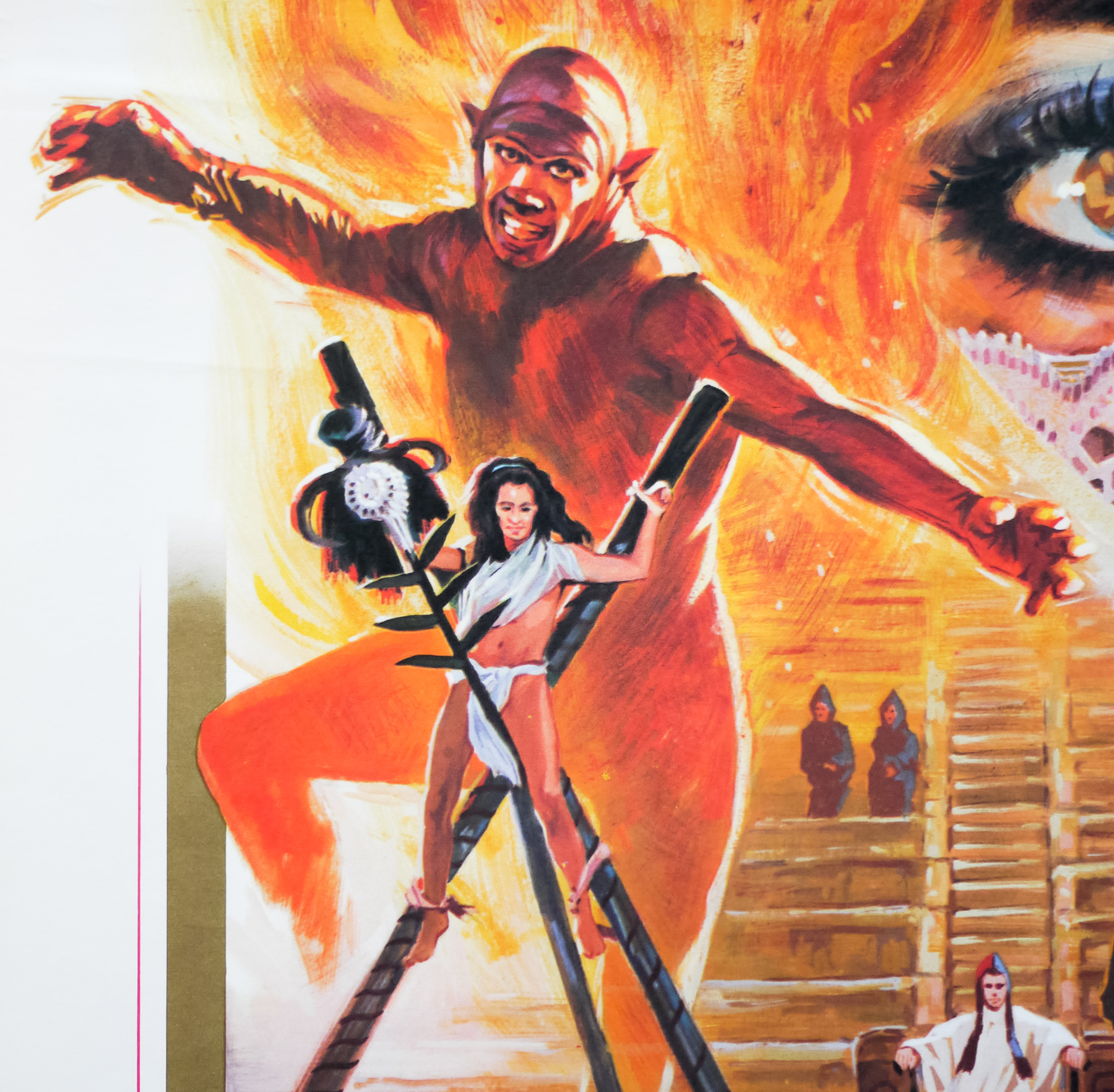
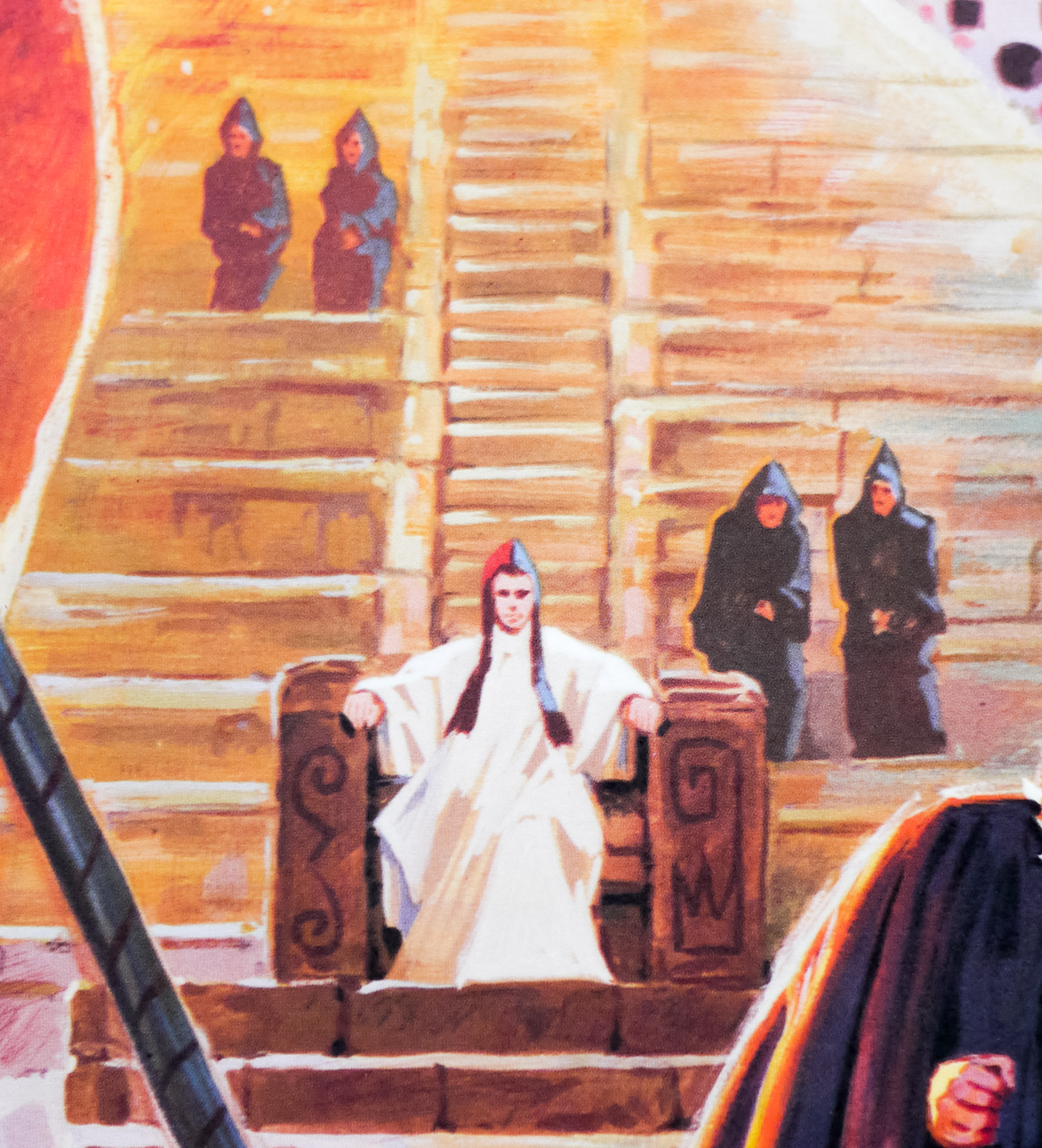
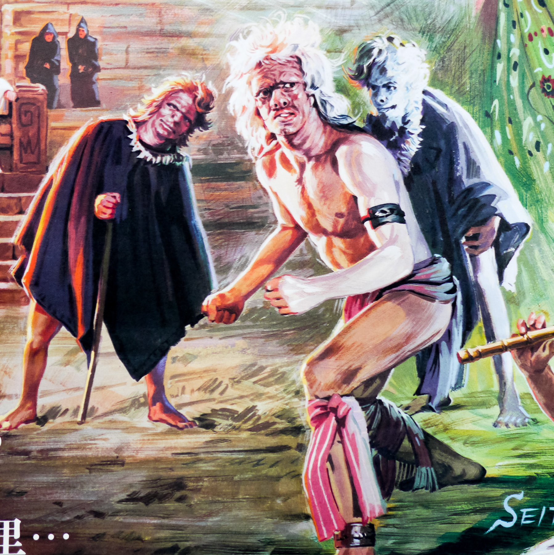
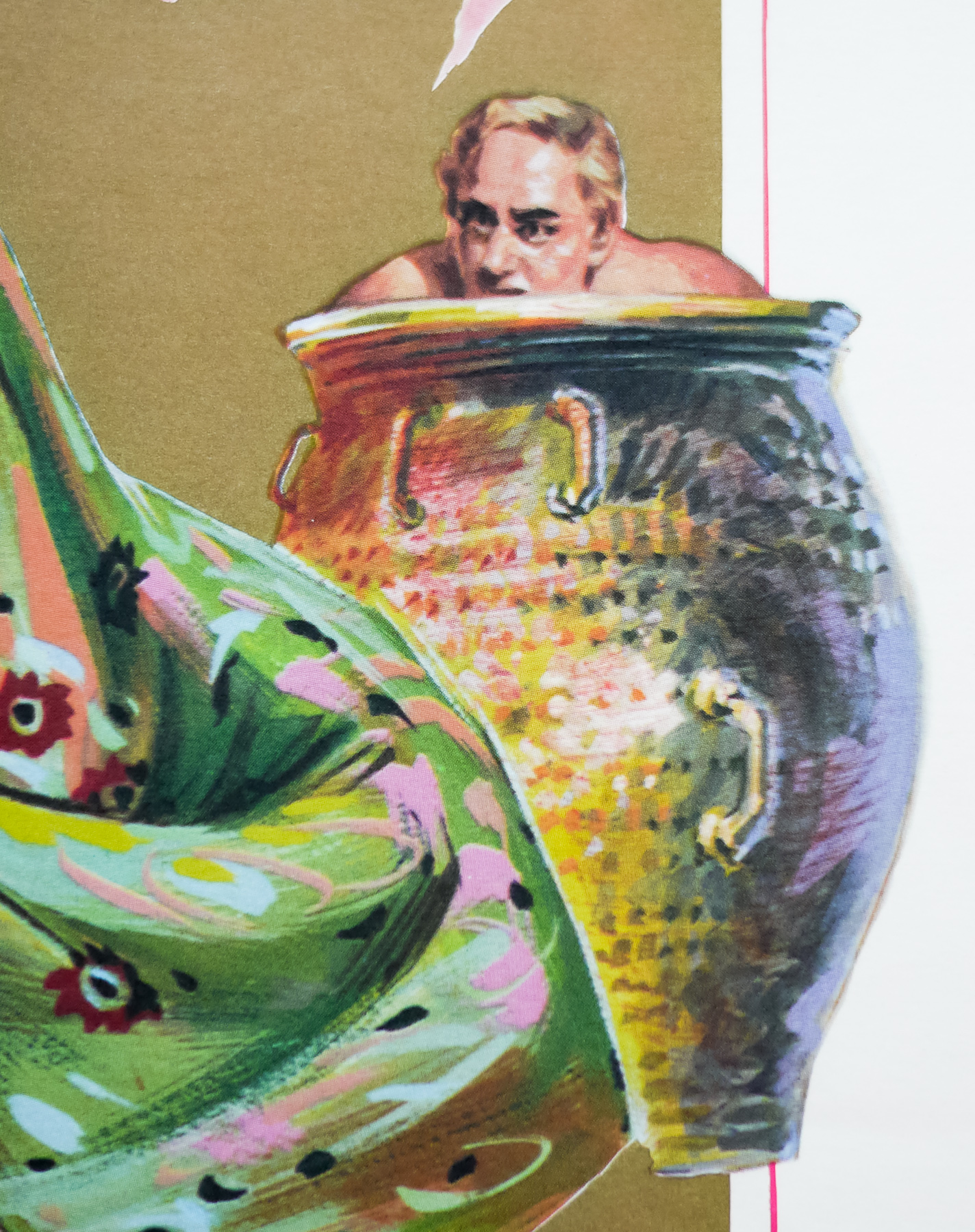
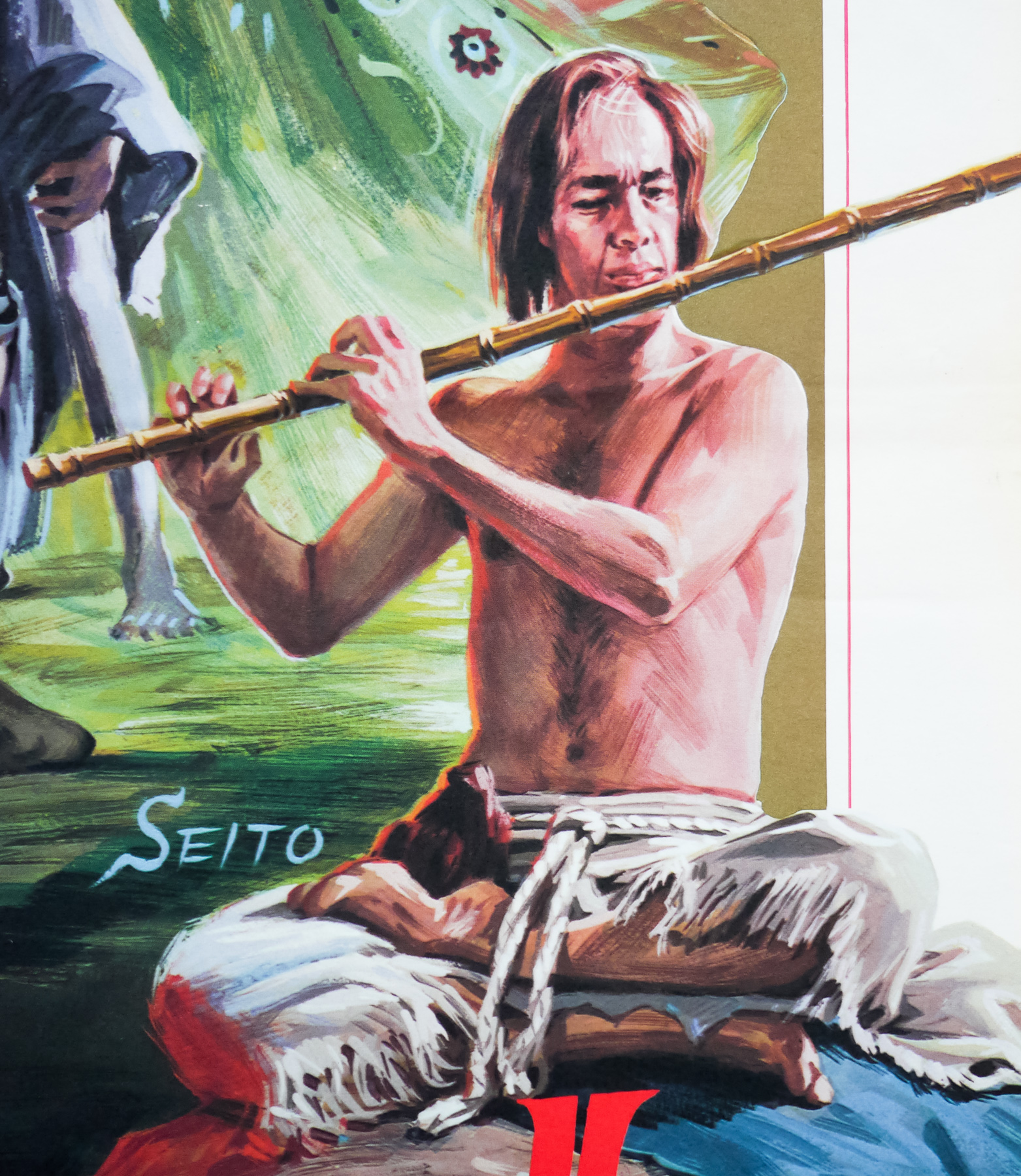
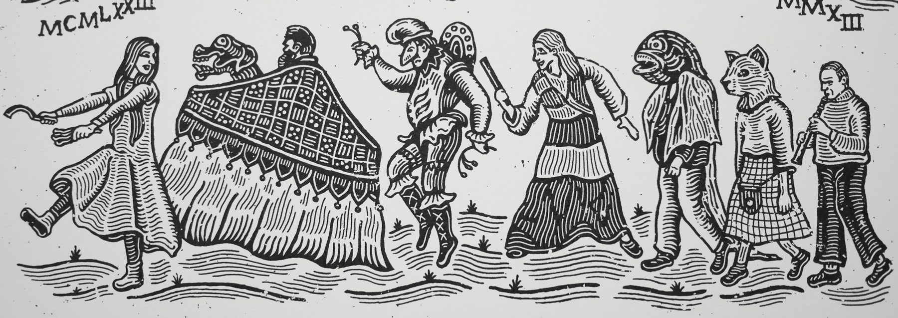
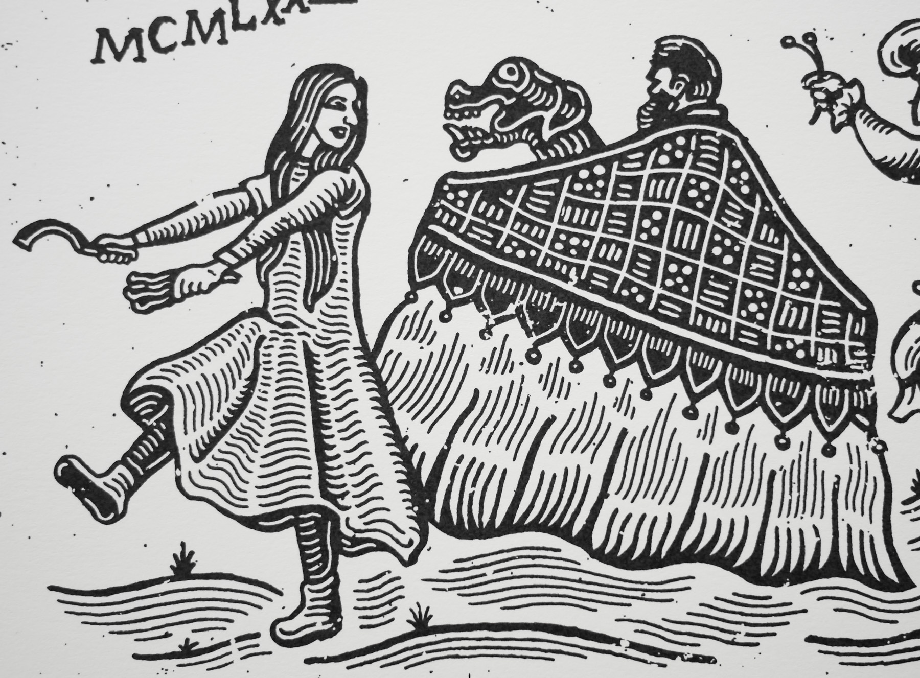
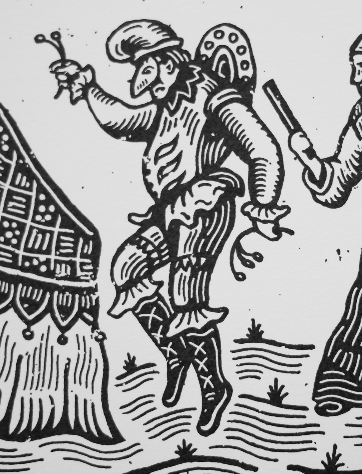
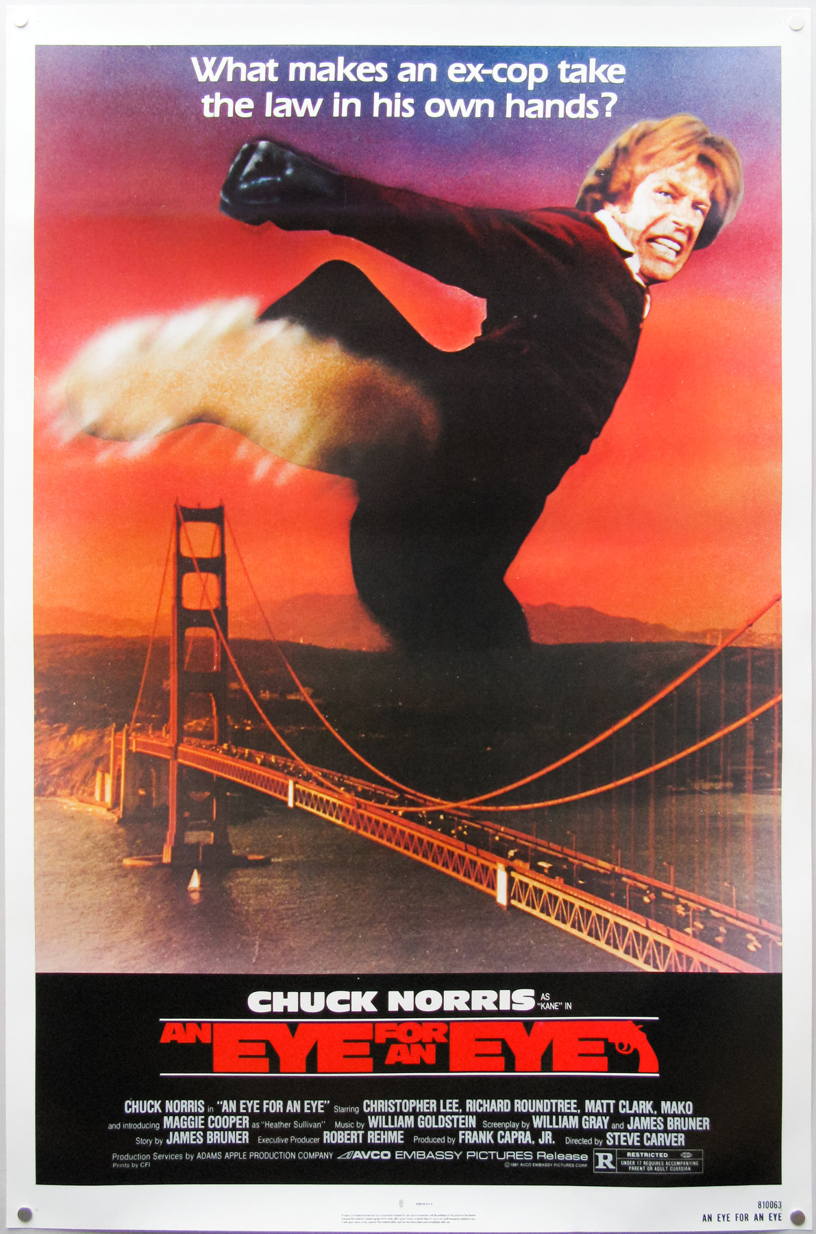
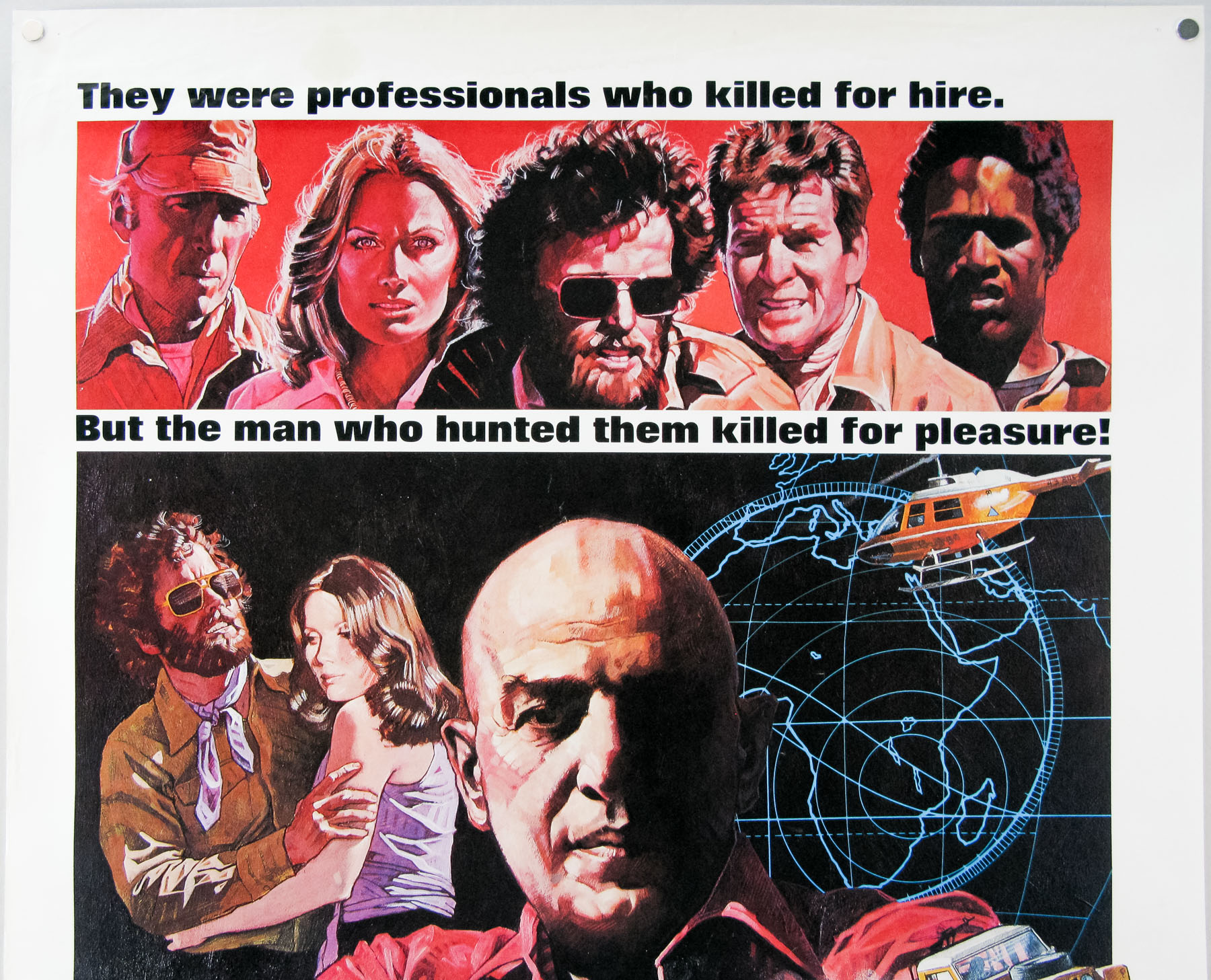
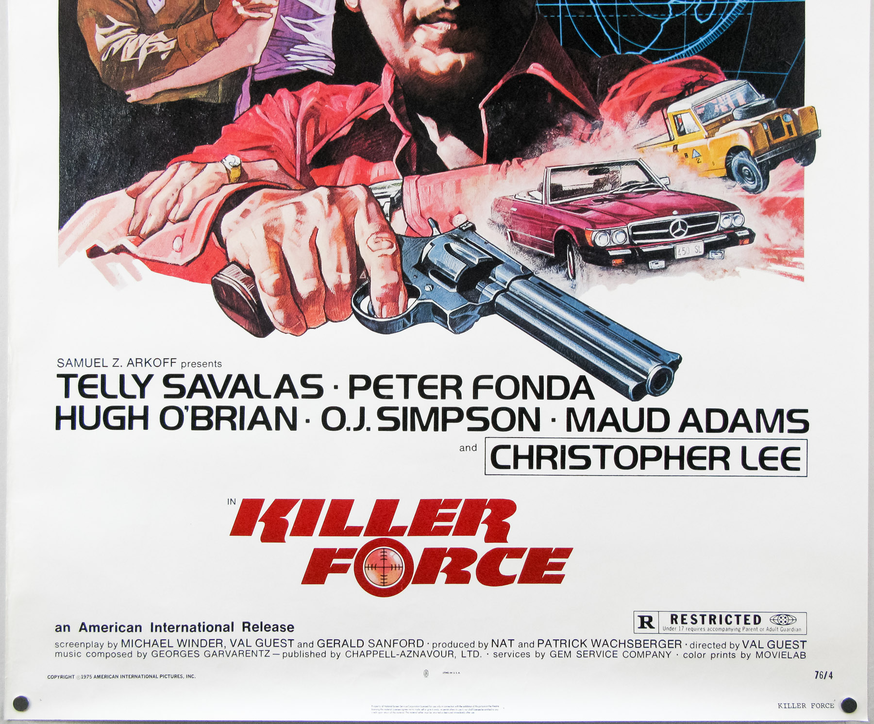
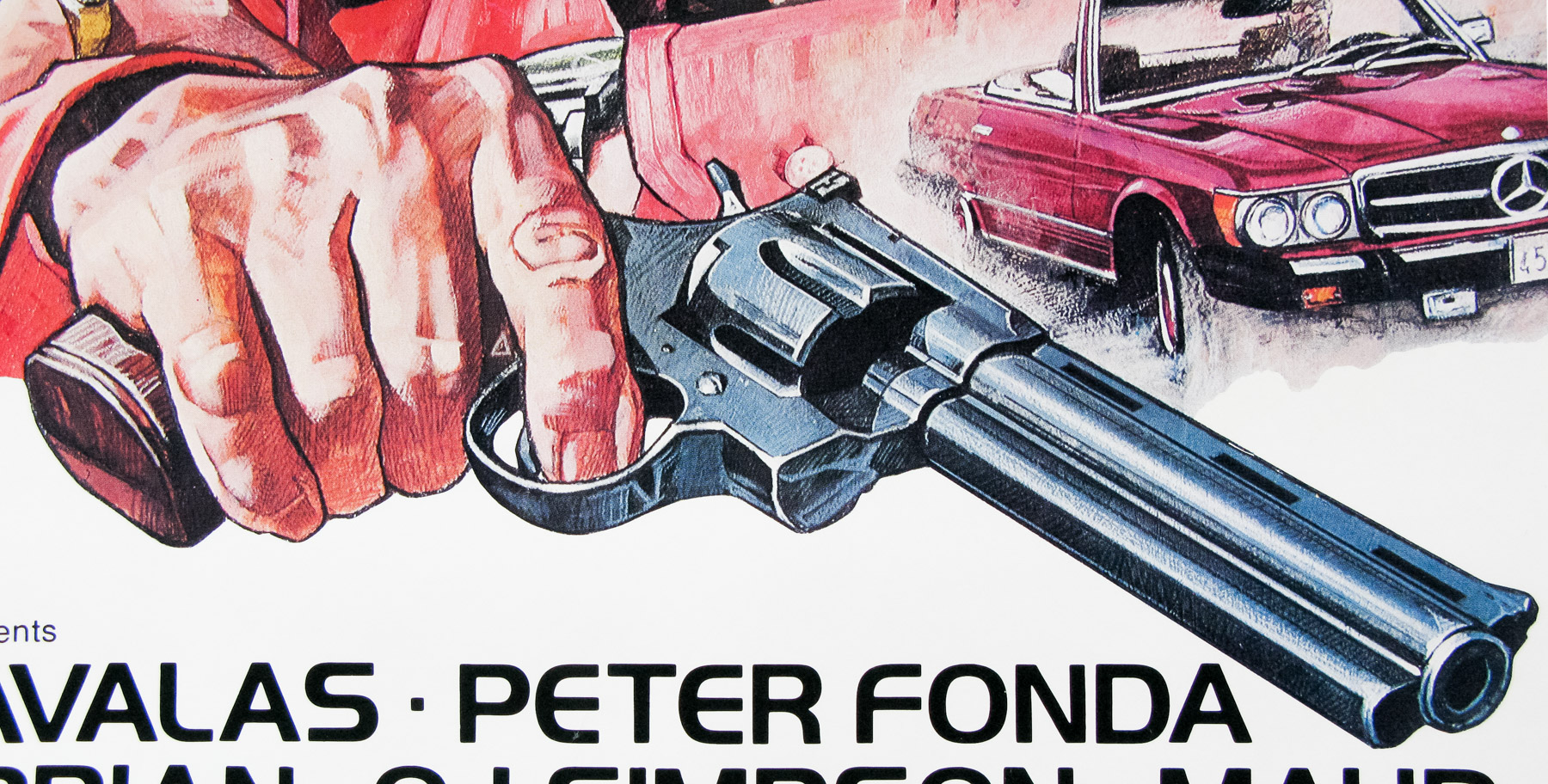
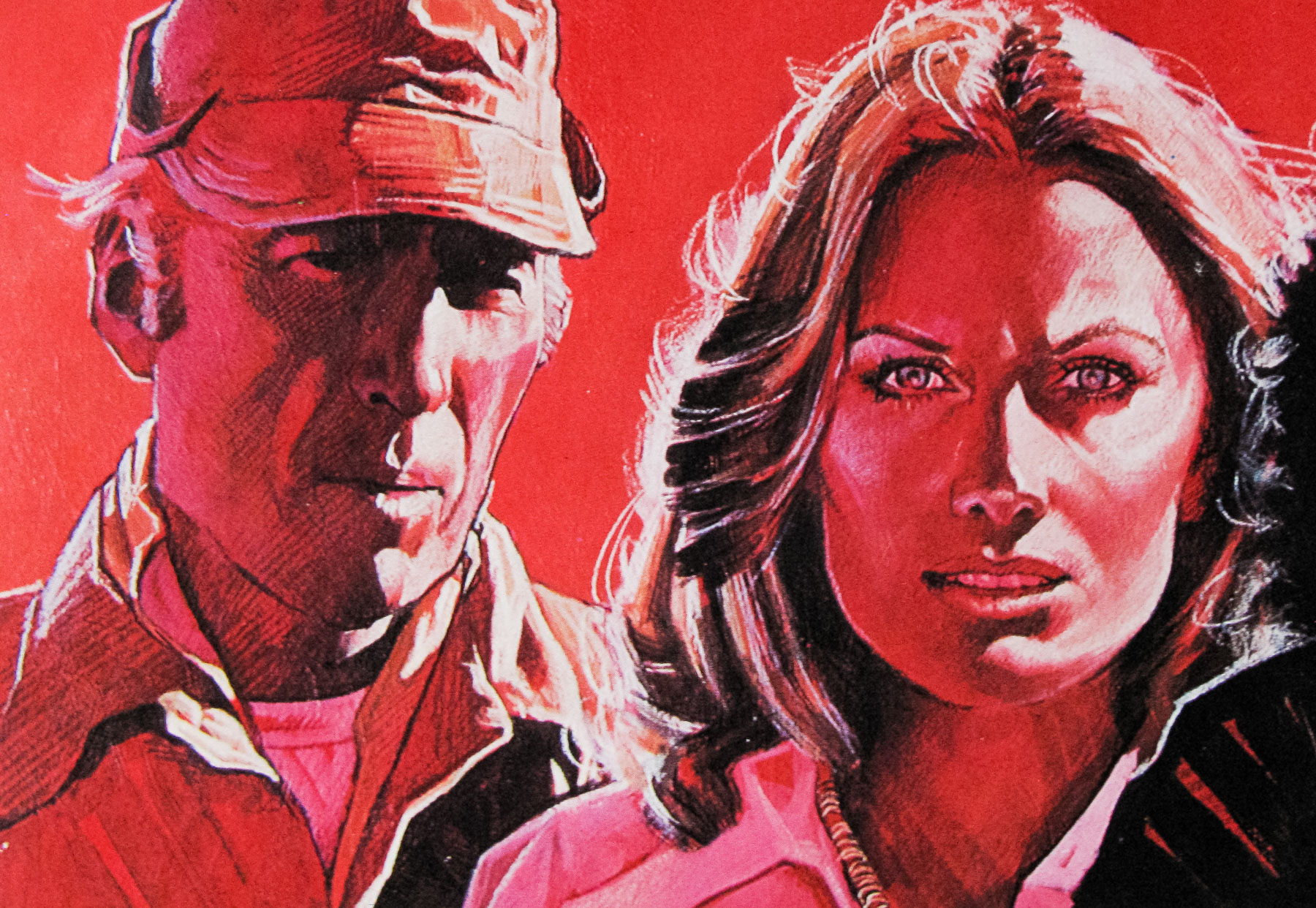
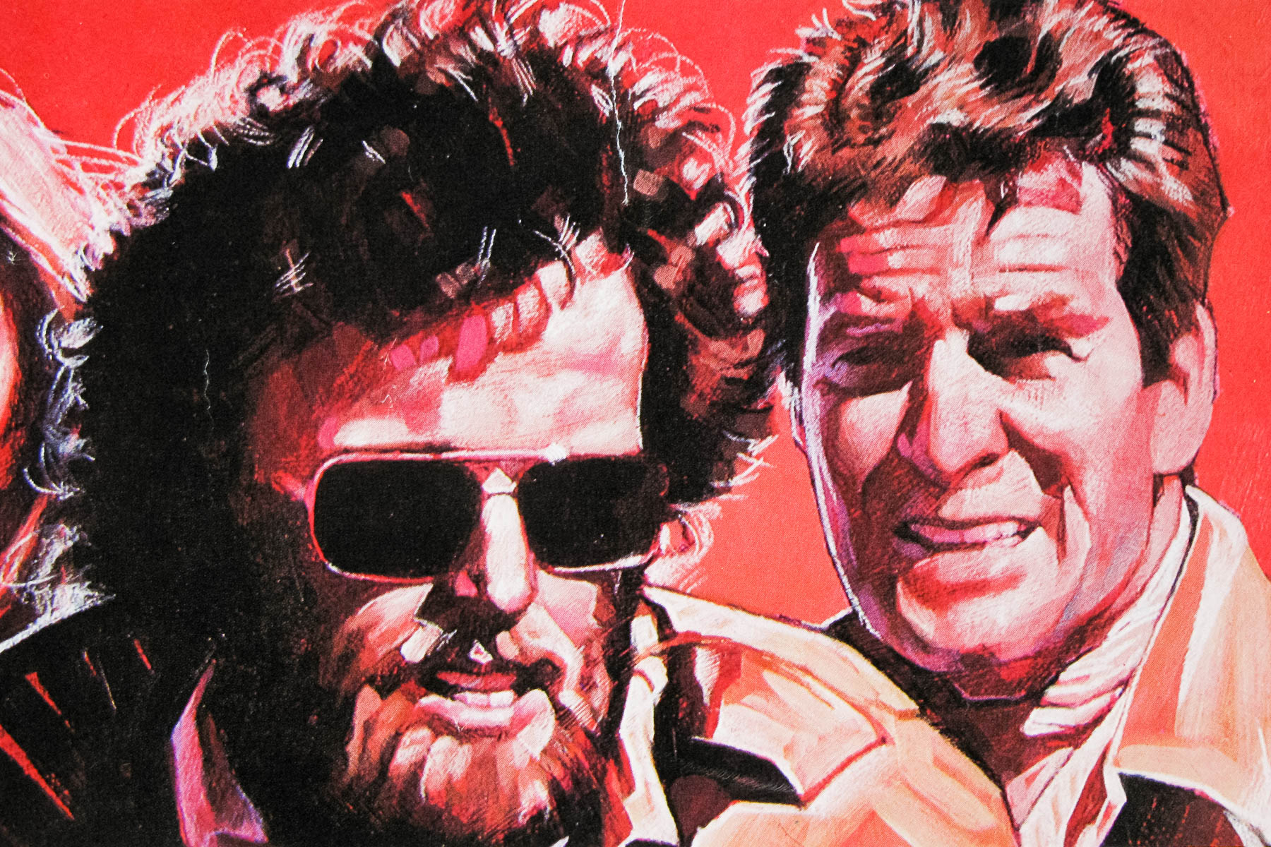
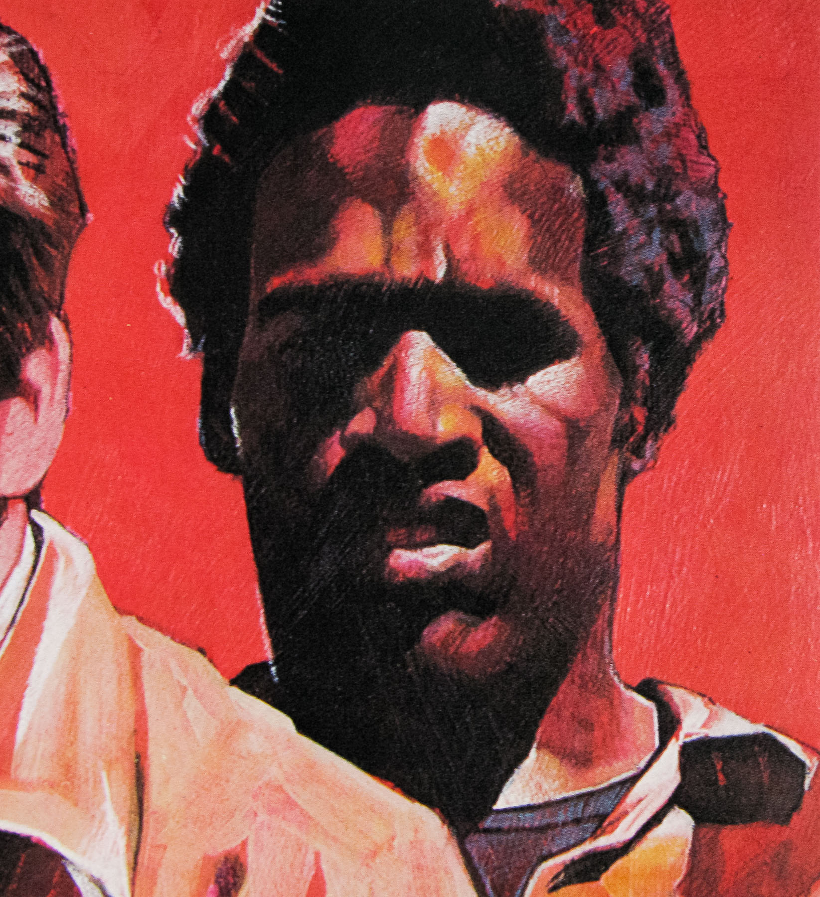
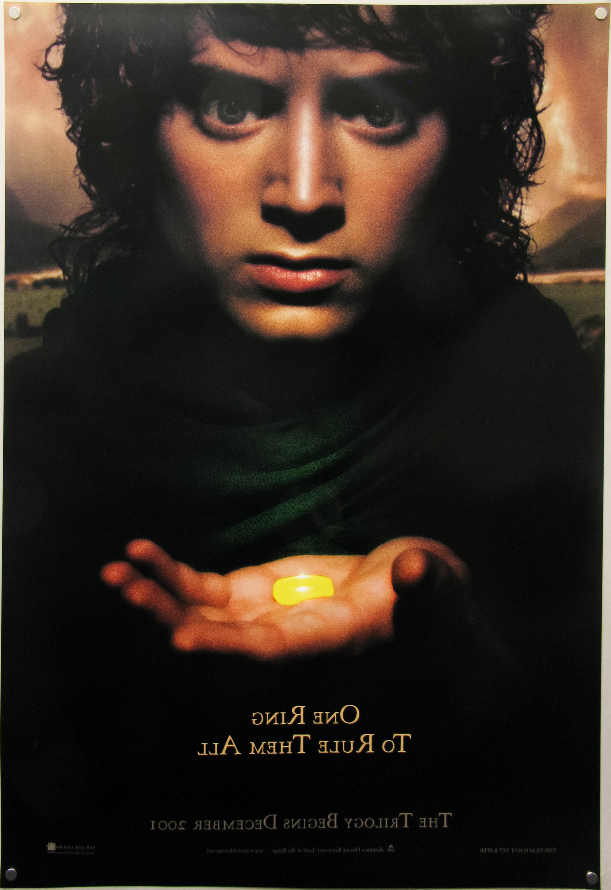
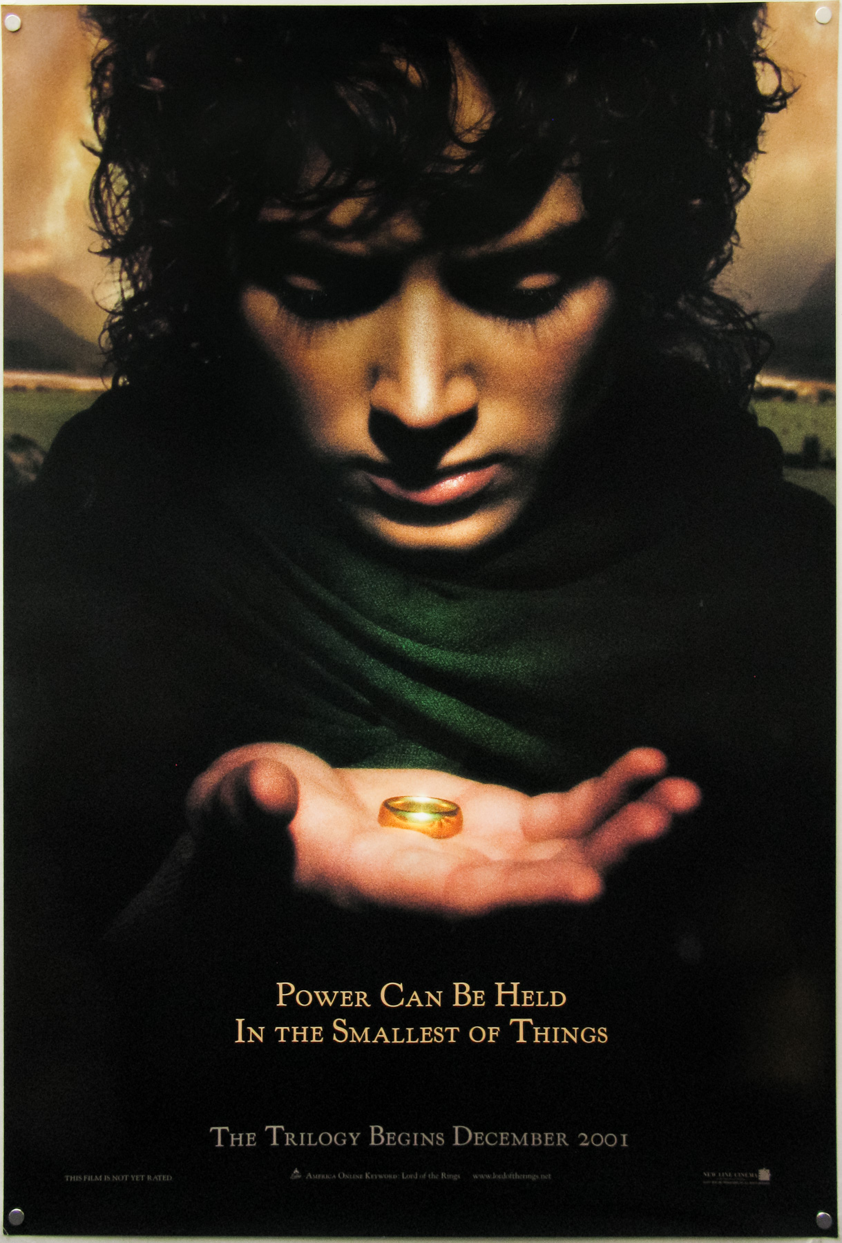
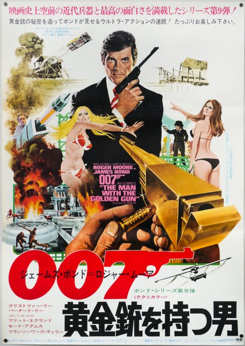
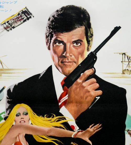
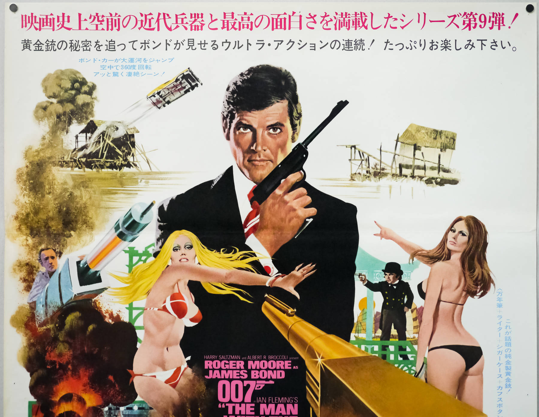
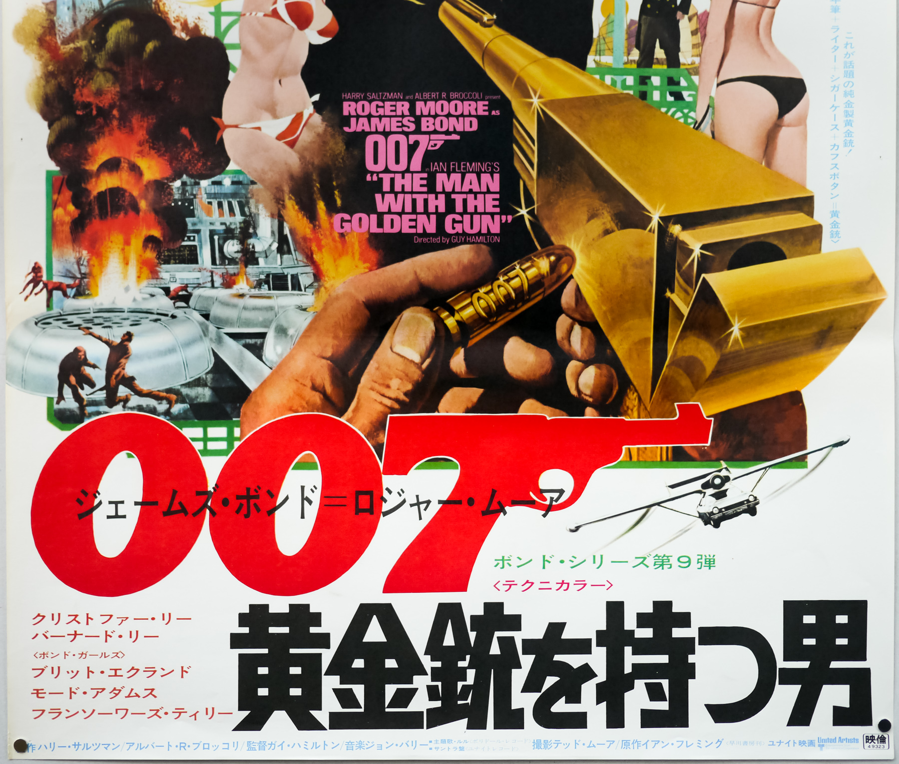
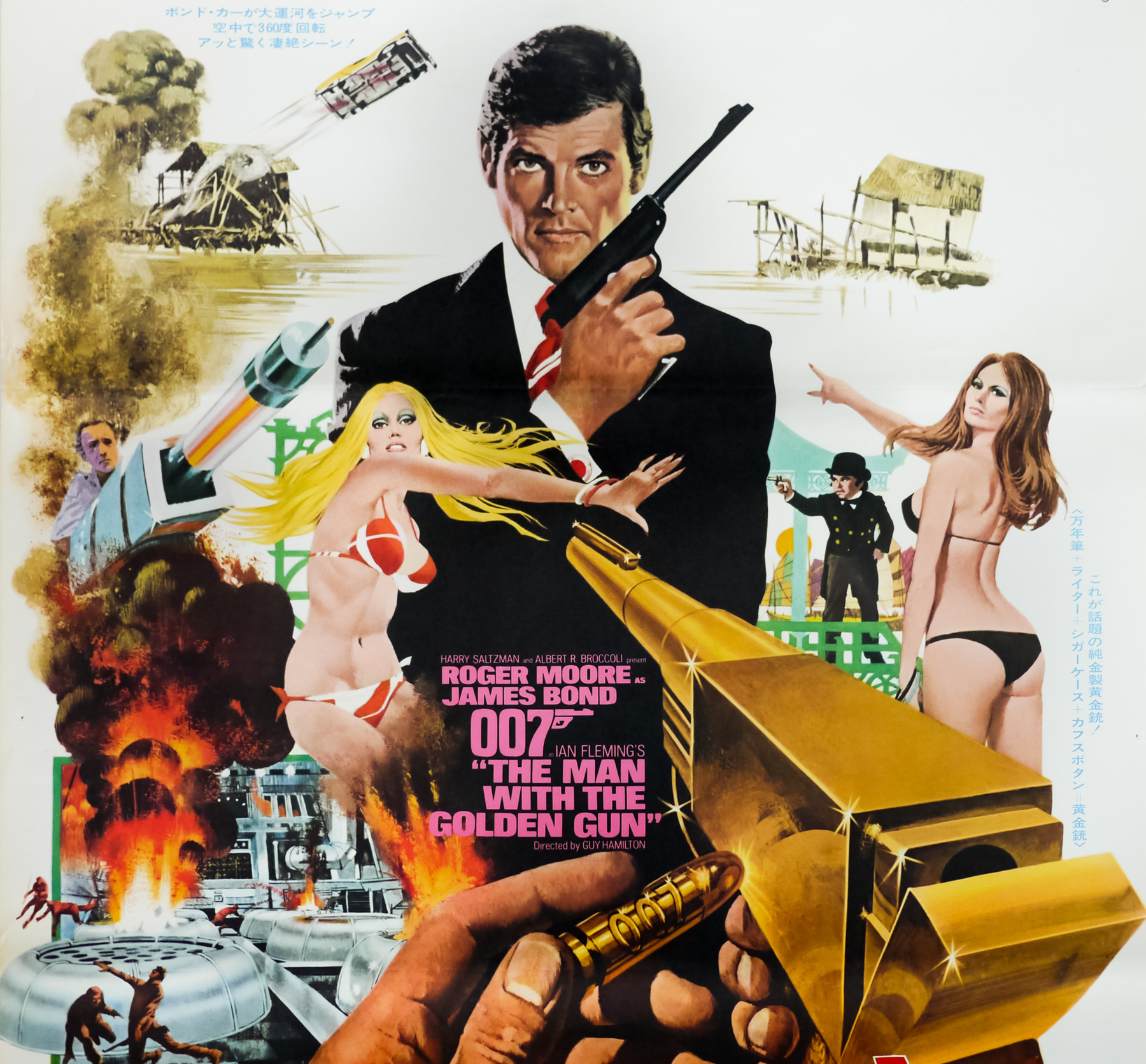
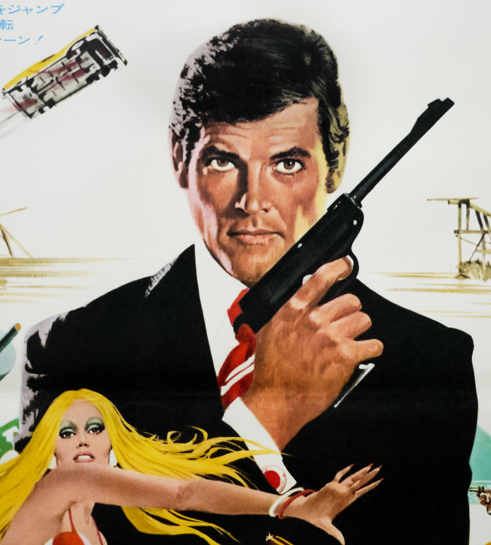
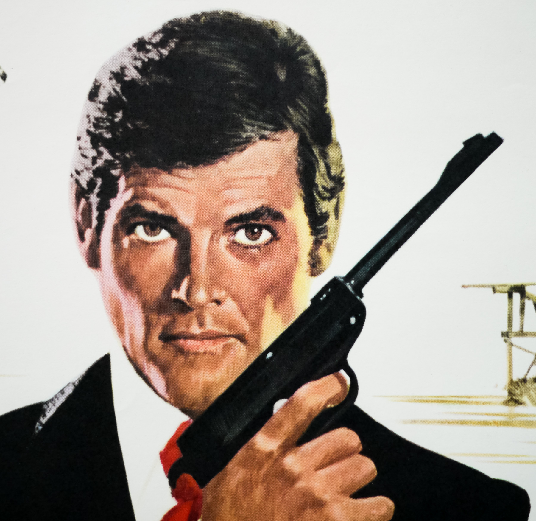
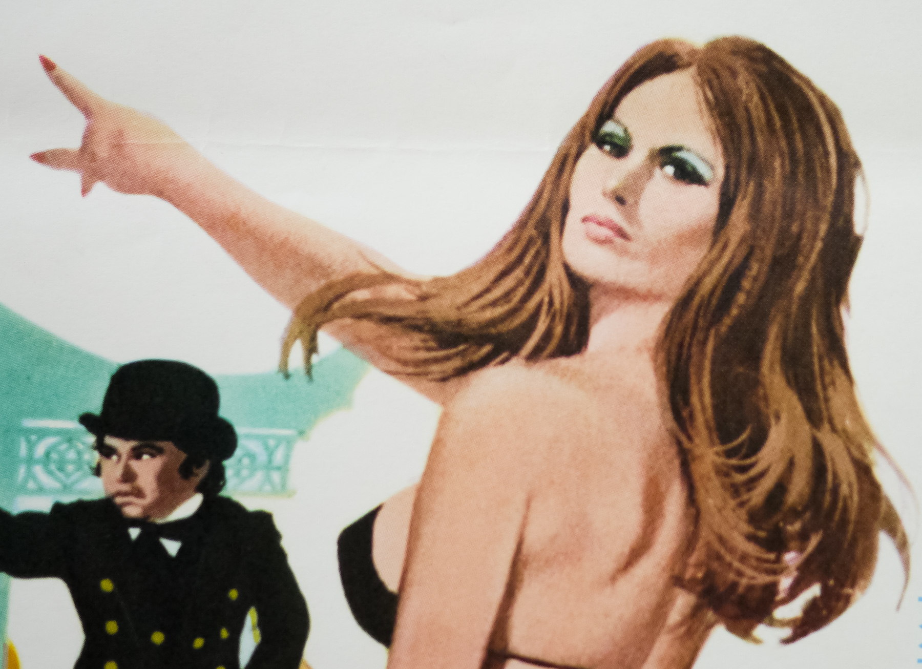
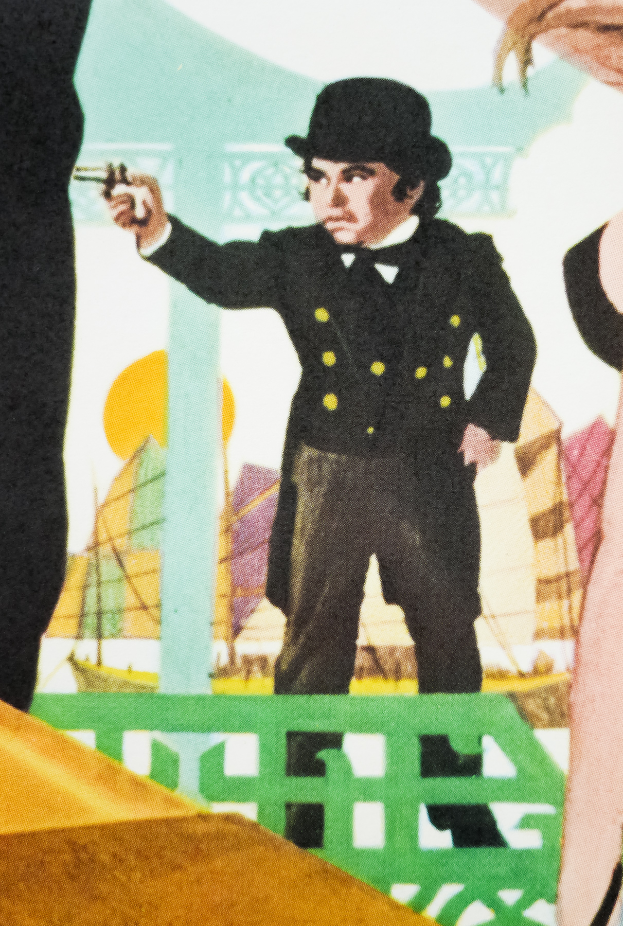
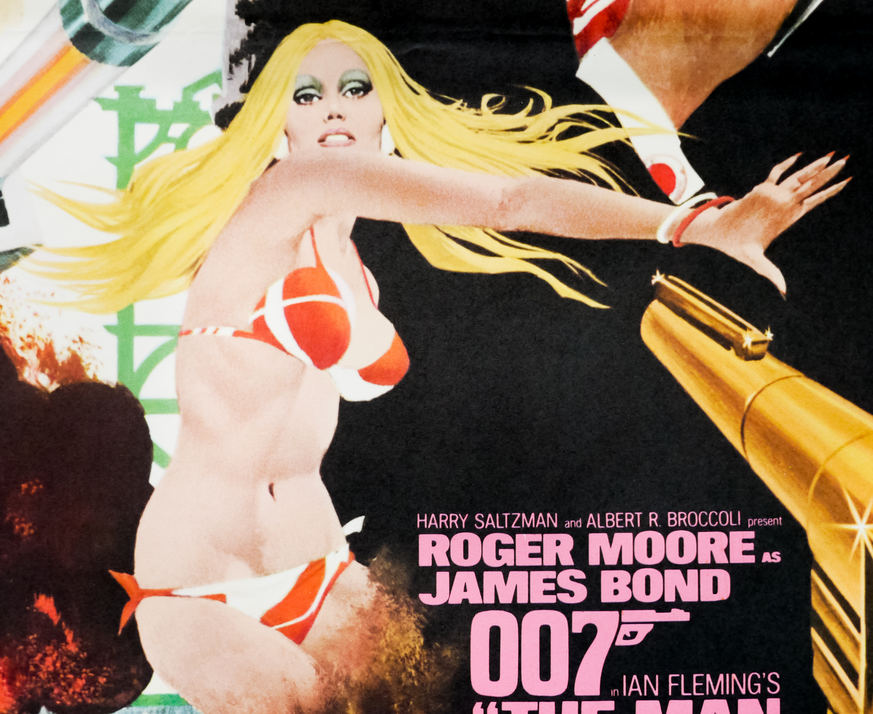
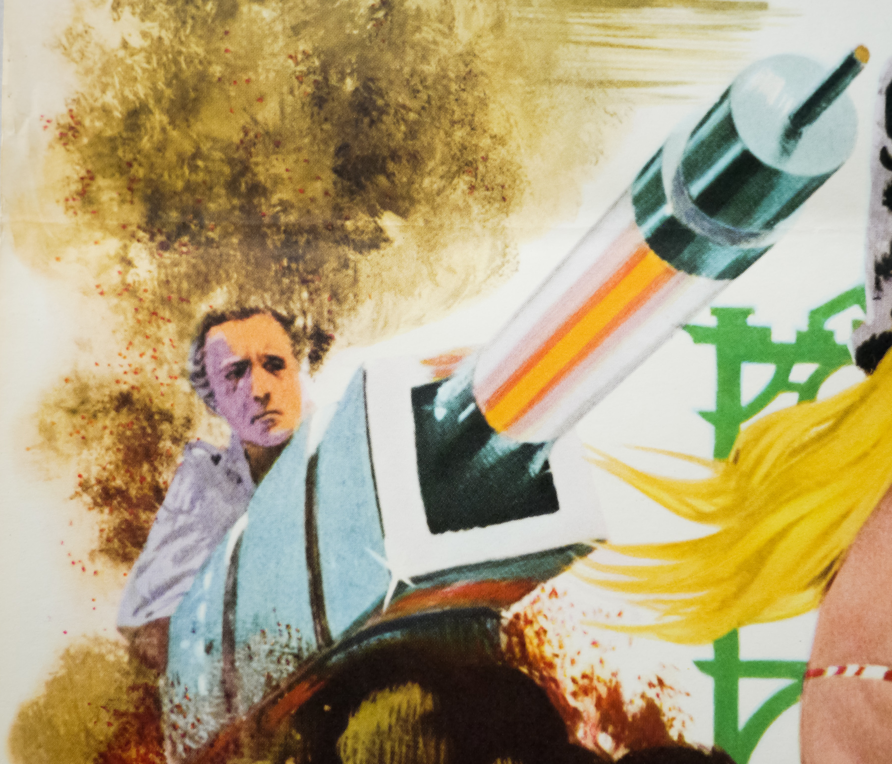
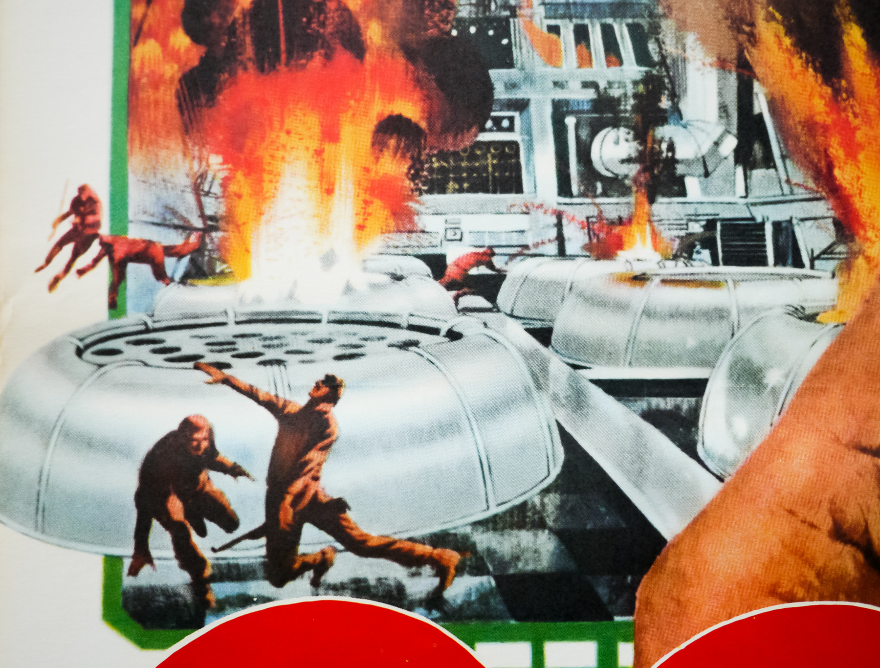
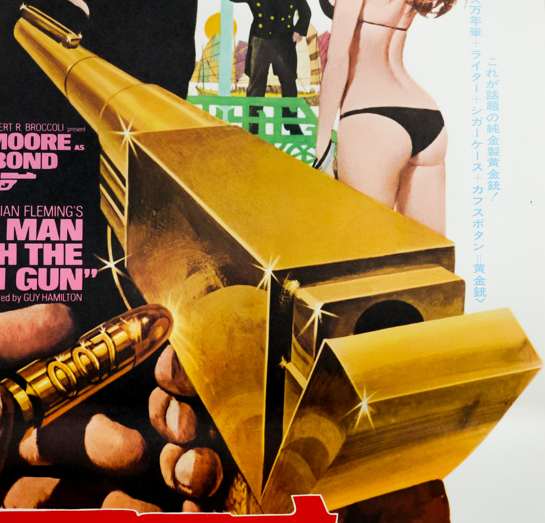
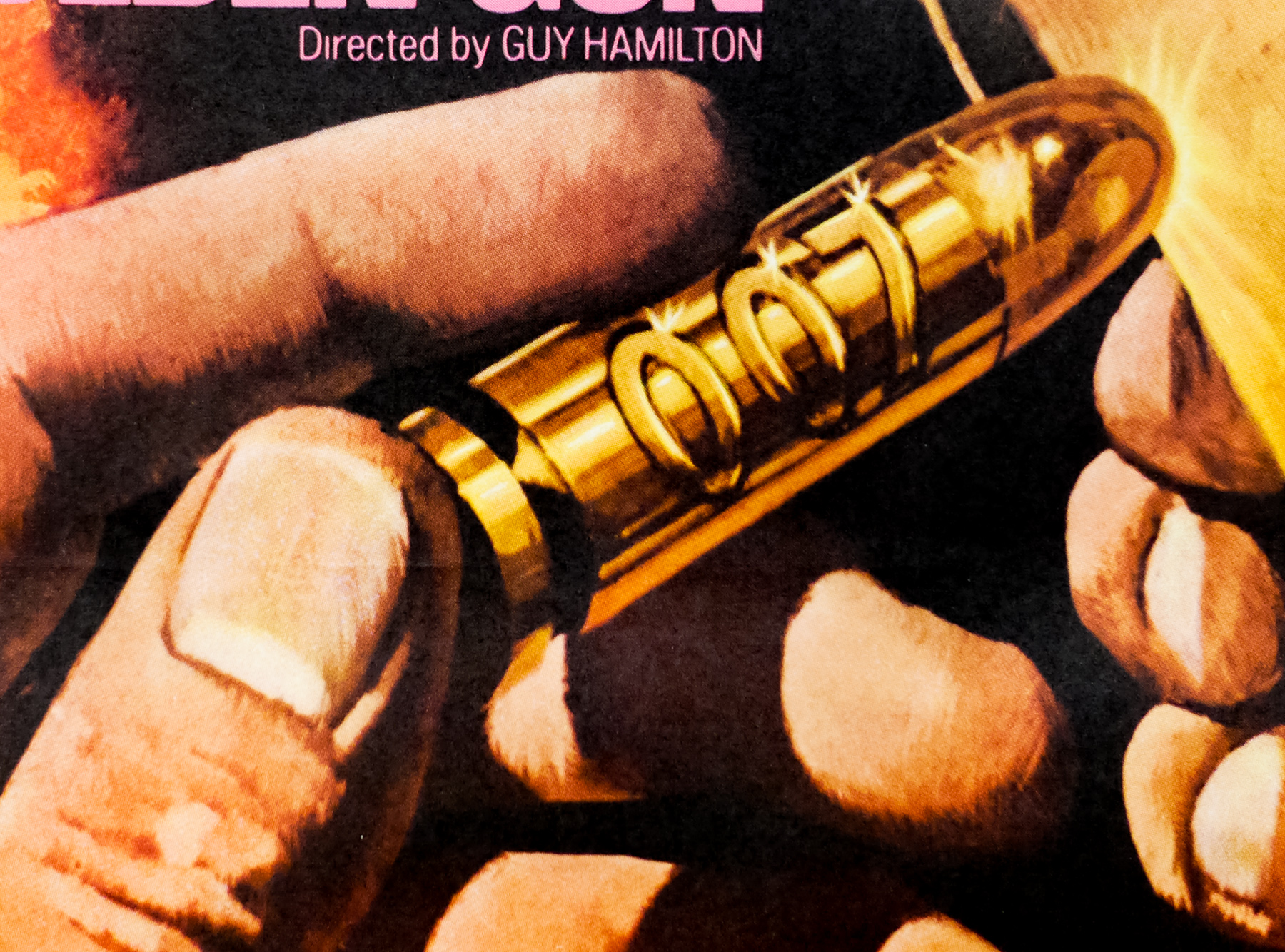
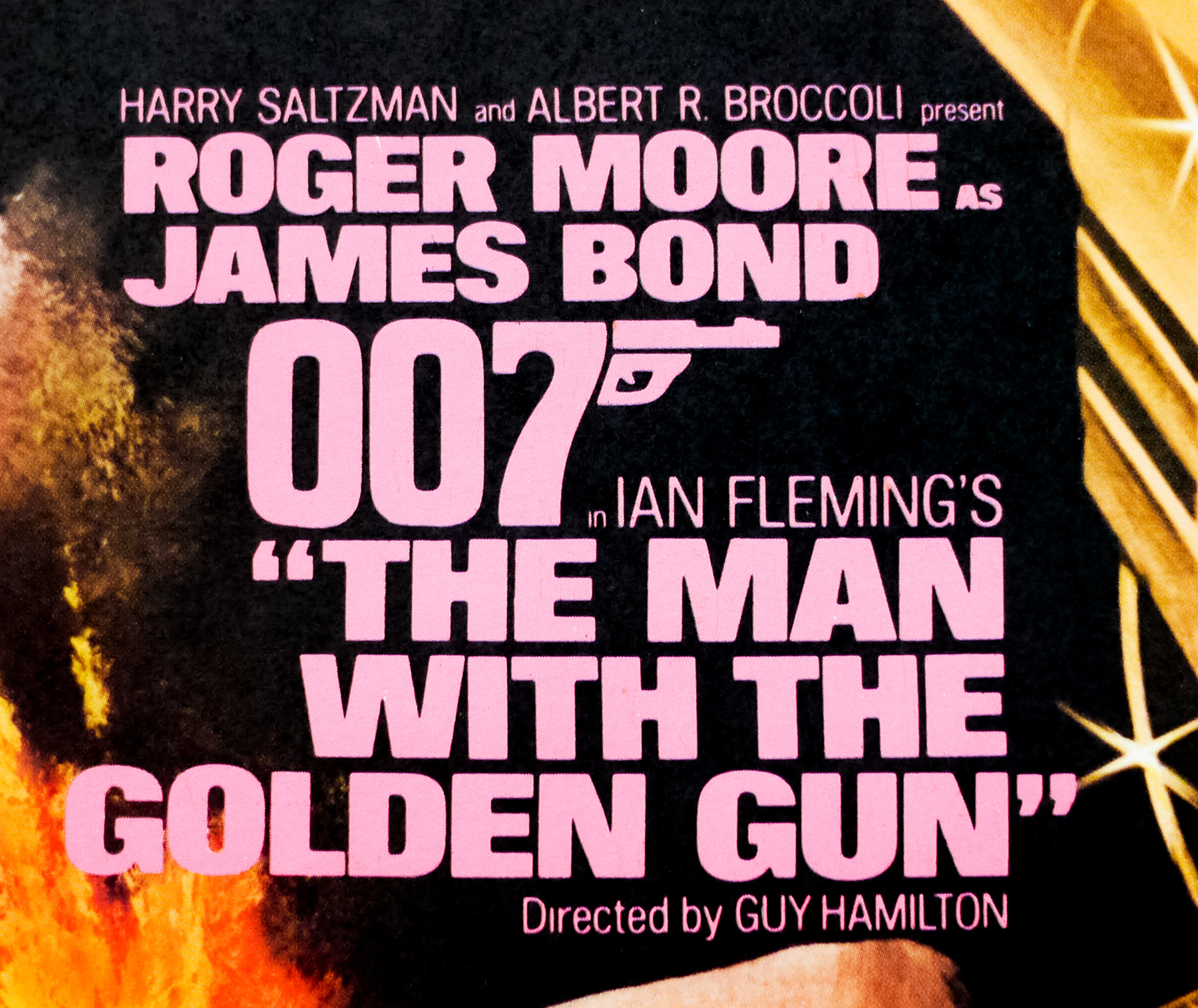
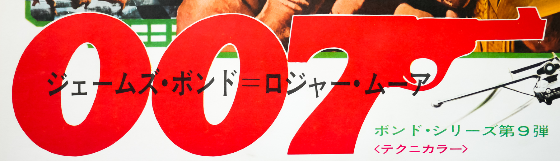
This is the Japanese B2 poster for the release of The Man With the Golden Gun, the ninth James Bond film and the second to star Roger Moore as the legendary secret agent. It’s definitely one of the weaker films in the long-running series and certainly not Moore’s finest hour, but it has several elements that make it worth watching, including a host of interesting far-eastern locales, strong production design and a very memorable bad guy in the shape of Christopher Lee‘s Scaramanga. Guy Hamilton returned as director for the fourth and last time in the series and the script, written by Richard Maibaum and Tom Mankiewicz, takes place amidst the climate of energy worries that followed the 1973 oil crisis. It also reflected the then craze for martial arts movies that followed the release of films like Bruce Lee’s Enter the Dragon with several kung-fu sequences and exotic locations.
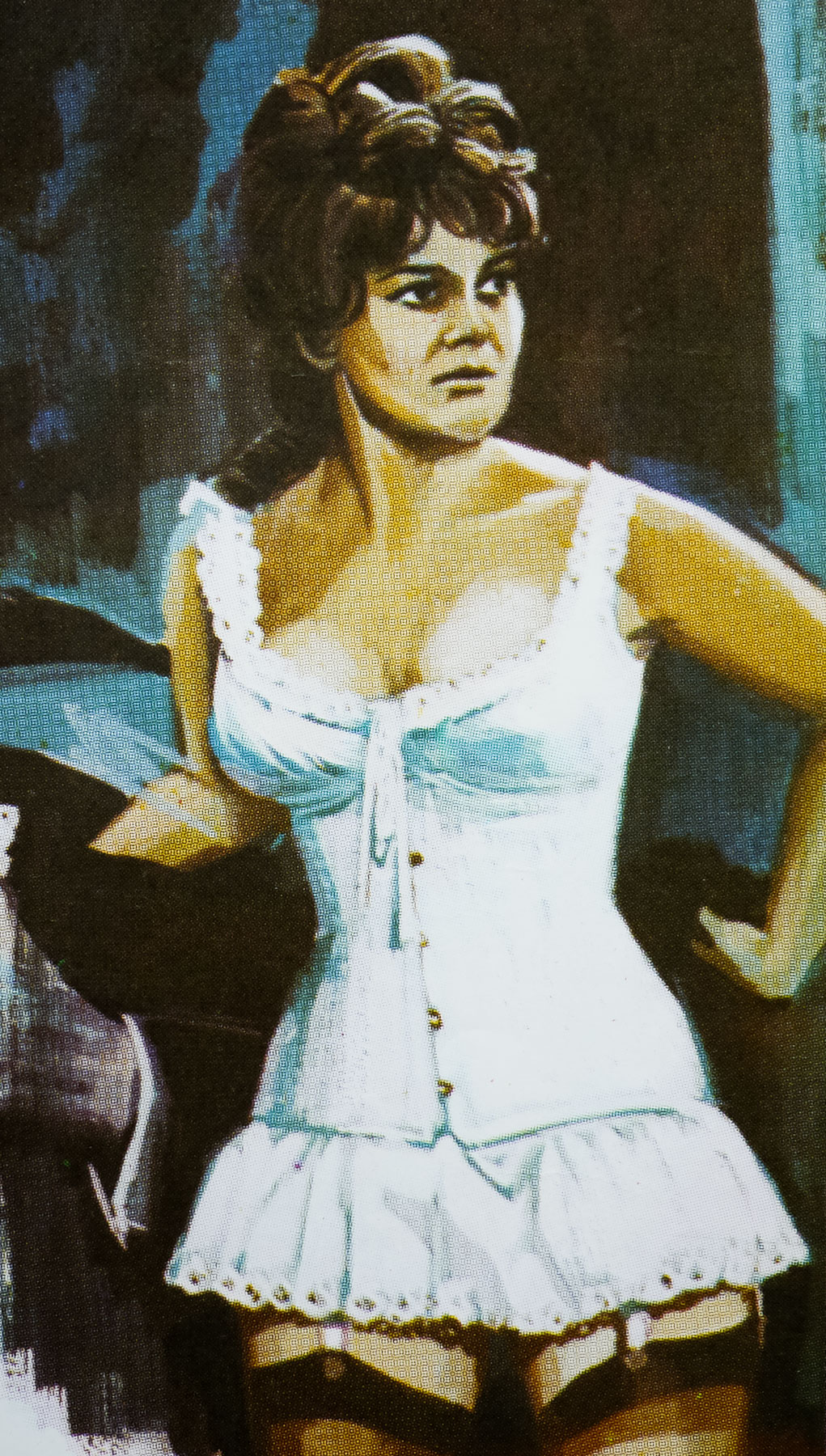
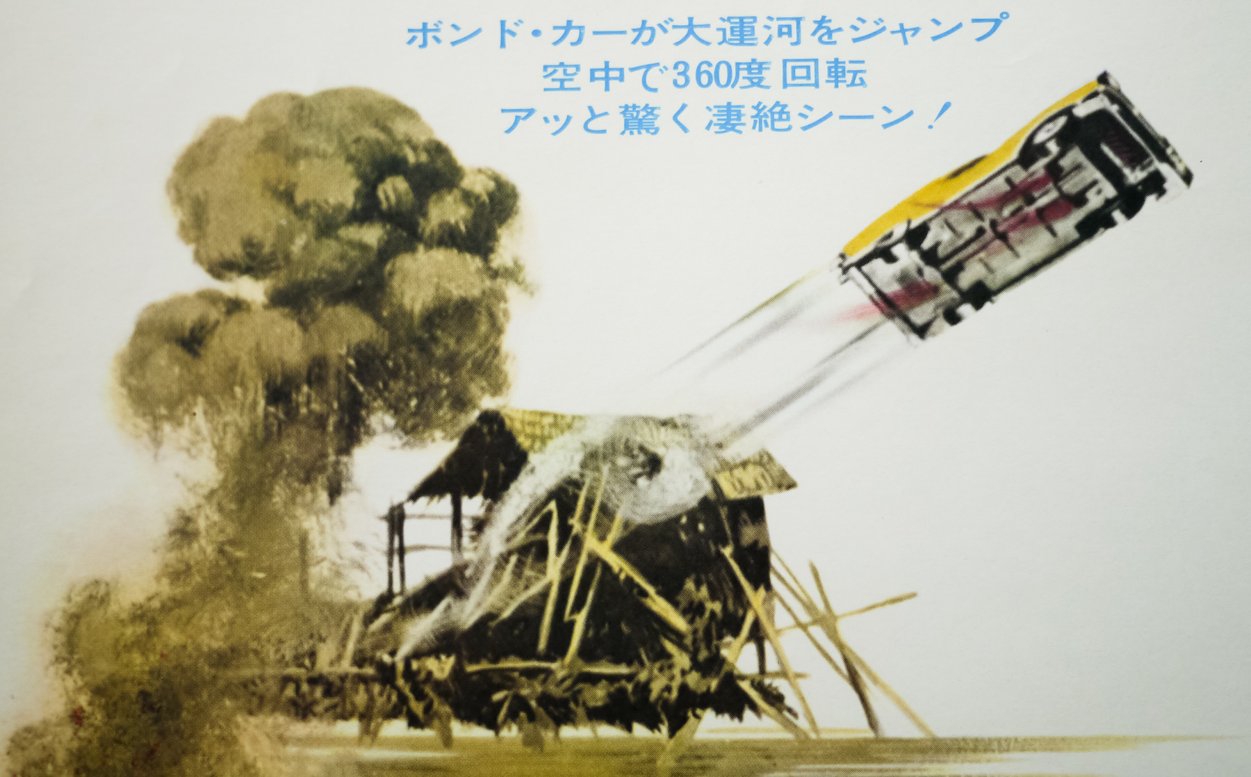
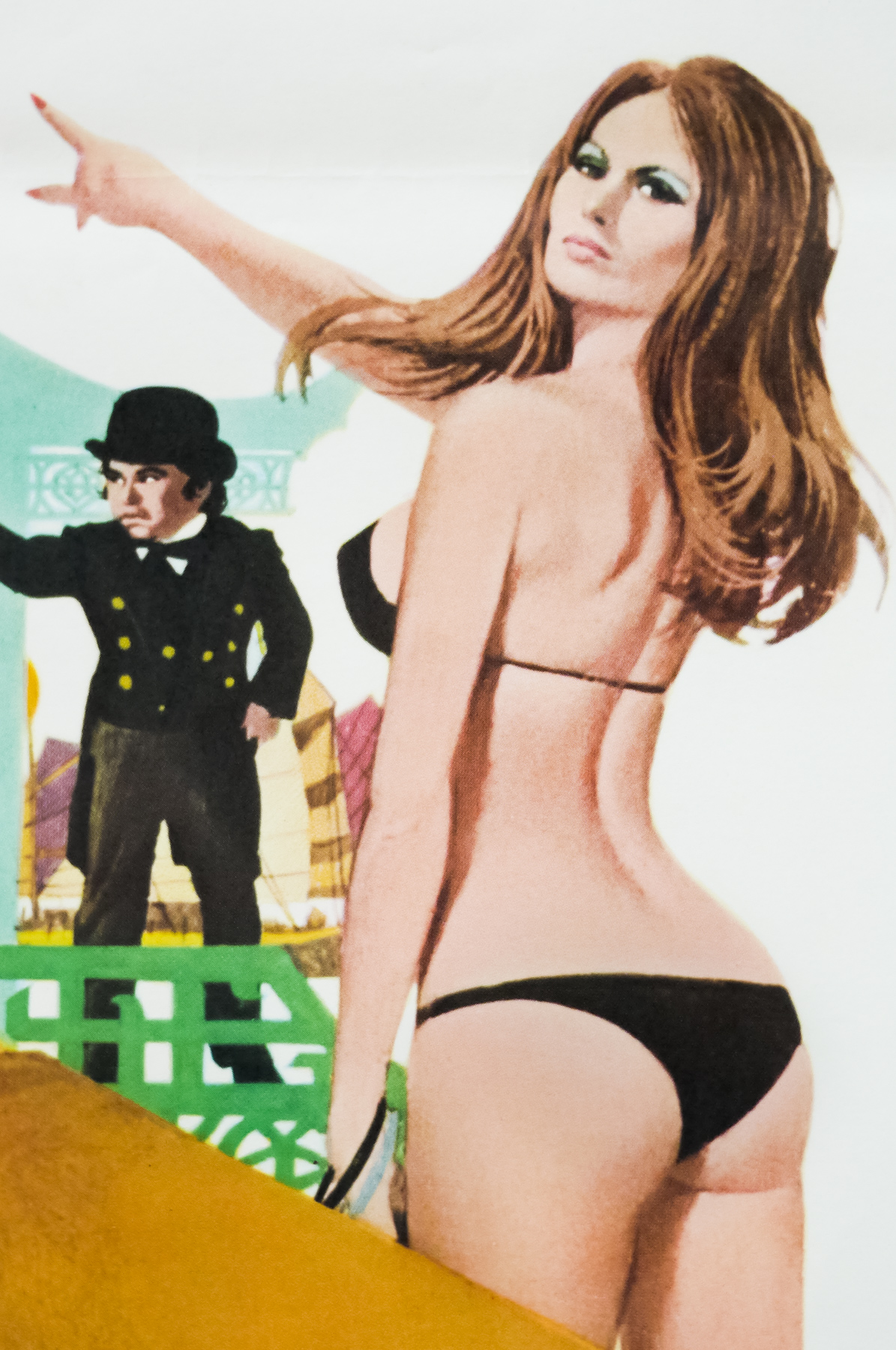
The story starts as MI6 receive a golden bullet with 007 etched into it, leading them to believe that Bond’s life is at threat from the notorious international assassin Scaramanga so they decide to remove him from active duty. The agent was on the trail of a scientist who it is thought could help with the energy crisis and he is frustrated to have been stopped in his pursuit so he sets off to find Scaramanga without official approval. Bond follows a trail of assassinations which lead him from Macau to Bangkok and eventually to Scaramanga’s private island hideout where he discovers that the master assassin has an interest in solar power. Soon Bond is challenged to a duel to the death and he must use his wits to survive the traps set around Scaramanga’s hideout. Dwarf actor Hervé Villechaize has a memorable role as the assassin’s servant Nick Nack, and Clifton James returns as the (perhaps ill-advised) comic relief figure of Sheriff J.W. Pepper, as featured in Live and Let Die.
The artwork on this poster also features on the US one sheet and was painted by Robert McGinnis who is responsible for some of the best James Bond posters, including Thunderball, Live and Let Die and Diamonds are Forever as well as multiple other classic posters from the 60s, 70s and 80s. He was born in Cincinatti, Ohio in 1926 and was given an apprenticeship at Walt Disney studios before studying fine art at Ohio State University. After serving in the Merchant Marines during World War II, he started work in the advertising industry and later moved into painting book jackets for several notable authors, as well as editorial artwork for the likes of Good Housekeeping, TIME and The Saturday Evening Post. McGinnis’ first film poster was the now iconic one sheet for Breakfast at Tiffany’s, painted in 1962, and he went on to paint over 40 others during his career, including one for The Incredibles in 2004.
To see the other posters I’ve collected that were painted by McGinnis click here and to see the other James Bond posters in the Film on Paper collection click here.