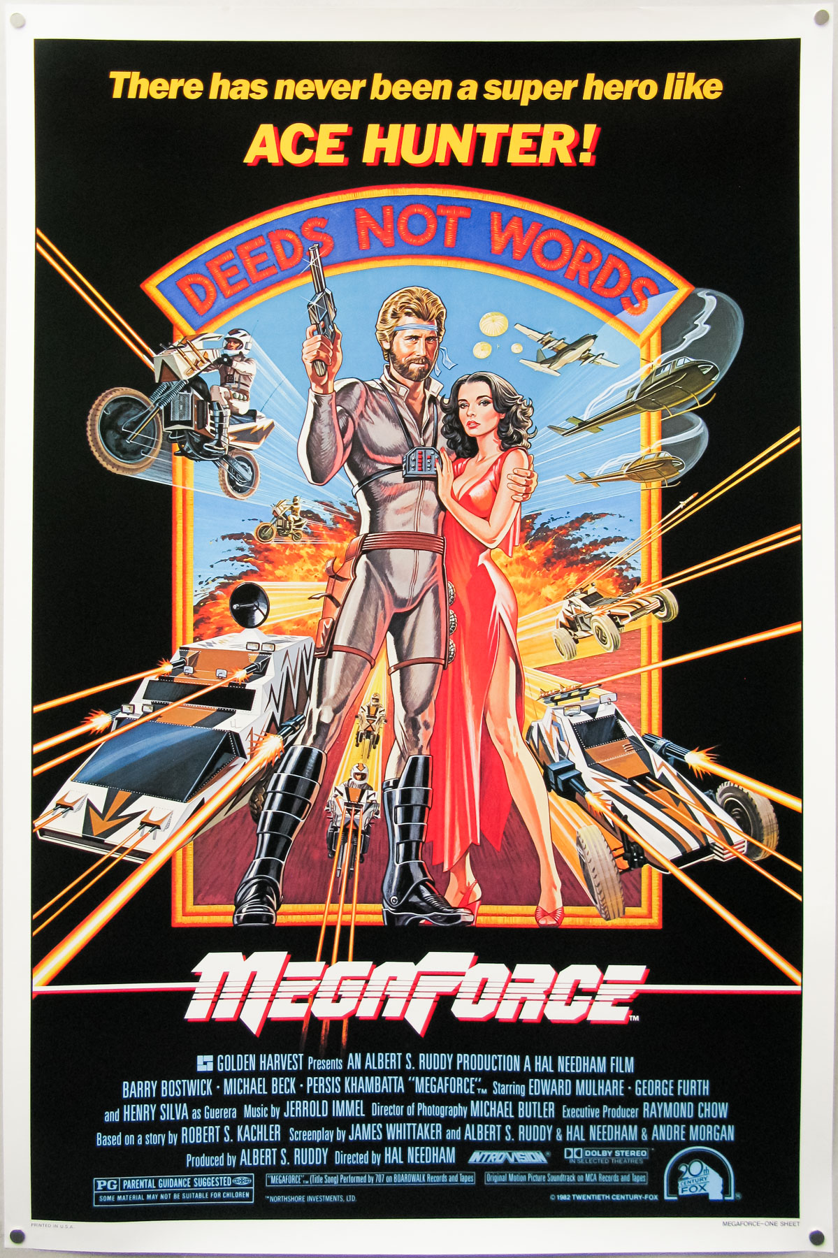
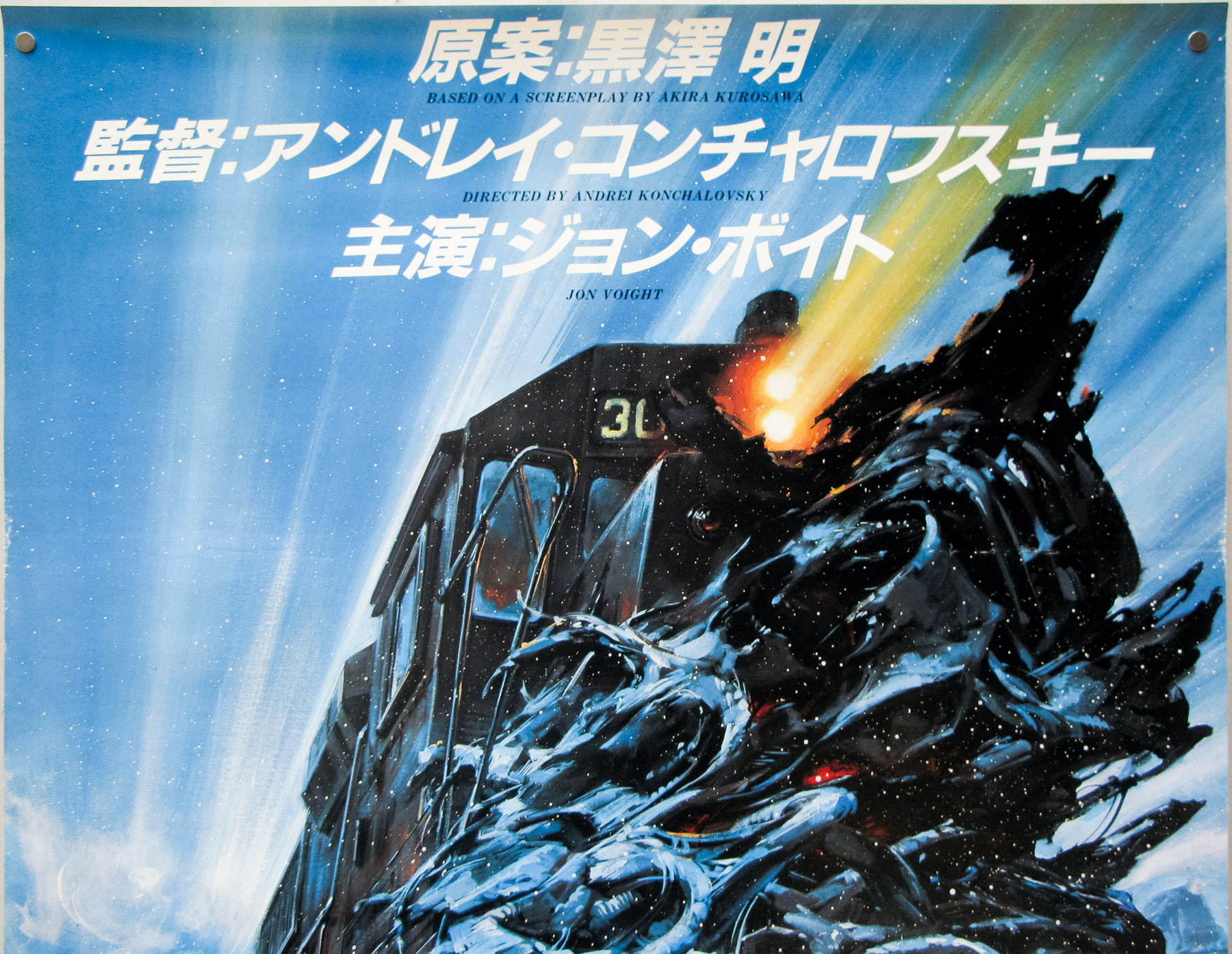
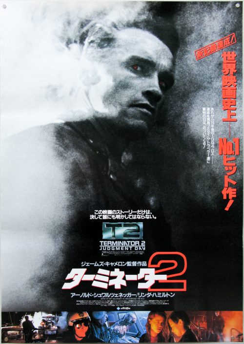
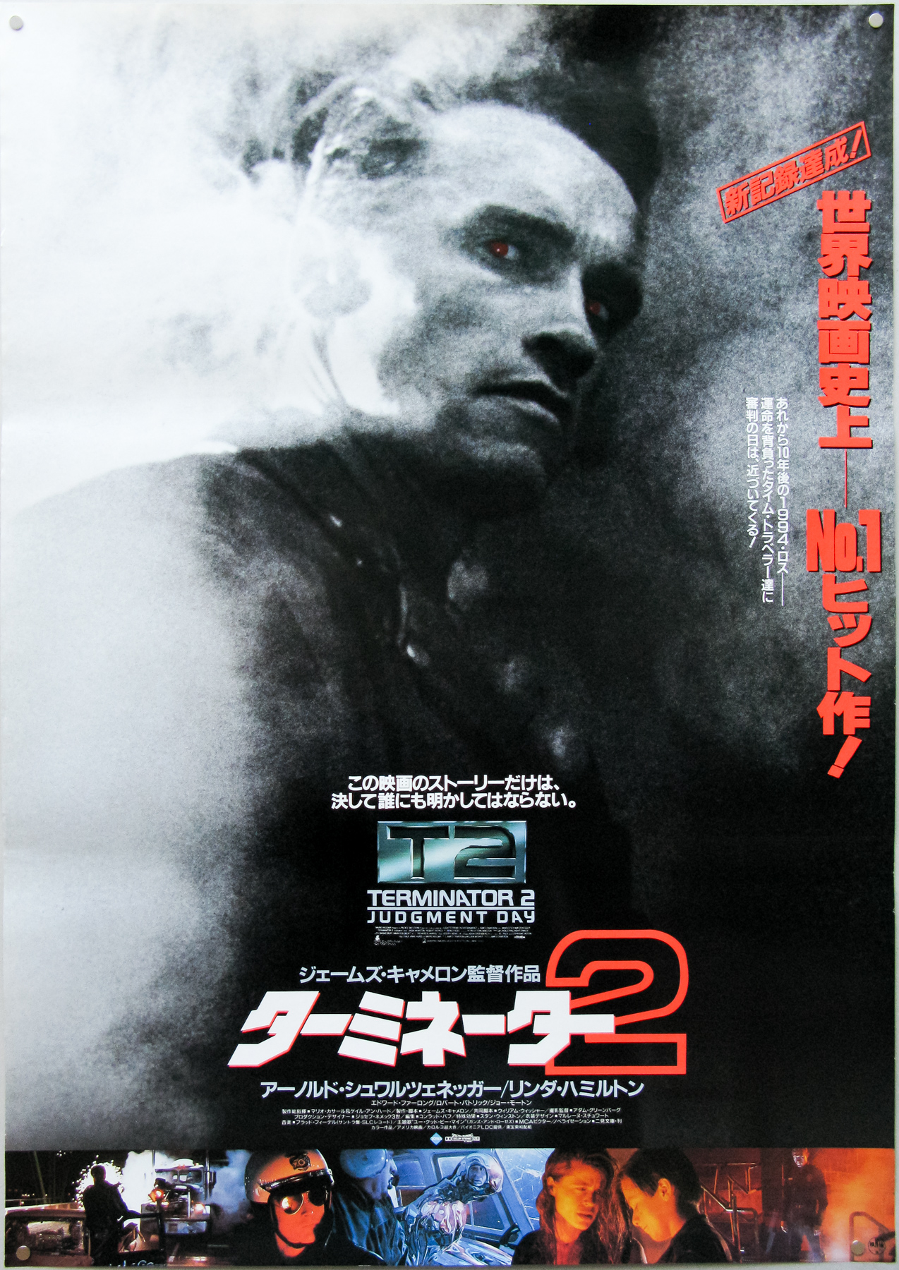
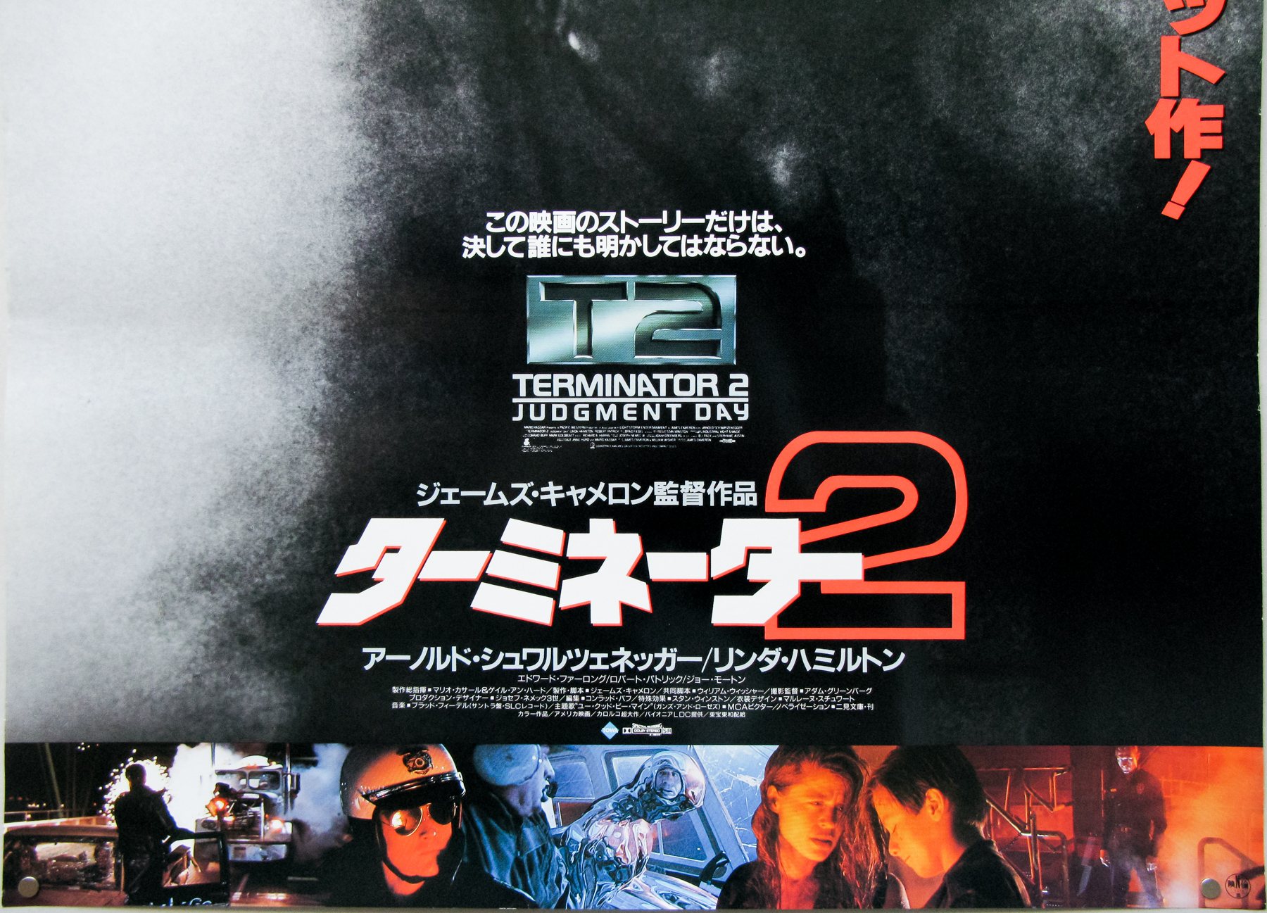
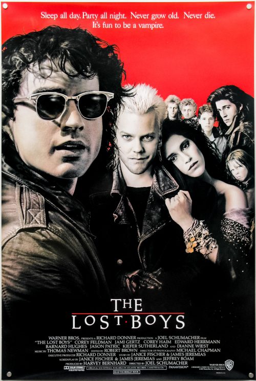
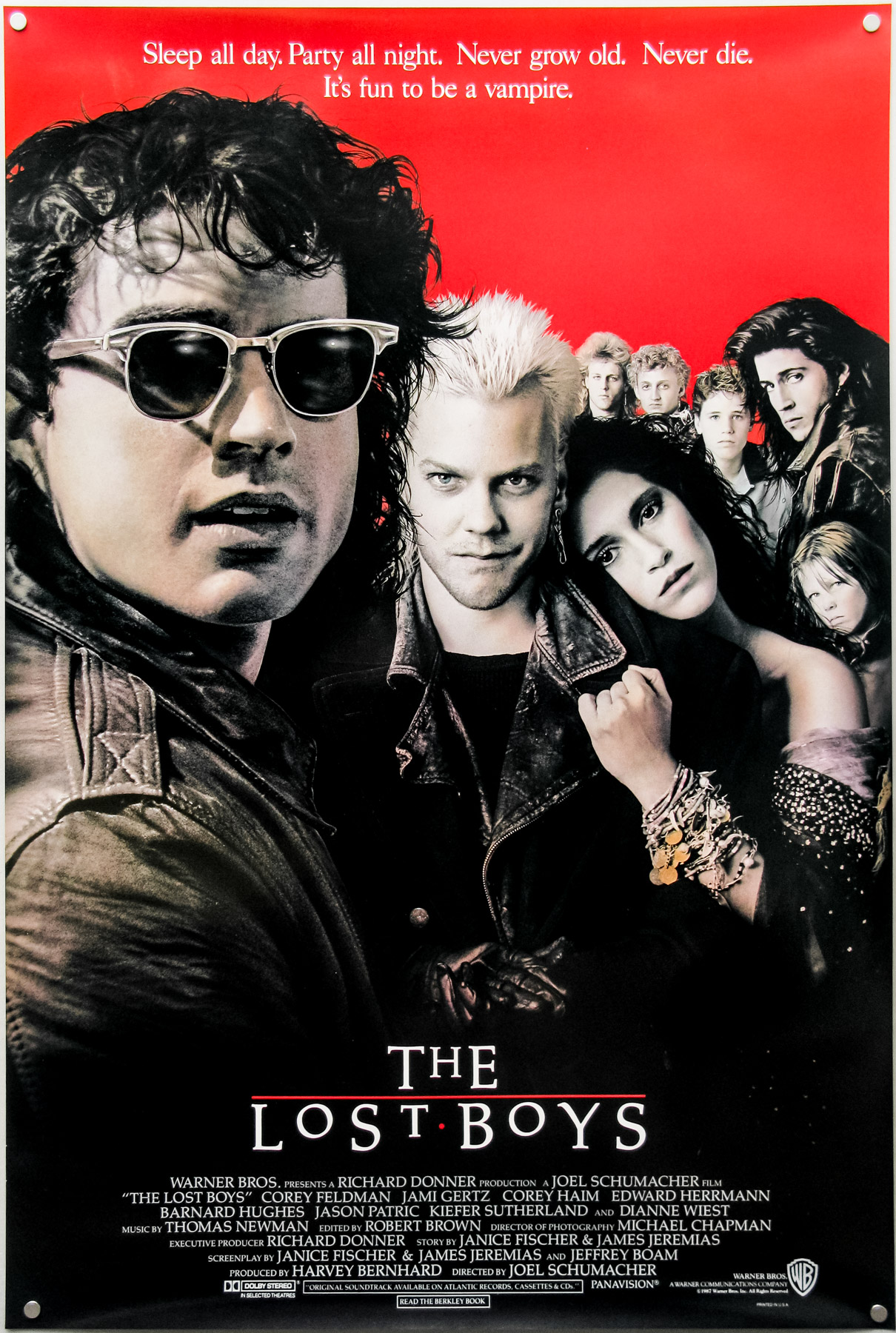
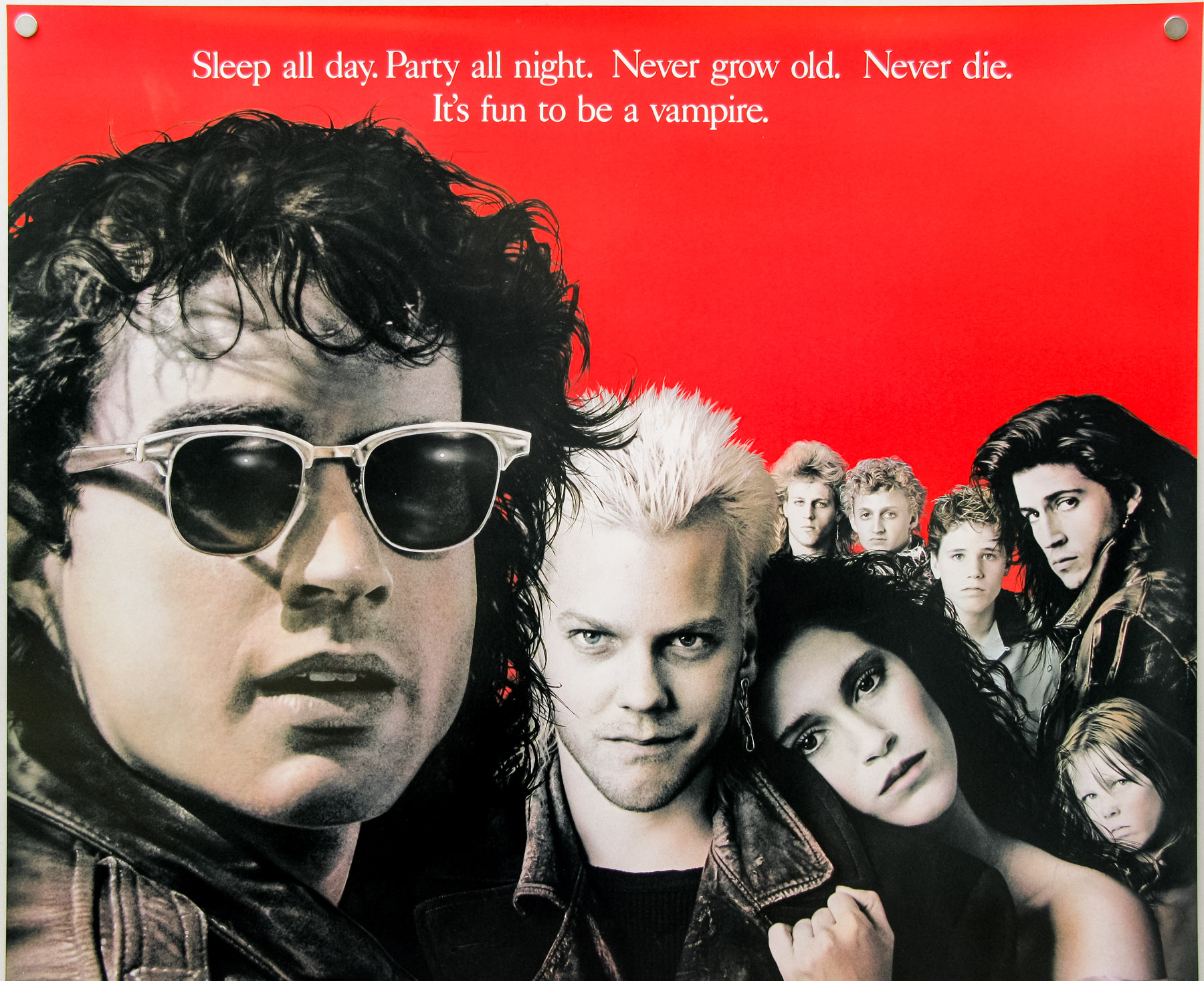
- Title
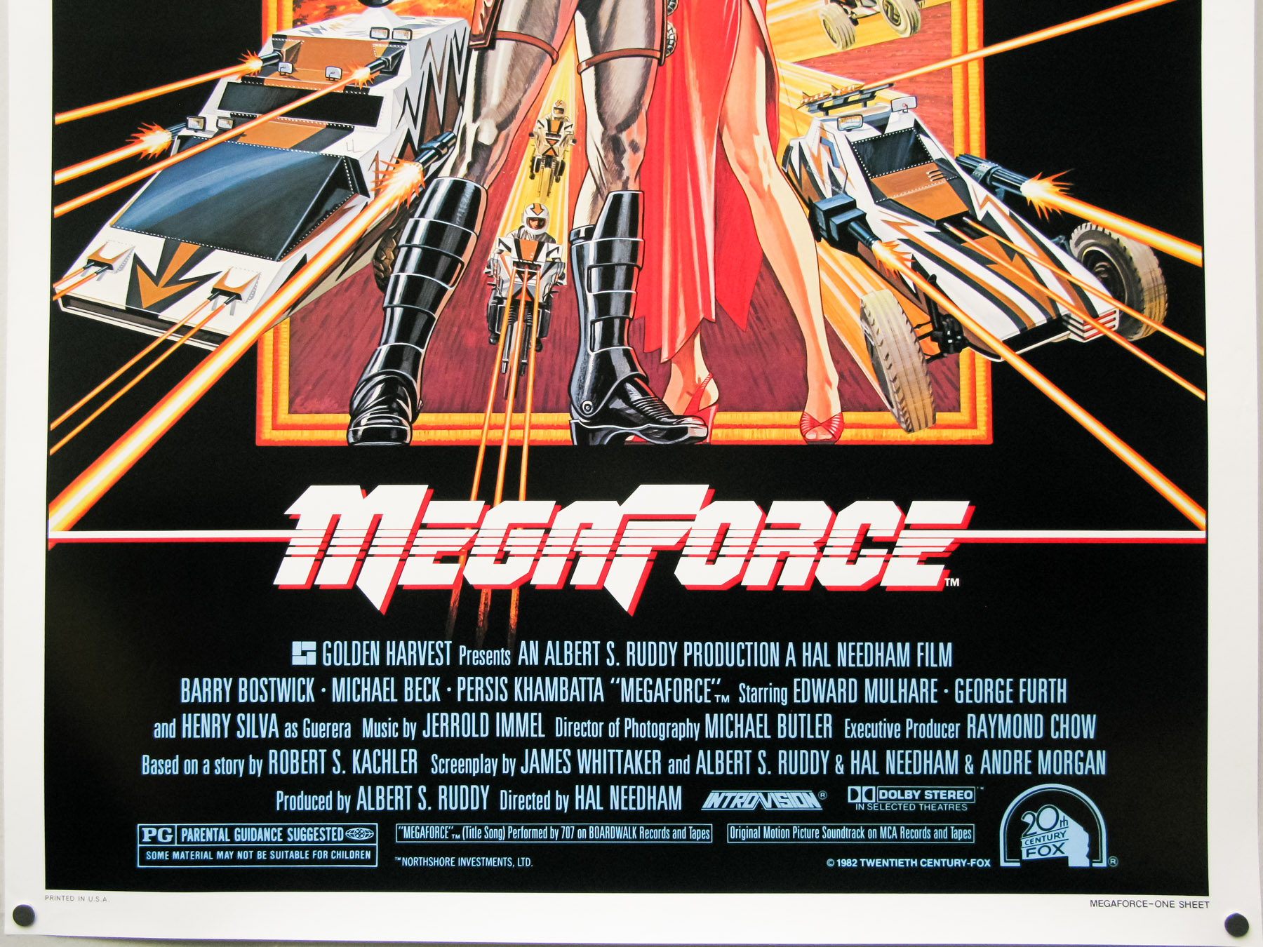
- Megaforce
- AKA
- --
- Year of Film
- 1982
- Director
- Hal Needham
- Starring
- Barry Bostwick, Persis Khambatta, Michael Beck, Edward Mulhare, Evan C. Kim, Ralph Wilcox, Henry Silva
- Origin of Film
- USA
- Genre(s) of Film
- Barry Bostwick, Persis Khambatta, Michael Beck, Edward Mulhare, Evan C. Kim, Ralph Wilcox, Henry Silva,
- Type of Poster
- One sheet
- Style of Poster
- --
- Origin of Poster
- USA
- Year of Poster
- 1982
- Designer
- Unknown
- Artist
- Unknown
- Size (inches)
- 27 1/16" x 41"
- SS or DS
- SS
- NSS #
- --
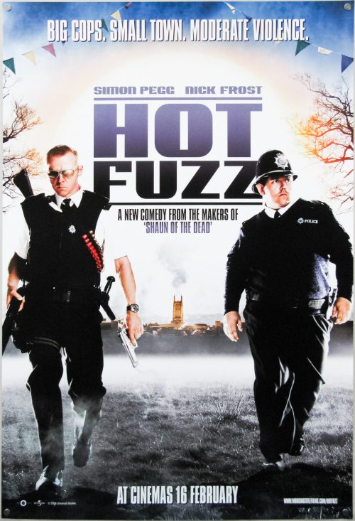
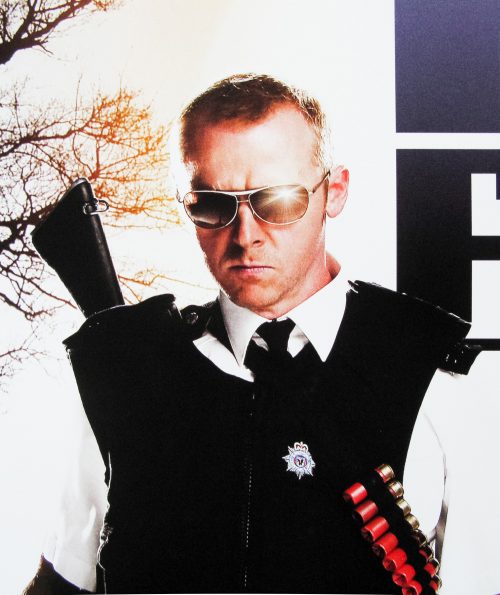
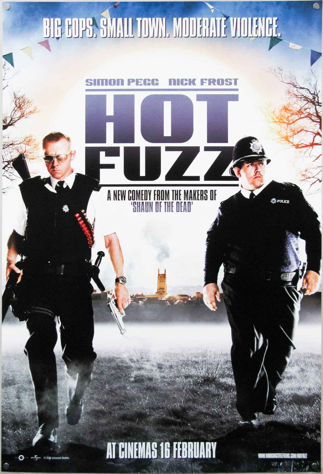
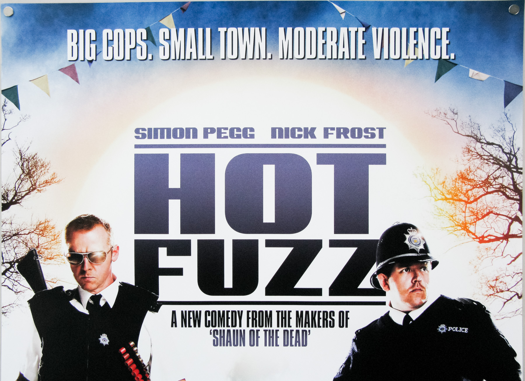
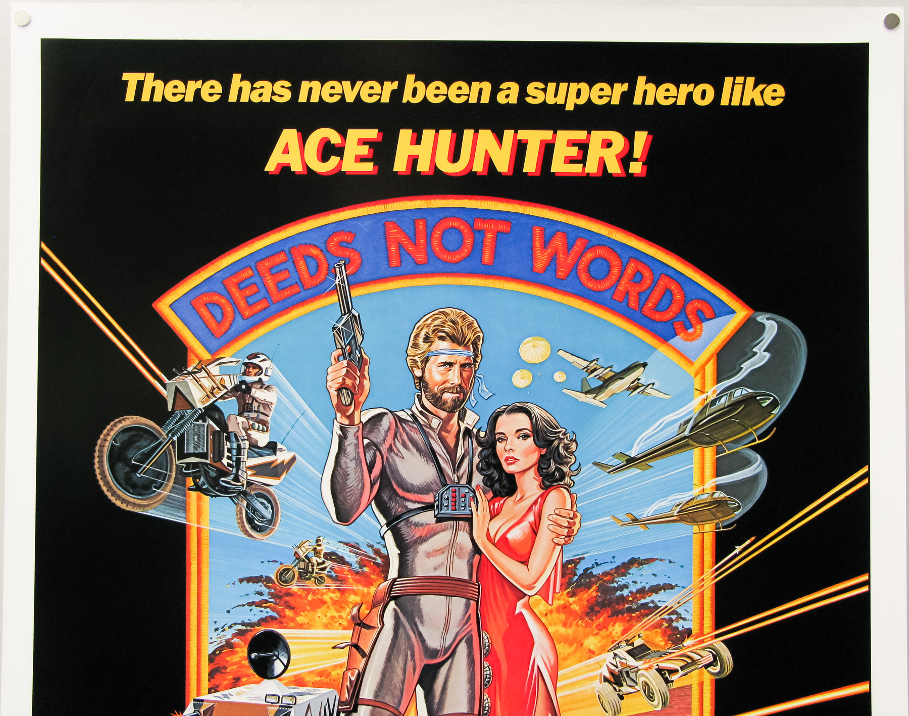
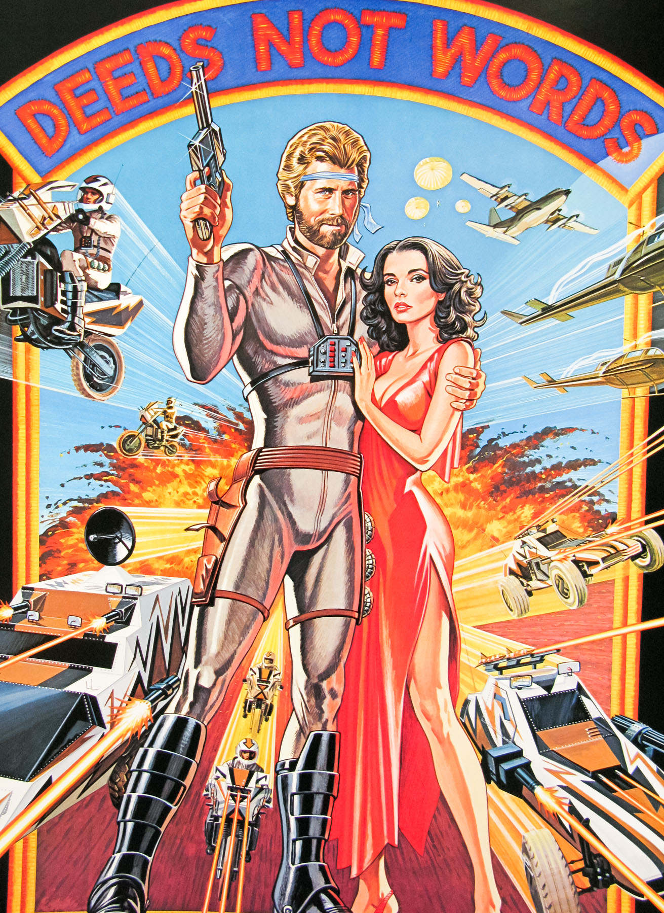
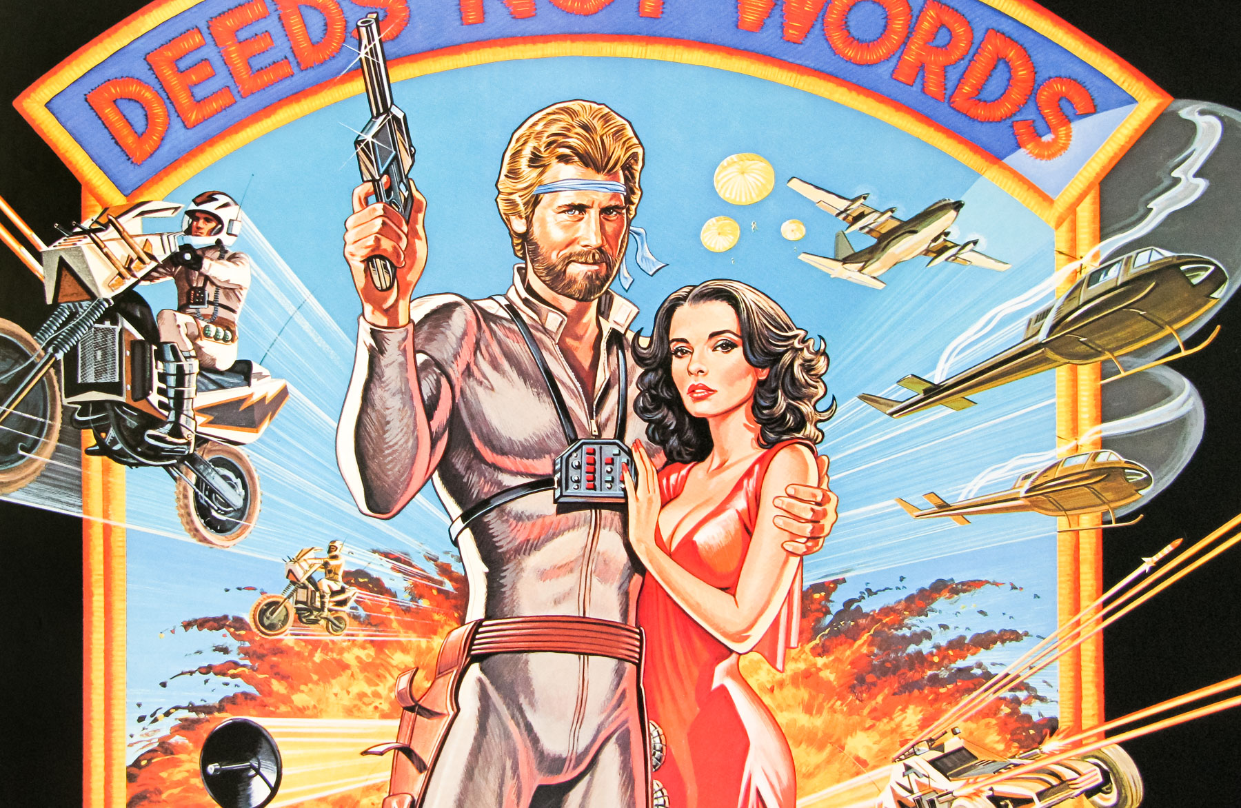
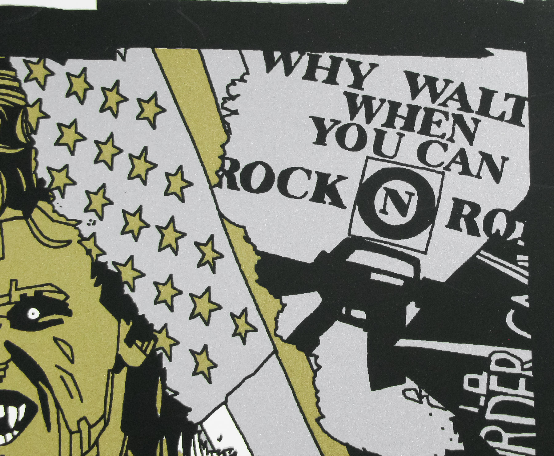
- Tagline
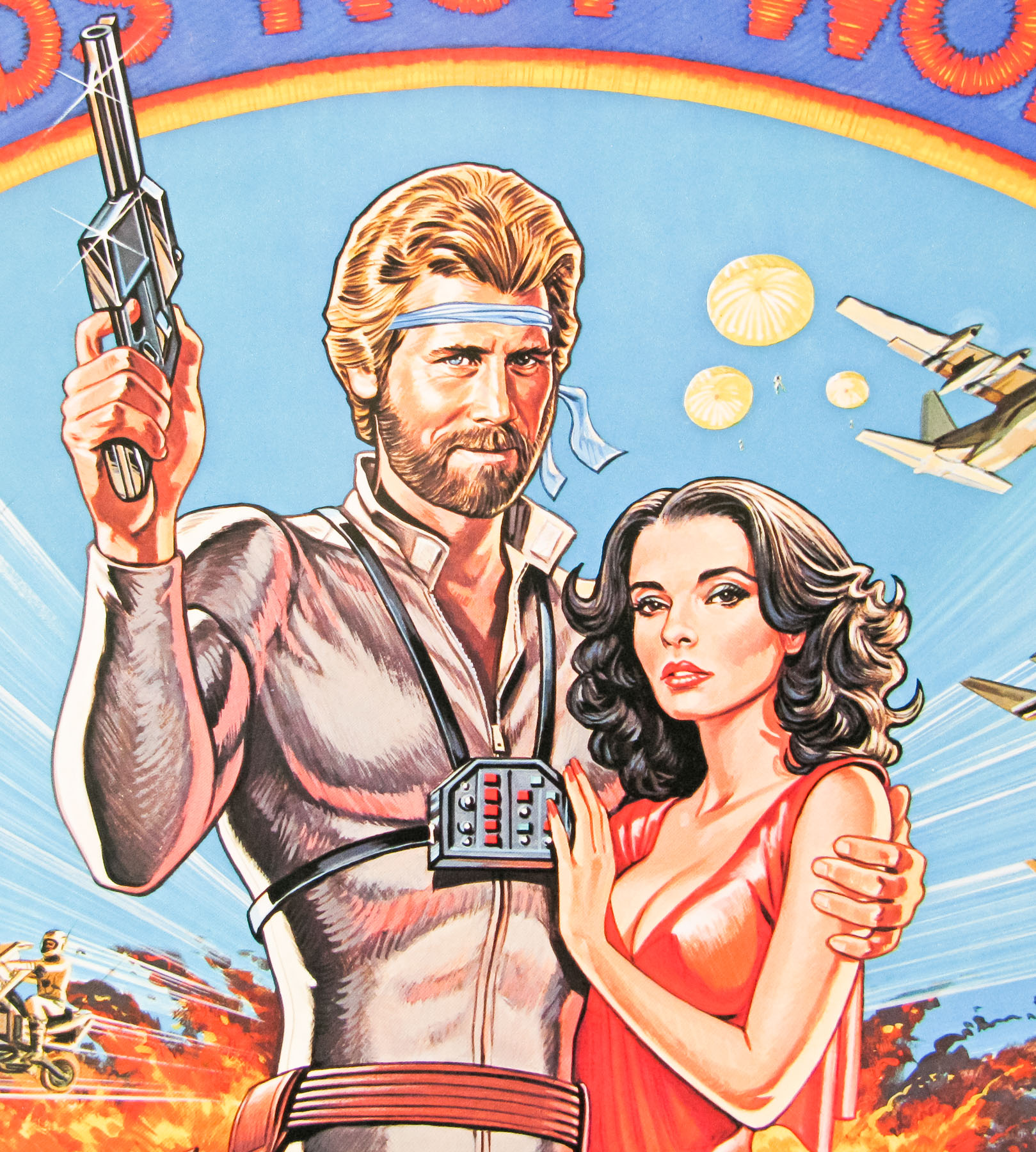
- There has never been a super hero like ACE HUNTER! | Deeds Not Words
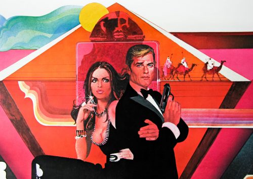
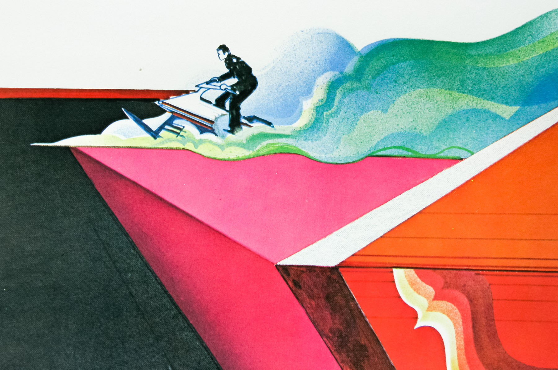
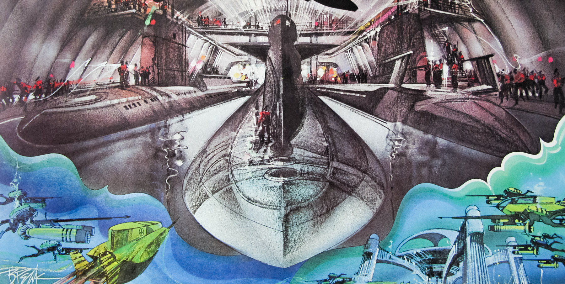
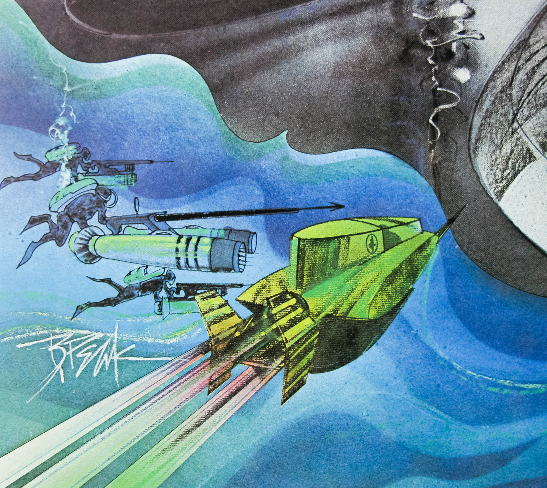
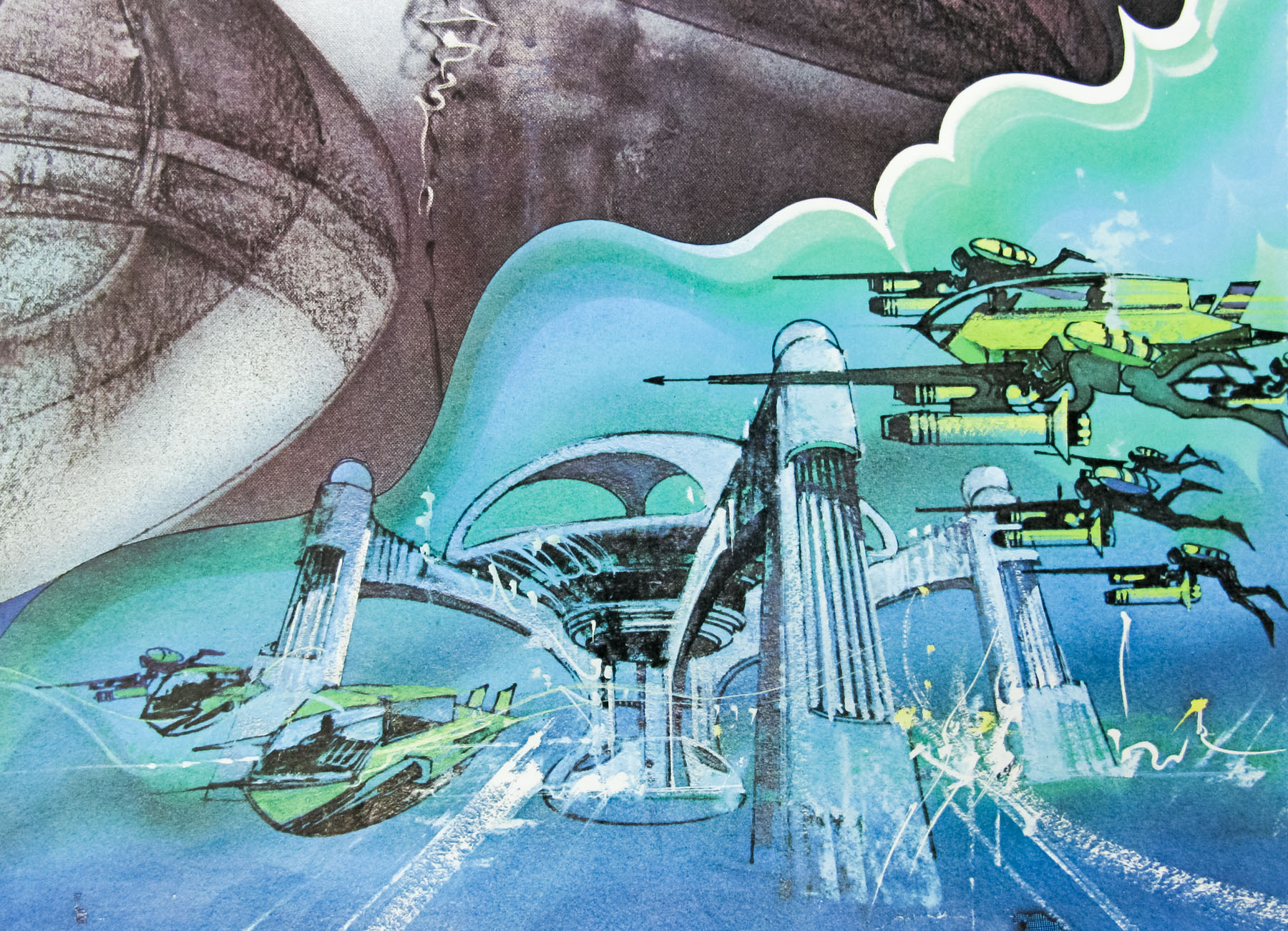
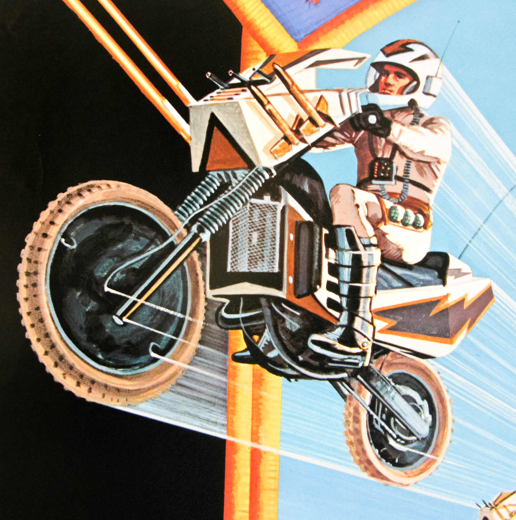
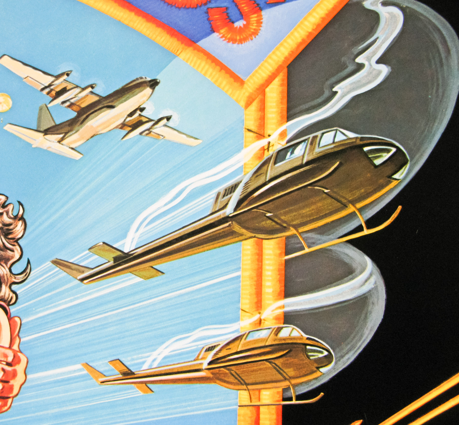
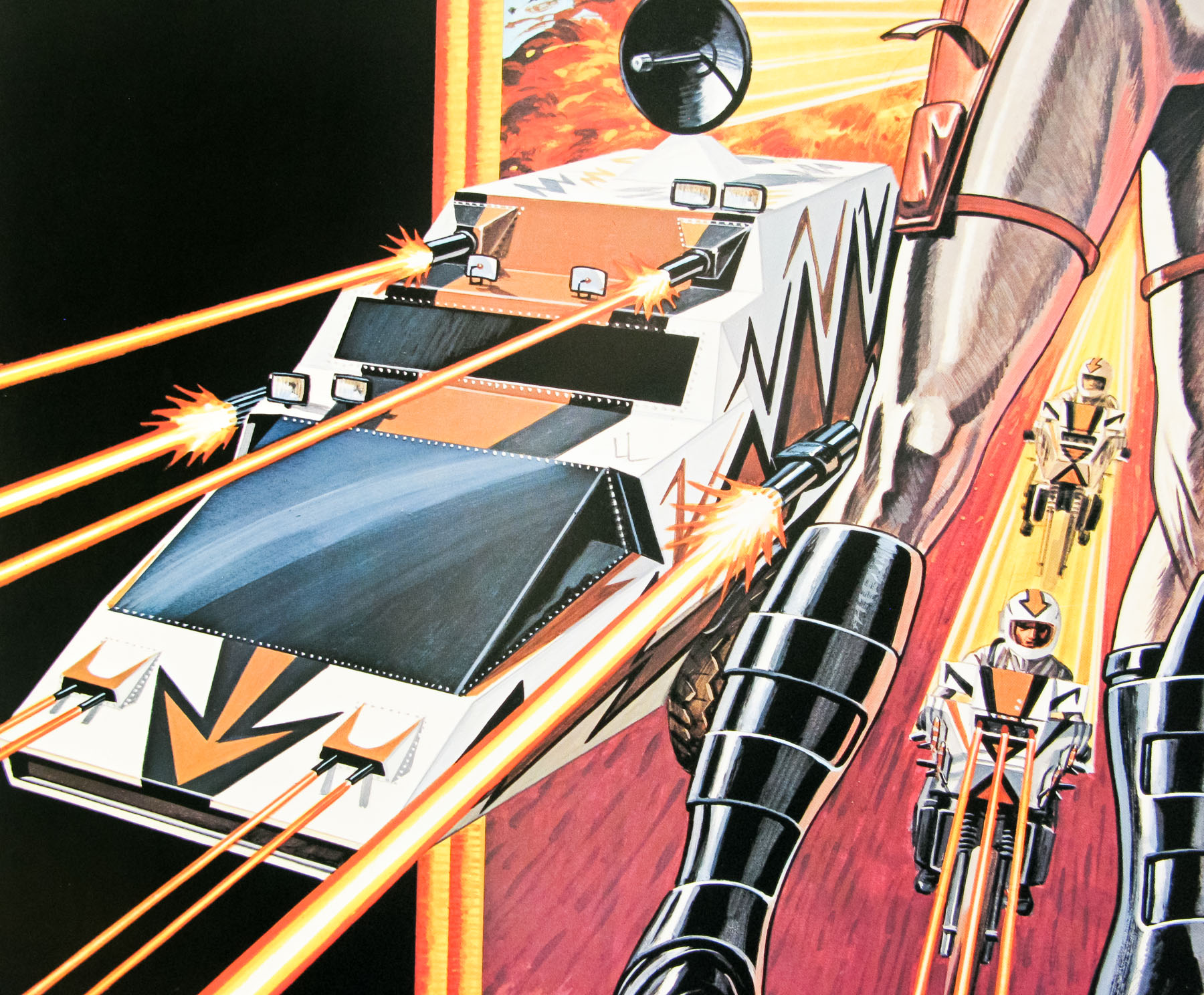
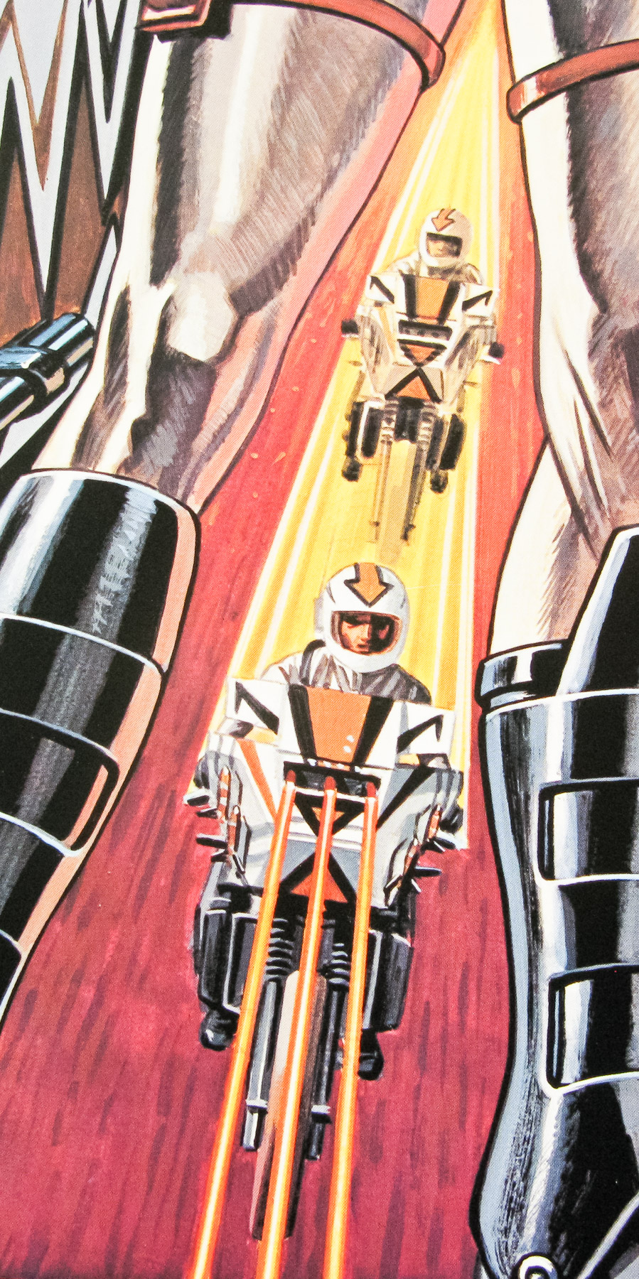
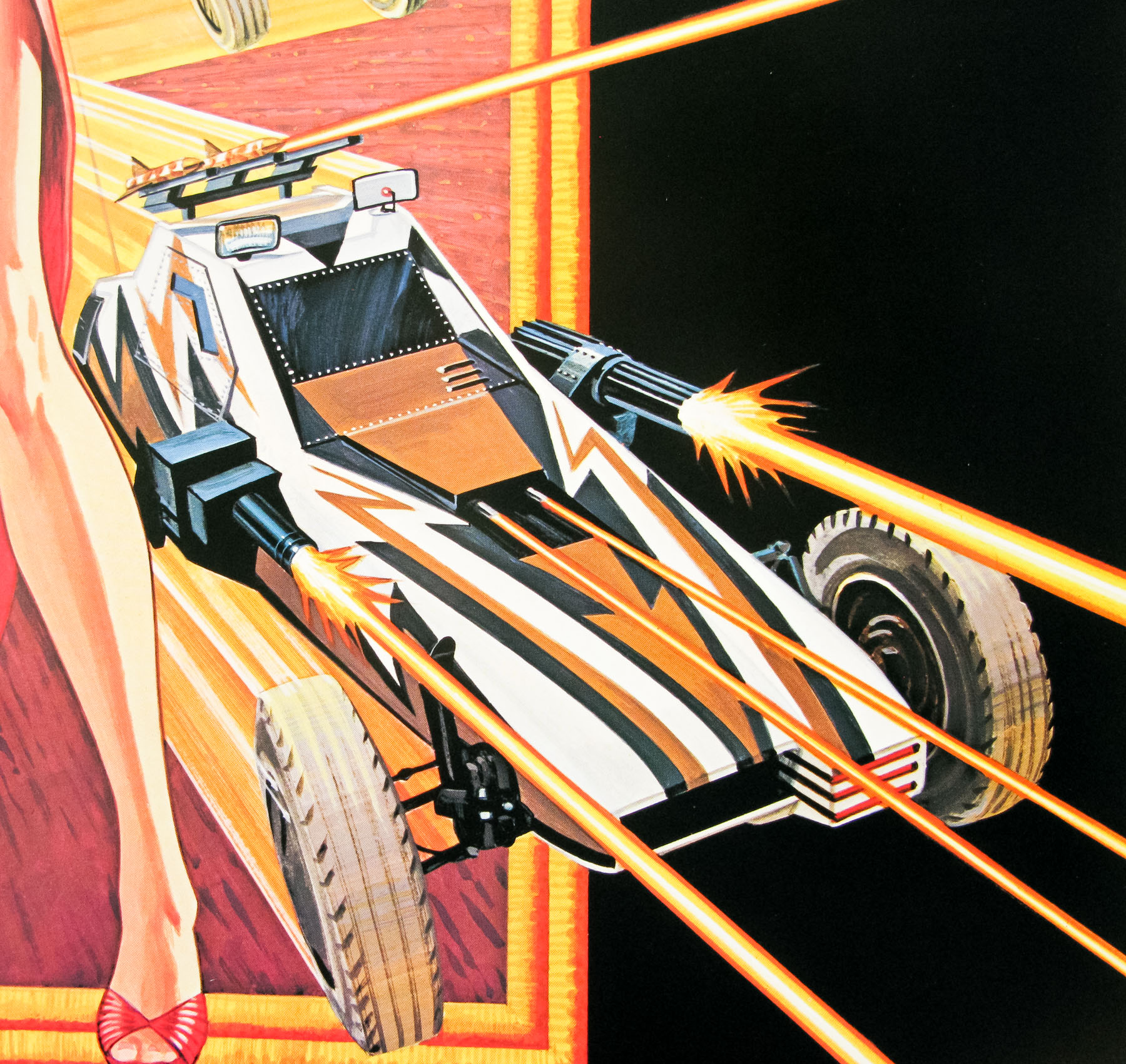
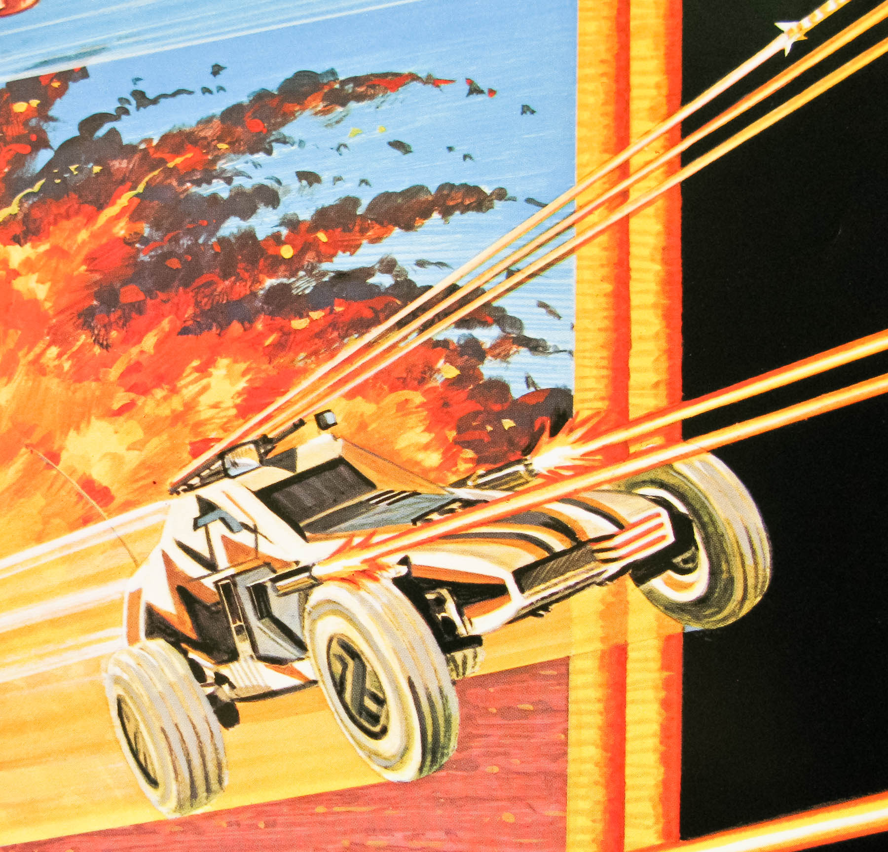
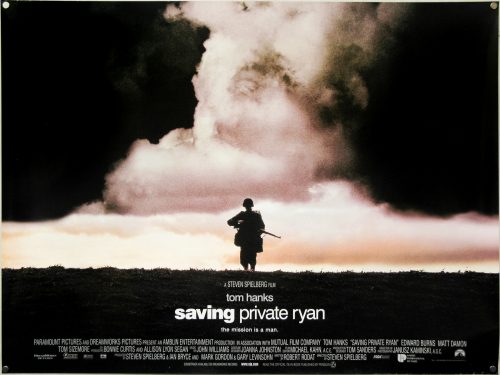
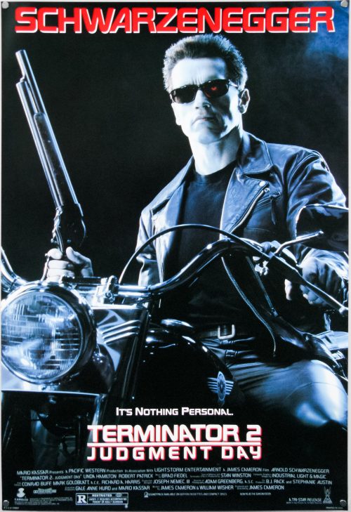
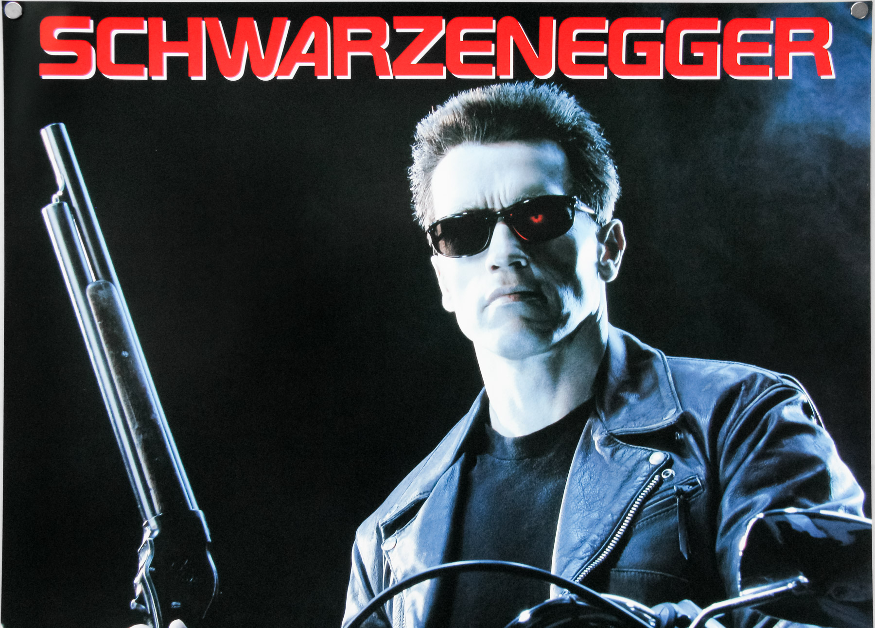
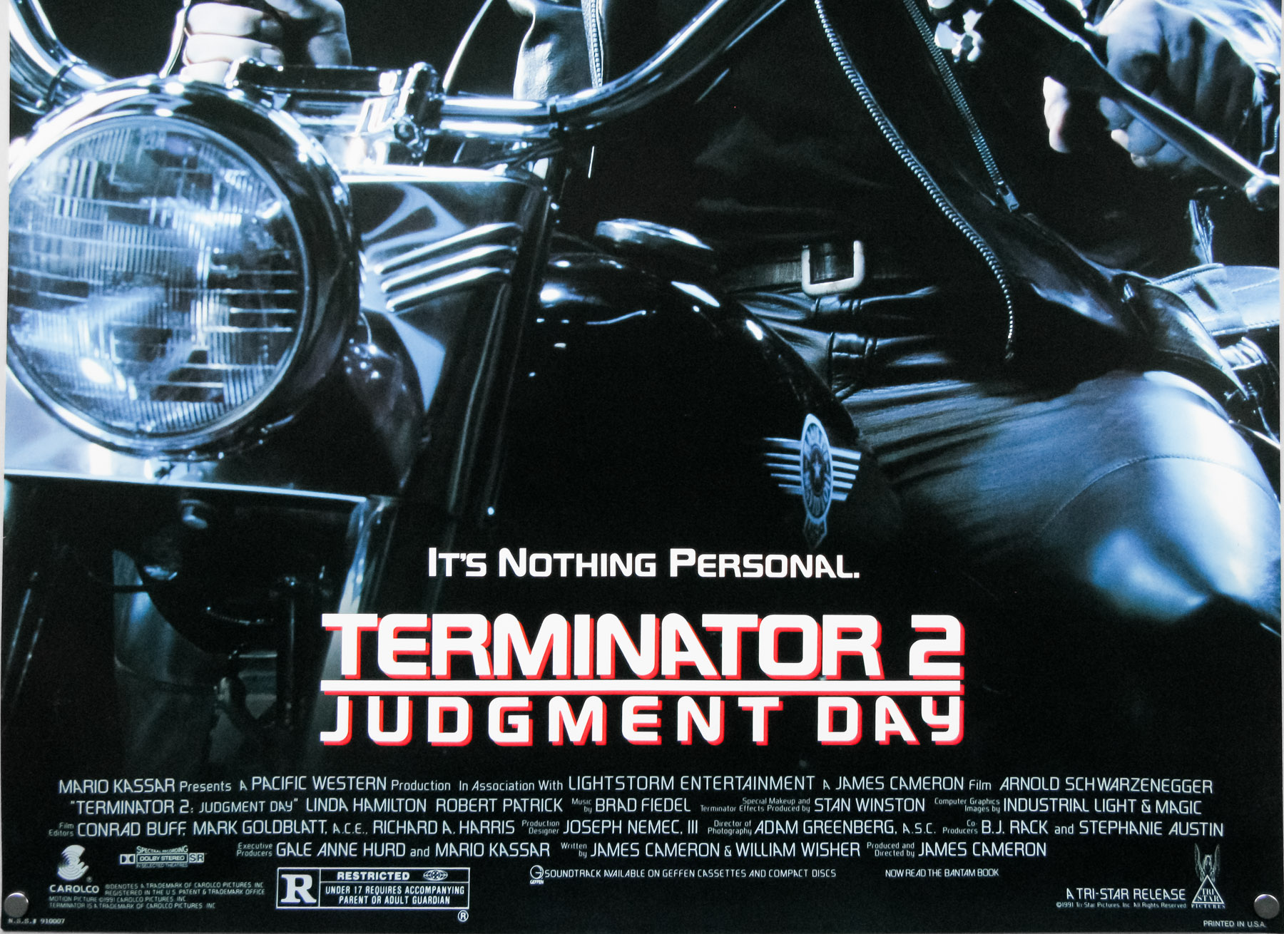
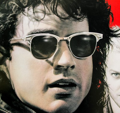
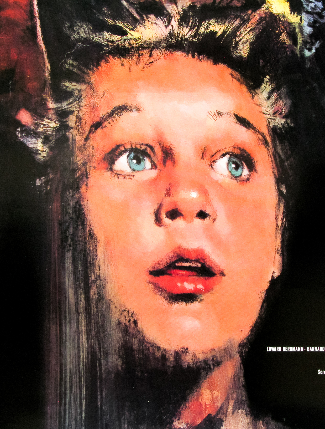
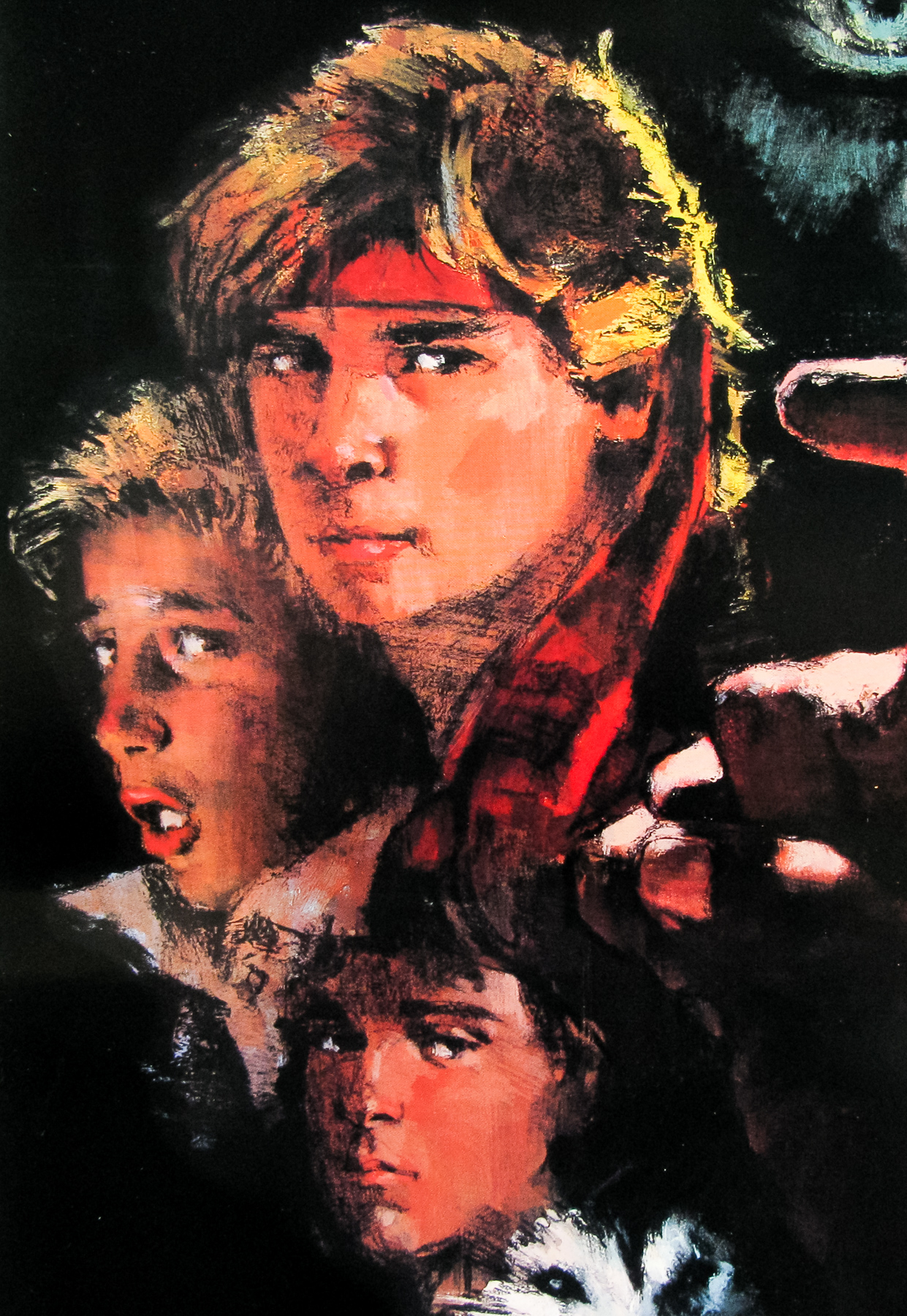
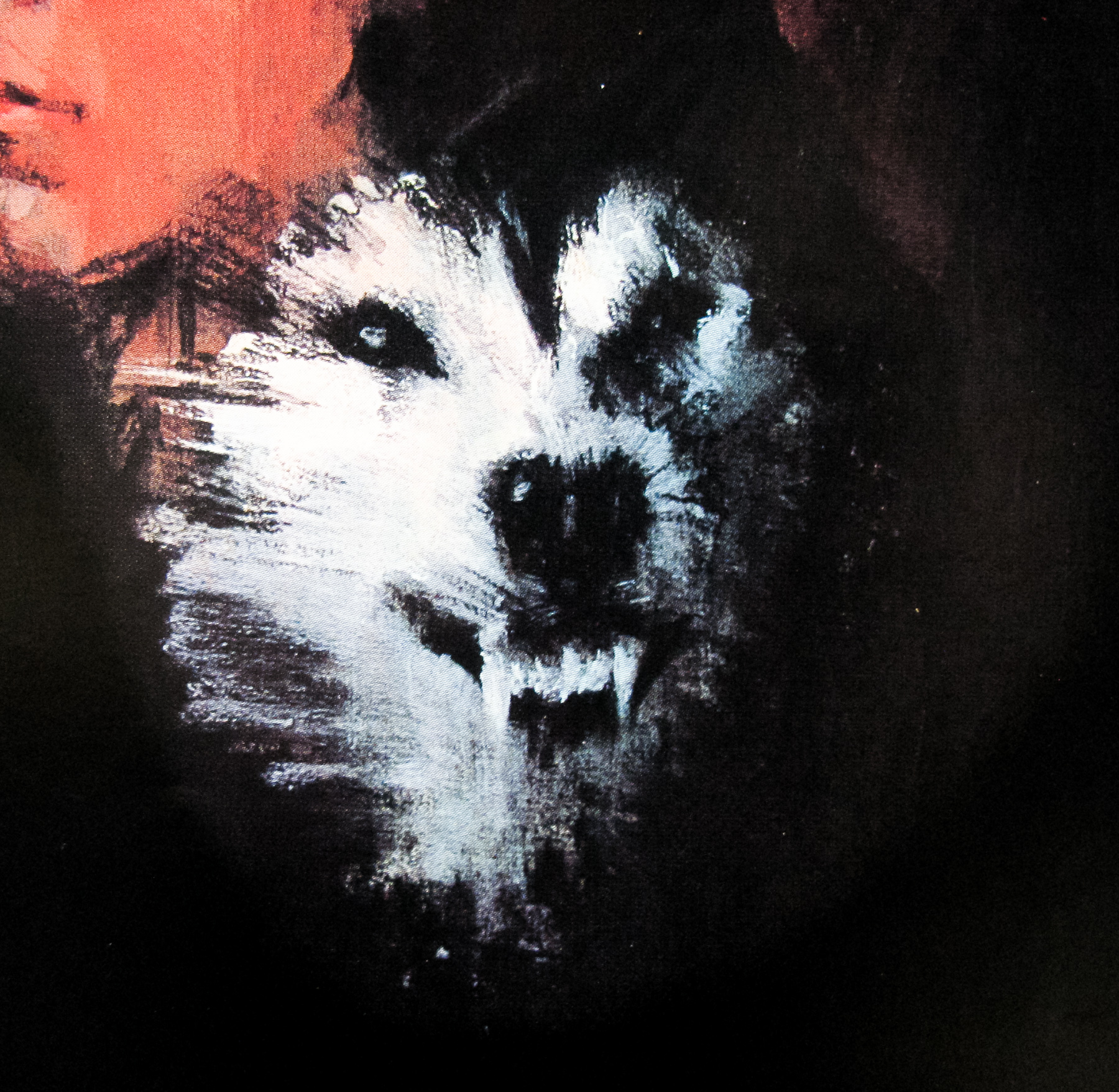
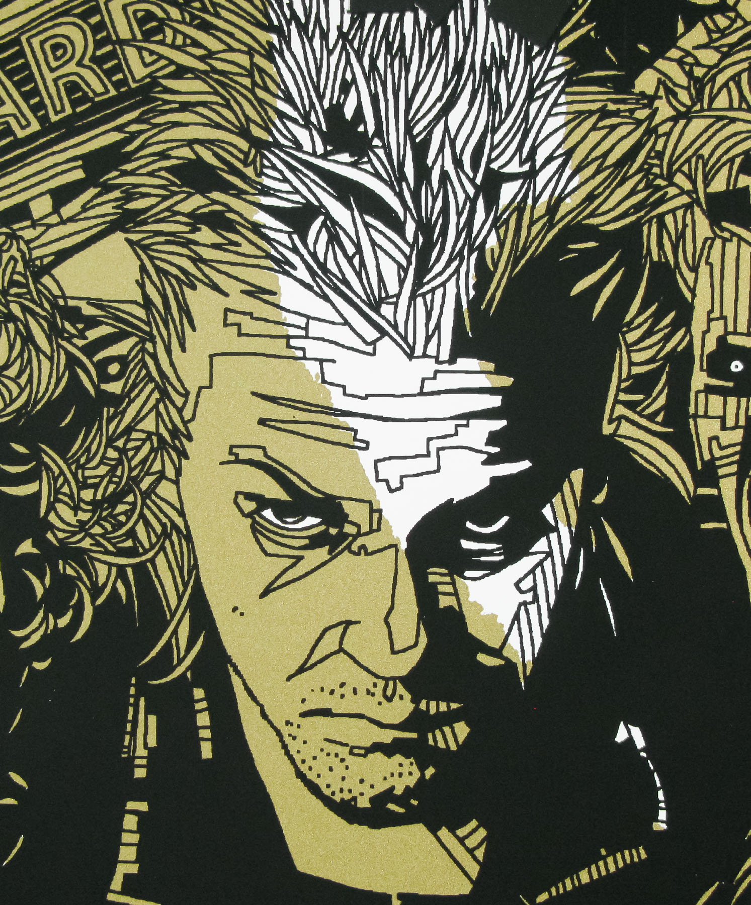
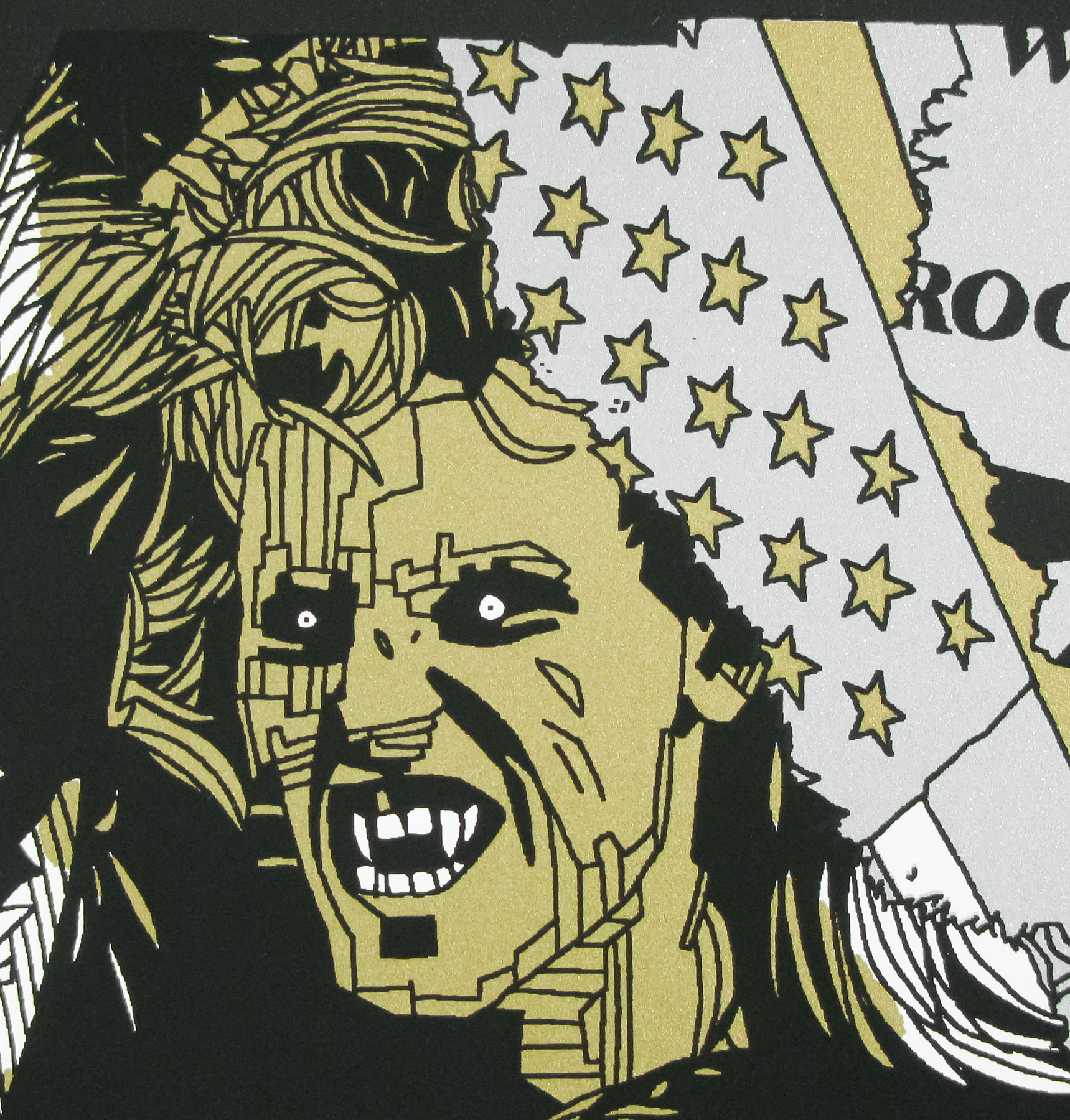
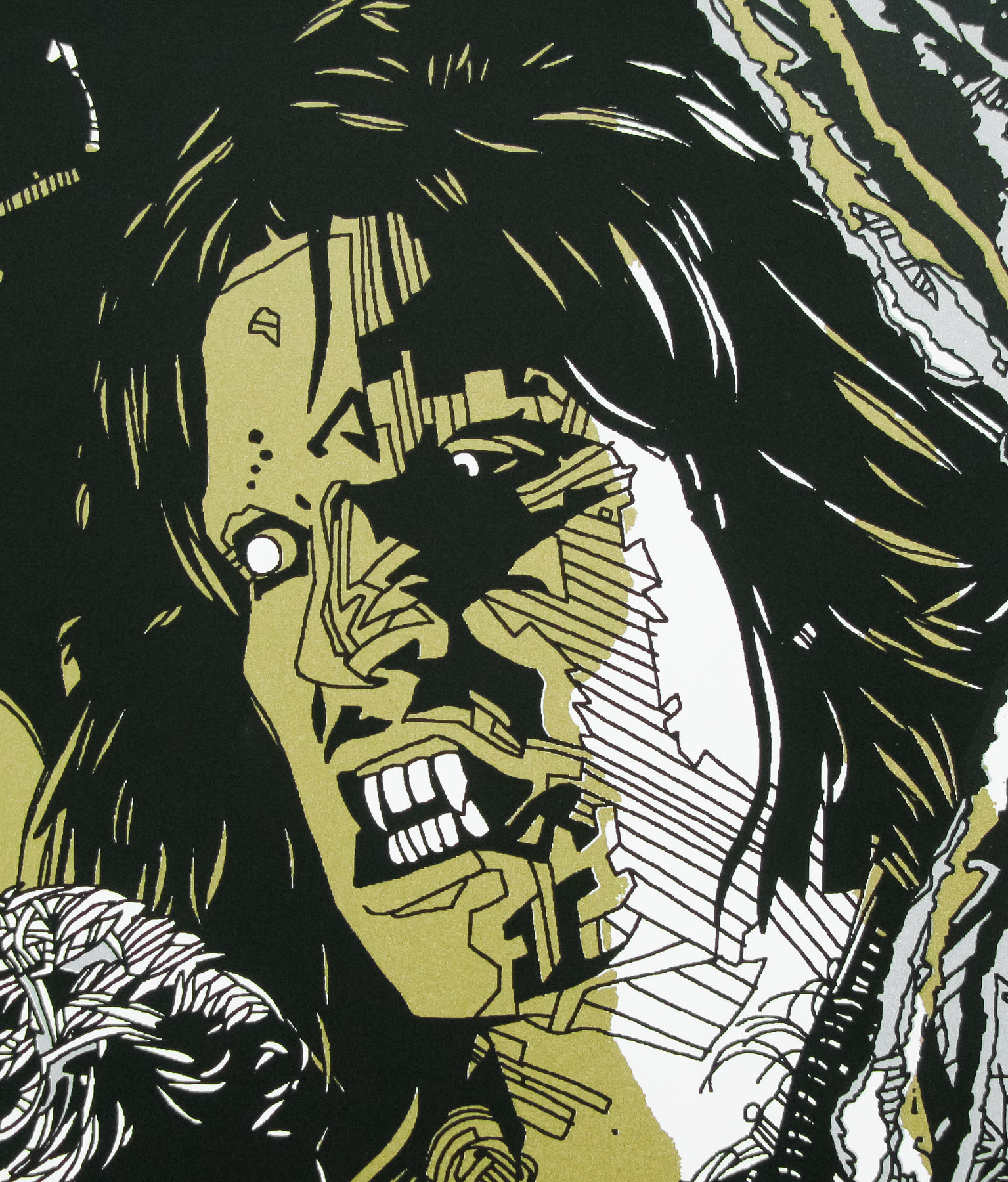
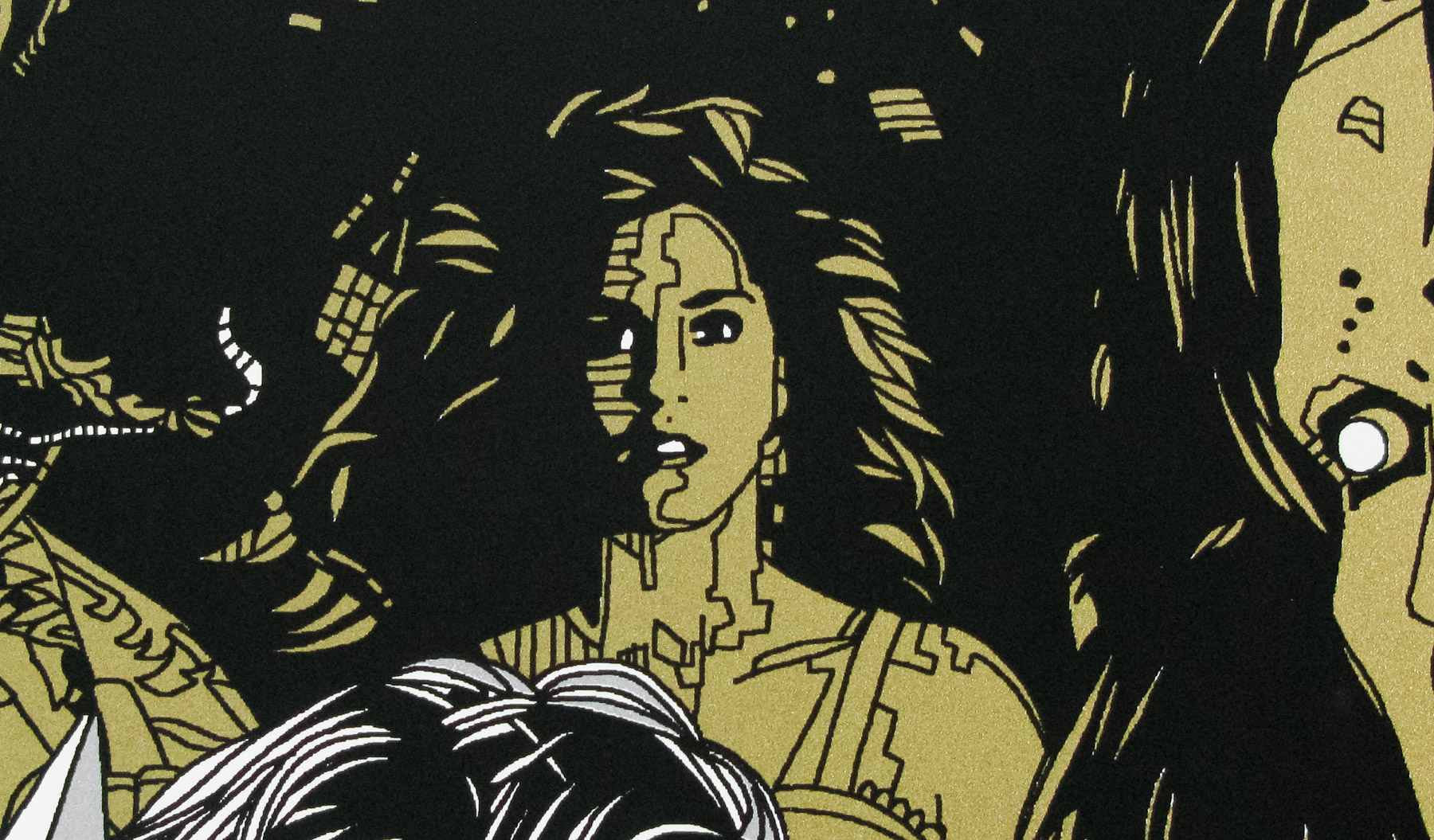
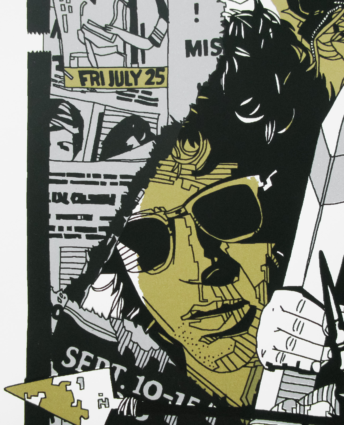
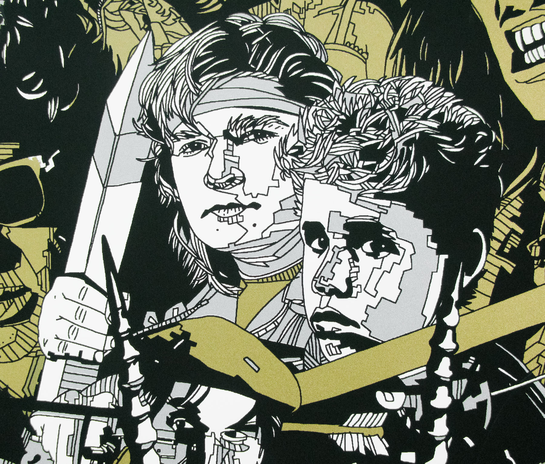
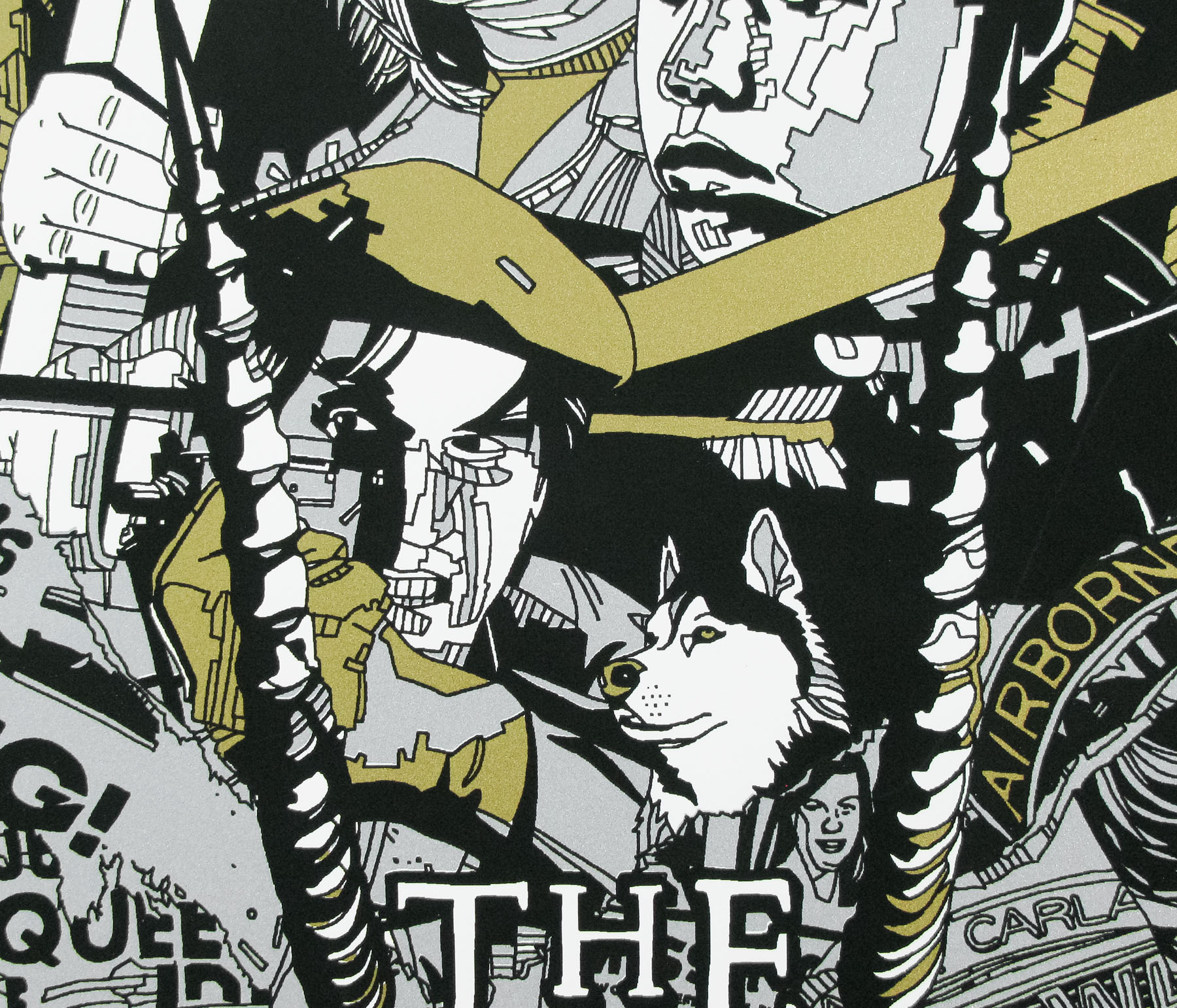
Brilliantly over-the-top artwork on this US one sheet for the equally over-the-top 1982 action flick, Megaforce, which was directed by former stuntman Hal Needham, perhaps best known for Smokey and the Bandit (his directorial debut) and The Cannonball Run. The film focuses on an elite squad of soldiers equipped with an array of advanced weaponry and vehicles (several of which are depicted on this poster) who lend their help to a peaceful nation that is being invaded by the hostile forces of a neighbouring country.
Prolific film and TV actor Barry Bostwick plays Commander Ace Hunter, the leader of the titular unit who, in one of the more infamous scenes, rides a flying motorcycle to escape death and rendezvous with his squad in mid-air. The film was a commercial and critical failure and plans for a sequel called Deeds Not Words were shelved indefinitely. It didn’t help that the film was released in the summer of 1982 and was up against the likes of Blade Runner (released the same day) and E.T. The Extra-Terrestrial (released two weeks before).
Apparently, South Park creators Trey Parker and Matt Stone are huge fans of the film and there are several references to it in their 2004 satirical action comedy Team America: World Police.
I’m unsure who is responsible for the artwork so please get in touch if you have an idea.
The trailer is on YouTube (“The good guys always win… even in the 80s!”)