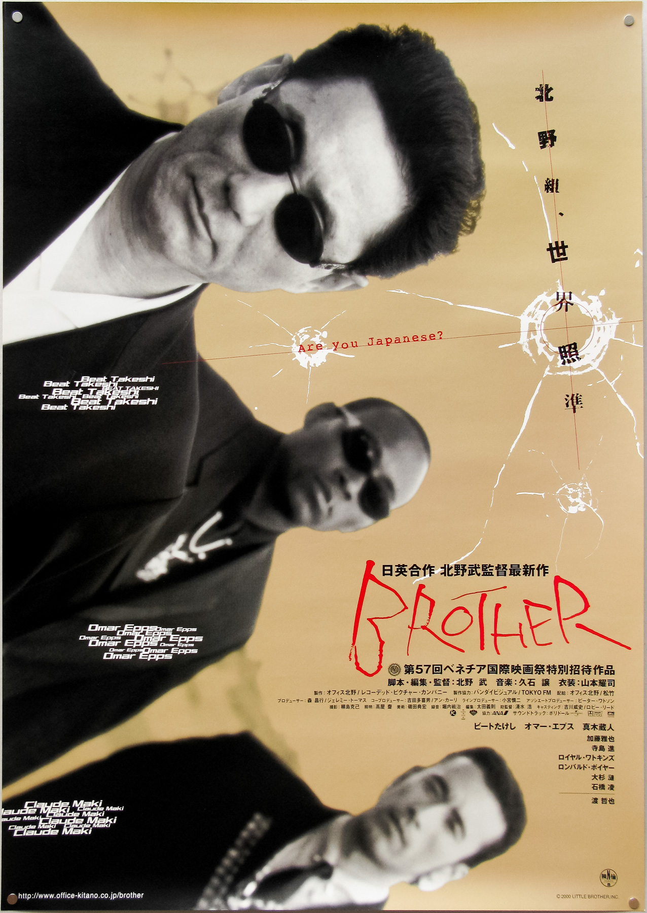
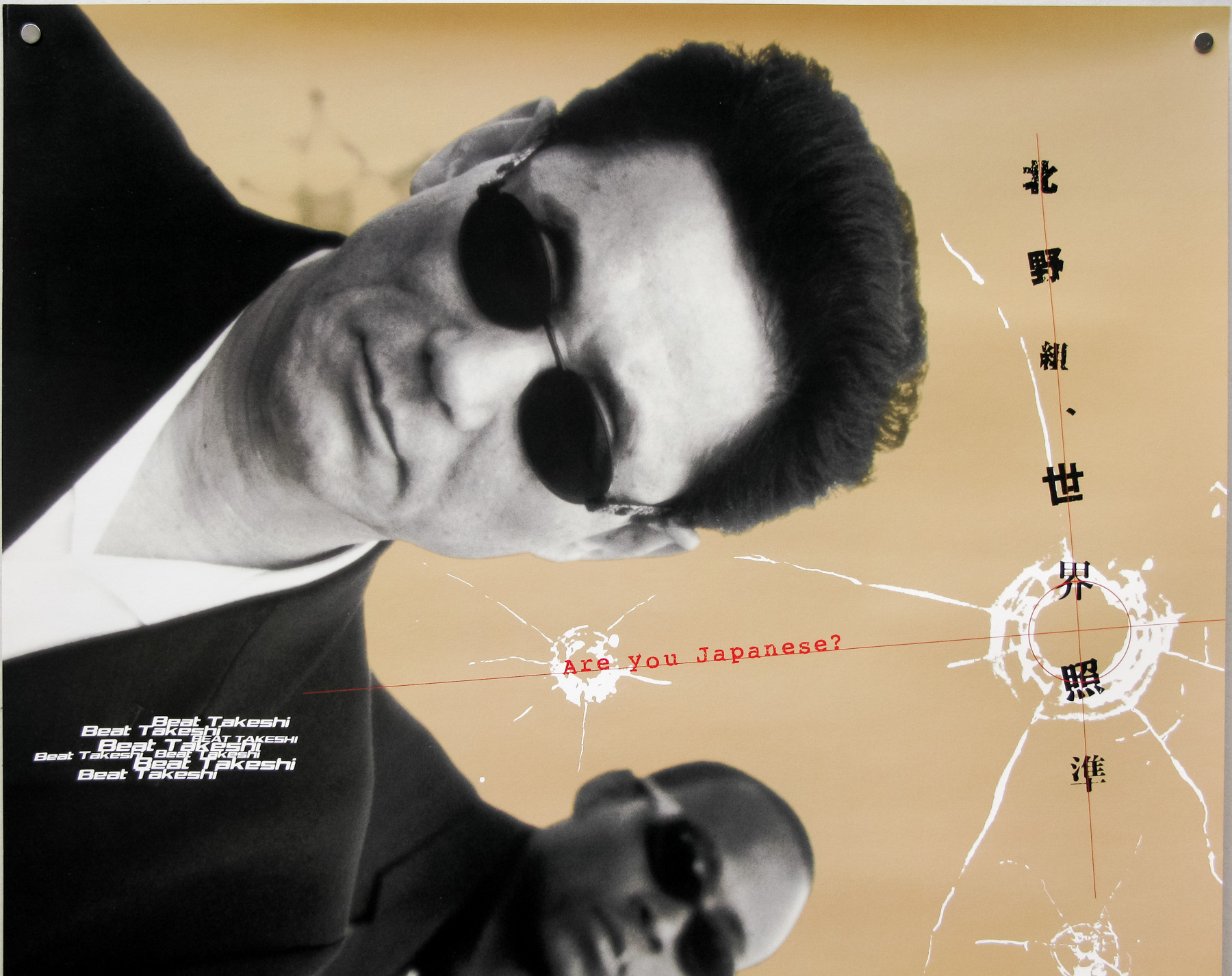
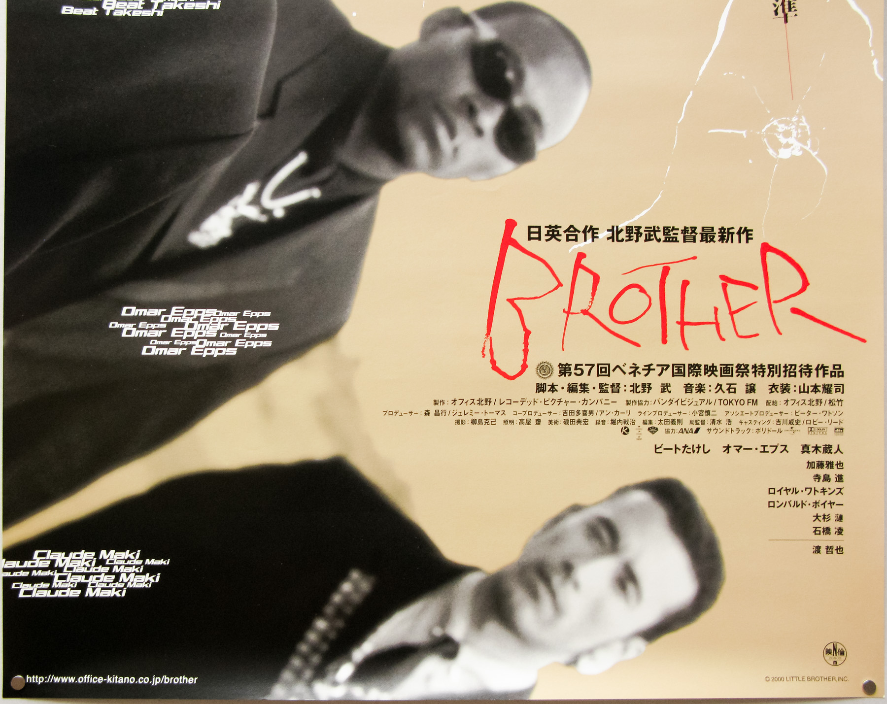
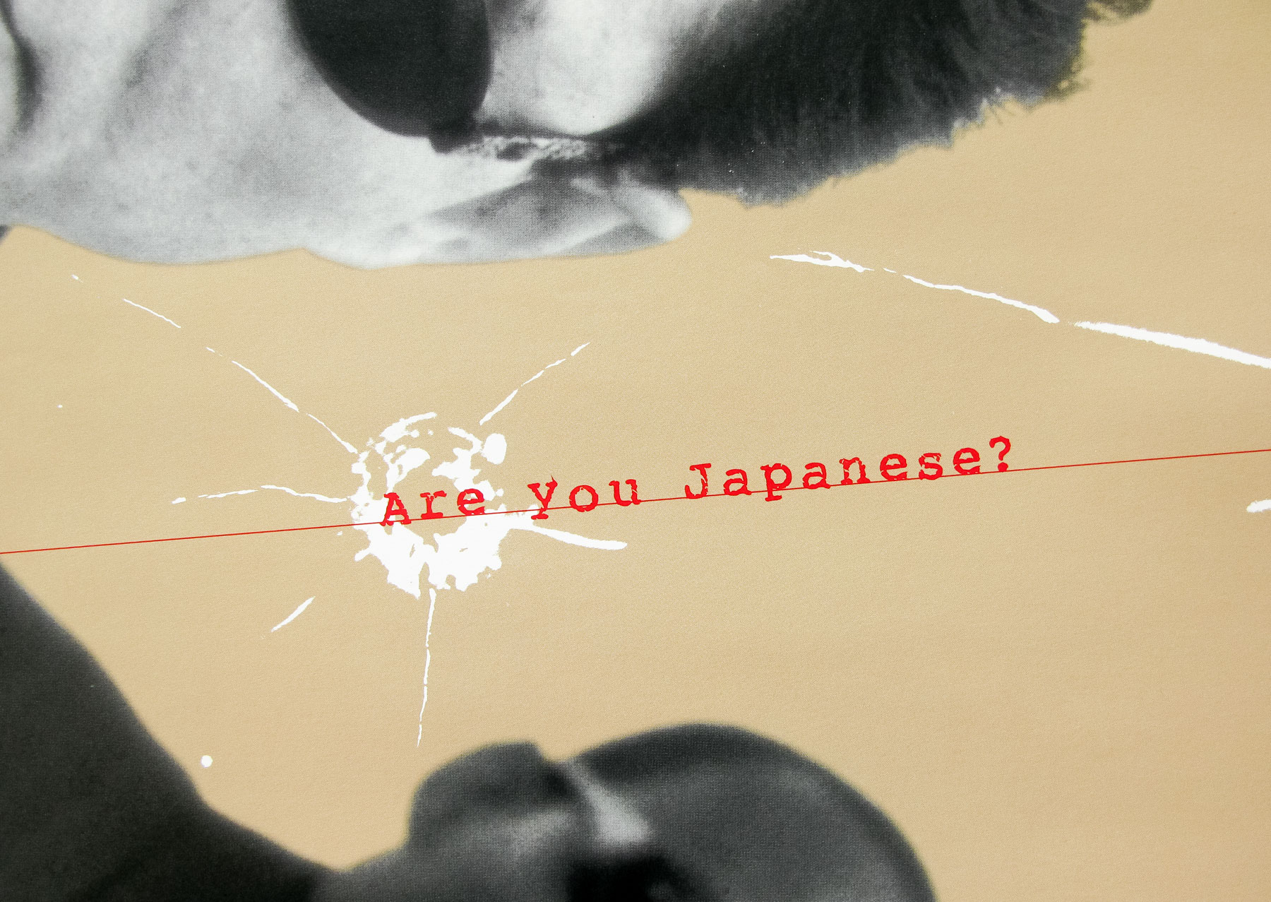
- Title
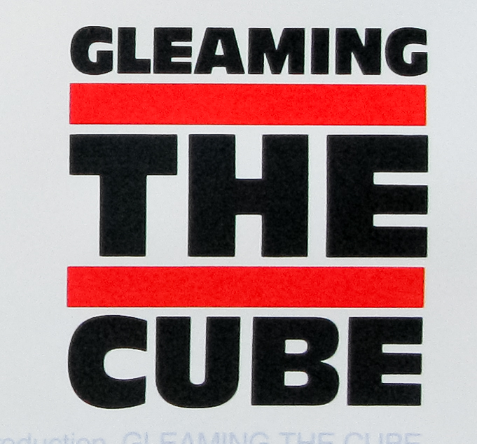
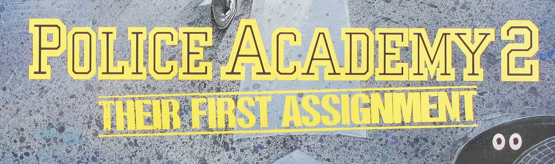
- Basket Case
- AKA
- ¿Dónde te escondes, hermano? [Where are you hiding, brother?] (Spain)
- Year of Film
- 1982
- Director
- Frank Henenlotter
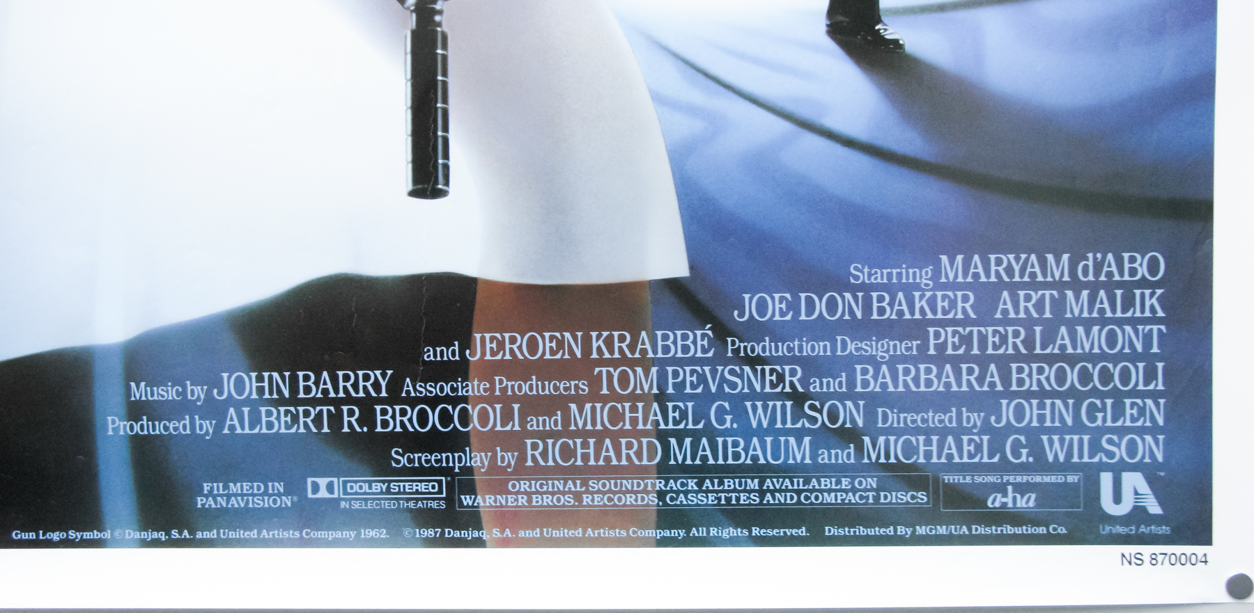
- Starring
- Kevin Van Hentenryck, Terri Susan Smith, Beverly Bonner, Robert Vogel, Diana Browne, Lloyd Pace, Bill Freeman, Joe Clarke
- Origin of Film
- USA
- Genre(s) of Film
- Kevin Van Hentenryck, Terri Susan Smith, Beverly Bonner, Robert Vogel, Diana Browne, Lloyd Pace, Bill Freeman, Joe Clarke,
- Type of Poster
- Quad
- Style of Poster
- --
- Origin of Poster
- UK
- Year of Poster
- 1982
- Designer
- Unknown
- Artist
- Unknown
- Size (inches)
- 30 2/16" x 40"
- SS or DS
- SS
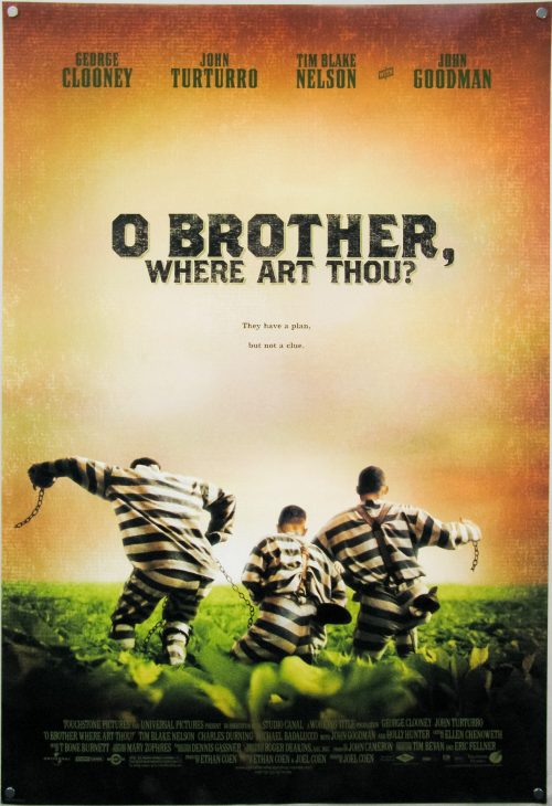
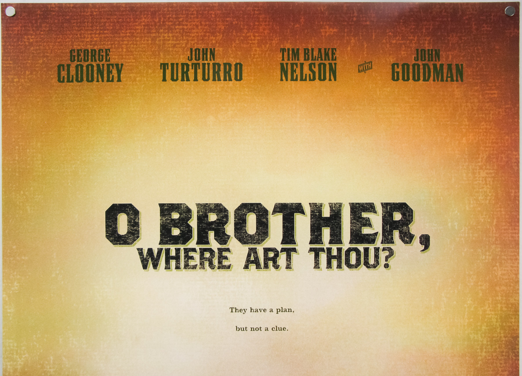
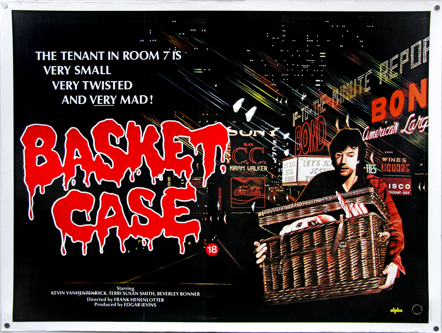
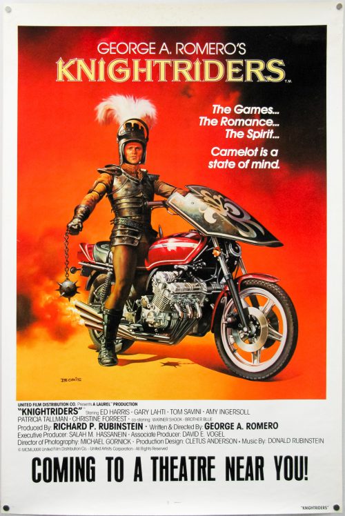
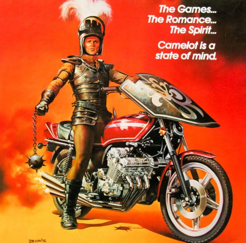
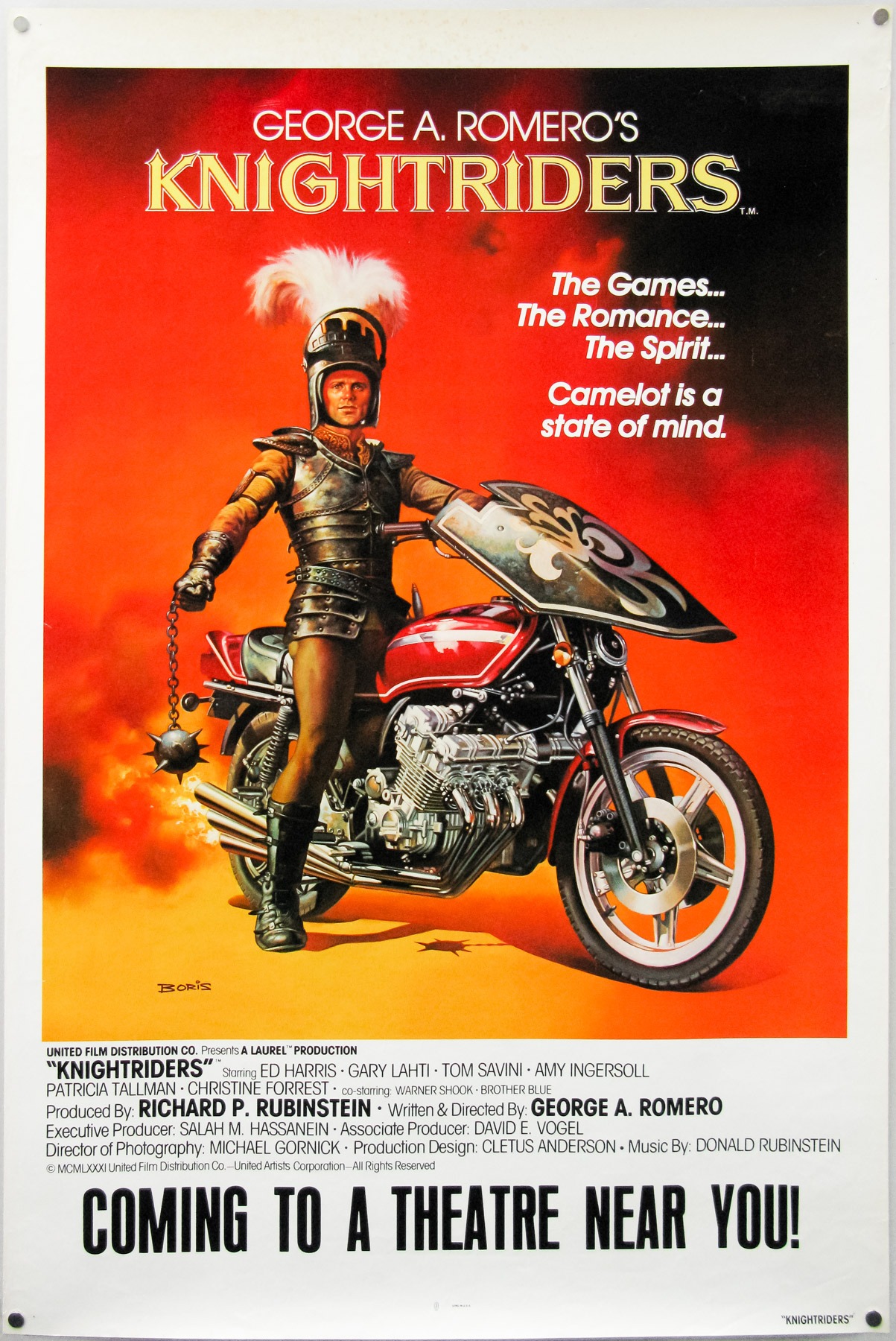
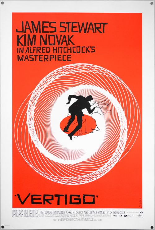
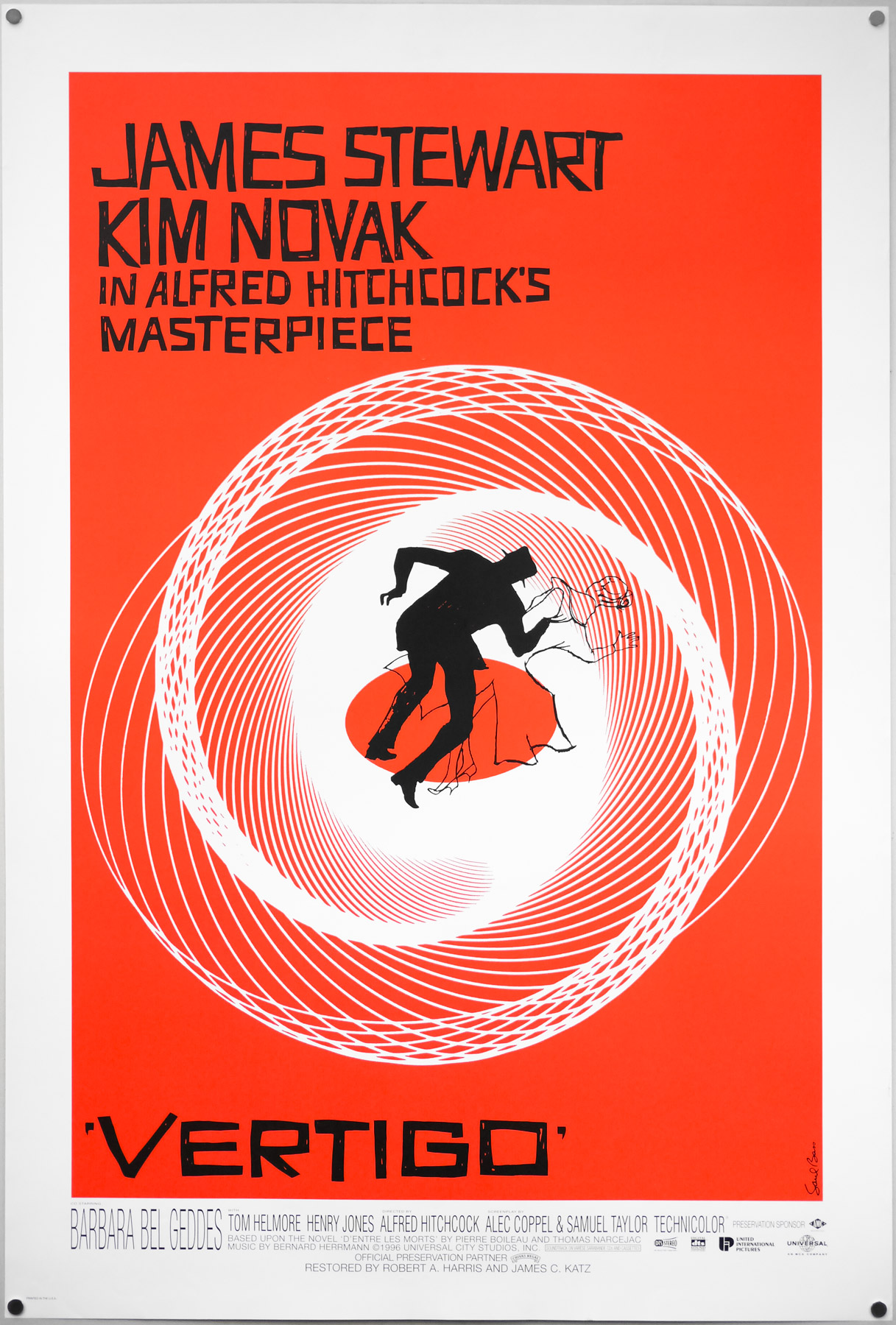
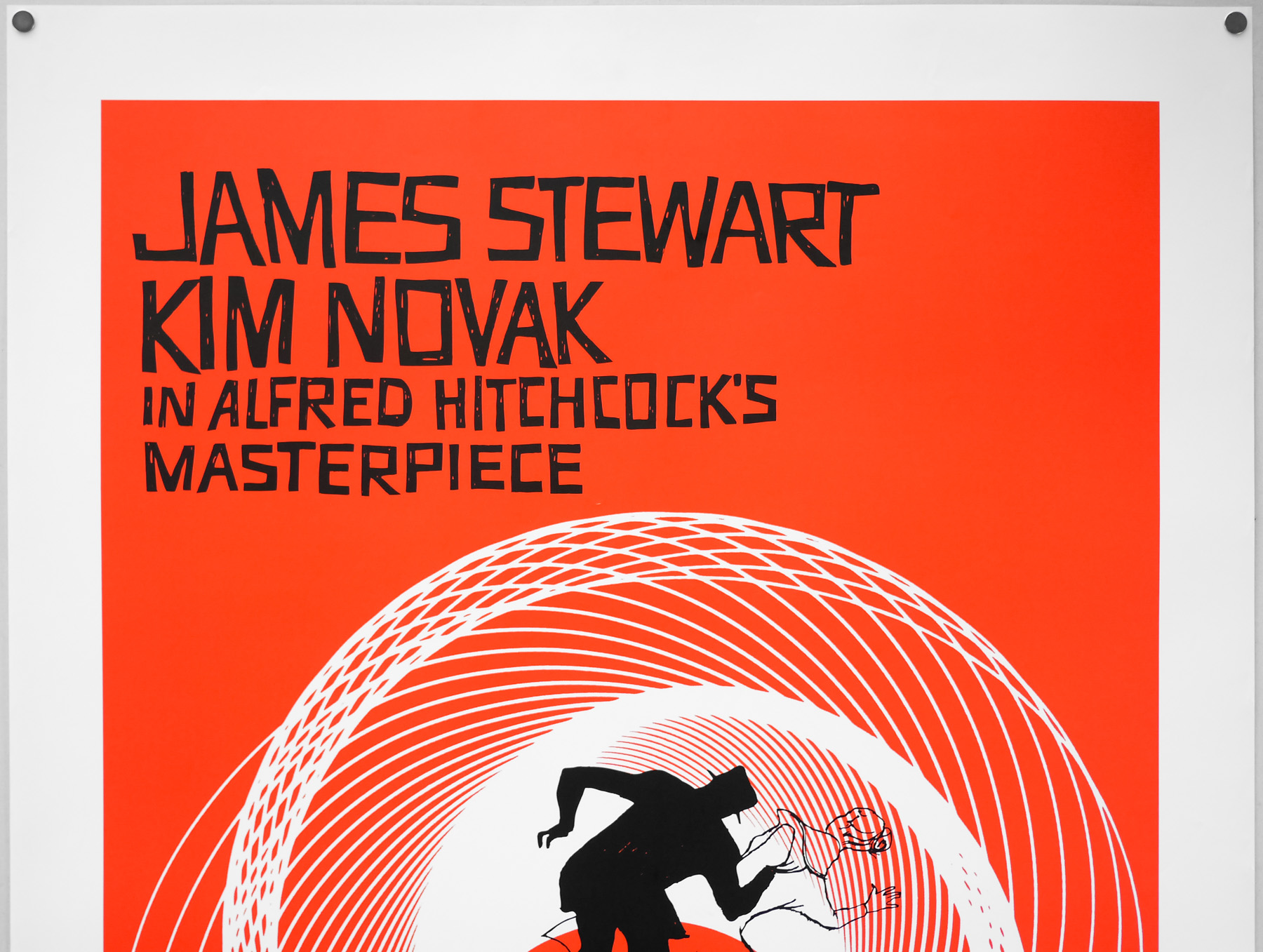
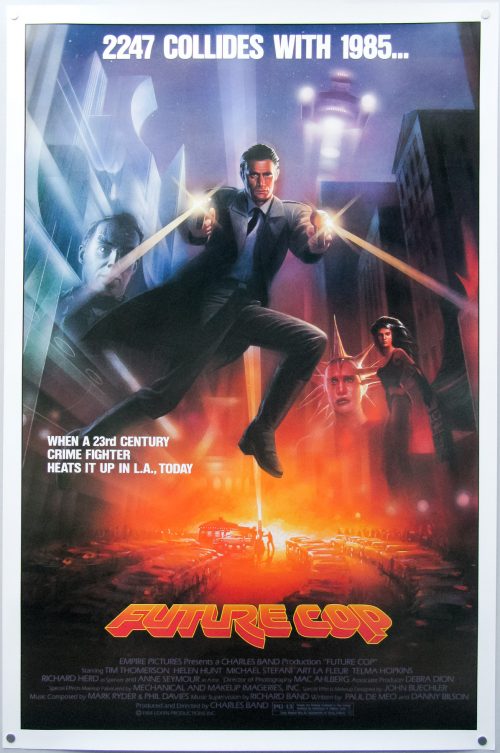
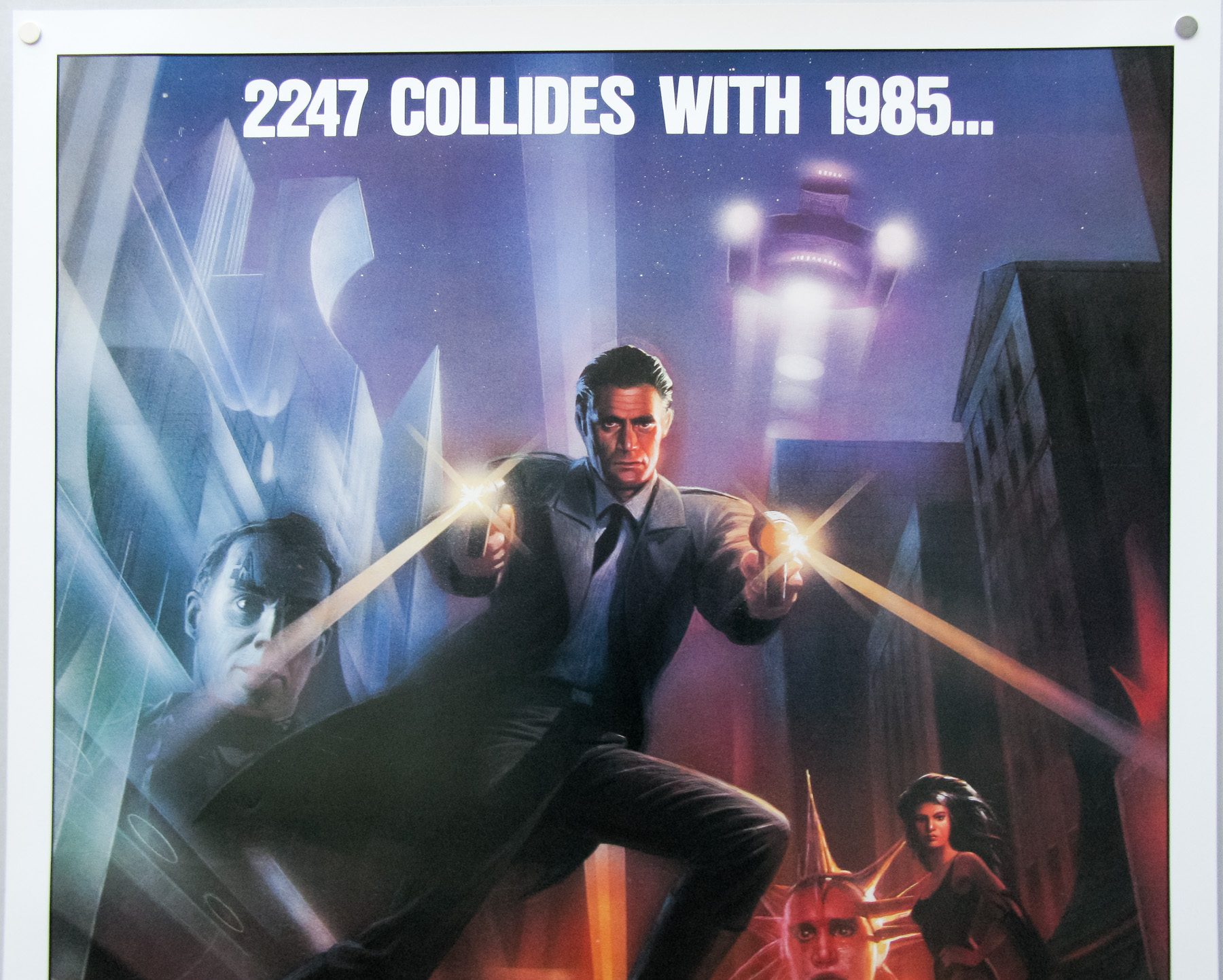
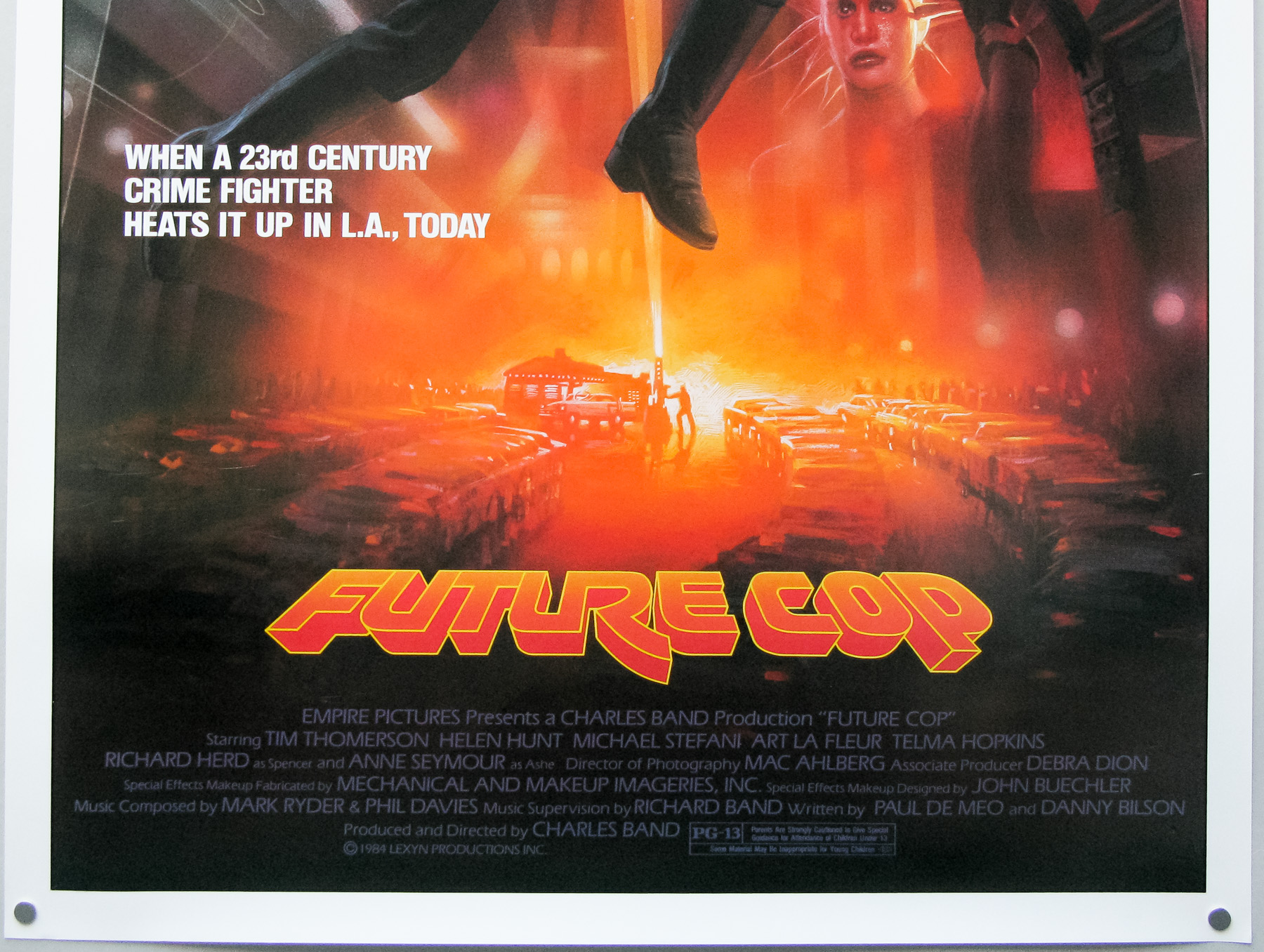
- Tagline
- The tenant in room 7 is very small, very twisted and very mad.
Frank Henenlotter’s marvellously sleazy Basket Case is a true cult classic and is a film that transcended it’s micro budget to become a mainstay of midnight movies across the globe. Technically the film shouldn’t work; the acting is terrible throughout and makes the cast of Tommy Wiseau’s The Room look like Oscar-winning legends, the special effects are laughable and the editing is seriously rough in places, but the film has a certain charm that allows you to forgive it’s faults and revel in its trashy delights.
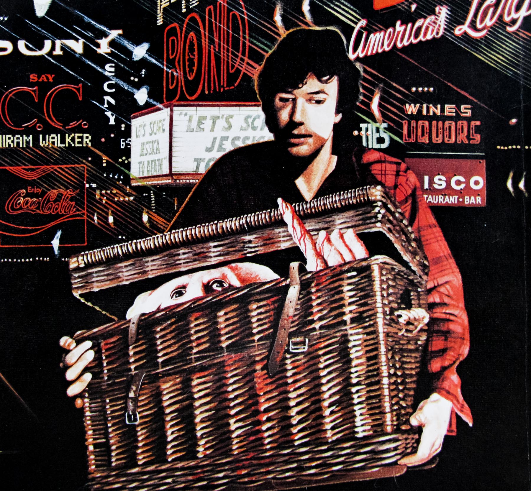
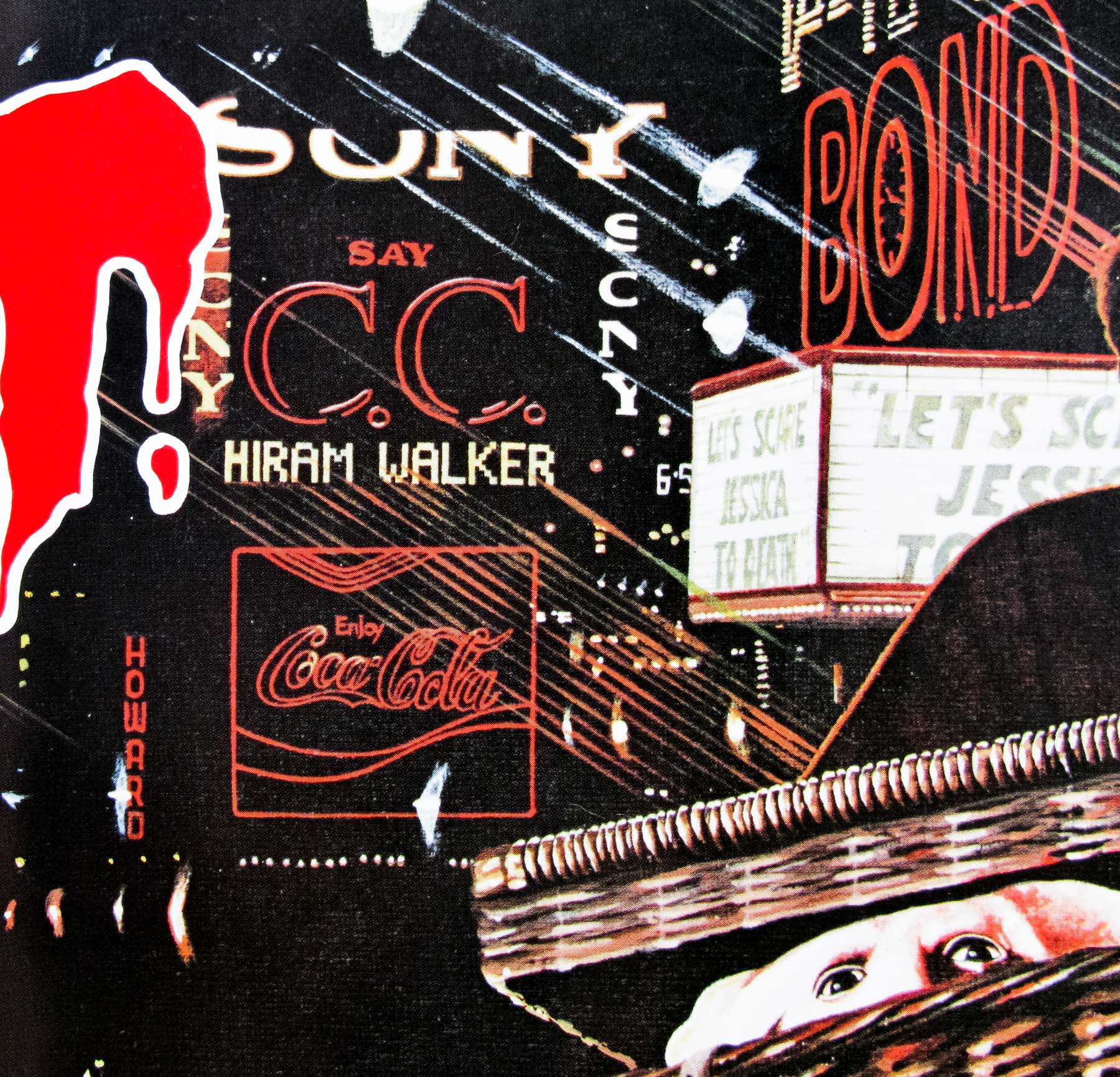
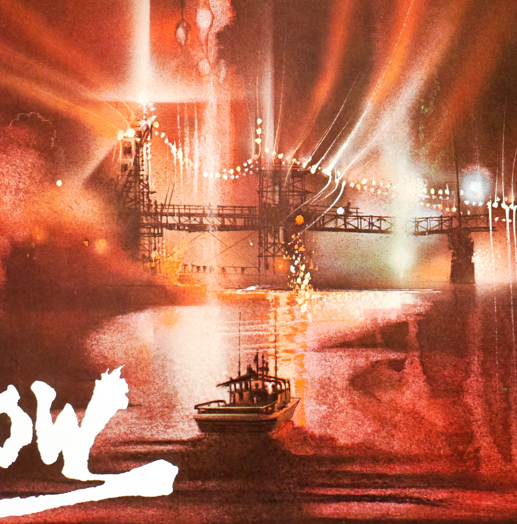
The film is definitely a love letter to a New York City, specifically the area around Times Square and 42nd street, that has long since changed. On the film’s excellent audio commentary Henenlotter talks about how he could see the change coming and shot lots of footage of the area so he could capture what it was like before it was cleaned up and sanitised beyond all recognition. Times Square was once a haven of sleazy nightclubs, nude shows and sex shops, full of weird and wonderful characters, particularly once the sun went down. Basket Case was shot in and around the area and you can really feel the griminess in every scene, particularly the opening shots where Duane (poodle-haired Kevin Van Hentenryck) makes his way through these streets on his way to Hotel Broslin.
Like many low-budget ($35k apparently) films Basket Case had some trouble getting into cinemas in the form that the director had envisioned. This is talked about in the commentary and is mentioned on Hotelbroslin.com, the official website:
When Analysis Films first released “Basket Case,” they cut it. They removed most of the gore so the film would be “funnier.” Obviously, the gore is part of the punch line so their cut version was awful, few came to see it, and the film died almost the moment it was released in April of ’82. However, “Drive-In Movie Critic” Joe Bob Briggs wanted to host the Dallas premiere of the film in June but wouldn’t host a cut version. So Analysis sent it to Dallas uncut and let it play there. The film quickly started selling out. So Analysis quietly replaced the cut version with the uncut version everywhere else and the film suddenly became a hit. After three weeks of the uncut version playing in New York’s Waverly Theatre in Greenwich Village, Analysis finally put an ad in the Village Voice announcing that, yes, it’s finally uncut.
The film was recently released on blu-ray and it’s a revelation to see the film as the director intended. It was shot on 16mm and so was originally full frame (4:3). To be able to show it at cinemas the distributor blew it up to 1:85:1 widescreen and, as Henenlotter notes, it made everything look squashed and claustrophobic, whilst also seriously affecting the many night scenes. For the blu-ray transfer the original 16mm negatives were used and the film has never looked better, particularly if, like me, you first saw the film on murky VHS.
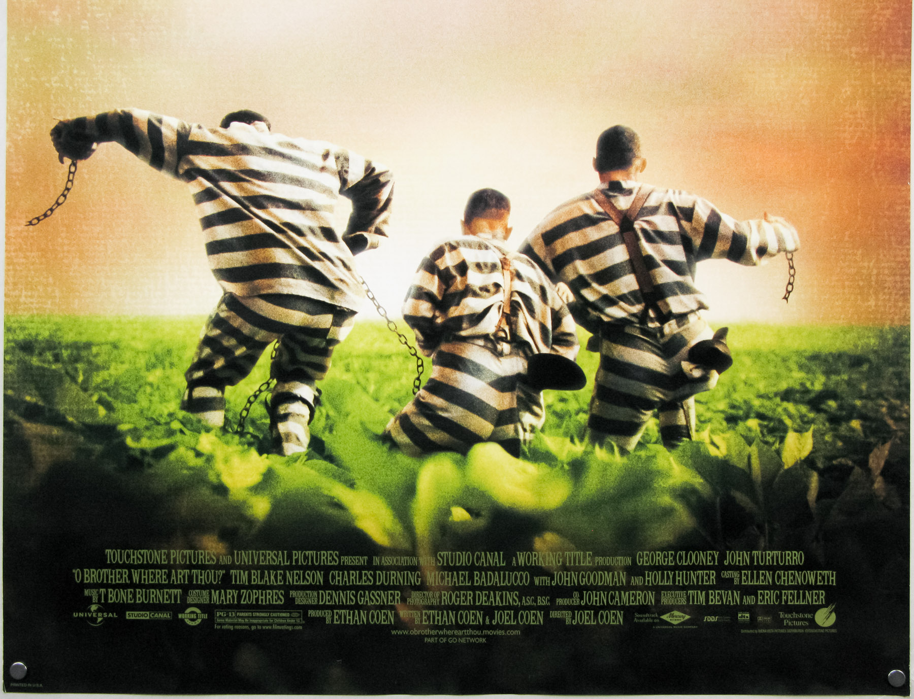
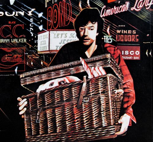
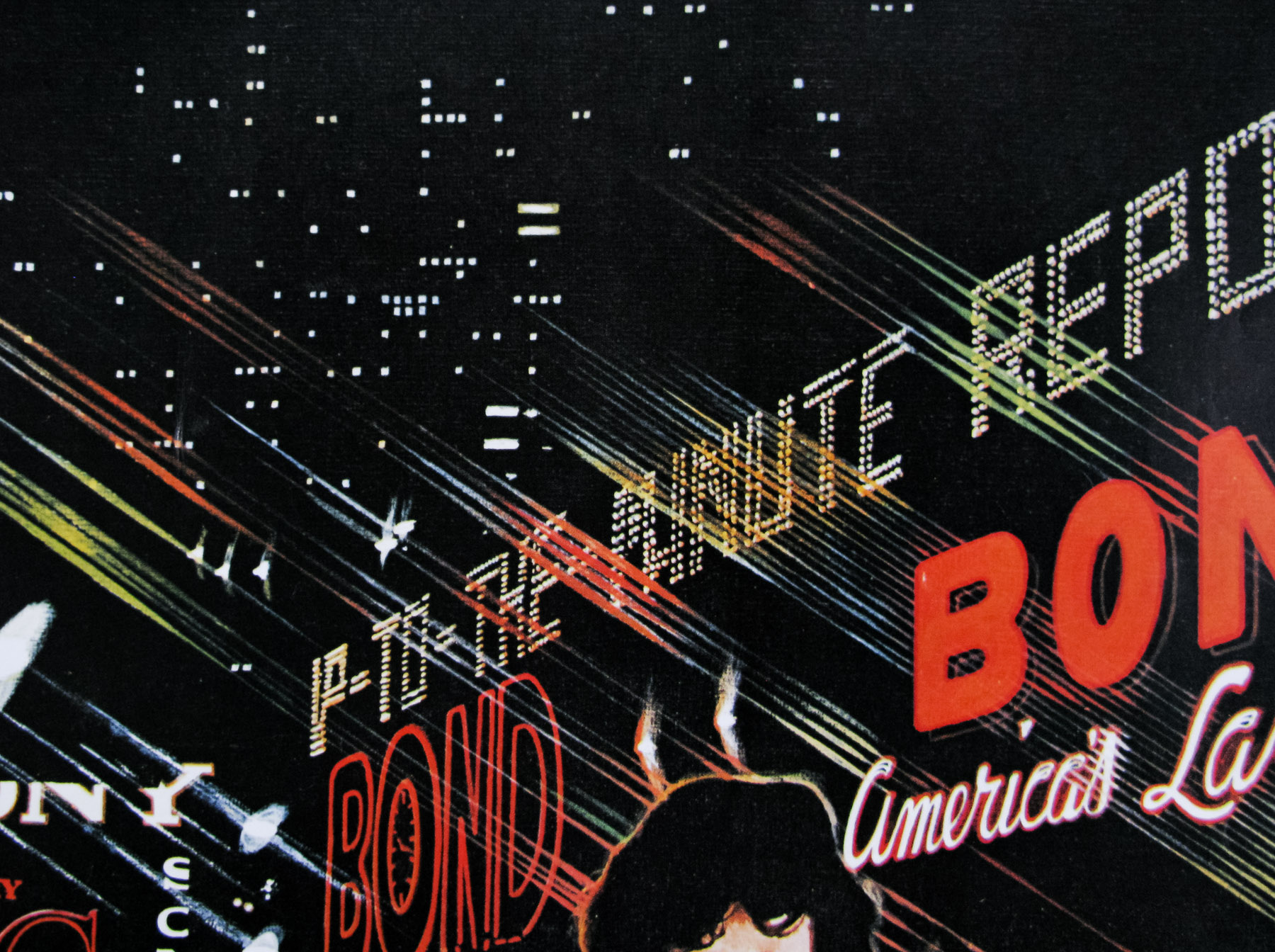
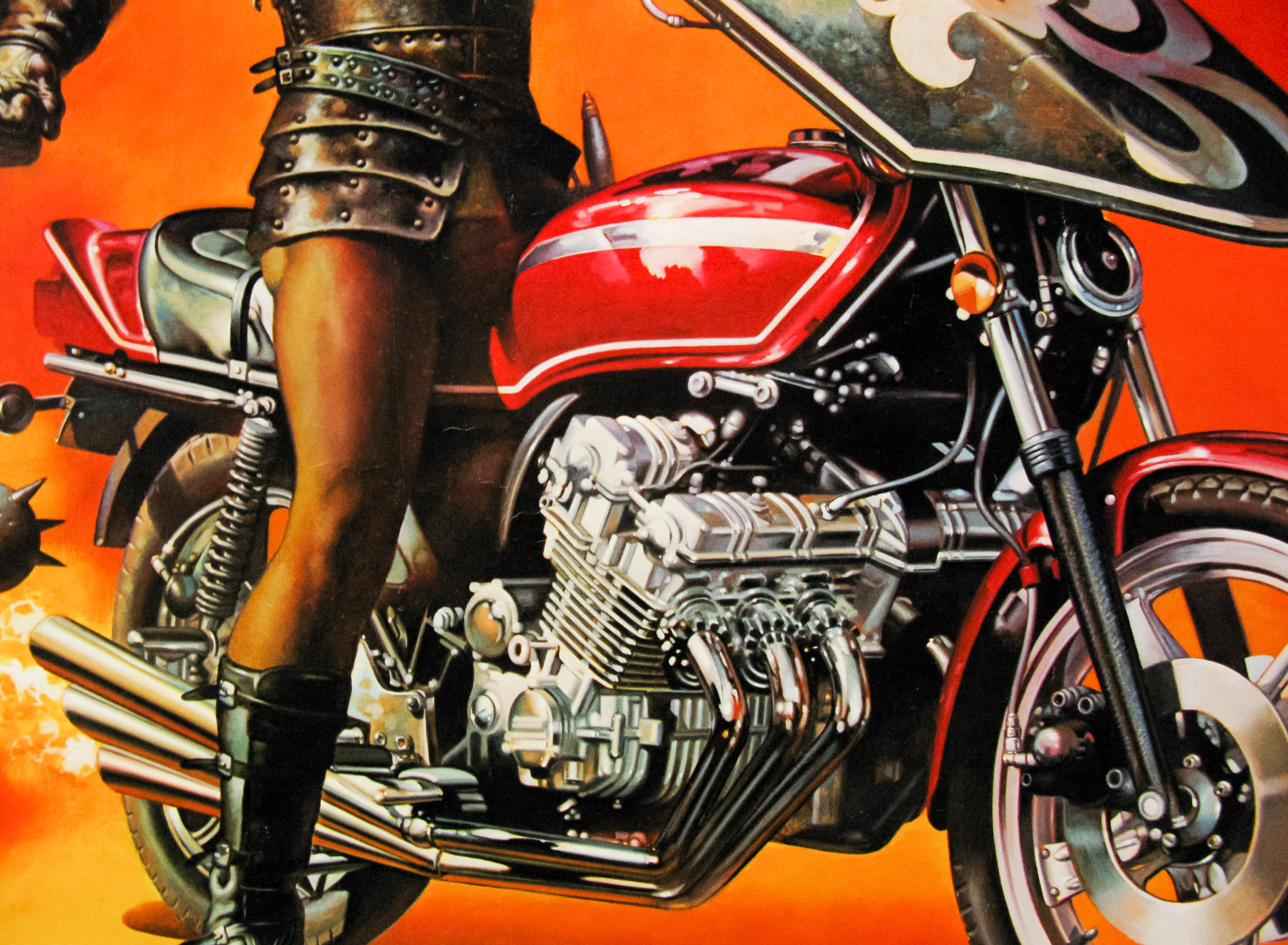
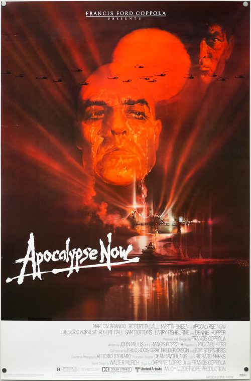
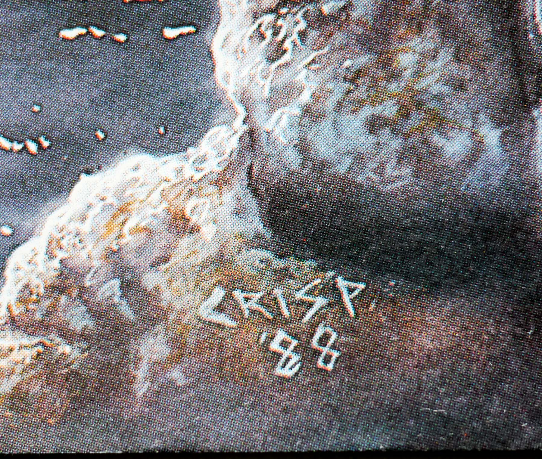
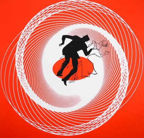
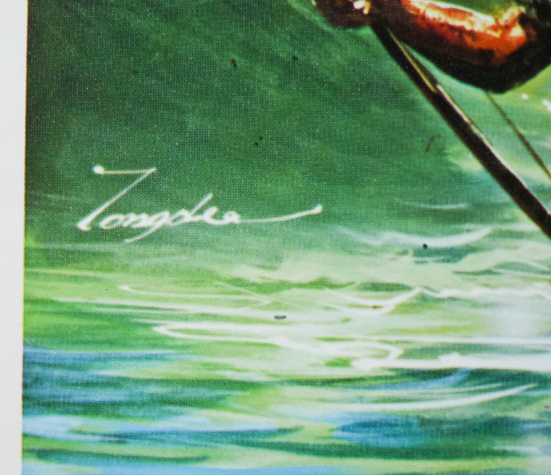
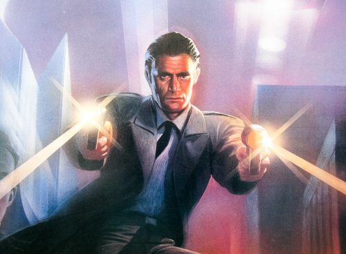
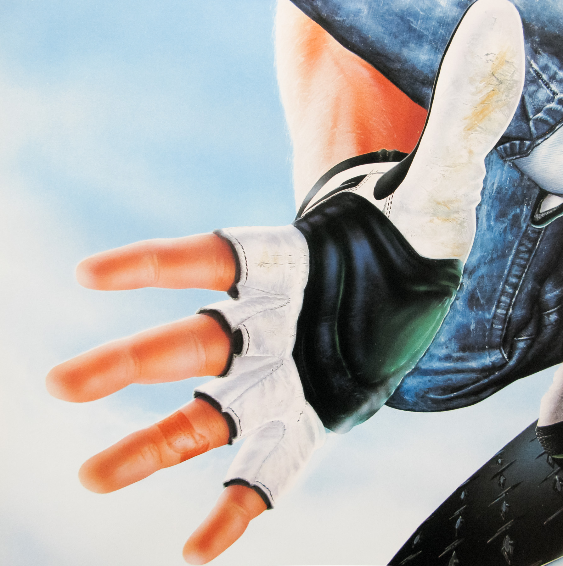
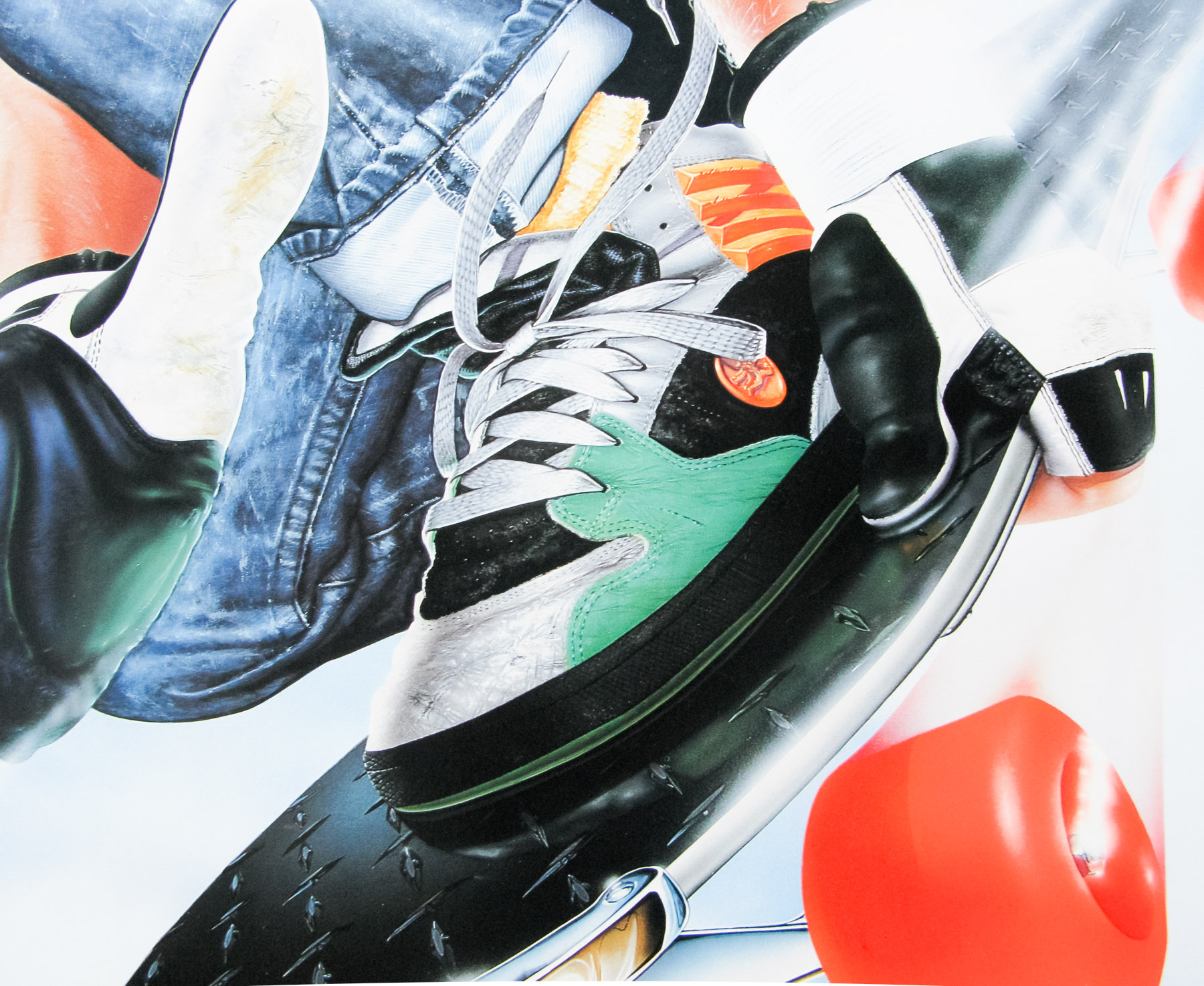
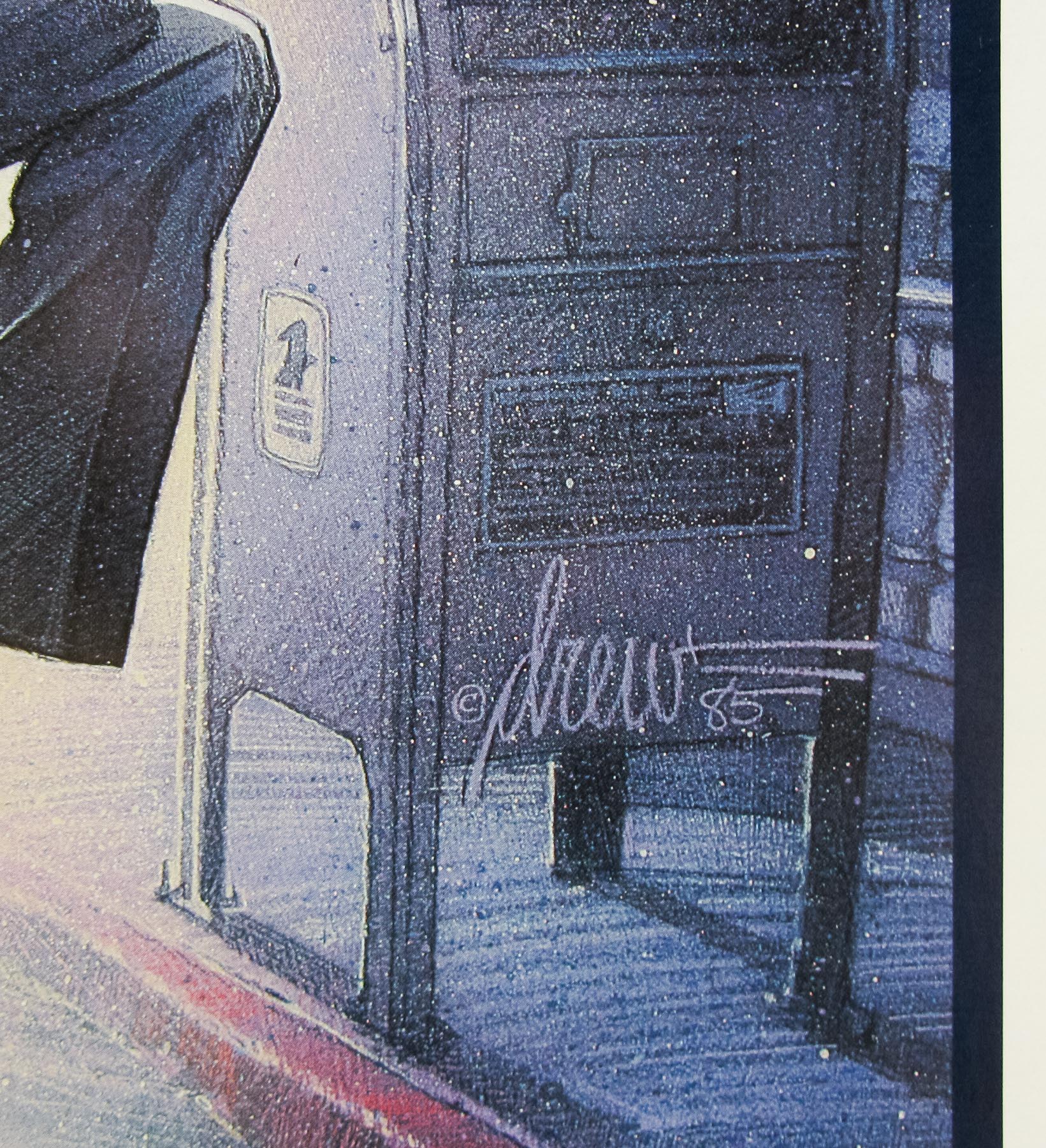
This British quad features a surreal background made up of images from the Times Square of the time. There are various genuine brands in there as well as what I assume are fictional ones. I’m pretty sure the unknown artist’s name is one of the signs too, but can’t be certain. Note the cinema hoarding showing the 1971 horror film ‘Let’s Scare Jessica to Death’. The character holding the basket doesn’t look massively like Van Hentenryck but I think this can be forgiven!
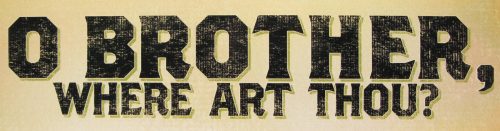
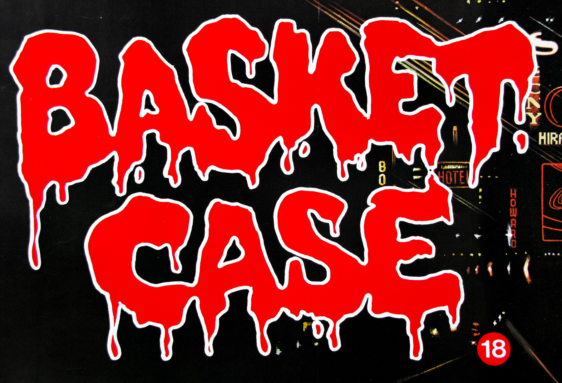
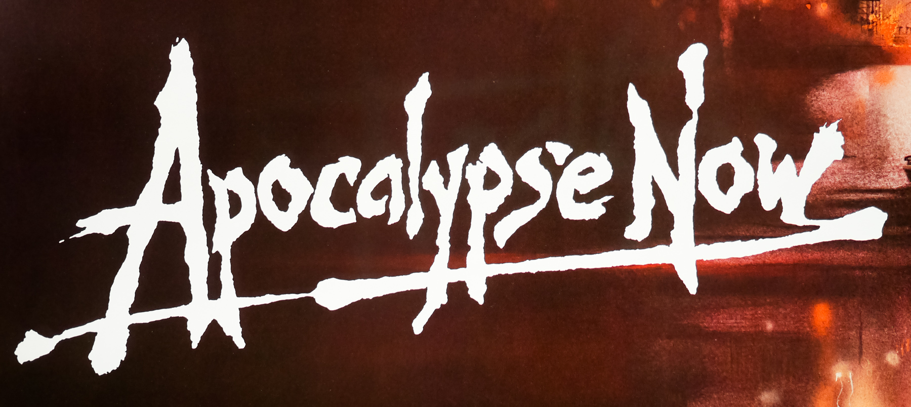
The tagline and logo are also undoubted classics and rank up there as some of the best ever to grace British horror posters.
The film’s original trailer is on YouTube.