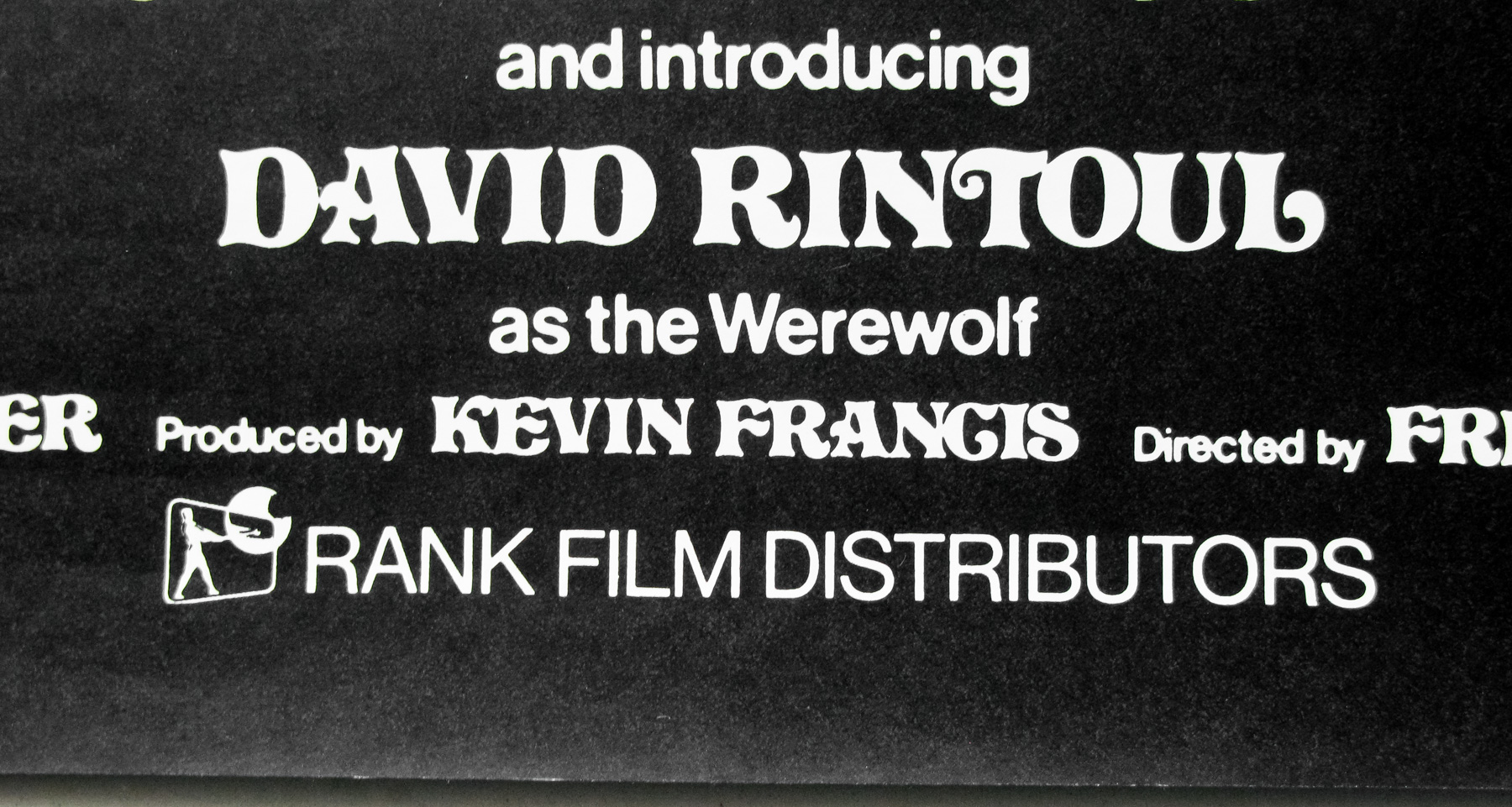
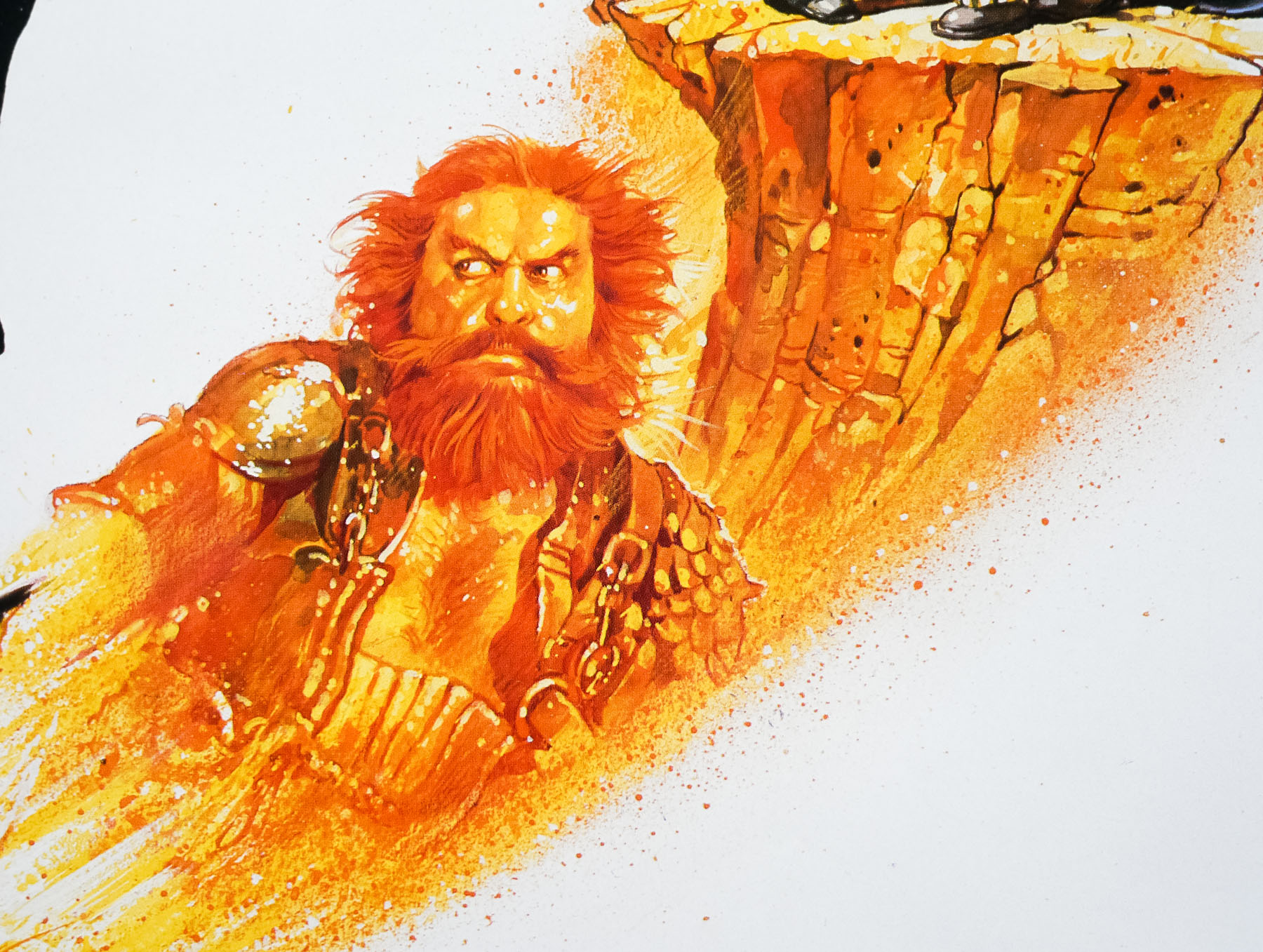
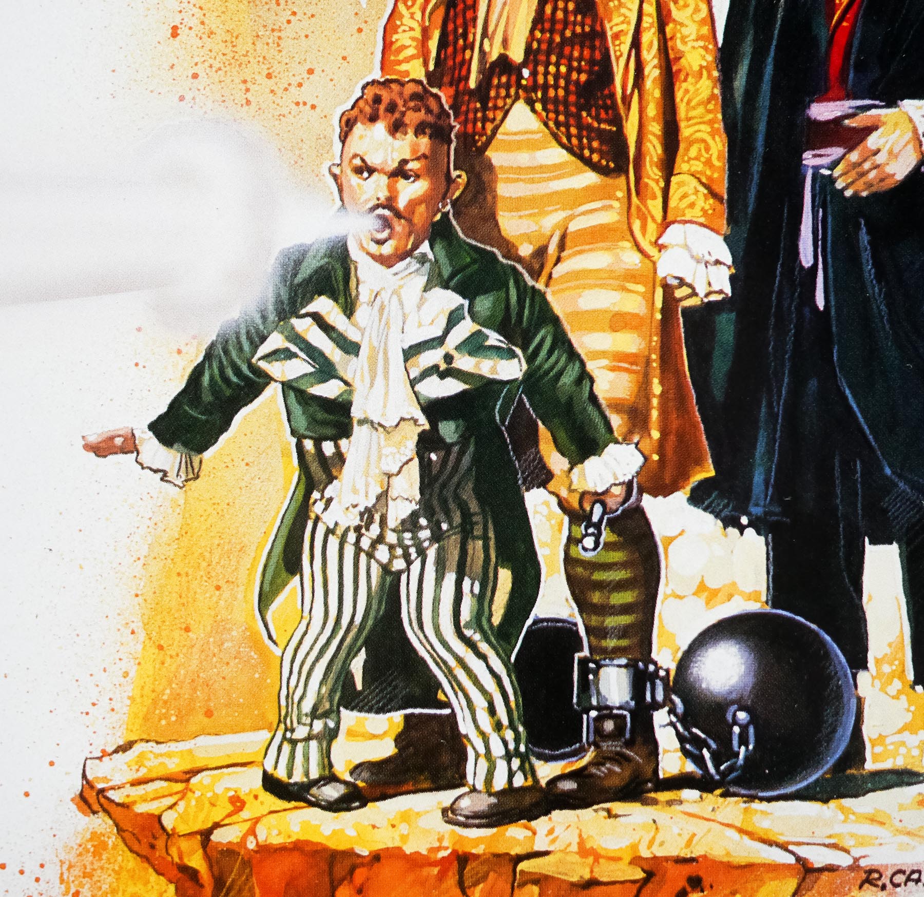
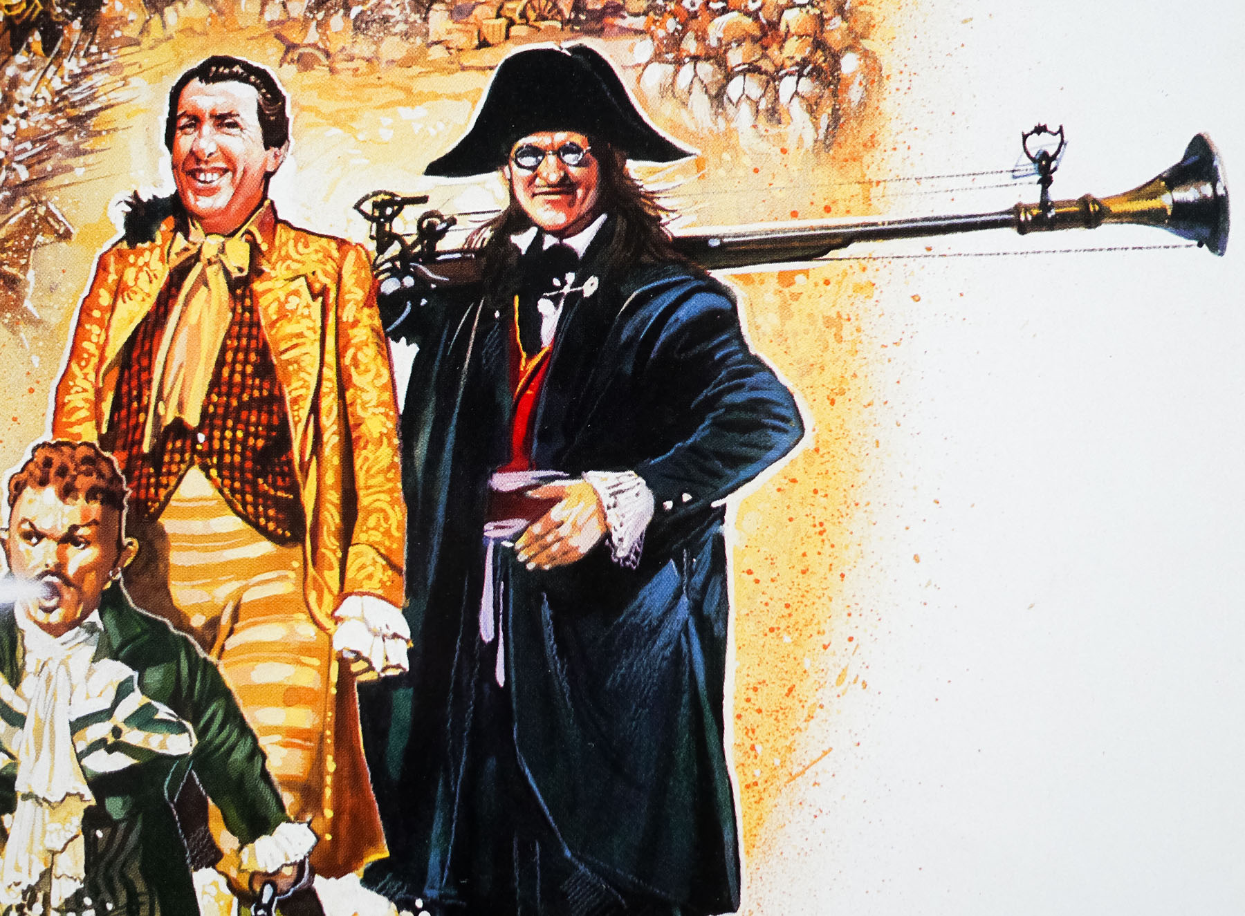
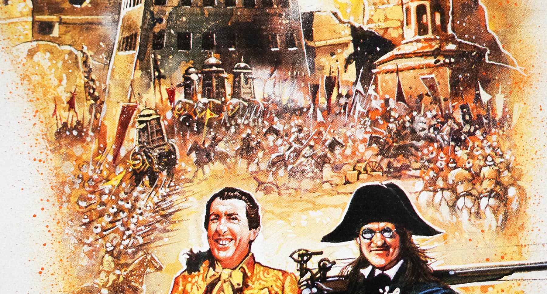
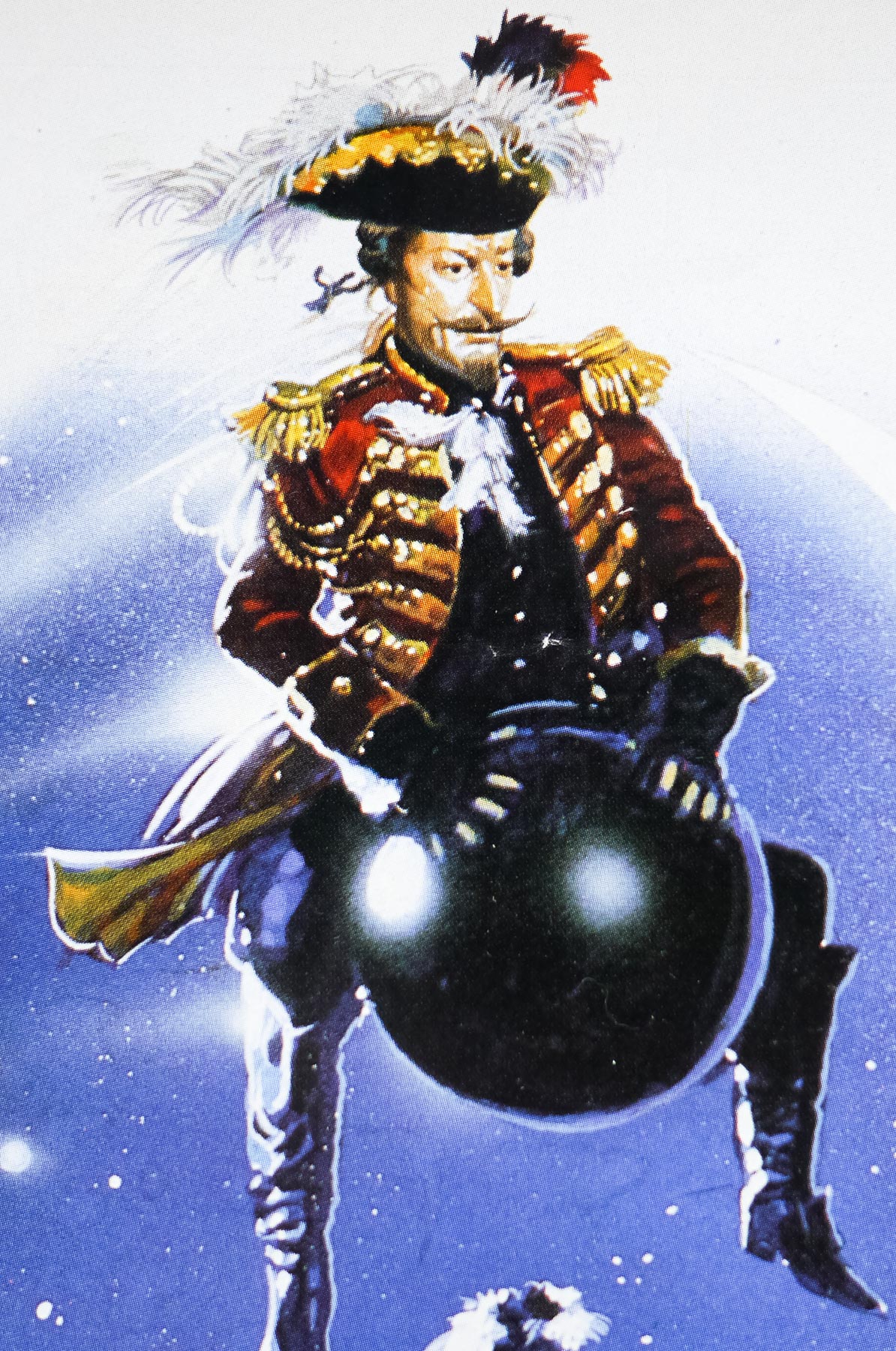
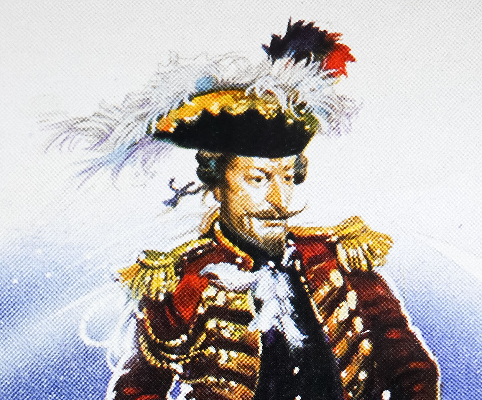
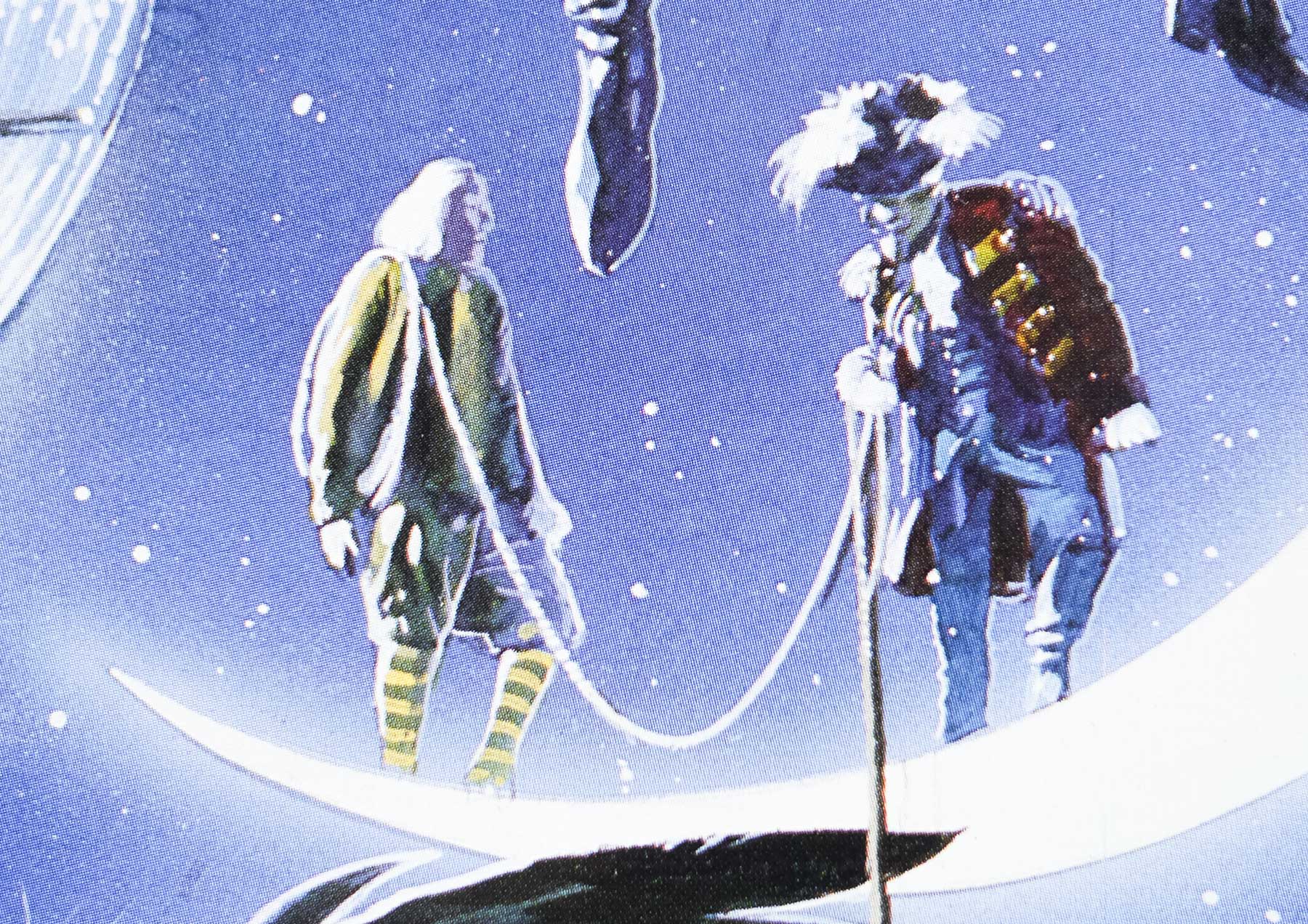
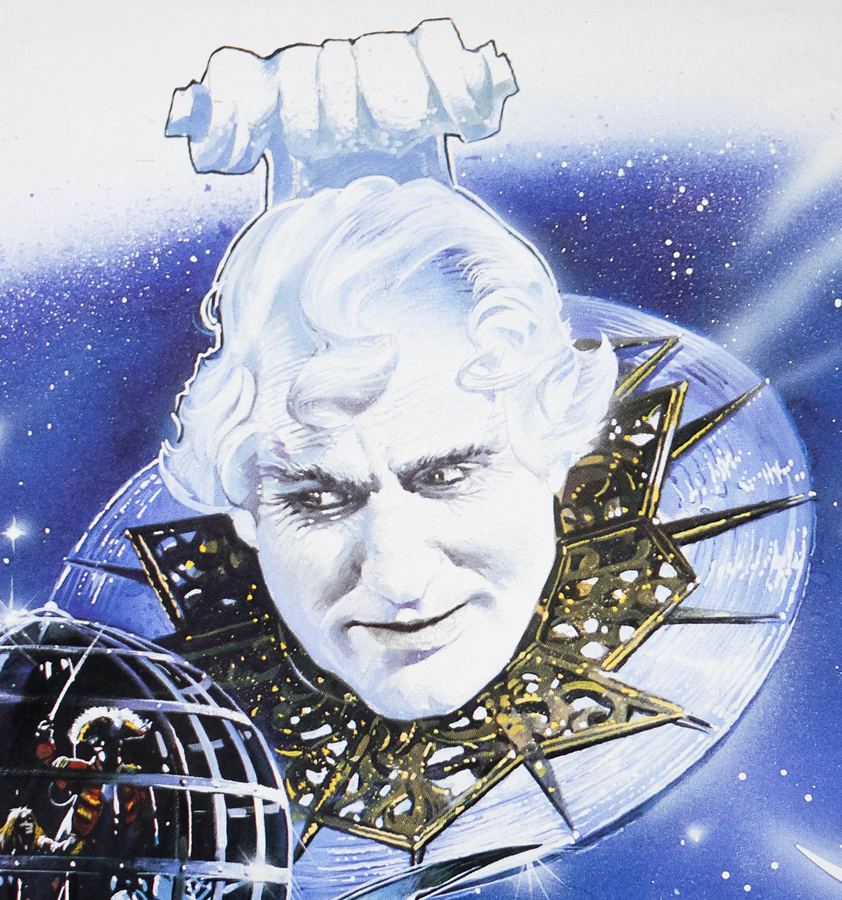
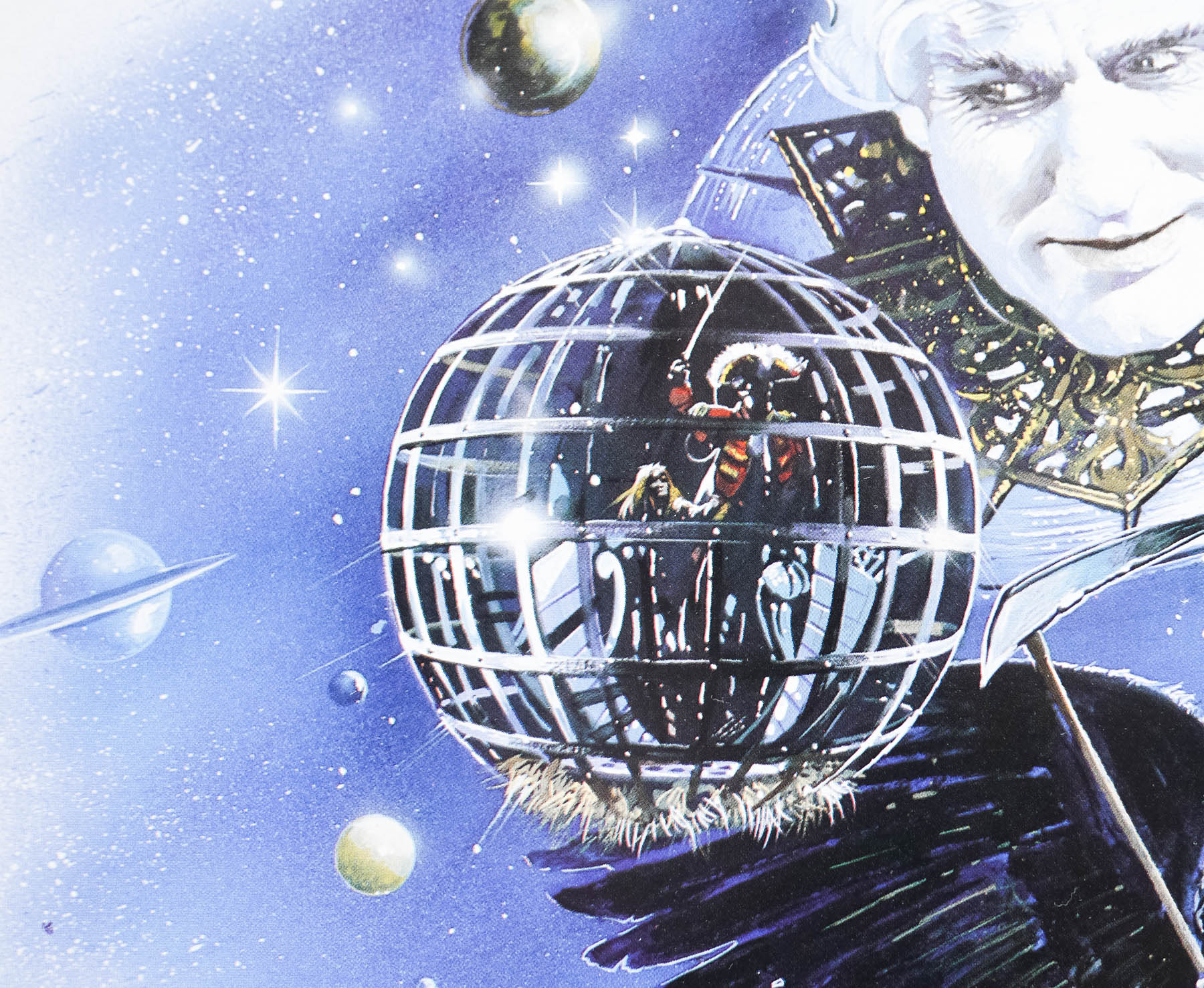
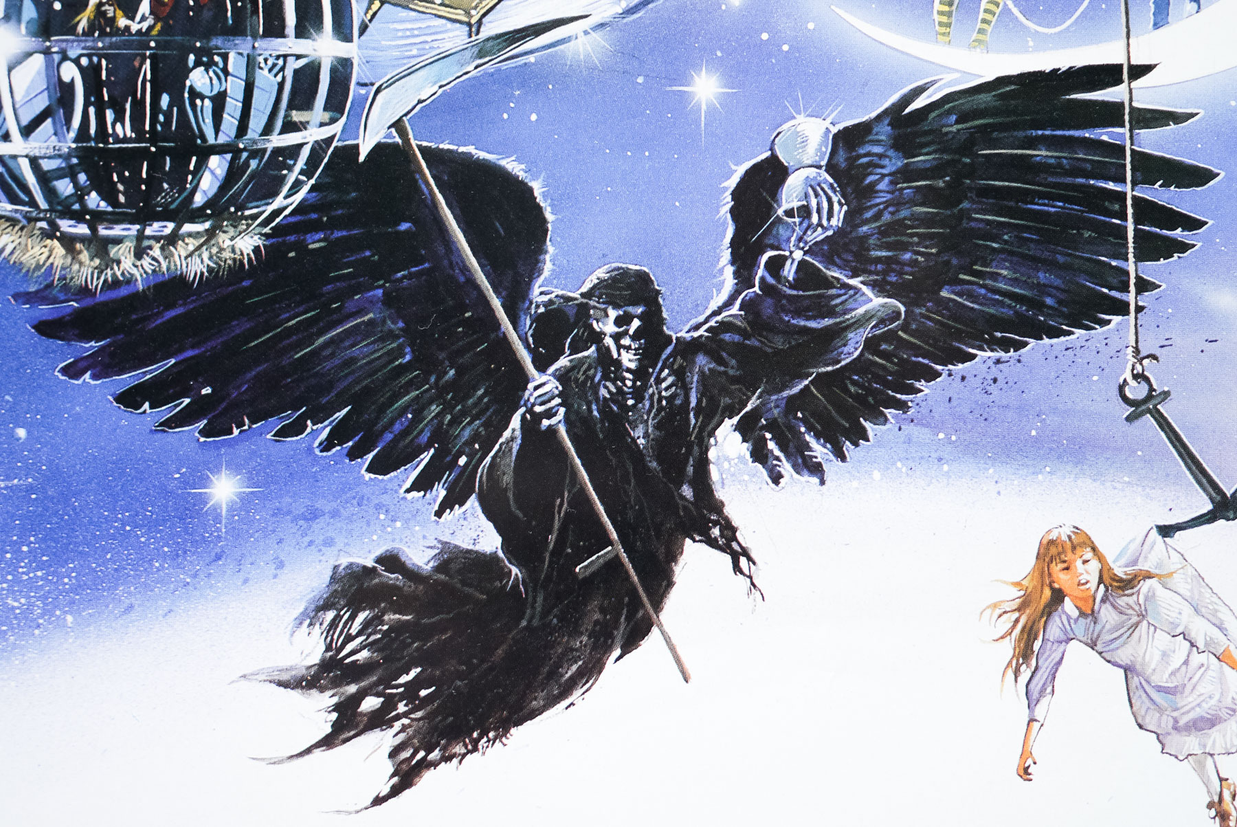
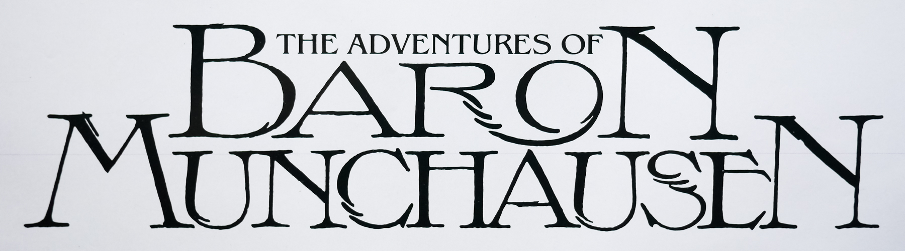
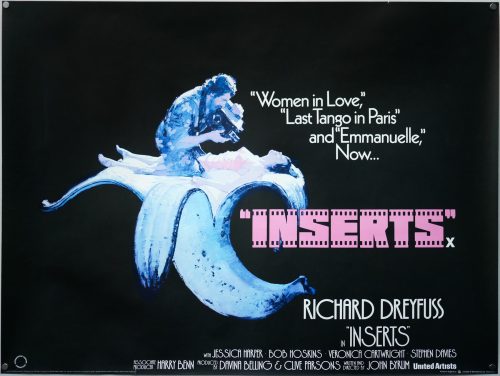
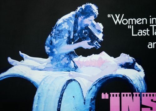
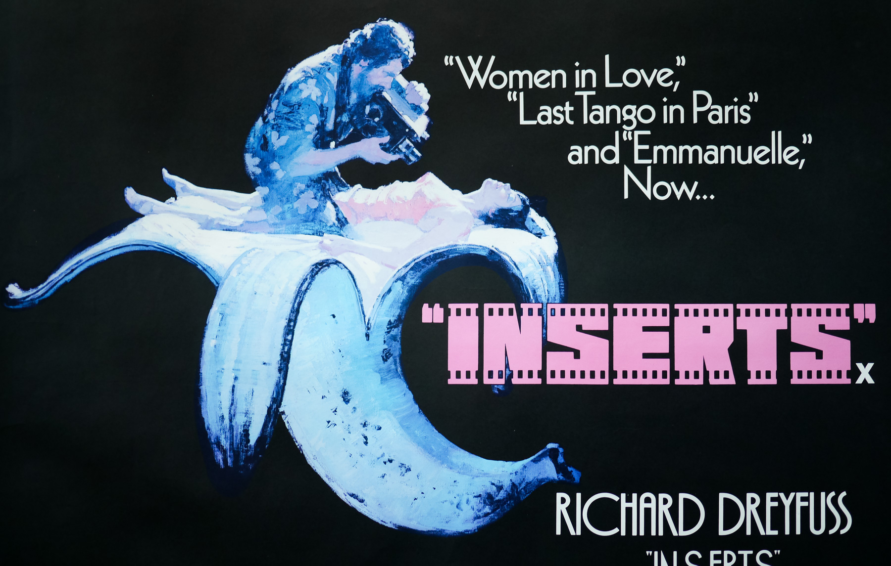
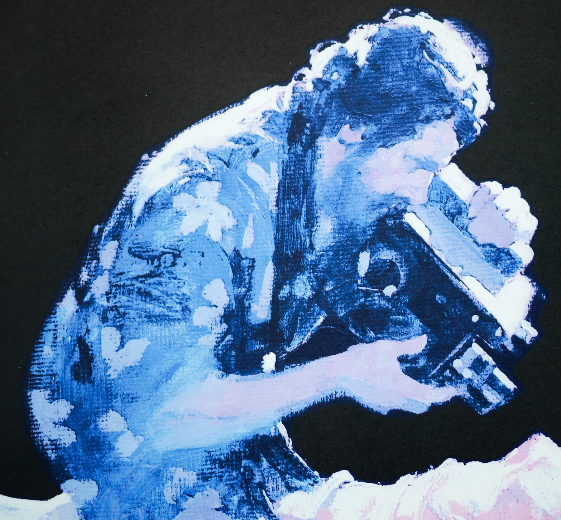
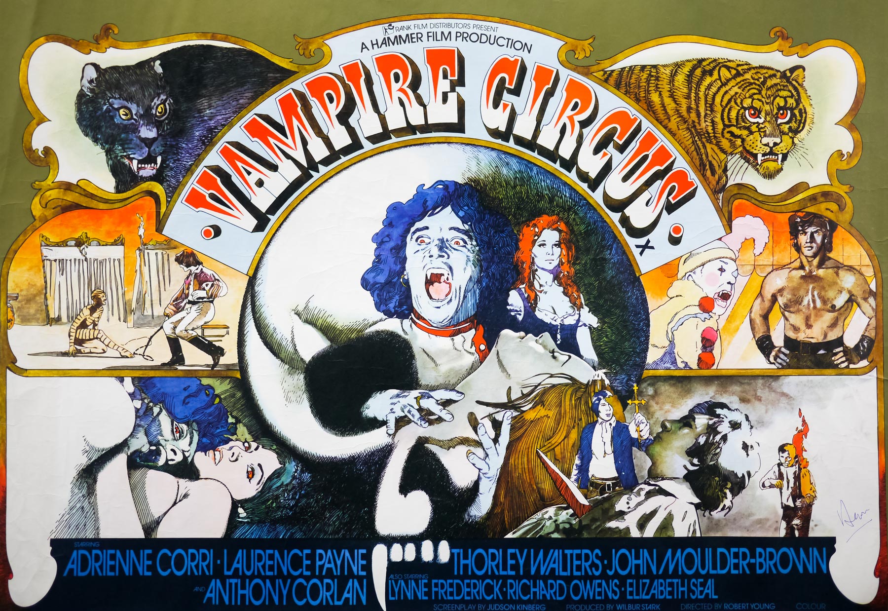
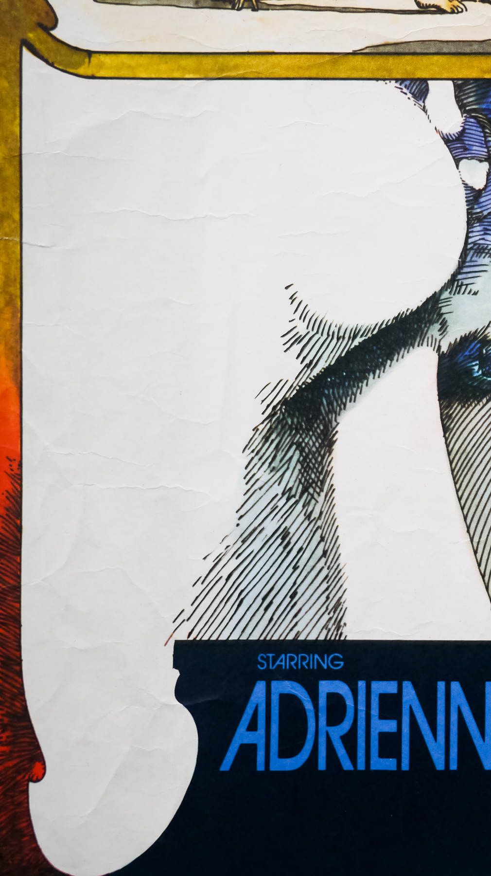
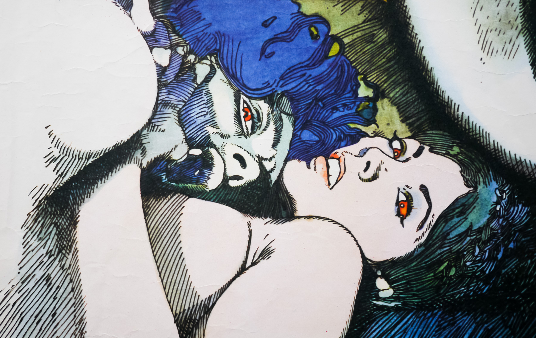
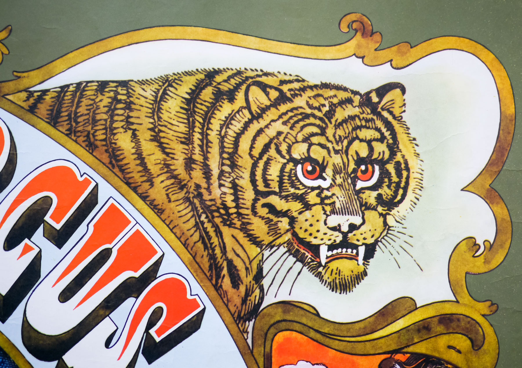
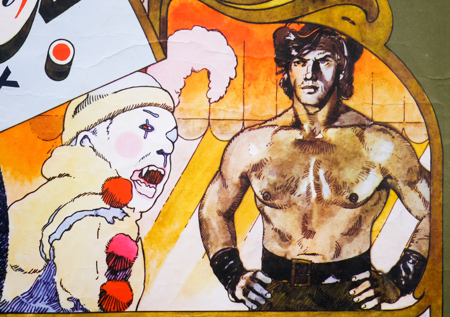
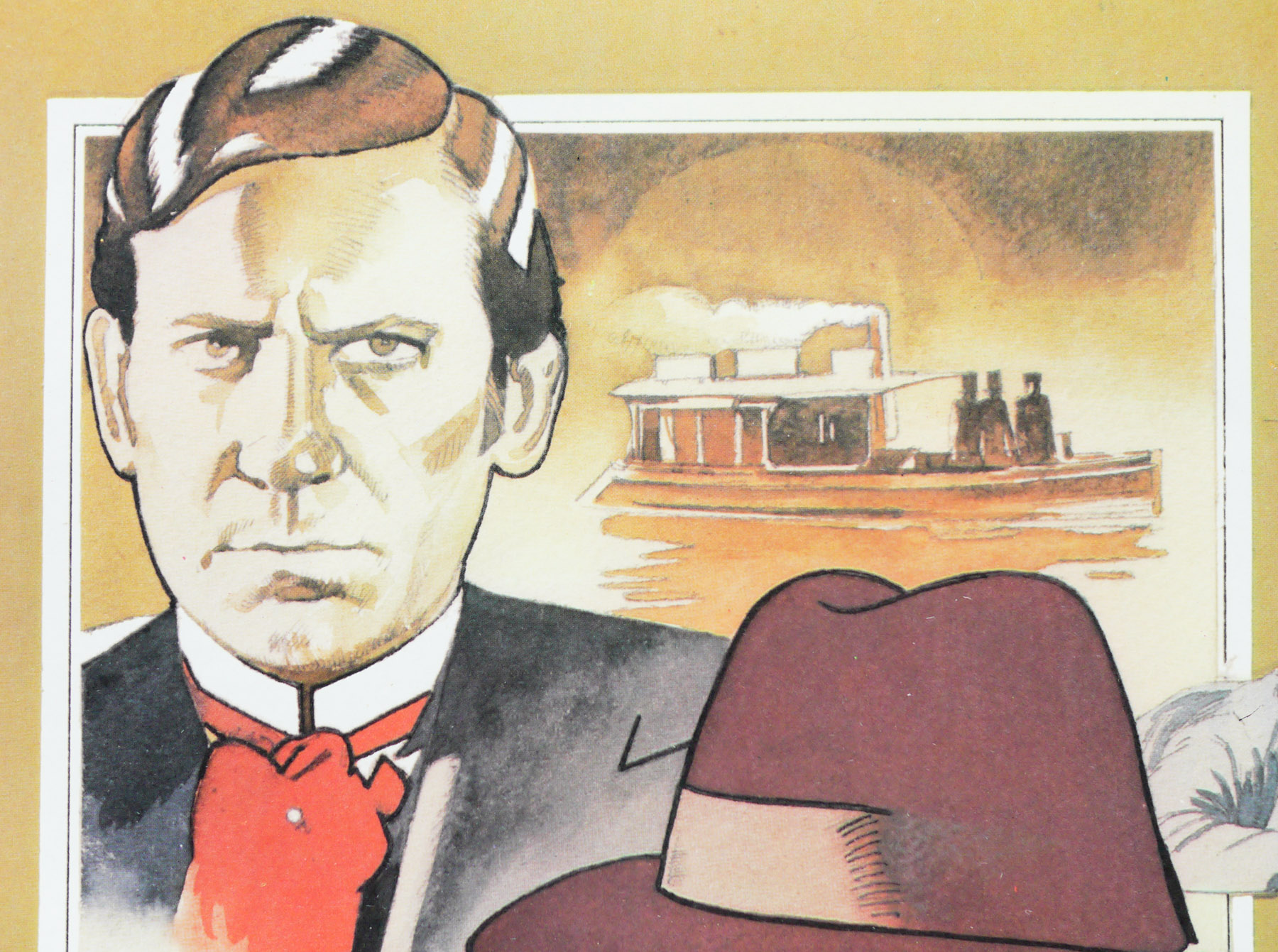
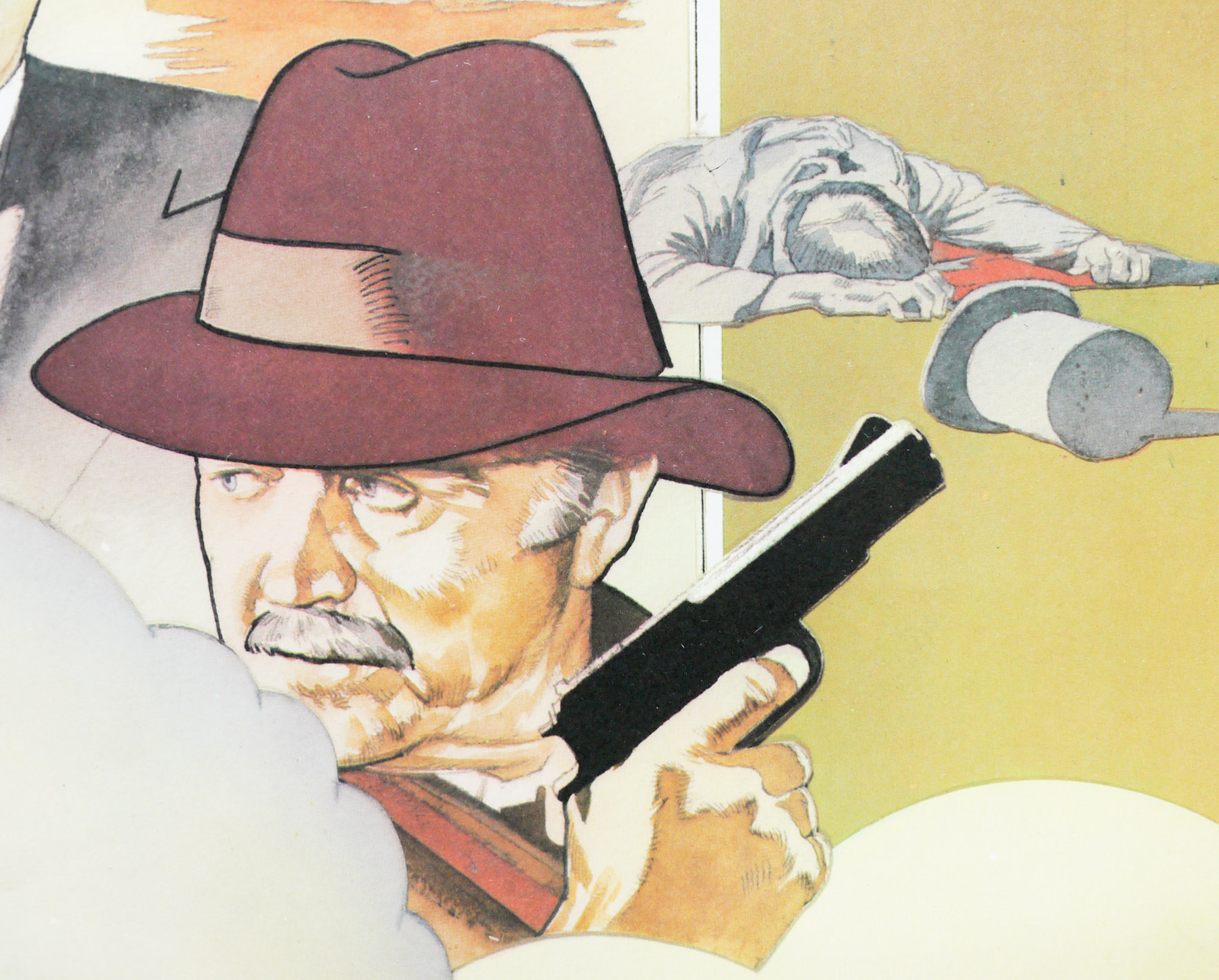
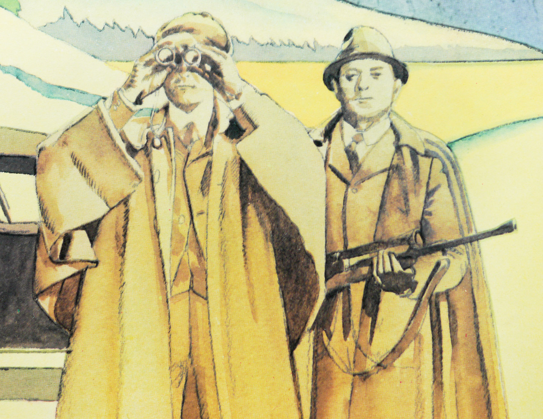
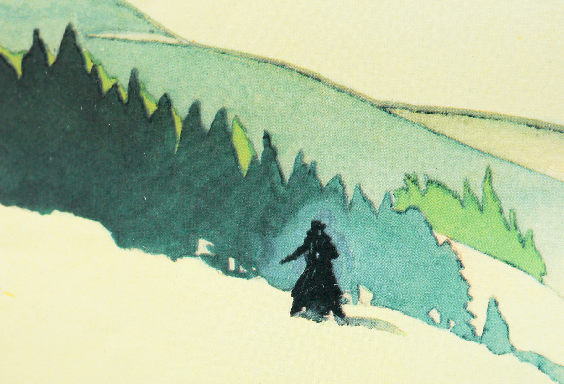
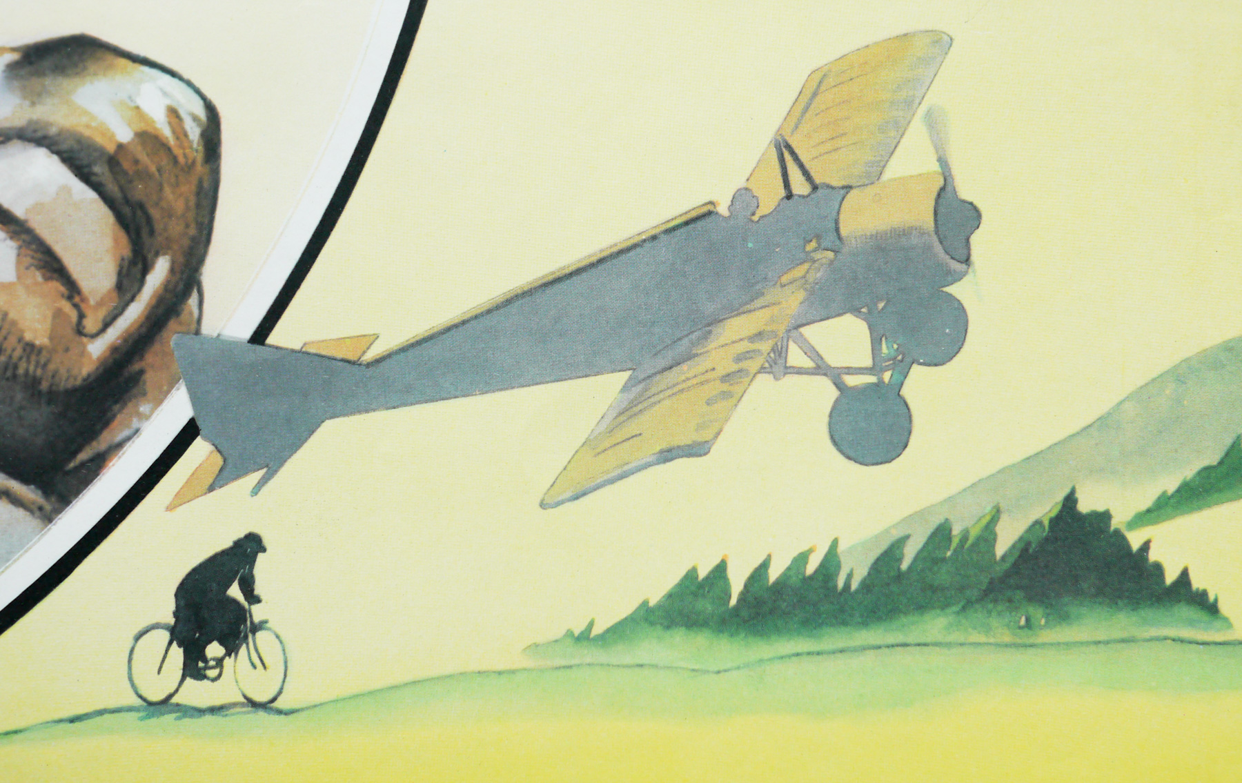
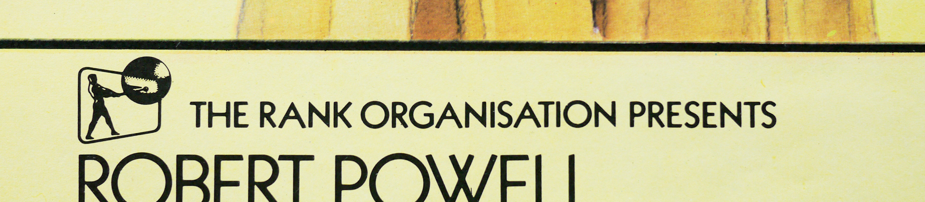
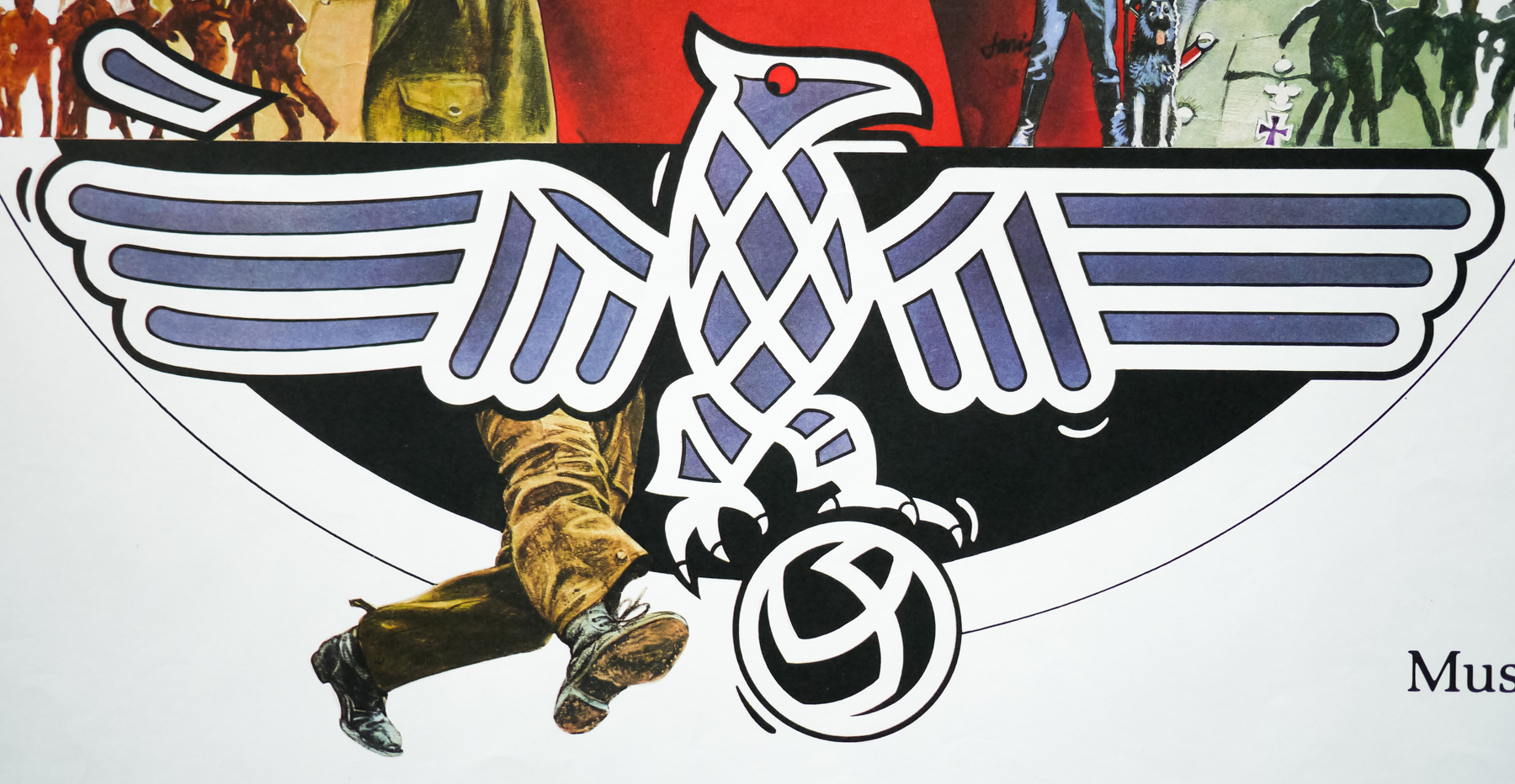
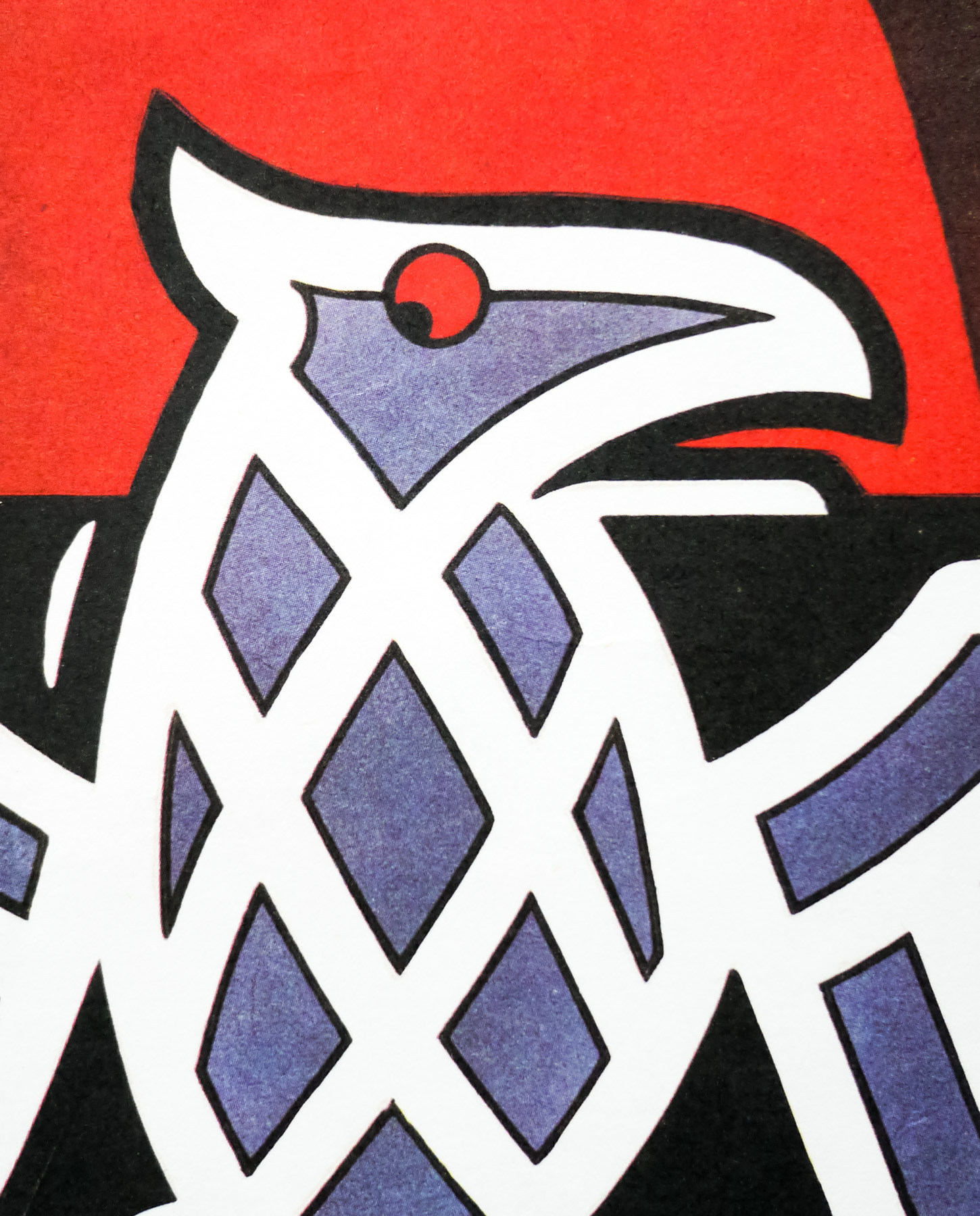
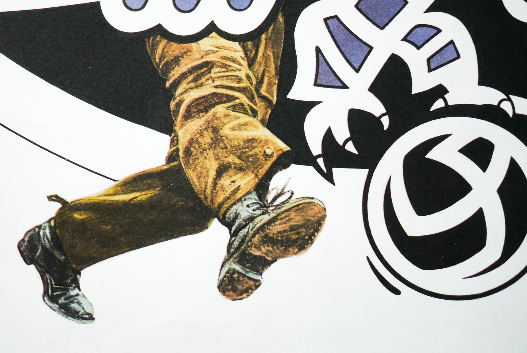
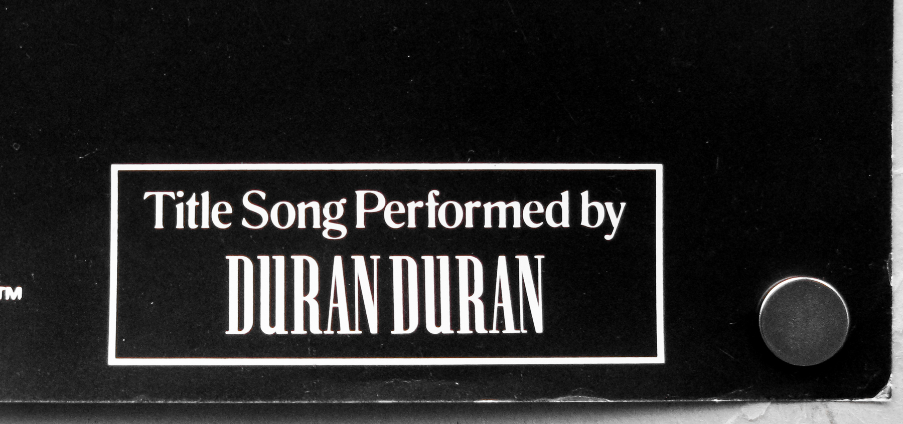
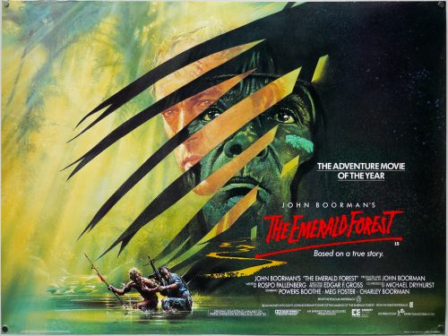
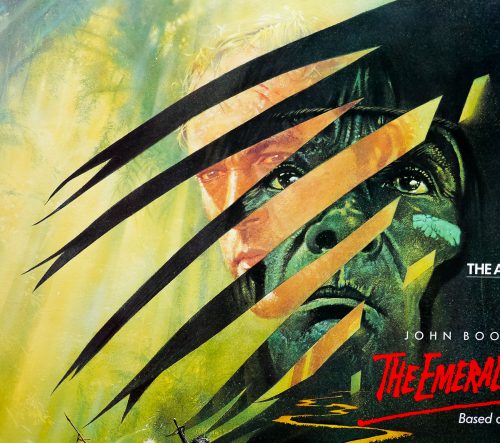
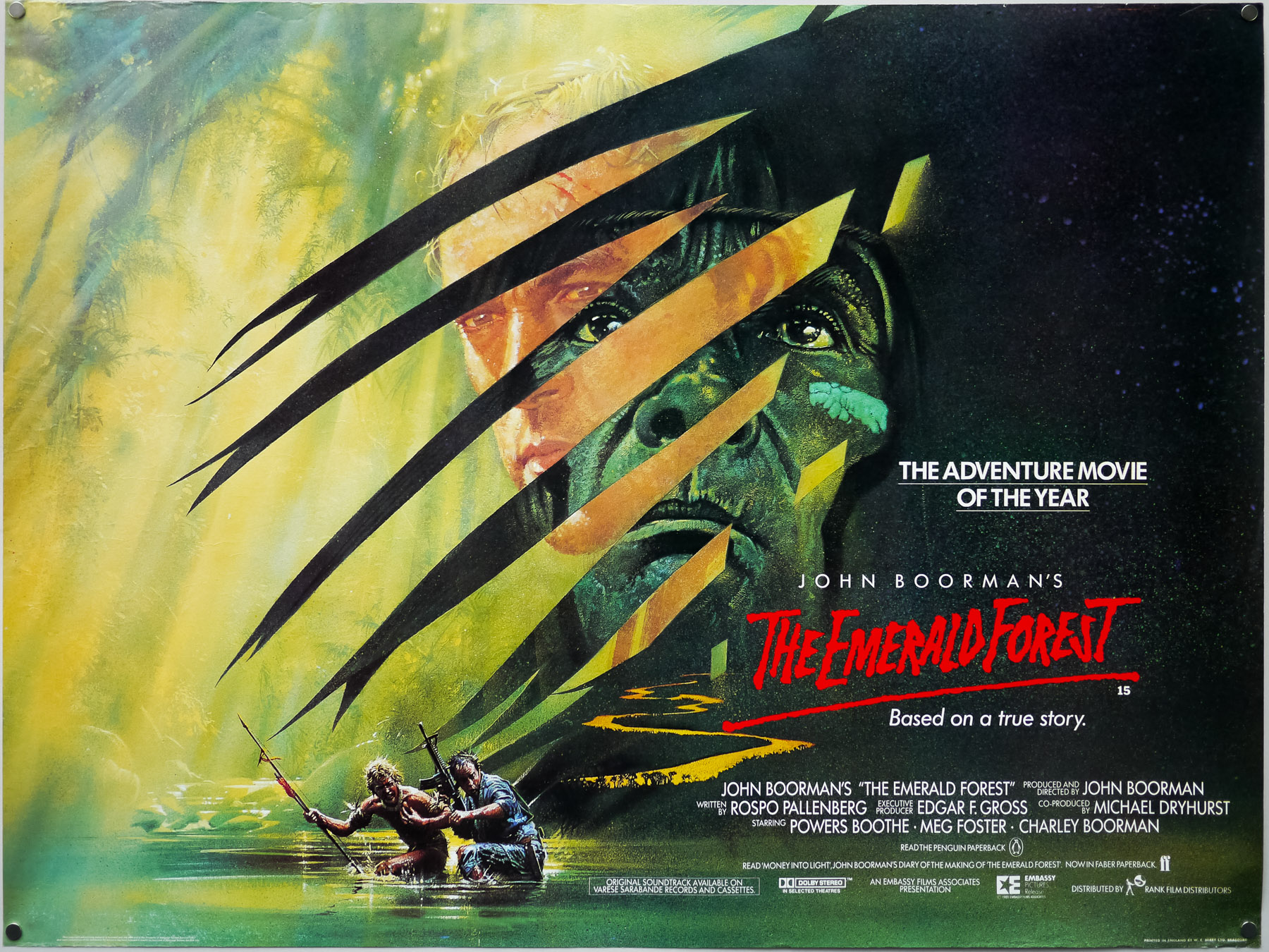
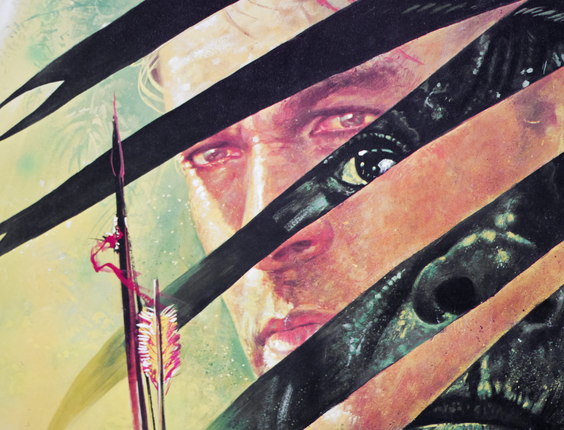
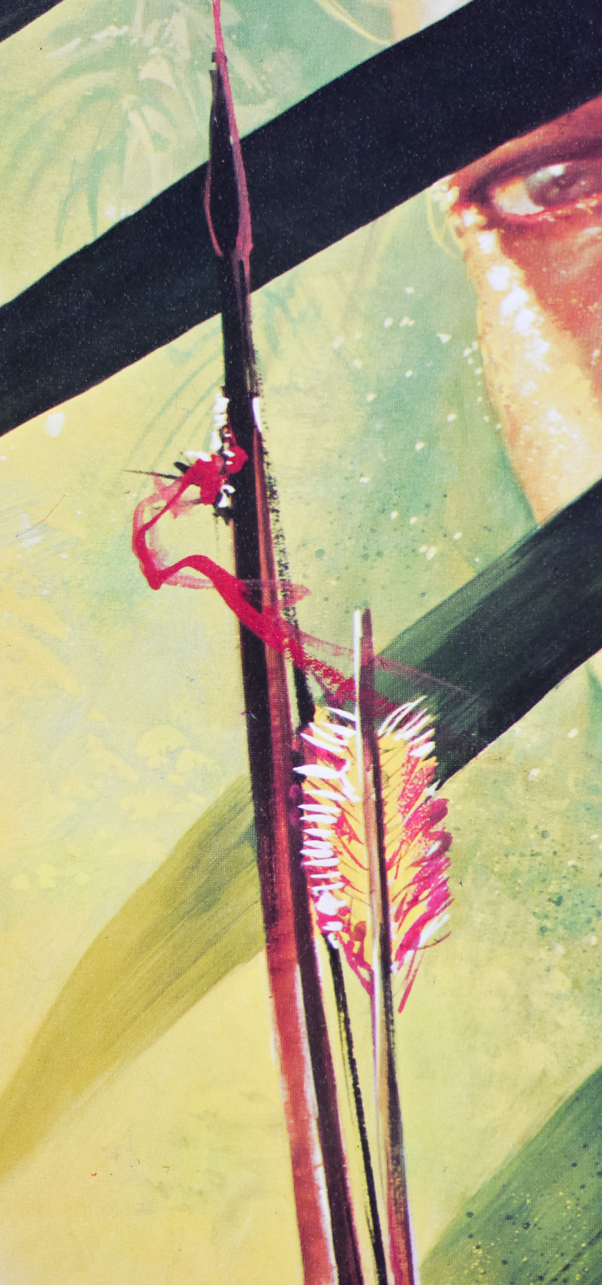
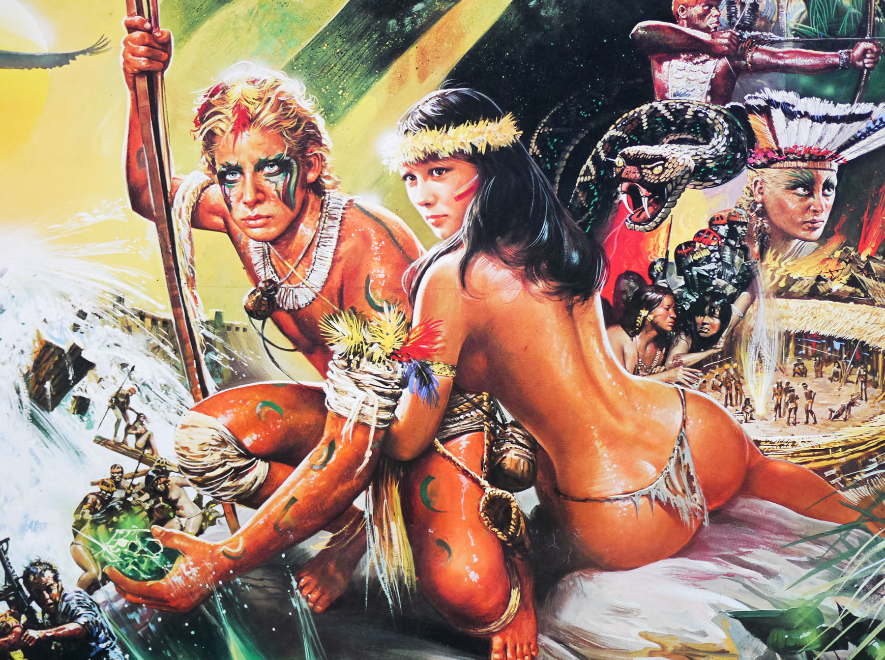
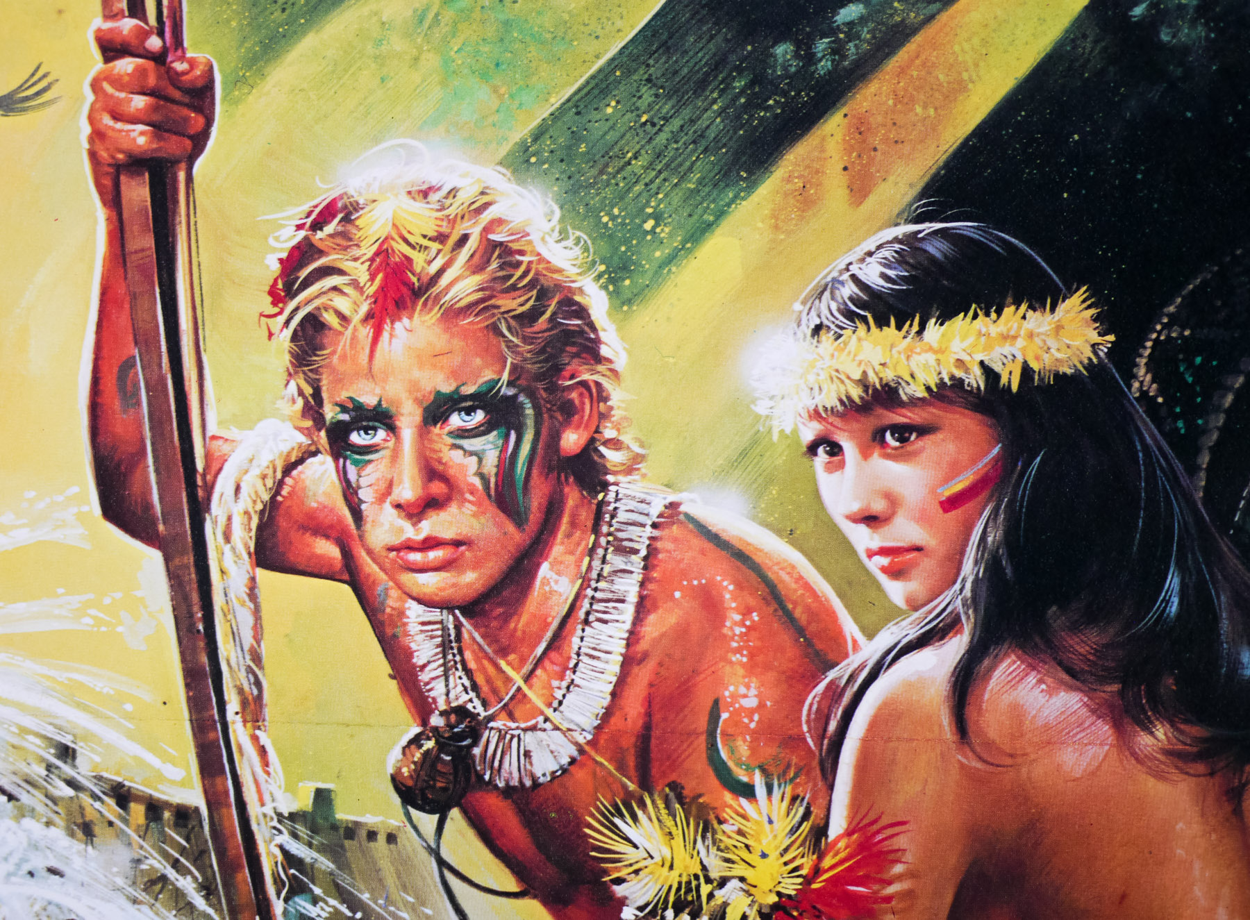
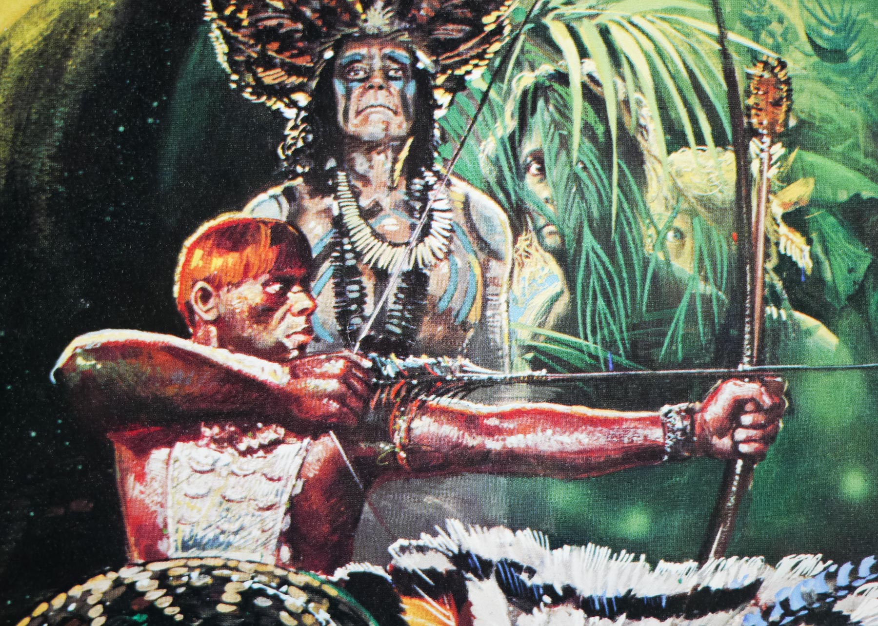
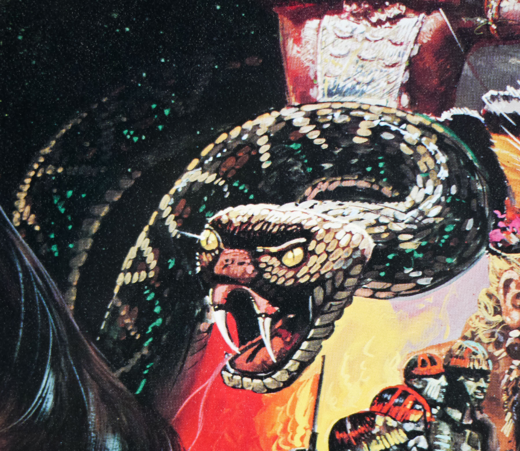
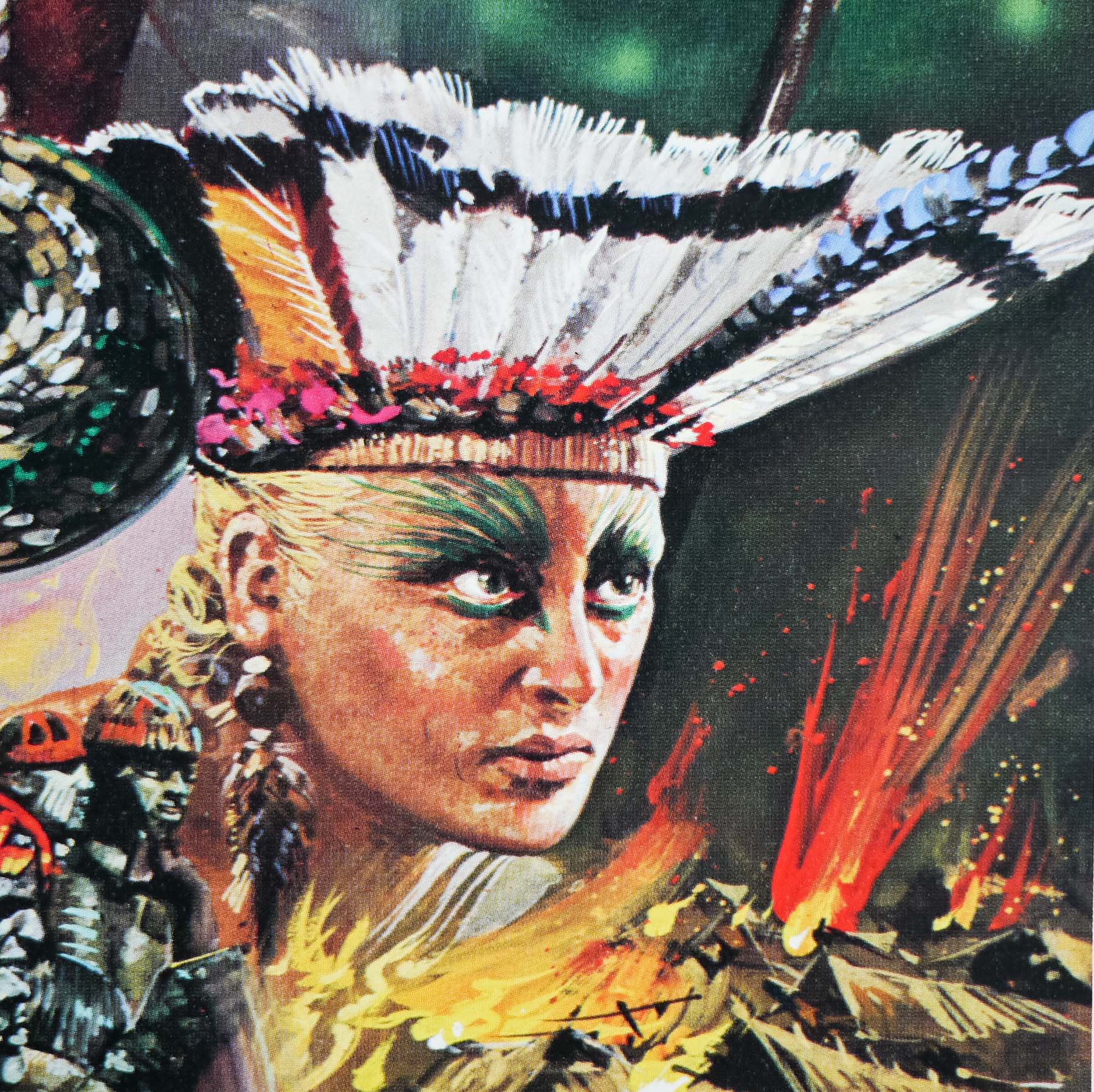
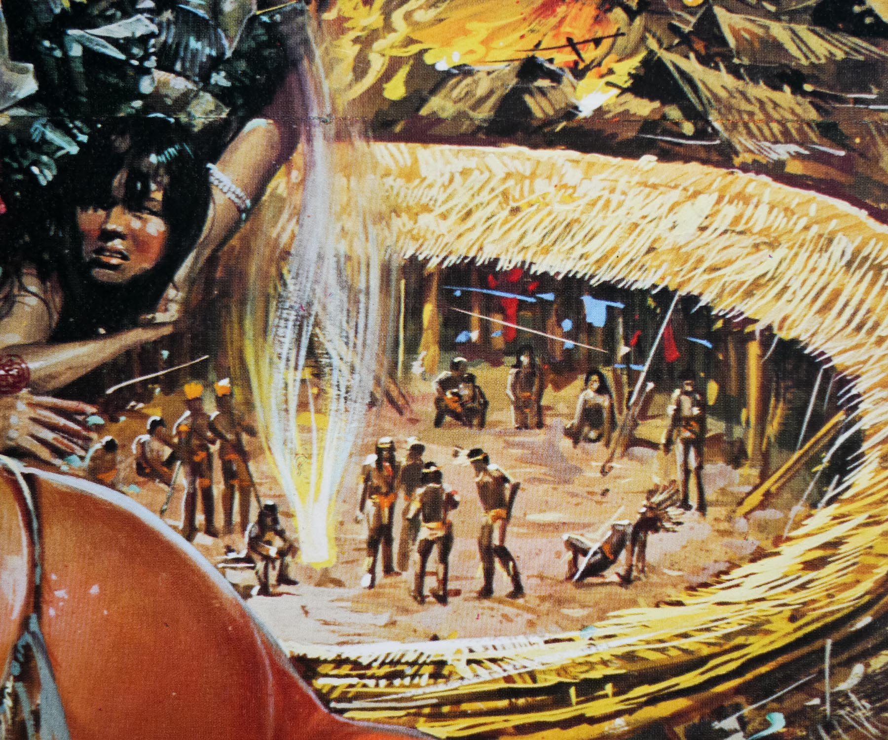
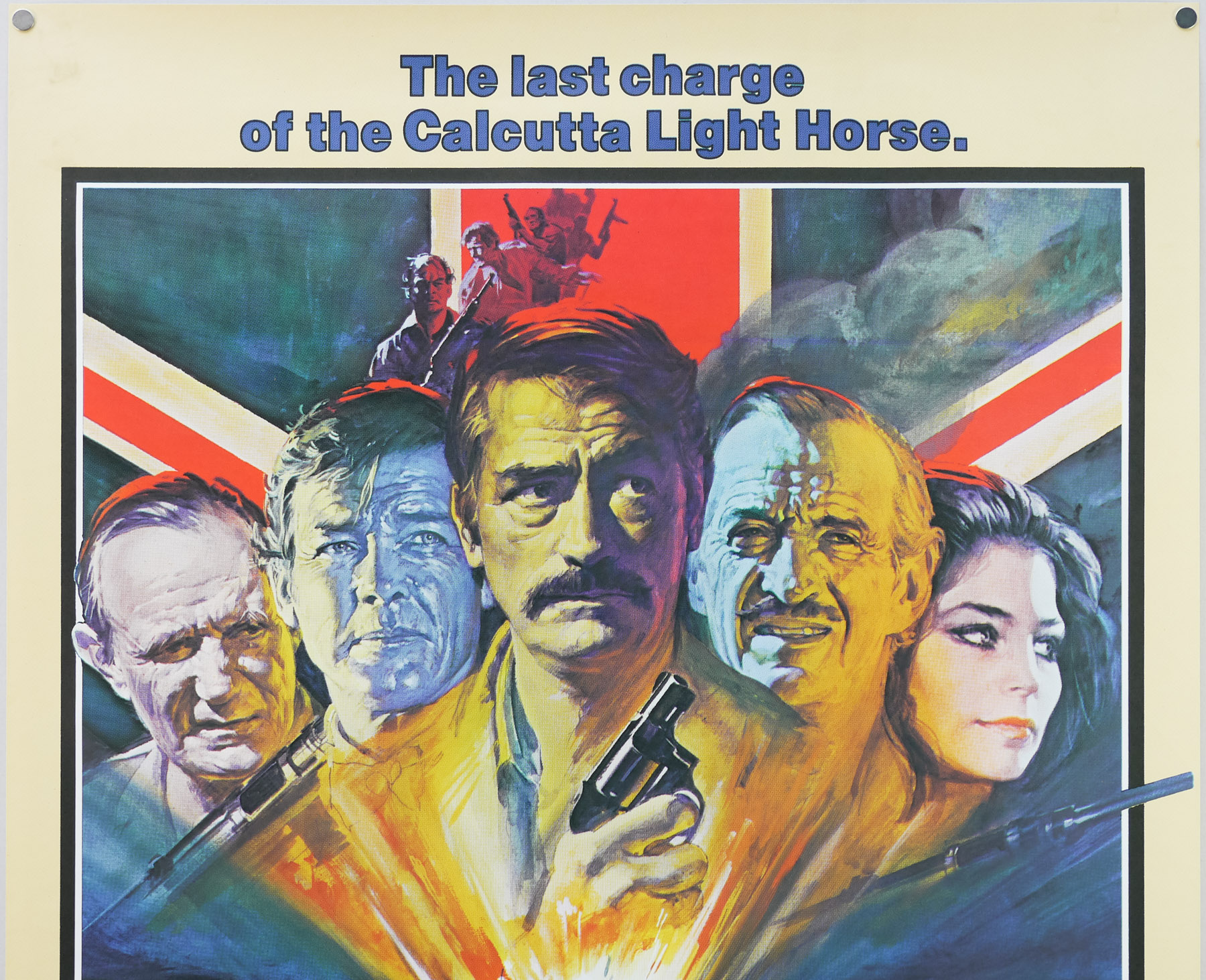
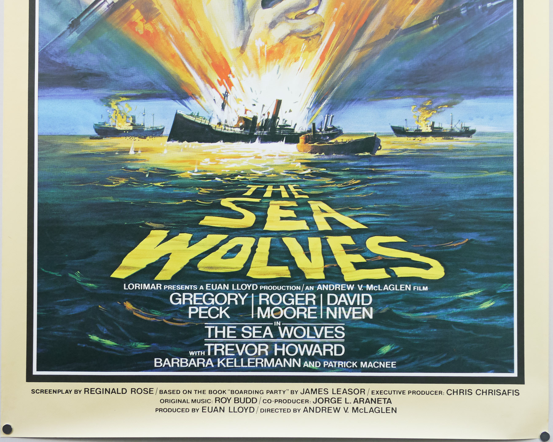
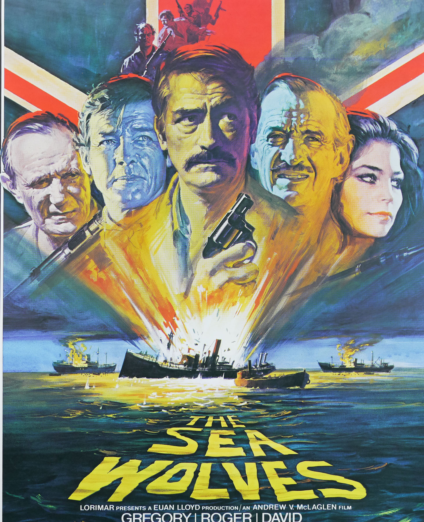
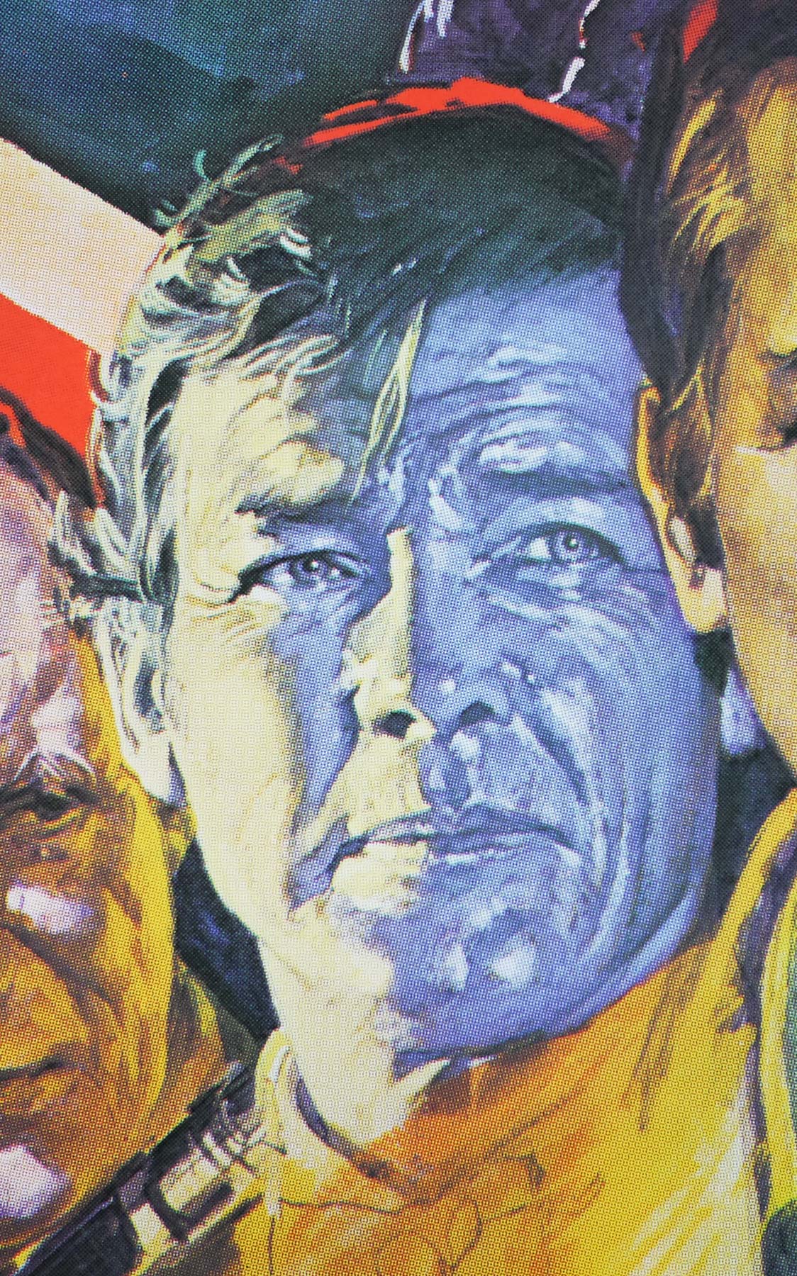
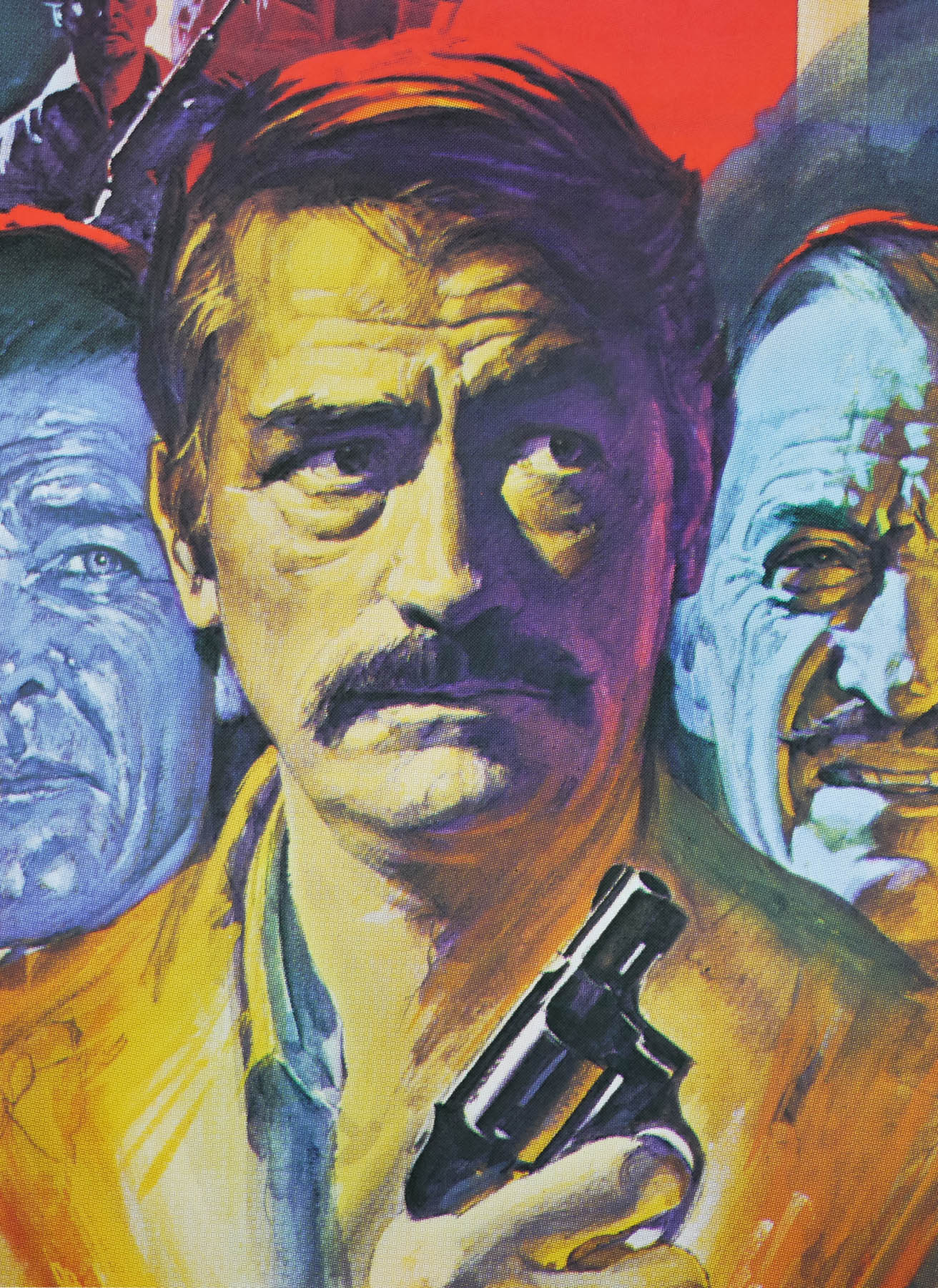
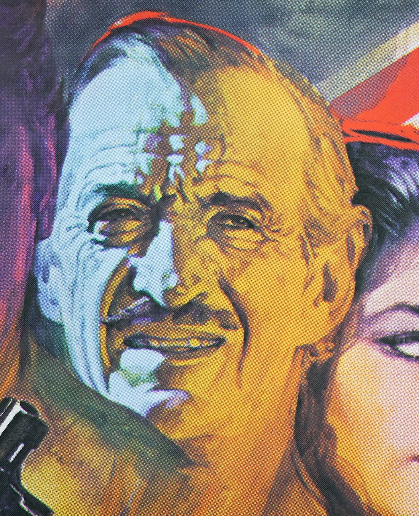
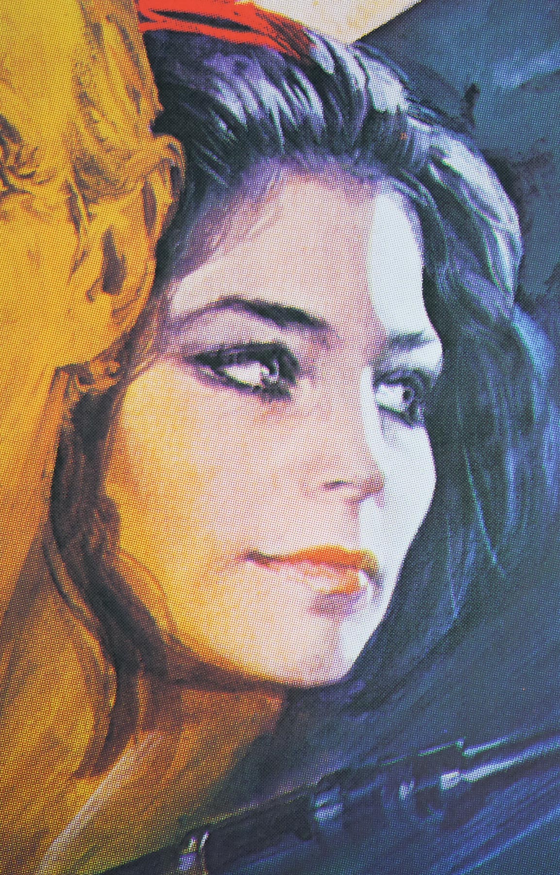
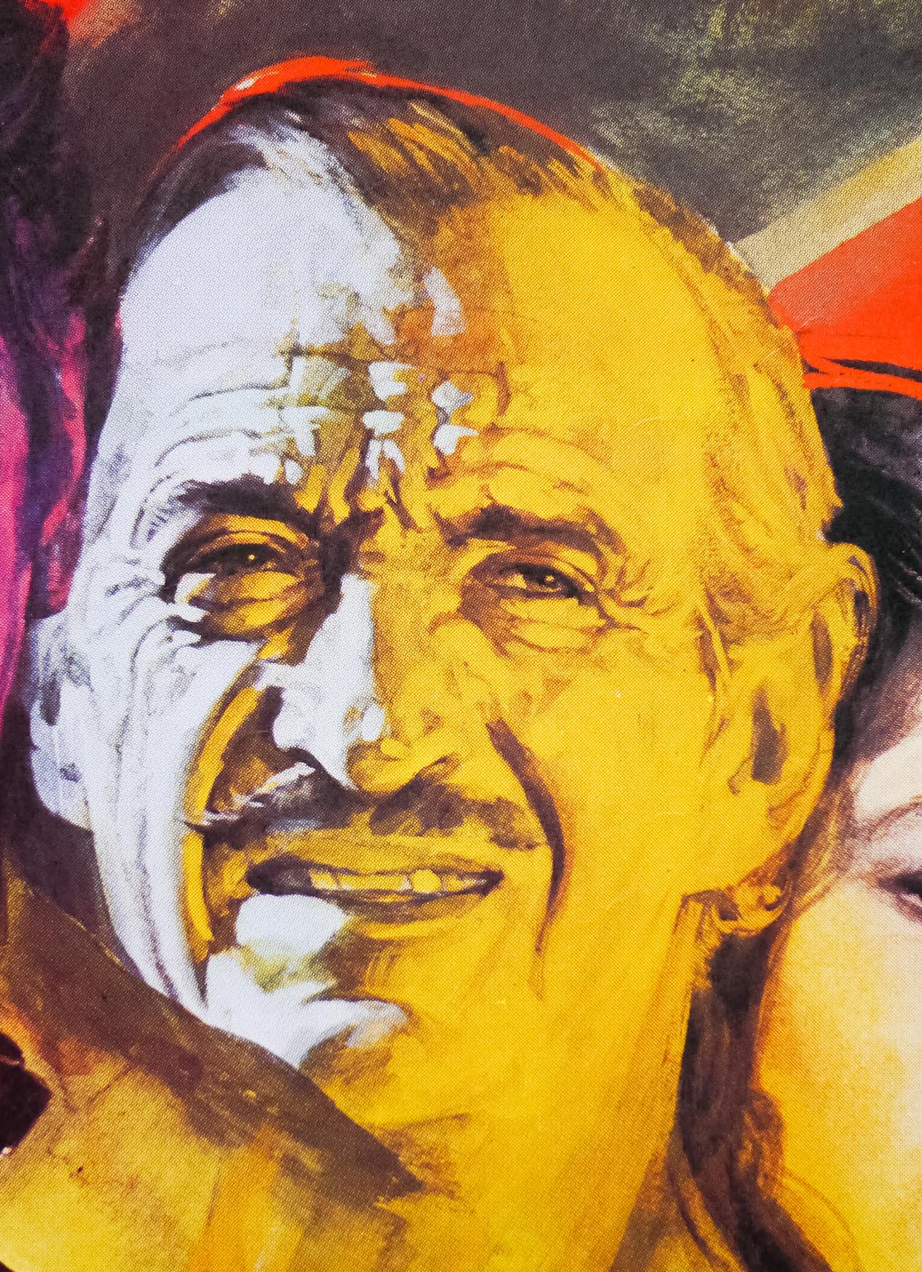
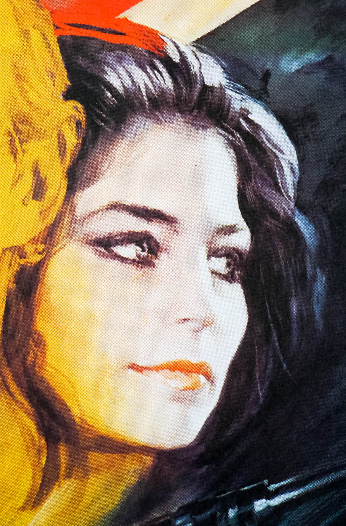
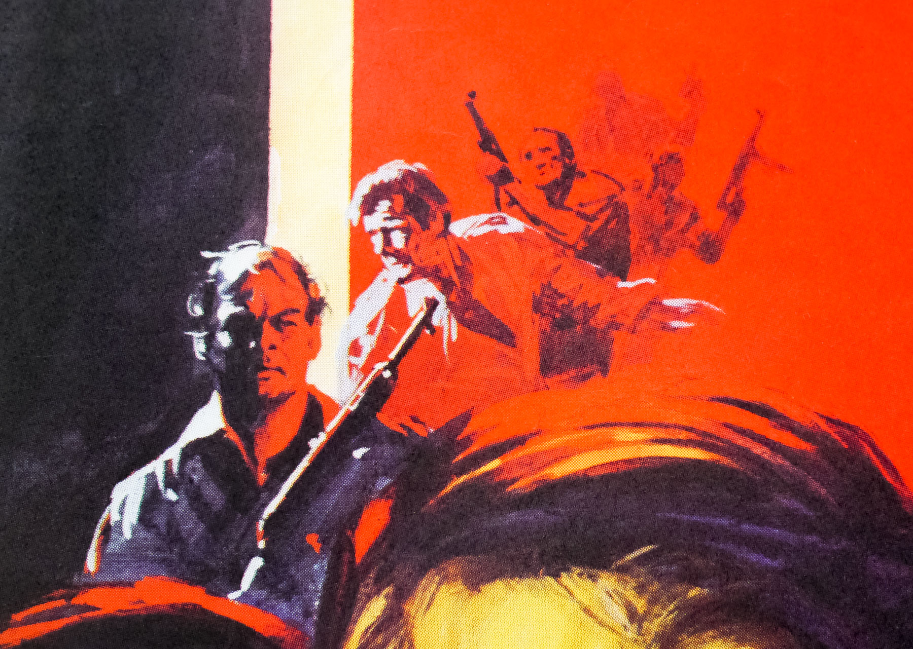
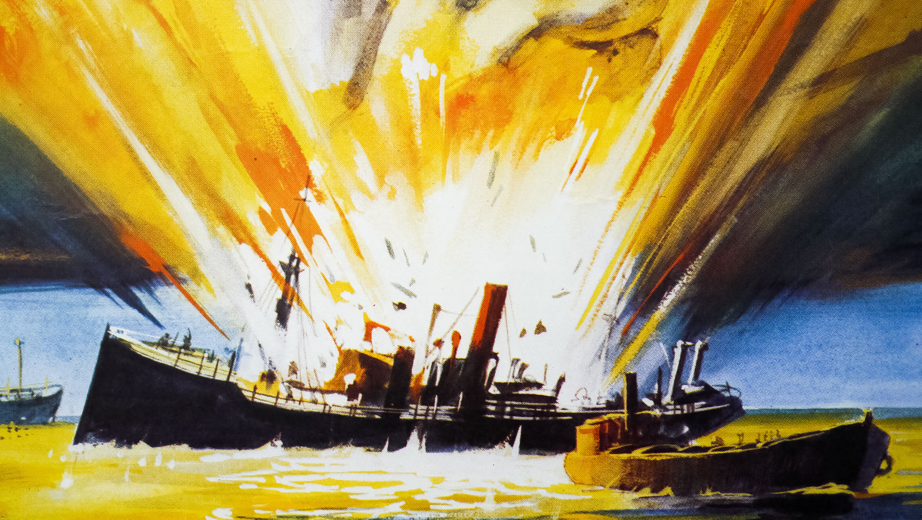
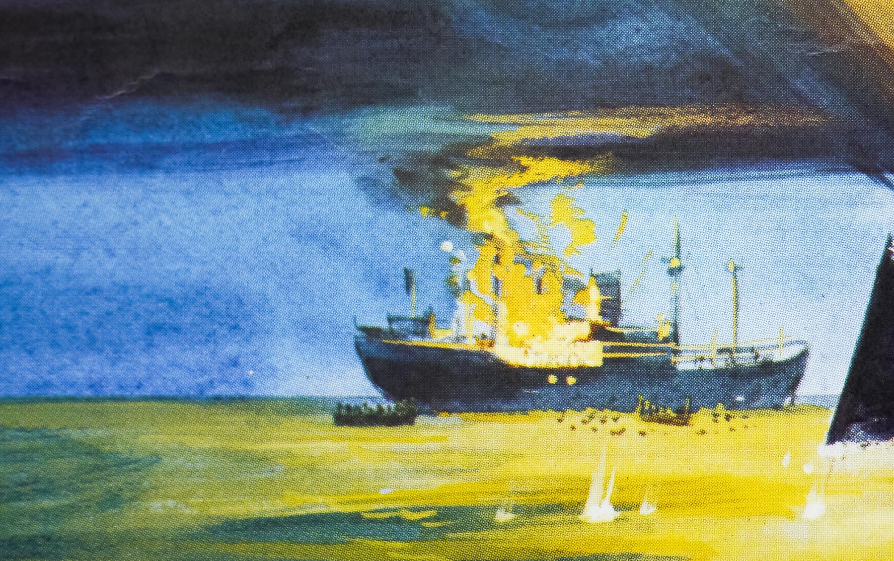
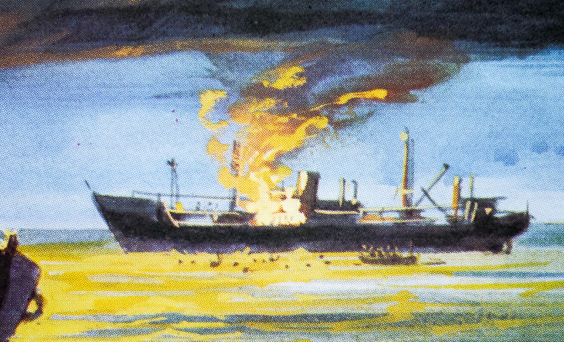
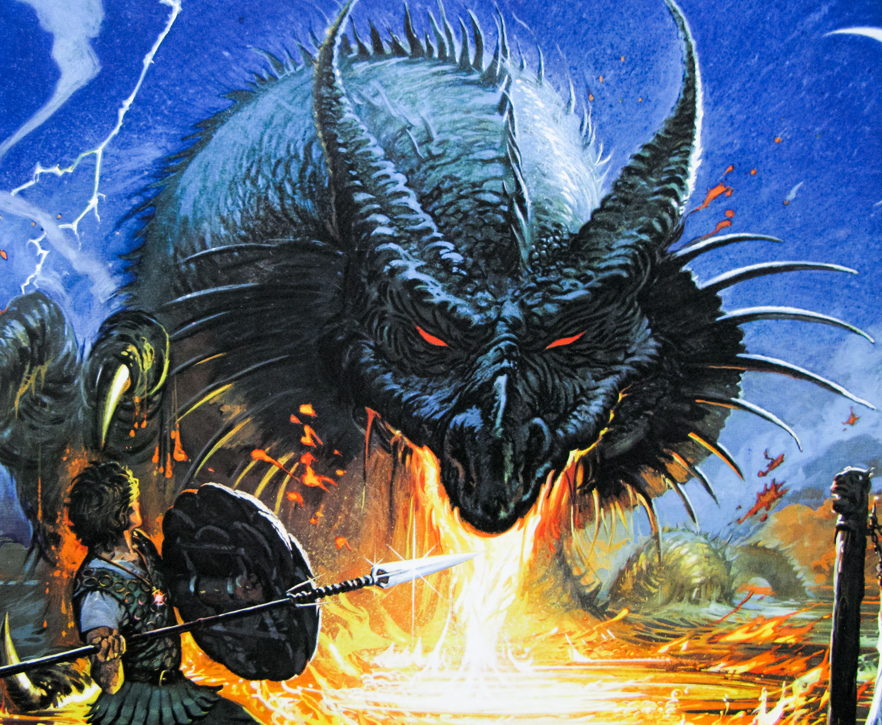
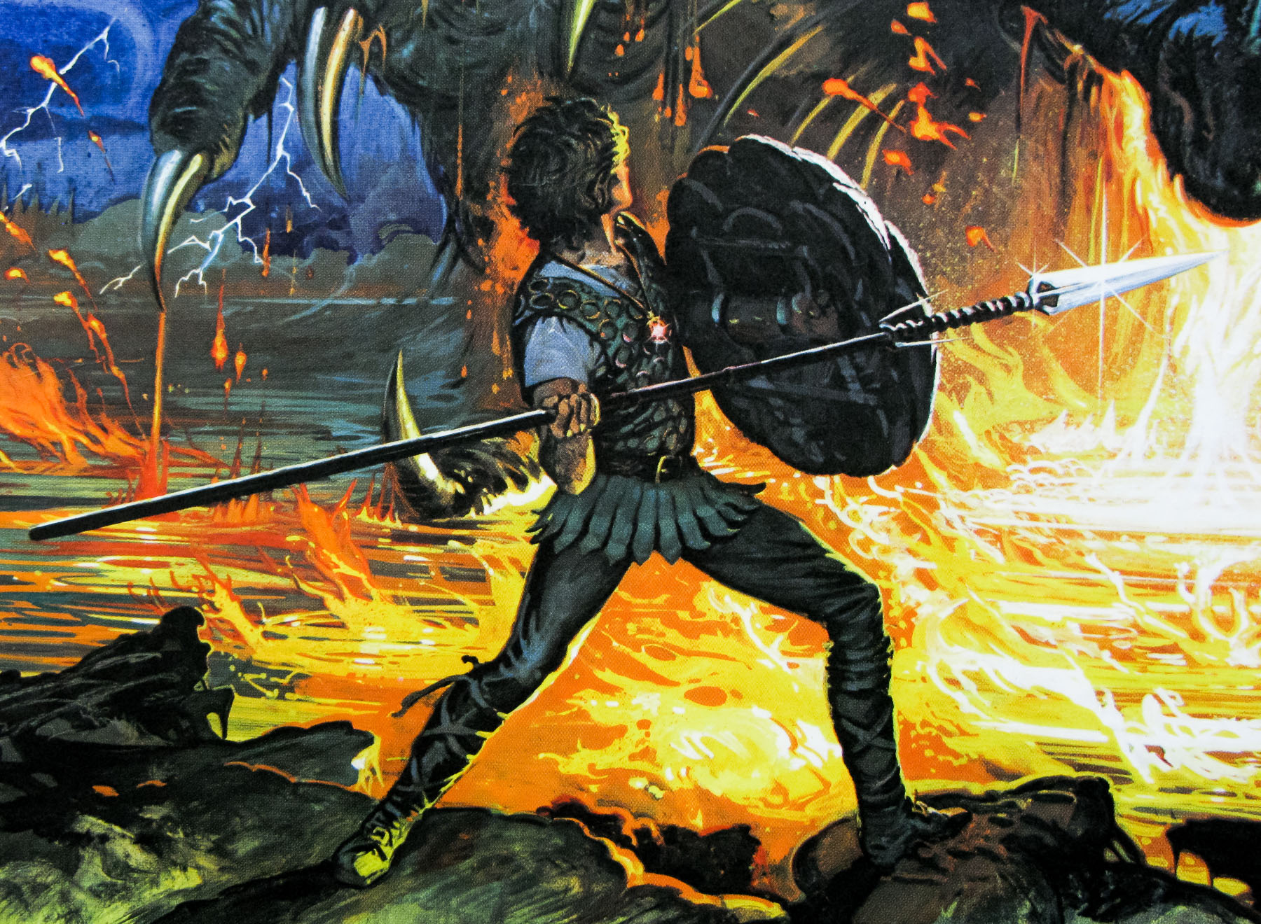
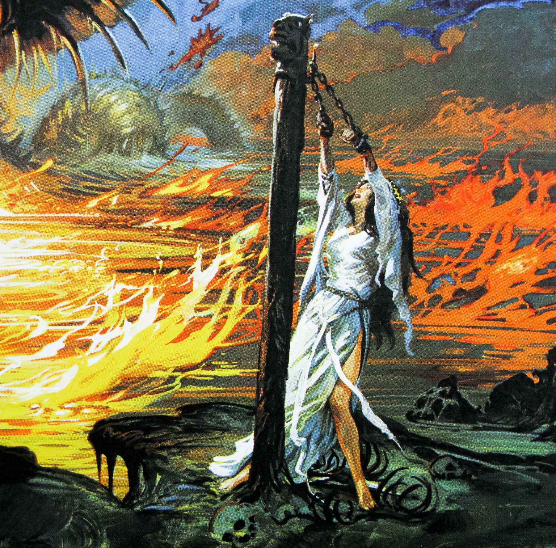
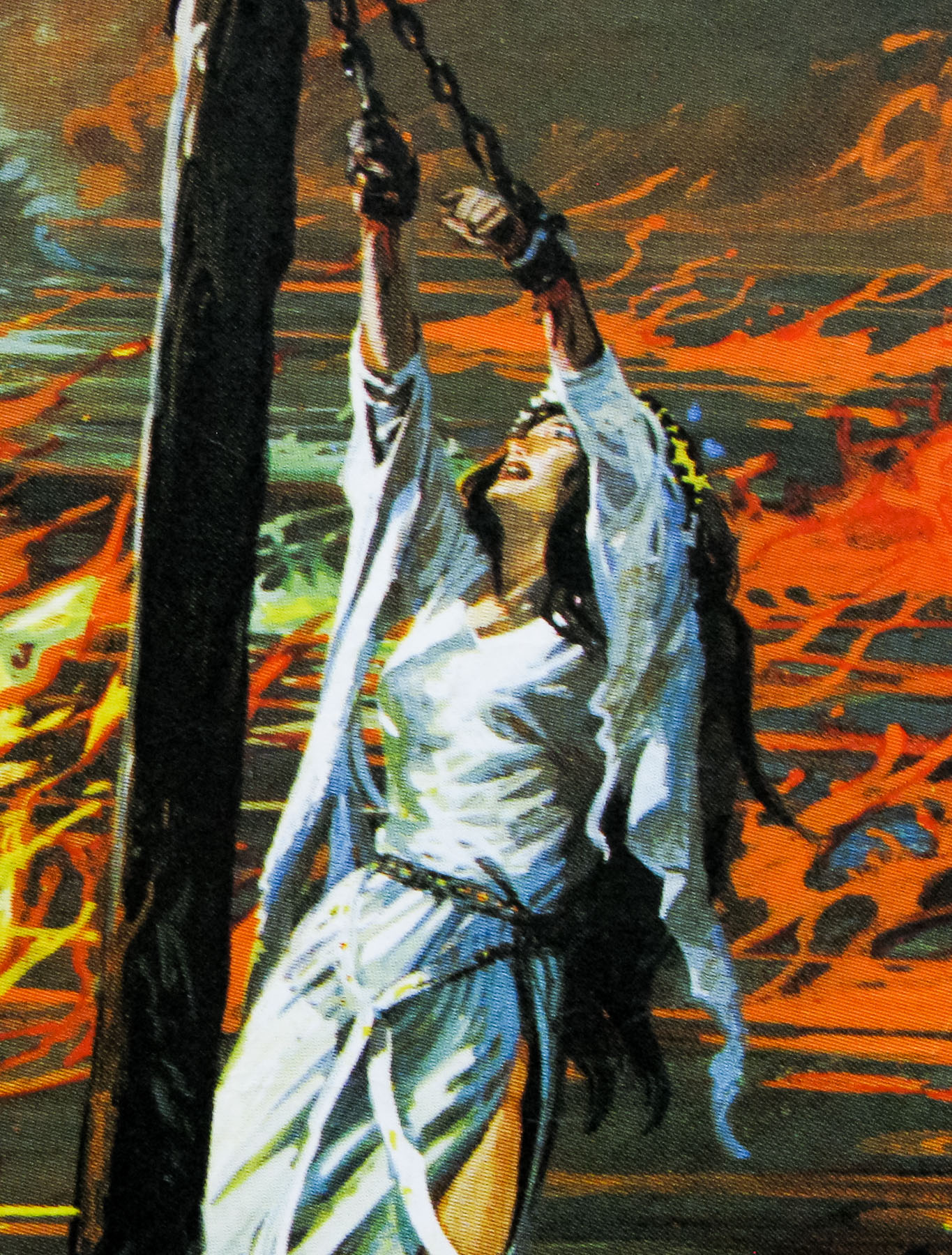
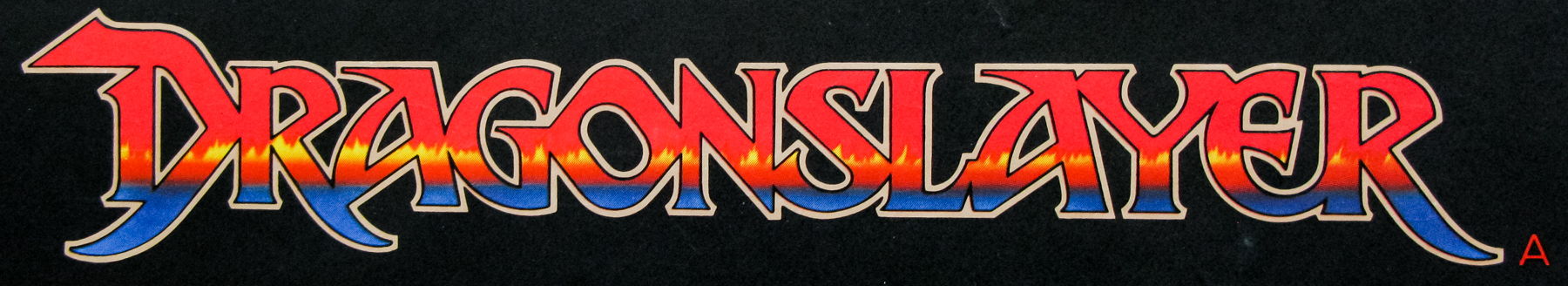
In the history of British film posters there are few characters as significant and influential as the designer and artist Vic Fair. During a career that spanned close to forty years, many of them spent as part of the same ever-evolving agency, Vic lent his inimitable style to several of the most iconic British posters ever printed. He designed marketing campaigns for most of the big film studios and distributors, including for the likes of Hammer Films and all of the posters for the very British ‘Confessions…’ series of bawdy comedies. Over the years, Vic also developed a strong working relationship with many of the British film industry’s leading directors, including Nic Roeg, Terry Gilliam and Michael Winner.
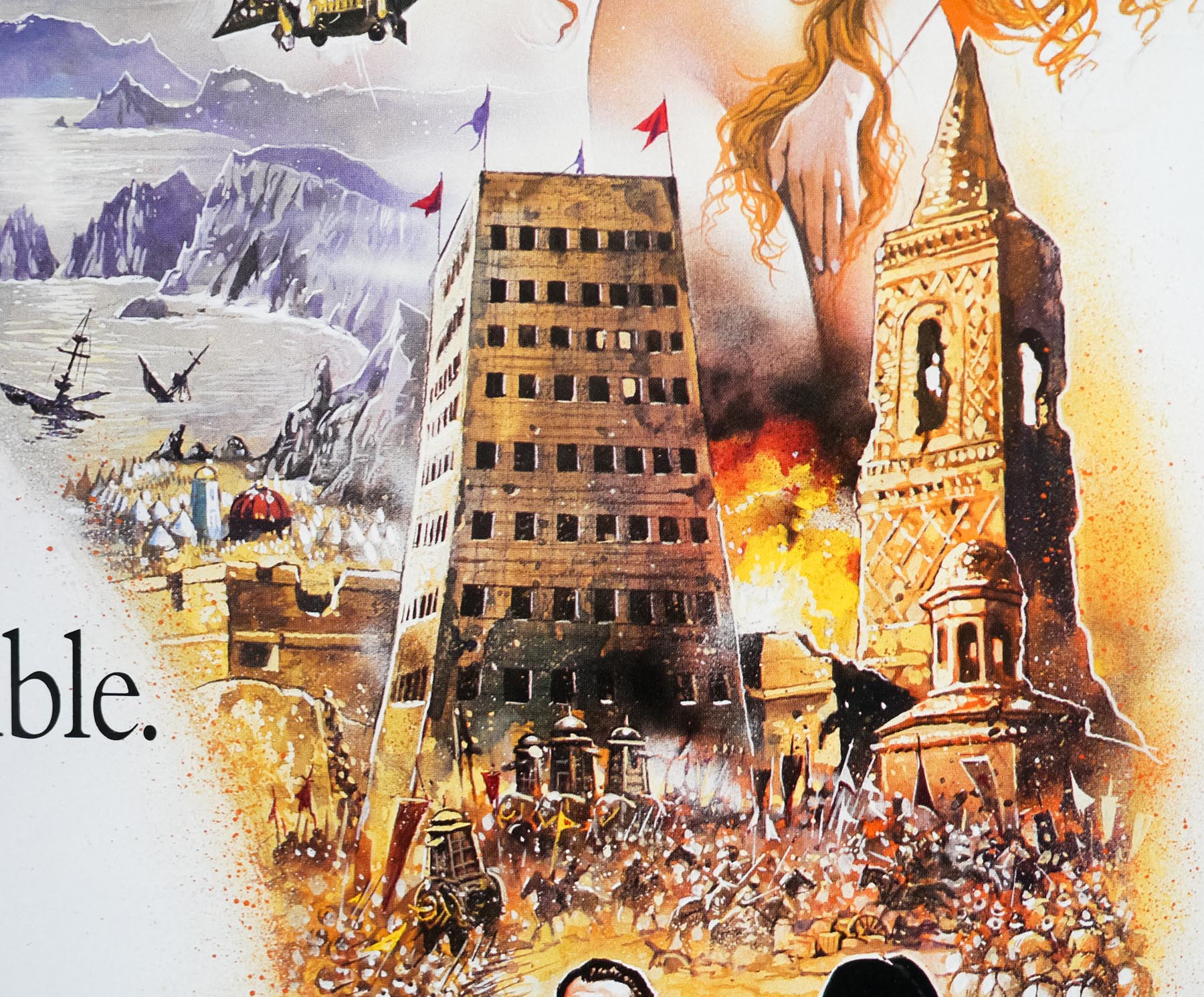
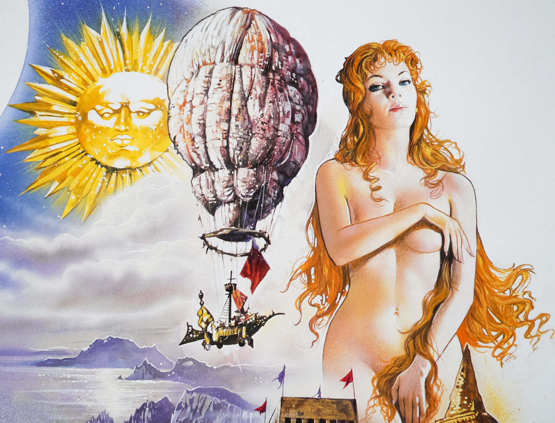
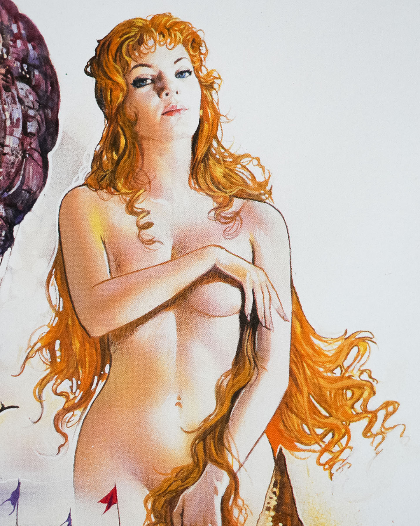
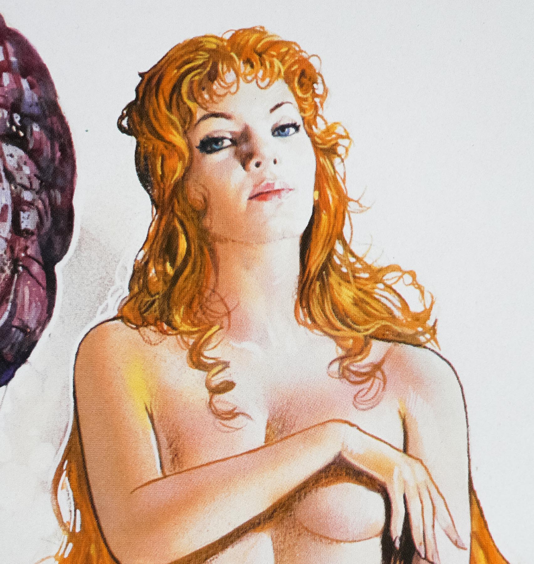
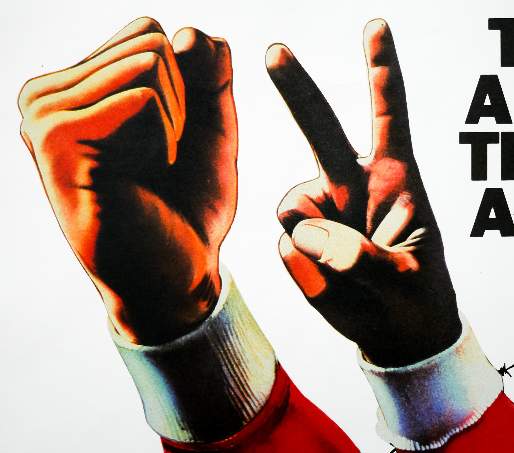
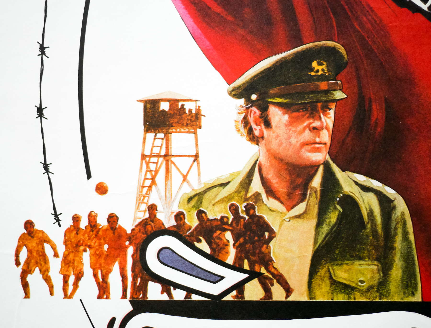
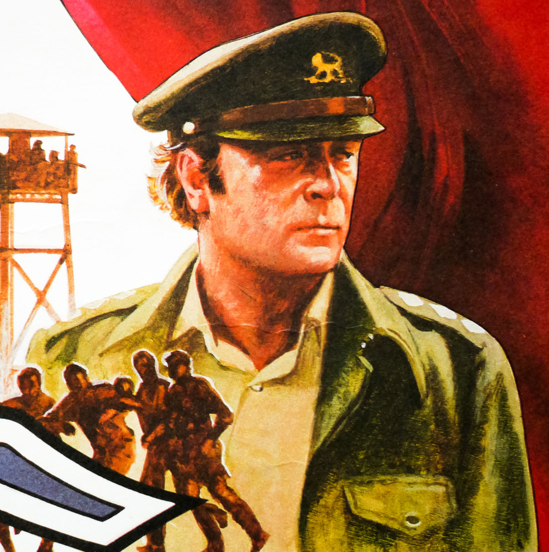
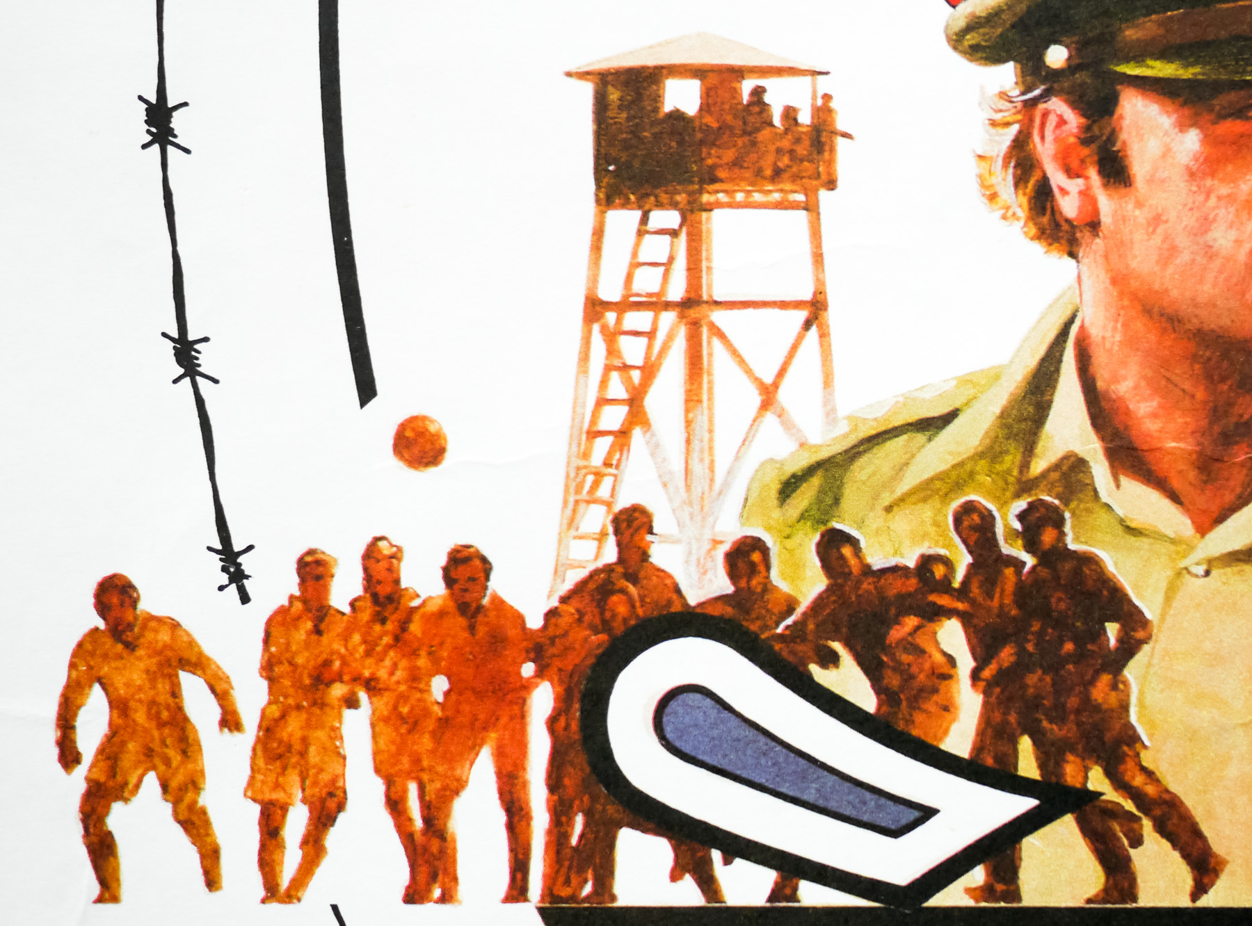
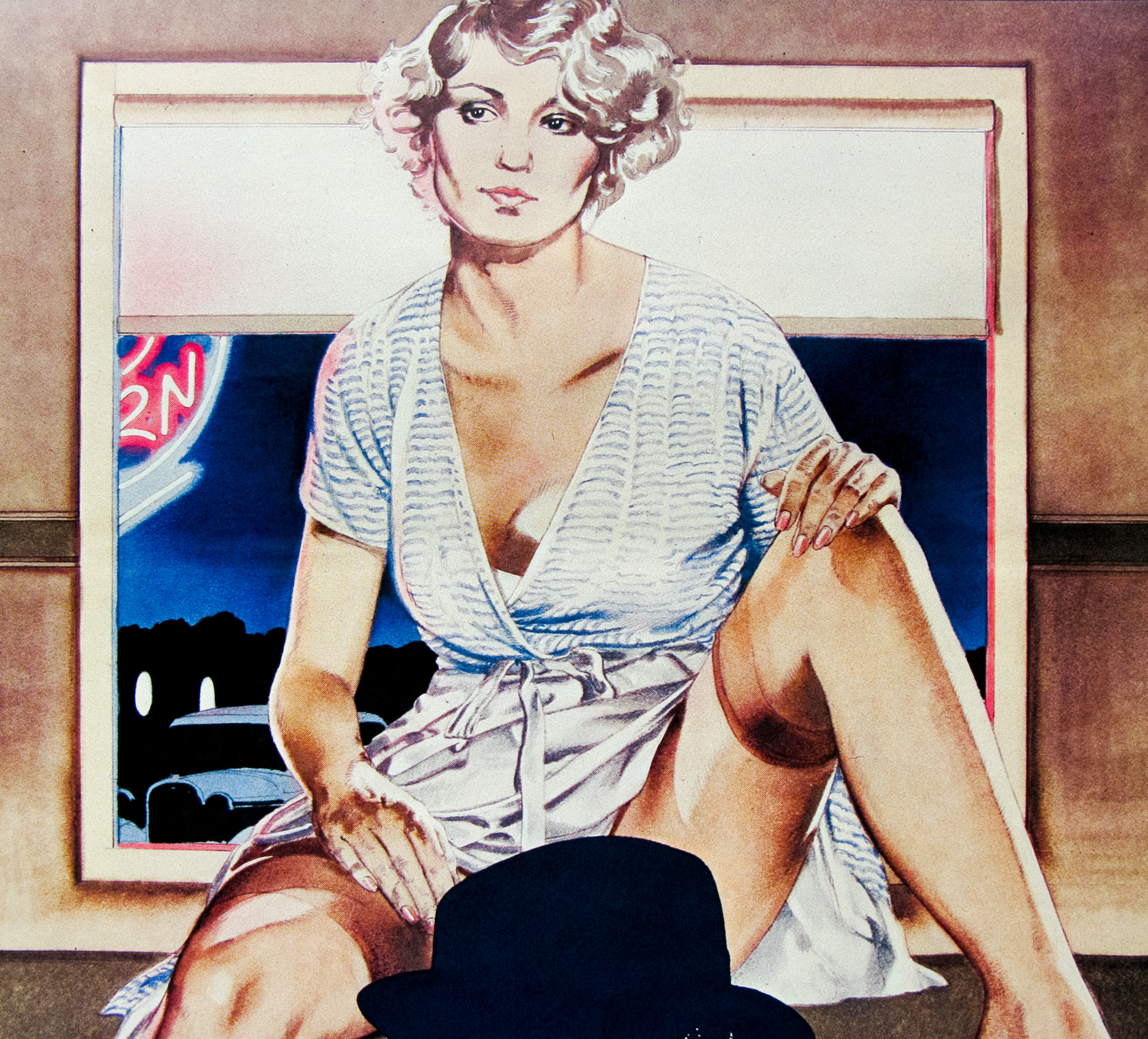
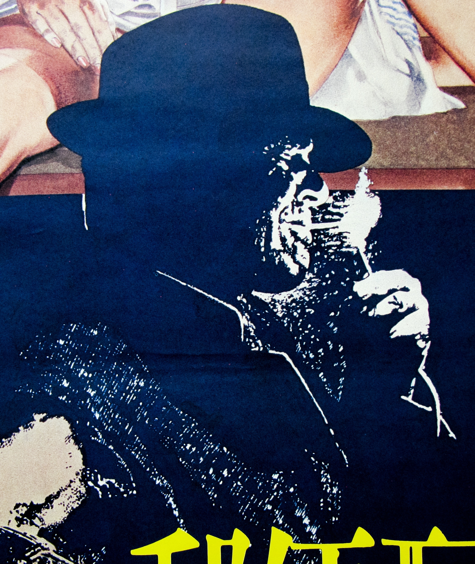
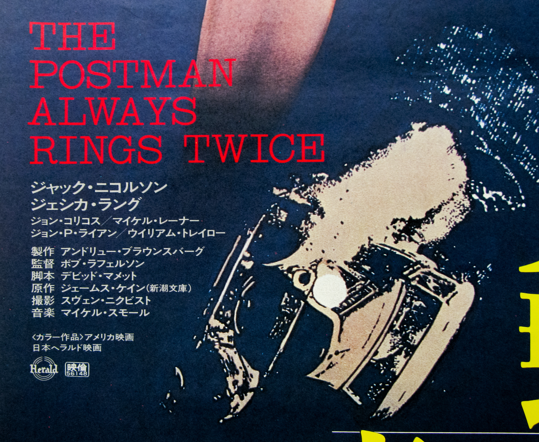
One of the things that really set Vic apart from his contemporaries were his skills at developing concepts that were unique and stood out from what was often a sea of other ideas, depending on how many design agencies a distributor might have been working with. He had a natural talent for concepts that used ingenious juxtaposition of elements to create surprising layouts and he wasn’t one to shy away from risqué concepts, many of which unfortunately never made it onto a printing press. Many of these designs did, however, proceed through to the end of the process and clearly demonstrate his cheeky sense of humour.
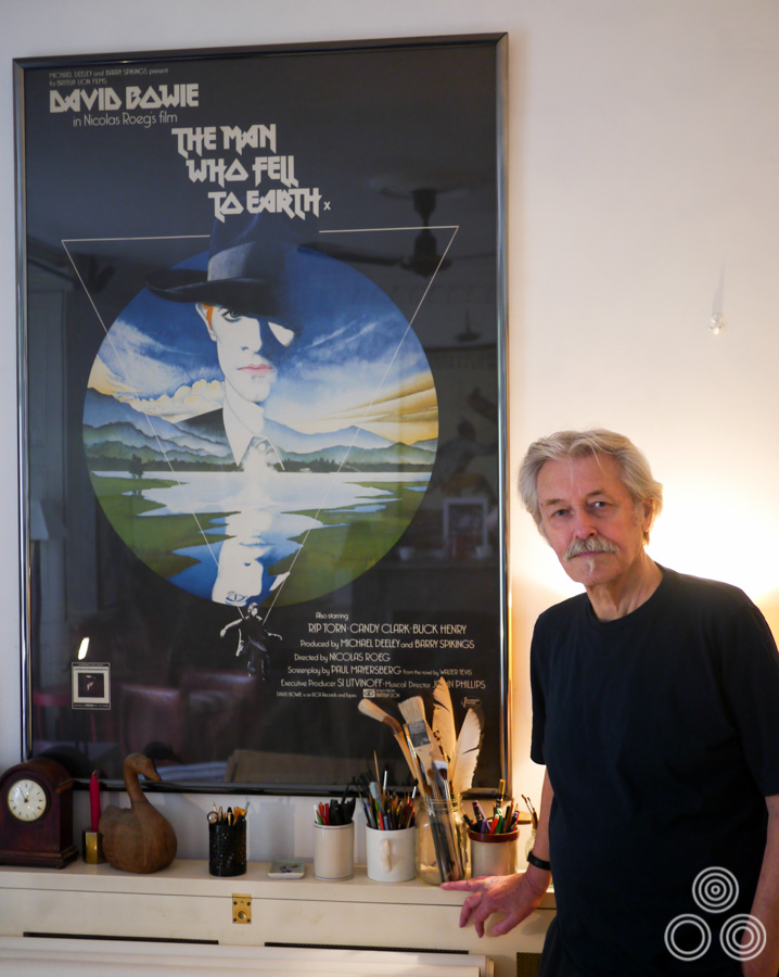
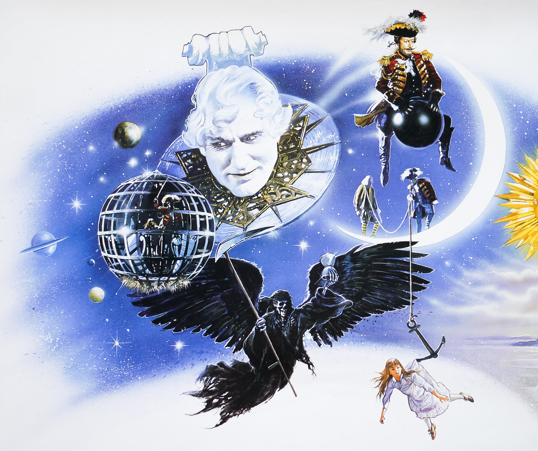
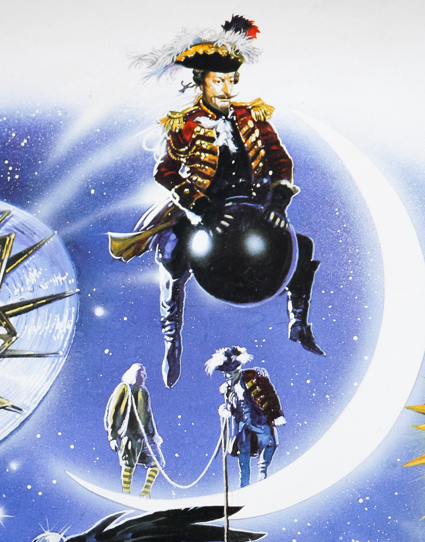
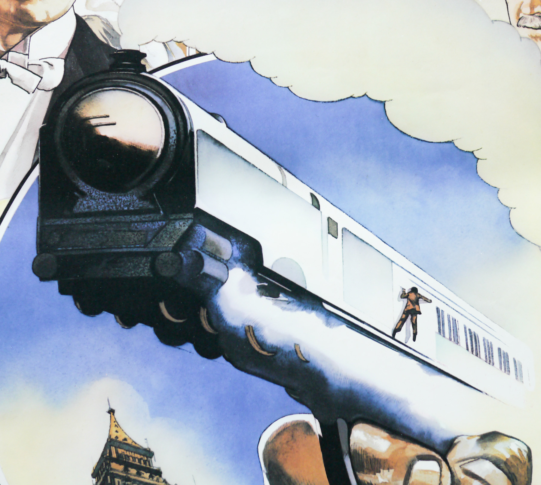
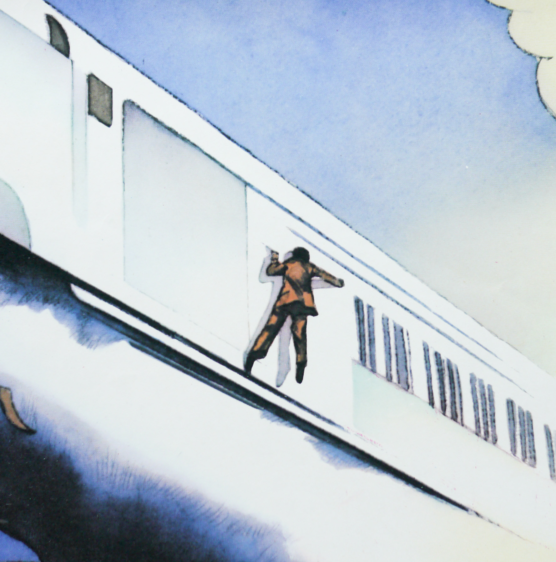
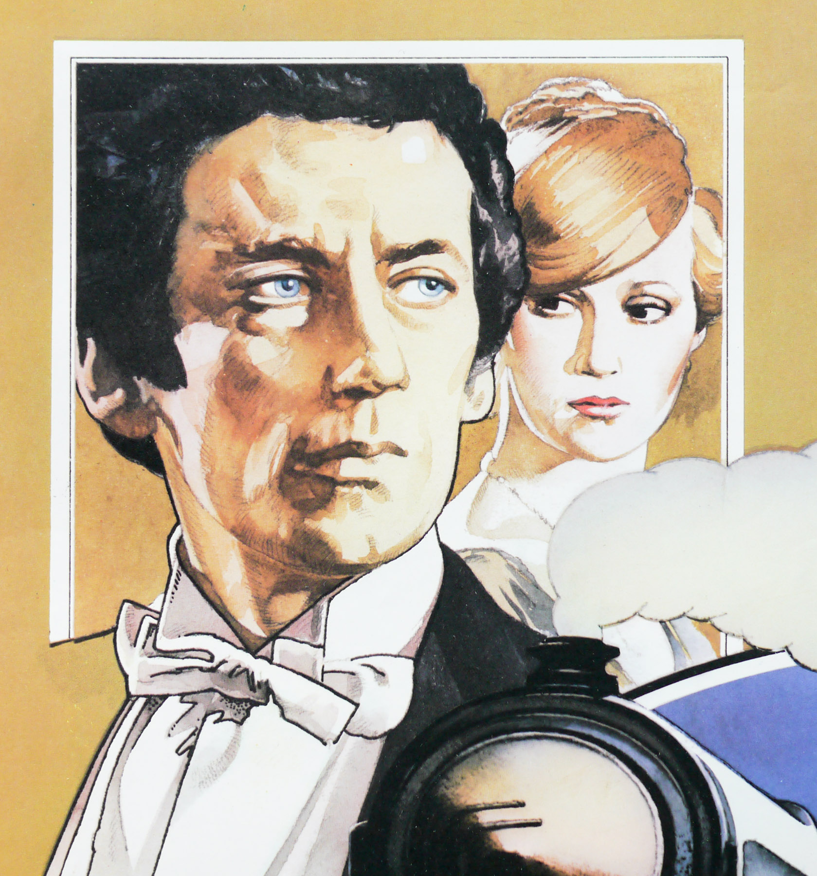
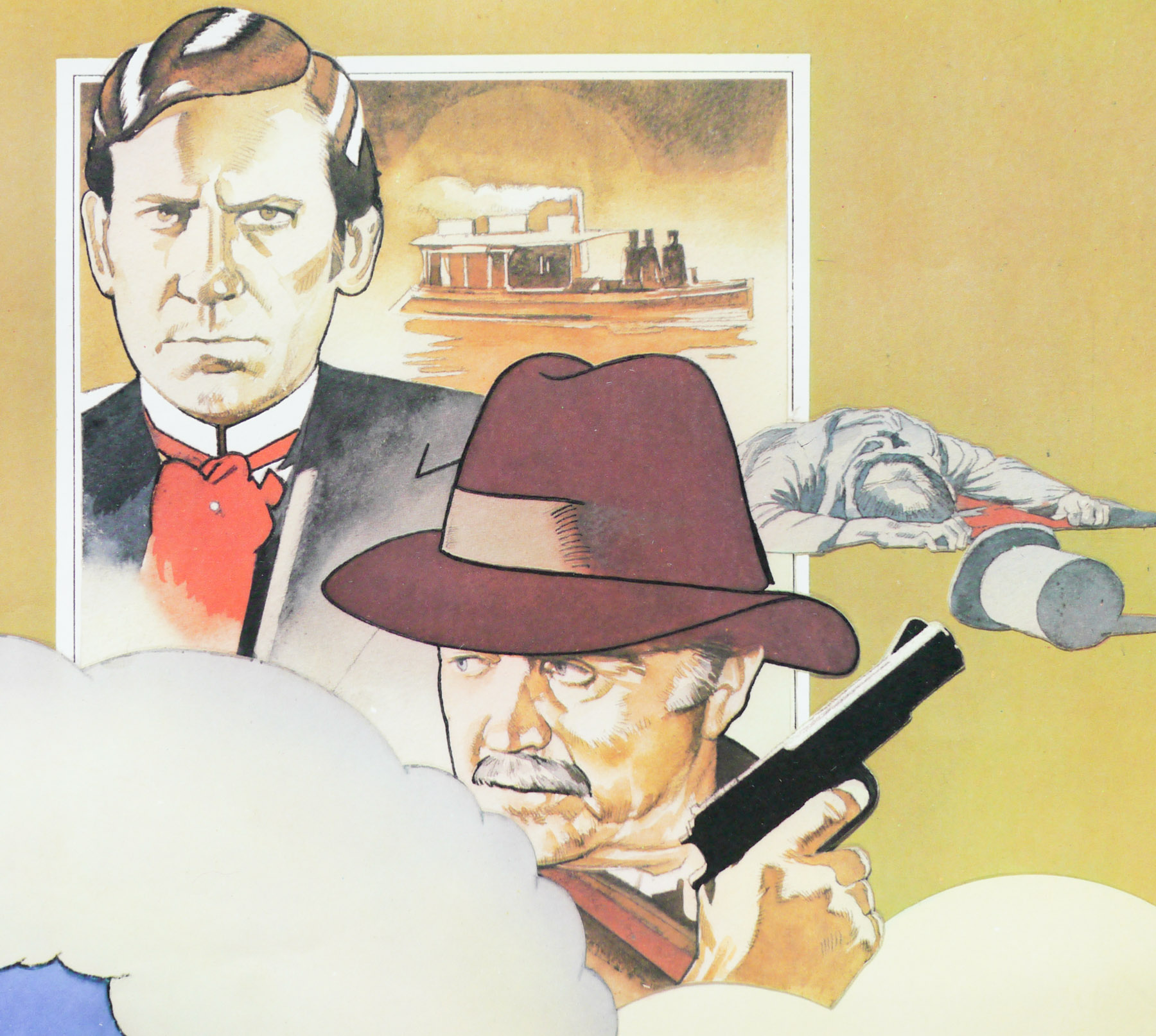
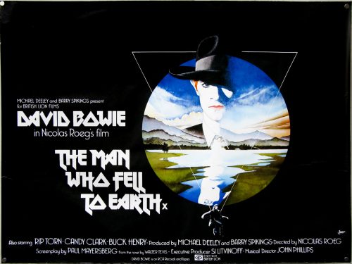
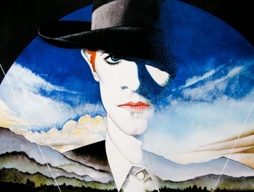
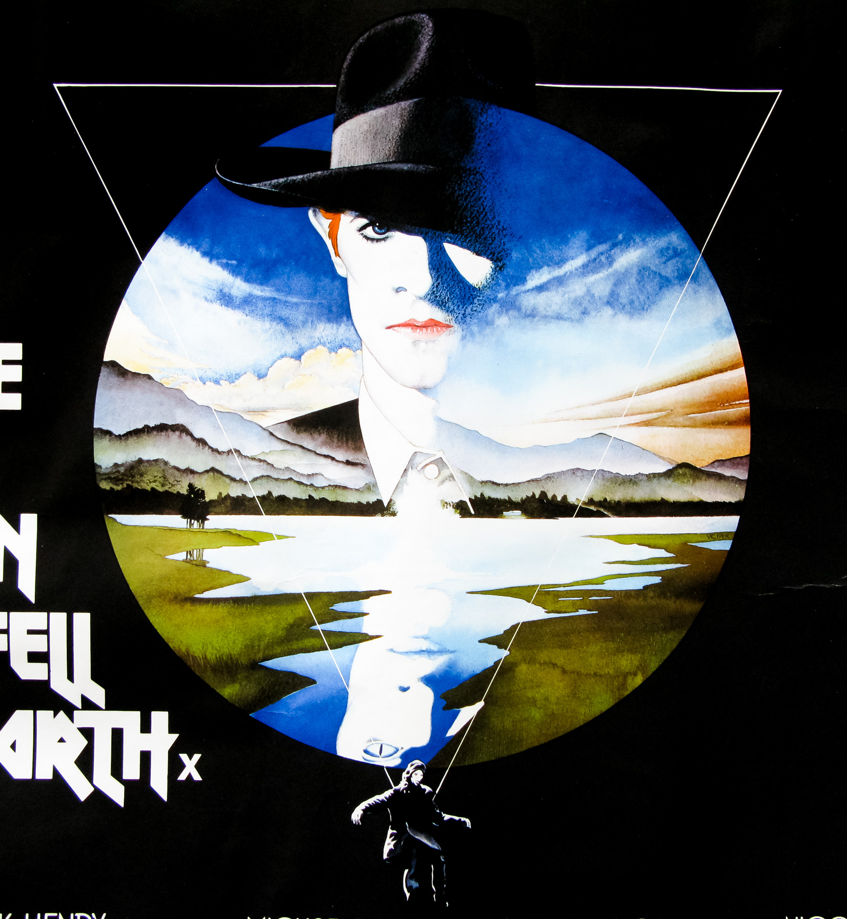
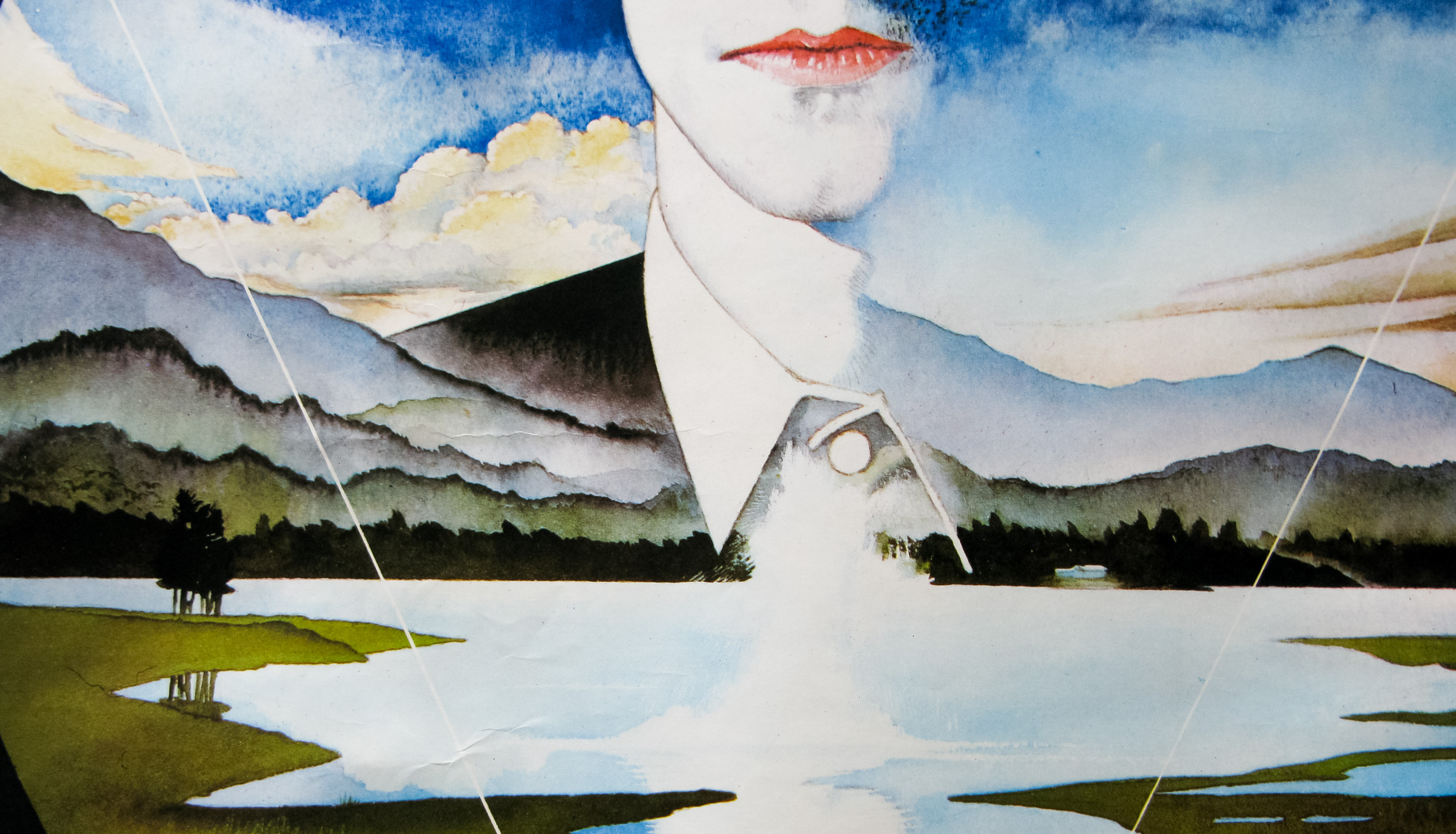
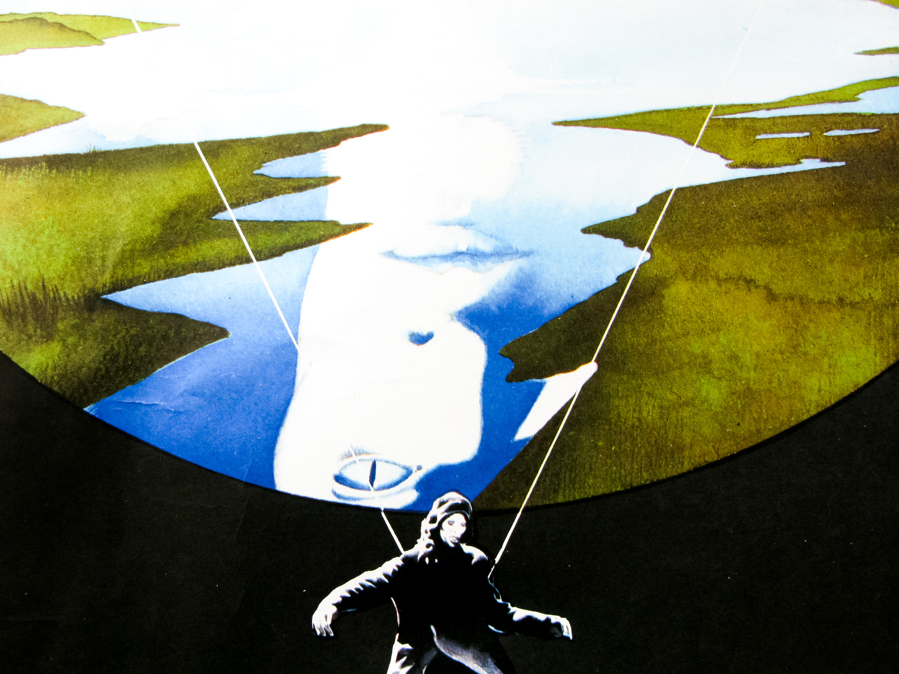
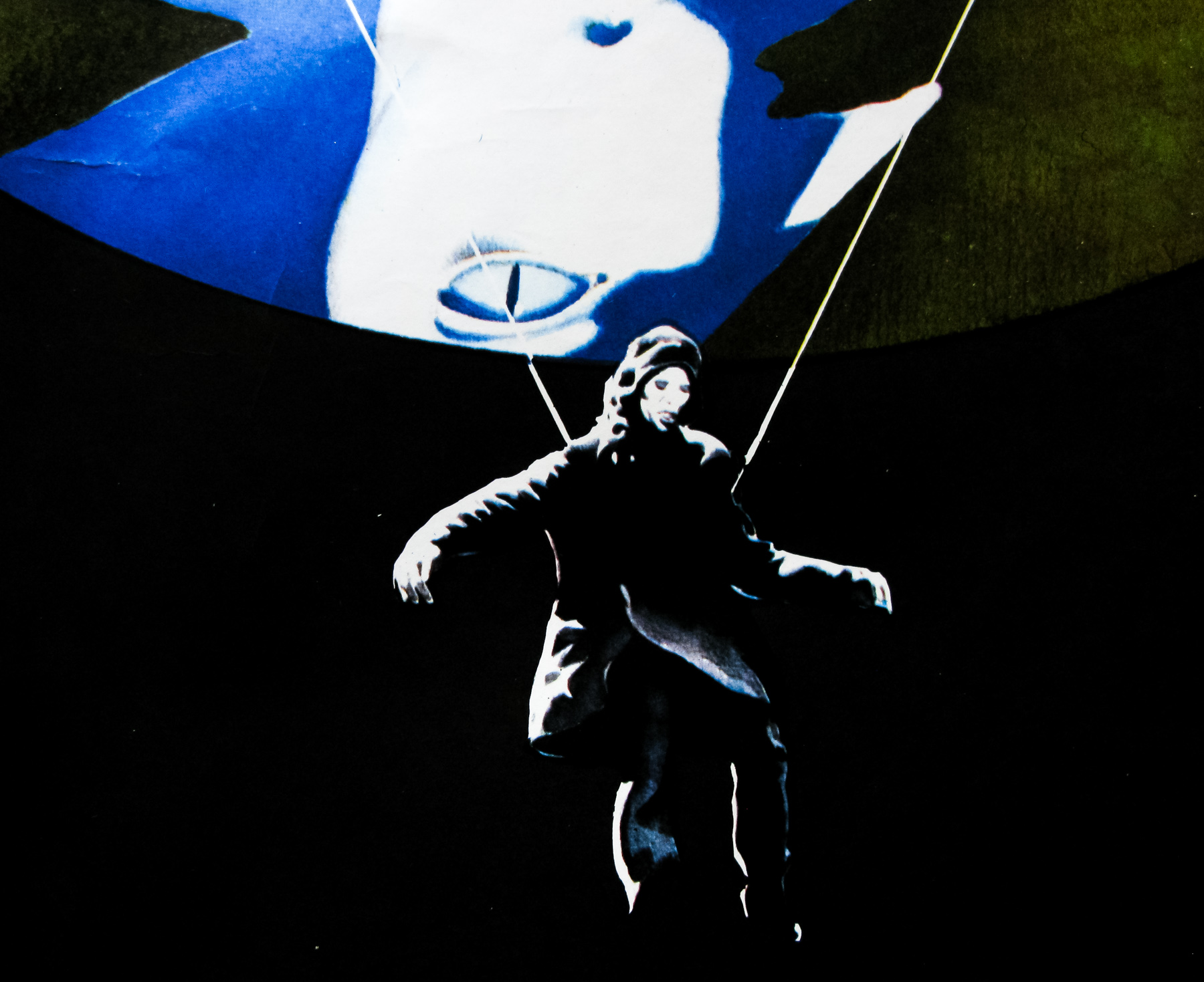
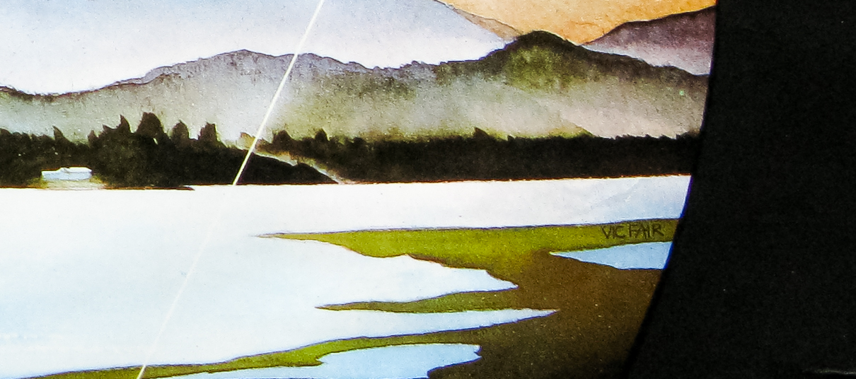
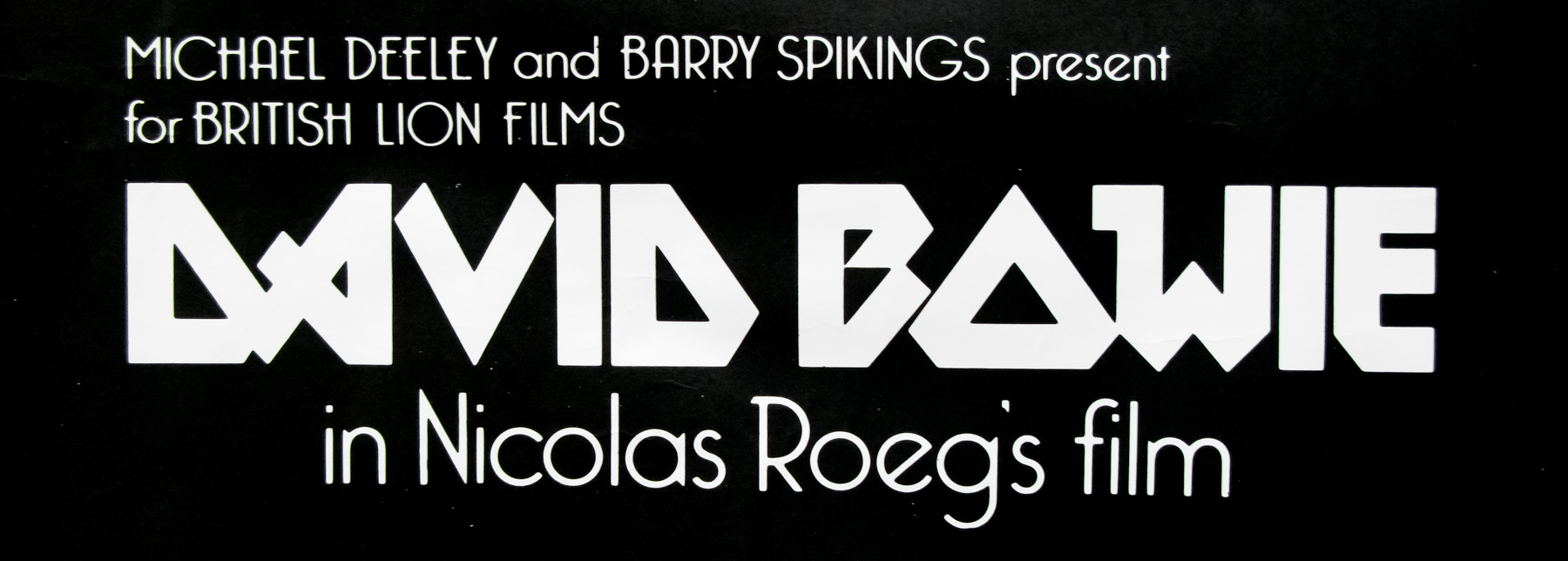
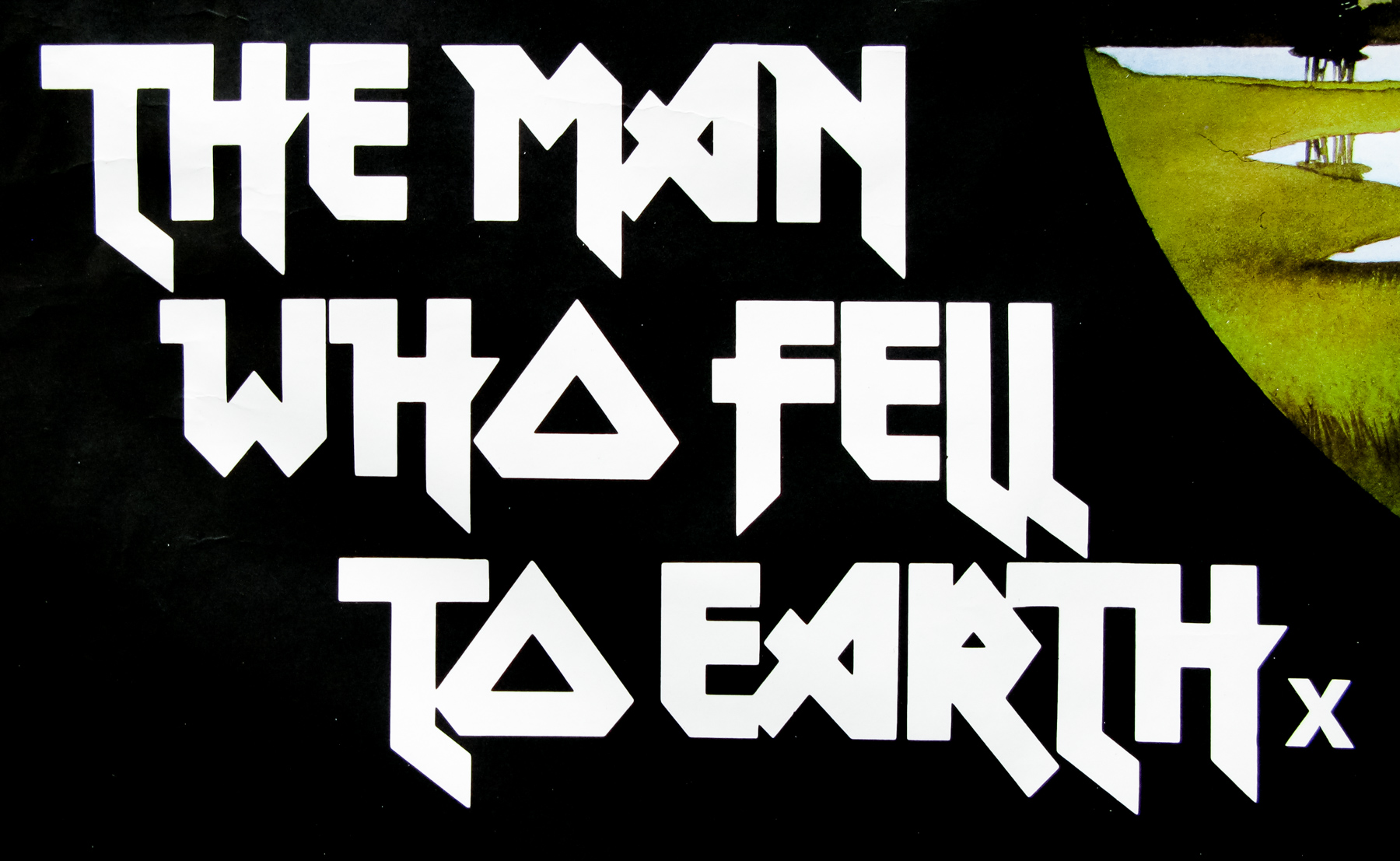
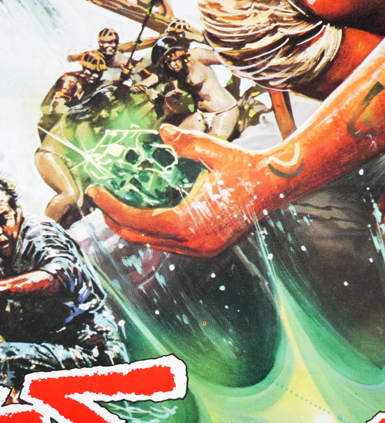
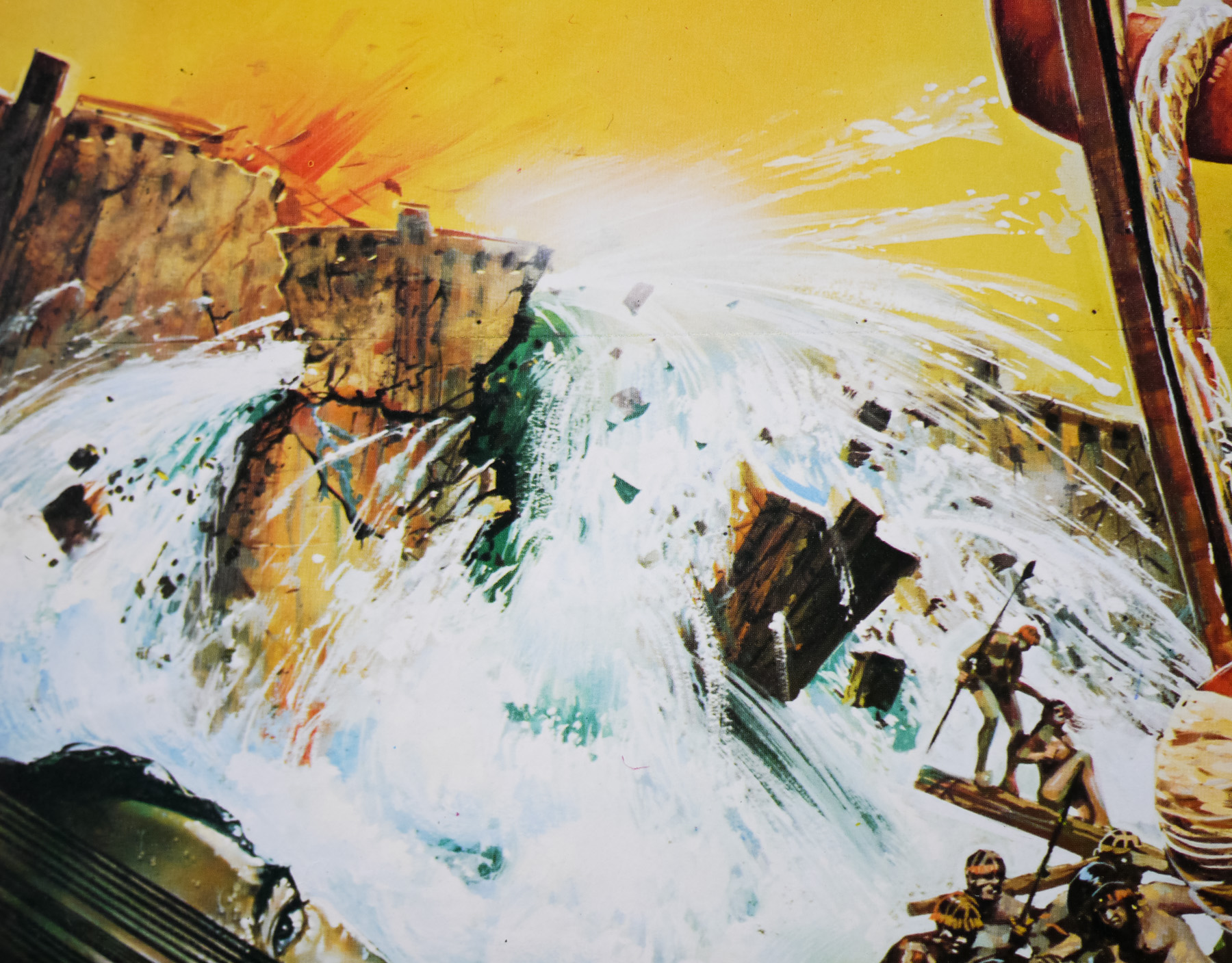
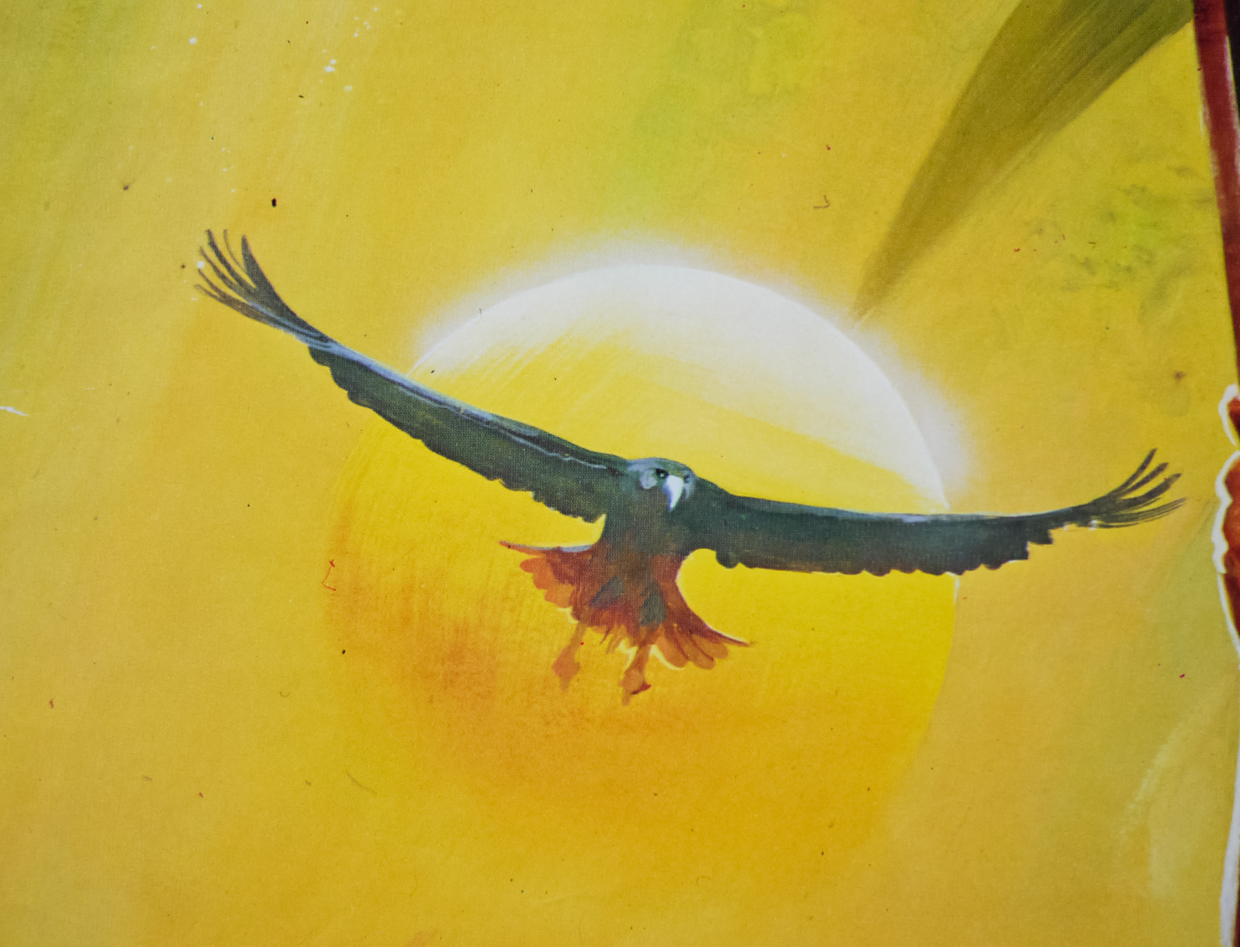
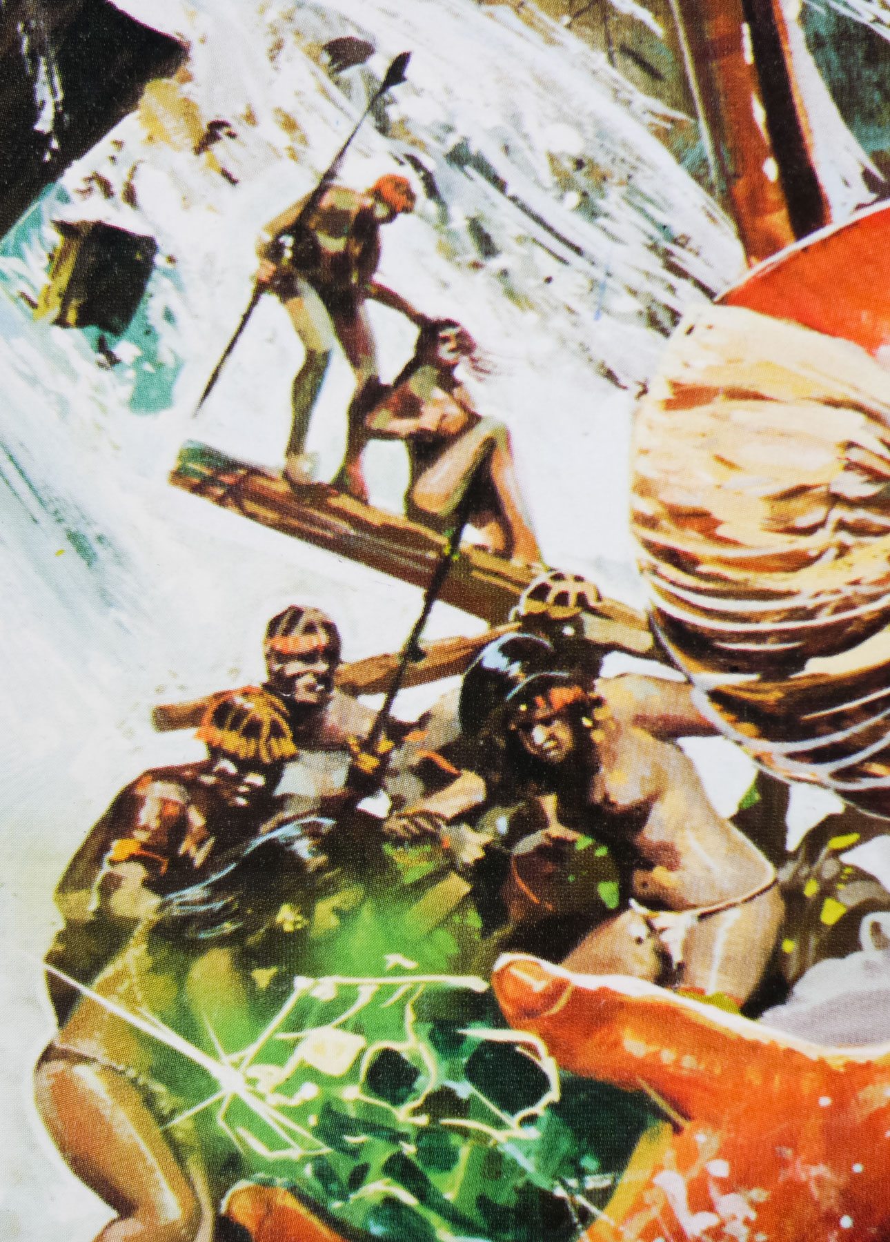
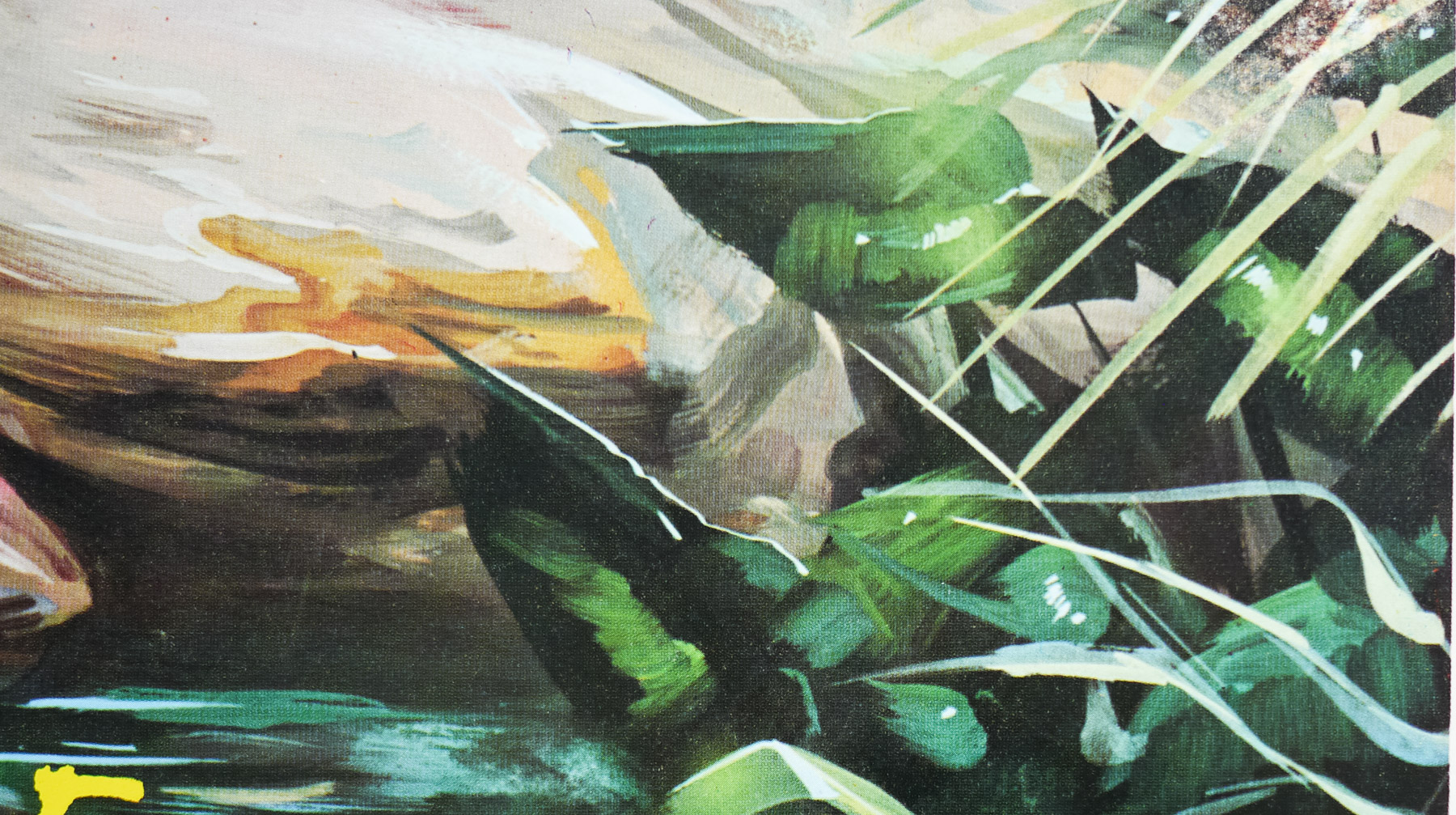
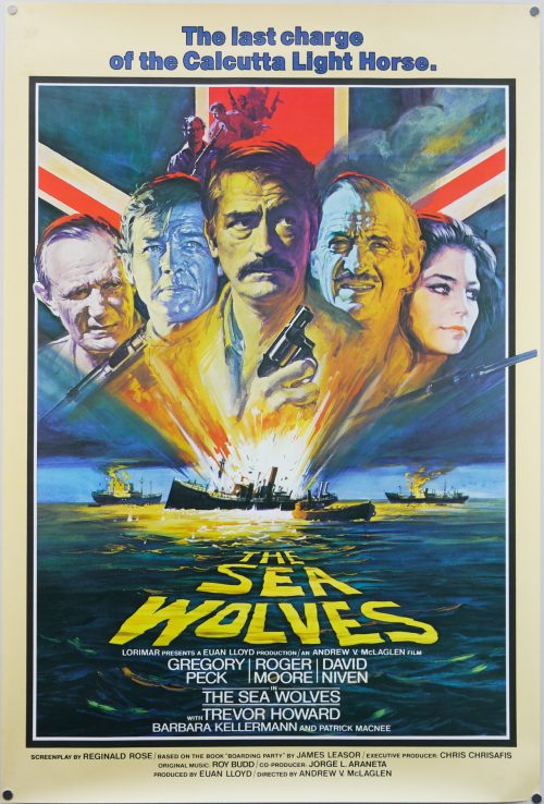
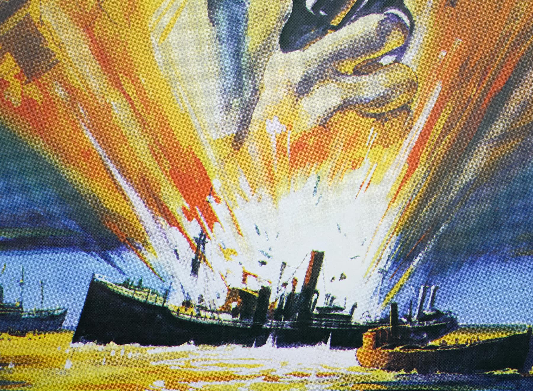
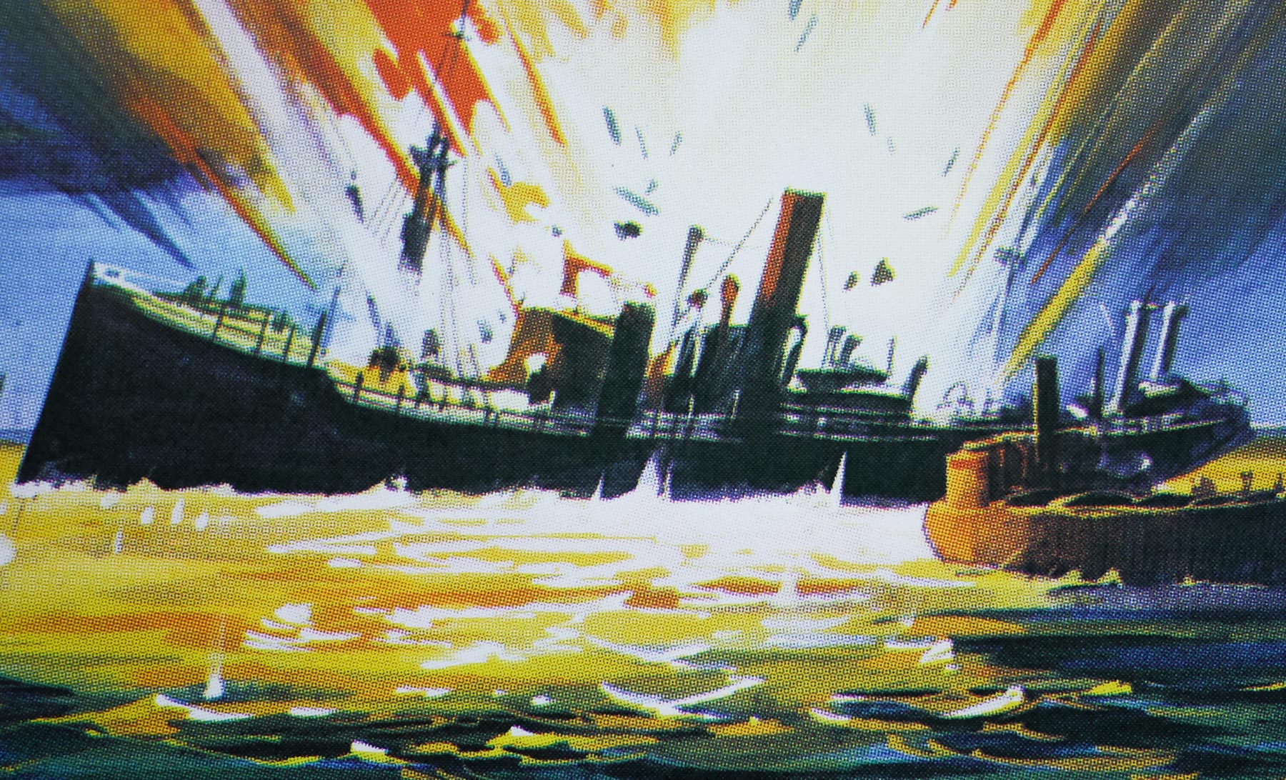
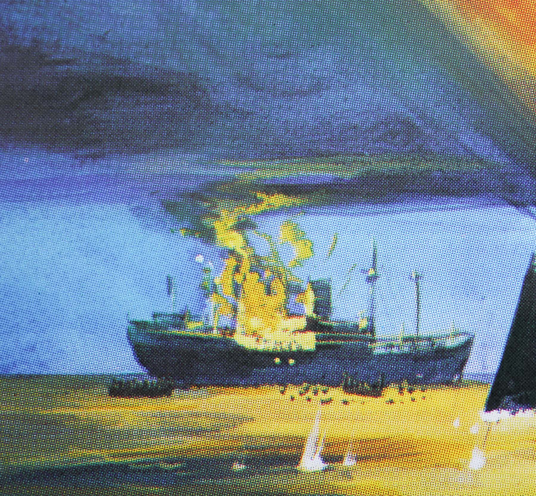
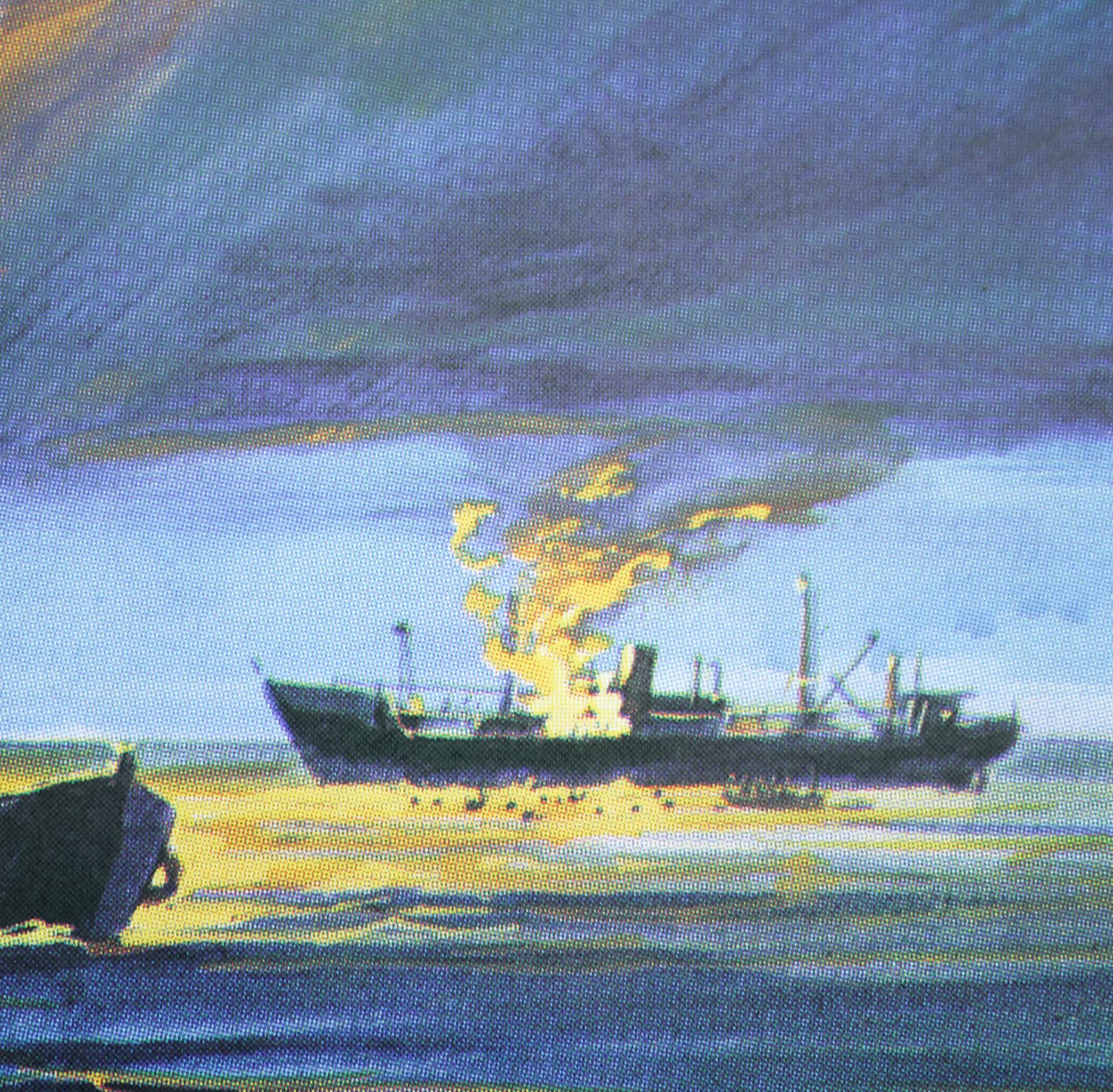
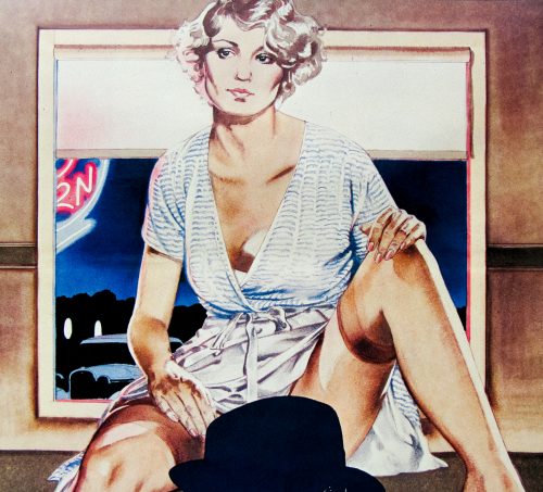
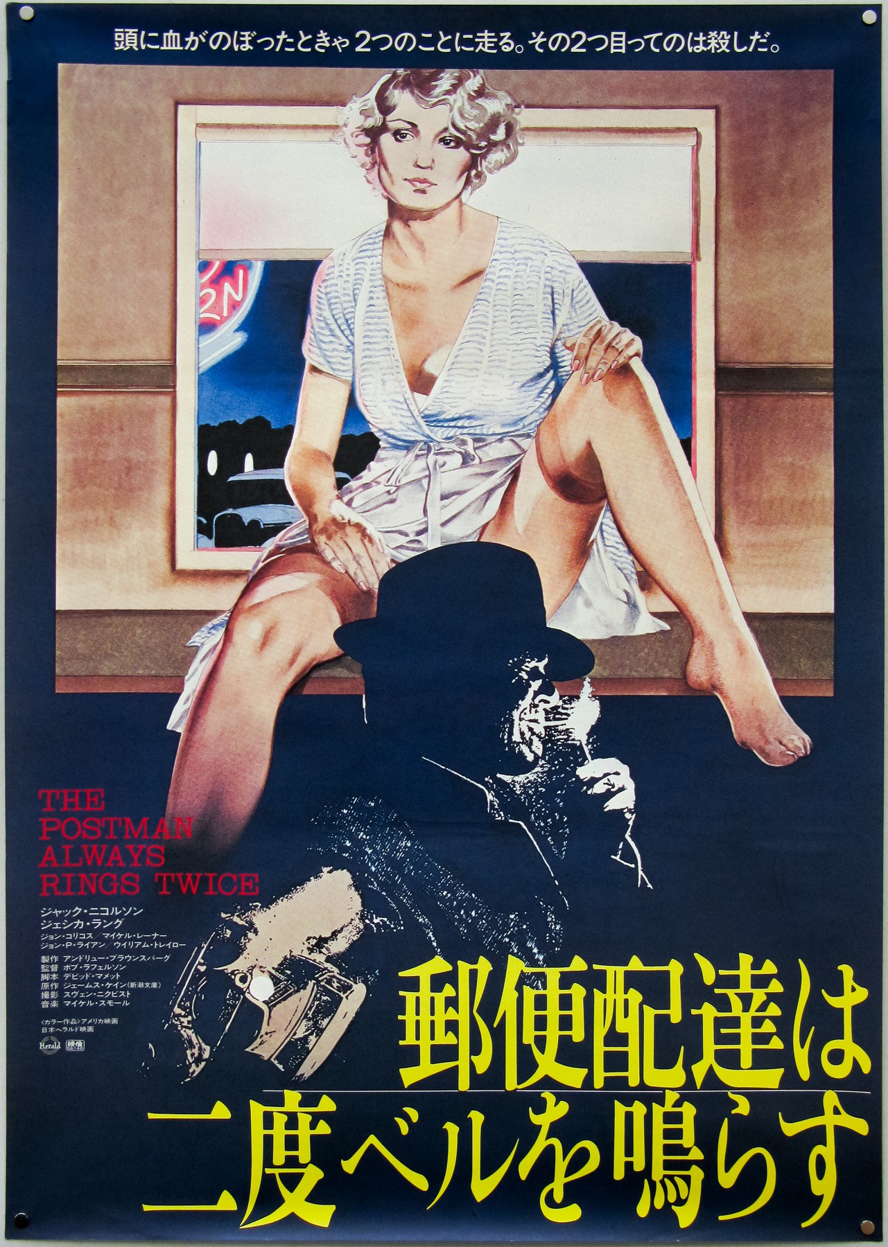
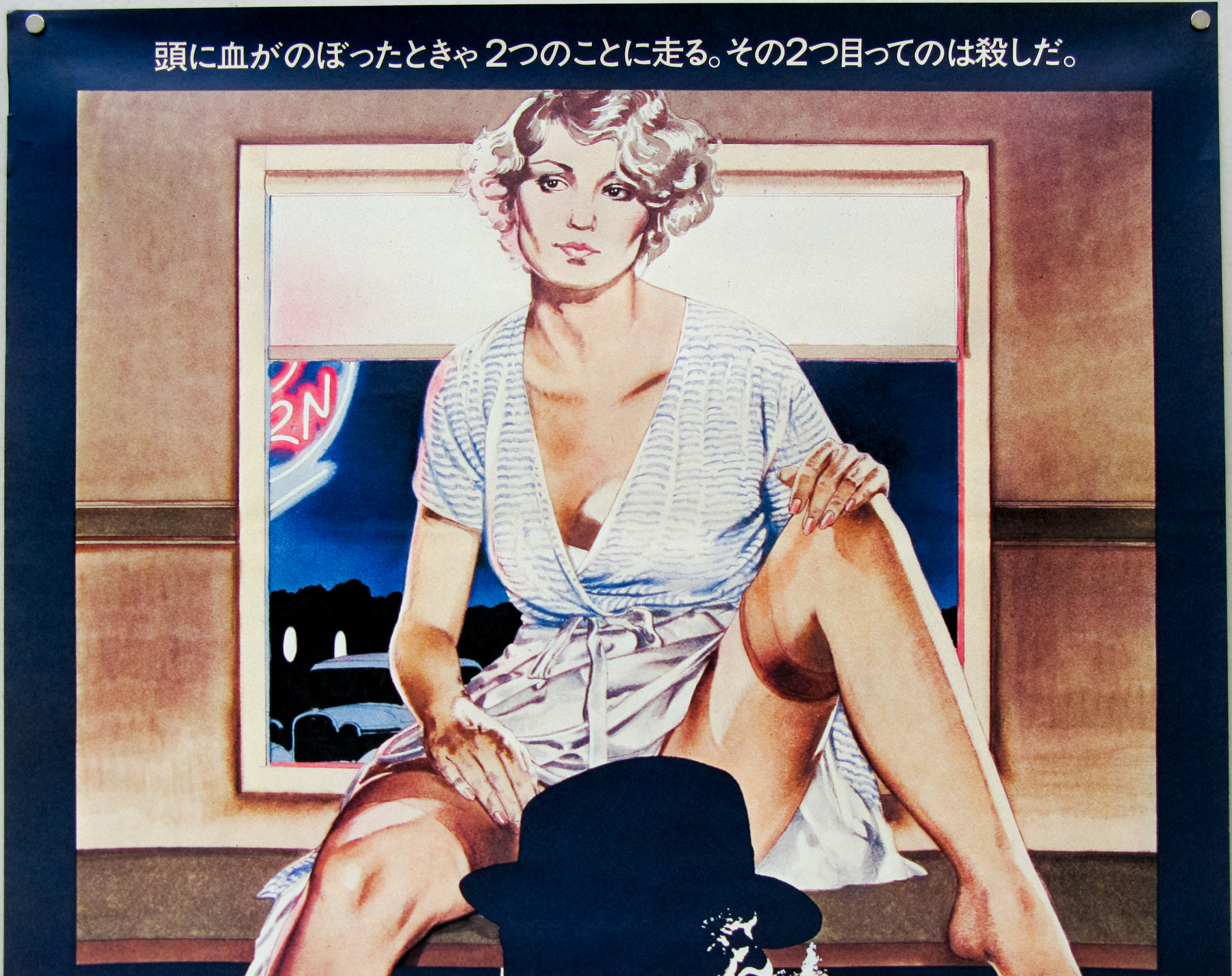
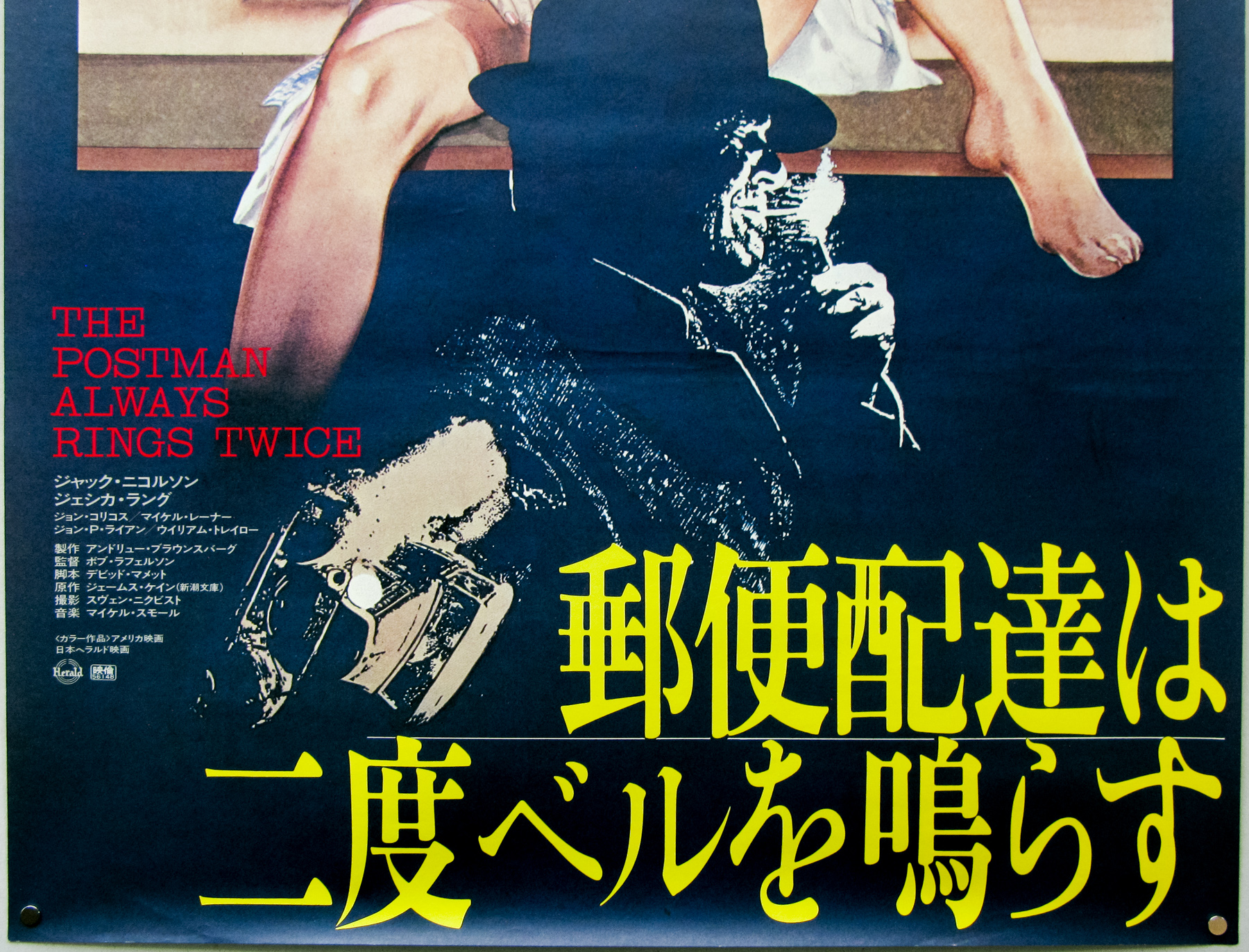
Vic Fair stands next to the large format (40″ x 60″) poster for The Man Who Fell to Earth, which he both designed and painted in 1976. Photo taken in 2013.
Over the past couple of years I’ve been fortunate enough to befriend and spend several occasions with Vic where we discussed his life and career. We also took a look at the hundreds of concept roughs (sketches), original artwork and printed posters that he has saved and stored over the years. I wanted this interview article to tell the story of his life from his beginnings as a messenger boy in a design office through to his retirement as one of the most prominent designers working for the British film industry. This article features pictures of many never-before-seen concepts, unused artwork and photos of Vic over the years which I hope the reader will enjoy.
Hello Vic, thanks for agreeing to talk to me today. I’d like to start with your origins, if I may? You were born in Chadwell Heath, Essex in March 1938. I understand your father was an industrial designer?
He was, yes. He worked for Ford and designed tractors; the ones with the giant metal wheels without tyres that were in use around then. He would make the models that were used to decide what designs the company would put into production. I have some photographs of some of the ones he worked on and they’re pretty good actually.
He died just before my fifth birthday so I can’t remember much about him, but his name was William and he’d originally come from Stratford in London. He was also a good athlete and a musician with a jazz band. I must have picked up some of his artistic and design skills because I can remember that I was always building something in the back garden, whether it was a fort, a boat, or other vehicles. I was always constructing something and just loved tinkering away.
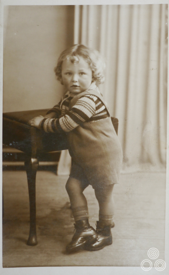
Vic Fair as a young boy, aged around 3, in 1941.
Because my father worked at Ford we owned a Model C Ten, which was one of the first cars they sold to the public and it was also the first car on our street.
May I ask how he passed away?
It was really bad luck because he’d had blood poisoning and within a year of his death they had found a way to prevent that from being an illness that would usually always kill you.
My mother was incredibly attractive and she looked like a film star. She used to take me to school and the other kids used to think she was my glamorous older sister! I lived with my mother and sister and had become the man of the house, doing repair jobs and keeping the bungalow in good order. The problem was that my mother had become very possessive and was jealous of any girlfriend that I brought back to the house, which was very awkward.
In the end I decided to go and do my National Service to get away from the house. I could have actually escaped doing it because I’d previously had a few illnesses like Tuberculosis, but I realised it was a way of spending time away from the situation I was stuck in at home.
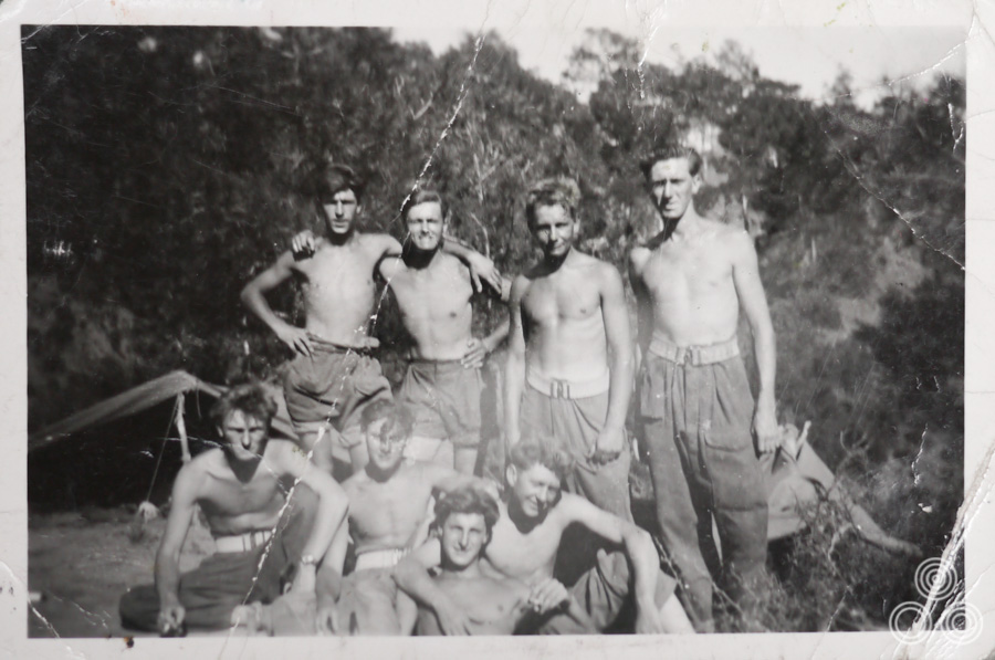
Vic Fair (second left, top row) with fellow National Service enlistees on an Army base in Cyprus, circa 1955.
Had you realised you had a gift for sketching and painting whilst you were at school?
Yes, I was always sketching and I got on really well with the art teacher. I was often asked to do illustrations for the school magazine and the people who ran it were always after the work I was doing during my art classes to put in the next issue. I was also good at carpentry and that was definitely thanks to my father.
I’ve always loved making things and there are actually a few pieces of furniture in my house that I made myself. I’ve still got the tools that I had inherited from my father when he died. Making stuff was definitely an extension of my artistry and I enjoy it just as much as painting. I was always coming up with ideas for things to make and paint and fortunately that served me well when it came to my later career.
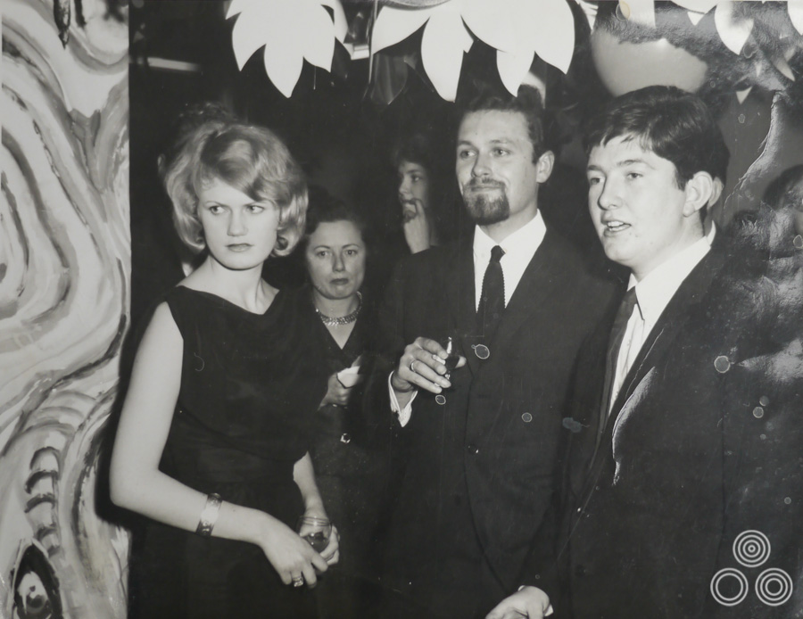
Vic Fair (centre) stands with colleagues, including Richard Vaughan (right) and David Till (behind Vic), at a party, circa 1964.
From Secondary school you went to join an agency in London?
I ended up as one of only two kids from my school that left Chadwell Heath and got a job in London. I secured a job at a design agency called Hector Hughes and it was on Southampton Row in London. I started out doing a lot of messenger work for the company, but the office manager had given me a table on which I could practice designing and illustrating. There were a couple of decent artists who allowed me to watch over their shoulder as they worked.
There was one chap called Philip Happé who was a talented typesetter and was a good friend to me whilst I was there. He actually put a good word in for me when I wanted to move on and he recommended me to someone at the next agency I went to. We later ended up working together again later in our careers.