
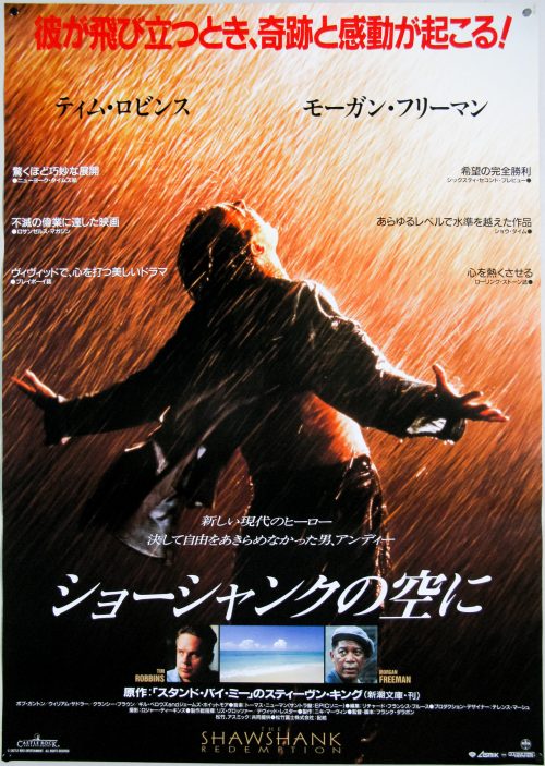
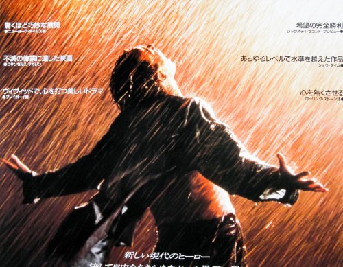
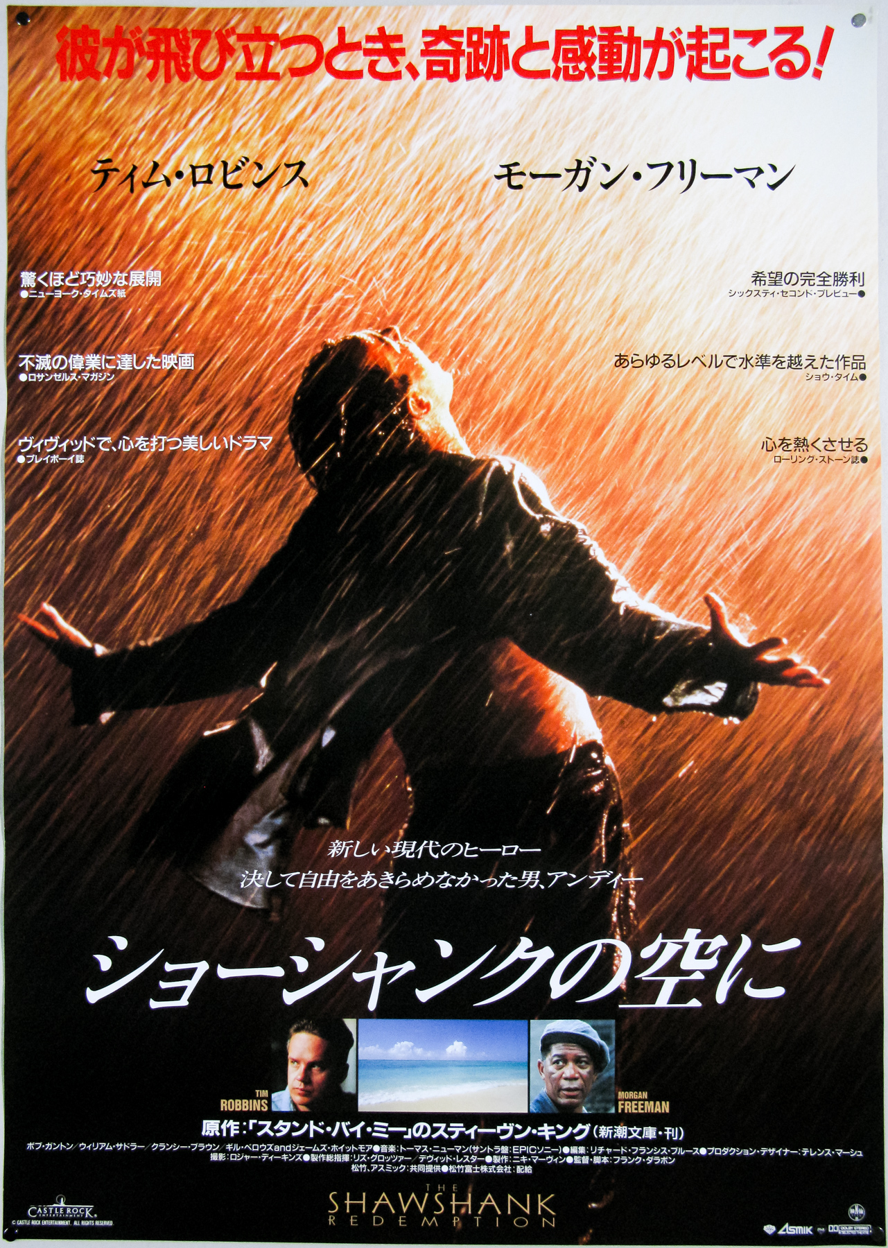
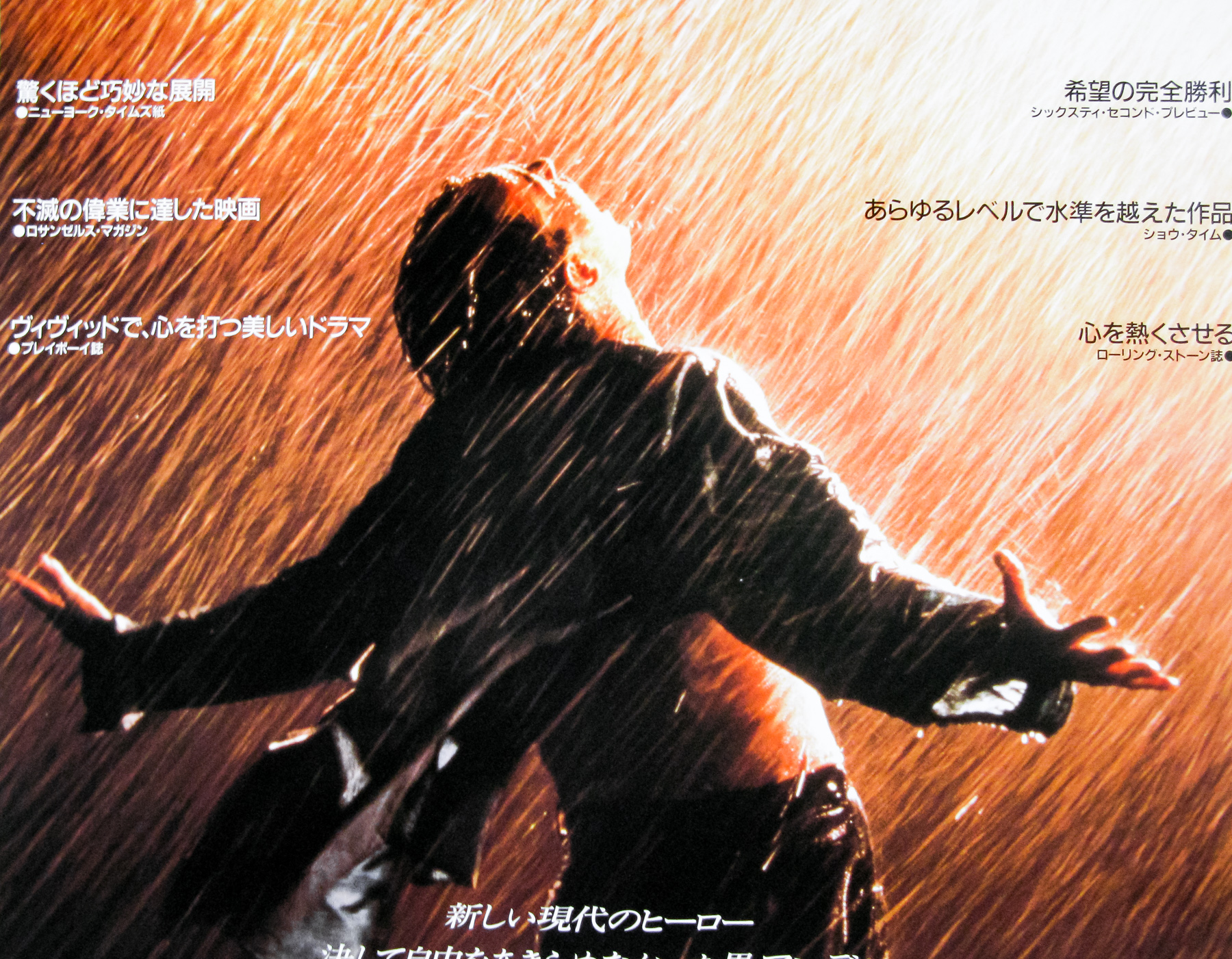
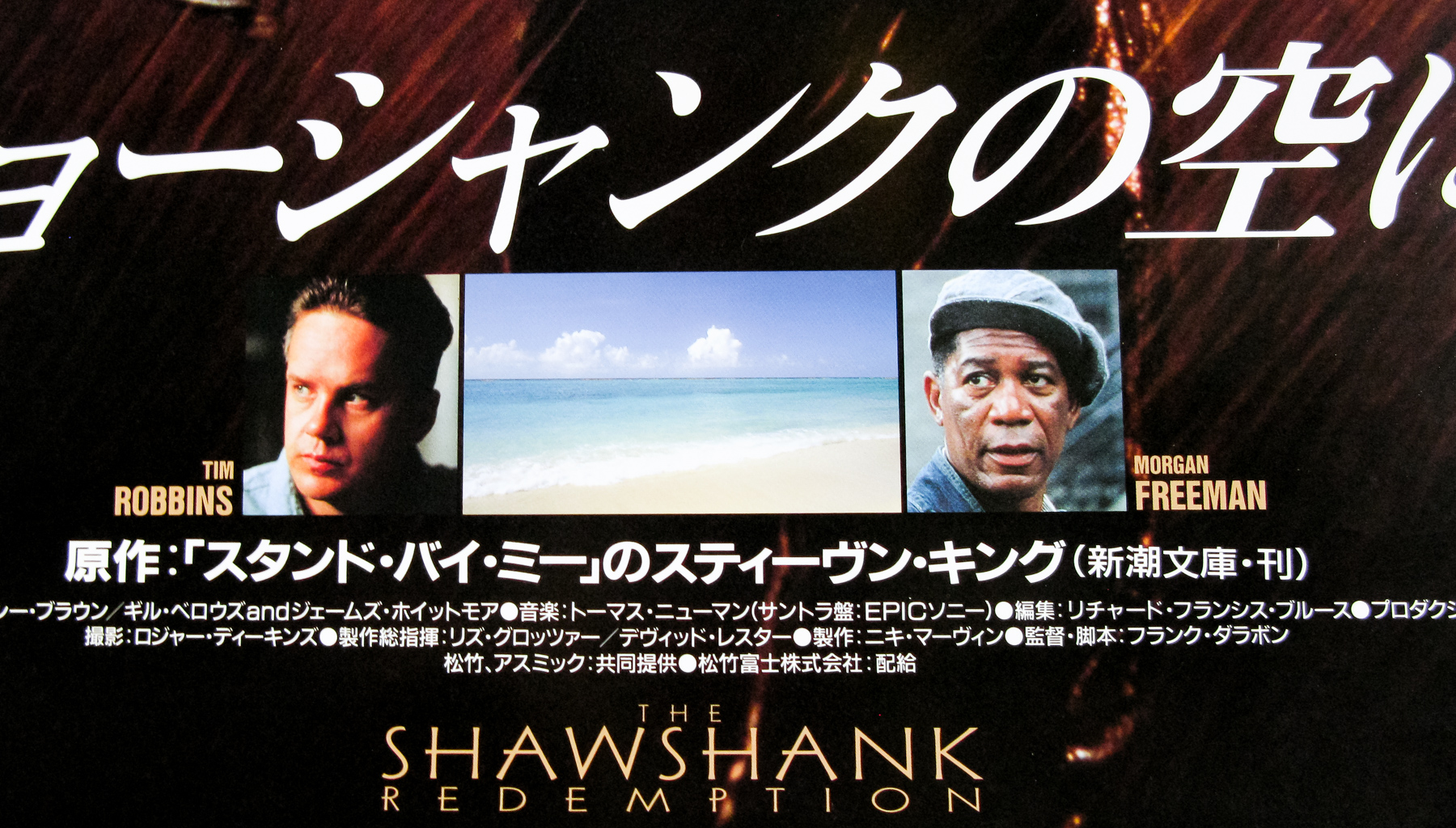
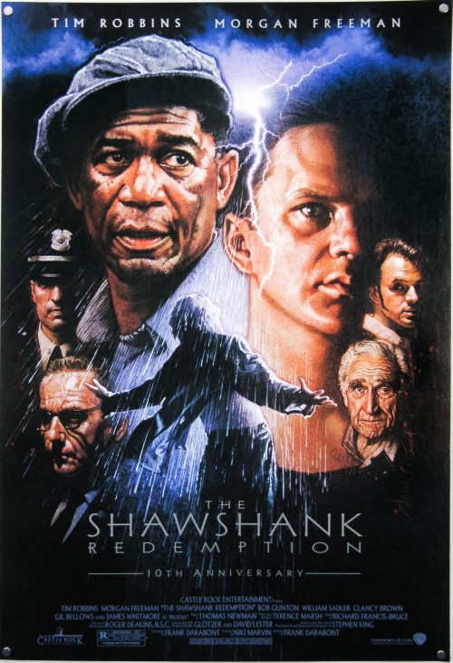
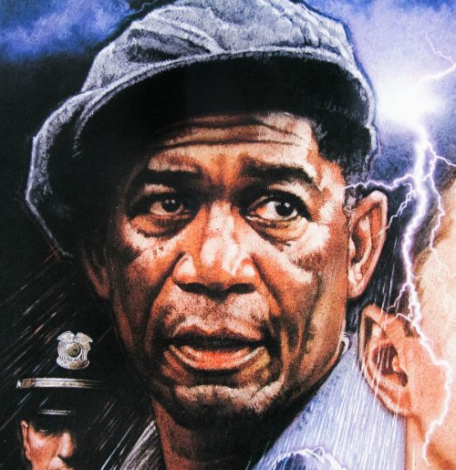
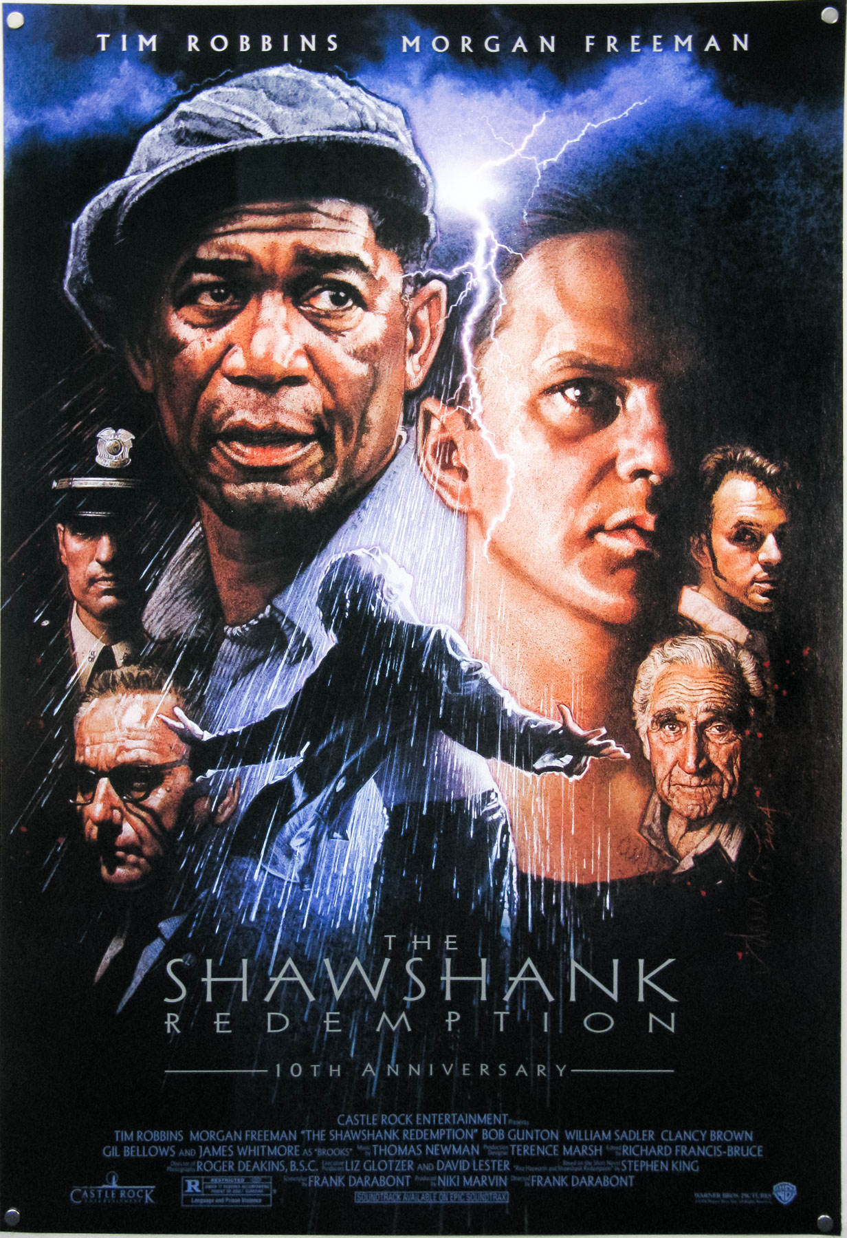
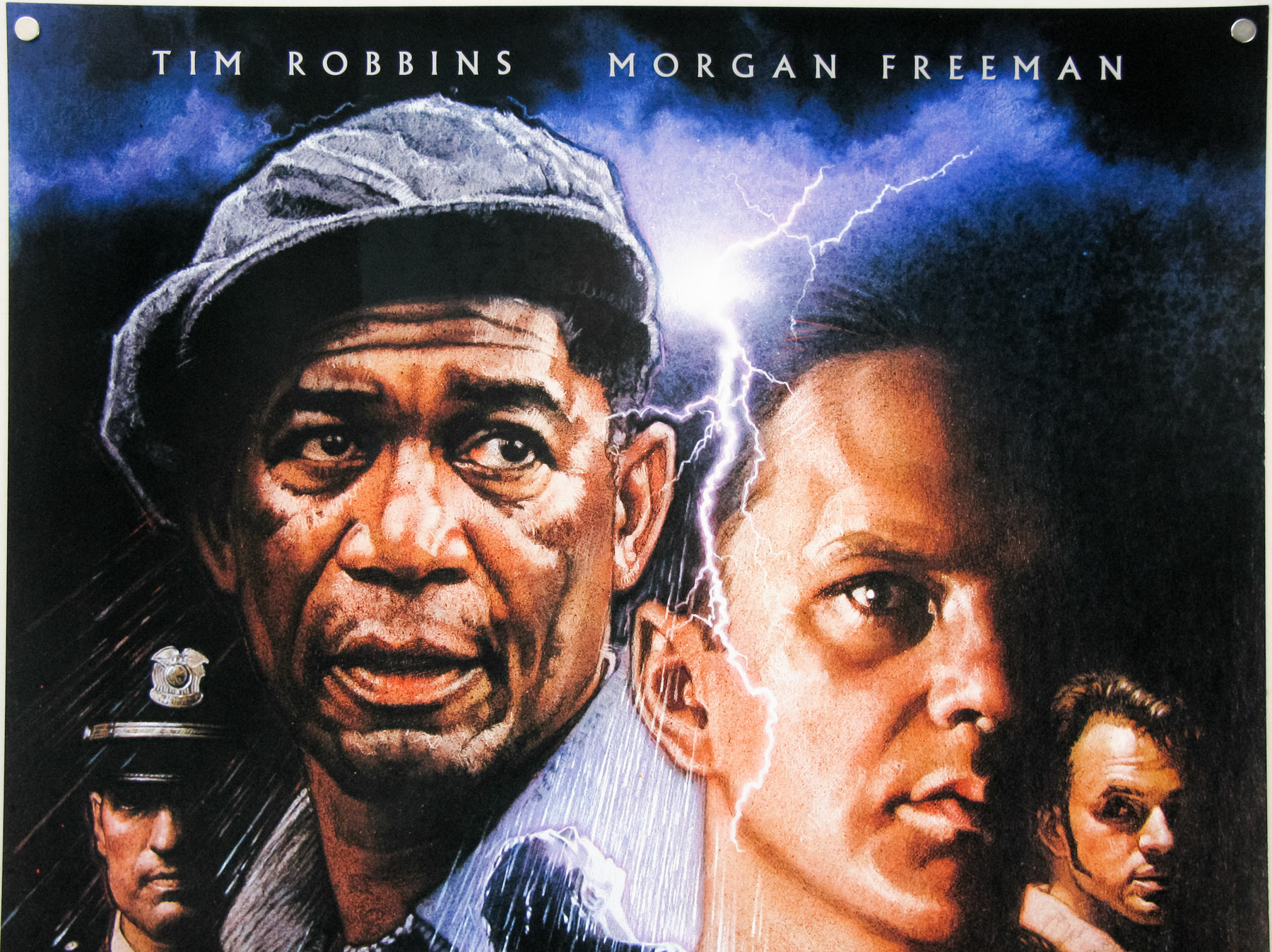
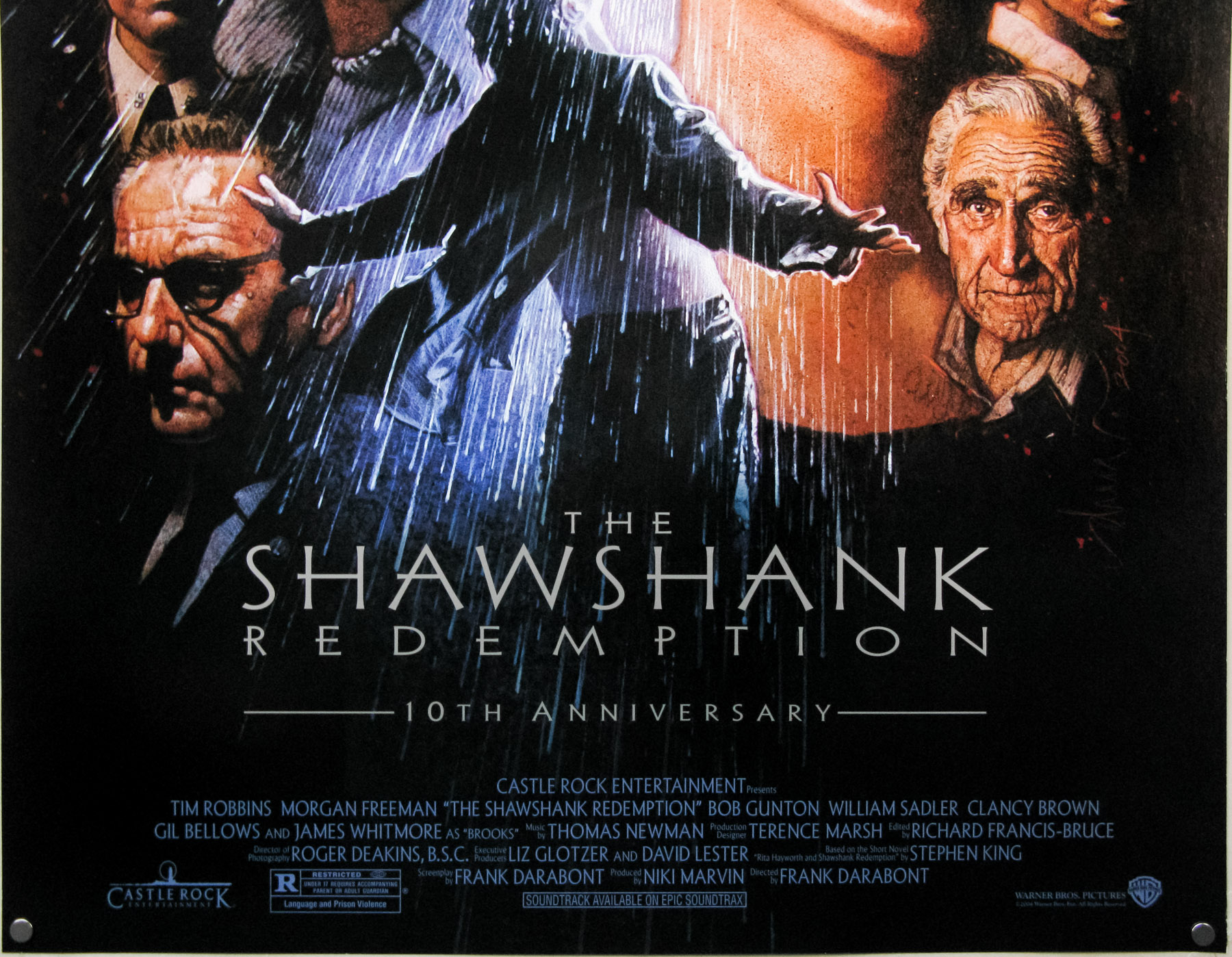
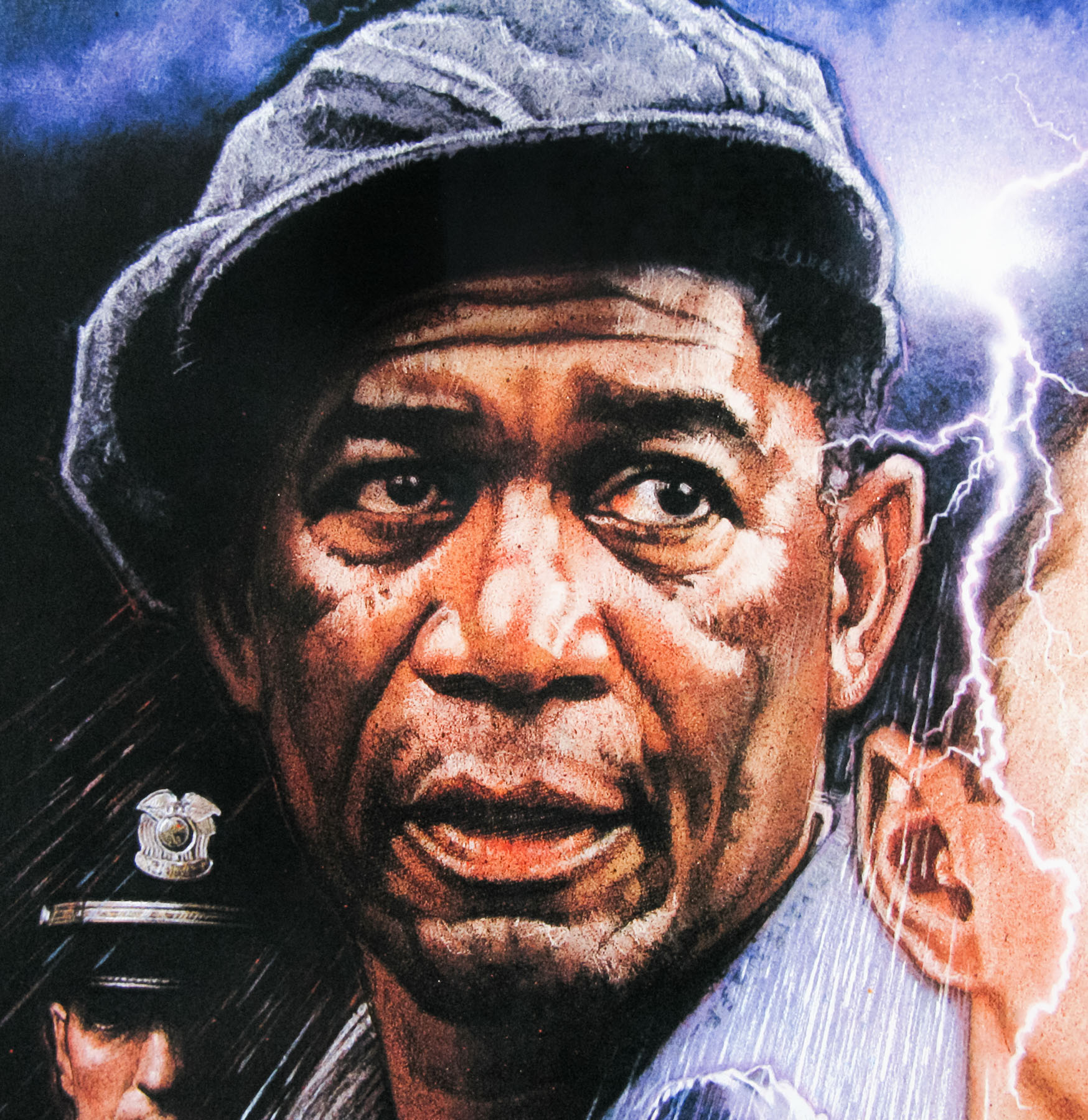
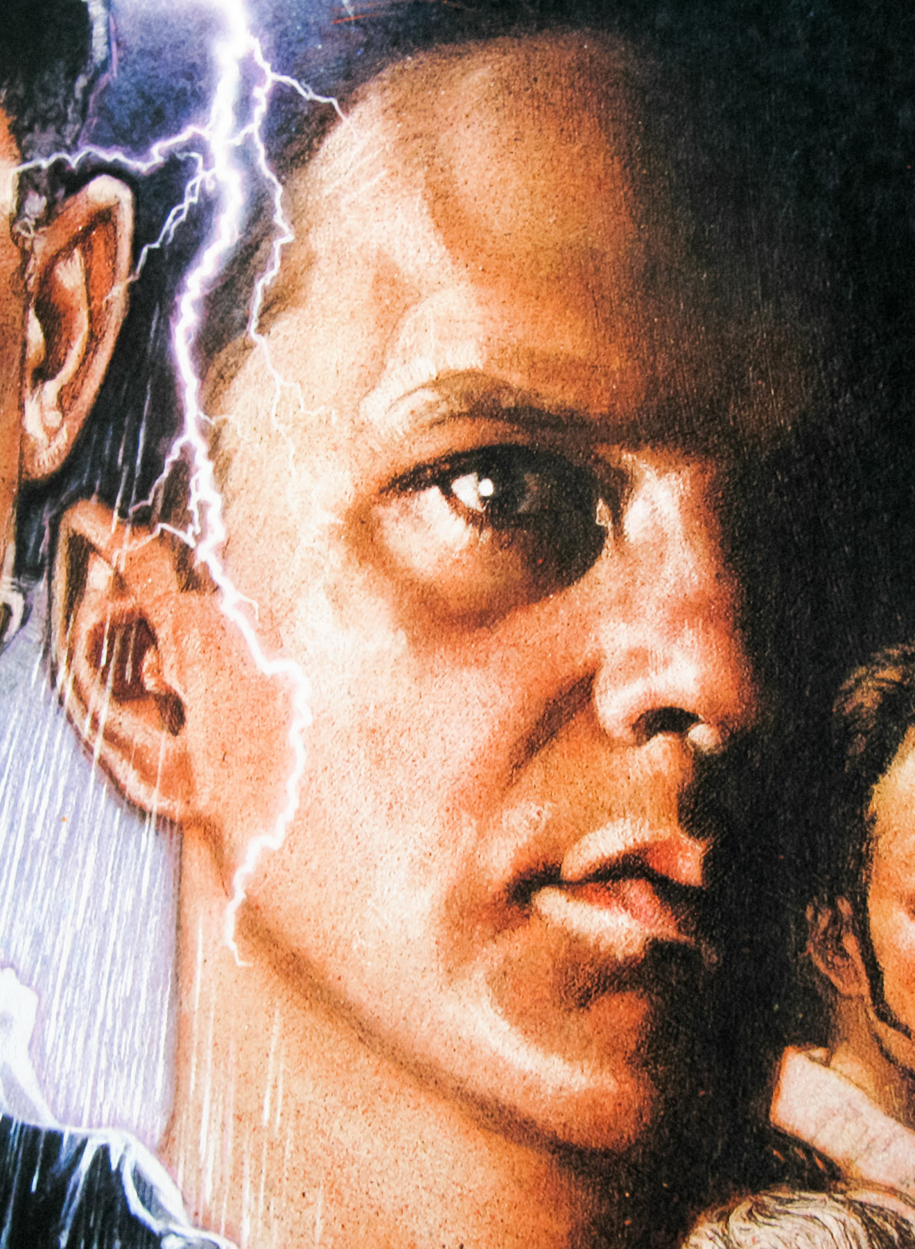
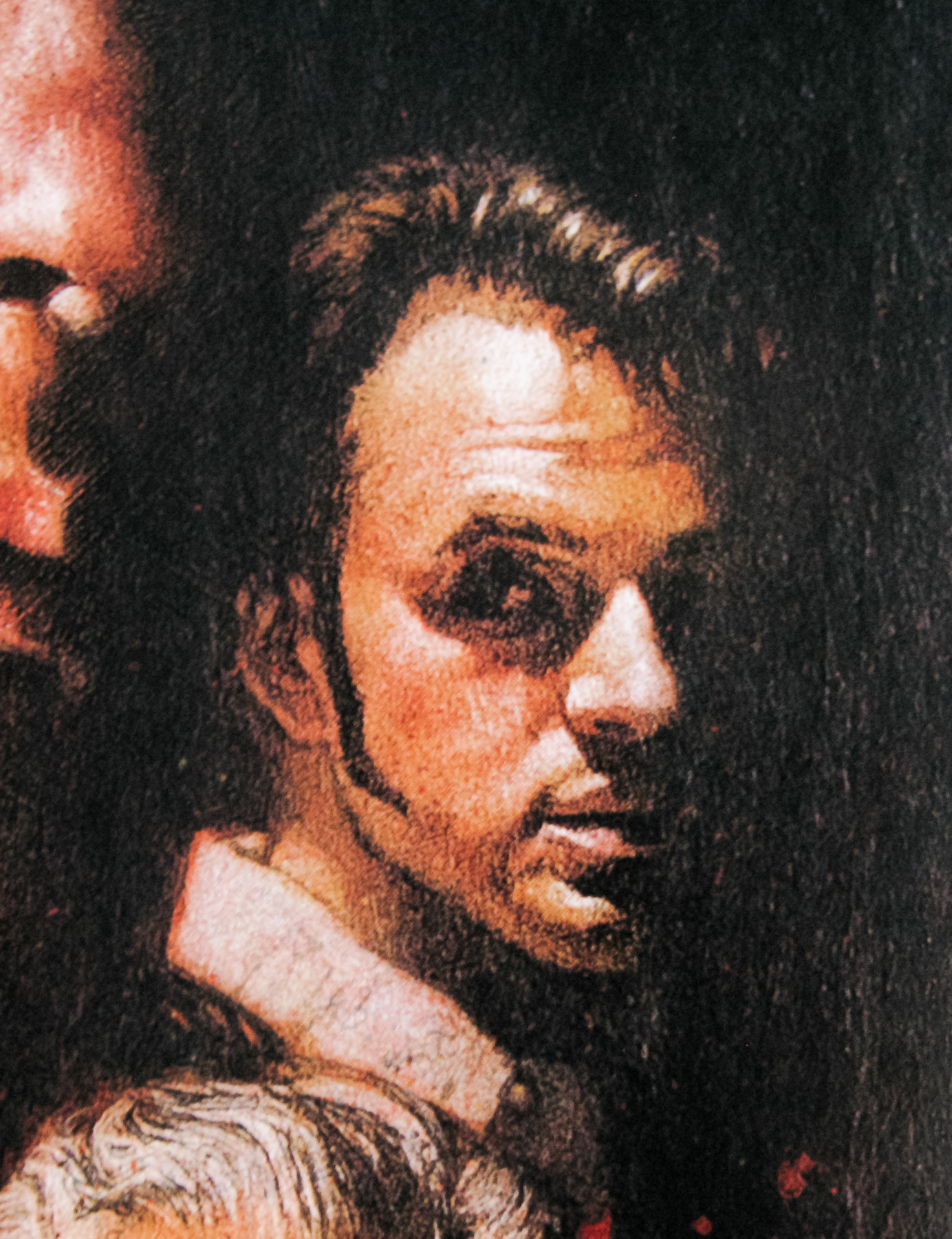
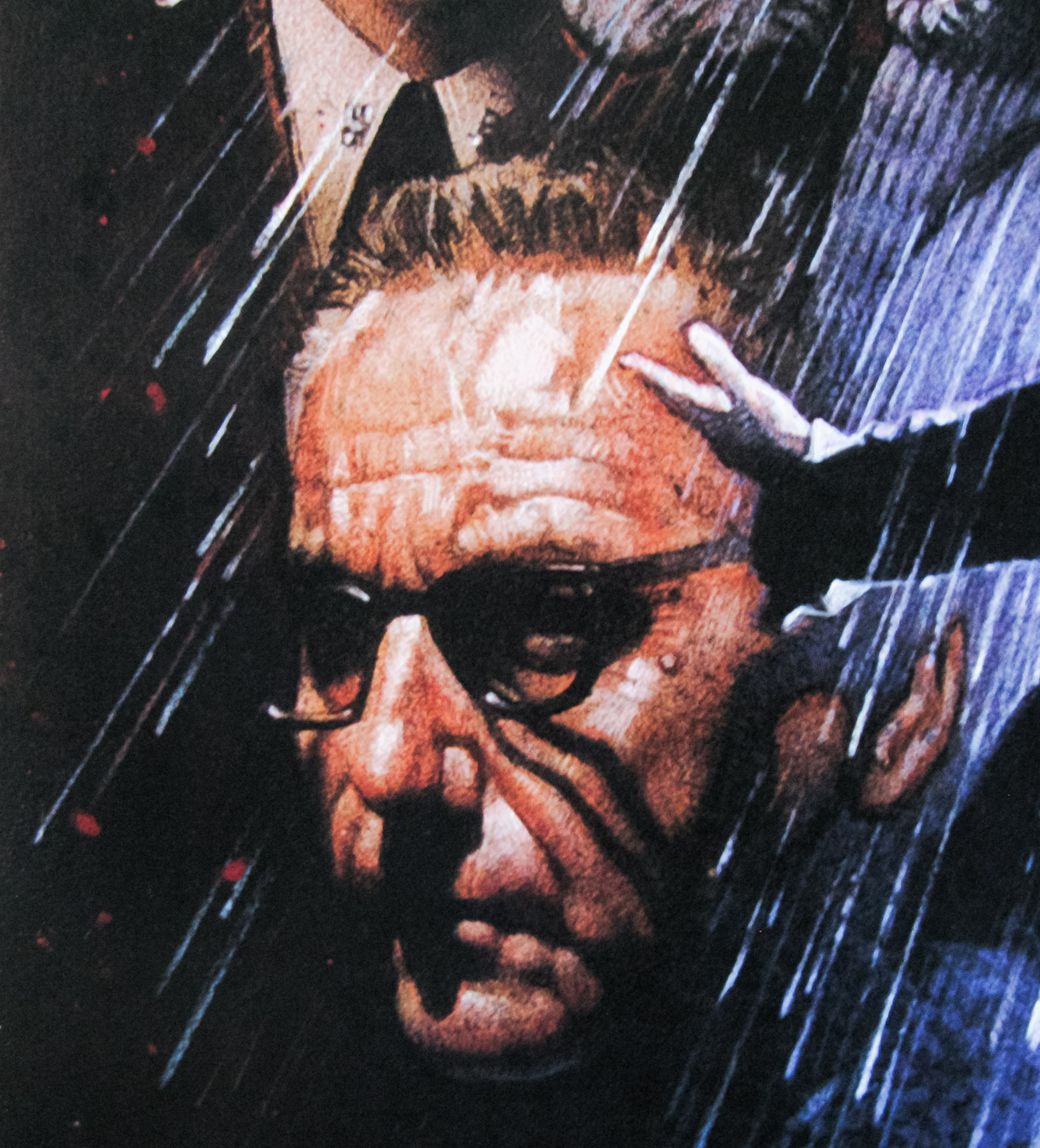
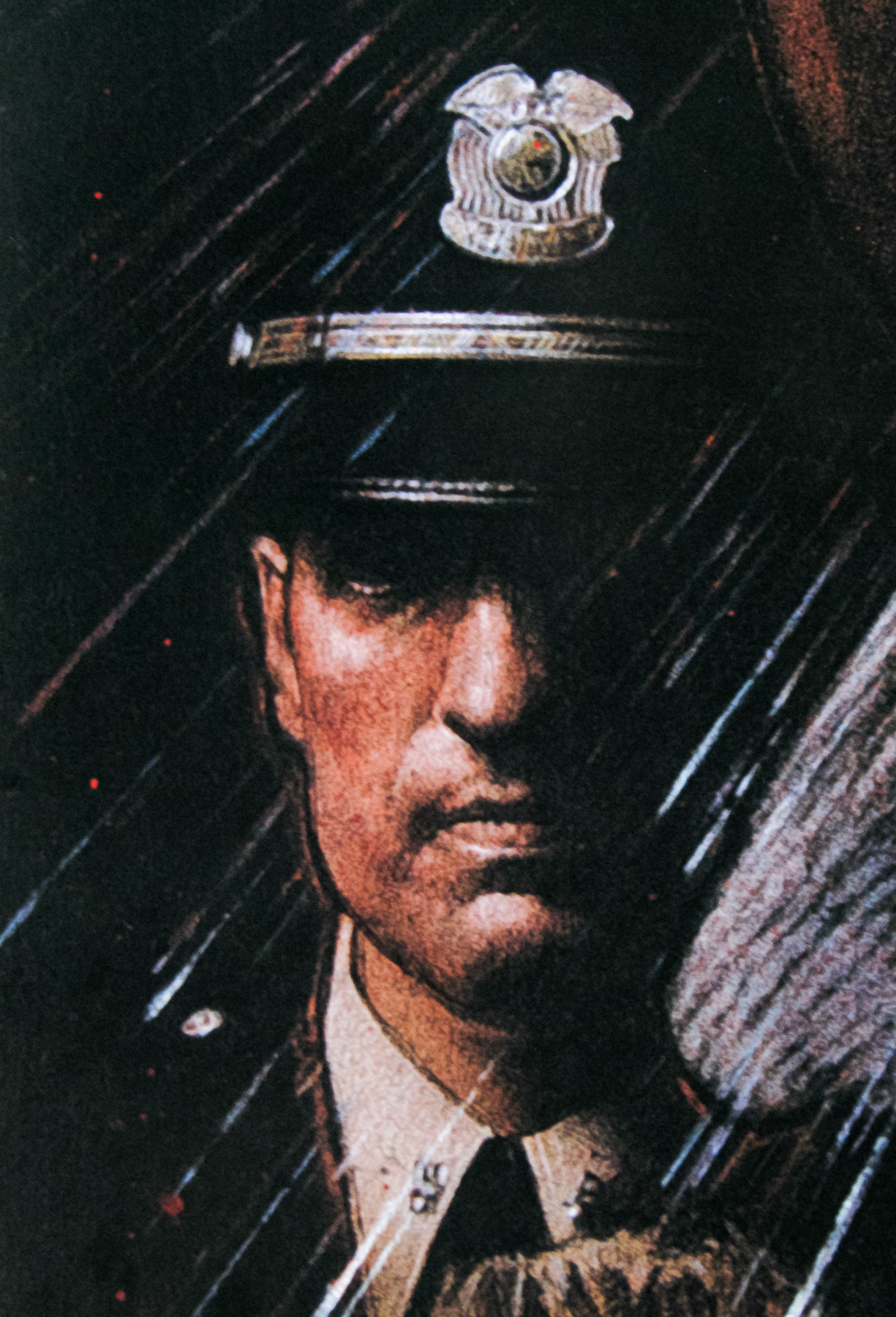
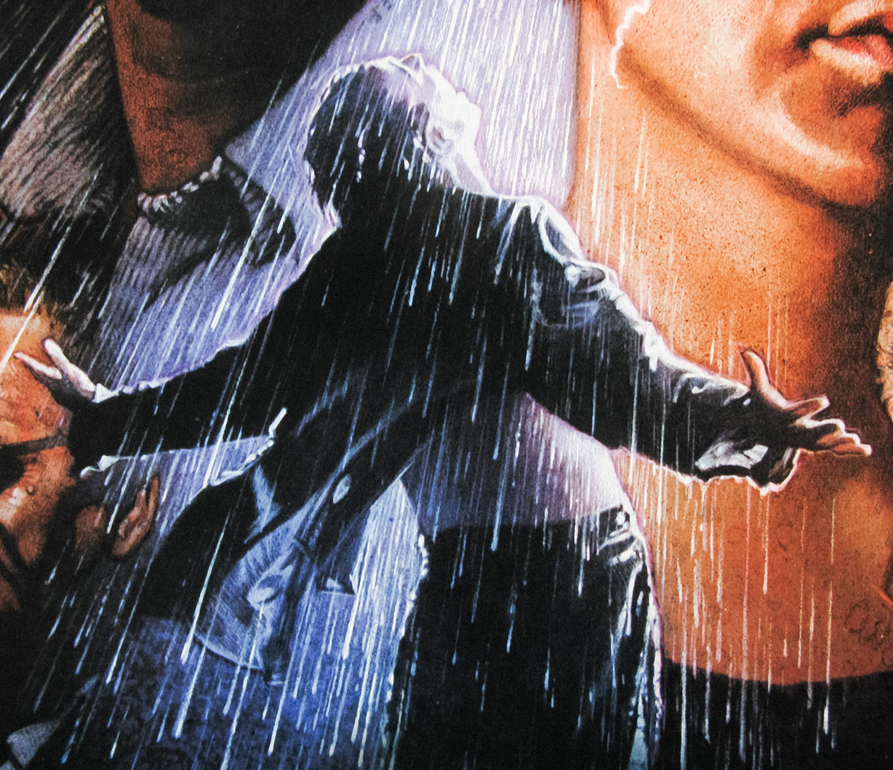
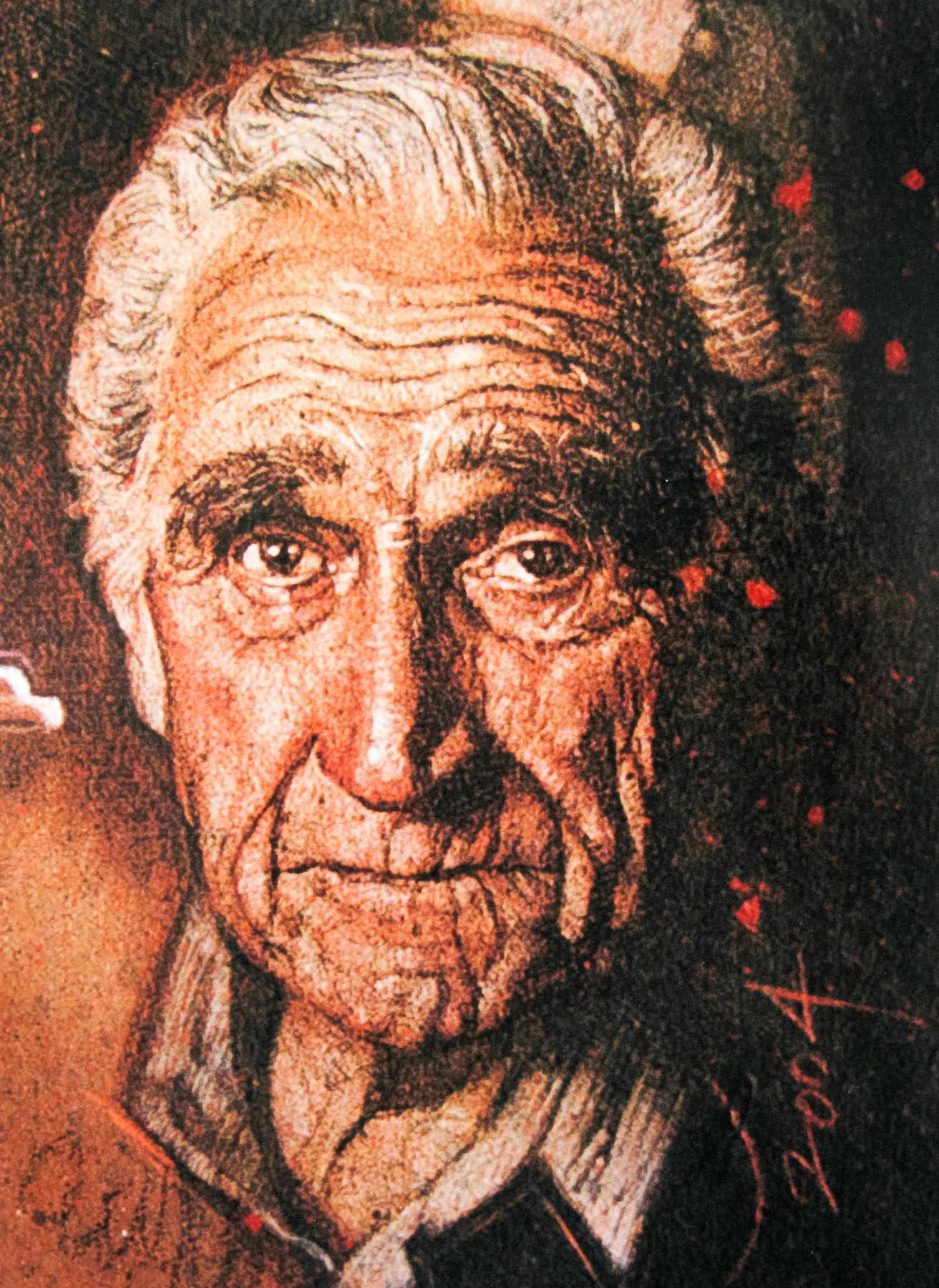
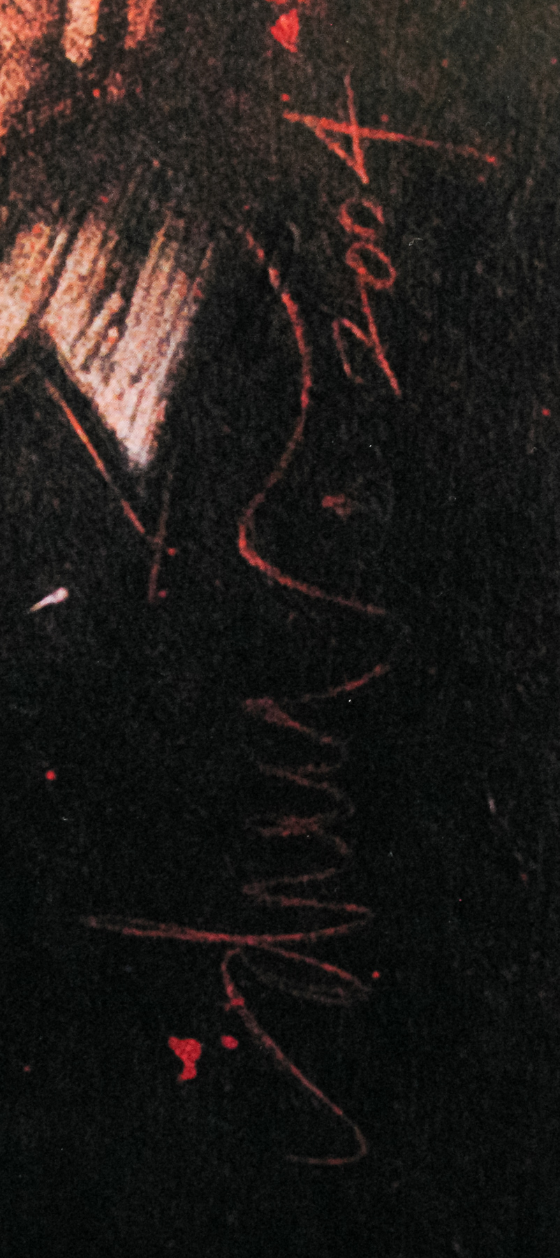
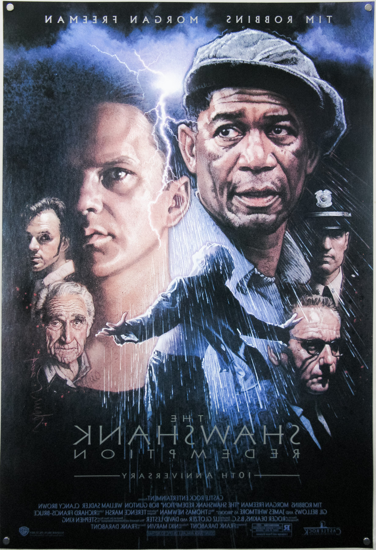
The Greatest Film Ever Made (IMDb) was re-released with a brief cinema run on its 10th anniversary in 2004. Director Frank Darabont approached legendary illustrator Drew Struzan and asked him to work on the poster. This design is featured in the brilliant book ‘The Art of Drew Struzan’ (available at Amazon.com & Amazon.co.uk).
The book reveals several of the other designs that he and Darabont worked on together and explains how the pair first met:
You know how I met Frank Darabont? He ordered two copies of the Creature from the Black Lagoon print and liked them so much he called me on the phone, out of the blue, to thank me and ask to meet. Frank became my friend through his appreciation of my work, same as Guillermo [Del Toro].
Once Frank approached Drew to work on the Shawshank re-release poster the pair quickly struck up a close working relationship:
Warner Bros. Home Video was ready to accept whatever Frank wanted, so I did some comps [comprehensive roughs] directly for him. The trouble with working a director who loves my stuff: He couldn’t decide what he wanted: he wanted them all! He ultimately chose my reprise of Tim Robbins in the rain for the cover.
Drew clearly has a fond recollection of the project and remarks on the fact that the style of painting stands out from the rest of his work:
It was a real blessing – he got me the job, he used the art, and I got to do a kind of painting that is completely different from what I had done for movie posters. The experience was all about Frank. We didn’t meet in some office; he came over to my house, we collaborated, I showed him my pictures, and he watched me work.
And the fate of the other comps that can be seen in the Art of Drew Struzan book?
In the end, they’re hanging in his house because he fell in love with the art, and I fell in love with him.
The original US one sheet is the single photographic image of Andy (Tim Robbins) in the rain after his escape and, whilst that image is a well-known one, I do prefer Drew’s moody collage. The use of light and dark on the faces is superbly done and the layout of each of the characters works very well.
The other posters in my Drew Struzan collection can be seen here.
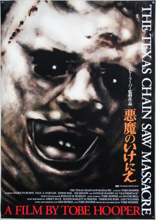
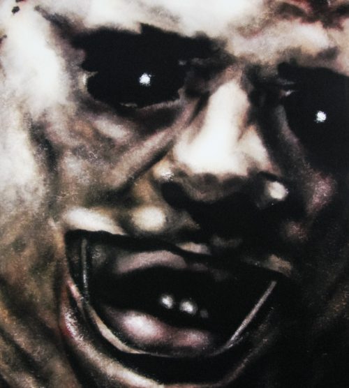
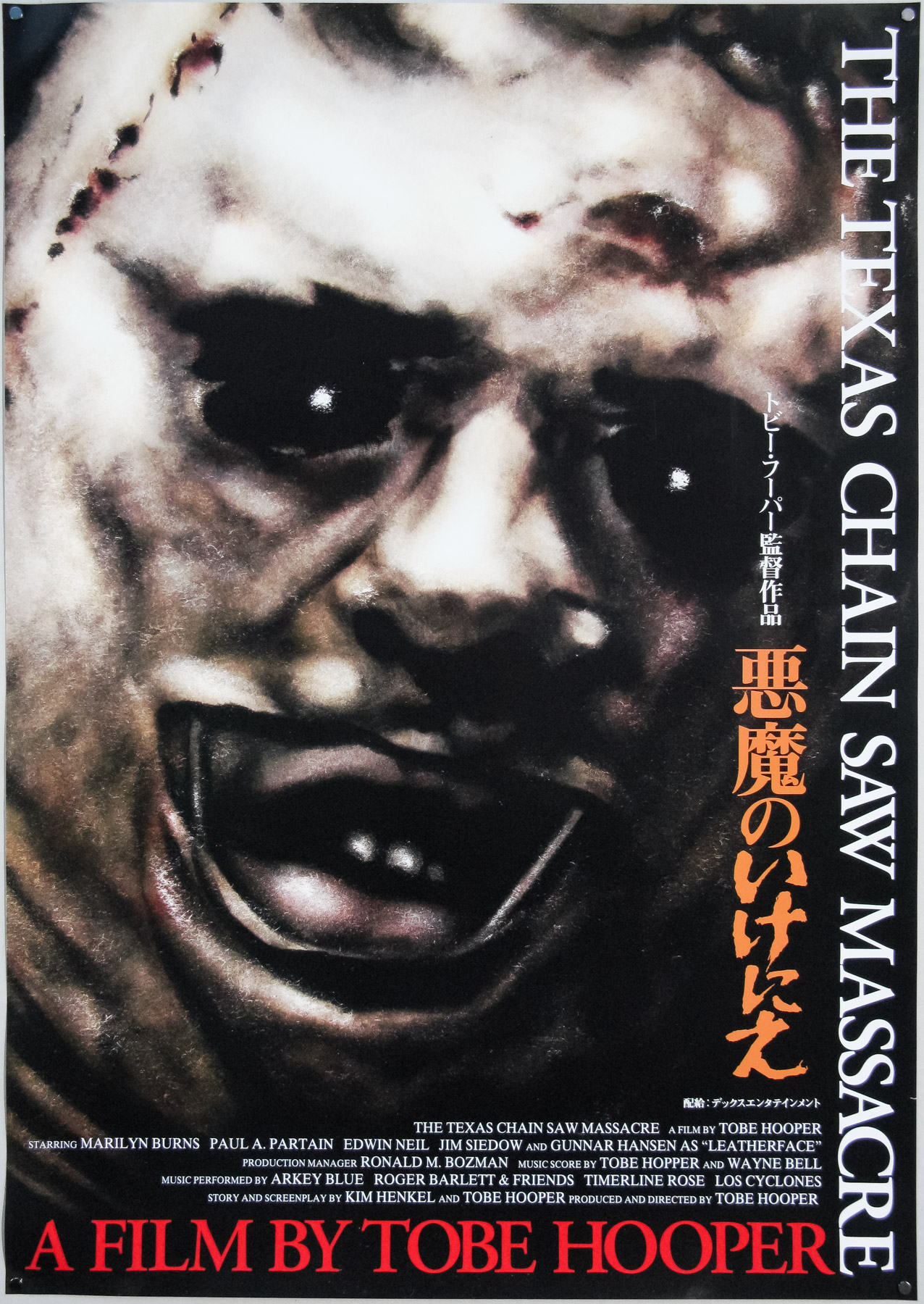
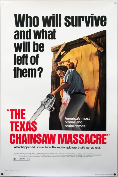
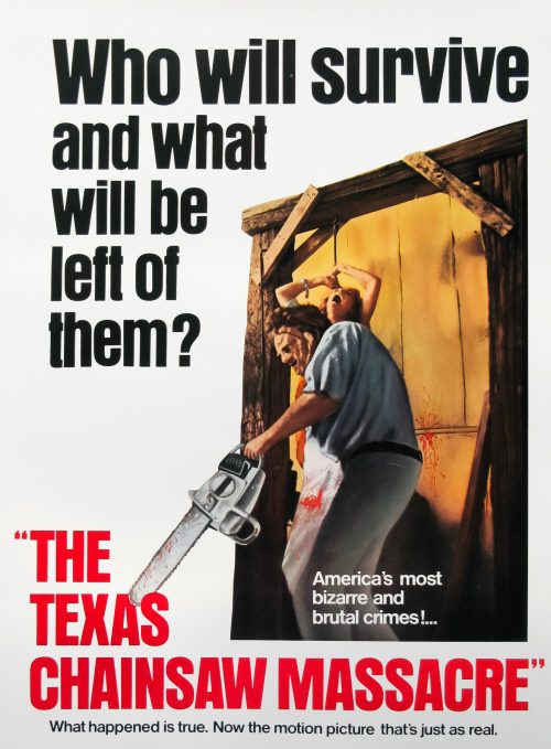
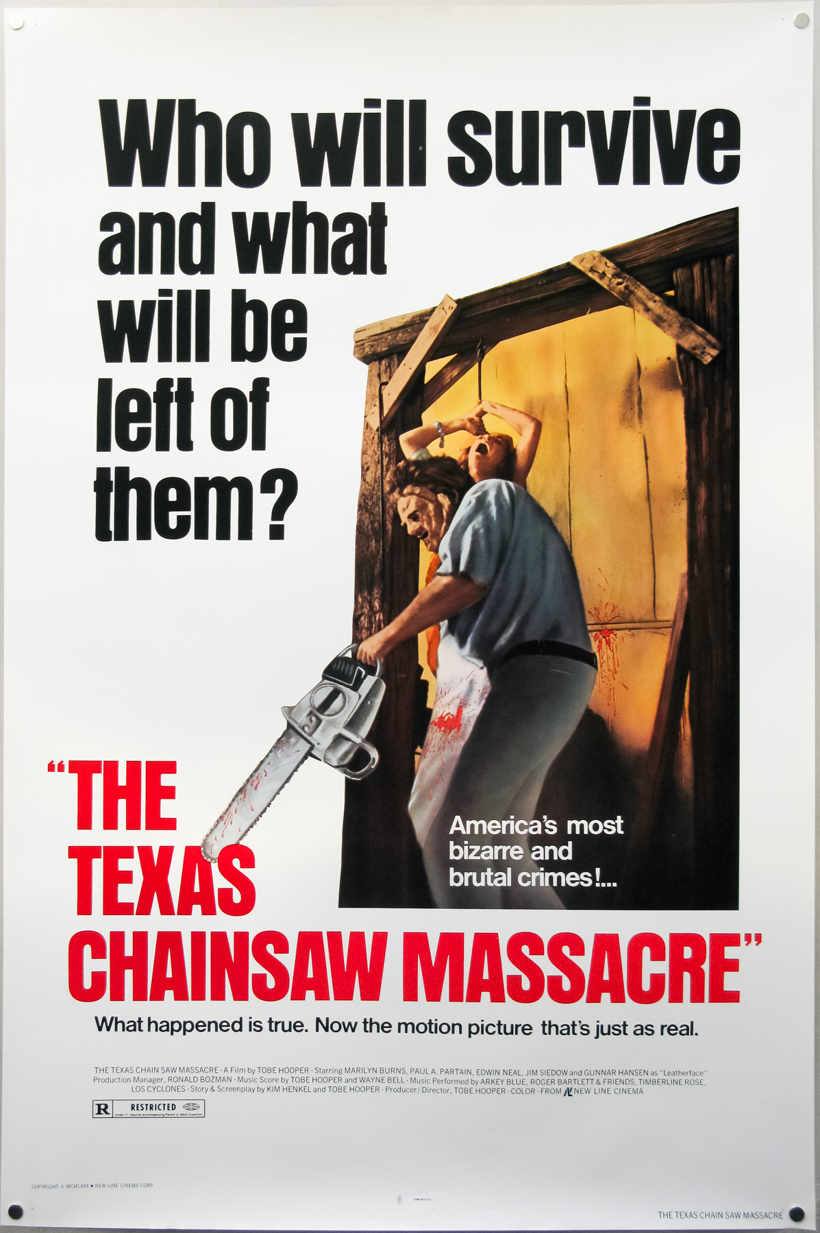
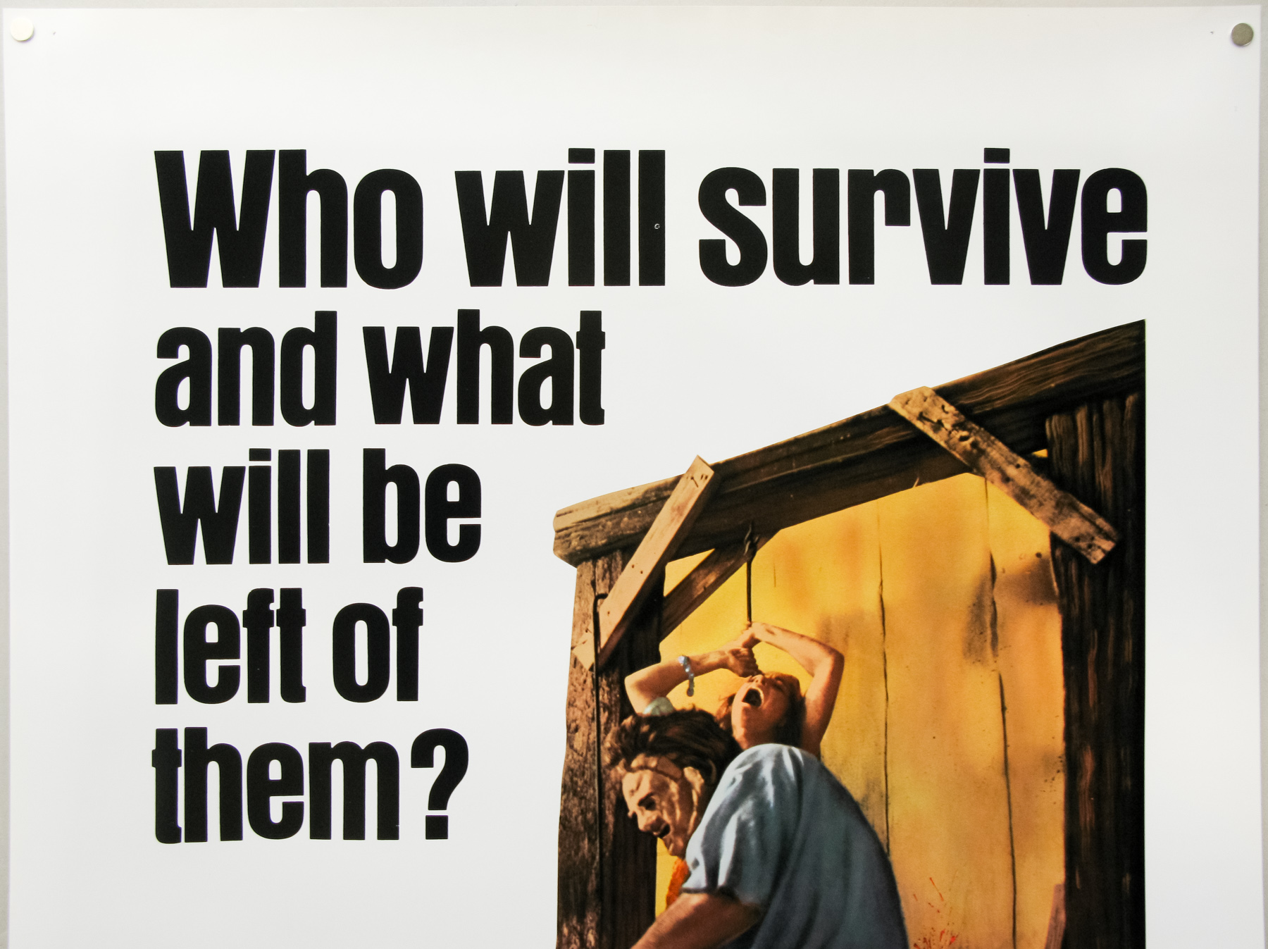
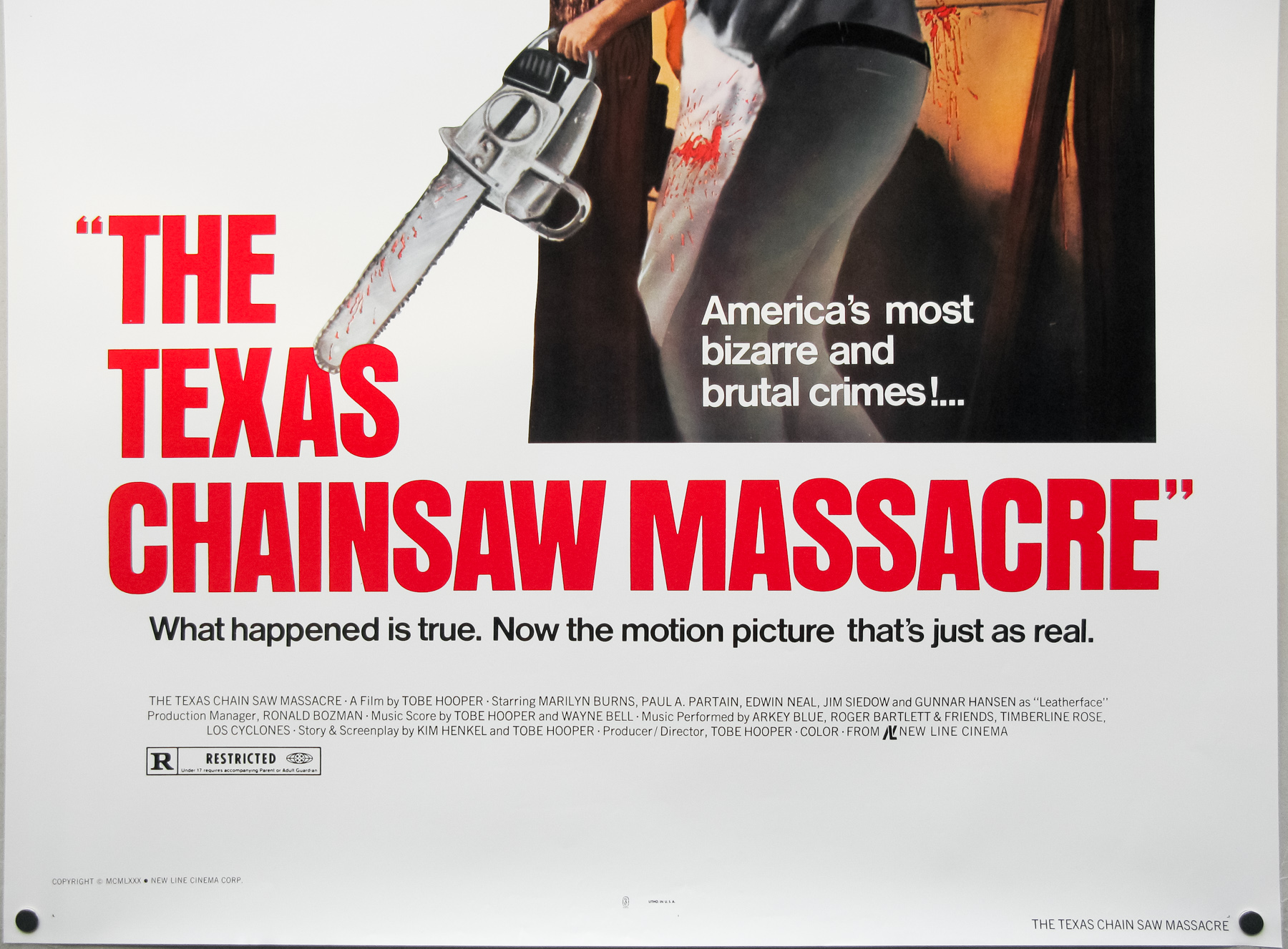
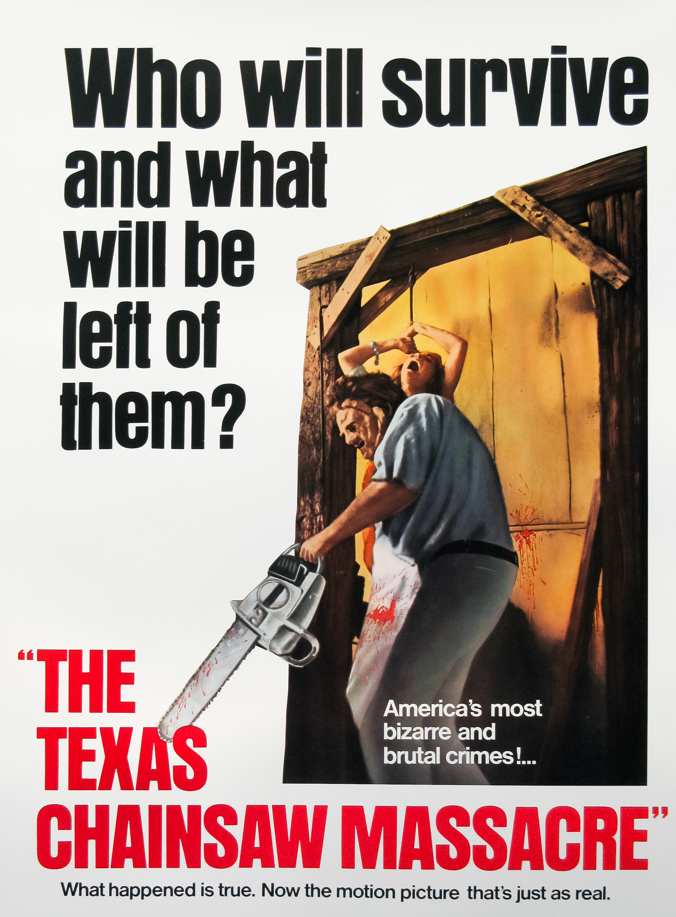
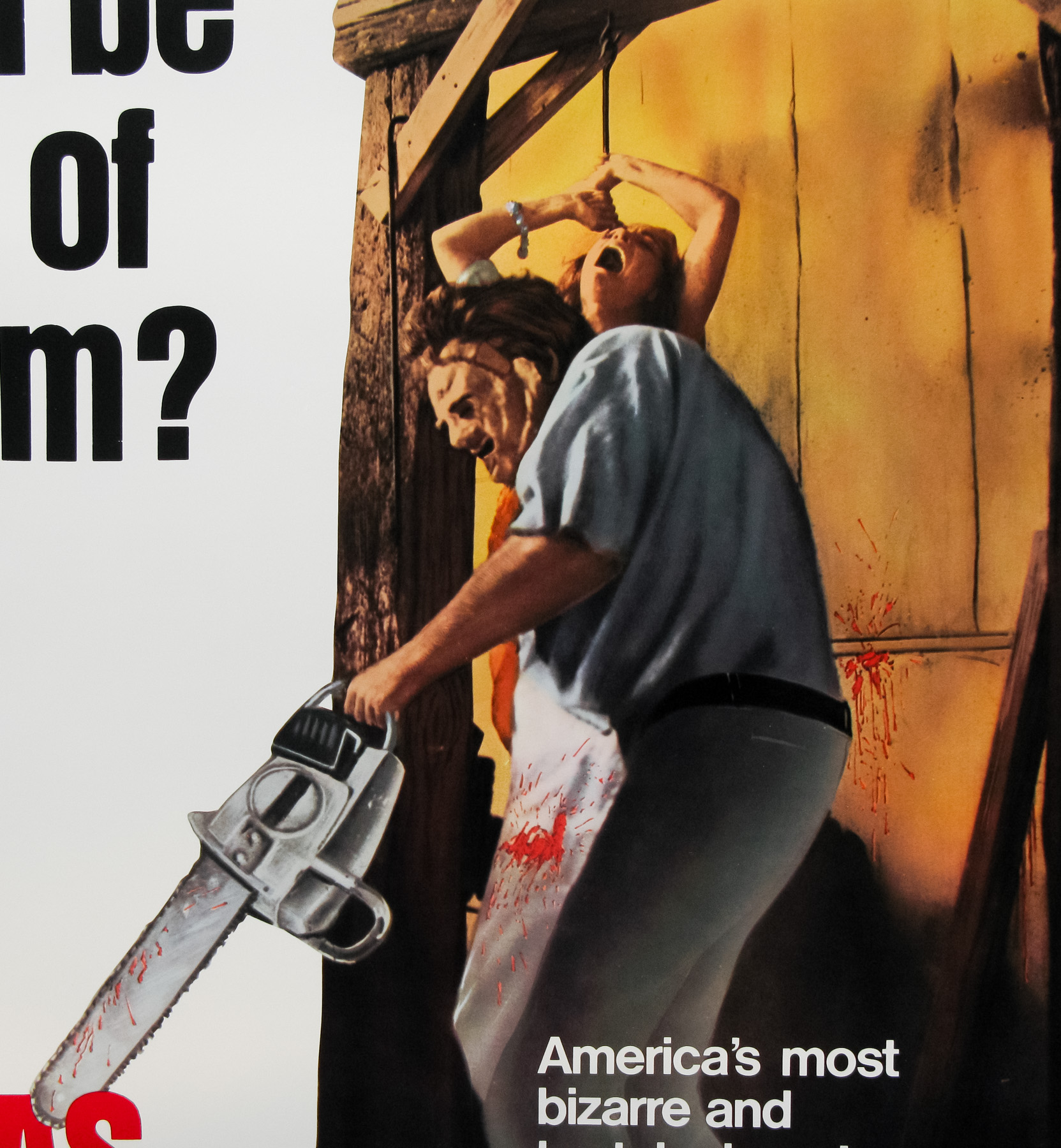
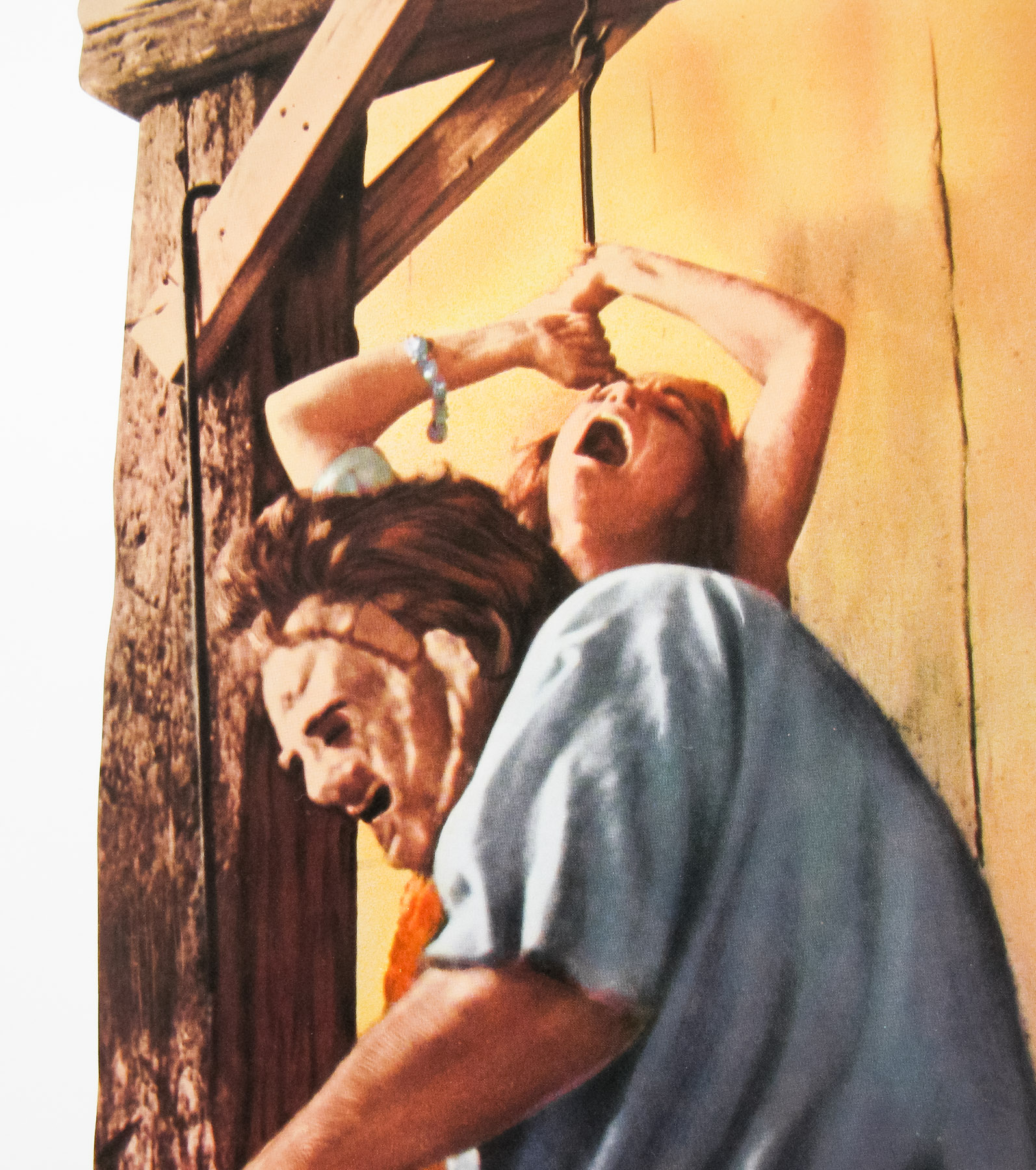
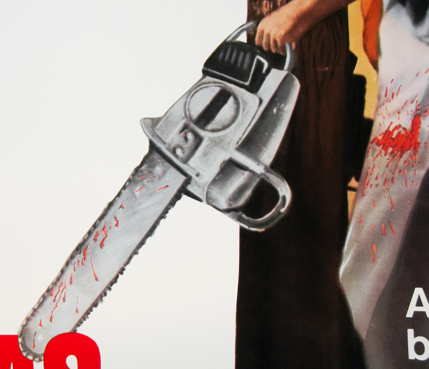
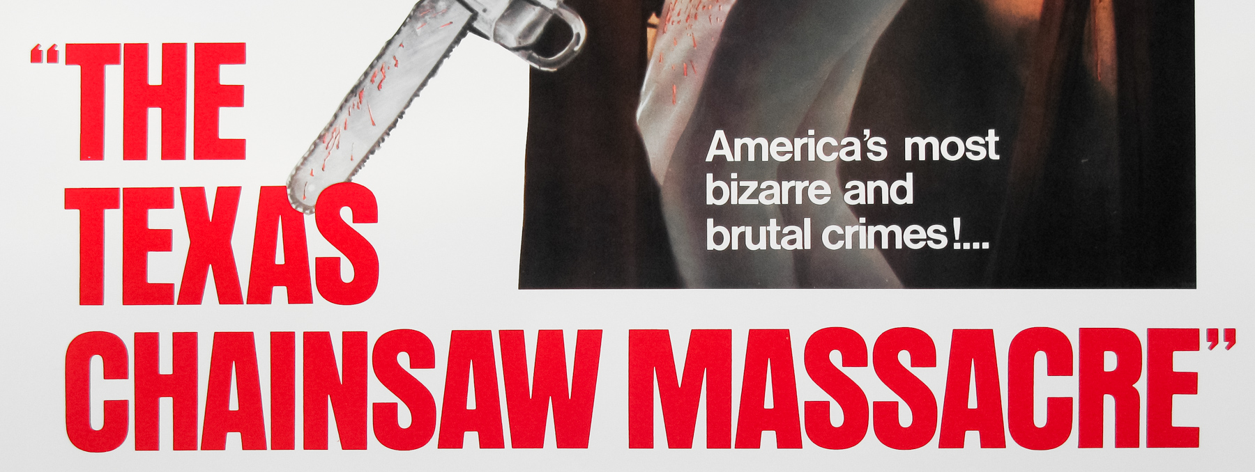
One of the best horror films of all time has a poster featuring one of the best taglines of all time. 37 years on, the film has lost none of its raw, brutal power and the US one sheet must have left cinema-goers in no doubt as to the movie they were about to watch. It’s interesting that the decision was made to reveal the (subsequently) iconic Leatherface on the poster and not leave his introduction to the film itself.
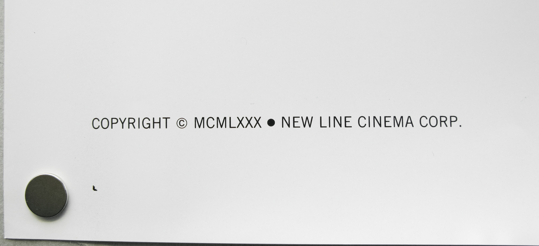
This version of the poster was for the 1980 re-release of the film by New Line Cinema. They obtained the rights from the (then) bankrupt Bryanston Distributing Company who originally released the film in 1974. The first release poster is practically identical to this one with the only notable difference being the copyright notice in the bottom left and the lack of an NSS number and blurb on the re-release.
Some more information on the Bryanston/New Line change from IMDB:
“The film’s original distributor was Bryanston Distribution Company, in fact a Mafia front operated by Louis “Butchie” Peraino, who used the movie to launder profits he made from Deep Throat (1972). In return, the production received only enough money to reimburse the investors and pay the cast and crew $405 a piece. The producers eventually discovered that Peraino had lied to them about the film’s profits; after Peraino was arrested on obscenity charges when his role in Deep Throat was revealed, the cast and crew filed a suit against him and were awarded $25,000 each. New Line Cinema, which obtained the rights to “Chain Saw” from the bankrupt Bryanston, paid the cast and crew as part of the purchase agreement.”
The original trailer can be watched here.
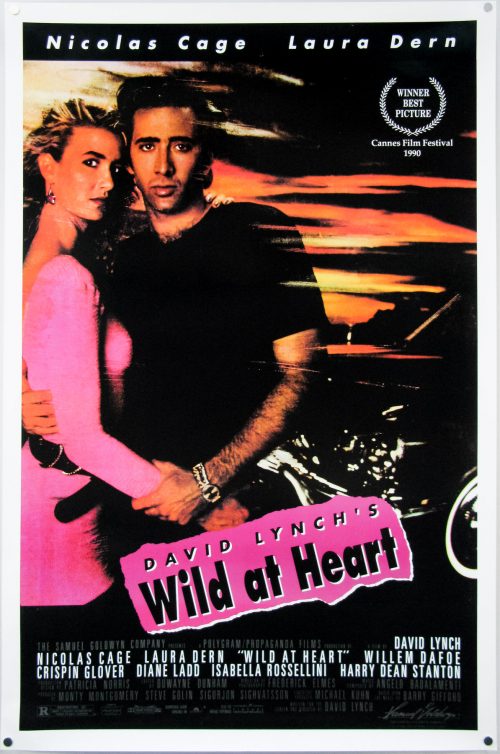
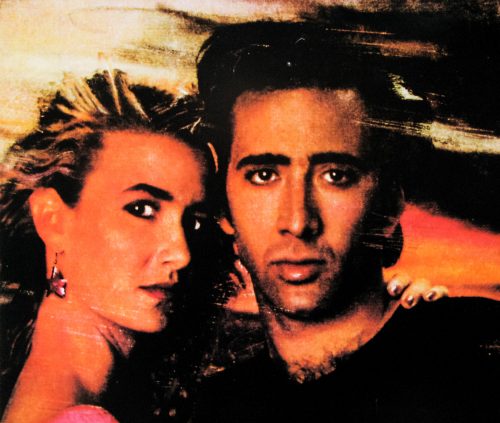
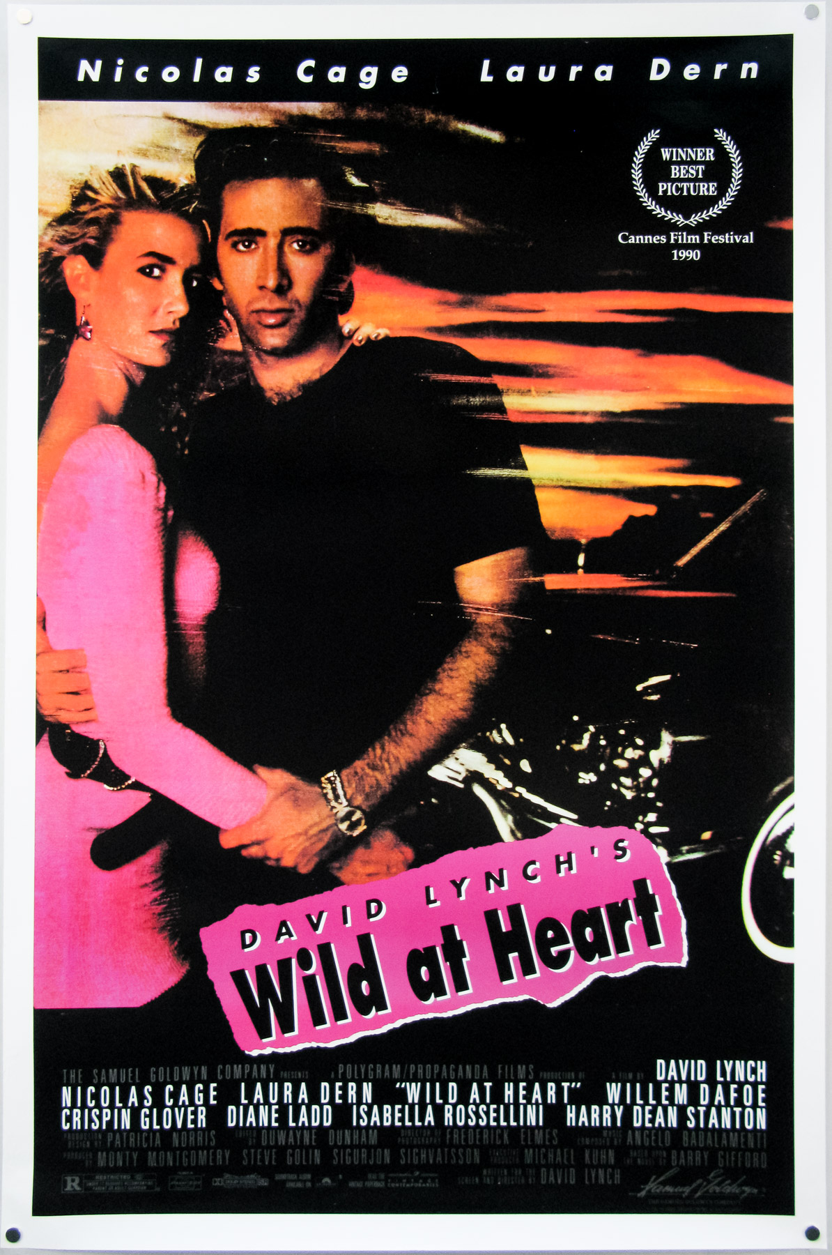
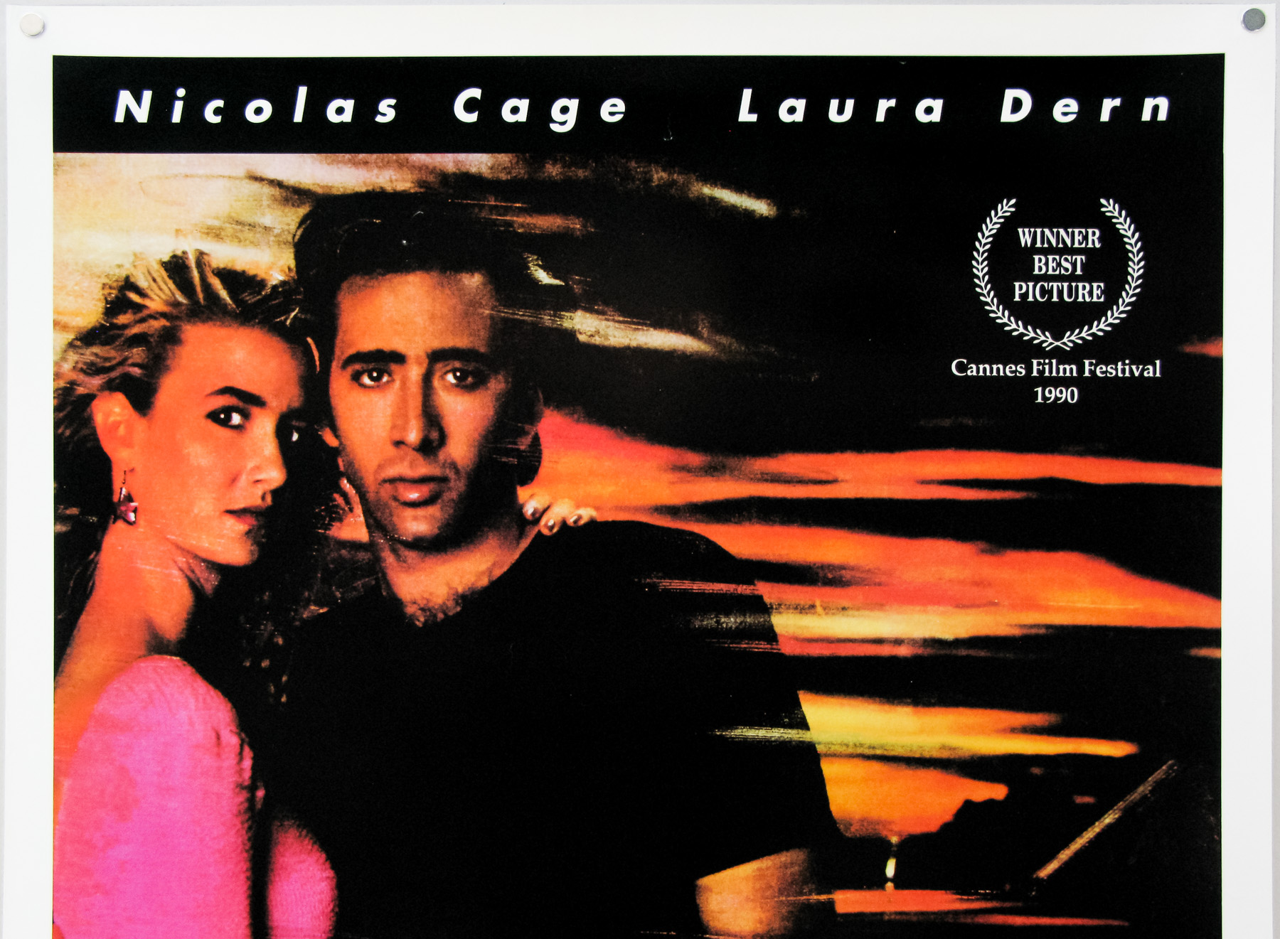
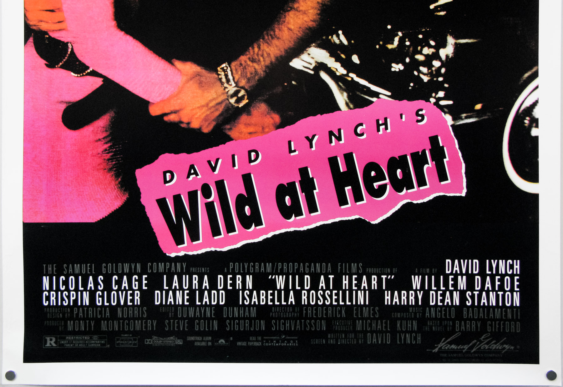
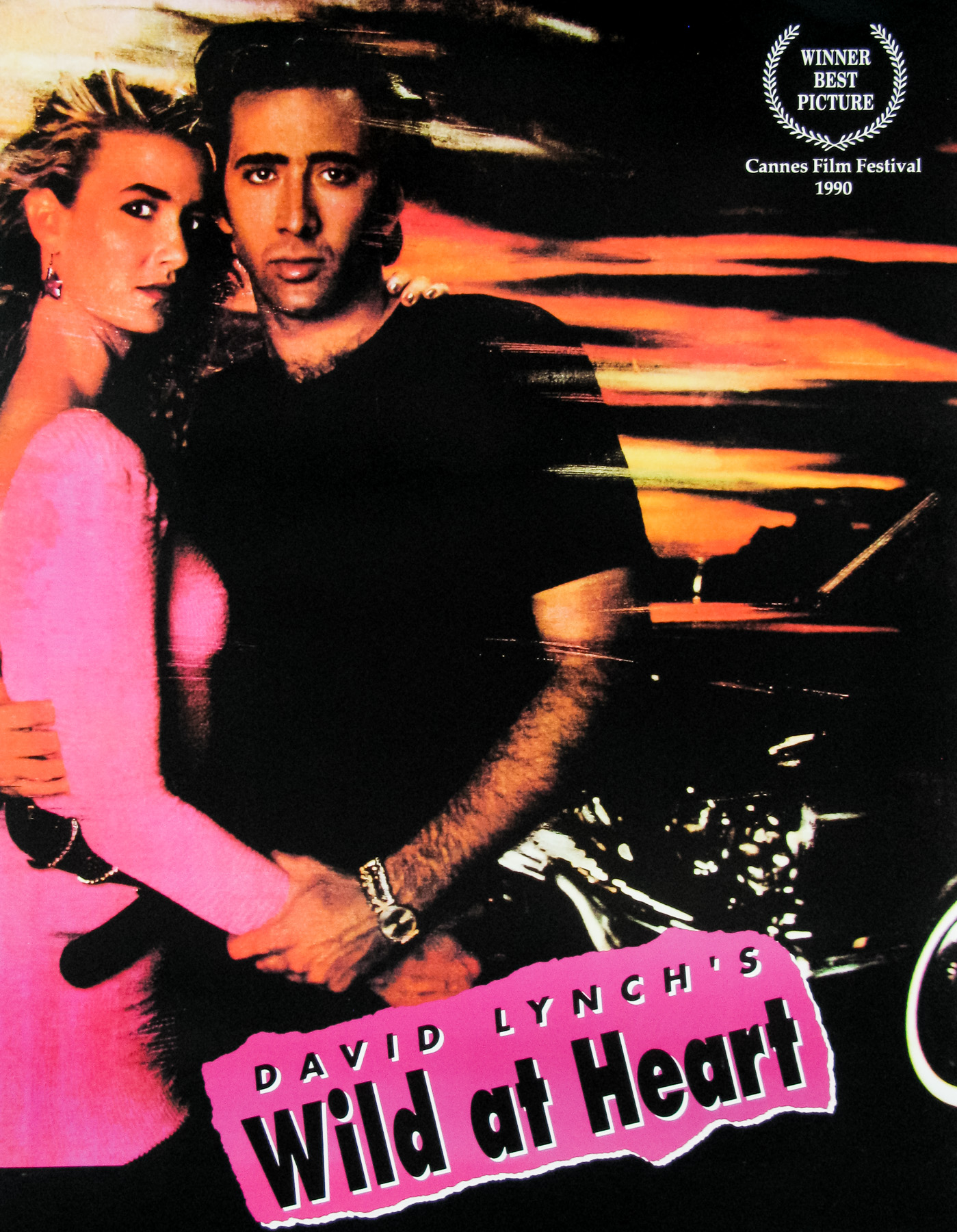
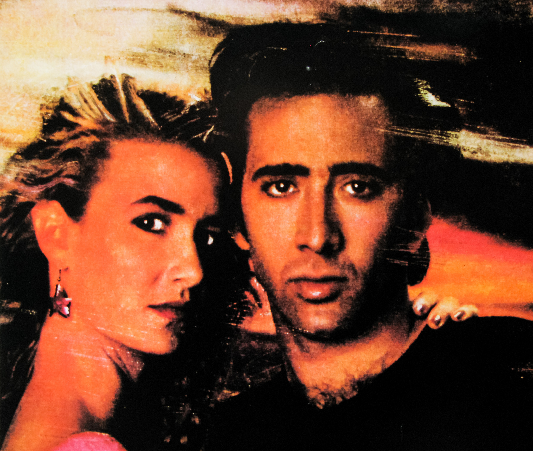
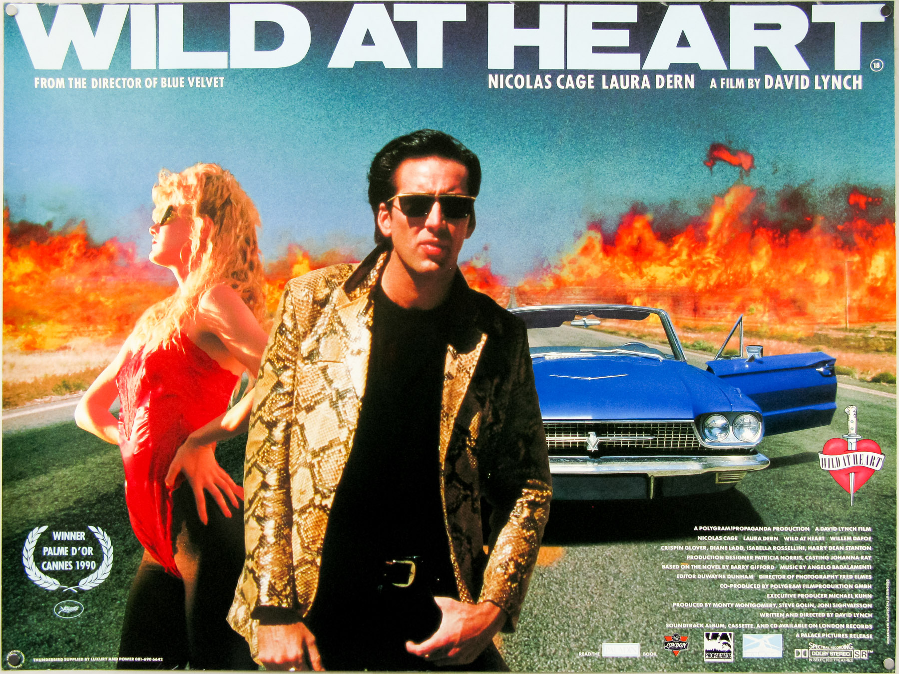
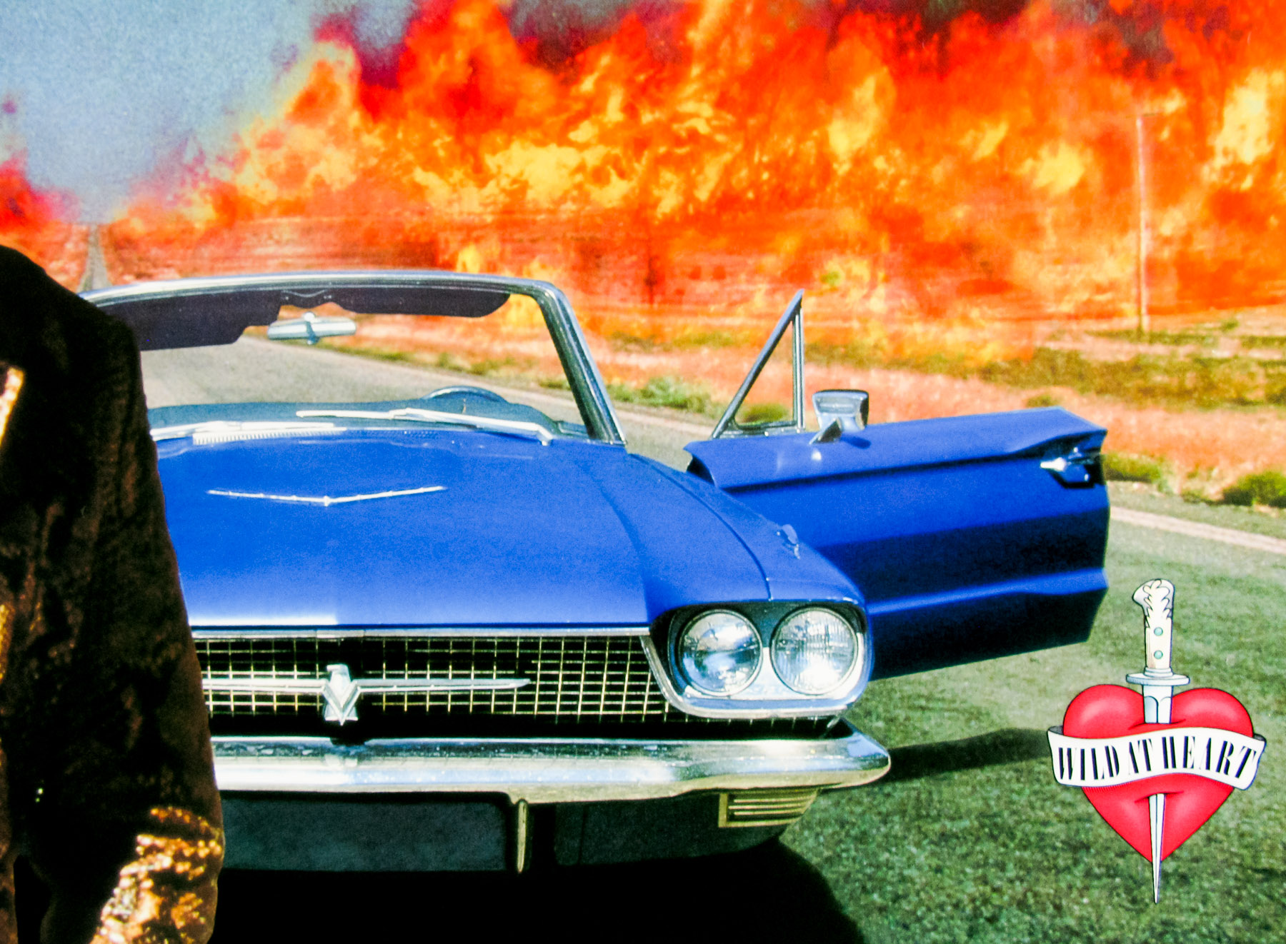
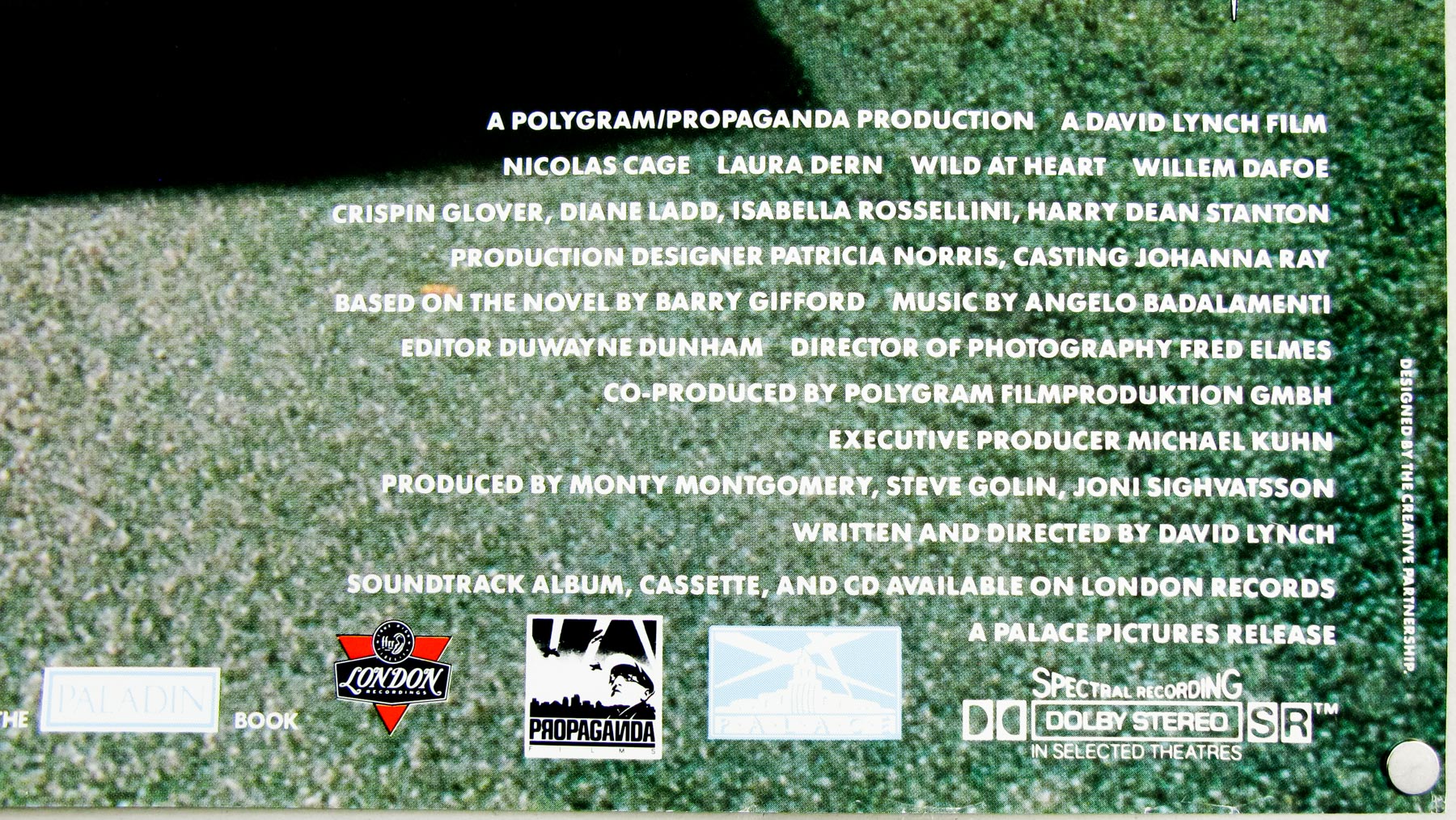
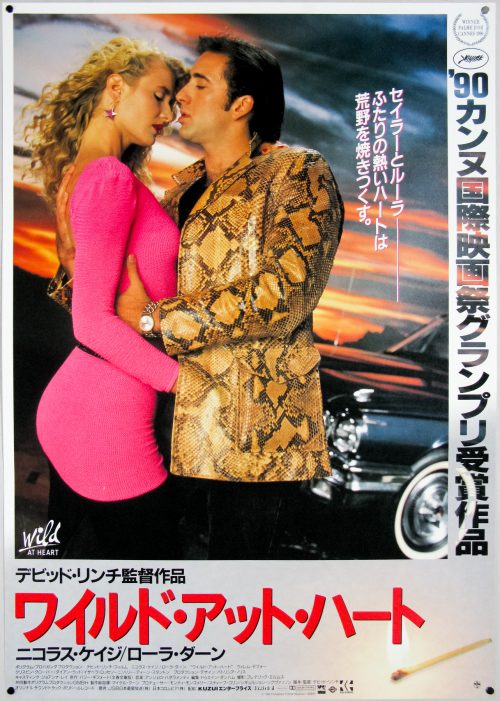
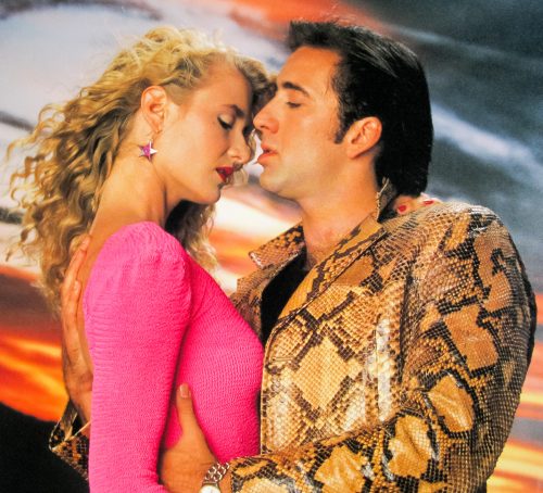
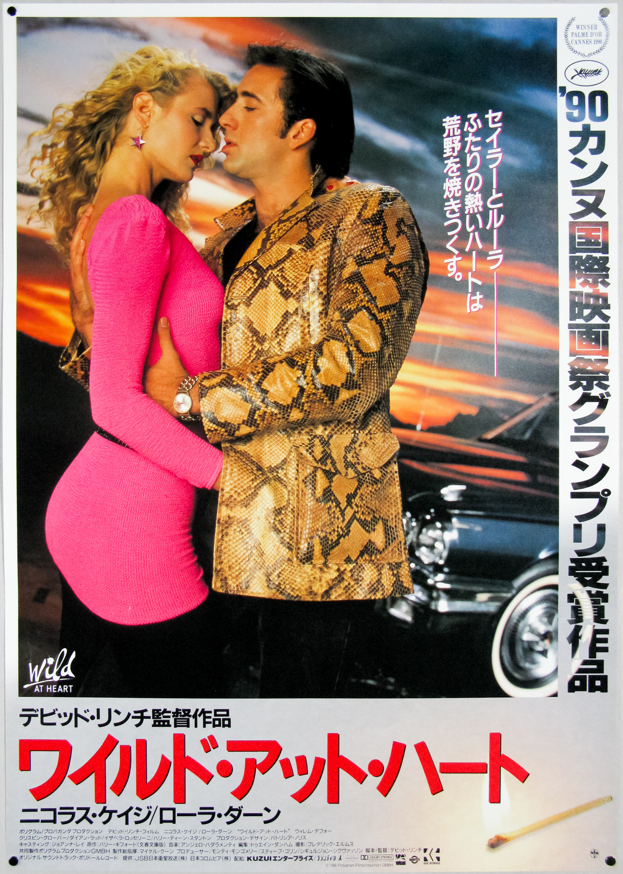
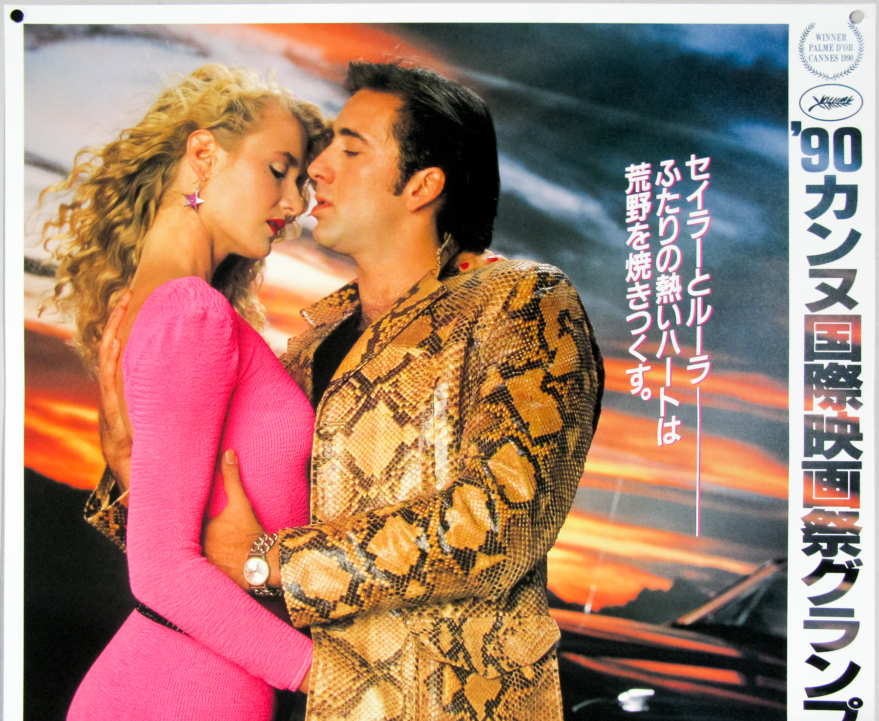
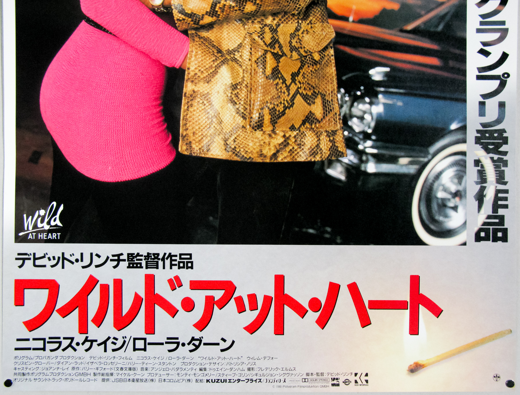
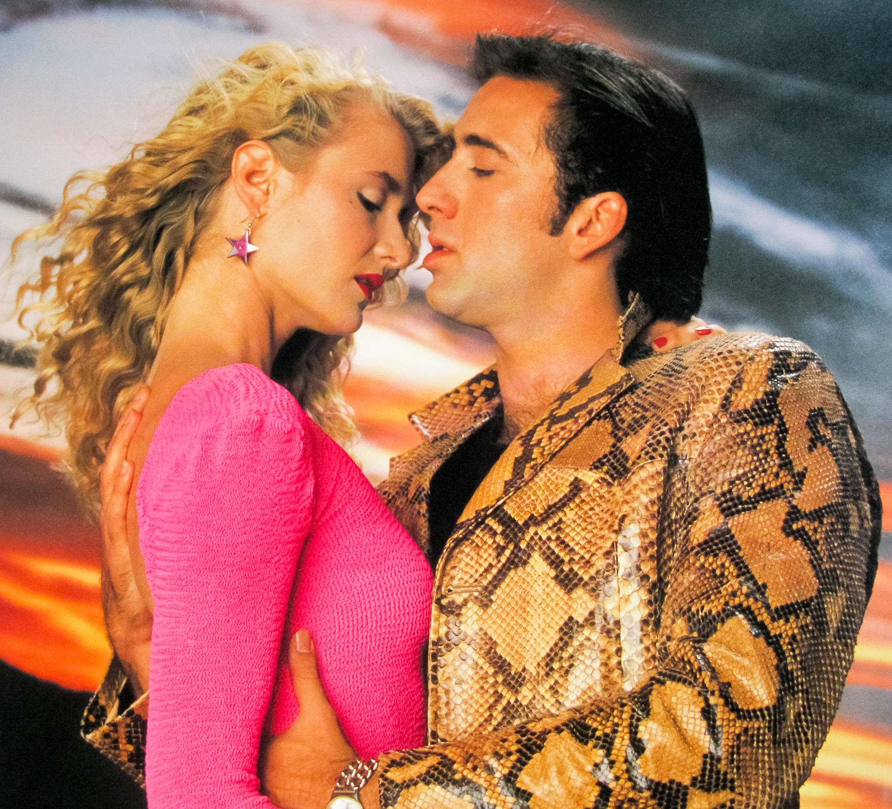
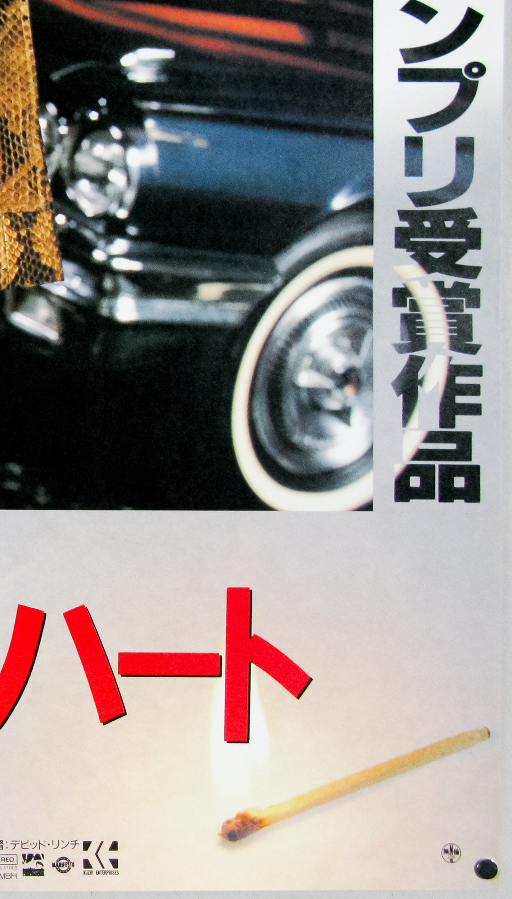
This is the US one sheet poster for David Lynch’s 1990 twisted road trip Wild at Heart. Based on Barry Gifford’s 1989 novel of the same name, the film is arguably the most conventional film that Lynch has ever made, but it’s no less weird and wonderful than the rest of his output. Nicolas Cage turns in one of his career best performances as Sailor Ripley, a young man sent to jail for killing a knife-wielding attacker in North Carolina.
Upon his release, he is met by his girlfriend Lula Fortune (Laura Dern) at the prison gates and the pair decide to run away to California to escape her domineering mother Marietta (a memorable performance by Diane Ladd). Marietta is a twisted bully and totally disapproves of Sailor and Lula’s relationship. It’s revealed that she sent the knife-wielding killer after him to begin with and when they disappear she hires both a private detective and a dangerous mobster to track them down.
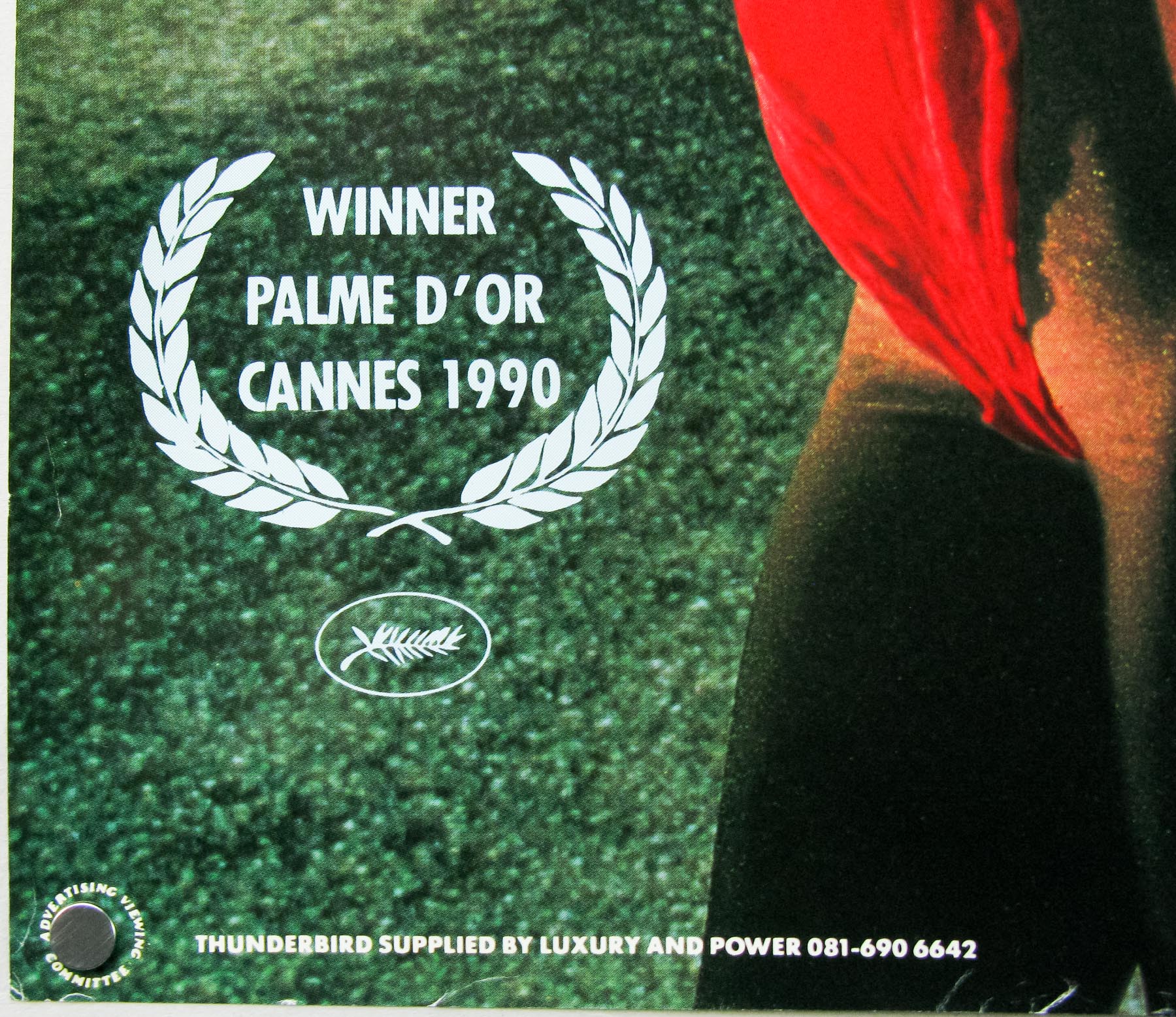
The lovers end up in Texas where they meet an old friend called Perdita Durango (Isabella Rossellini) who they hope will be able to help them, but also encounter the psychotic gangster Bobby Peru (a terrifying Willem Dafoe) who leads Sailor astray with terrible consequences. The film is full of Lynch’s trademark surreal sequences and shocking moments of violence, including one involving a shotgun that is hard to forget. Apparently the film tested badly upon completion and Lynch recalls that over 100 people walked out during one screening. It received a pretty mixed critical reception but it did win the coveted Palme d’Or at the Cannes Film Festival and was a moderate financial success in the US and internationally.


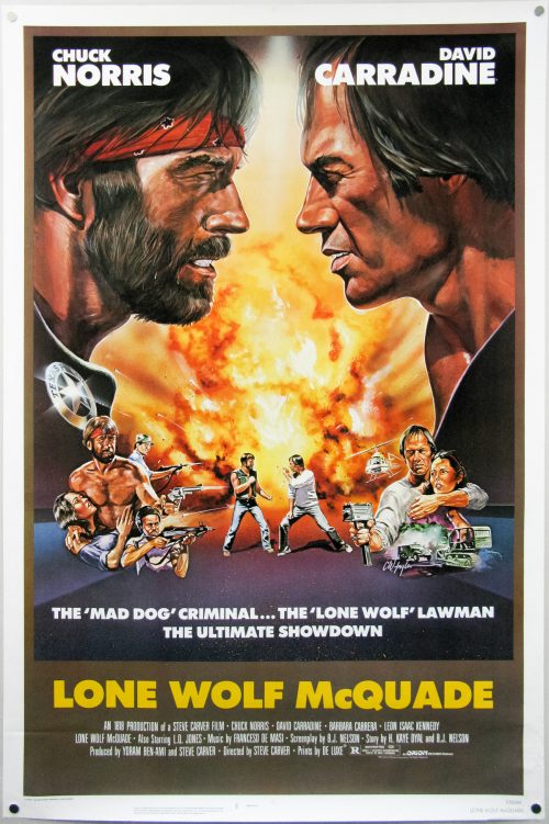
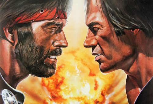
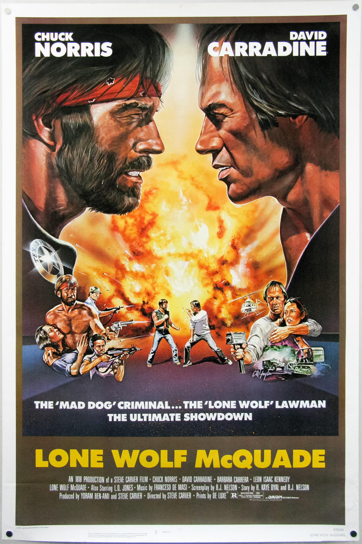
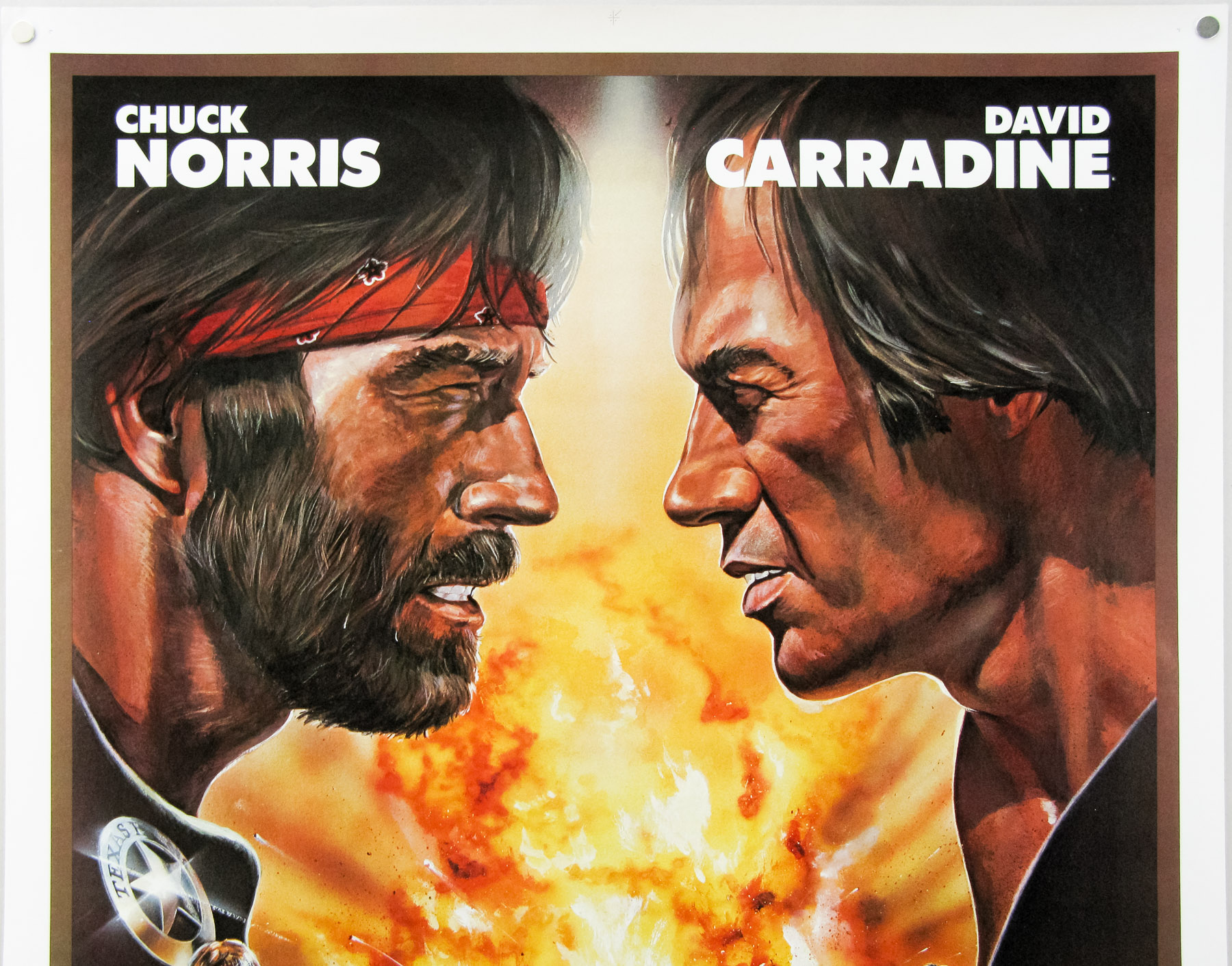
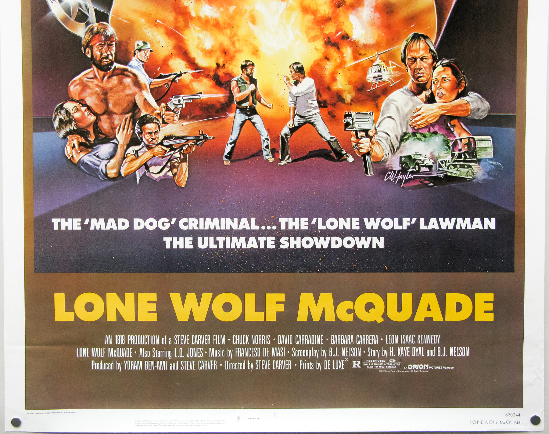
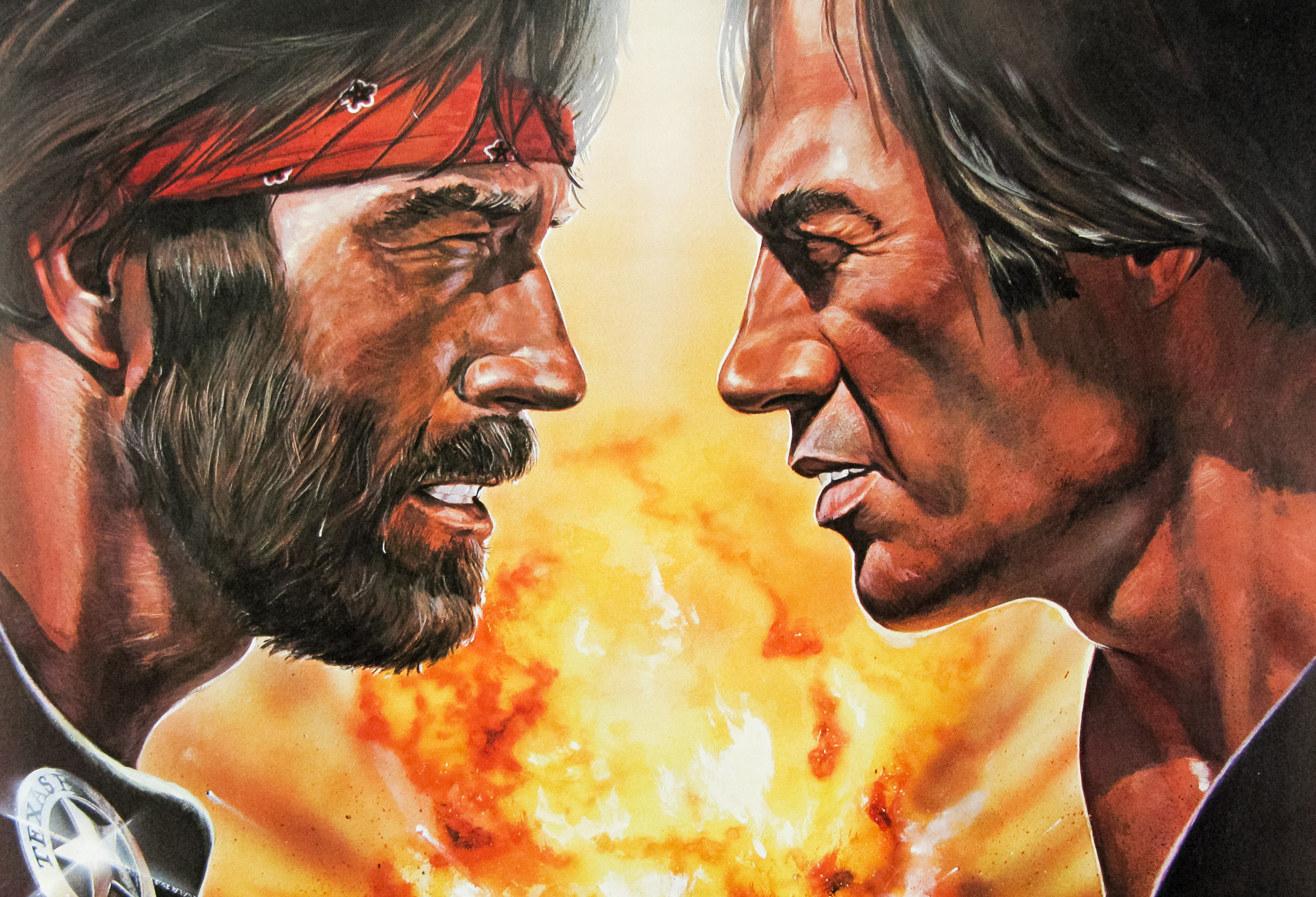
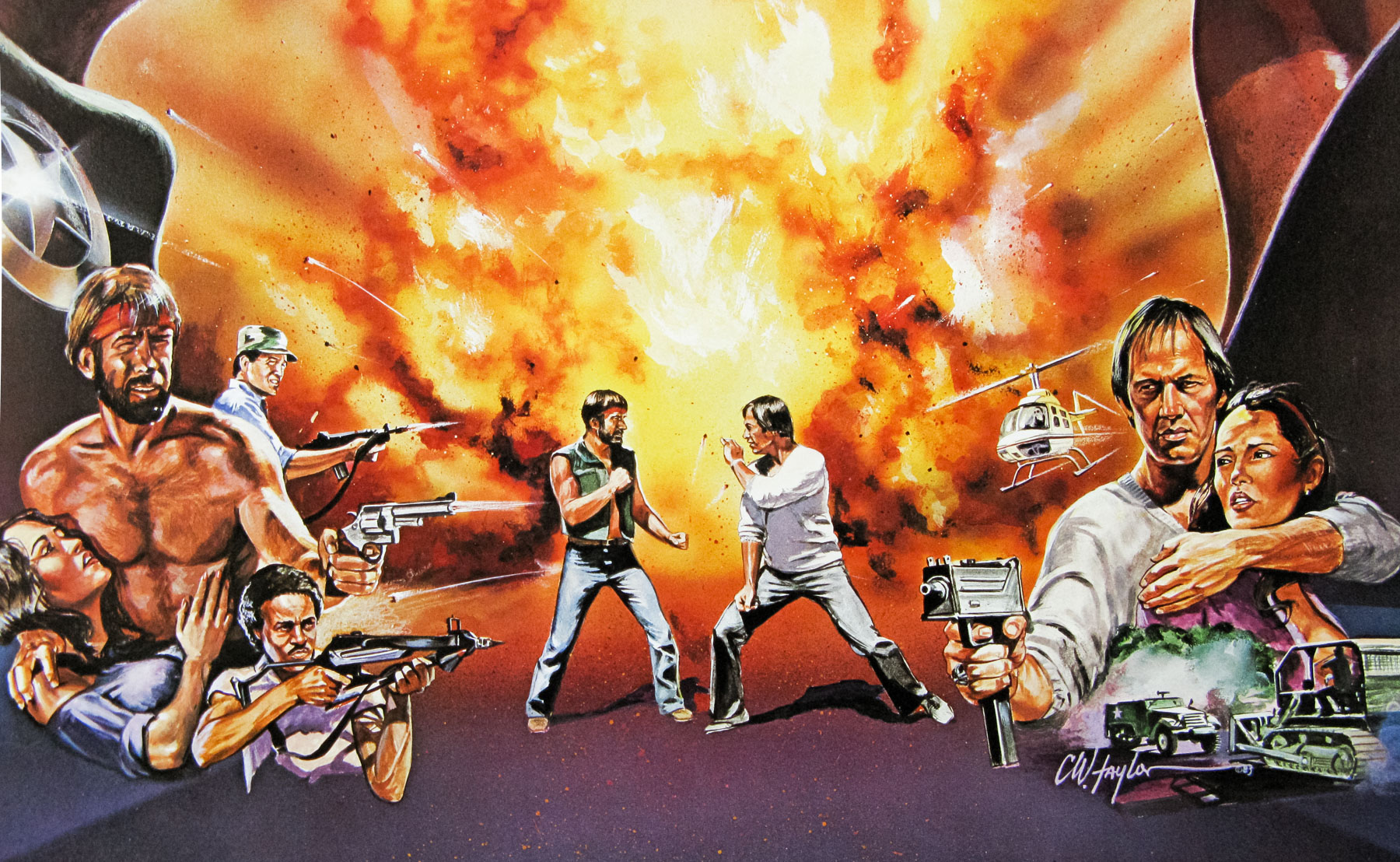
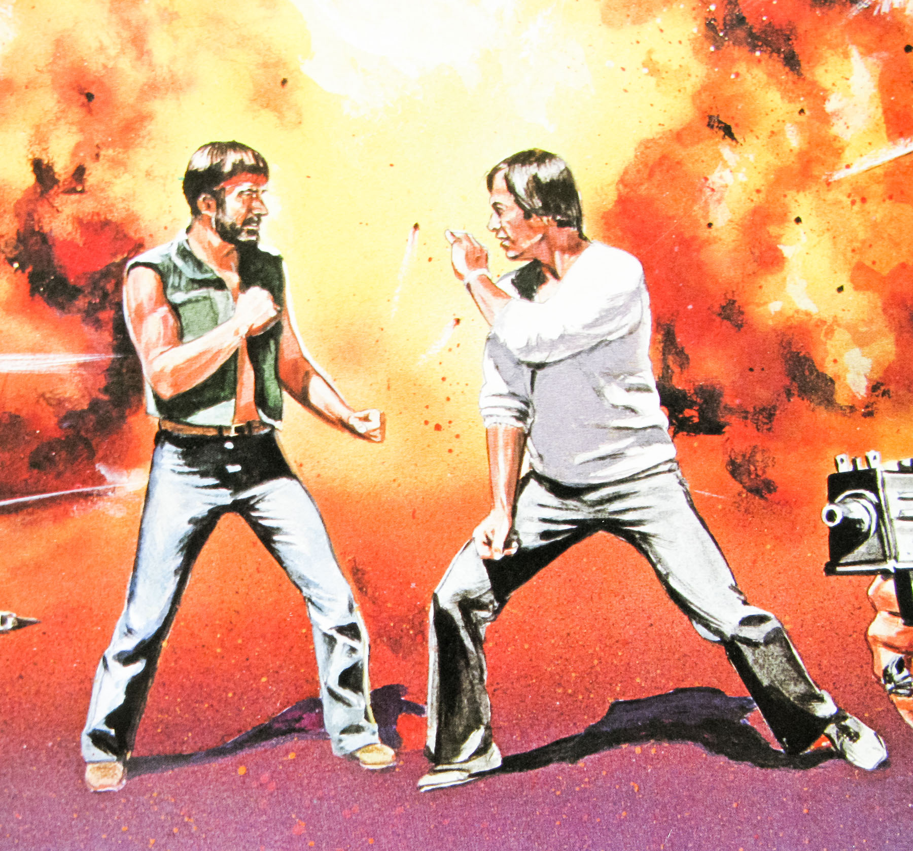
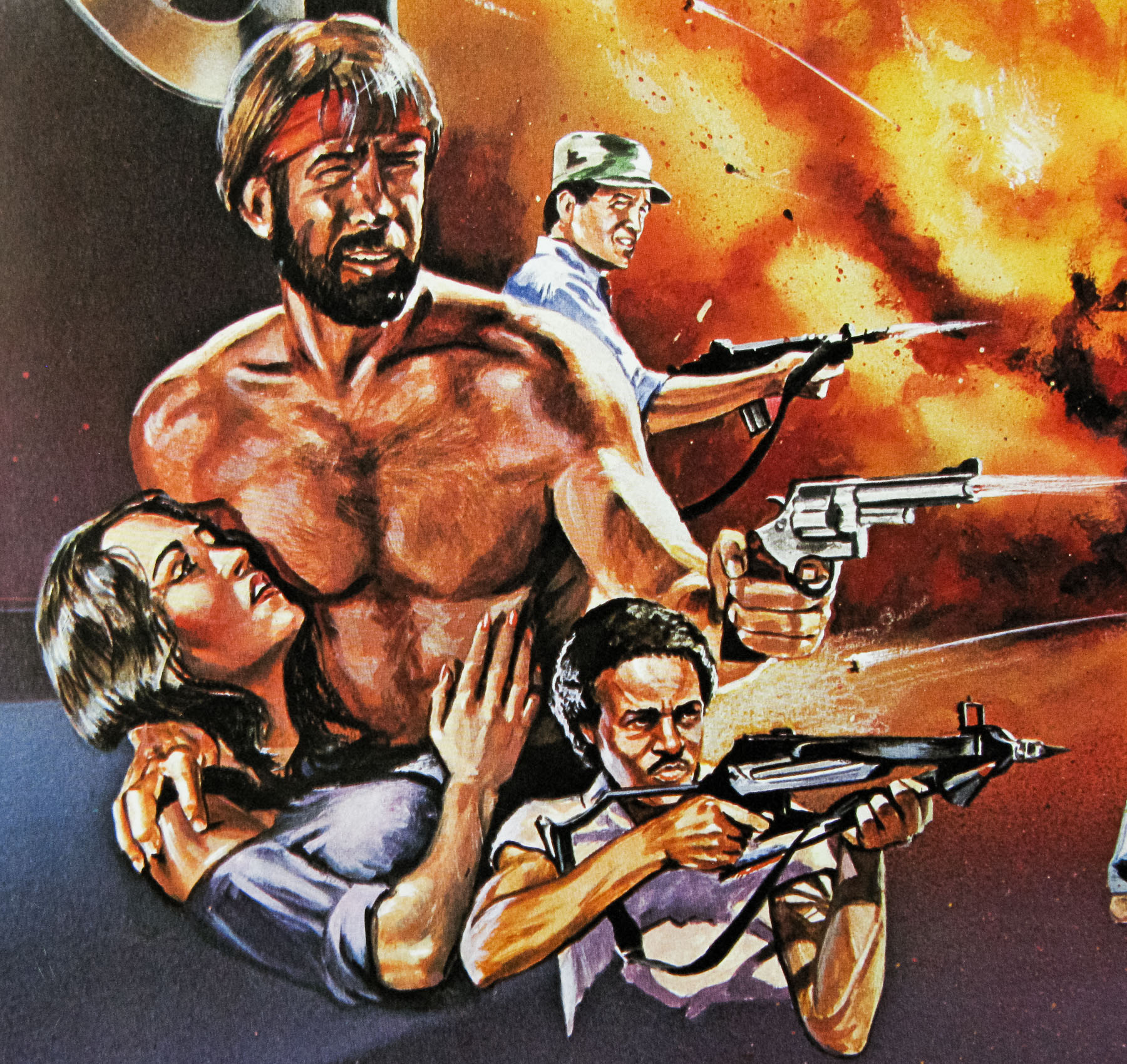
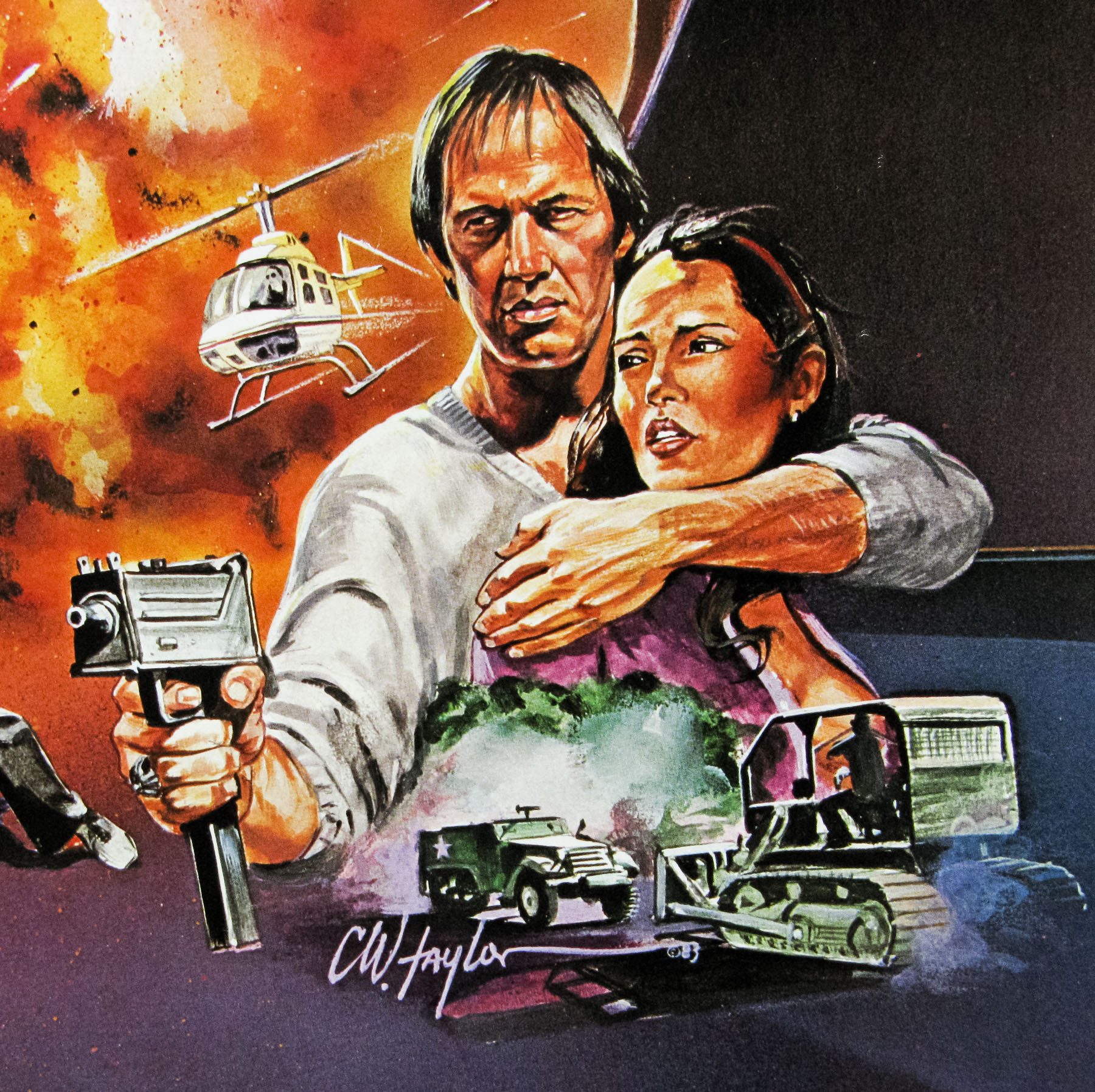
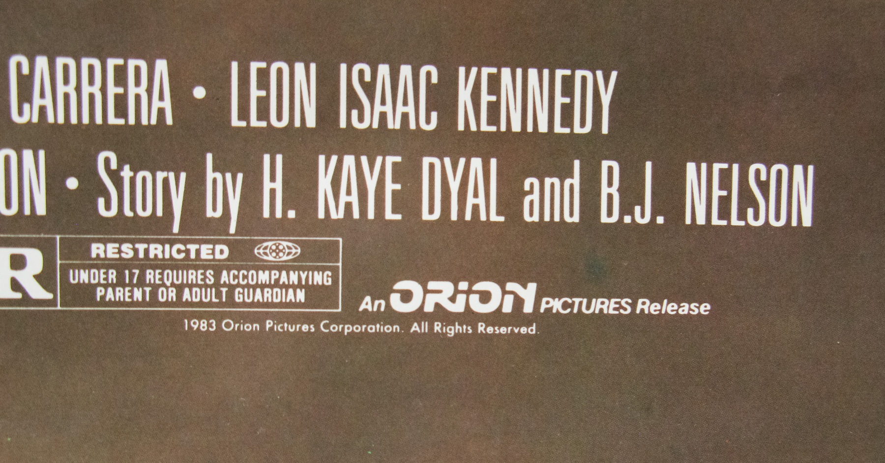
Norris versus Carradine was always going to be a good match and this is definitely one of Chuck’s better films. His character, a Texas Ranger named J.J. McQuade, was the inspiration behind his successful TV series Walker, Texas Ranger that began 10 years after this film. This US one sheet features great action artwork by C.W. Taylor.
The uncensored trailer can be watched on Youtube.
Someone has made a clip called Lone Wolf McQuade in four minutes, handy if you never intend to watch the film in full. Also, here’s the film’s body count.

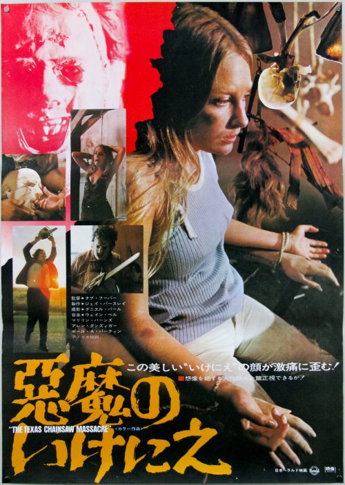
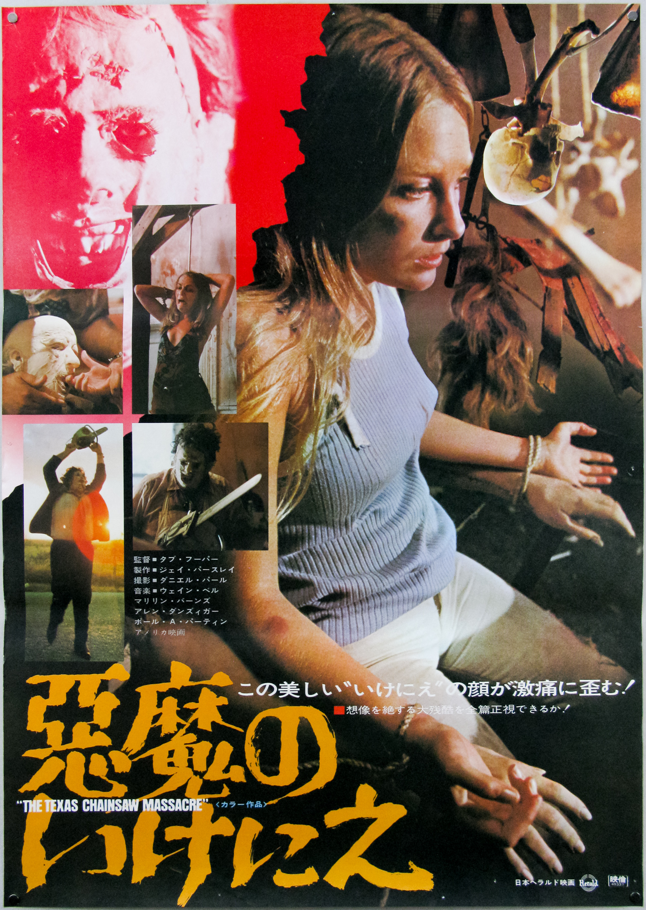
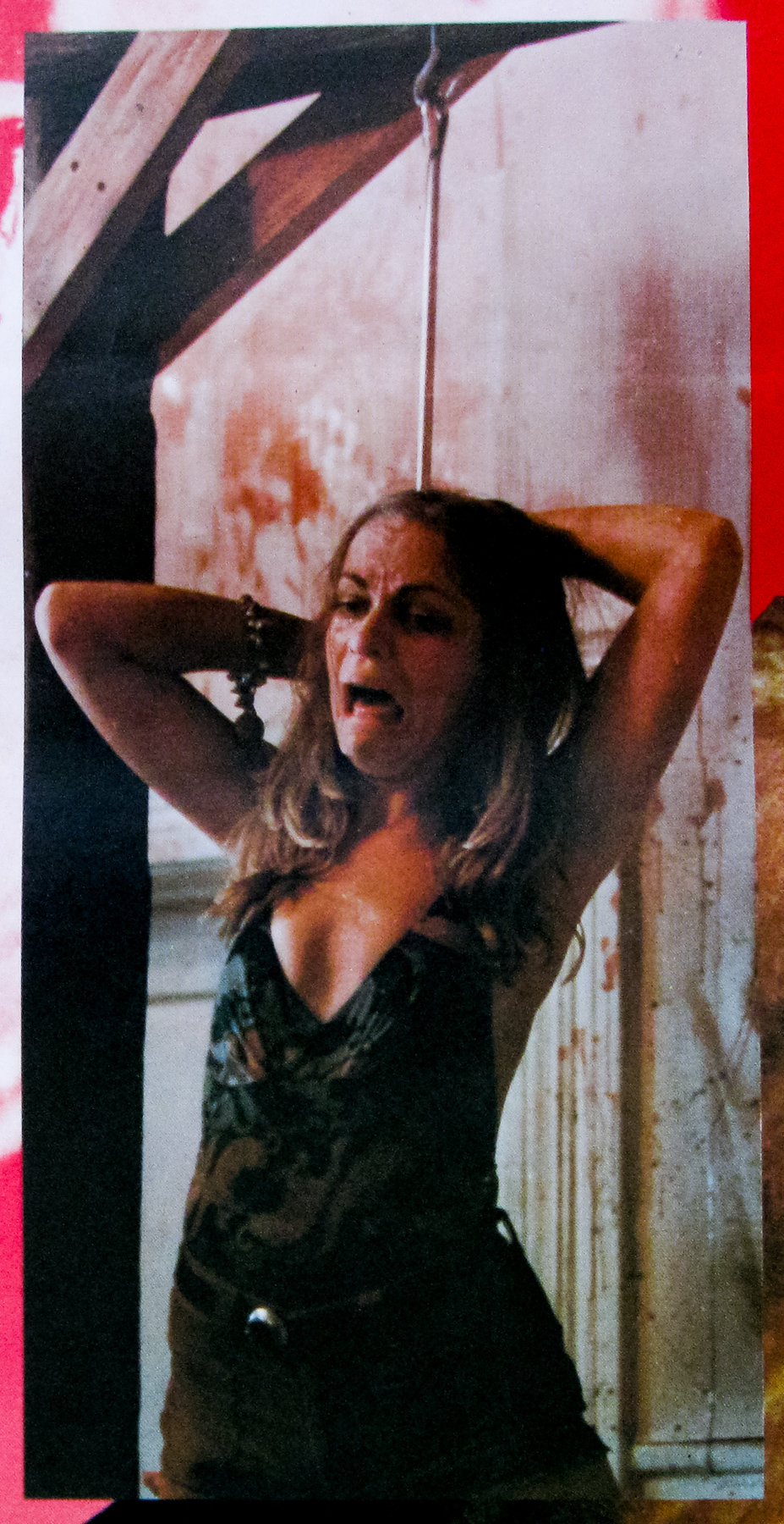
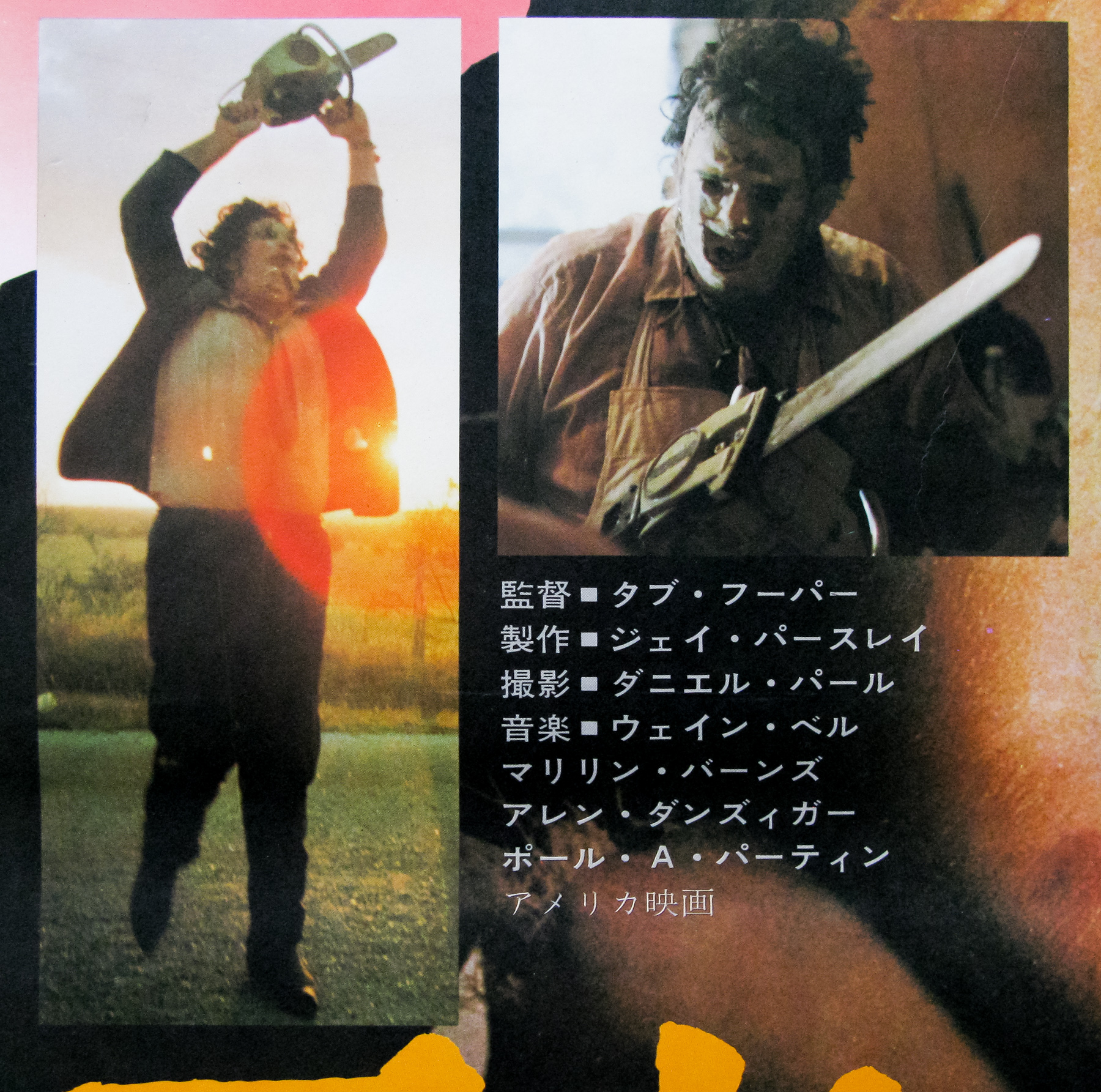
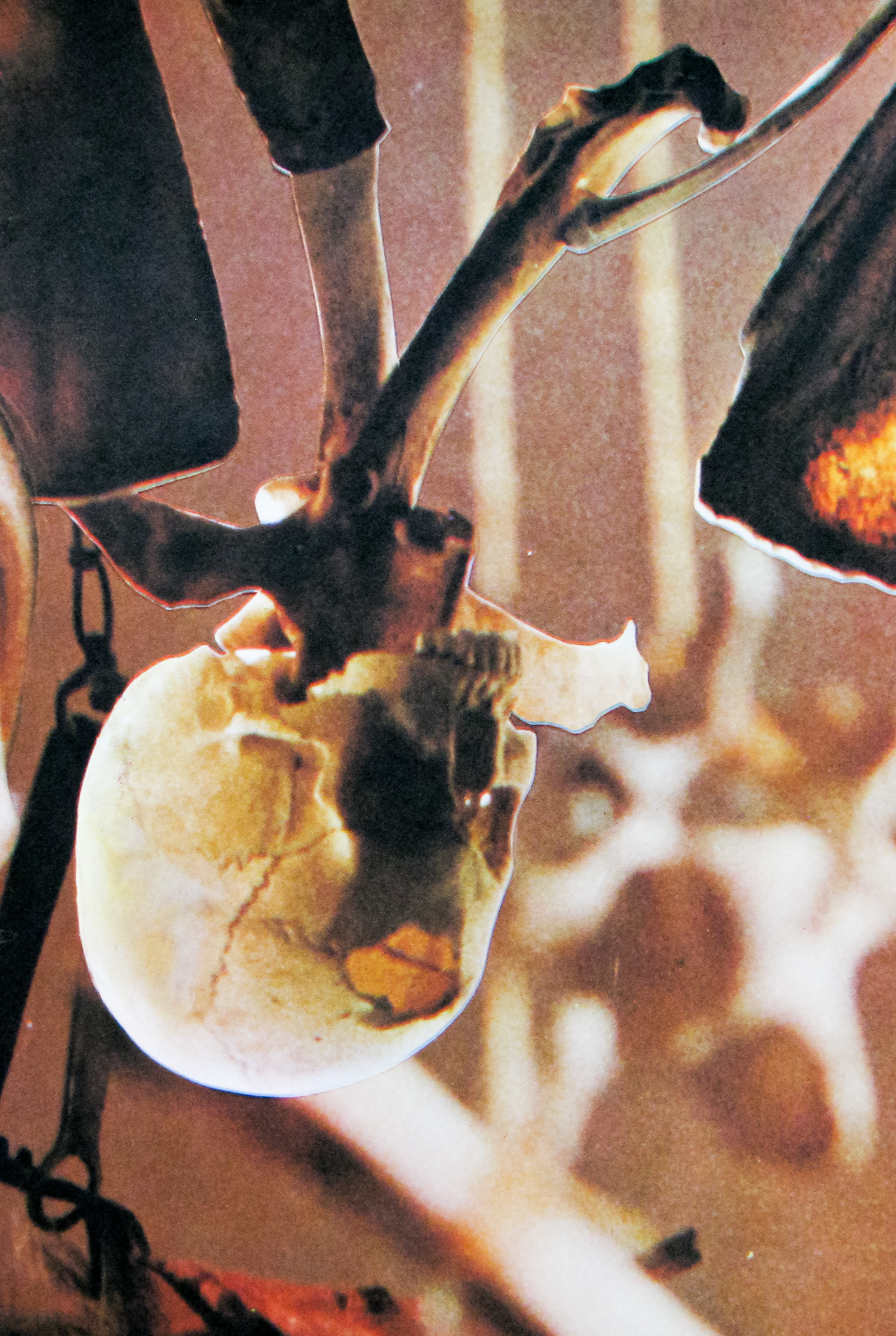
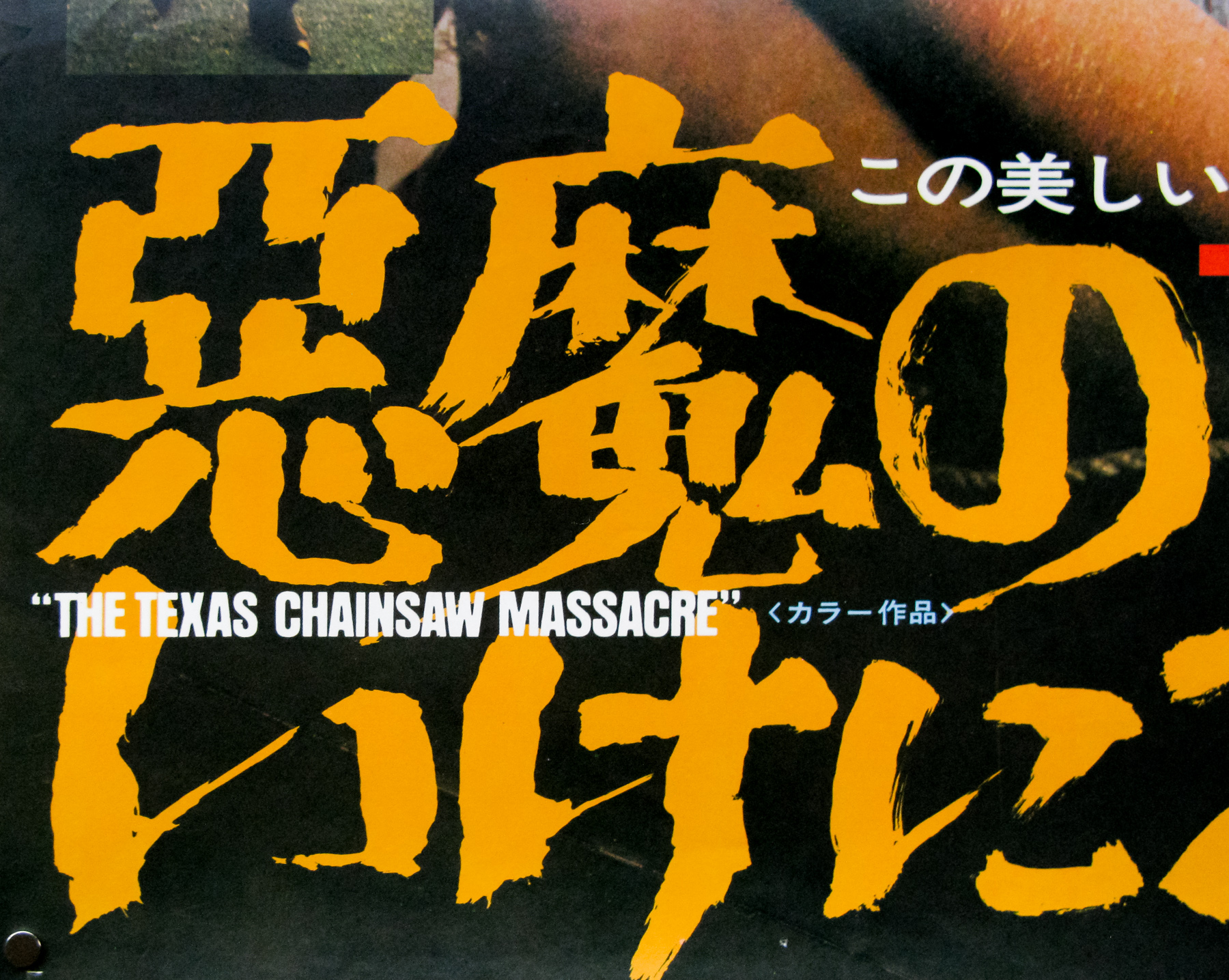
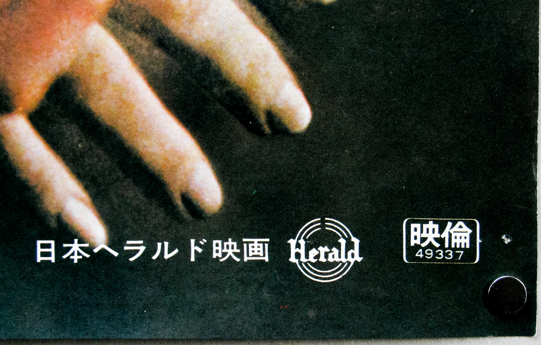
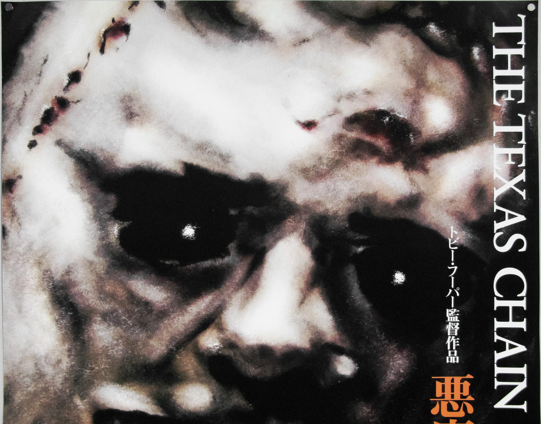
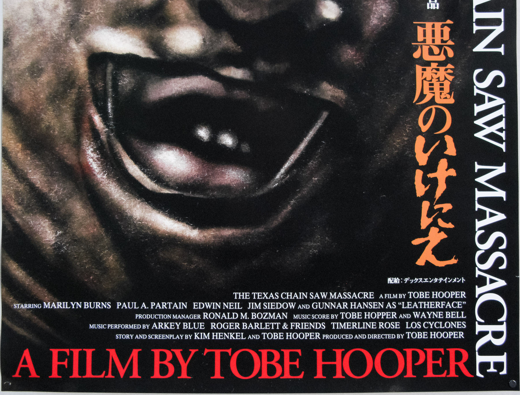
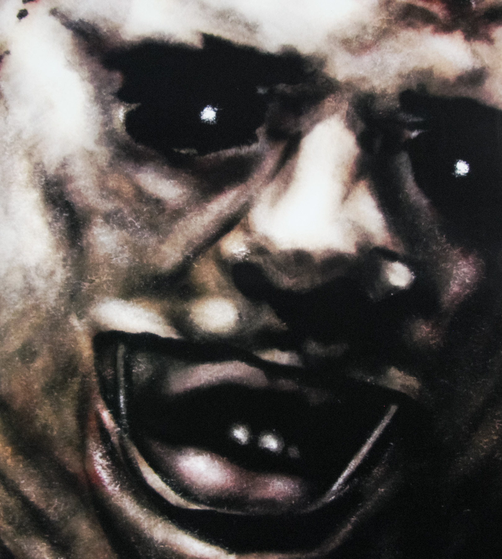
If I had to choose my top 10 horror films of all time there’s no question that Tobe Hooper‘s 1974 classic would be very close to the top of the list. 37 years after it was filmed it has lost none of its raw power, despite the countless imitations made since, and its impact on the horror genre cannot be underestimated.
To my mind there are few scenes in horror as brutal and shocking as the moment involving Leatherface and the sliding door. The film features little in the way of the kind of gore that modern horrors seem to rely on, yet is no less disturbing for it. The 1986 sequel famously upped the gore and violence significantly.
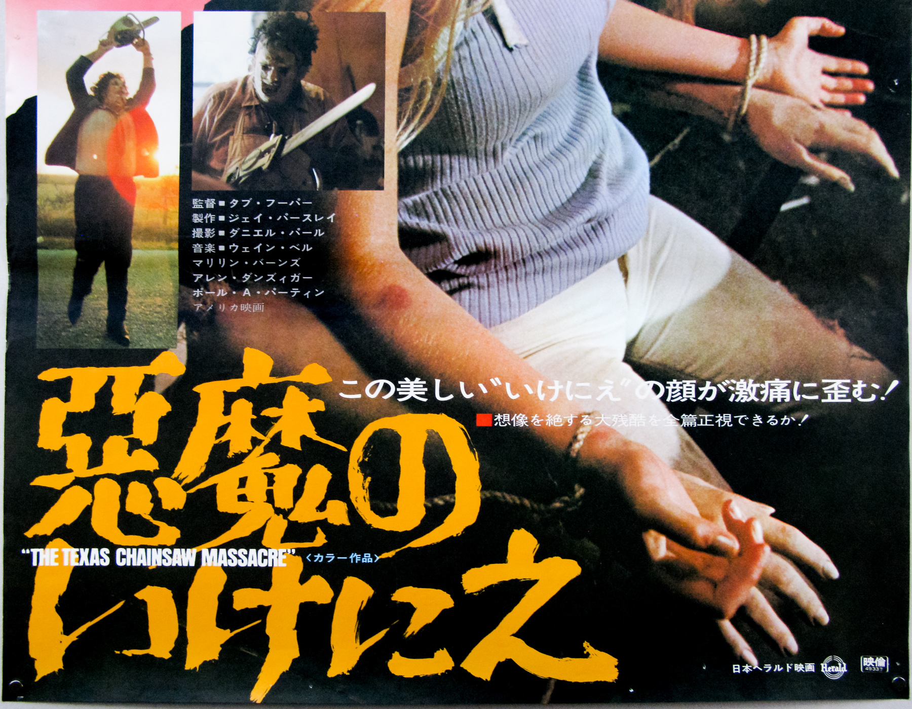
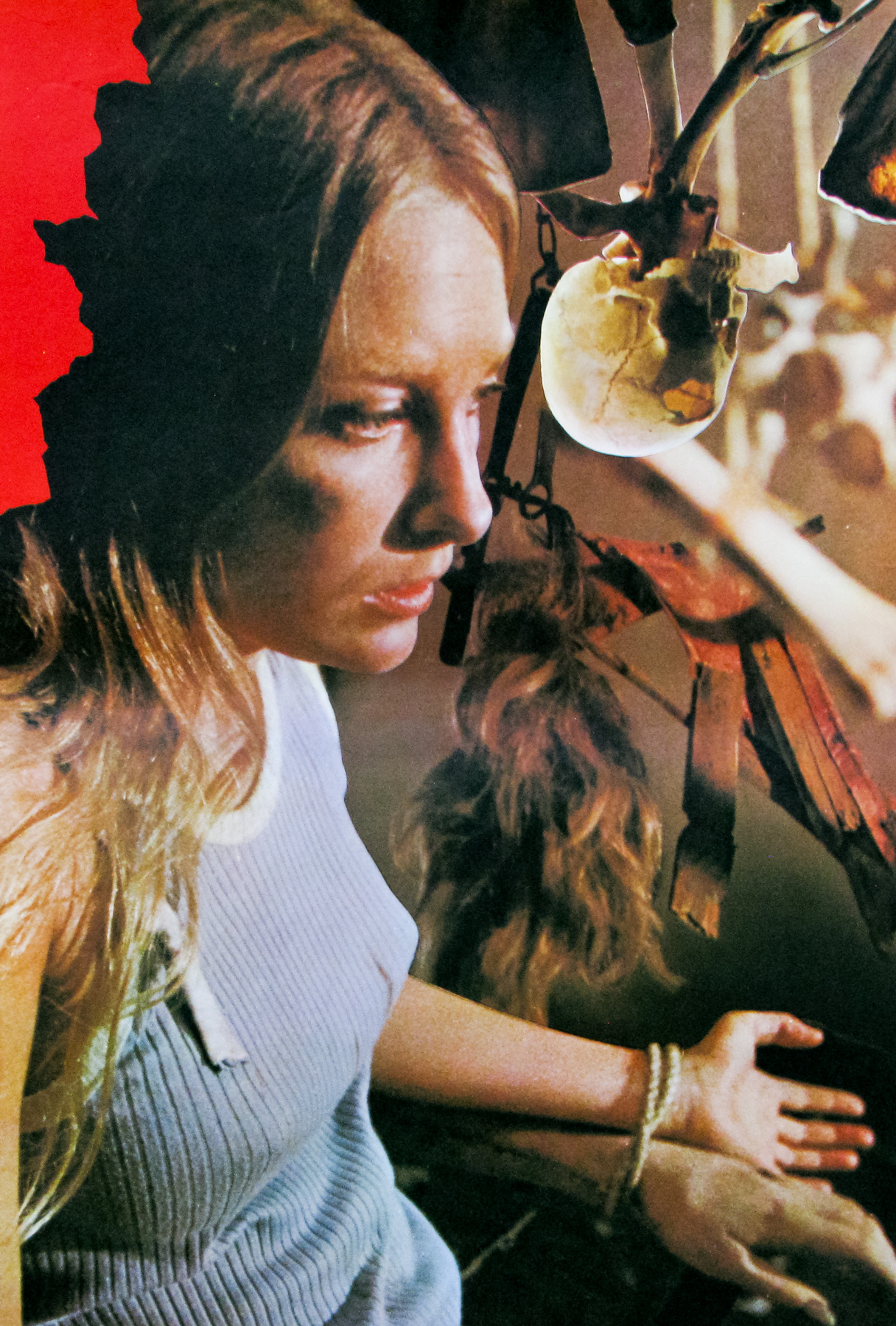
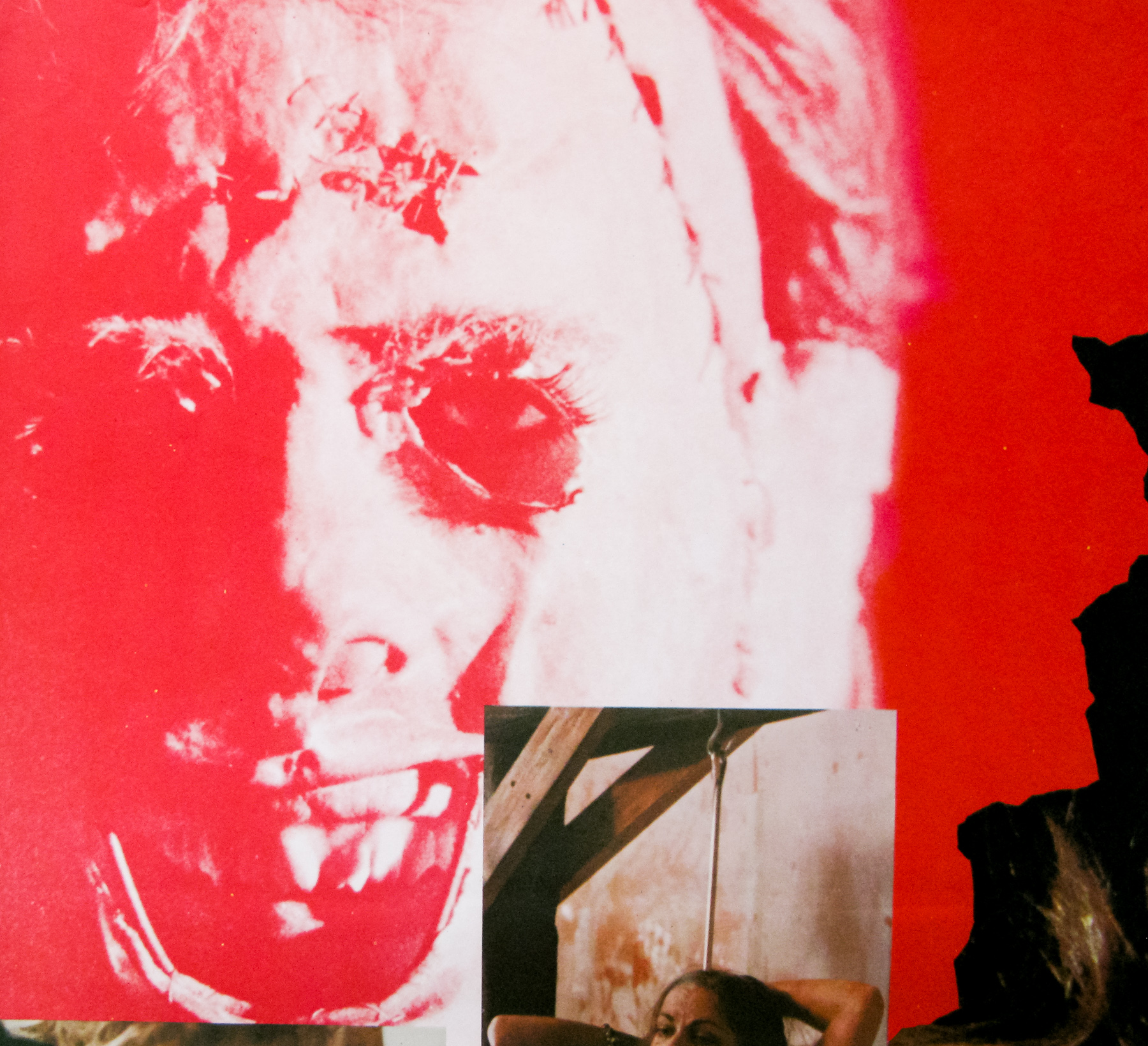
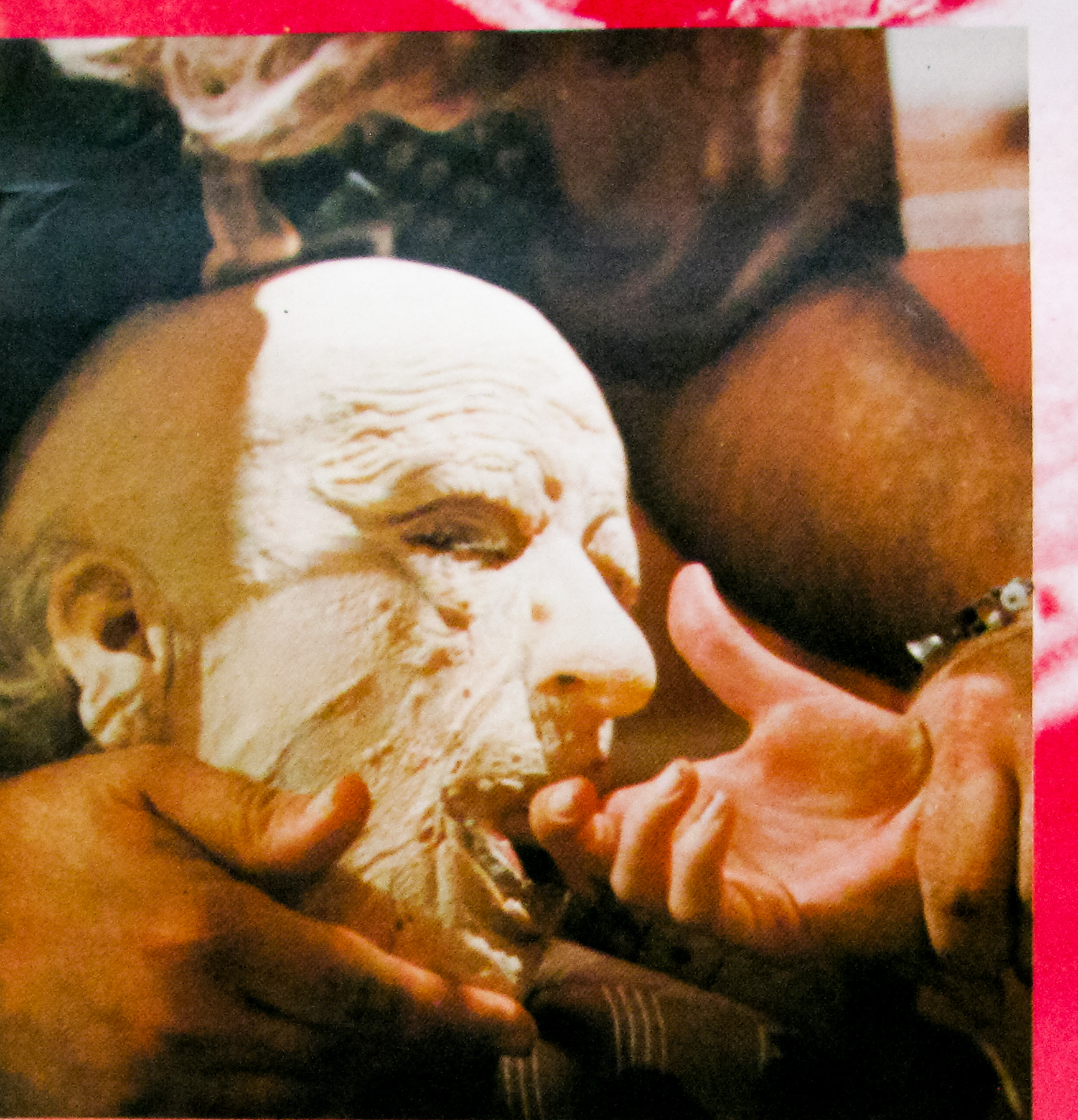
This Japanese poster features star Marilyn Burns in one of the film’s most disturbing scenes involving ‘Grandpa’, as well as smaller images of Leatherface, Grandpa himself and the infamous meat-hook scene.
Check out the Japanese poster for a 2007 festival re-release of the film and the classic US poster.
Bizarrely, the house featured in the film is now a family restaurant!
Here’s the brilliant original trailer.
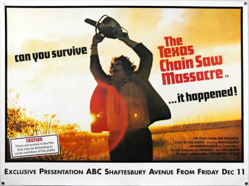
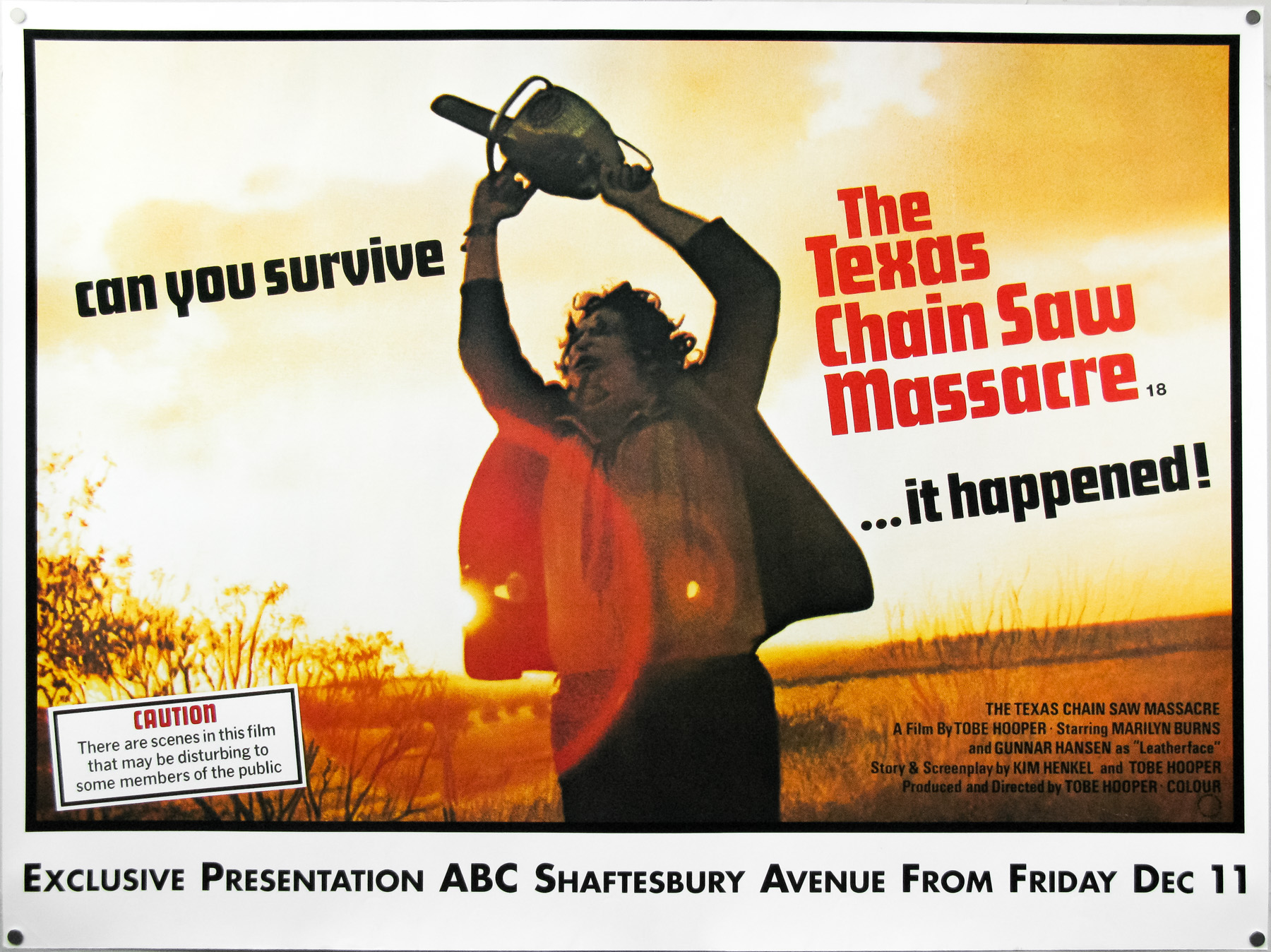
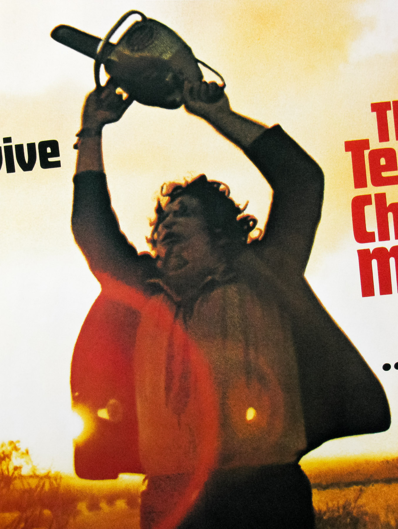
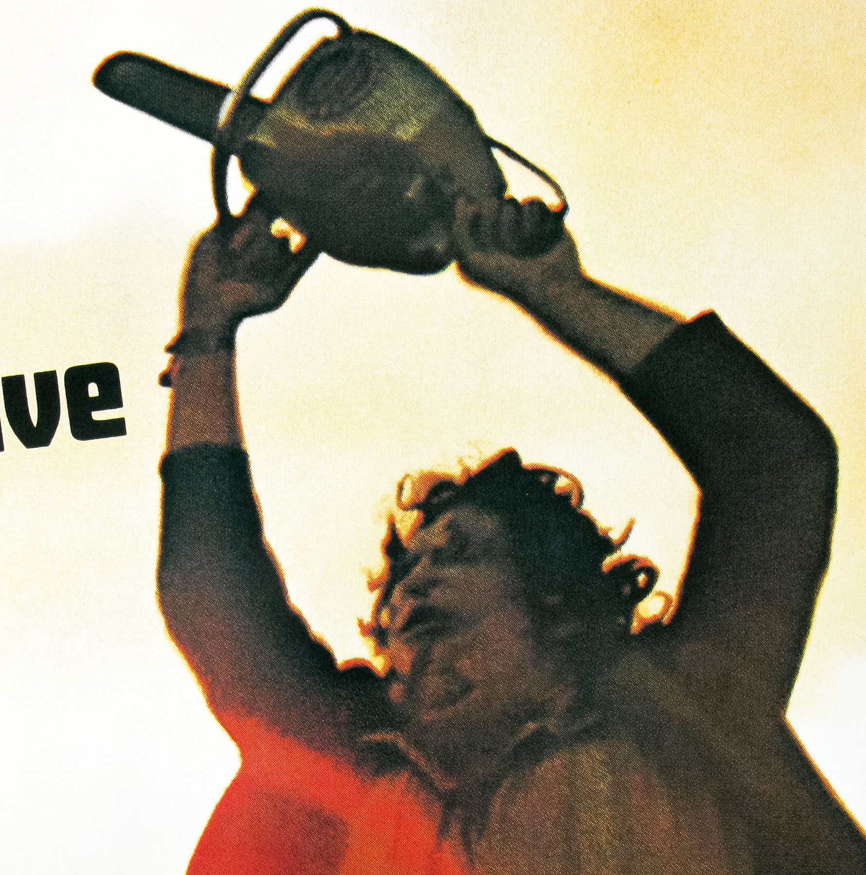
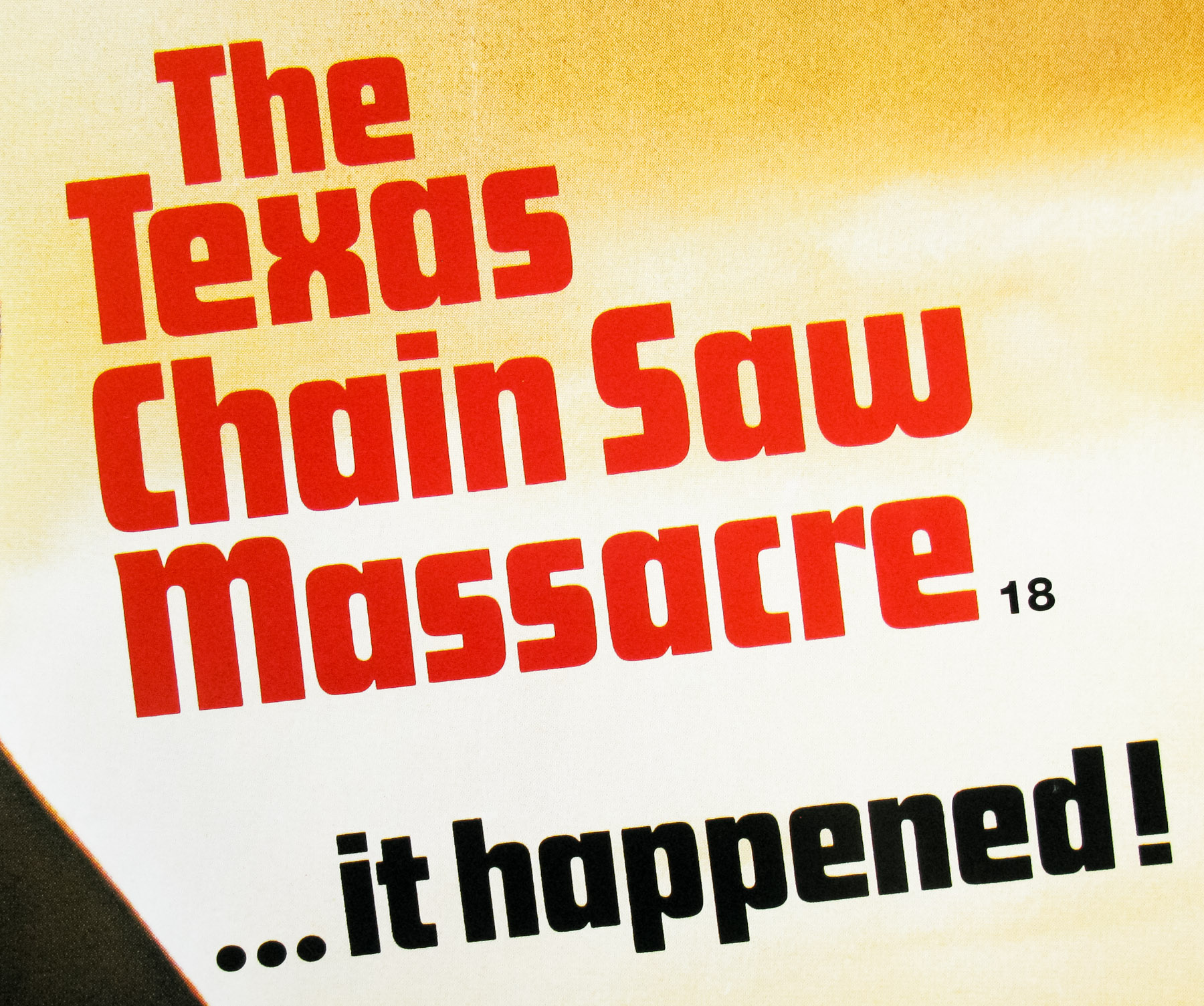
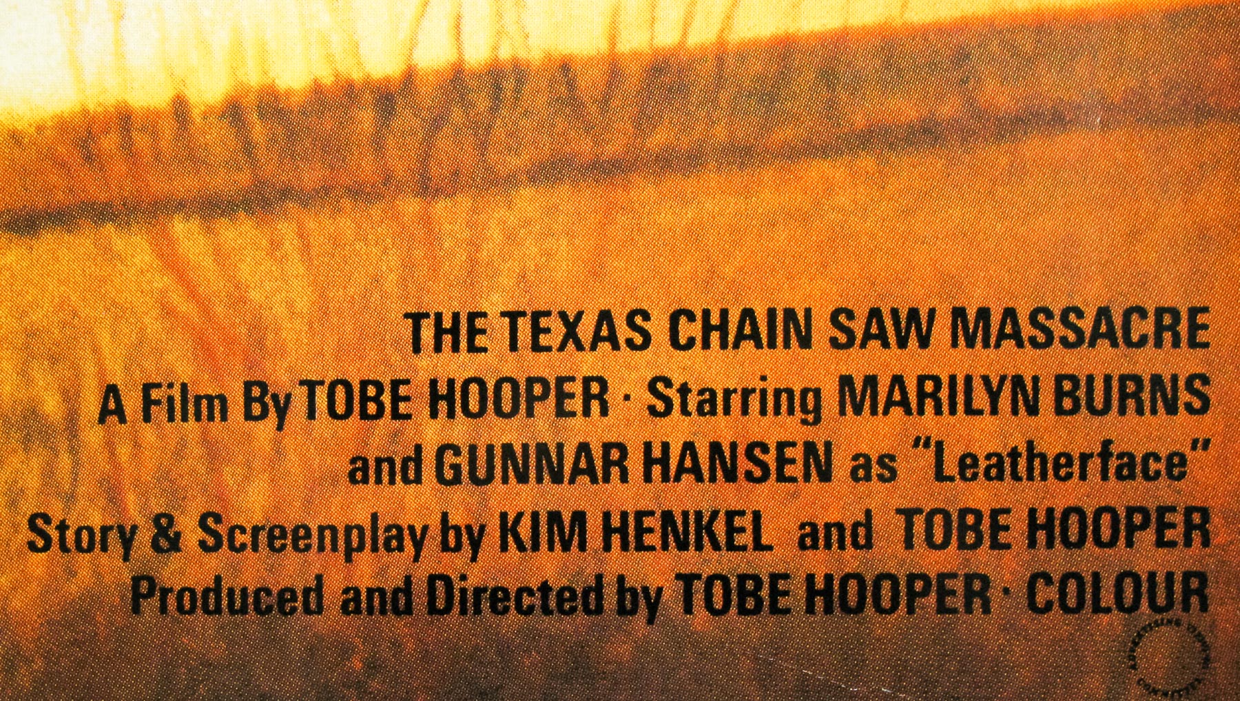
If I had to choose my top 10 horror films of all time there’s no question that Tobe Hooper‘s 1974 classic would be very close to the top of the list. Decades after it was filmed it has lost none of its raw power, despite the countless imitations made since, and its impact on the horror genre cannot be underestimated.
To my mind there are few scenes in horror as brutal and shocking as the moment involving Leatherface and the sliding door. The film features little in the way of the kind of gore that modern horrors seem to rely on, yet is no less disturbing for it. The 1986 sequel famously upped the gore and violence significantly.
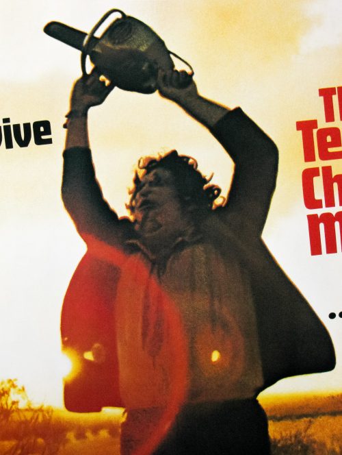
This is the British quad for a 1998 re-release of the film at the ABC Shaftesbury avenue cinema in London. Despite the BBFC declining to issue the film a certificate back in 1975, which effectively meant the film was banned from release, the Greater London Council decided to allow cinemas to screen a pre-cut ‘X’ version of the film. A few other councils around the UK also ignored the ban but many upheld it. An uncut VHS was apparently released on the Wizard label in 1981.
In 1998 the London Borough of Camden passed the film uncut with an 18 certificate and began showing the film in cinemas. Shaftesbury avenue is just inside the Borough boundary so the ABC was well placed to screen the film to central London audiences. The fact that this poster has a December date on there indicates it’s from 1998 and not 1999 when the film was finally passed uncut by the BBFC and given a wider release.
The censorship website Melon Farmers features a great write up of the situation.
The ABC is now an Odeon cinema and it has changed owners several times in its history. Check out this fantastic set on Flickr, which contains photos of the cinema over the years . The same Flickr user has uploaded a veritable gold mine of British cinema photos – see here.
This poster is practically identical to the original 1975 quad (aside from the certificate) and I’m pretty sure they simply scanned the original to create this one. This re-release poster often appears with the cinema snipe at the bottom having been removed.
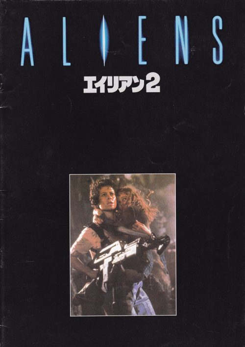
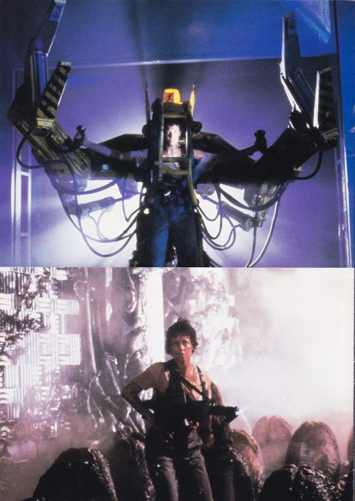
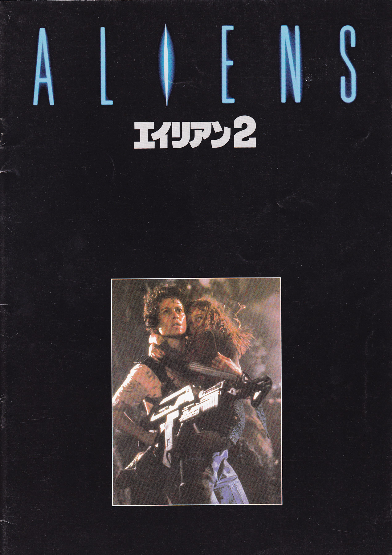
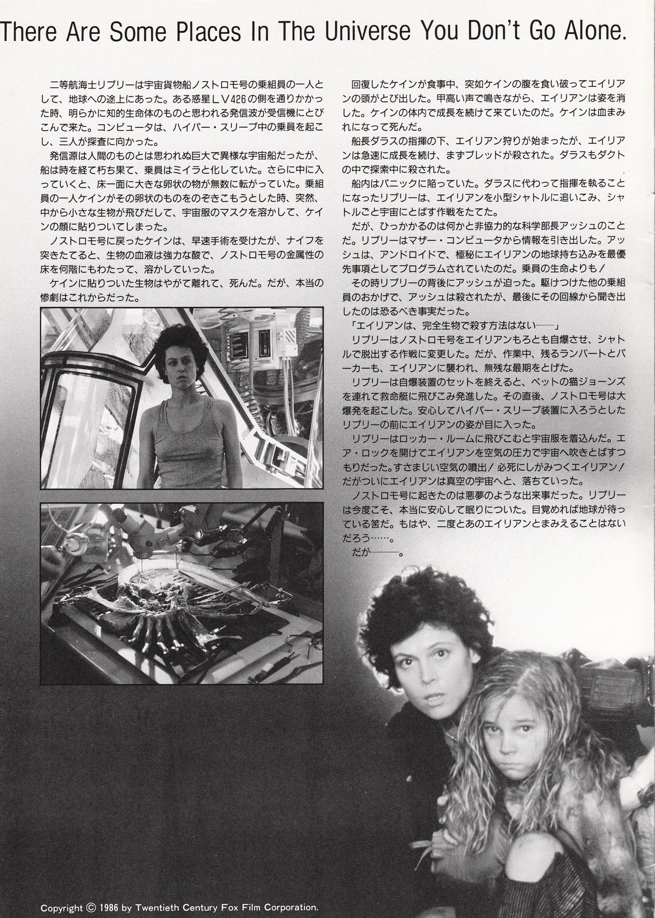
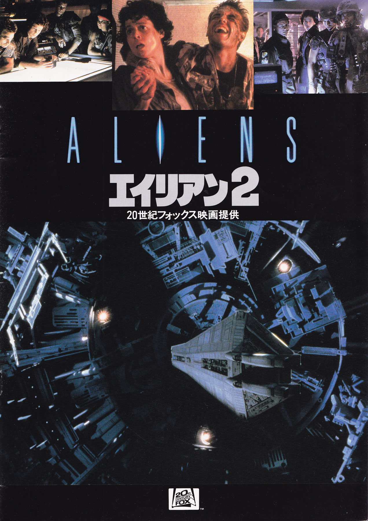
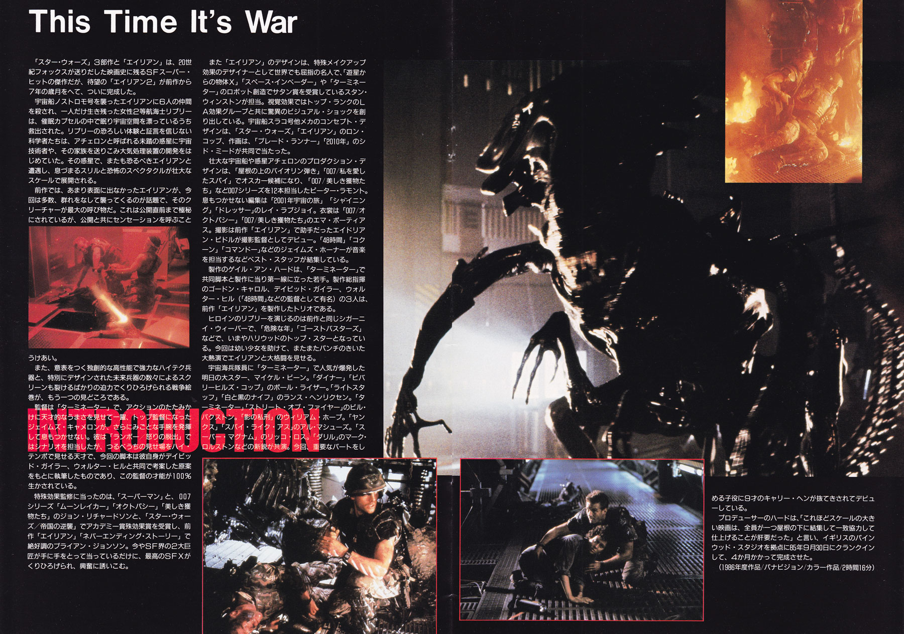
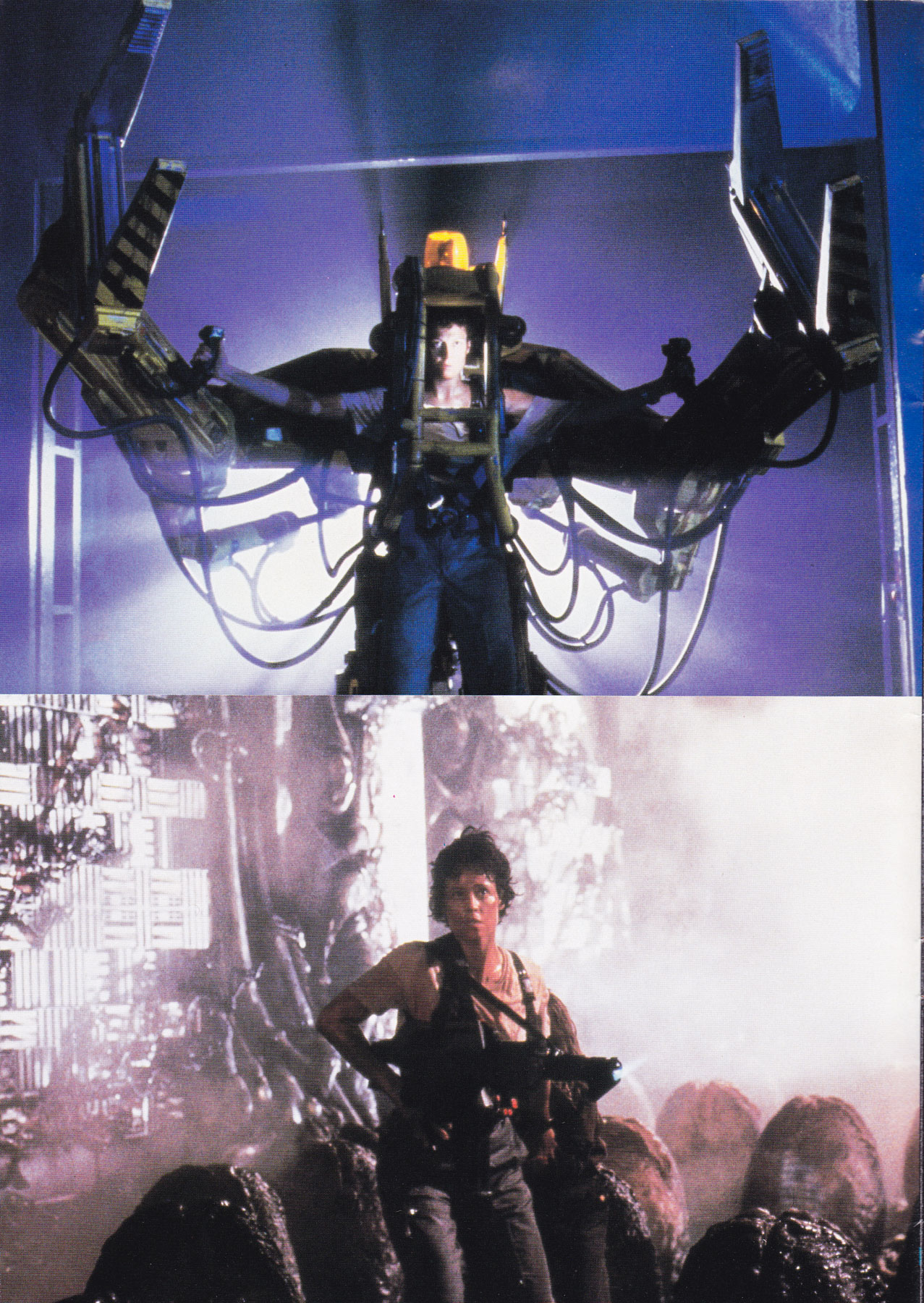
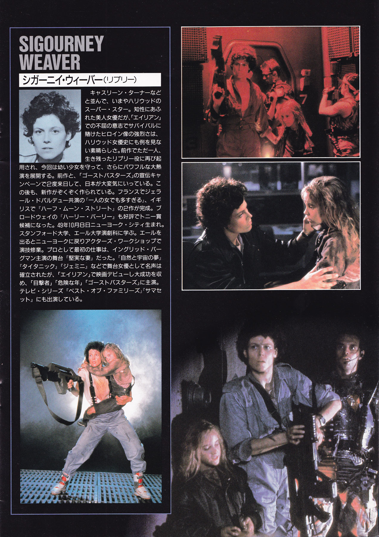
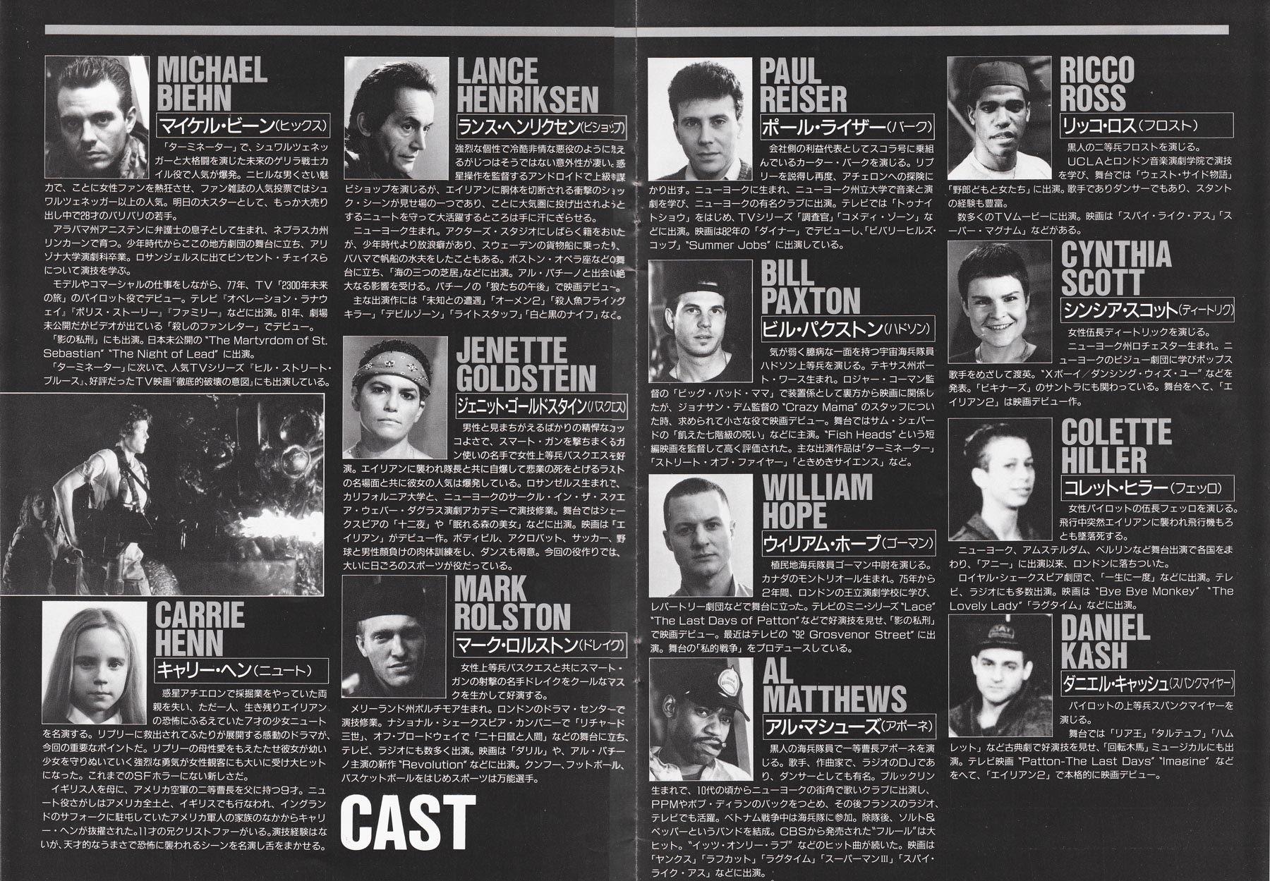
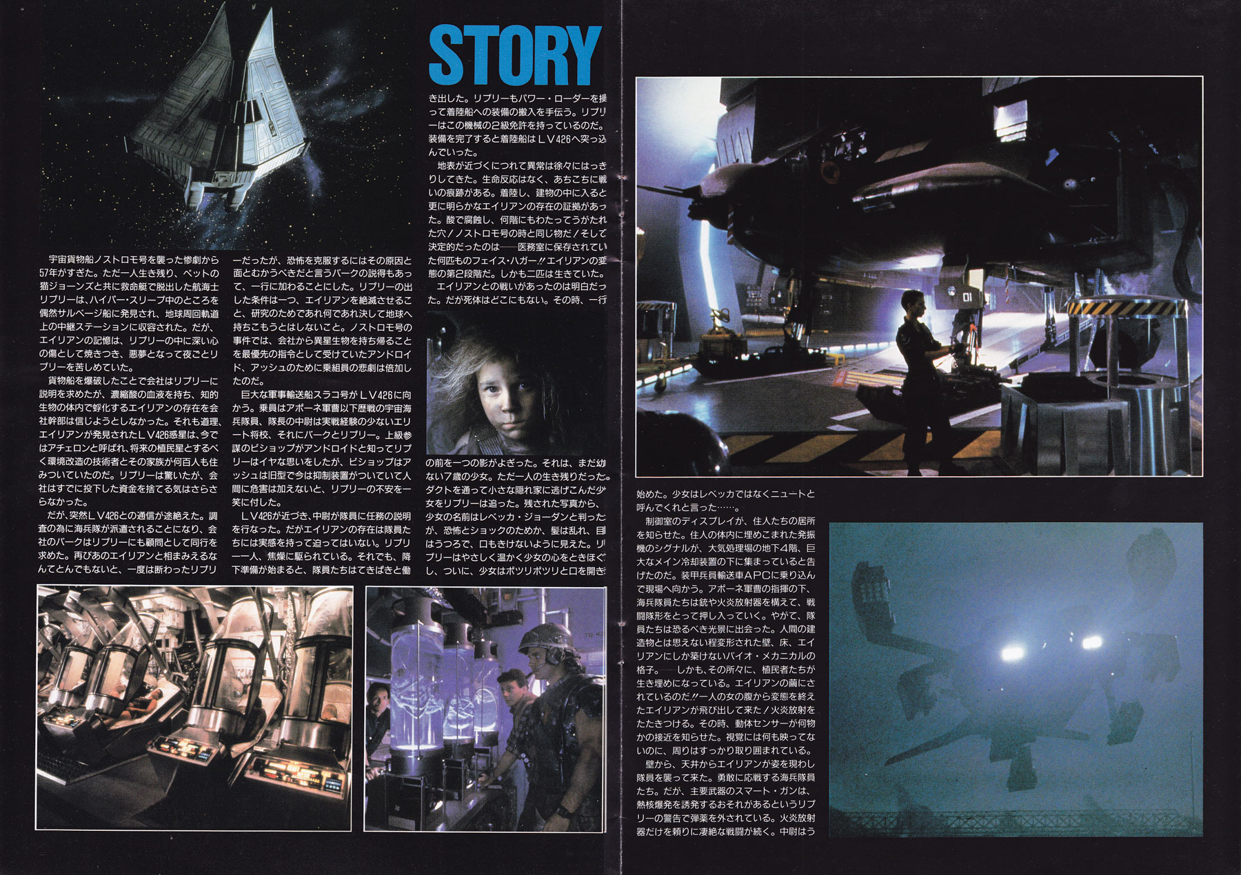
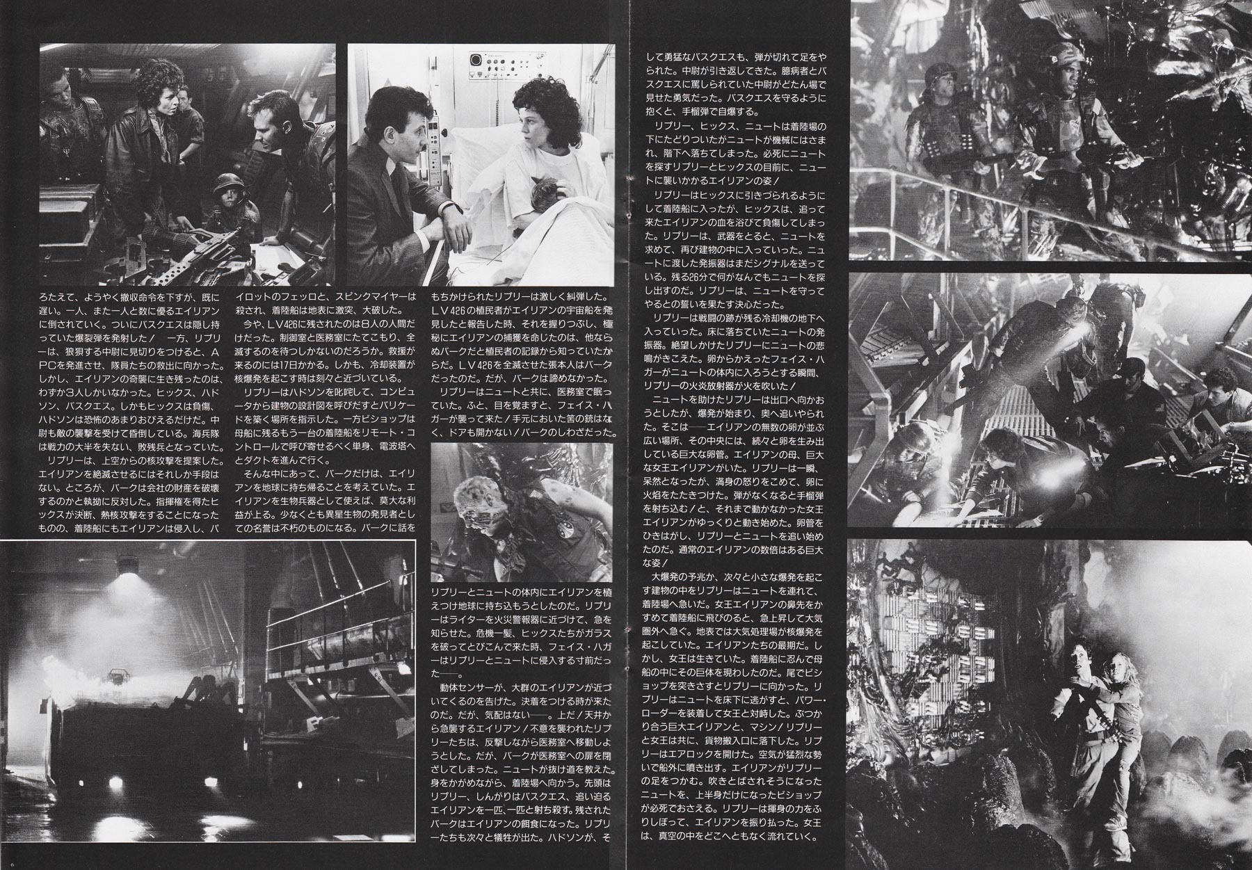
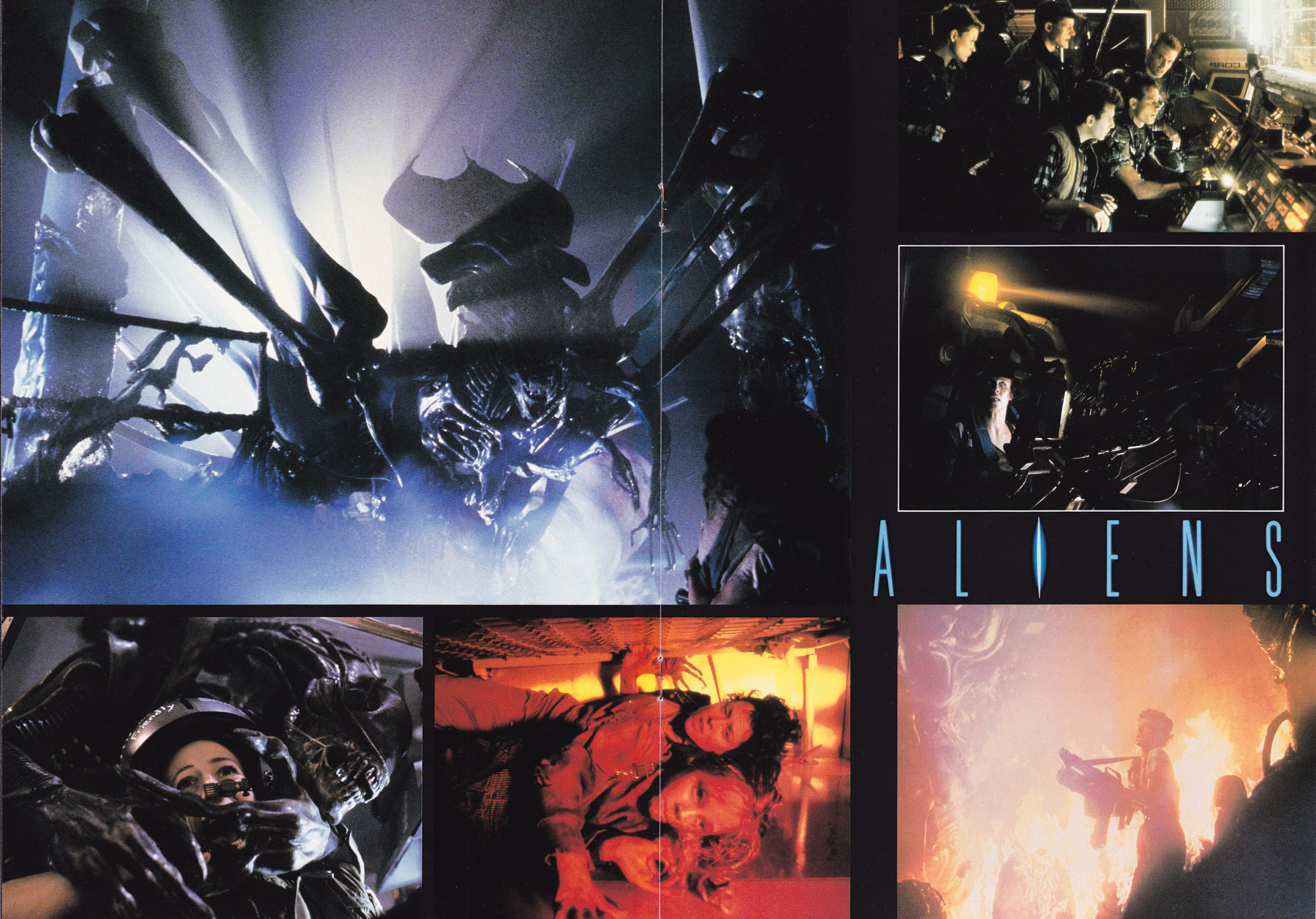
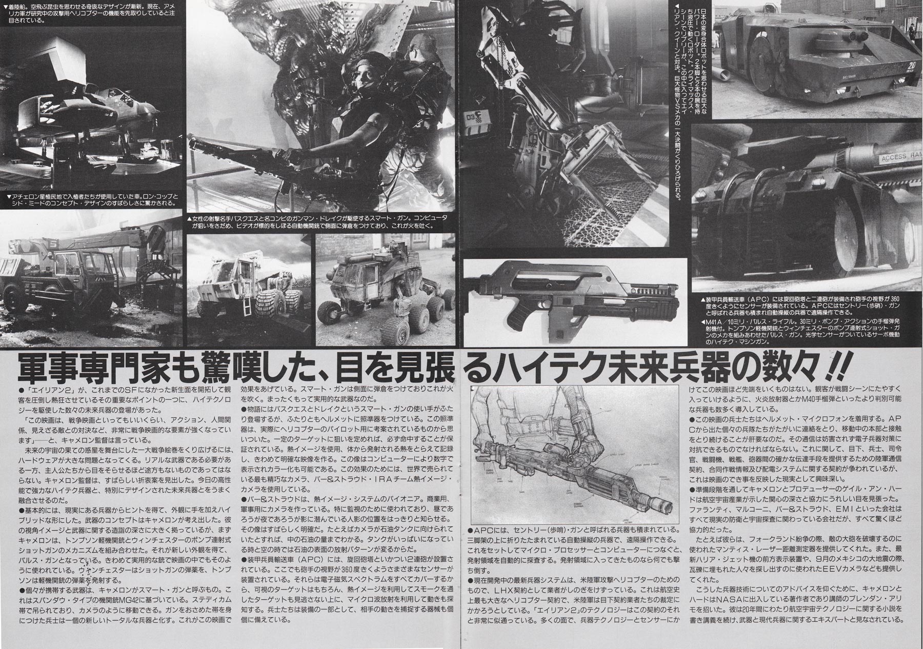
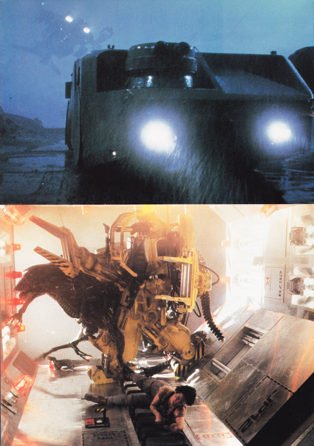
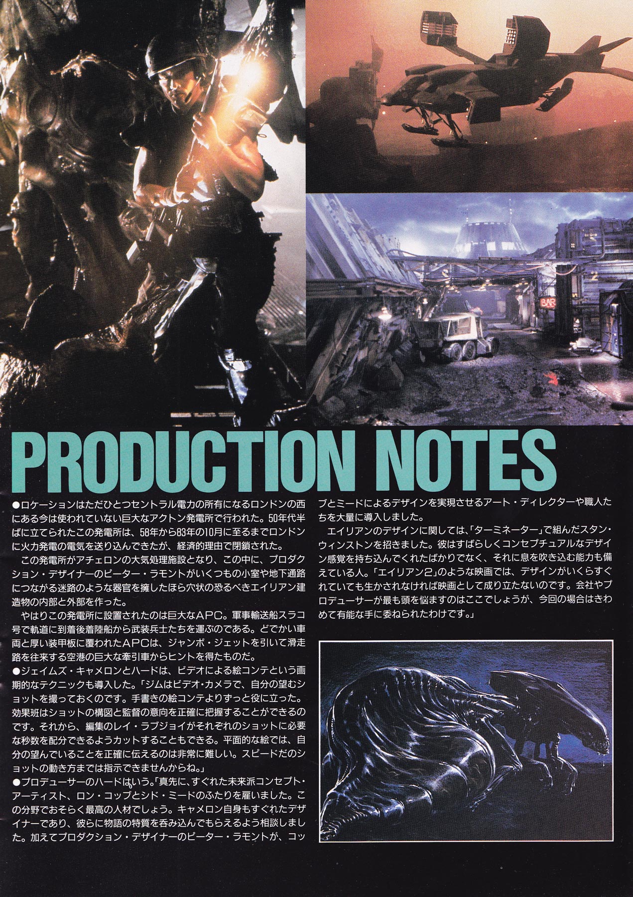
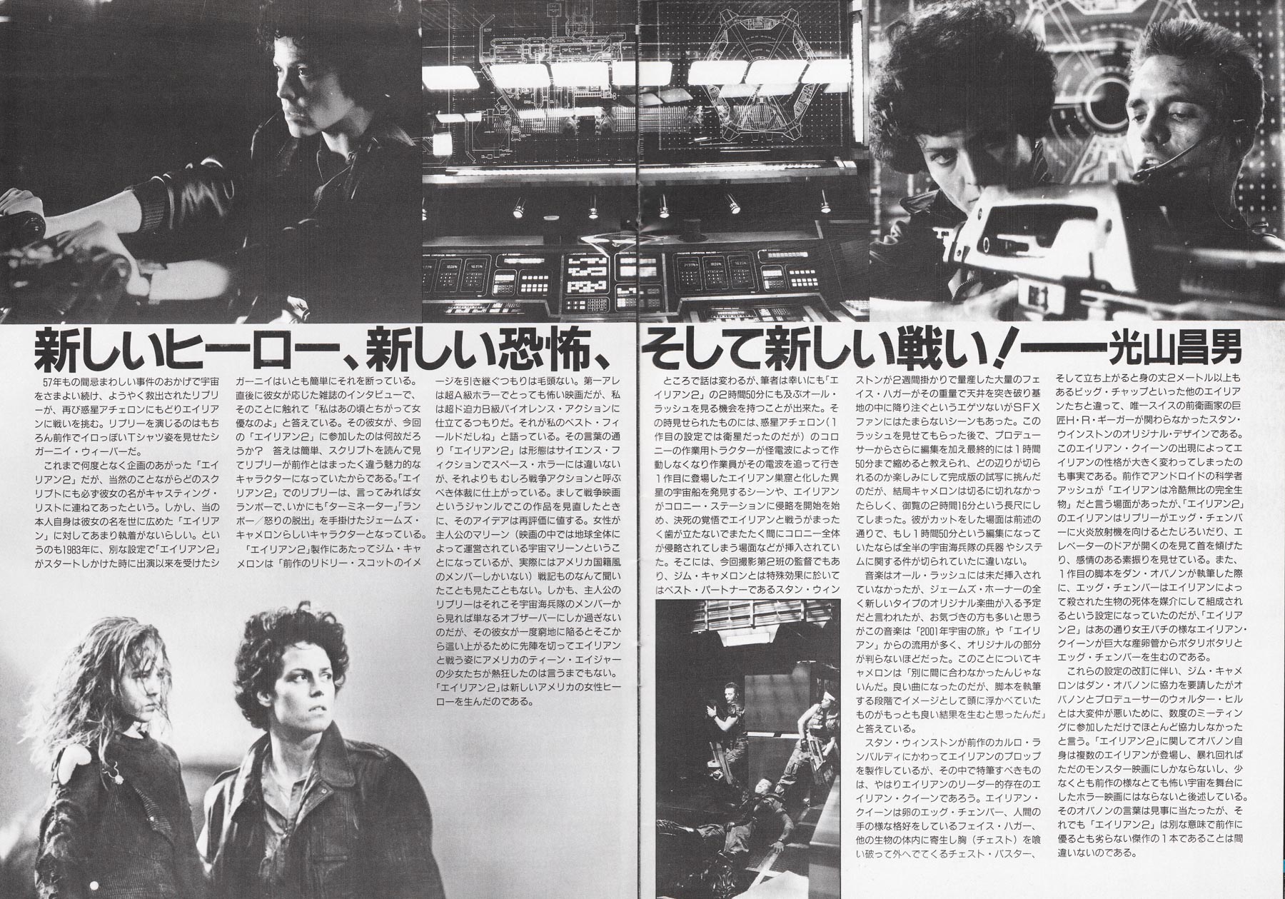
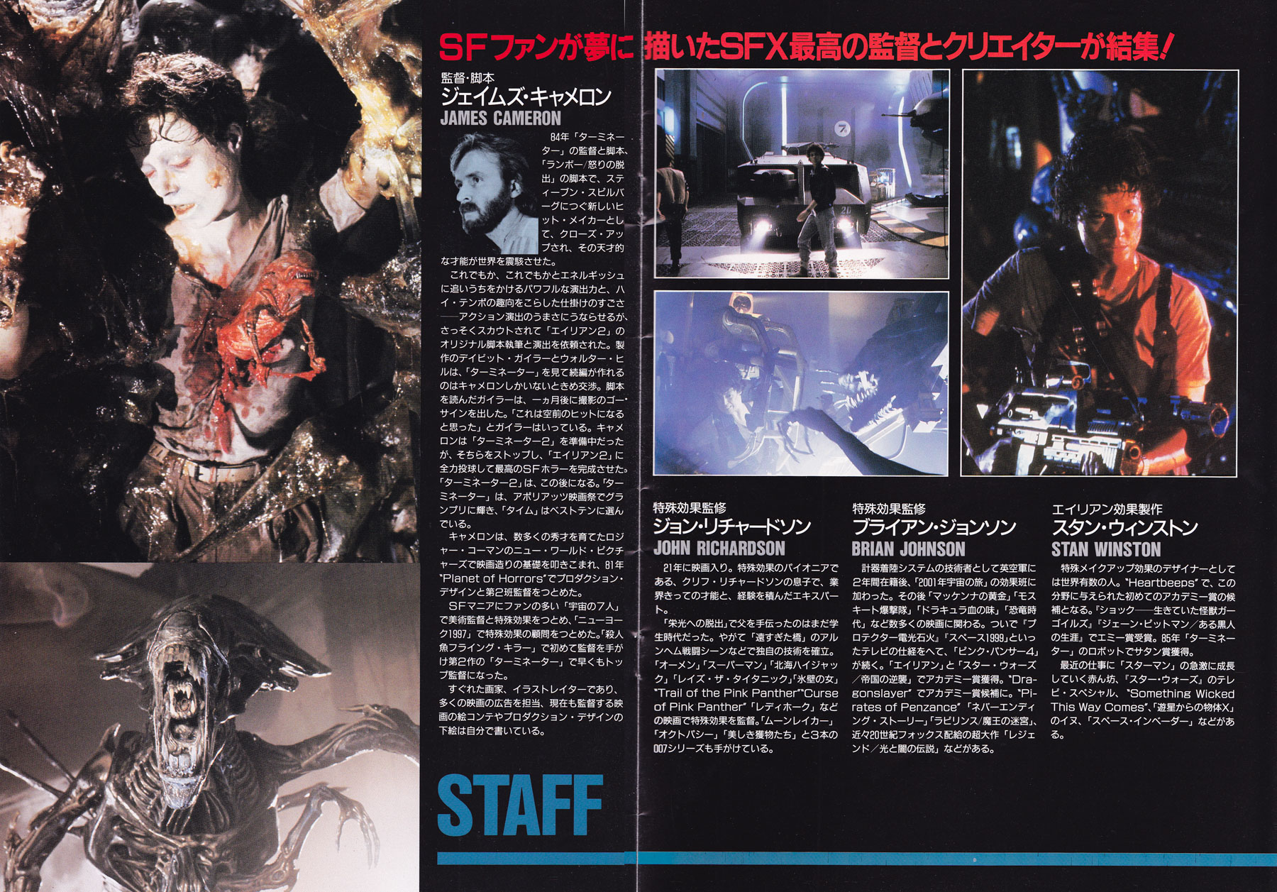
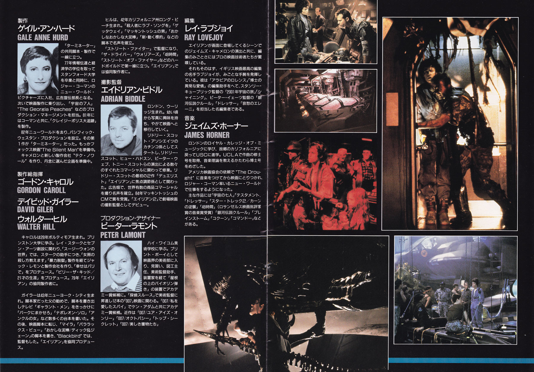
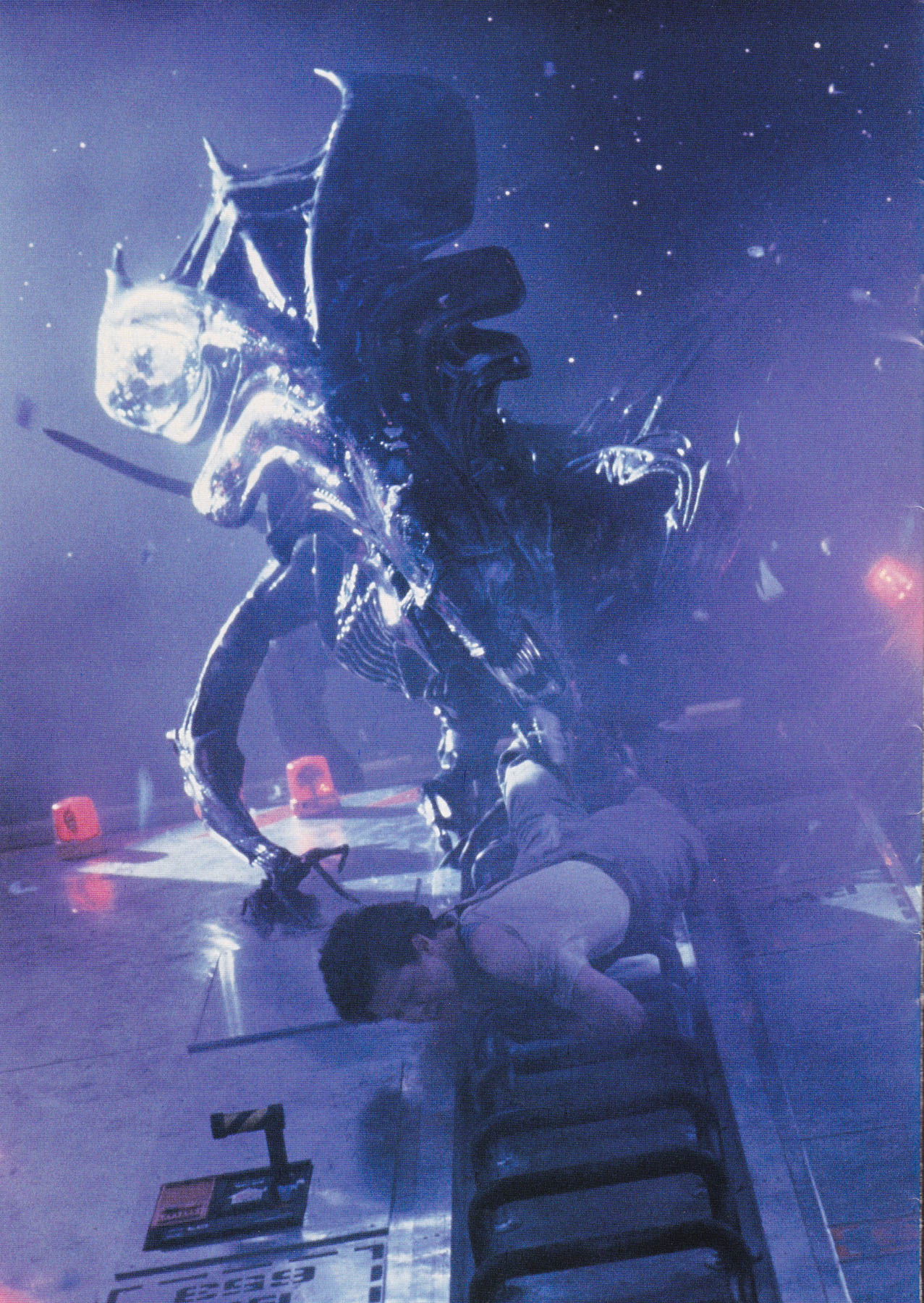
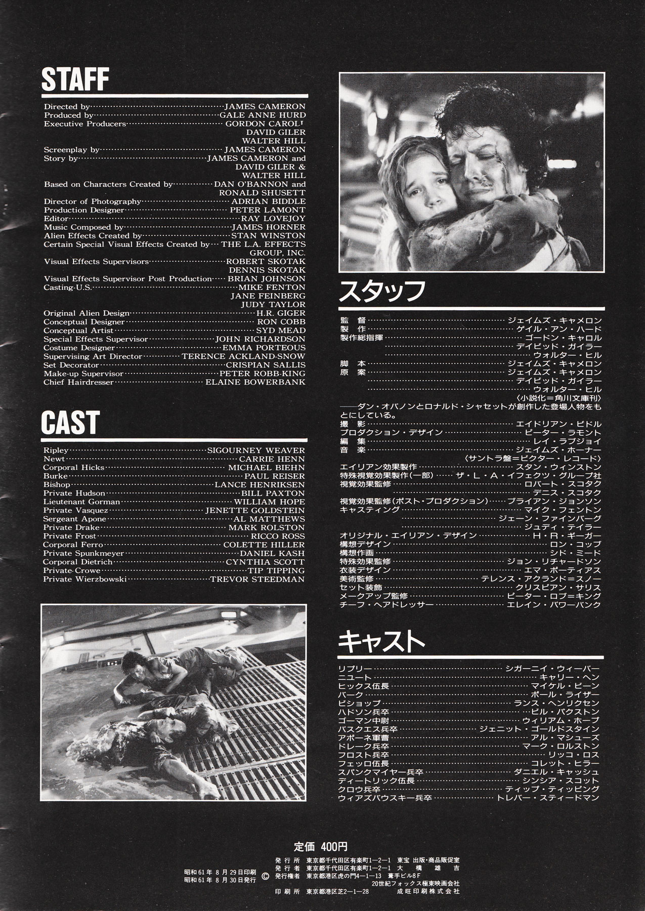
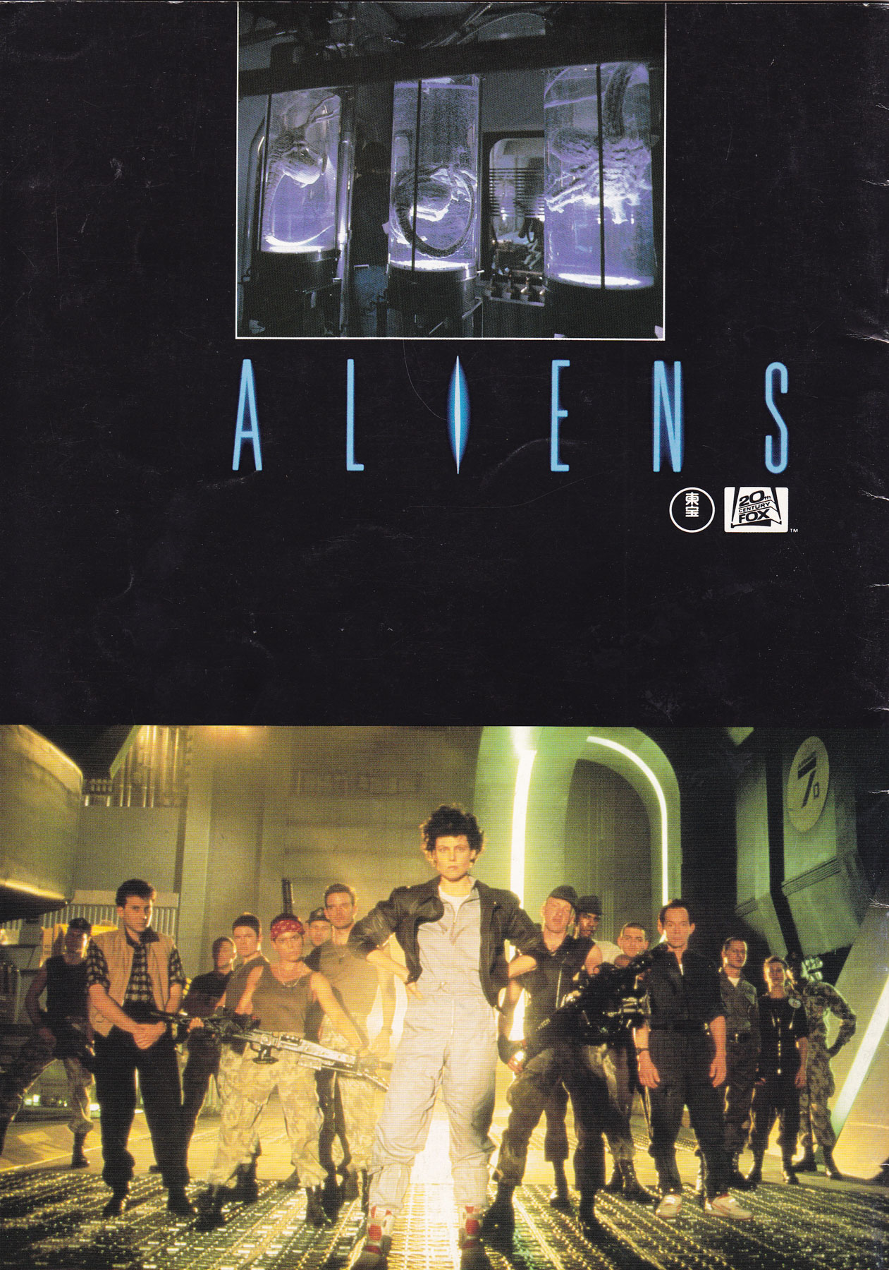
Another non-poster entry, this is the original Japanese program for James Cameron‘s sci-fi masterpiece Aliens. It would have been available to purchase in the cinema when the film was screening back in 1986.
There are some great stills in there as well as a handful of concept illustrations (check the Smart Gun sketch and alien queen image). It’s also great to see the head shots of the actors as well as some of the crew in the last few pages.
Aliens will always be firmly in my top five films of all time. To see the other items I’ve collected for the film click here.
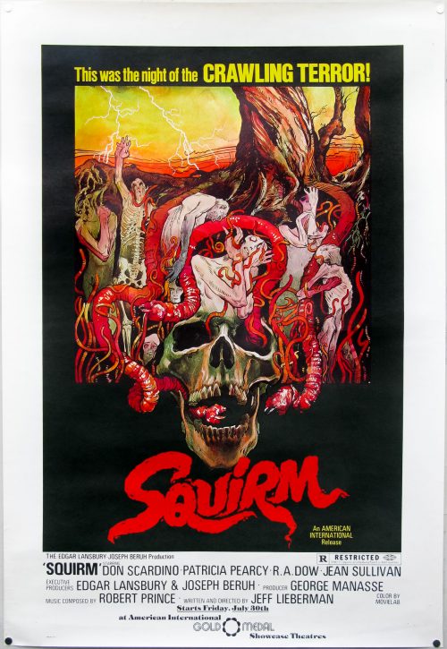
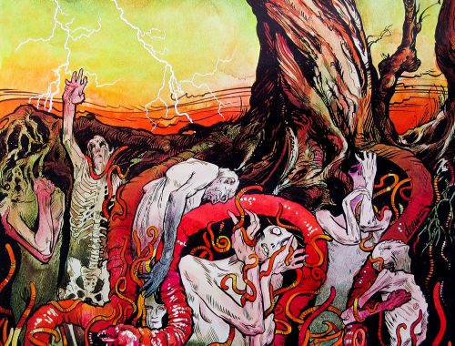
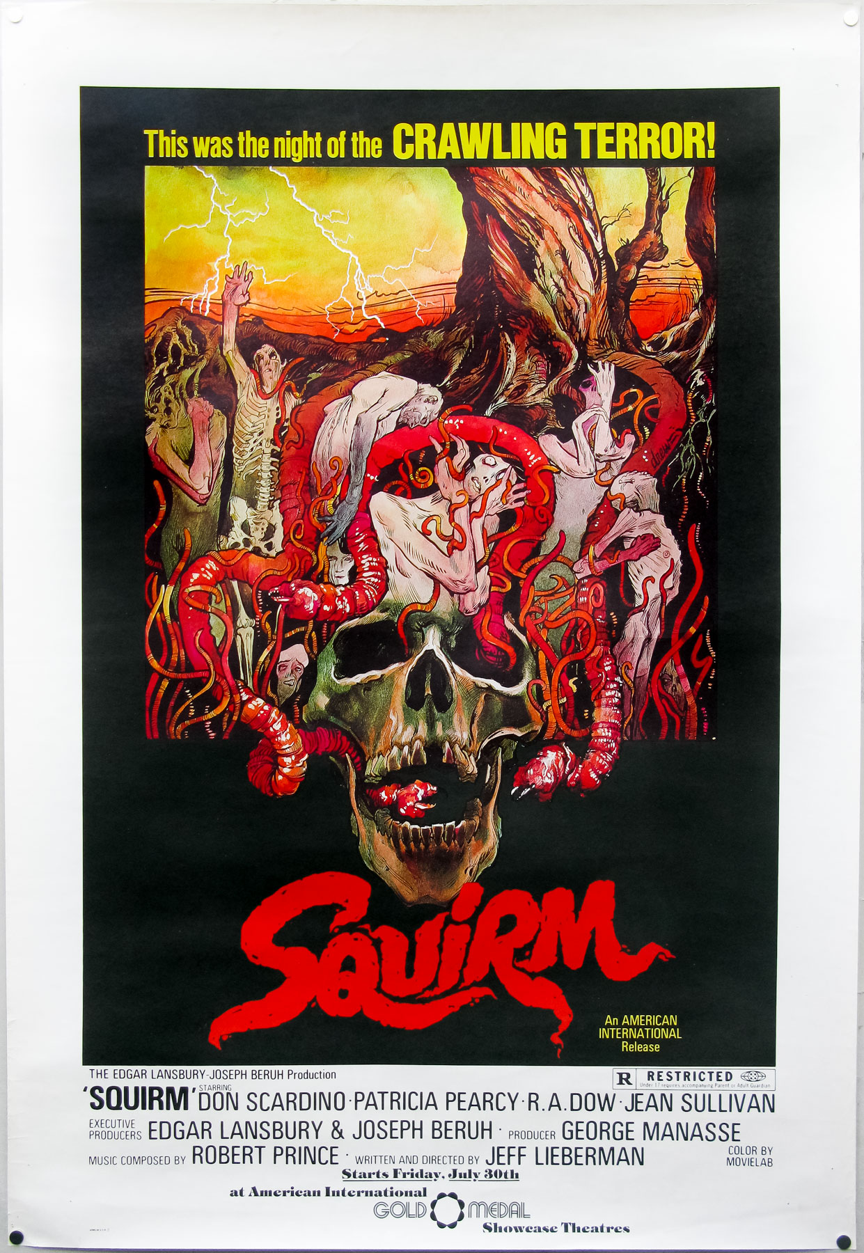
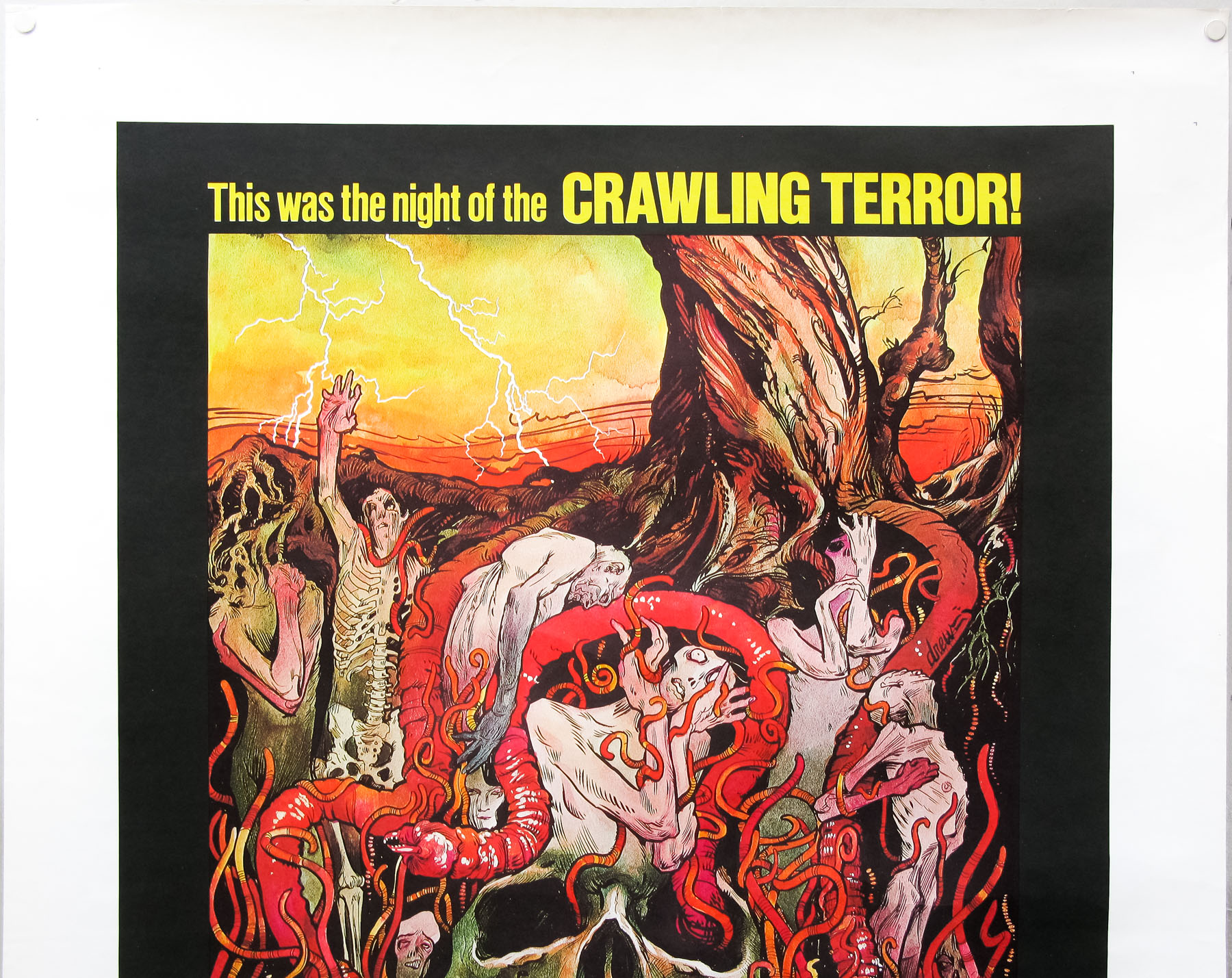
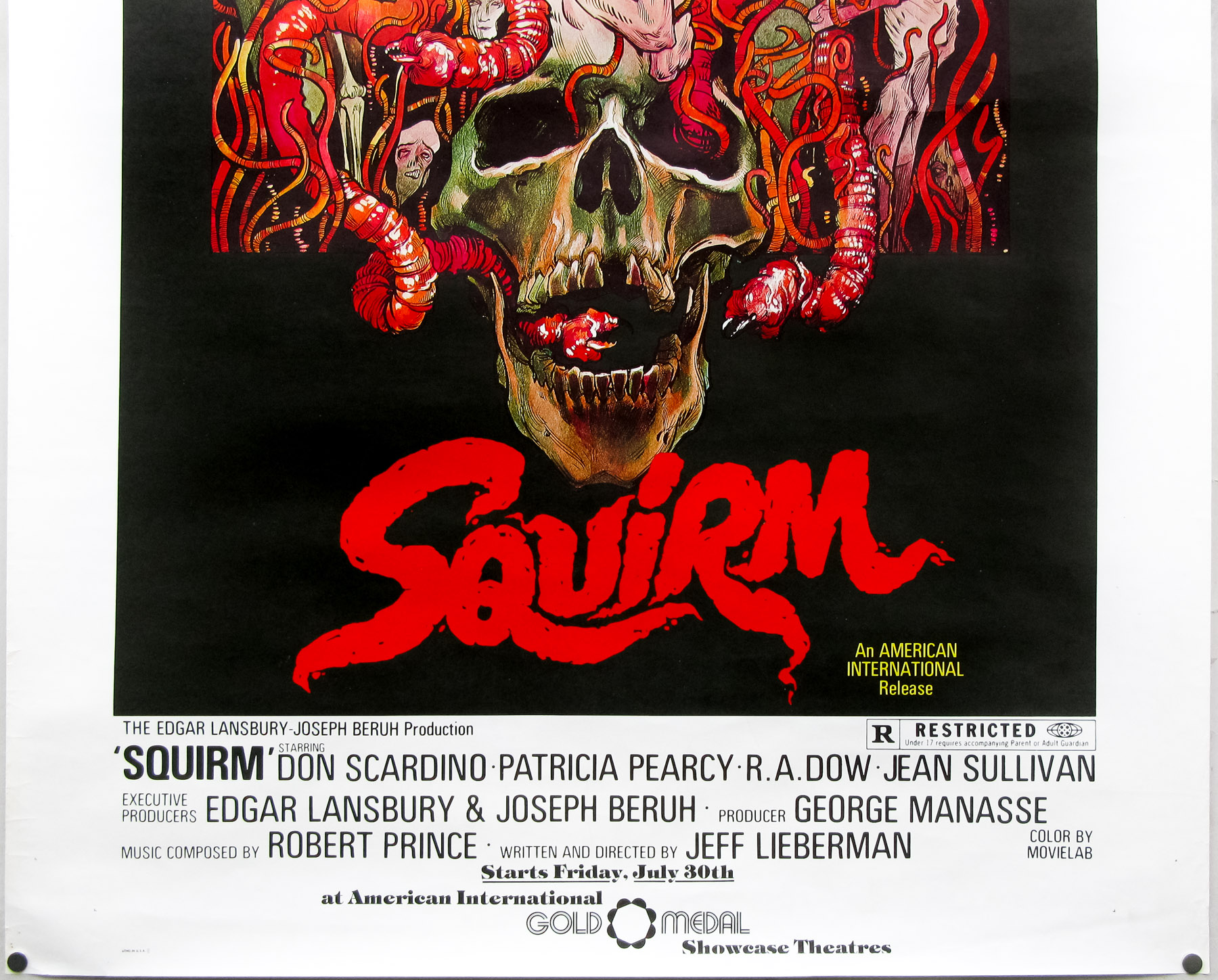
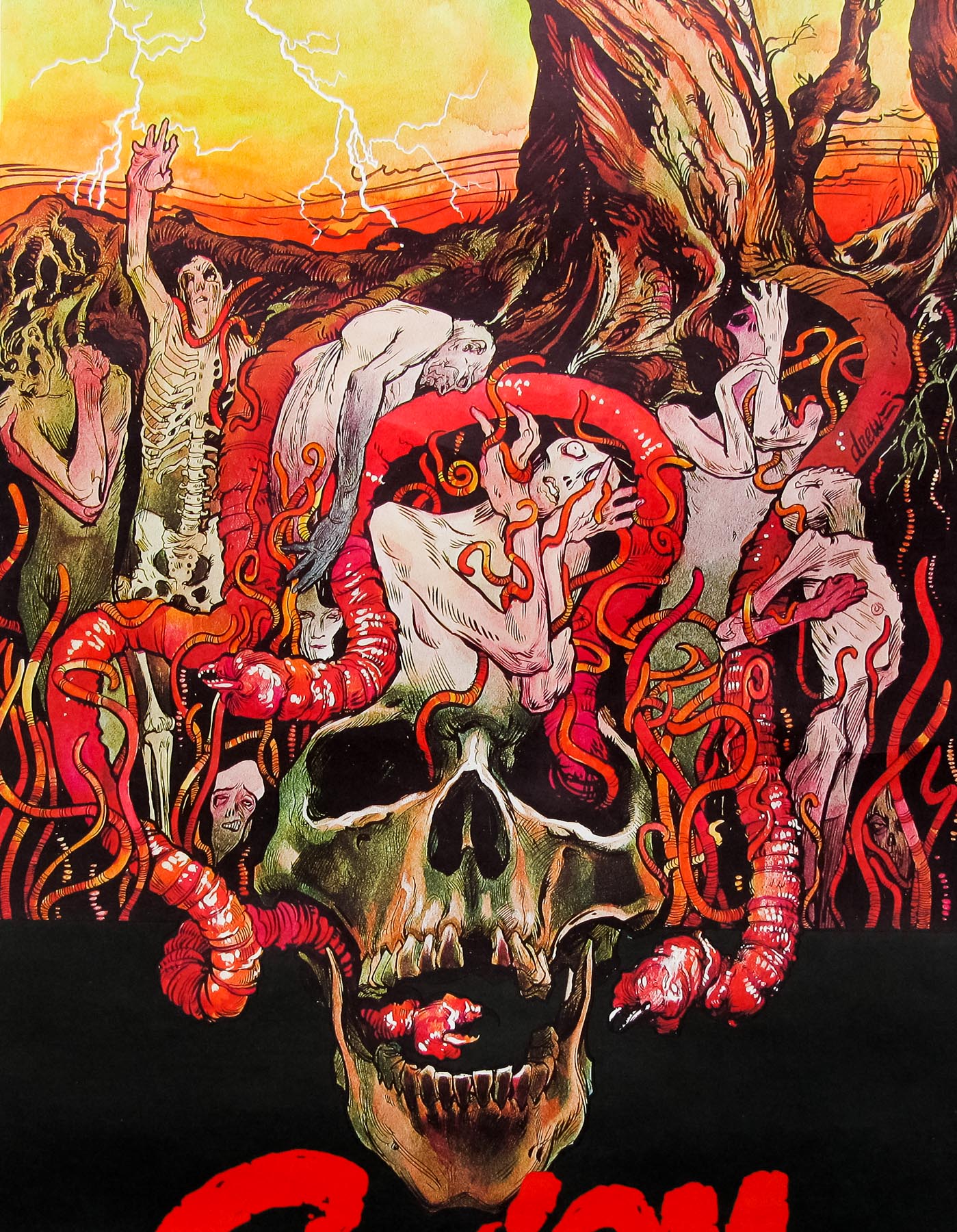
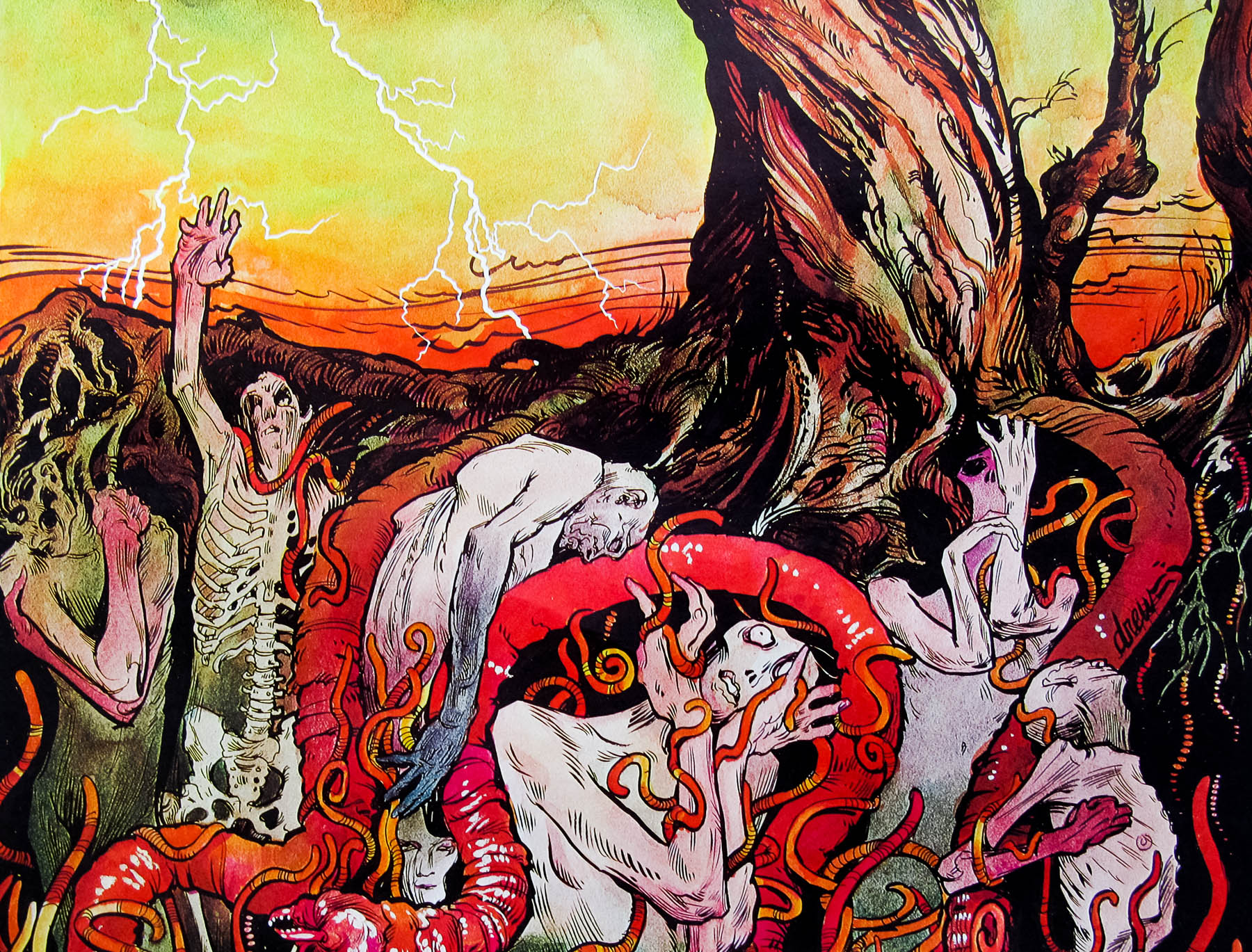
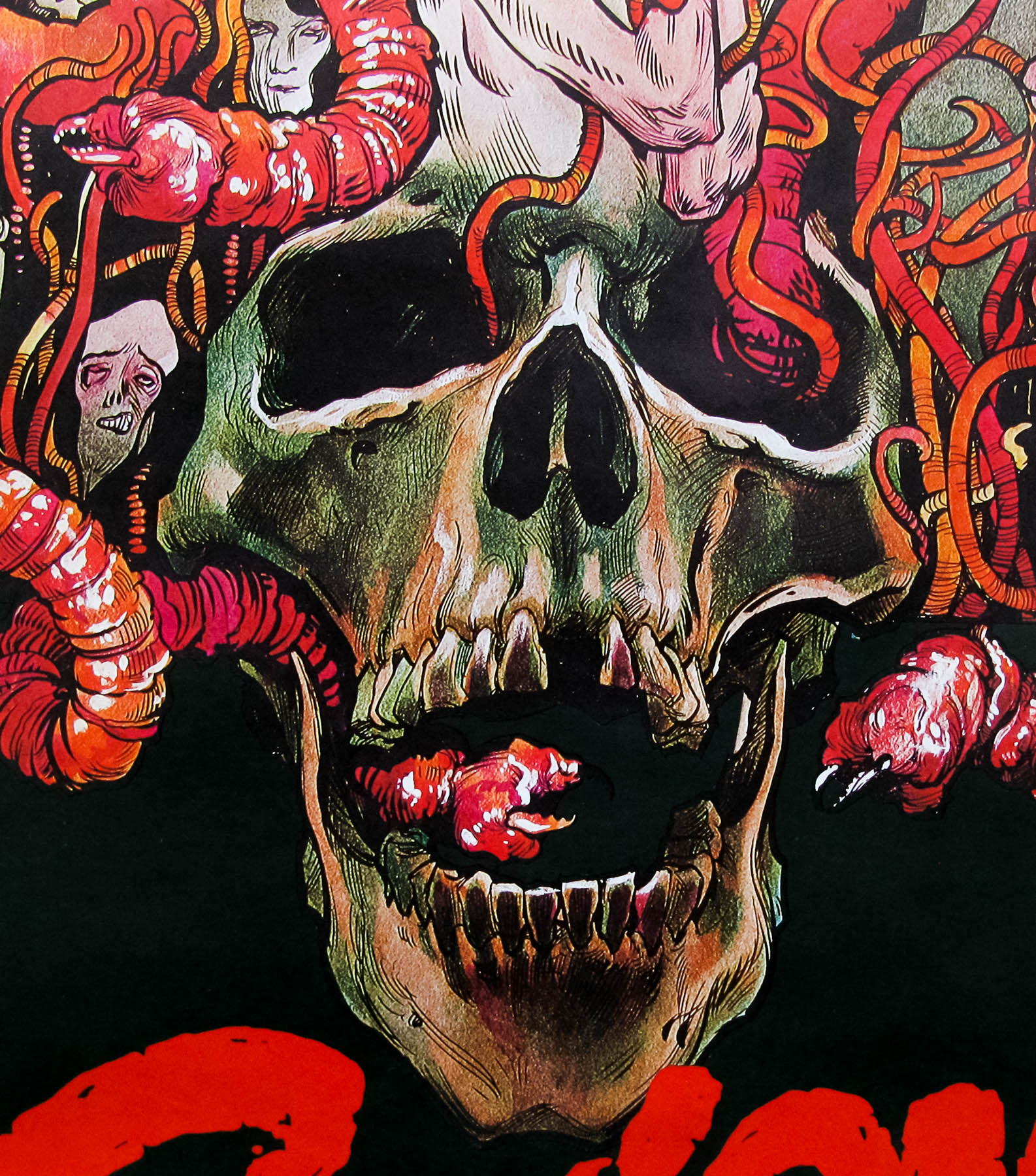
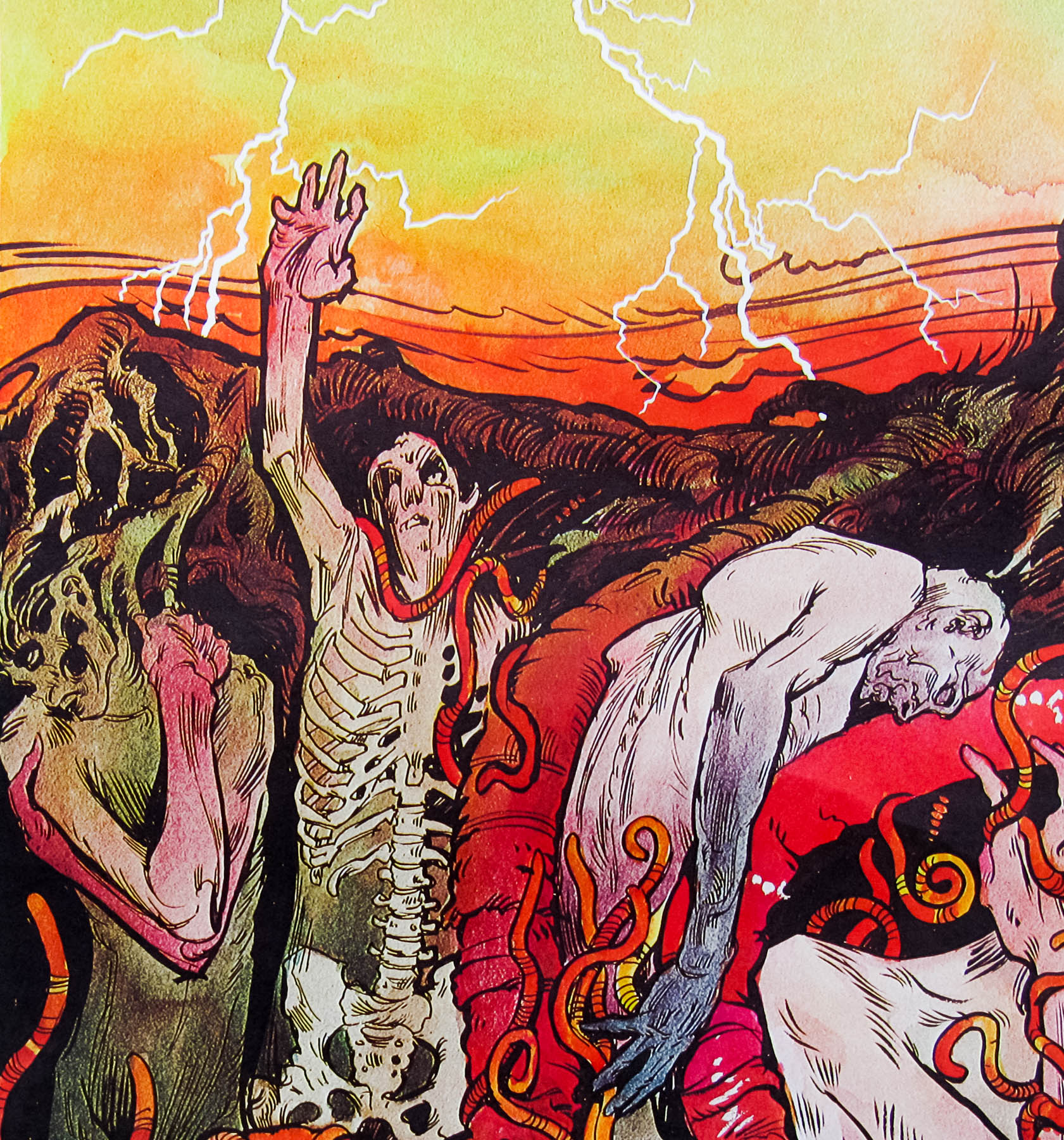
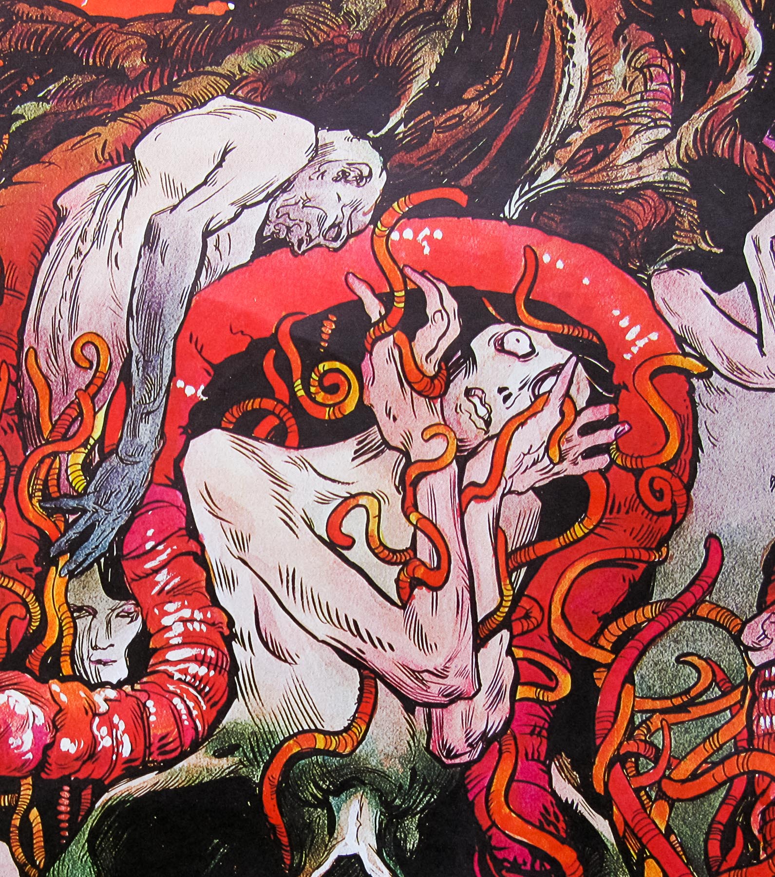
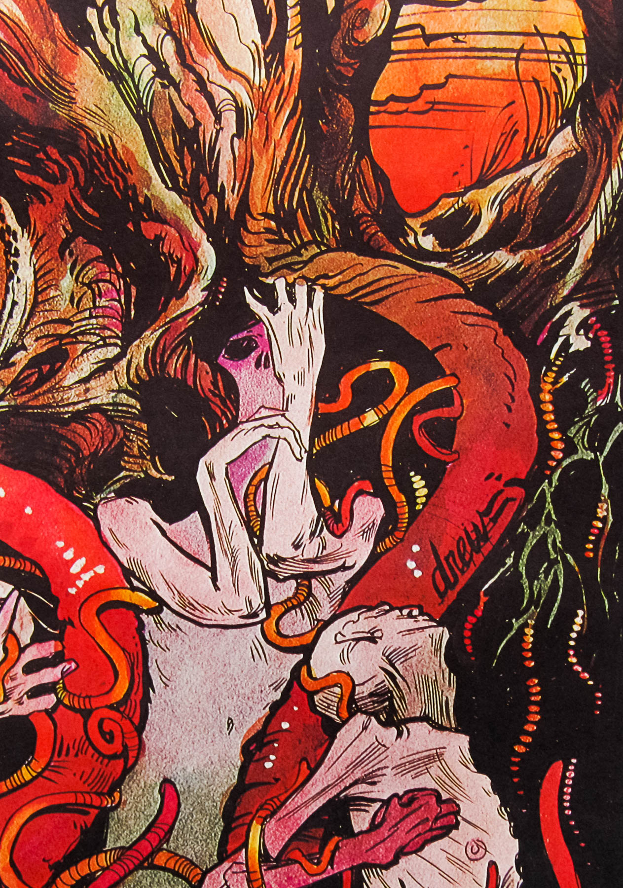
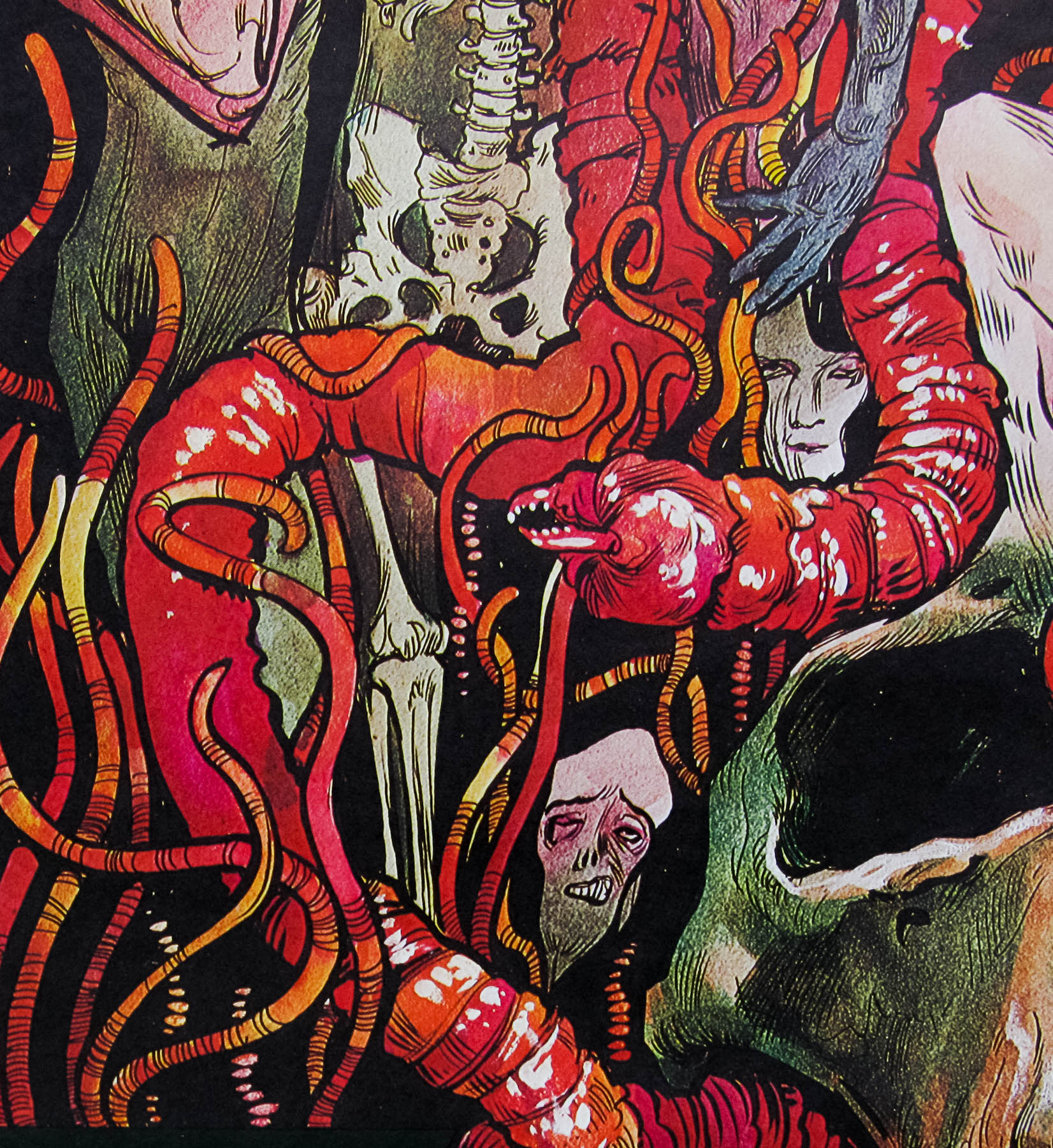
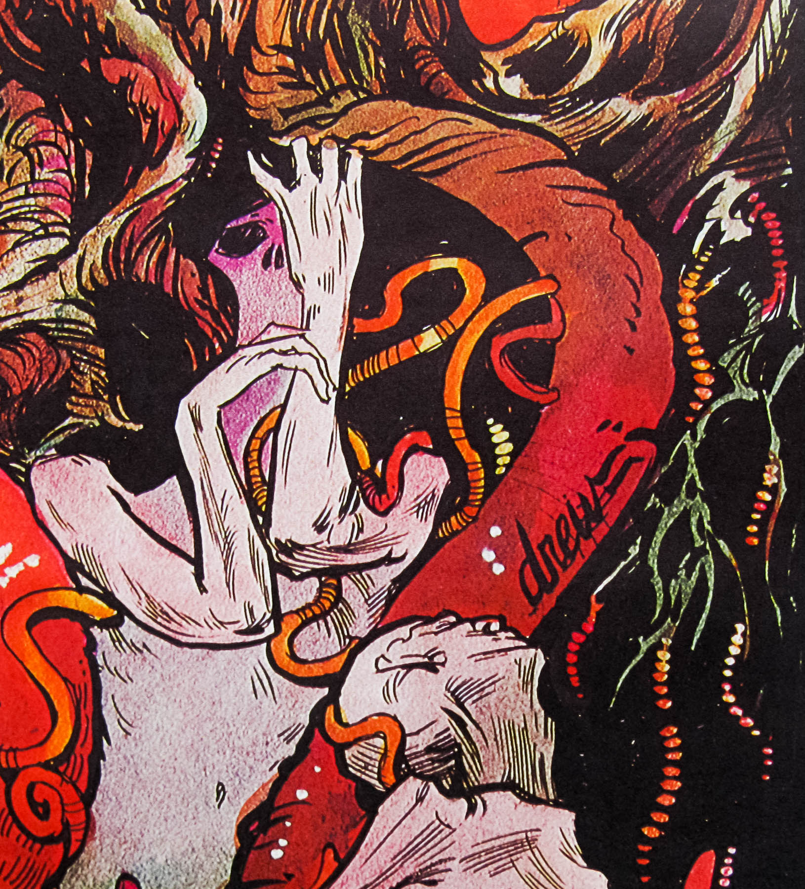
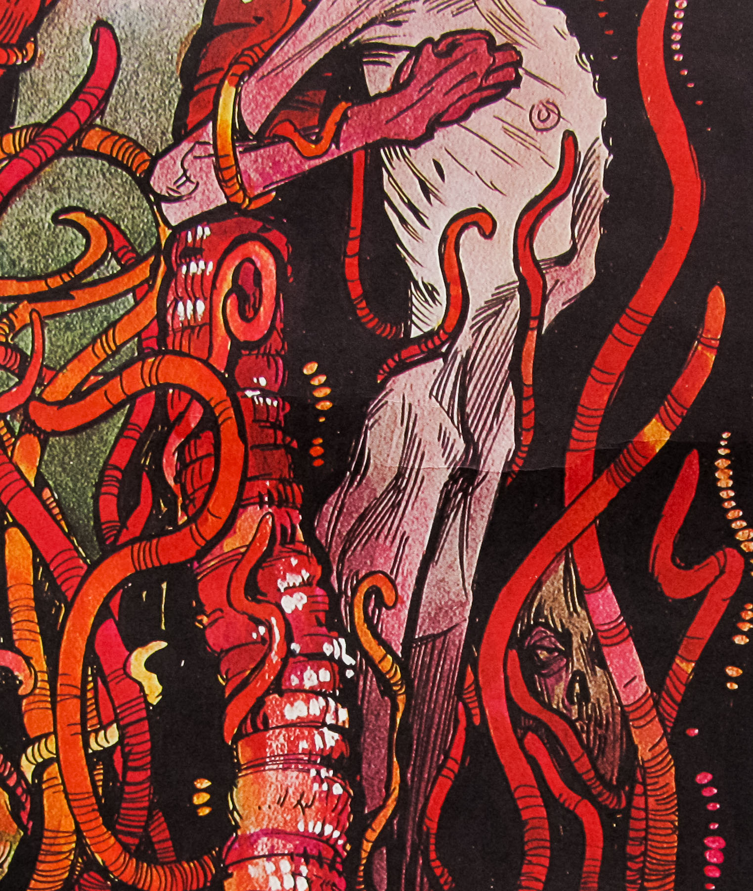
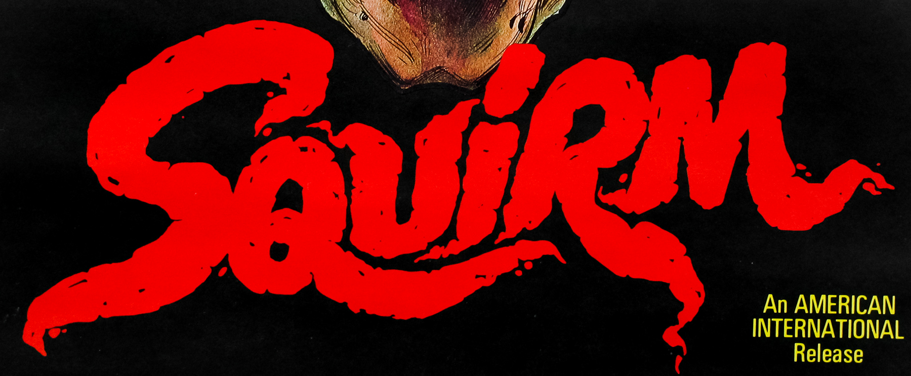
Very early Drew Struzan artwork on this poster for the film Squirm, which was an entry in the ‘nature strikes back’ sub-genre of horror and features millions of earthworms feasting on the unwitting population of a small Georgia town. The worms are forced to the surface after a downed power line crashes into wet soil and, for some unexplained reason, turns them into carnivores with a taste for human flesh.
This surreal illustration is quite unique amongst Struzan’s oeuvre and puts me in mind of a painting by Hieronymus Bosch (example here) and one of Francis Bacon‘s more nightmarish images. There’s a lot of detail in there and I spot new elements every time I look at it.
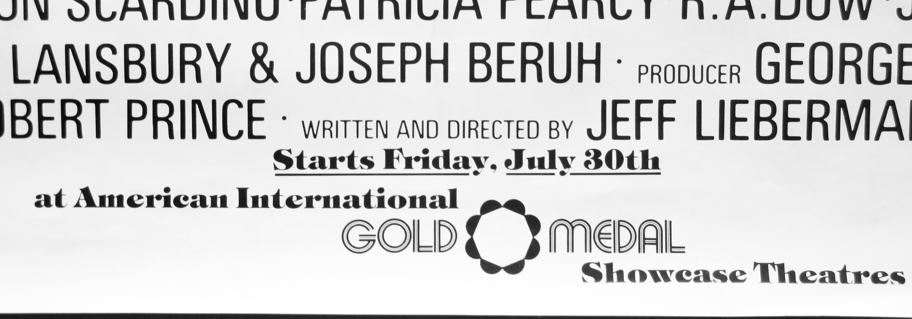
This particular poster is an oversized 30×40 and features a mention of the Gold Medal Showcase Cinema chain, which leads me to believe it was printed especially for them and could have been for a preview showing. I’m certain that it’s from the time of the original release, but if anyone has any more information on the poster please get in touch.
The trailer can be viewed on YouTube.
The other posters I’ve collected by Drew can be seen here.
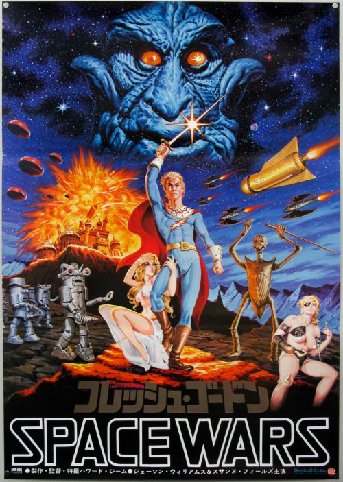
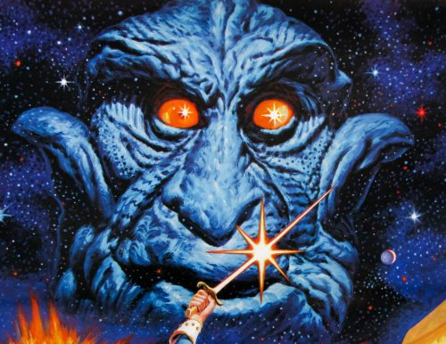
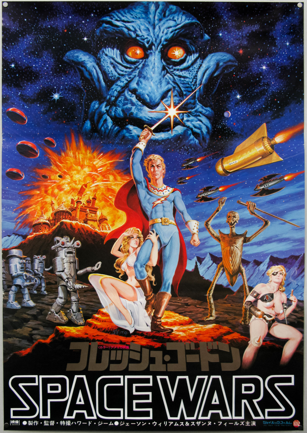
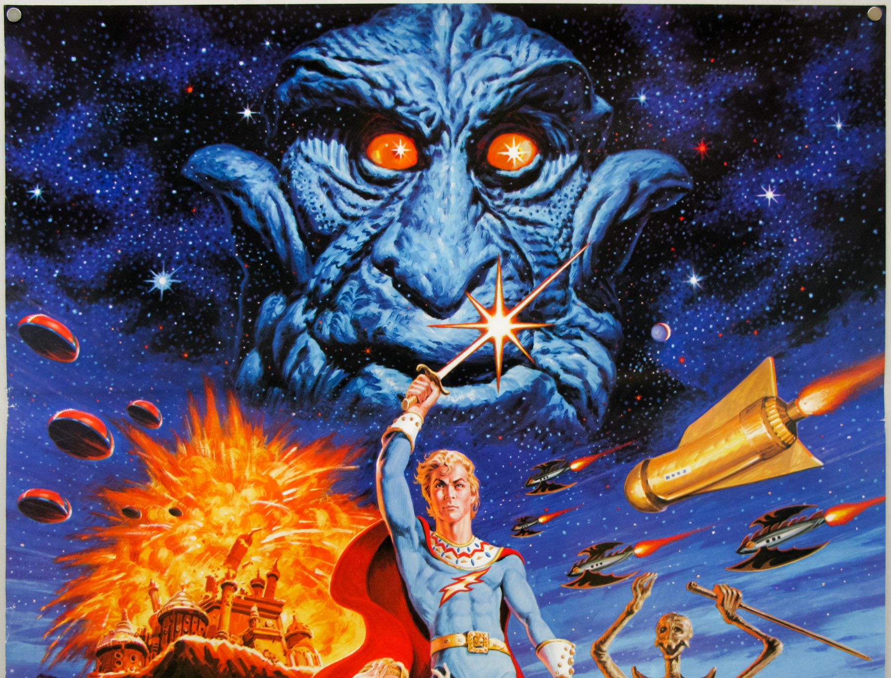
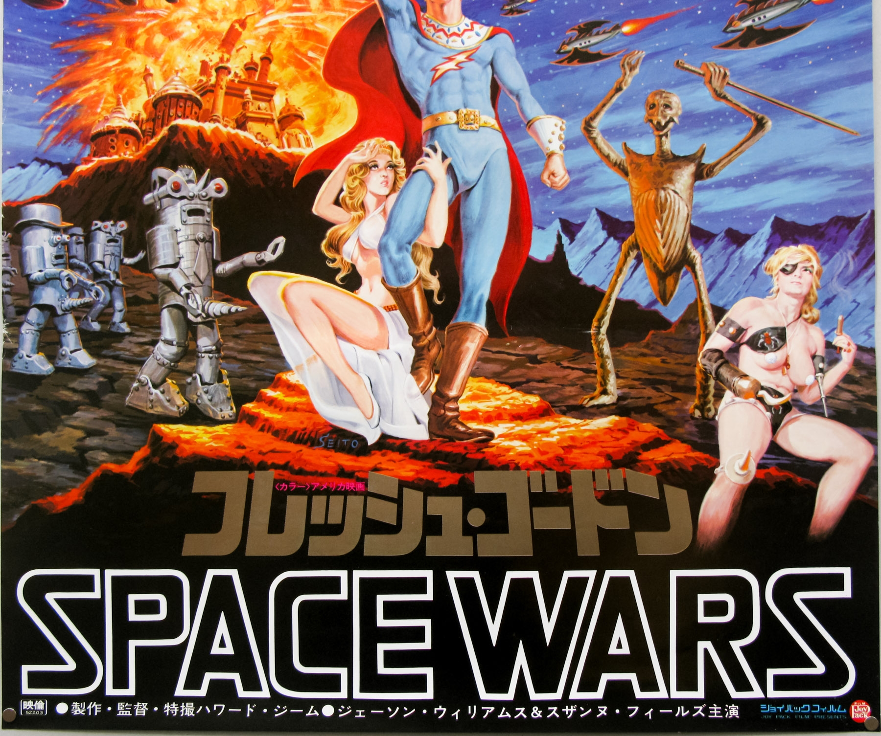
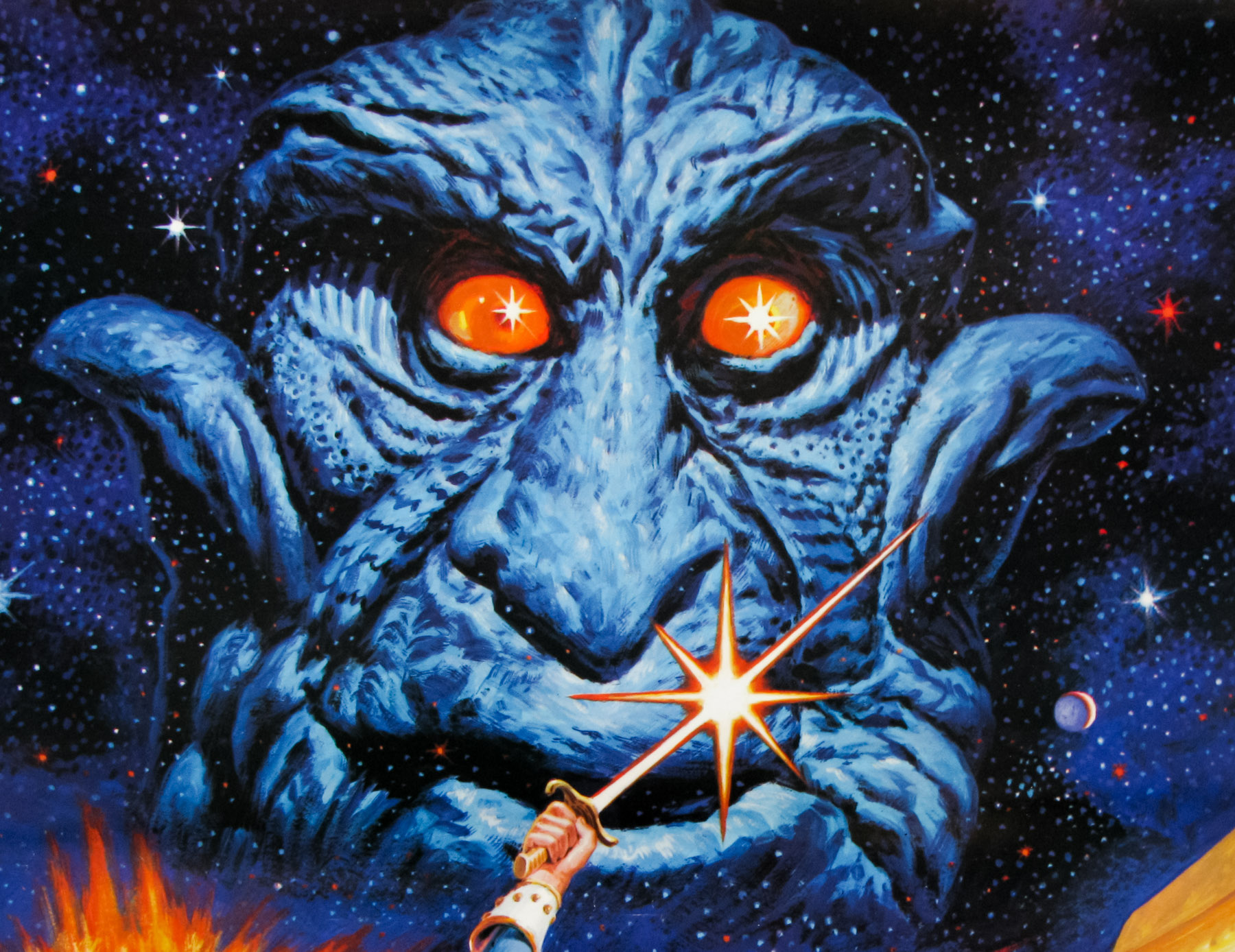
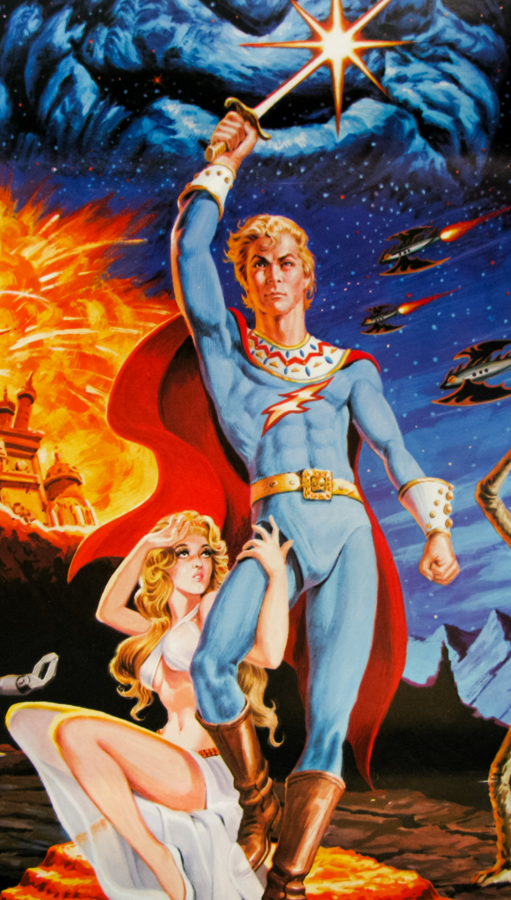
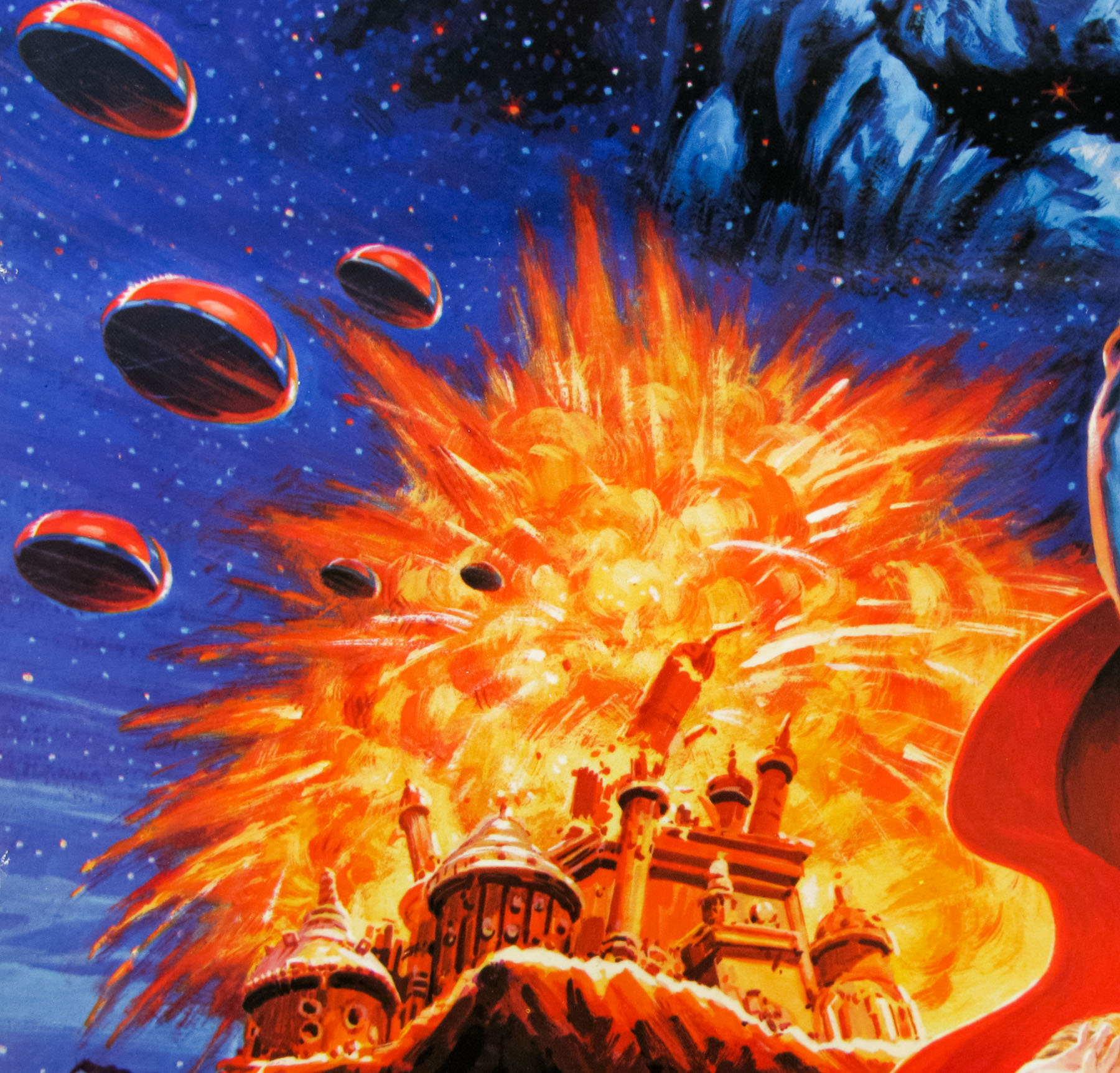
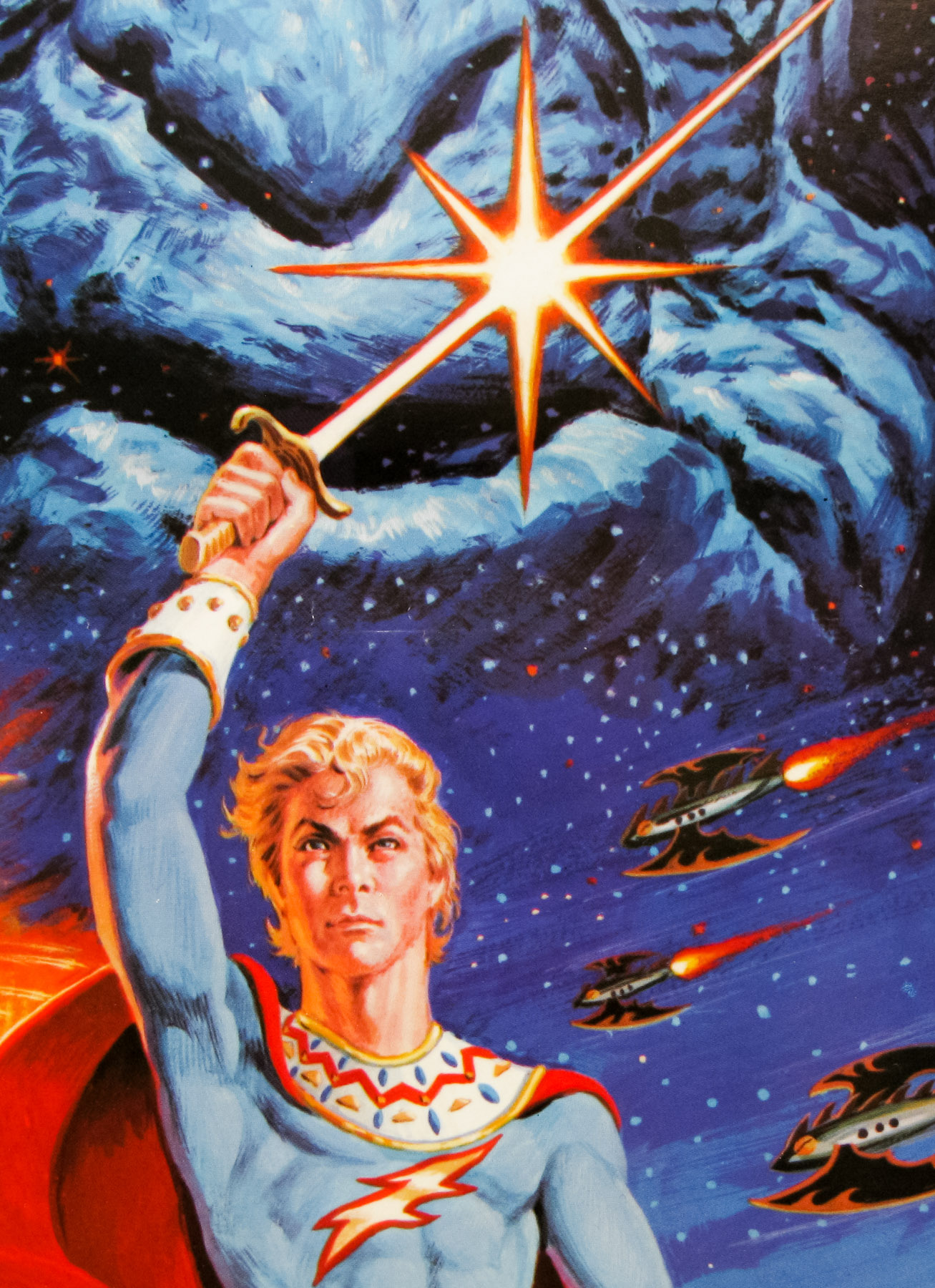
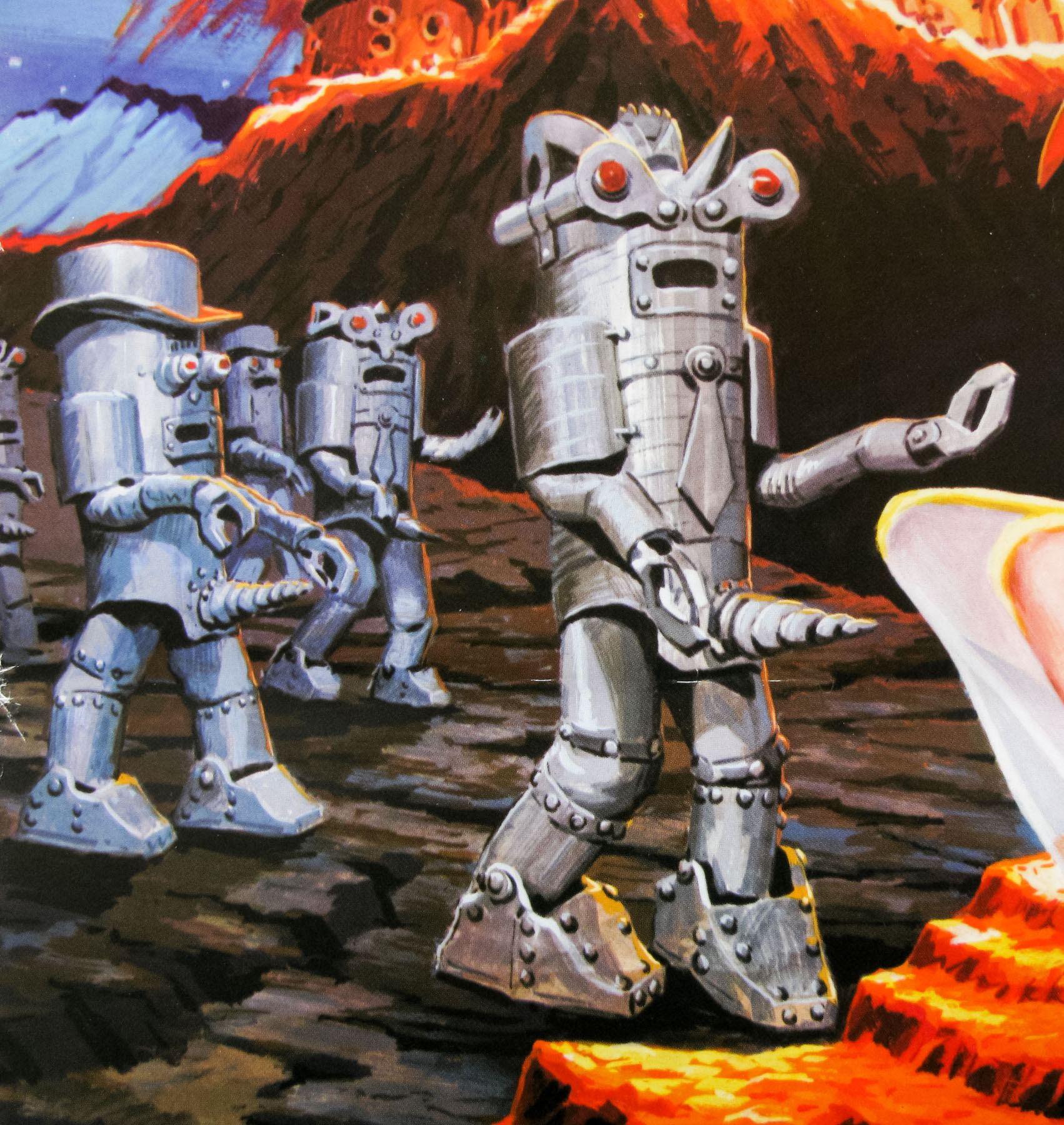
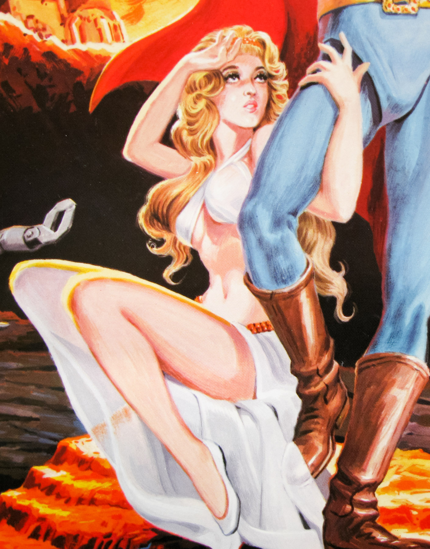
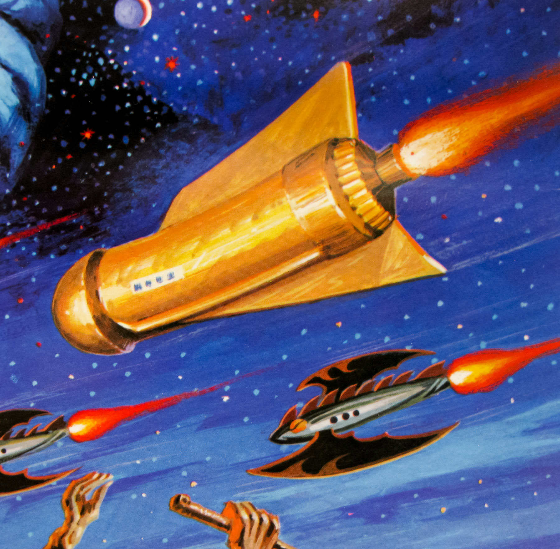
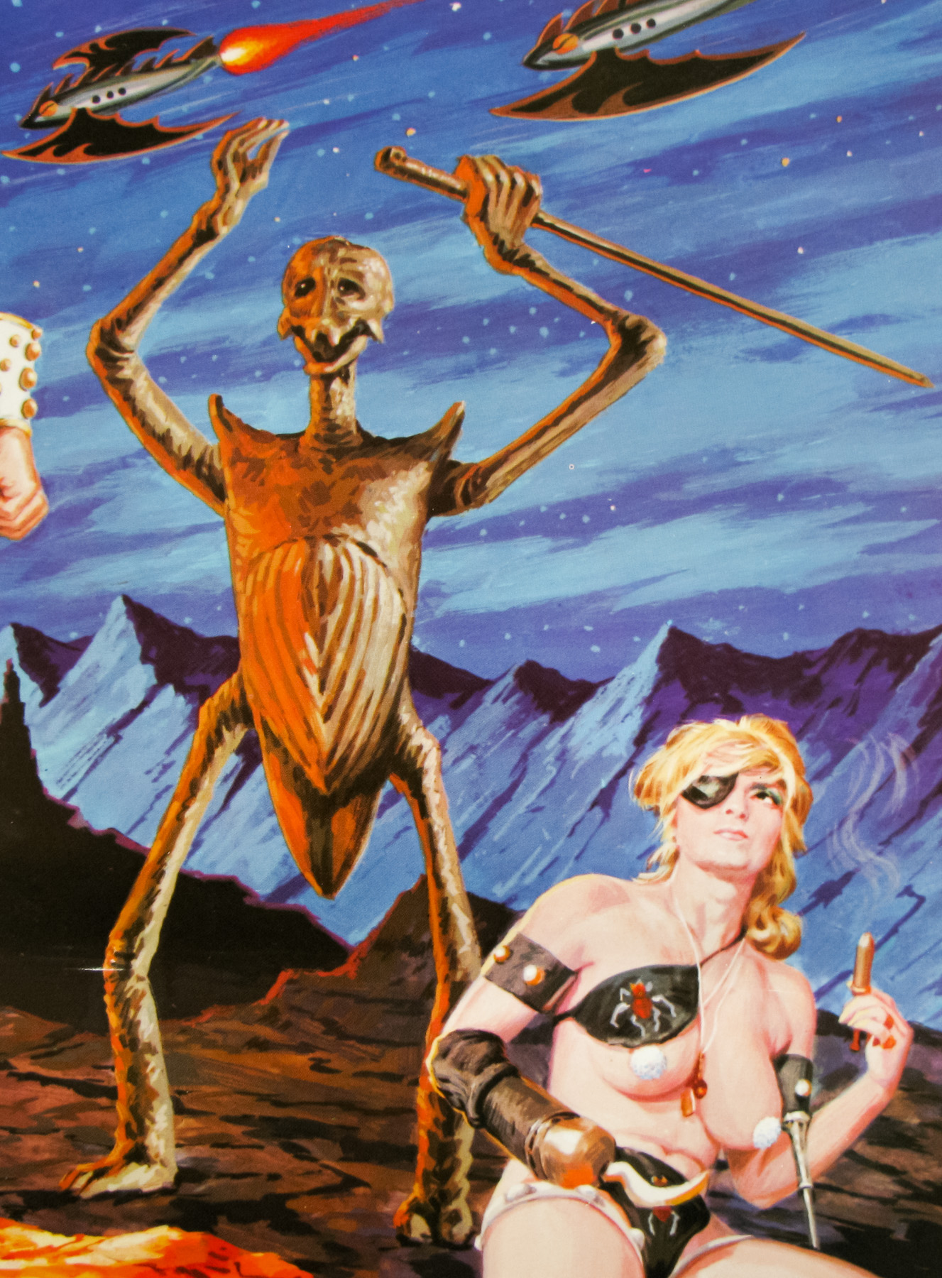
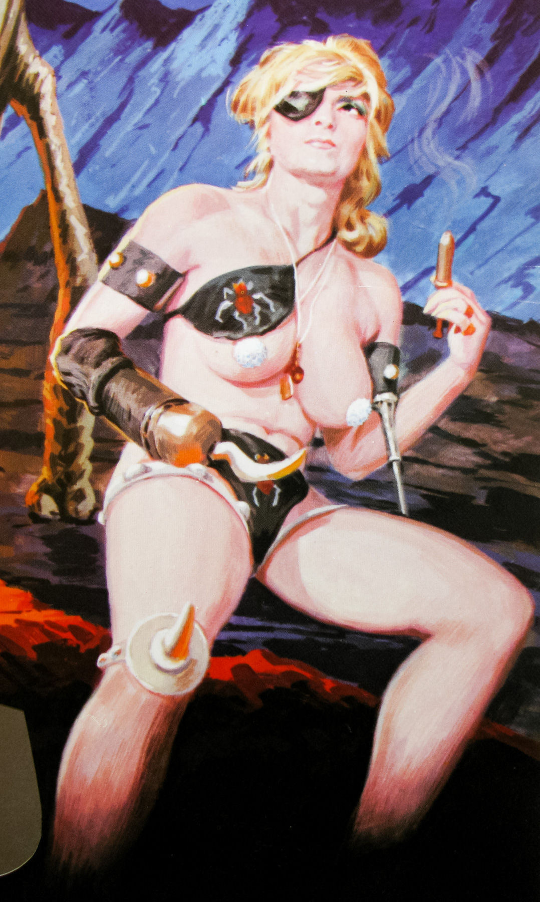


The sex-spoof Flesh Gordon was released within a few months of Star Wars in Japan and that probably accounts for the name change to a title so similar there can be no doubting the canny local distributors were hoping to cash in on some of the success of George Lucas’ sci-fi classic. Based on the original Buster Crabbe-starring Flash Gordon film serials of the 1930s, which were themselves based on a comic strip created by Alex Raymond, the film parodies many of the names and situations seen in the originals.
In this version Emperor Wang the Perverted, the leader of the planet Porno, points his mighty ‘Sex Ray’ towards Earth, turning everyone into sex-crazed lunatics. Only one man can save the planet; football player Flesh Gordon. Along with his girlfriend Dale Ardor and the (brilliantly named) mad Professor Flexi-Jerkoff, they set off towards the source of the Sex Ray determined to put a stop to Wang.
Entertaining and unremittingly trashy, the film does an excellent job of being just reverential enough to the original source material whilst adding it’s own brand of madcap humour interspersed with sex scenes. The effects are particularly decent for such a low-budget film and that’s because several of the effects specialists who worked on it were either established experts or men who would later go on to become leading artists in the field, including Mike Minor, Greg Jein, and Rick Baker (An American Werewolf in London).
For the large monster seen towards the end of the film the production utilised the talents of Jim Danforth and Dave Allen who are both now recognised as two of the leading figures in the world of stop-motion animation. The monster was given the name ‘Nesuahyrrah’, which is ‘Harryhausen’ spelled backwards, the surname of likely the greatest stop-motion animator of all time, Ray Harryhausen.
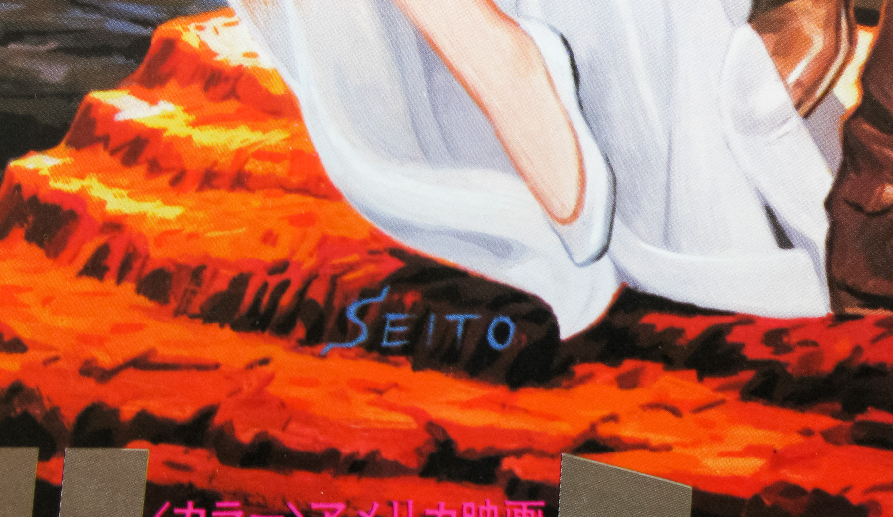
The poster artwork is by one of my favourite Japanese artists, Seito, and is unique to this B2. To see the other posters I’ve collected by the artist click here.
The original trailer is on YouTube.
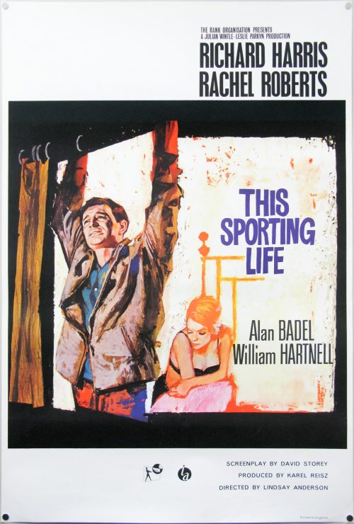
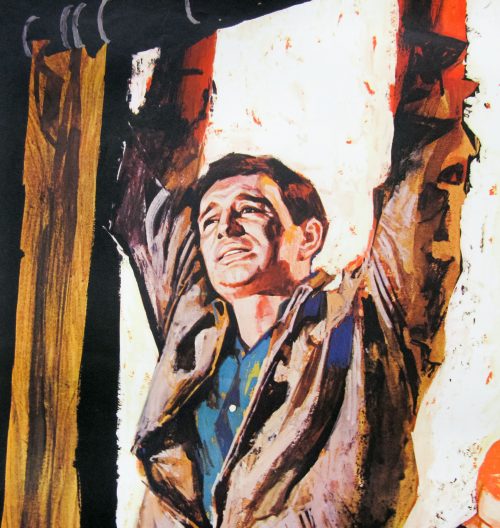
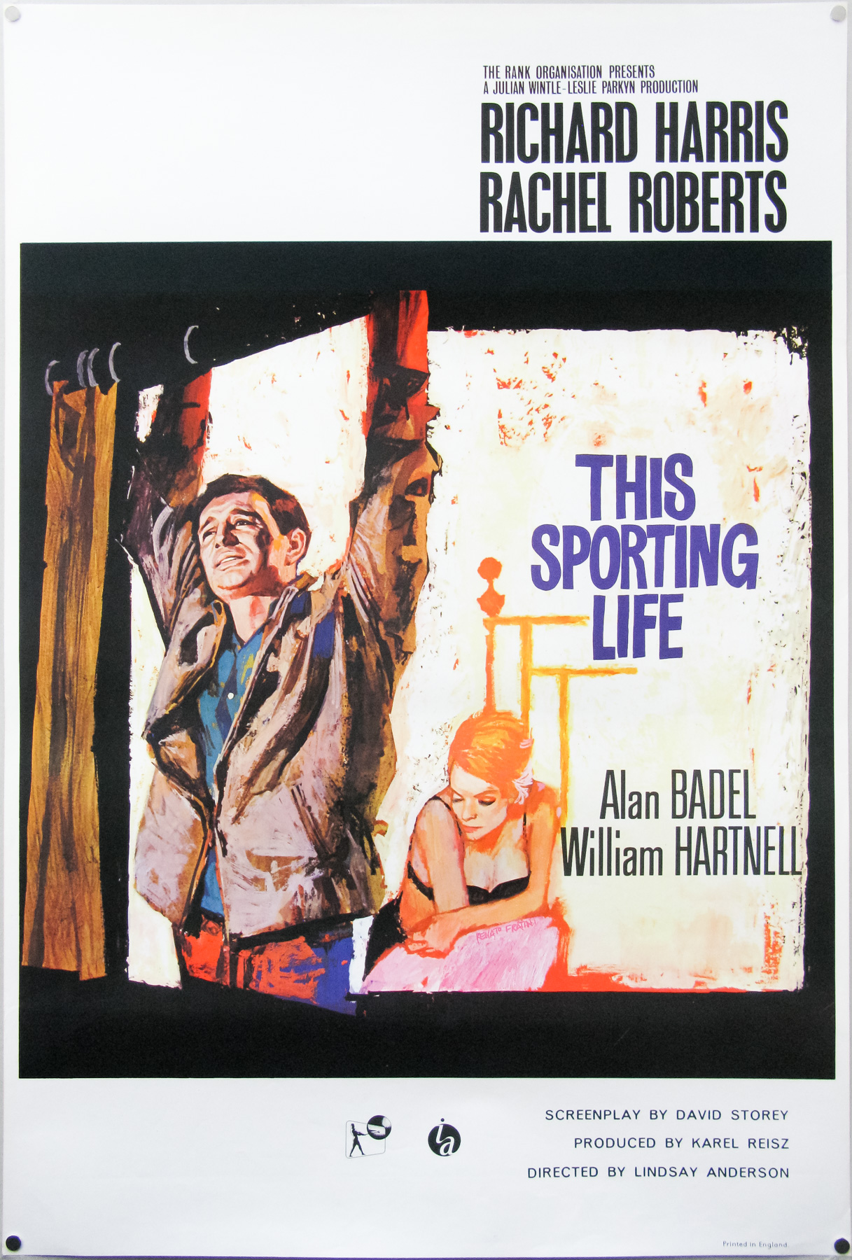
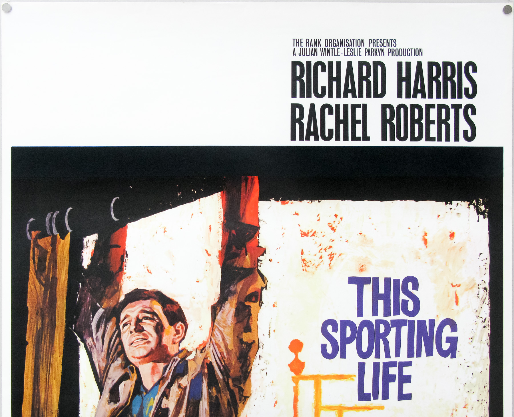
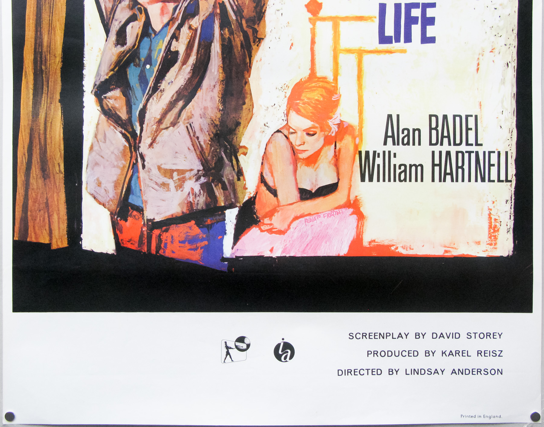
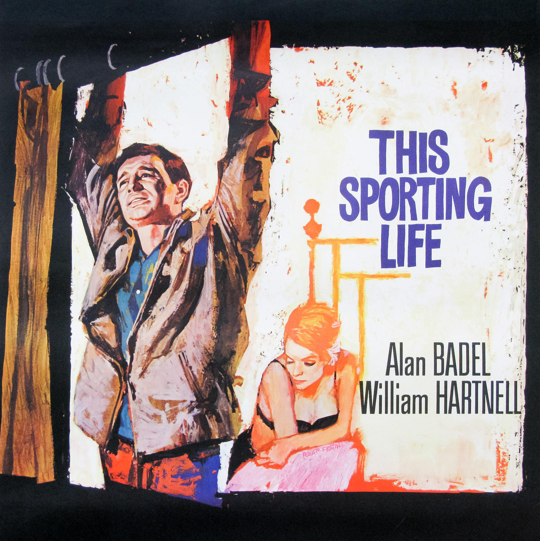
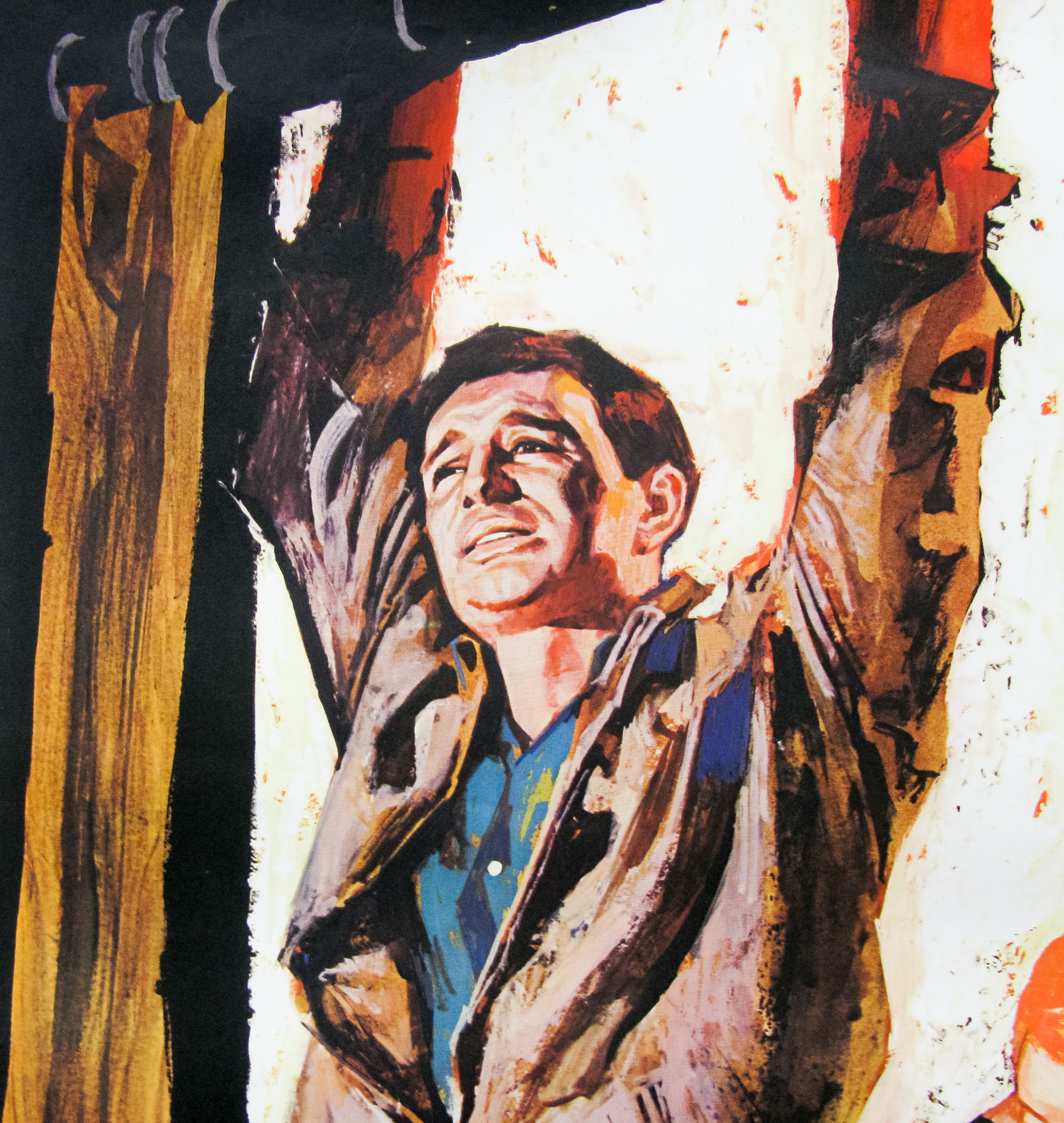
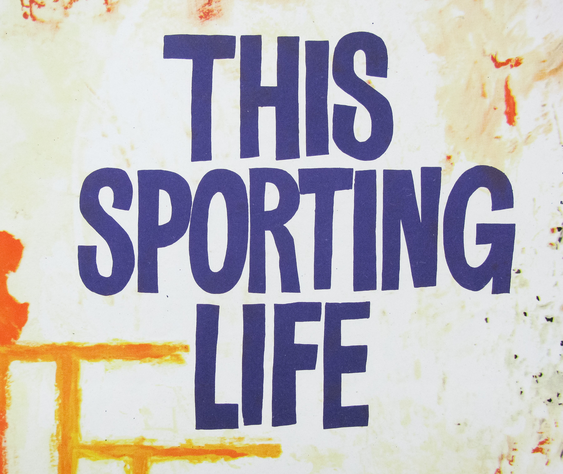
This Sporting Life was the first full-length film by the late British director Lindsay Anderson (best known for ‘If….‘ and ‘O Lucky Man!‘) and starred Richard Harris in what is now acknowledged as his breakout role. The story follows the exploits of Frank Machin (Harris) a tough, young miner in a Northern England town who finds success as a Rugby League player and must deal with his violent tendencies as he copes with his new found fame. The film also featured Rachel Roberts in a memorable turn as the widower landlady of Machin with whom he has been having a strained relationship.
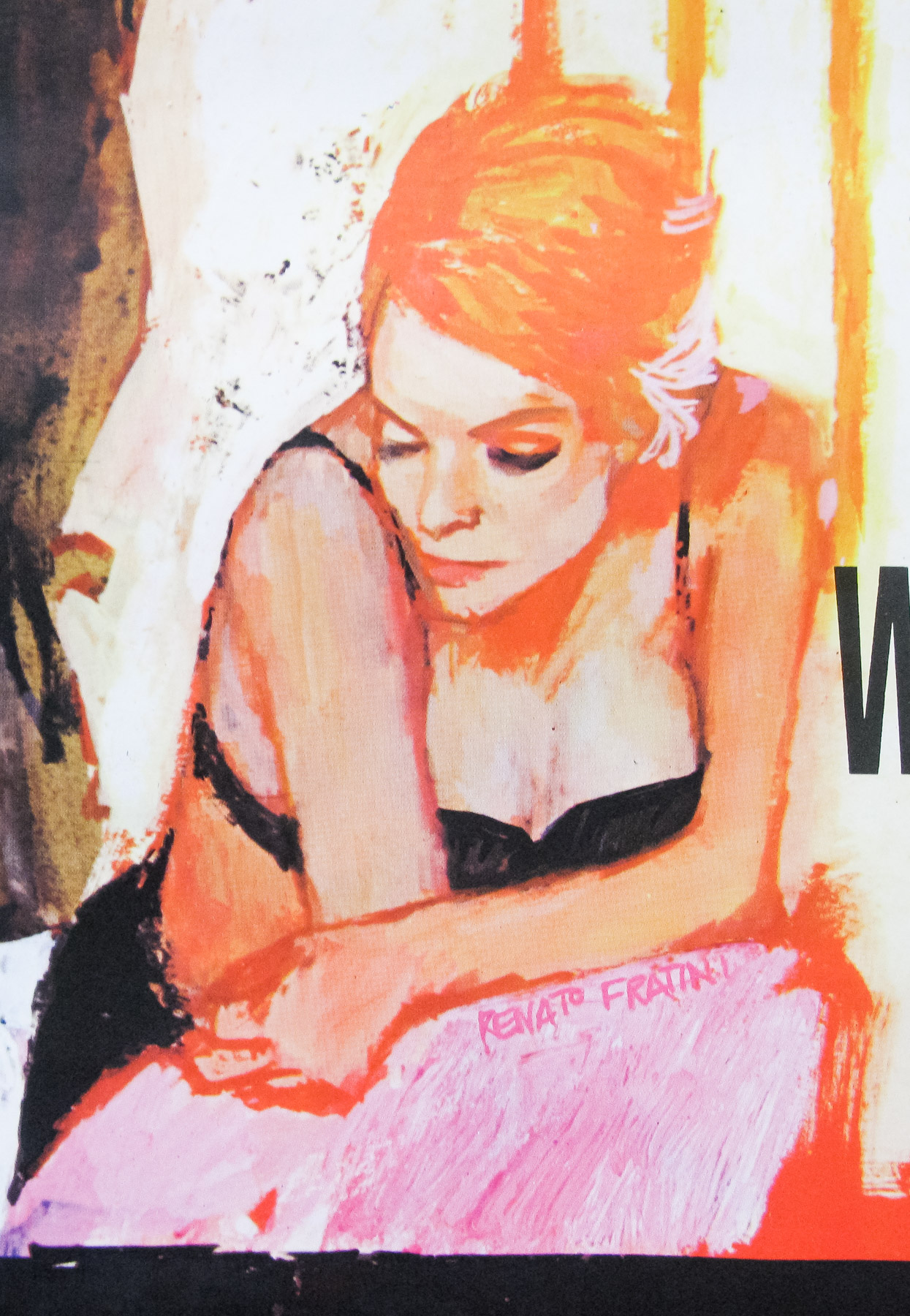
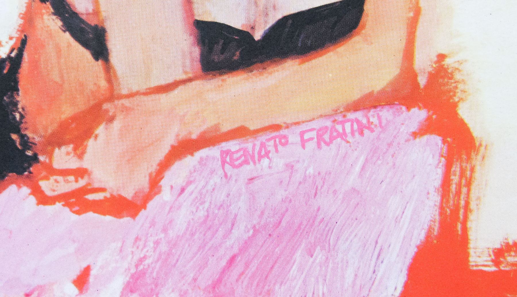
This UK one sheet features artwork by Renato Fratini, an Italian painter who came over to England to work in film publicity at the end of the 1950s and is regularly cited by many of his contemporaries as one of the greatest artists ever to have worked in the business. Fratini was born in Rome in 1932 and went on to study at the city’s Academy of Fine Art before landing a job at Studio Favalli, which was part of the legendary Cinecittà studios and handled film publicity for many Italian productions. Eric Pulford, who was head of Downton Advertising in London, began to enlist the help of the Italian artists in the mid-1950s once it became clear how much talent studio head Augusto Favalli had enlisted, and, perhaps crucially, how relatively cheap the work was.
Fratini was brought over to London by Pulford and put on a retainer for Downtons in 1958. He quickly impressed with his technical ability and skilful draughtsmanship, which was often marvelled upon by other artists working at the time. Ace British designer Vic Fair recalls the speed with which Fratini was able to work – ‘He was incredible. He was like a machine – he could just bash things out overnight’. Fratini very much enjoyed his life in London and was infamous for his love of a good party, quickly gaining a reputation as a man who enjoyed the finer things in life. Despite this he was still able to turn out stunning pieces of artwork with relatively little notice.
Perhaps Fratini’s most famous work is the quad he painted for From Russia With Love (in 1963 – the same year as this poster), which is probably the best of all the James Bond quads. Later he would work on a number of posters for the Carry On series of films, known for their colourful and brilliantly stylised designs, as well as some incredibly detailed artwork on posters such as the quad for Waterloo (1970), for which he was paid a then record fee of £2000. In 1969 Fratini had a broken marriage behind him and was losing money through tax bills, so he made the decision to leave London and head for Mexico from where he continued to paint for advertising firms in America and the odd assignment for Downtons. Sadly, in 1973 Fratini collapsed whilst at a beach party and died from massive heart attack, his years of excess finally catching up with him.
He was only 40 years old at the time and, as Sim Branaghan (author of the brilliant ‘British Film Posters‘ book) described in my interview with him, his tragic end perfectly embodies the stereotypical profile of a ‘doomed bohemian genius’. Sim’s book contains a lot more information on Fratini and is an absolute must-buy if you have even a passing interest in the artists behind these great posters.
It’s worth noting that this is one of the few pieces of artwork that prominently features Fratini’s signature.
The trailer for the film is on YouTube.
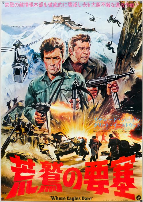
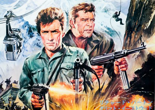
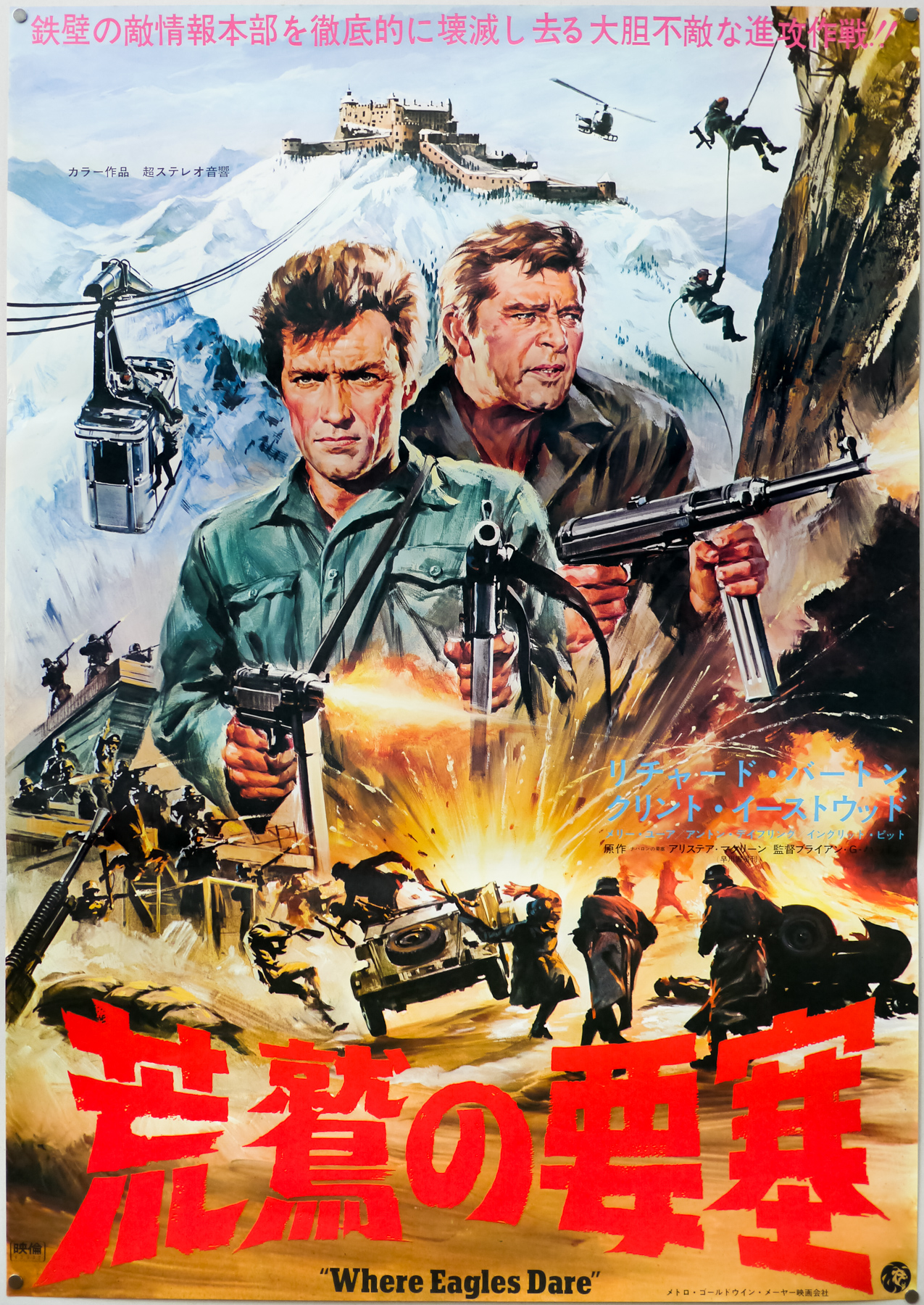
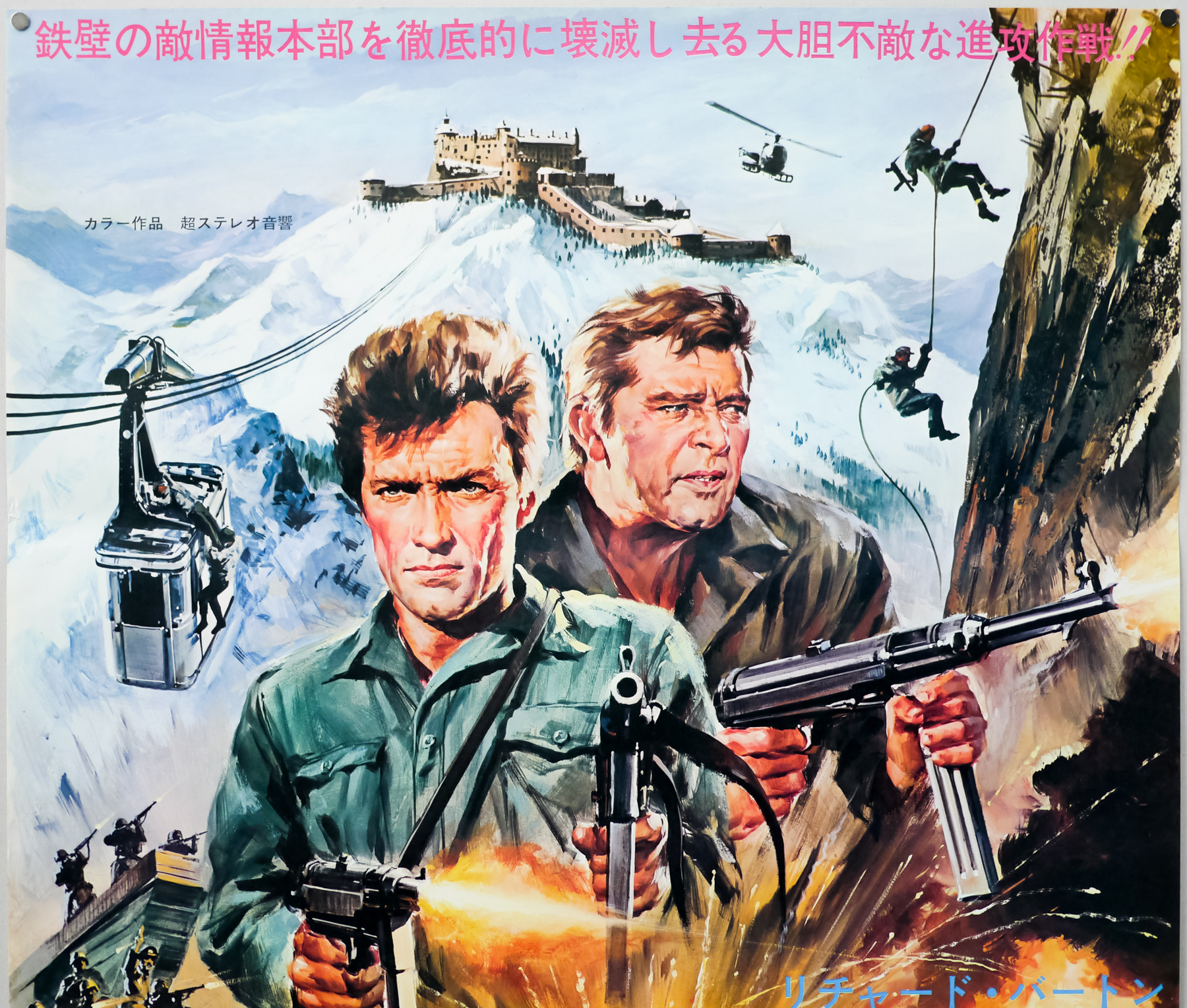
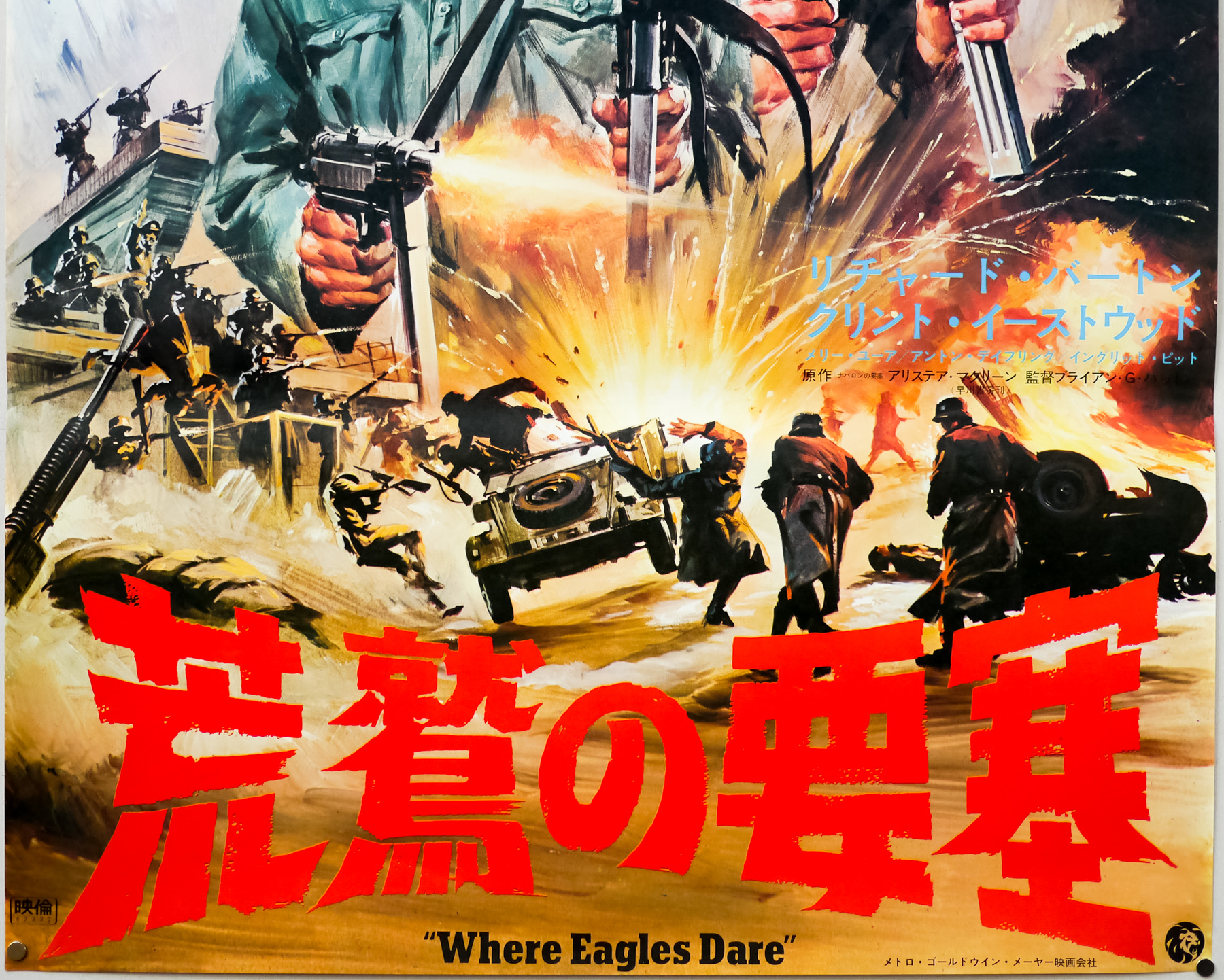
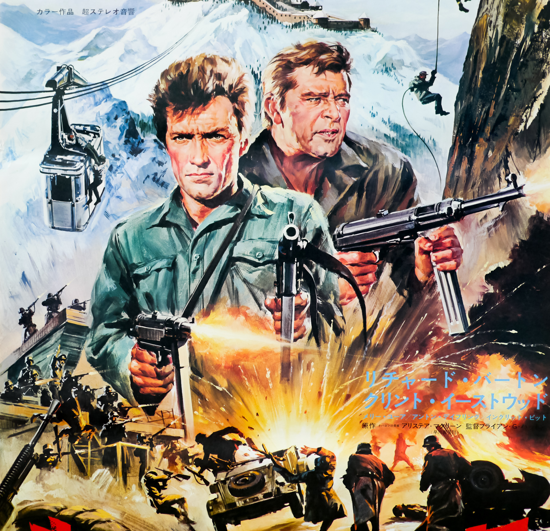
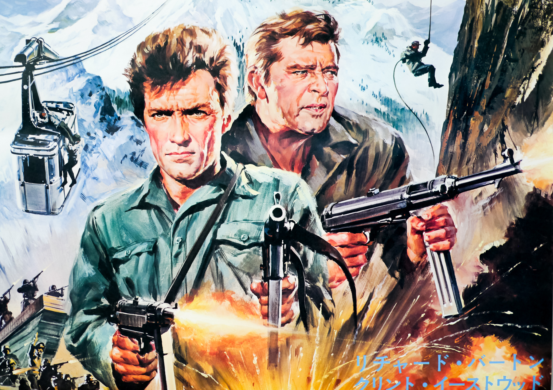
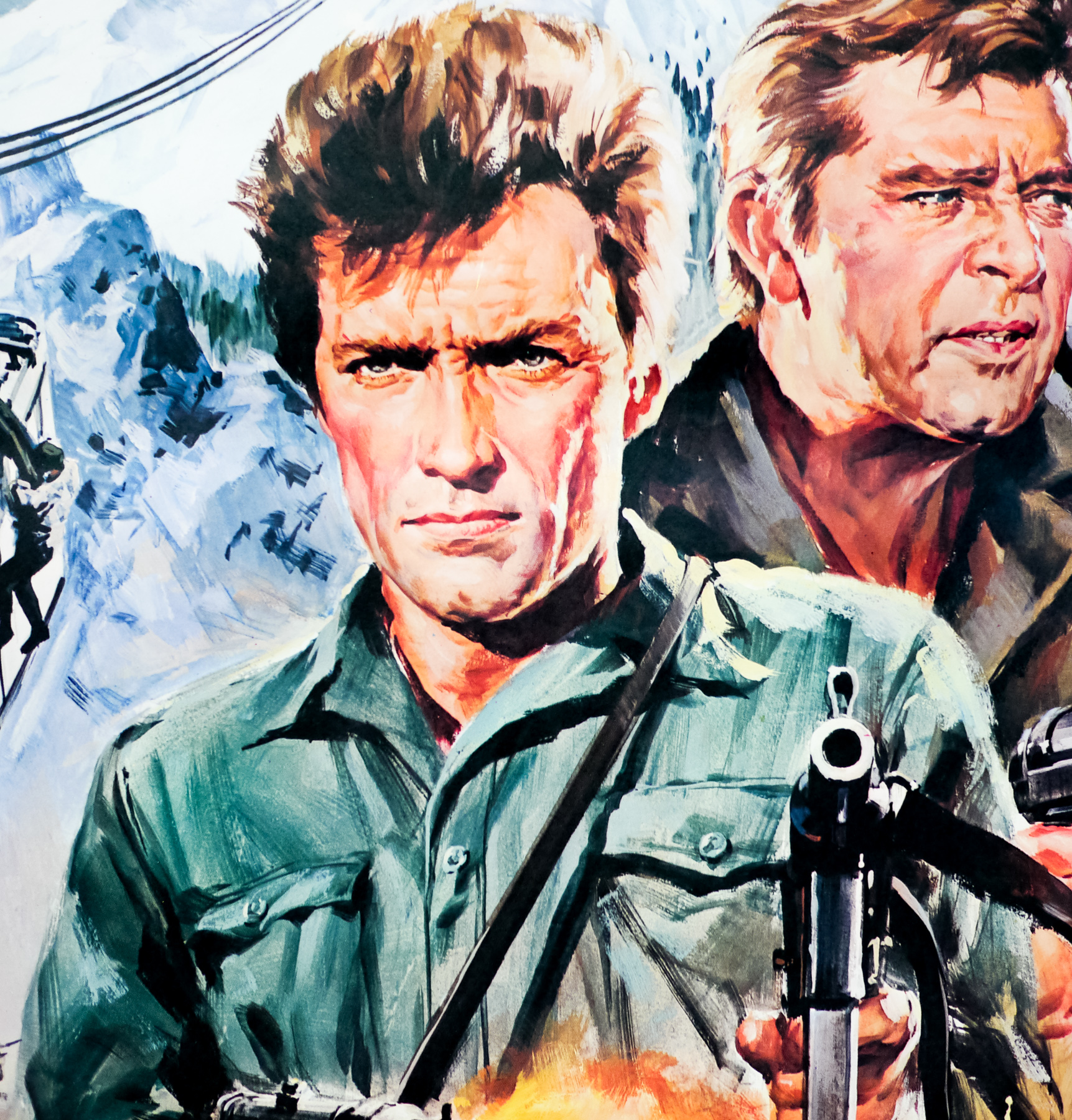
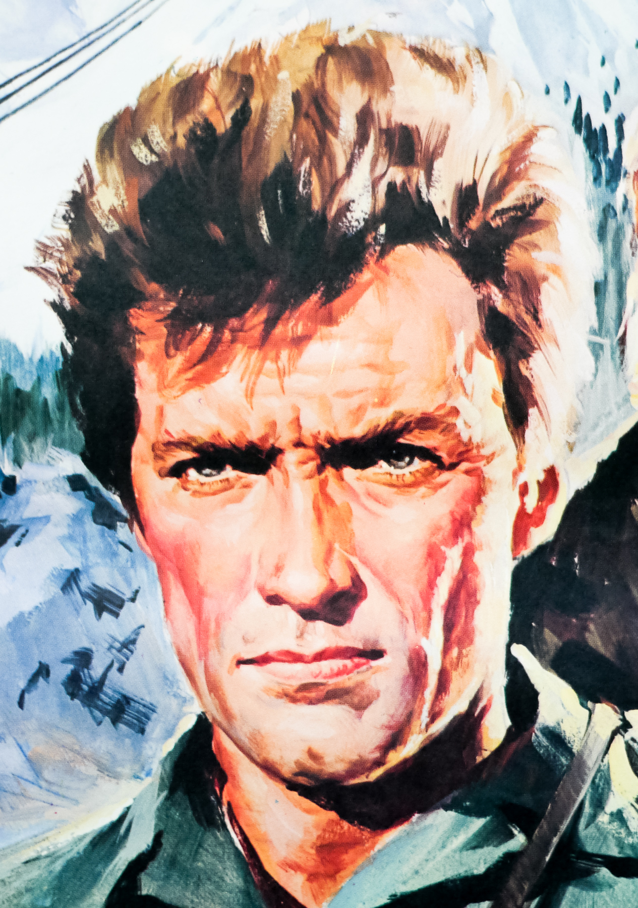
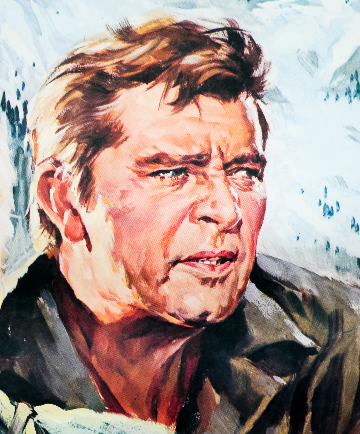
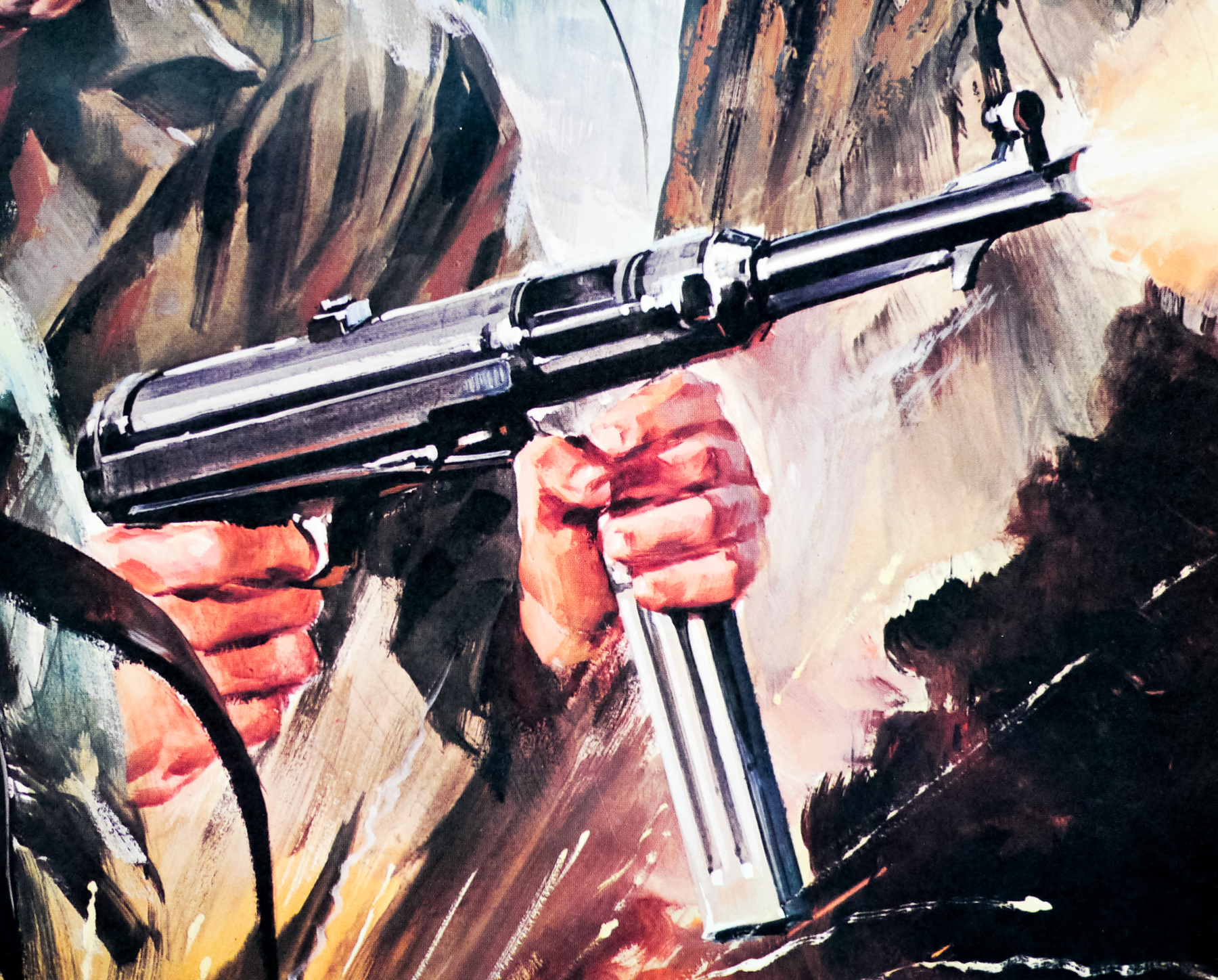
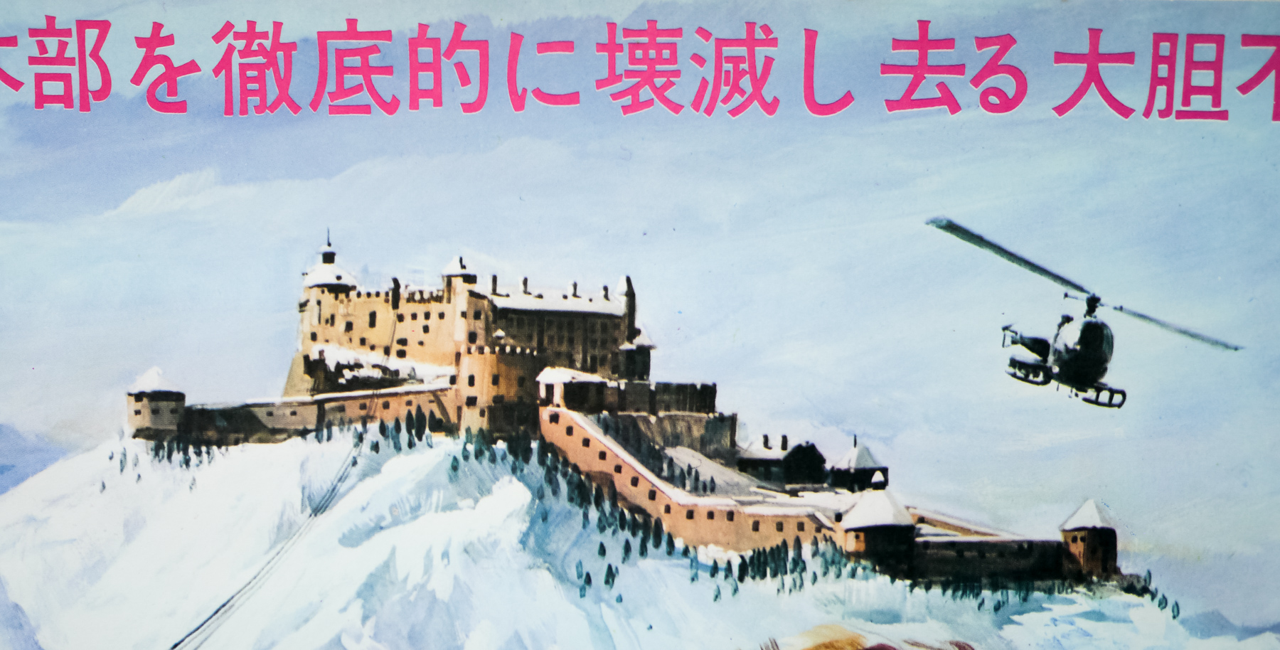
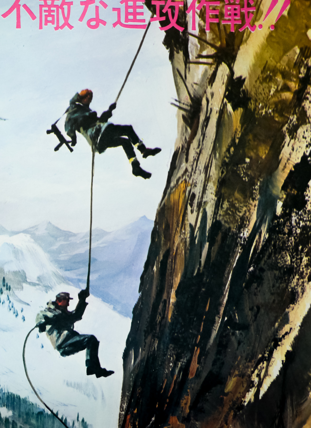
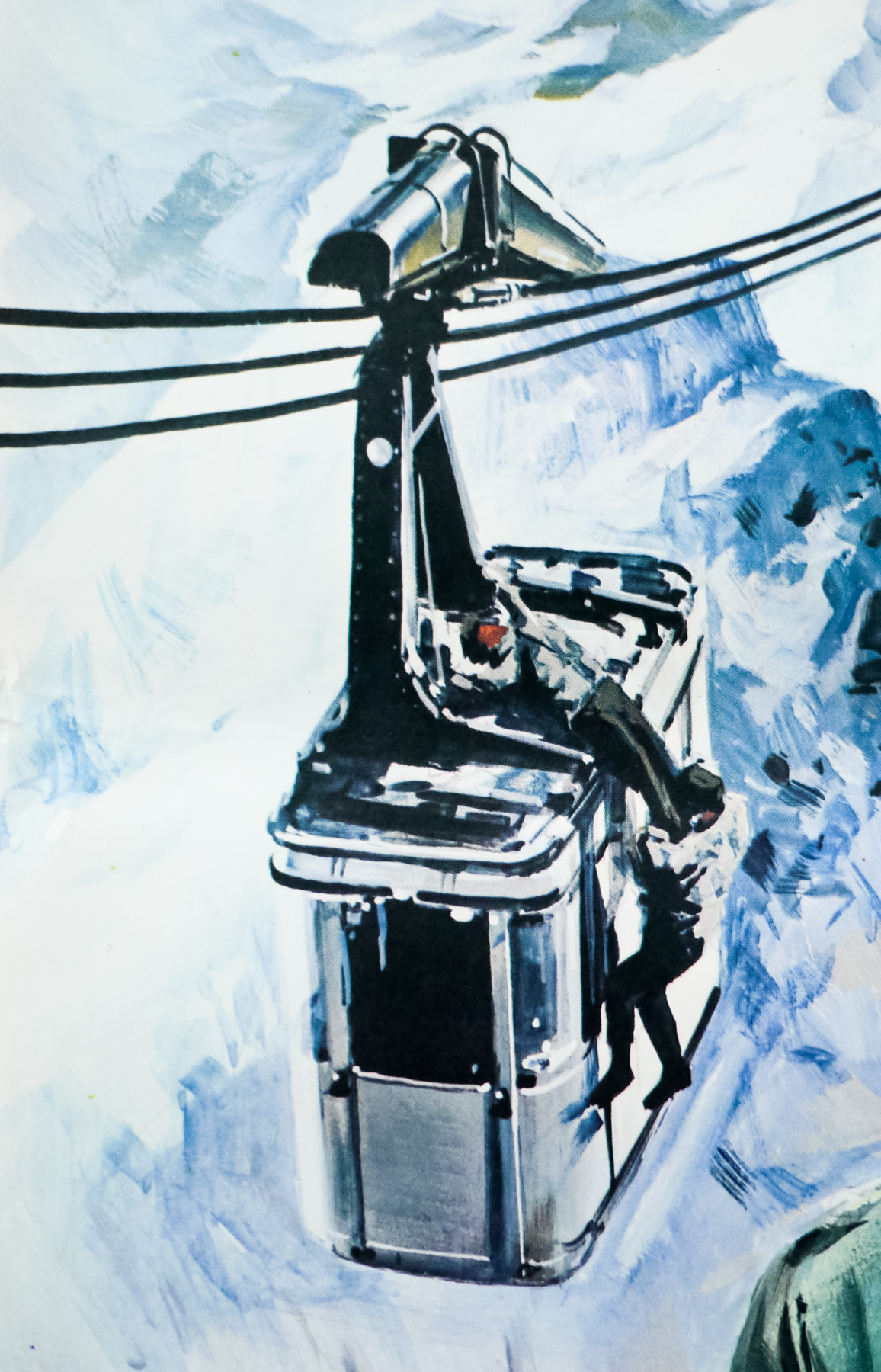
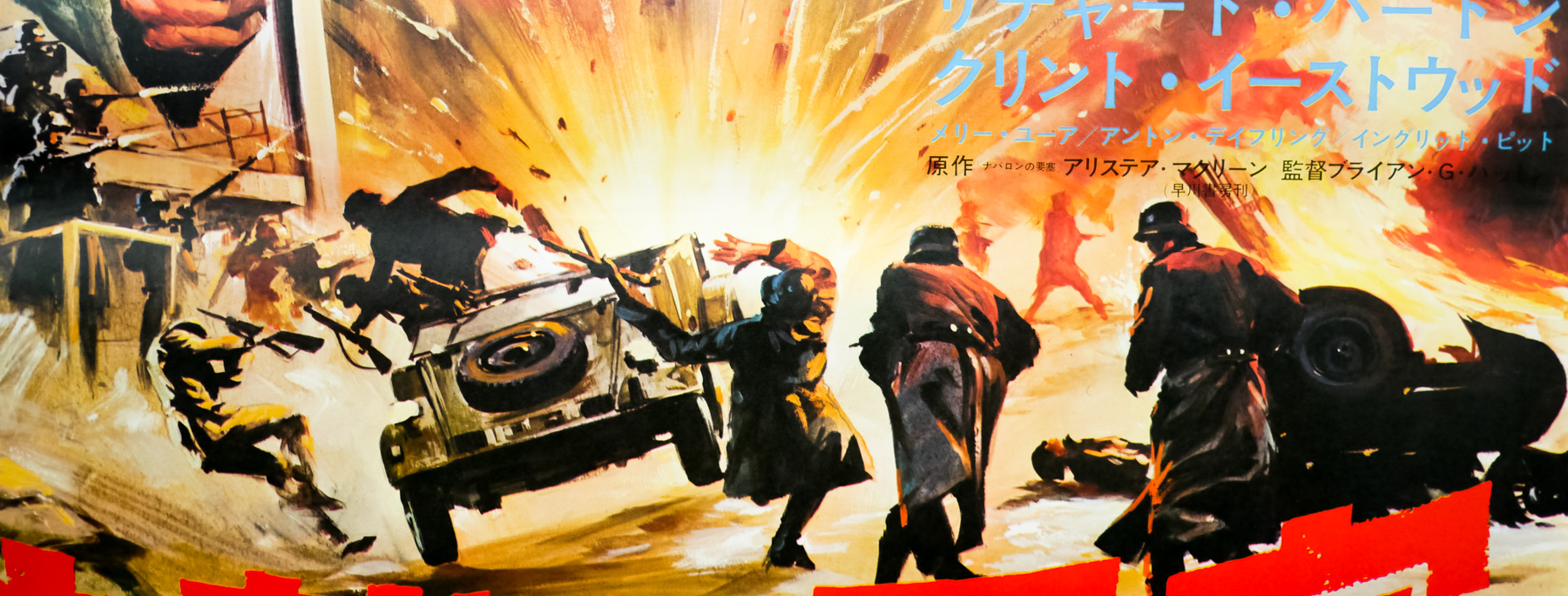
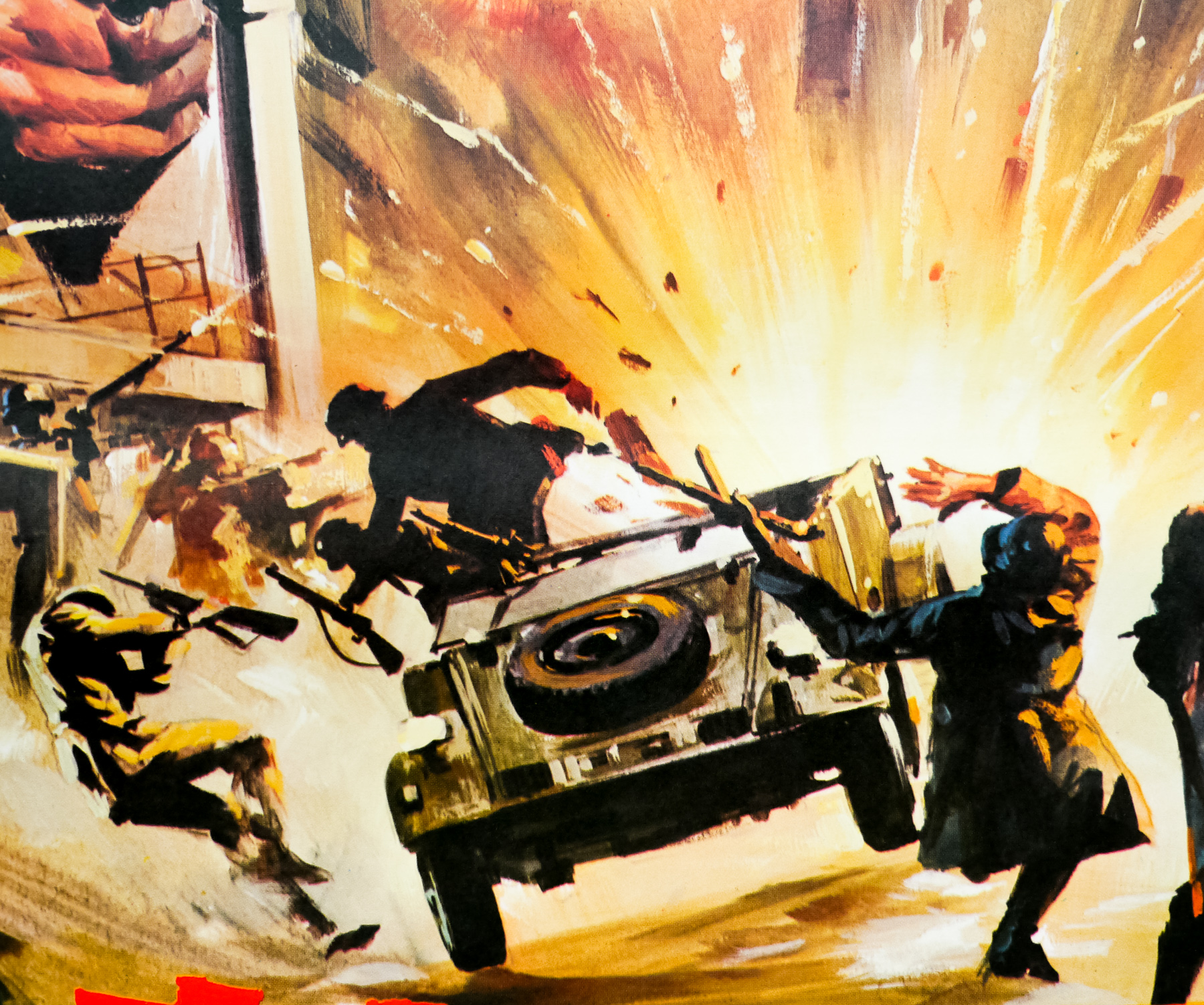
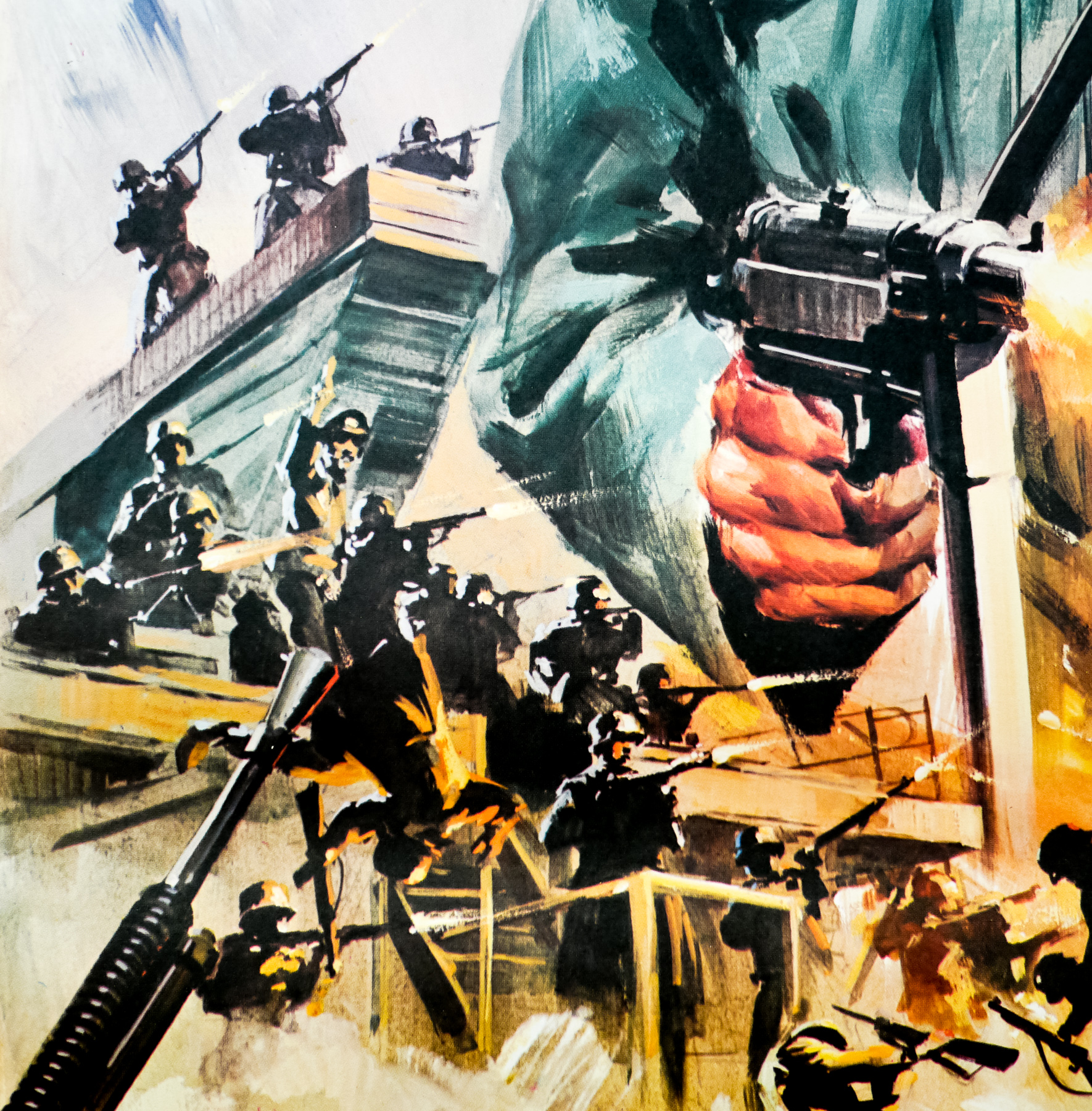
Great artwork by the Italian/French artist Jean Mascii on this Japanese B2 for the 1968 WWII action-adventure Where Eagles Dare, starring Richard Burton and Clint Eastwood. Scottish novelist Alistair MacLean was apparently commissioned by Burton to write a ‘boys-own’ action thriller that the actor could take his son to see. MacLean, who was already responsible for several successful novels-turned-films, including Guns of Navarone and Ice Station Zebra, wrote the book for Where Eagles Dare at the same time as the screenplay. The film would end up differing from the book, with the screenplay featuring significantly more violence – the film is often thought to feature Eastwood’s highest on-screen bodycount.
The story, set in the winter of 1943, sees Burton’s army major tasked with leading a team of commandos on a mission to a castle high in the Bavarian Alps to rescue a captured American General who, unknown to the Nazis, has detailed knowledge of the planned D-Day landings. Joining the team is Lieutenant Schaffer (Eastwood) an American ranger who is puzzled by his inclusion, but as the men scale the mountain to reach the castle and undertake their mission several members of the team reveal their true plans.
Jean Mascii was born in Italy in 1923 and moved with his parents to France in 1932. In 1947 he was given his first job painting cinema billboards and from there he moved onto designing and painting film posters and is thought to have worked on over 2000 of them during his career, including several undisputed classics such as the poster for Jean-Luc Godard’s Alphaville and George Franju’s Les Yeux Sans Visage. The Cinesud site features a gallery of hundreds of his posters that’s well worth browsing.
I’m not 100% certain that this Japanese version of Where Eagles Dare was painted by Mascii but I’ve seen the painting, which also features on a British quad (with some differences – Burton’s face being one), credited to him several times. There is also an alternative French poster (image taken from eatbrie.com) for the film that is credited to the artist. If anyone know for certain that Mascii can be credited with this painting please get in touch.
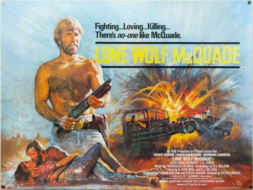
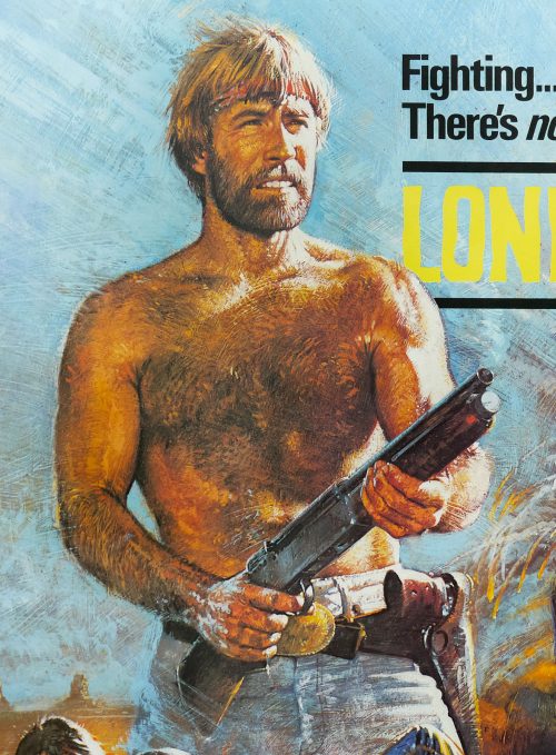
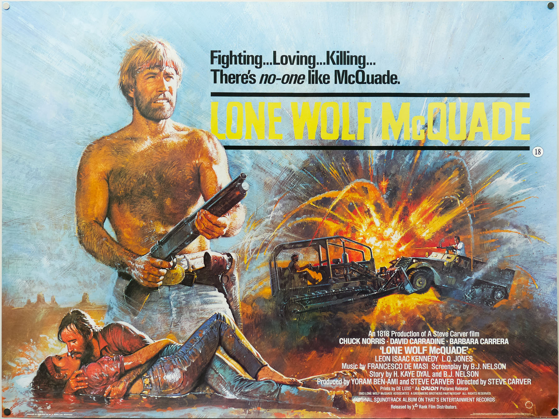
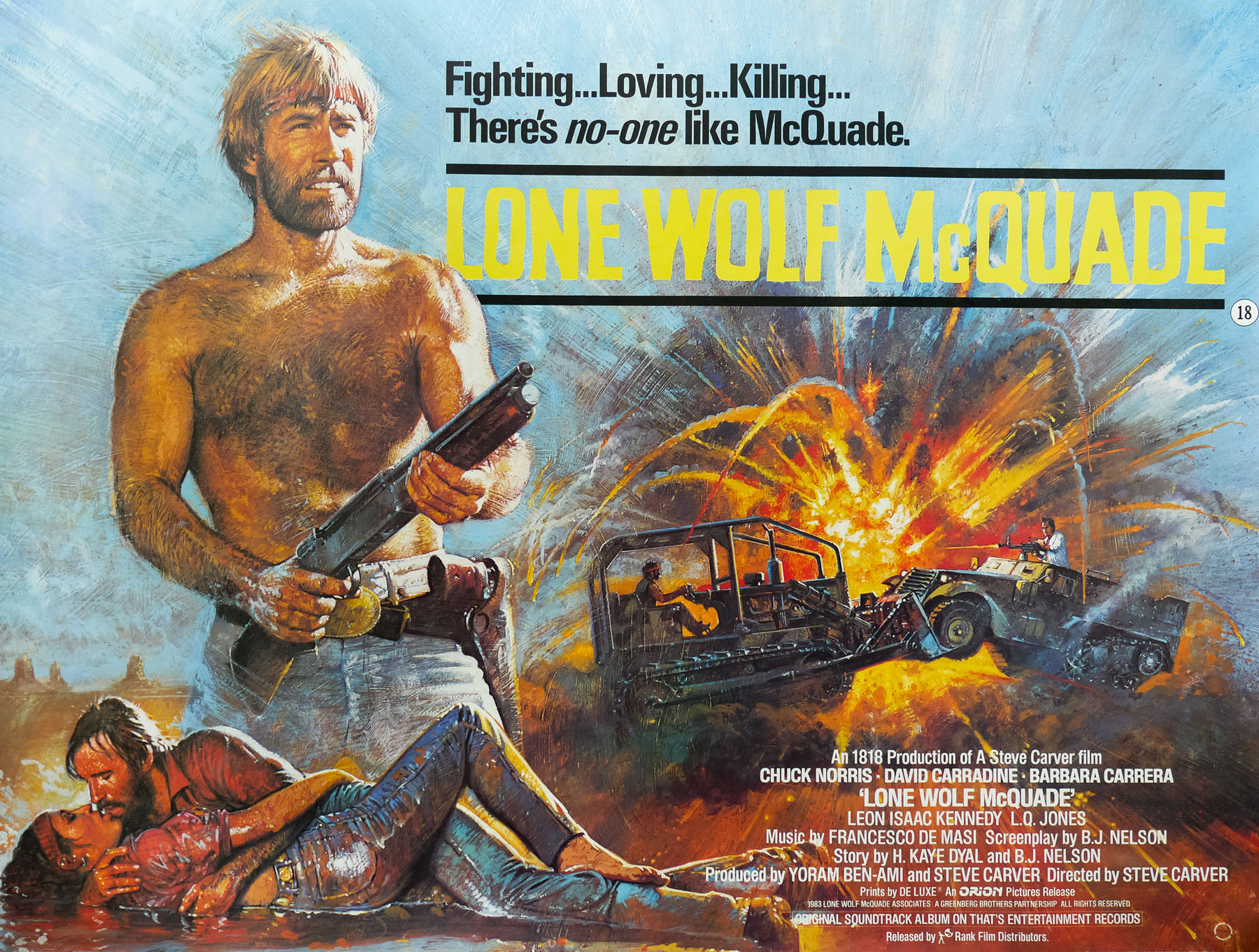
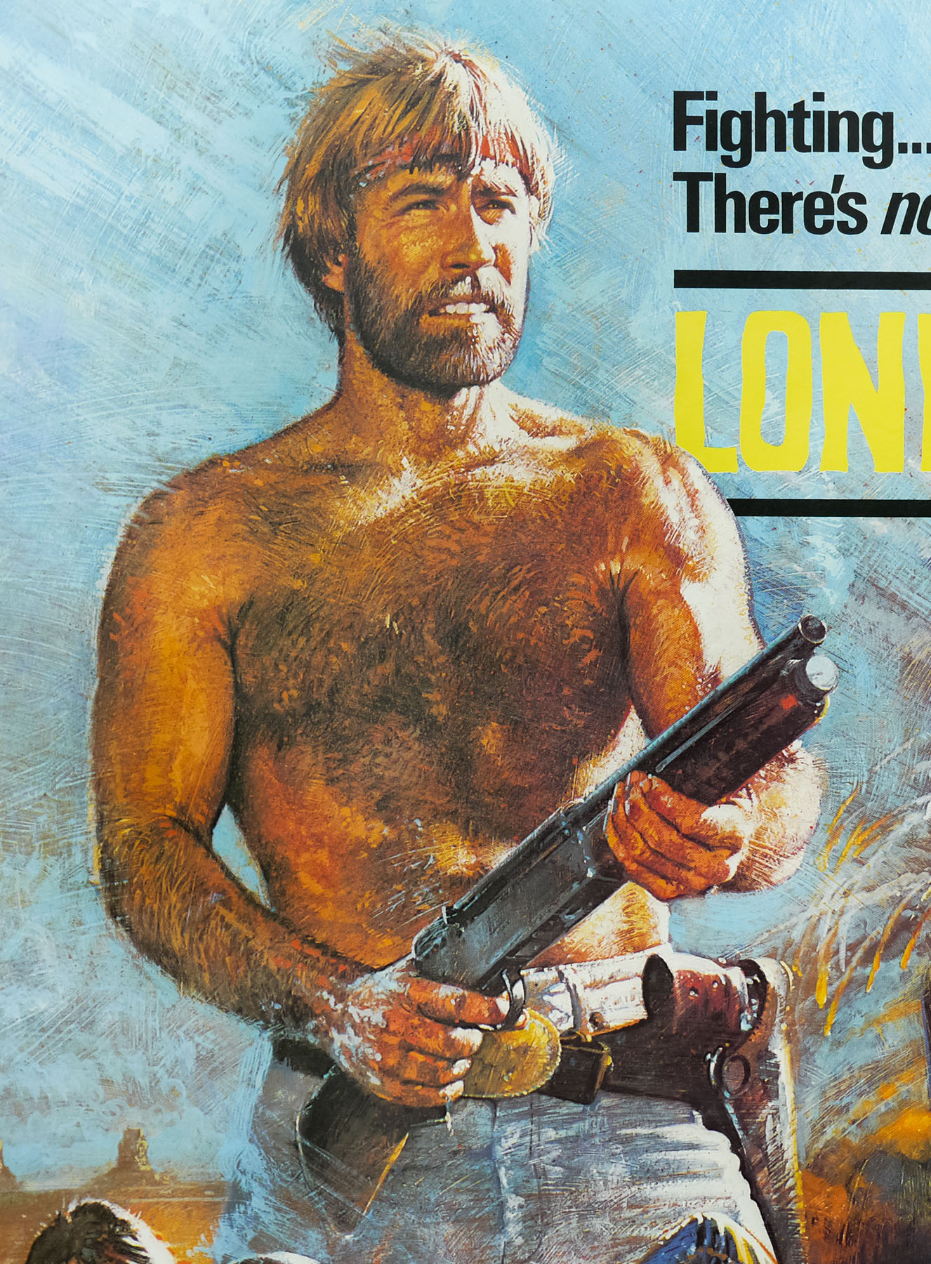
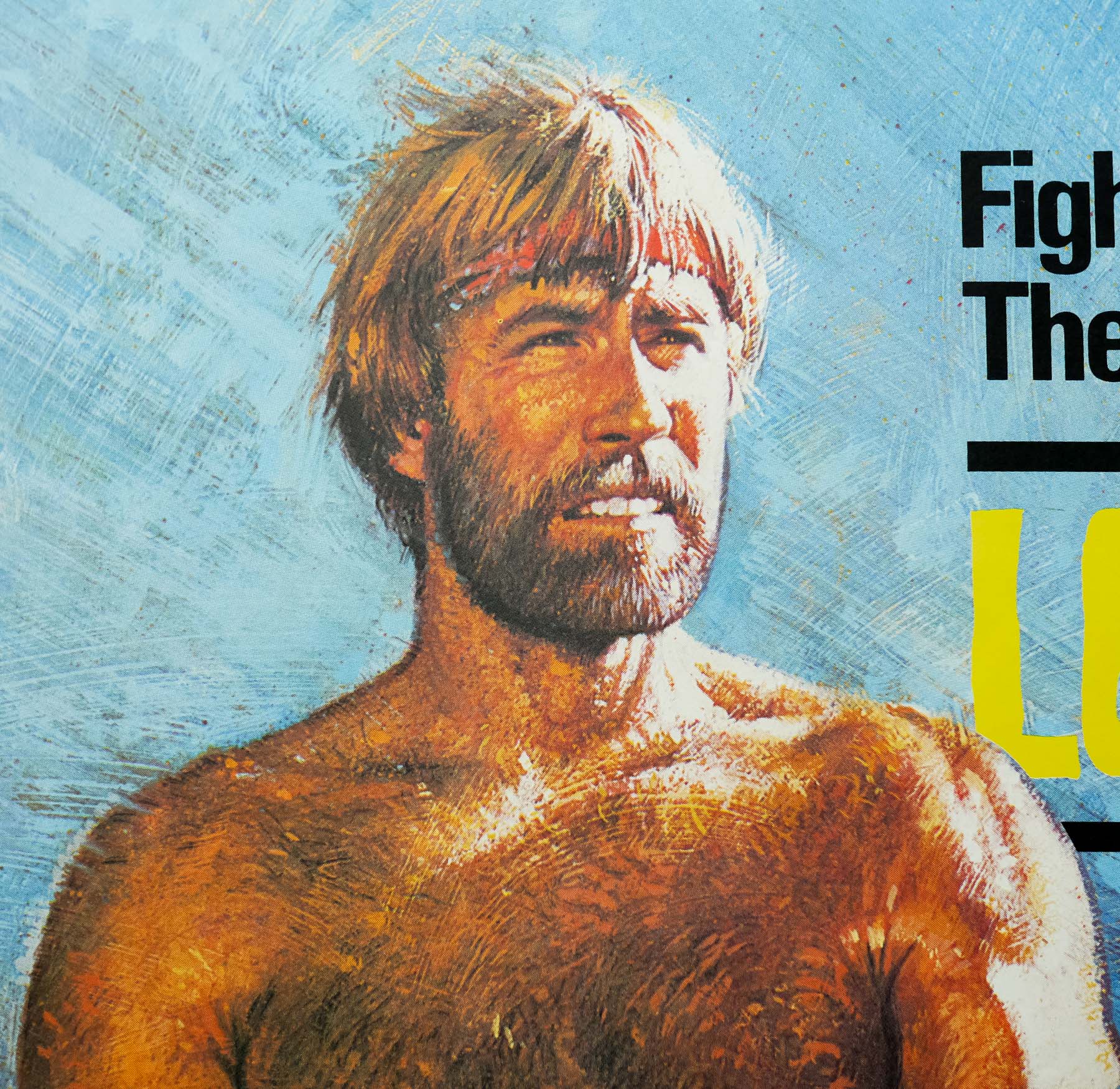
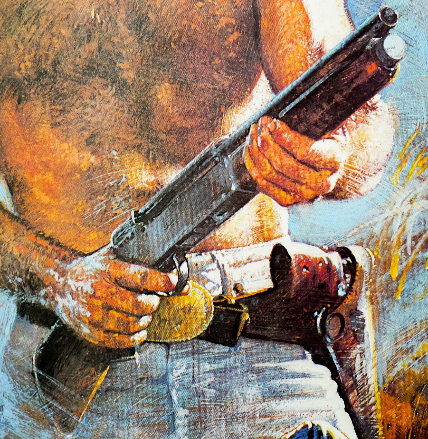
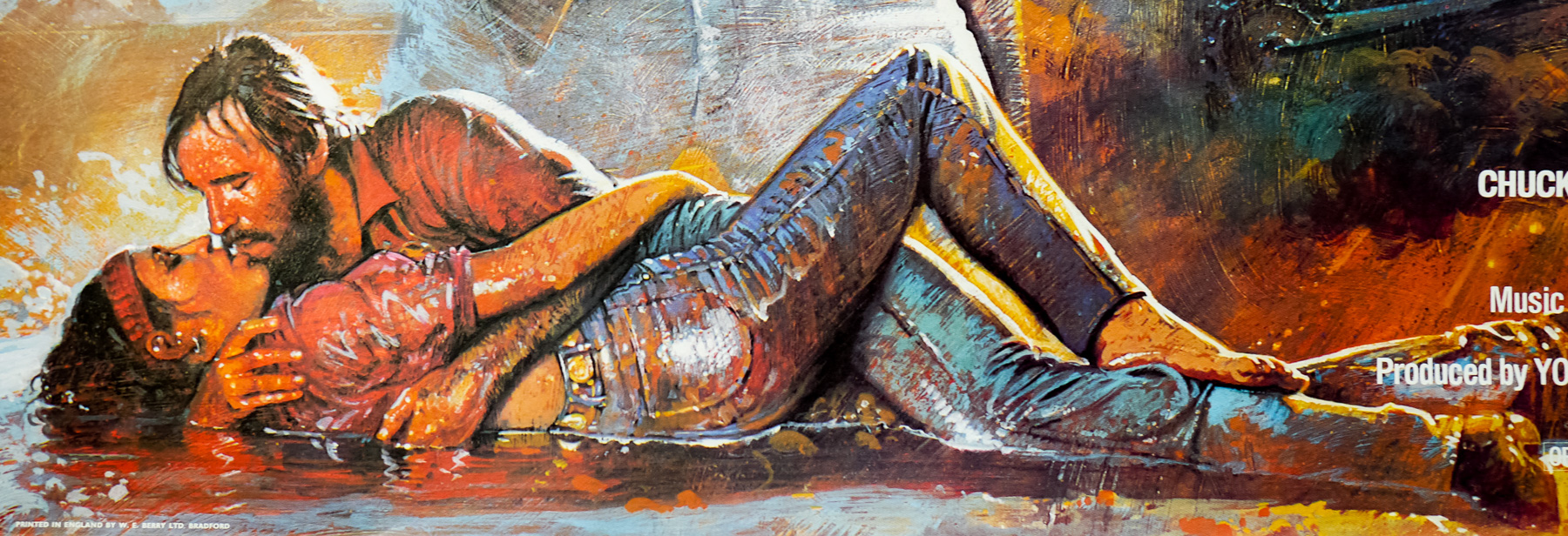
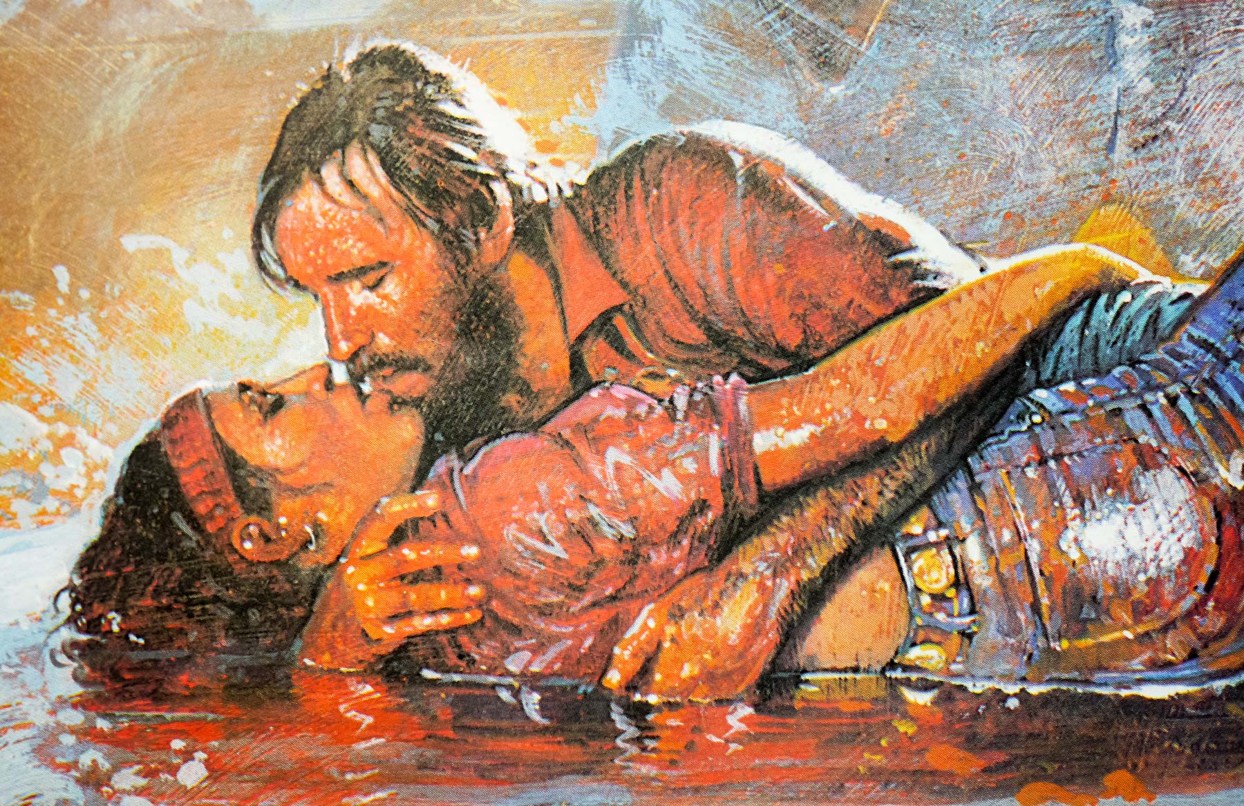
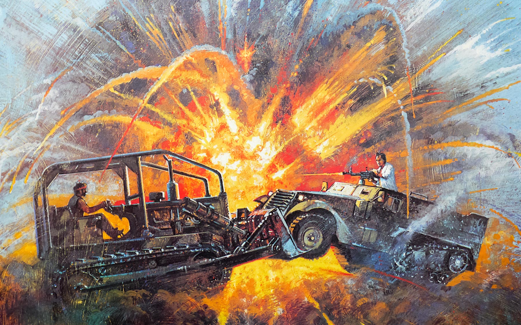
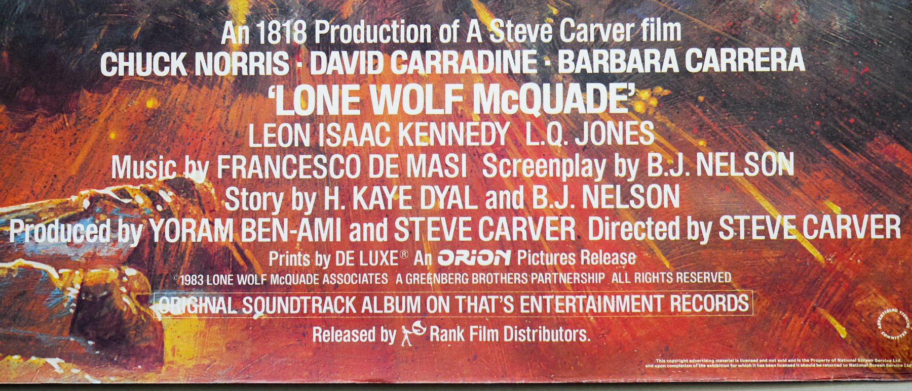
Chuck Norris versus David Carradine was always going to be a good match and this is definitely one of Chuck’s better films. His character, a Texas Ranger named J.J. McQuade, was the inspiration behind his successful TV series Walker, Texas Ranger that began 10 years after this was released. In this film, ex-Marine McQuade lives on his own with only a wolf for company and prefers to do things his way. When an army convoy is hijacked and his daughter put in hospital after witnessing the attack, the Texas Ranger reluctantly teams up with an FBI agent (Leon Isaac Kennedy) and ends up facing off against the arms dealer Wilkes (Carradine). The pair go head to head in a series of increasingly violent martial arts and gun battles. The film’s body count is detailed in a YouTube video.
This British quad poster was designed and painted by the British artist Brian Bysouth whilst he was working at the FEREF agency. The artwork is unique to this poster but it has elements that appear on both the Style A and the style B American one sheets. I also have another American one sheet for the film in the collection. In 2012 I interviewed the artist and that article can be found here. Other posters I’ve collected by Brian can be seen by clicking here.
The uncensored trailer can be watched on Youtube. Someone has made a clip called Lone Wolf McQuade in four minutes, which is handy if you never intend to watch the film in full.
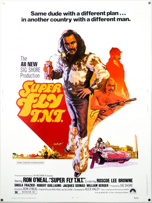
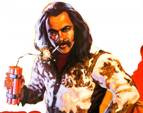
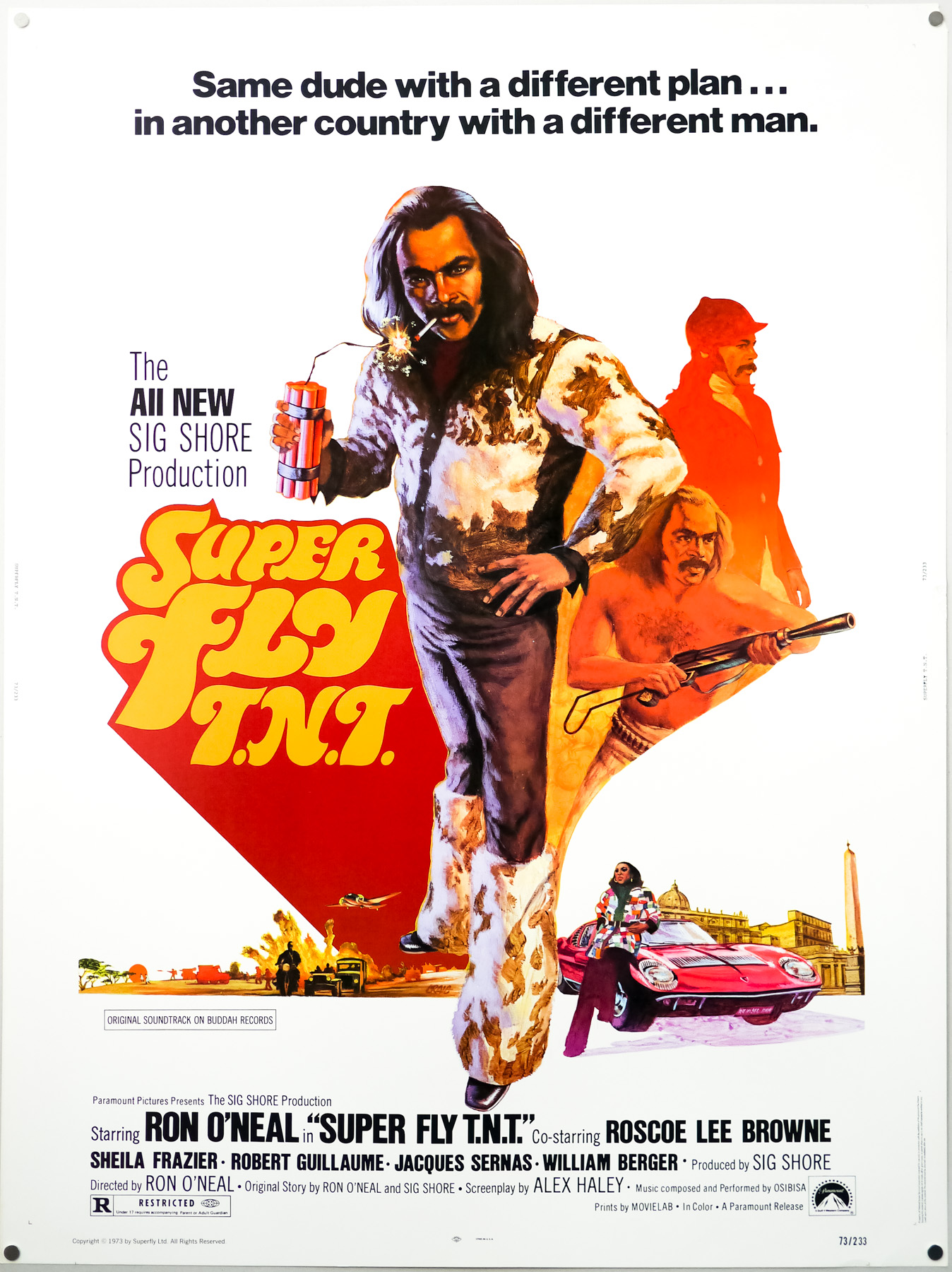
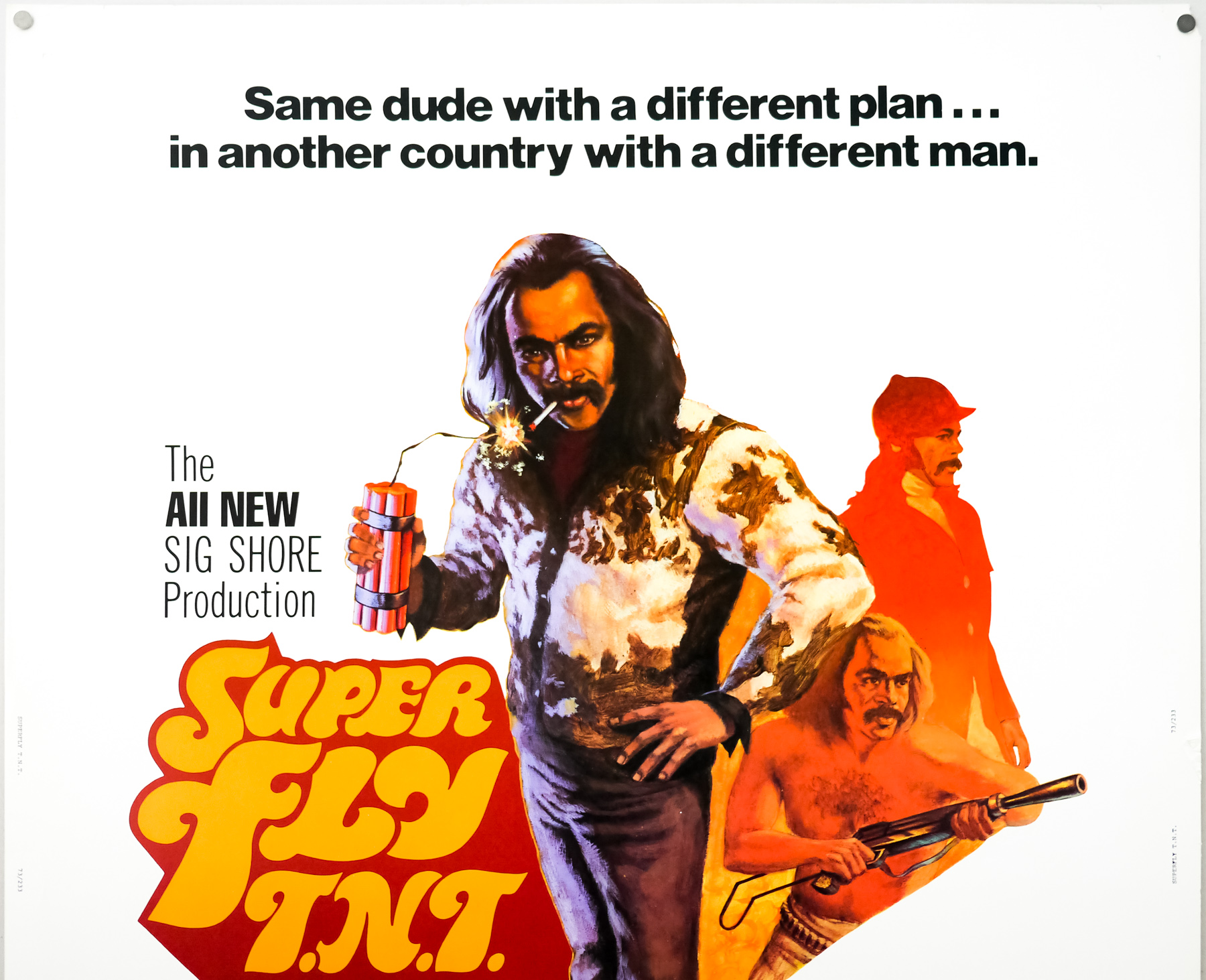
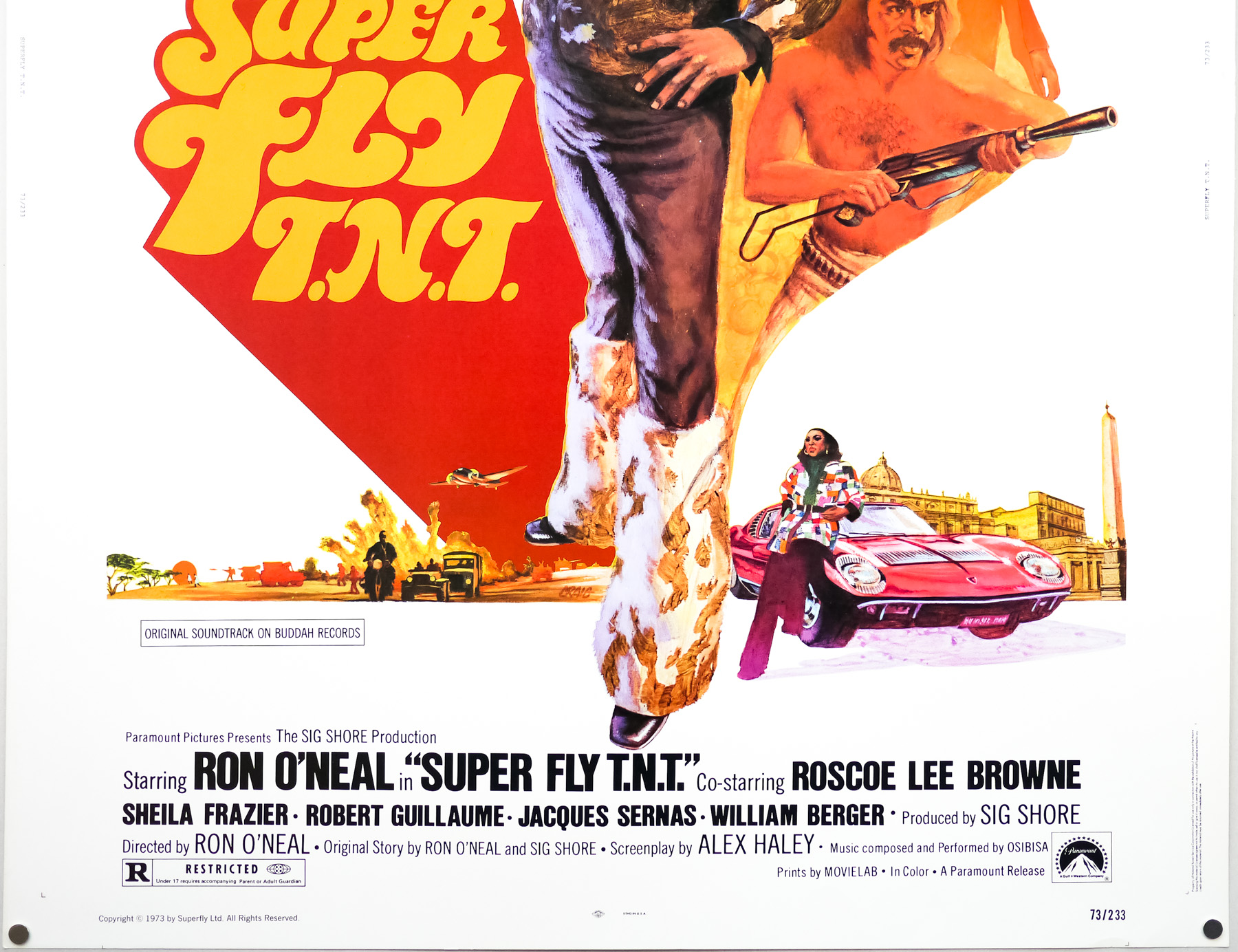
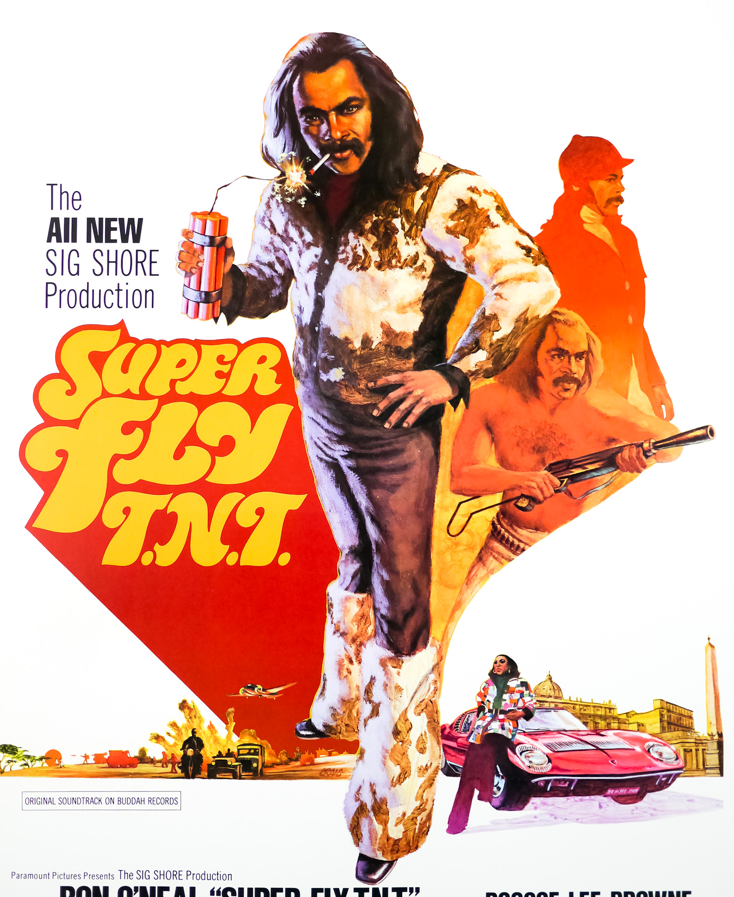
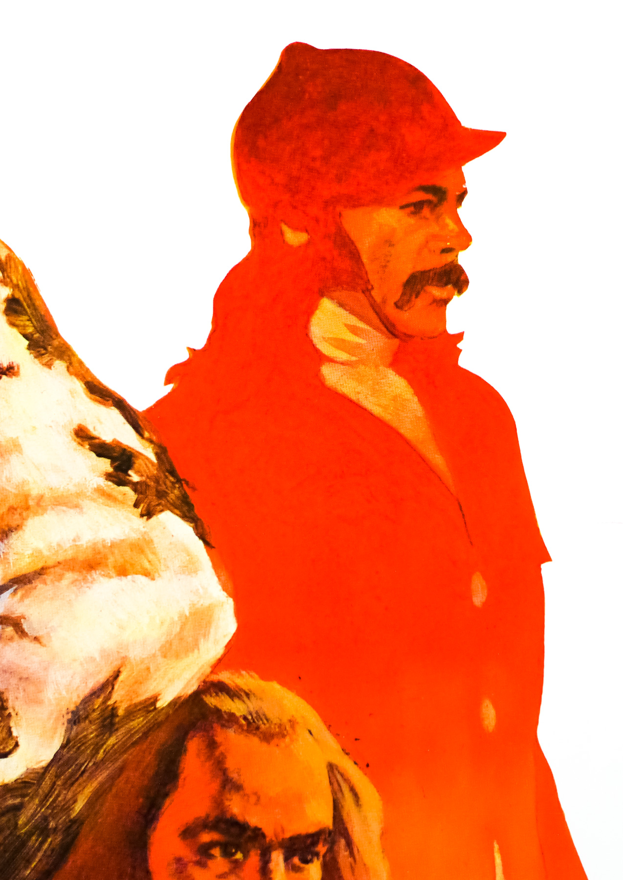
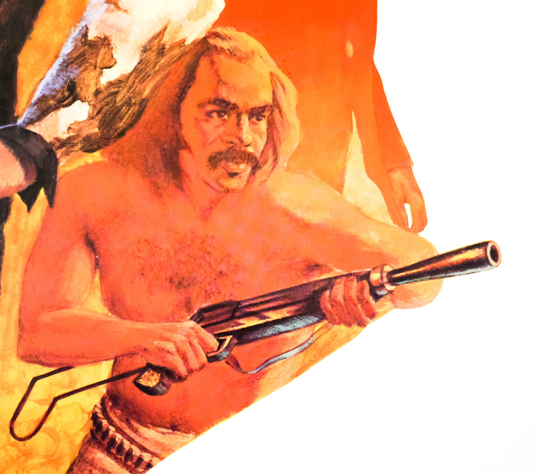
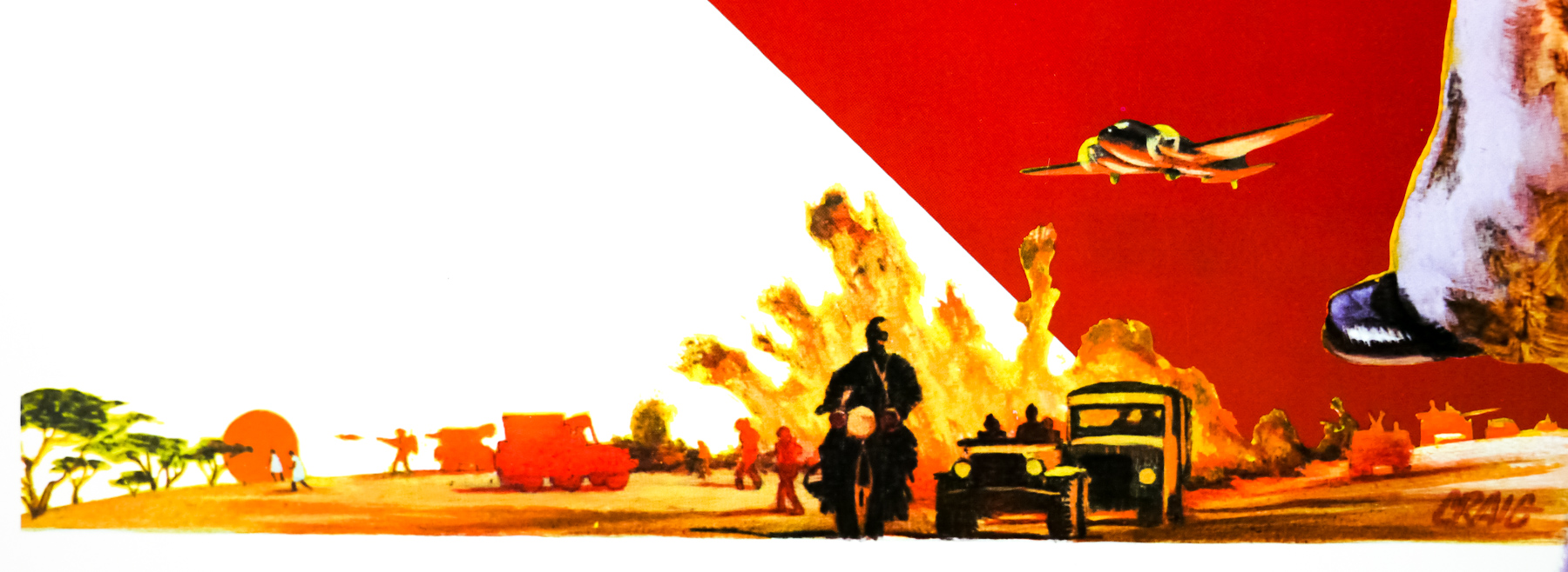
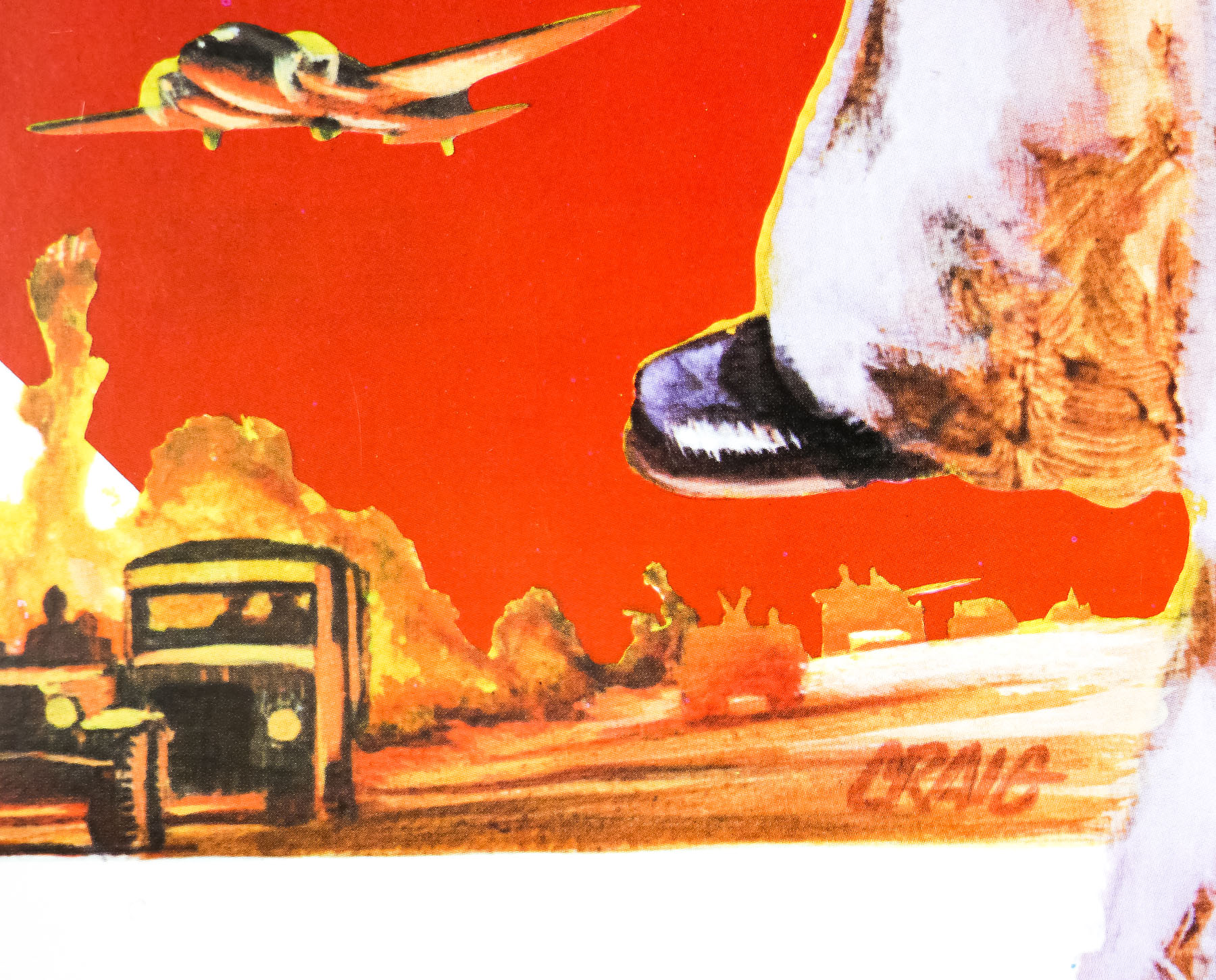
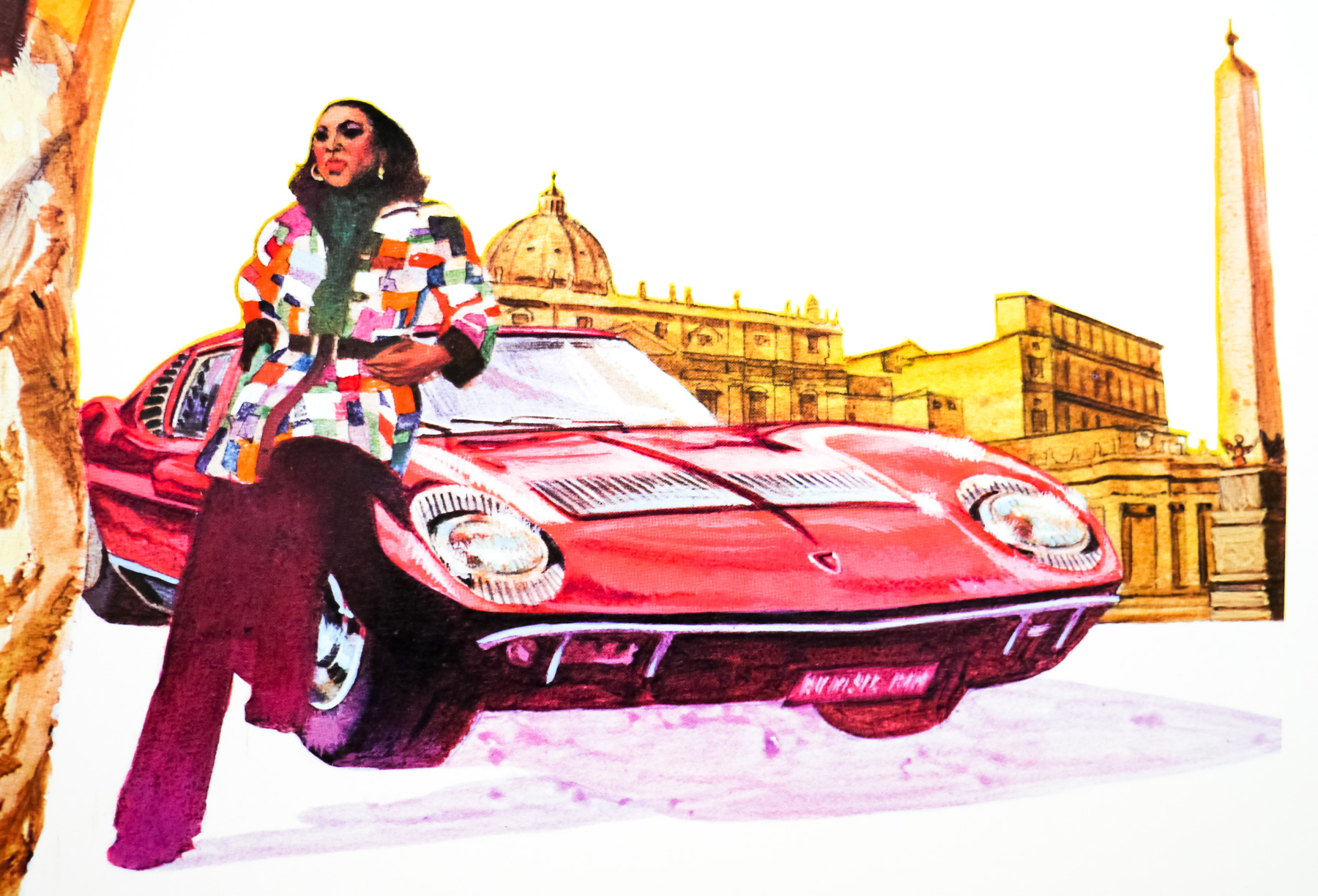
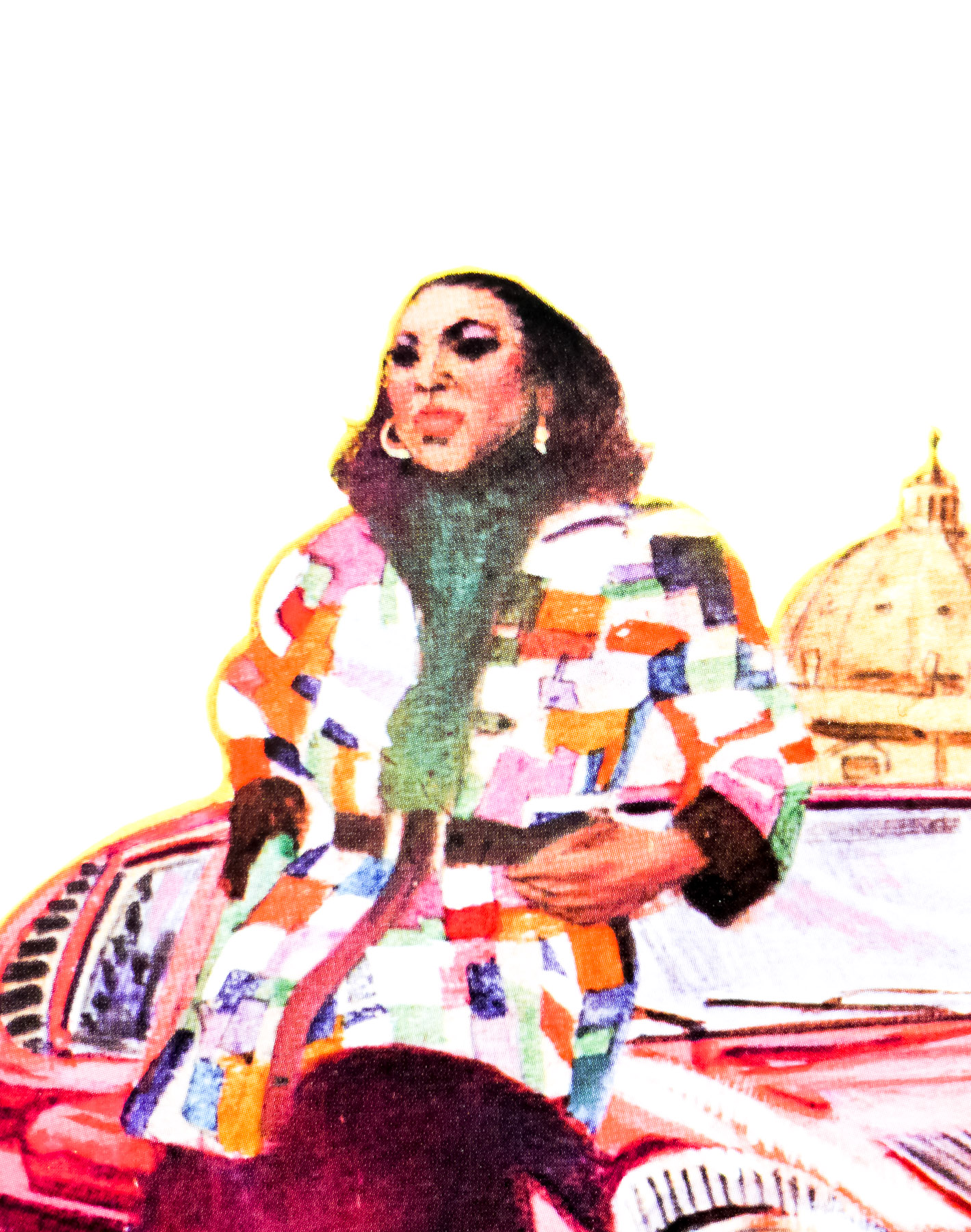
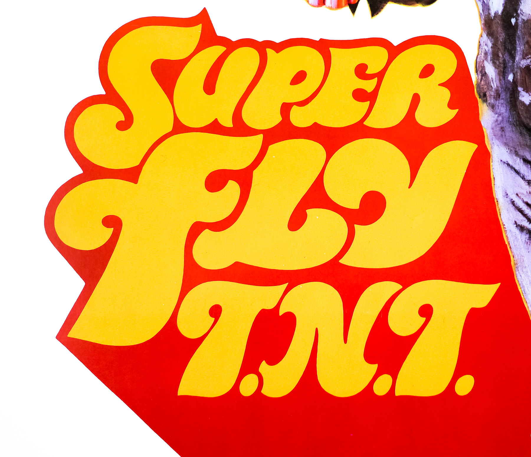
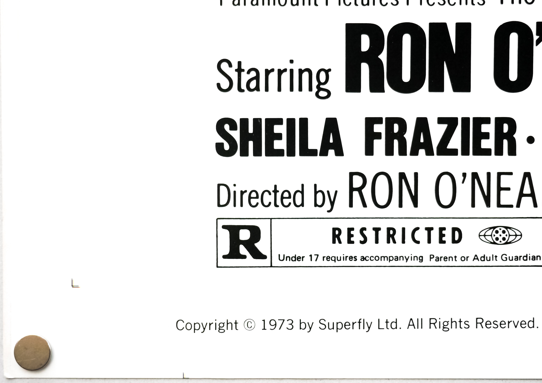
Written, directed by and starring the late Ron O’Neal, Super Fly TNT was the hastily released follow up to the smash hit 1972 original Super Fly, one of the classic entries into the then burgeoning blaxploitation genre. Reprising his role as Priest from the first film, O’Neal would forever struggle to shake loose from the character and he was always to be known as ‘that Super Fly guy’. In this film, the character has retired from hustling and is living the good life in Rome, Italy with his lady Georgia (Sheila Frazier). Although he’s financially stable following a huge cocaine deal he manage to pull of back in New York, Priest is bored and spends his time playing cards against Italian businessmen.
One day he is approached by an African dignitary Dr. Lamine Sonko (Roscoe Lee Browne) who wants help with a gun smuggling operation that will help overthrow colonialism in his country. Initially reluctant to help, Sonko manages to convince Priest that he owes it to his ‘African brothers’ to help and, feeling a sense of guilt over his hustling days, the Super Fly guy decides to get back into action. The film was critically panned and faired poorly at the box-office; strong proof that rushing a sequel out to cash in on the success of an original usually ends in disaster.
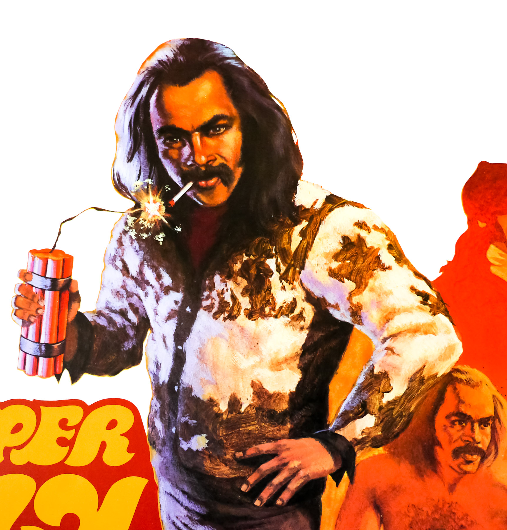
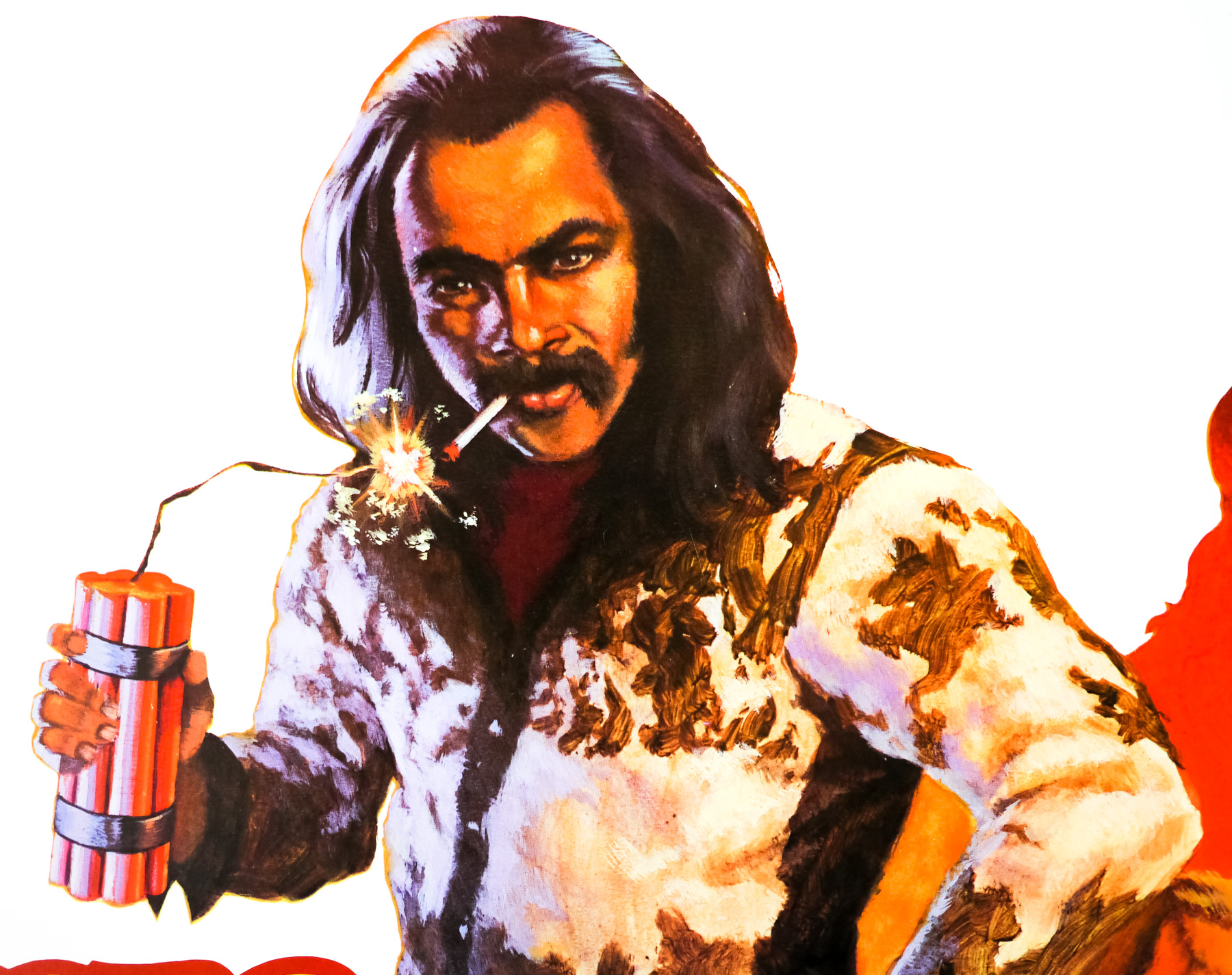
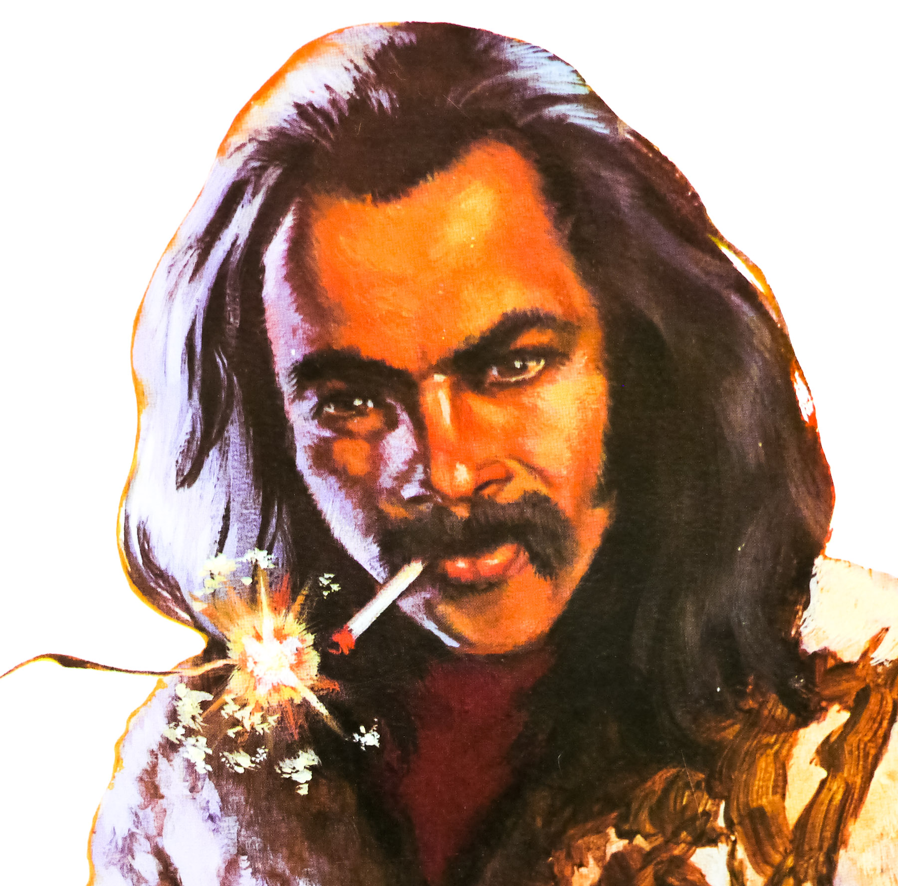
This US 30×40 poster features artwork by the American artist Craig Nelson who has been painting for over forty years, and is an accomplished figure and landscape artist who also teaches at the Academy of Art College in San Francisco where he is Director of Fine Art, Drawing and Painting. Two other film posters that Nelson is known for are the US one sheets for The Monster Squad (1987) and Slap Shot (1977). The artist’s official website can be viewed by clicking here and includes galleries of his fine art paintings and a biography that does have mention of his film work, but there are no galleries of his other posters.