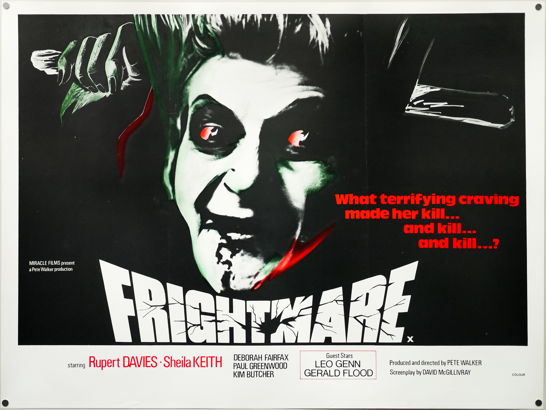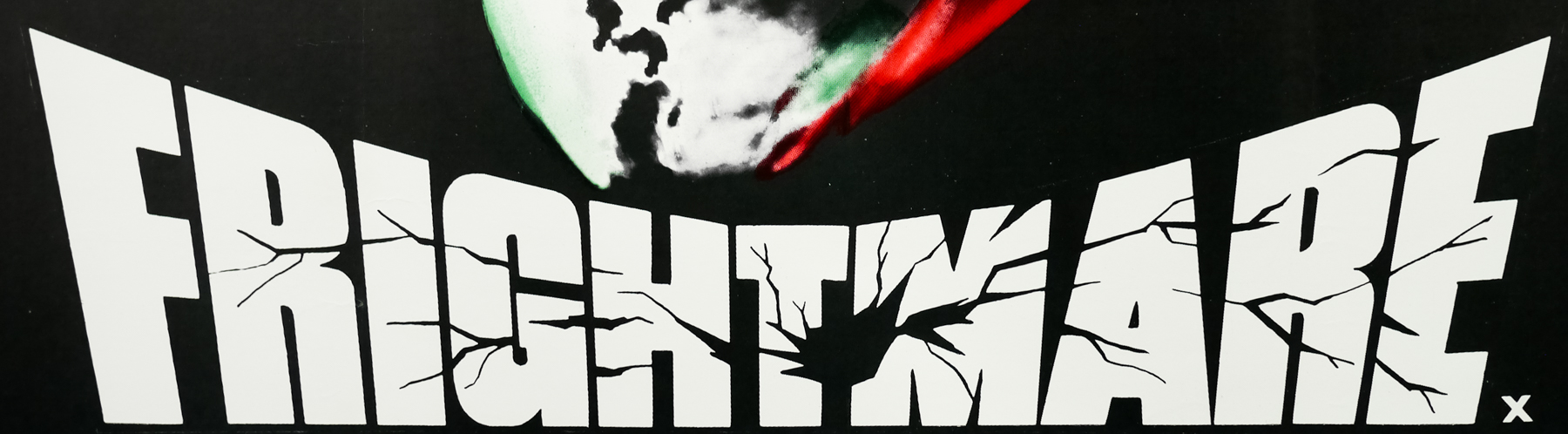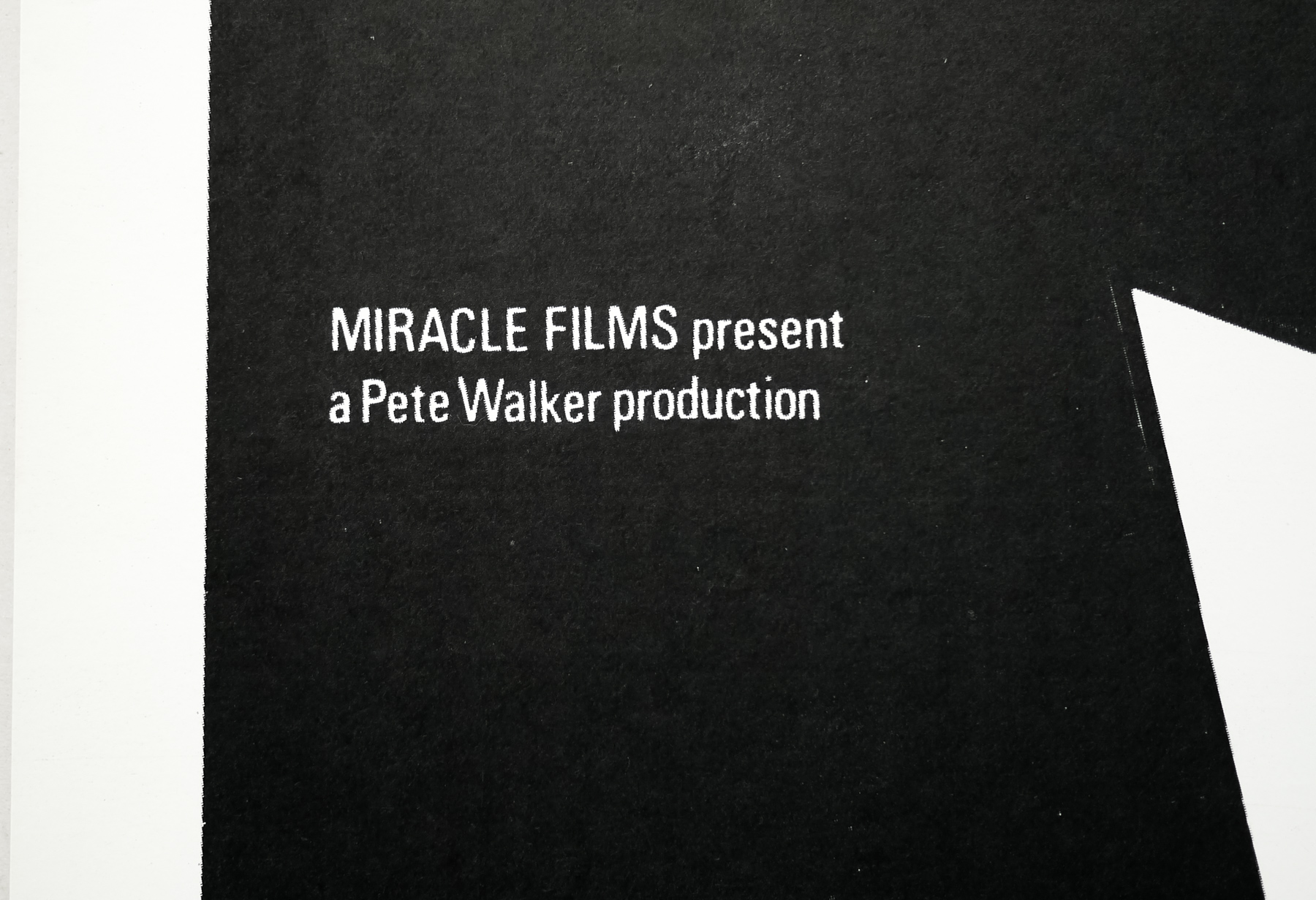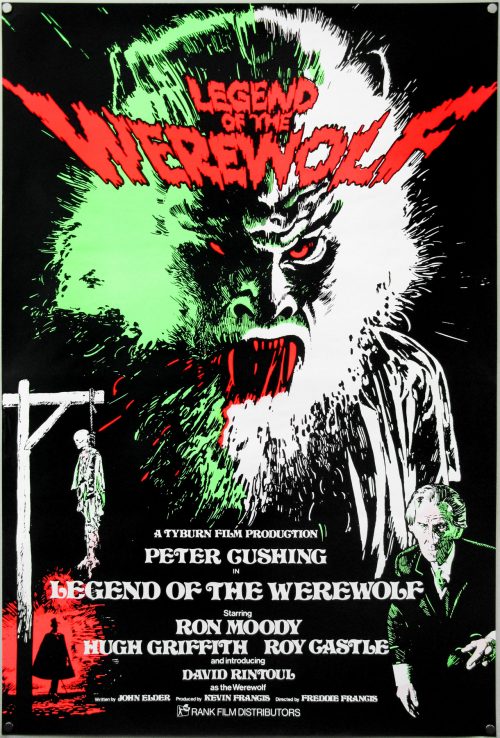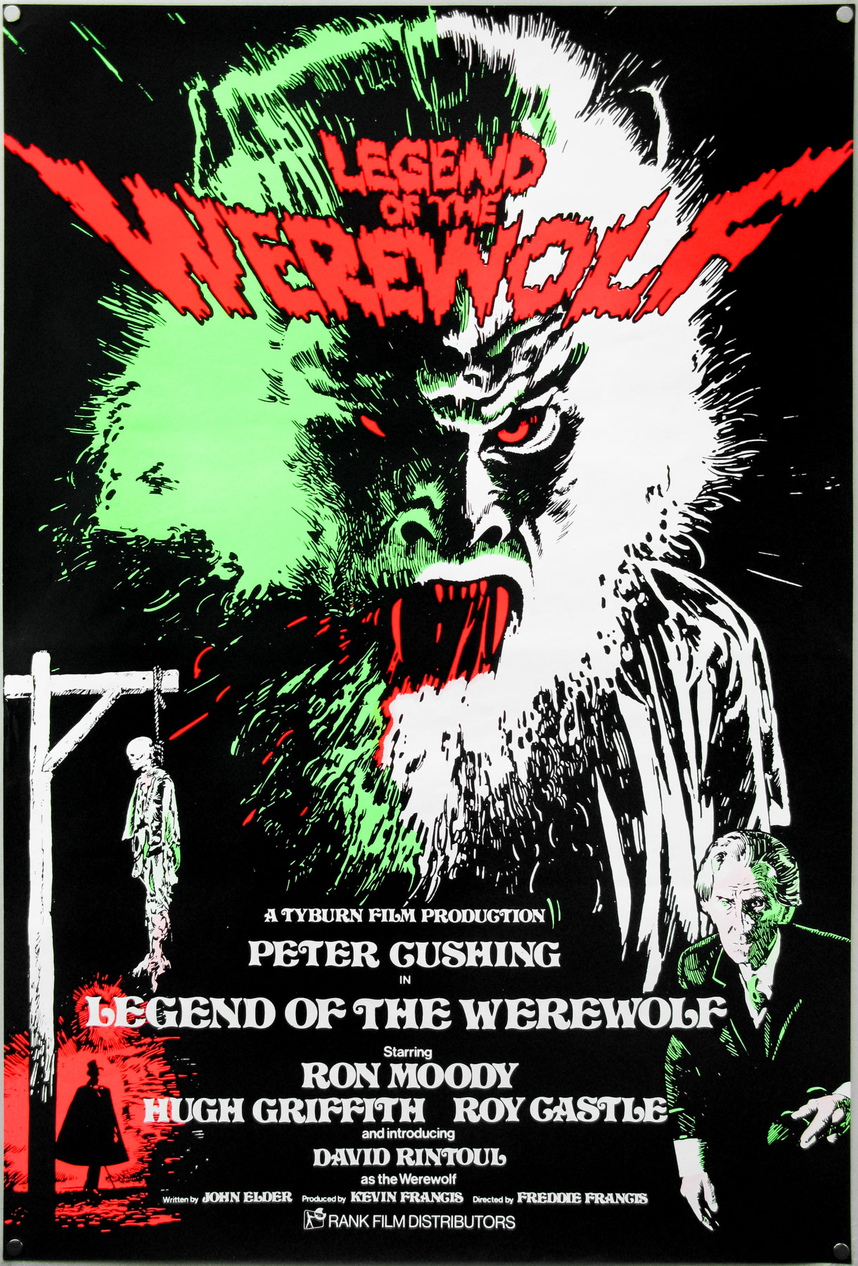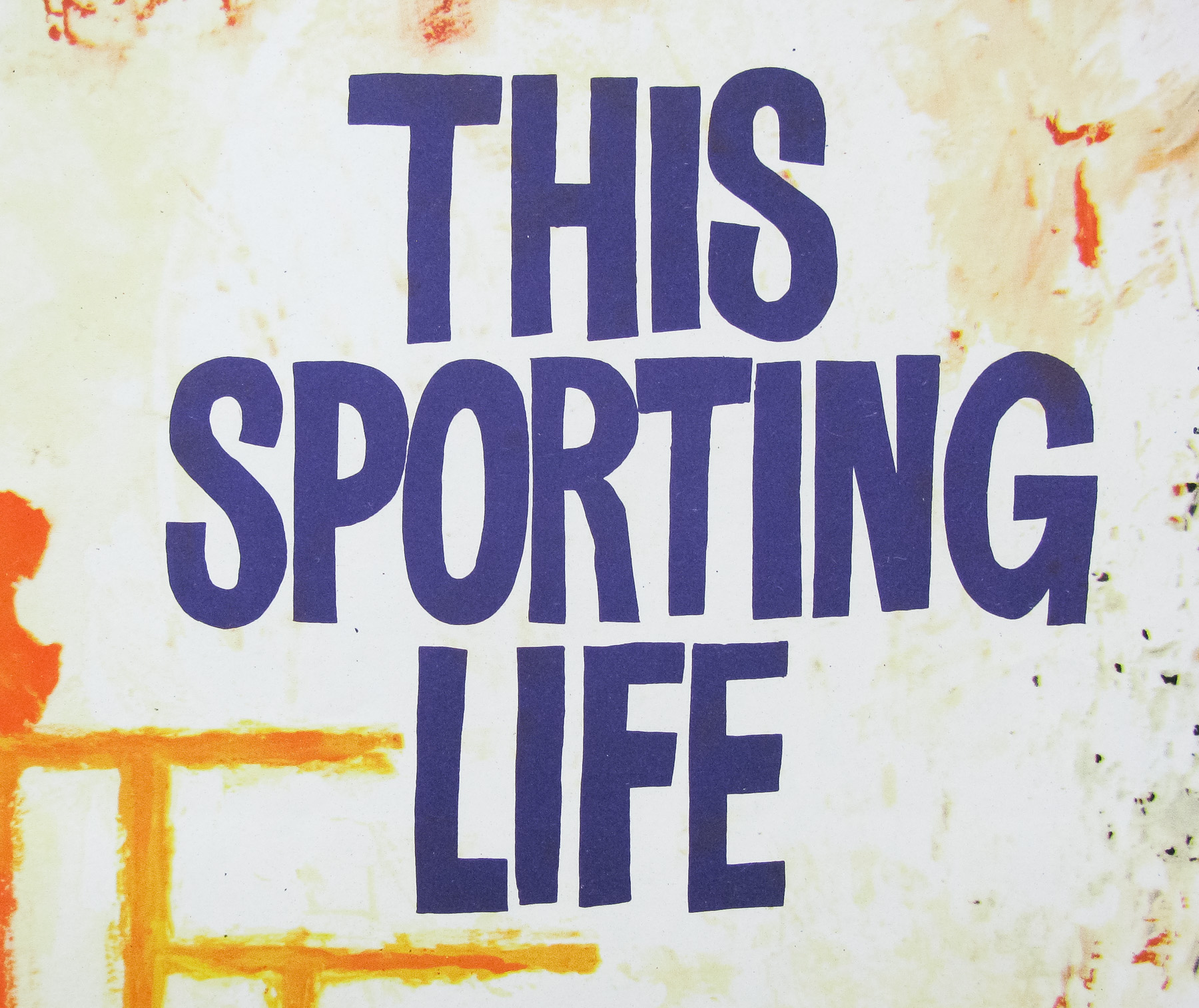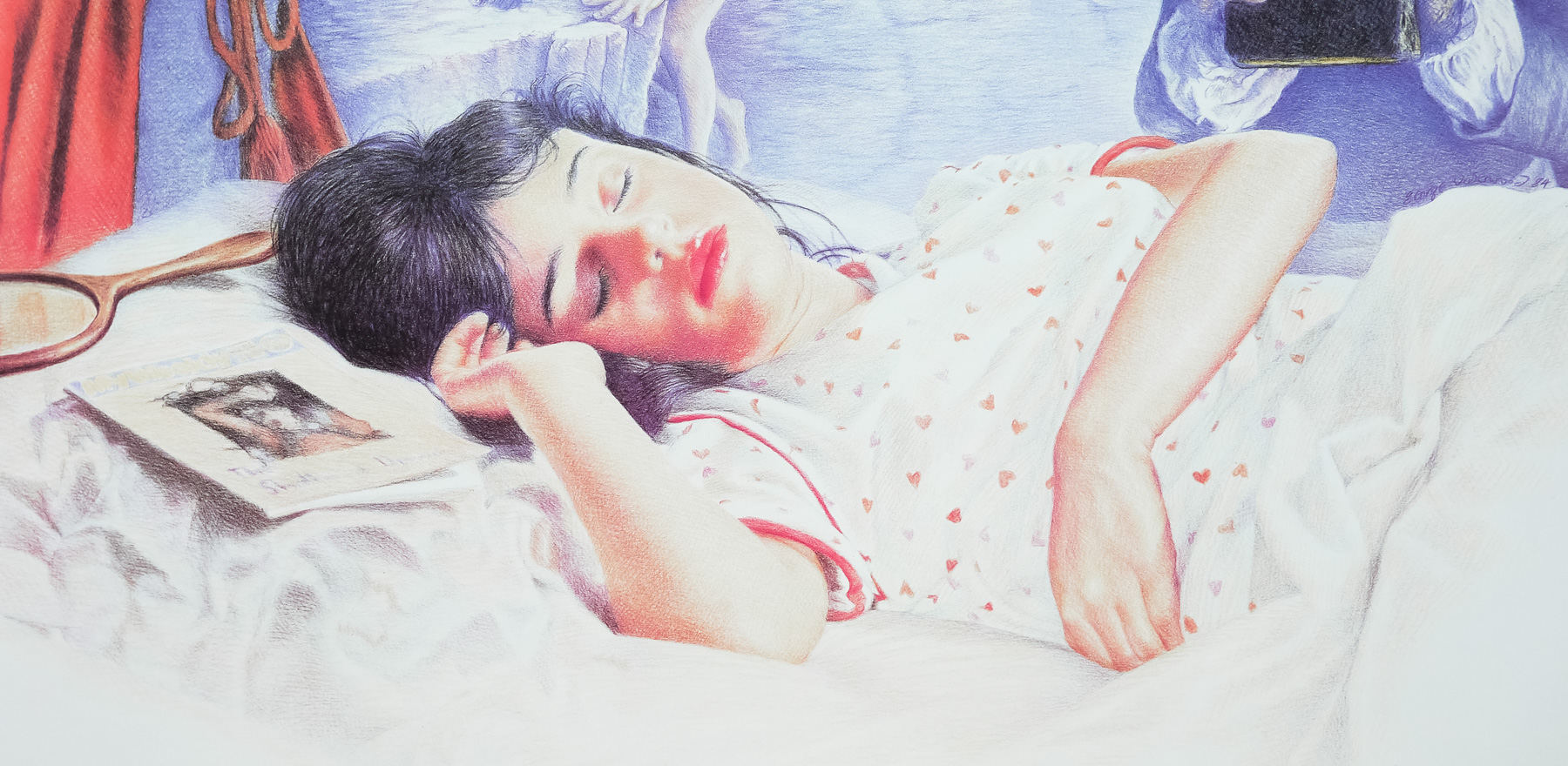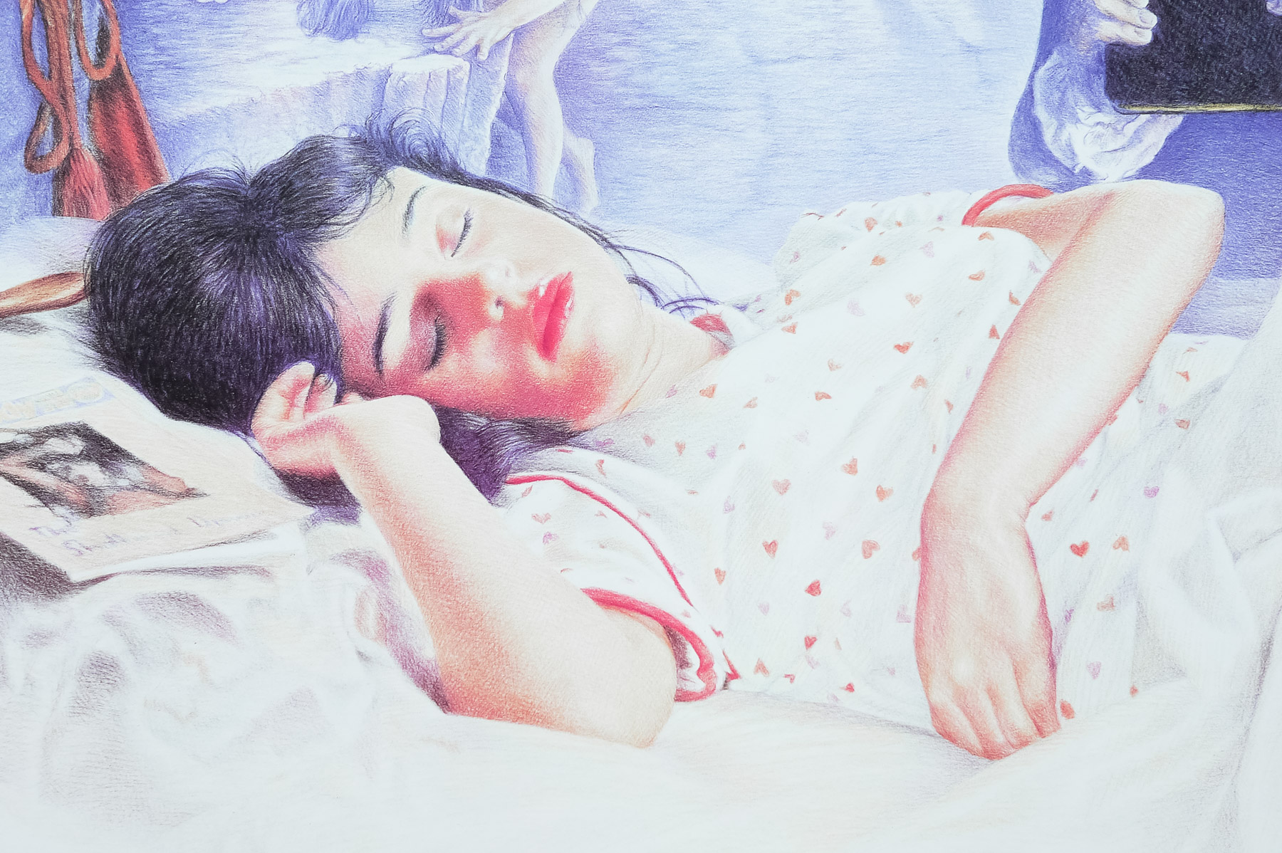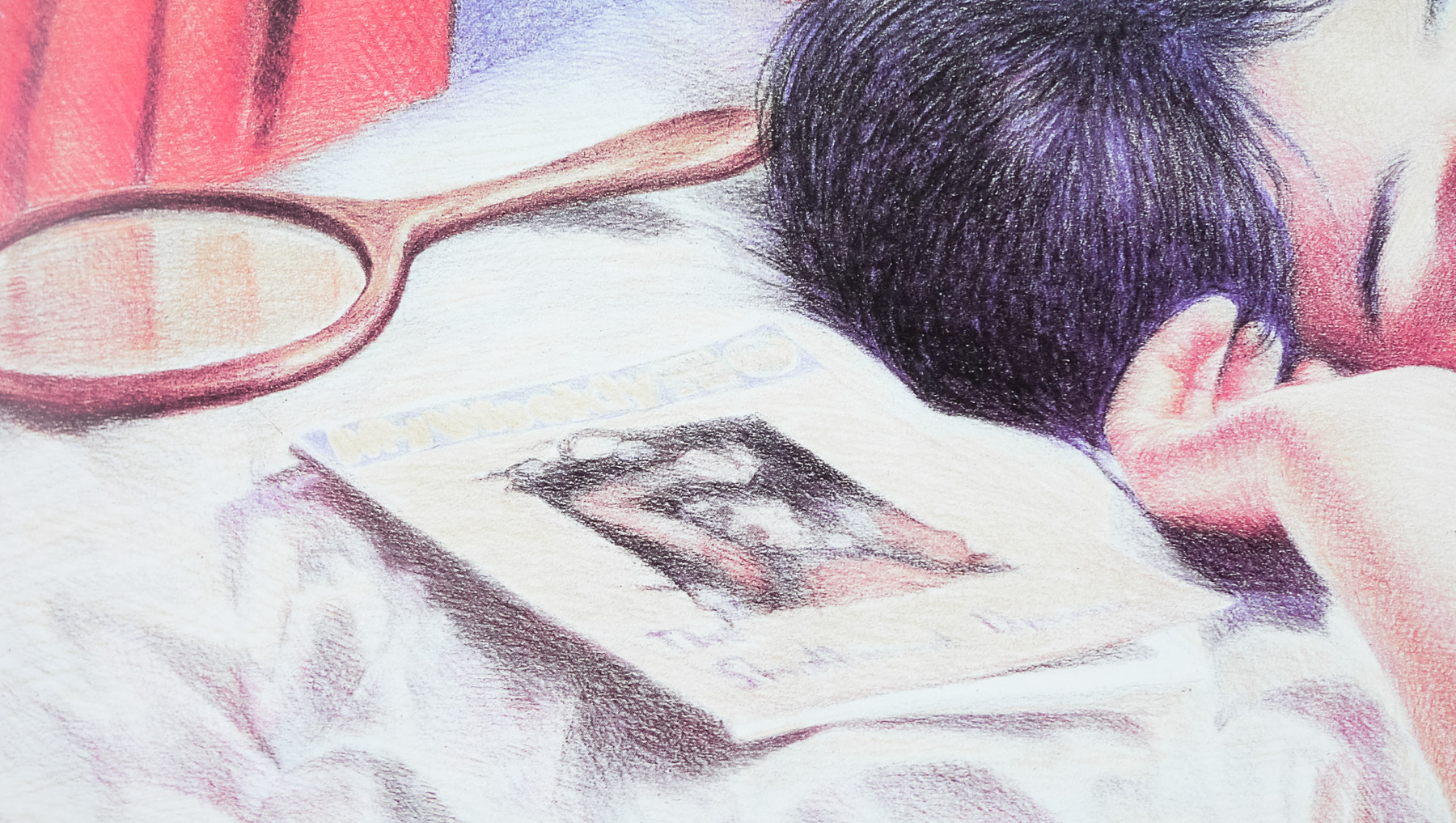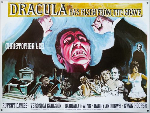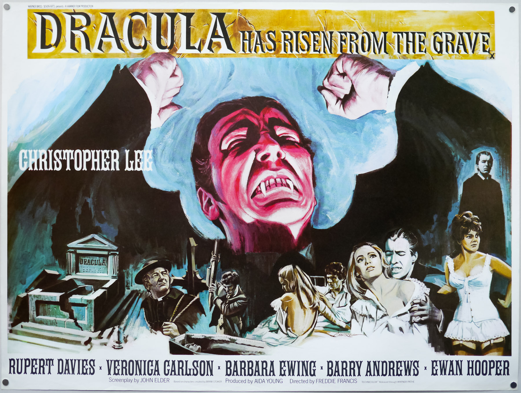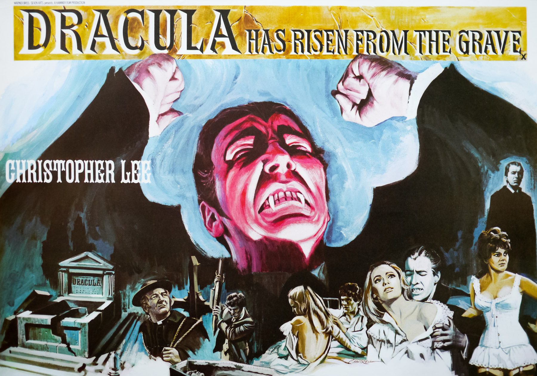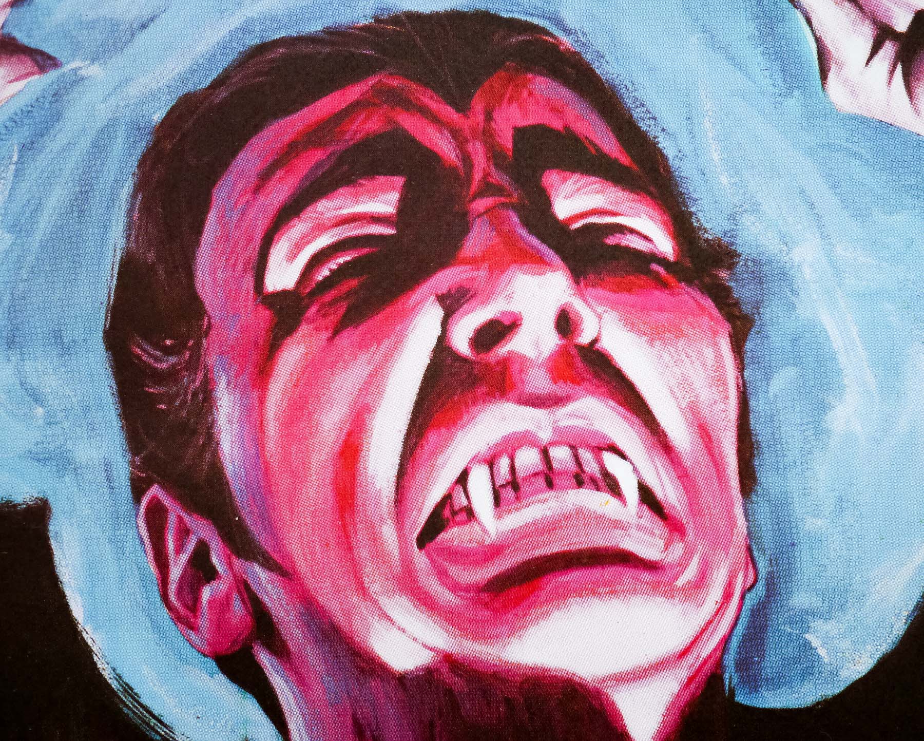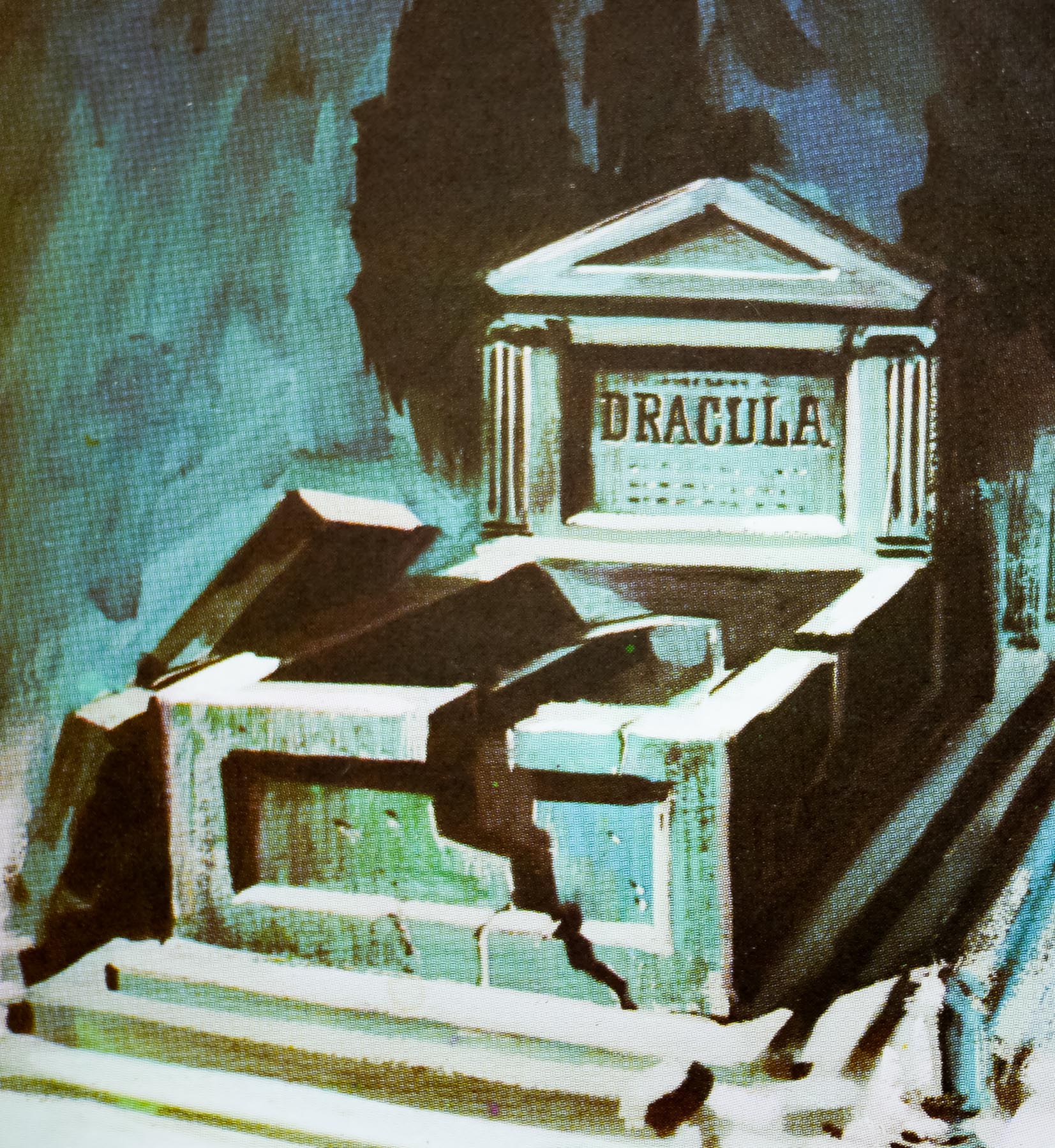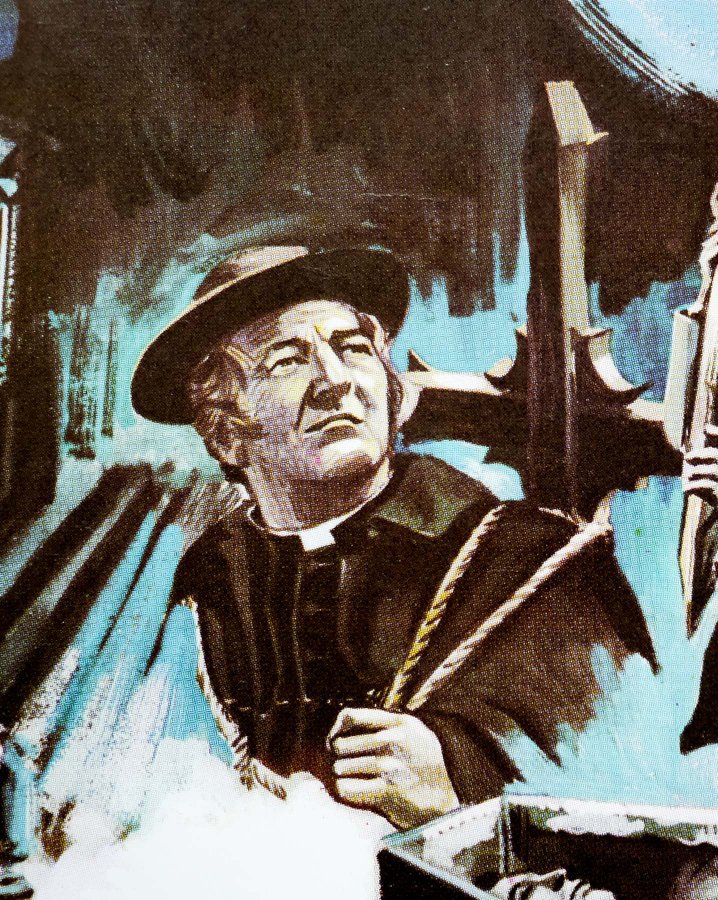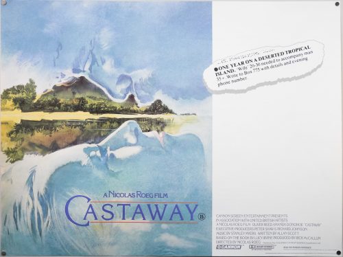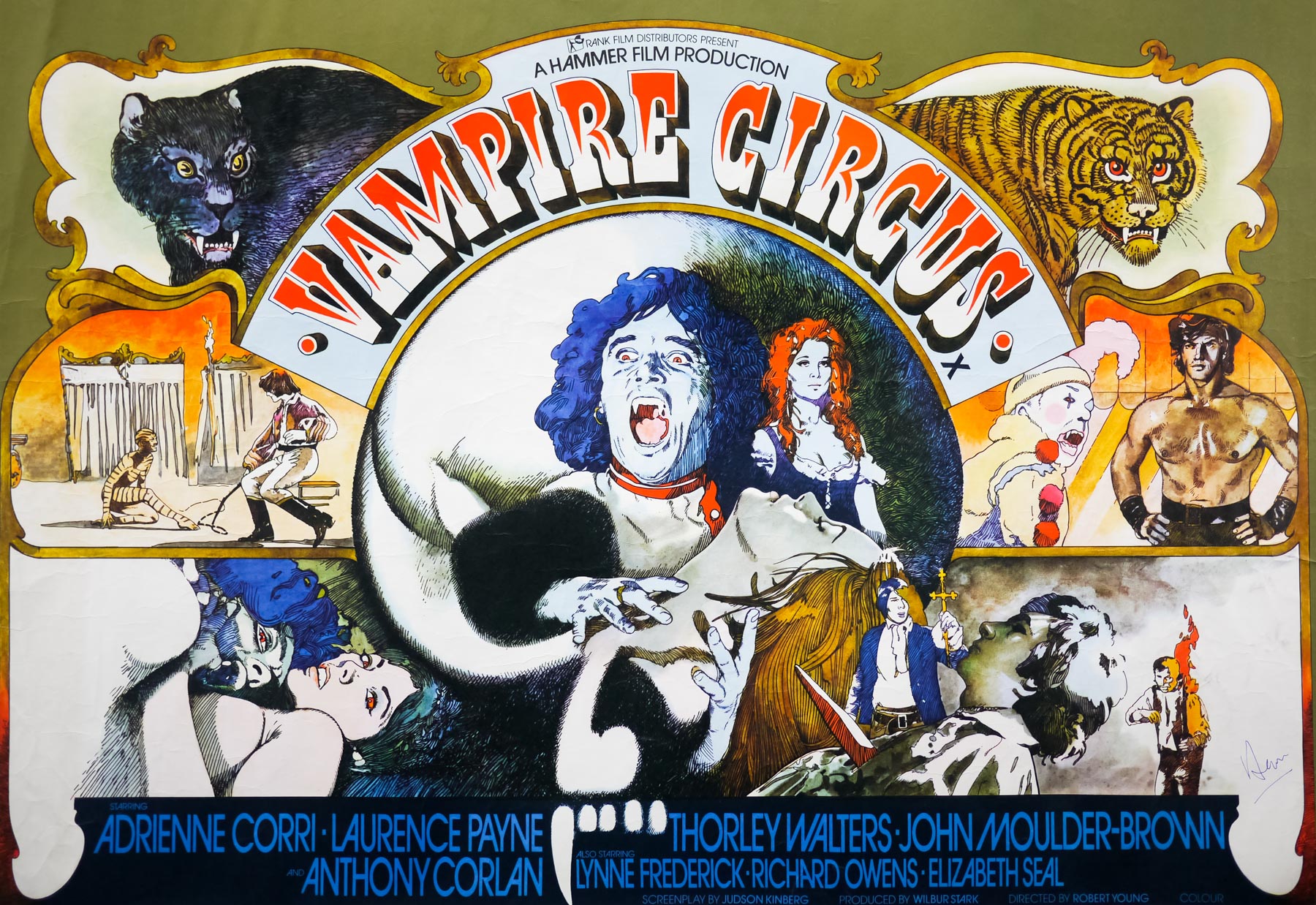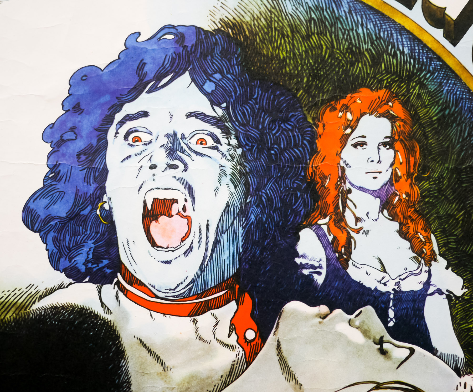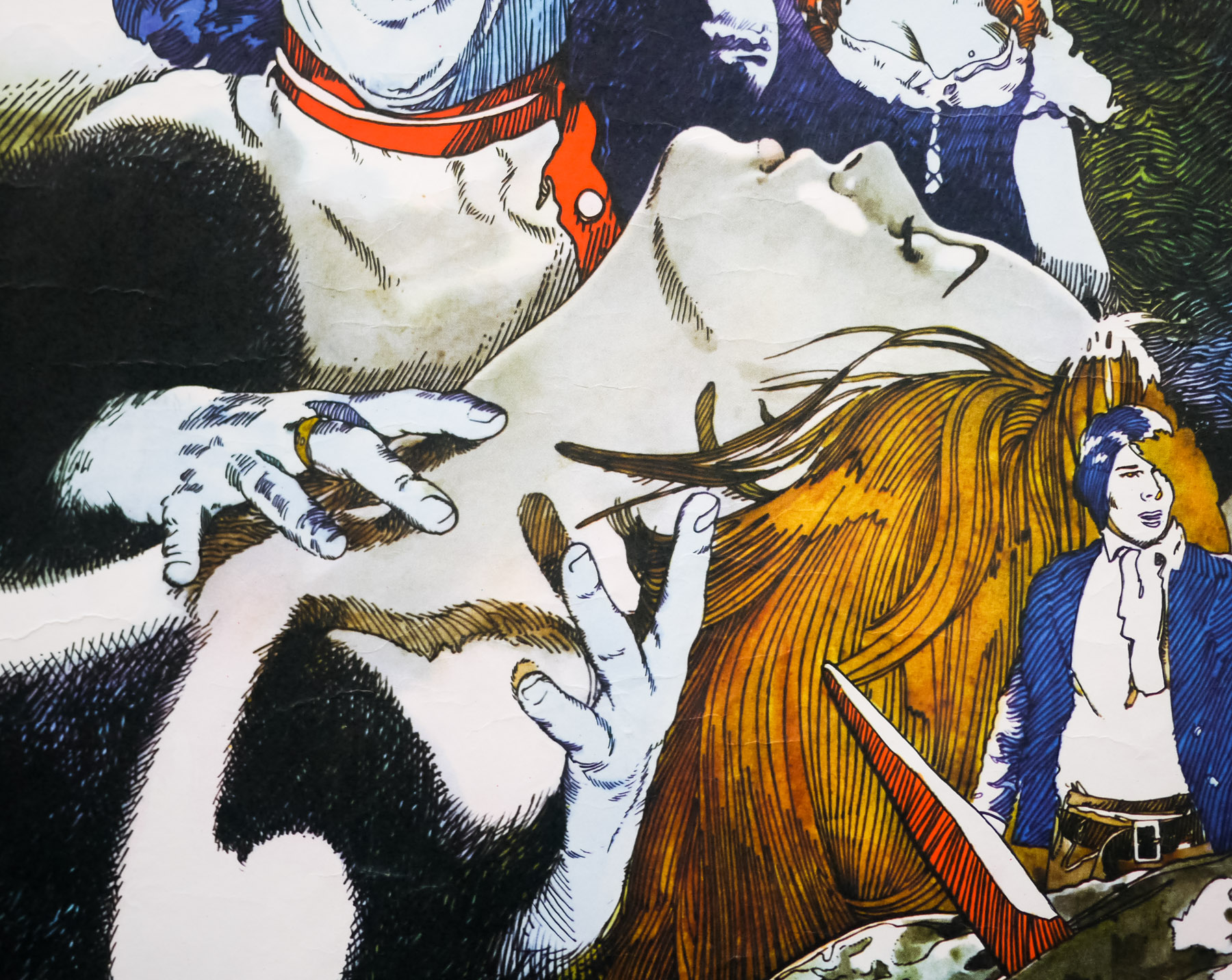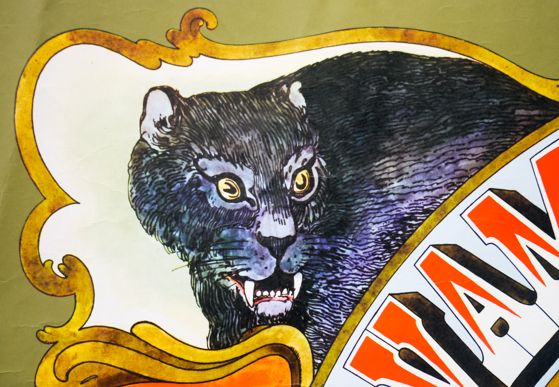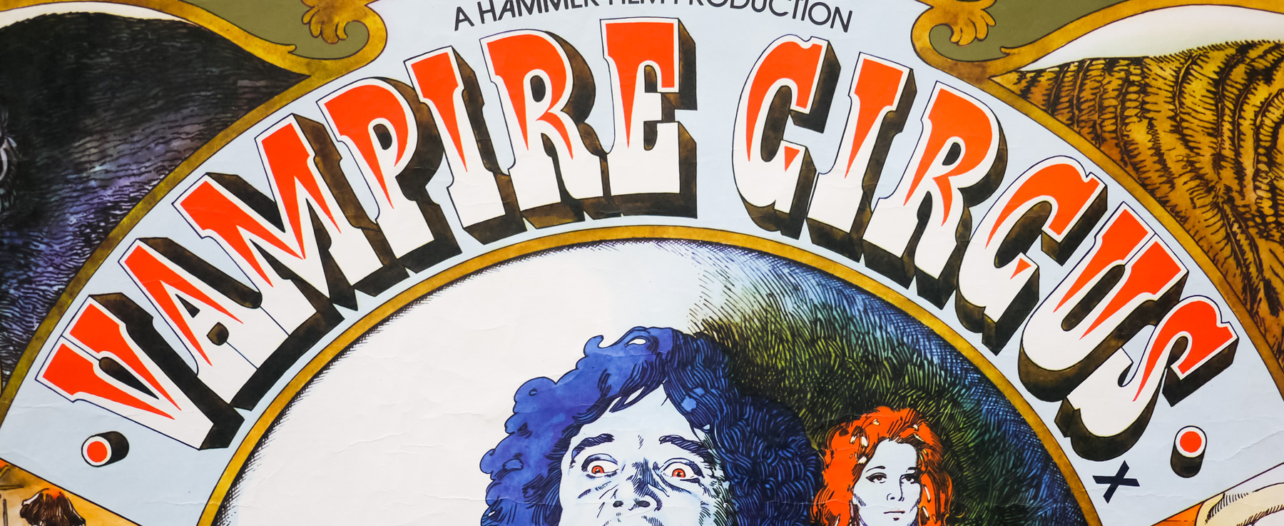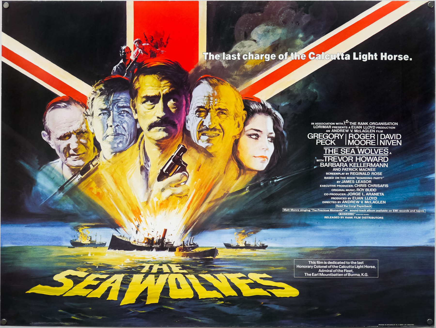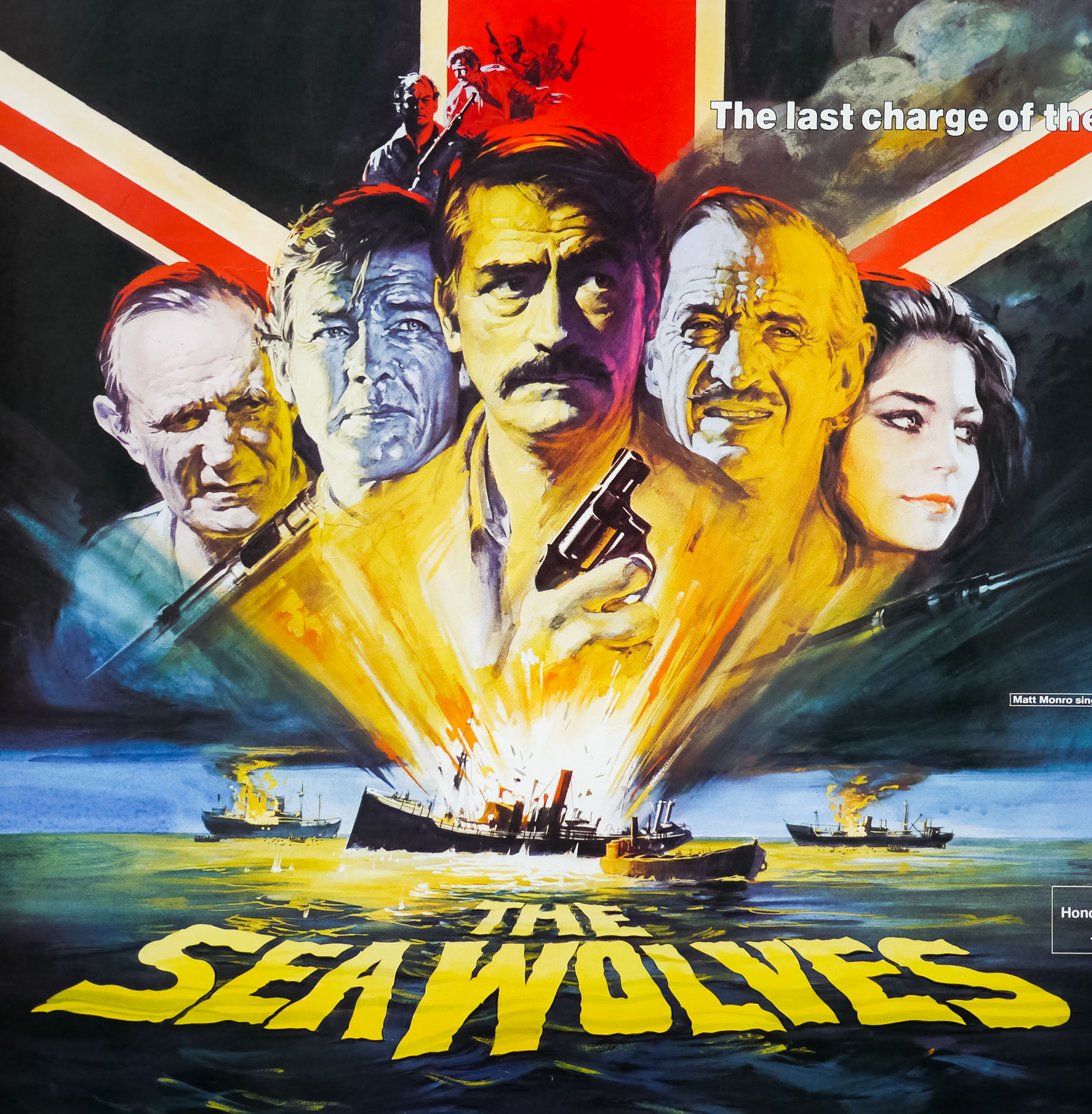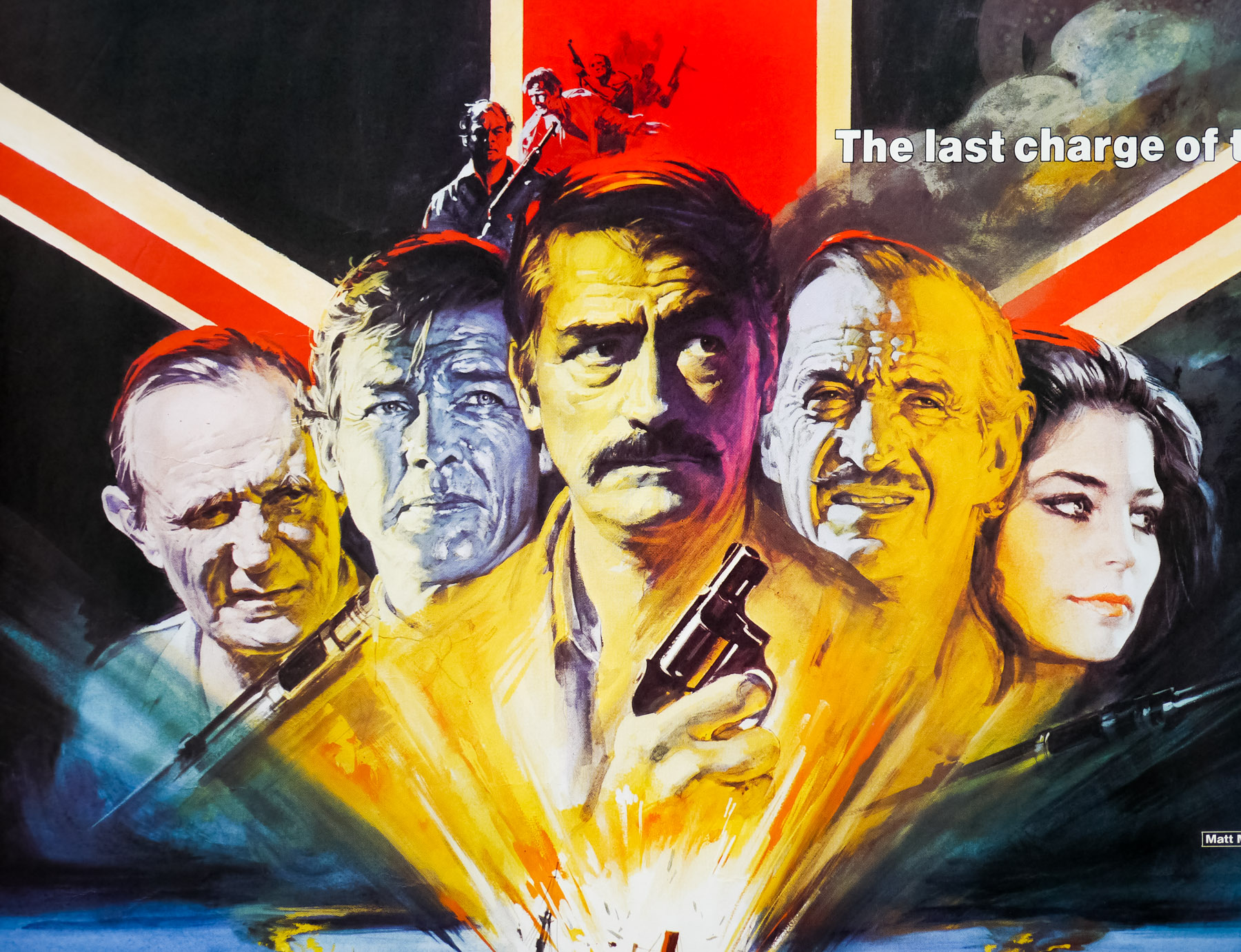
Poster detail
1-5


- AKA
- Quella villa accanto al cimitero (Italy - original title)
- Year of Film
- 1981
- Director
- Lucio Fulci
- Starring
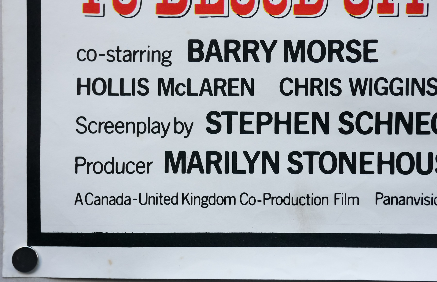
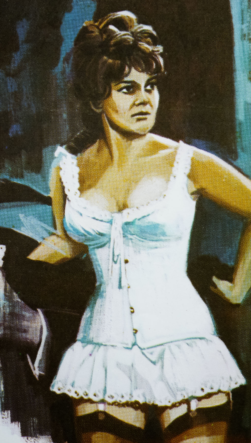
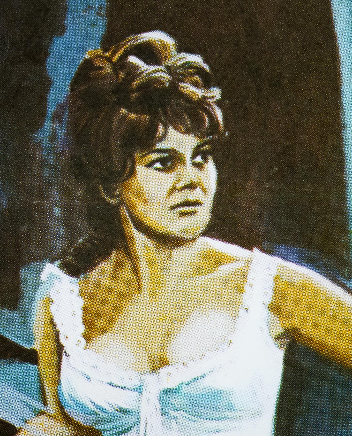
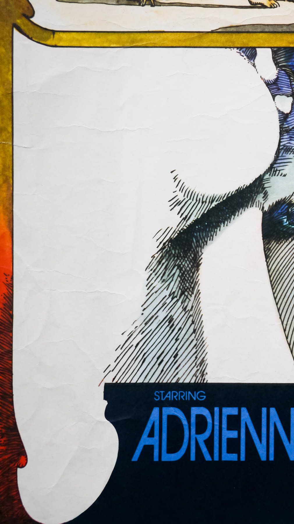
- Catriona MacColl (as Katherine MacColl), Paolo Malco, Ania Pieroni, Giovanni Frezza, Silvia Collatina, Dagmar Lassander, Giovanni De Nava, Daniela Doria, Gianpaolo Saccarola, Carlo De Mejo, Kenneth A. Olsen
- Origin of Film
- Italy
- Genre(s) of Film
- Catriona MacColl (as Katherine MacColl), Paolo Malco, Ania Pieroni, Giovanni Frezza, Silvia Collatina, Dagmar Lassander, Giovanni De Nava, Daniela Doria, Gianpaolo Saccarola, Carlo De Mejo, Kenneth A. Olsen,
- Type of Poster
- Quad
- Style of Poster
- --
- Origin of Poster
- UK
- Year of Poster
- 1982
- Designer
- Unknown
- Size (inches)
- 30 1/16" x 40"
- SS or DS
- SS
- Tagline
- --
Nicknamed The Godfather of Gore, the late Italian director Lucio Fulci is responsible for several memorable entries in the horror genre and The House by the Cemetery is one of what I consider to be the big four Fulci films (the others being Zombie Flesh Eaters, The Beyond and City of the Living Dead), which were all made within two years of each other. The director tried his hand at various genres, including westerns and comedies, but it was horror where he found the greatest success and for which he is best remembered.
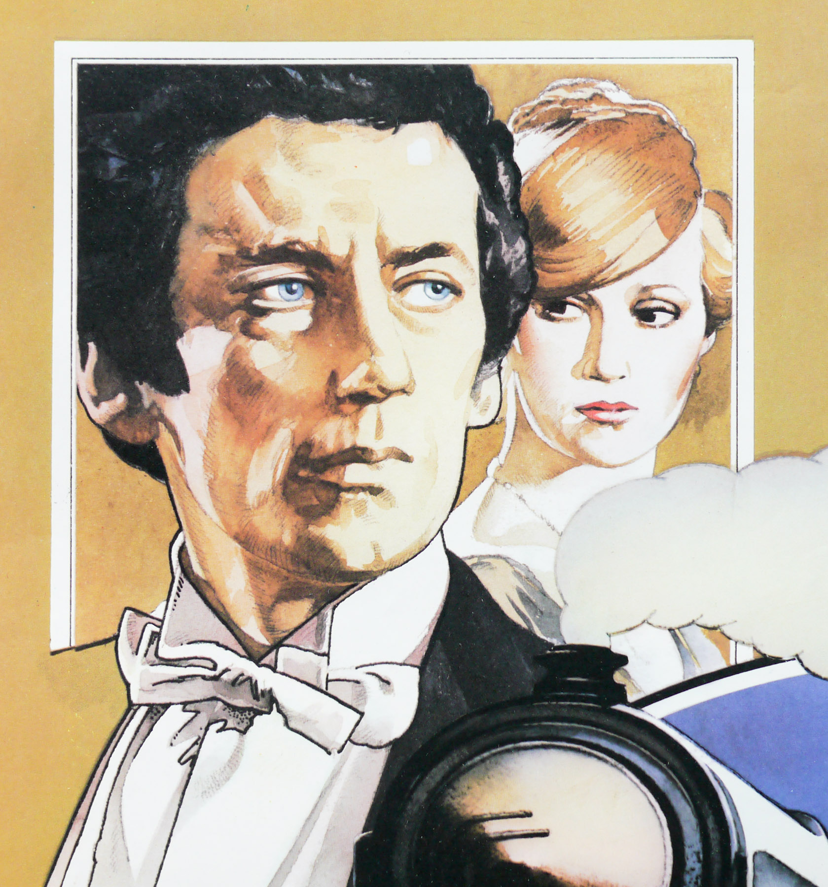
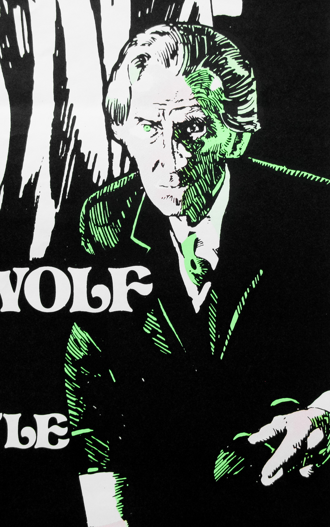
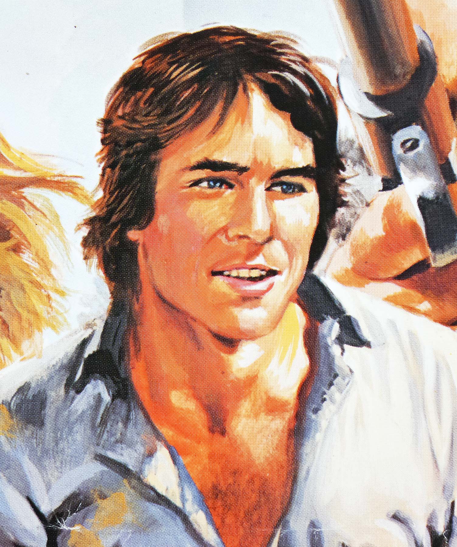
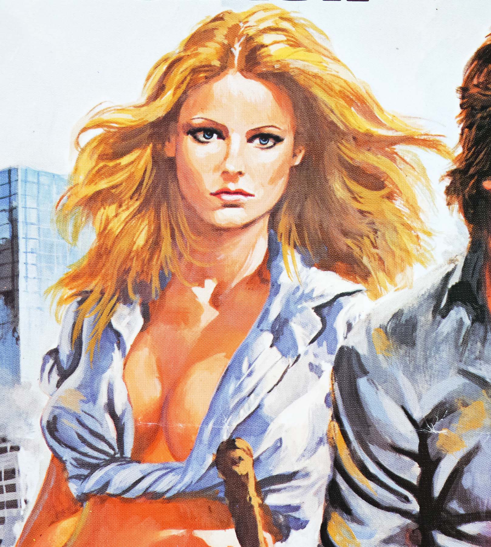
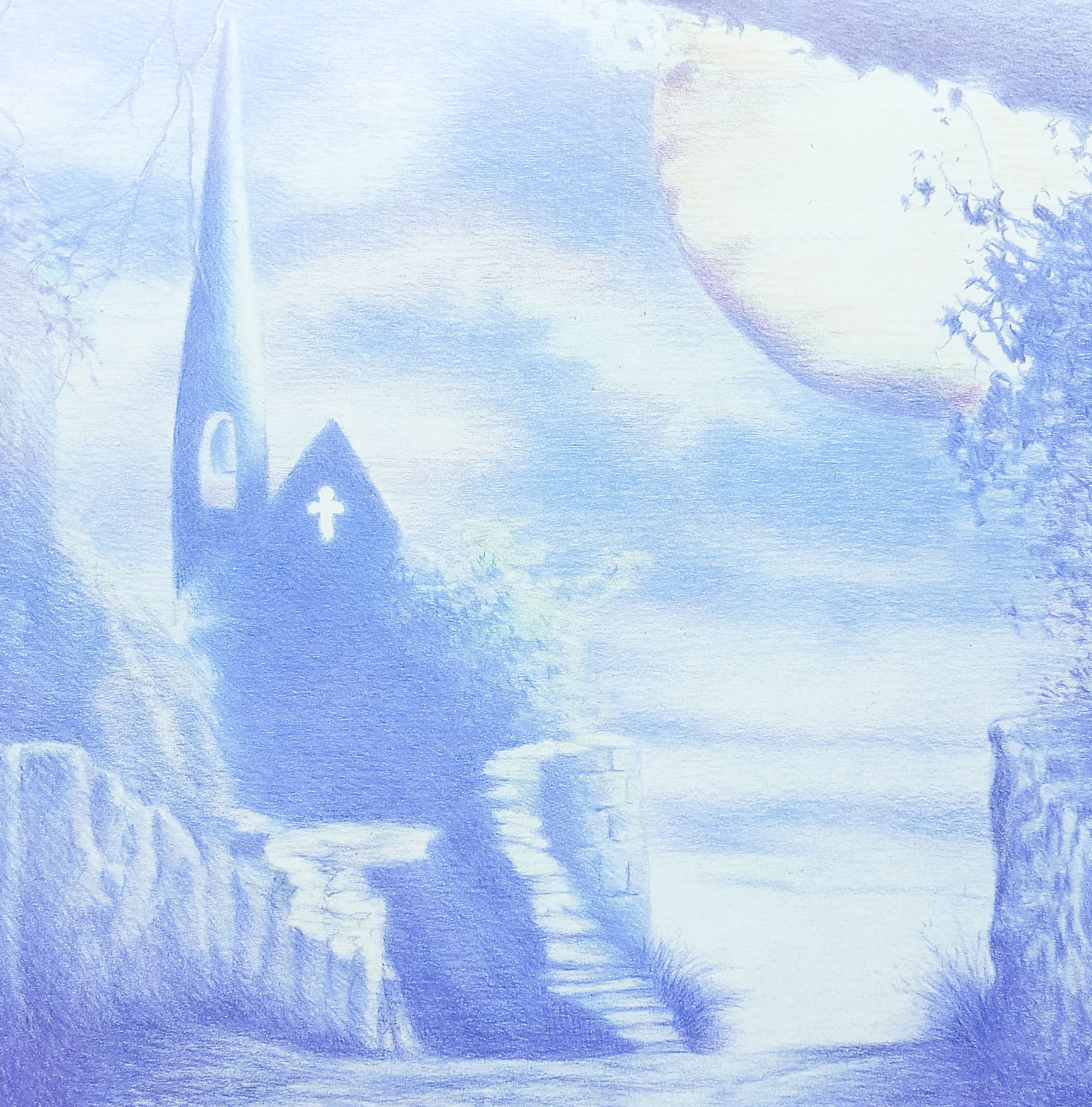
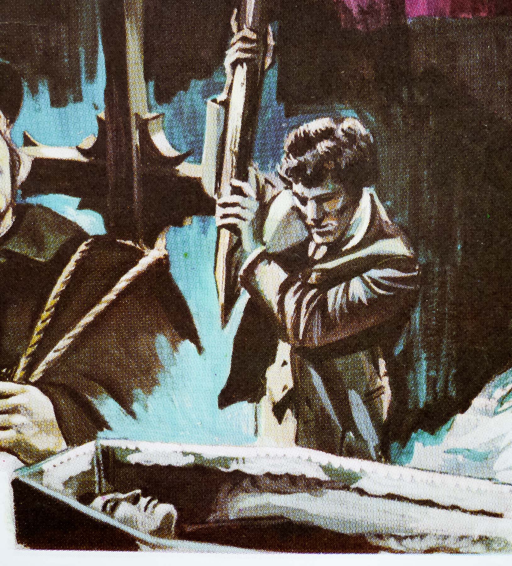
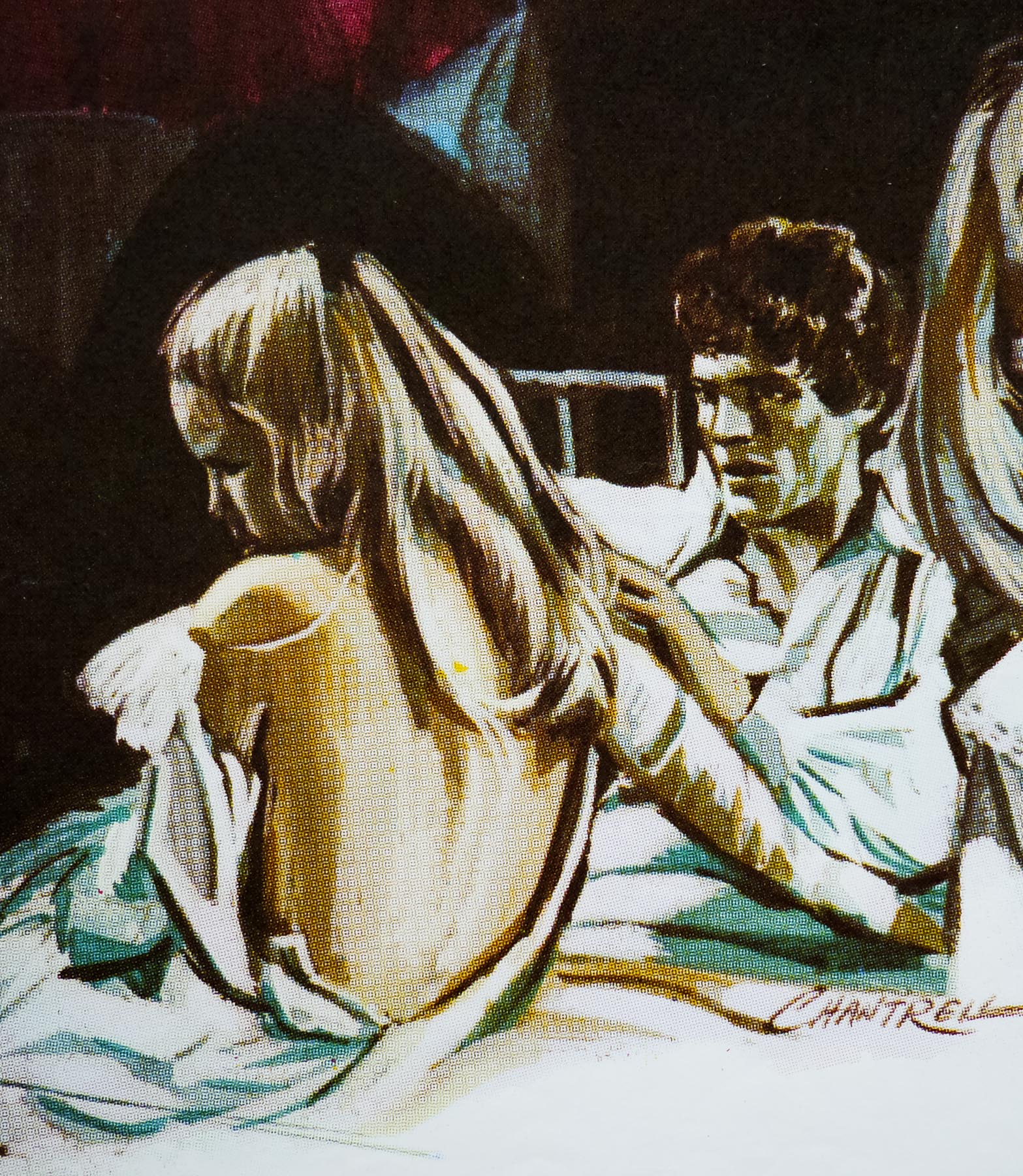
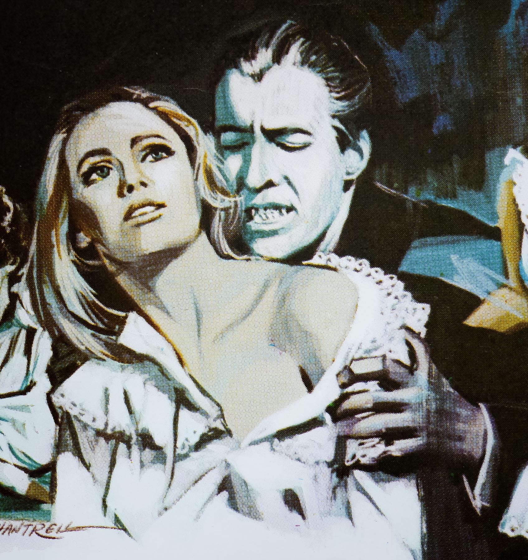
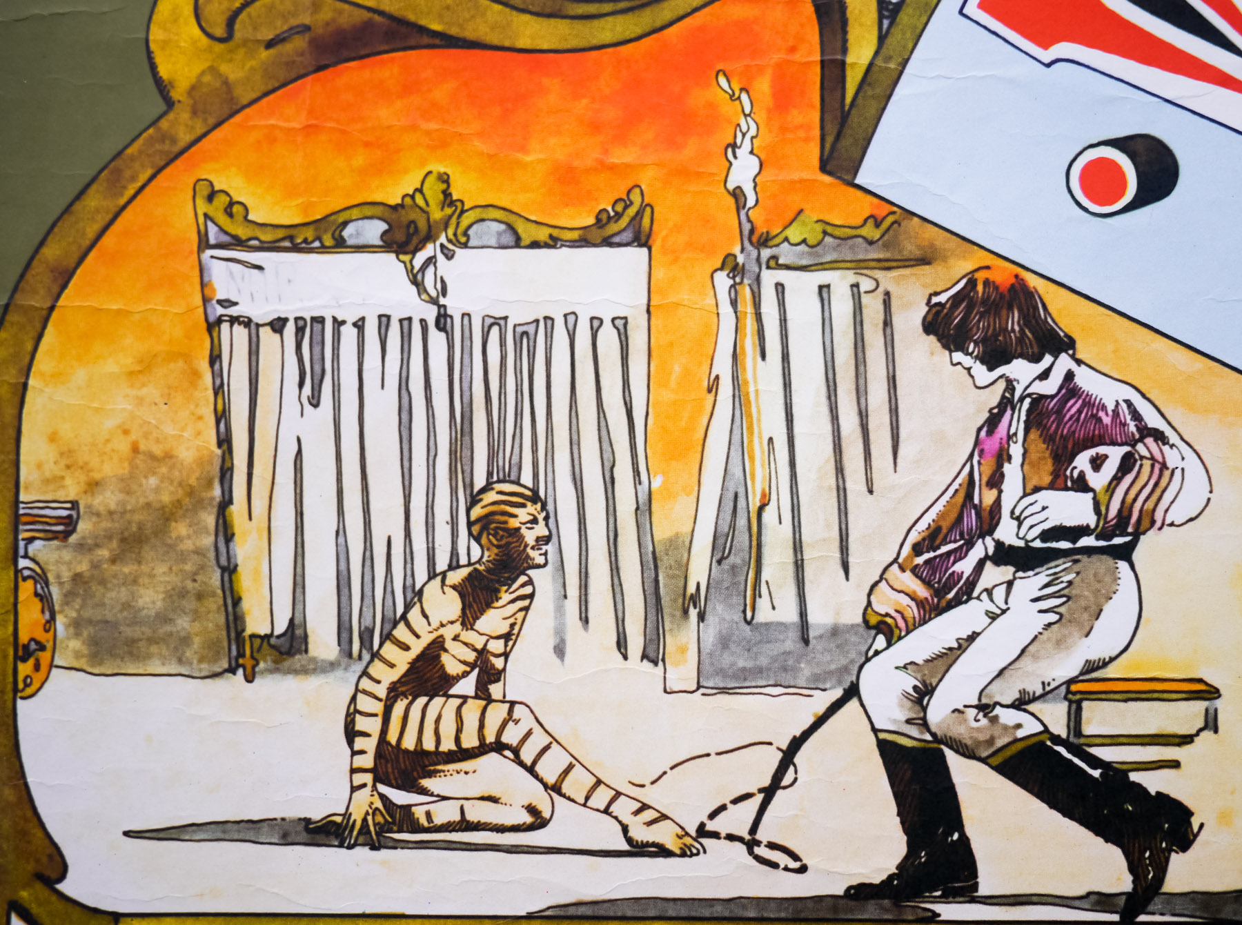
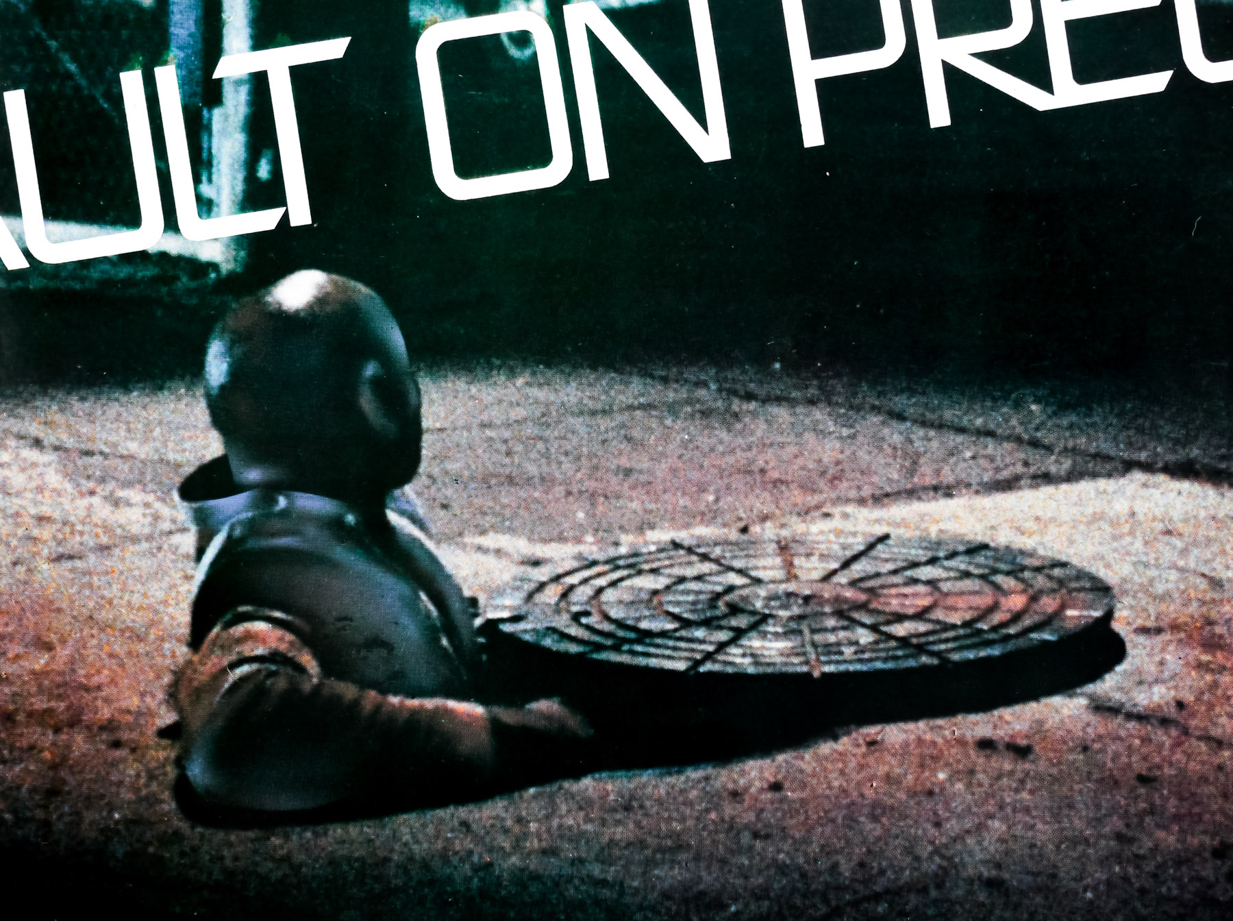
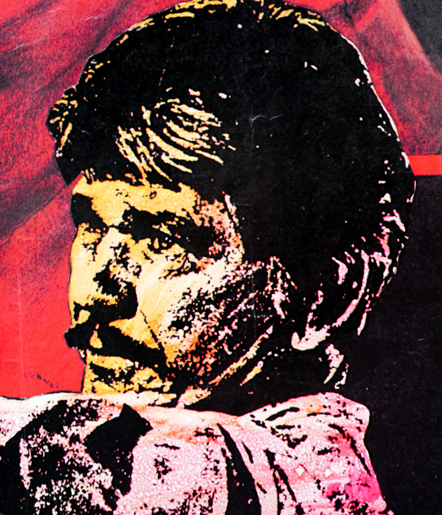
The House by the Cemetery is the third film in the unofficial ‘Gates of Hell’ trilogy of Fulci films that began with 1980s City of the Living Dead and was followed by The Beyond. It stars British actress Catriona MacColl (credited on the poster as Katherine MacColl) who had collaborated with Fulci on the previous two entries. The story sees Dr Norman Boyle (Paolo Malco), a professor at a New York University, being sent on research trip to New Whitby, Boston, taking his wife (MacColl) and young son with him. Their base is a big old house situated, as the title suggests, in the grounds of an old graveyard. After moving in and meeting a few of the locals, it soon becomes clear to the family that they aren’t the only ones living in the house and slowly but surely the dark secret of the previous occupant is revealed.
As was typical with all of Fulci’s output during this period, the film features several scenes of brutal, graphic gore and there’s one death scene in particular that would fall foul of the BBFC, the folks responsible for passing the film for release in the UK. This page on IMDB details the various cuts the UK release of the film was given over the years; in 1984 the film was caught up in the infamous Video Nasties situation and the VHS was banned outright. When it was re-released on tape in 1988 there were almost five minutes cut from its running time and it wasn’t until 2009 that a fully uncut version was available.
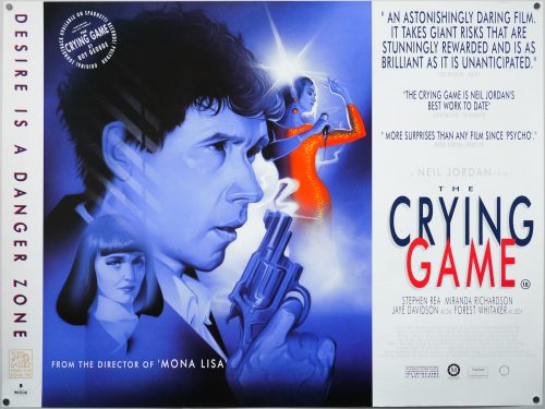
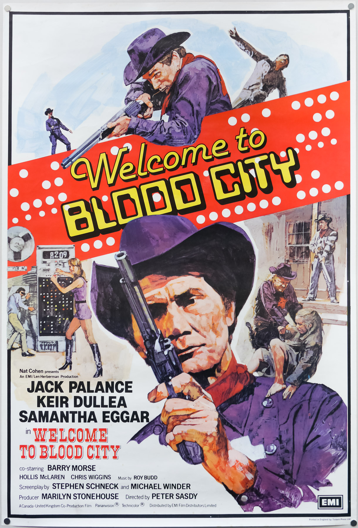
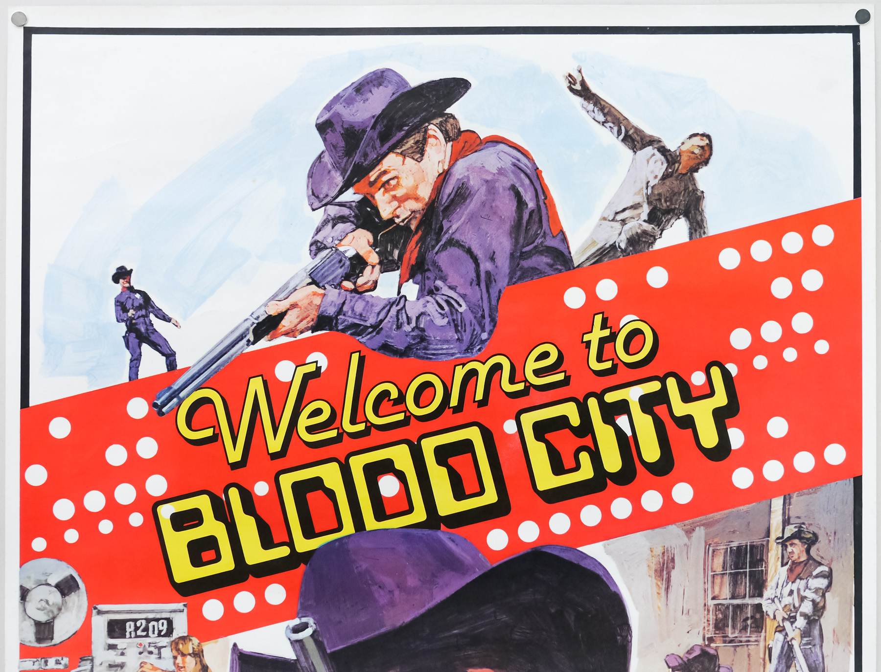
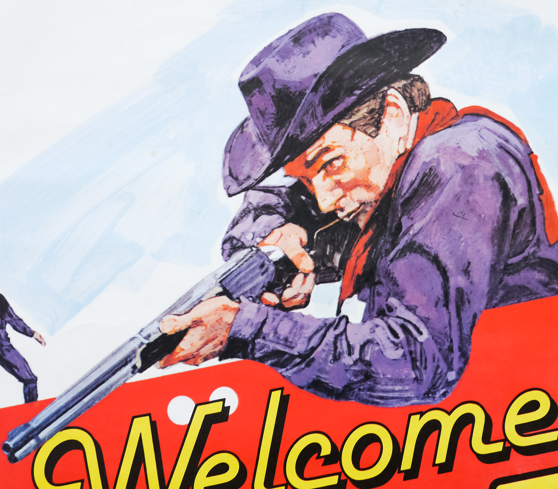
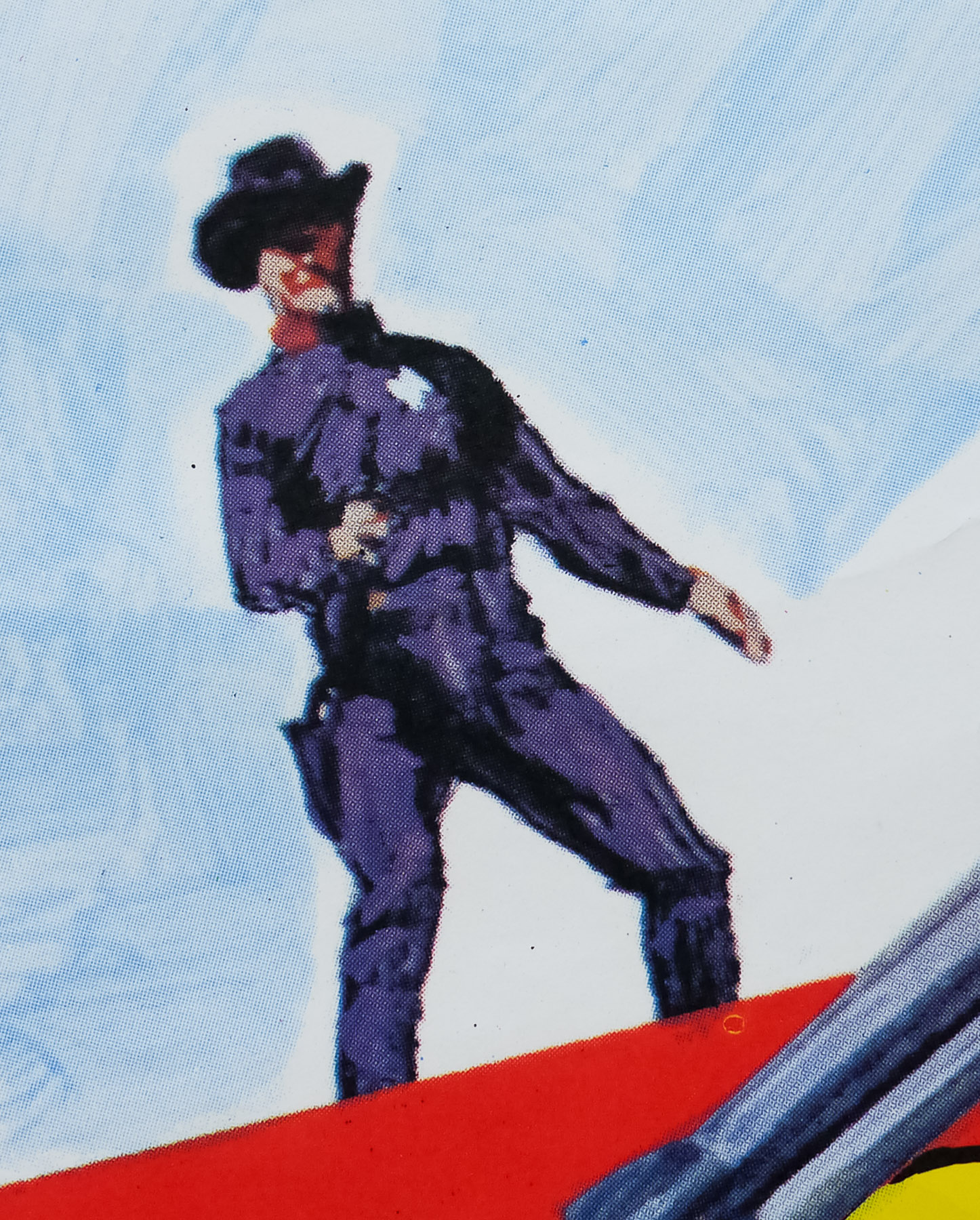
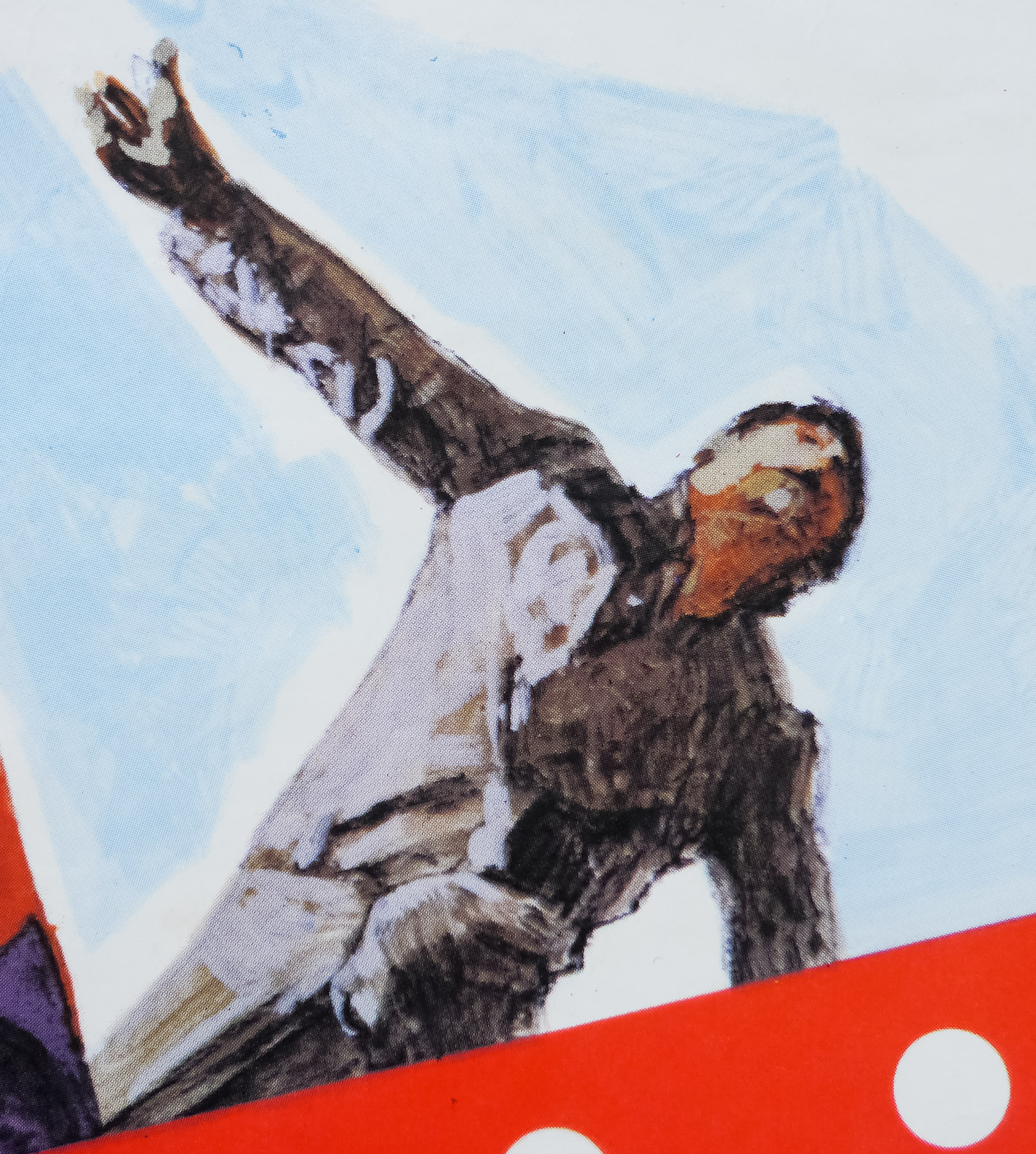
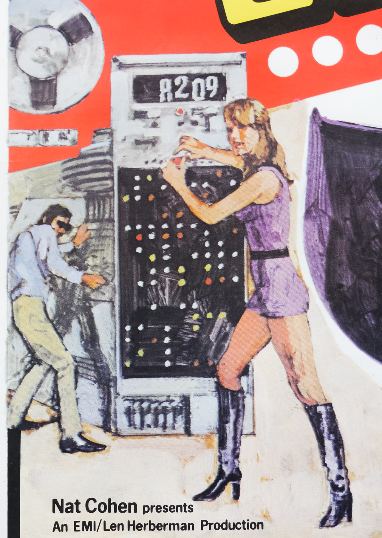
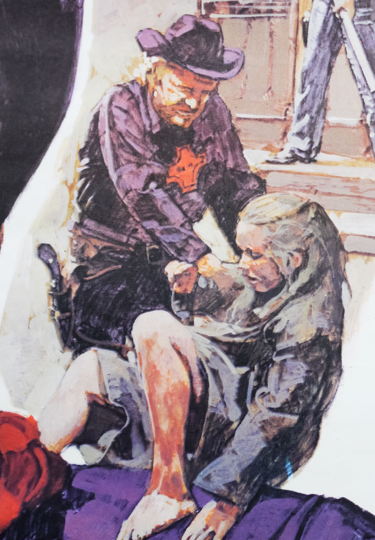
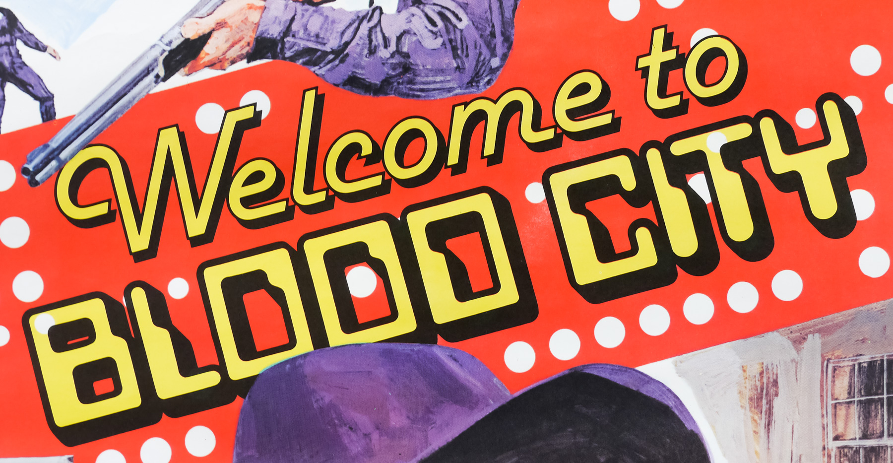
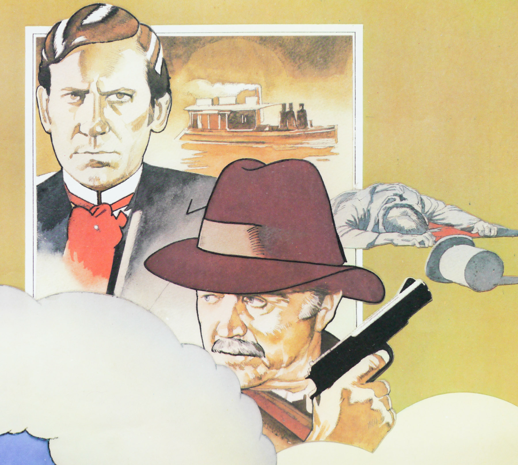
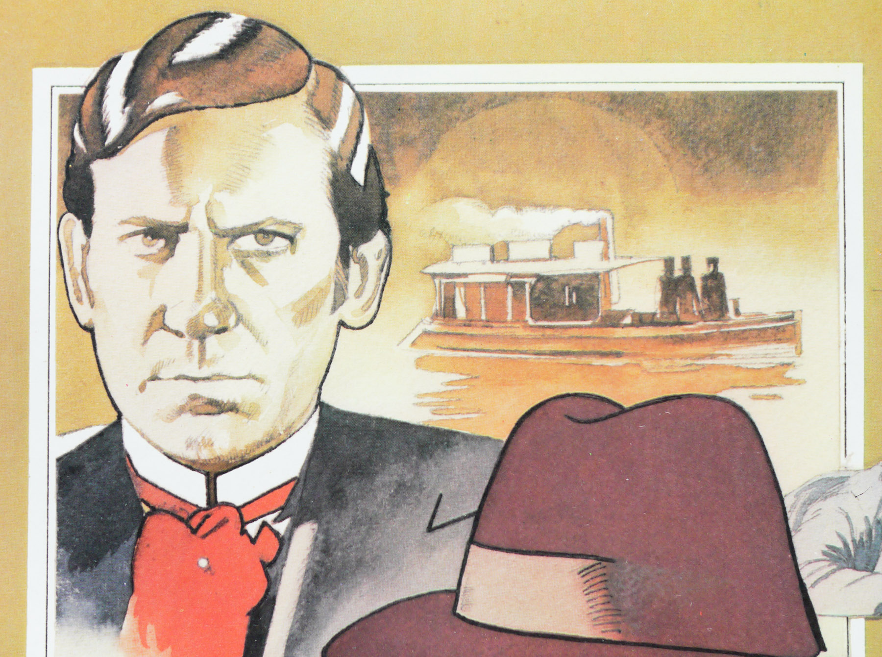
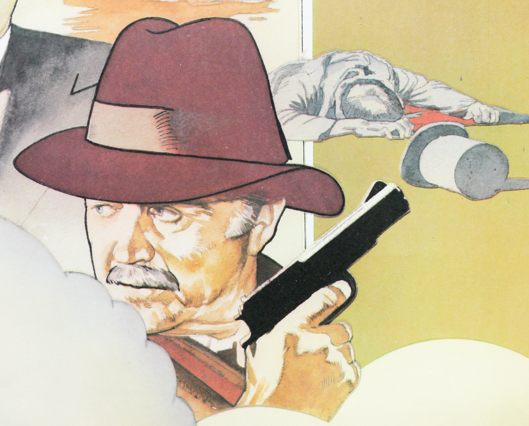
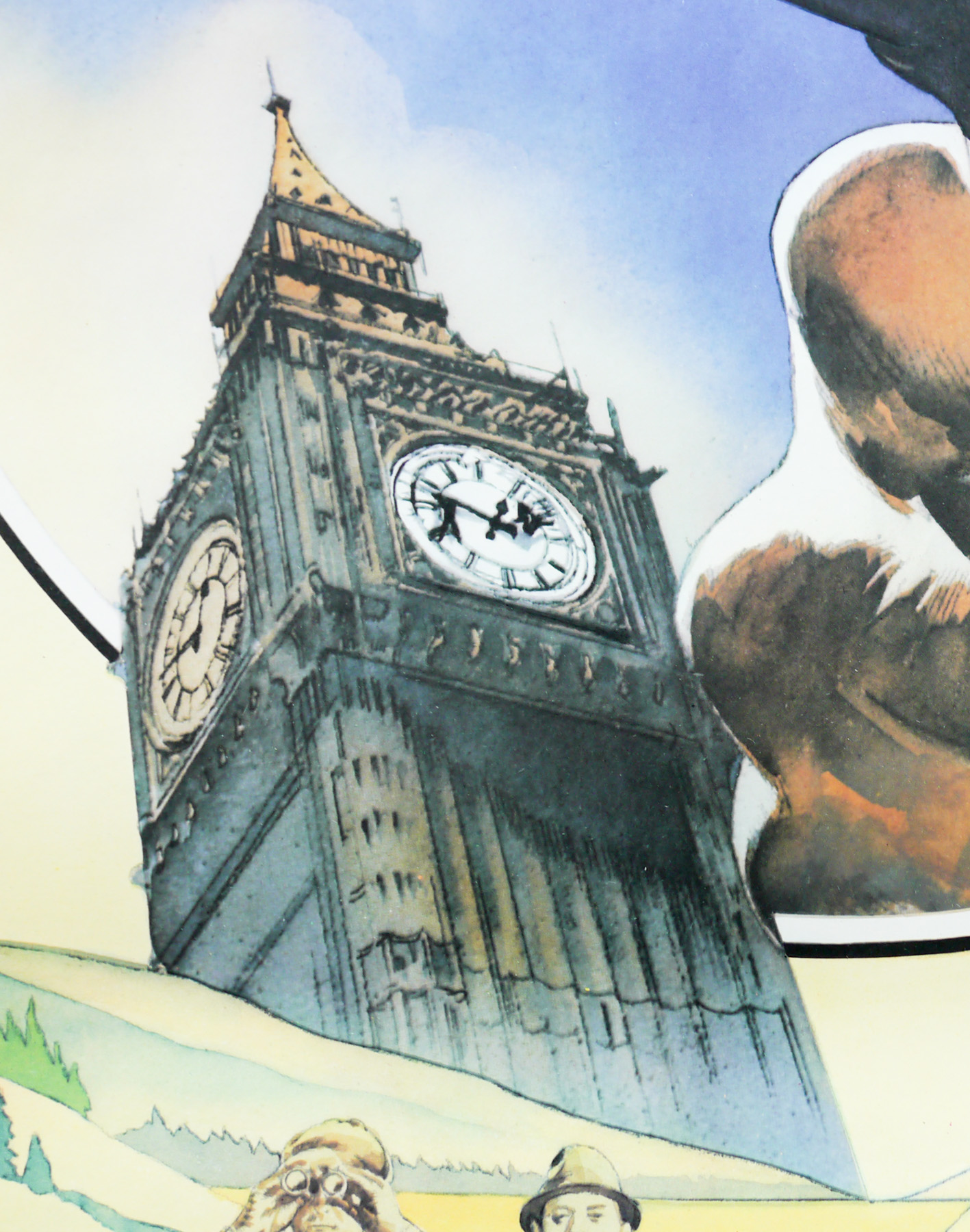
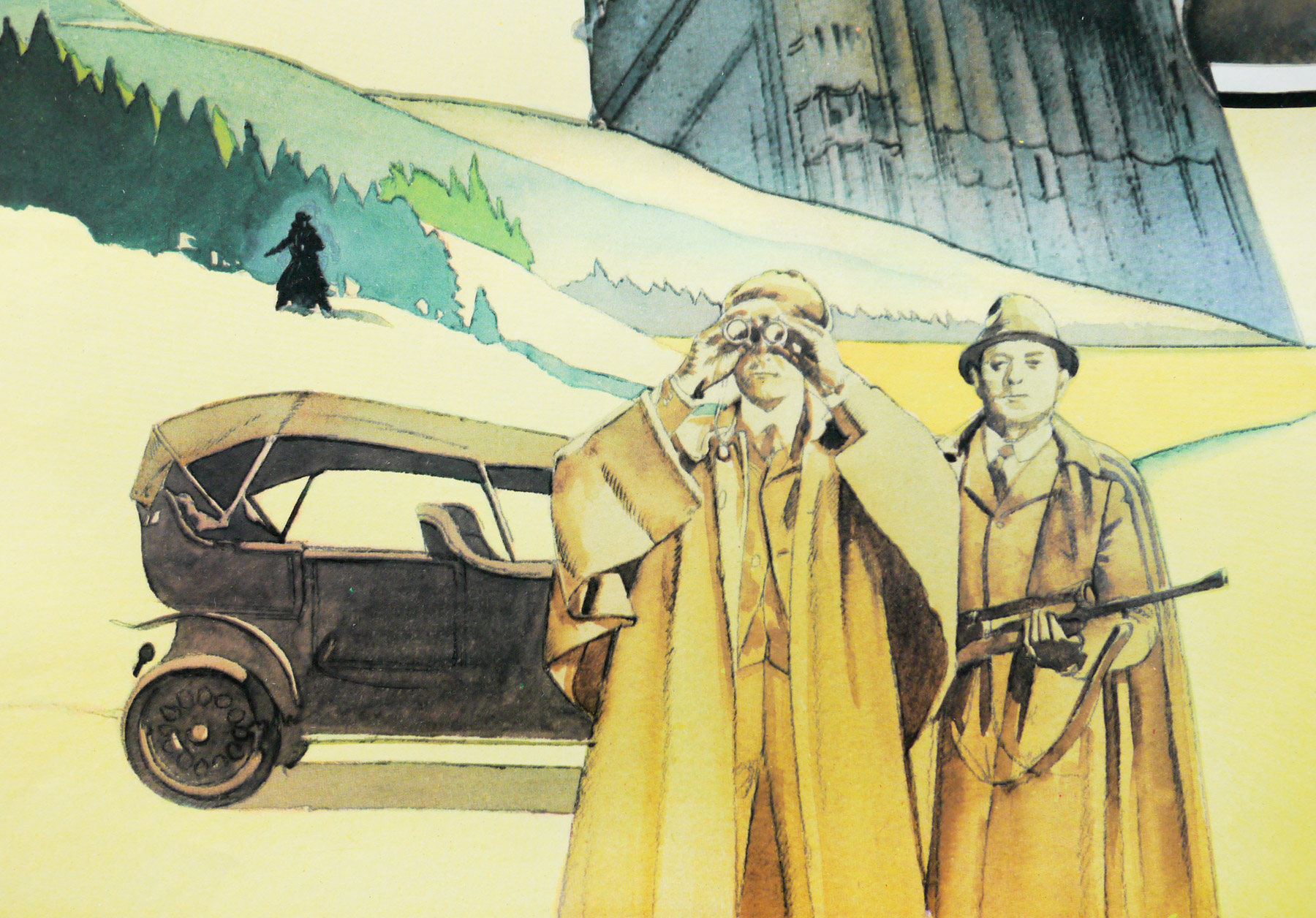
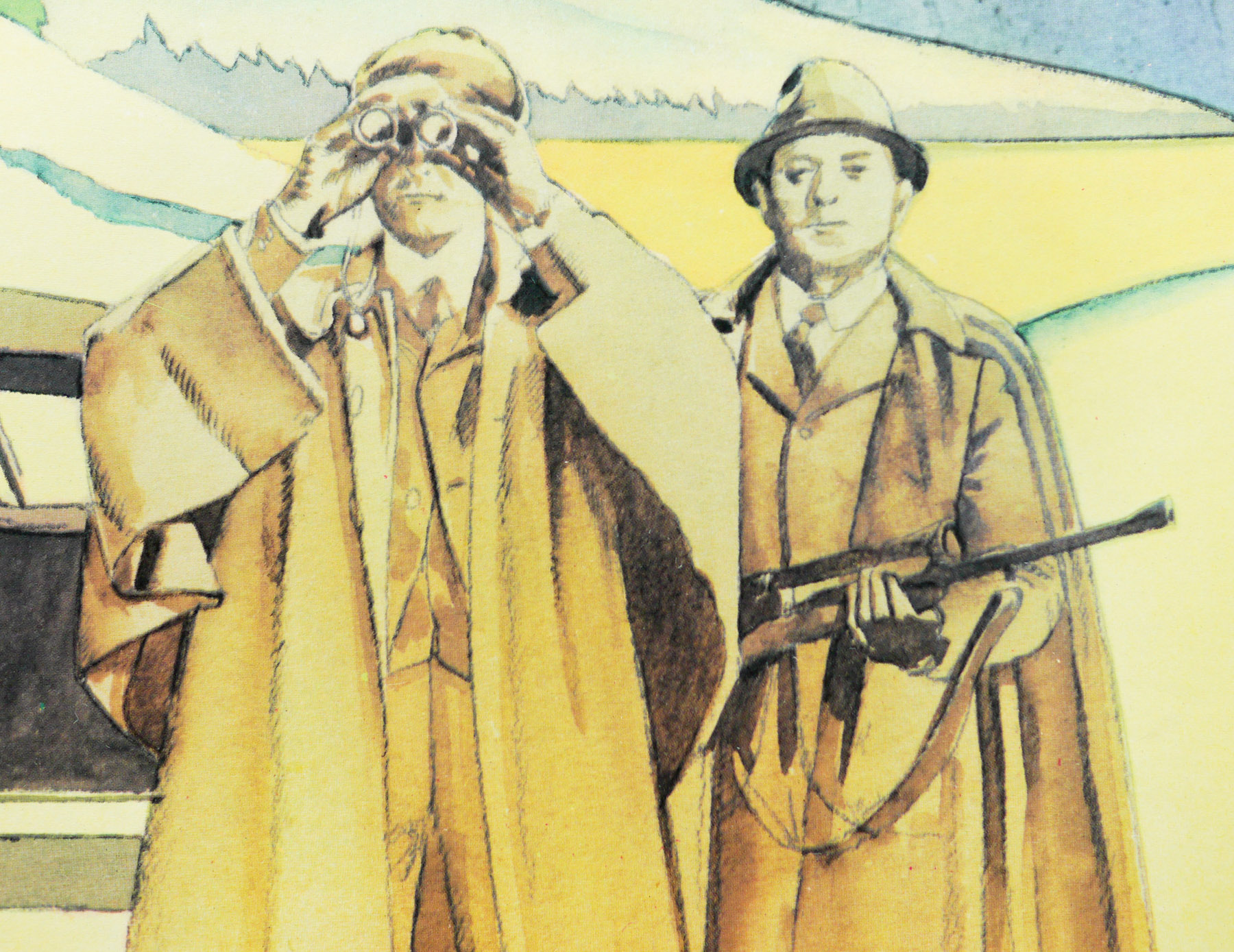
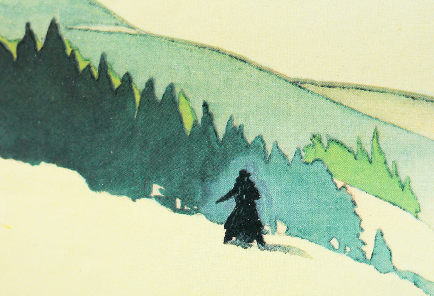
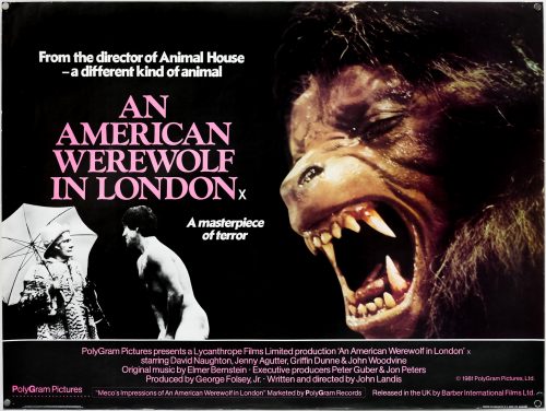
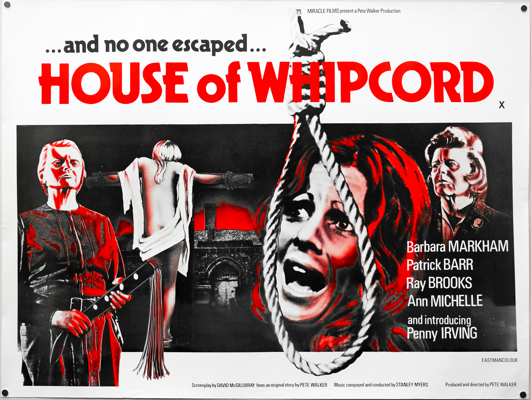
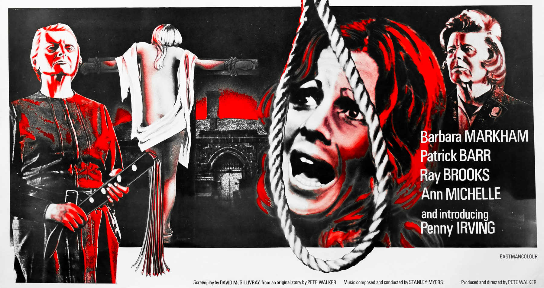
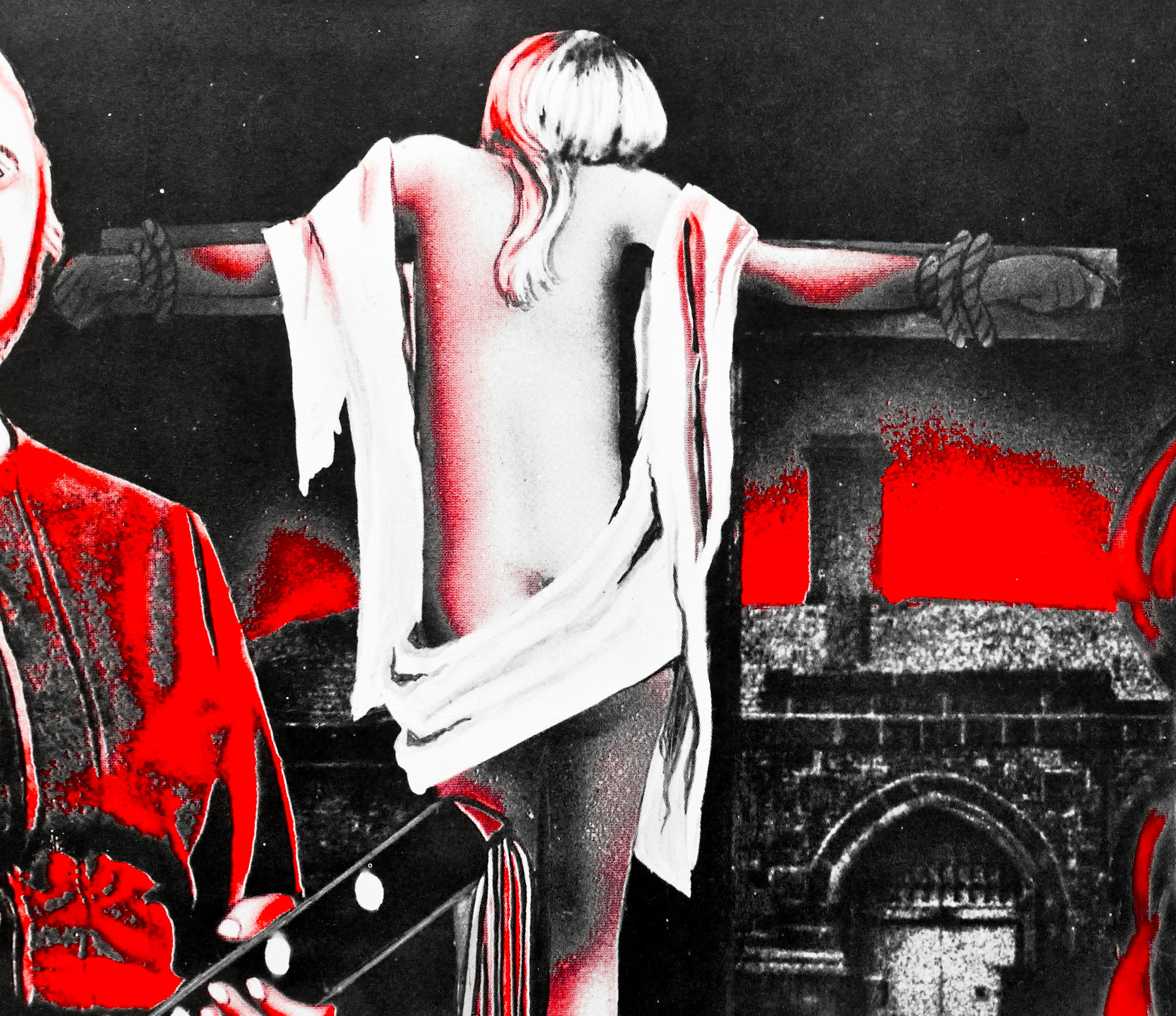
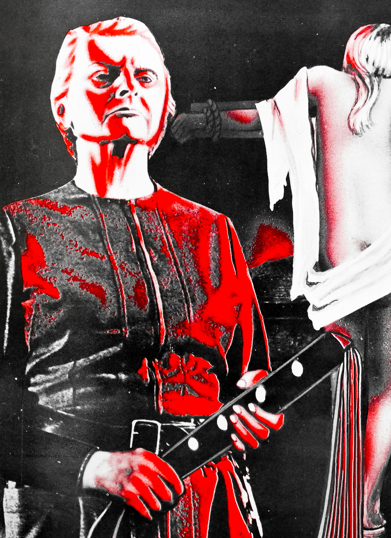
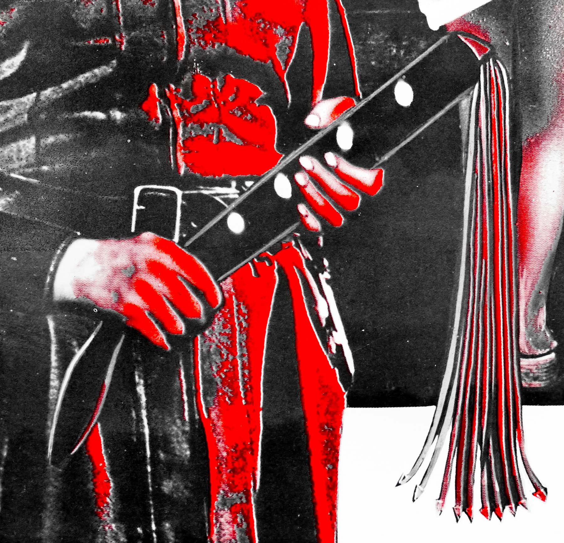
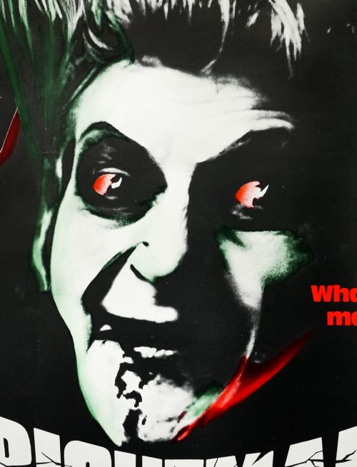
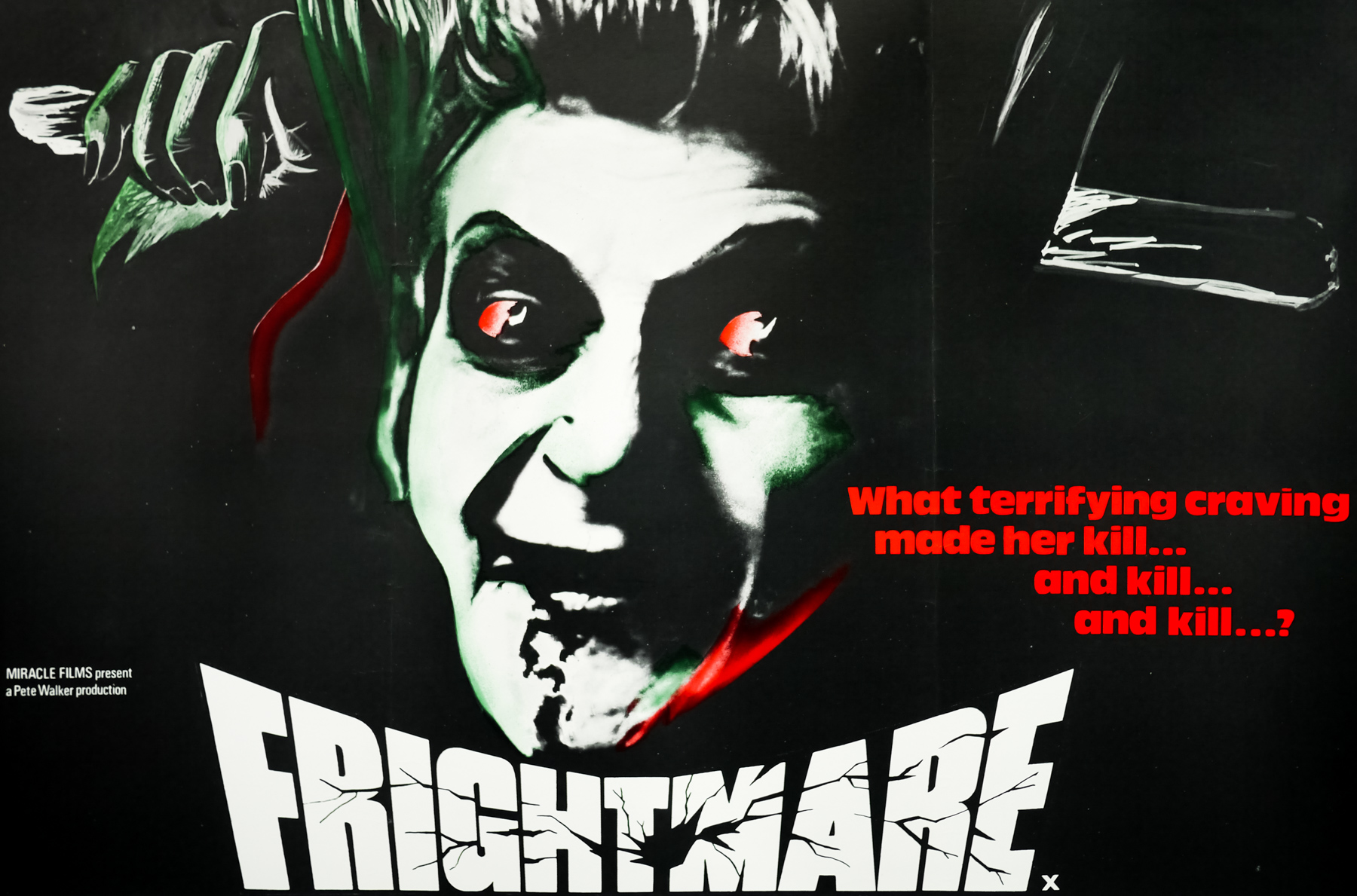
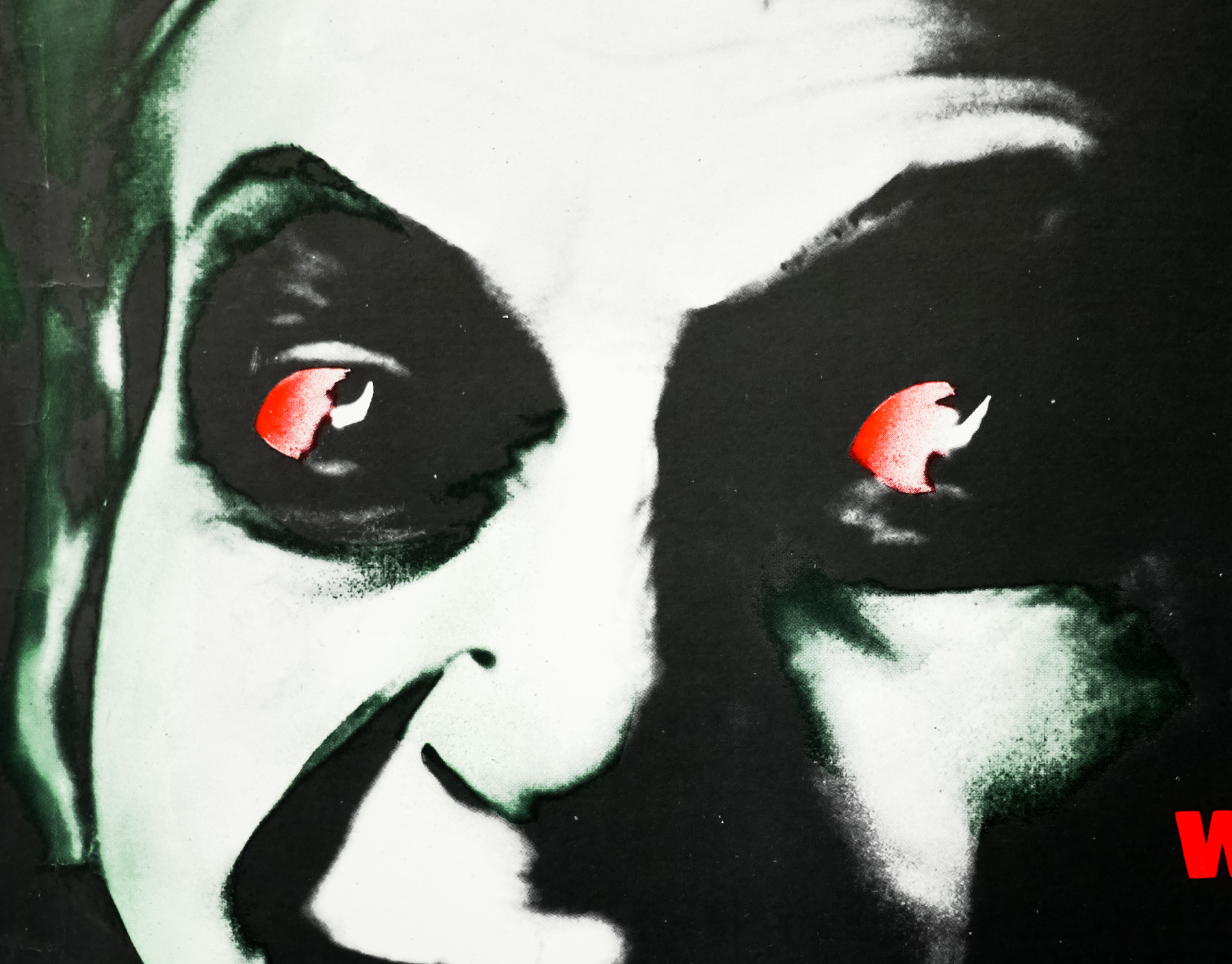
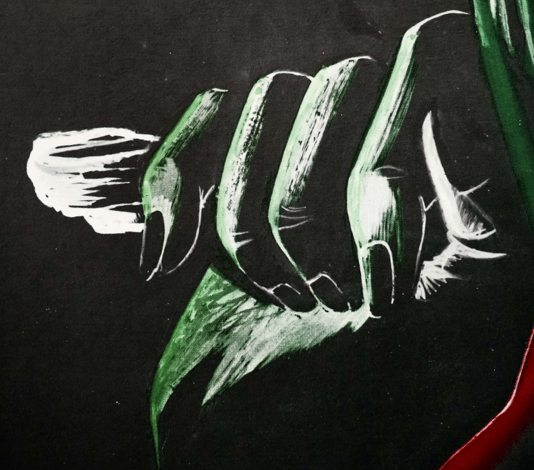
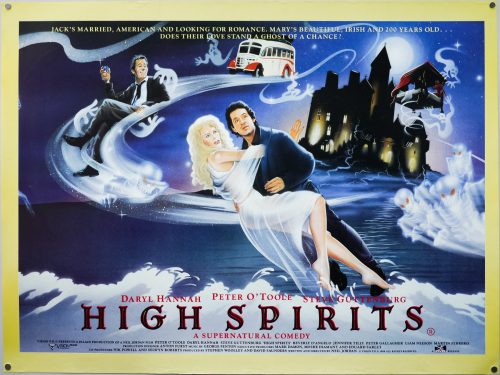
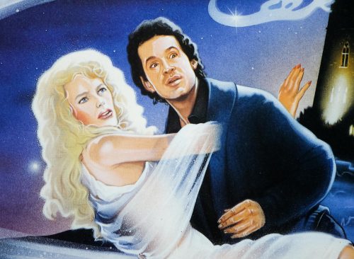
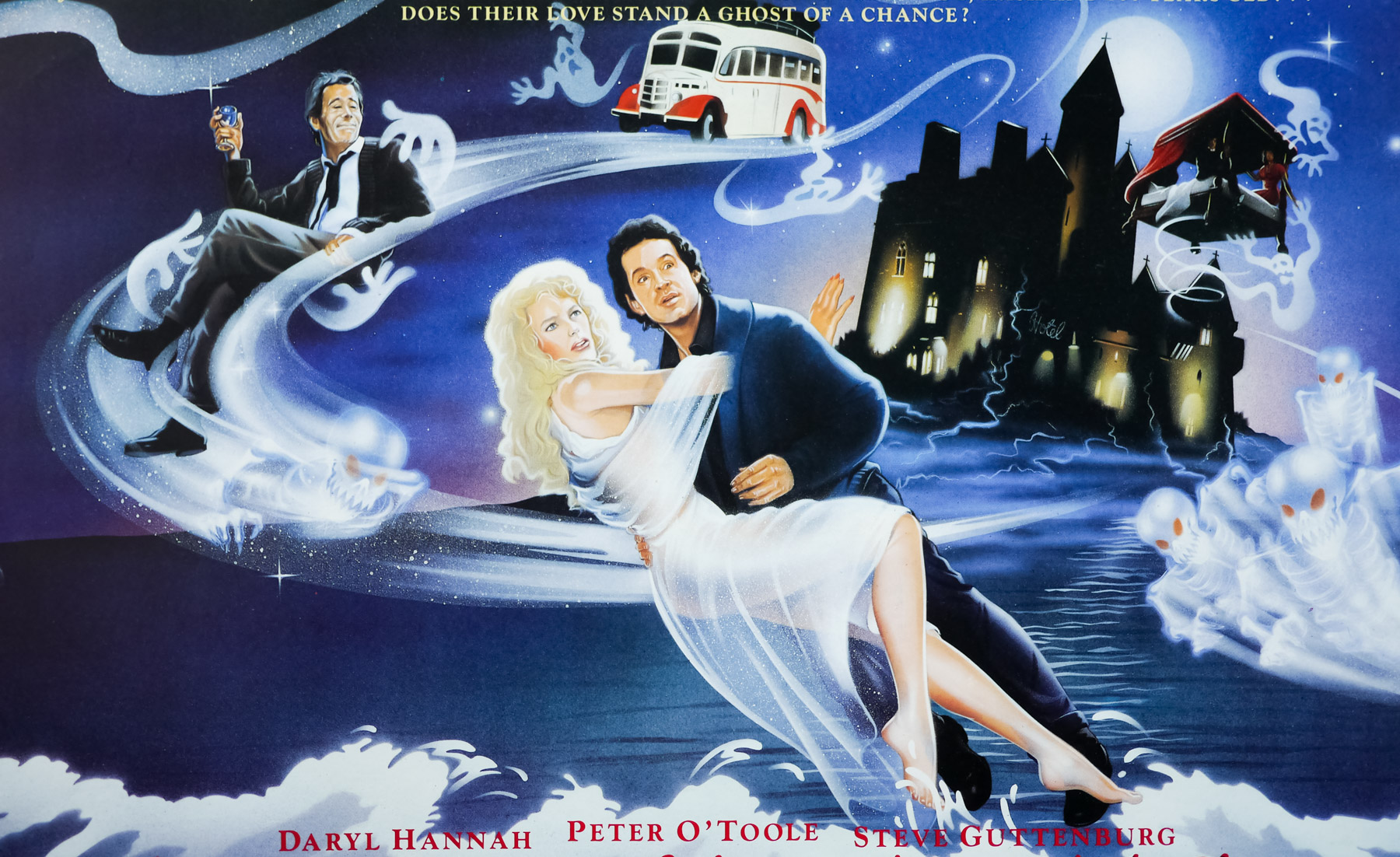
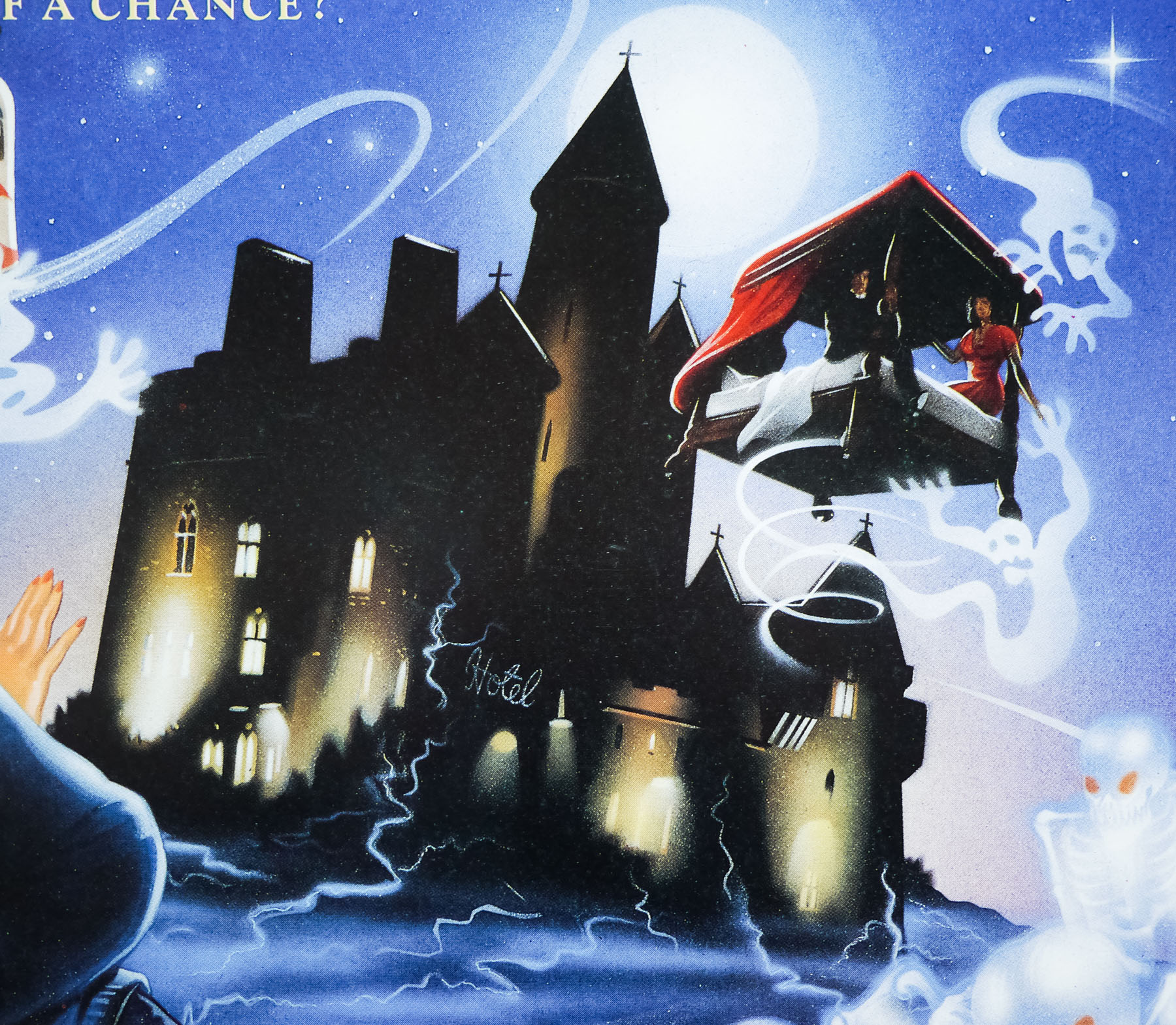
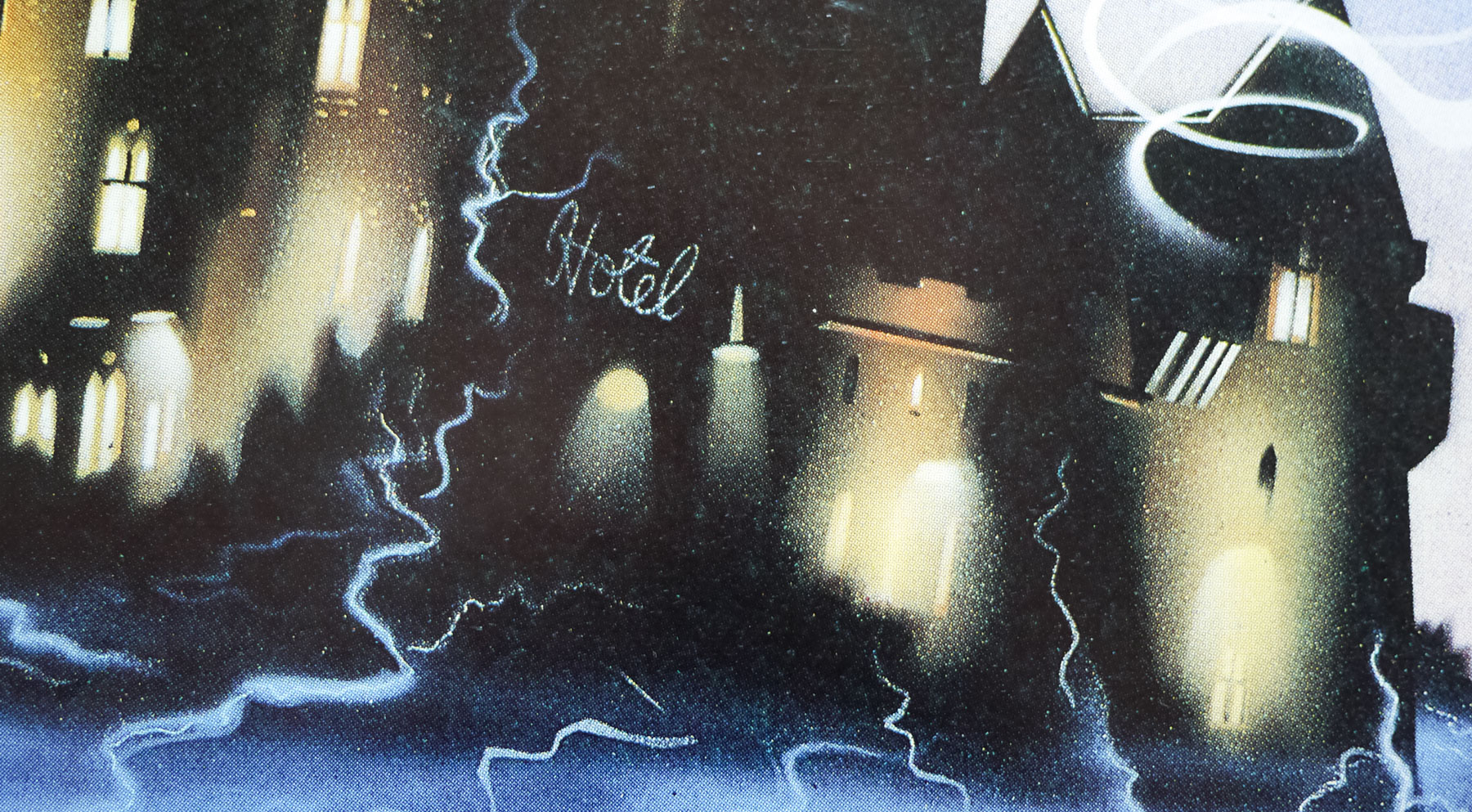
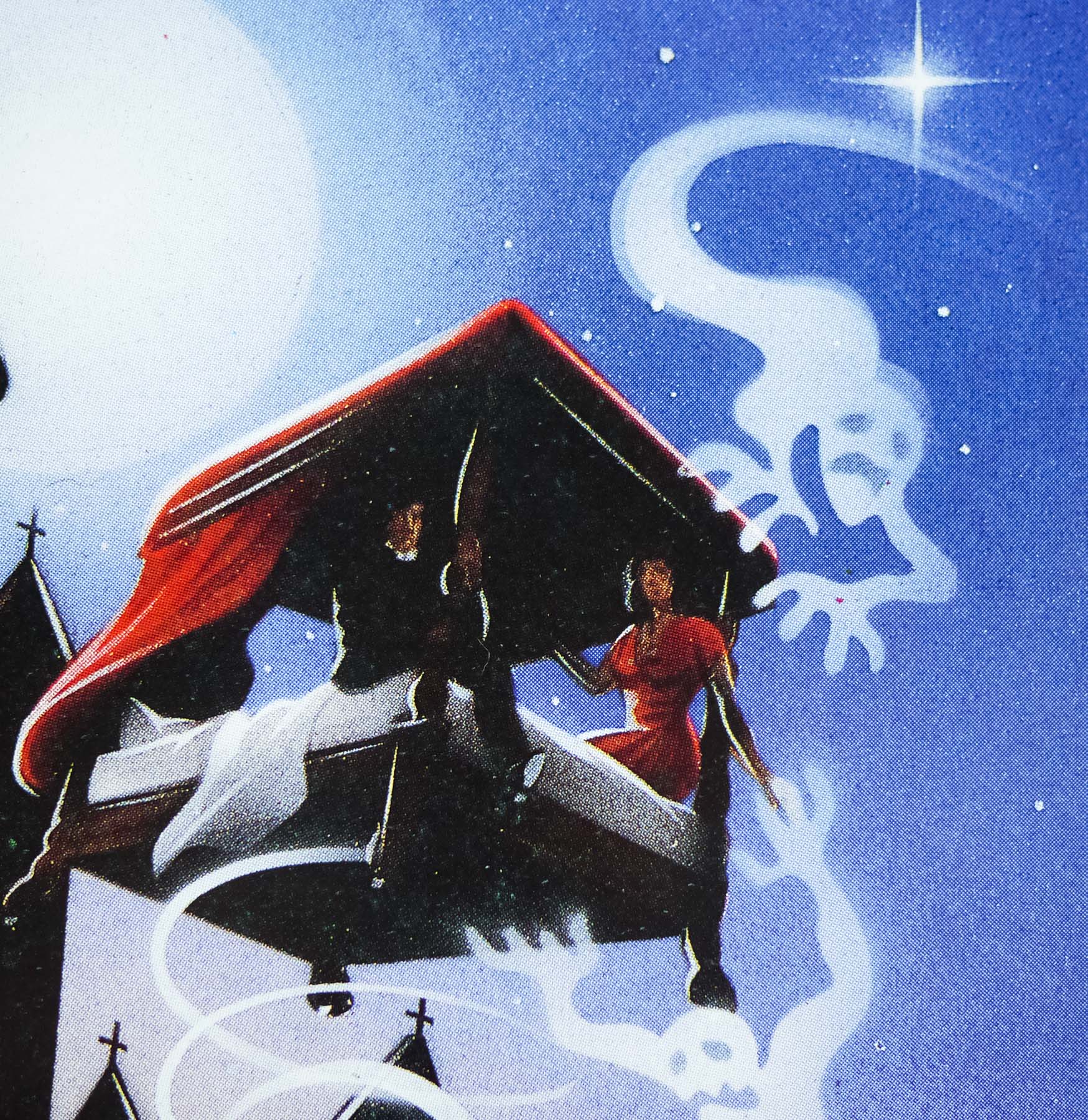
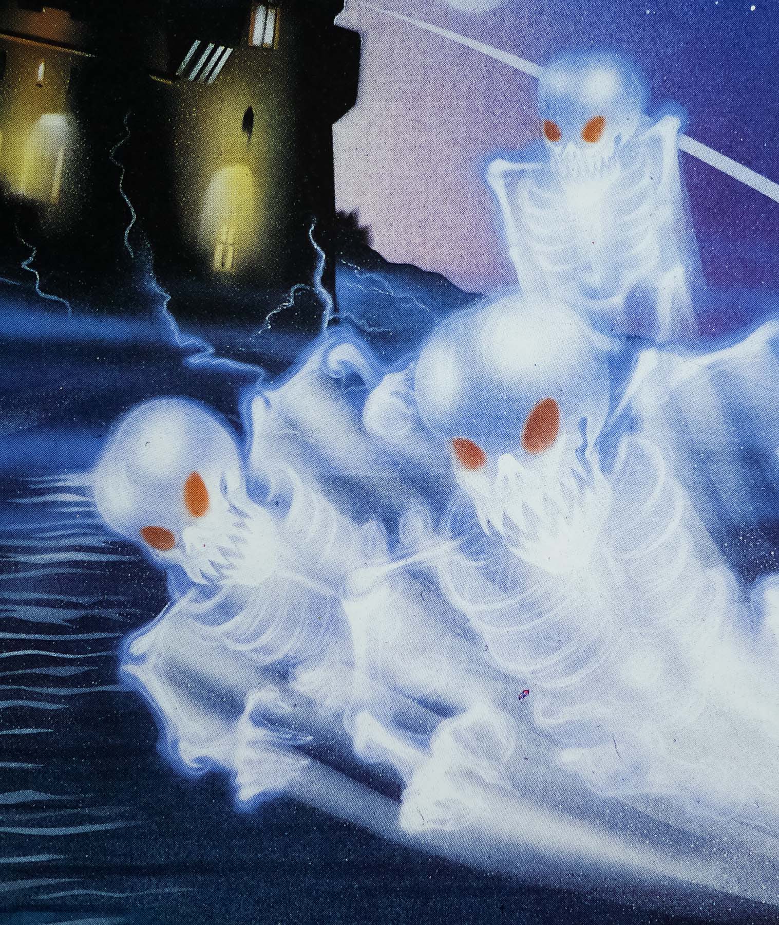
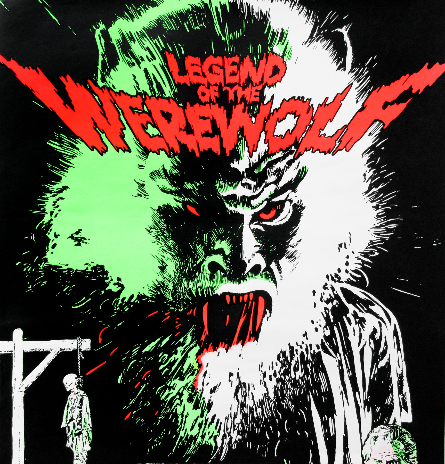
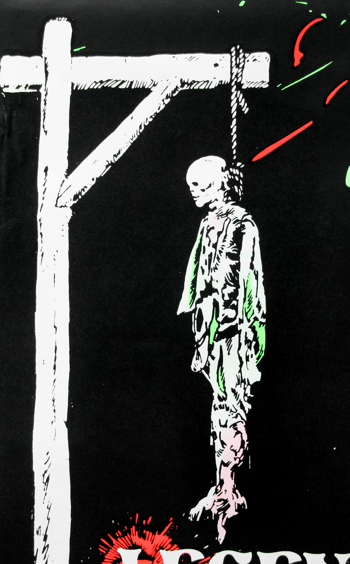
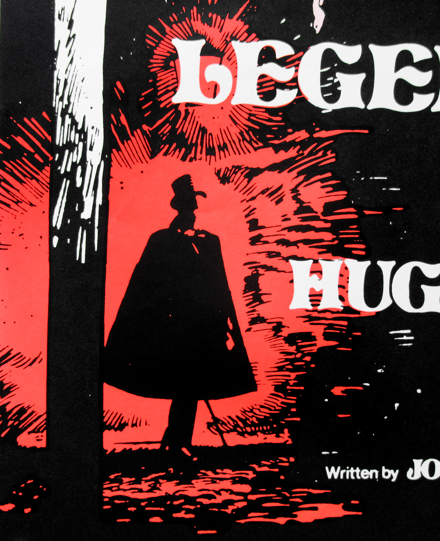
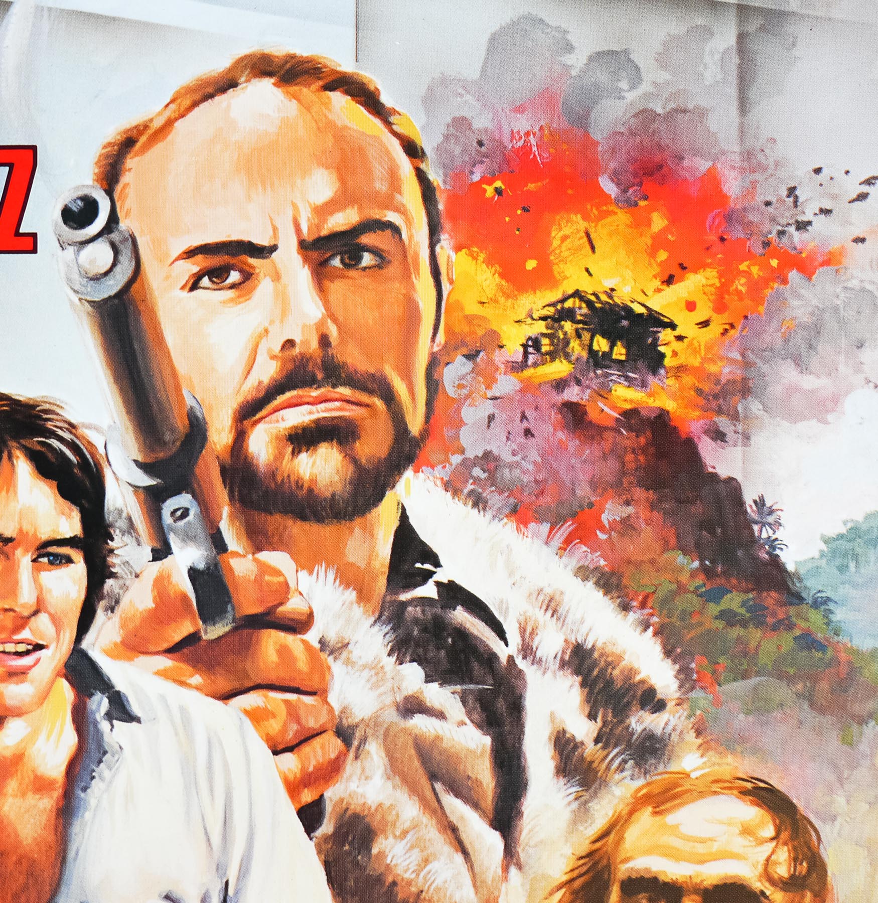
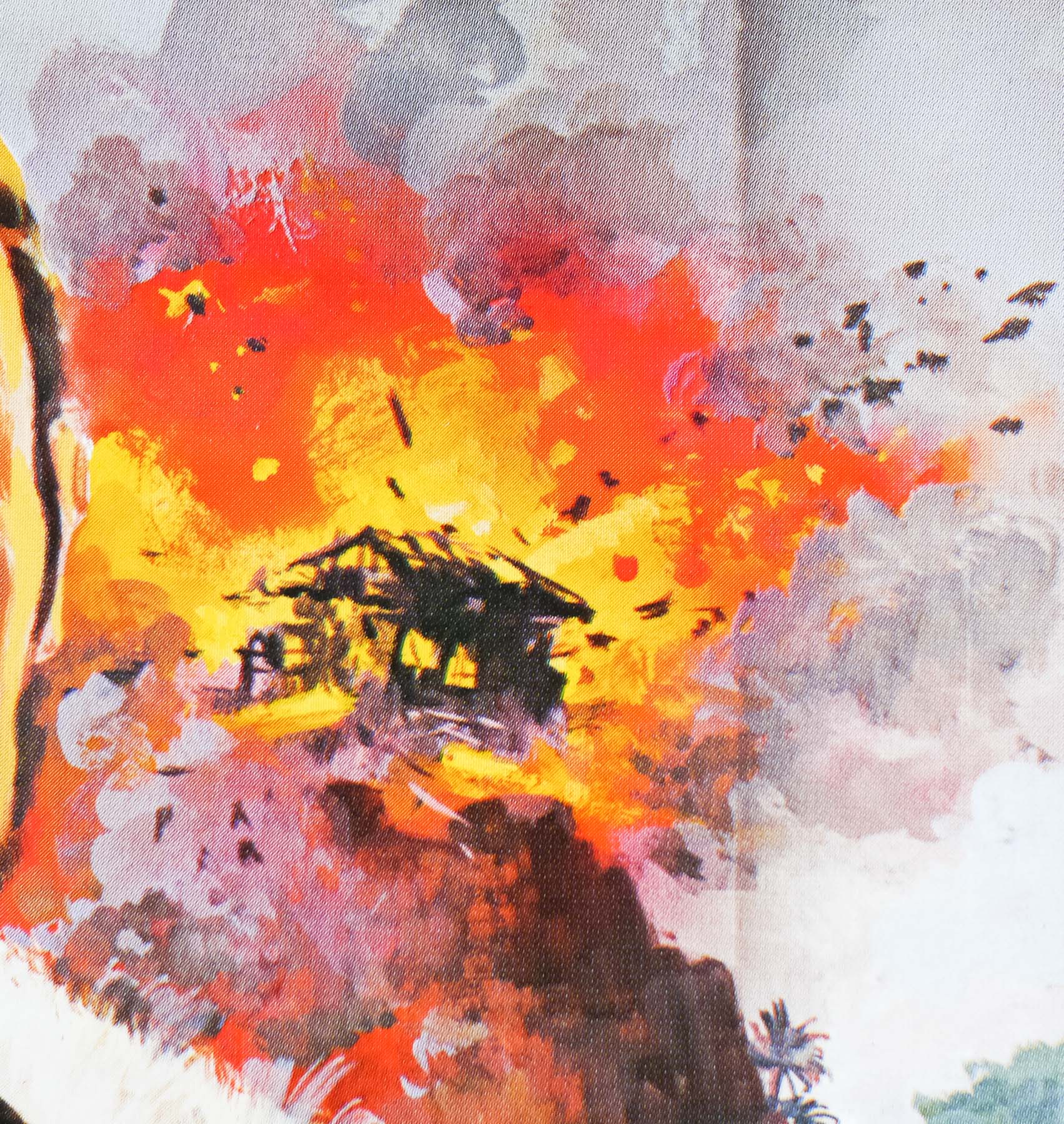
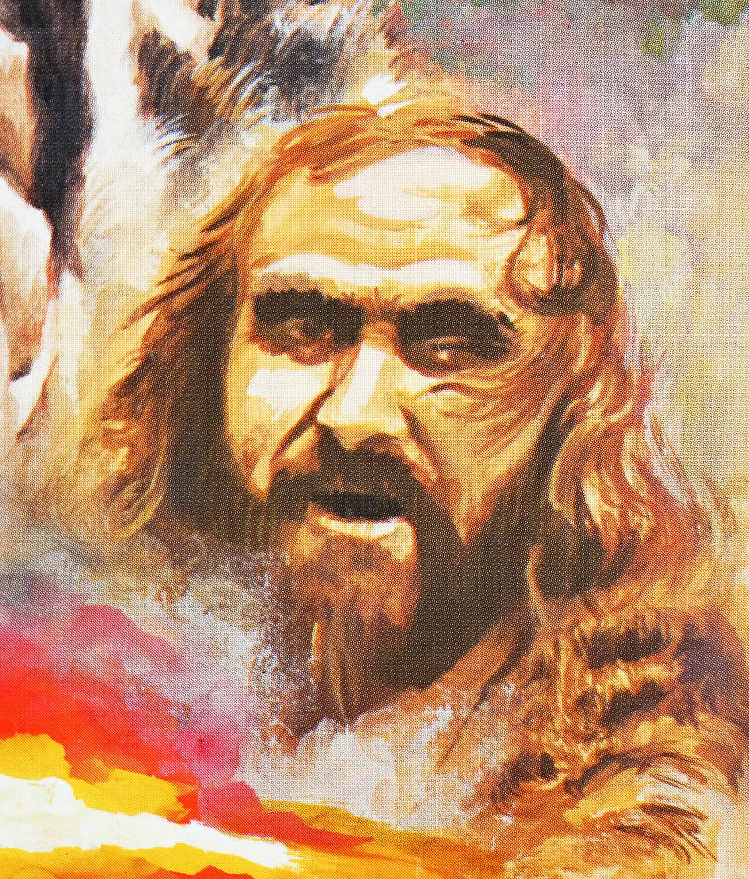
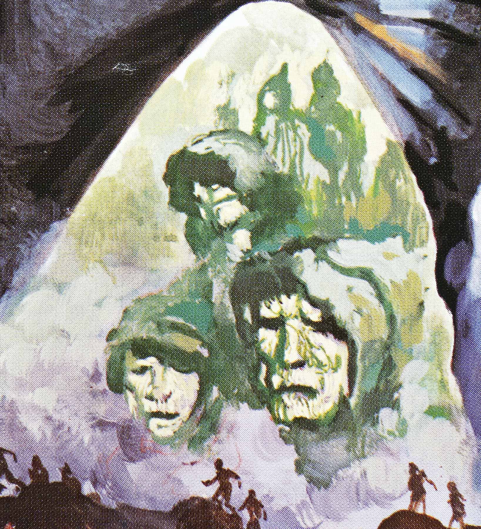
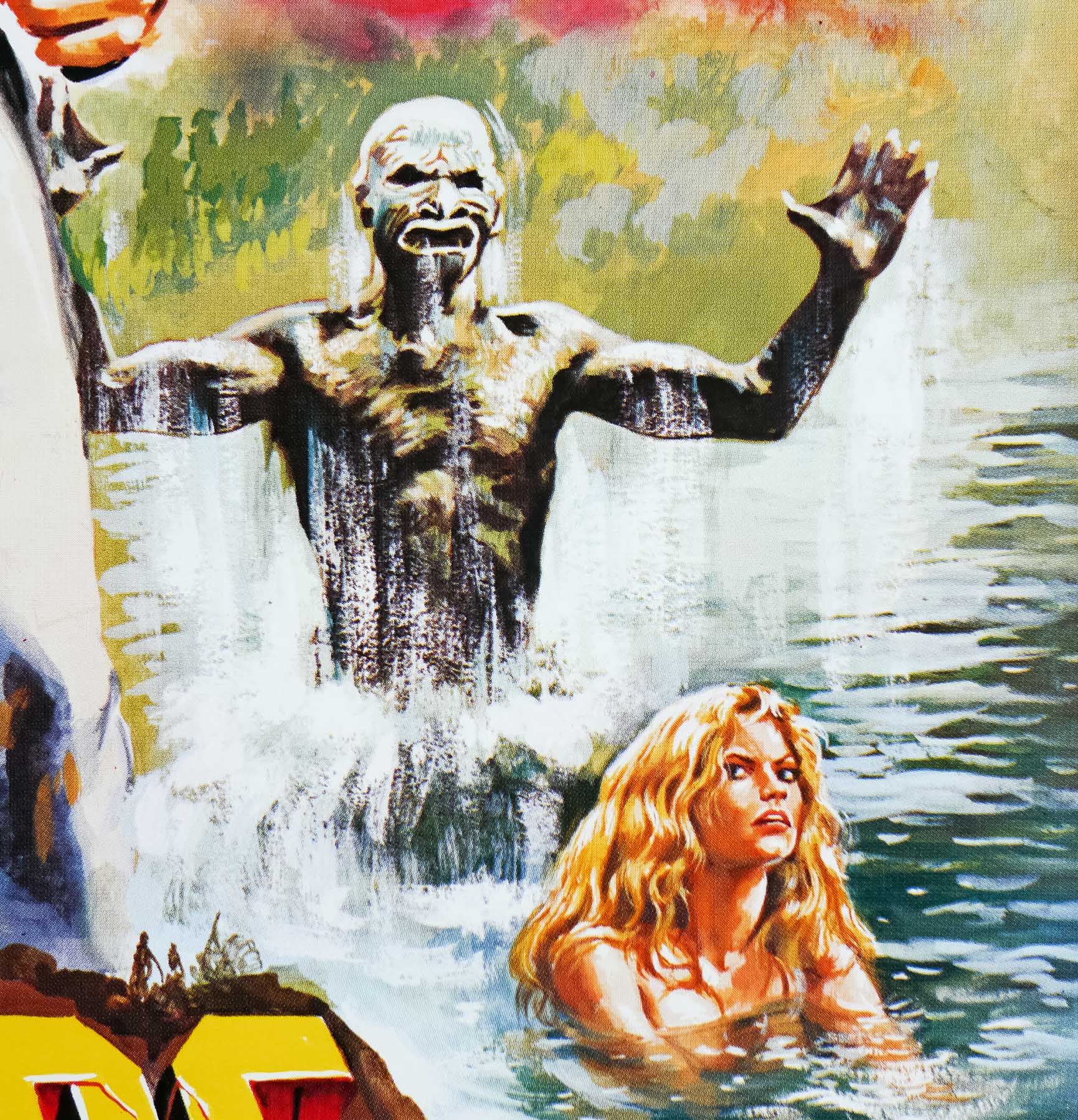
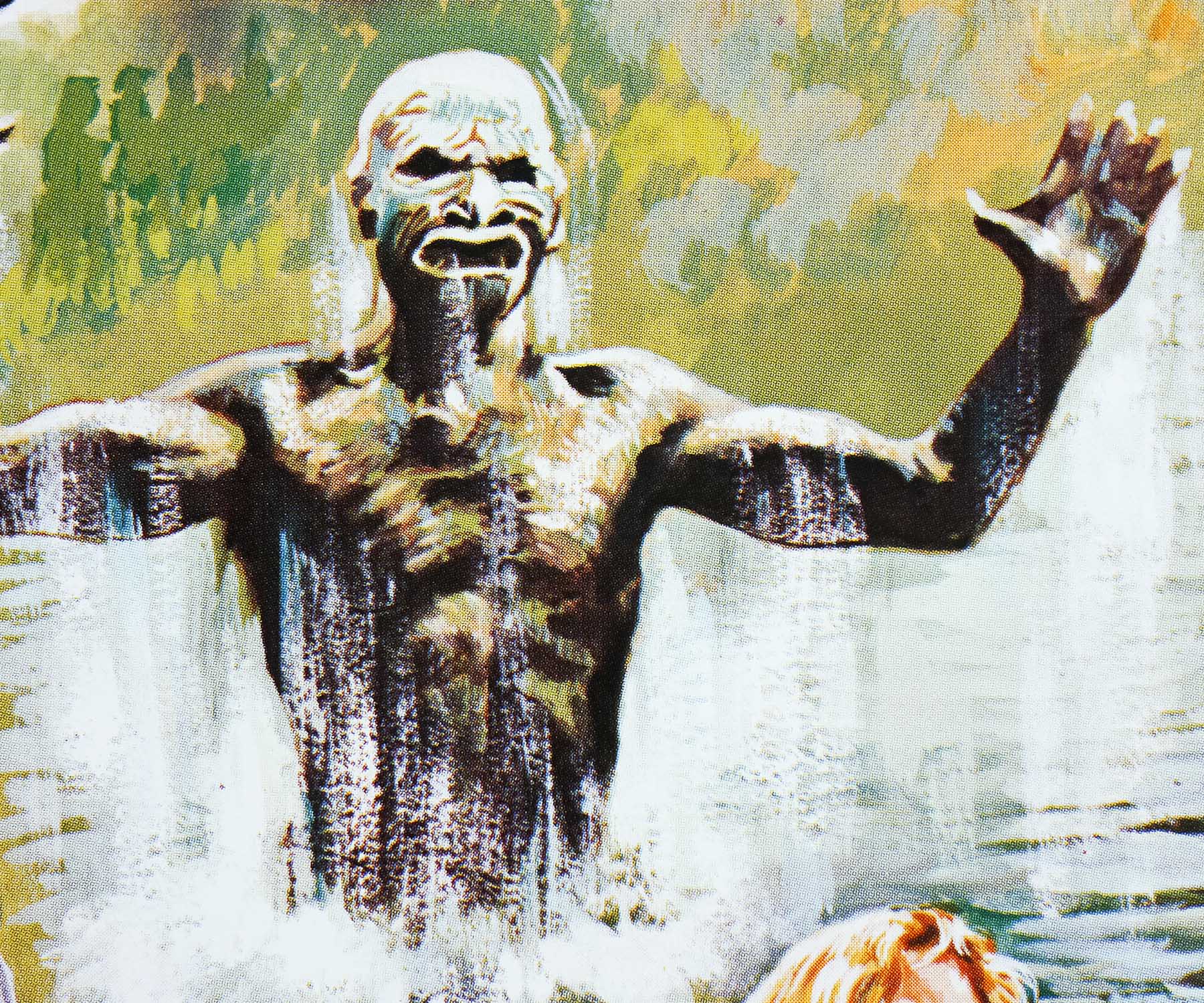
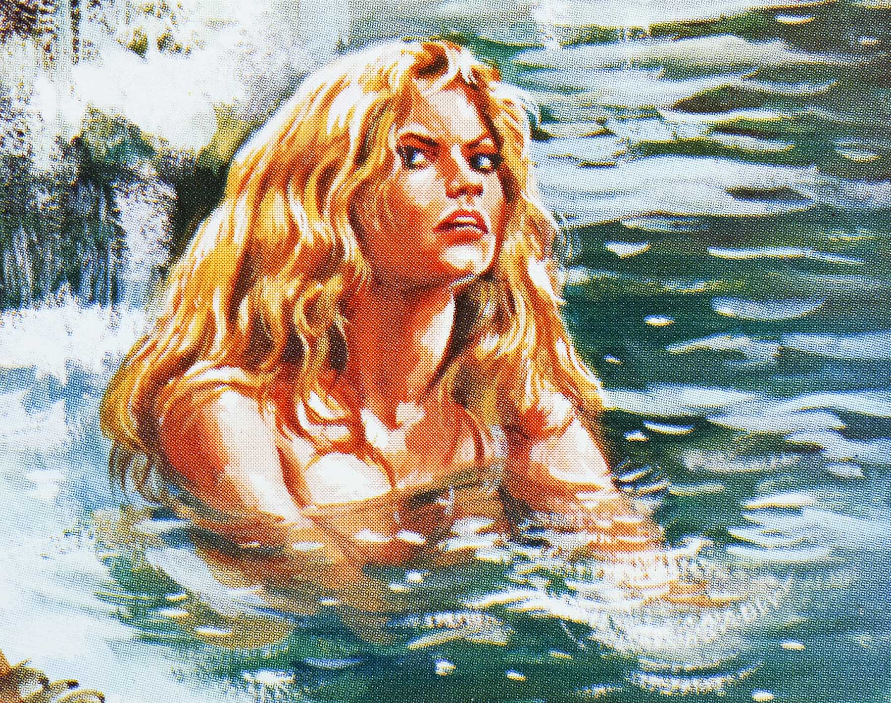
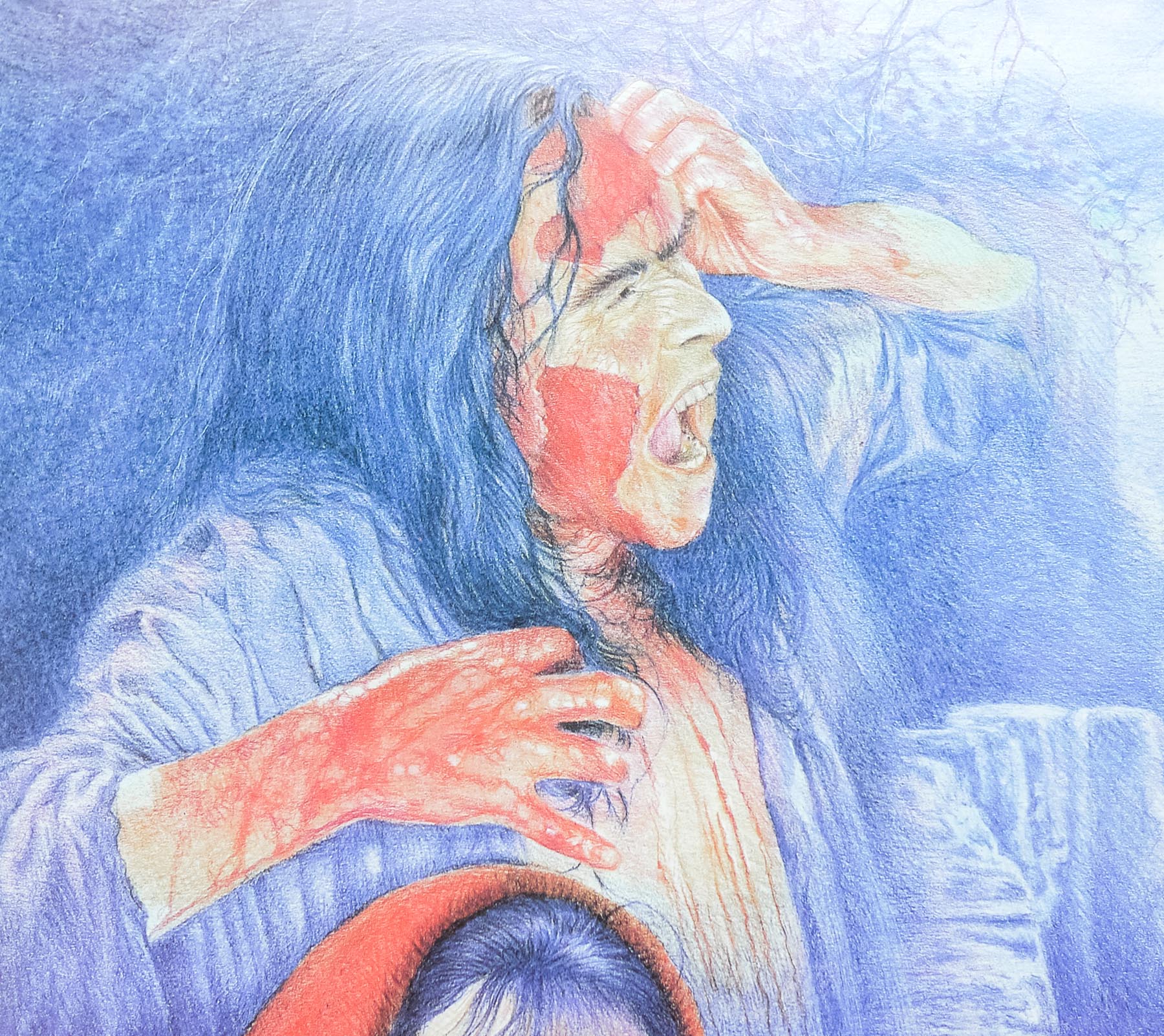
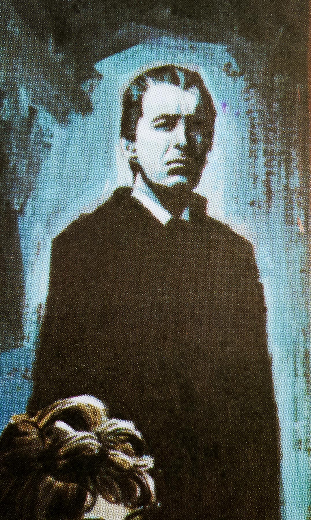
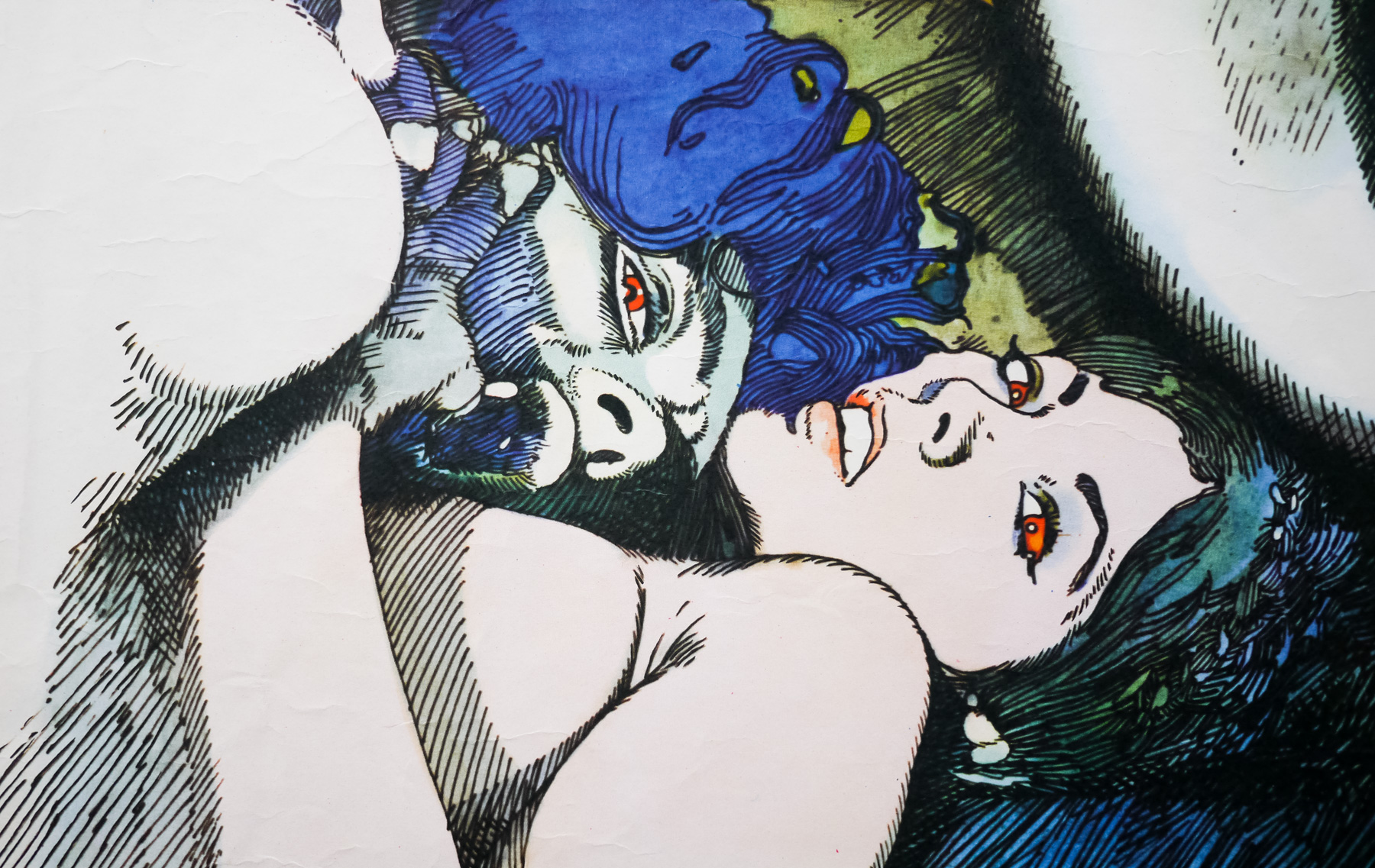
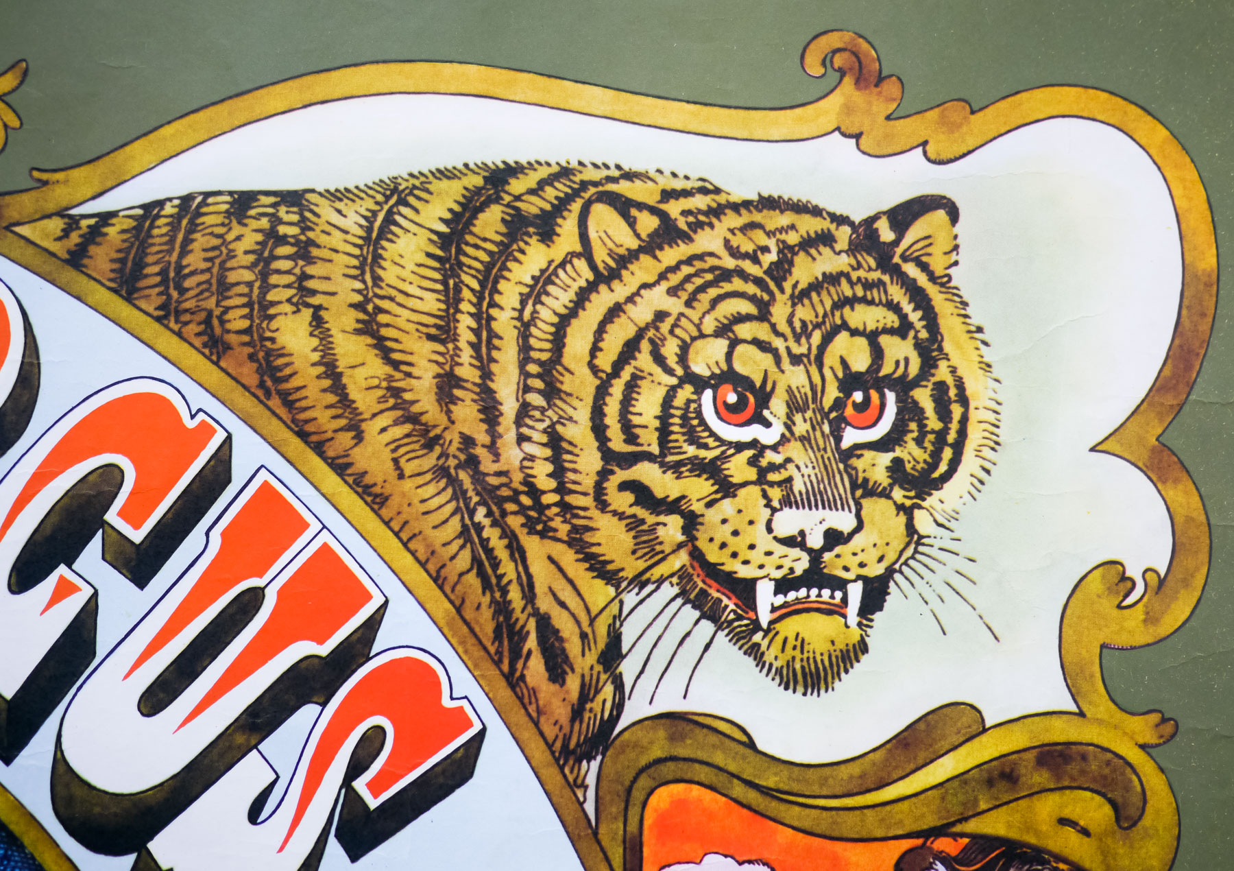
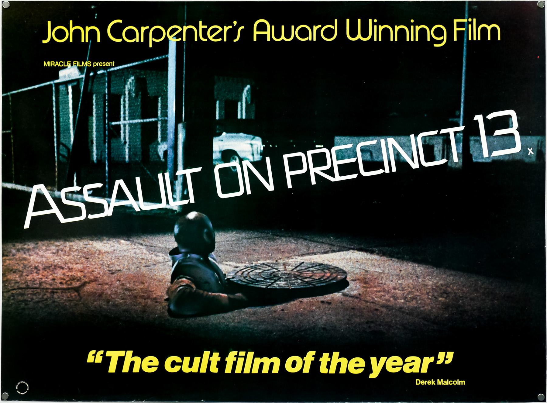
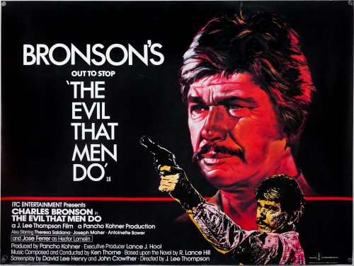
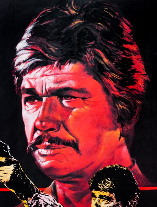
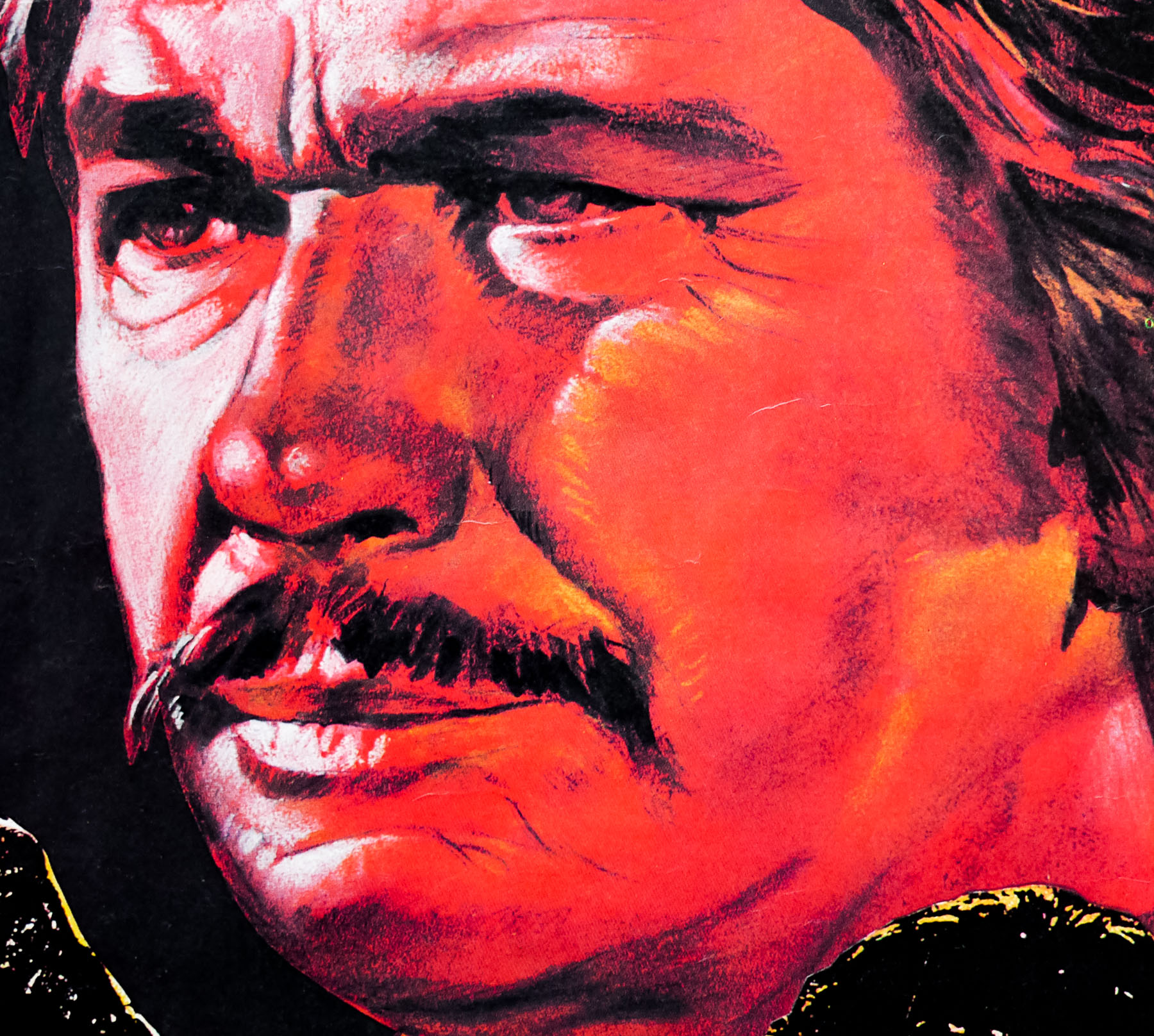
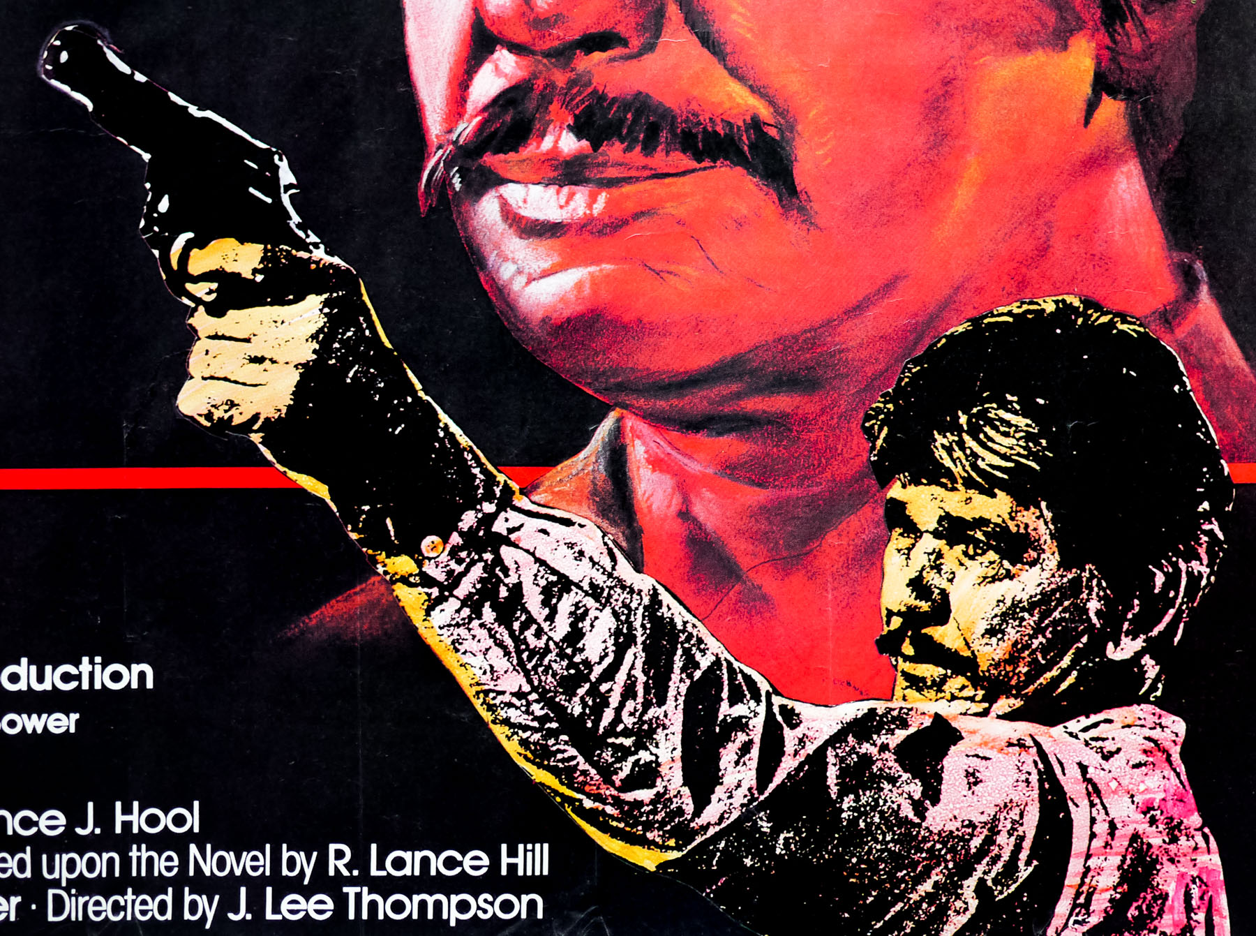
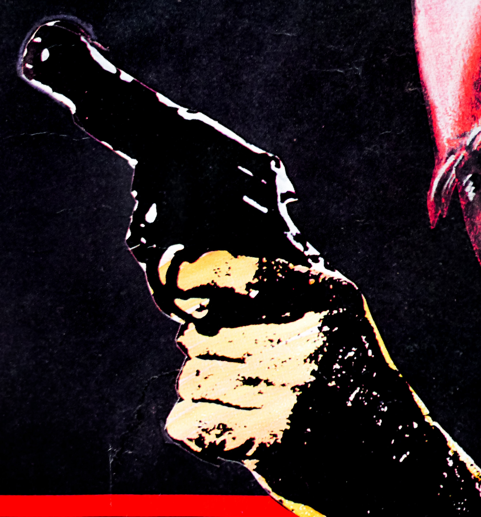
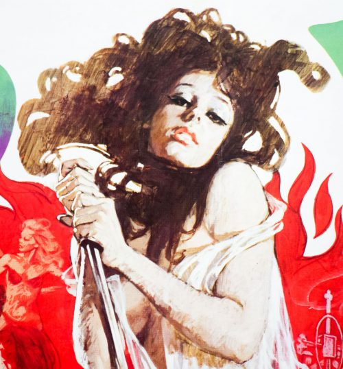
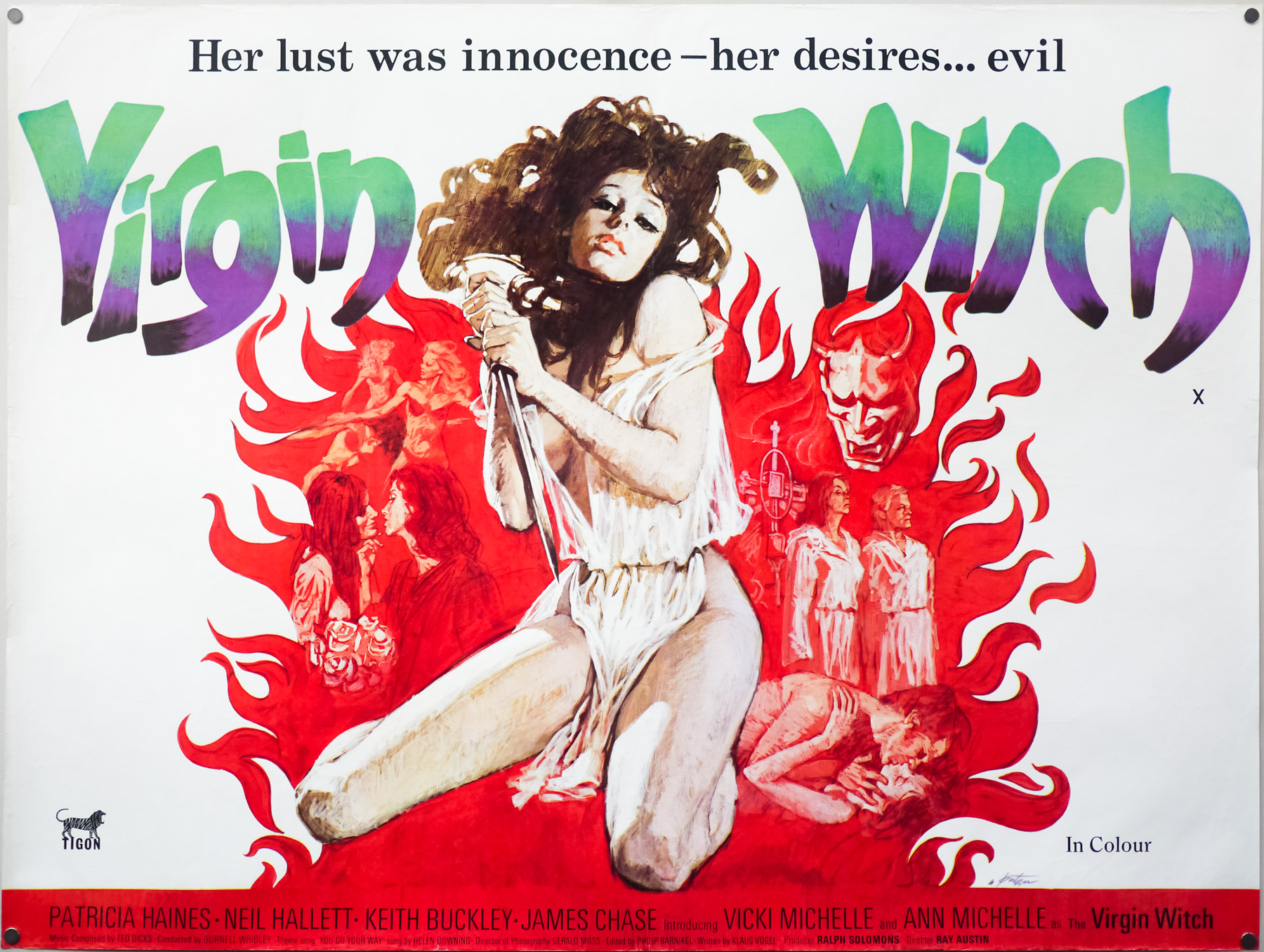
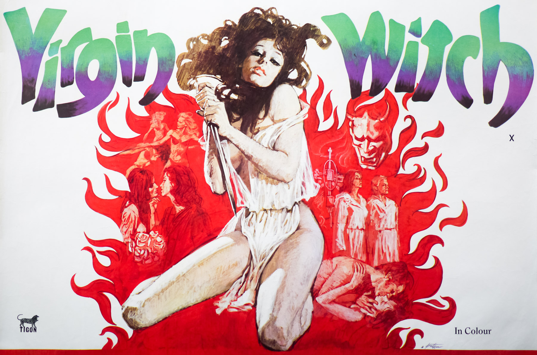
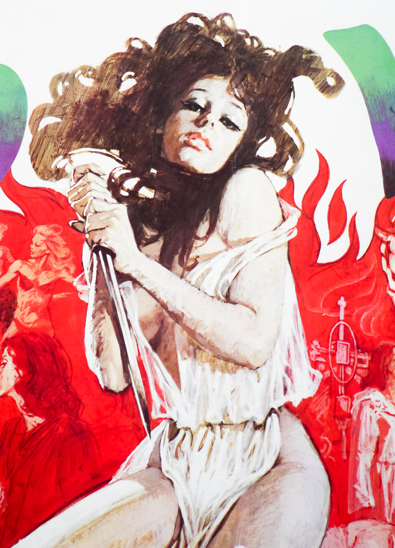
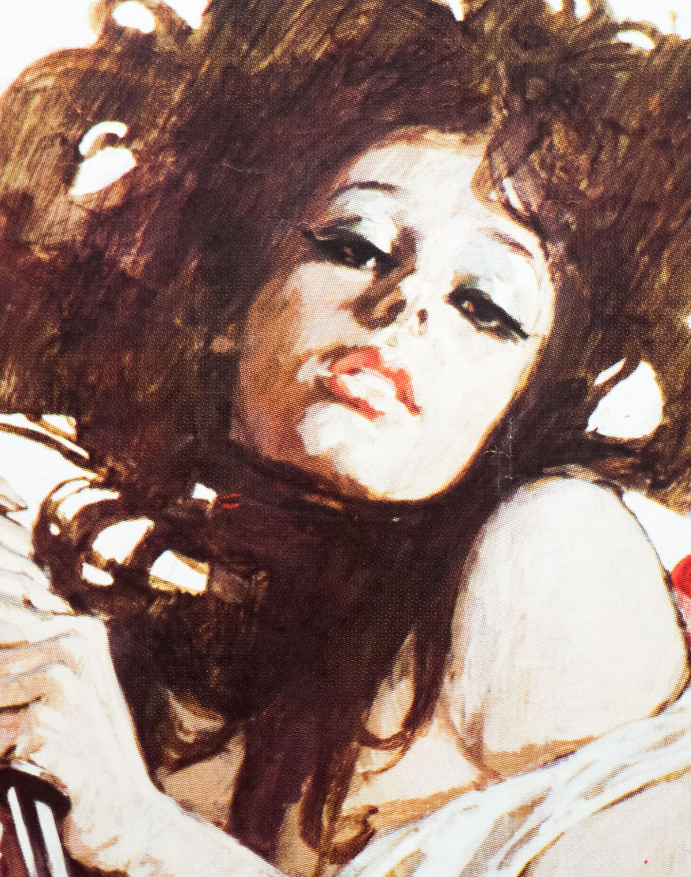
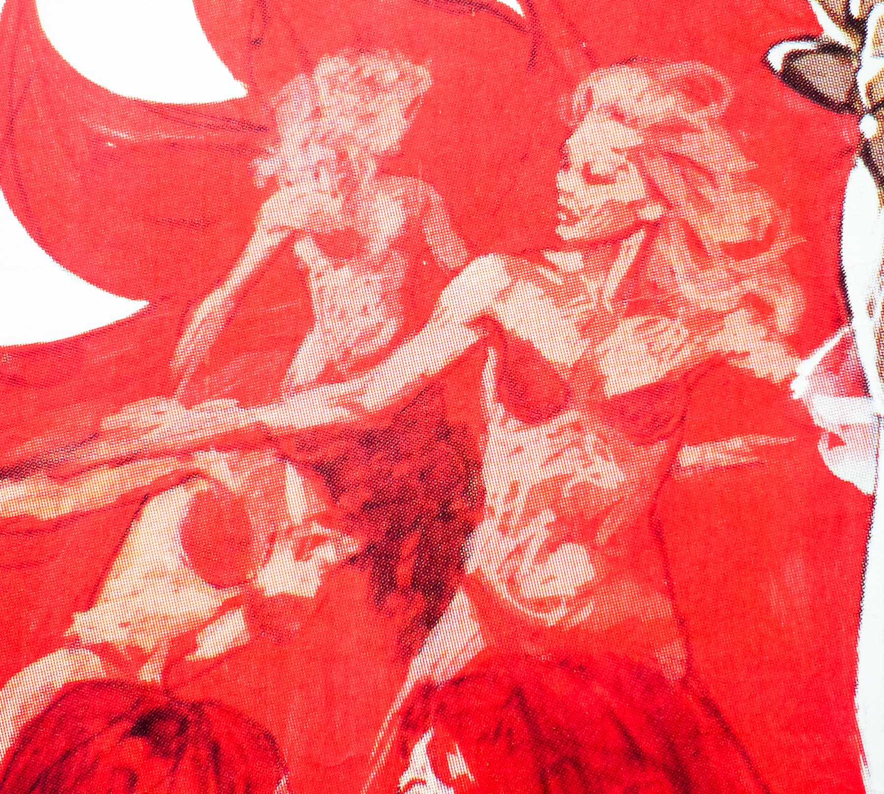
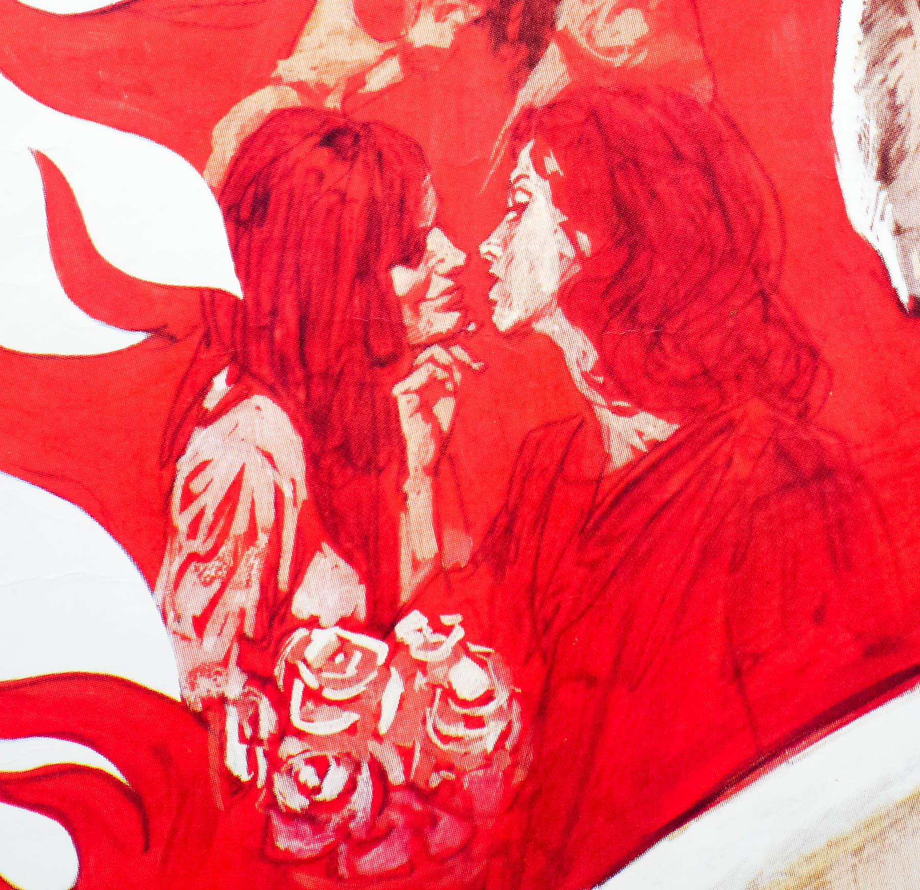
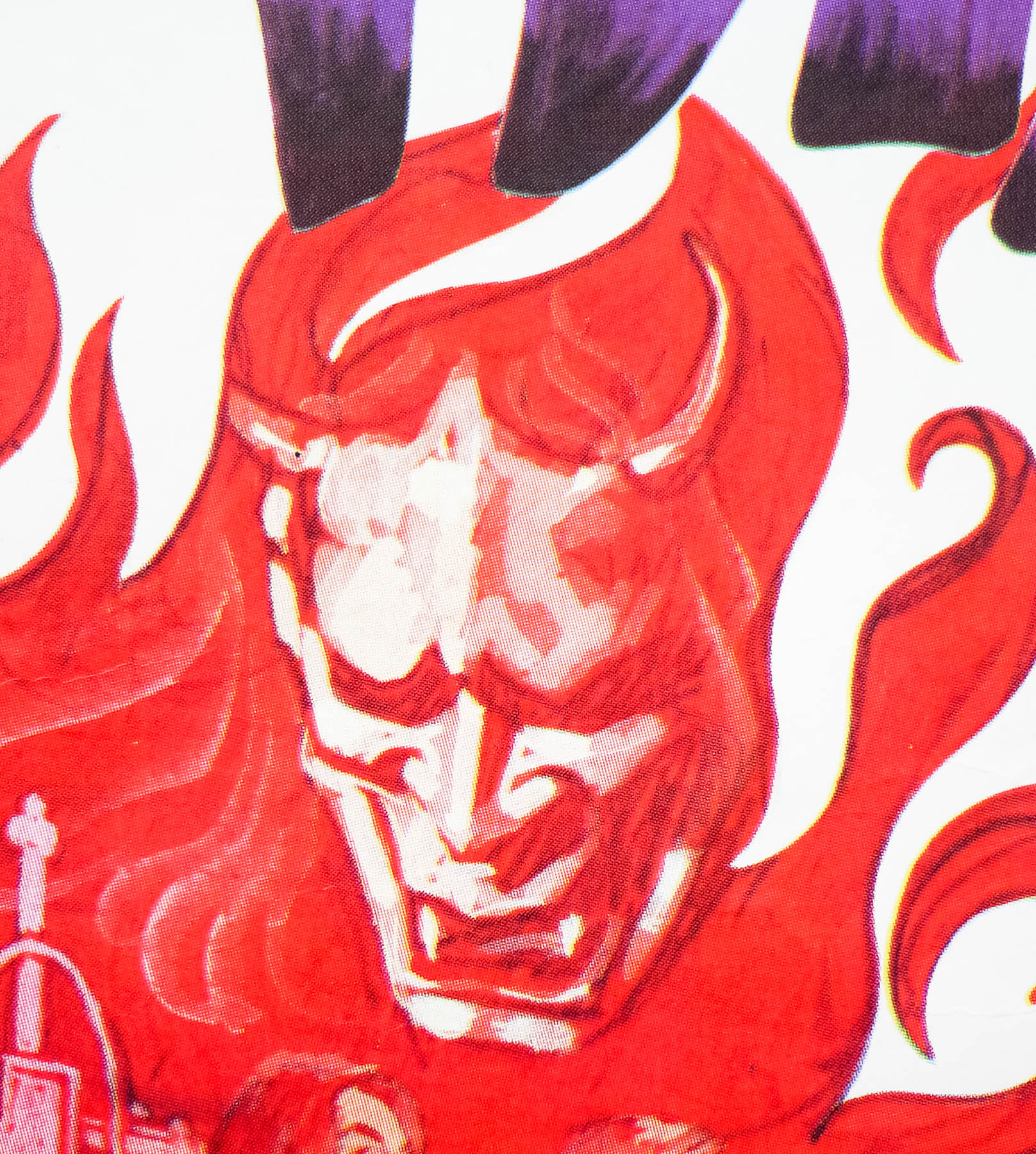
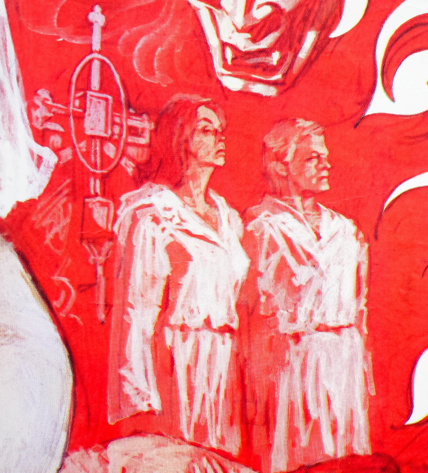
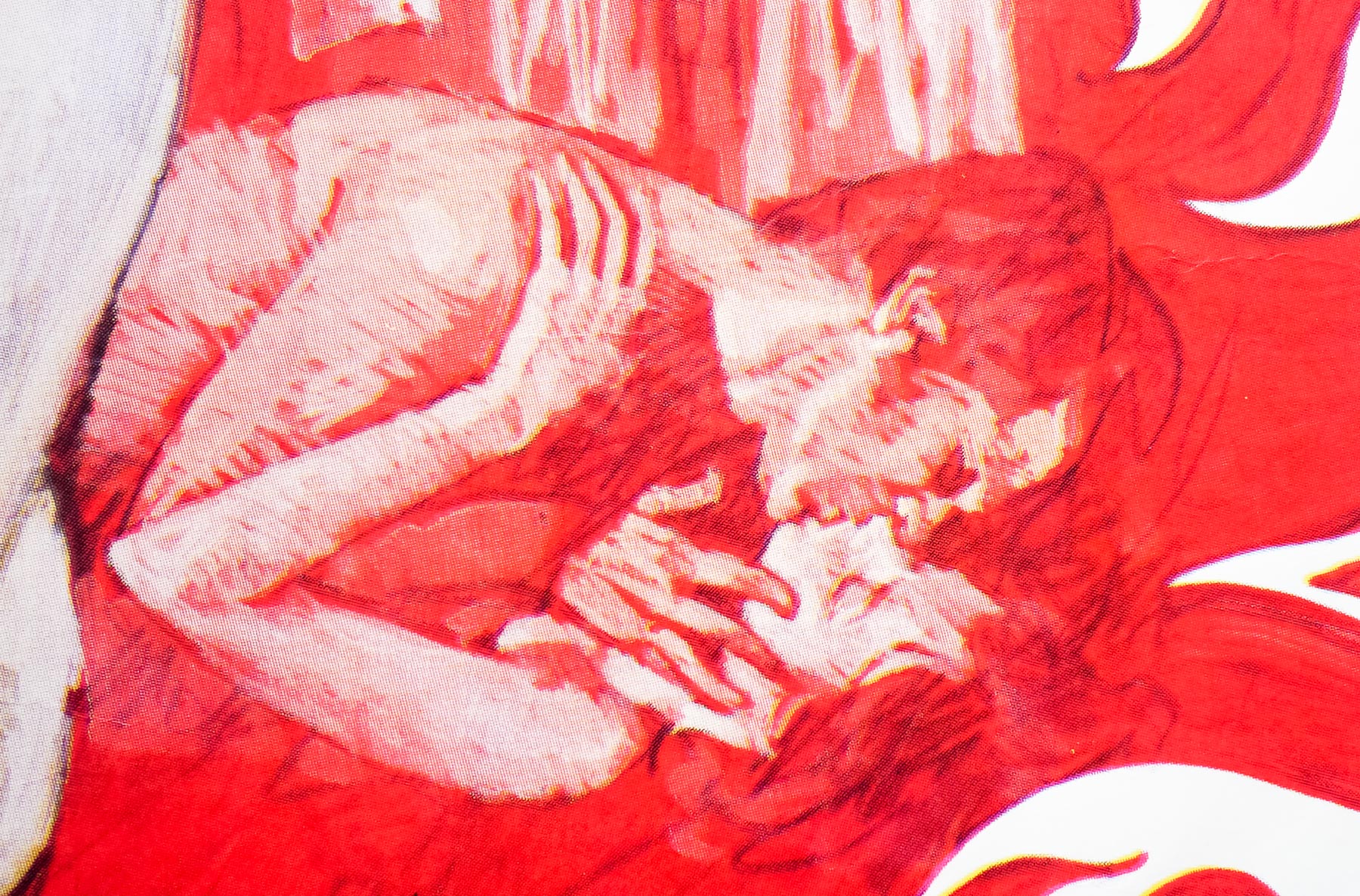
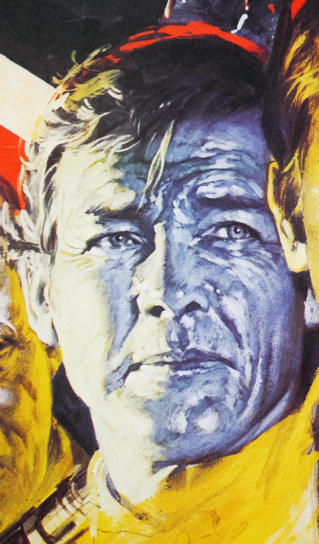
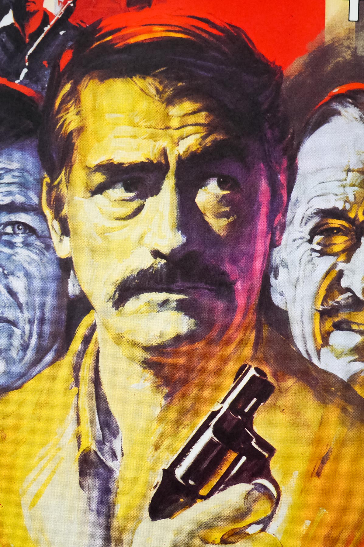
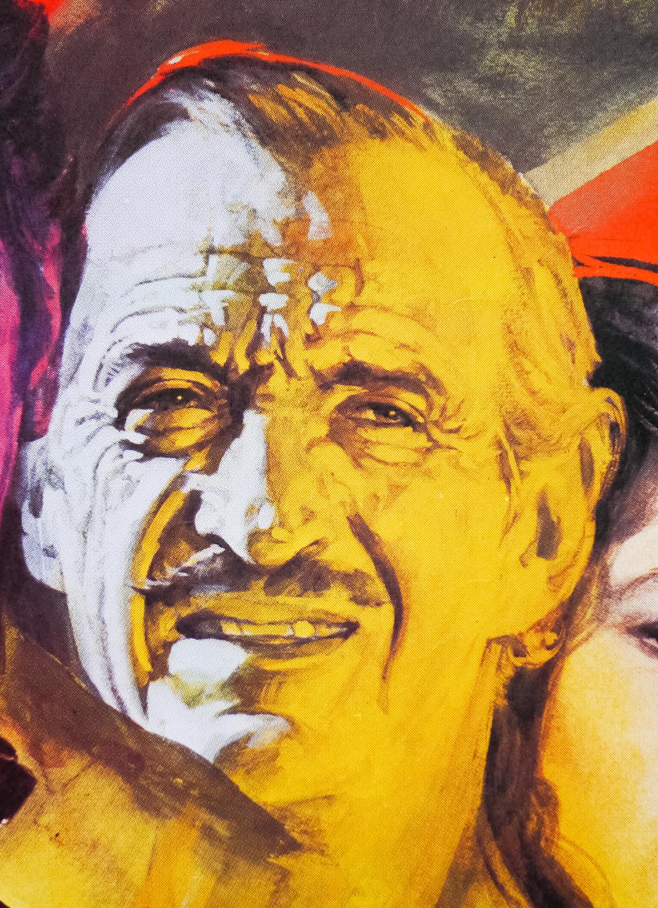
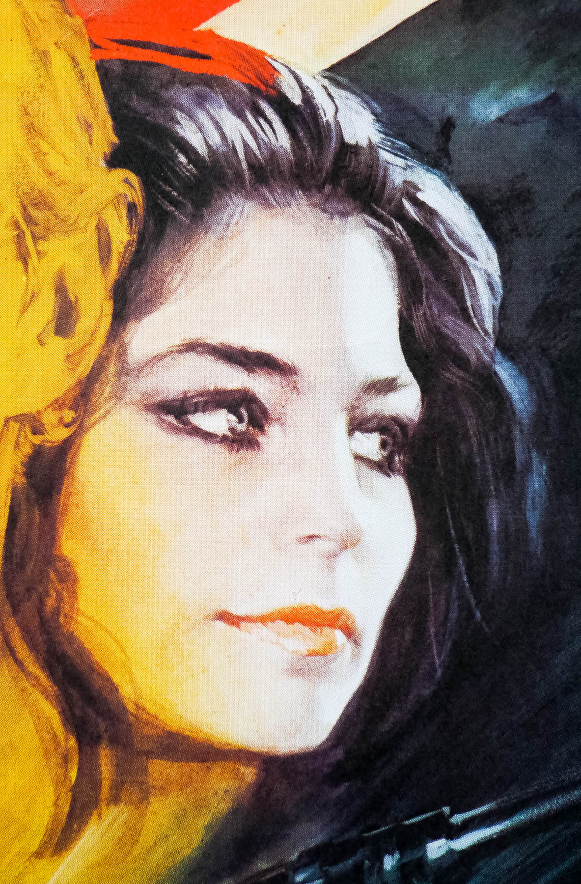
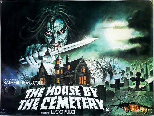
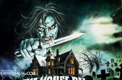
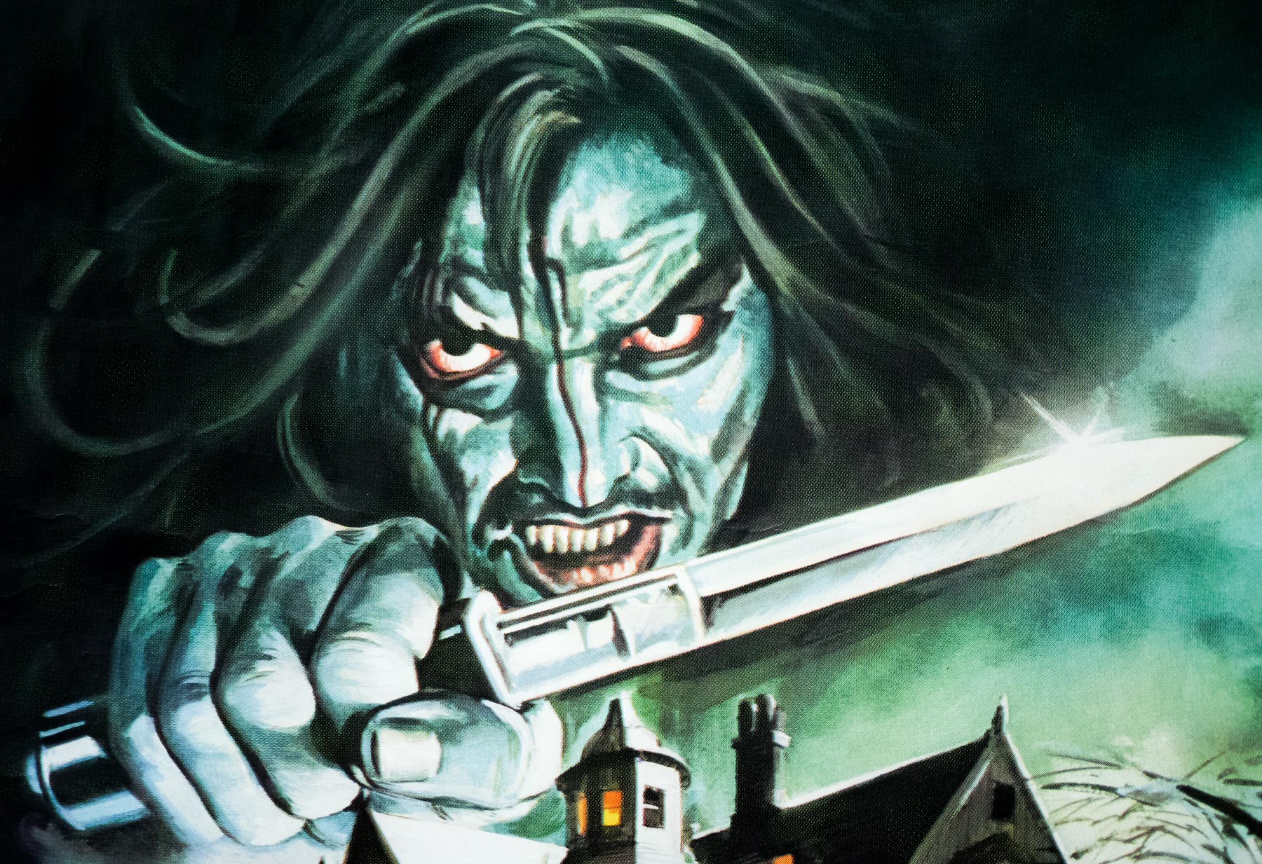
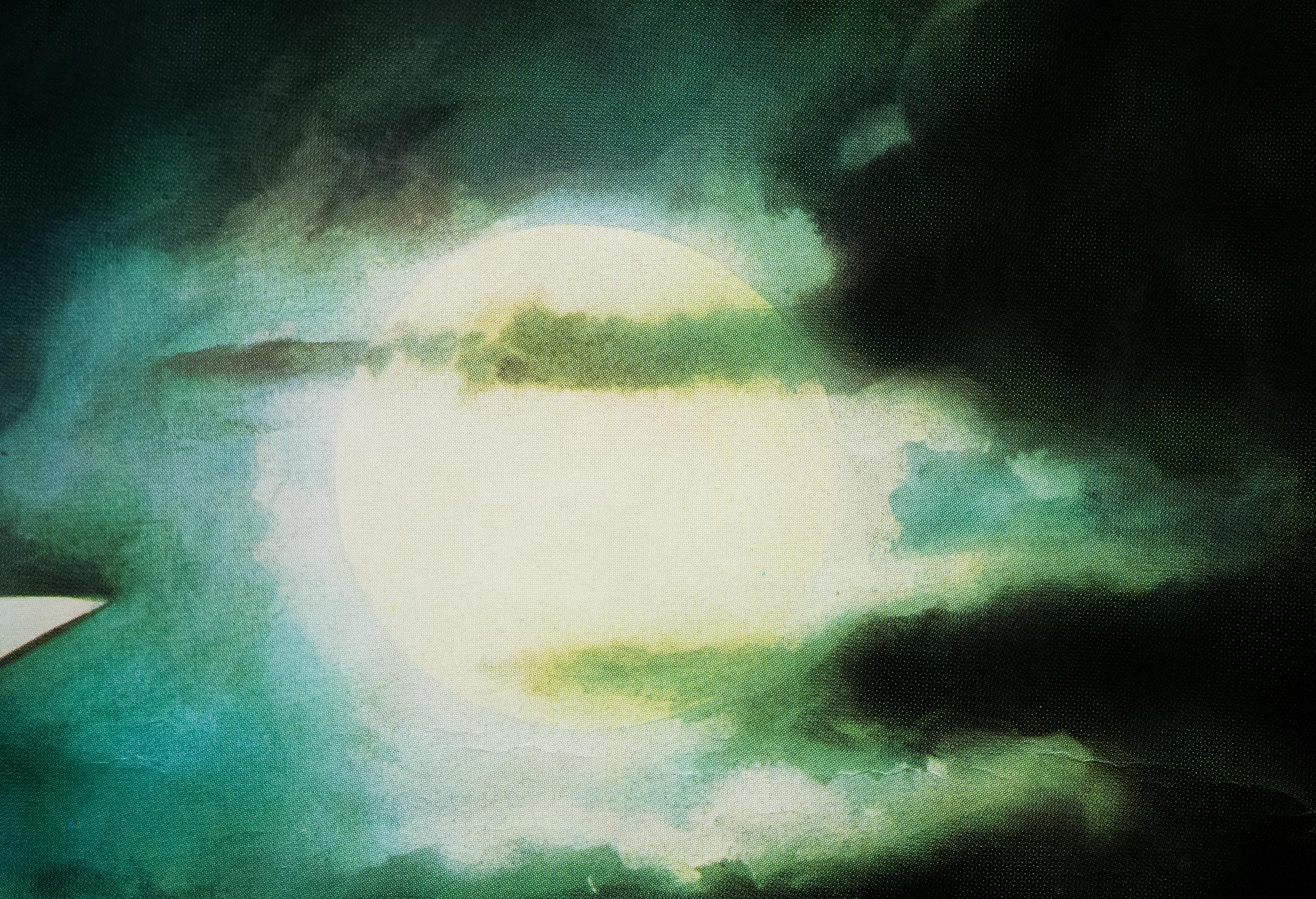
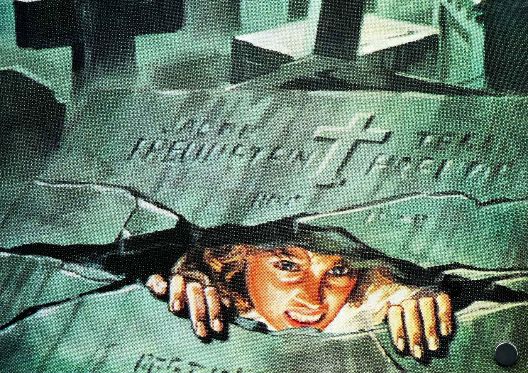
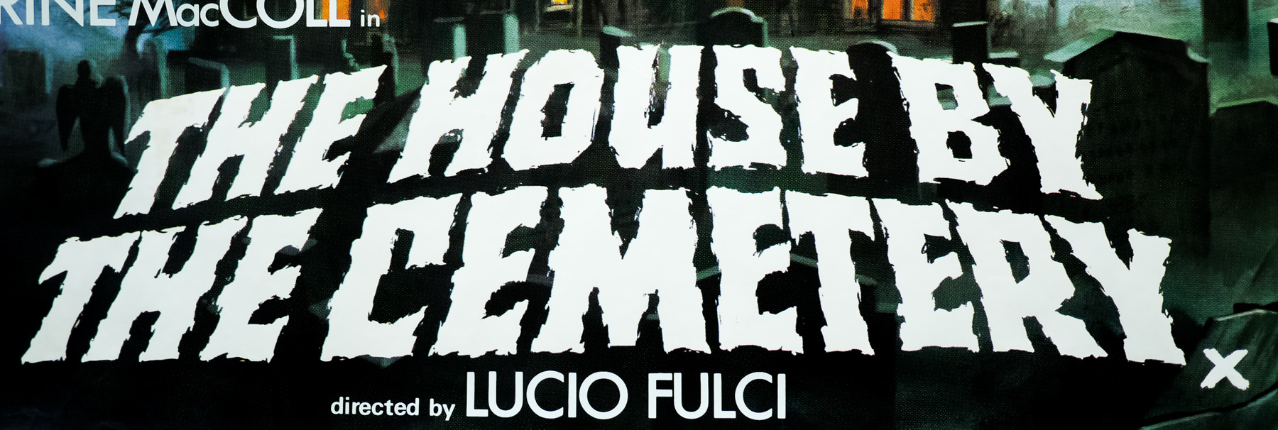
This is the UK quad poster for the first release of the film in British cinemas in 1982. It features artwork that is based on the Italian poster that was painted by the great artist Enzo Sciotti who has painted countless fantastic horror, sci-fi and exploitation posters over the years. As anyone who has seen the film will know, the knife-wielding character that dominates the poster doesn’t actually feature in the film itself. It’s said that the decision was taken to depict a psychotic killer that resembled Jack Nicholson’s character in Stanley Kubrick’s The Shining after that film had proven such an international success only a year previously.
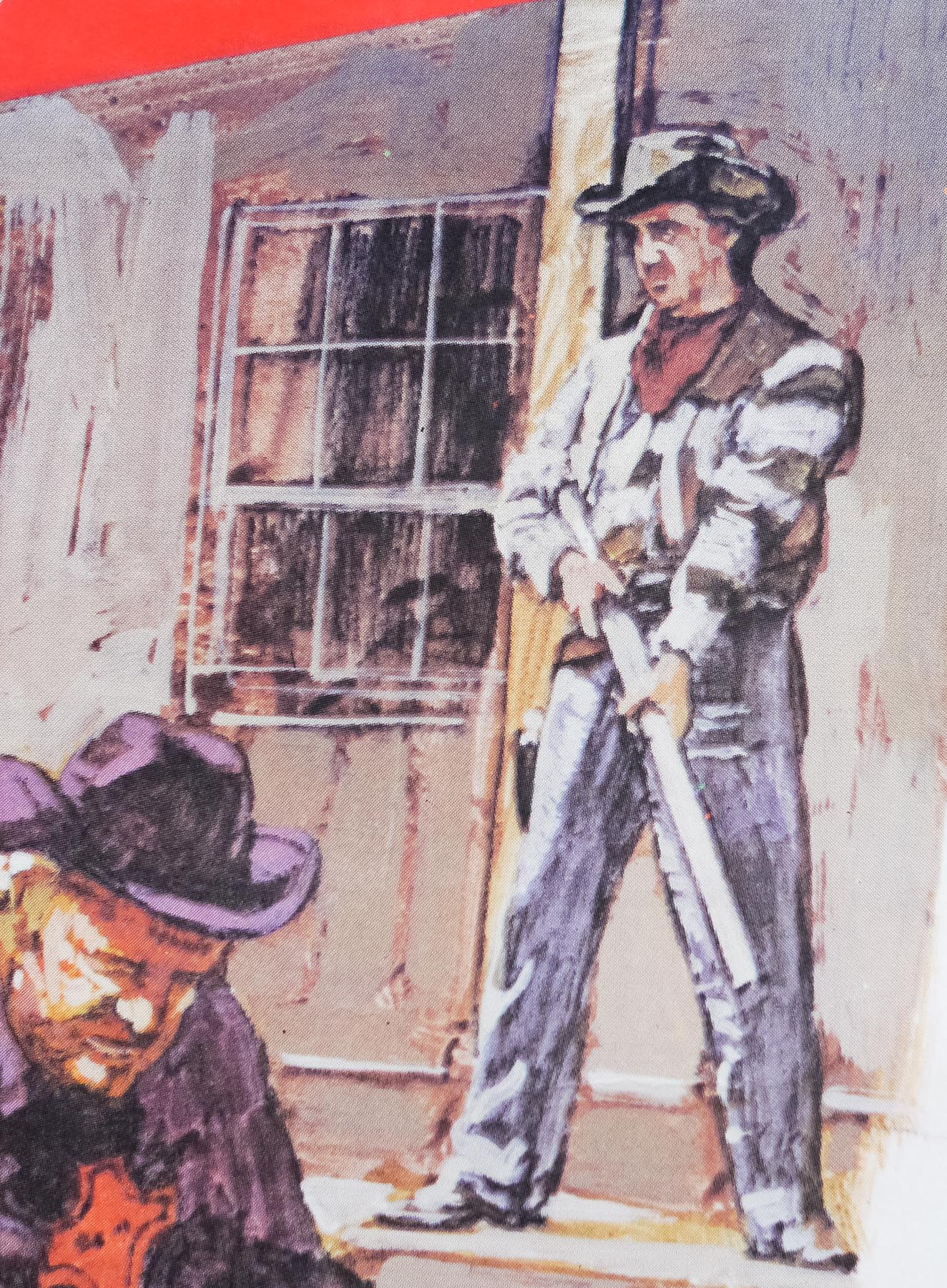
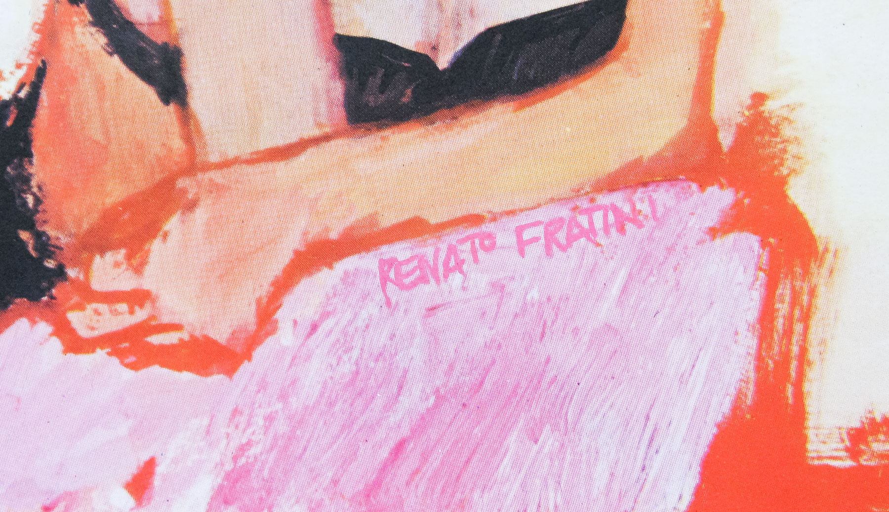
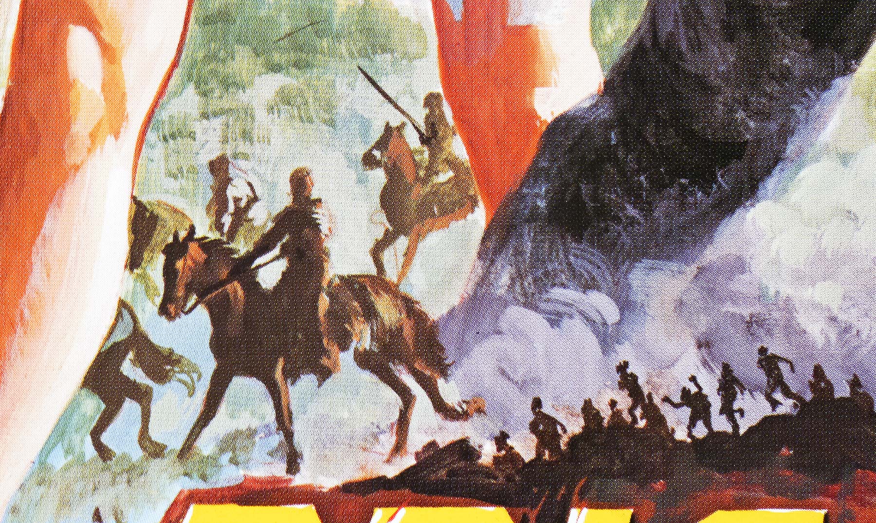
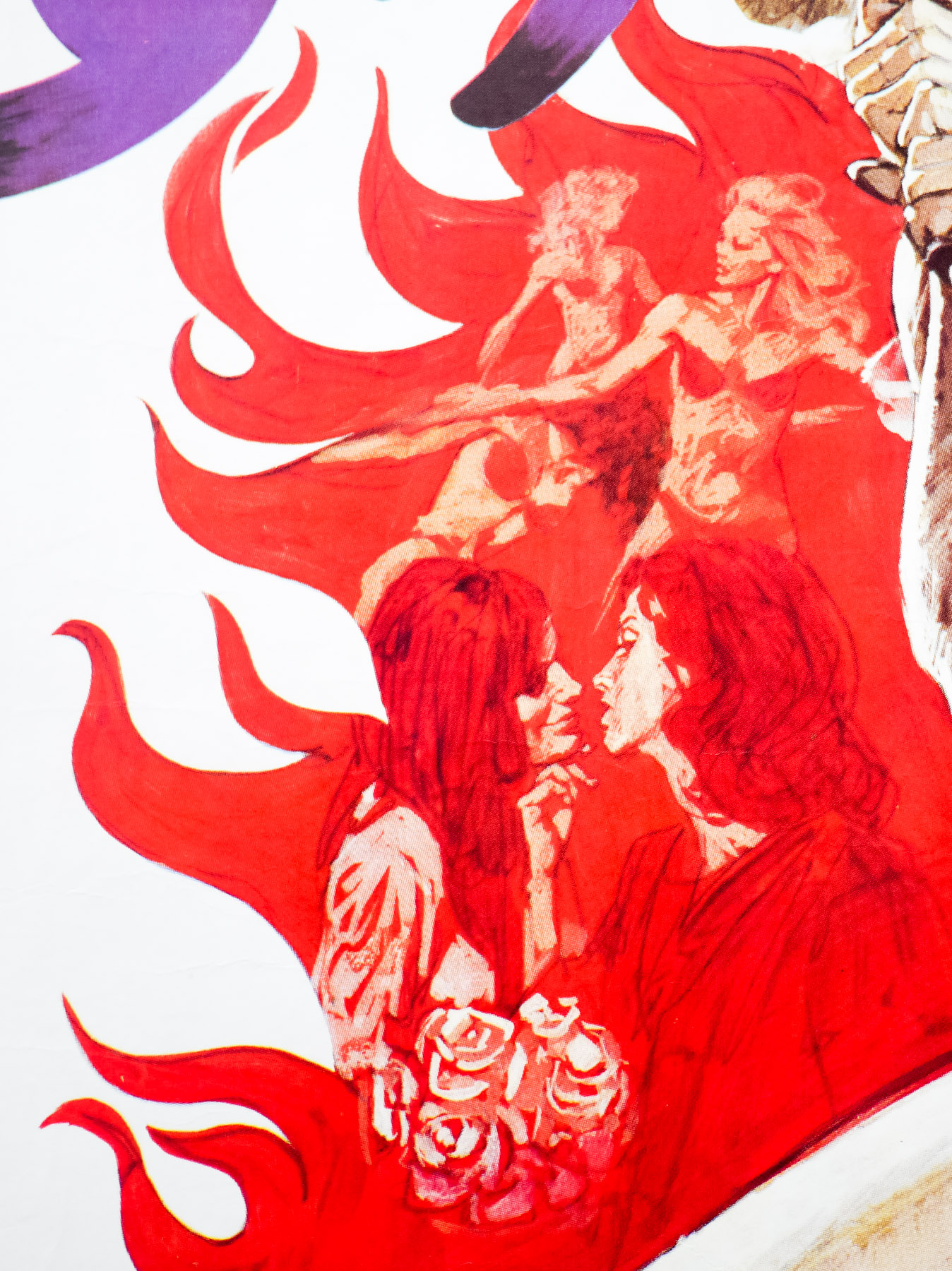
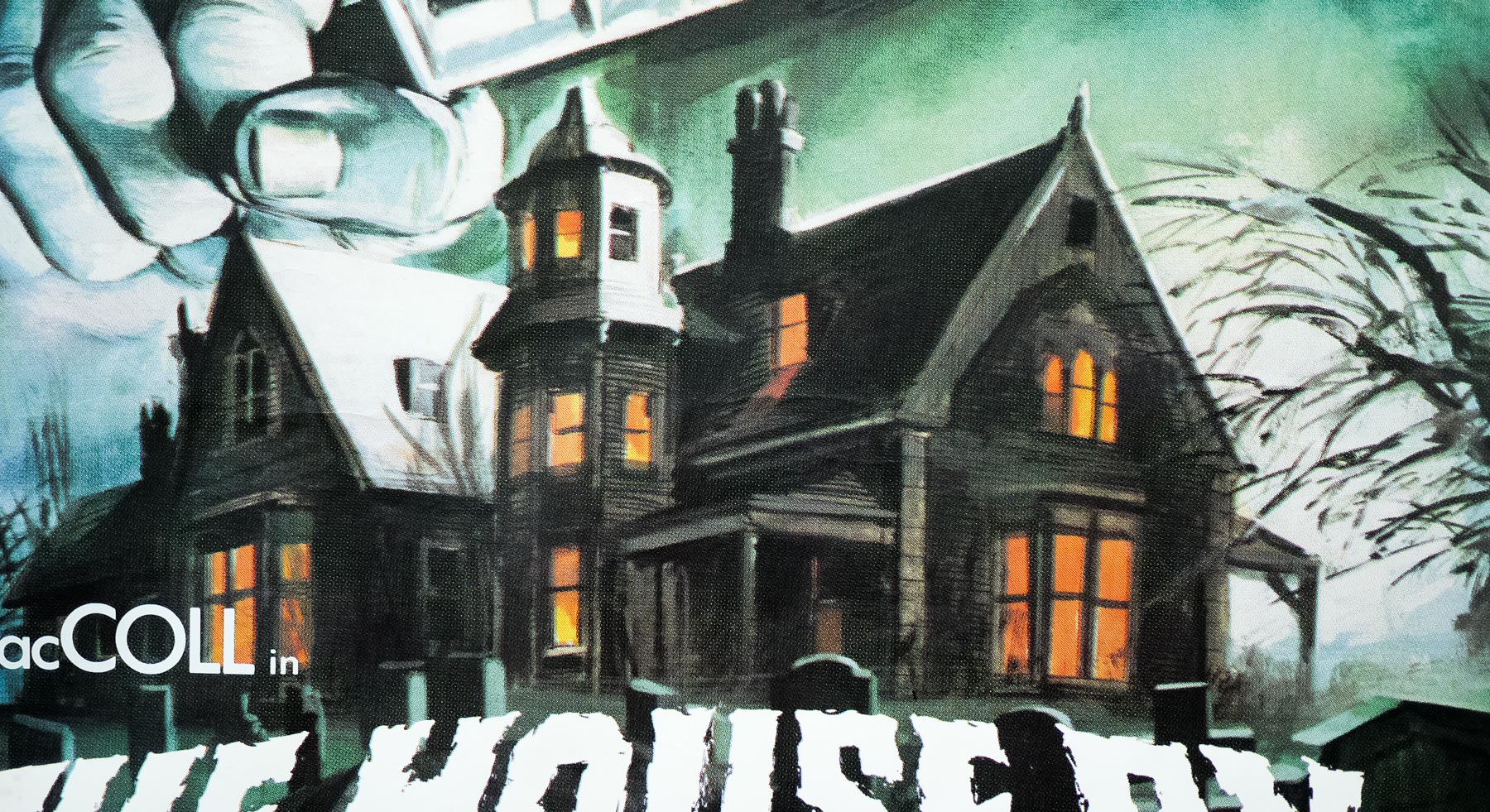
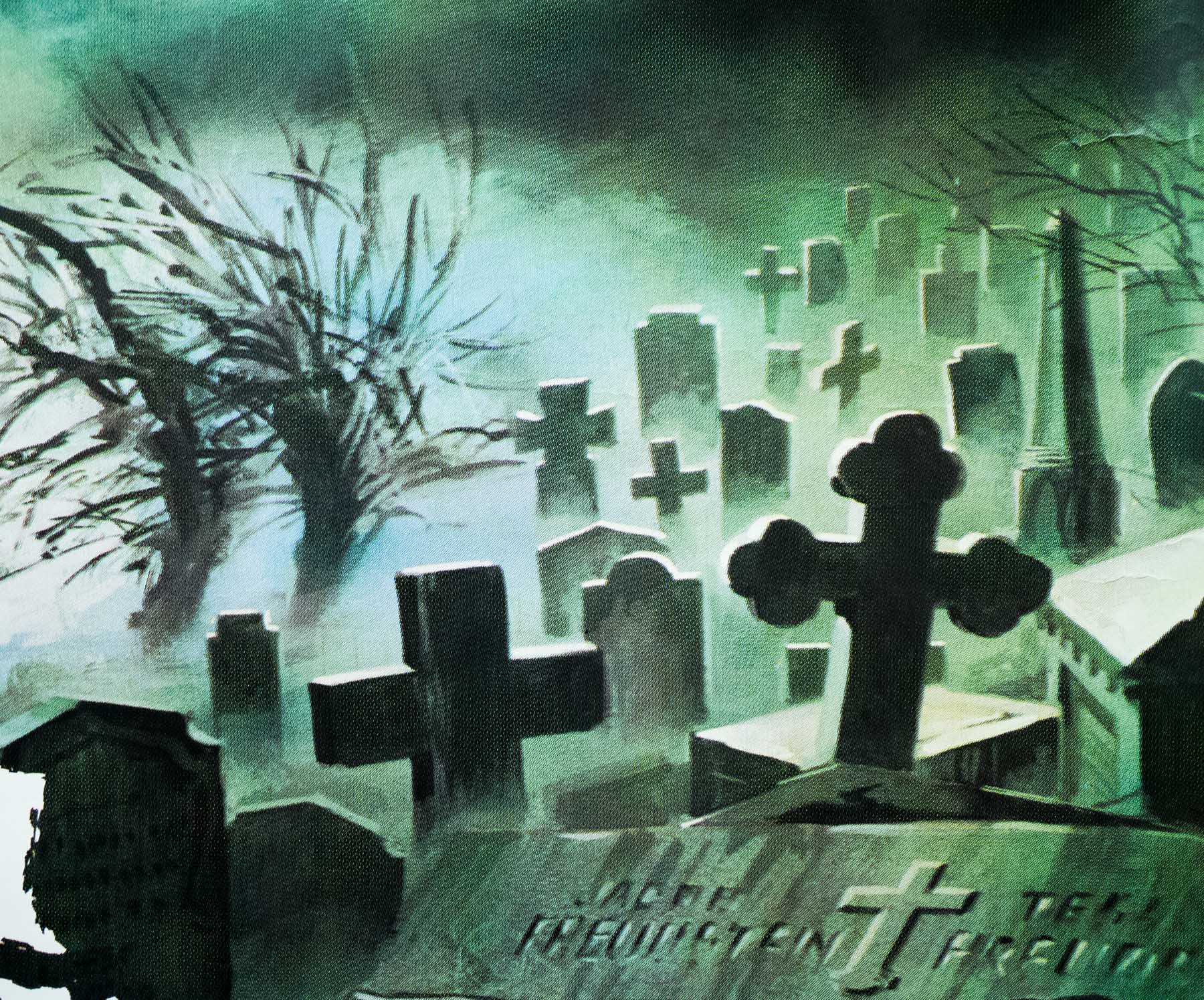
It is my belief that this artwork has been adapted from Sciotti’s original by a British artist, quite possibly Ted Baldwin who is thought to be responsible for the art on the quad for Zombie Creeping Flesh. Note the clear differences between the Italian poster and the details seen on this quad, particularly the evil character, the orientation and size of the house, and the layout of the graveyard. Obviously the original poster is in a portrait format so the decision may well have been taken to redraw it to better fit the landscape format of the quad.
Enzo Sciotti‘s official site has galleries of his work, some of which is for sale. Wrong Side of the Art has a selection of some of his work, and Eatbrie.com also features several of his designs. The other posters I’ve collected by him can be seen here.