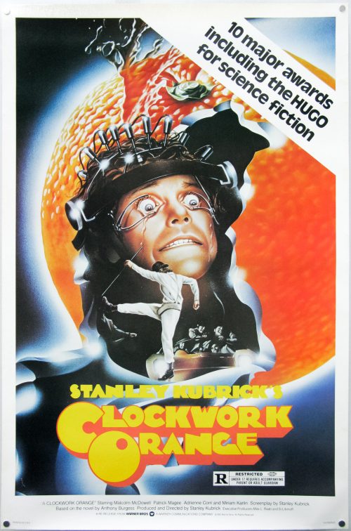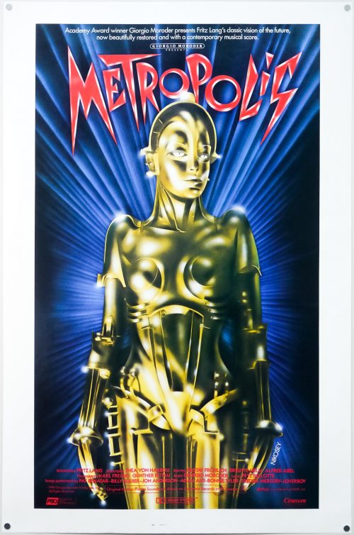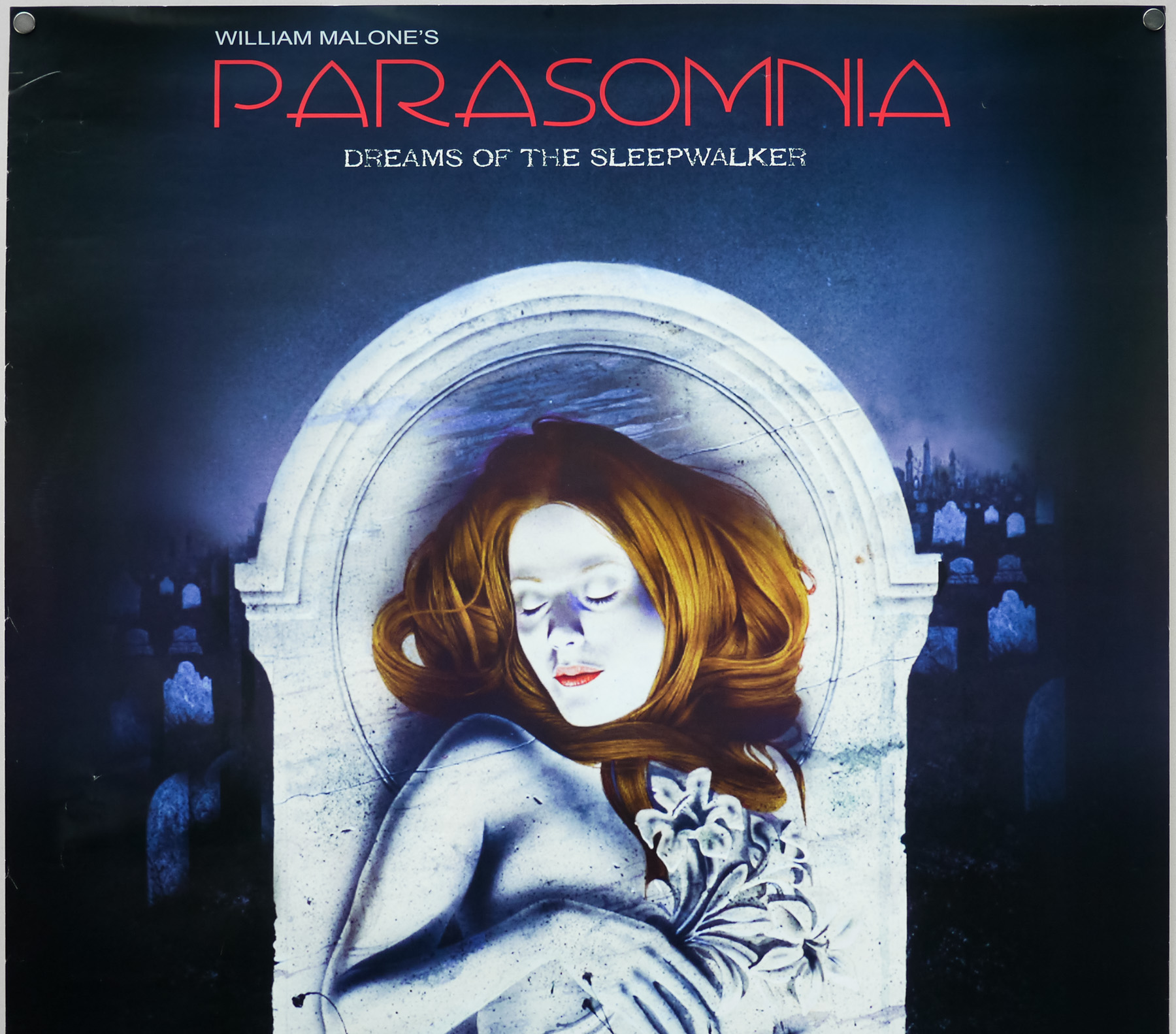
Poster detail
1-5


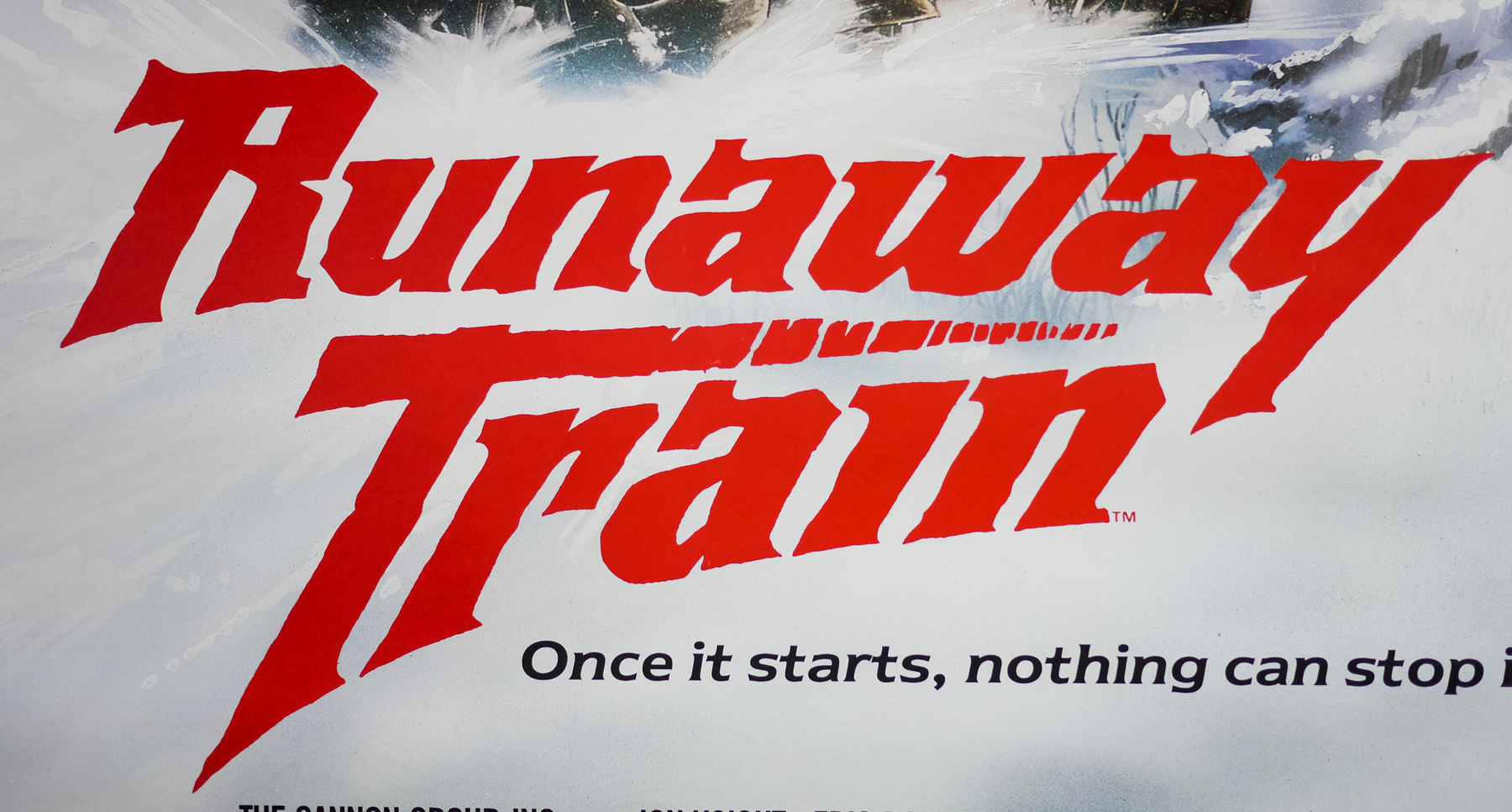
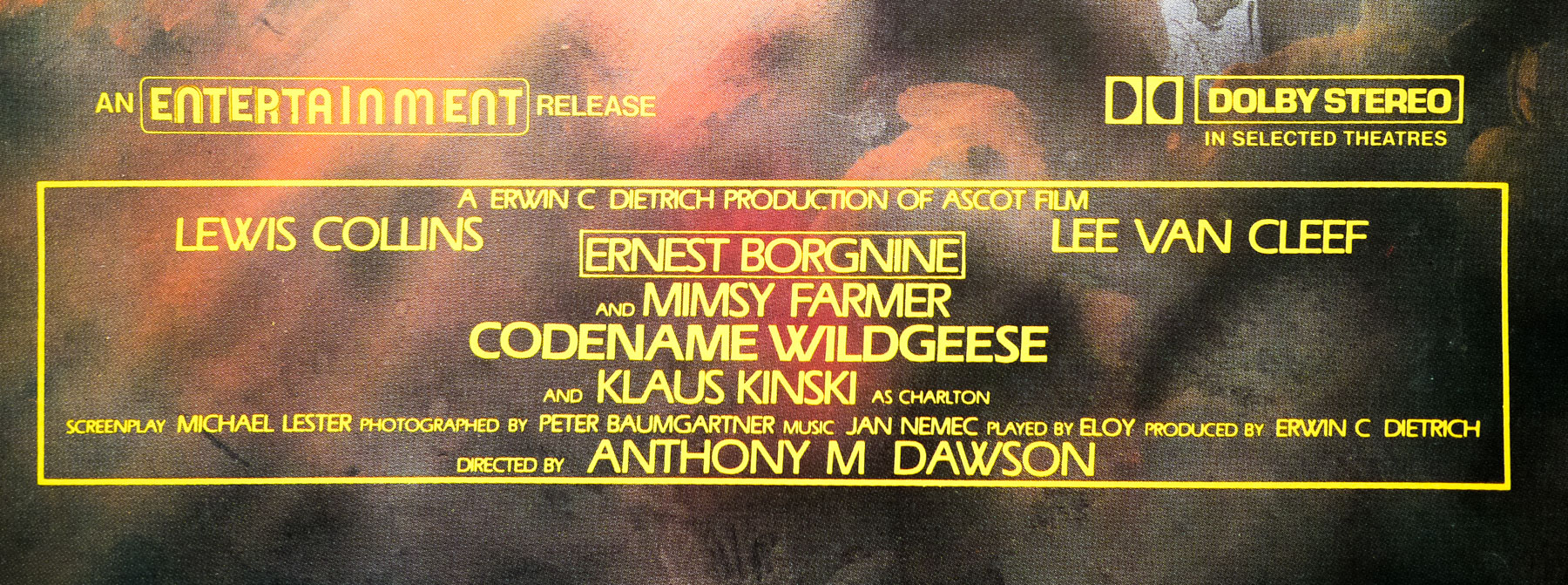
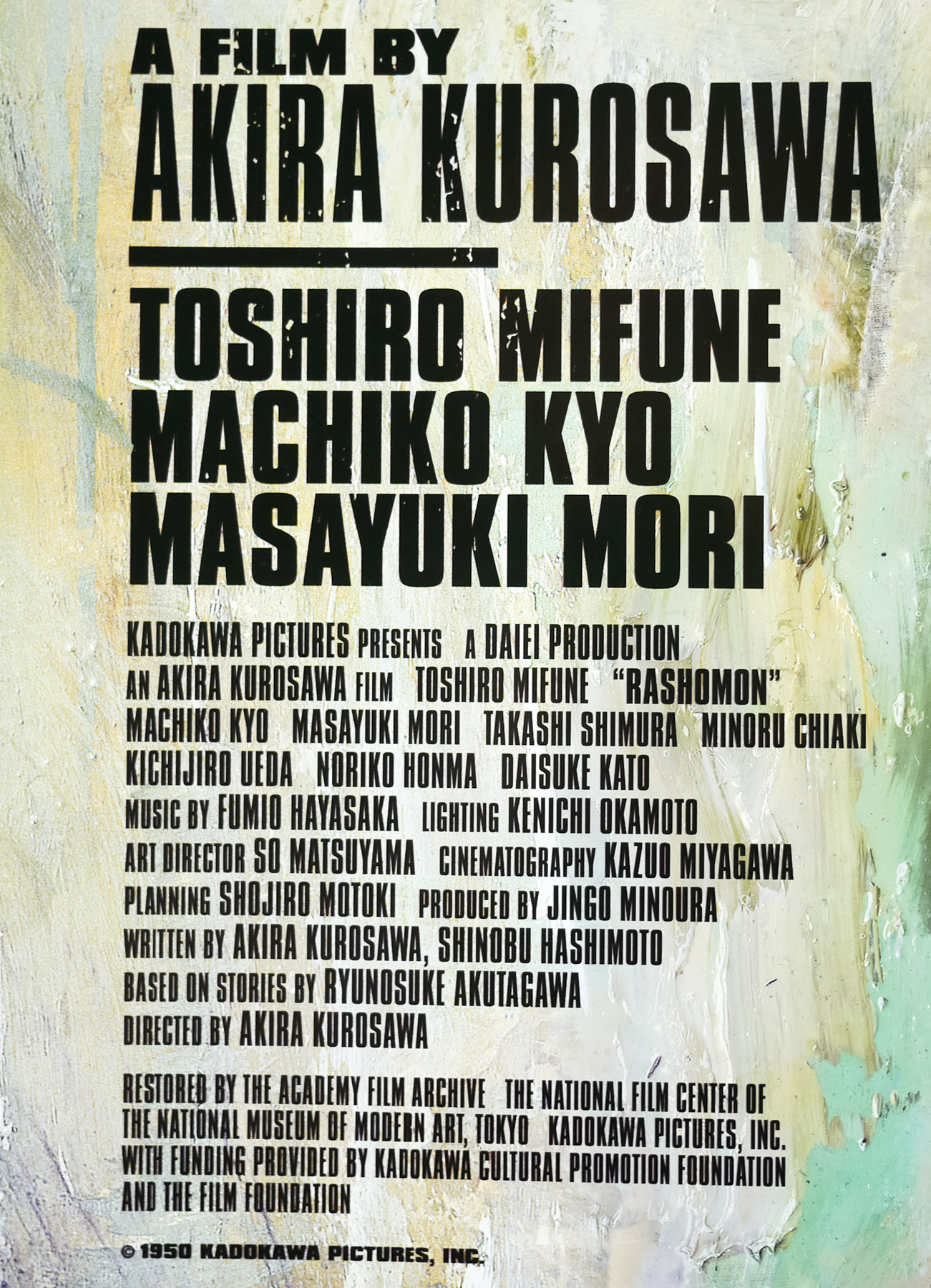
- Title
- Runaway Train
- AKA
- A 30 secondi dalla fine [30 seconds from the end] (Italy)
- Year of Film
- 1985
- Director
- Andrei Konchalovsky
- Starring
- Jon Voight, Eric Roberts, Rebecca De Mornay, Kyle T. Heffner, John P. Ryan, T. K. Carter, Kenneth McMillan, Stacey Pickren, Walter Wyatt, Edward Bunker
- Origin of Film
- USA | Israel
- Genre(s) of Film
- Jon Voight, Eric Roberts, Rebecca De Mornay, Kyle T. Heffner, John P. Ryan, T. K. Carter, Kenneth McMillan, Stacey Pickren, Walter Wyatt, Edward Bunker,
- Type of Poster
- Video
- Style of Poster
- --
- Origin of Poster
- UK
- Year of Poster
- 1986
- Designer
- Unknown
- Artist
- Unknown
- Size (inches)
- 23 13/16" x 33 1/16"
- SS or DS
- SS
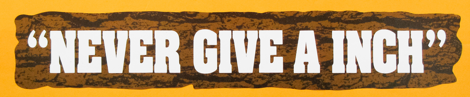
- Tagline
- --
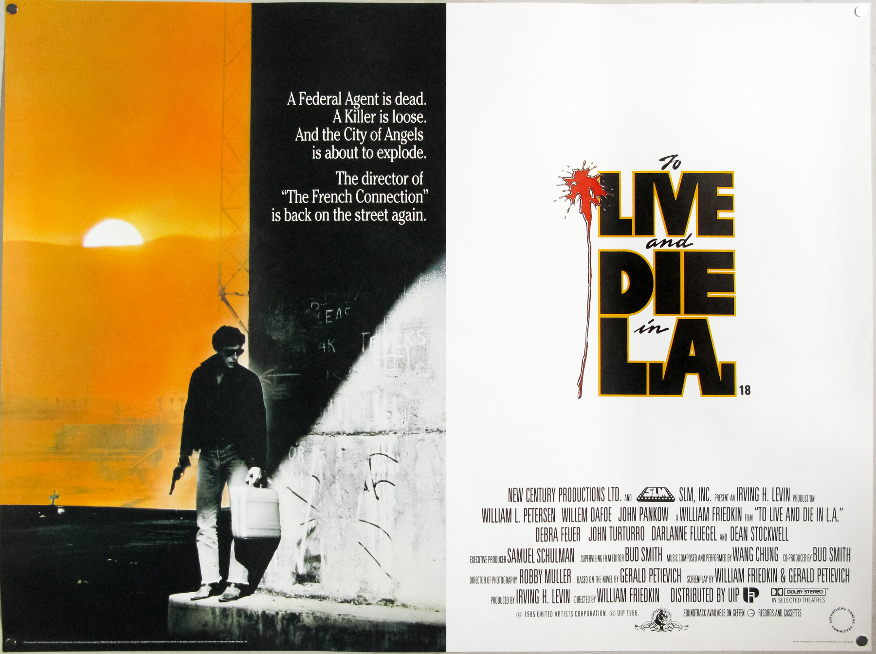
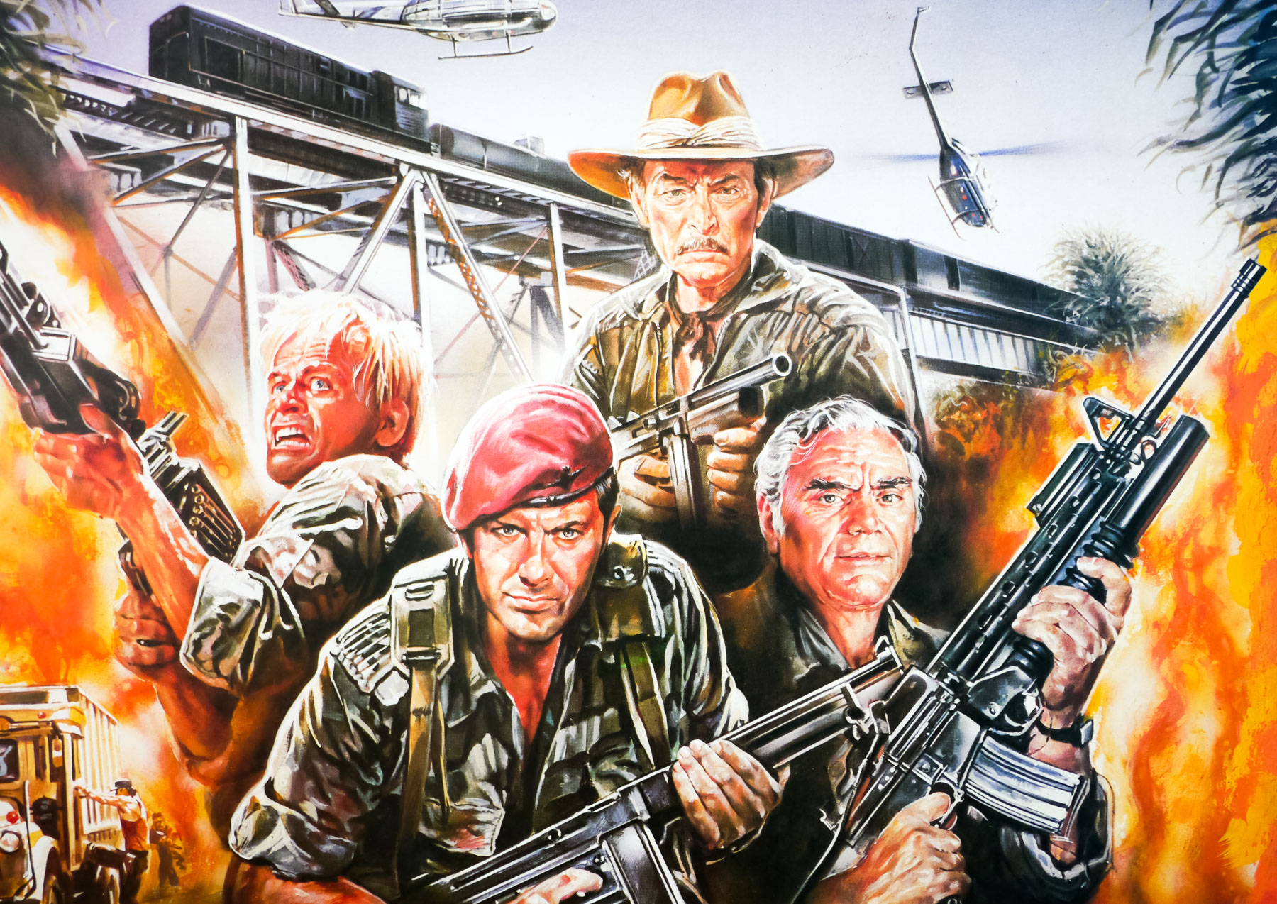
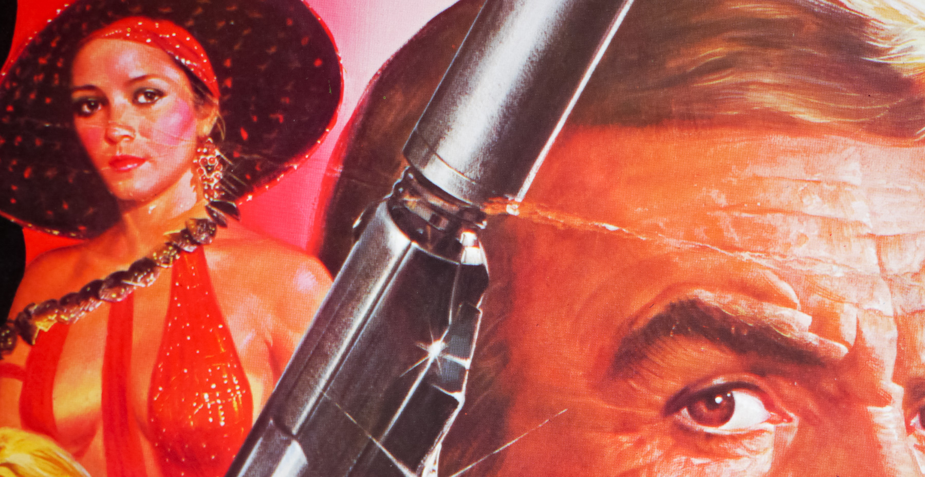
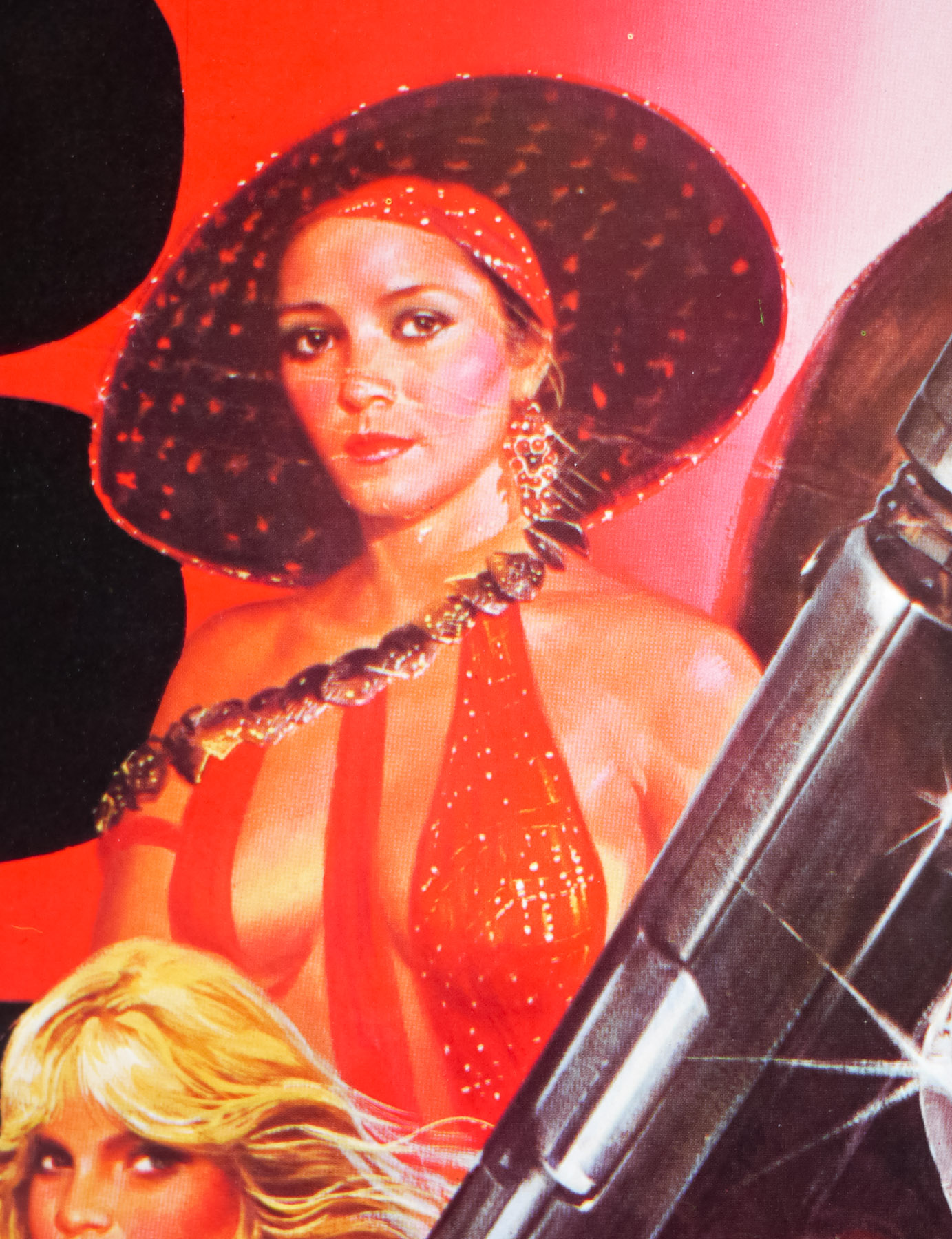
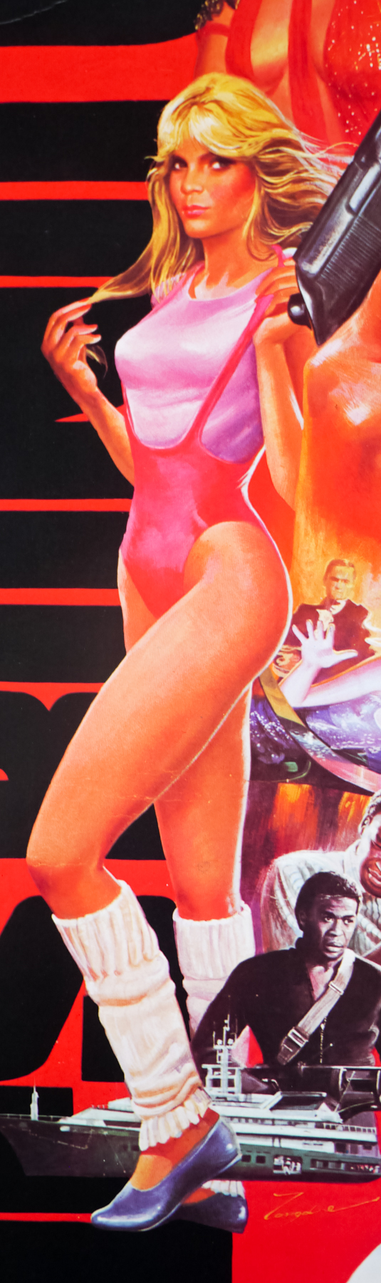
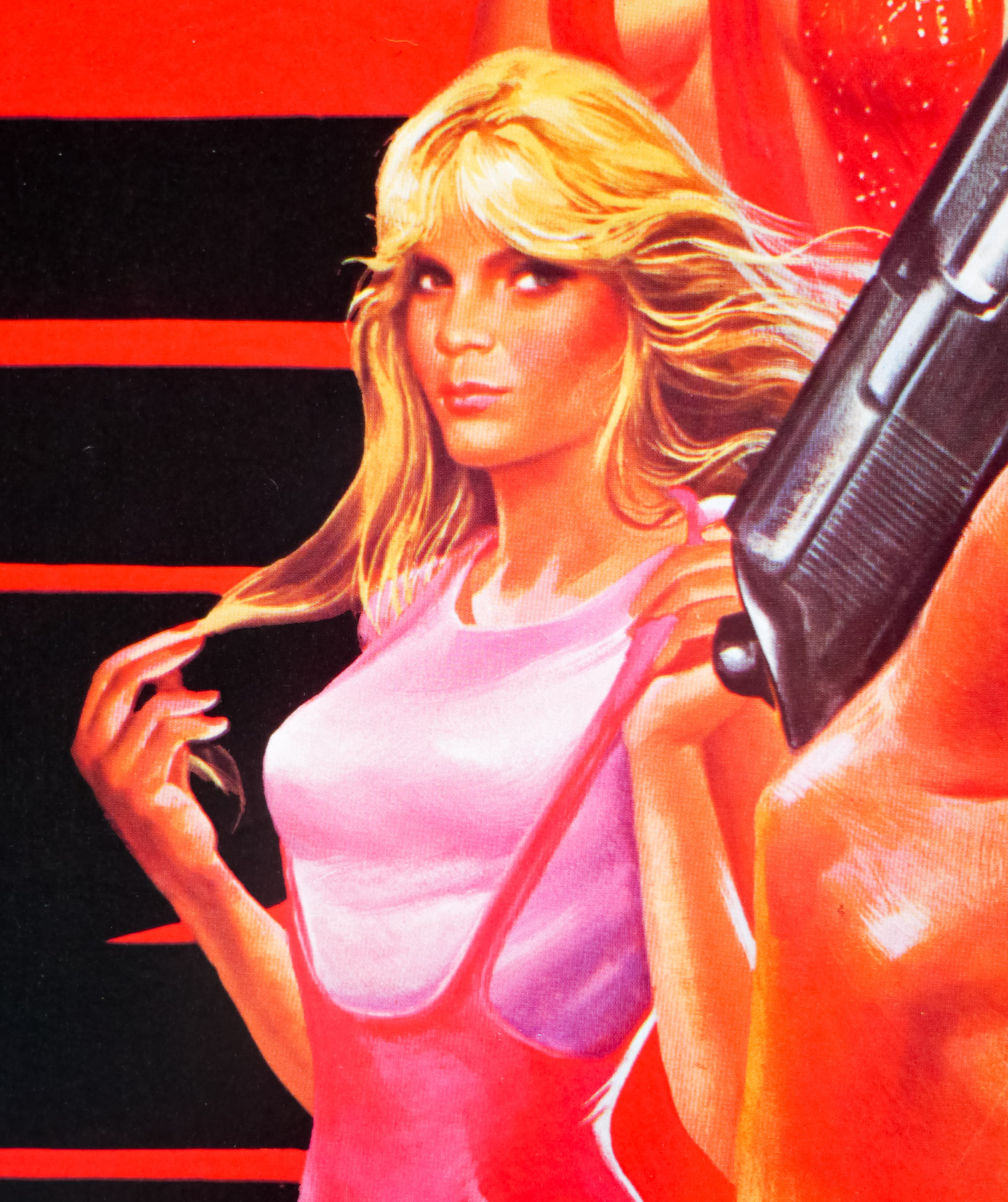
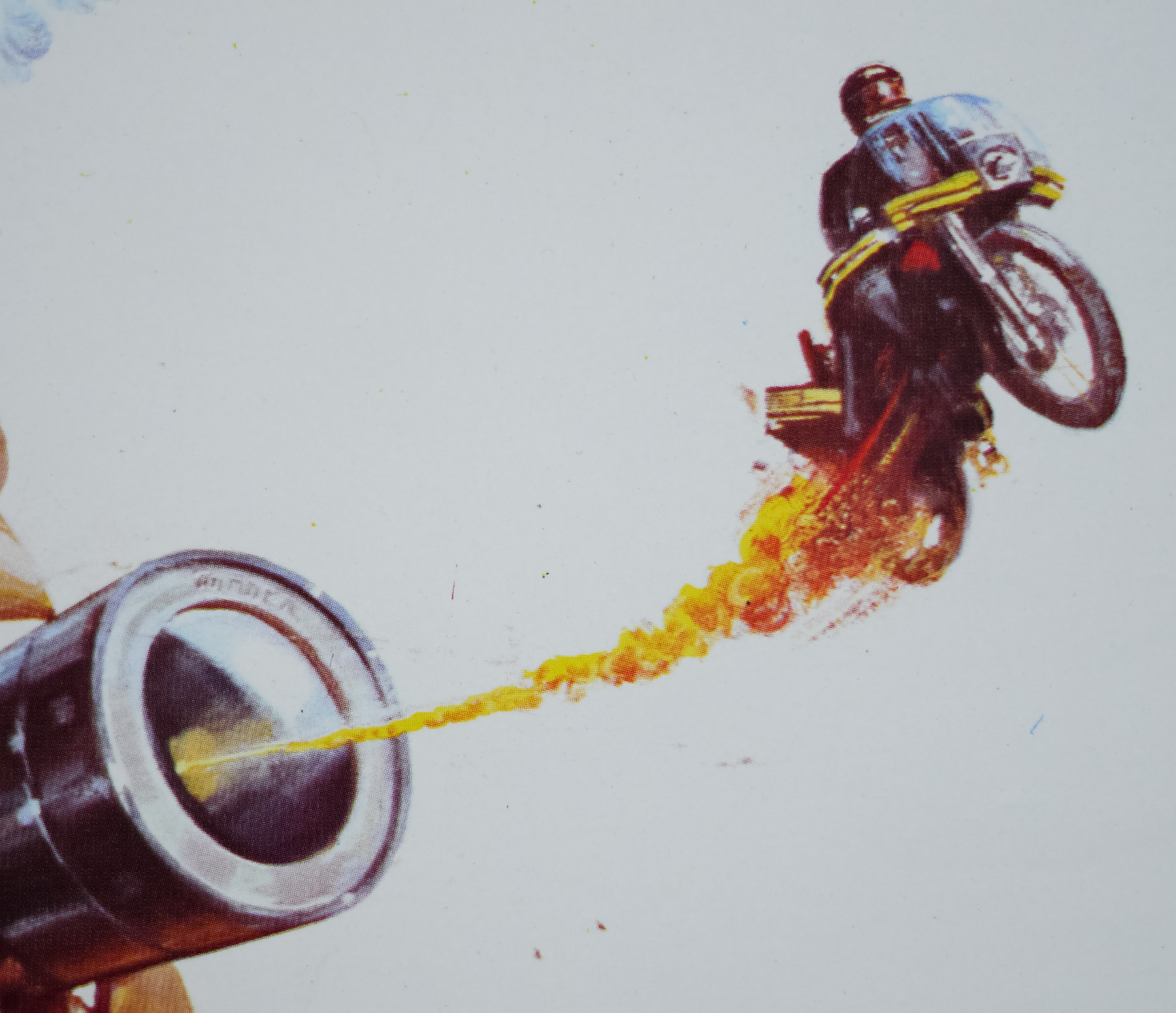
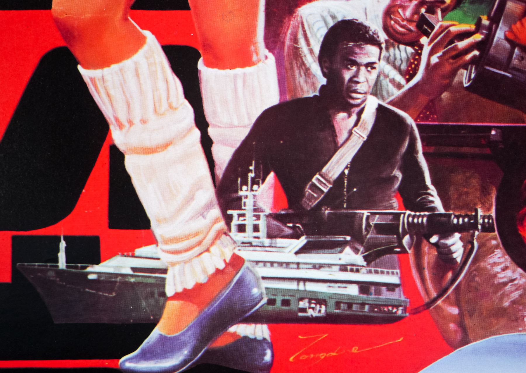
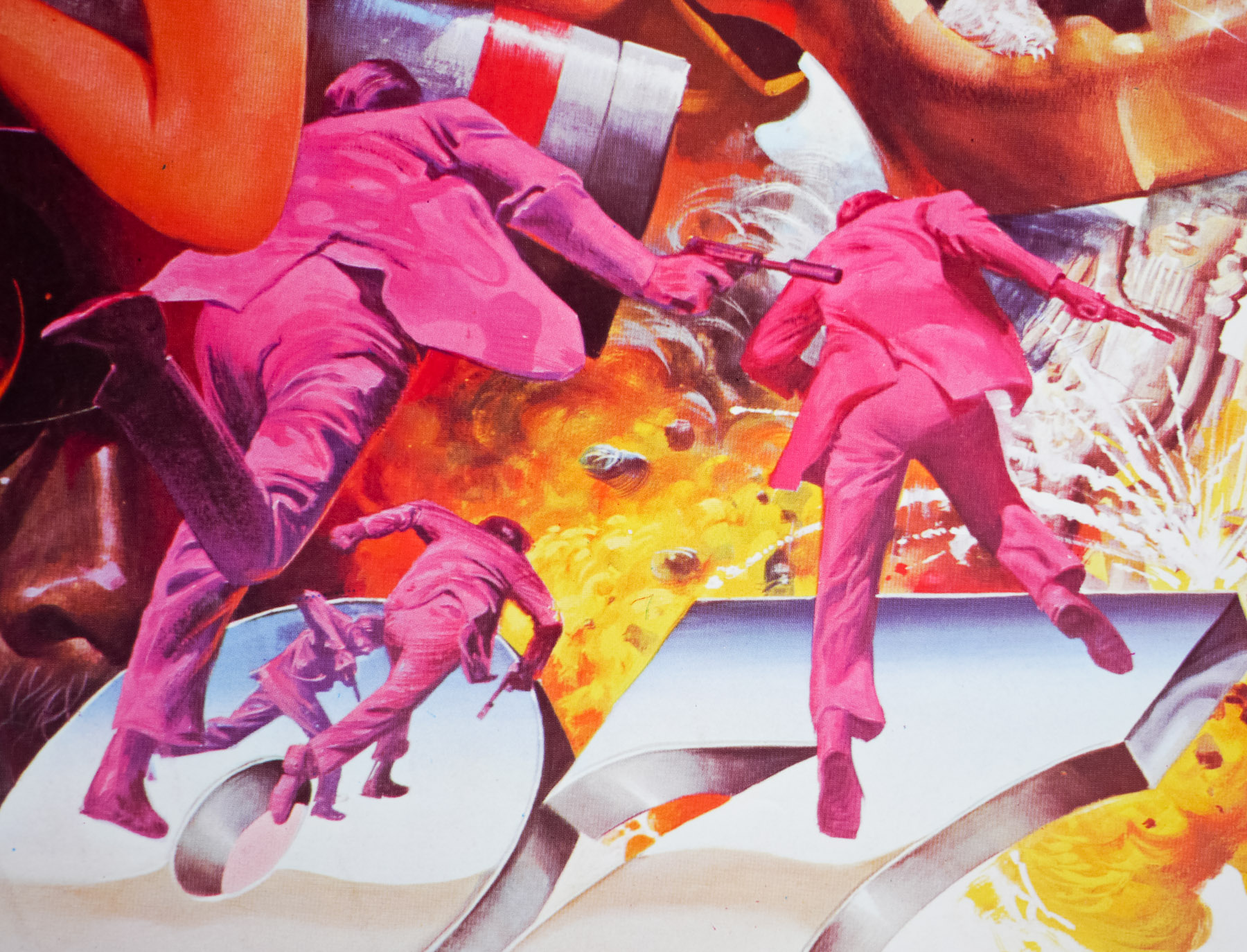
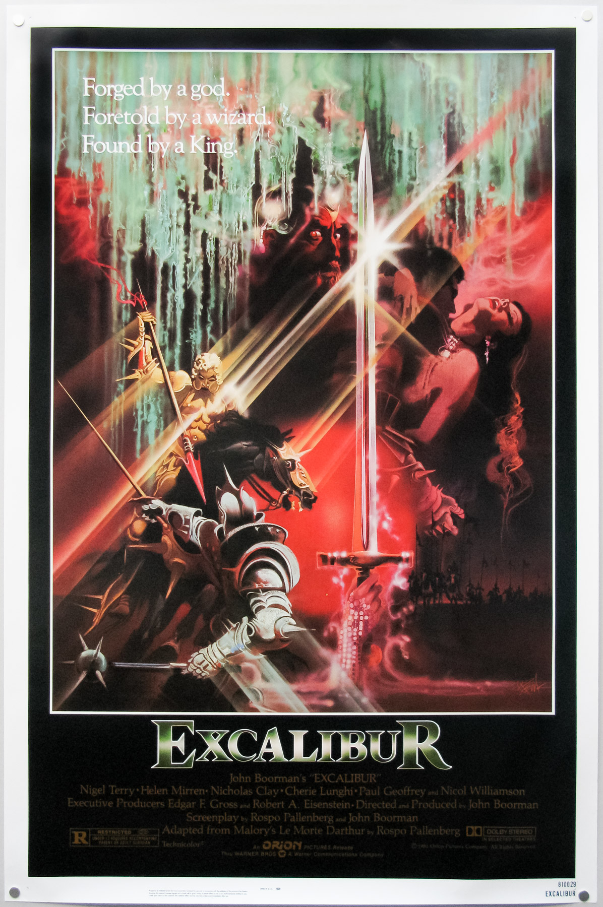
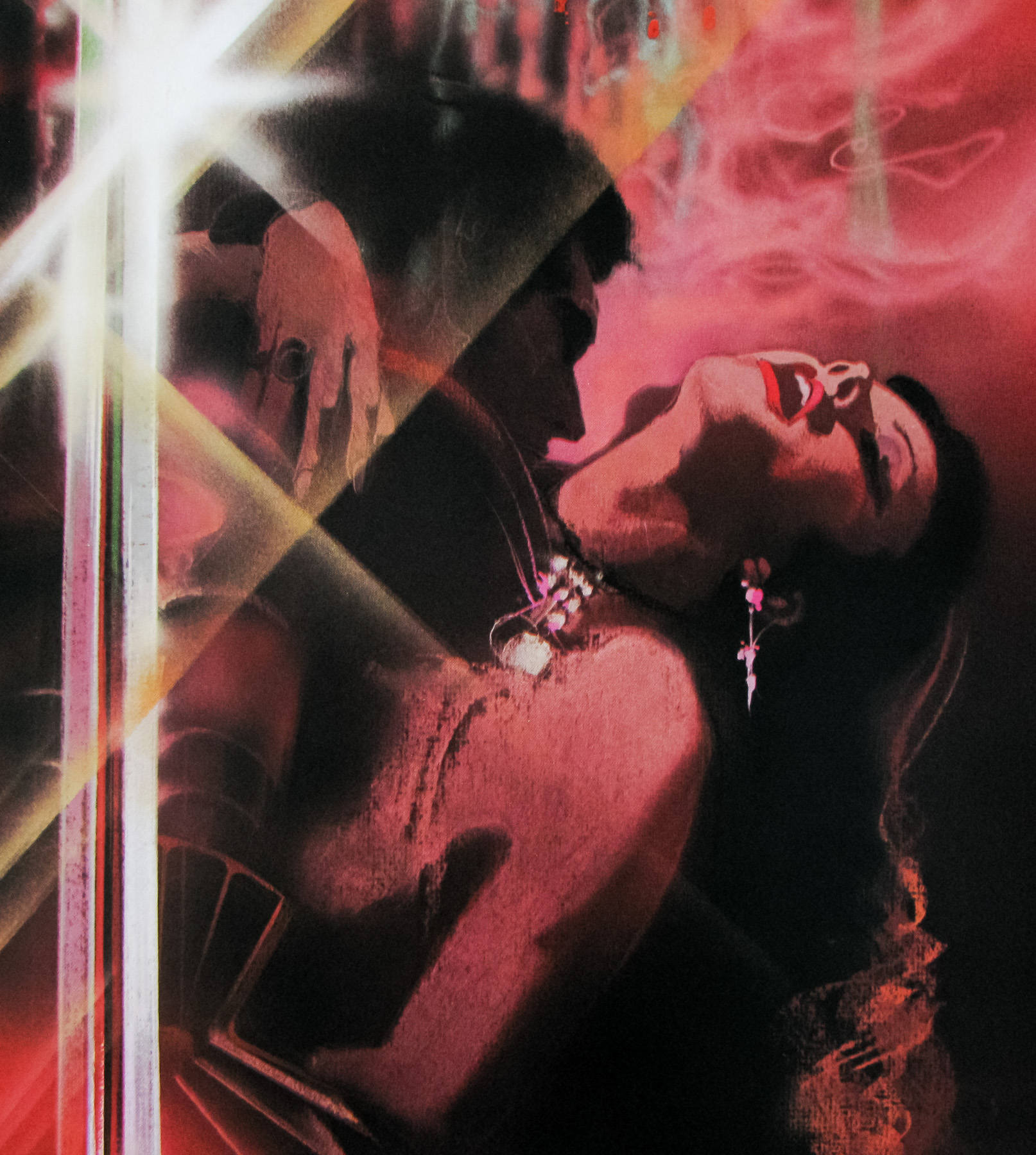
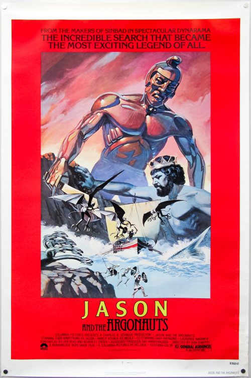
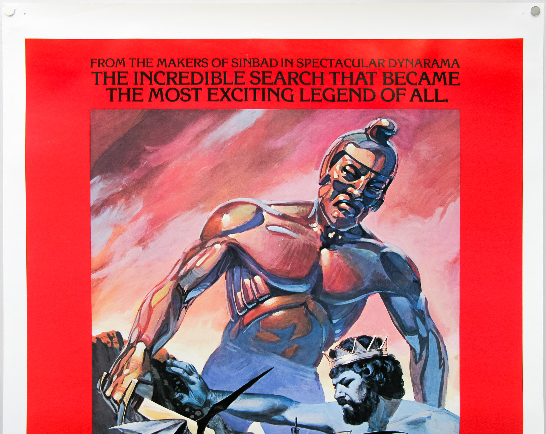
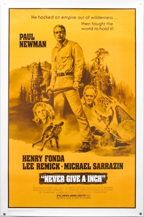
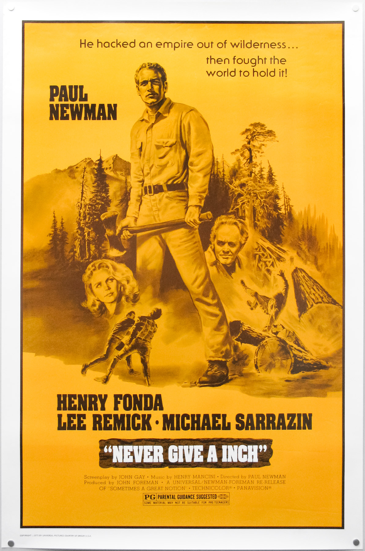
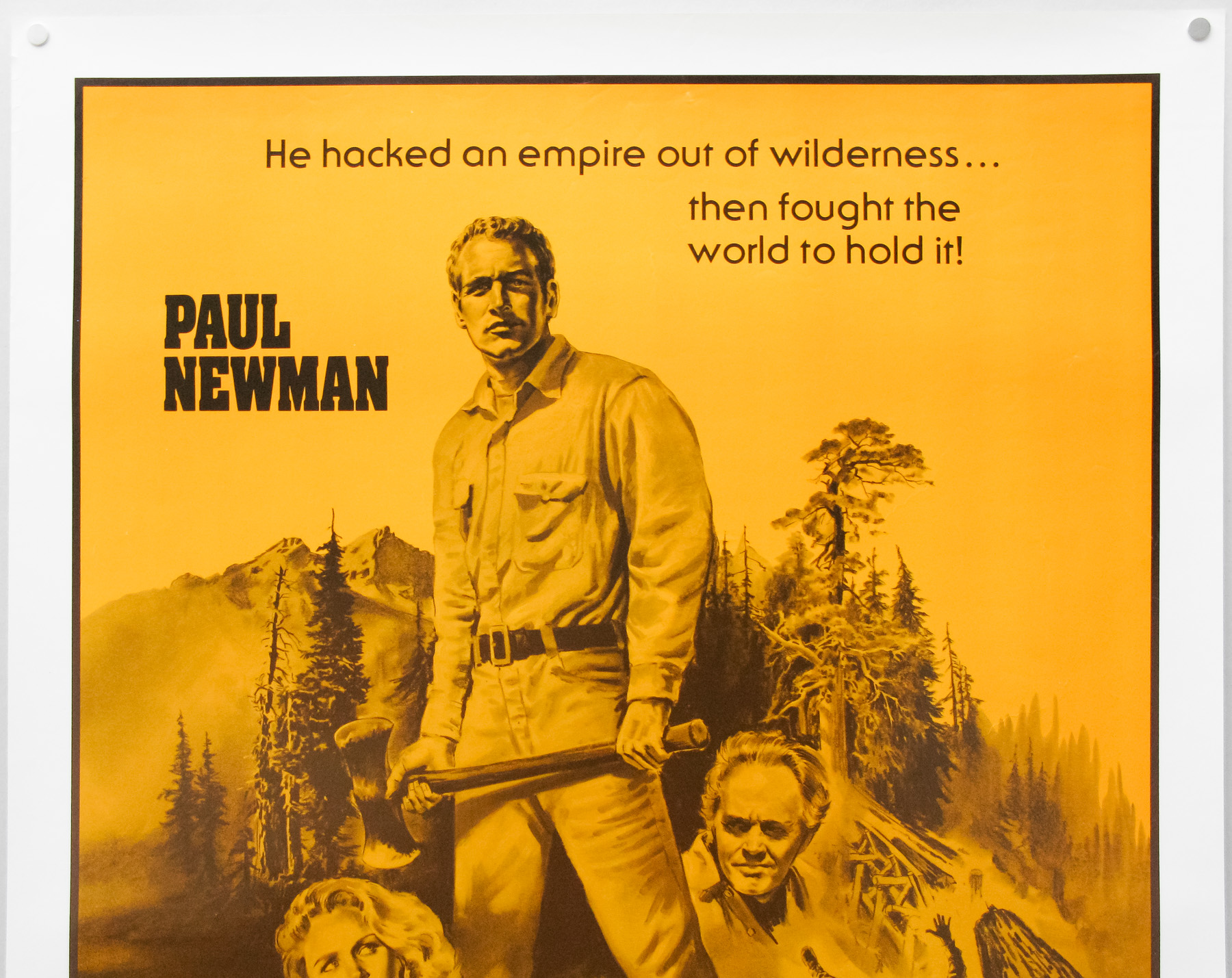
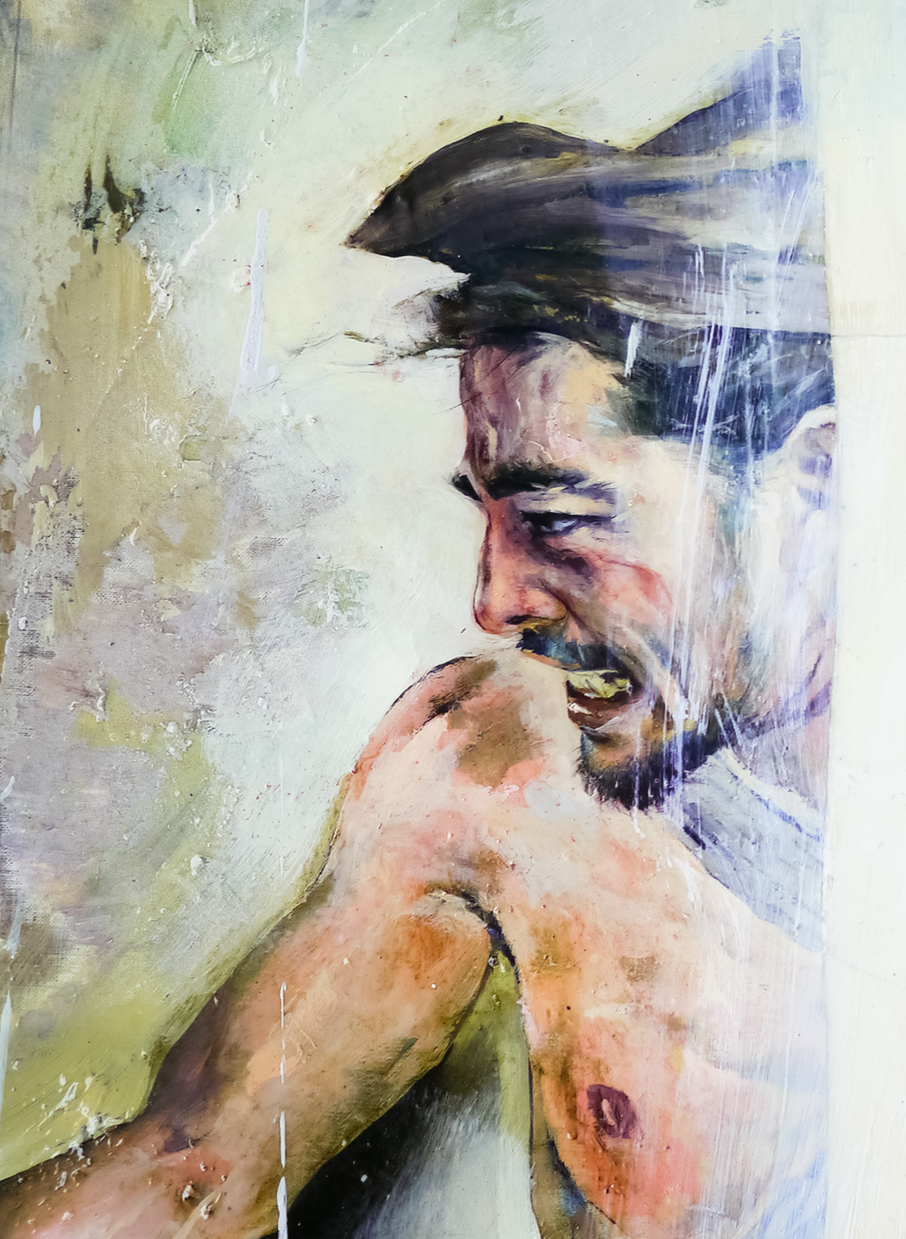
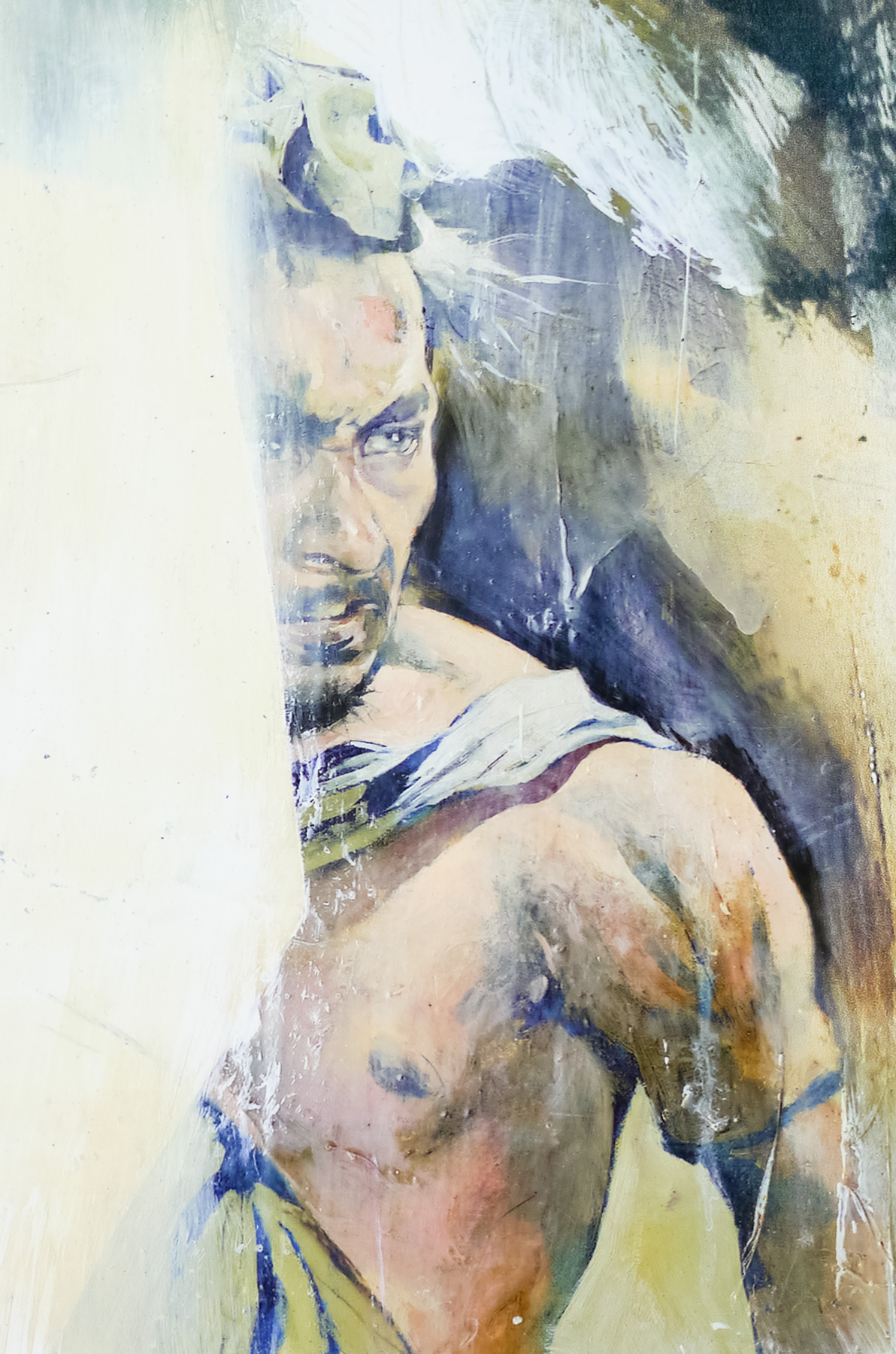
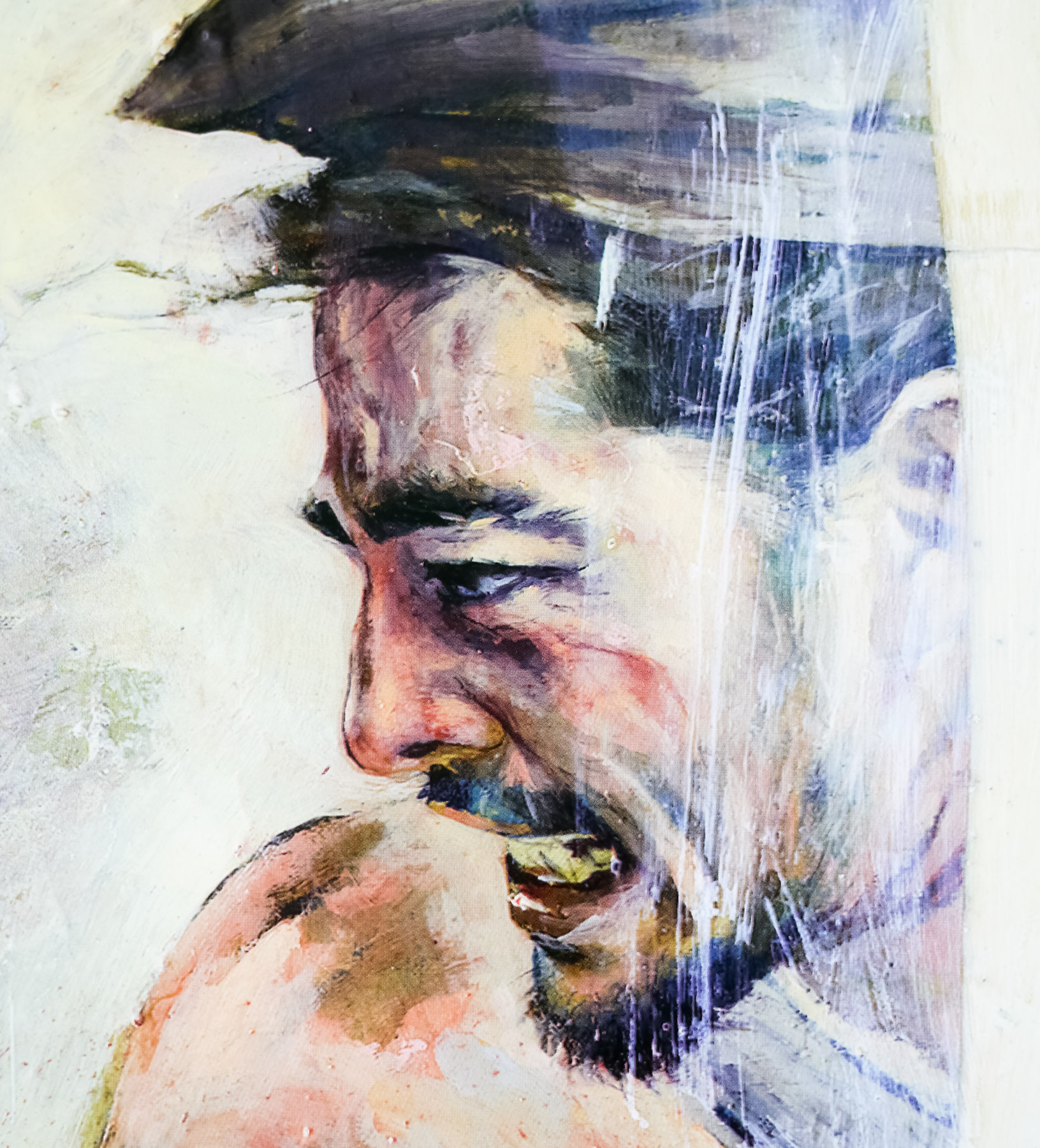
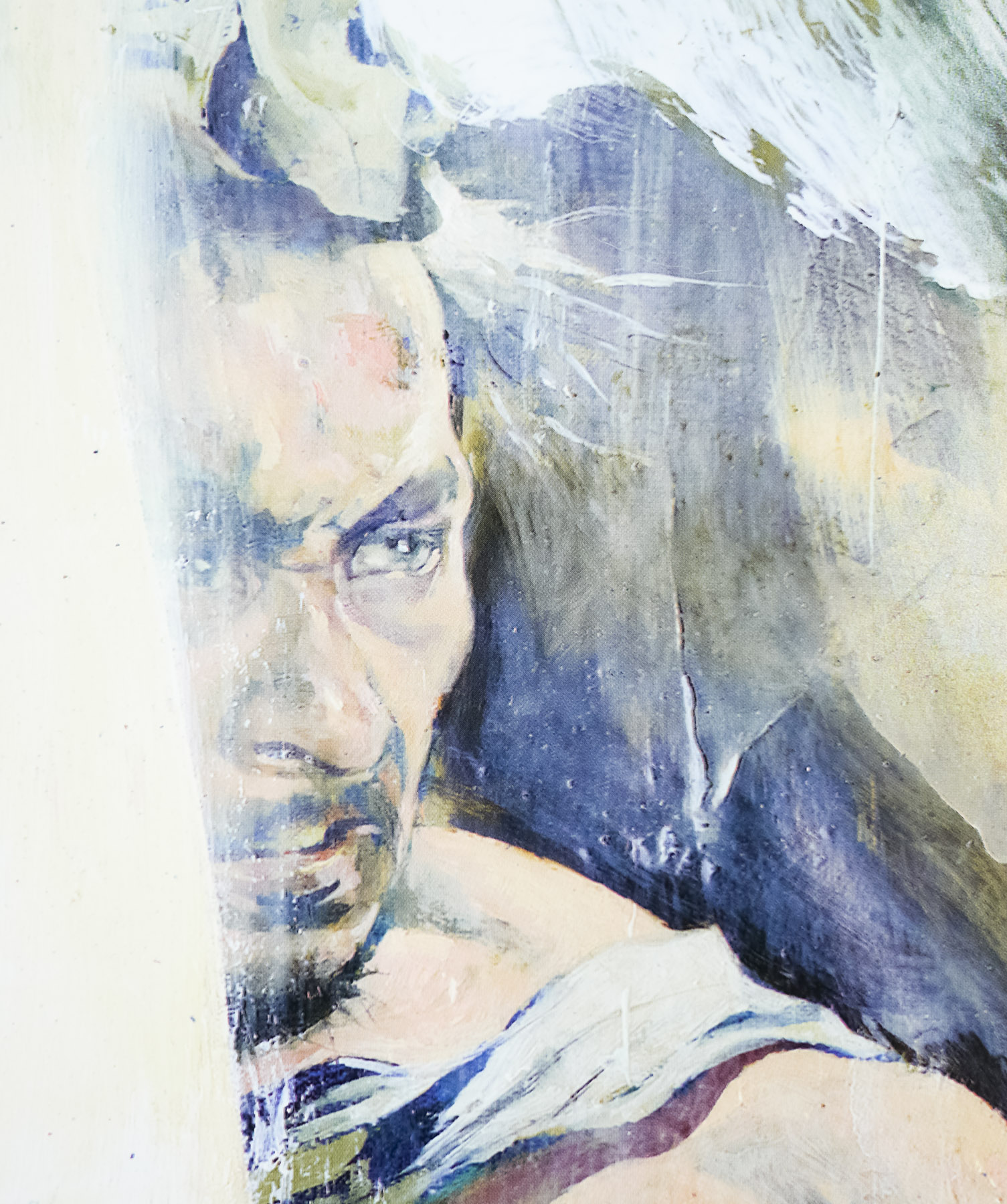
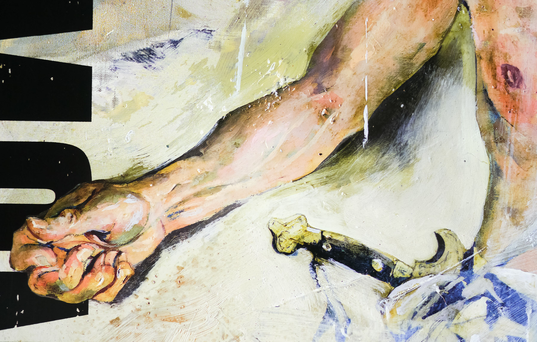
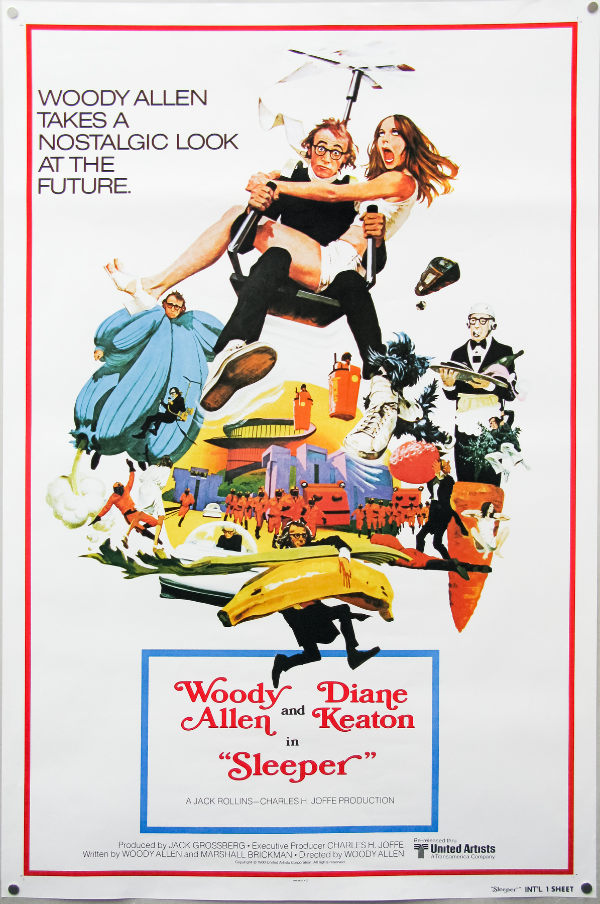
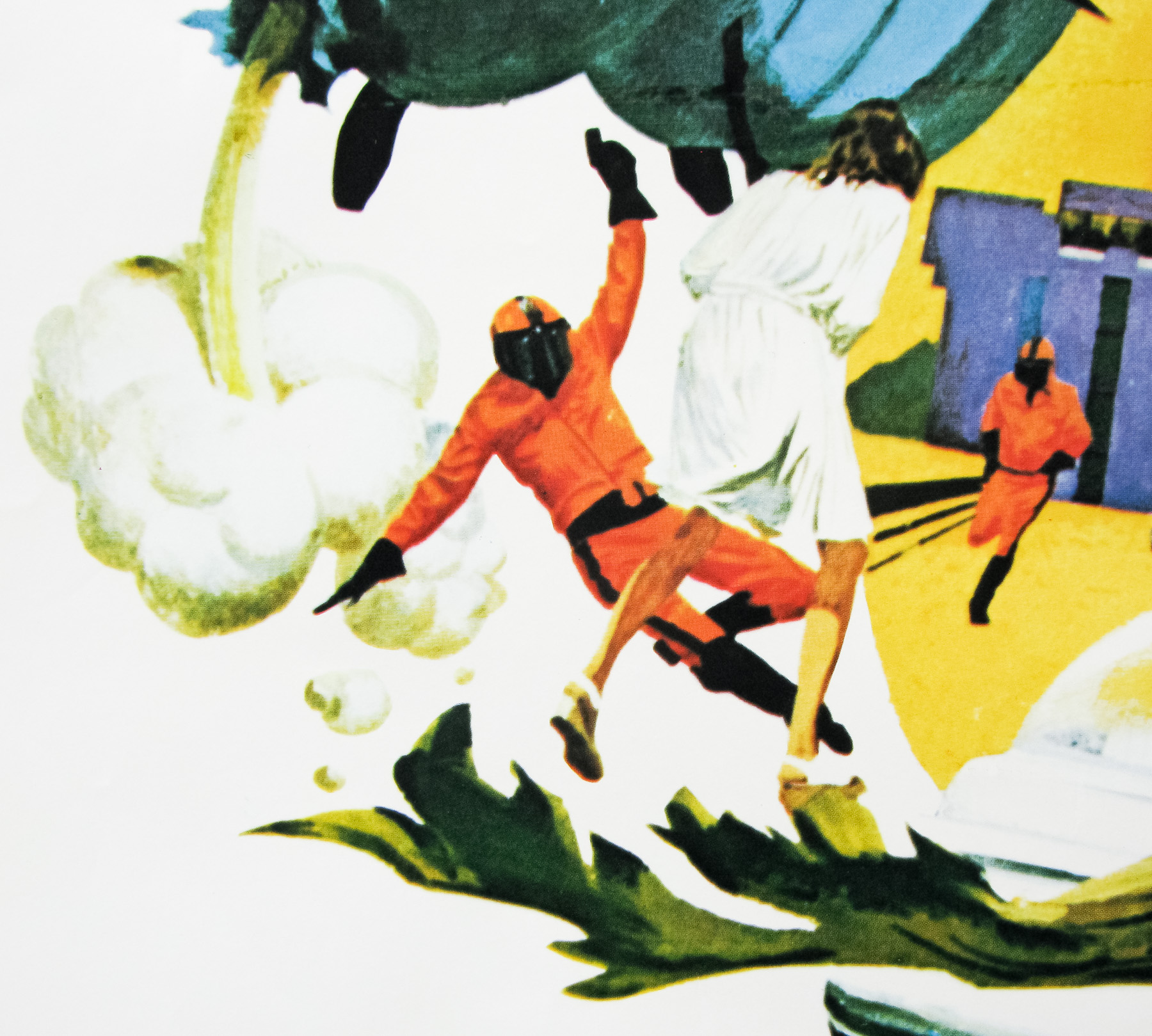
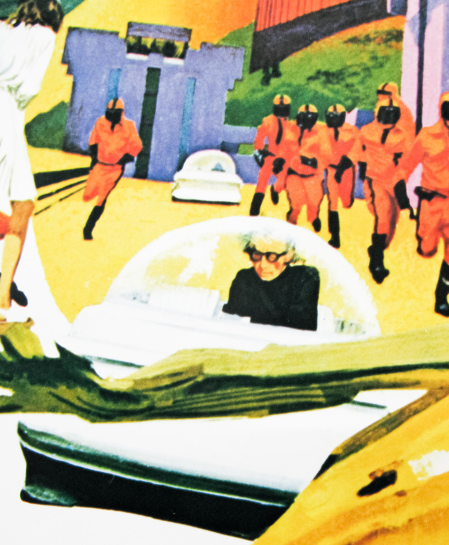
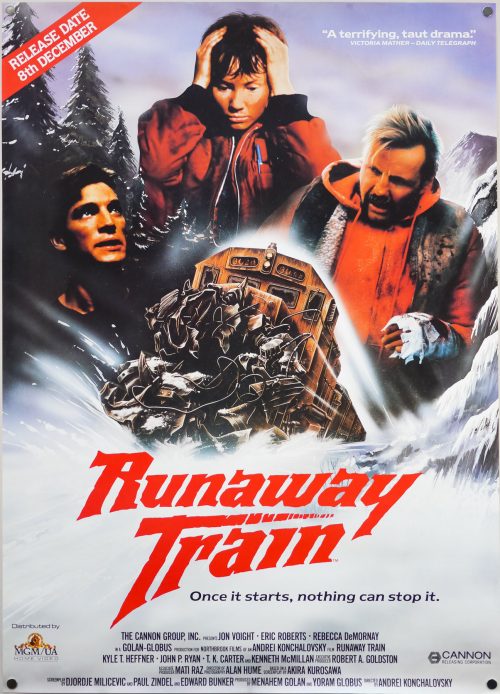
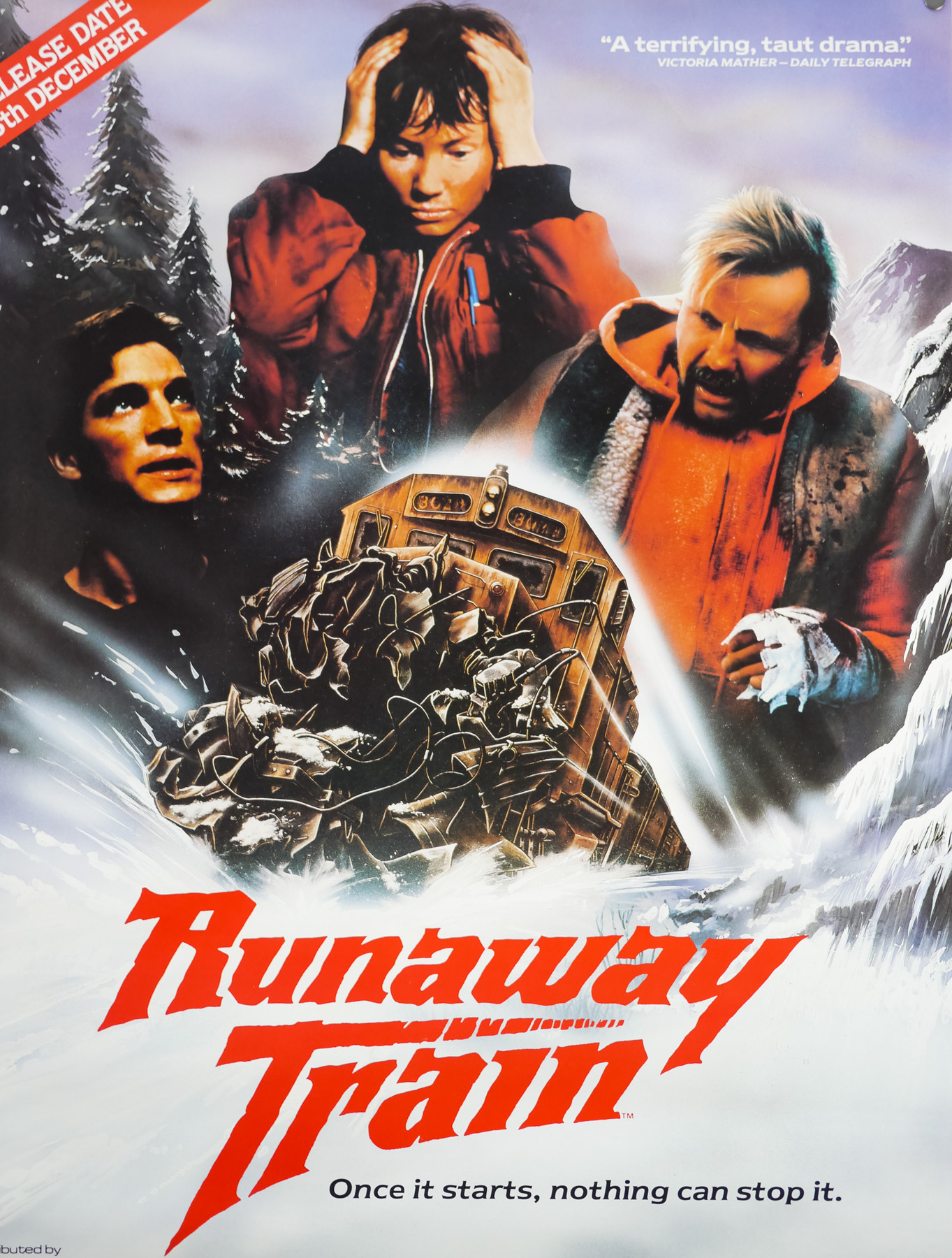
This is the UK video poster for the release of the excellent 1985 action-drama Runaway Train. The film was produced by the notorious schlock-peddlers Cannon Films, which at the time was run by two Israeli cousins, the director Menahem Golan and producer Yoram Globus. It’s often cited as one of the best films that Cannon Films ever produced, which makes sense when you look at their filmography (Breakin’ 2: Electric Boogaloo anyone?).
Rather improbably, the first version of the script was written by celebrated Japanese director Akira Kurosawa and he was planning to direct it himself. When the financial backing fell through the script was shelved. It was later picked up and underwent re-writes to prepare it for the Russian director Andrey Konchalovskiy who was a contemporary of Andrei Tarkovsky (and co-wrote Andrei Rublev with him). Konchalovskiy later went on to helm films such as Tango & Cash for US producers.
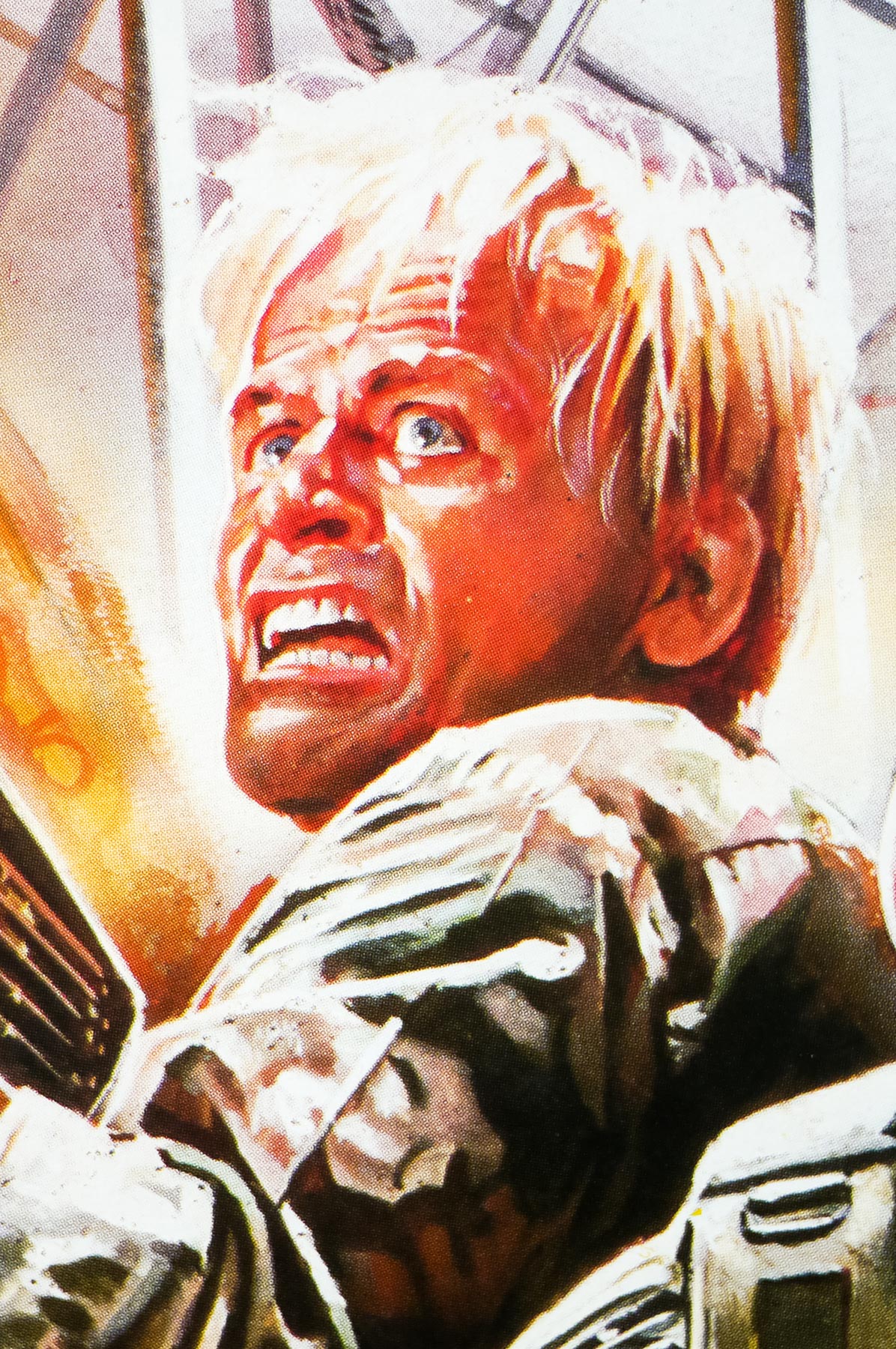
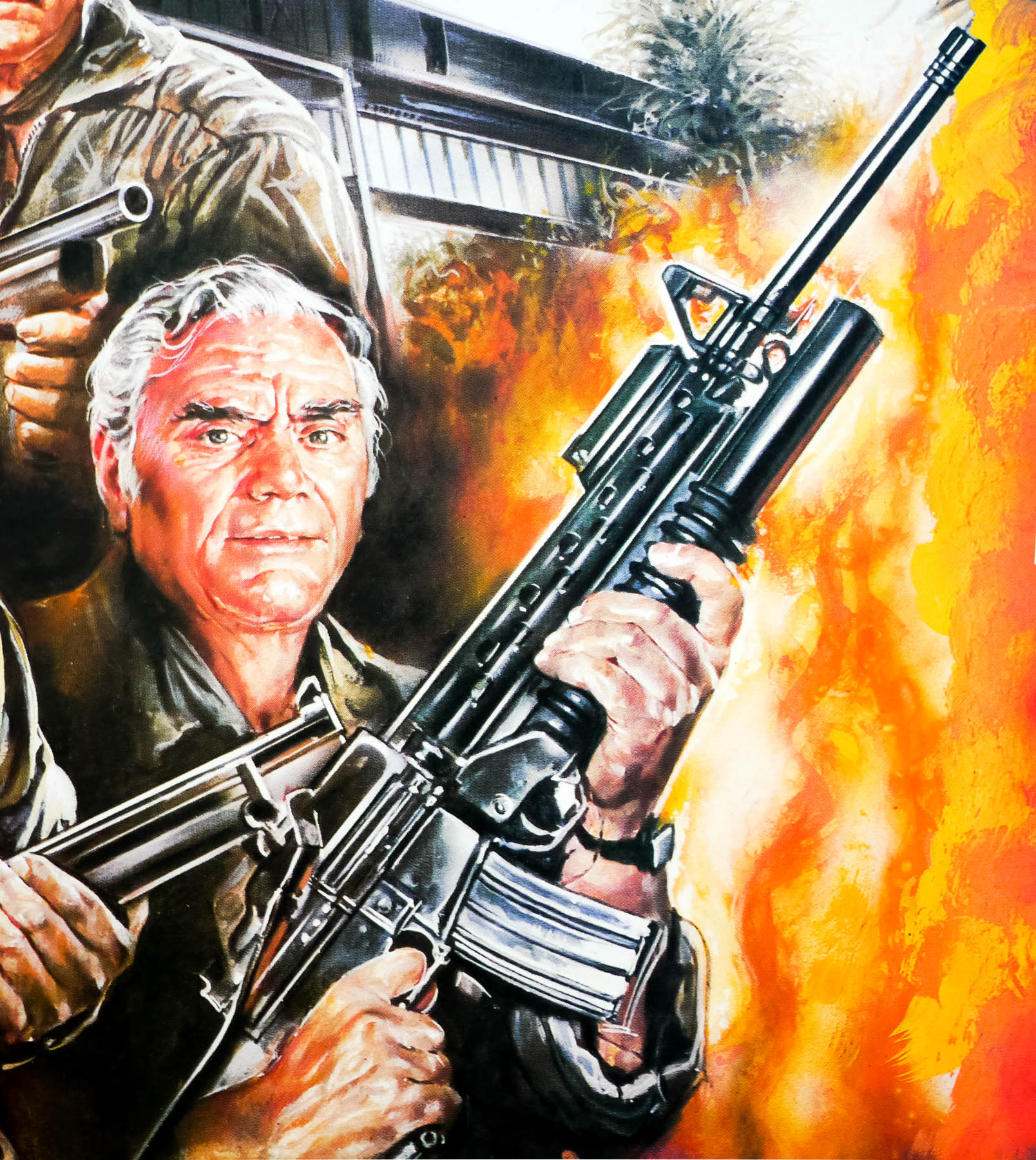
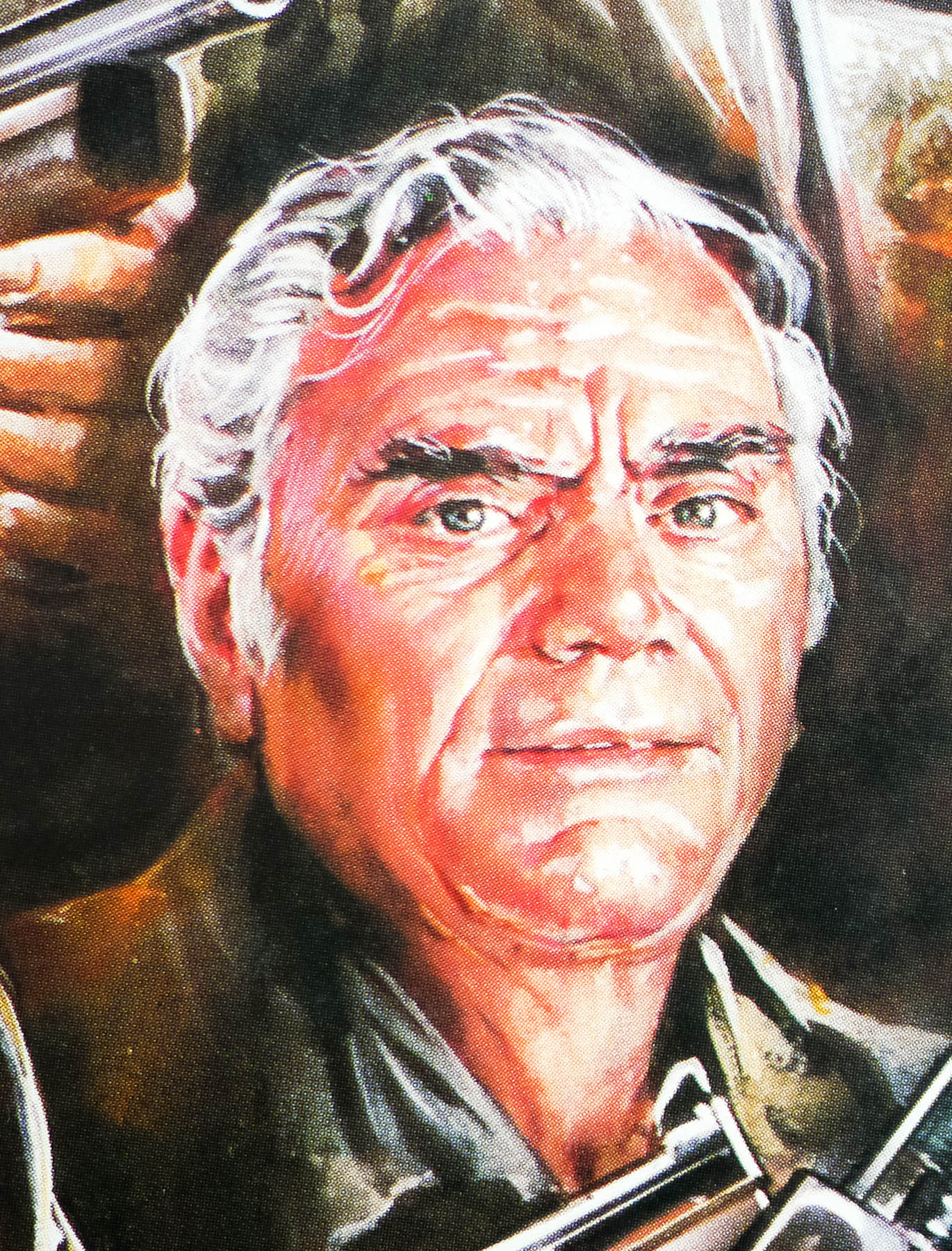
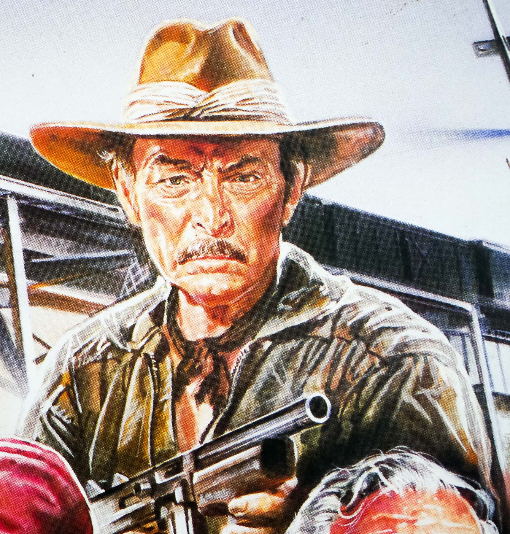
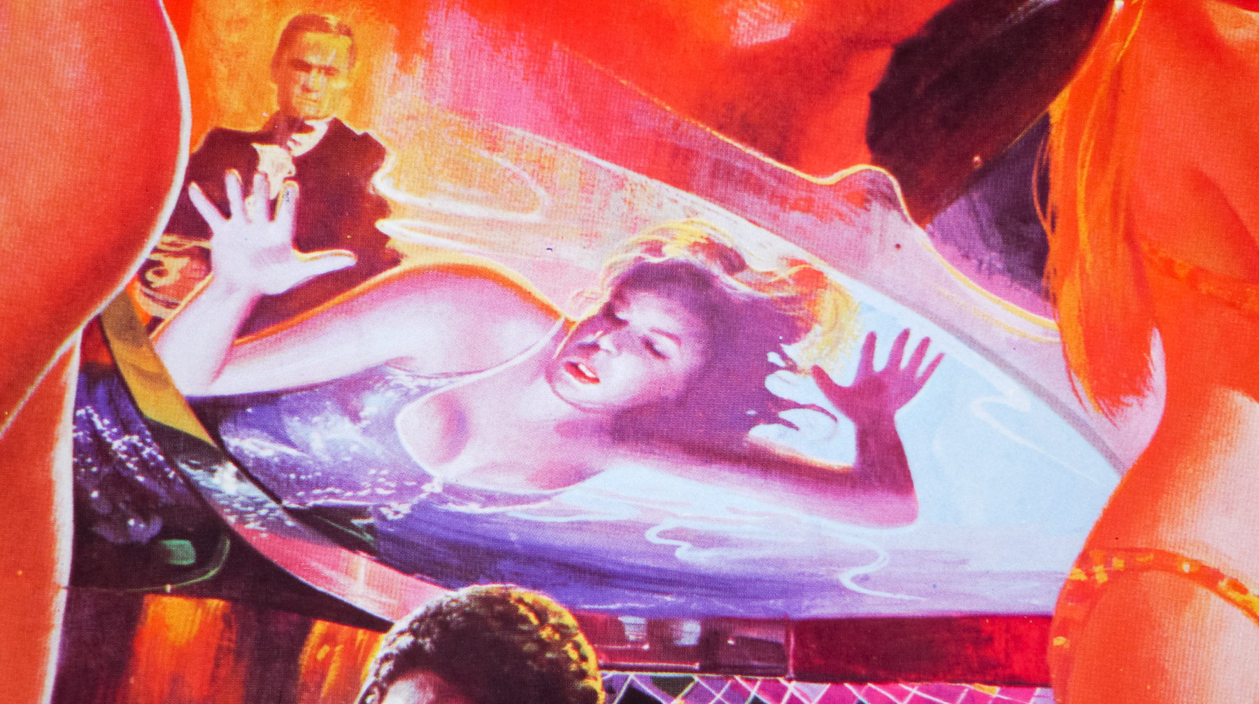
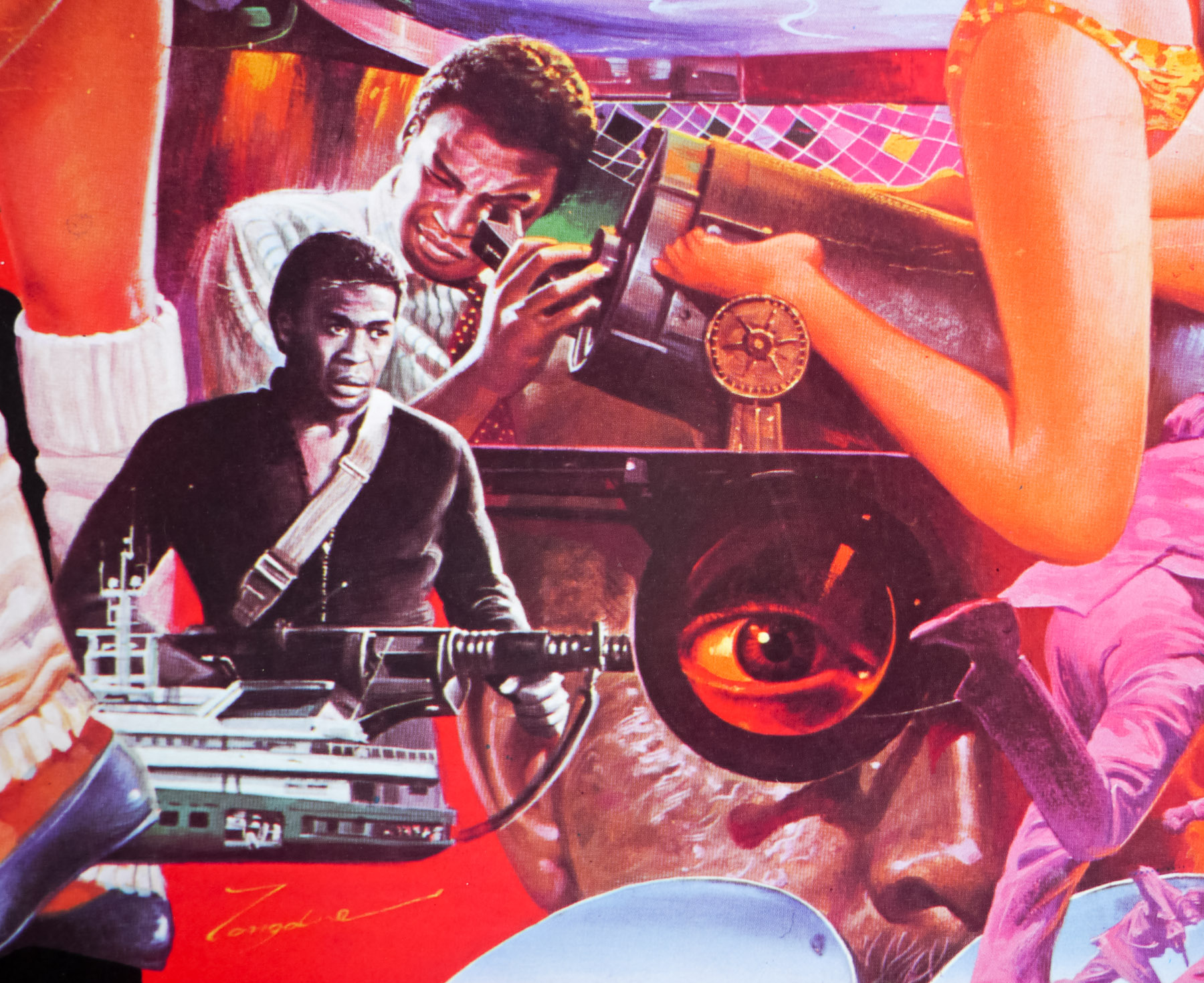
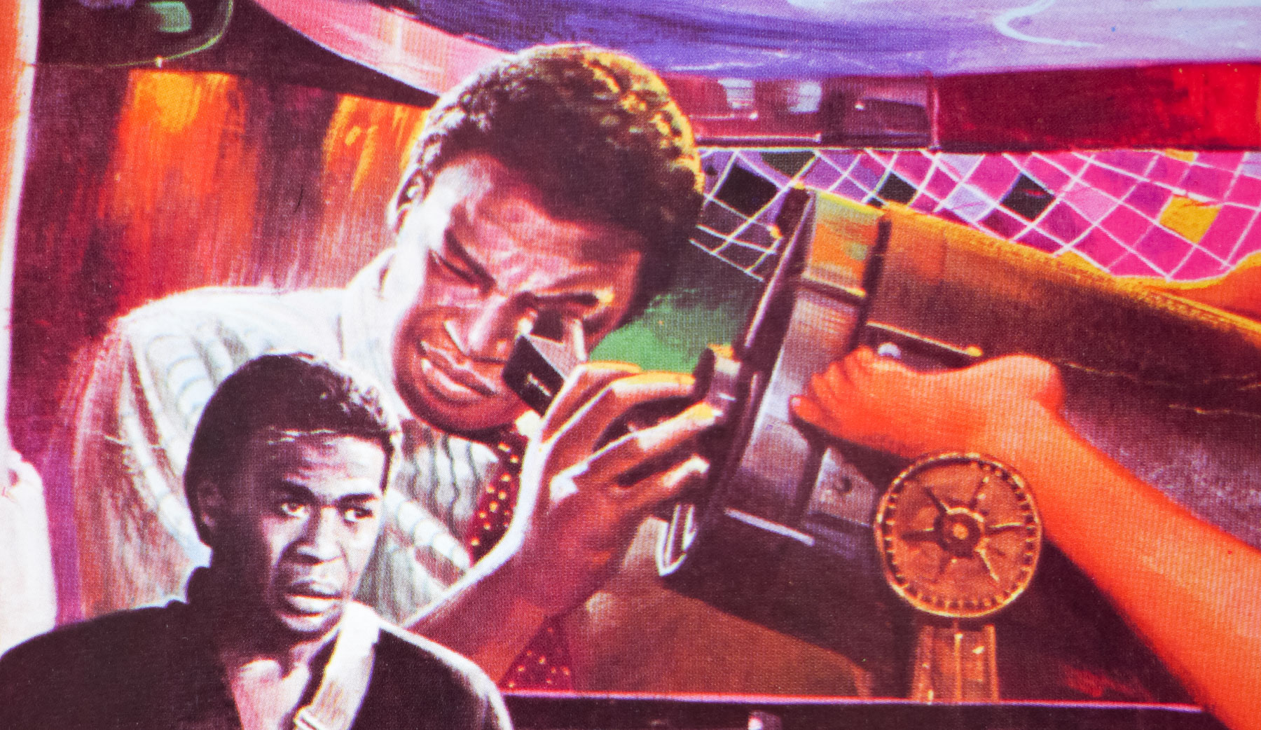
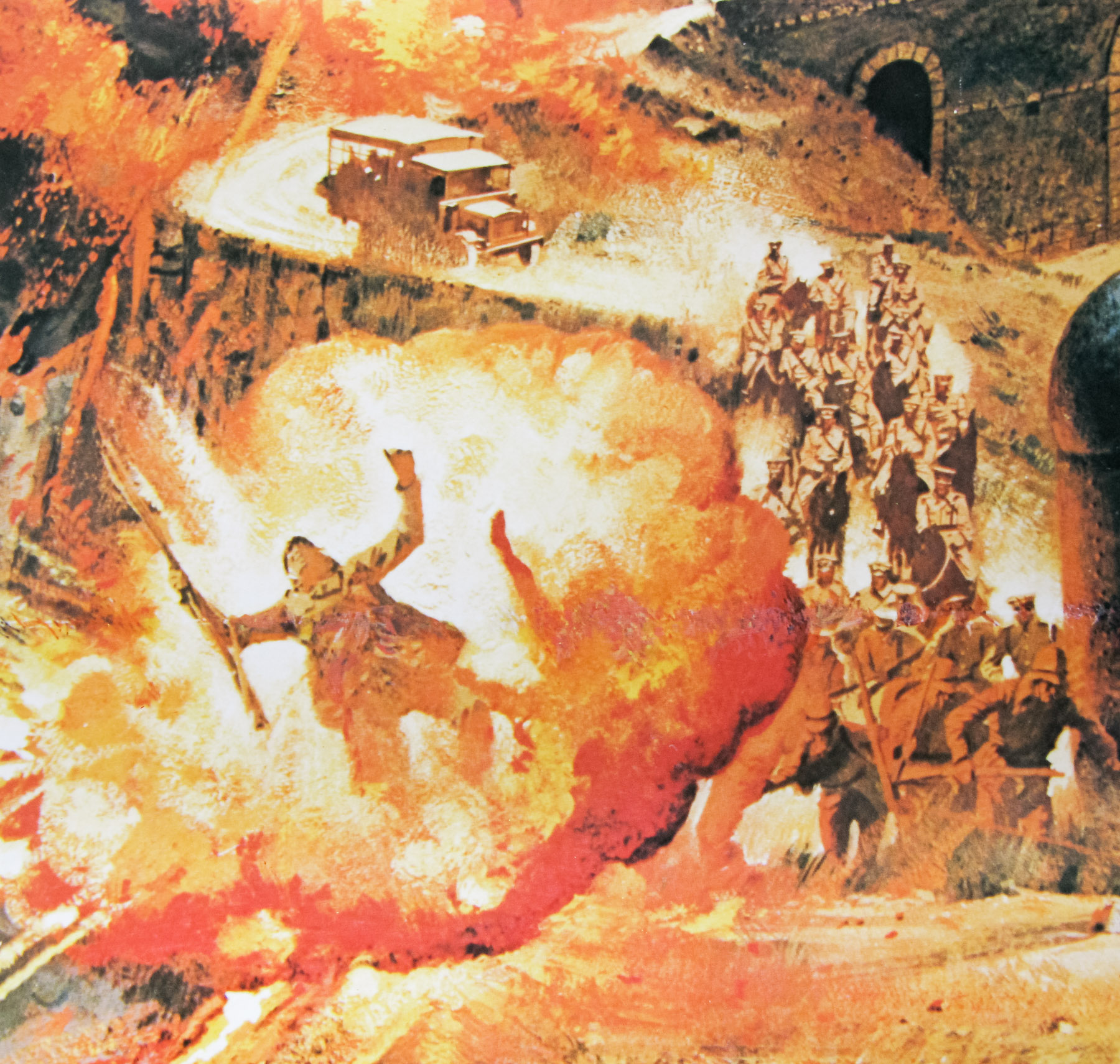
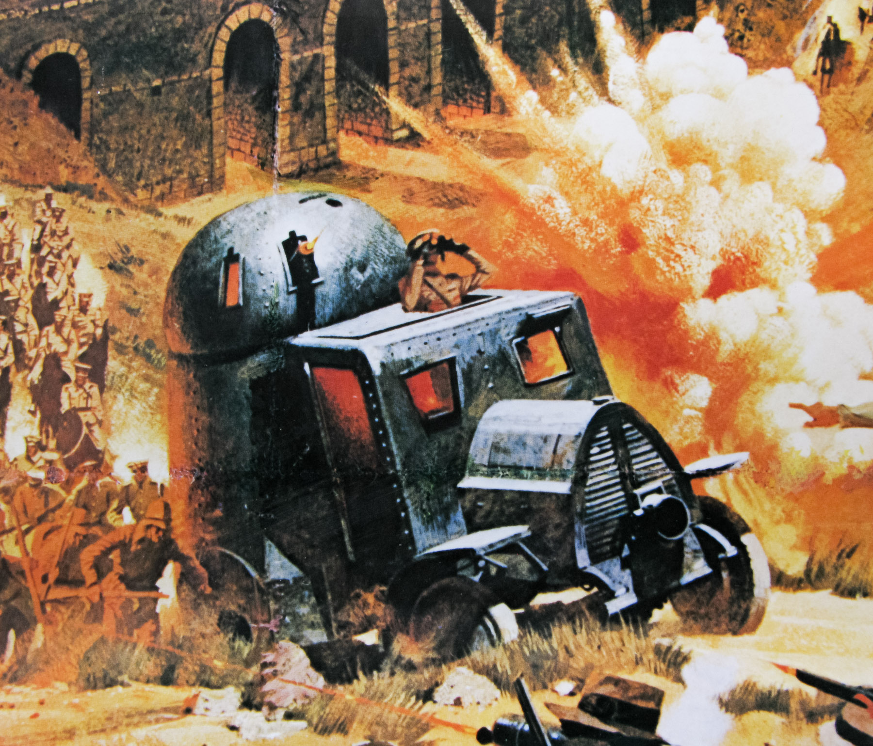
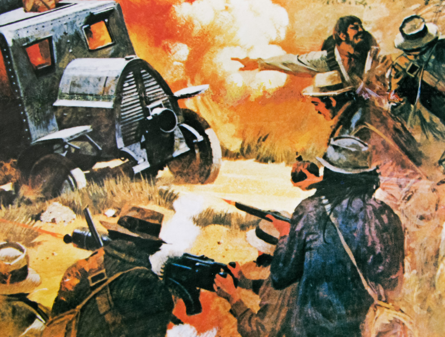
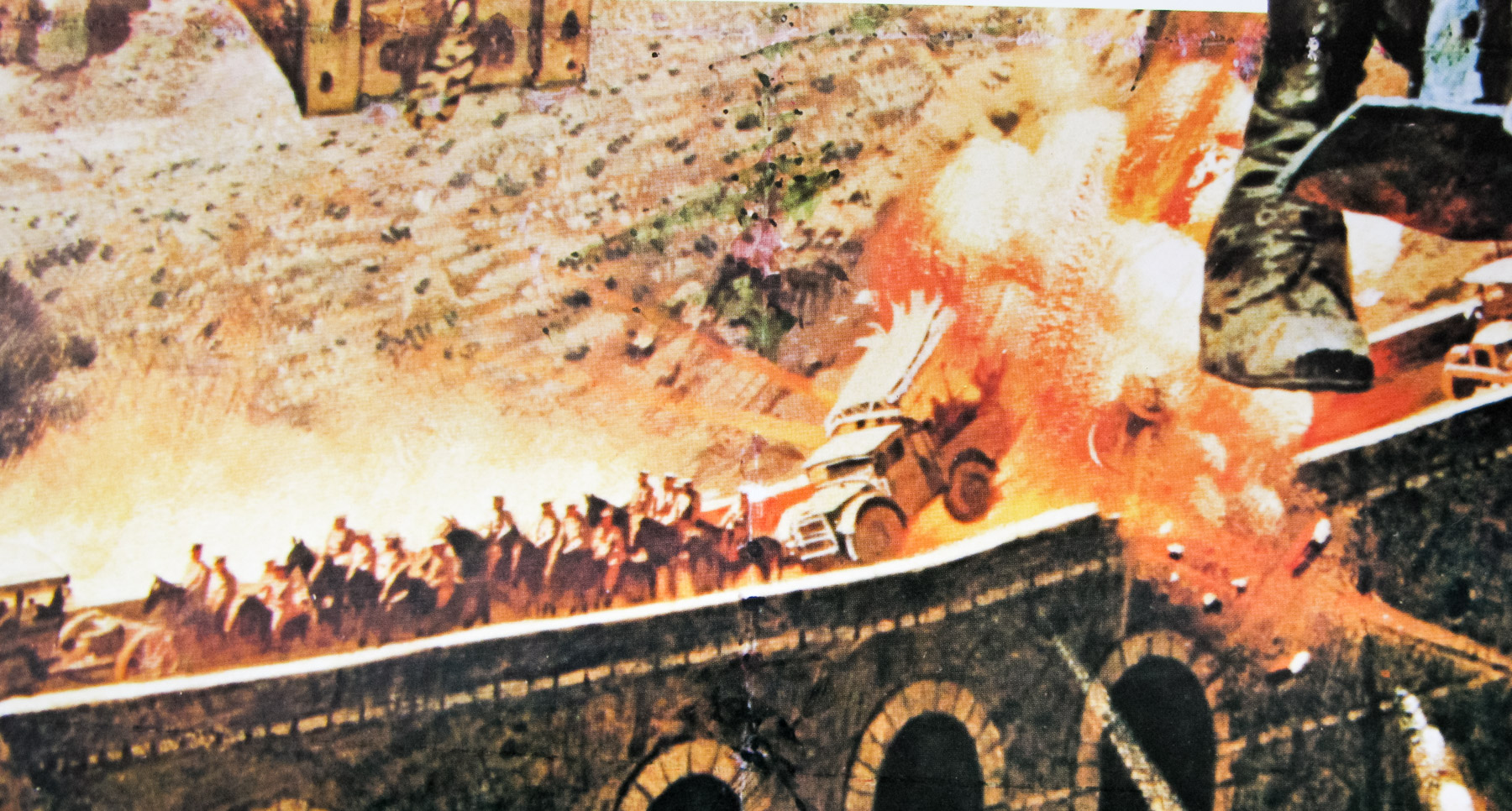
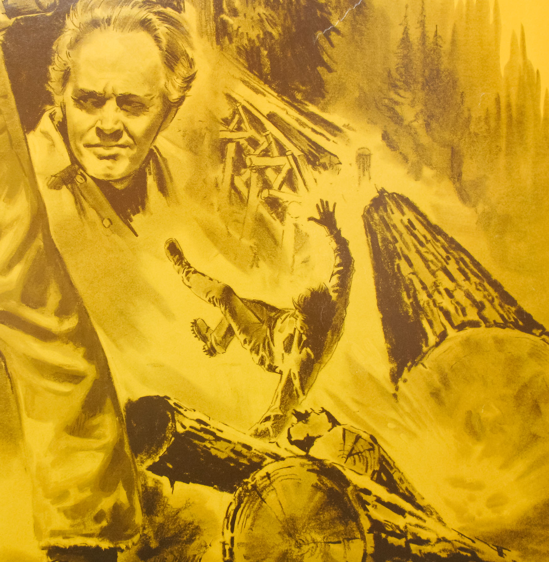
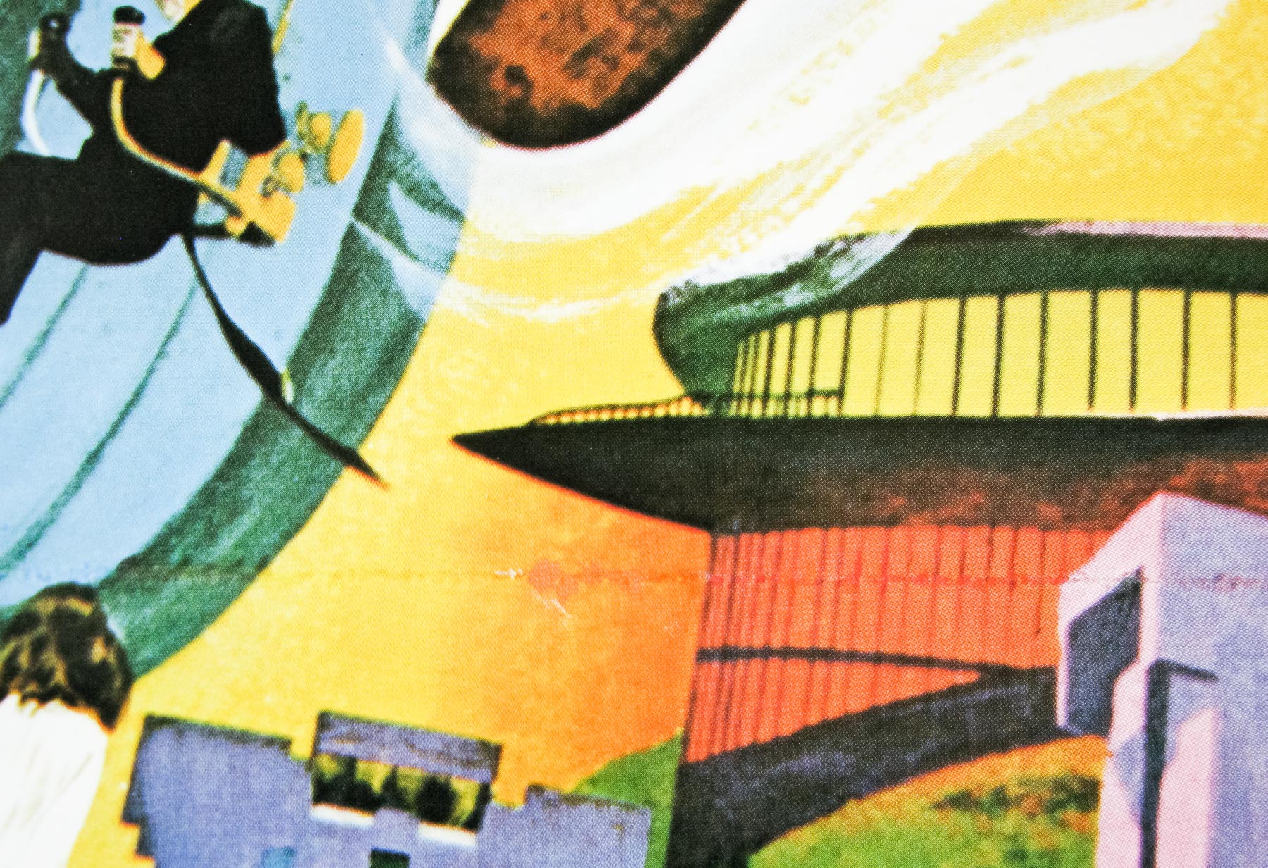
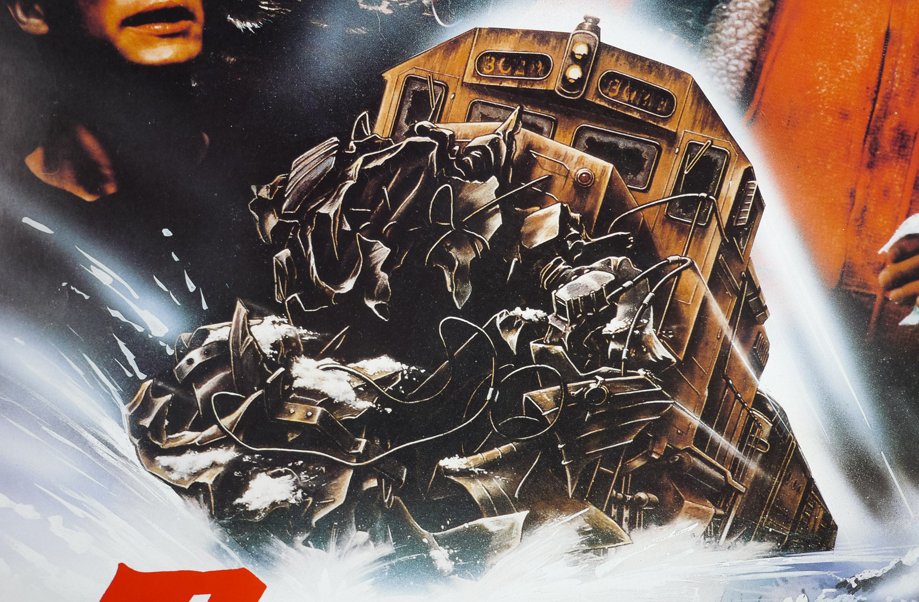
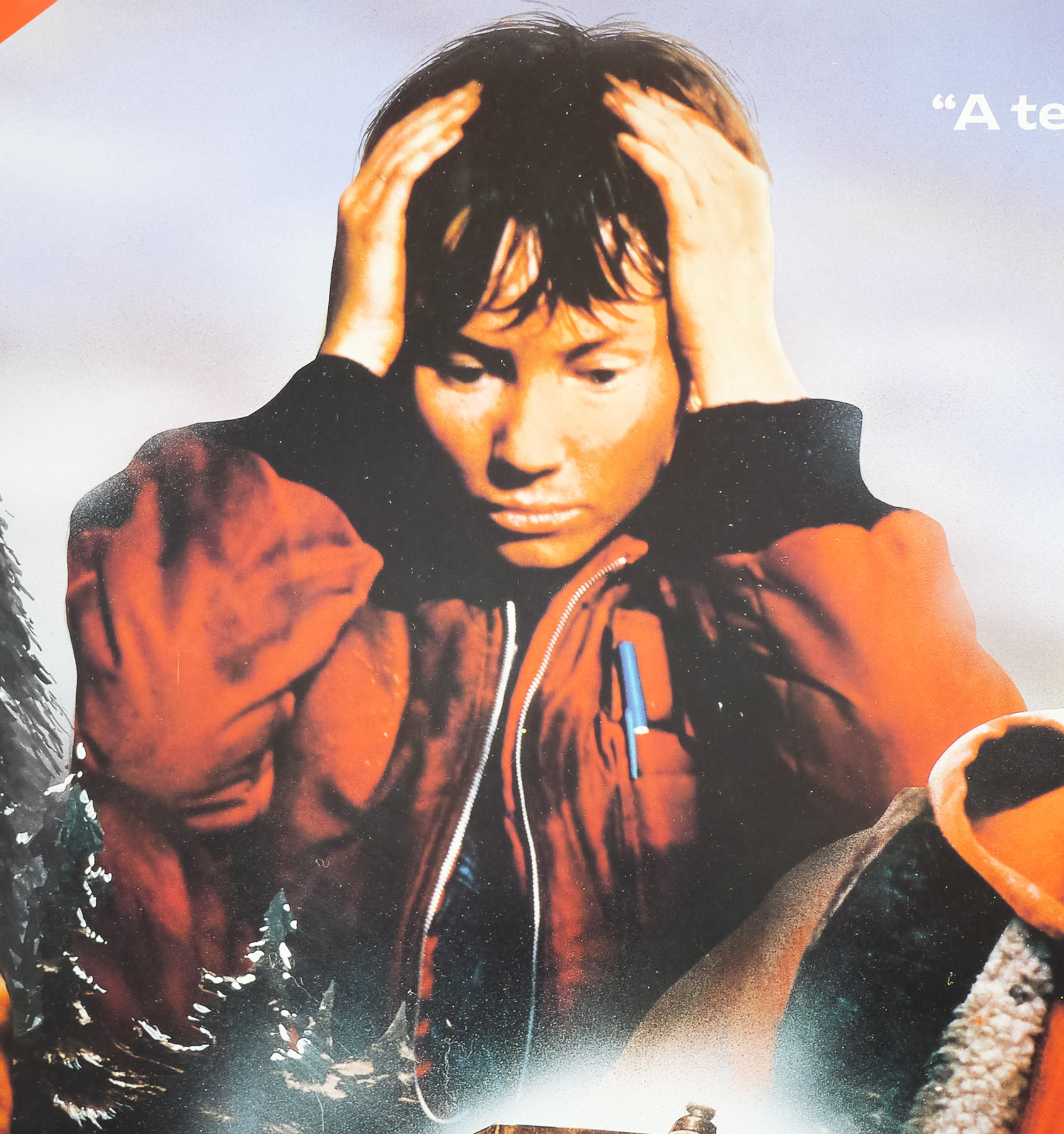
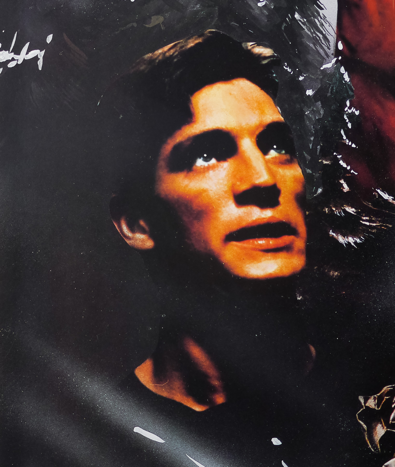
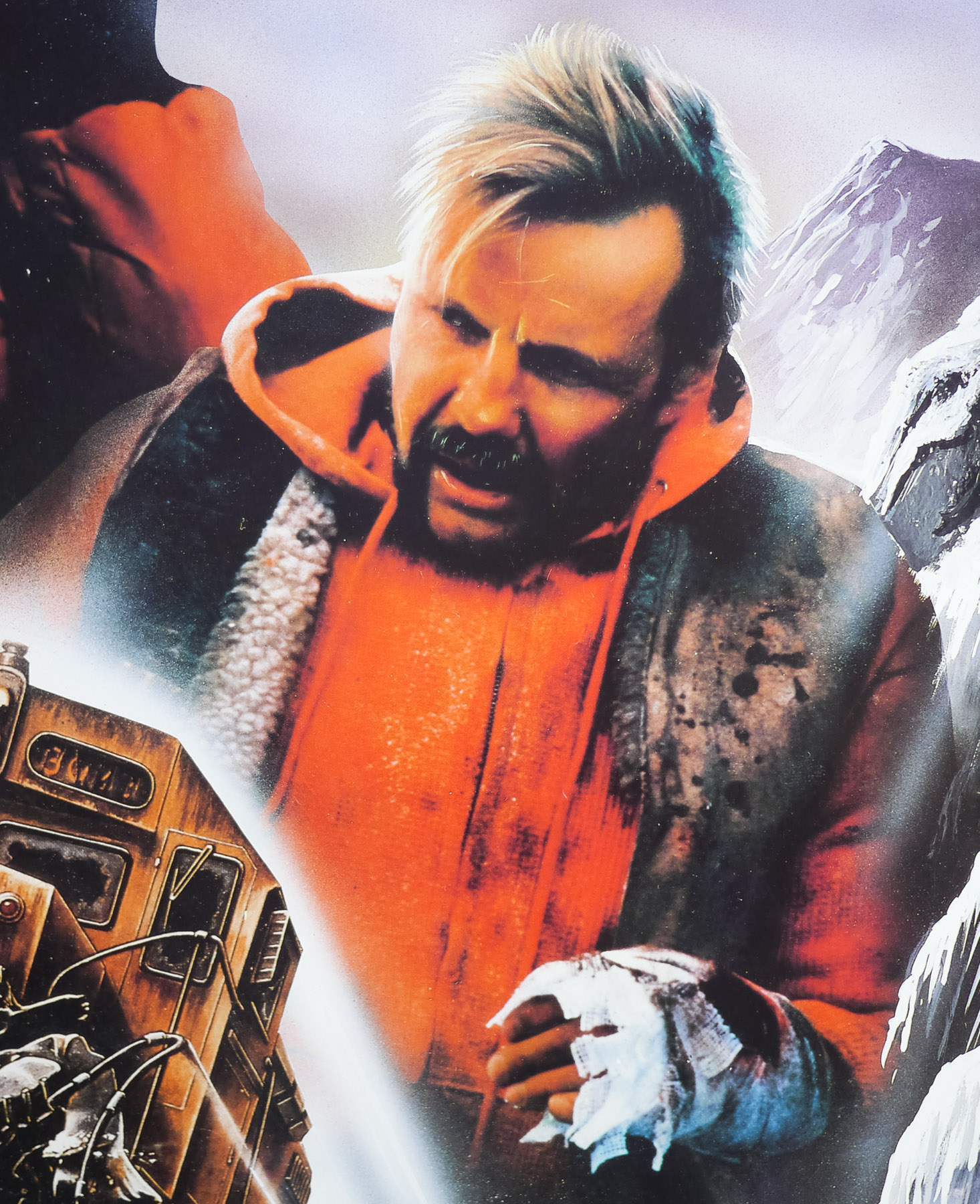
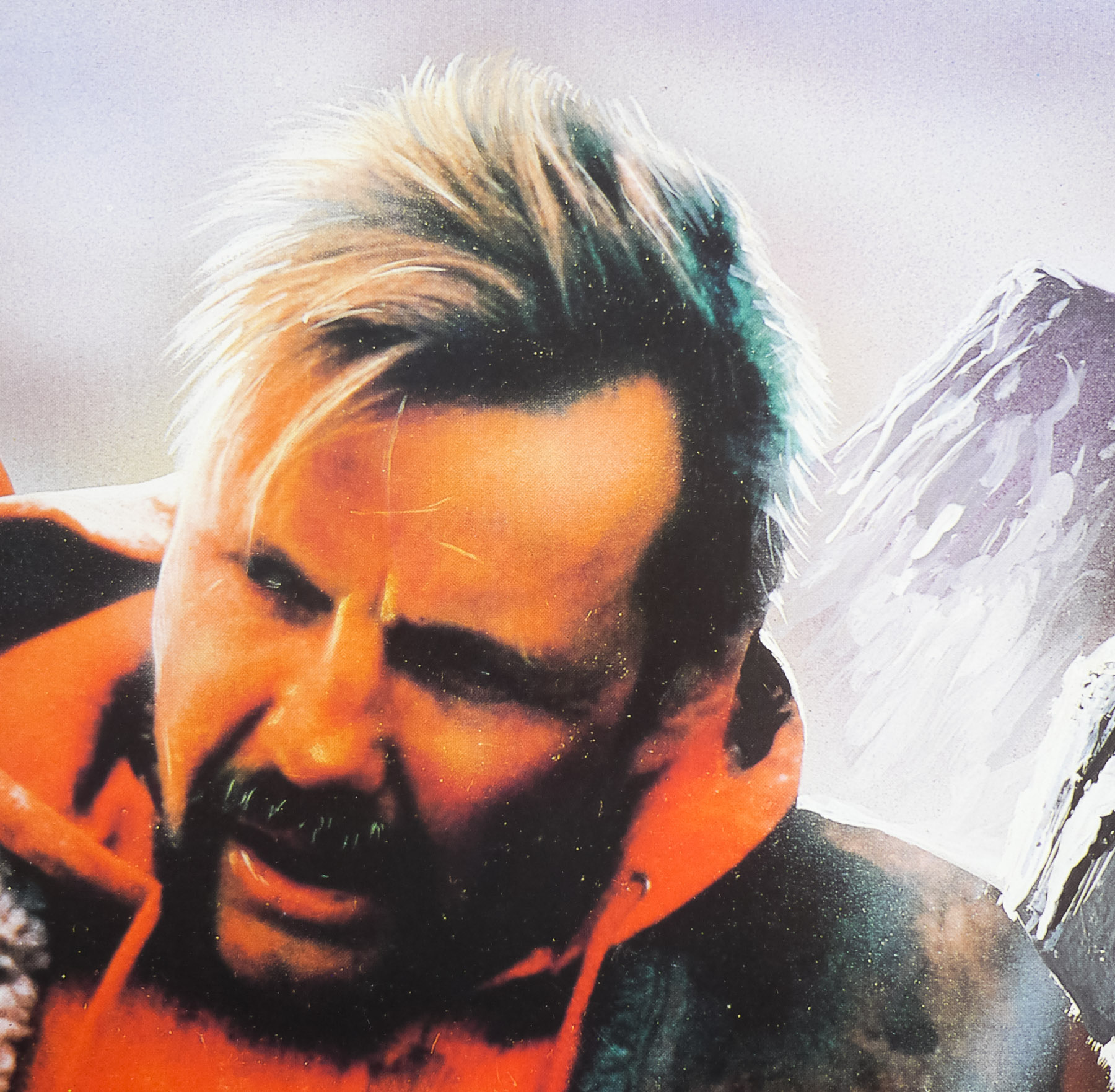
The film is set in remote Alaska and begins in a high-security prison. Oscar ‘Manny’ Manheim (a memorable turn from Jon Voight) is a notorious bank robber who hatches an escape plan that involves the help of the skittish Buck McGeehy (Eric Roberts). After smuggling Manny into the laundry room, the pair escape through the sewers and eventually find their way to a railroad. There they jump onboard a slowly moving locomotive and hide in one of the cars. Unbeknownst to them, the train driver suffers a heart attack whilst trying to stop the train and falls off it. The automatic train stop is not engaged and the runaway train begins its journey down the tracks. Also onboard is another railway worker called Sara (Rebecca De Mornay) who realises quickly that they’re in a bad predicament. The rest of the film sees the trio attempting to bring the speeding train to a stop whilst being pursued by the sadistic prison warden Ranken (John P. Ryan) and his men.
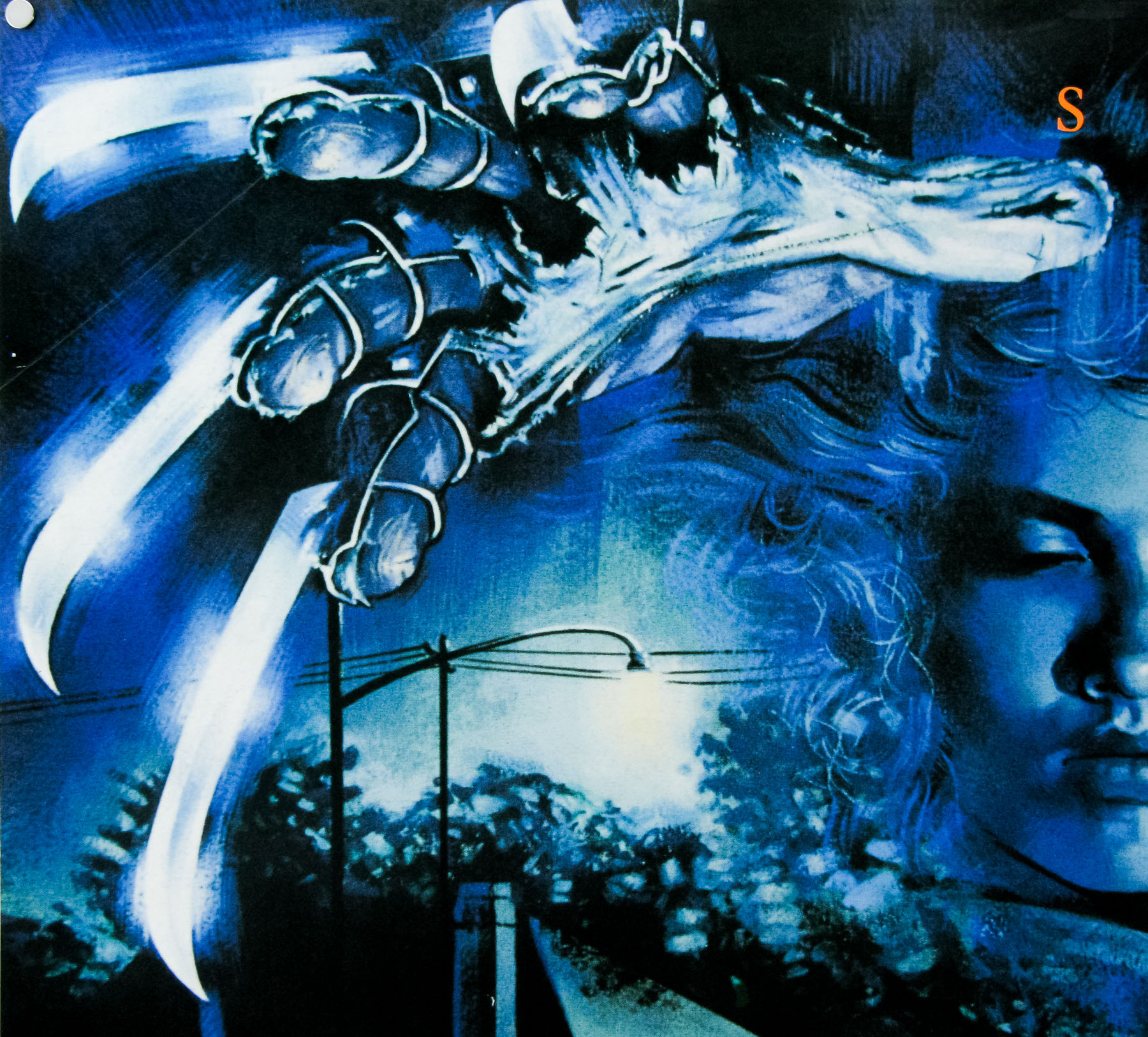
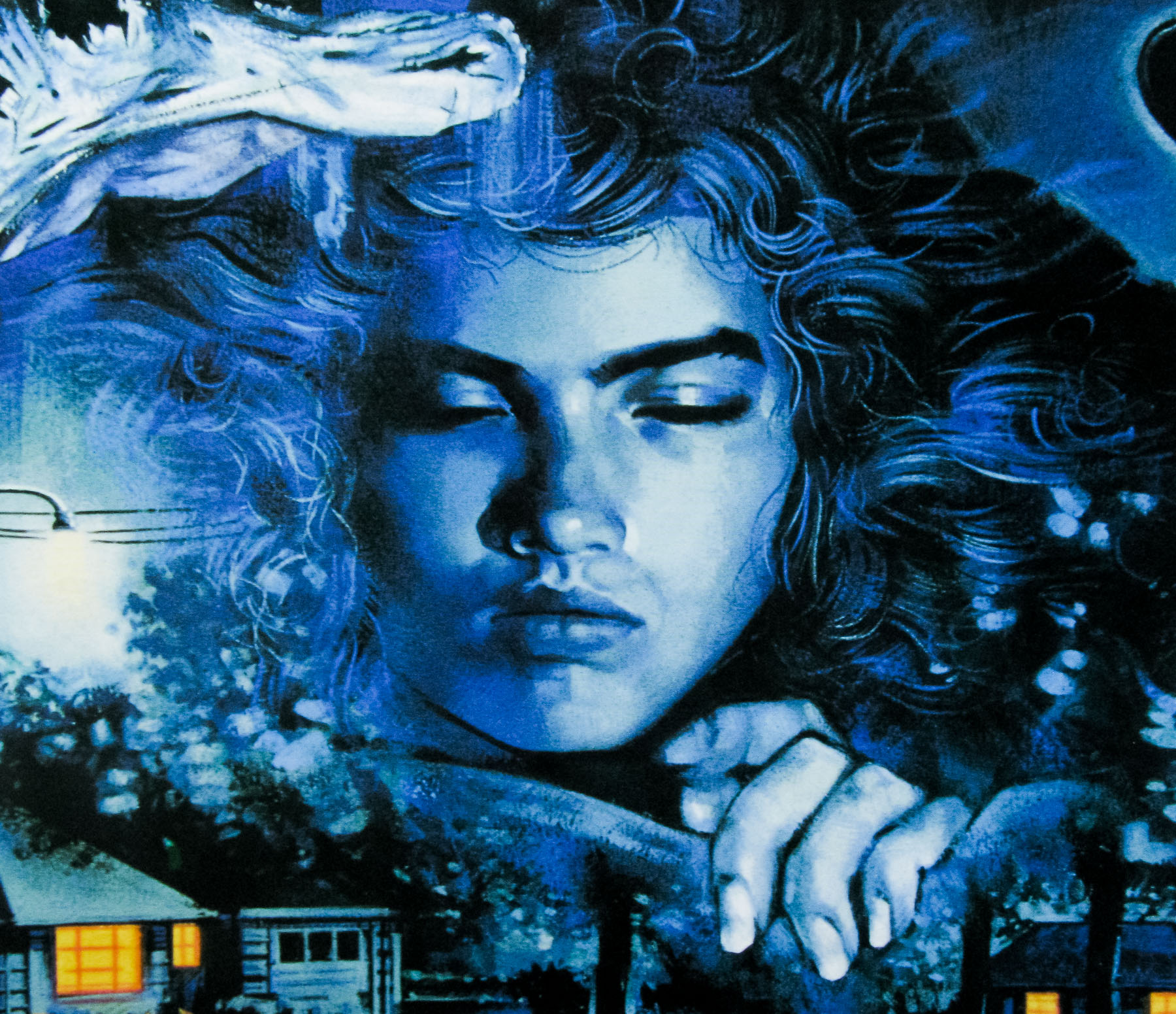
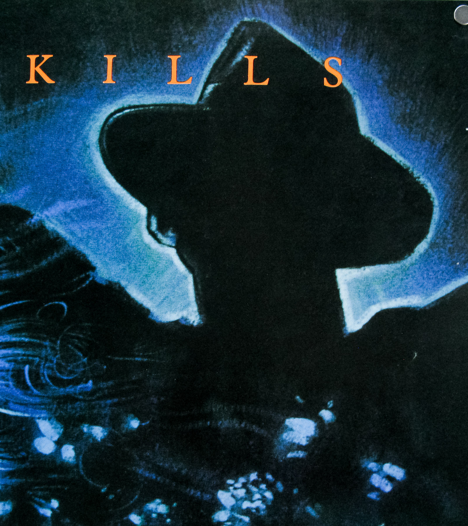
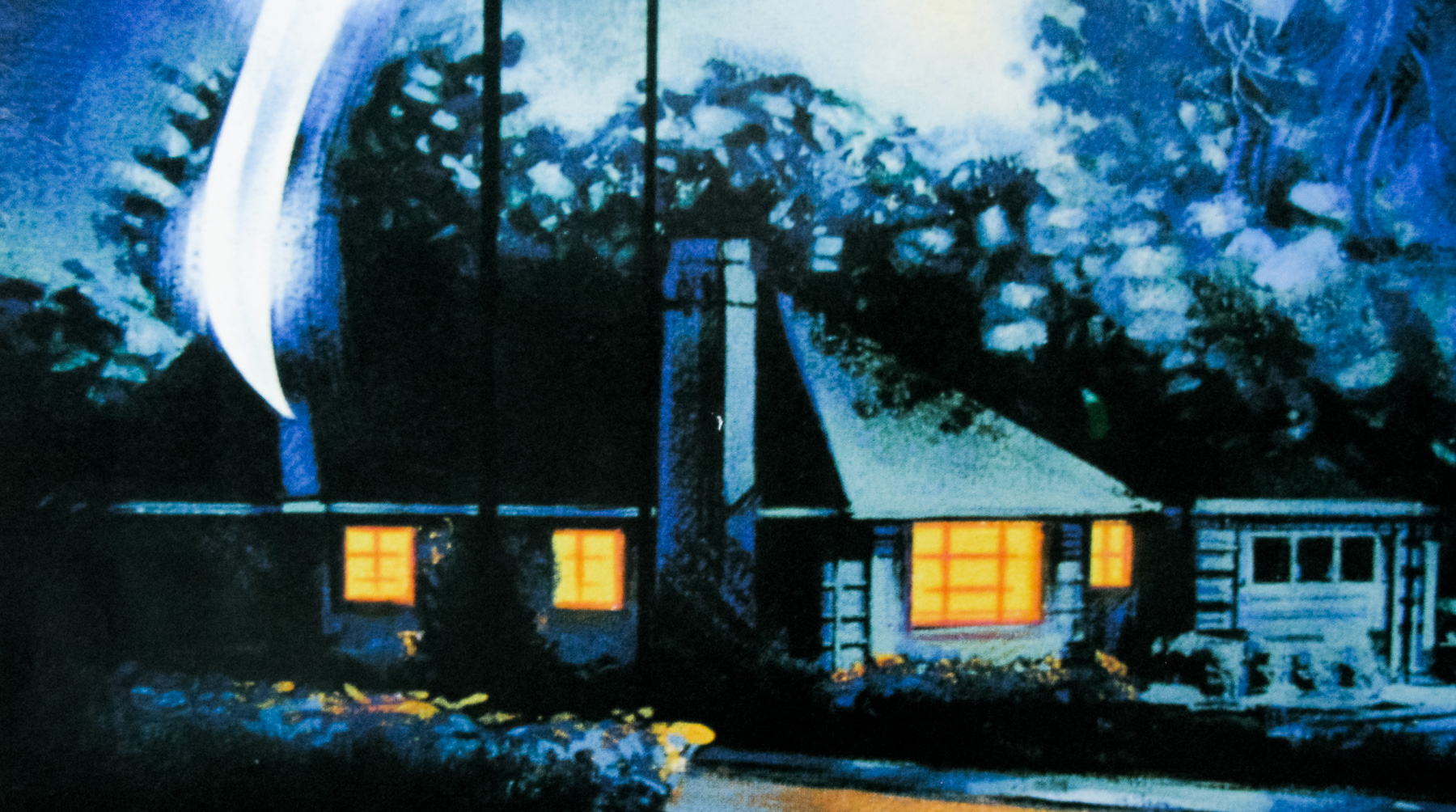
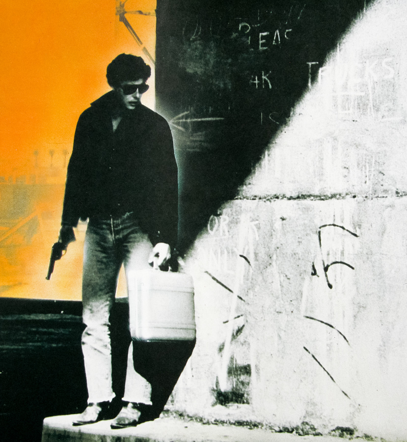
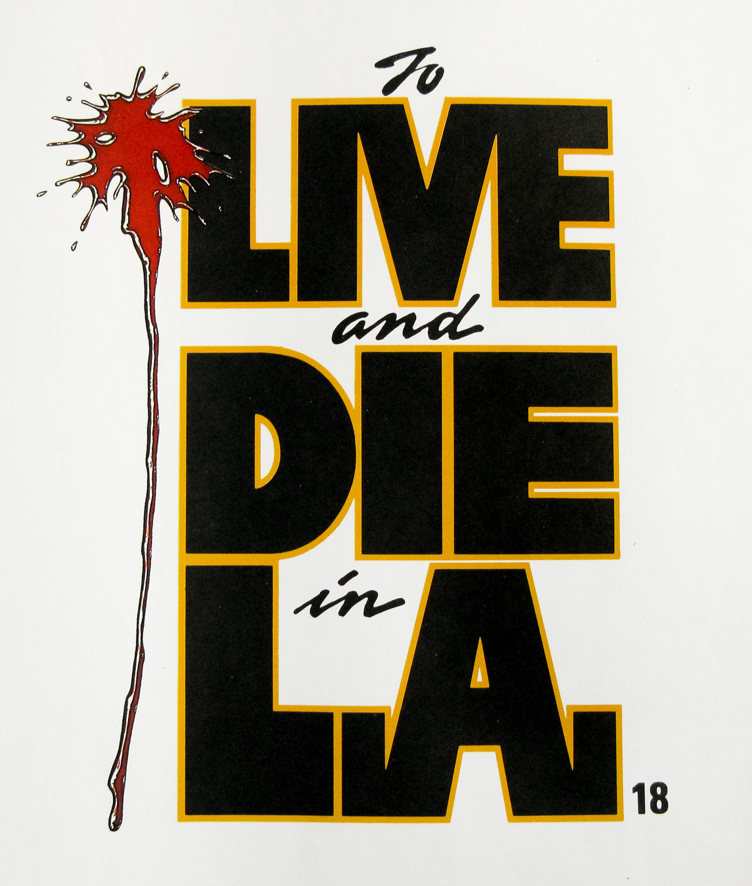
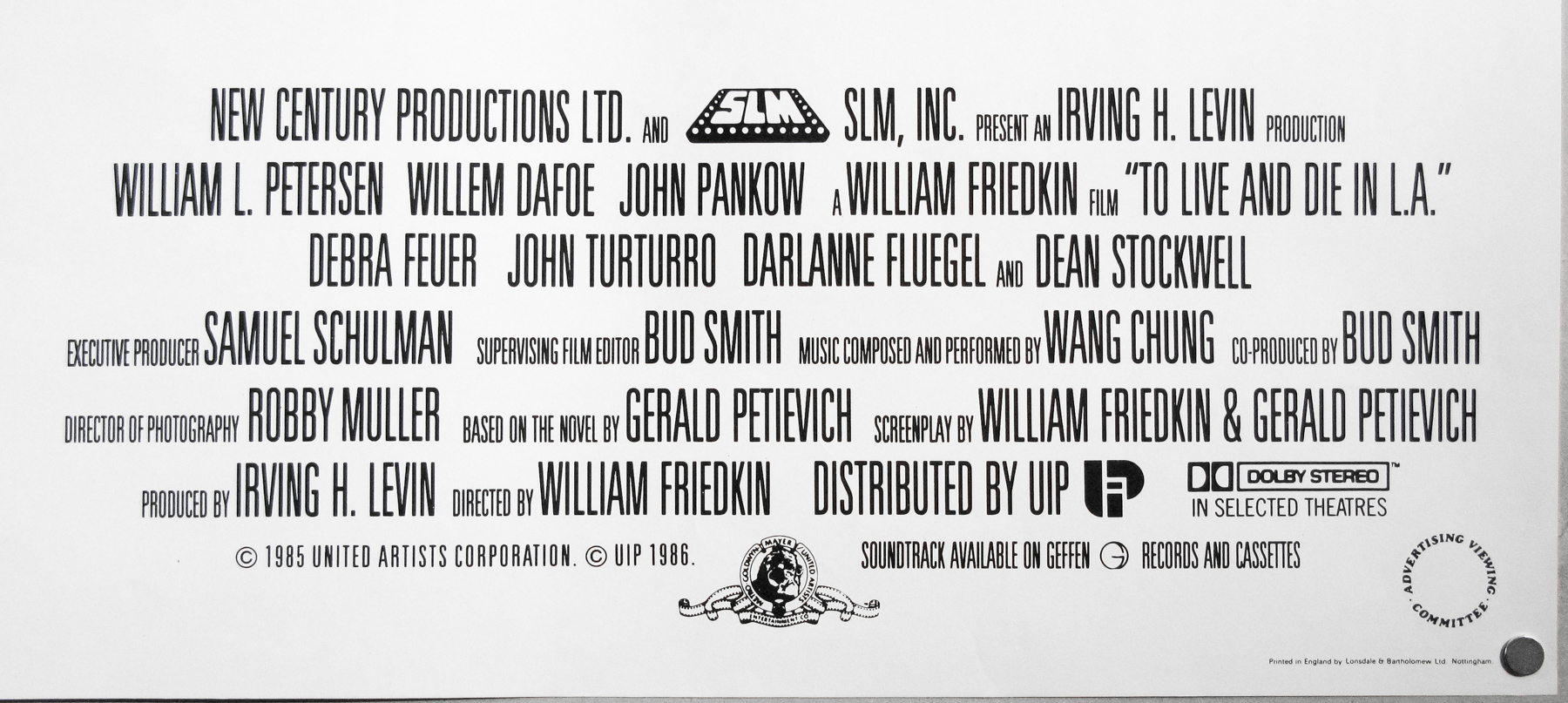
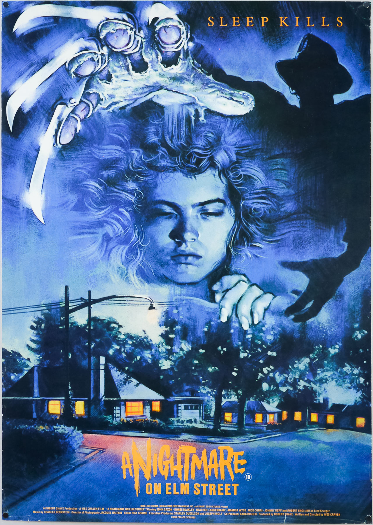
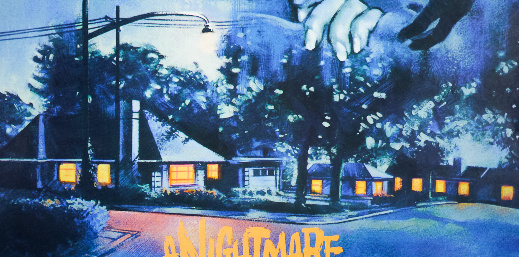
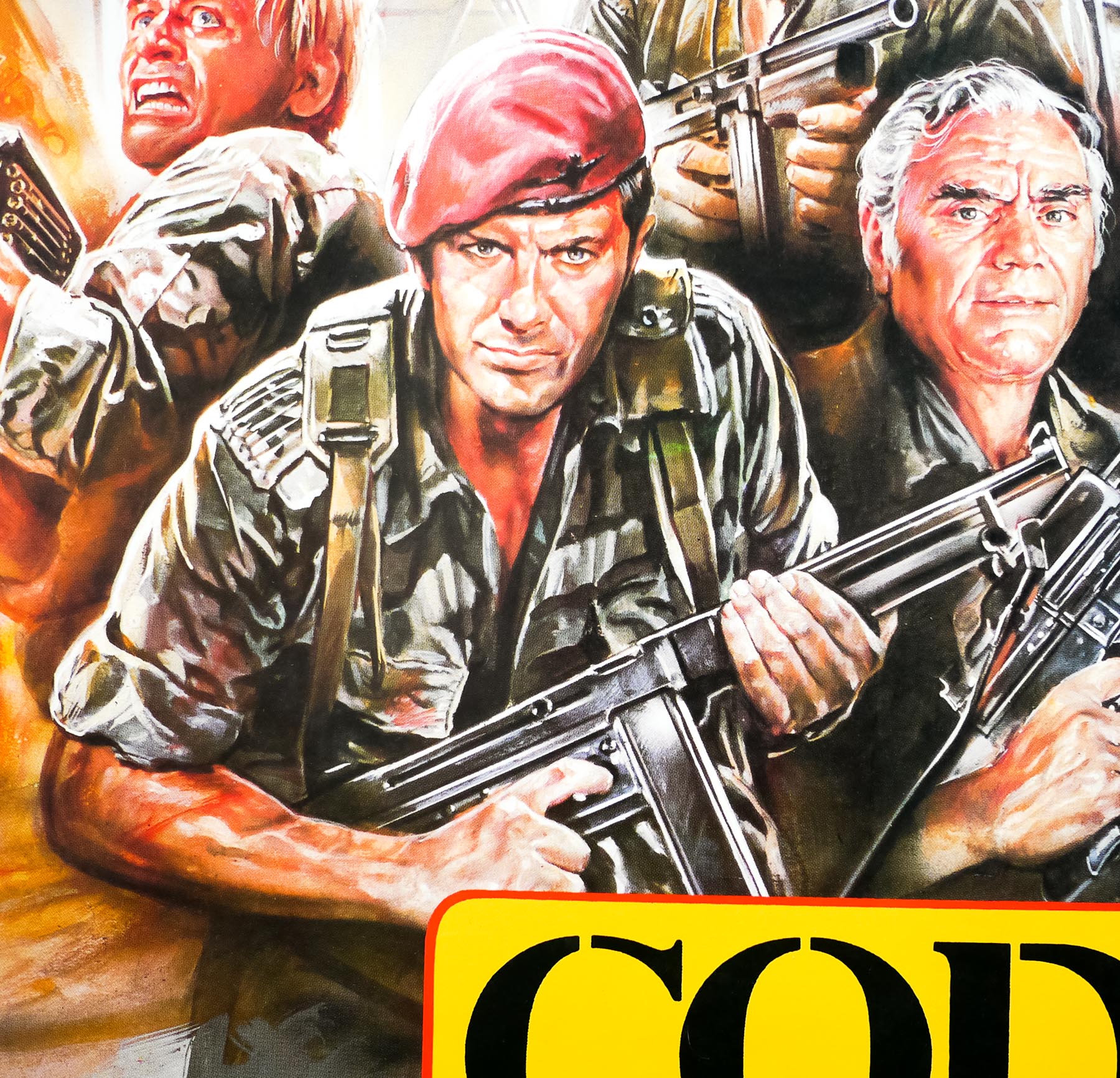
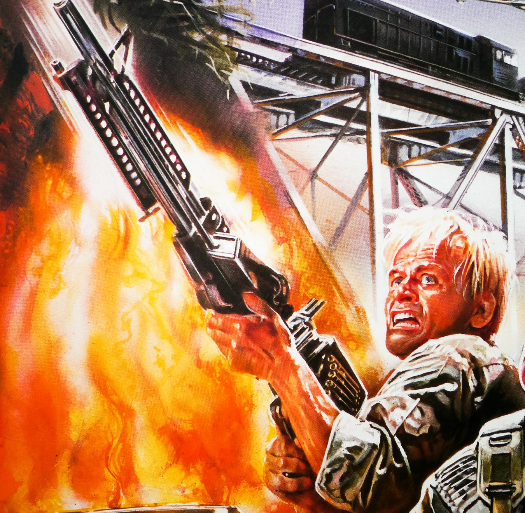
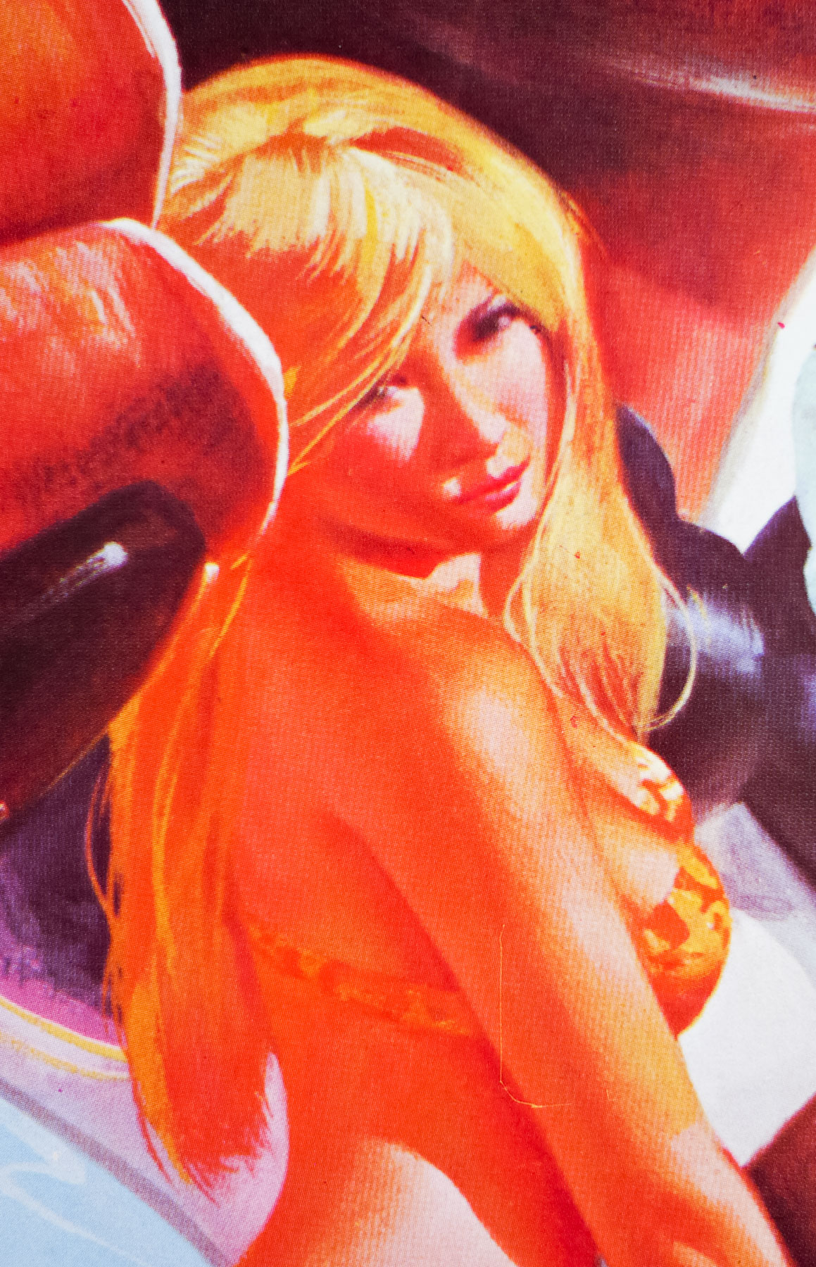
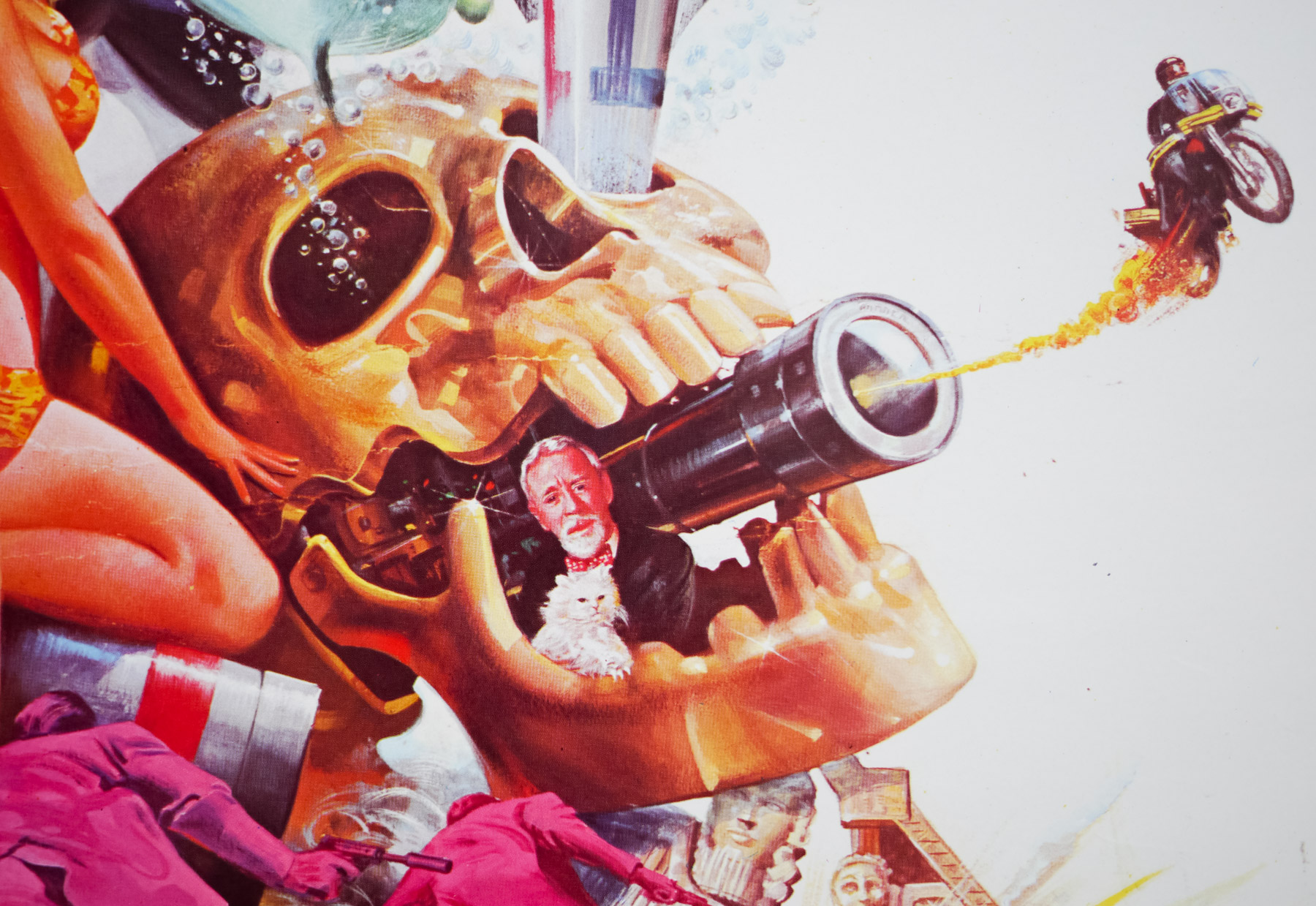
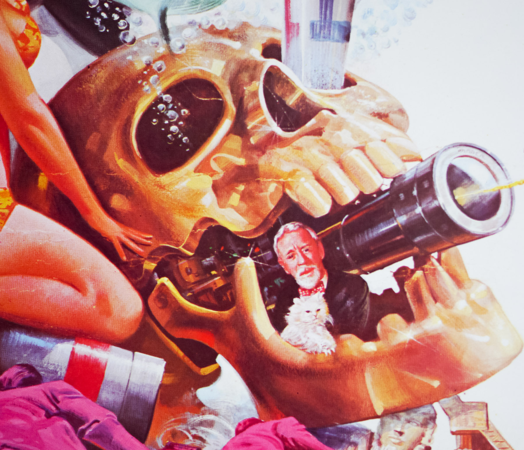
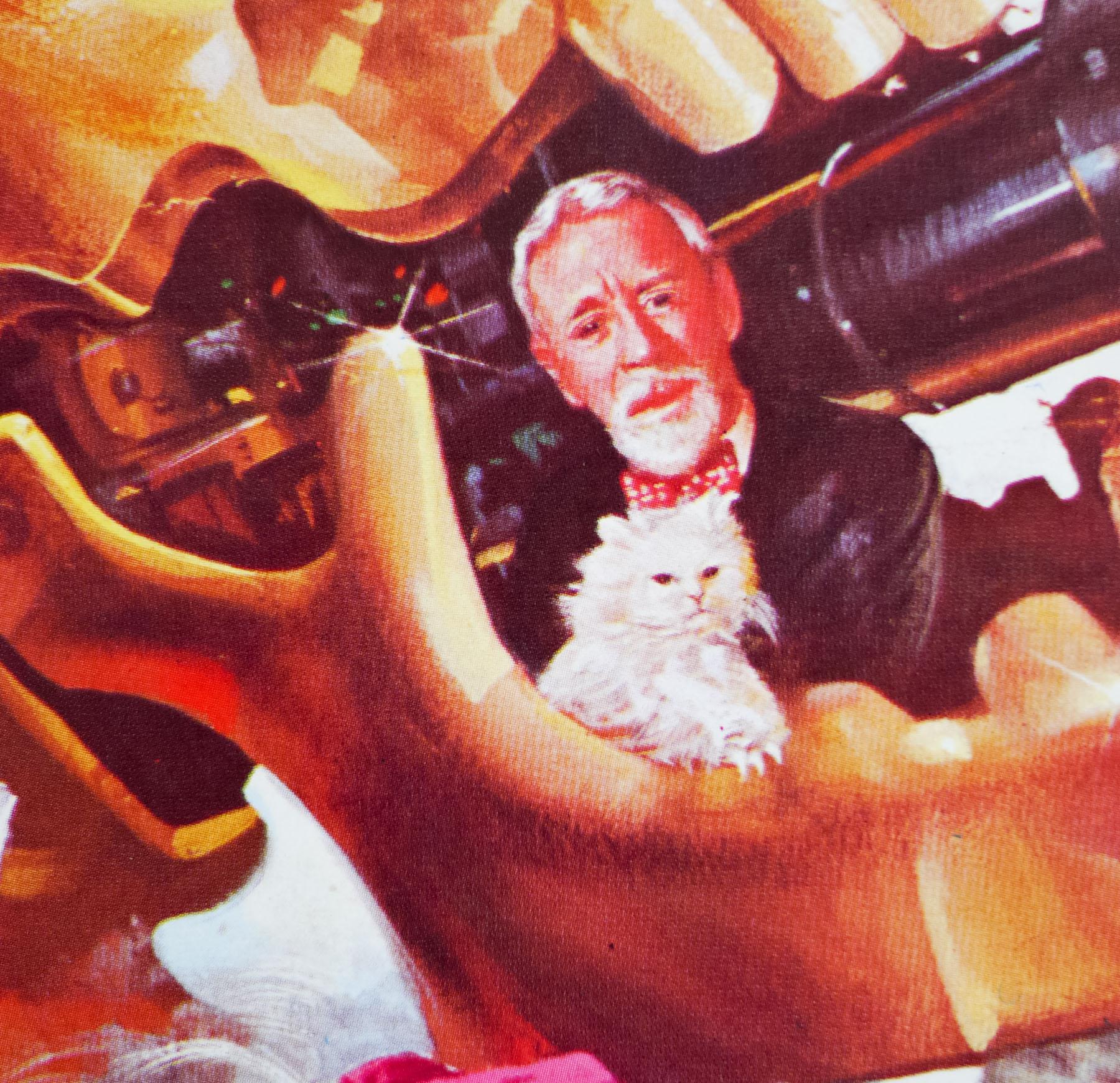
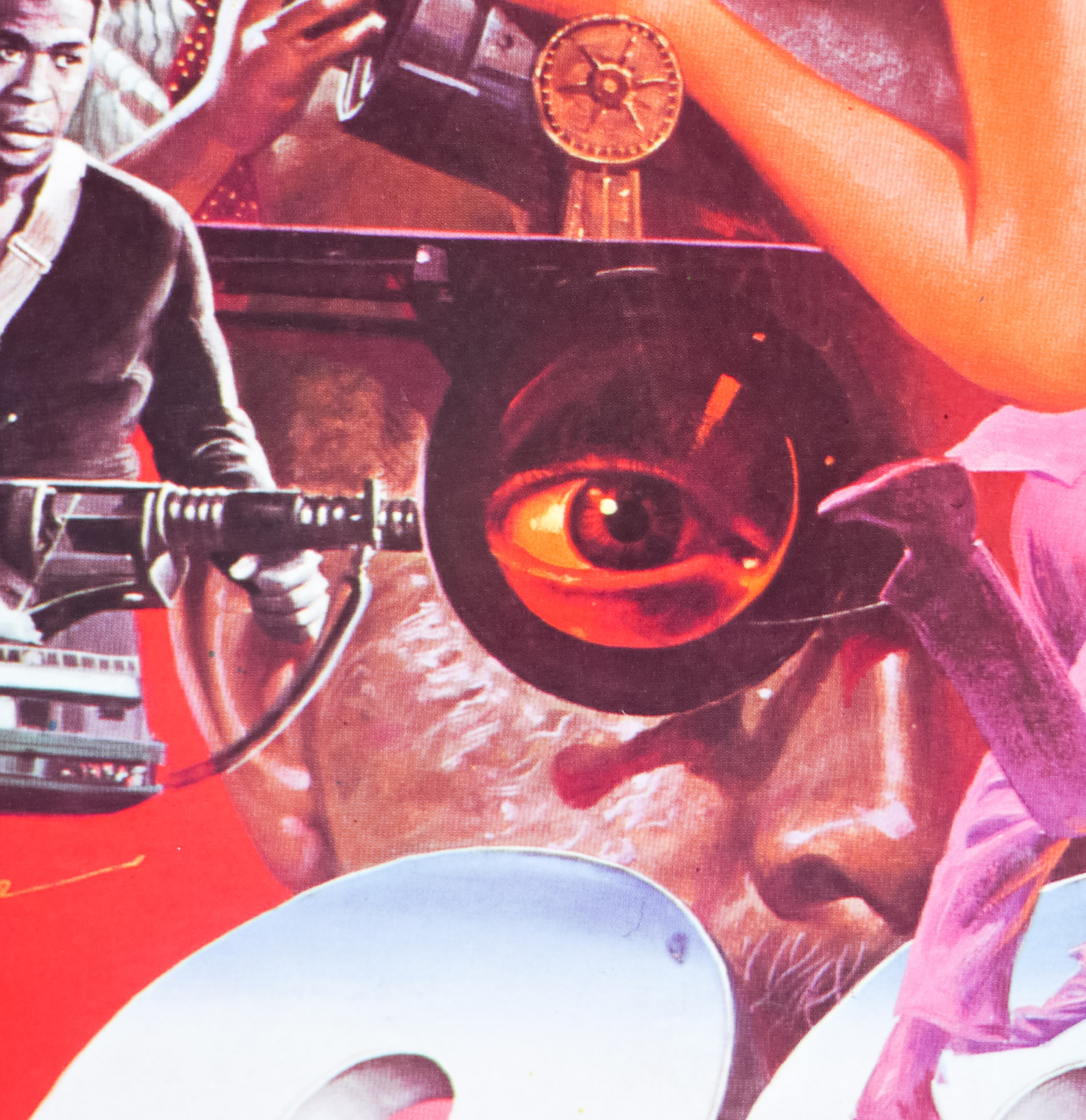
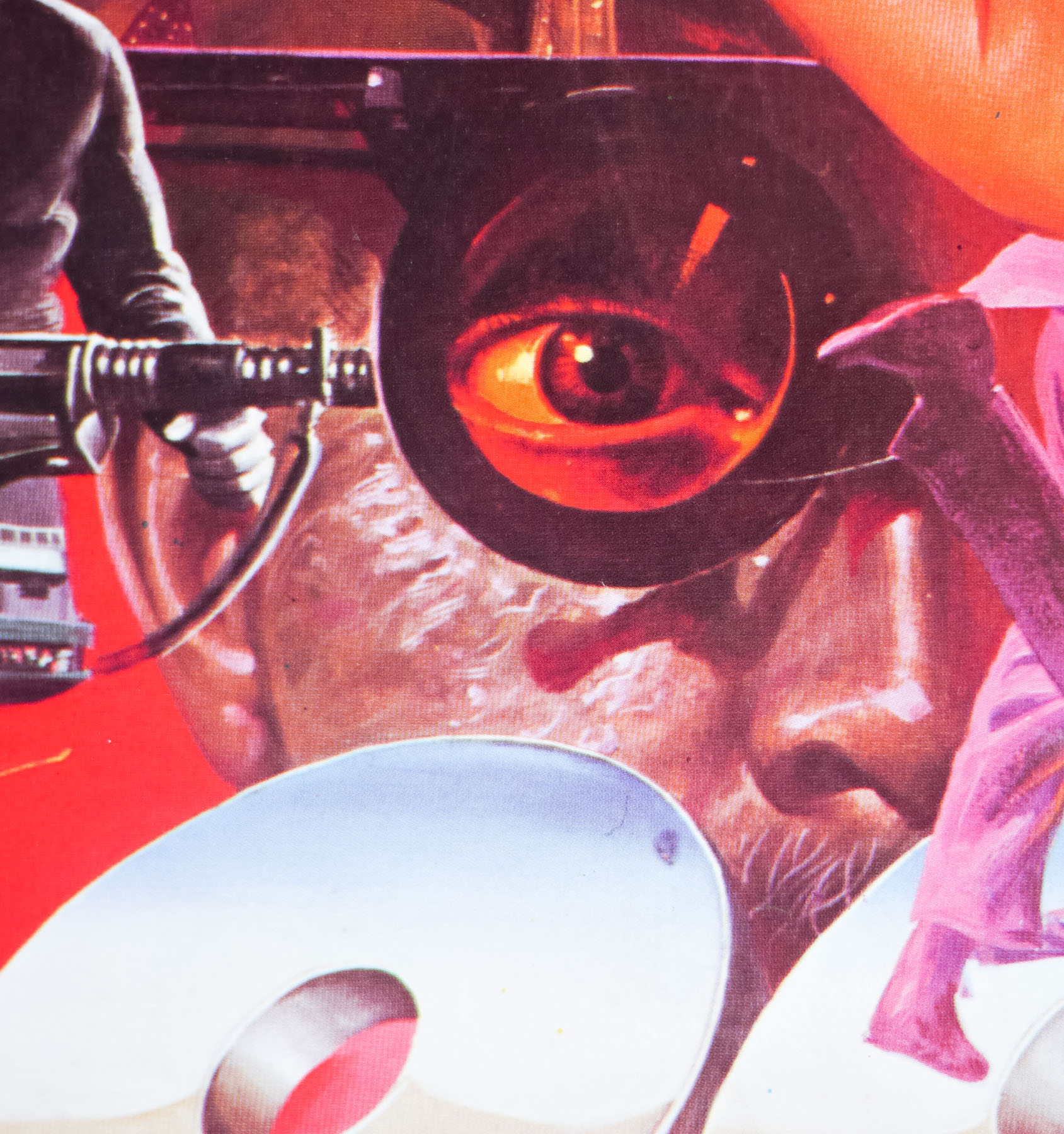
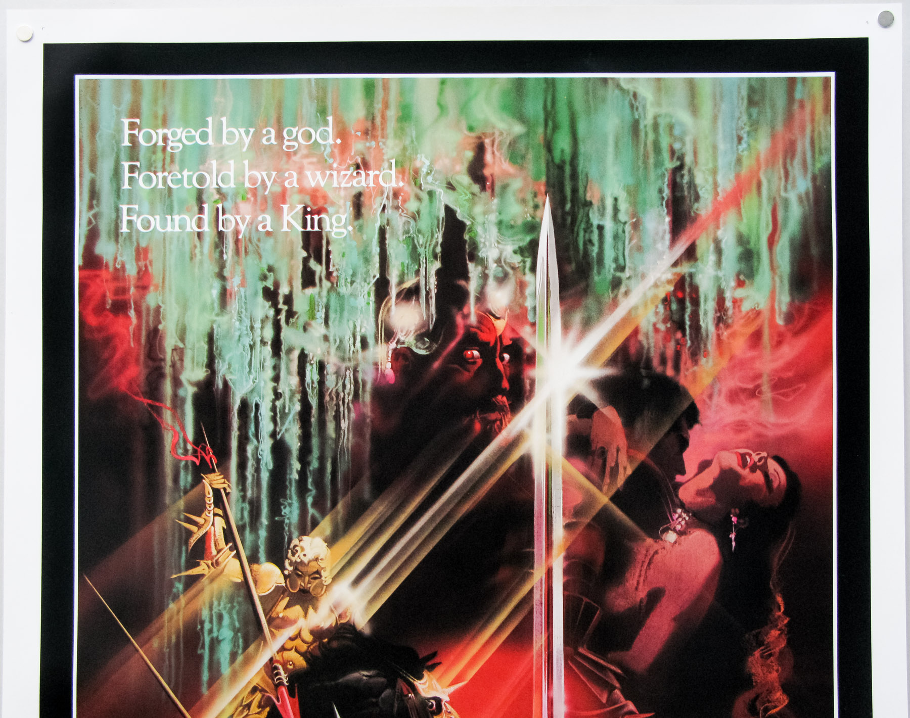
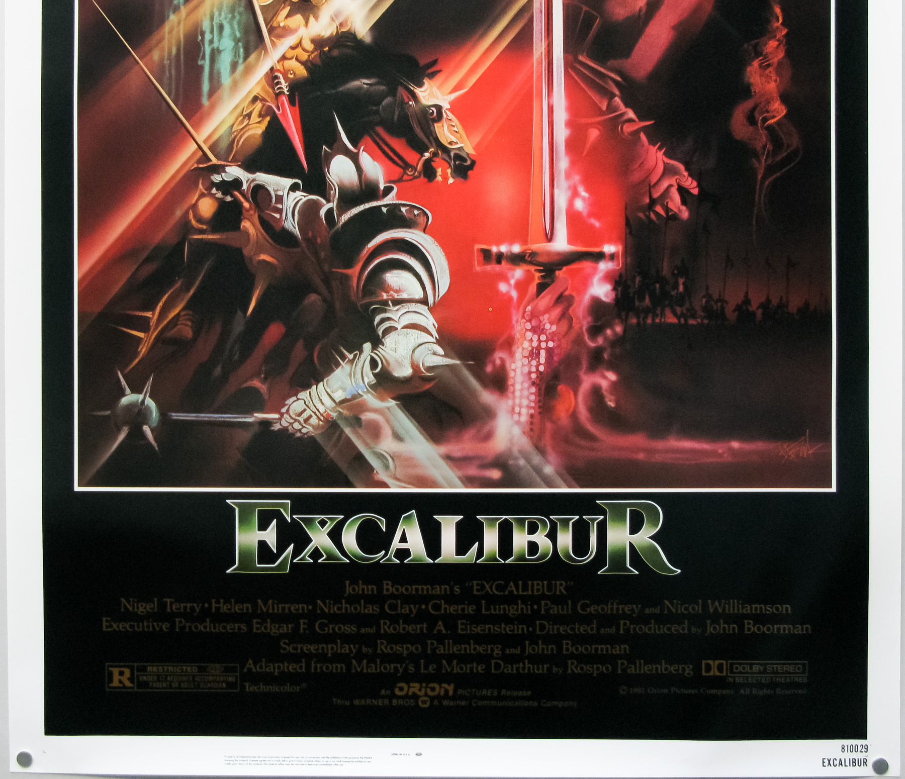
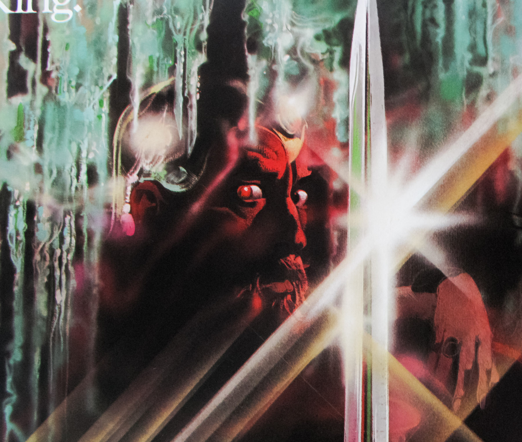
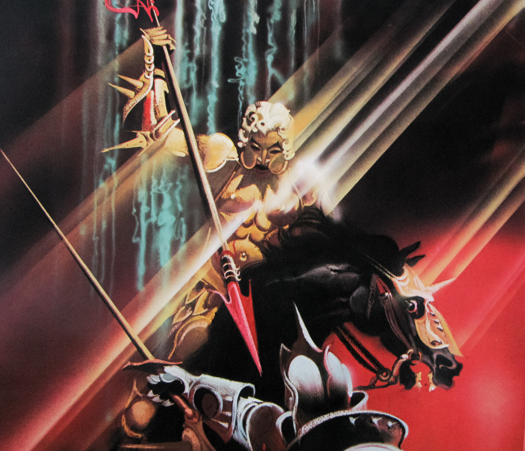
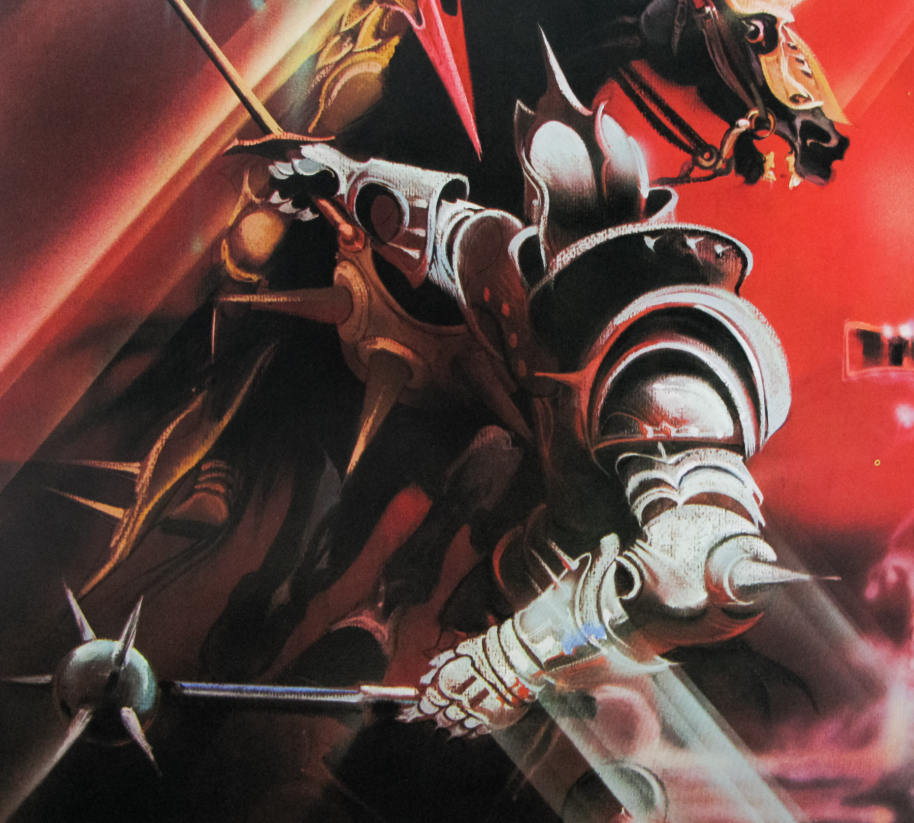
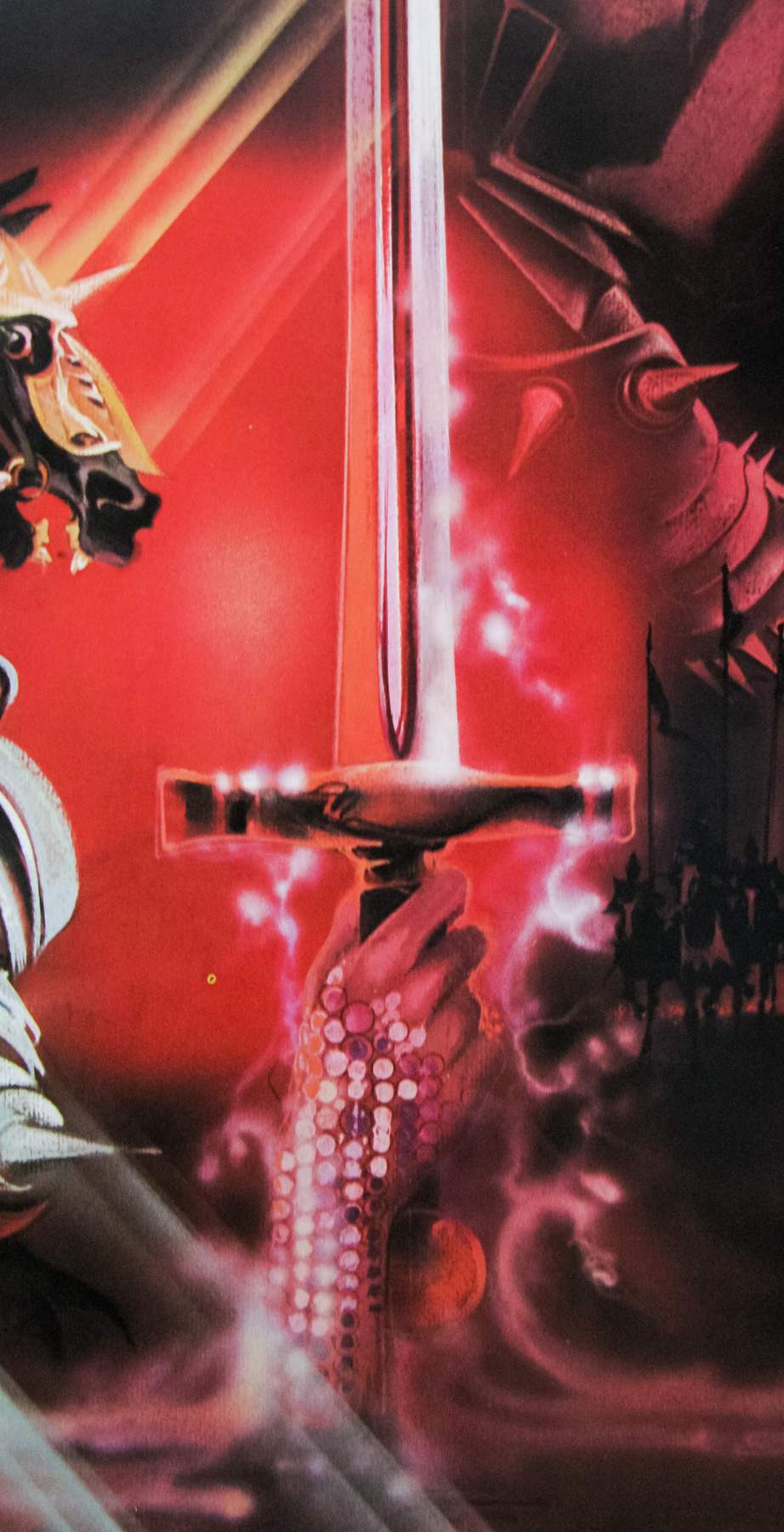
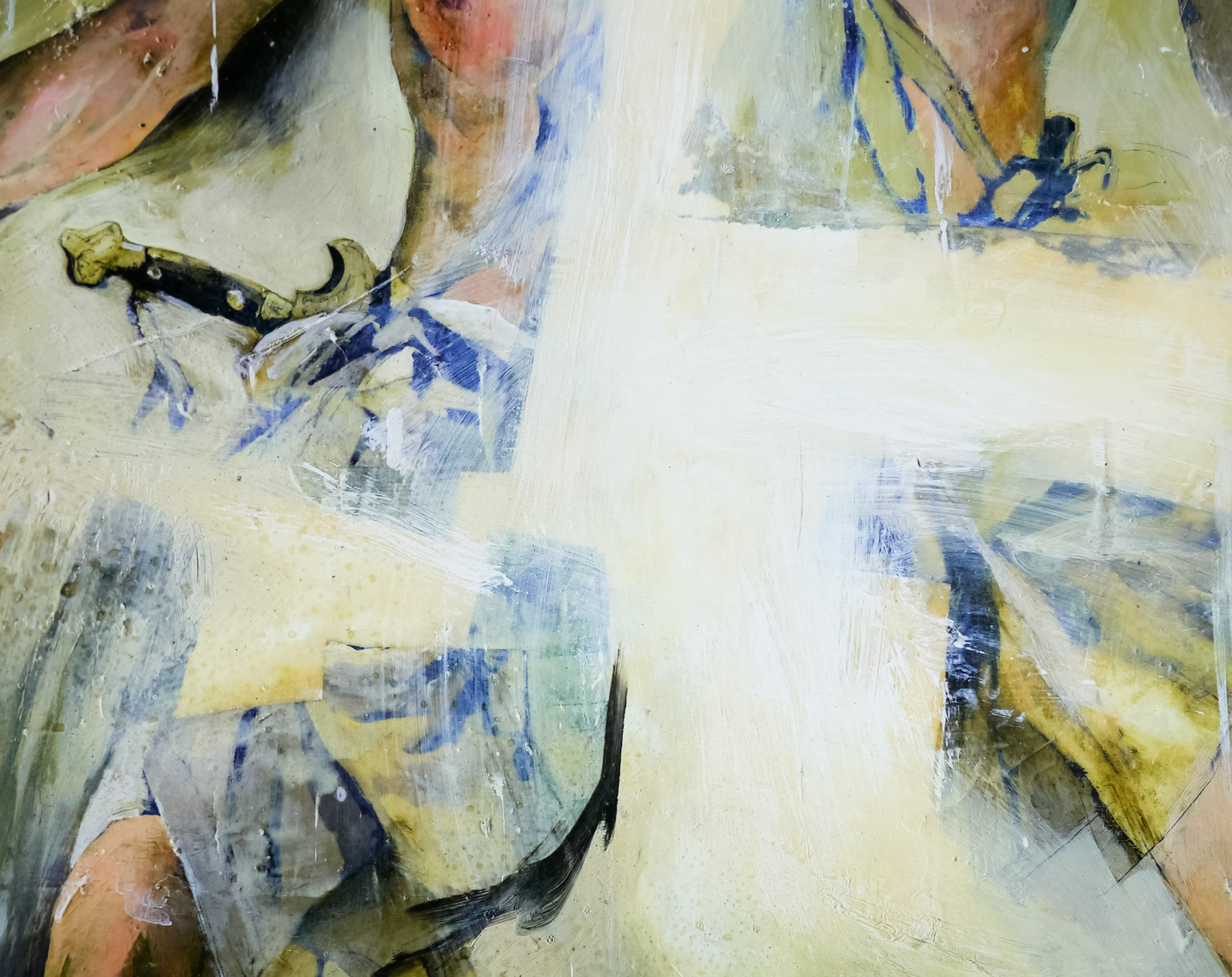
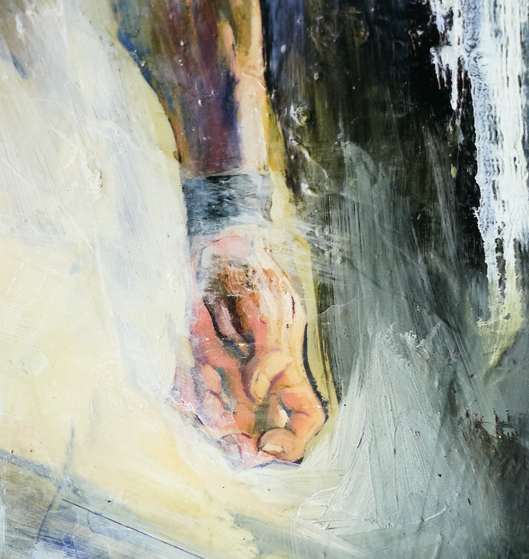
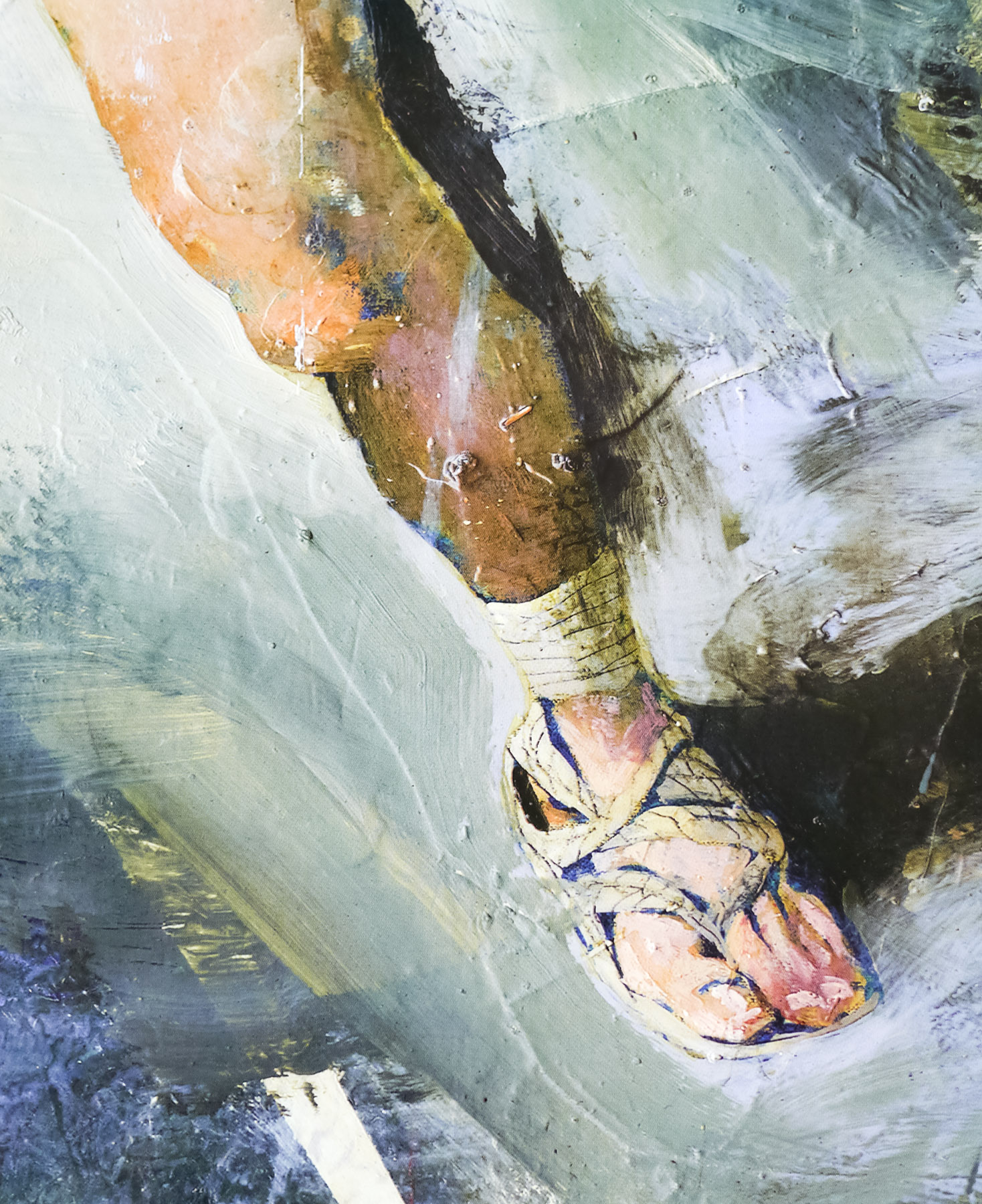
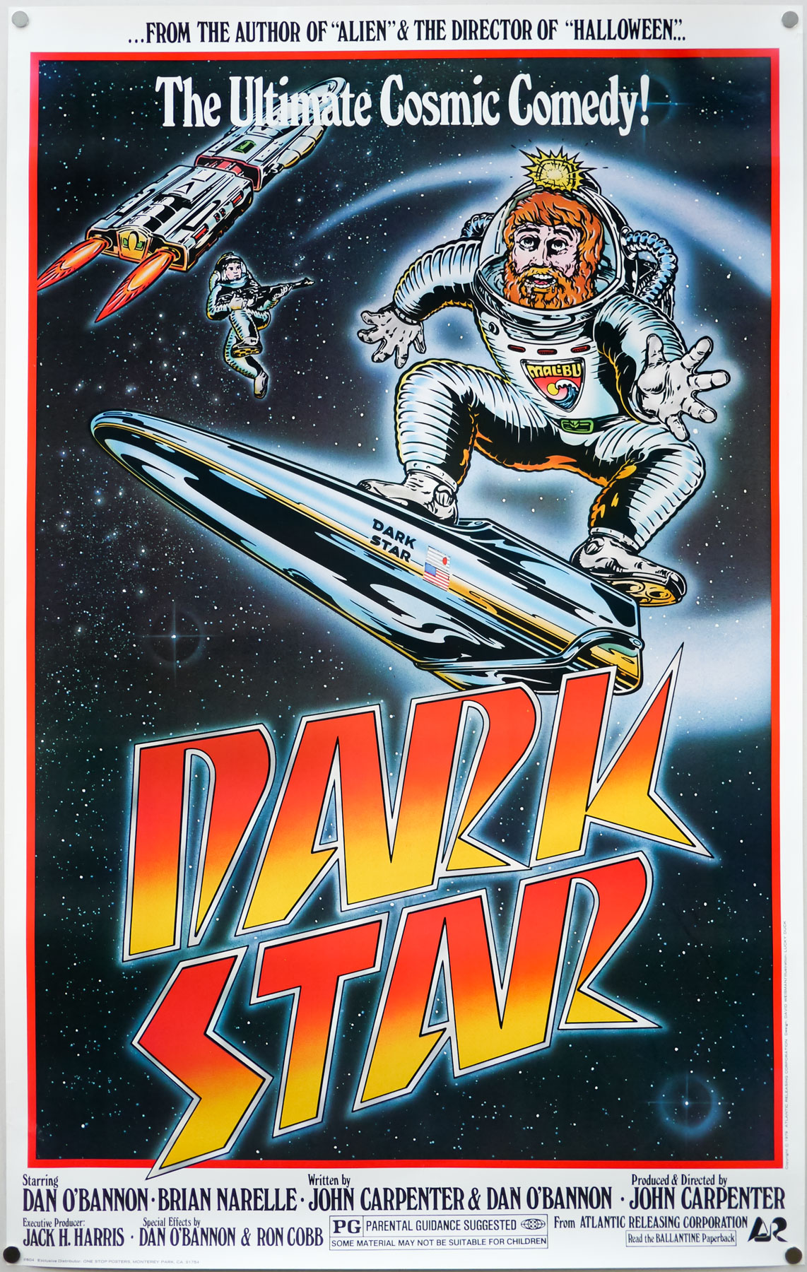
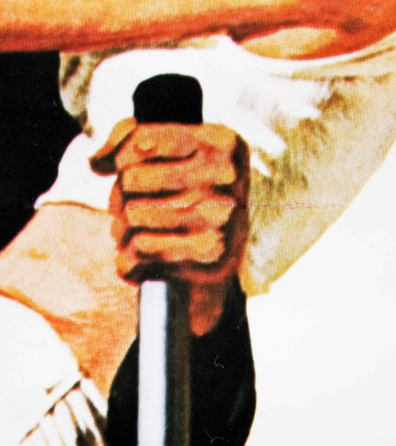
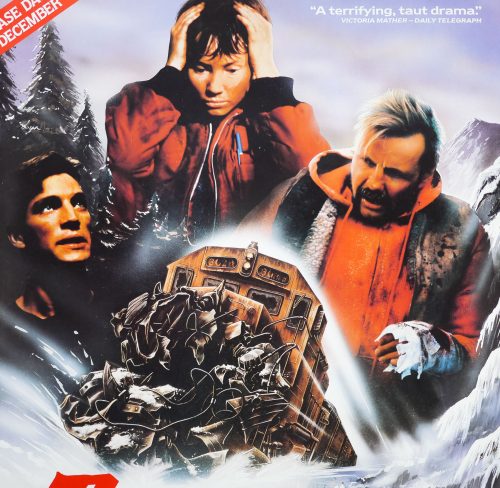
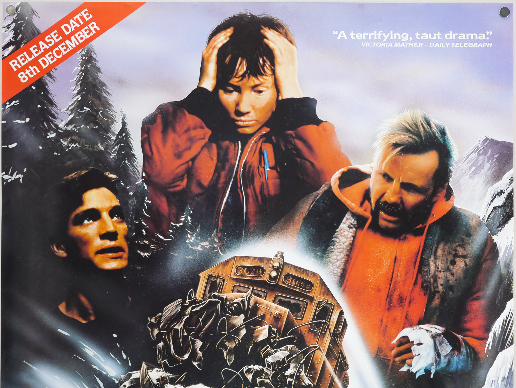
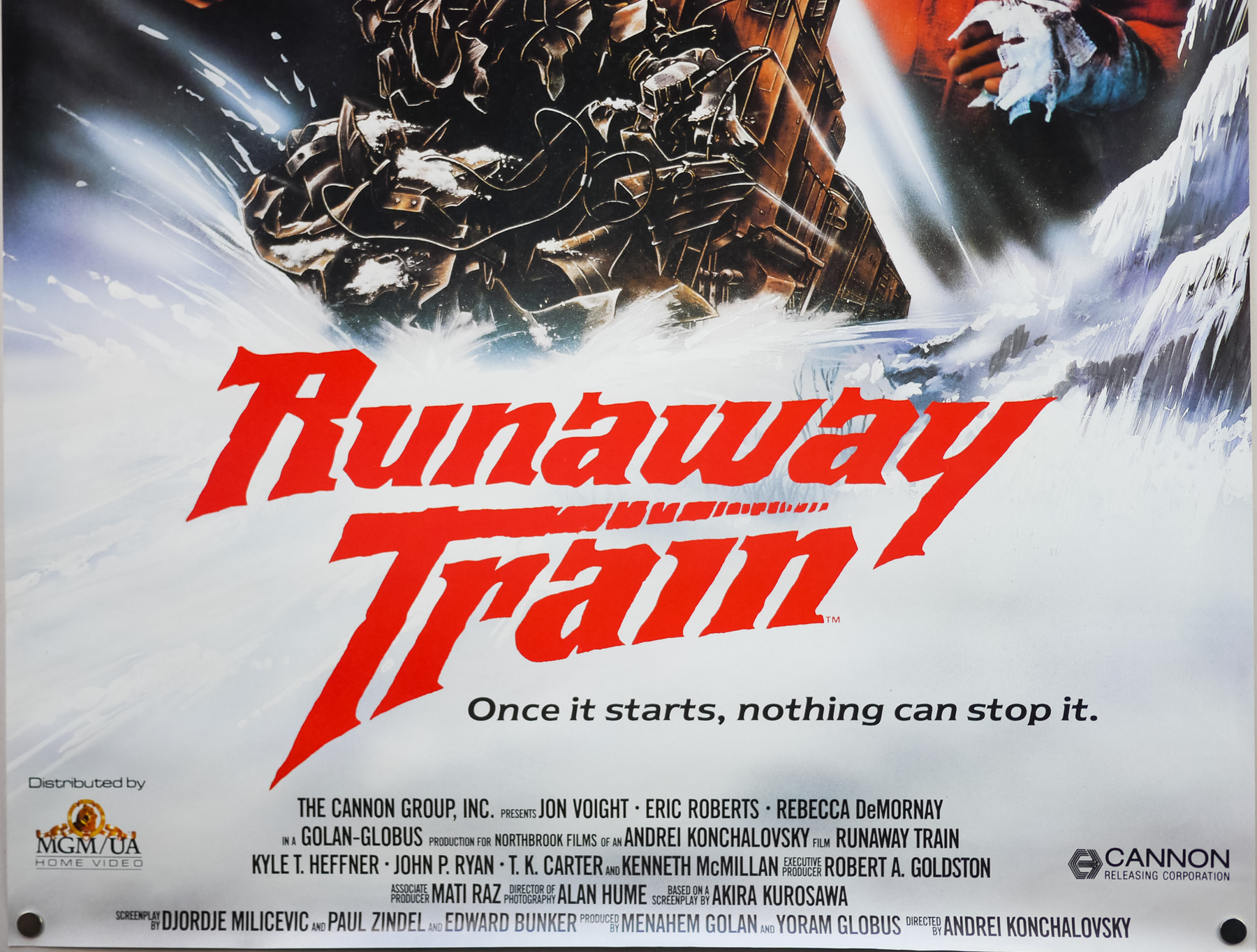
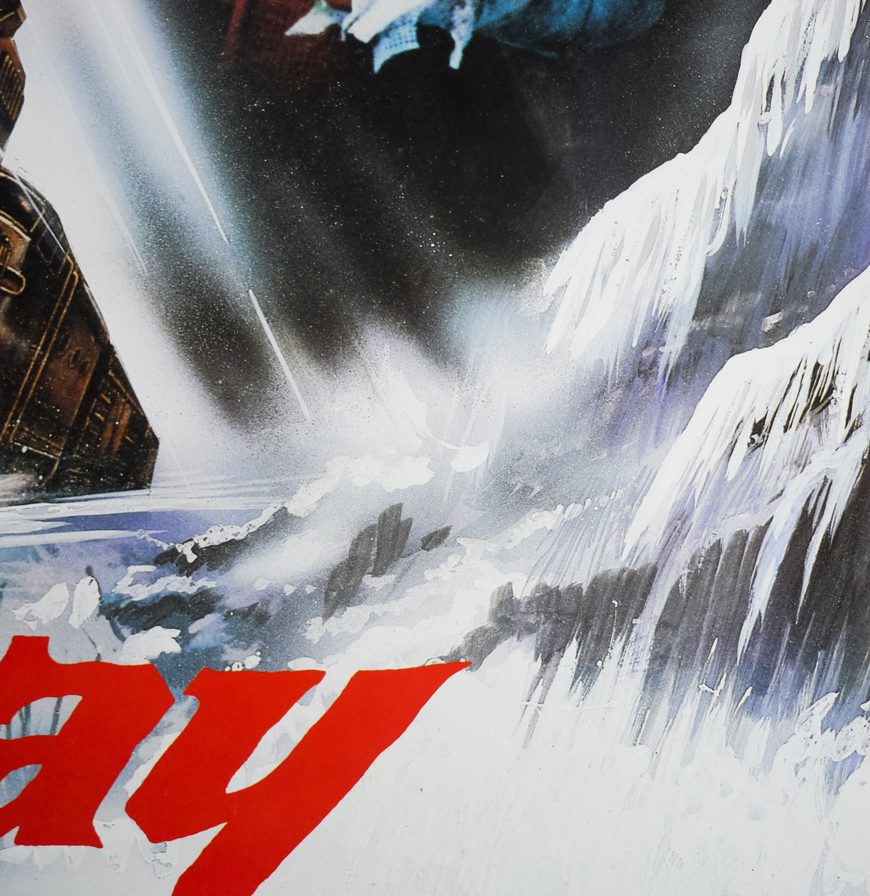
Runaway Train was a critical and commercial success in the US and abroad. It was also nominated for several awards – an unusual occurrence for a Cannon film (Jon Voight would win a Golden Globe for Best Actor). This video poster was for the 1986 release on MGM home video in the UK and features a unique design that is, I believe, exclusive to the poster. It’s a mixture of artwork and photograph. The trees, train and elements of the background are painted and Jon Voight’s image has also had some painting applied to it as well, strangely.