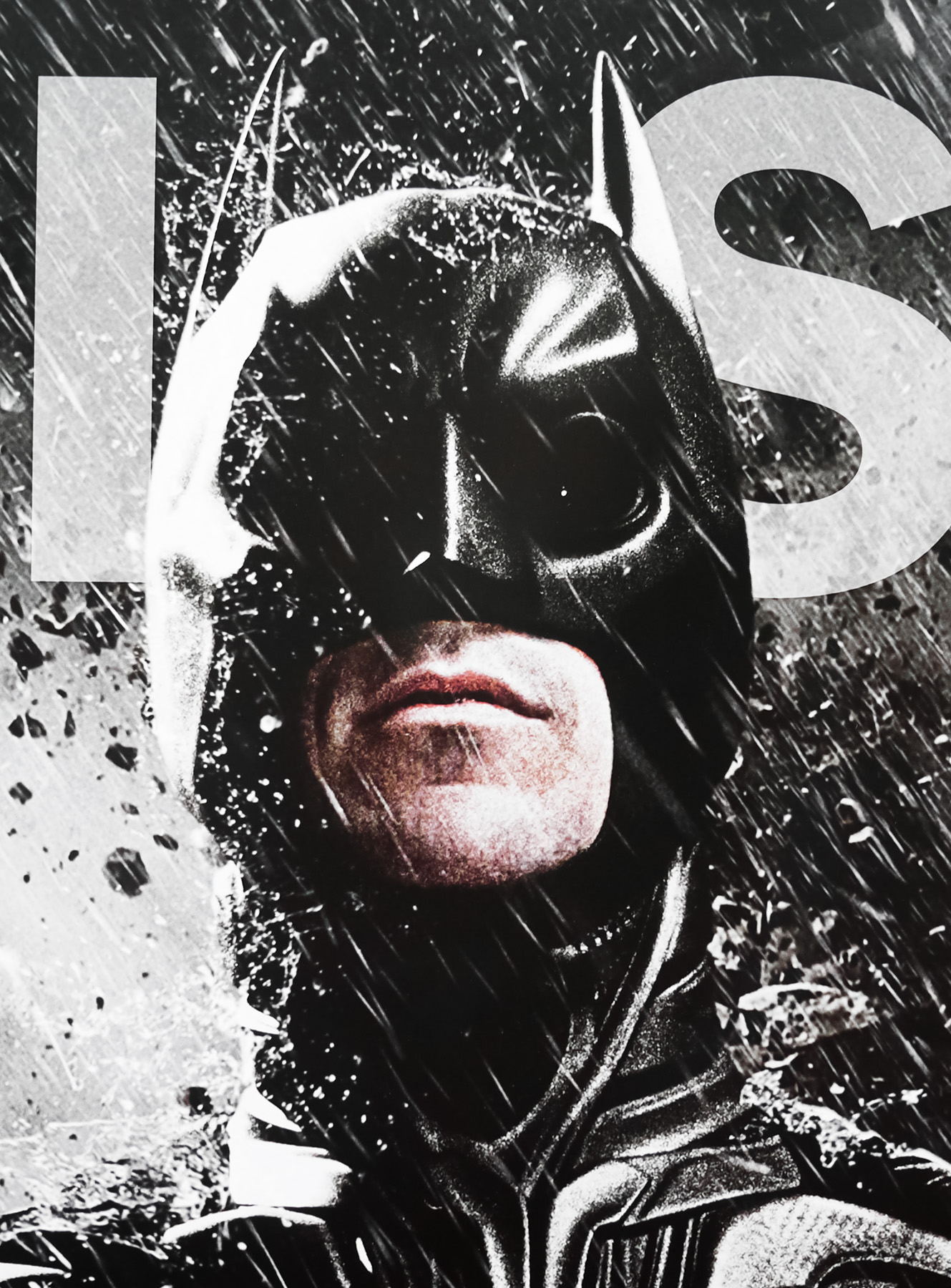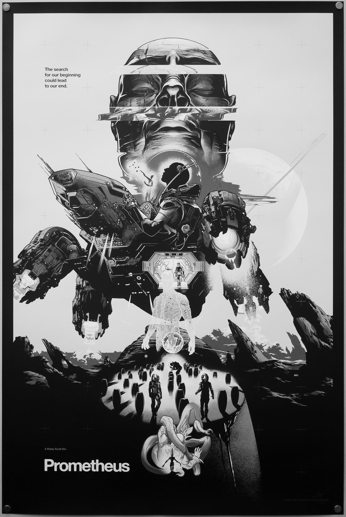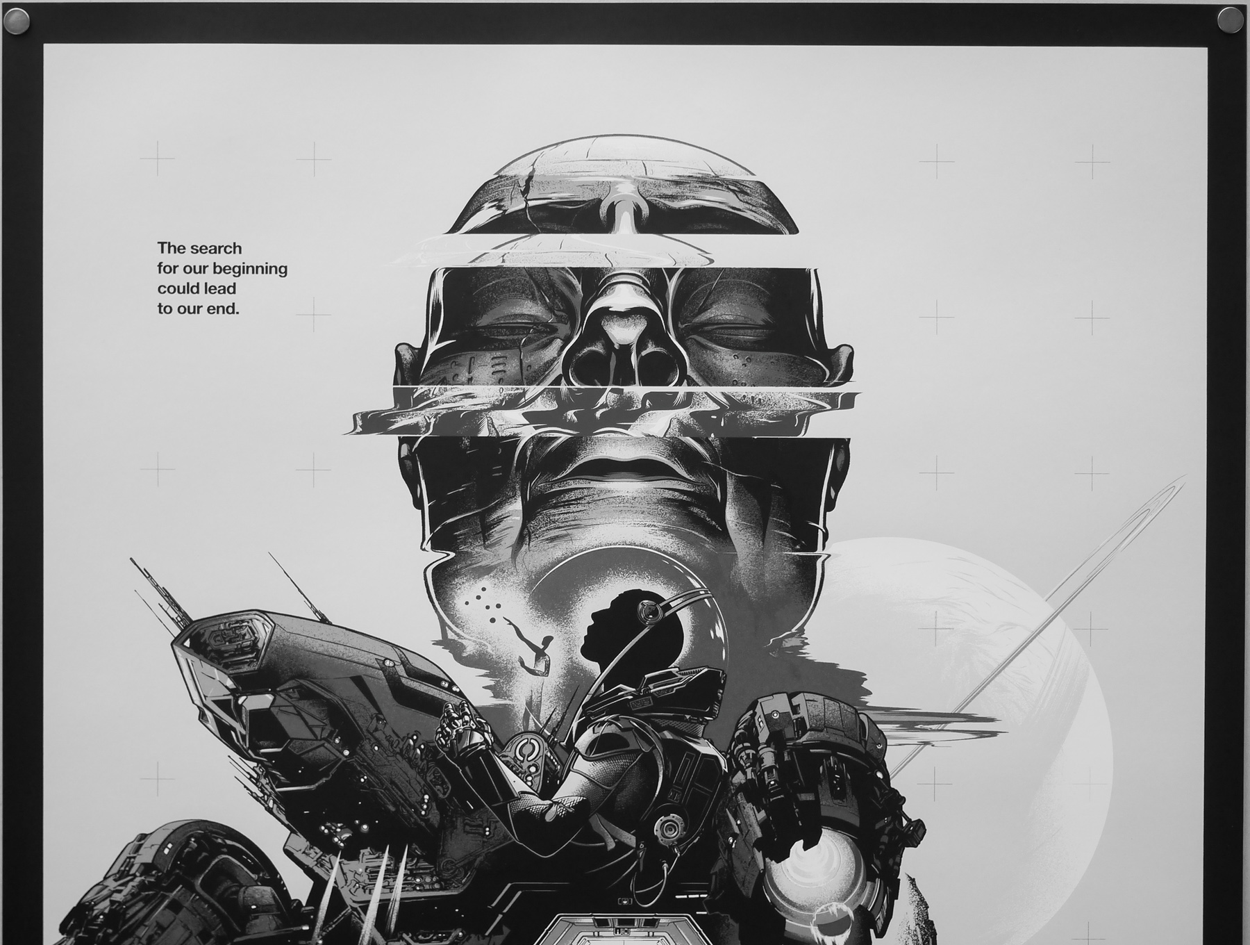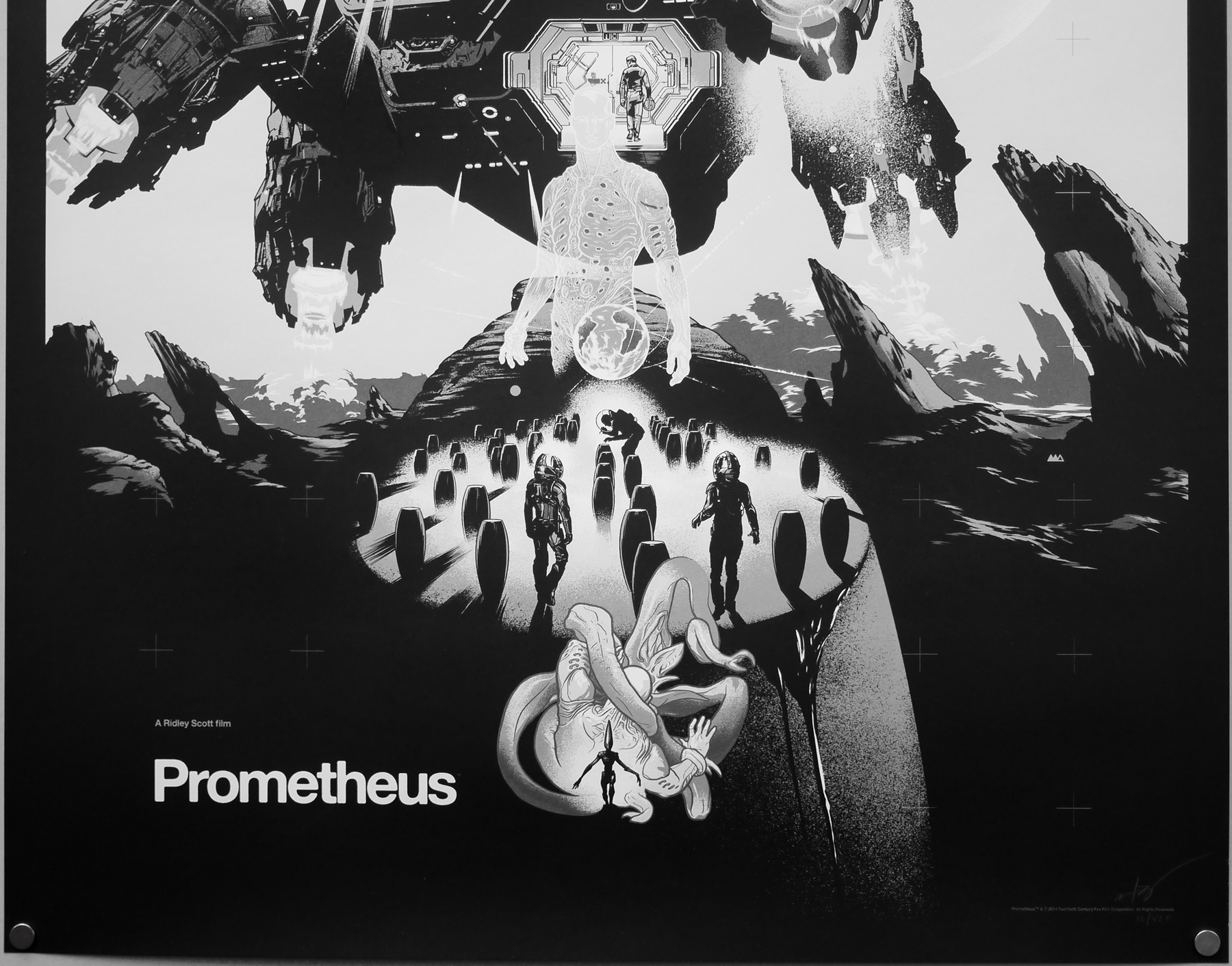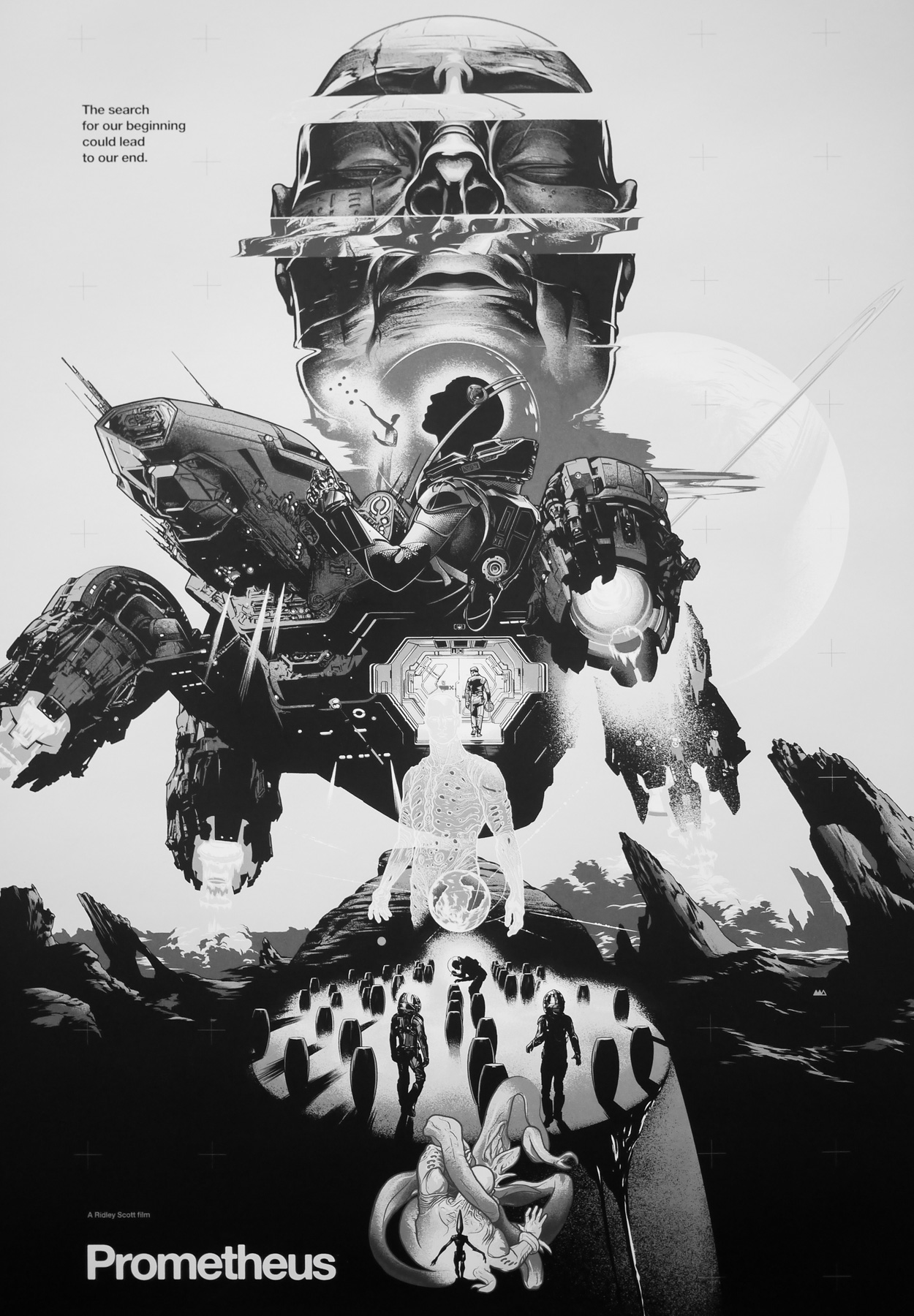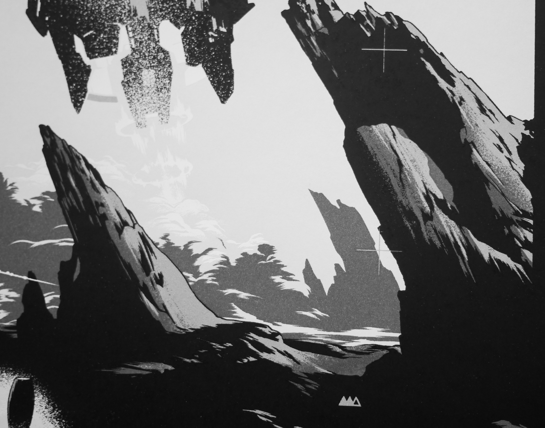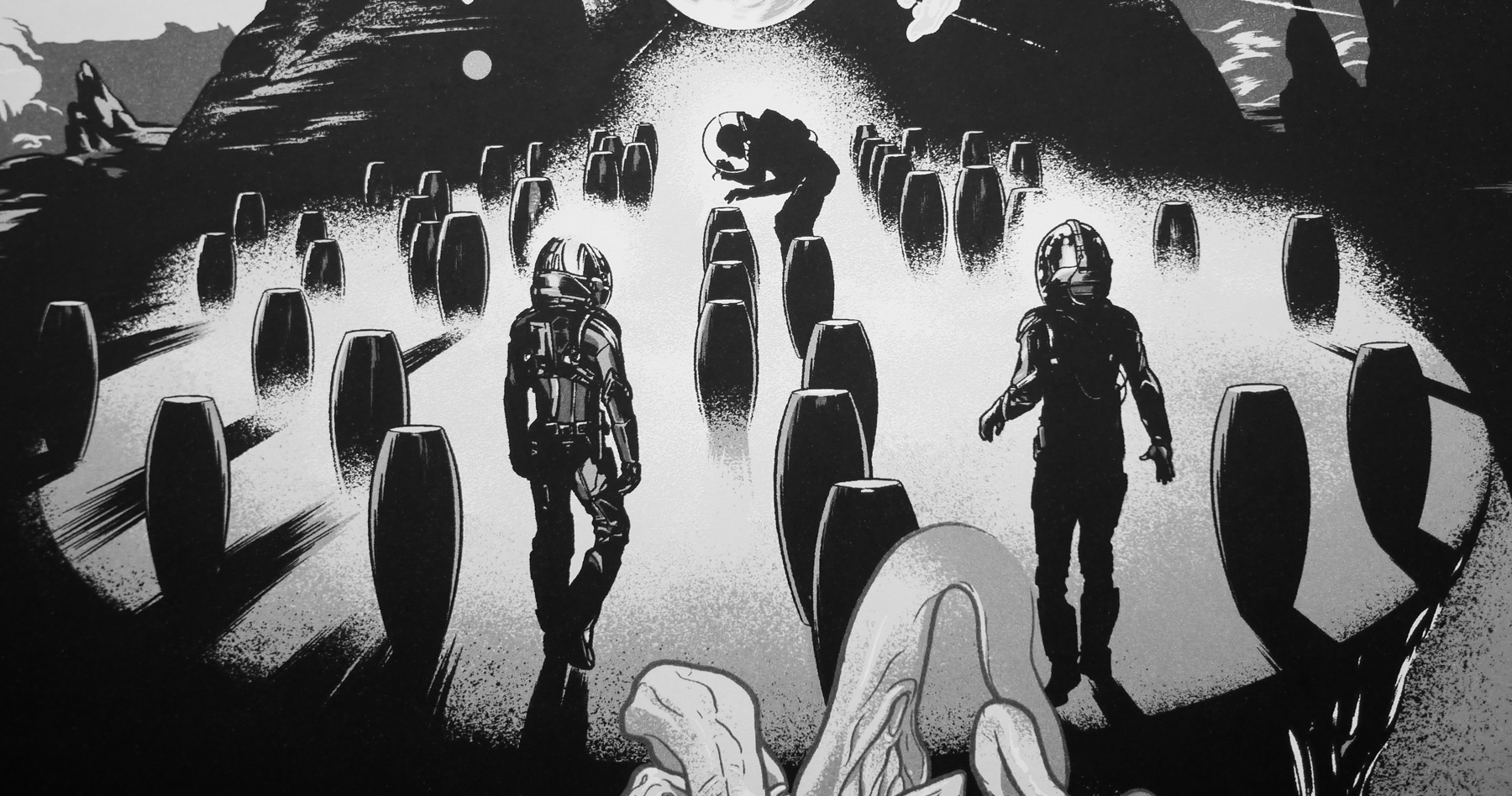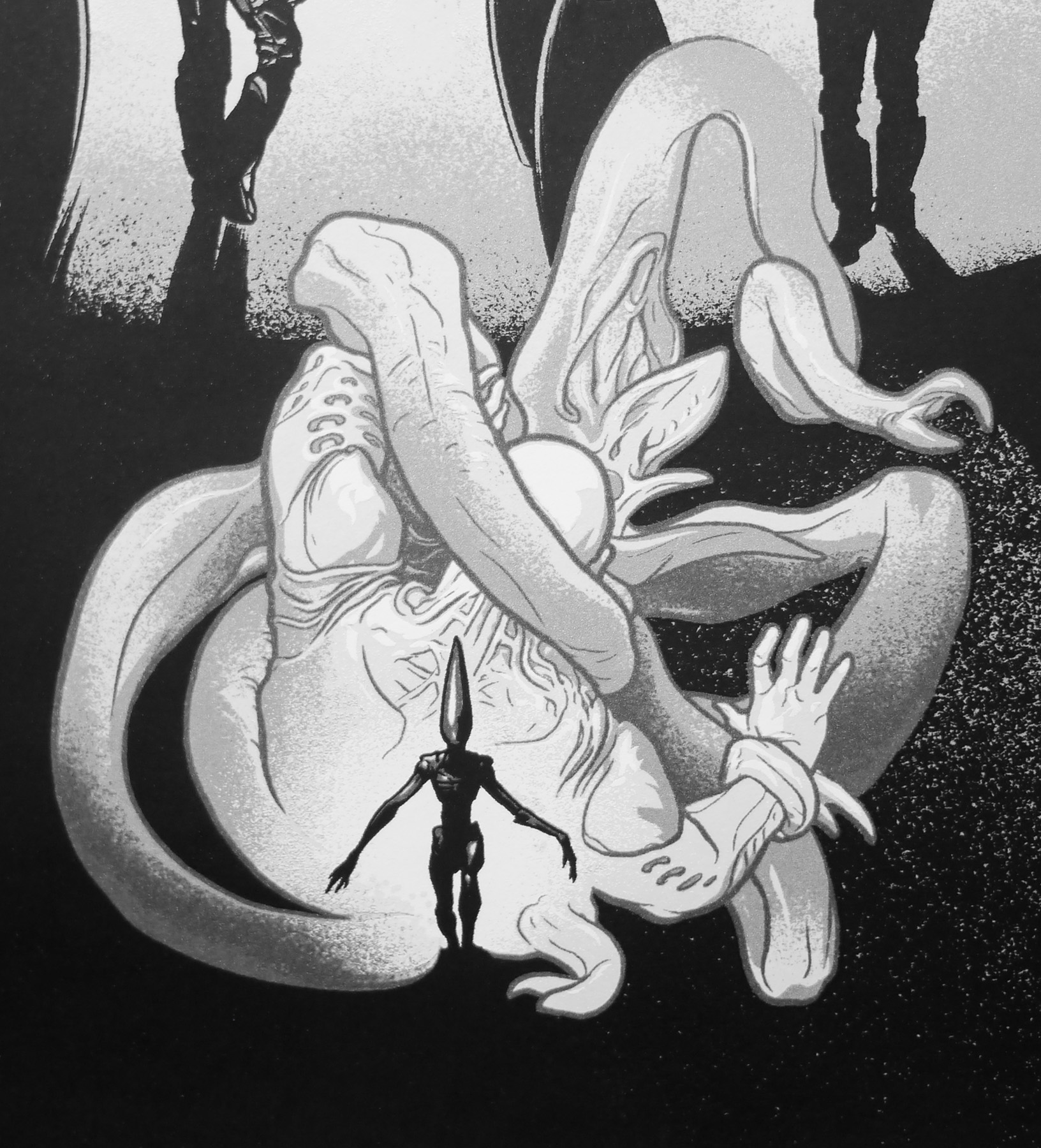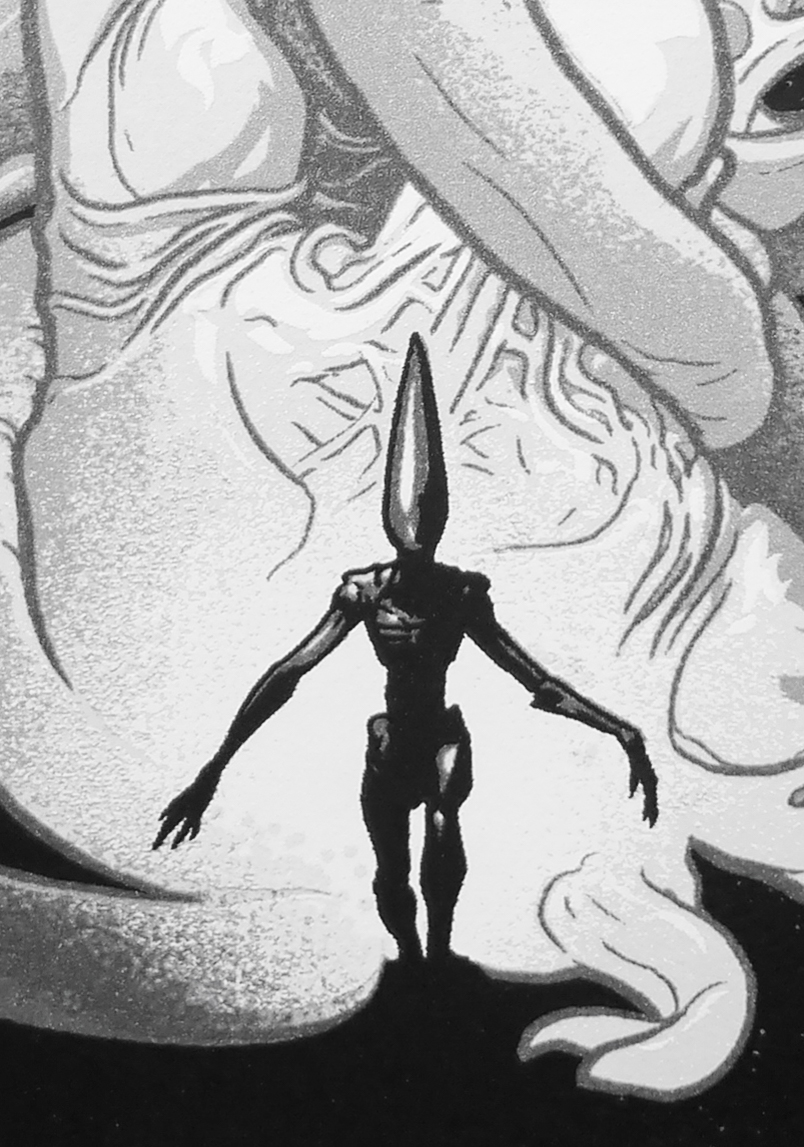
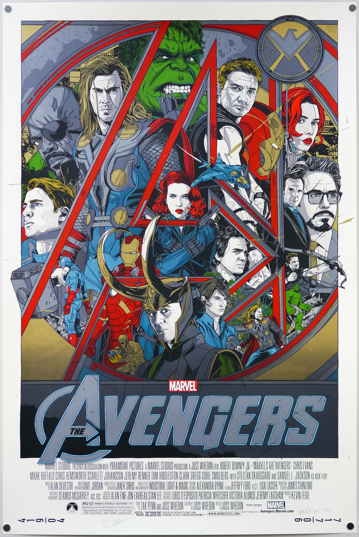
Poster detail
1-5
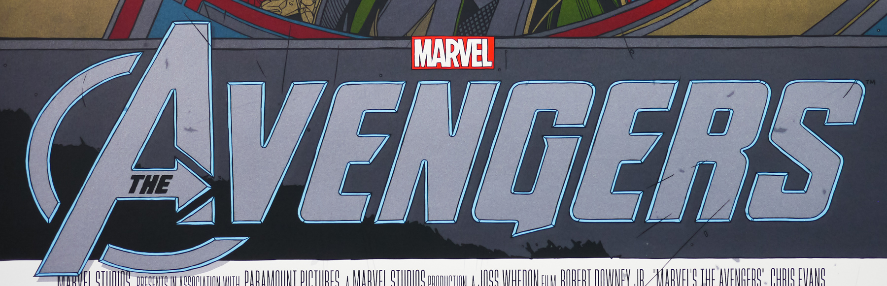
- Title
- The Avengers
- AKA
- Avengers Assemble (UK) | Group Hug (USA - fake working title)
- Year of Film
- 2012
- Director
- Joss Whedon
- Starring
- Robert Downey Jr., Chris Evans, Mark Ruffalo, Chris Hemsworth, Scarlett Johansson, Jeremy Renner, Tom Hiddleston, Clark Gregg, Cobie Smulders, Stellan Skarsgård, Samuel L. Jackson, Gwyneth Paltrow, Paul Bettany
- Origin of Film
- USA
- Genre(s) of Film
- Robert Downey Jr., Chris Evans, Mark Ruffalo, Chris Hemsworth, Scarlett Johansson, Jeremy Renner, Tom Hiddleston, Clark Gregg, Cobie Smulders, Stellan Skarsgård, Samuel L. Jackson, Gwyneth Paltrow, Paul Bettany,
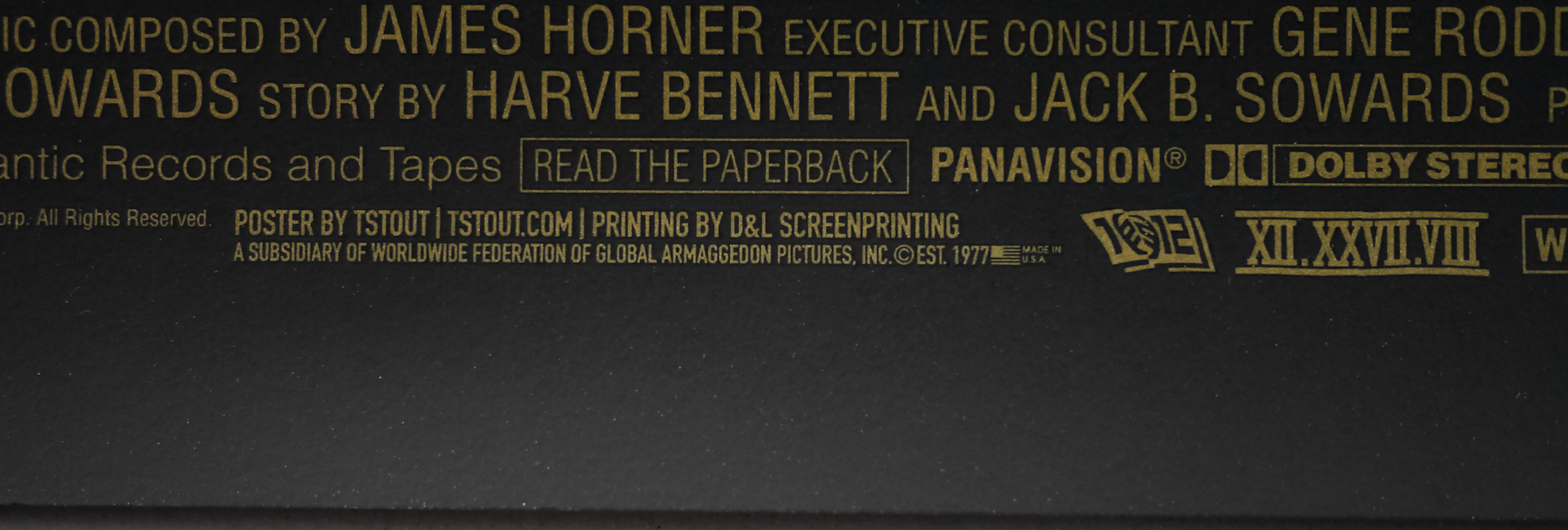
- Type of Poster
- Screen print
- Style of Poster
- Regular
- Origin of Poster
- USA
- Year of Poster
- 2012
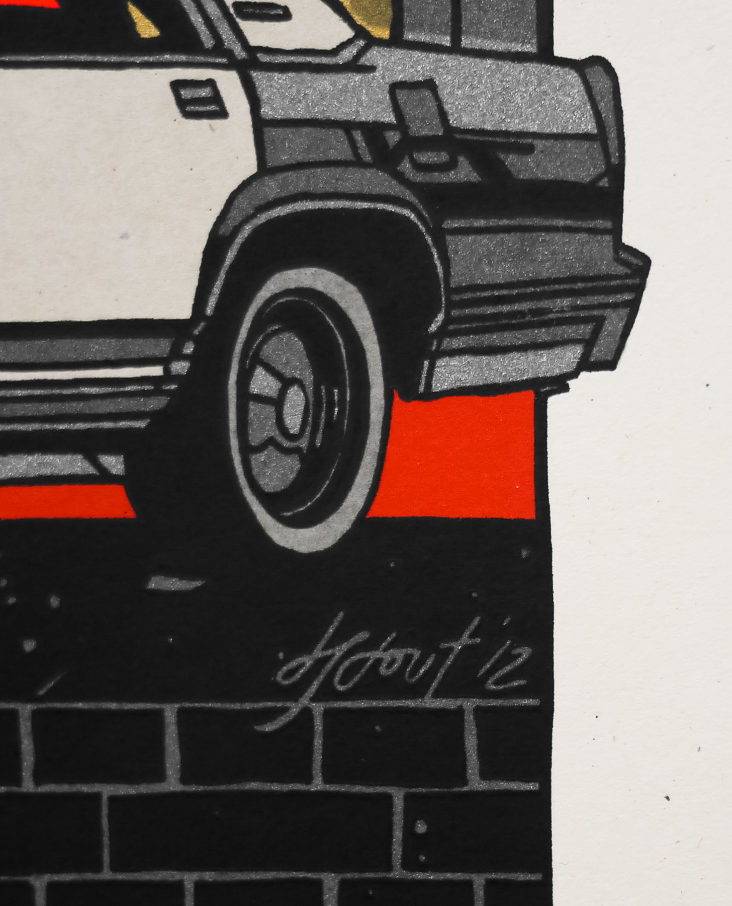
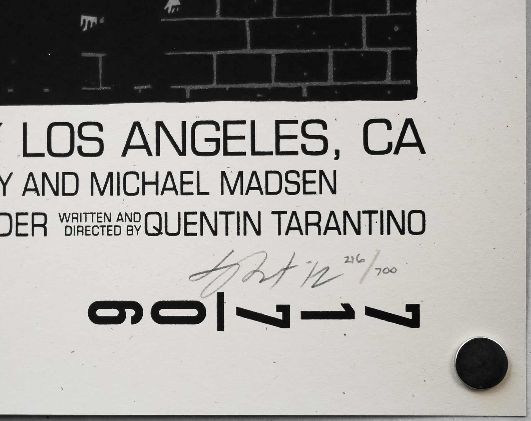
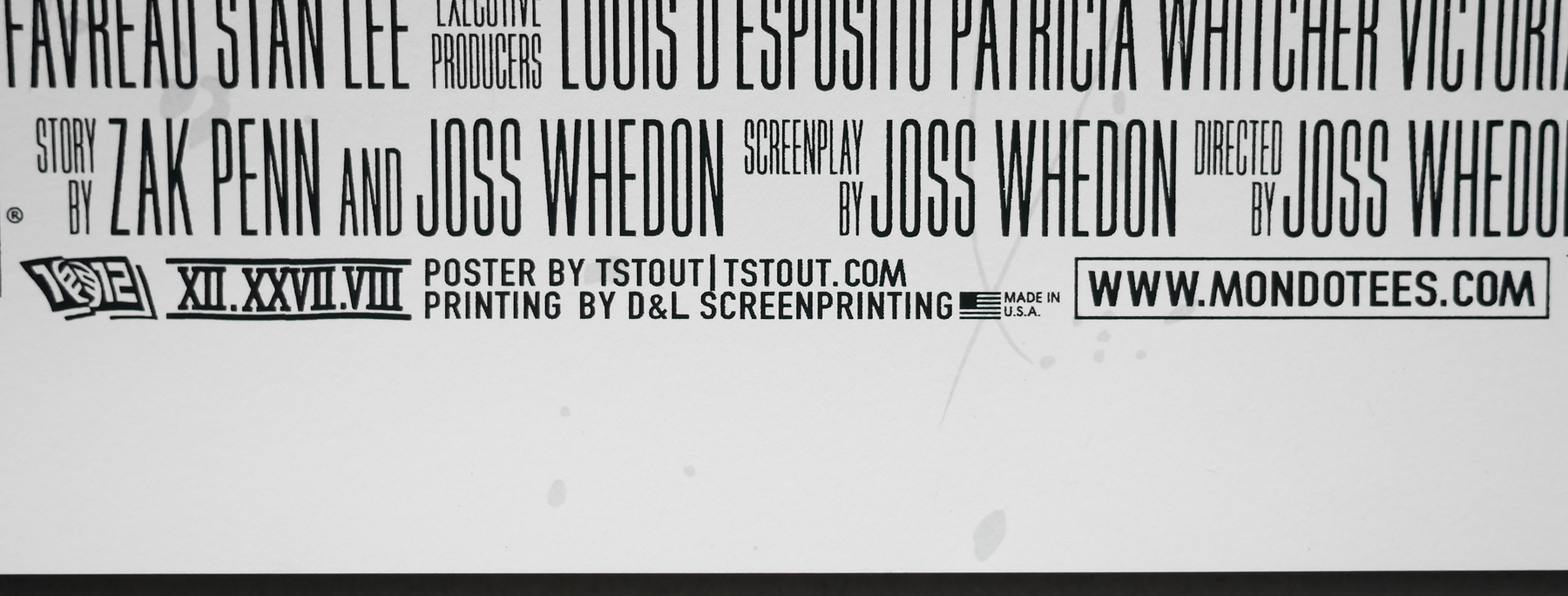
- Designer
- Tyler Stout
- Artist
- Tyler Stout
- Size (inches)
- 24" x 35 11/16"
- SS or DS
- SS
- Tagline
- --
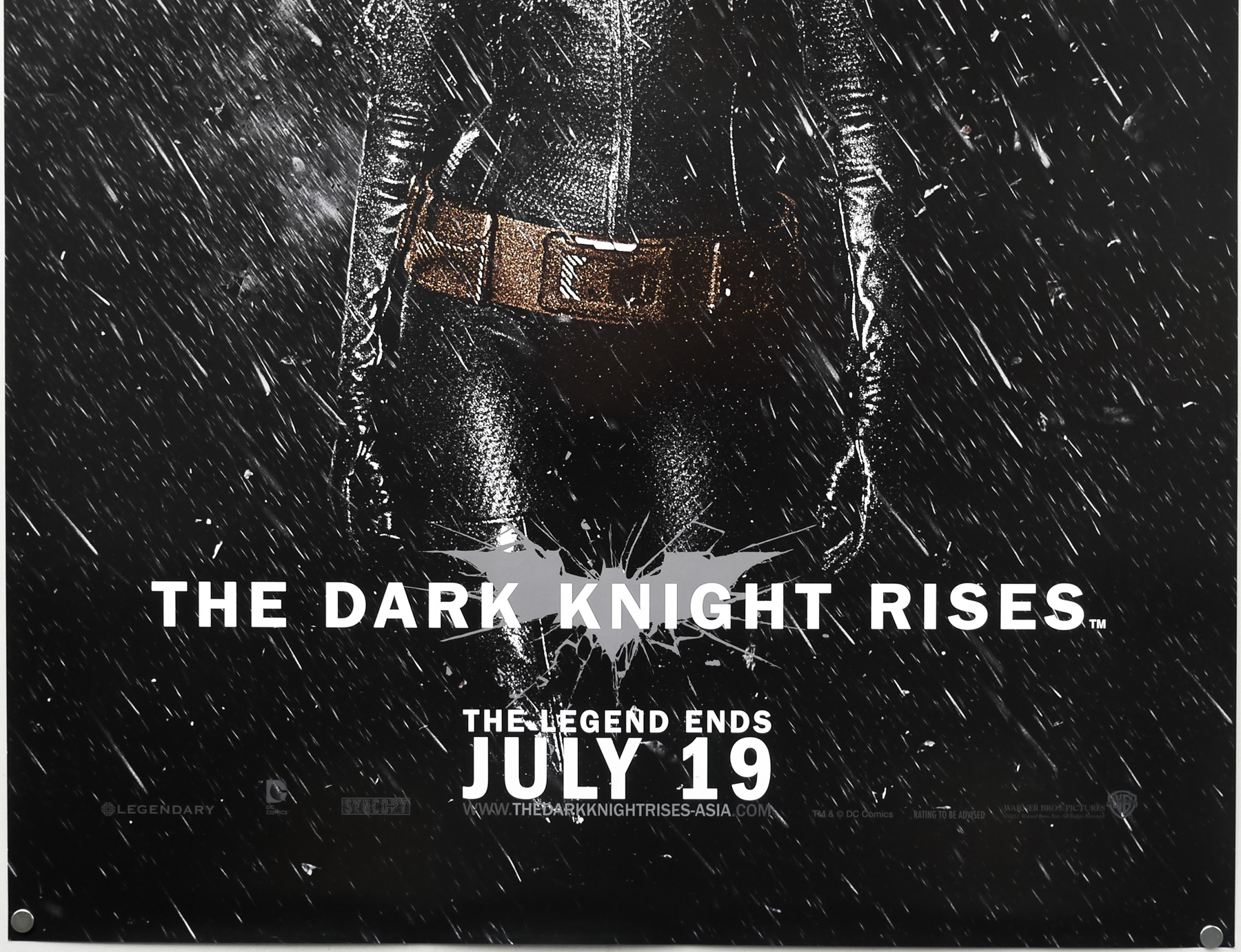
2012 was an important year for several of cinema’s biggest franchises with the latest James Bond film, Skyfall, appearing four years after the last, plus Christopher Nolan bringing his Dark Knight trilogy to a spectacular close with The Dark Knight Rises. However, unquestionably the cinematic event of the year was the much anticipated release of Marvel’s superhero team-up The Avengers.
Even before the successful release of Iron Man in 2008, the production team in charge of what is known as the Marvel Cinematic Universe, had planned to release a series of films focusing on individual superheroes based on Marvel comic characters, with the intention of establishing their backstories, and popularity, with fans before uniting them together in a ‘crossover’ film. The original Avengers comic, which brought together previously stand-alone characters including Thor, Captain America, Hulk and Iron Man, was first released in 1963 and has been in print since then so it was no surprise that it was chosen to the be the crossover film following the first five standalone stories.
The film was helmed by cult screenwriter/director Joss Whedon who saw worldwide success with TV shows like Buffy, Angel and cult favourite Firefly, but this was his first major studio film and his appointment in 2010 was seen as a surprise, but welcome, choice by many fans. Whedon pushed the studio allow him to begin a new script after reading a screenplay by Zak Penn that they had been tinkering with since 2007 and the studio eventually agreed, with production beginning in July 2010.
Marvel’s faith in Whedon paid off in spectacular style when the film was released in 2012 and broke multiple worldwide box-office records, including highest-grossing opening in the US, the highest opening week earnings and fewest number of days to reach half a billion dollars (23). It was the highest grossing film of 2012 and currently stands at third in the all-time rankings.
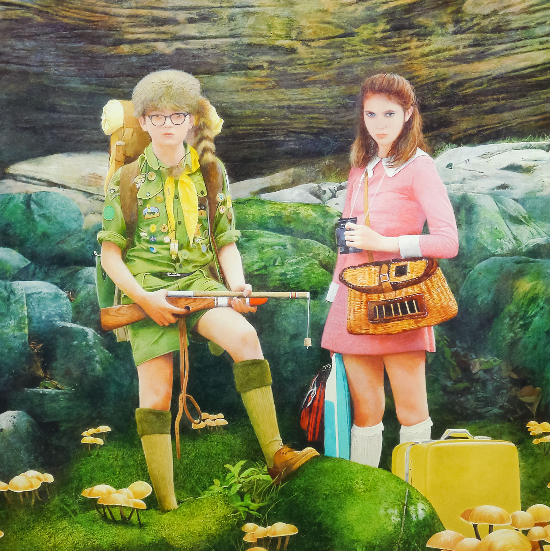
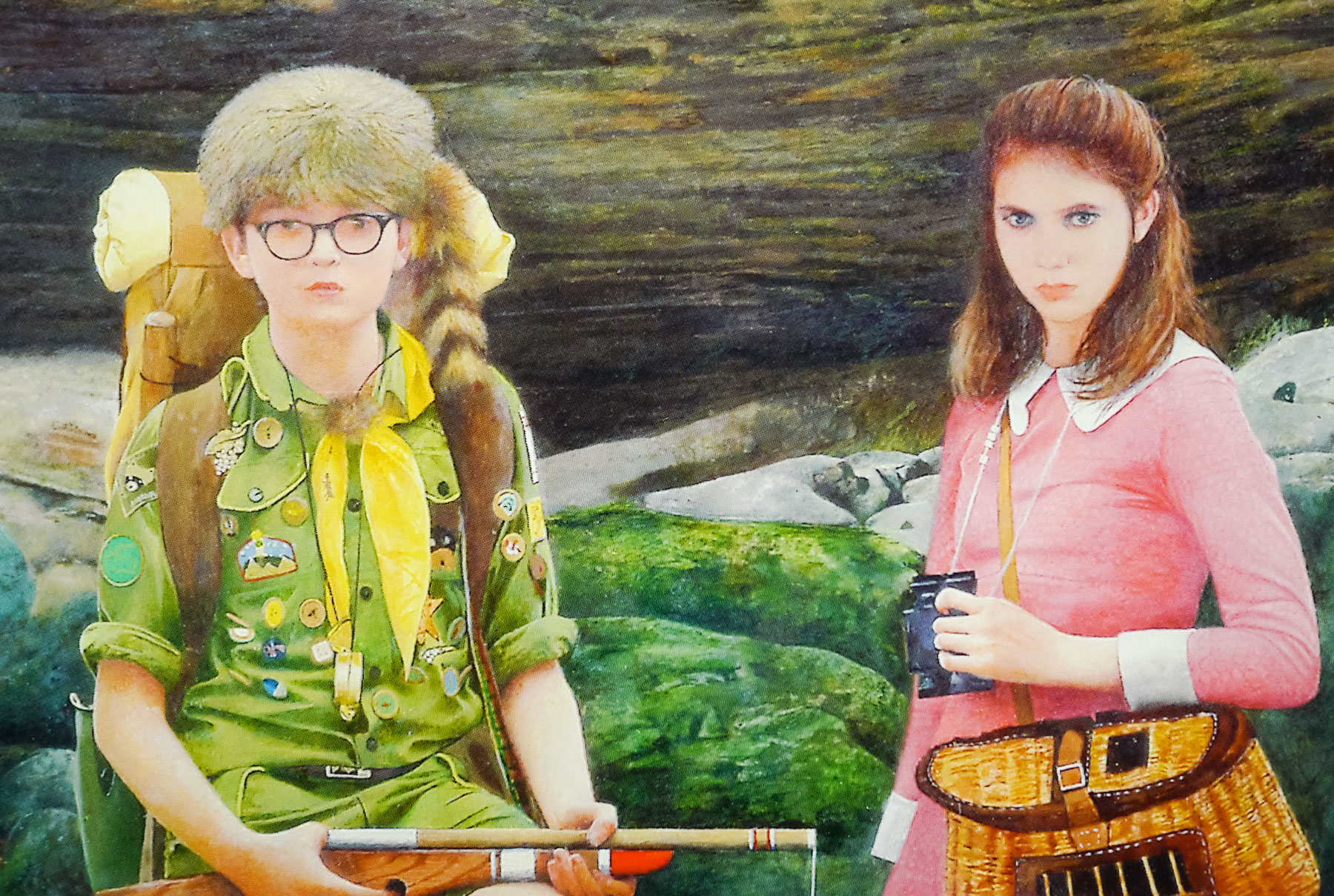
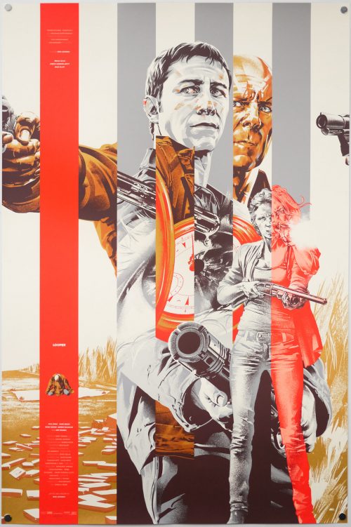
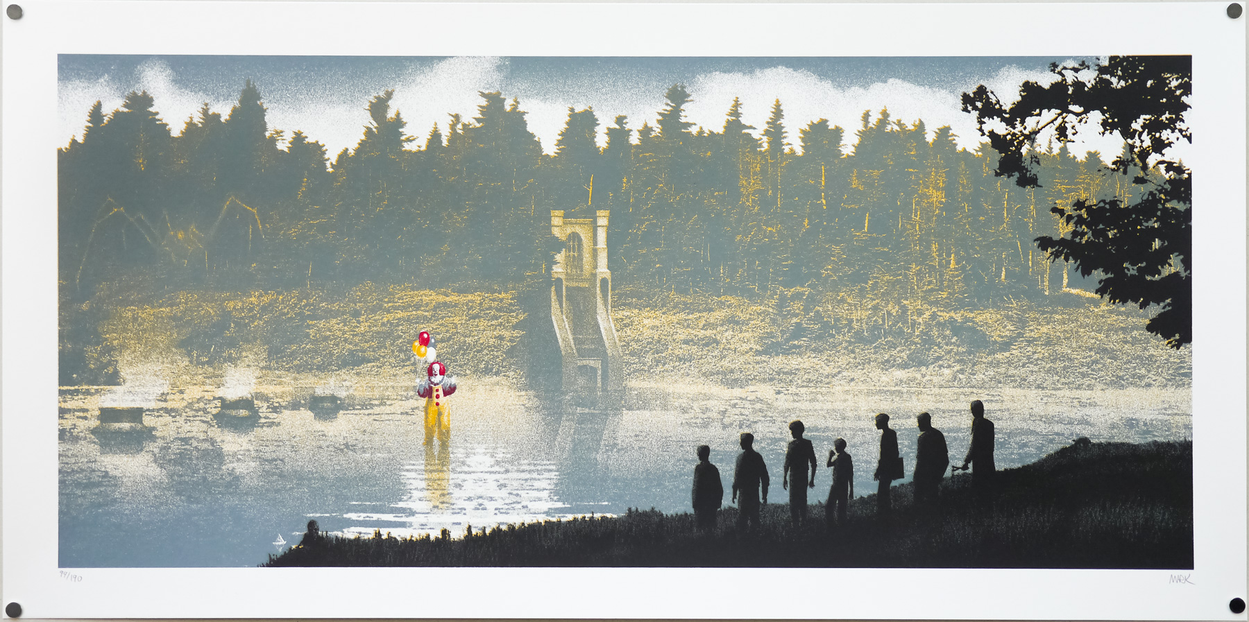
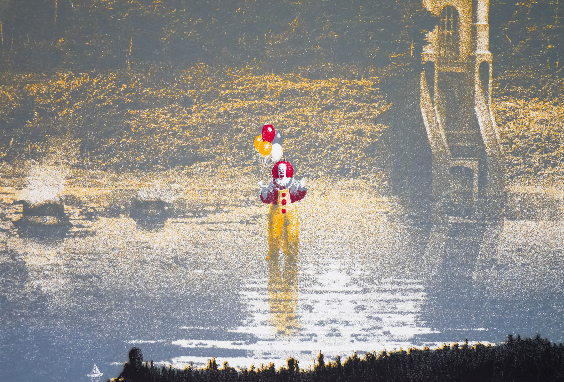
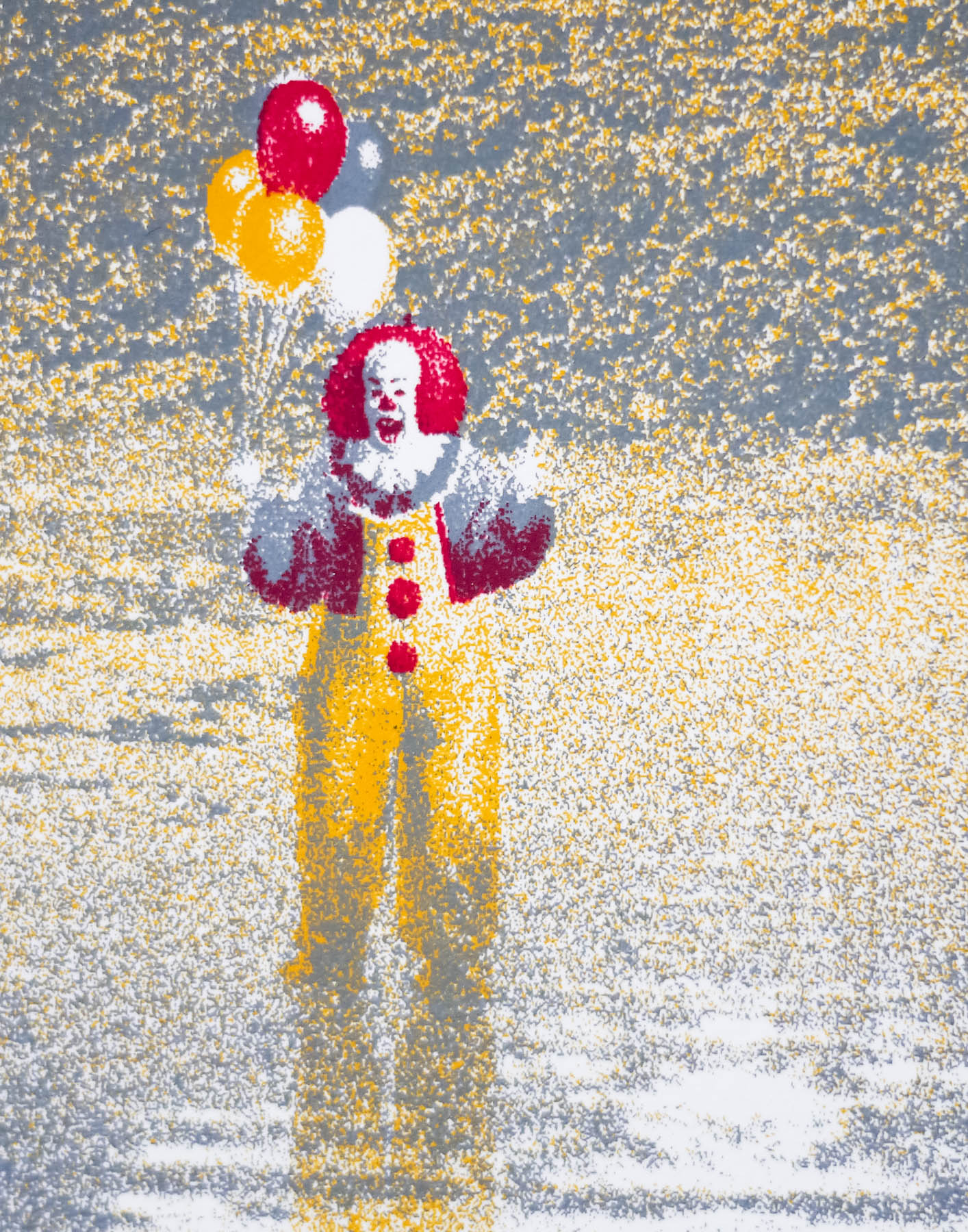
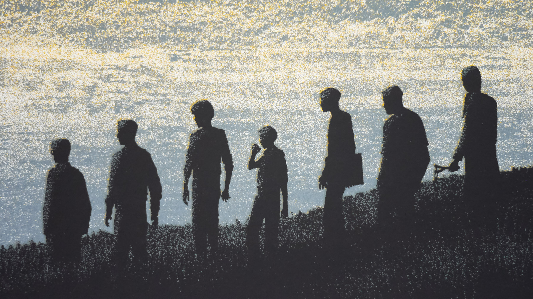
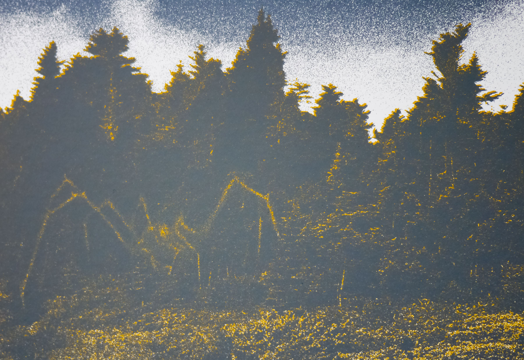
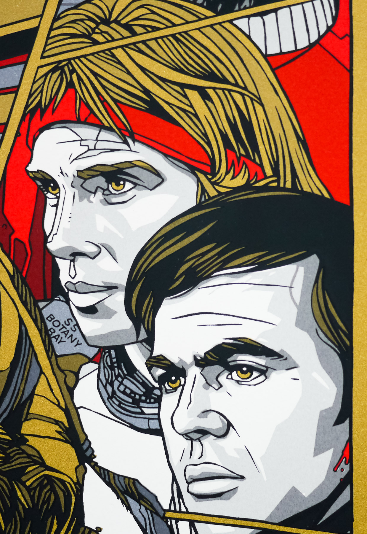
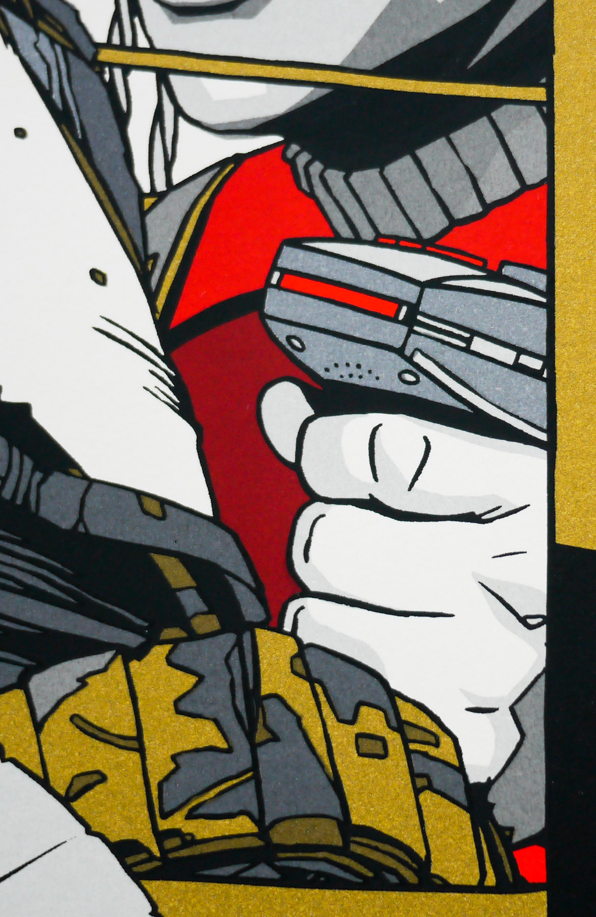
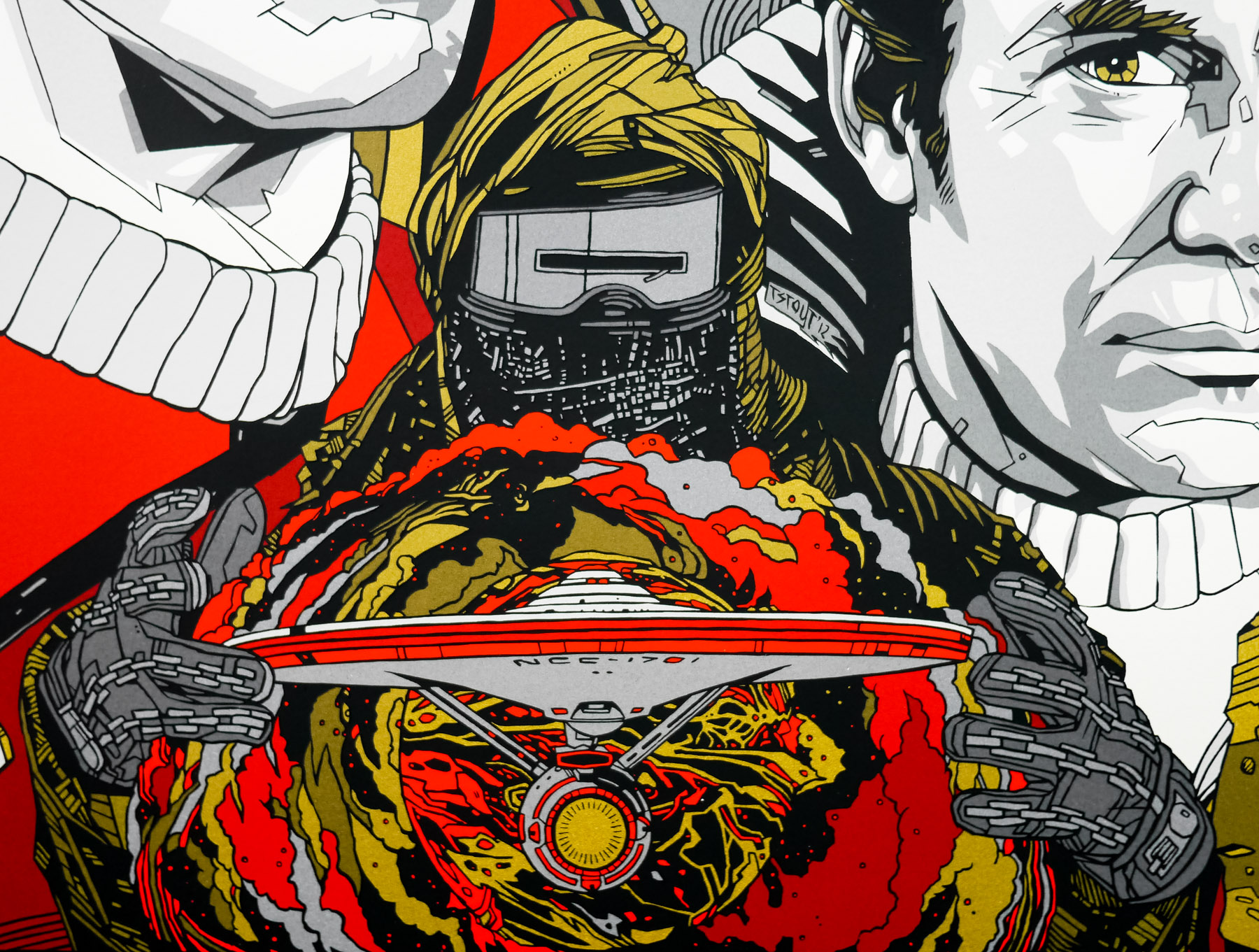
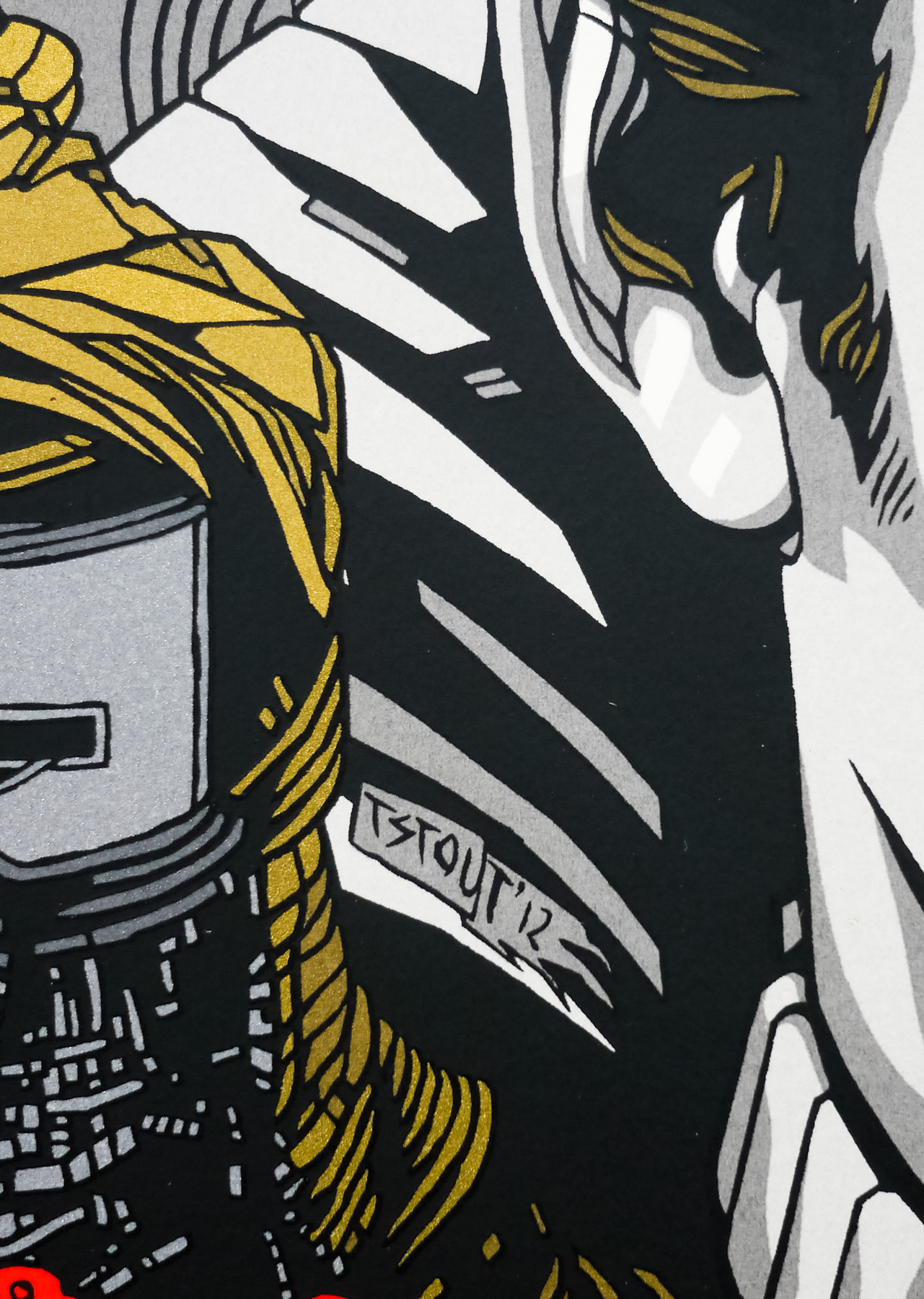
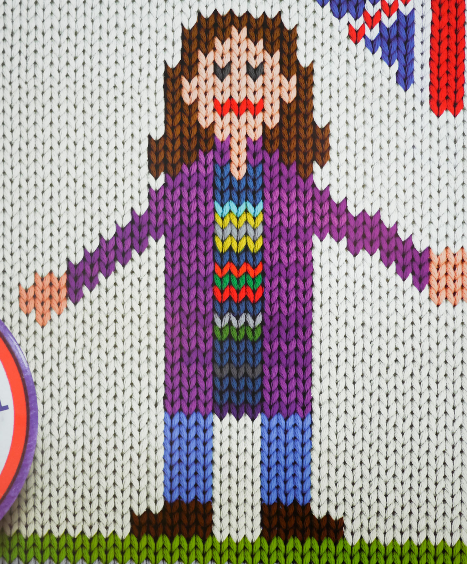
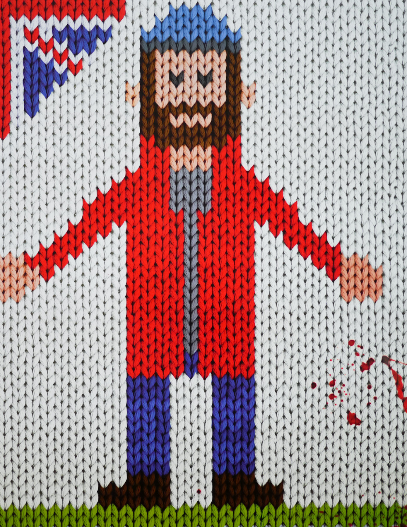
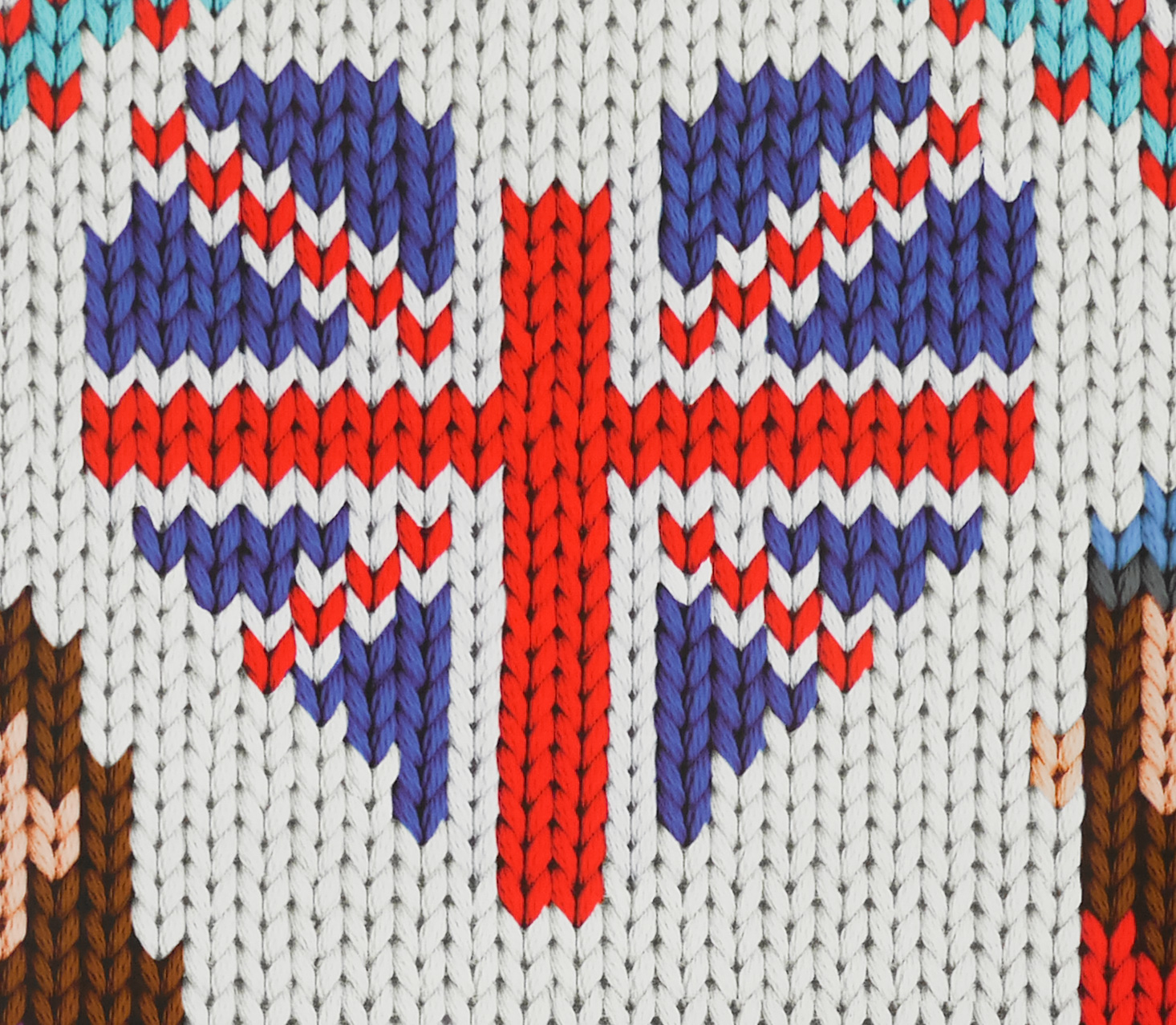
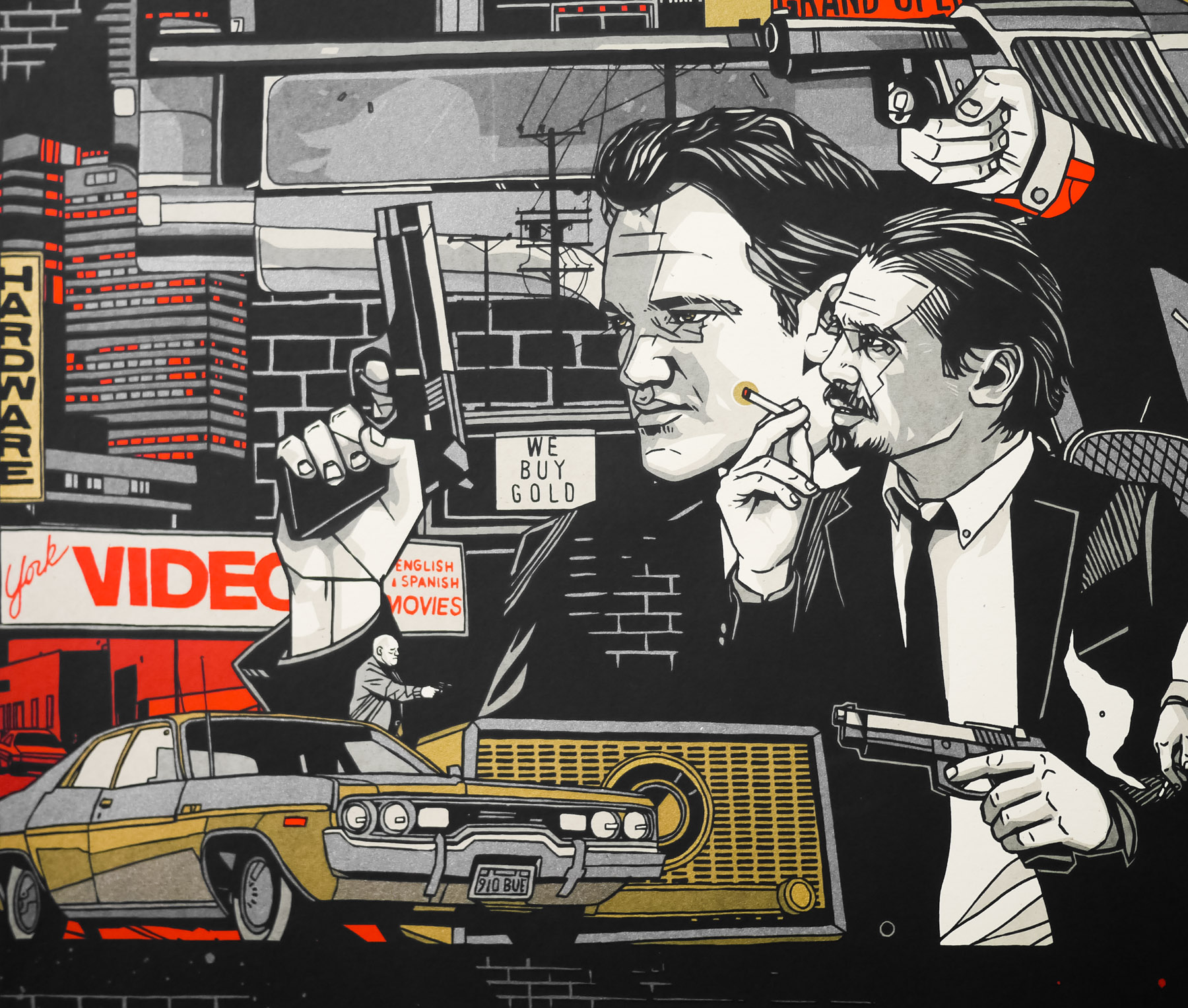
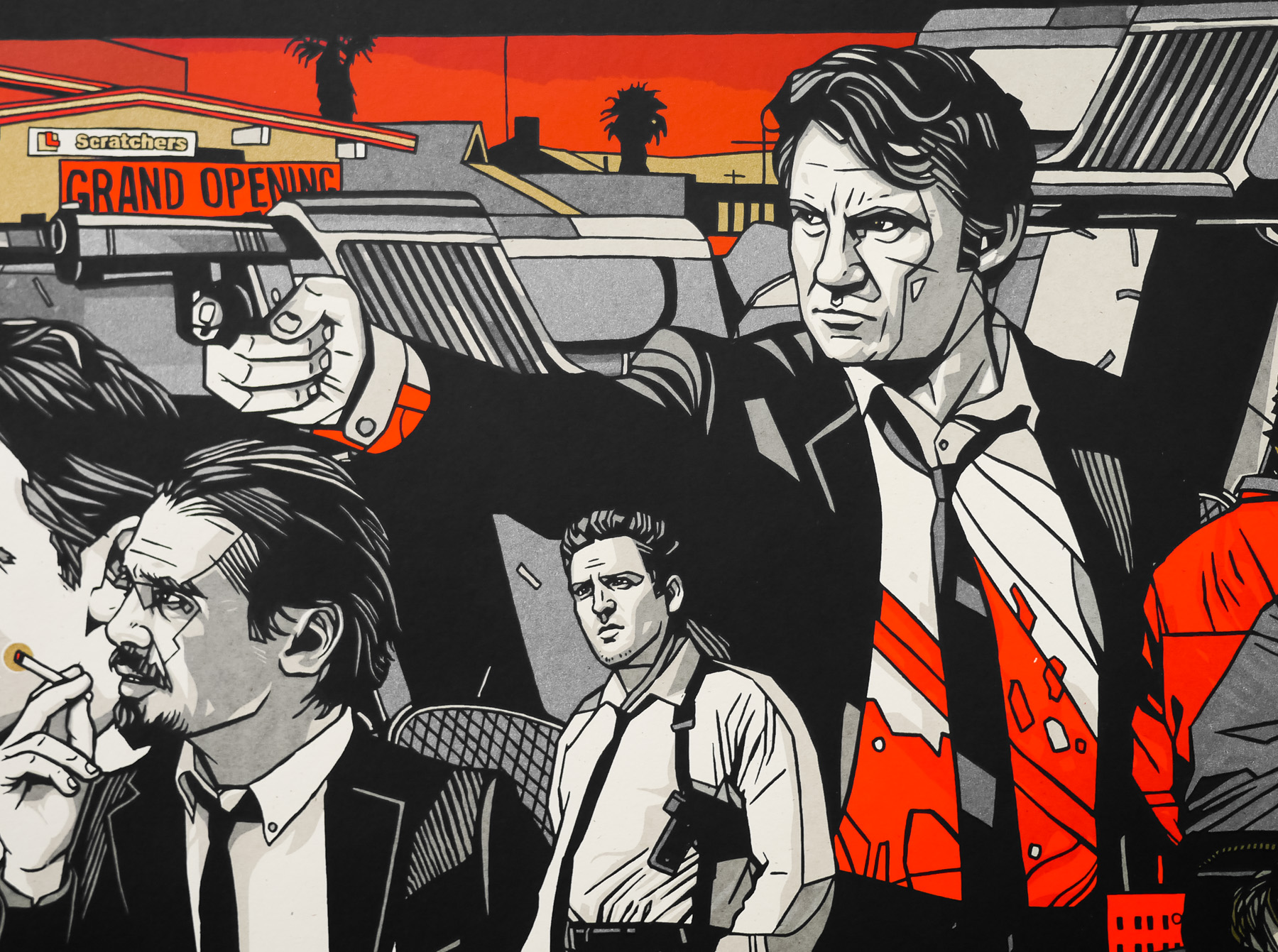
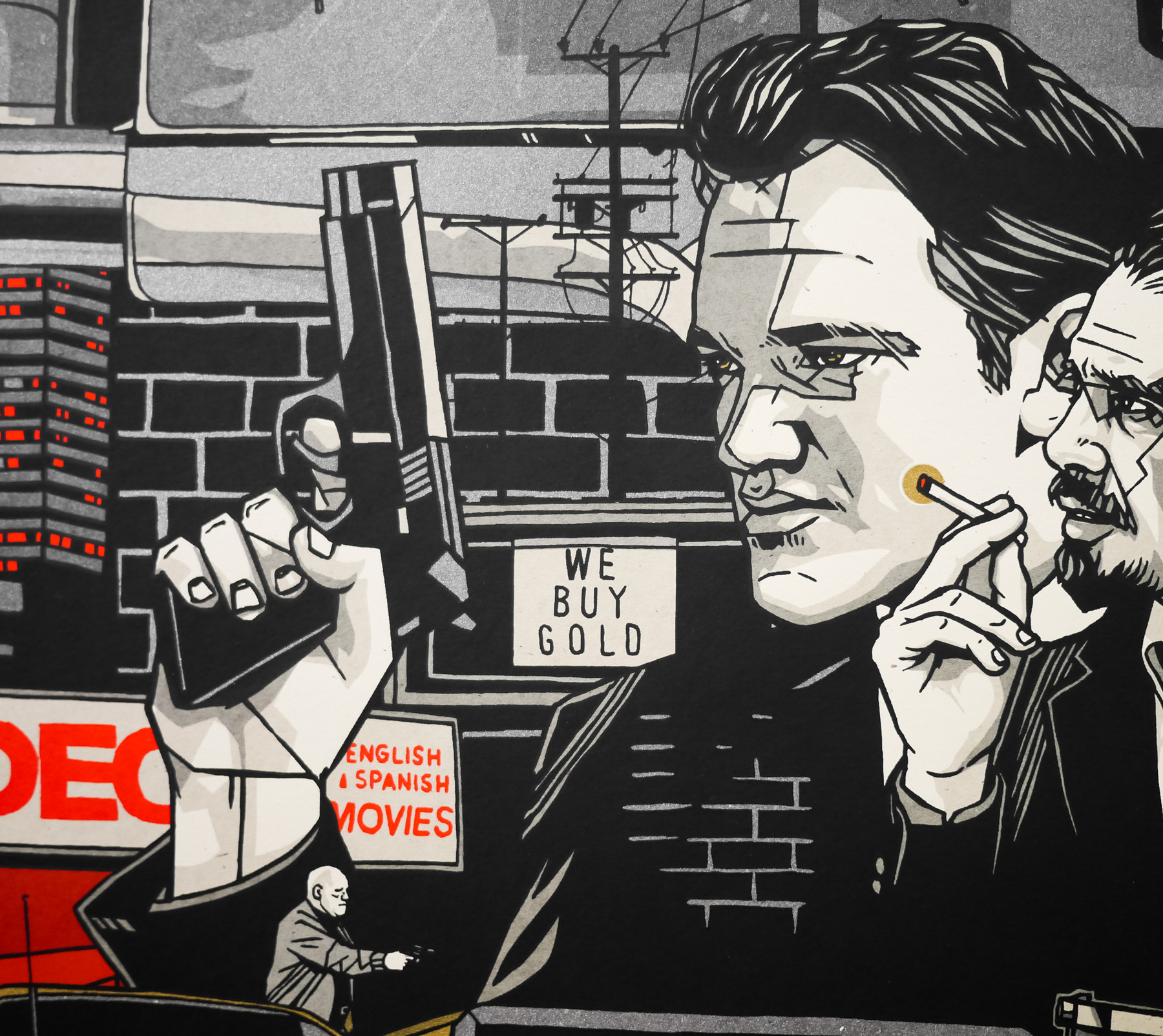
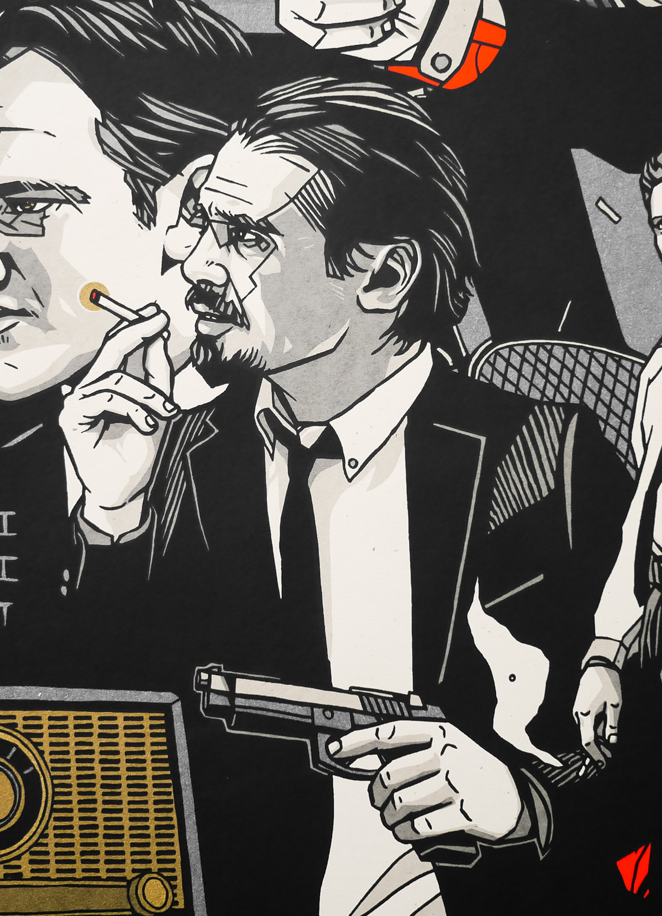
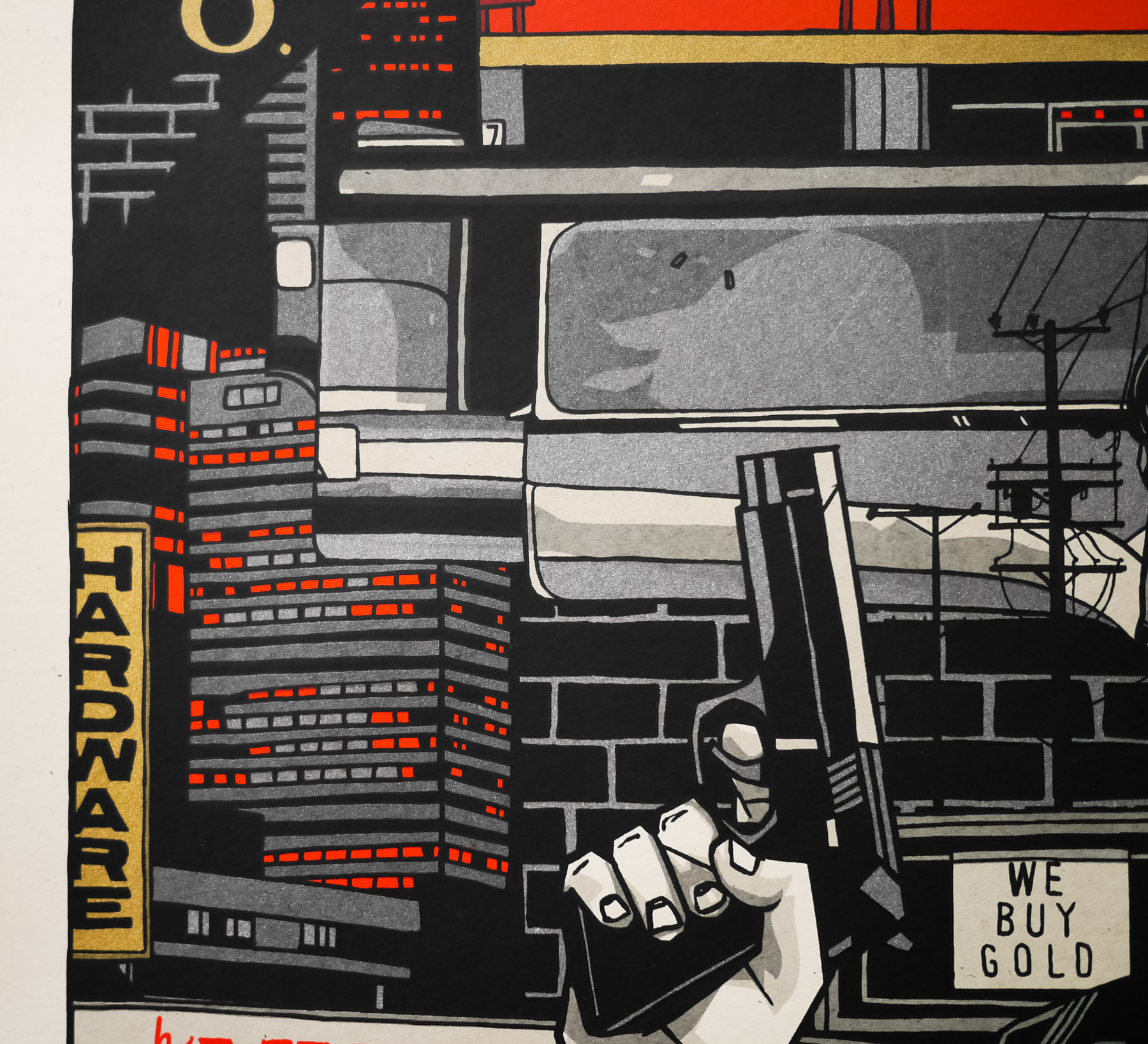
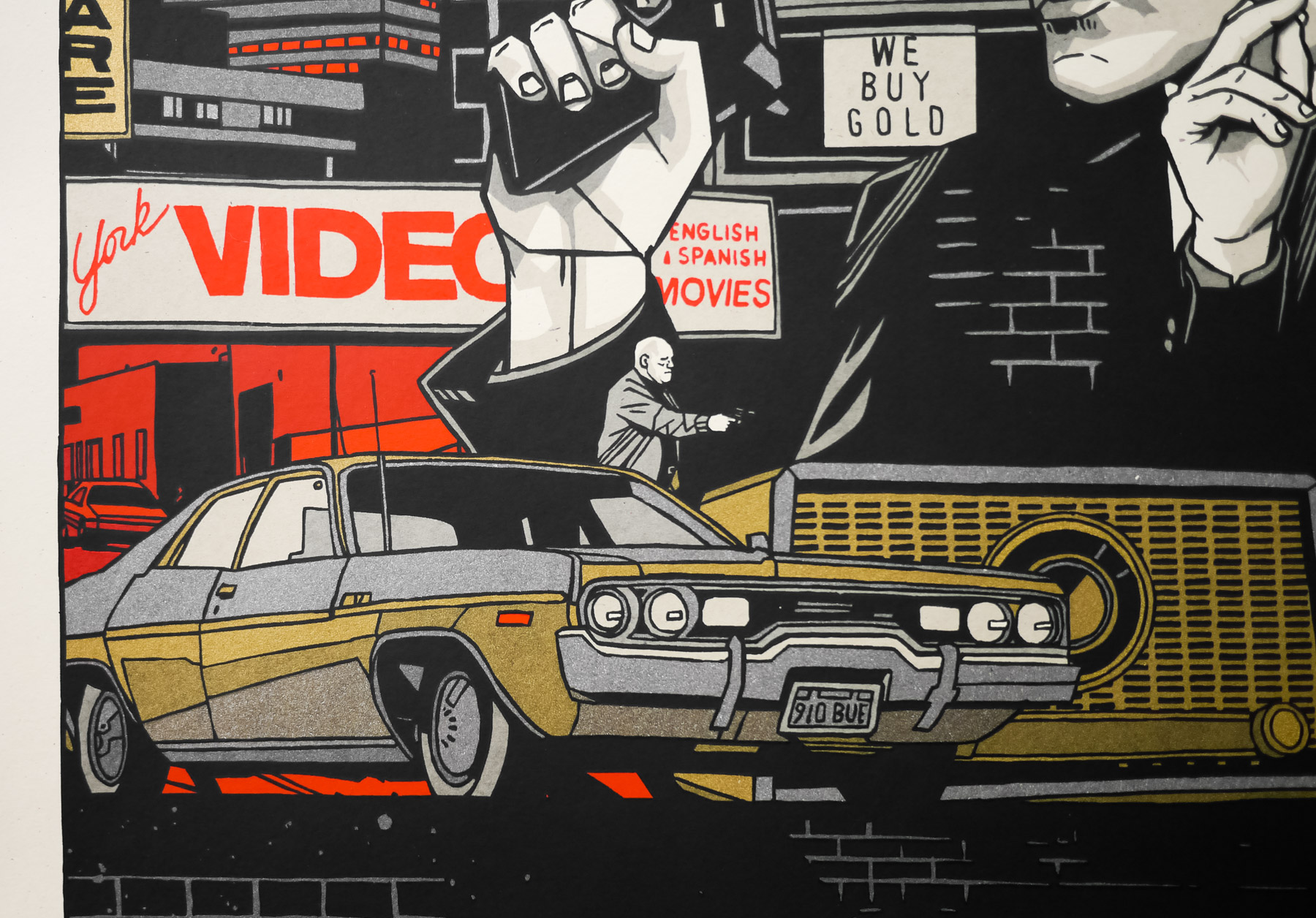
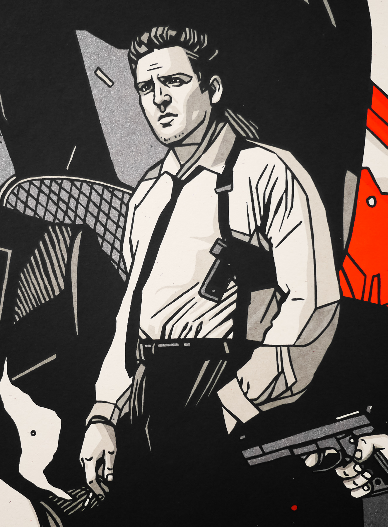
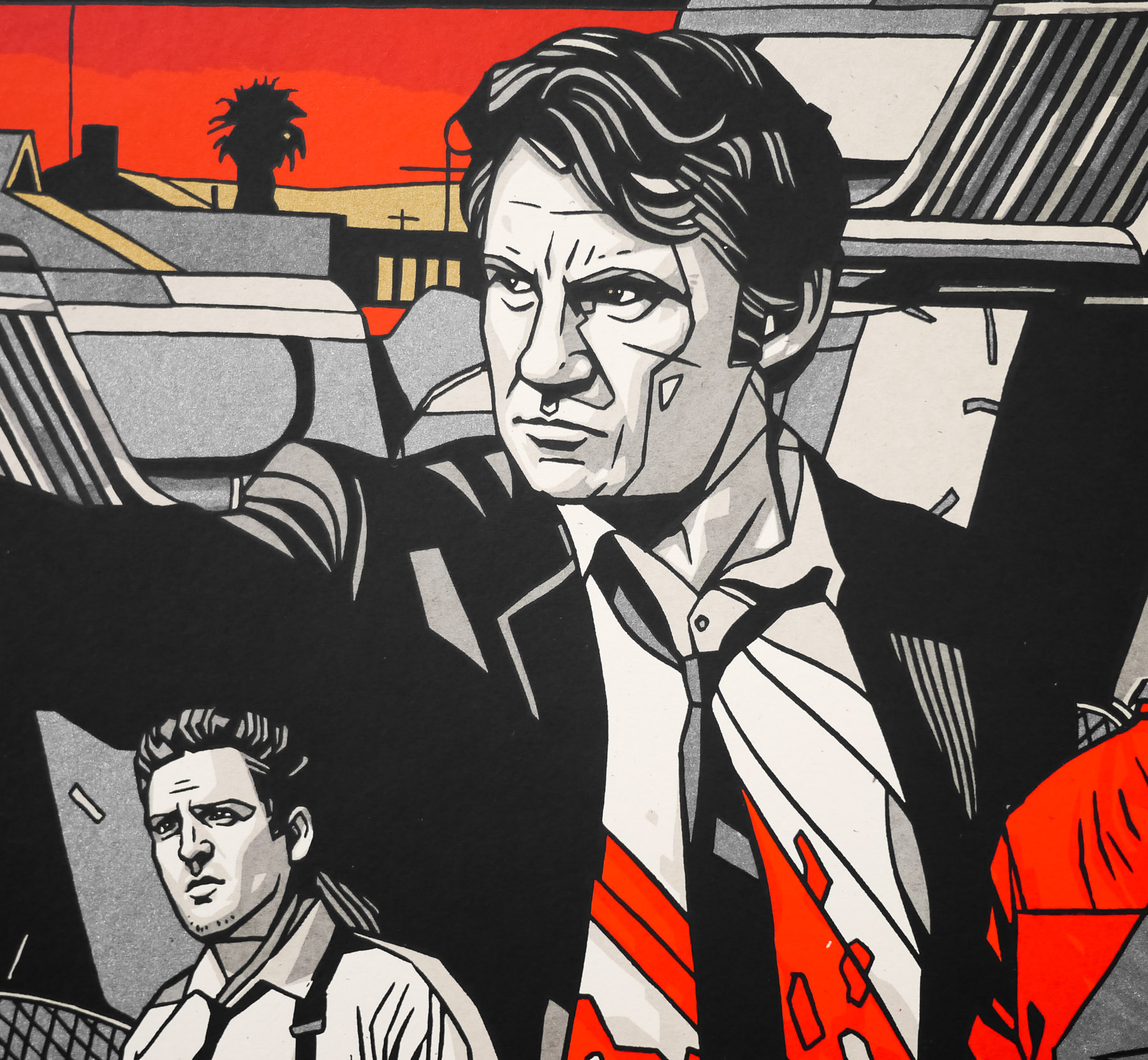
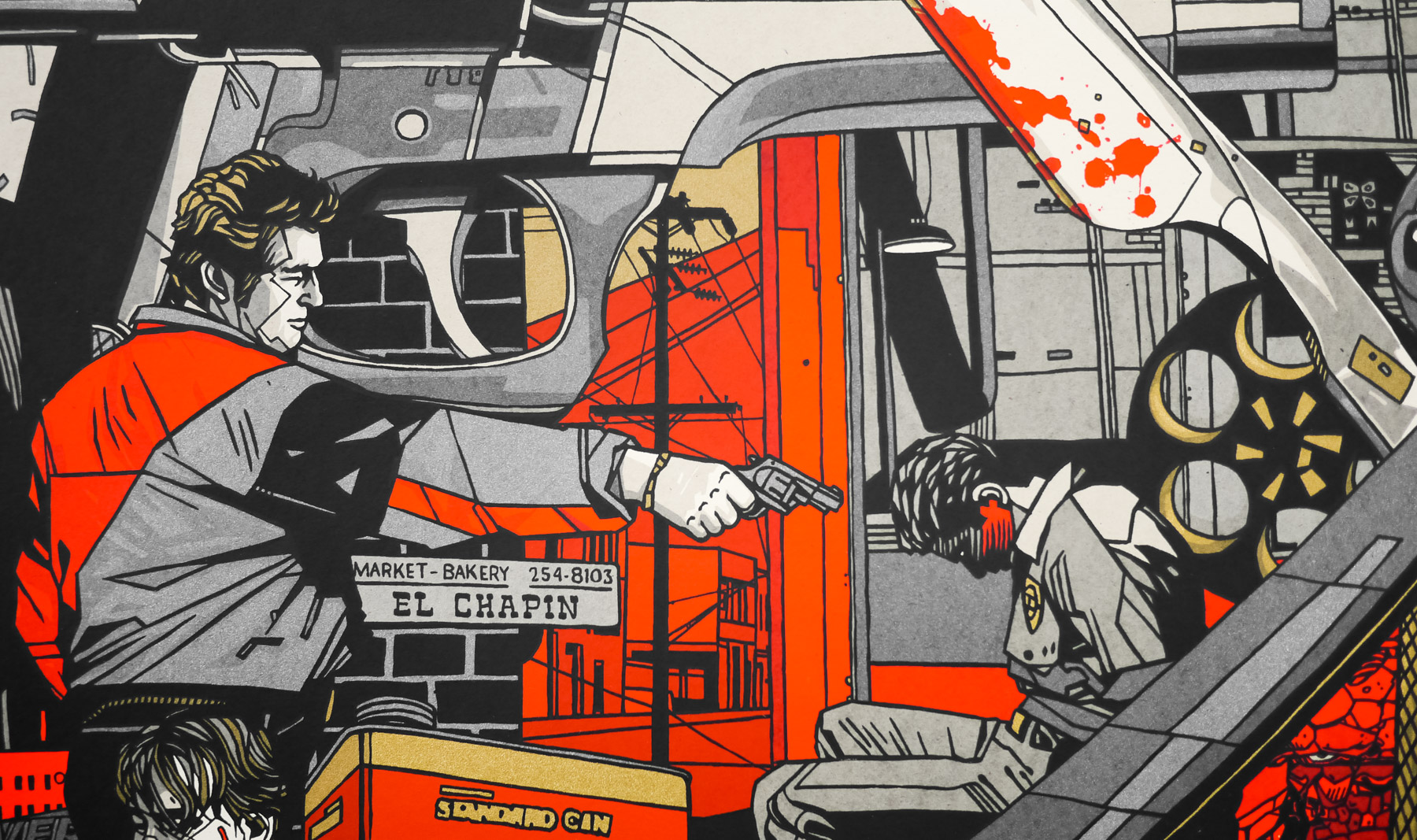
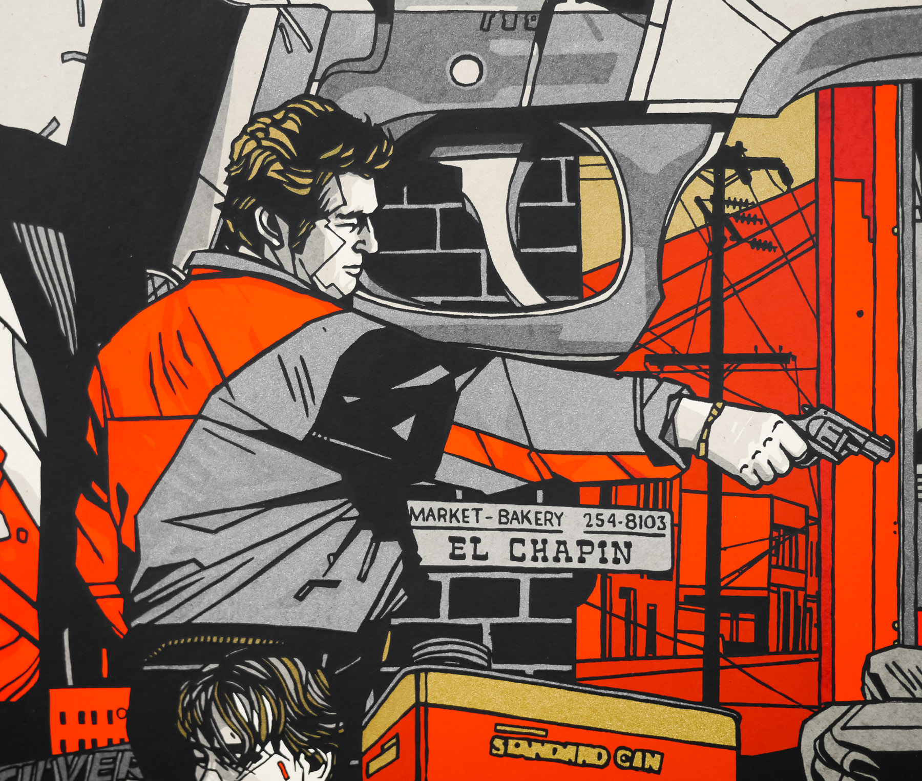
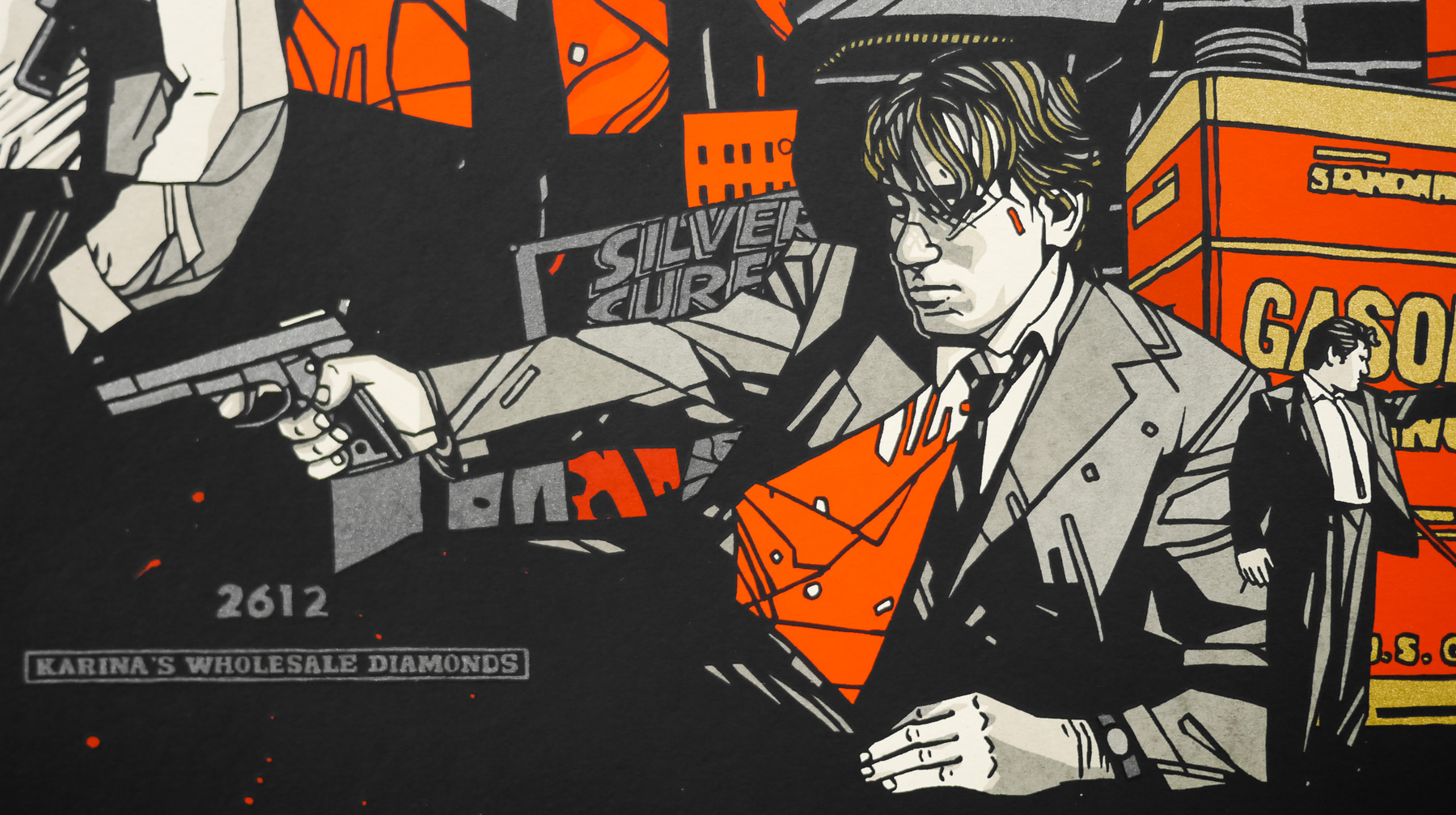
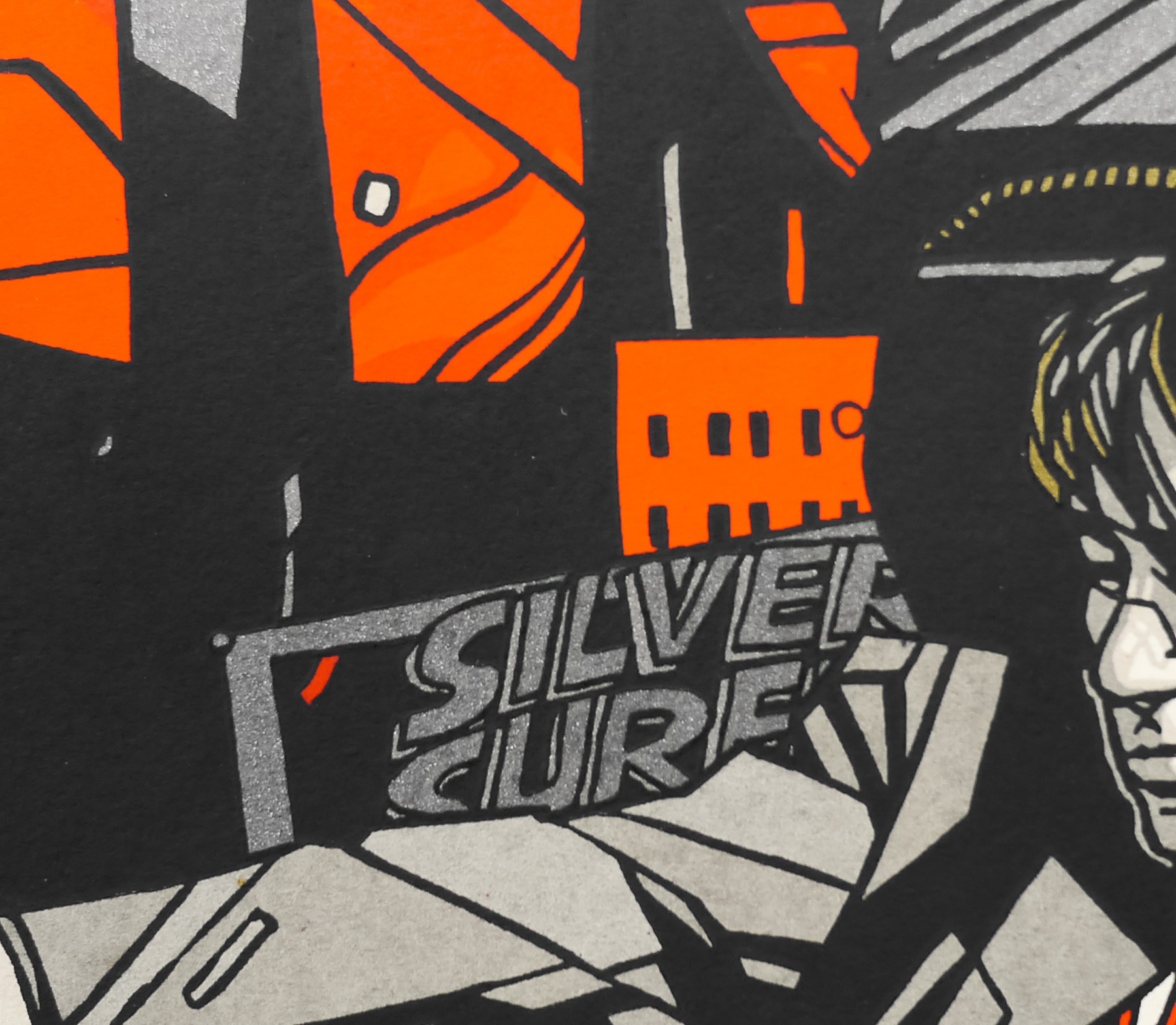
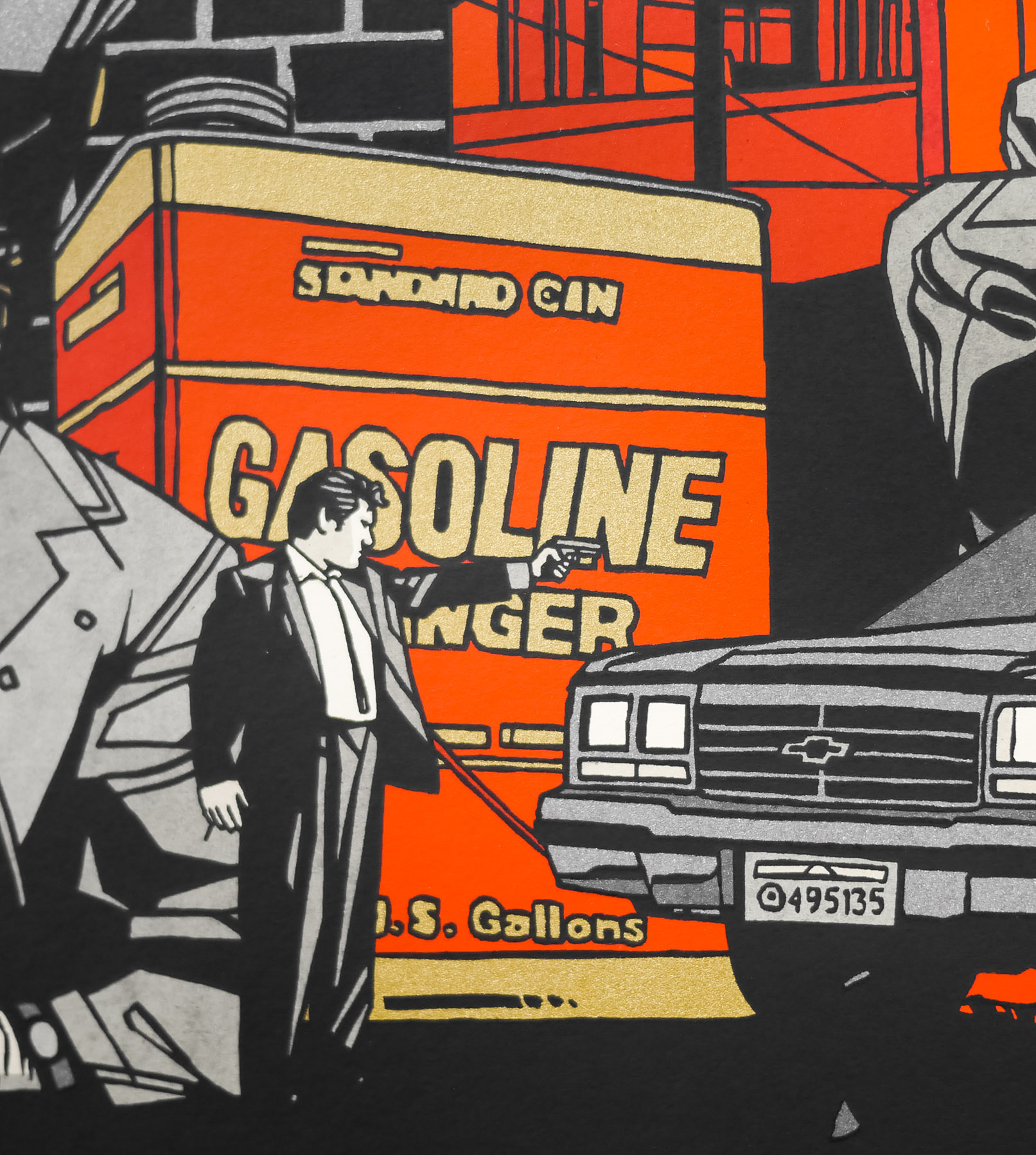
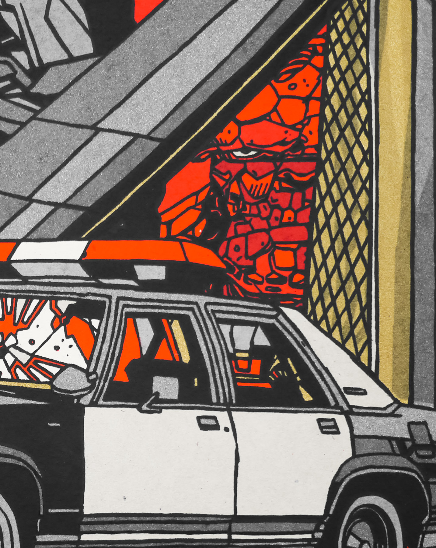
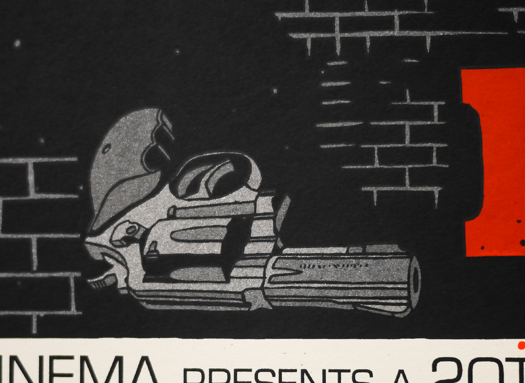
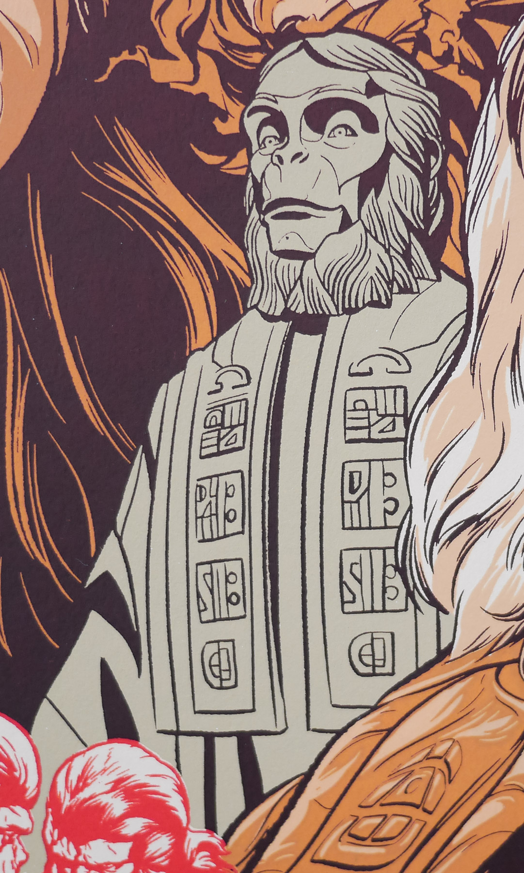
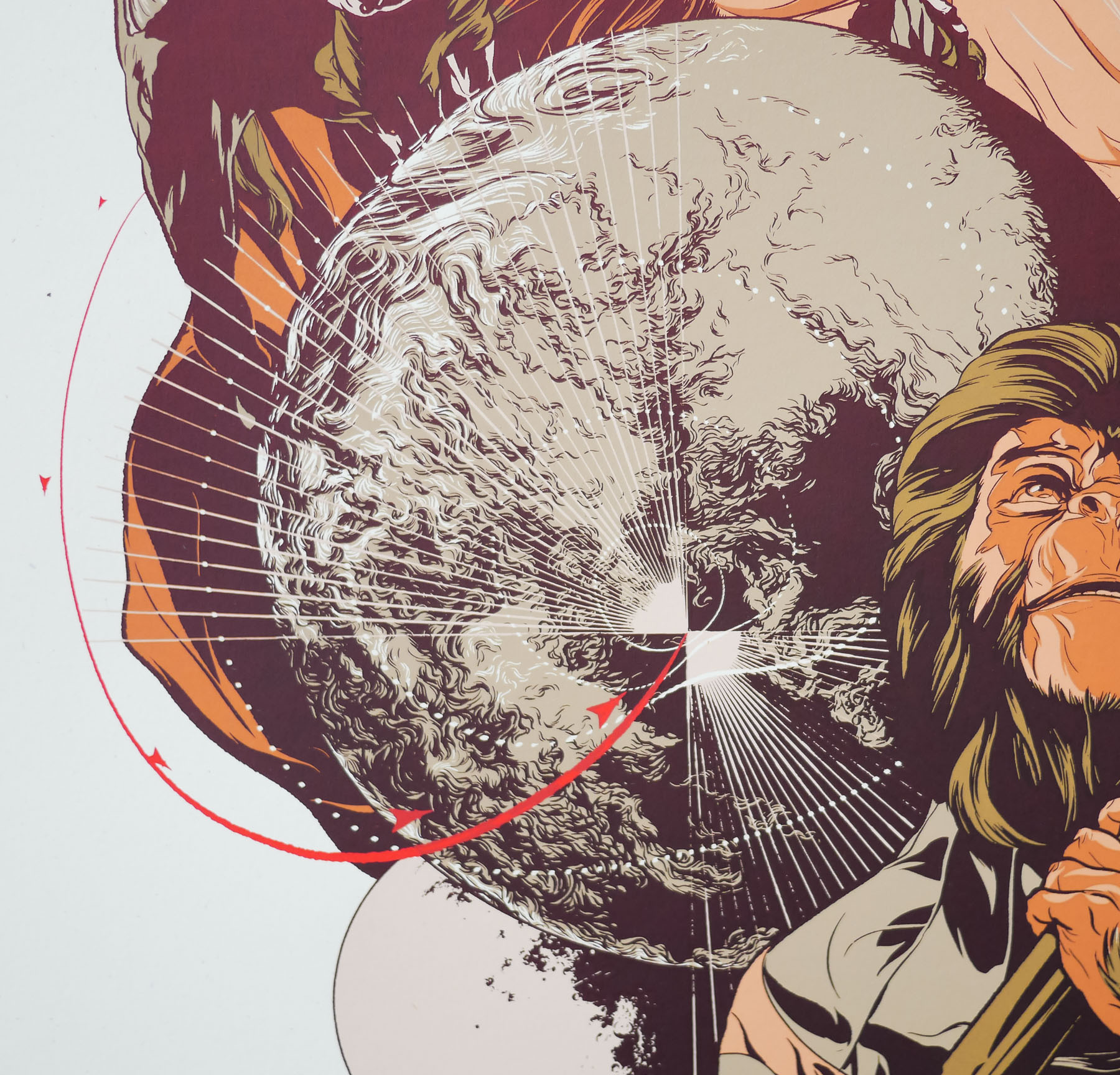
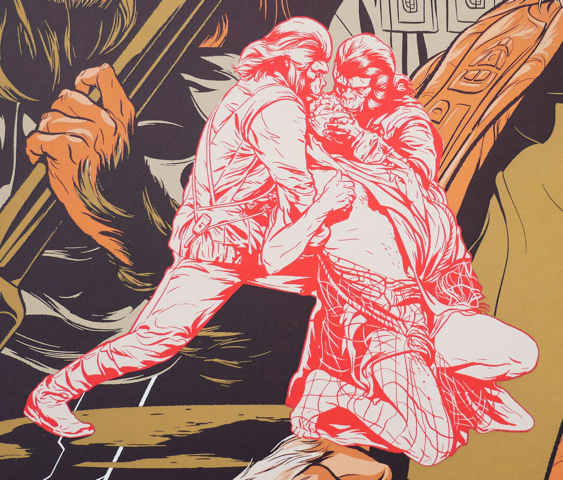
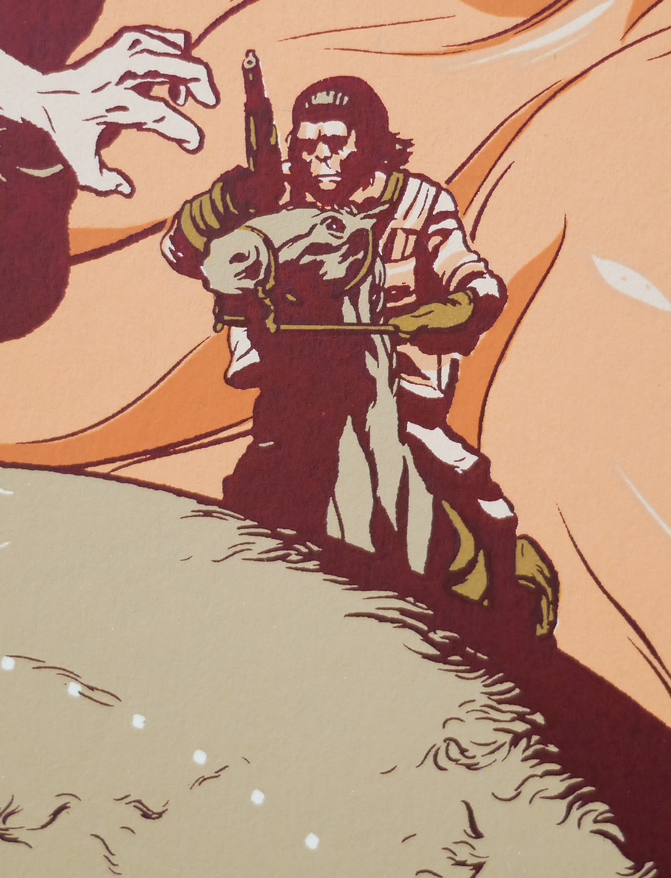
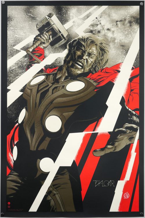
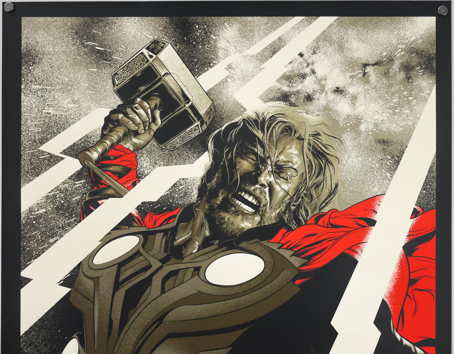
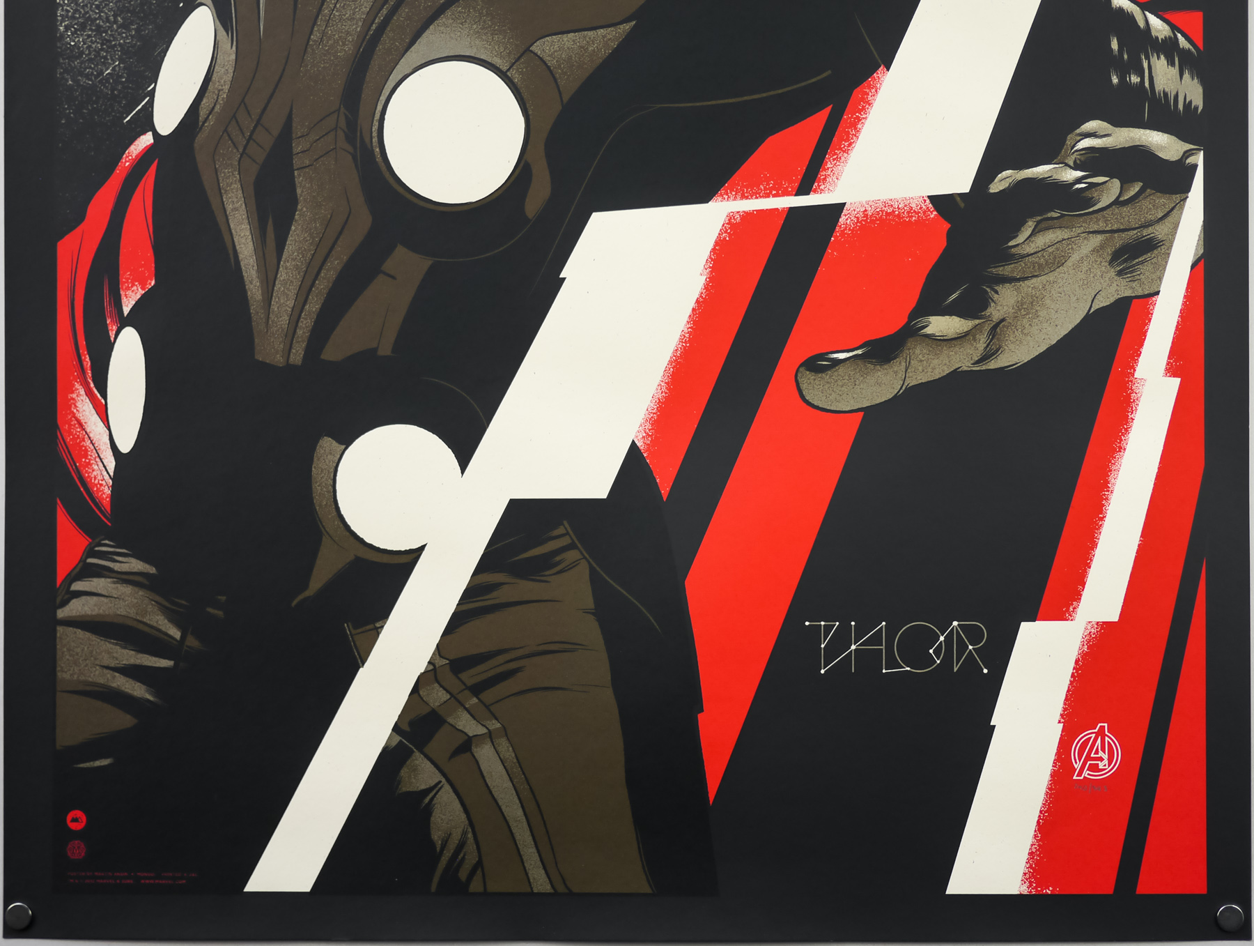
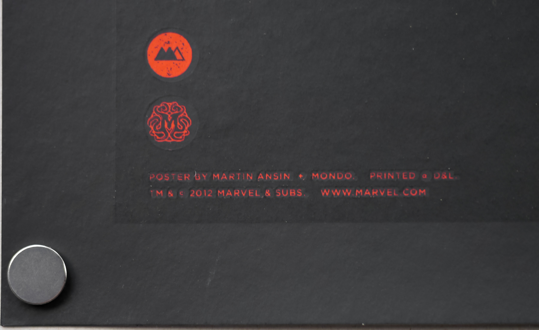
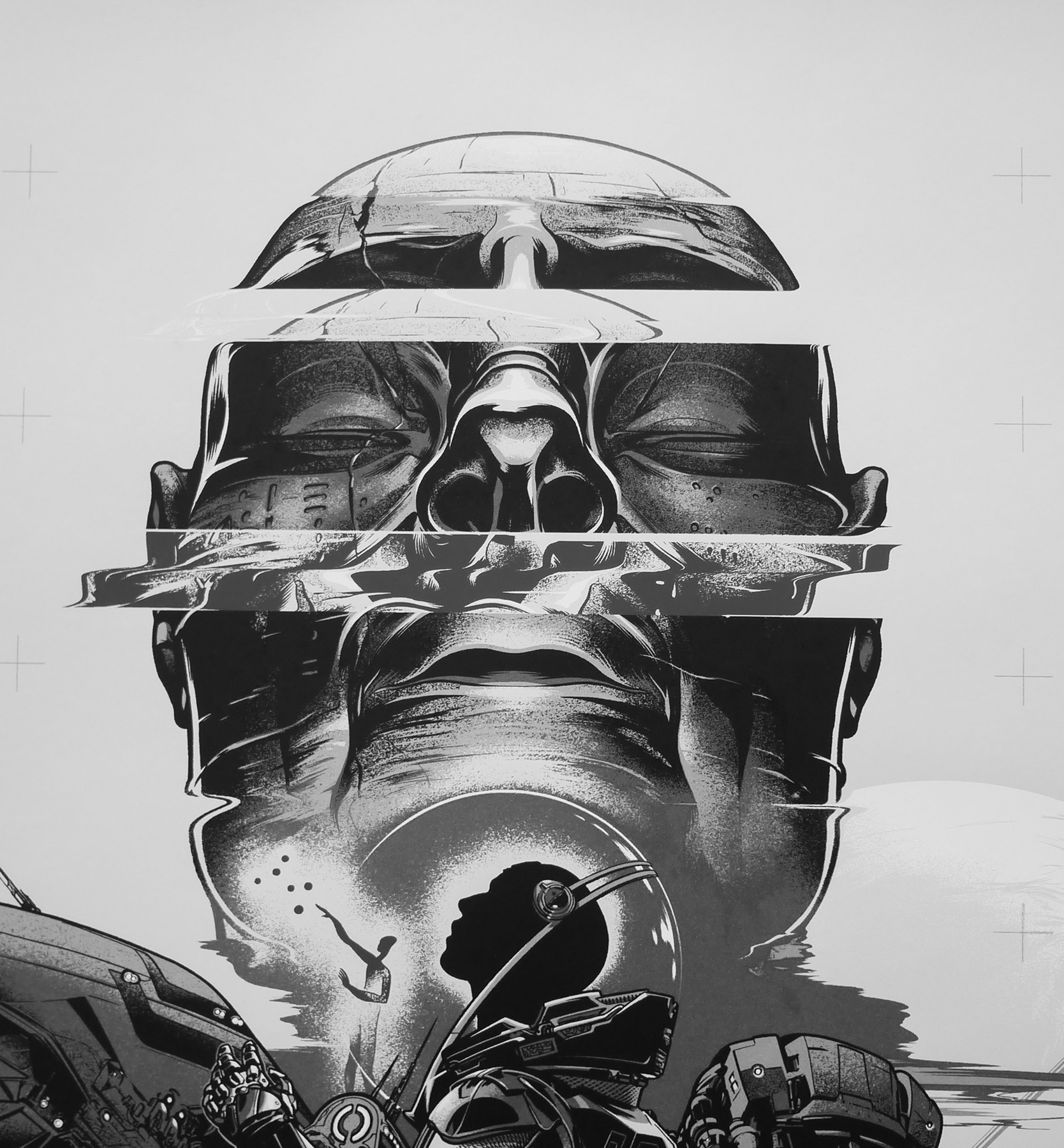
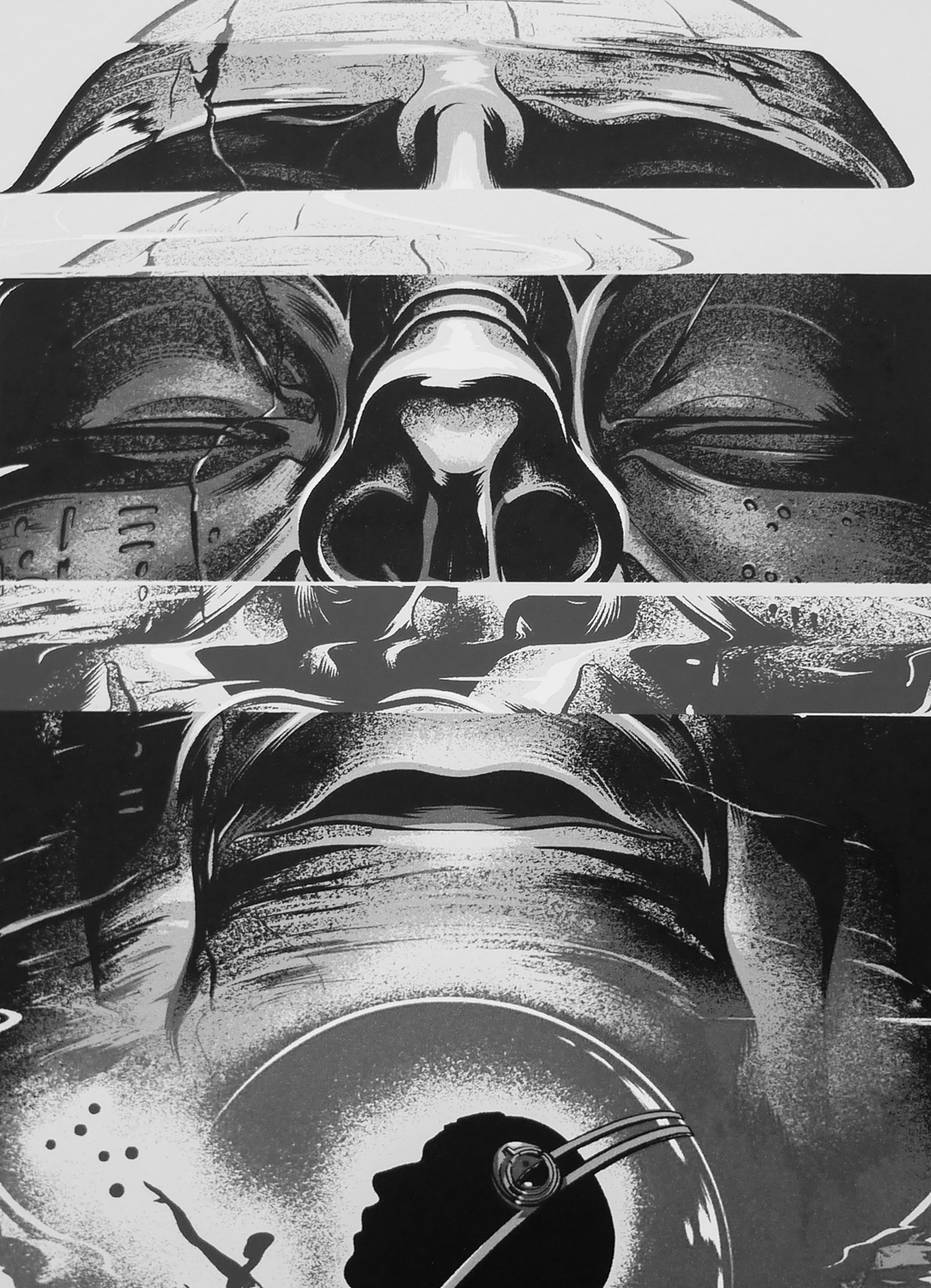
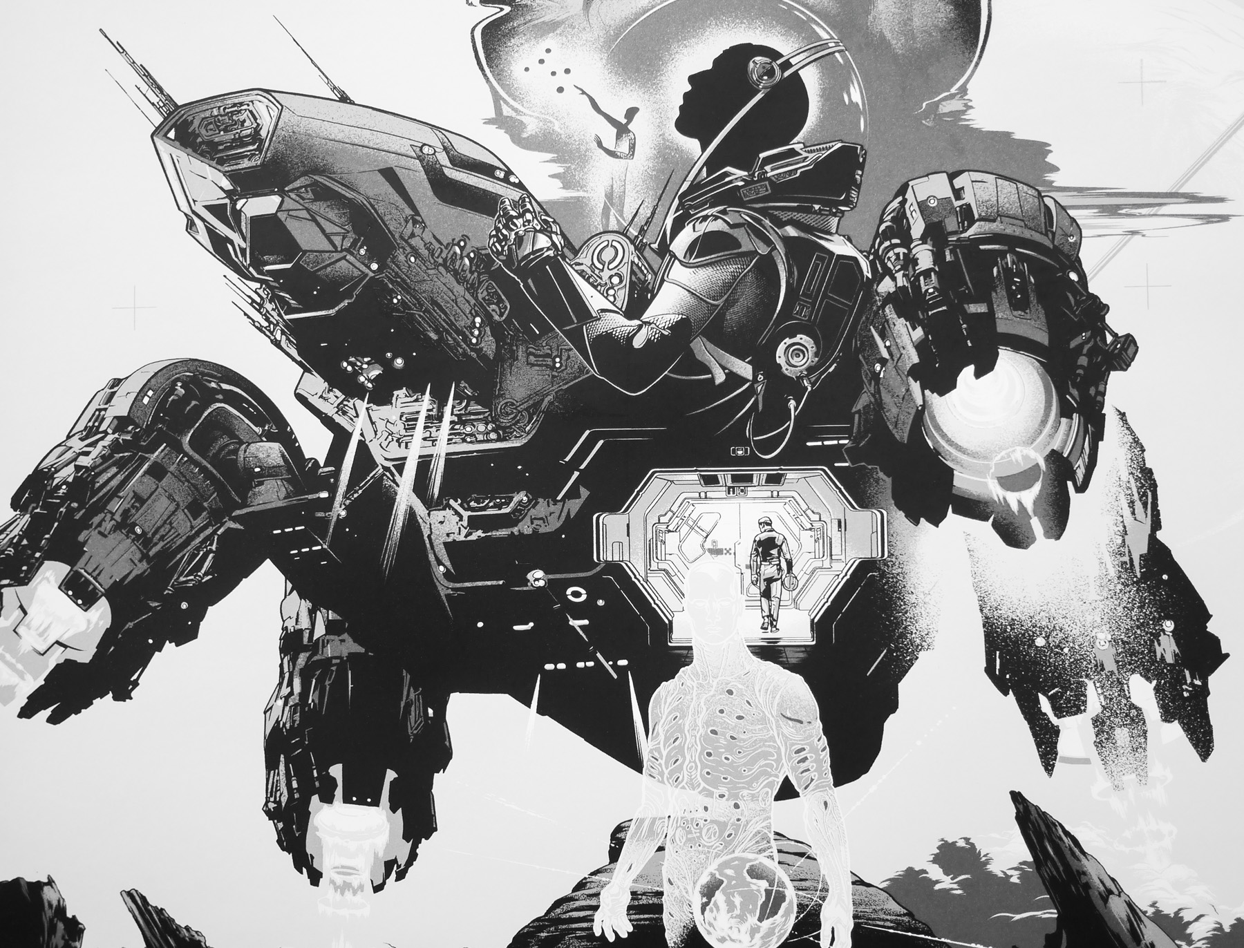
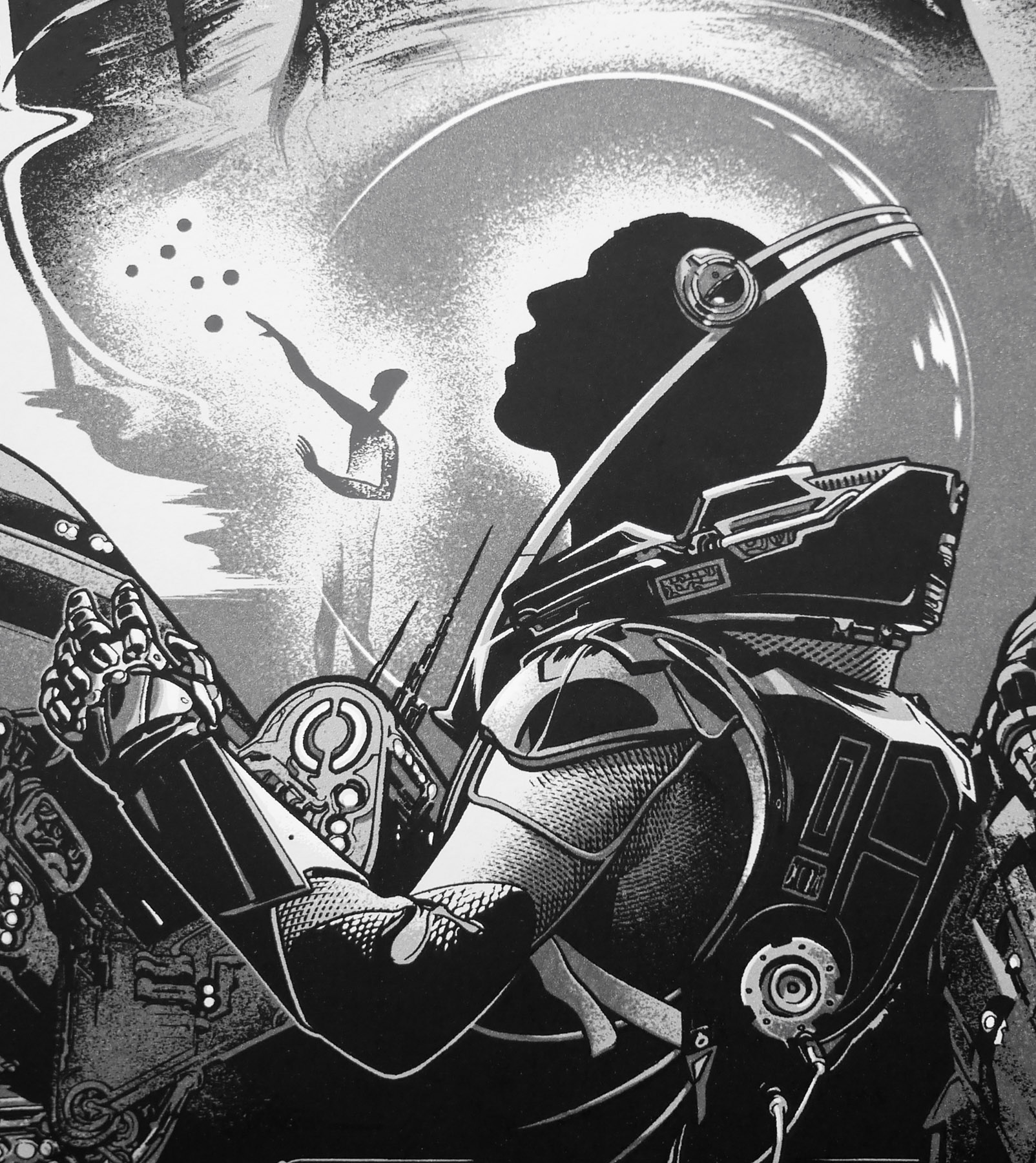
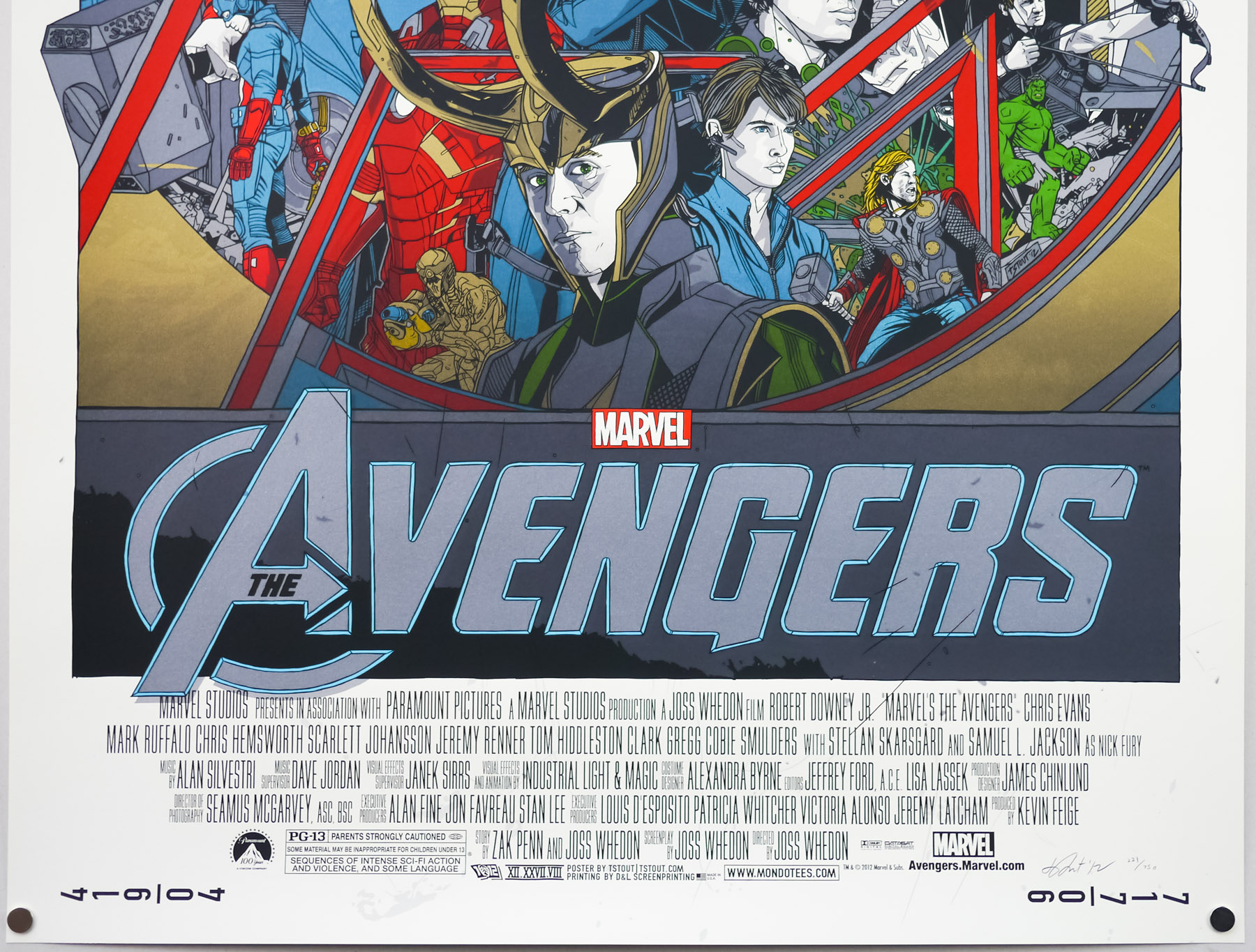
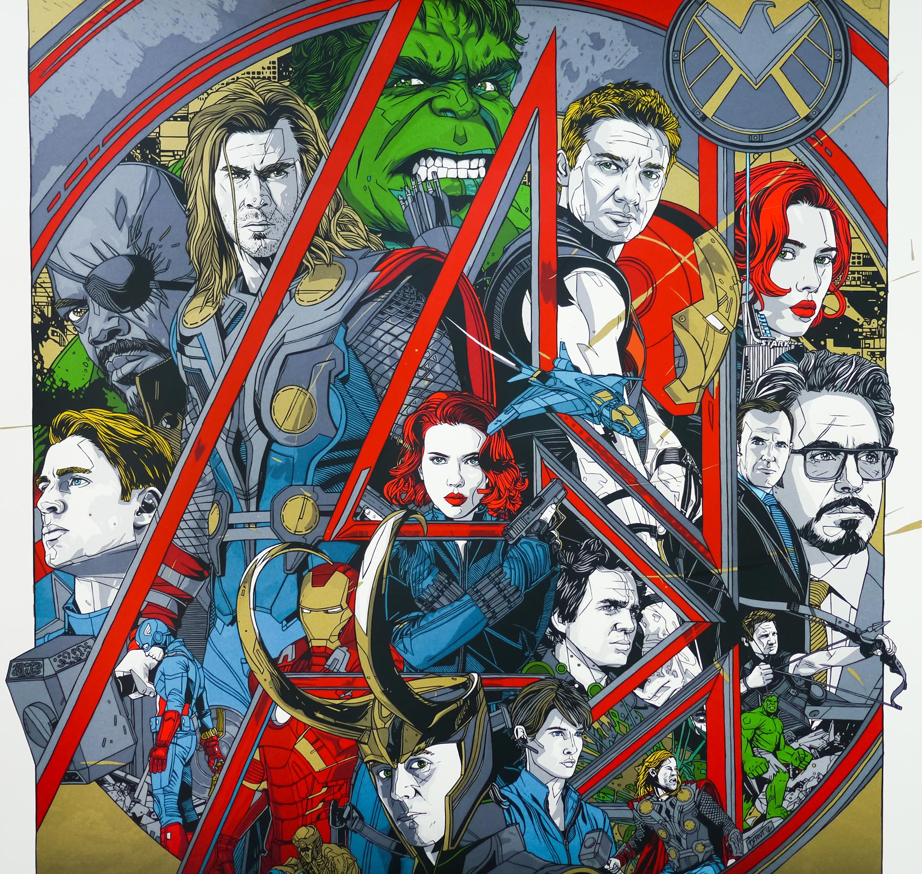
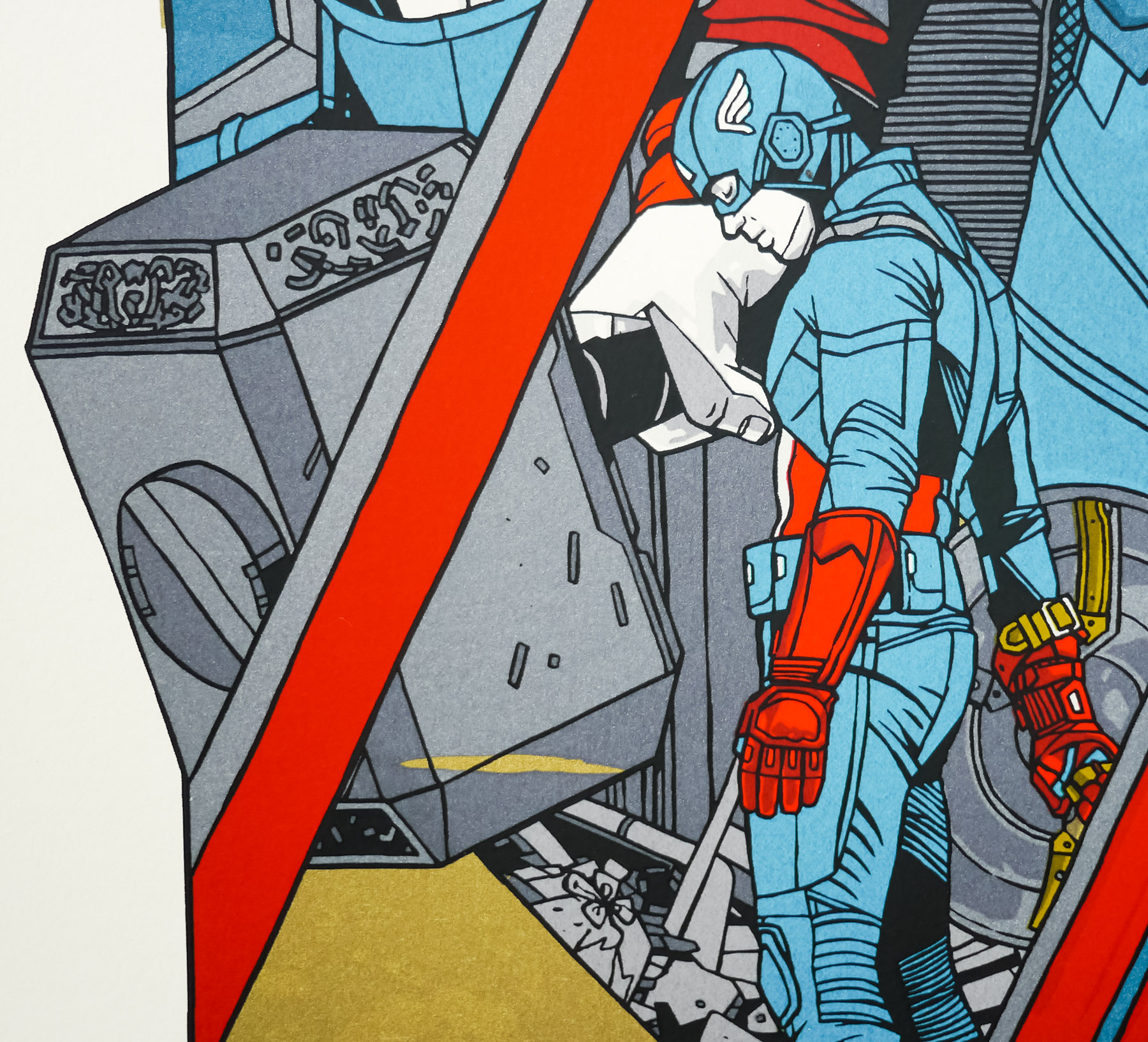
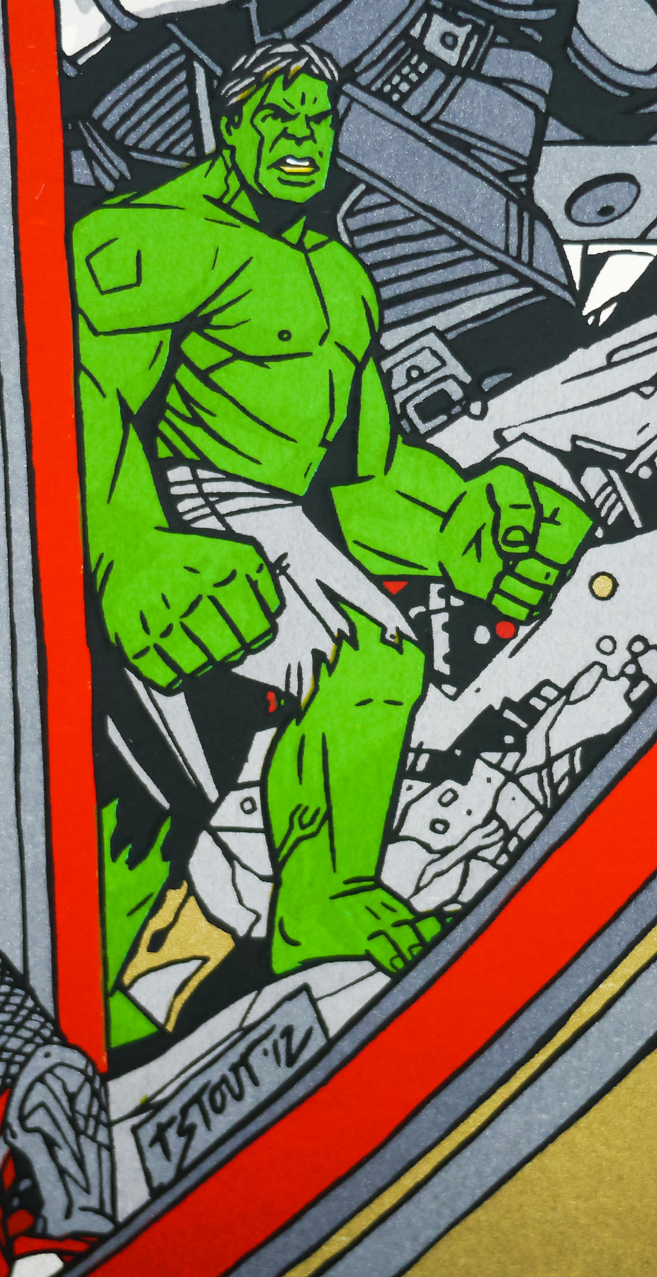
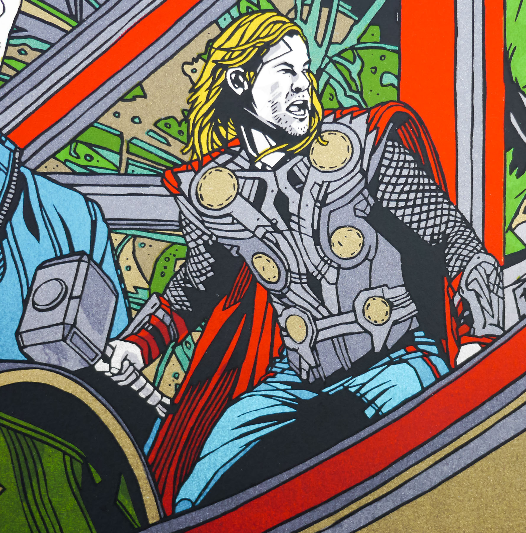
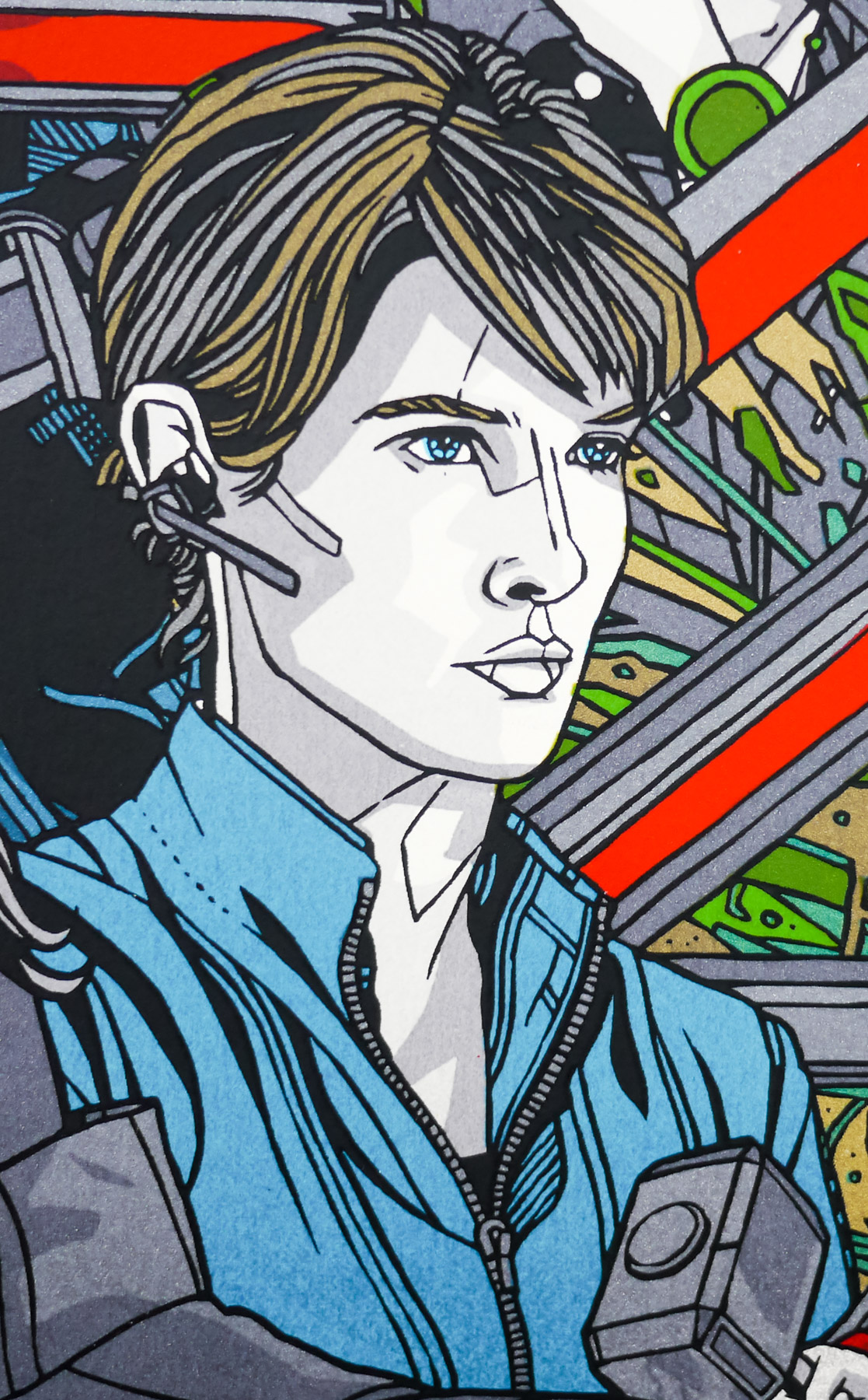
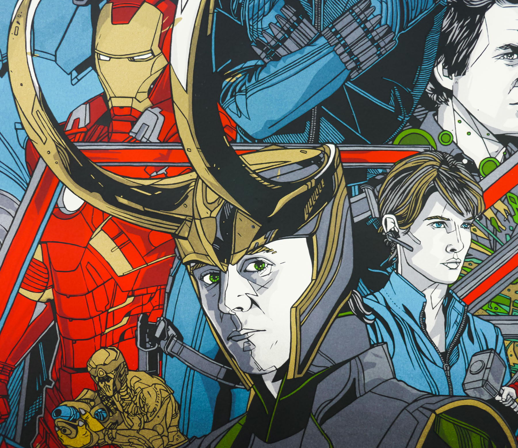
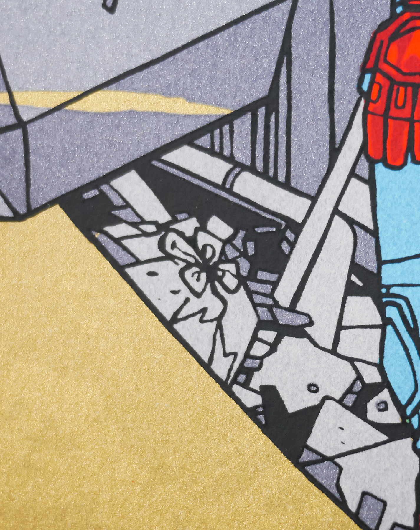
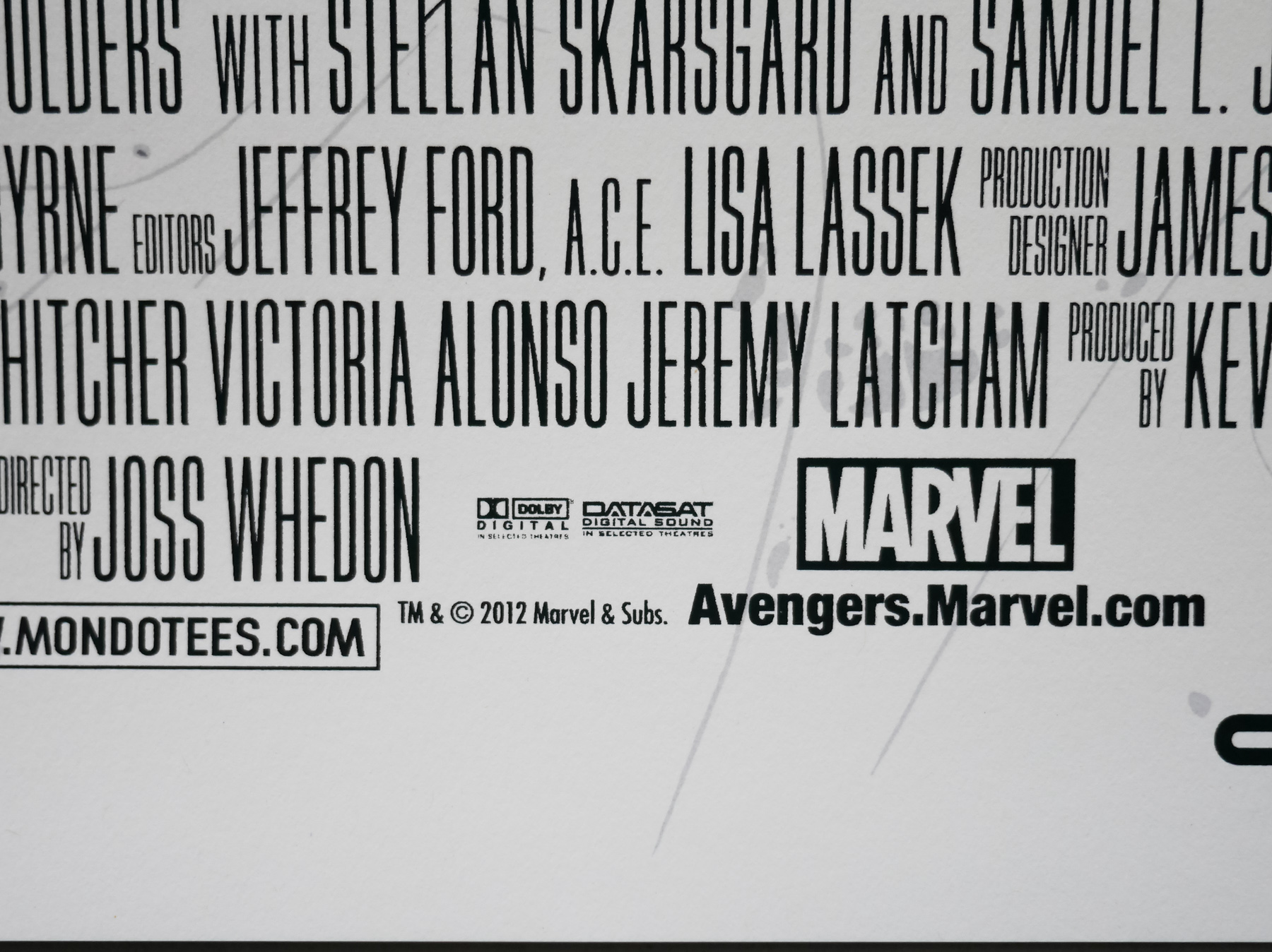
To celebrate the release of the film, Marvel once again worked with Austin-based Mondo to release a series of screen prints based on characters from the film. The incomparable Austin-based geek culture outfit has worked on prints for all of the standalone Marvel releases, starting with Iron Man in 2008 and only skipping the same year’s The Incredible Hulk.
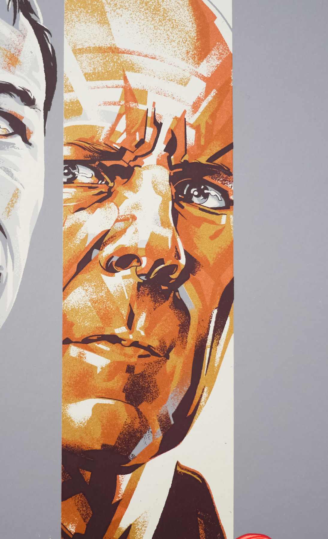
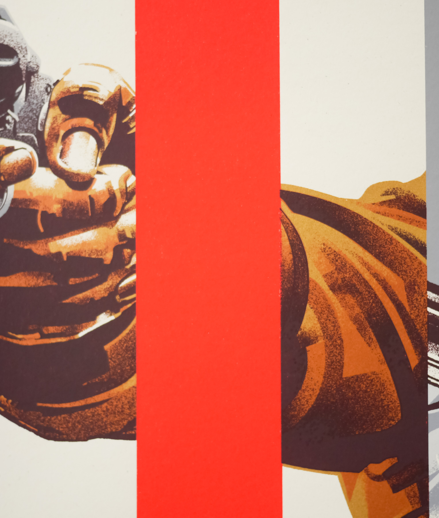
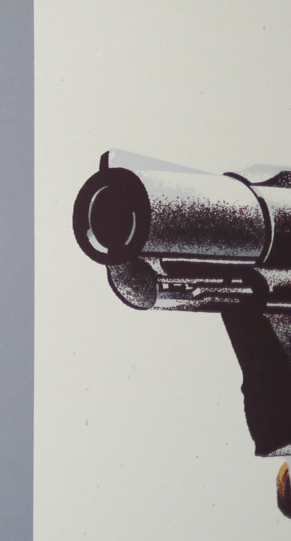
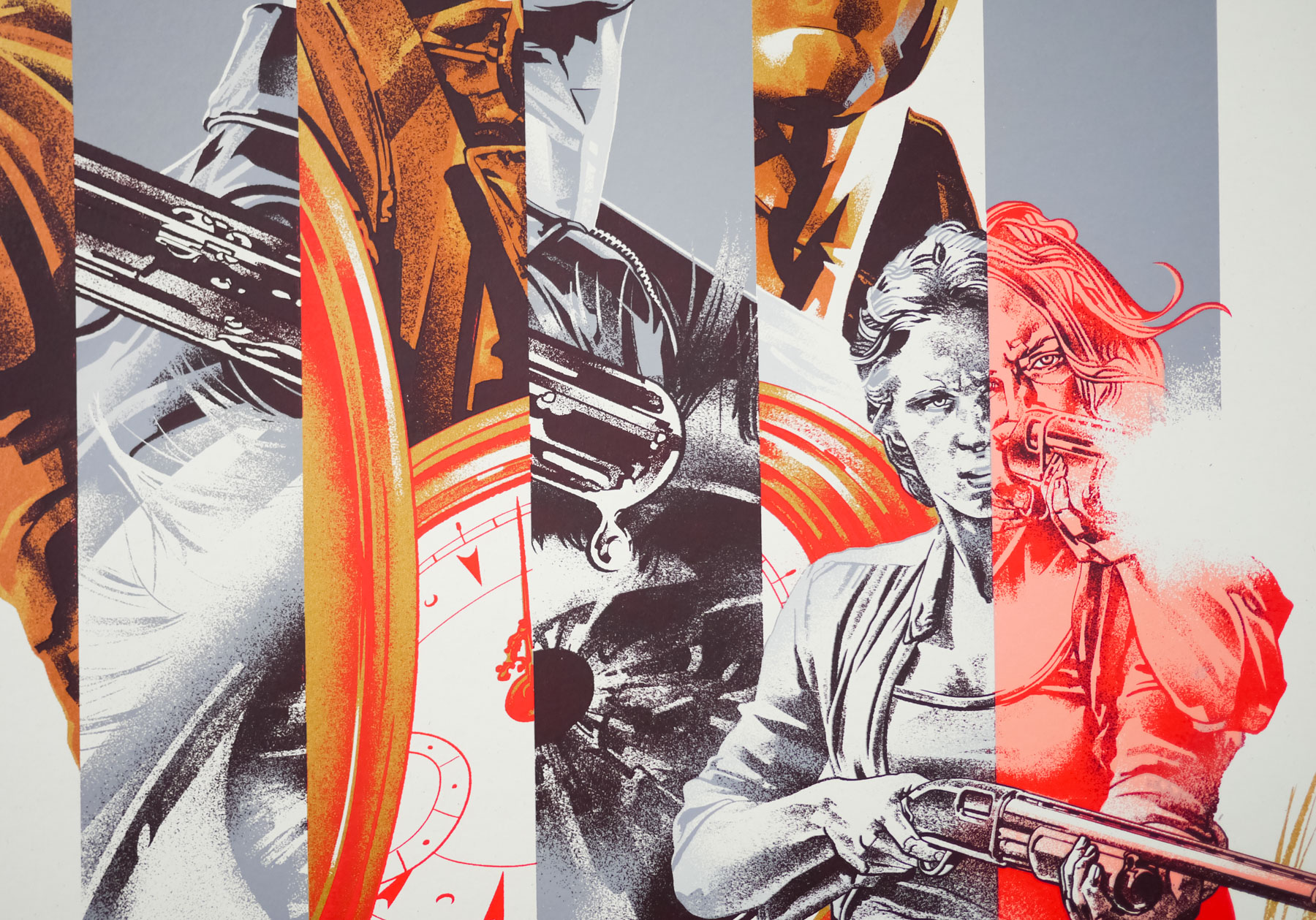
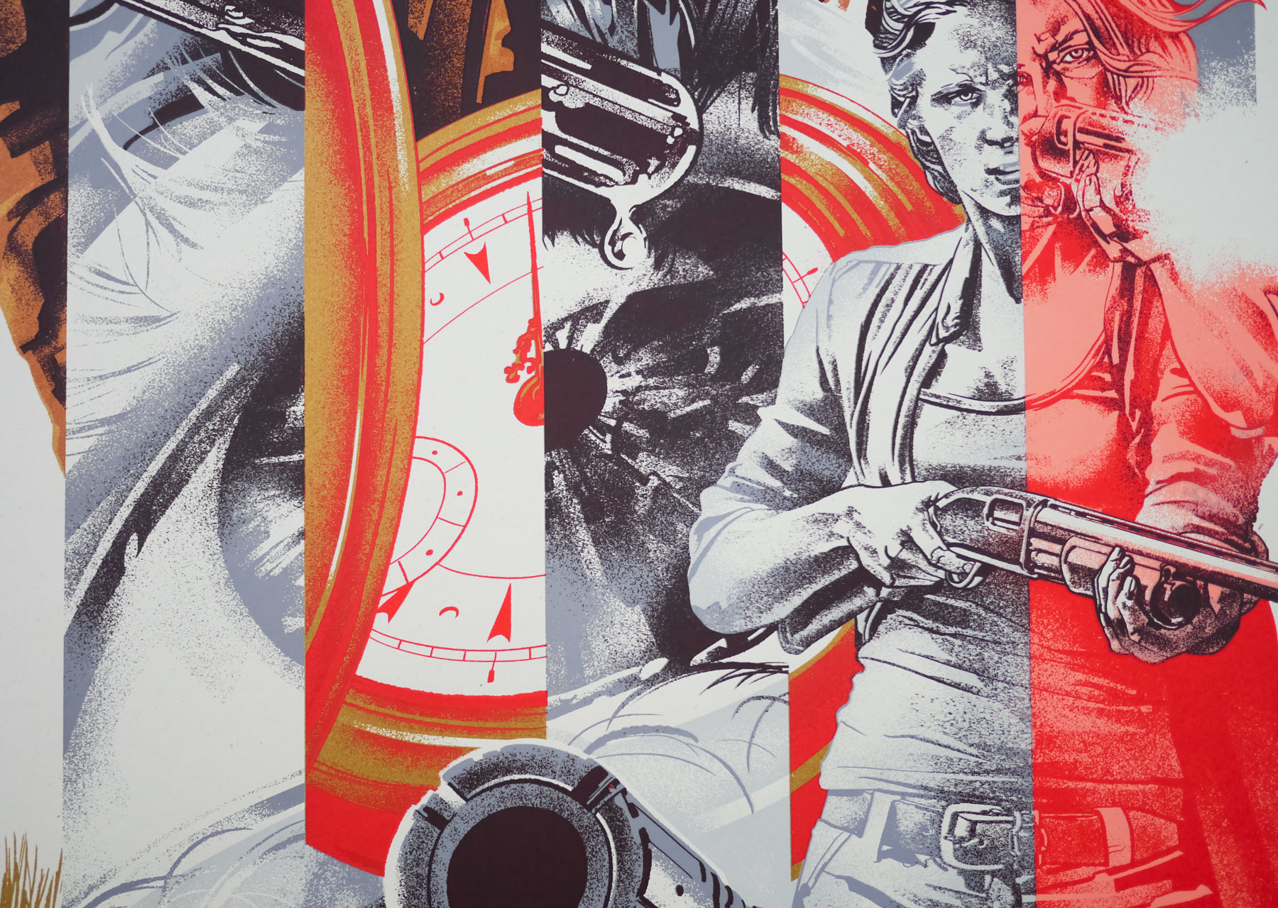
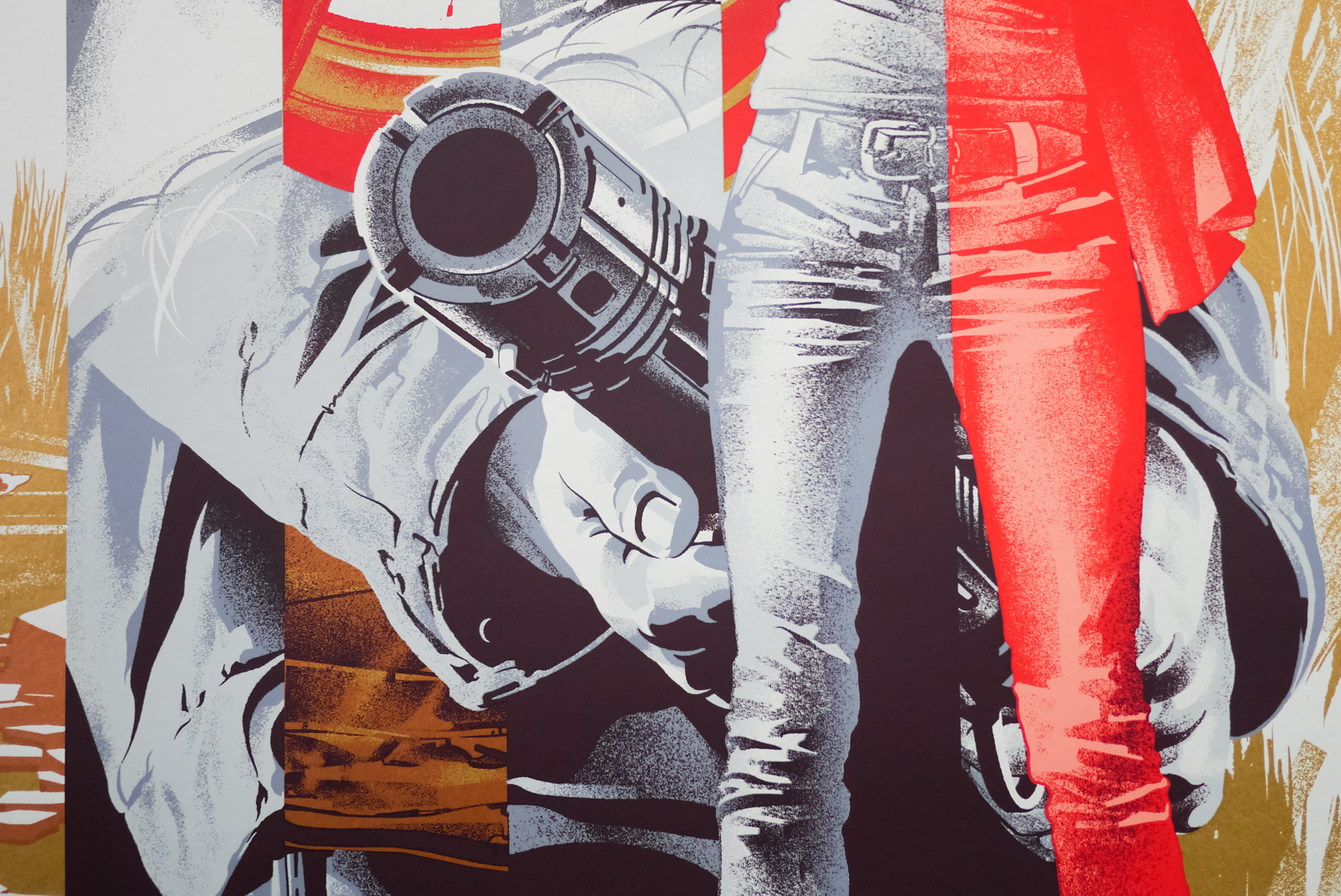
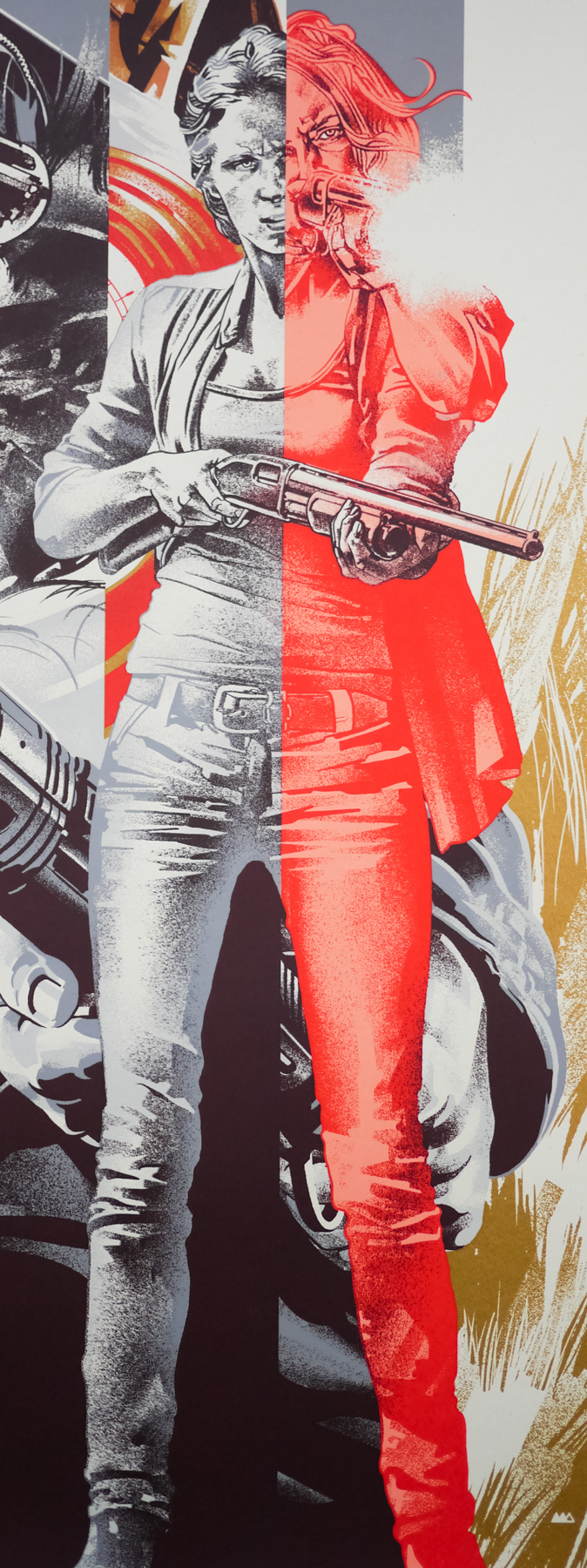
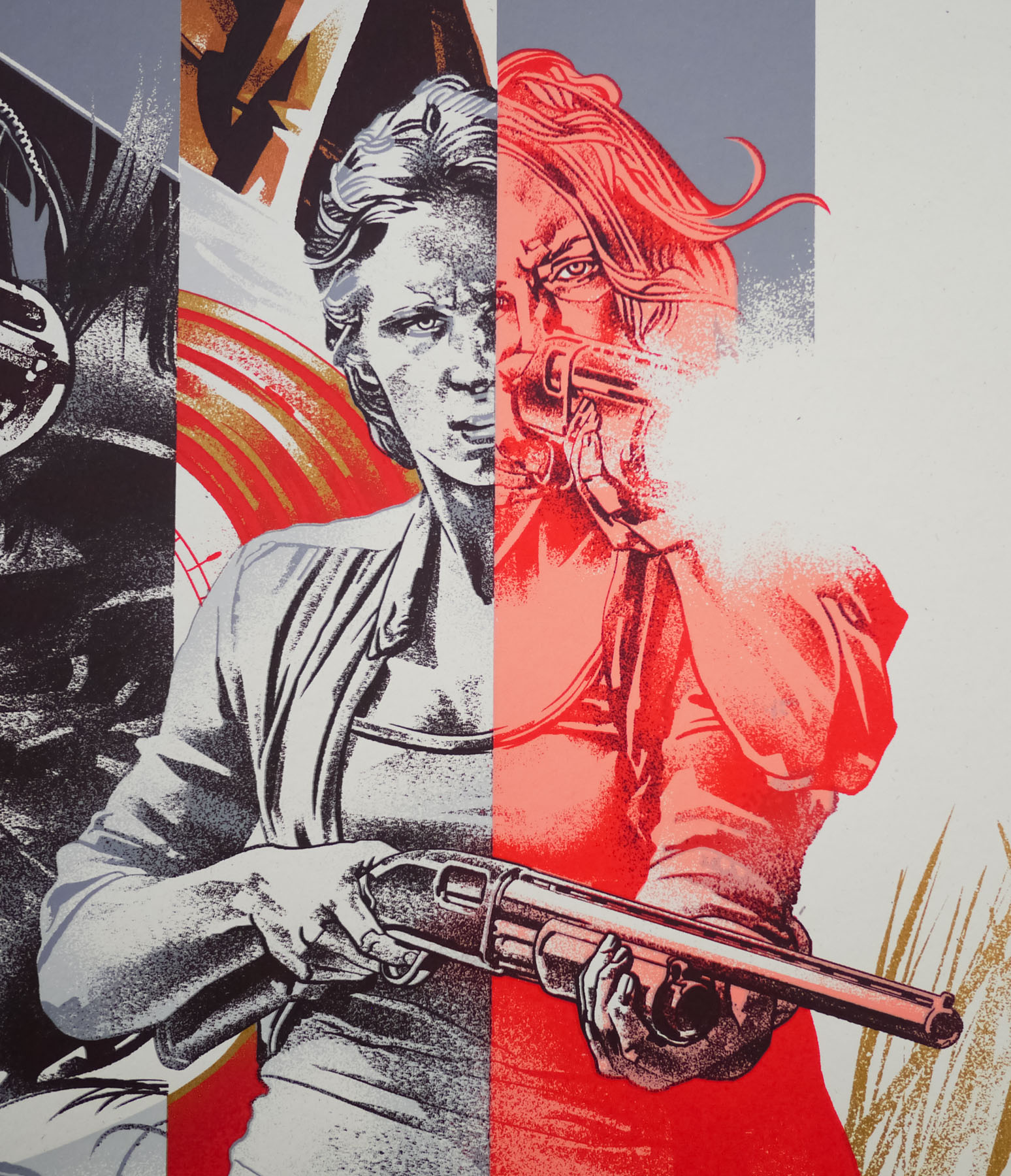
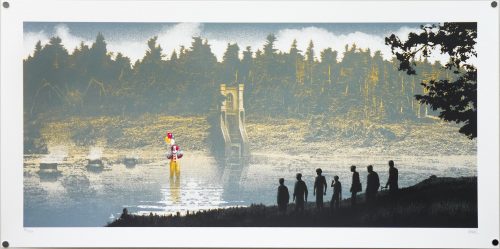
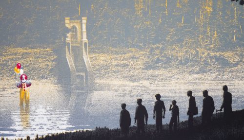
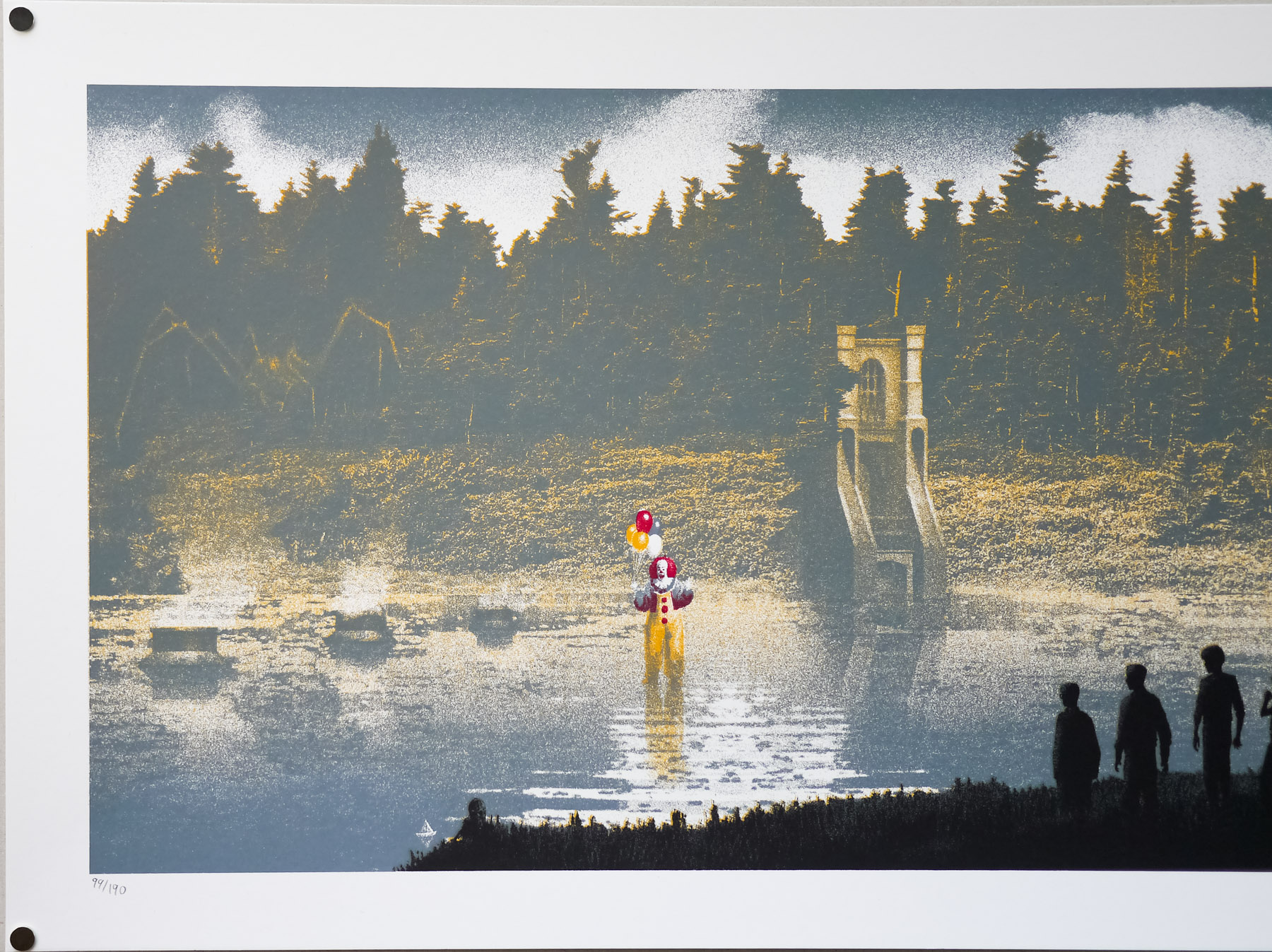
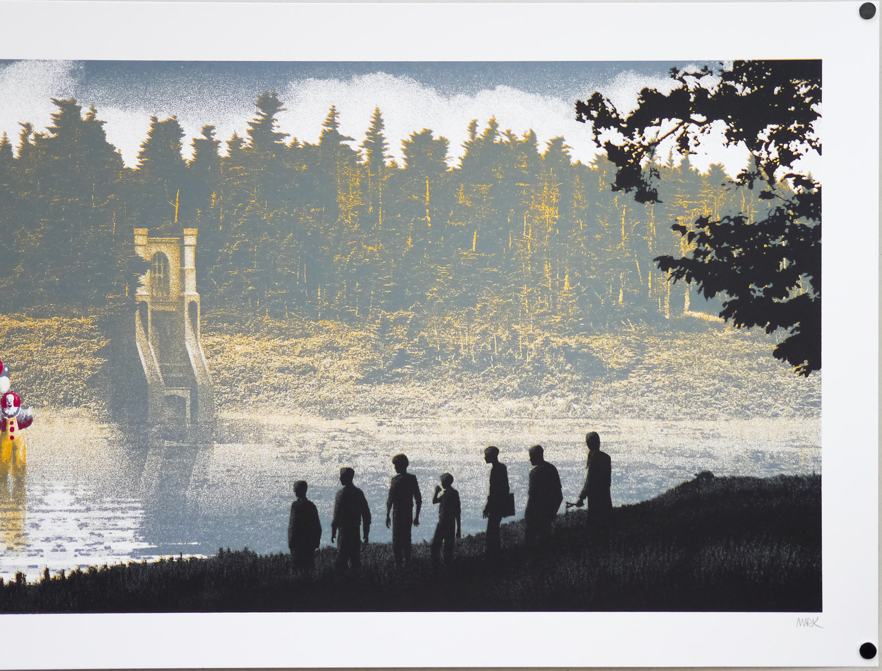
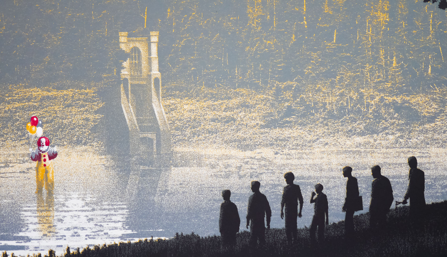
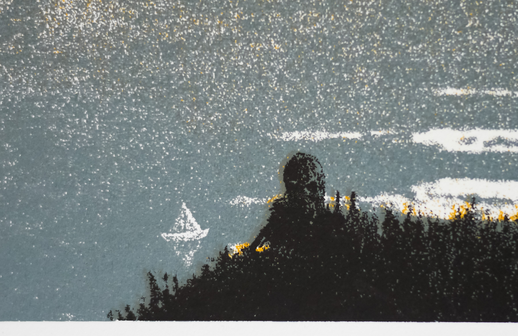
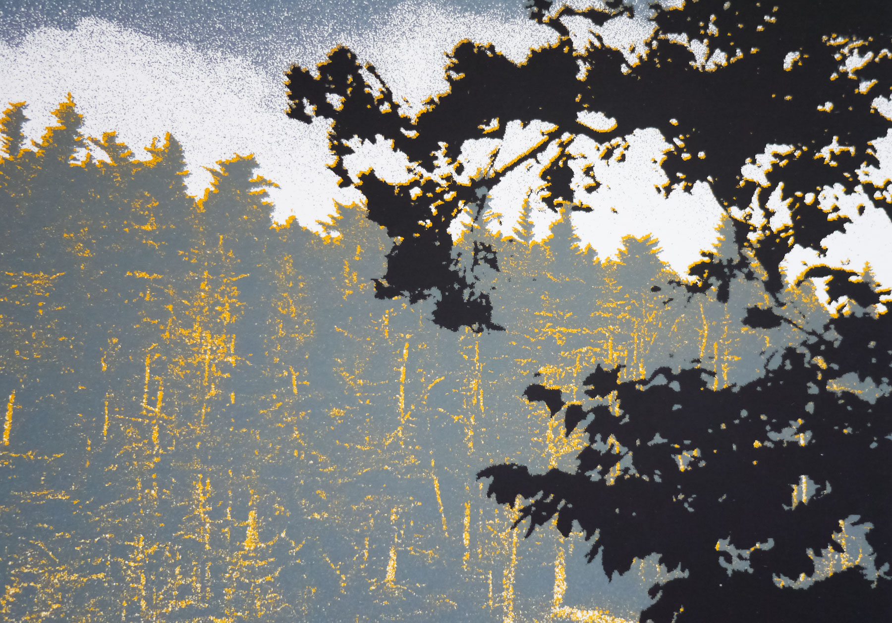
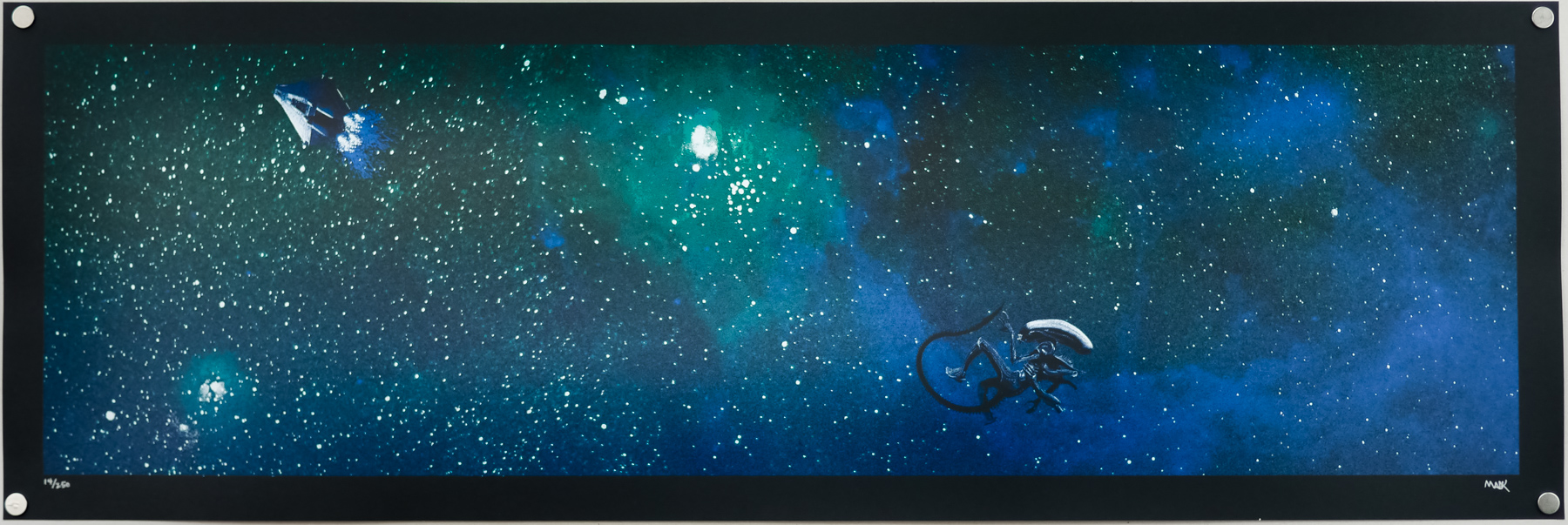
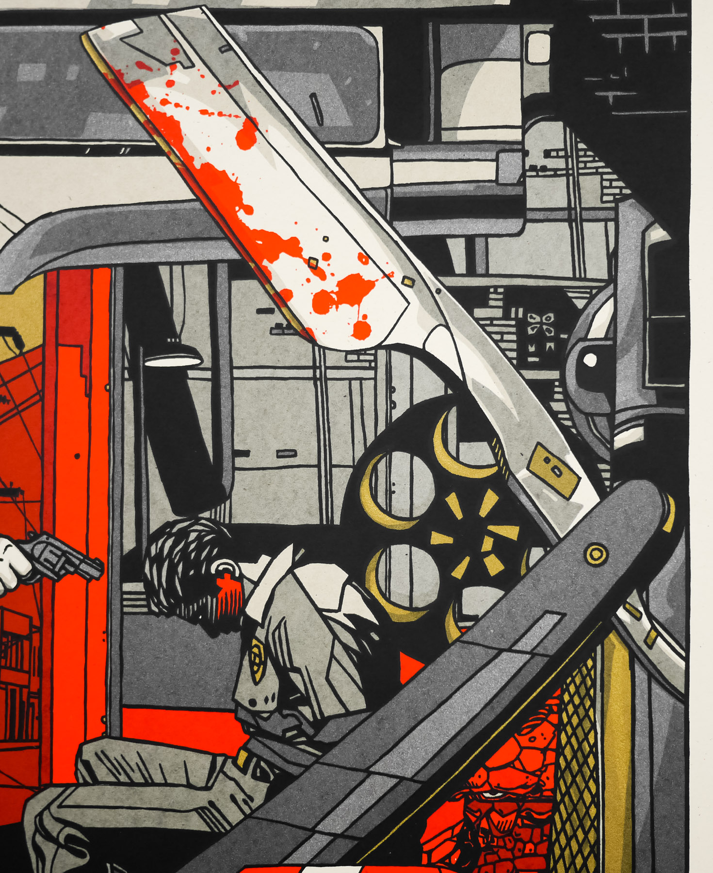
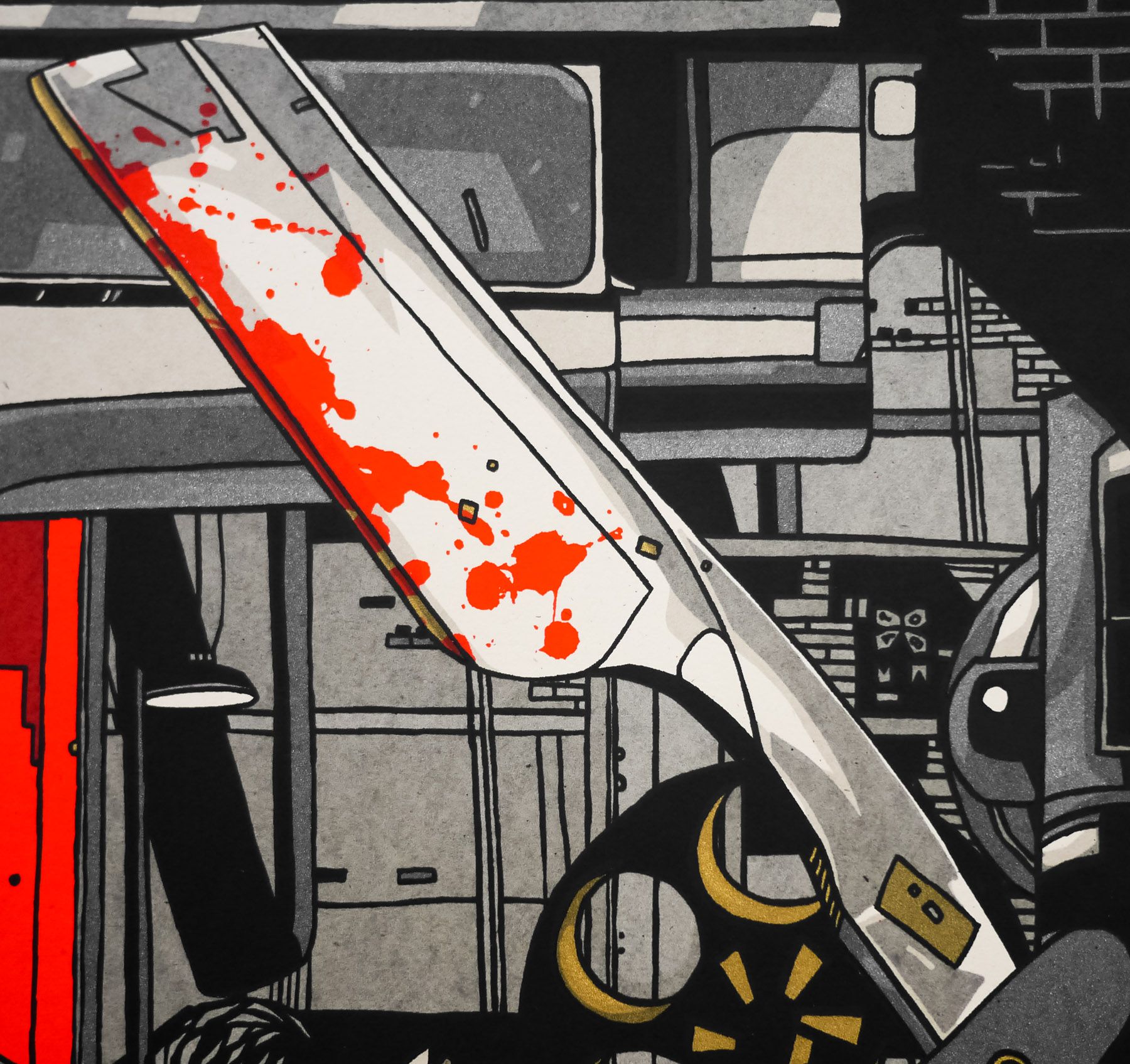
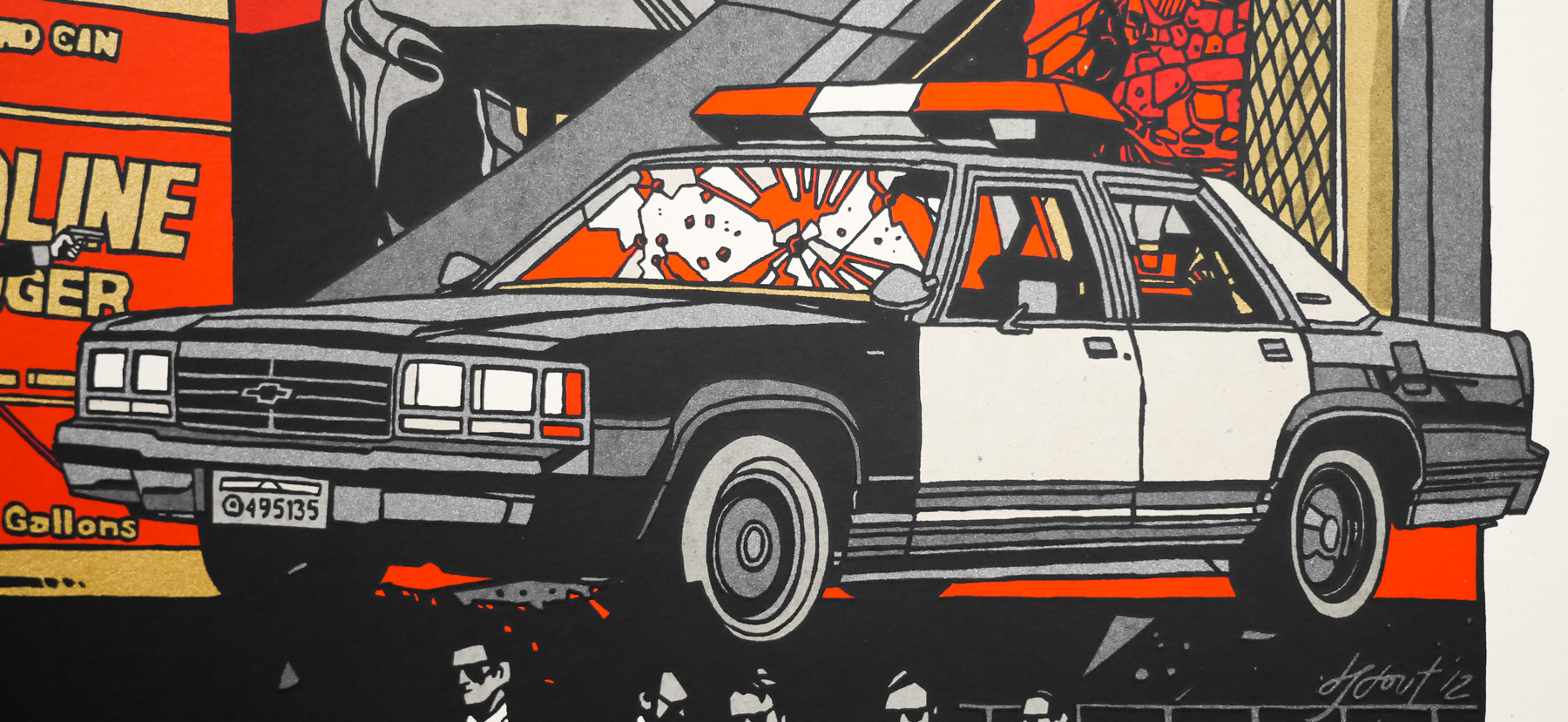
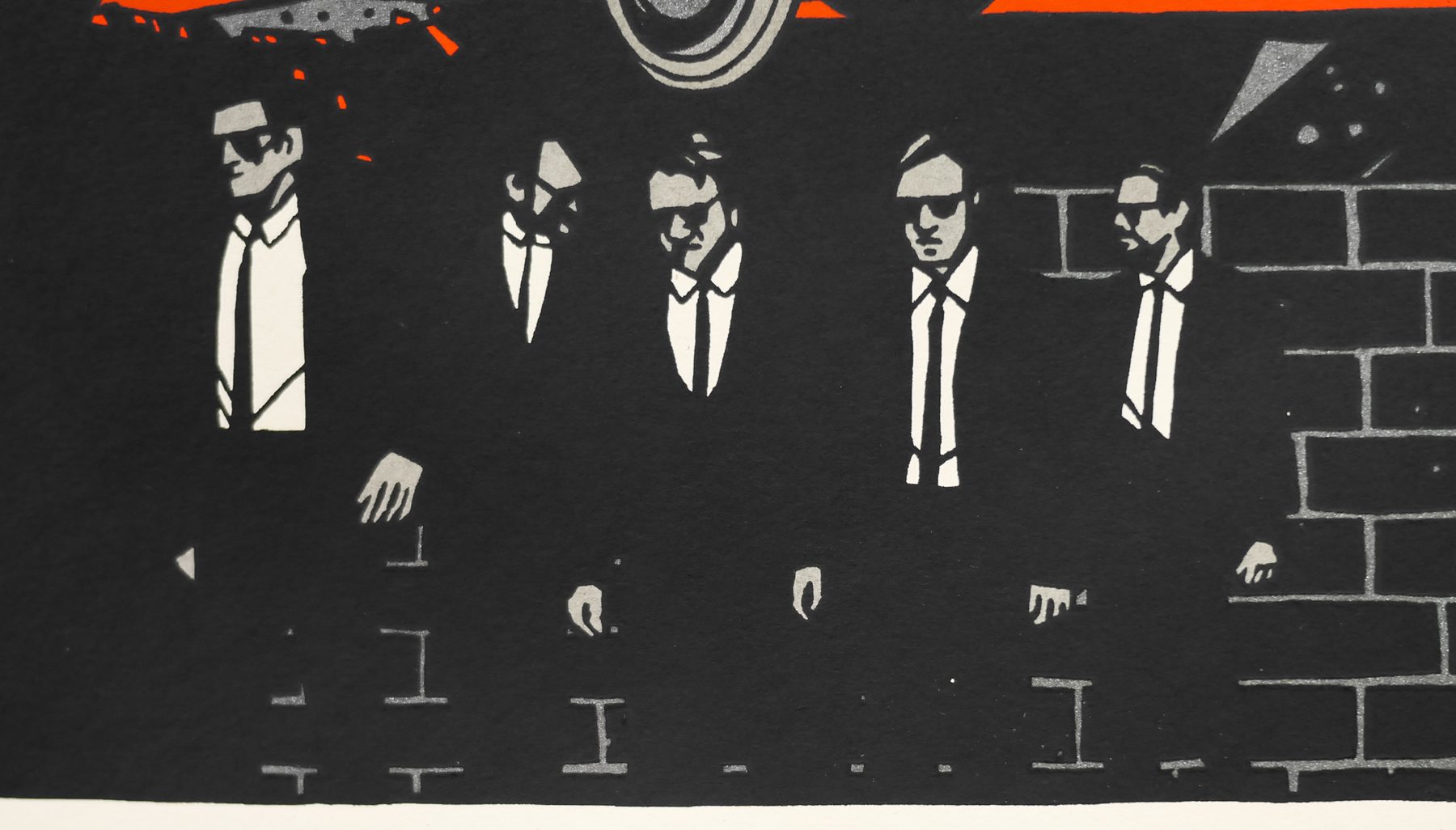
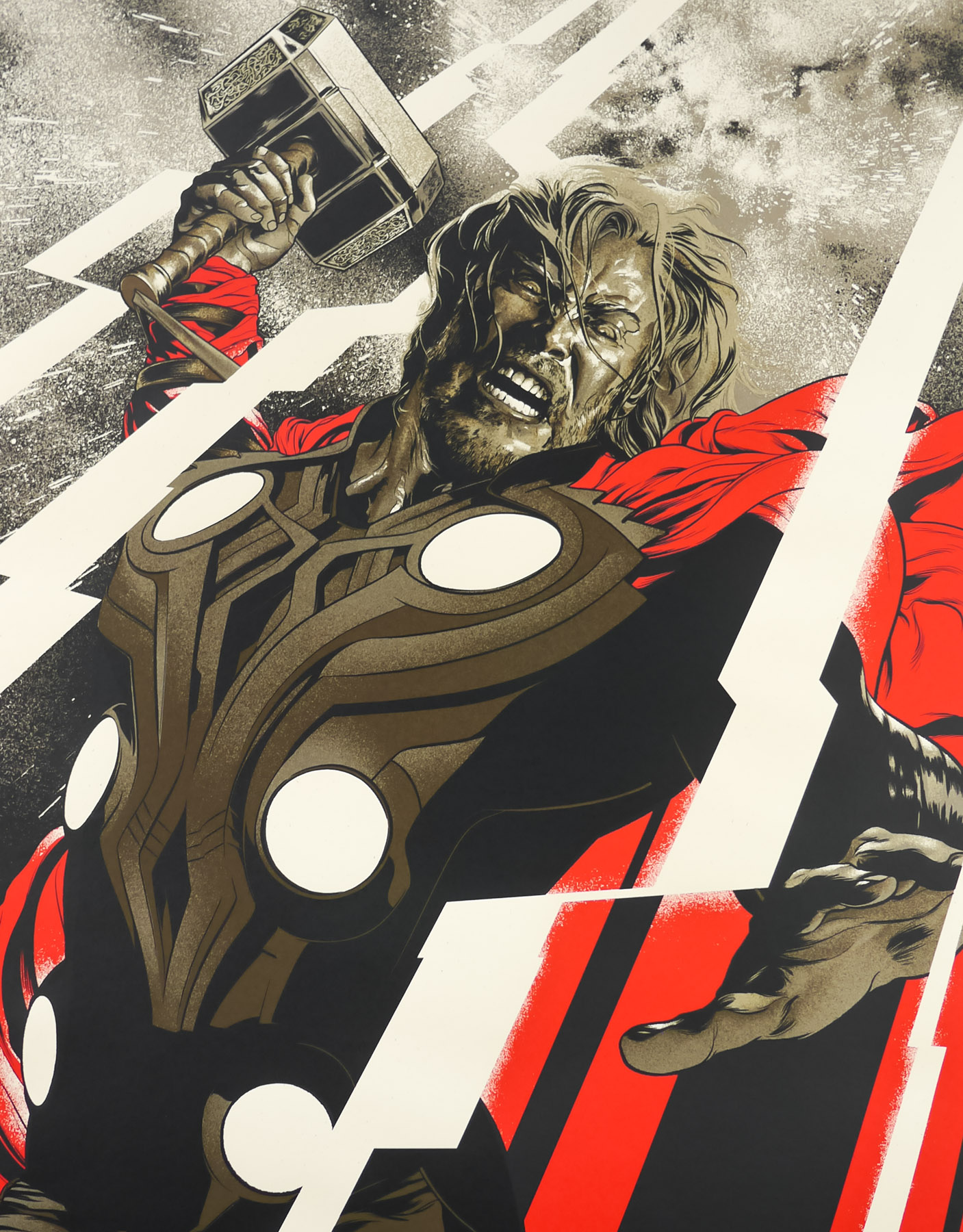
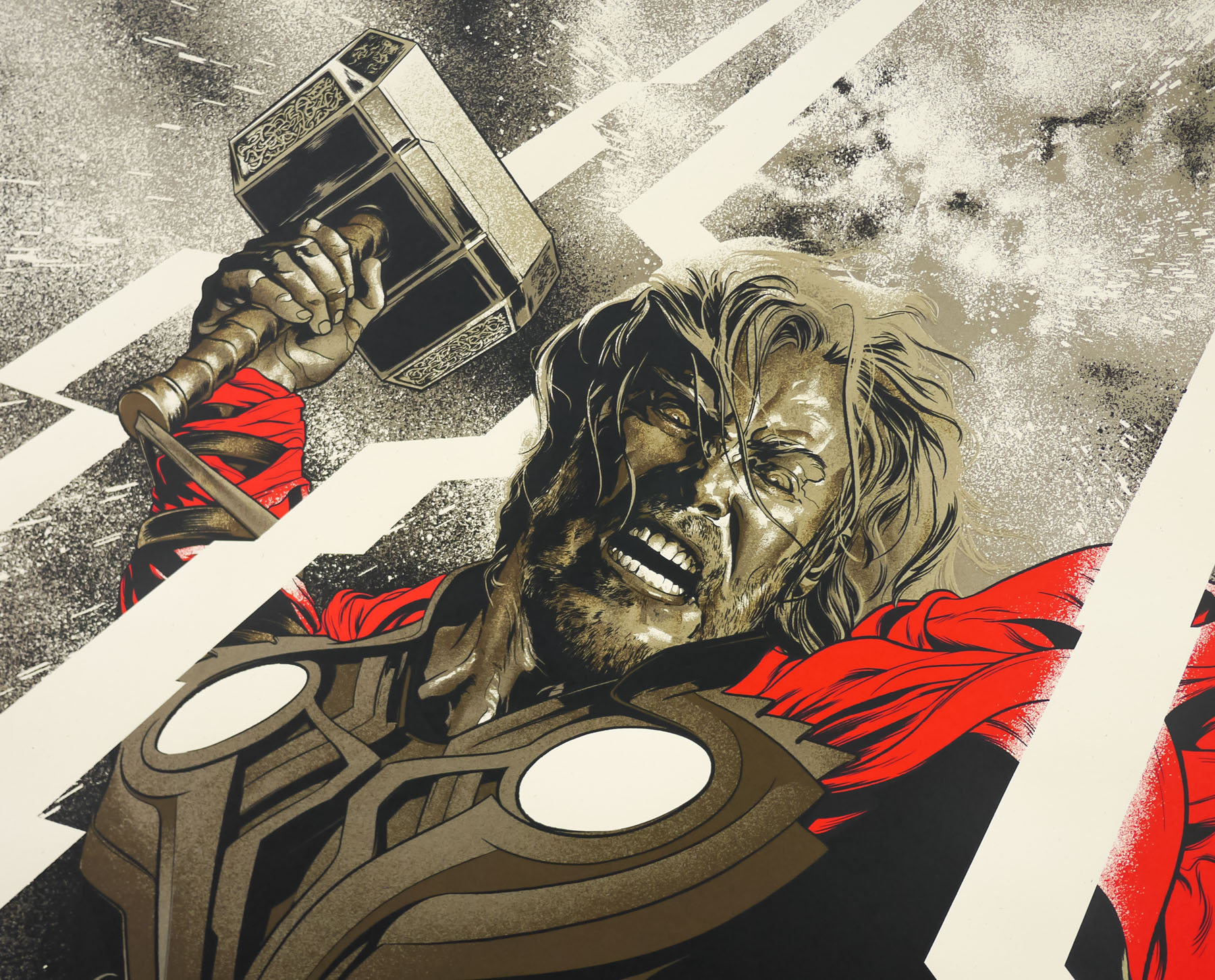
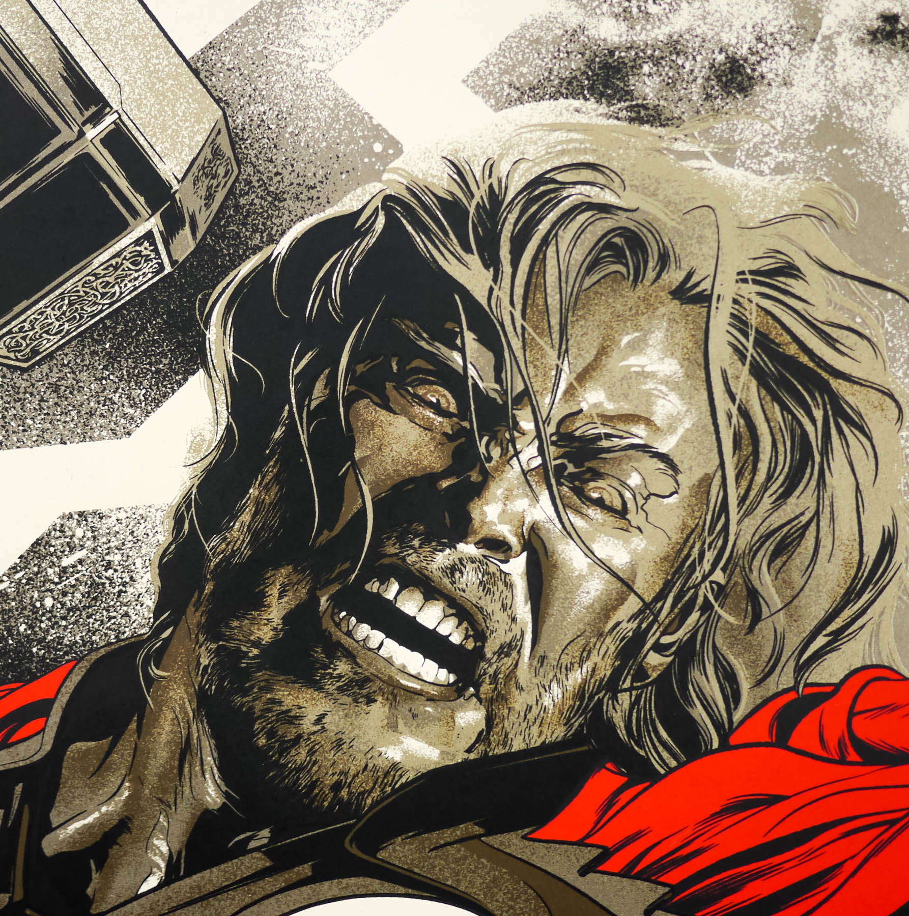
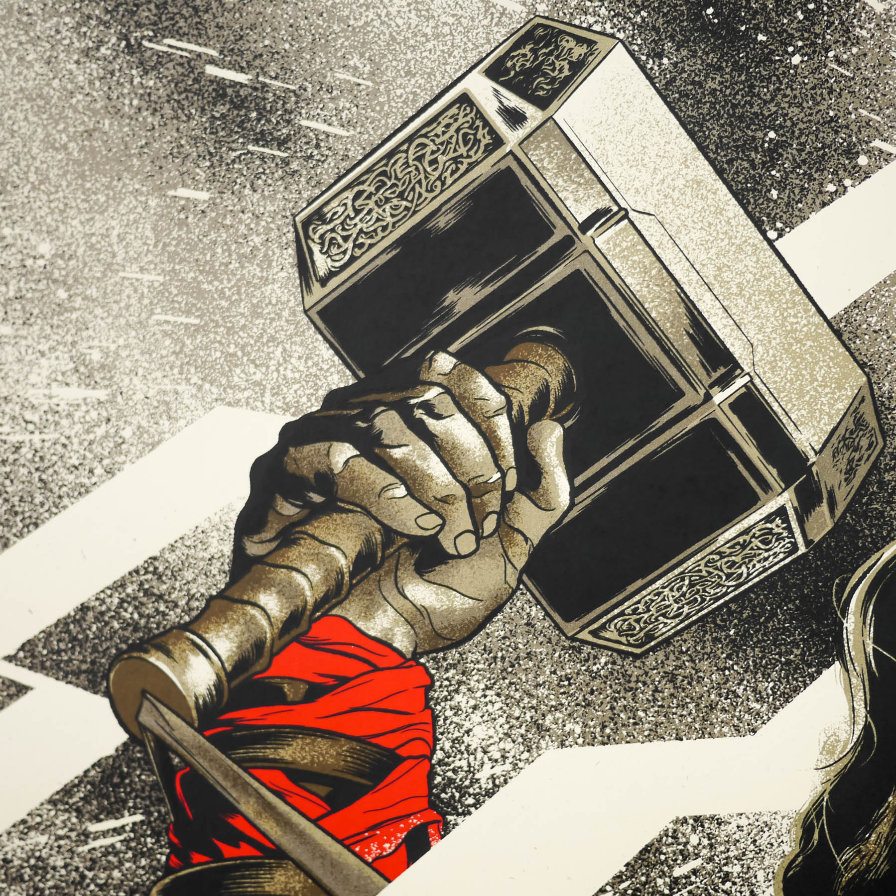
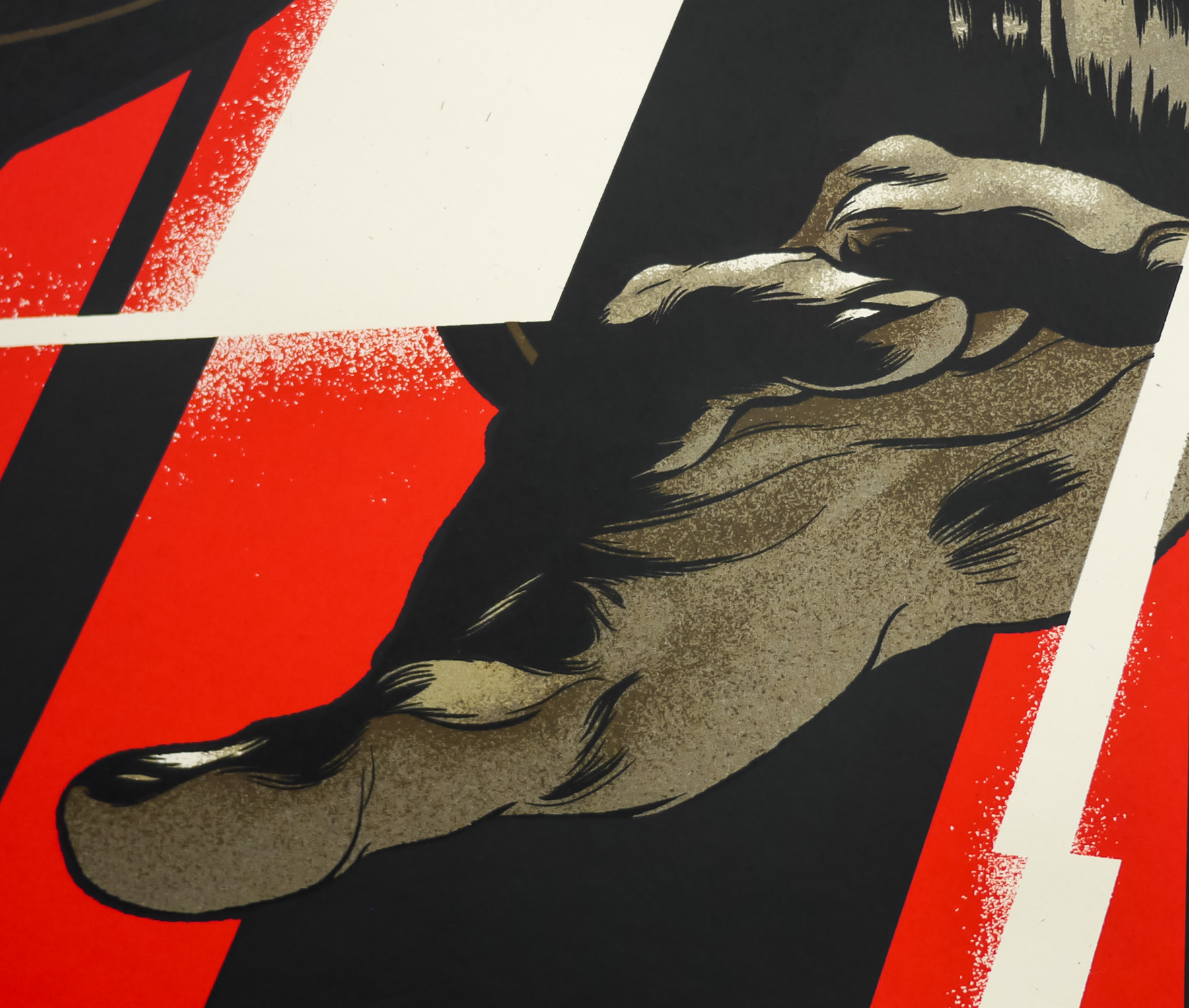
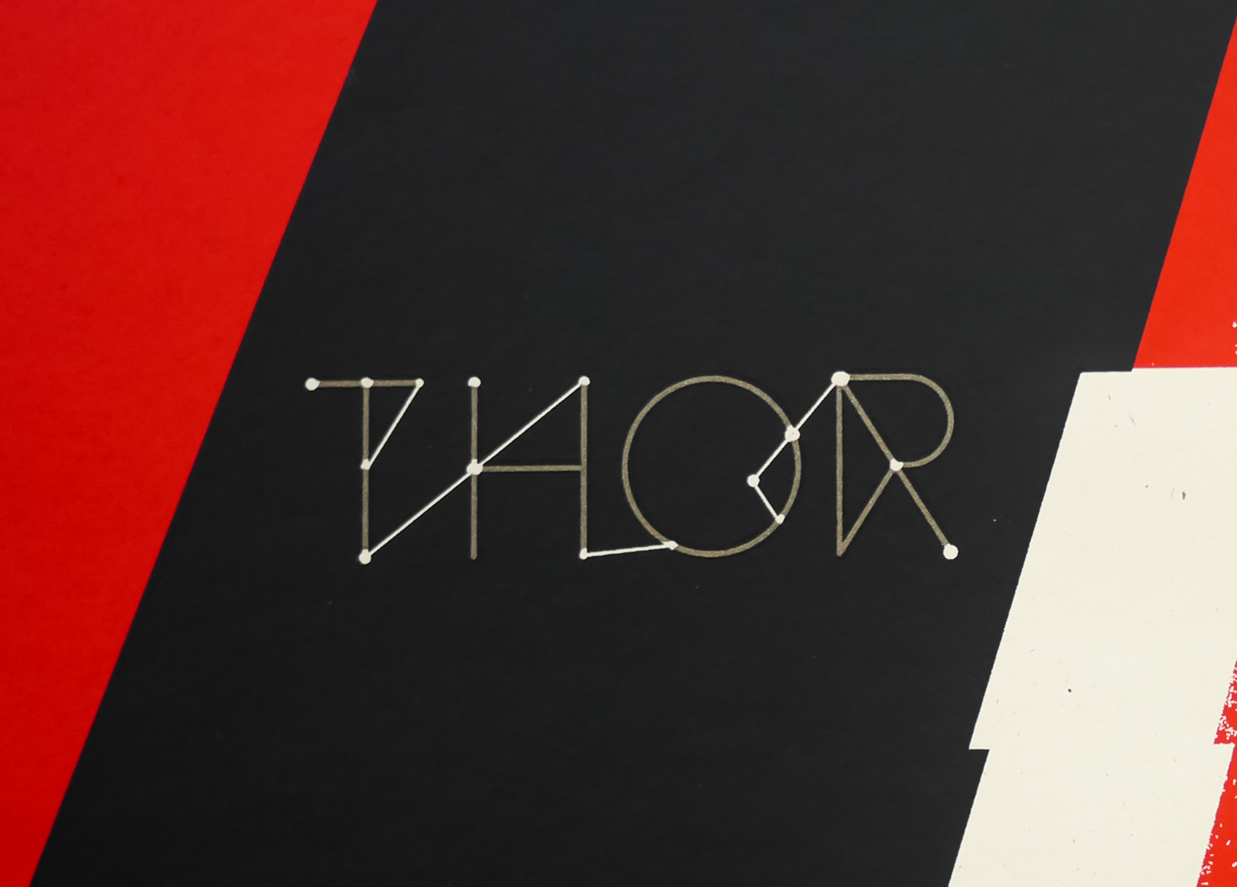
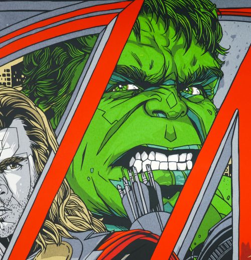
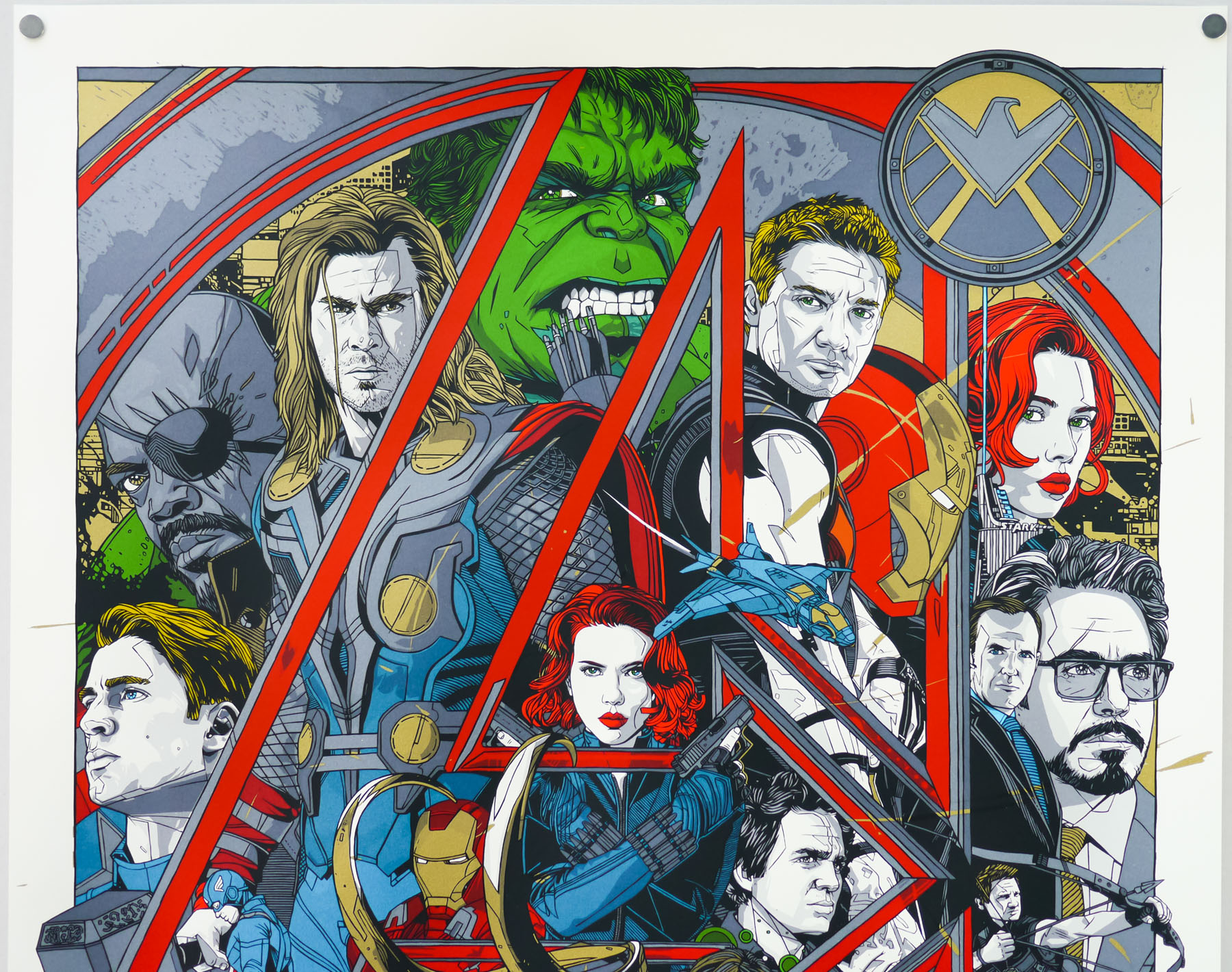
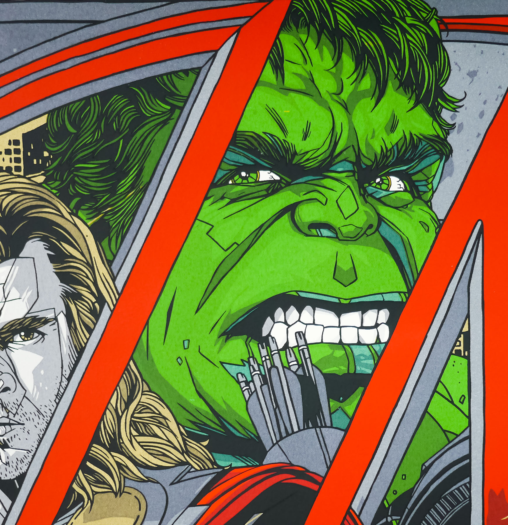
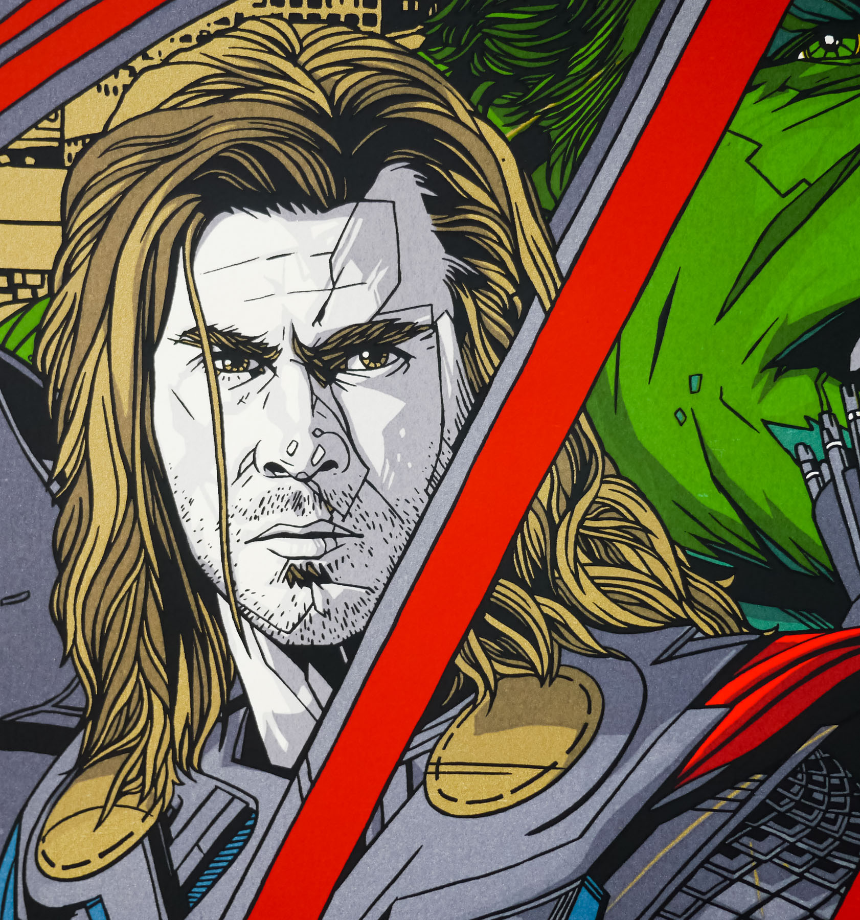
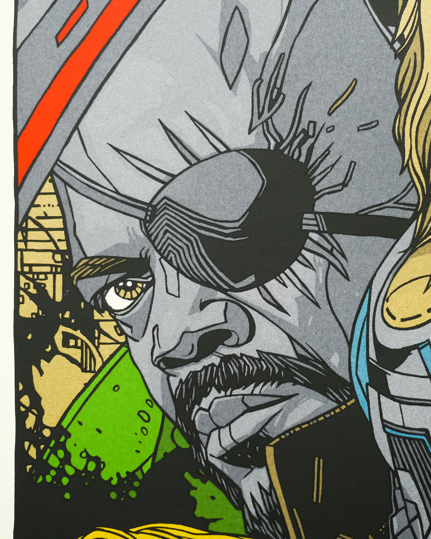
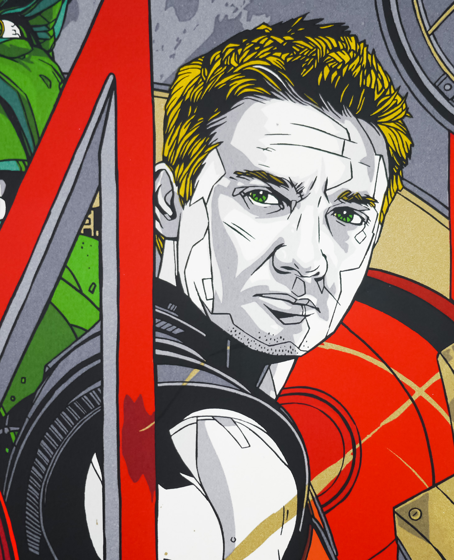
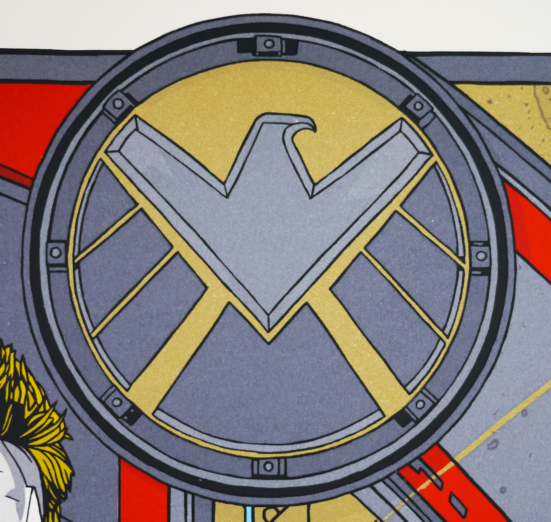
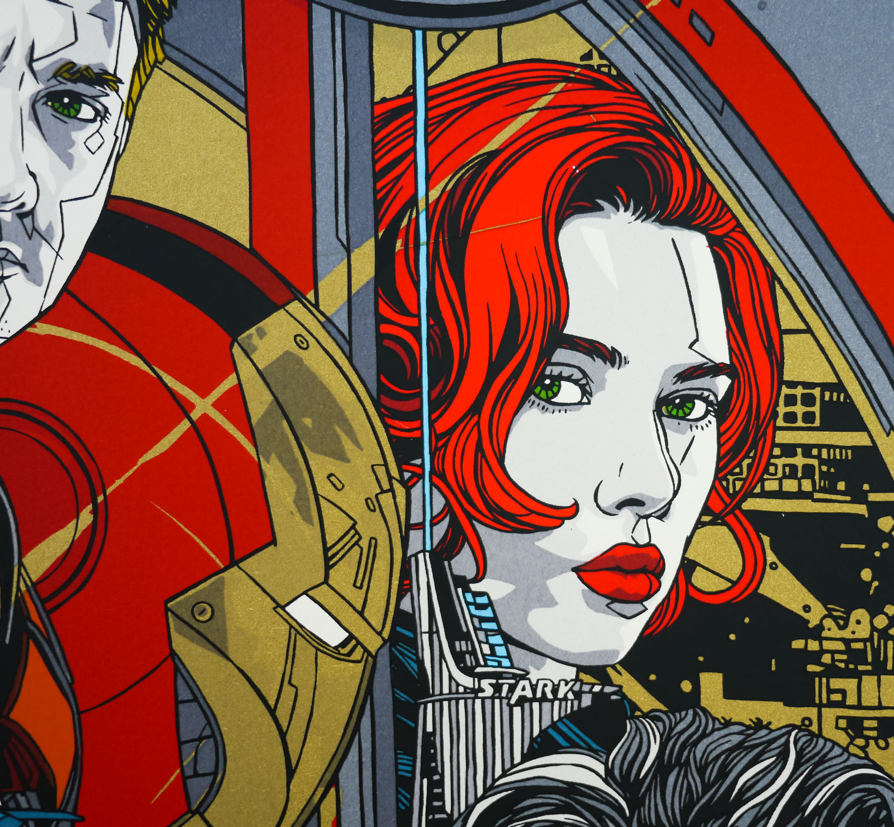
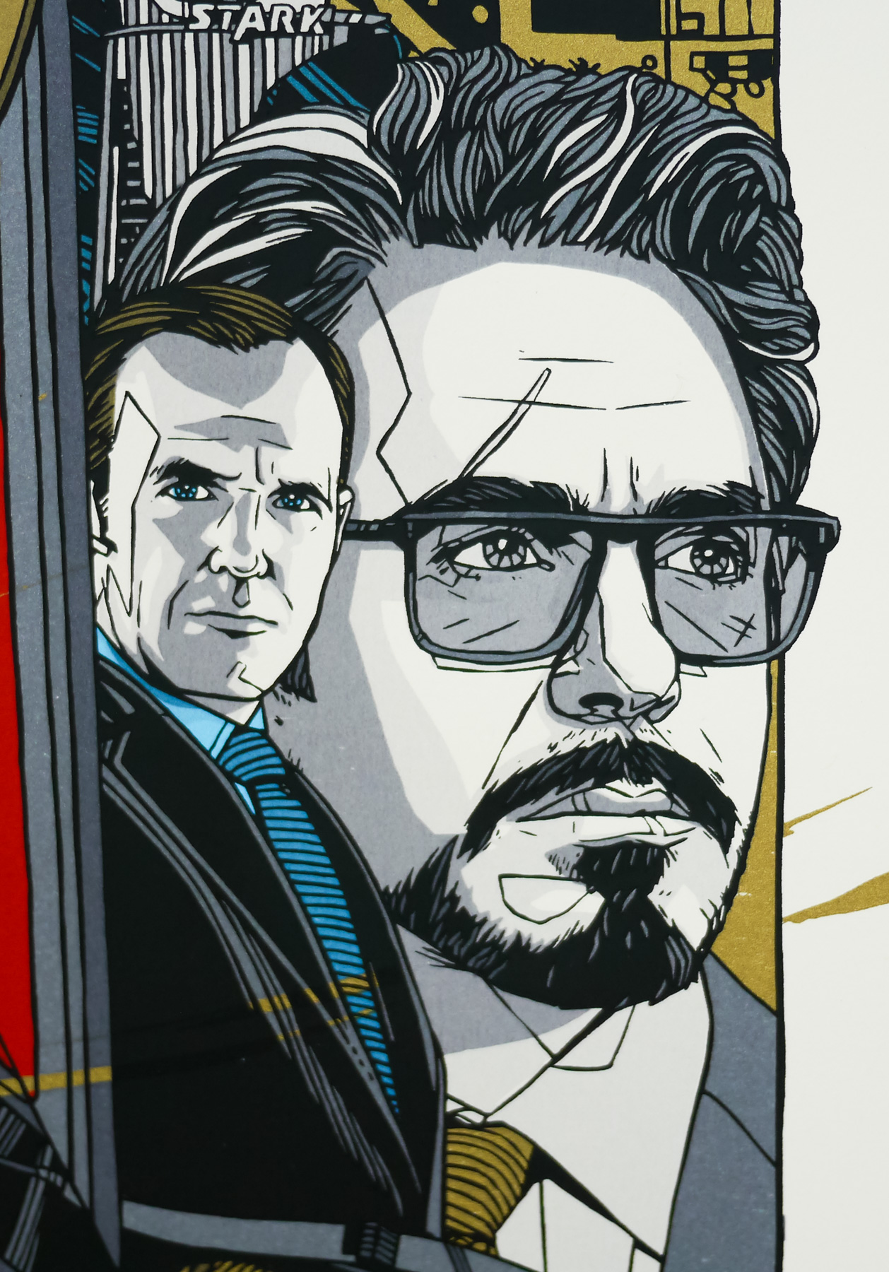
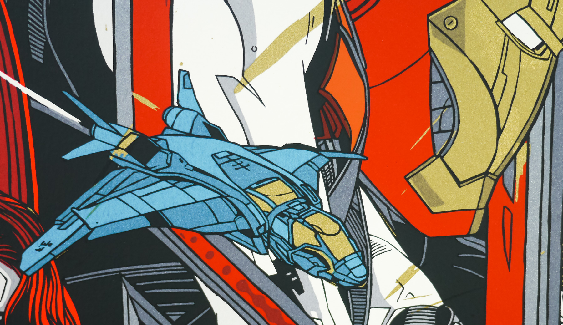
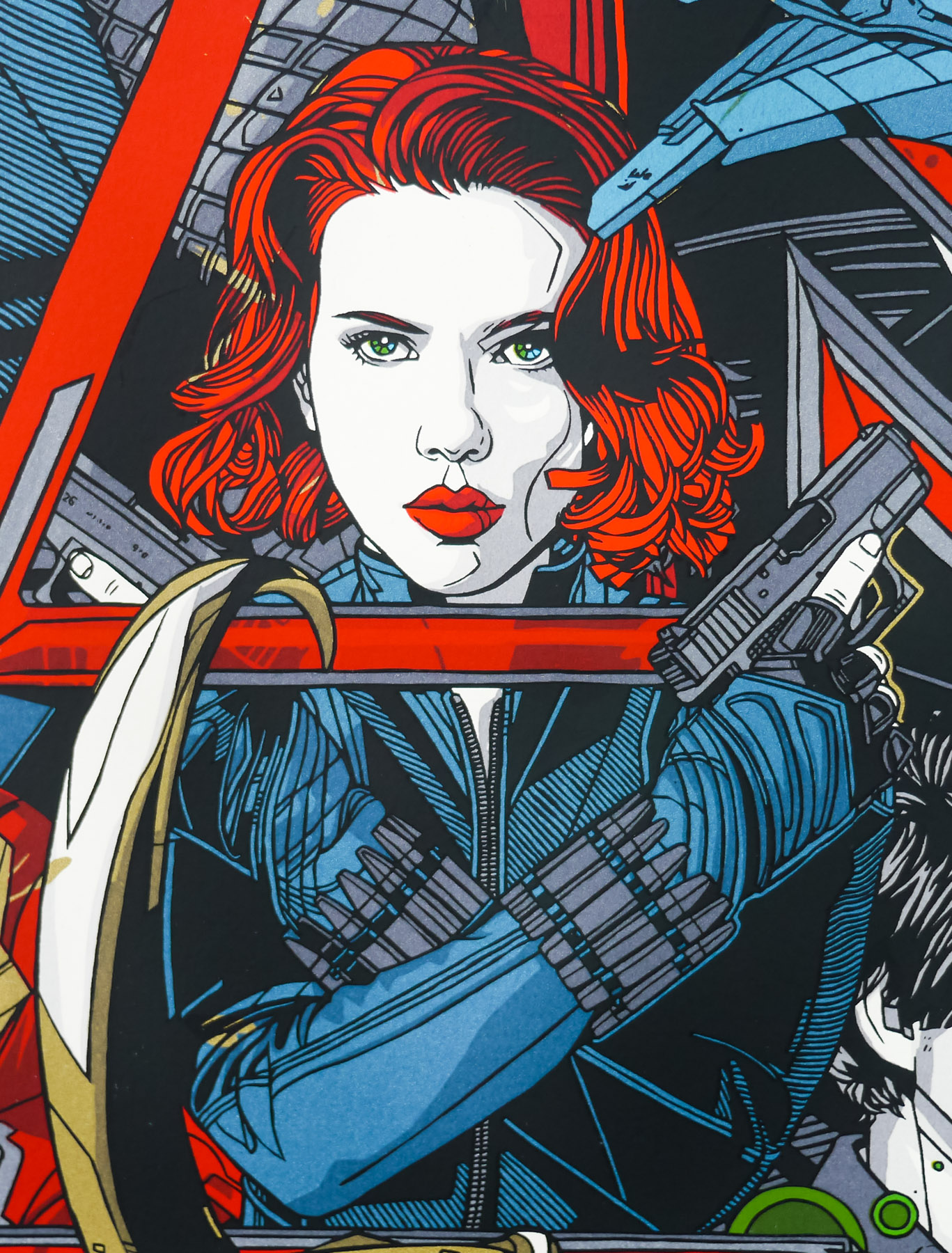
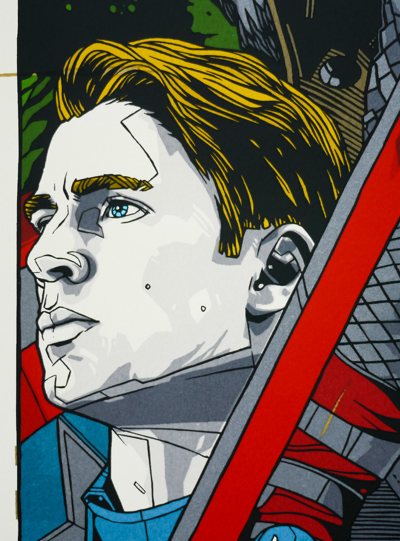
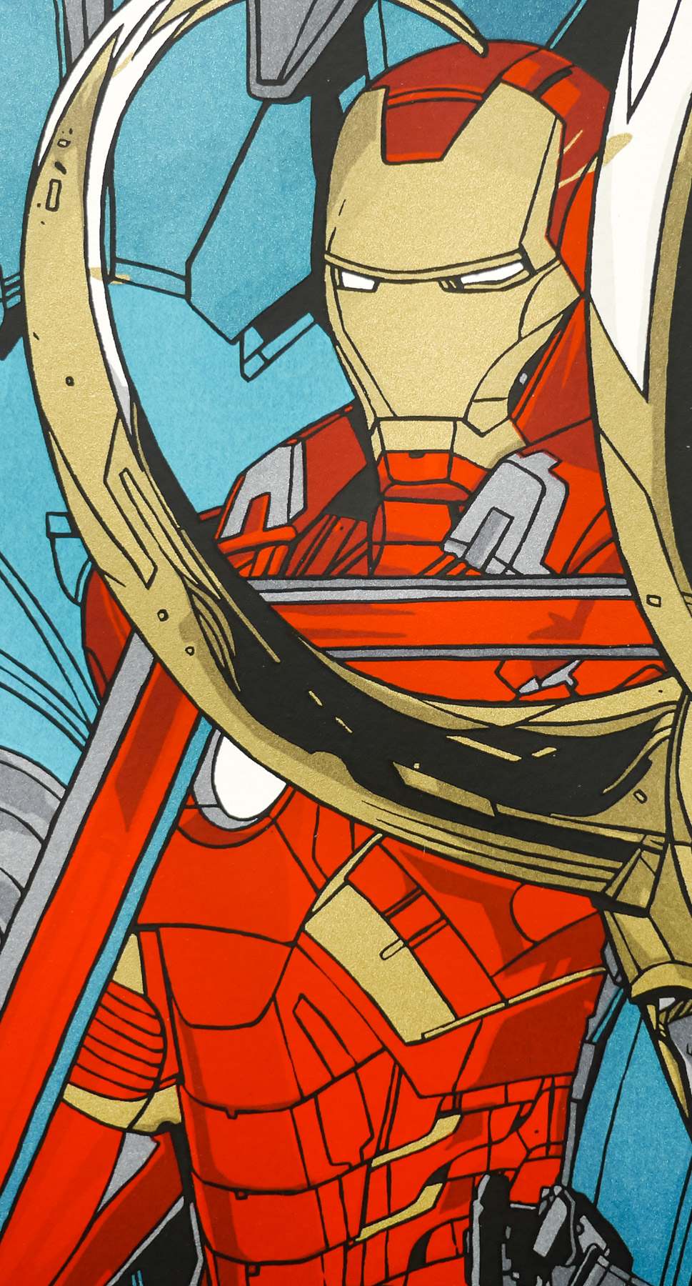
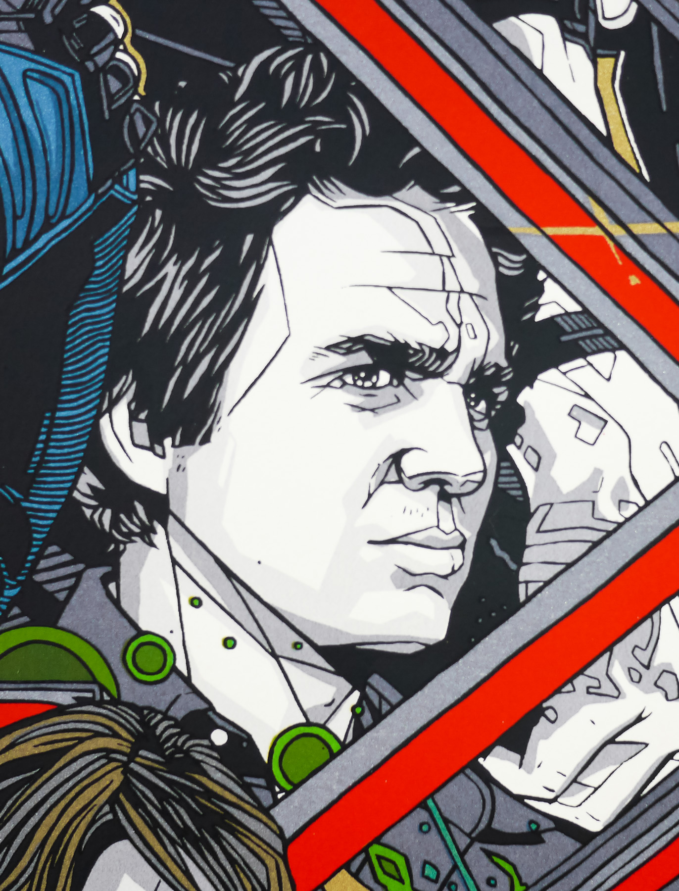
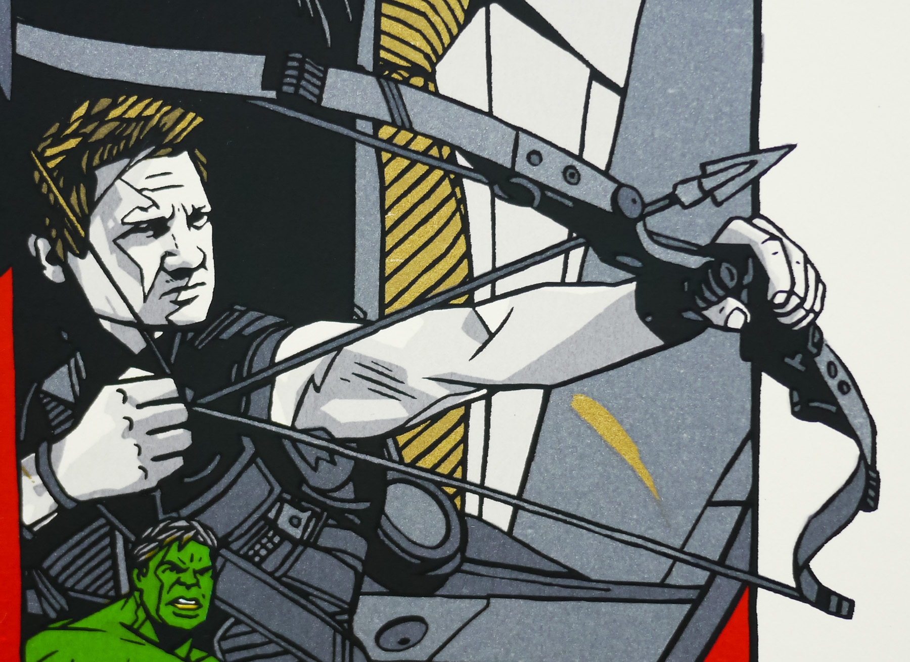
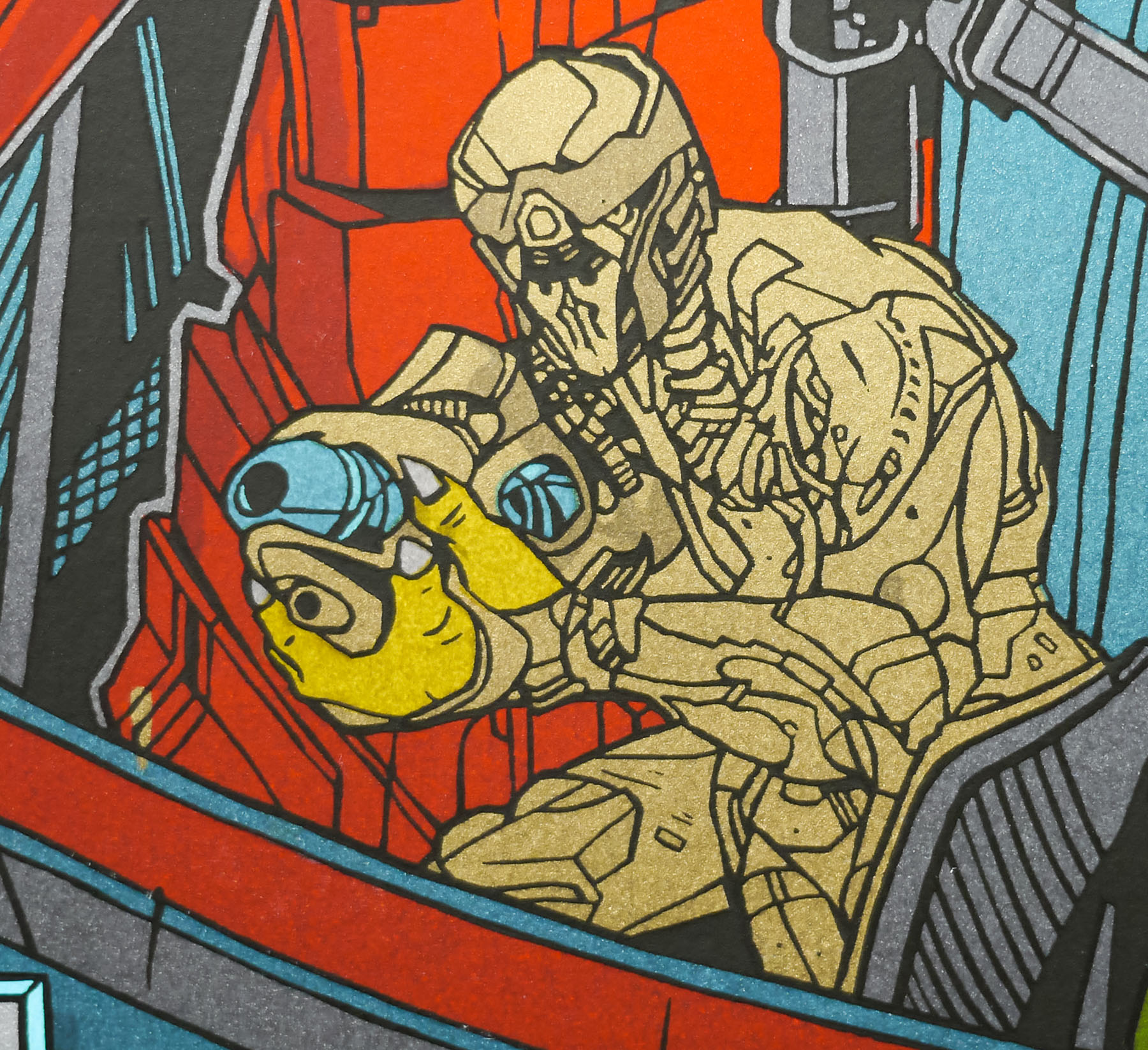
The team at Mondo assembled a roster of its most celebrated artists to turn in designs for each of the main characters and these were released over the period of a week in April 2012, beginning with Olly Moss‘ portrait of Black Widow and ending with Thor by Martin Ansin and Iron Man by Kevin Tong. A few weeks later, on the eve of the film’s release, Mondo then revealed a print featuring all of the characters that was designed and illustrated by arguably their most popular artist, Tyler Stout.
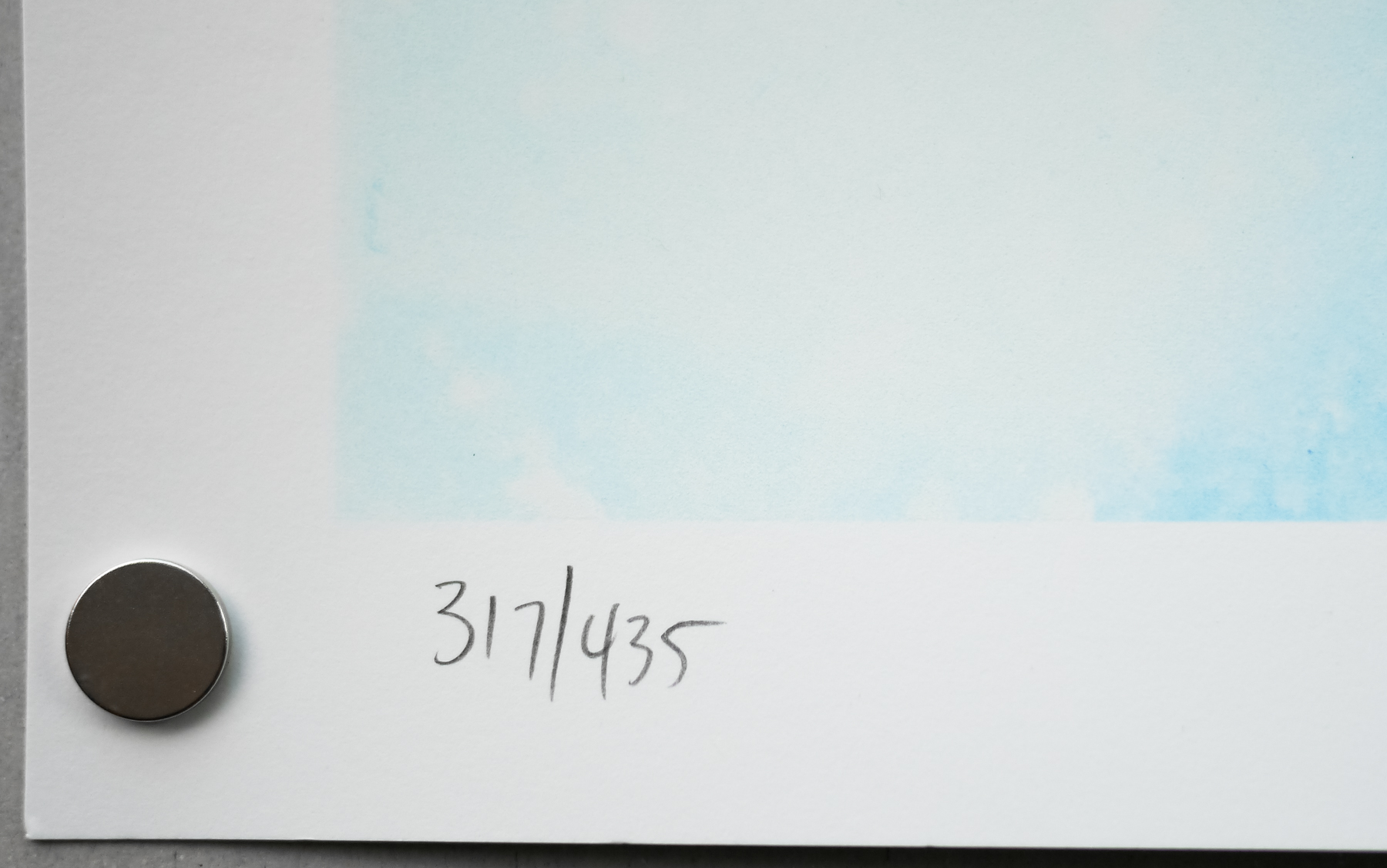
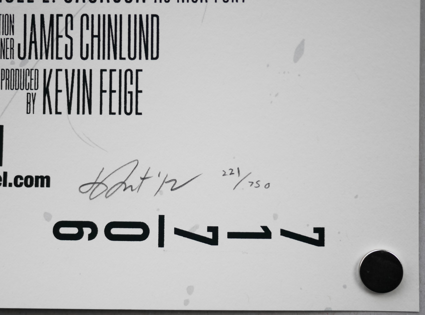
As usual, the print came in both regular and variant versions and, despite each having relatively high print runs, the poster sold out within seconds of going on sale on Mondo’s webshop. I was lucky to snag a copy of the print via Tyler’s ‘lottery’, which he now holds on his own site shortly after each print release sells out via Mondo.
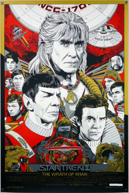
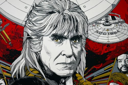
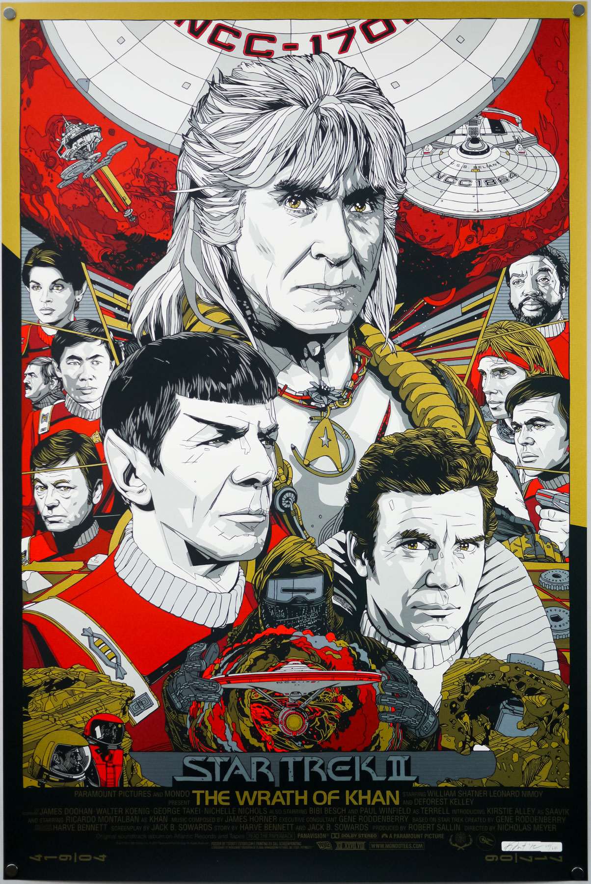
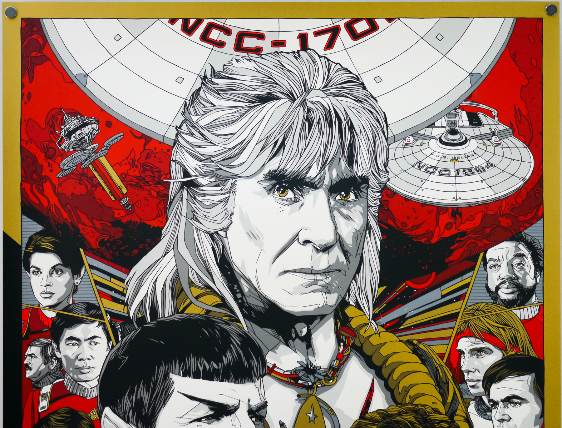
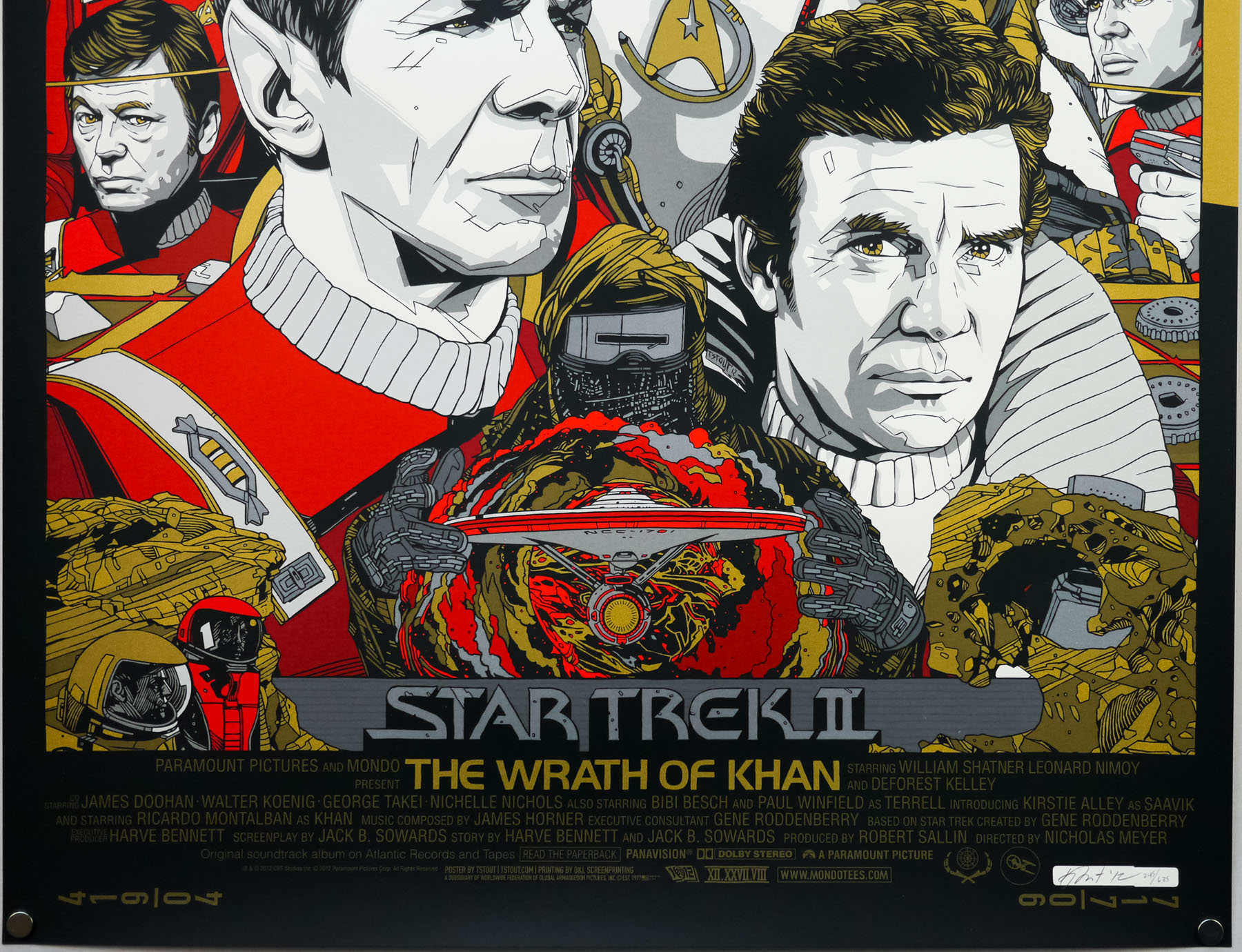
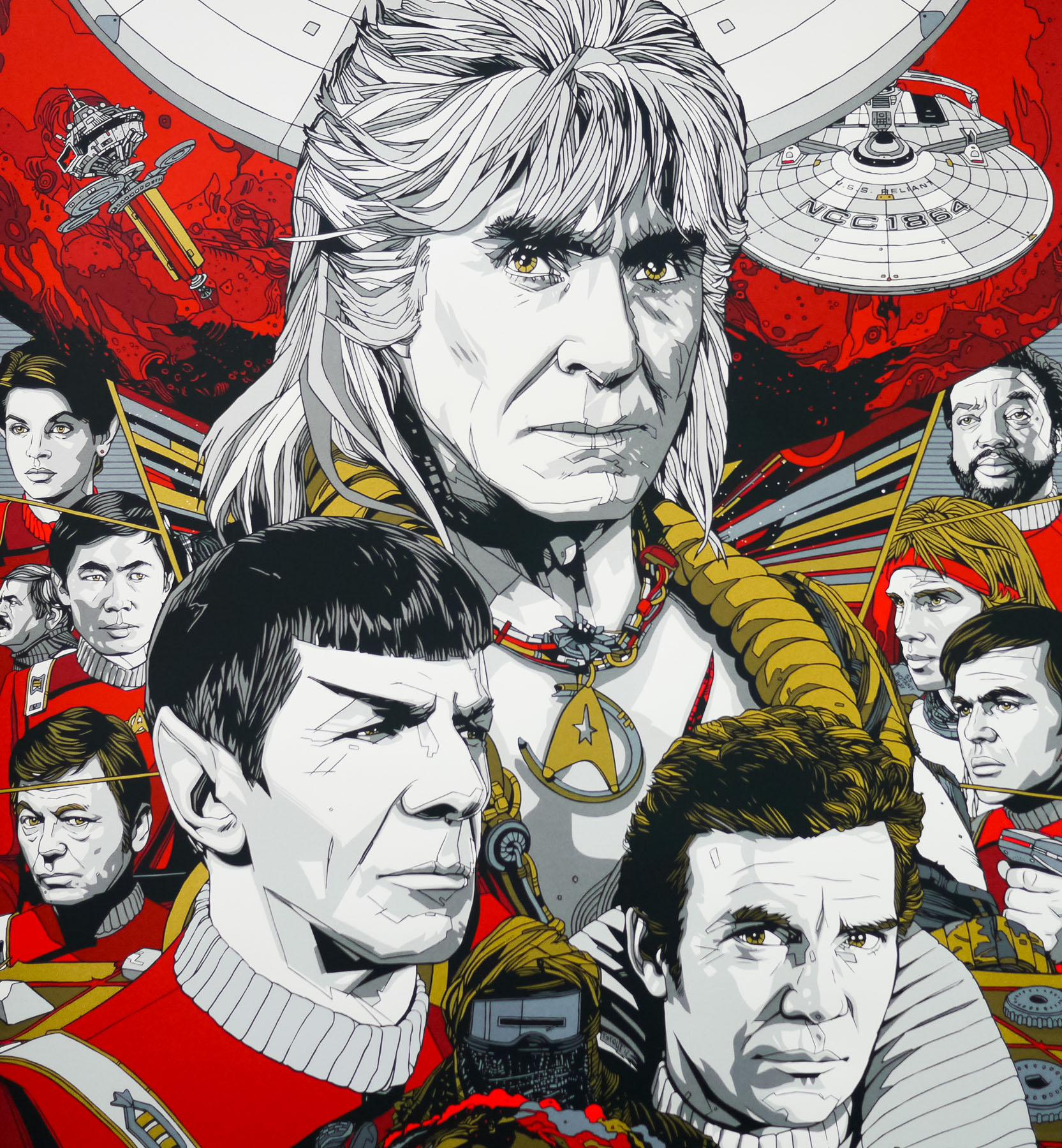
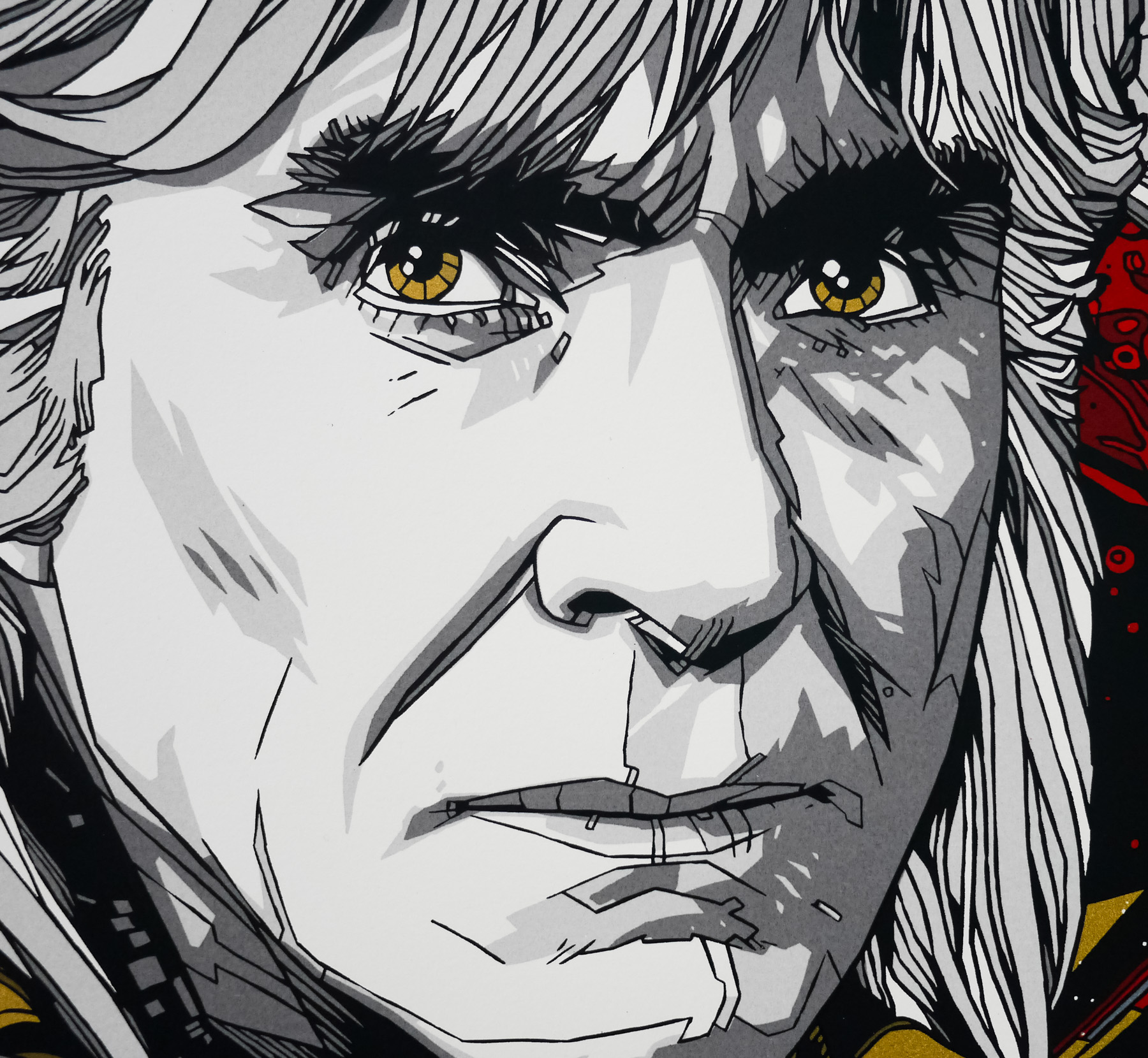
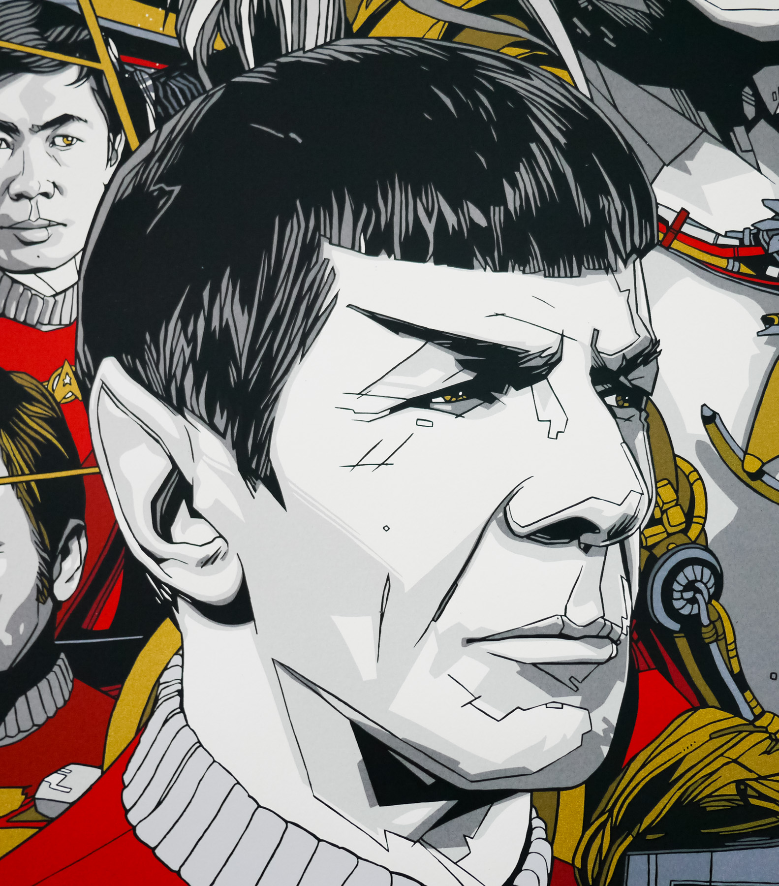
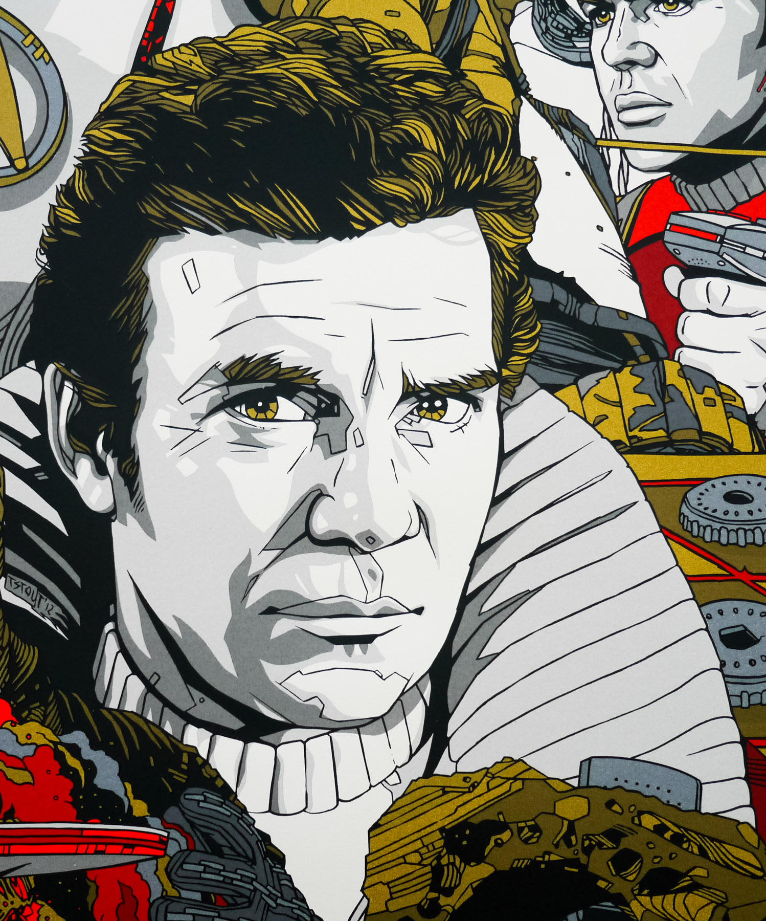
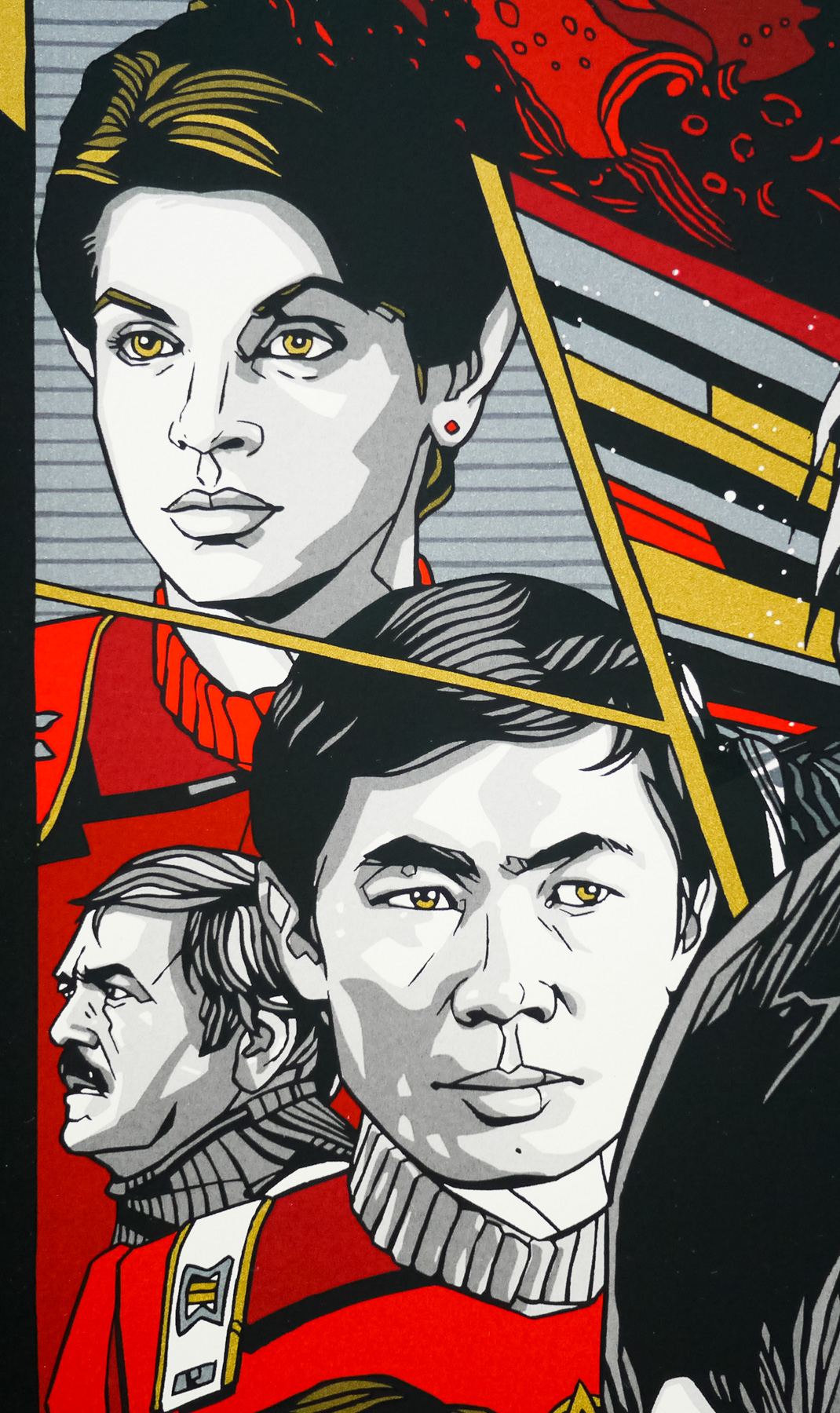
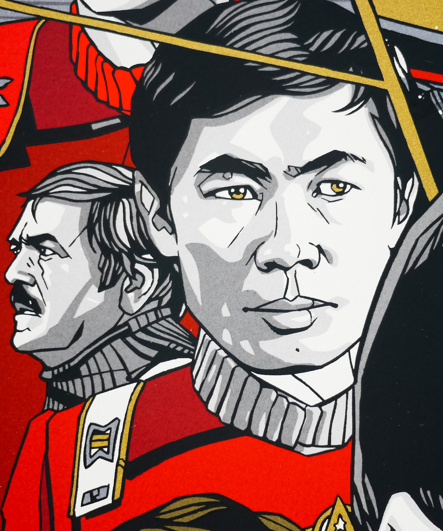
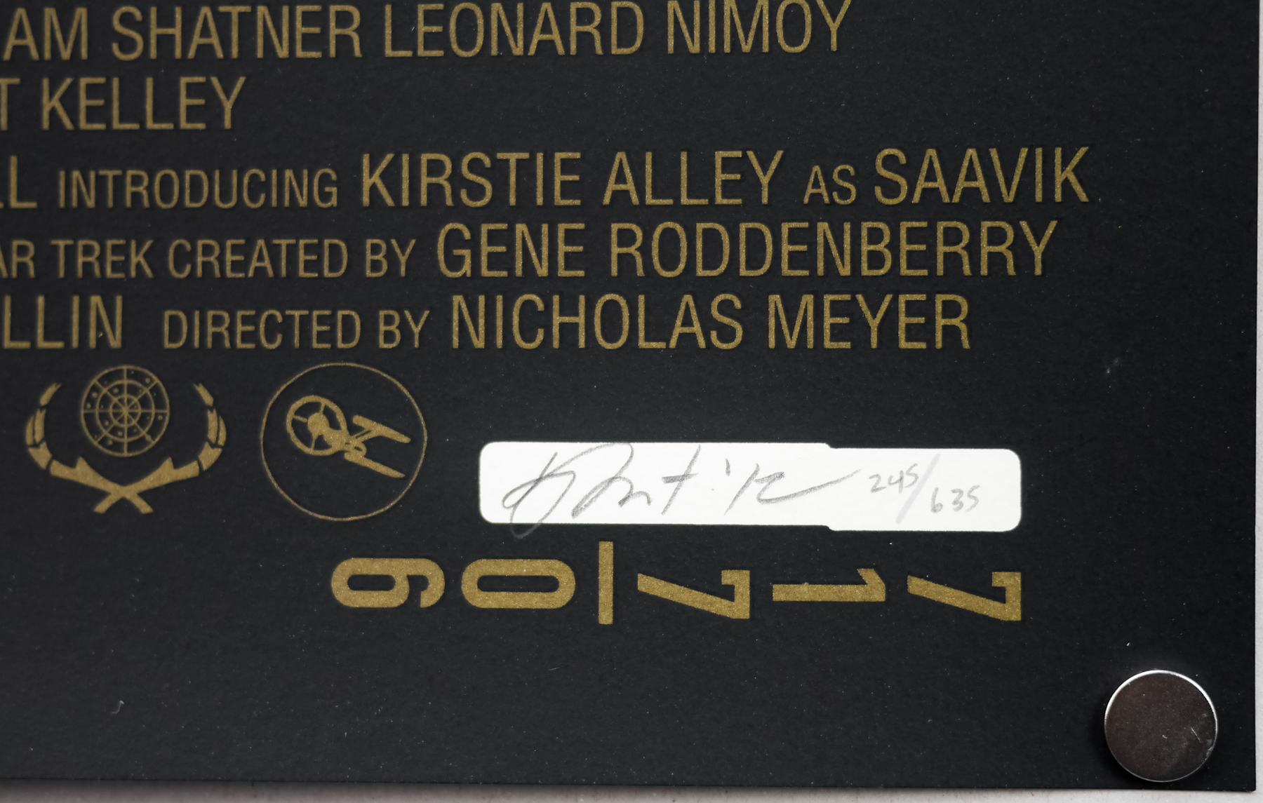
Whilst adding the regular version to the Film on Paper collection I wanted to interview the man himself about the creation of the poster as I’ve done previously with his work on the prints for Akira, Kill Bill and Star Trek II: The Wrath of Khan. The interview can be read in full by clicking here.
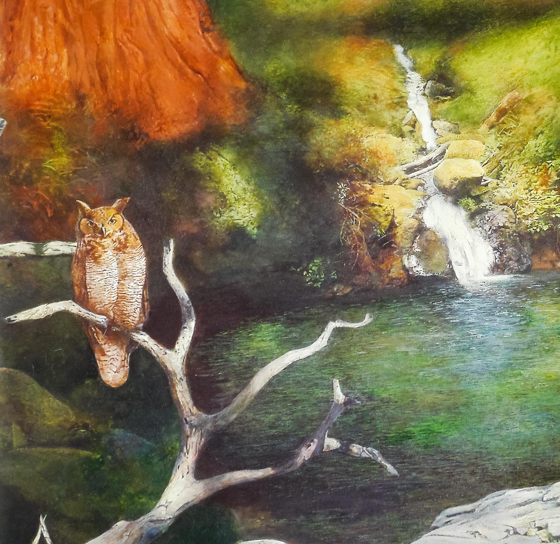
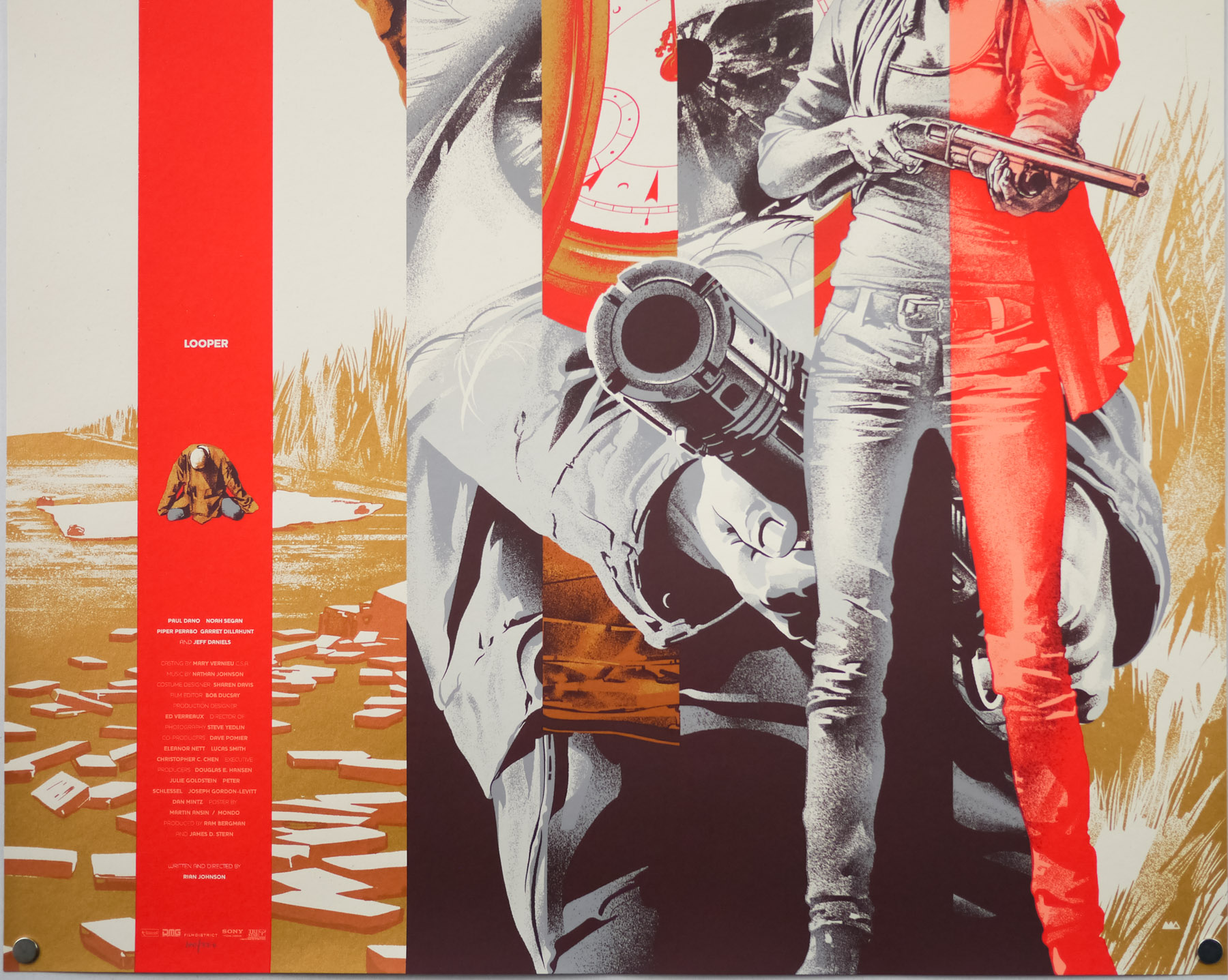
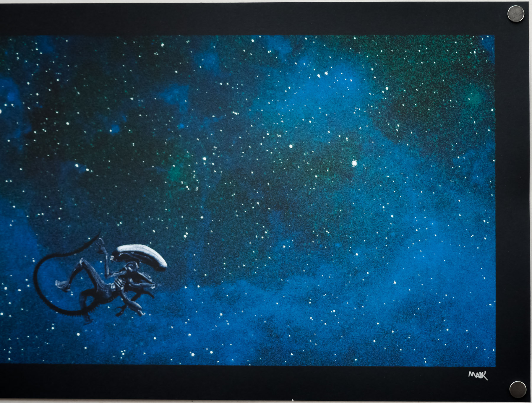
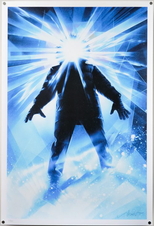
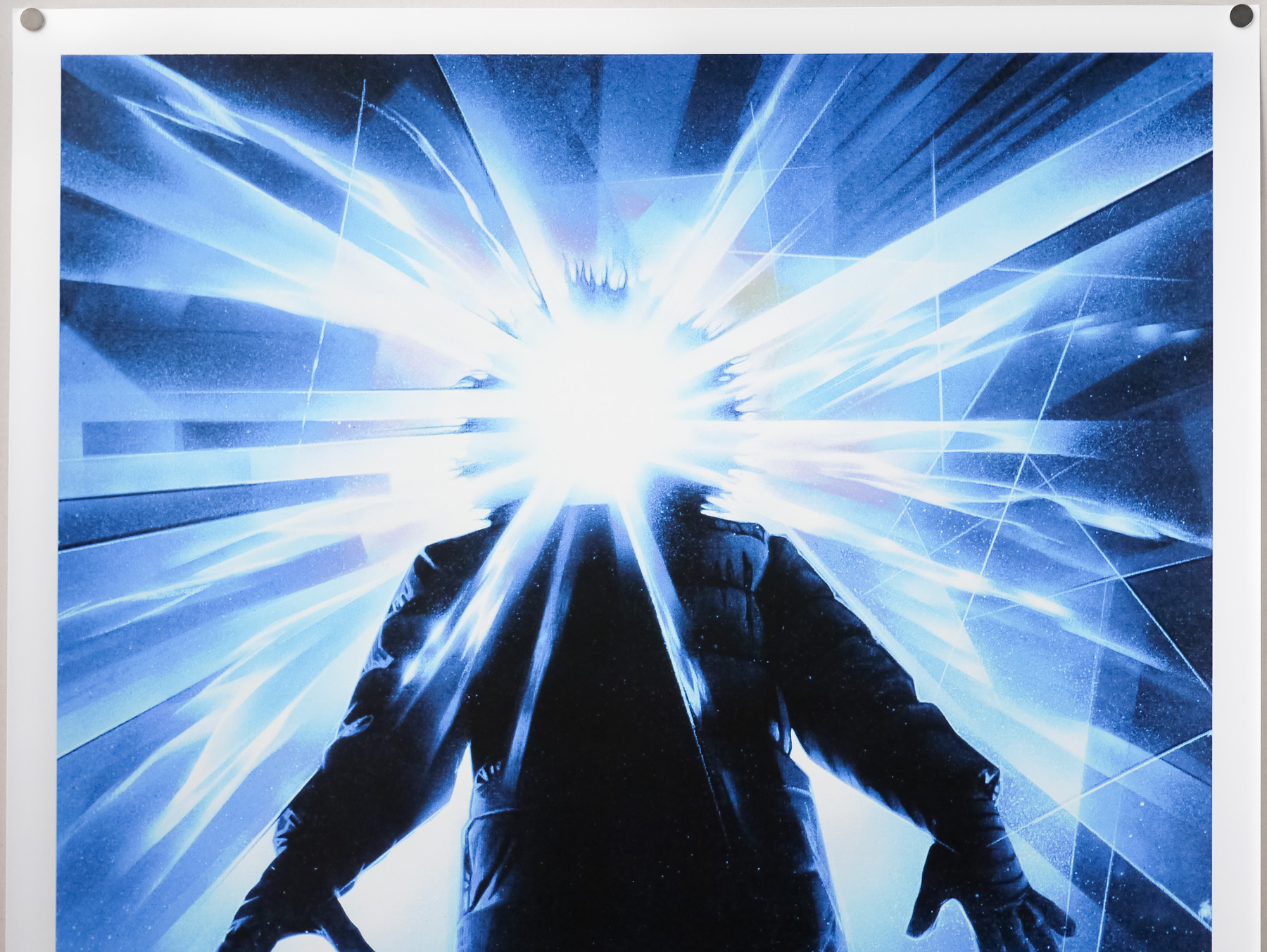
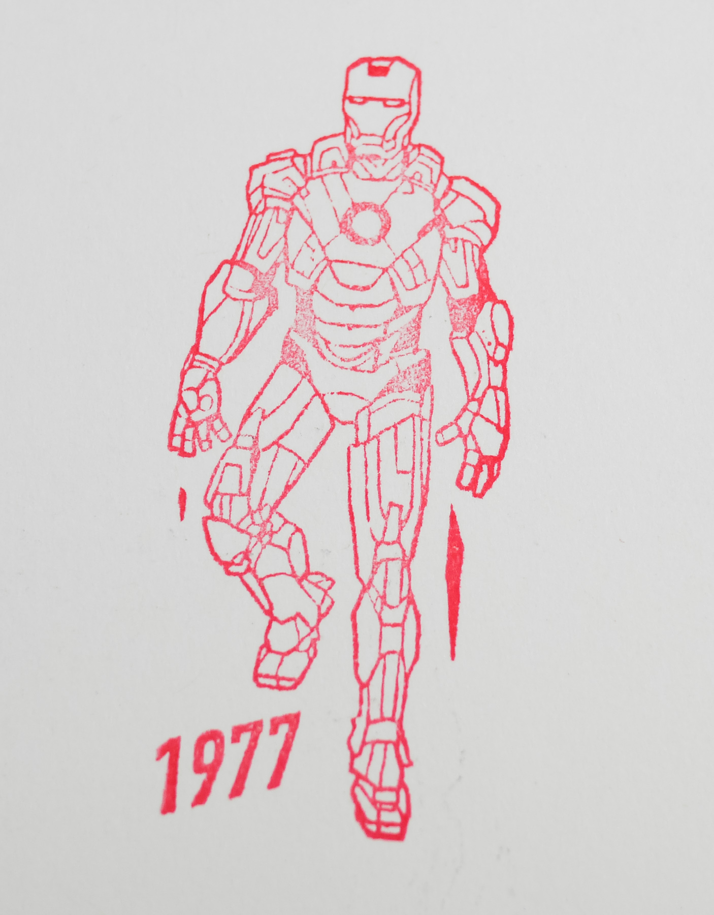
Note that the final image of Iron Man is stamped on the back of the print.