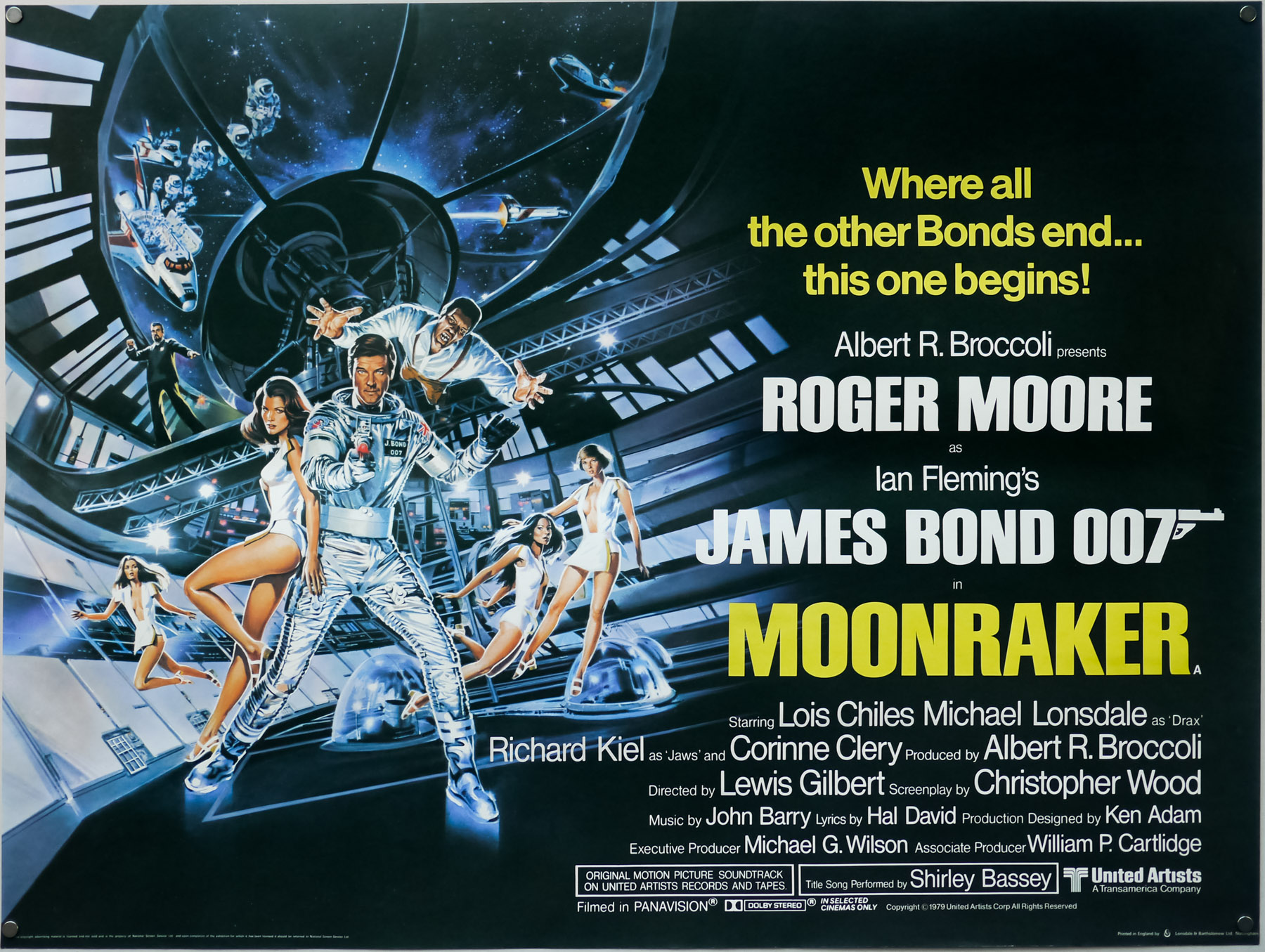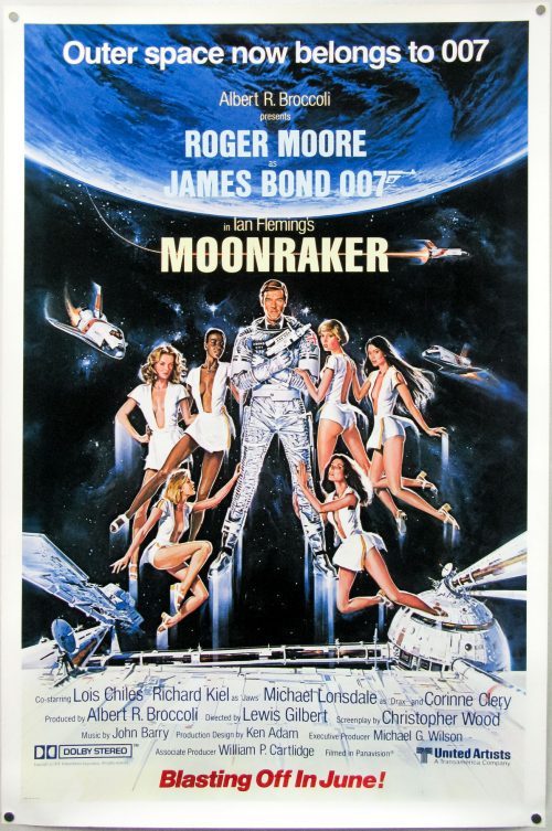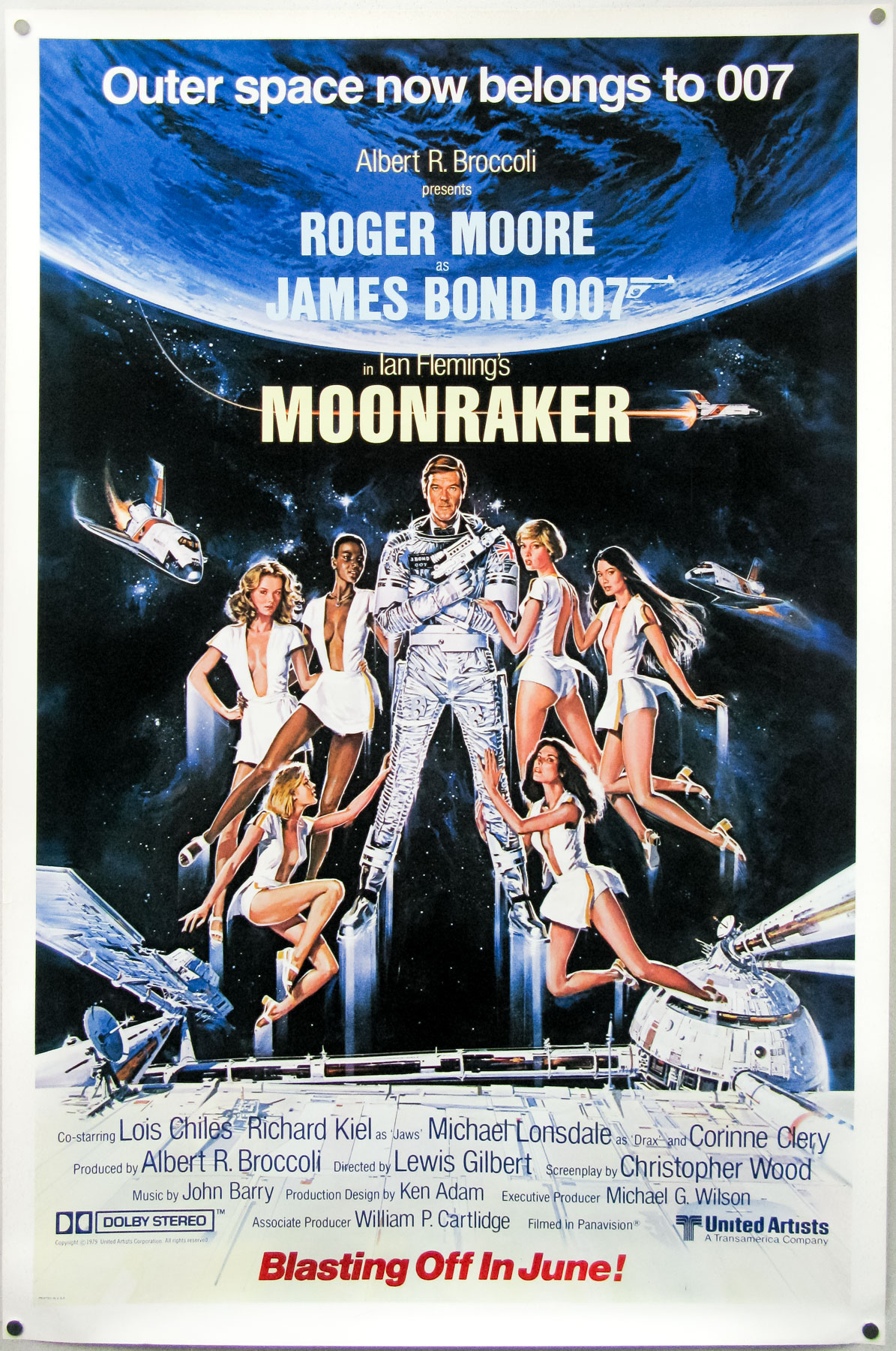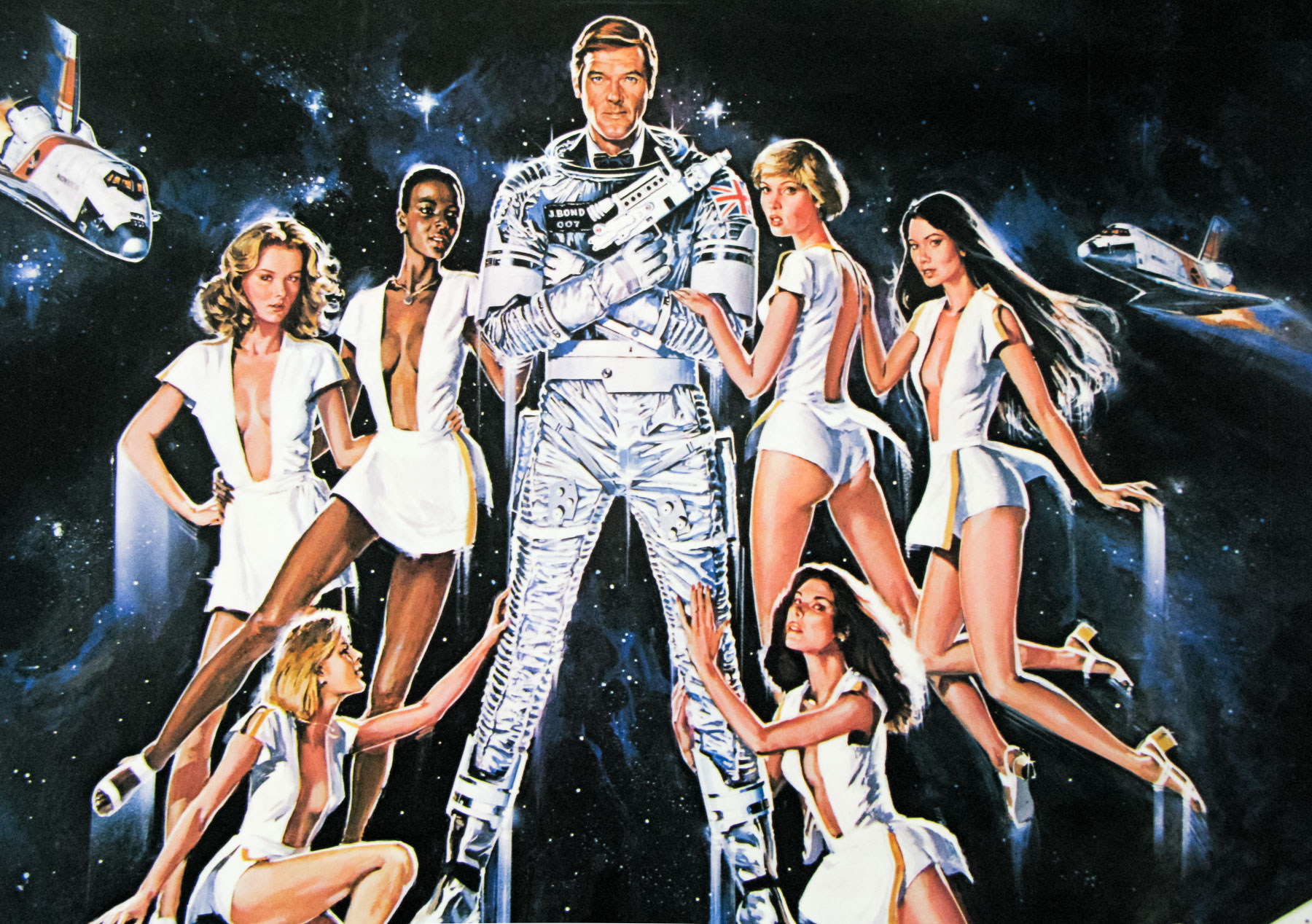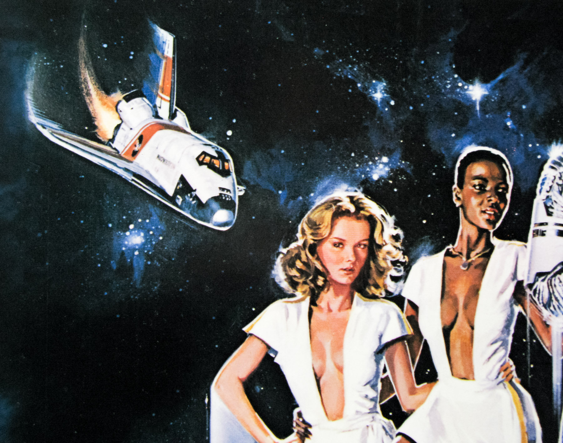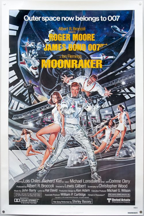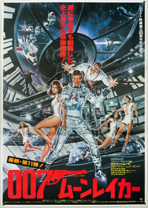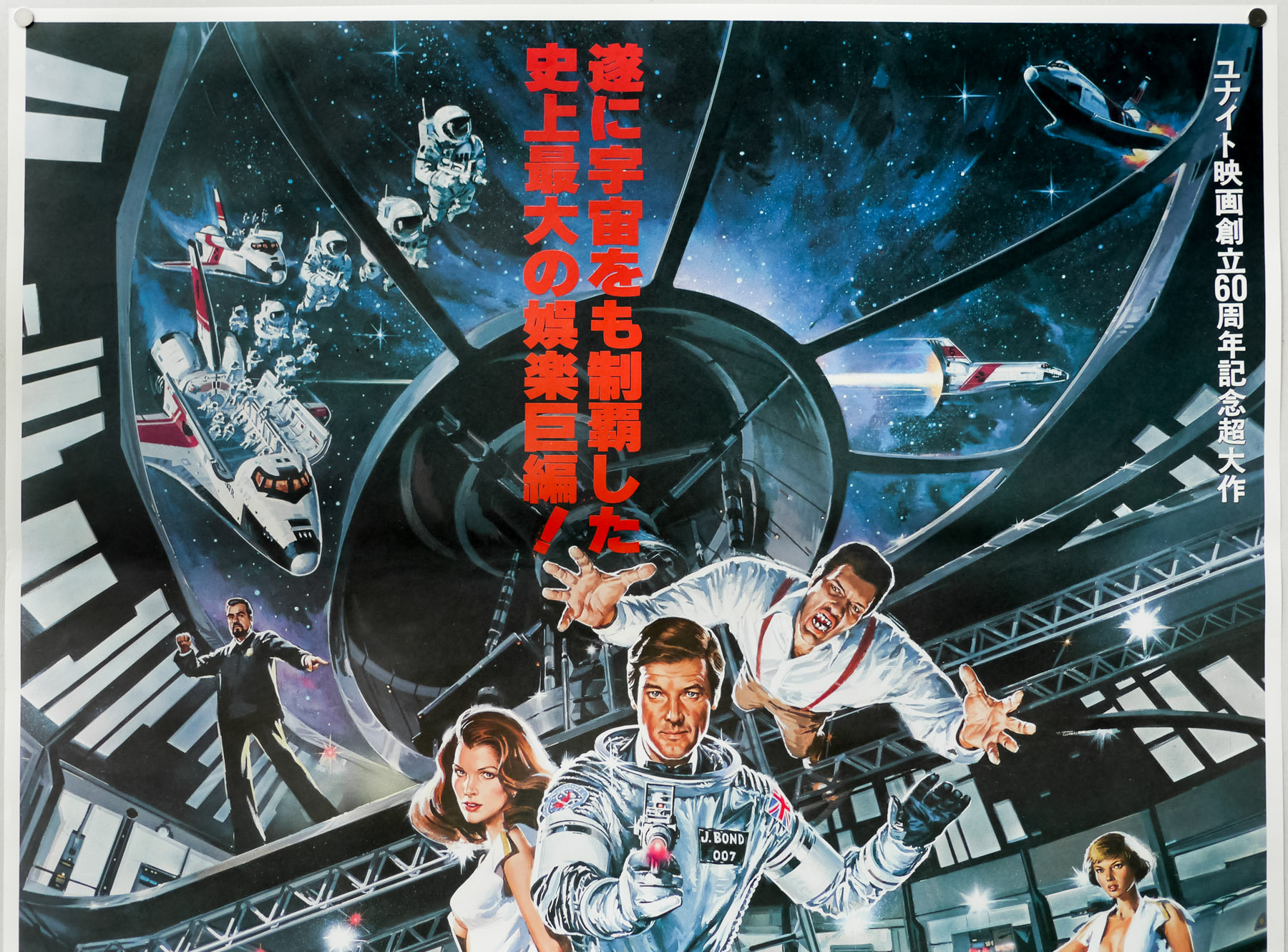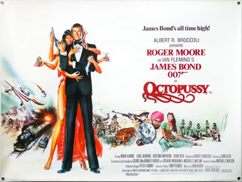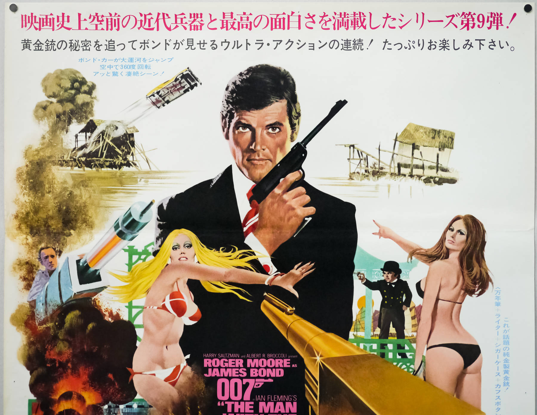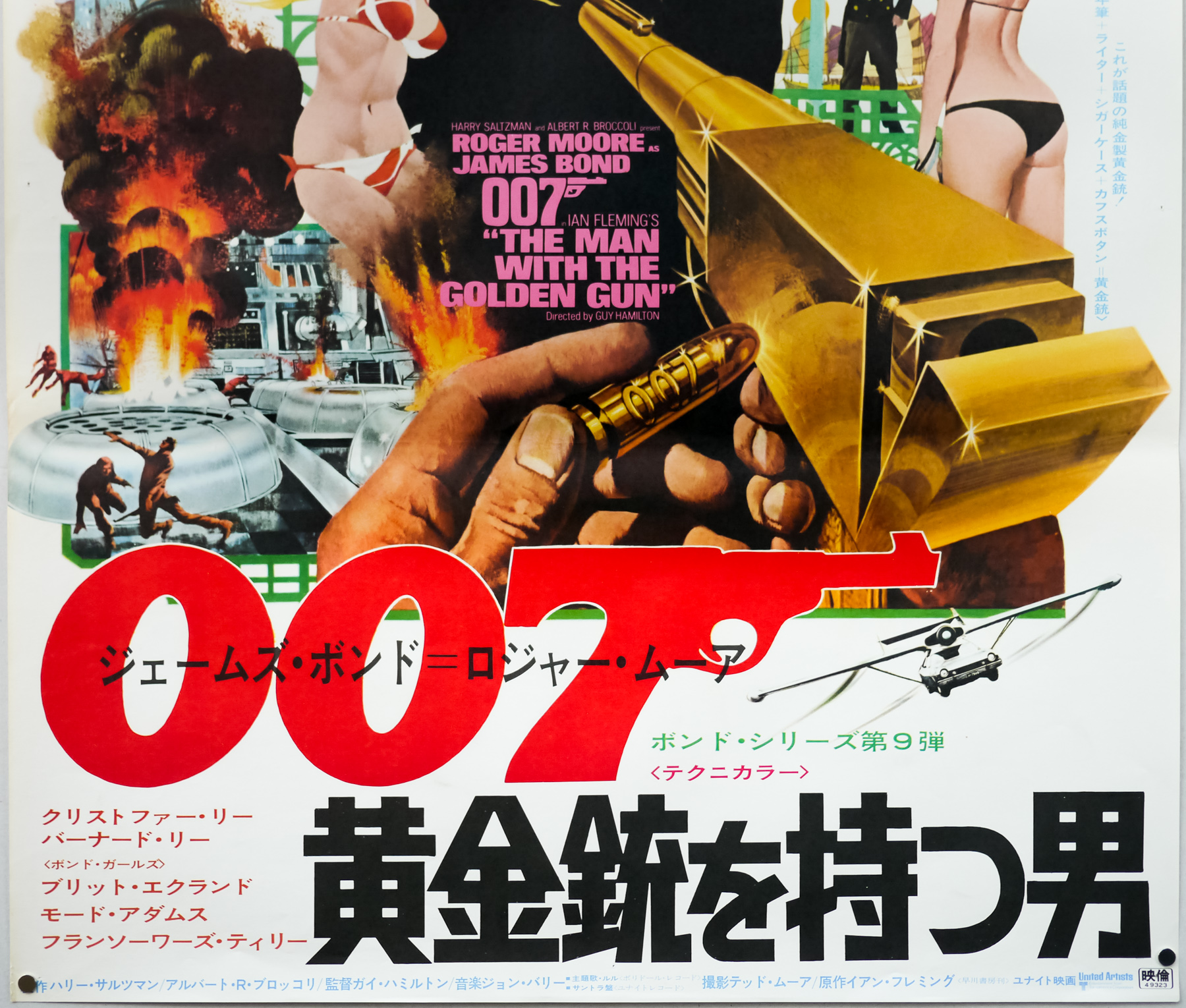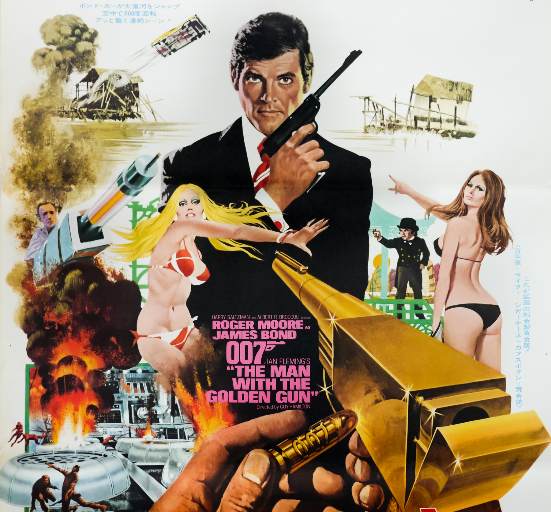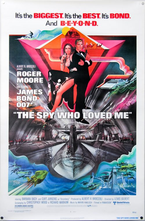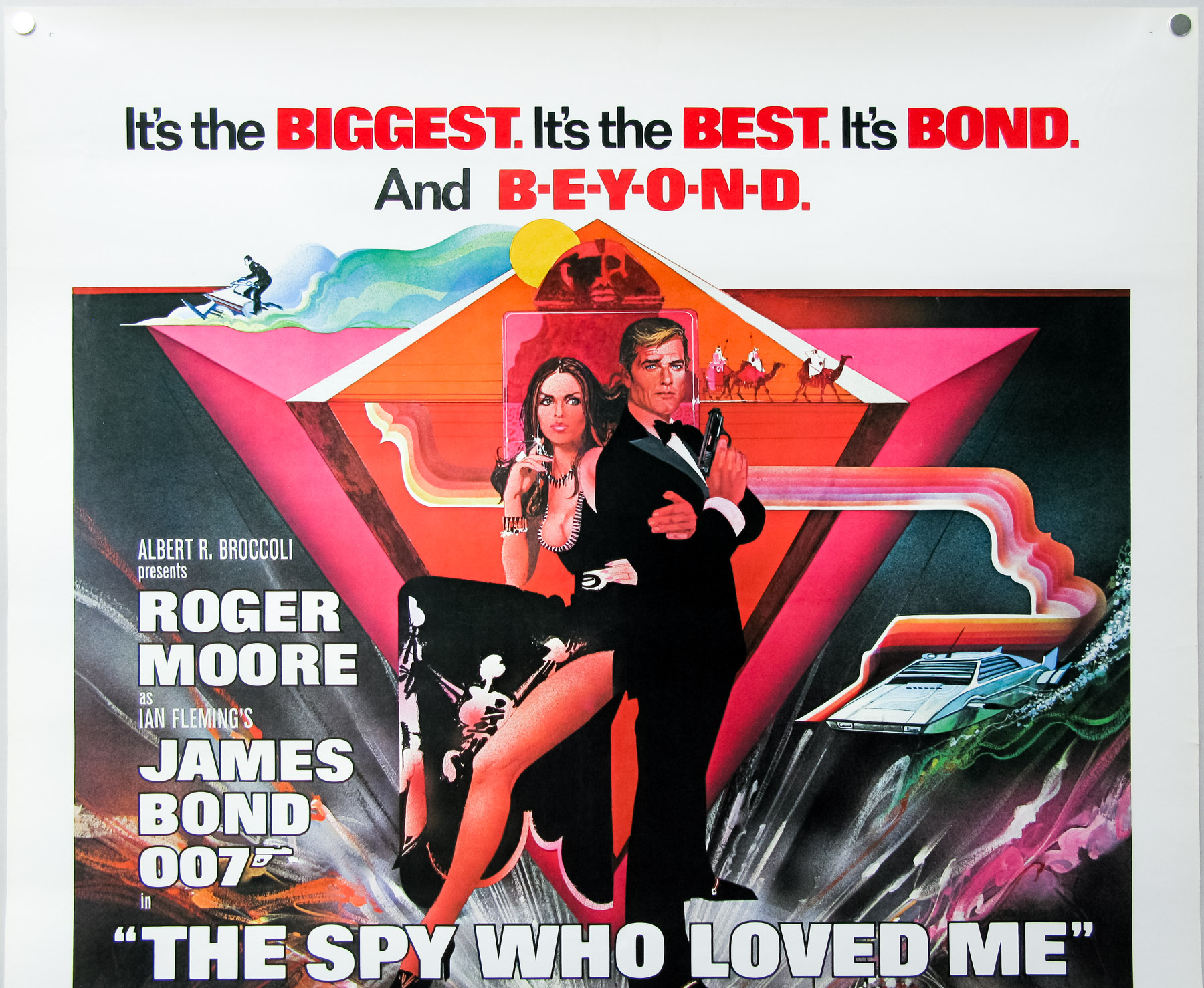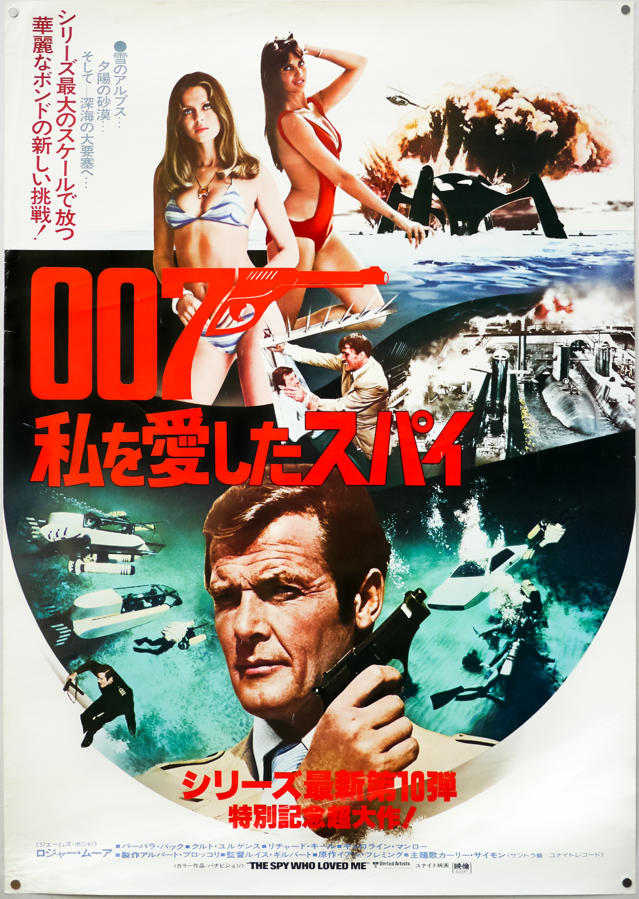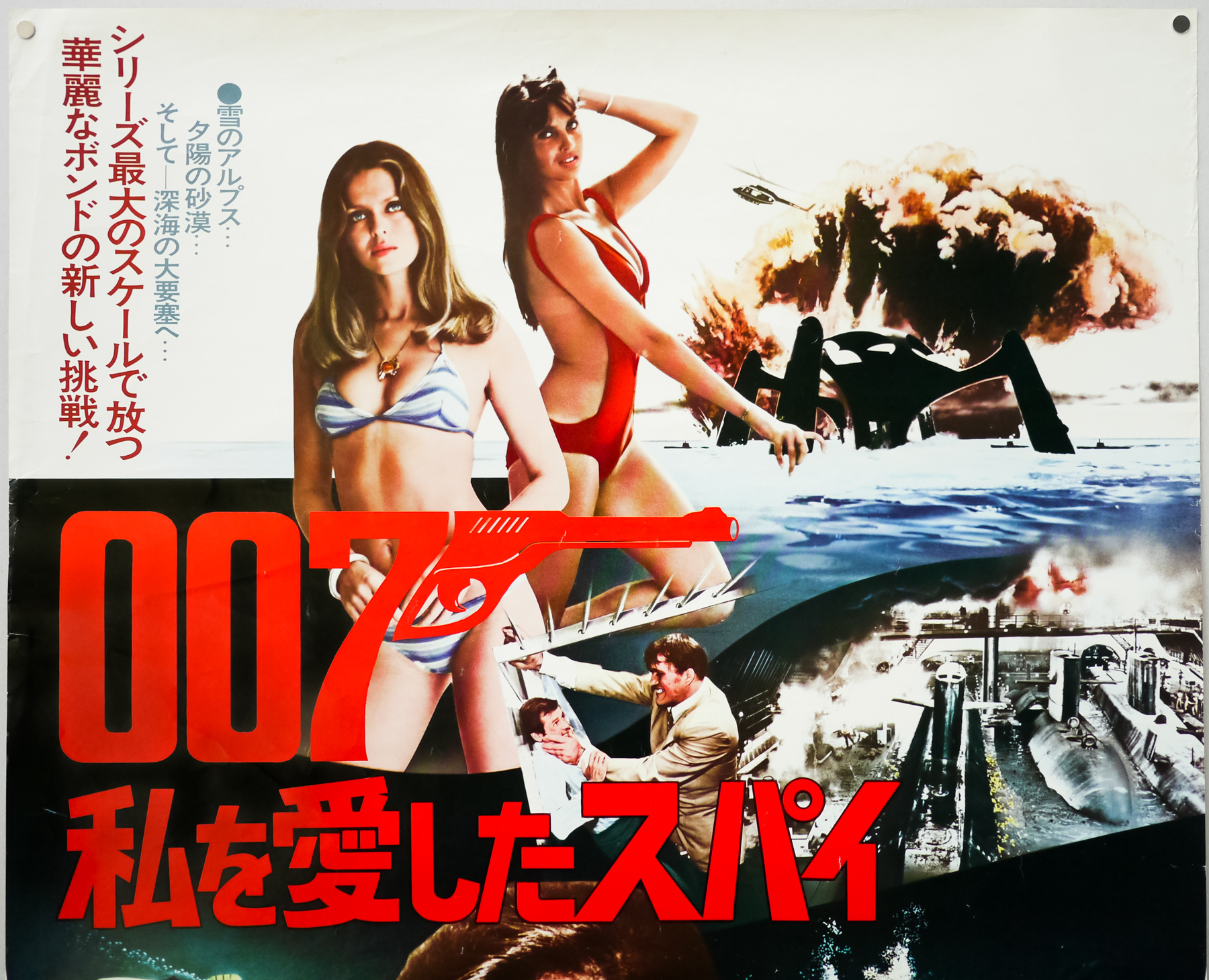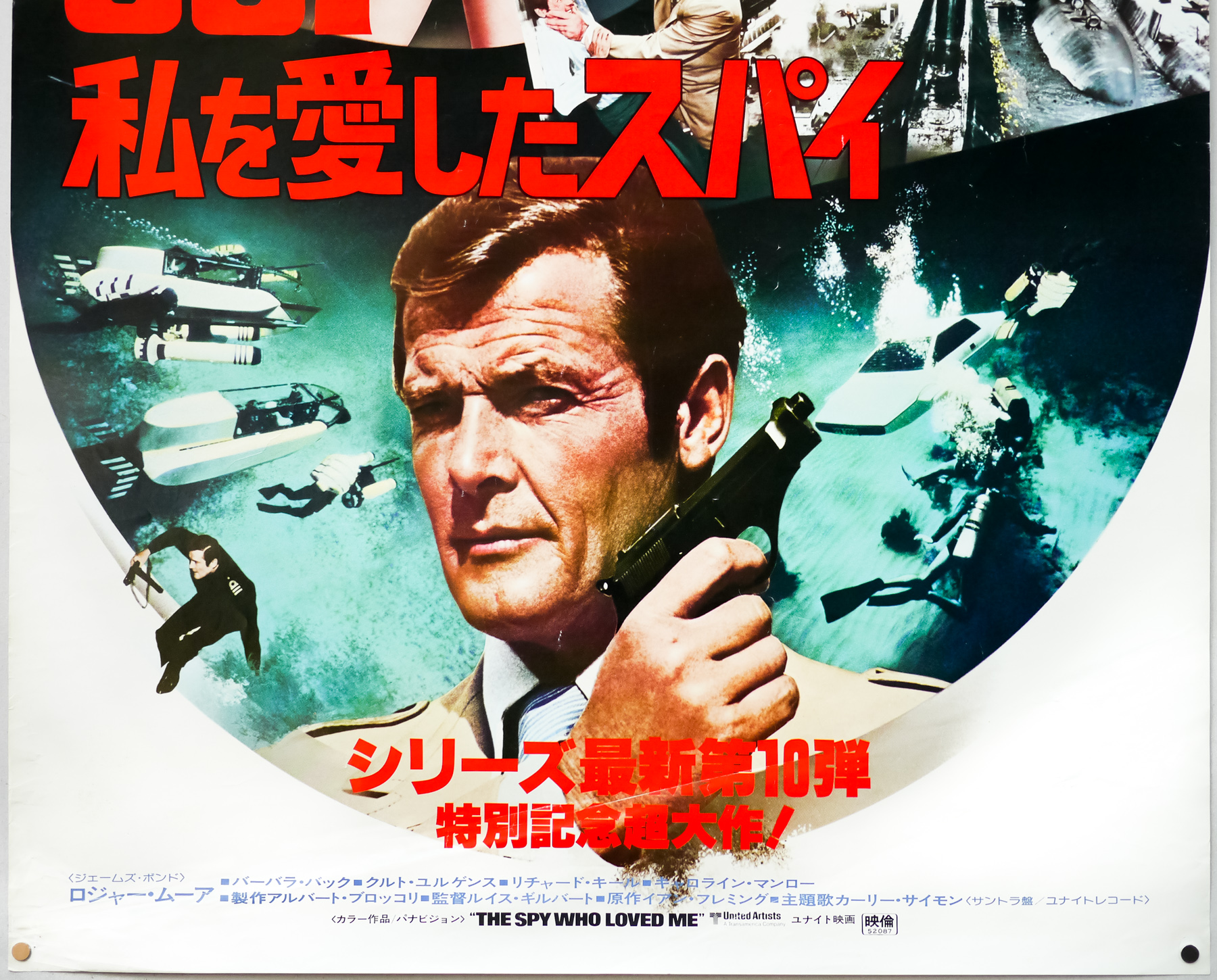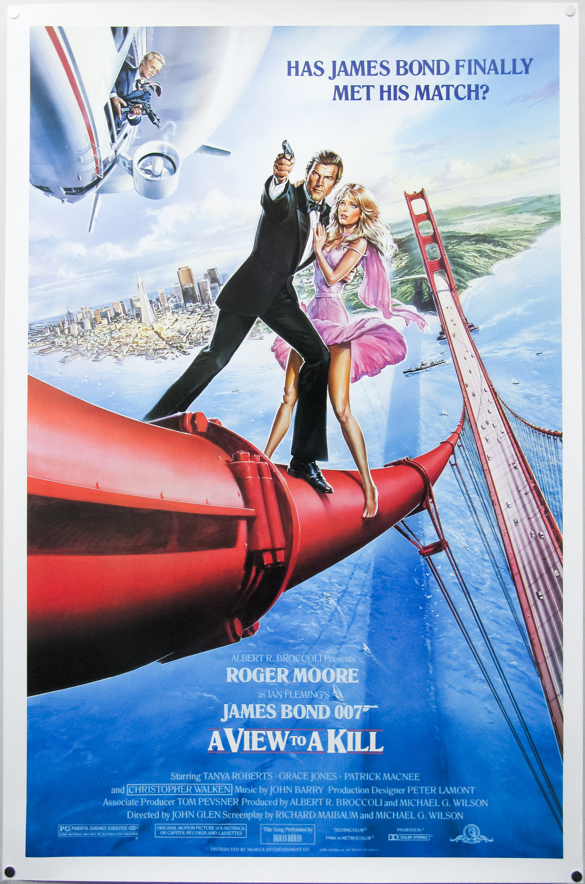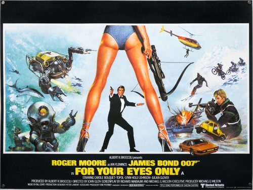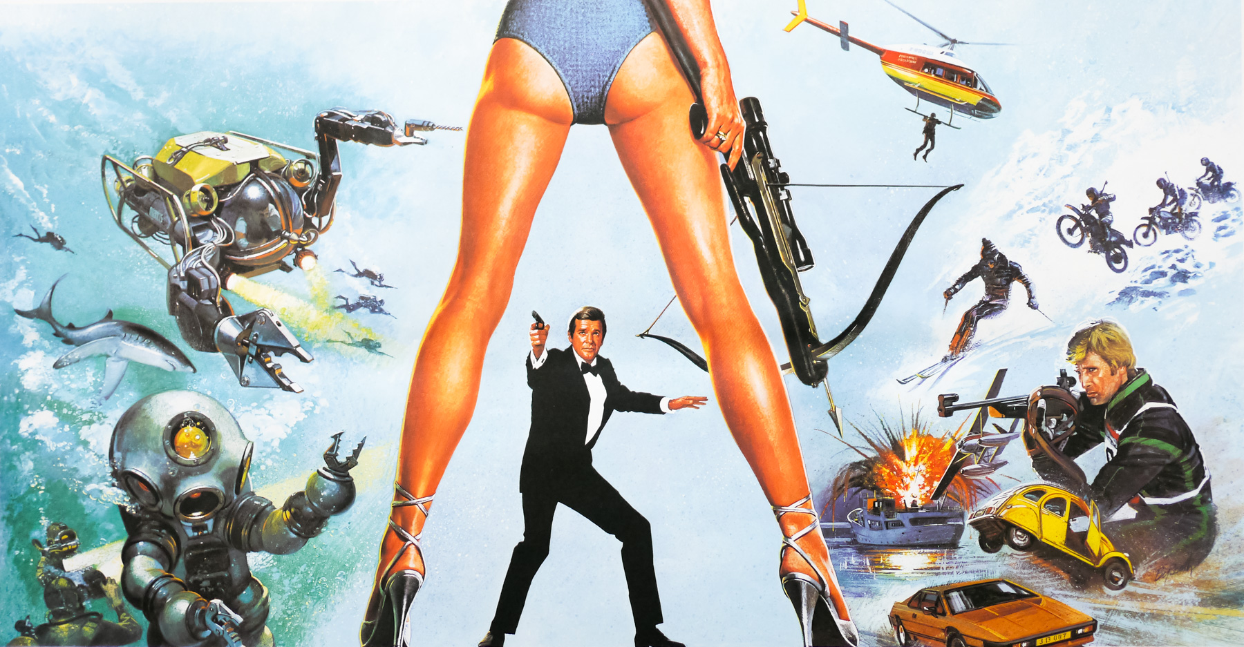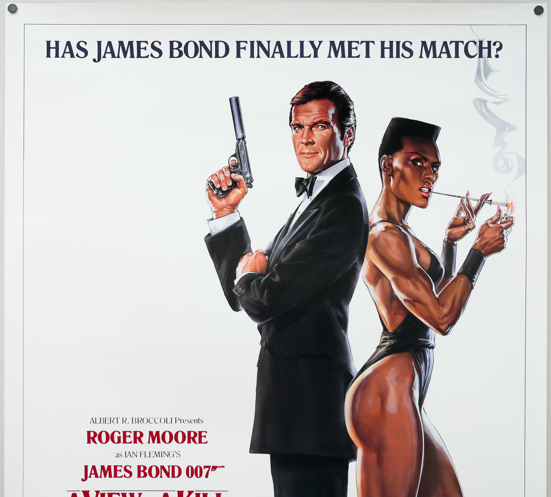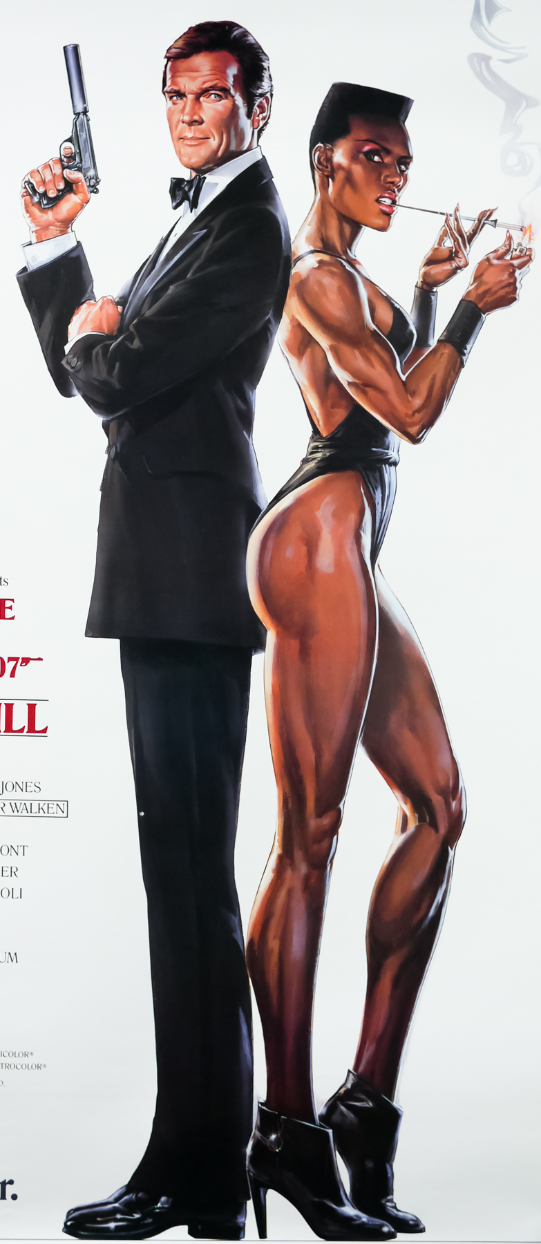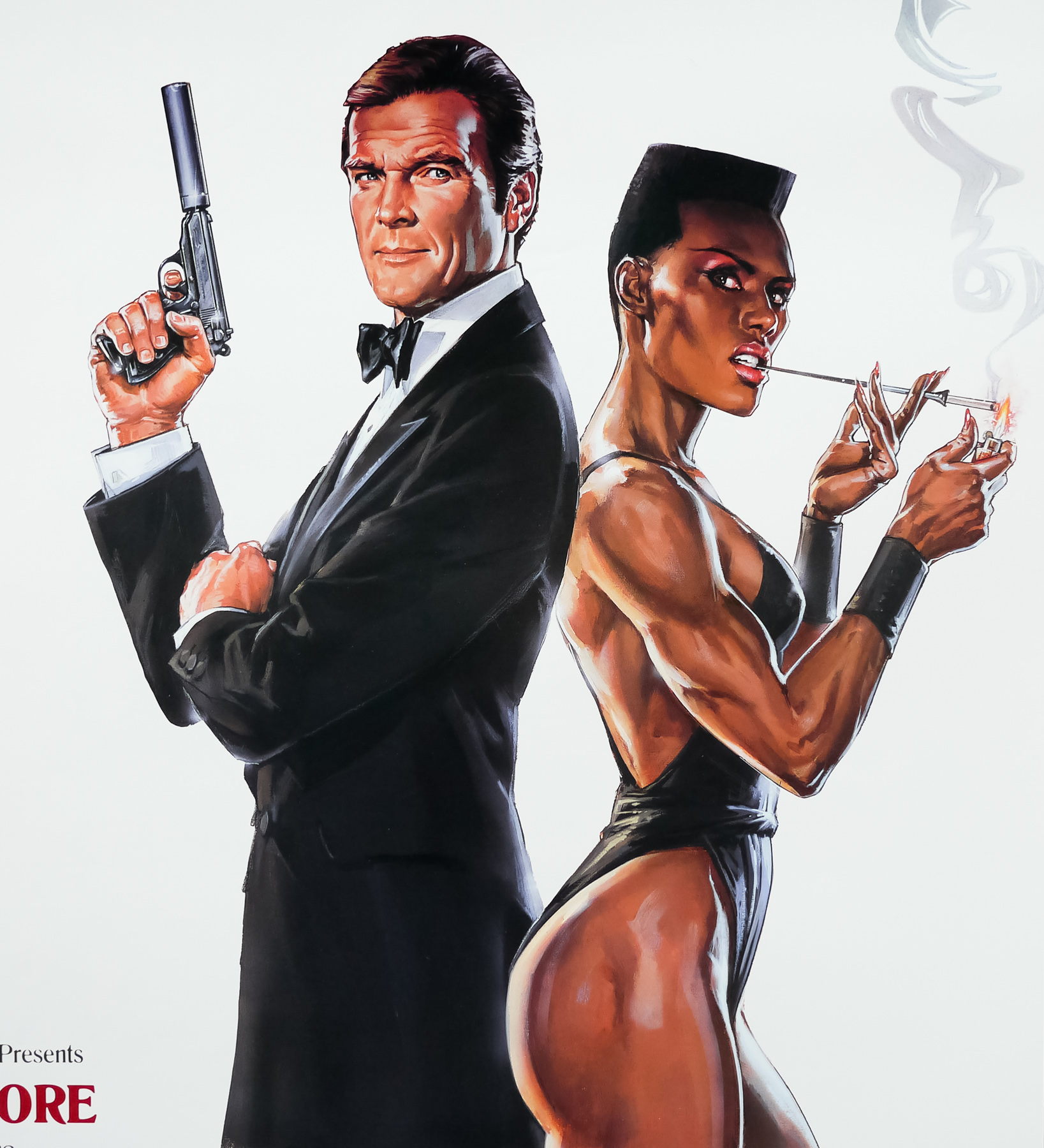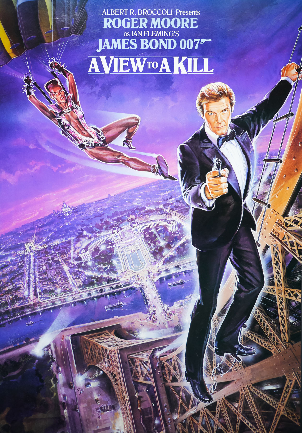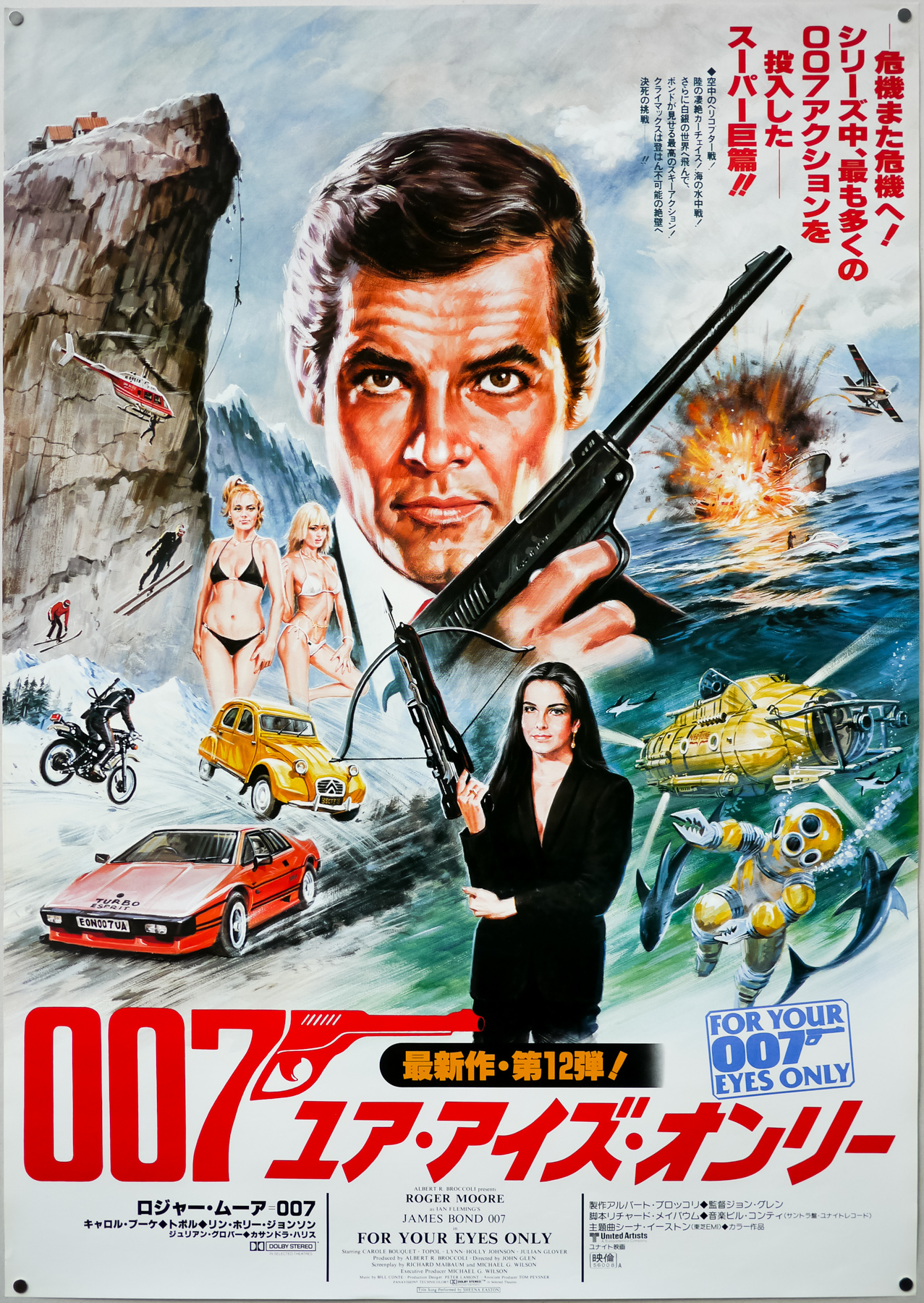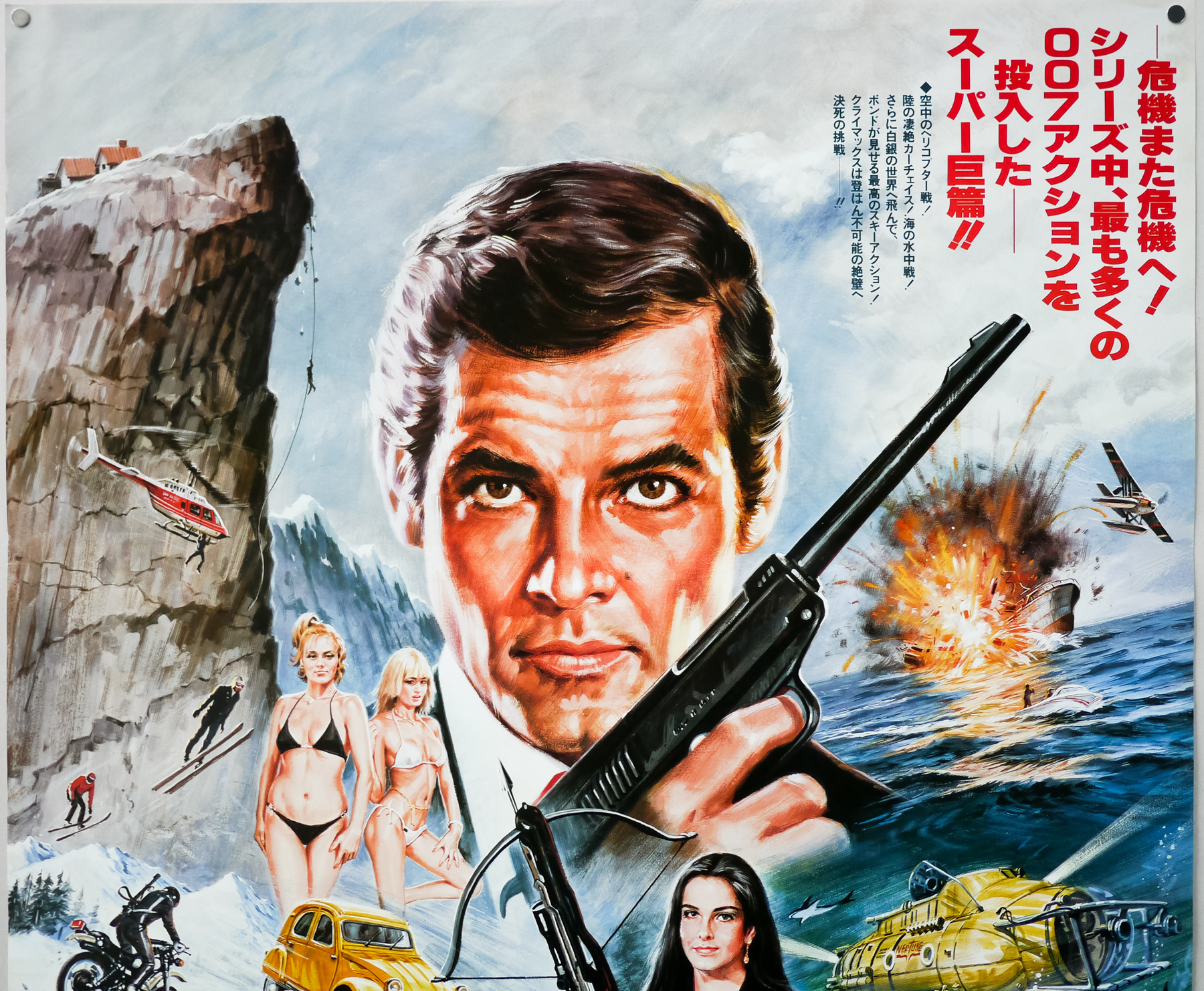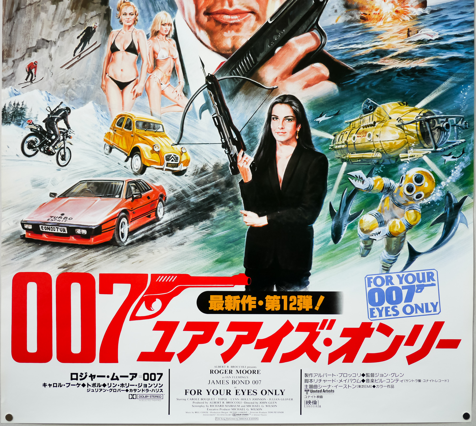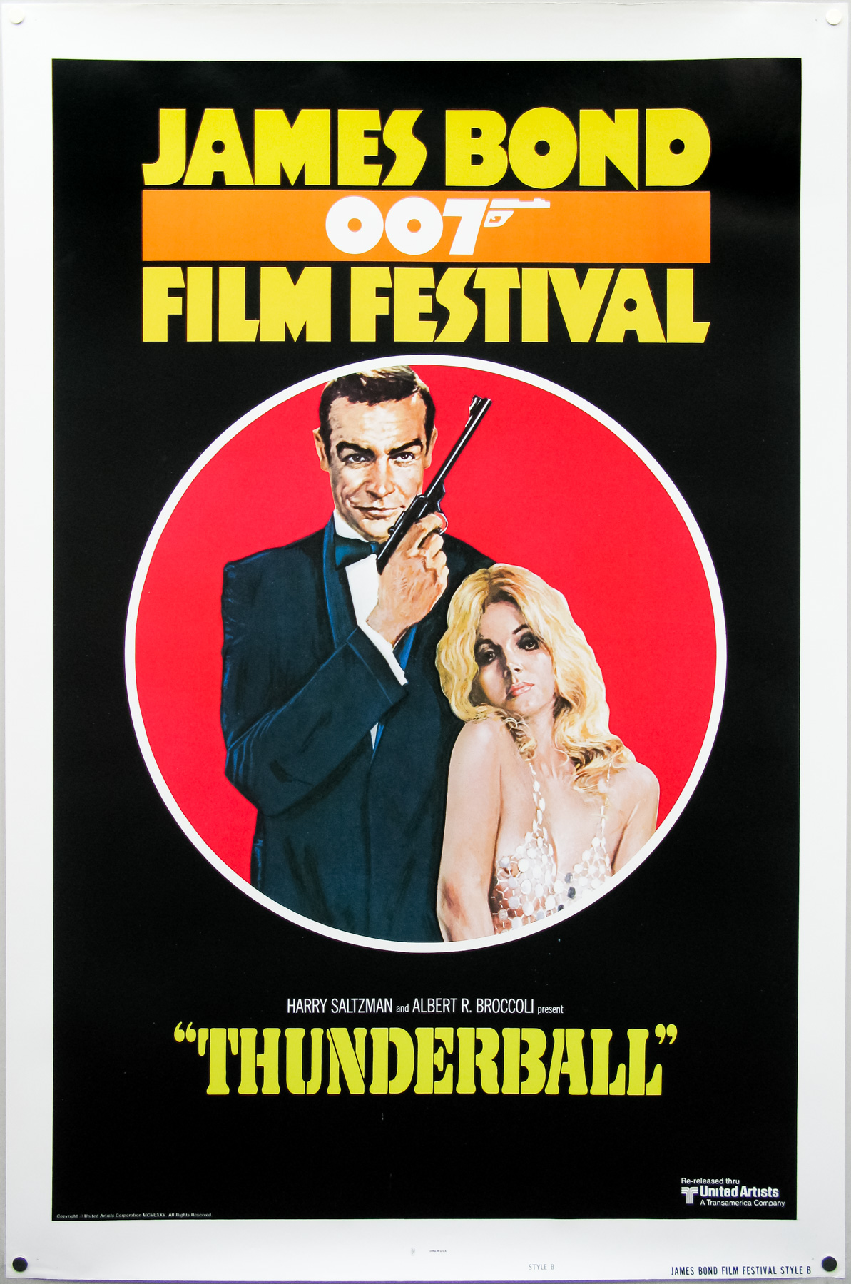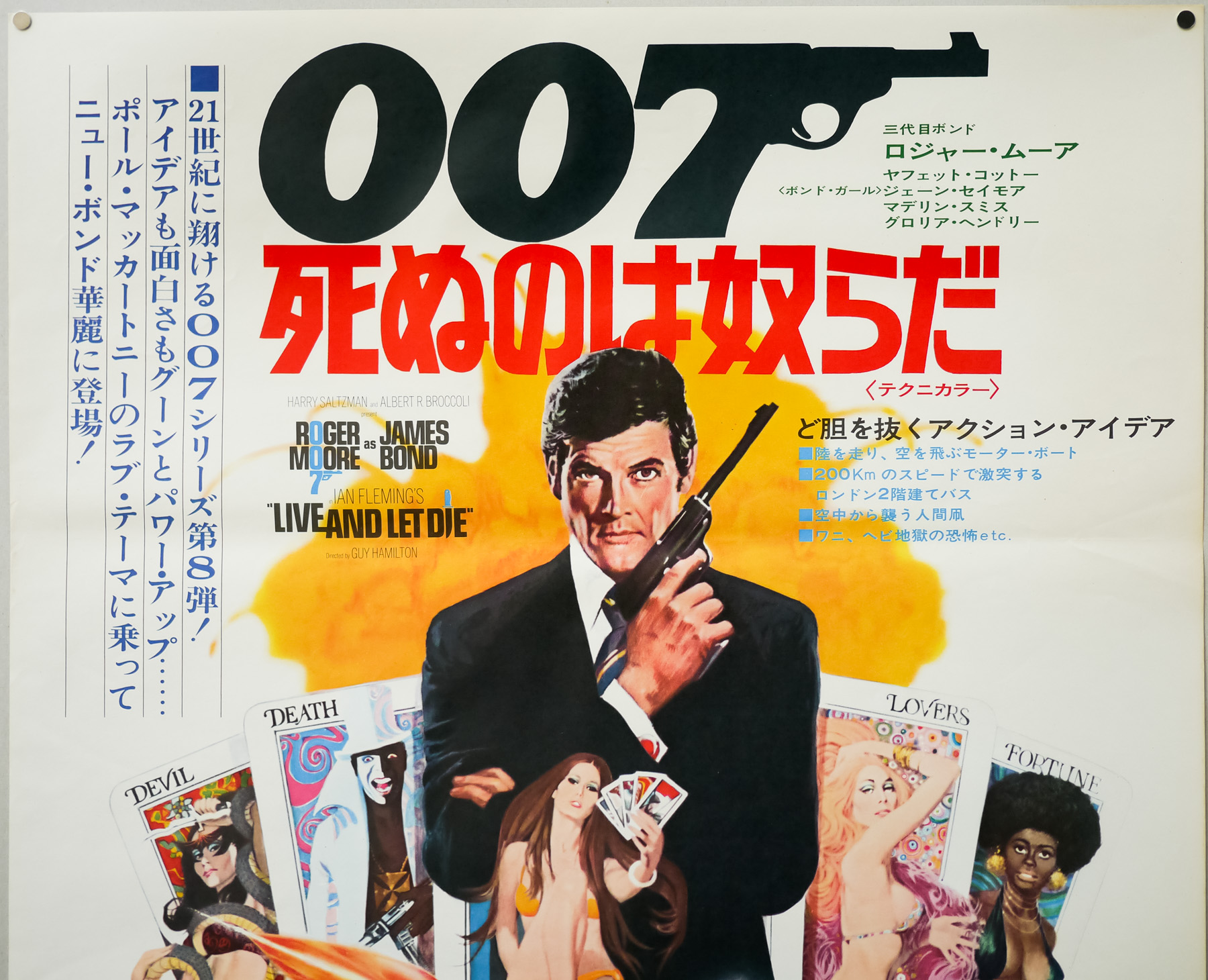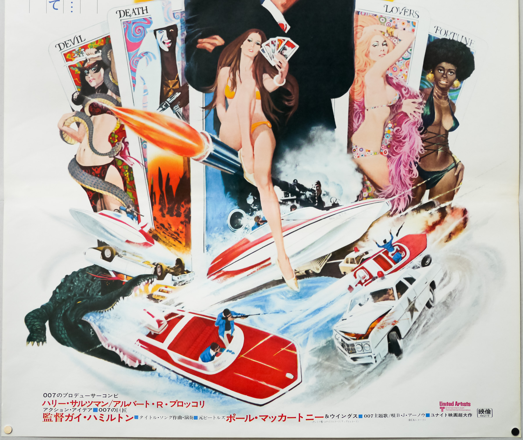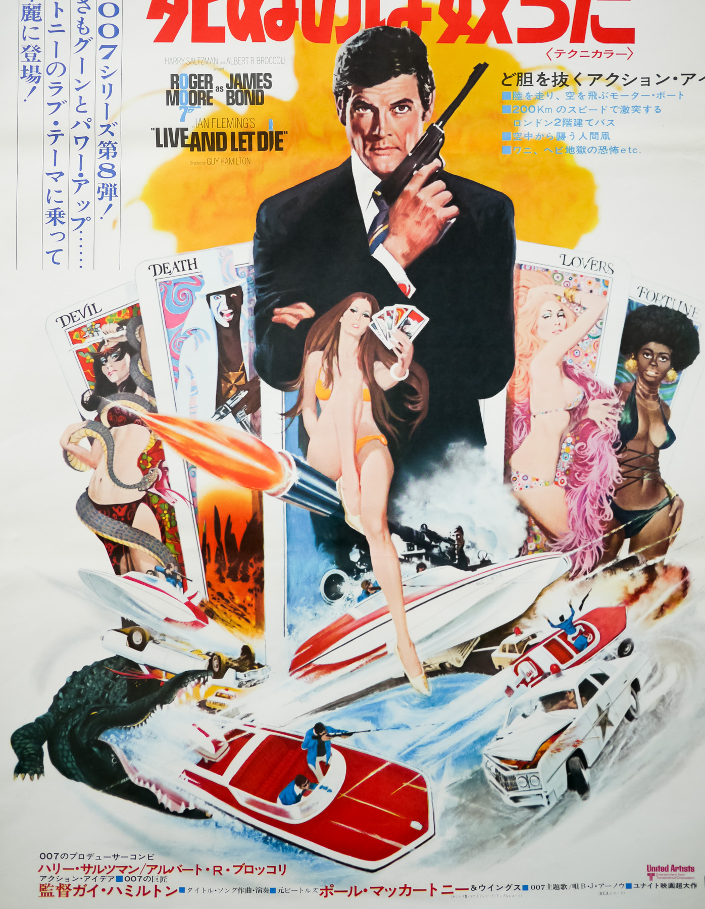
Poster detail
1-5

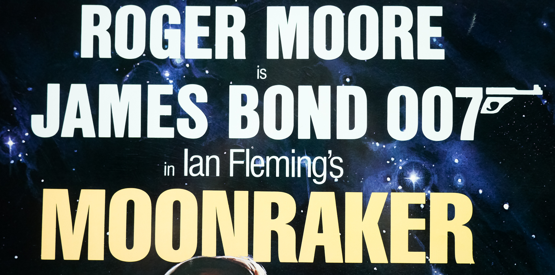
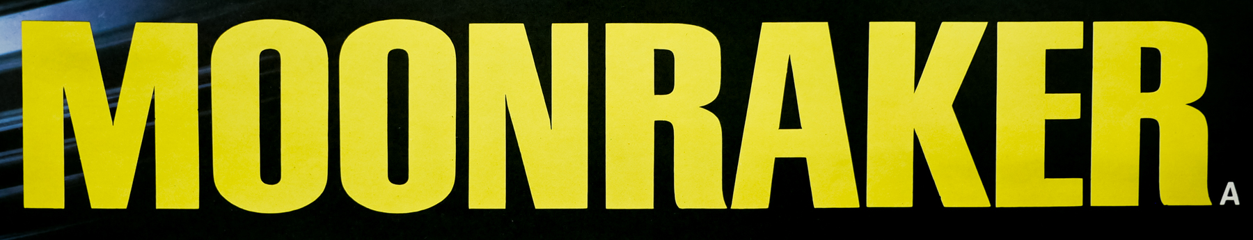
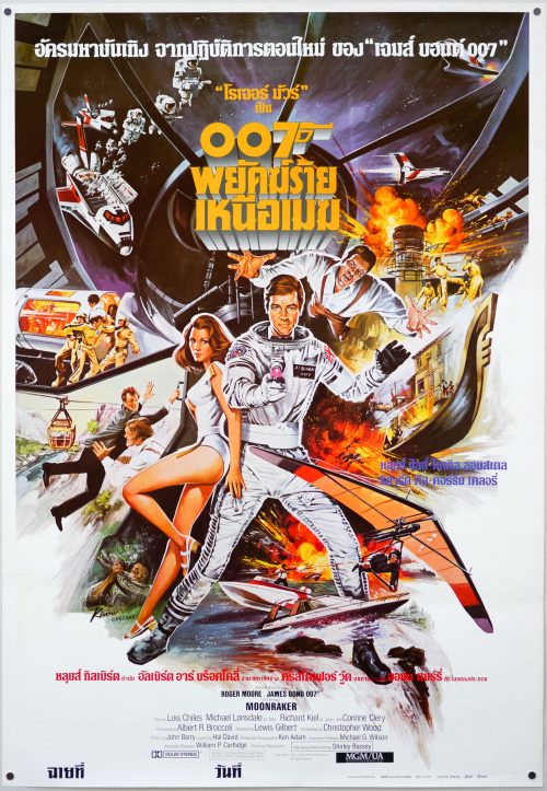
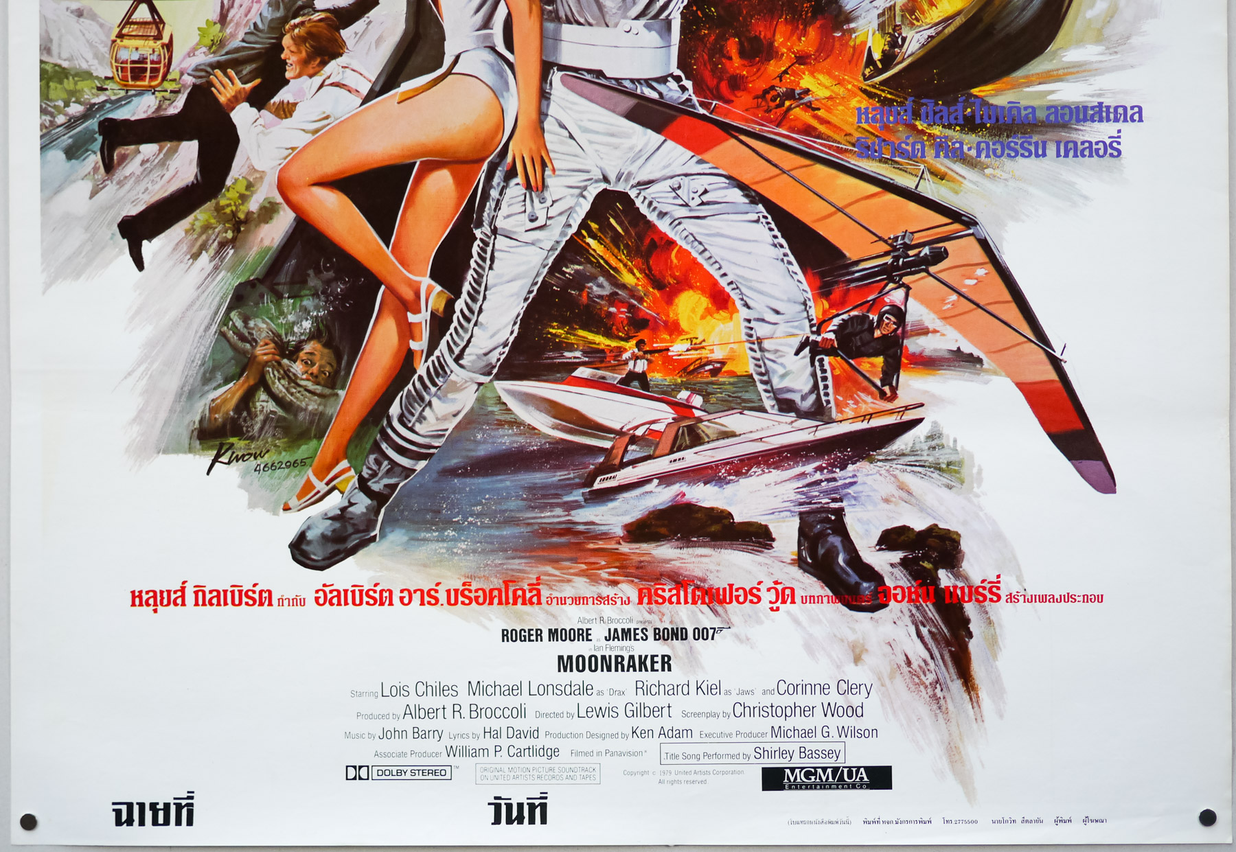
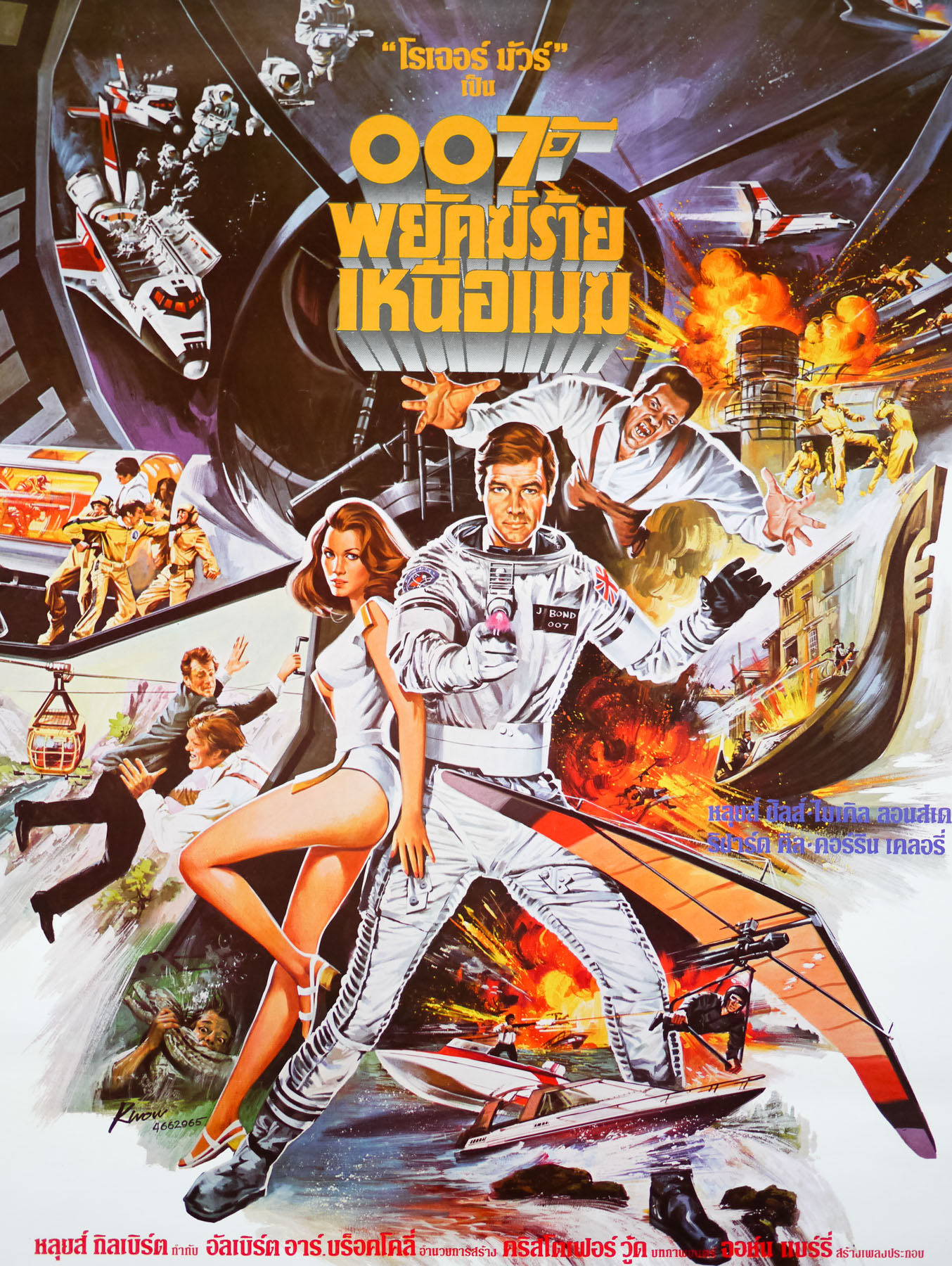
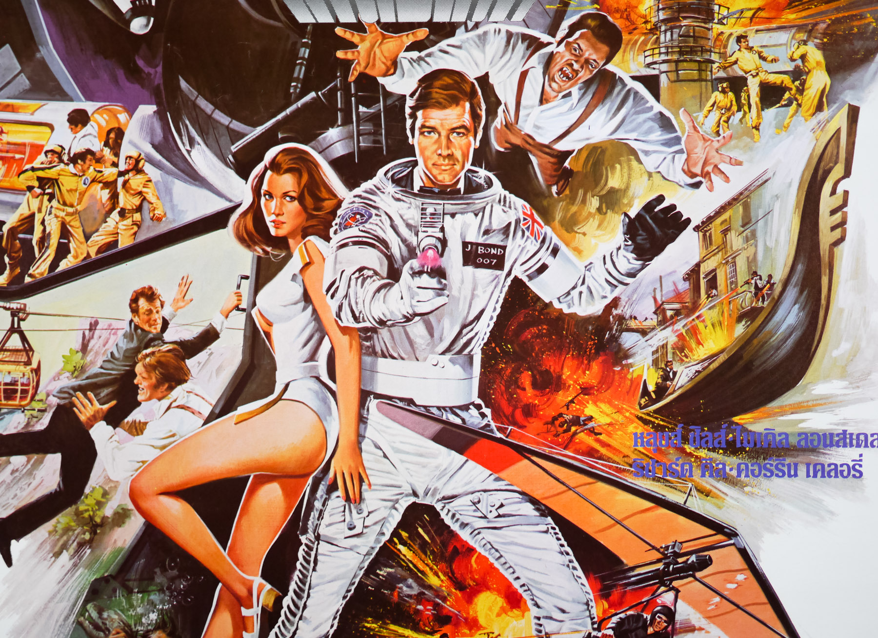
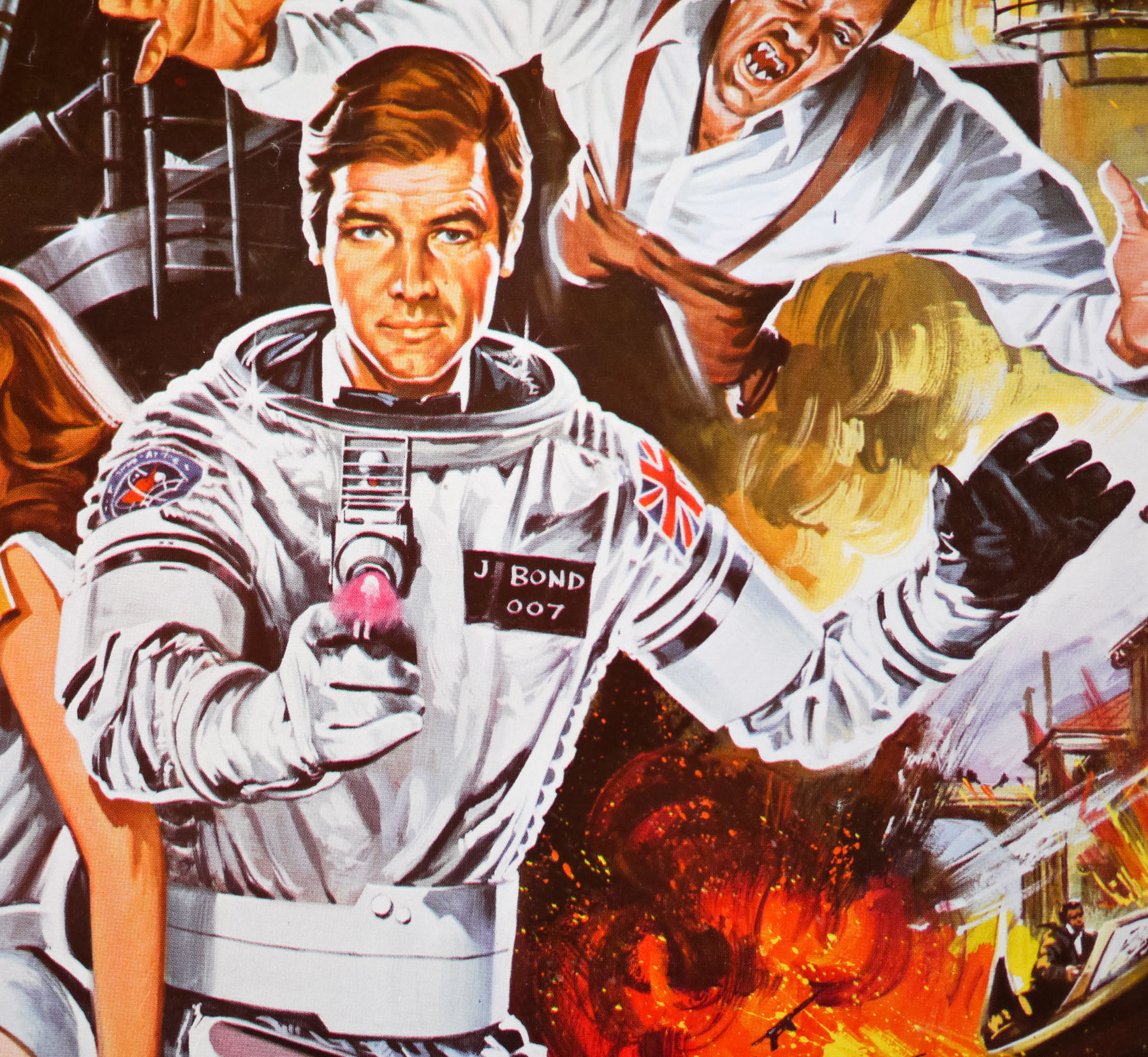
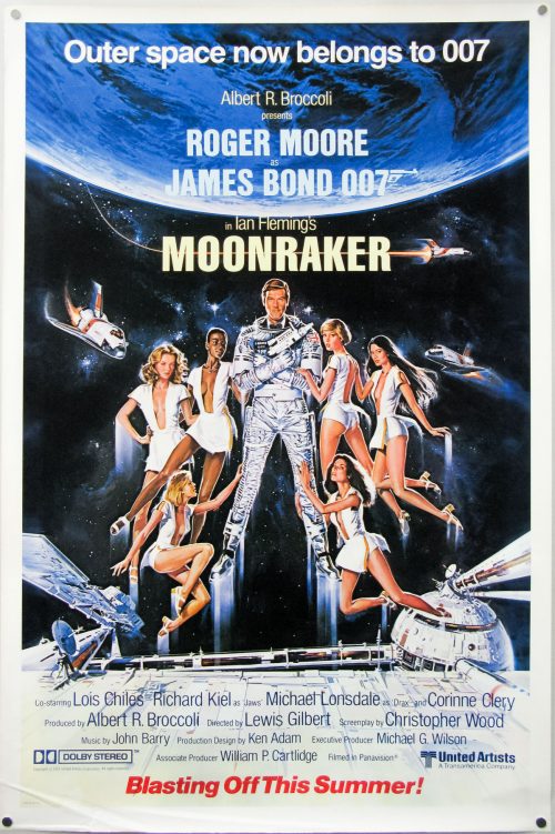
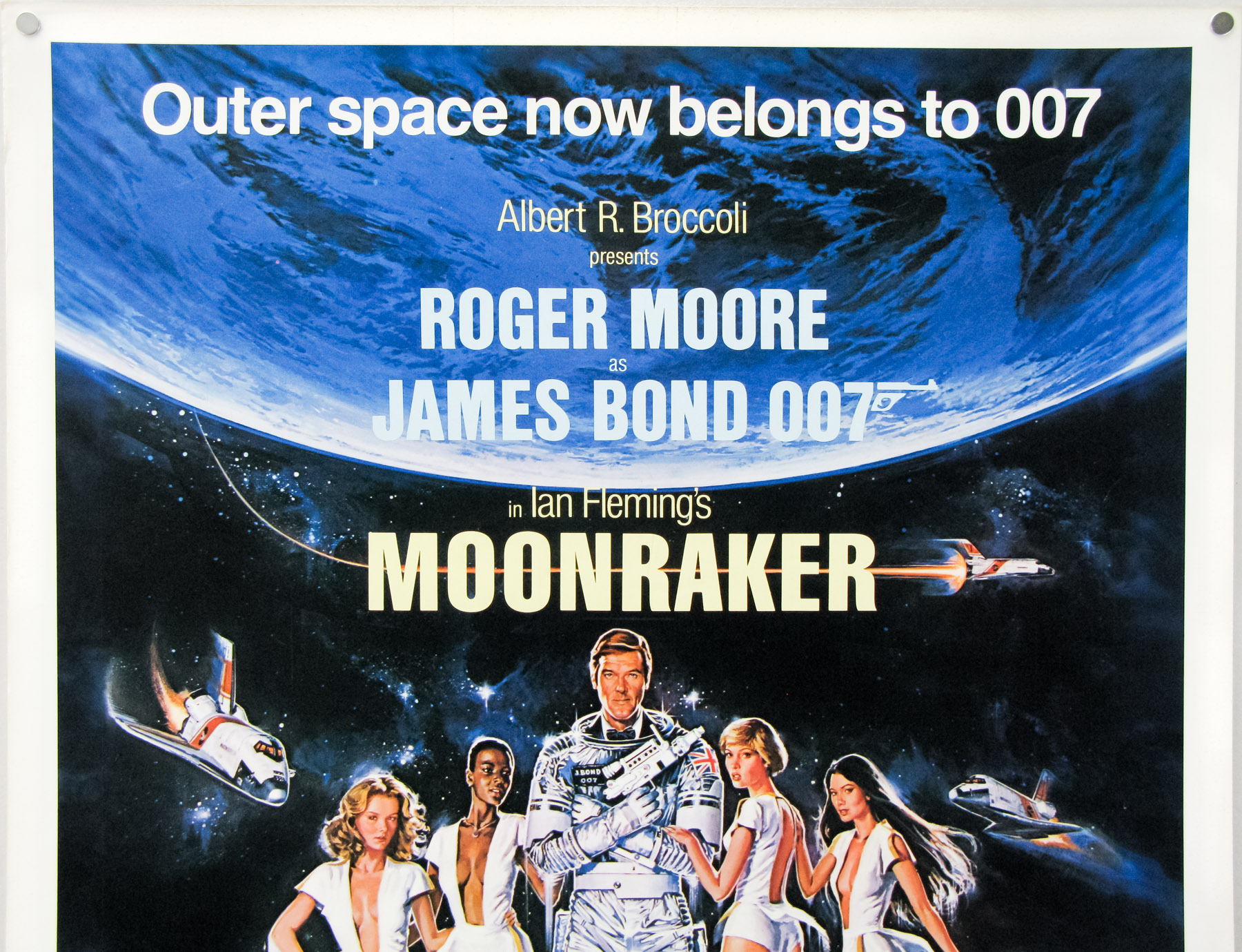
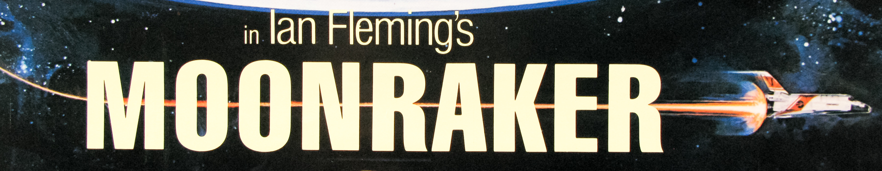
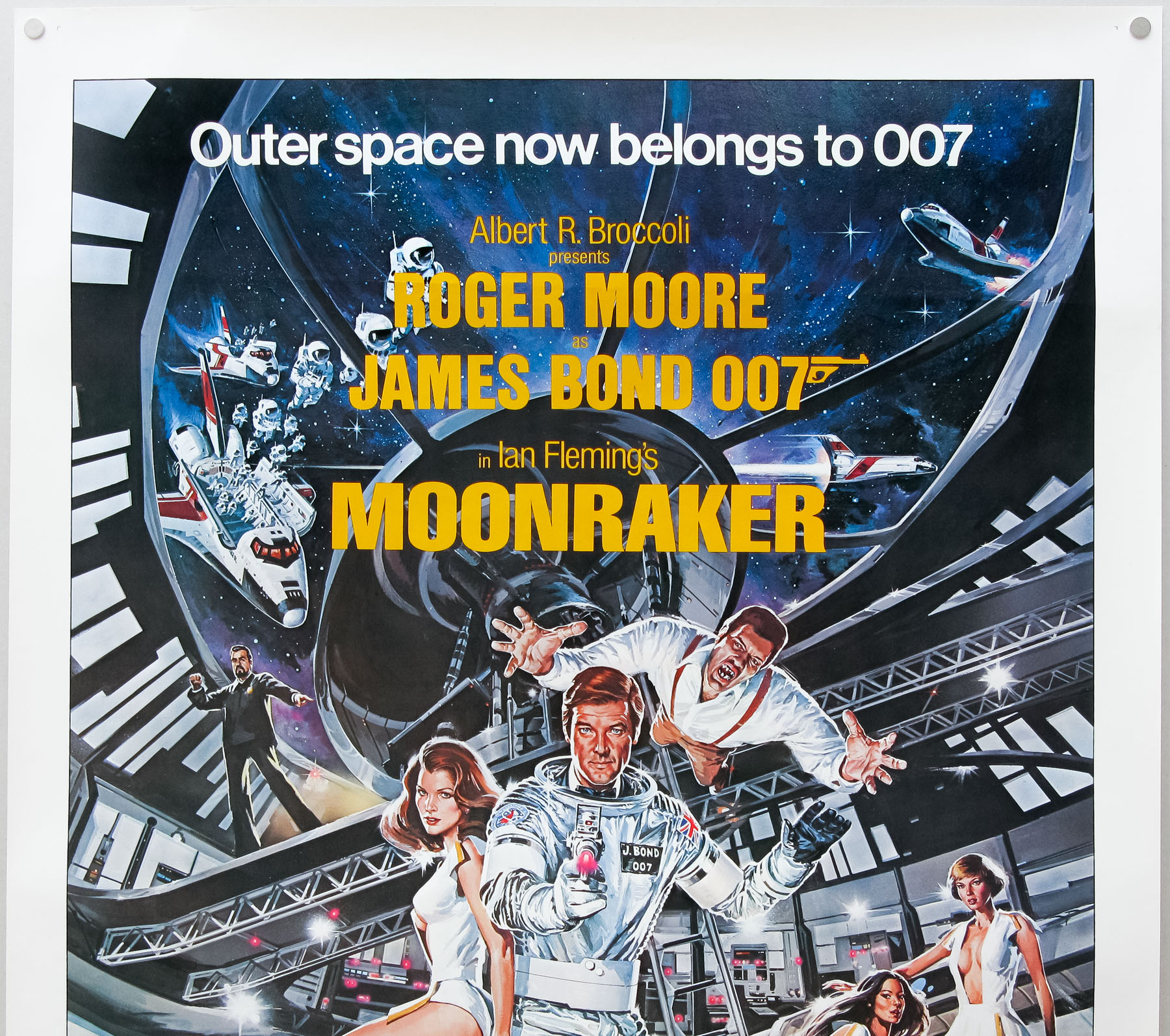
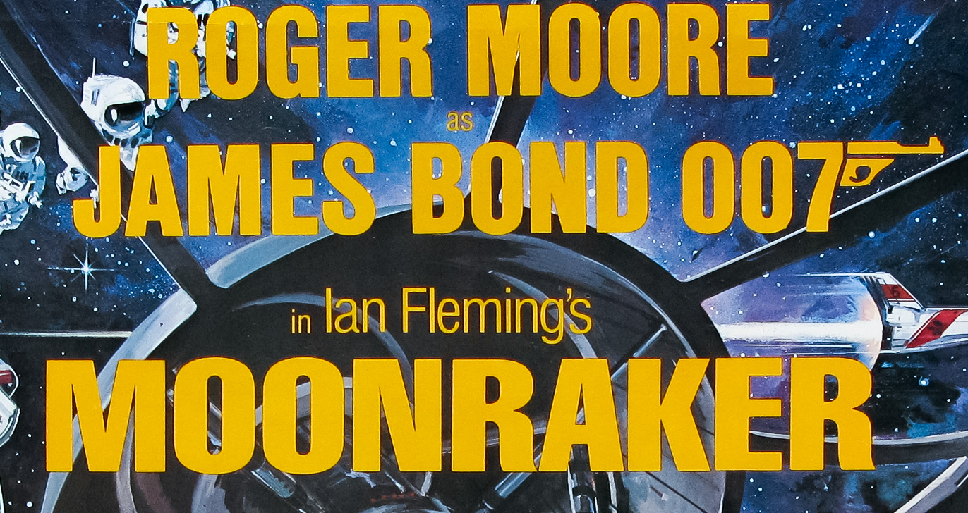
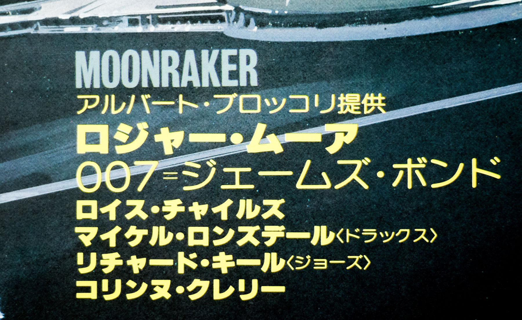
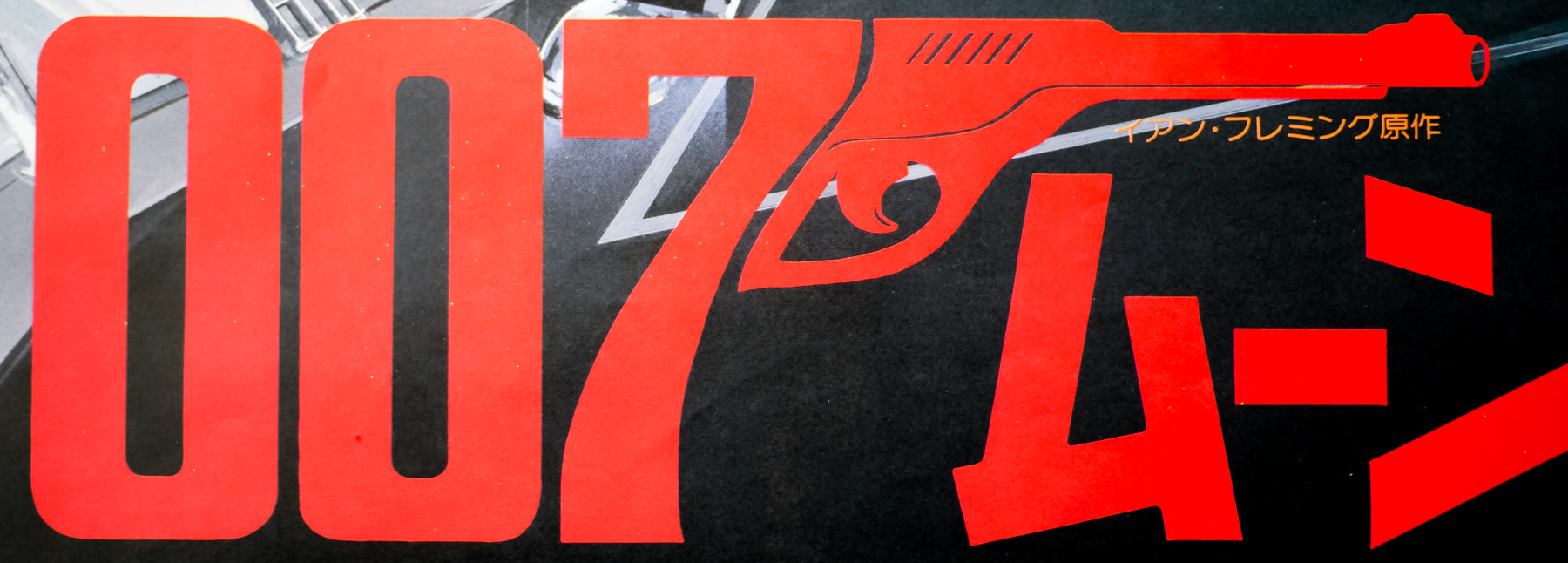
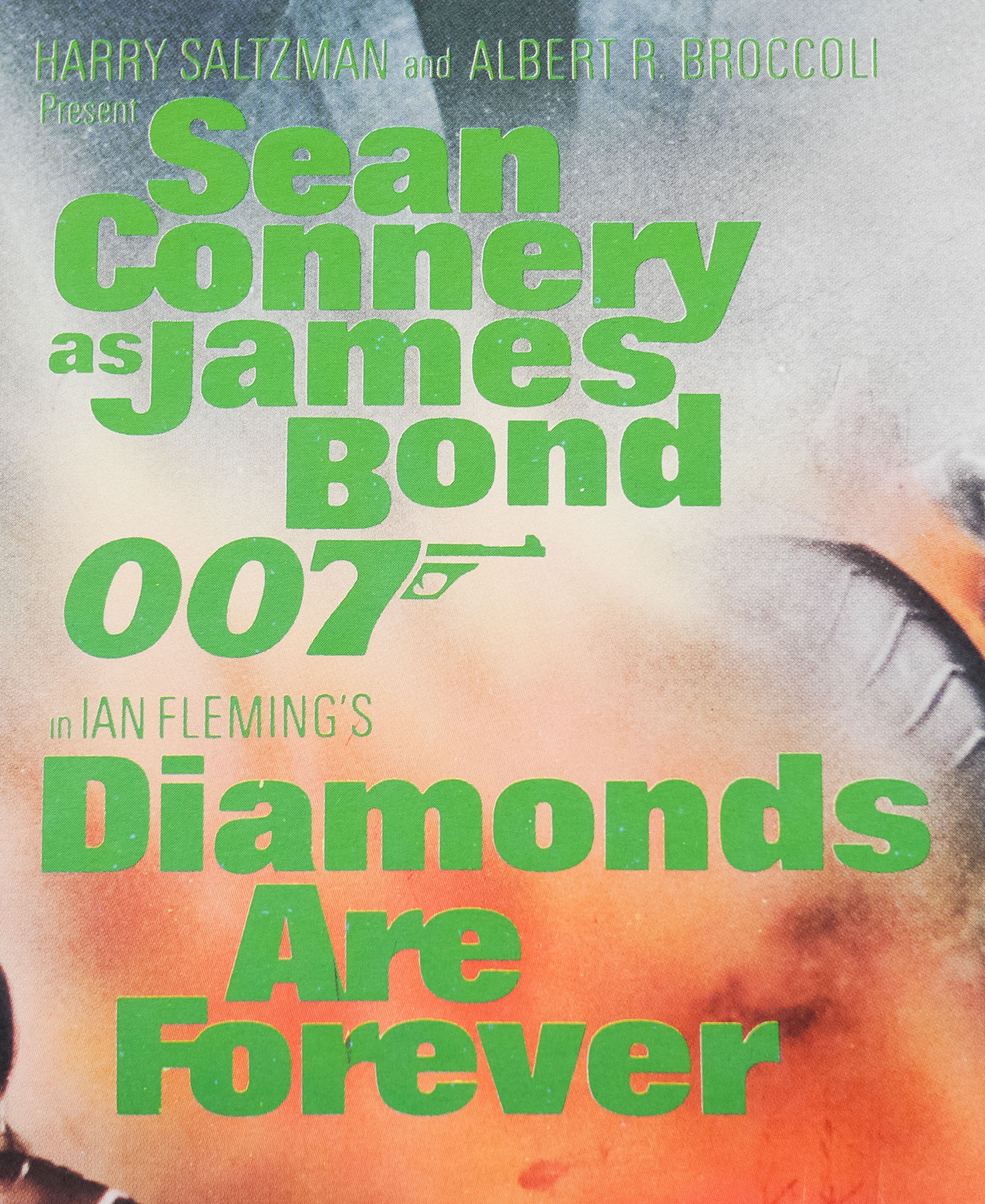
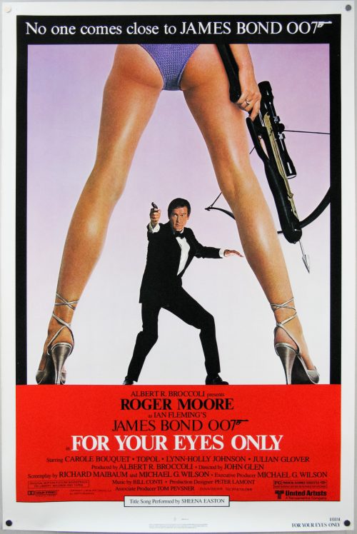
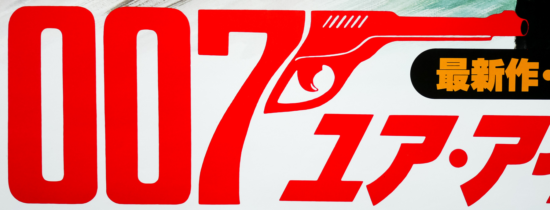
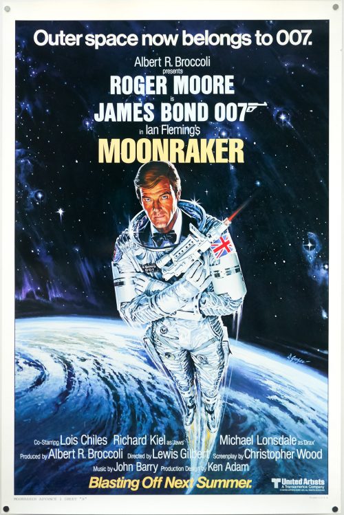
- Title
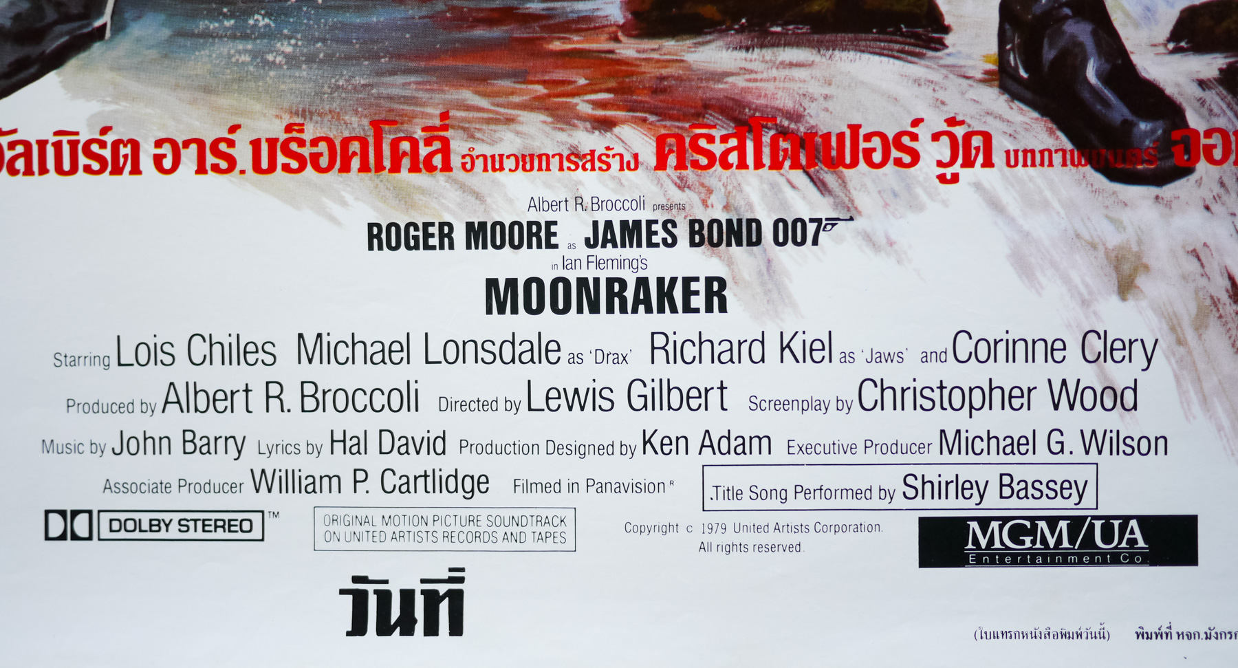
- Moonraker
- AKA
- Agente 007, Moonraker: Operazione Spazio [Operation Space] (Italy)
- Year of Film
- 1979
- Director
- Lewis Gilbert
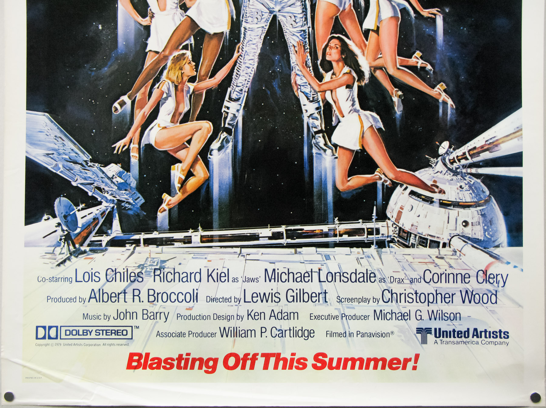
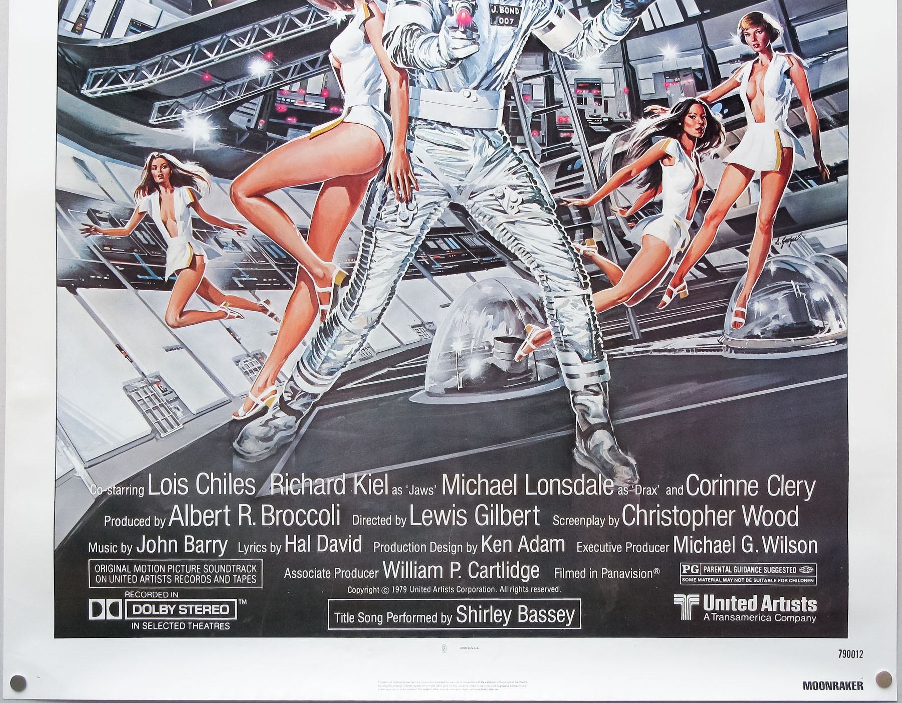
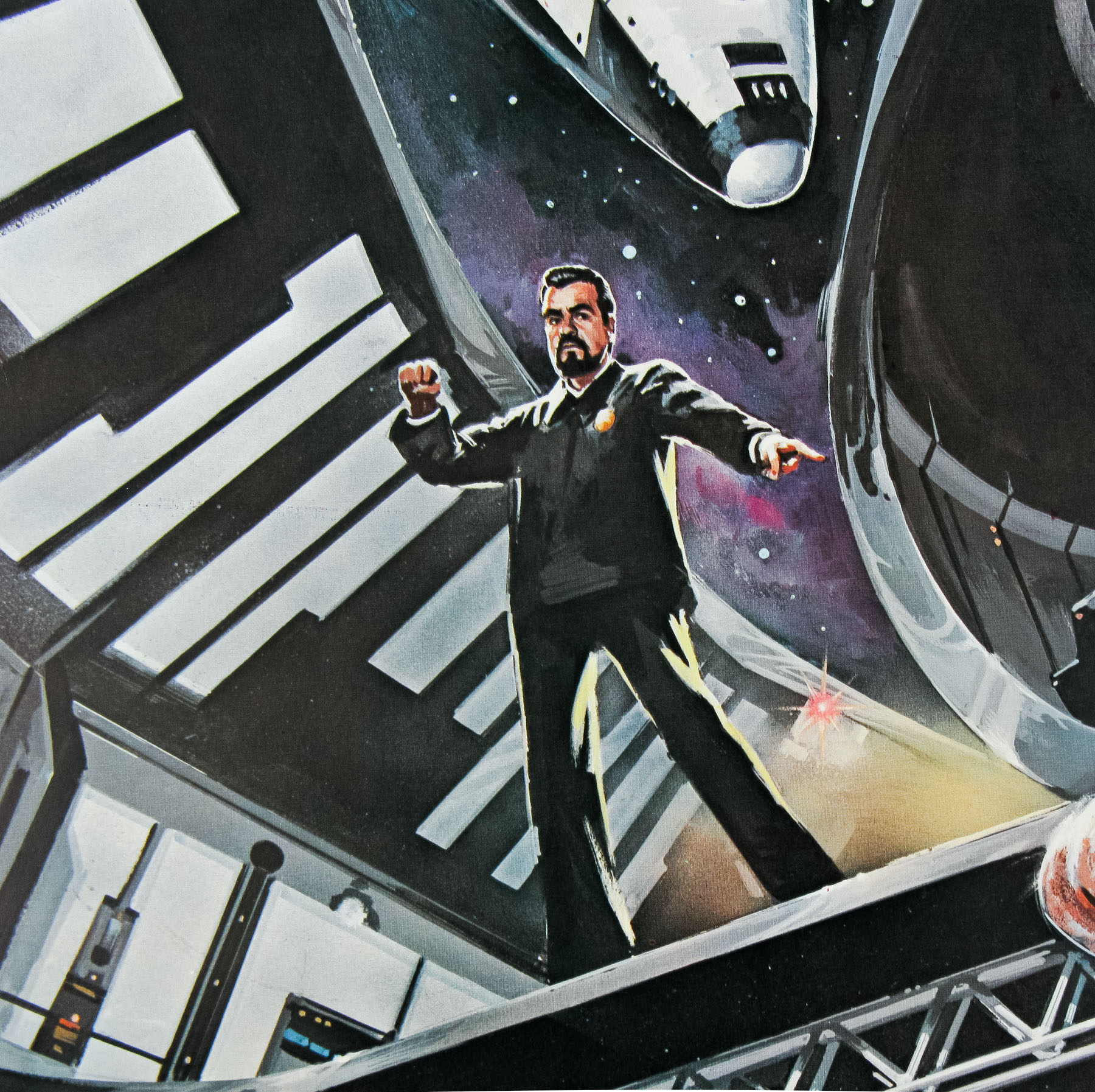
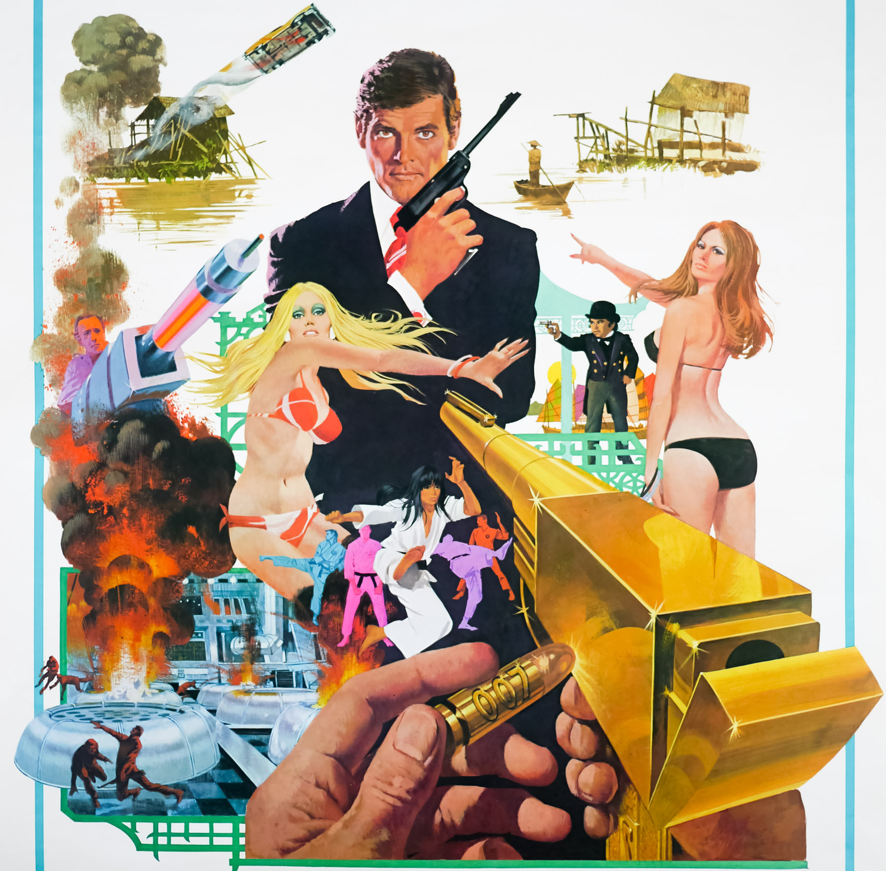
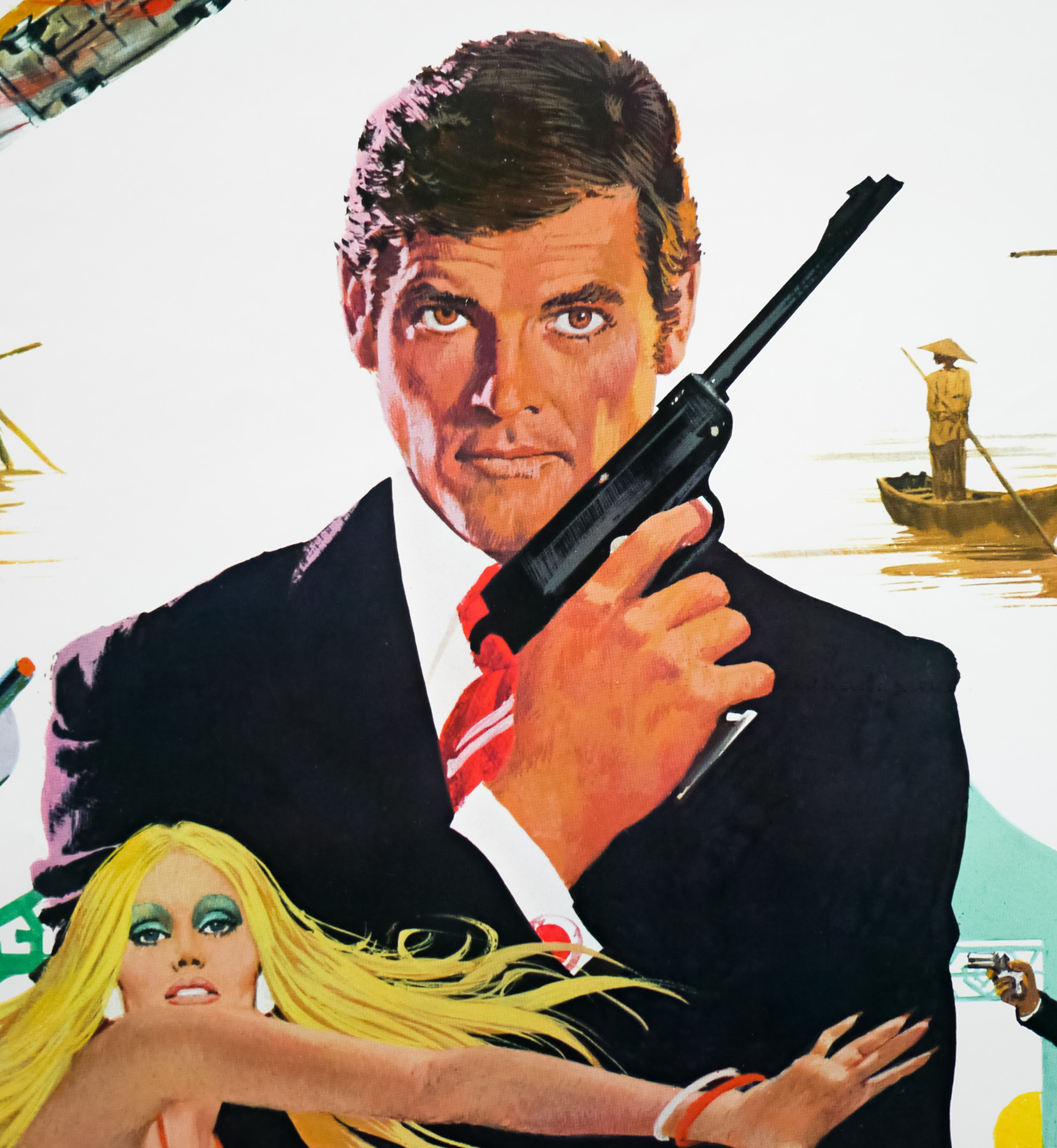
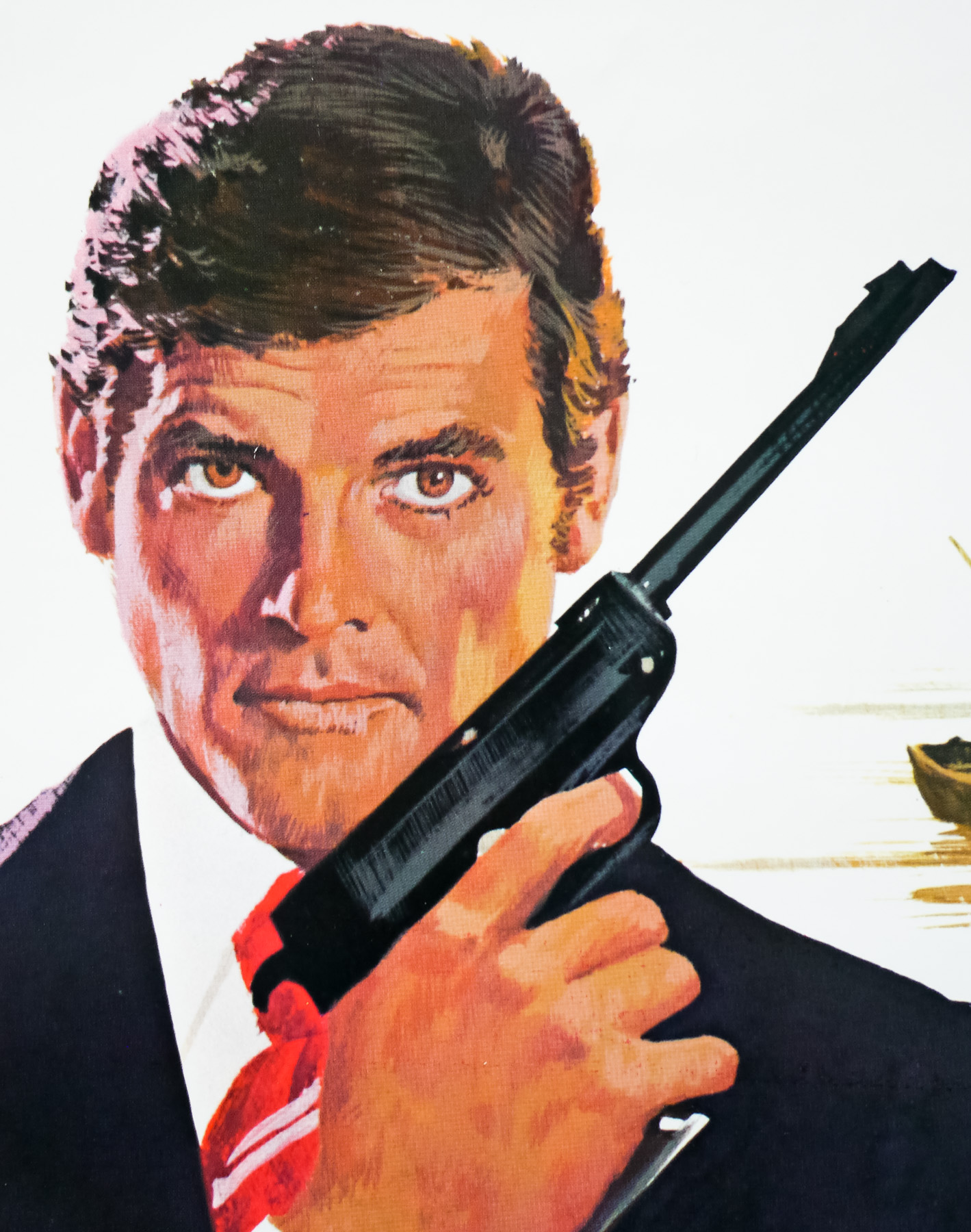
- Starring
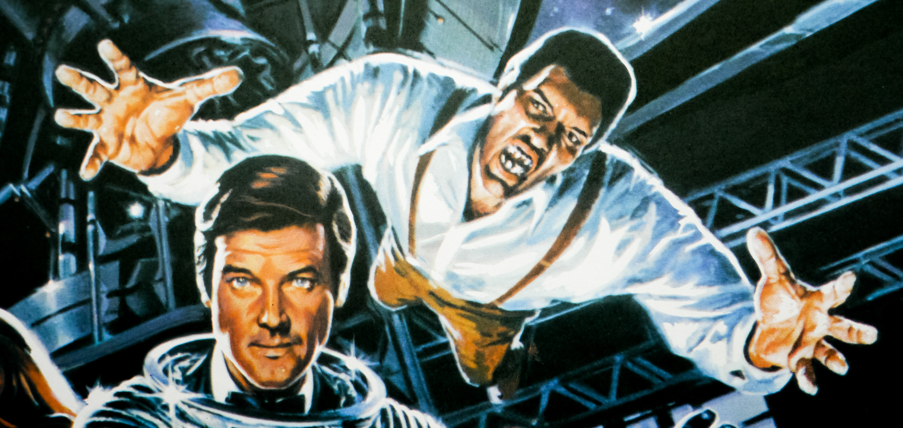
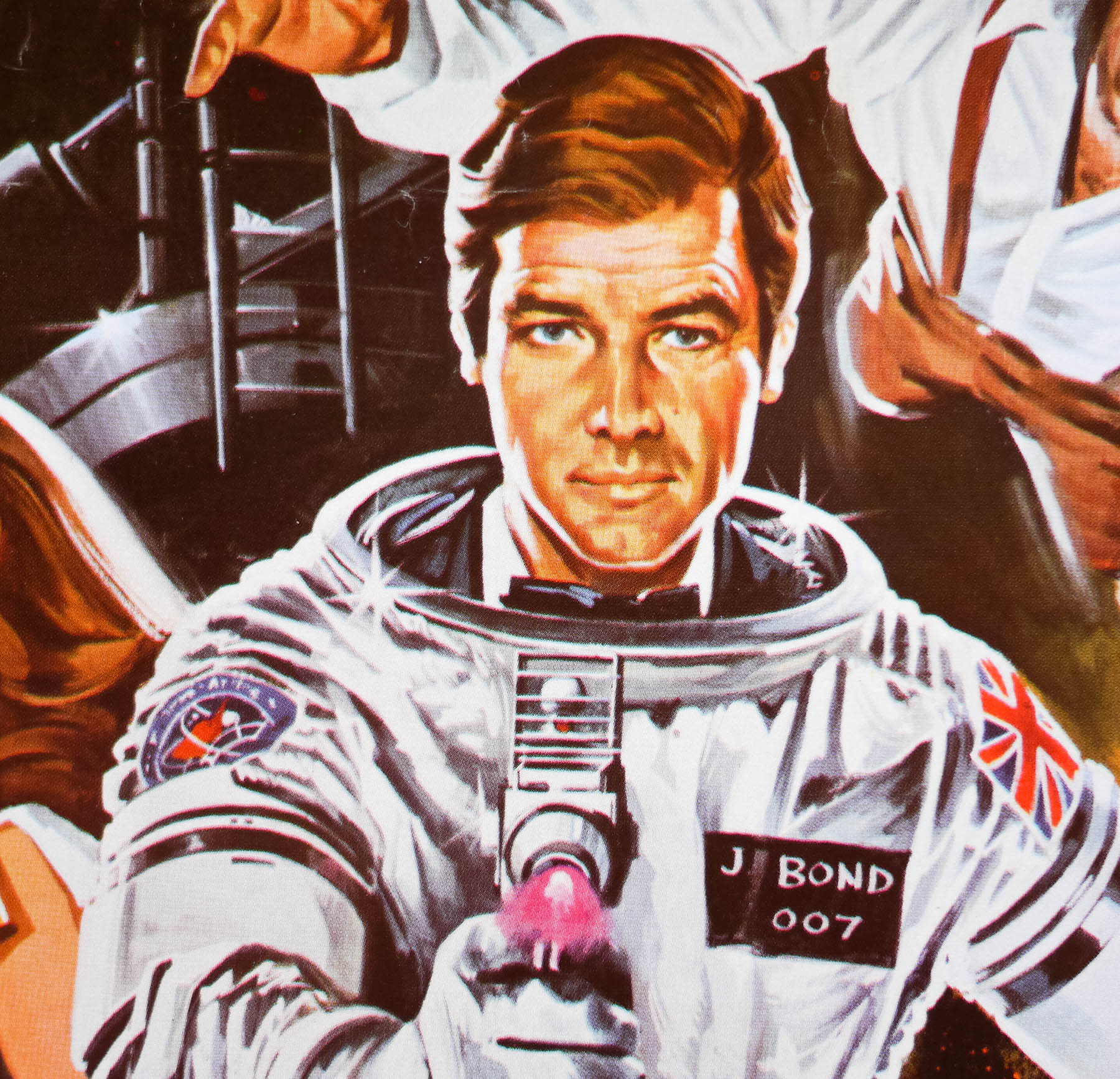
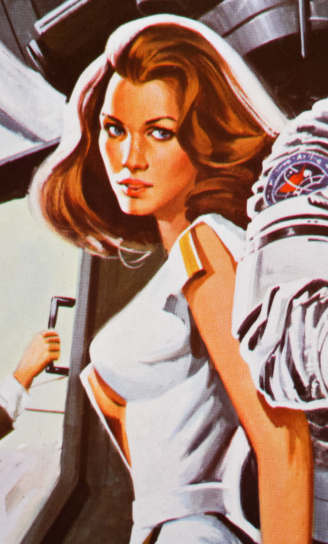
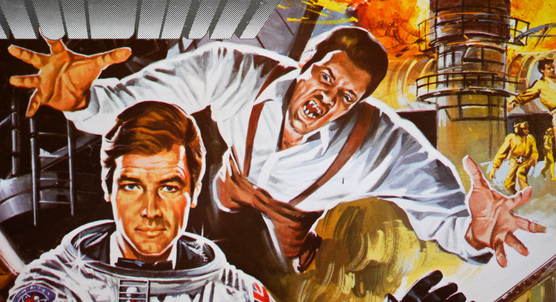
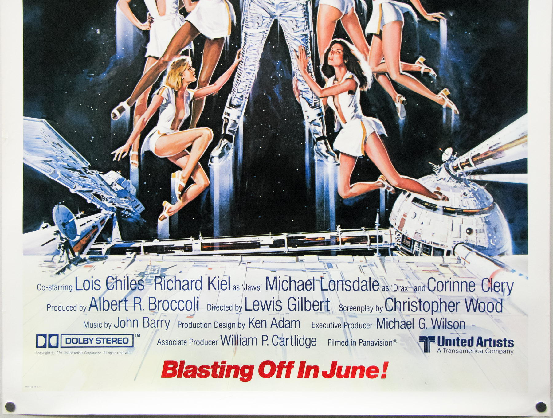
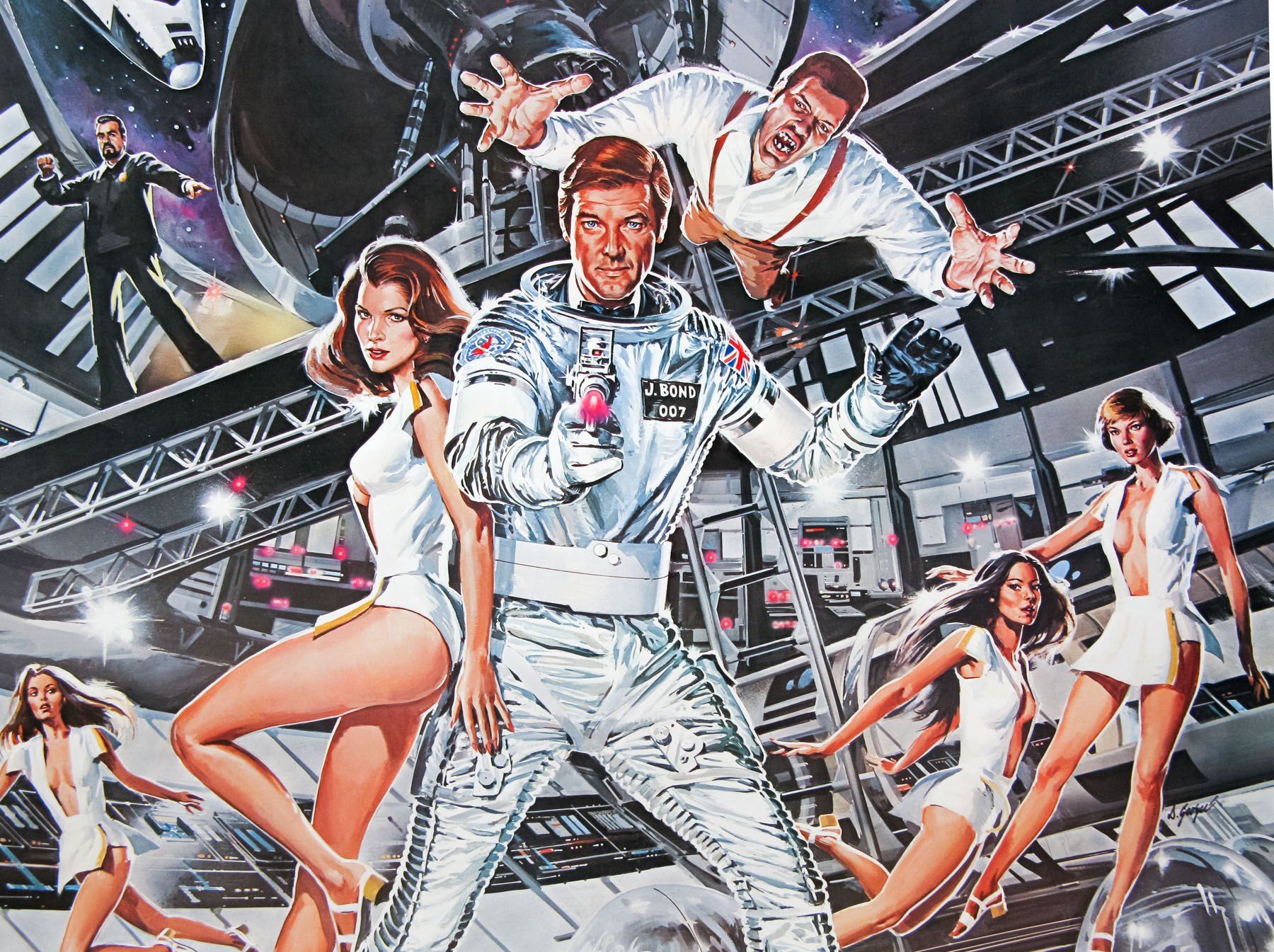
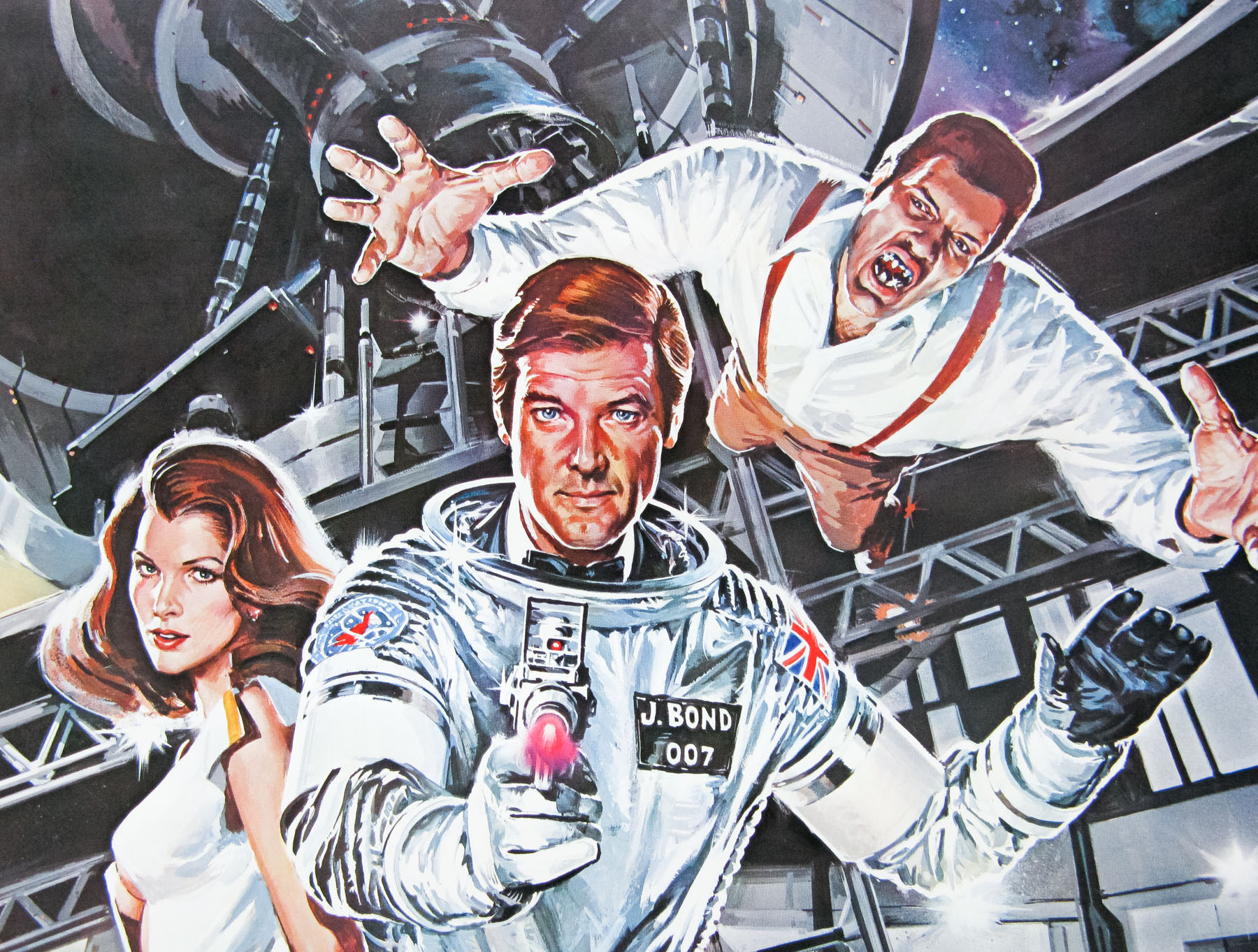
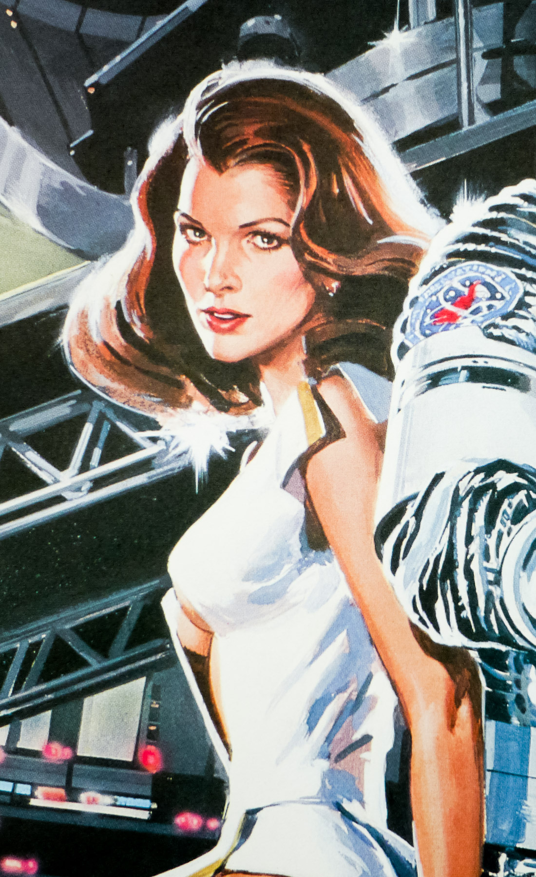
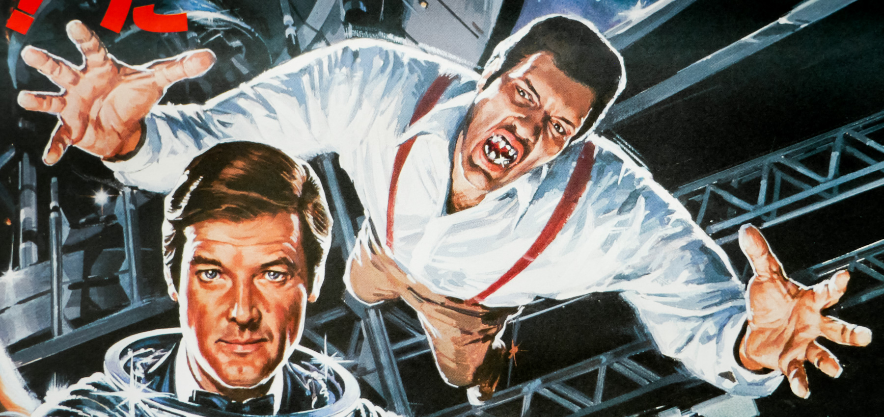
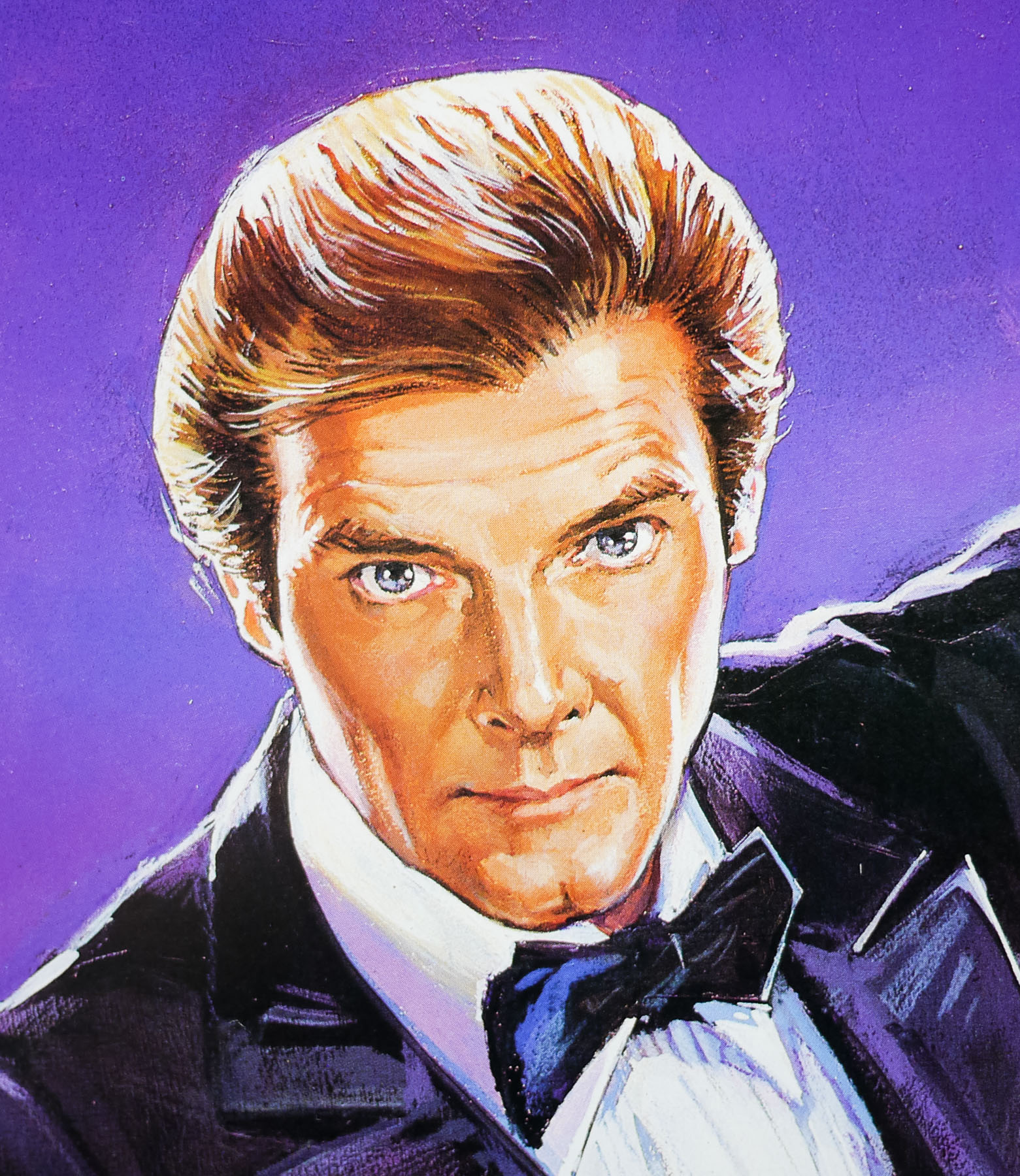
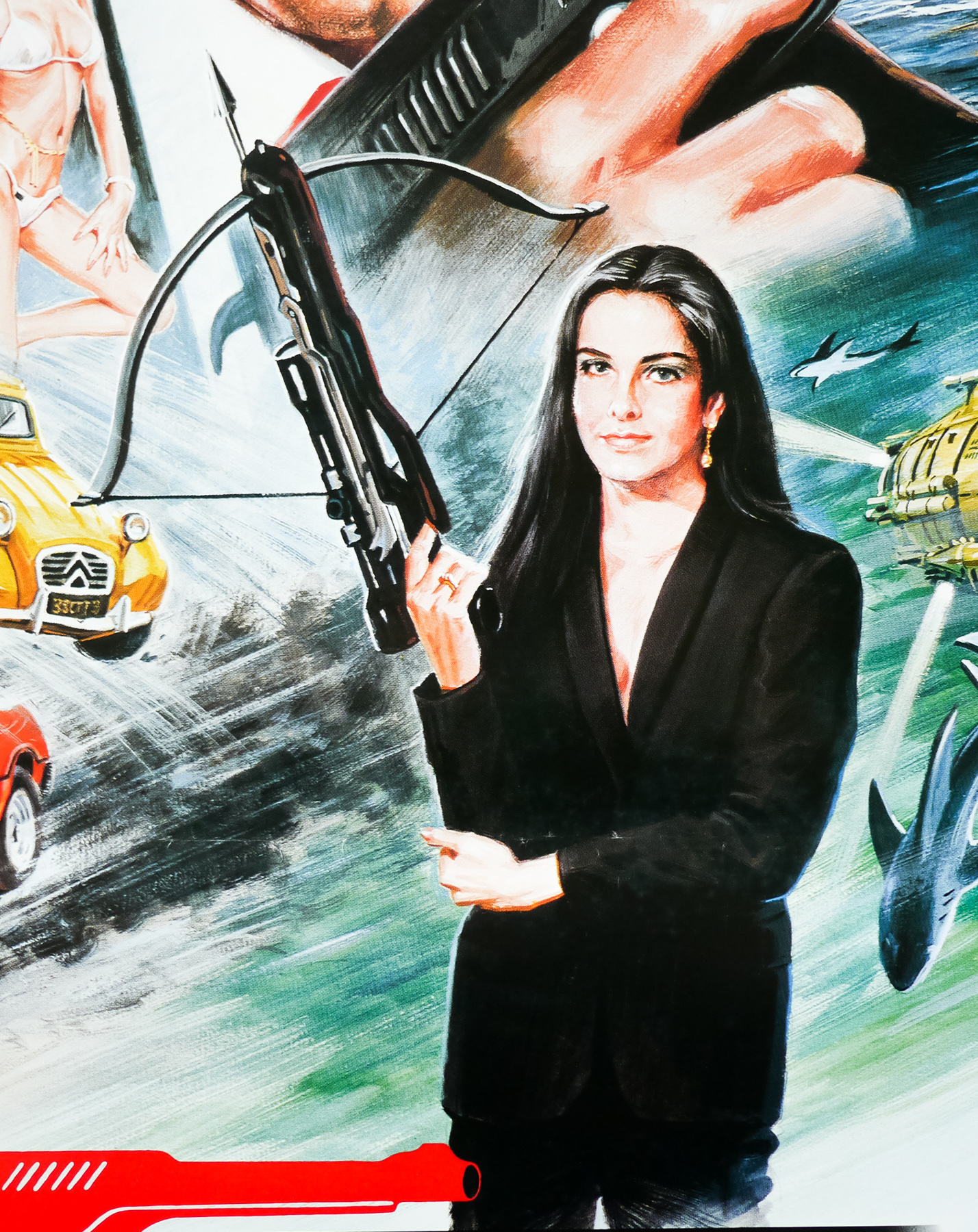
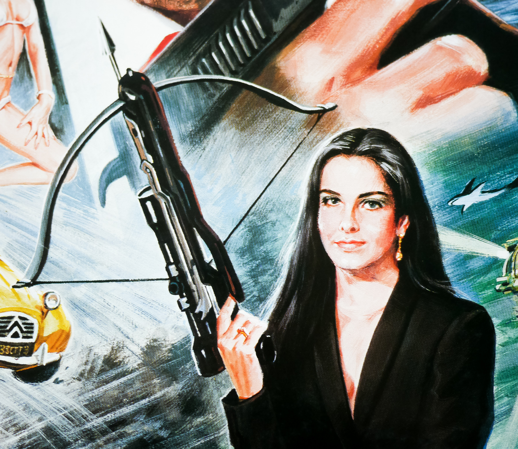
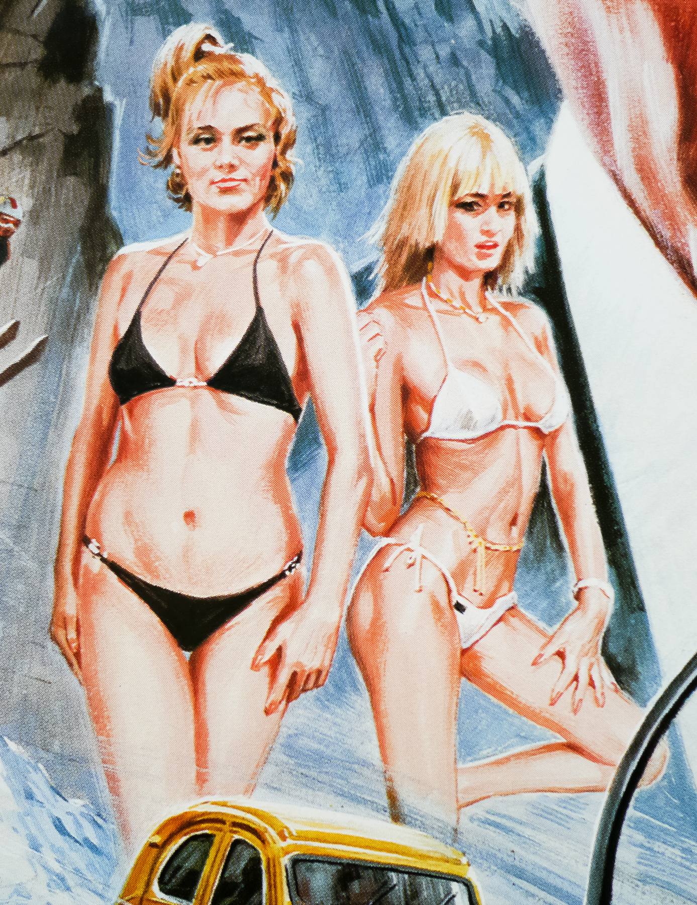
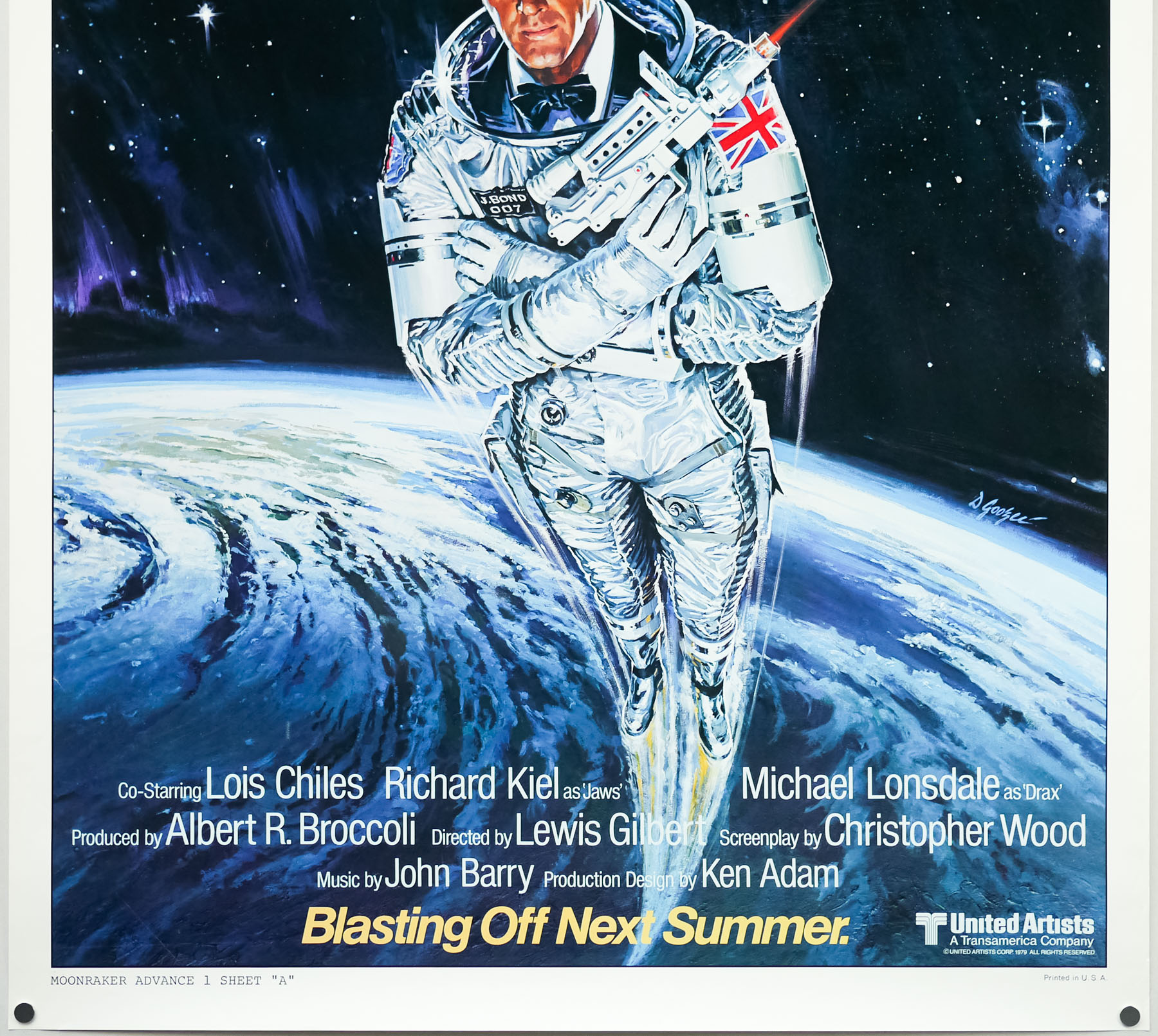
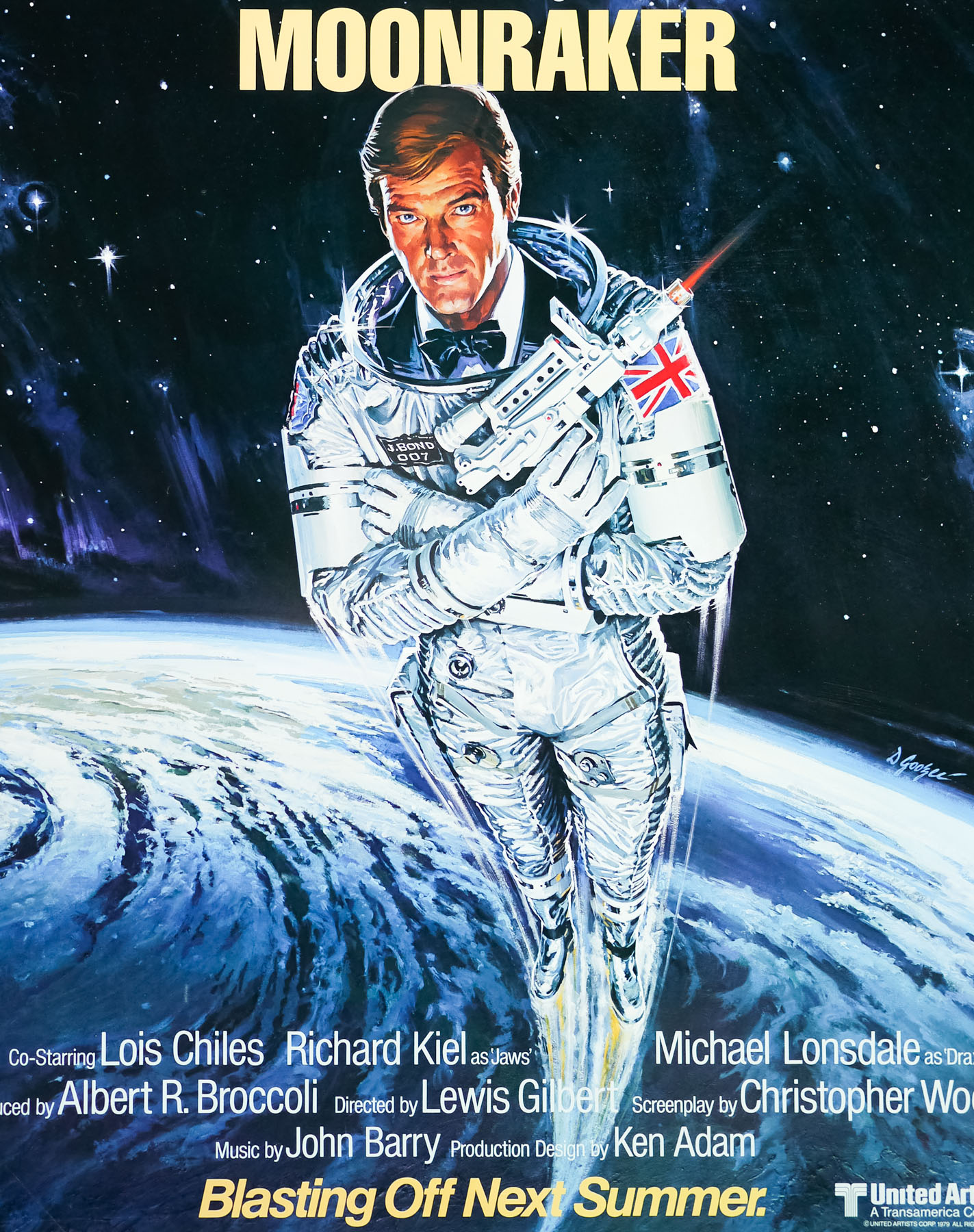
- Roger Moore, Lois Chiles, Michael Lonsdale, Richard Kiel, Corinne Clery, Bernard Lee, Geoffrey Keen, Desmond Llewelyn, Lois Maxwell, Toshirô Suga, Blanche Ravalec
- Origin of Film
- UK | France
- Genre(s) of Film
- Roger Moore, Lois Chiles, Michael Lonsdale, Richard Kiel, Corinne Clery, Bernard Lee, Geoffrey Keen, Desmond Llewelyn, Lois Maxwell, Toshirô Suga, Blanche Ravalec,
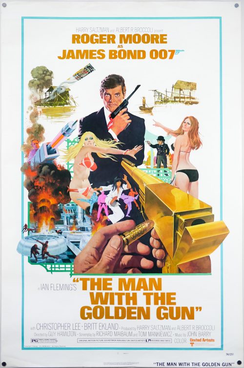
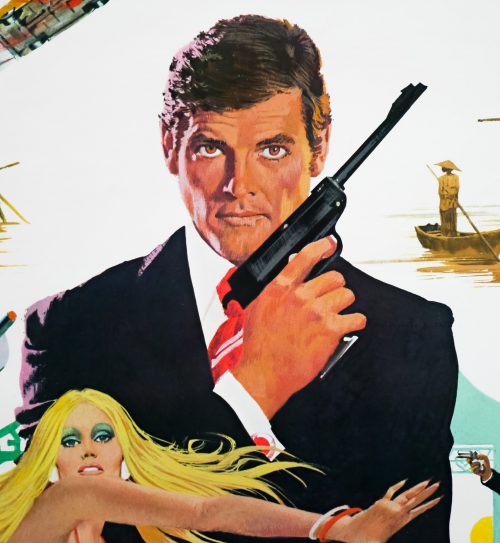
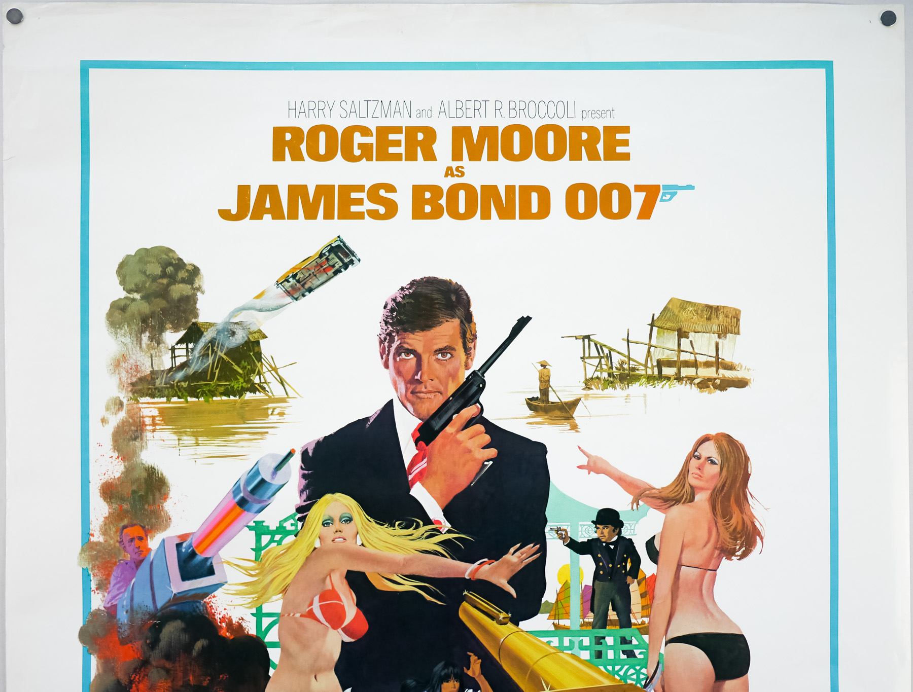
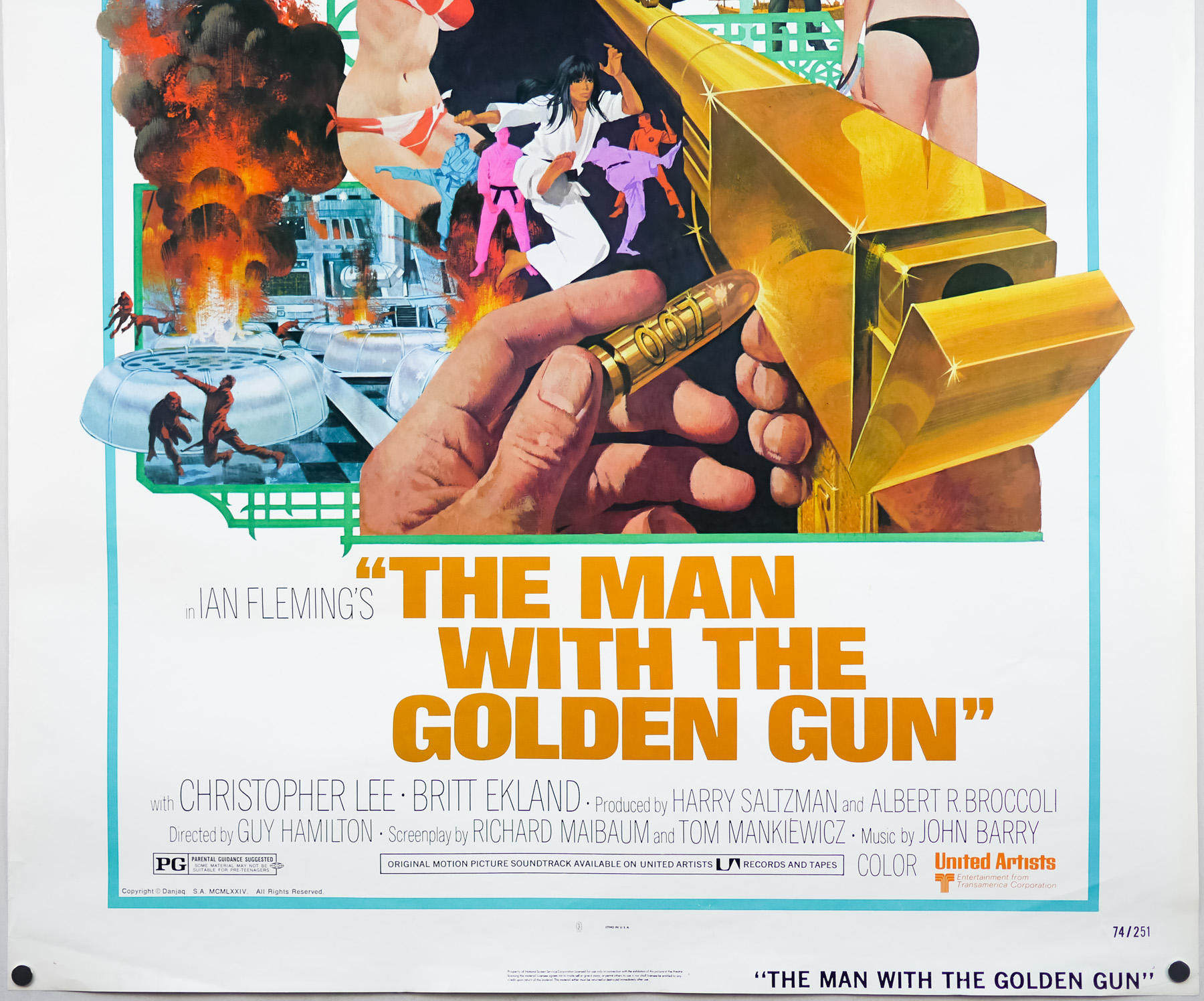
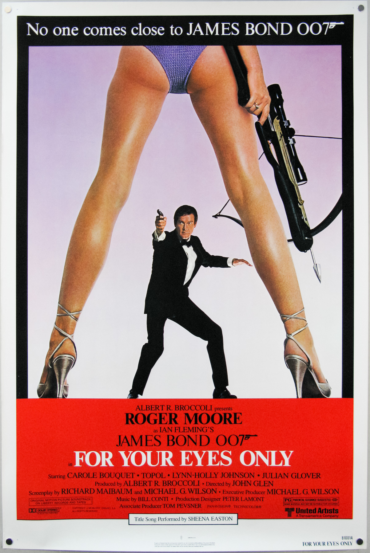
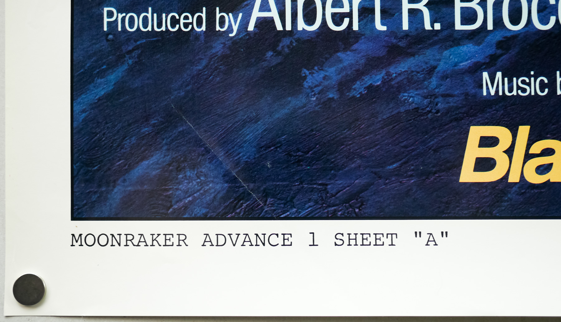
- Type of Poster
- One sheet
- Style of Poster
- Advance - style A
- Origin of Poster
- USA
- Year of Poster
- 1979
- Designer
- Unknown
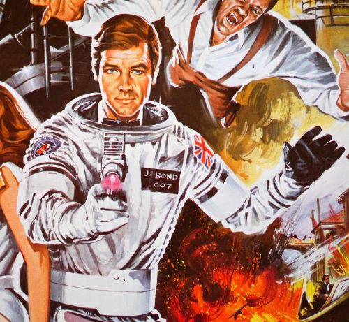
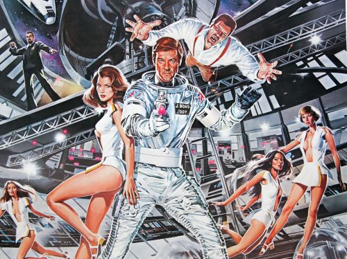
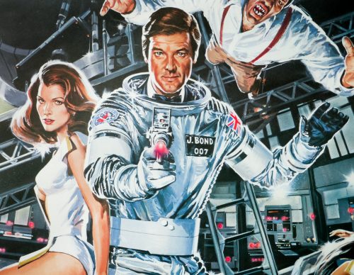
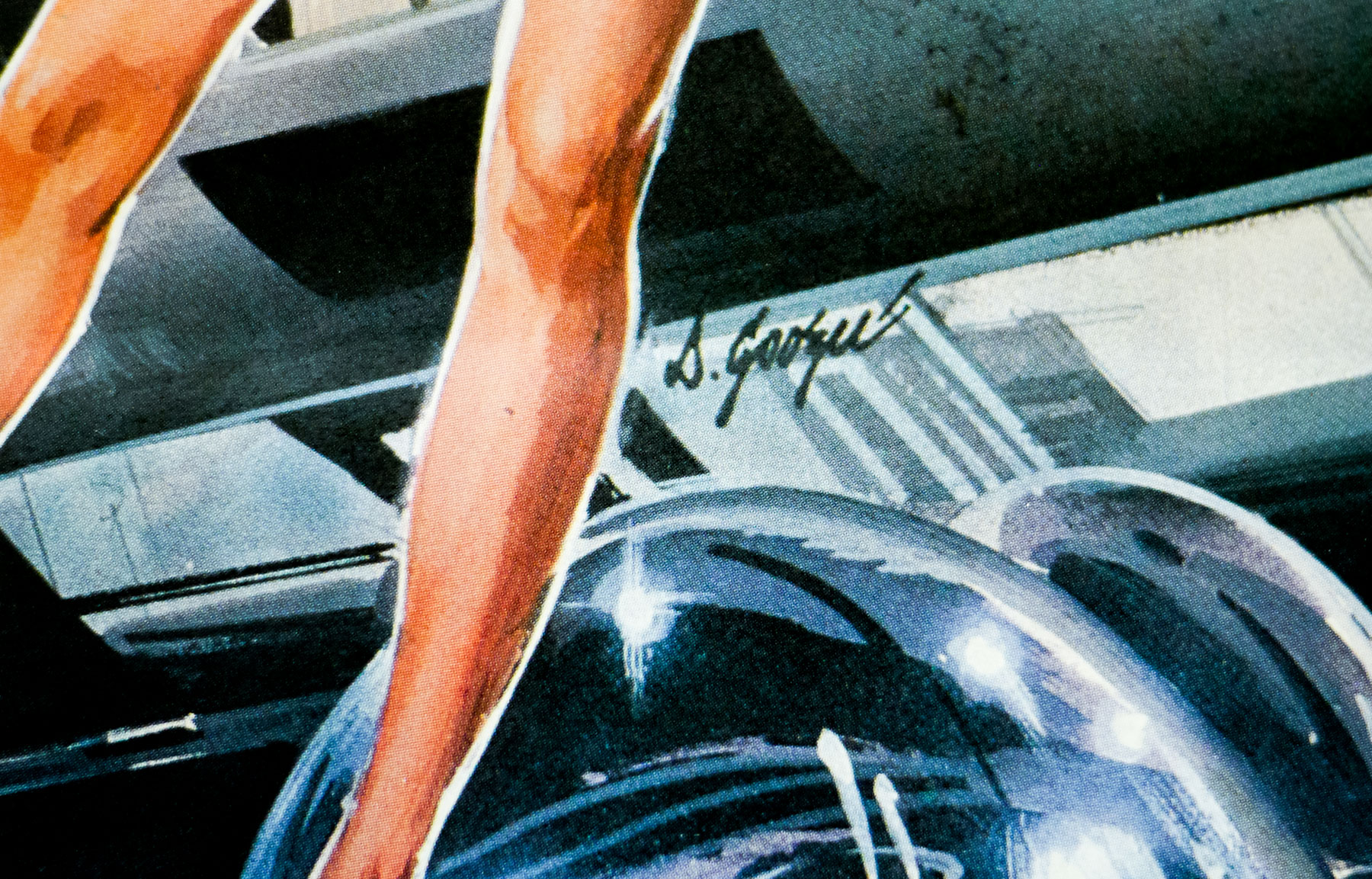
- Artist
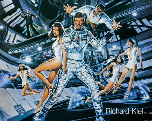
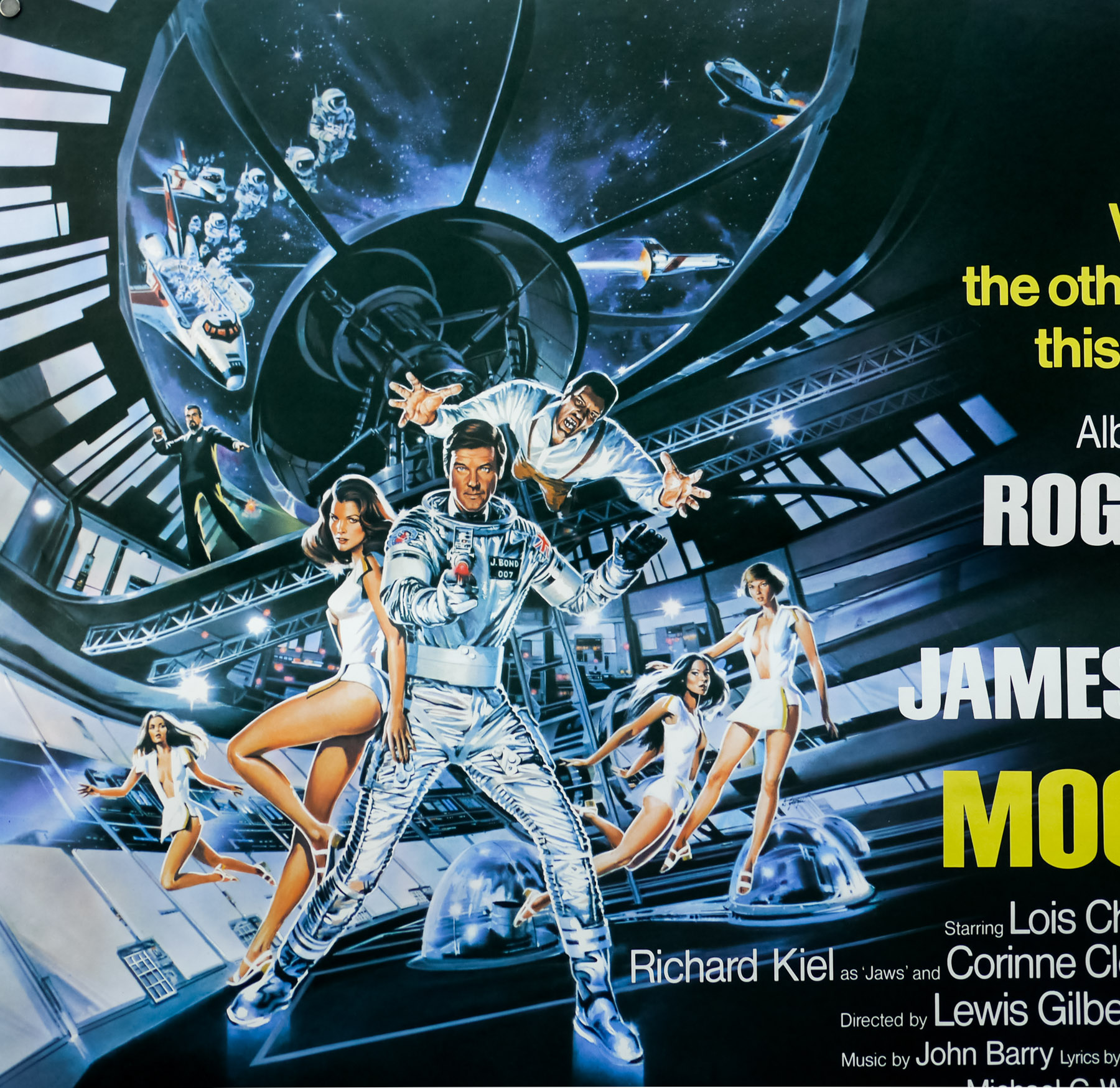
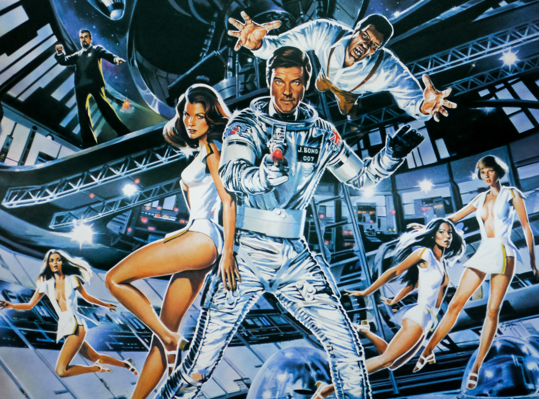
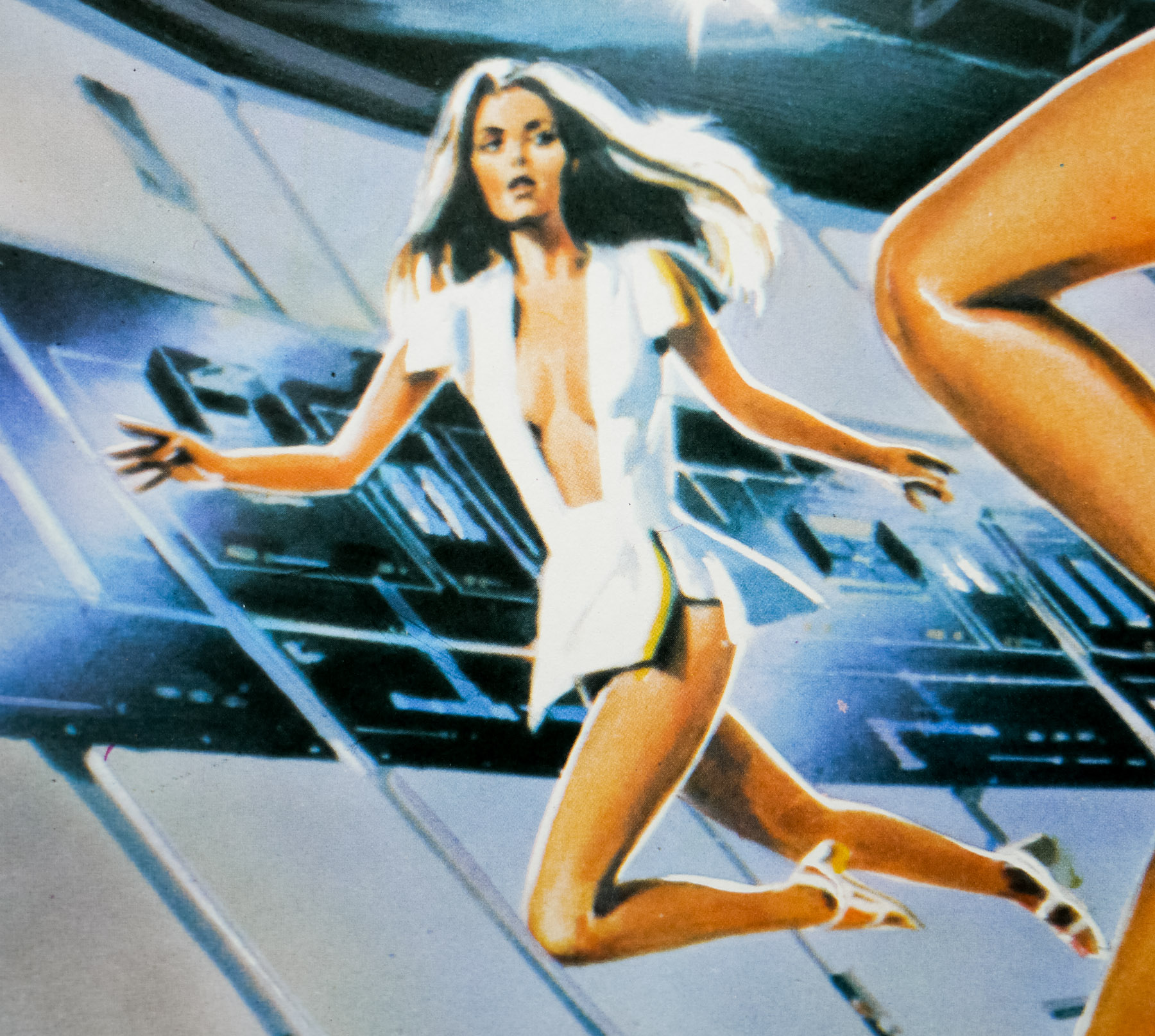
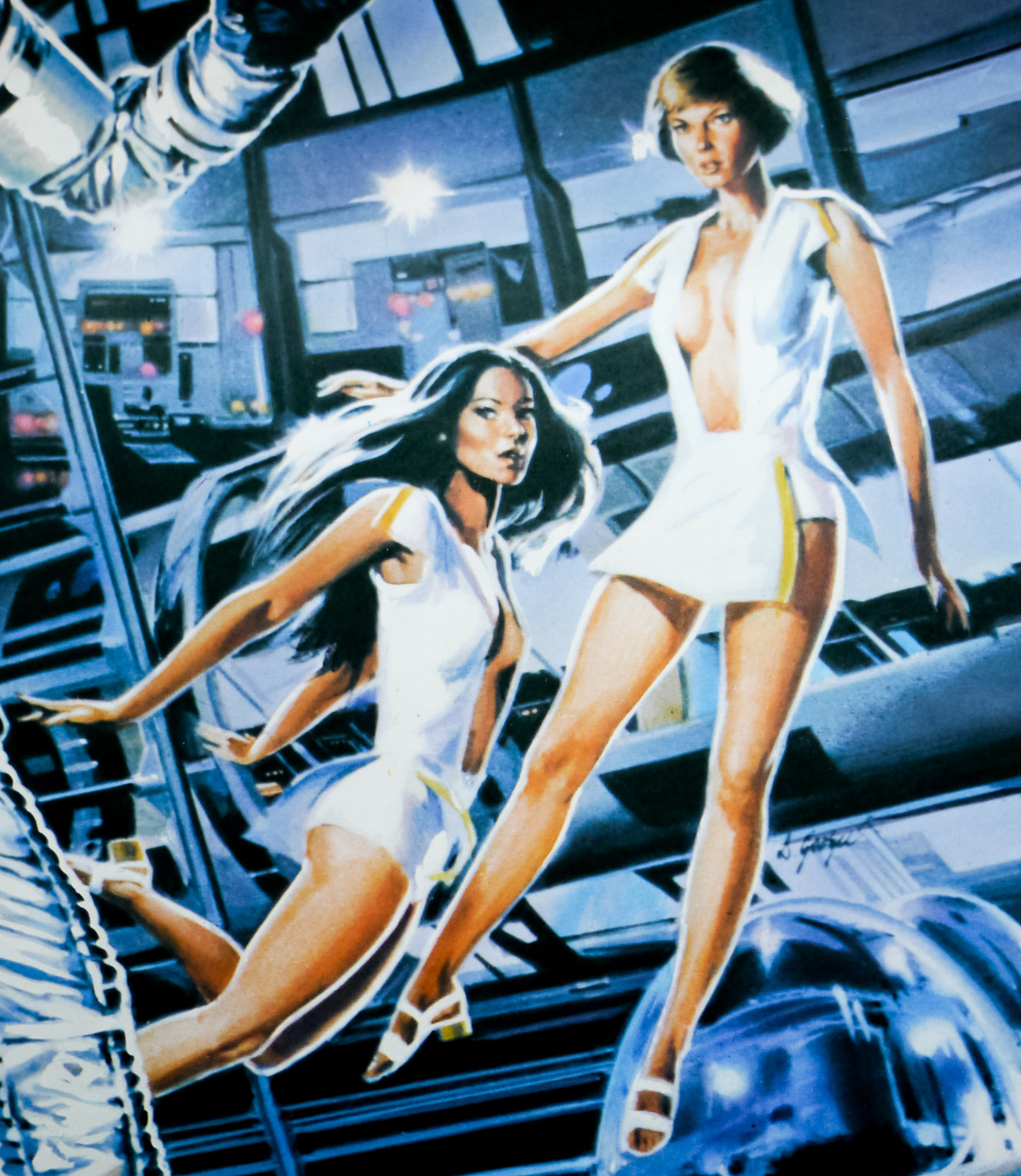
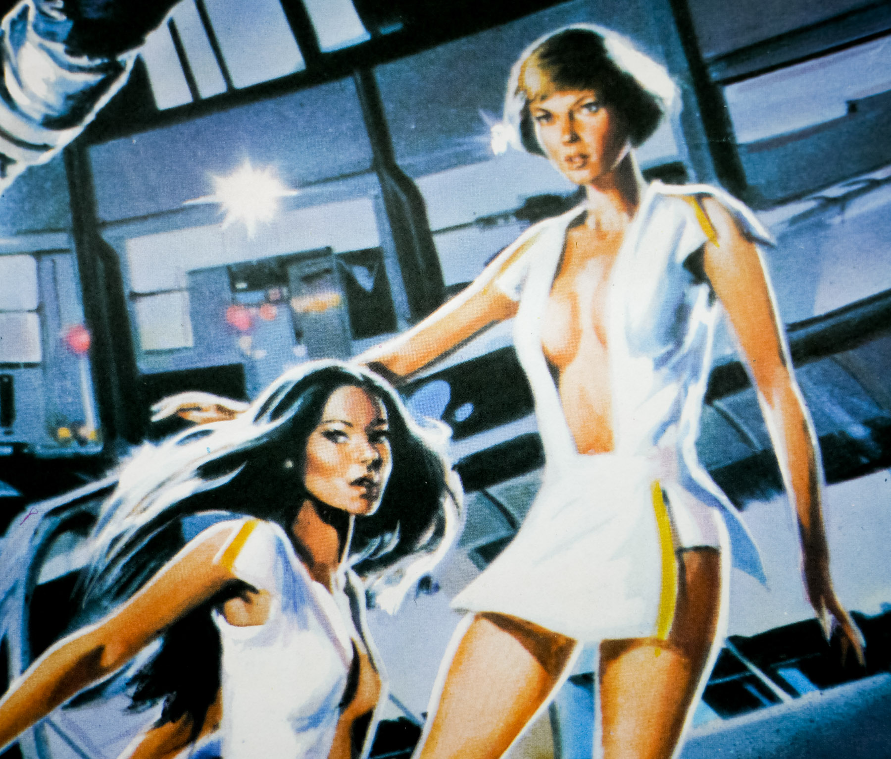
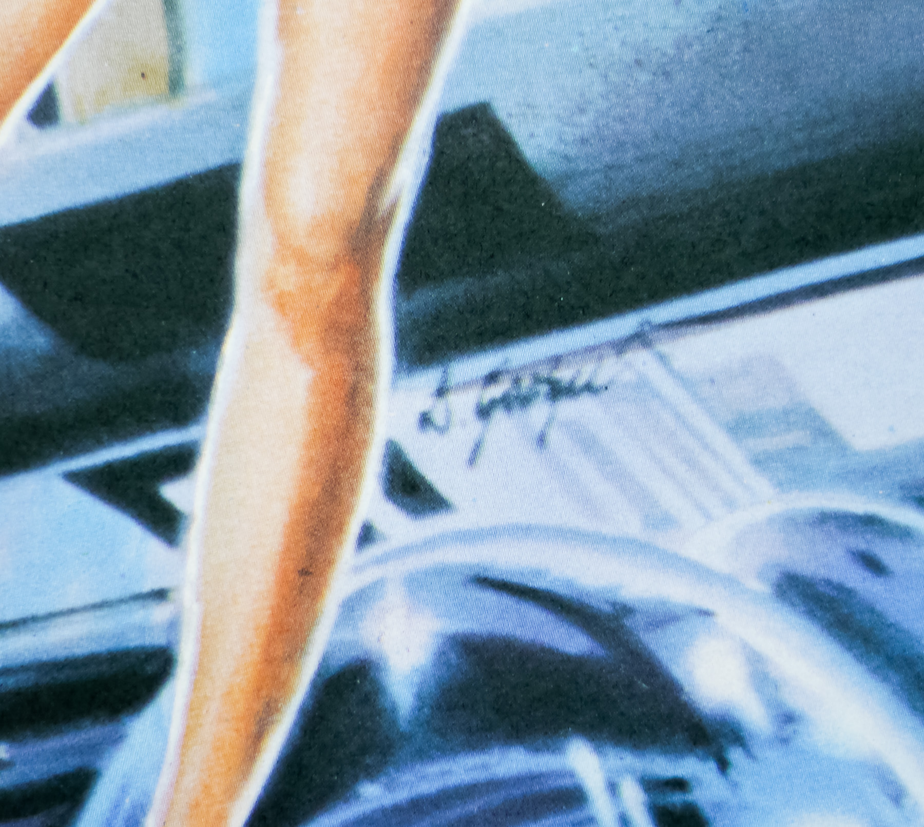
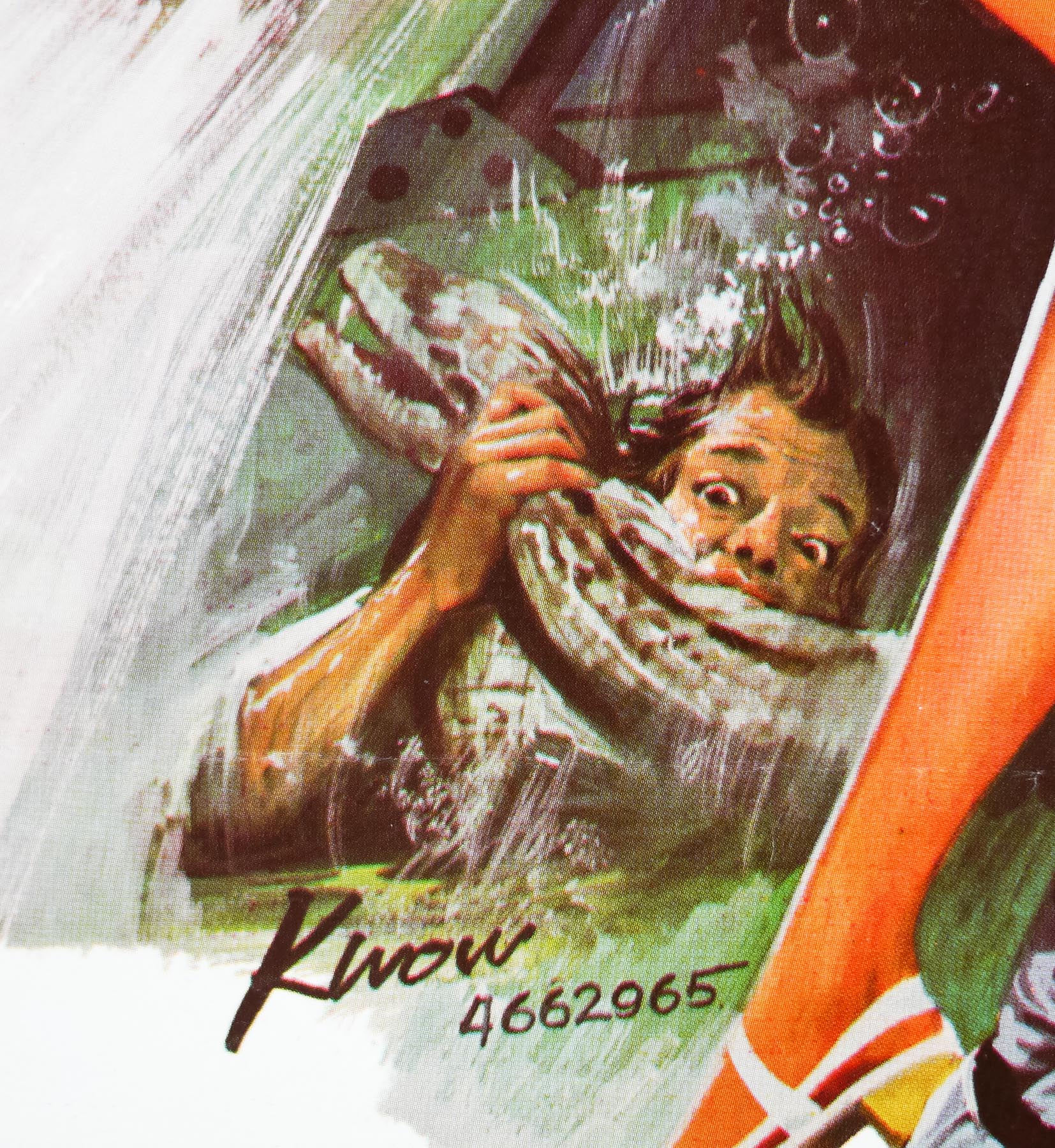
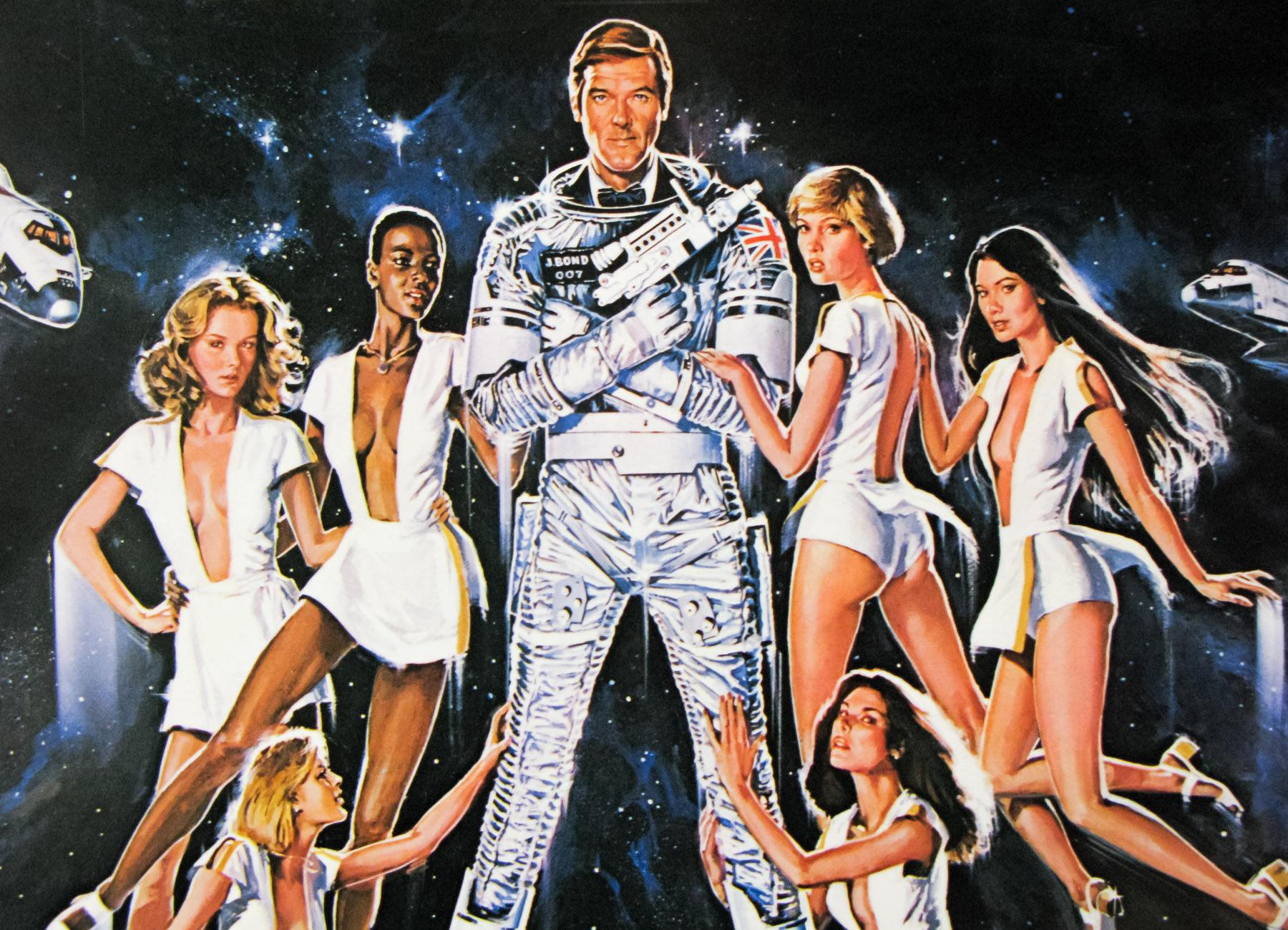
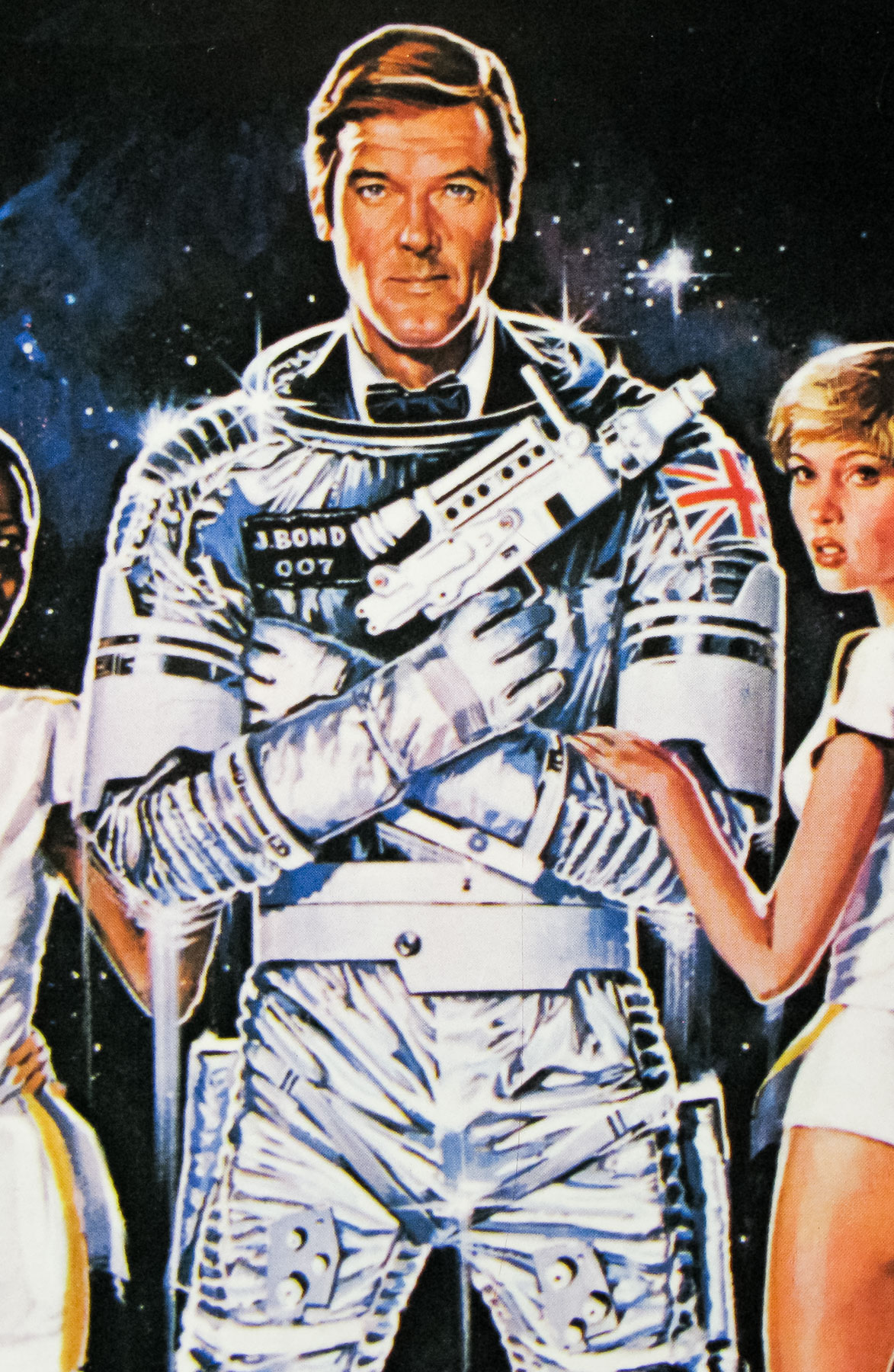
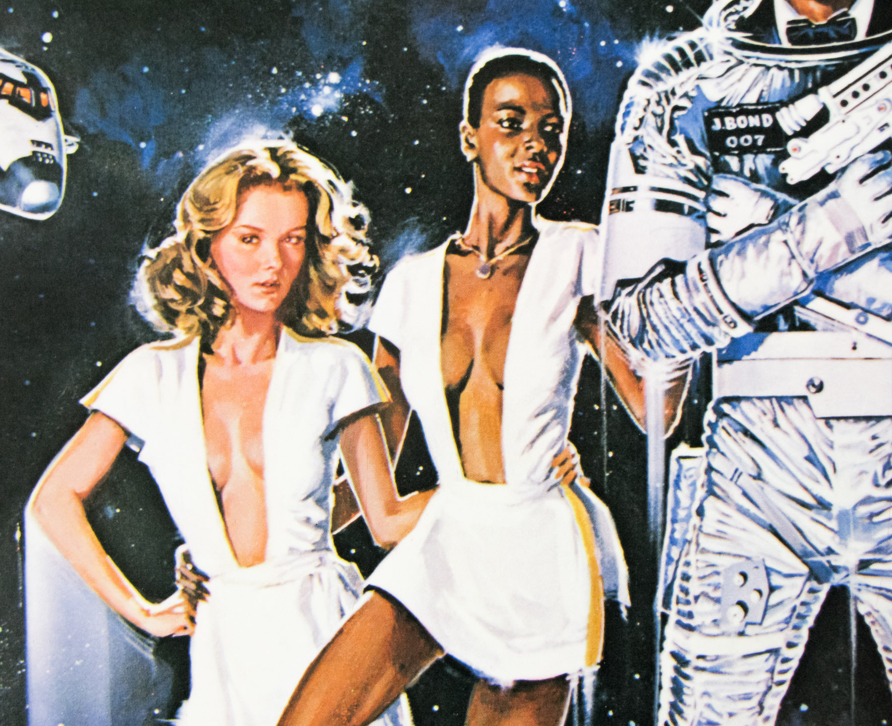
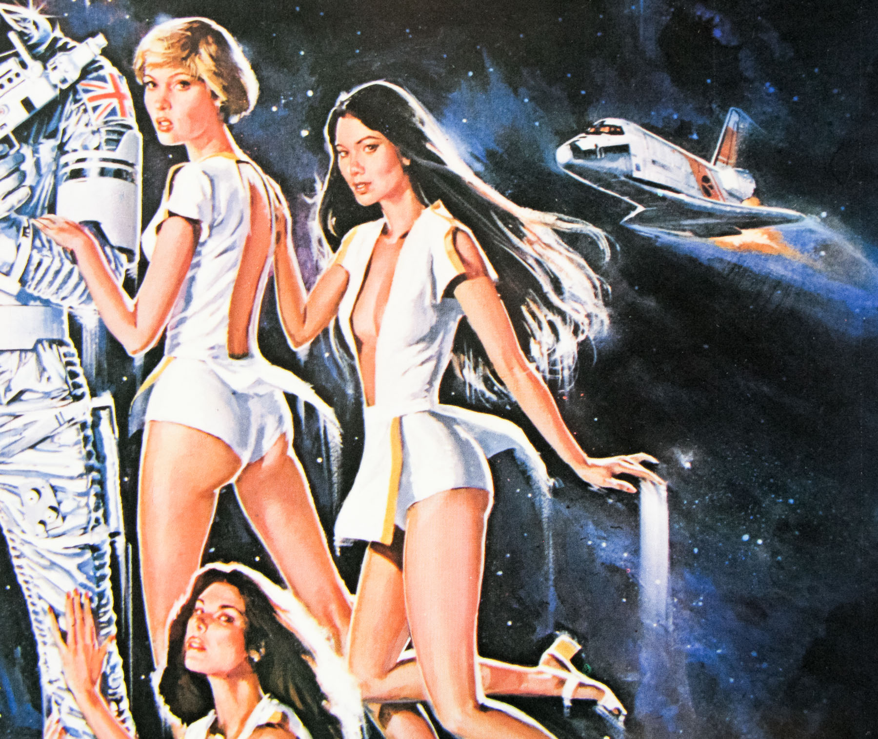
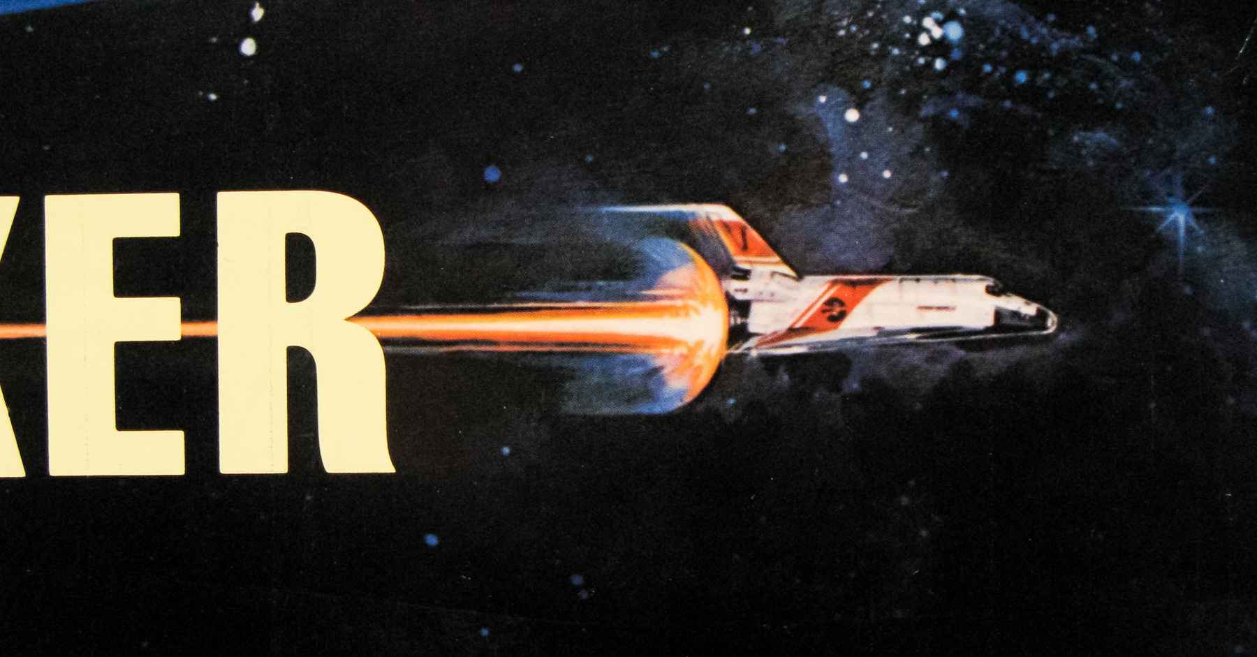
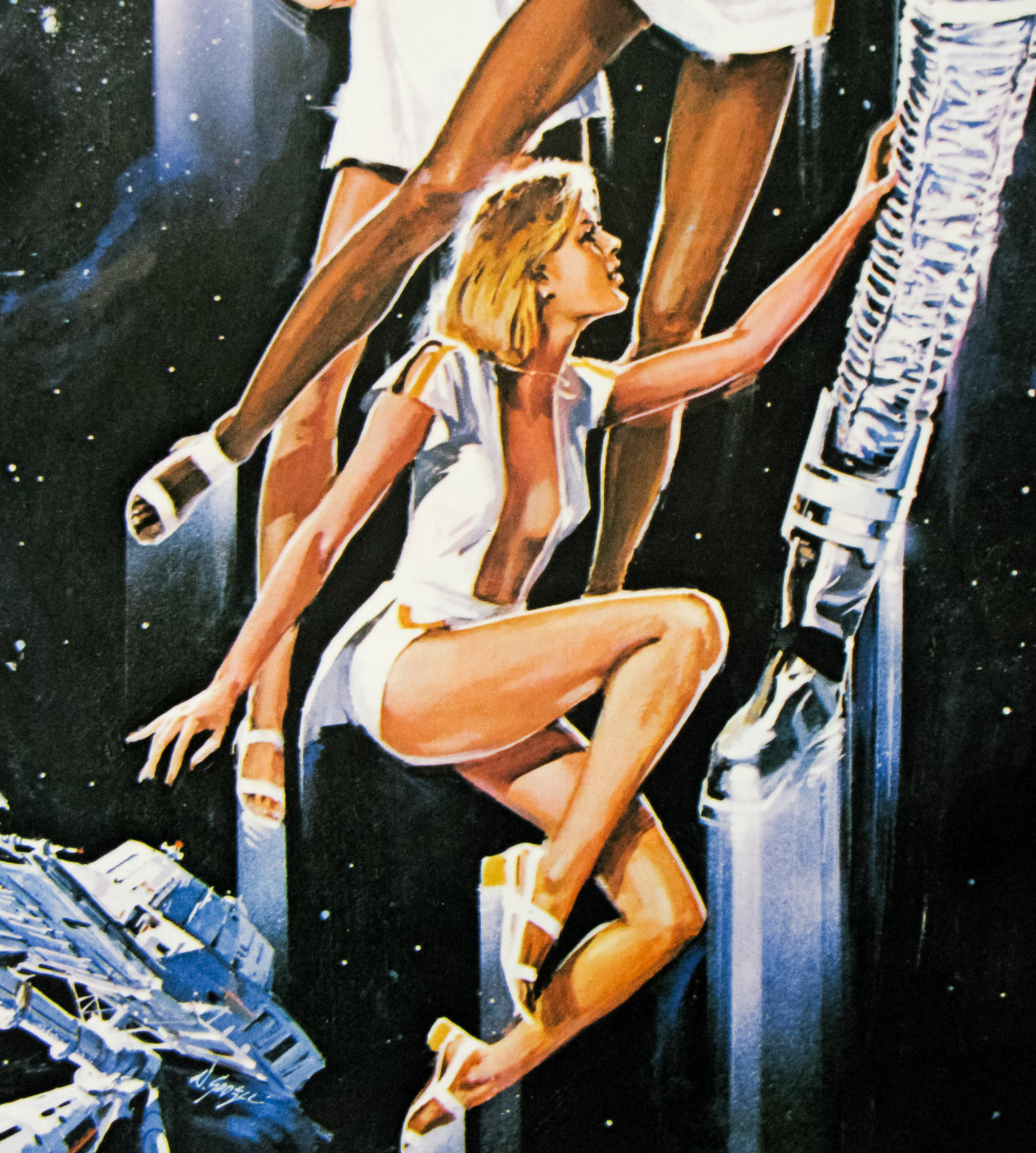
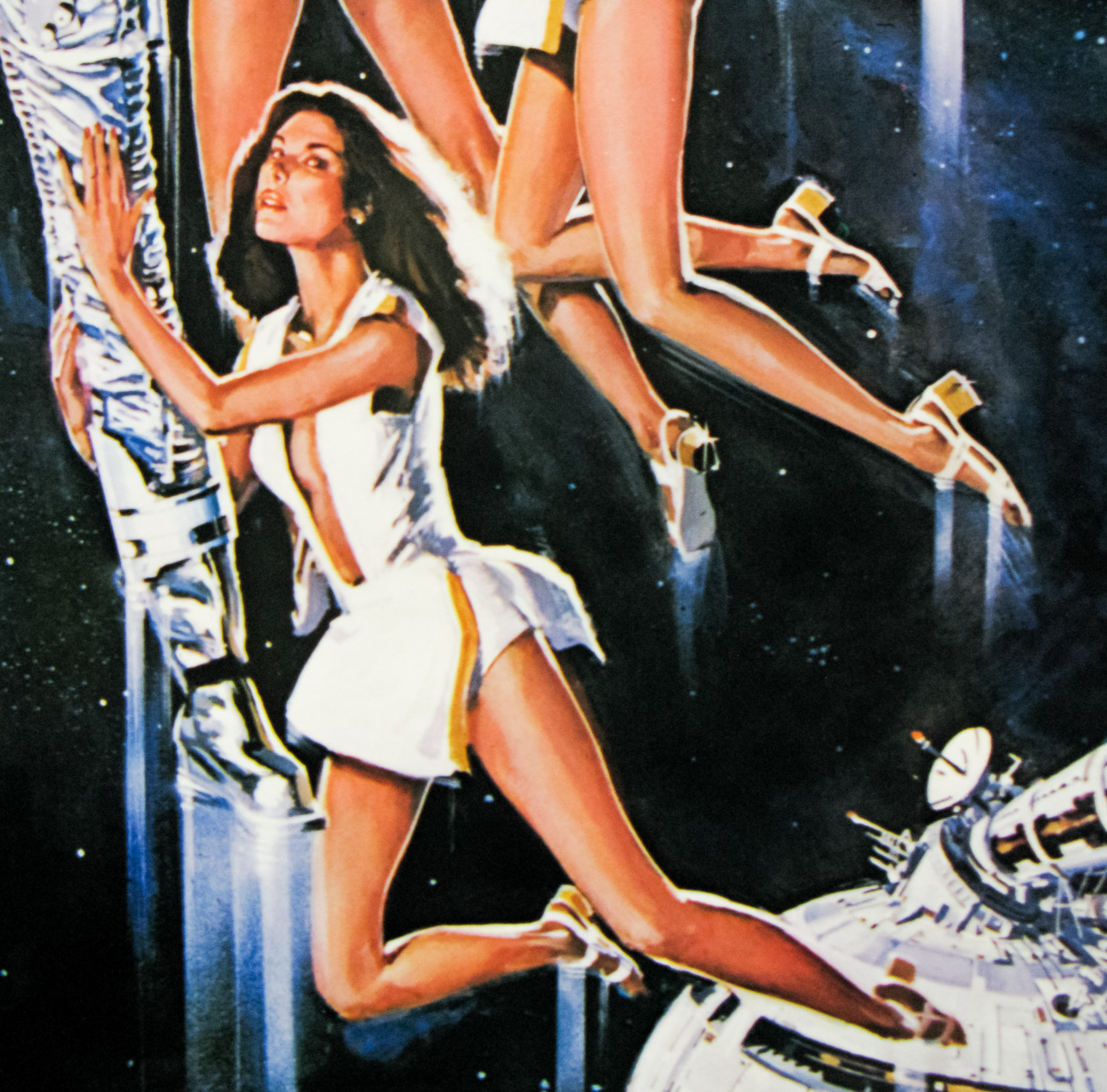
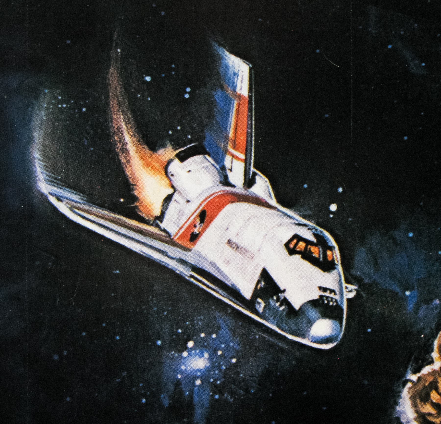
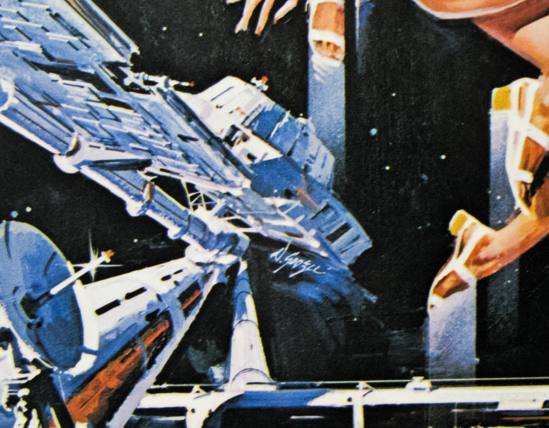
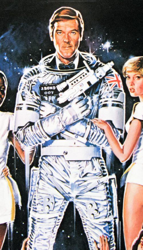
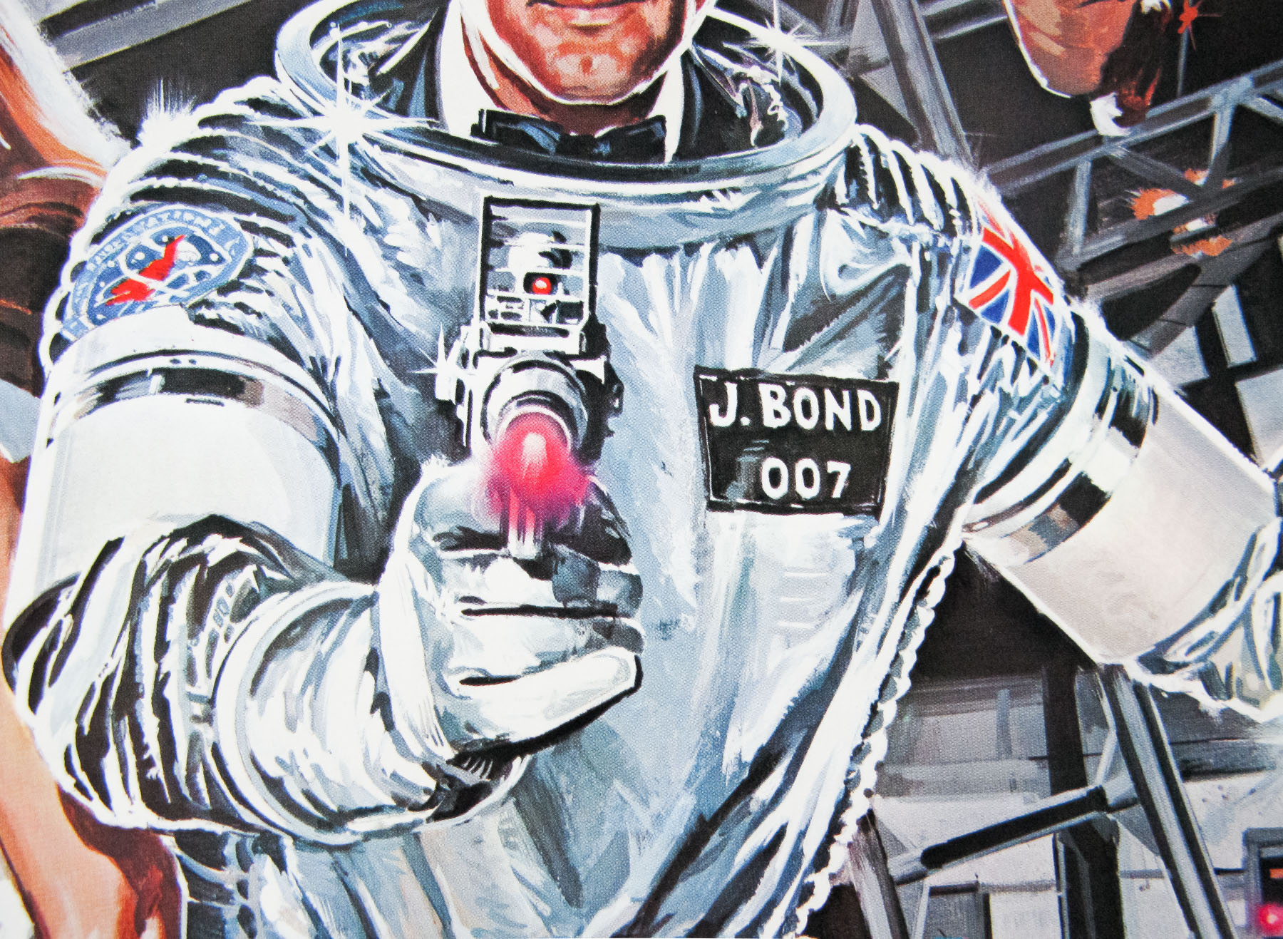
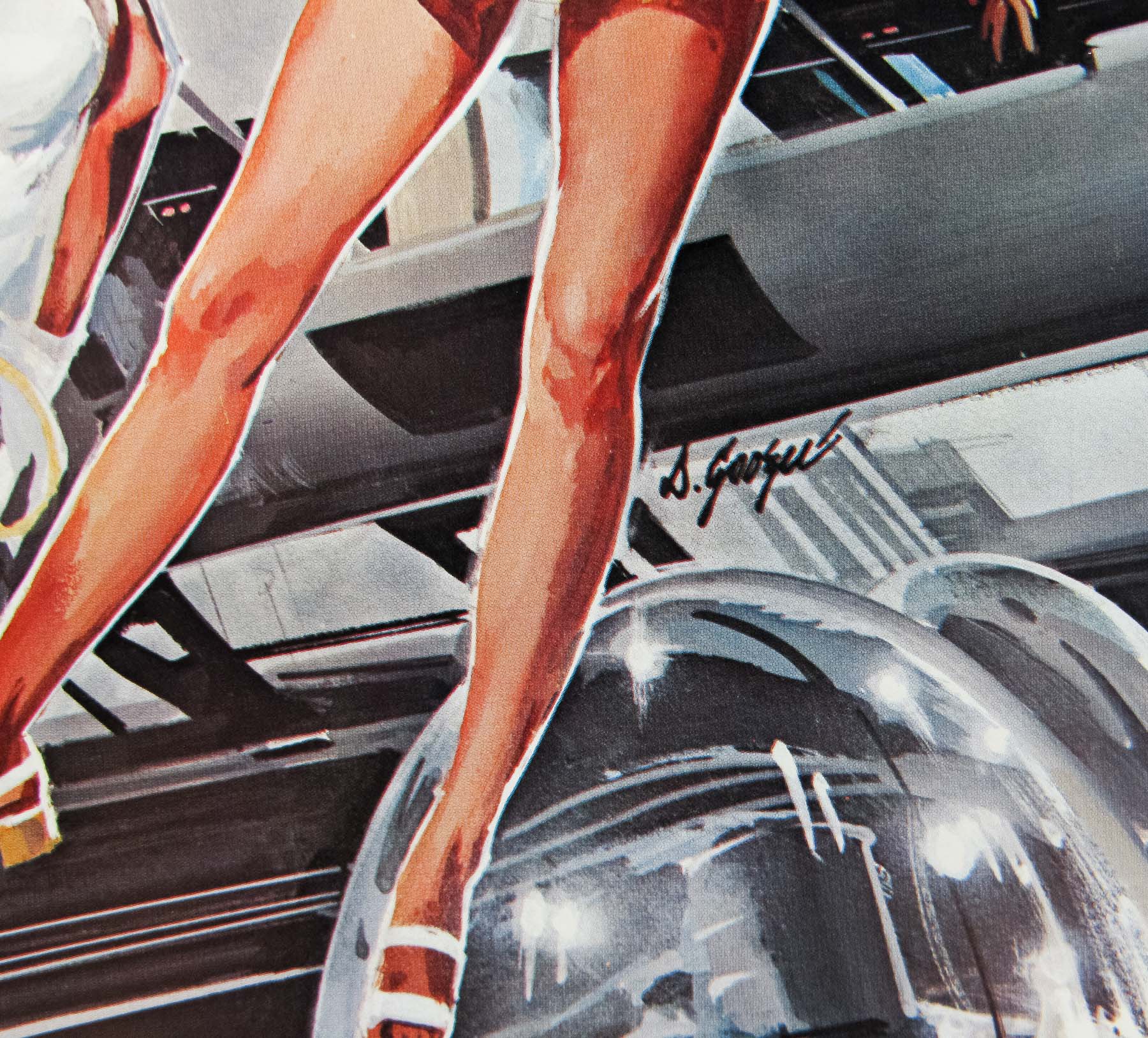
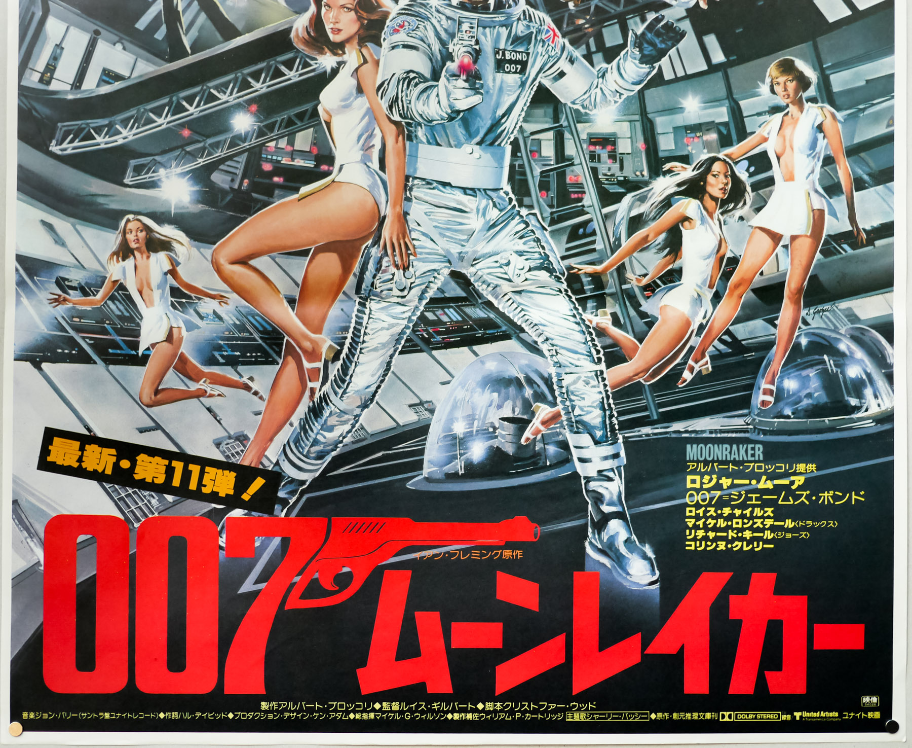
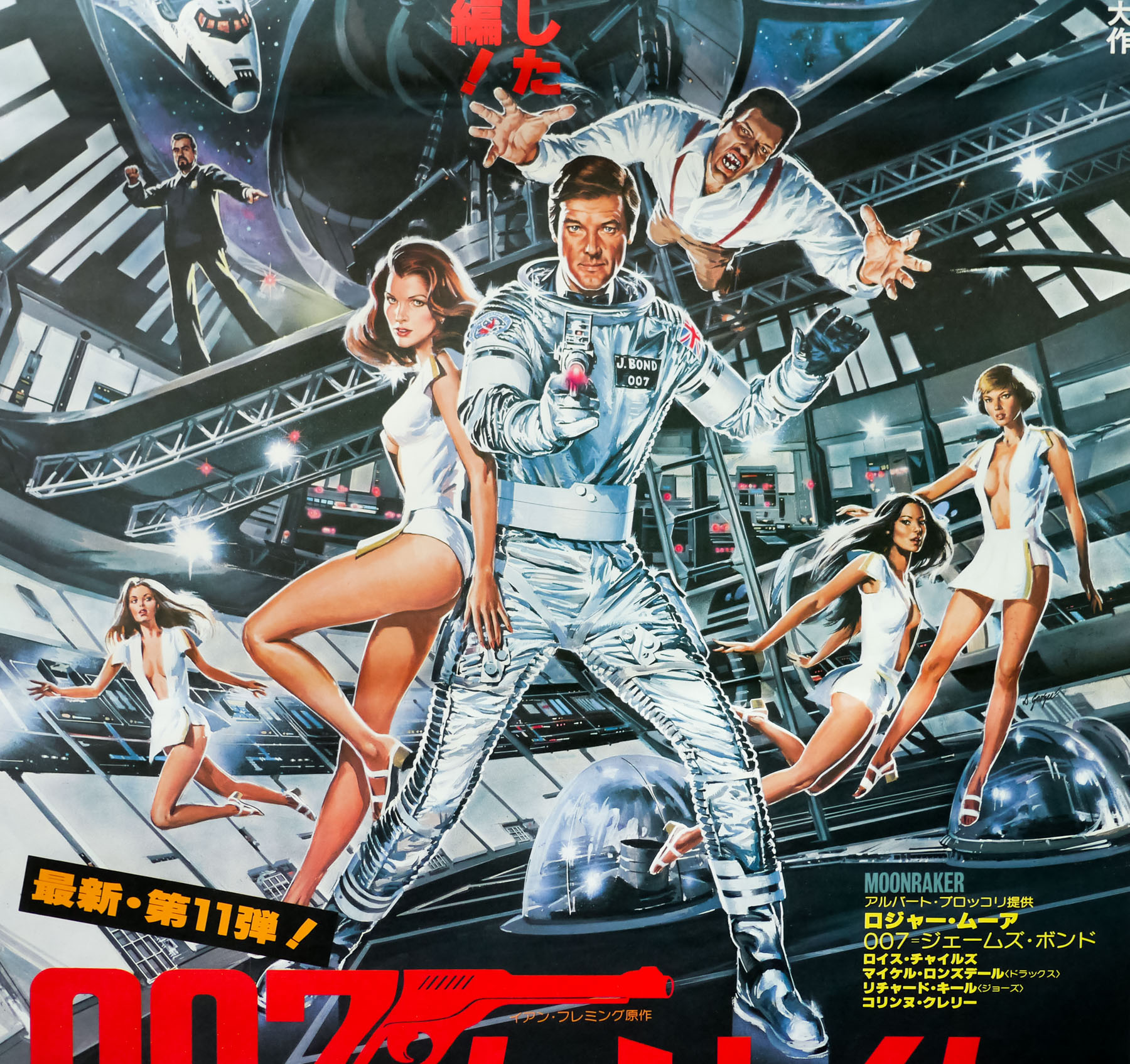
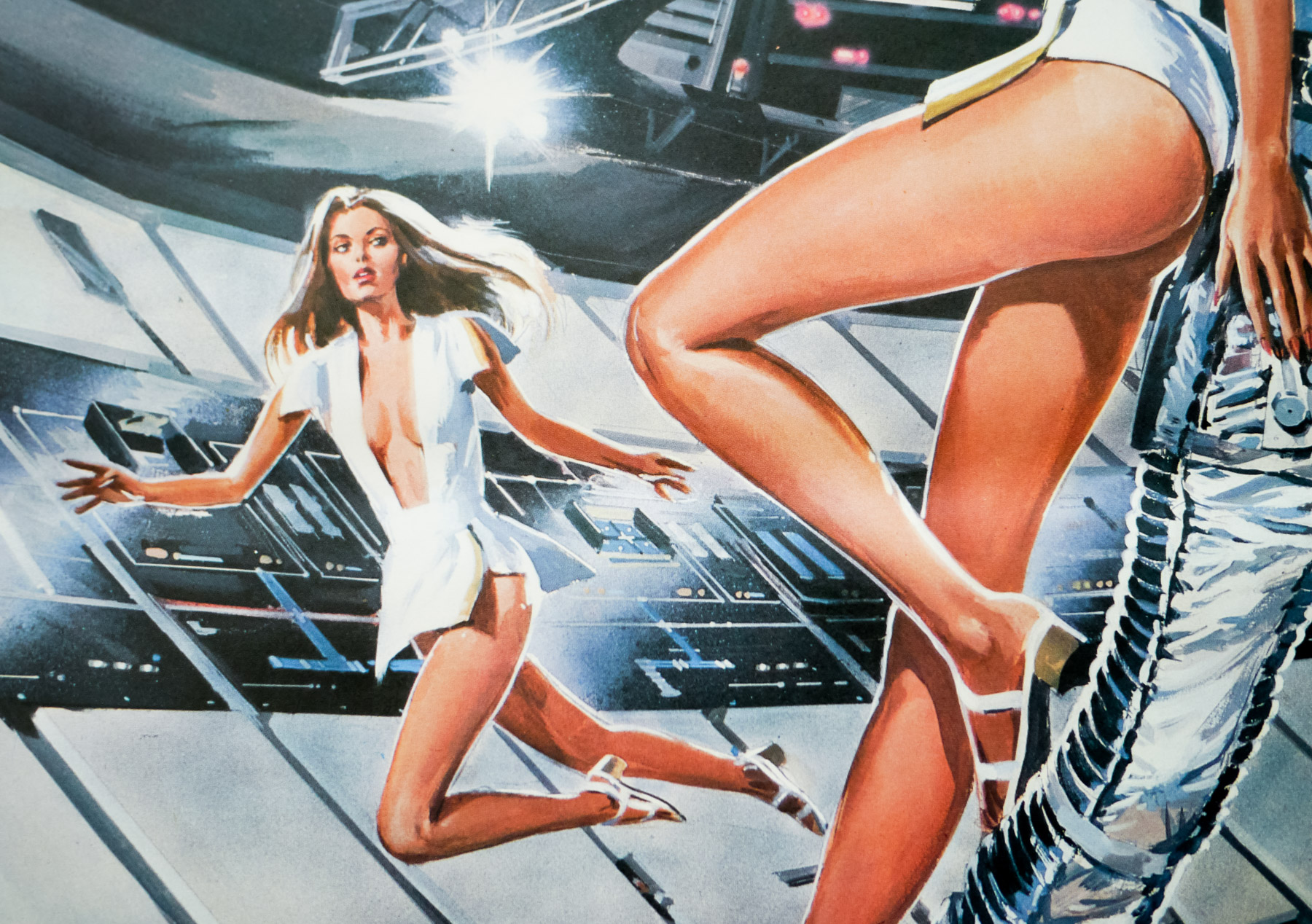
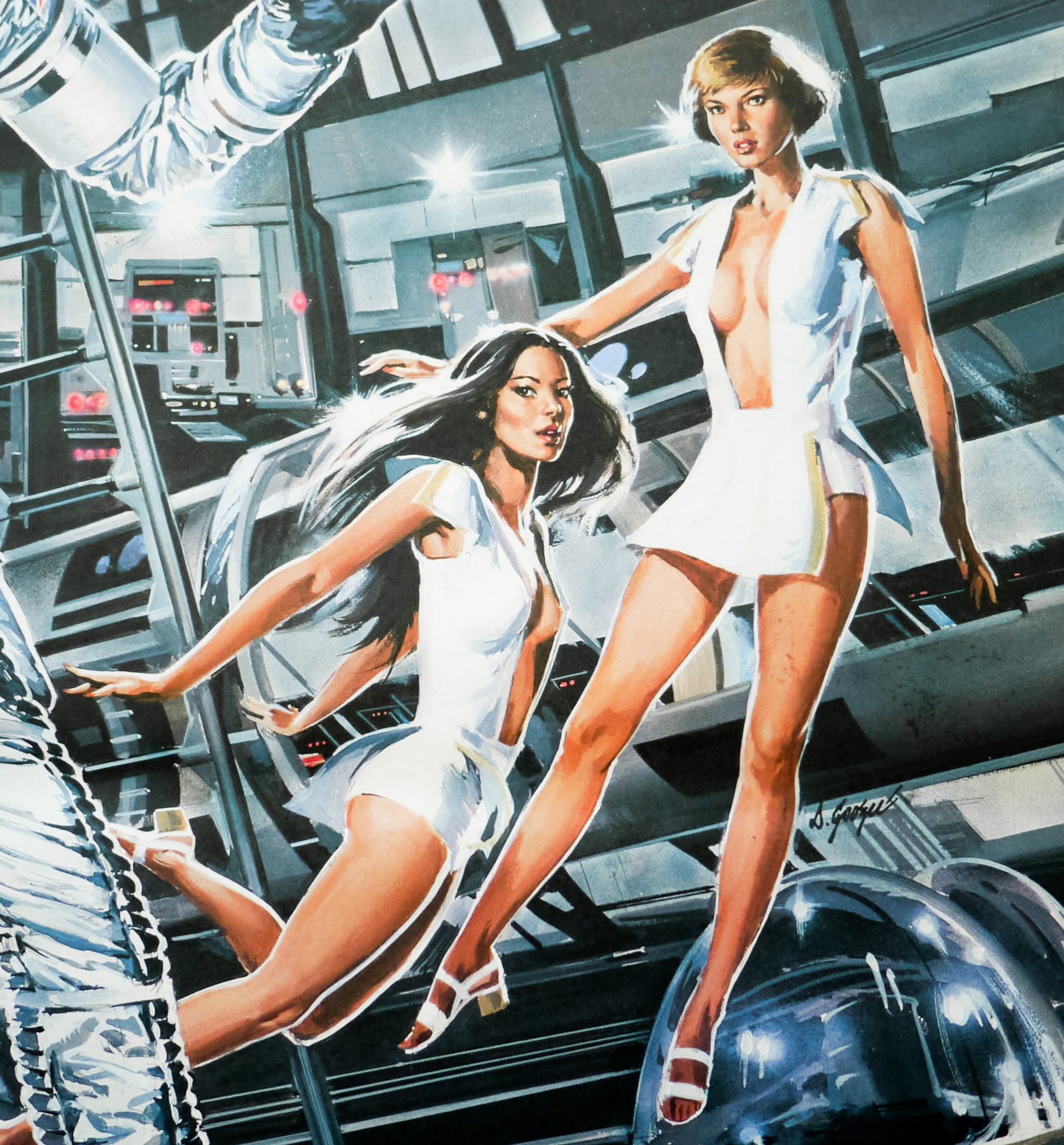
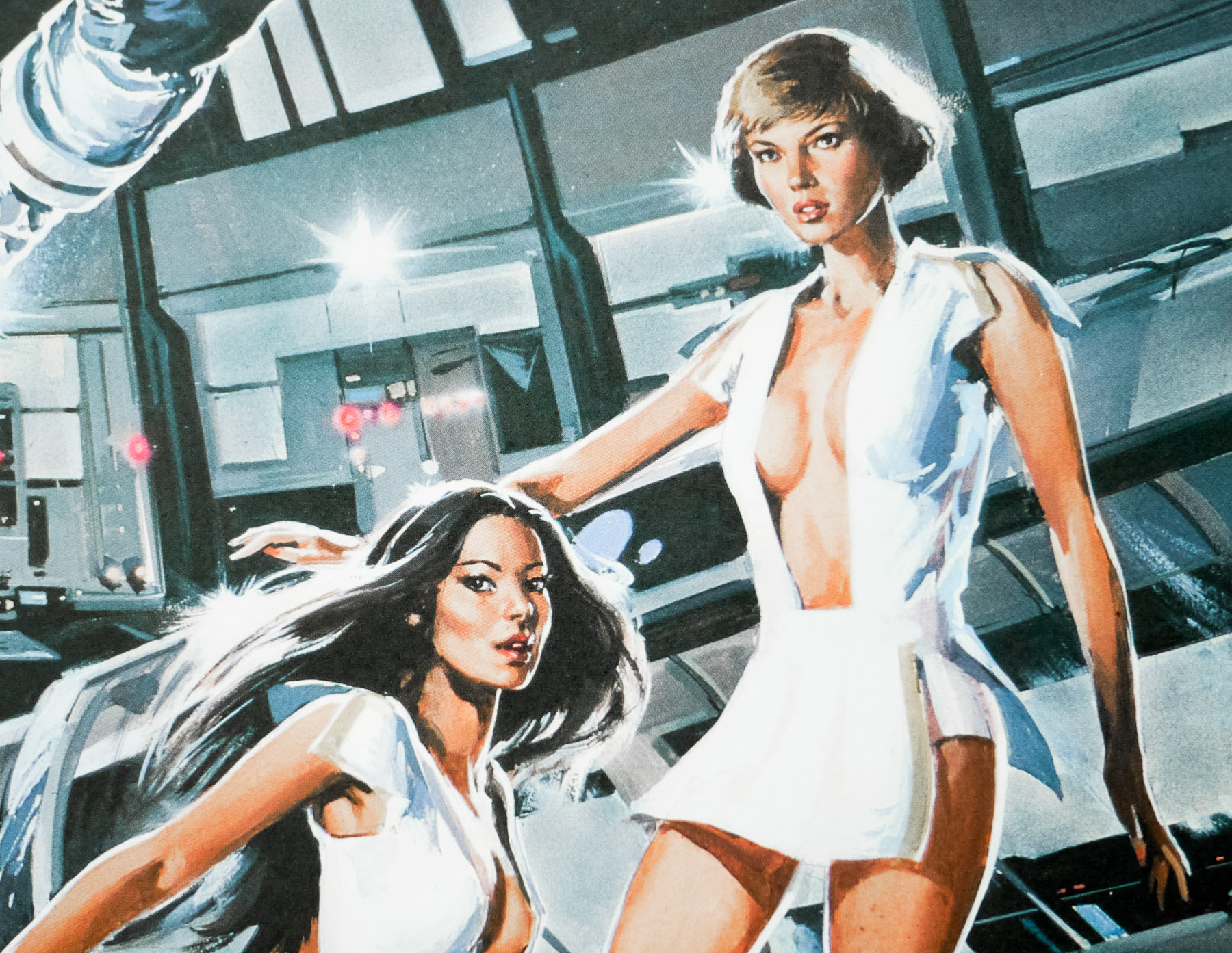
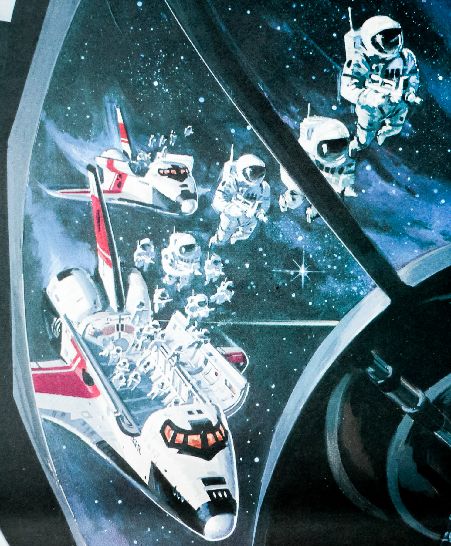
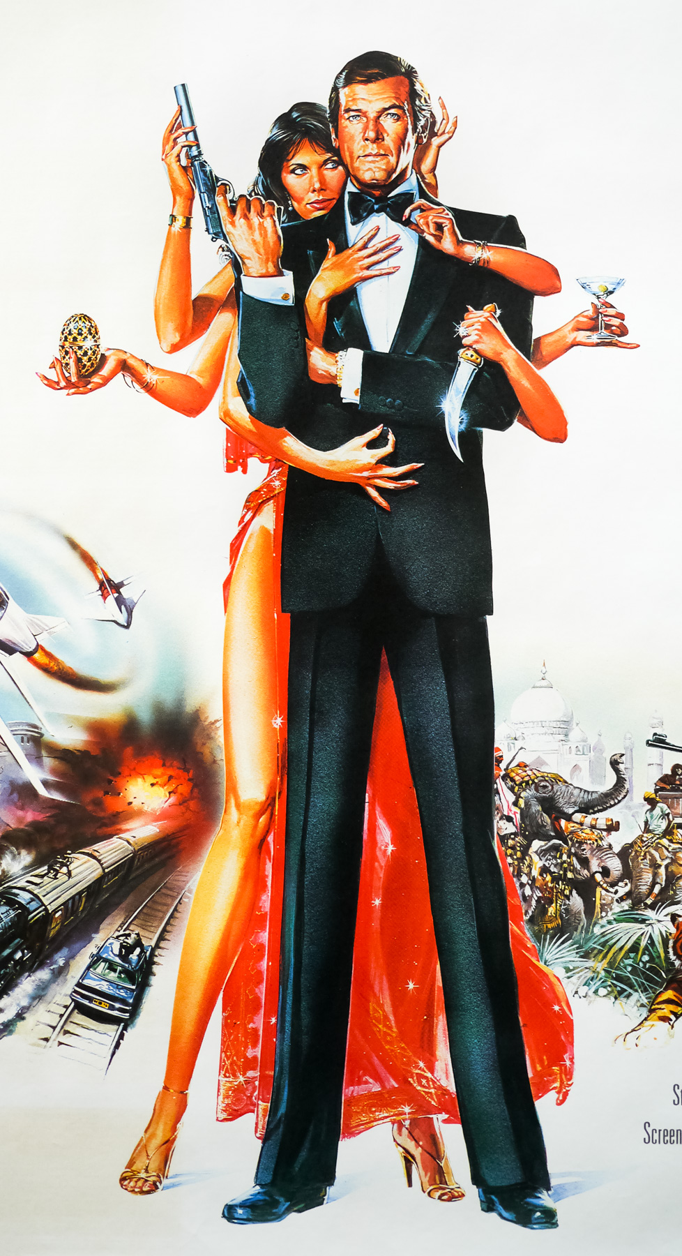
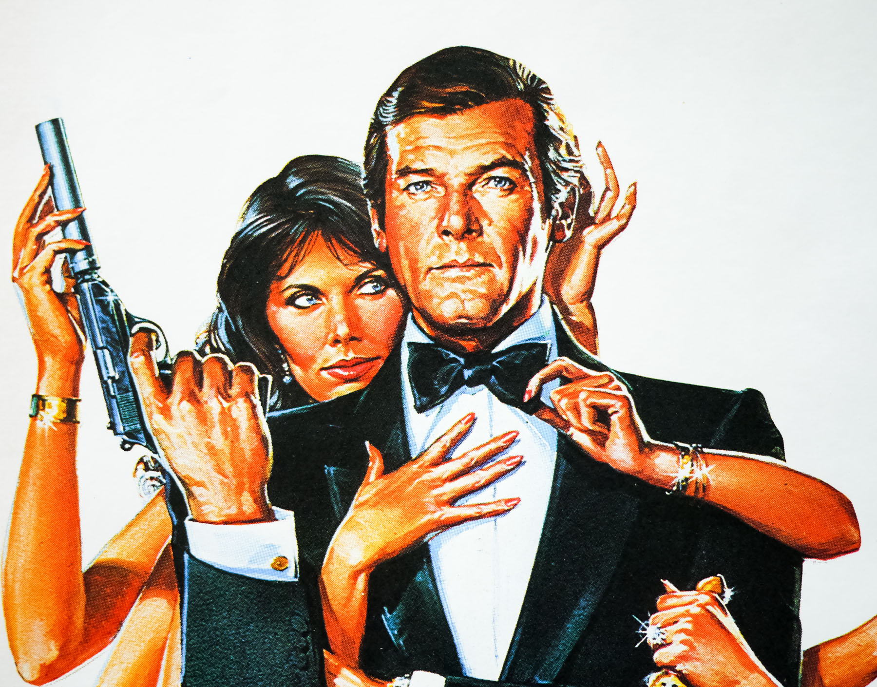
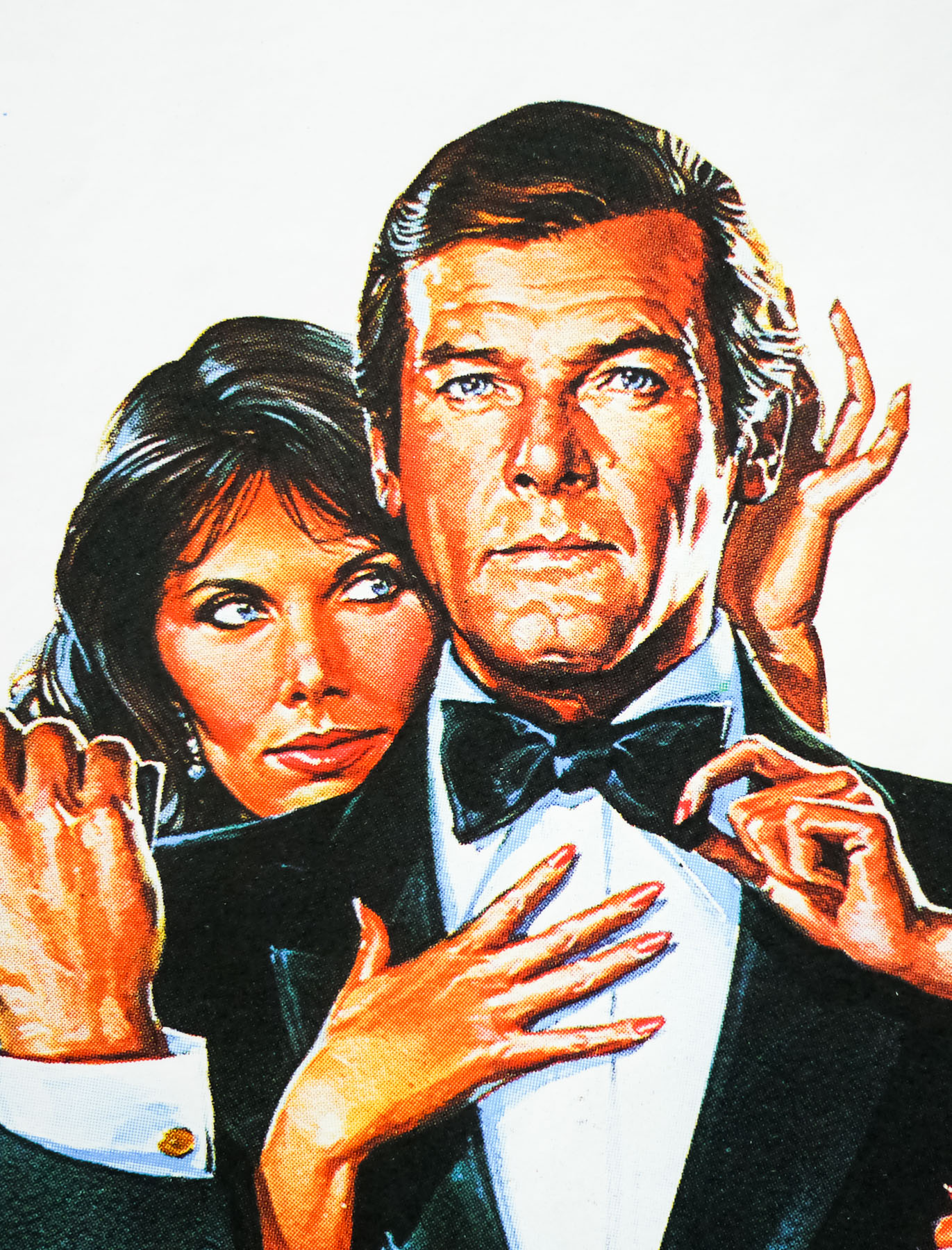
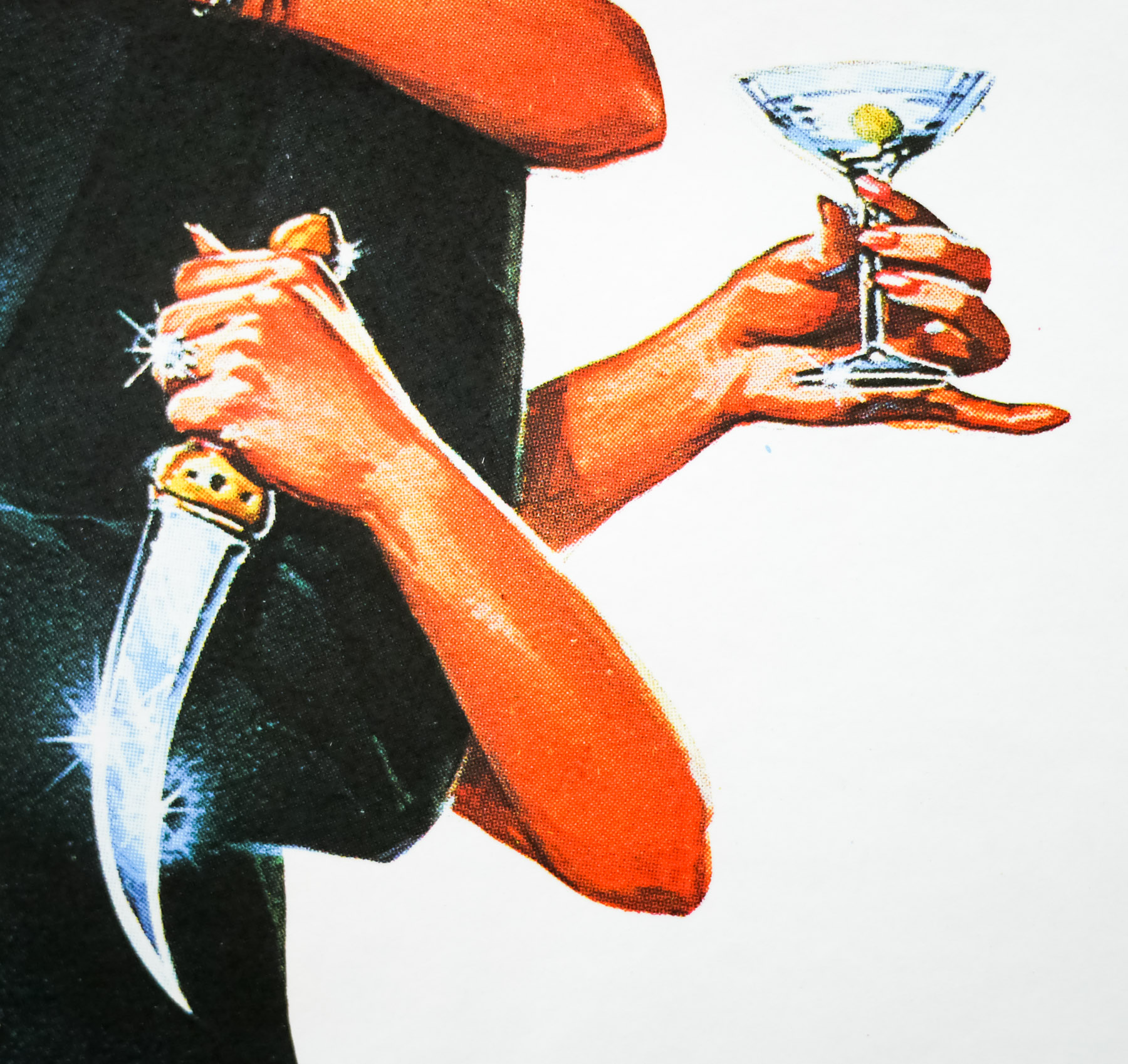
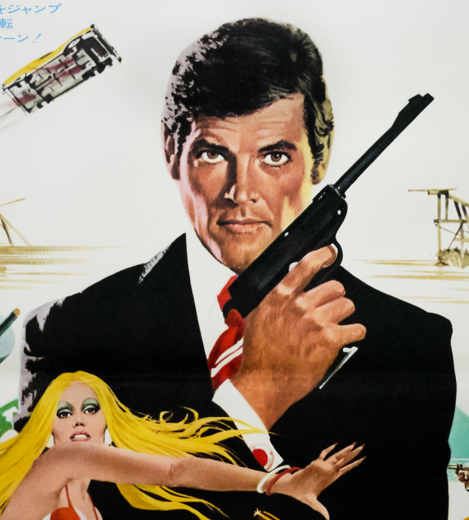
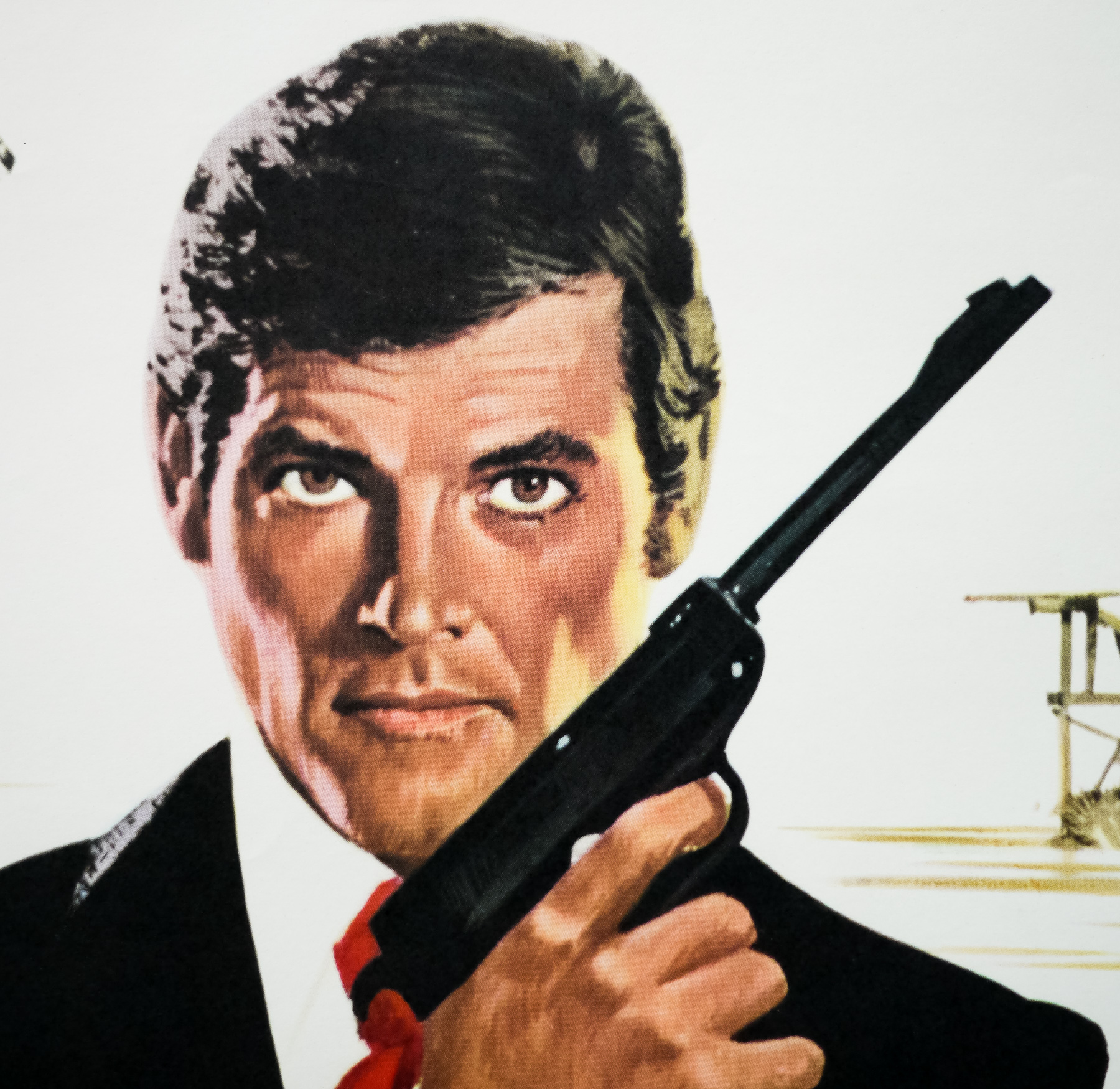
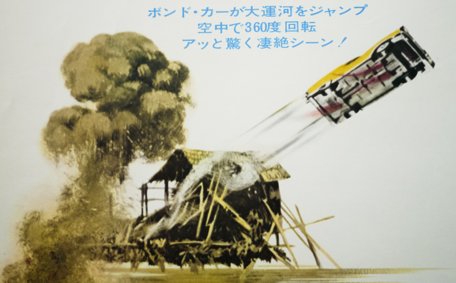
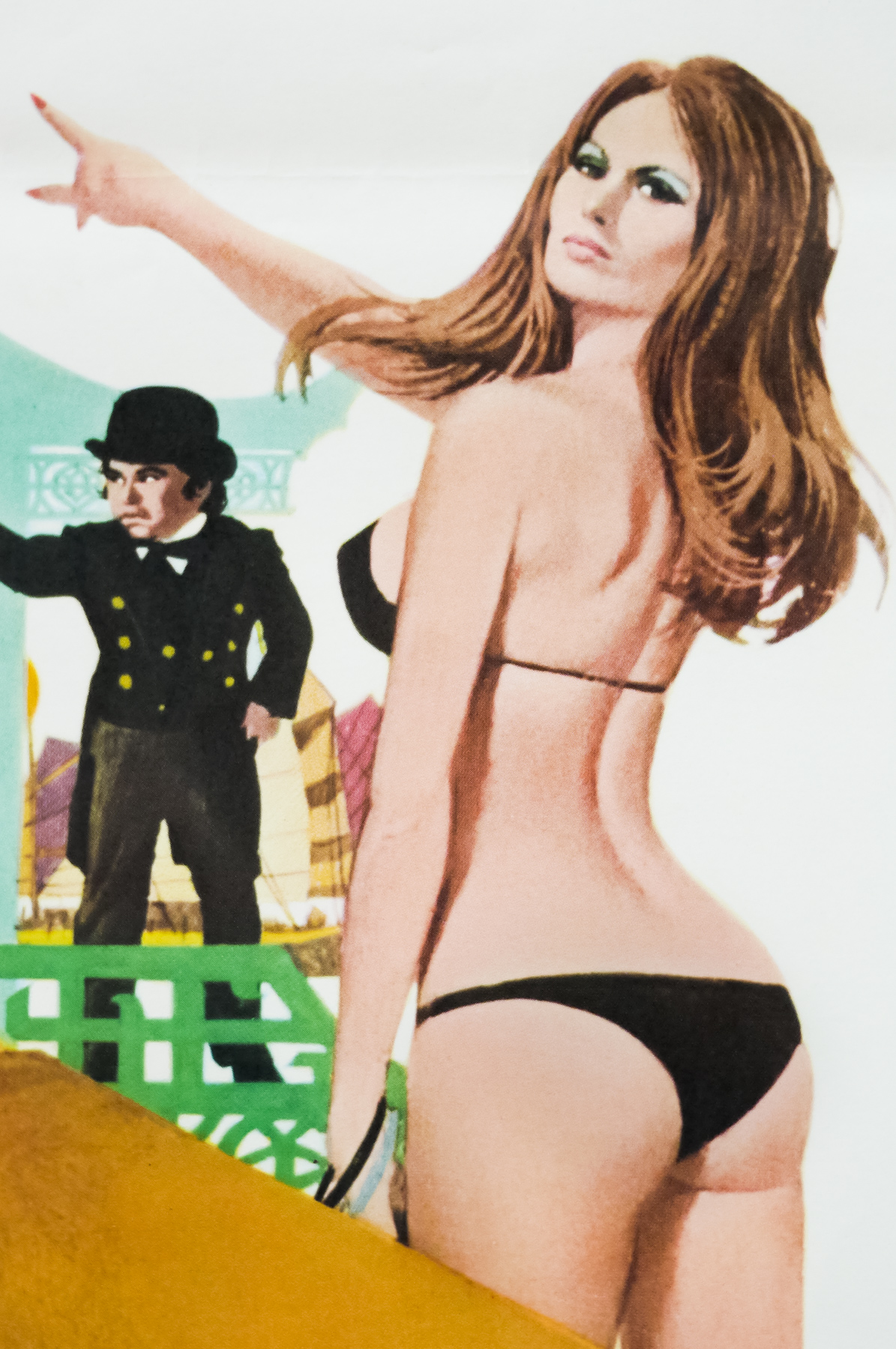
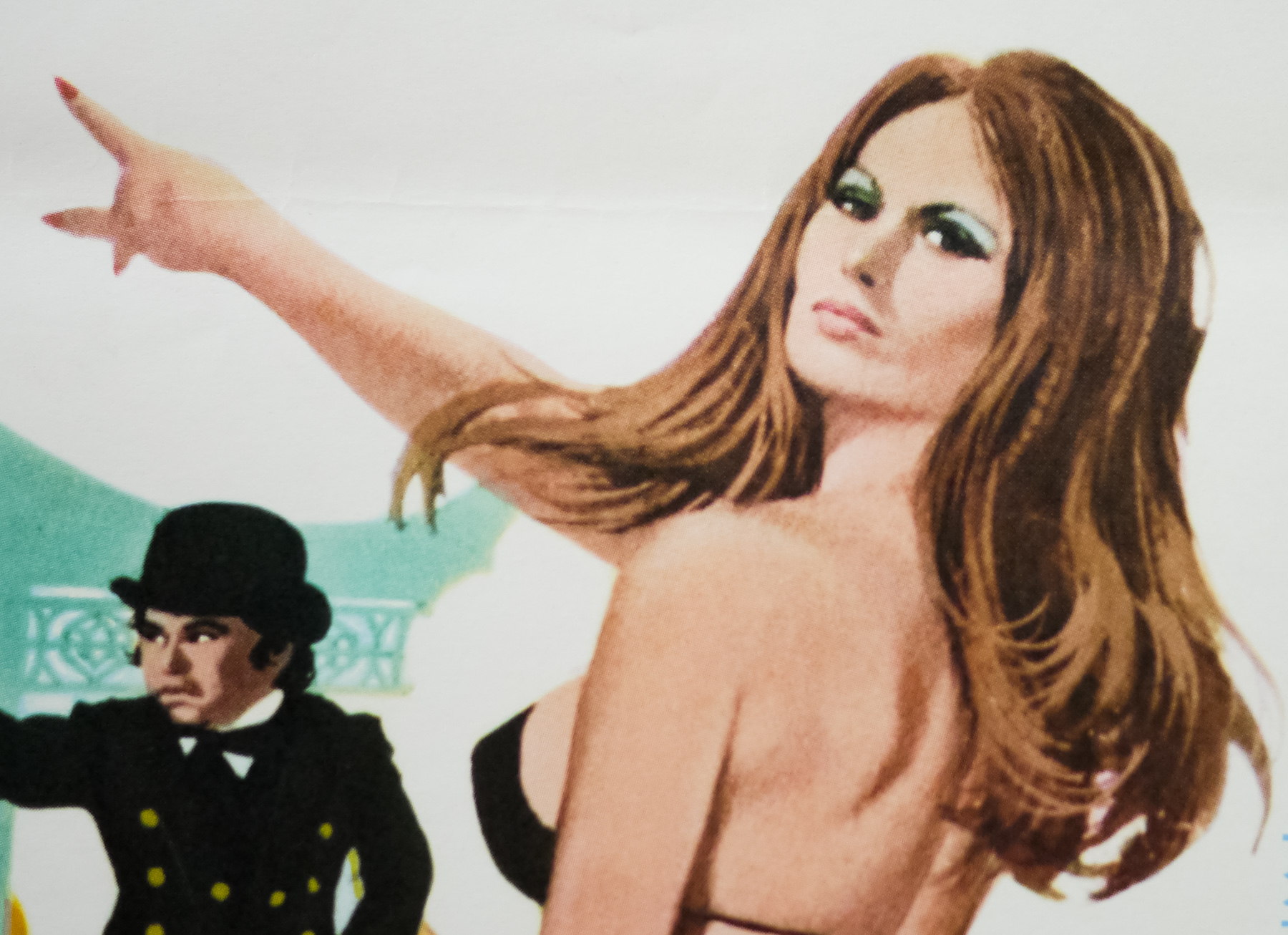
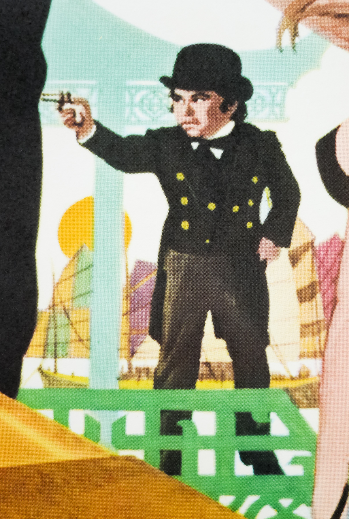
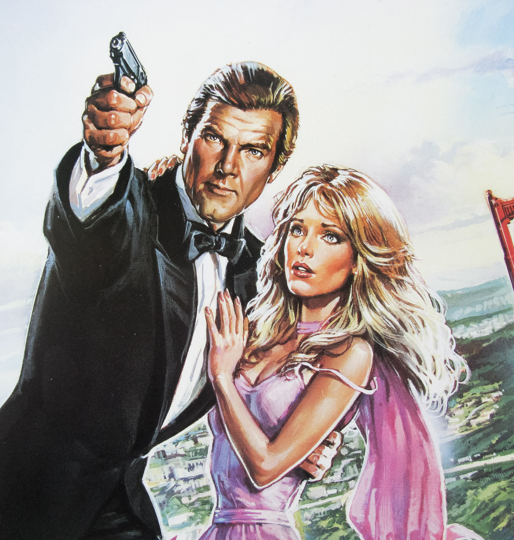
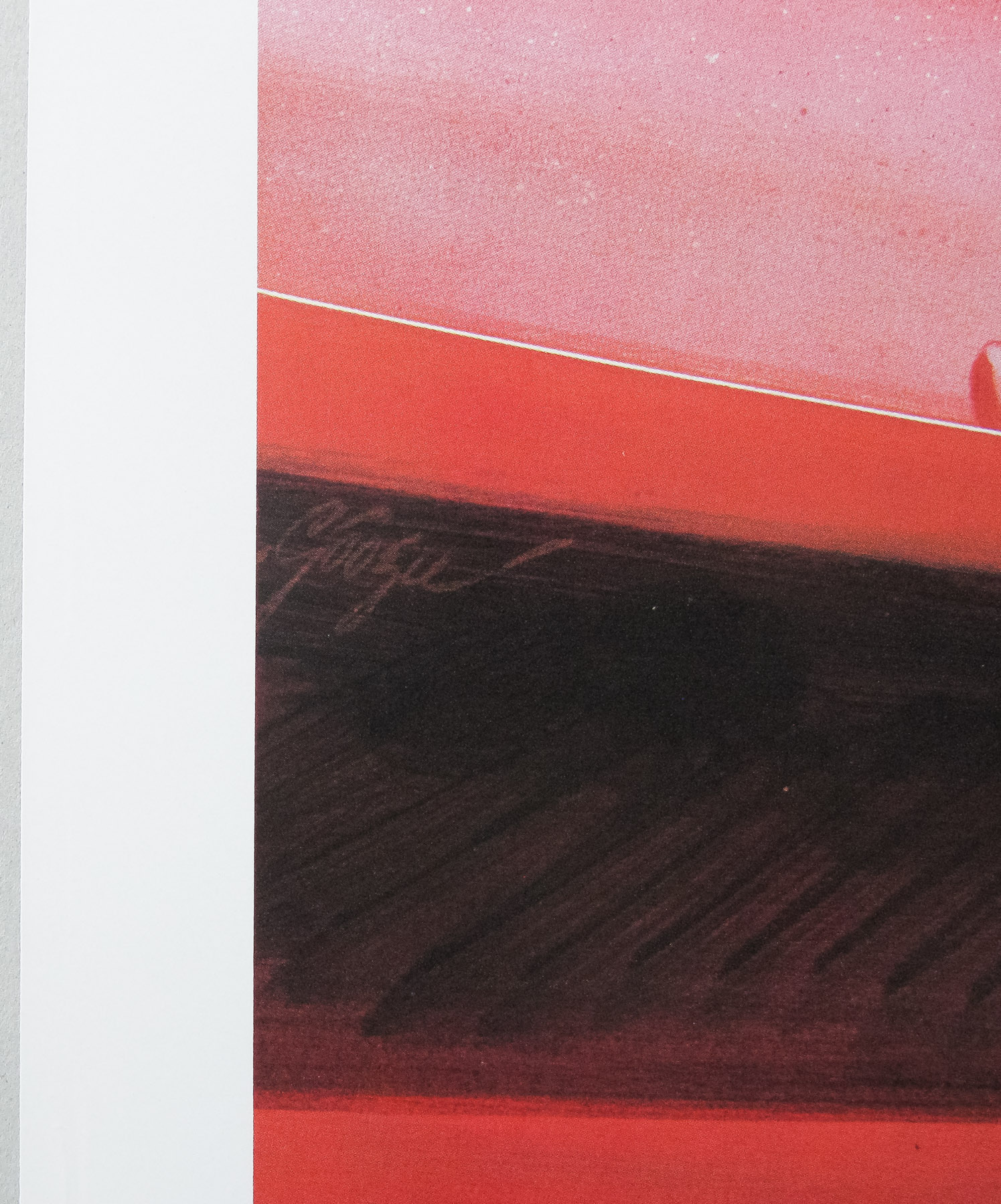
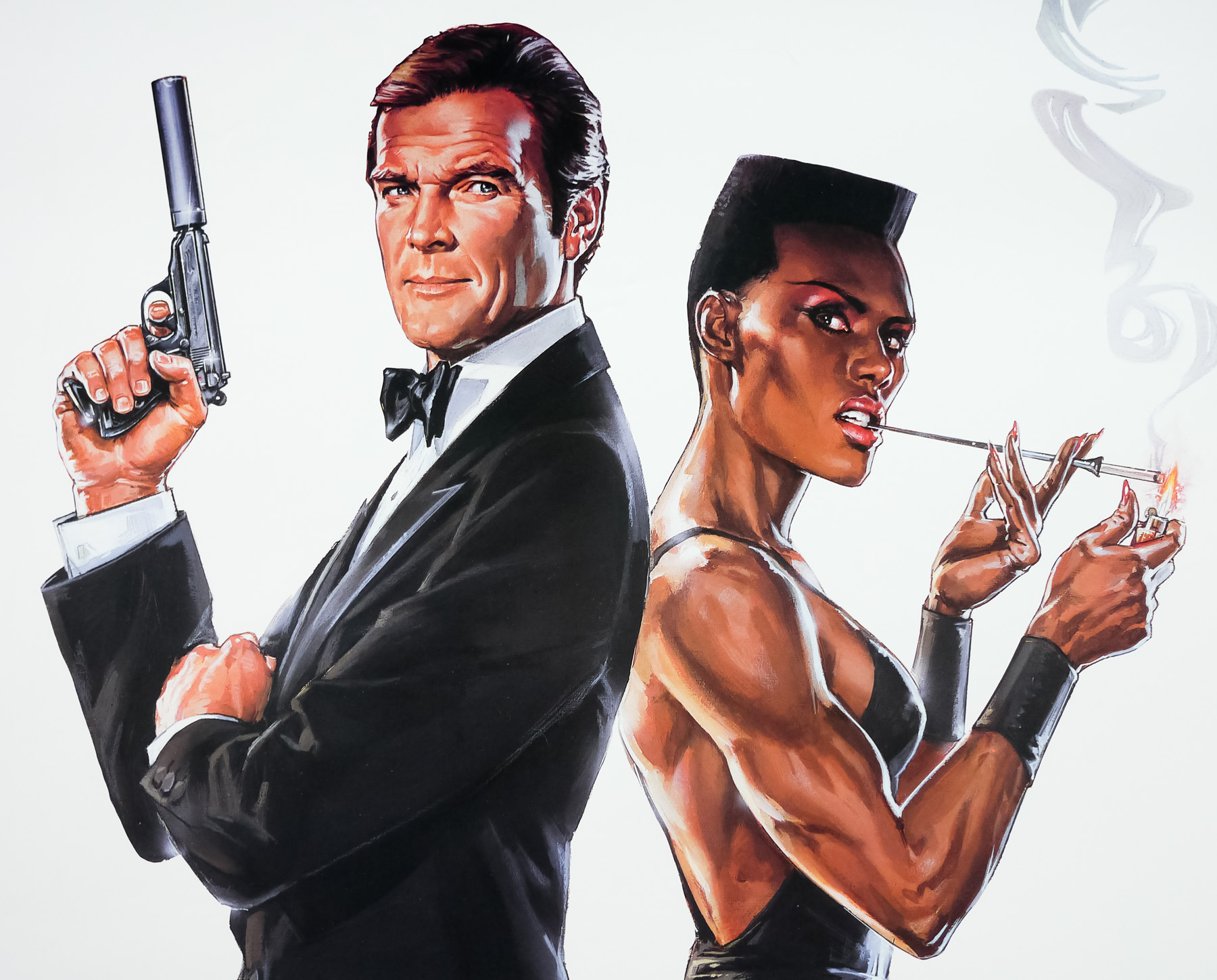
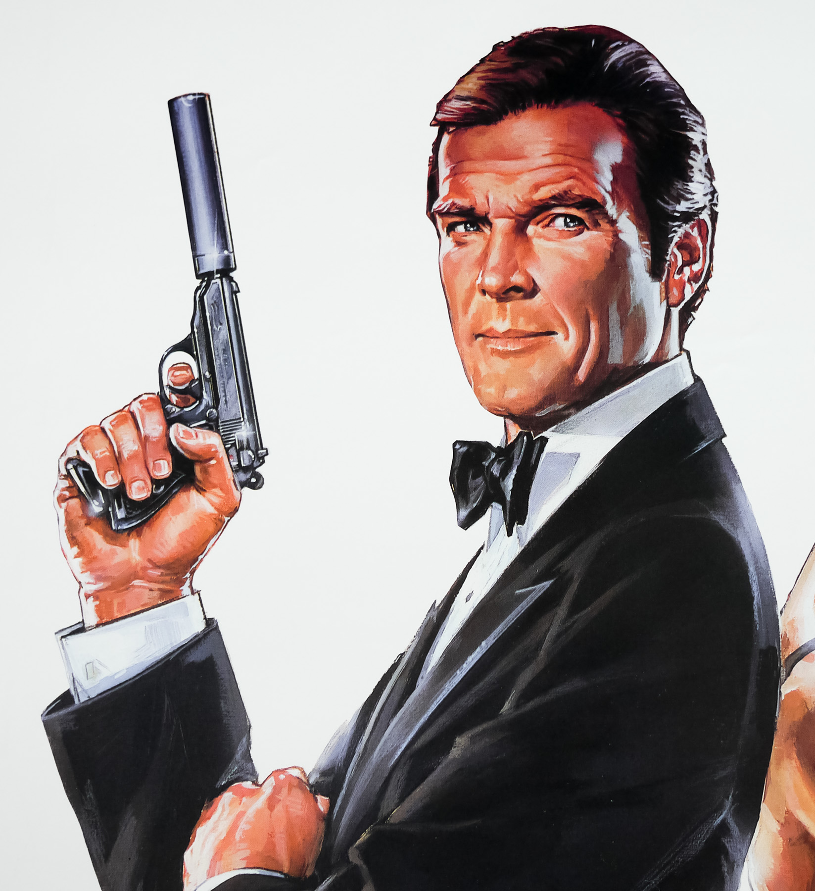
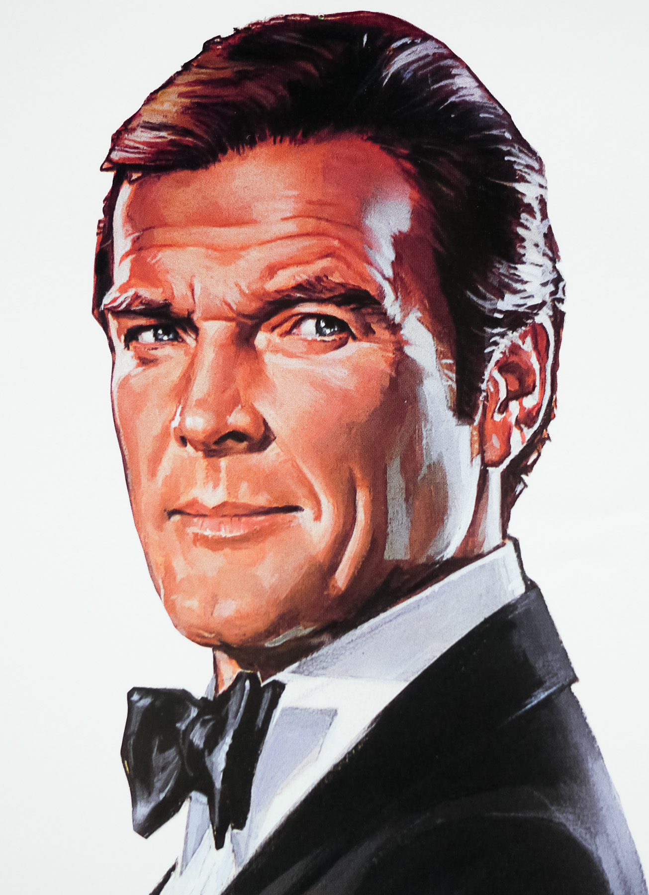
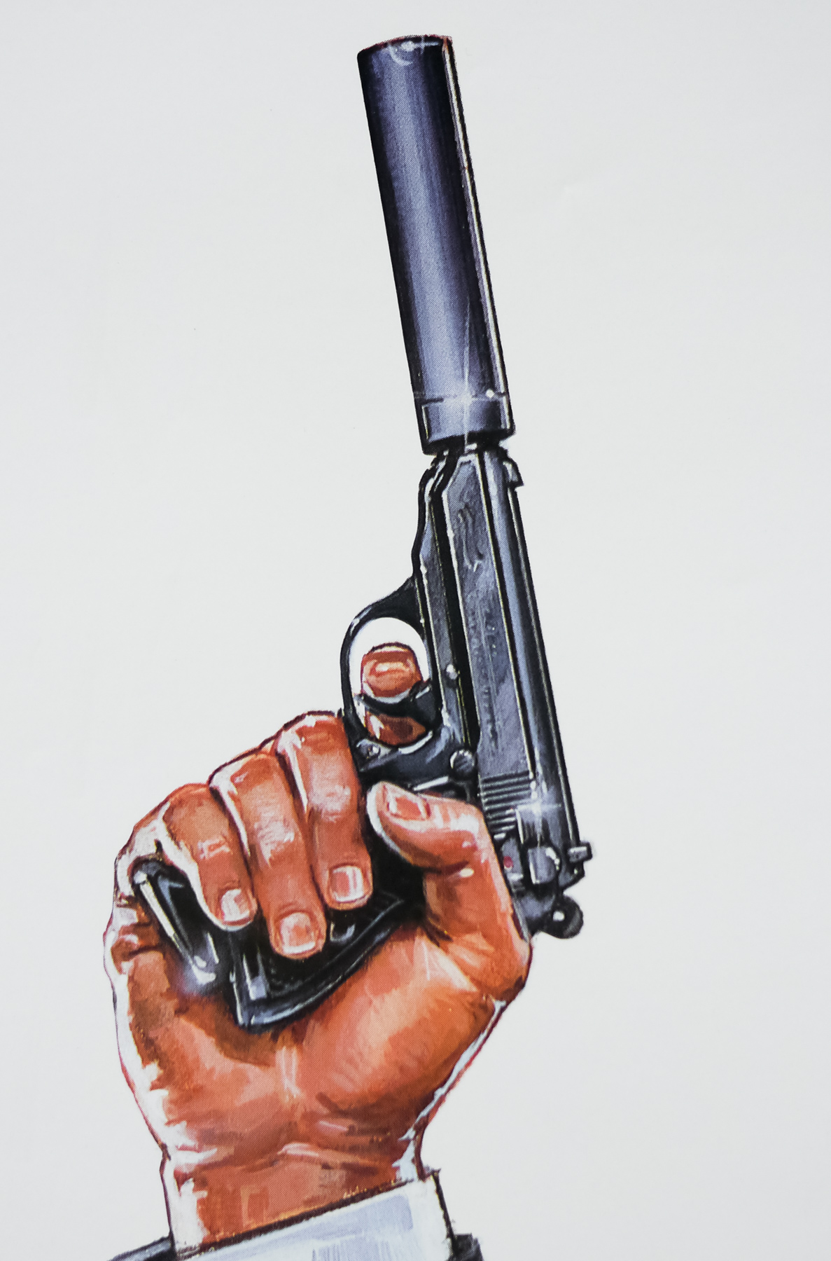
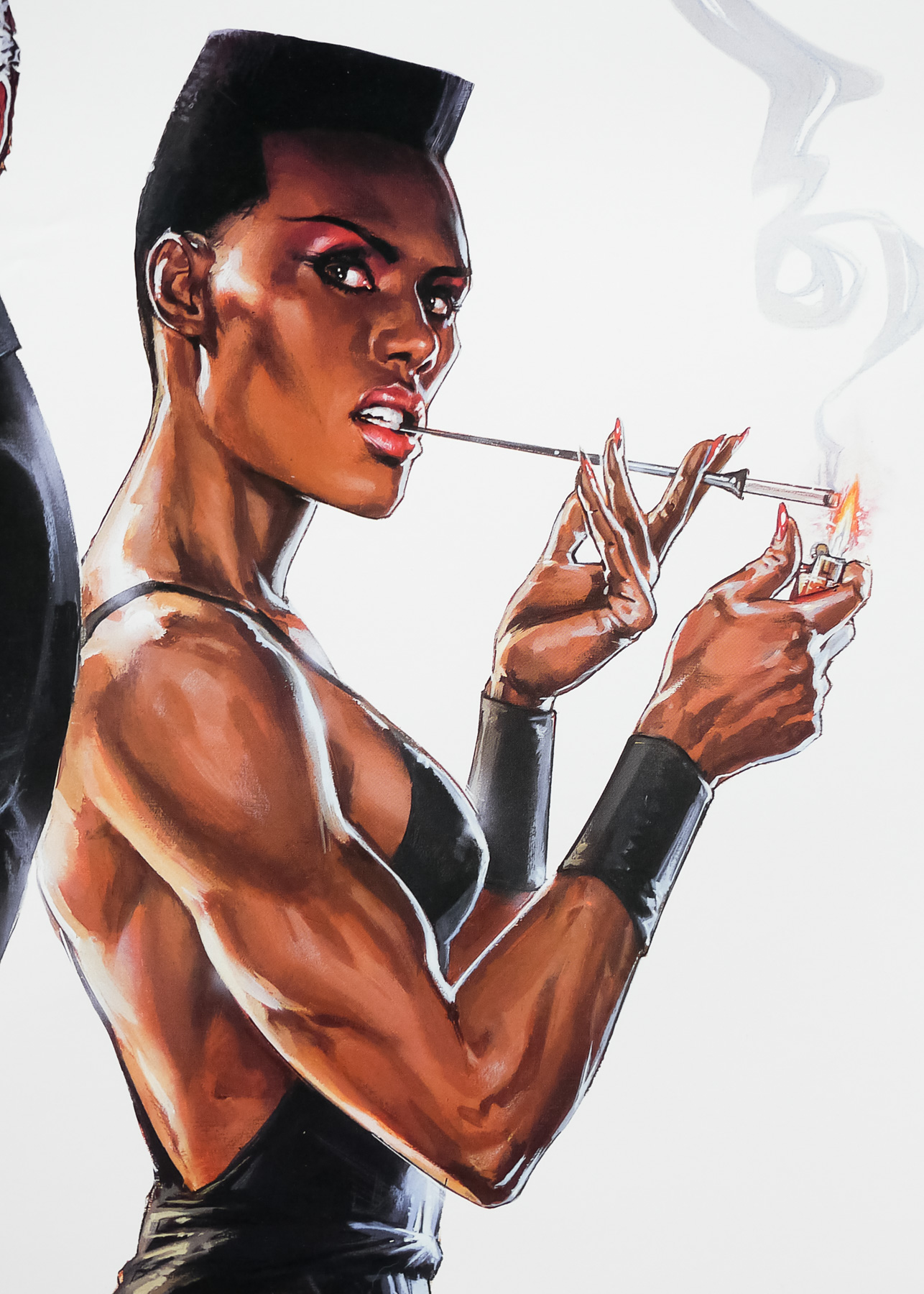
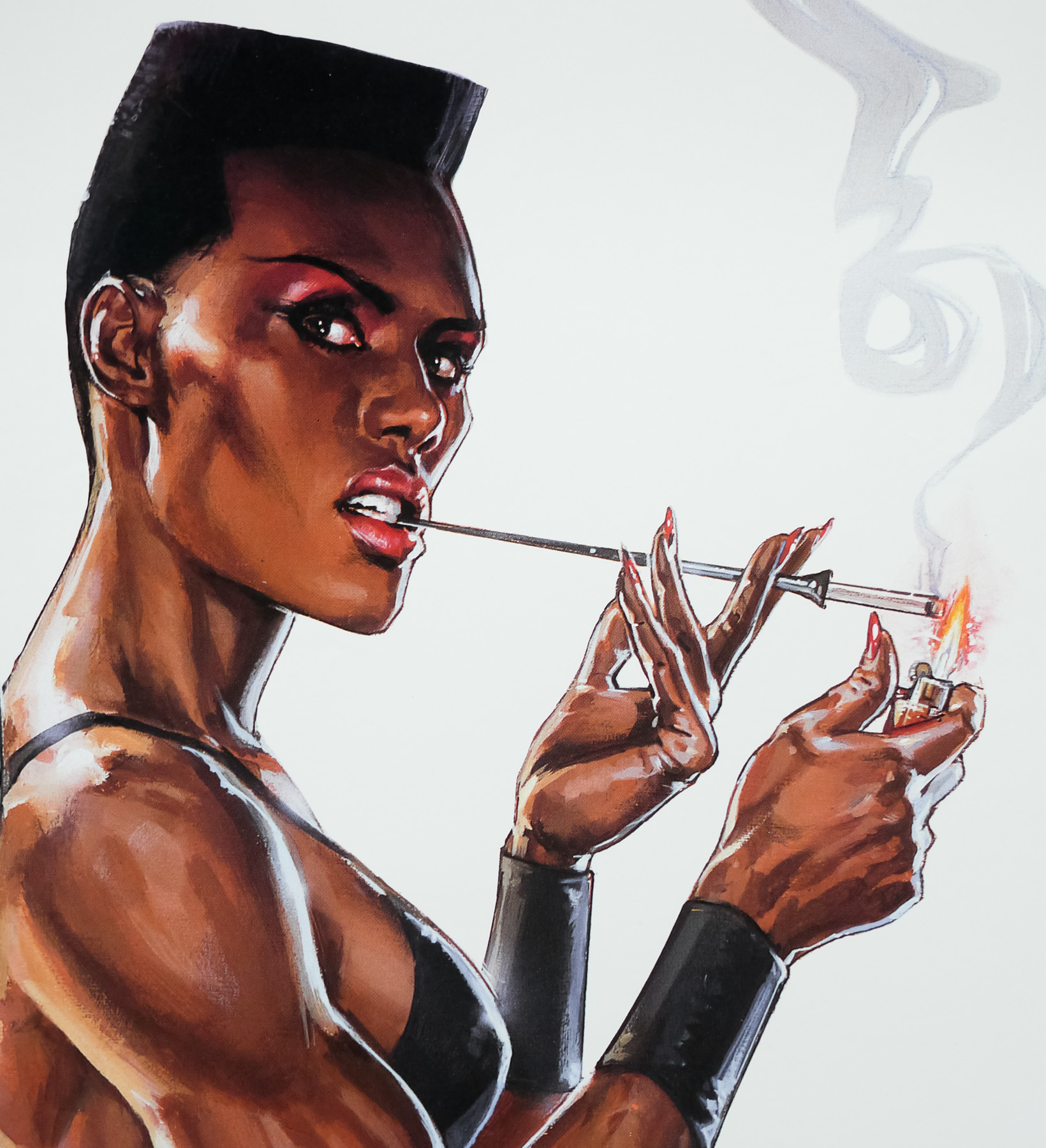
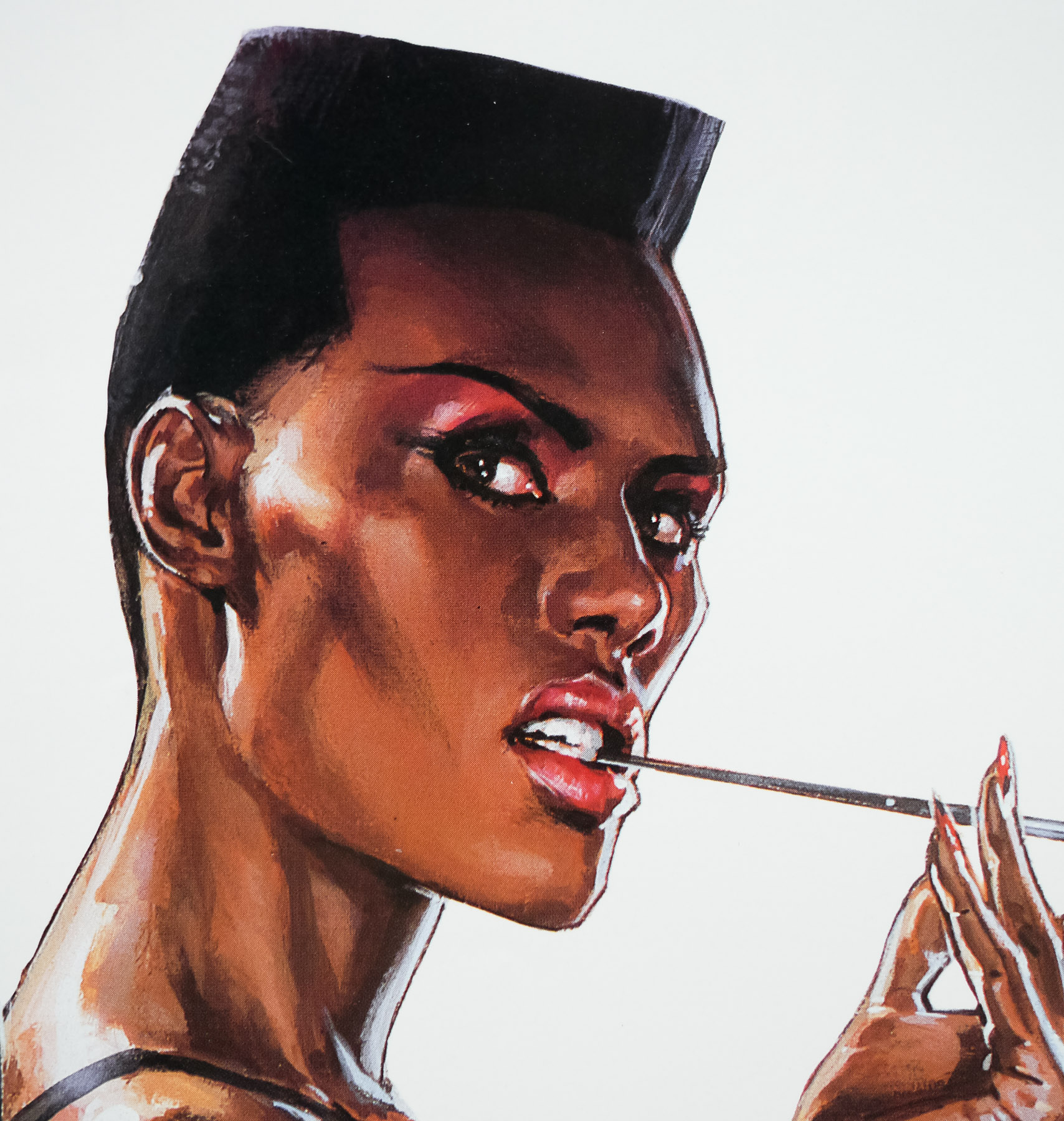
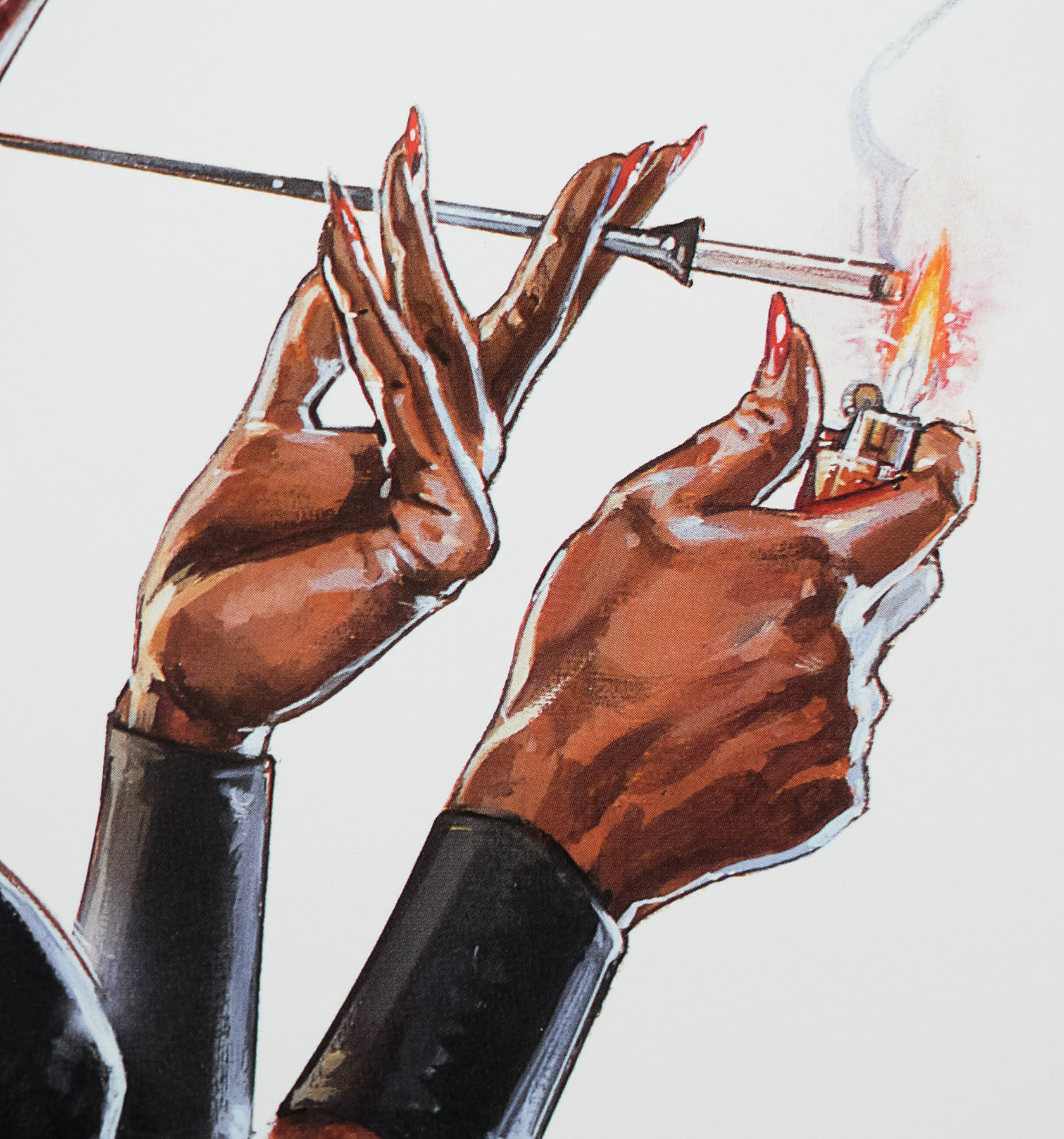
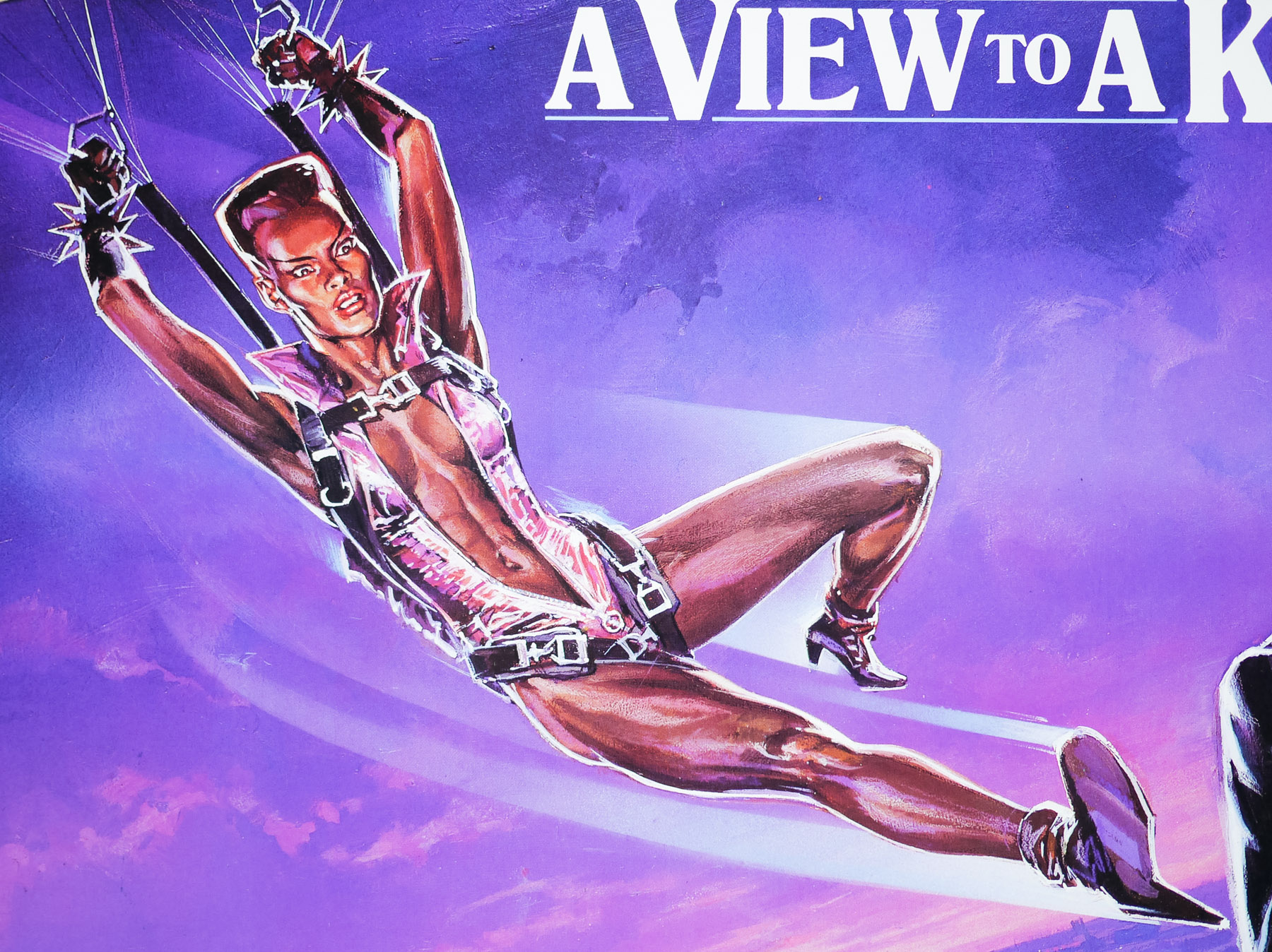
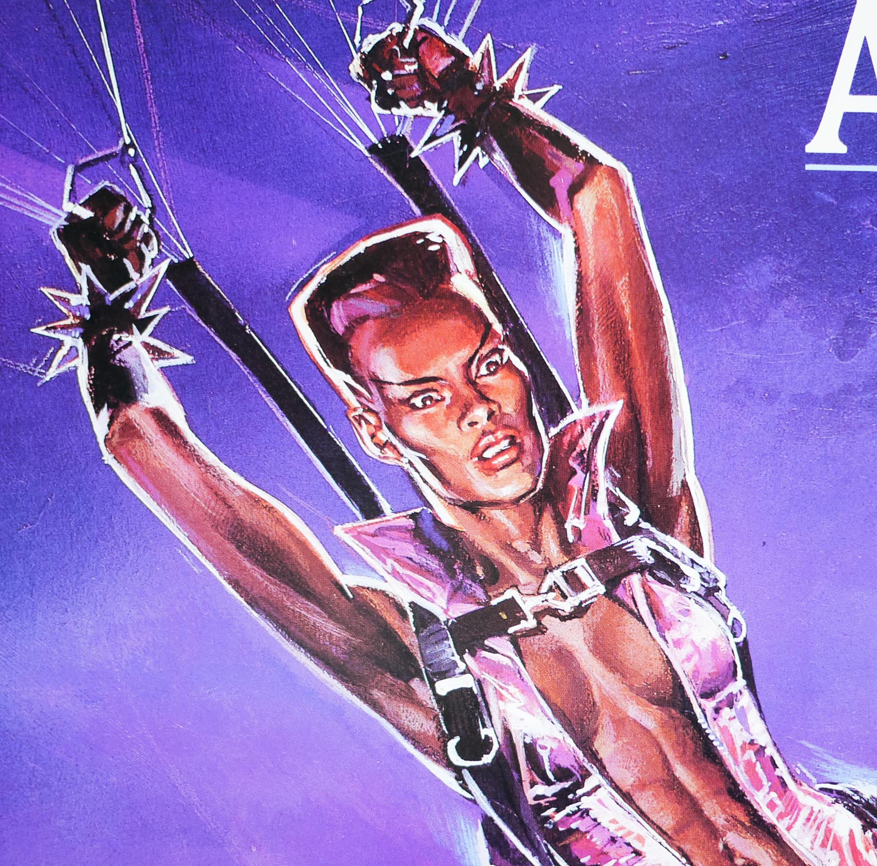
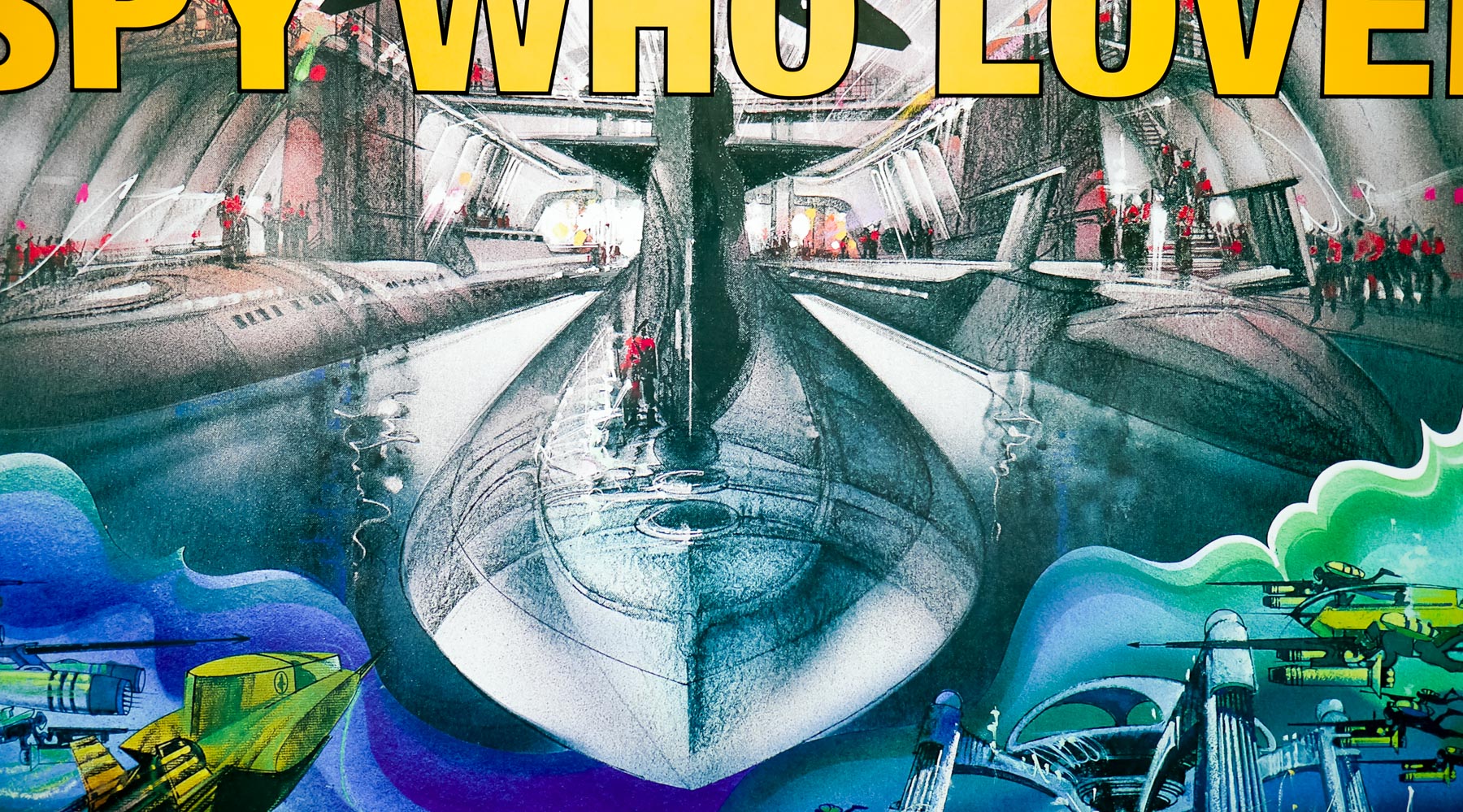
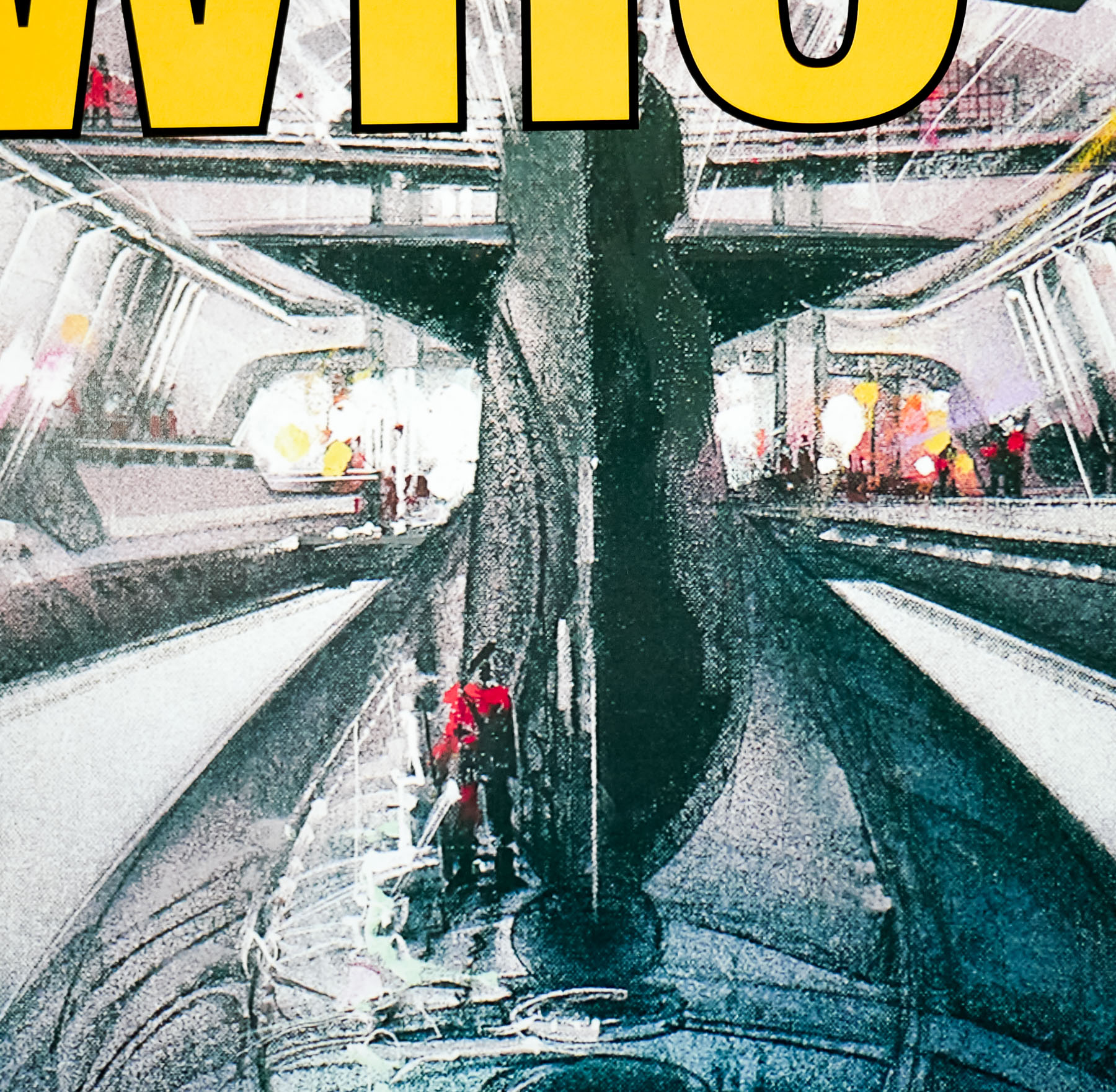
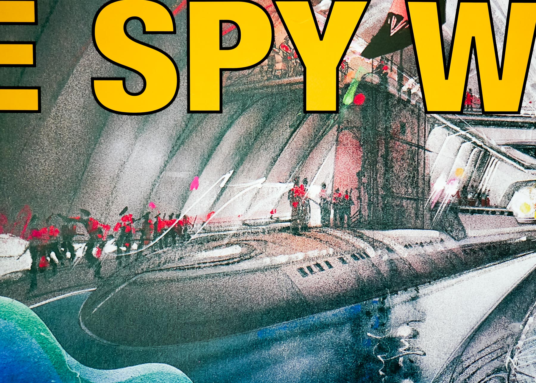
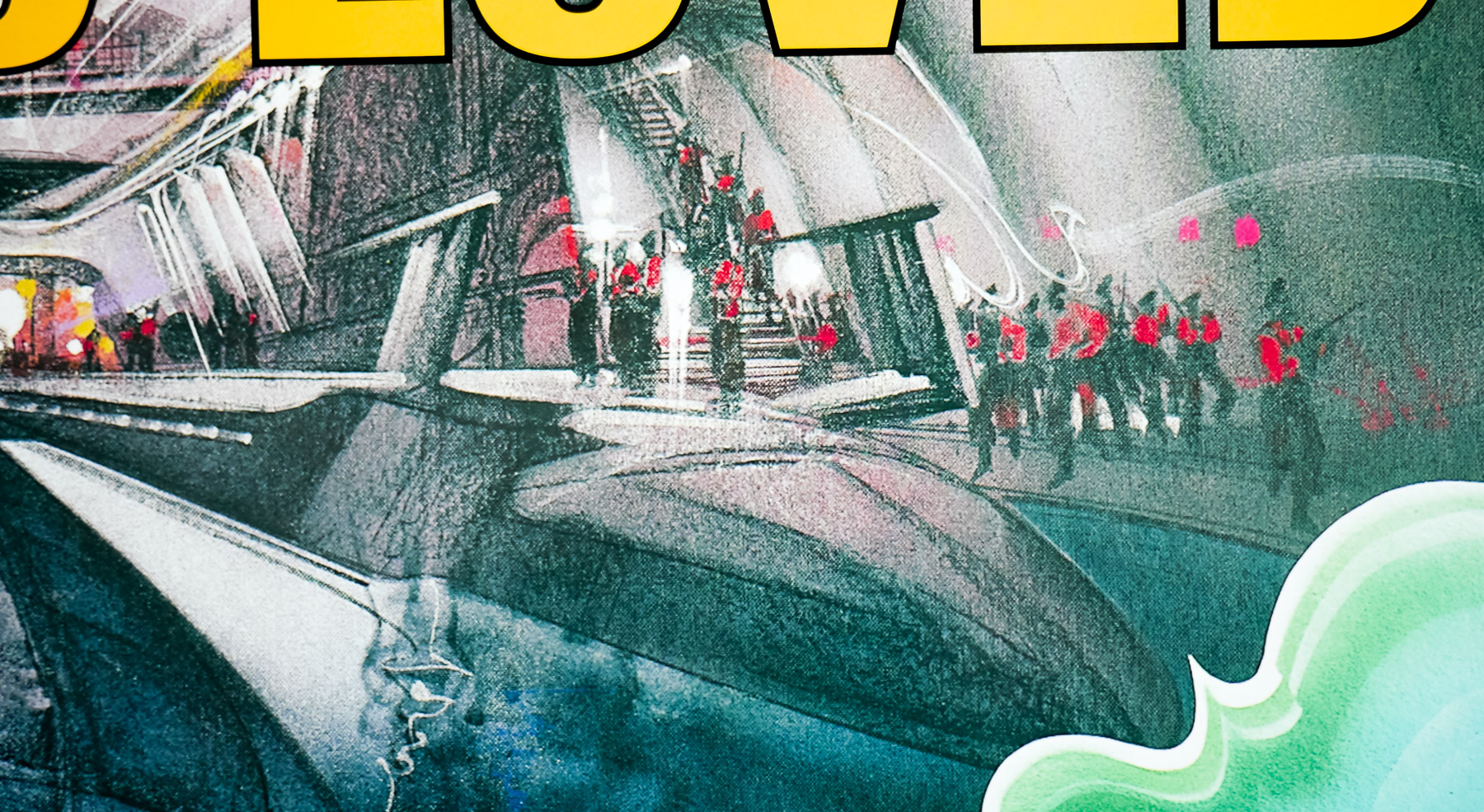
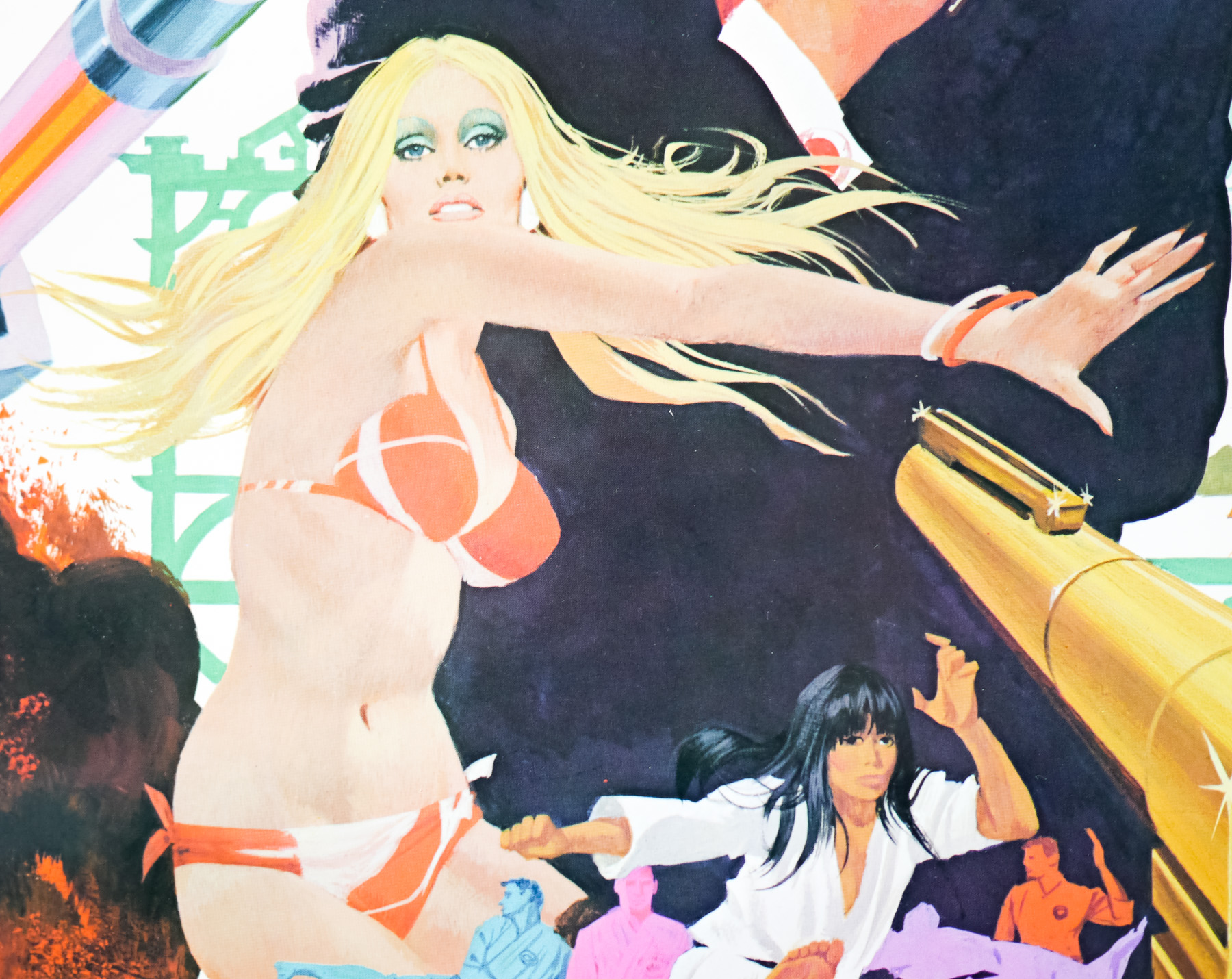
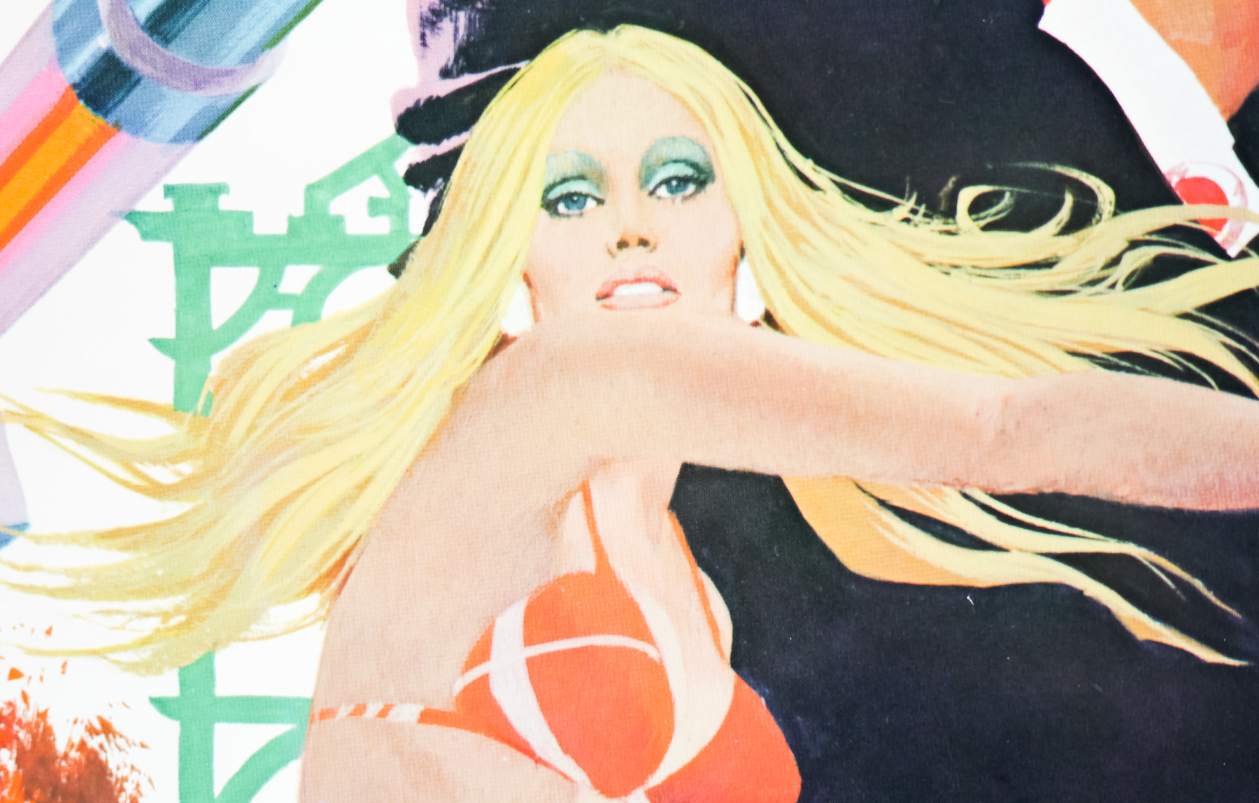
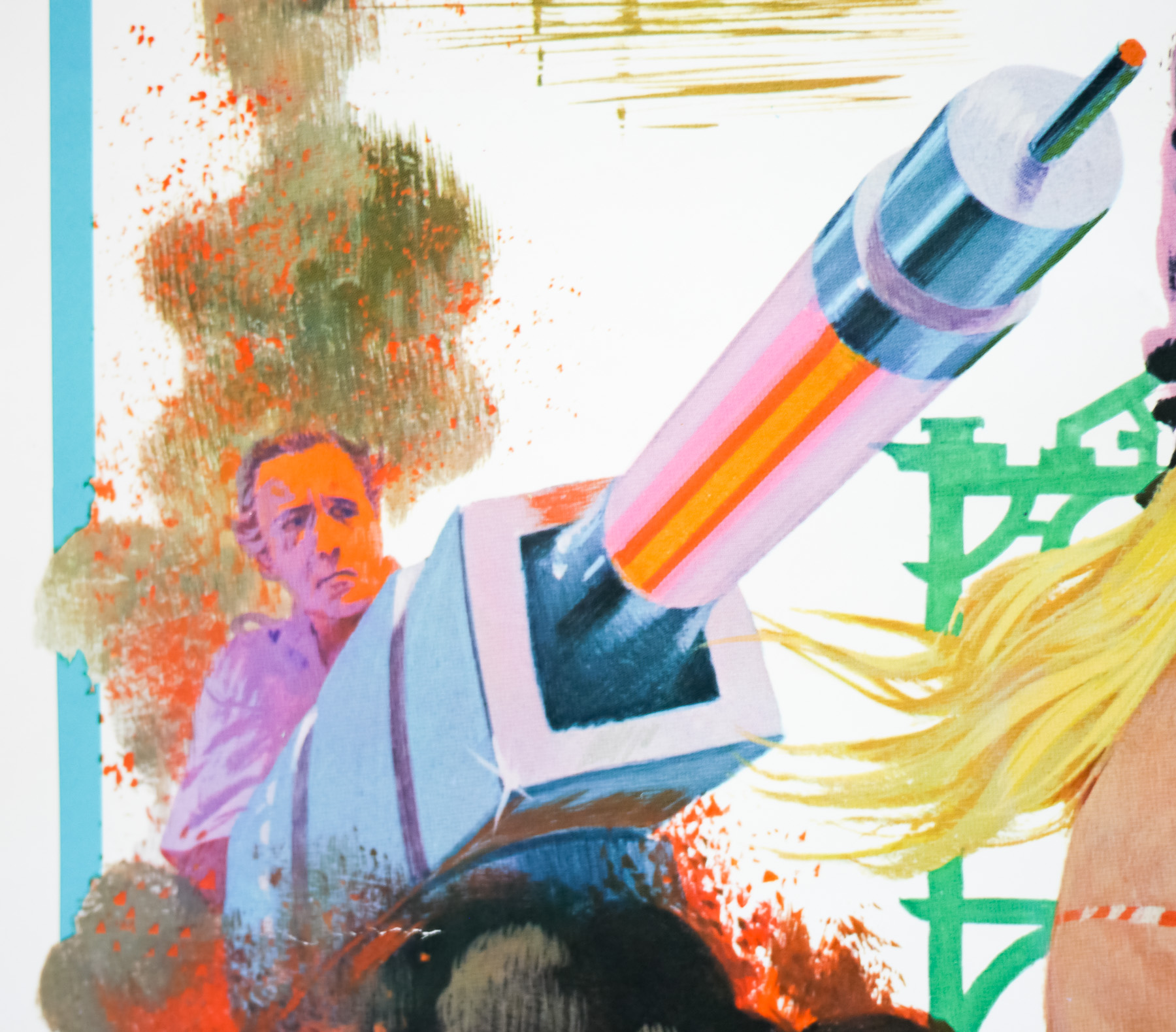
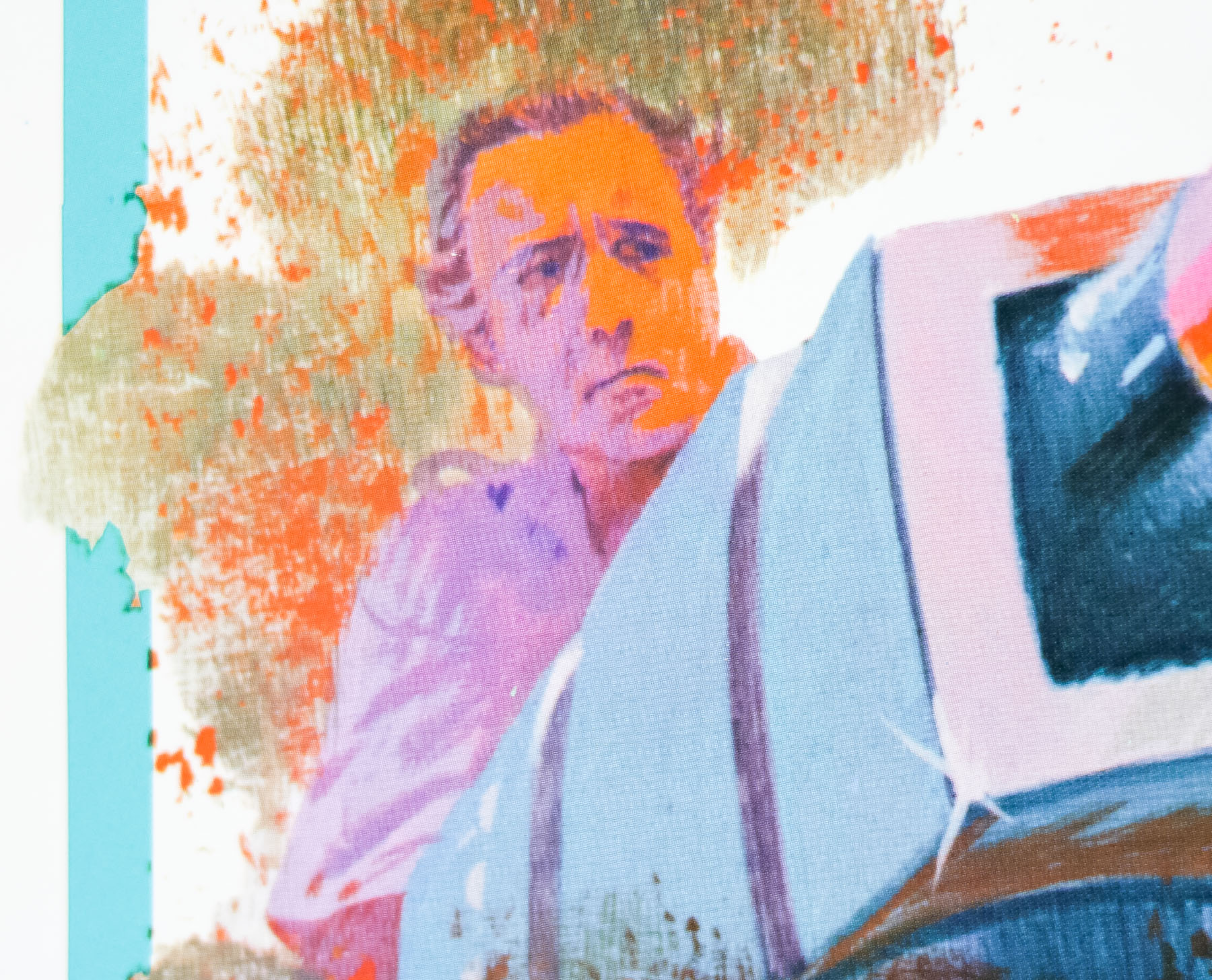
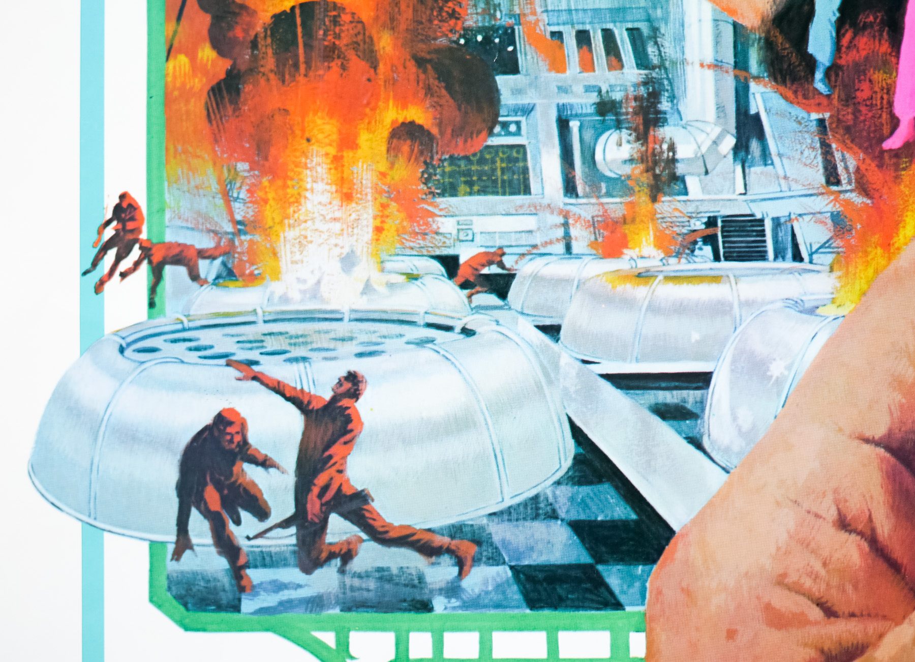
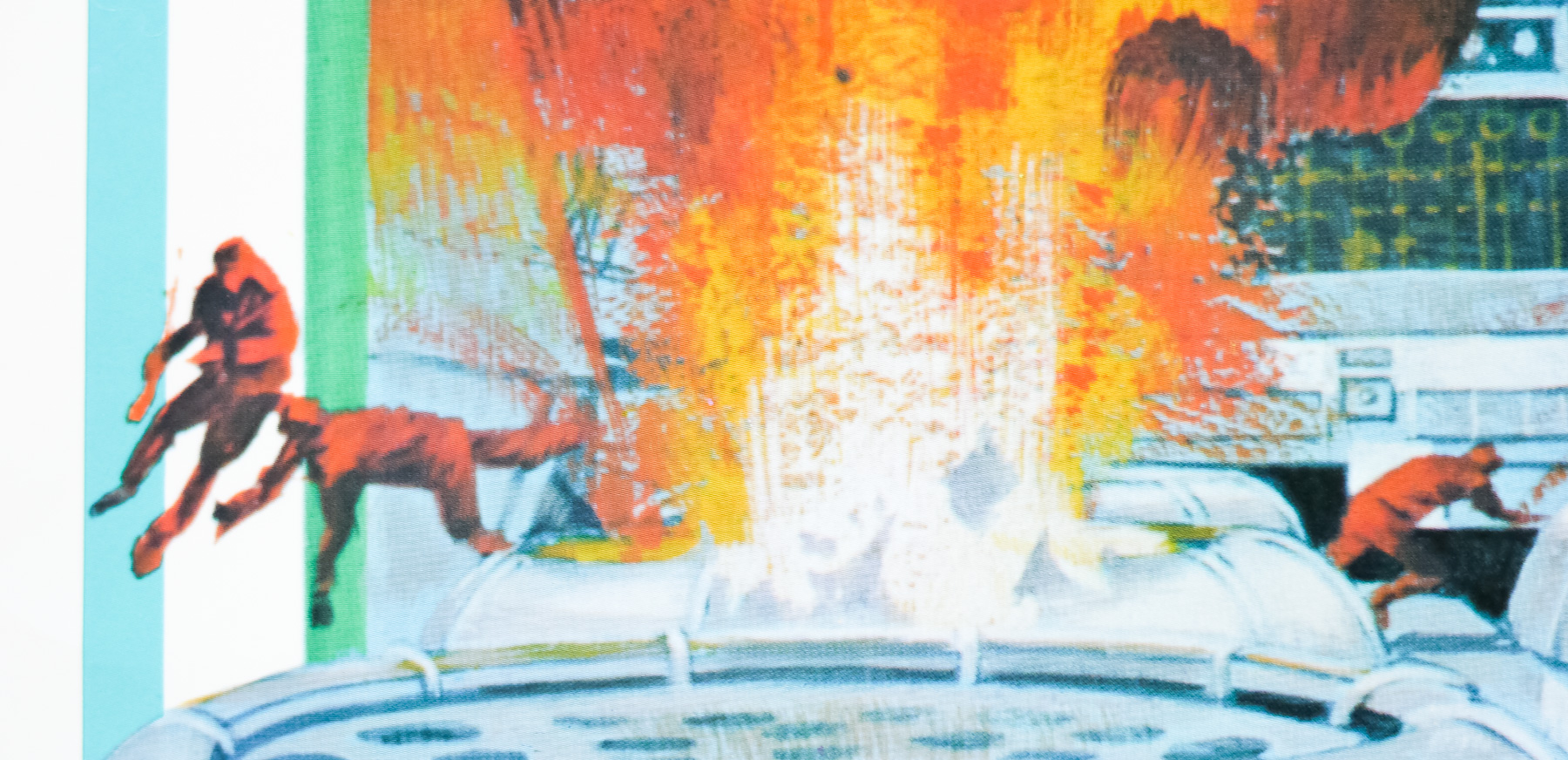
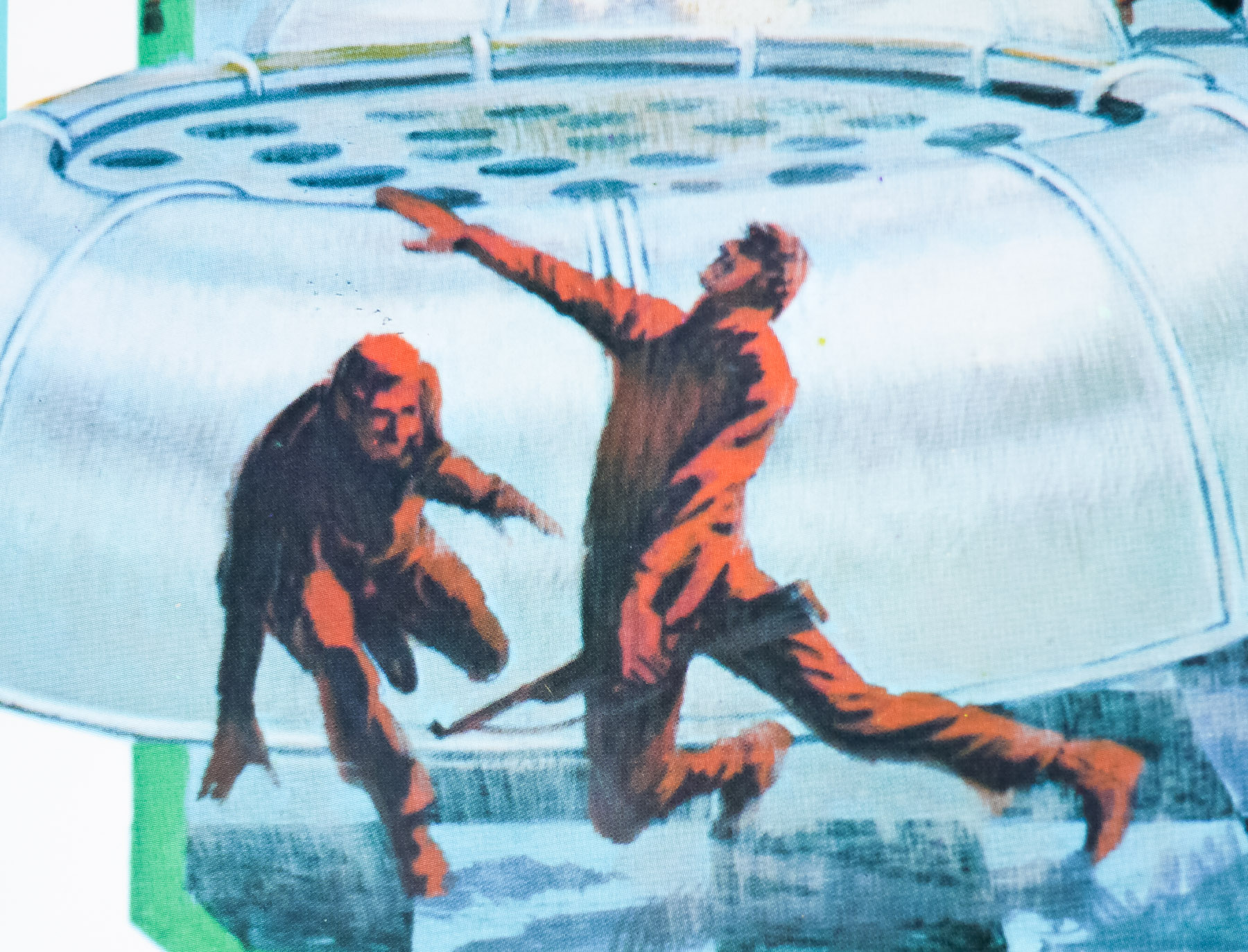
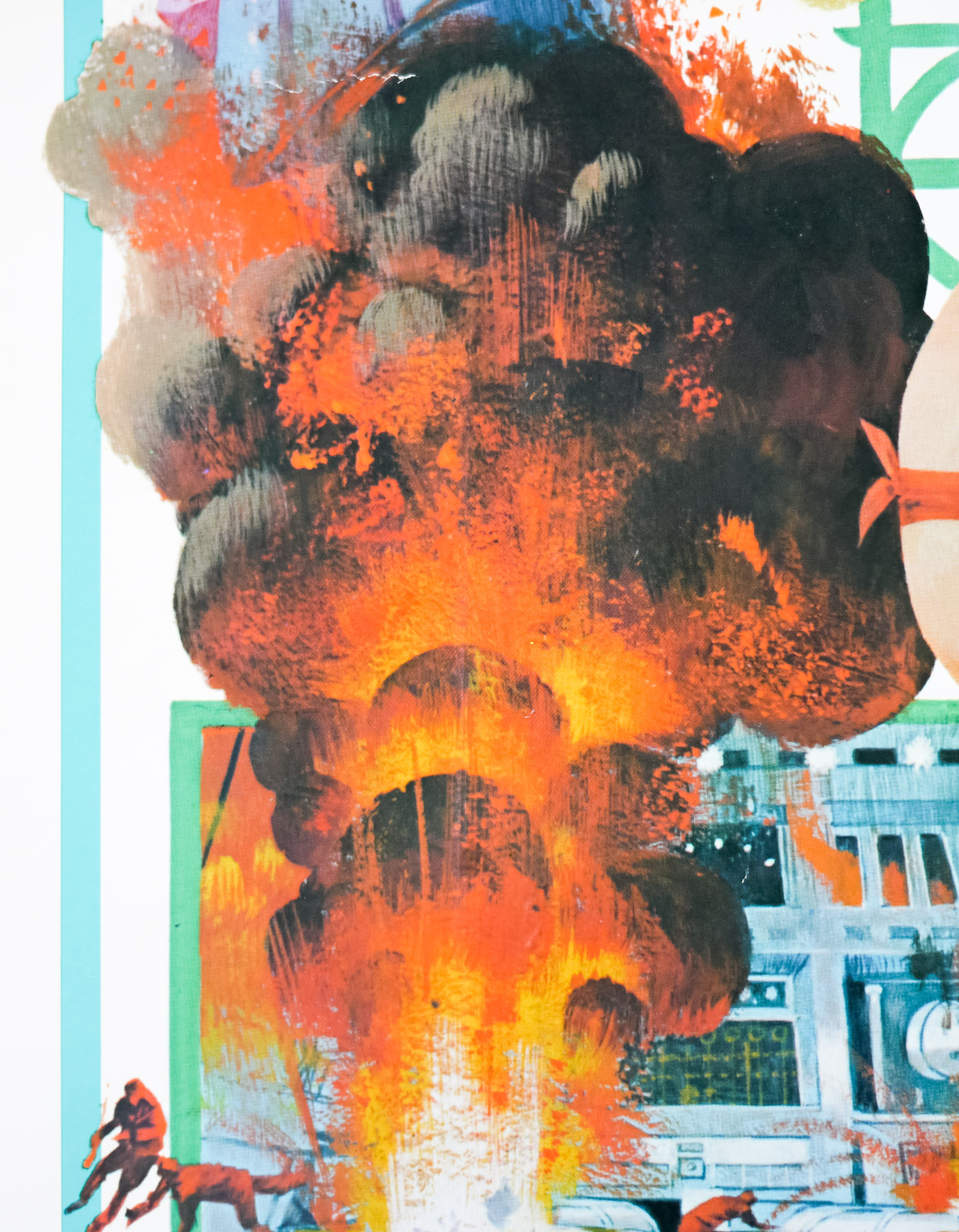
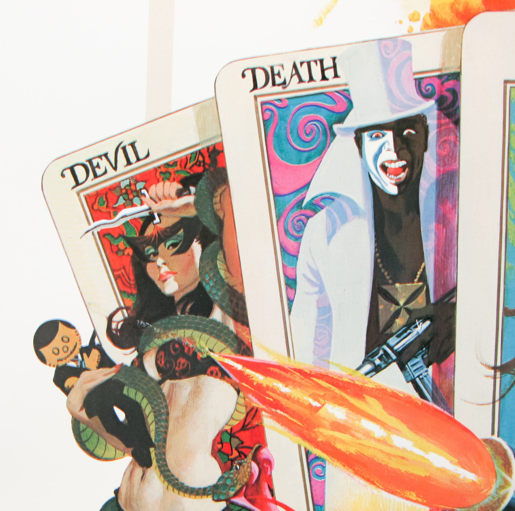
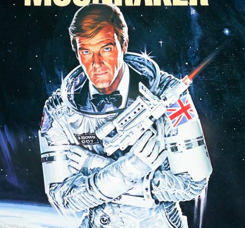
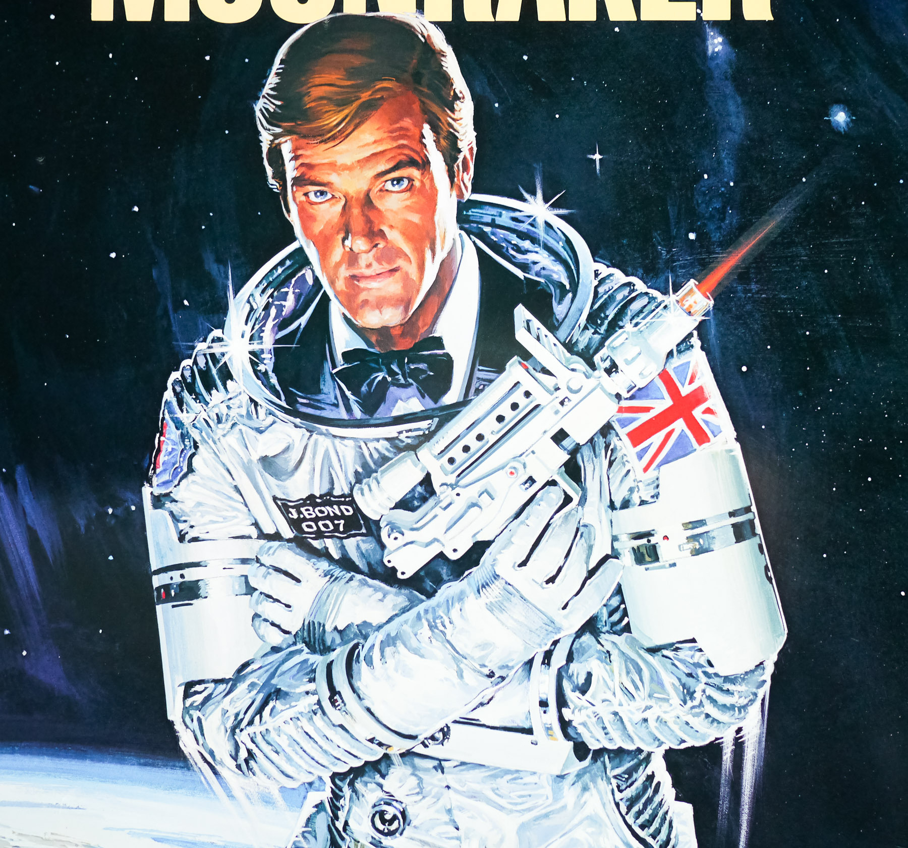
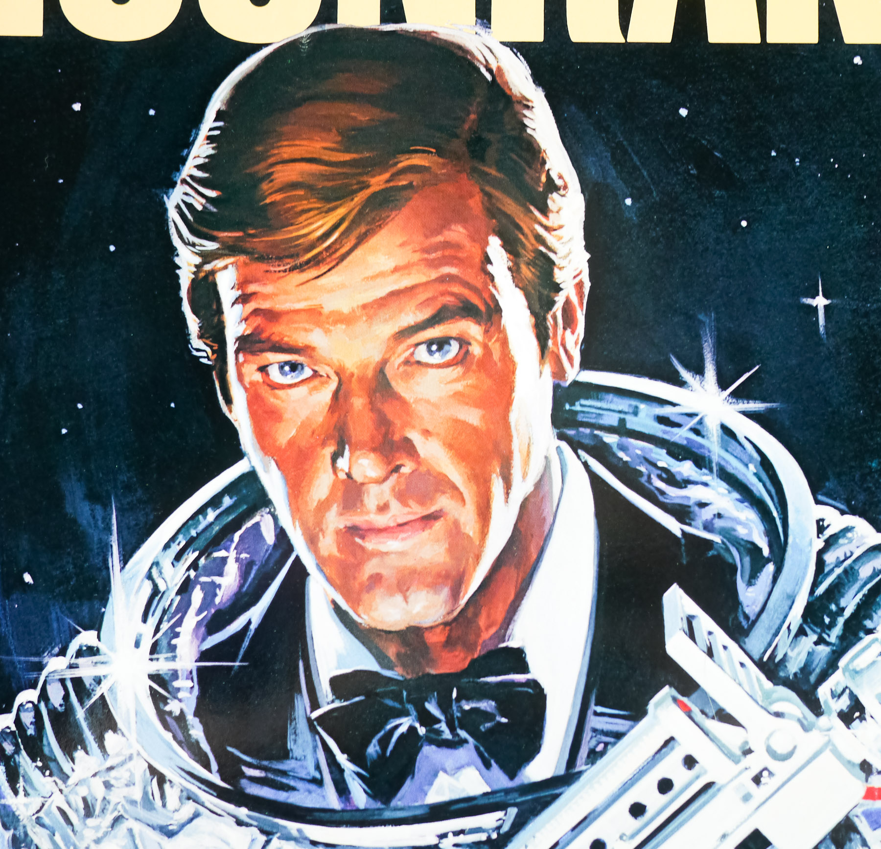
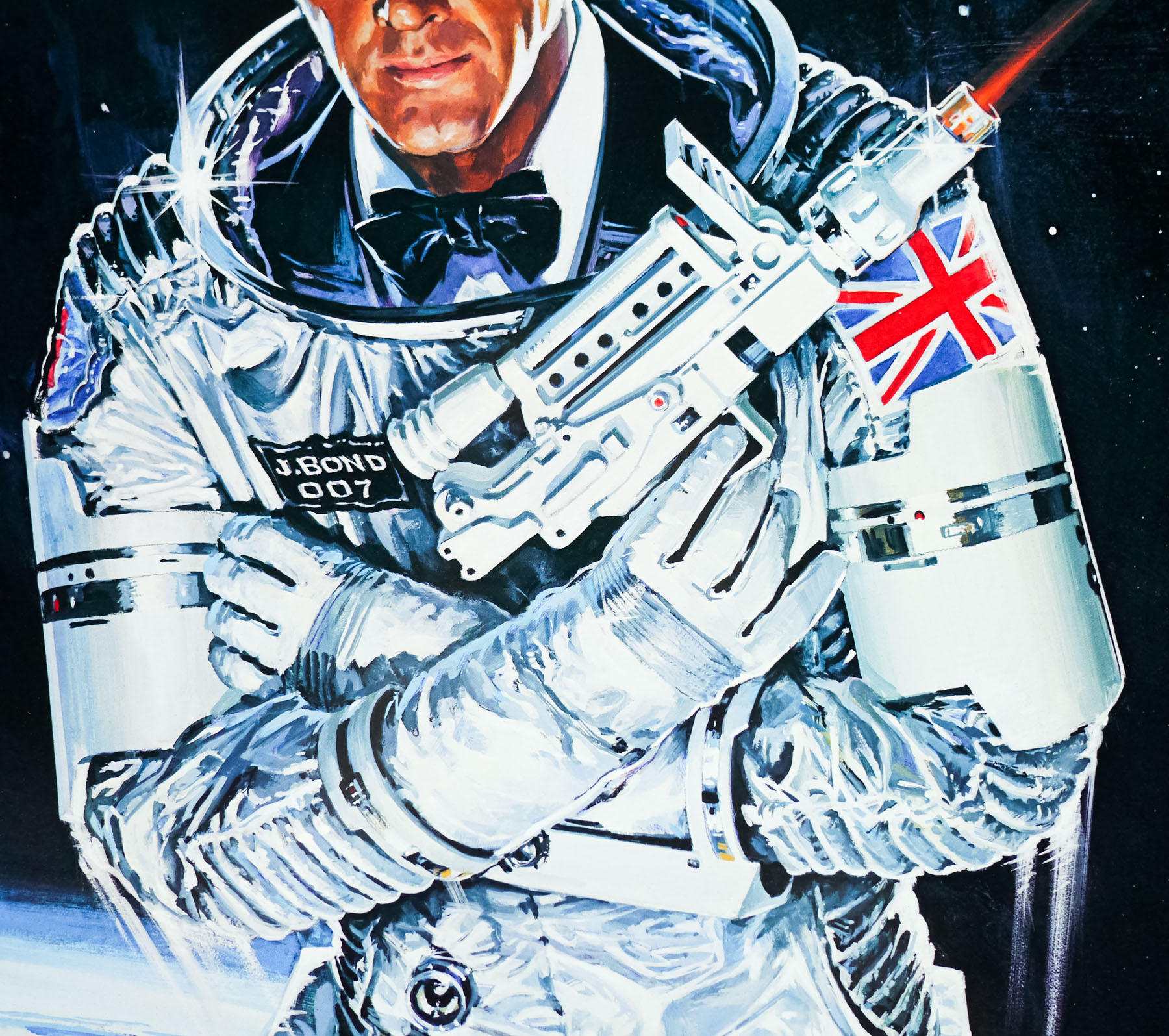
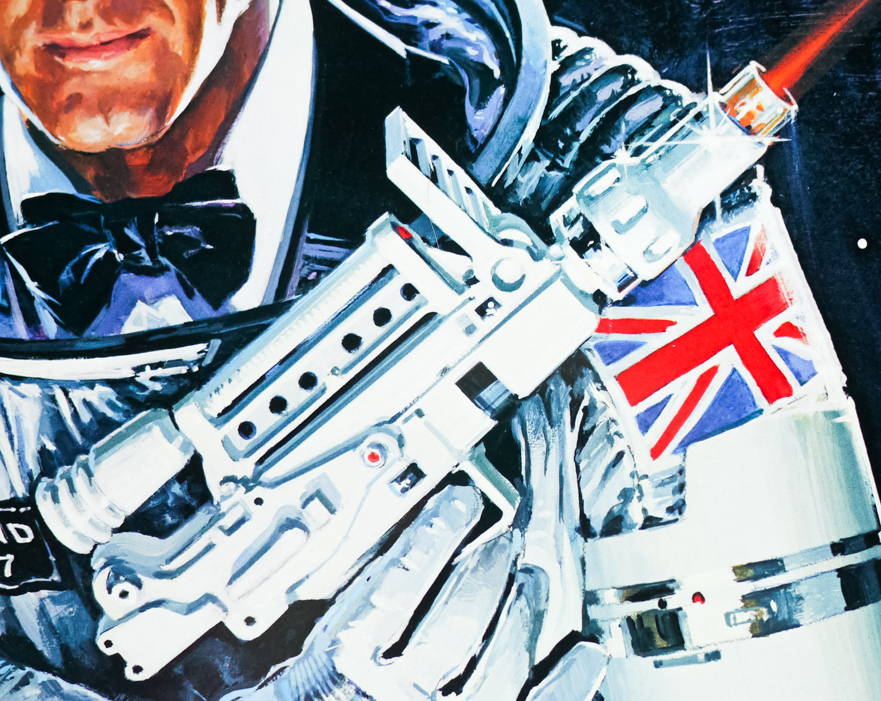
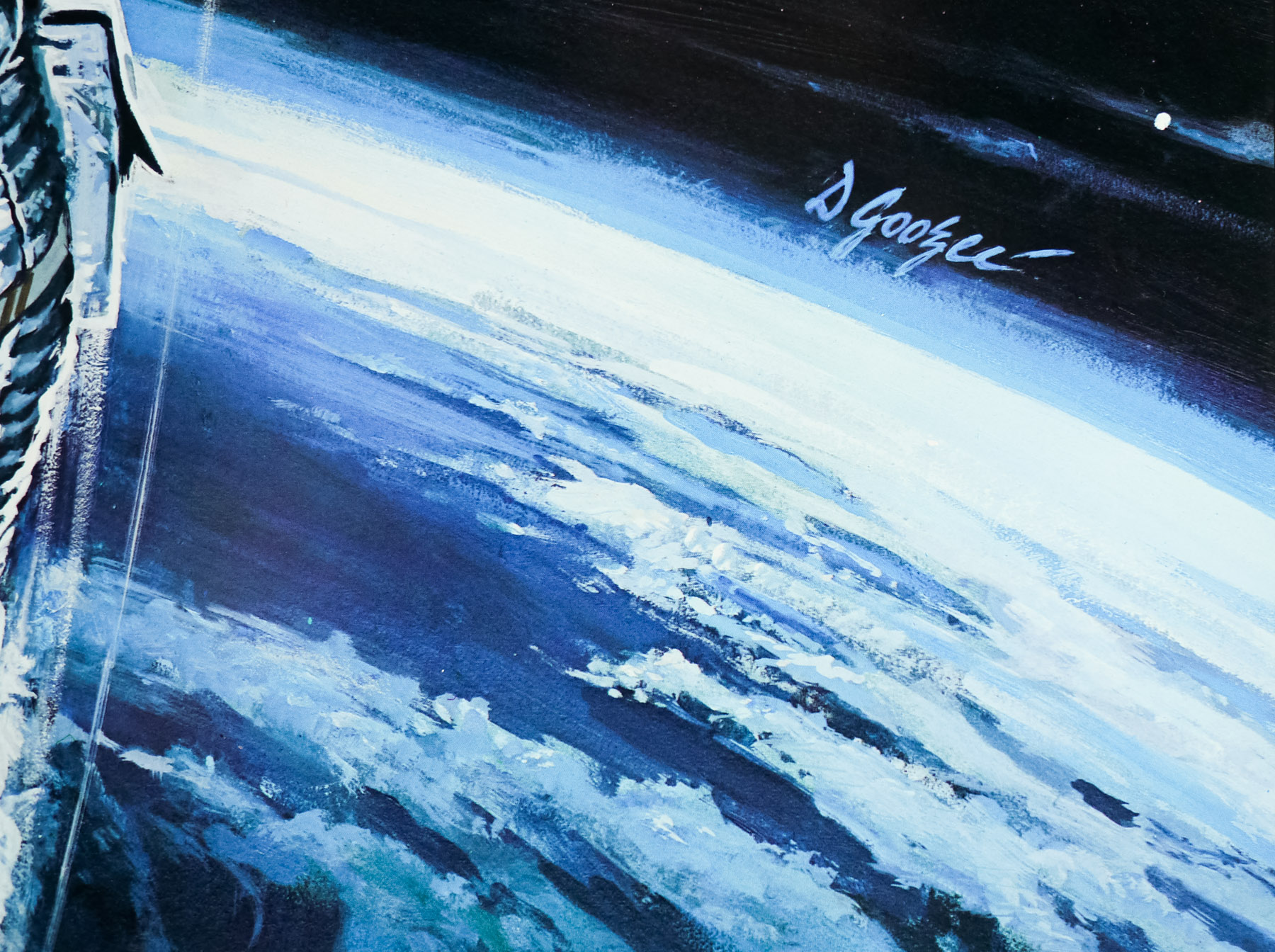
- Dan Goozee
- Size (inches)
- 27 2/16" x 40 14/16"
- SS or DS
- SS
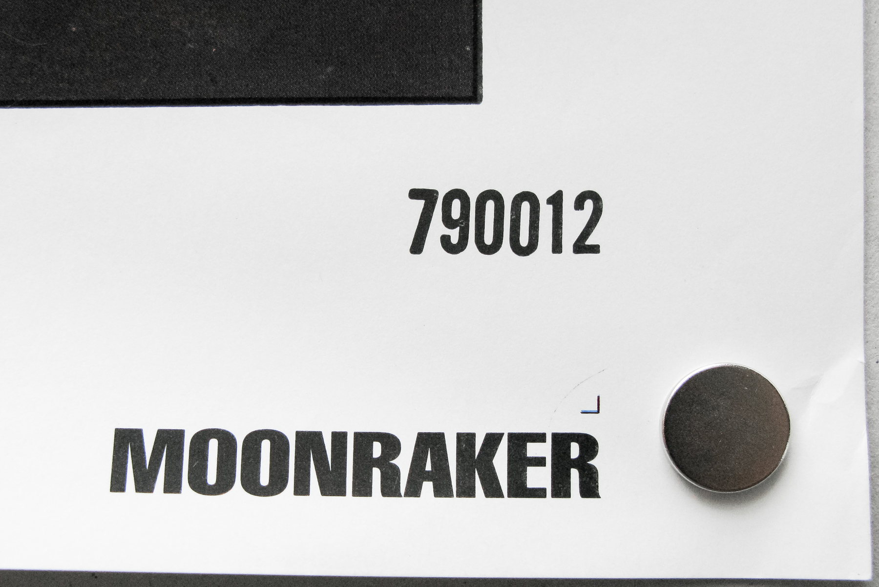
- NSS #
- --
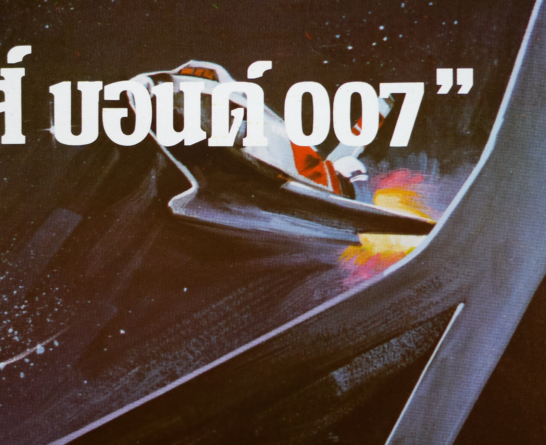
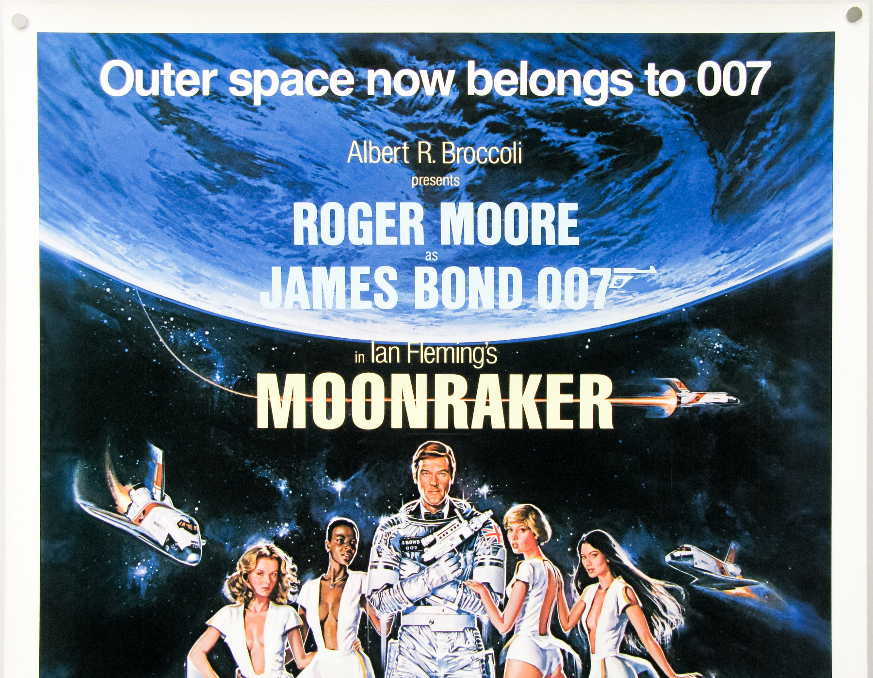
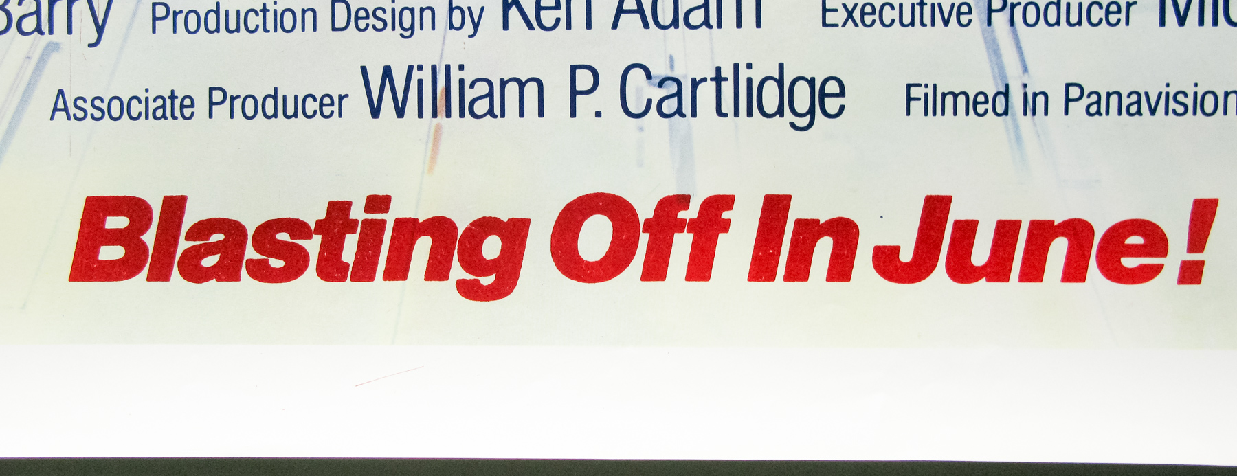
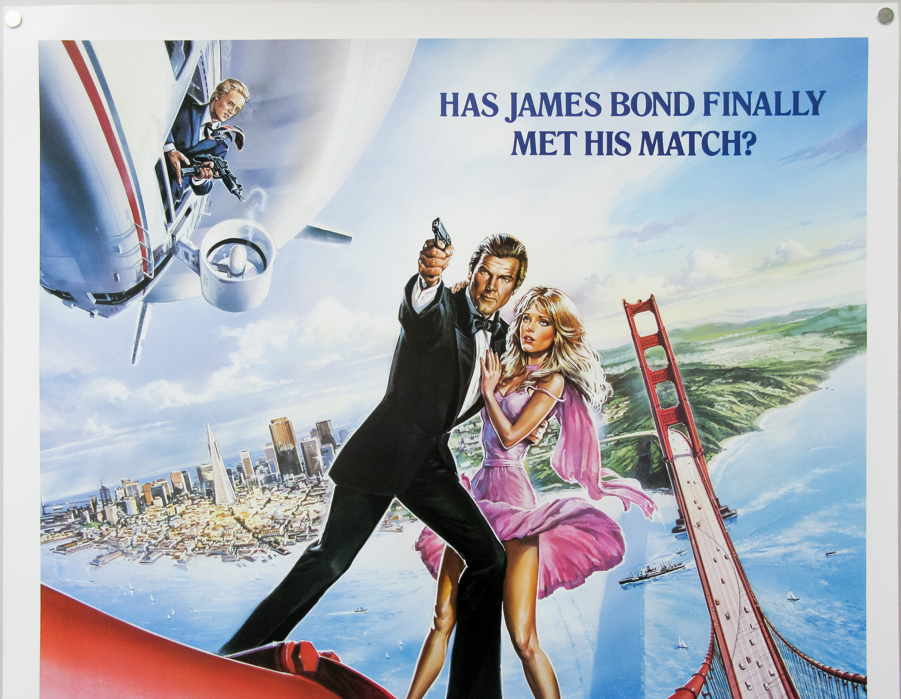
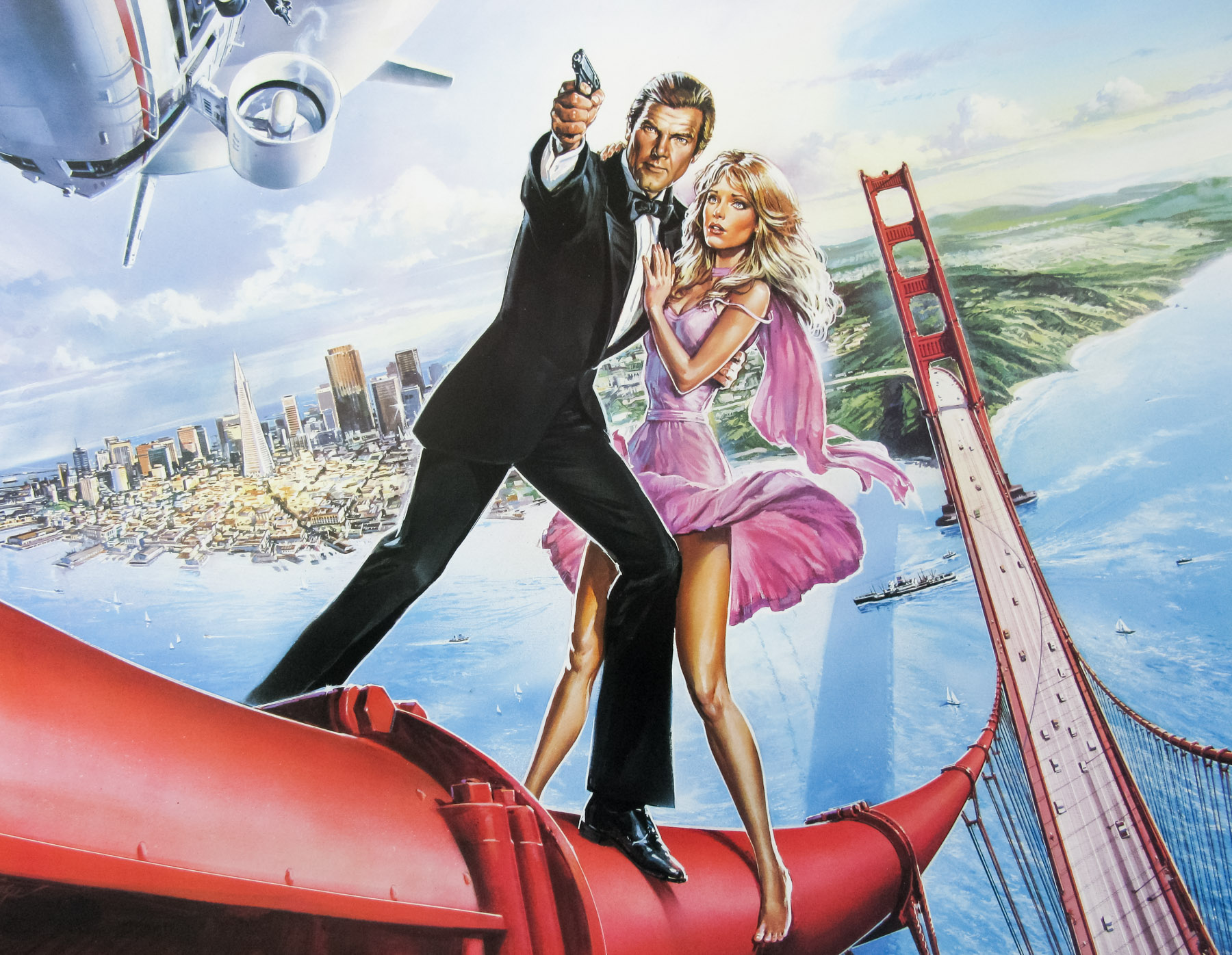
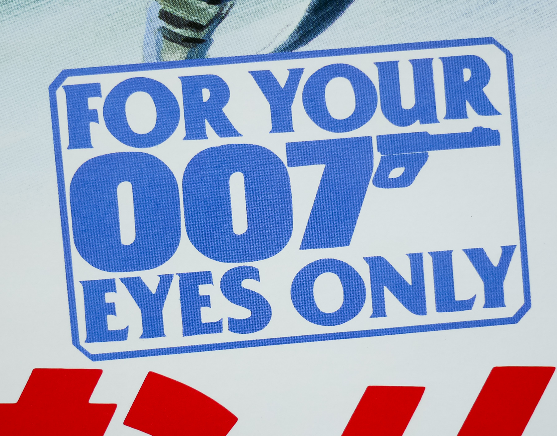
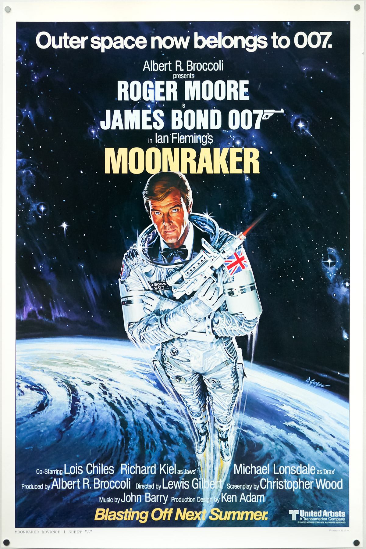
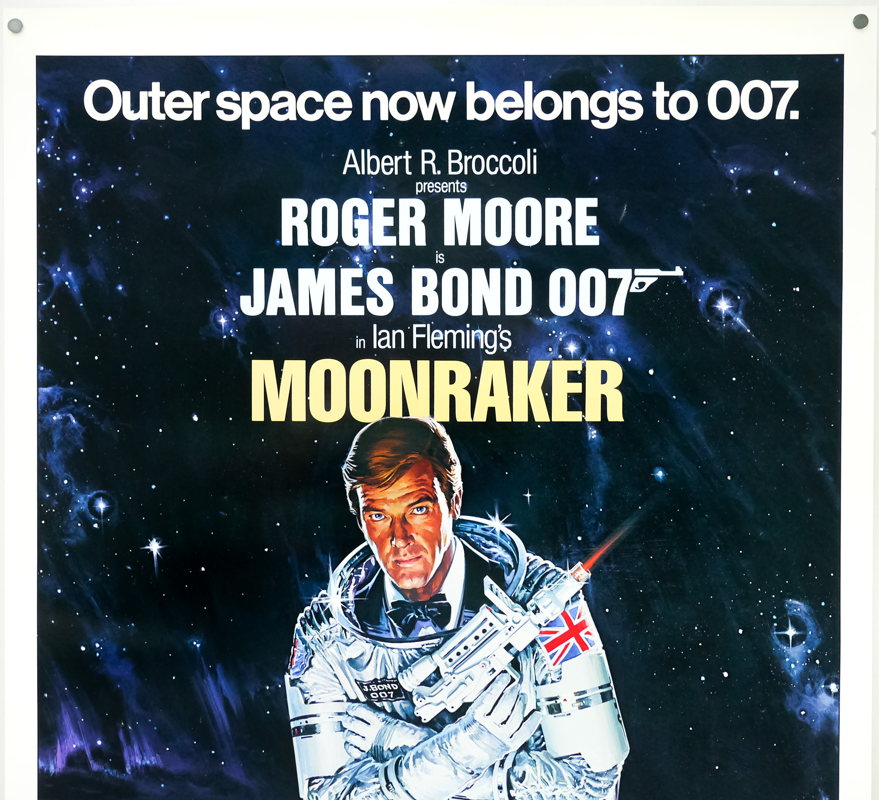
- Tagline
- Outer space now belongs to 007
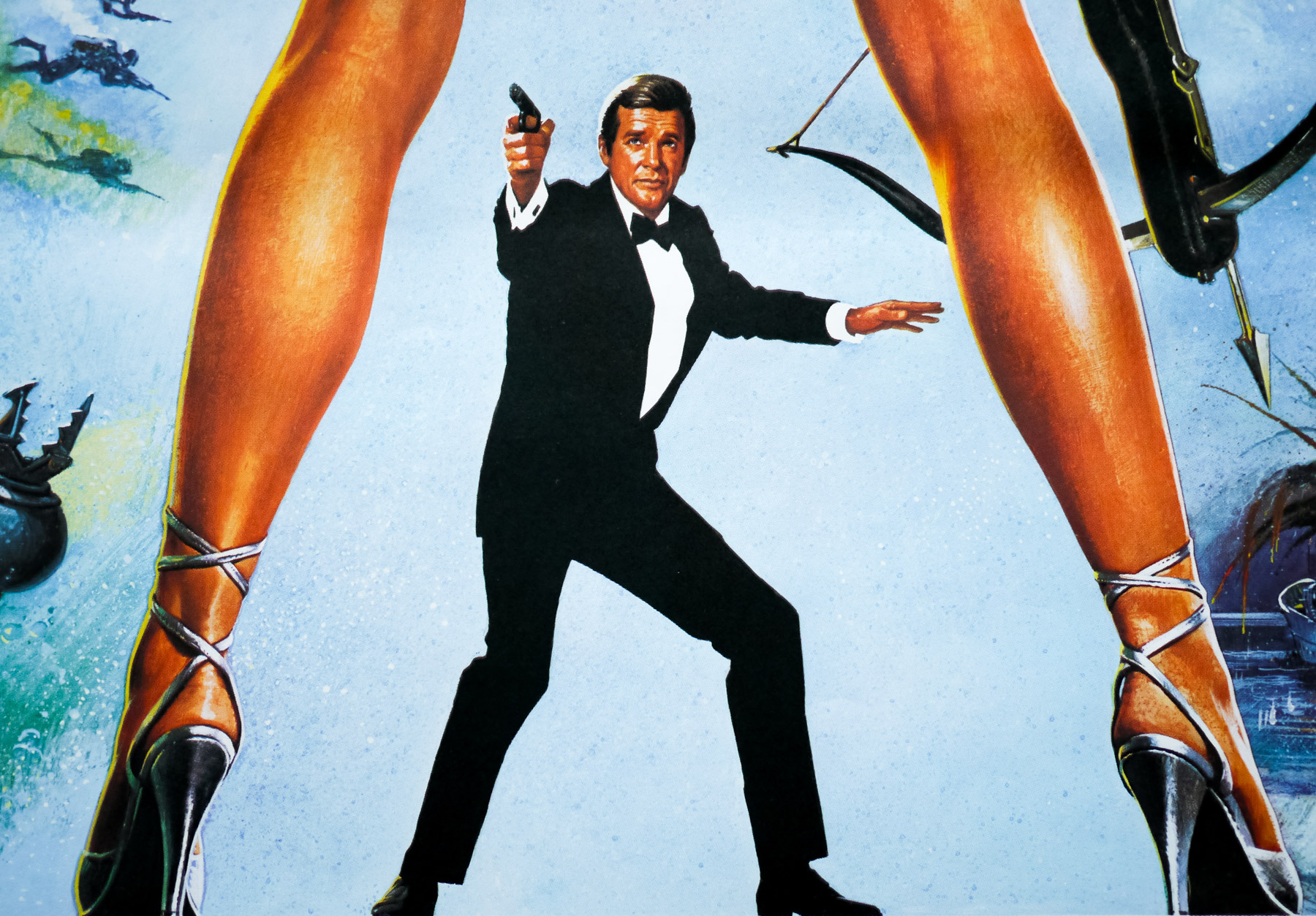
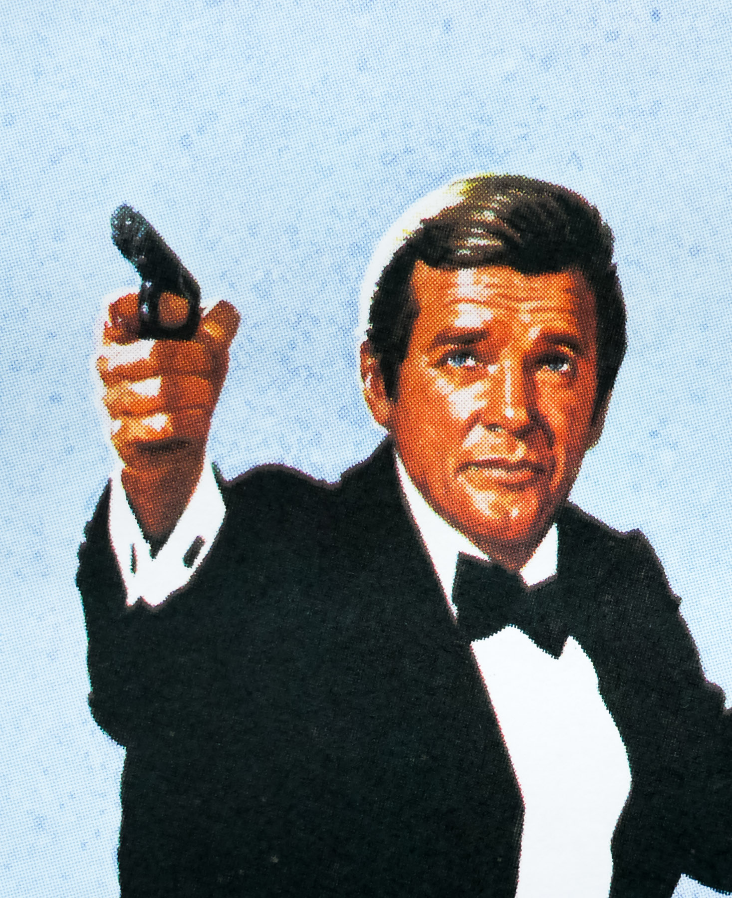
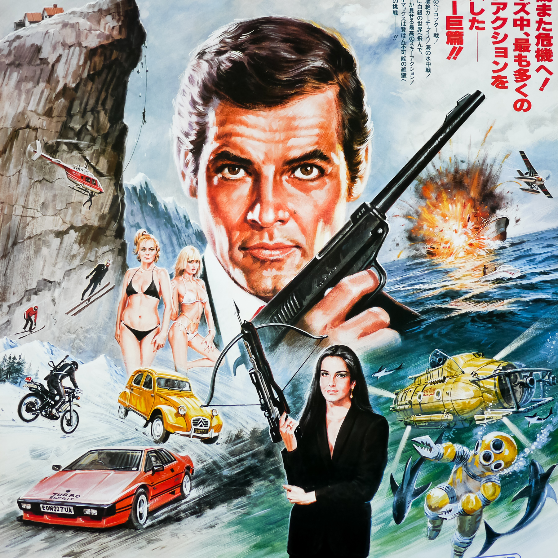
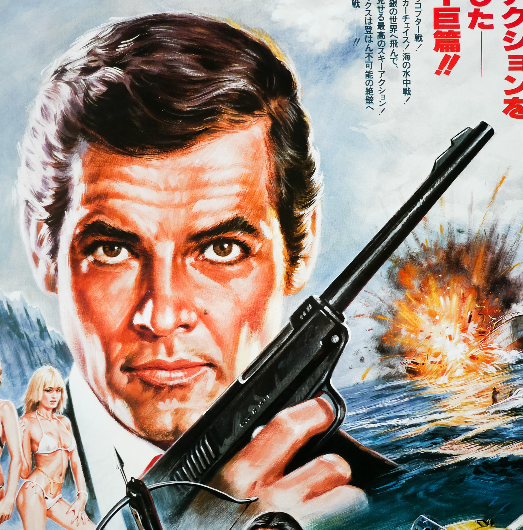
Although considered by most Bond fans to be one of the weakest of the series, I know I’m not the only one to have a soft spot for Moonraker, Roger Moore‘s fifth outing as James Bond. Thanks to endless TV showings during the 1980s and early 1990s I’ve probably seen this more than any other in the series and, like Live and Let Die, it had a huge impression on my young mind.
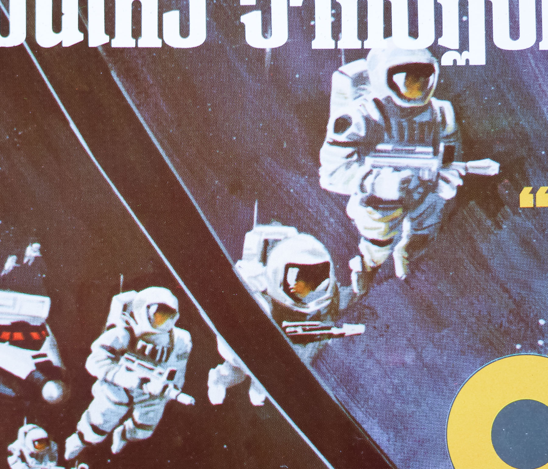
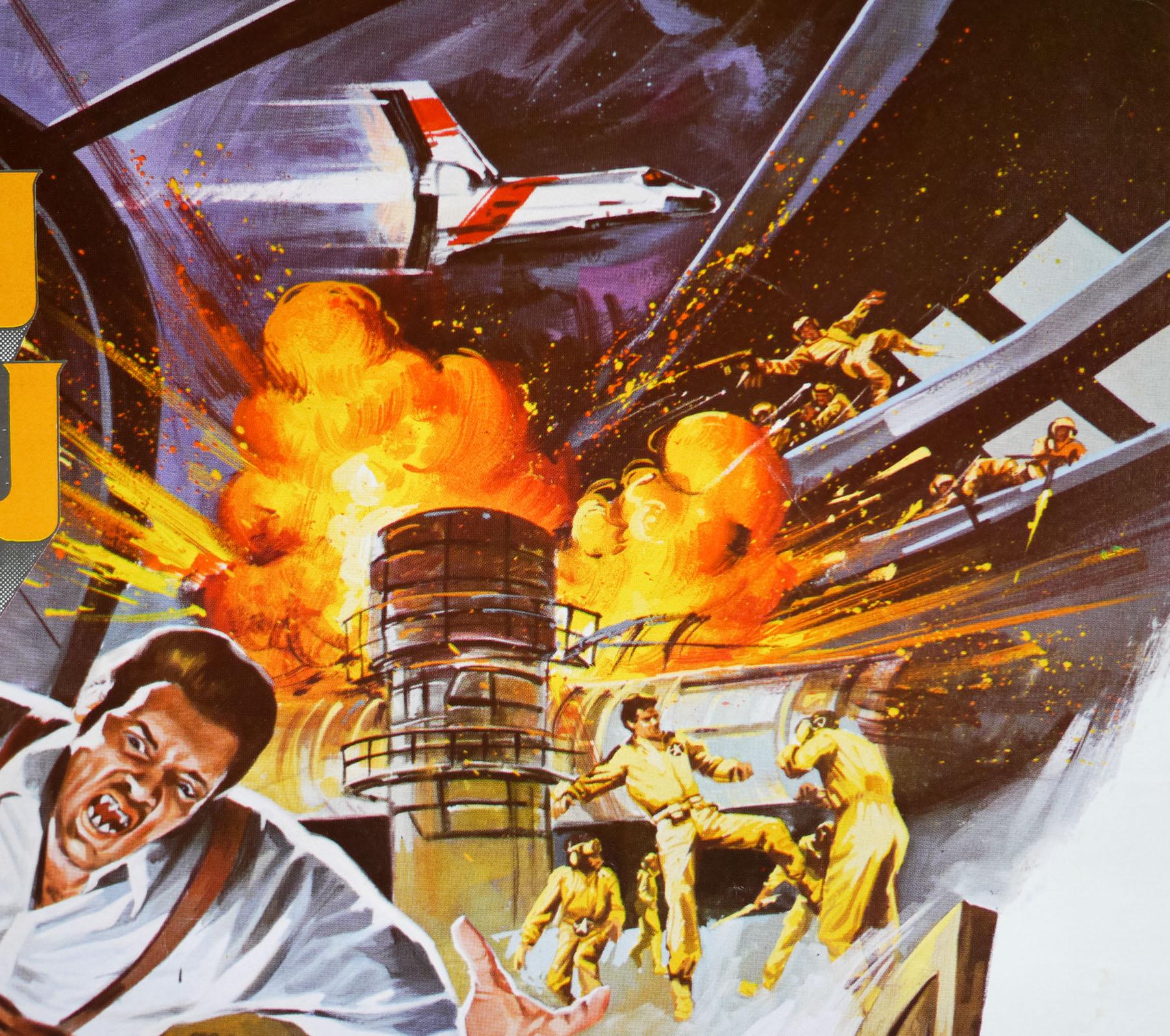
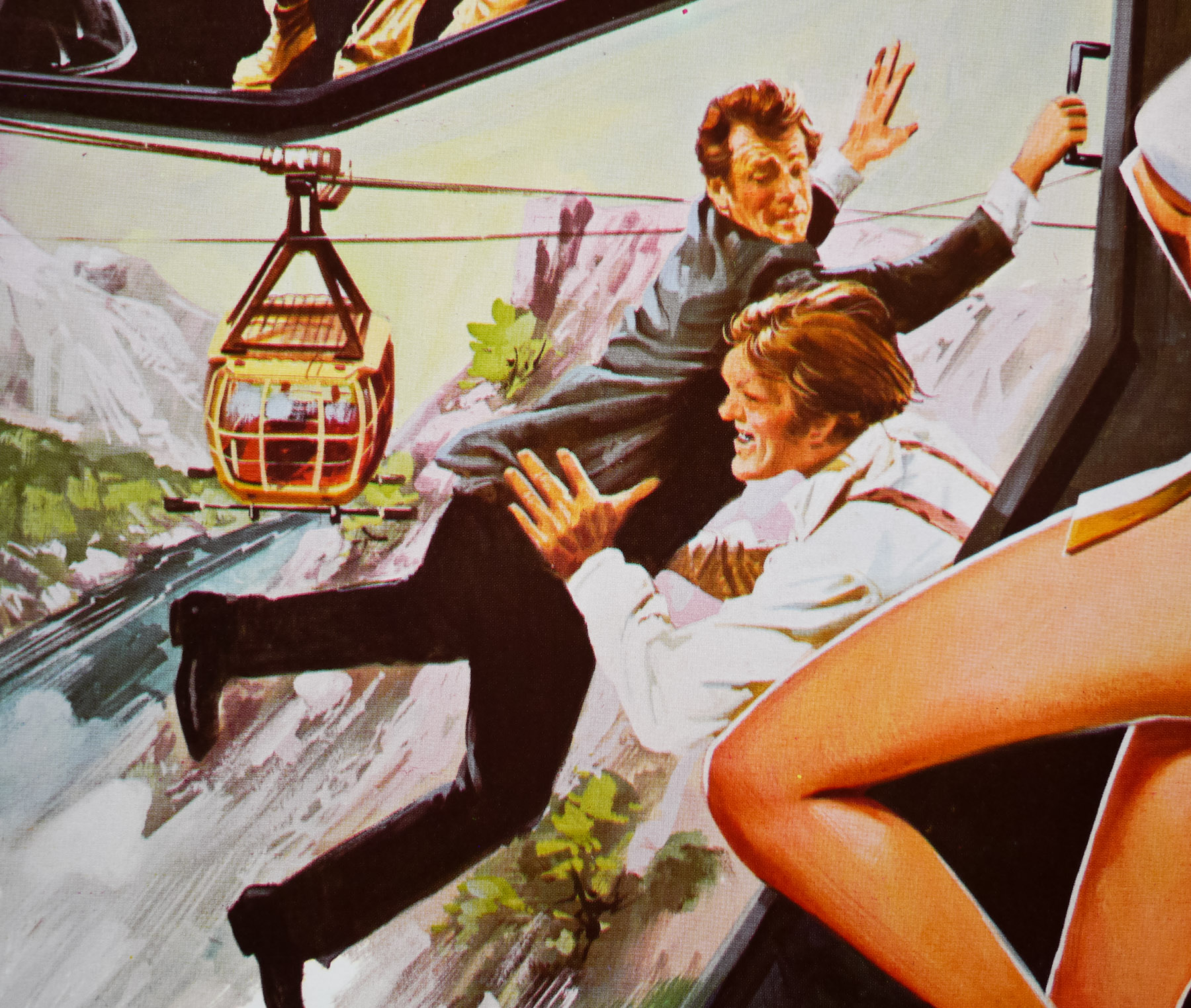
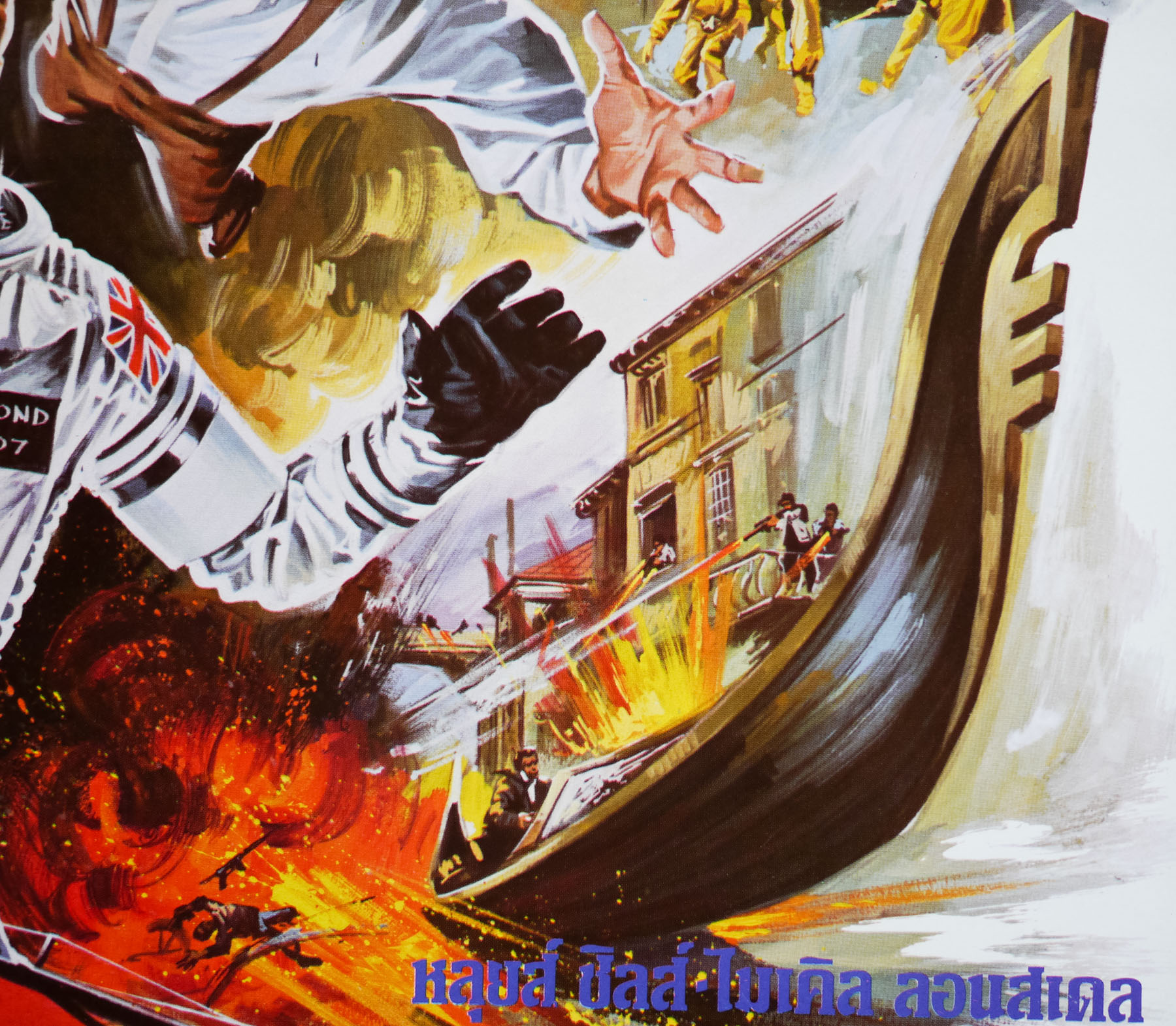
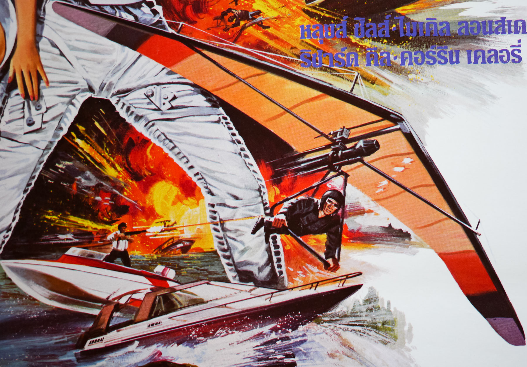
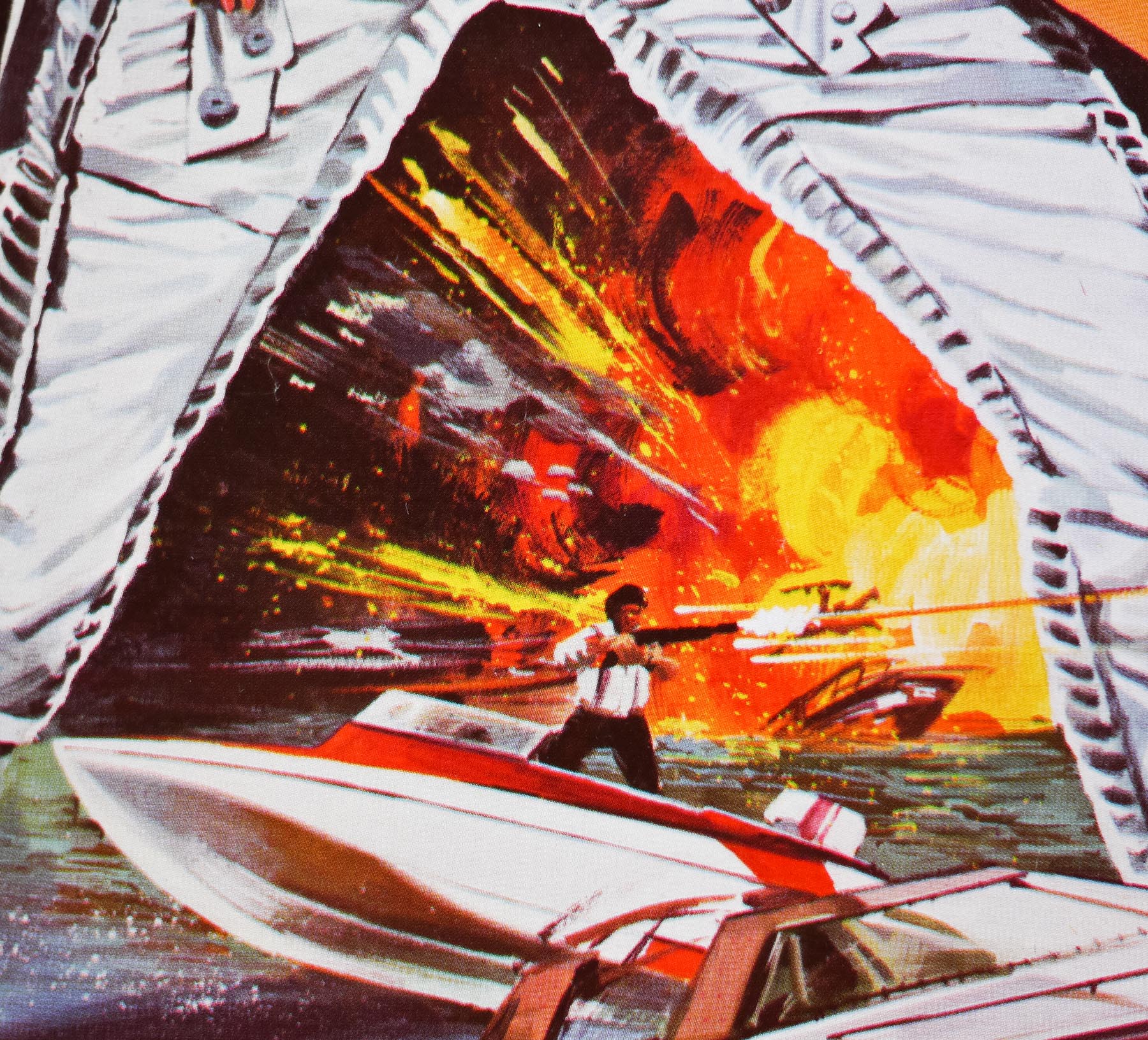
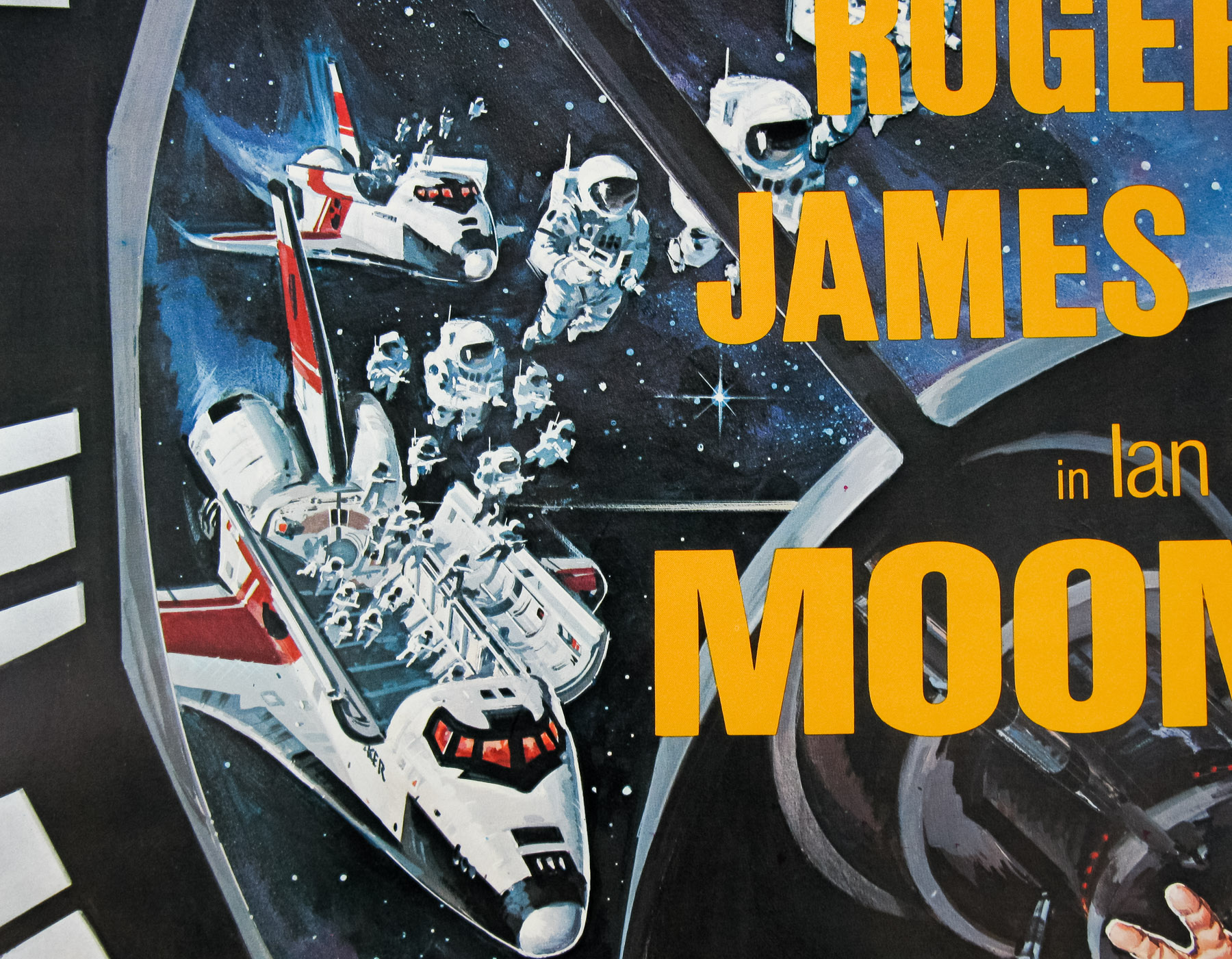
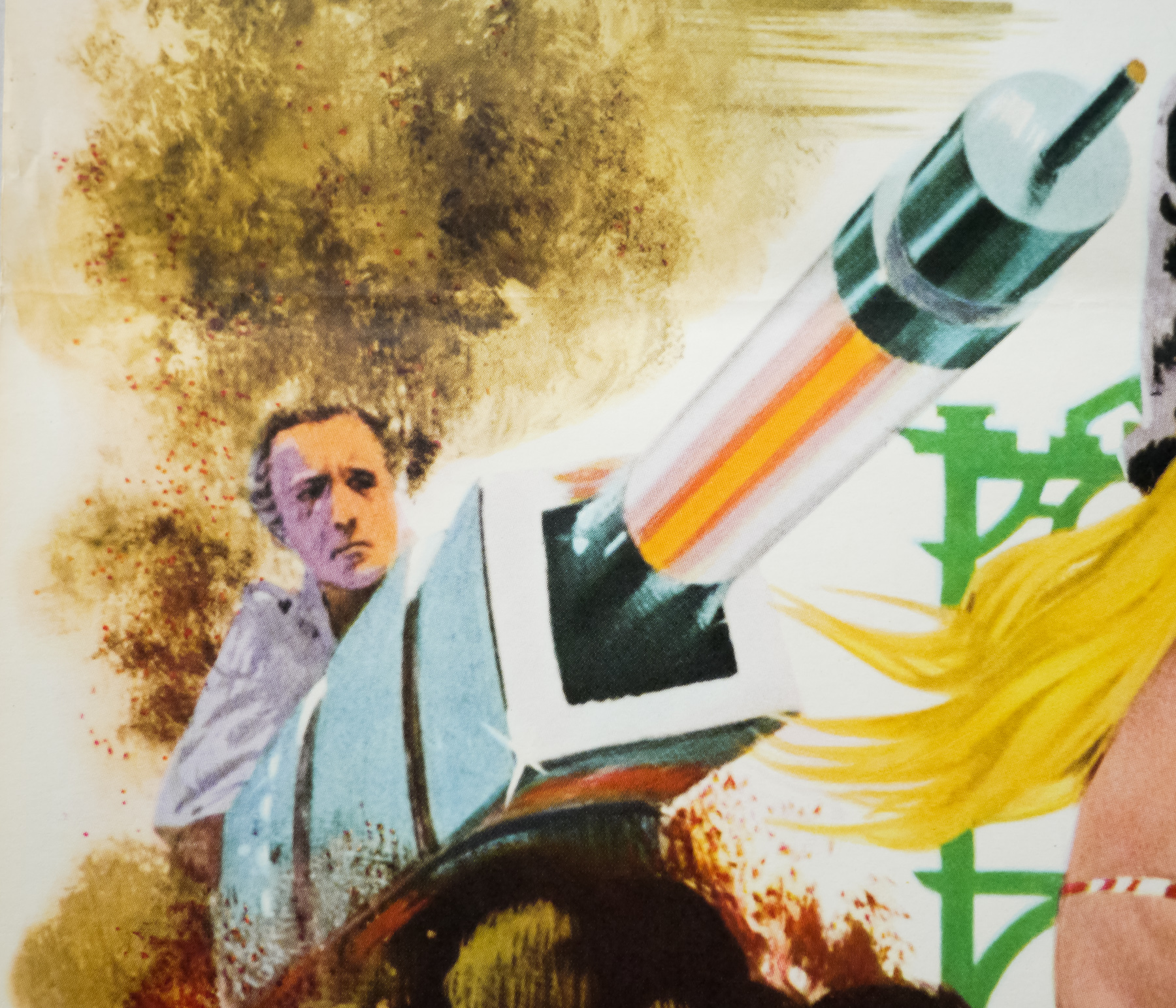
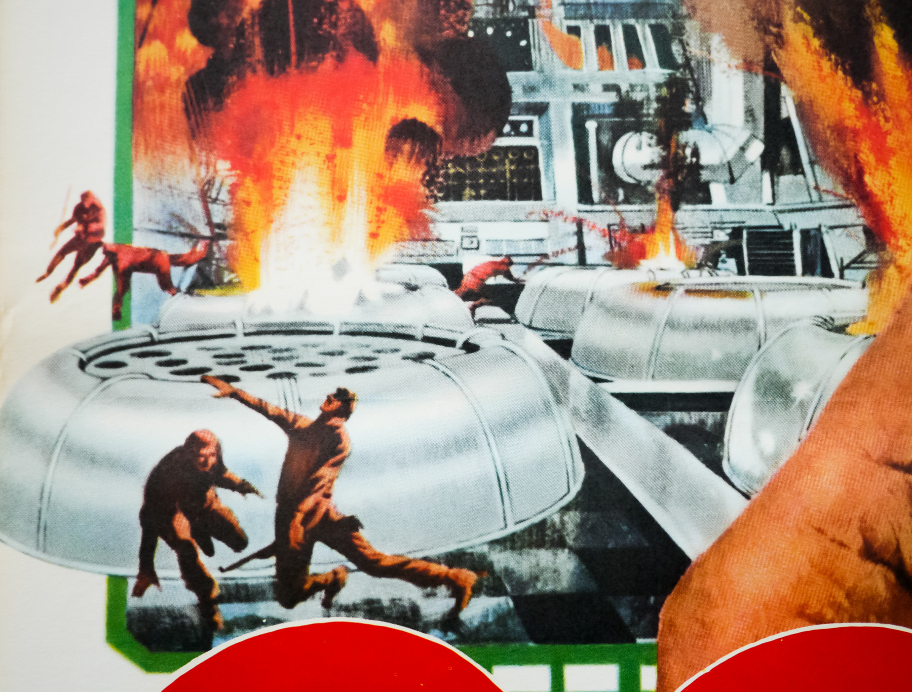
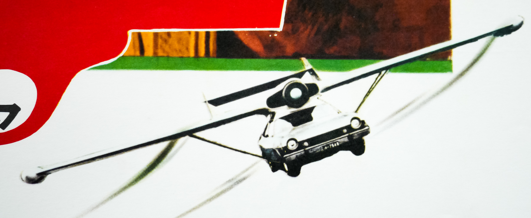
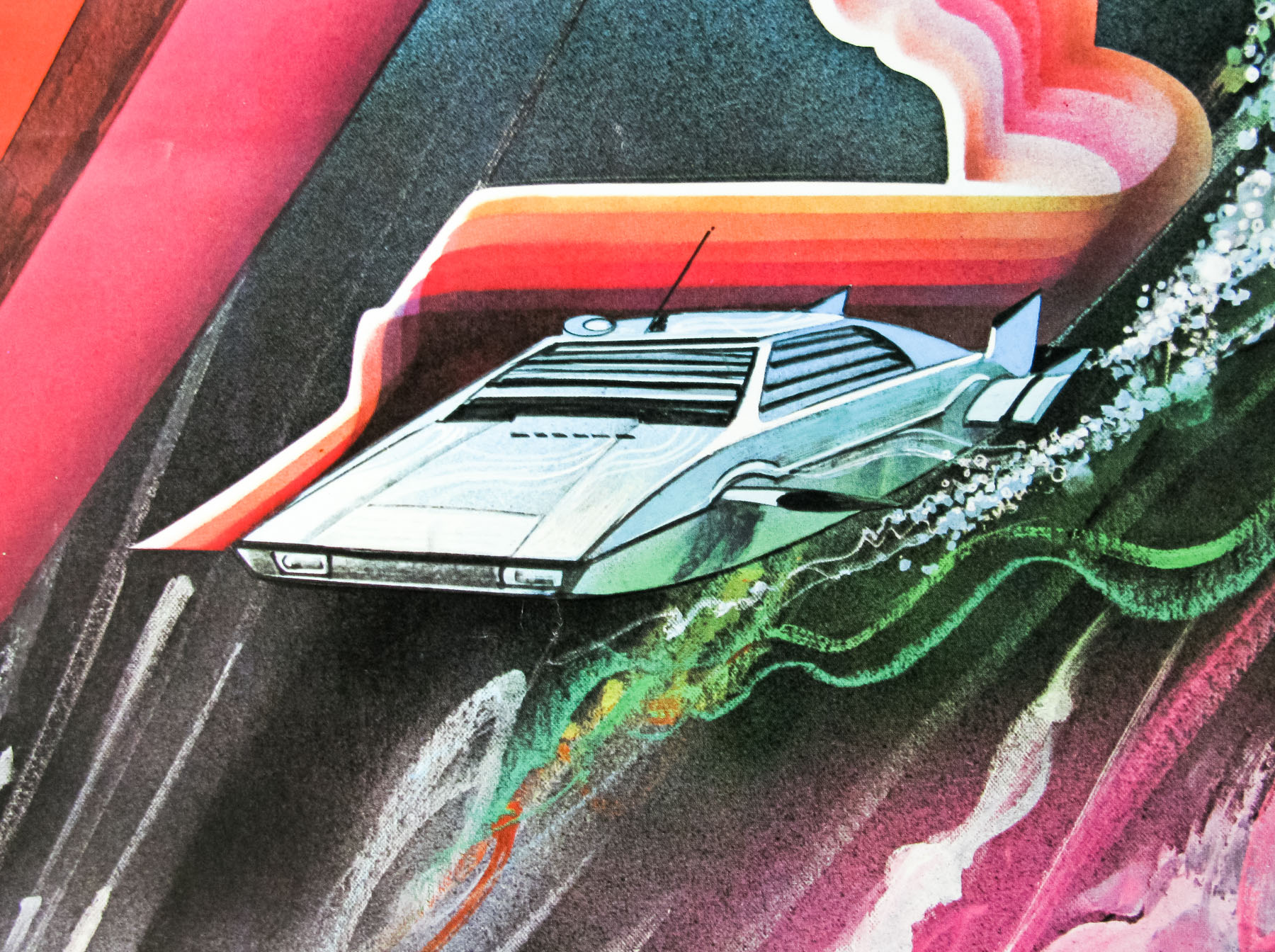
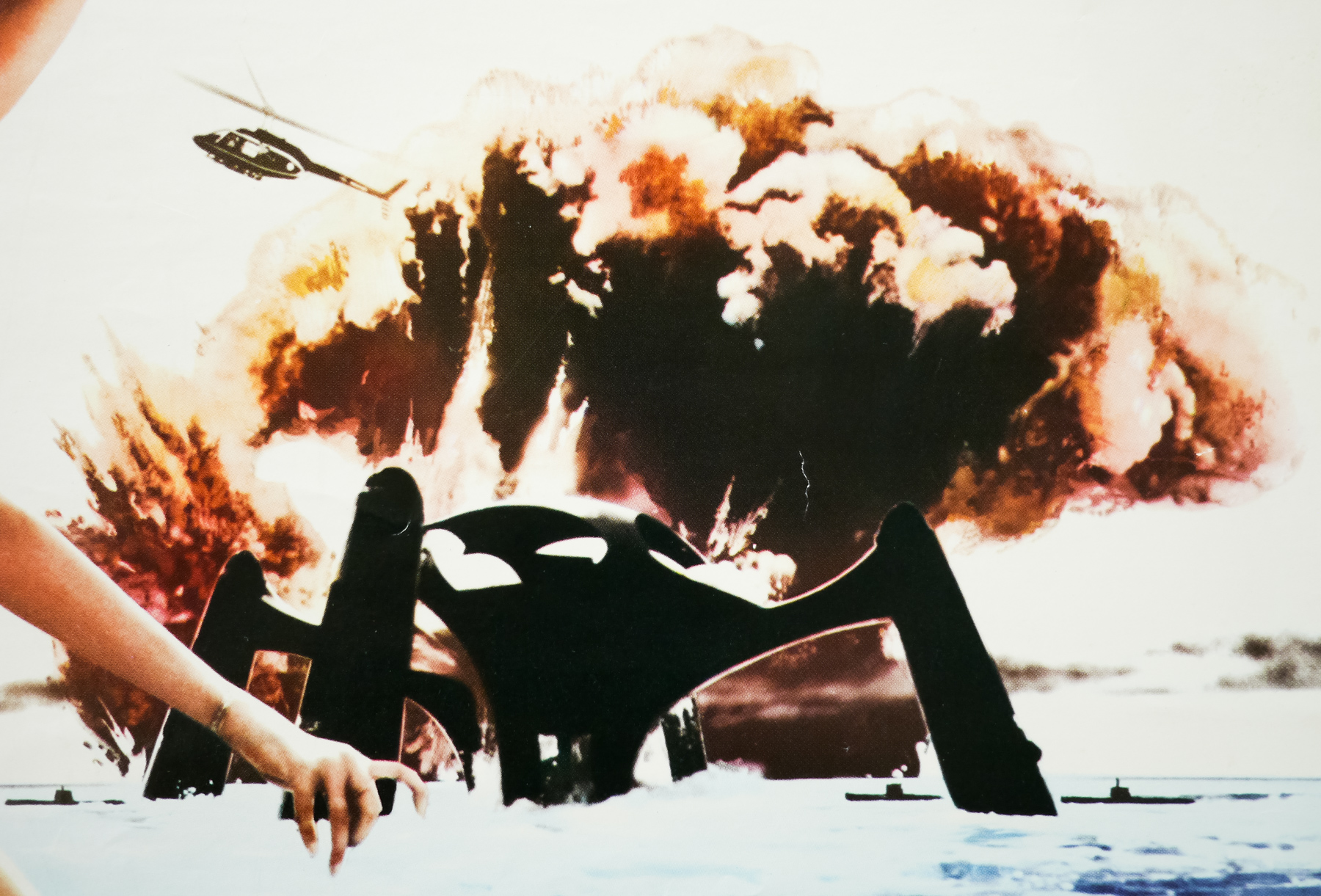
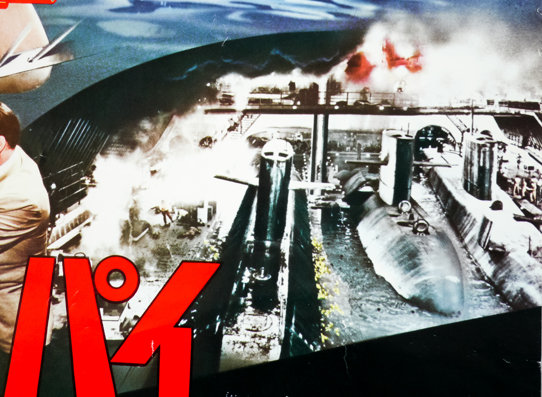
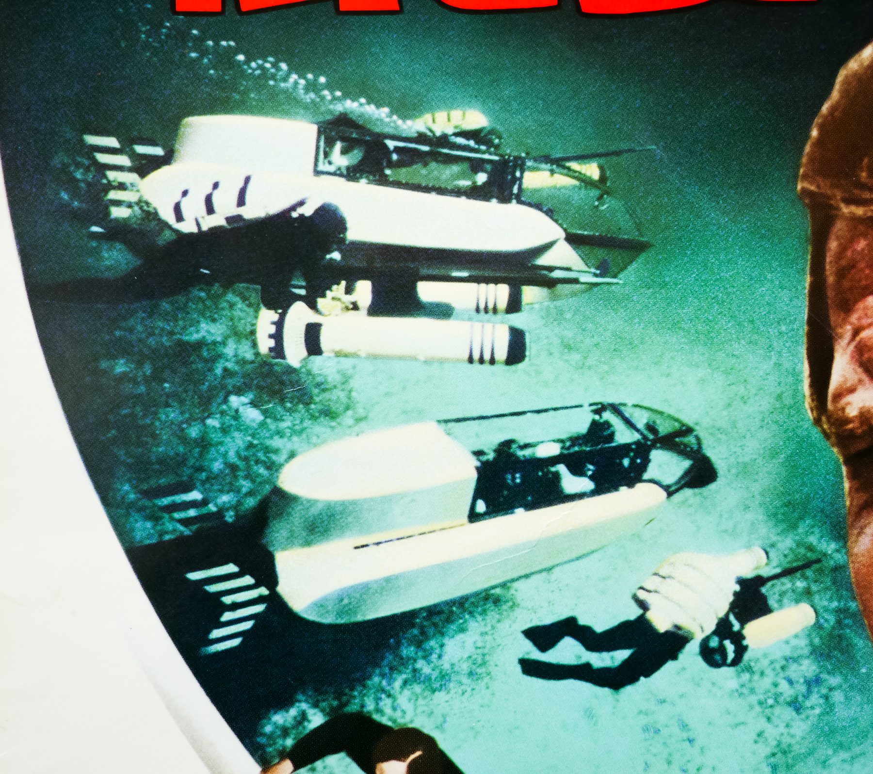
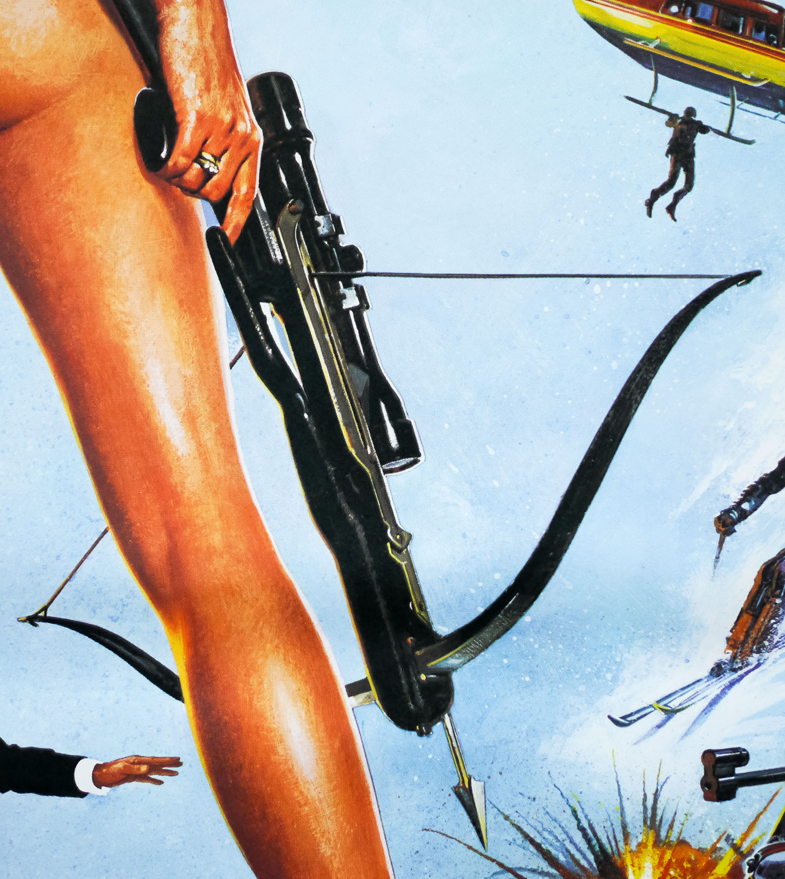
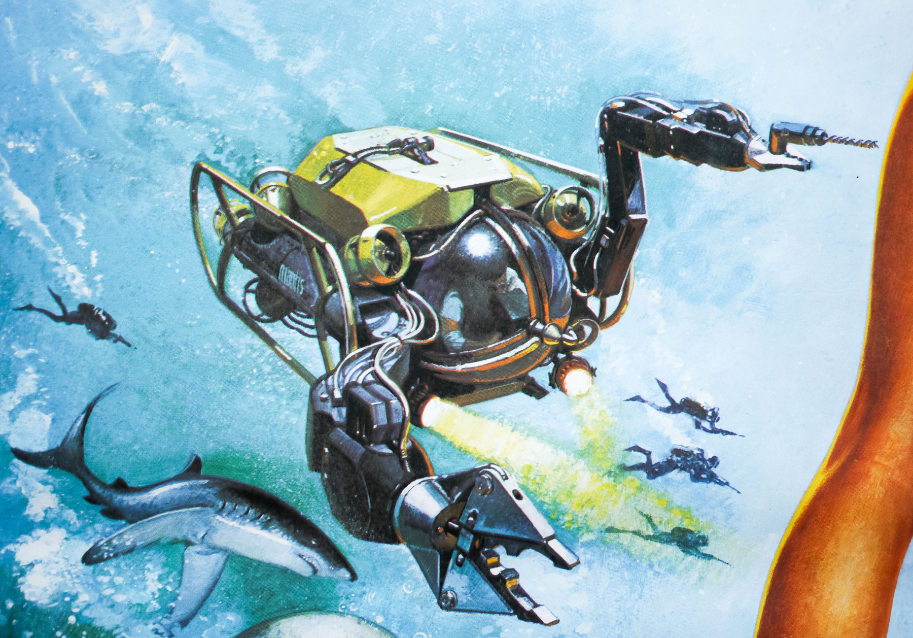
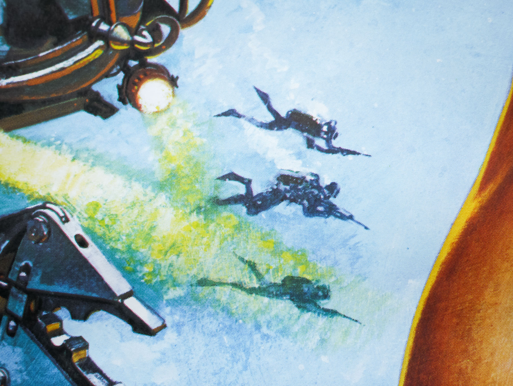
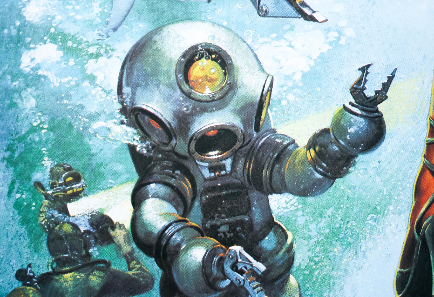
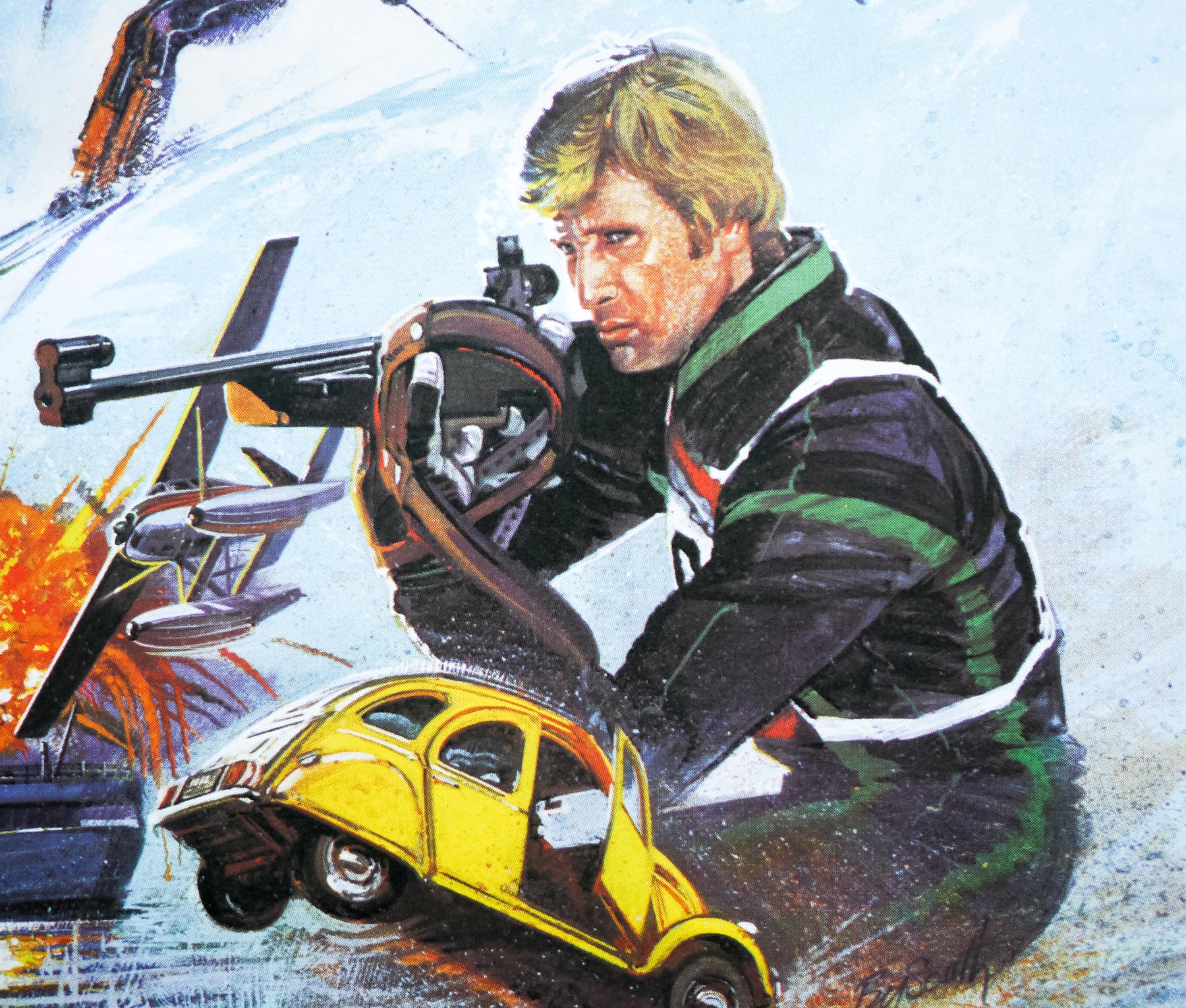
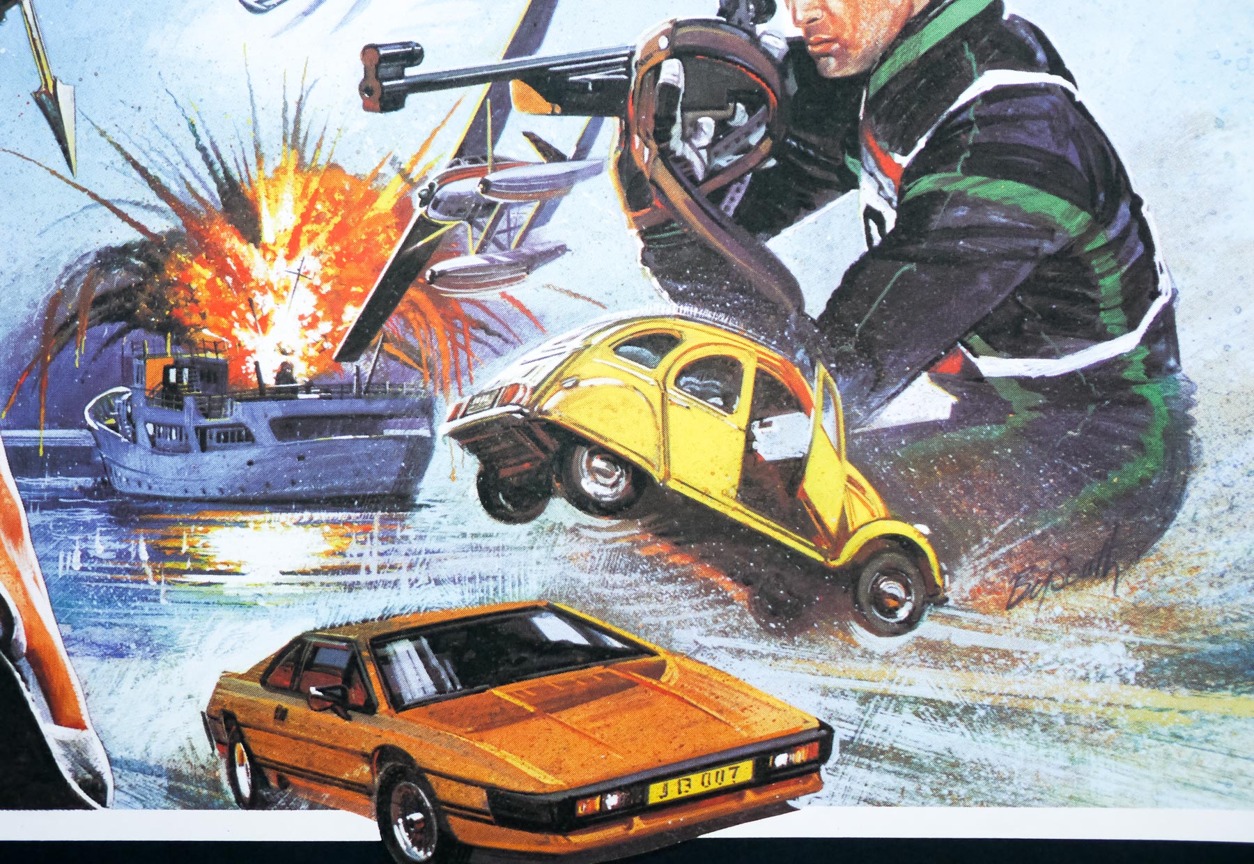
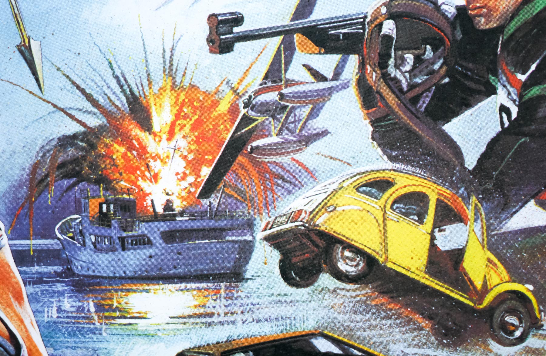
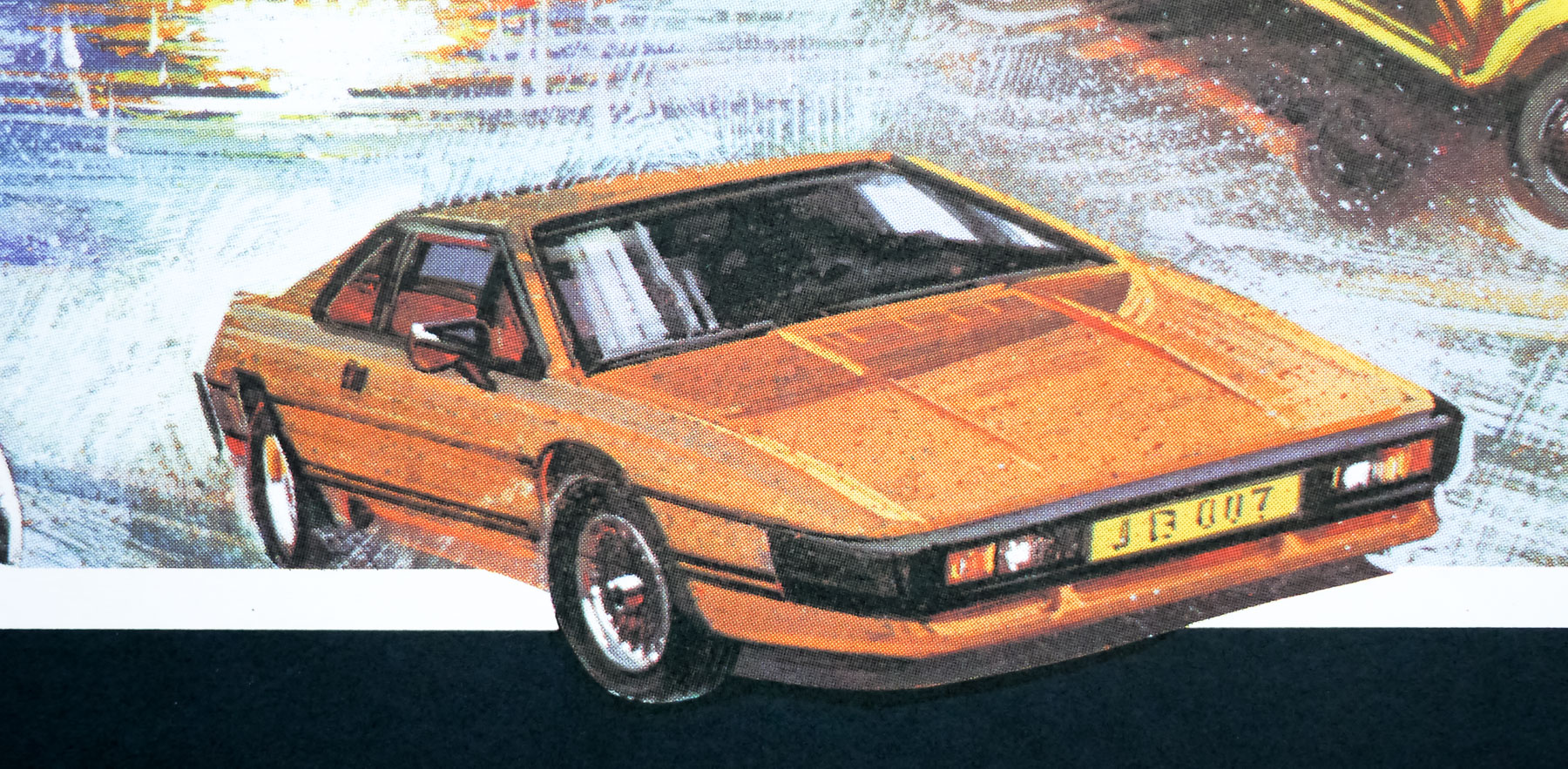
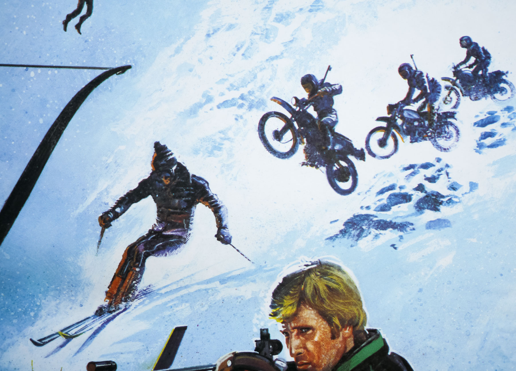
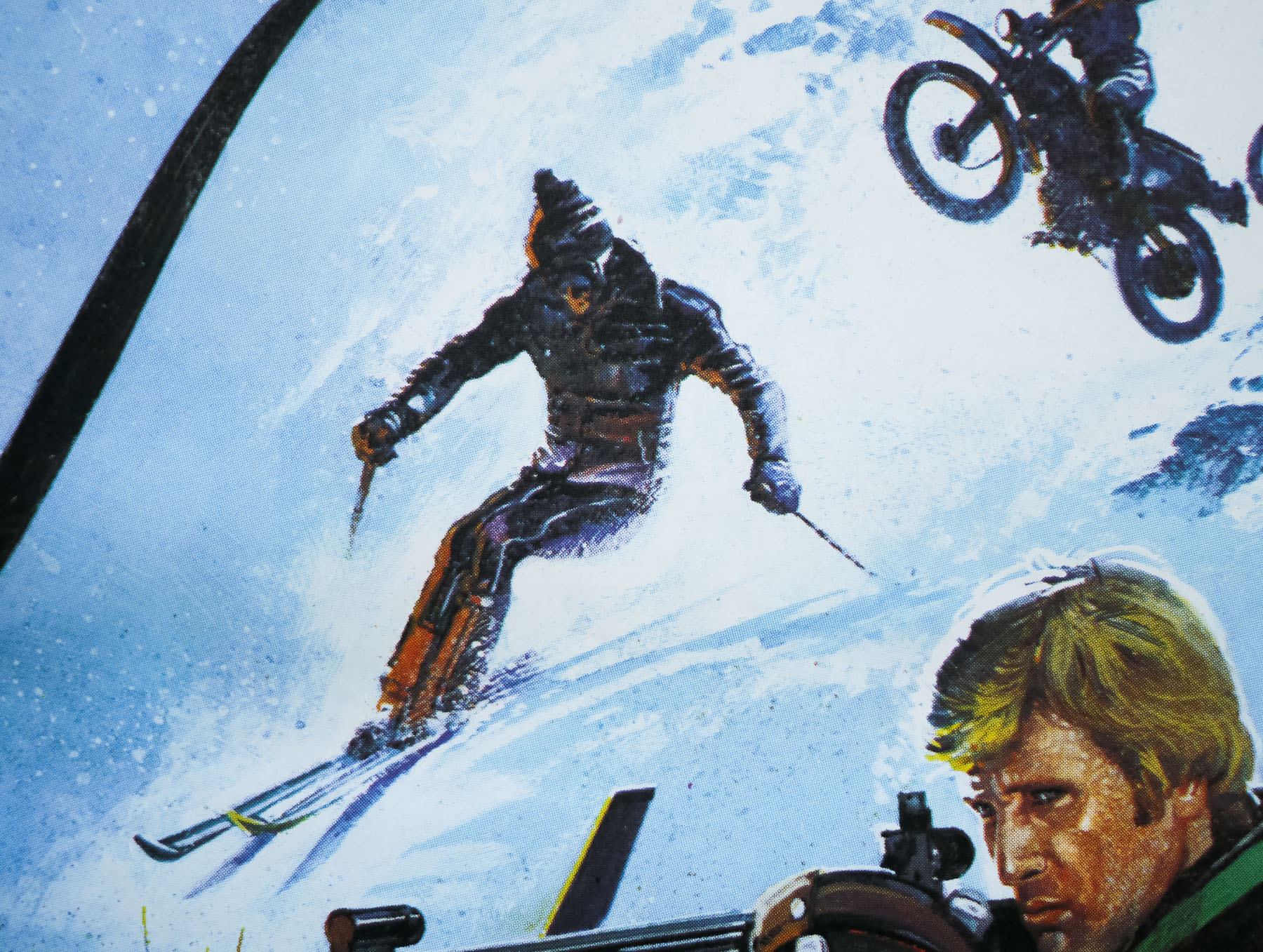
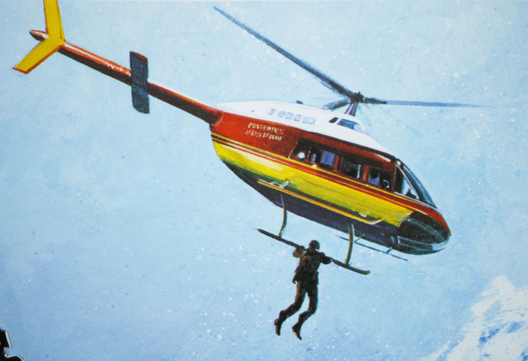
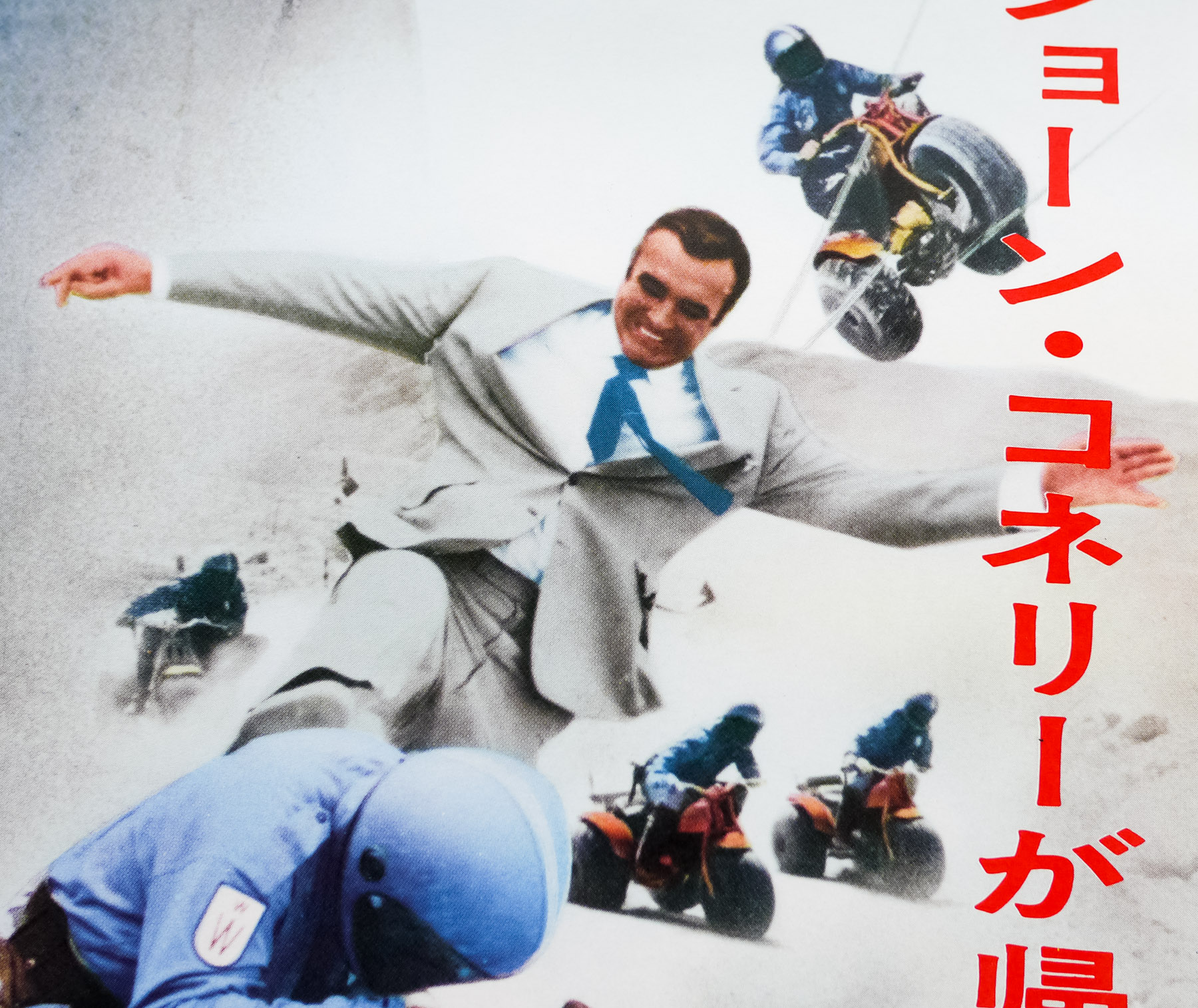
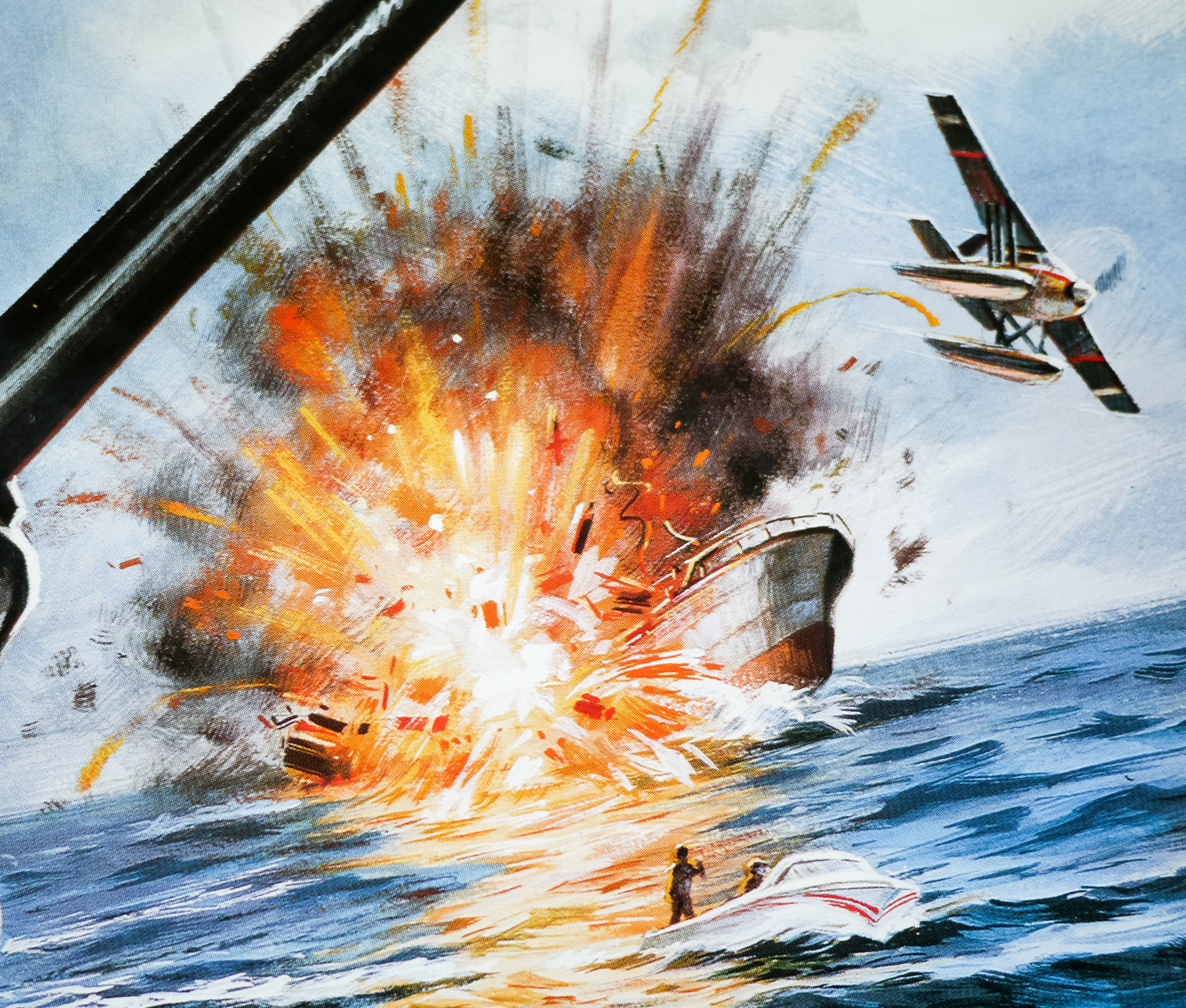
Looking at it through the cynical fog of adulthood it’s easy to sneer at the camp script, supremely daft action sequences (motorised Gondola anyone?) and painfully obvious attempt to cash in on the success of Star Wars (a very common theme amongst films released in its wake). The film is probably the quintessential outing for Moore as Bond and only he could have pulled it off as well as he did, particularly when it comes to the hokey script and madcap action.
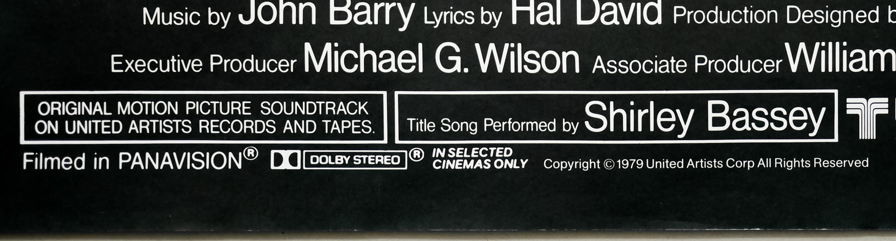
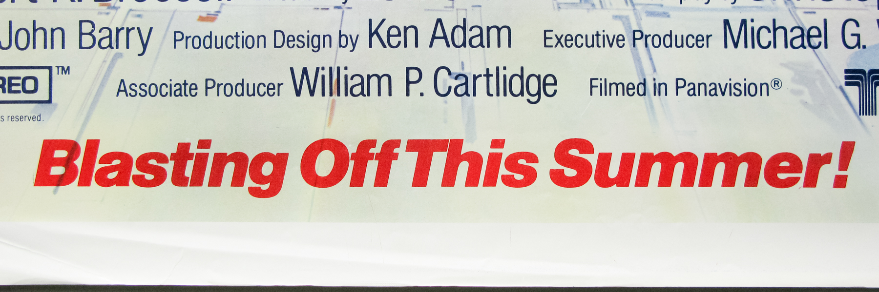
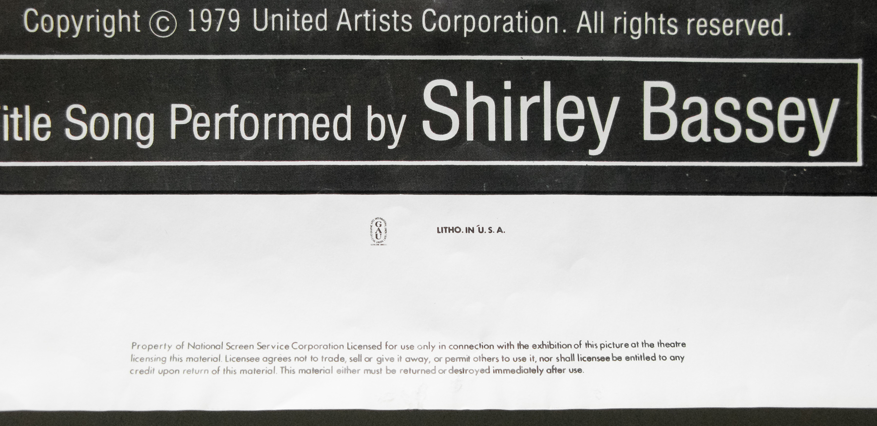
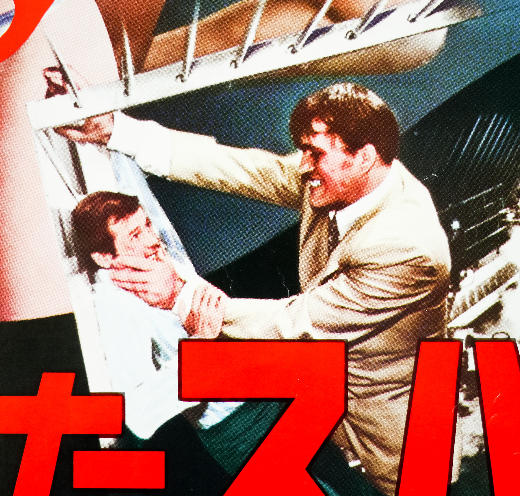
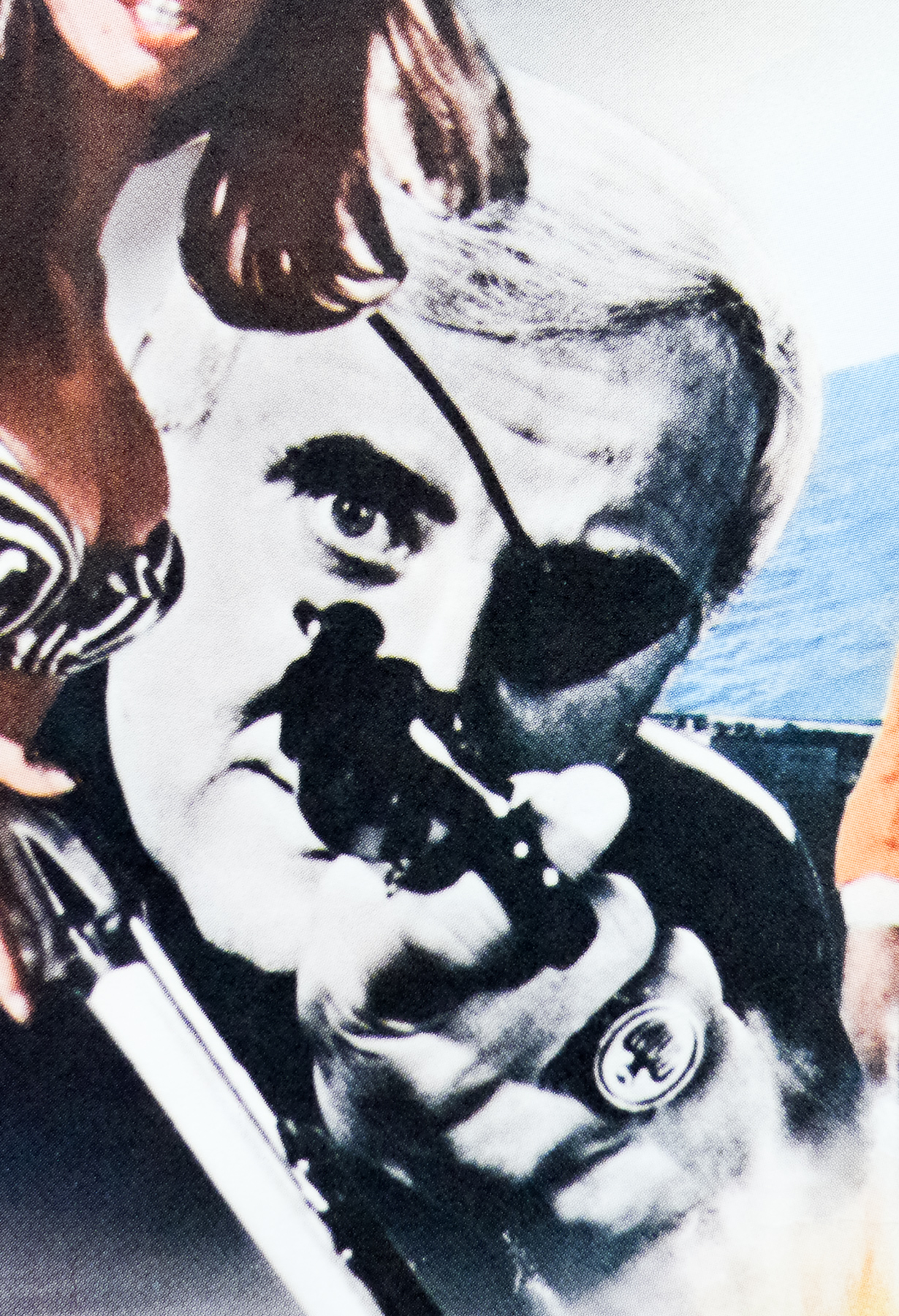
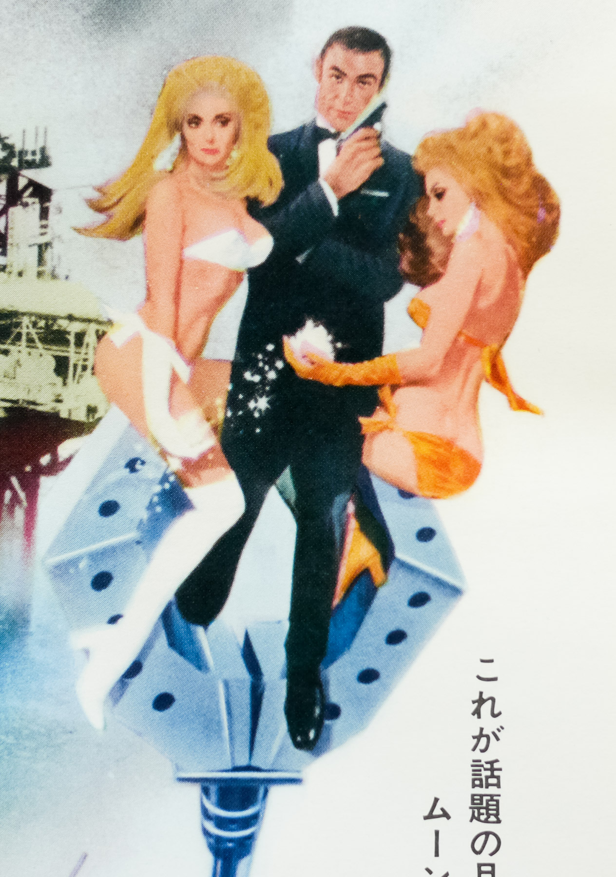
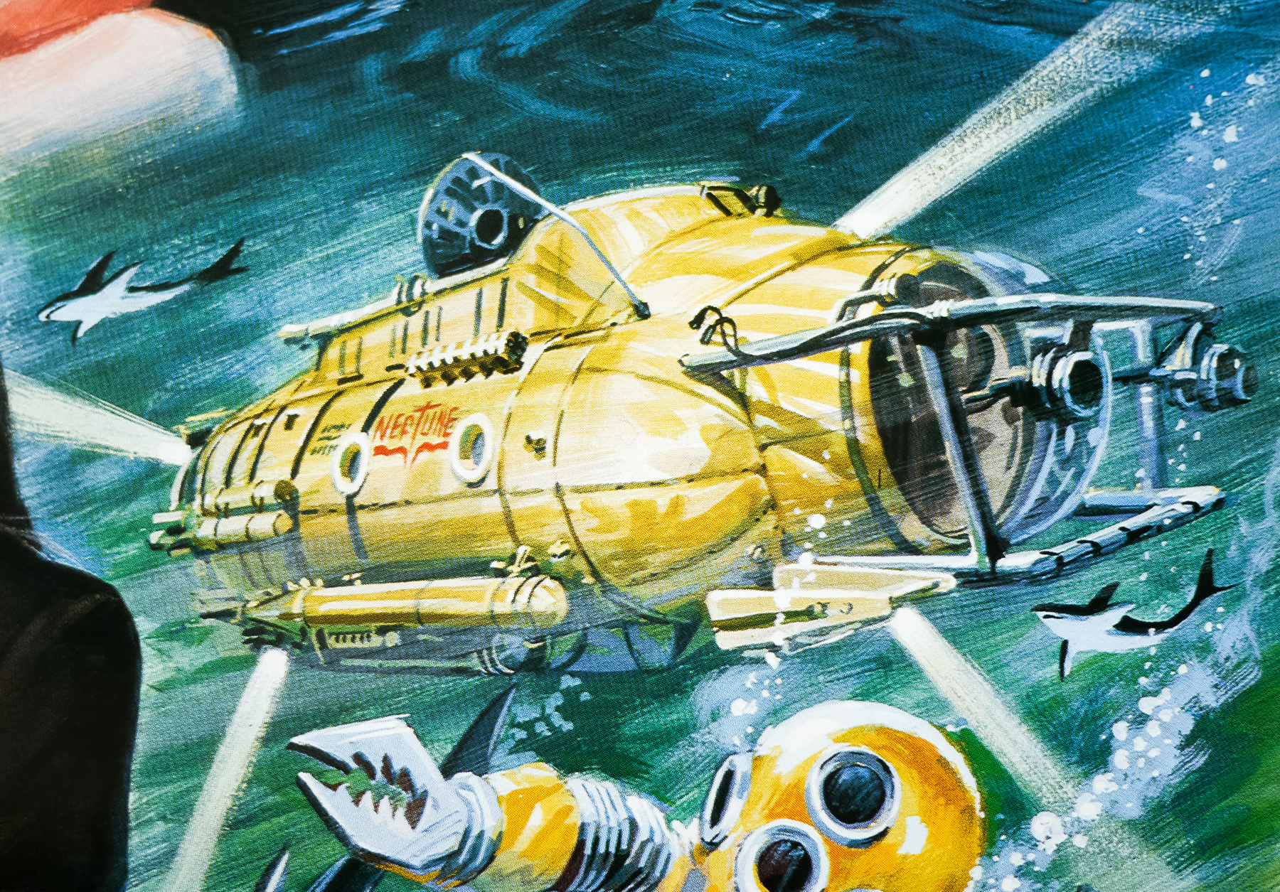
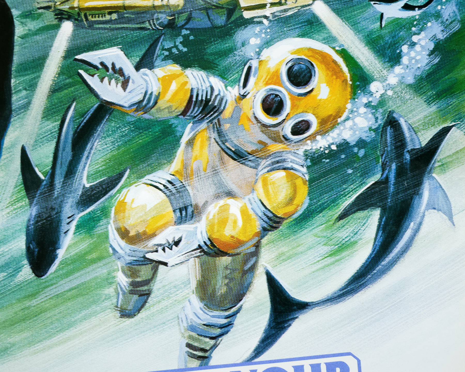
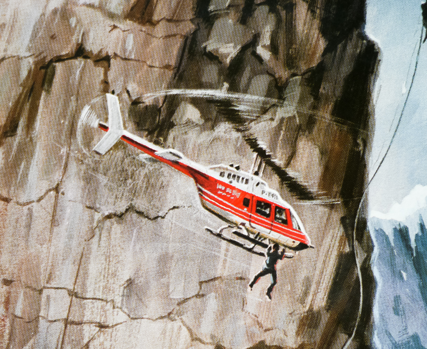
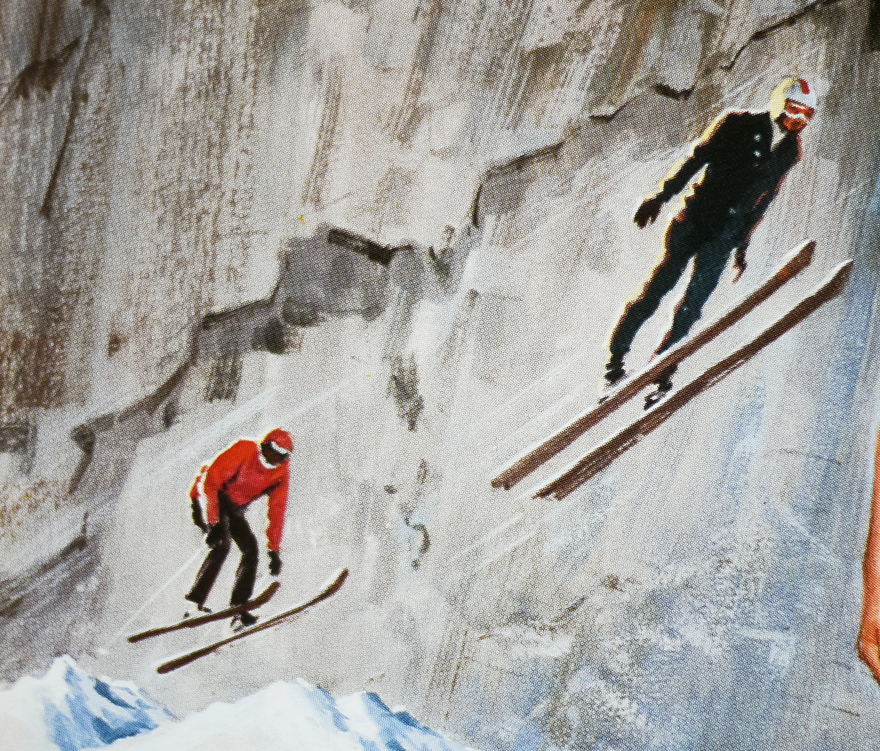
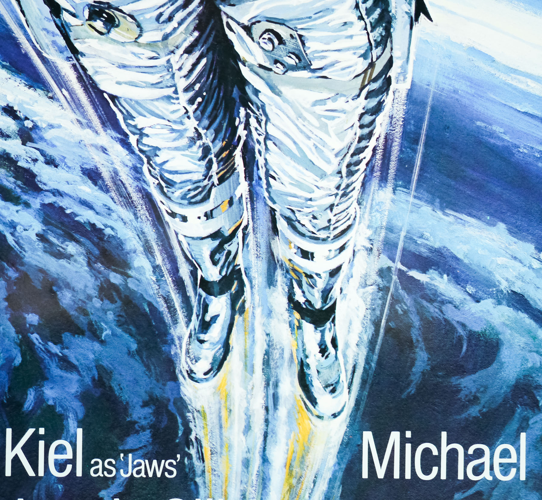
The film features several memorable sequences, including a stunning cable car fight over Rio de Janeiro, and a memorable bad guy in Richard Kiel‘s inimitable ‘Jaws’ who used to scare me senseless as a kid. Also notable is John Barry‘s soundtrack, which marked a departure from his previous Bond work by mainly using strings instead of the typical brass. The film also features one of the most (literally) eyebrow-raising character names in the form of Dr Holly Goodhead (Lois Chiles) and one of the best/worst sign-offs of the entire series:
Sir Frederick Gray, Minister of Defence: My God, what’s Bond doing?
Q: I think he’s attempting re-entry, sir.
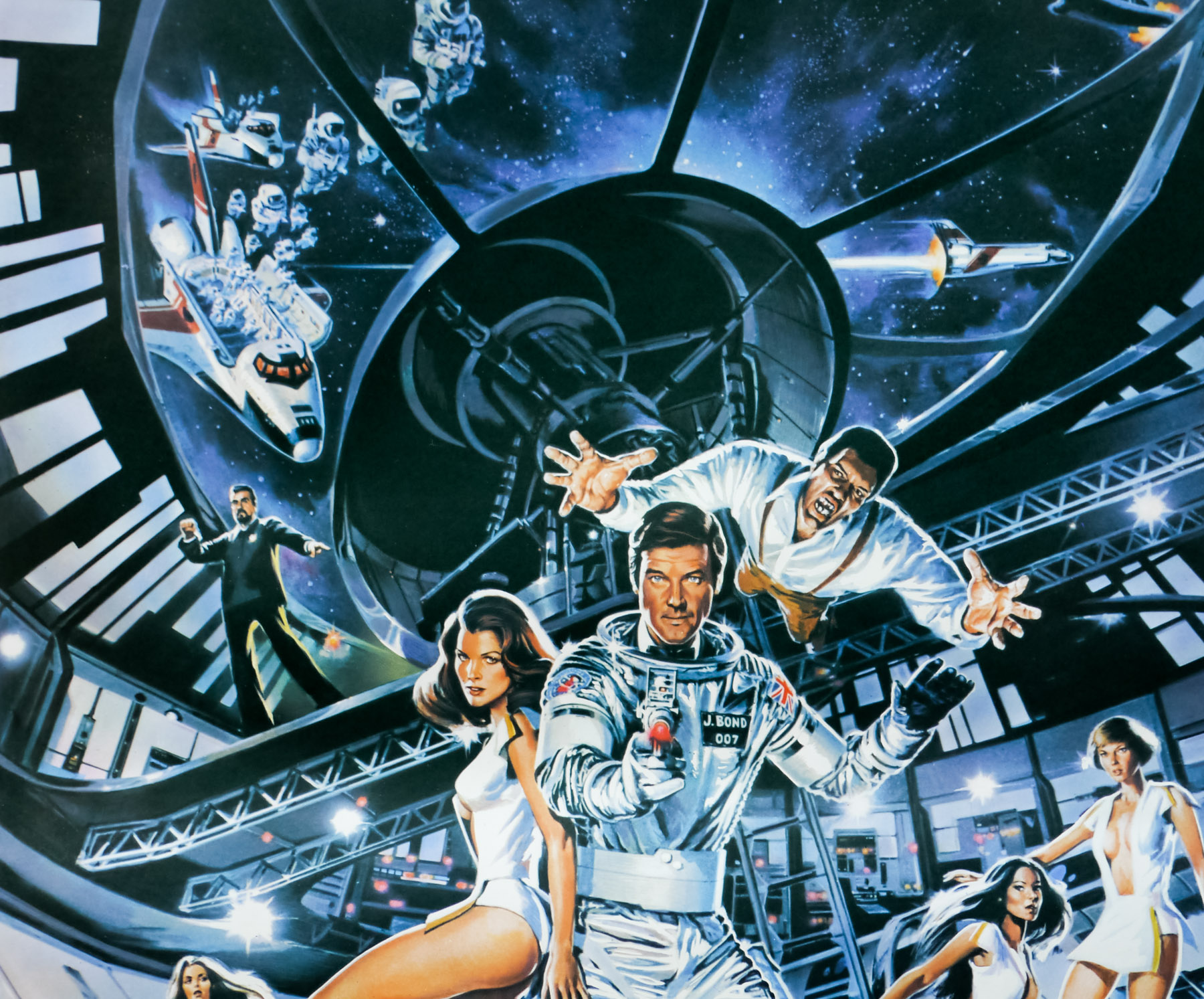
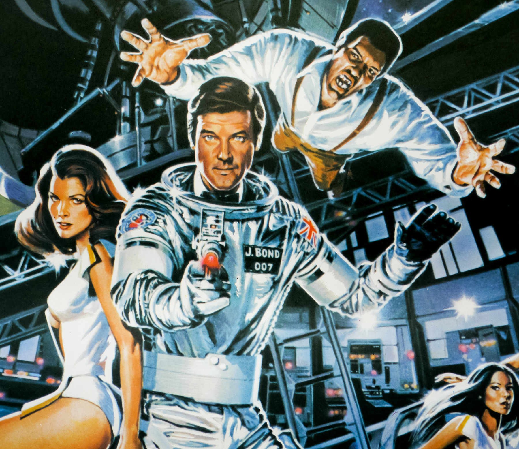
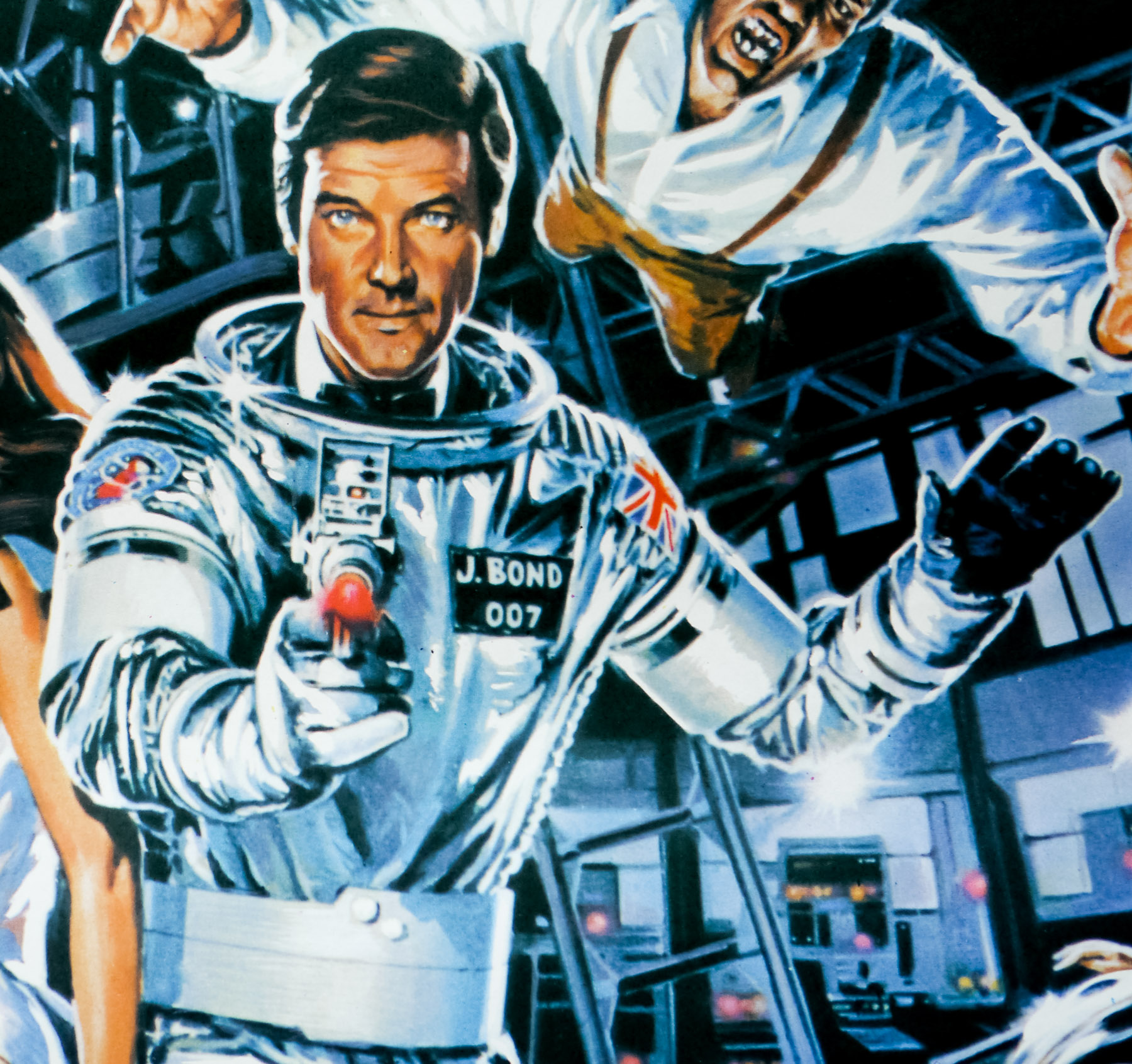
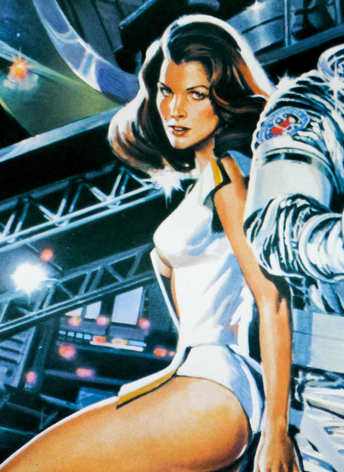
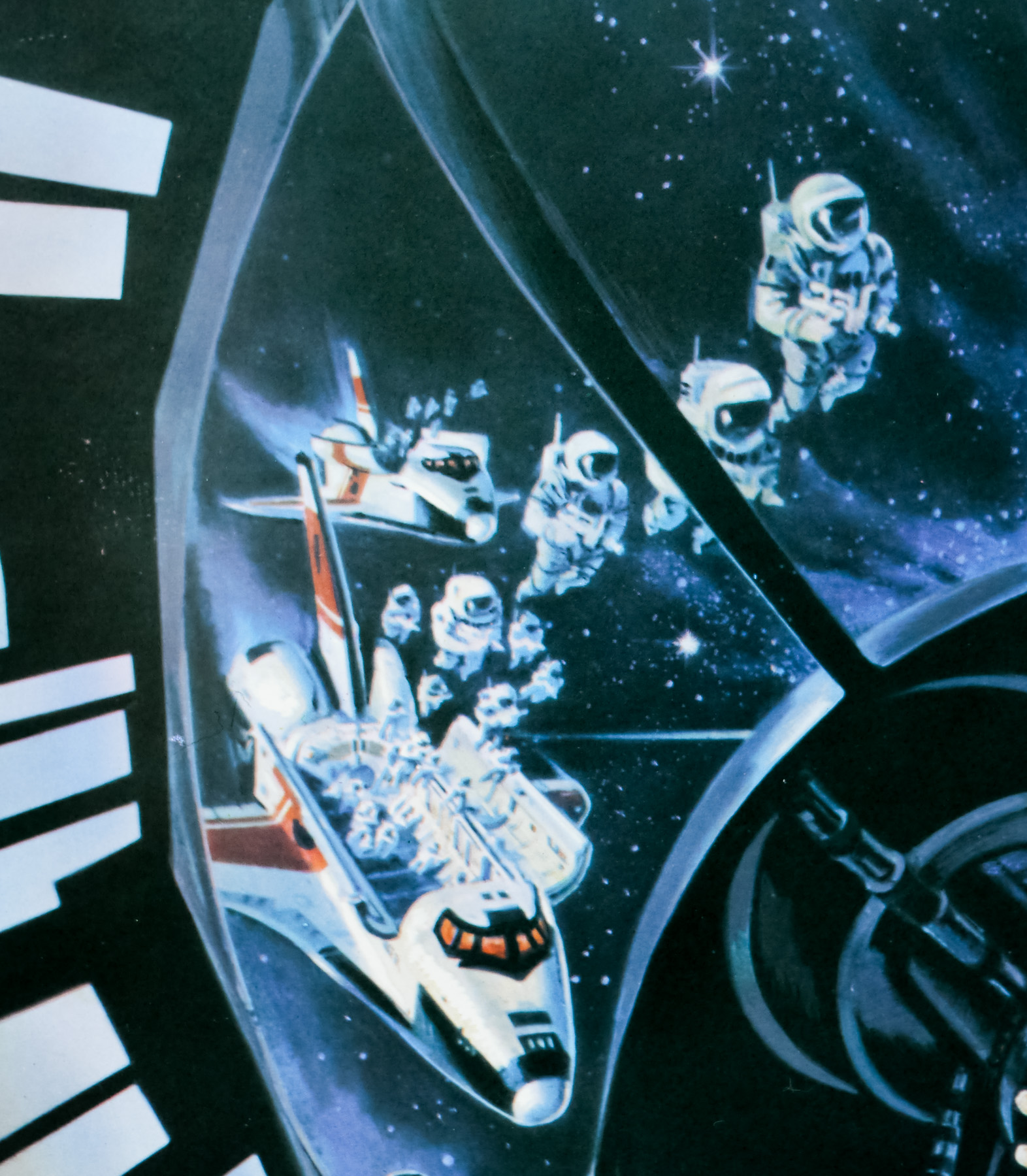
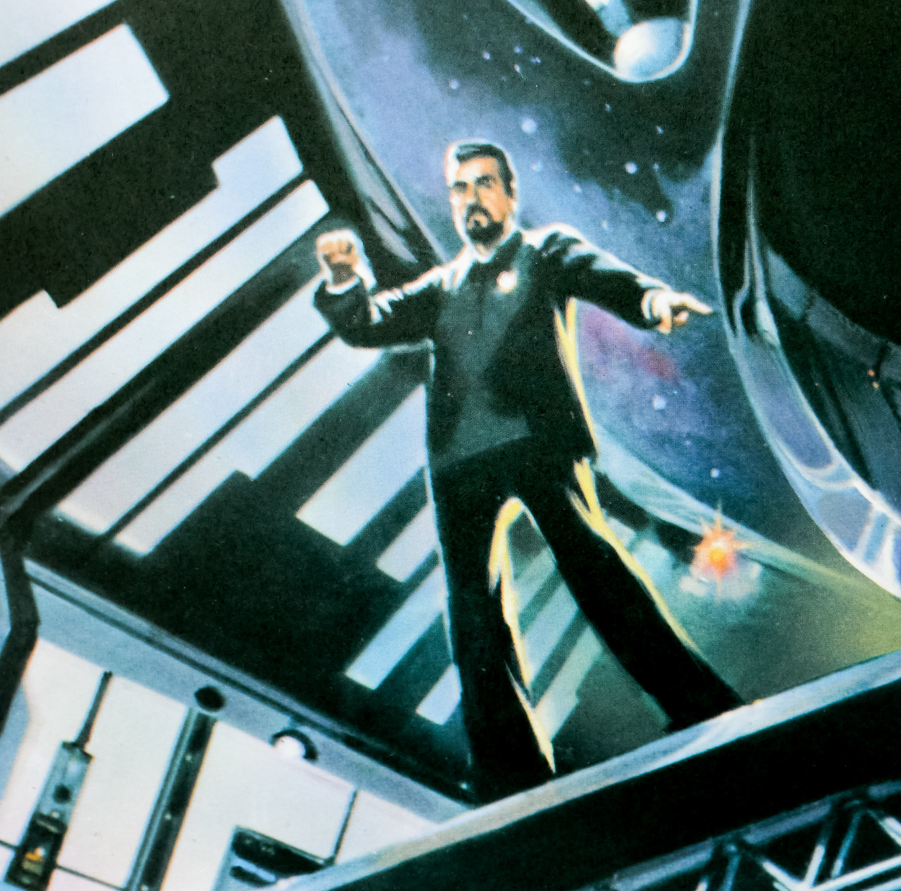
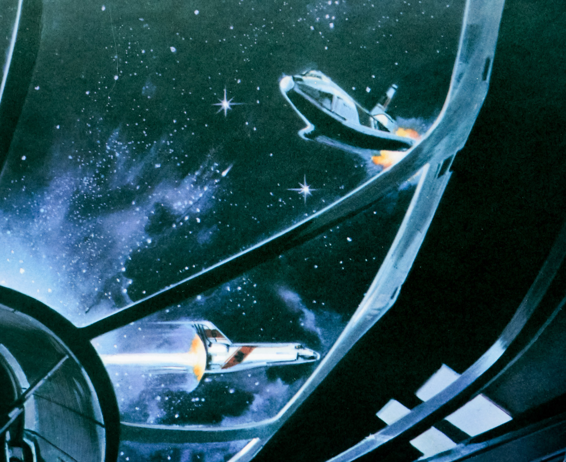
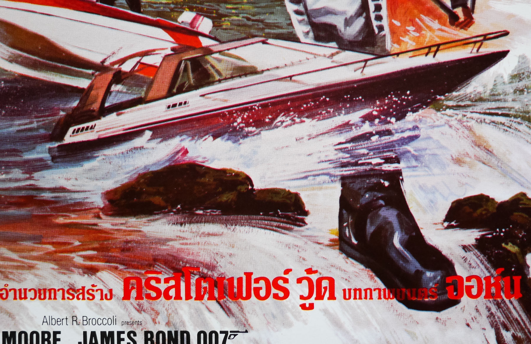
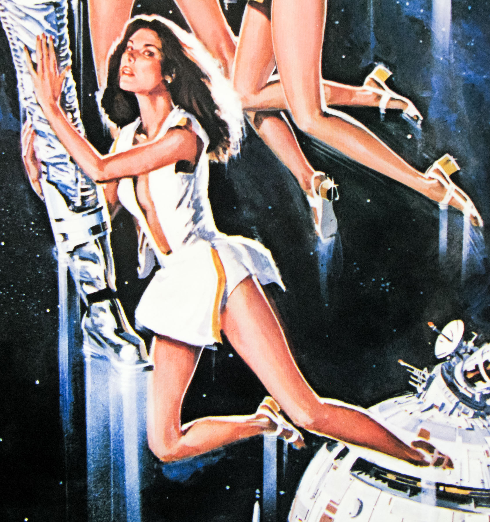
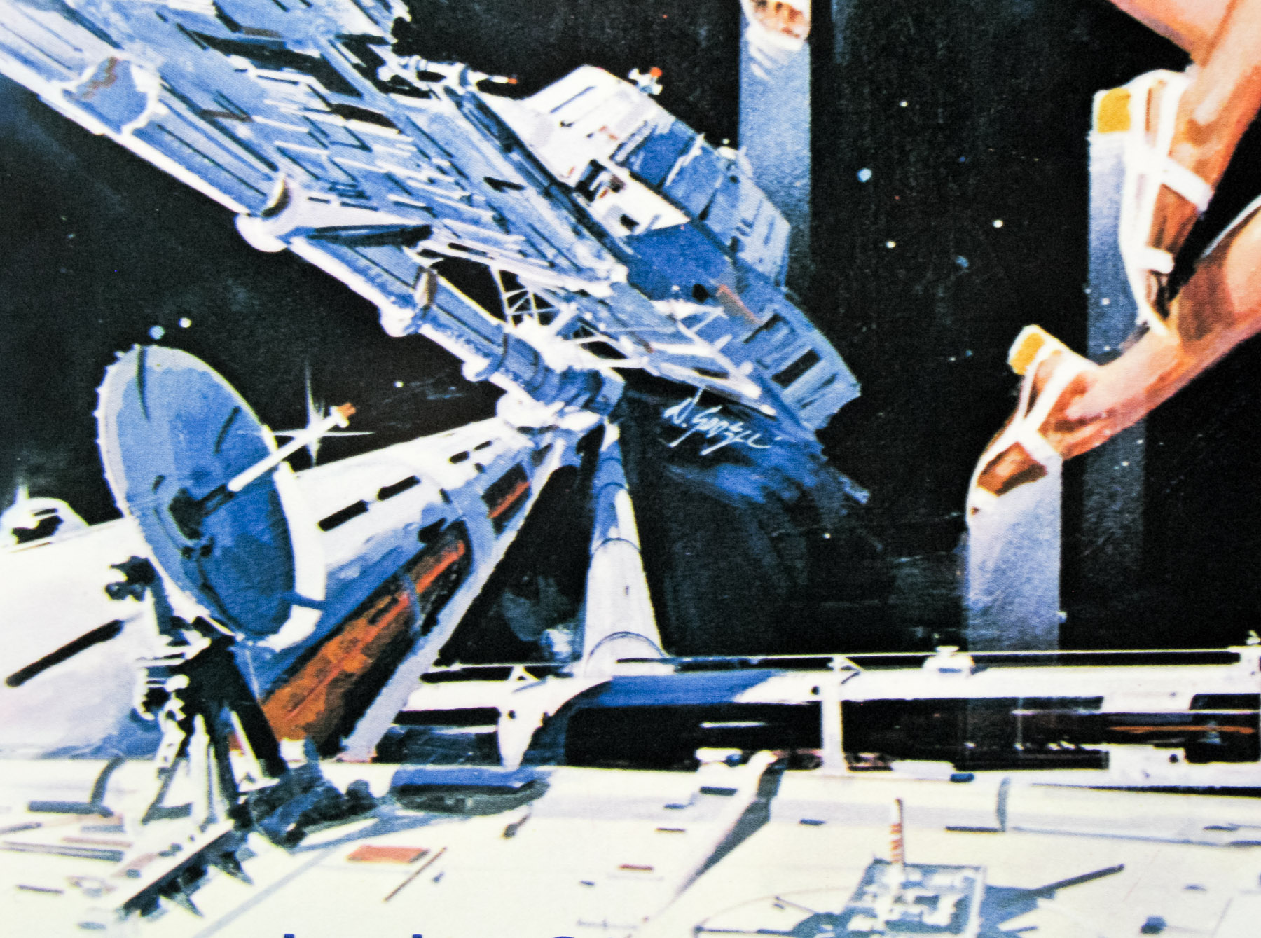
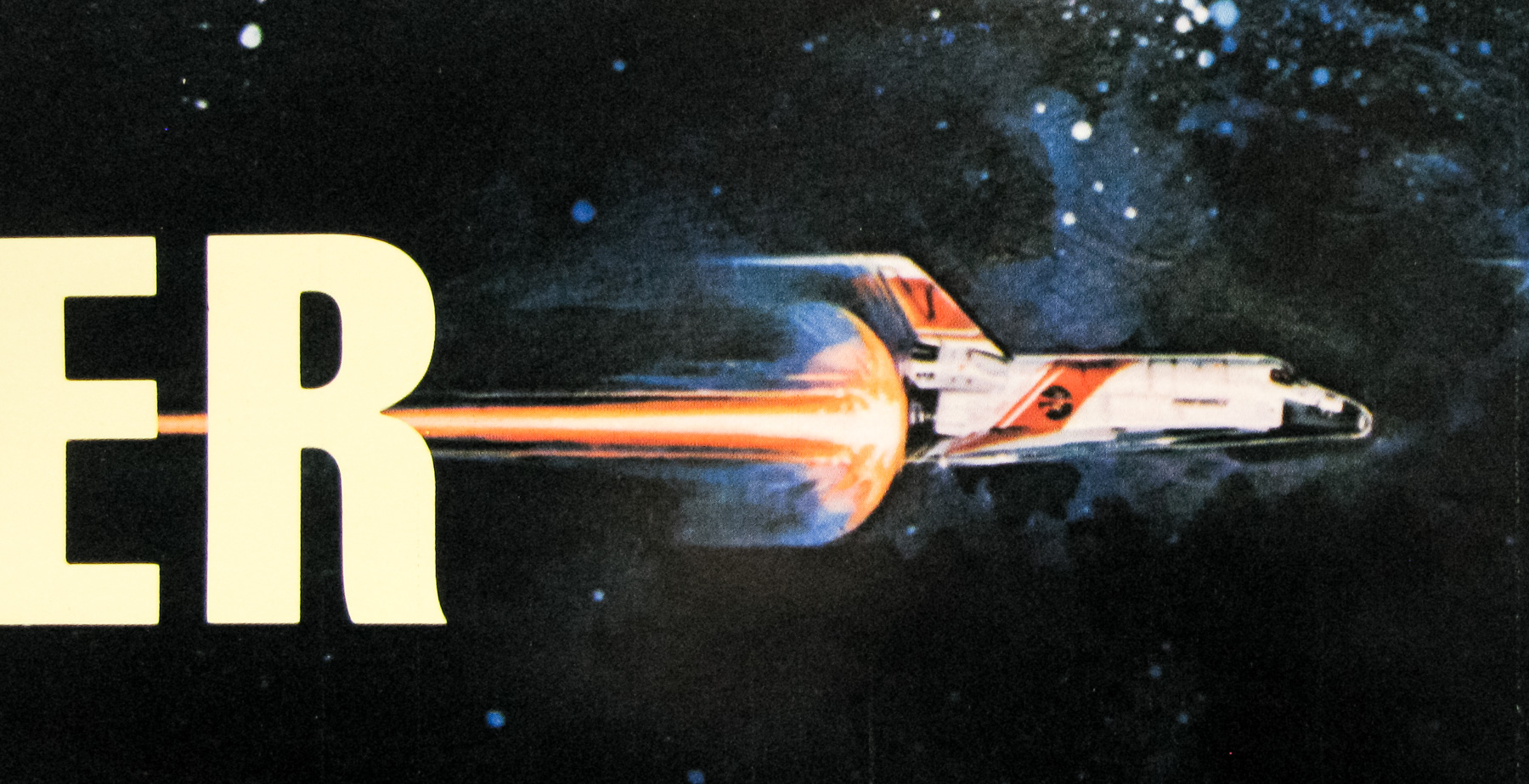
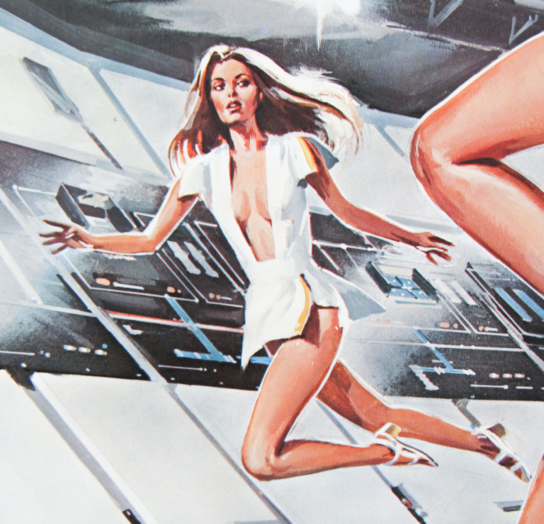
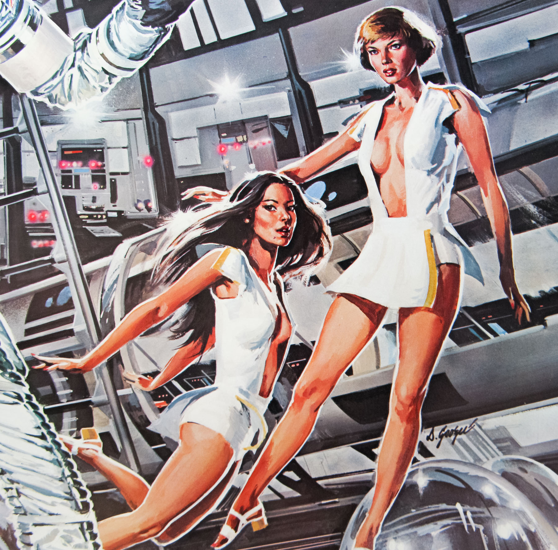
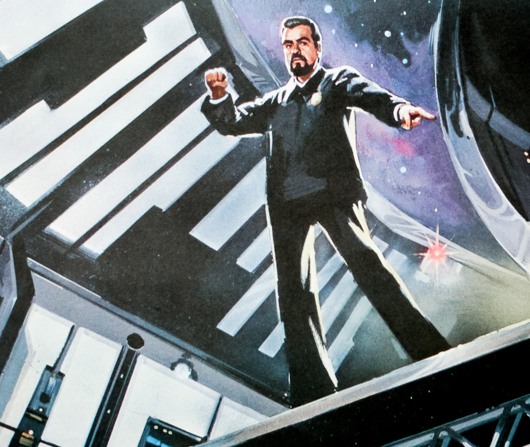
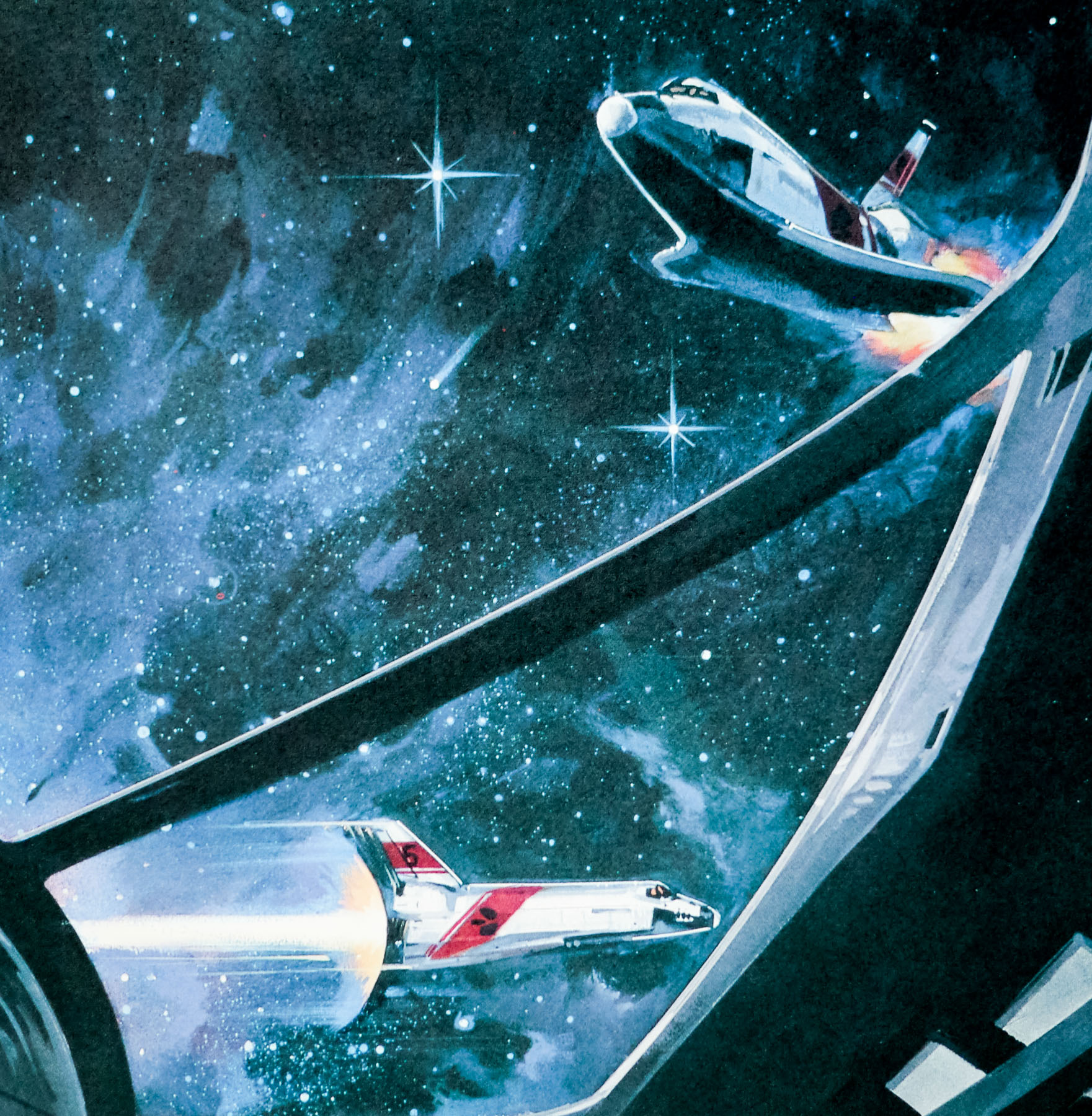
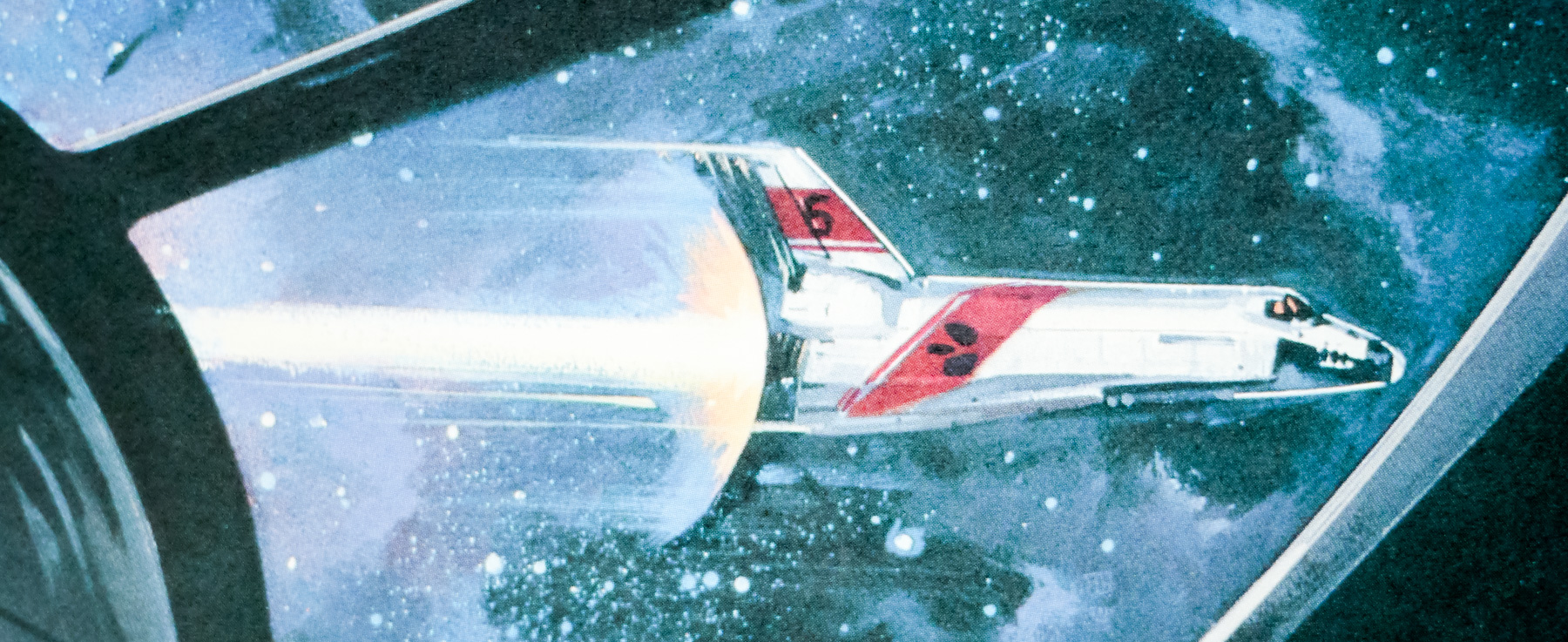
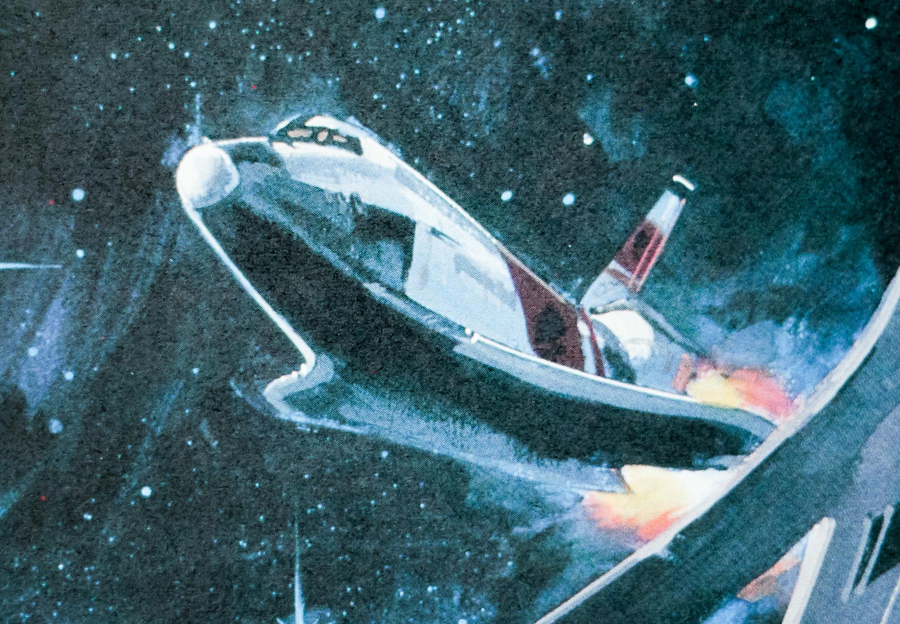
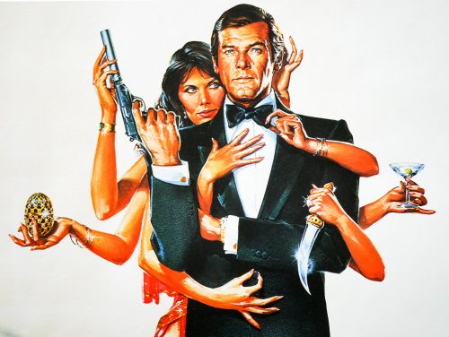
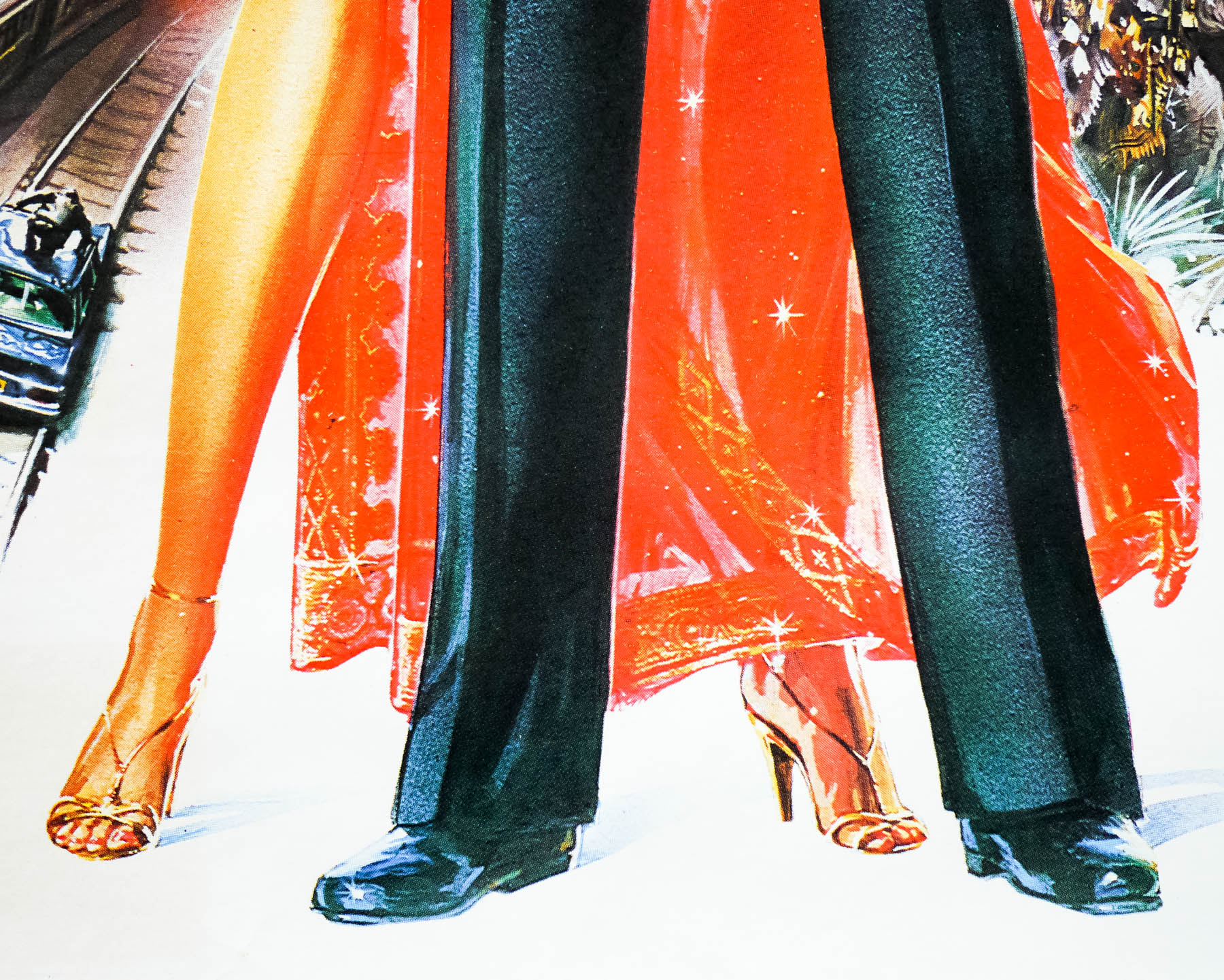
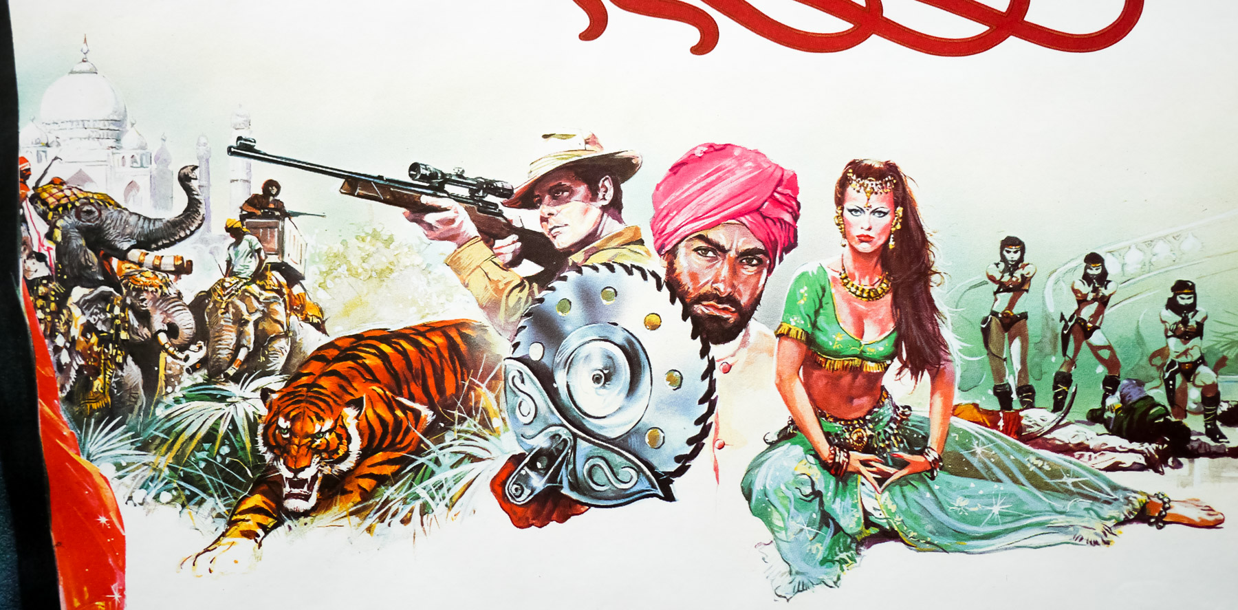
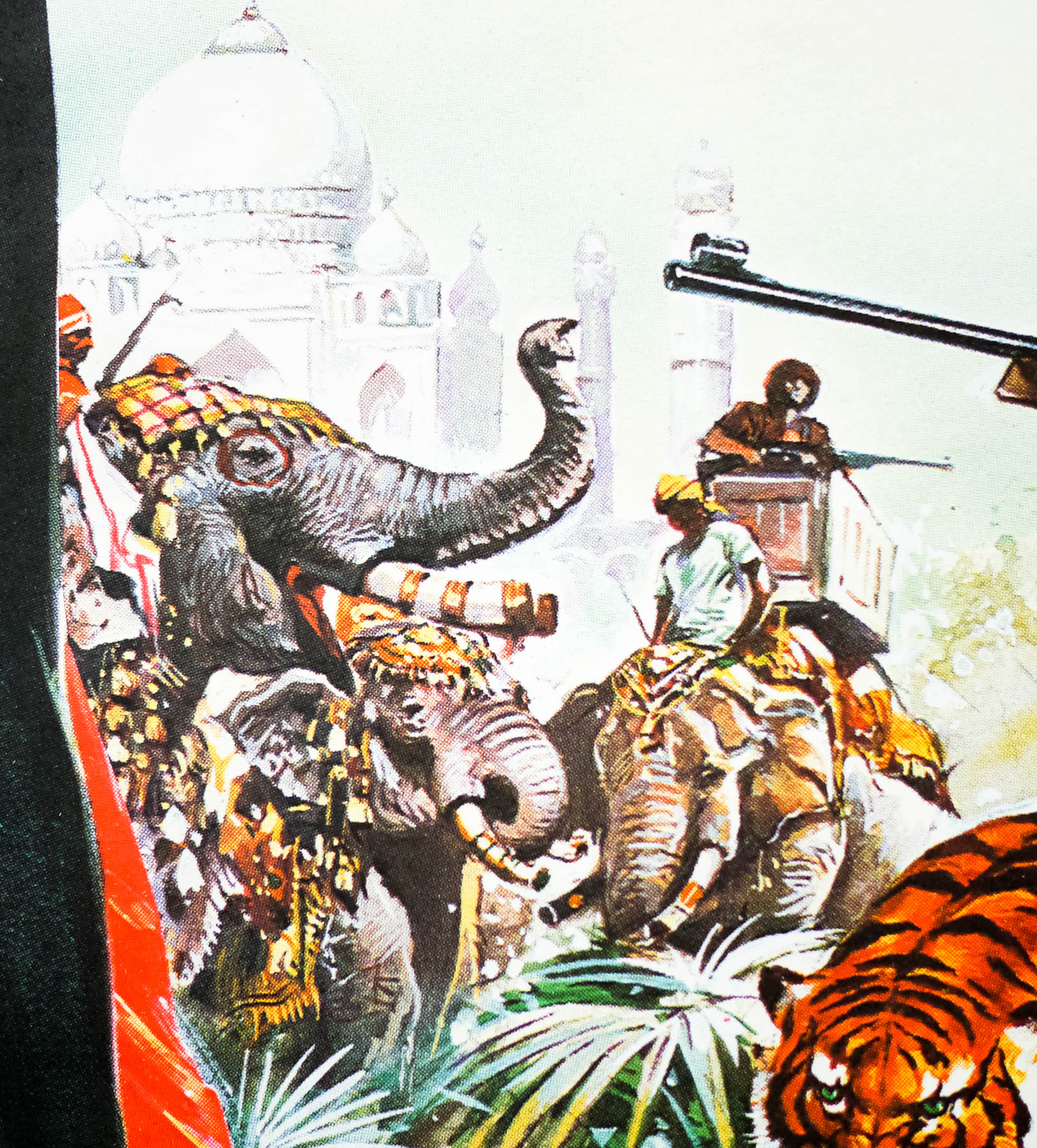
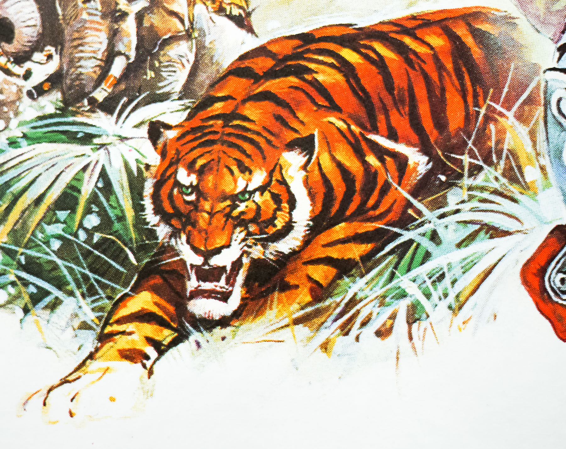
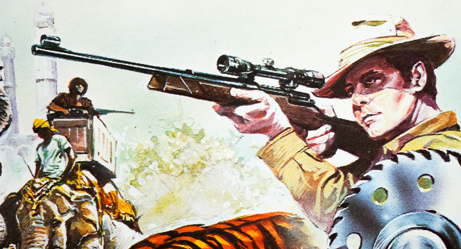
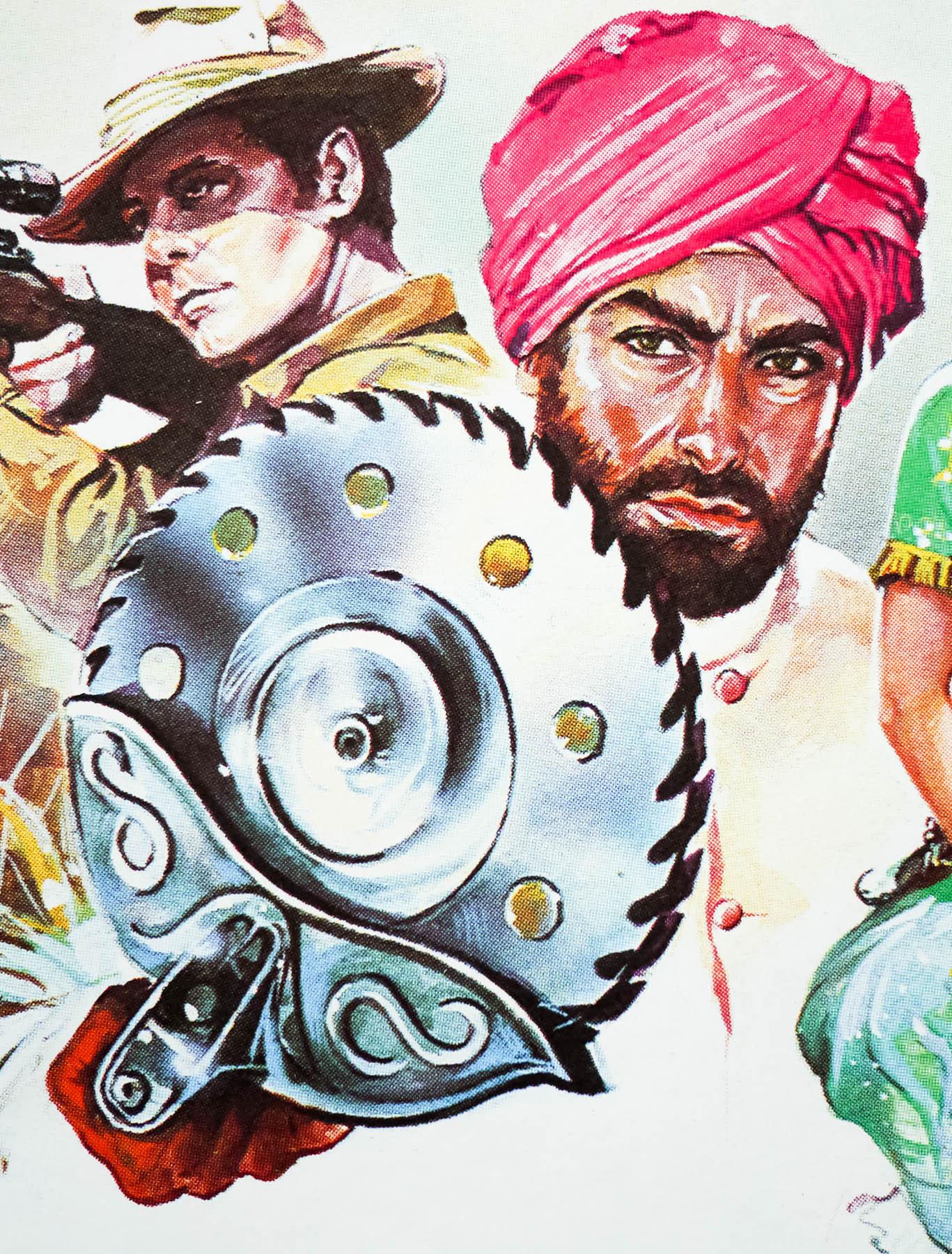
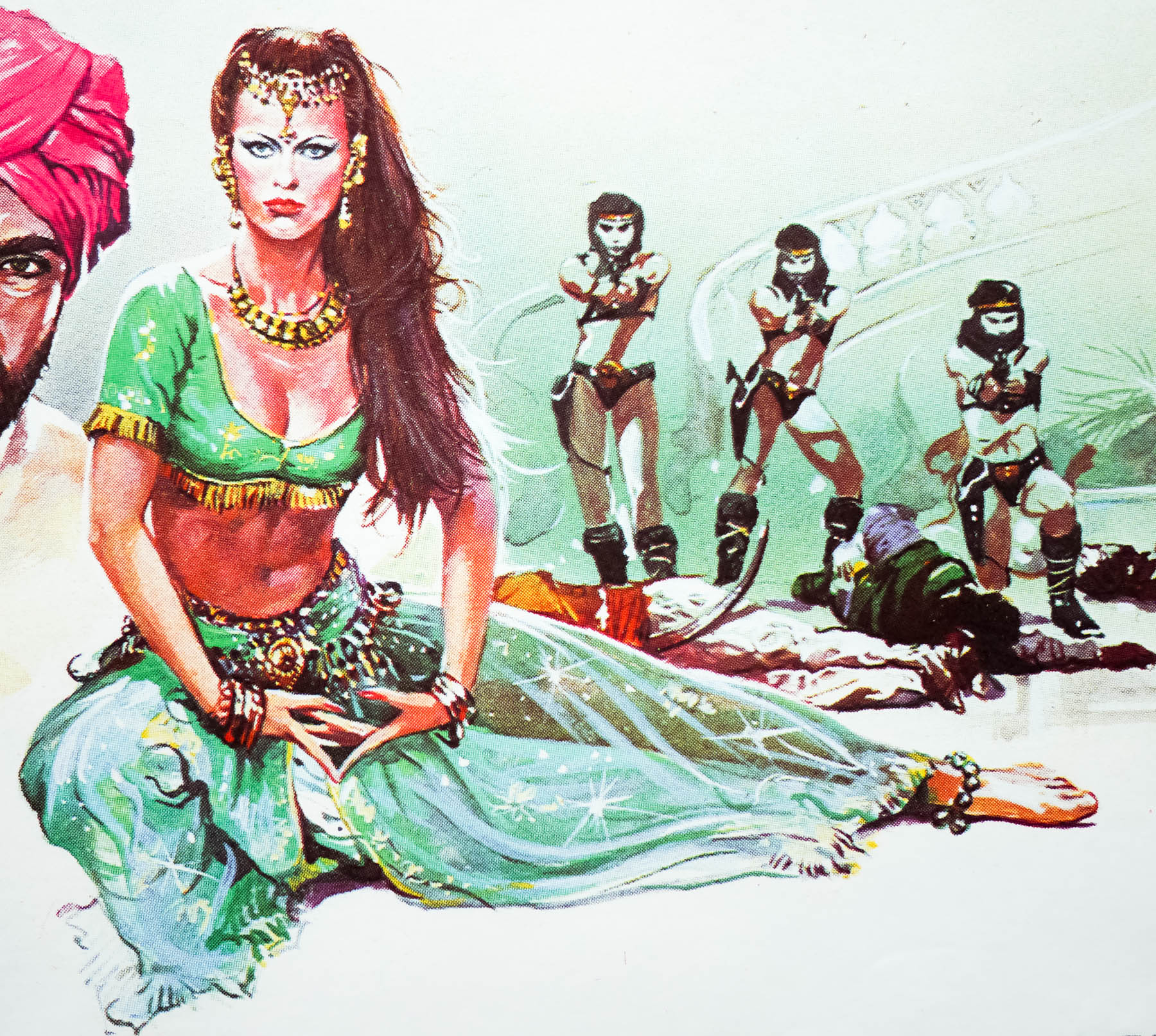
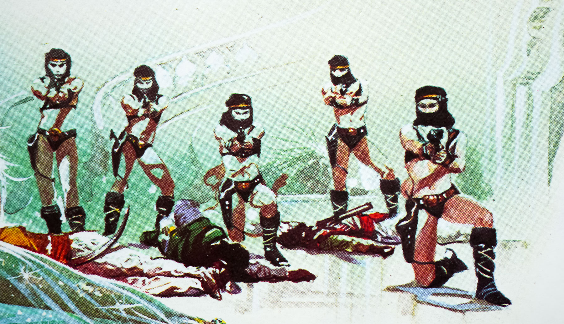
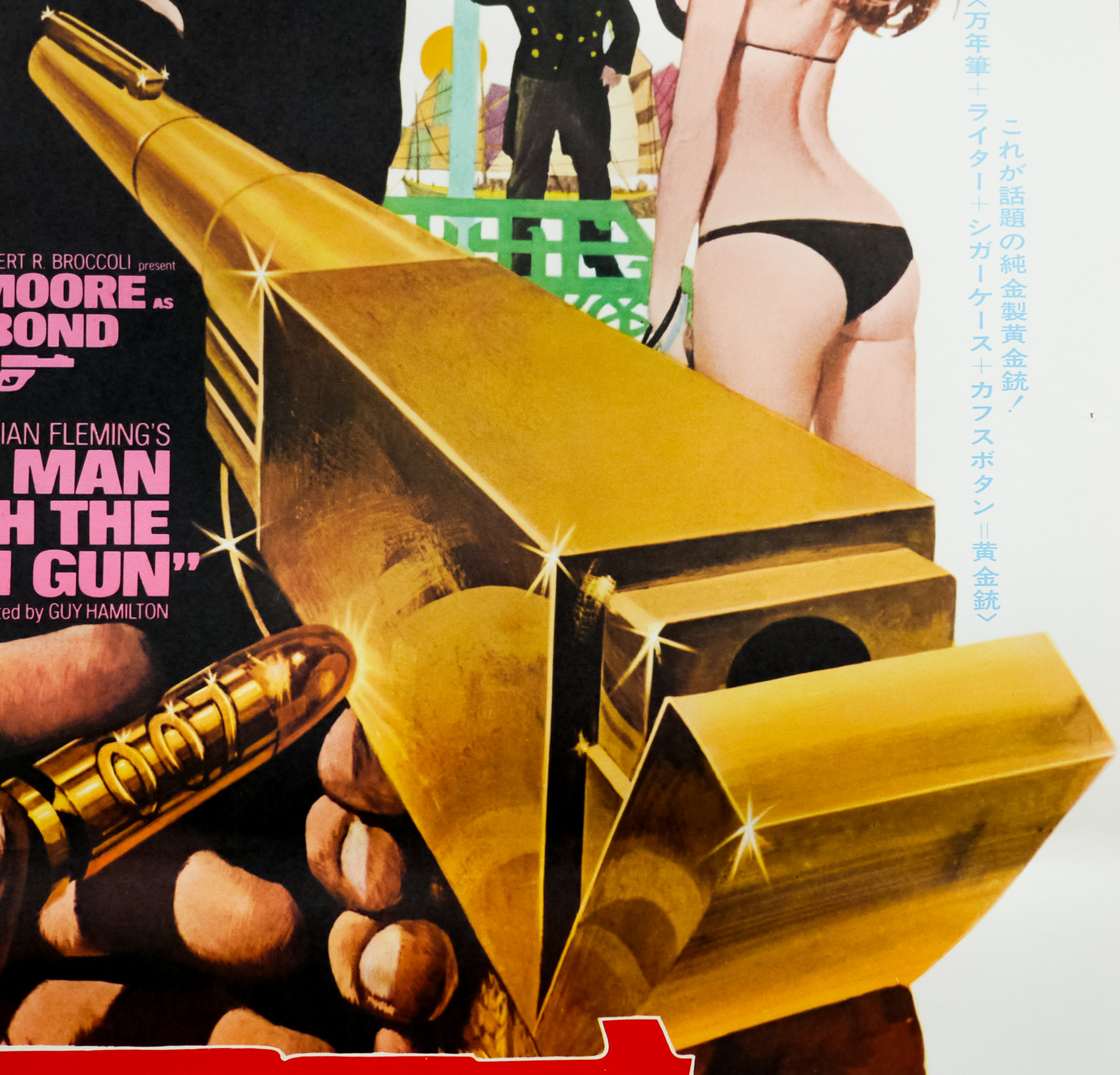
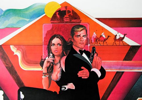
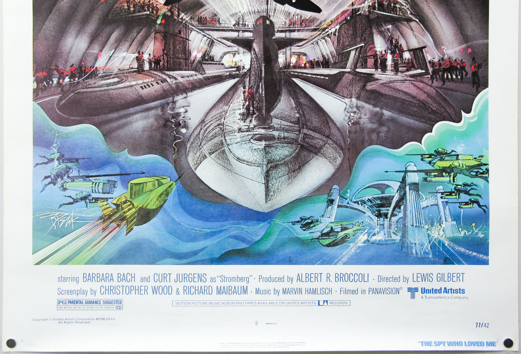
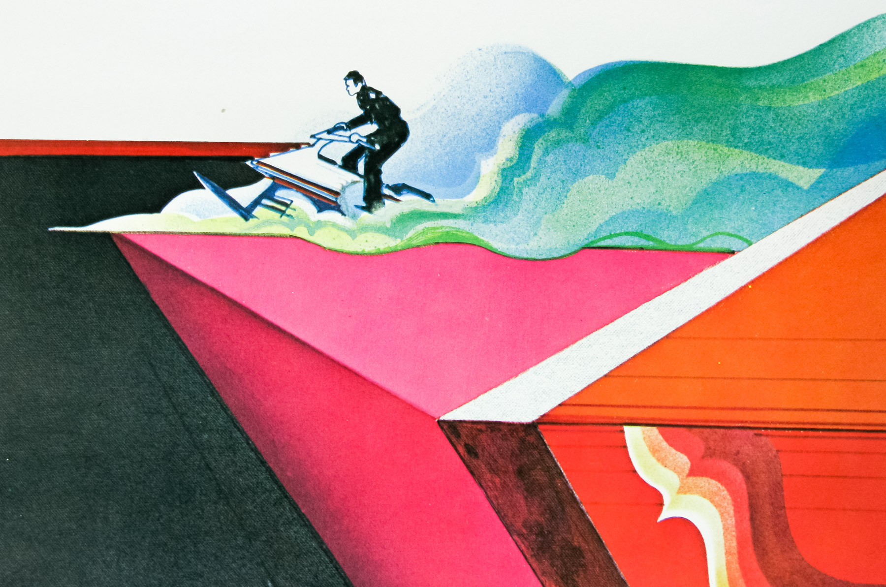
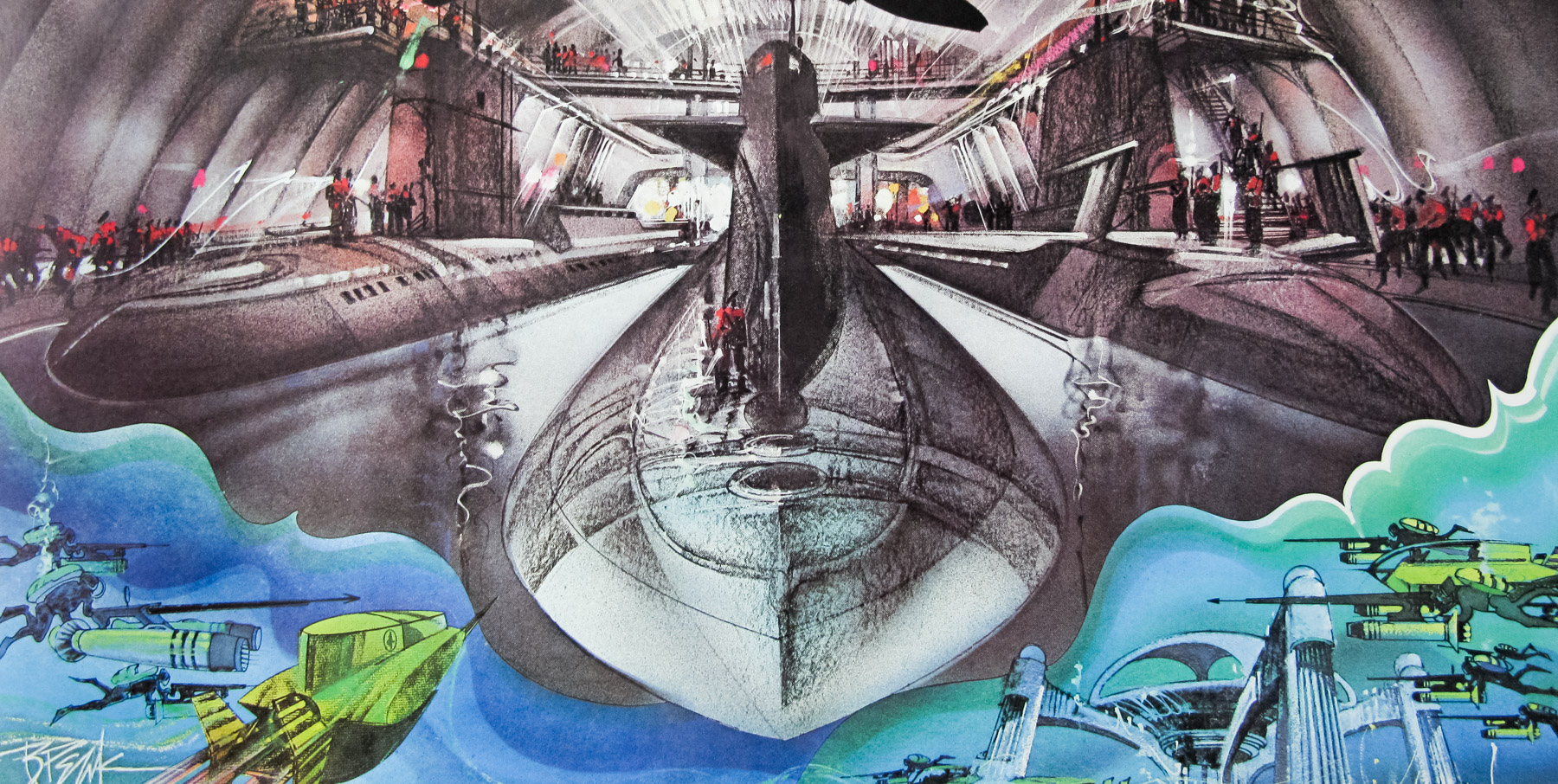
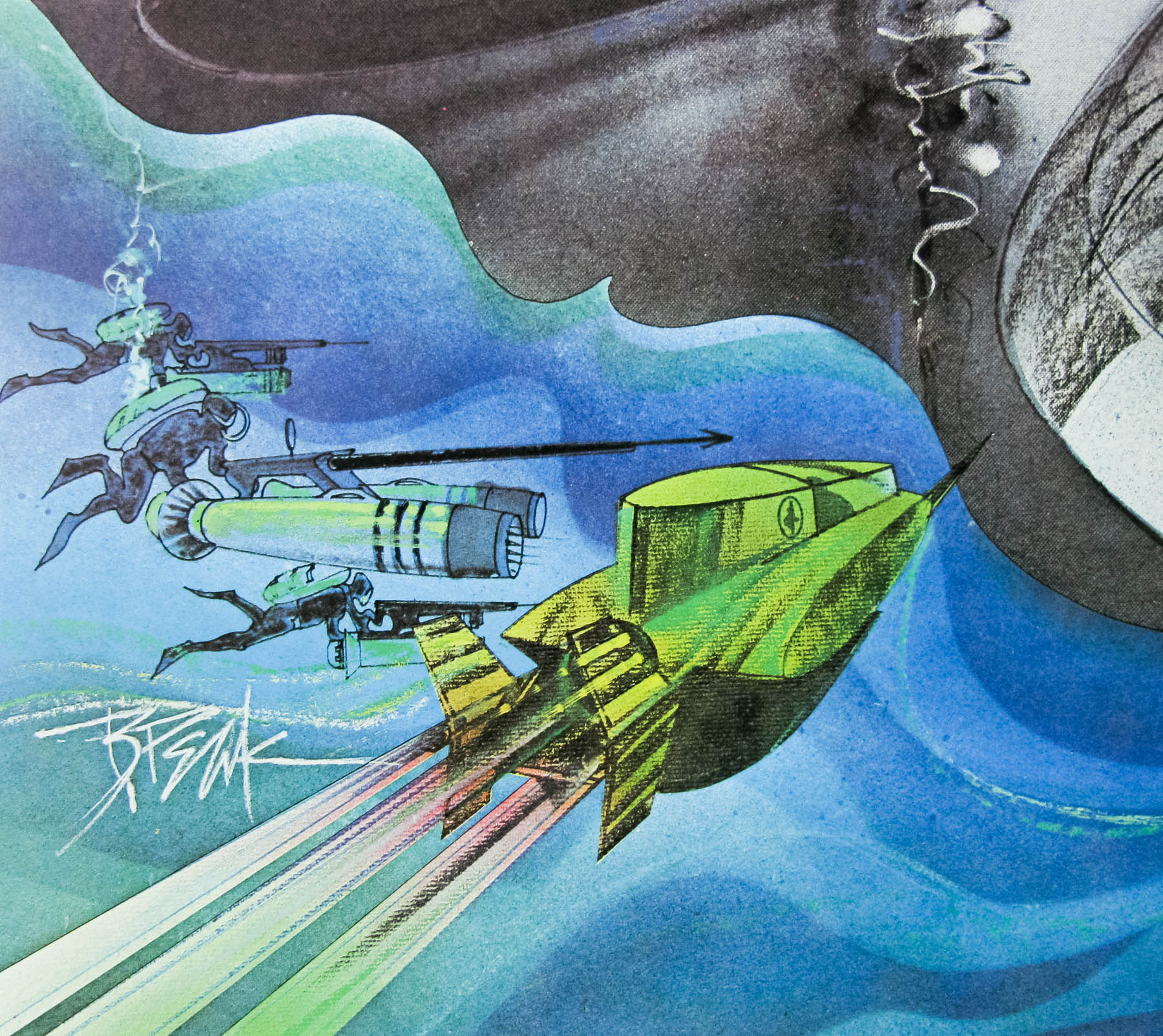
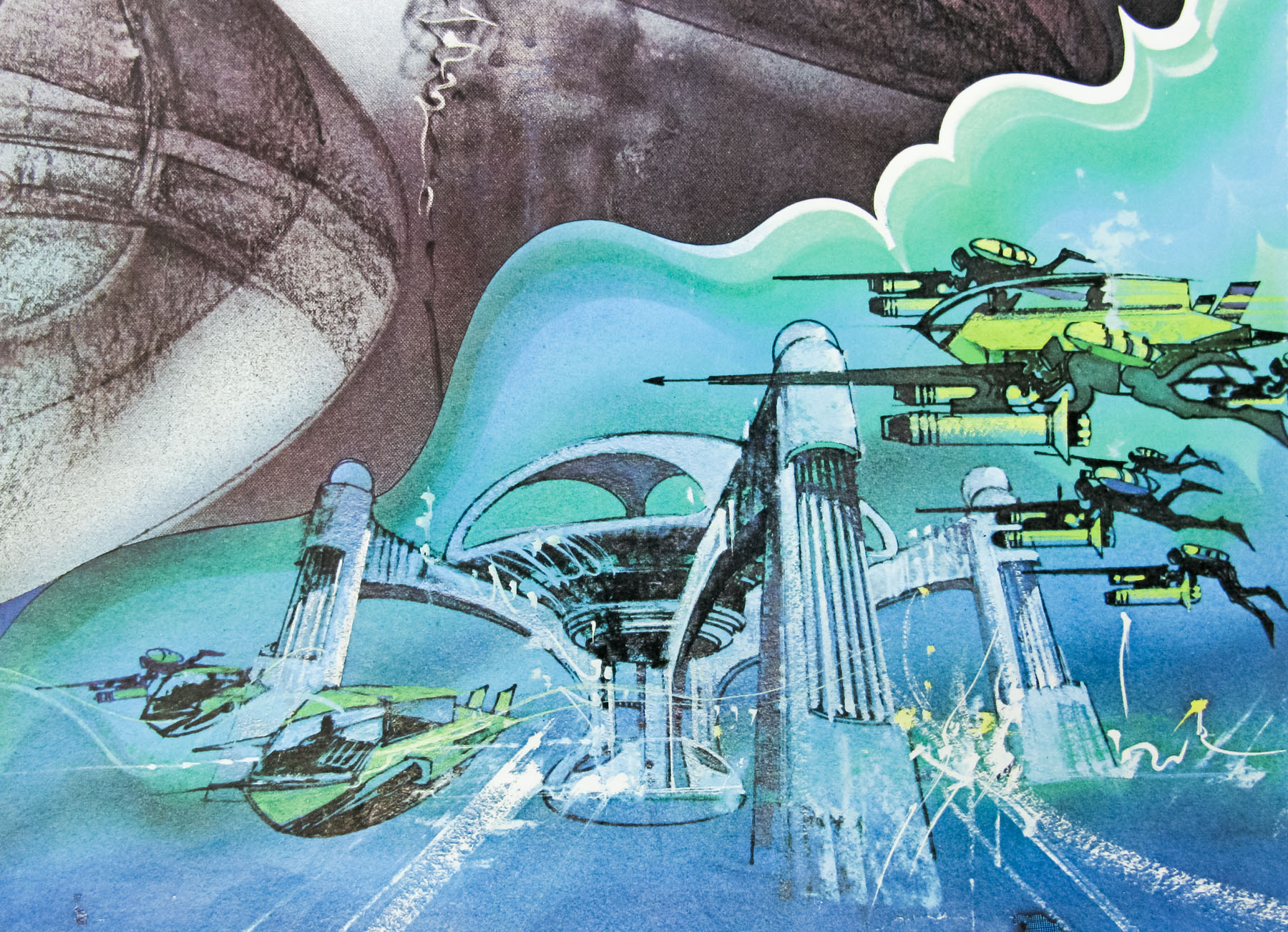
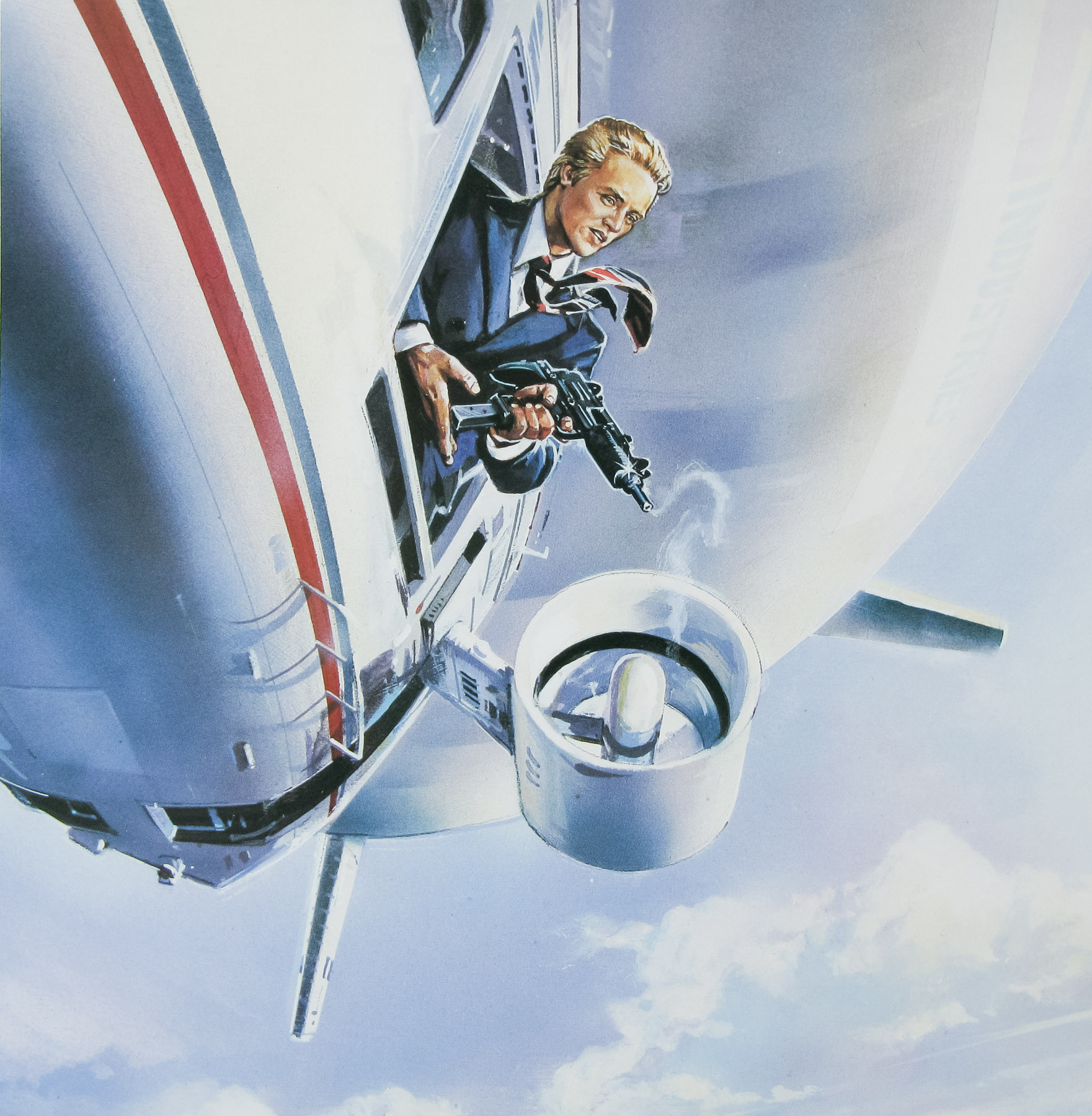
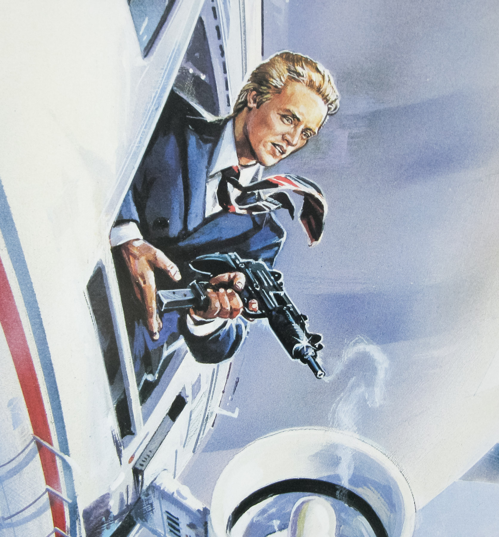
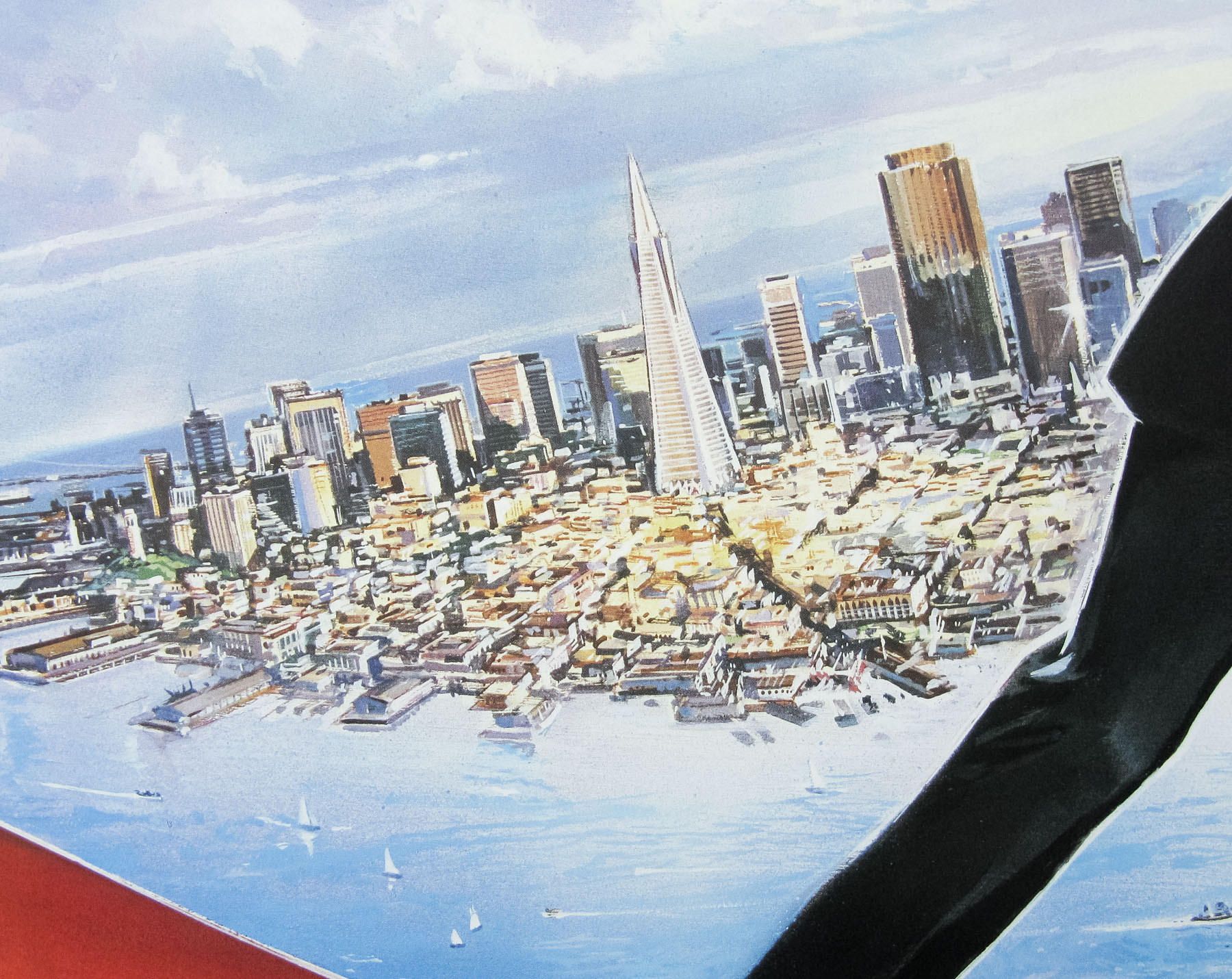
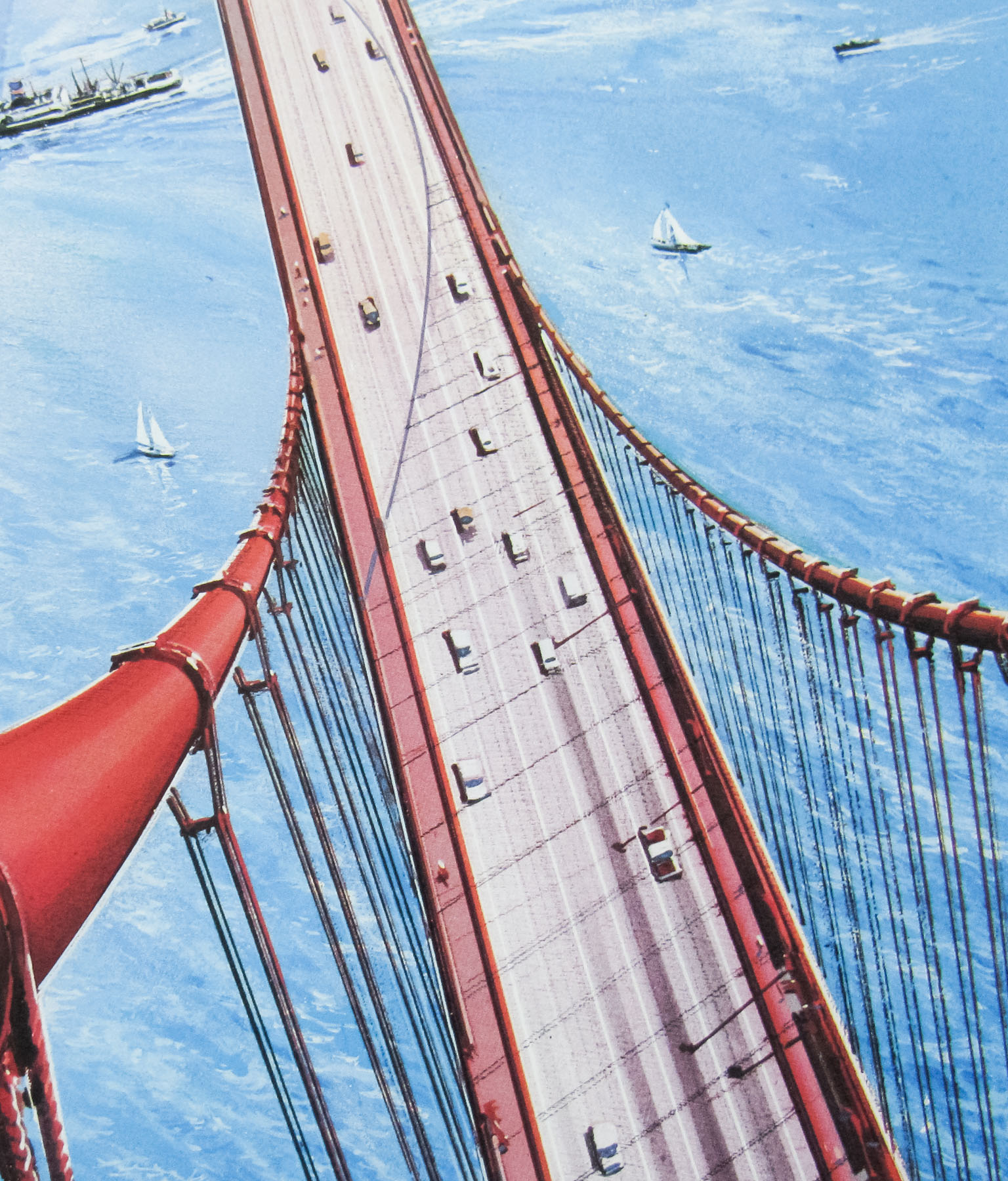
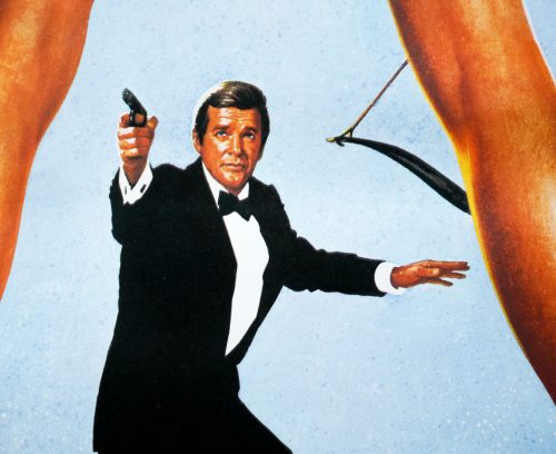
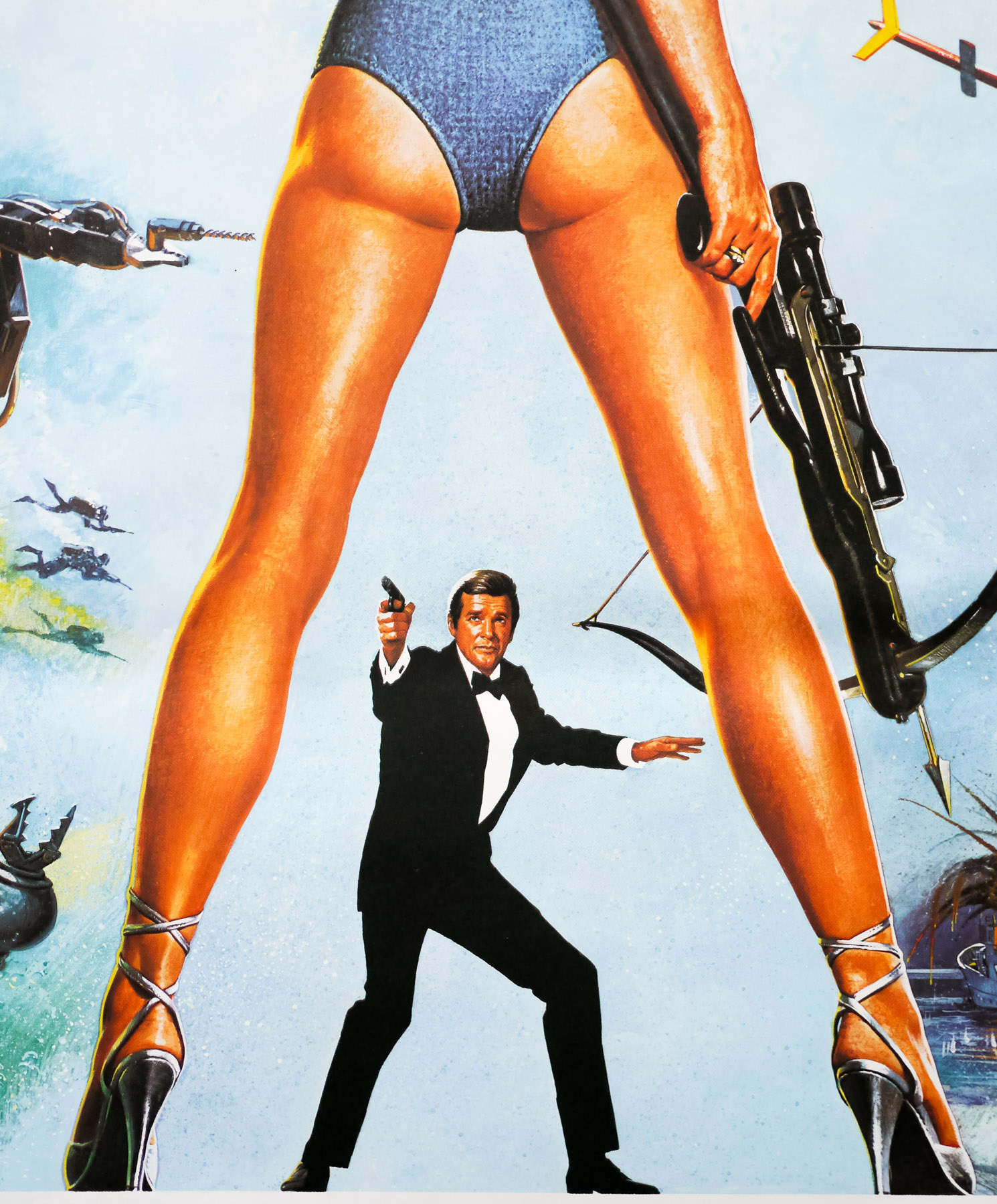
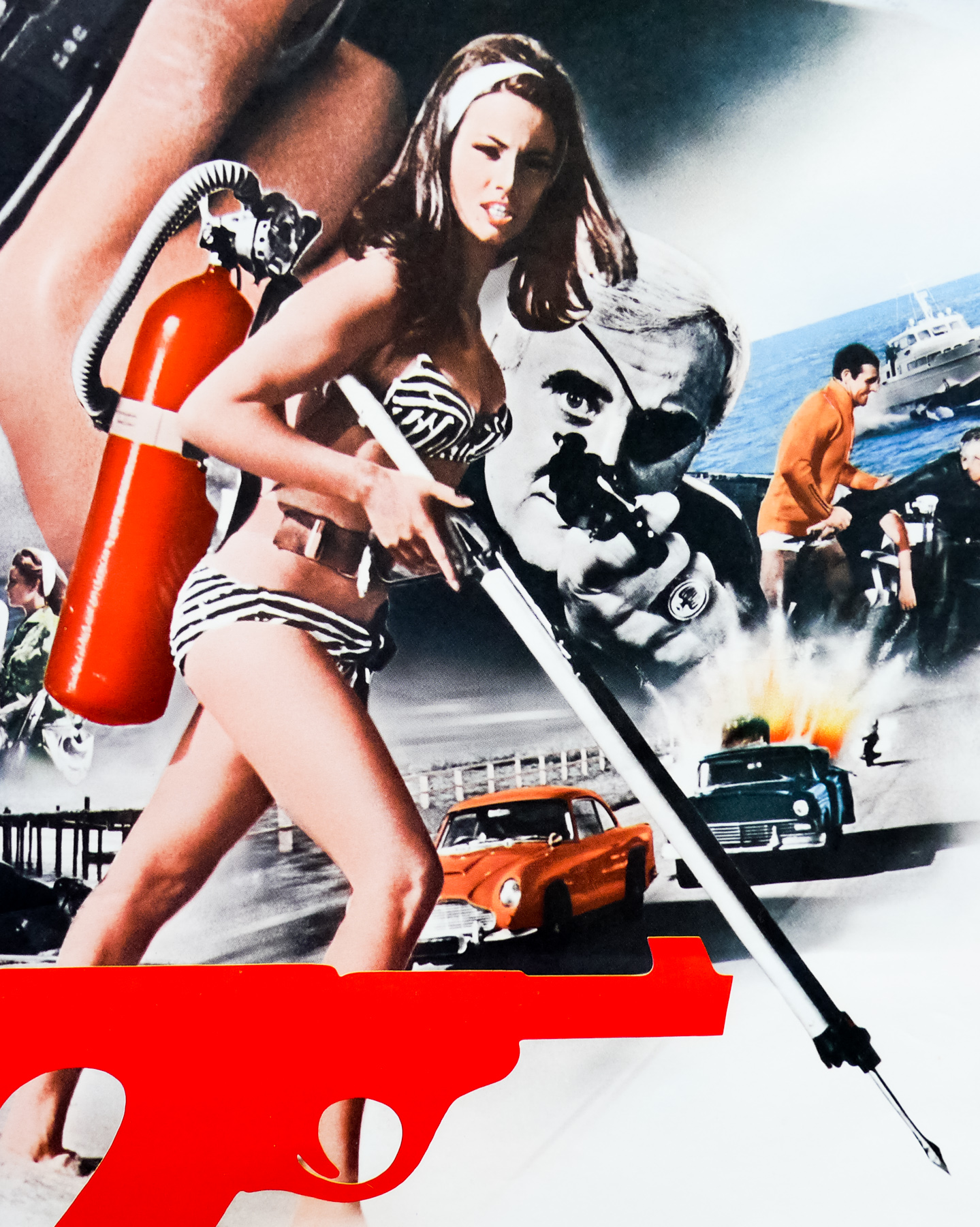
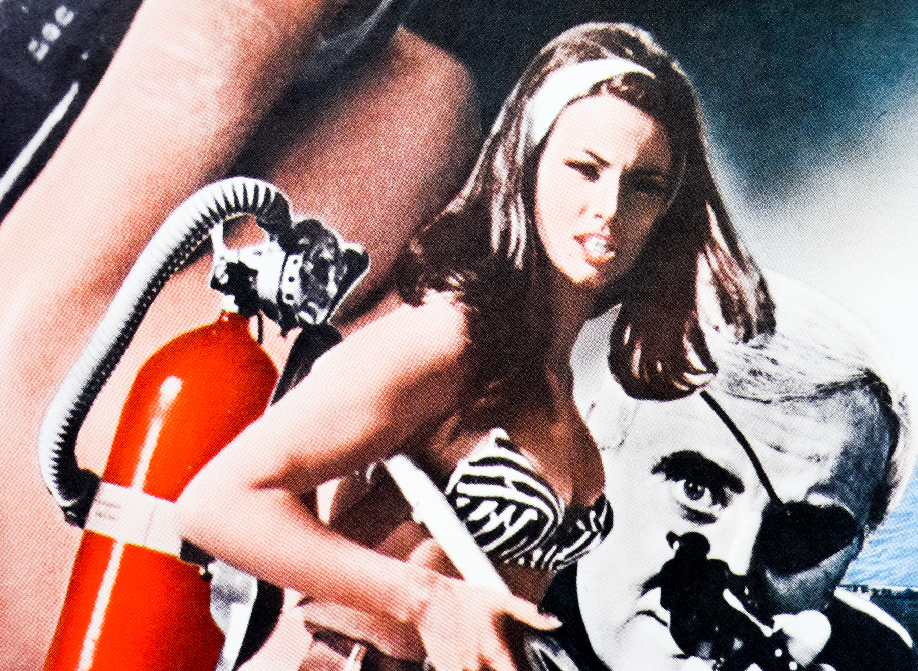
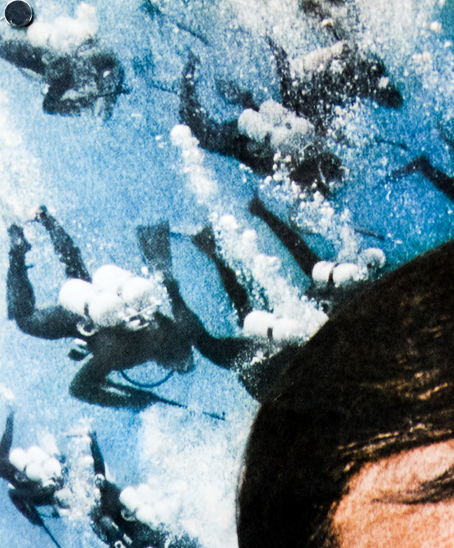
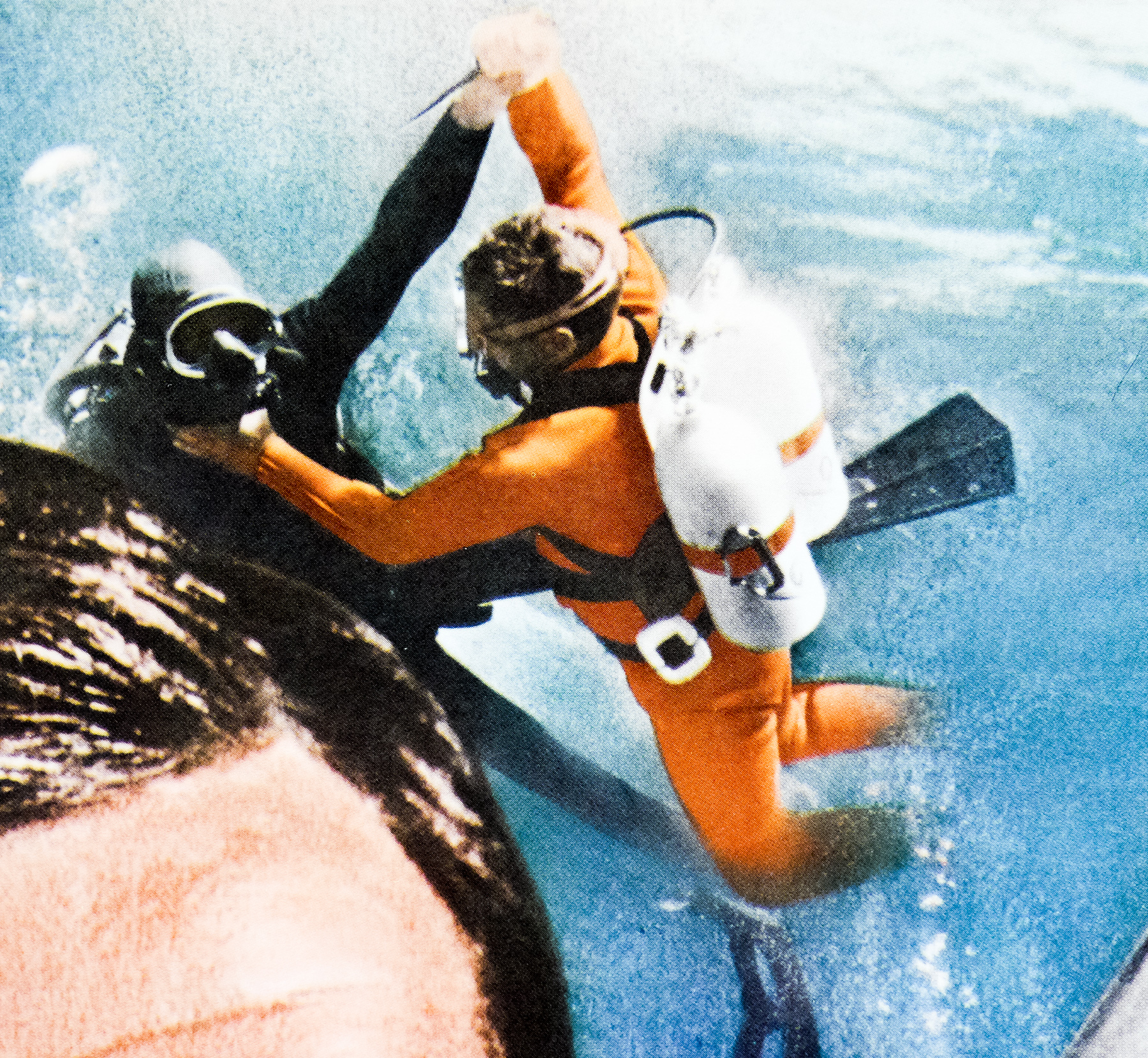
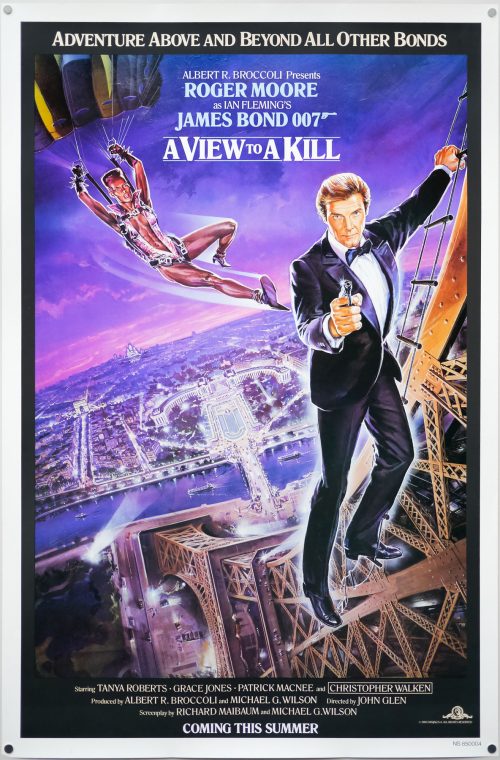
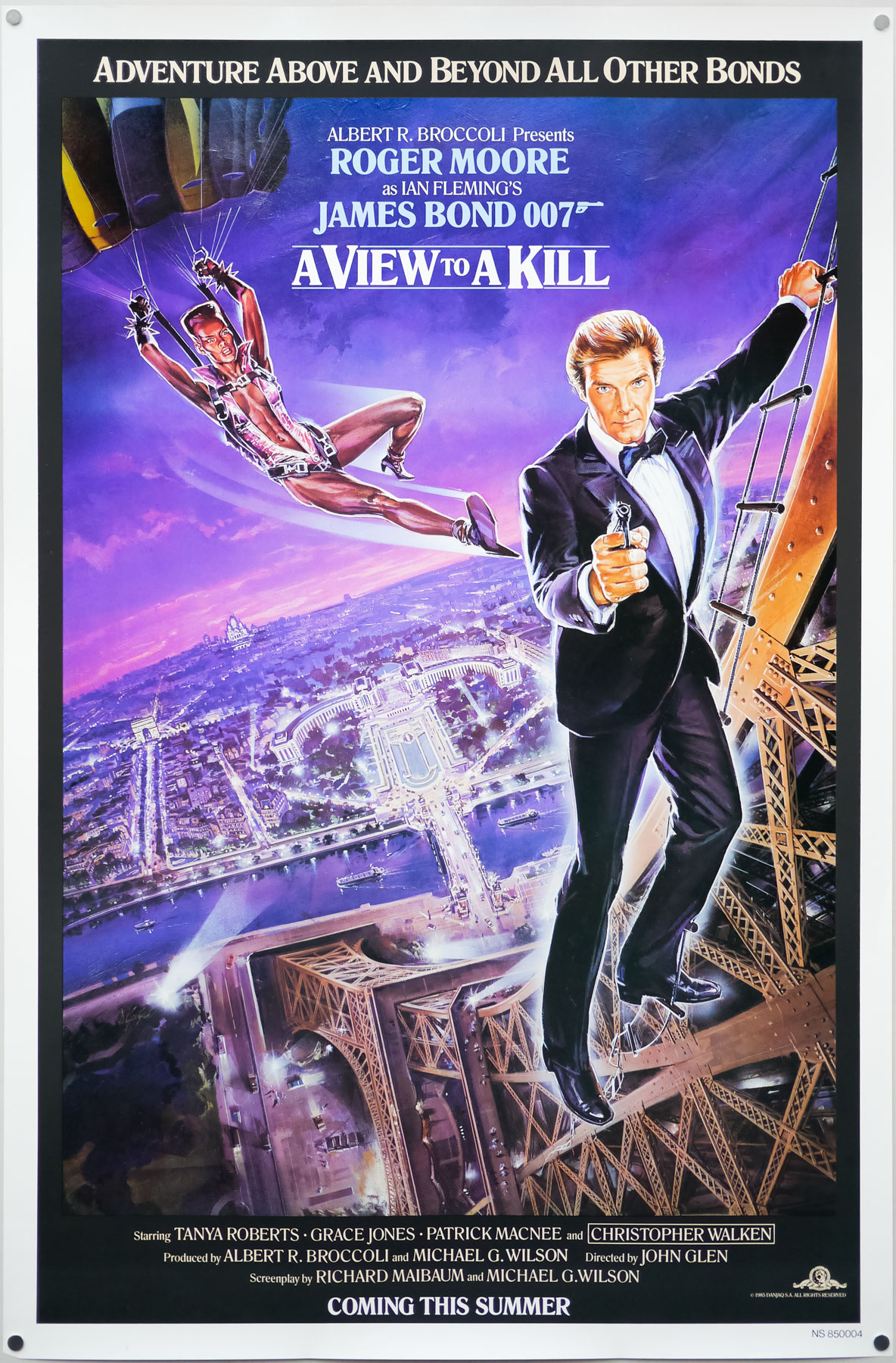
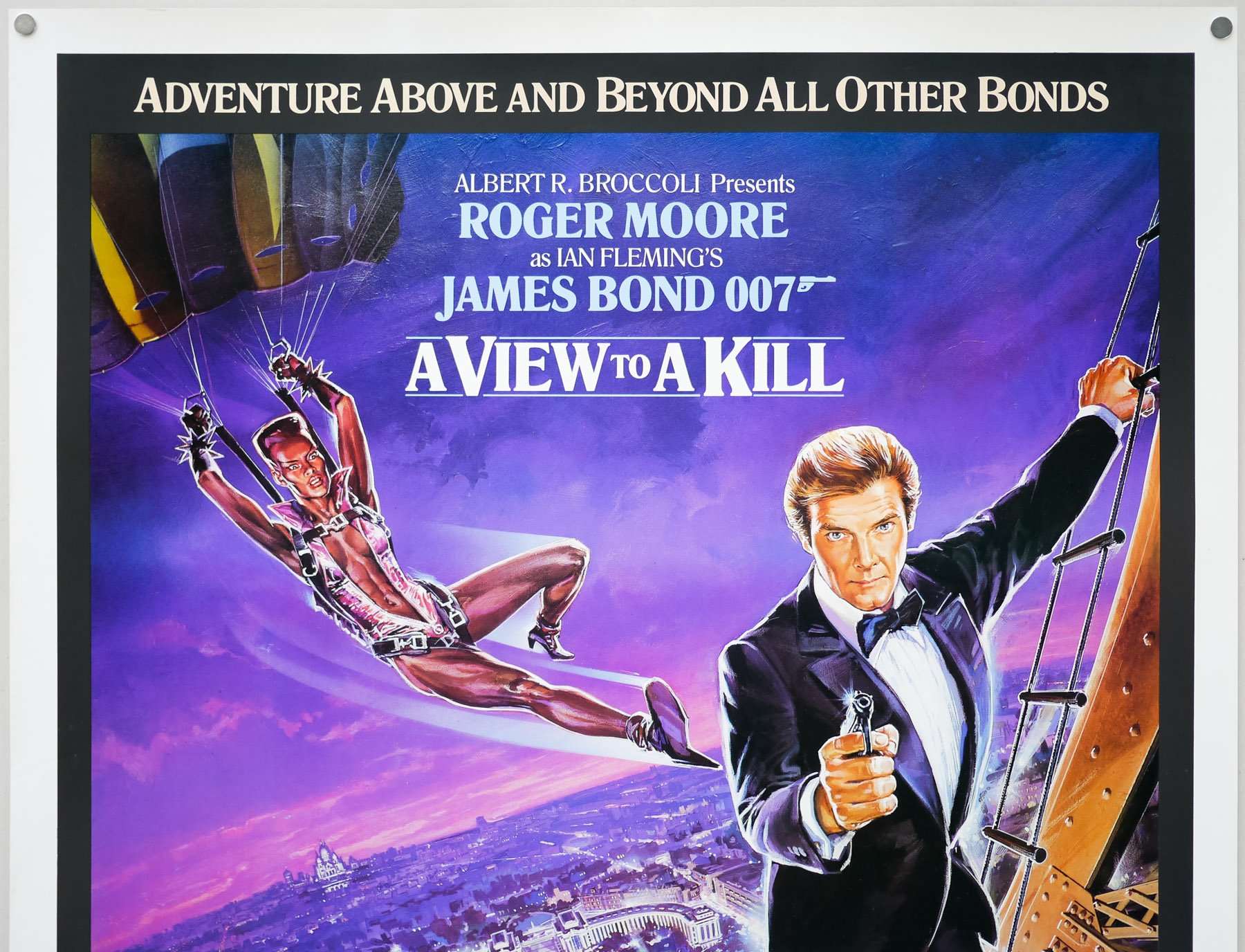
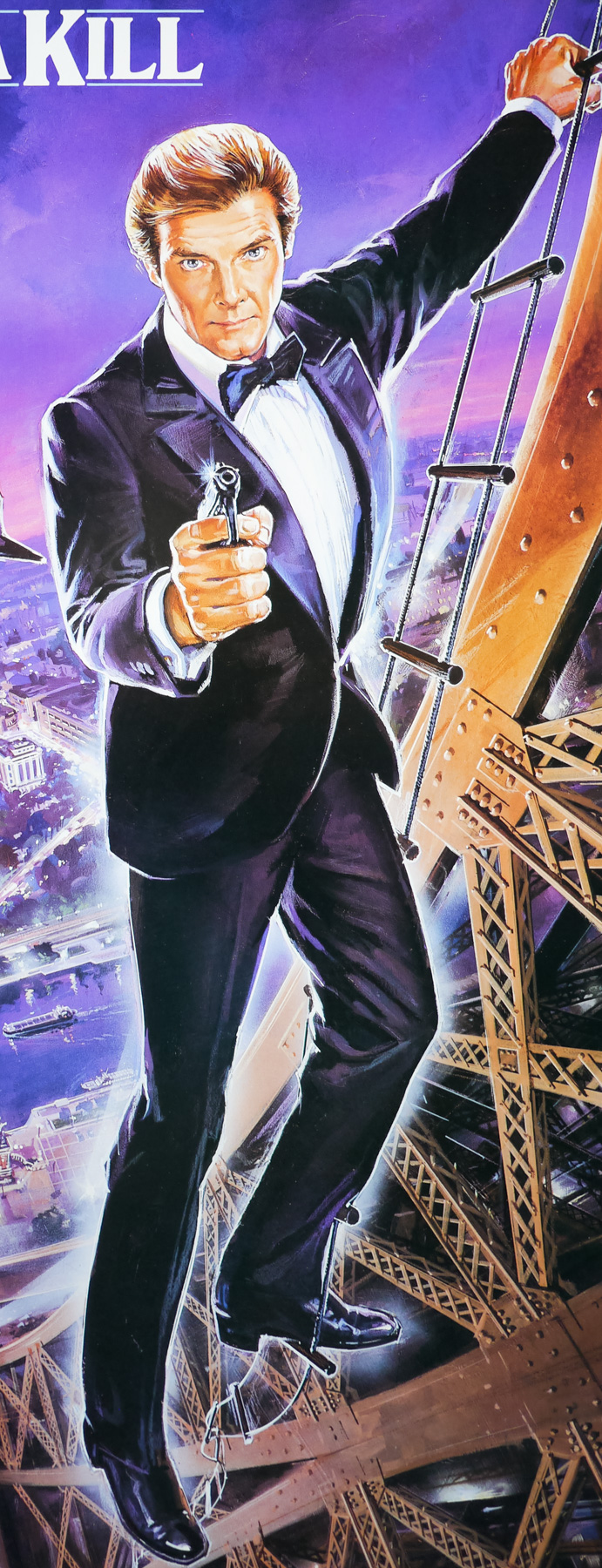
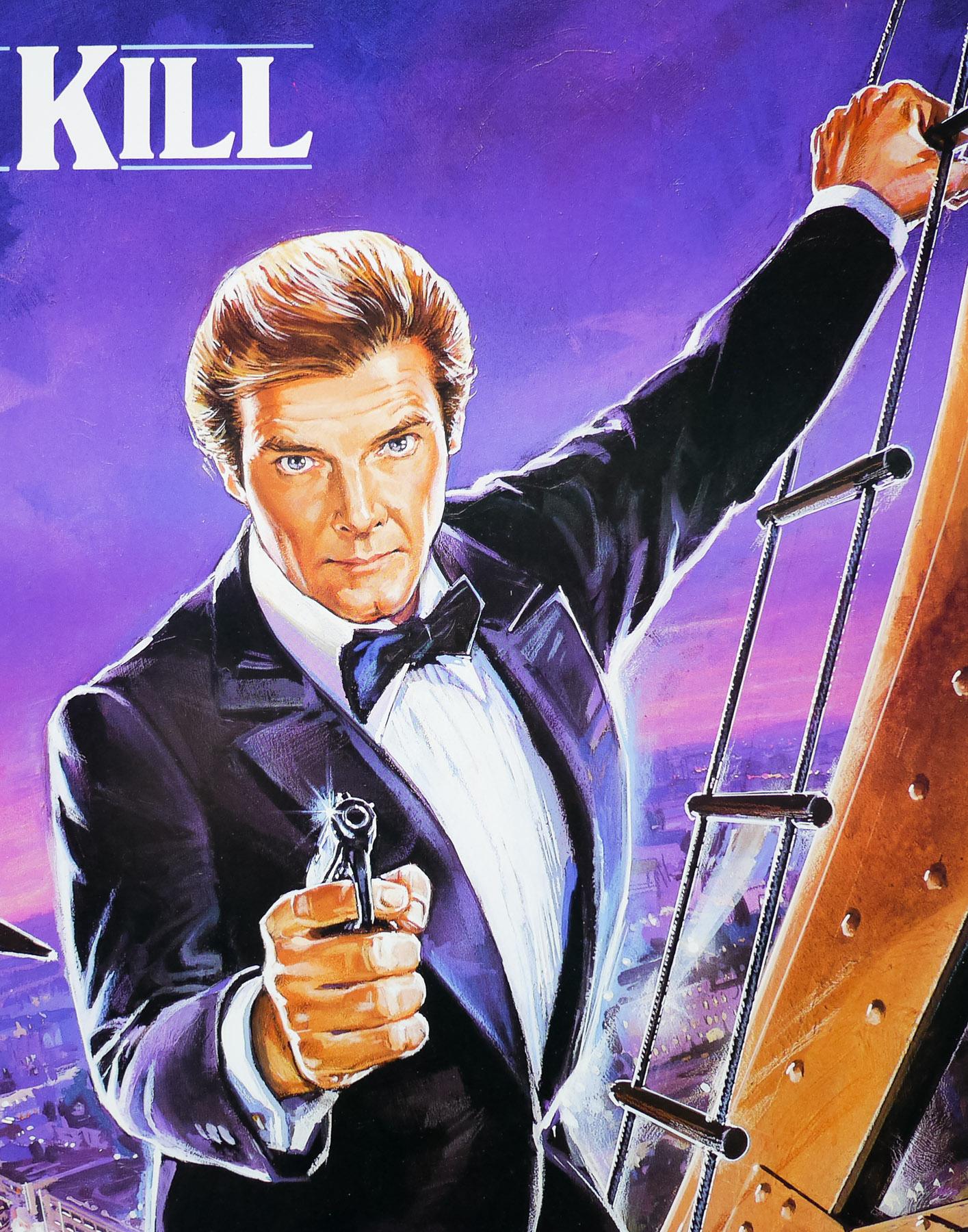
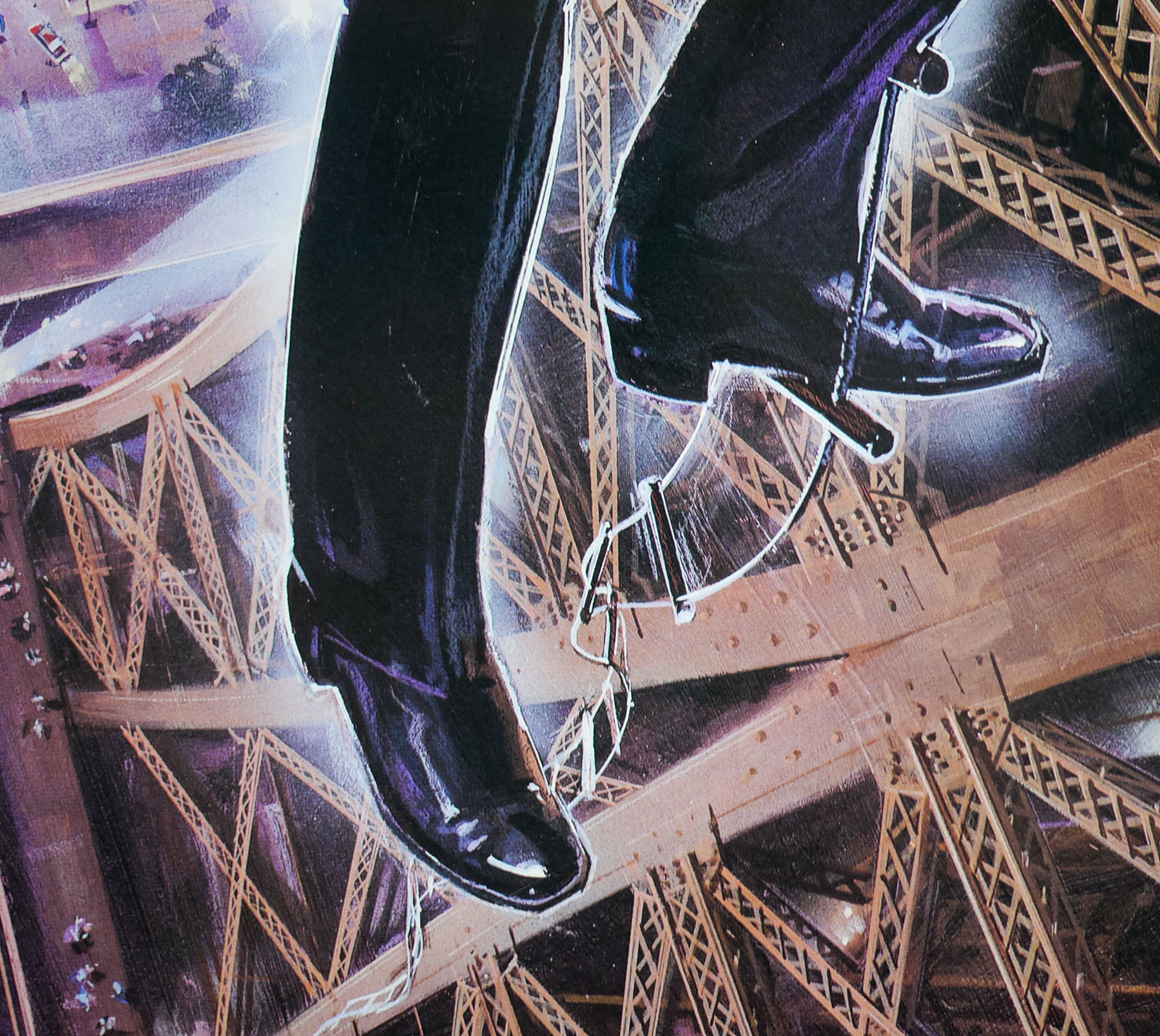
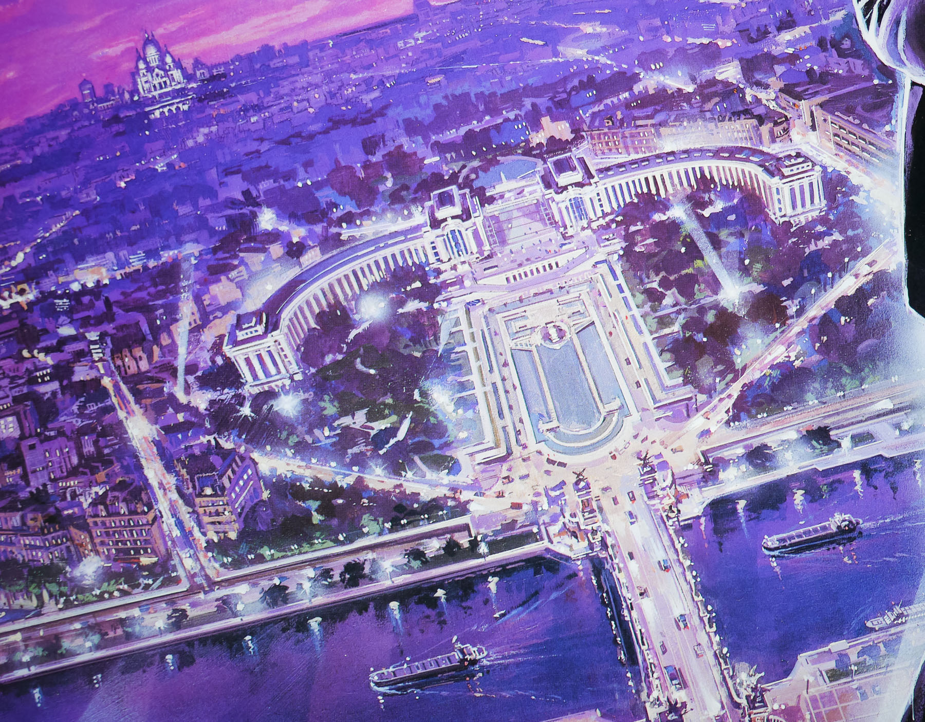
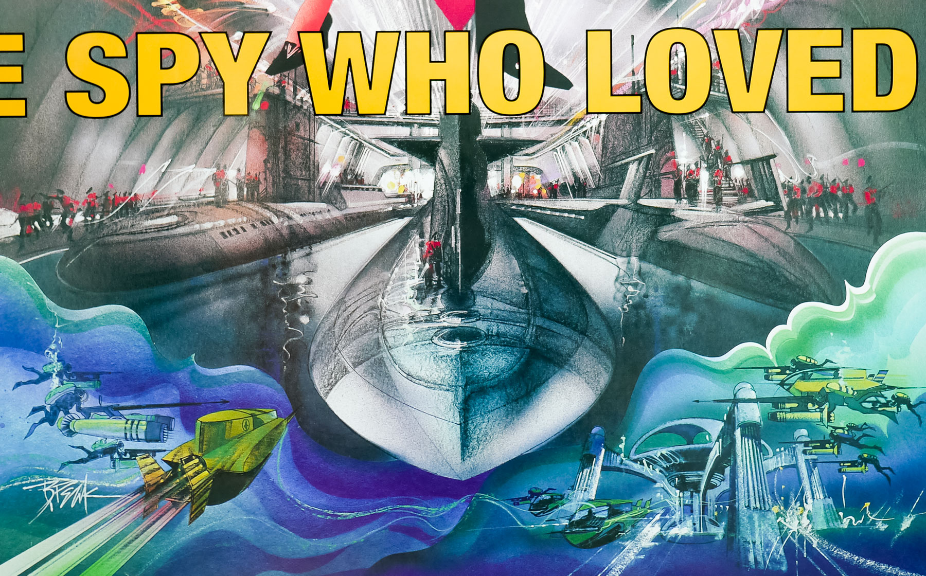
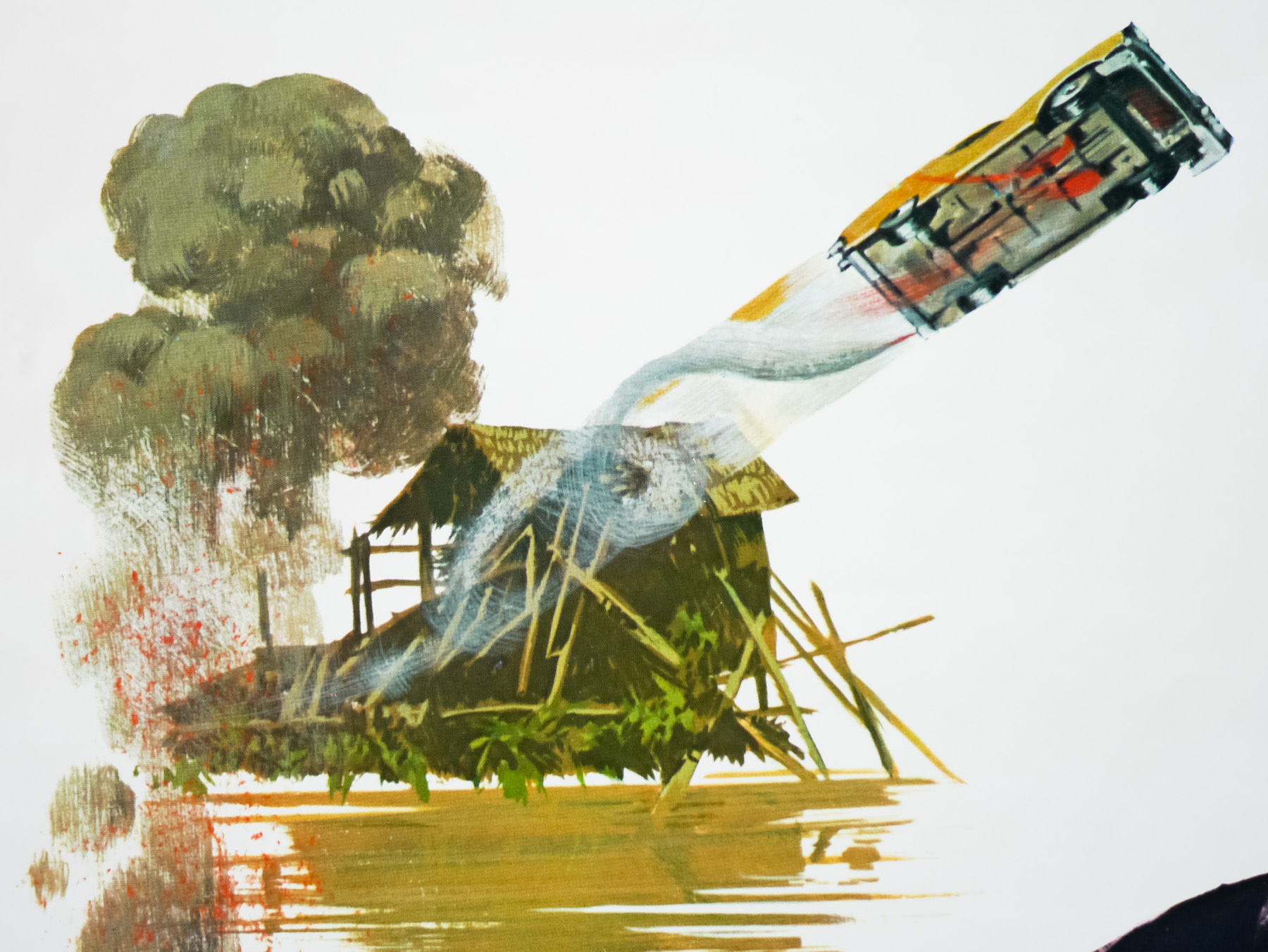
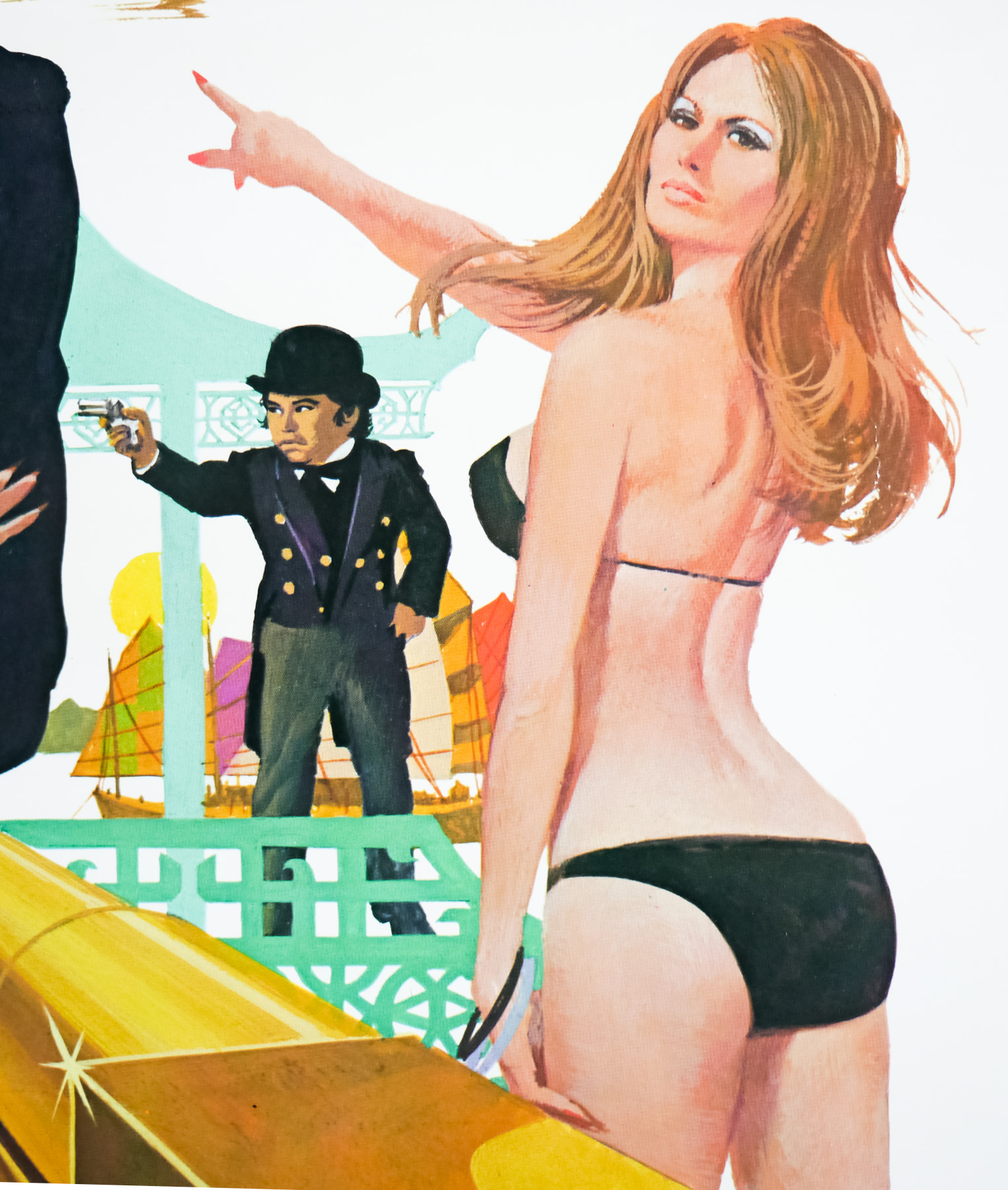
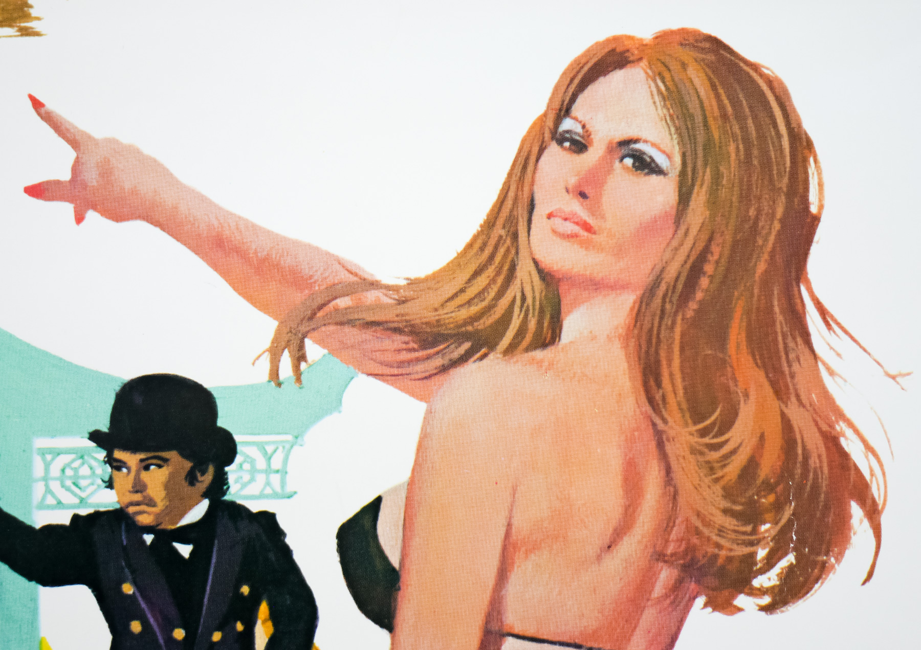
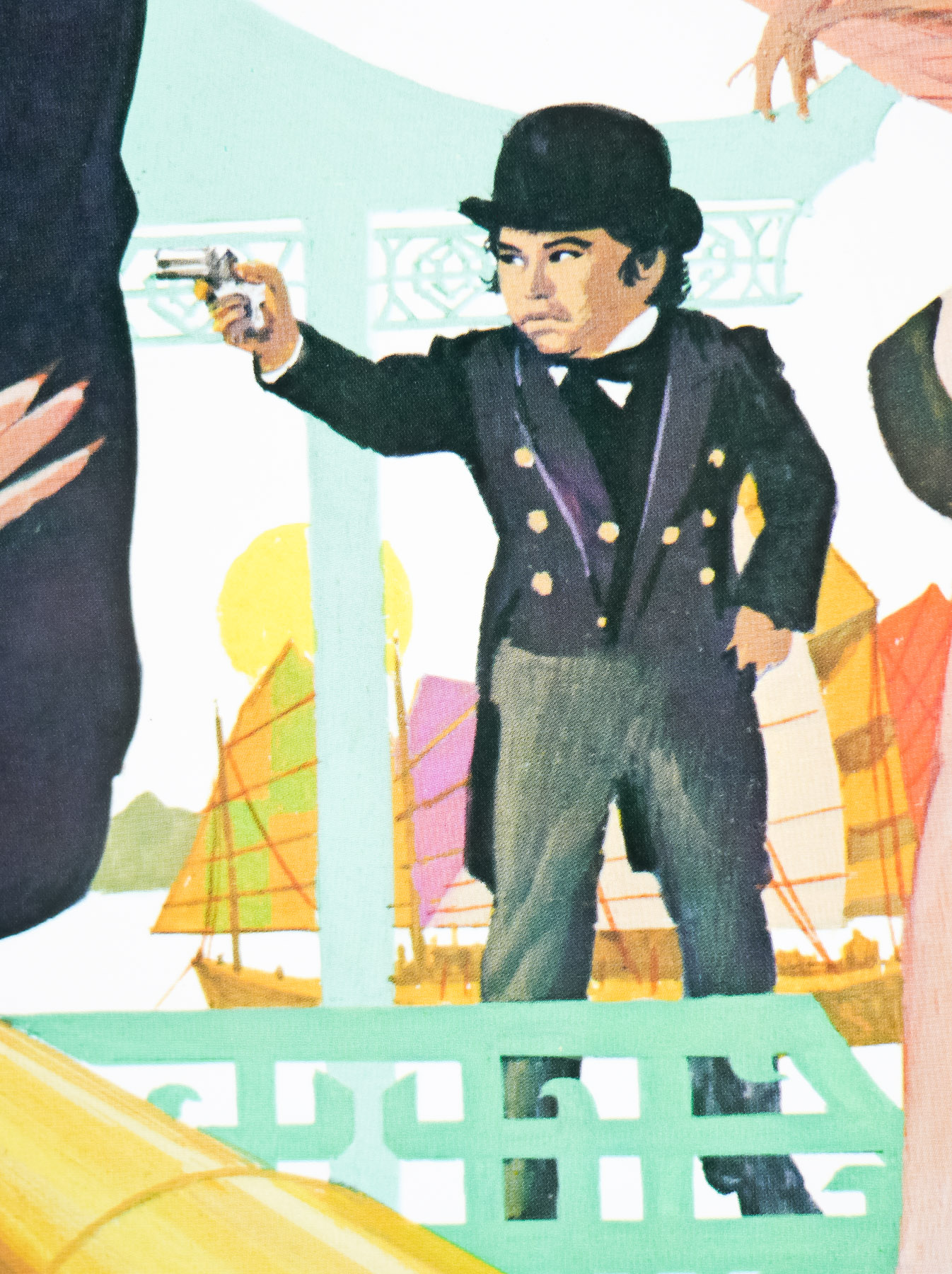
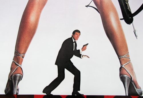
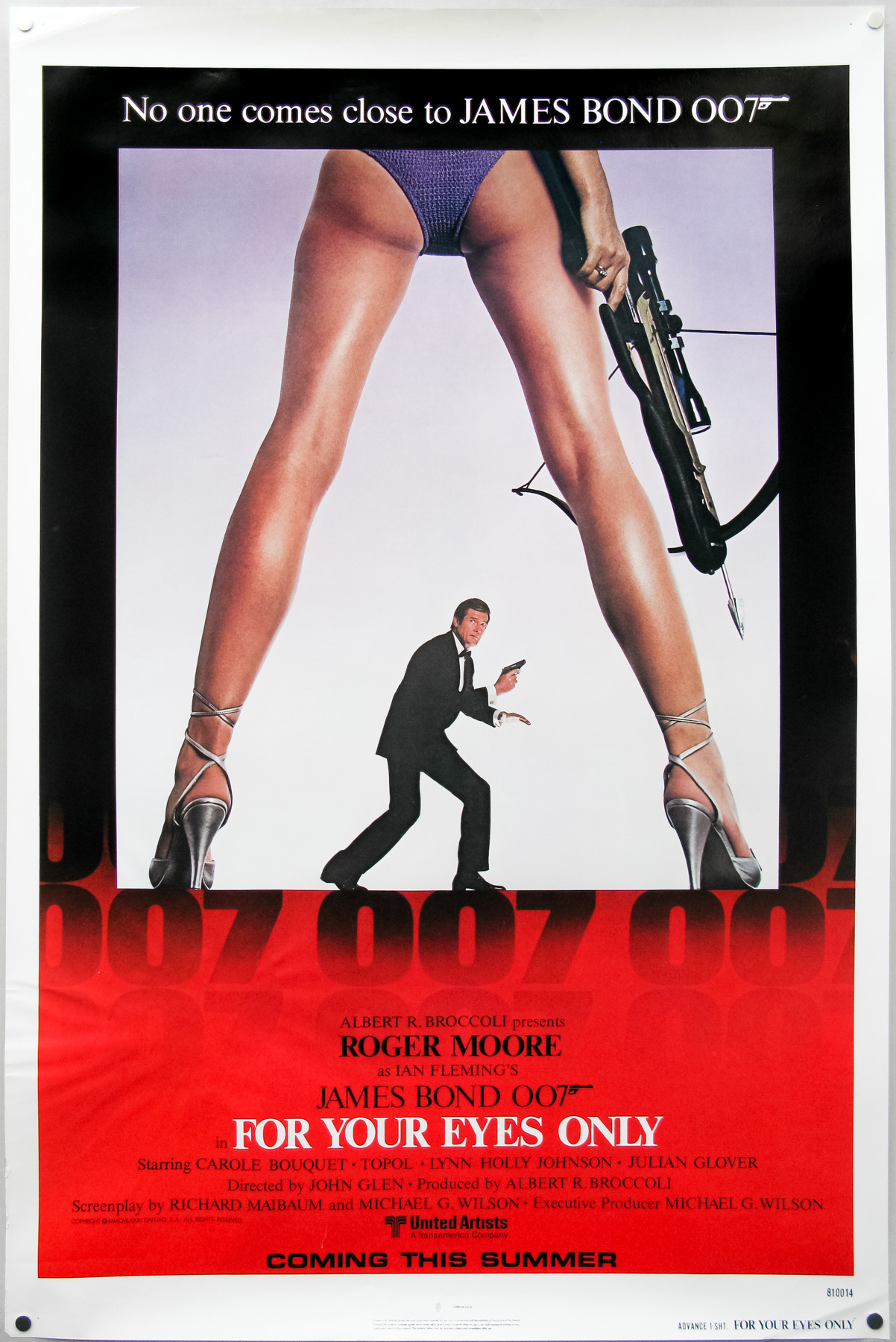
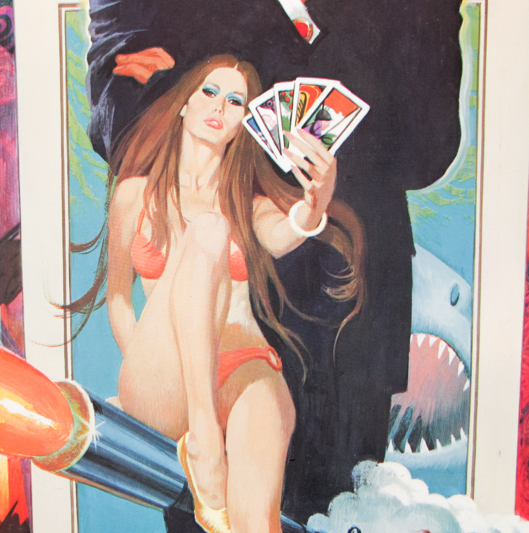
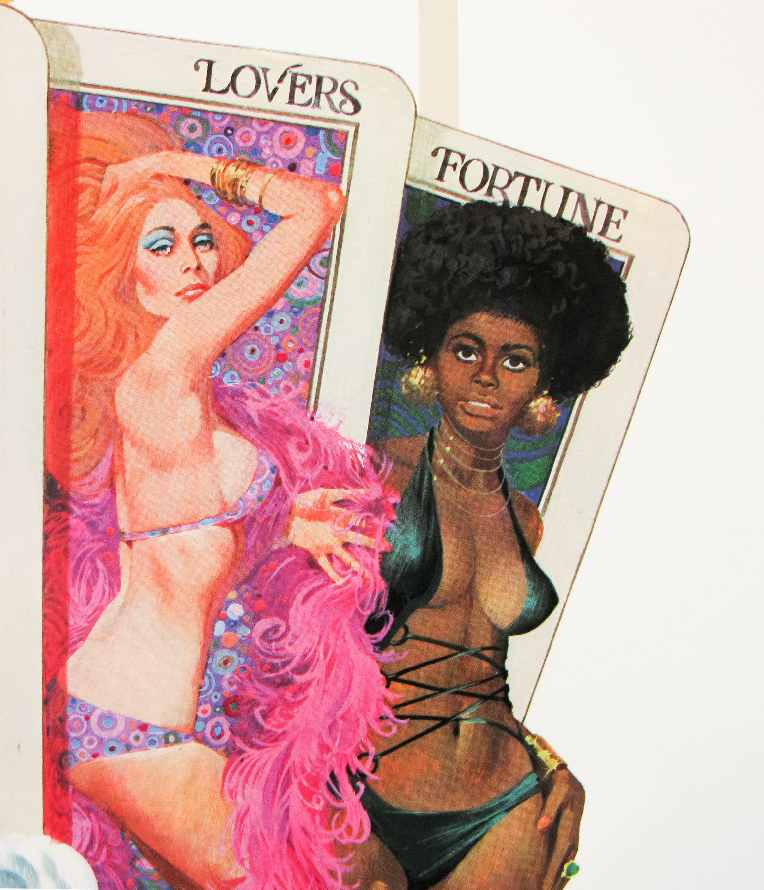
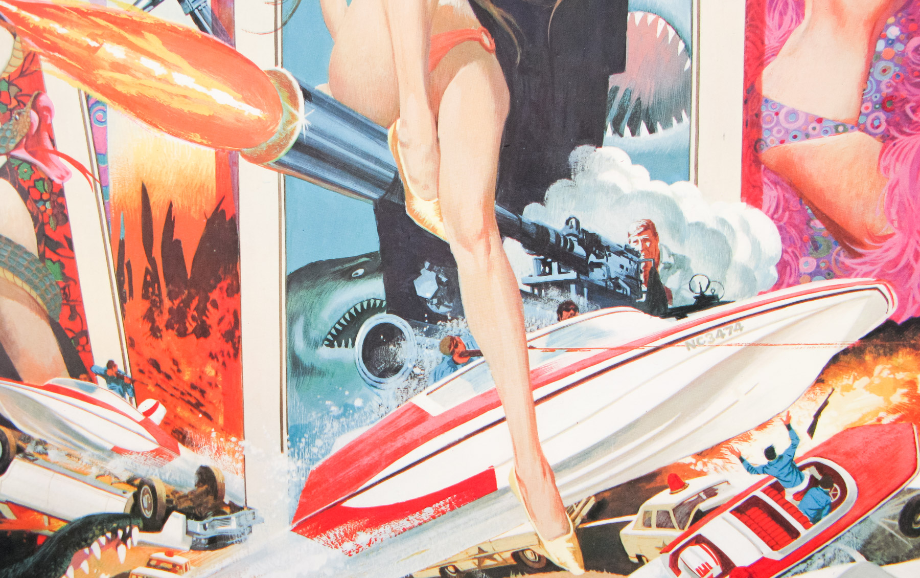
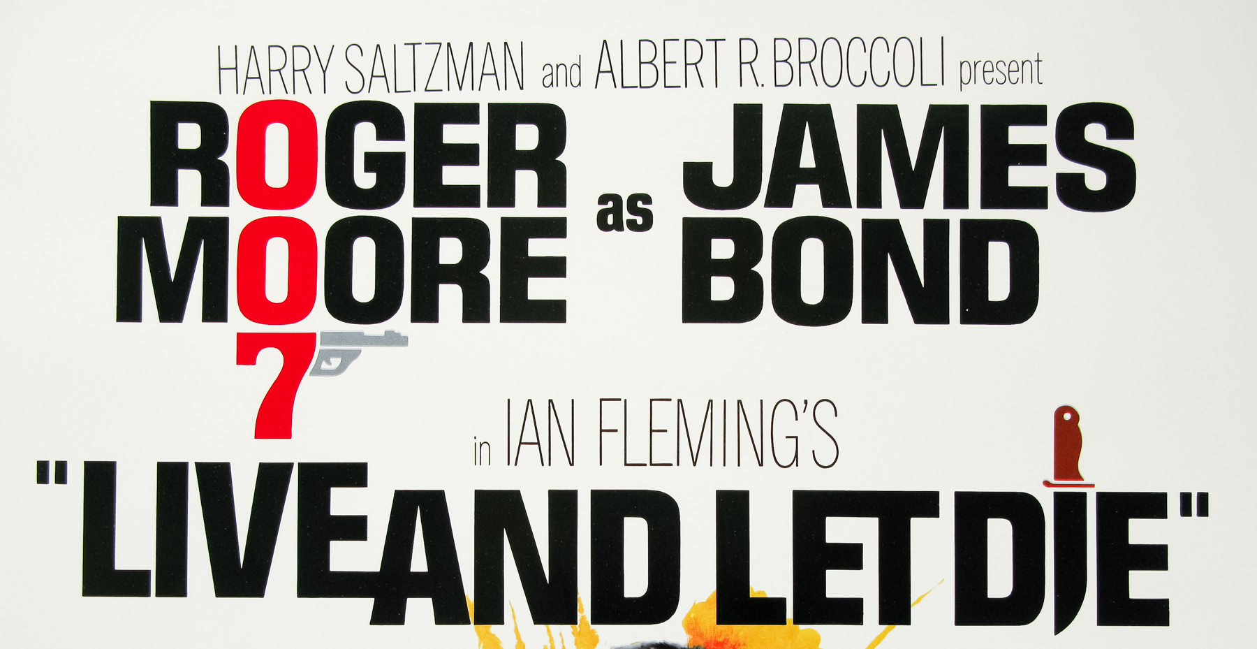
This particular poster is the American advance one sheet with artwork by Dan Goozee who is responsible for several other Bond posters, including the final Moonraker US one sheet and the international advance one sheet. Other posters I’ve collected by him can be seen here.
The original trailer for the film is on YouTube.