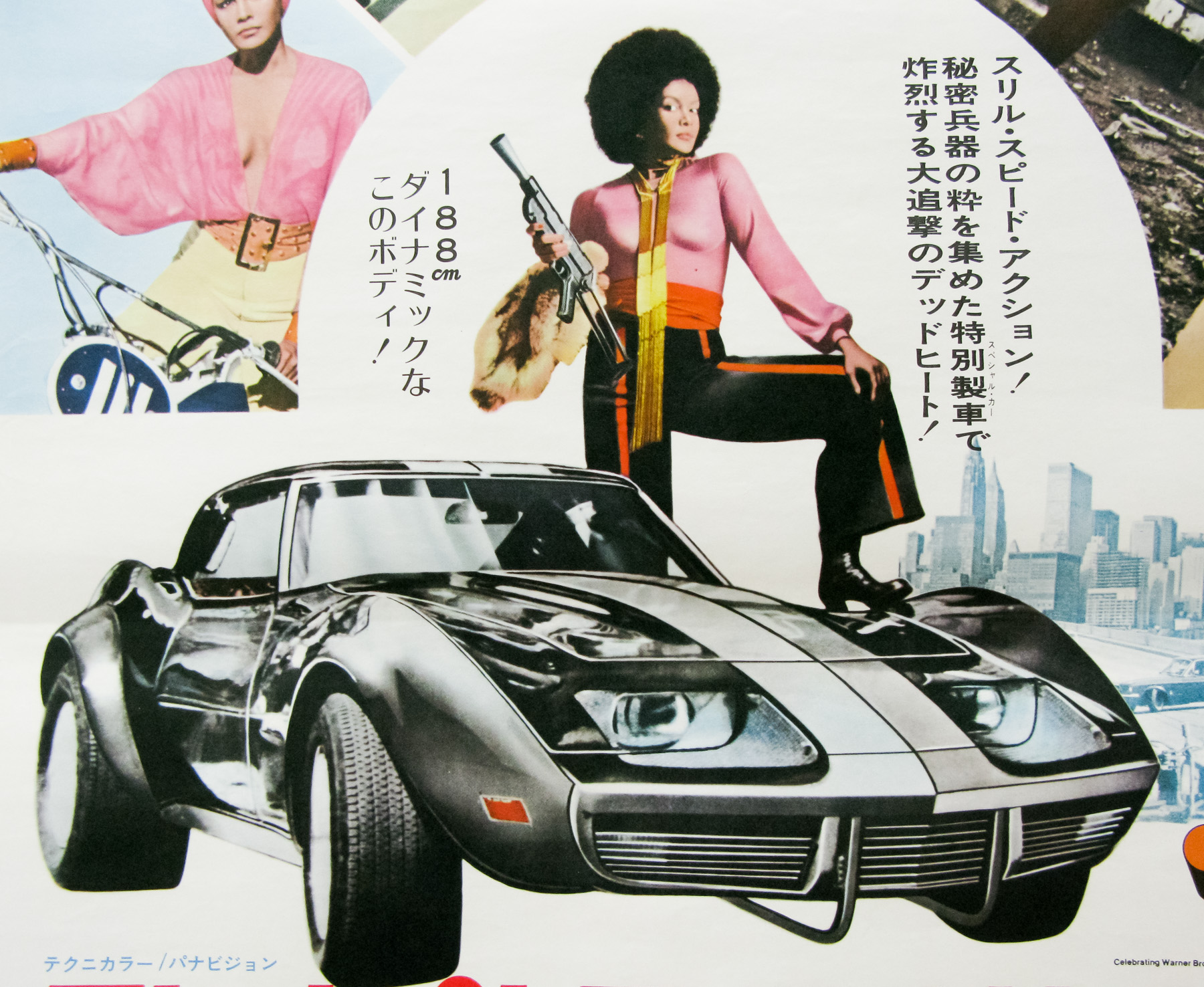
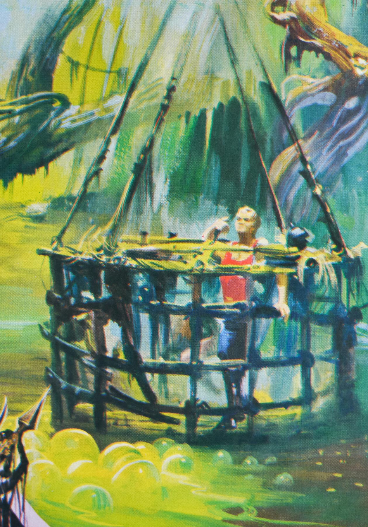
Nashville-based Sam Smith, who works under the moniker Sam’s Myth, is an acclaimed graphic designer and artist who has worked with multiple independent film distributors on official posters for films as diverse as the brilliant 1977 Japanese cult oddity House (for a 2010 re-release) and the sprawling biopic Carlos. In addition, Sam has designed and illustrated screen prints and unofficial posters for film screenings at the likes of Nashville’s celebrated Belcourt Theatre and San Francisco’s famous Castro Theatre.
A true cineaste, Sam’s portfolio overtly reflects his taste in movies since he’ll often elect to work on a poster for a cult, independent or little-seen film of his own choosing, plus he regularly works on packaging and disc menus for the much-loved video label Criterion. On top of this, Sam is an accomplished musician who has drummed for the likes of Ben Folds, Tristen and My So Called Band, and when not working on design projects he can be found on the road with one of these bands. Work on record covers, gig posters and other music-related projects also feature in Sam’s folio.
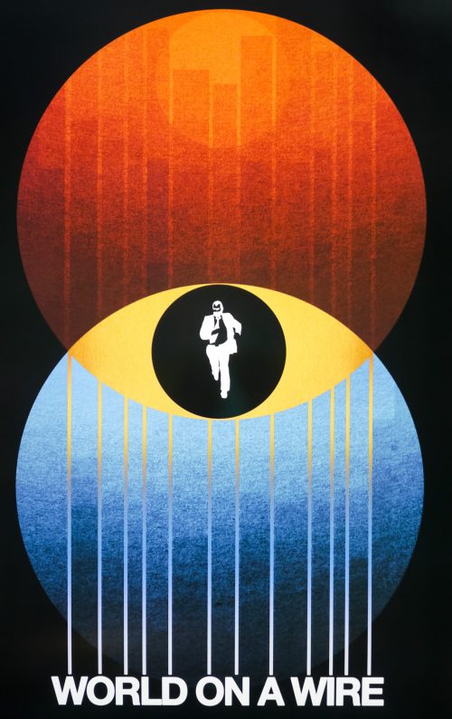
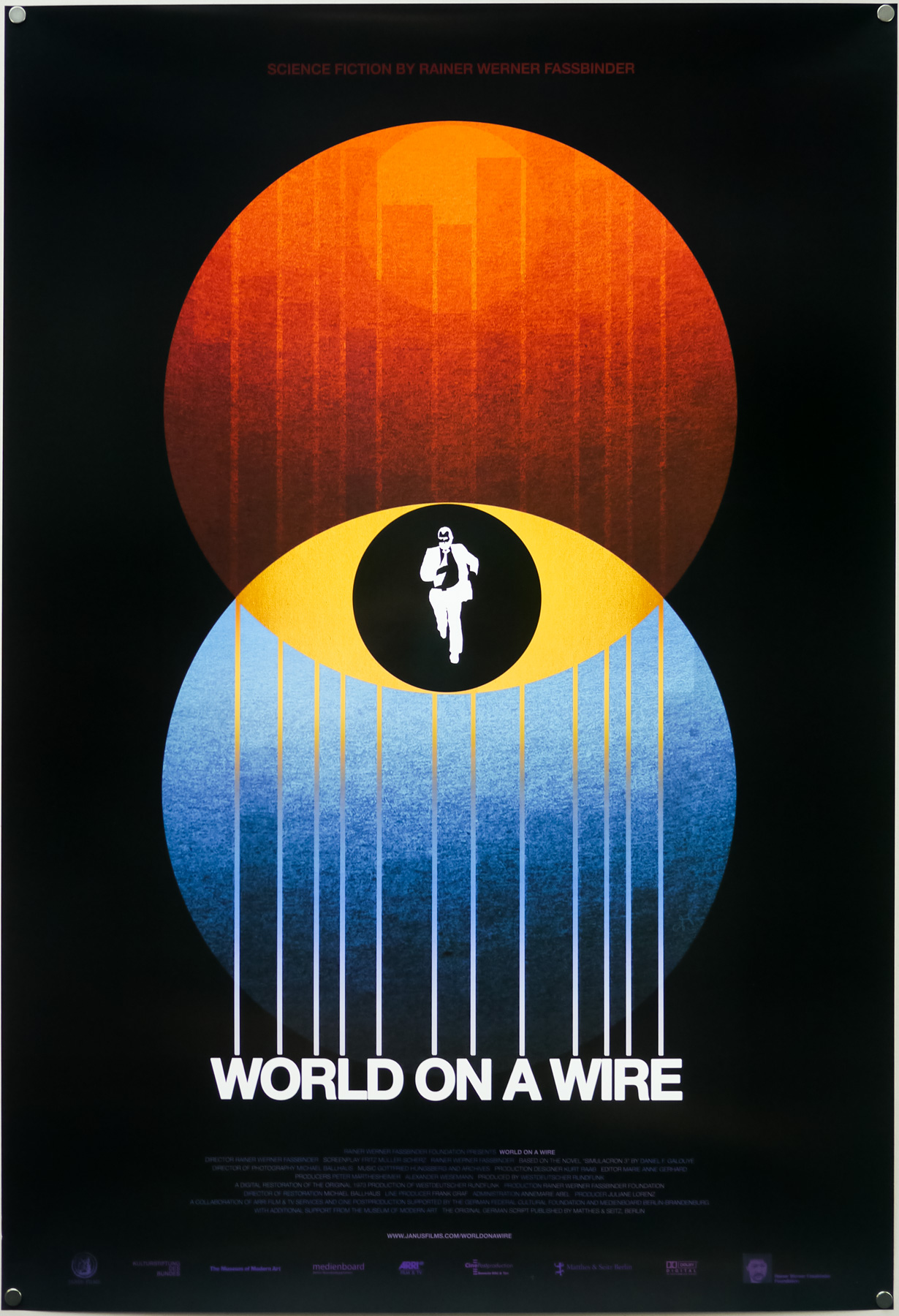
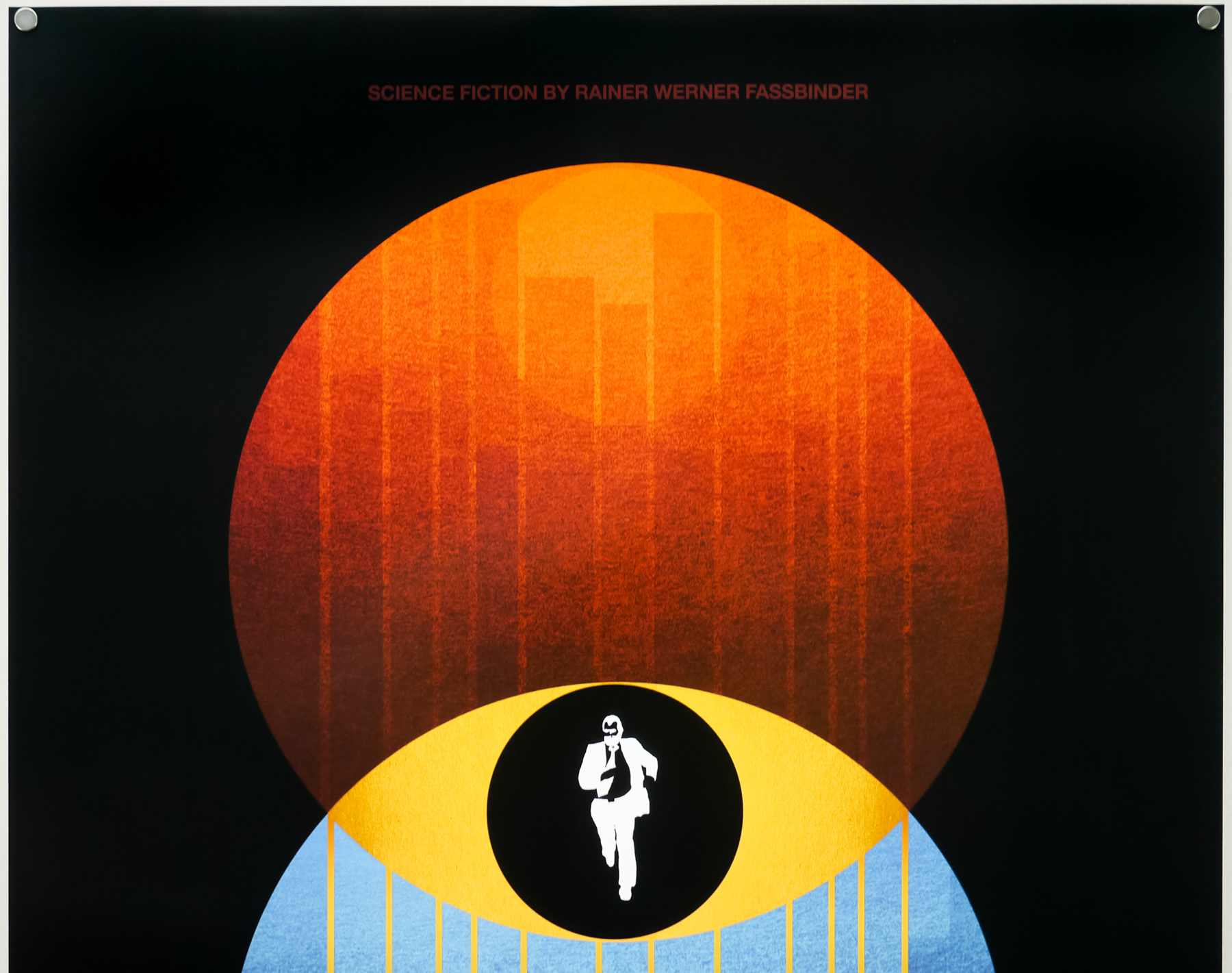
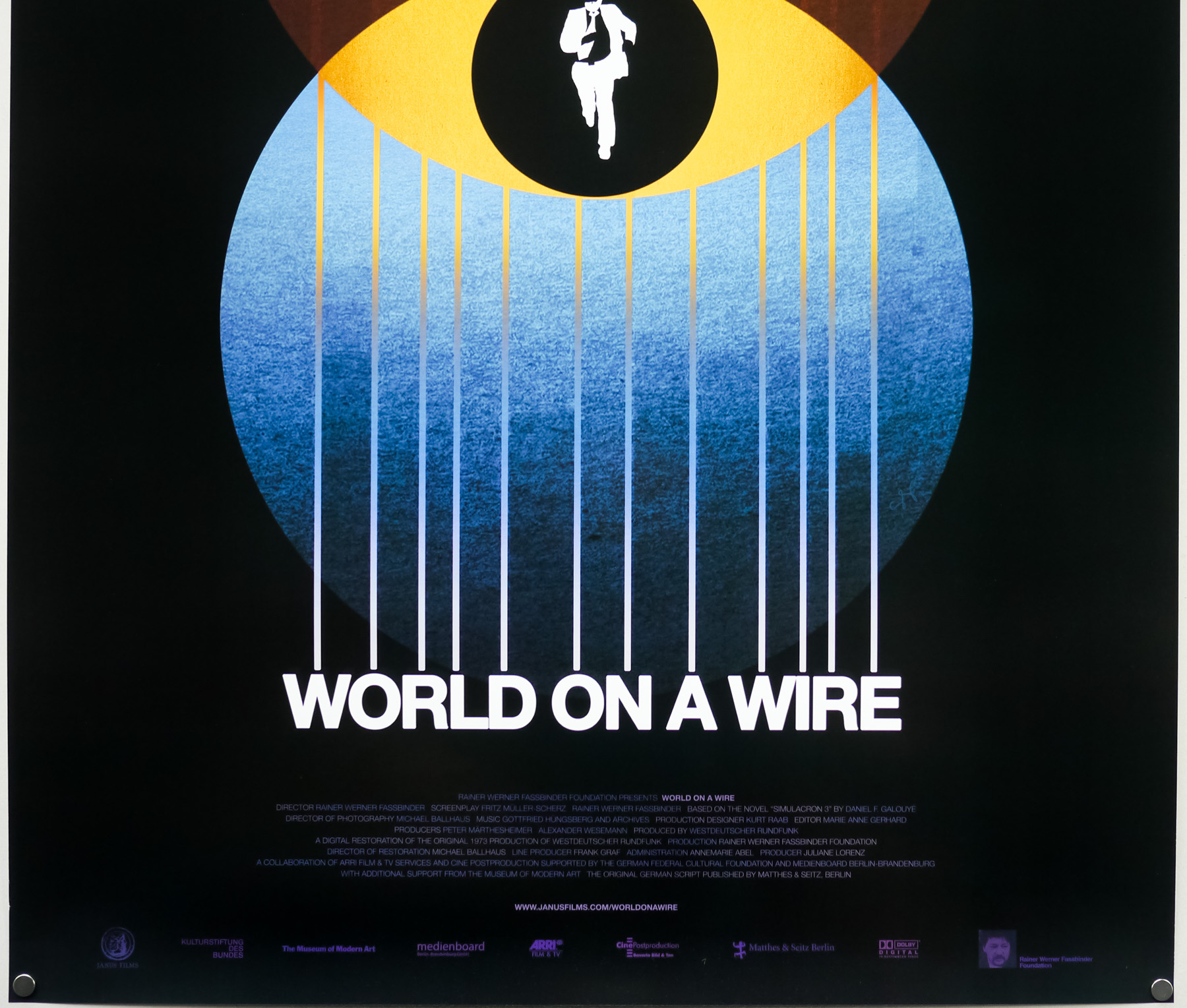
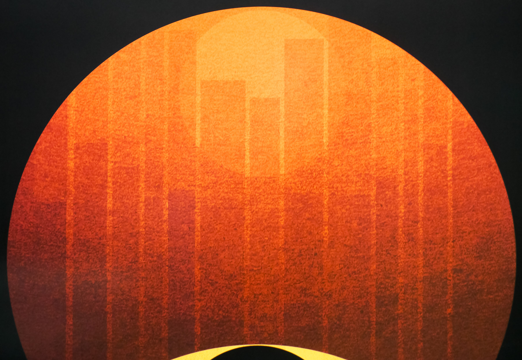
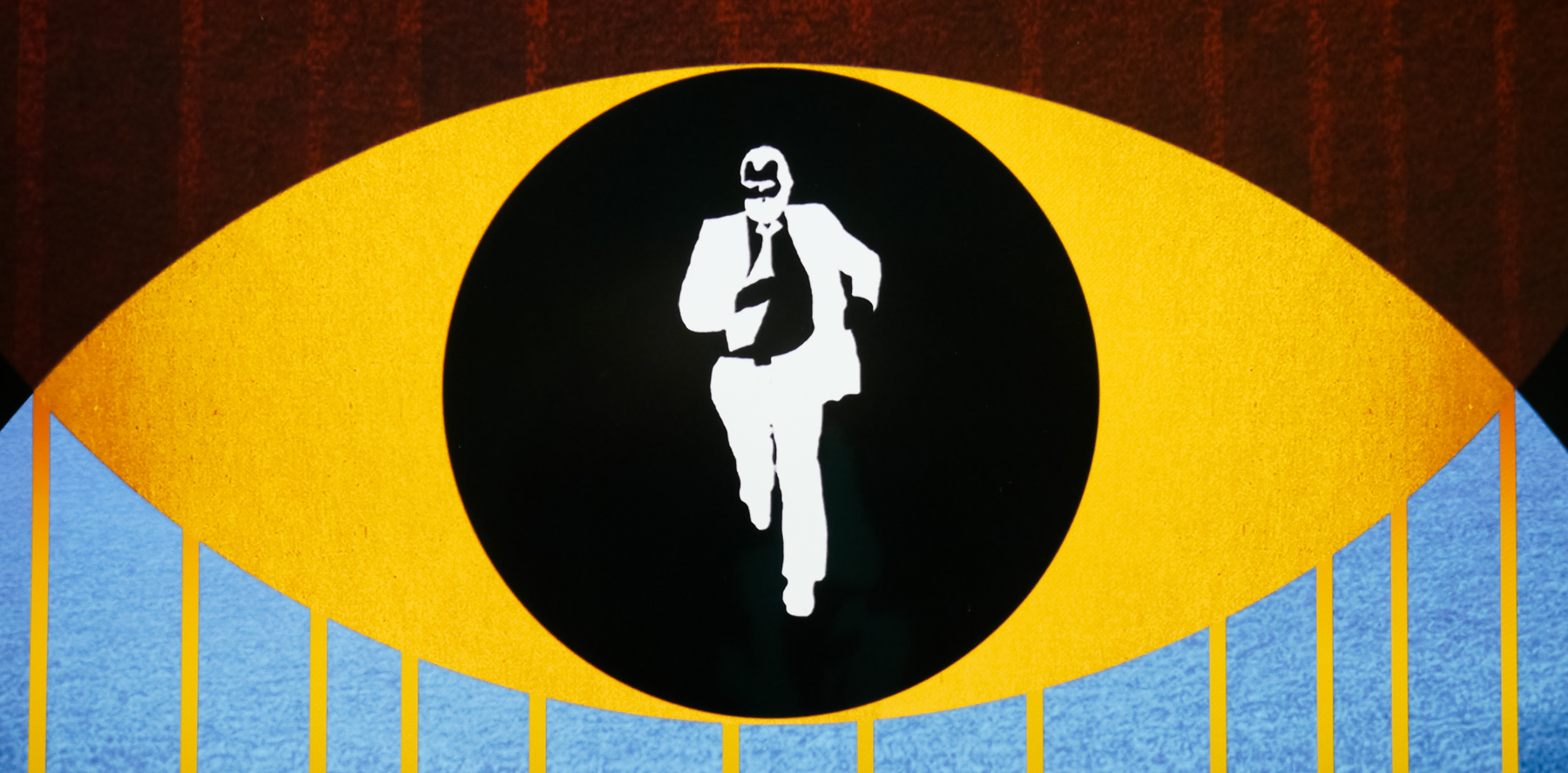
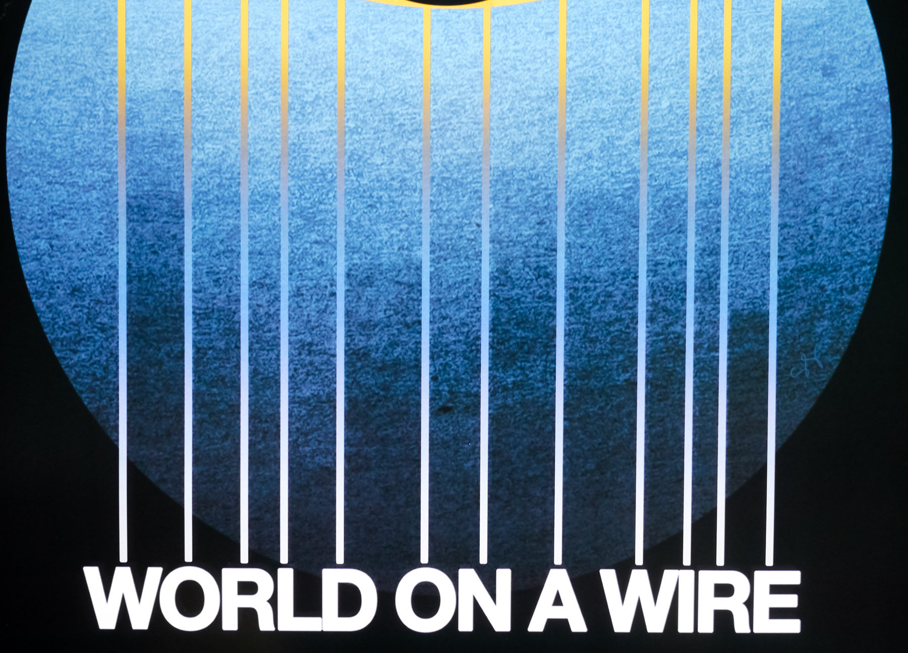
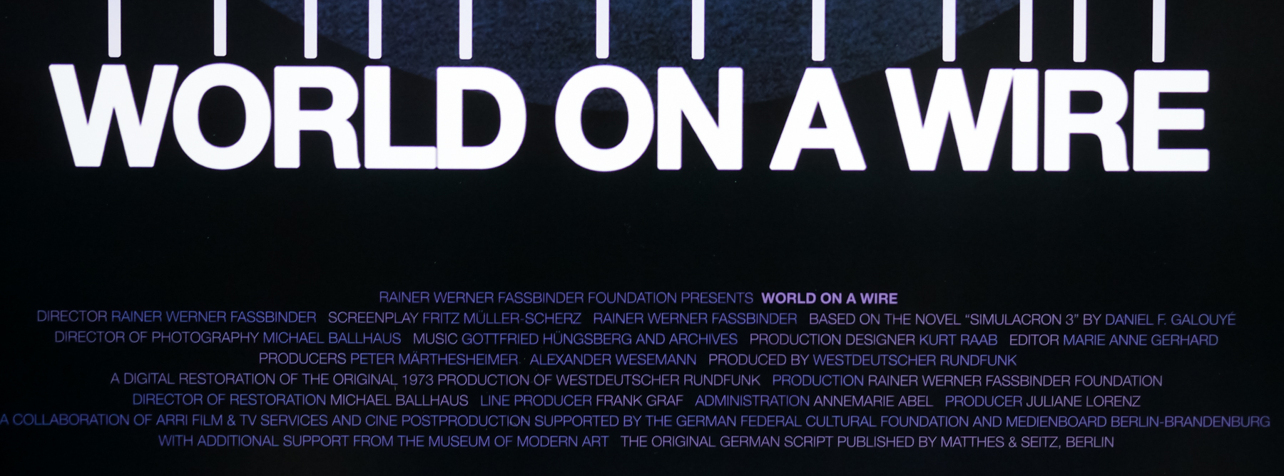
I first became aware of Sam when I purchased the superb re-release one sheets for House (see below) and Rainer Werner Fassbinder’s sci-fi epic World on a Wire in 2011, and I’ve been following his work ever since then. I wanted to interview Sam for the site at the same time as adding those two posters to my site and the resultant article is below.
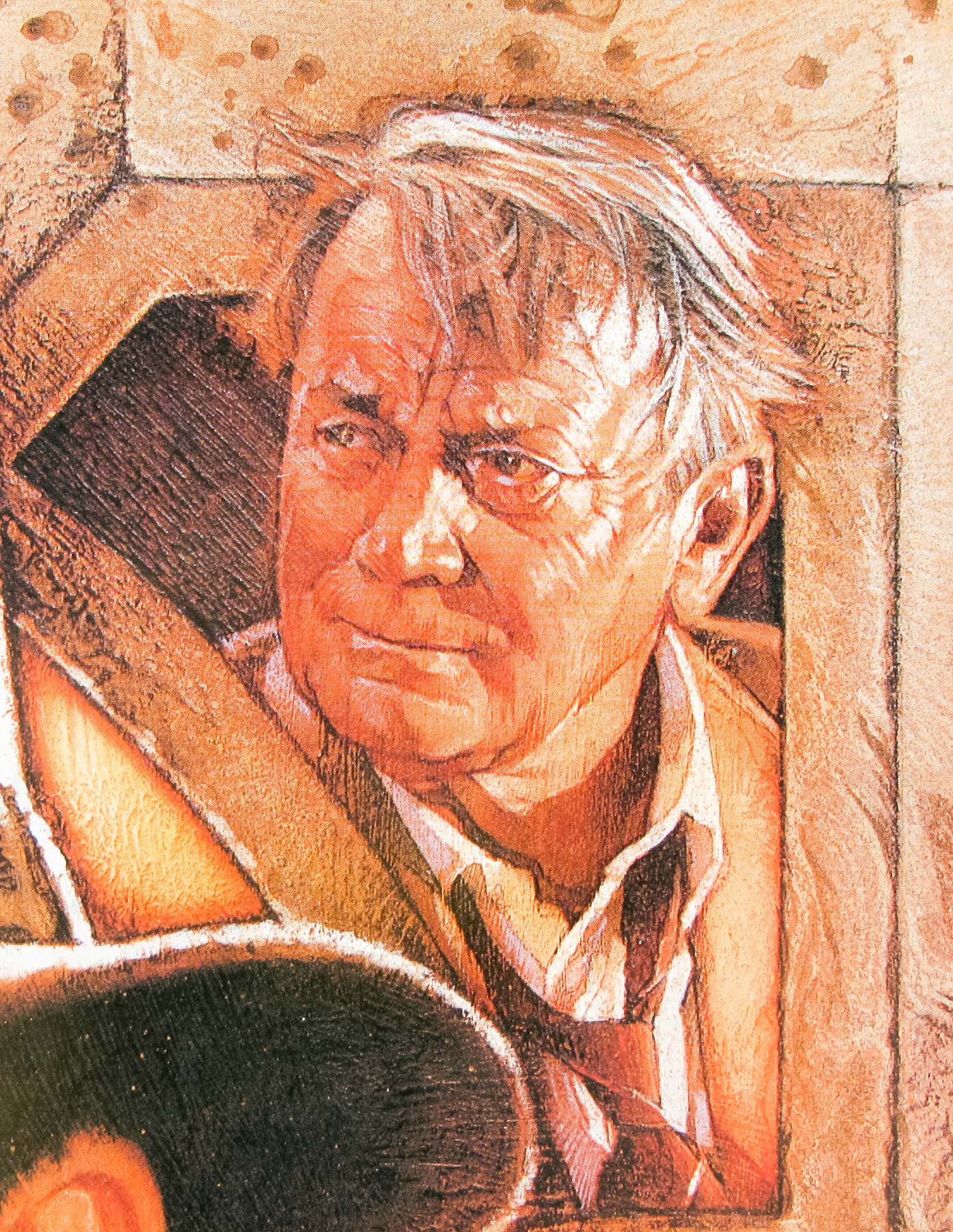
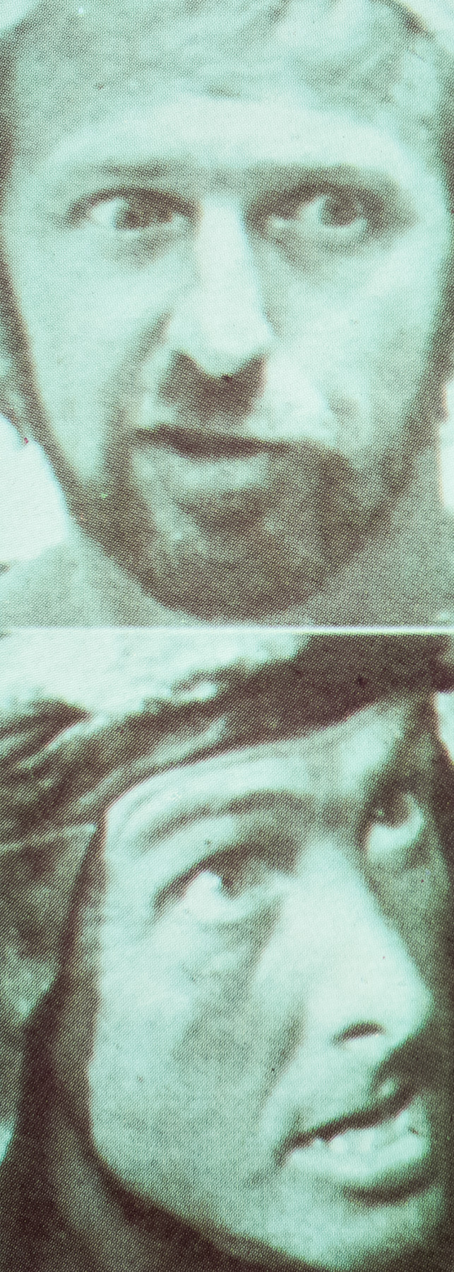
The designer, artist and musician Sam Smith, June 2013

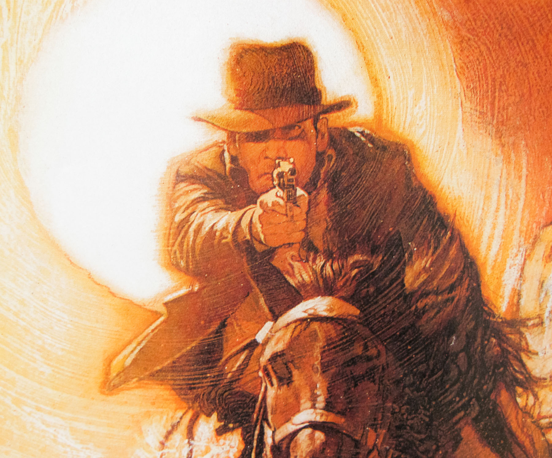
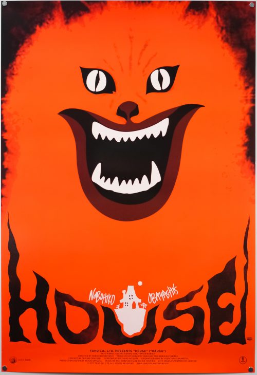
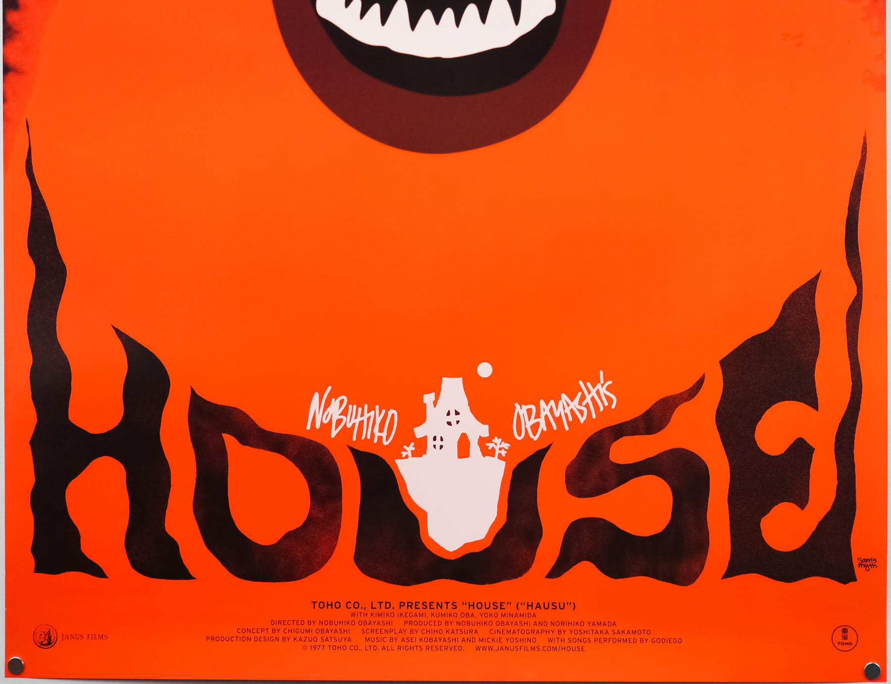
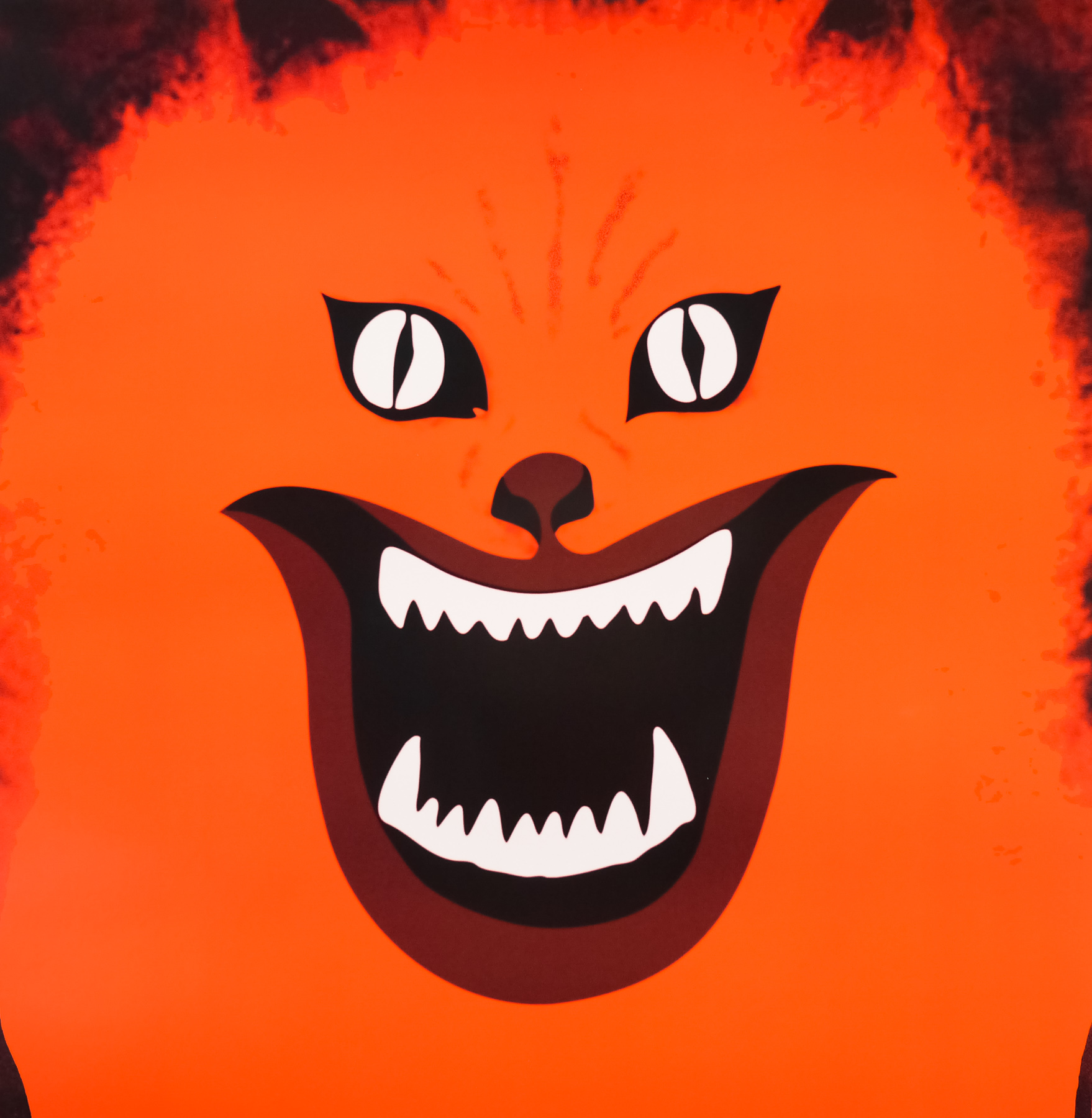
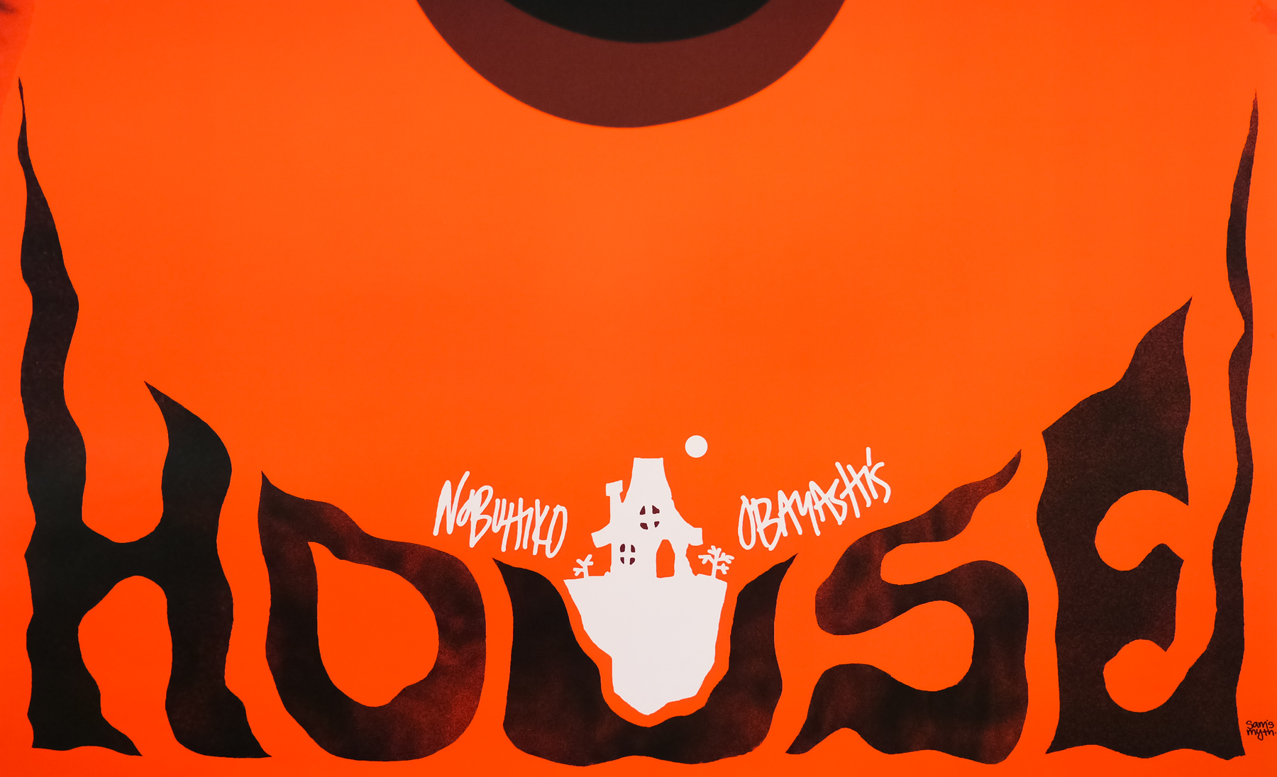
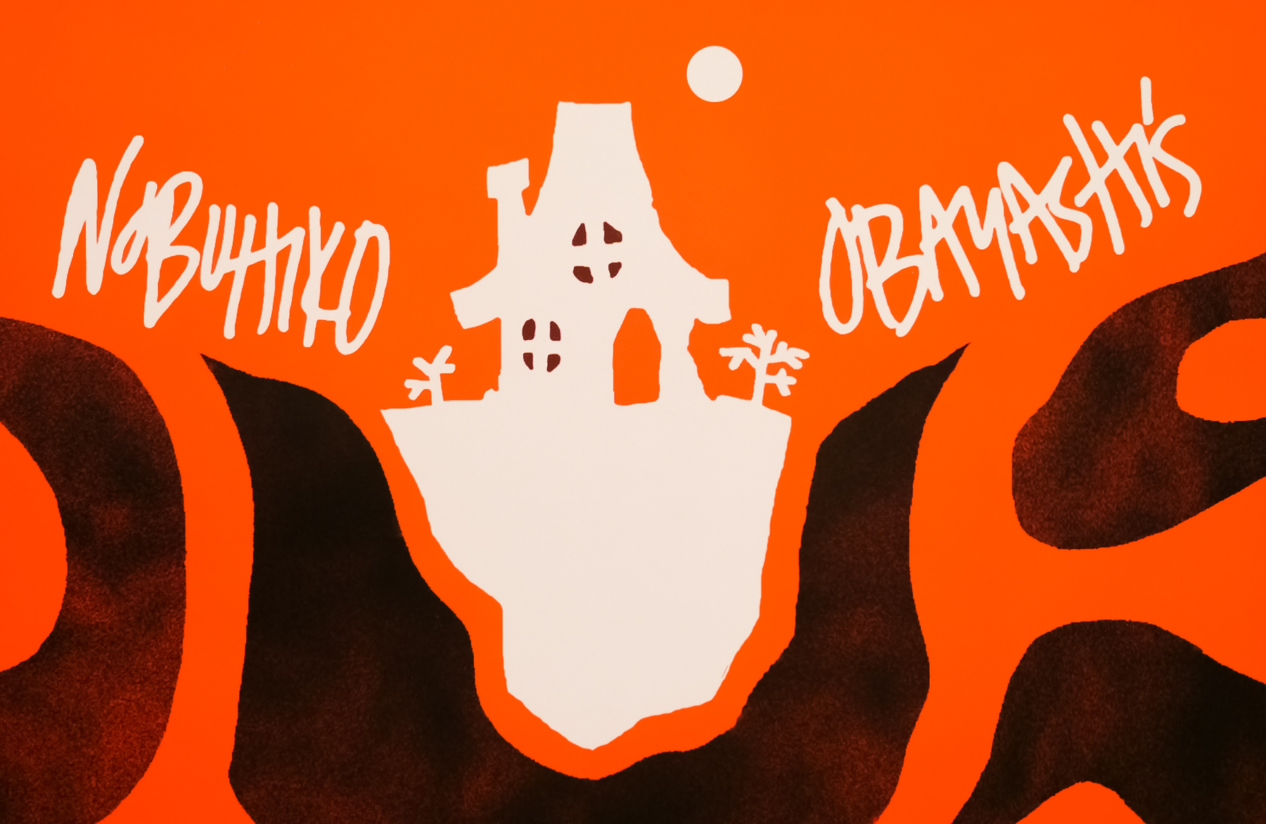
The US one sheet for the 2010 re-release of Nobuhiko Obayashi’s House, designed by Sam’s Myth
I’ve split the interview up into six parts and you can use the links below to jump directly to a section, should you wish.
Part 1 – Origins and starting out
Part 2 – Film and music
Part 3 –
Working methods
Part 4 – Criterion
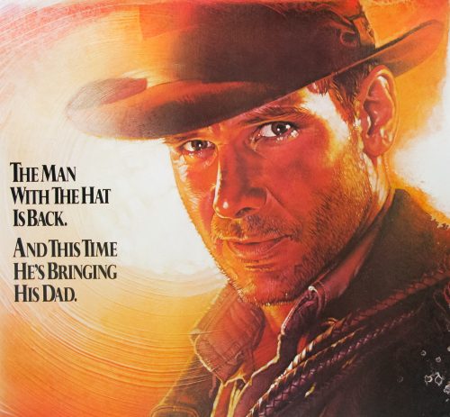
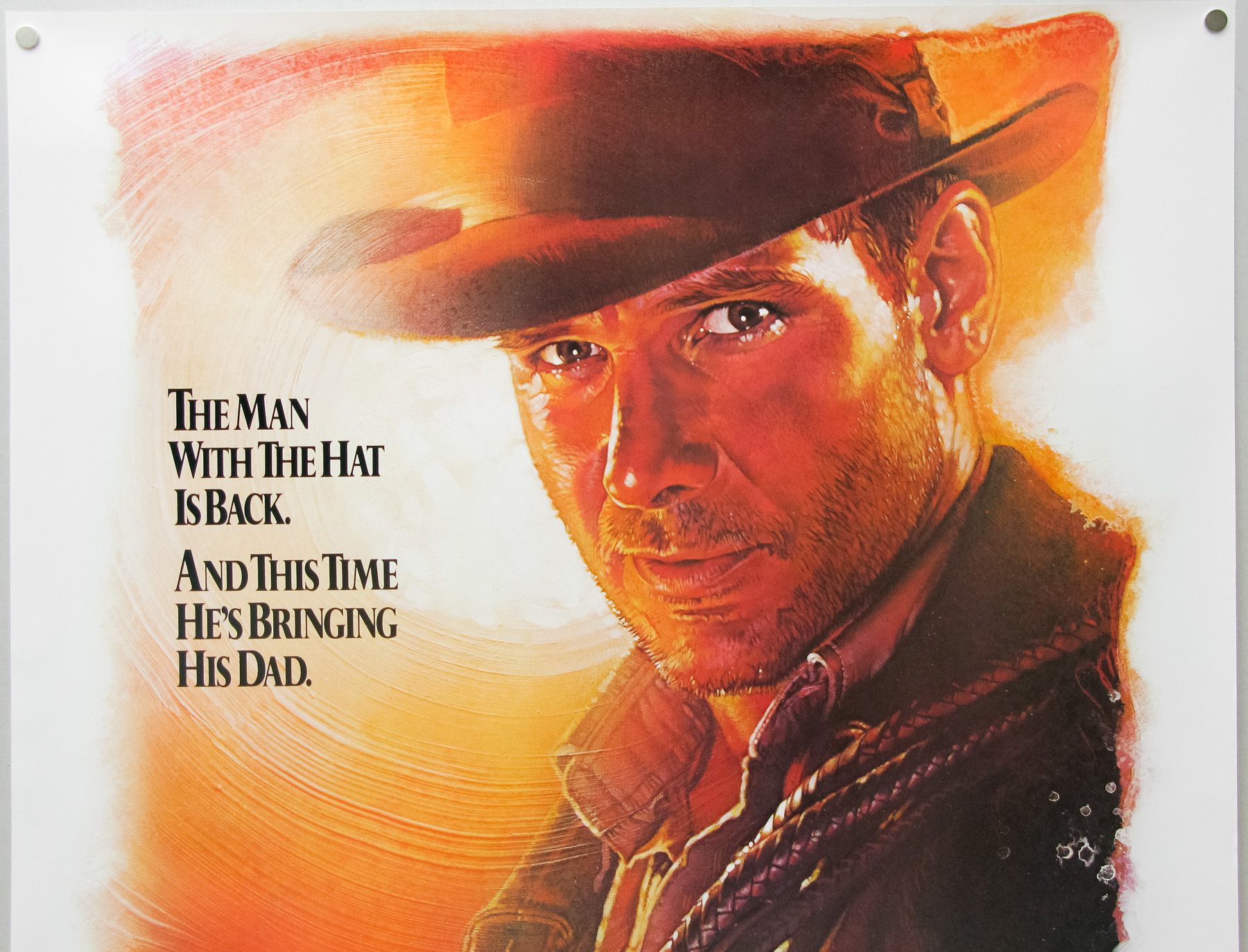
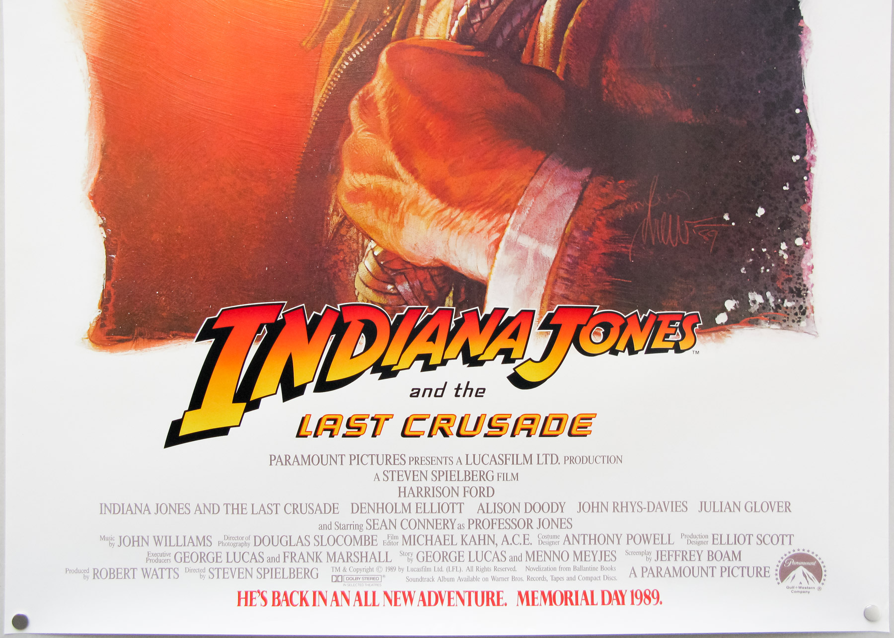
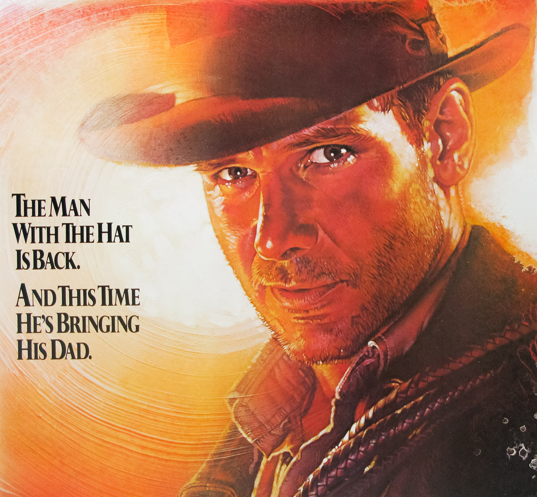
Part 5 – Posters in detail
Part 6 – Influences, advice and future plans
Part 1 – Origins and starting out
I’d like to start with your origins, if I may? When and where were you born?
I was born in 1981 in Nashville, TN. I’ve lived in Nashville for the bulk of my life, aside from going to school in New York City and touring around the world off and on for the several years after that.
I understand your father is also a designer? Can you talk about his work?
He was and still is an artist who has worked in different mediums, never as a designer per se, but a painter and woodworker and found object artist… All kinds of things. For a period in the 80’s he worked with airbrush creating large, colorful abstract landscapes, patterns and conceptual imagery. His drawing and illustration style has always had an enormous influence on my art. He fostered my obsession with all things visual. Now he lives in the country and makes furniture and things out of reclaimed wood, writes novels and short stories, and draws from time to time.
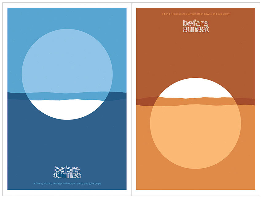
Before Sunrise and Before Sunset screen prints by Sam’s Myth
How did you start out designing? Did you study it at university?
I’ve always just made art on my own, due in large part most likely to my dad and I working on creative projects all the time when I was a child. I would draw all of the characters and things I was obsessed with– Teenage Mutant Ninja Turtles, Batman, Dick Tracy, Roger Rabbit… By the time The Simpsons hit, I had been cartooning and drawing my own comics for several years. In high school, my love for posters began I guess, as I would draw and paste-up posters and flyers for all of my bands’ shows as well as all major school events. I “designed” the album art for my band’s releases, combining art I made, found images and photographs with type, and I found this very enjoyable. I went to New York University for the Cinema Studies program, went on tour after that, and literally stopped making visual art for several years.
What was your first real break into the world of professional design? Was there a first major client?
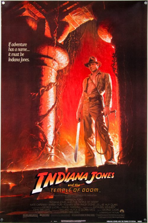
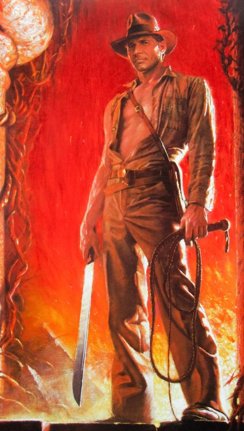
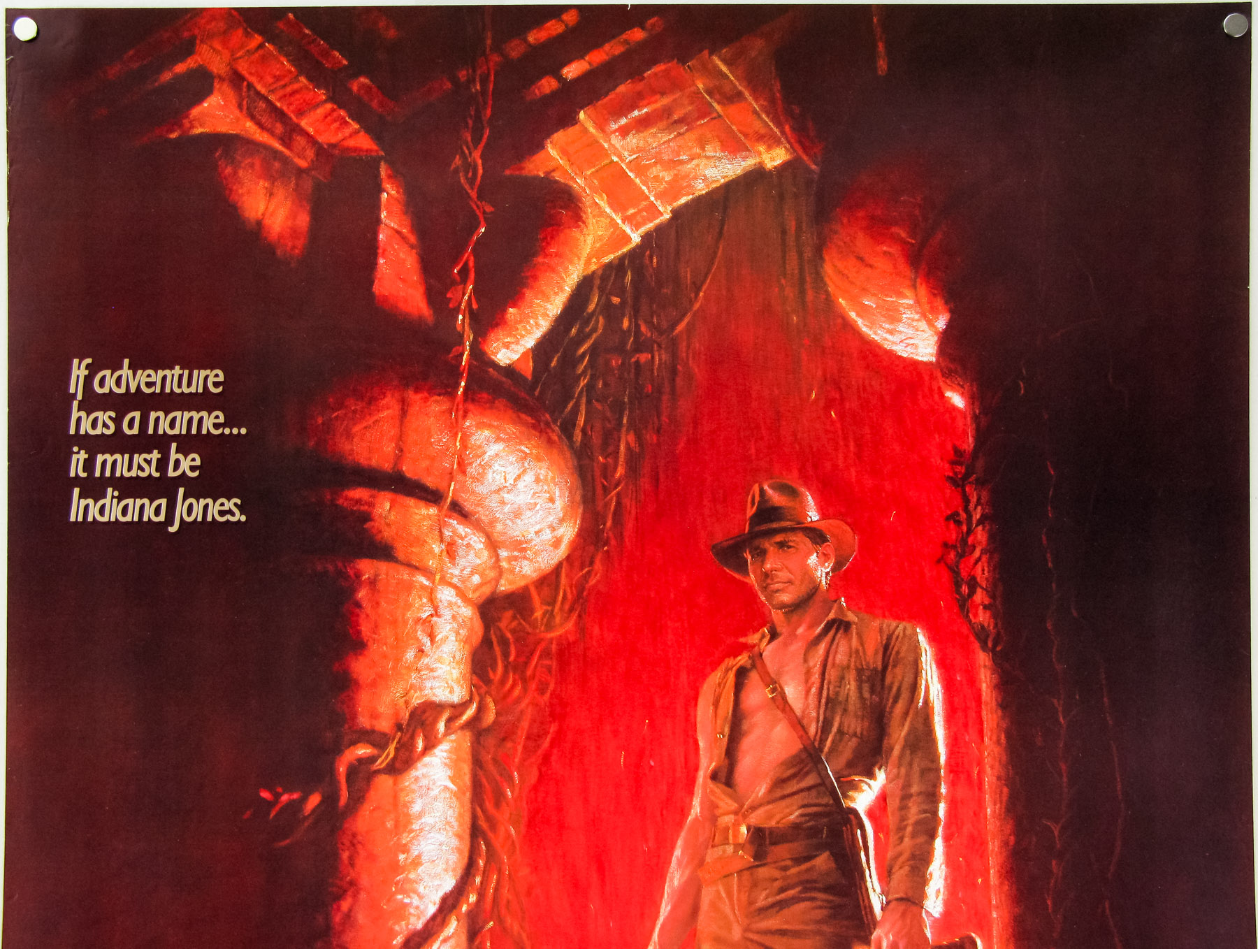
My first real break was the House poster. After touring for about four years, I had a long break and decided to do something about the fact that I had let my art skills atrophy so severely from not drawing or designing anything for years while I focused on other things. My mom had just built a small art studio in the back yard of the house I grew up in, and I holed up for a week there and forced myself to just crank out some posters. My love for film had grown so much at college, where I earned a degree in writing about film from an academic perspective.
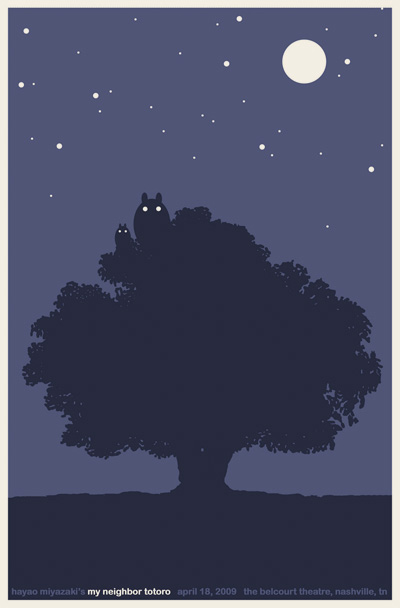
My Neighbor Totoro screen print by Sam’s Myth for the Belcourt Theatre, Nashville. 2009
While touring my writing also declined and I didn’t have a lot of interest in being a film critic. So I figured that making film posters would be a great way to channel my love for films (and for reading and interpreting films) into a visual art project. I made eight to ten designs during those several days that are still some of my favorite things I’ve done. I took them to my friends at the Belcourt Theatre, Nashville’s historic art-house, and showed them what Mondo was doing with collectible movie screen prints in Austin, thinking we could try something similar.
Testing the waters, they agreed to print up some posters for a couple upcoming films– I made screen prints for My Neighbor Totoro and The Human Condition, which was being re-released by Janus Films. Janus also had a digital version of House booked at the Belcourt as a midnight movie and I made a poster. I knew that Janus was supportive of what we were doing at the Belcourt and I’d always dreamed of working with them and with Criterion, their home video wing. My initial goal was to create 25 different posters for HOUSE just to increase my odds of landing on something great that might catch Janus’ attention, but I only made it through a few ideas, and the cat poster was the best. People really responded to it, and the midnight screenings at the Belcourt were a smashing success, so much so that Janus went ahead and planned to strike a new 35mm print and give HOUSE the full run in other theaters.
Janus asked if they could use my poster design as their official one-sheet. That led naturally to a relationship working with Criterion and Janus on an ongoing basis. So I feel I owe everything to the Belcourt and to Janus for giving me that opportunity to see myself as a professional designer of posters.
Have you always been freelance or have you worked in an agency?
I’ve always been freelance. I enjoy the challenge of maintaining a steady stream of professional work but doing so on my own schedule. I do fantasise sometimes about combining powers with other artist friends and forming a sort of collective, all working out of the same studio and sharing gear and tools, helping each other out and, most importantly, playing ping pong. I’ve never really considered working for an agency but wouldn’t rule it out, particularly if it were a movie poster agency which would have its own interesting challenges.
Continue reading