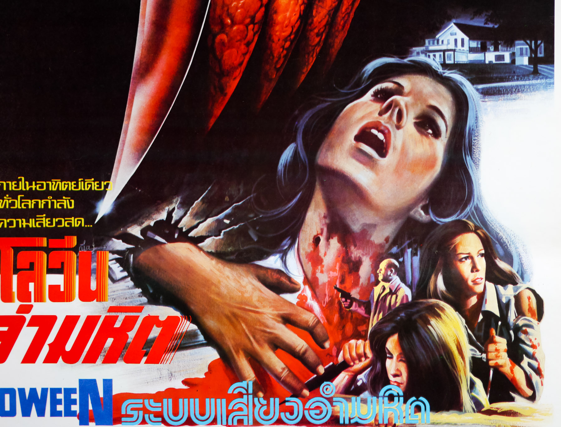
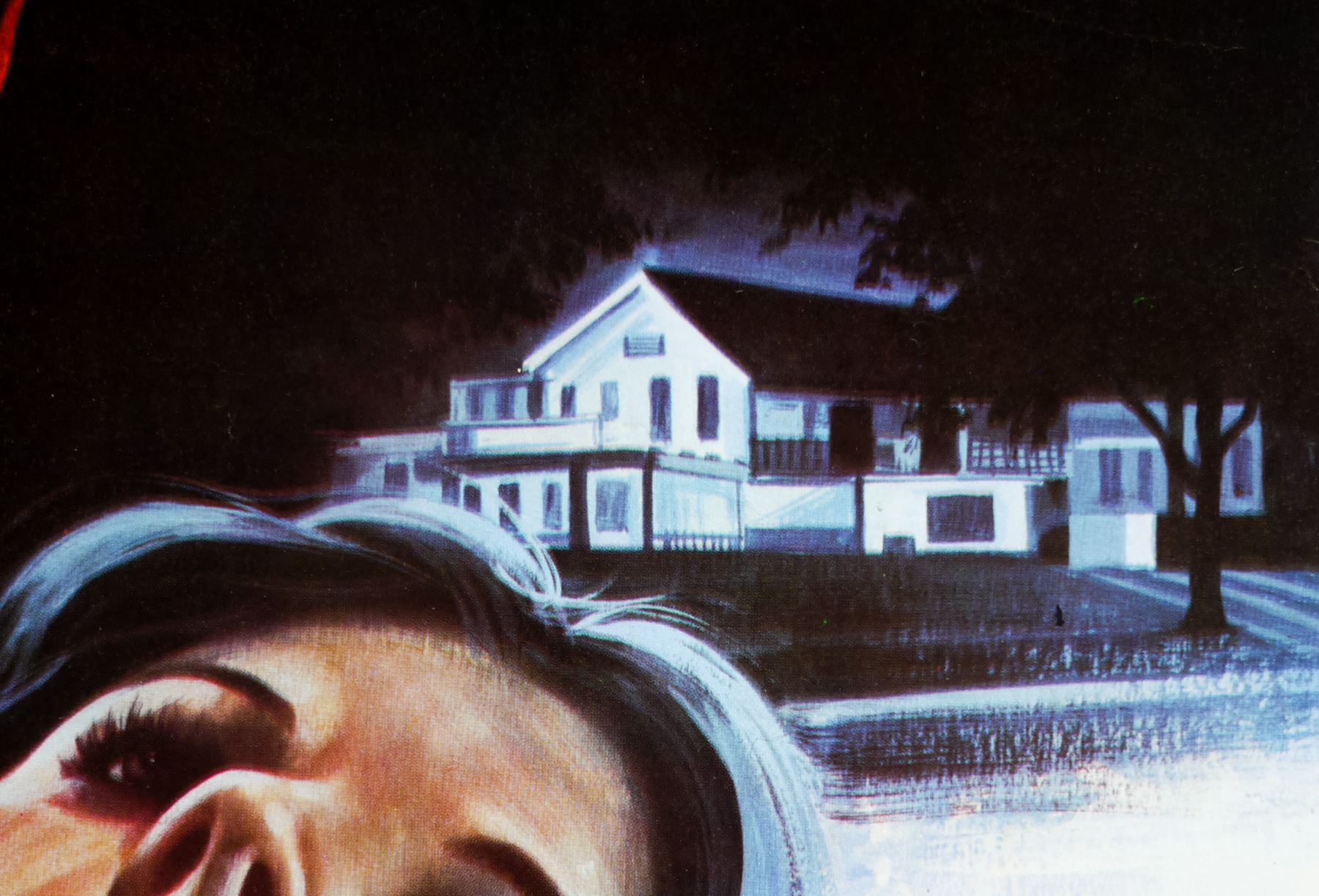
After adding the British quad for The Monster Club to the site, I wanted to speak to its designer and illustrator Graham Humphreys about its creation. The poster wasn’t one that we discussed during our 2011 interview and I felt it deserved this ‘making of’ article.
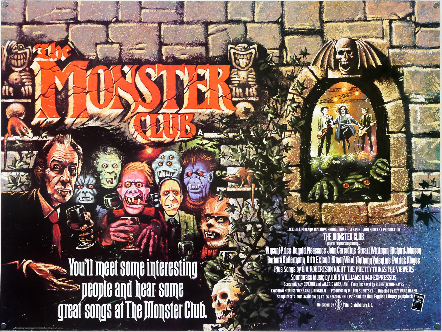
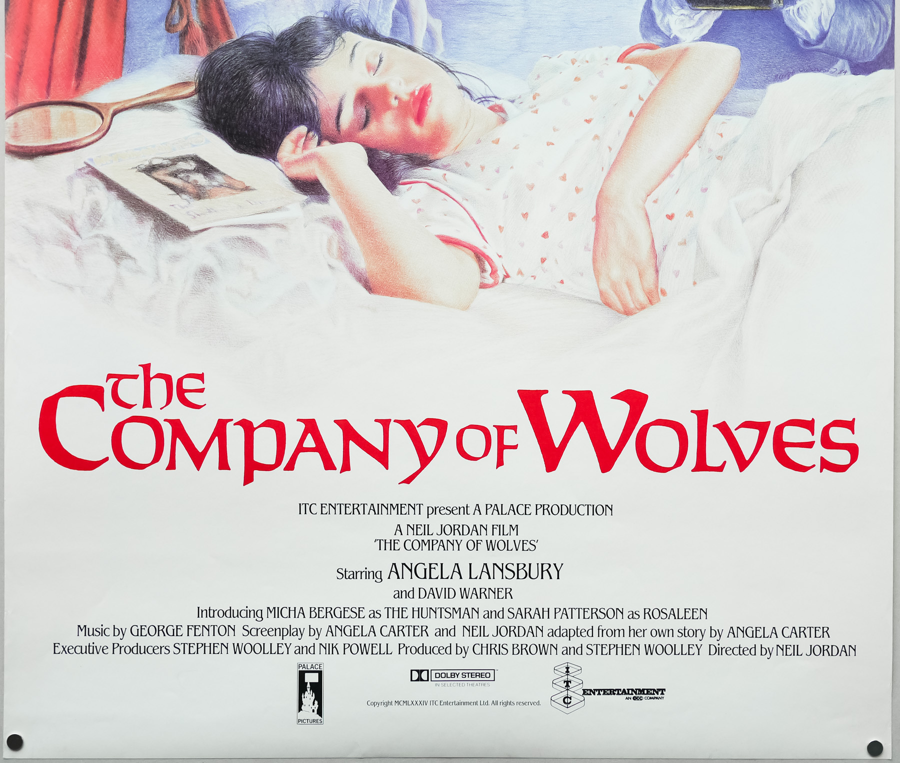
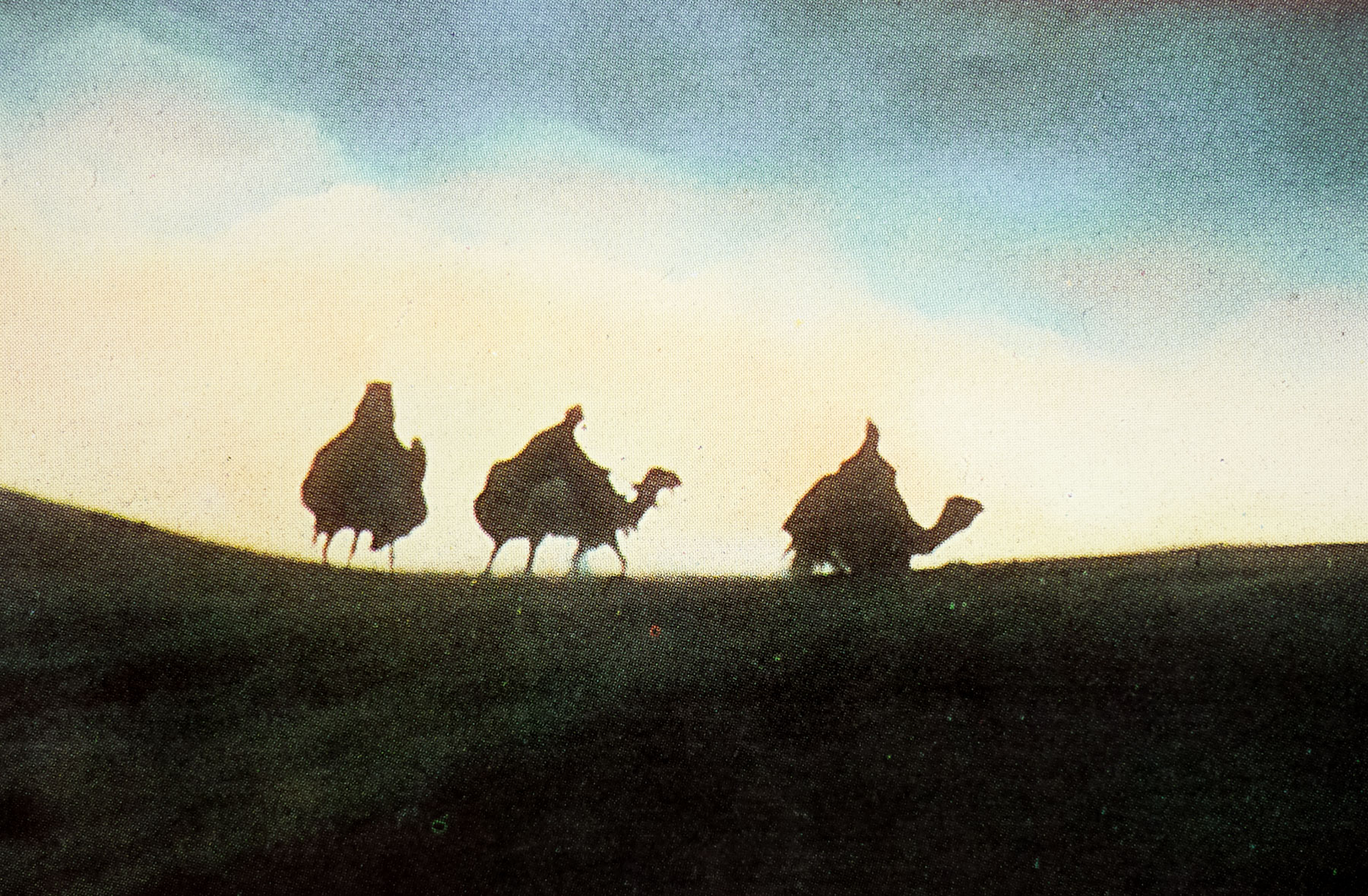
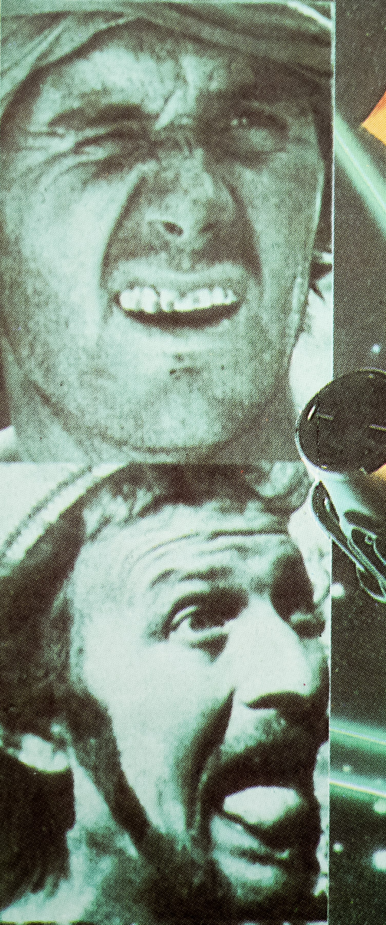
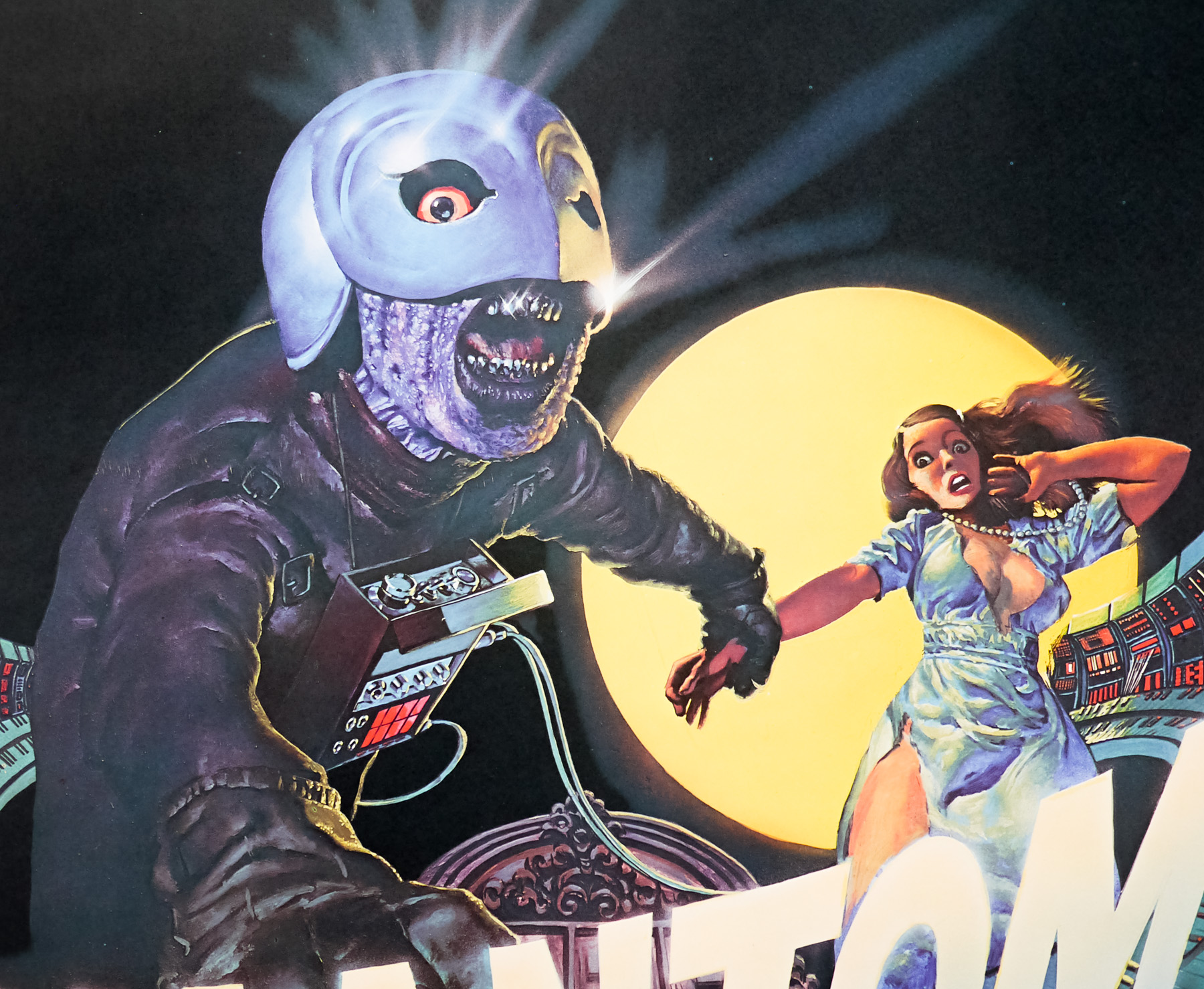
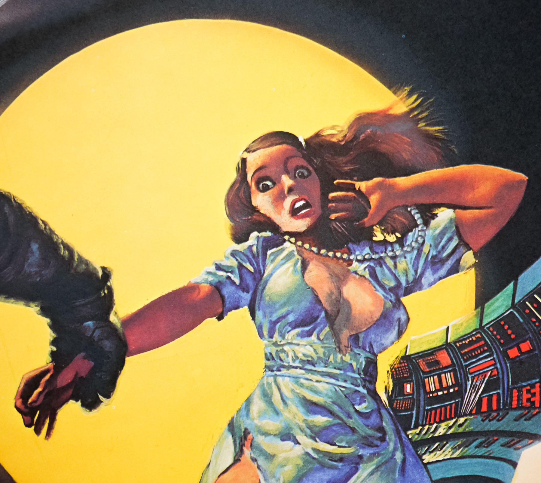
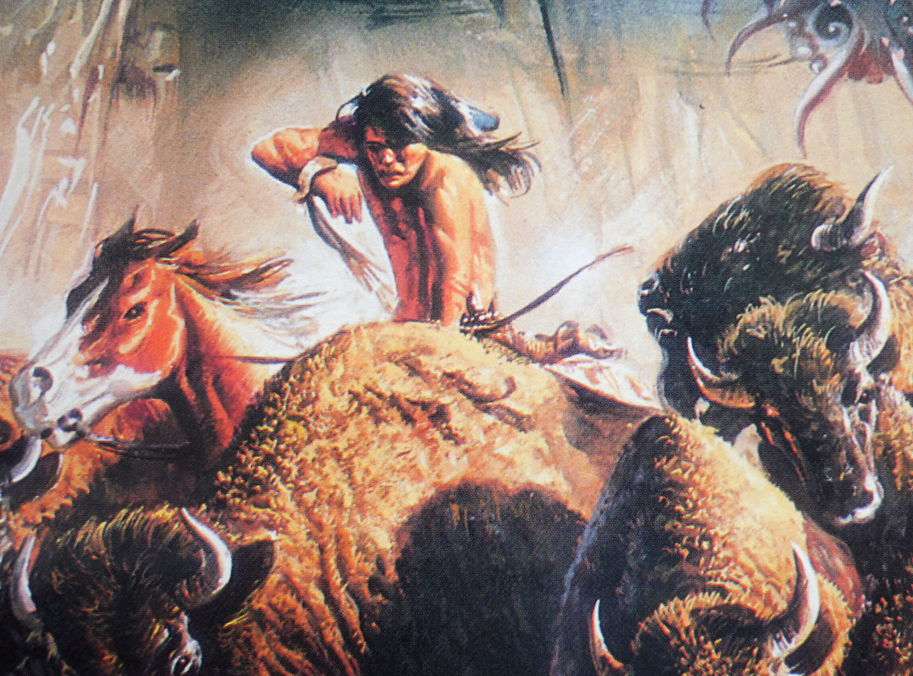
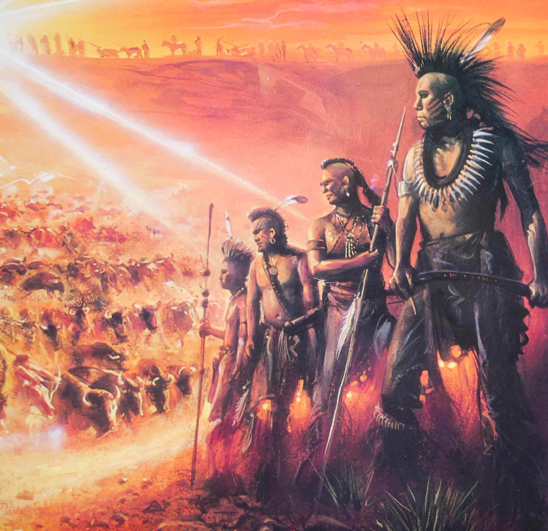
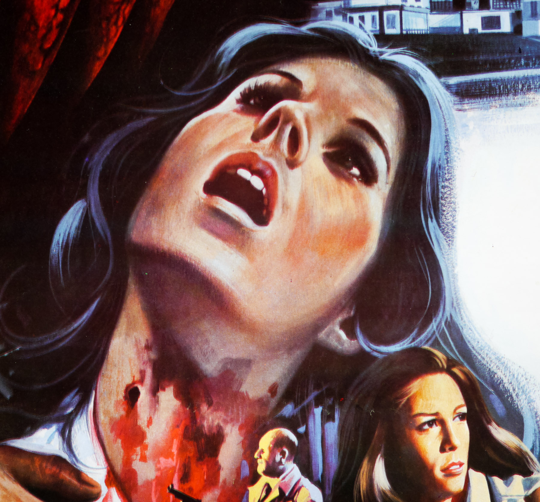
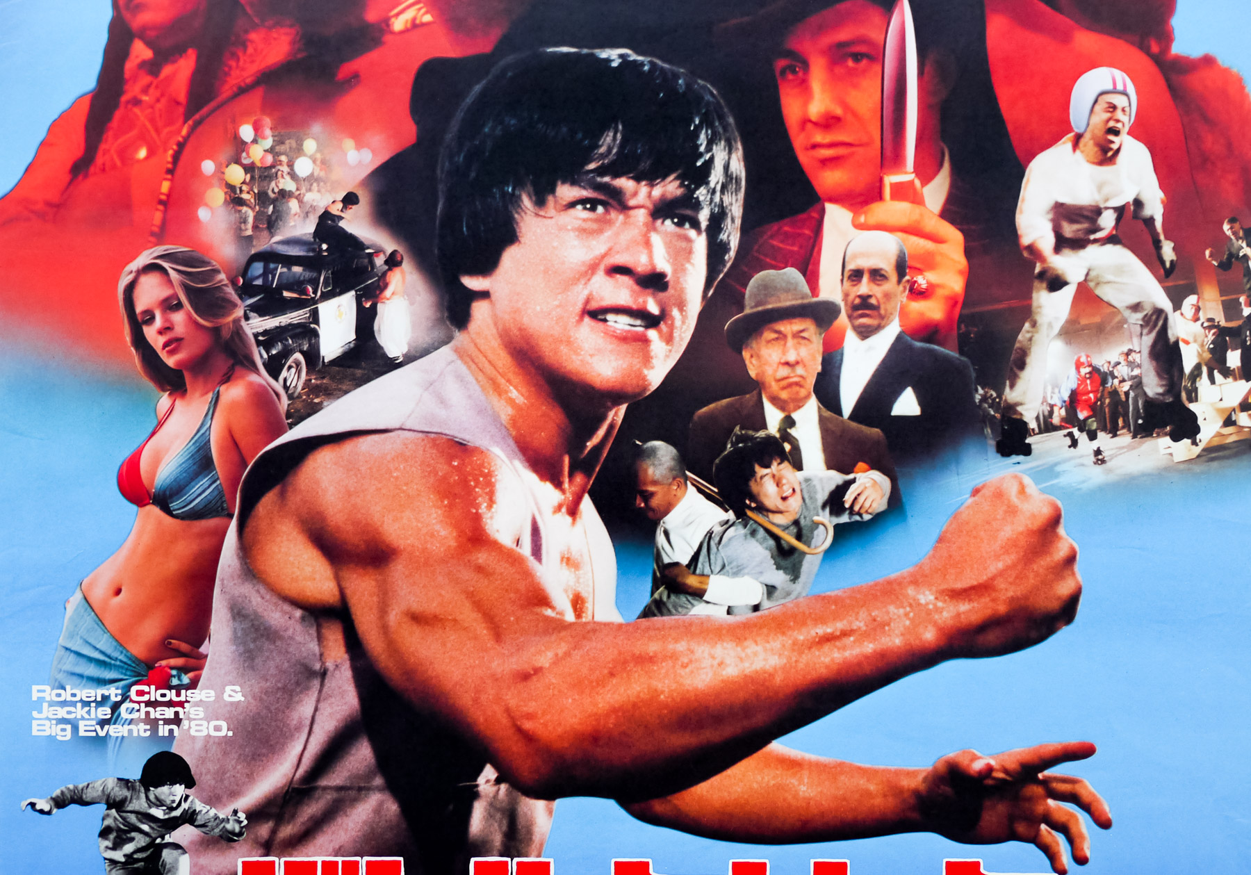
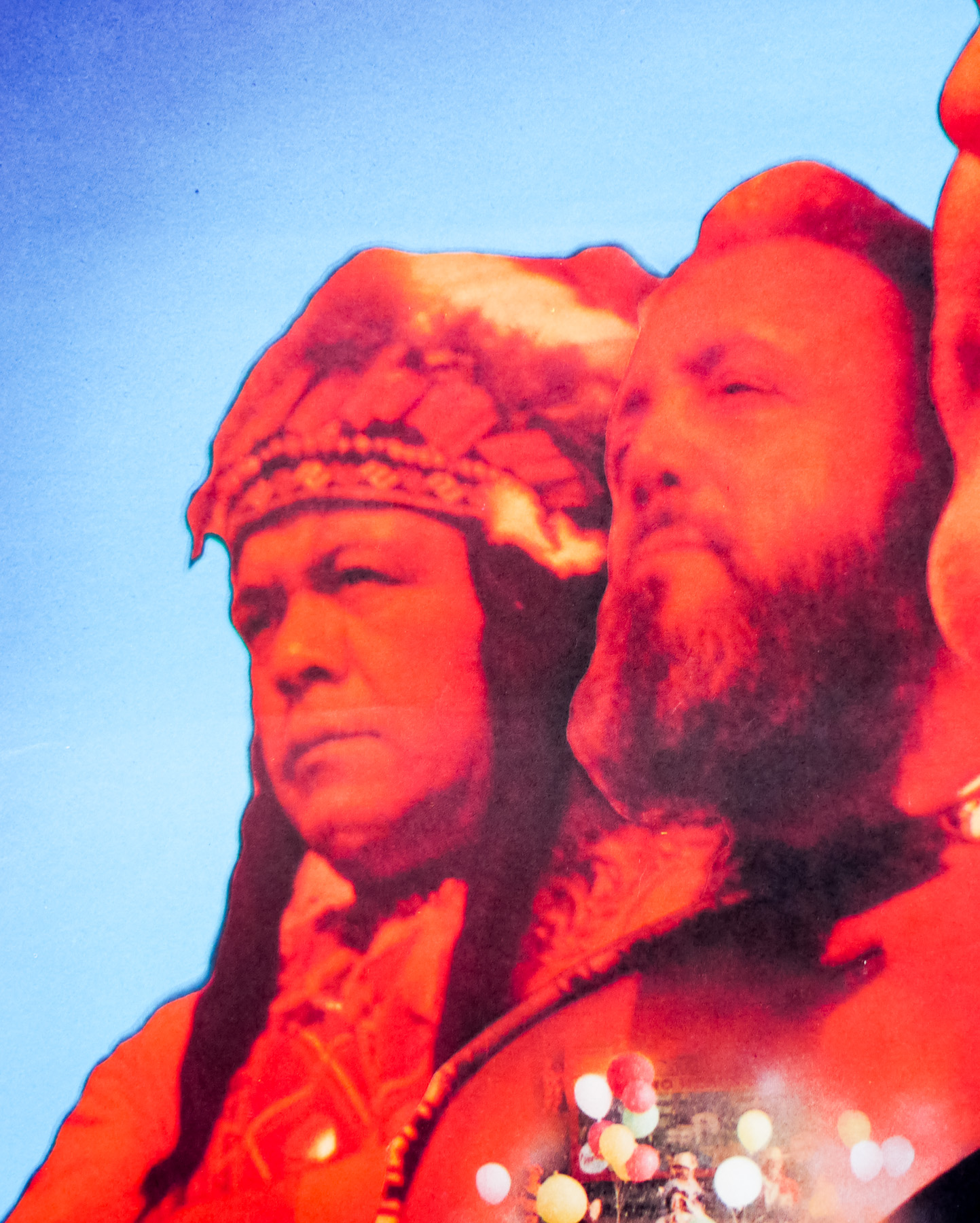
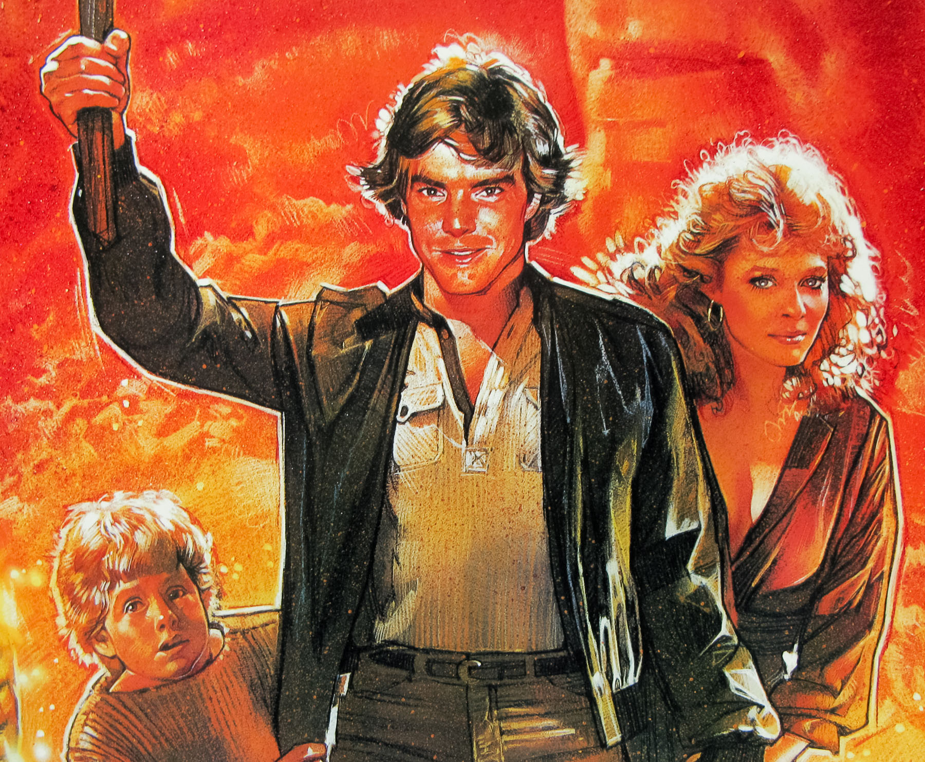
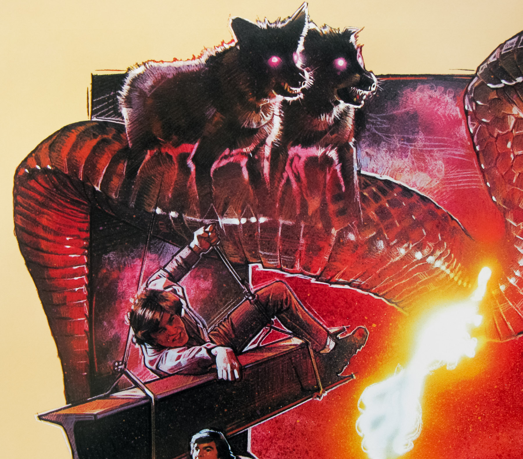
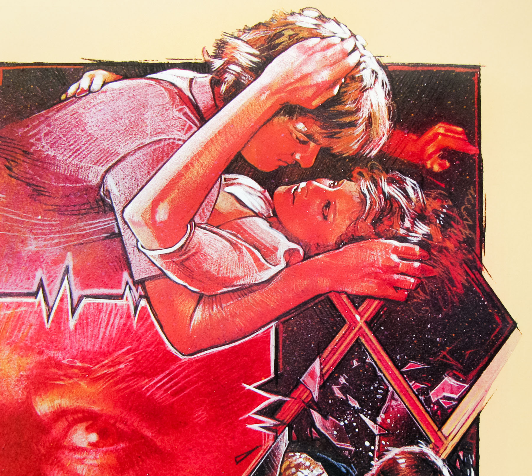
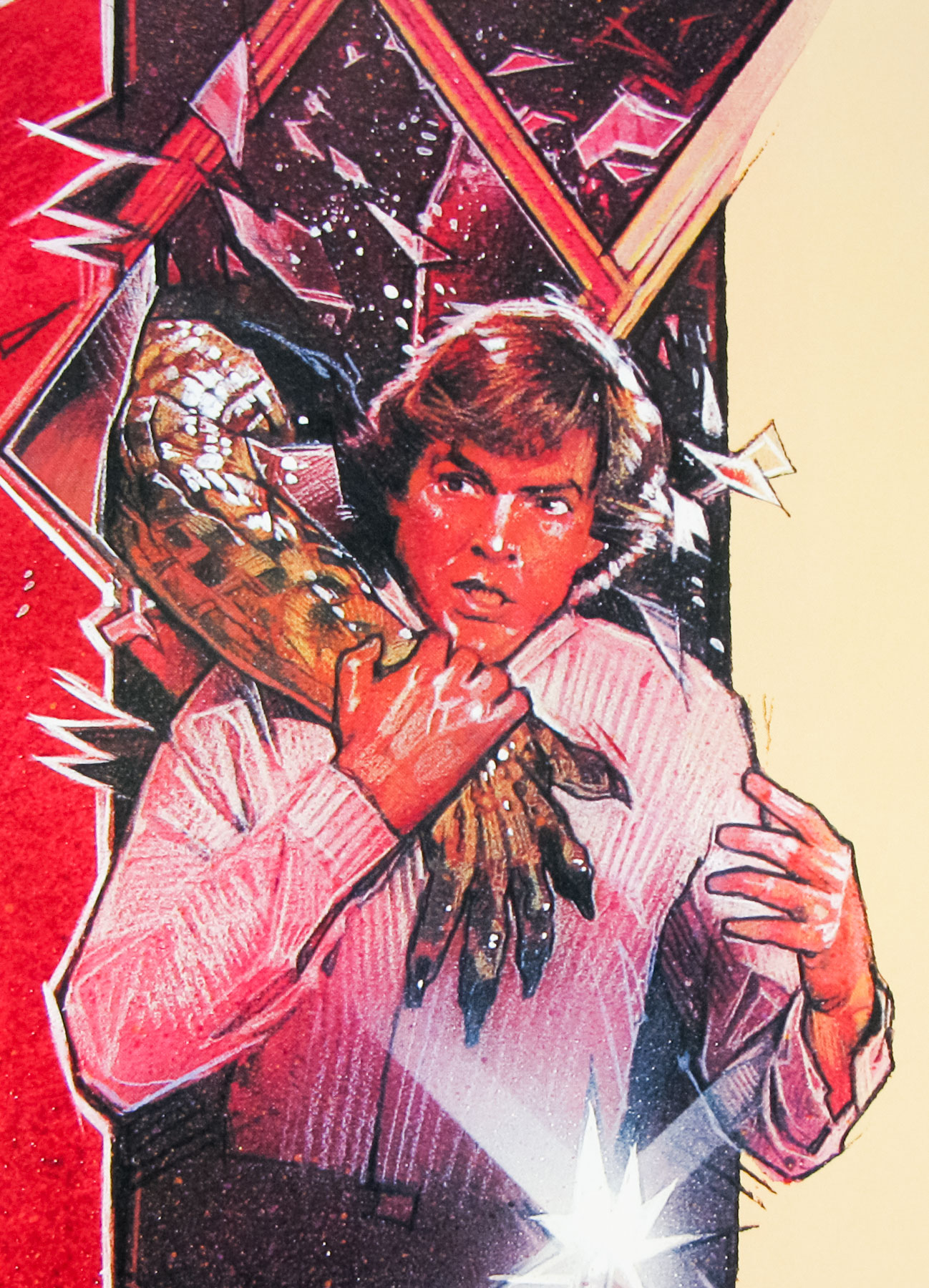
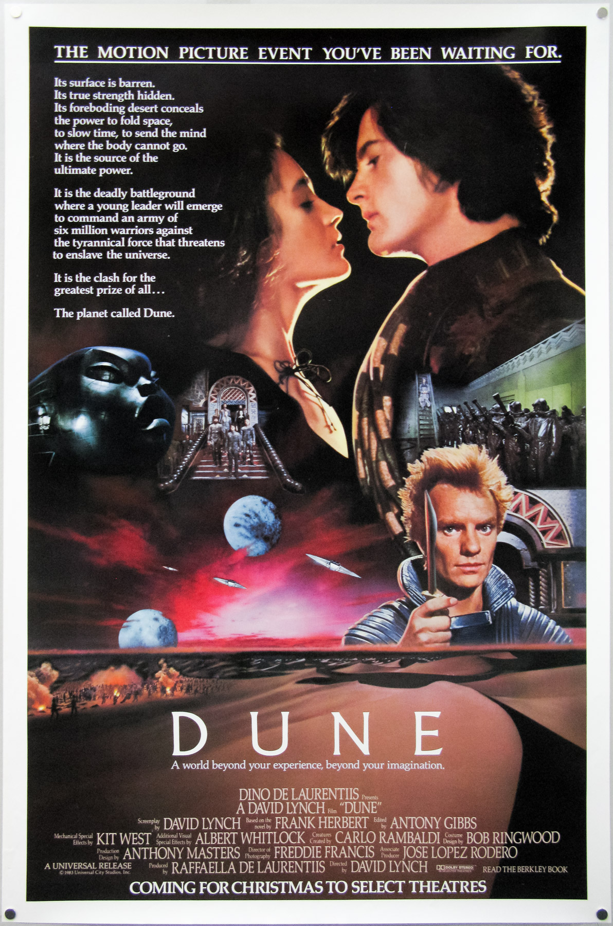
The British quad for The Monster Club, designed and painted by Graham Humphreys
Hi Graham, thanks for agreeing to talk about the poster. First of all, is it true this was the first film poster you ever worked on?
Yes, although in retrospect it was perhaps a bit bit of a false start!
How did you get involved with it?
The client was another random name on a list of people I went to see whilst I was starting out (film distributors, etc) and within two weeks of showing them my folio (my college folder, one of those basic cardboard versions tied by string!), this project turned up. I can’t remember who the company was – though they were one of the big distributors and it was at a time when everything was ‘in house’, ie. they had their own design studio.
What kind of brief were you initially given?
They called me in for a meeting and showed me a series of 35mm transparencies (pre-digital of course) and a drawing of the layout required, which specifically featured a title treatment that had to be copied. So my illustration was merely to flesh out the sketch to full artwork. I was offered the pick of transparencies which were then made into photographic prints that I could use as direct refrence. I had about a week and a half in which to deliver the painting.
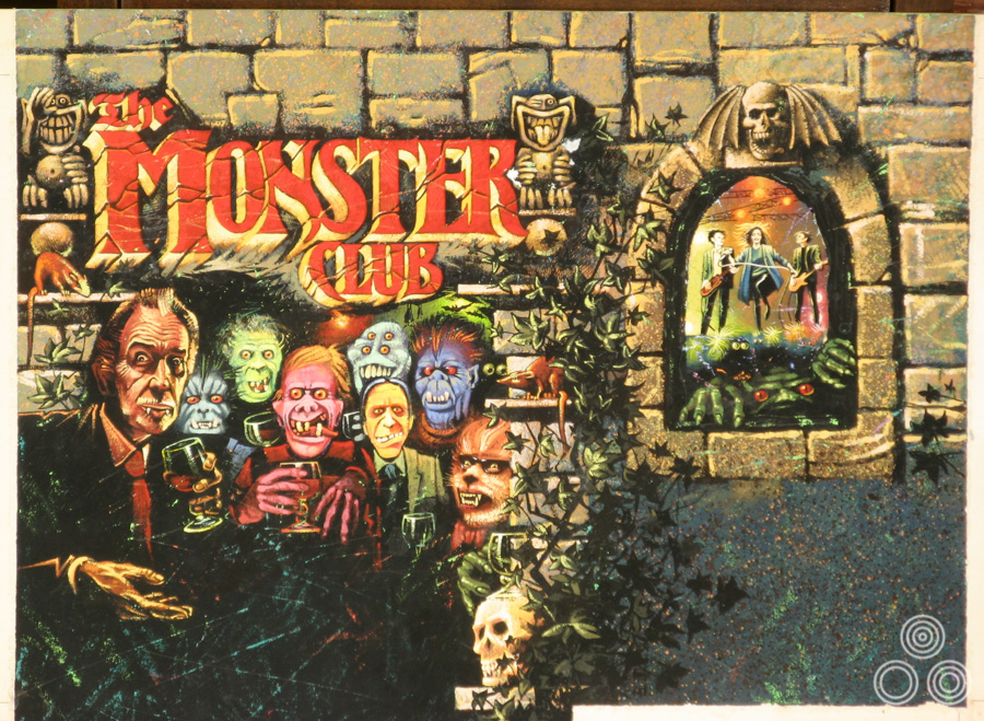
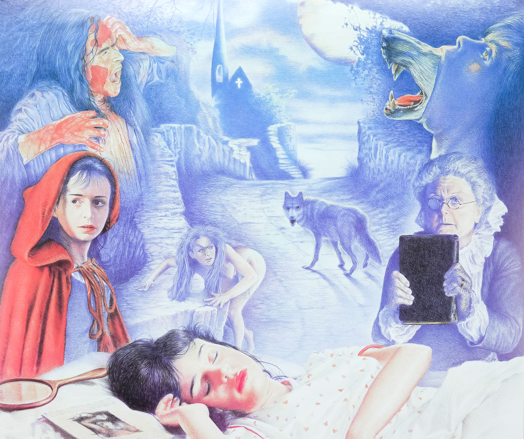
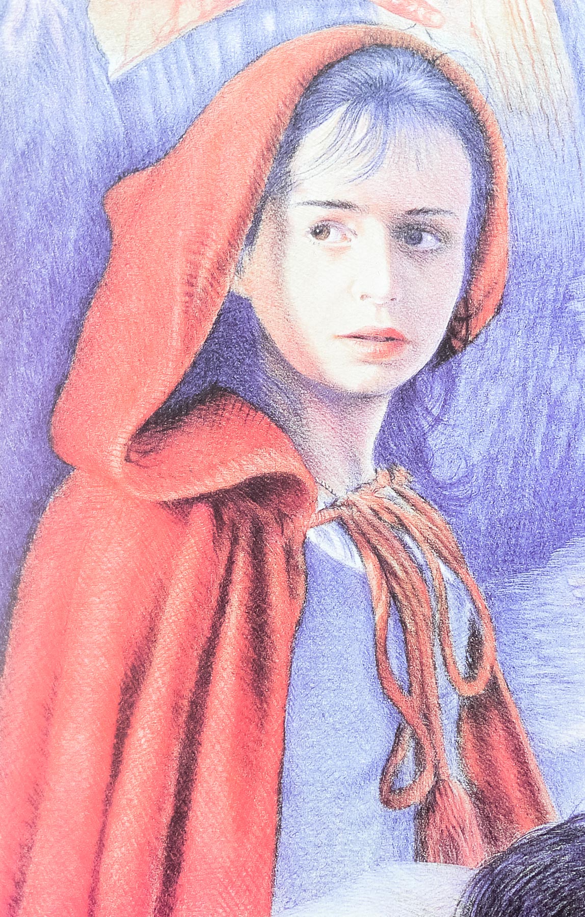
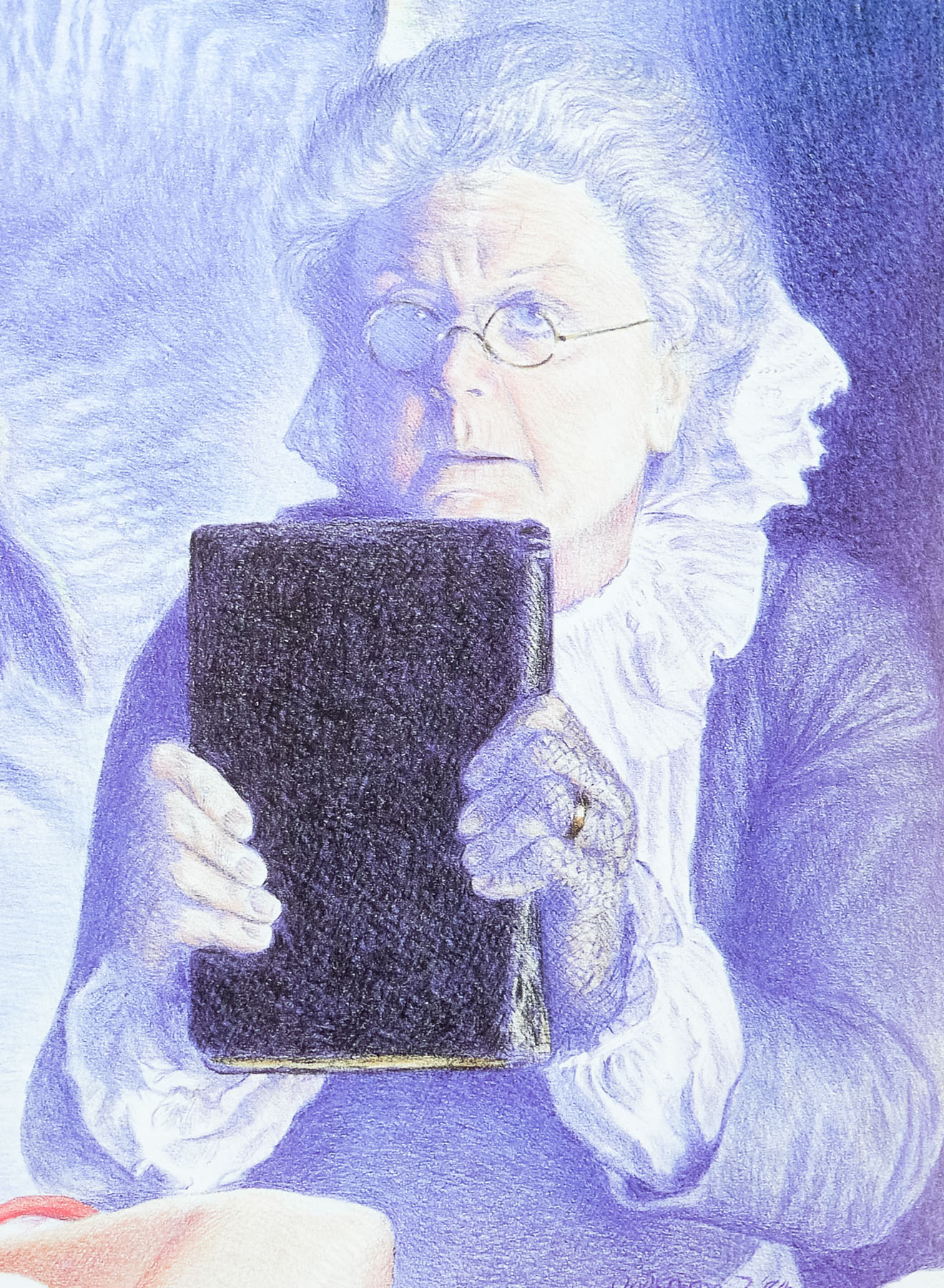
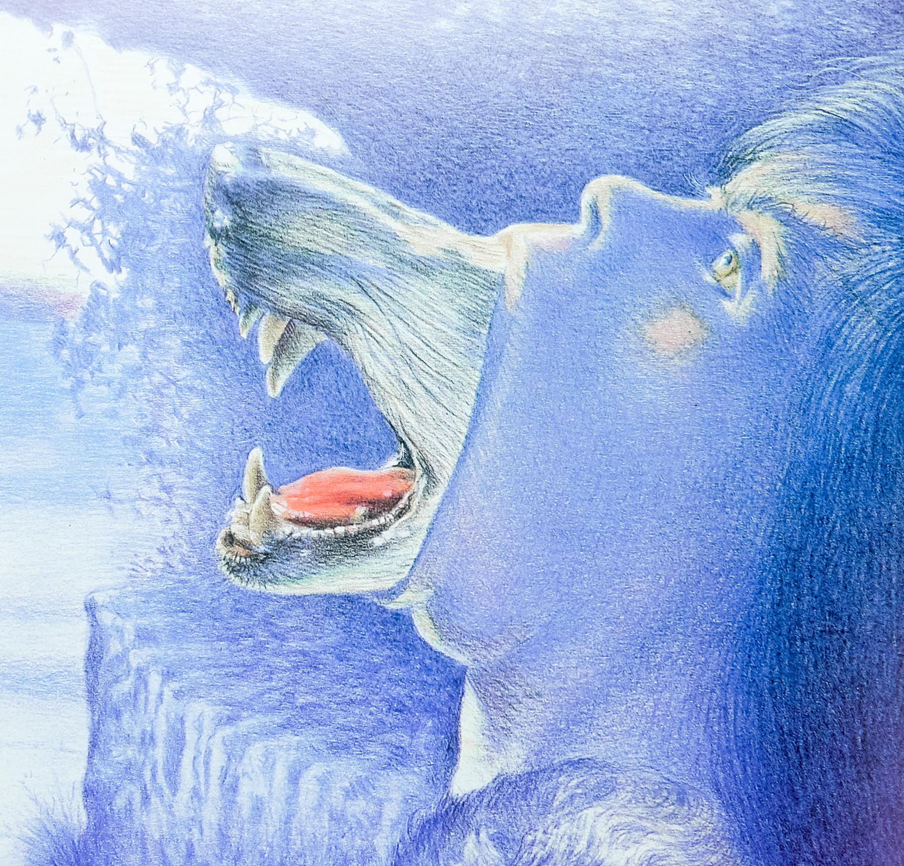
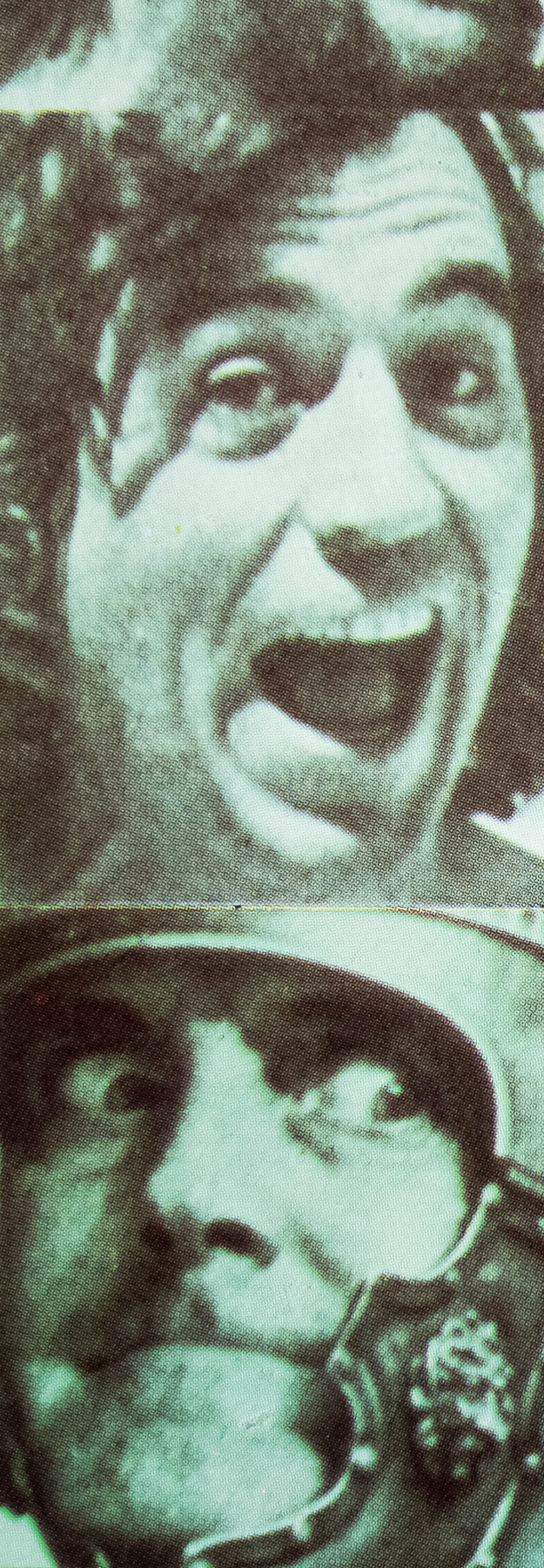
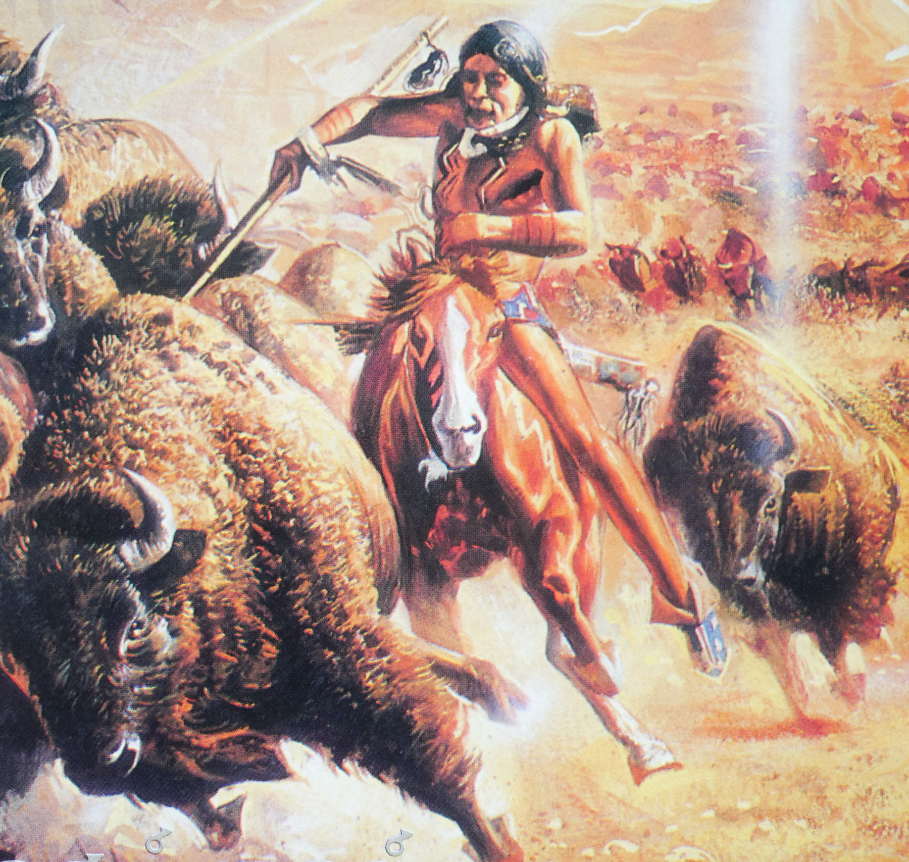
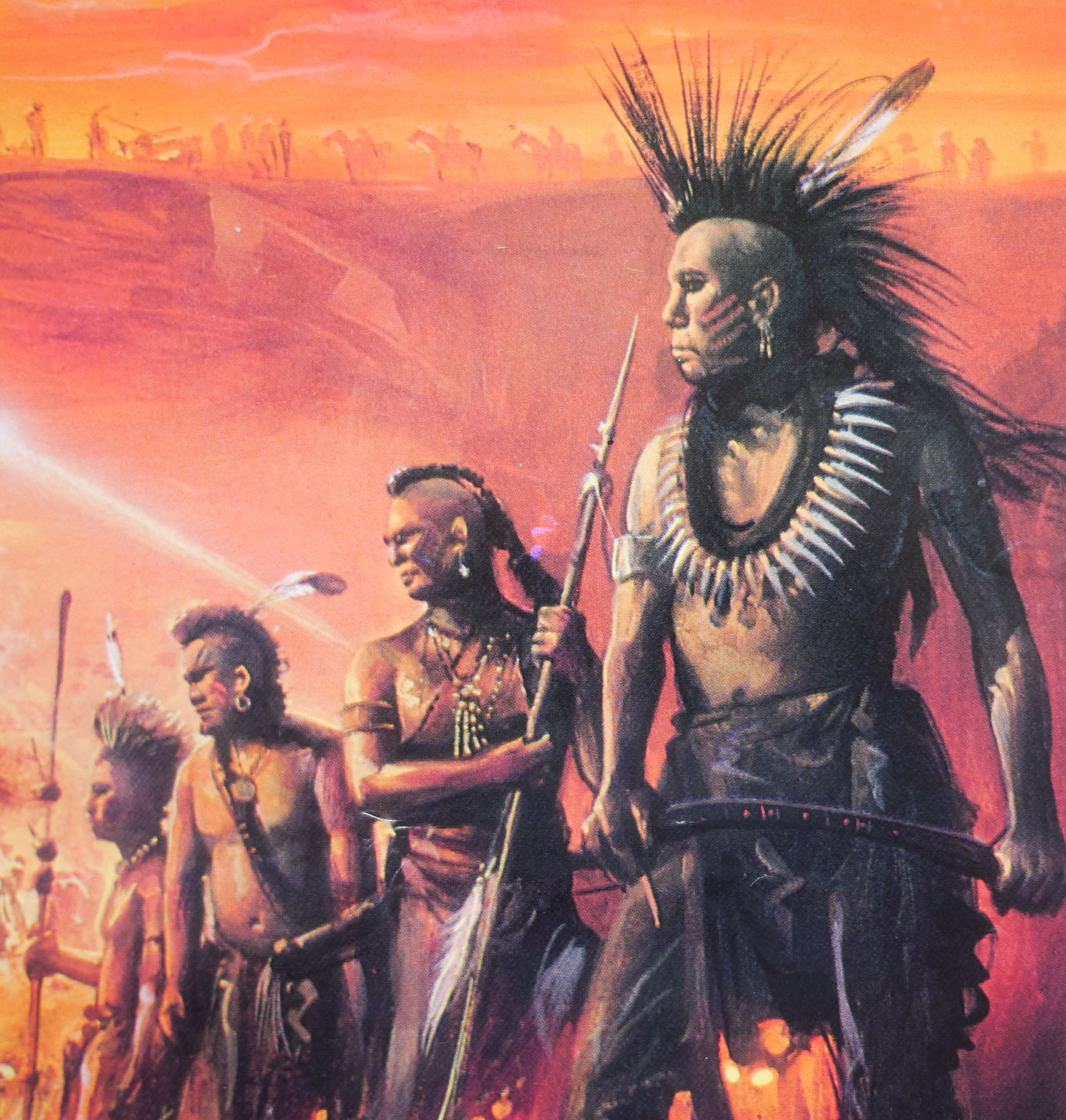
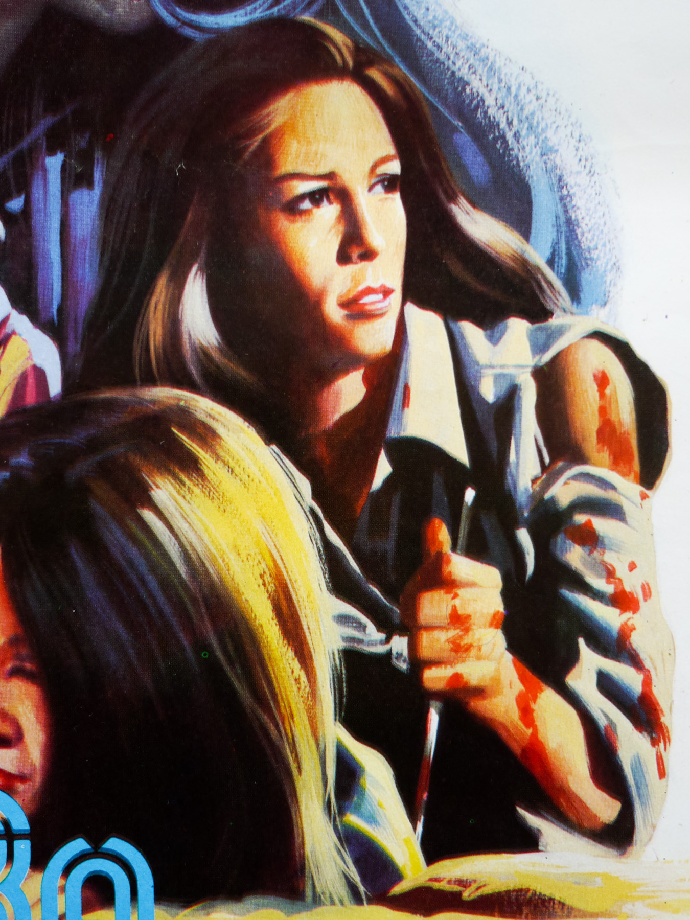
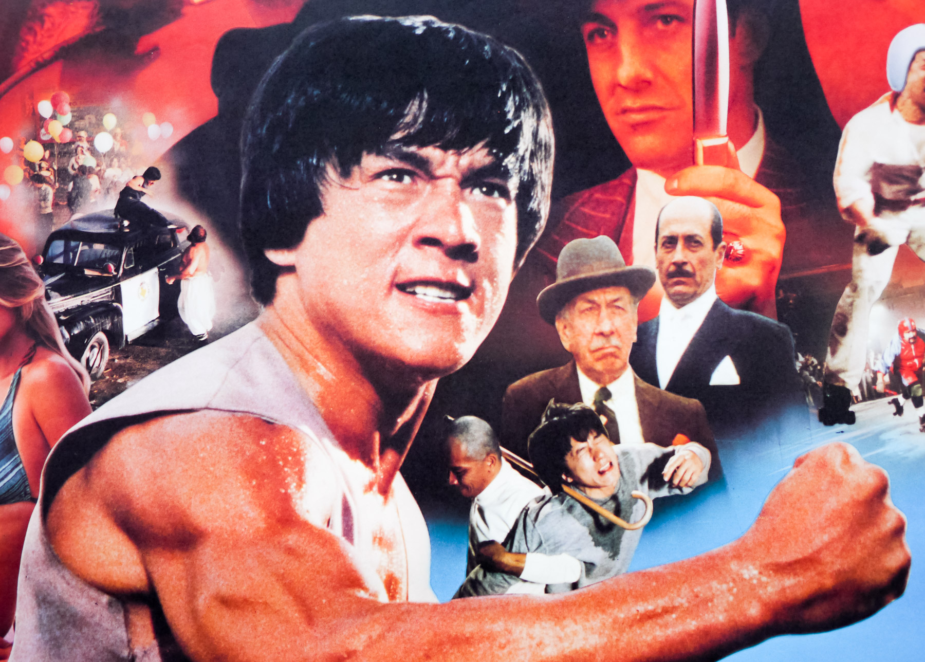
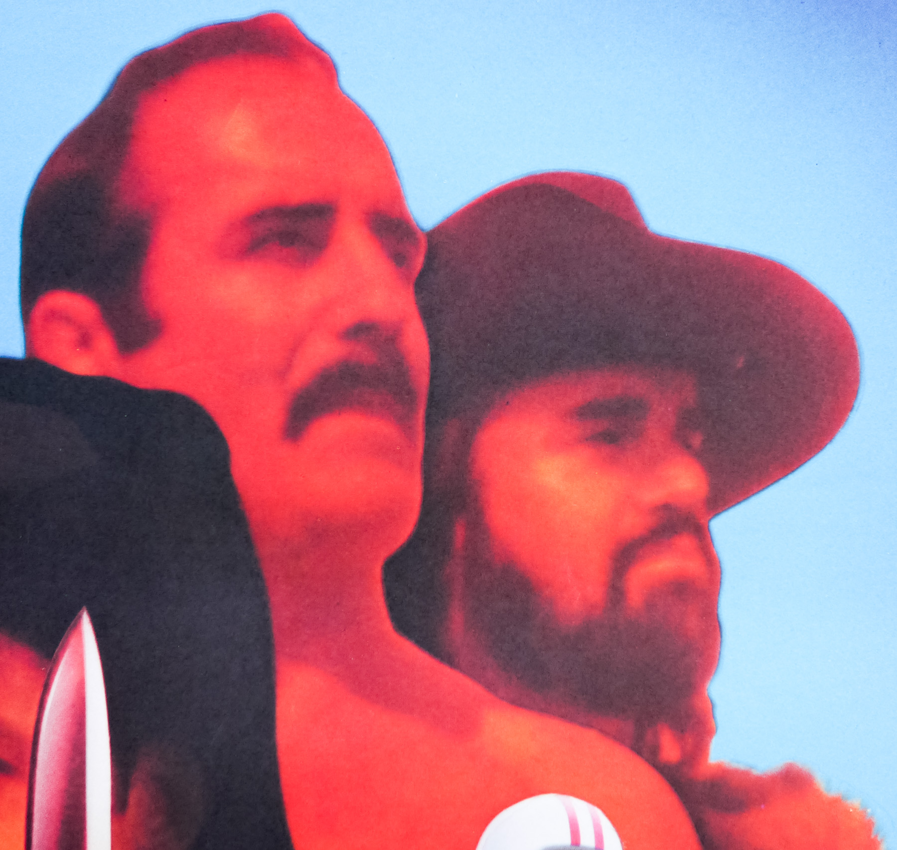
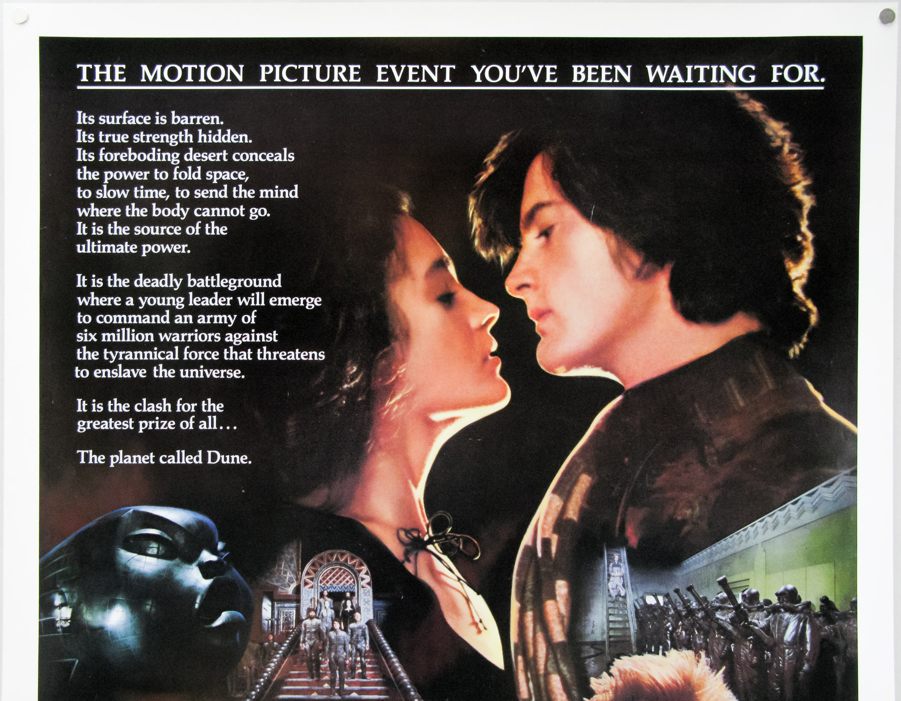
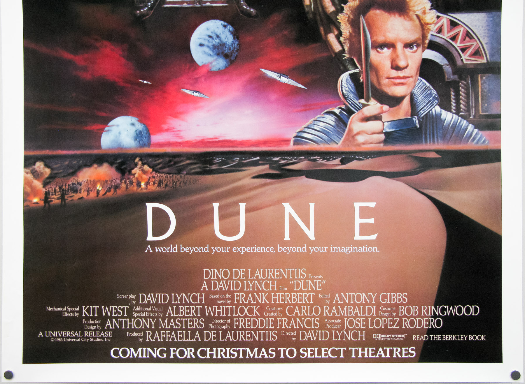
The British quad for The Monster Club, designed and painted by Graham Humphreys
I understand that the first version of the poster was rejected – what did it look like compared to the final printed version?
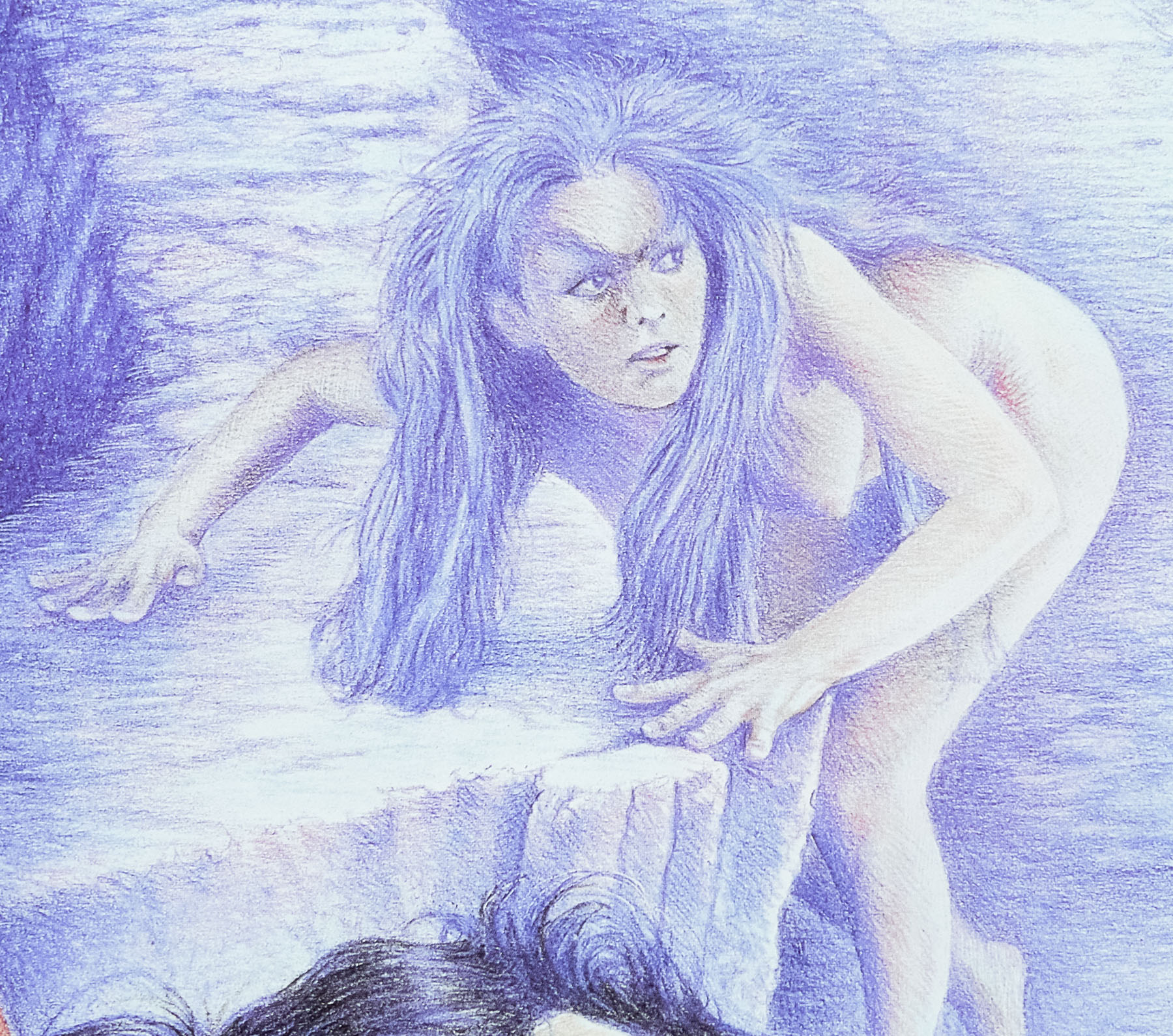
My original version had blue hues to give it a midnight feel. I spent time carefully making the Vincent Price portrait as true as possible. I took a full week to complete the painting working exclusively on the project. A few days after delivery I had a phone call informing me that it had been rejected and would I come in for a meeting. Apparently it was considered to ‘adult’ and ‘scary’. It had been hoped that kids would see the film as well, but the marketing people thought I had produced a ‘horror’ poster. It would have been futile to argue that a film called ‘The Monster Club’ starring Vincent Price and John Carradine, produced by Milton Subotsky, might already have appeared ‘genre’! However, the client, ‘being right’, were happy to let me repaint the illustration as ‘happier’ more colourful, daytime and ‘not scary’, but I had two days.
So I worked two days and two nights (including a visit from the client mid-way to check on progress) until I was a sleep deprived, hallucinating wreck. The painting was rushed and needed another two days, but the deadline was set. The job was delivered, approved and I got paid extra money and slept for a full 24 hours after.
What happened to the artwork for the first version of the poster?
I’ve been racking my brains and I can only conclude that I gave the original version to a friend who has since passed away and thus I will never see the painting again. We lost touch and apparently he became alcoholic and died penniless – I had no idea until recently but it’s a sad tale.
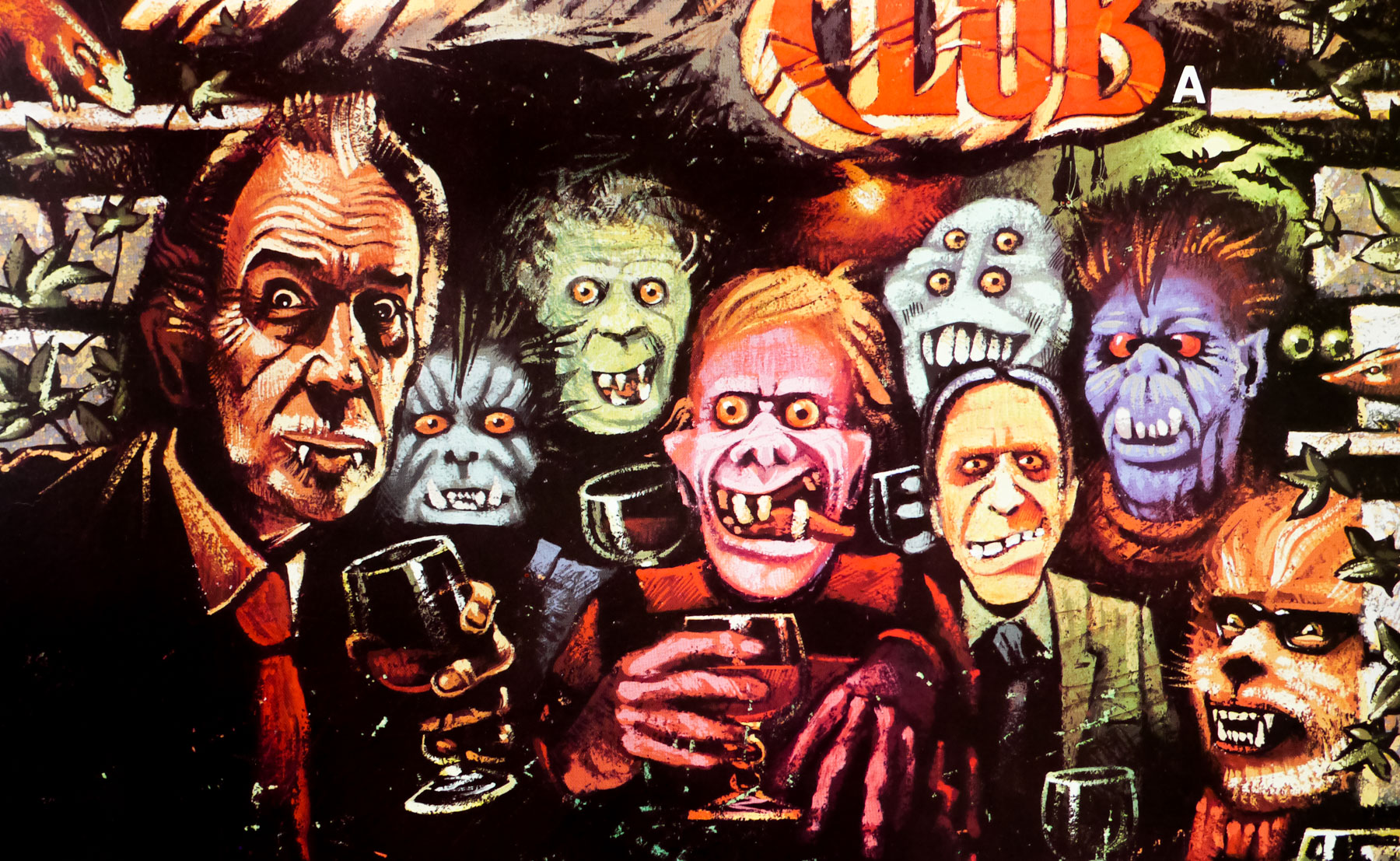
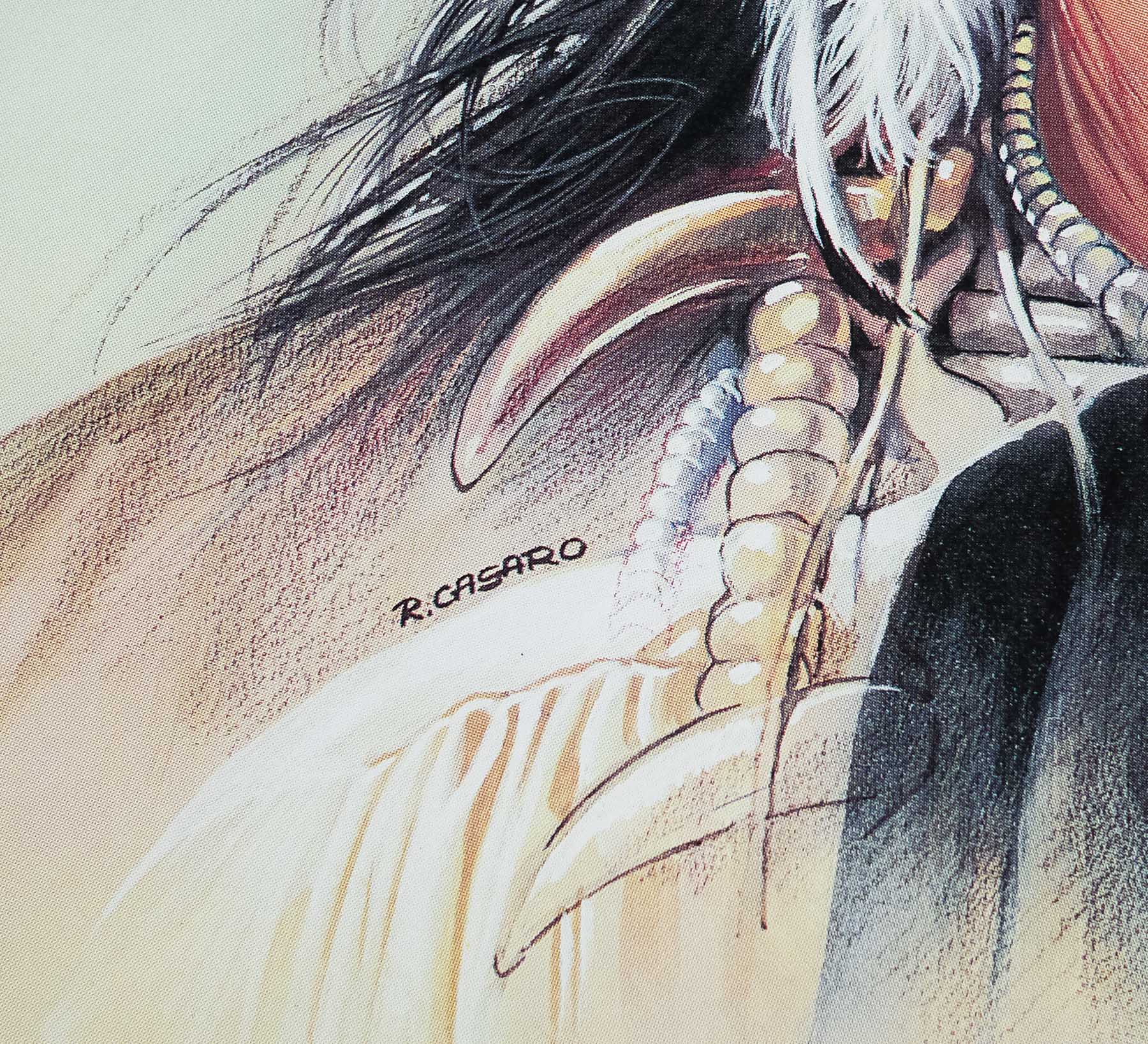
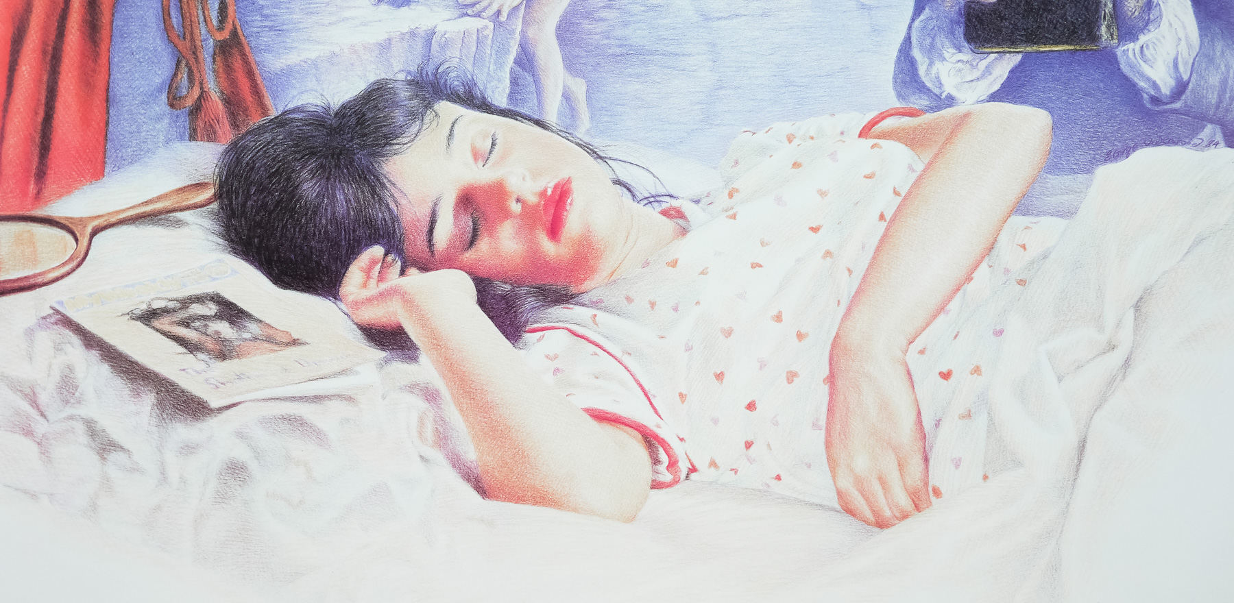
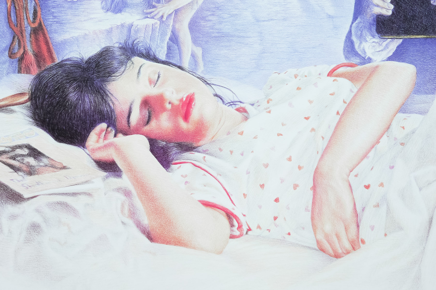
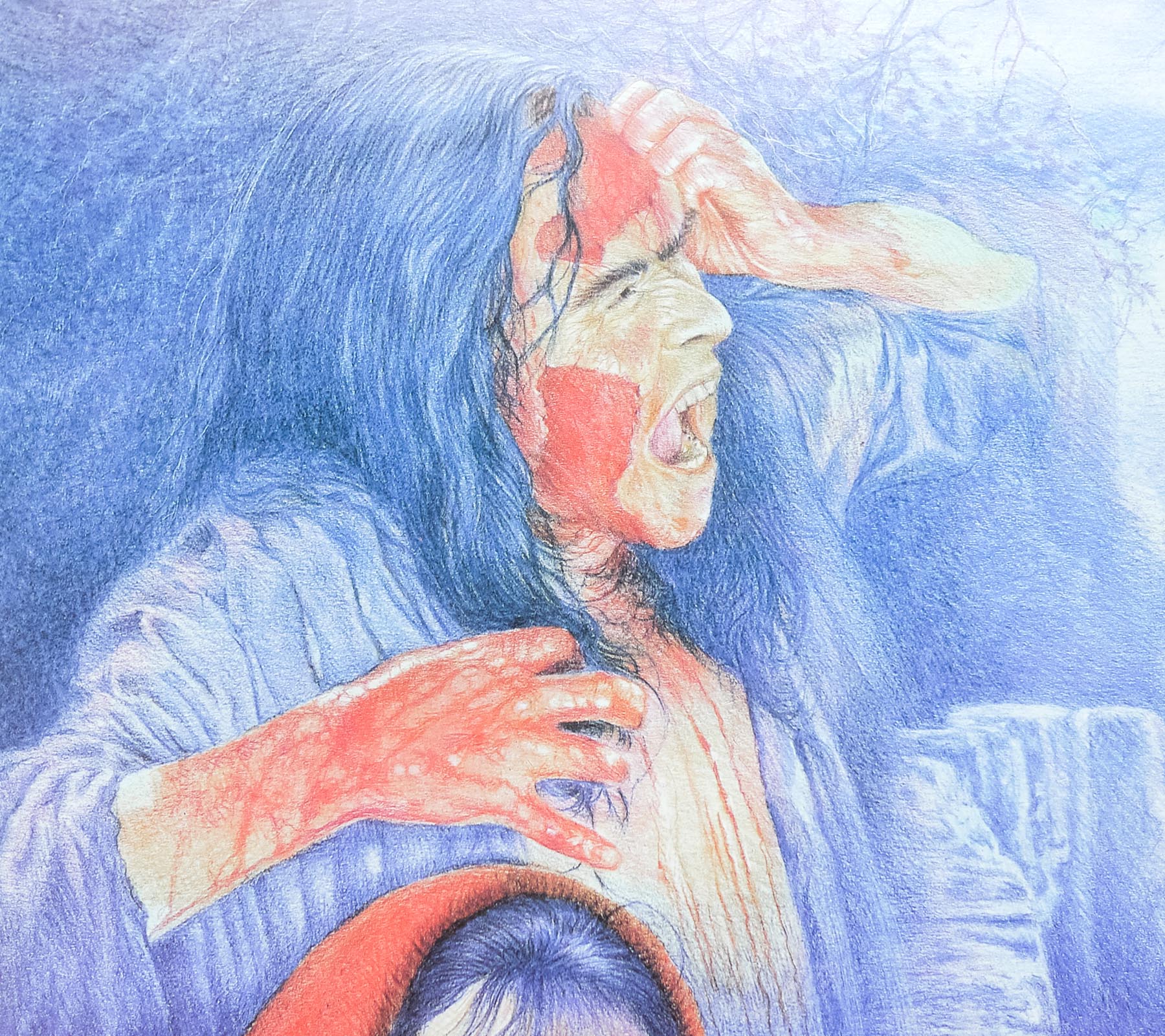
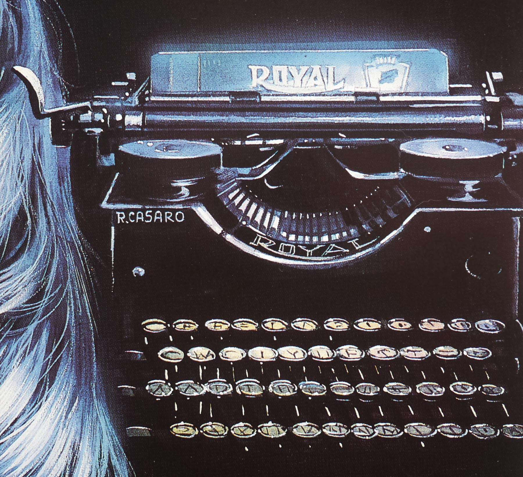
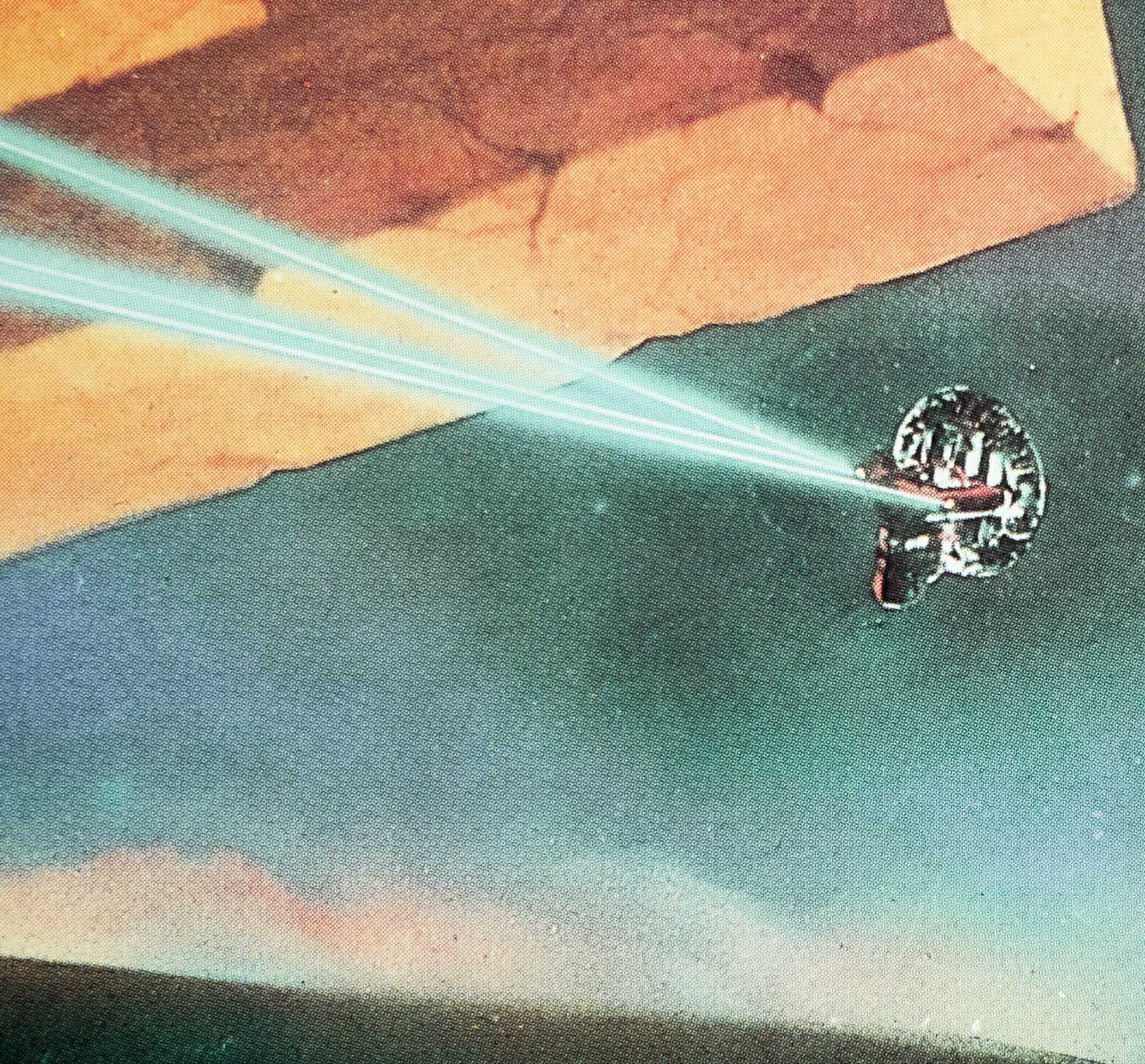
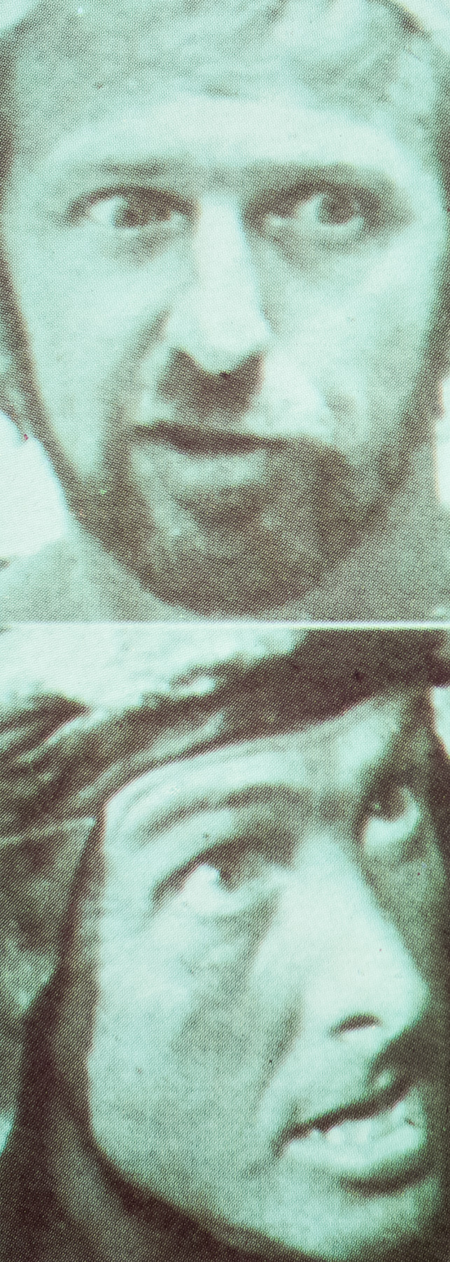
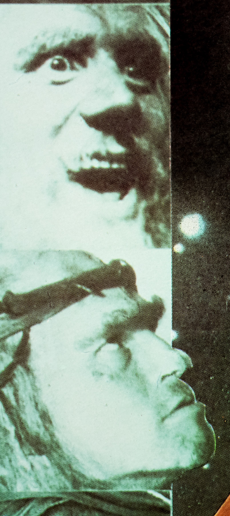
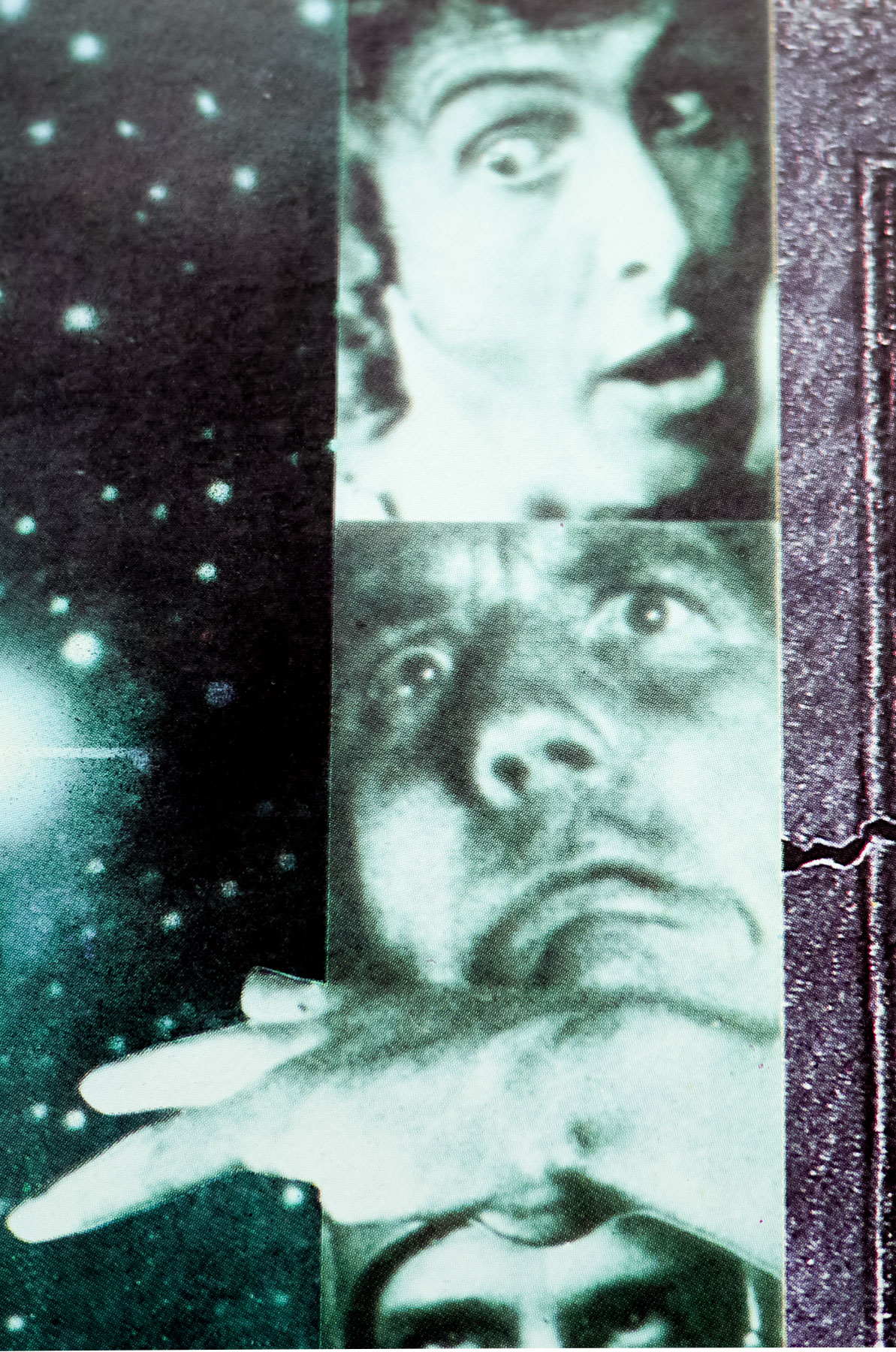
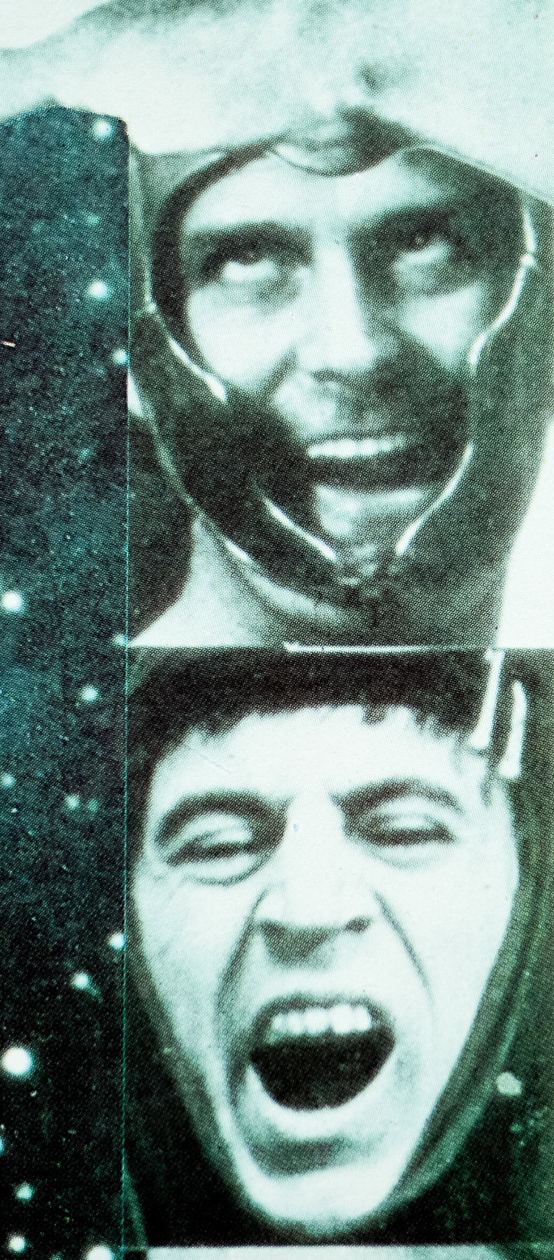
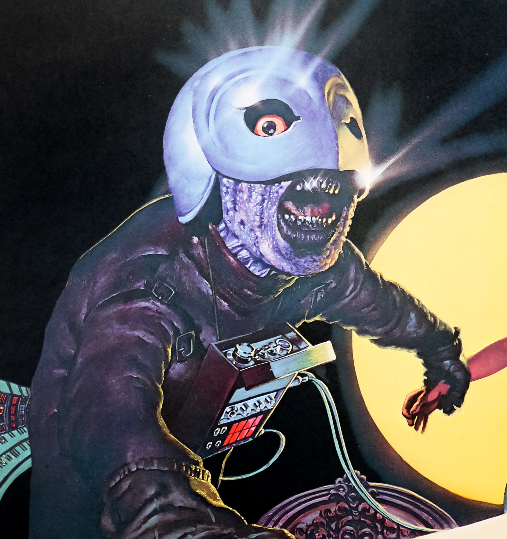
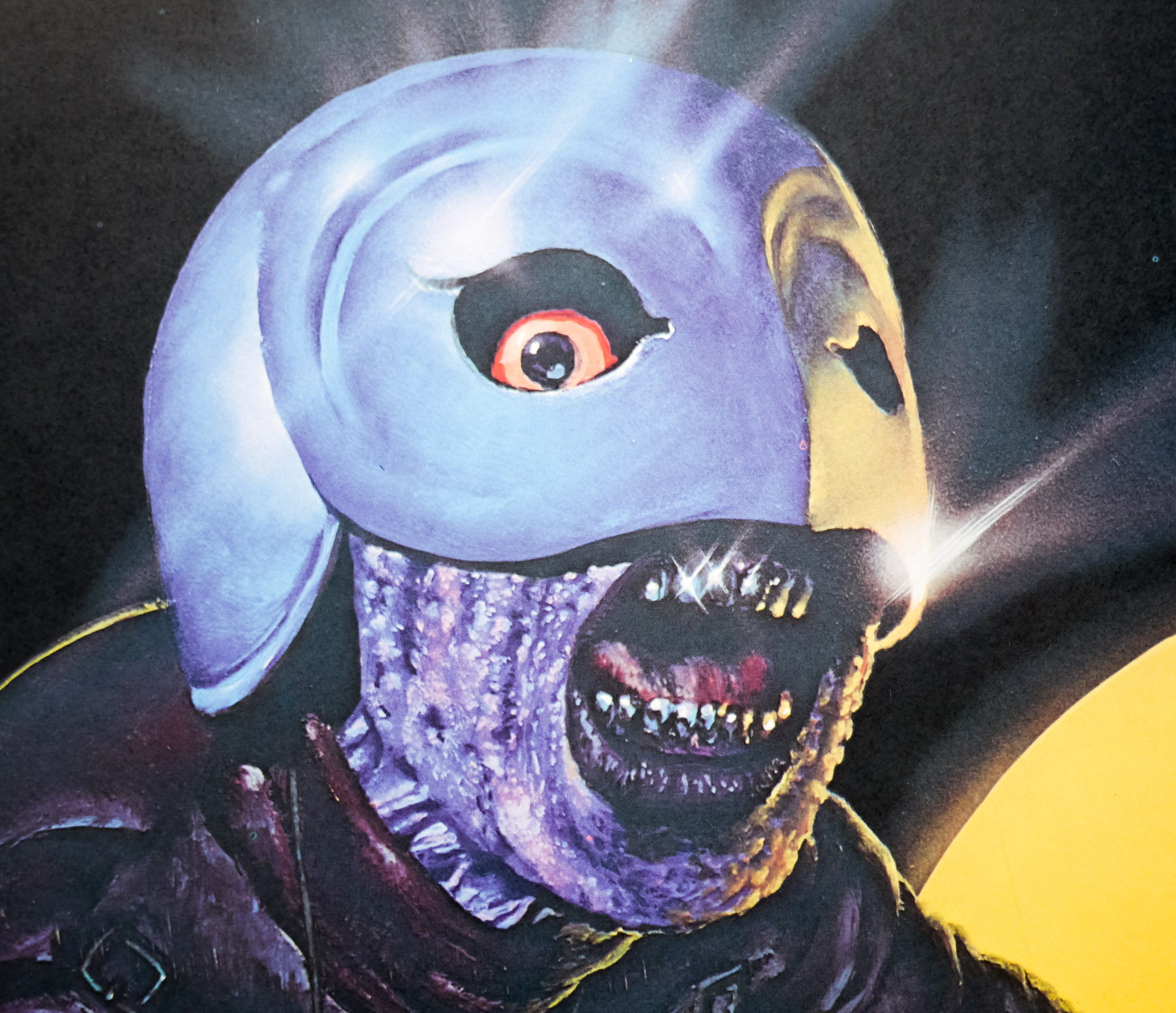
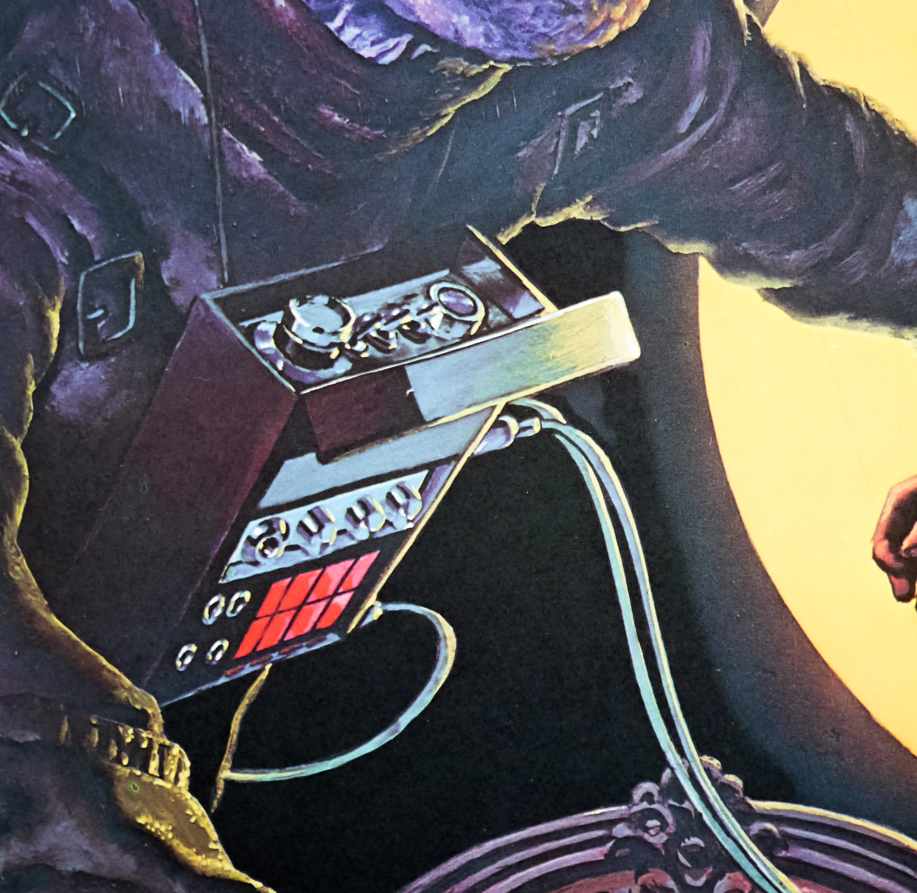
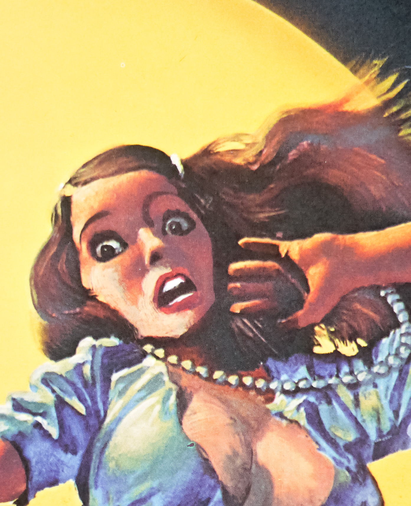
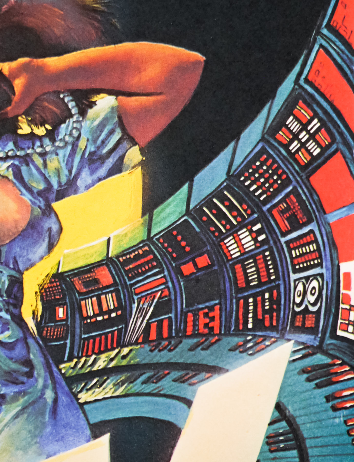
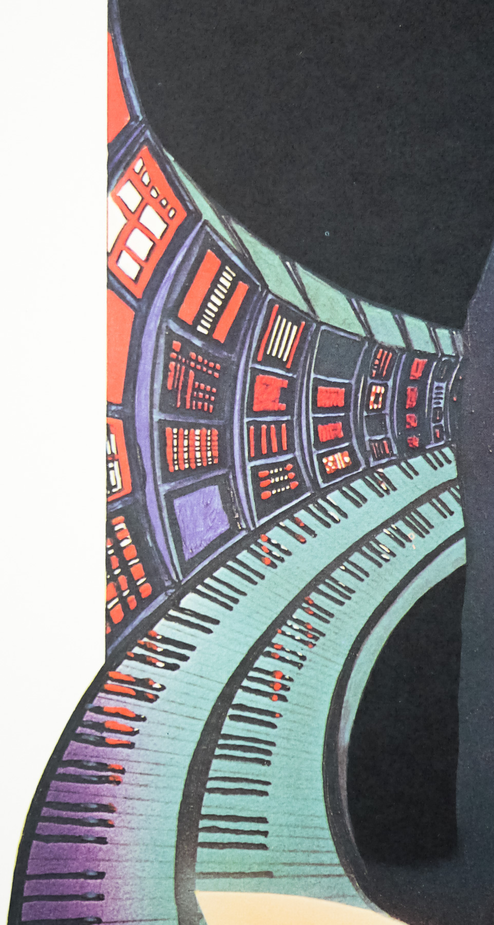
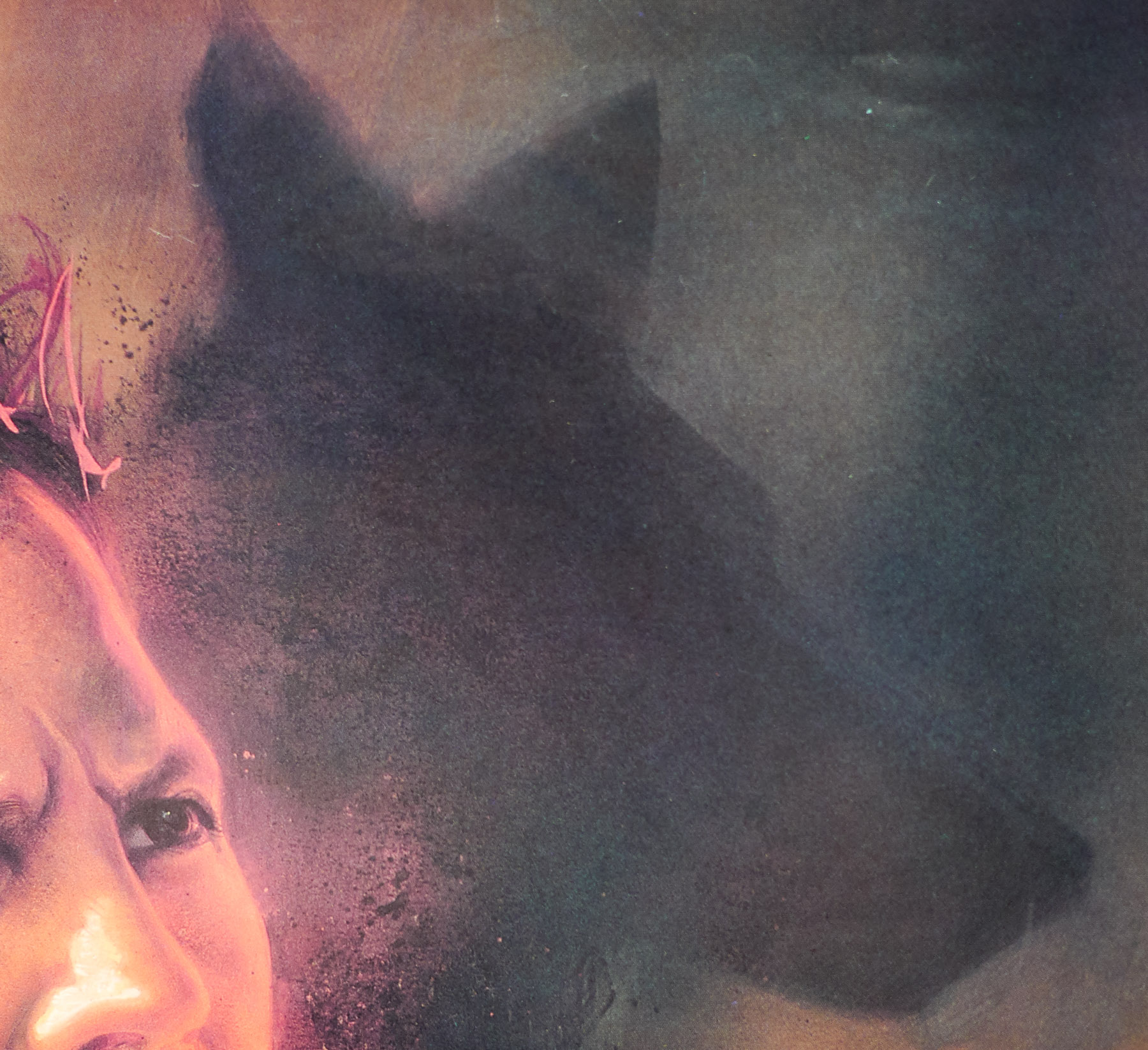
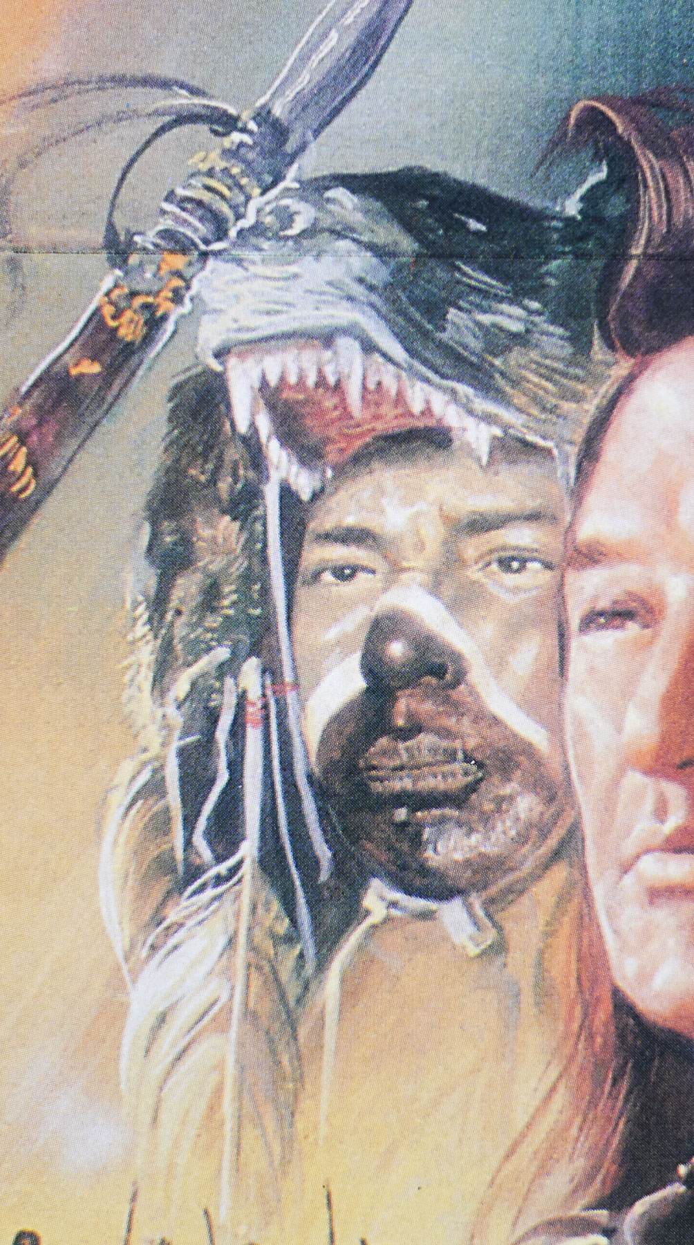
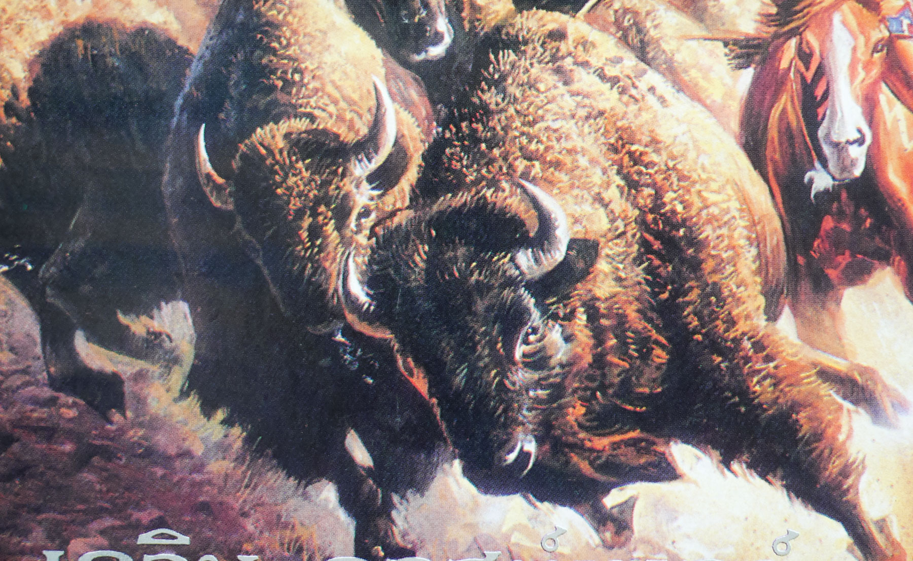
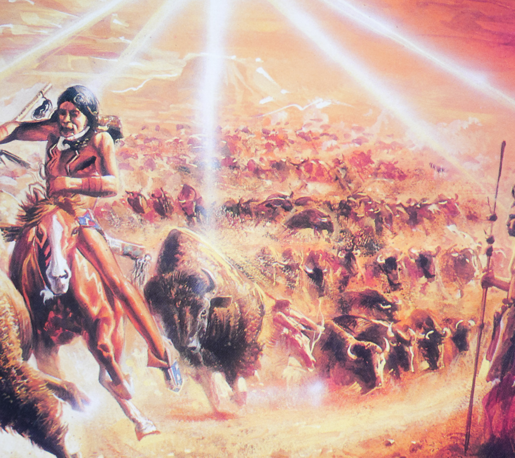
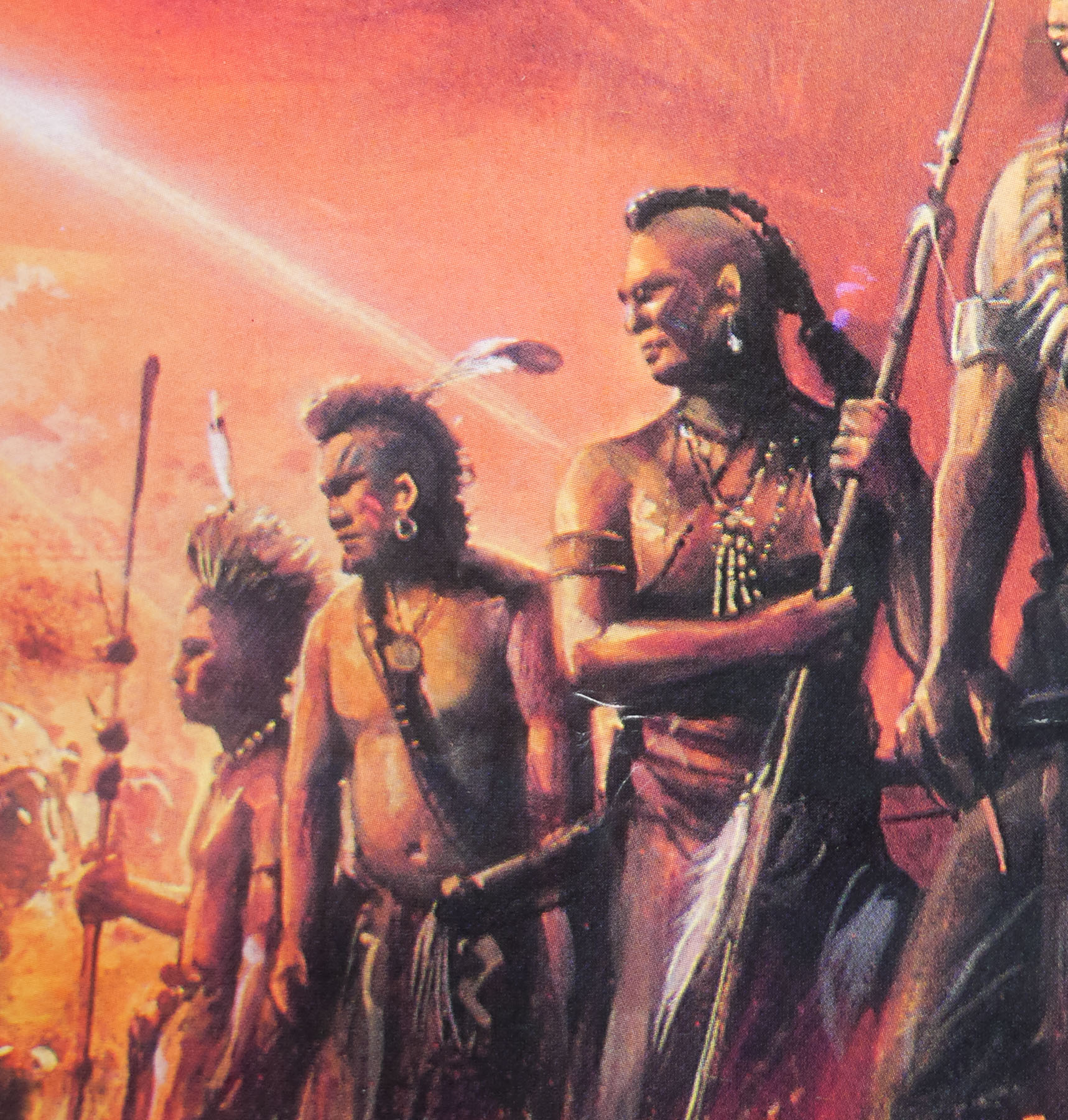
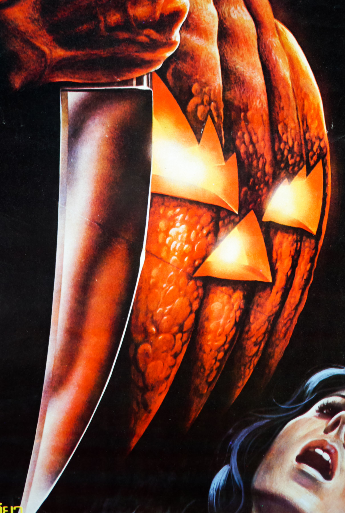
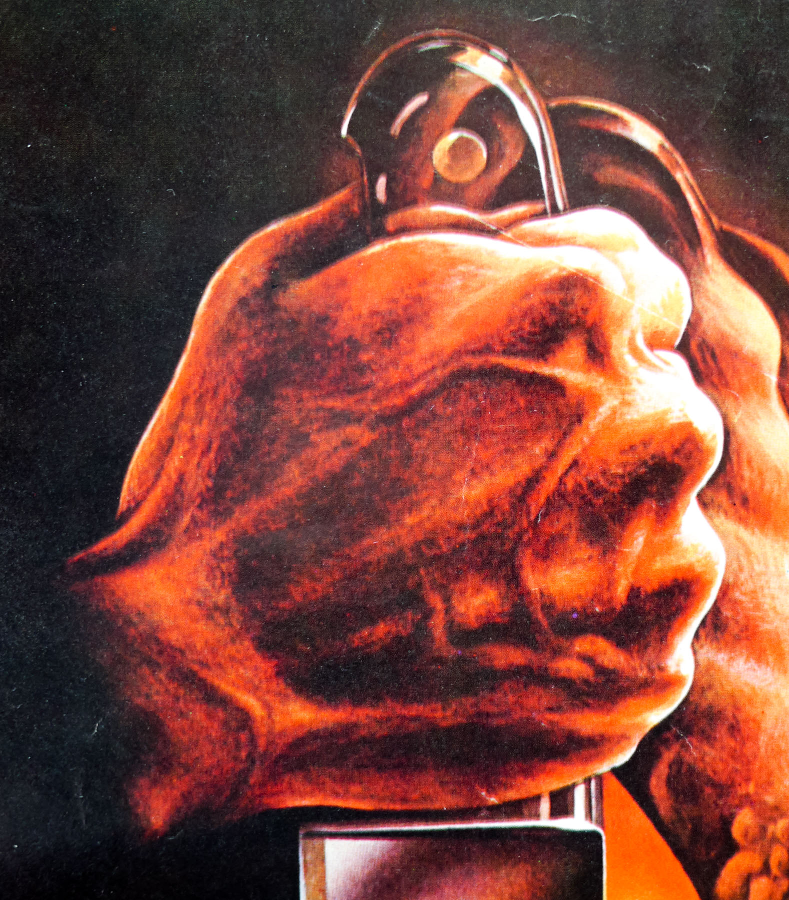
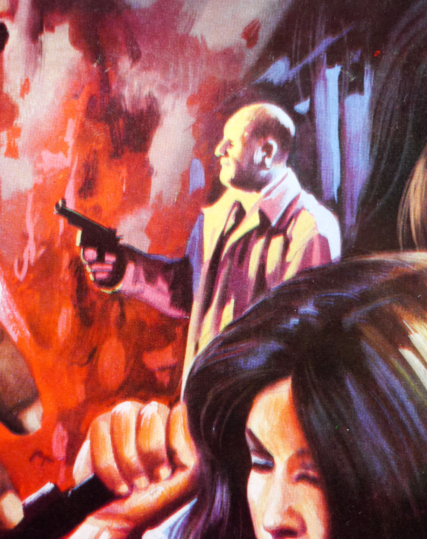
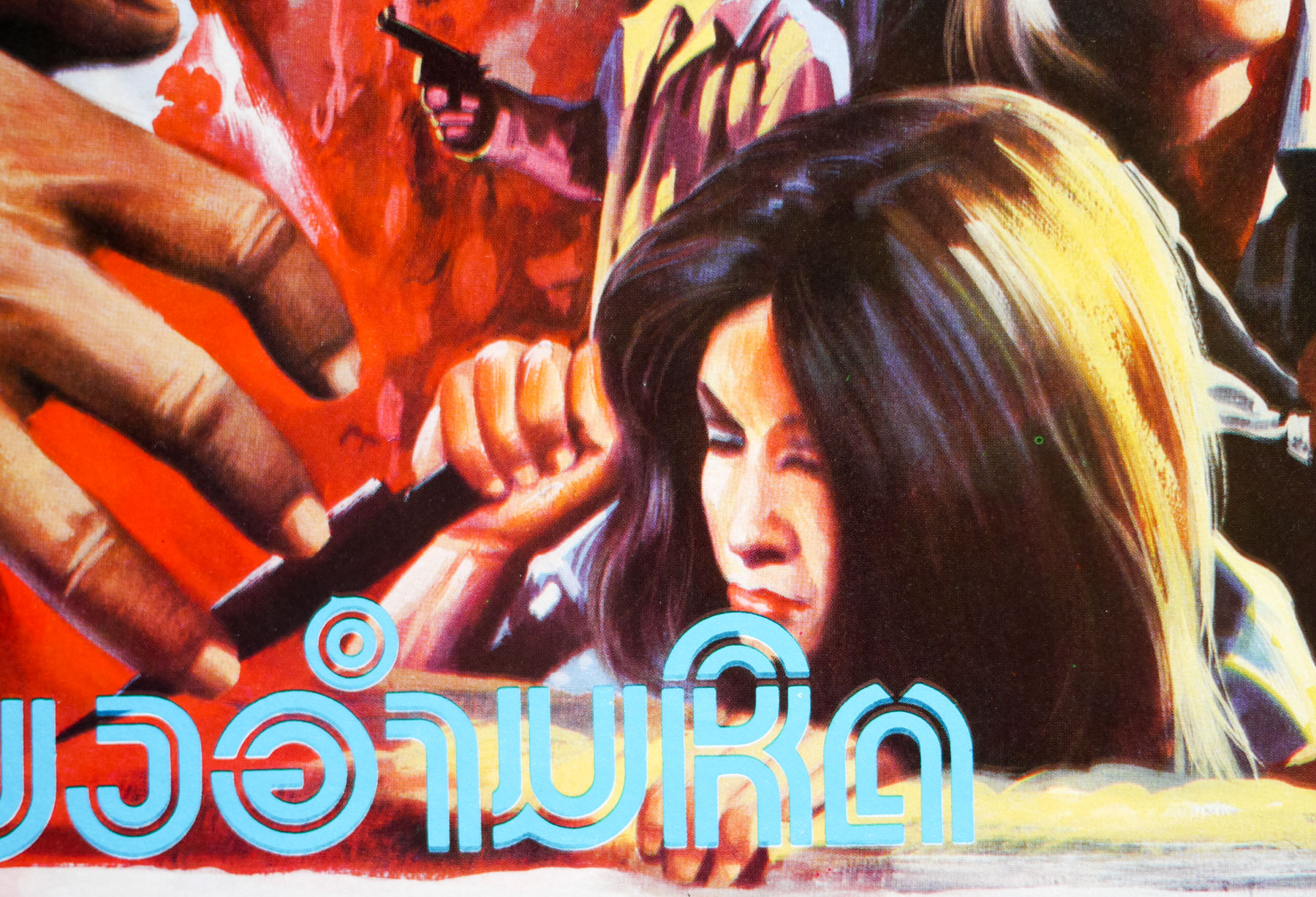
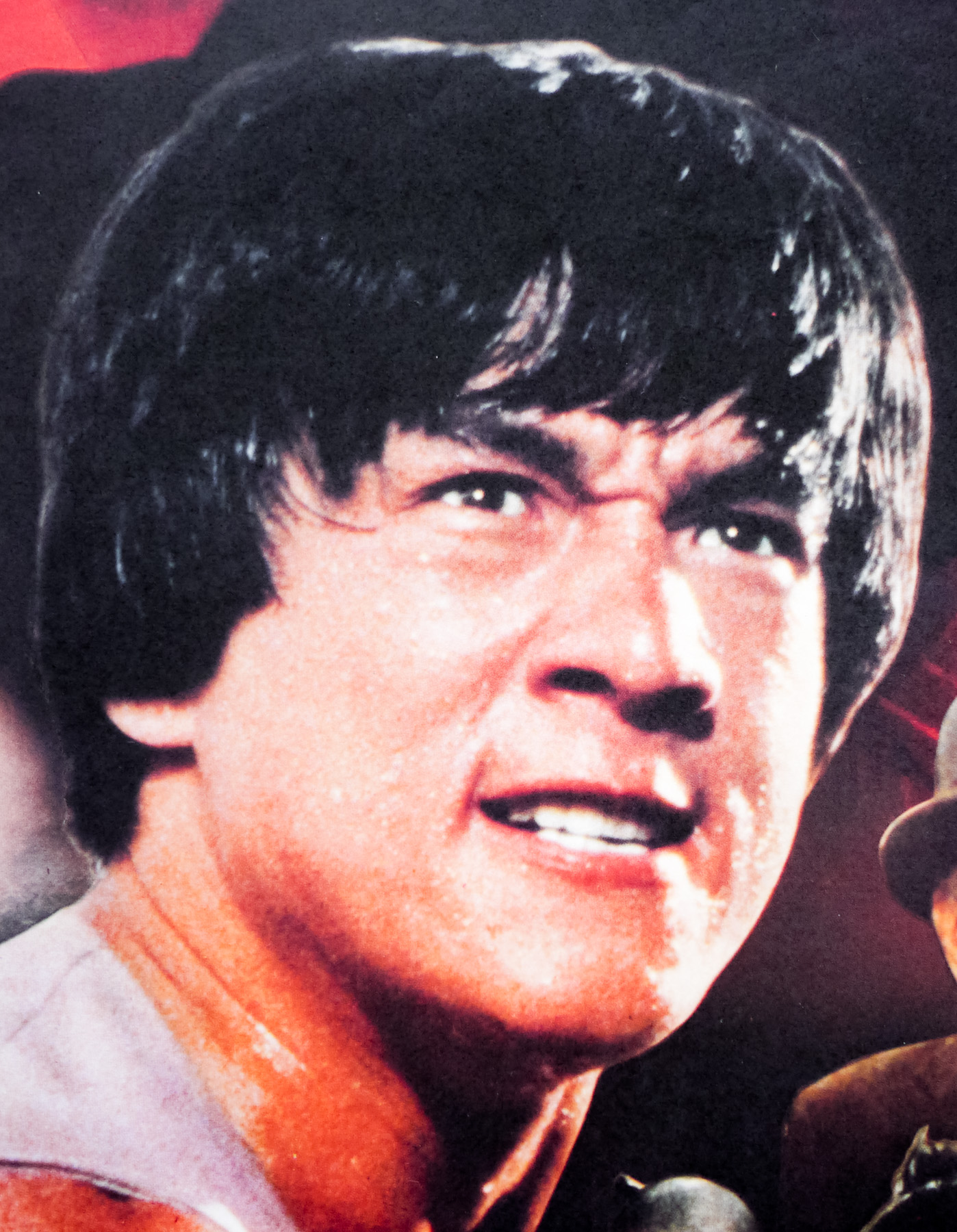
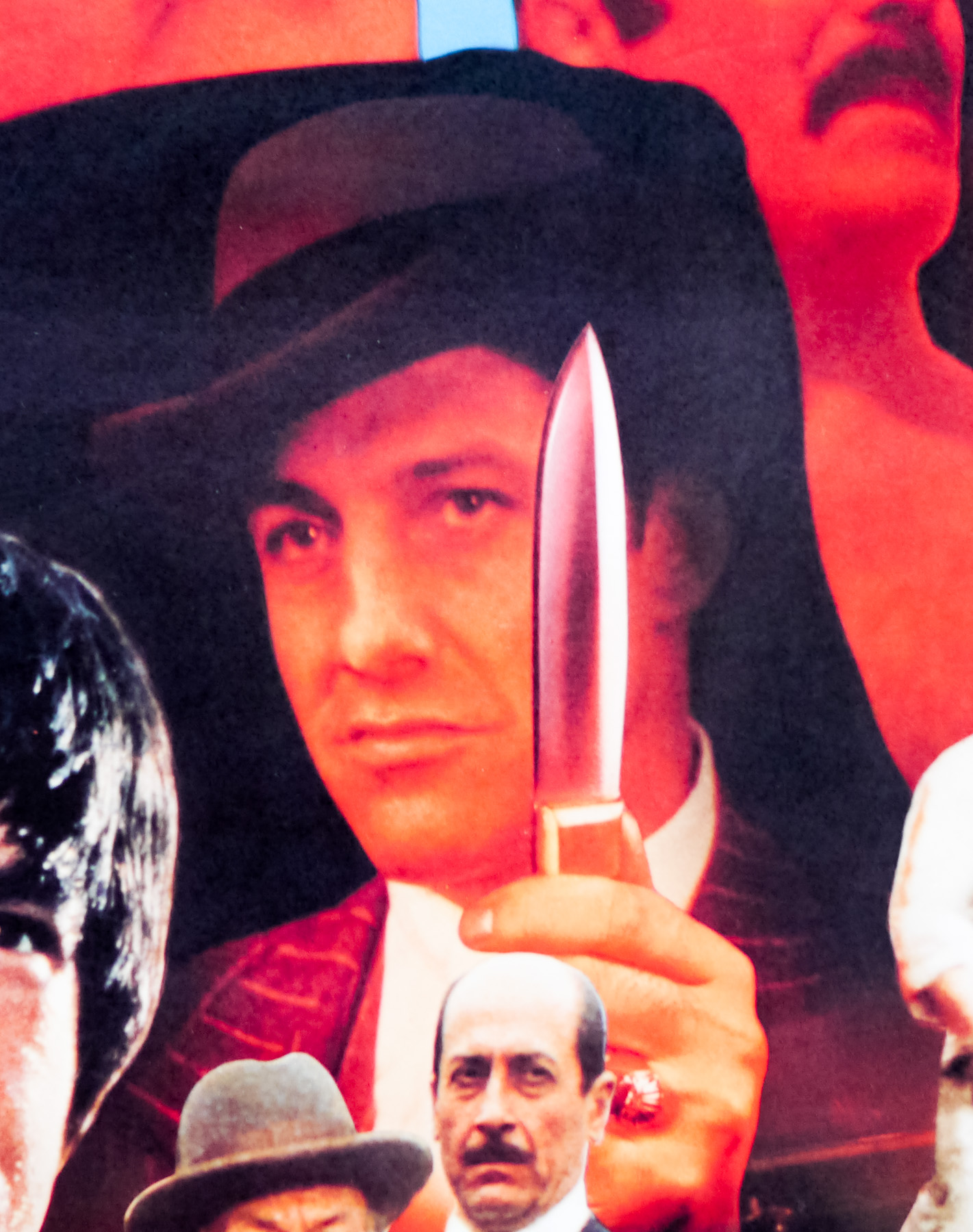
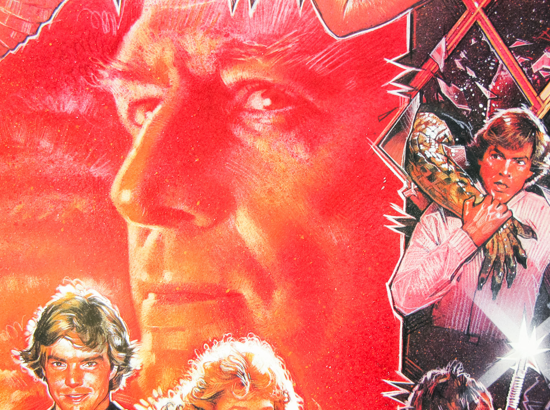
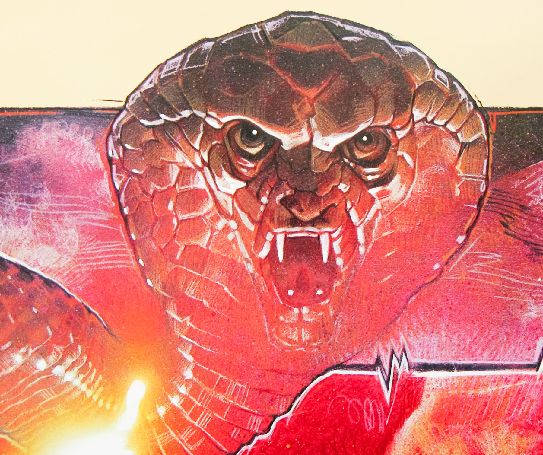
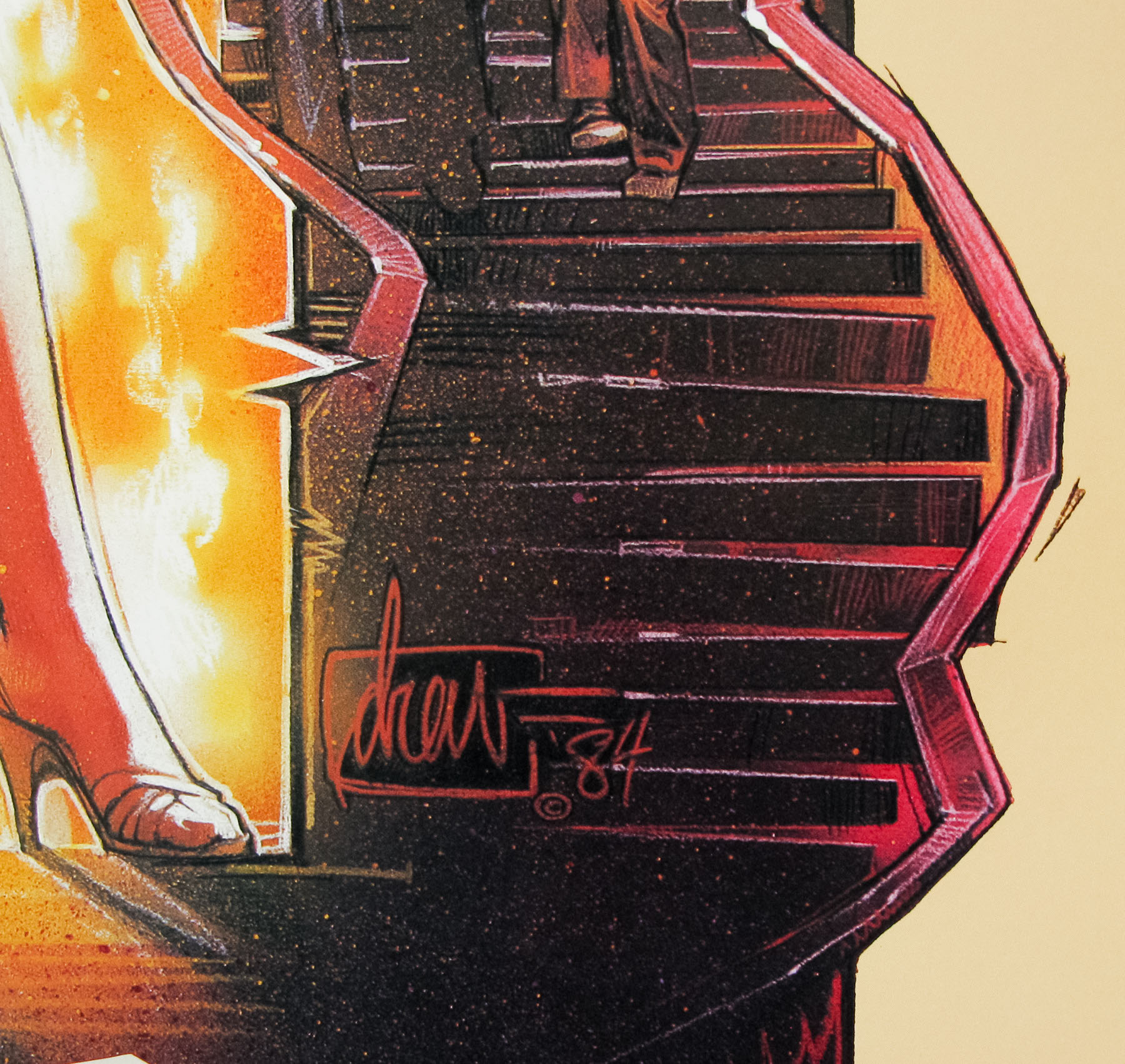
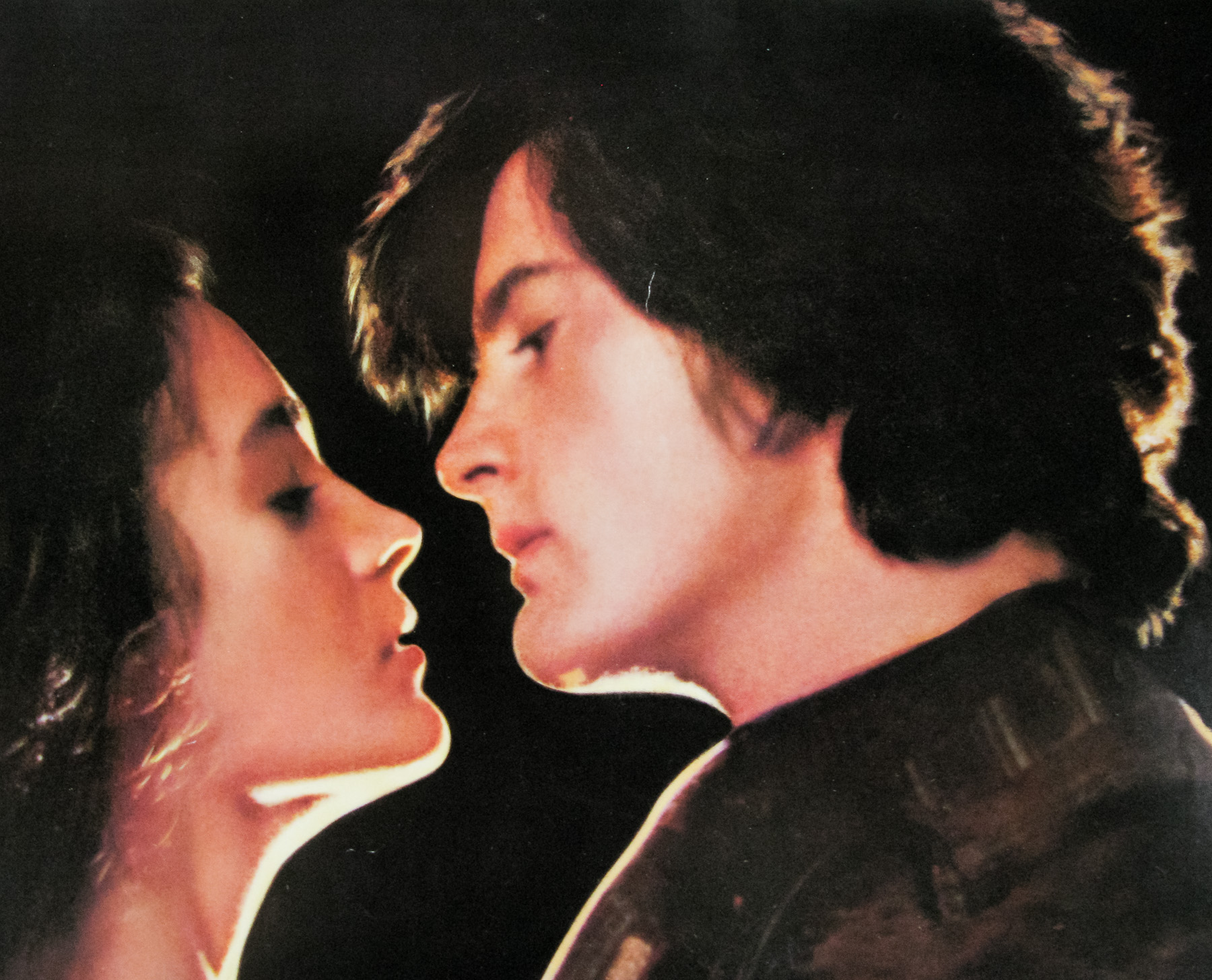
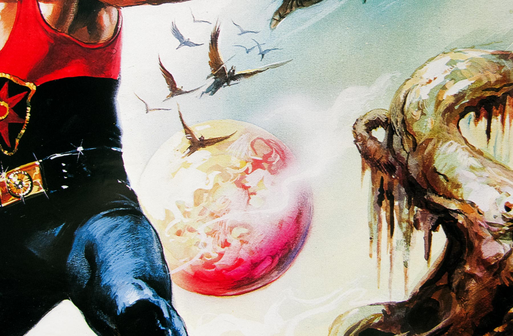
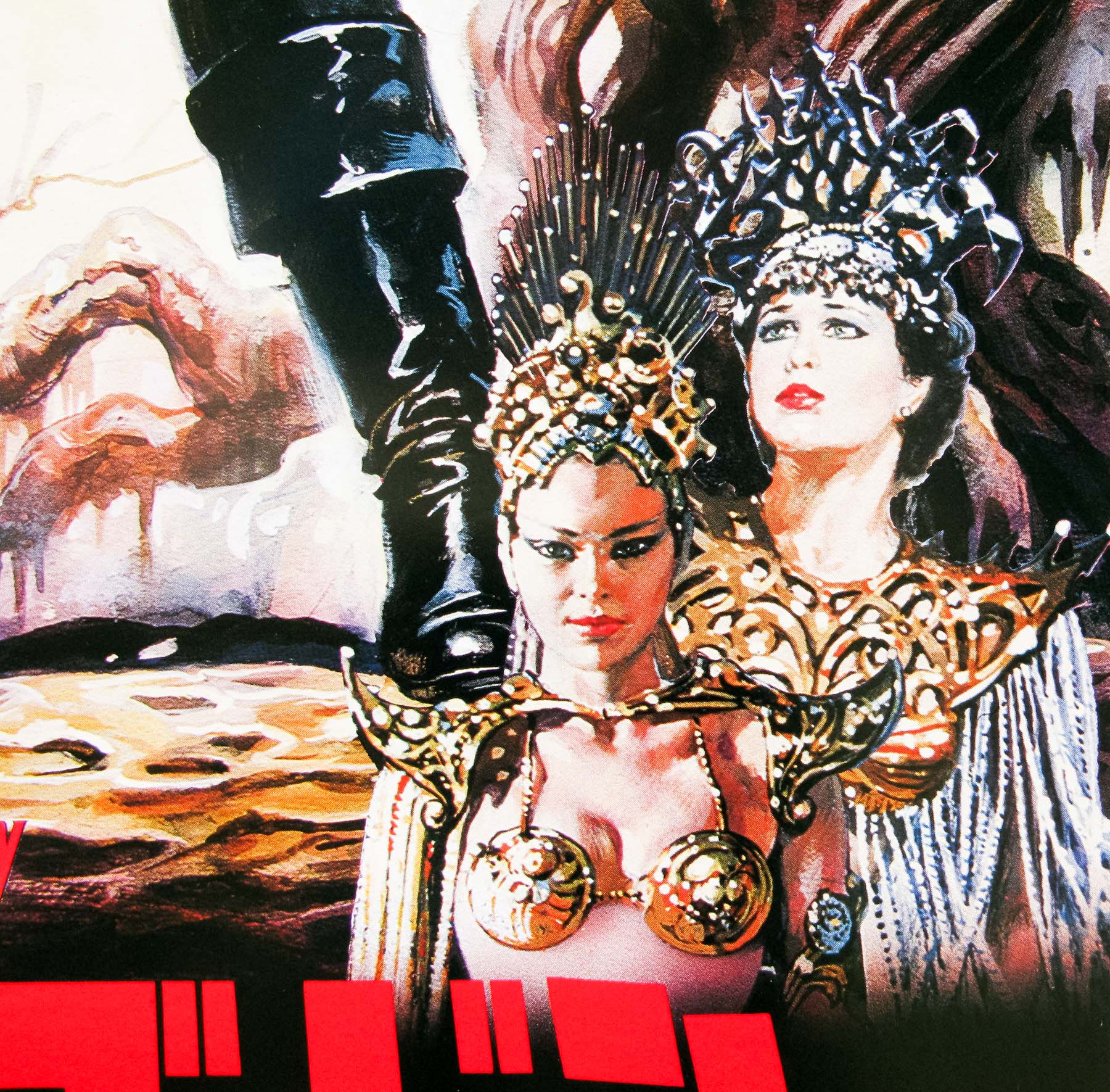
Close up detail of The Monster Club quad artwork by Graham Humphreys
Did you have fun painting the various creatures?
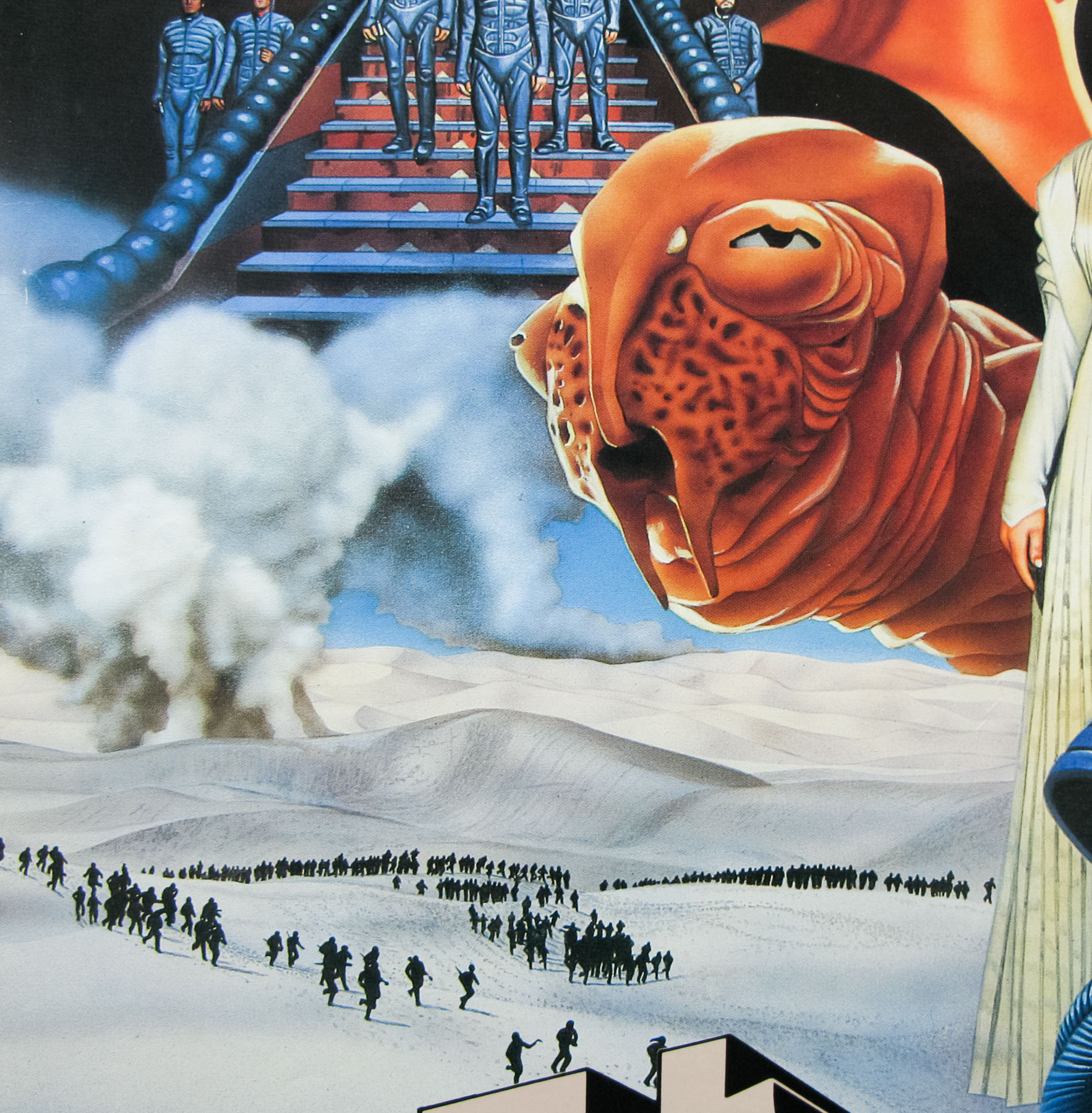
No, I had been shown images from the film and clearly most of the club members are wearing hastily prepared rubber masks, there was no license to be creative with the heads.
They must have liked the poster as the painting was used on a number of international posters as well as multiple VHS covers?
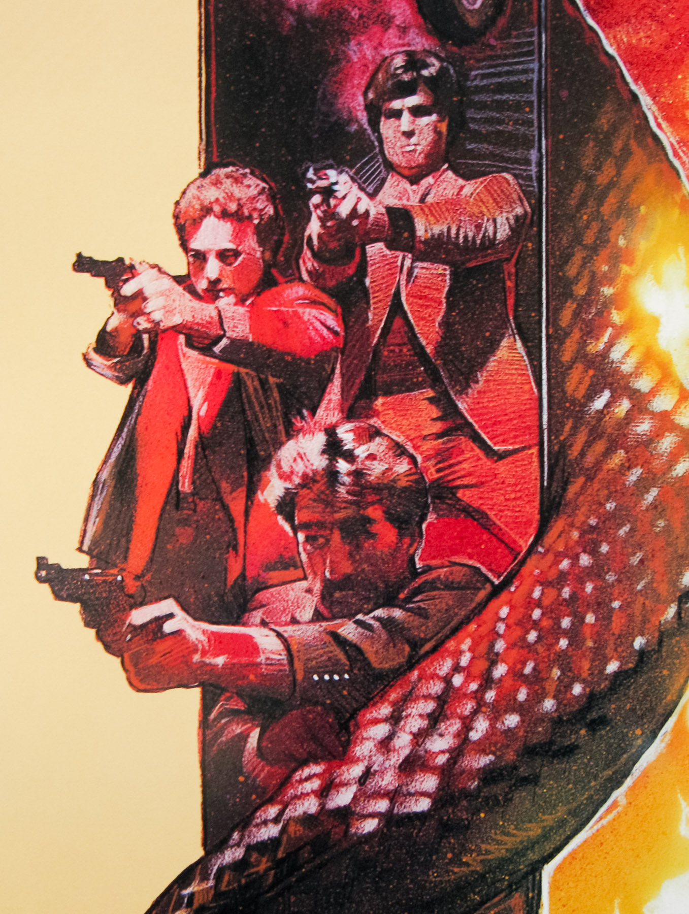
I suspect that this was more to do with budget. Clearly the film was intended to be supplied with a full supporting poster campaign as a package. This is why the marketing department were being so particular. This was an international poster, not domestic. The photo of the original painting shows that the main image descends further in order to facillitate the international format. Only the UK would have got the full width quad version.
Were you happy with the final result?
Absolutely not!
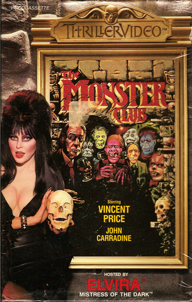
‘Elvira presents…’ – a VHS cover for the film released by Thriller Video – image taken from Bloodsprayer.com
Did this poster help you secure your next job?
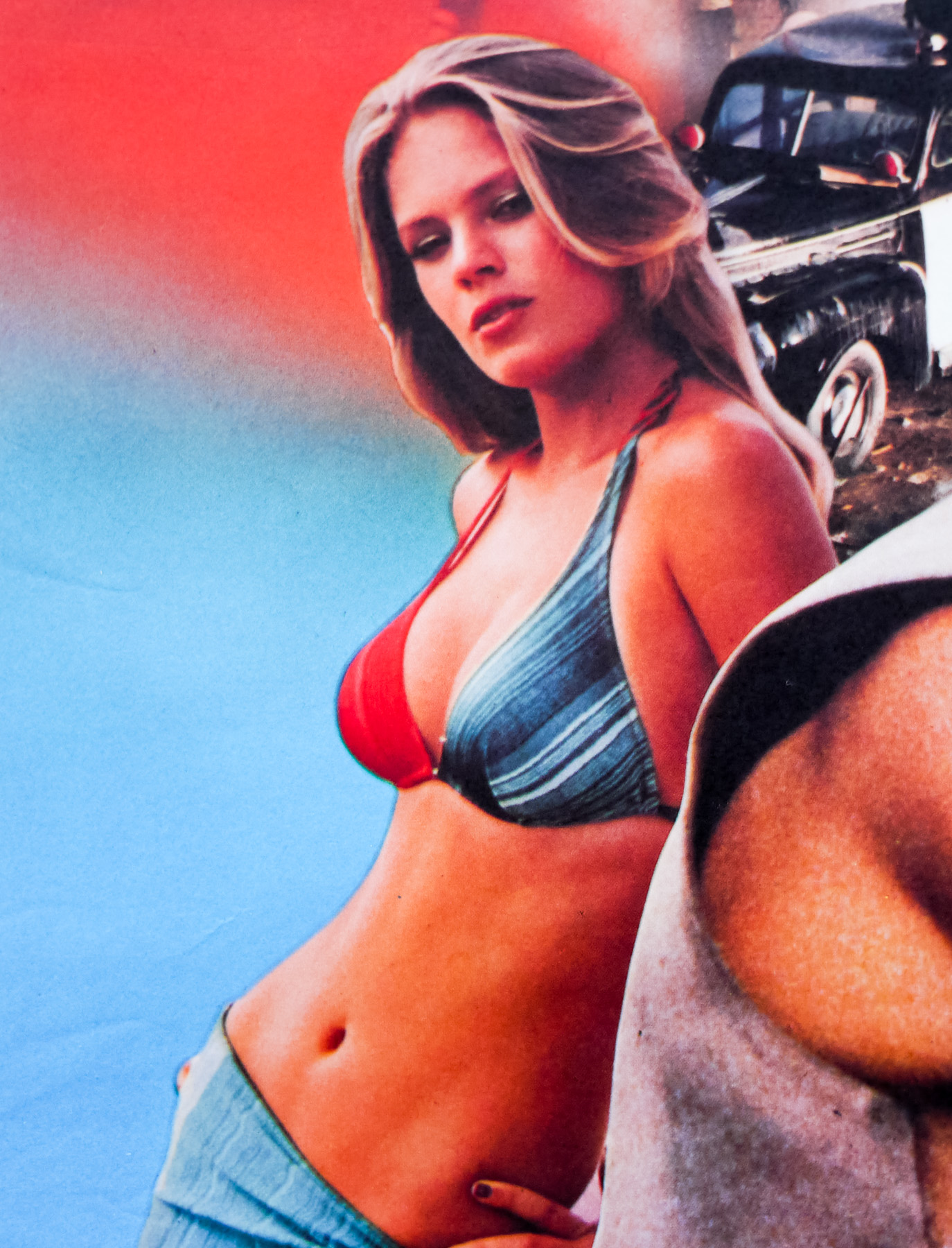
Whilst working on ‘The Monster Club’, the same distributor offered me ‘The Funhouse’ and, after supplying initial sketches, the job suddenly changed and was then a double bill with ‘My Bloody Valentine’. So all my ideas for a quad format poster had to adapt to a tall verticle format. Still smarting from the first poster, I was cautious with the imagery and in retrospect should have taken it much further.
Thanks for taking the time to speak to me about the poster, it’s much appreciated.
– Graham’s official website can be viewed here.
– This site’s 2011 interview with Graham is available here.
– The other posters I’ve collected that were designed and painted by Graham can be viewed by clicking here.