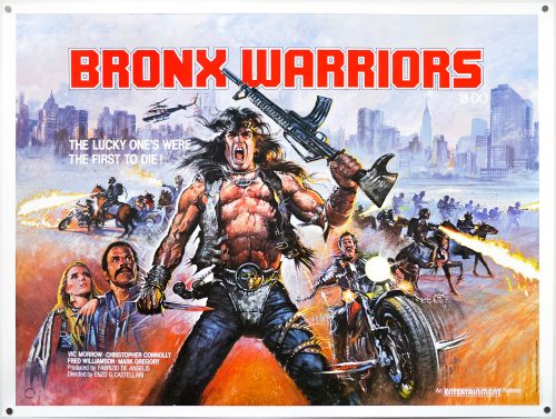
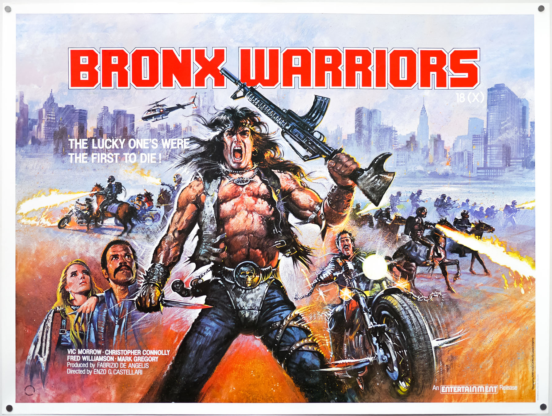
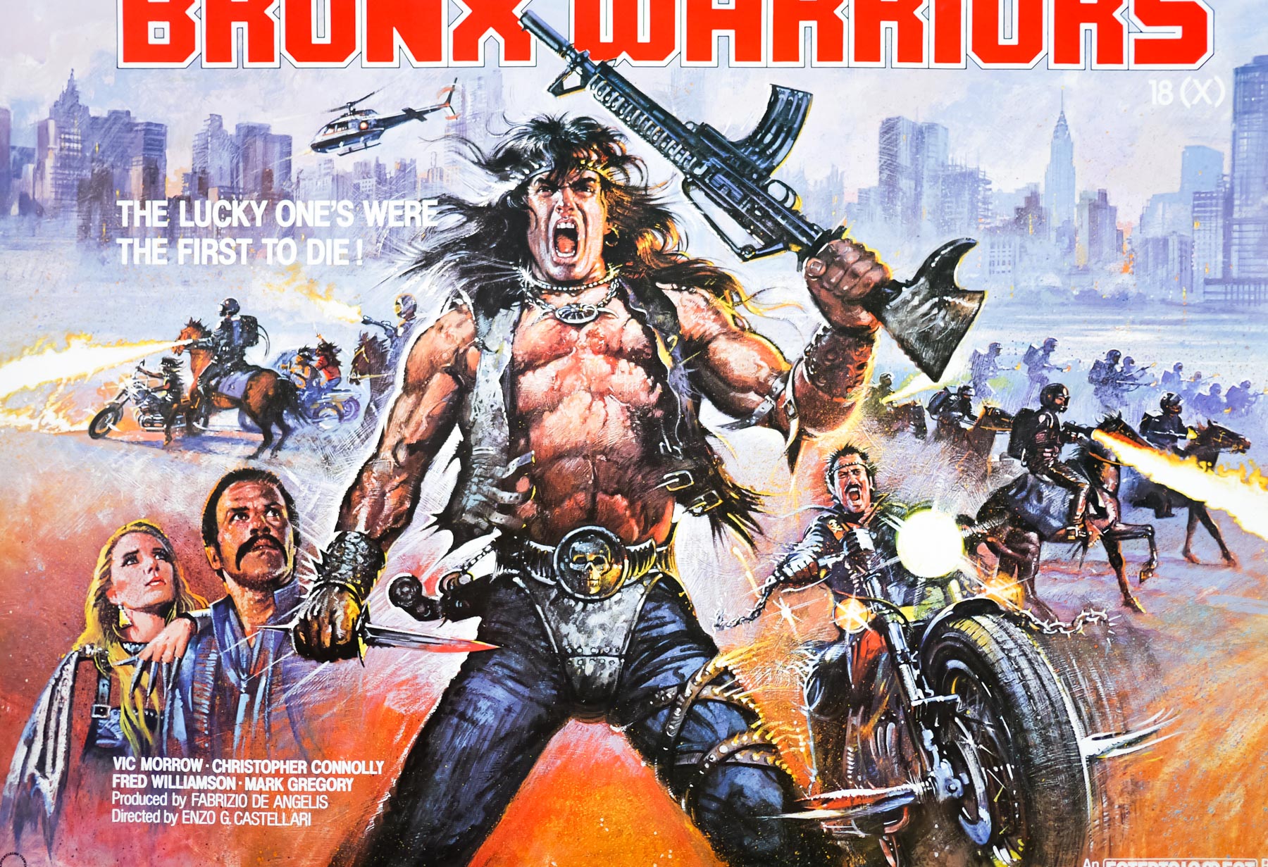
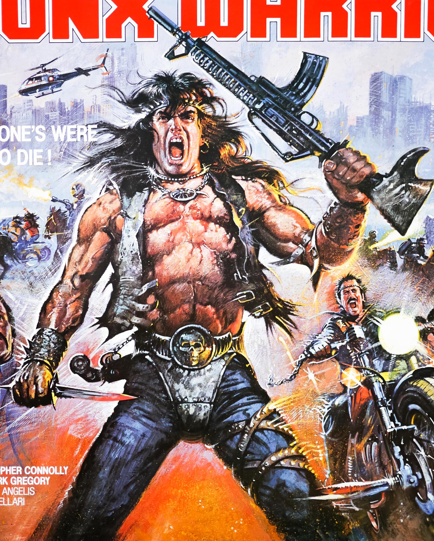
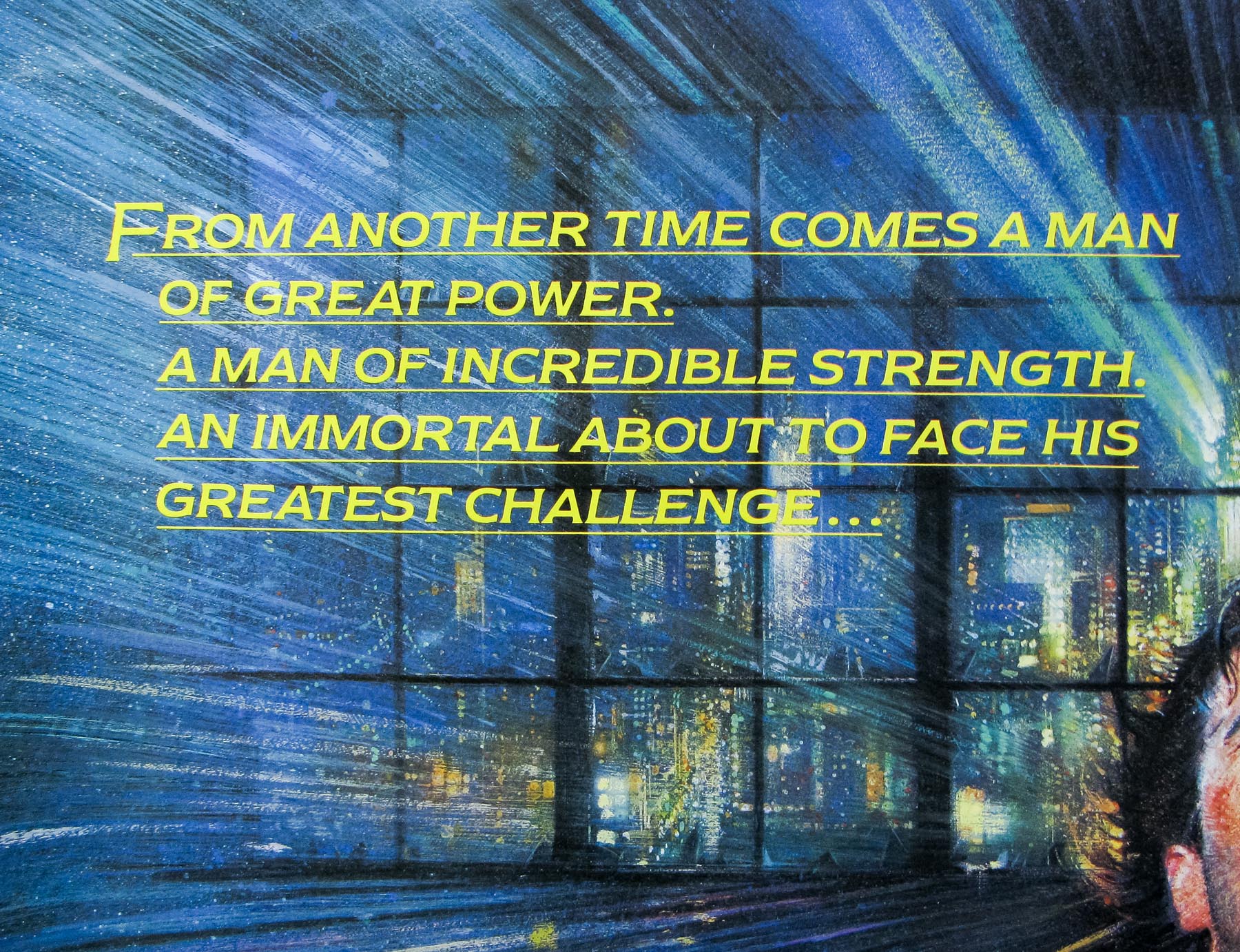
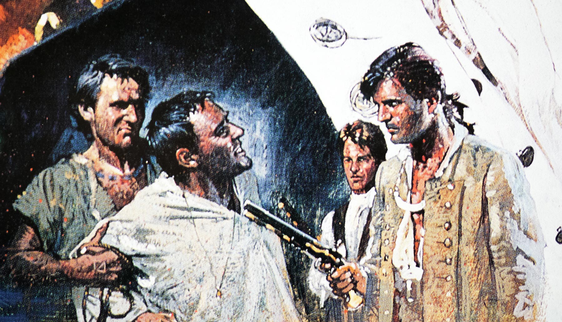
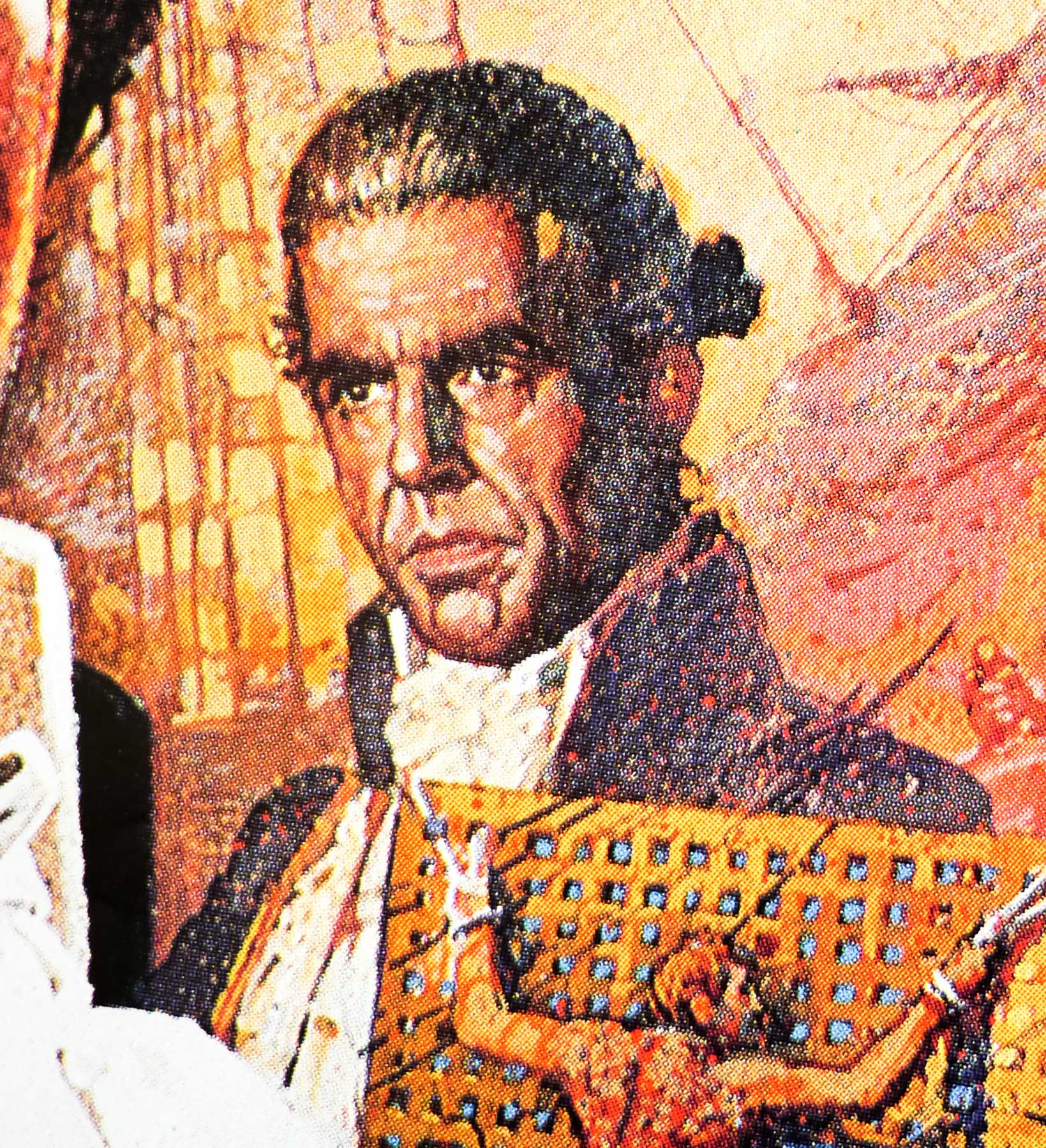
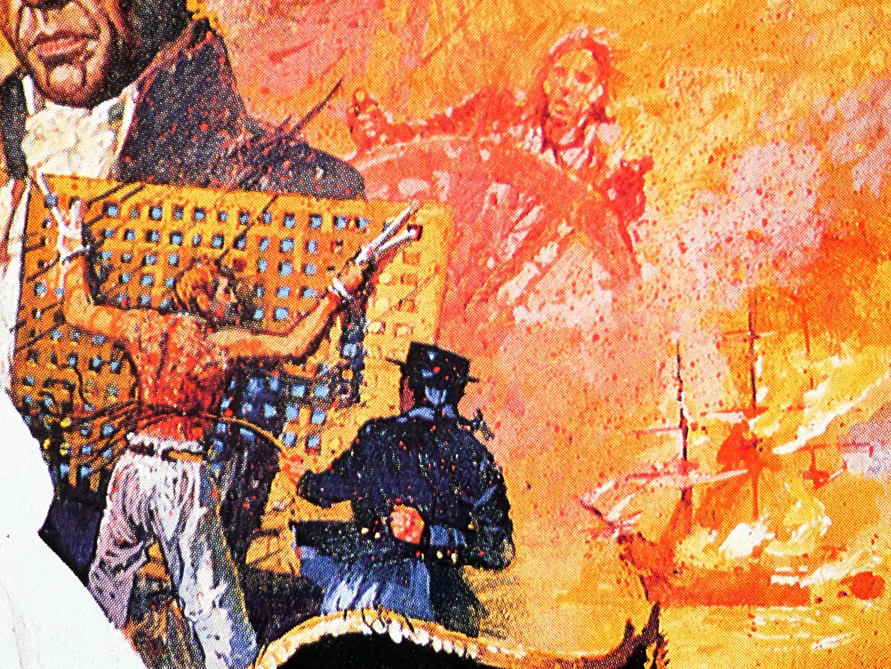
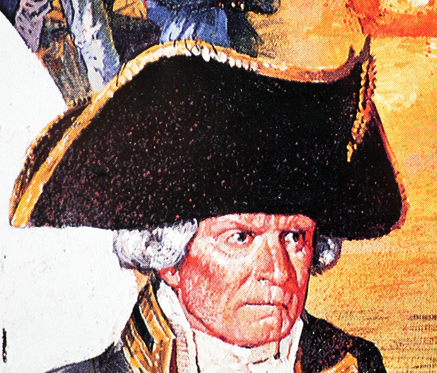
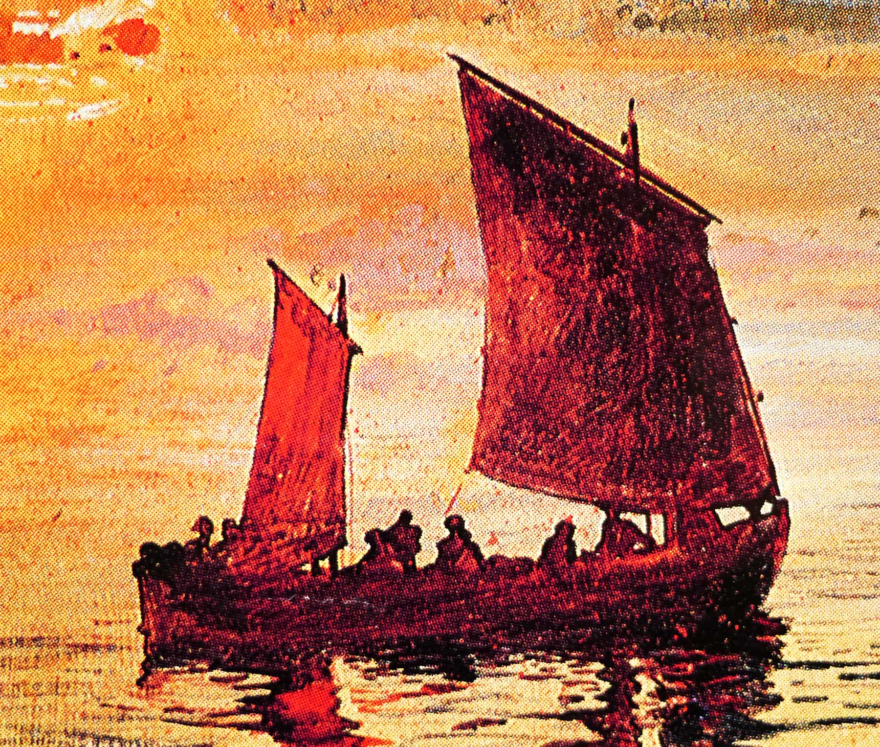
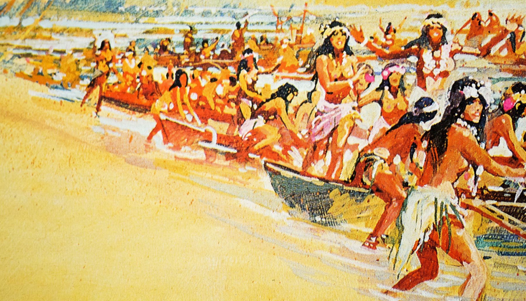
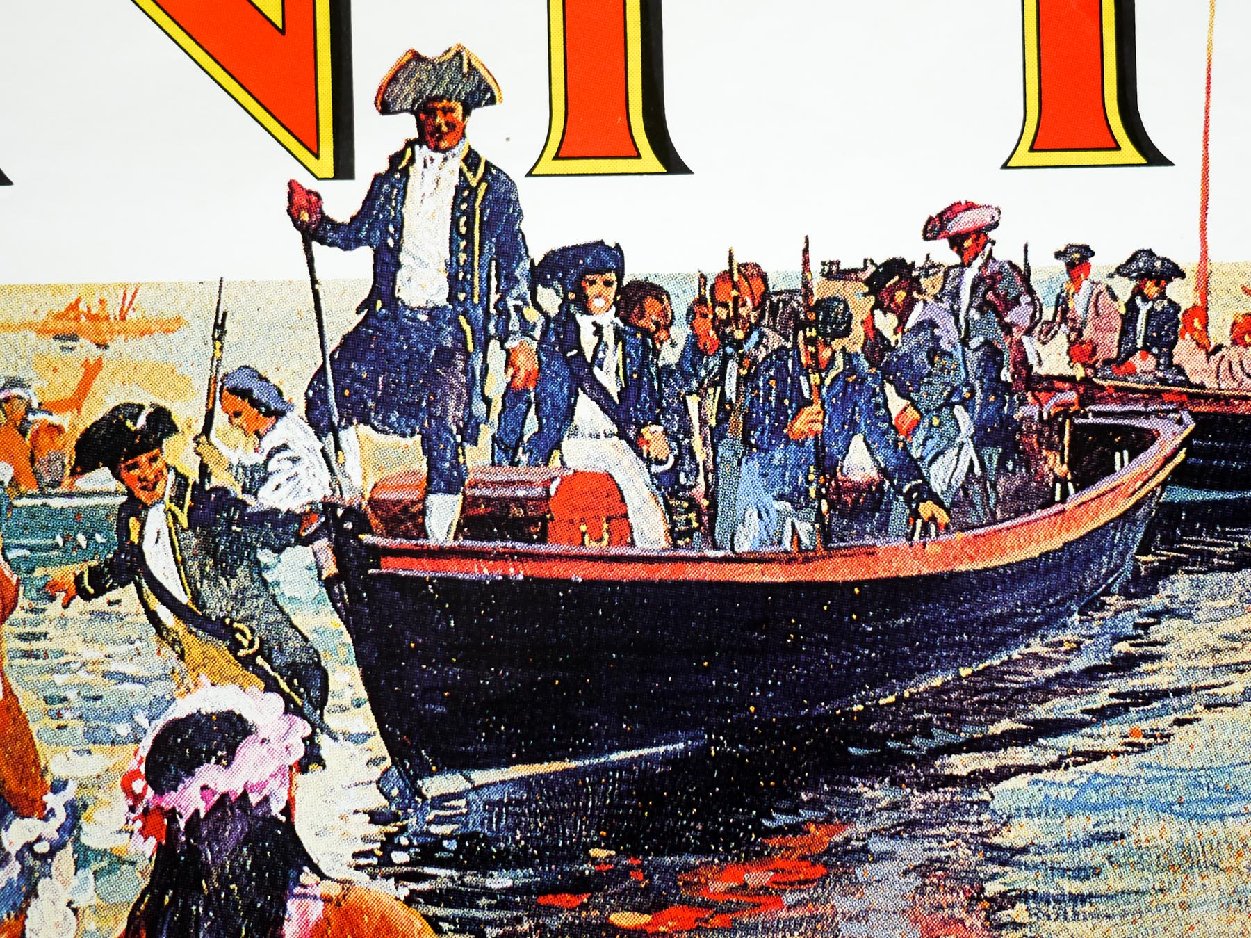
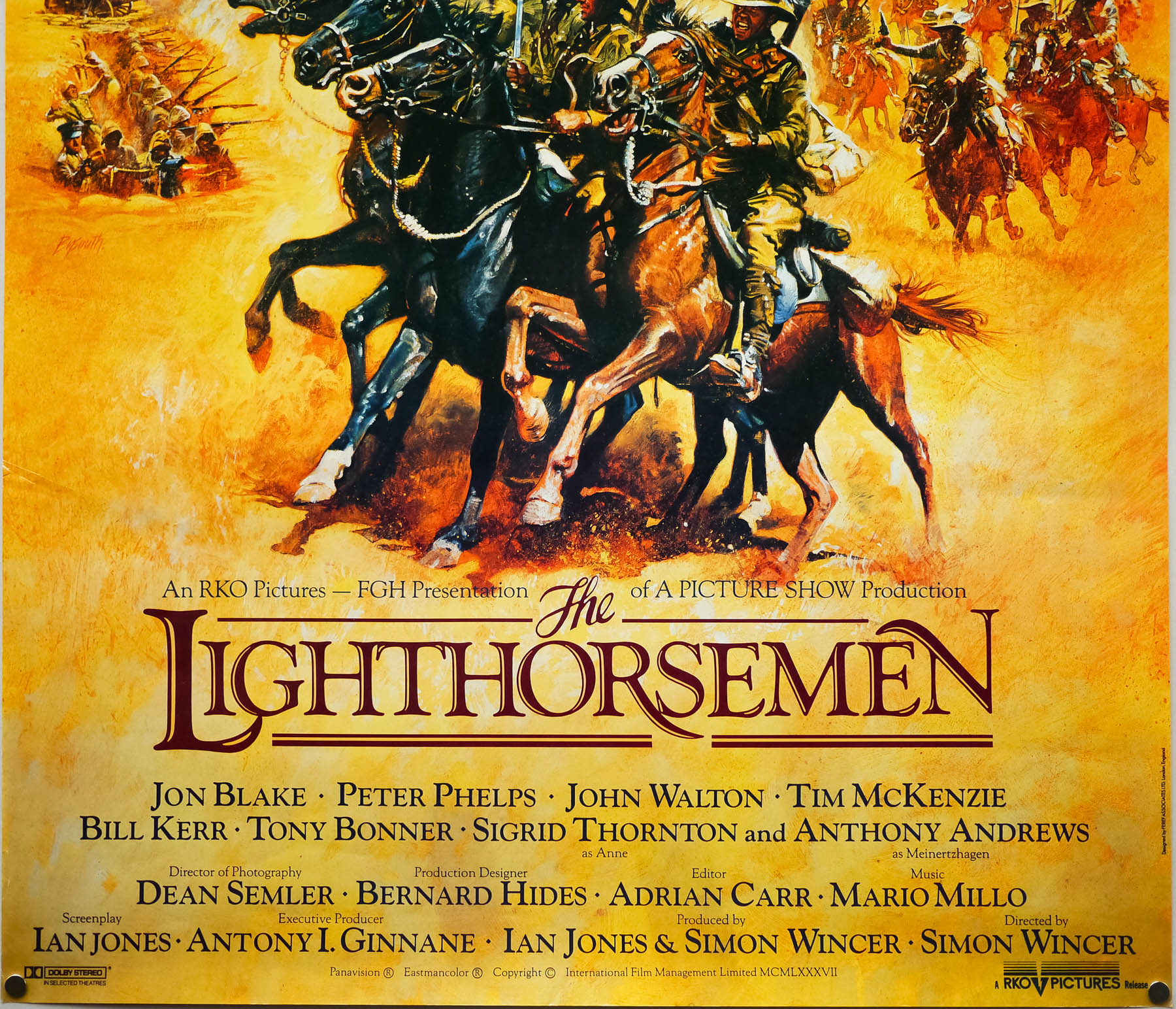
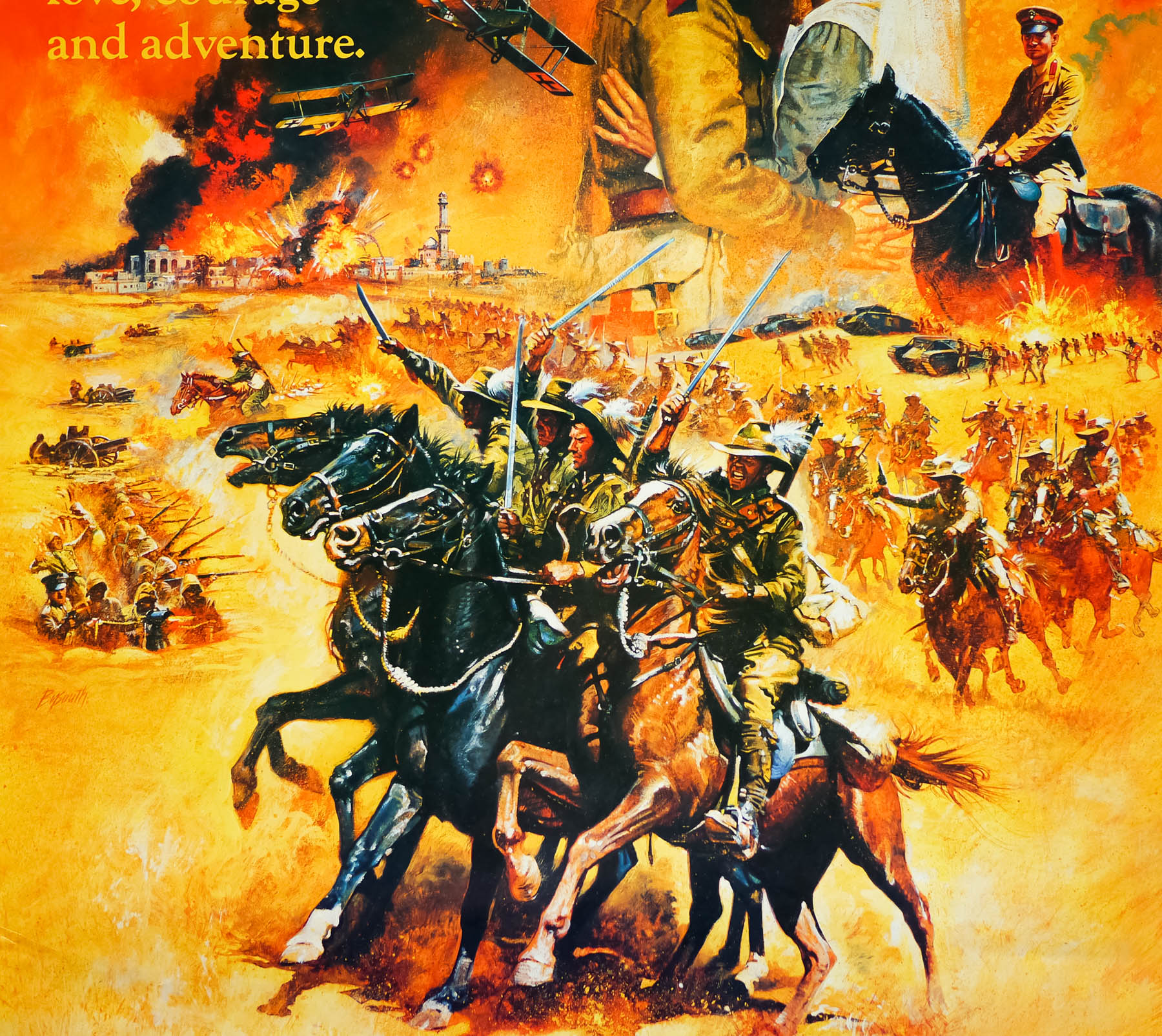
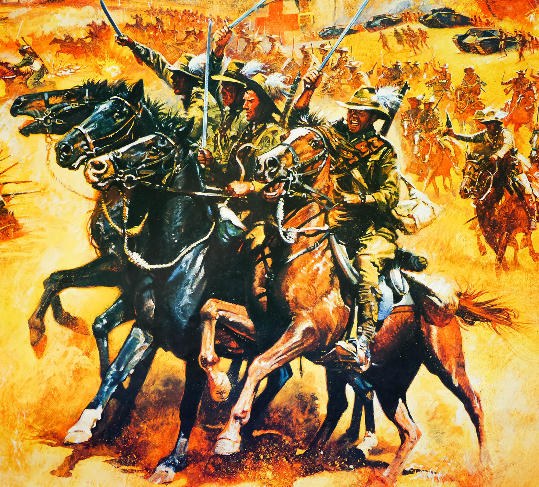
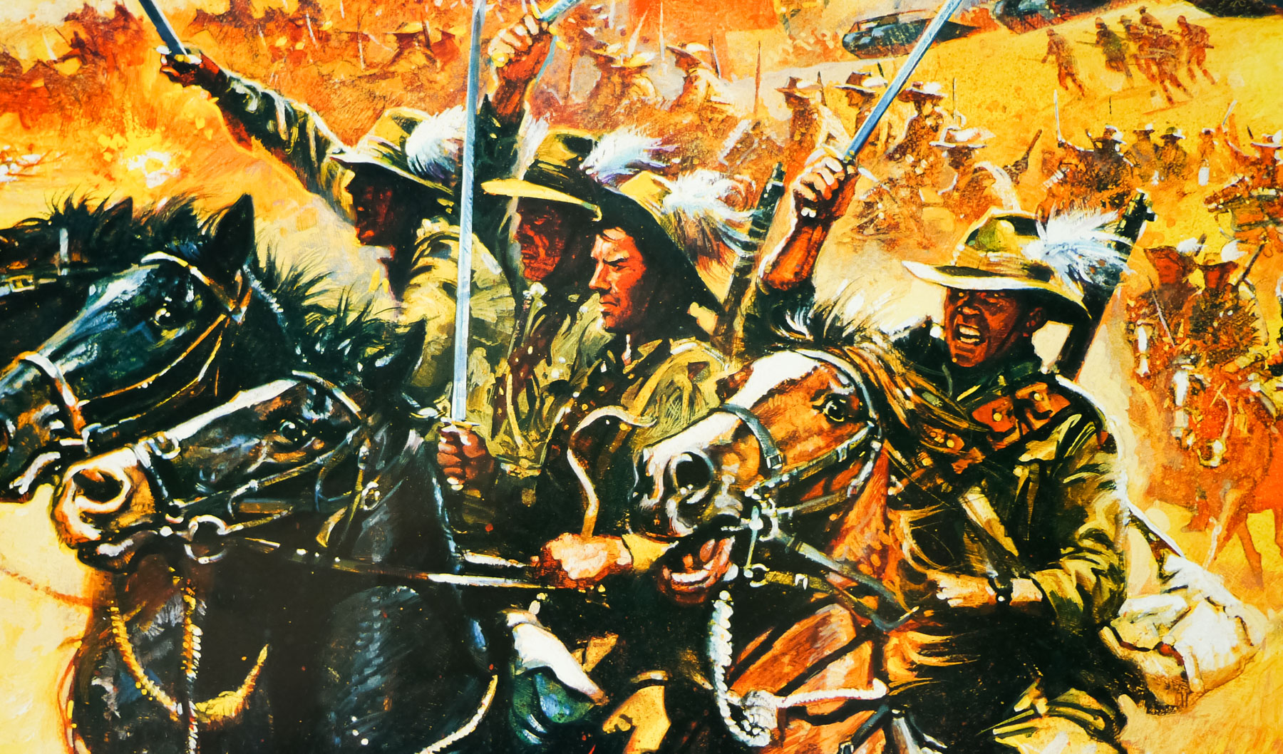
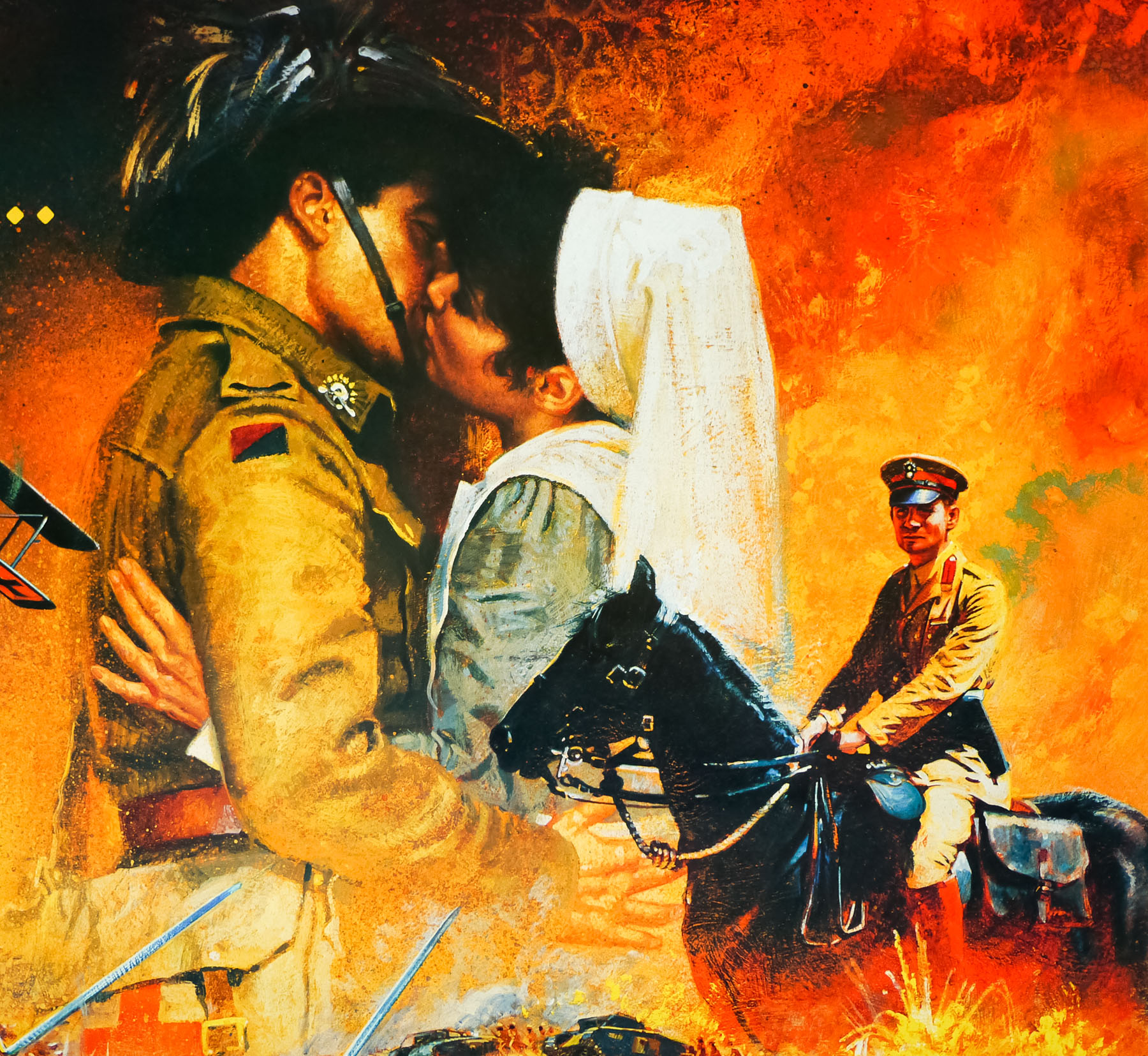
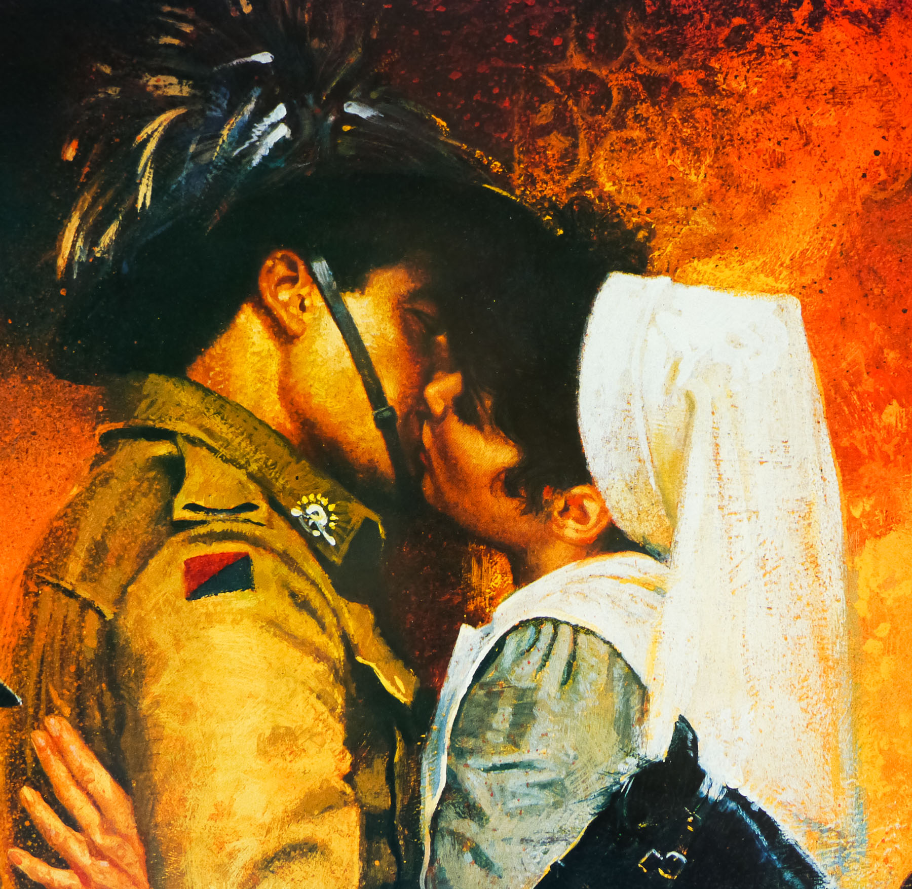
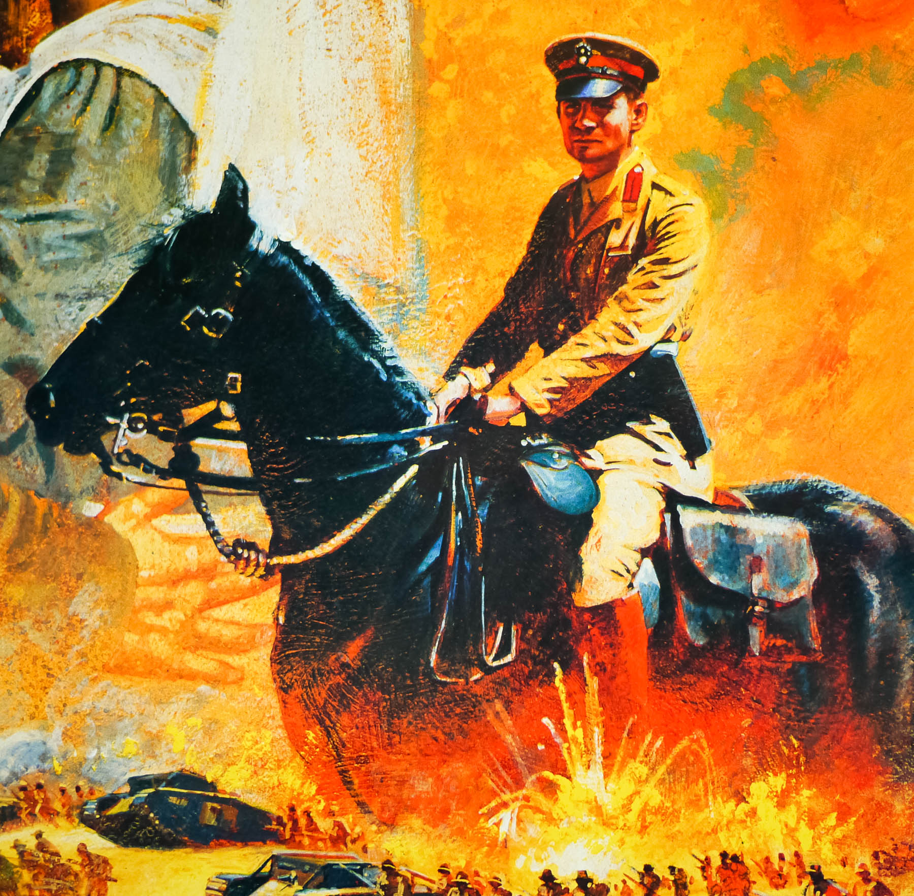
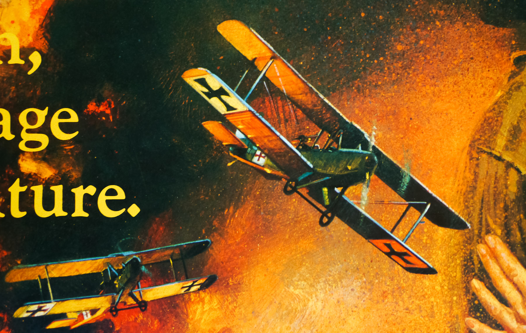
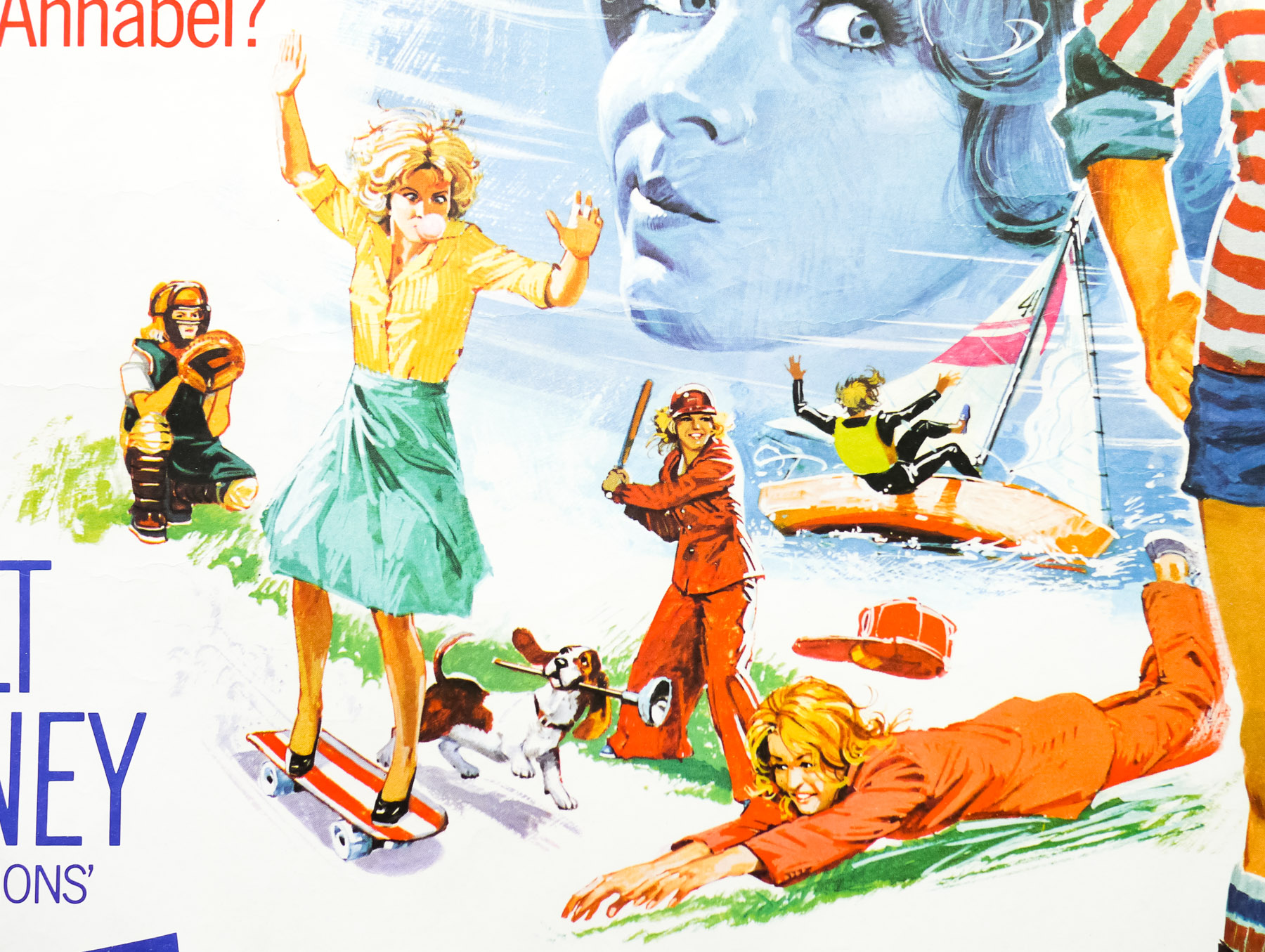
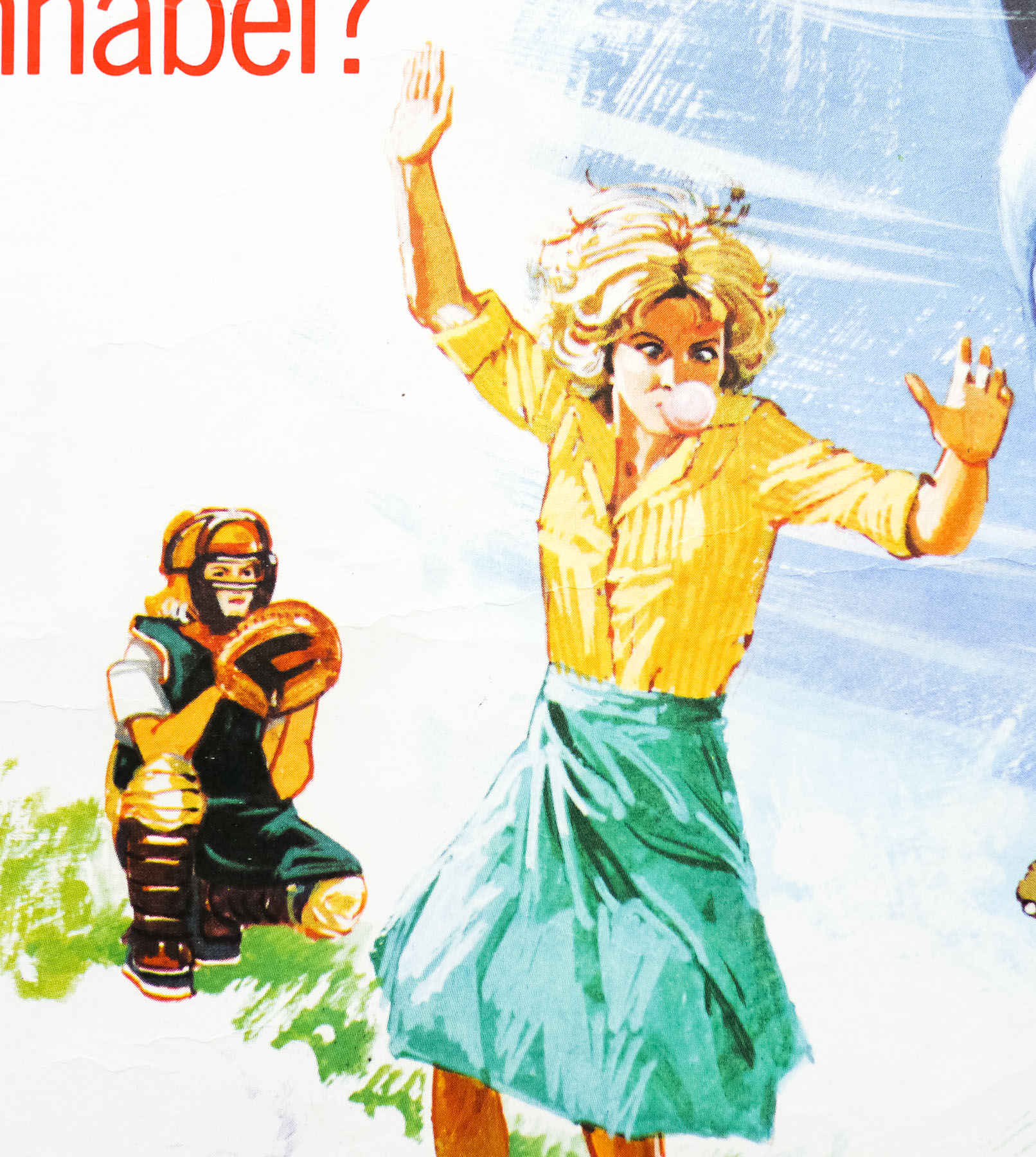
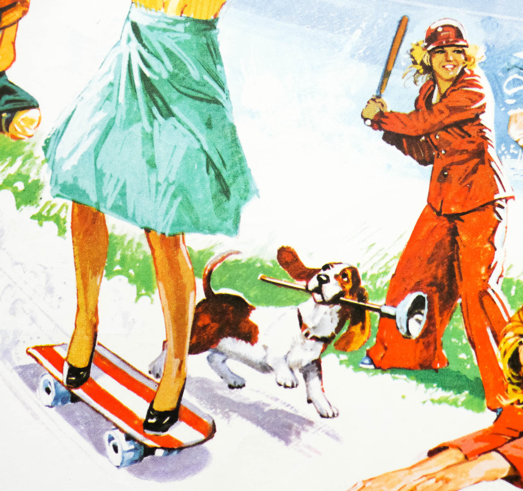
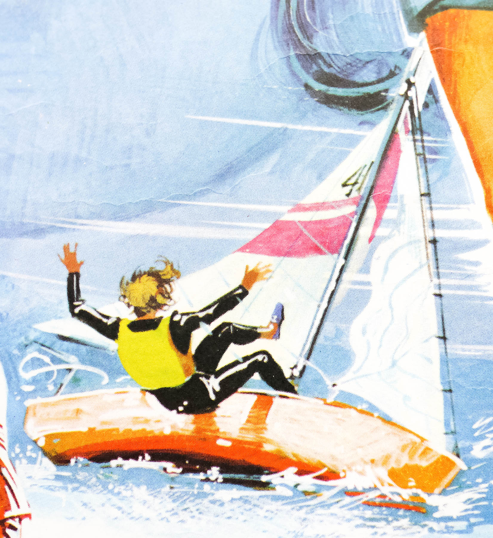
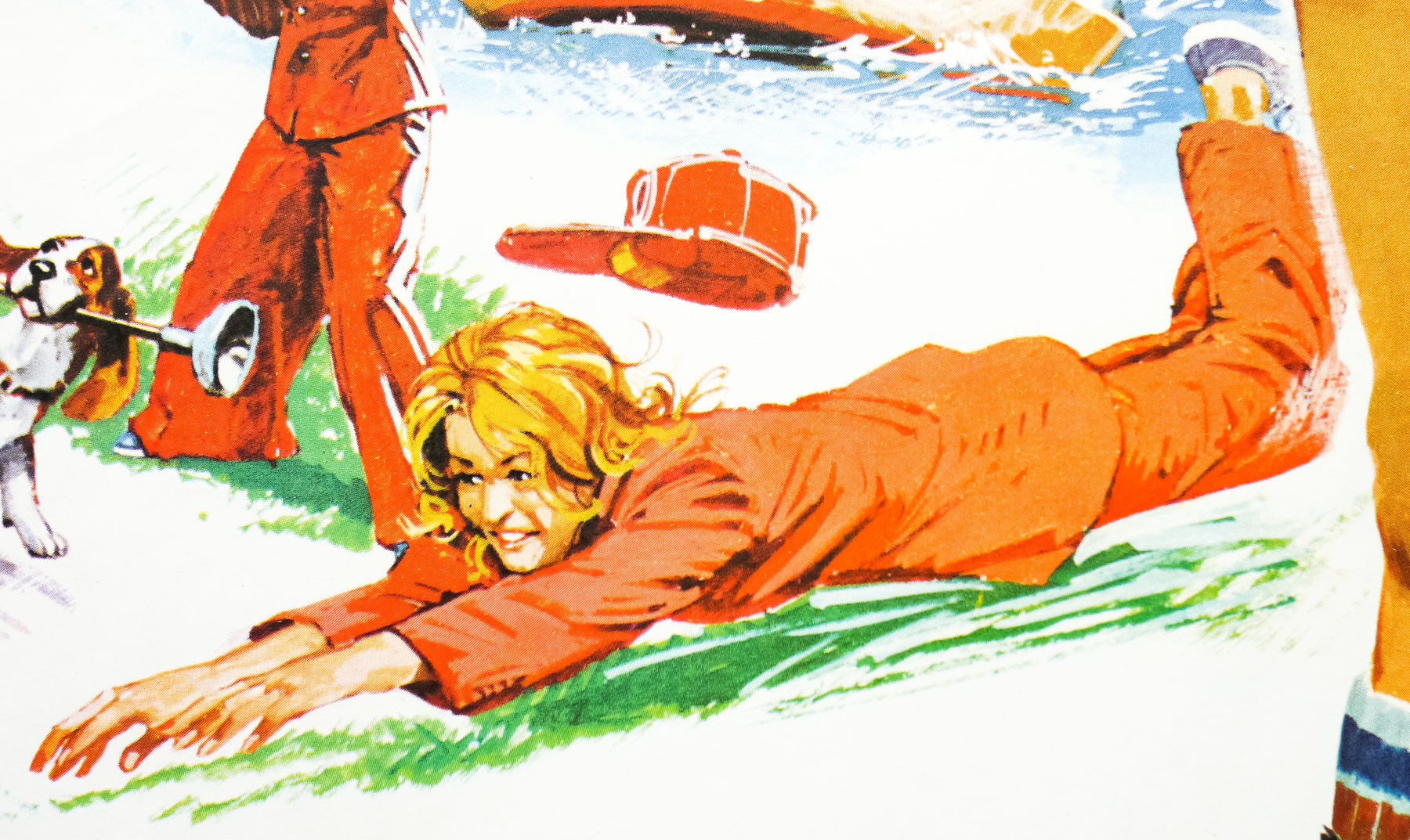
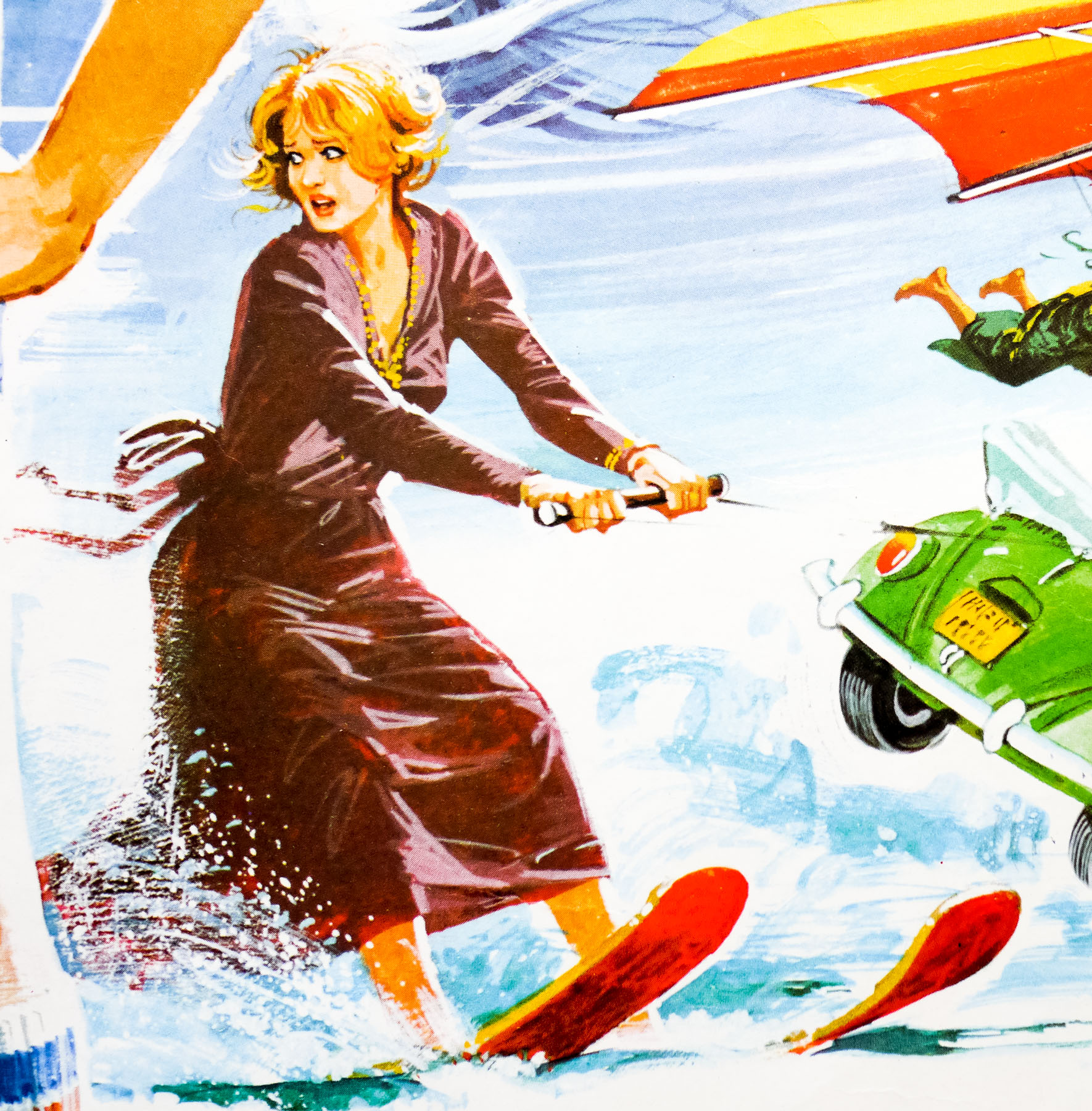
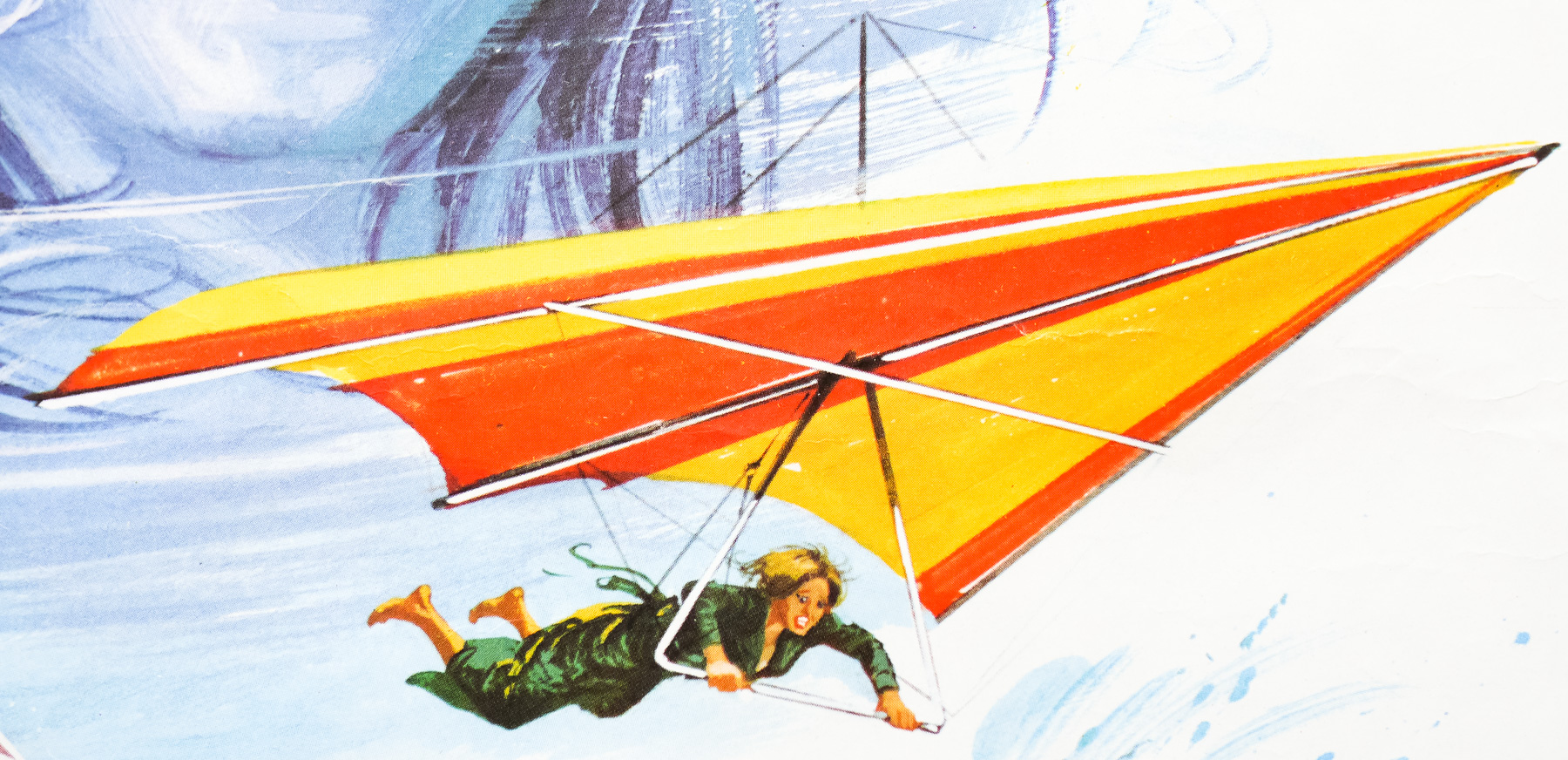
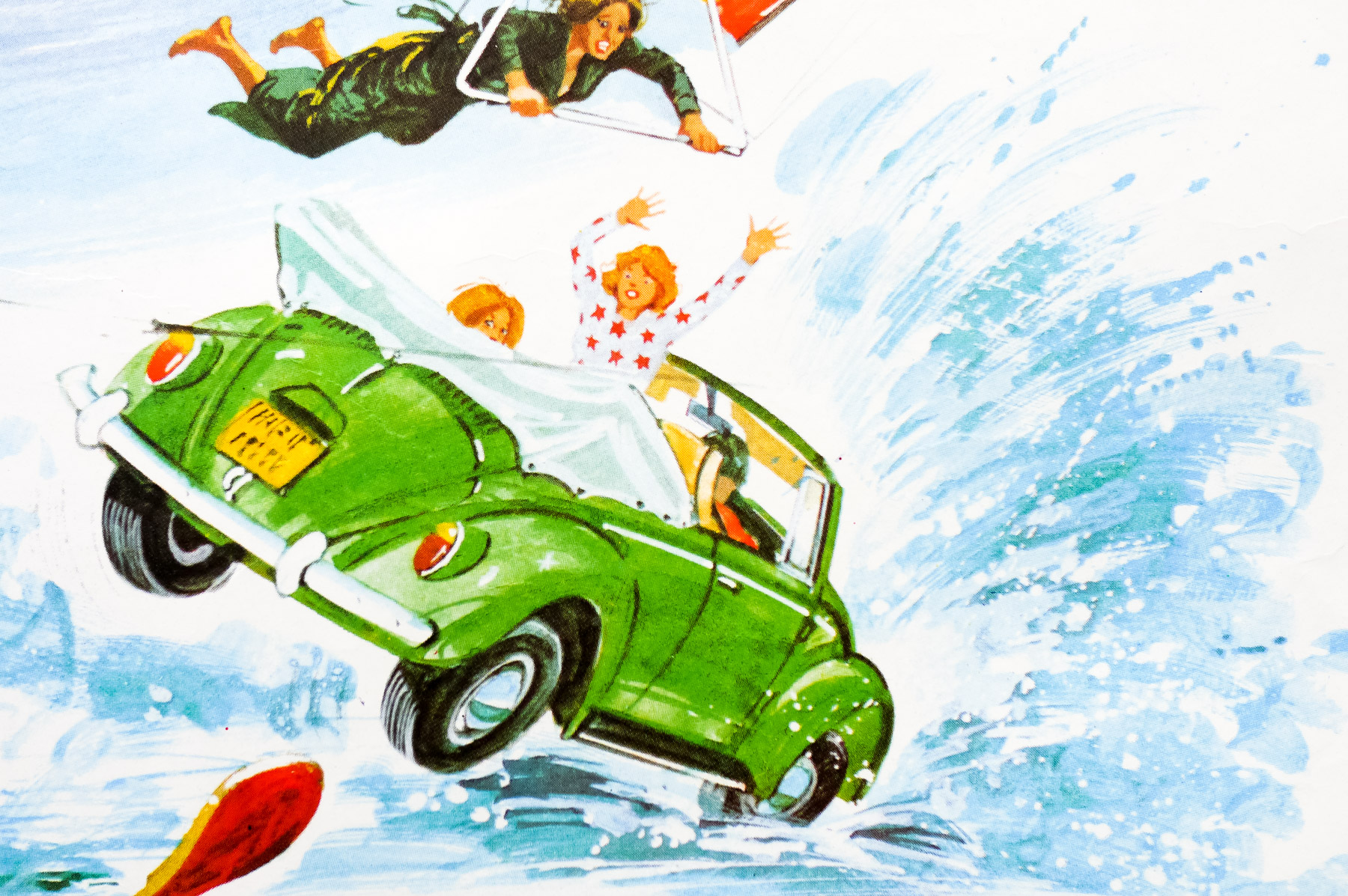
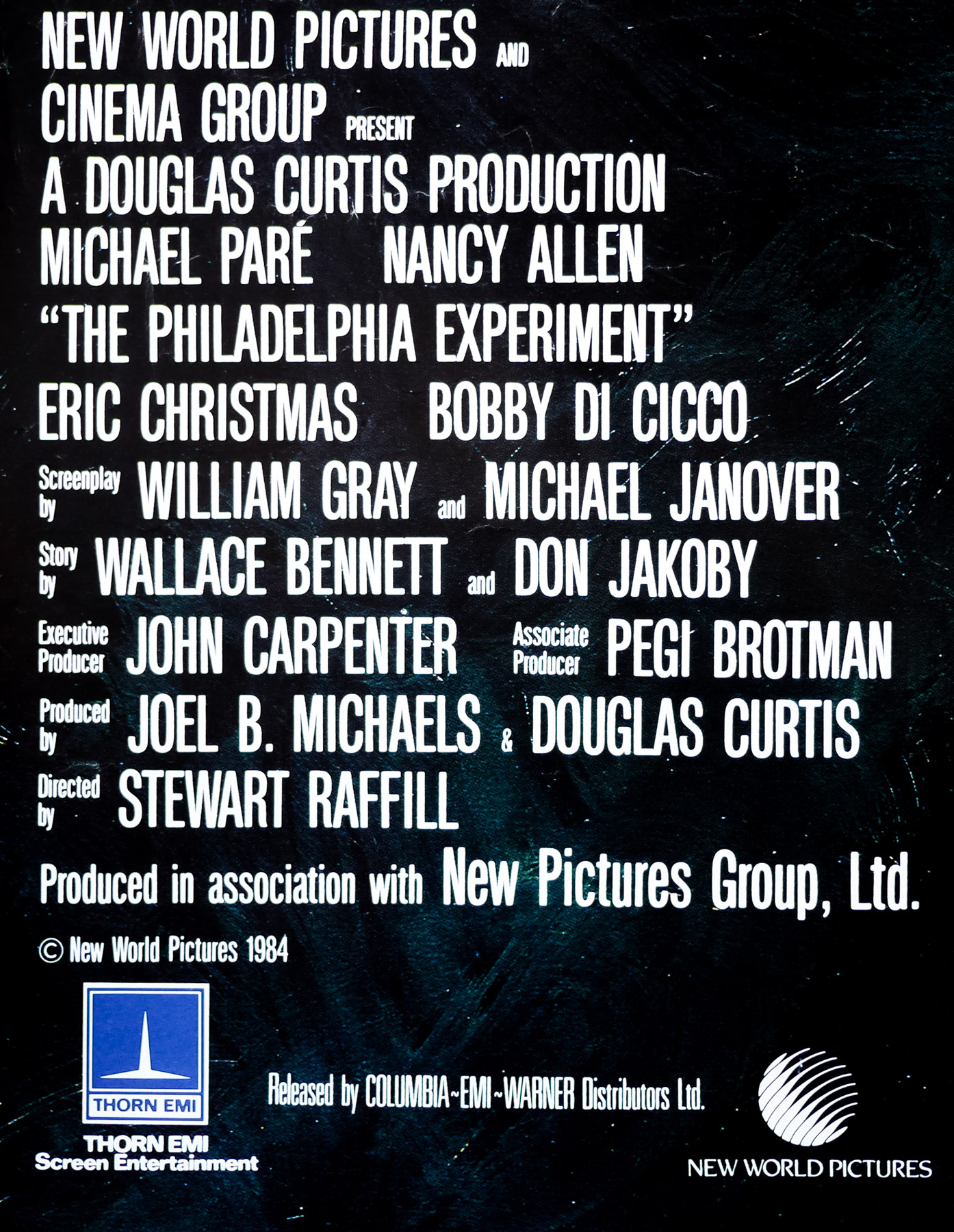
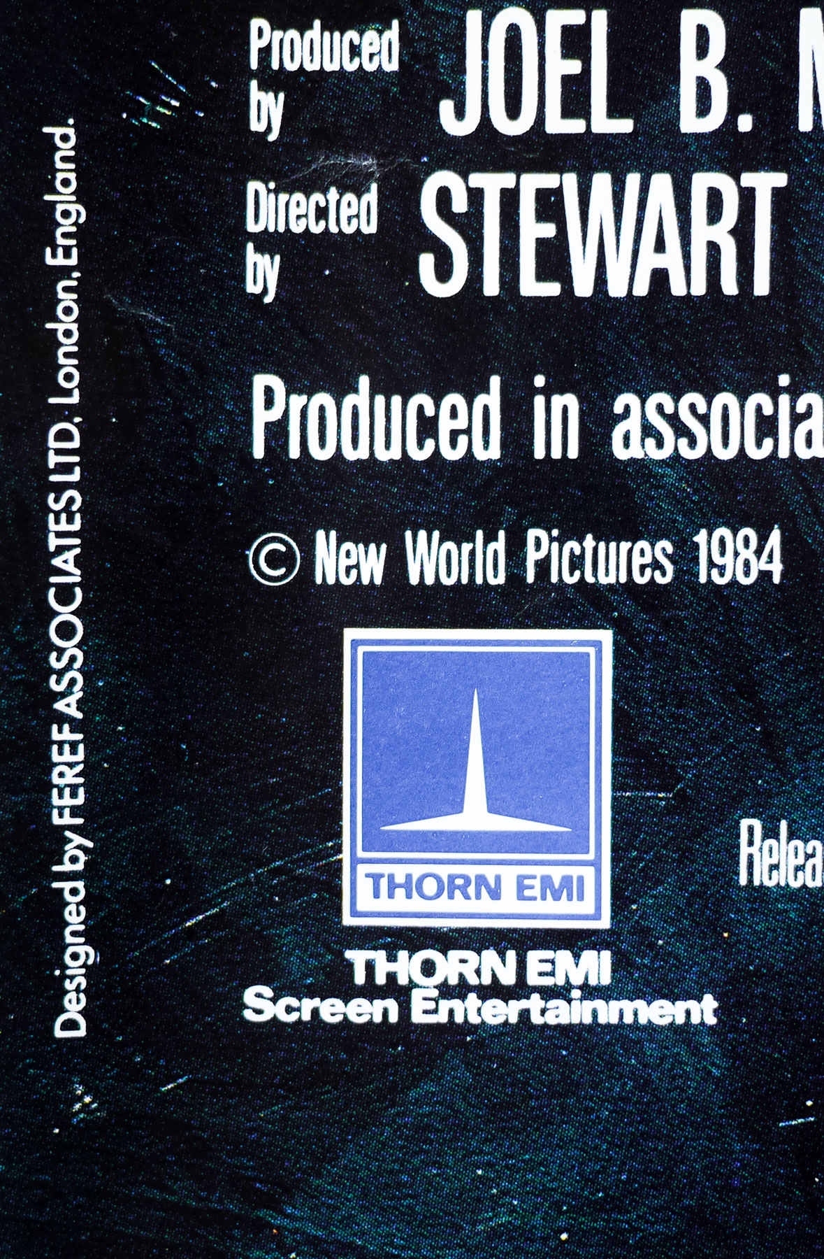
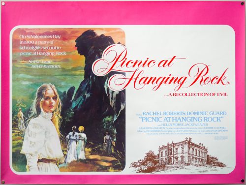
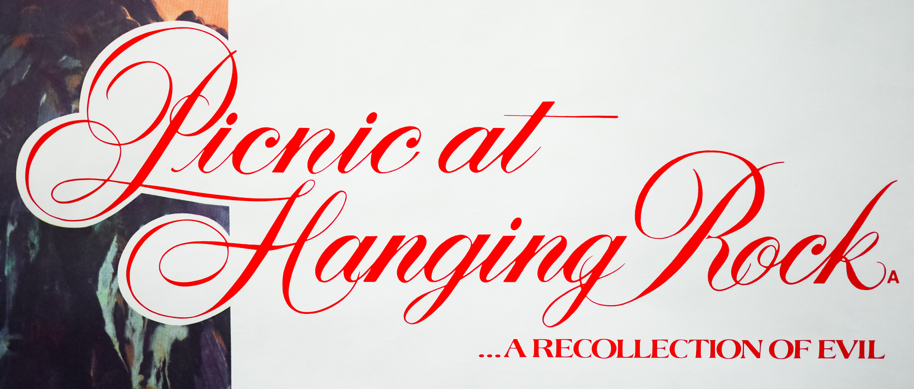
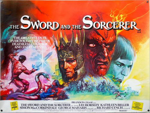
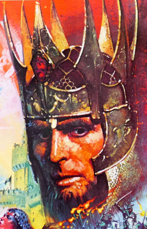
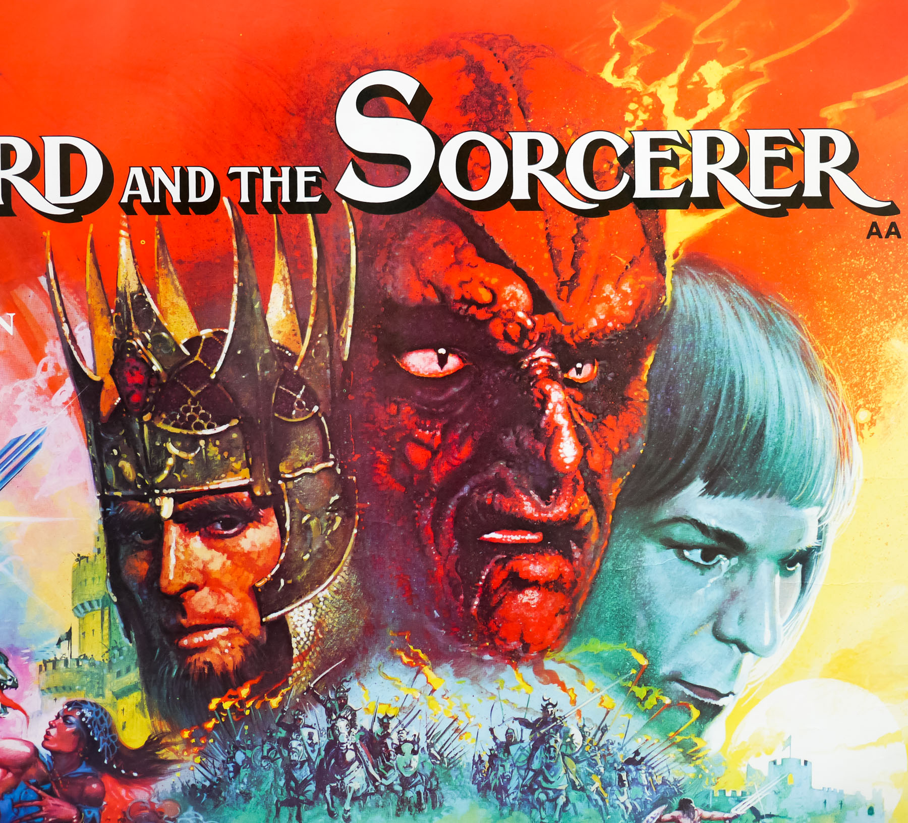
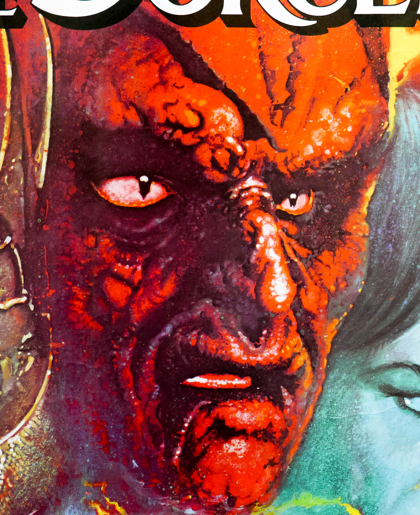
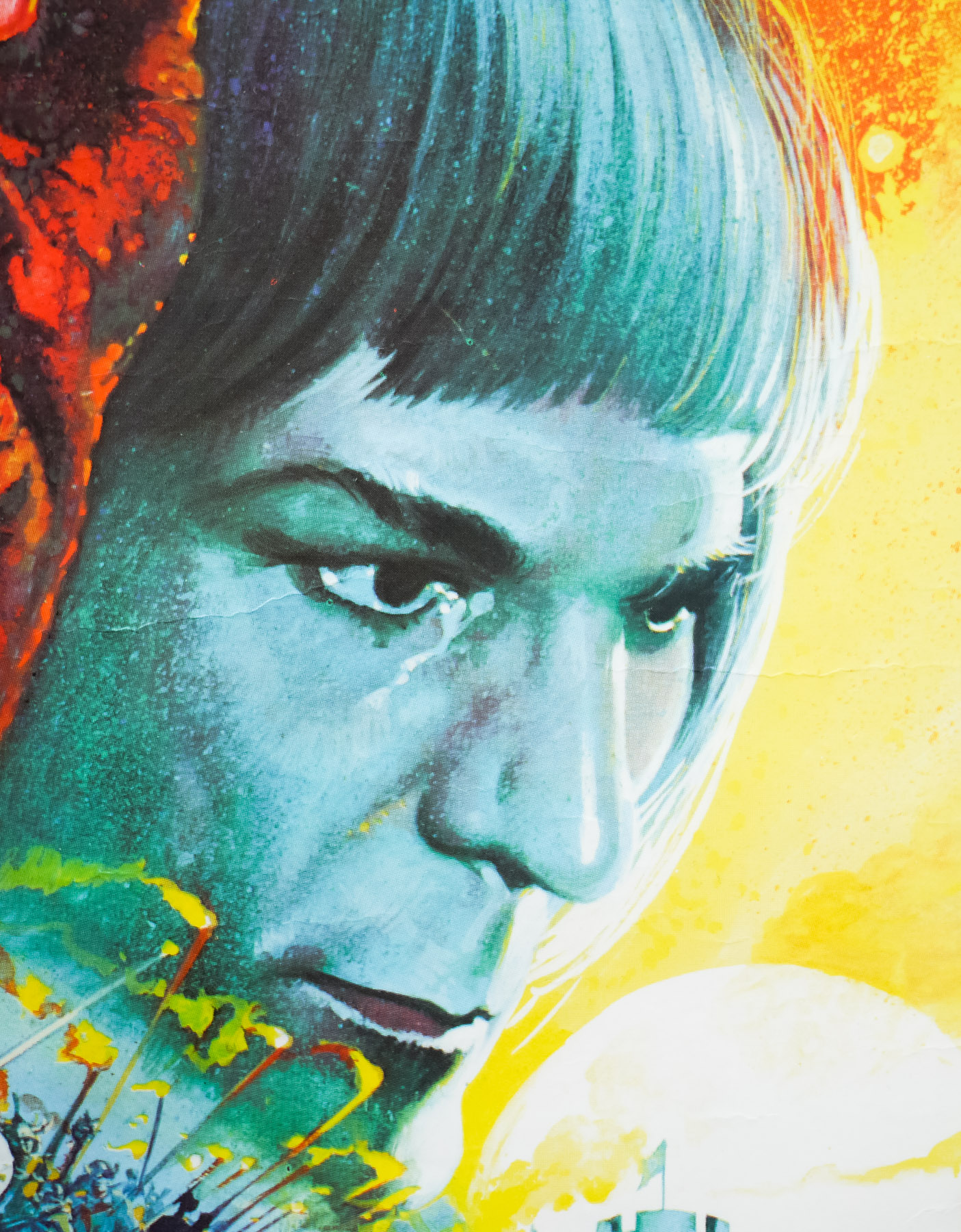
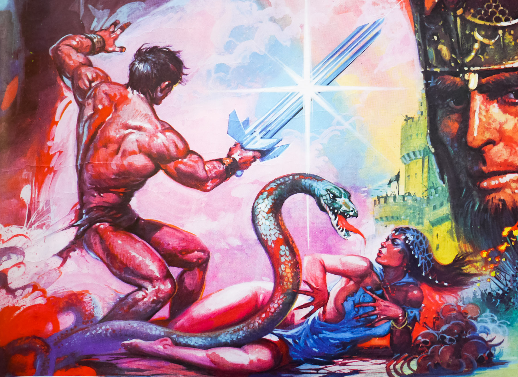
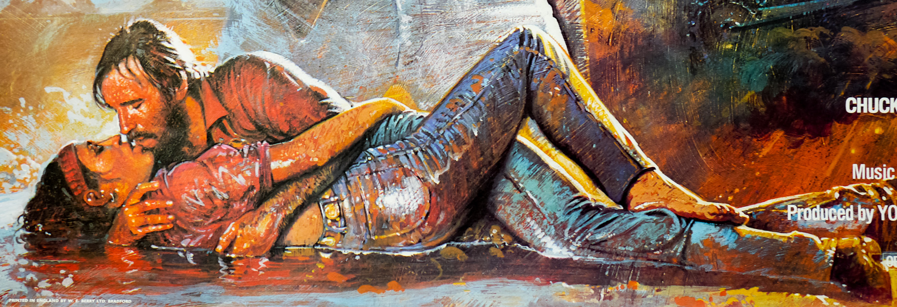
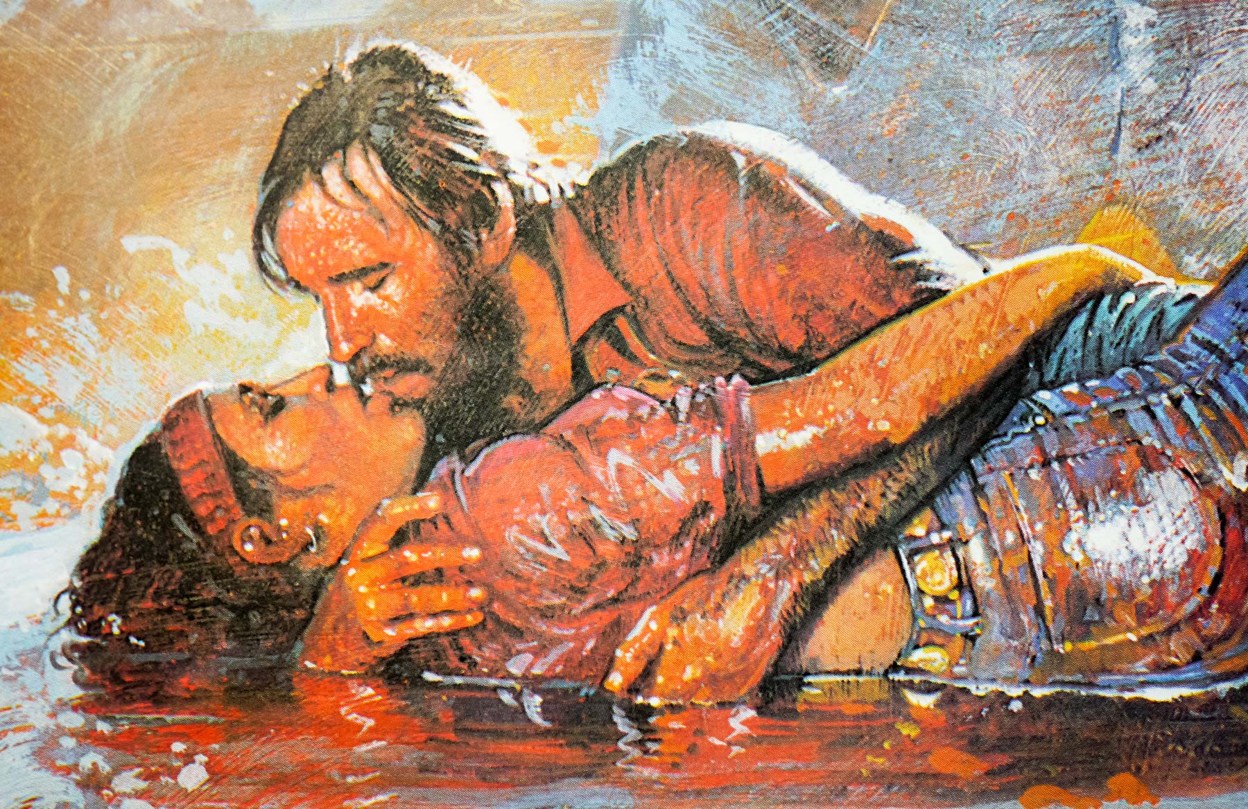
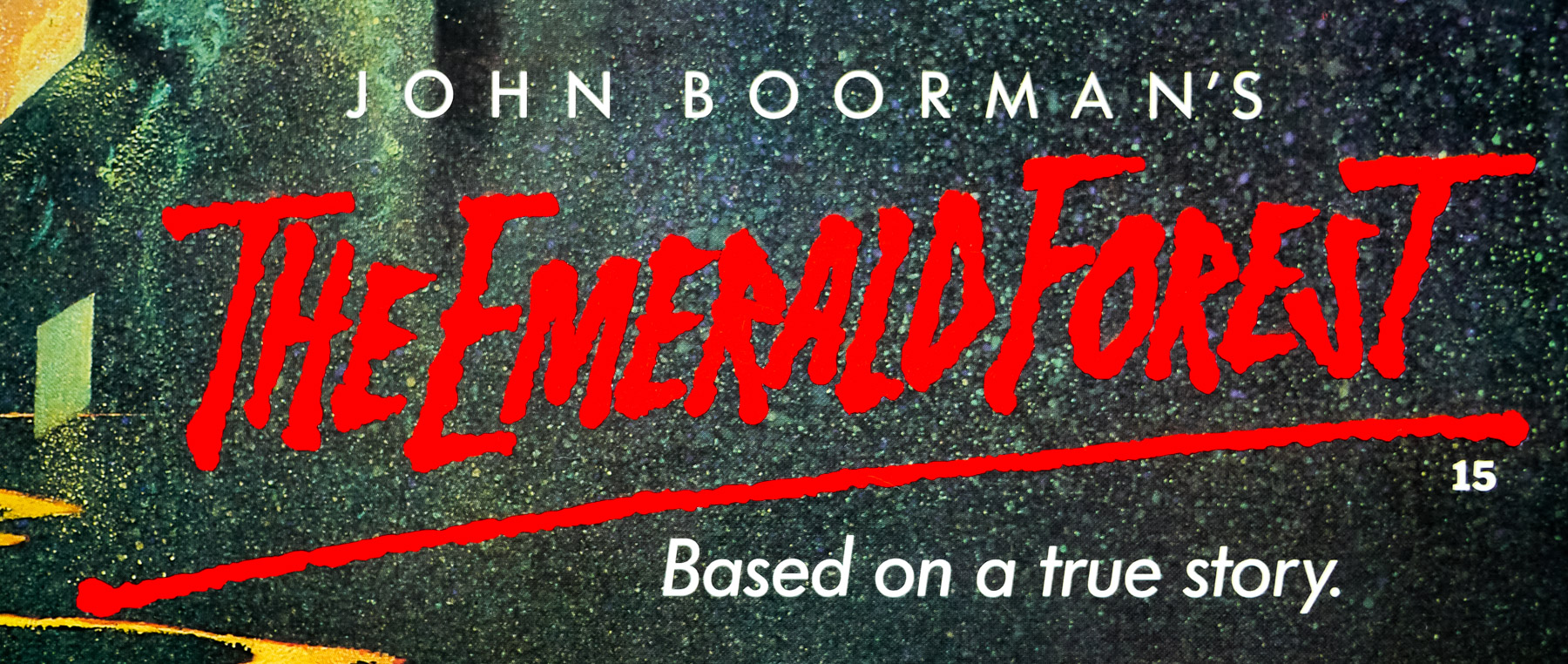
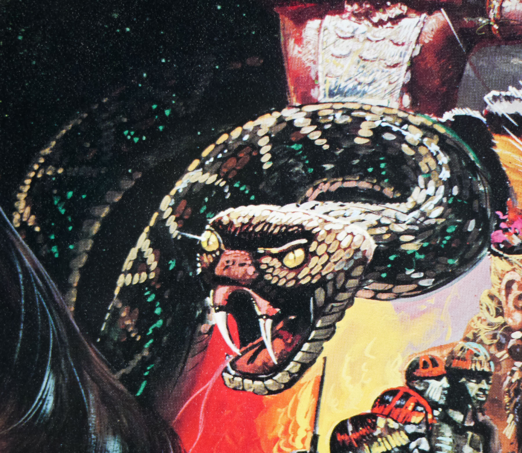
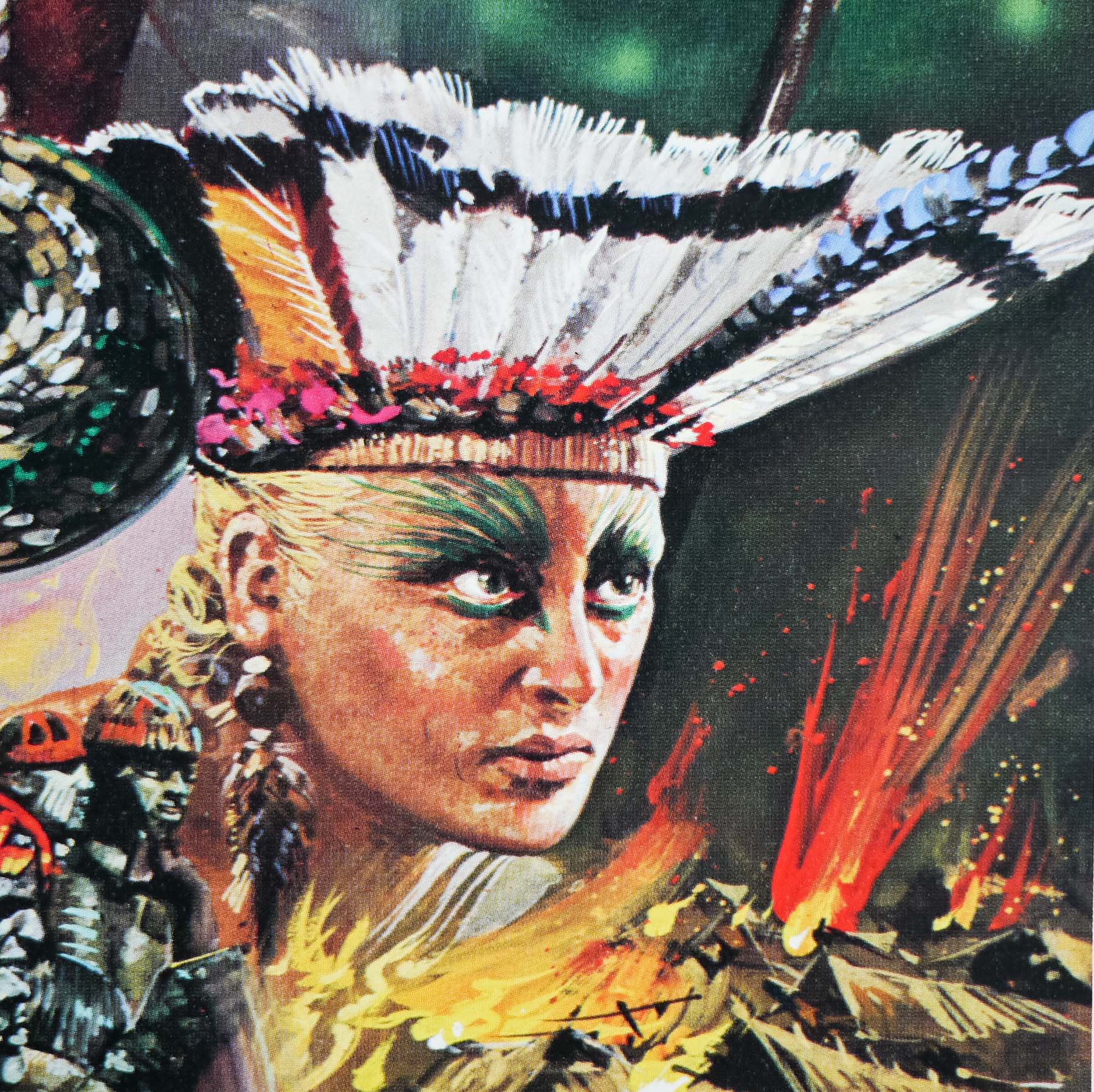
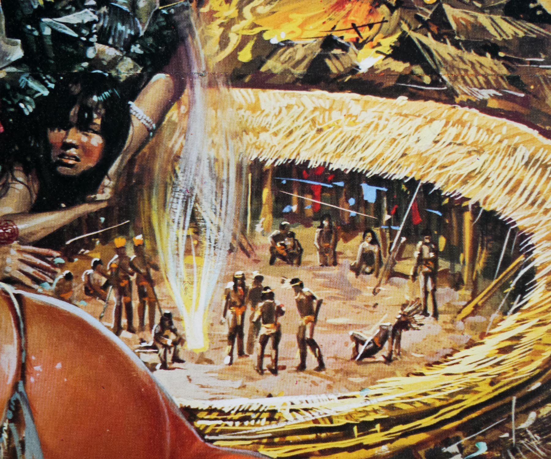
British designer and artist Brian Bysouth is responsible for some of the most iconic film posters ever printed. In a career lasting over forty years he lent his considerable talents to a wide range of design projects, including product and service adverts, editorial, TV storyboards, VHS and DVD covers and hundreds of fantastic film posters. Over the past year I’ve been lucky to get to spend time with Brian discussing his work and career and I’m very proud to present the following interview article that details his life from his beginnings as a fledgling artist through to his retirement in 2002. It features many images of his brilliant work, including early sketches and the original artwork for several posters. There are also a handful of unused designs and concepts, many of which have never been seen before online.
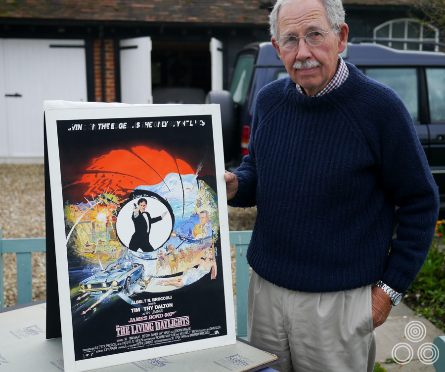
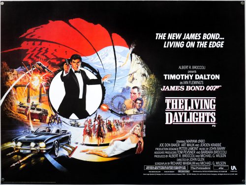
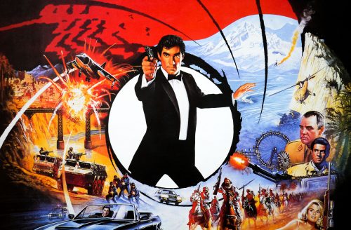
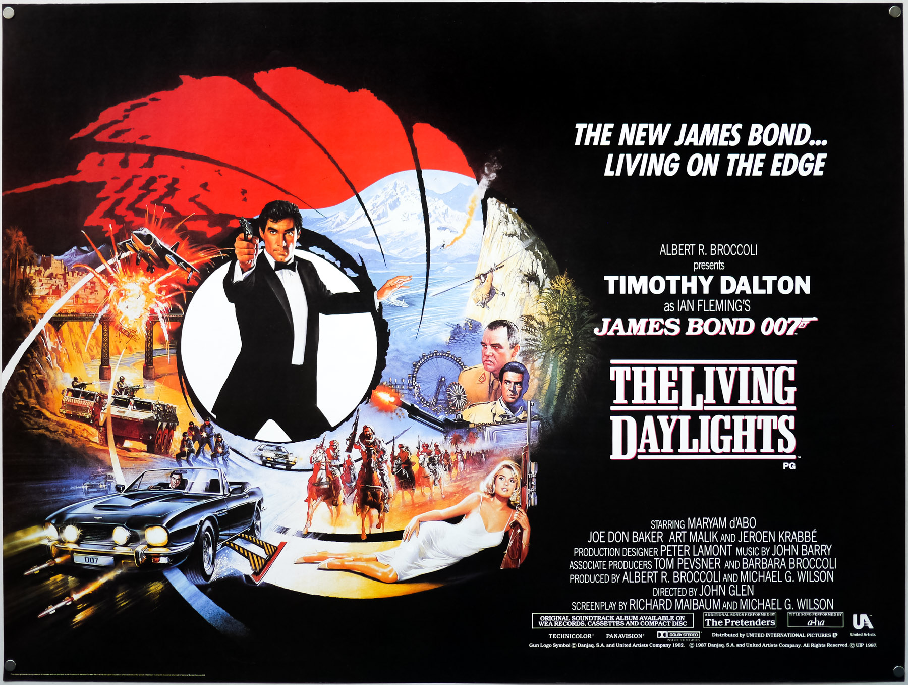
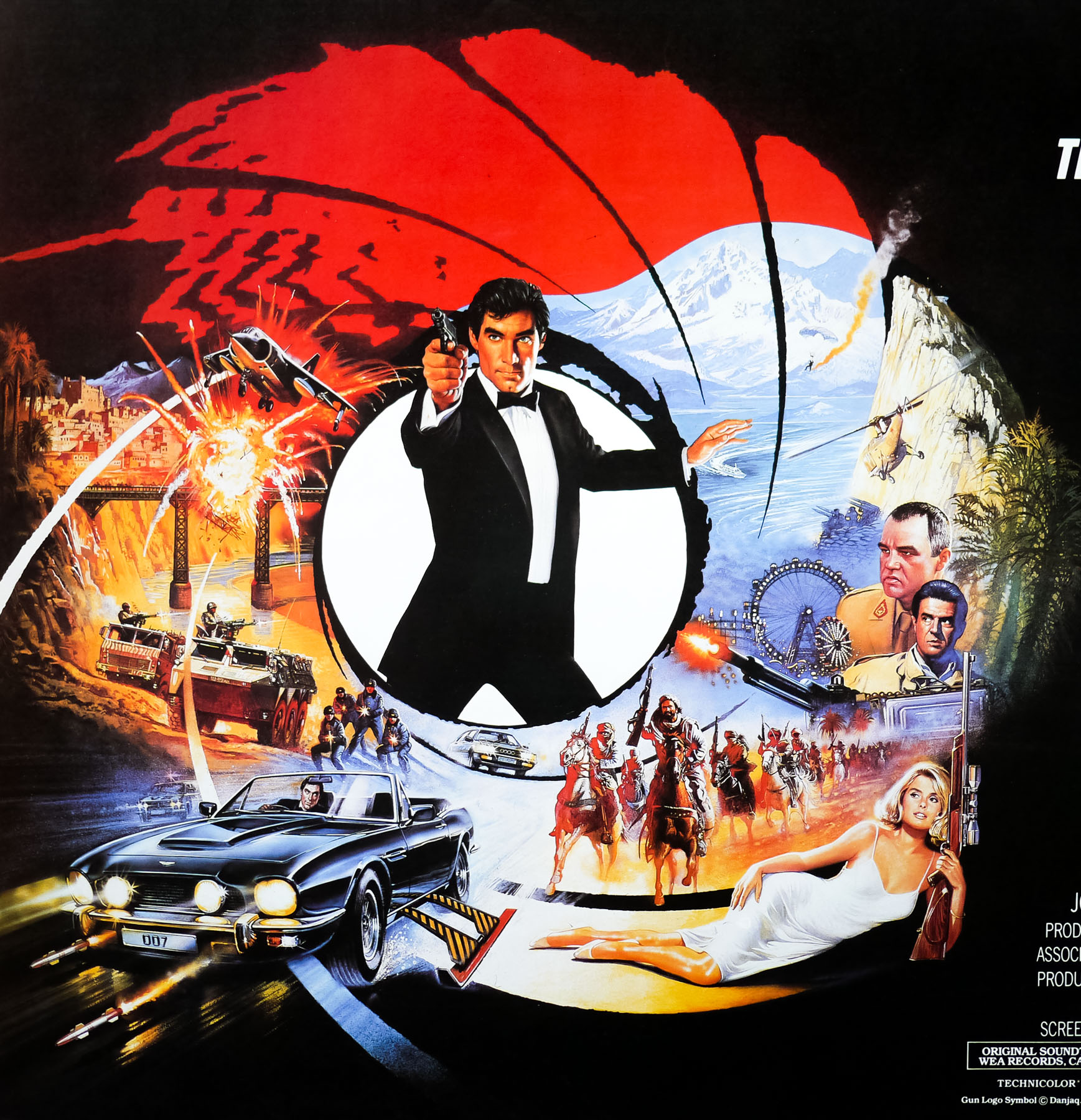
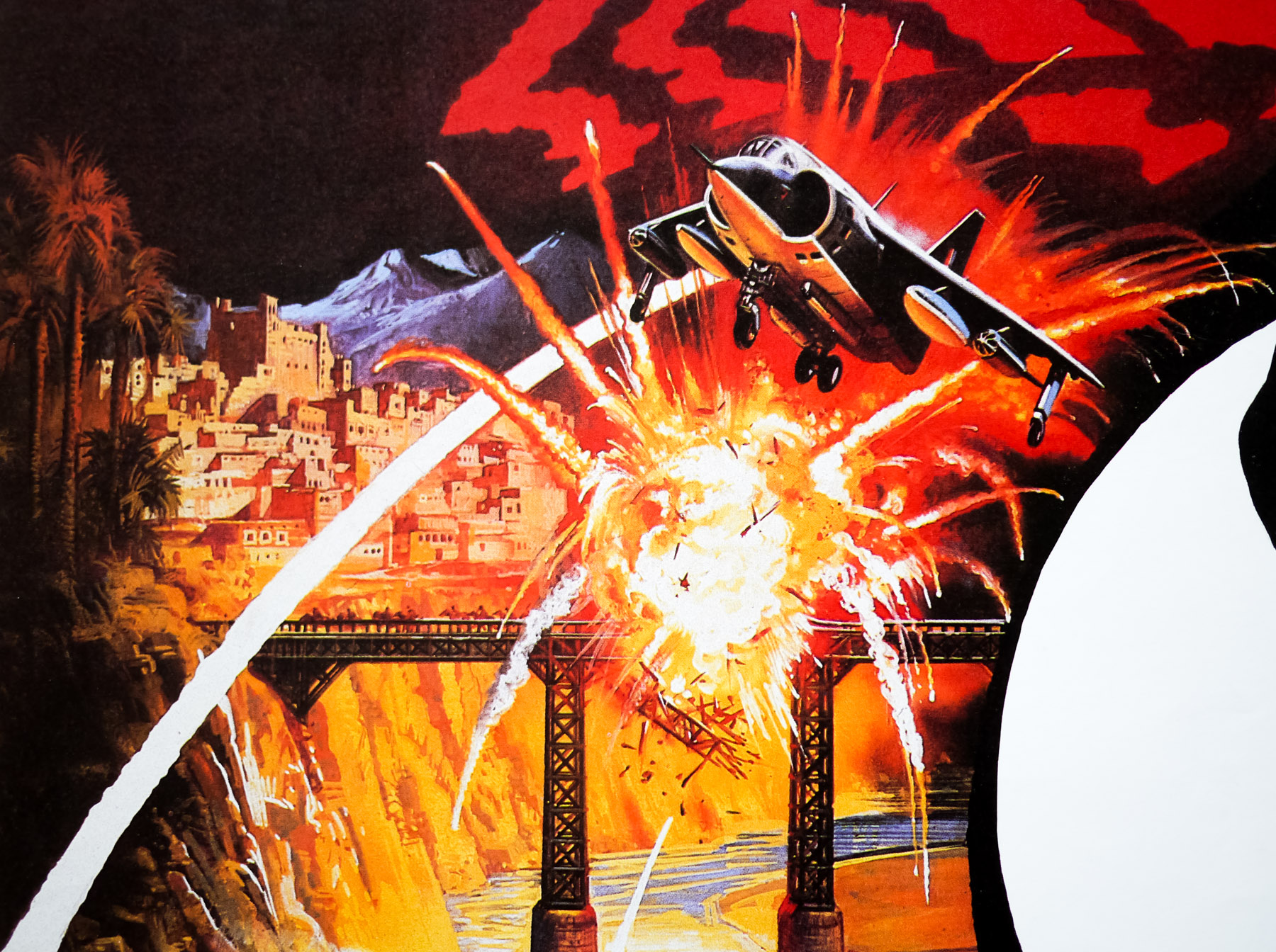
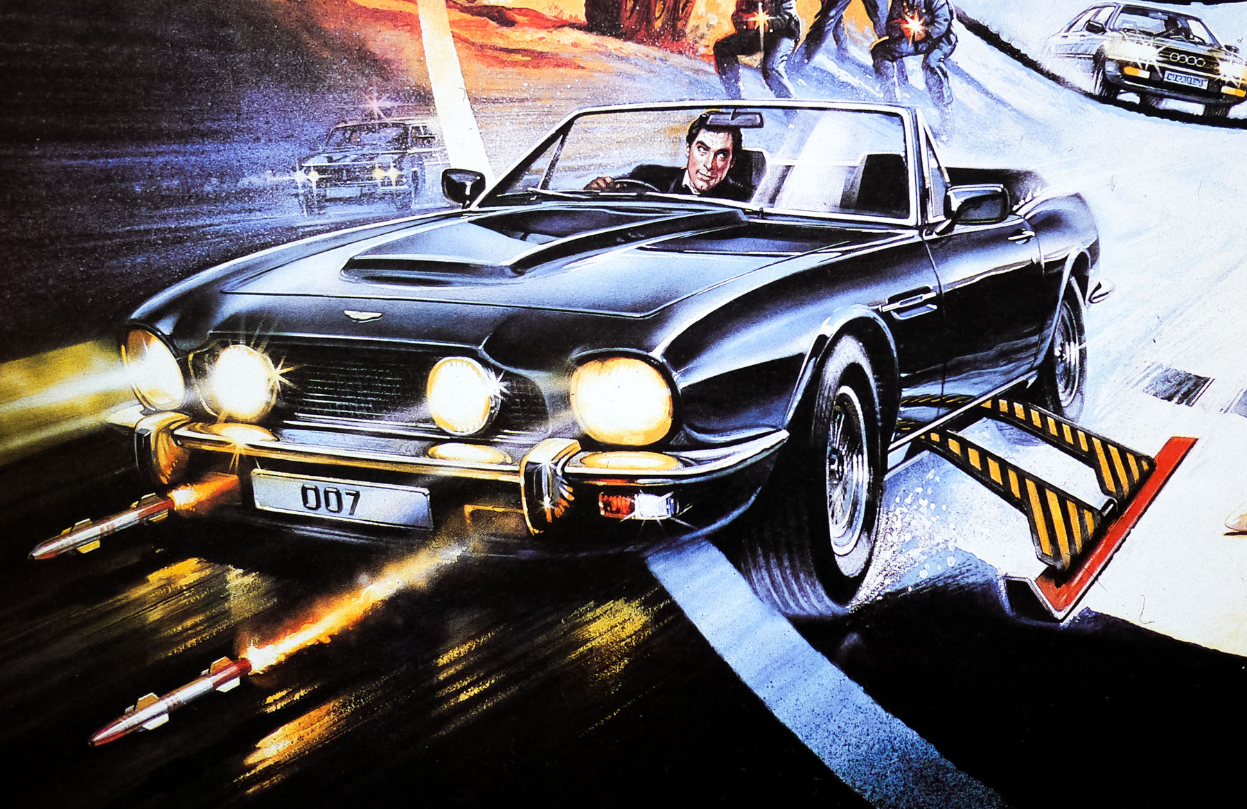
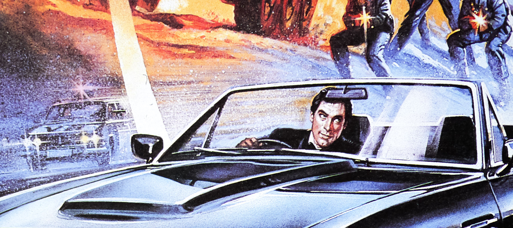
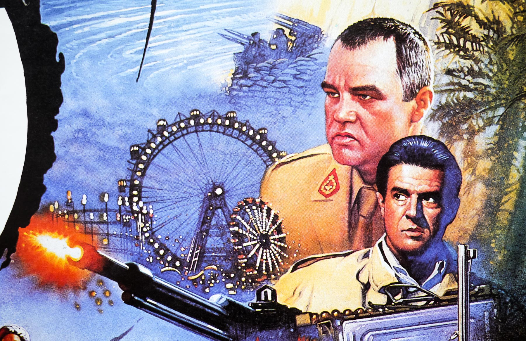
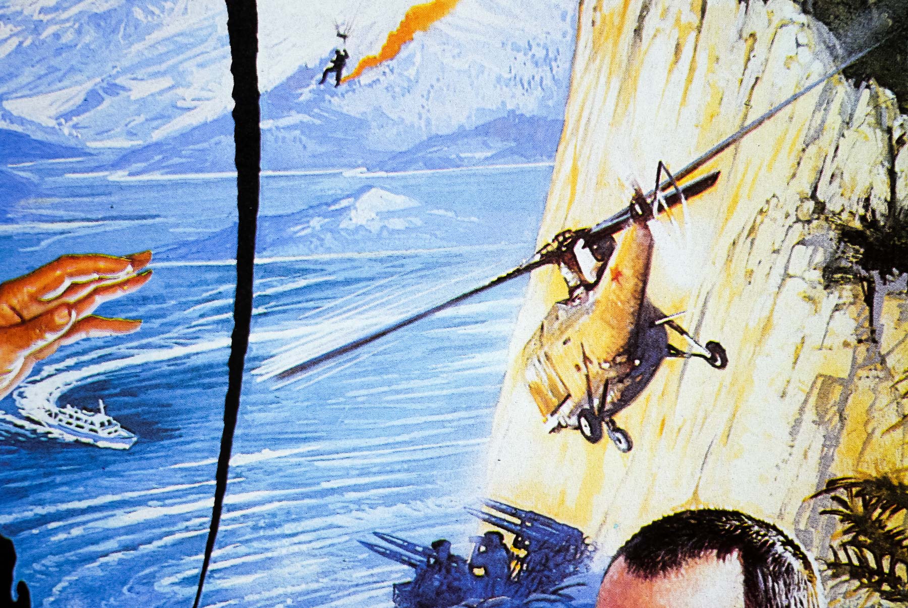
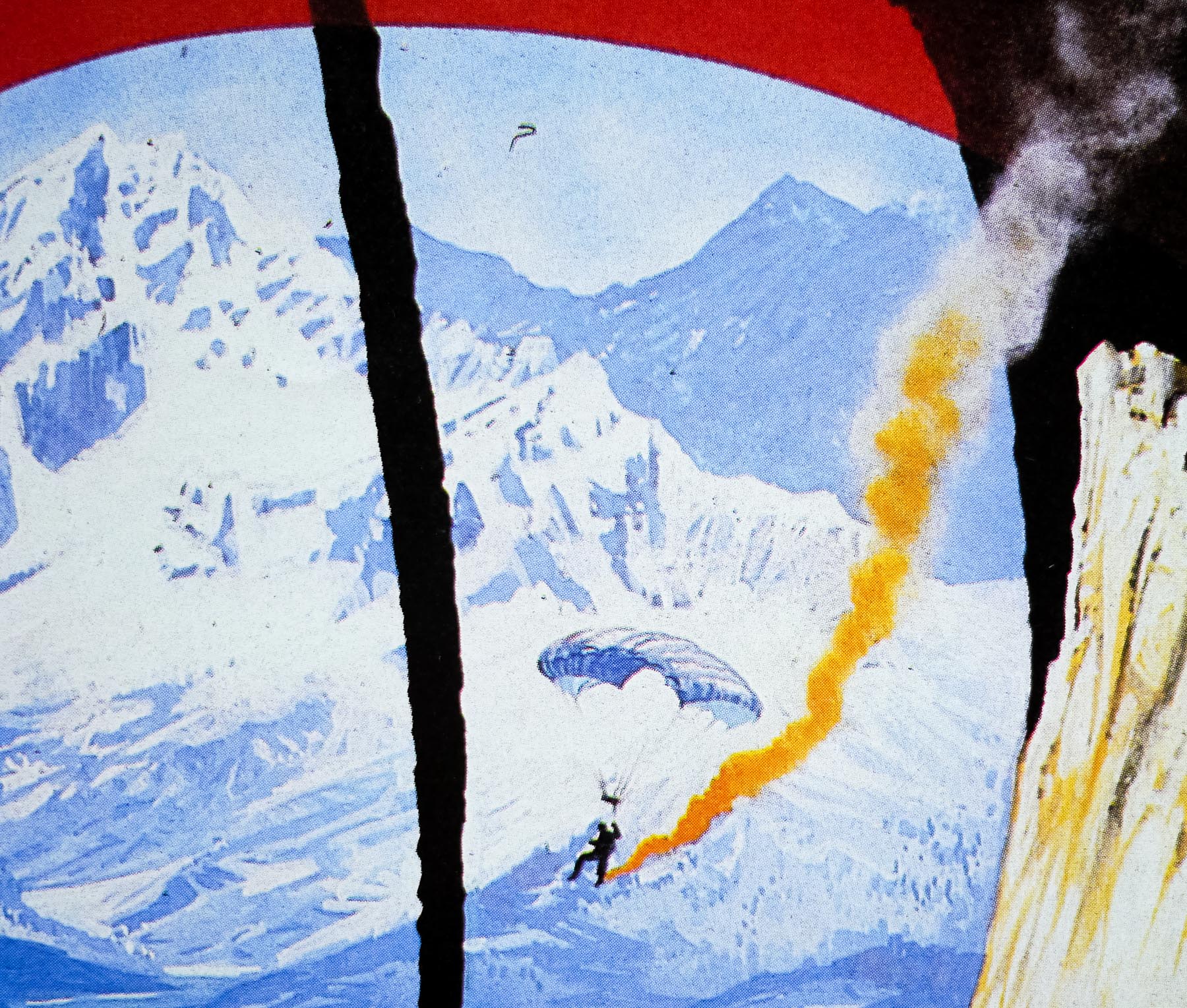
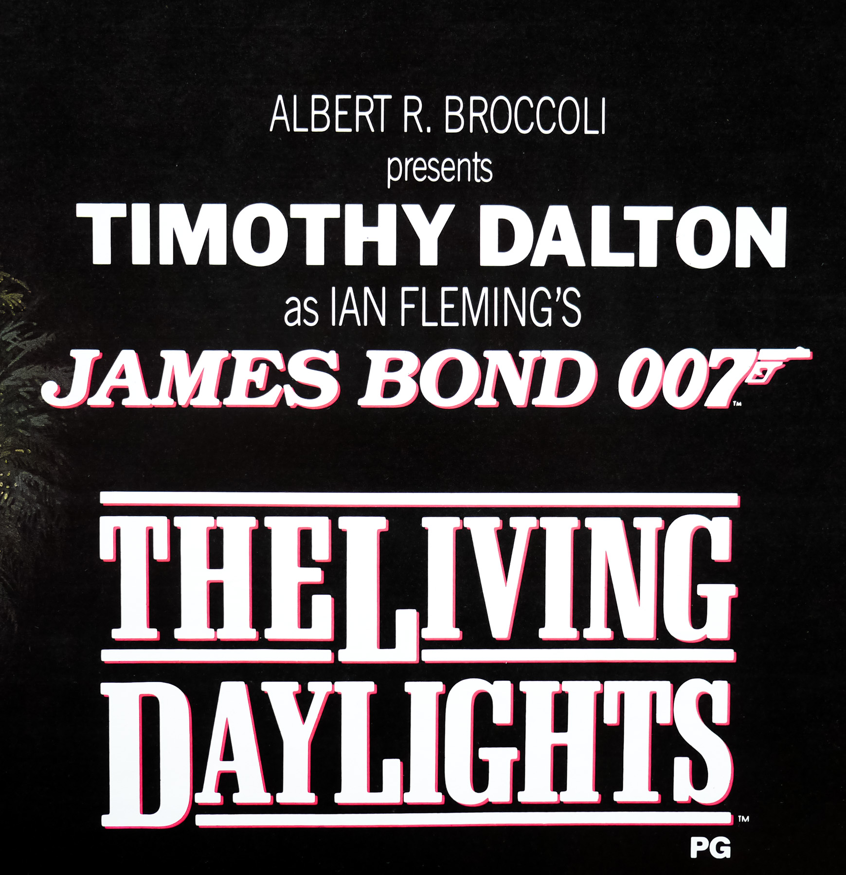
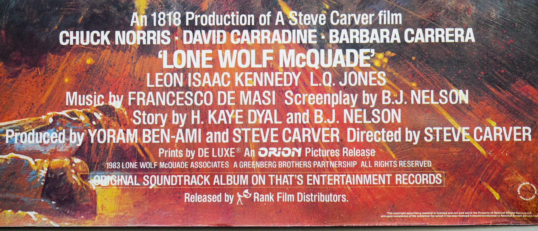
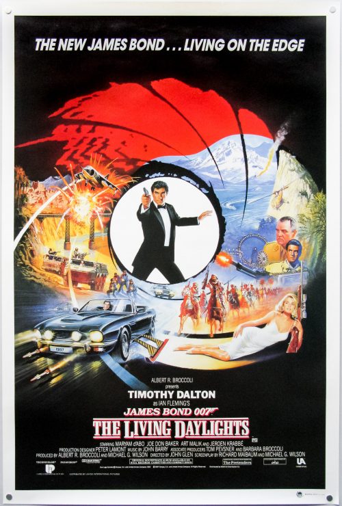
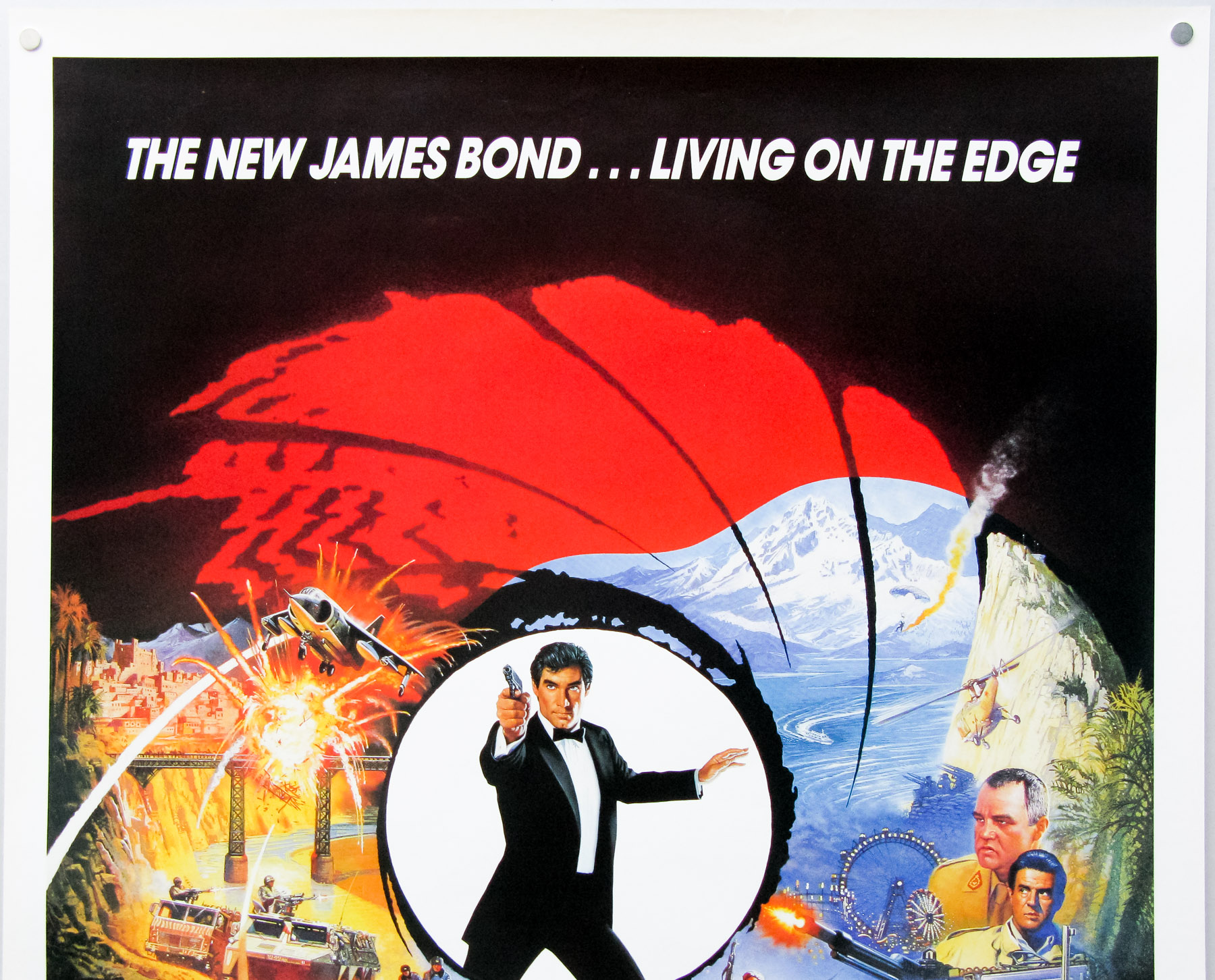
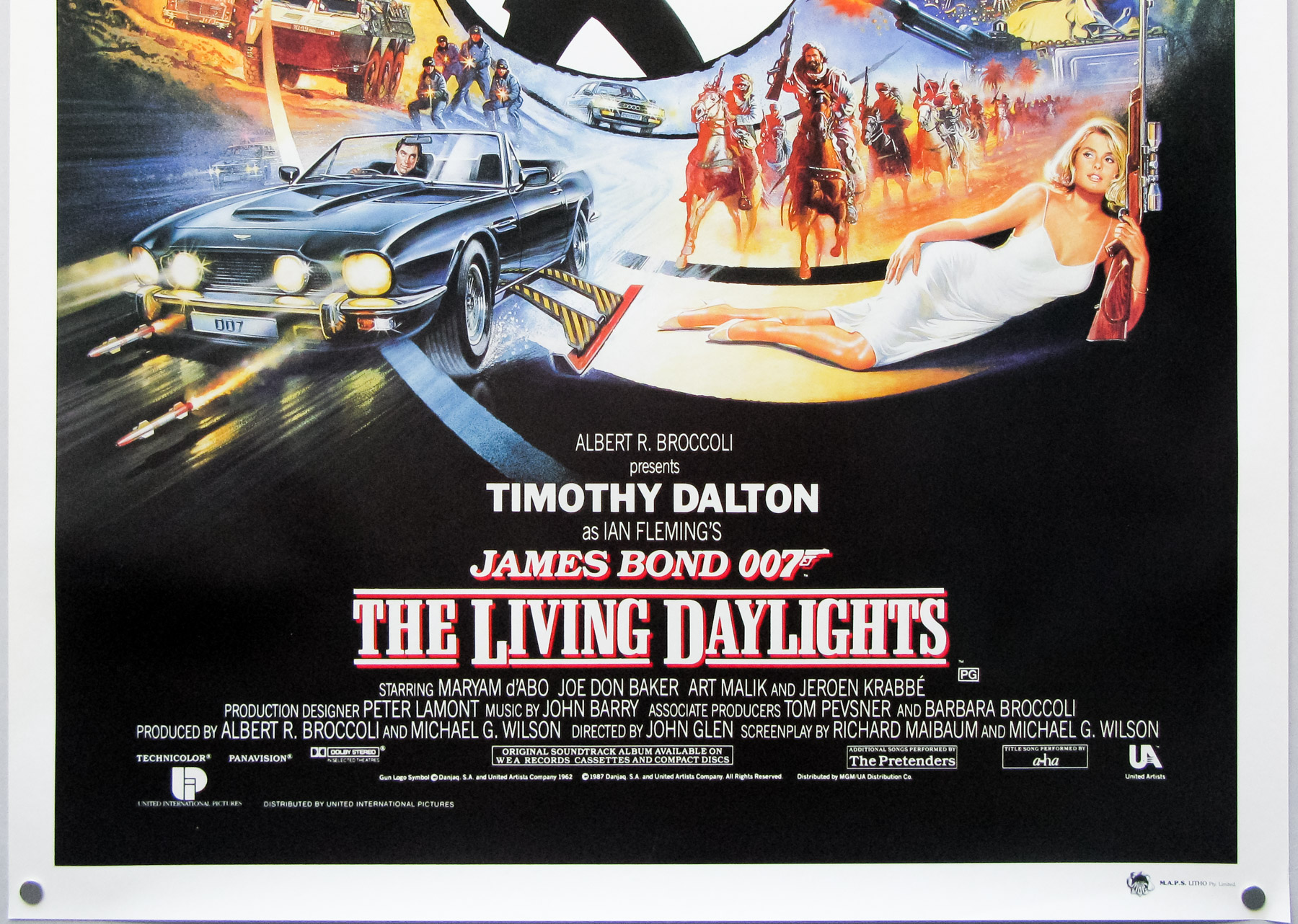
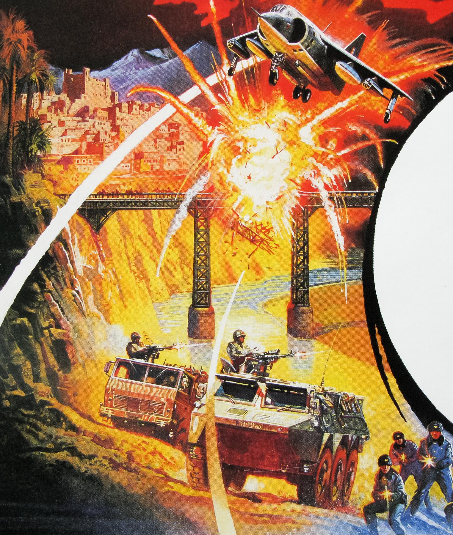
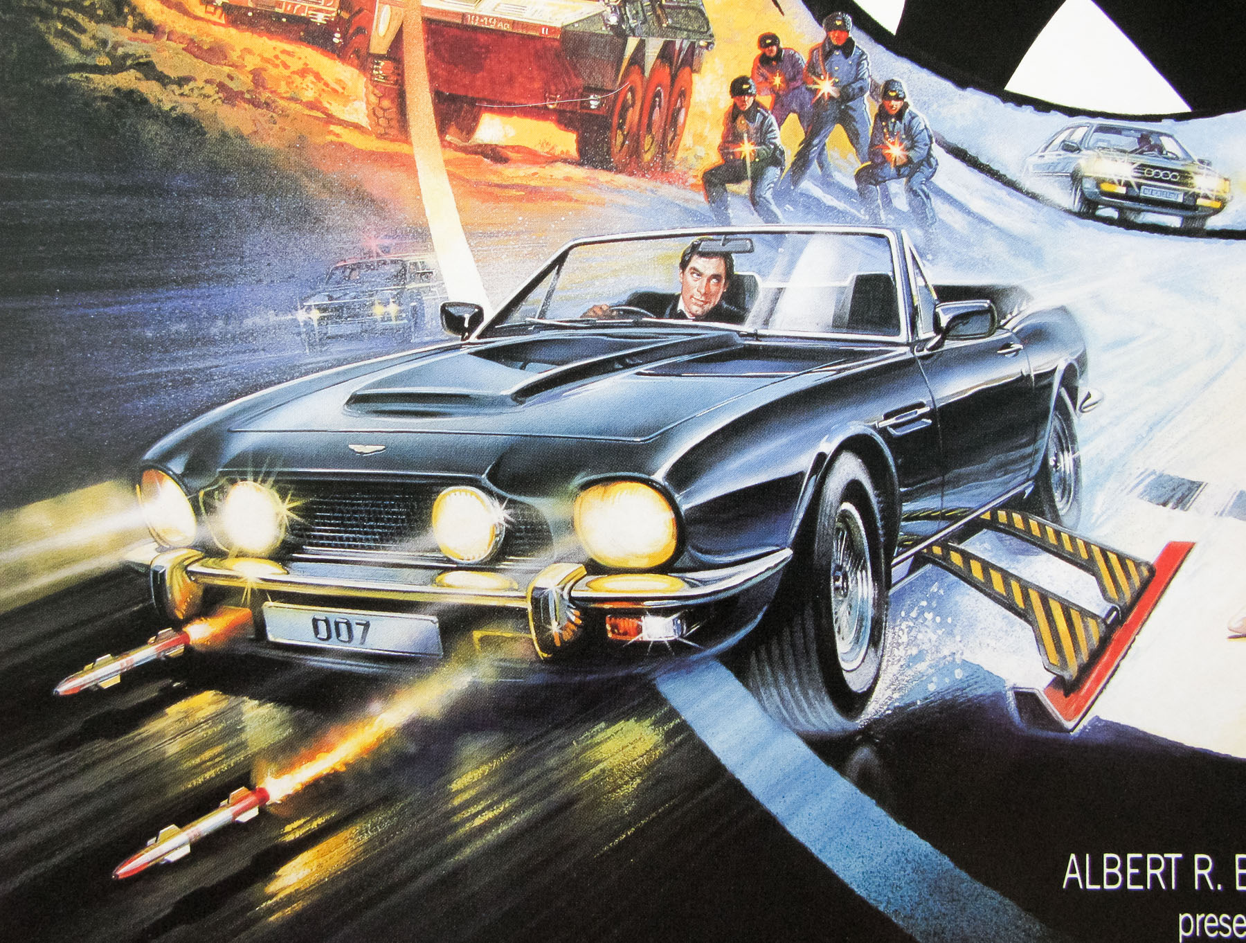
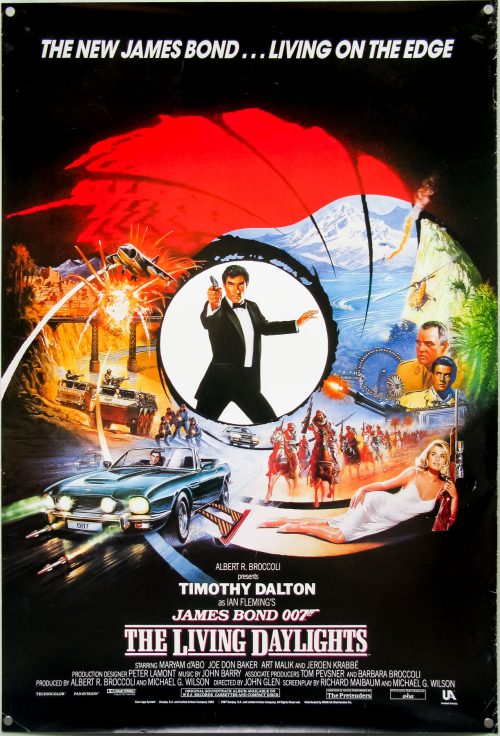
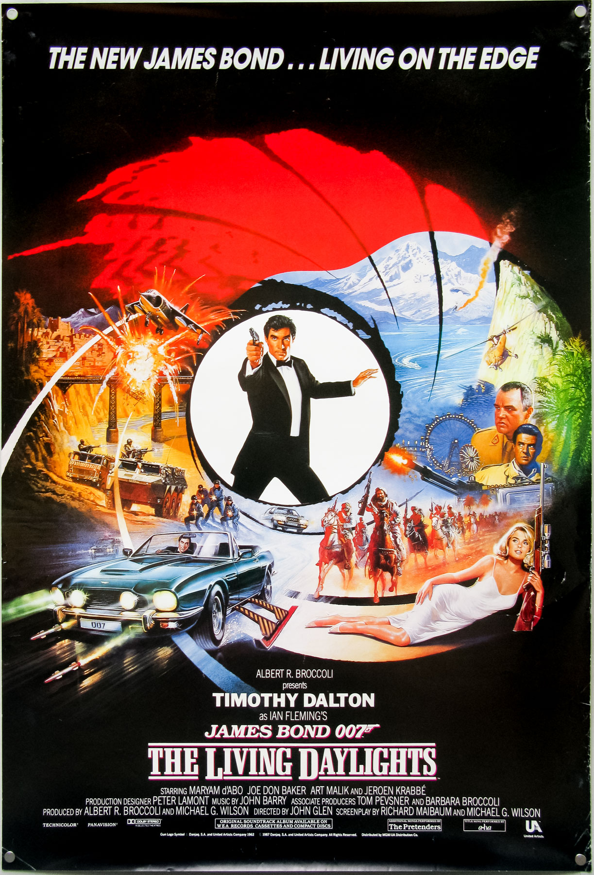
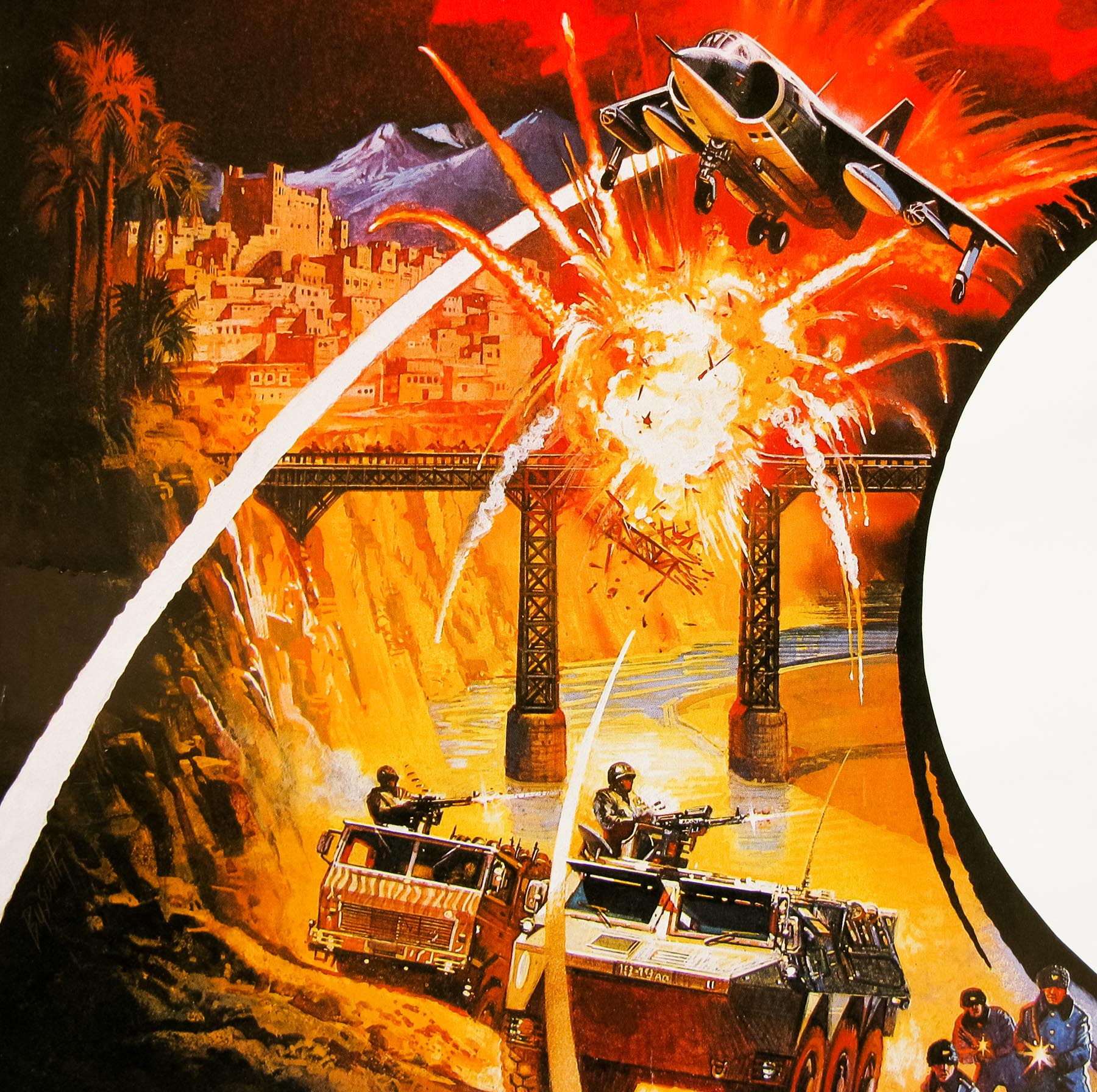
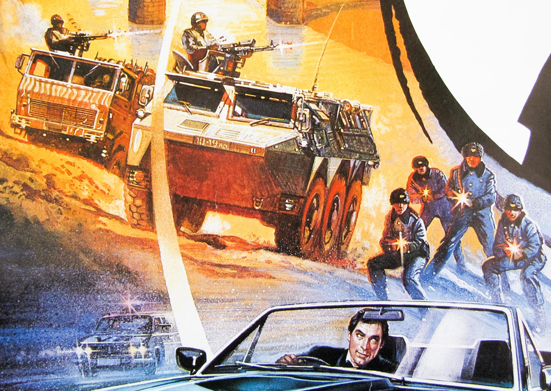
The artist Brian Bysouth with the original sketch for The Living Daylights poster, 2012
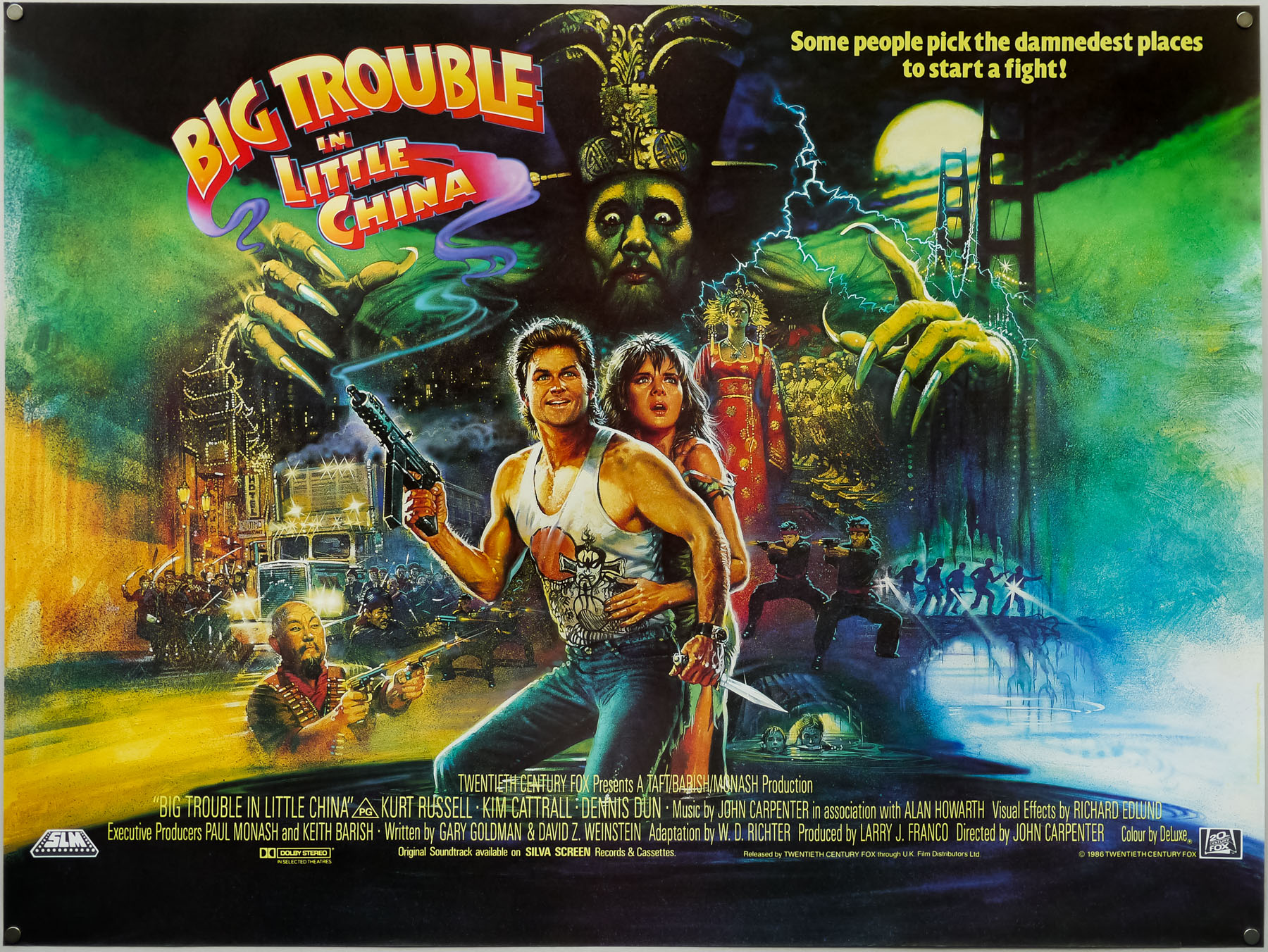
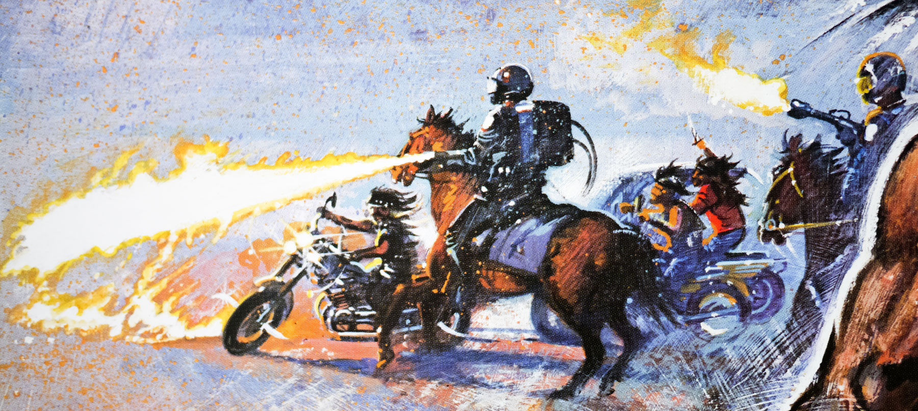
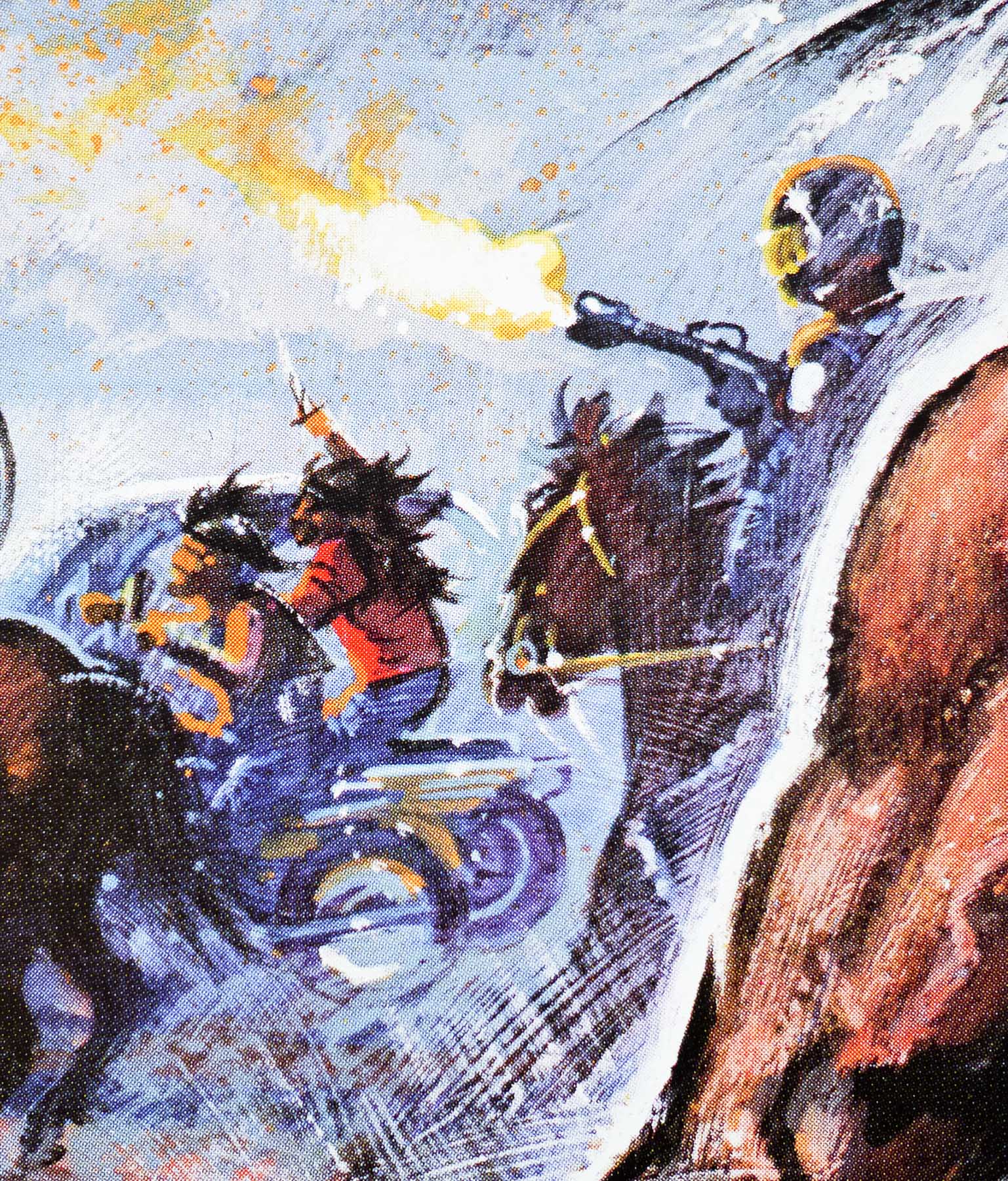
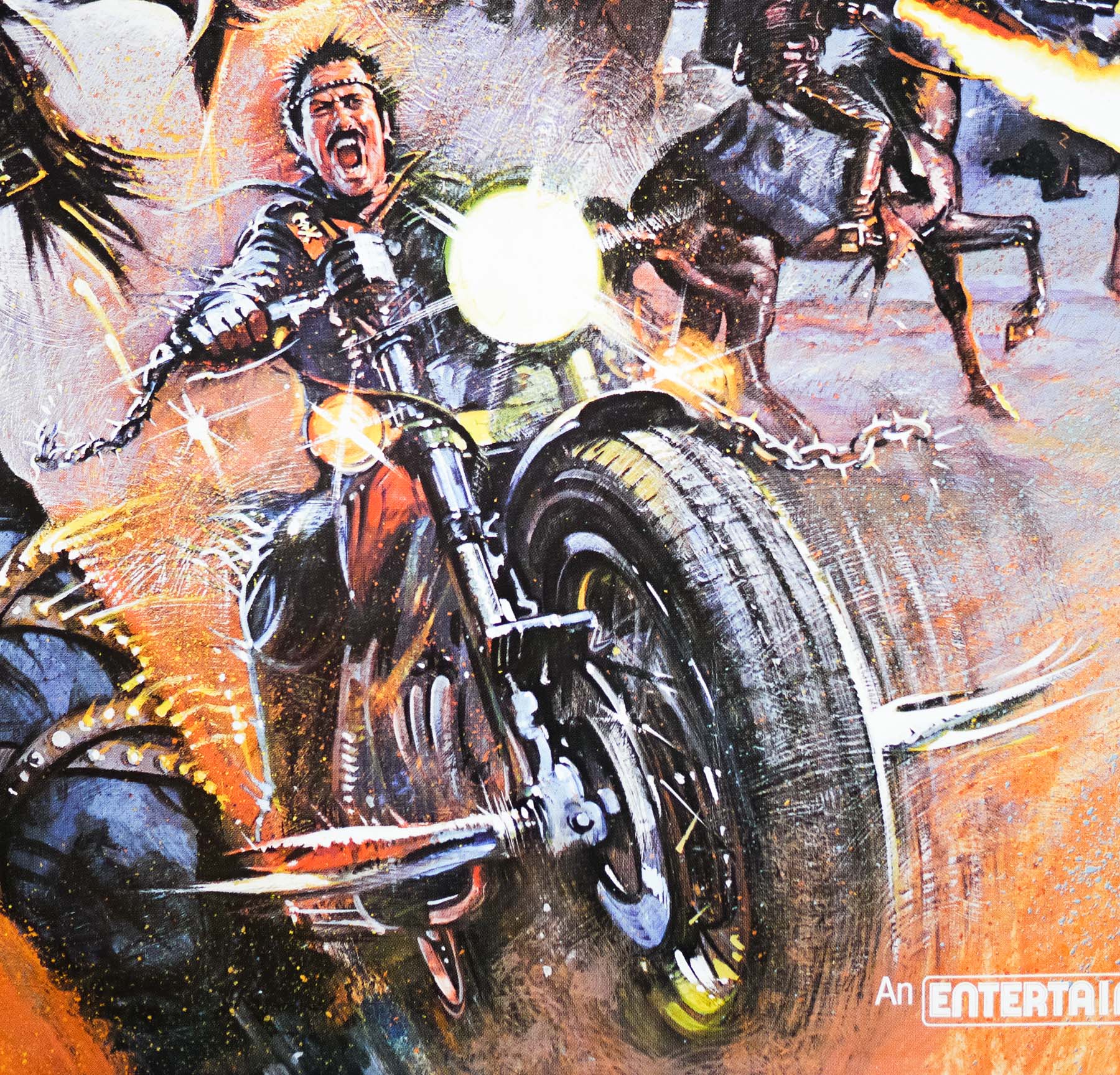
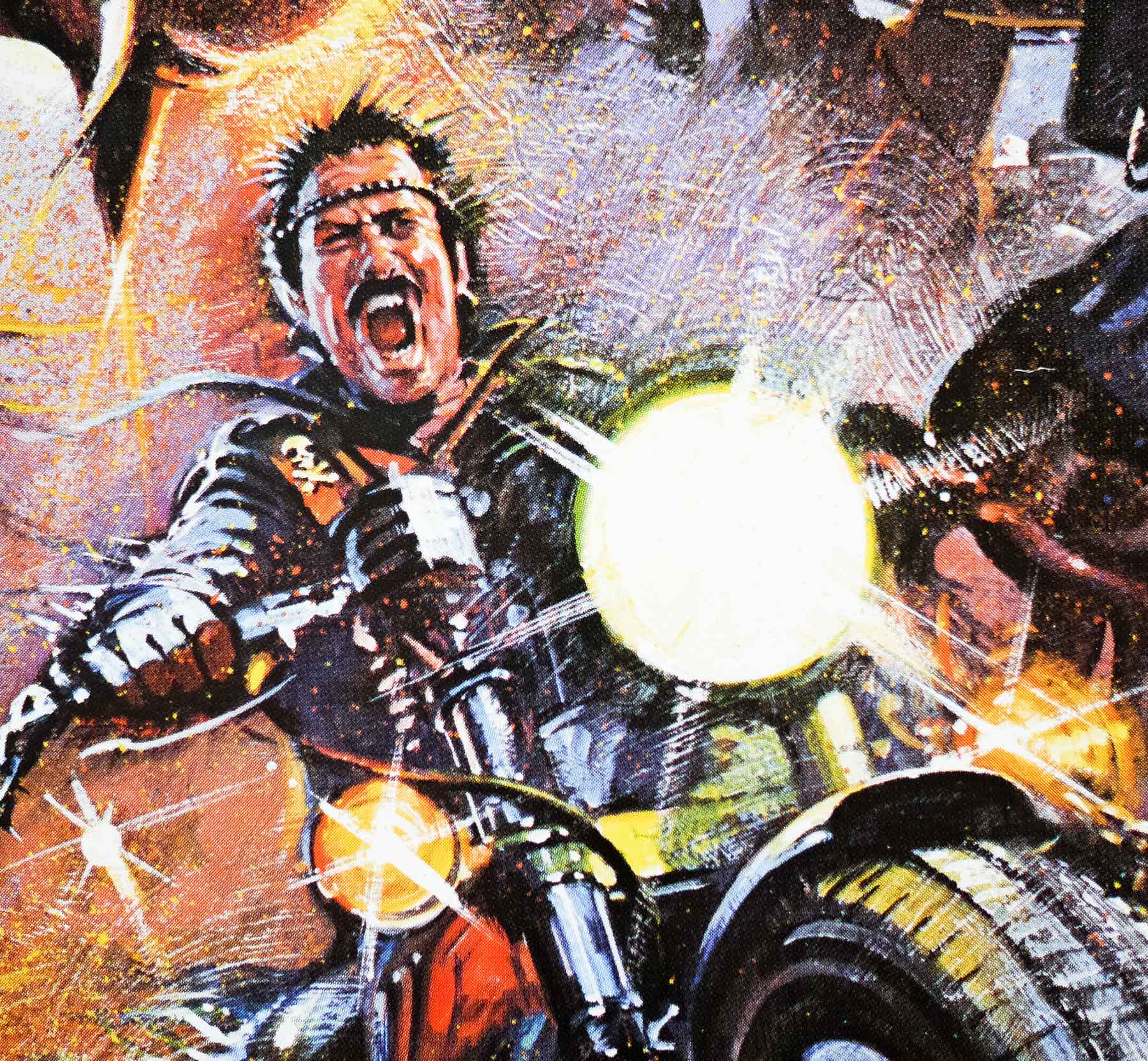
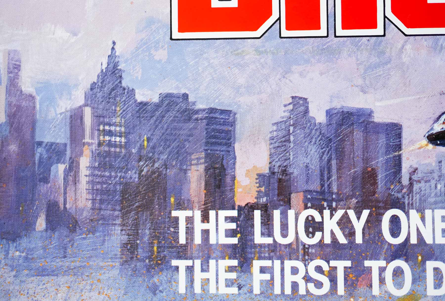
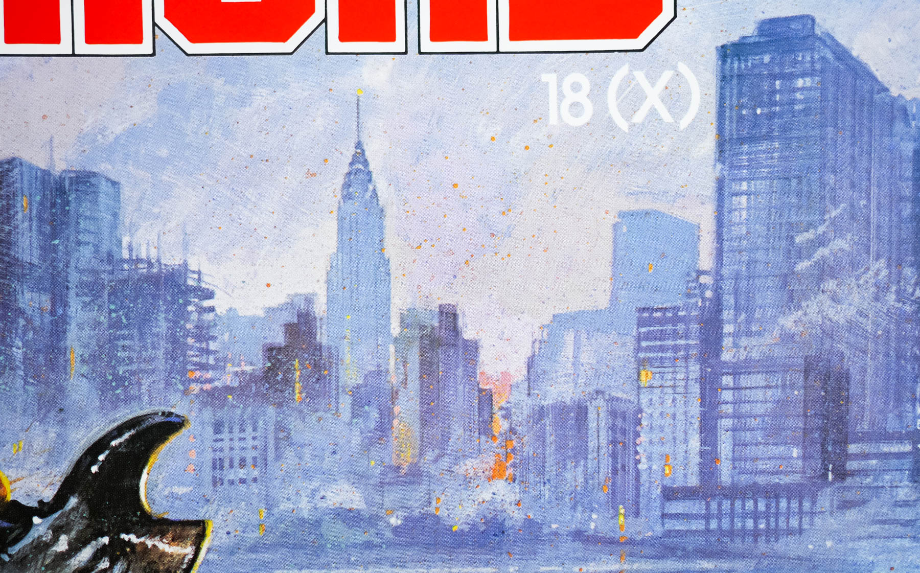
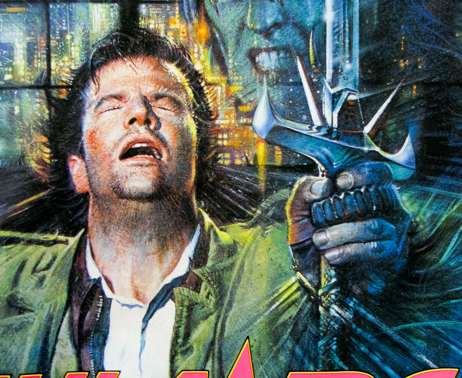
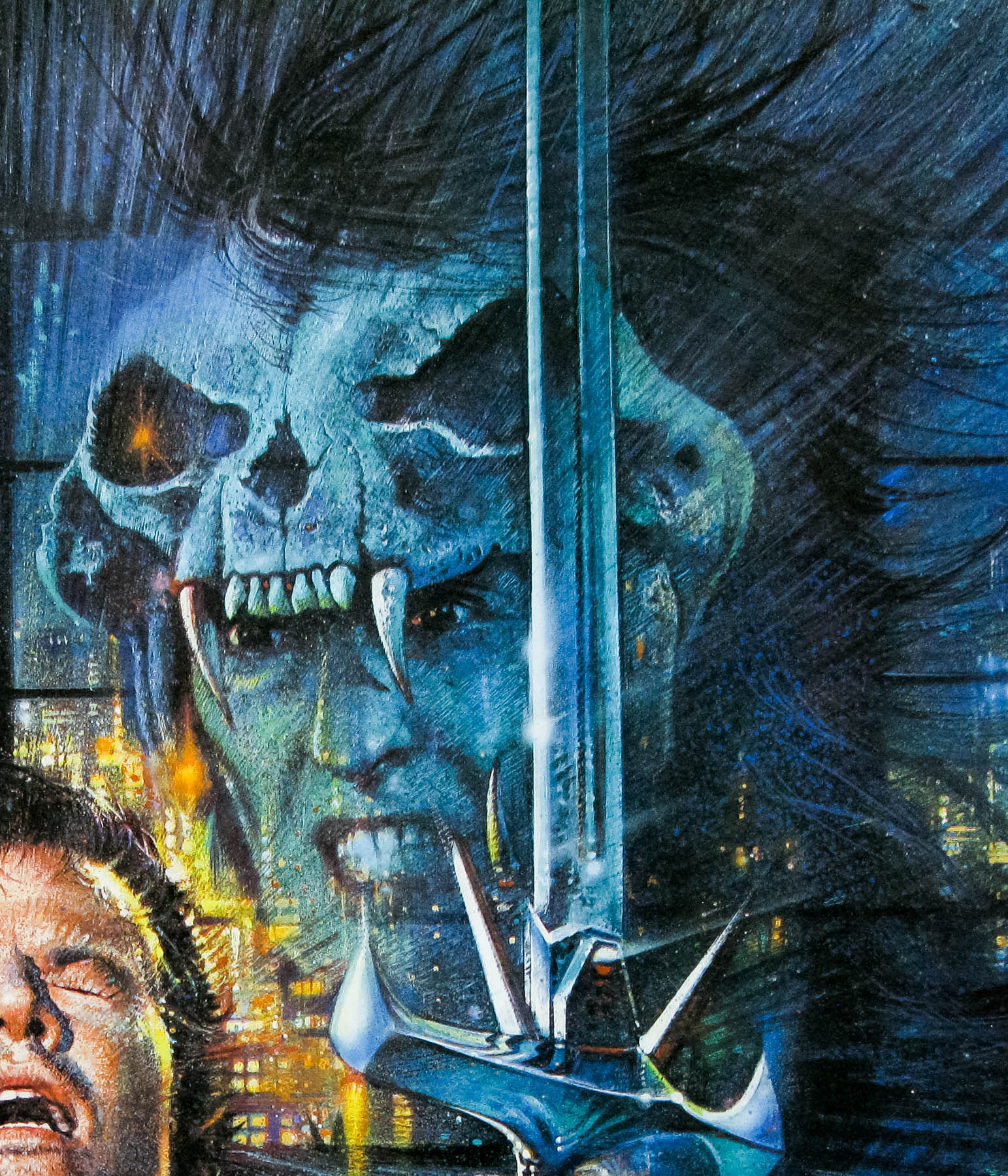
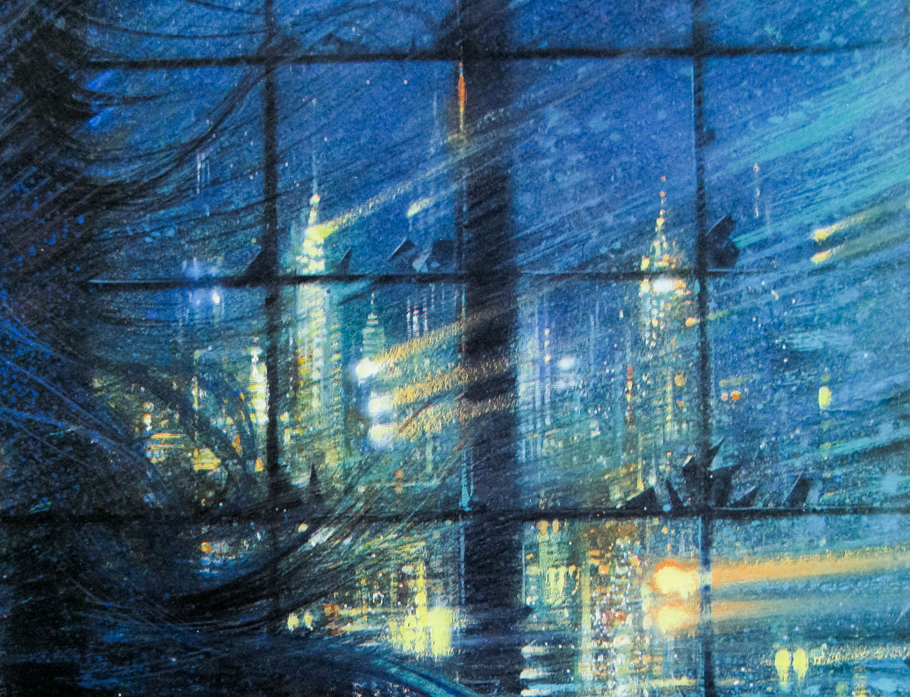
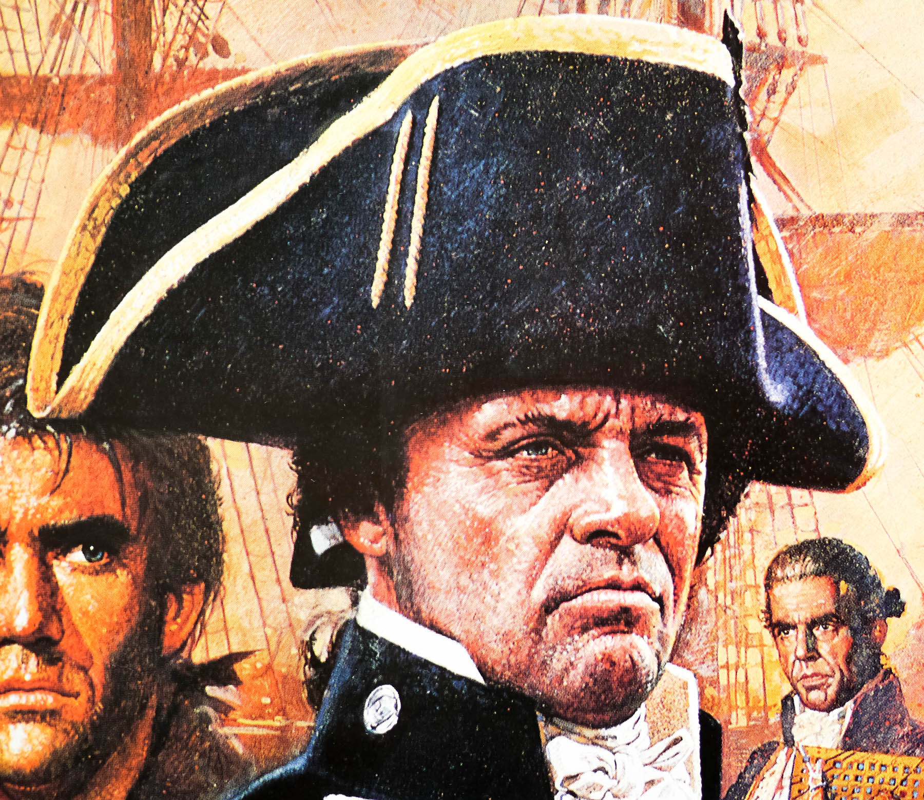
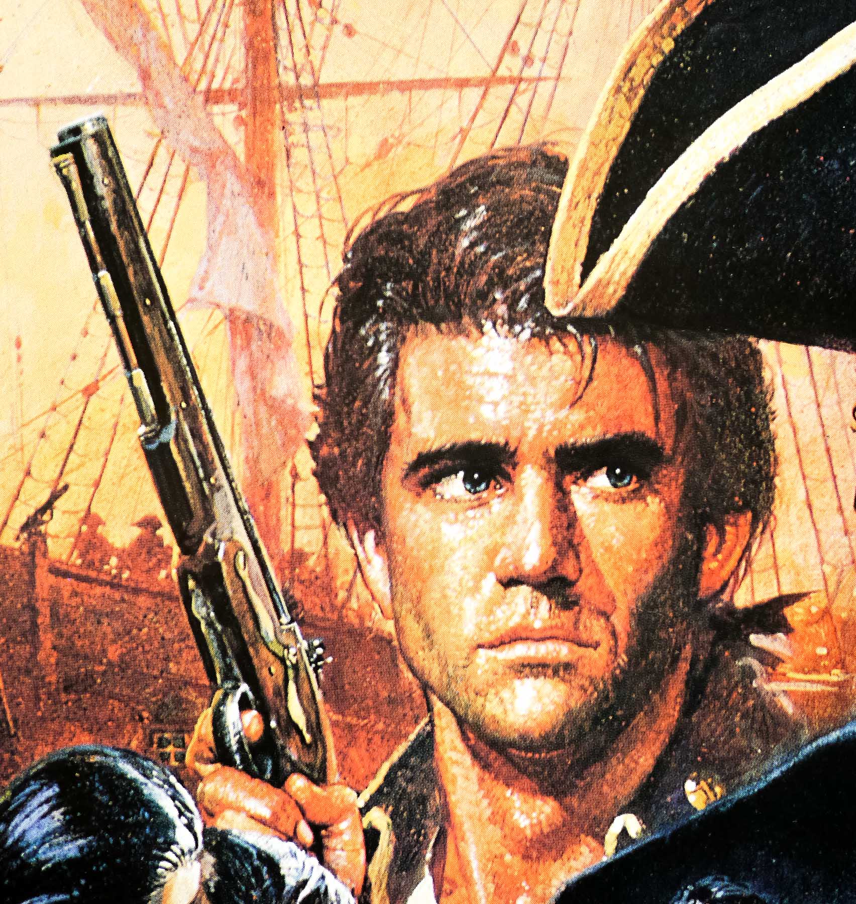
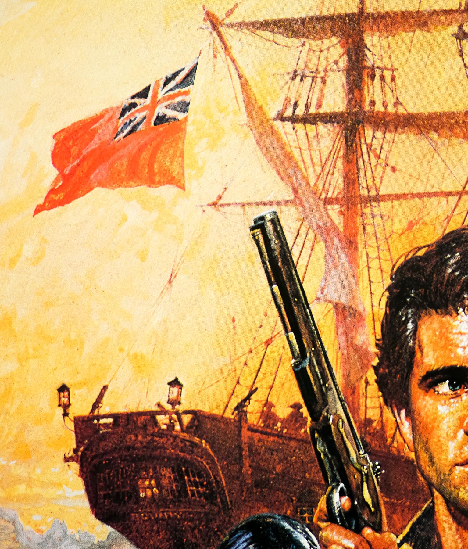
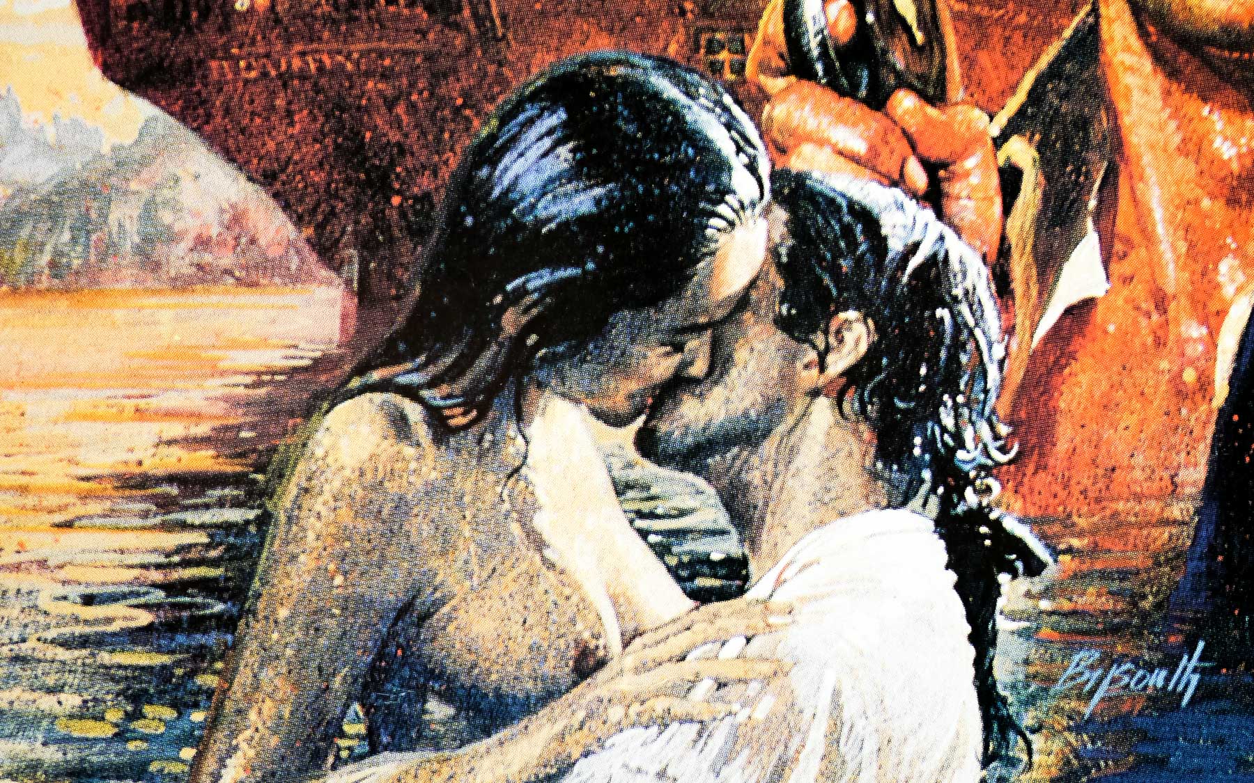
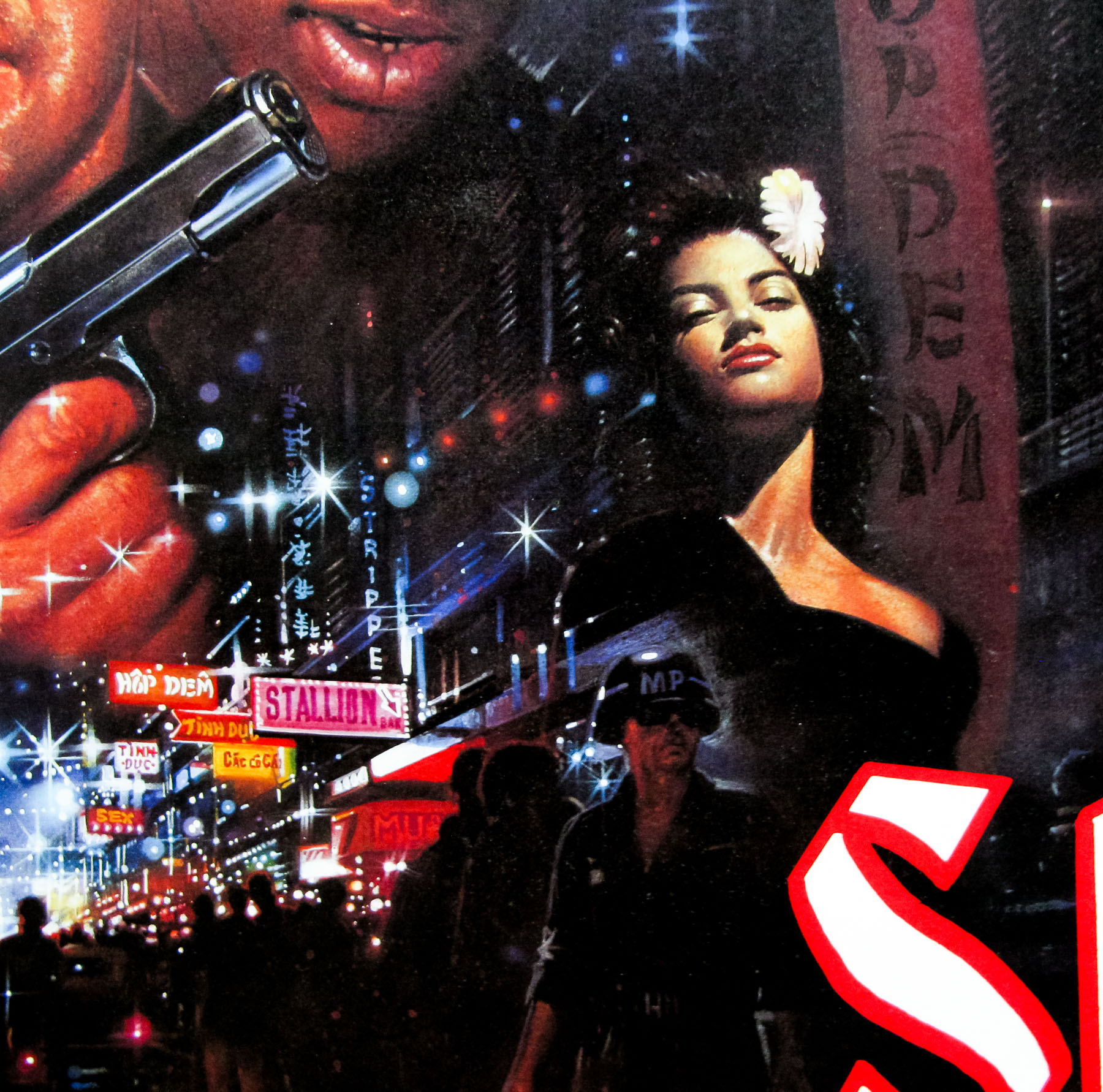
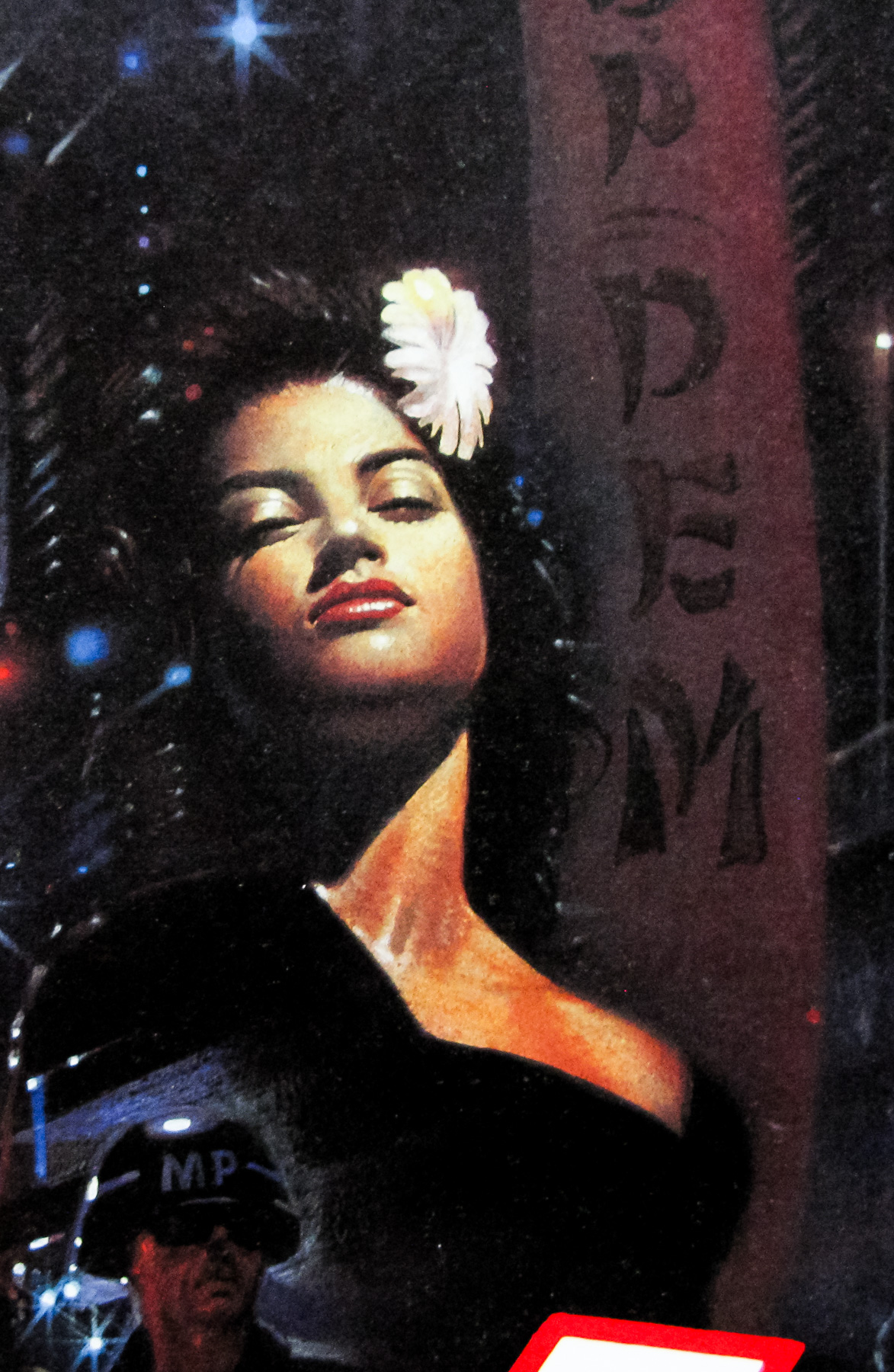
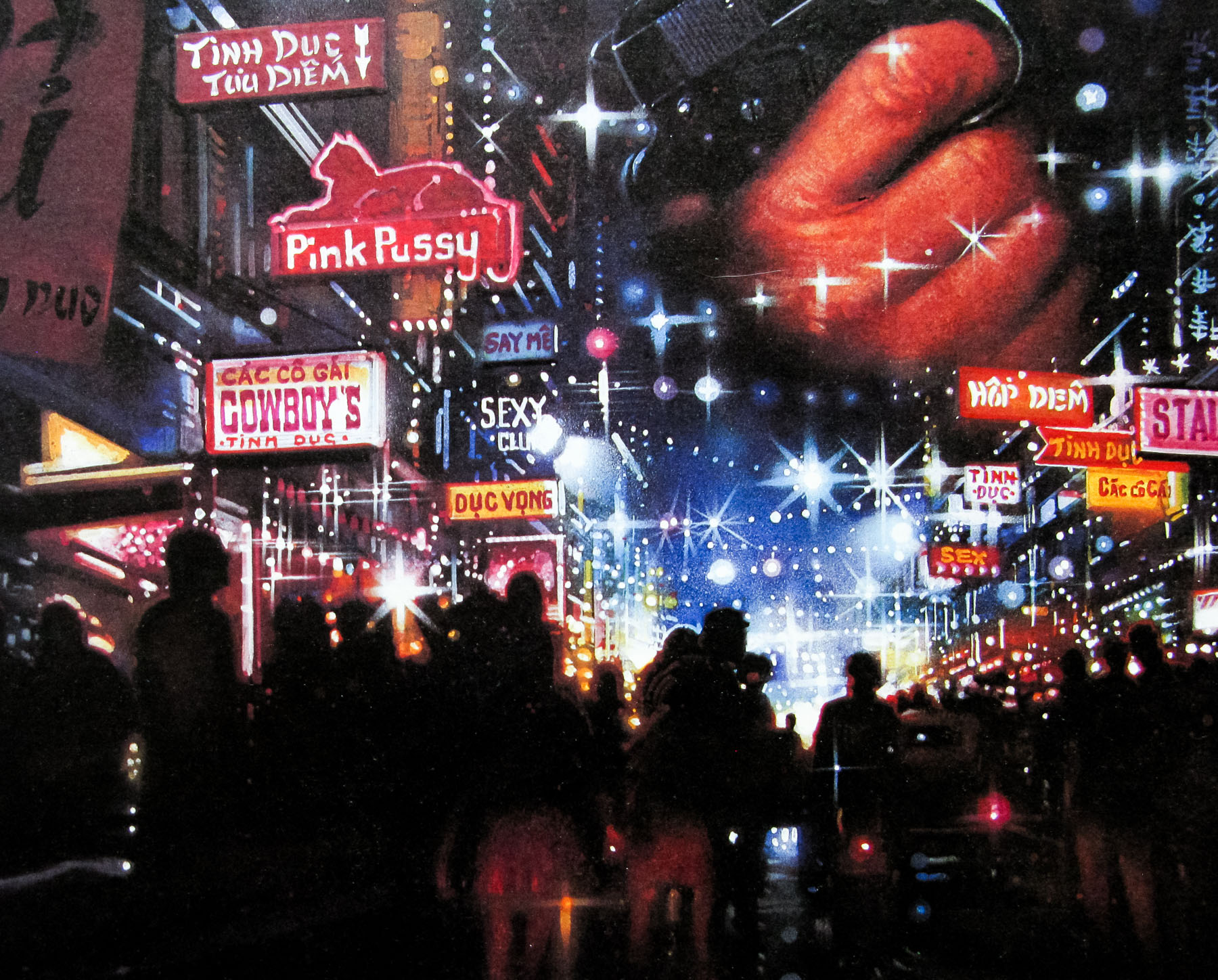
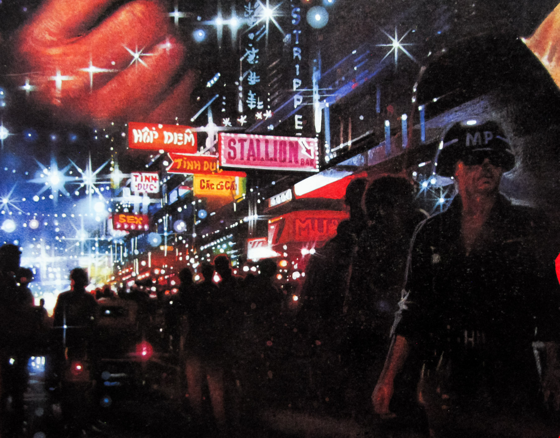
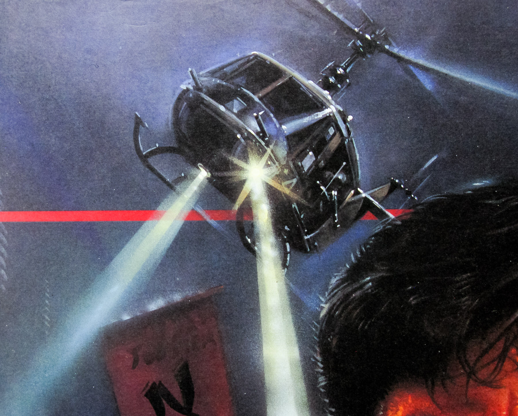
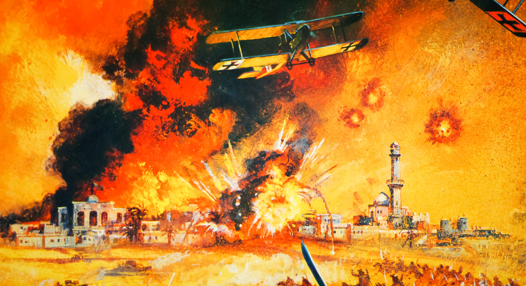
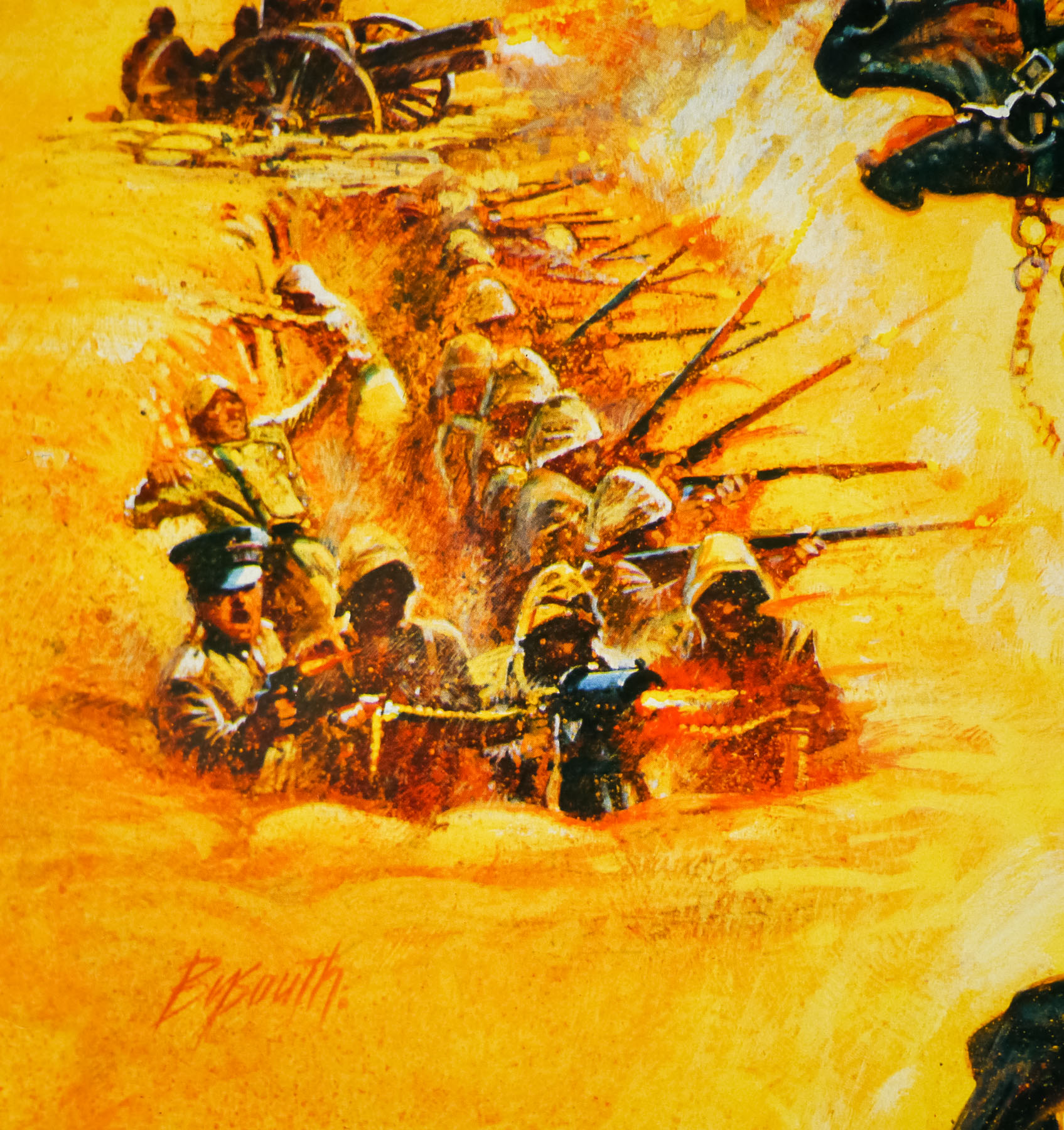
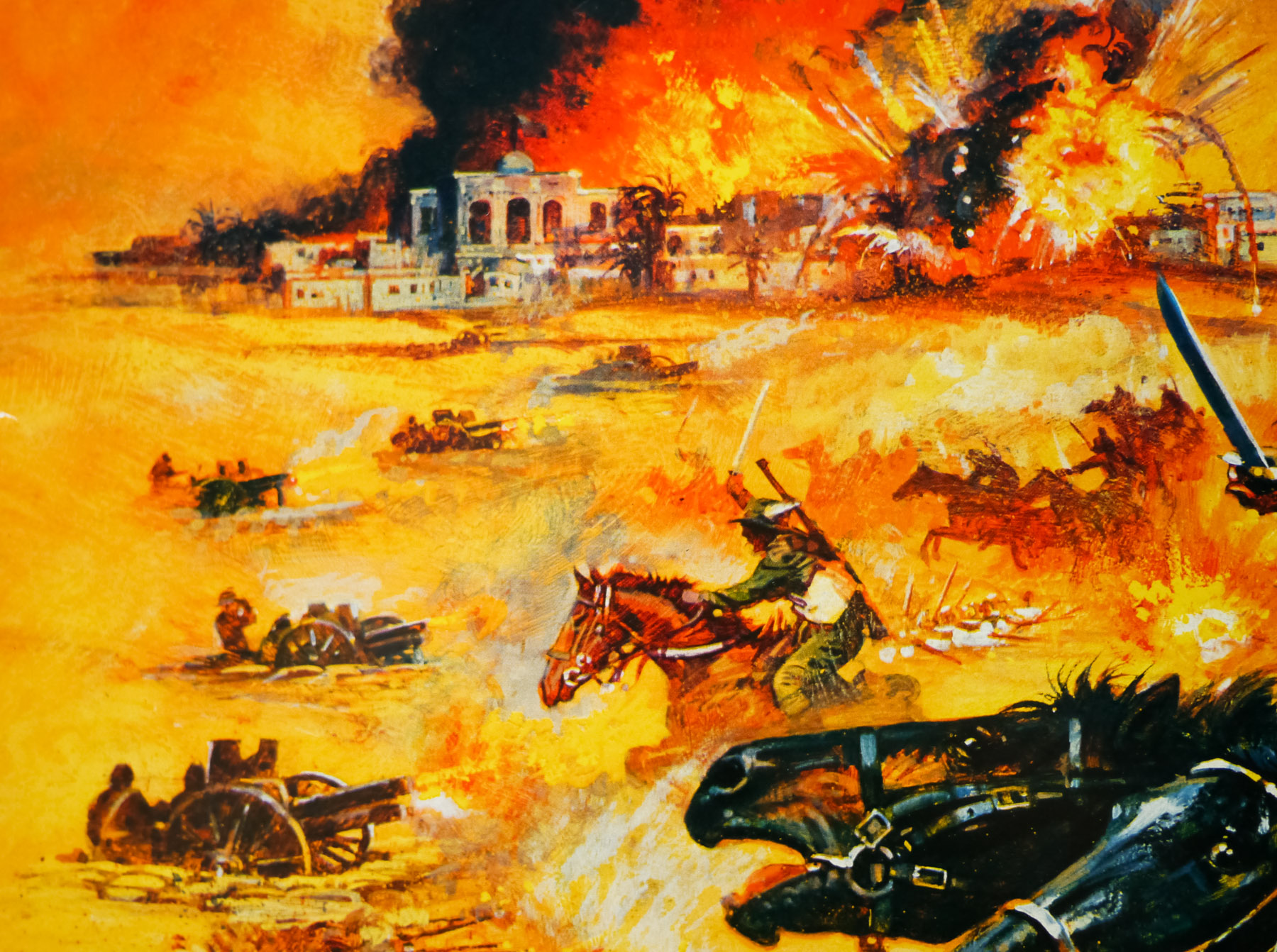
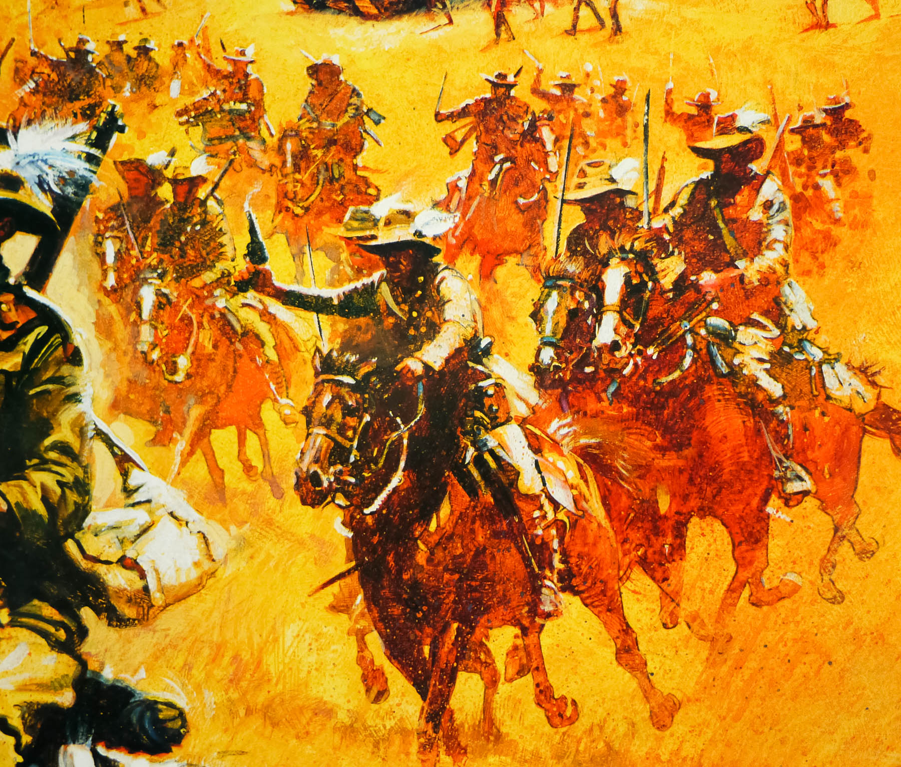
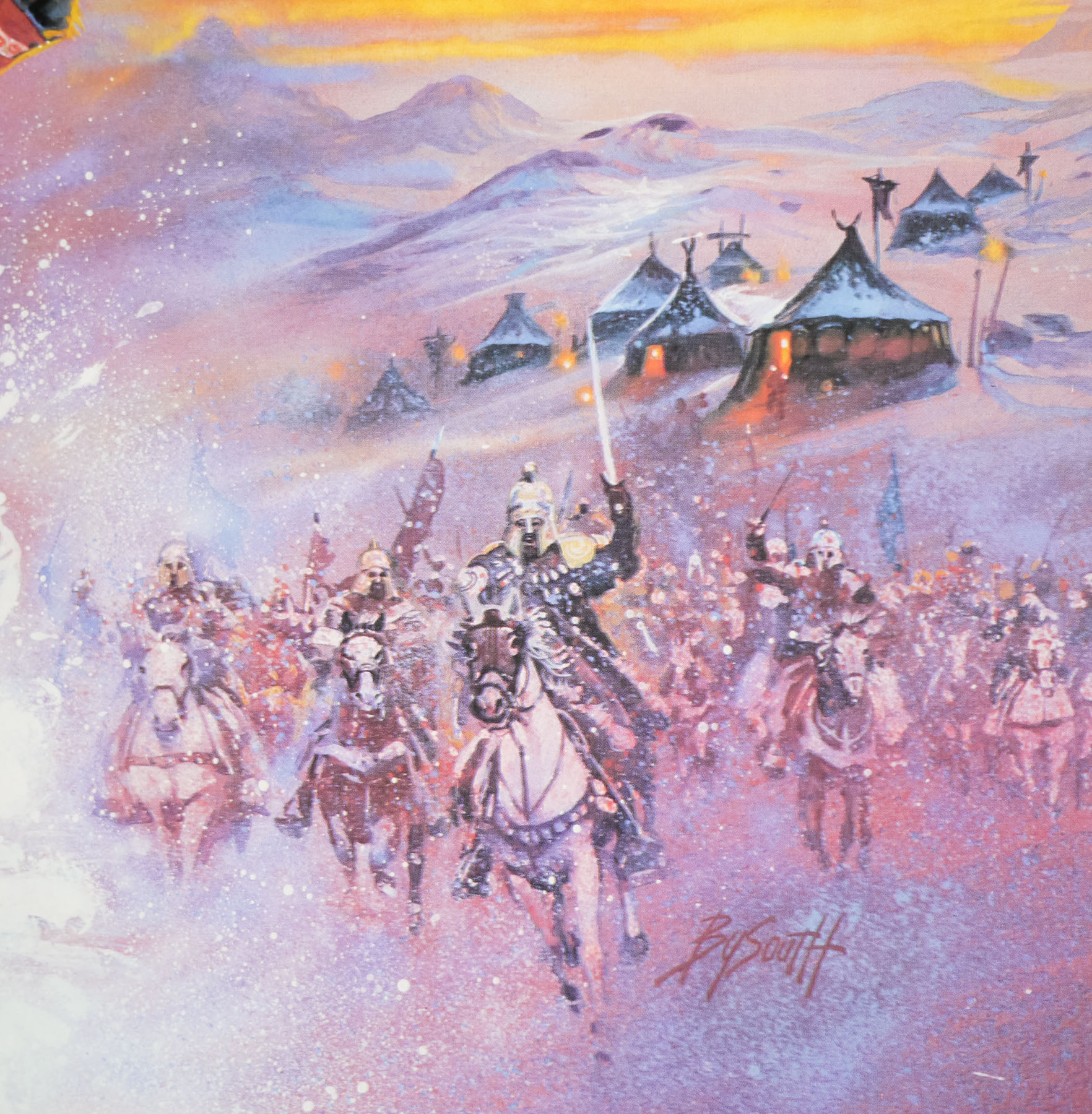
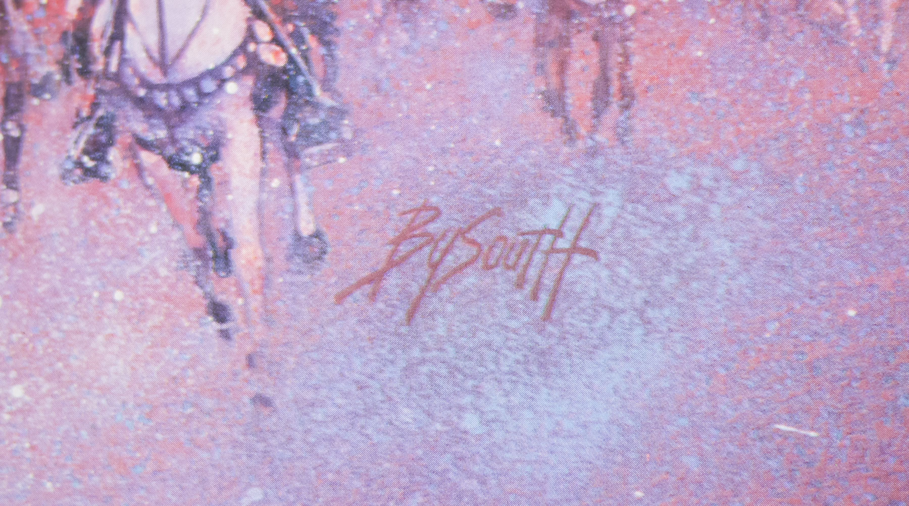
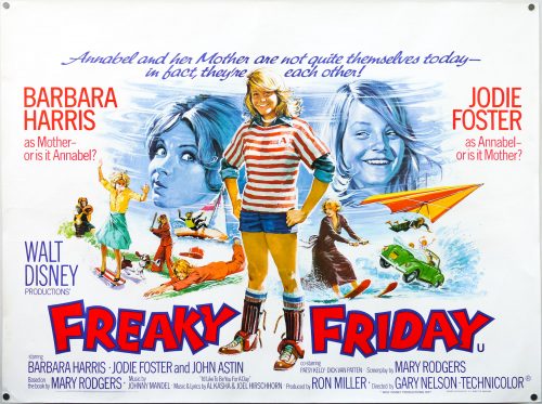
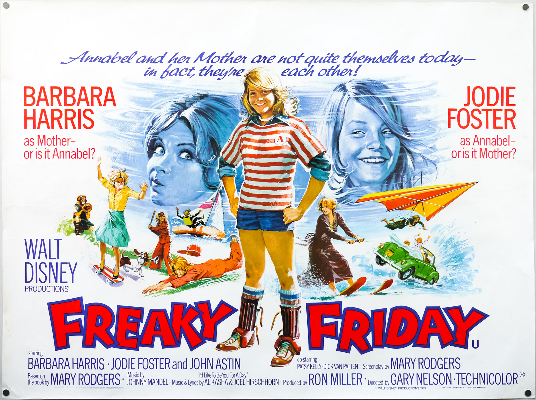
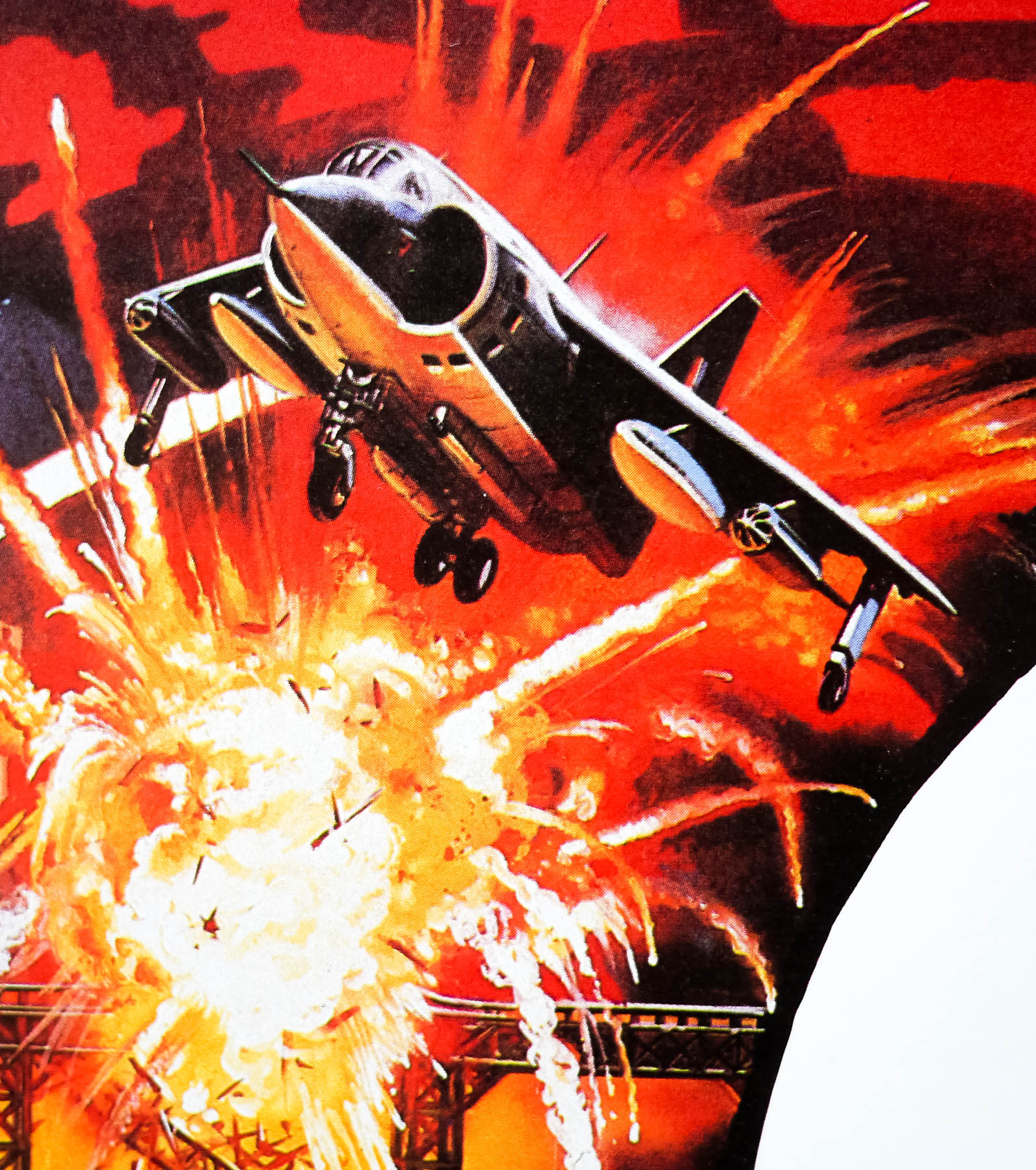
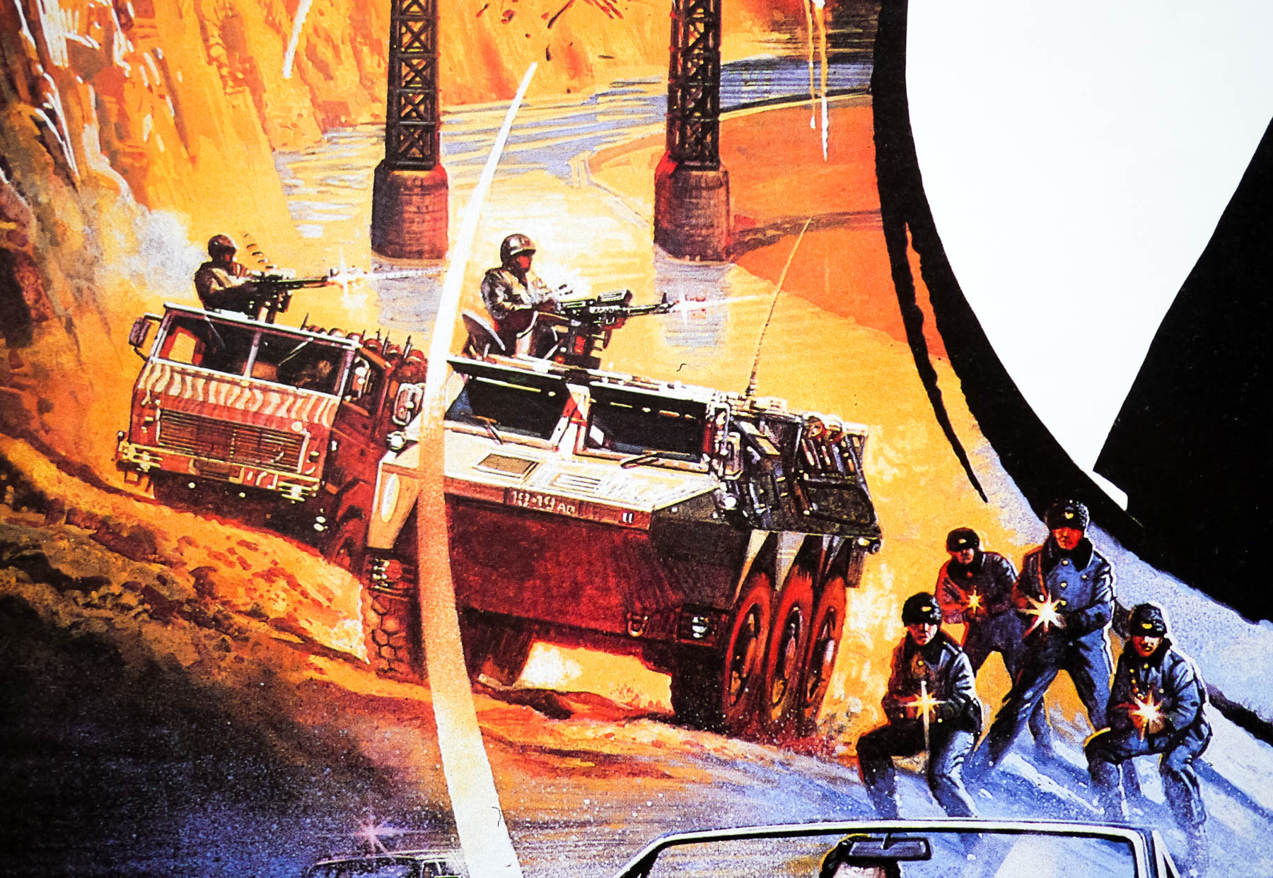
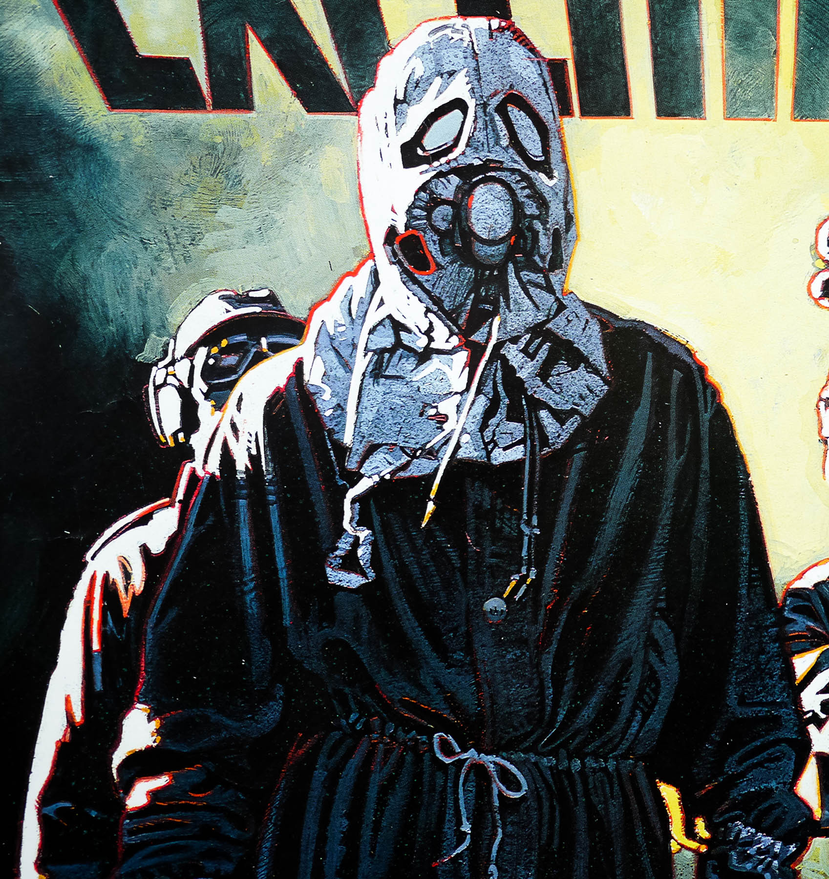
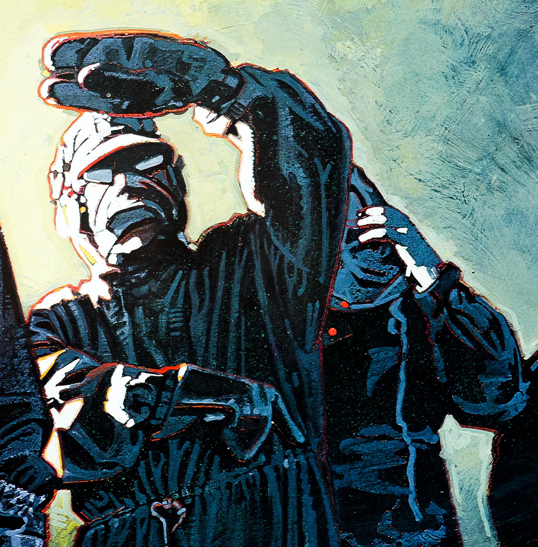
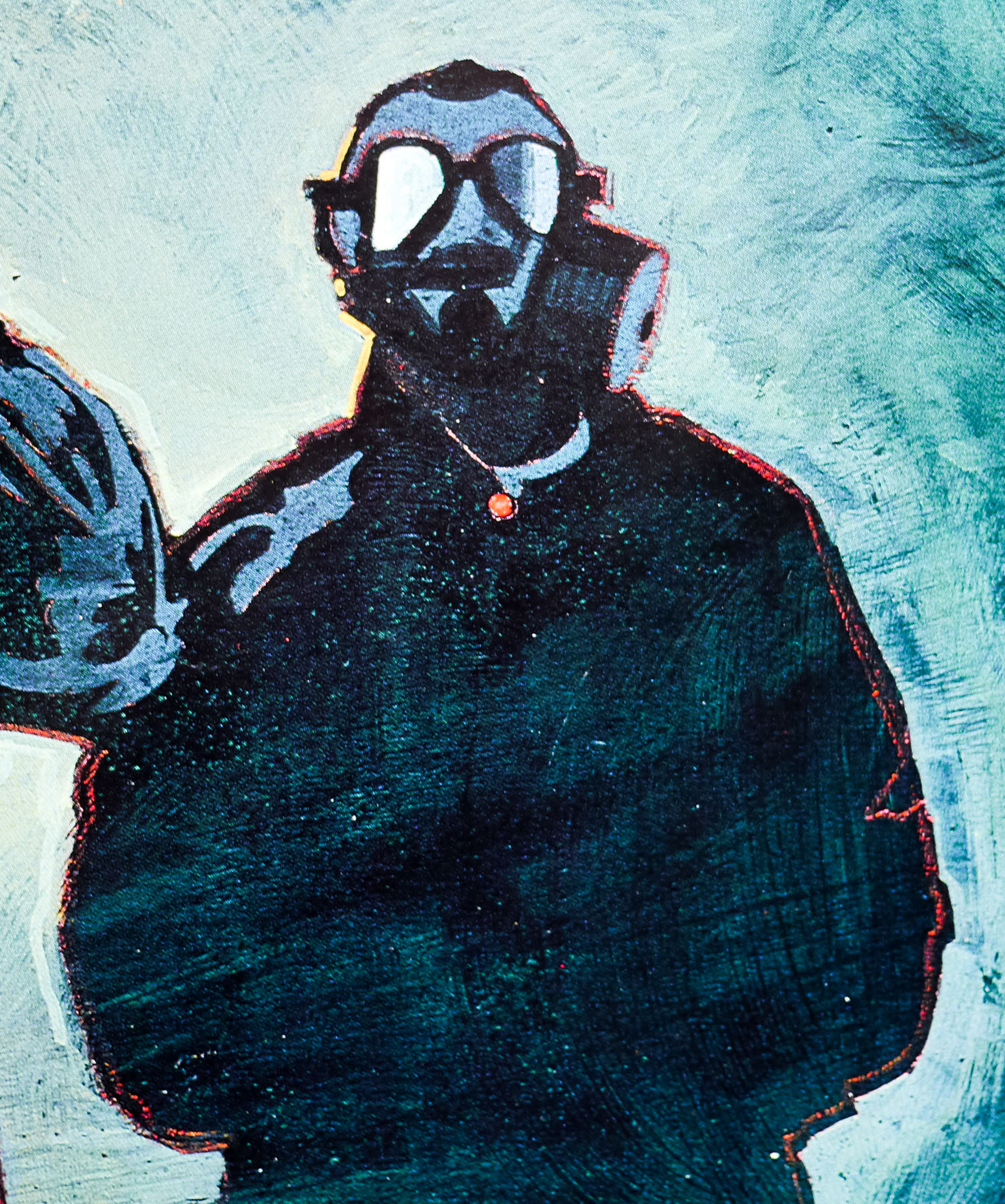
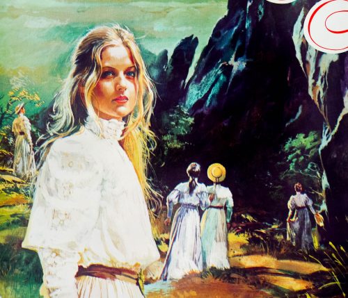
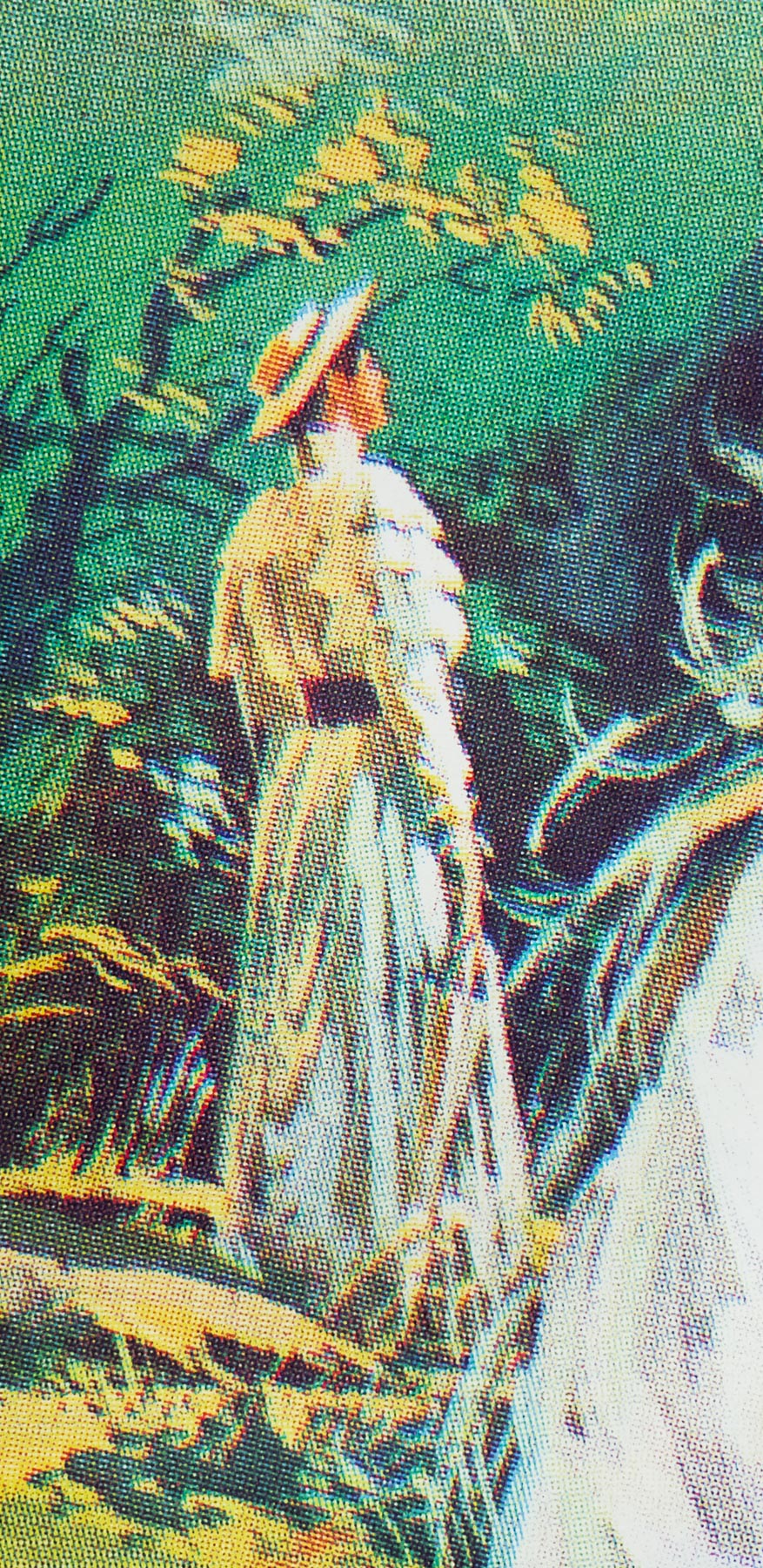
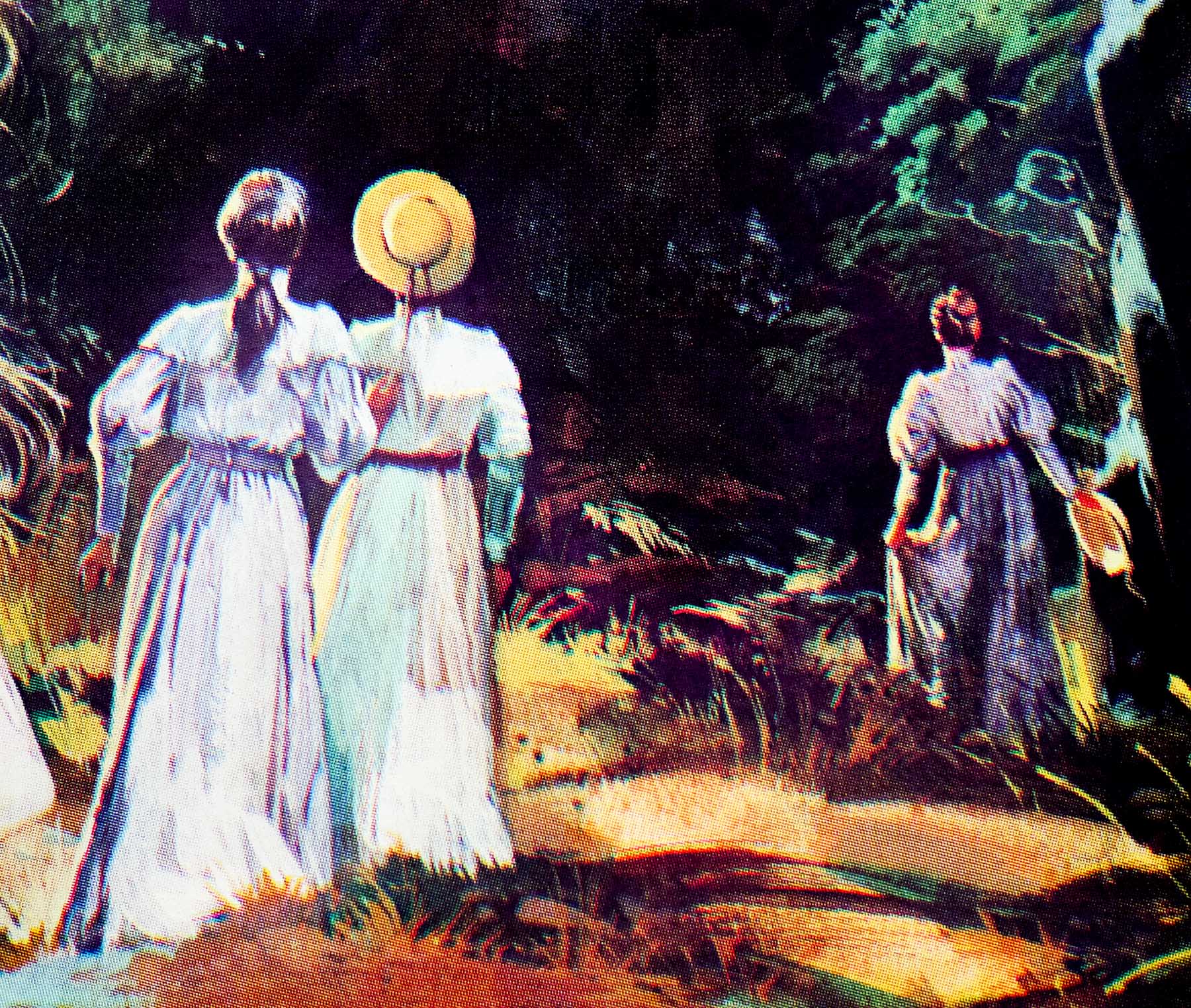
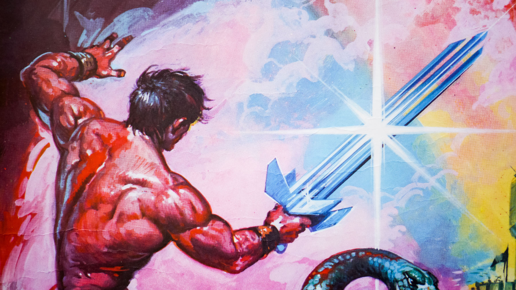
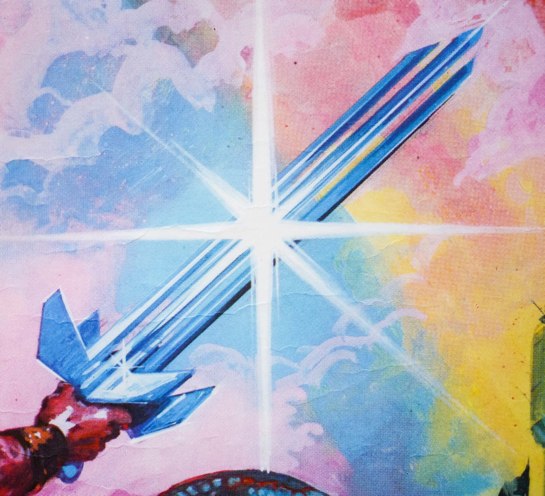
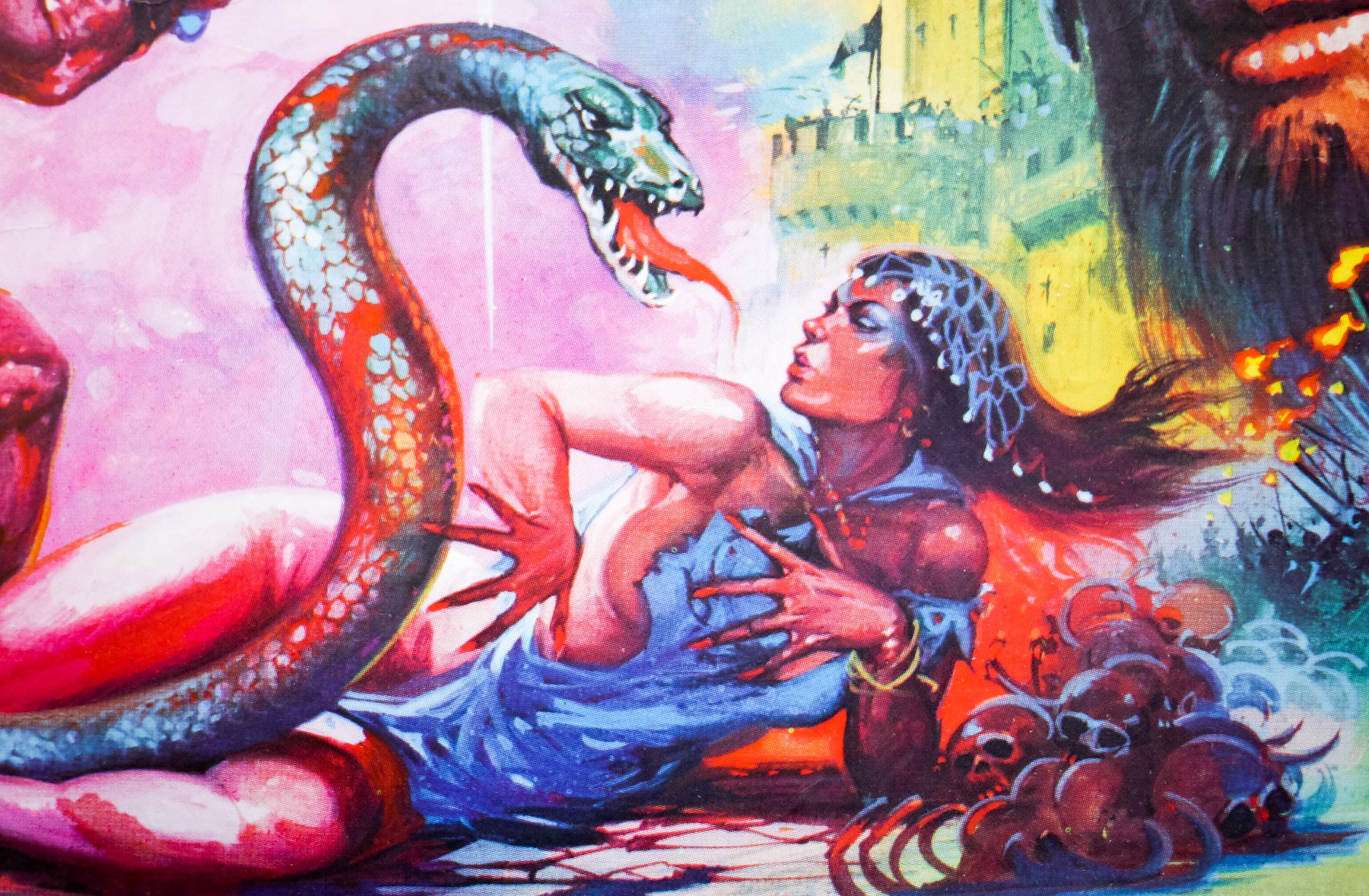
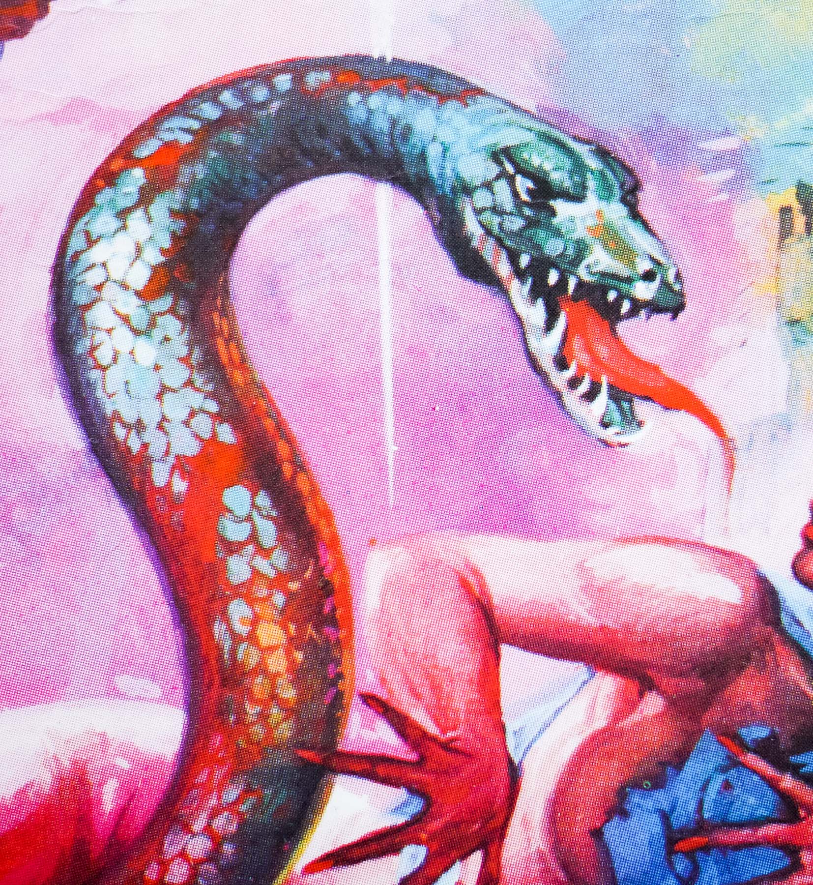
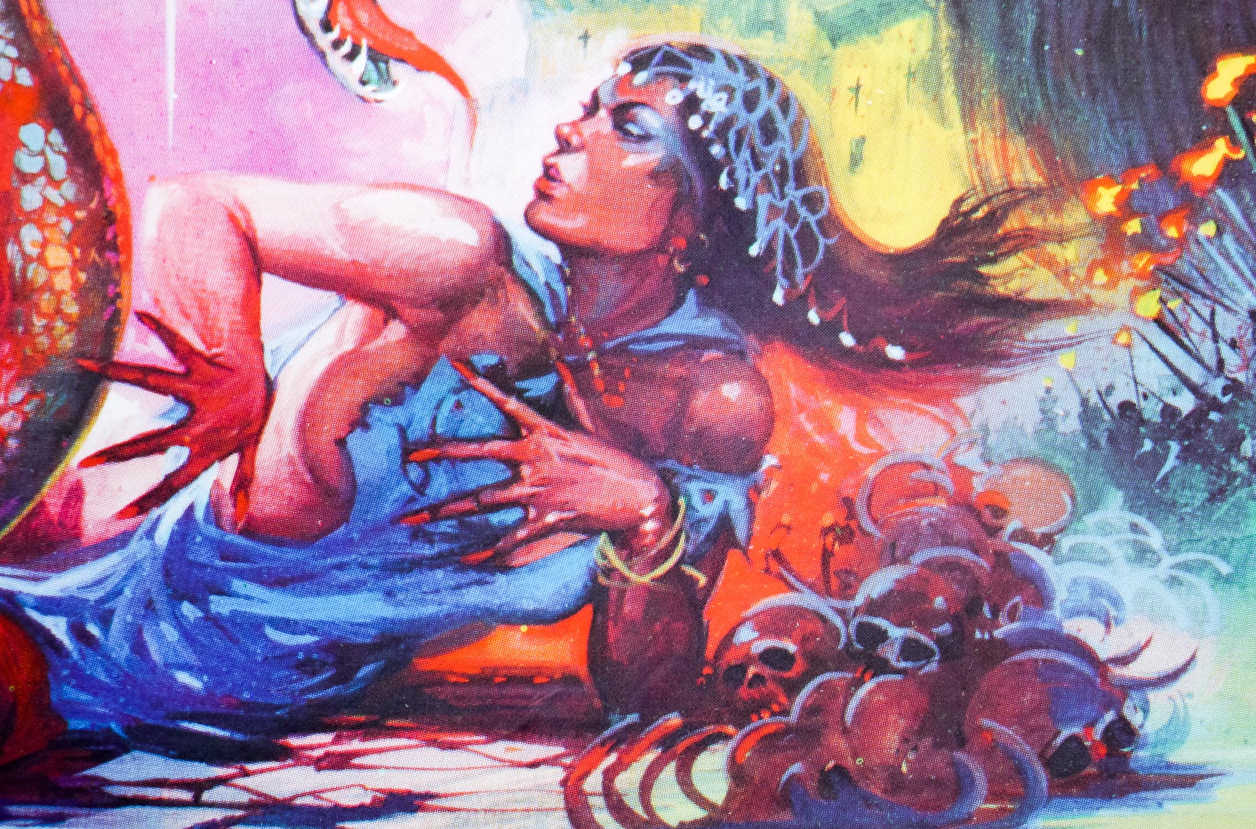
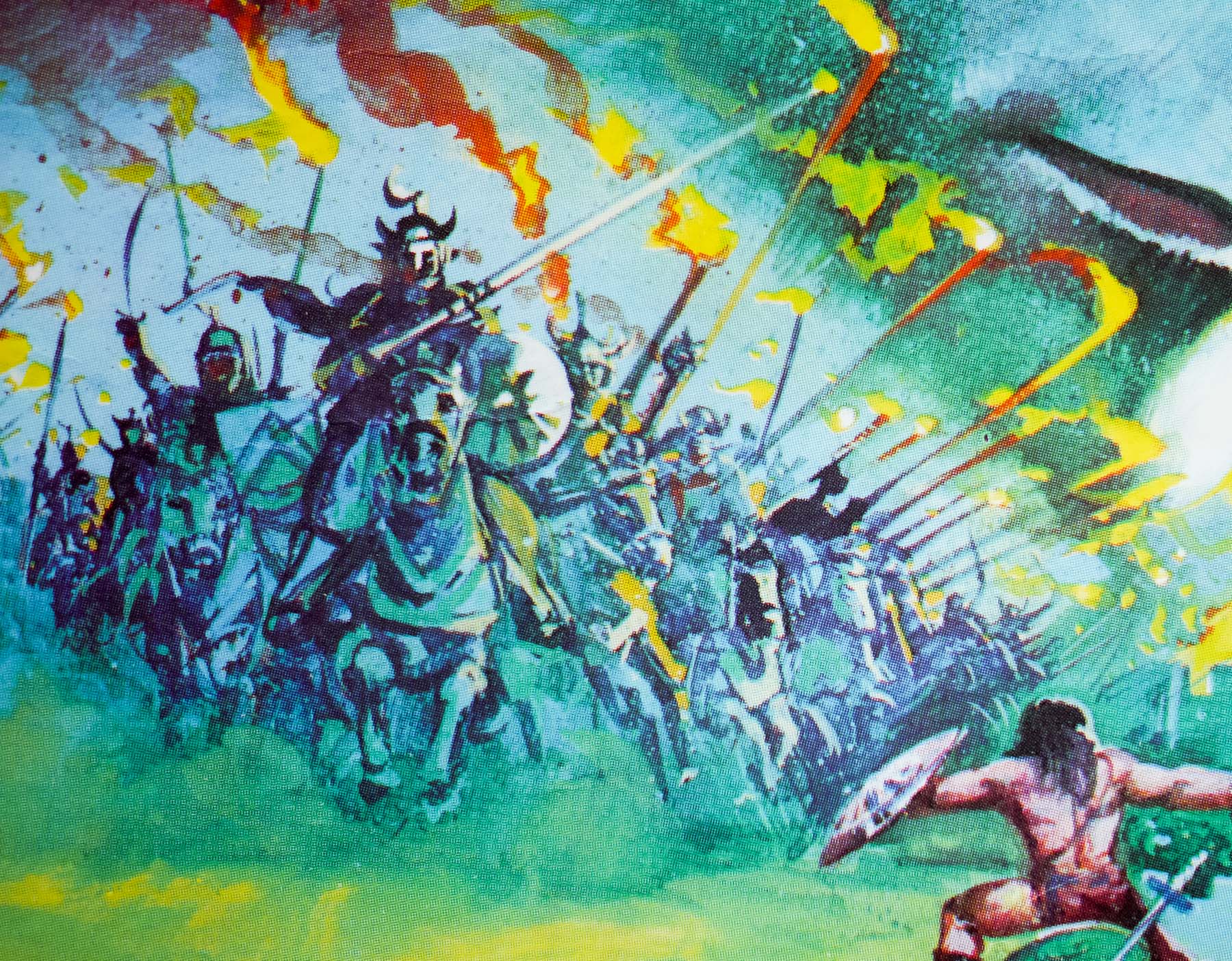
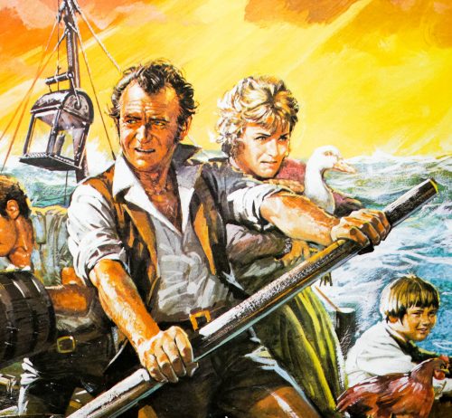
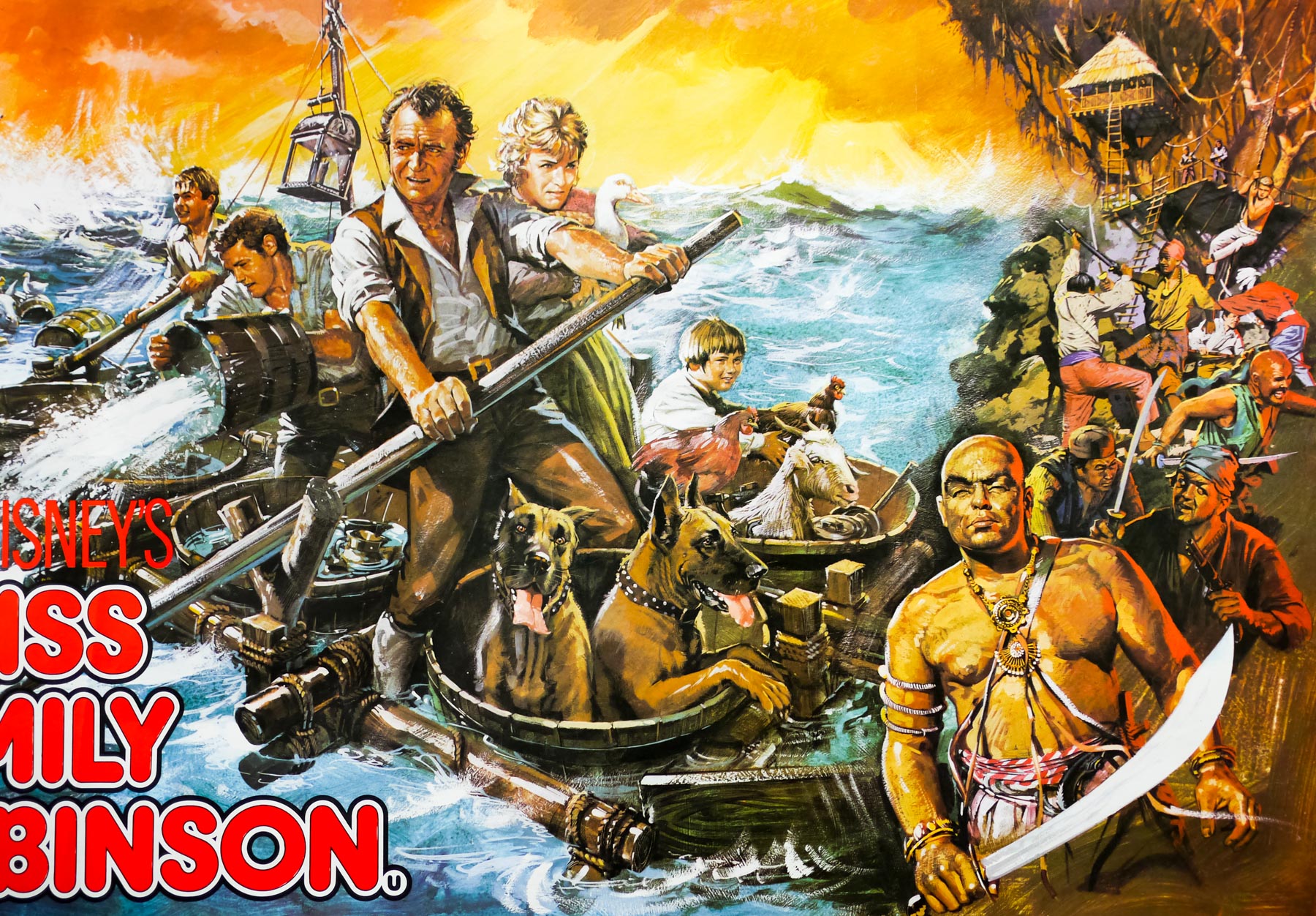
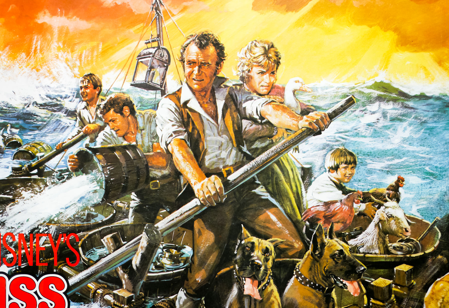
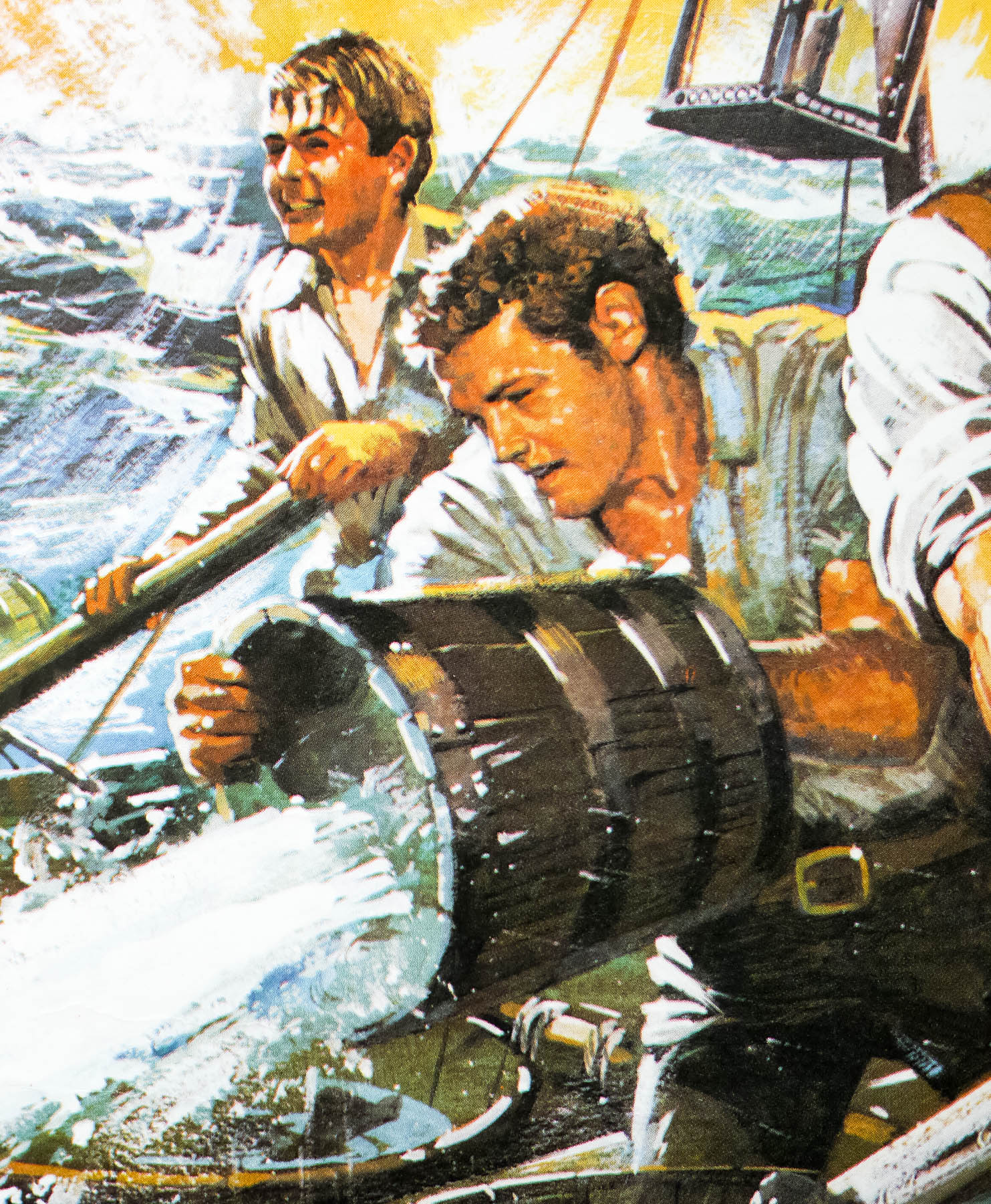
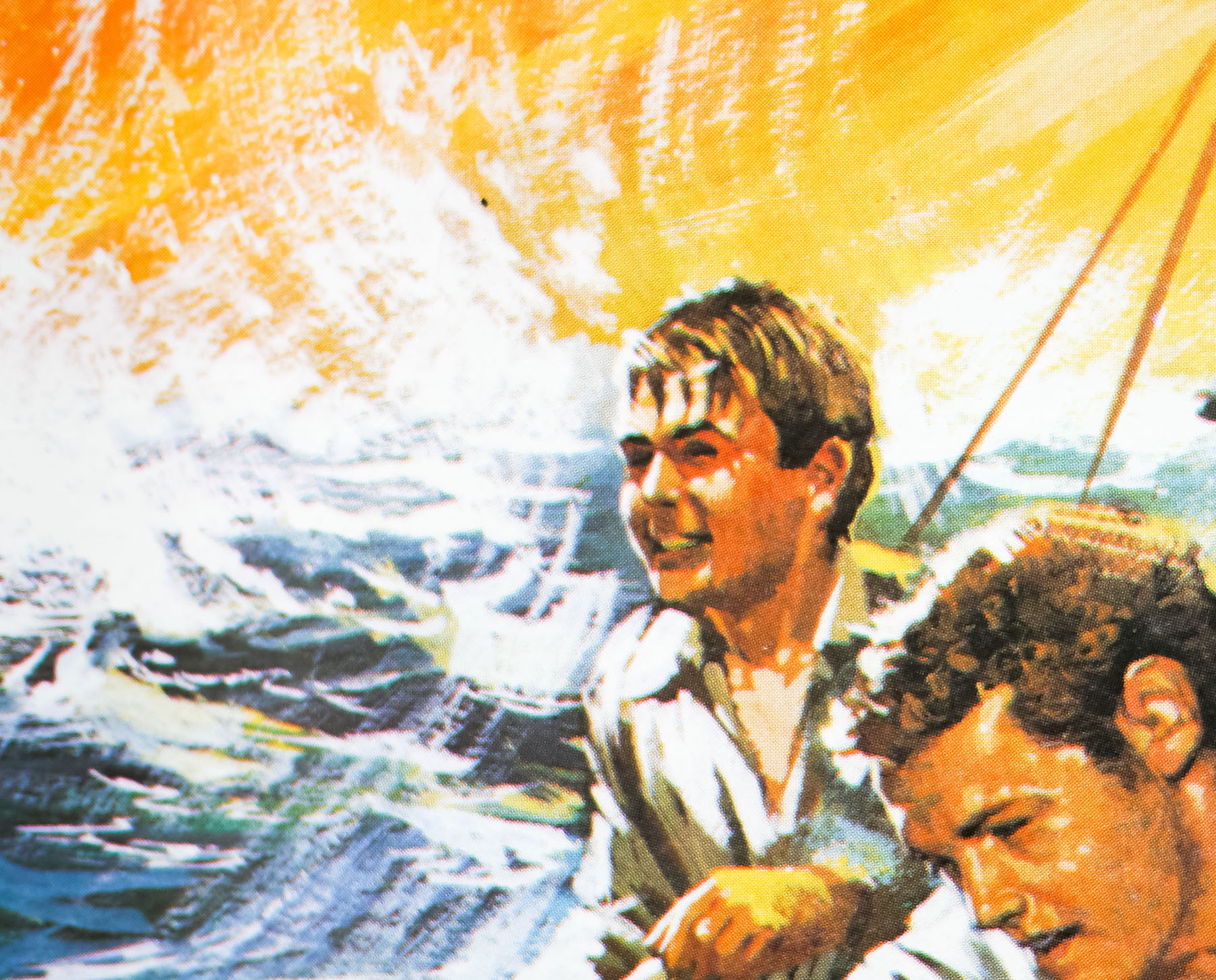
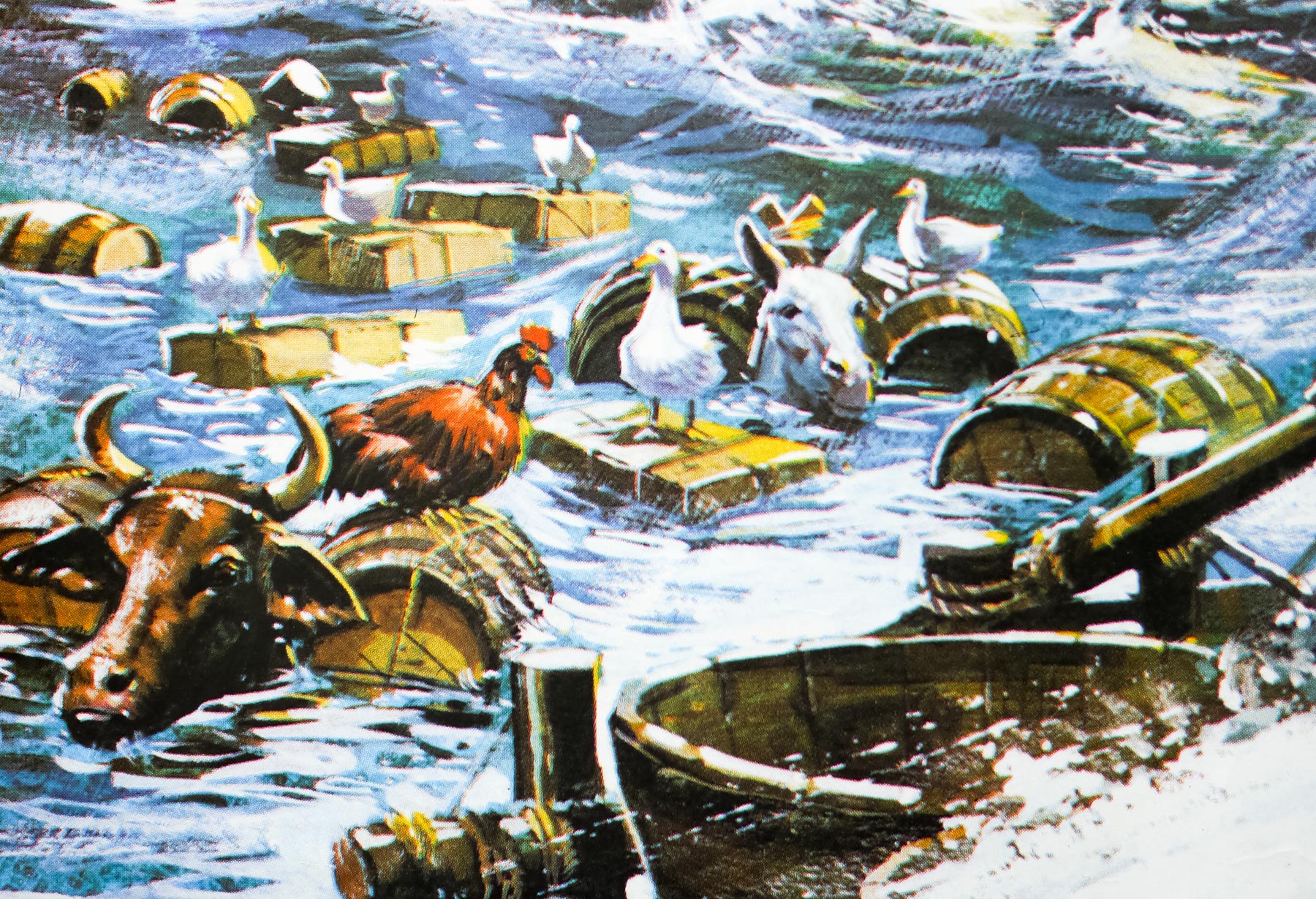
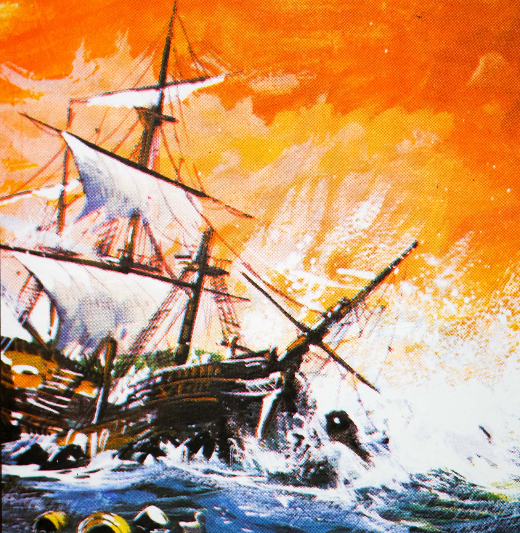
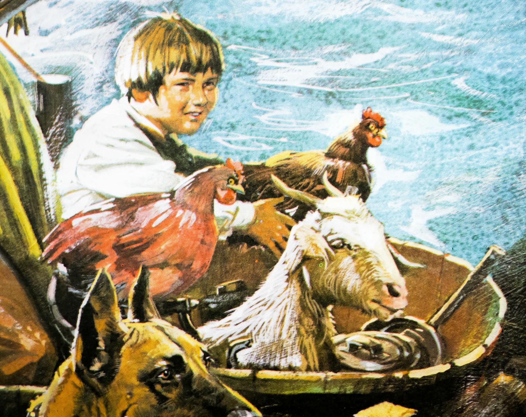
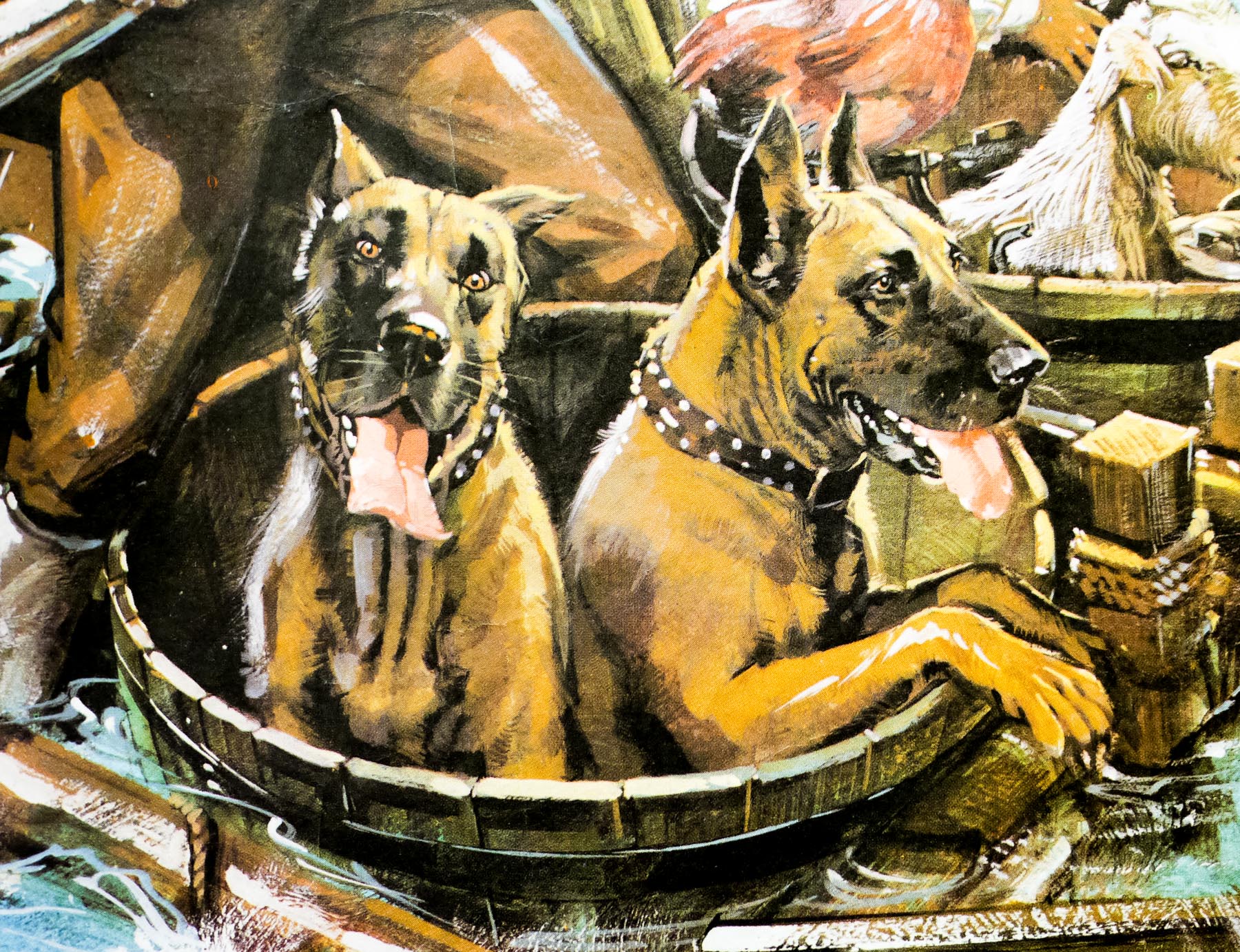
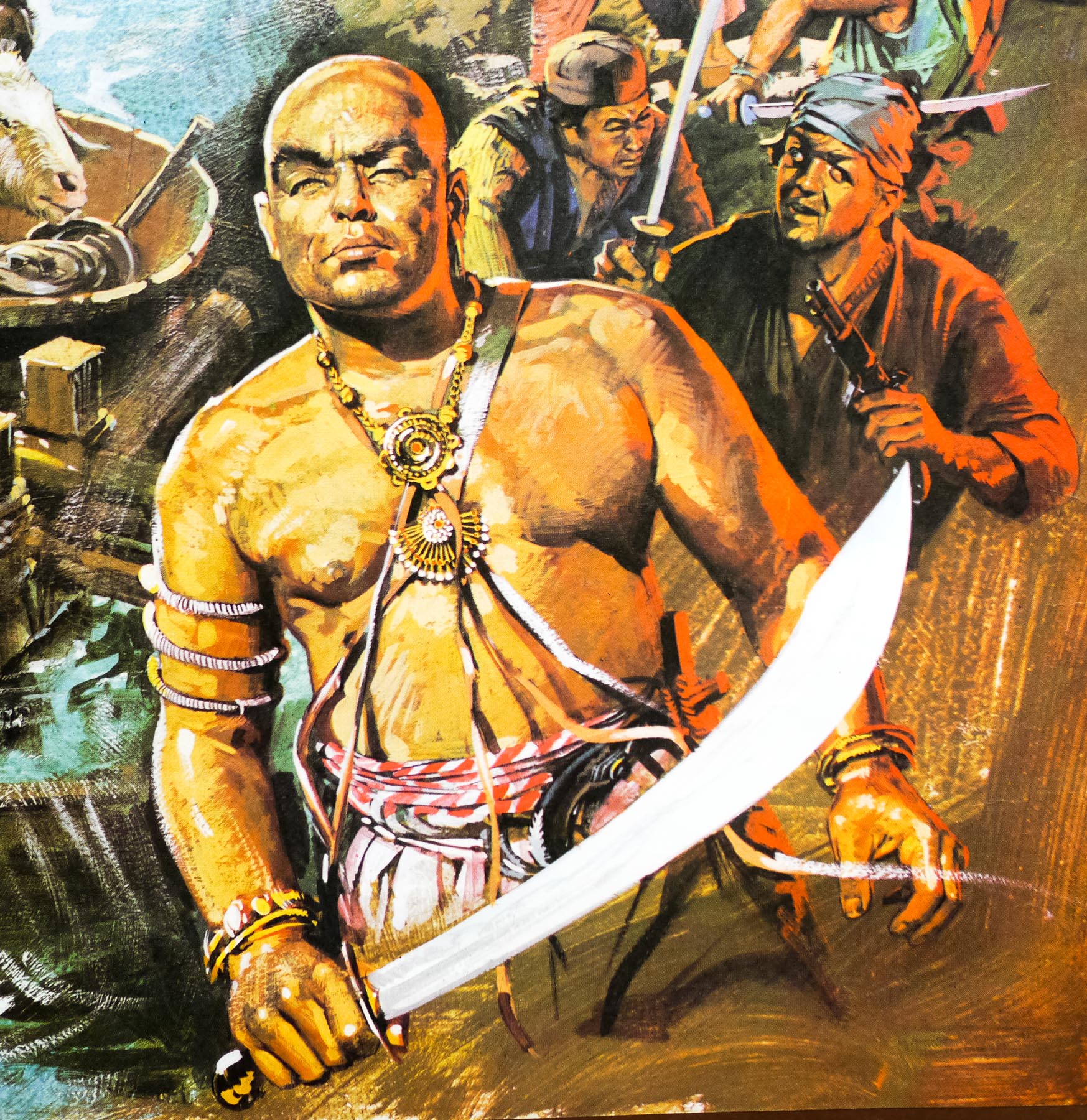
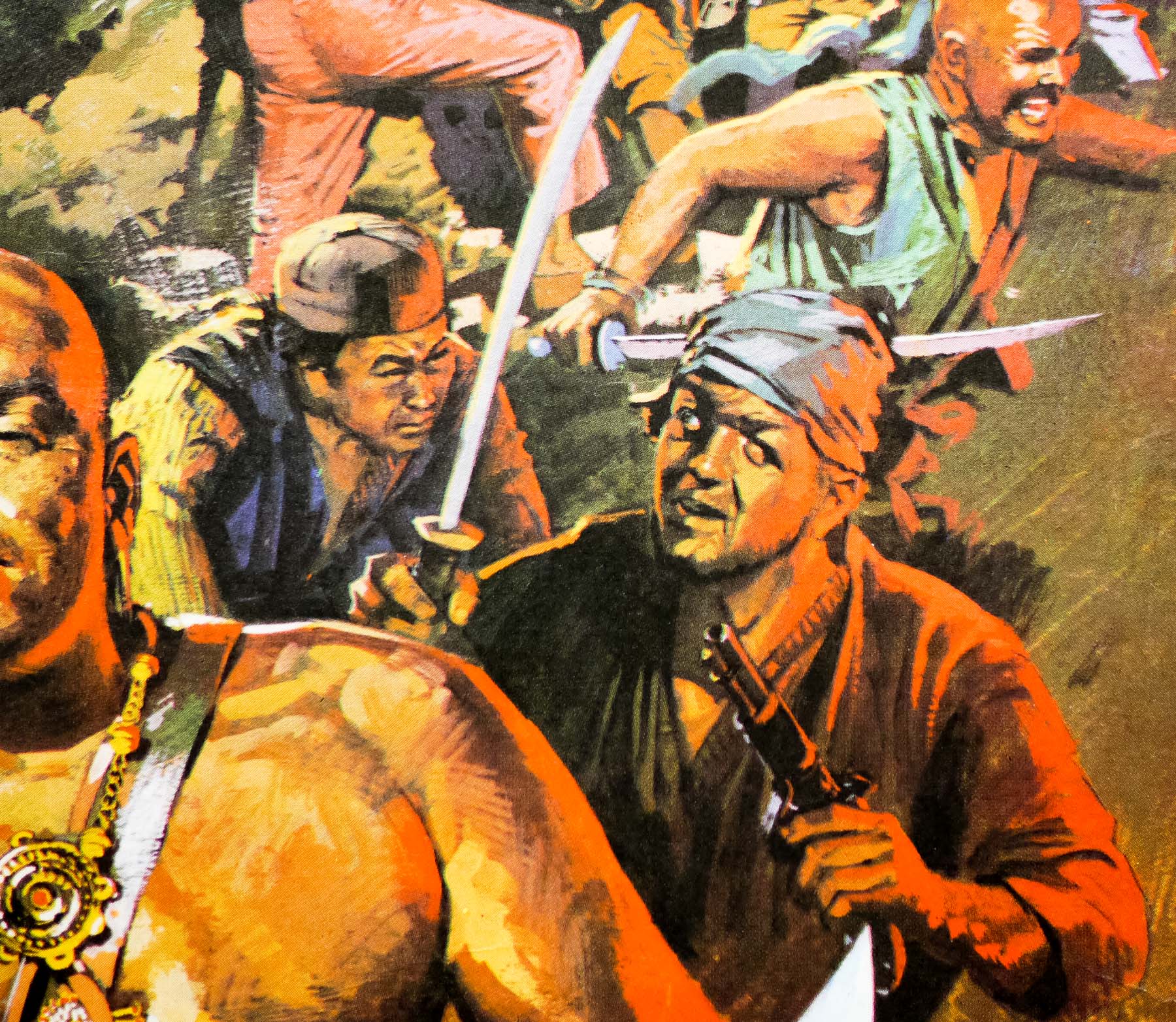
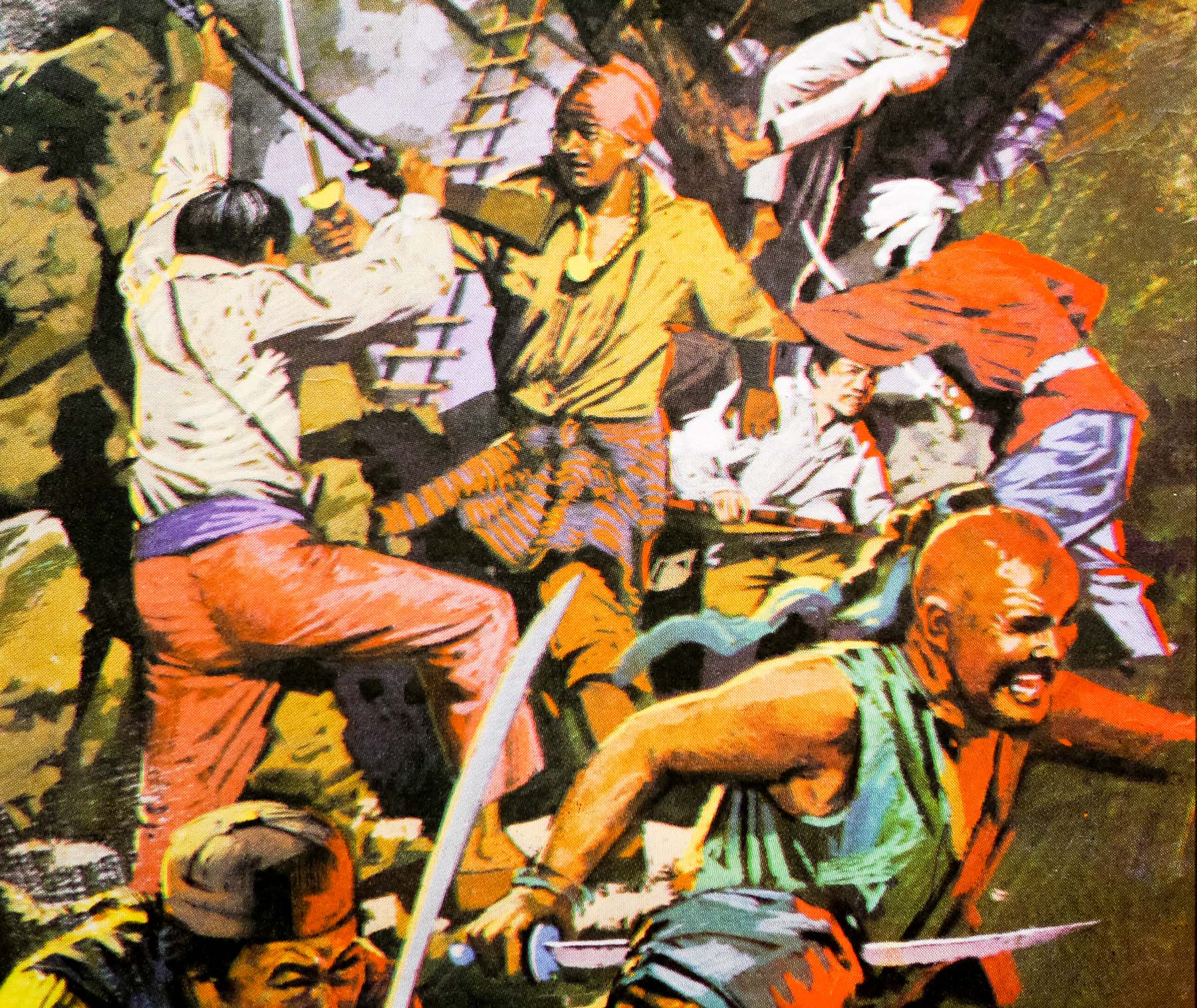
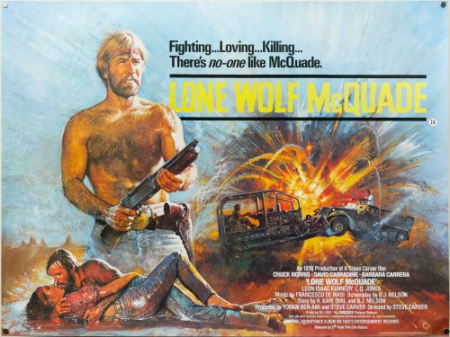
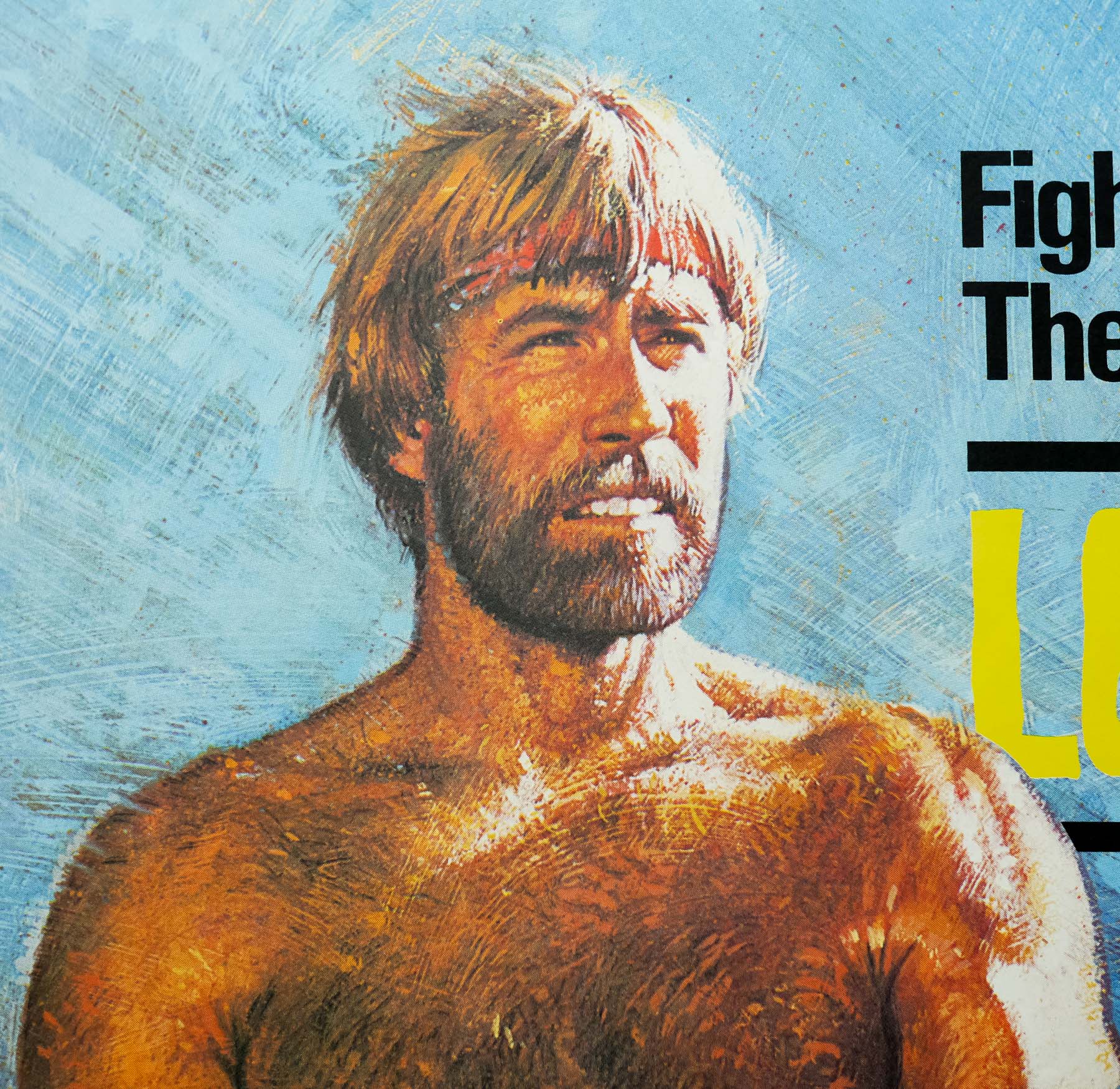
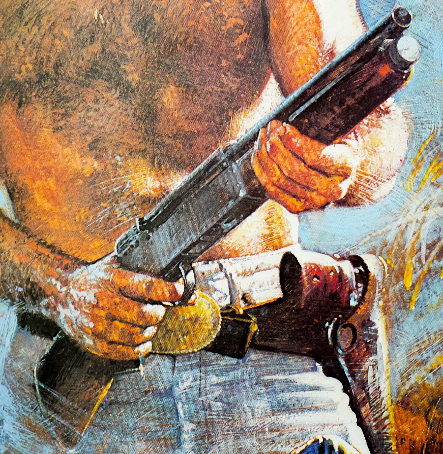
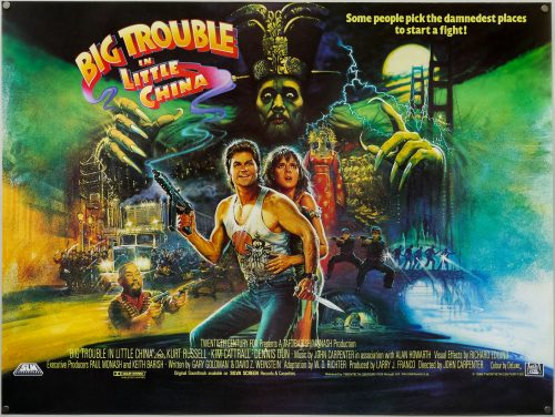
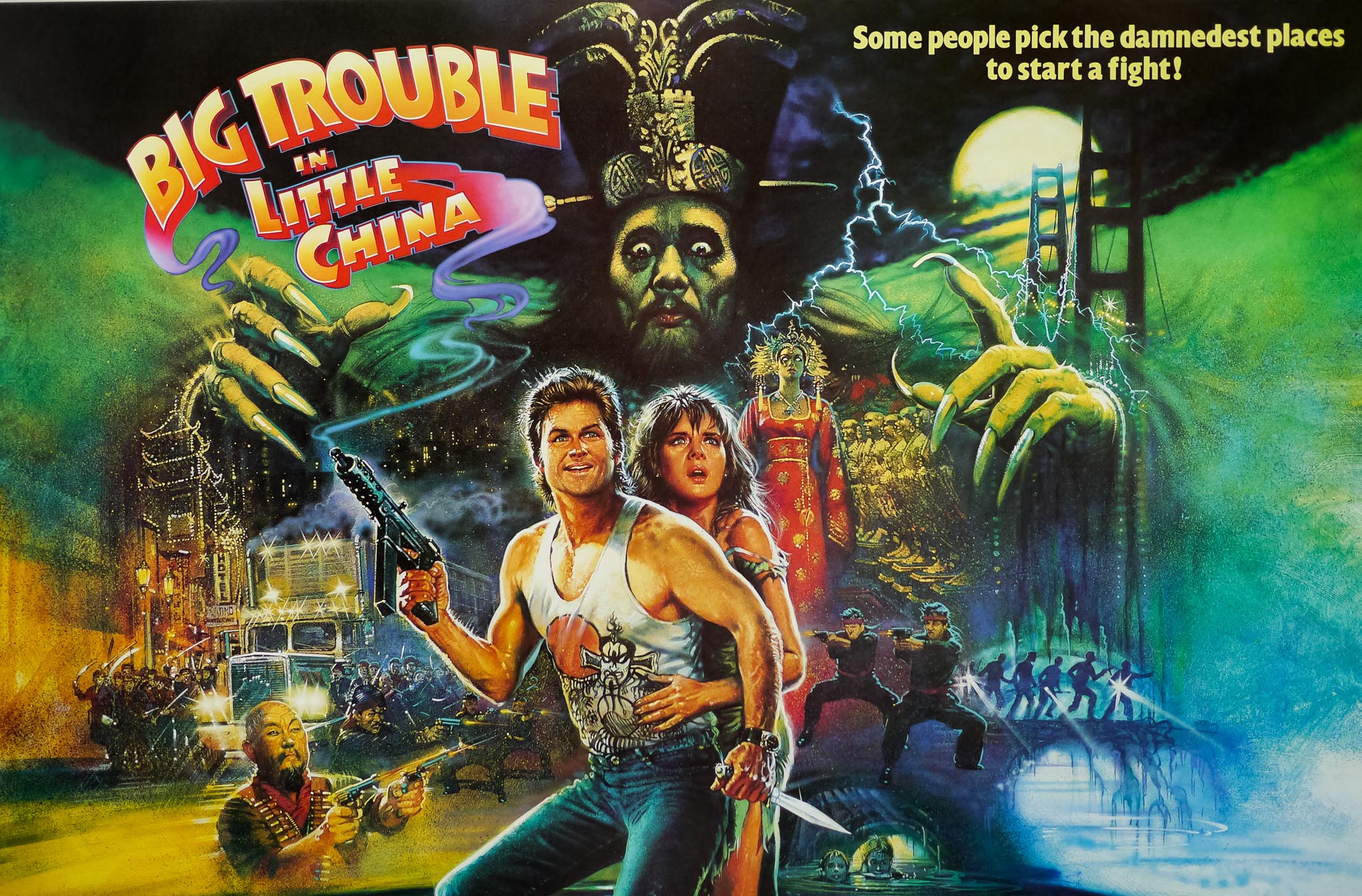
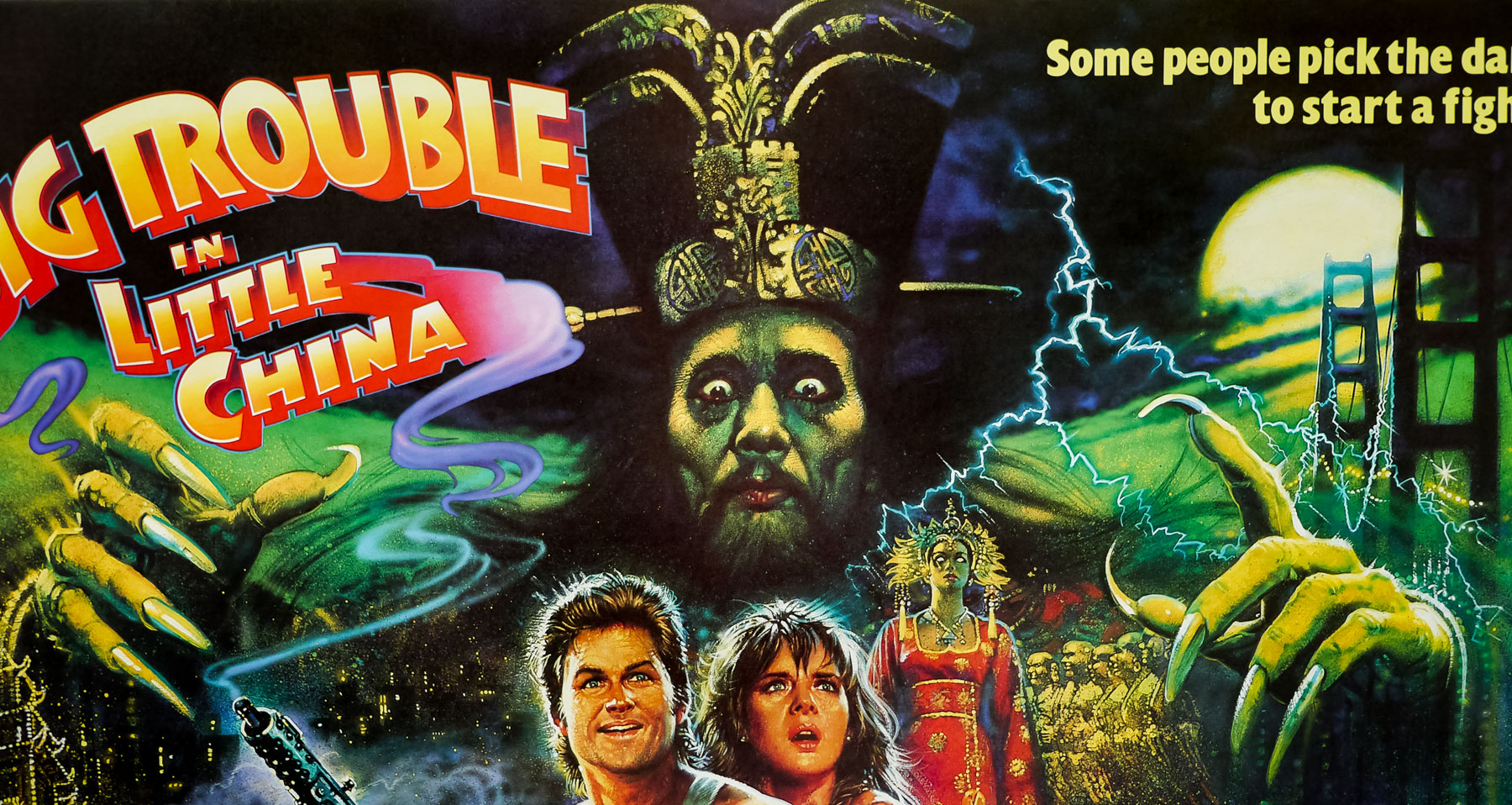
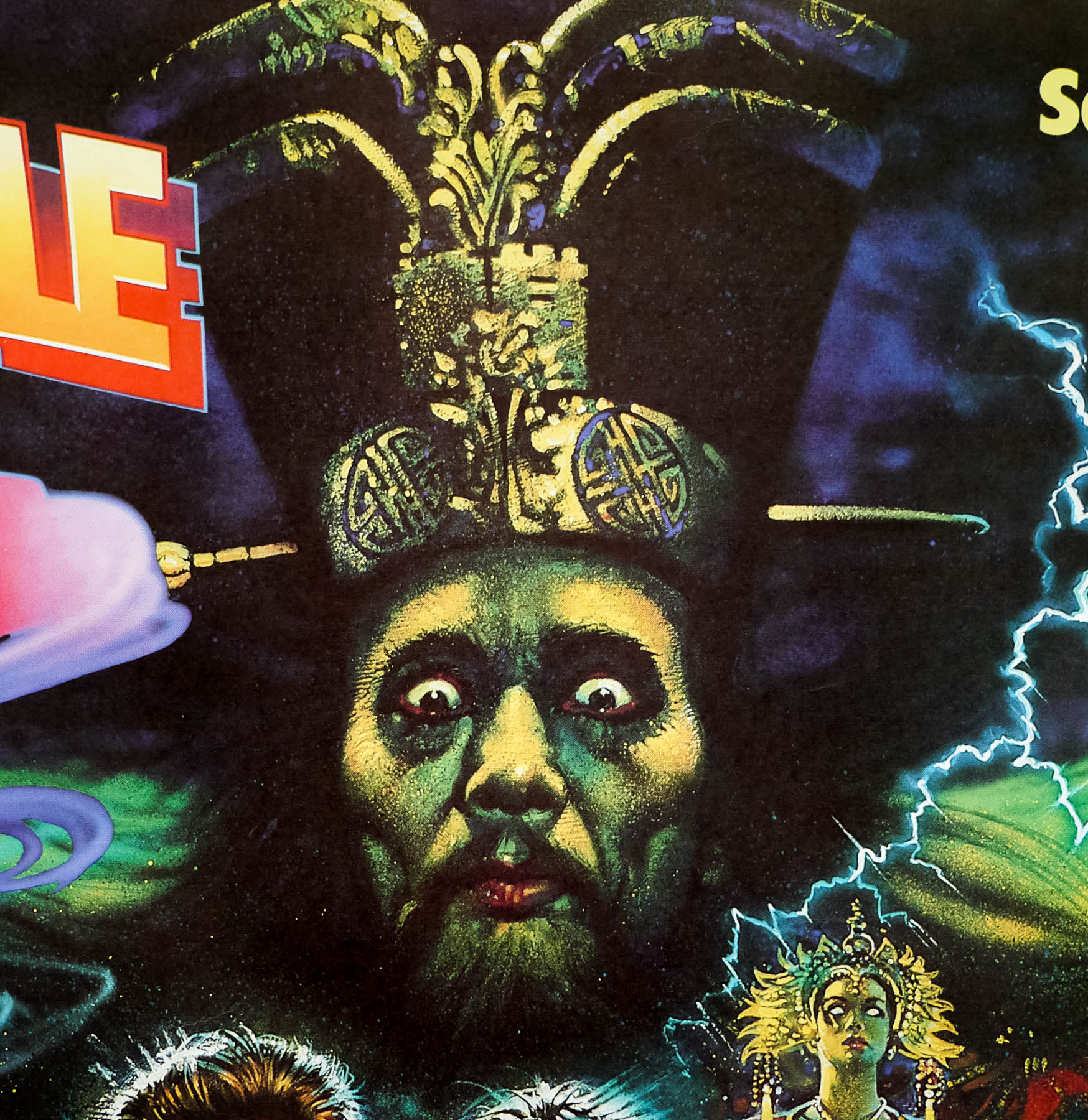
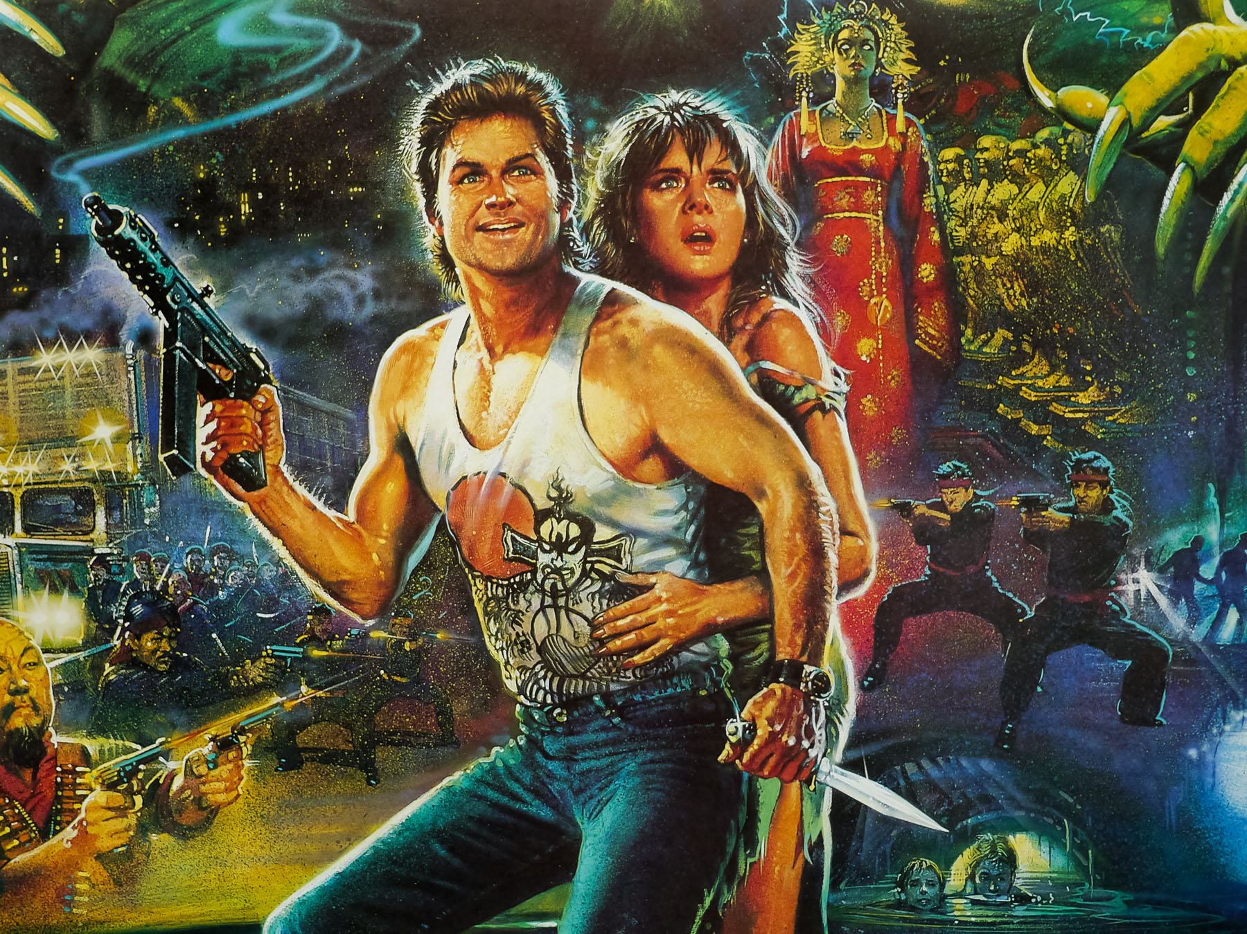
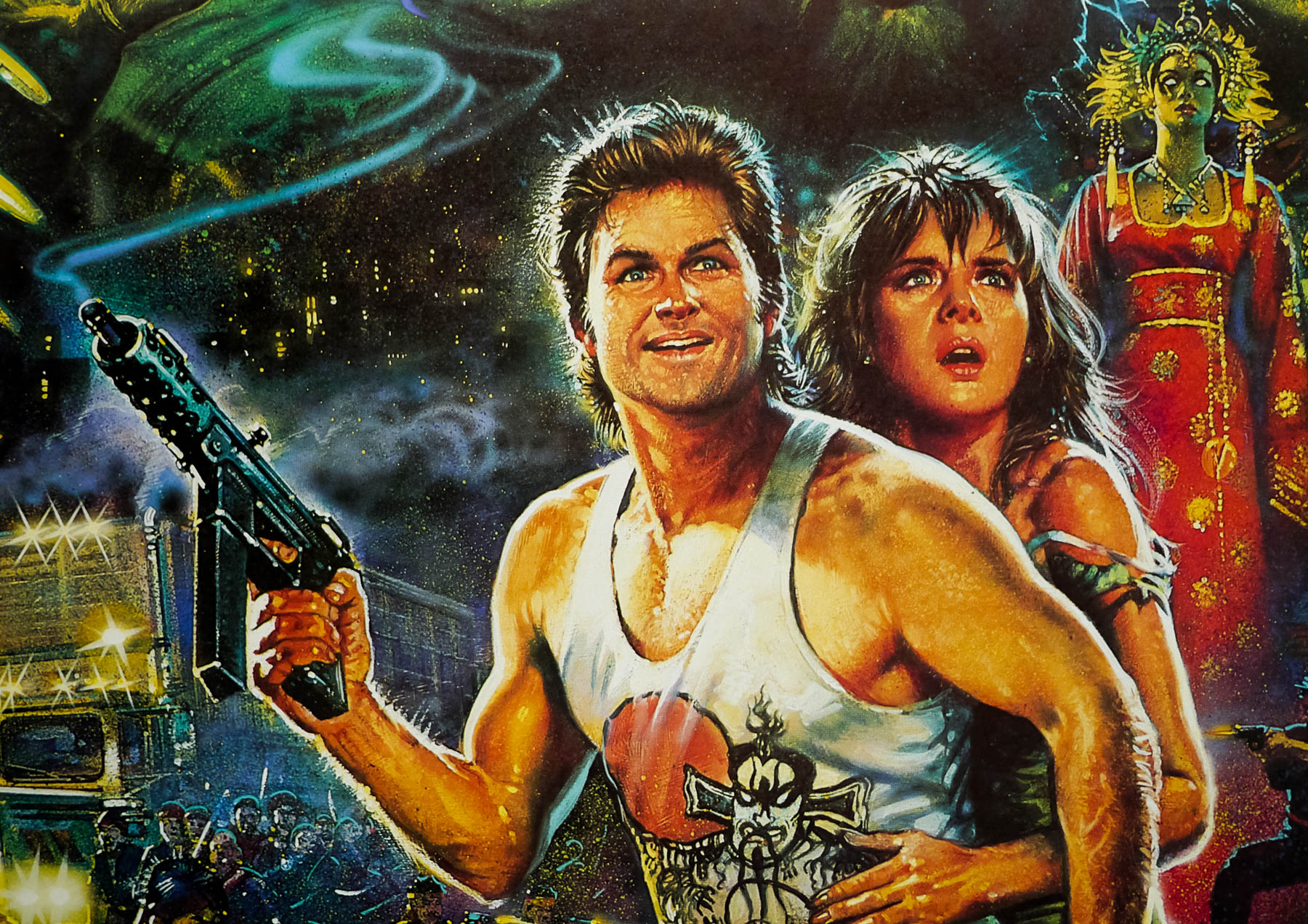
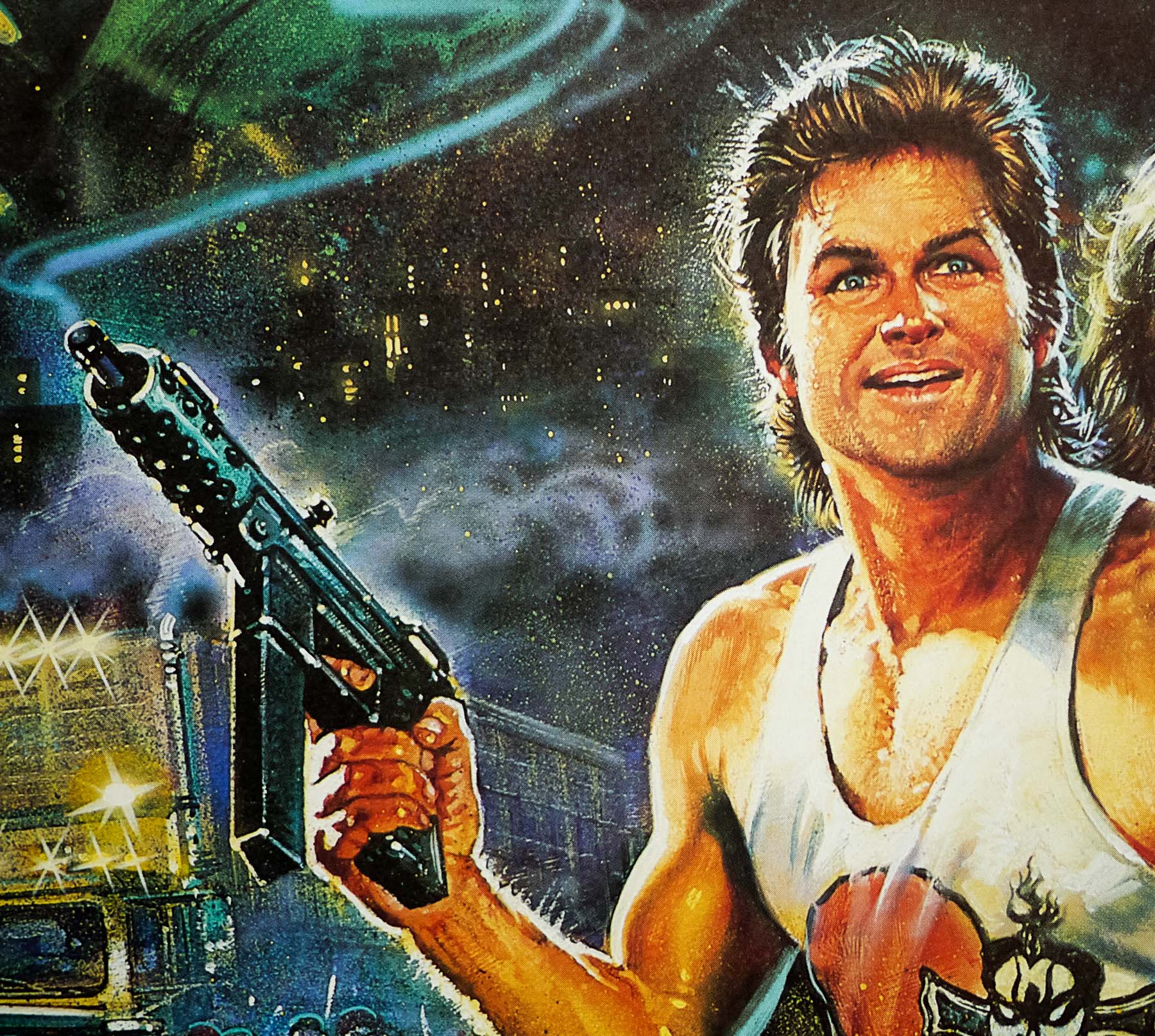
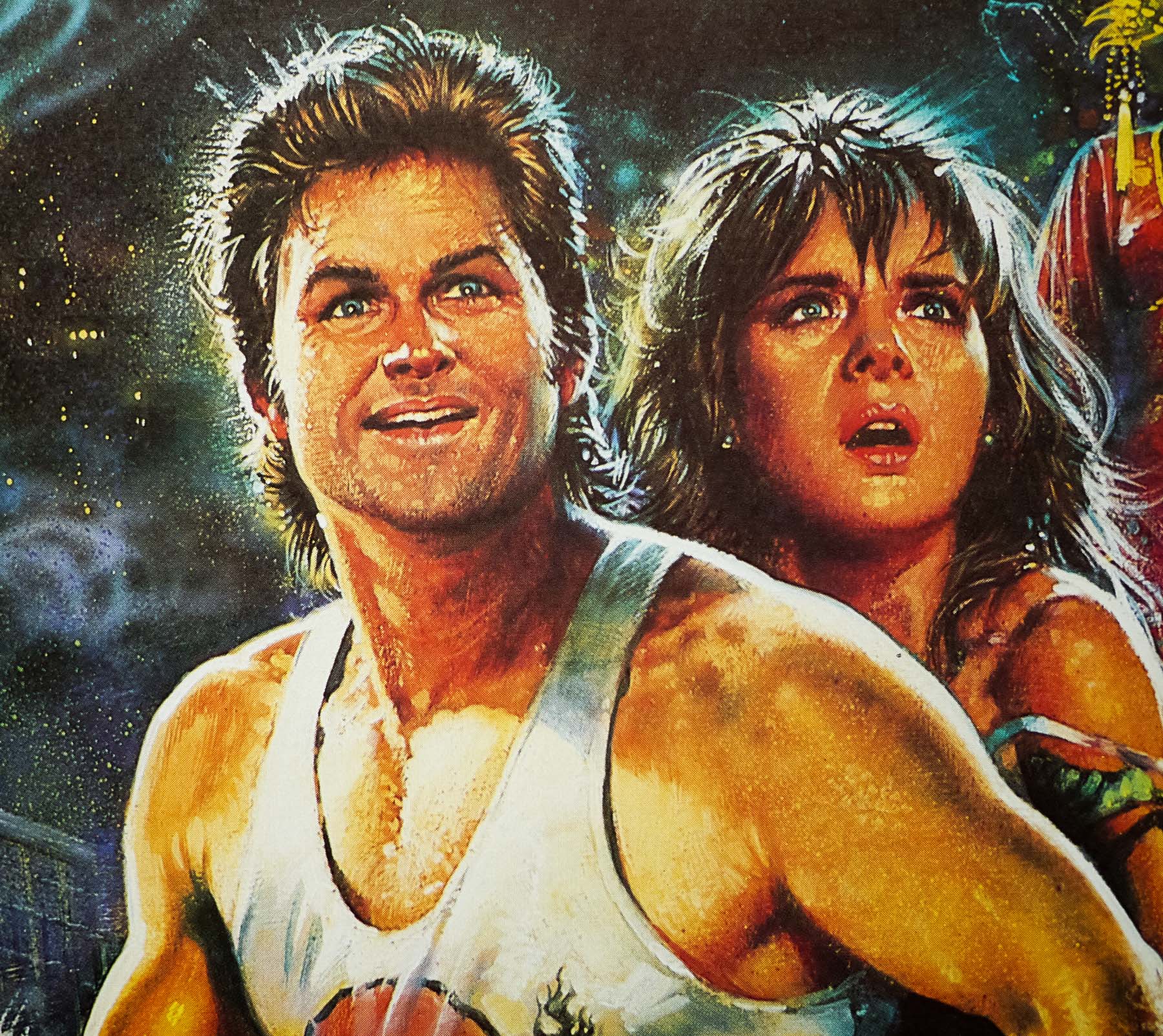
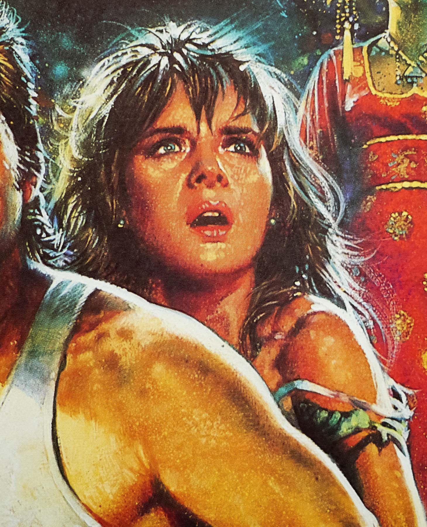
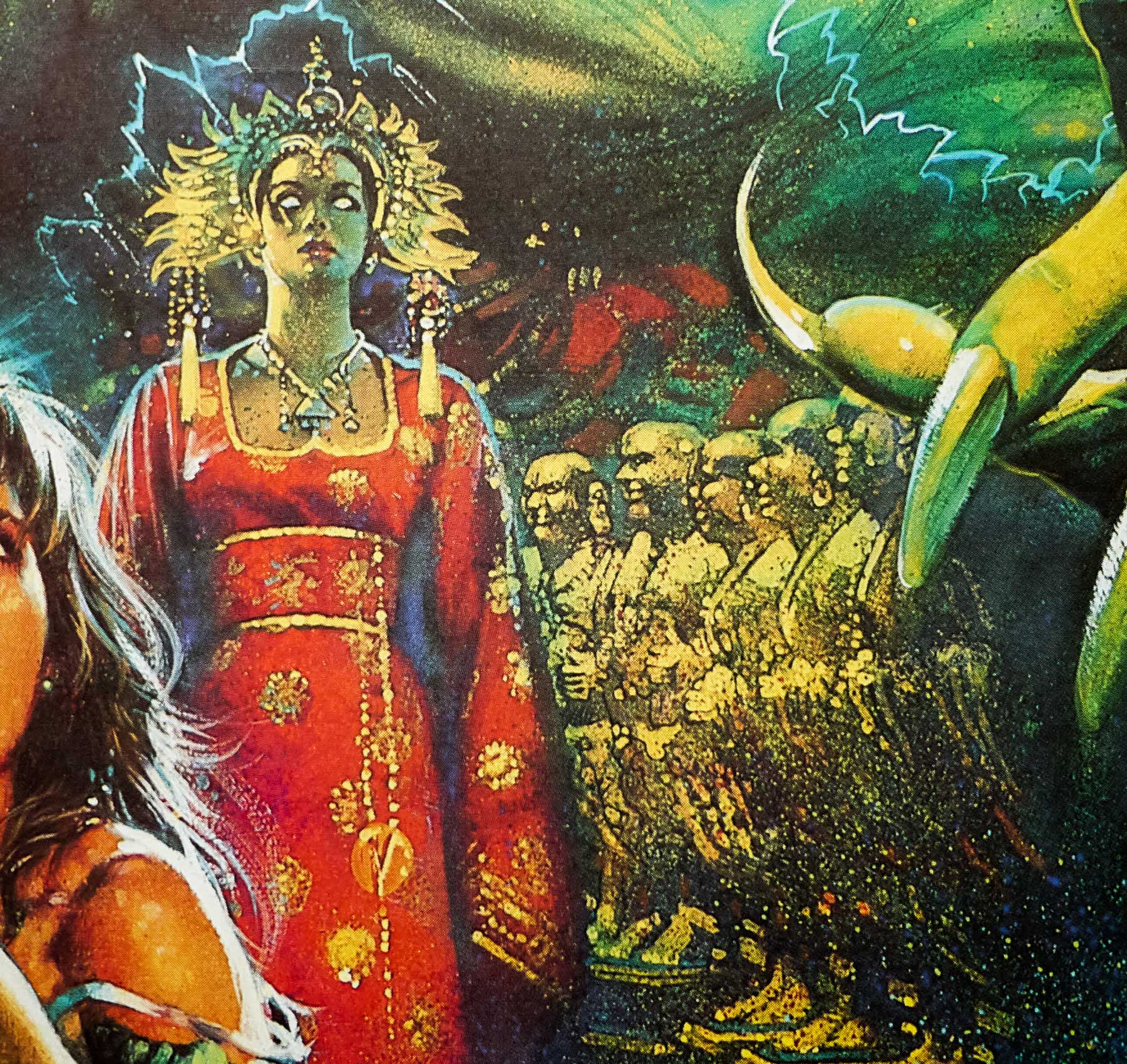
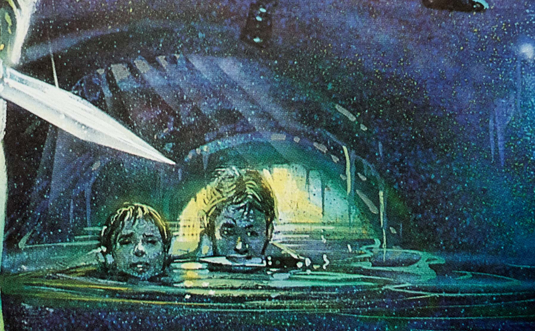
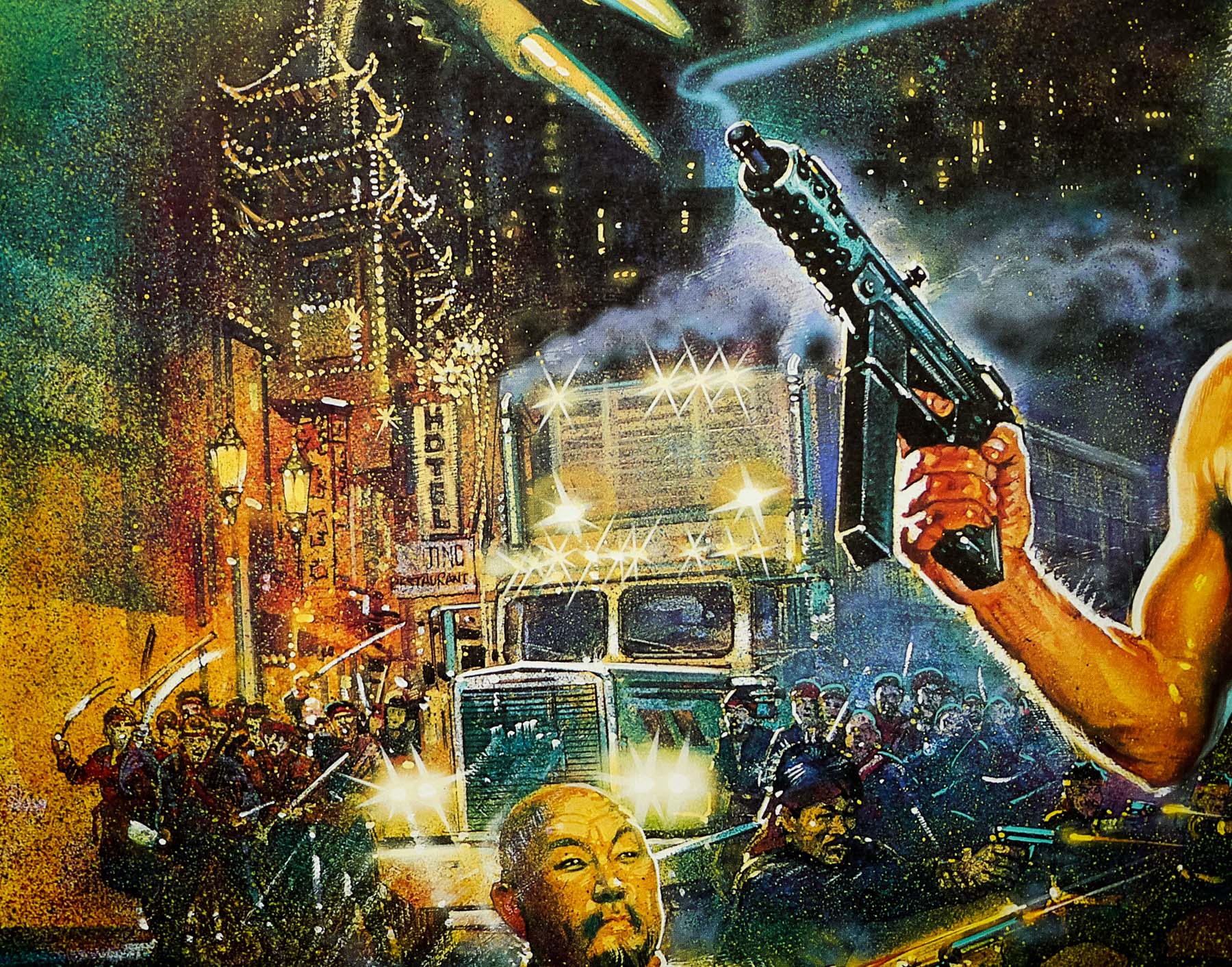
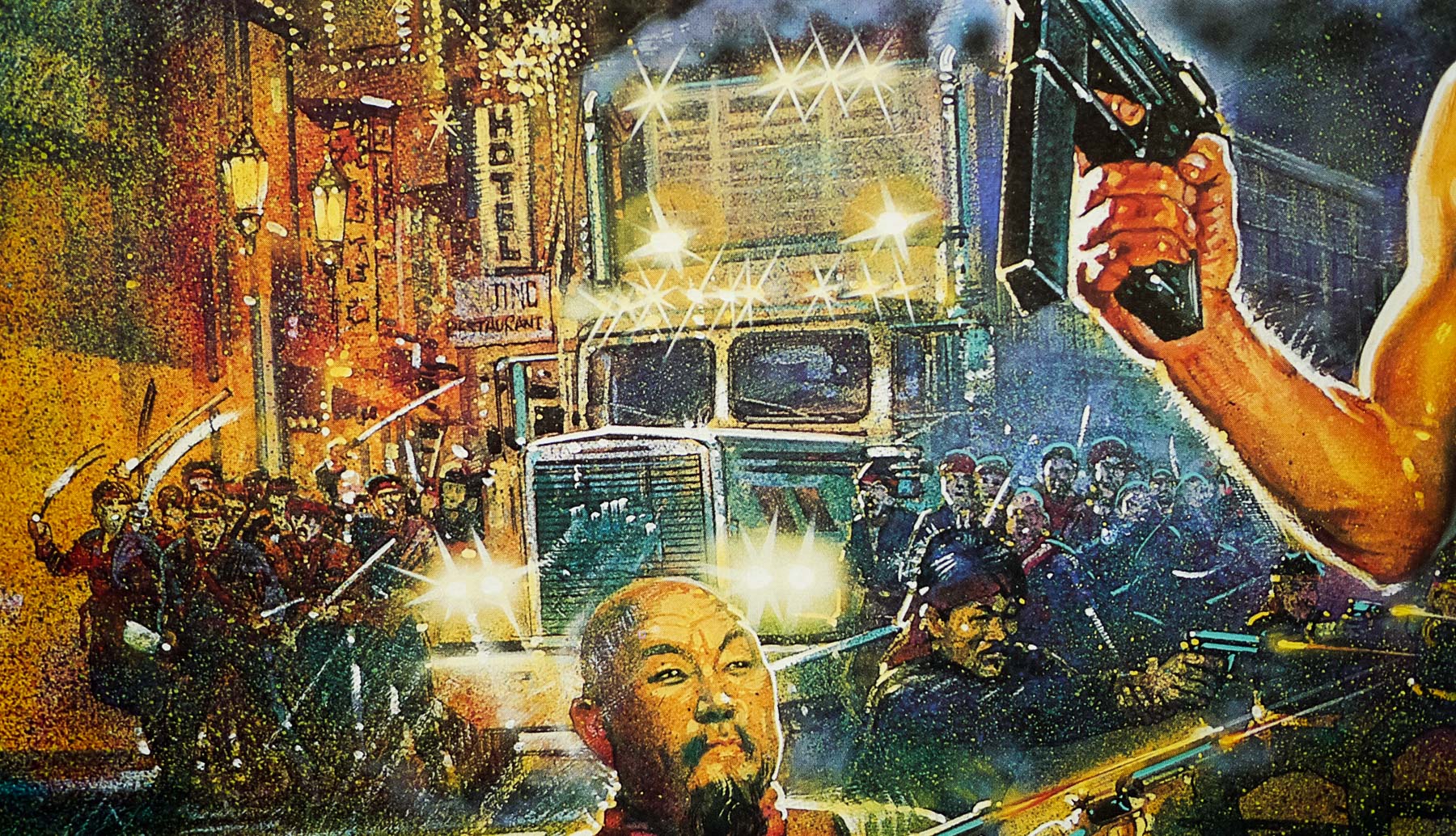
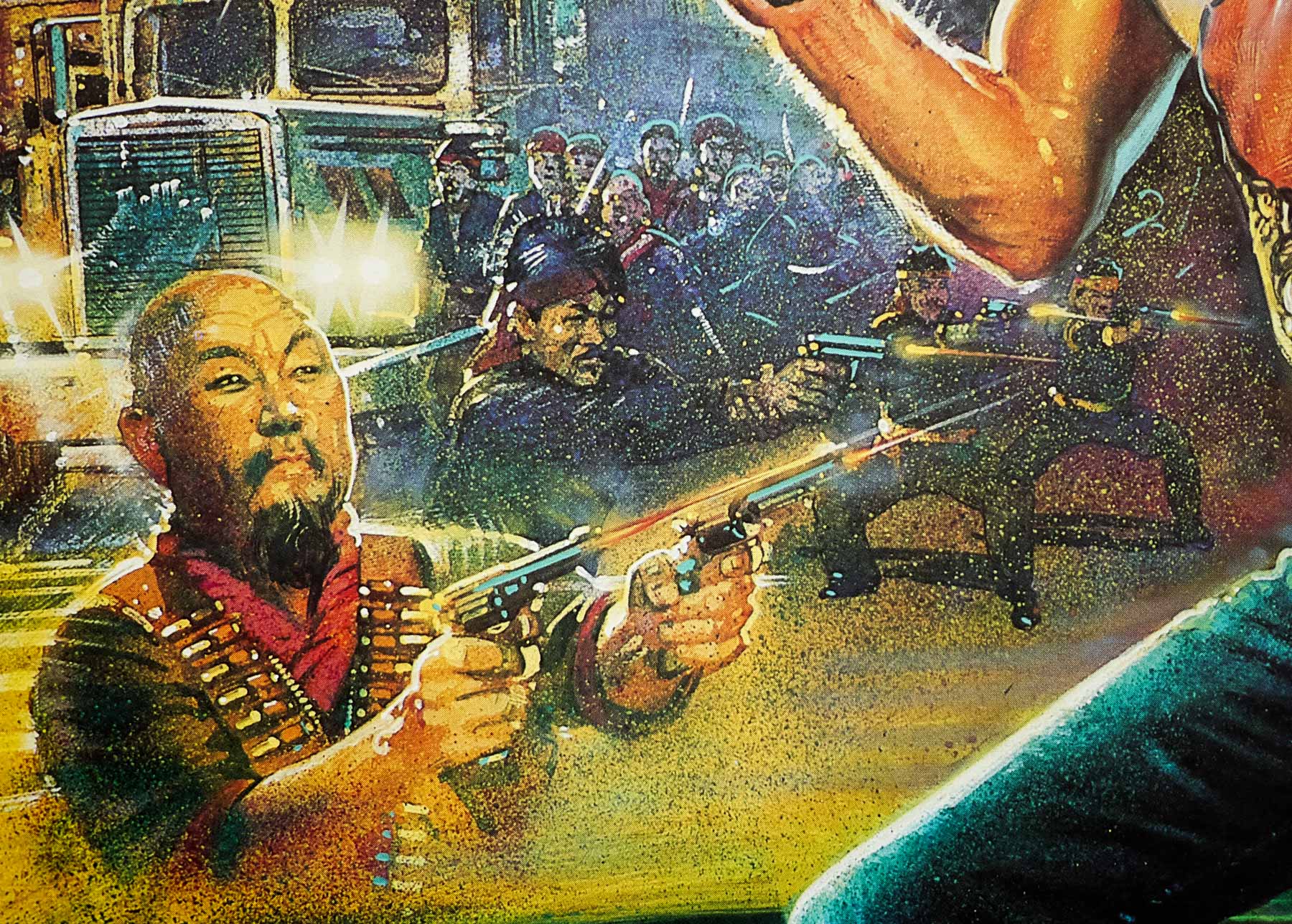
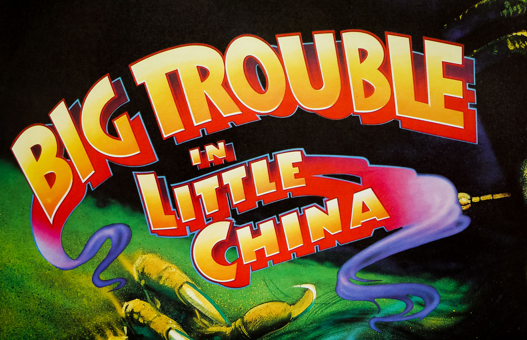
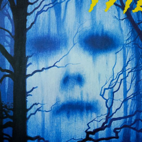
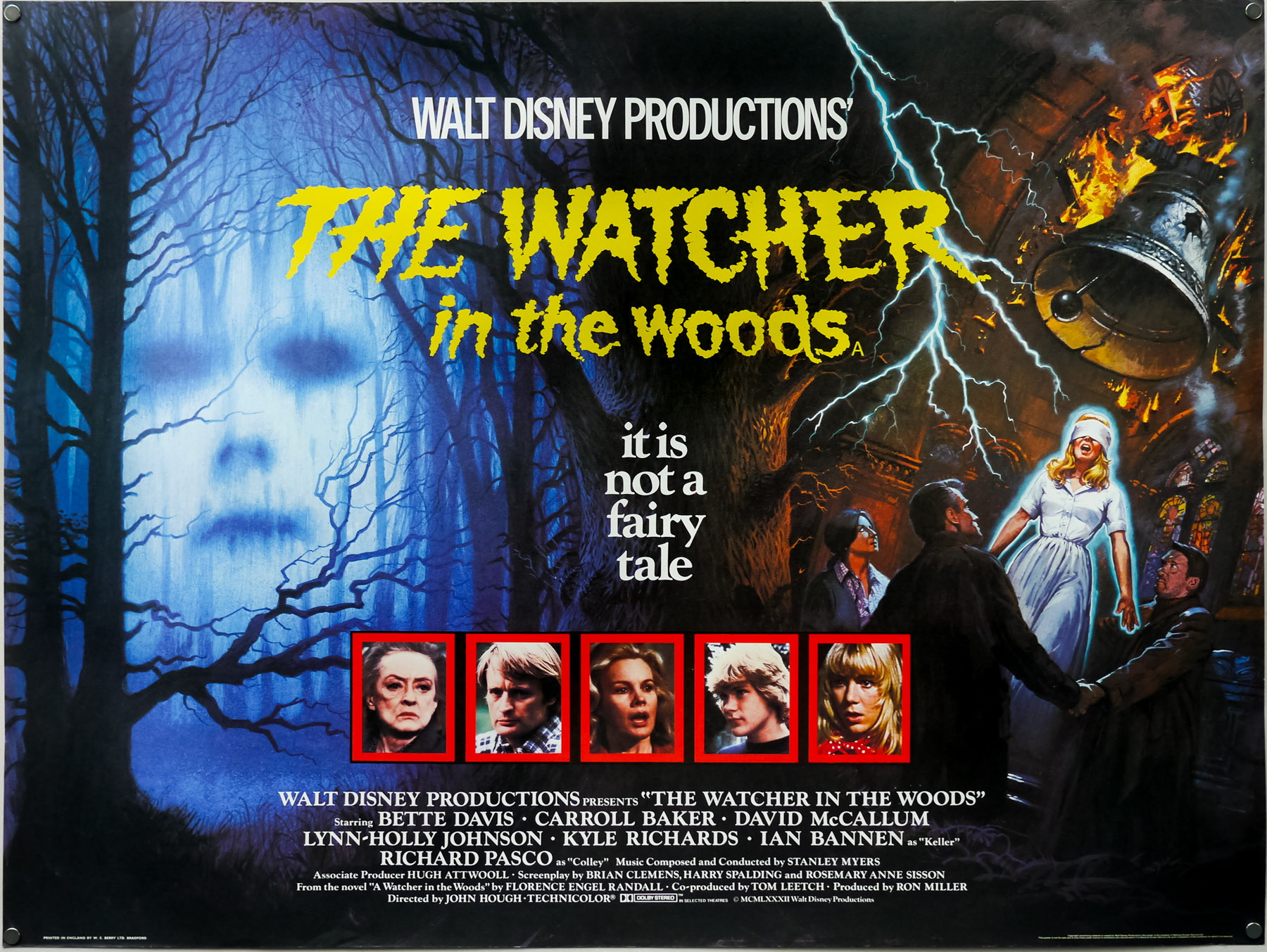
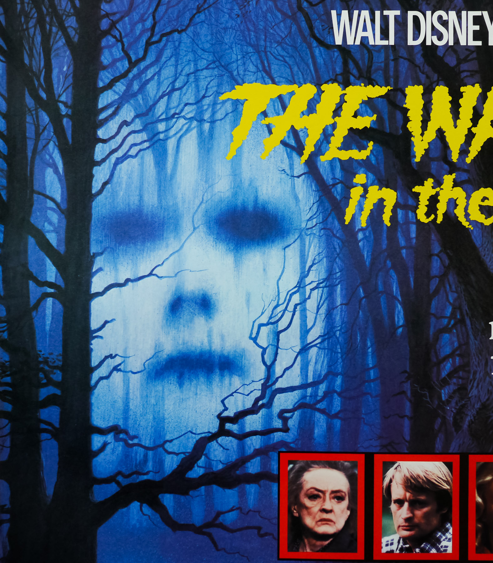
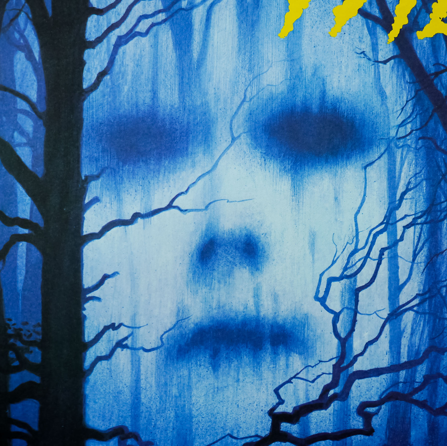
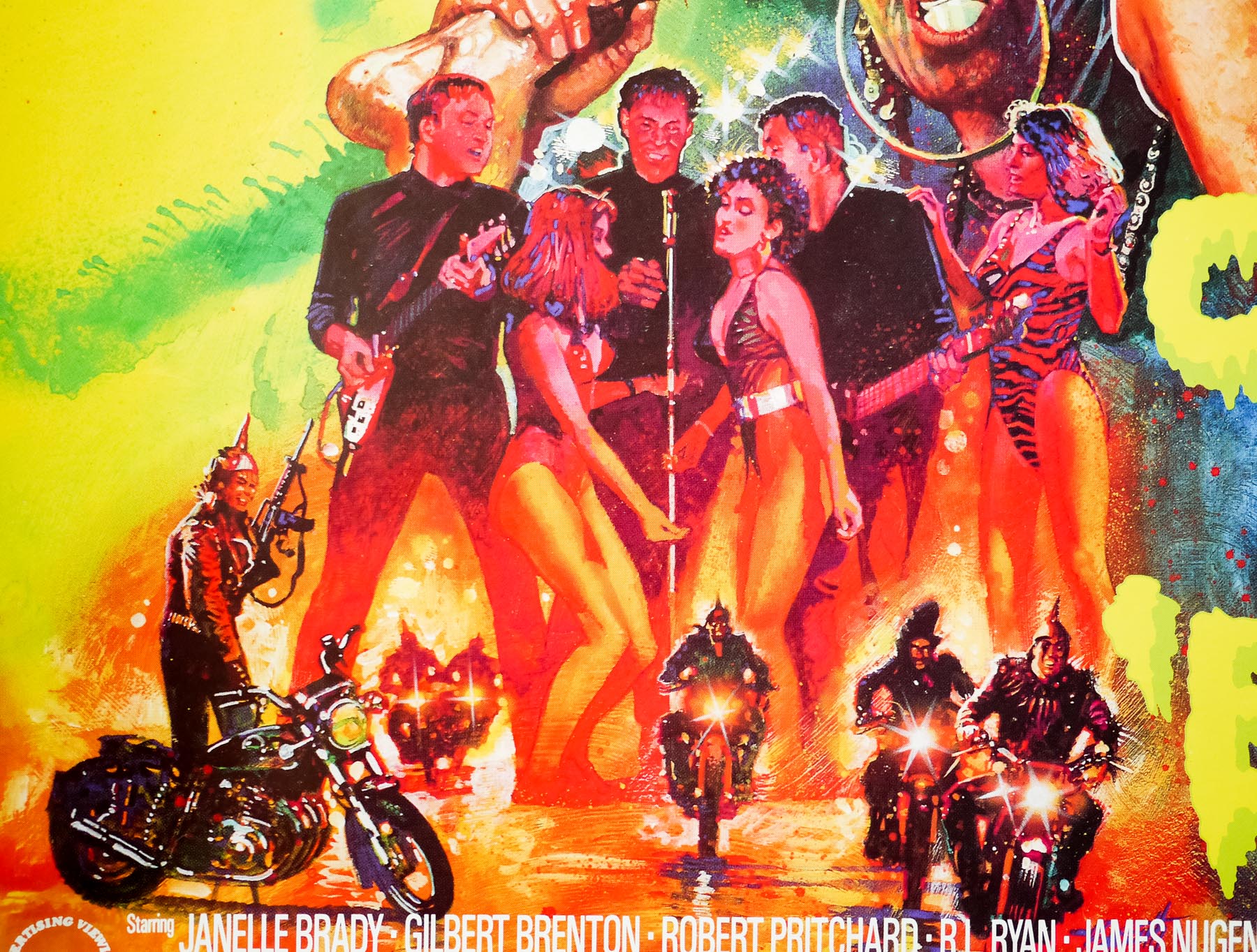
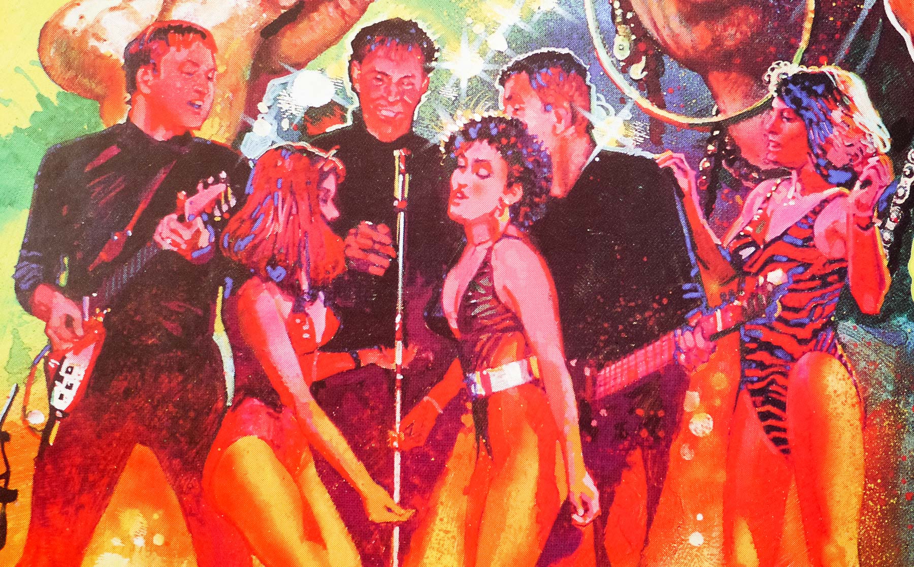
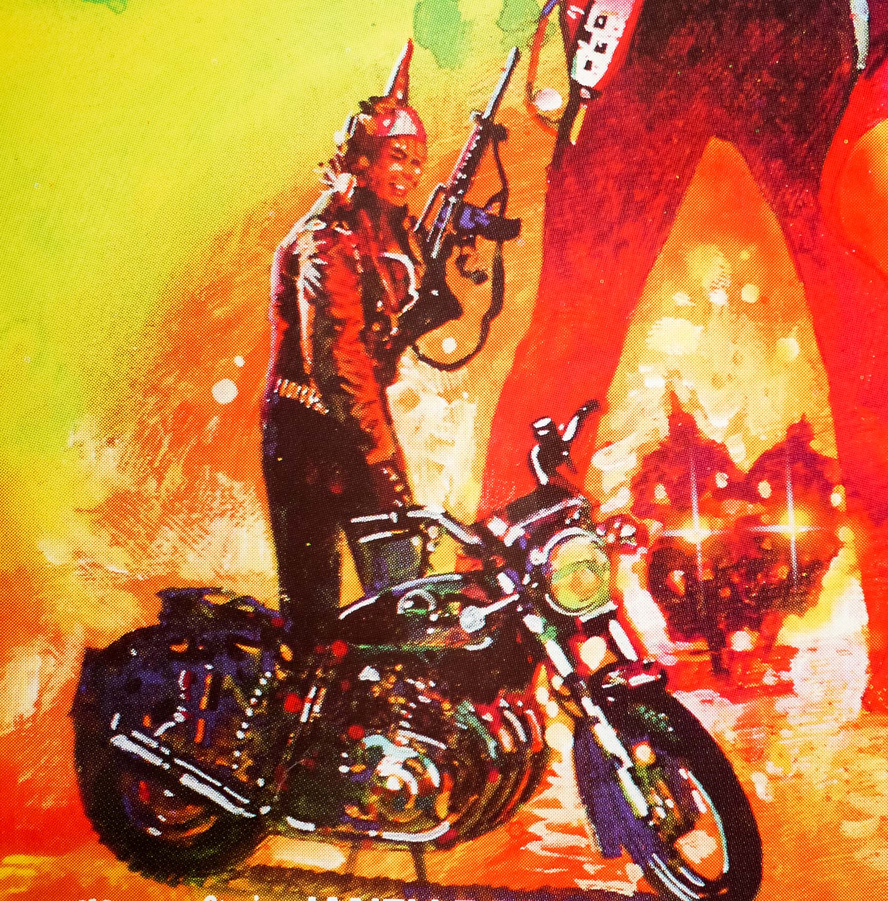
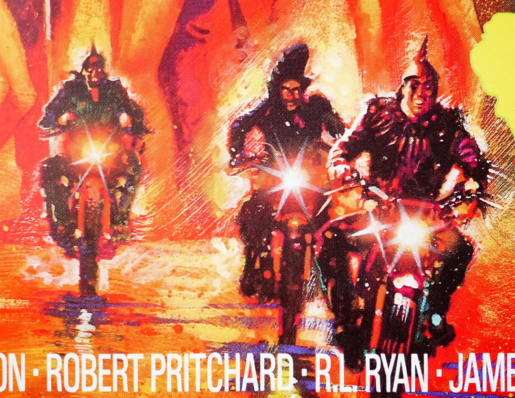
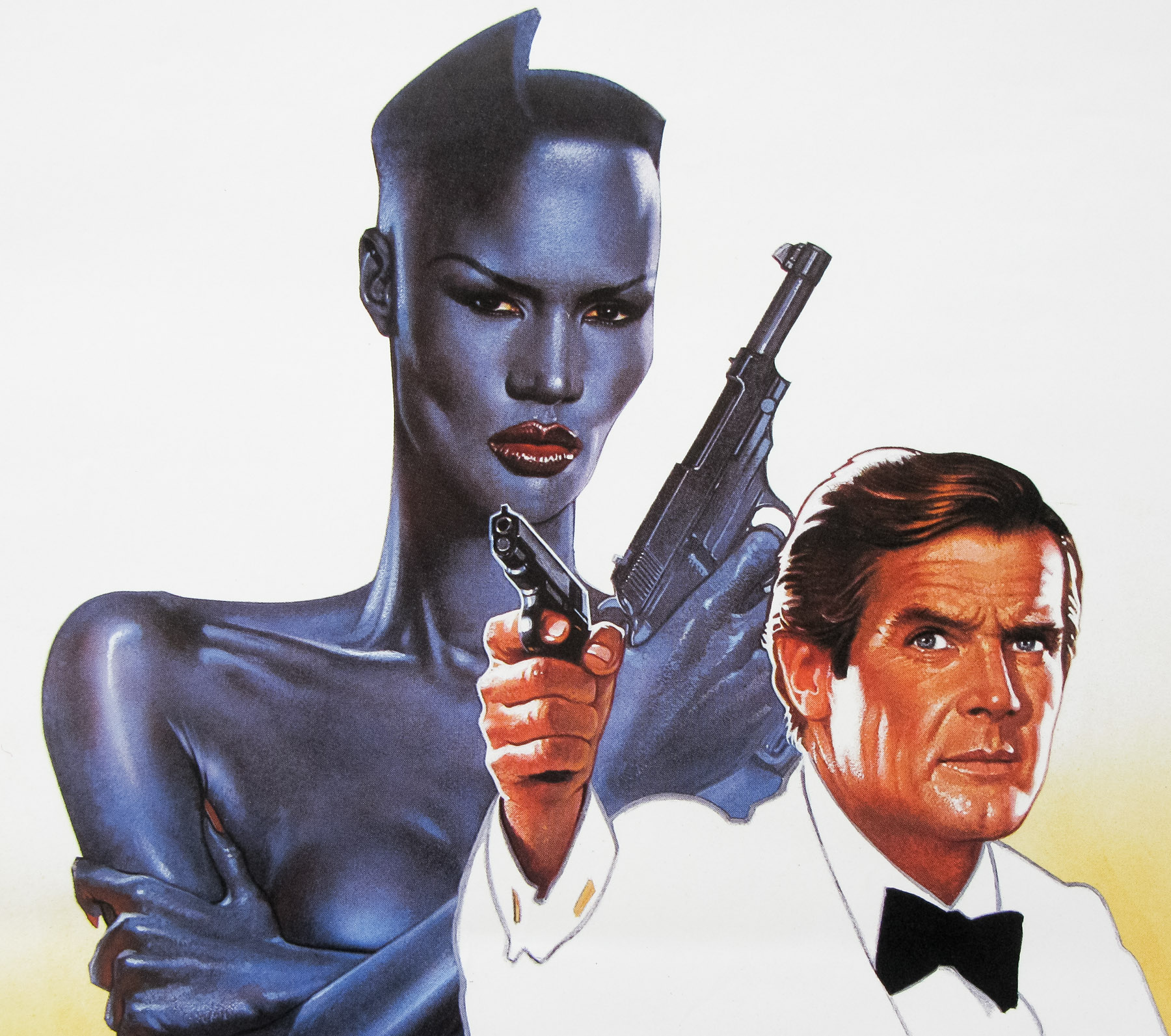
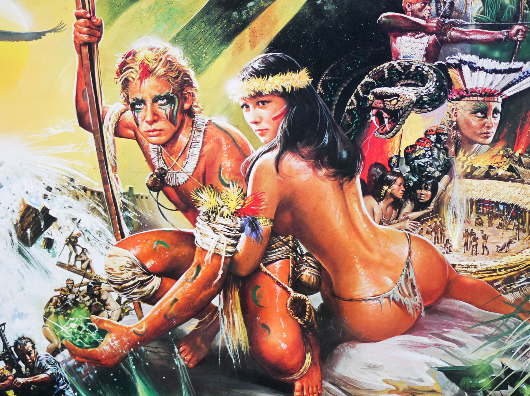
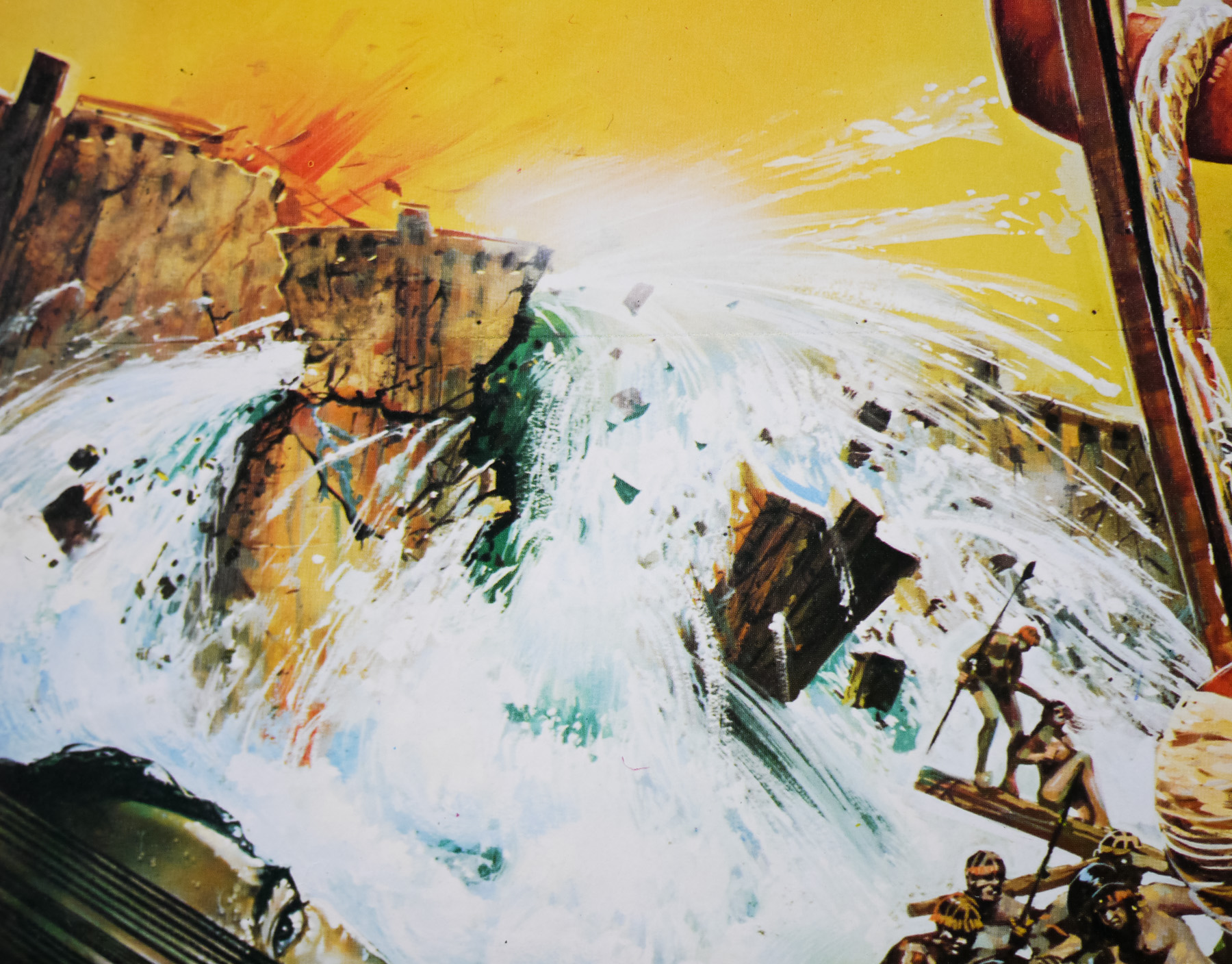
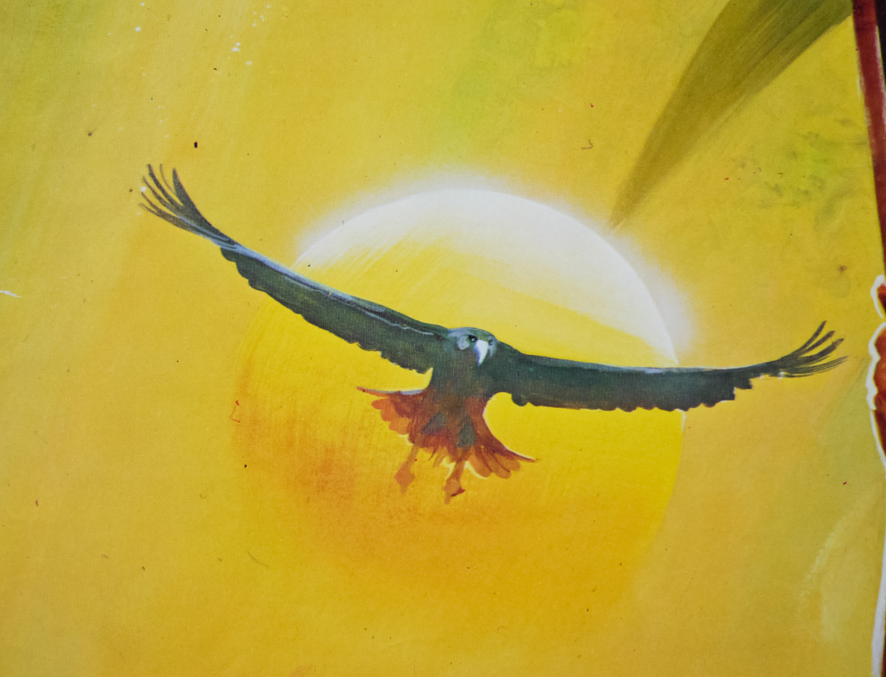
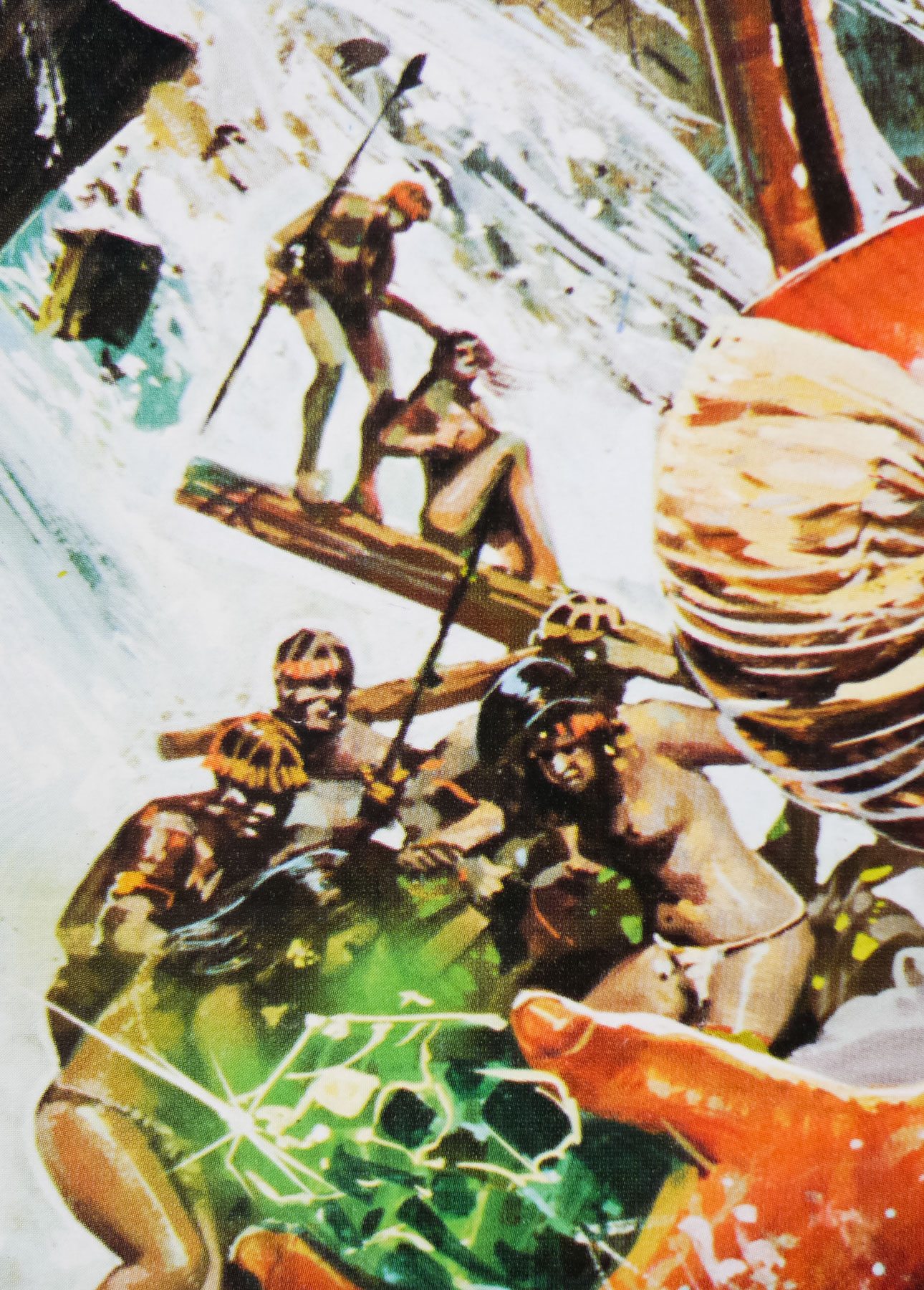
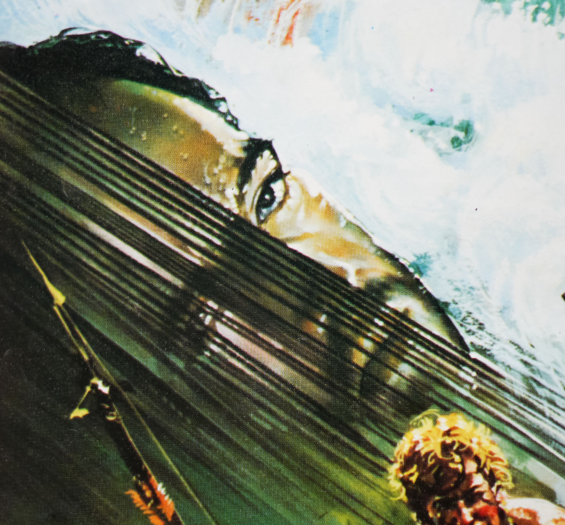
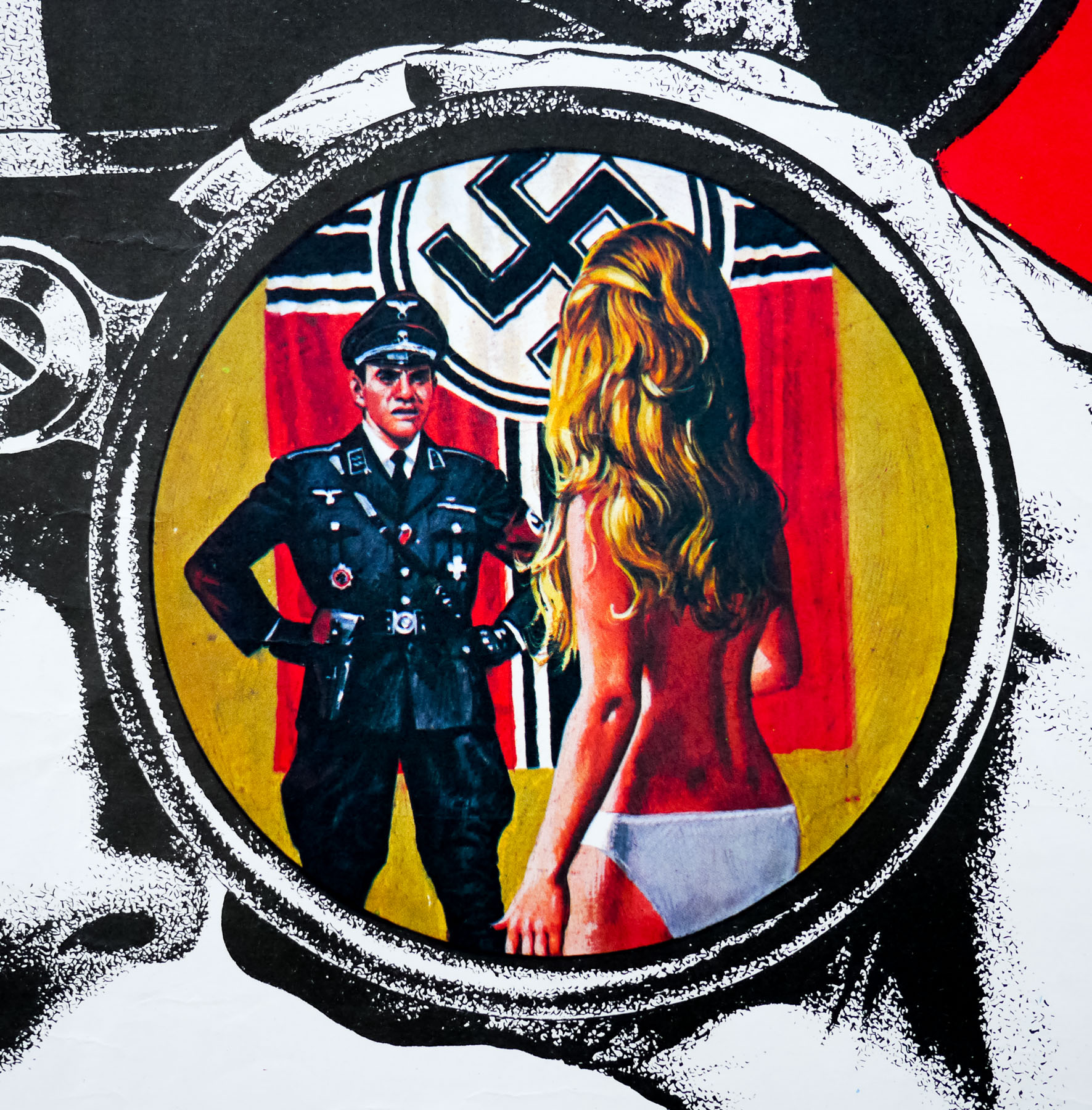
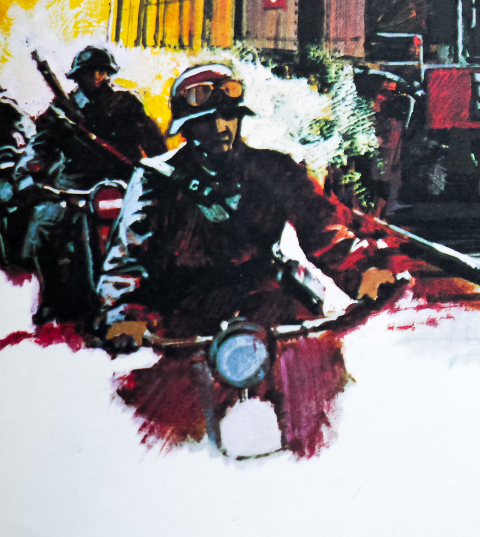
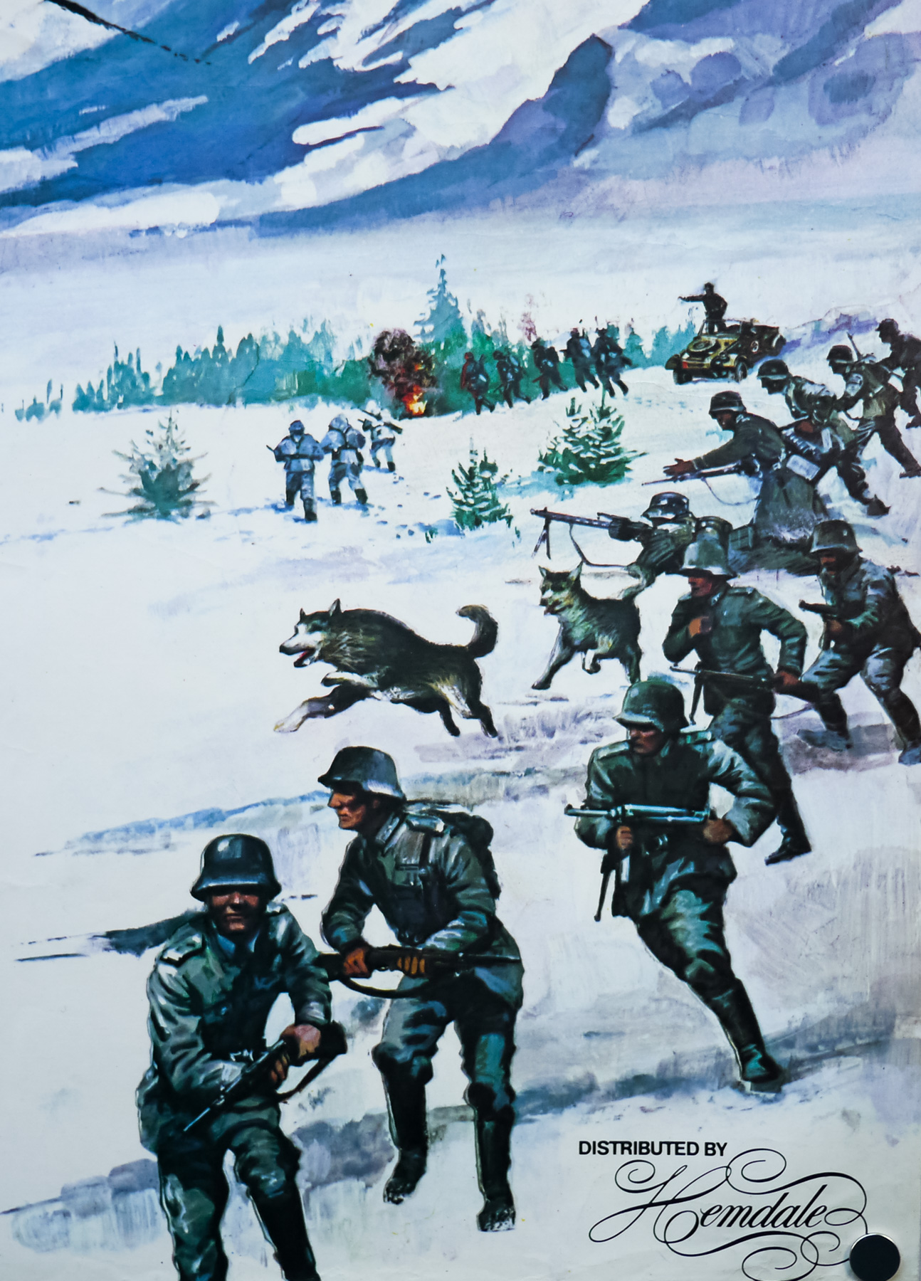
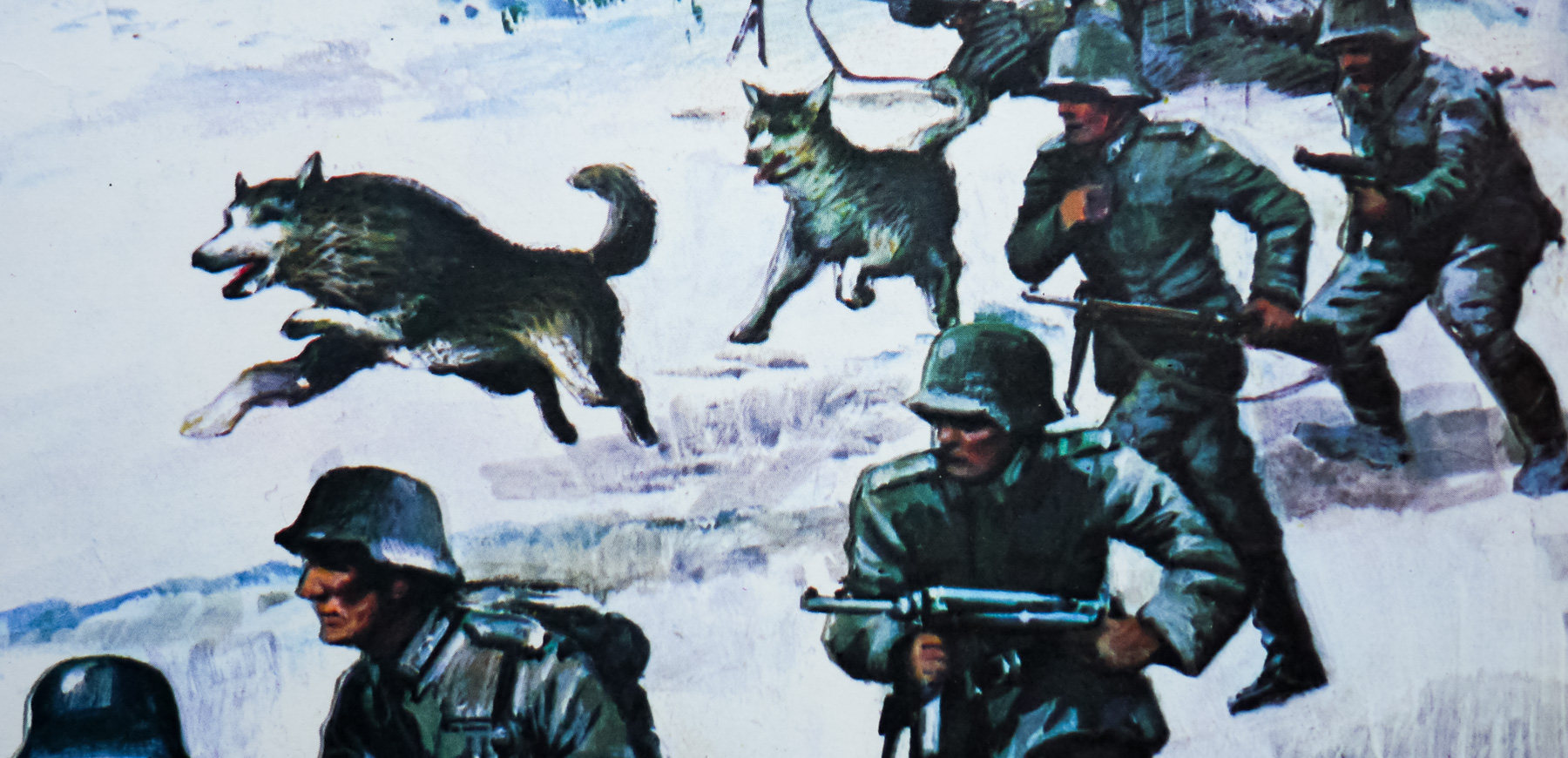
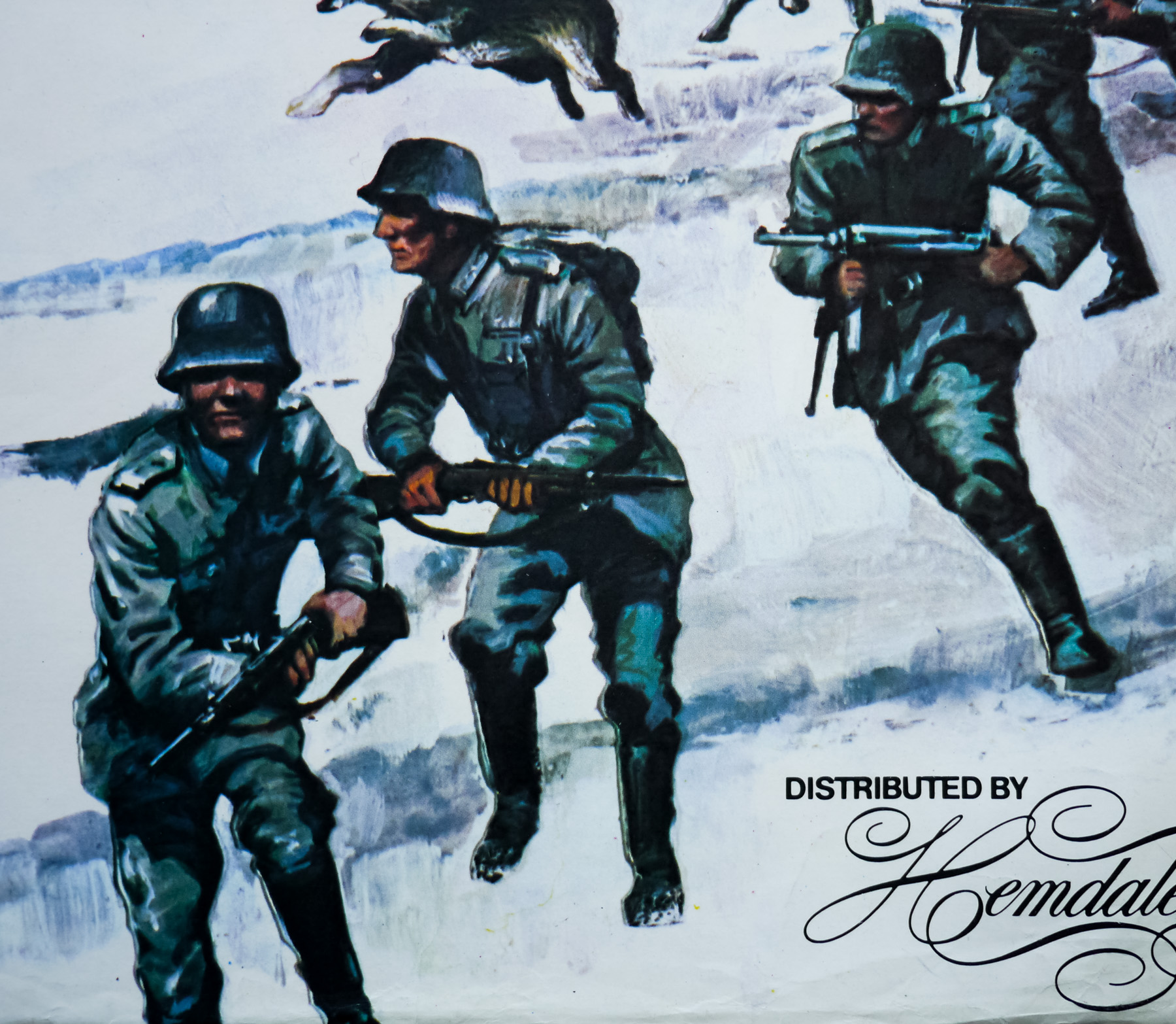
The British quad for John Carpenter’s Big Trouble in Little China, painted by Brian Bysouth in 1986
I’ve split the interview into seven parts and you can use the links below to jump quickly to each section if you wish.
Part 1 – Origins
Part 2 – Starting out – Downtons
Part 3 – Rapier Arts and then a return to Downtons
Part 4 – Going freelance
Part 5 – Bysouth and Hayer Associates
Part 6 – FEREF
Part 7 – The end at FEREF and retirement
Part 1 – Origins
I’d like to start with your origins and I understand you were born in October 1936 in London. Your mother was a fashion artist?
Yes, I remember when I was very young seeing some of her work and, looking back, I think it was pretty good. She worked for a firm just off Oxford Street in London, which was the capital of the rag trade then. This would have been whilst my father was away during the war. She always encouraged me to draw and often gave me paints and paper. Most of my time was spent sketching or drawing something.
I had an old watercolour box that a relative had given me and sometimes at the weekends I would fetch some paper and sit up in bed to draw and paint instead of getting up. I really enjoyed it and it absorbed most of my time.
Incidentally, when my mother died a couple of years ago we were clearing out her things and we found one of my old paintings that she had kept. When I was about seven she took me to see the film Snow White and the Seven Dwarves and afterwards I painted a picture of the dwarves’ mine. It was studded with great gobs of paint, which were meant to represent the jewels.
You’d spend every moment you could sketching and painting when you weren’t at school?
I suppose I did, but I was out with my friends playing cricket and football and later on getting into mischief. I think painting in my spare time subsided a bit in my early teens, but I was encouraged at school by our art teacher, a Mr. Thompson, who was a very nice man. He’d been in the RAF during the war and had a huge military moustache. I think he liked some of the lads in the class that he judged to be talented. He would sometimes pick out our work and say to the class, ‘this is how you should do it.’
Eventually the Eleven-plus came around and I didn’t do very well. I suppose I was reasonably good academically until about the age of nine or ten, but I remember when my father came back from serving in the war it was quite a traumatic time. He’d gone away in 1939 when I was three, and had been involved at Dunkirk. When he came back my mother persuaded him to apply for a commission and he was posted to India, then to West Africa and I didn’t see him until the end of the war. By that time I didn’t really know him and he didn’t know me. After he came home my two sisters were born and my parents were so occupied with them I was allowed freedom to neglect my schoolwork.