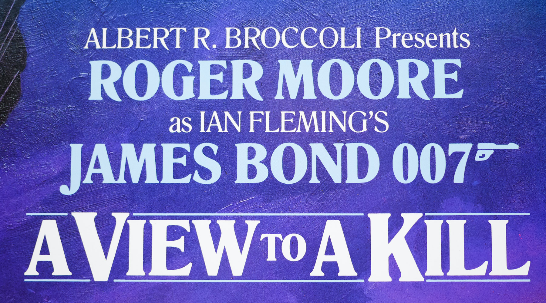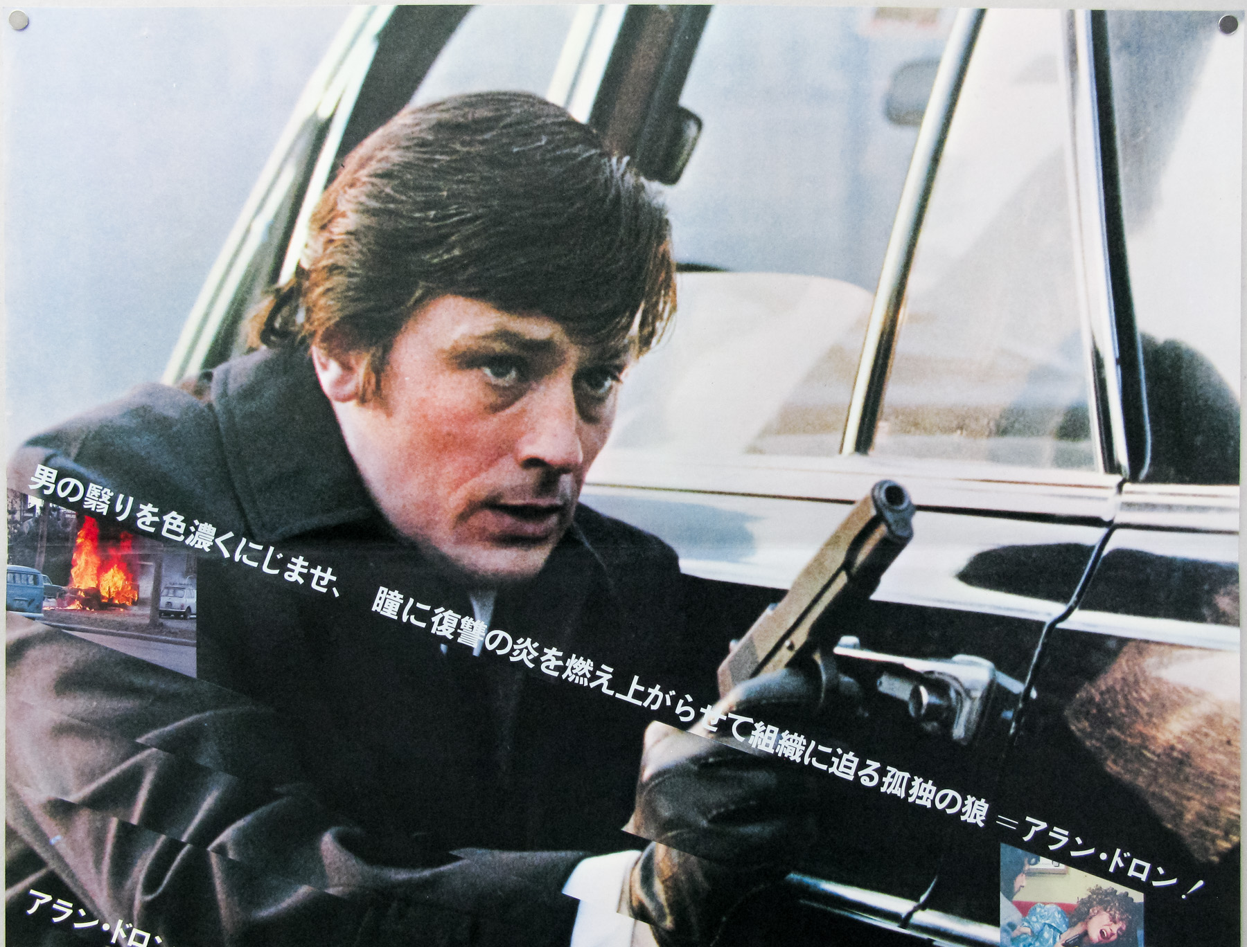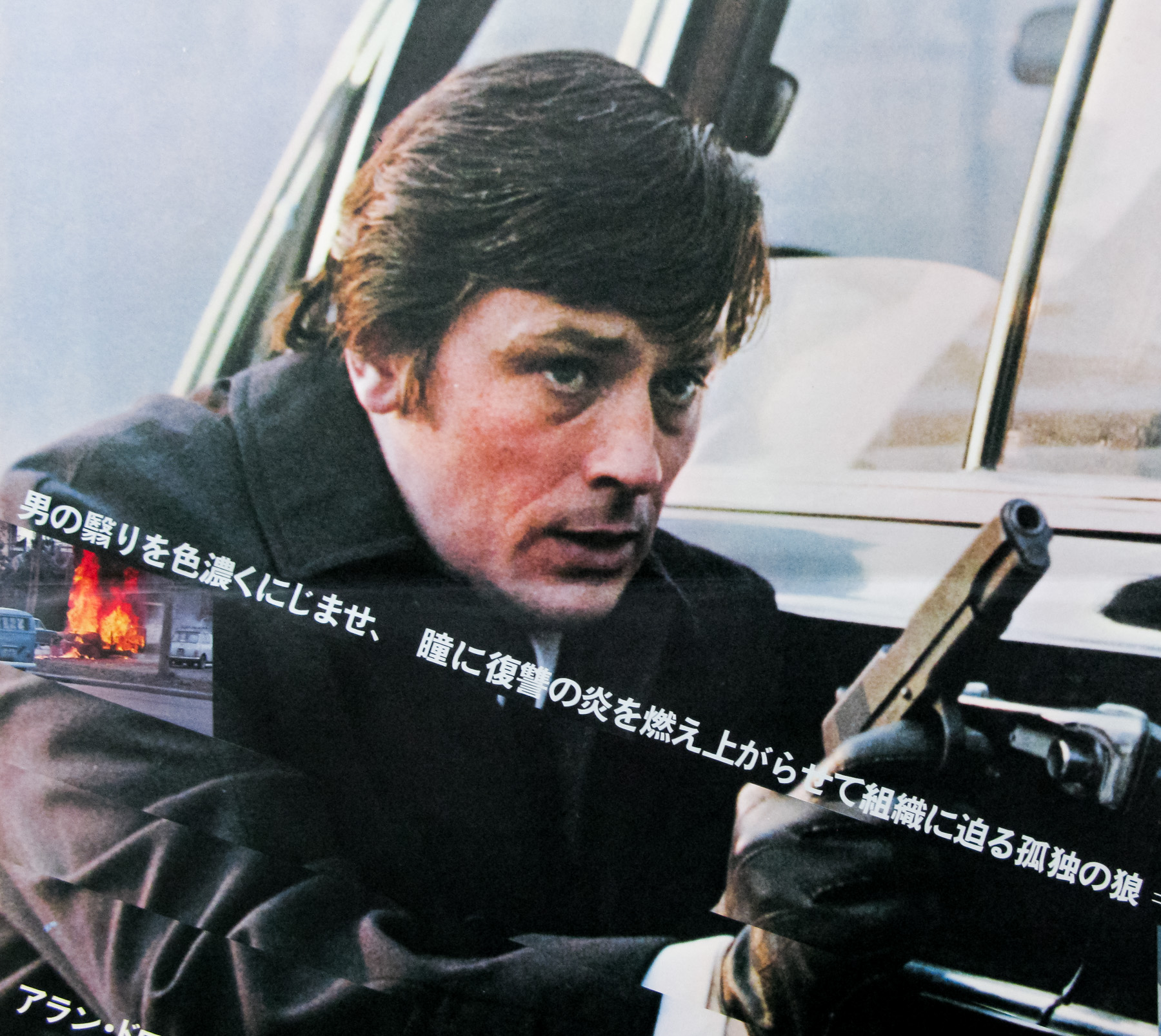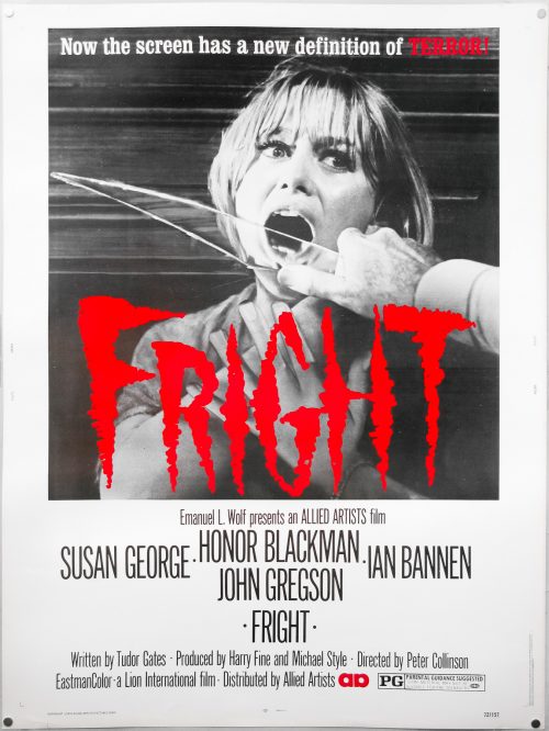
Poster detail
1-5

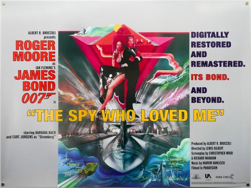
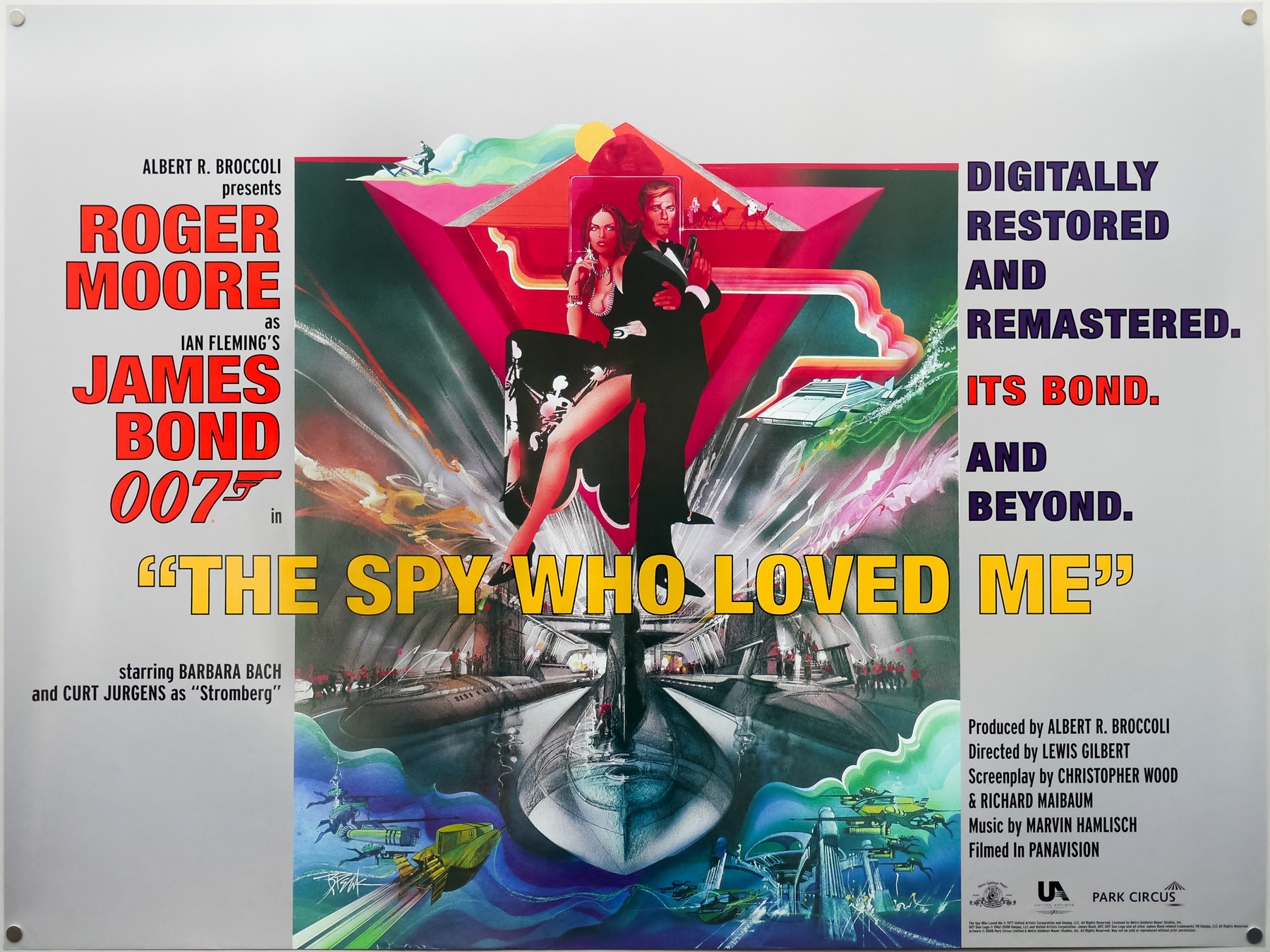
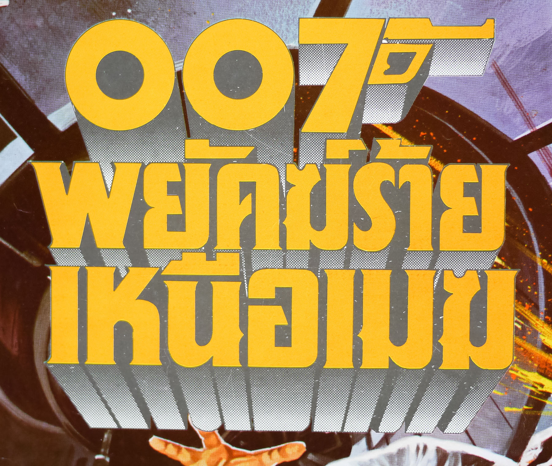
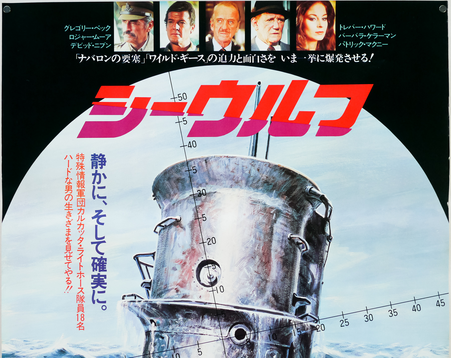
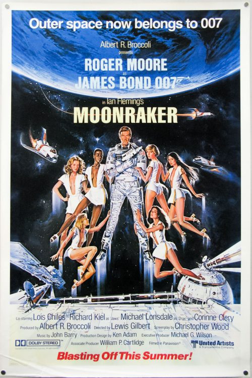
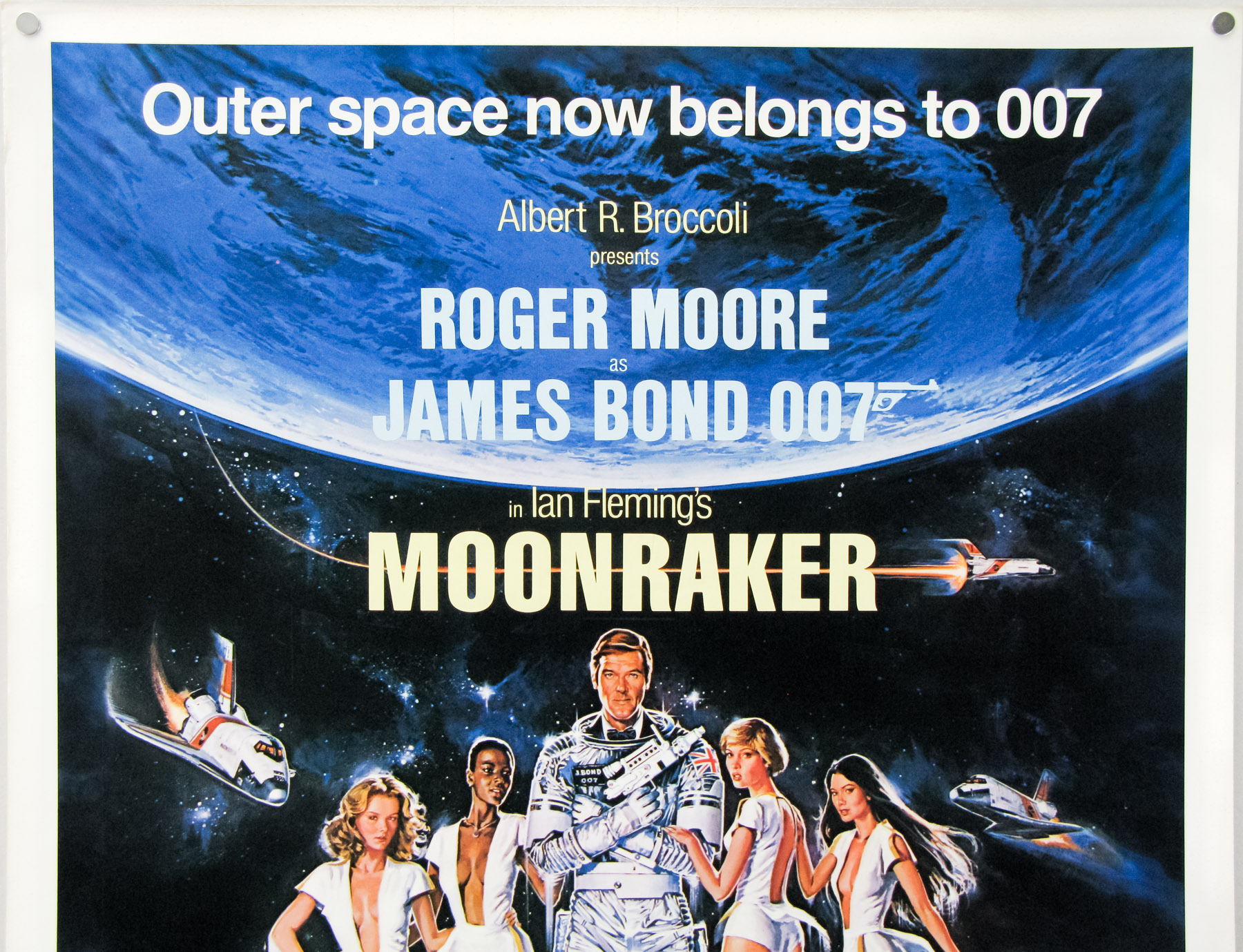
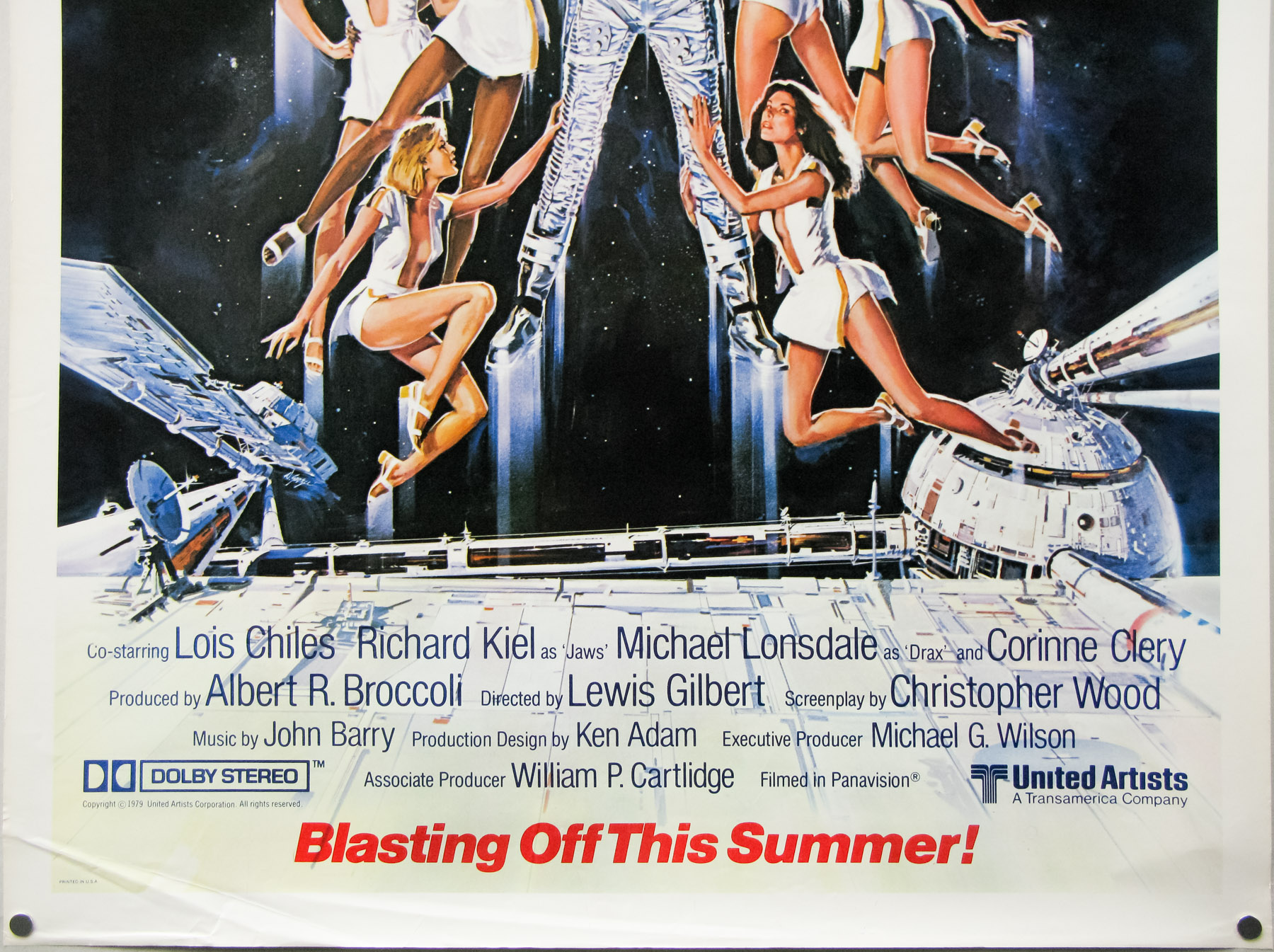
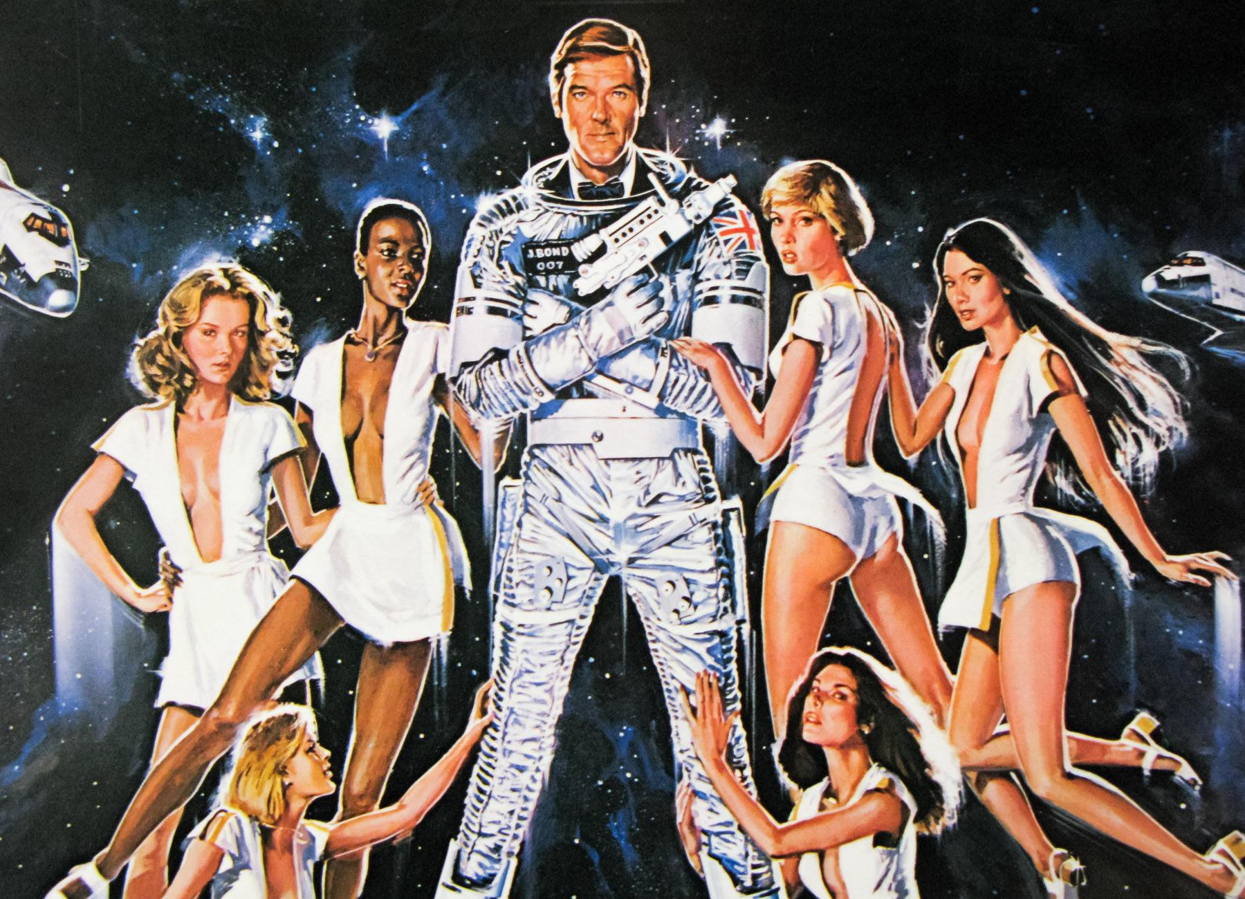
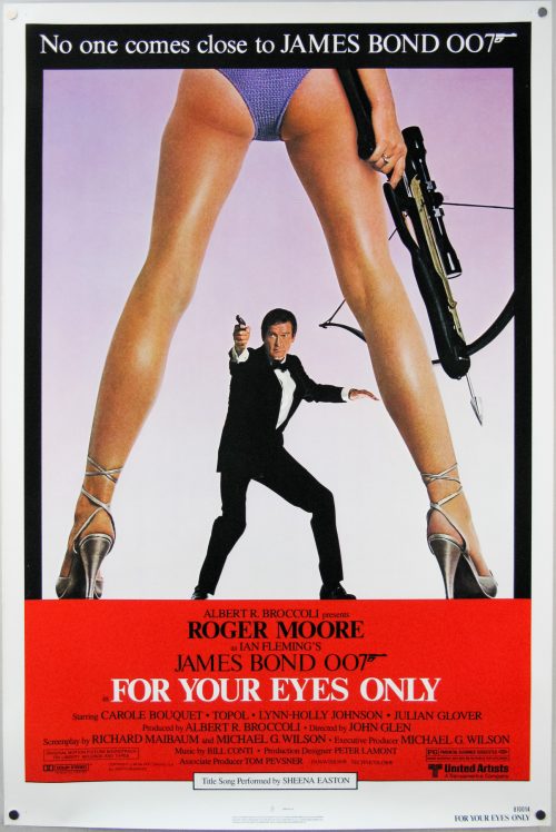
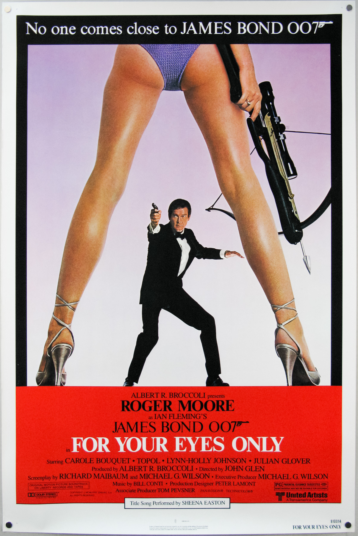
- Title
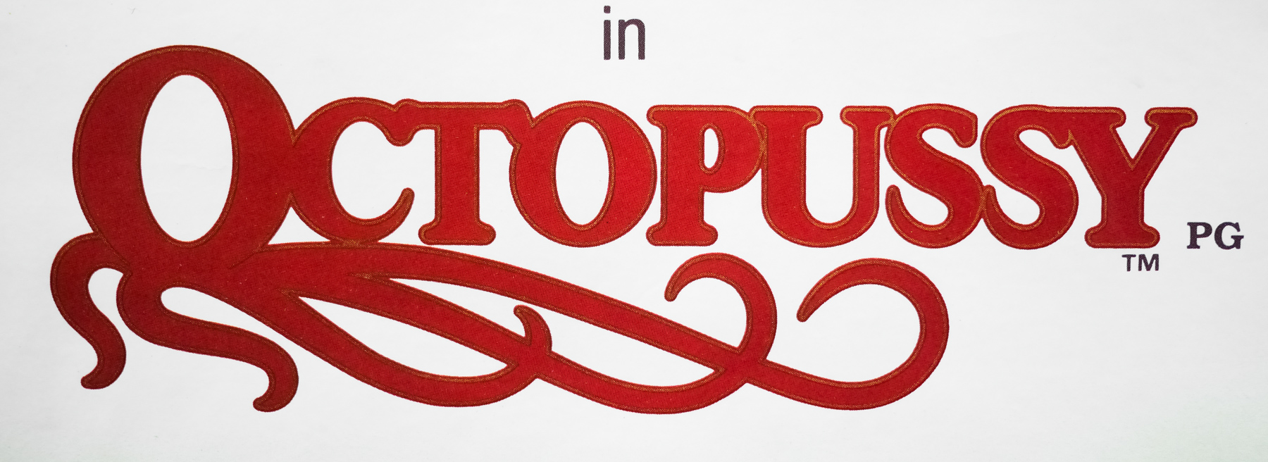
- Octopussy
- AKA
- --
- Year of Film
- 1983
- Director
- John Glen
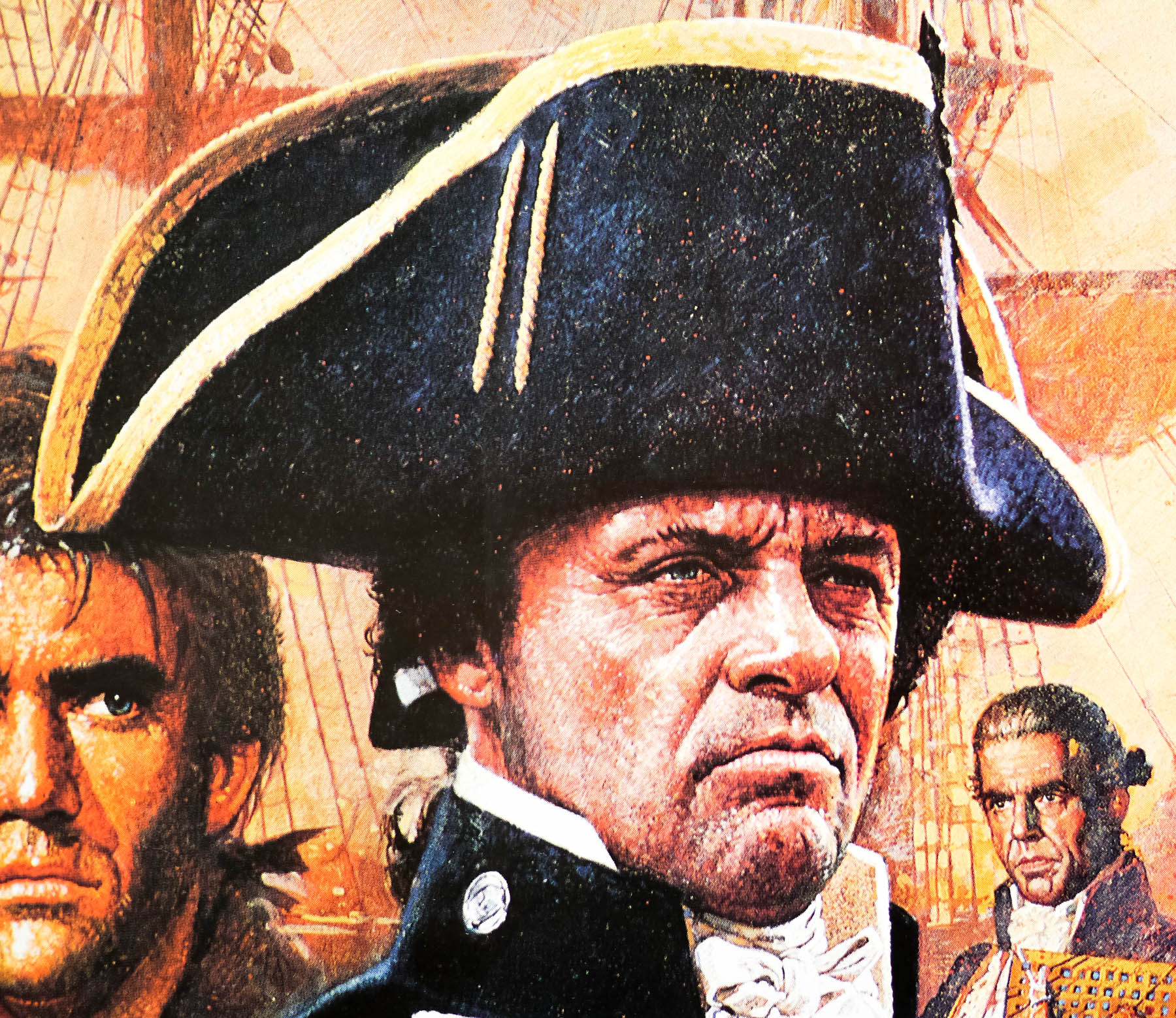
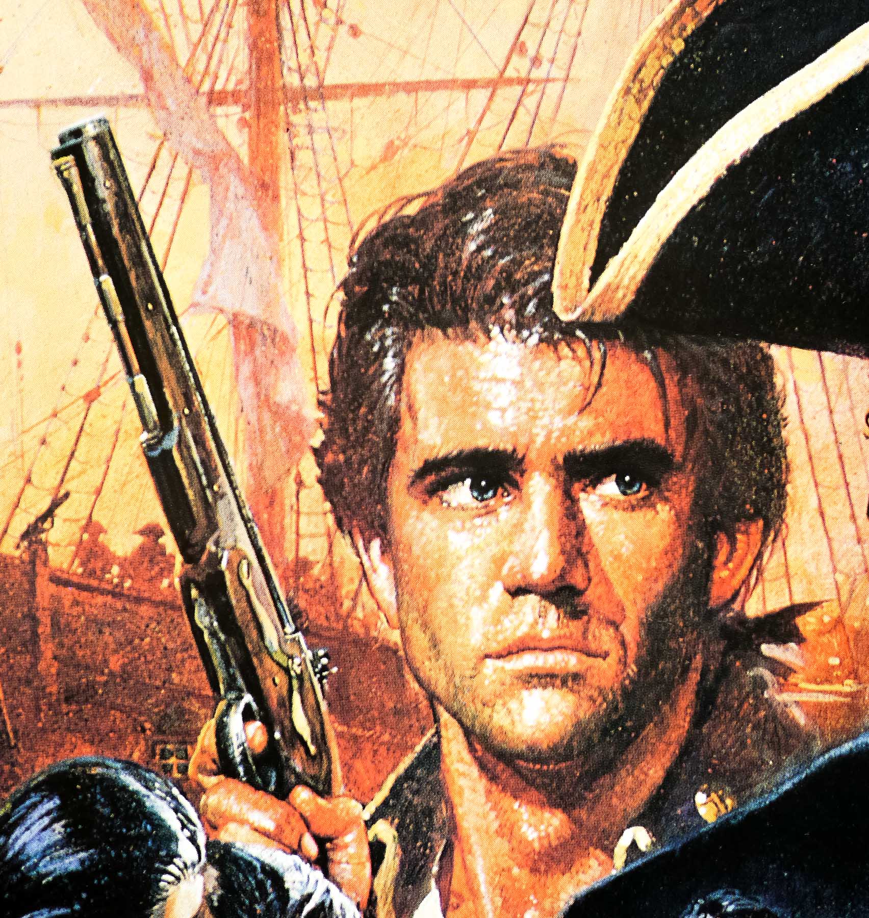
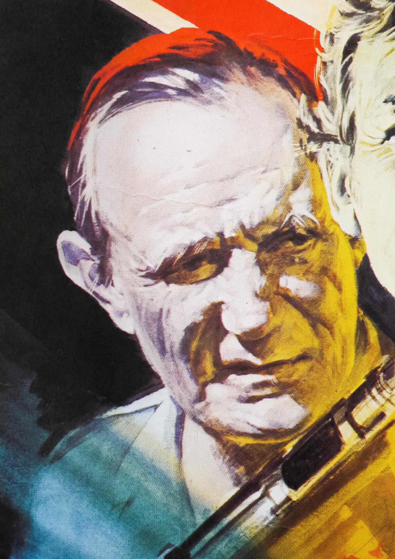
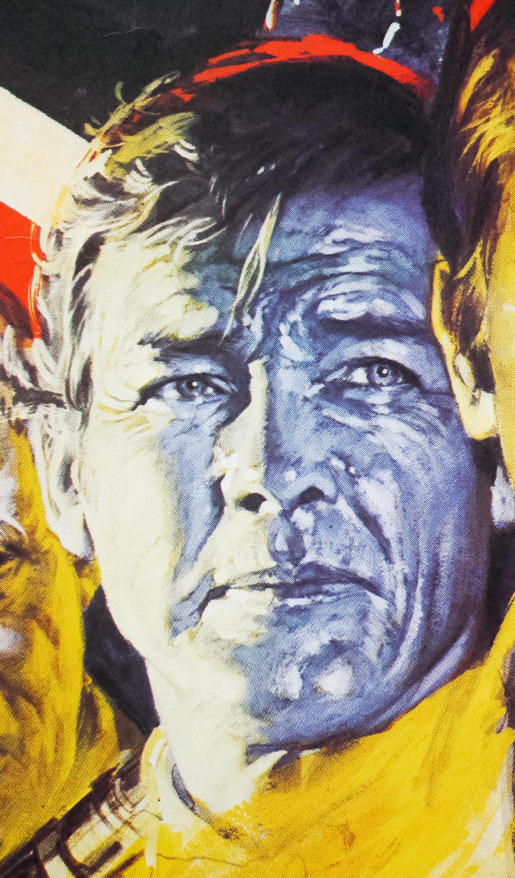
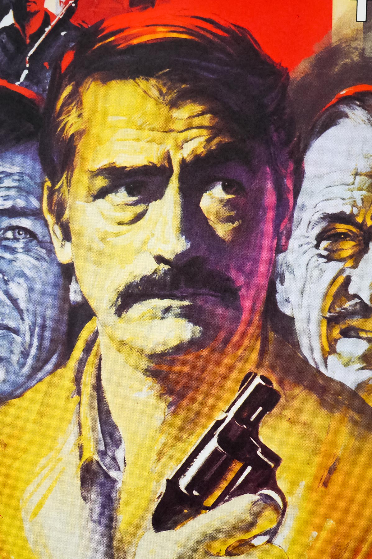
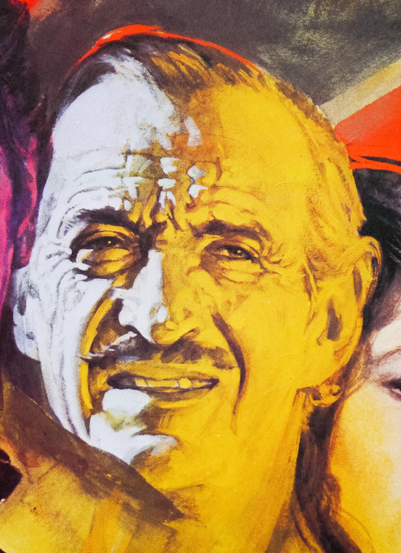
- Starring
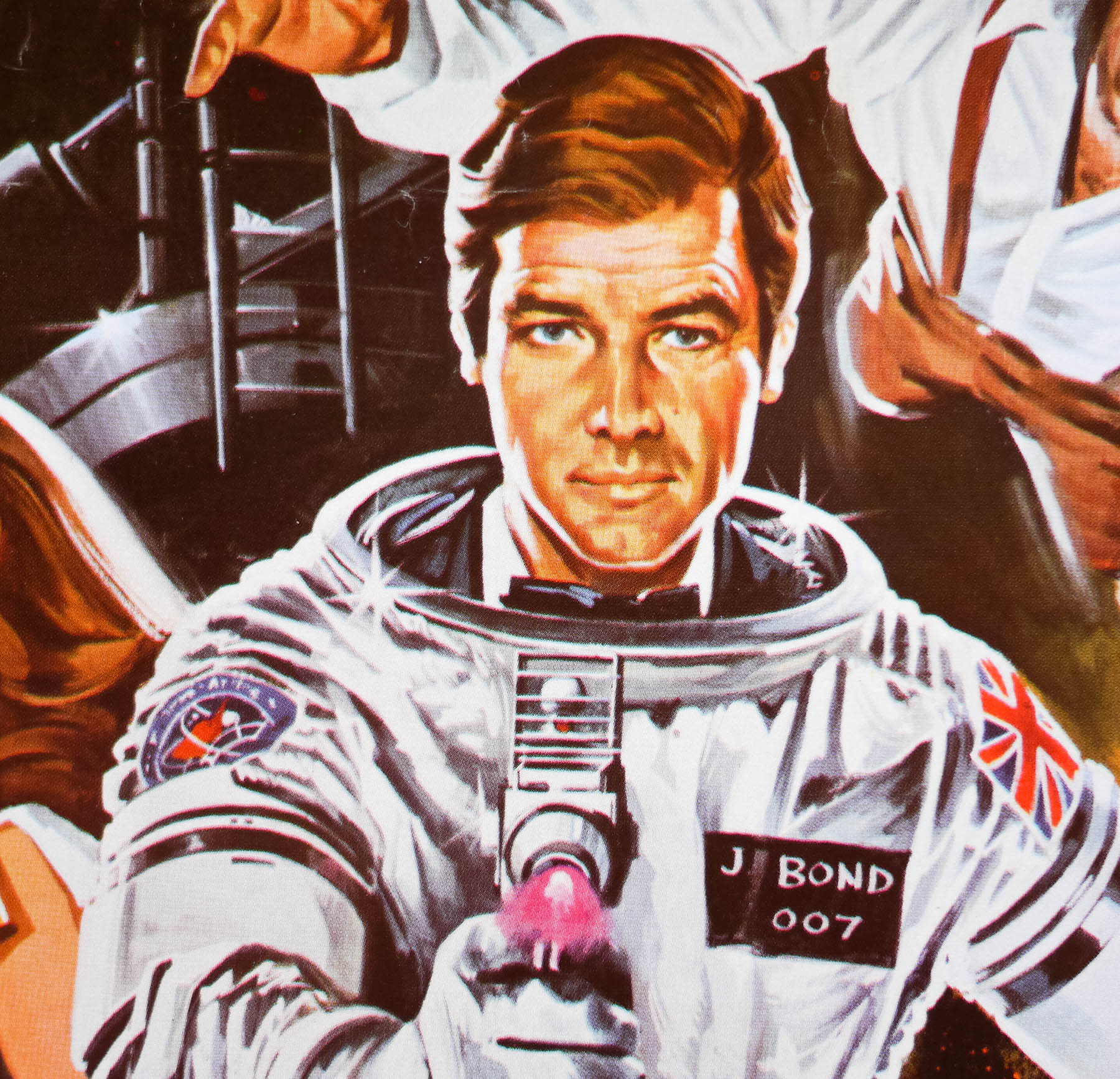
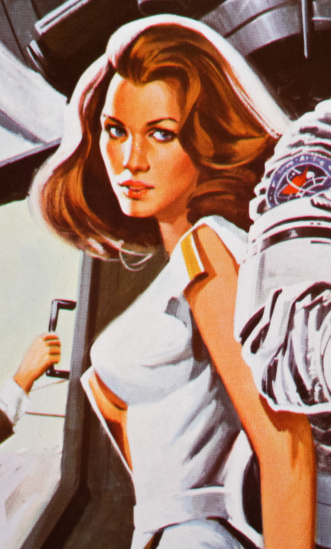
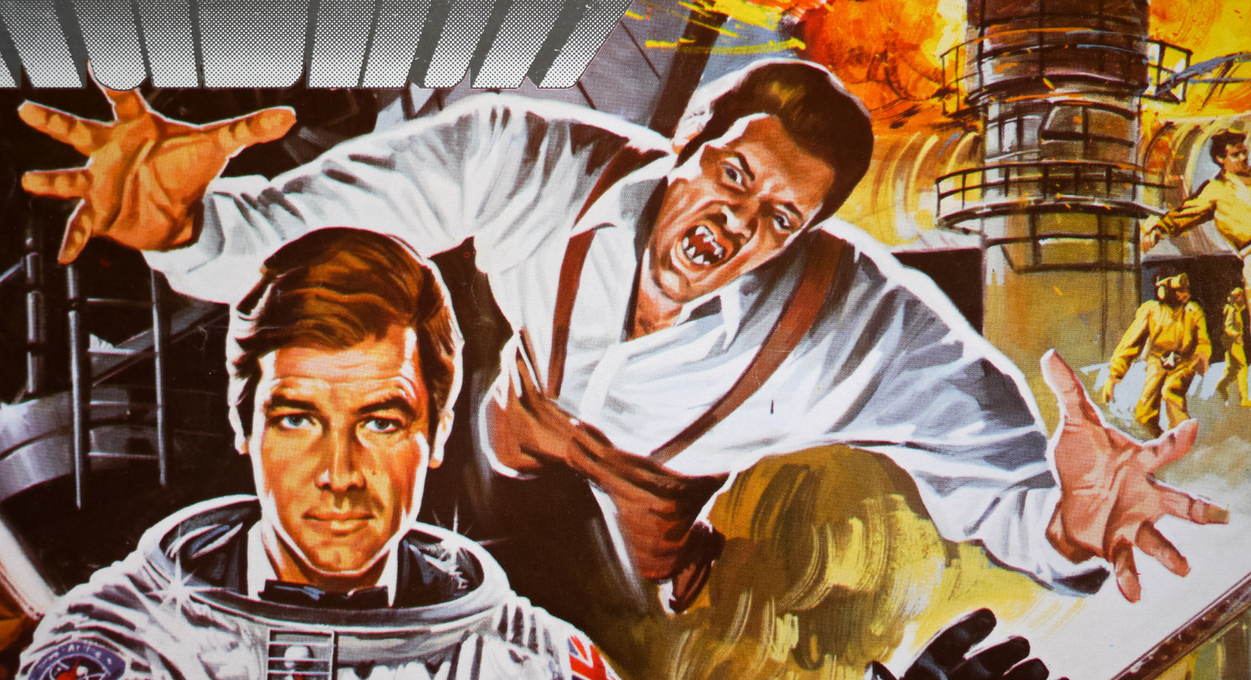
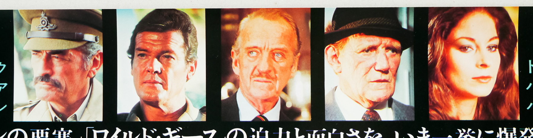
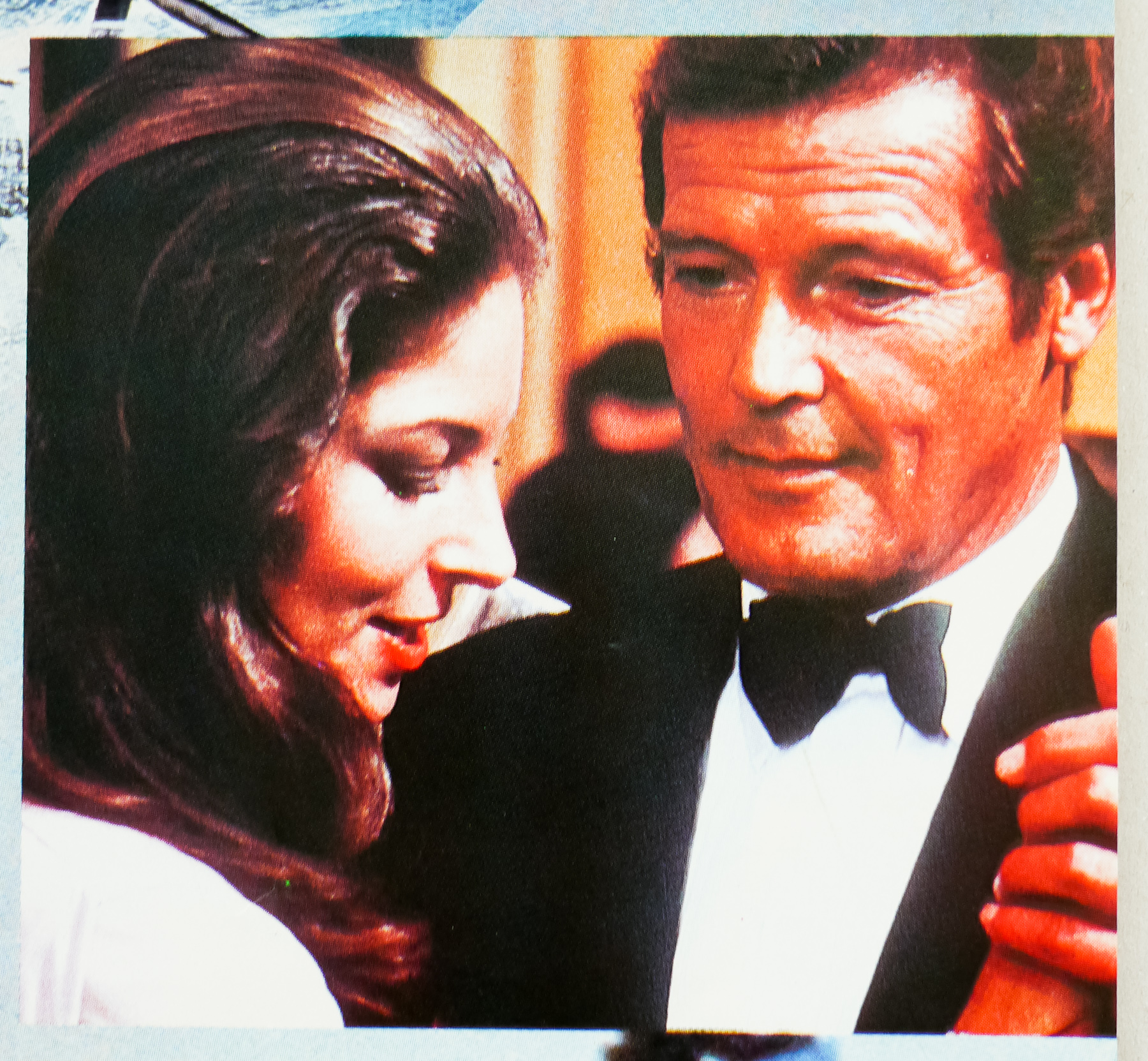
- Roger Moore, Maud Adams, Louis Jourdan, Kristina Wayborn, Kabir Bedi, Steven Berkoff, David Meyer, Tony Meyer, Desmond Llewelyn, Robert Brown, Lois Maxwell, Michaela Clavell, Walter Gotell, Vijay Amritraj, Albert Moses
- Origin of Film
- USA
- Genre(s) of Film
- Roger Moore, Maud Adams, Louis Jourdan, Kristina Wayborn, Kabir Bedi, Steven Berkoff, David Meyer, Tony Meyer, Desmond Llewelyn, Robert Brown, Lois Maxwell, Michaela Clavell, Walter Gotell, Vijay Amritraj, Albert Moses,
- Type of Poster
- Quad
- Style of Poster
- --
- Origin of Poster
- UK
- Year of Poster
- 1983
- Designer
- Unknown
- Size (inches)
- 30" x 39 14/16"
- SS or DS
- SS
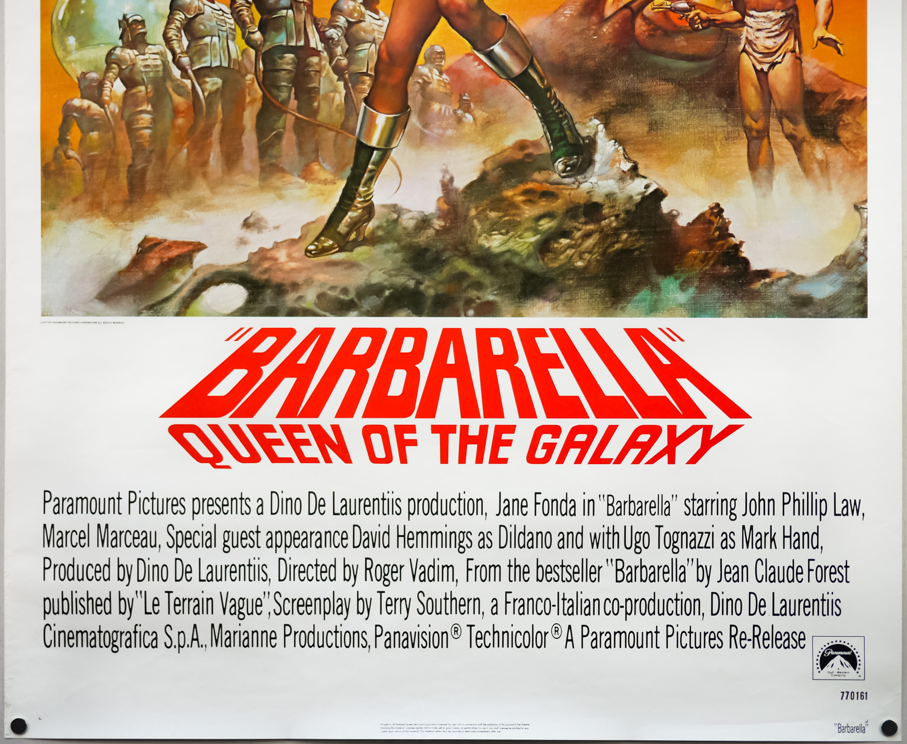
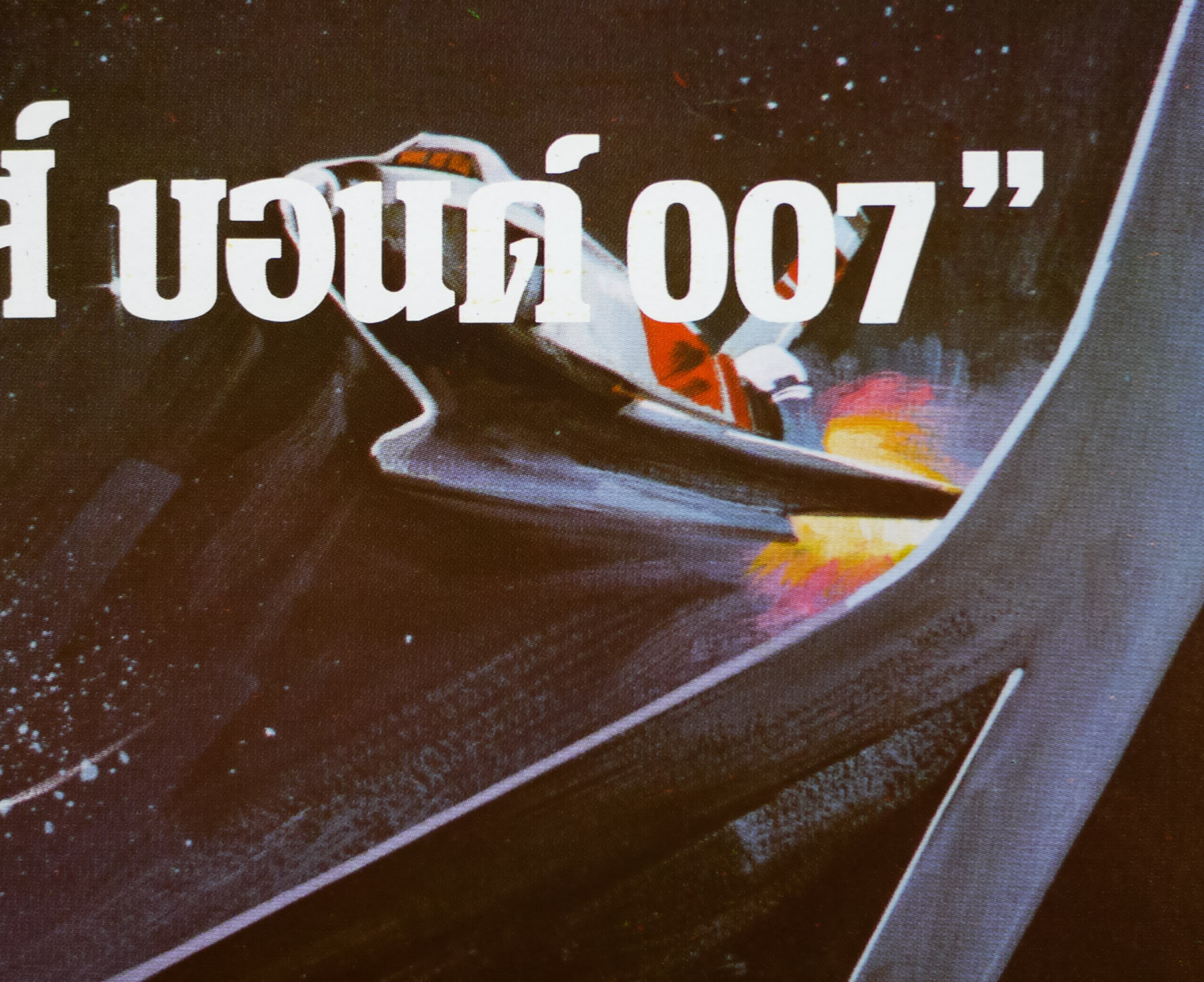
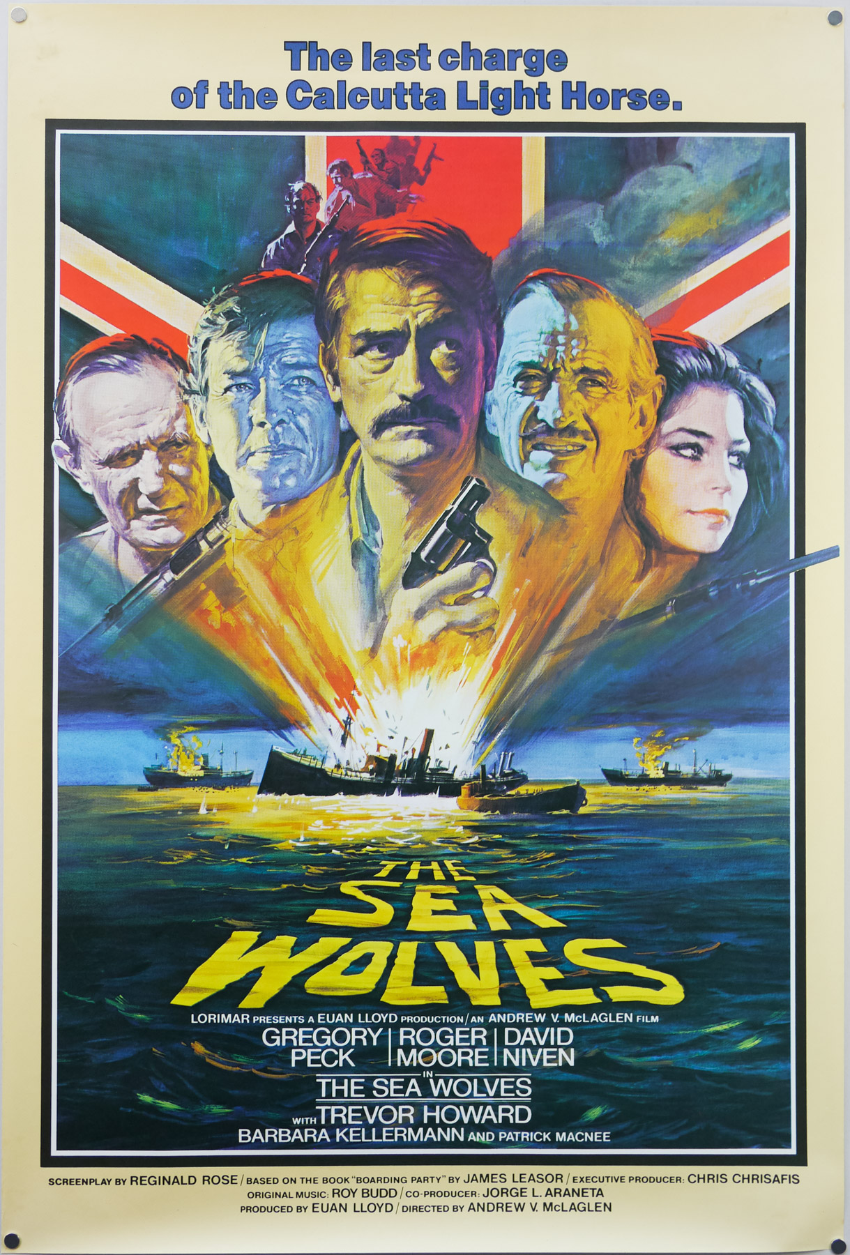
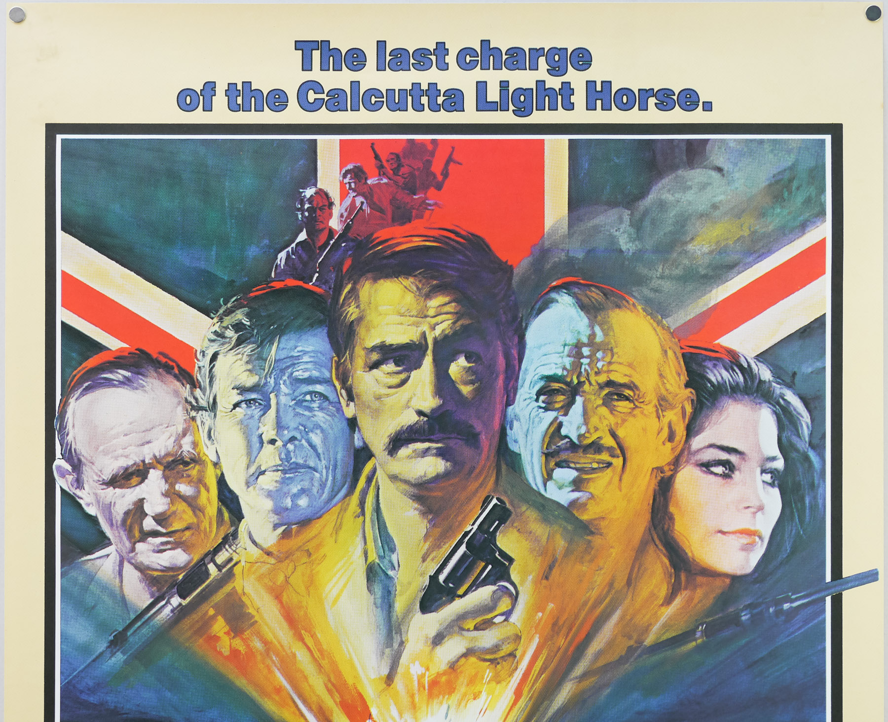
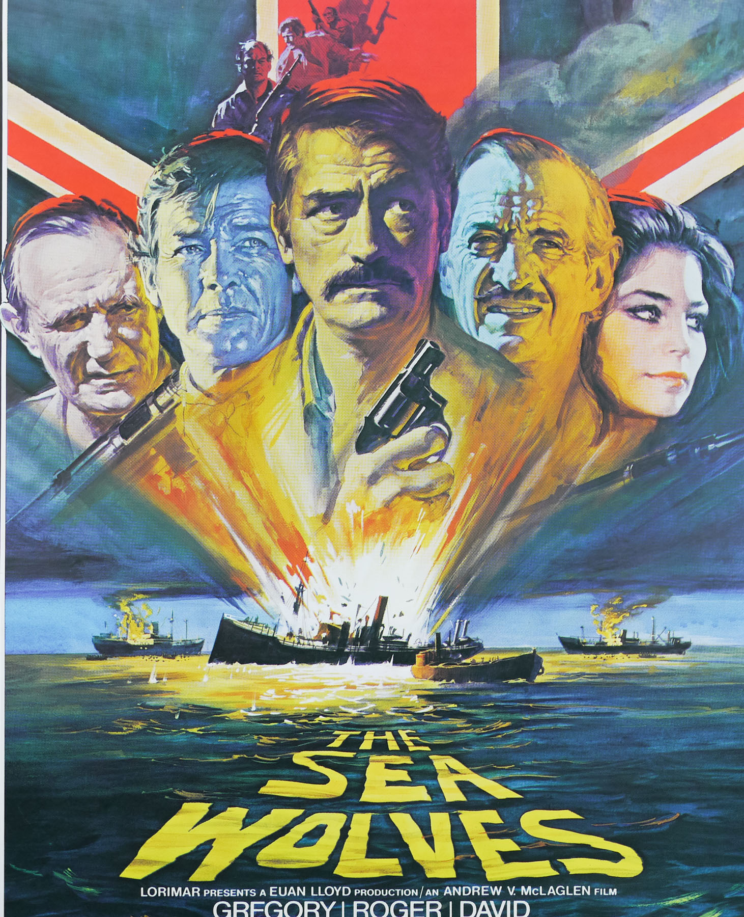
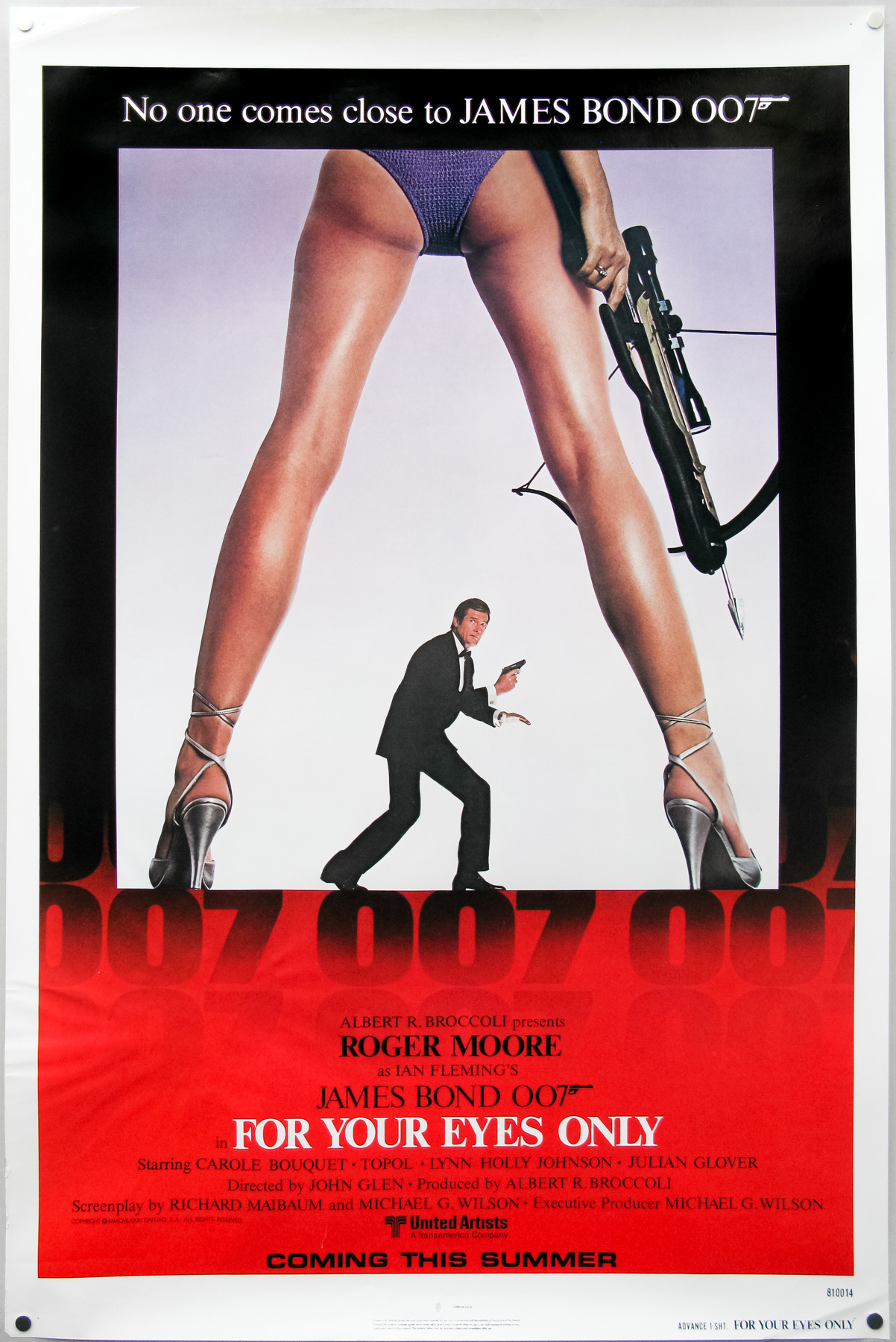
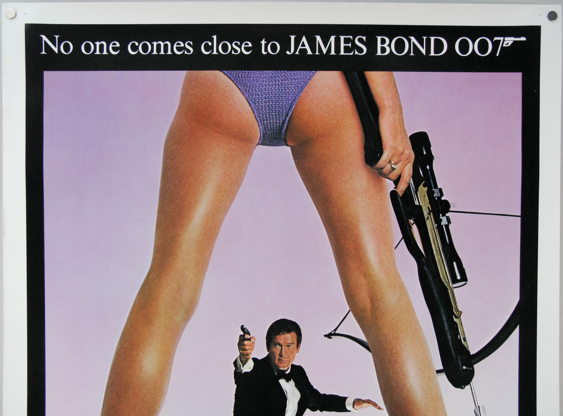
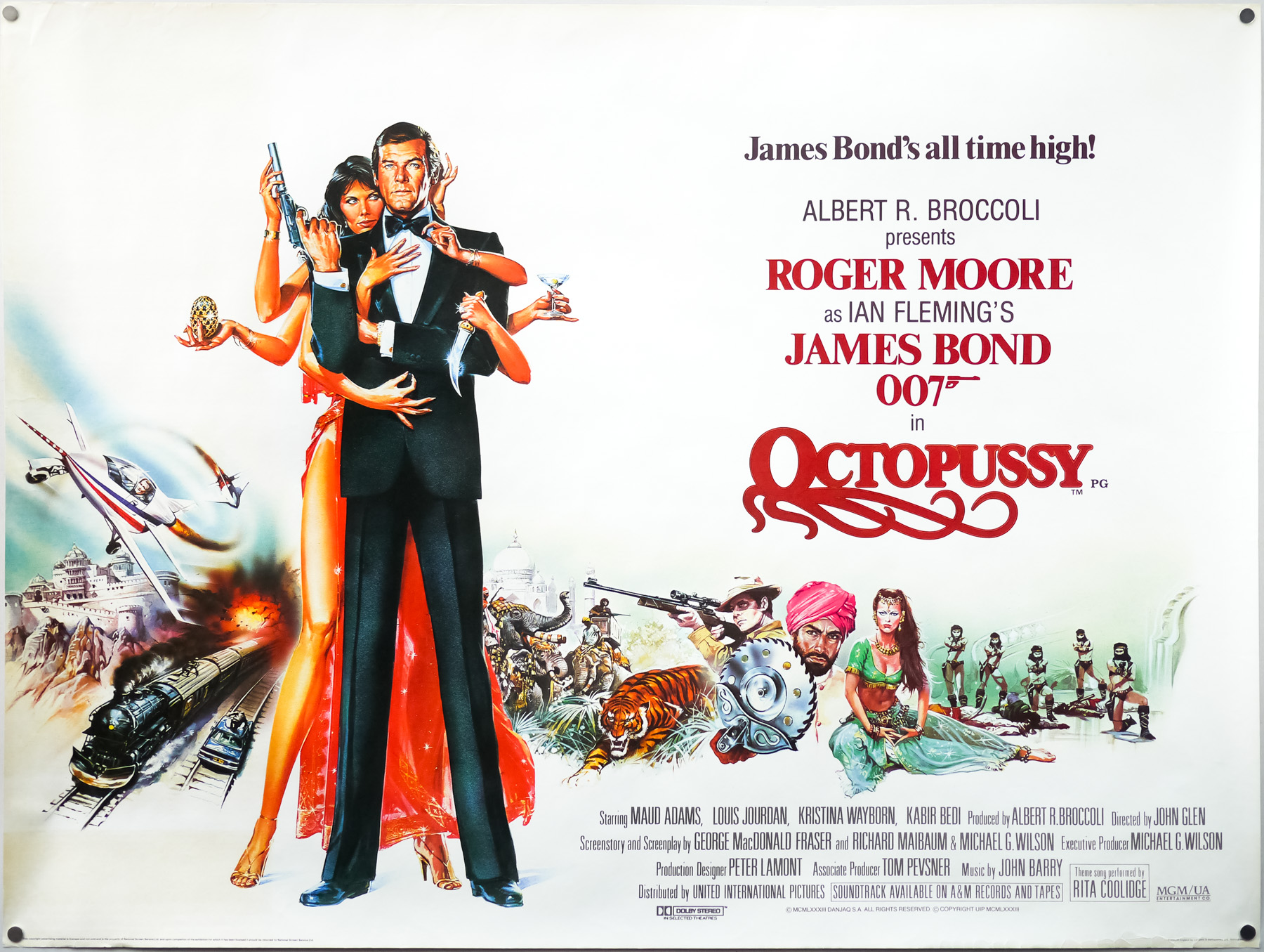
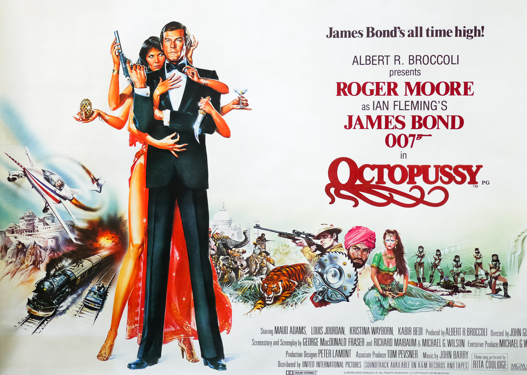
- Tagline
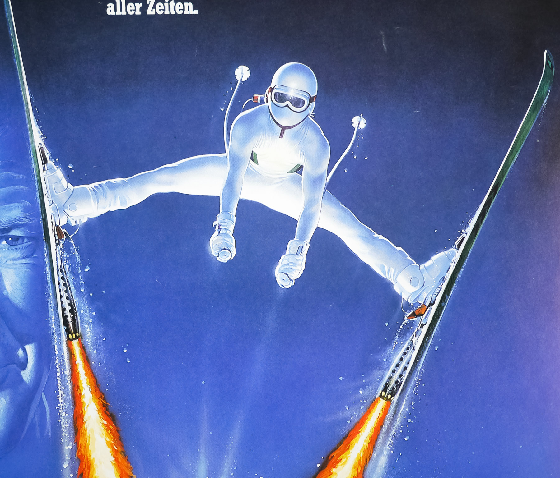
- James Bond's all time high!
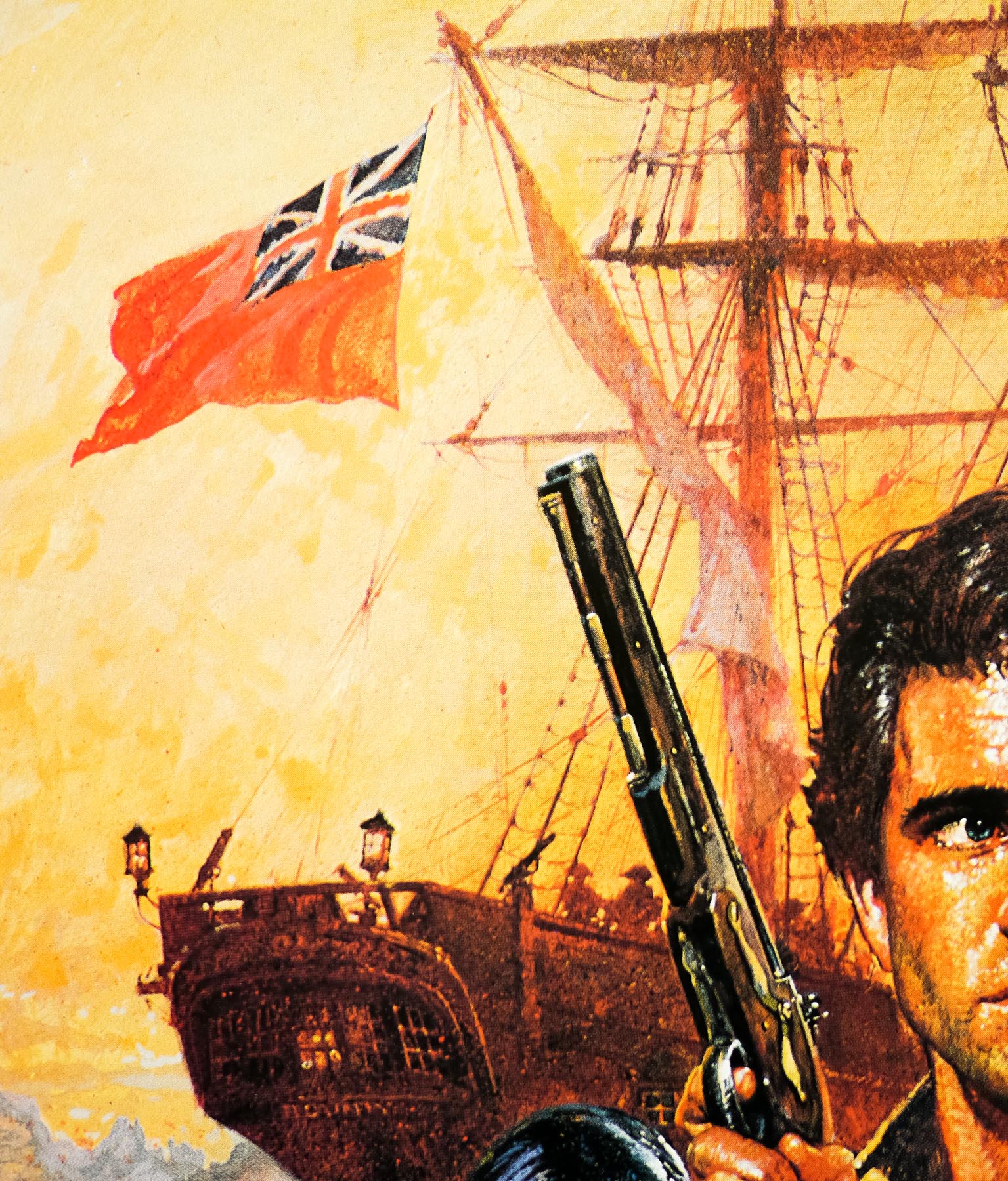
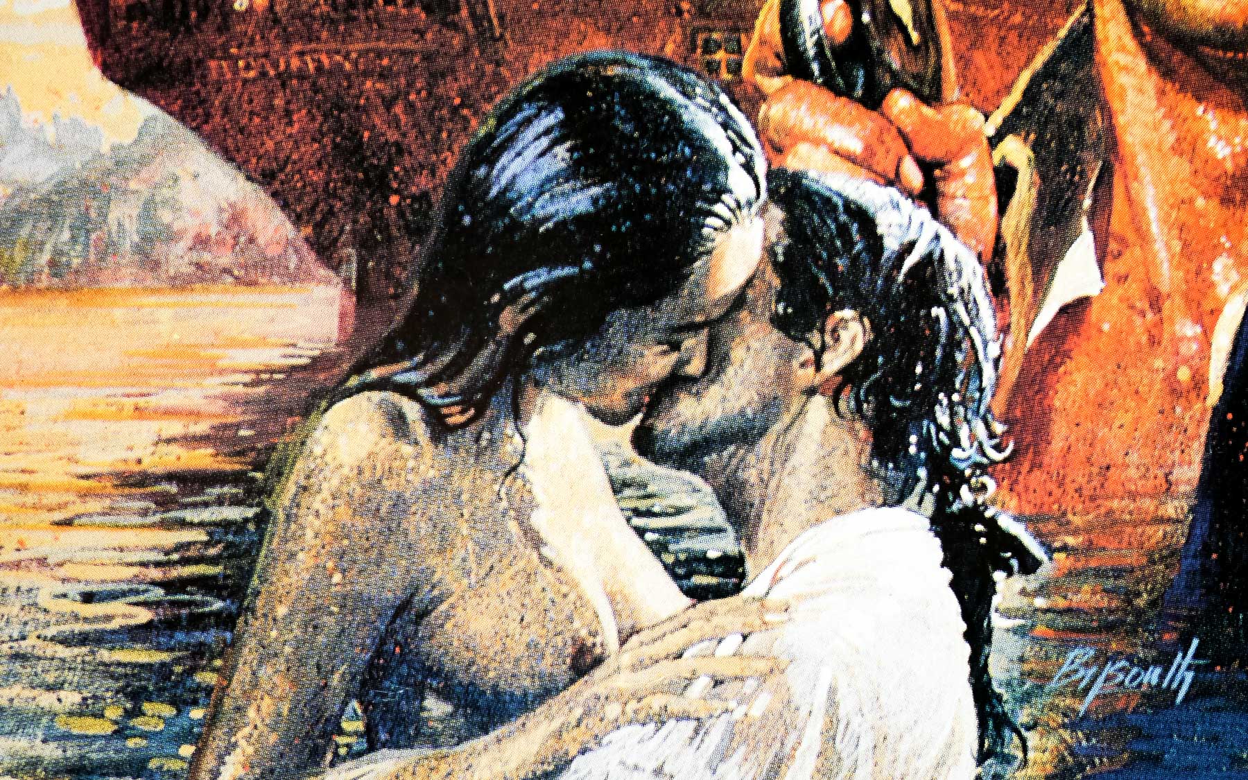
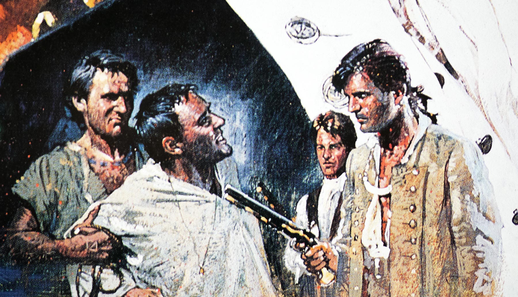
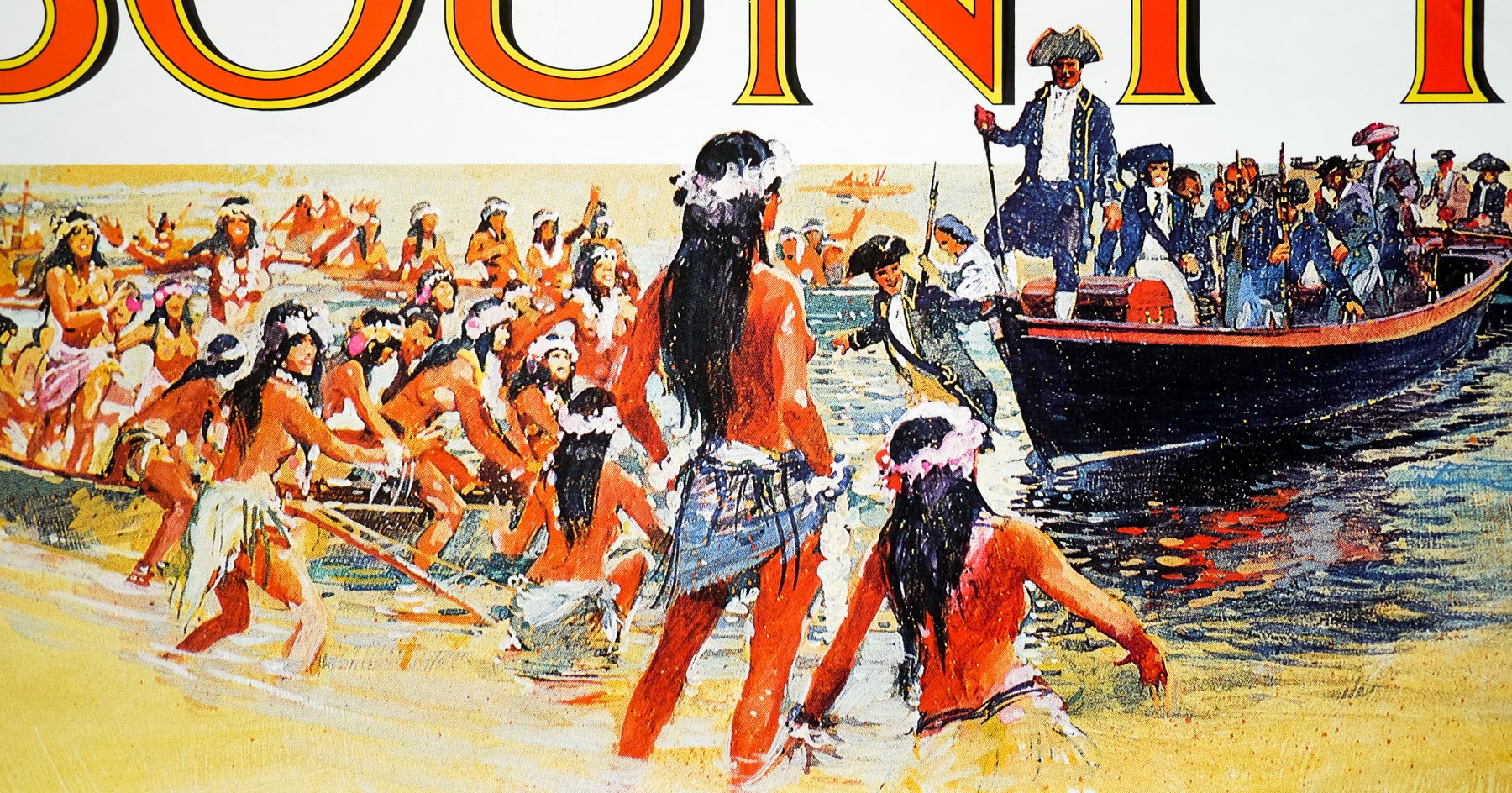
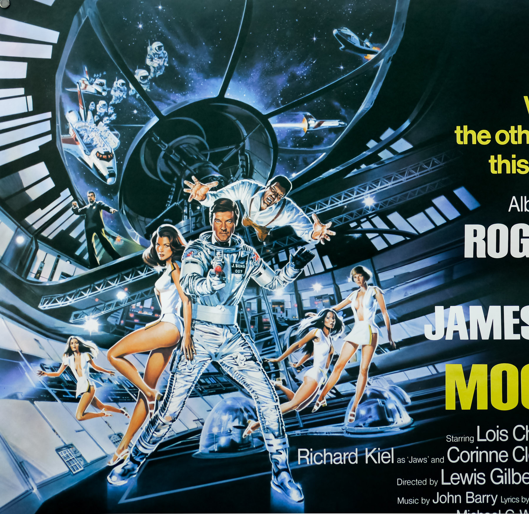
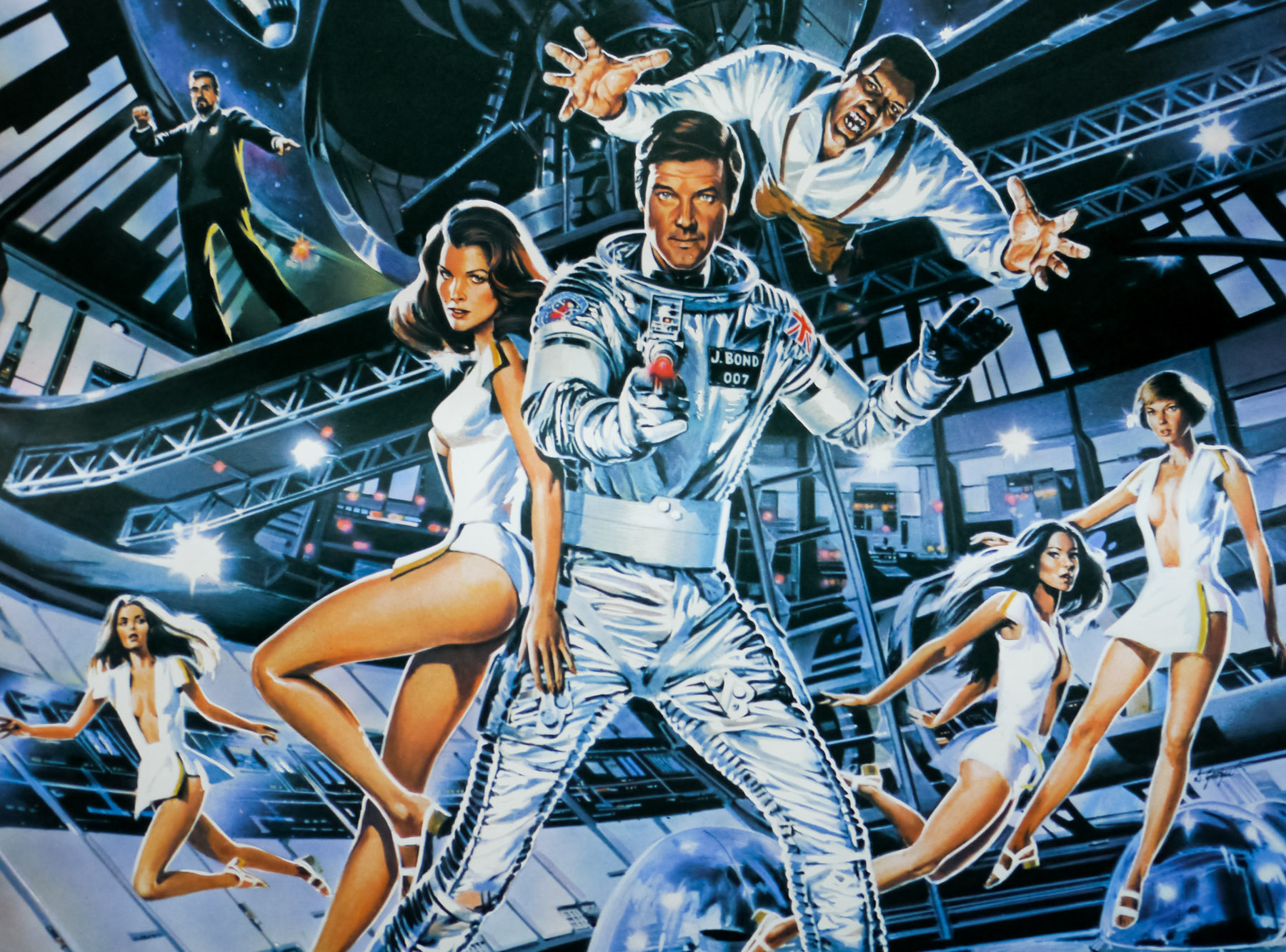
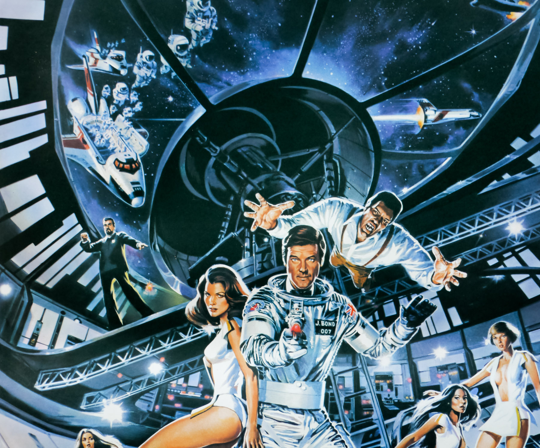
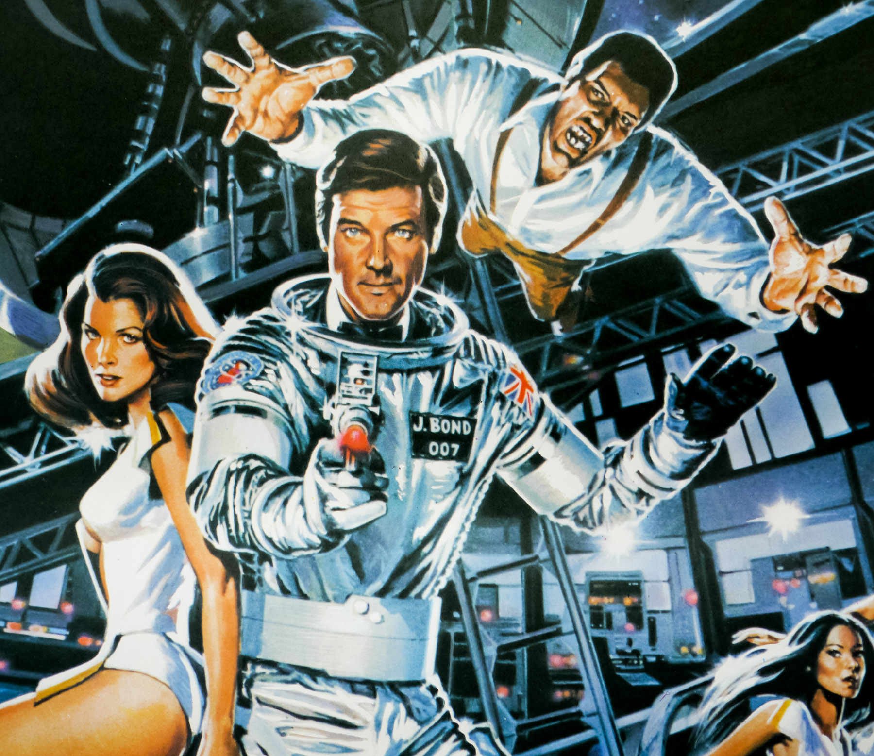
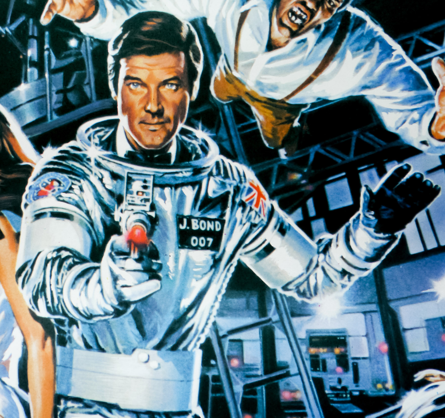
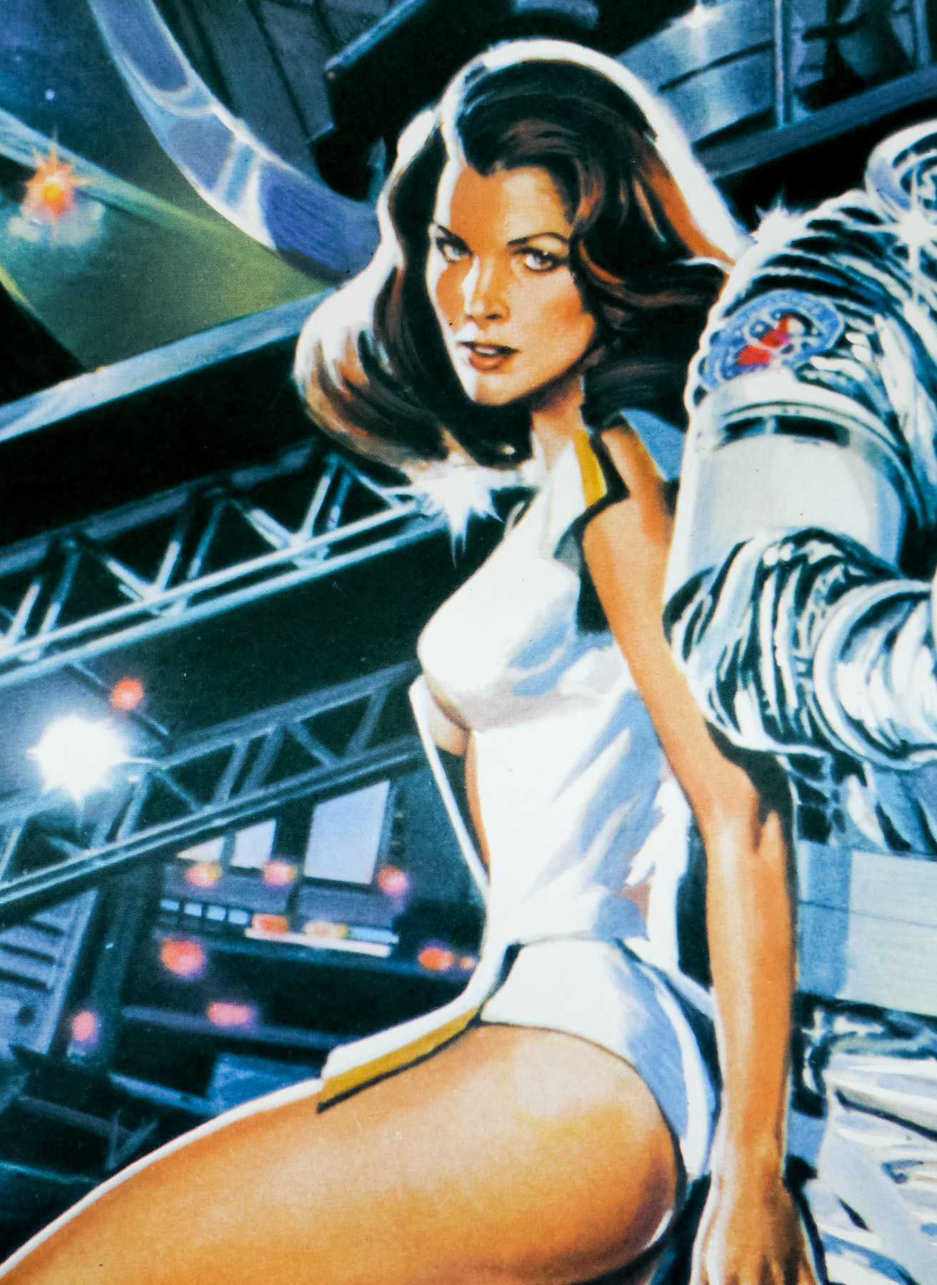
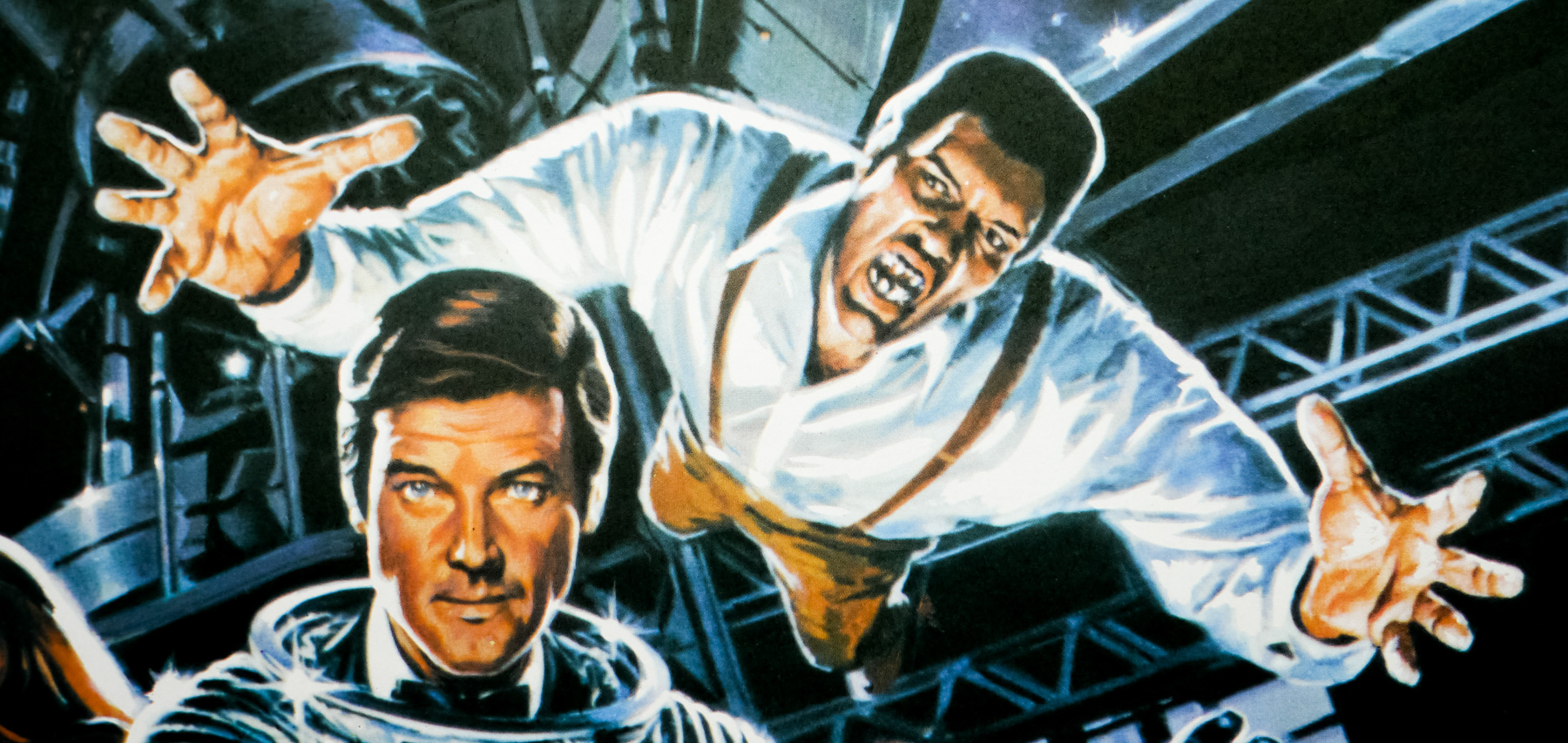
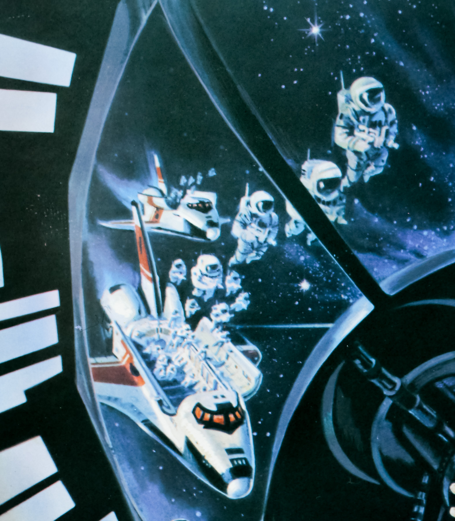
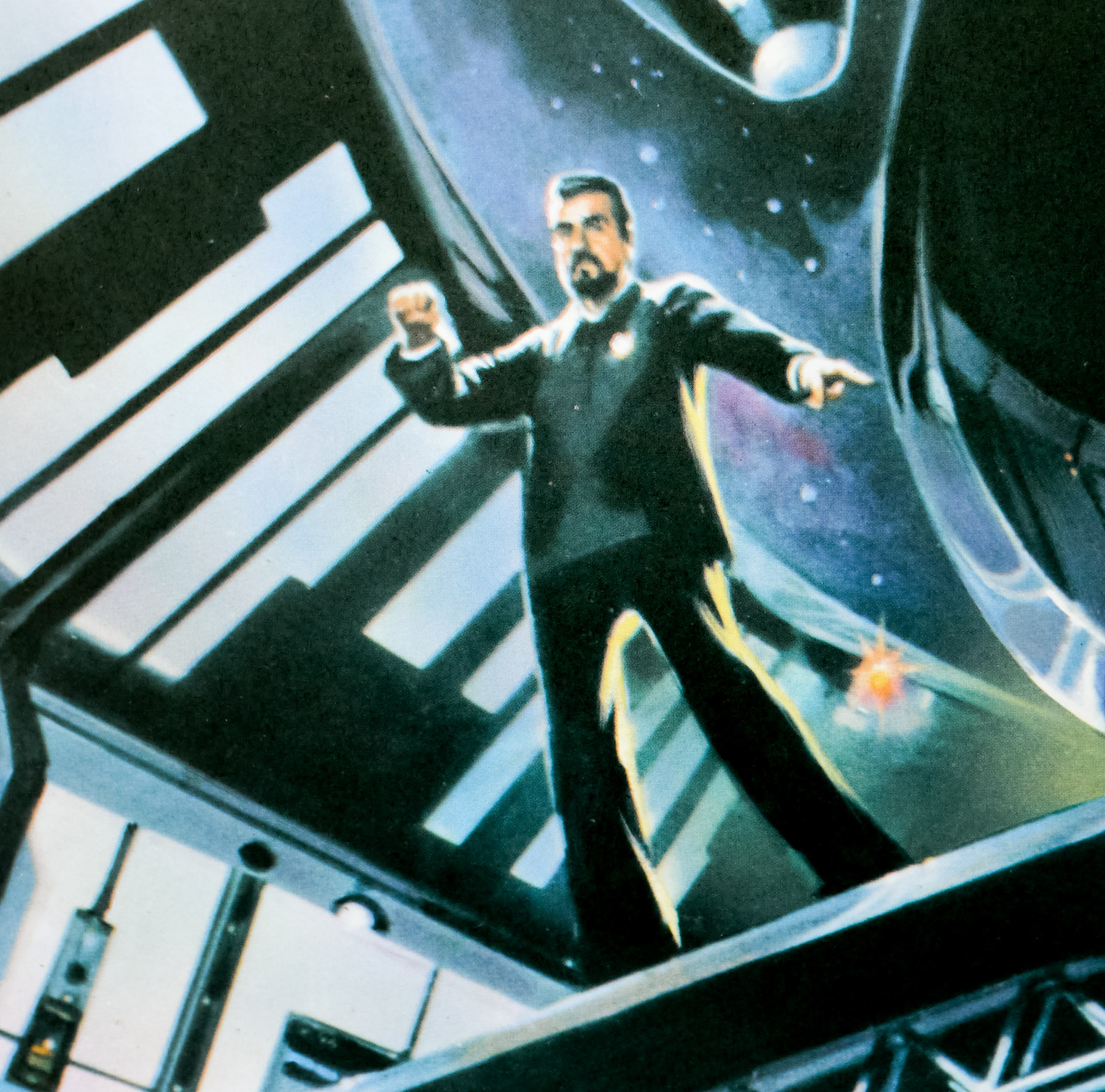
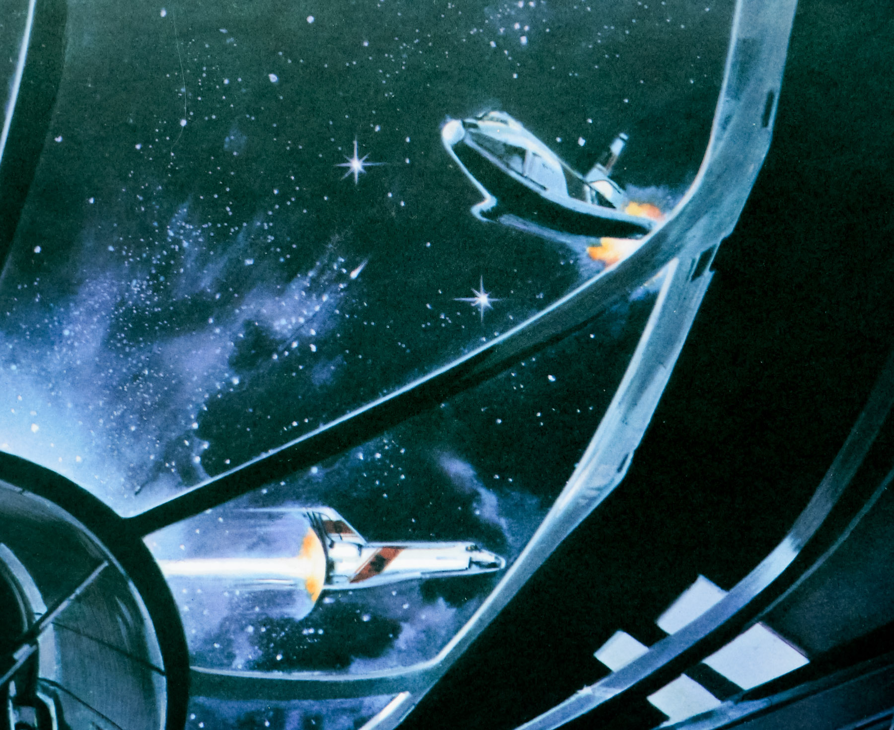
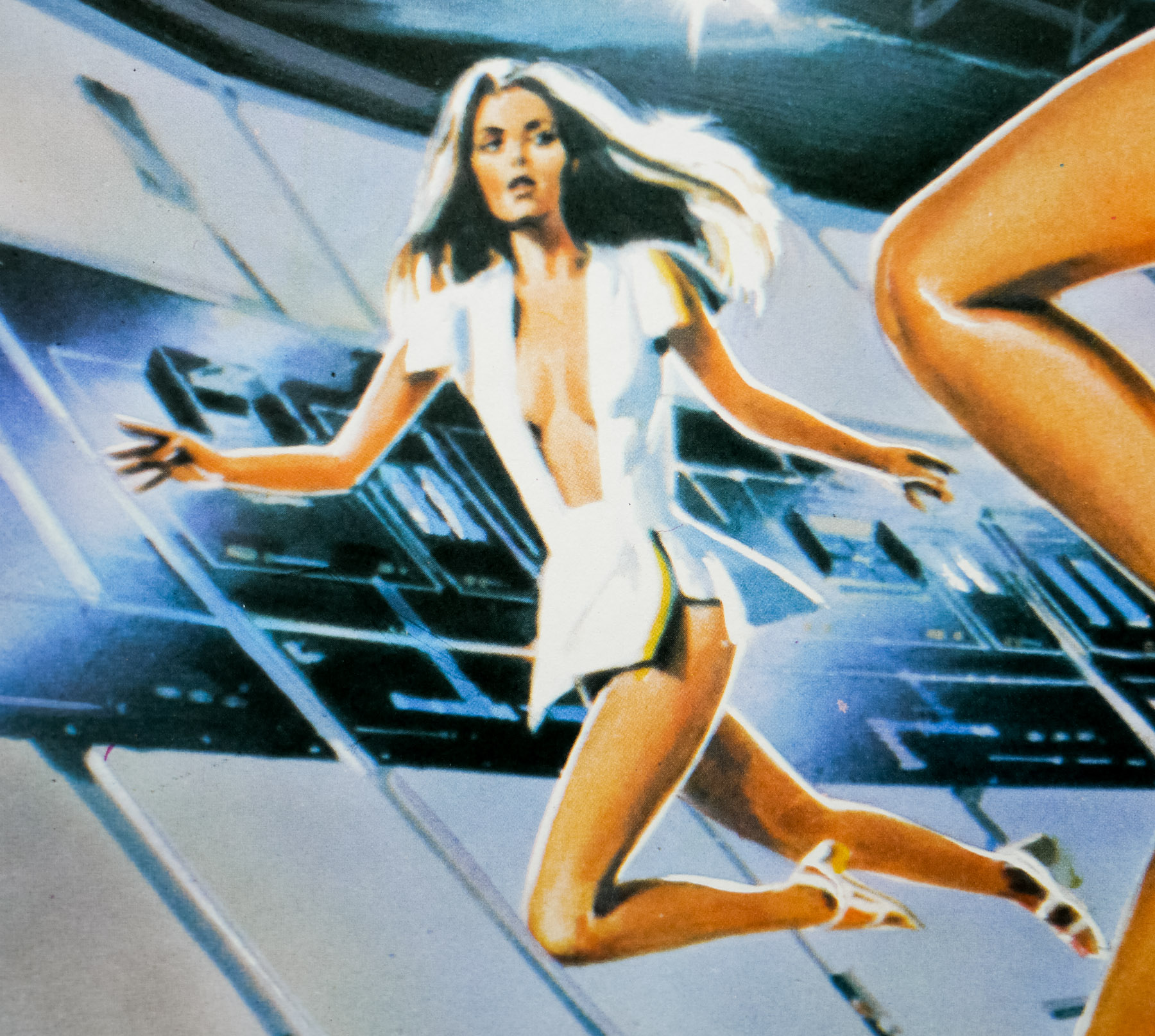
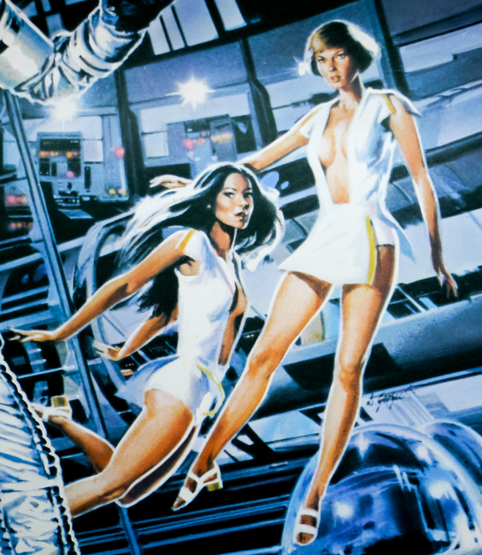
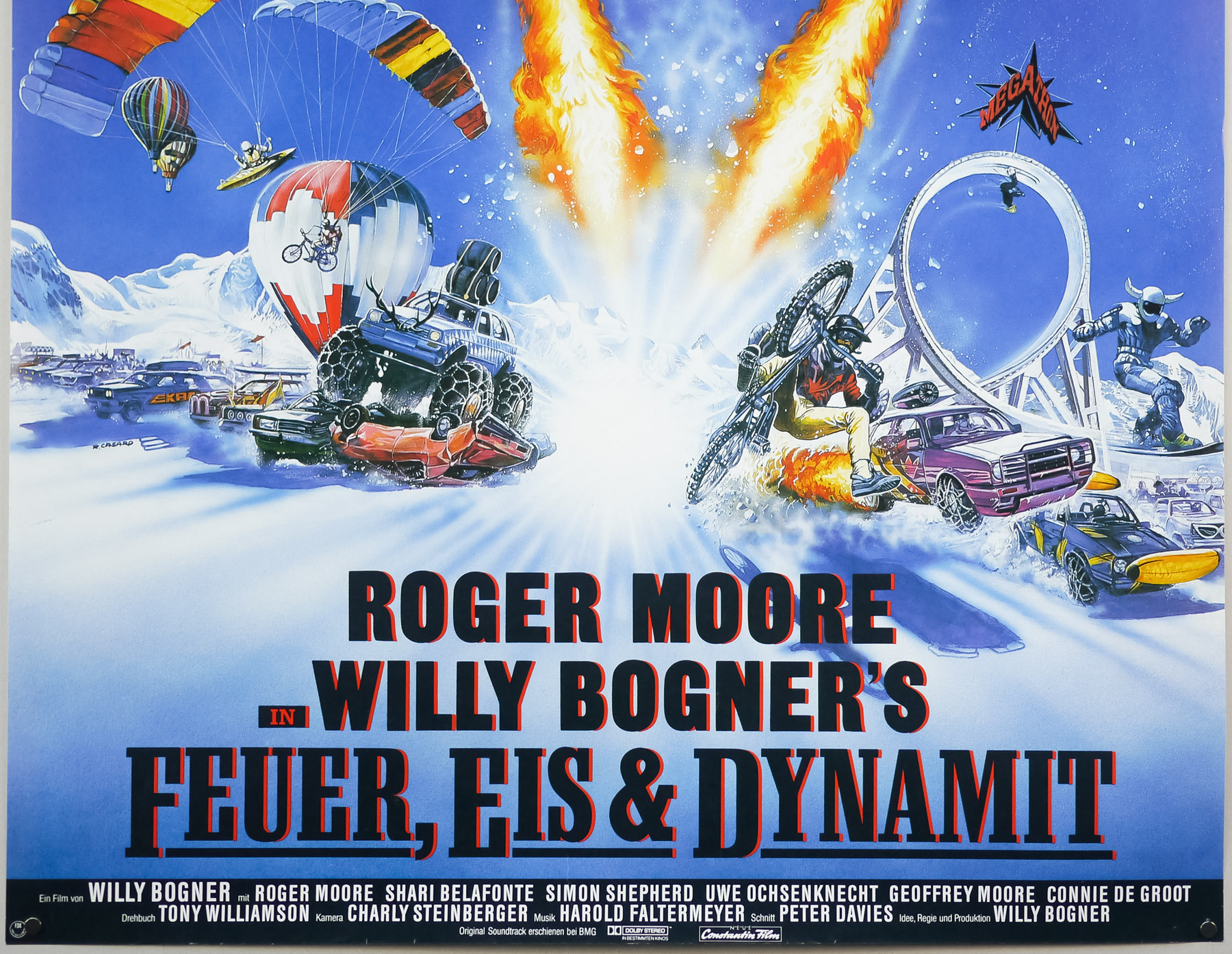
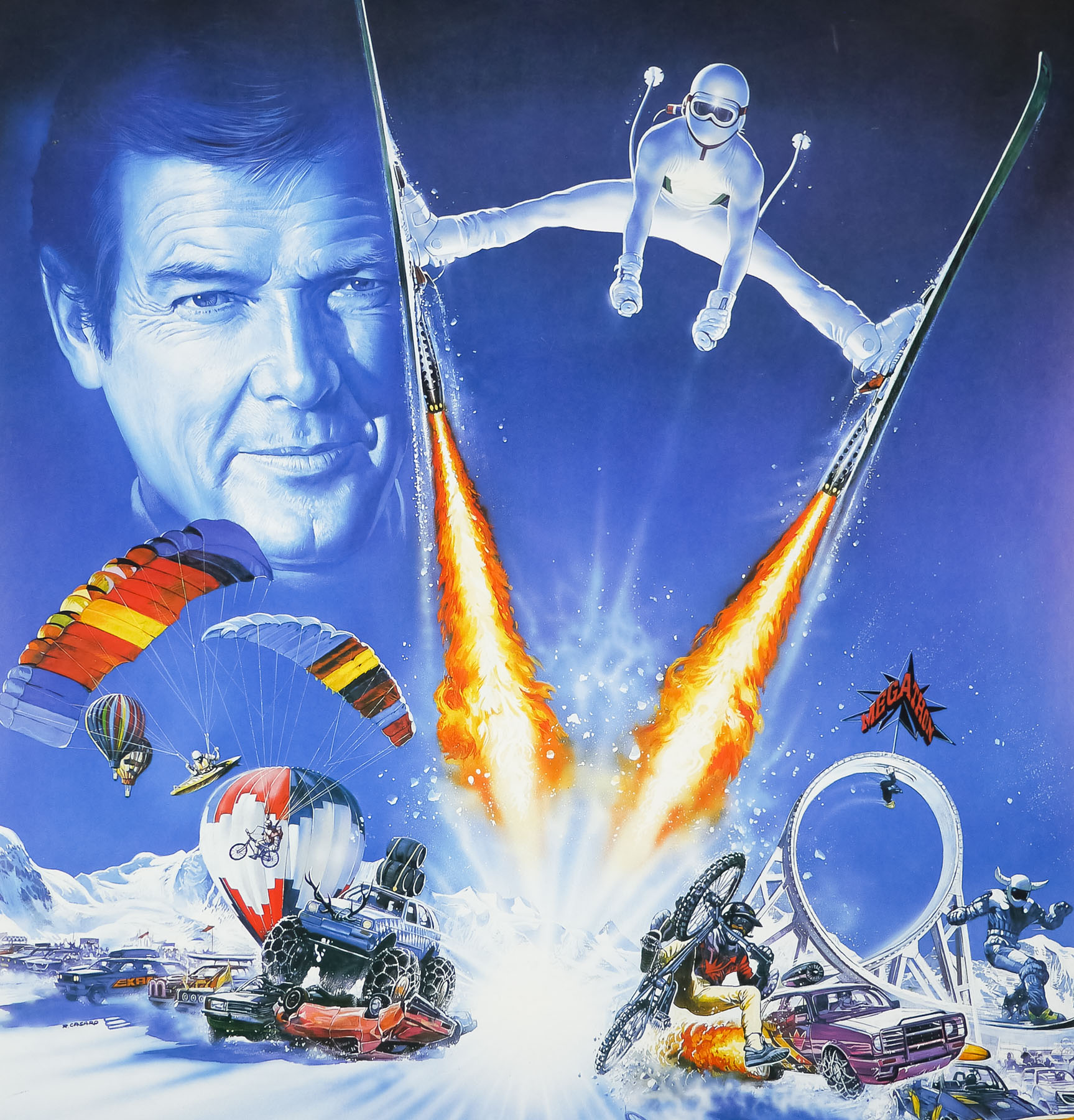
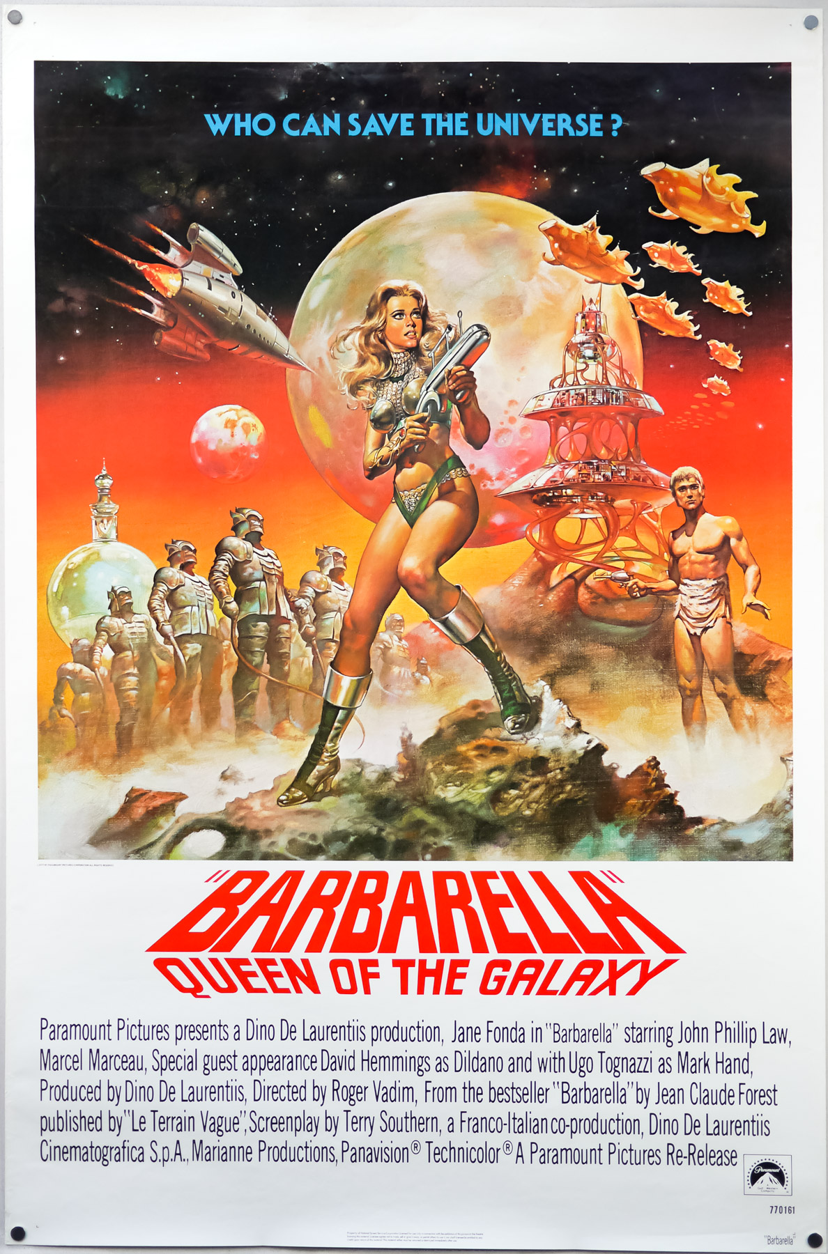
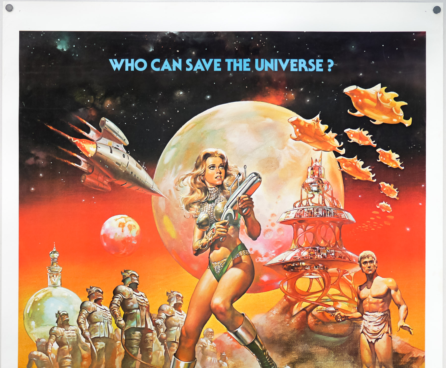
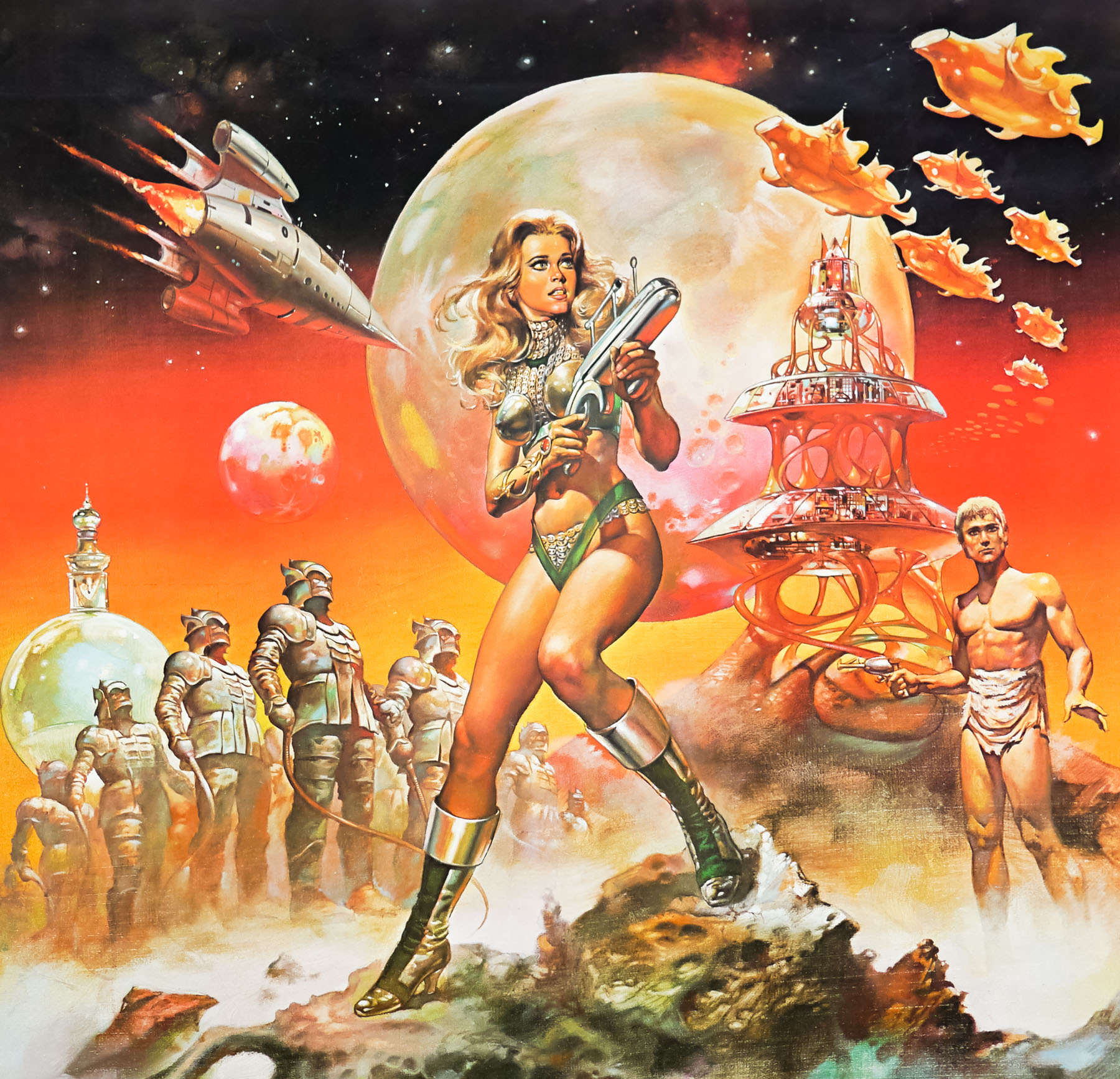
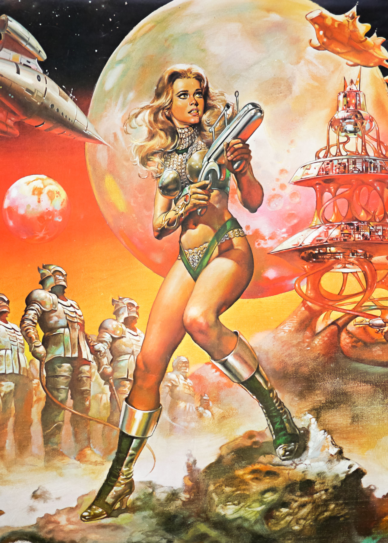
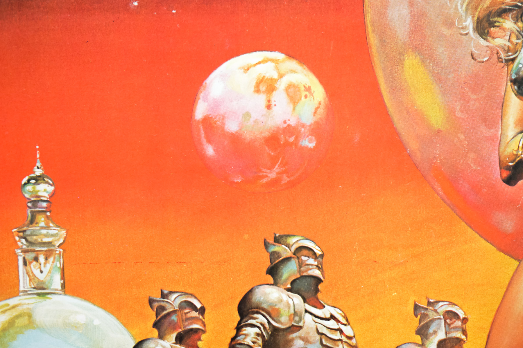
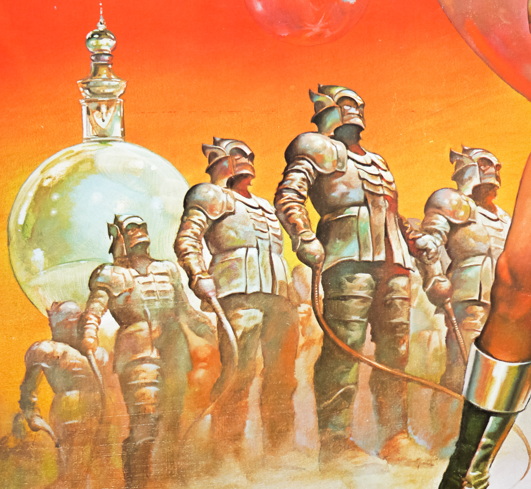
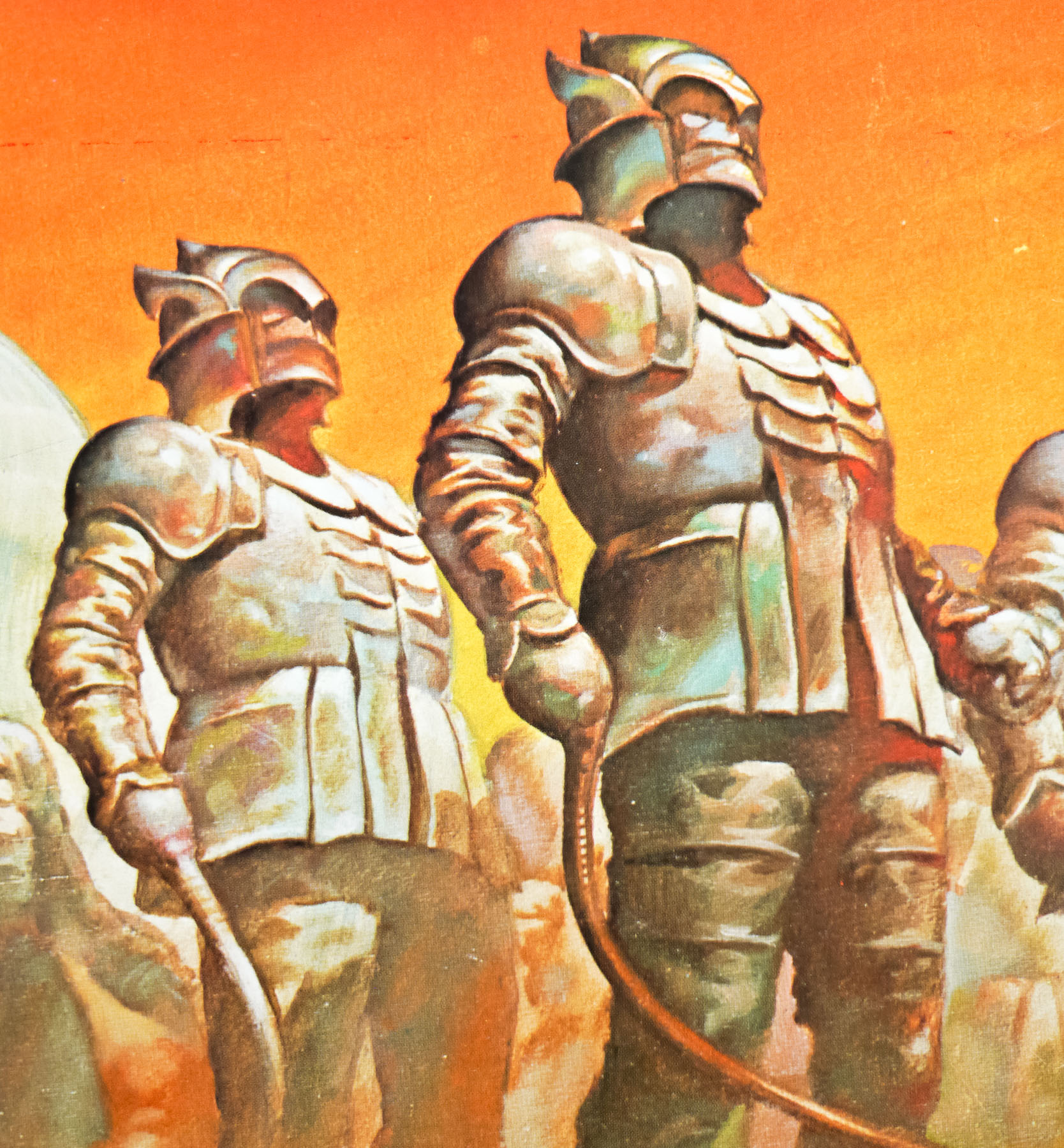
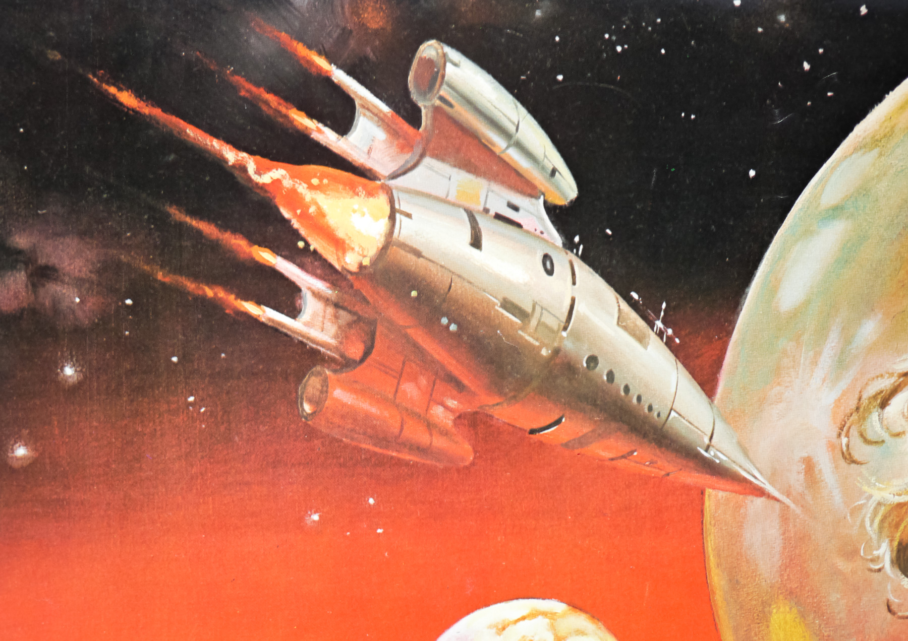
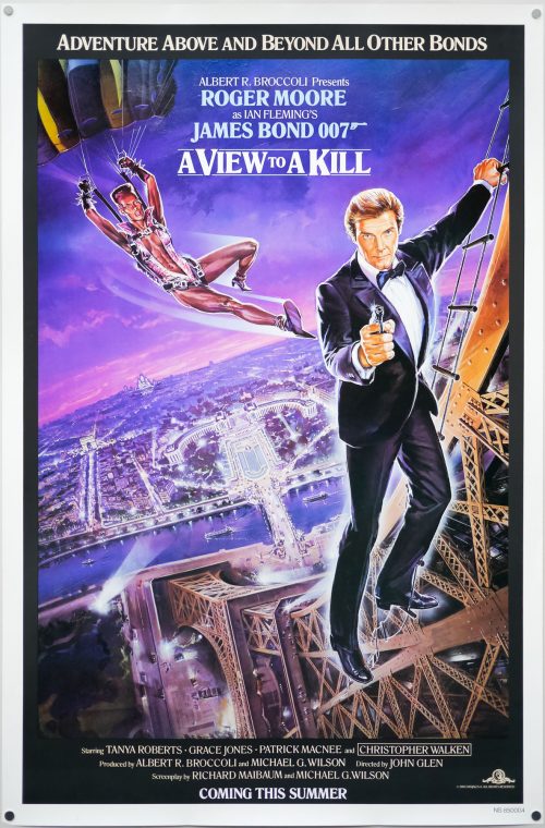
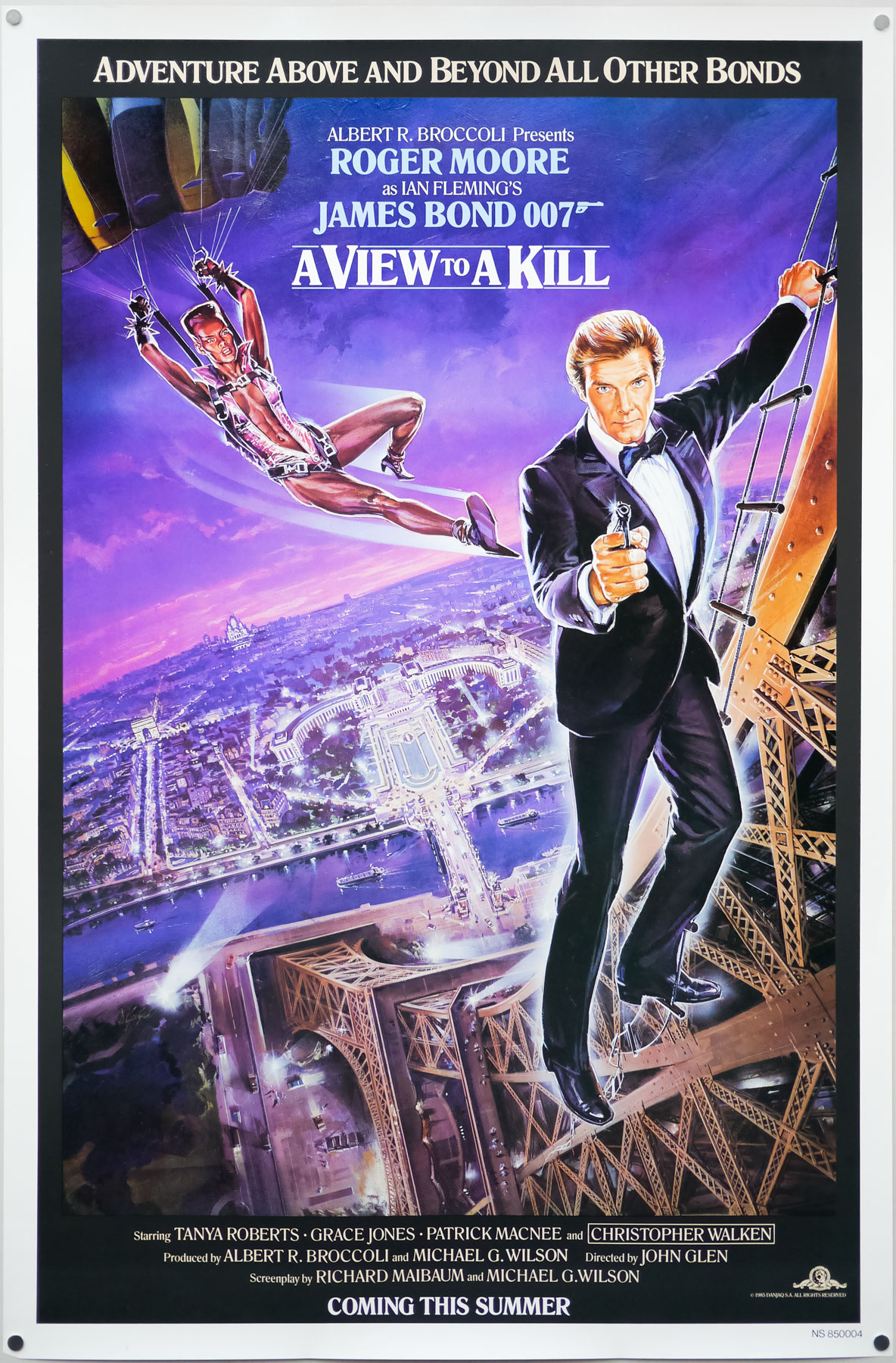
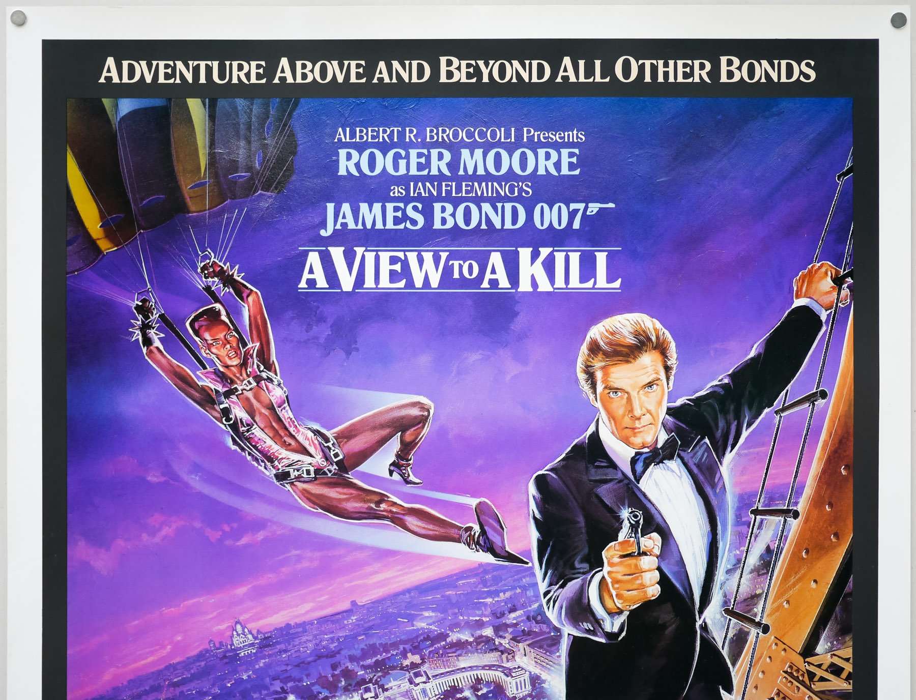
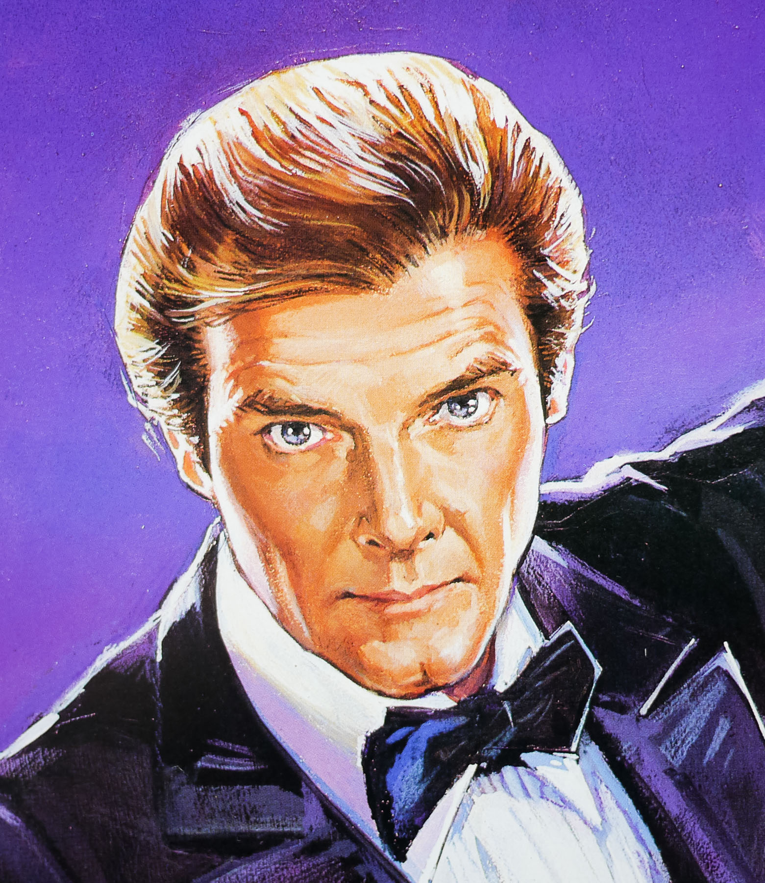
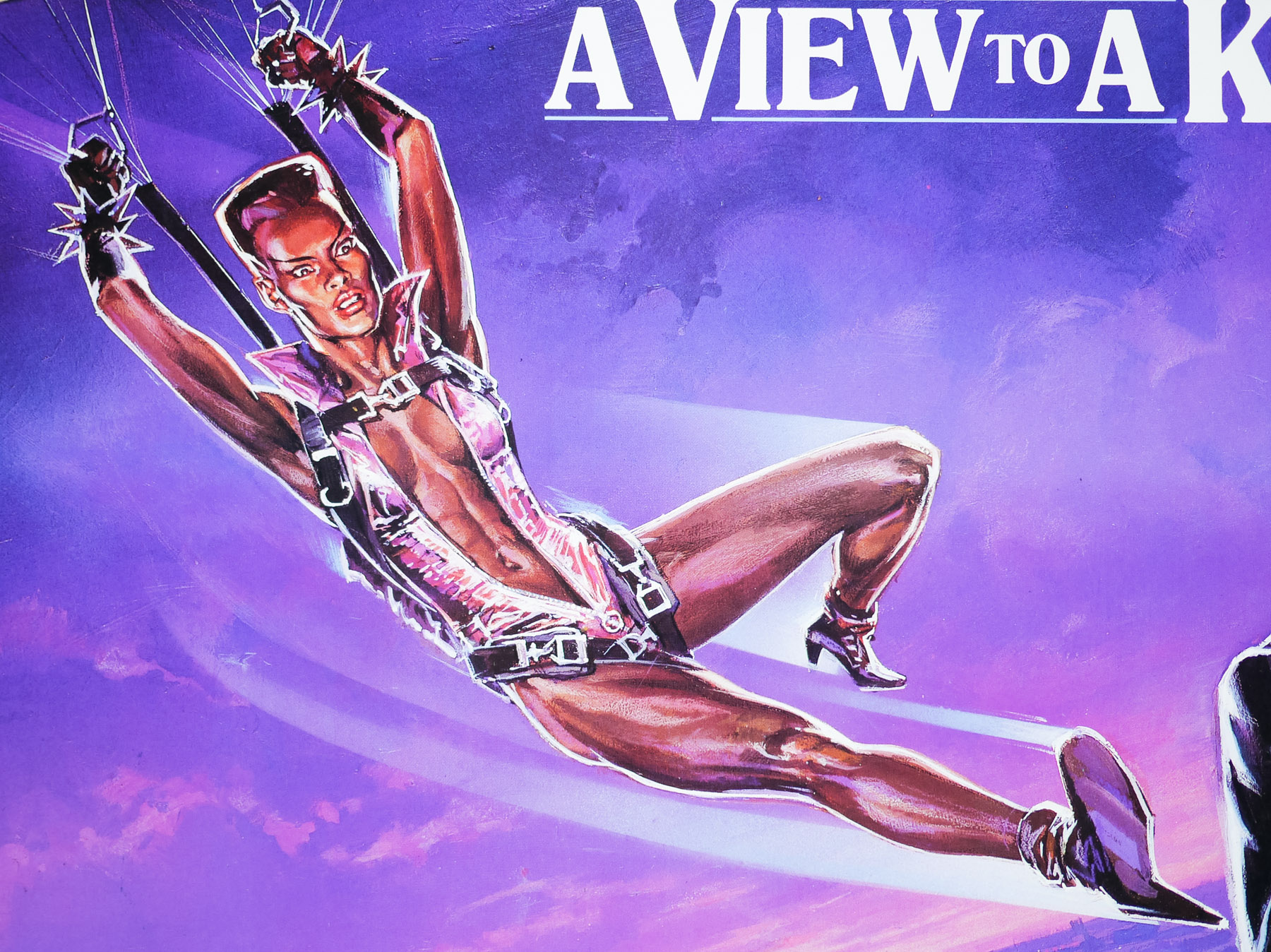
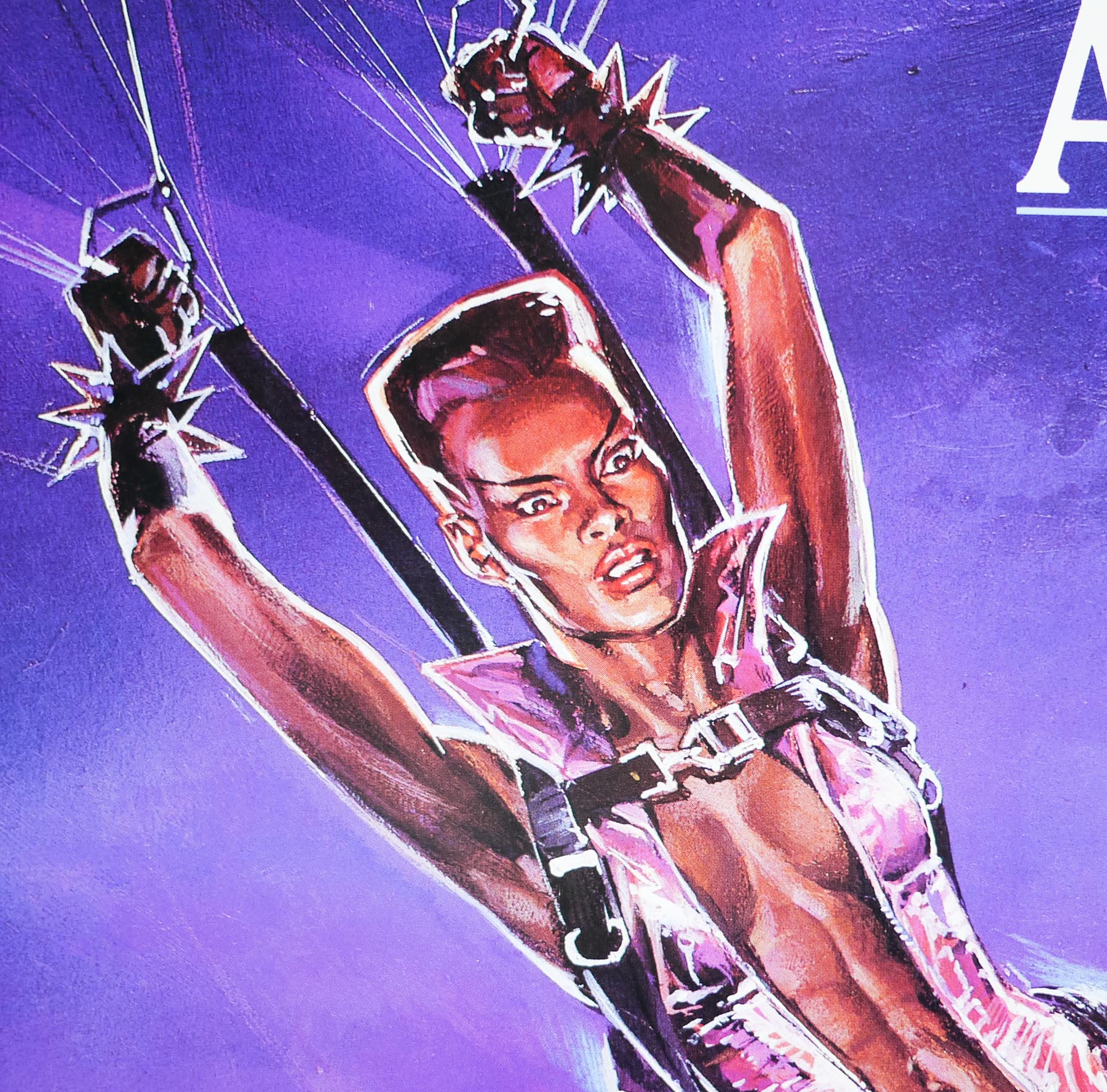
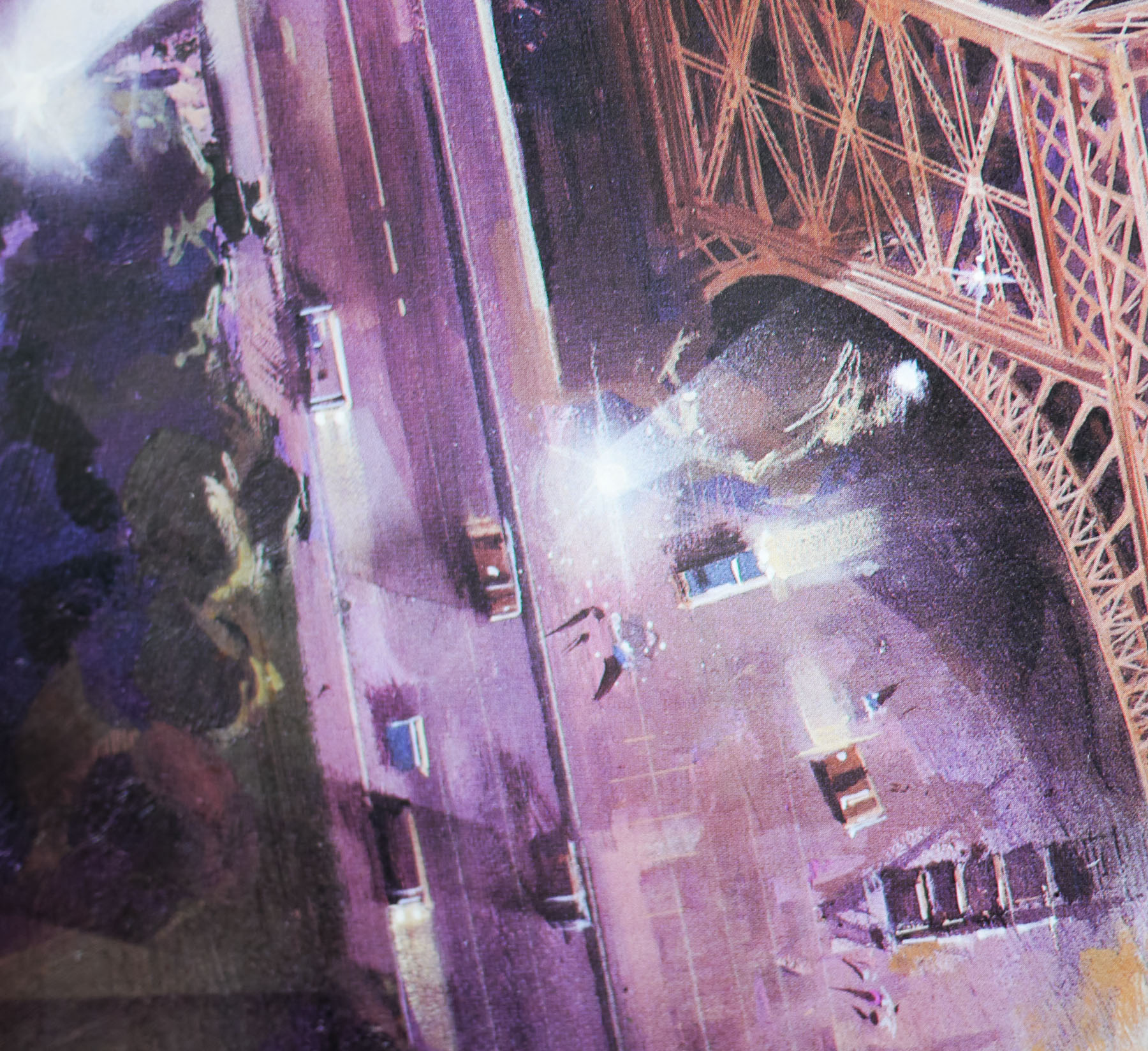
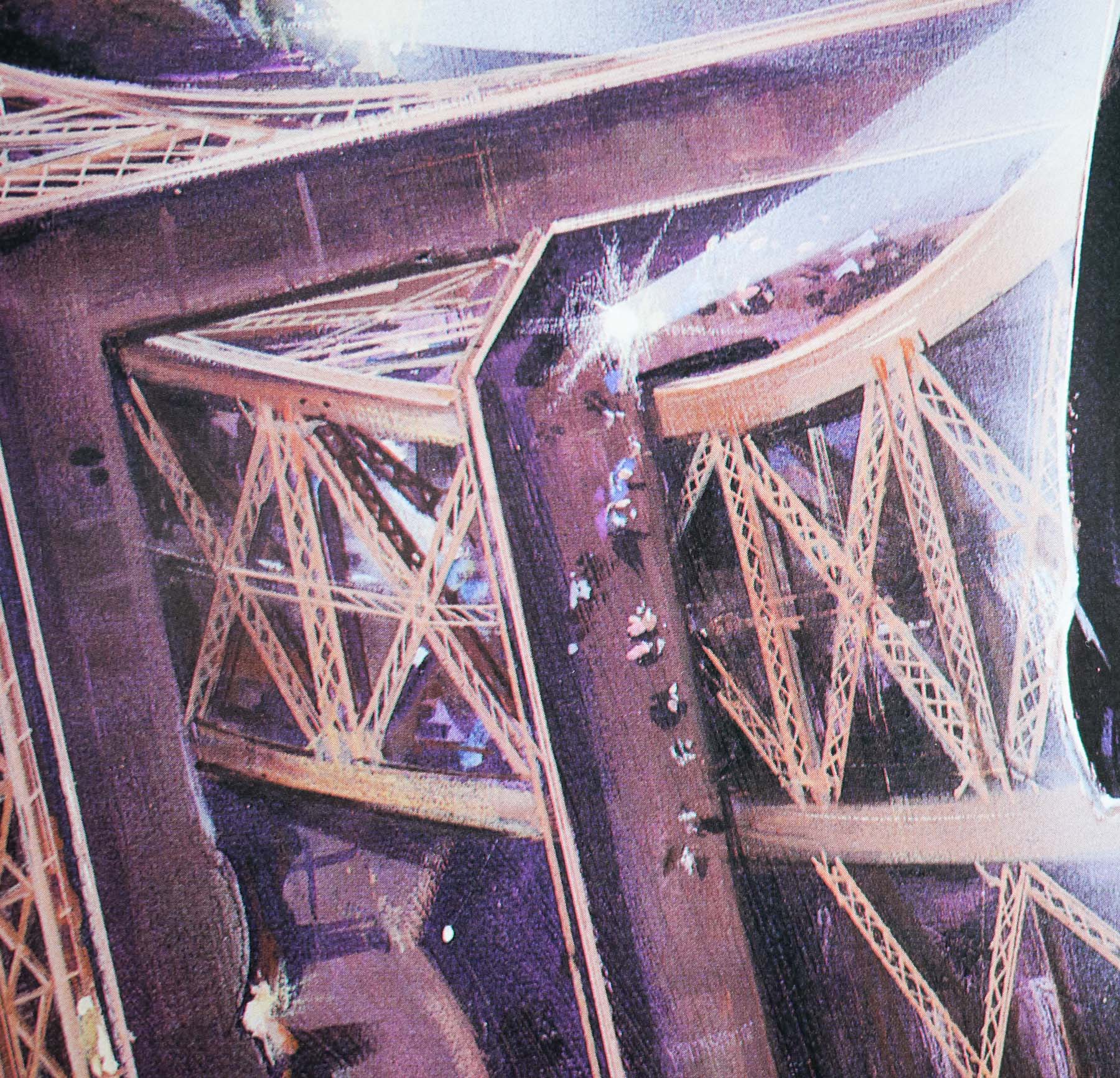
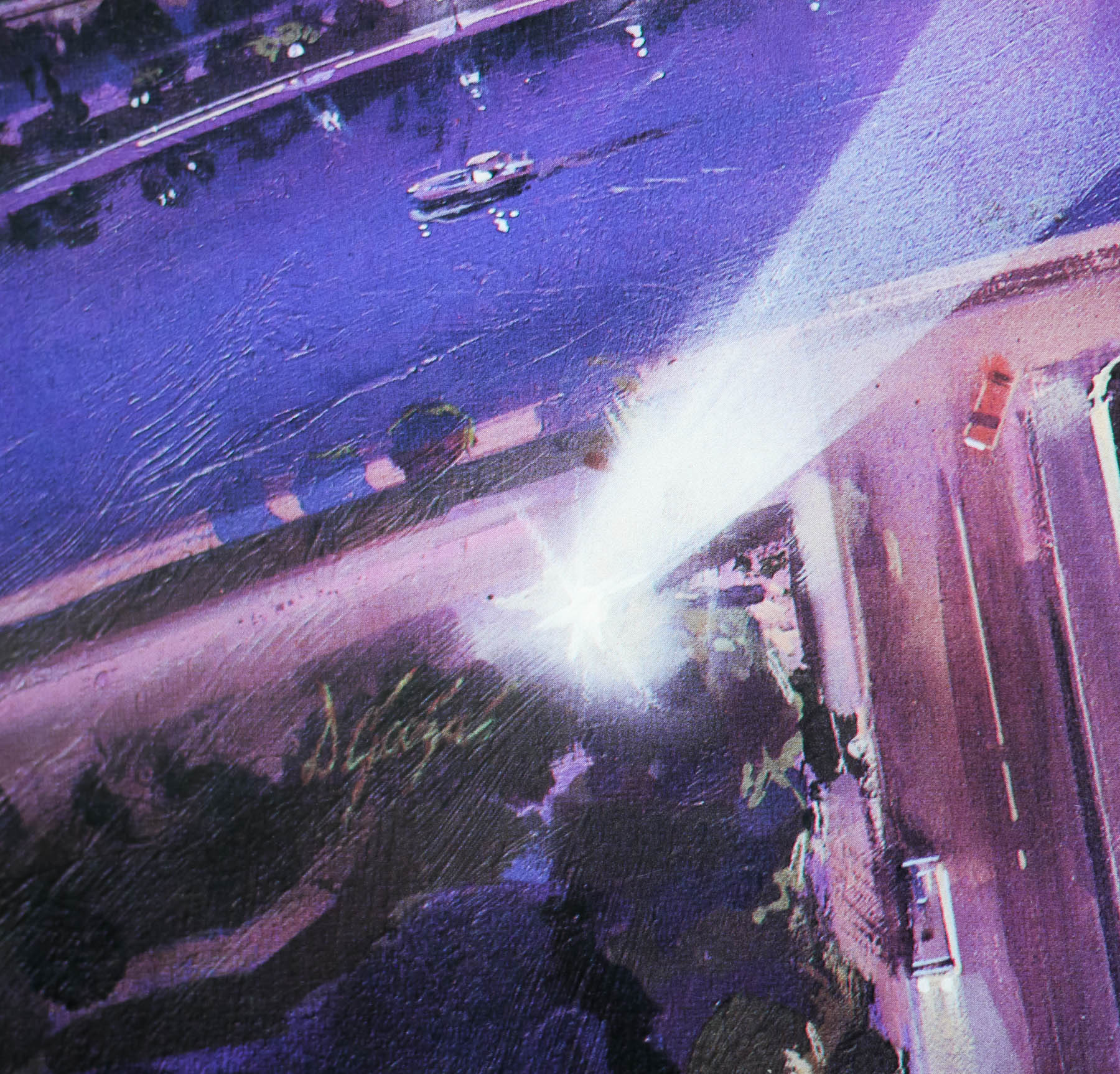
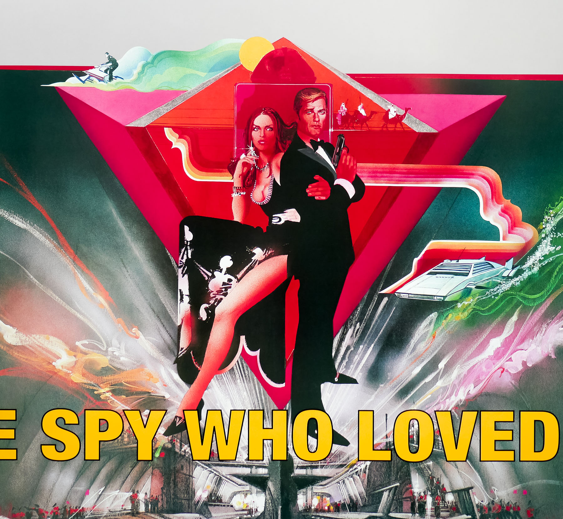
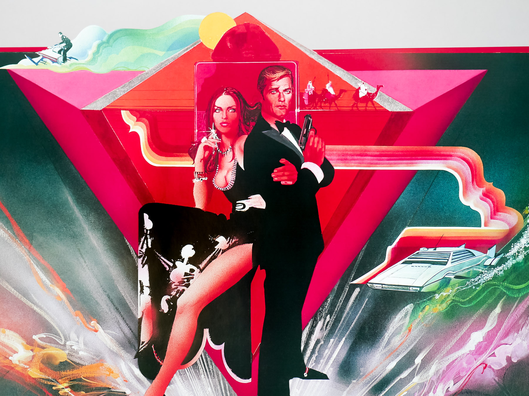
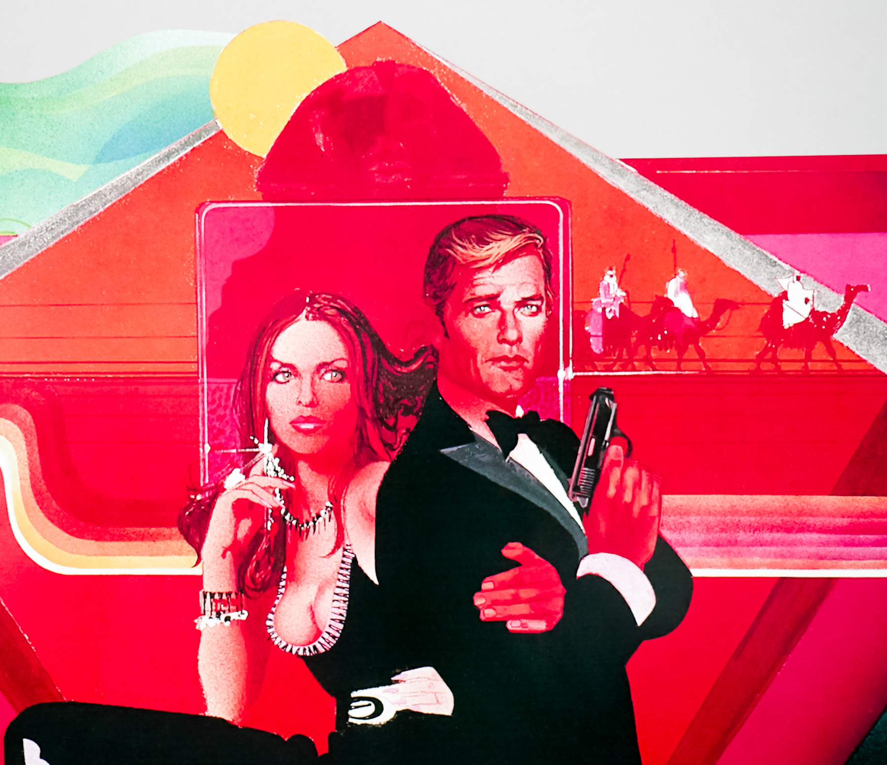
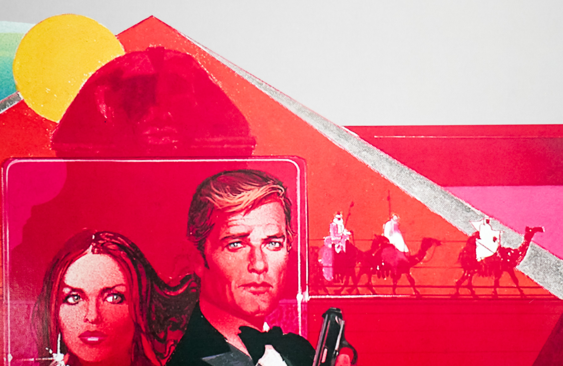
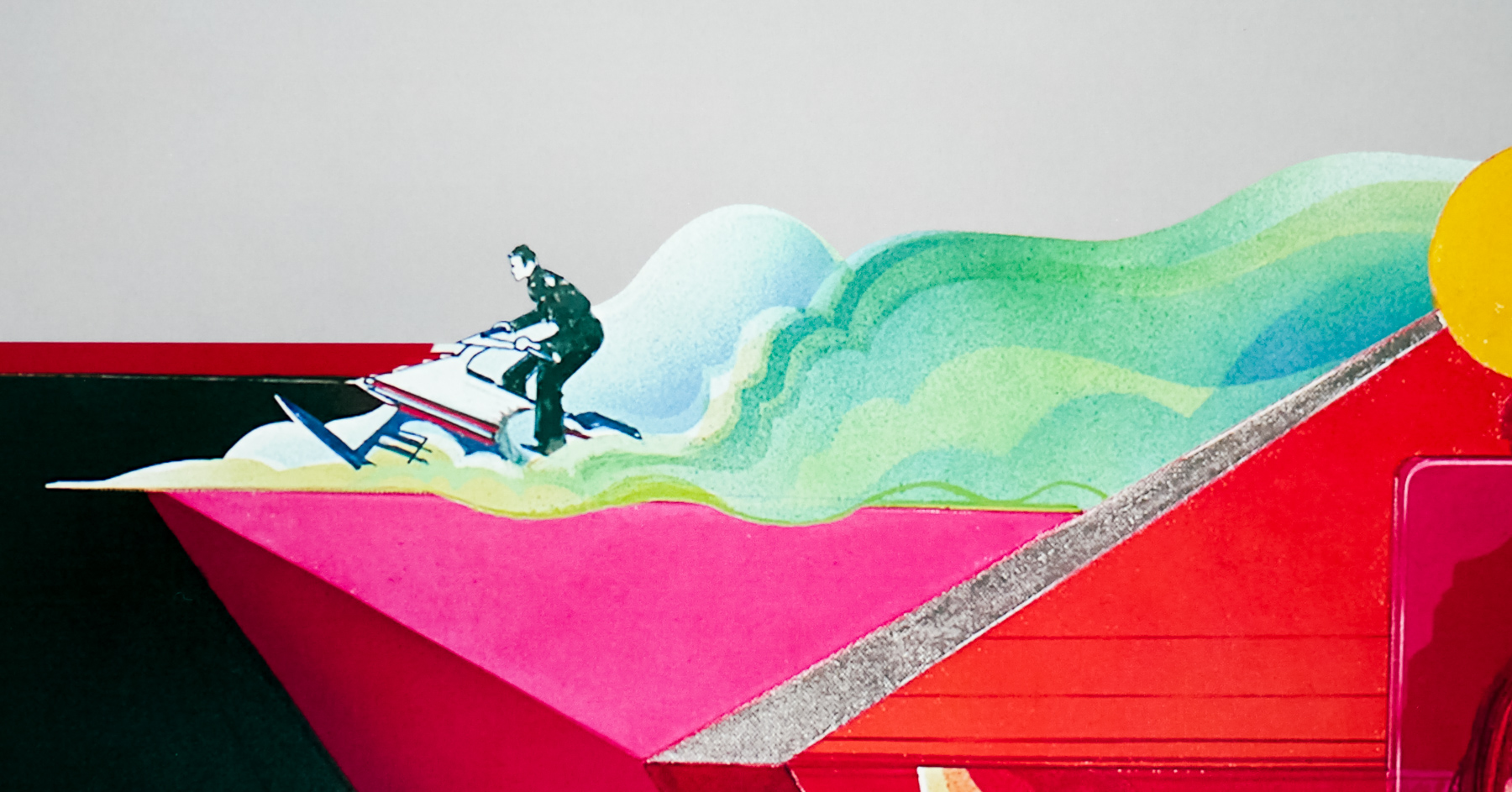
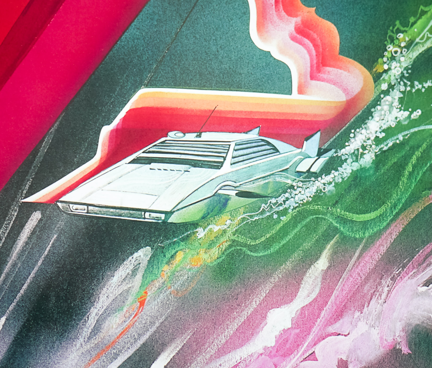
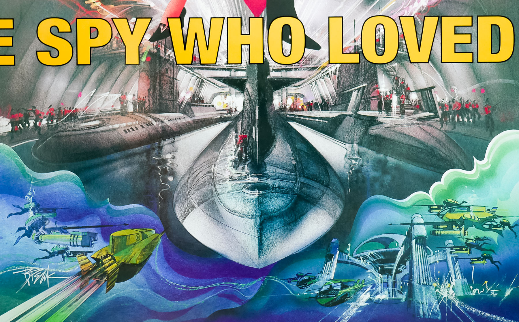
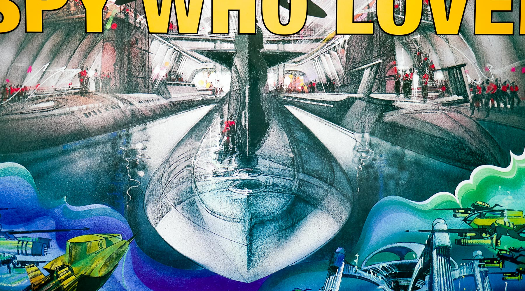
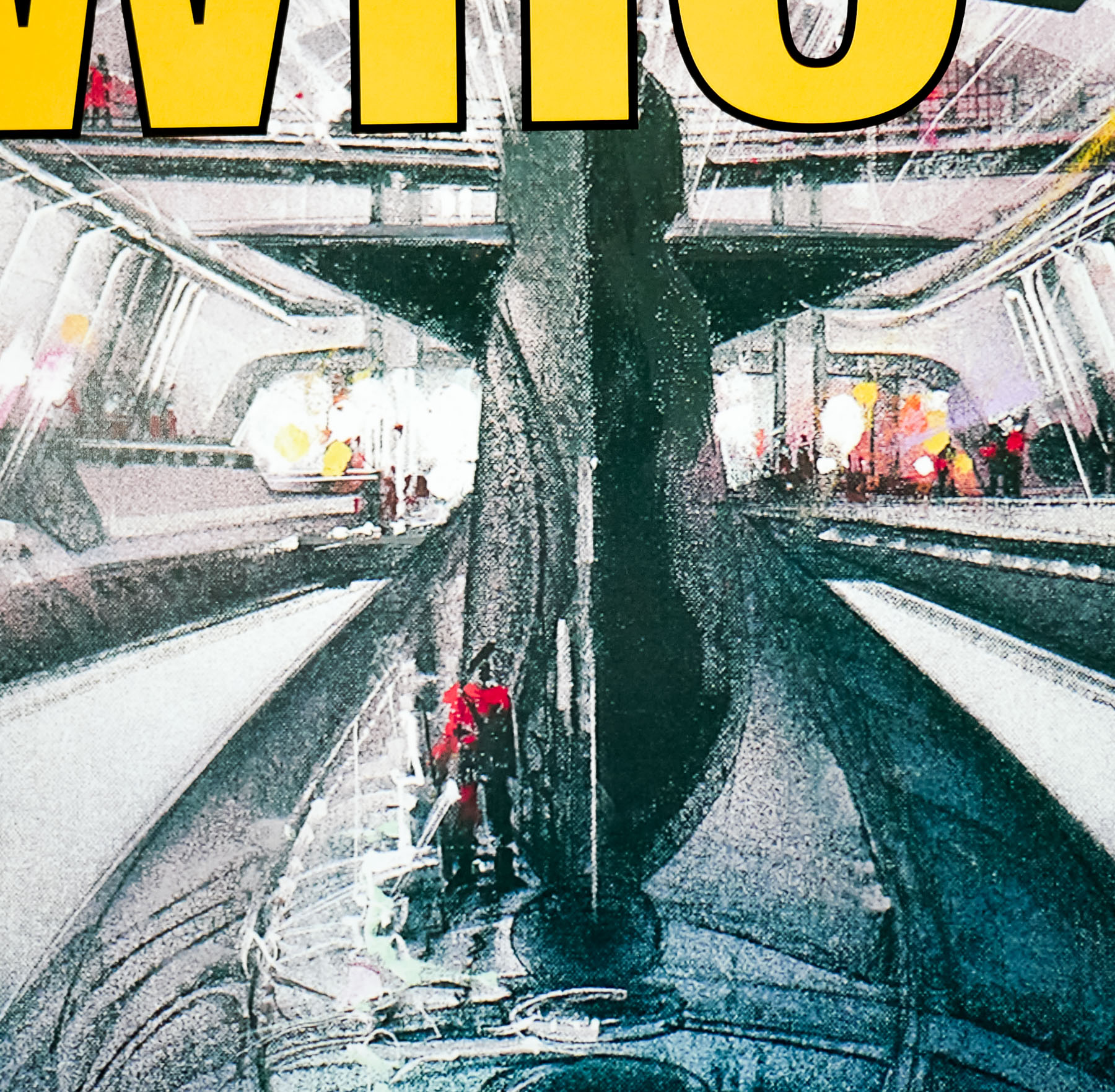
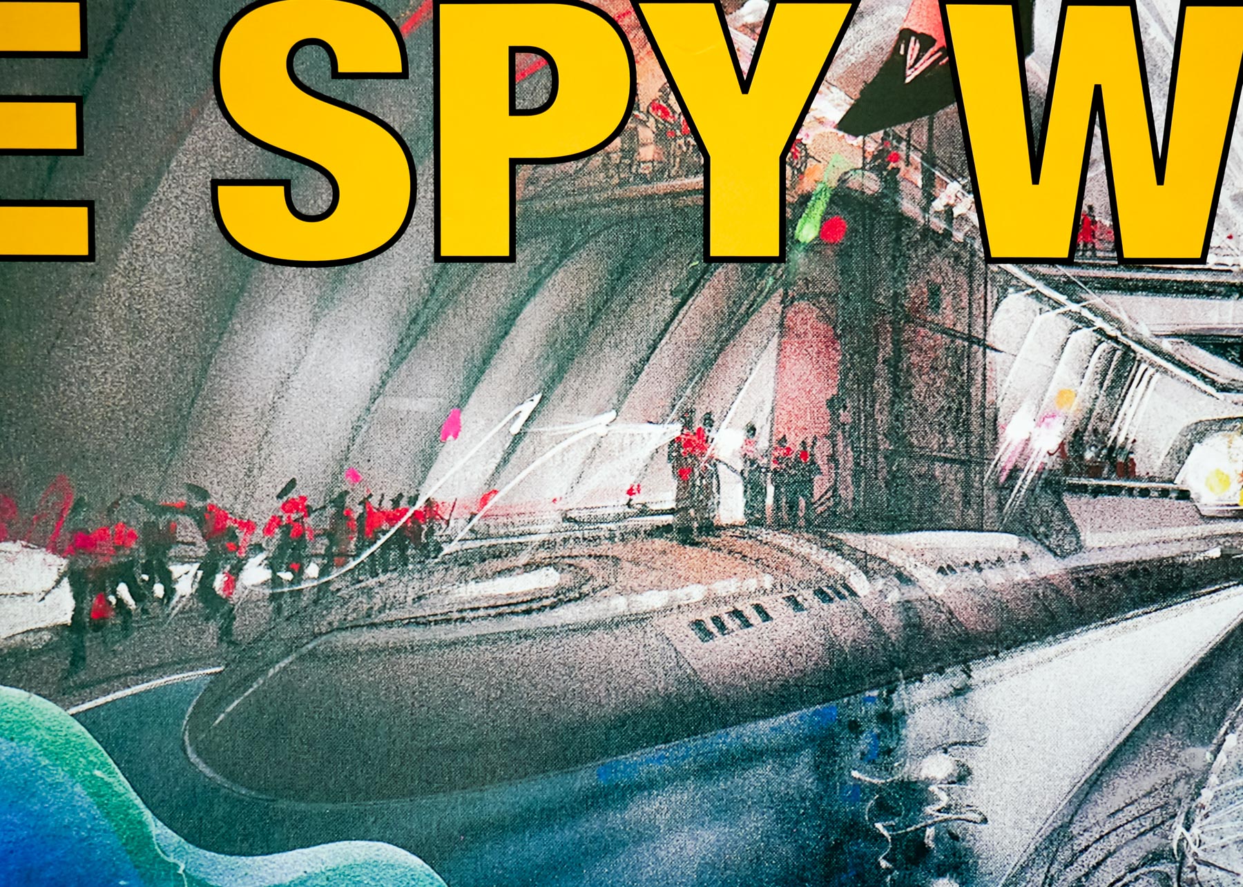
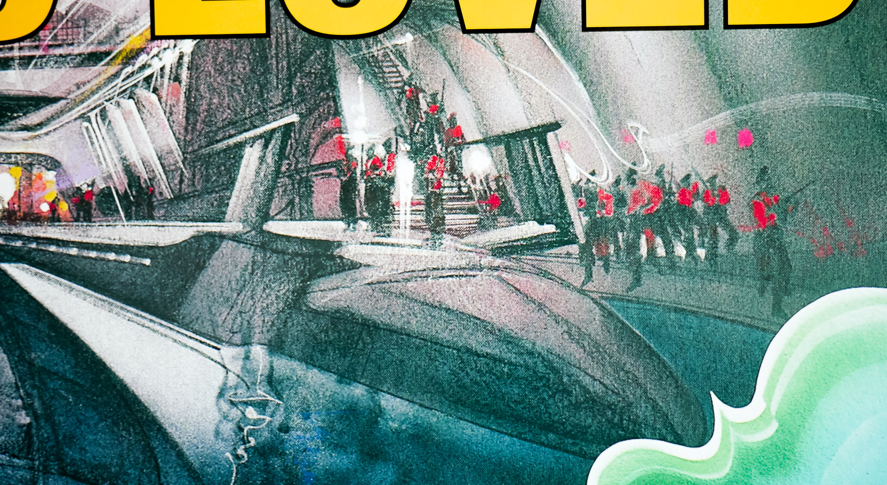
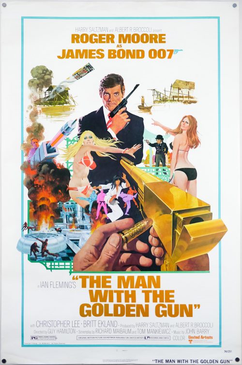
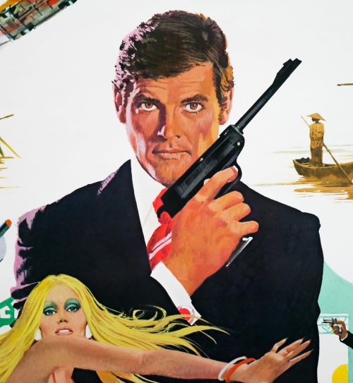
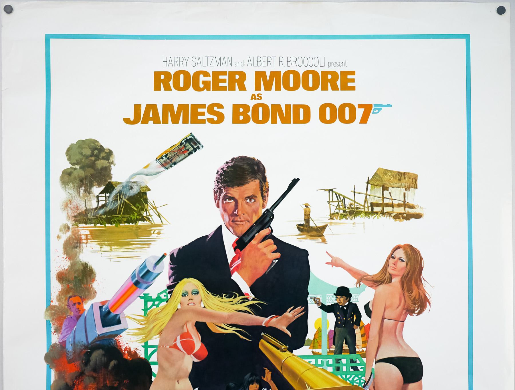
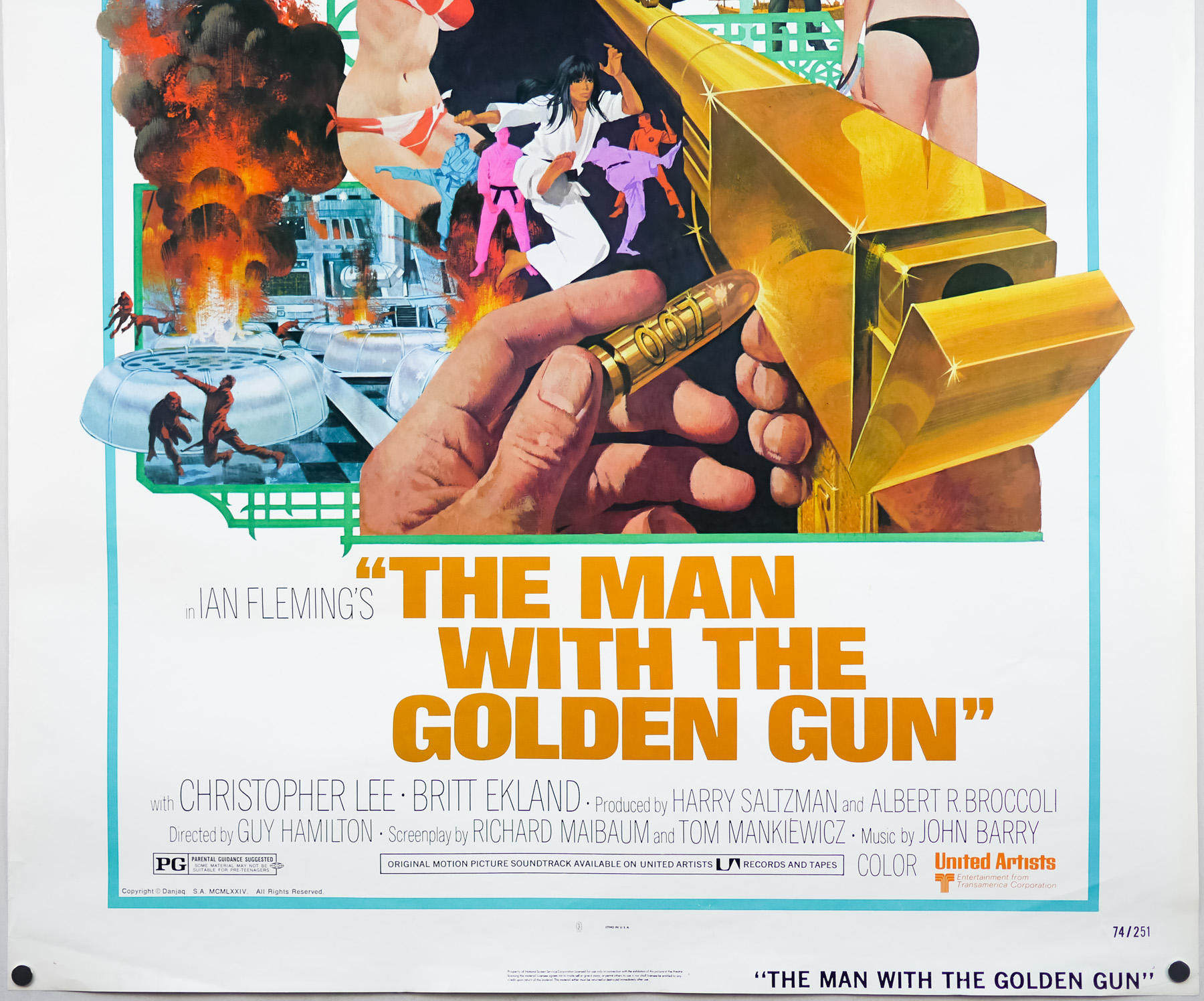
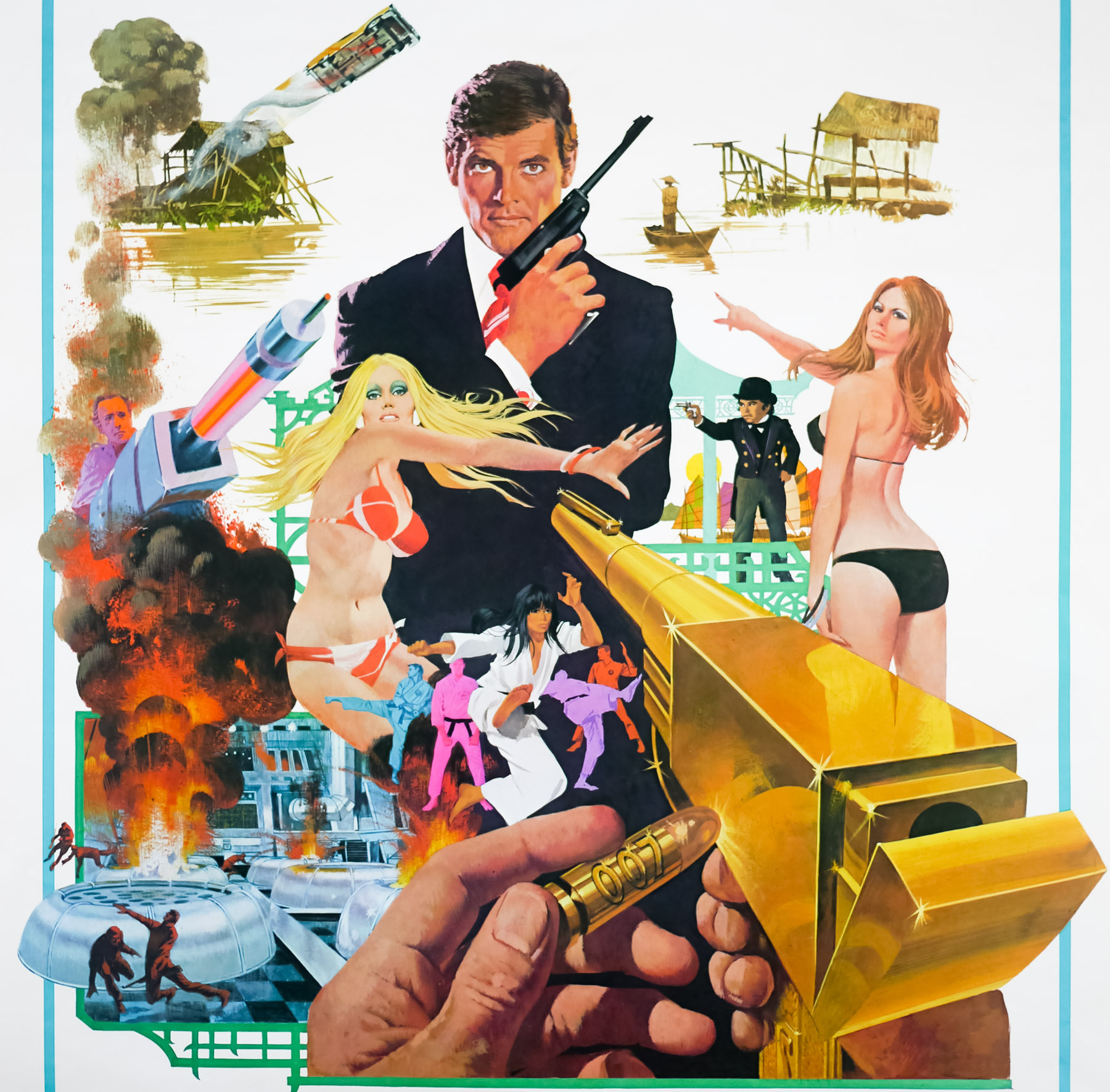
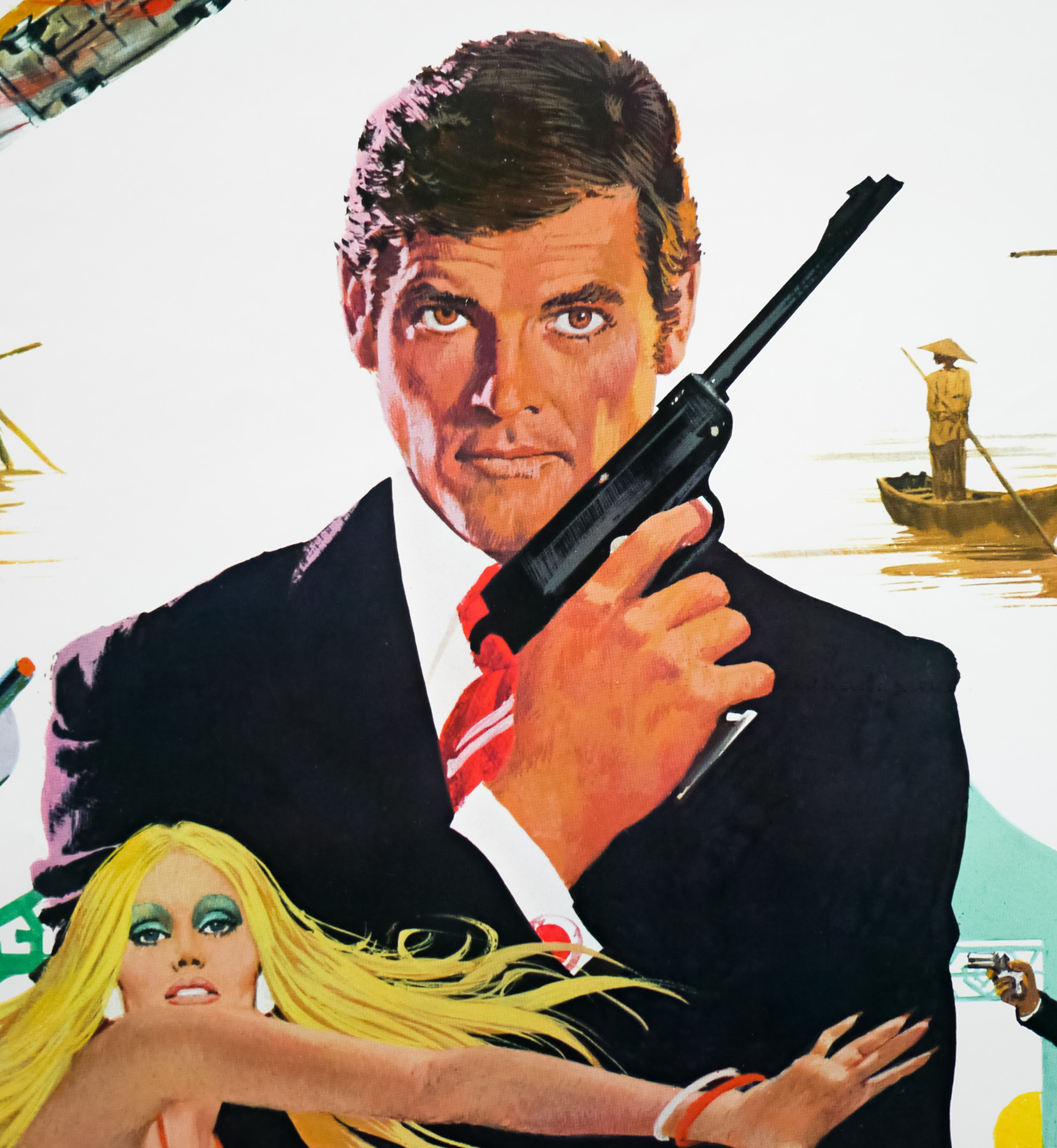
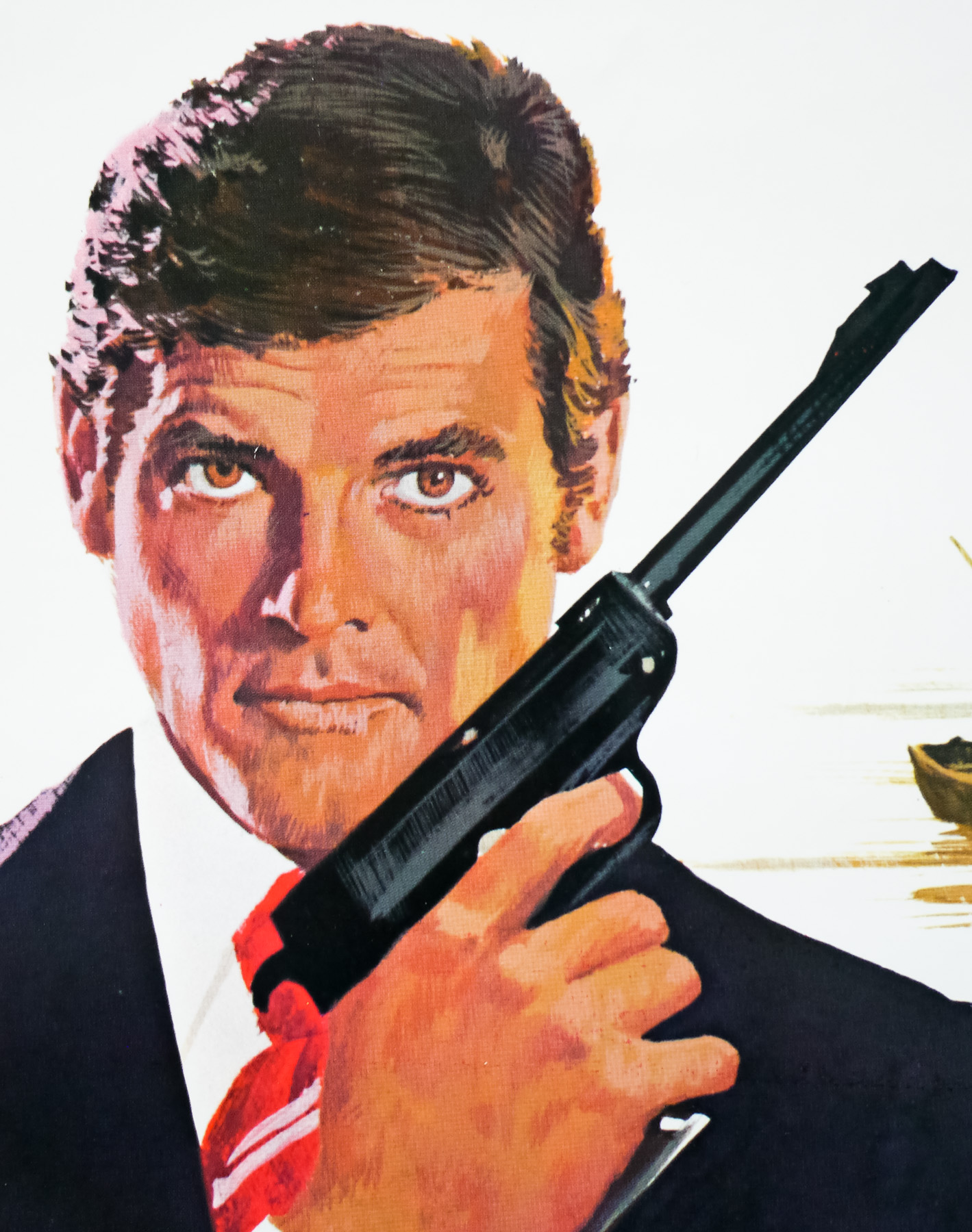
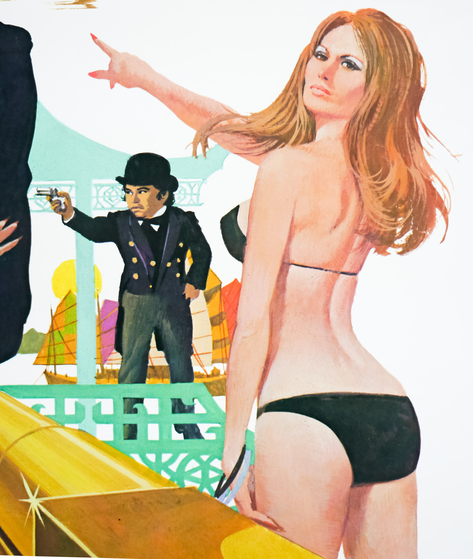
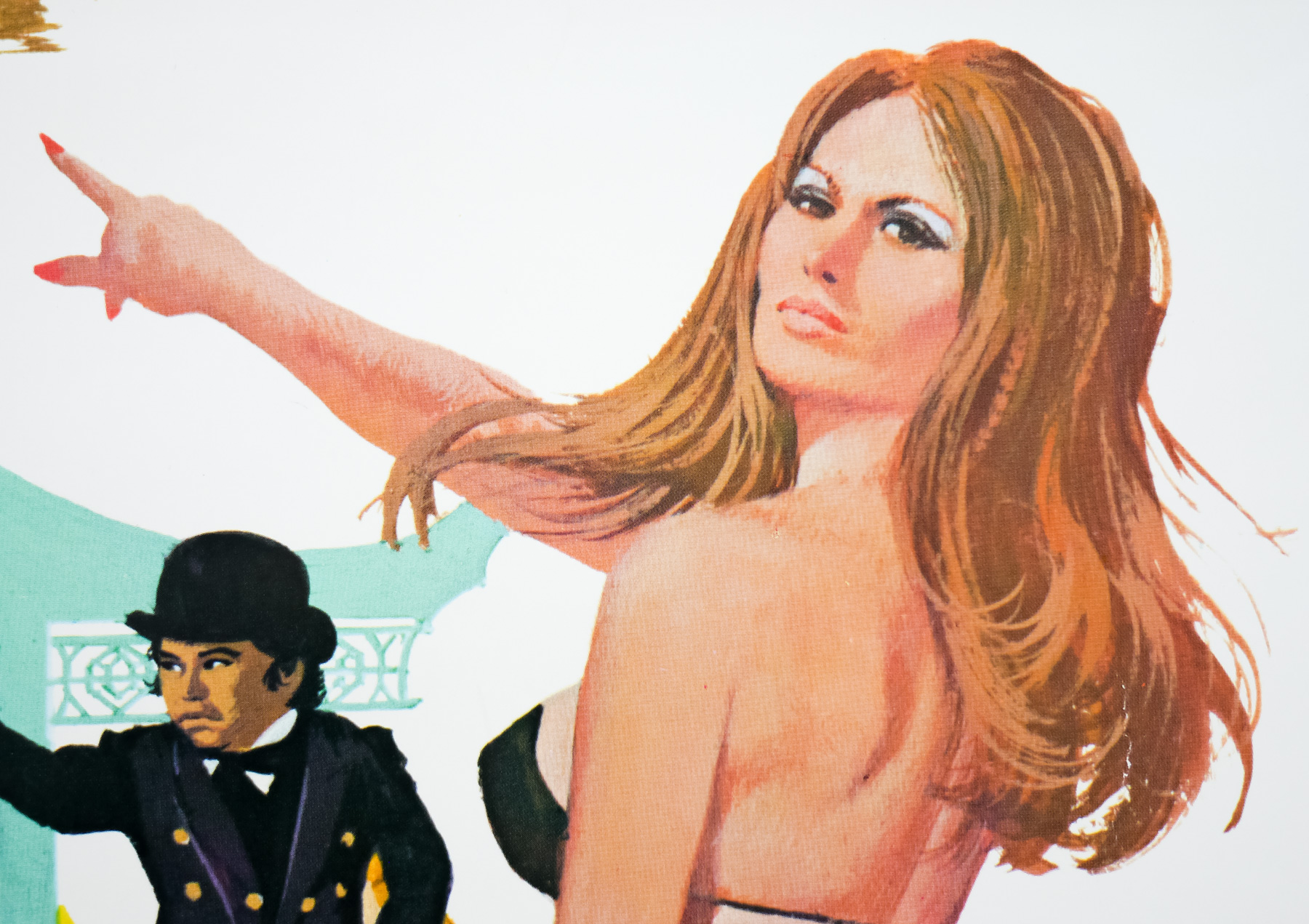
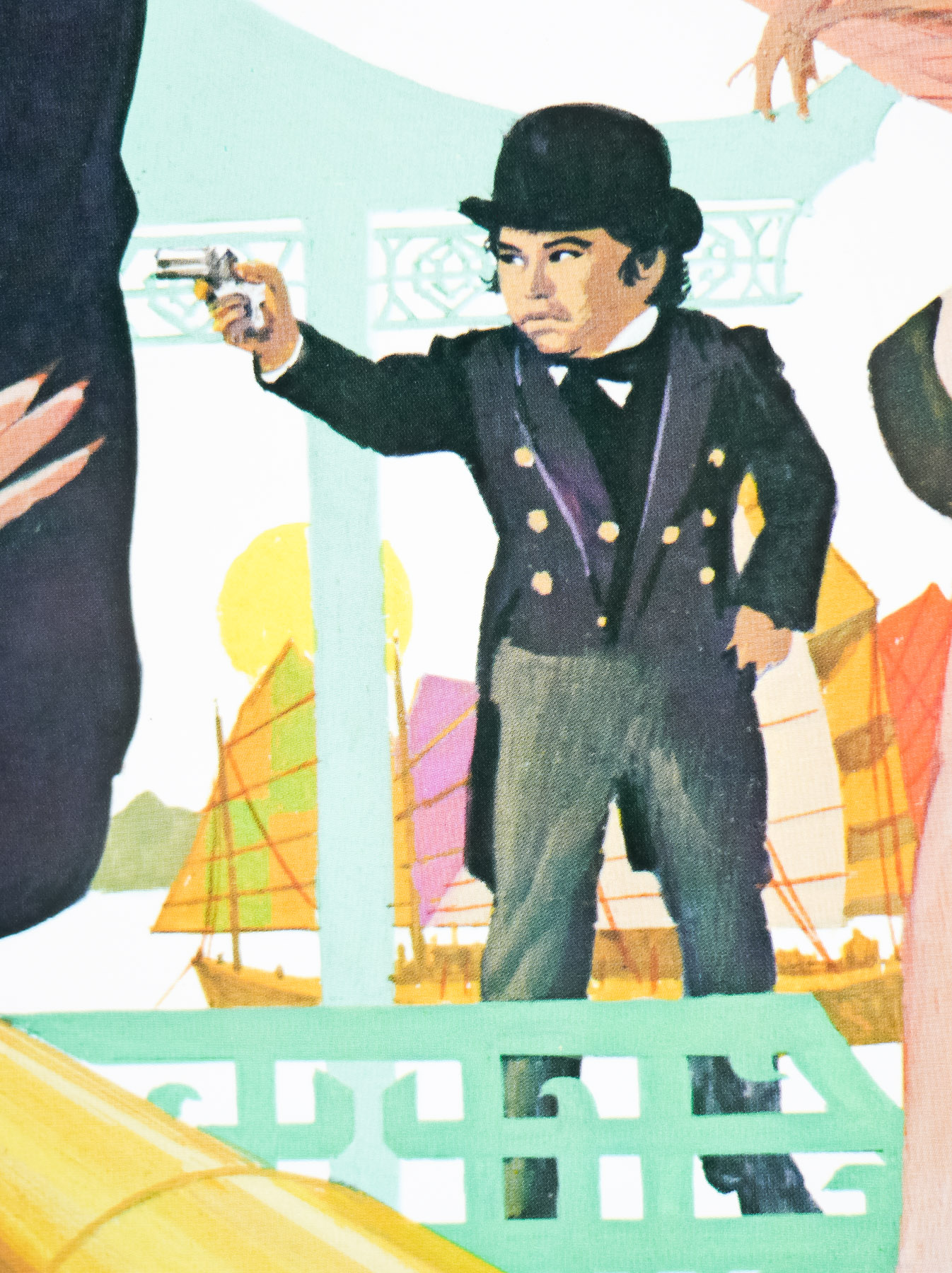
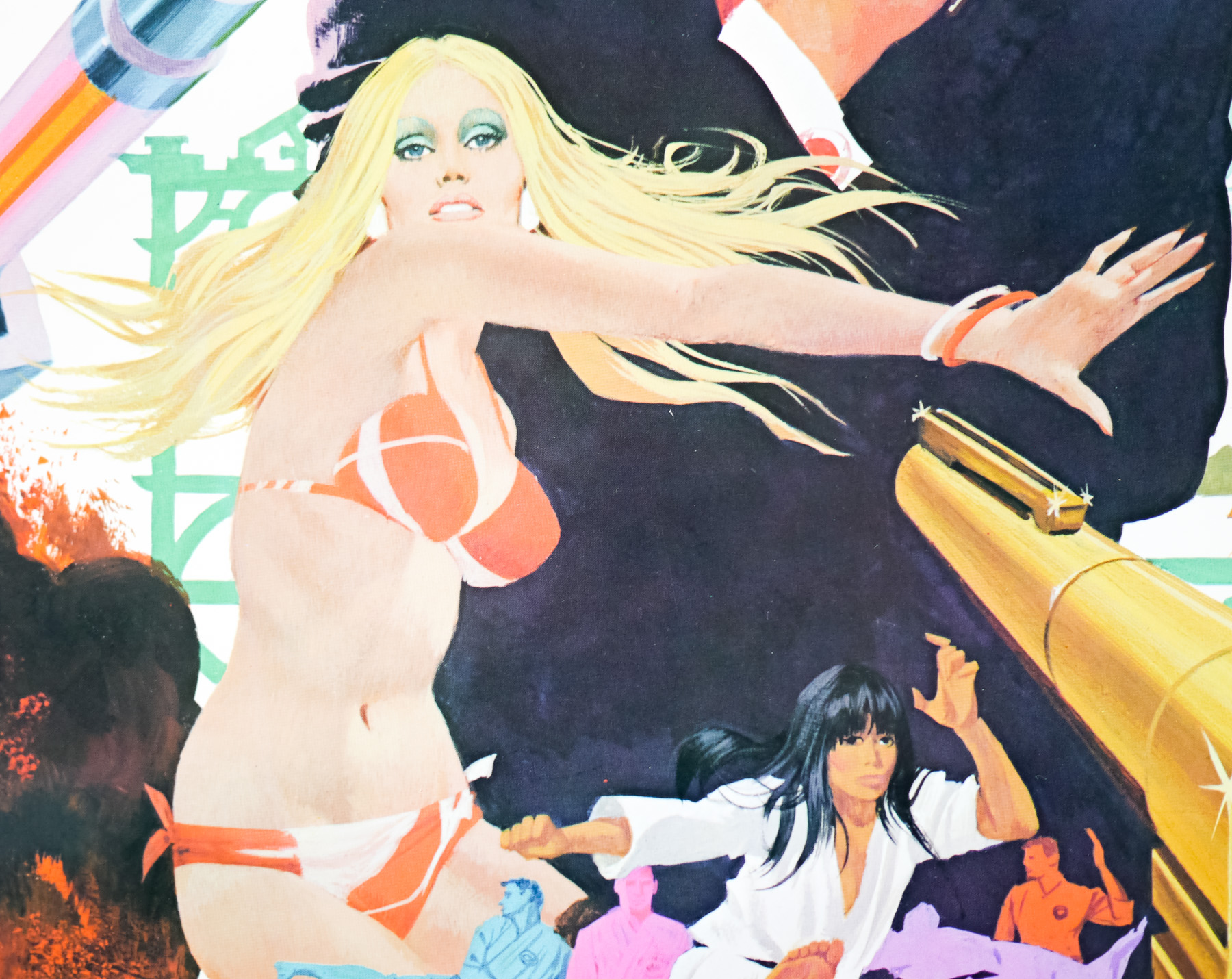
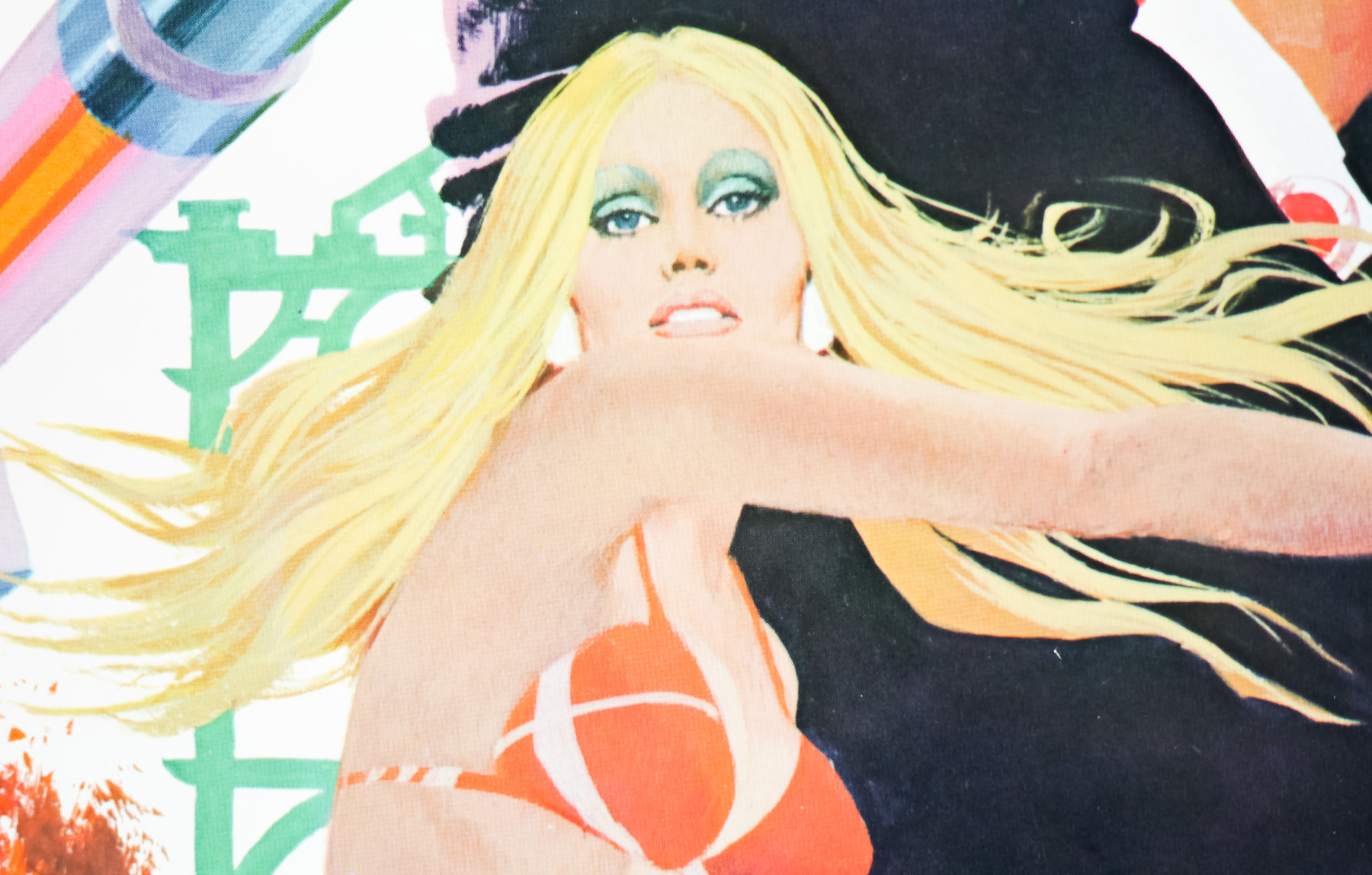
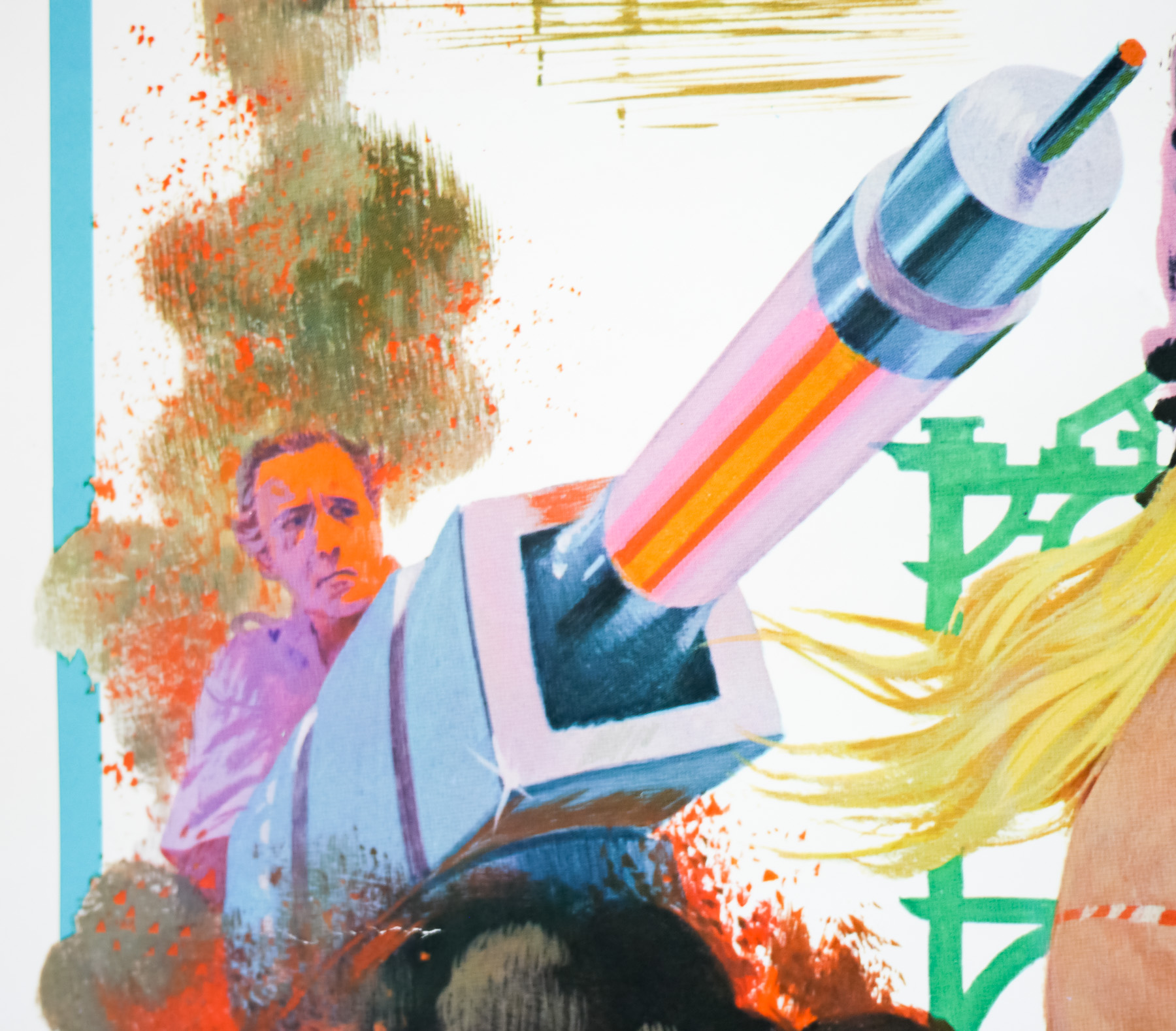
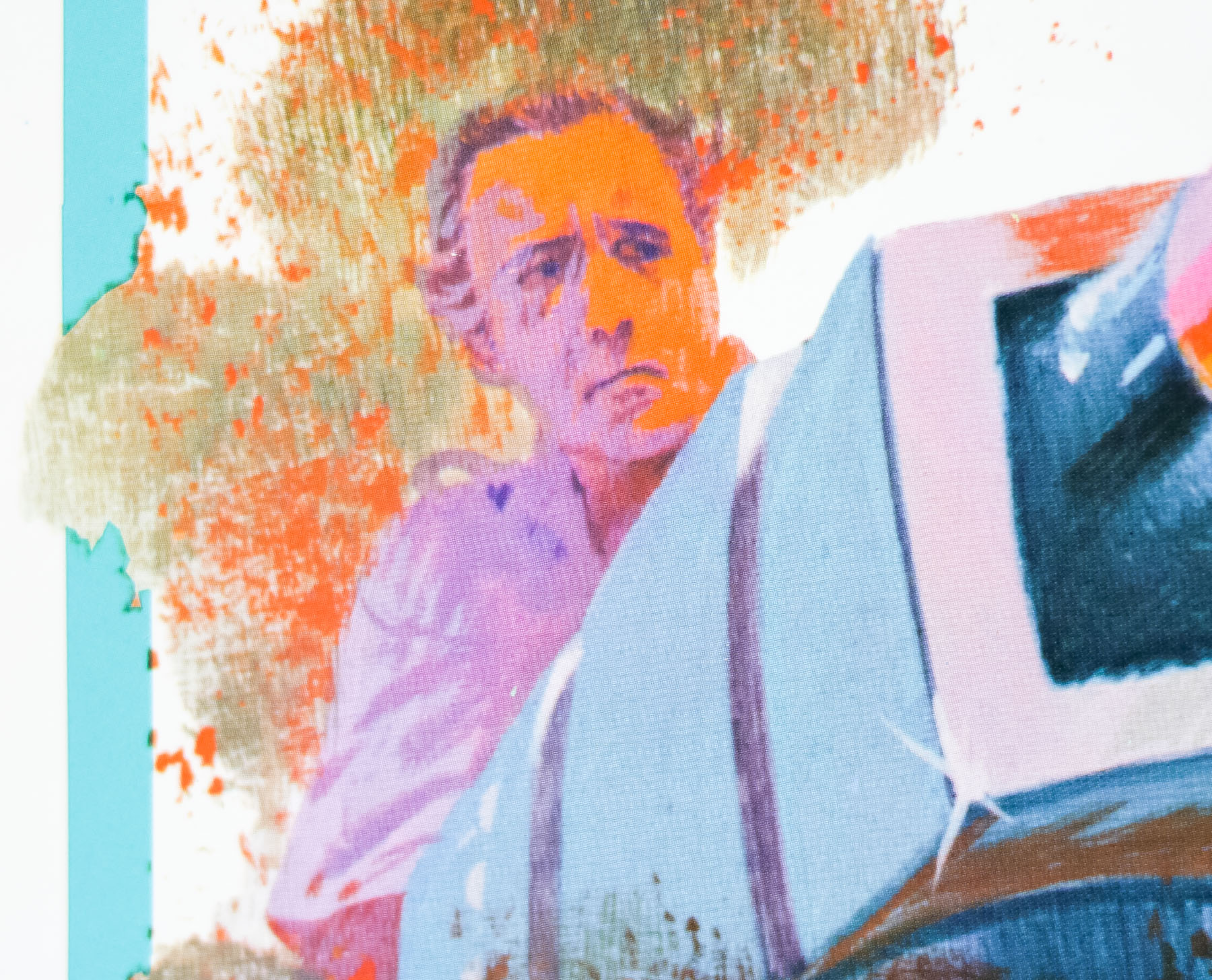
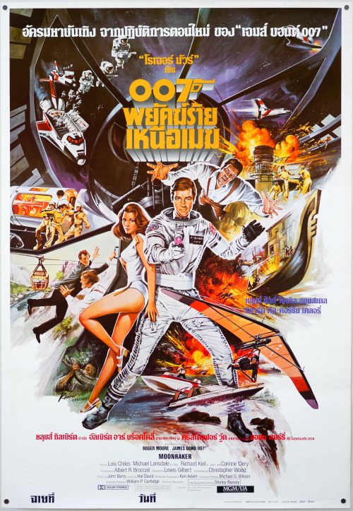
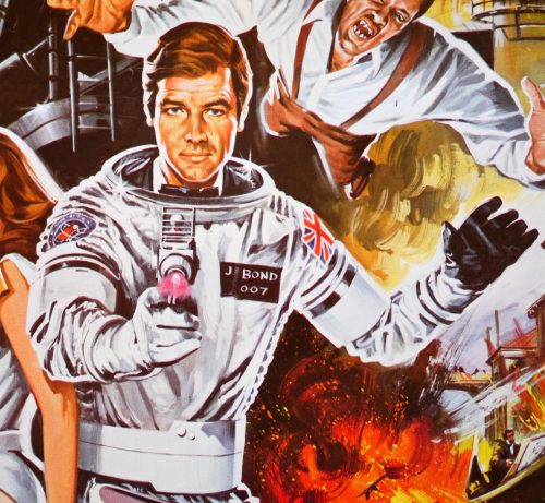
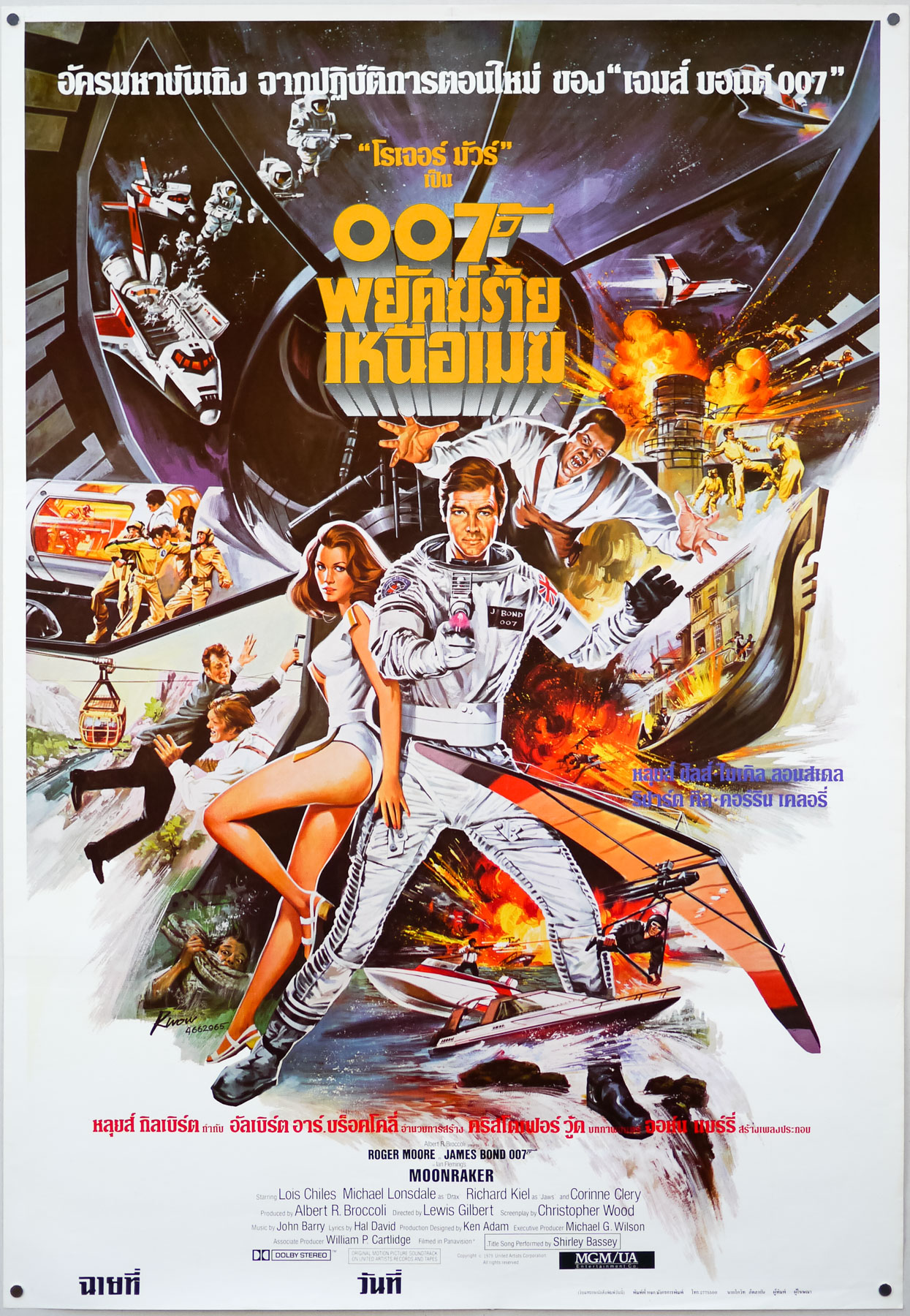
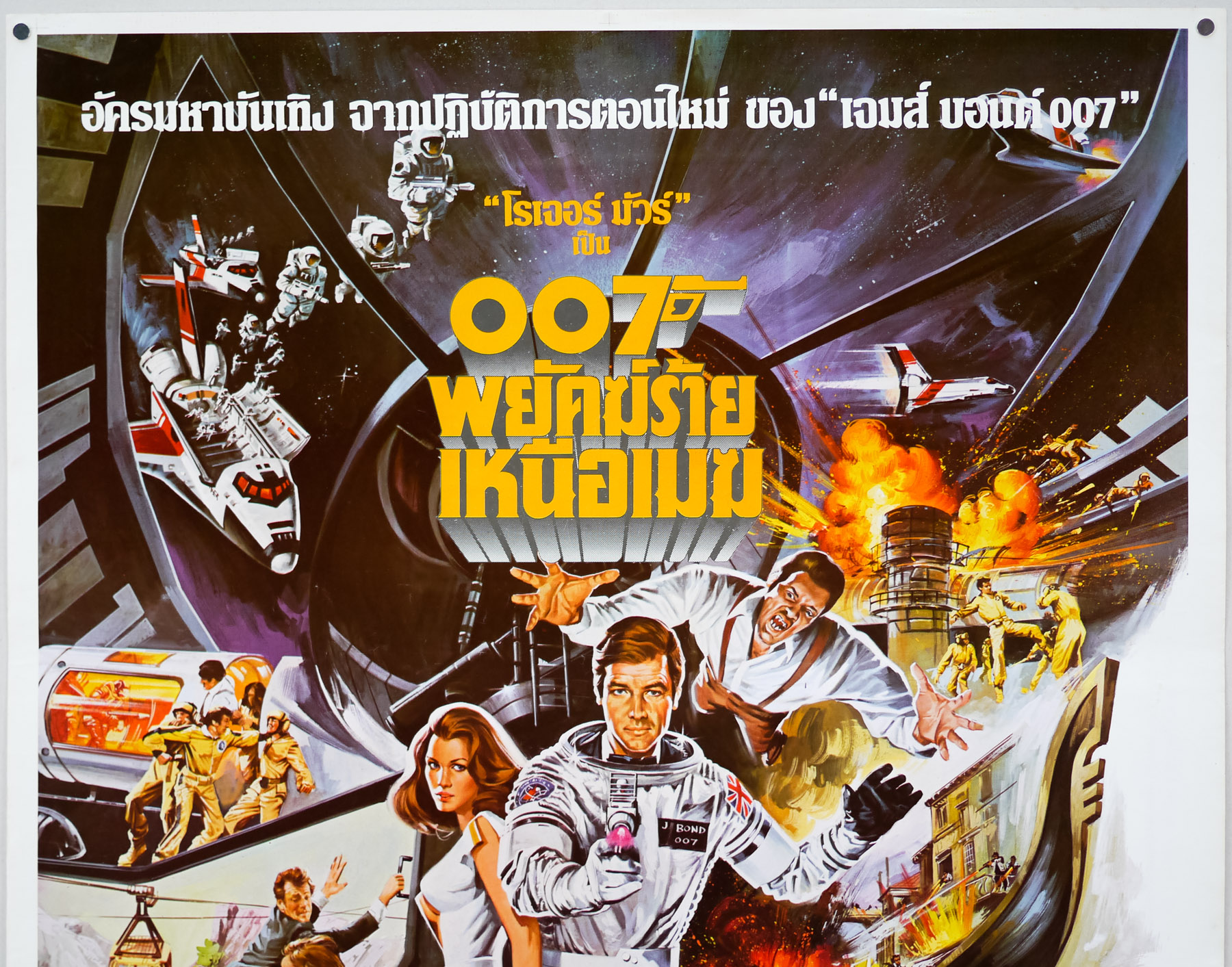
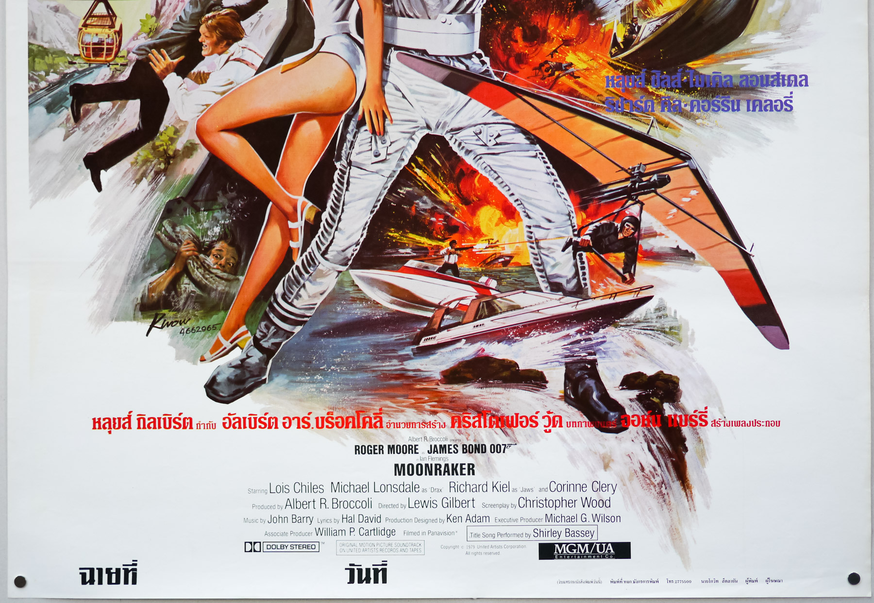
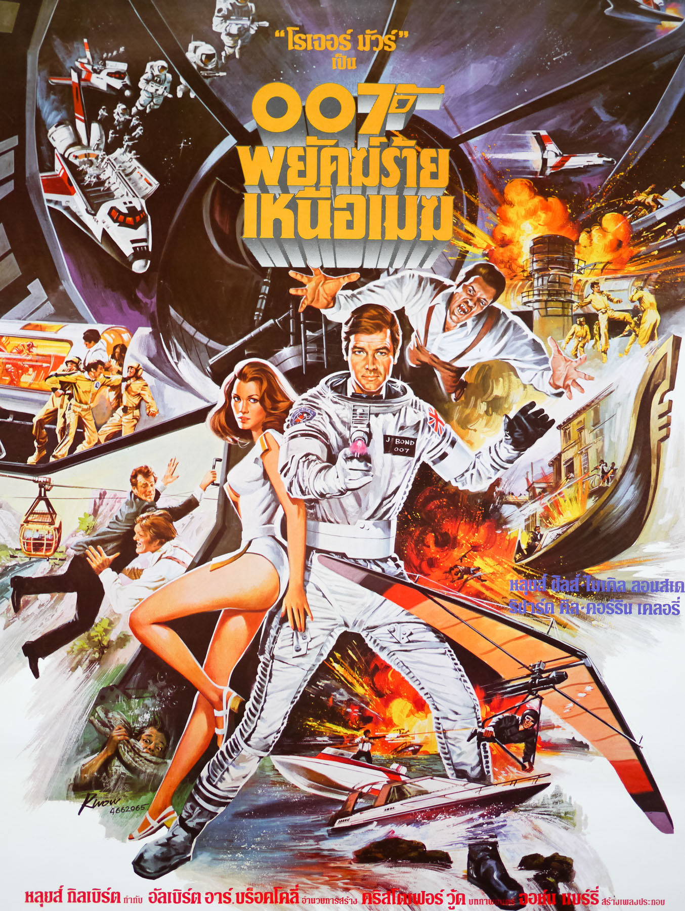
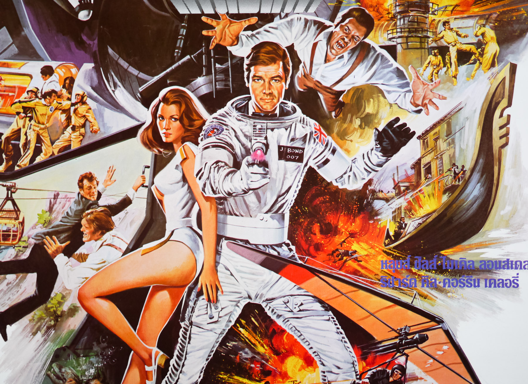
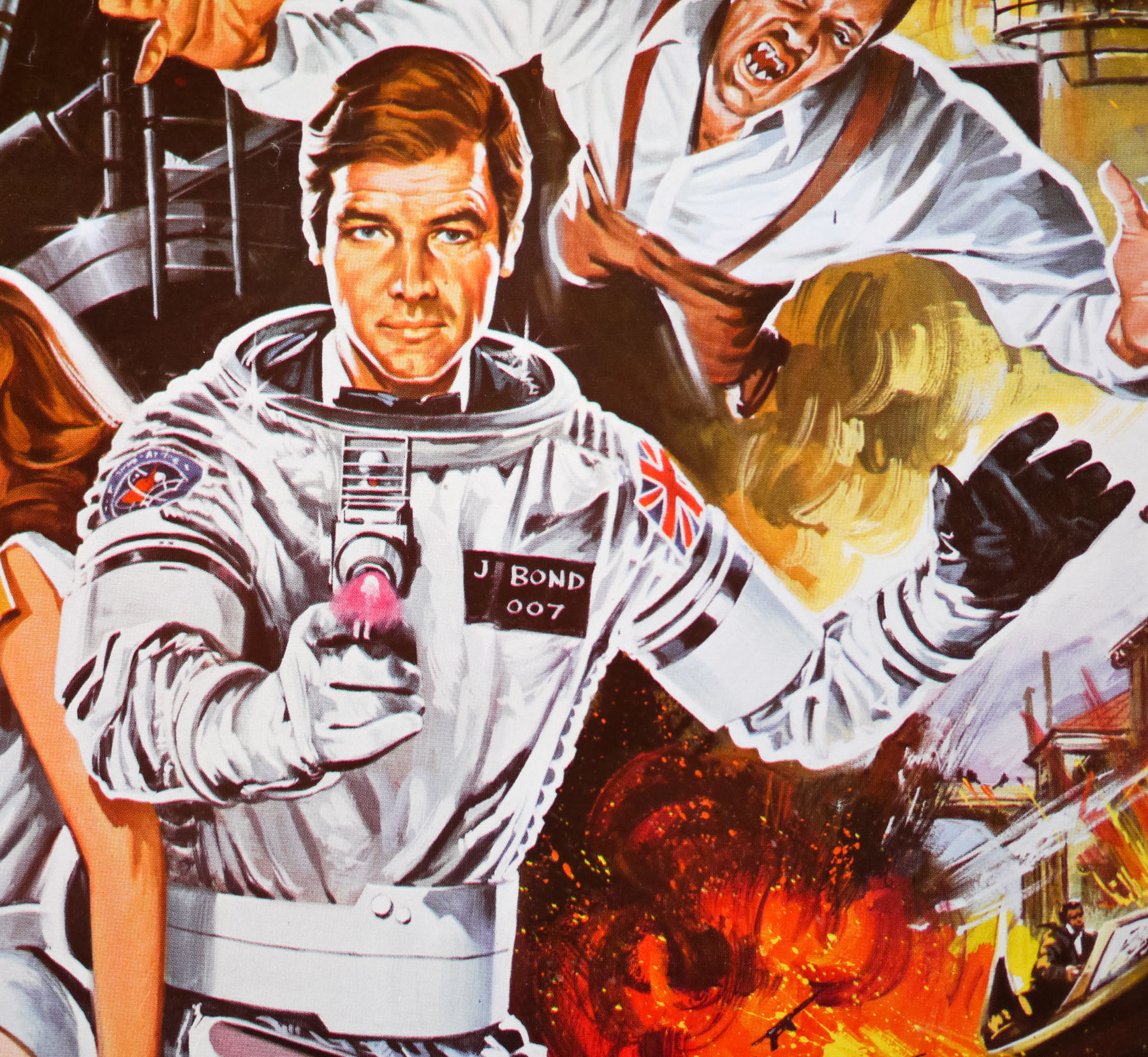
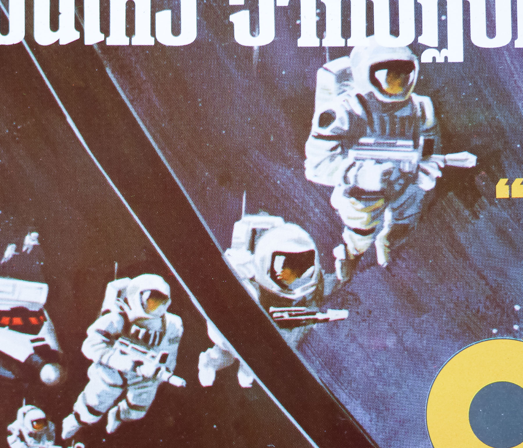
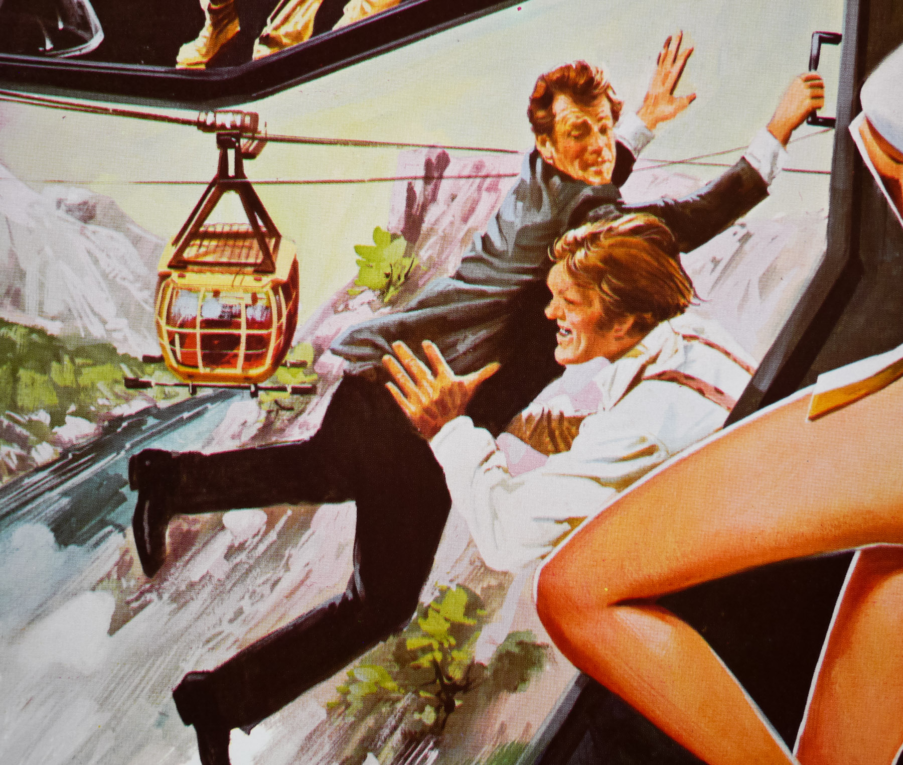
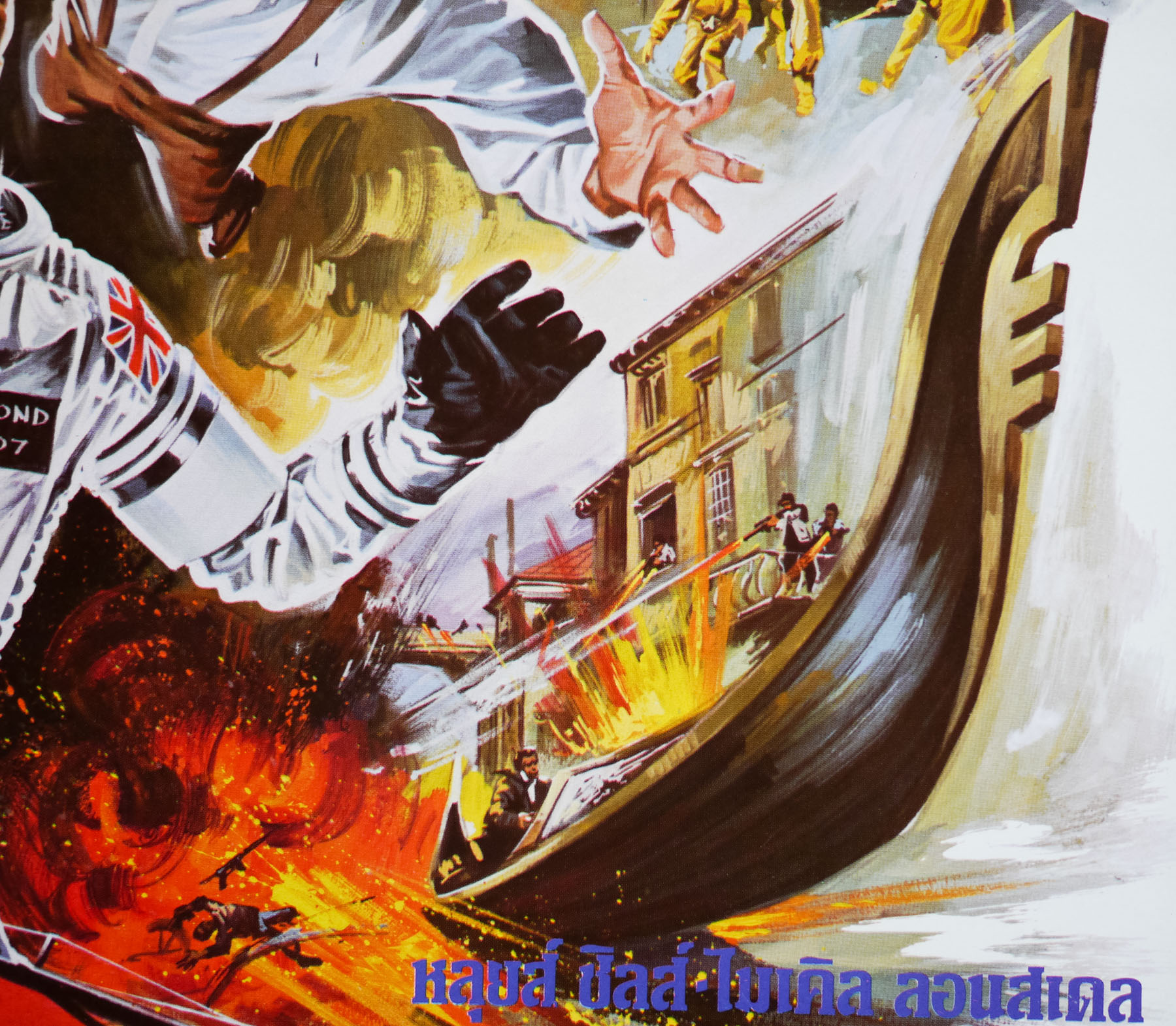
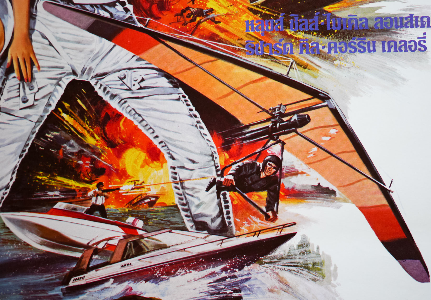
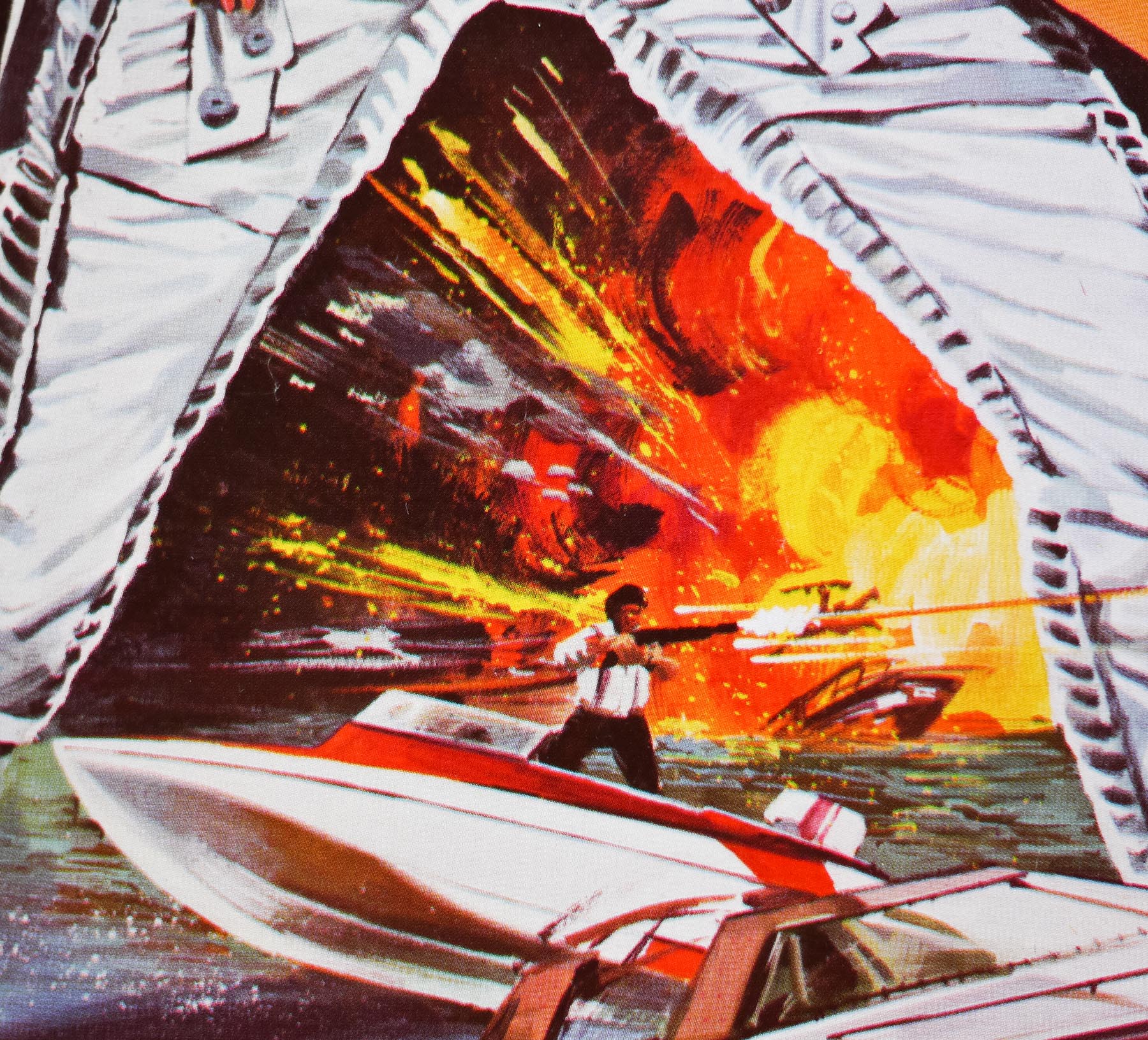
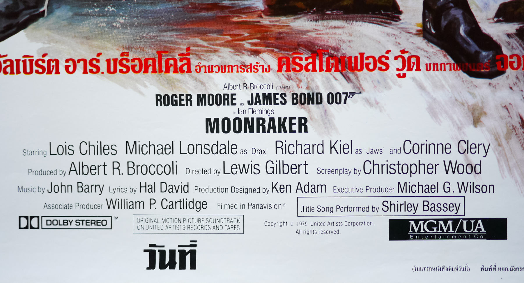
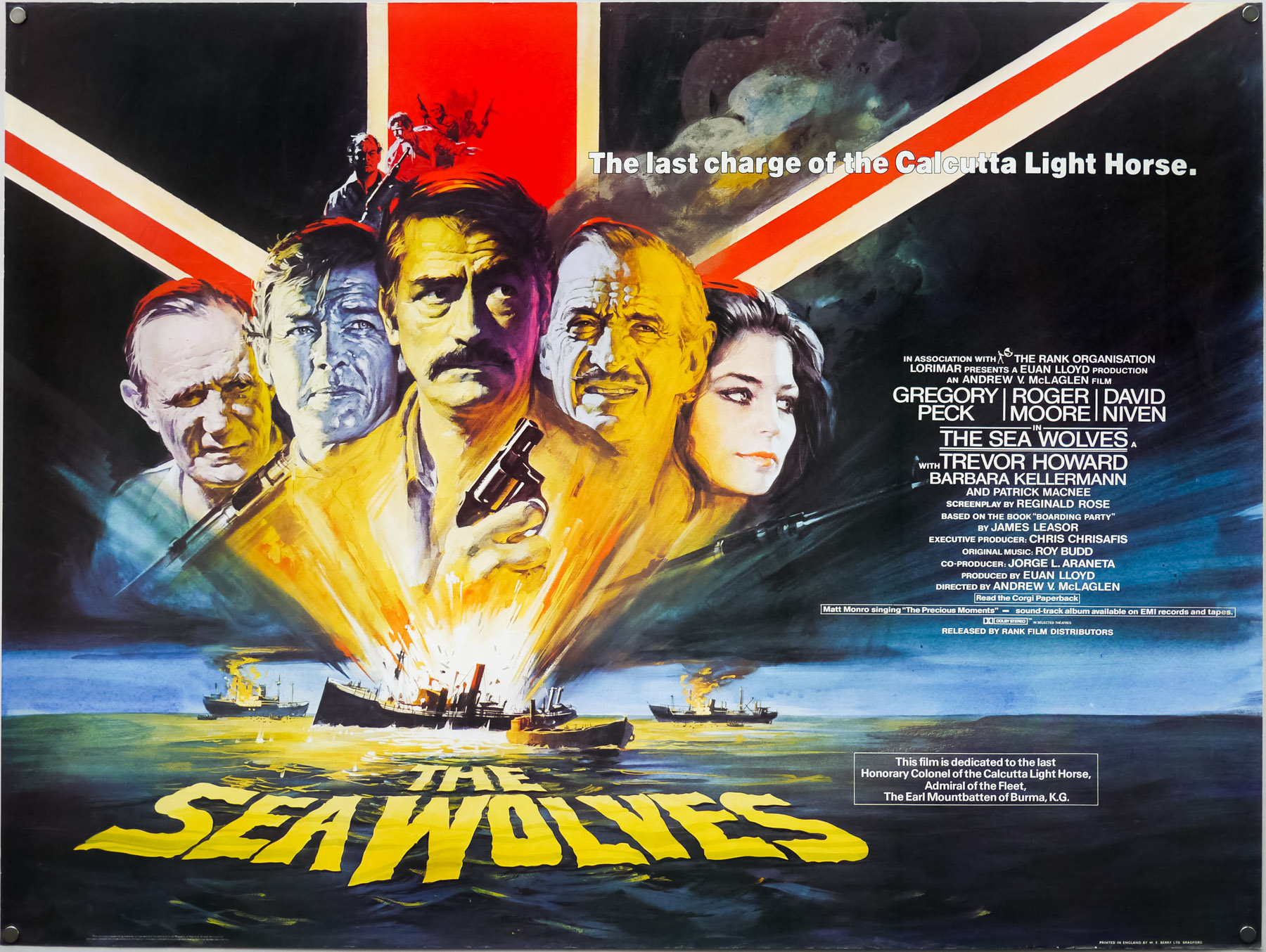
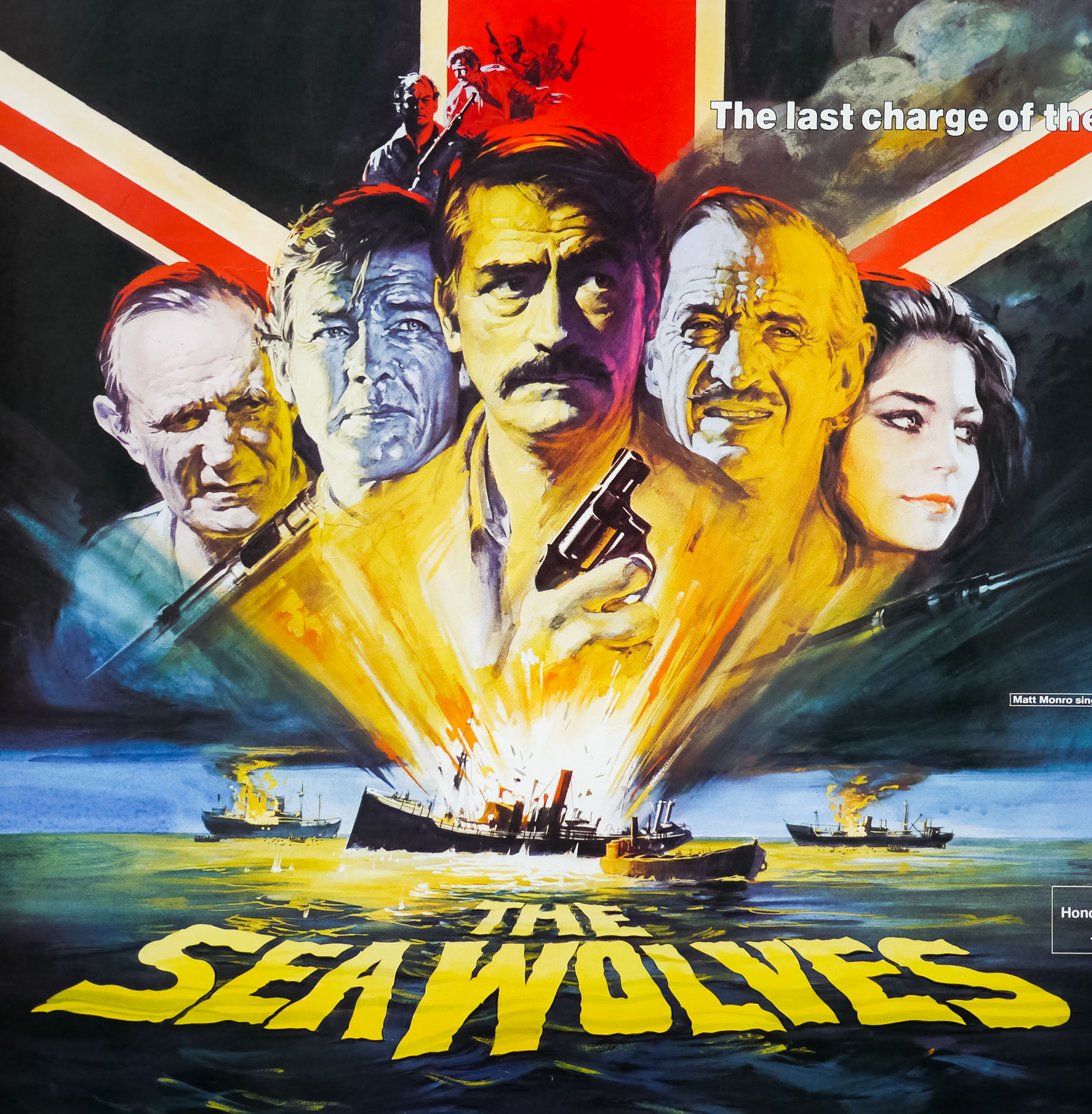
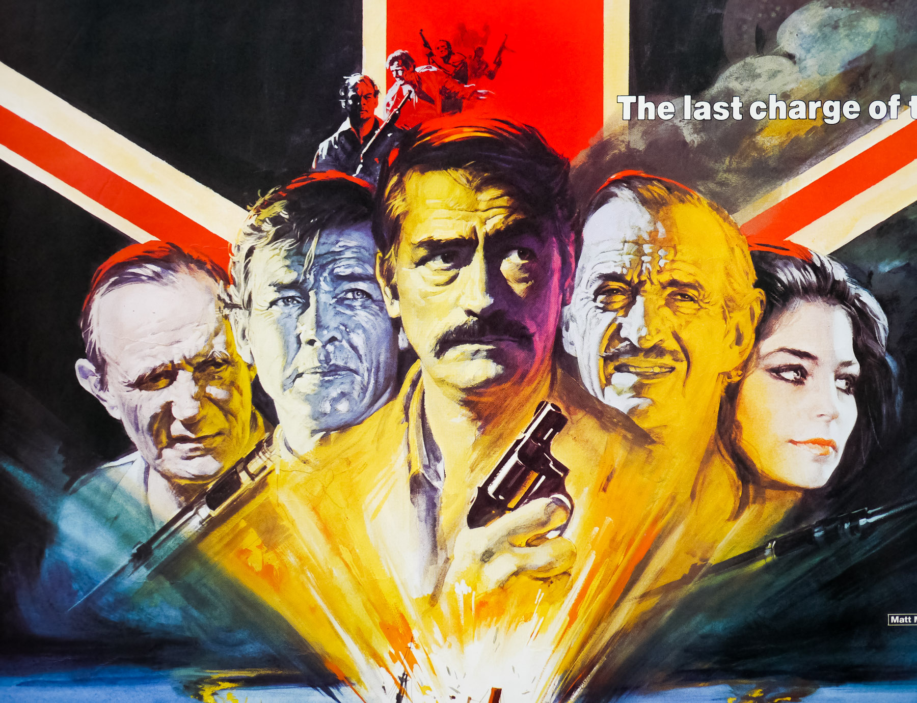
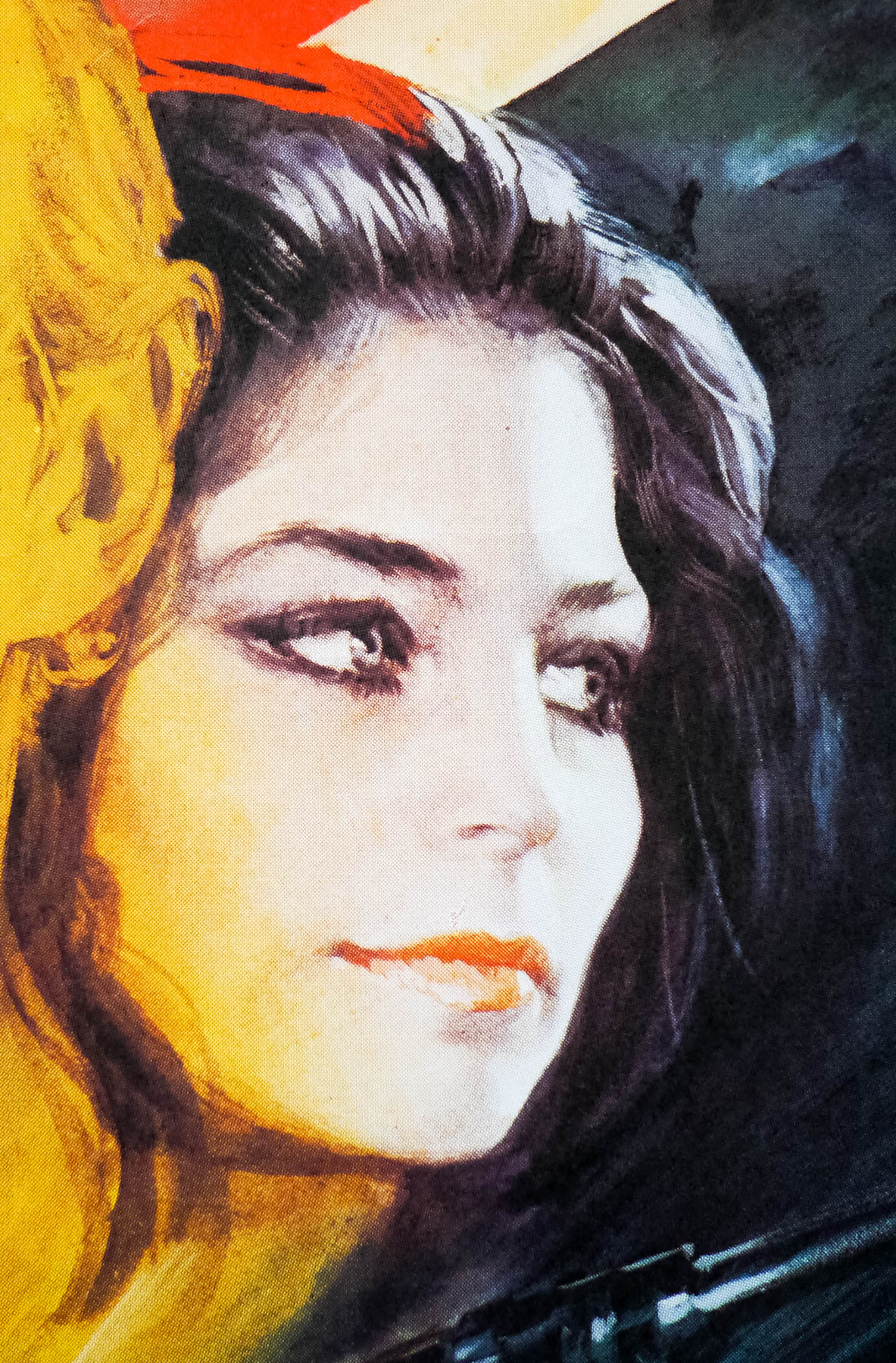
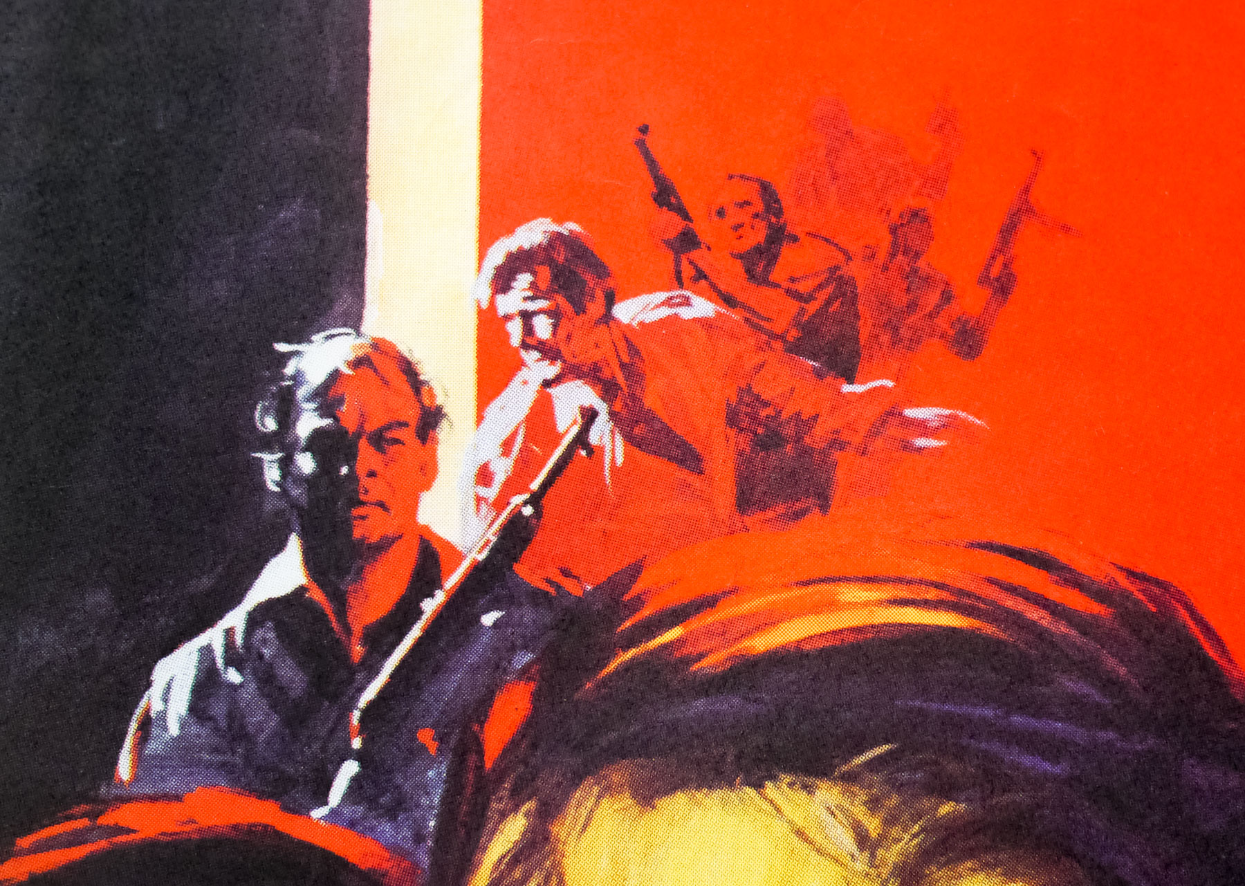
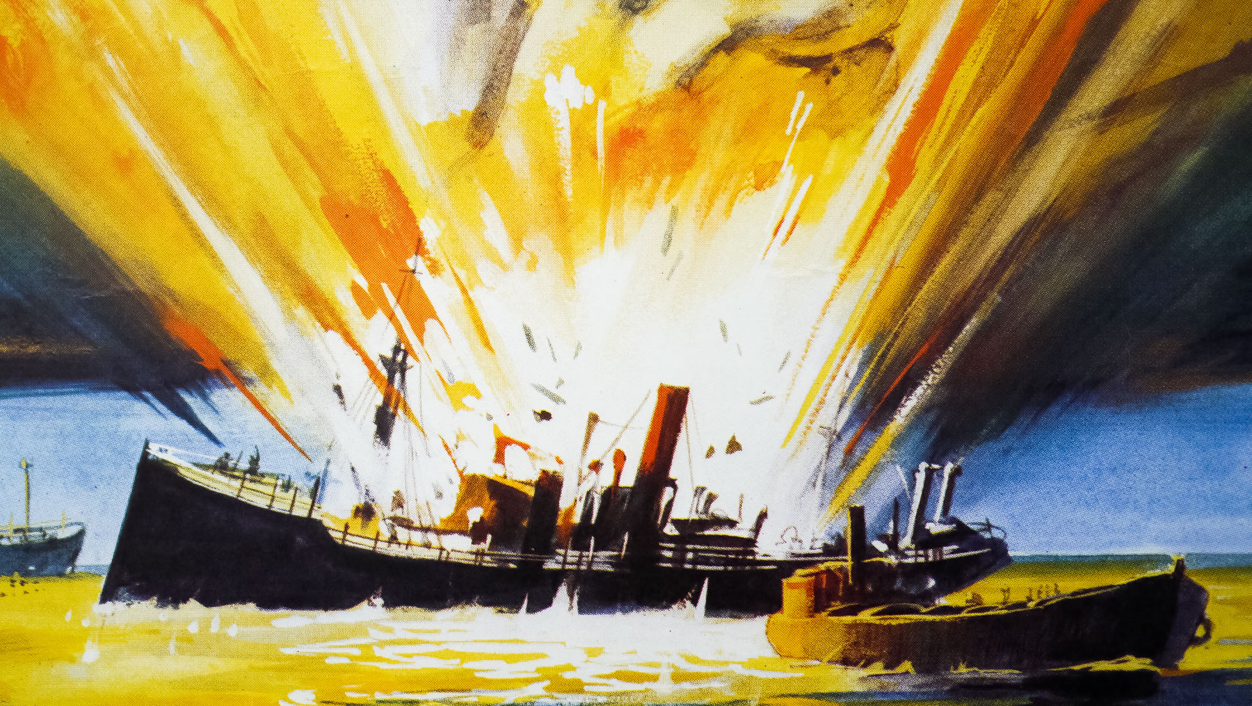
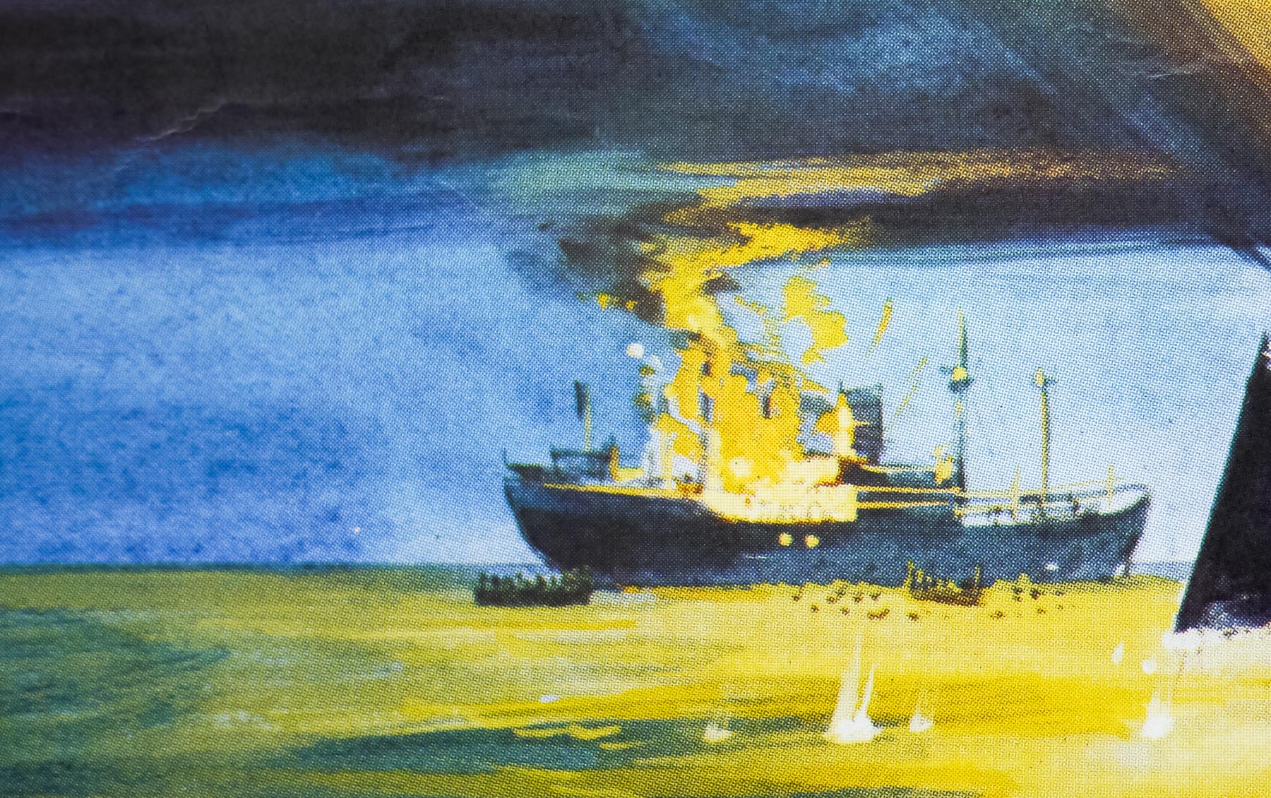
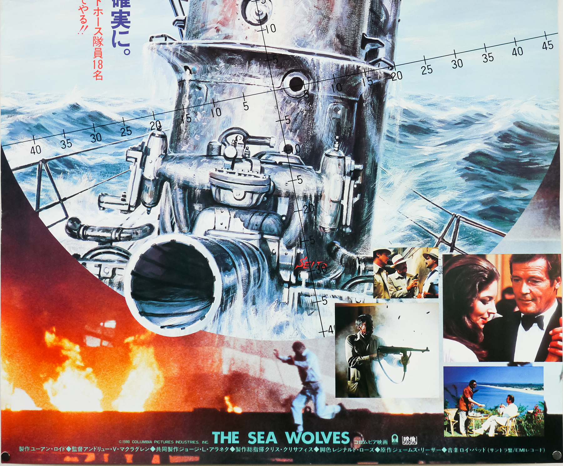
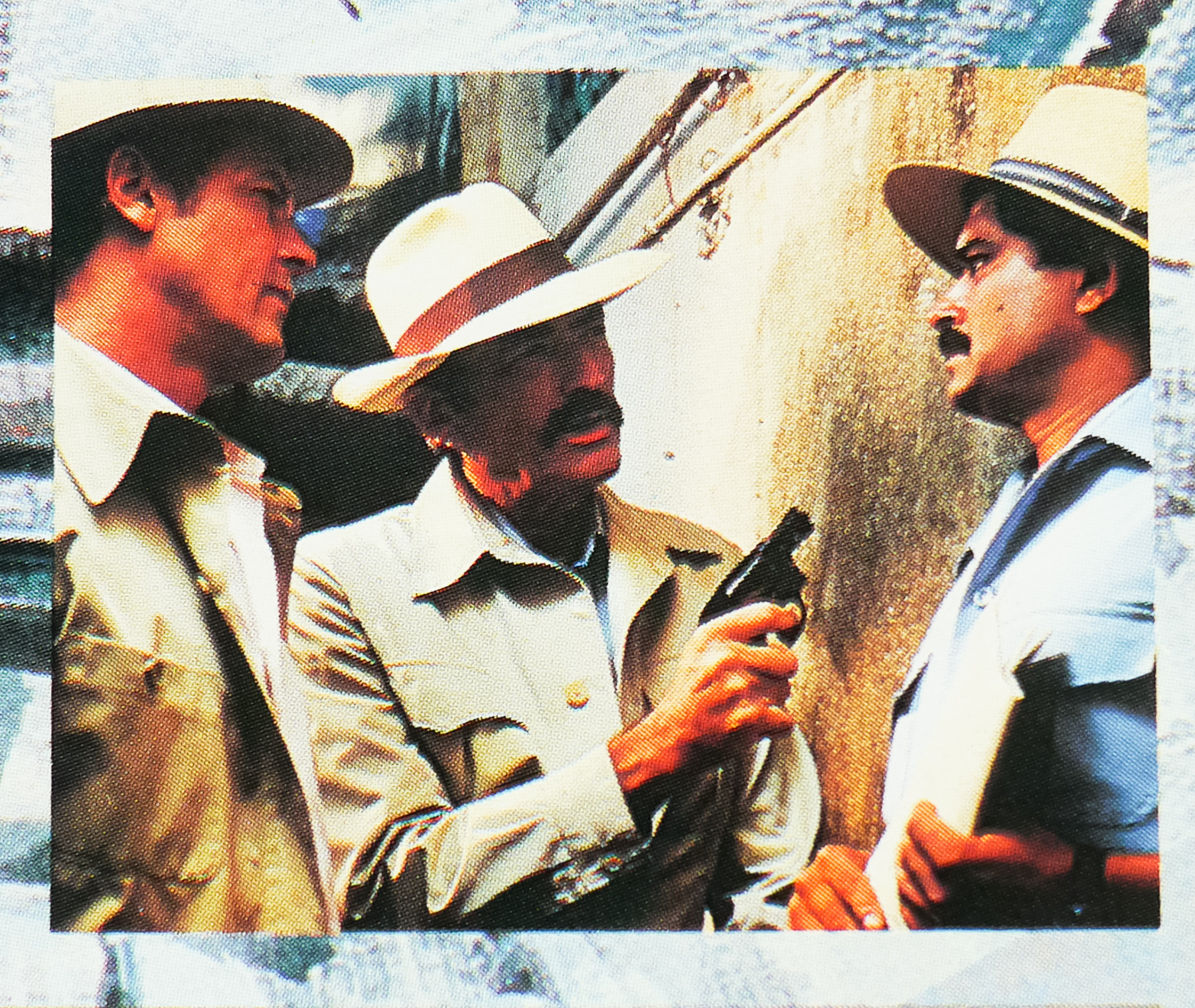
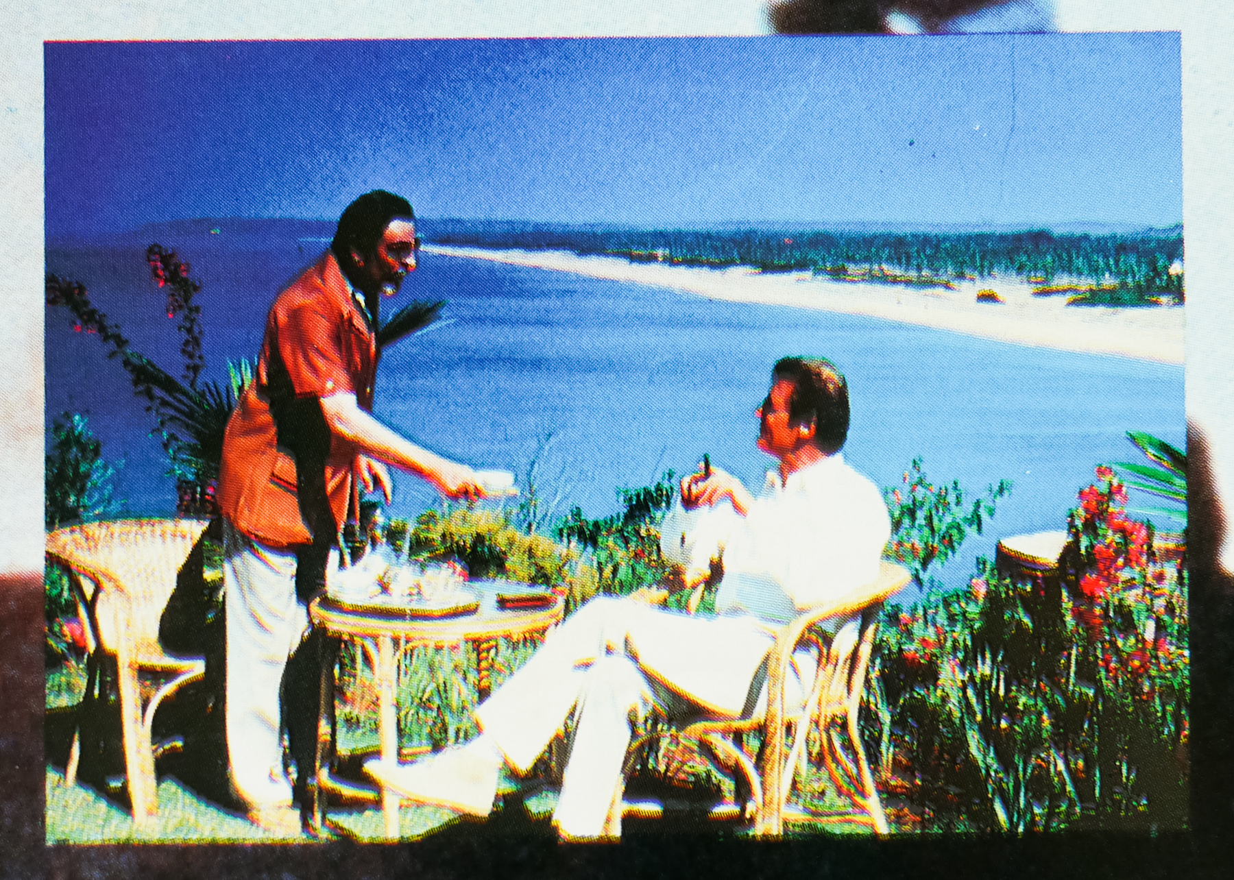
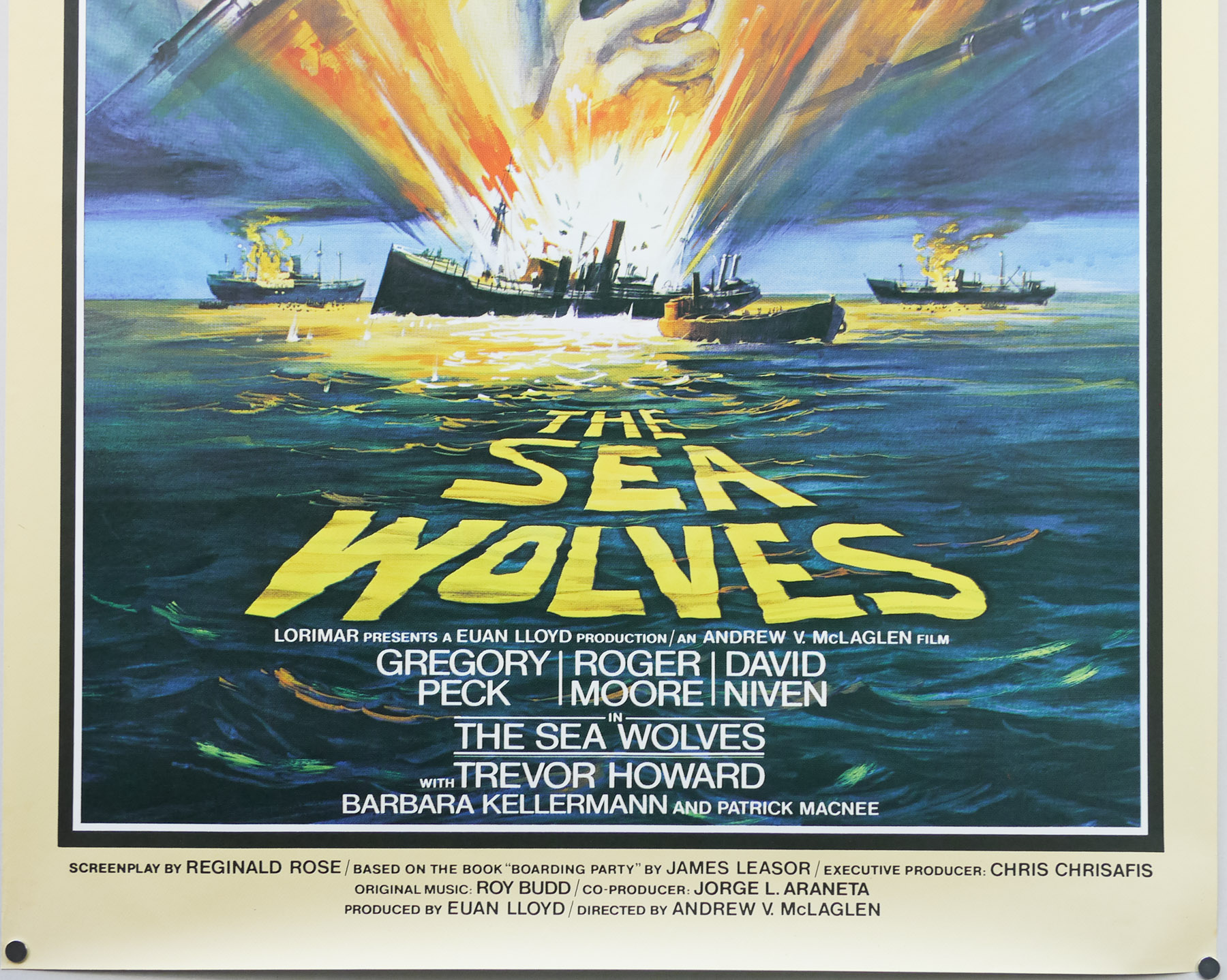
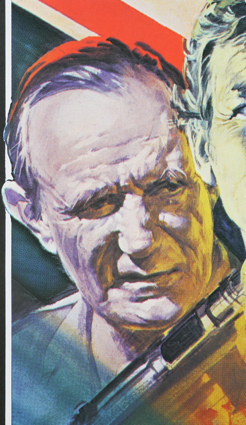
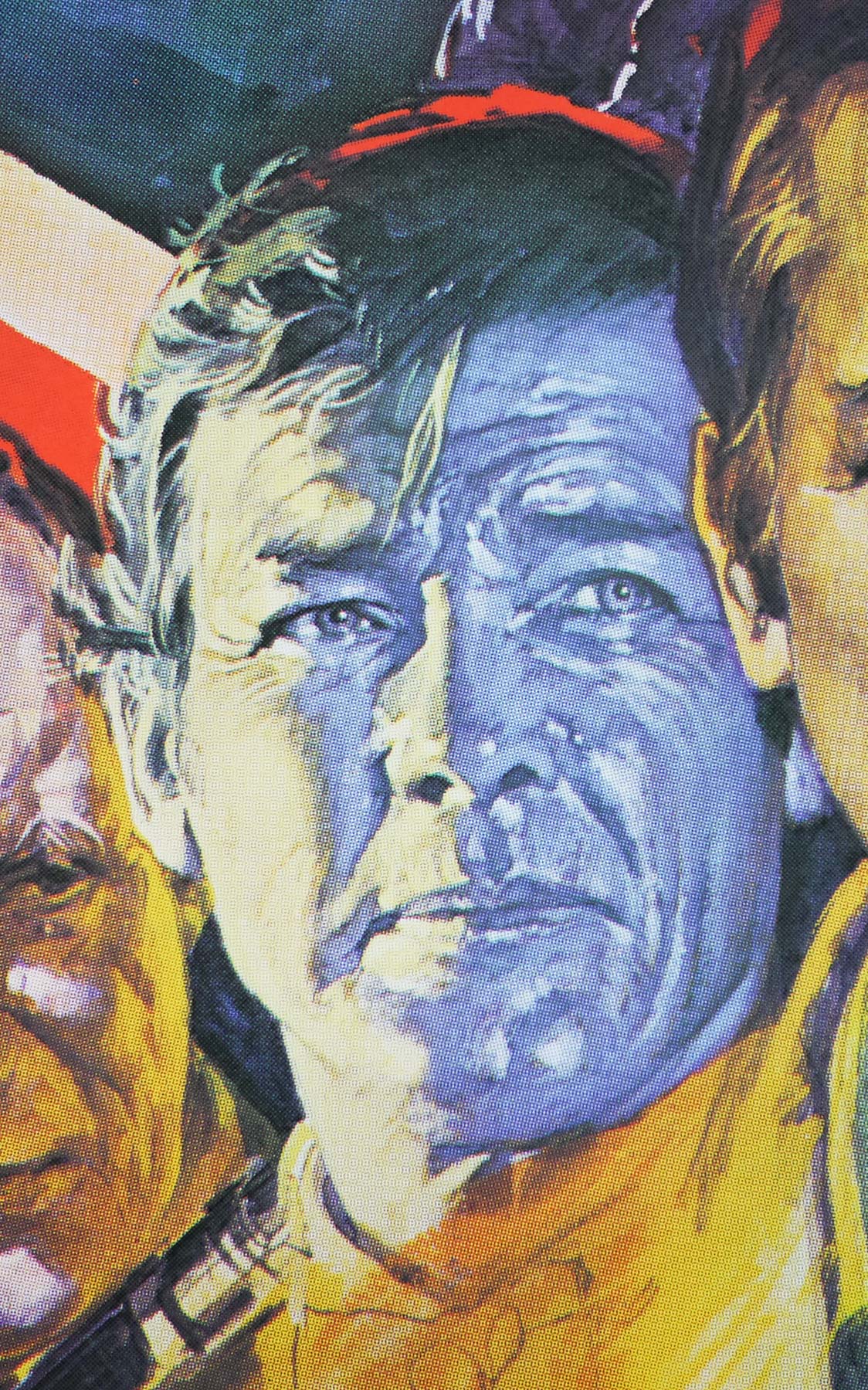
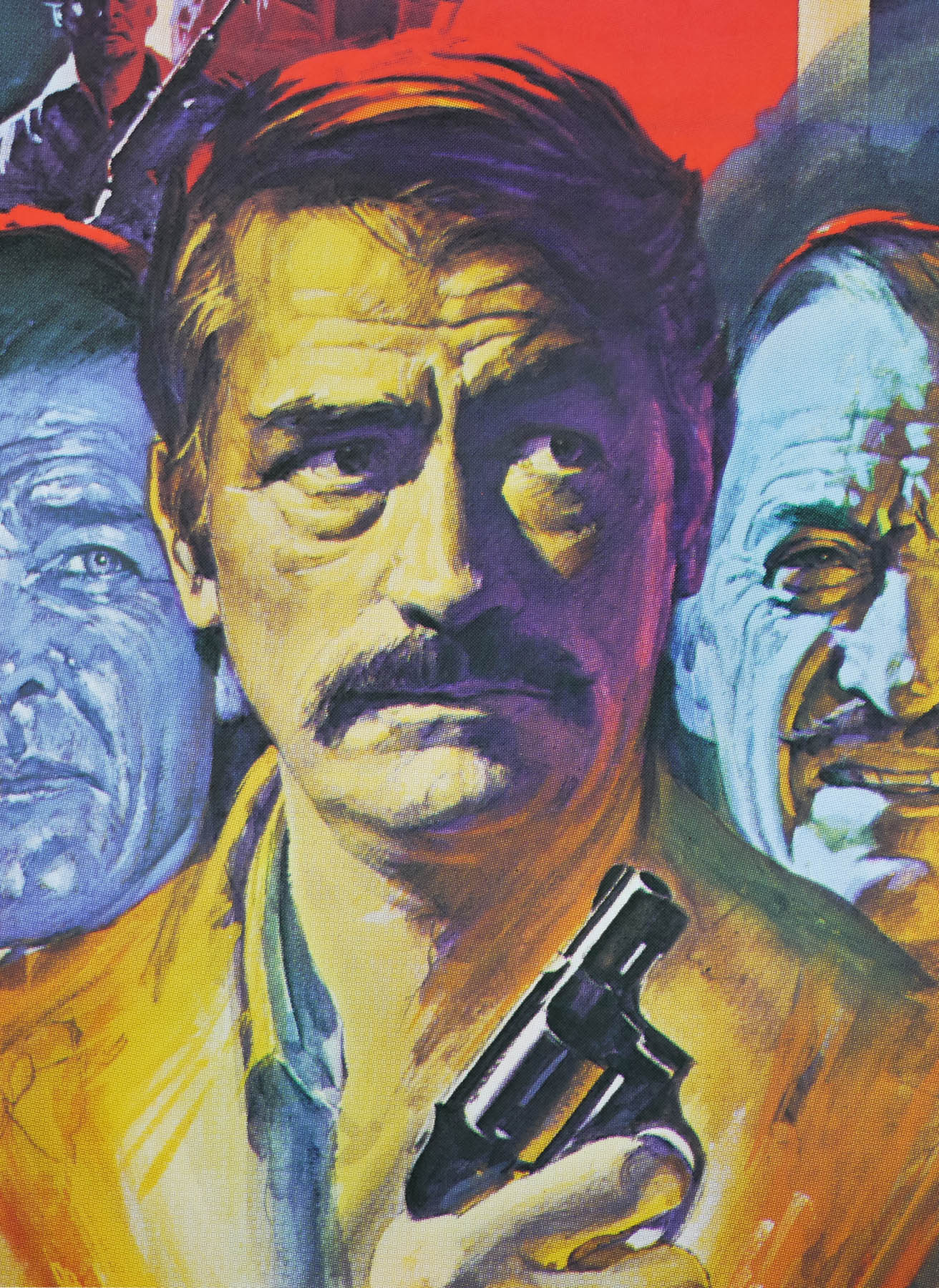
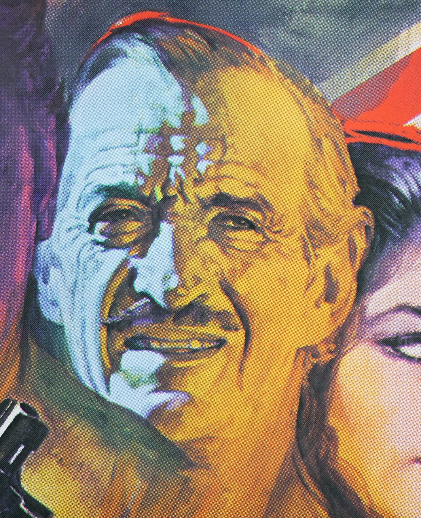
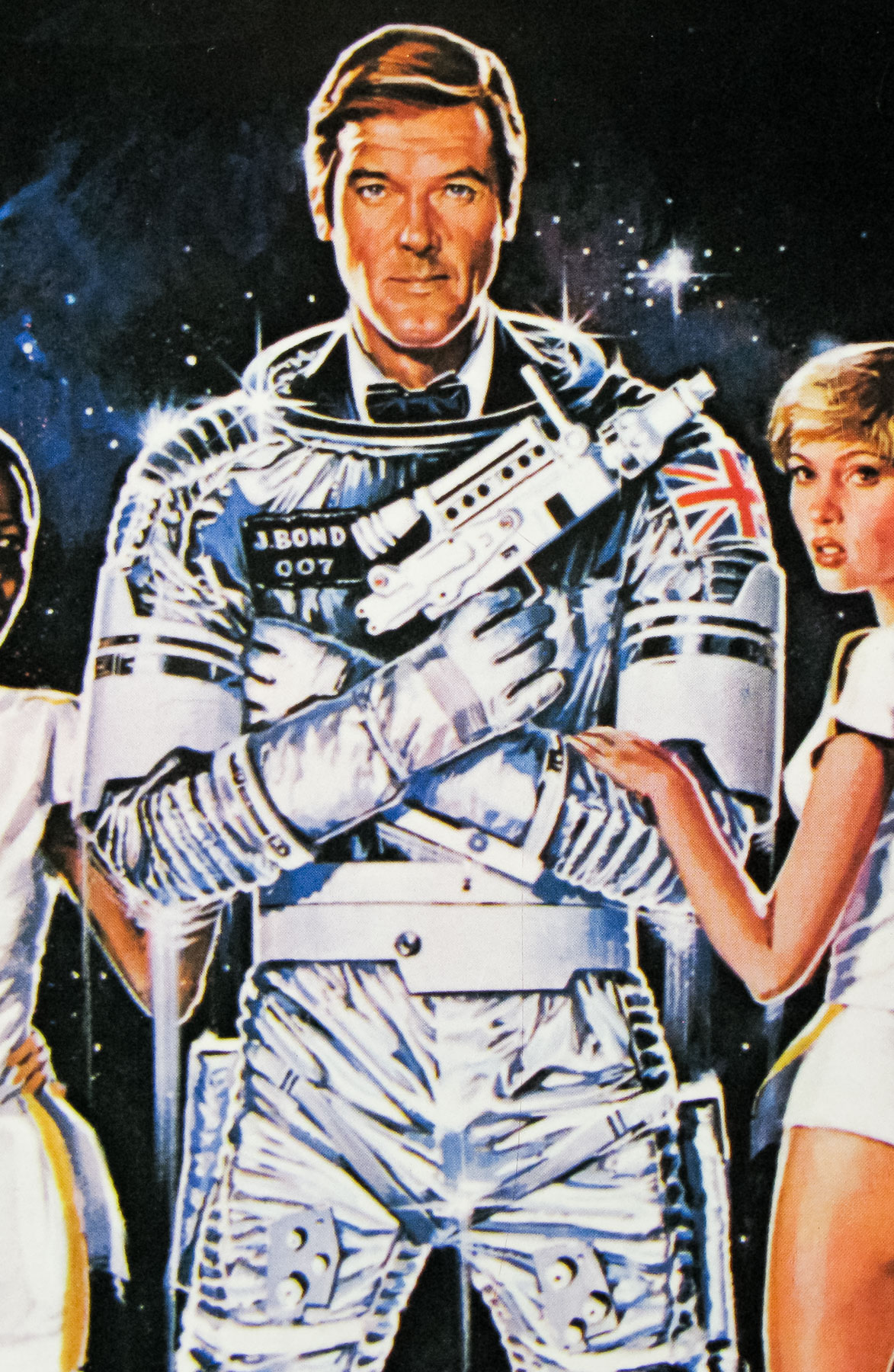
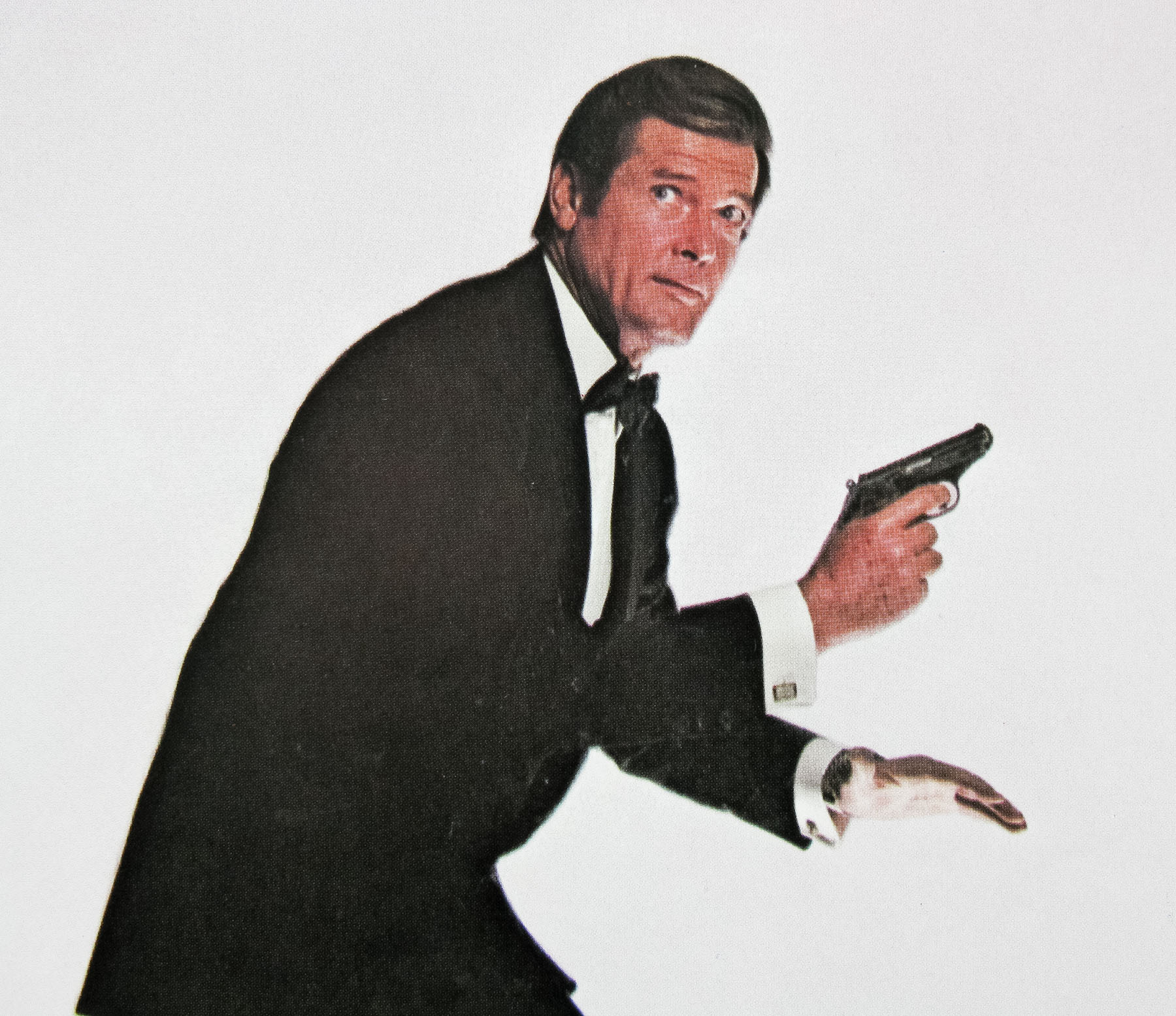
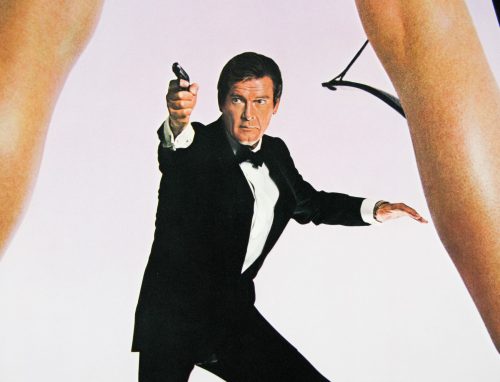
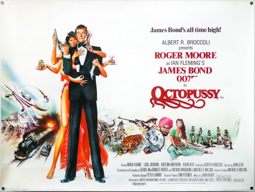
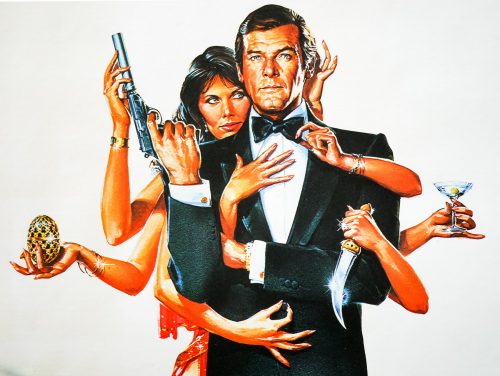
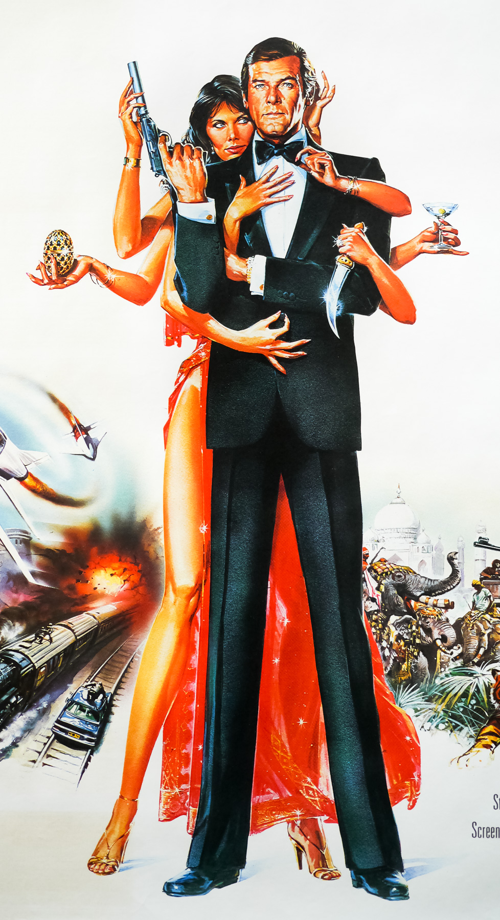
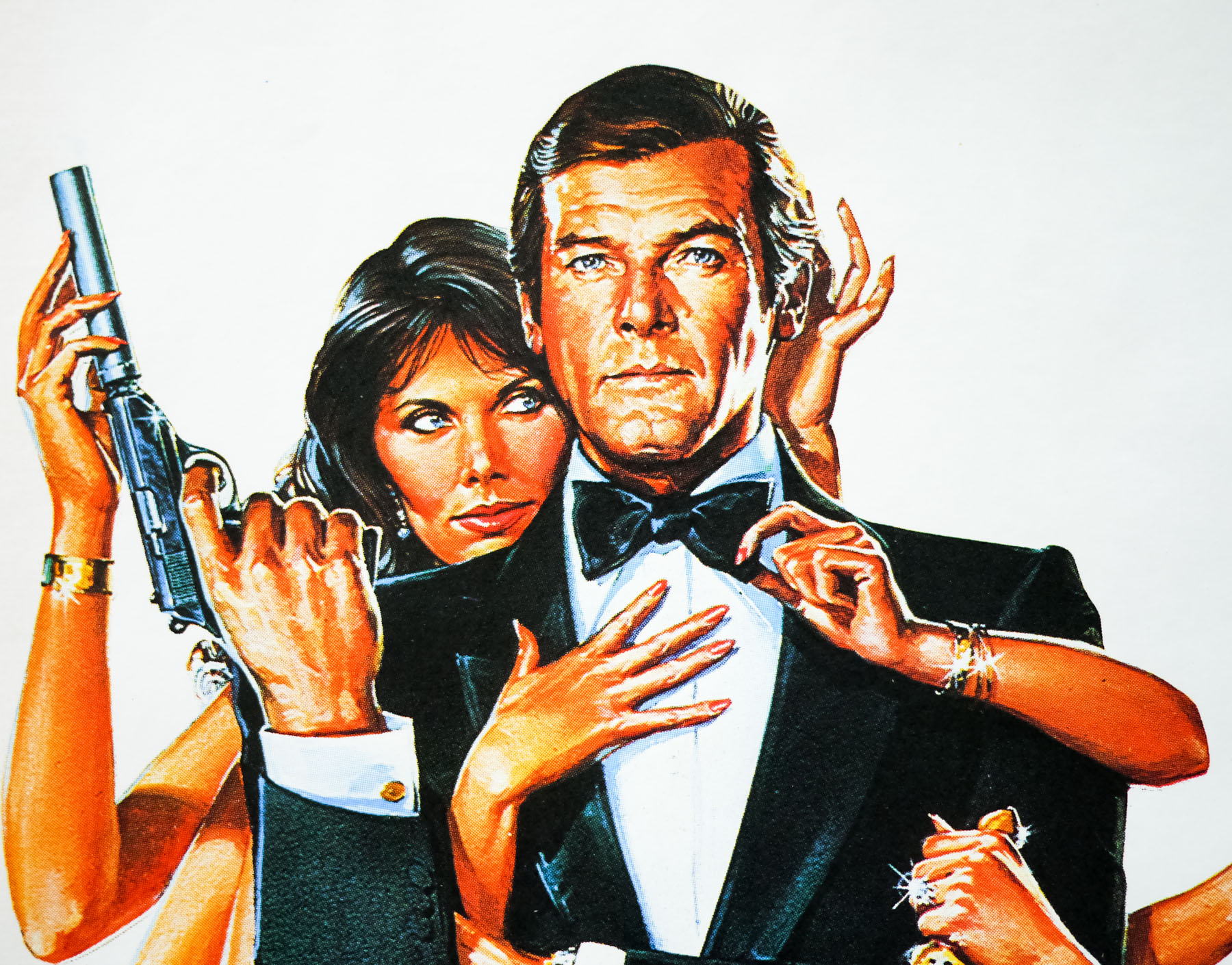
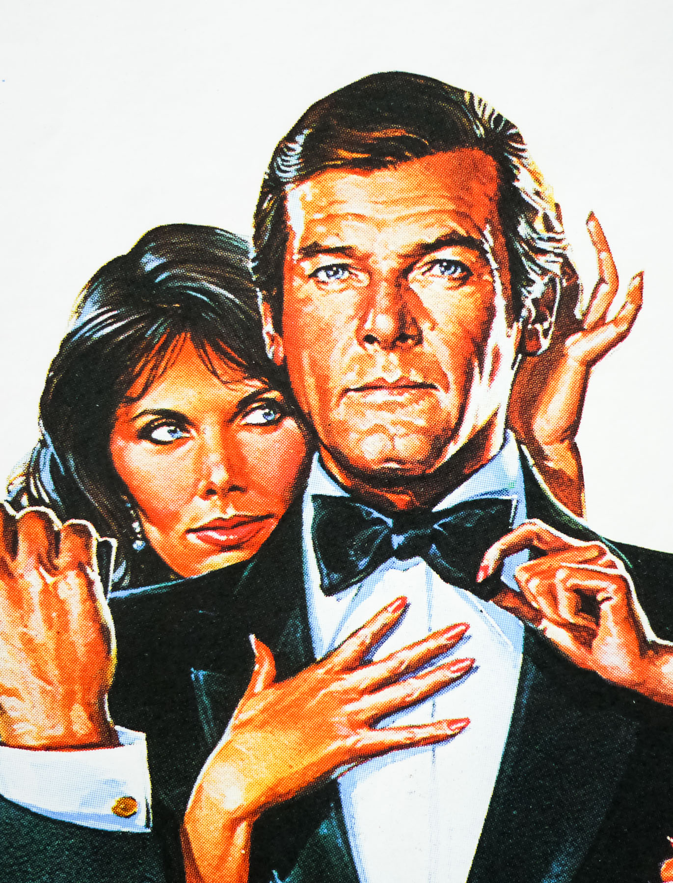
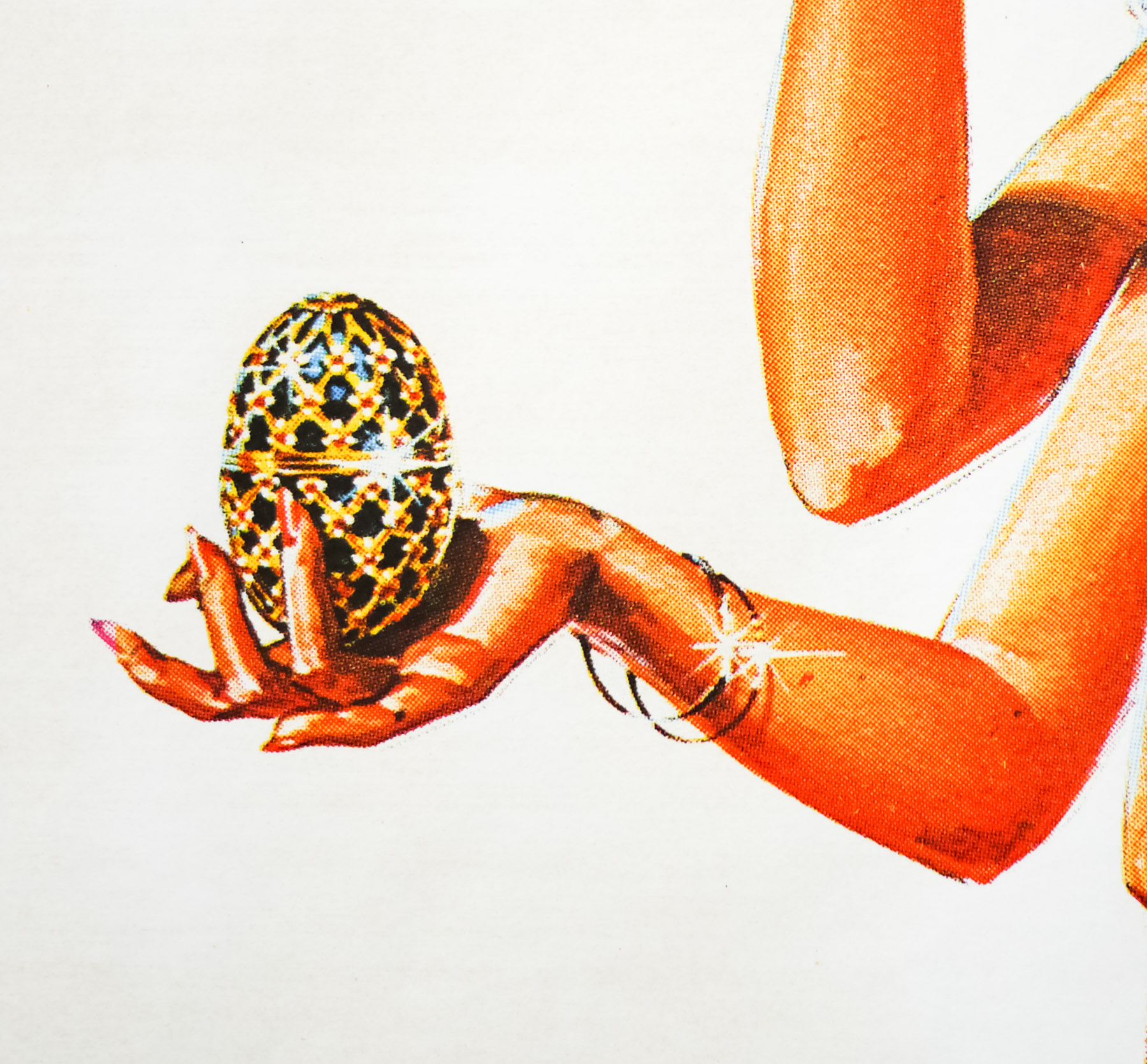
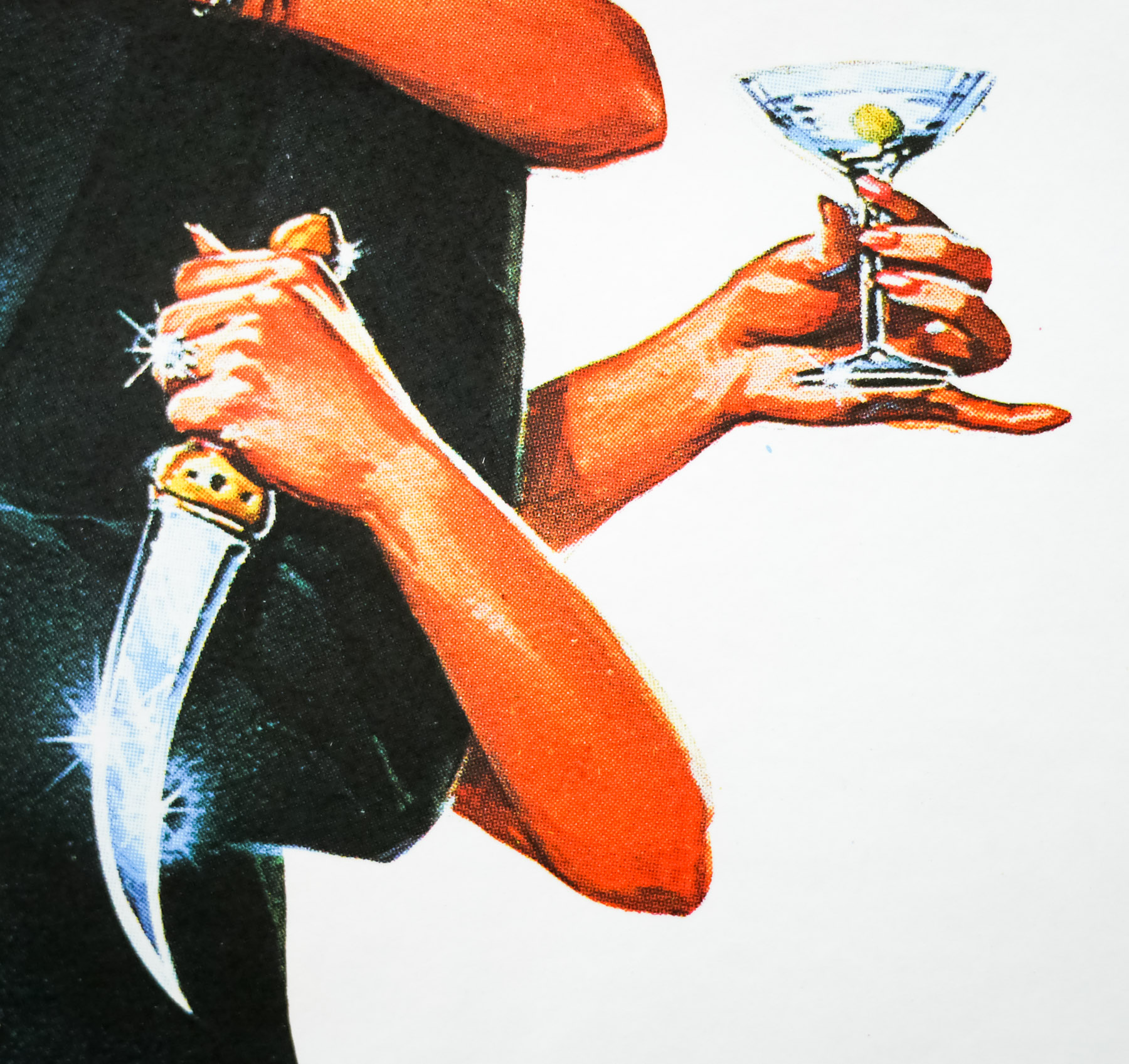
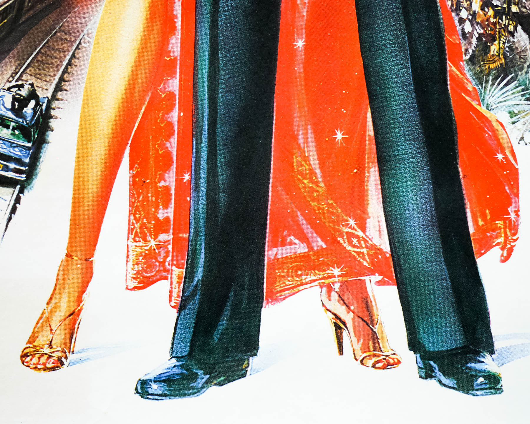
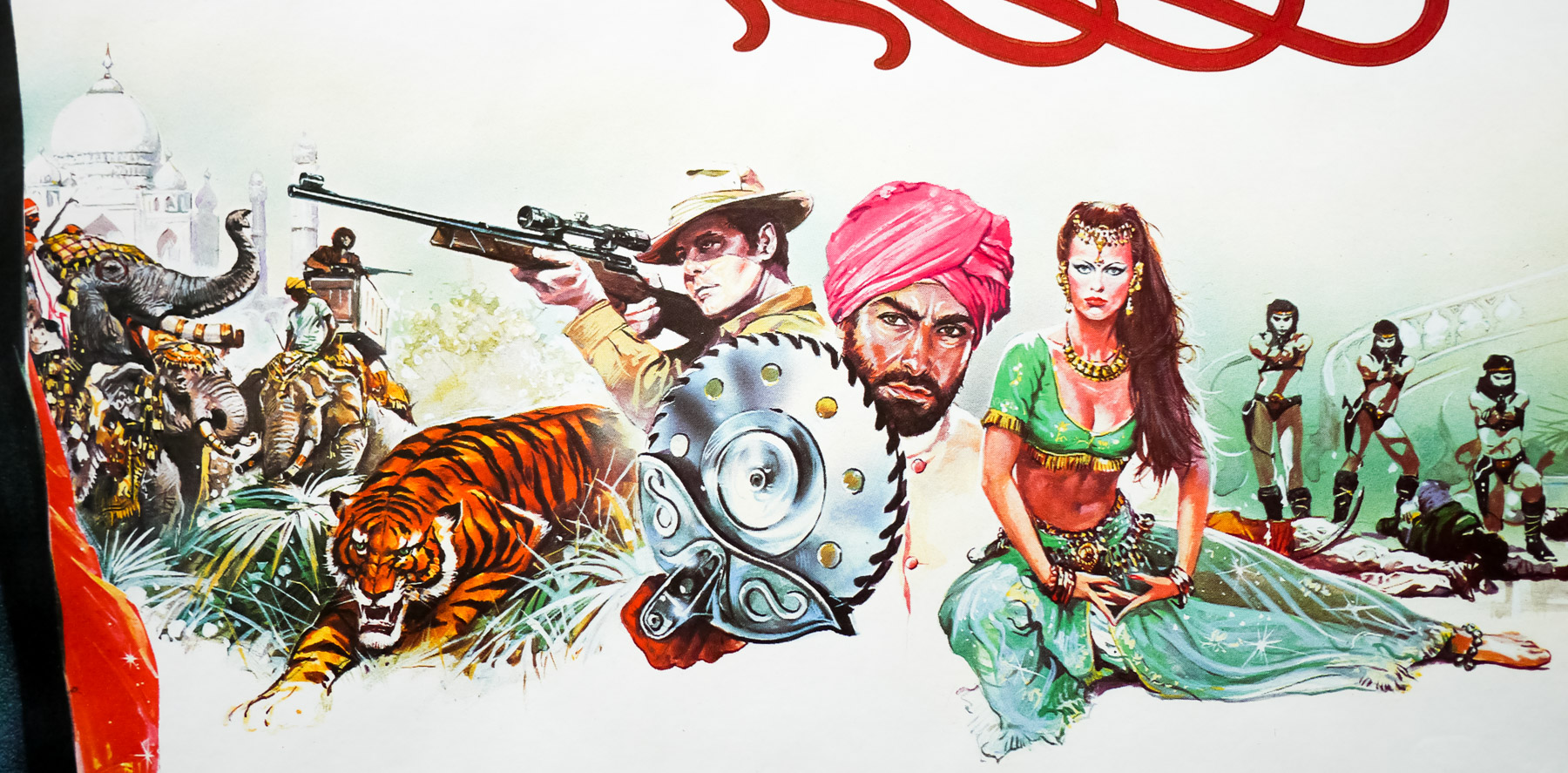
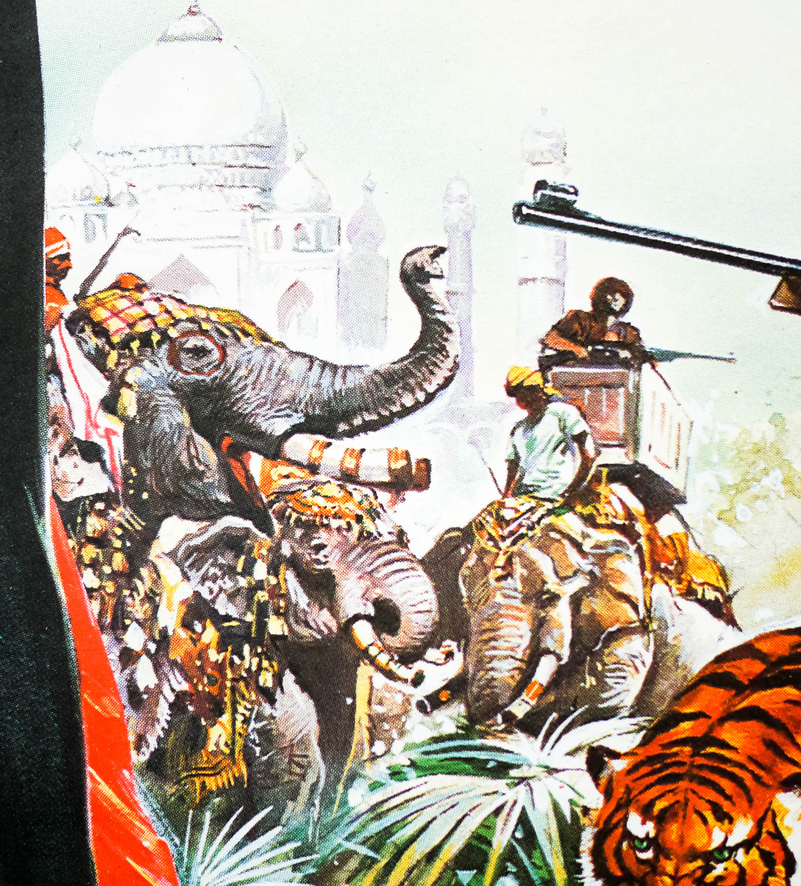
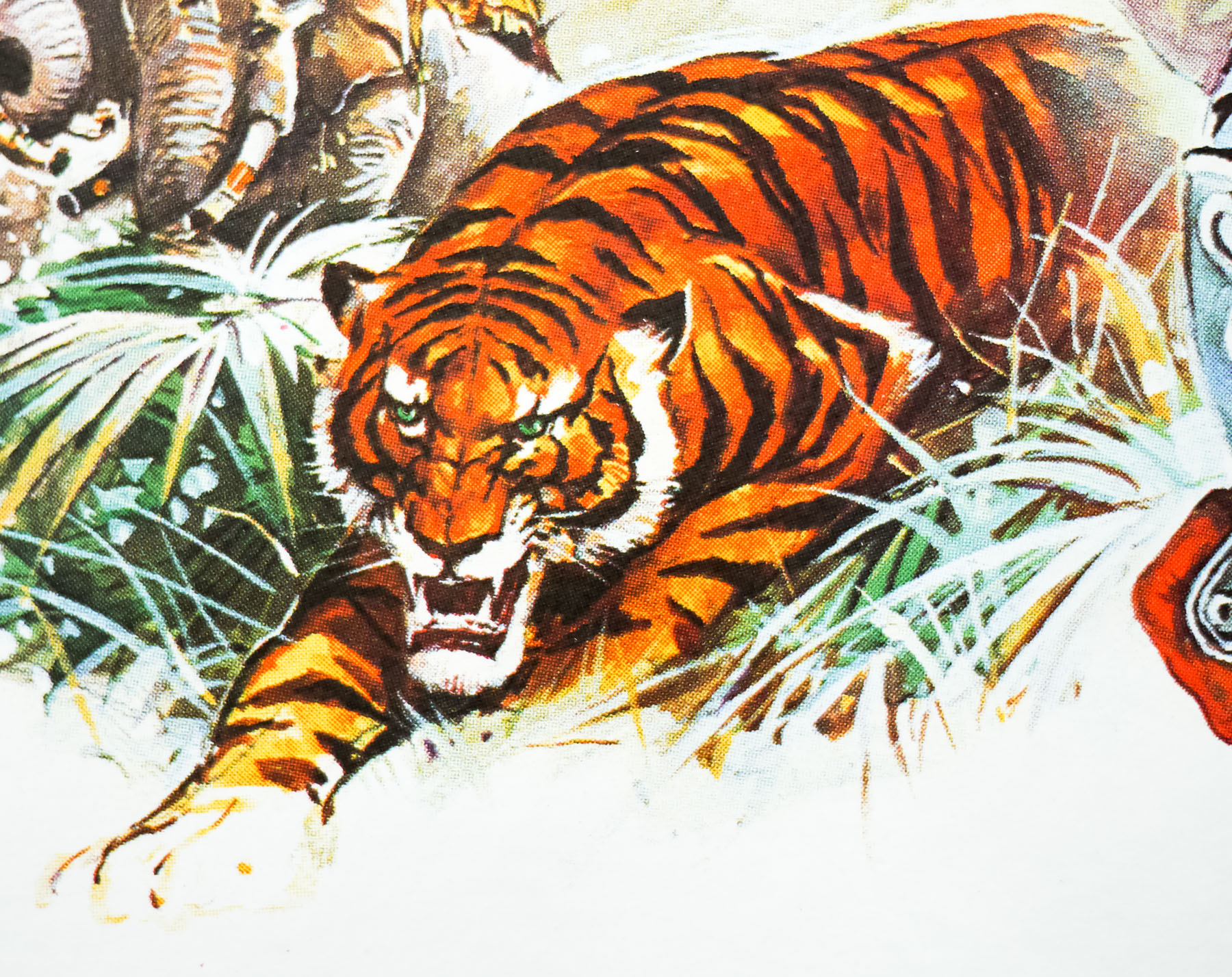
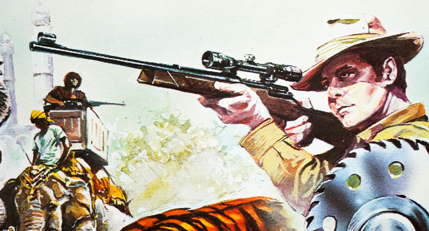
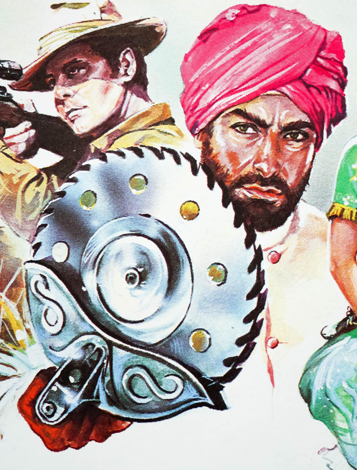
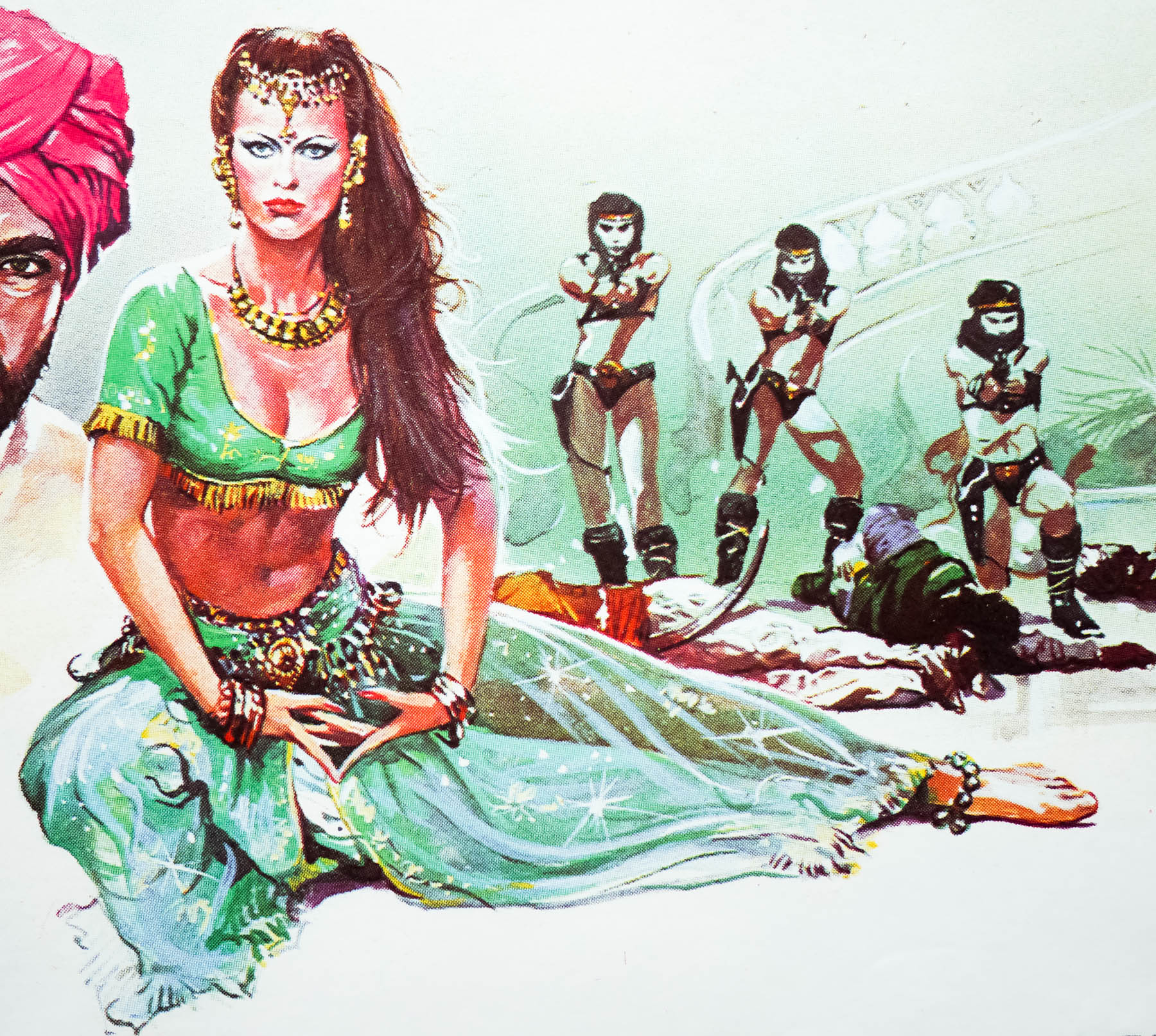
This is the UK quad for Roger Moore‘s sixth outing as the legendary spy, 1983’s Octopussy. Considered by many to be one of the weaker entries in the long-running series, the film nevertheless continued the more ‘realistic’ and down to earth approach that was taken for the previous entry, For Your Eyes Only (1981), following the over-the-top lunacy of Moonraker (1979). The story sees Bond sent to investigate the death of his fellow agent ‘009’ who perishes in front of the British embassy in East Berlin clutching a copy of a priceless Fabergé egg. When the trail leads to an auction house in London where the real egg is to be sold, Bond enters a bidding war with the mysterious Afghan prince Kamal Khan (Louis Jourdan), forcing him to spend several times its listing price.
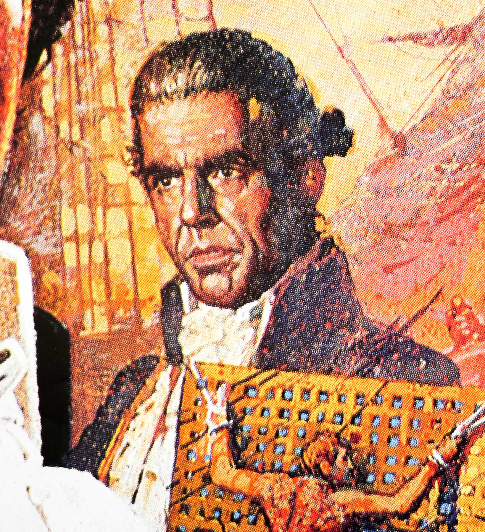
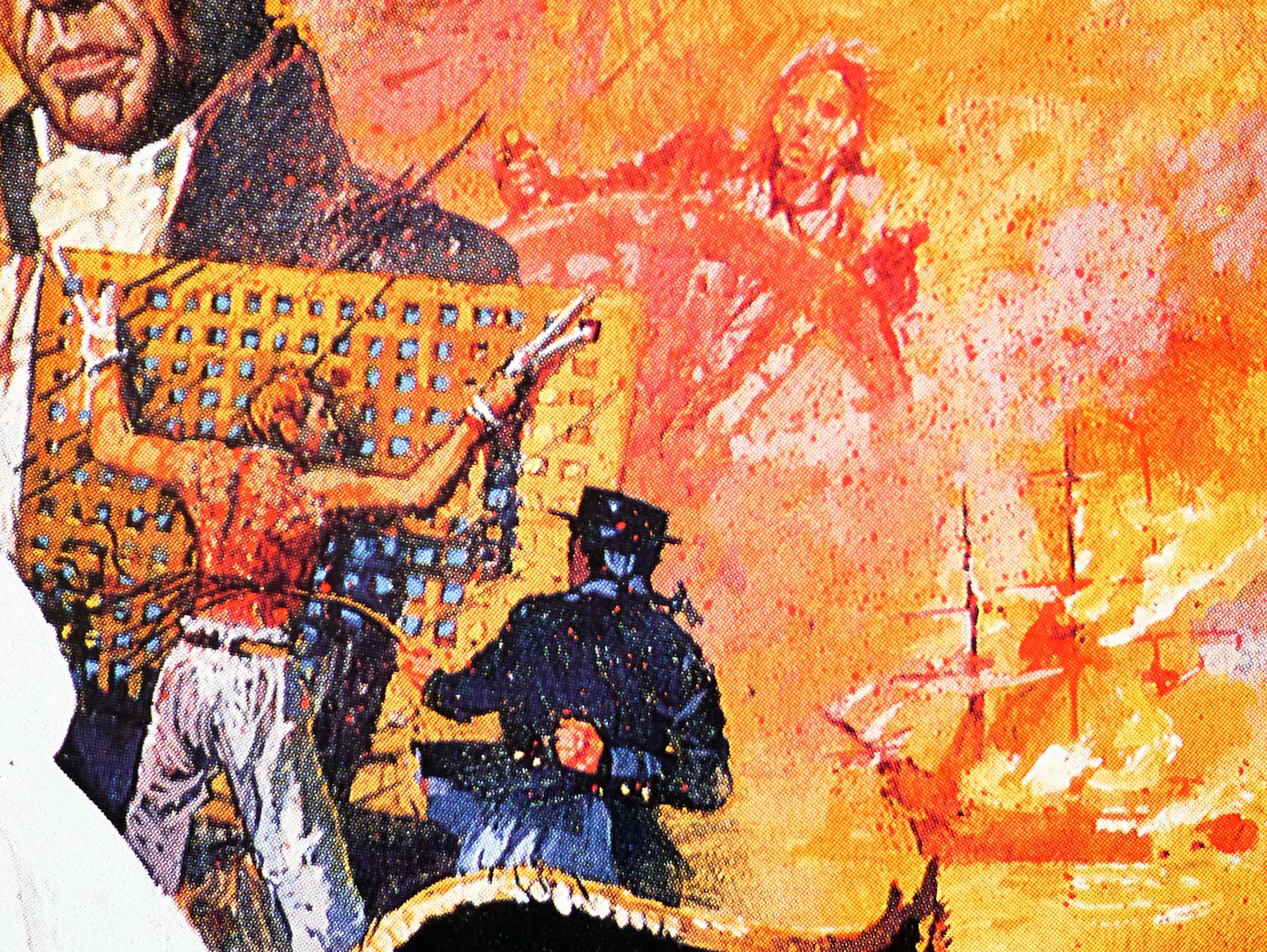
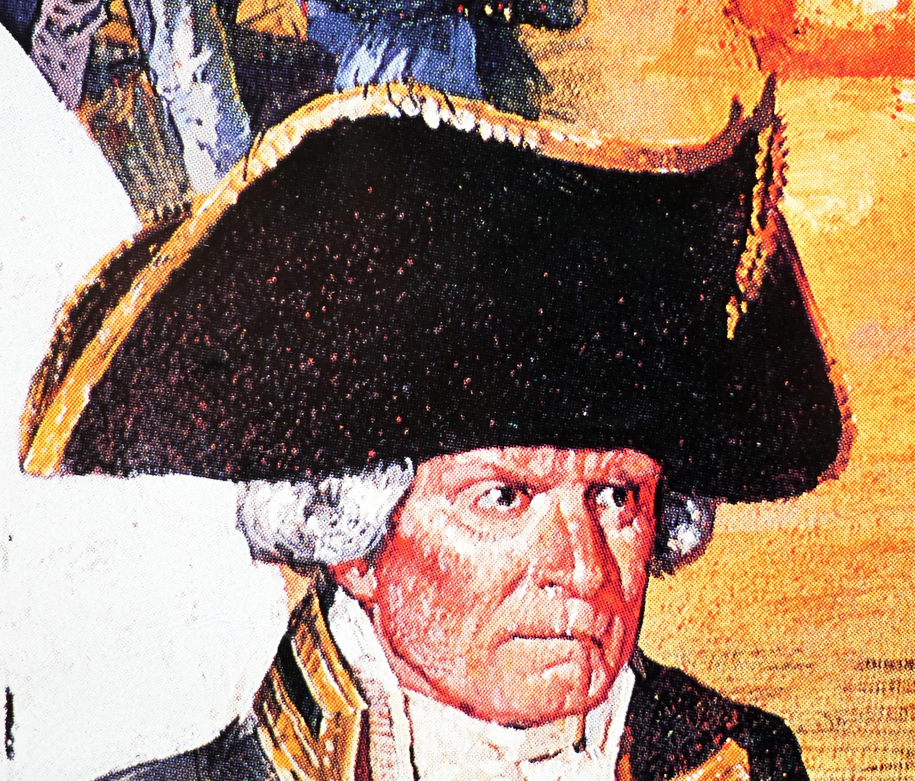
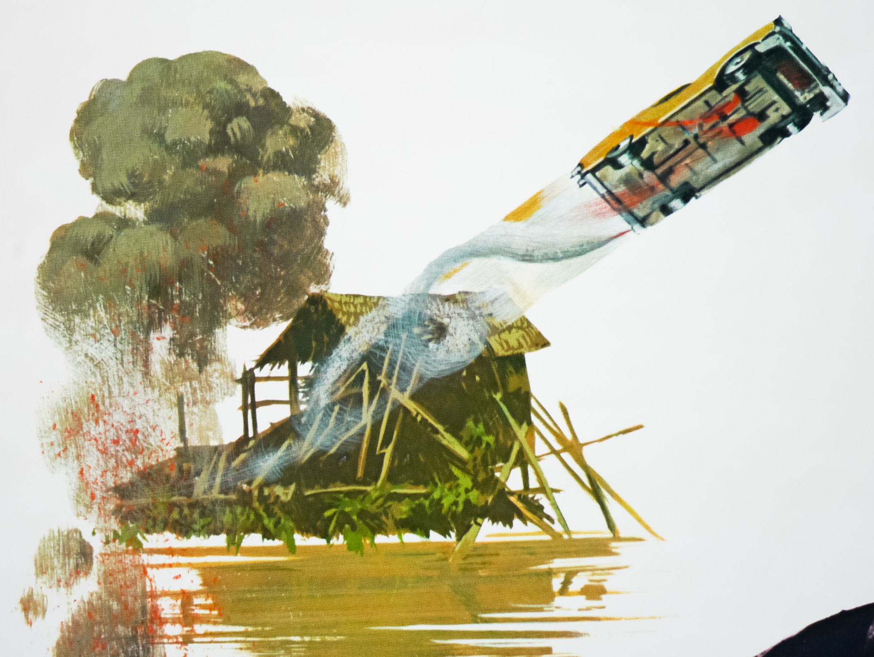
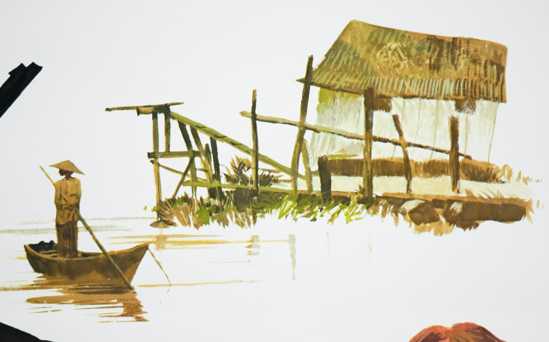
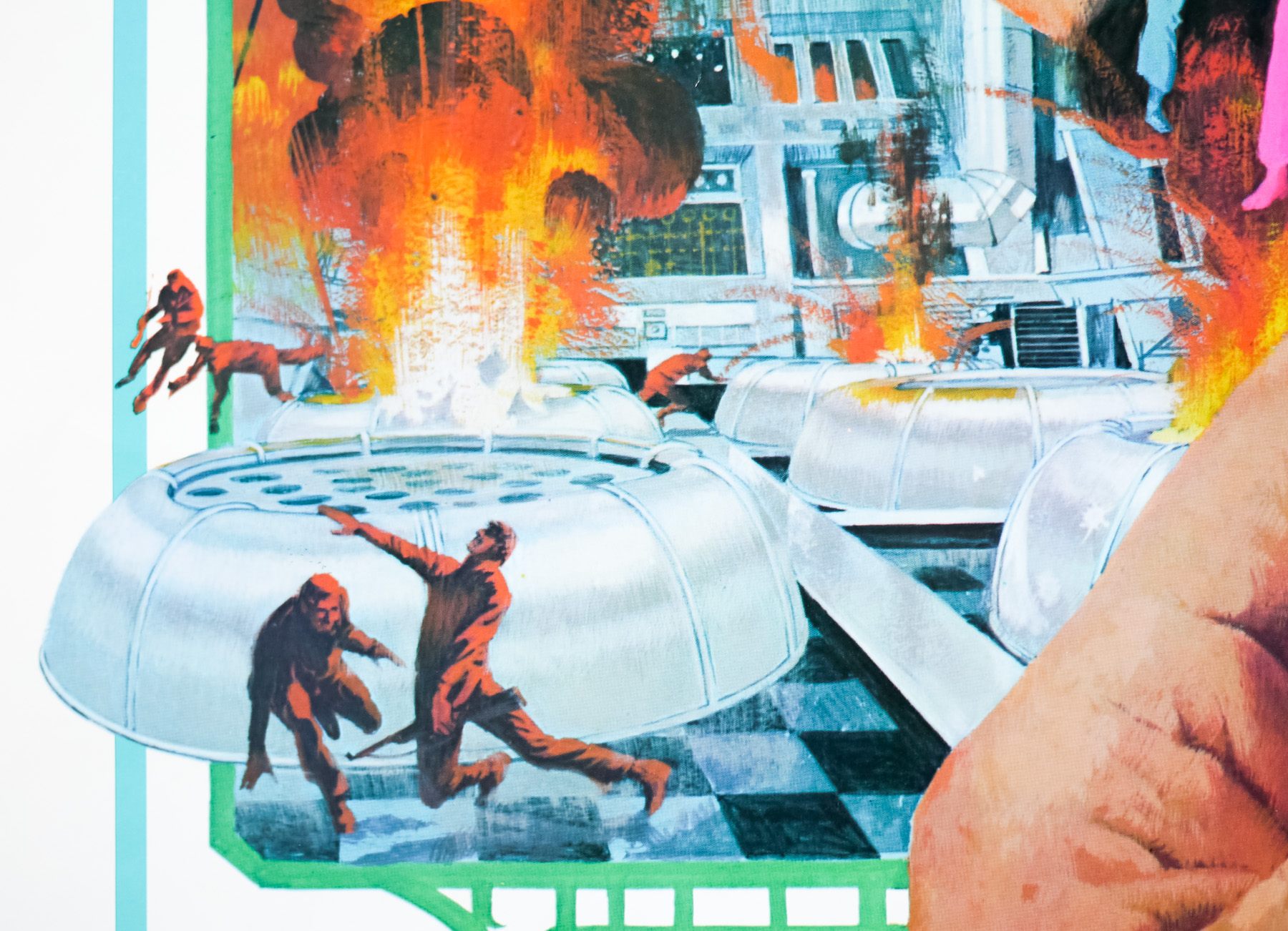
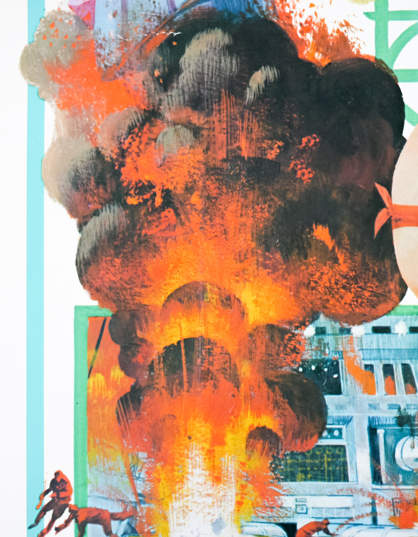
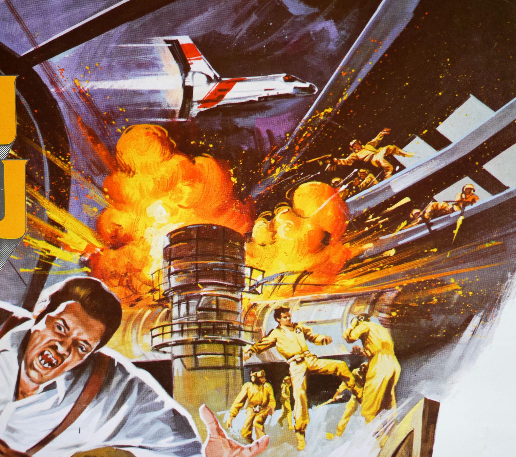
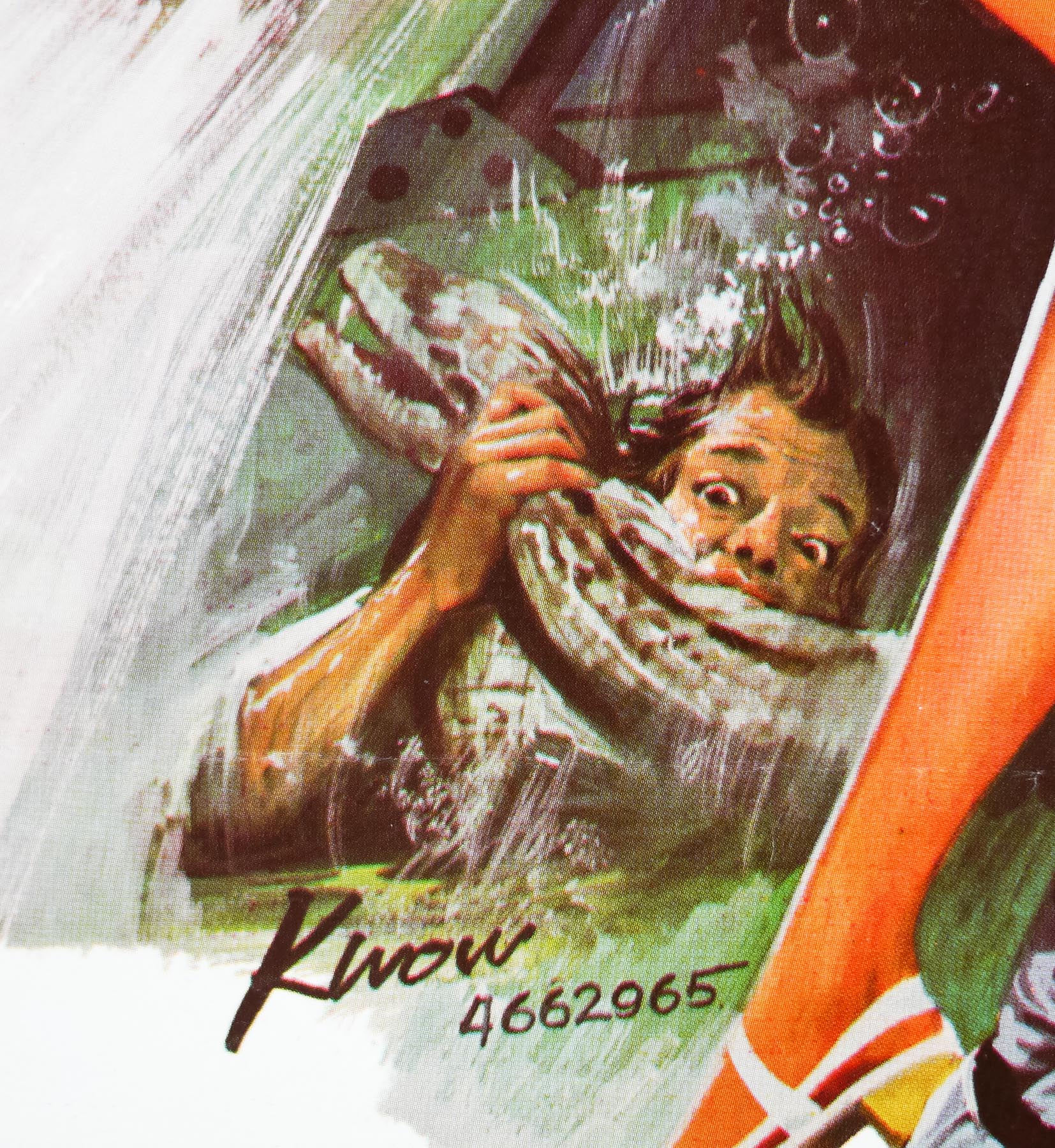
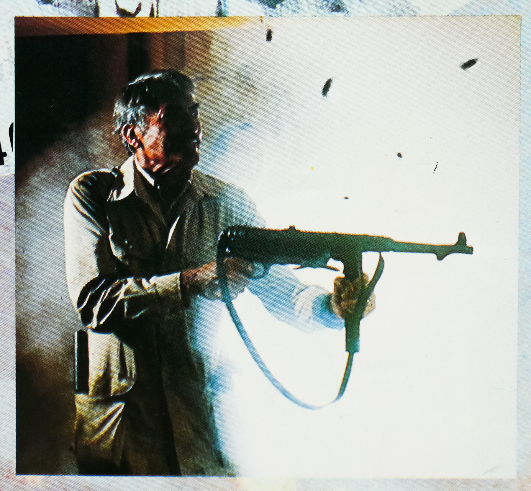
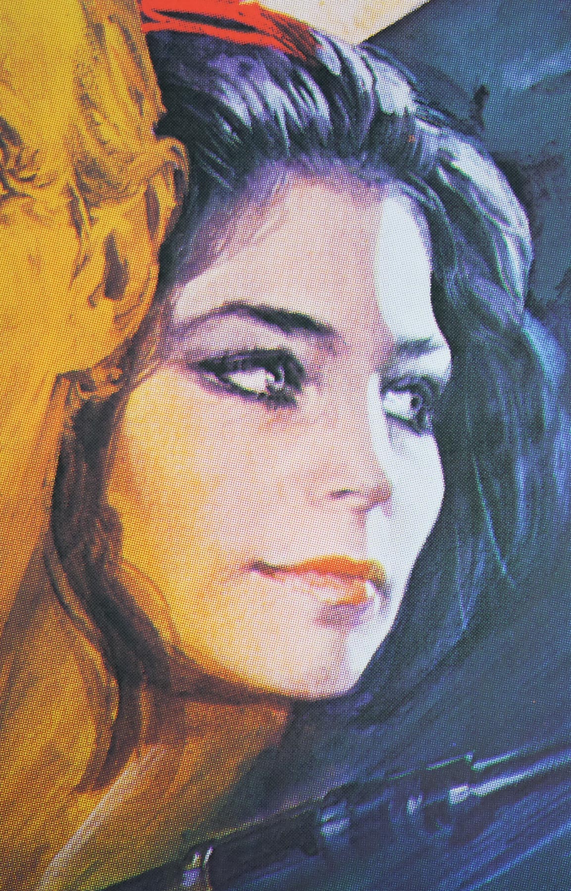
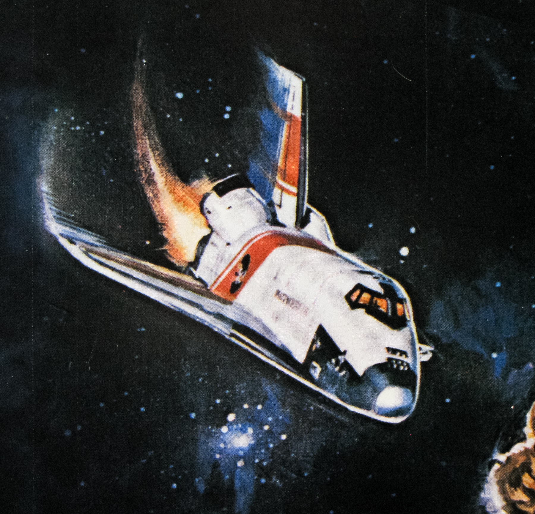
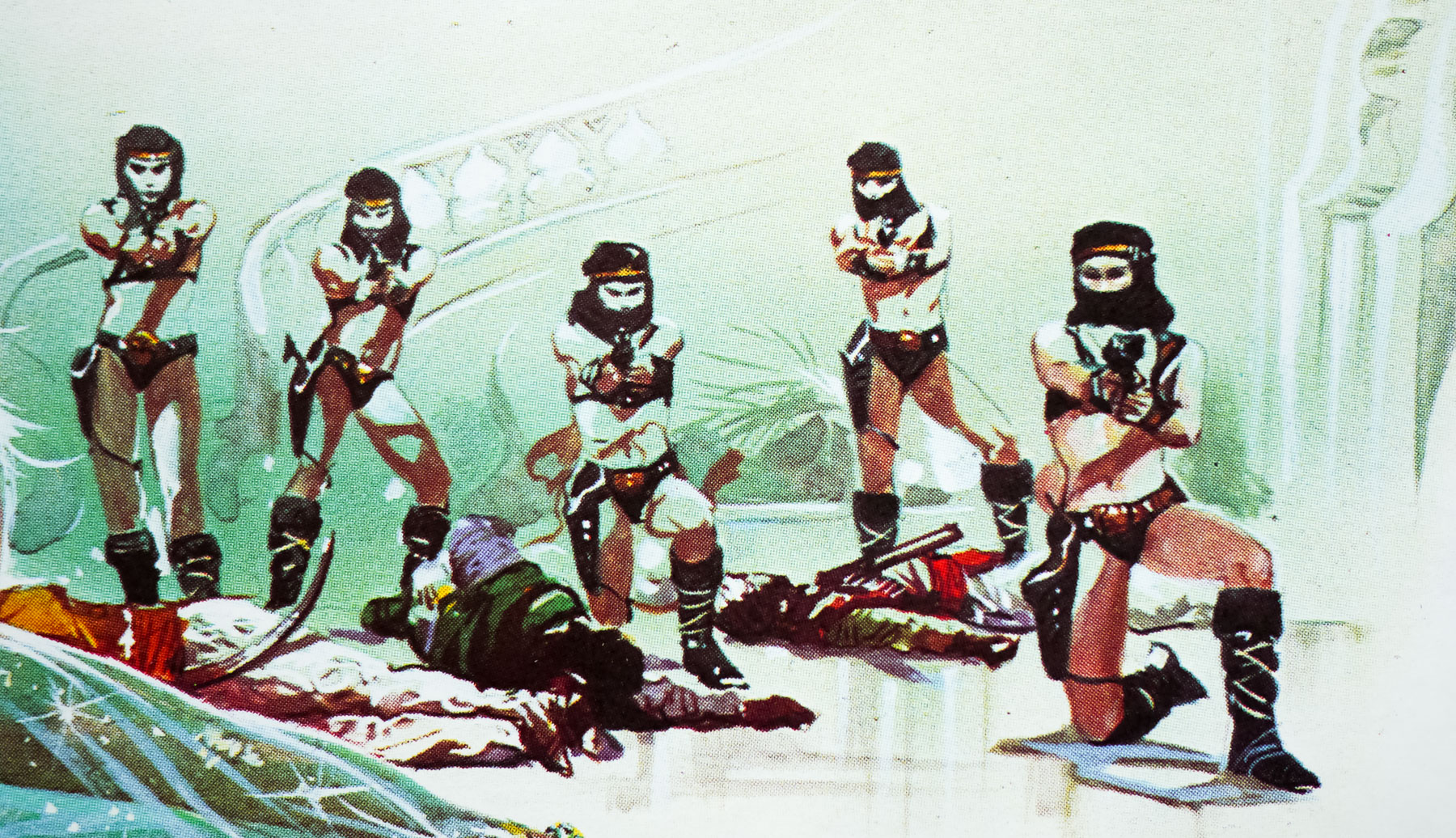
After following Khan back to his palace in Rajasthan, India, the spy eventually ends up in the clutches of Khan’s bodyguard Gobinda (an imposing Kabir Bedi) and, after escaping, discovers that the prince is working with a power-hungry Soviet general named Orlov (Steven Berkoff) who plans to detonate a nuclear bomb in a US Air Force base in Germany in order to destabilise Europe and expand Soviet borders. Bond heads to a palace on an Indian lake on the trail of Octopussy (Maud Adams), the enigmatic leader of an all-female cult and head of a travelling circus troupe that Khan and Orlov plan to use to smuggle the weapon into the base. Bond must convince Octopussy that Khan is only using her for his nefarious plot and sets out to prevent the bomb from detonating before Europe is plunged into chaos.
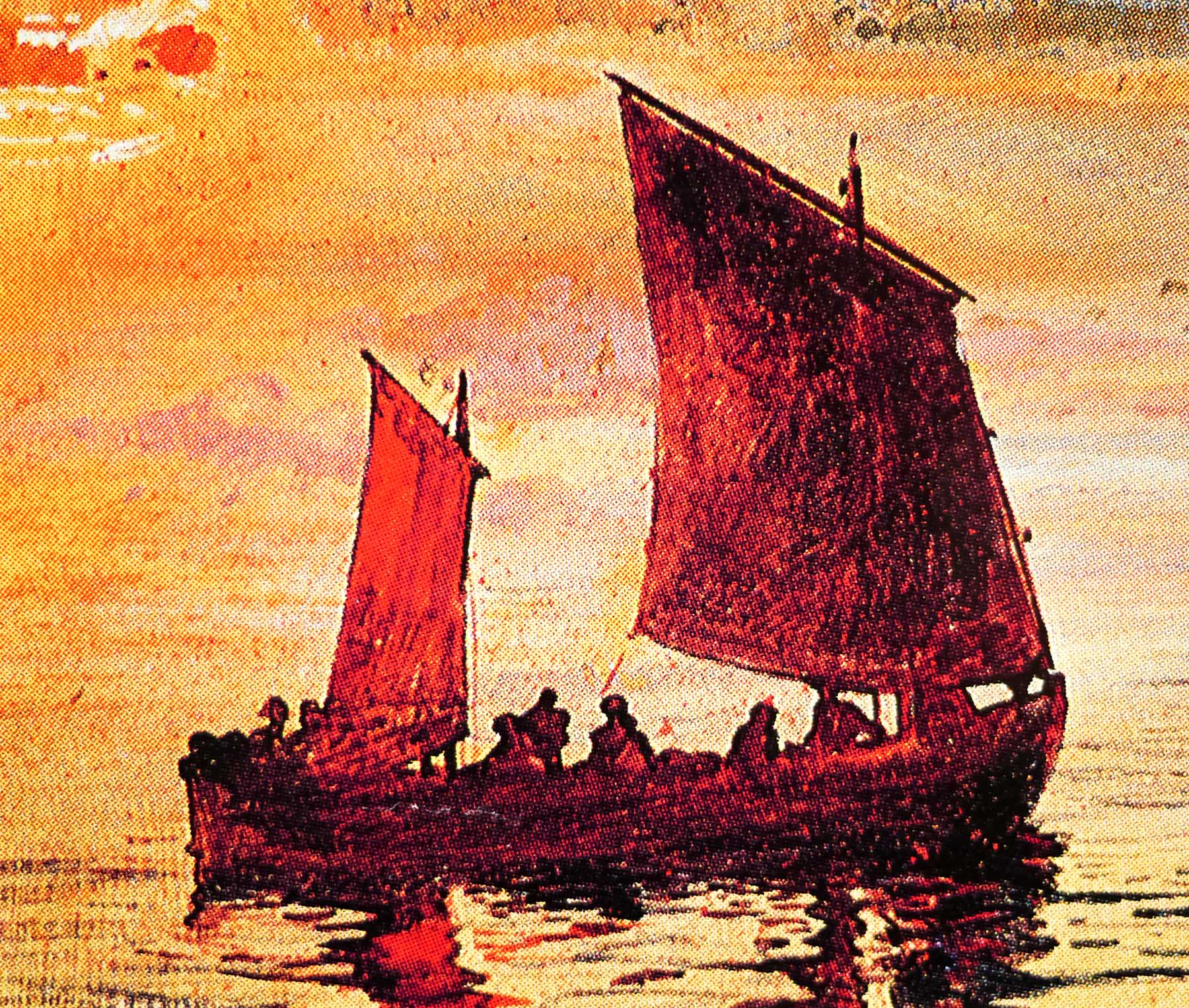
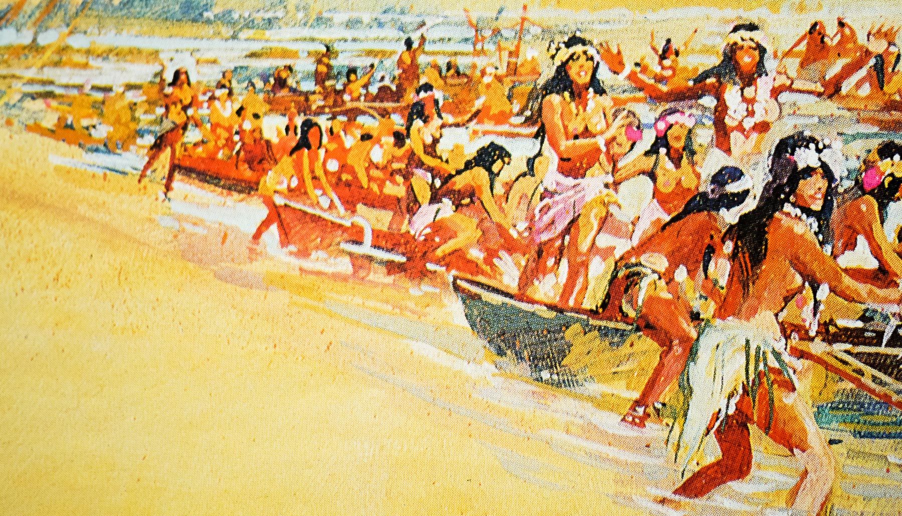
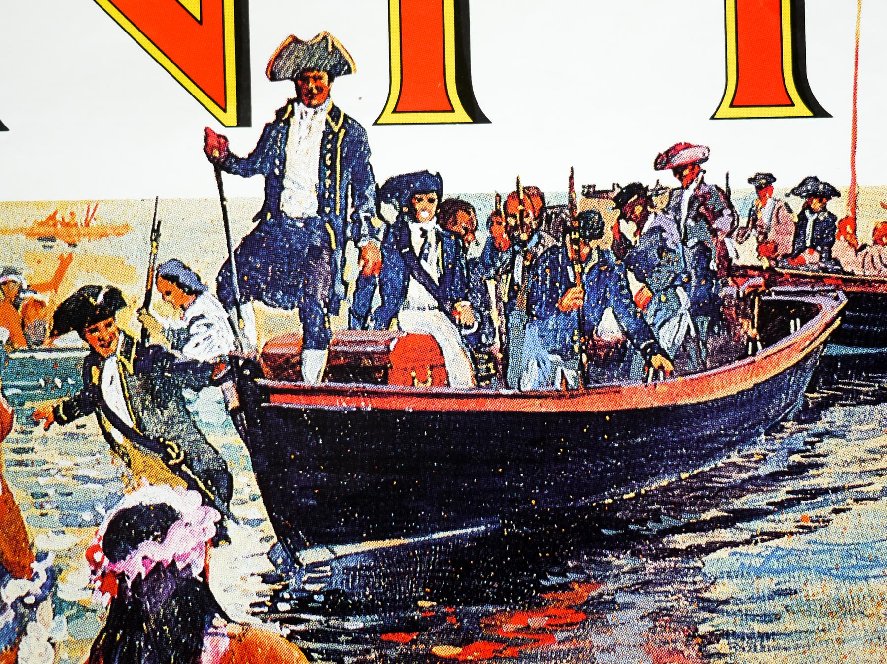
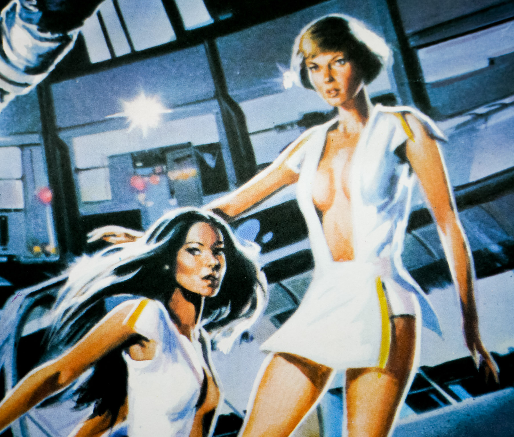
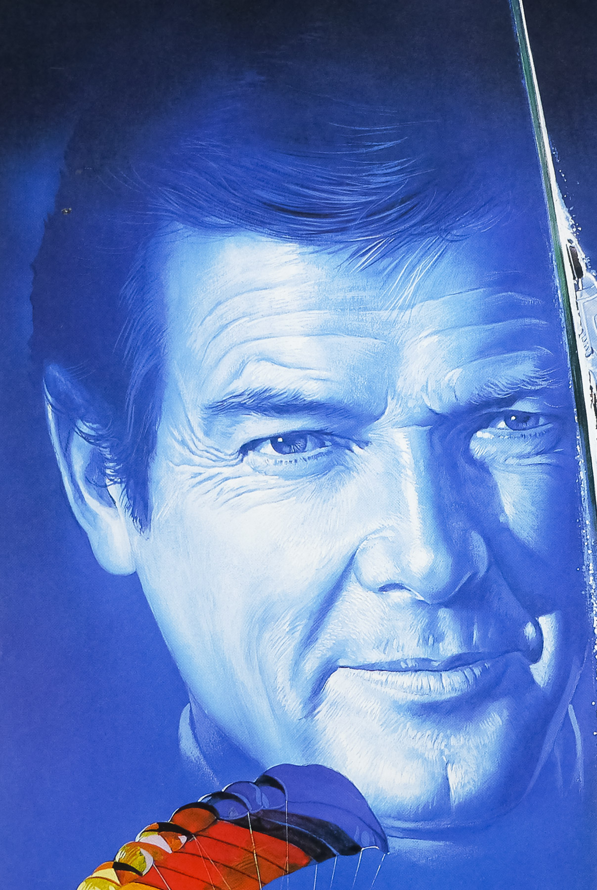
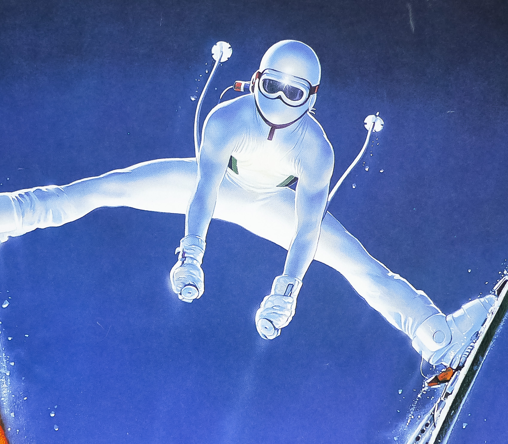
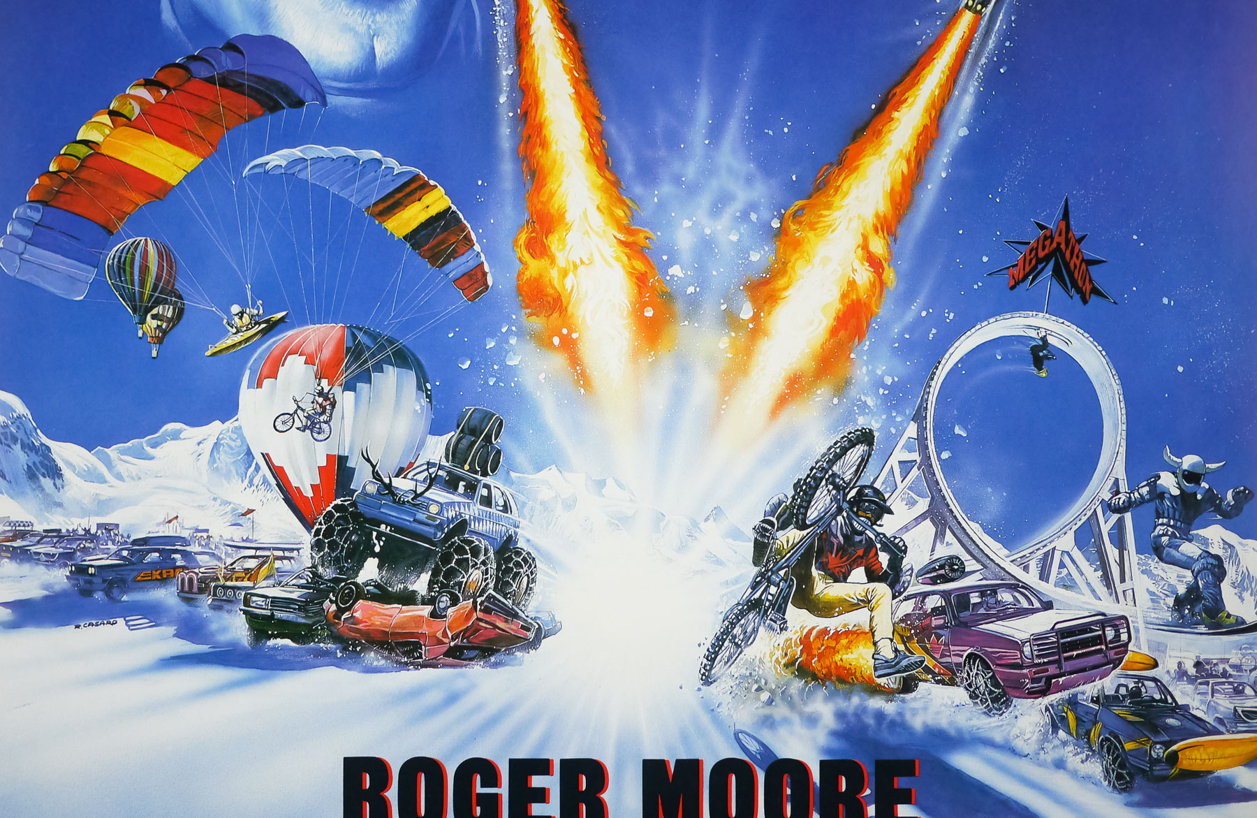
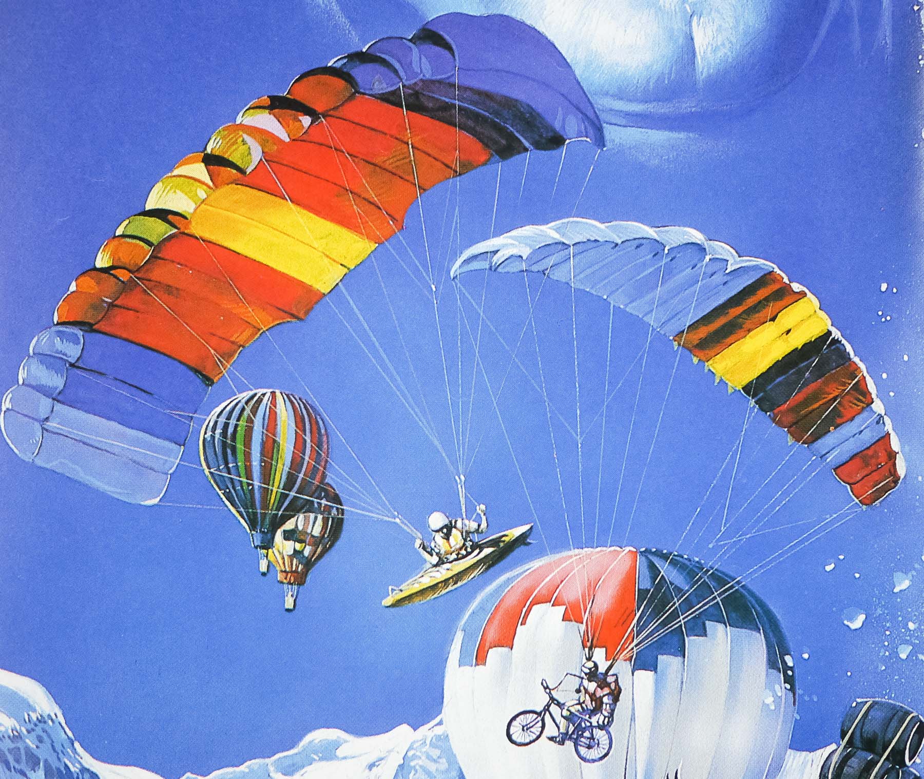
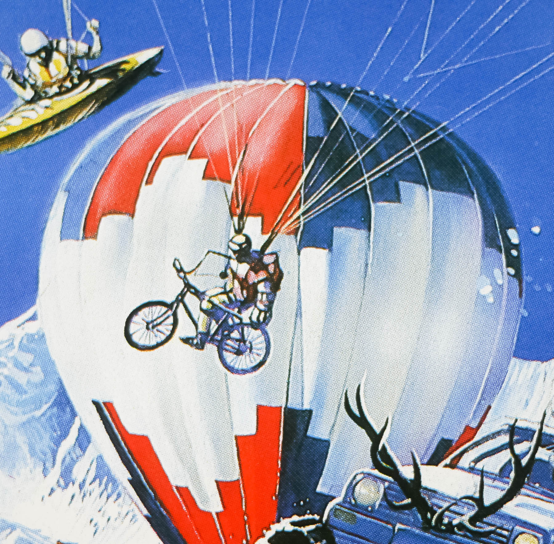
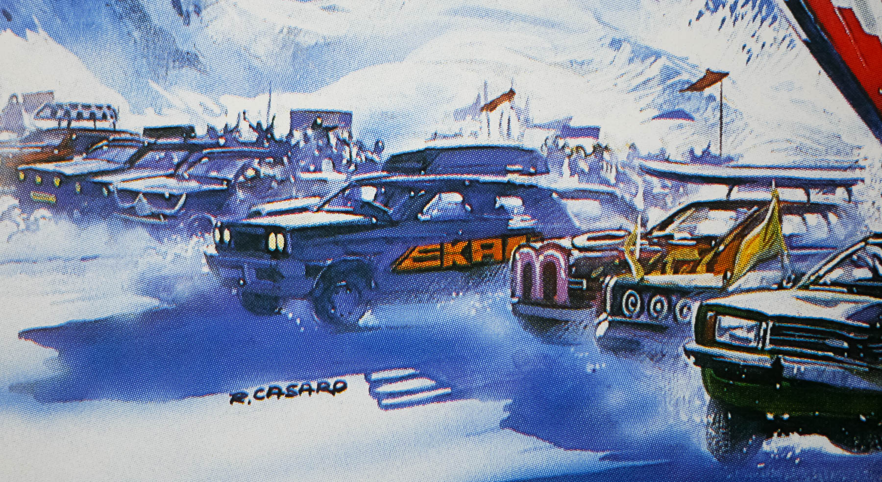
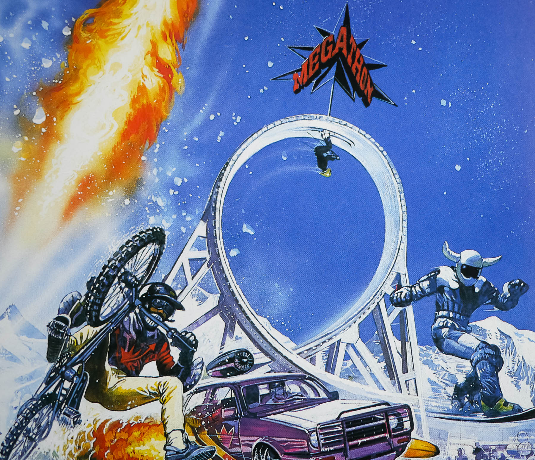
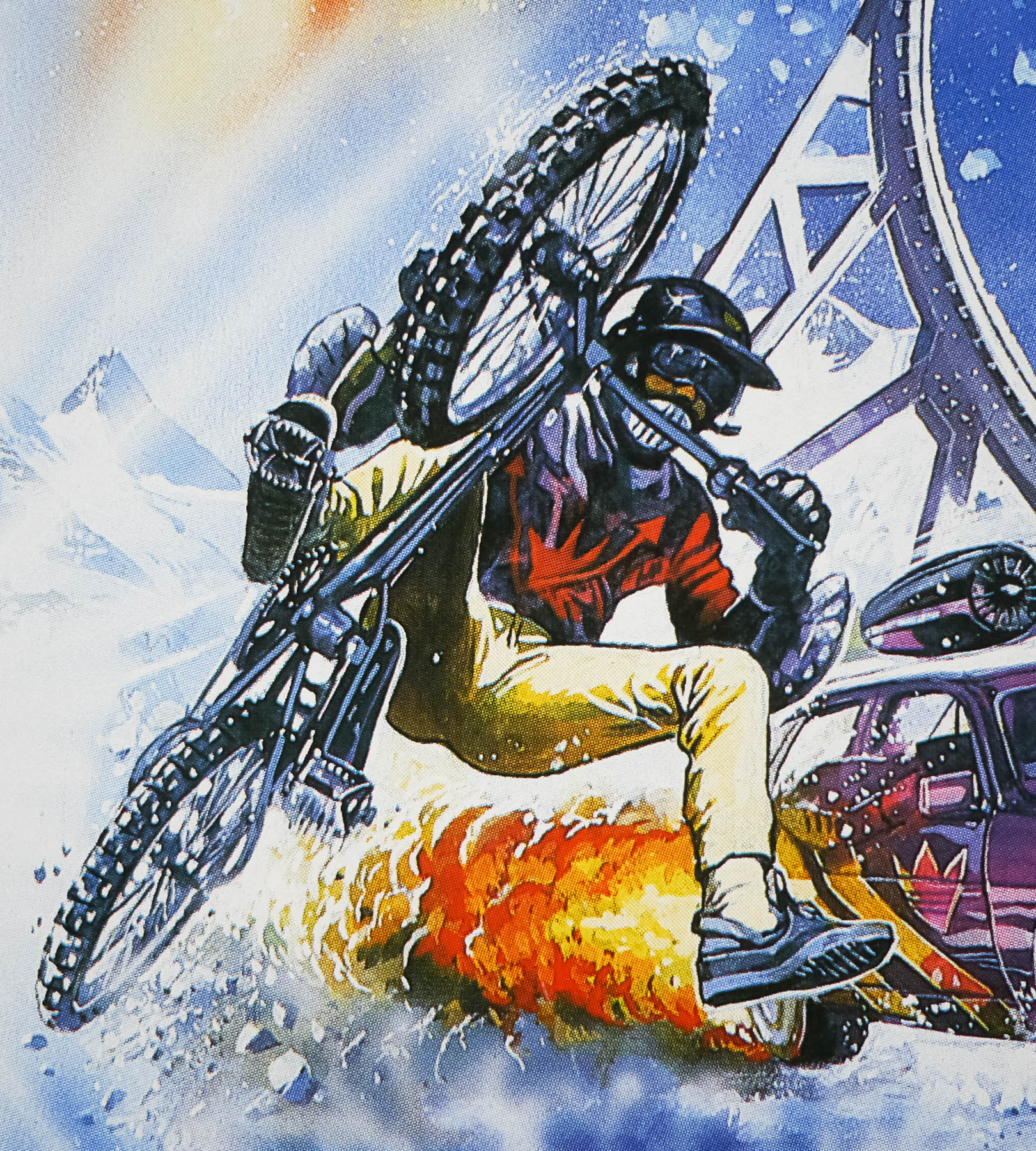
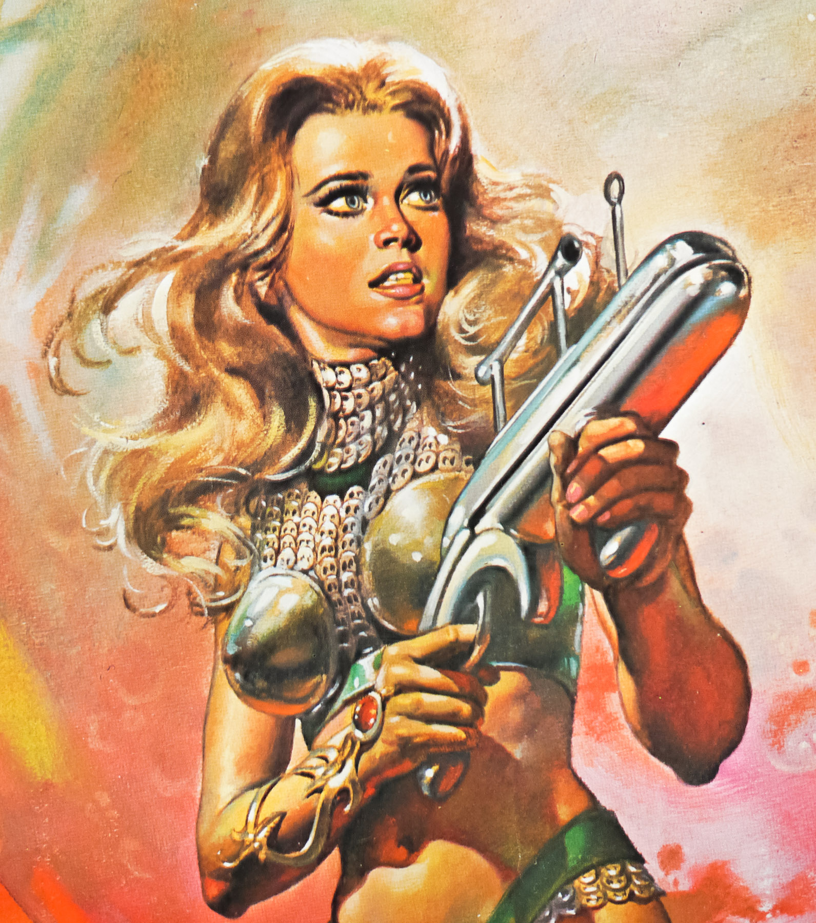
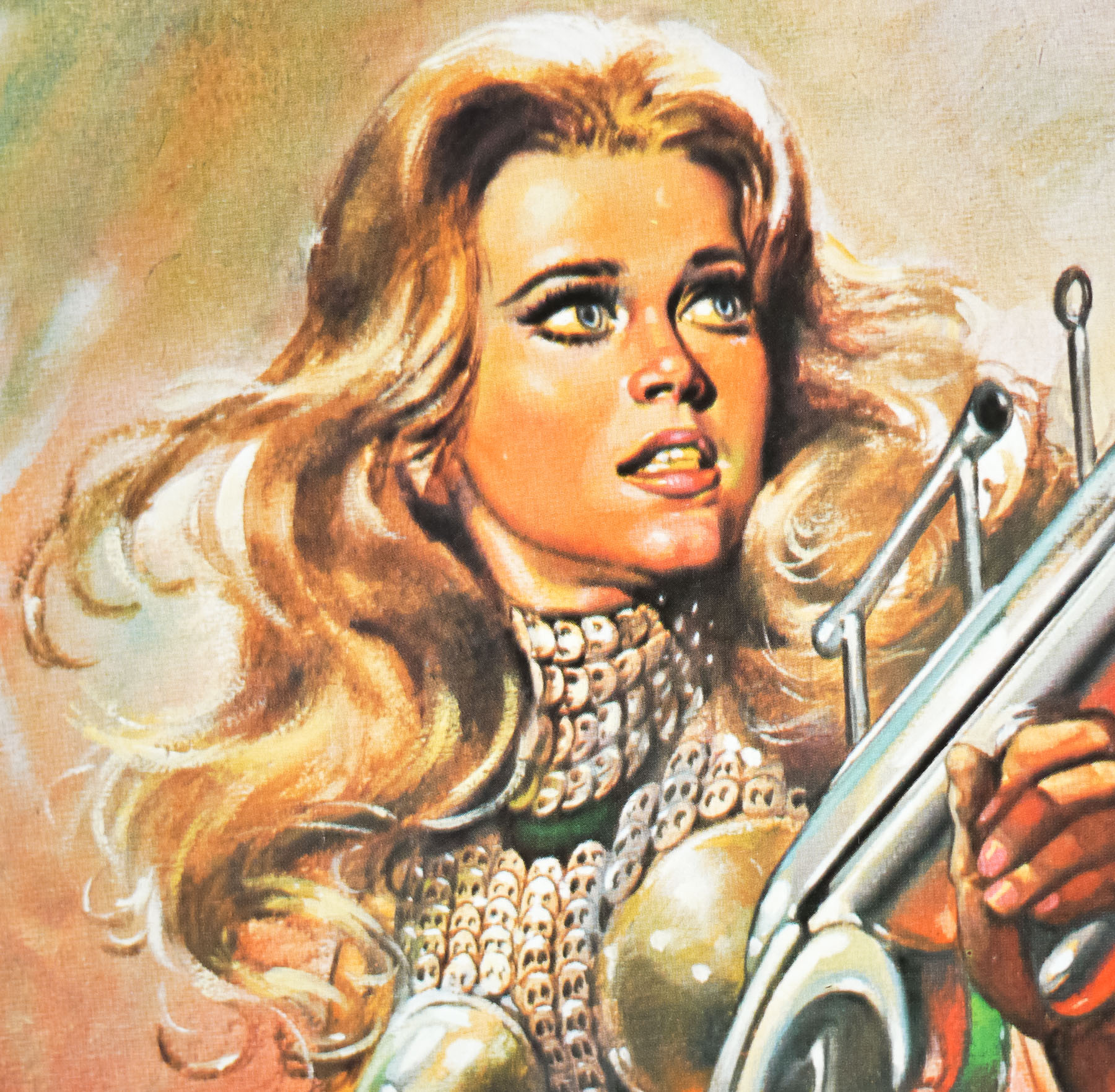
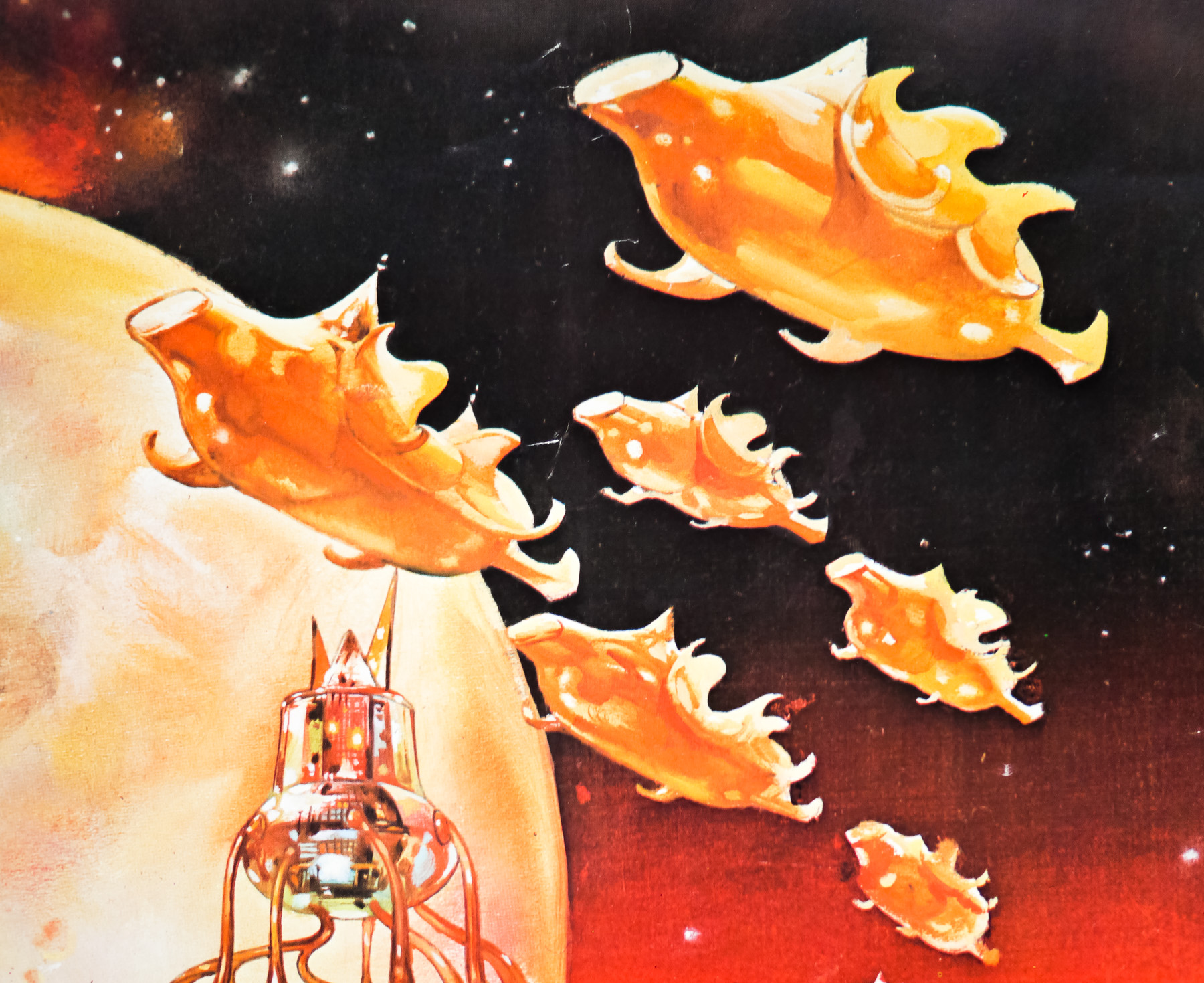
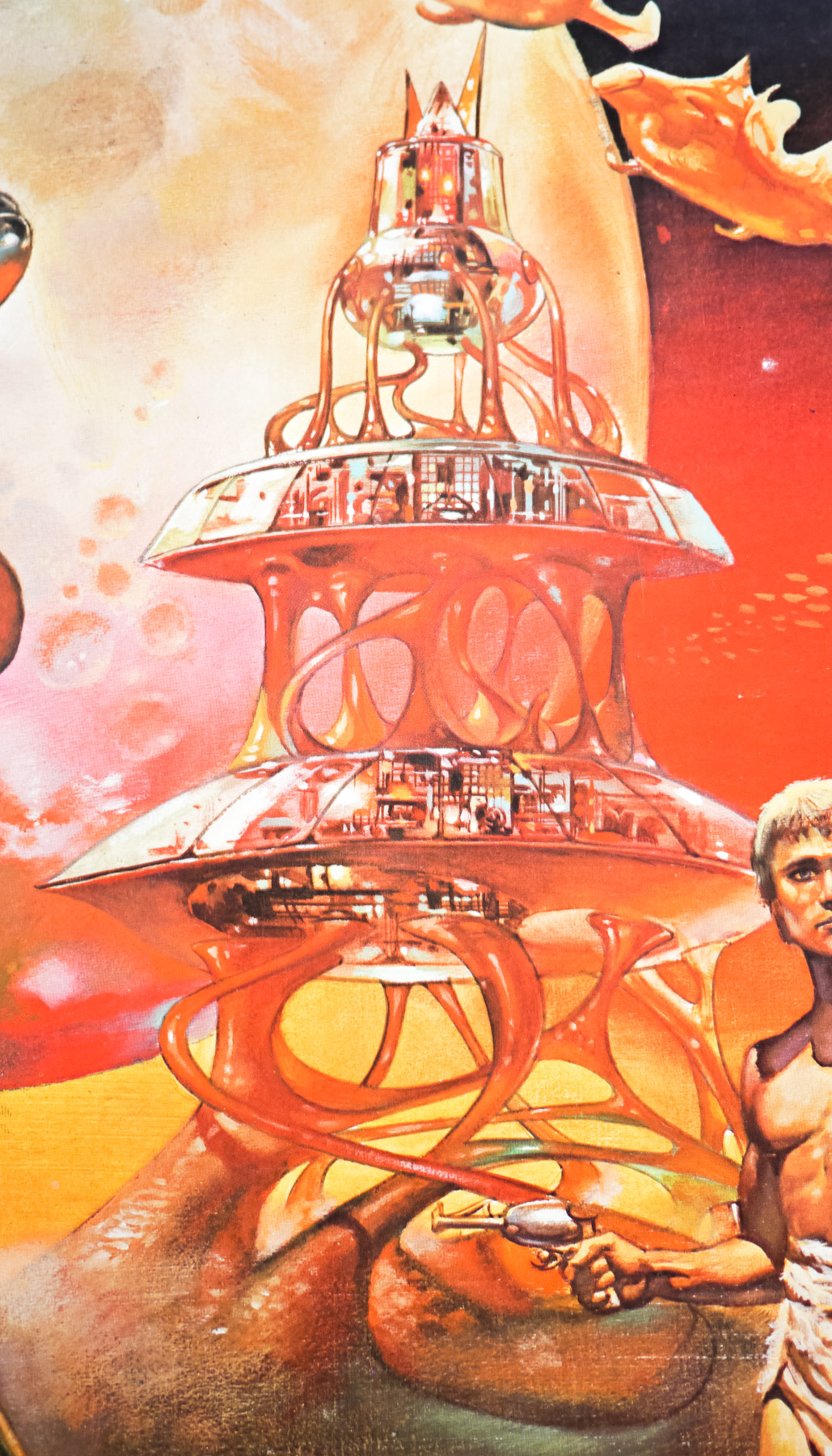
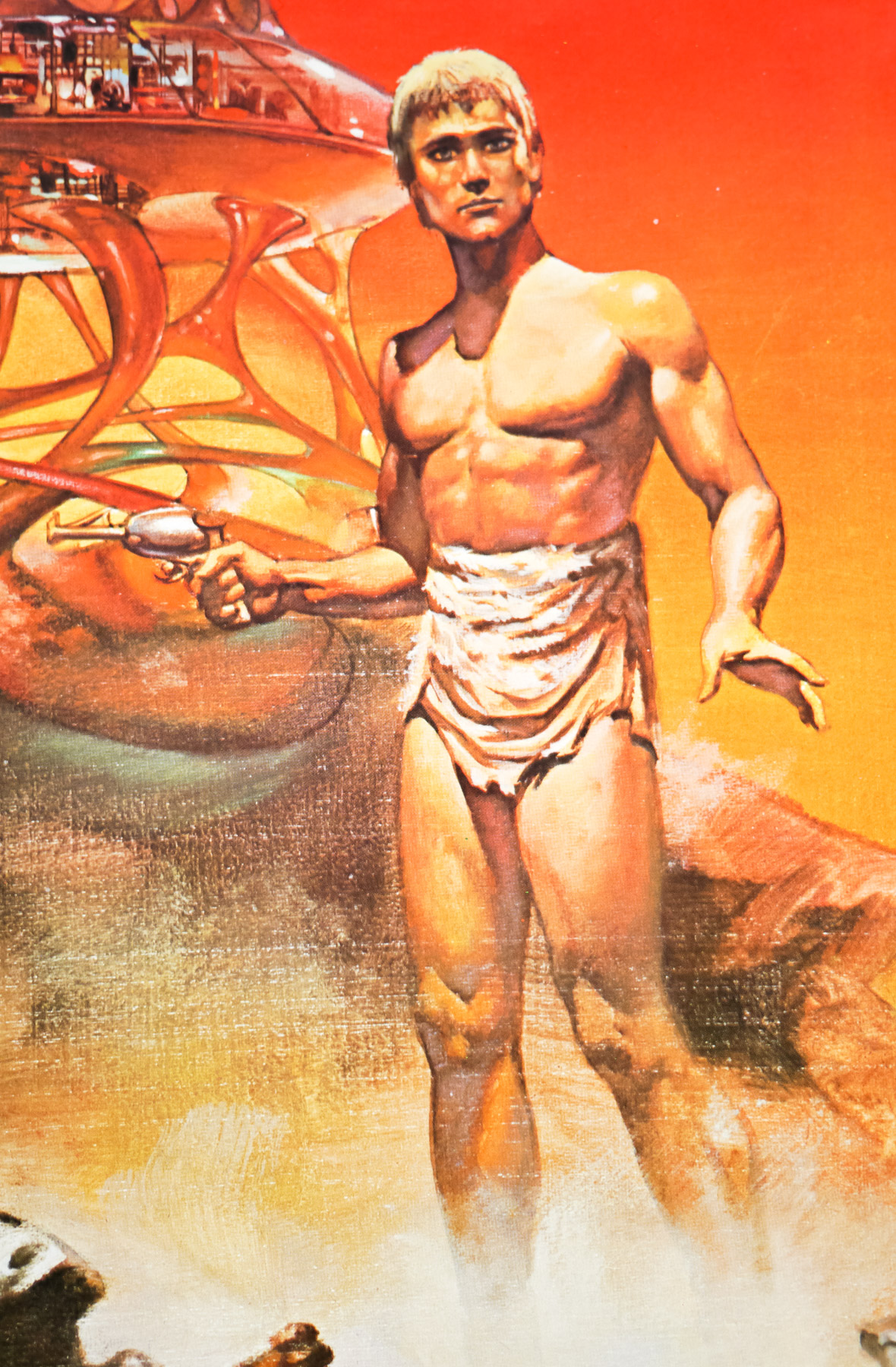
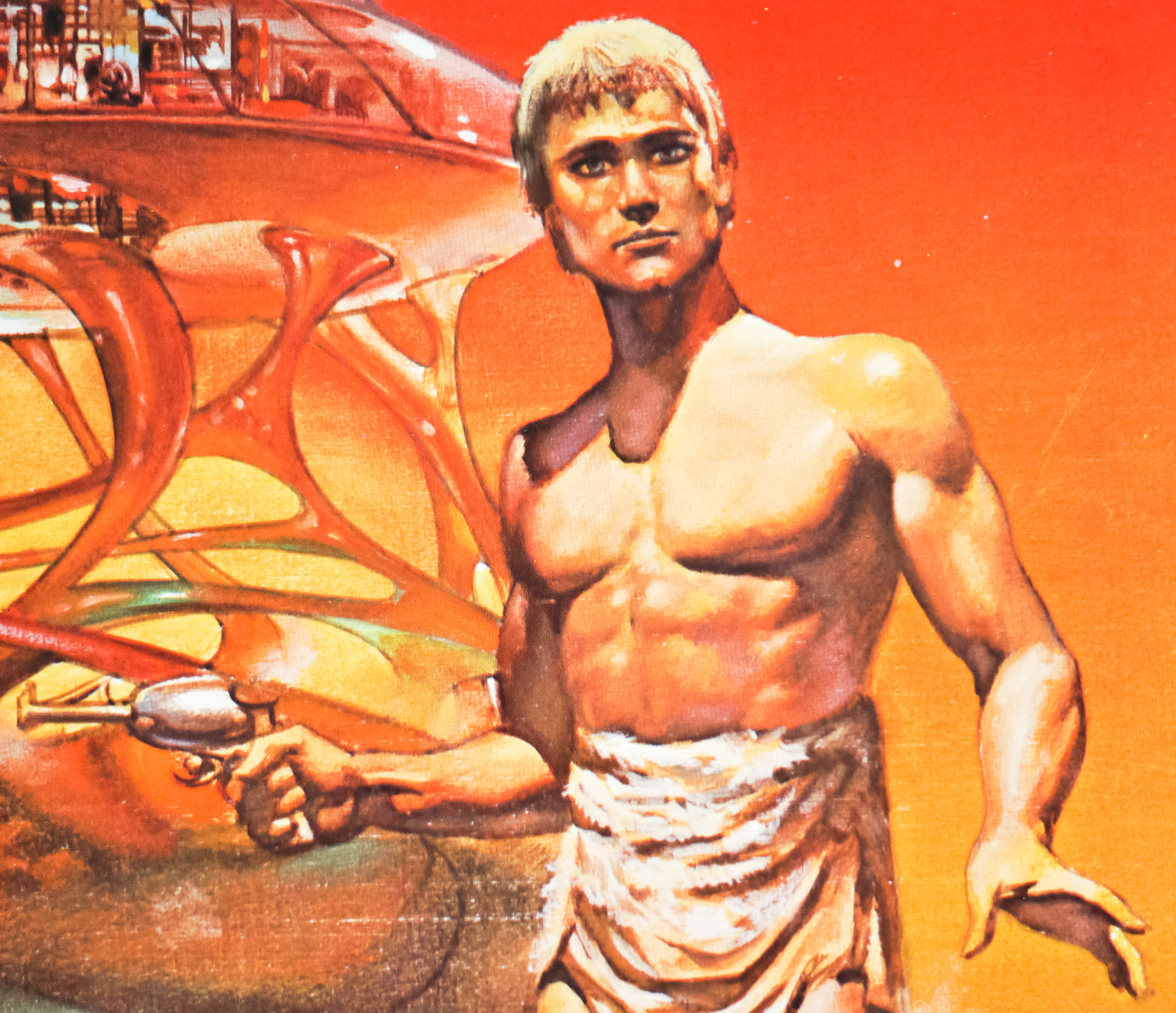
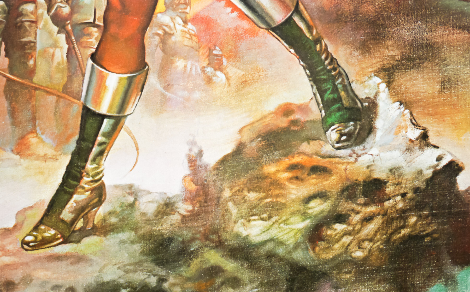
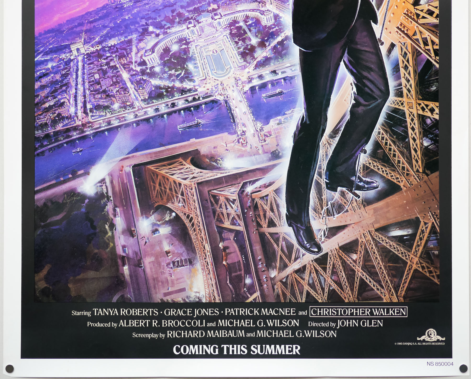
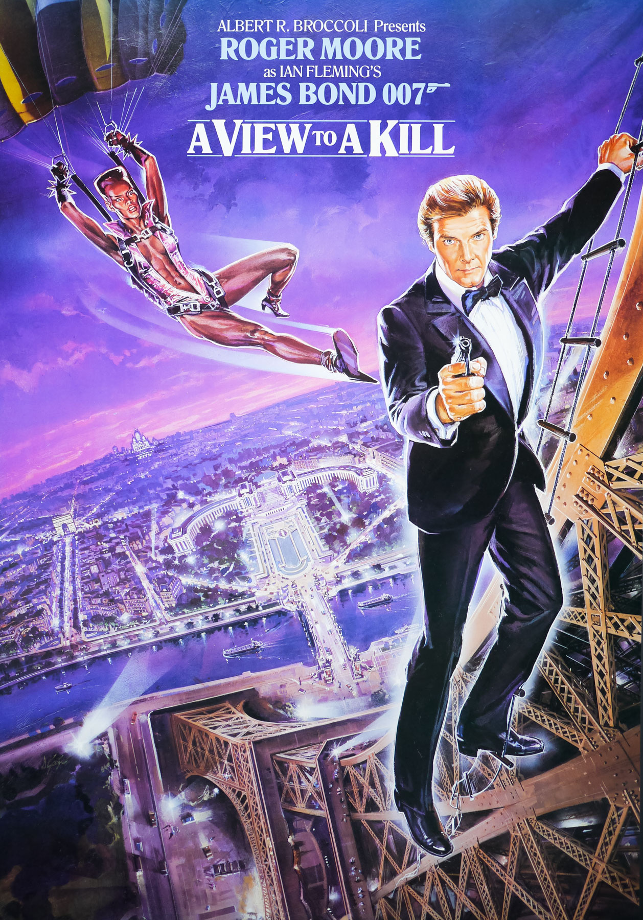
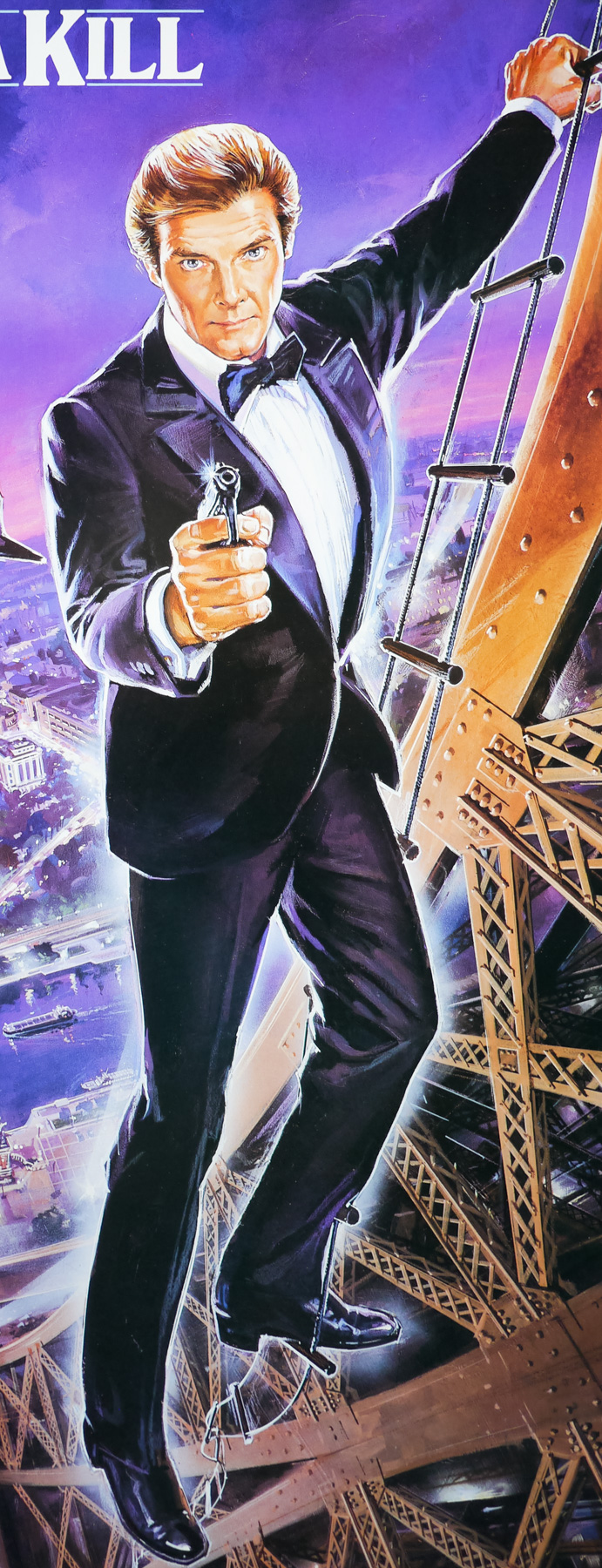
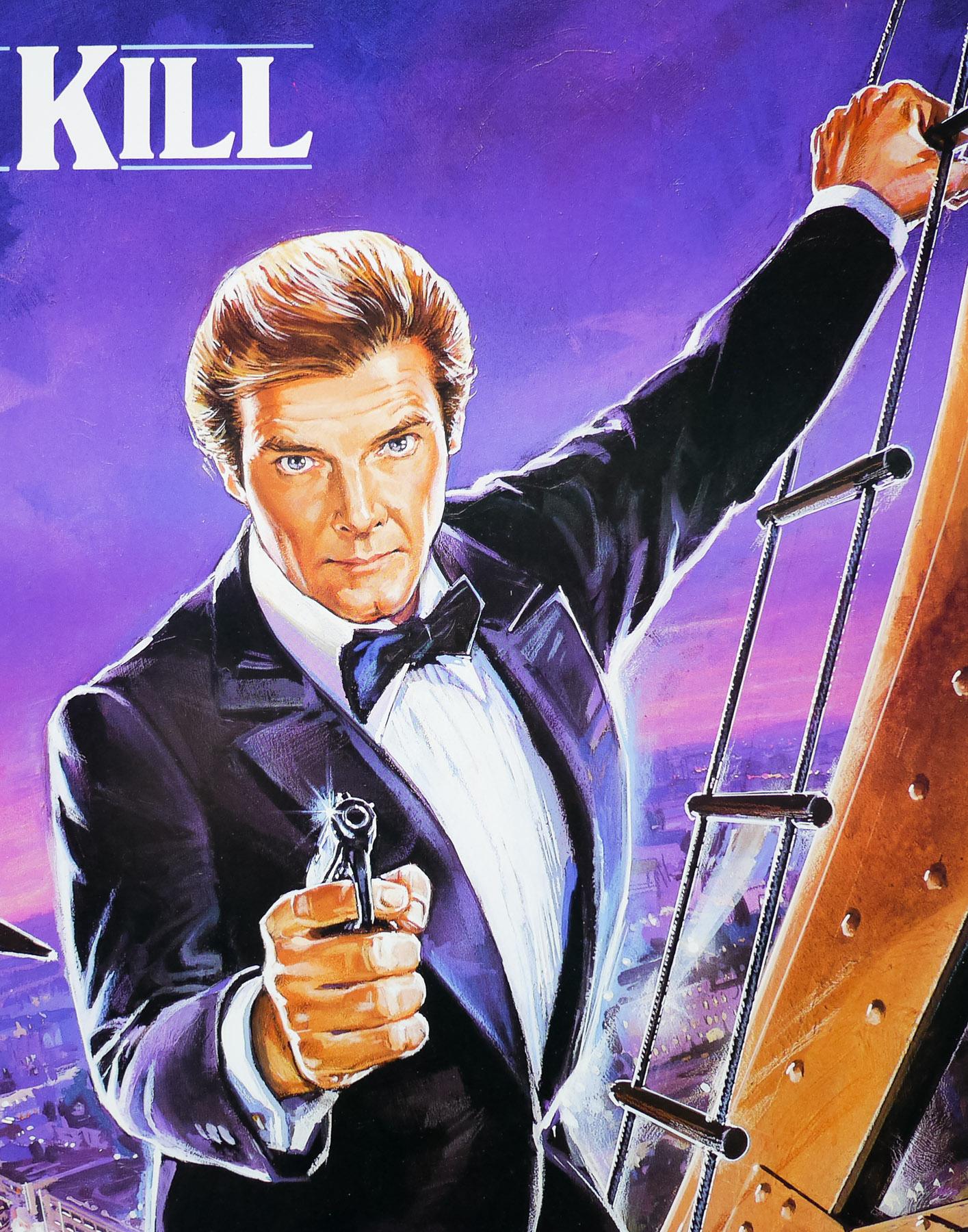
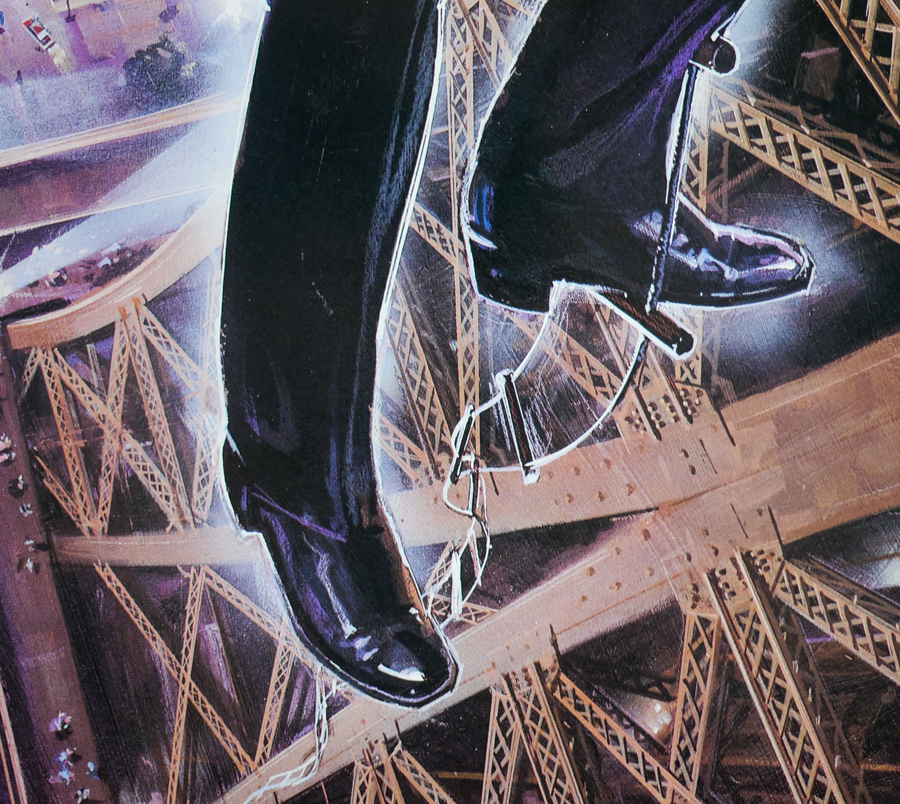
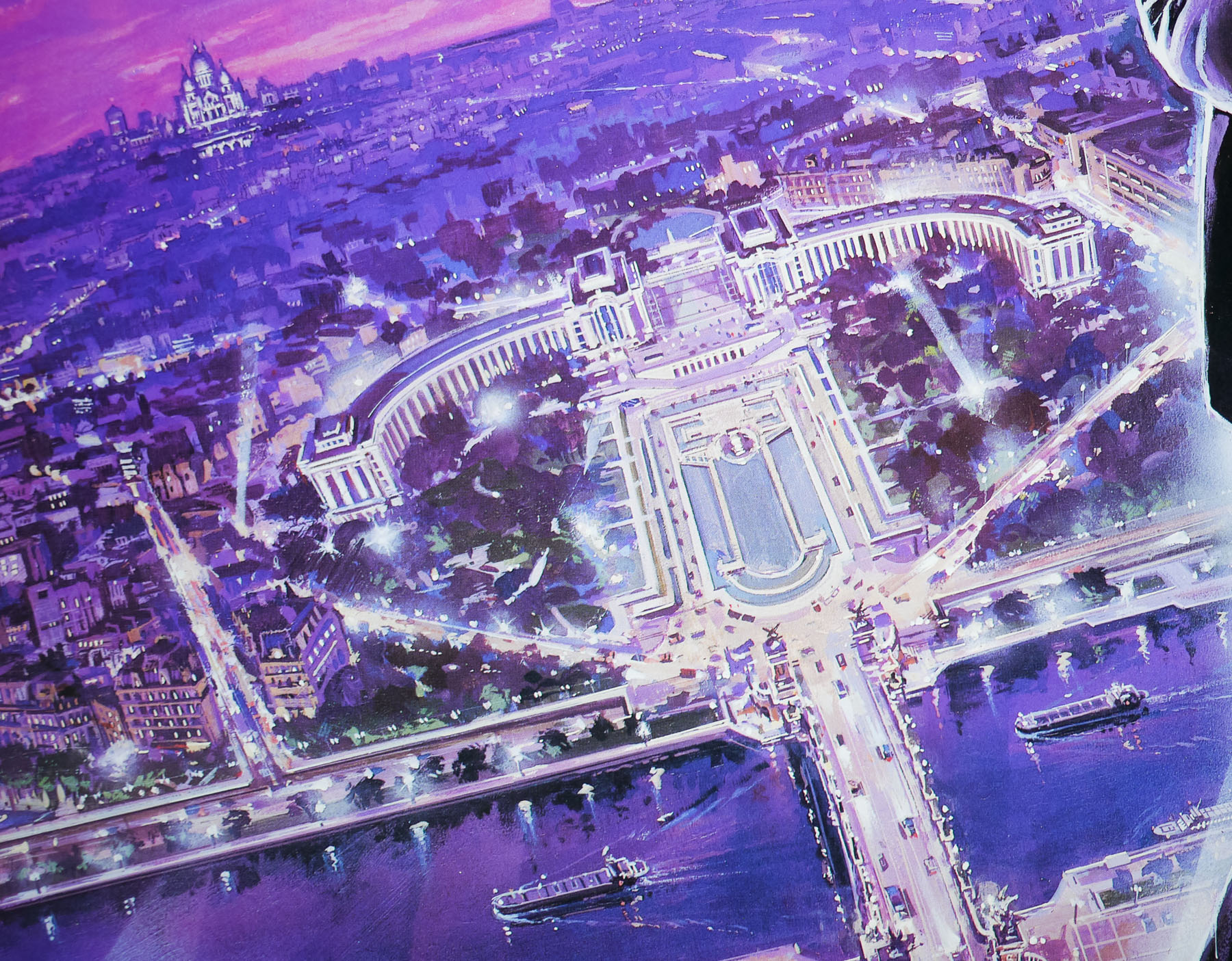
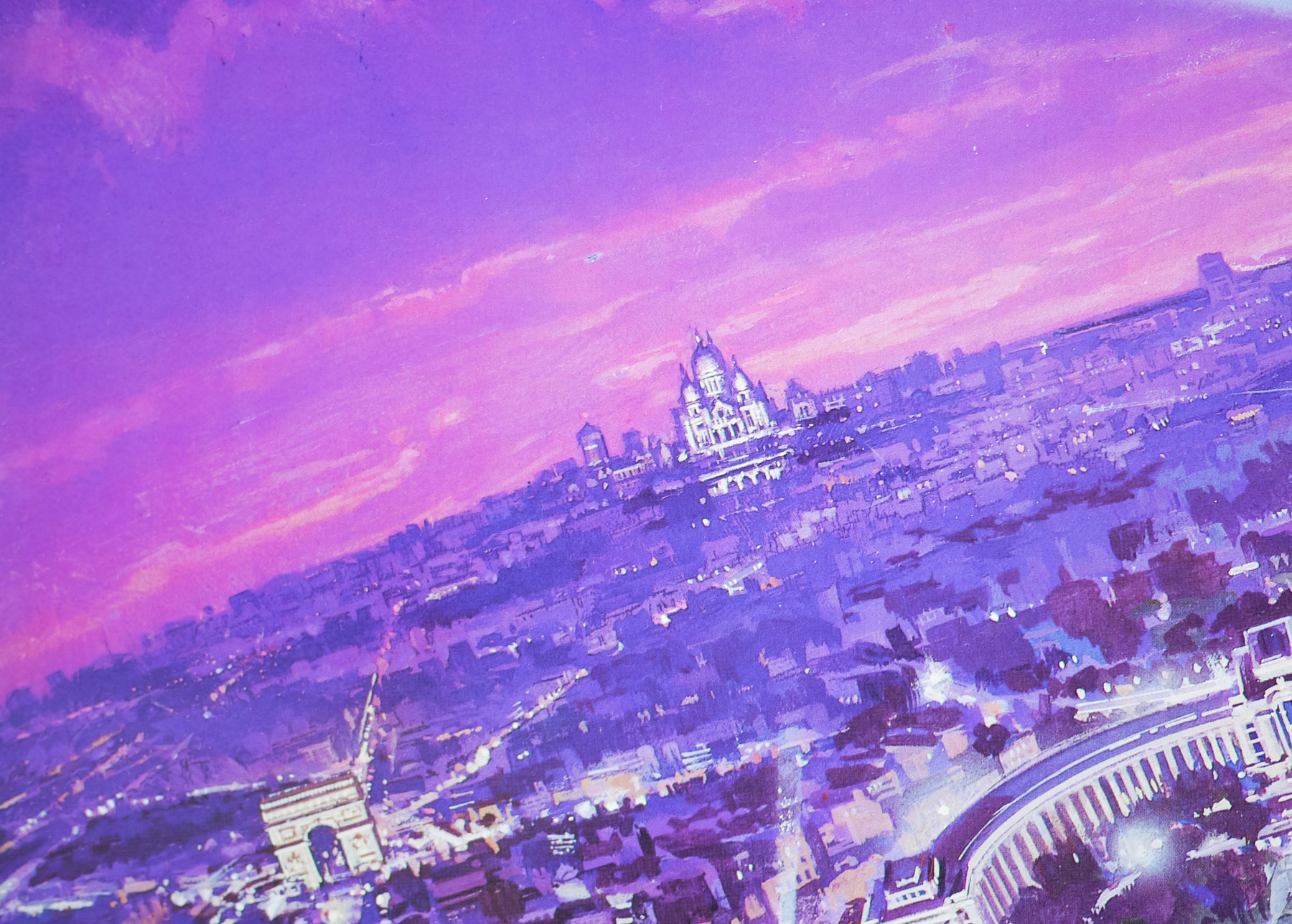
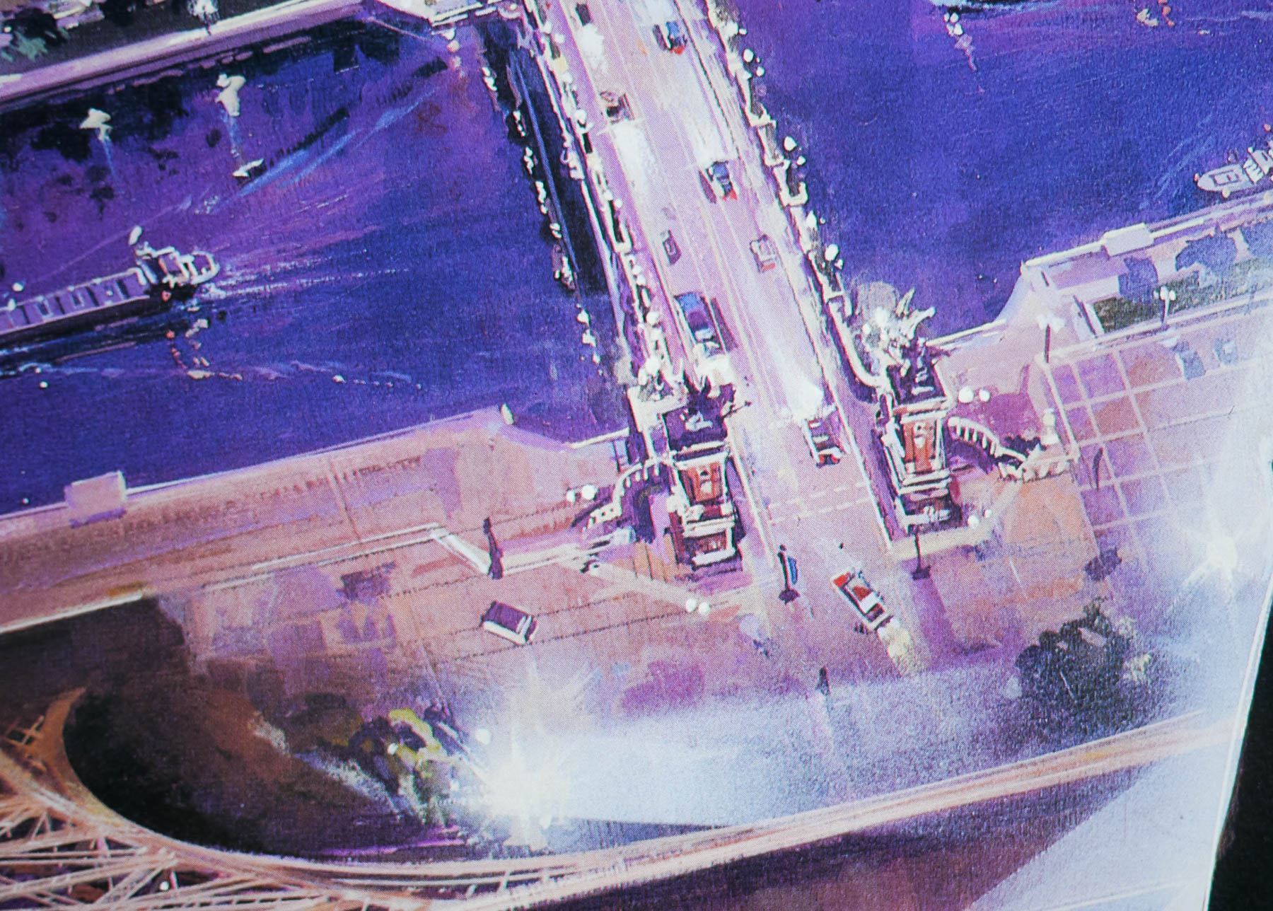
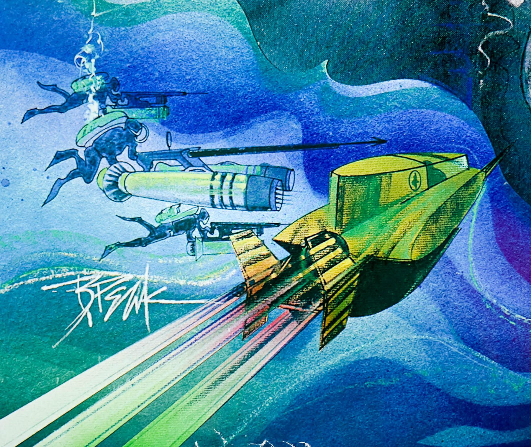
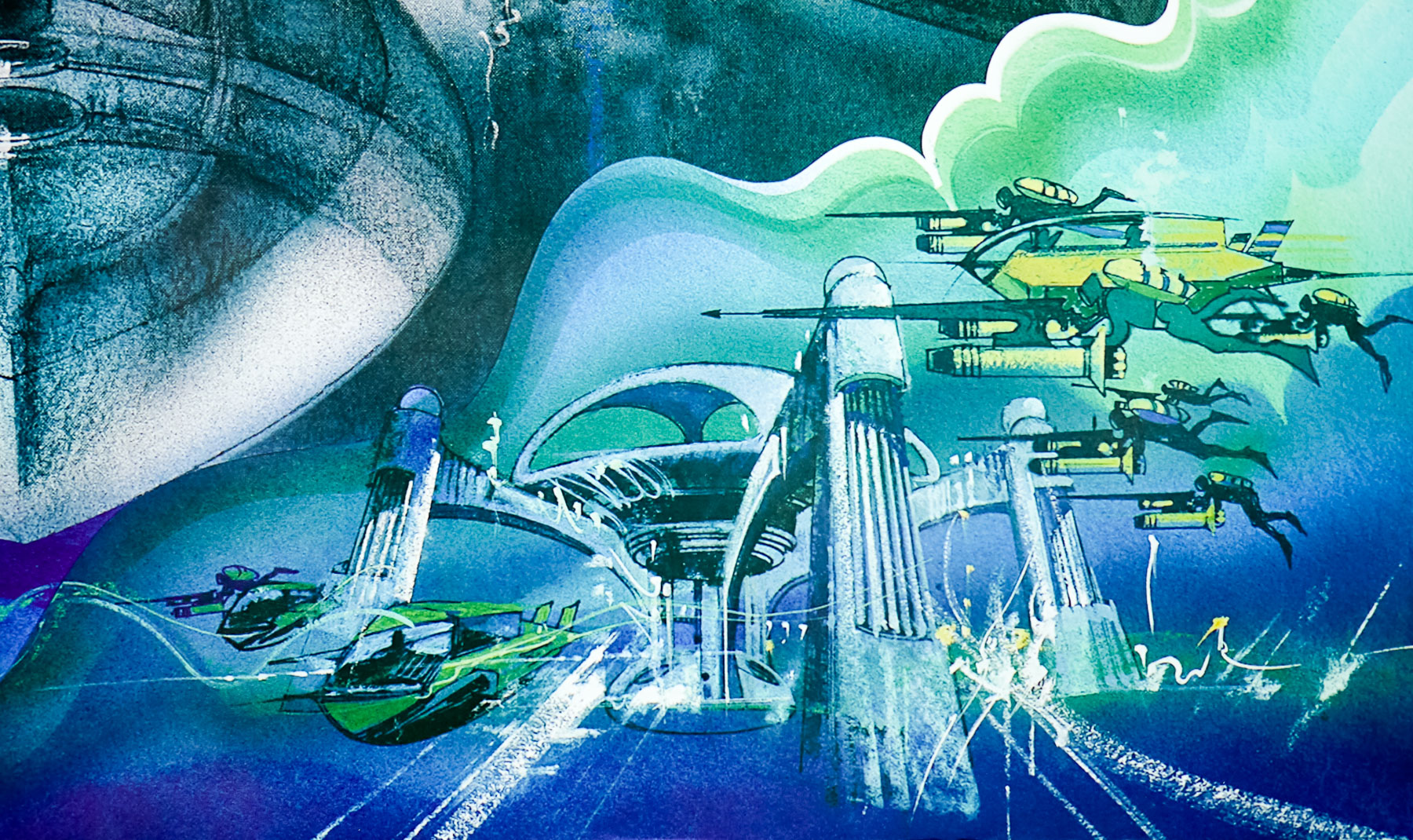
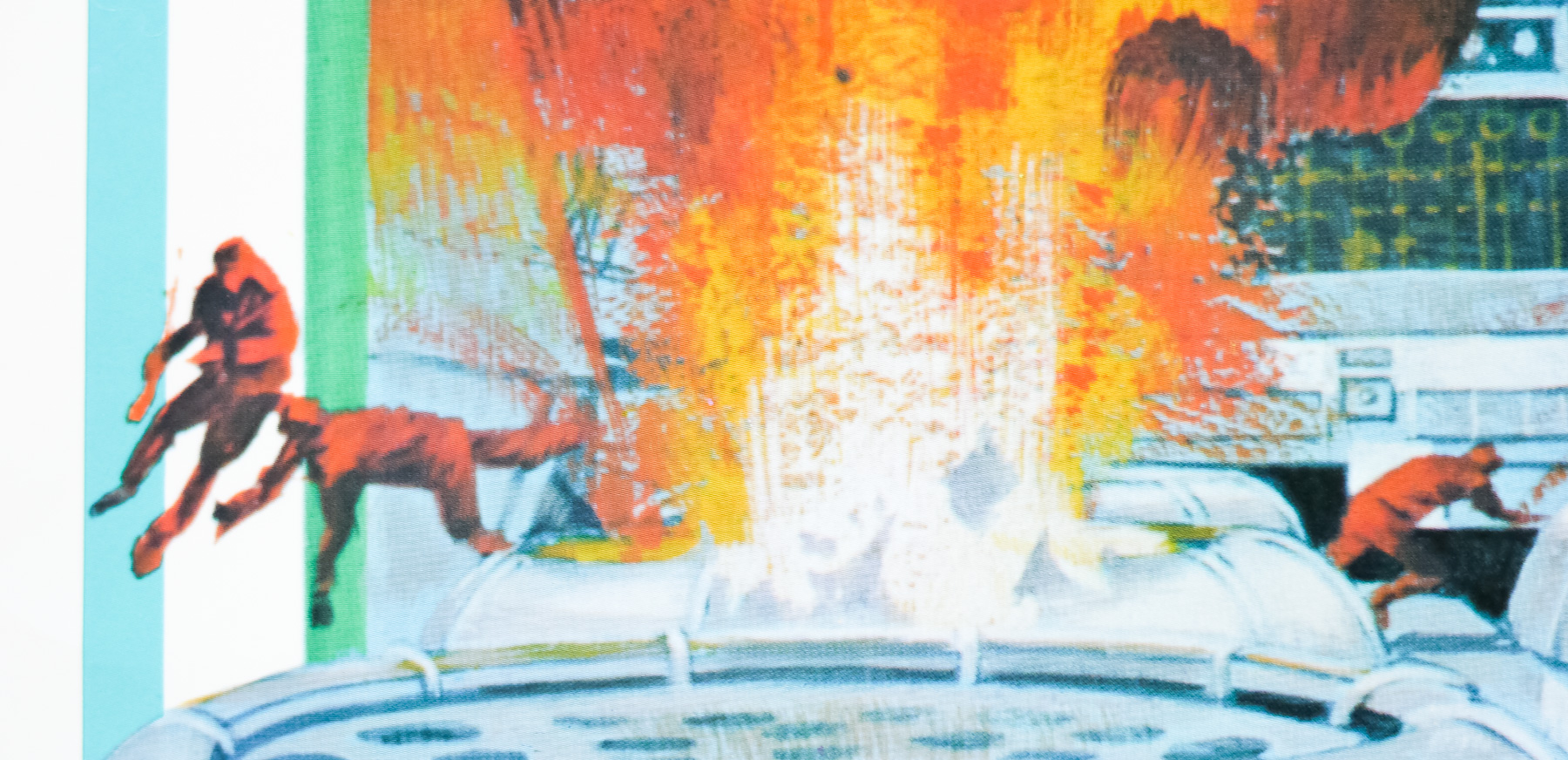
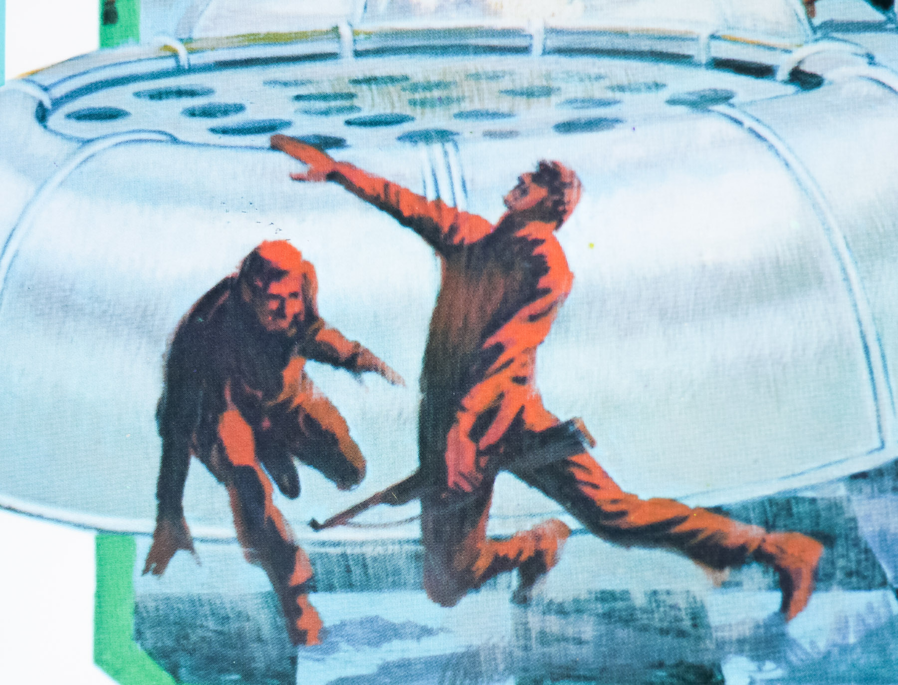
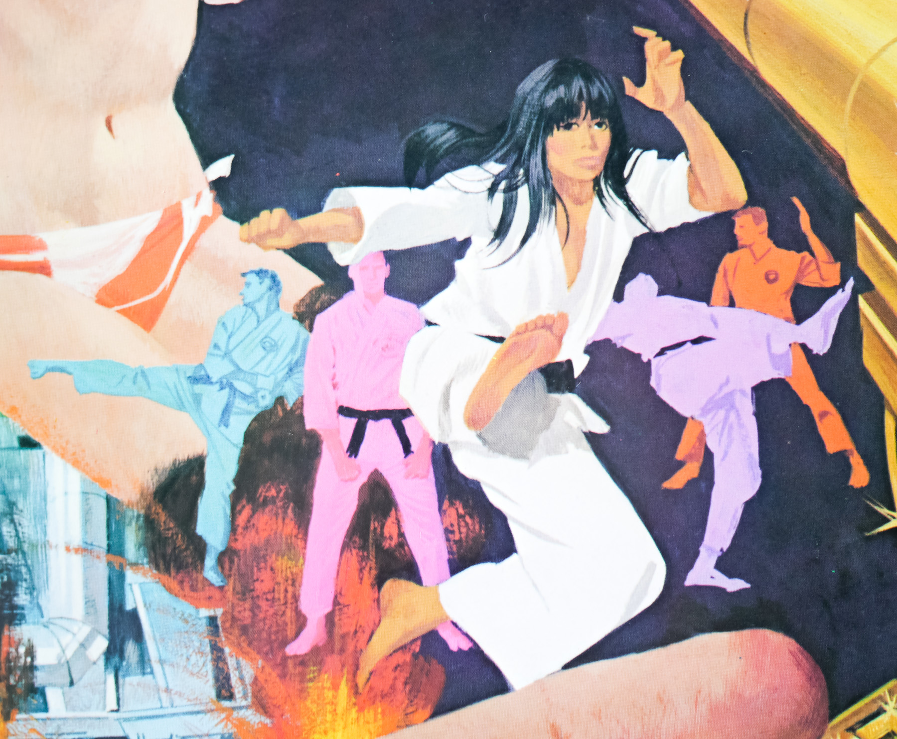
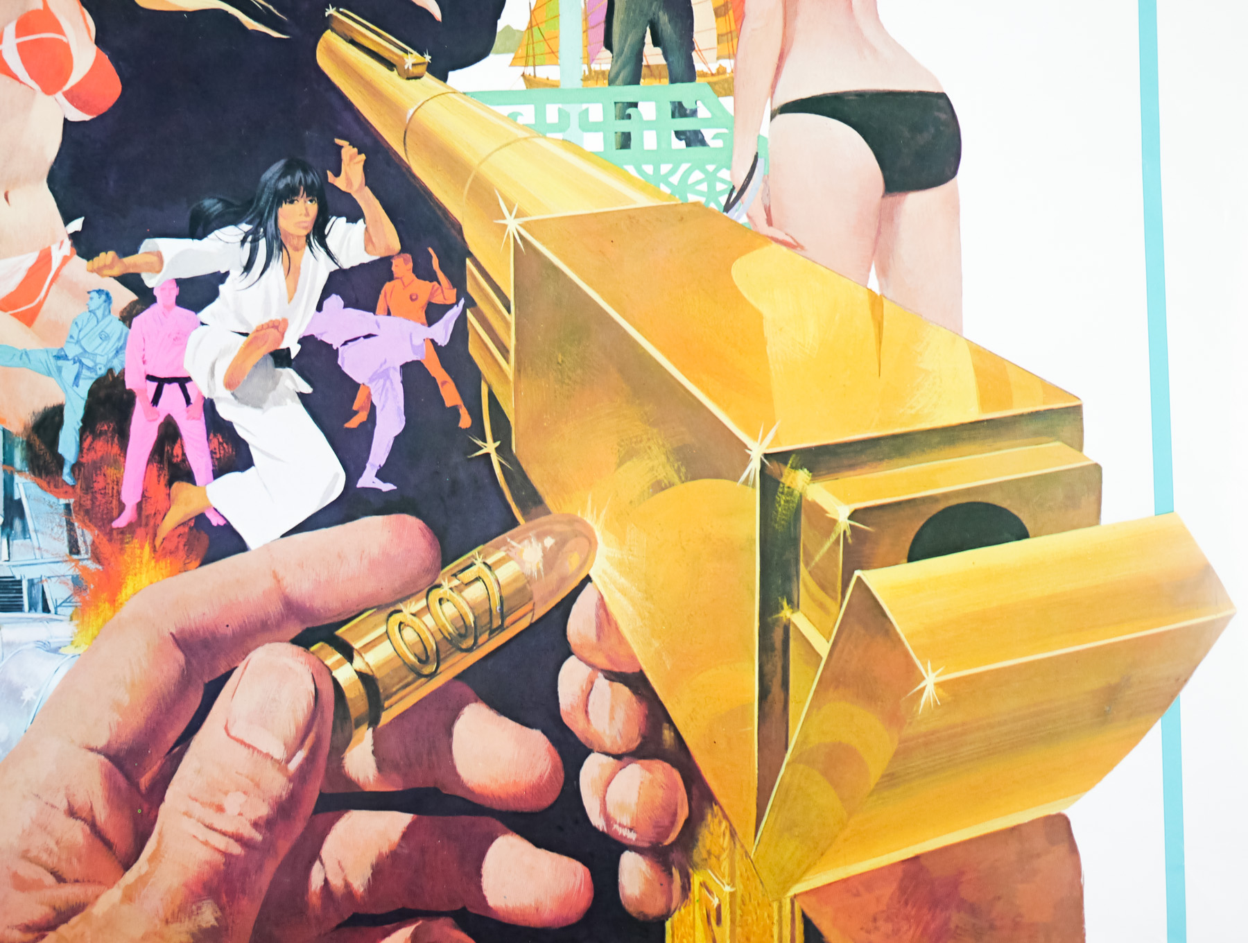
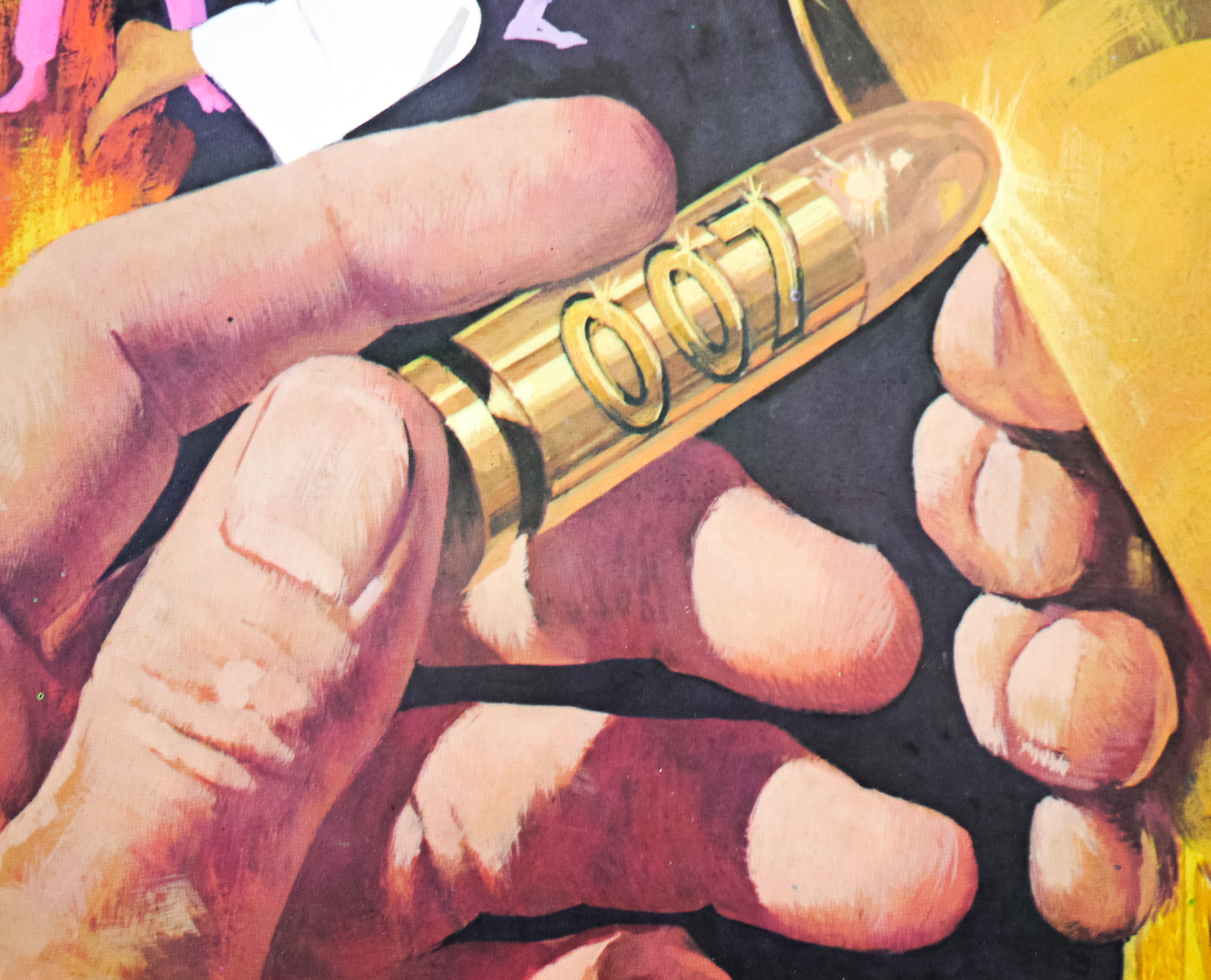
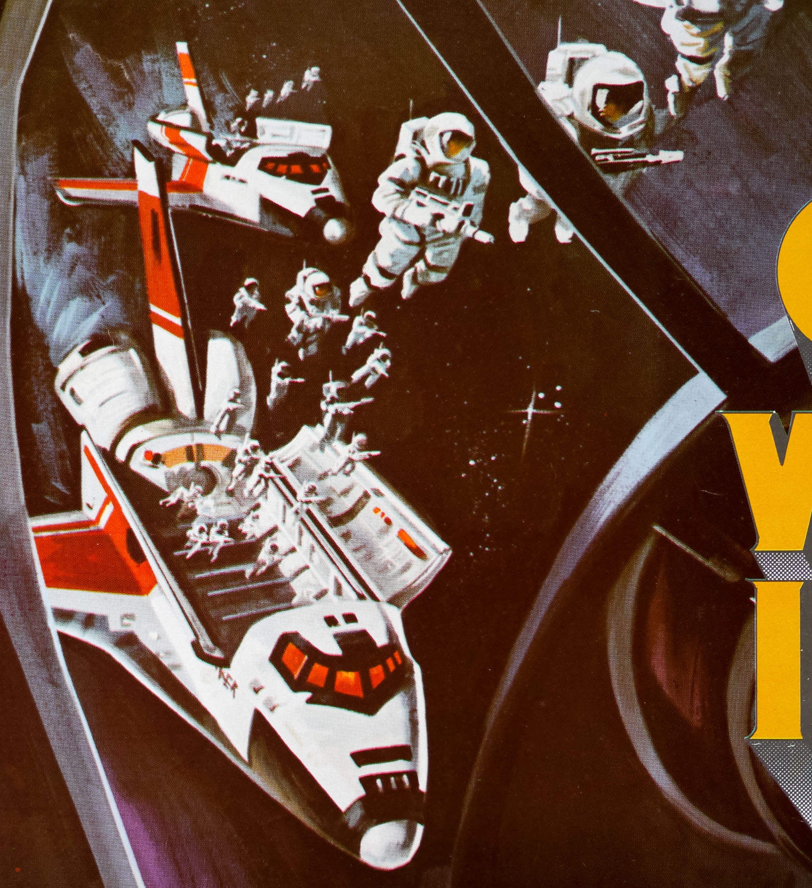
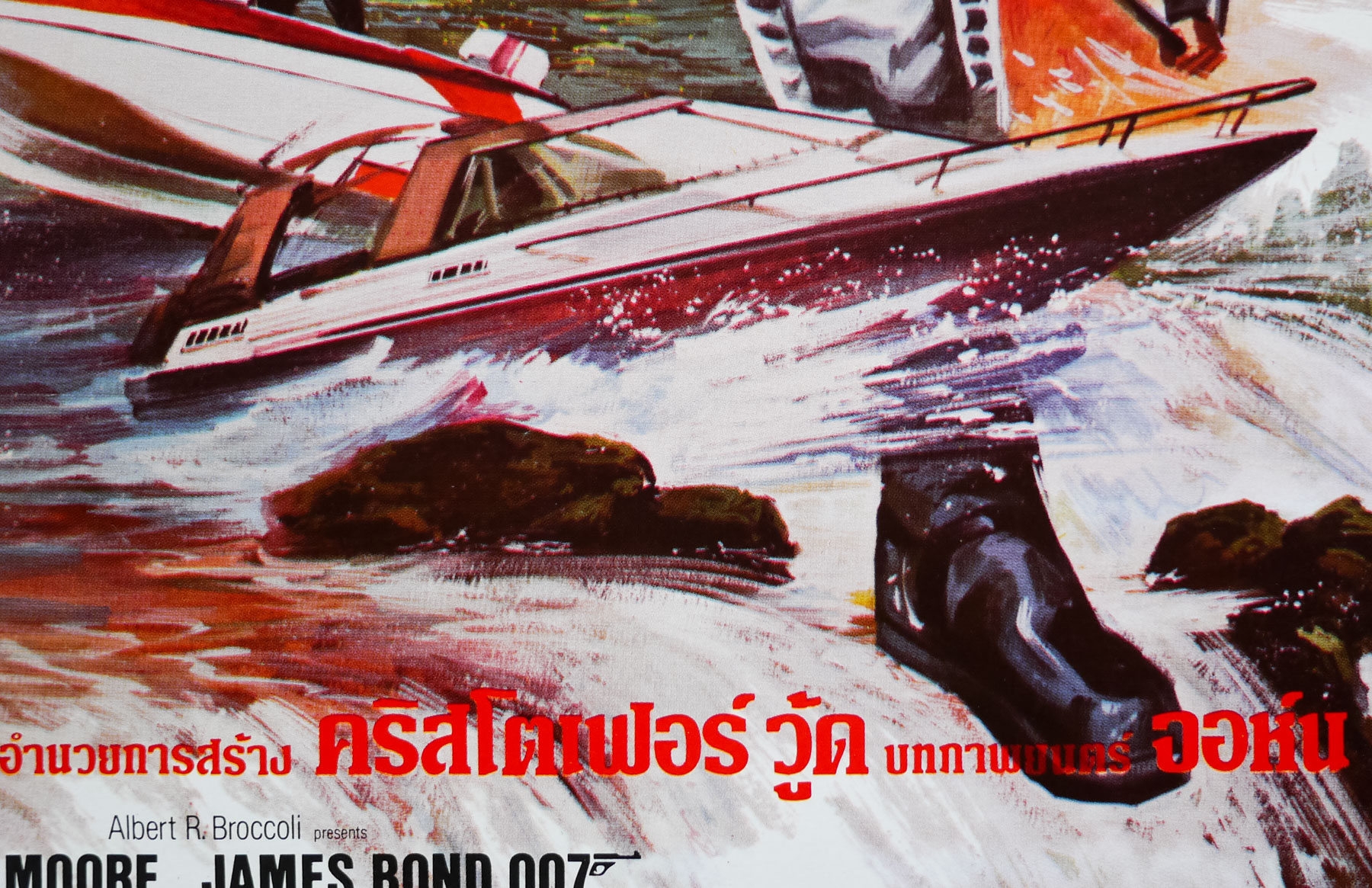
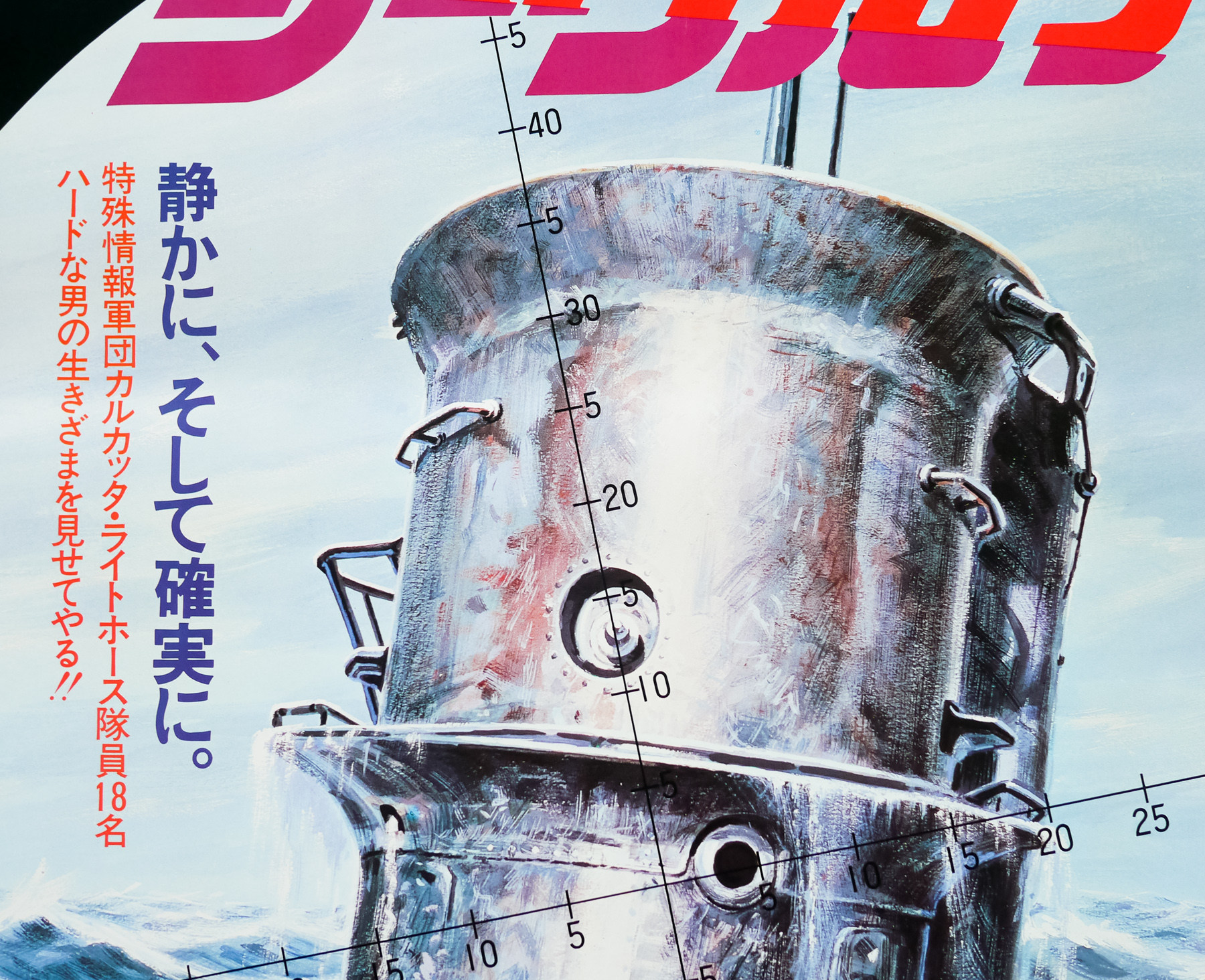
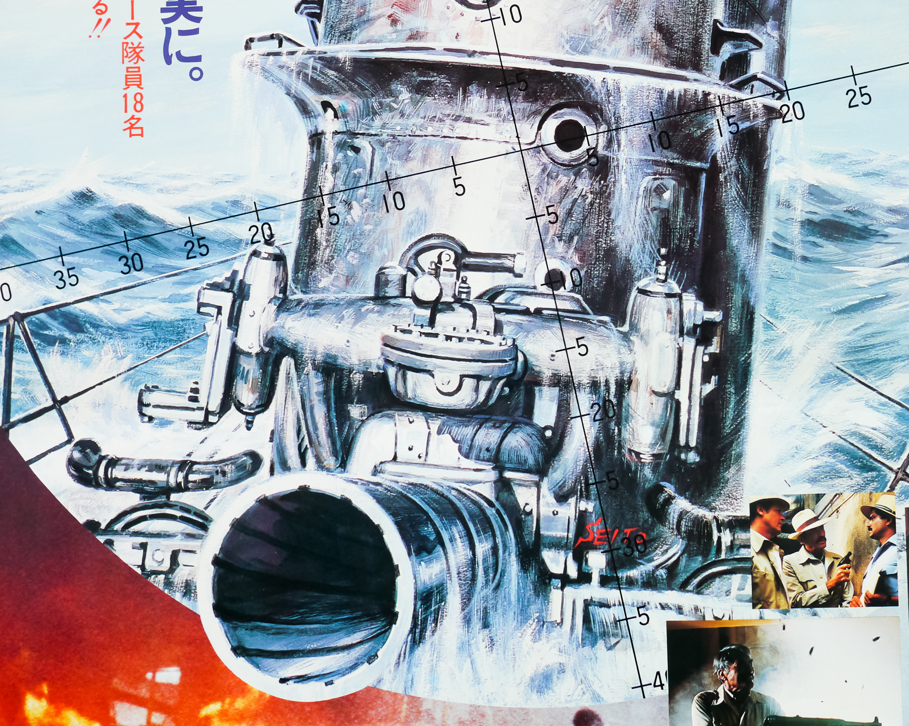
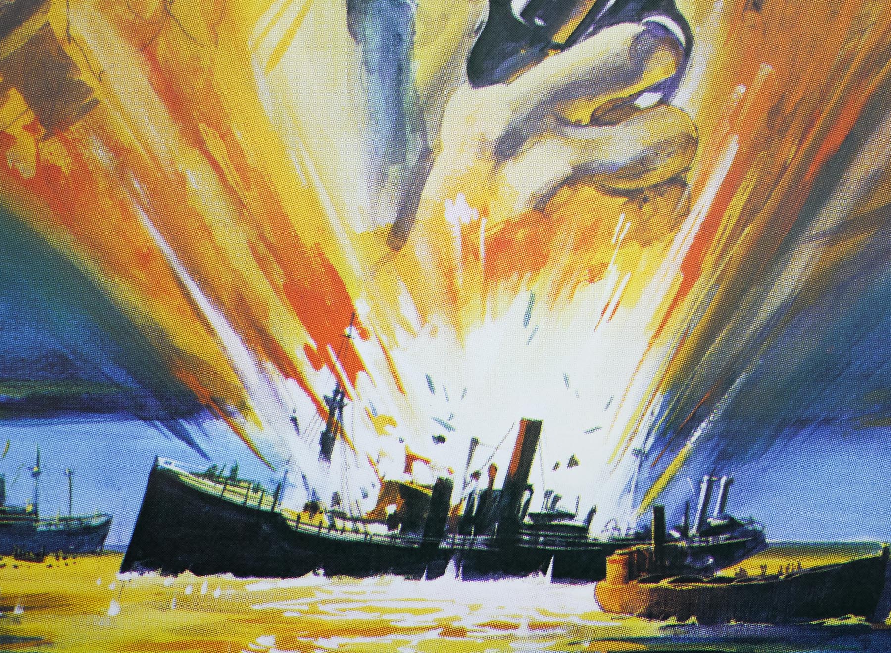
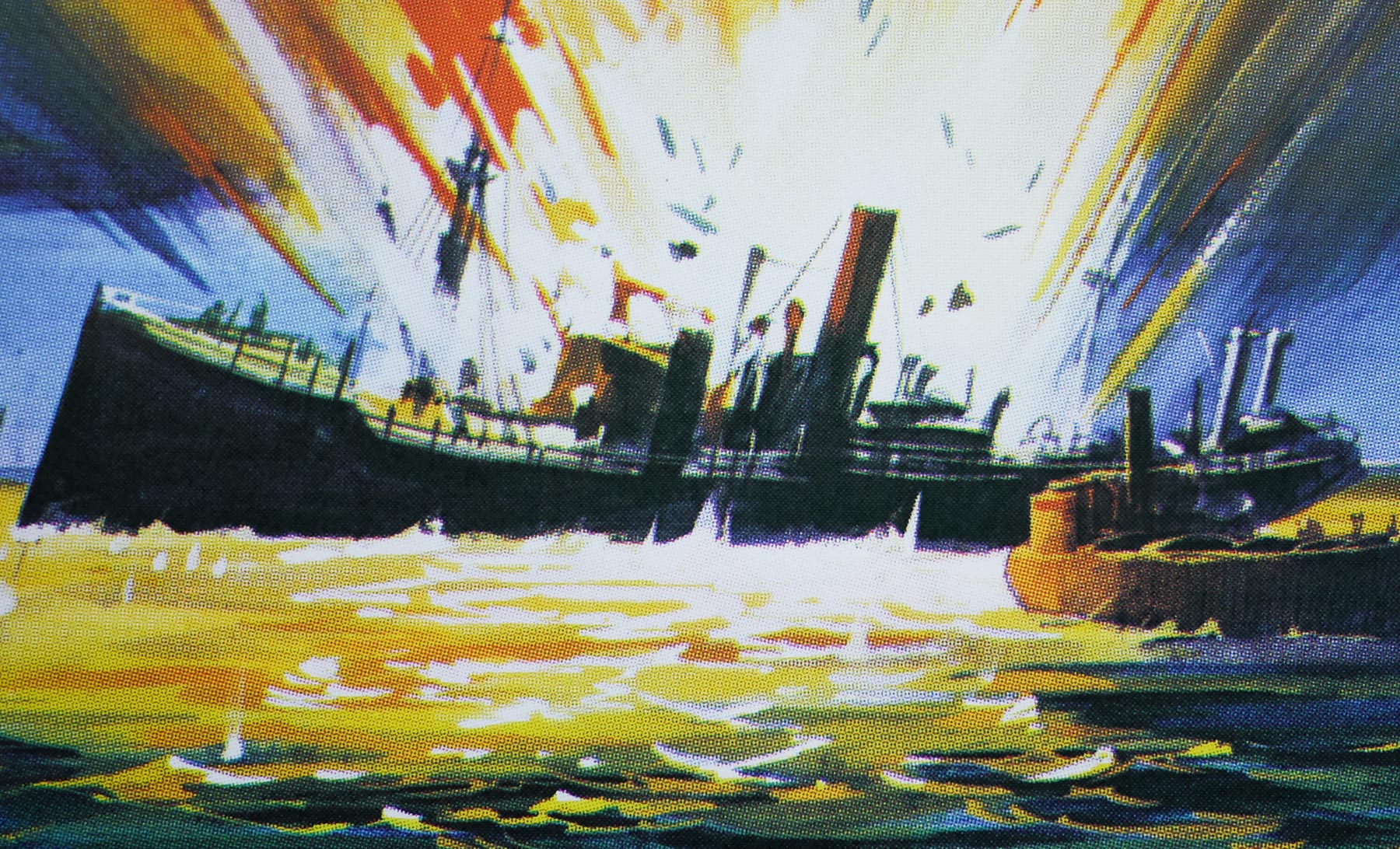
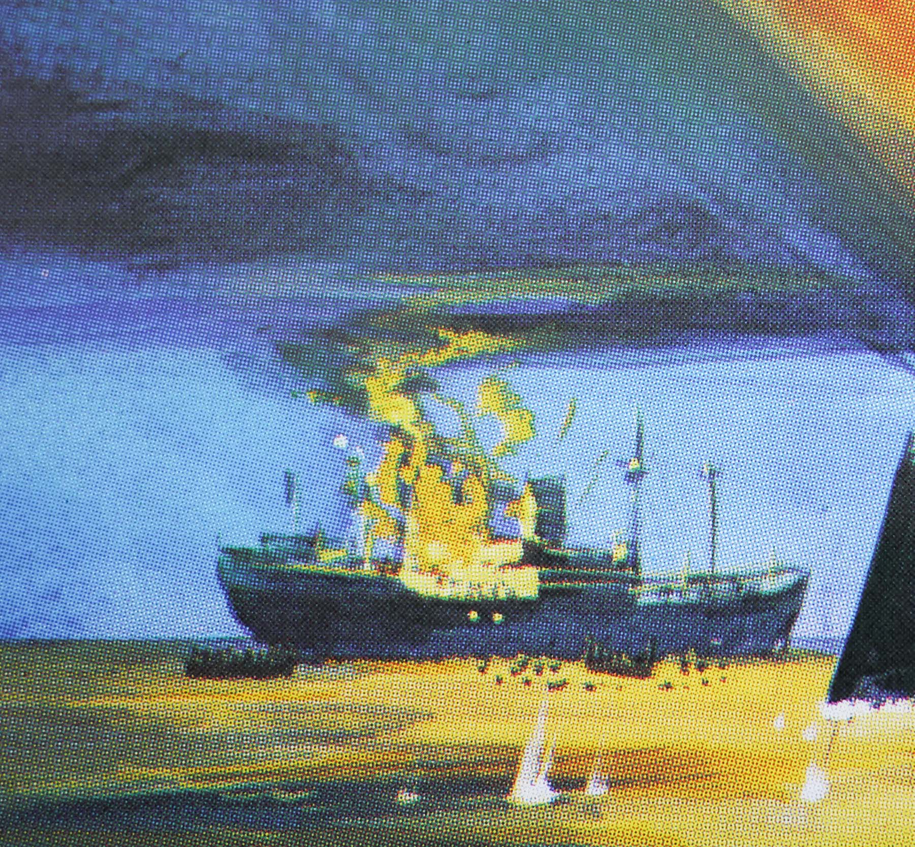
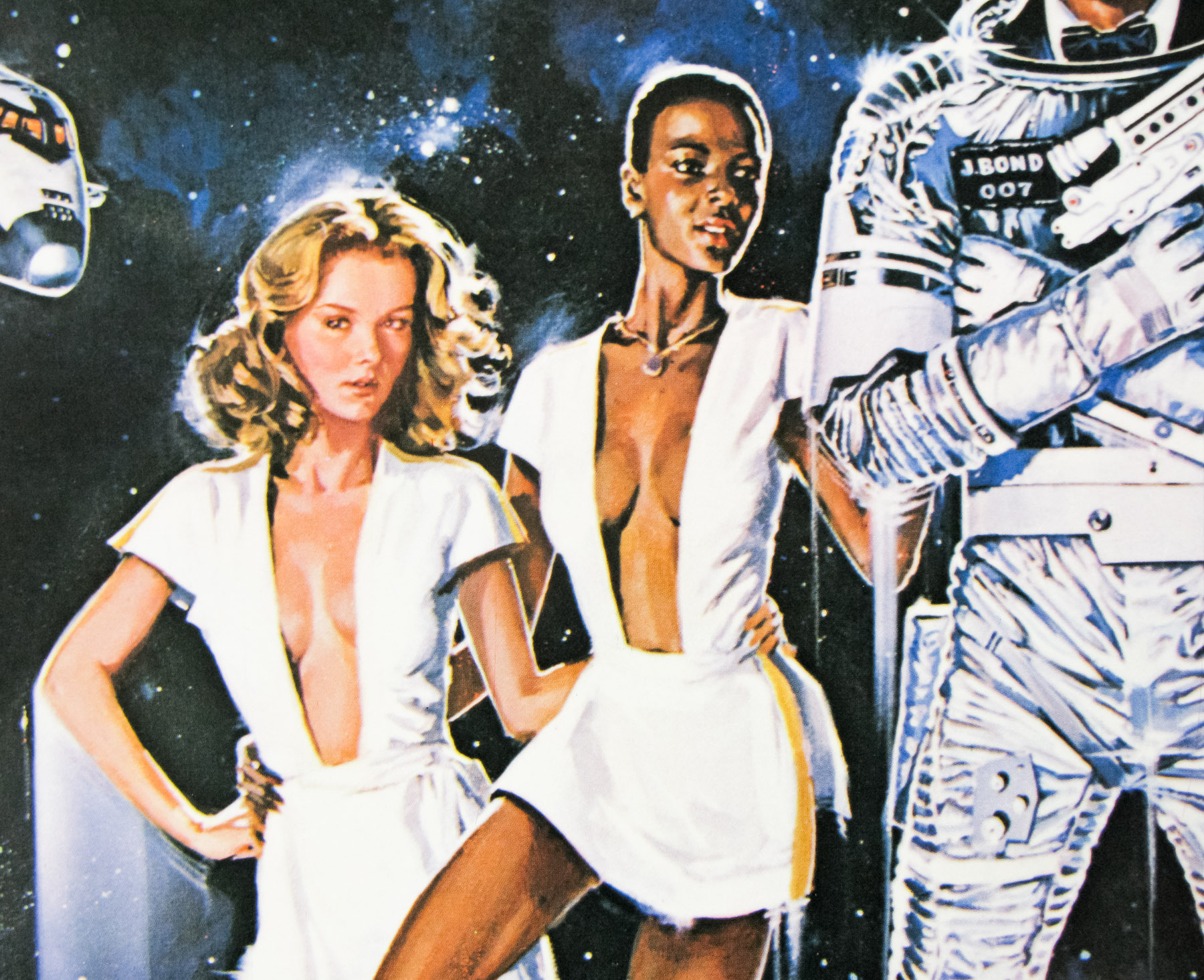
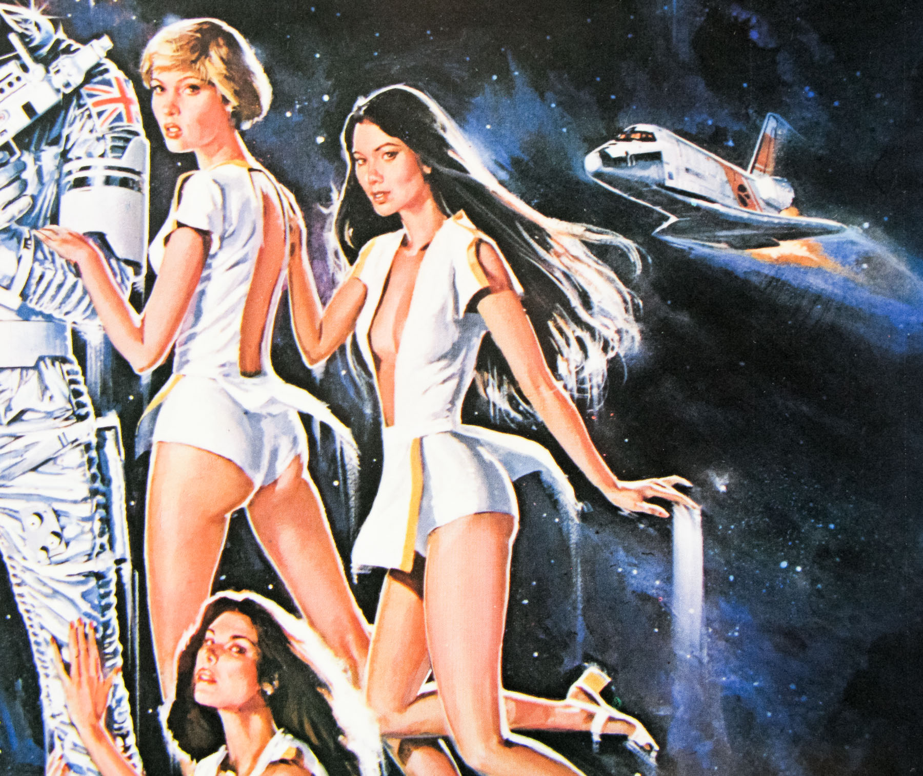
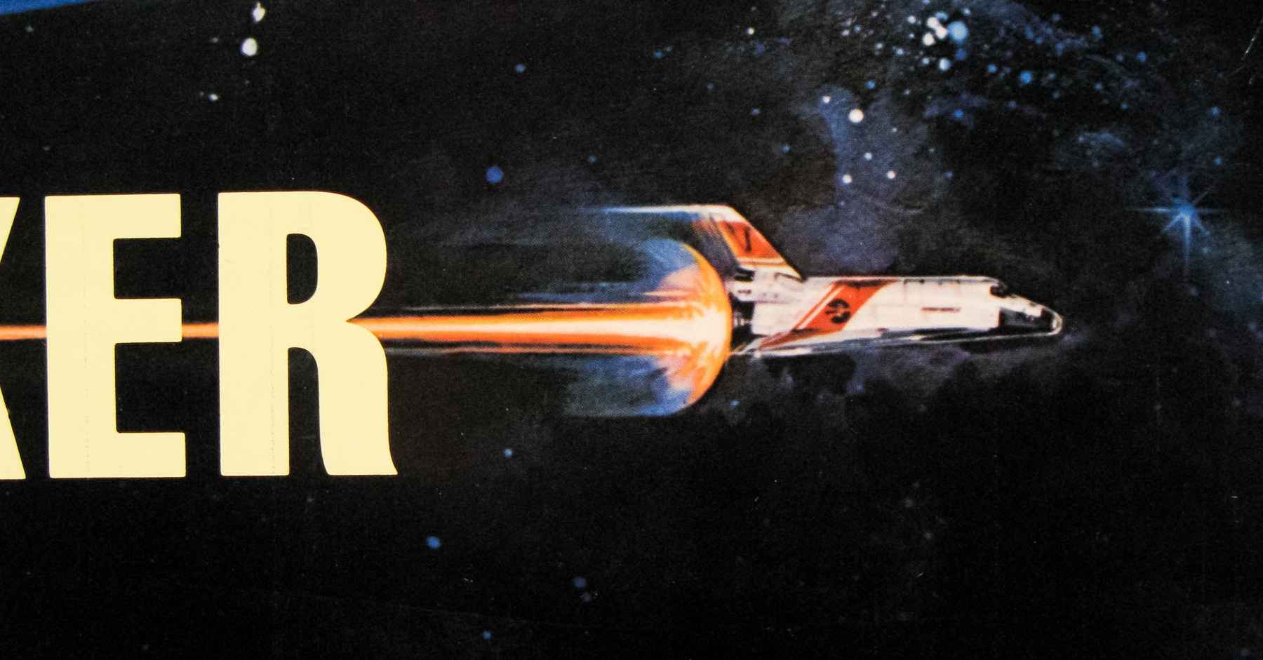
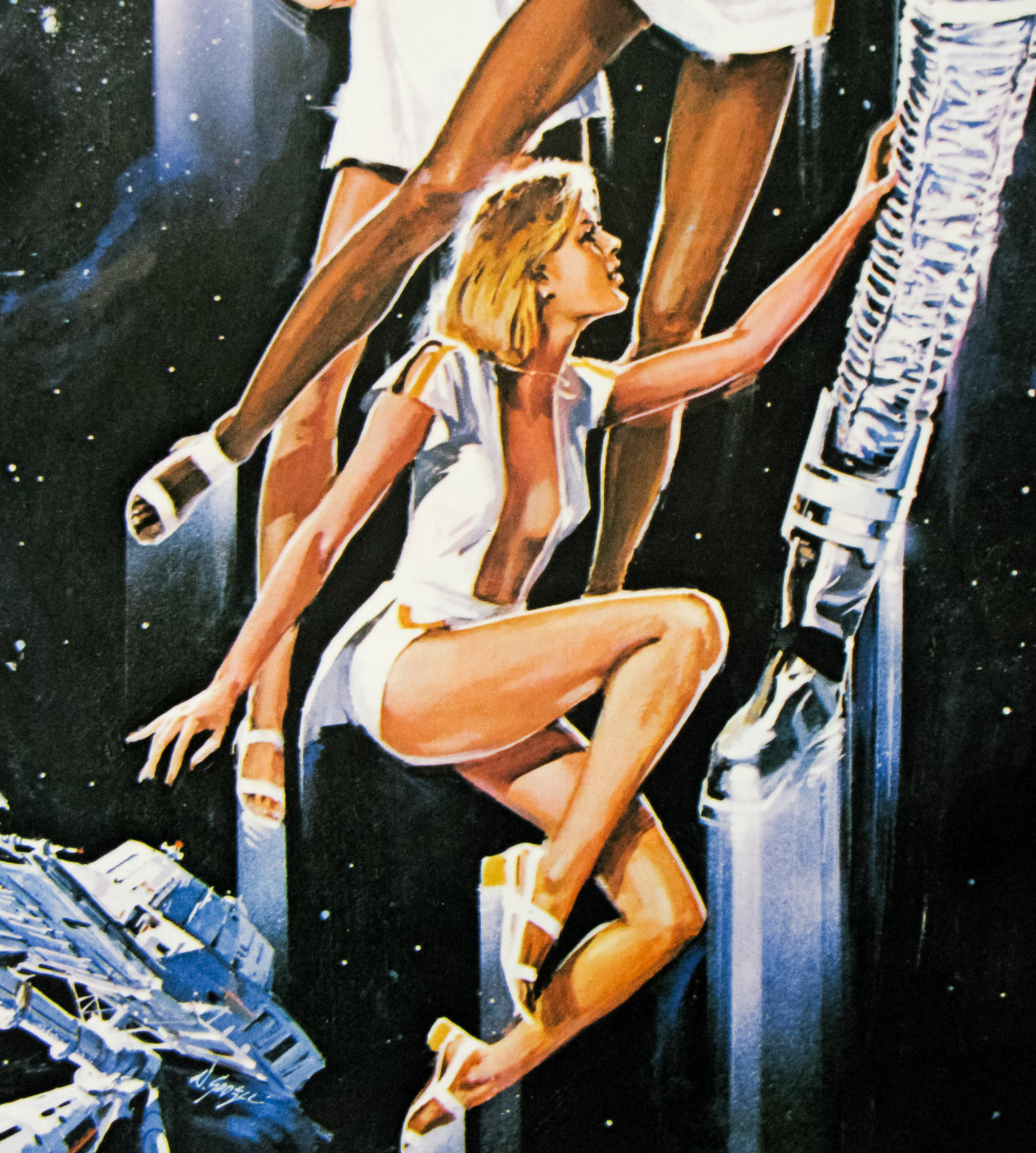
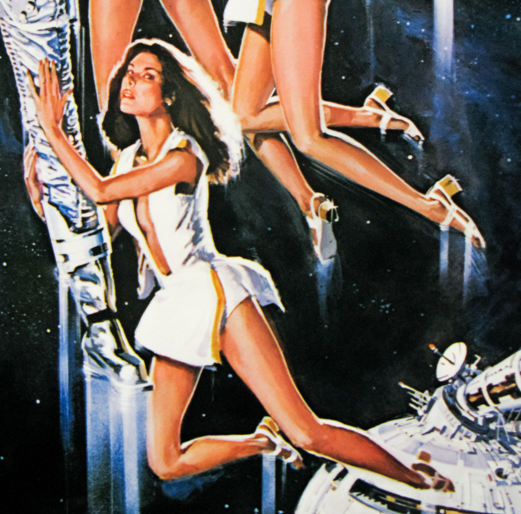
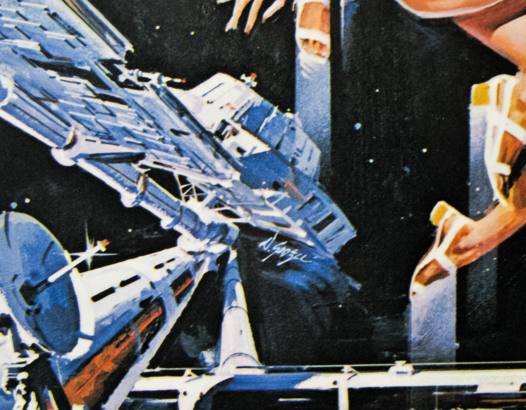
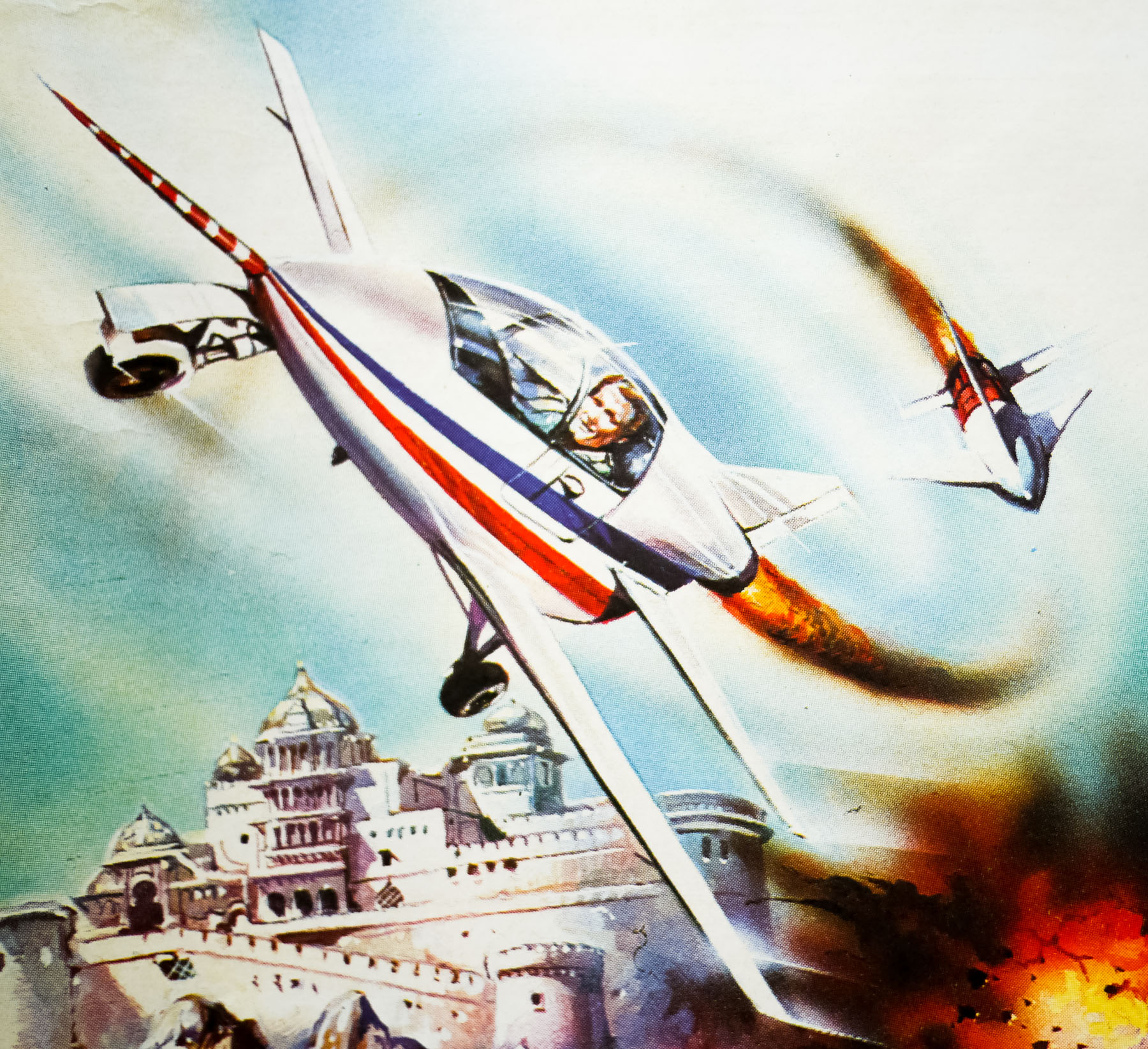
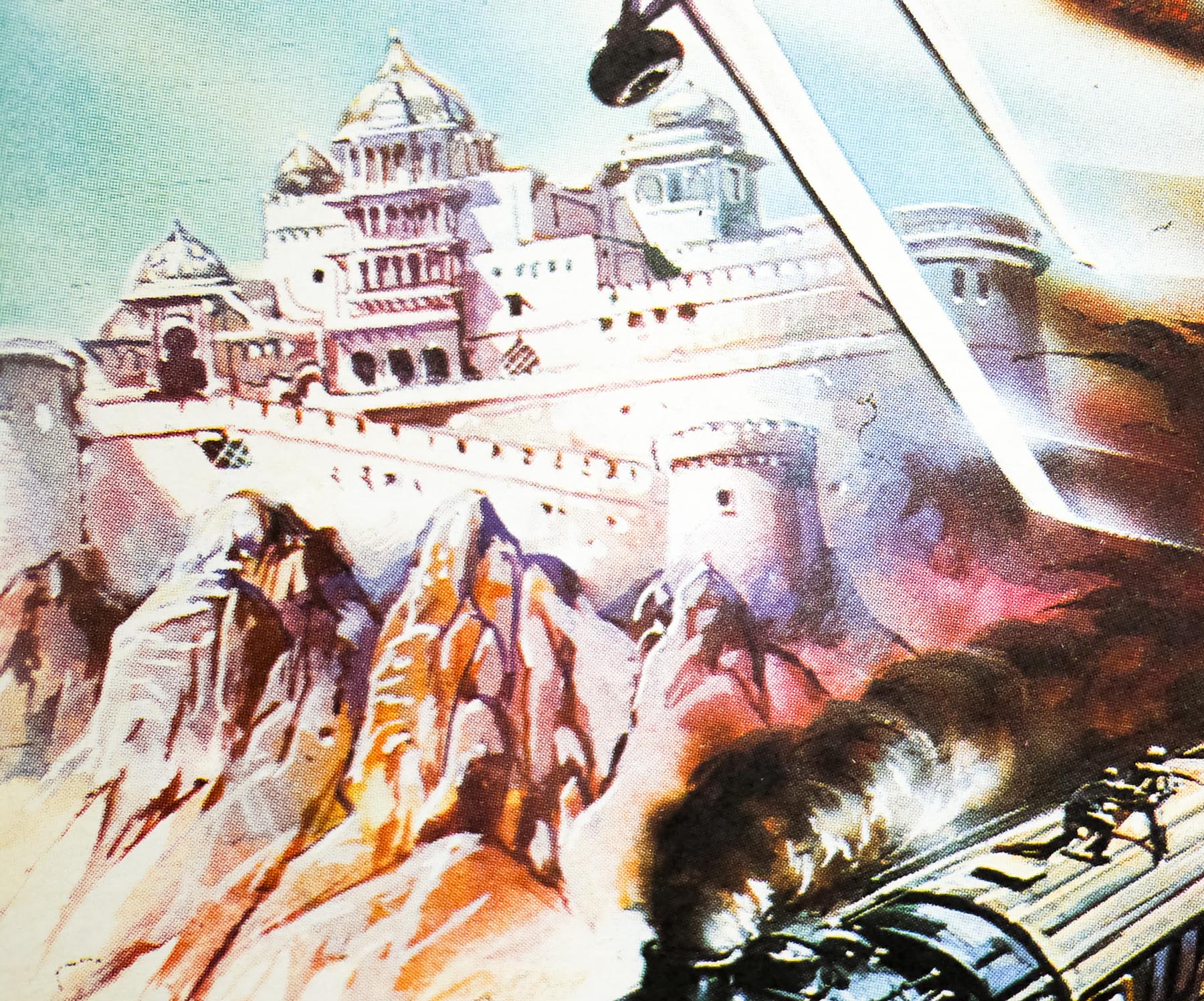
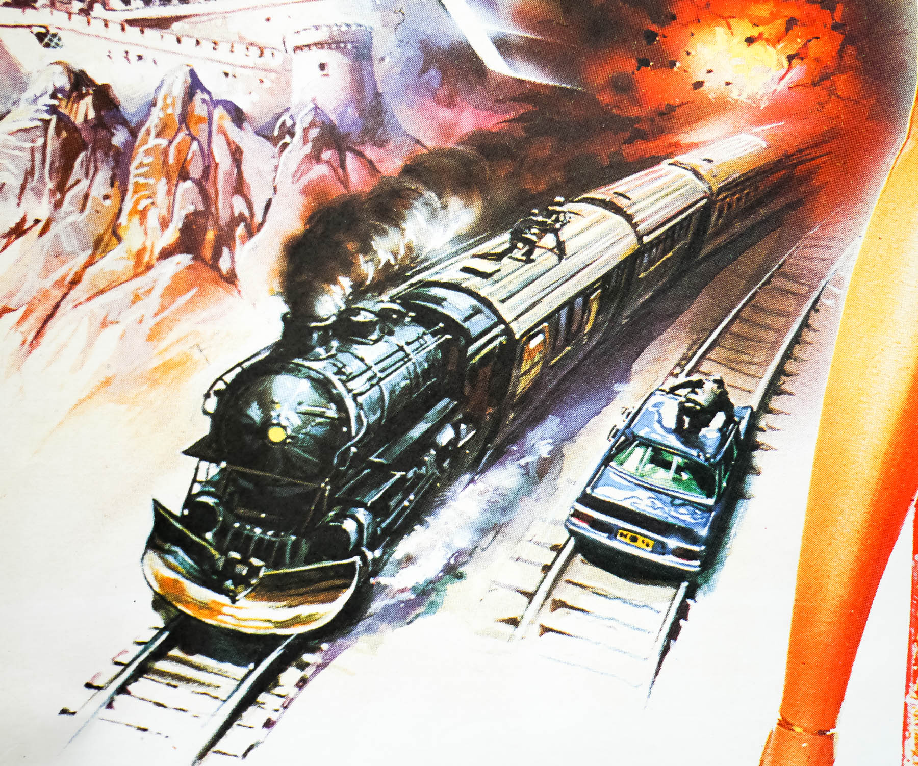
This quad was jointly illustrated by both Renato Casaro, an Italian artist with a prolific output, and the American artist Dan Goozee who painted the central two figures for the US one sheet. They were reused here and then surrounded by the montage of action scenes painted by Casaro. On the Japanese B2, Casaro actually repainted the figures, which then sat alongside a slightly modified montage.
Renato Casaro began his career in 1953, aged 19, at the famous Studio Favalli in Rome, which was part of the legendary Cinecittà studios and handled film publicity for many Italian productions. Casaro soon decided to become a freelance artist and went on to design and paint posters for many of the biggest directors in the world. His skill at accurately portraying actors and his brilliant use of colour and composition saw him much in demand from studios and actors alike. His artwork has featured on many German posters as well as others from countries including Japan, UK, North America as well as in his native Italy.
Check out the incredible amount of work on his official website here, which also features a biography of the artist. The other posters I’ve collected by Casaro can be seen by clicking here.