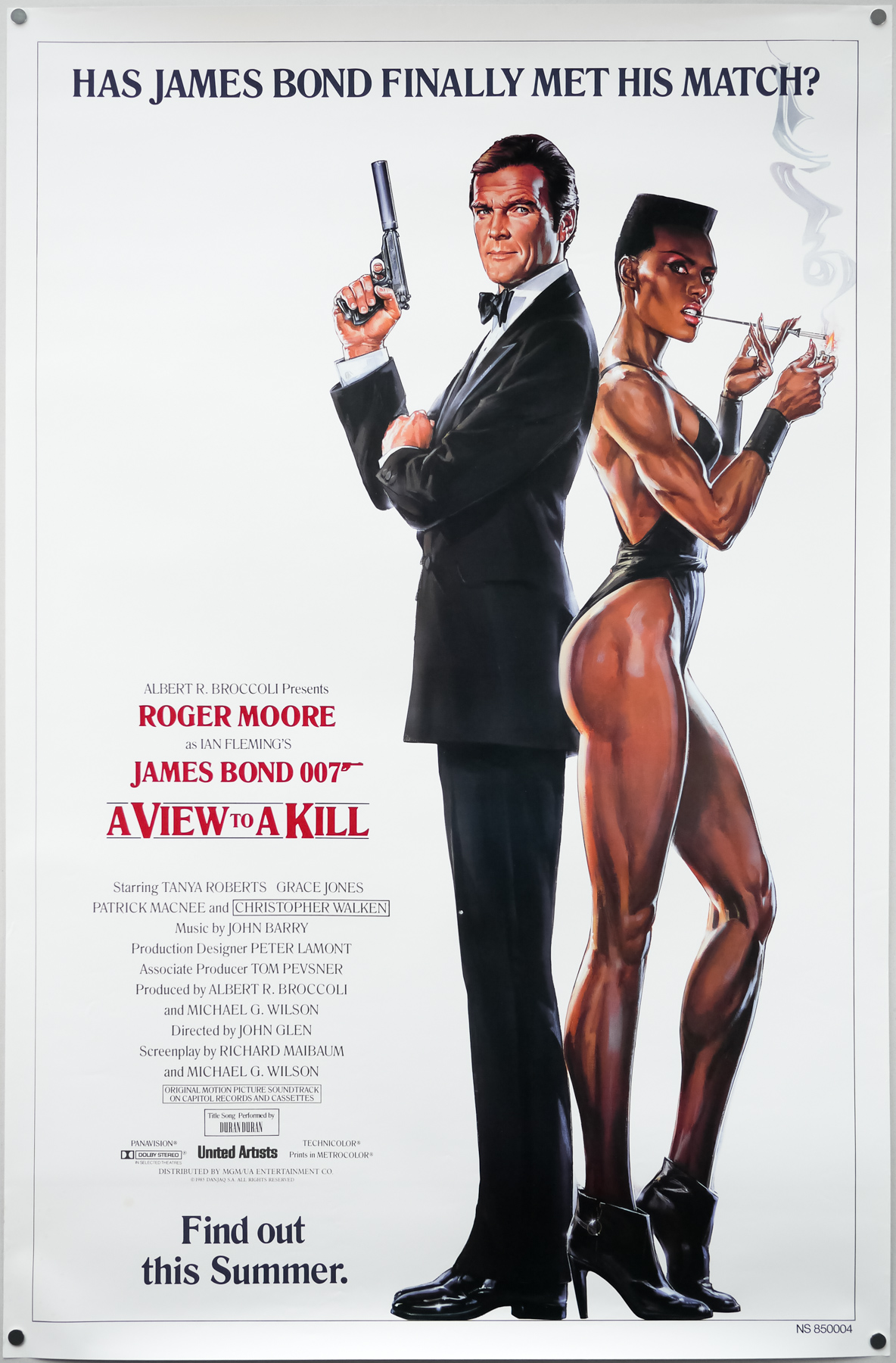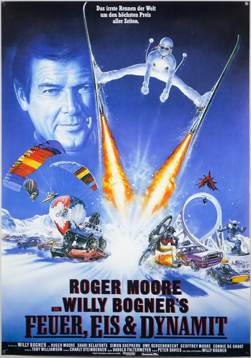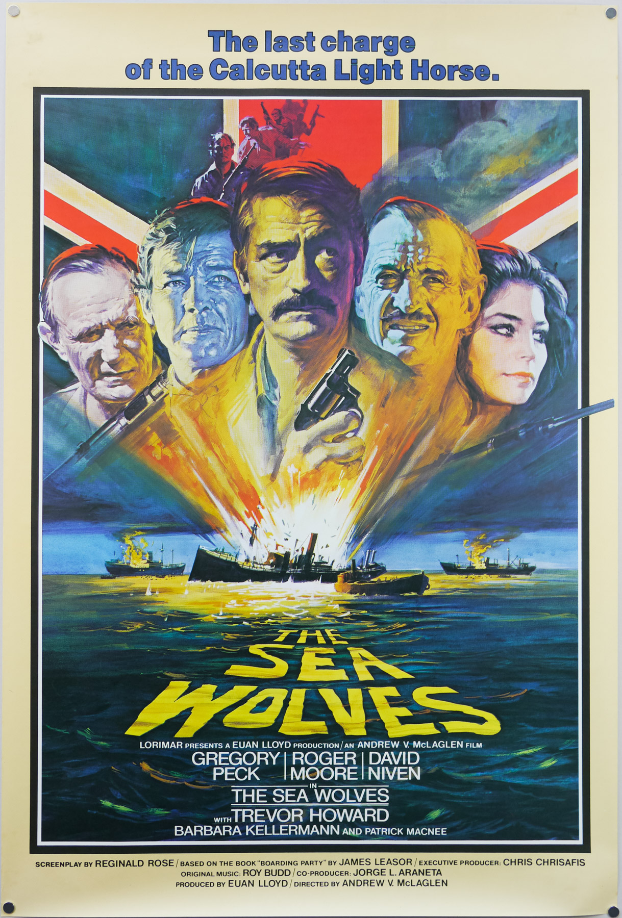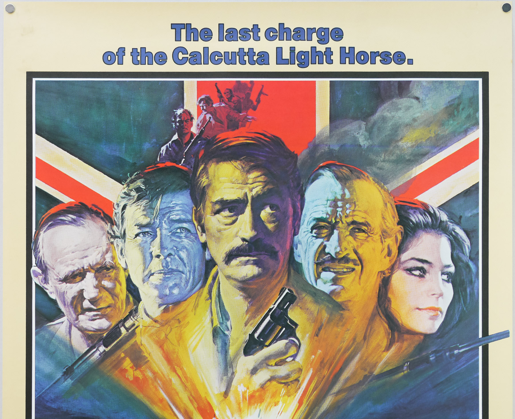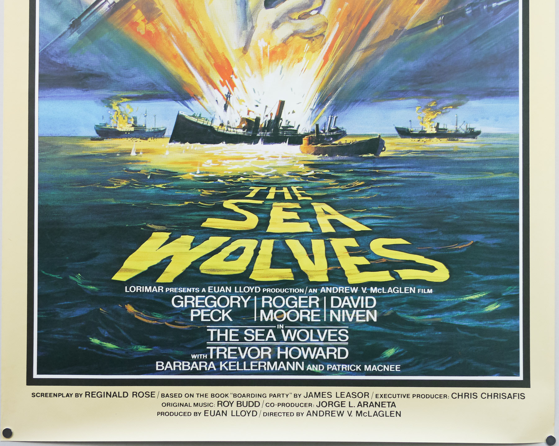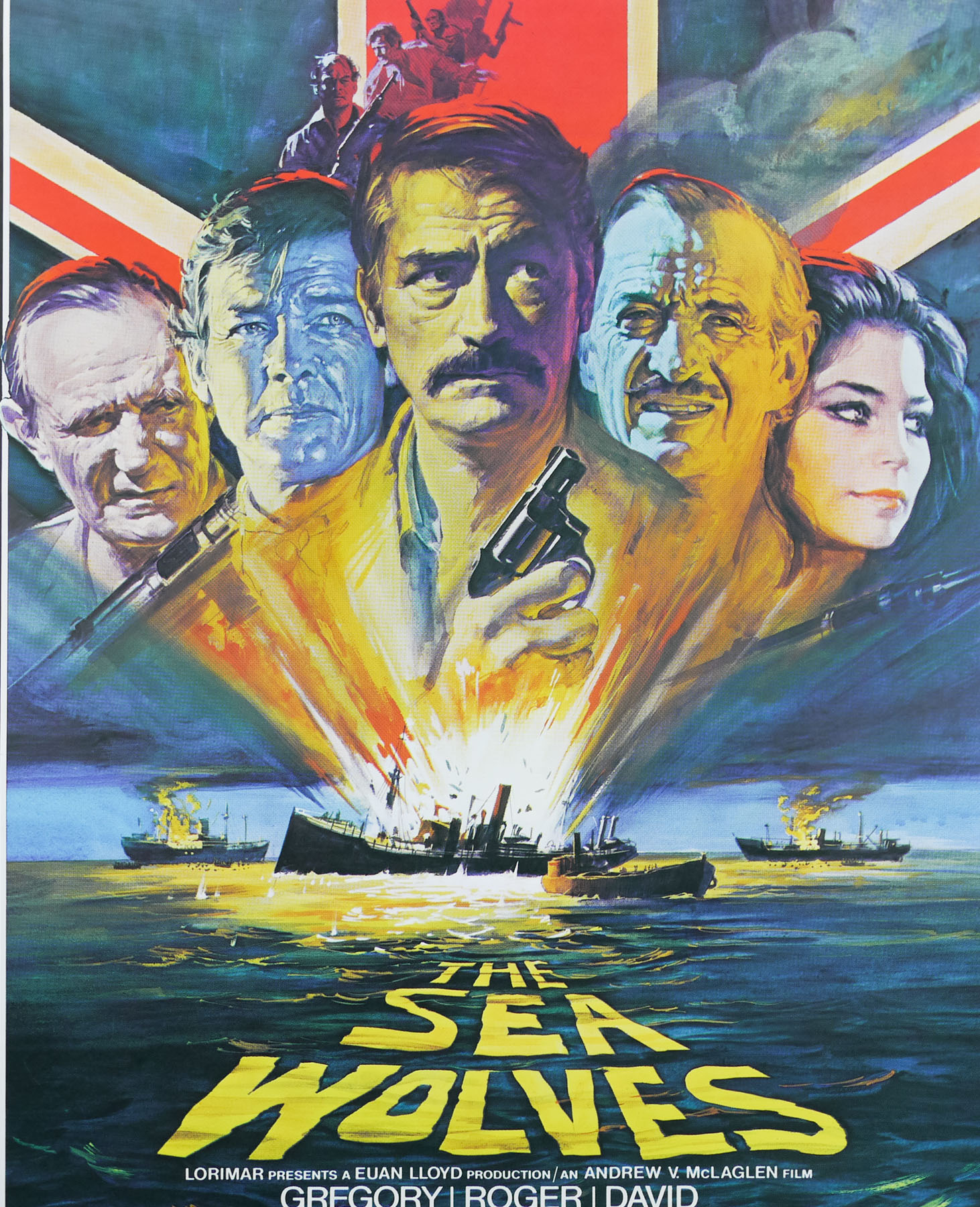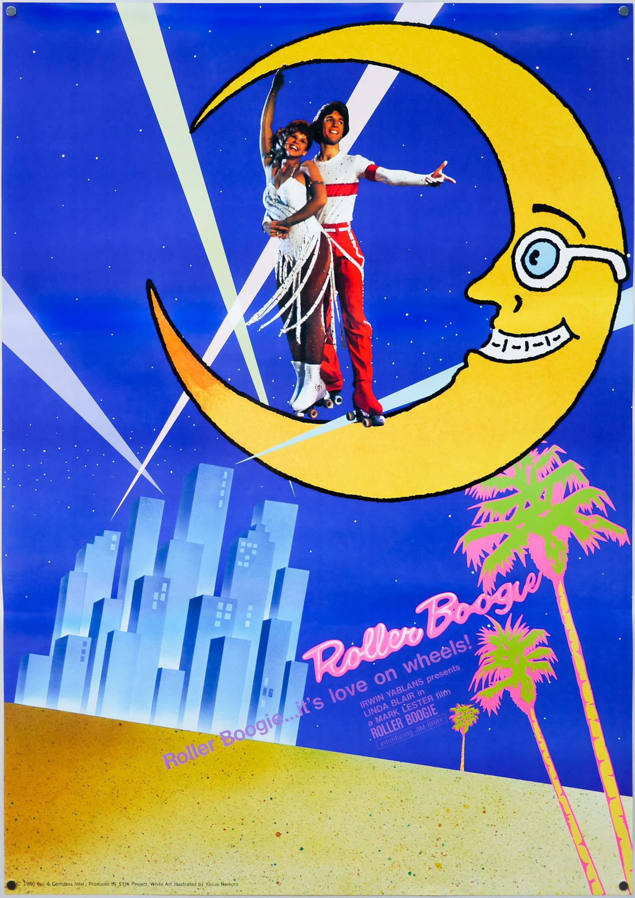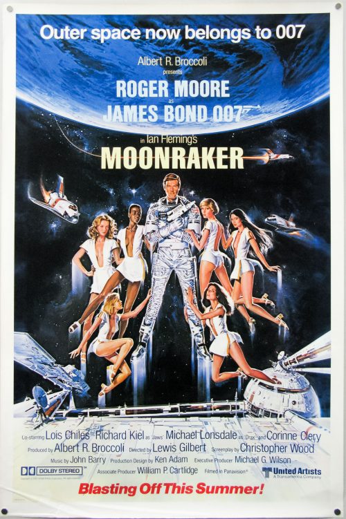
Poster detail
1-5


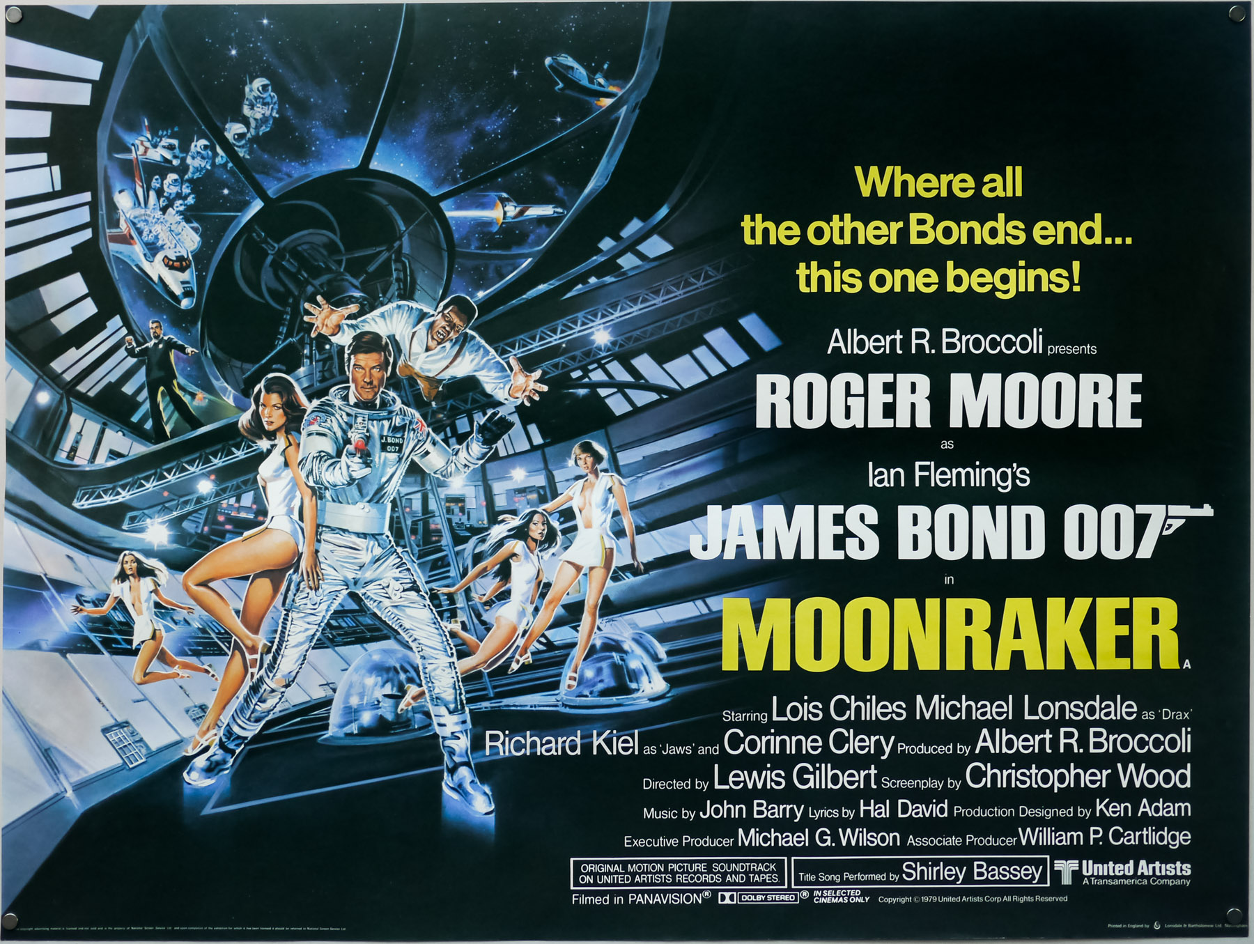
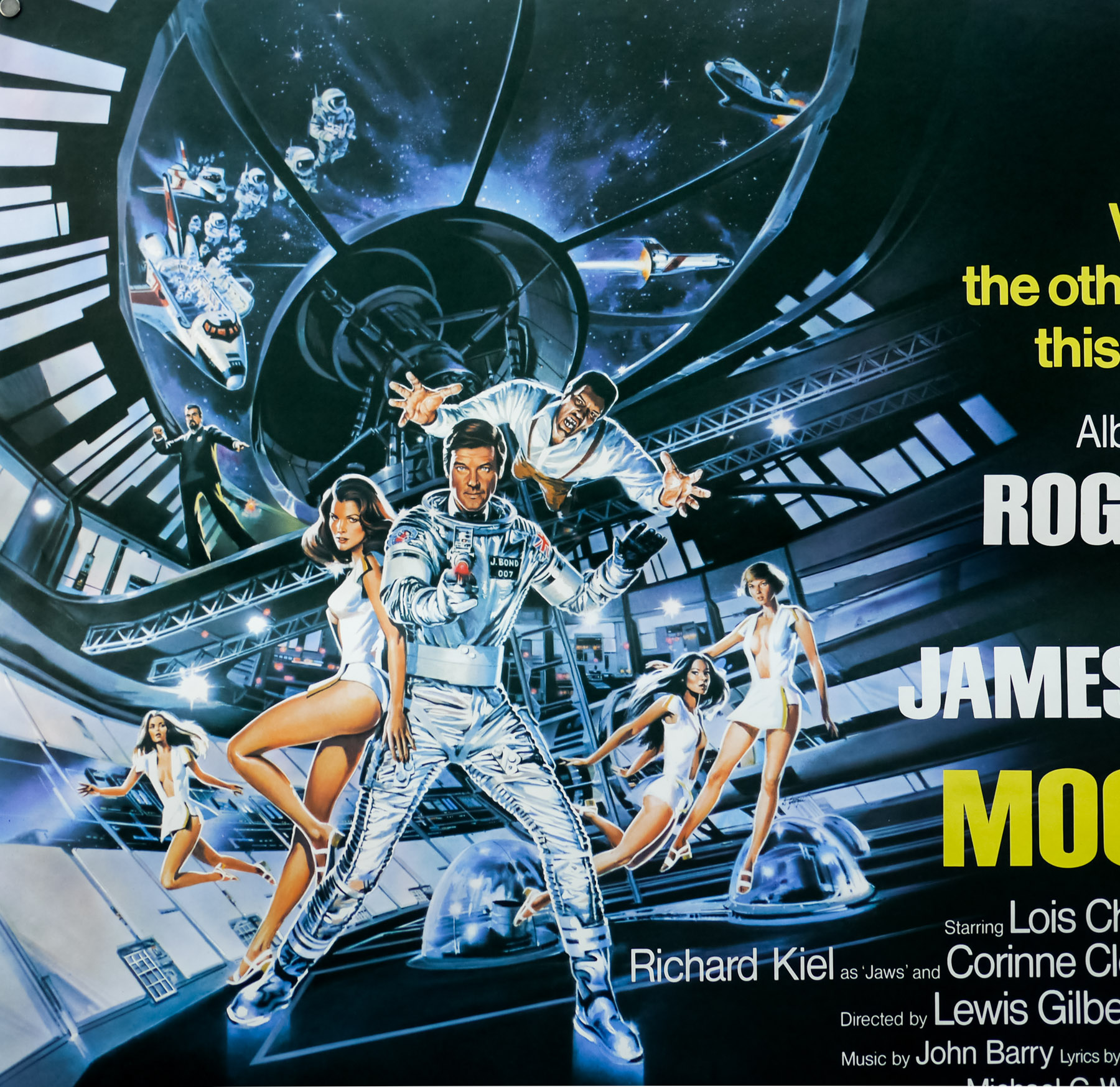
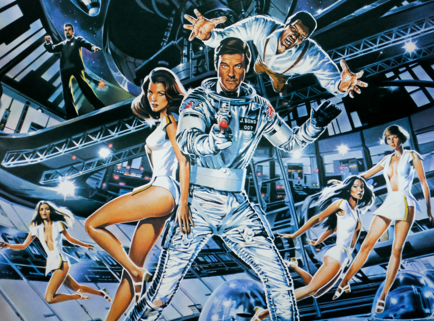
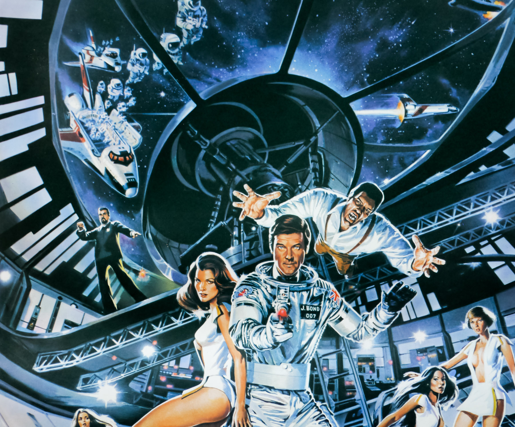
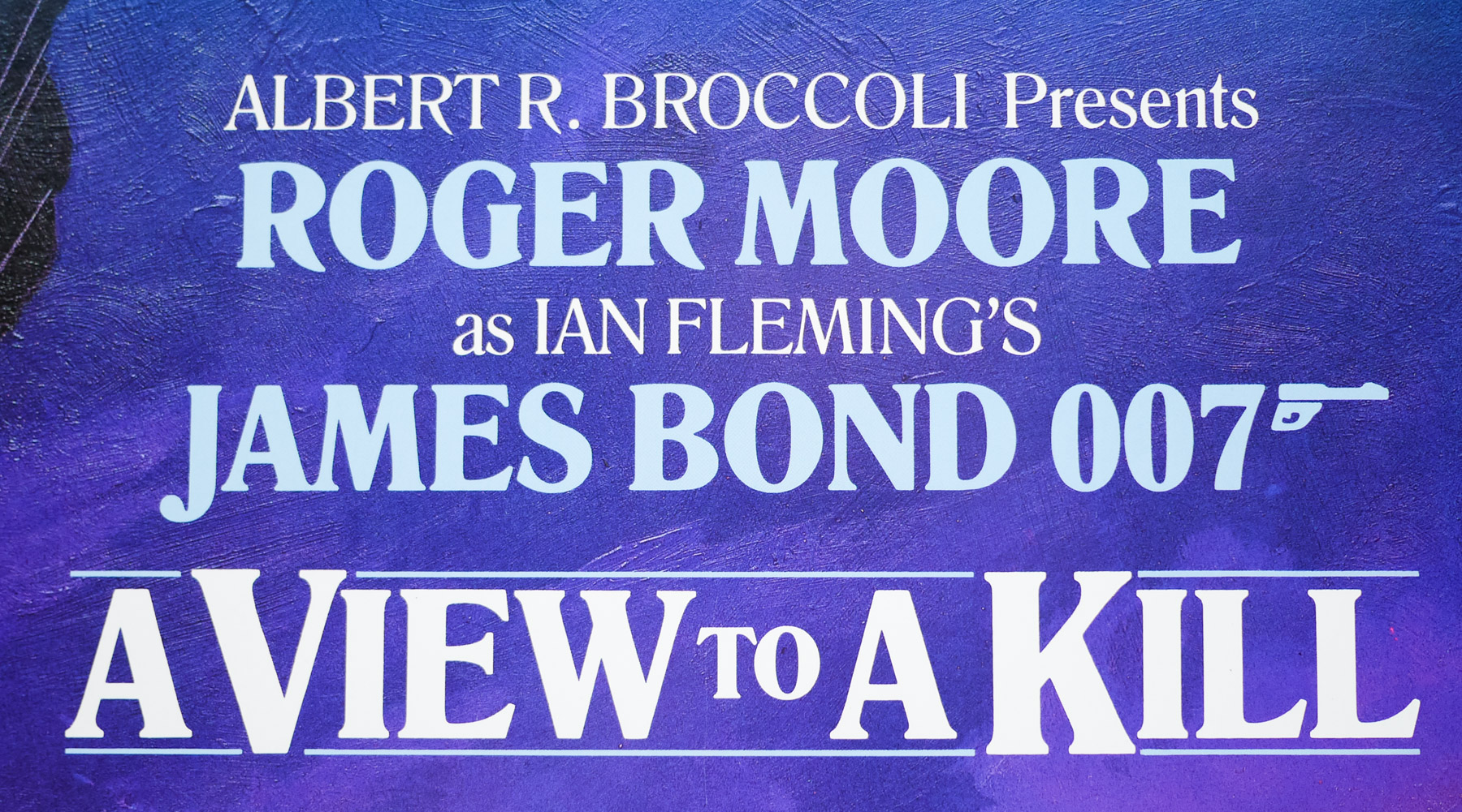
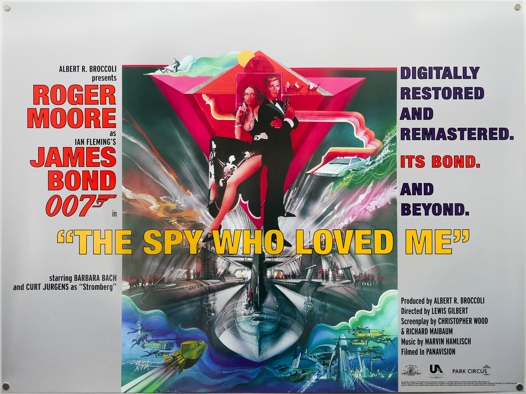
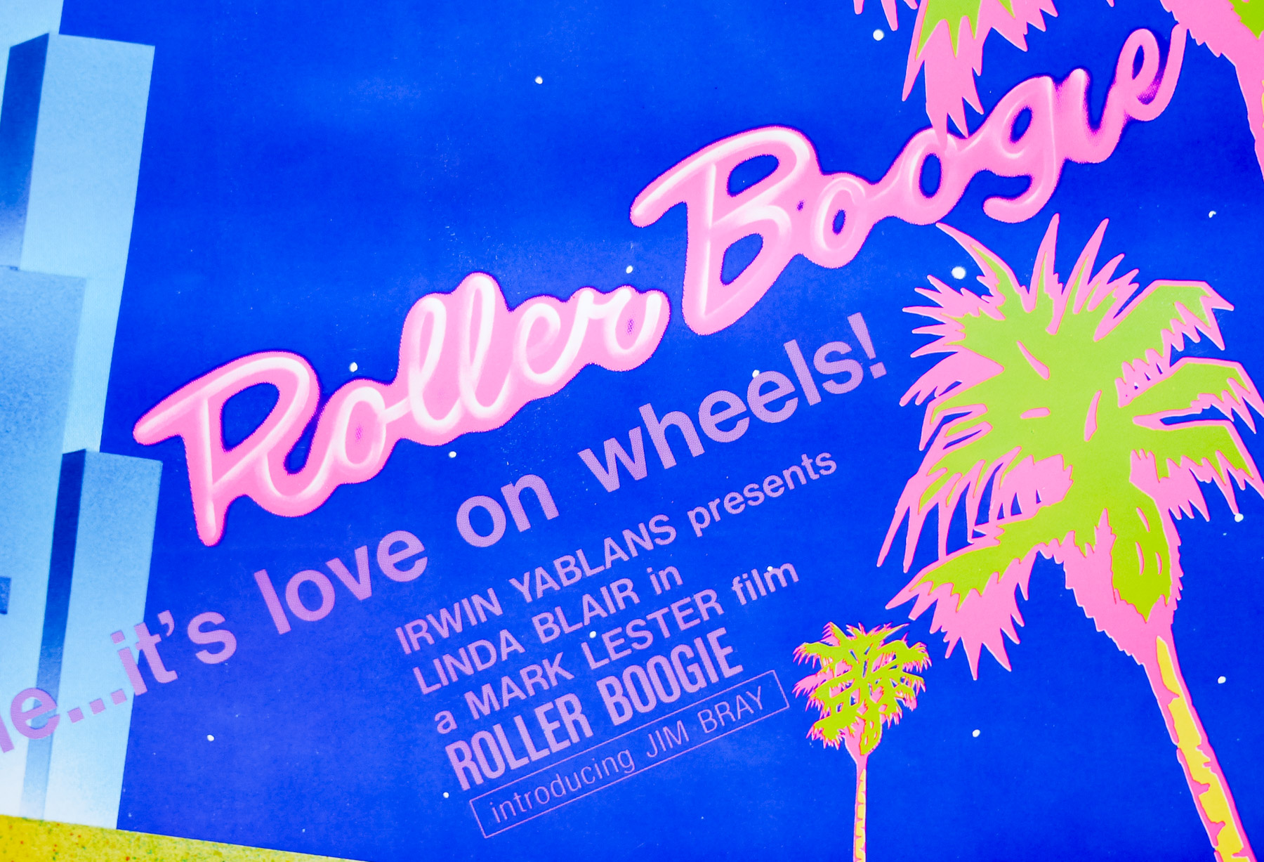
- Title
- For Your Eyes Only
- AKA
- 007 - Missão Ultra-Secreta (Portugal)
- Year of Film
- 1981
- Director
- John Glen
- Starring
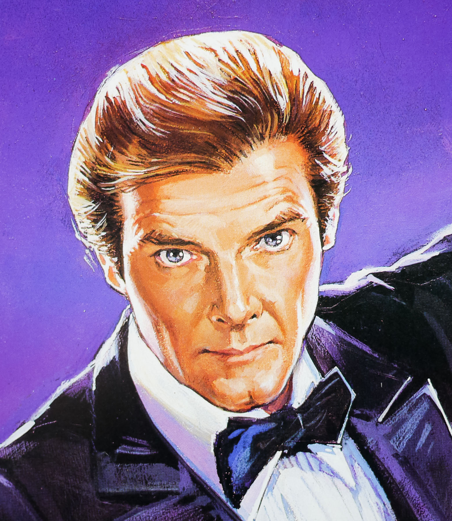
- Roger Moore, Carole Bouquet, Topol, Lynn-Holly Johnson, Julian Glover, Cassandra Harris, Jill Bennett, Michael Gothard, John Wyman, Jack Hedley, Lois Maxwell, Desmond Llewelyn
- Origin of Film
- UK | USA
- Genre(s) of Film
- Roger Moore, Carole Bouquet, Topol, Lynn-Holly Johnson, Julian Glover, Cassandra Harris, Jill Bennett, Michael Gothard, John Wyman, Jack Hedley, Lois Maxwell, Desmond Llewelyn,
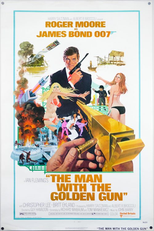
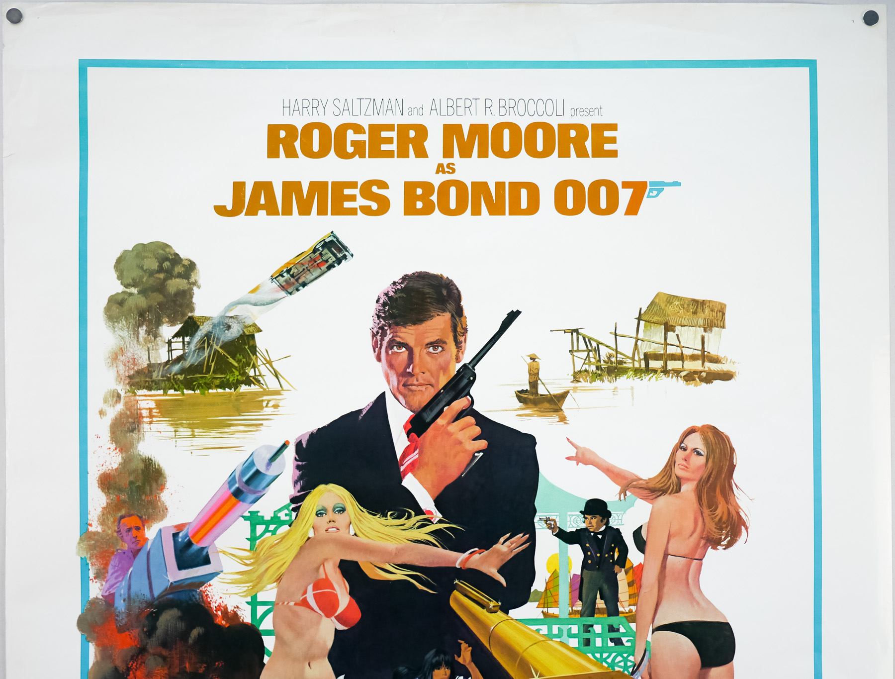
- Type of Poster
- Quad
- Style of Poster
- --
- Origin of Poster
- UK
- Year of Poster
- 1981
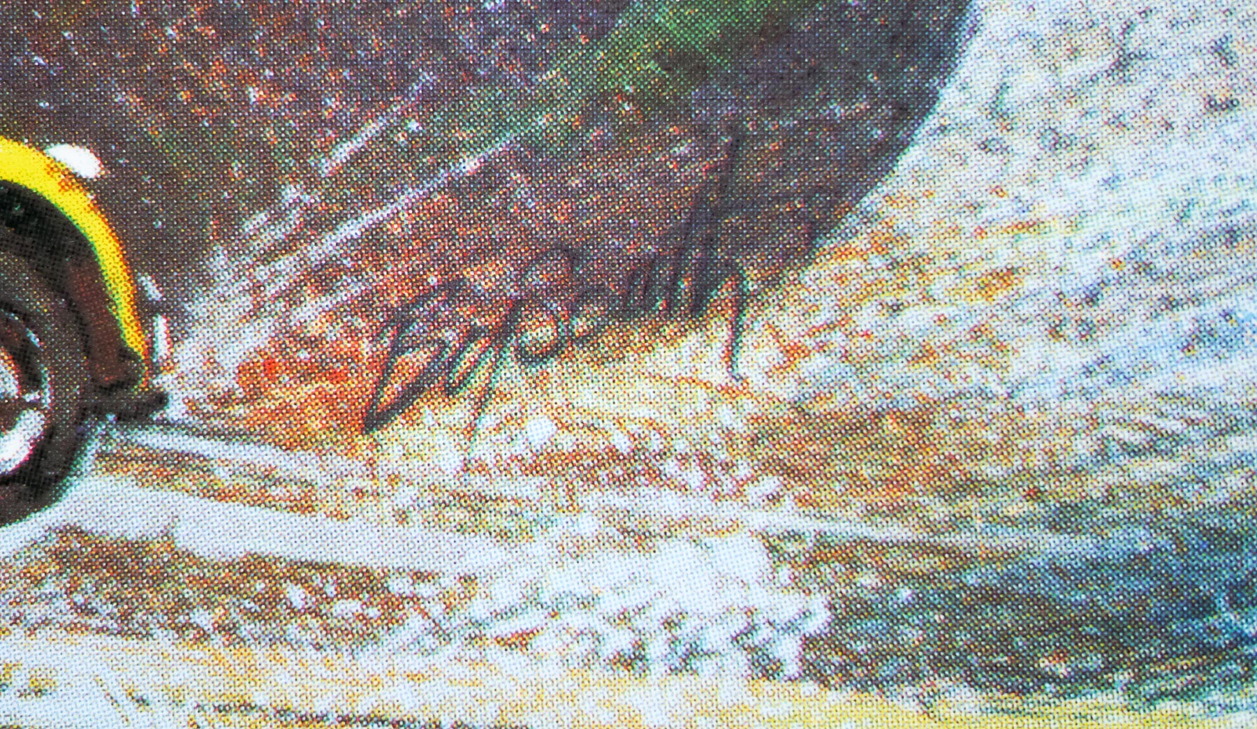
- Artist
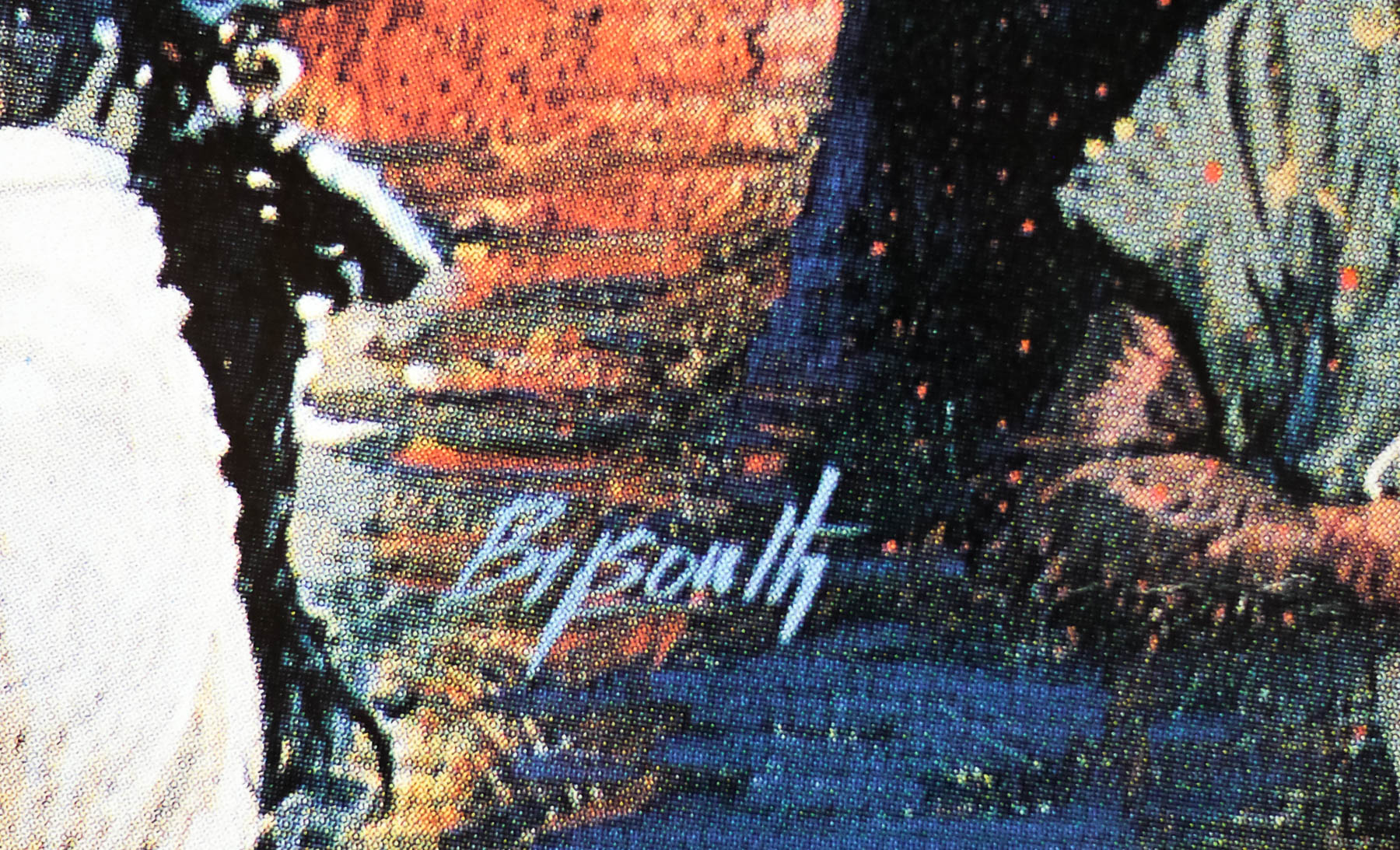
- Brian Bysouth
- Size (inches)
- 30" x 40"
- SS or DS
- SS
- Tagline
- --
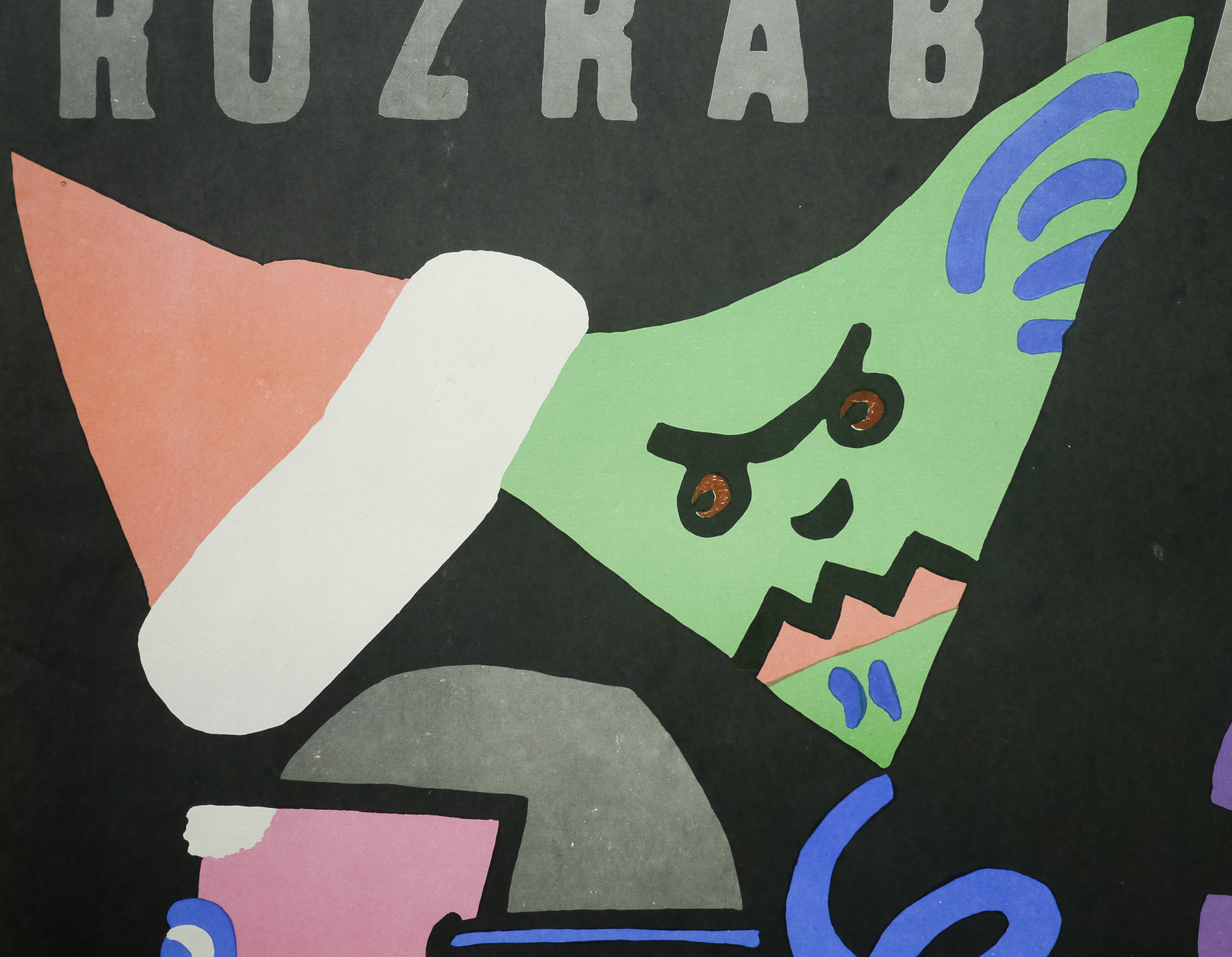
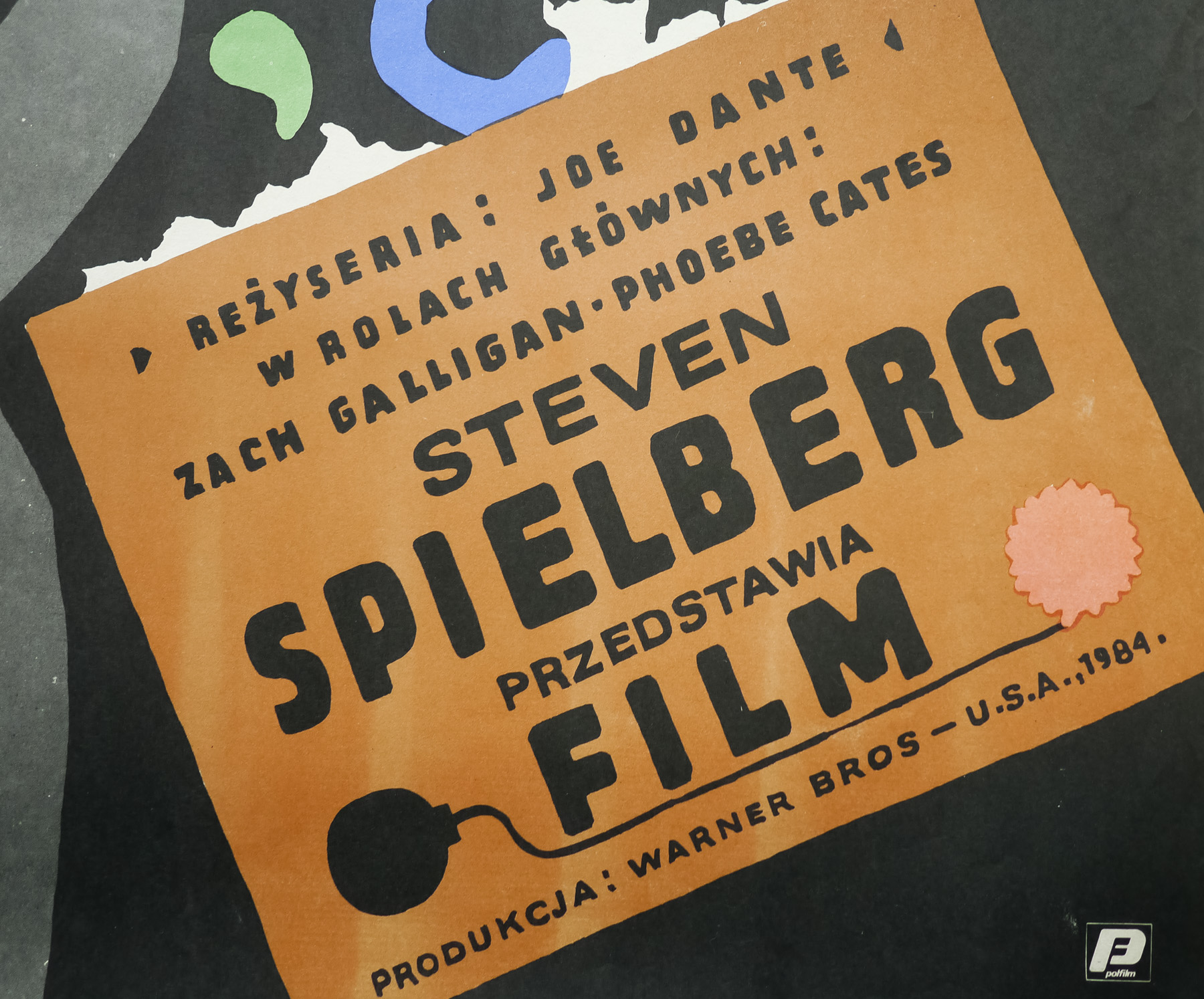
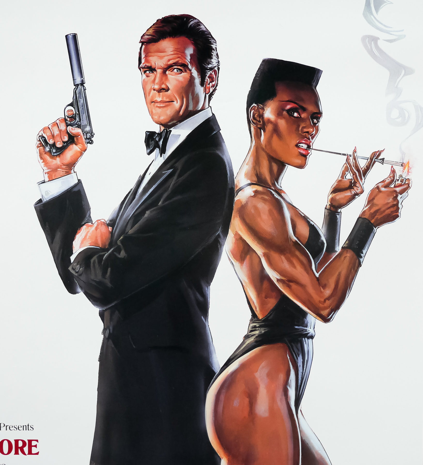
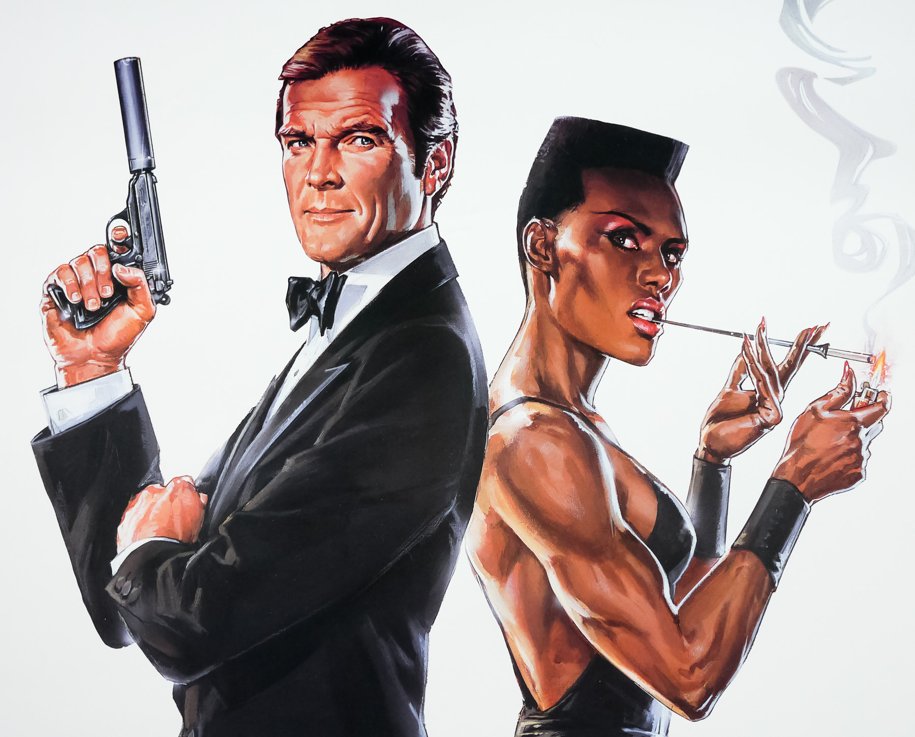
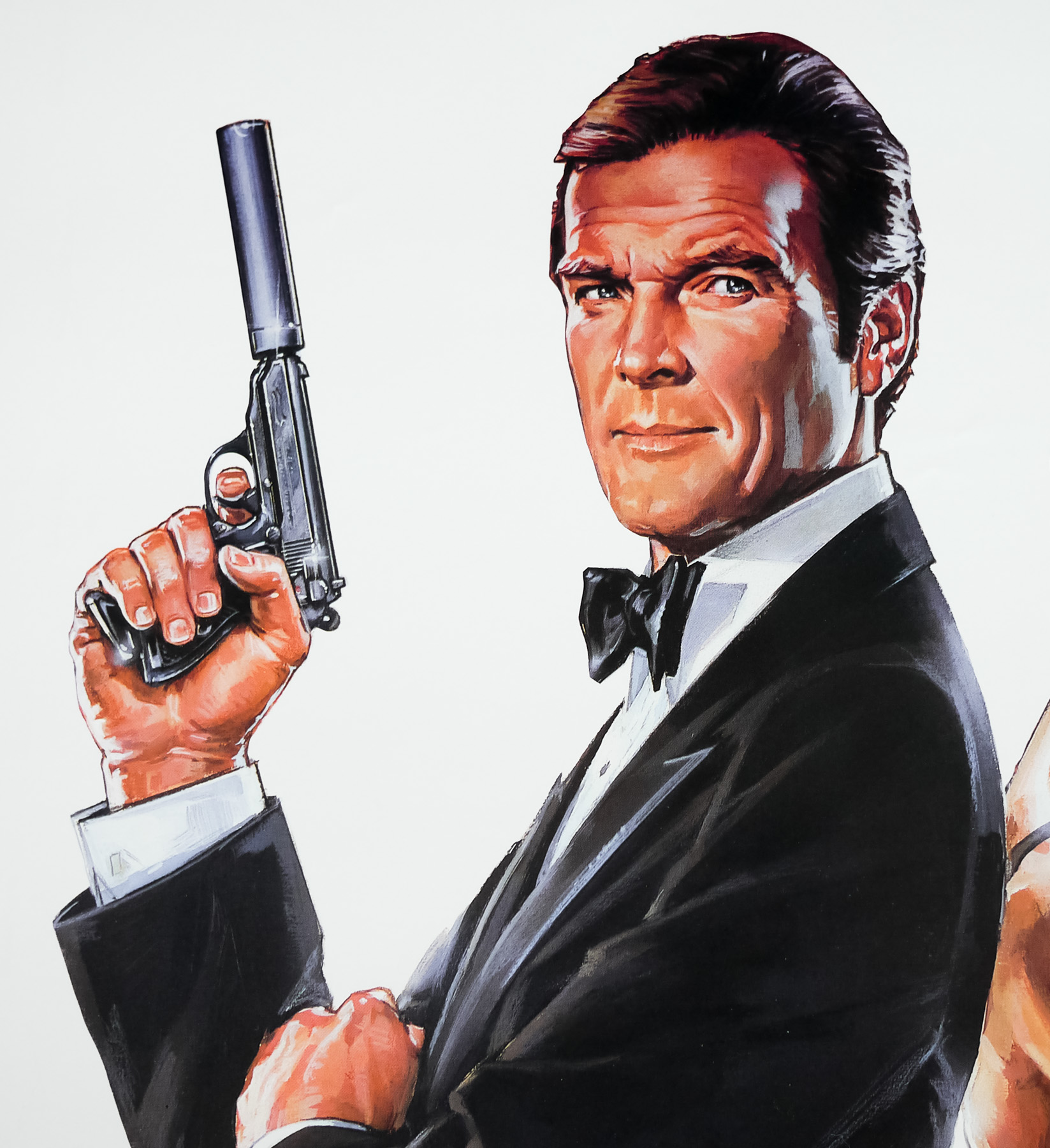
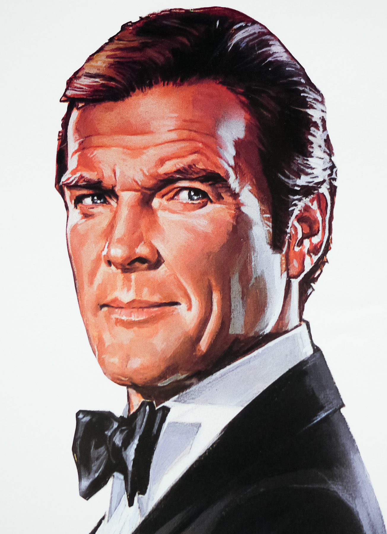
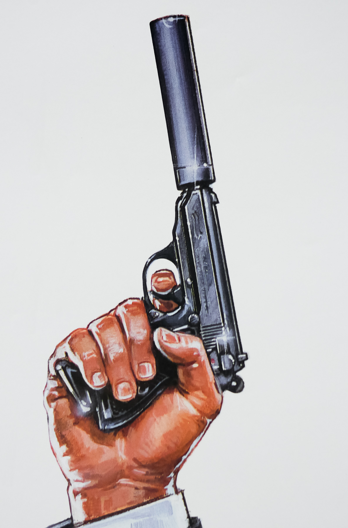
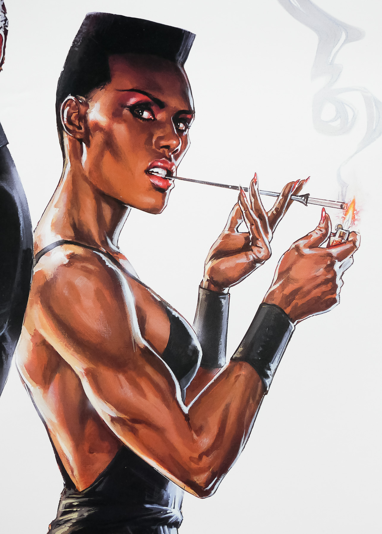
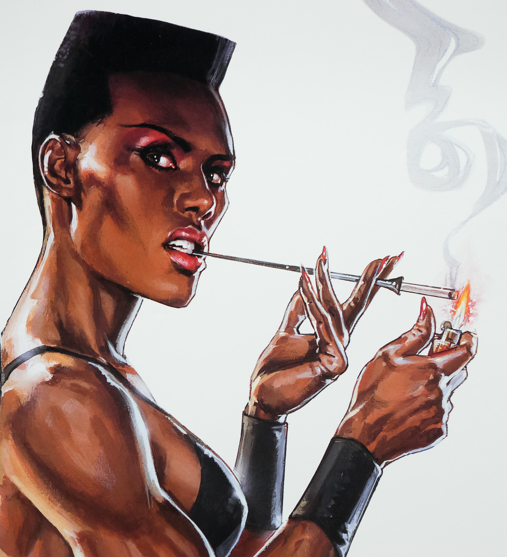
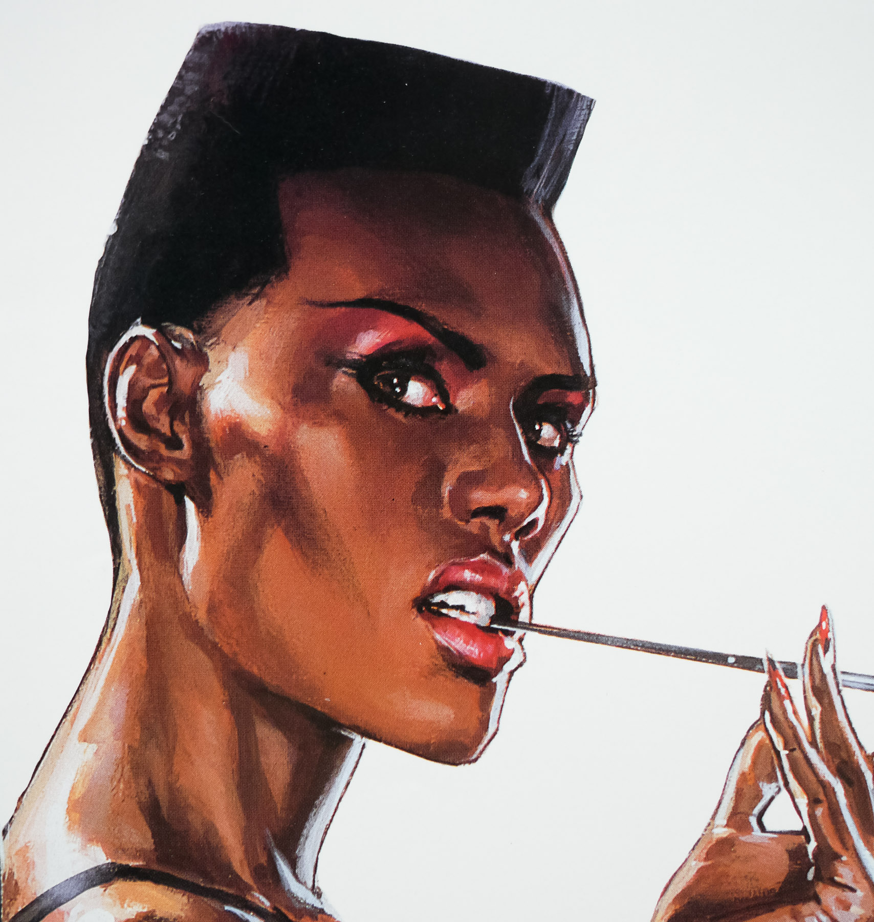
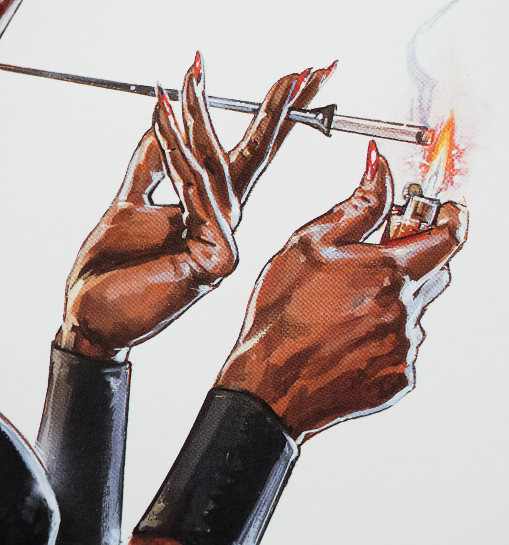
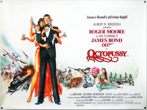
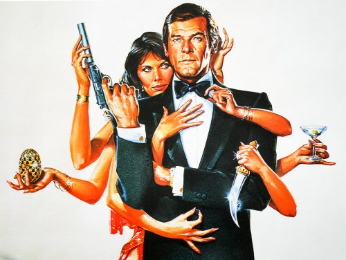
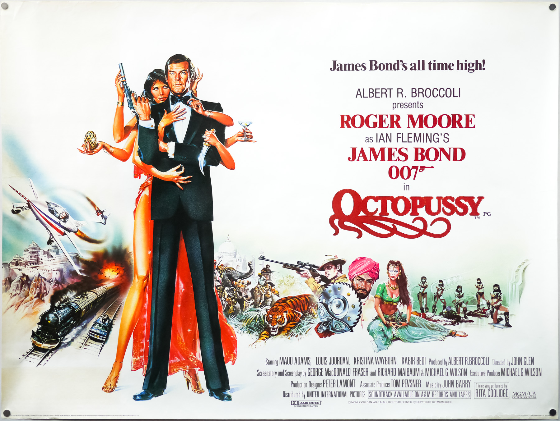
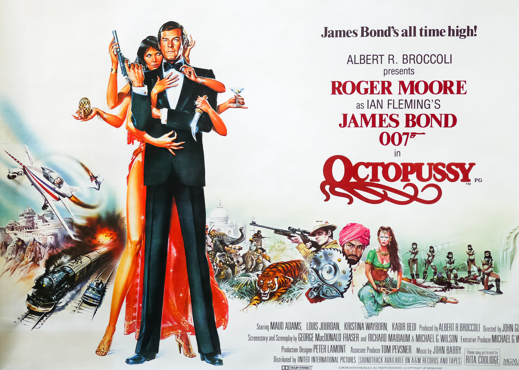
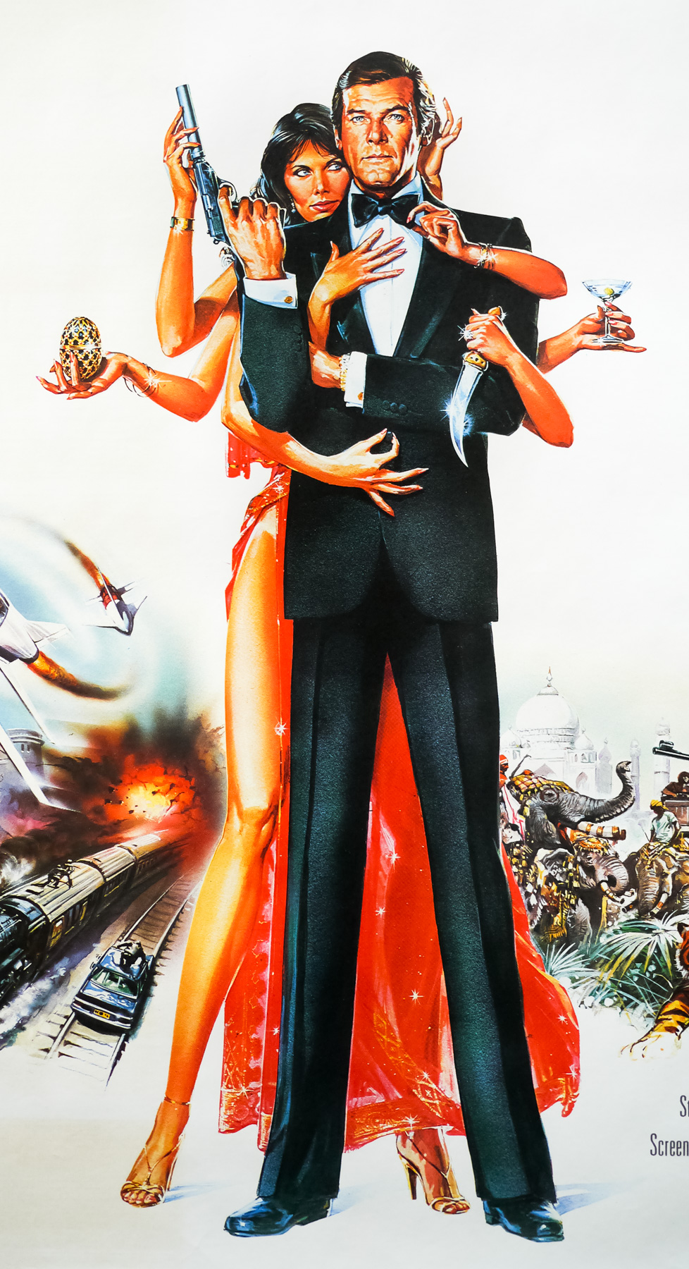
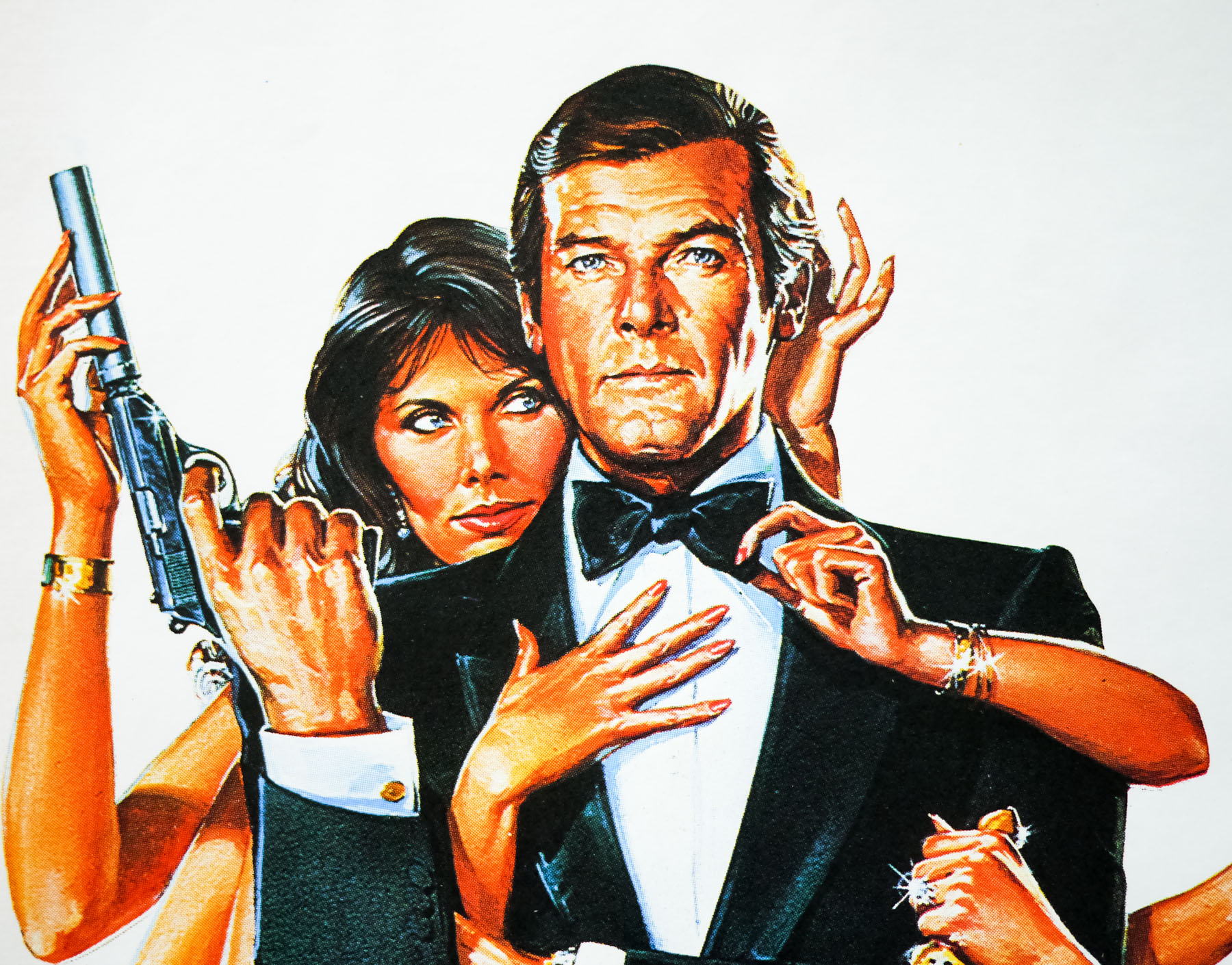
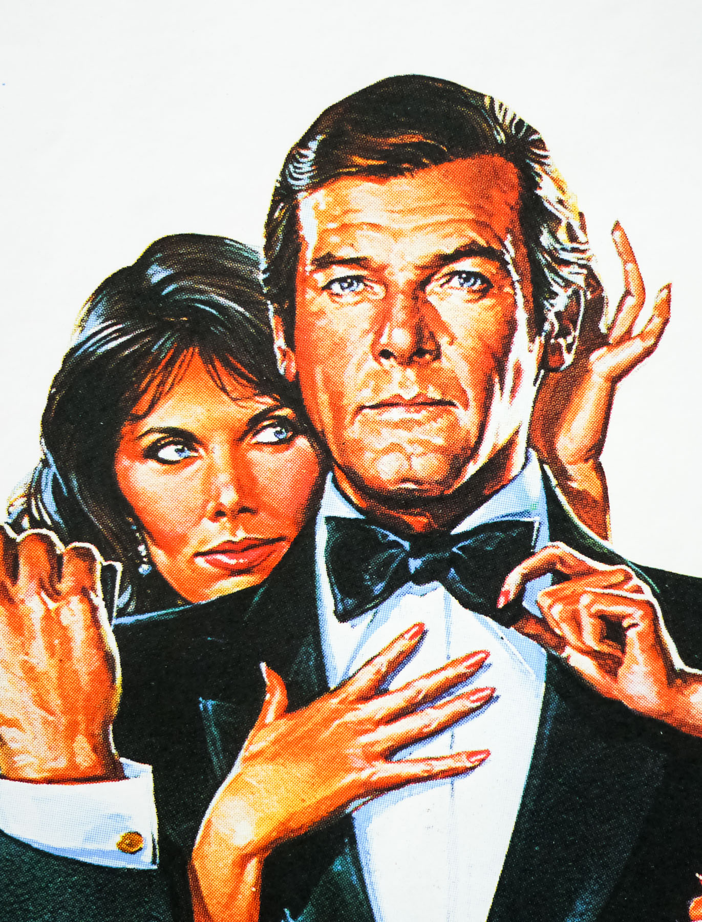
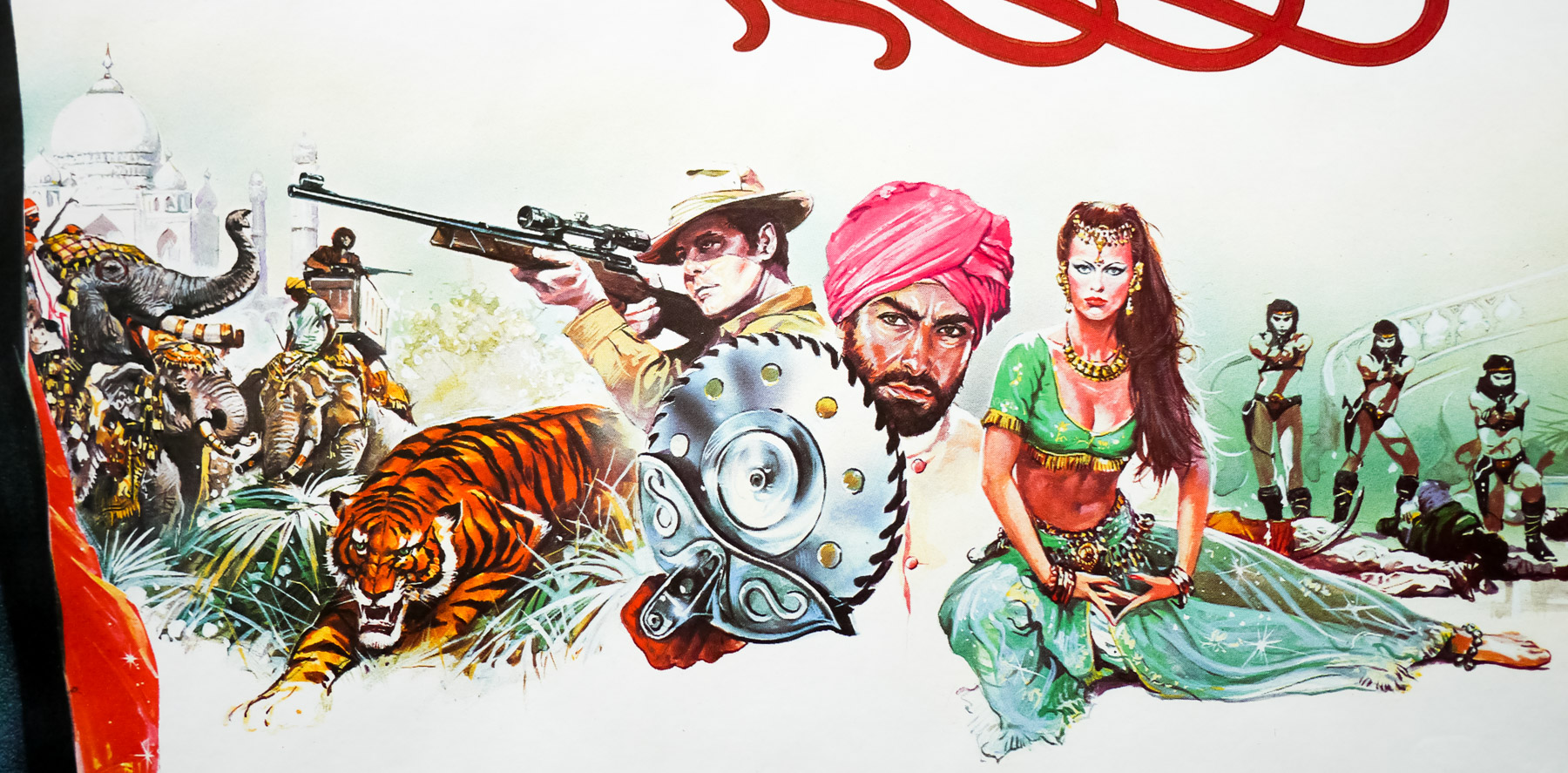
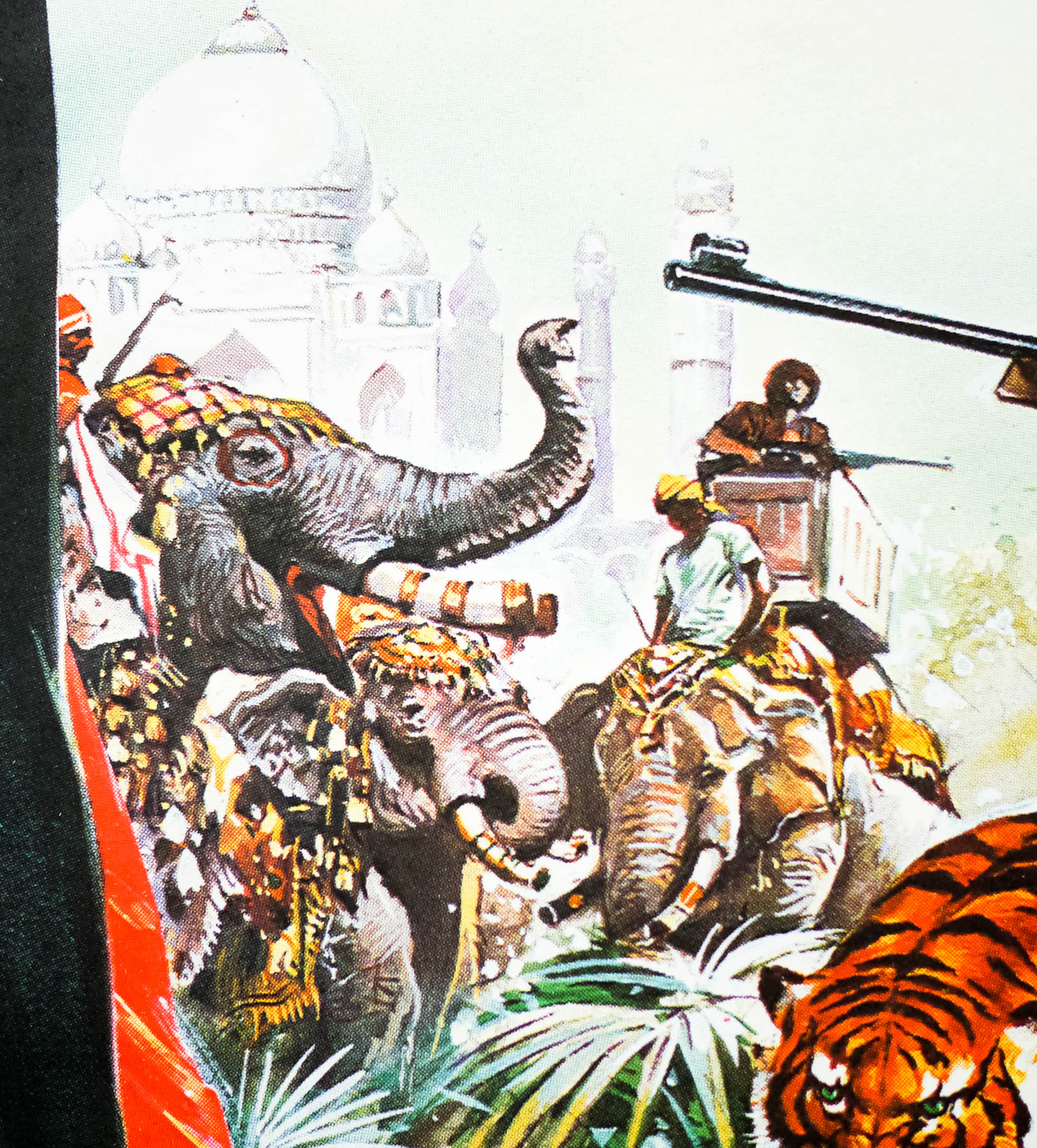
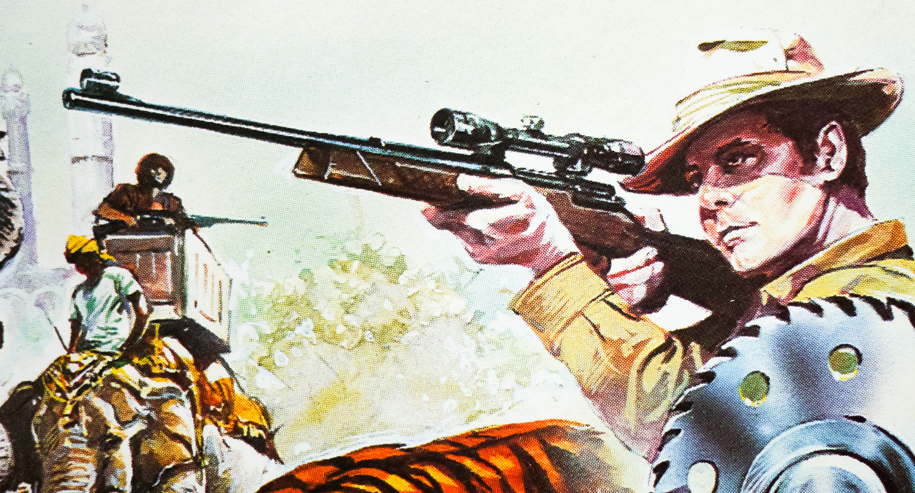
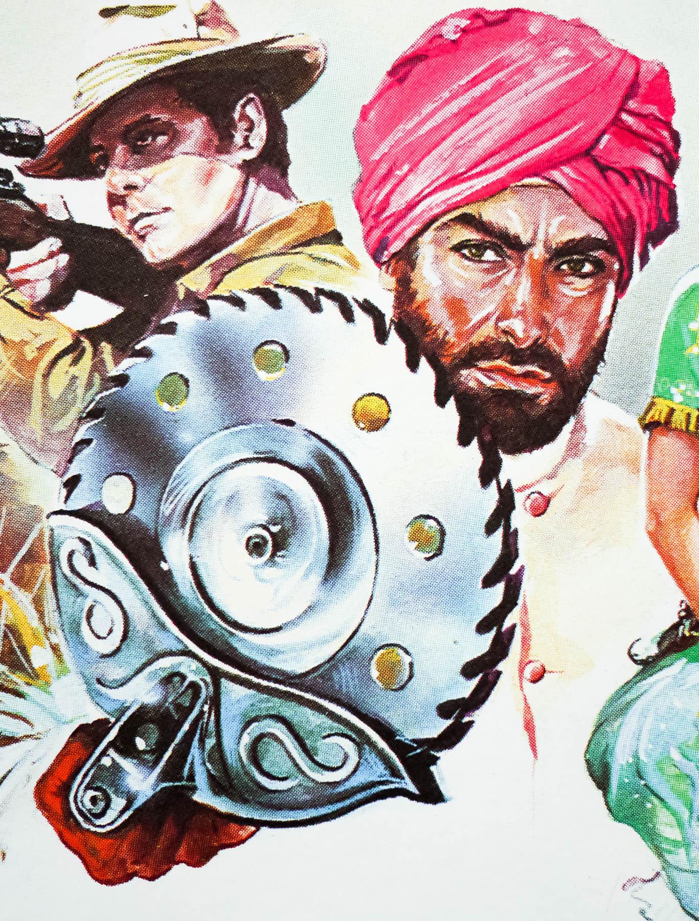
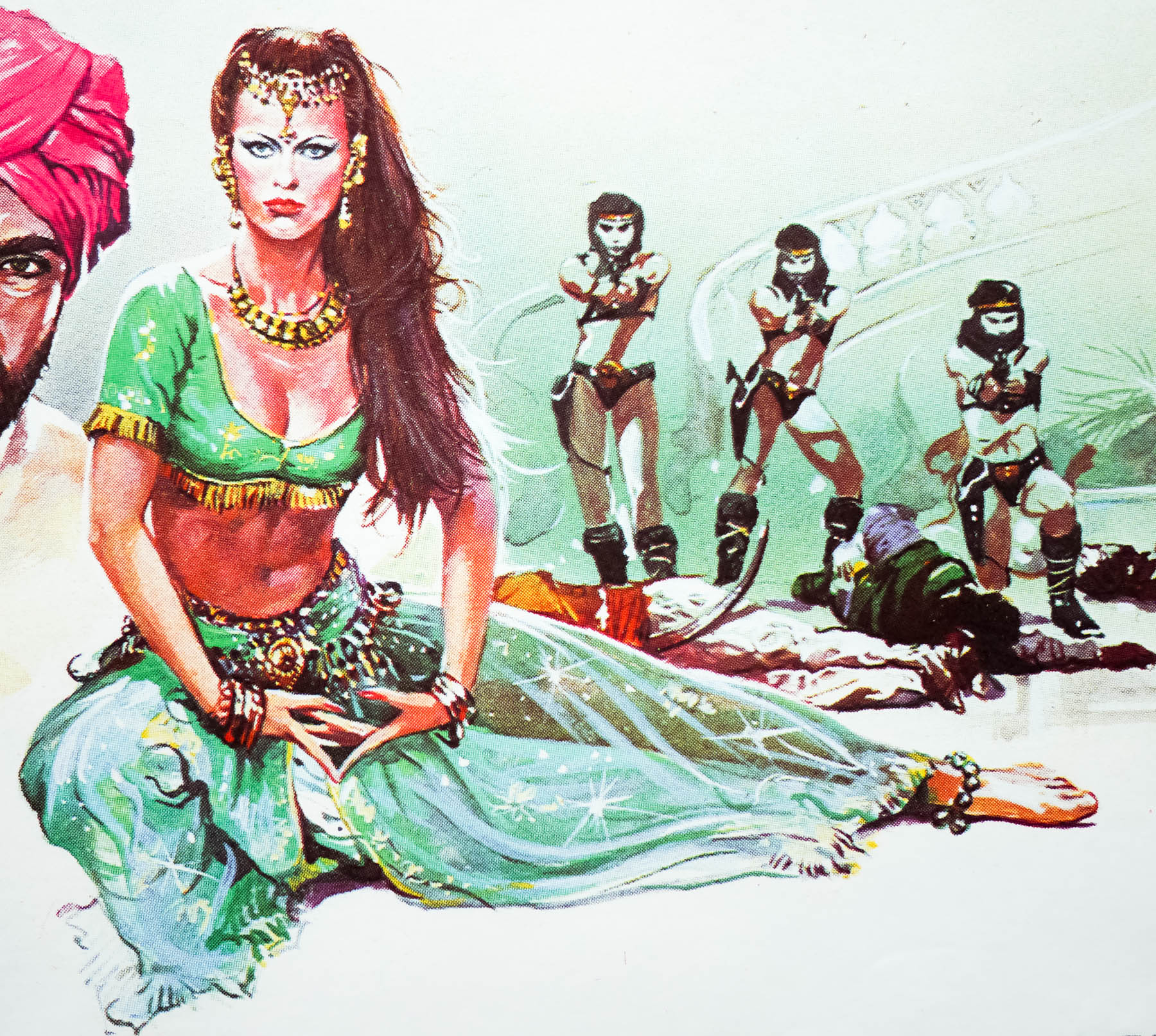
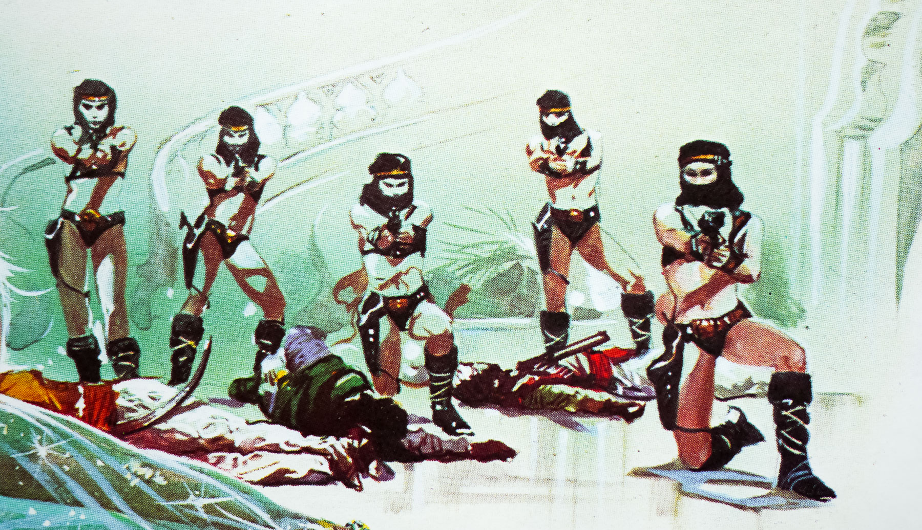
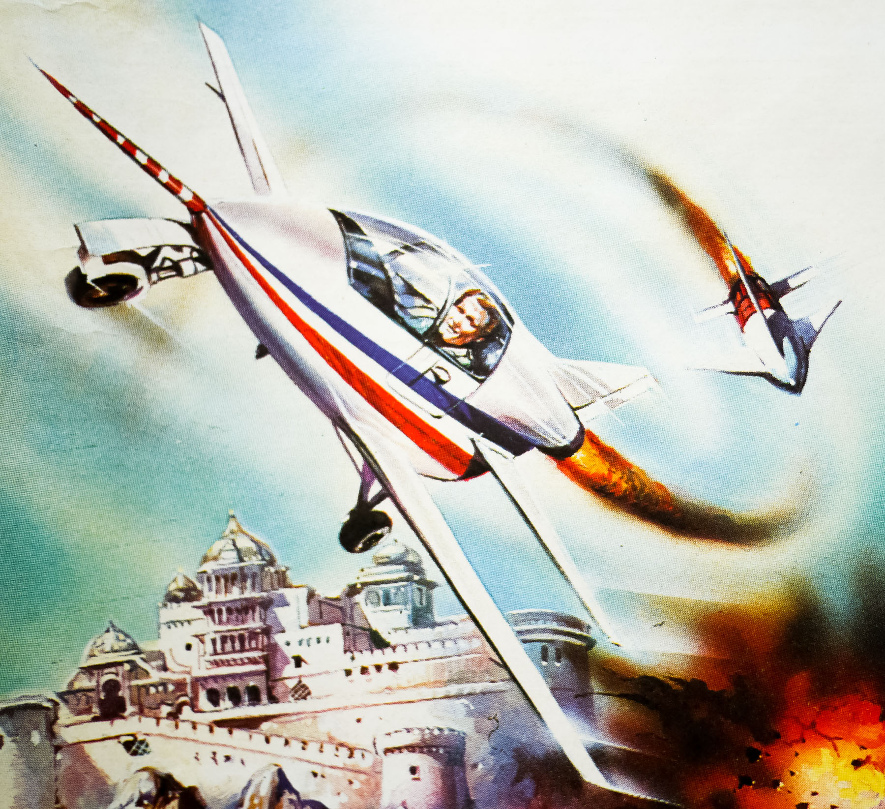
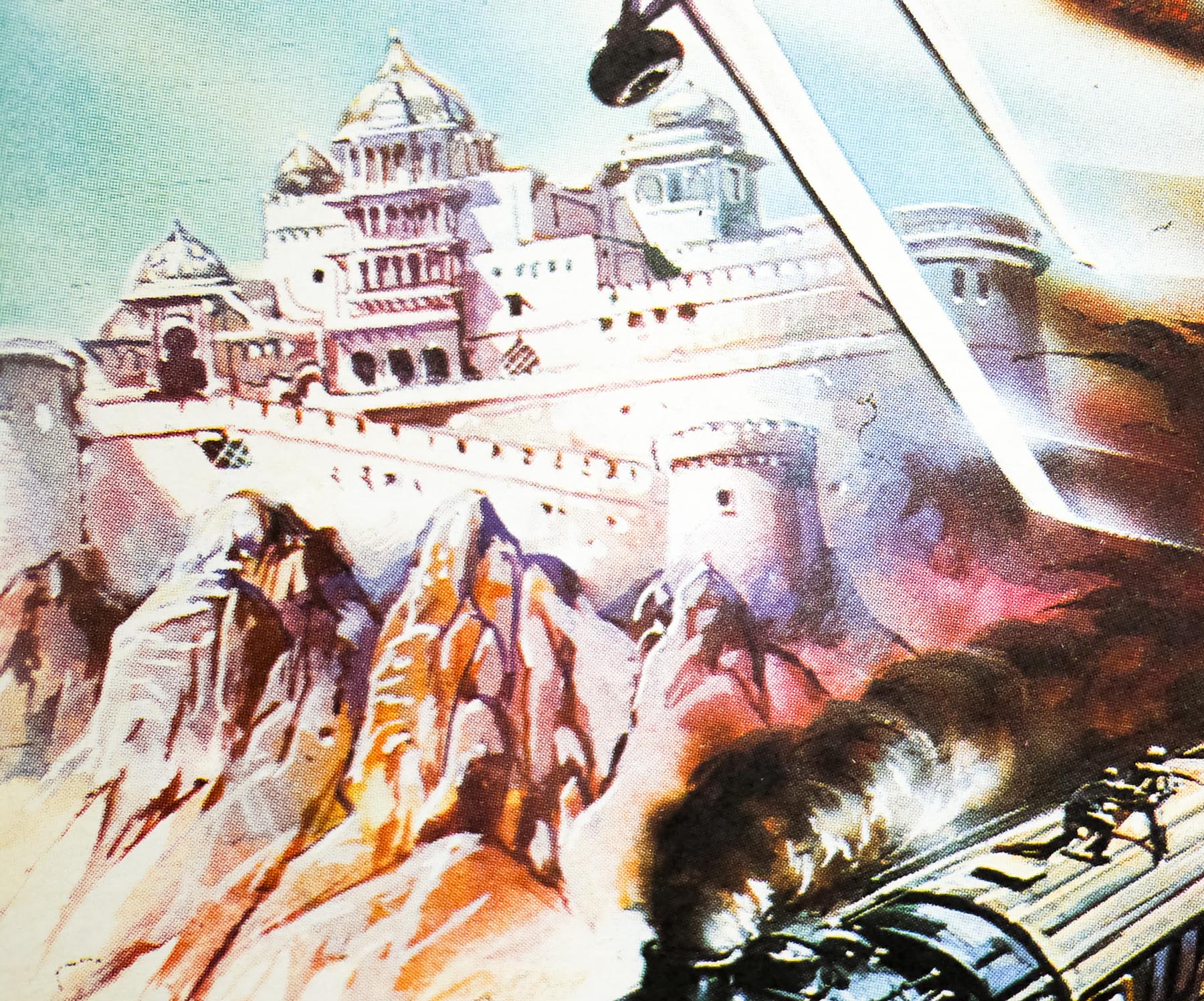
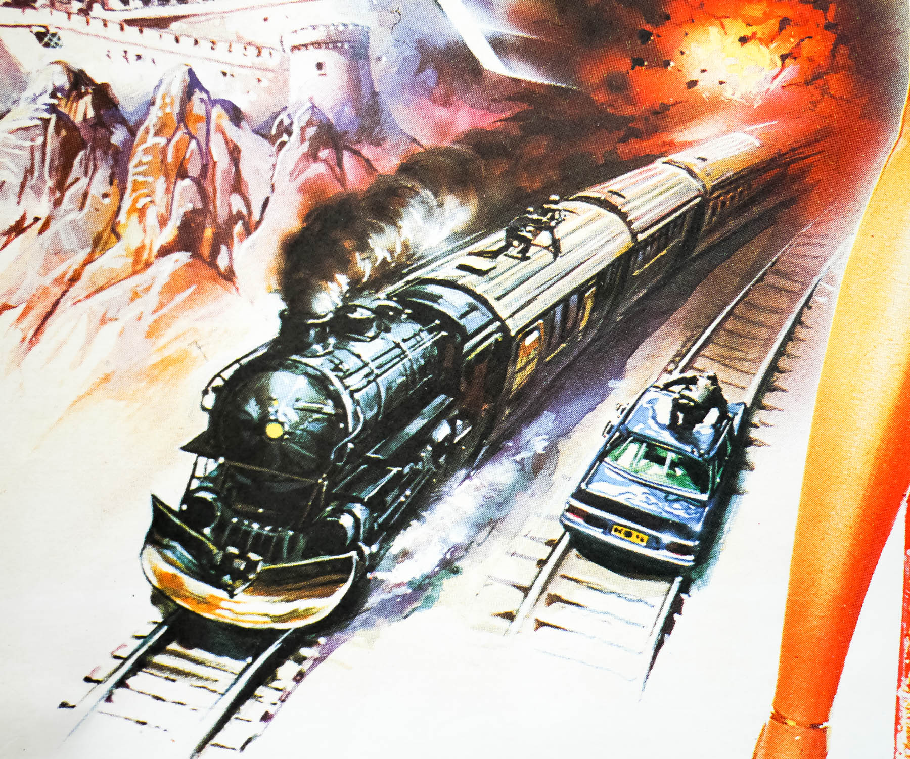
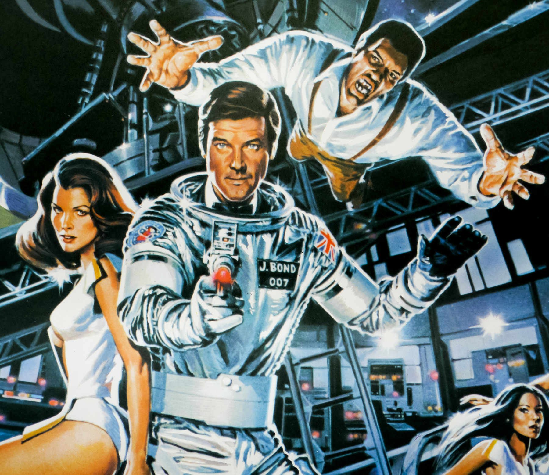
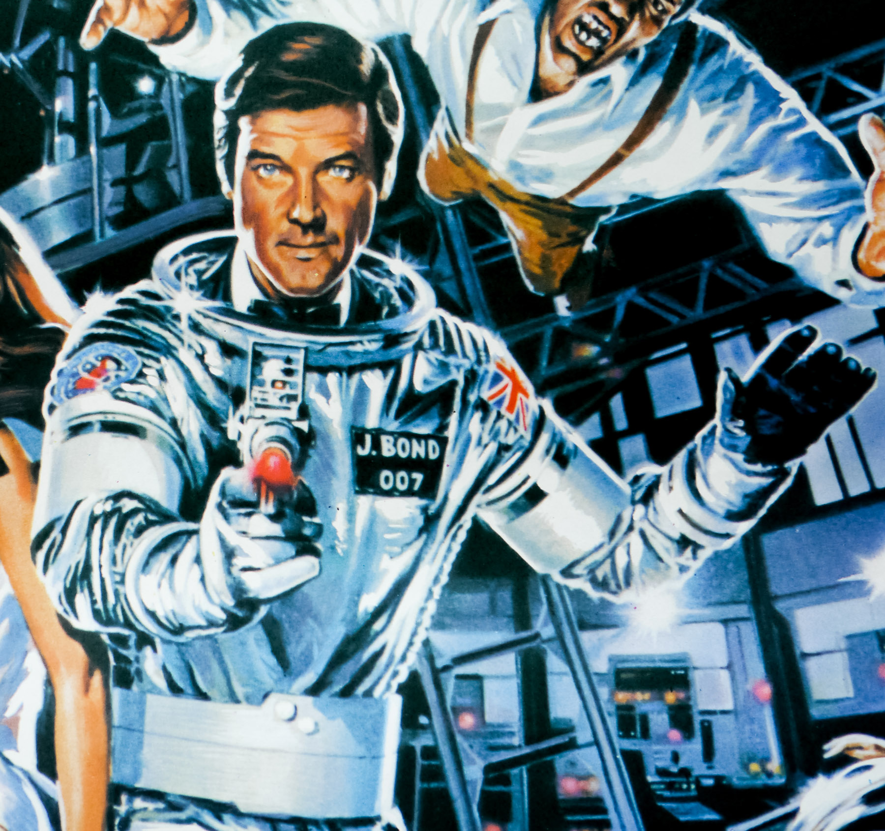
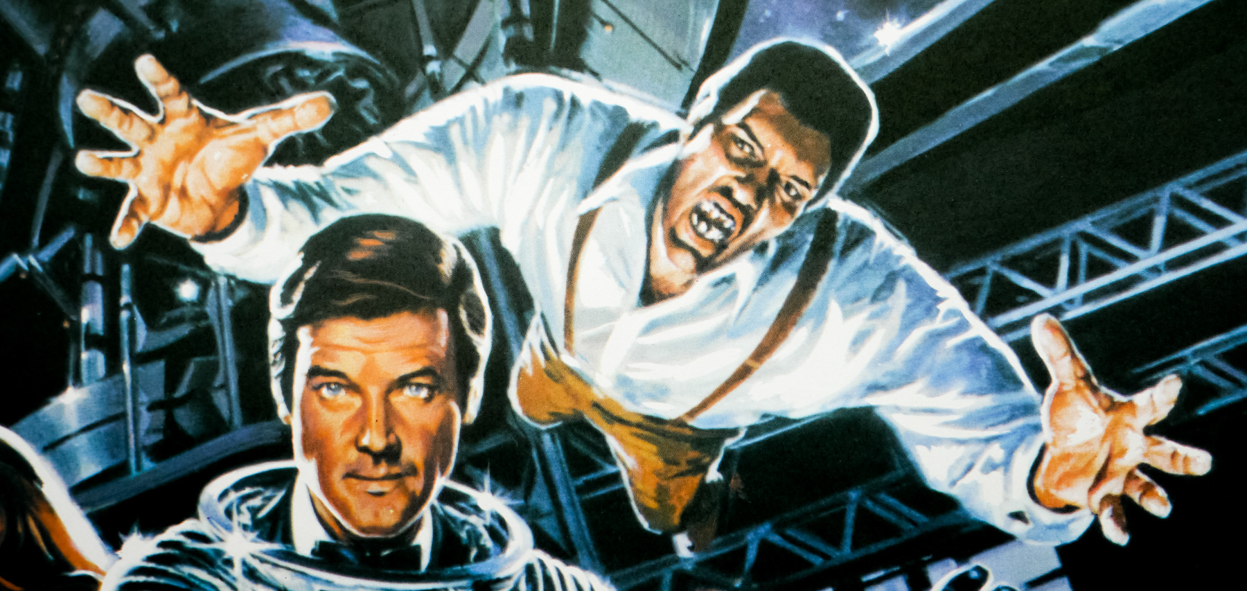
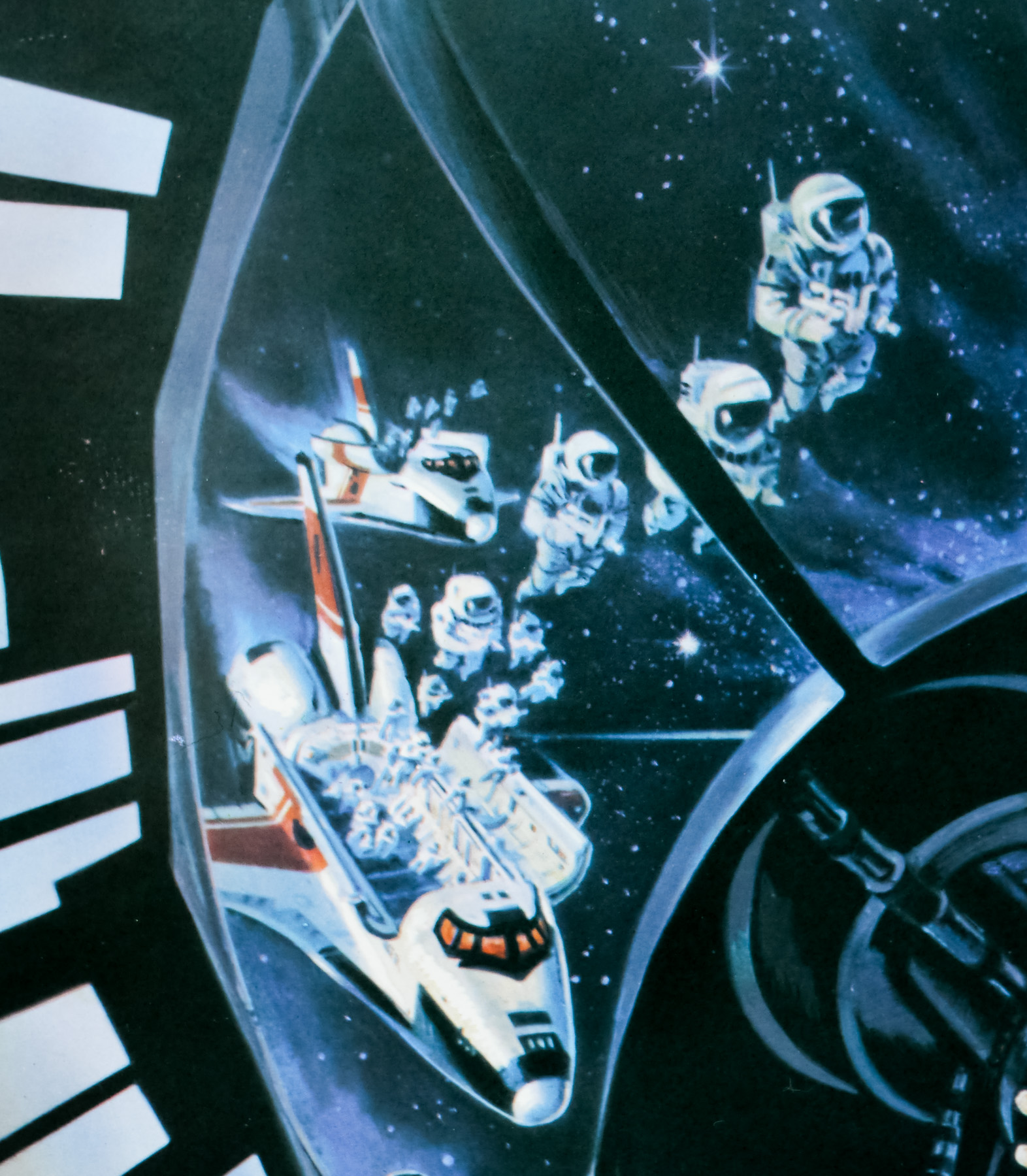
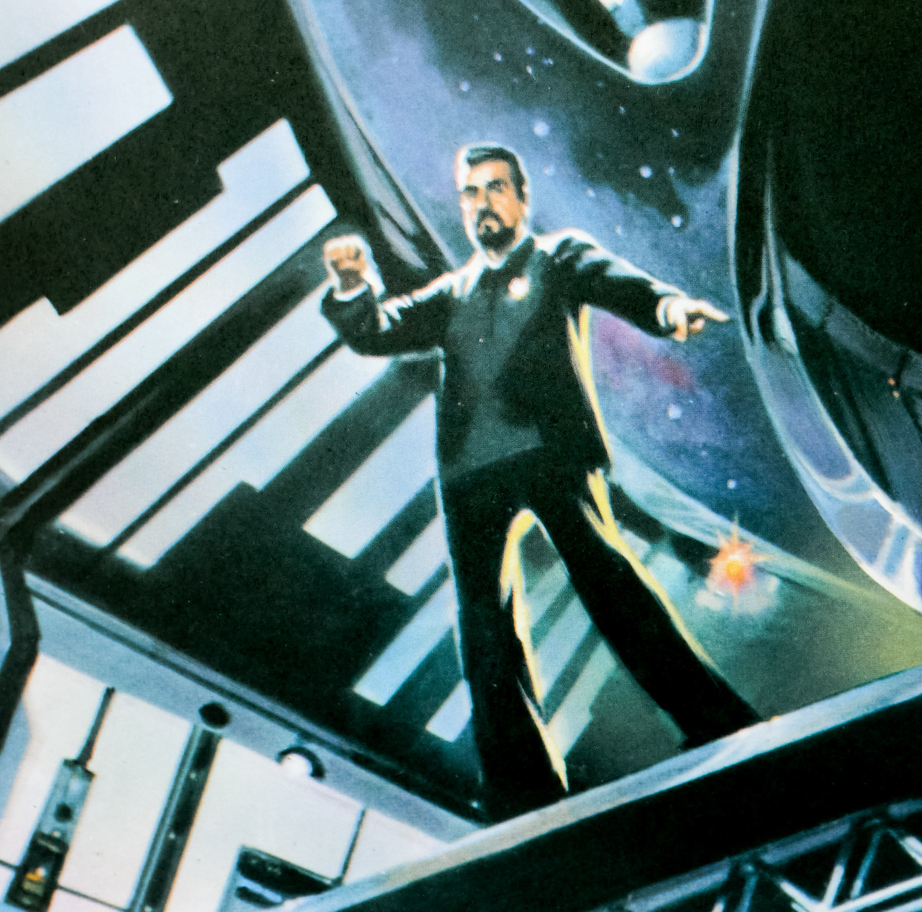
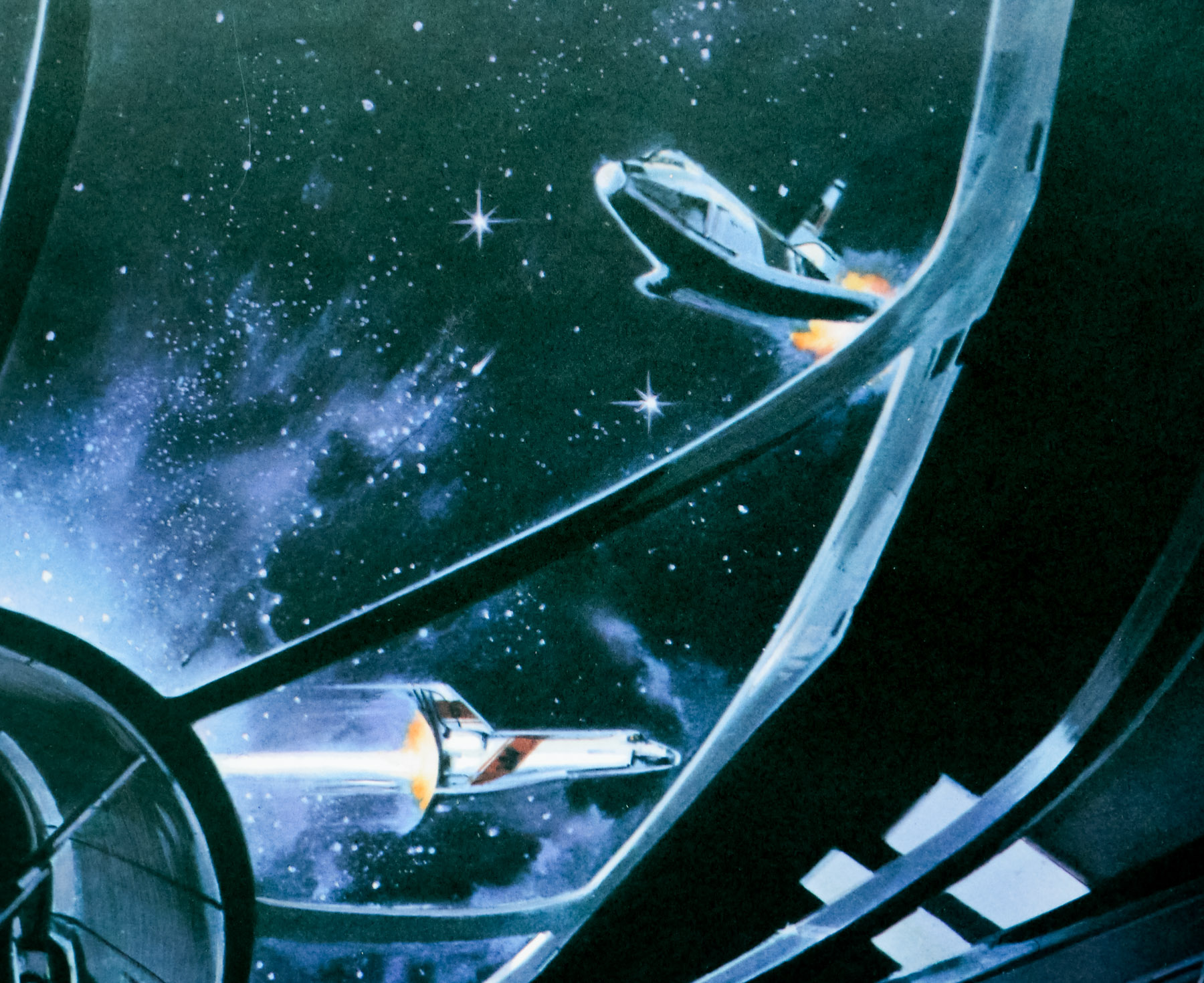
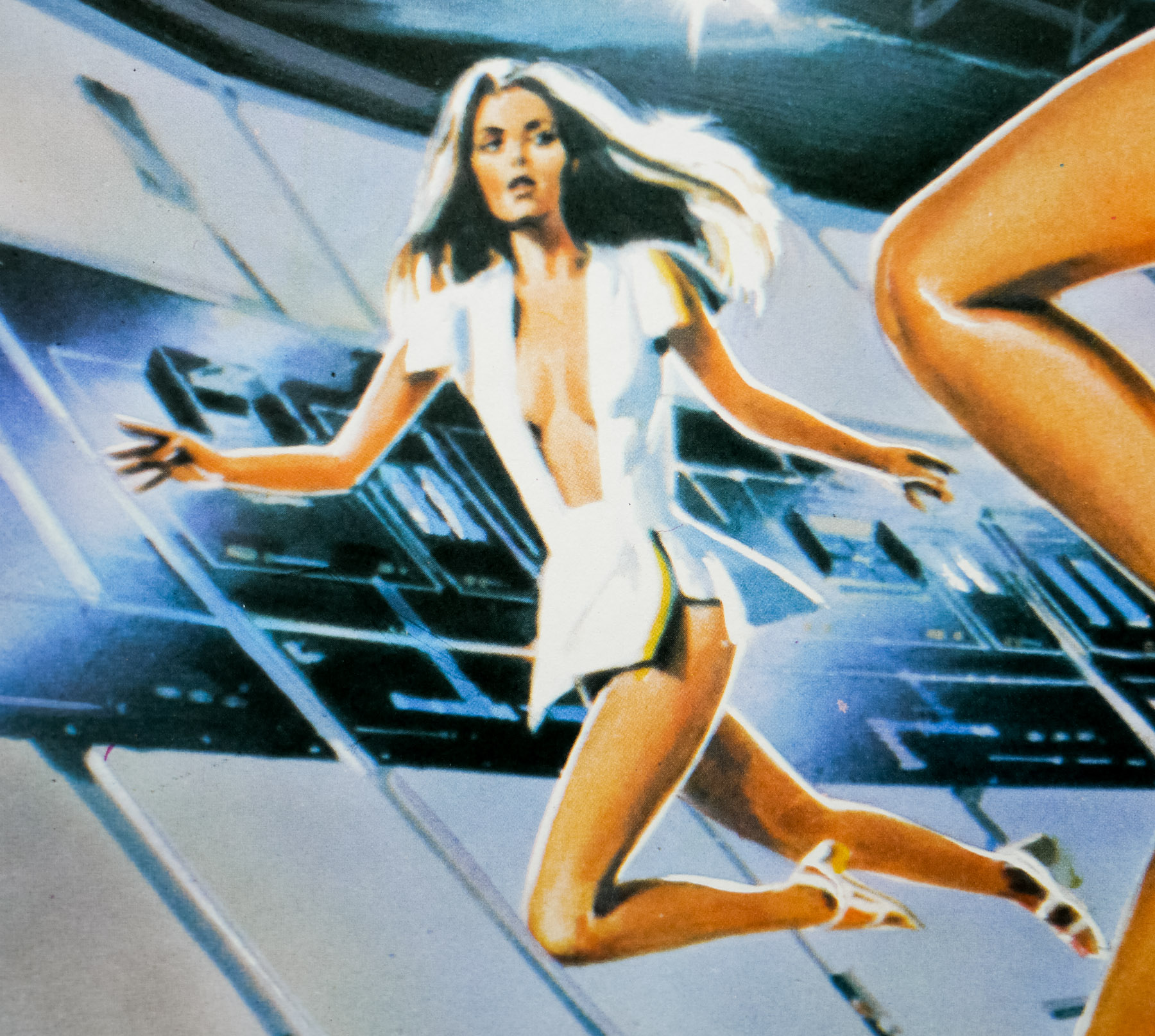
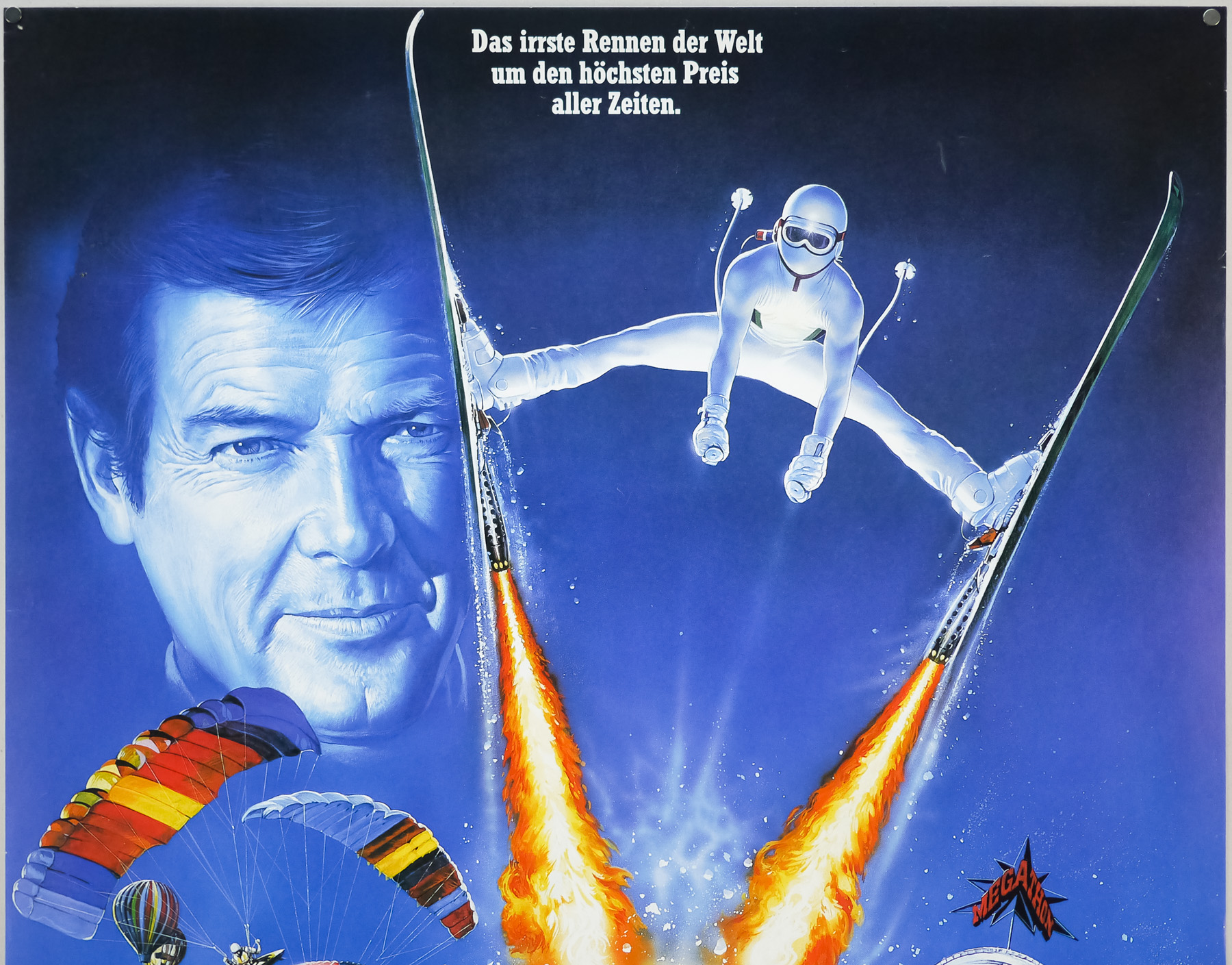
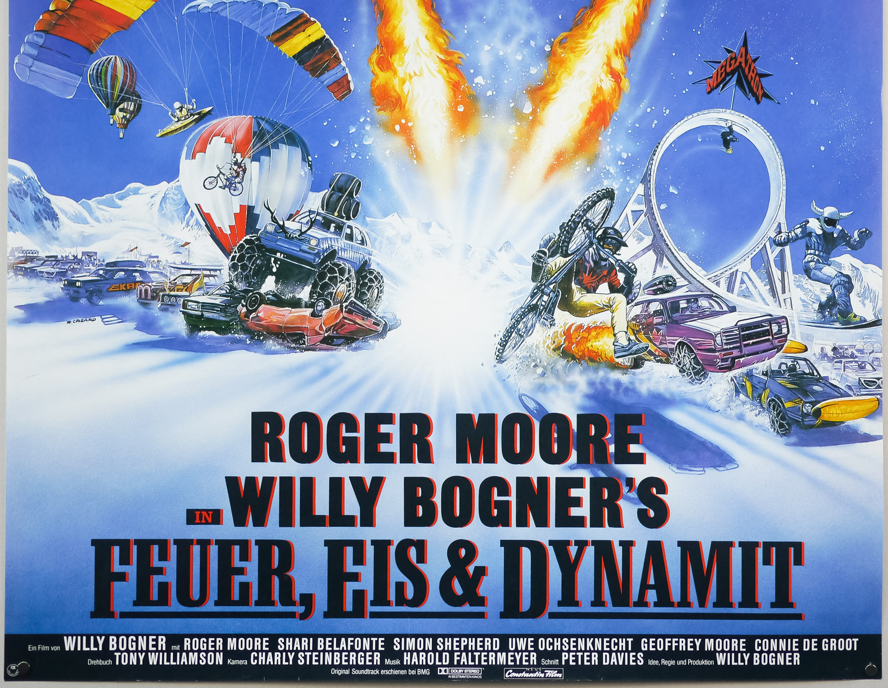
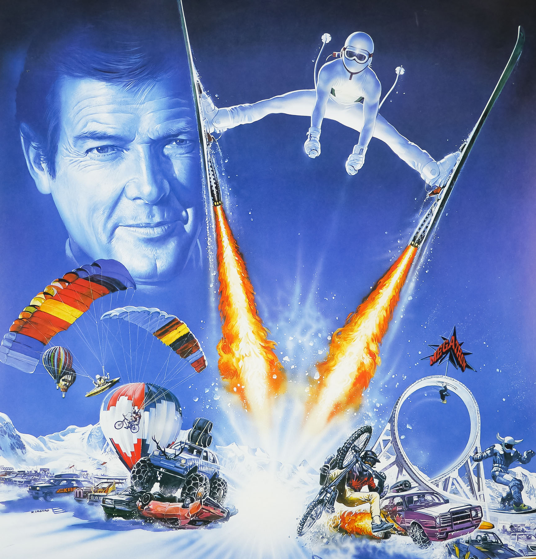
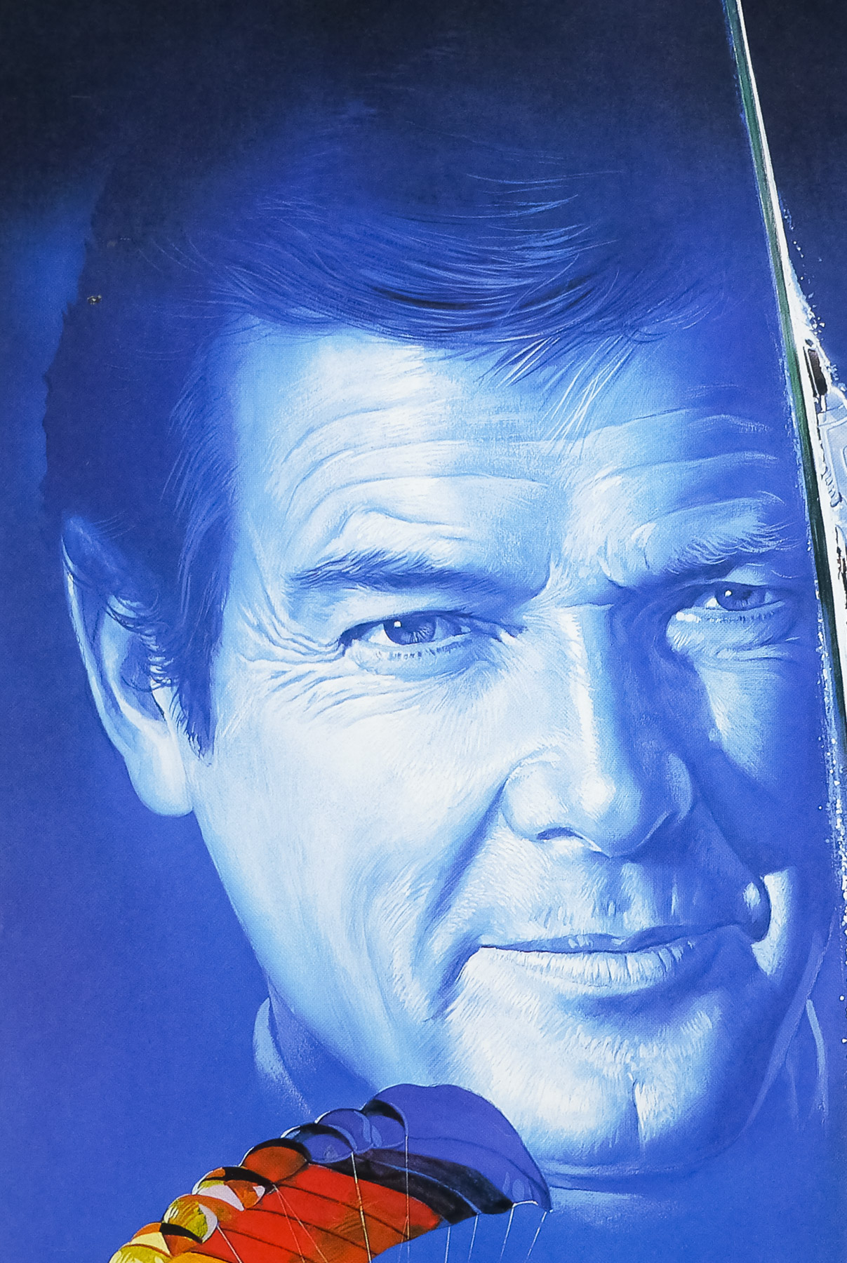
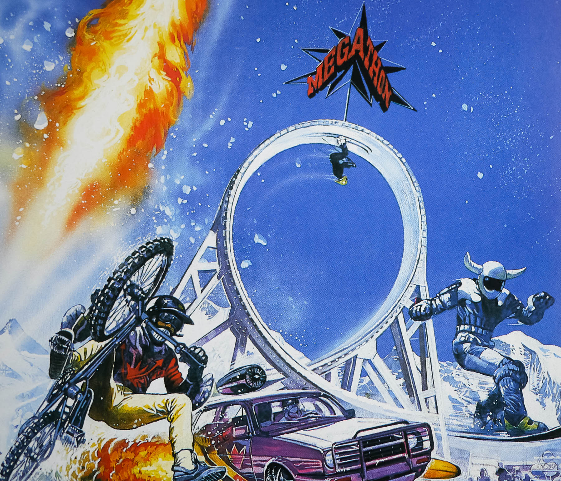
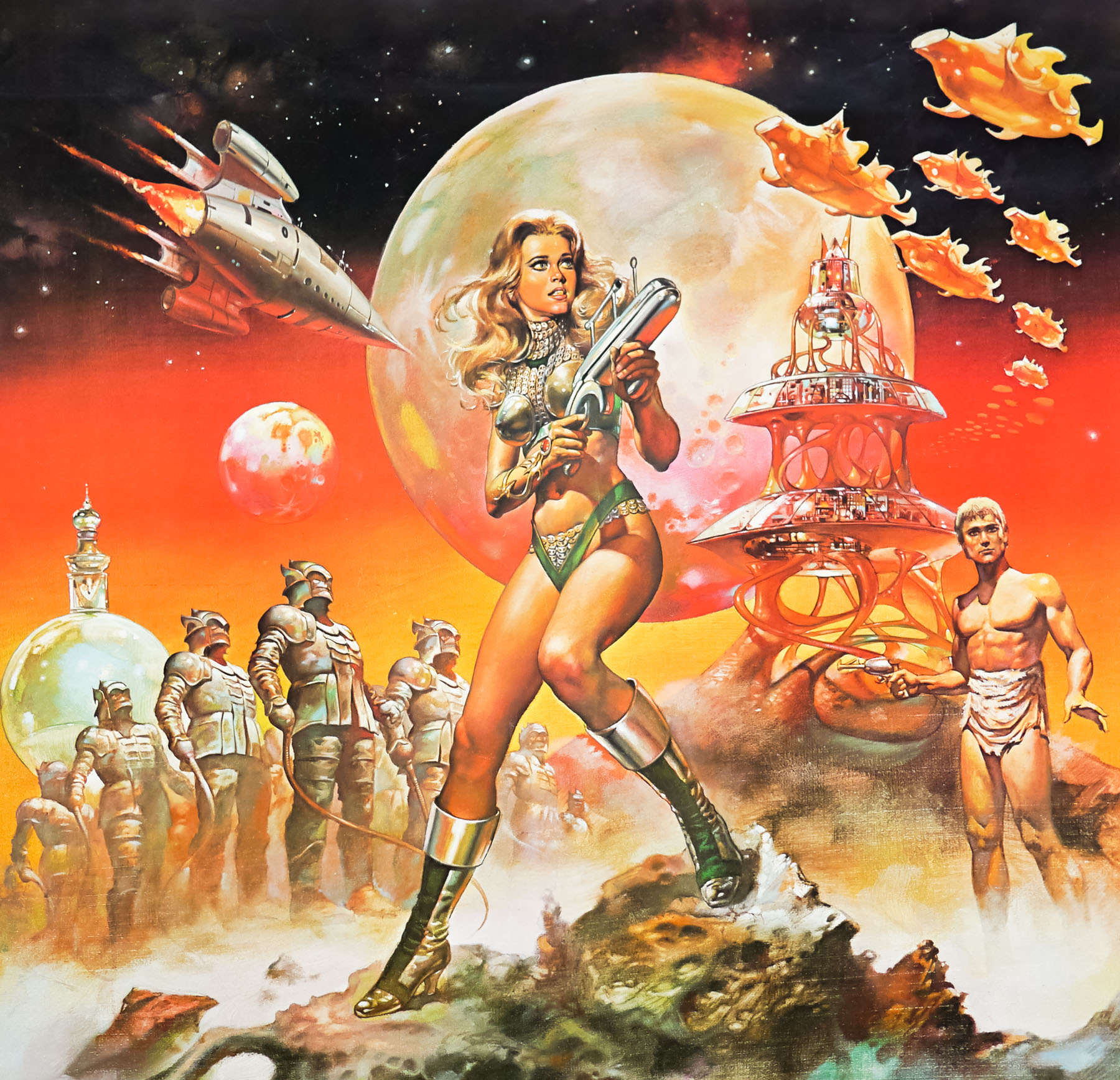
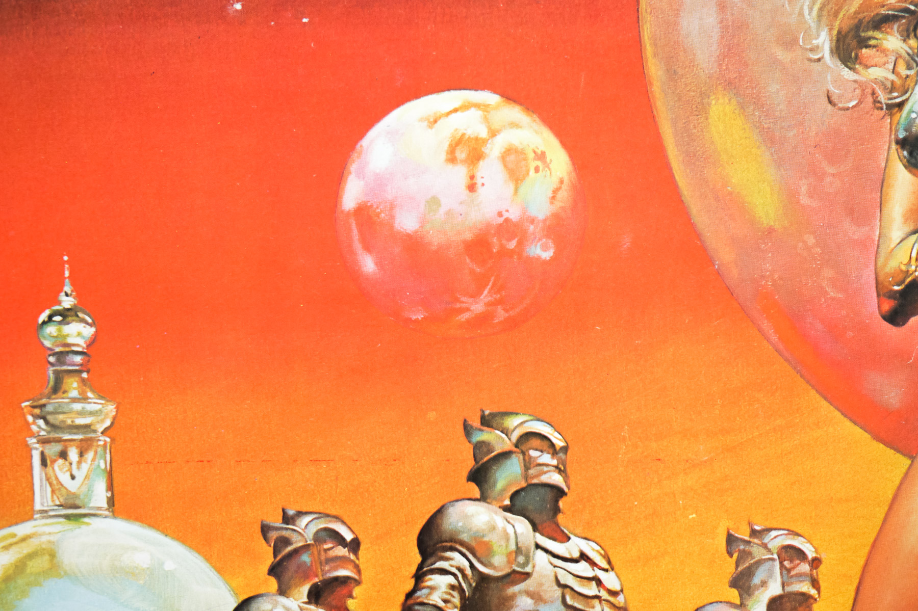
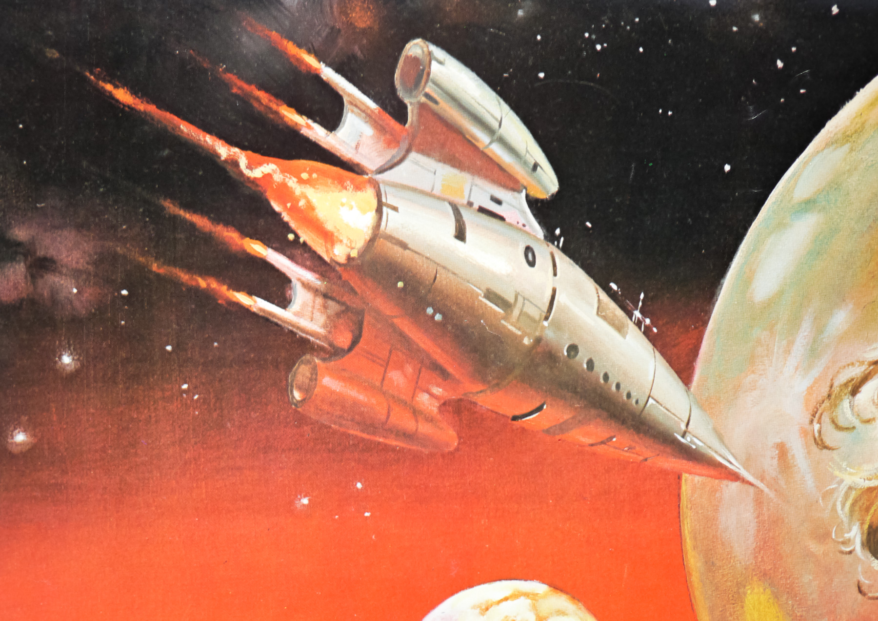
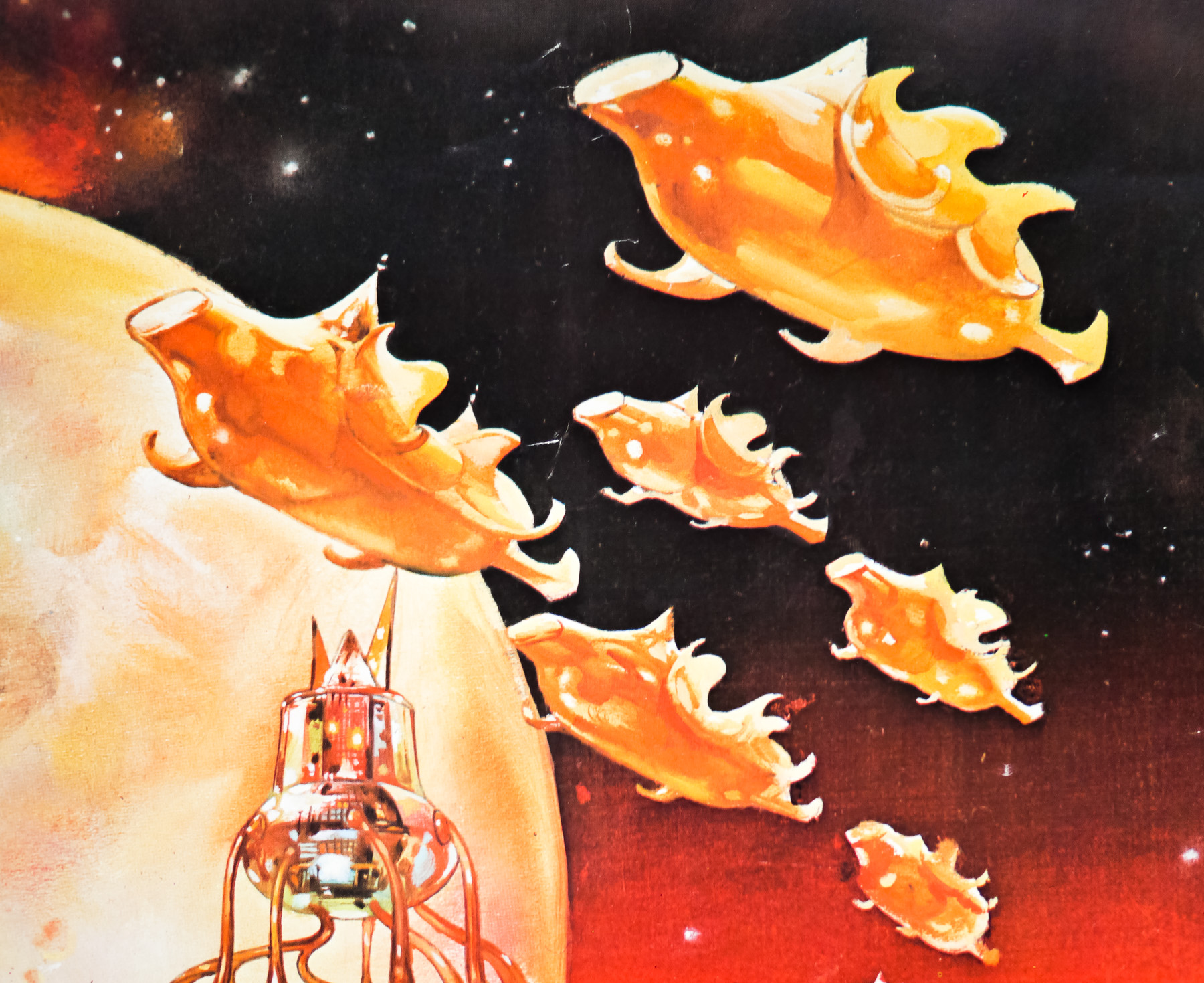
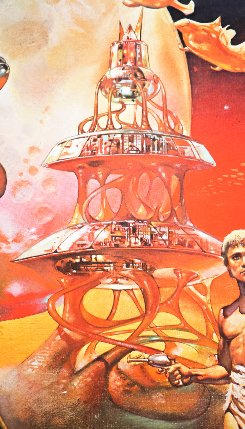
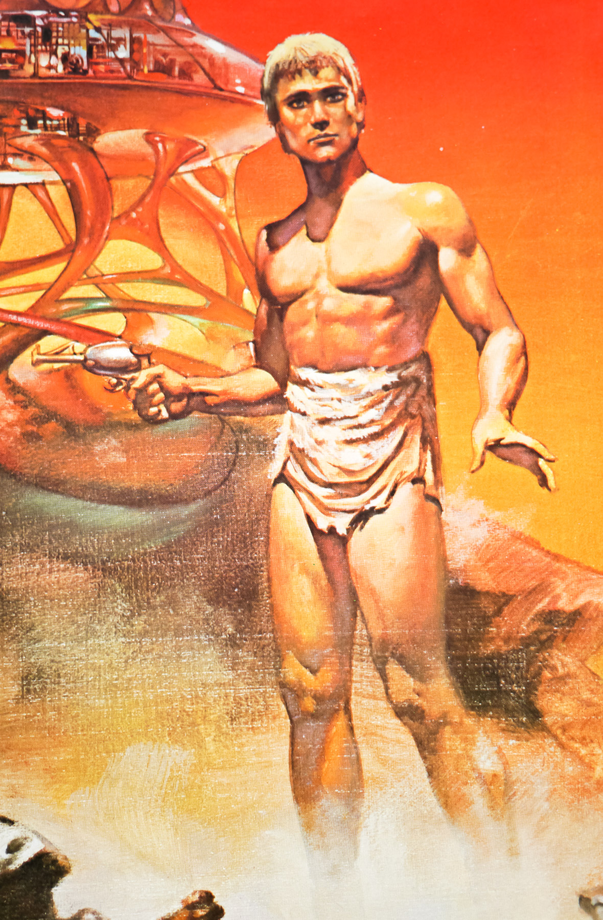
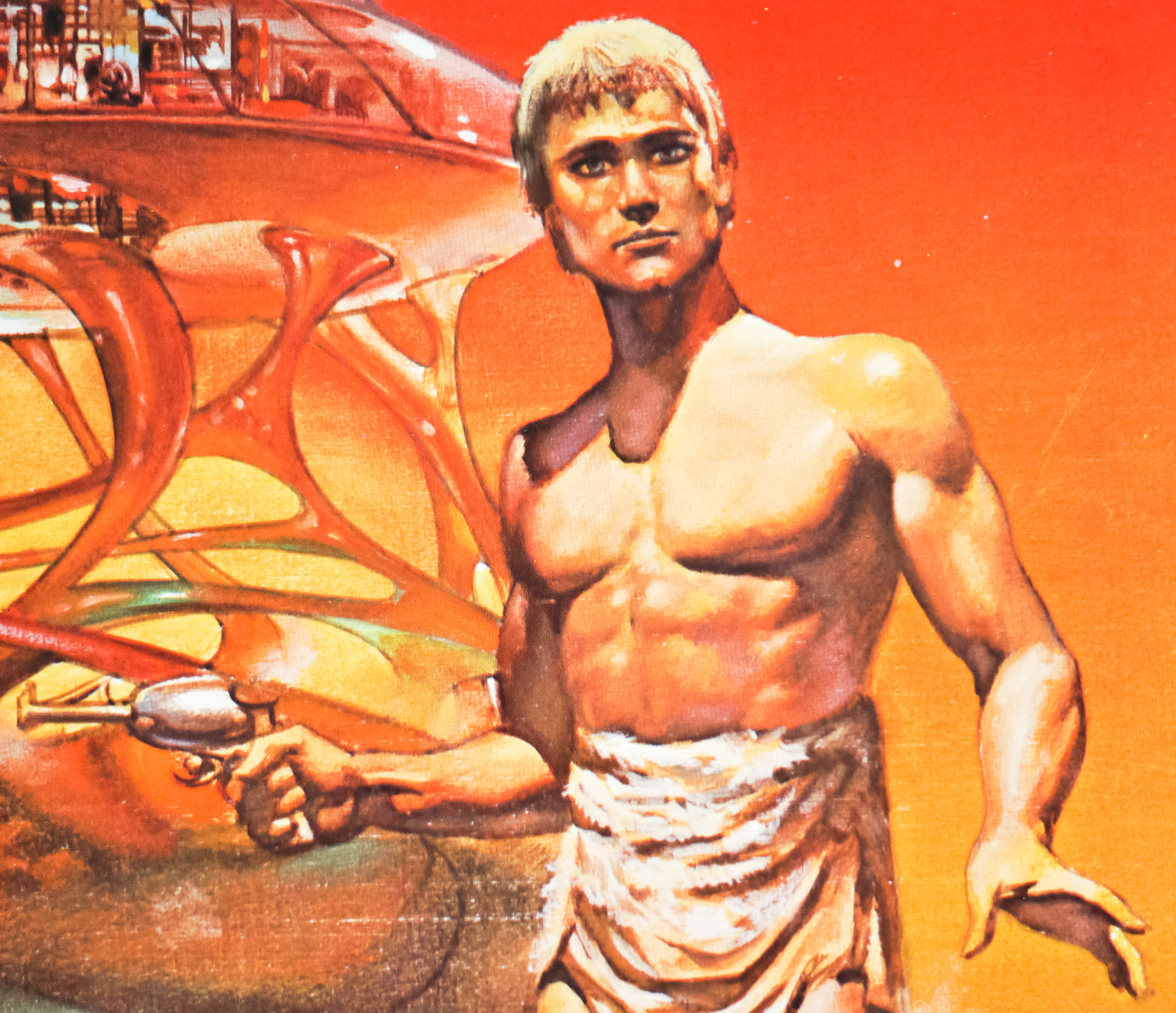
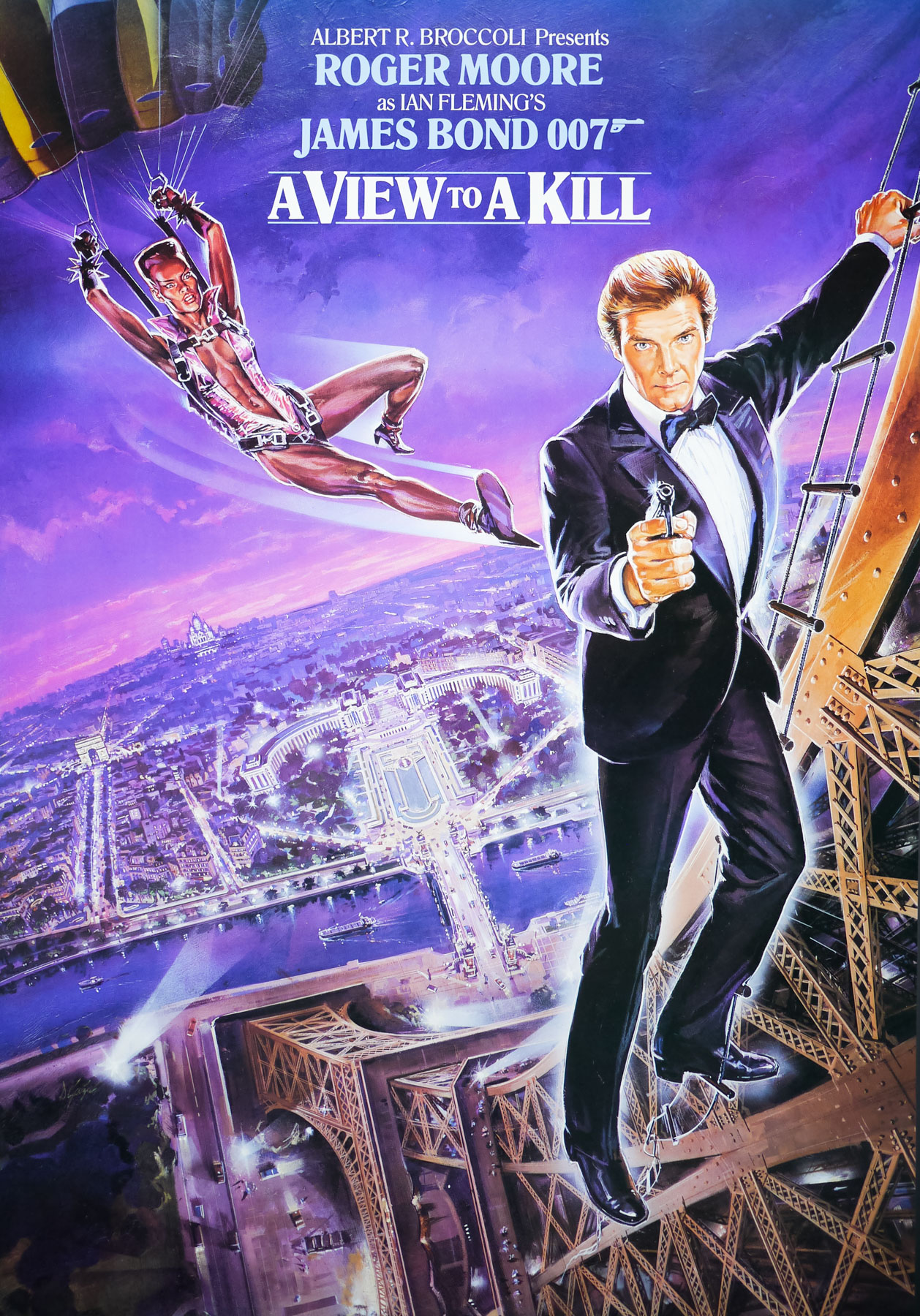
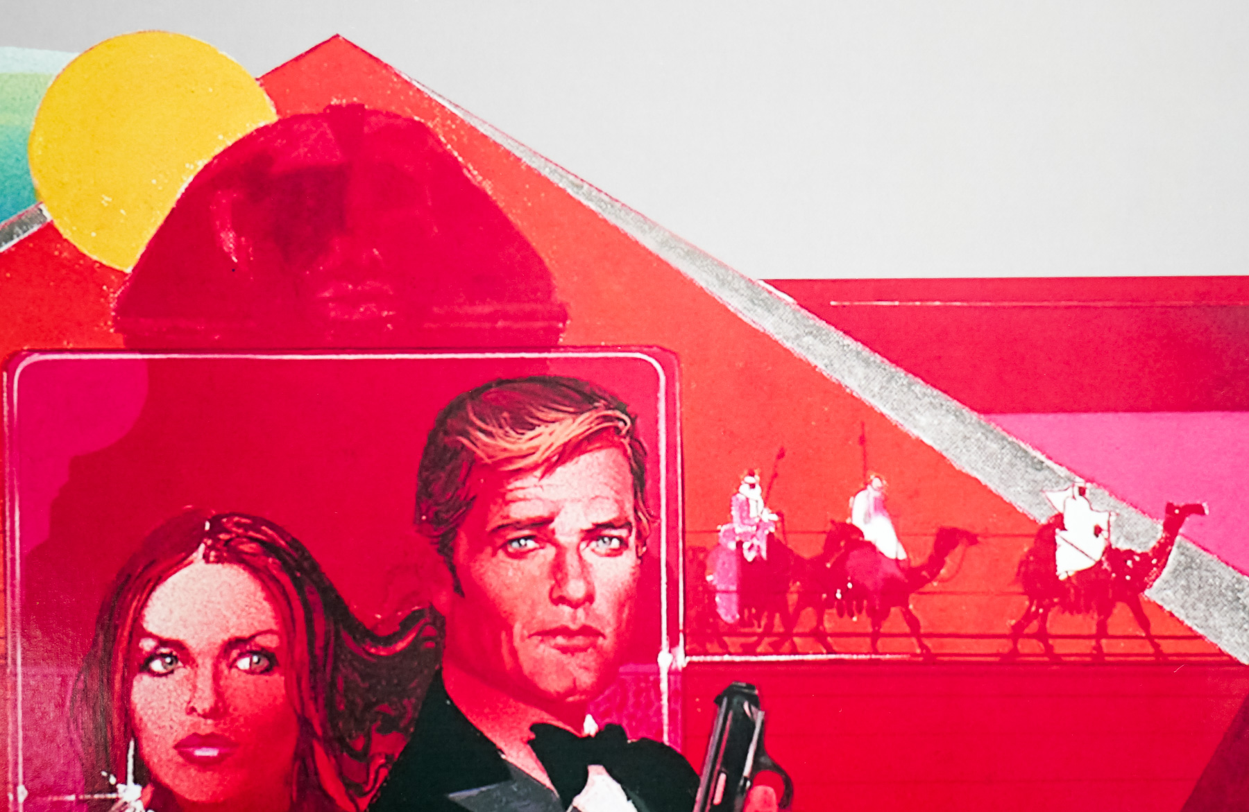
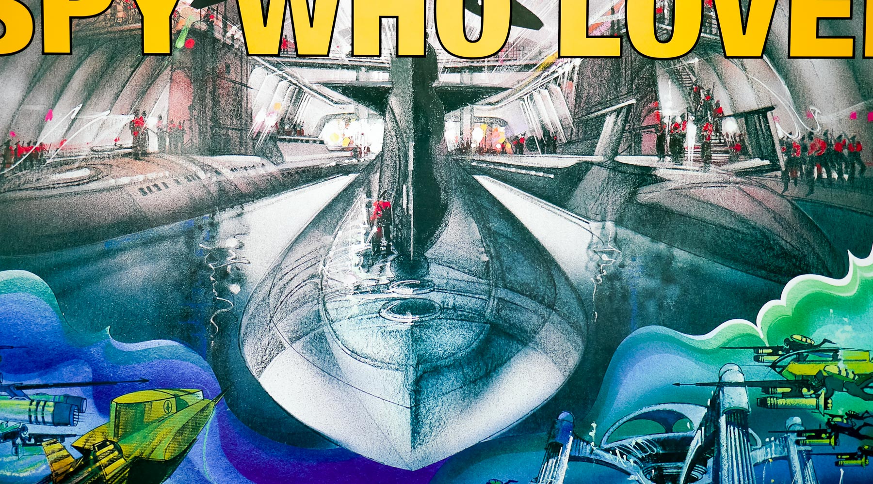
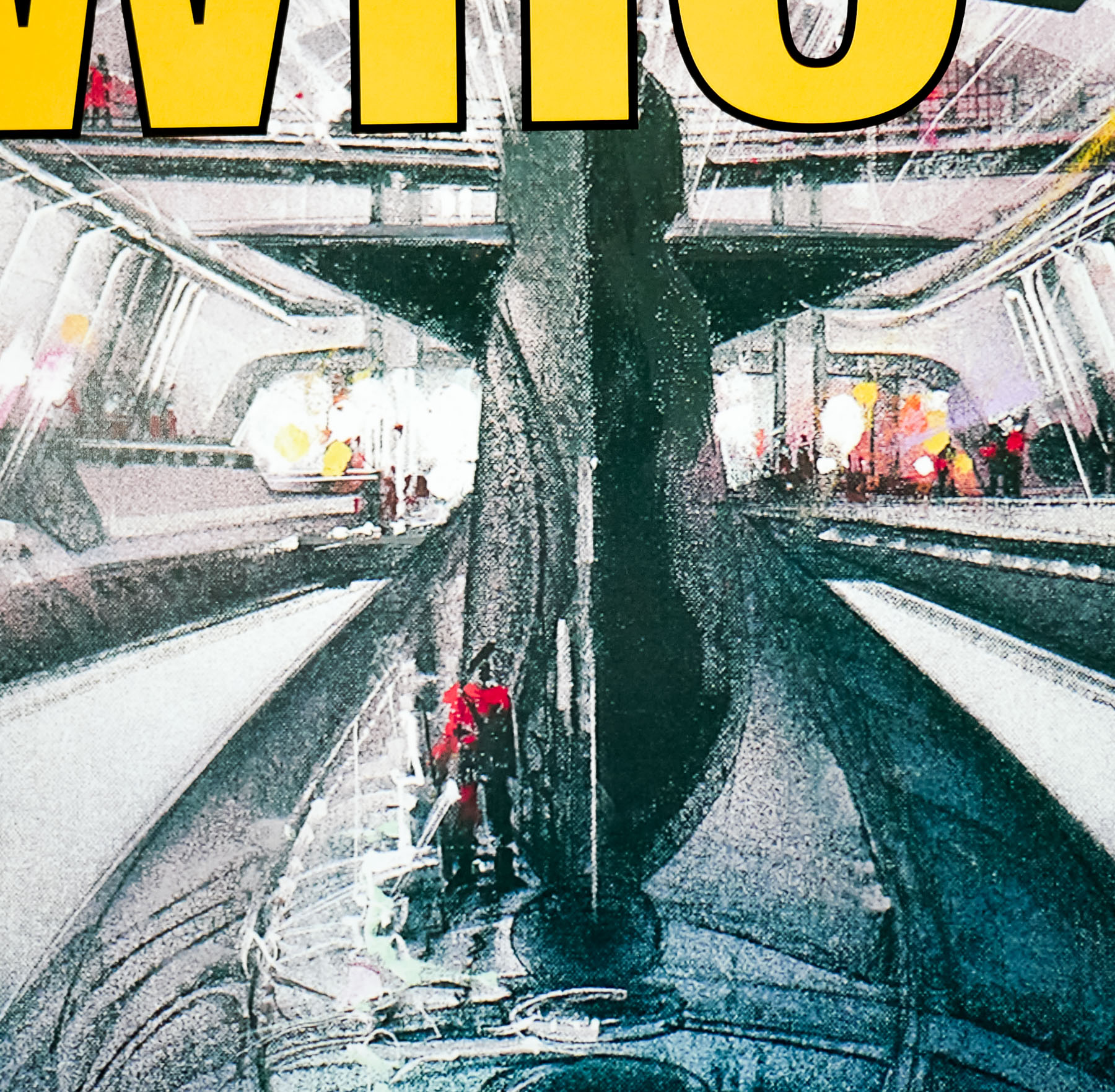
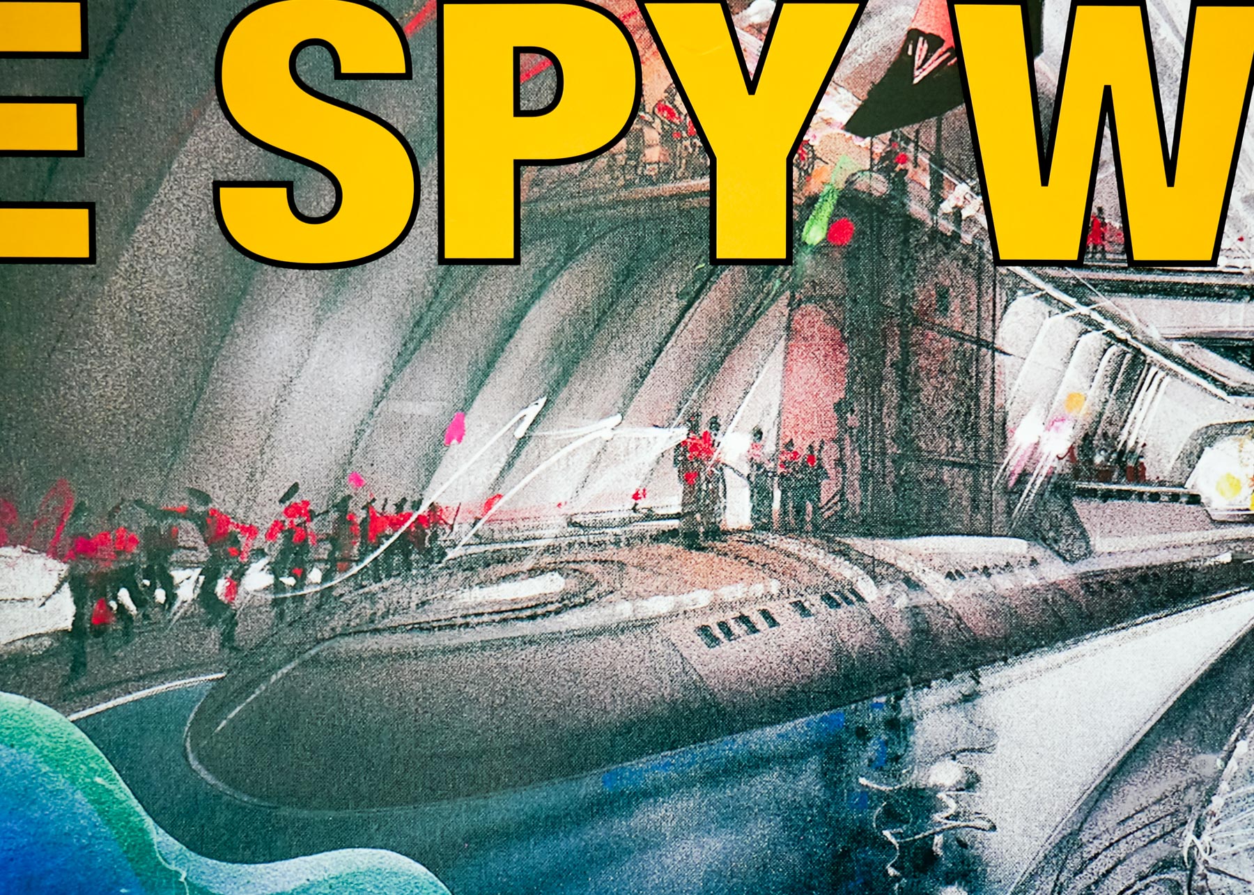
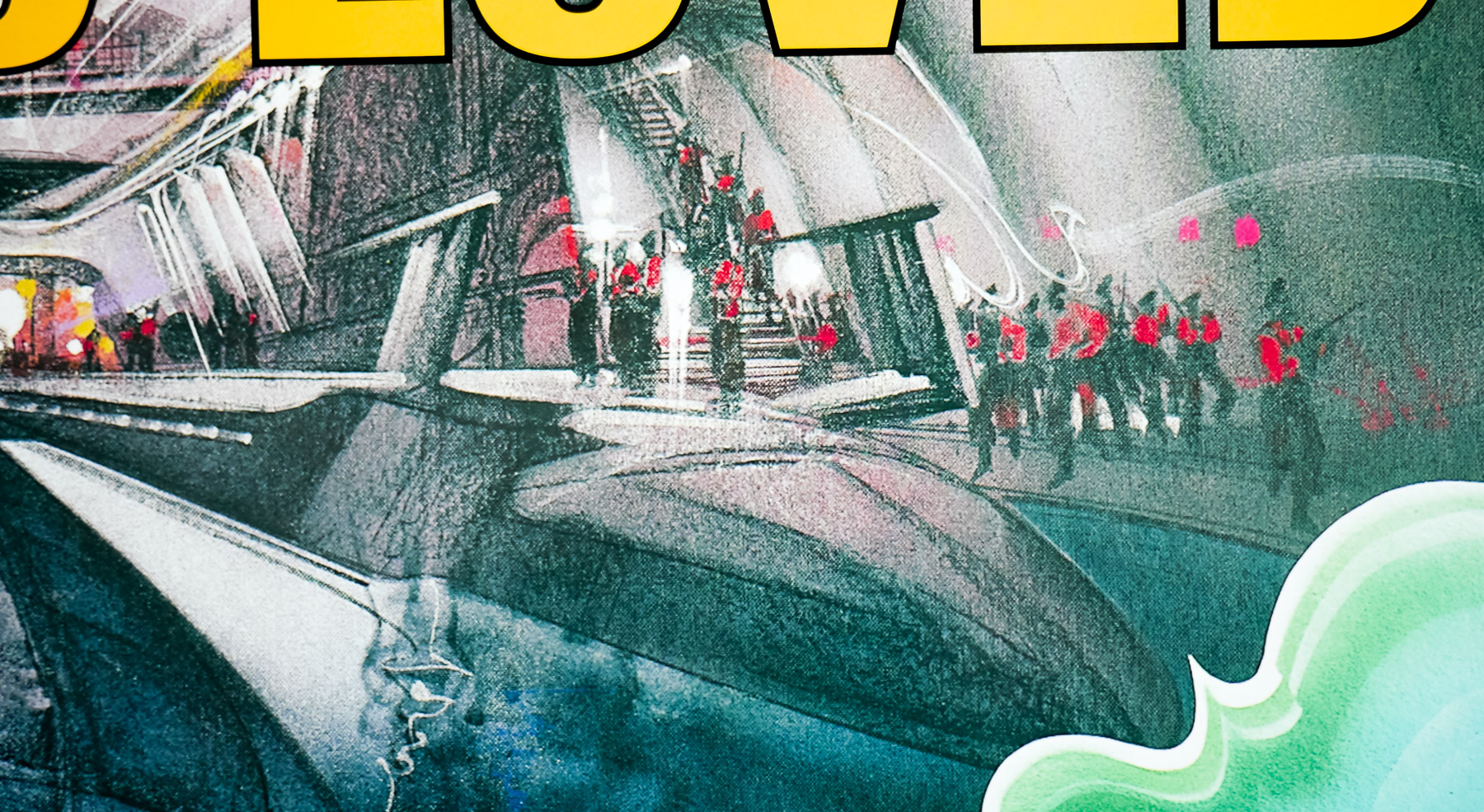
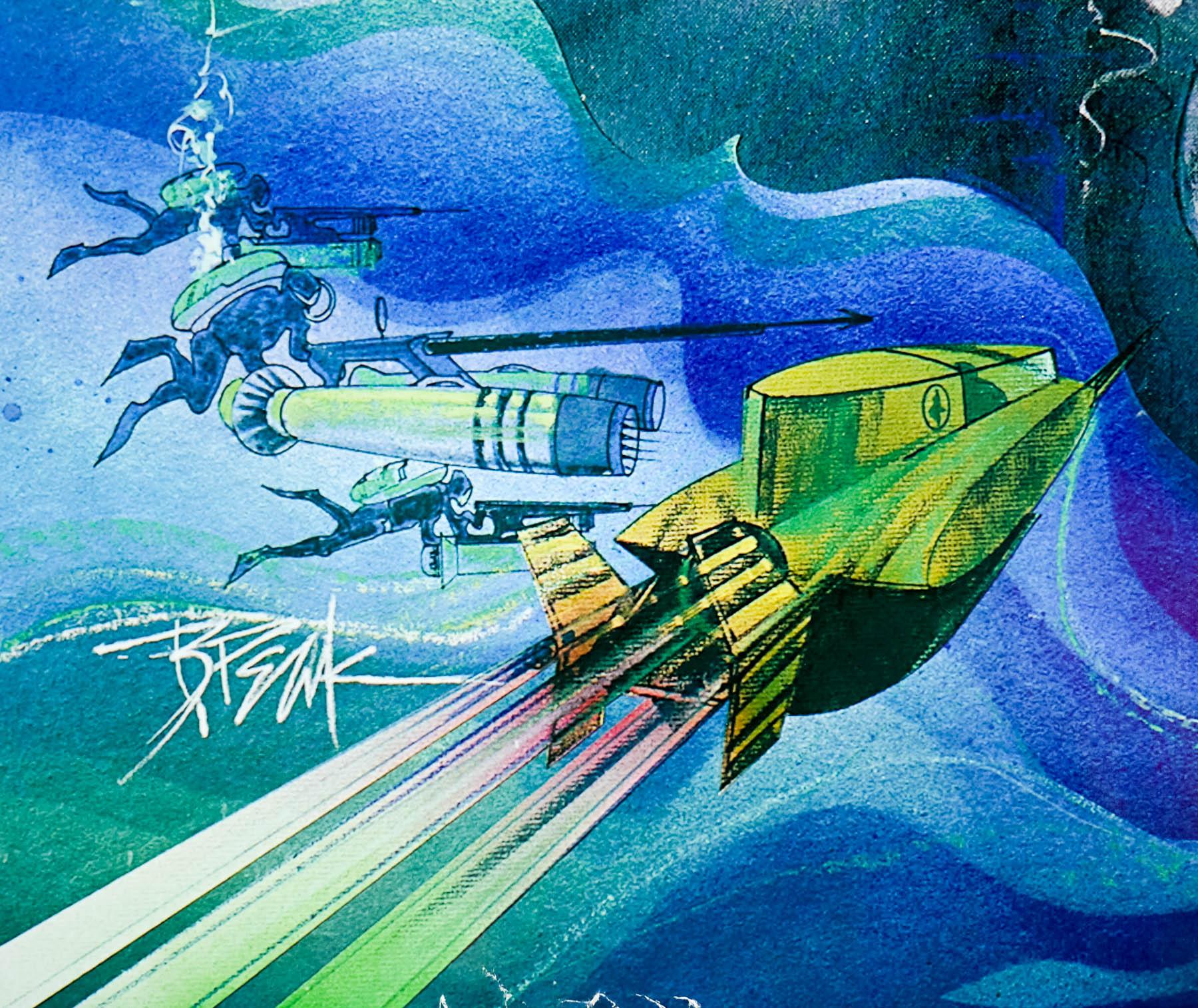
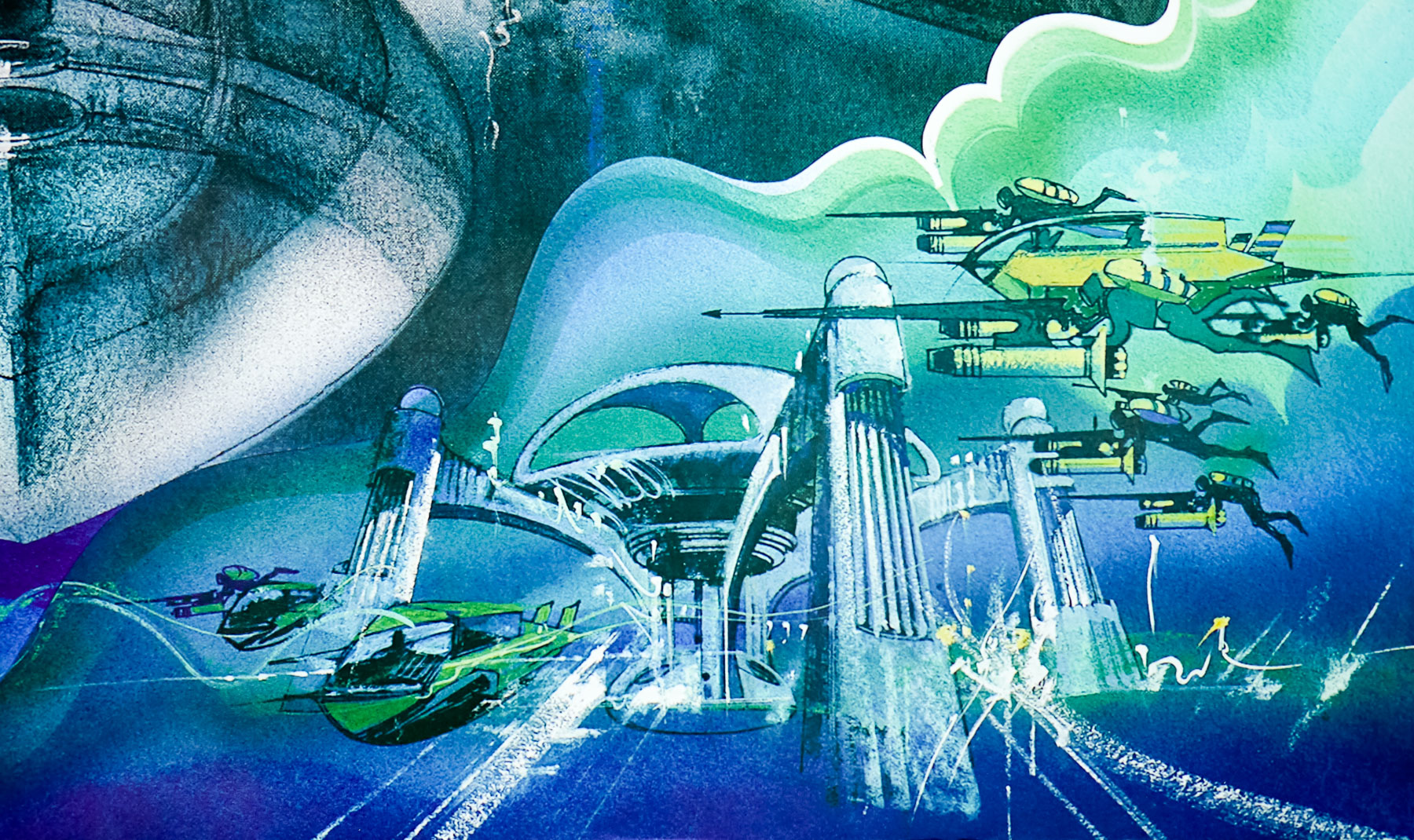
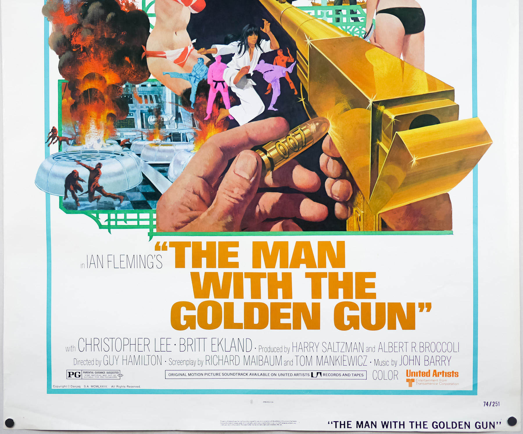
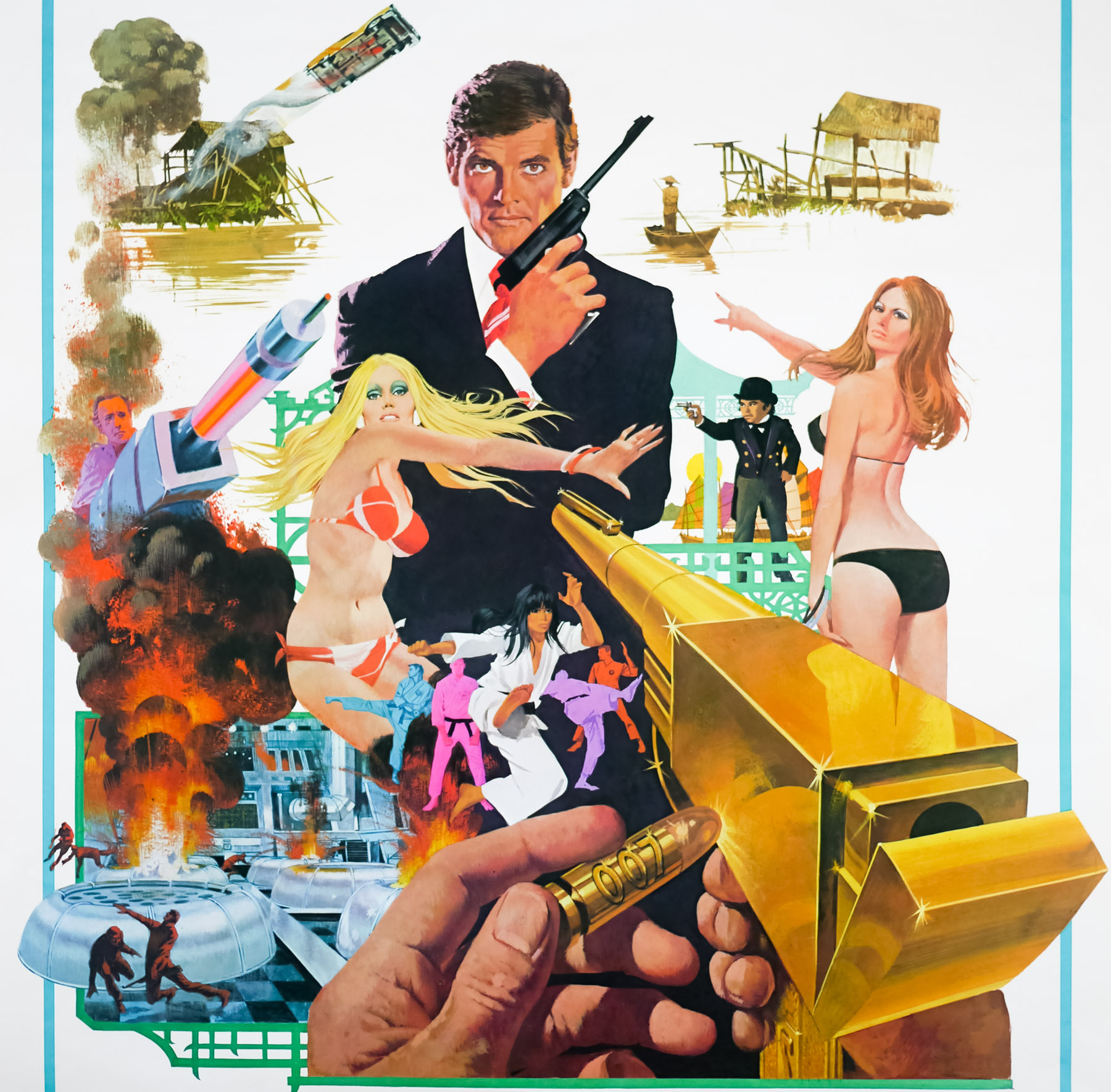
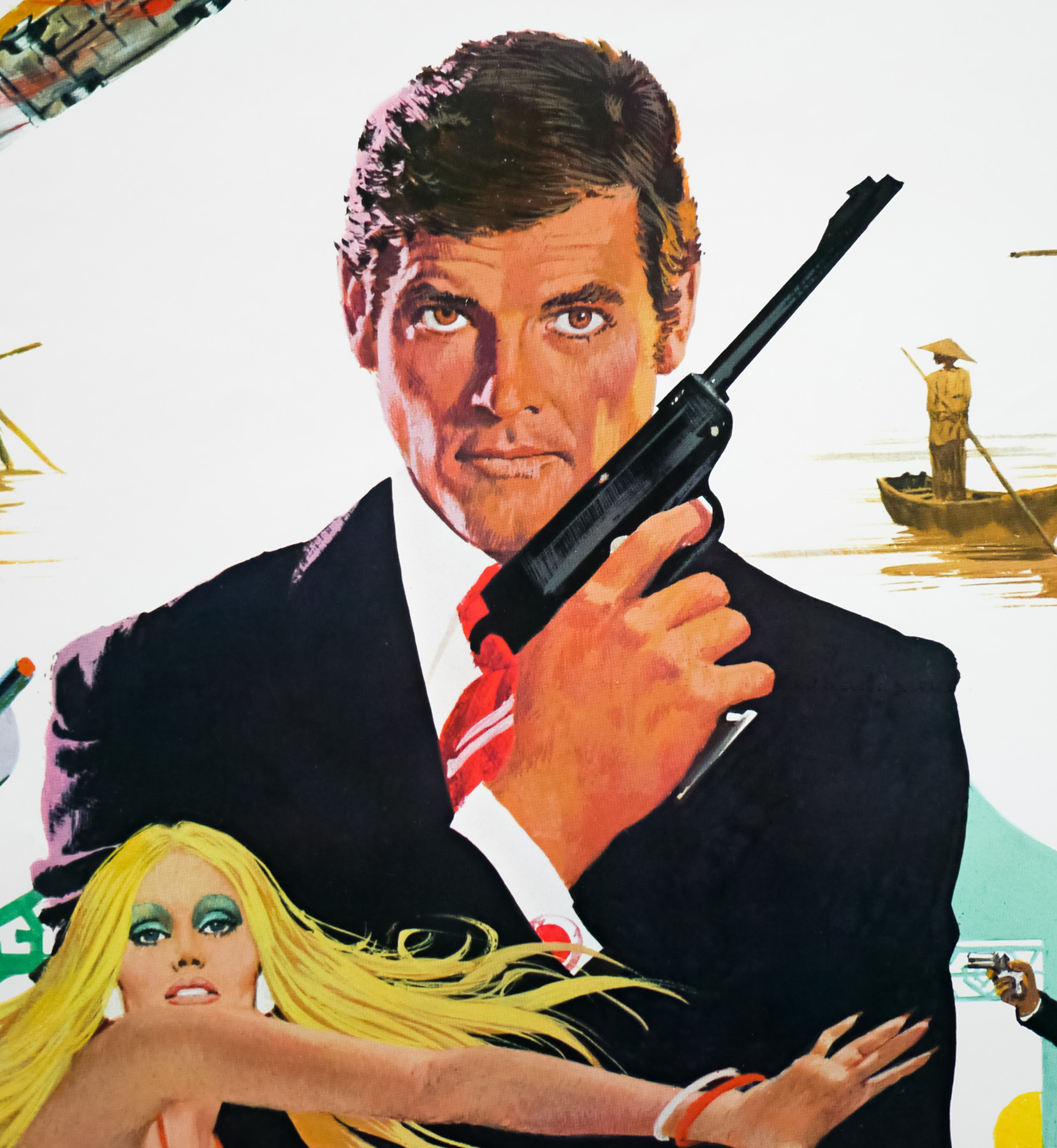
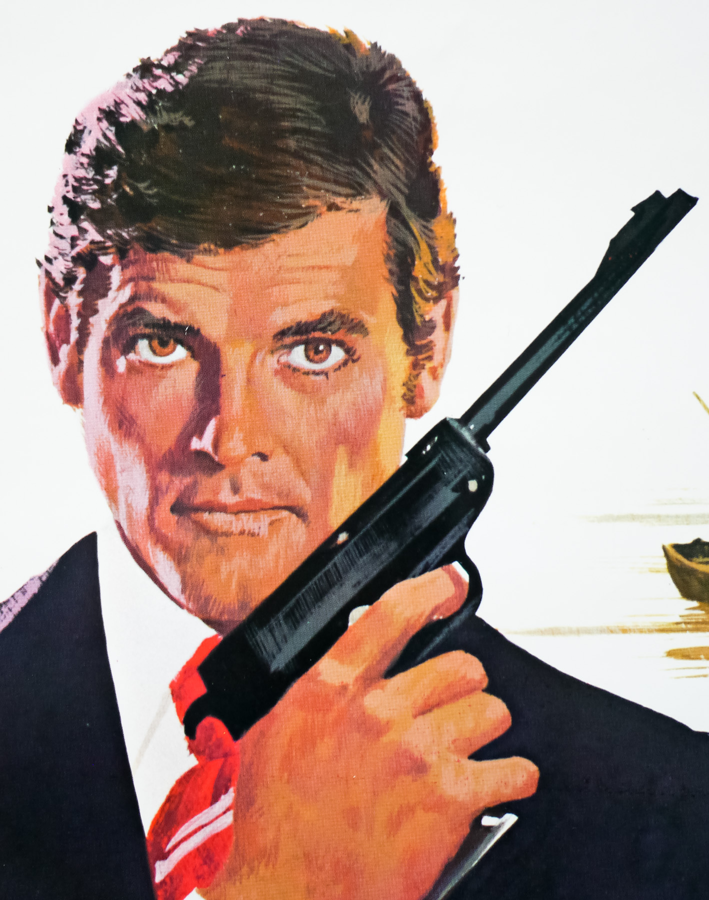
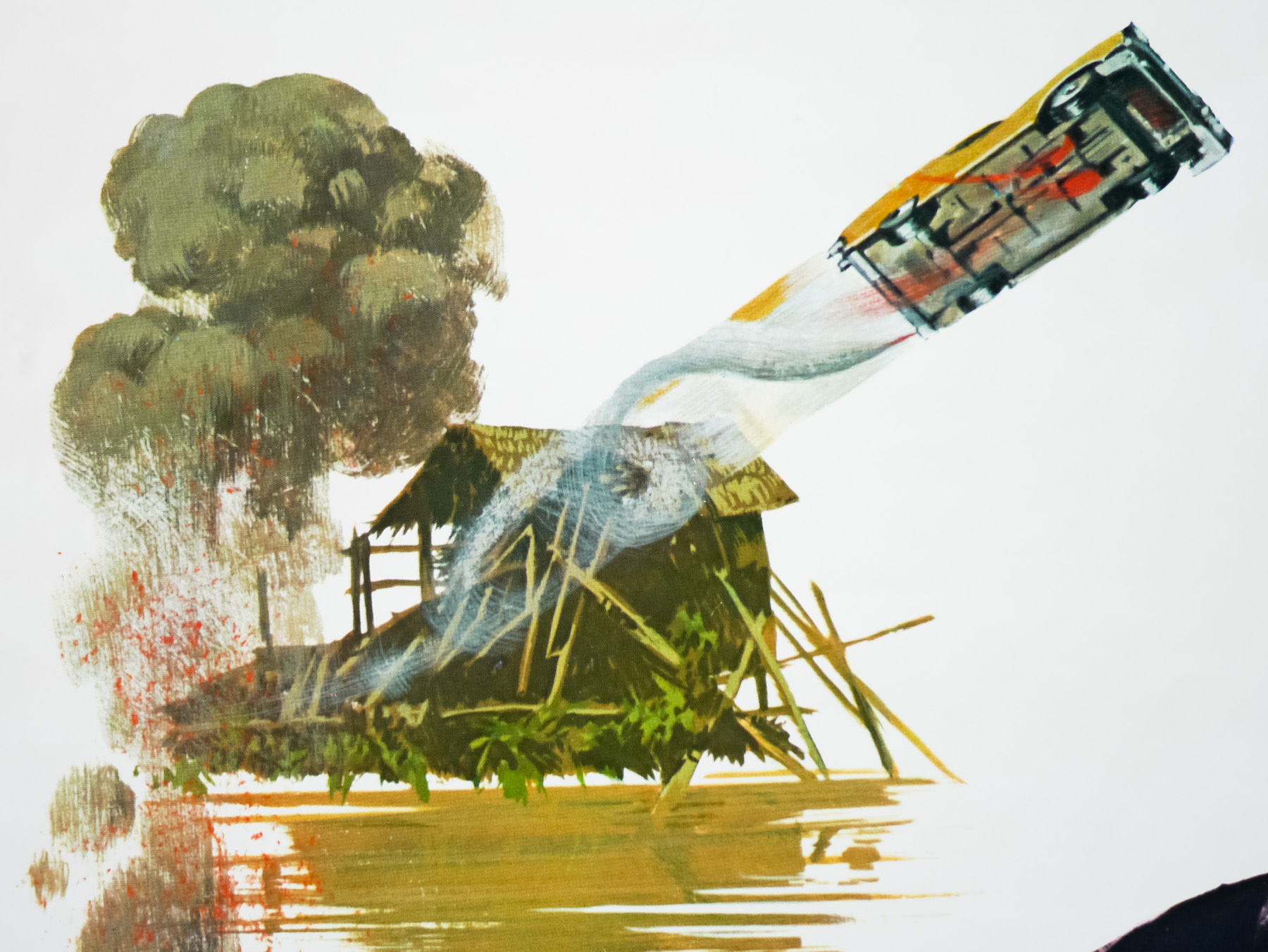
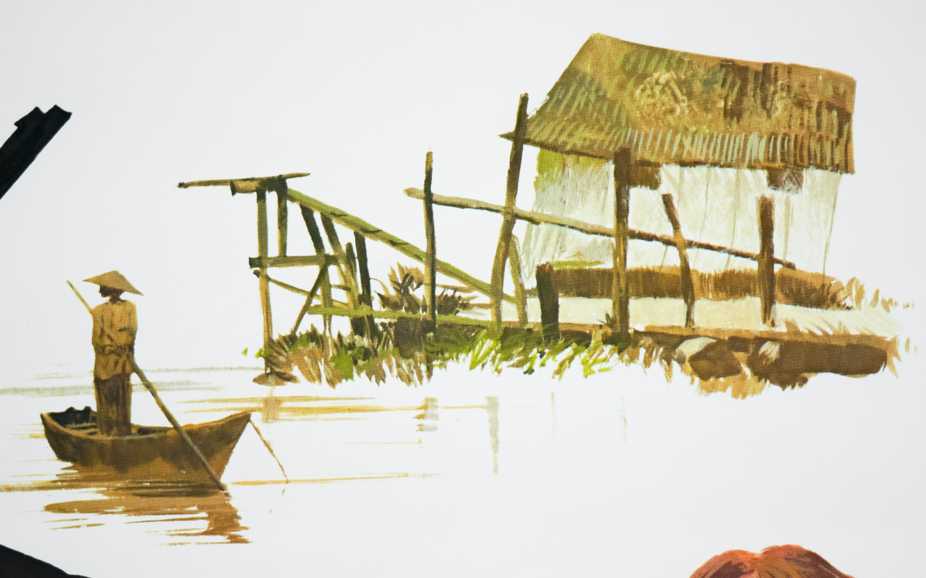
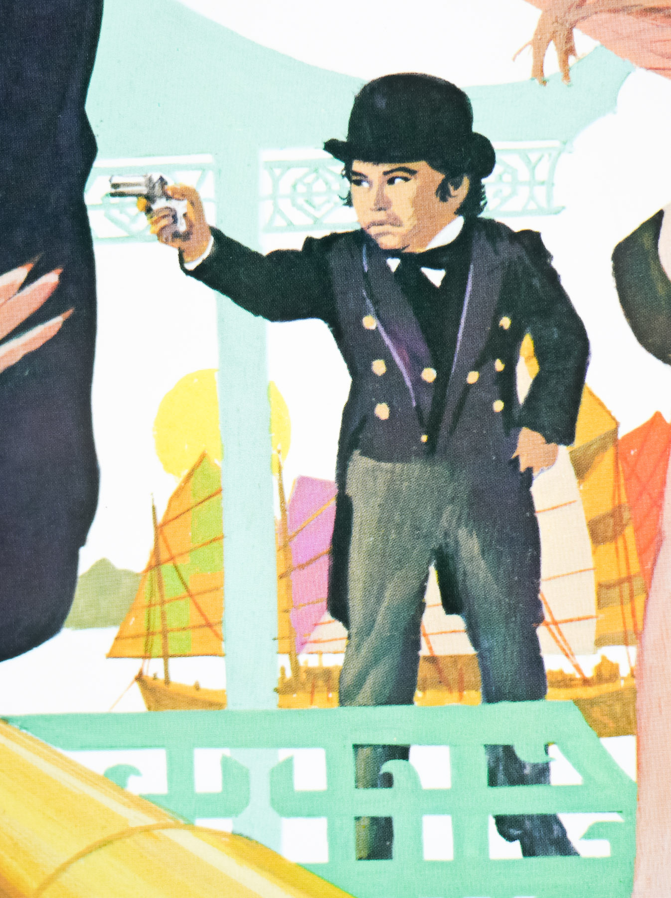
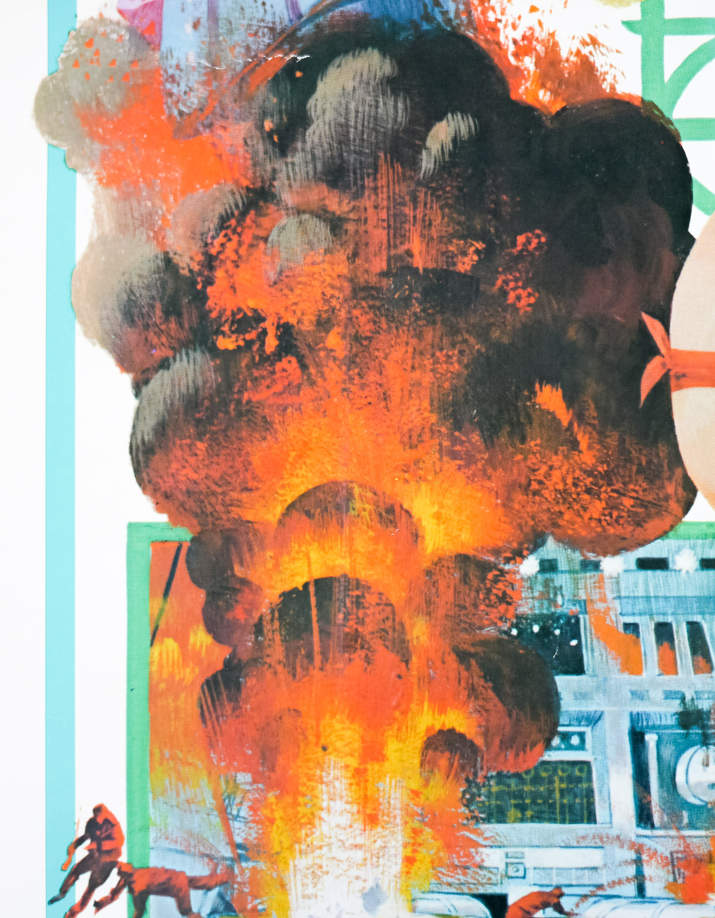
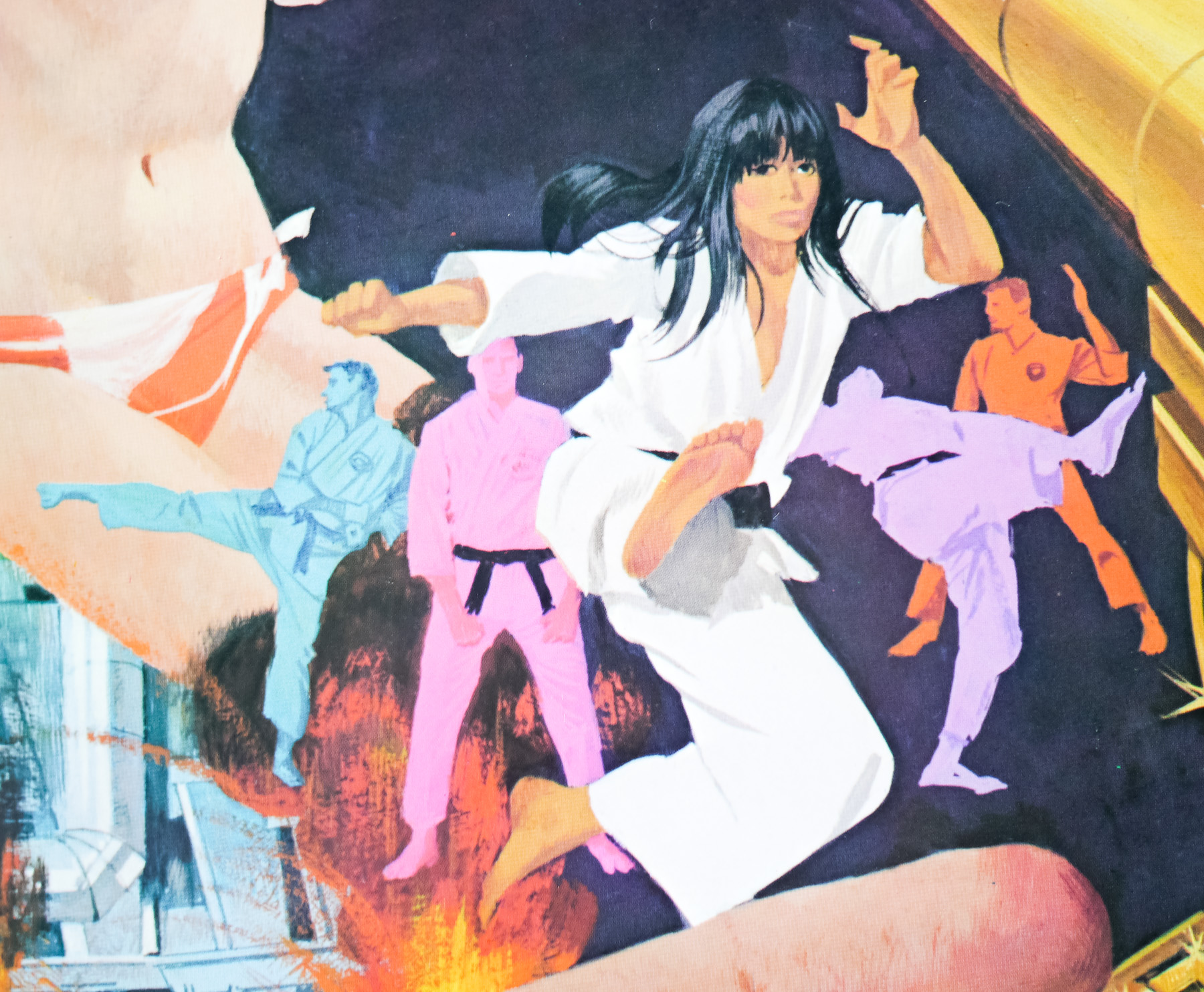
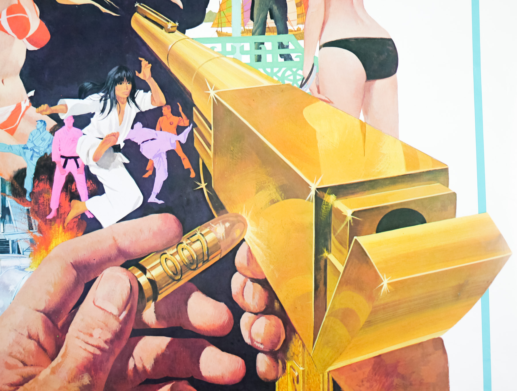
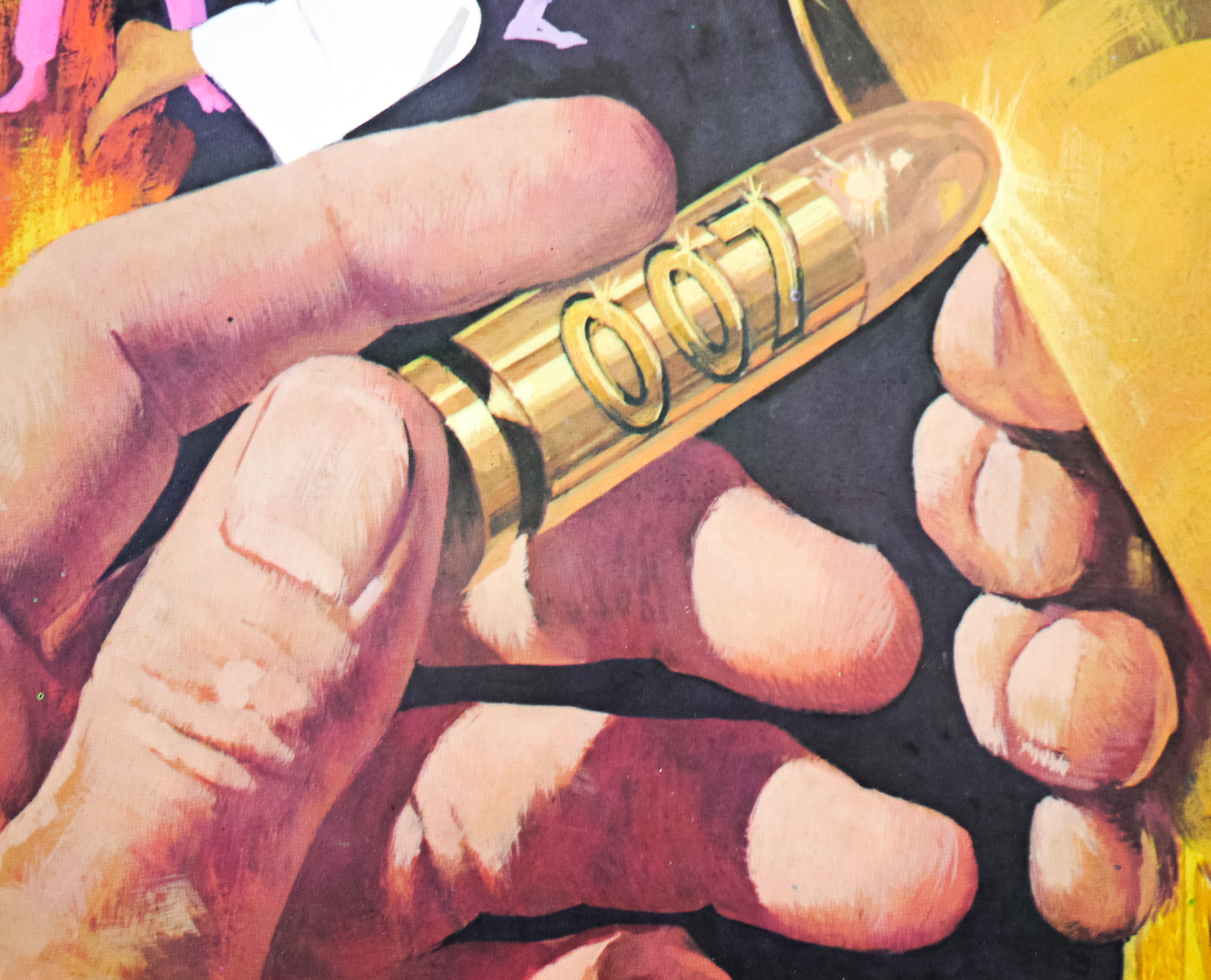
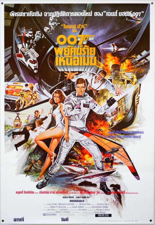
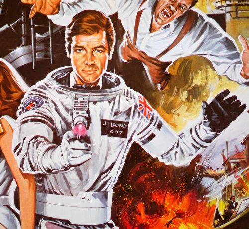
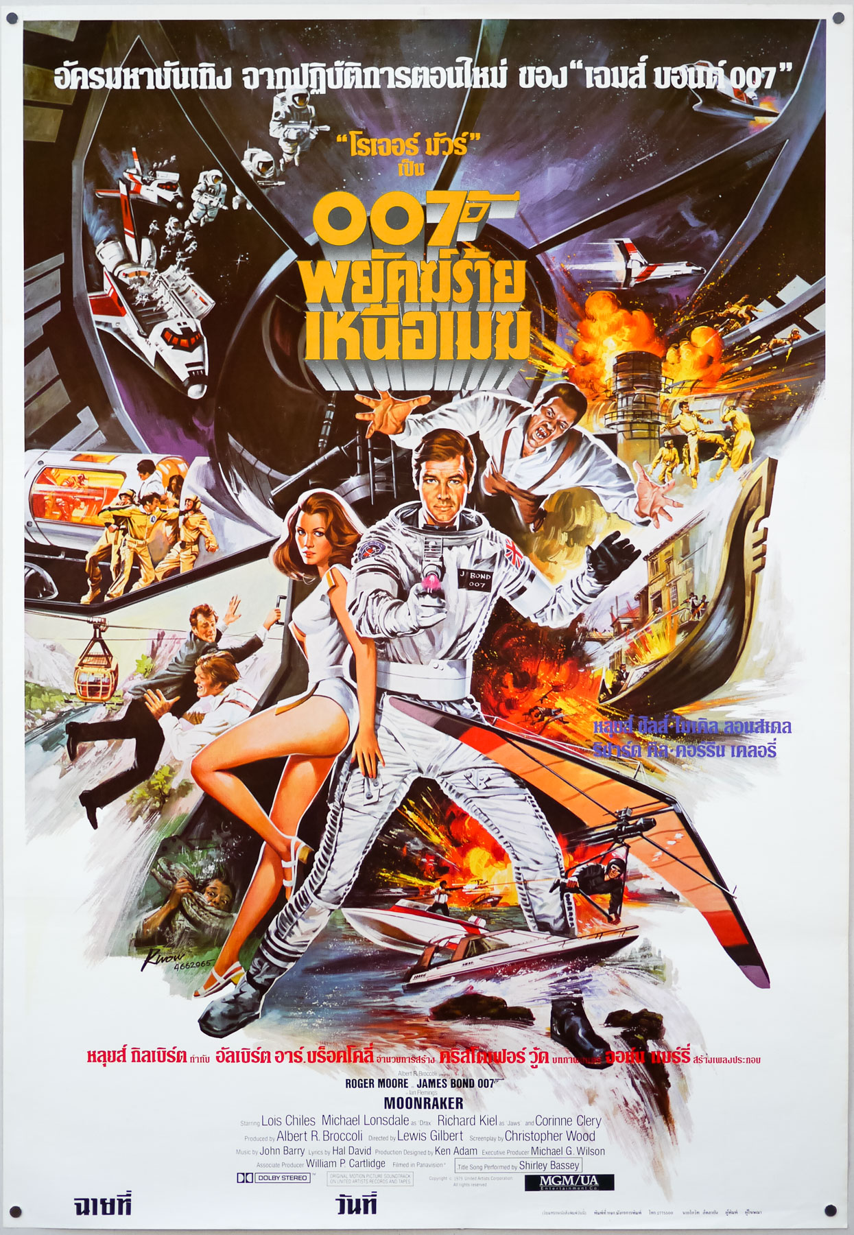
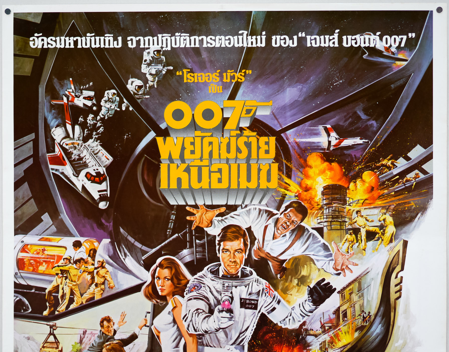
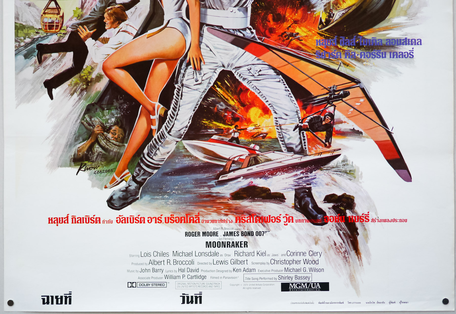
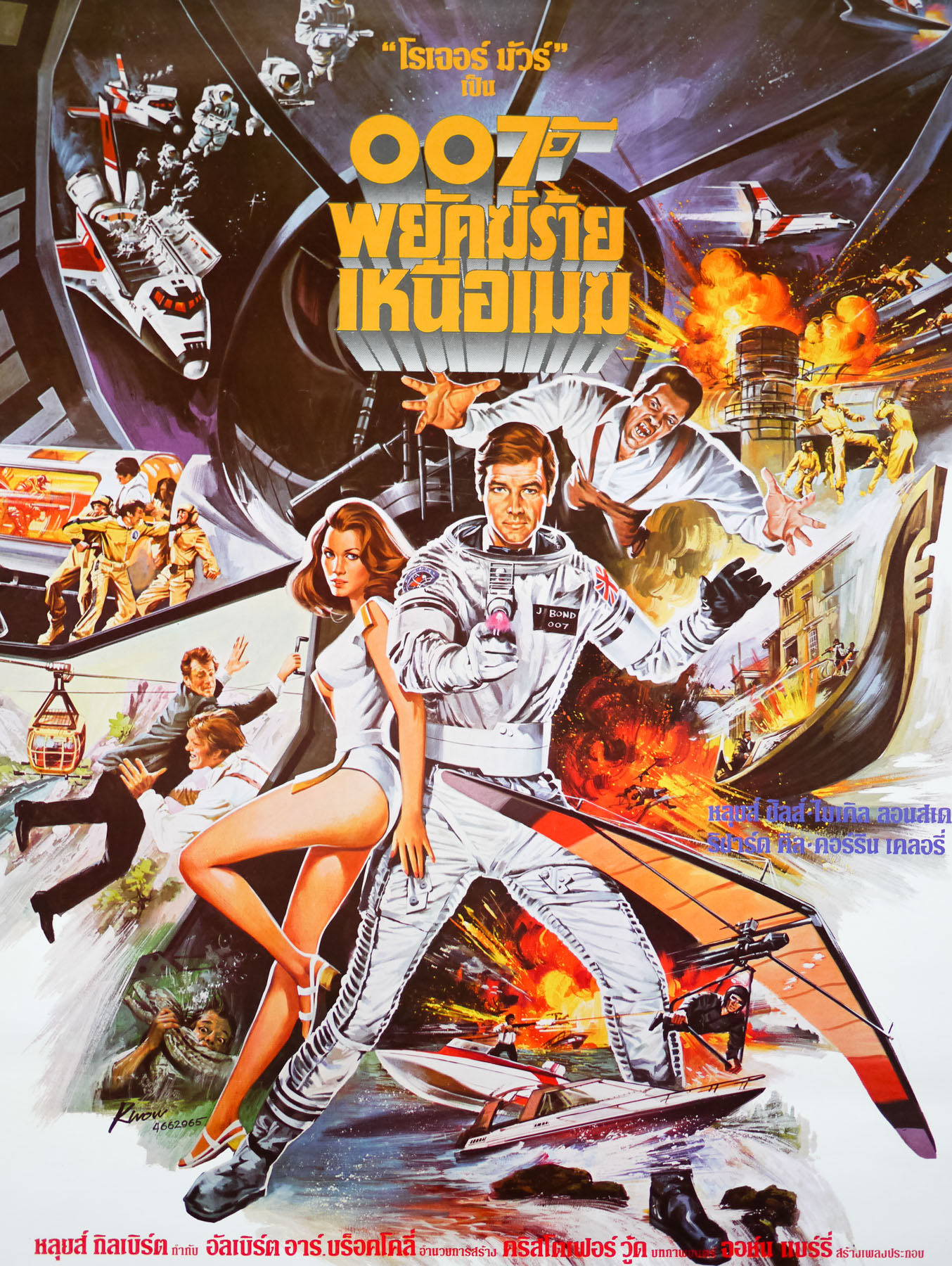
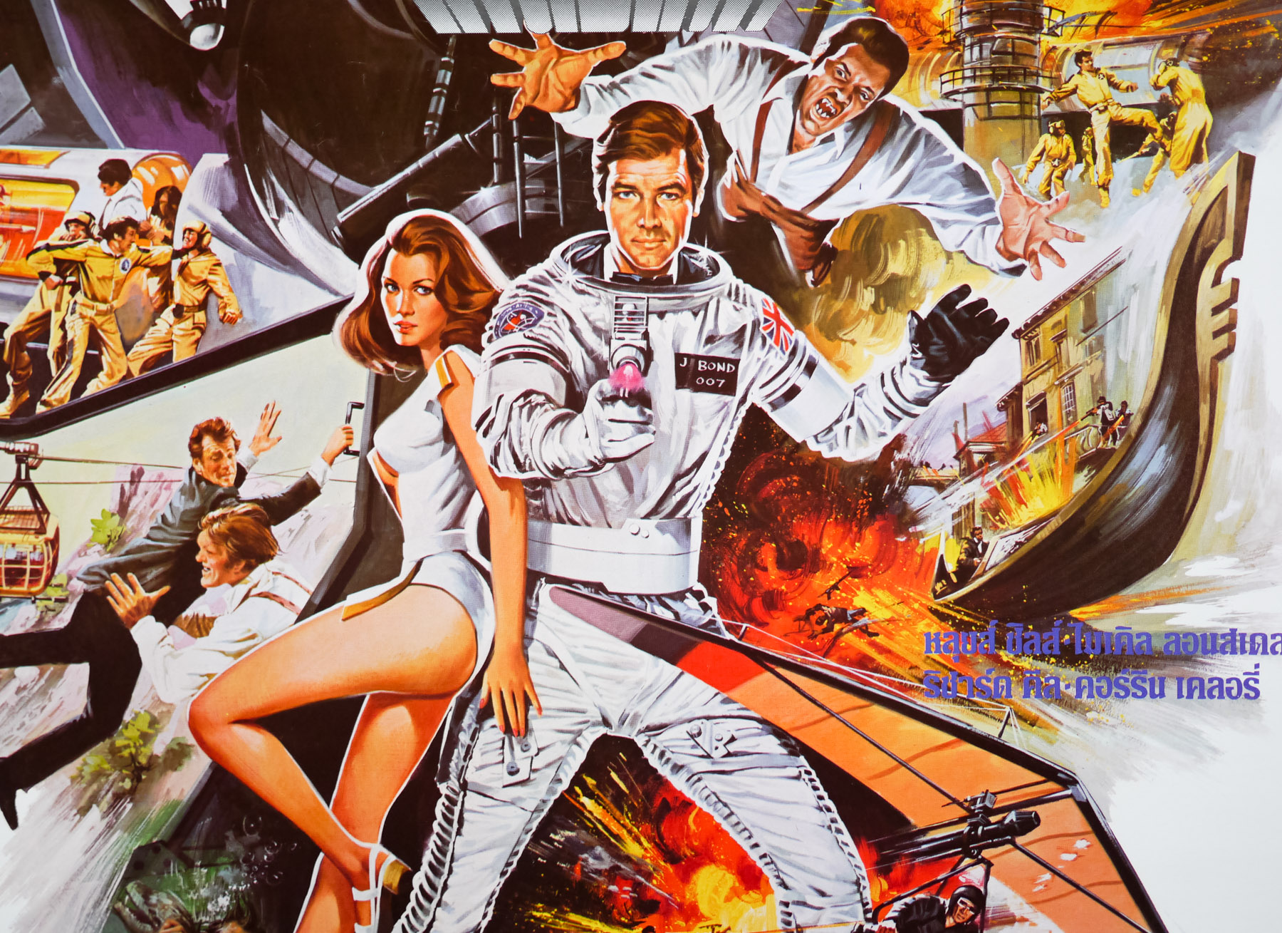
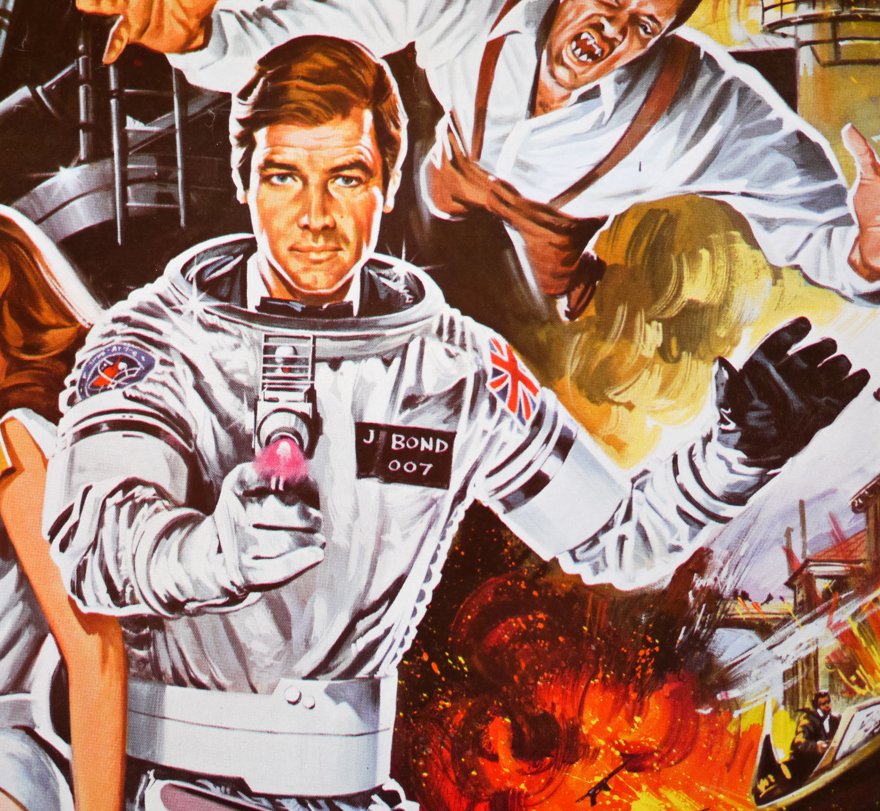
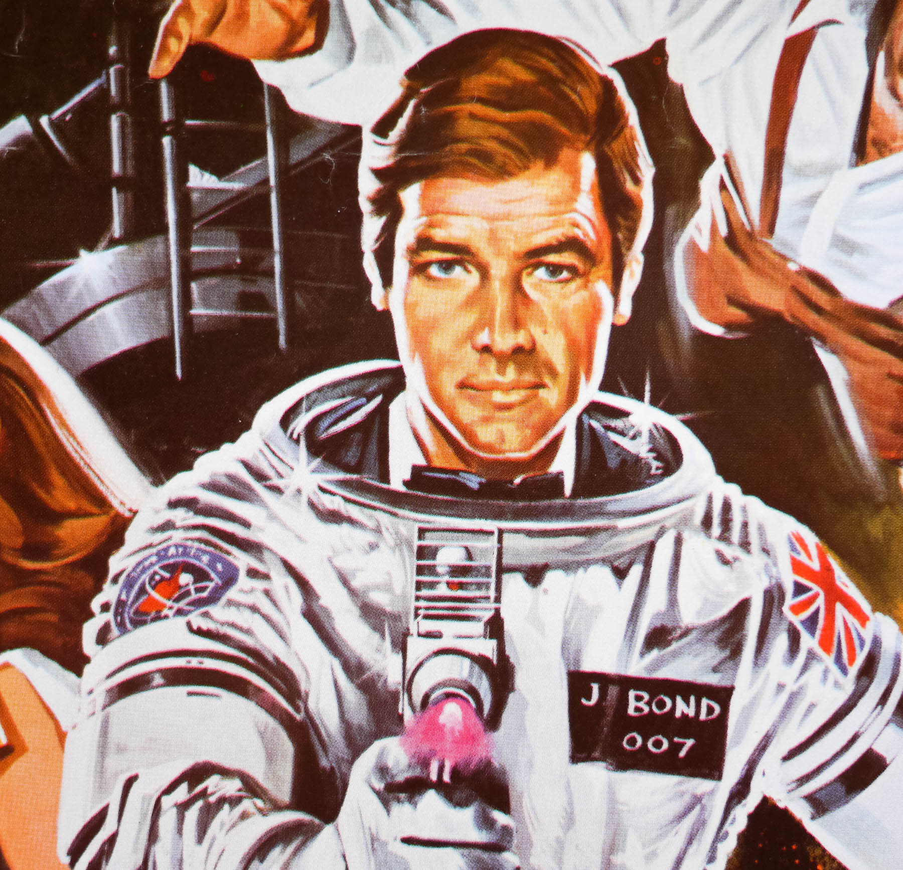
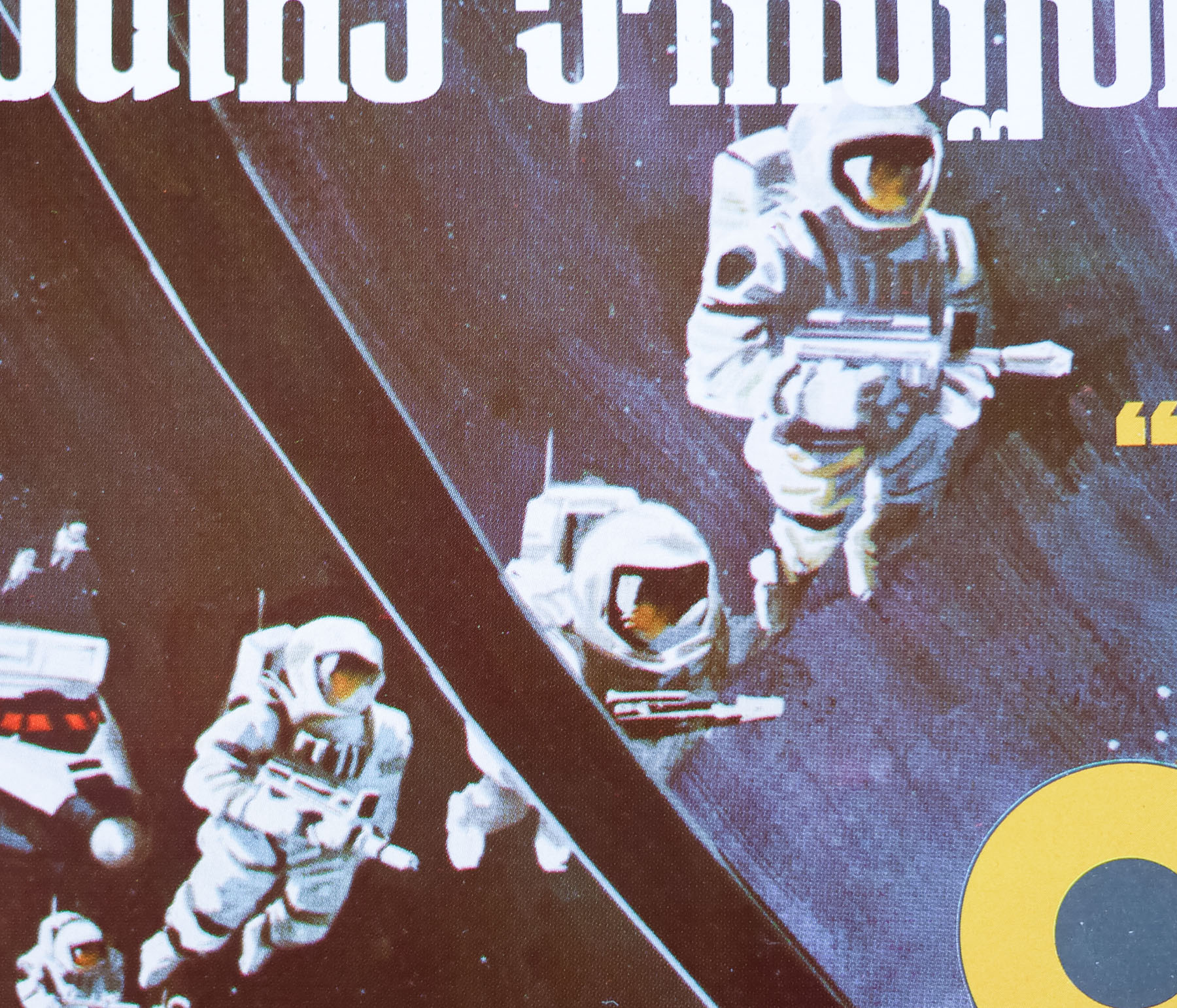
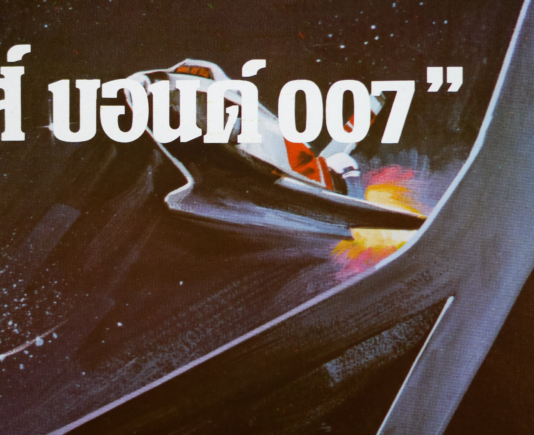
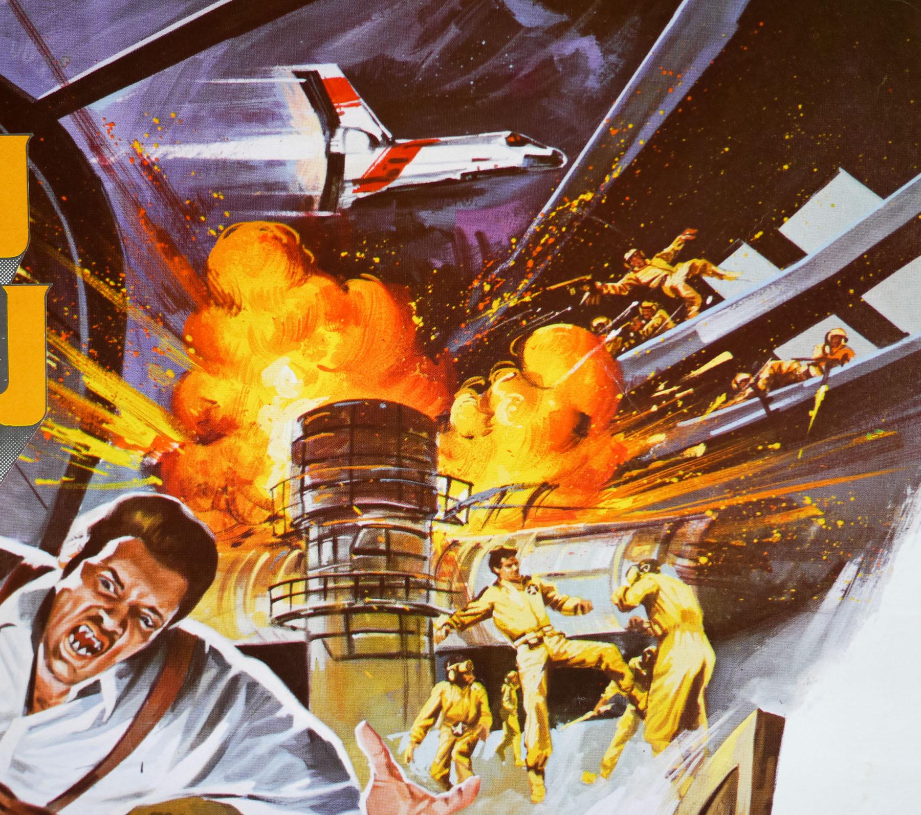
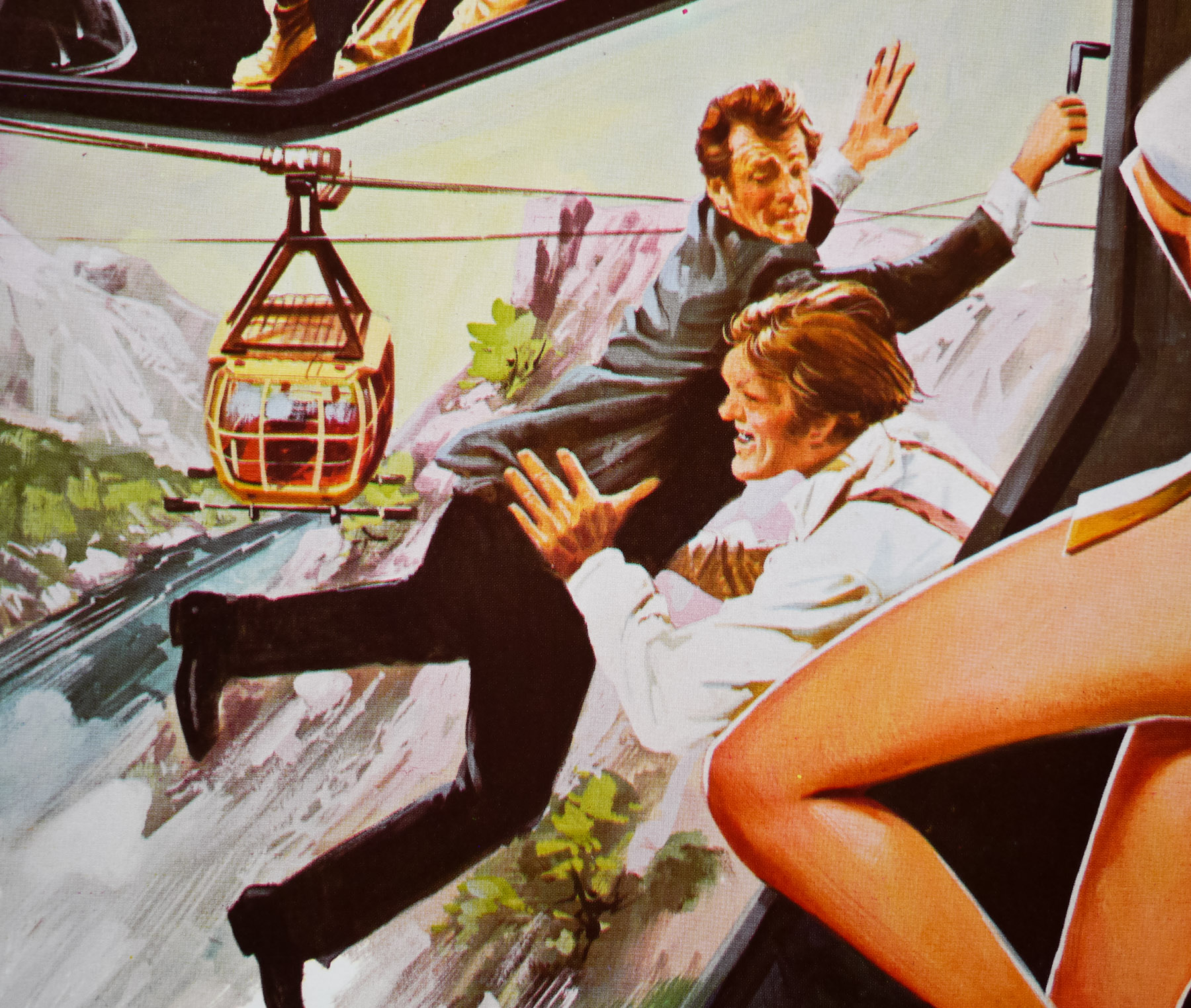
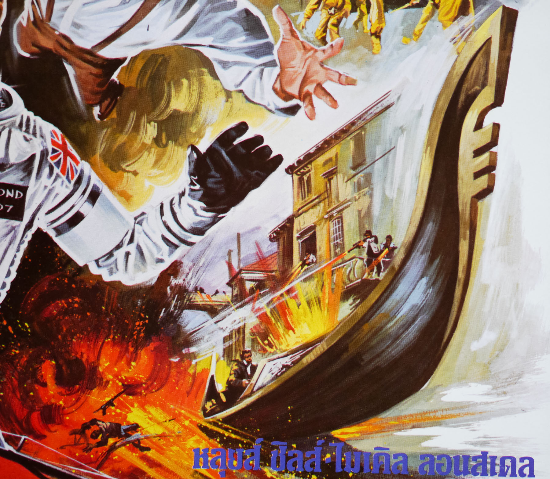
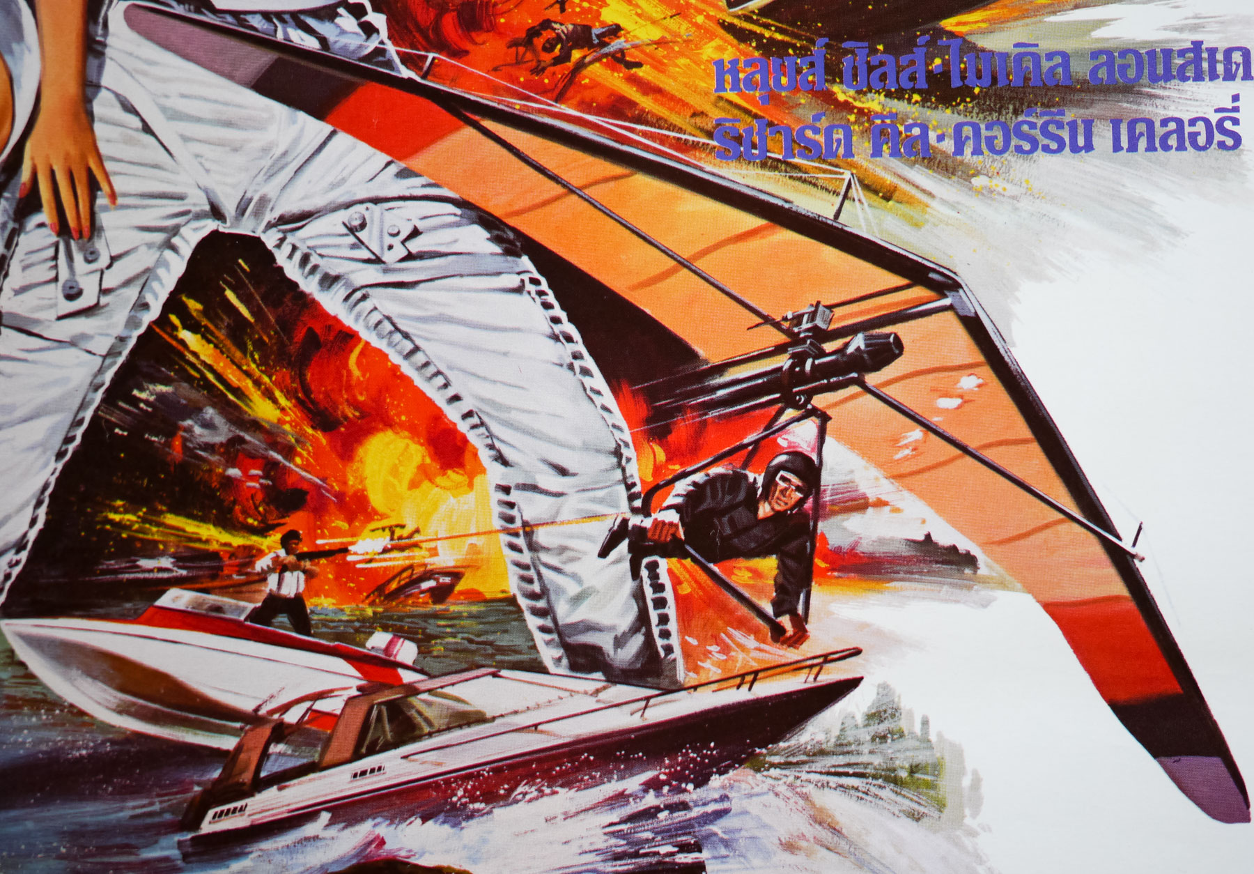
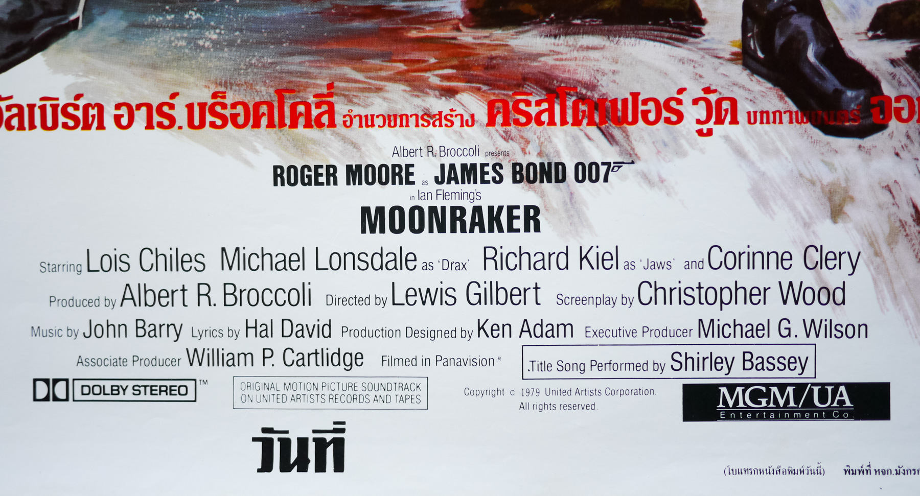
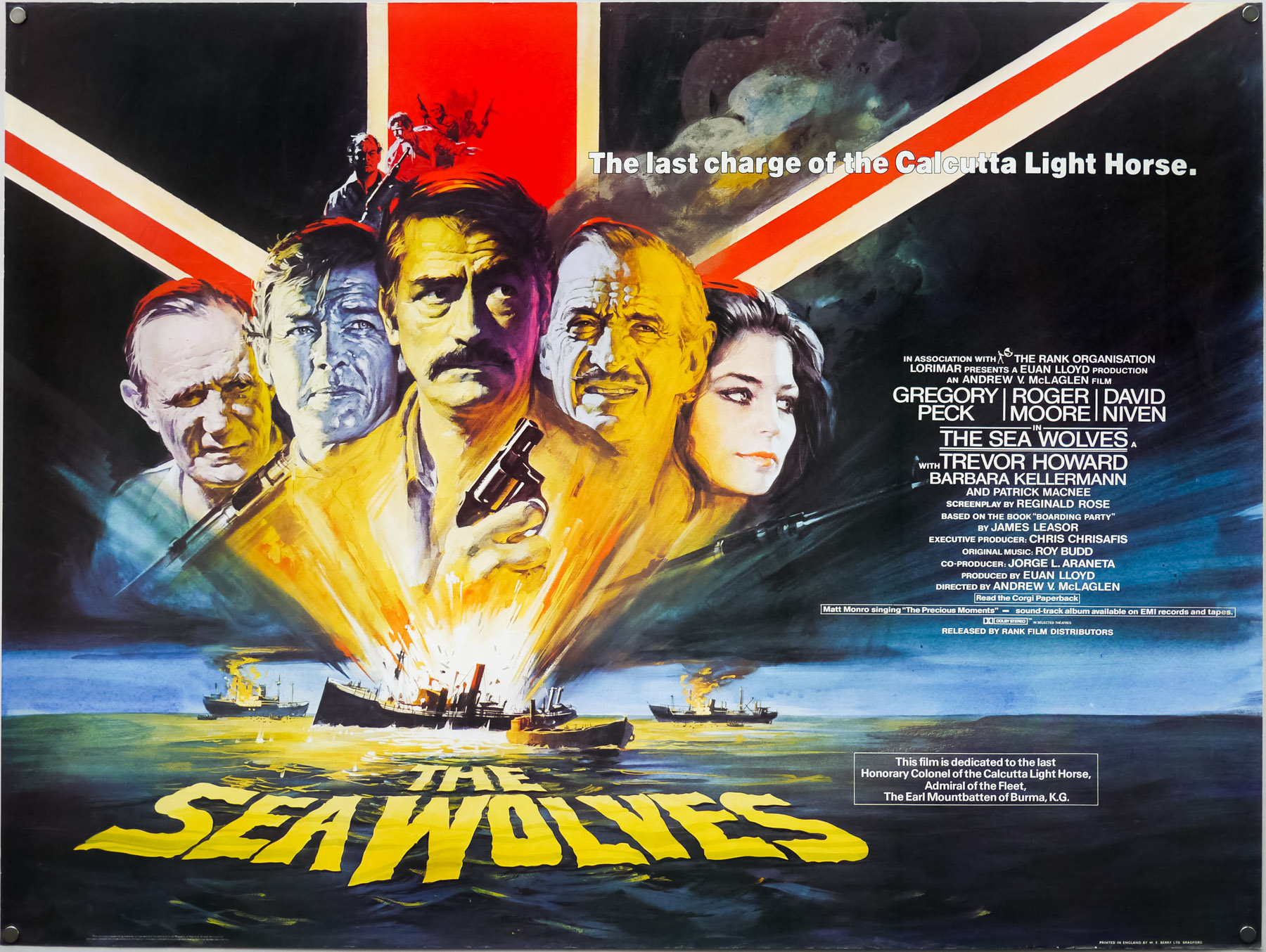
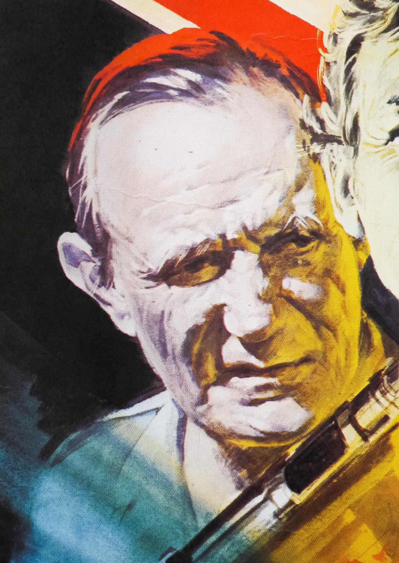
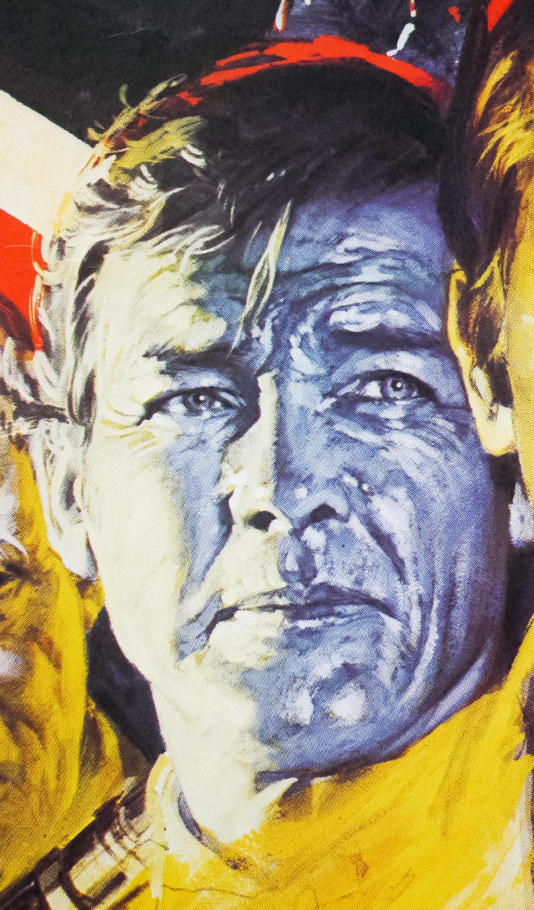
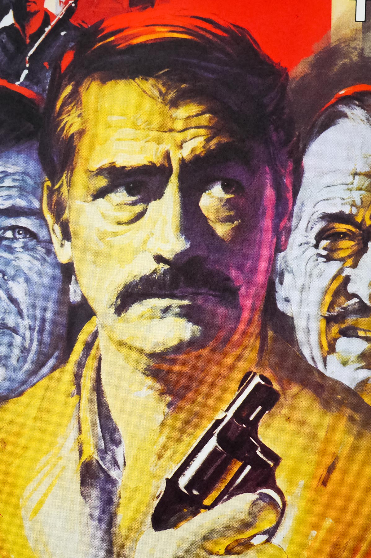
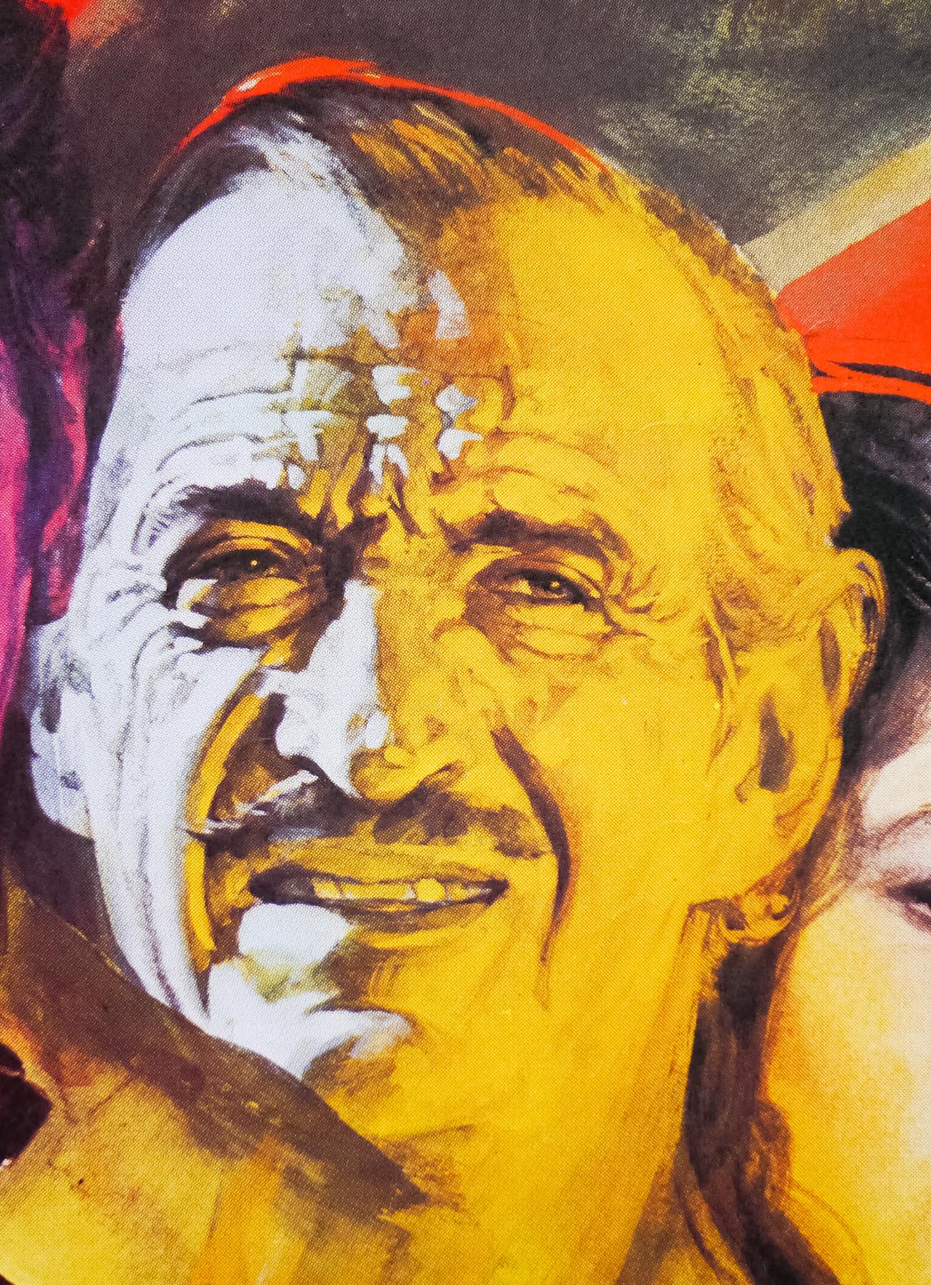
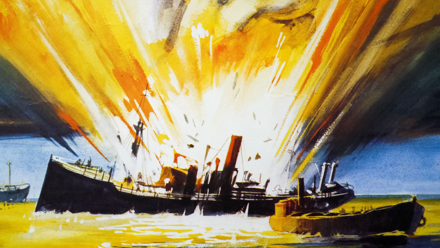
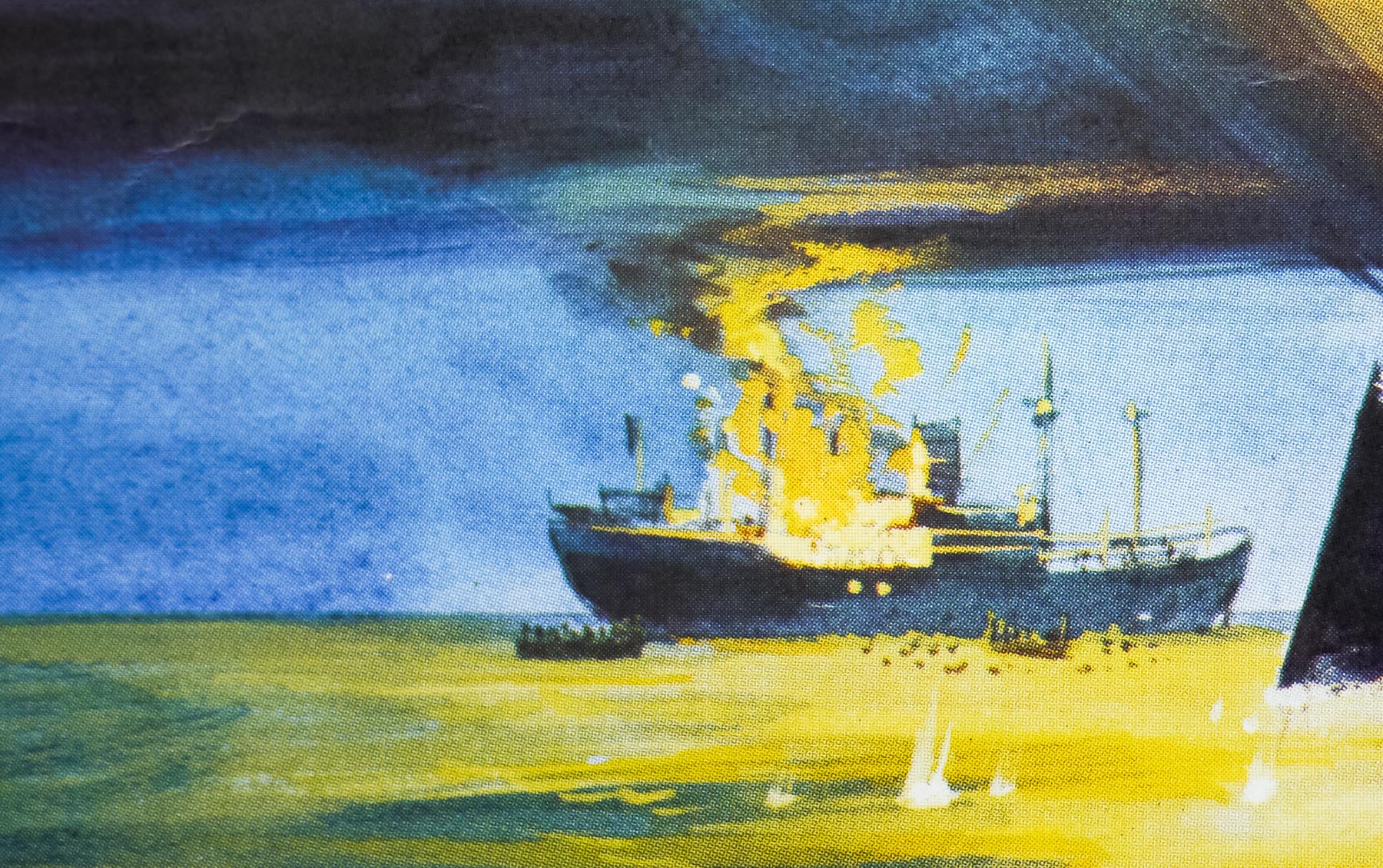
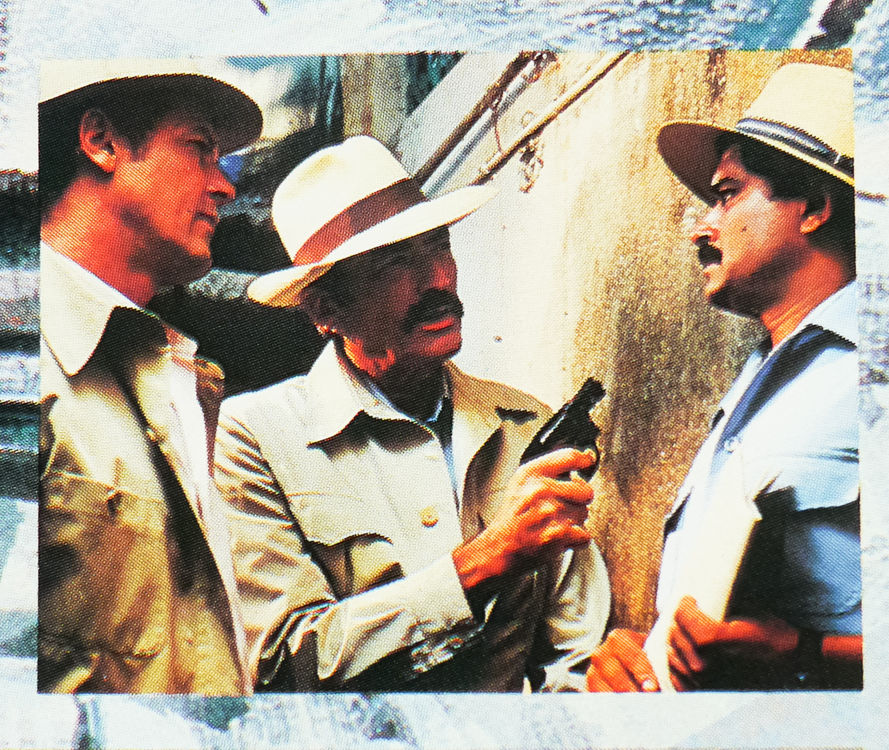
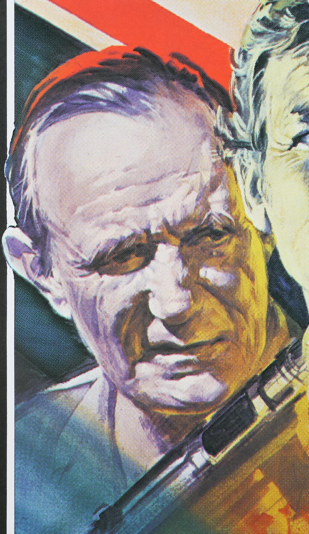
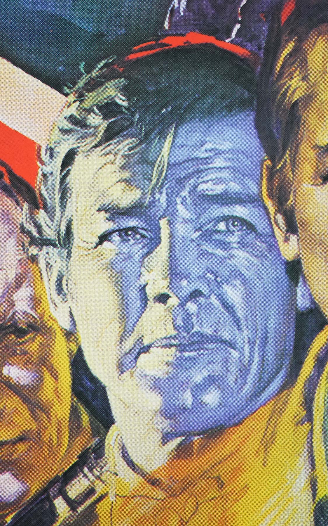
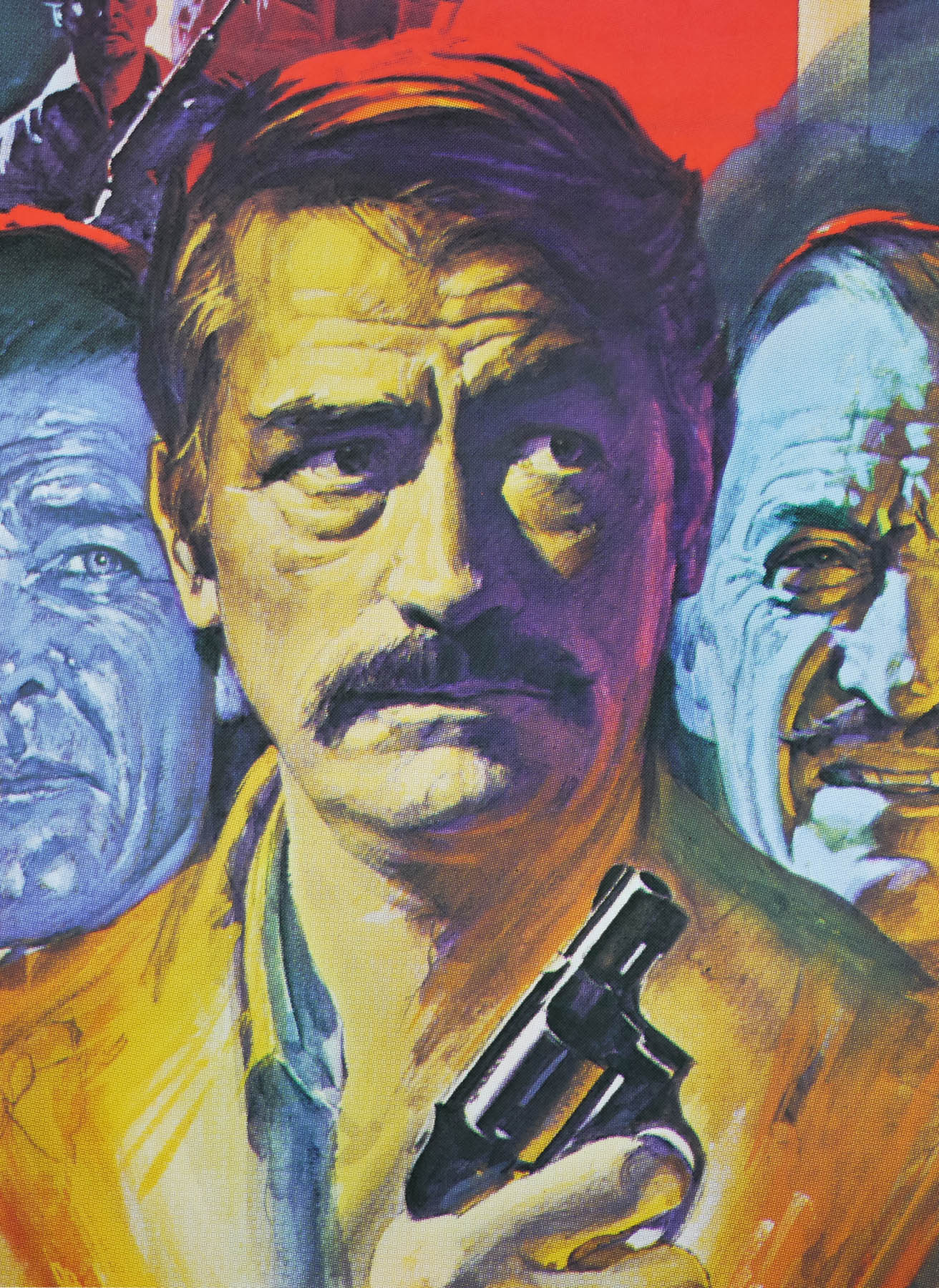
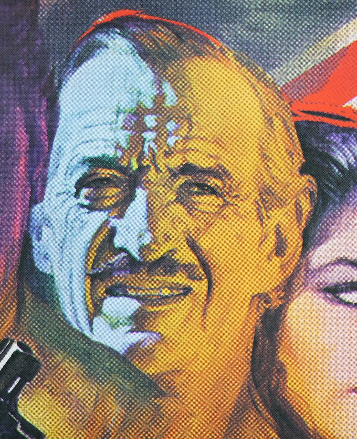
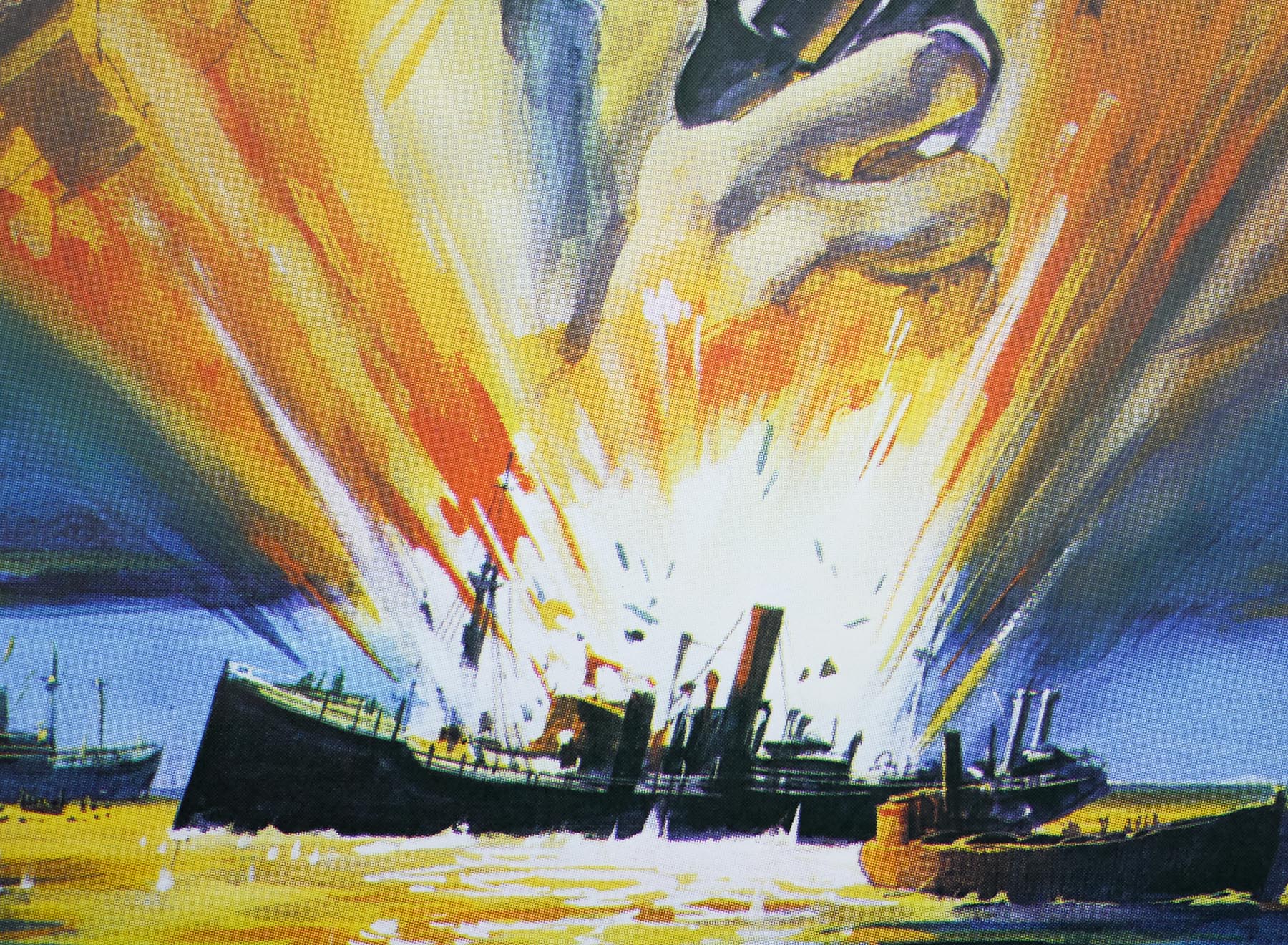
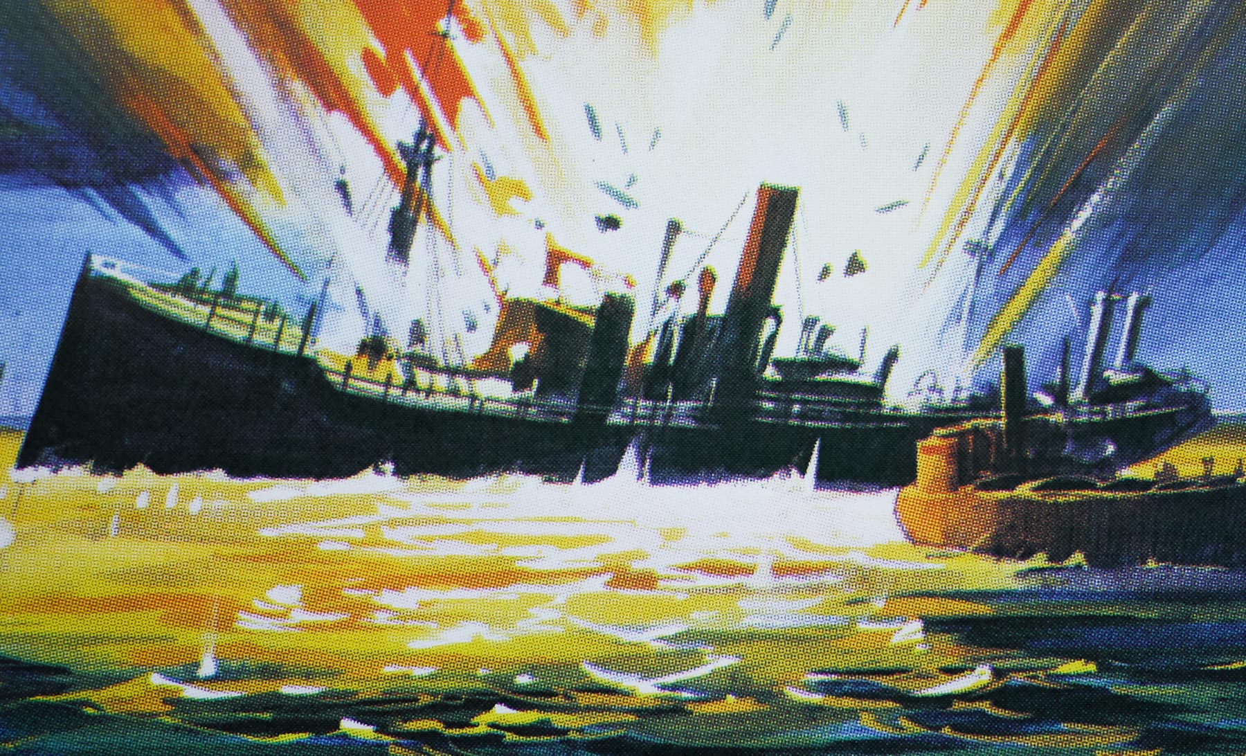
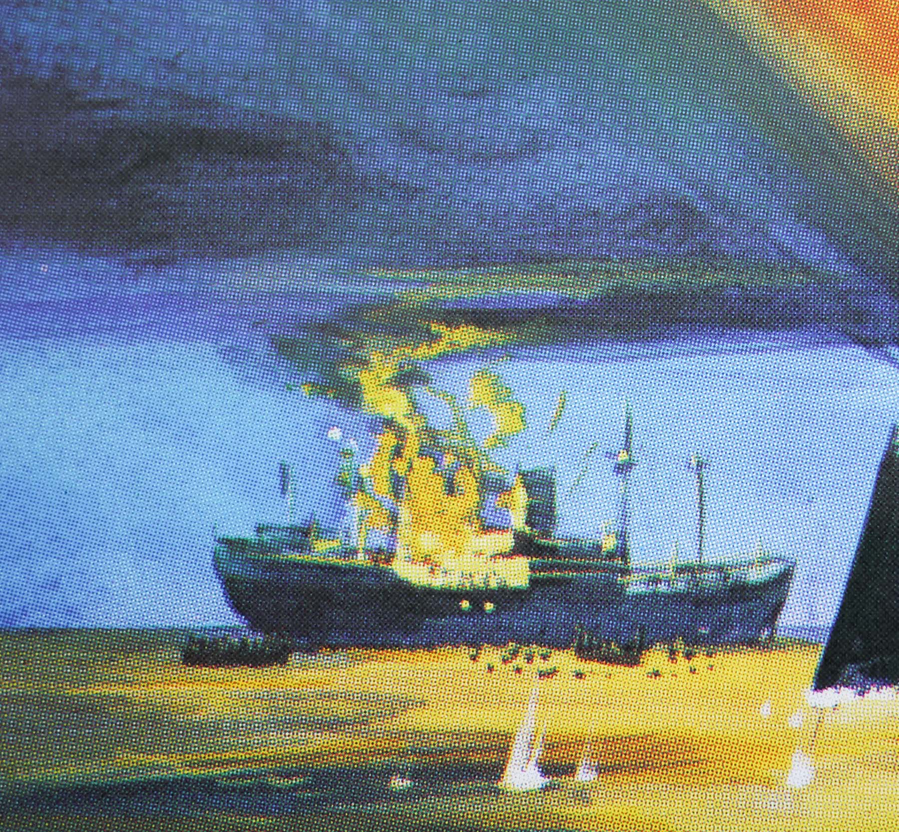
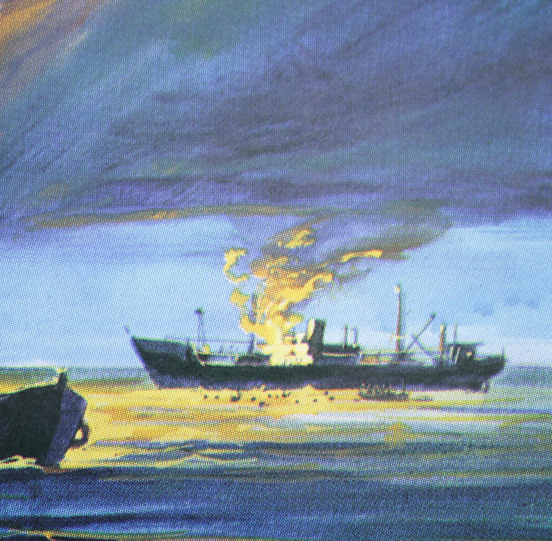
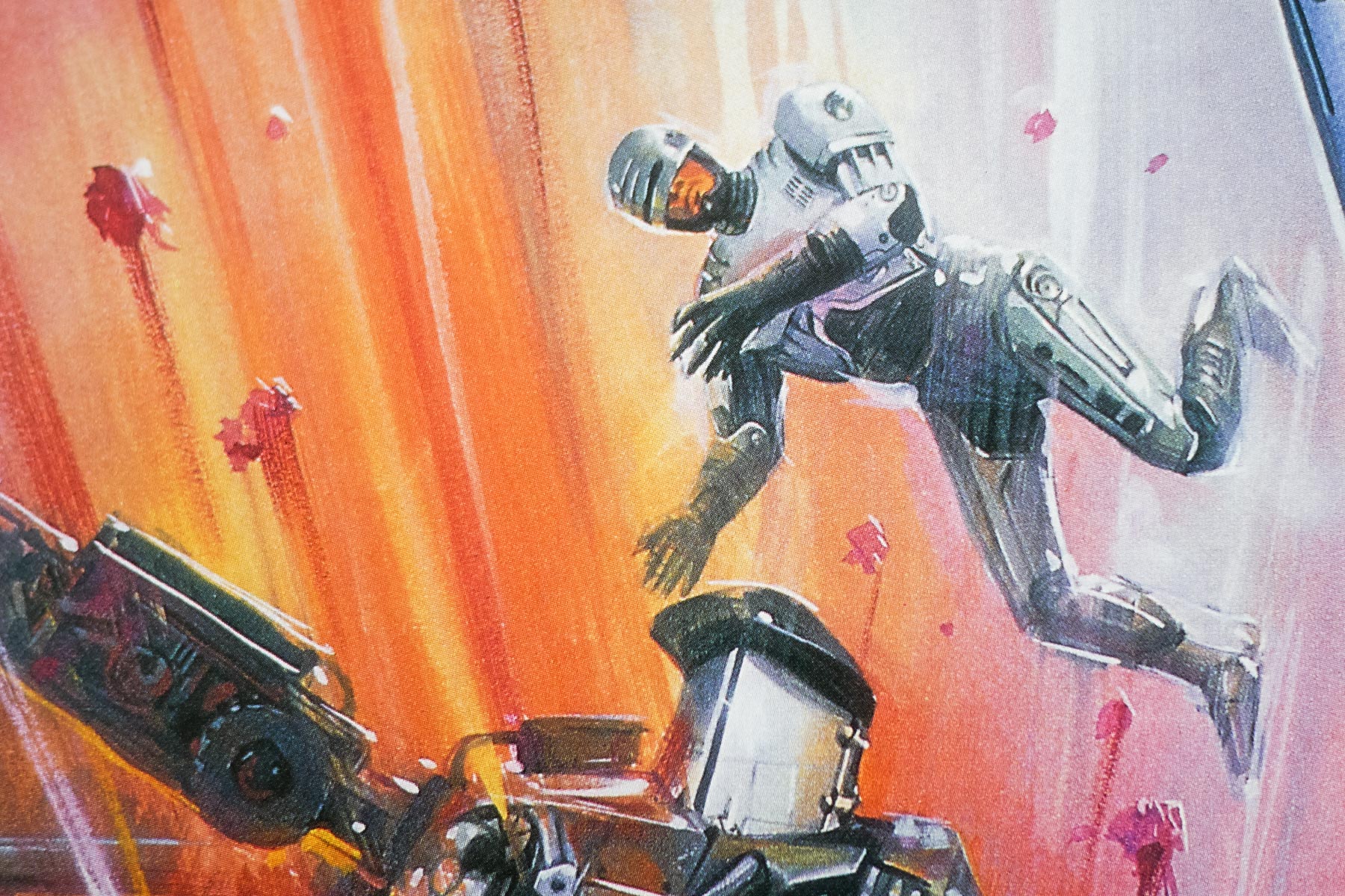
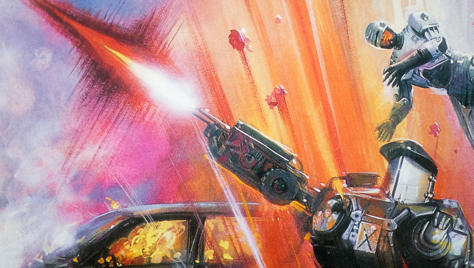
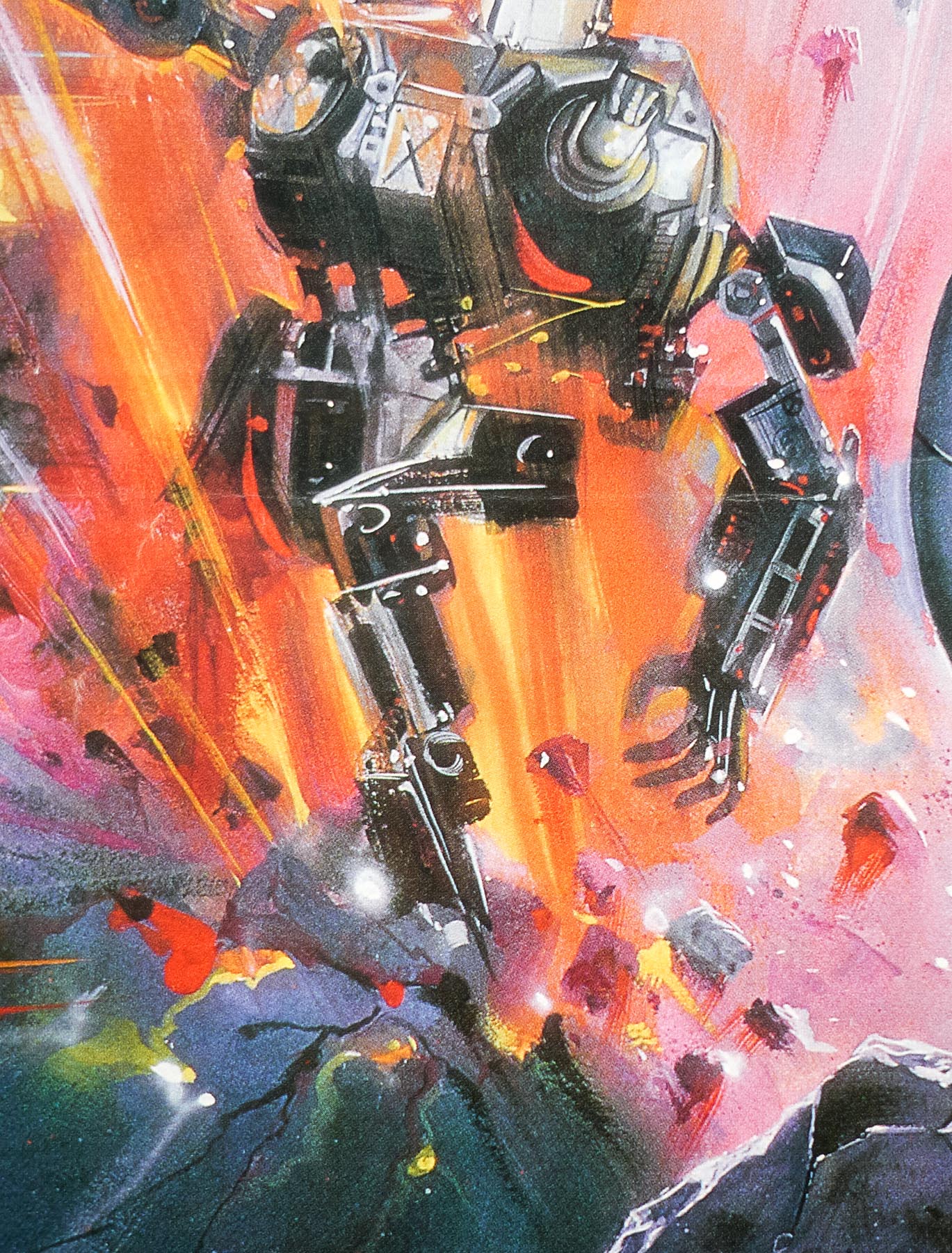
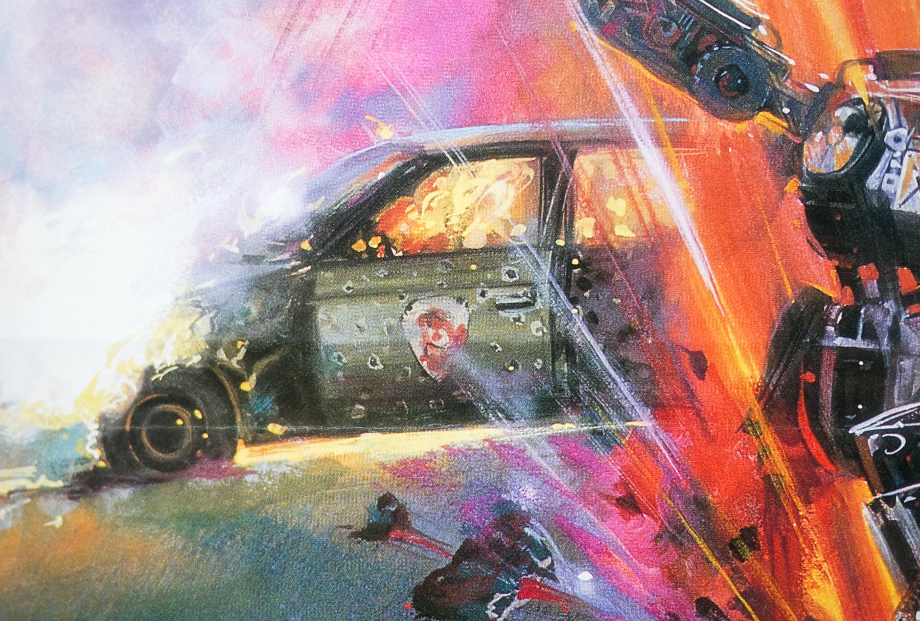
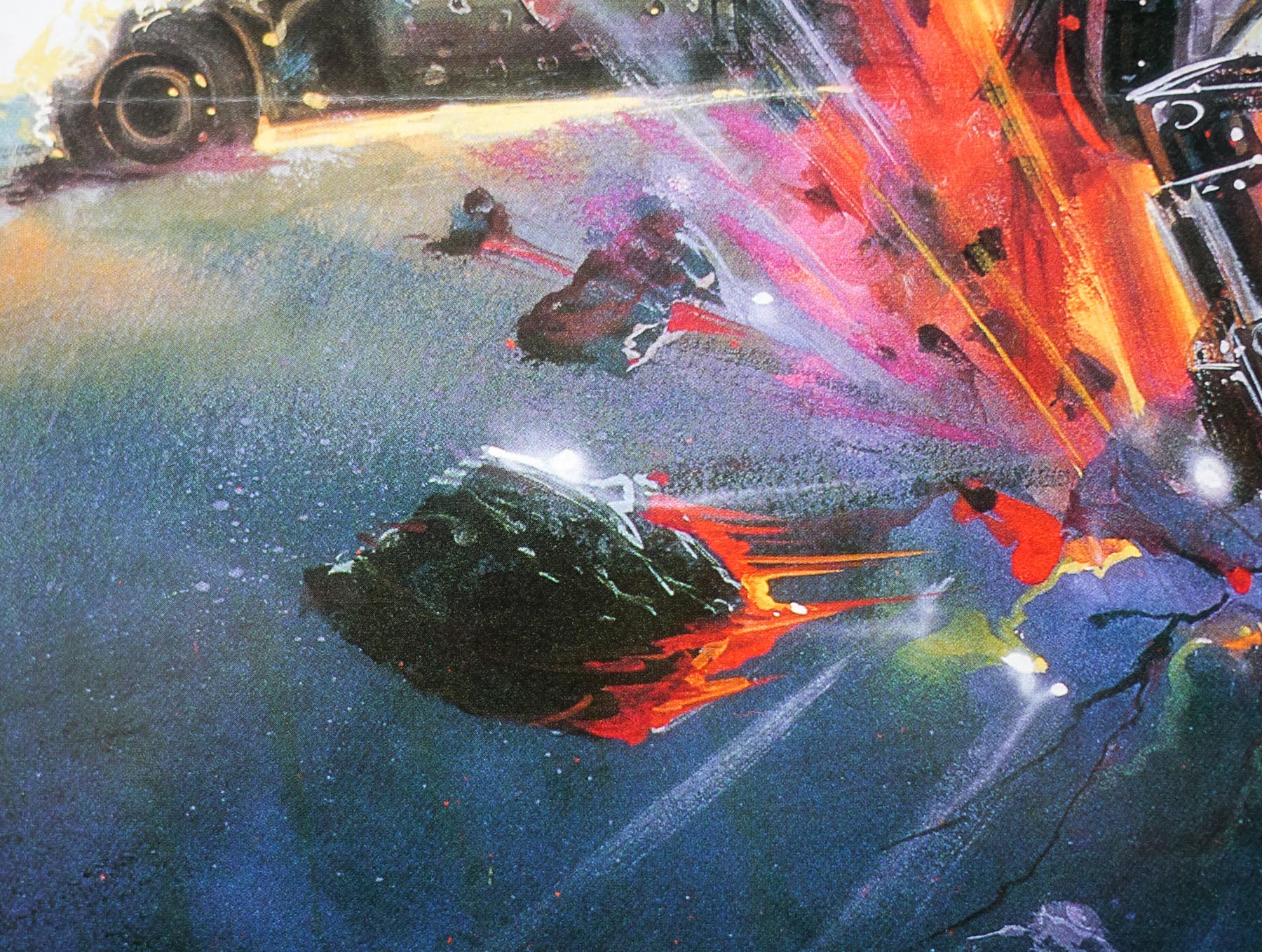
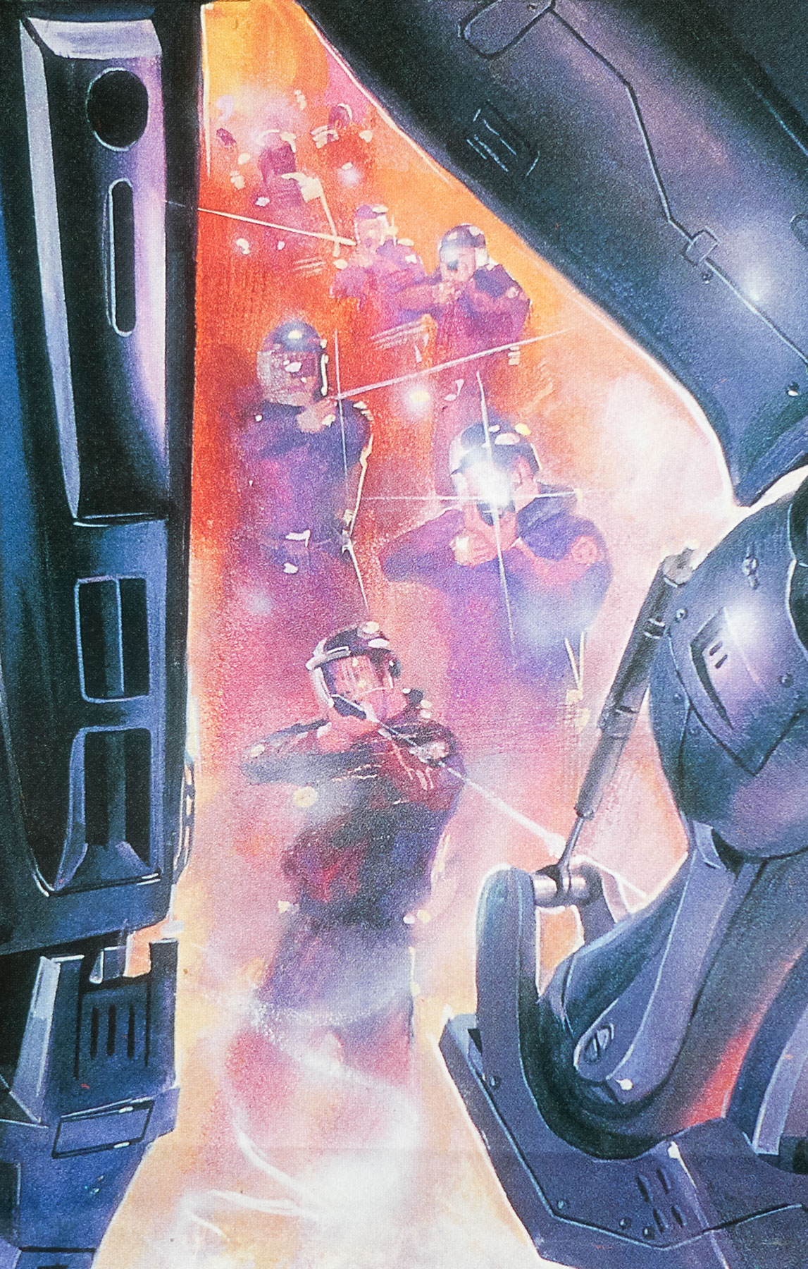
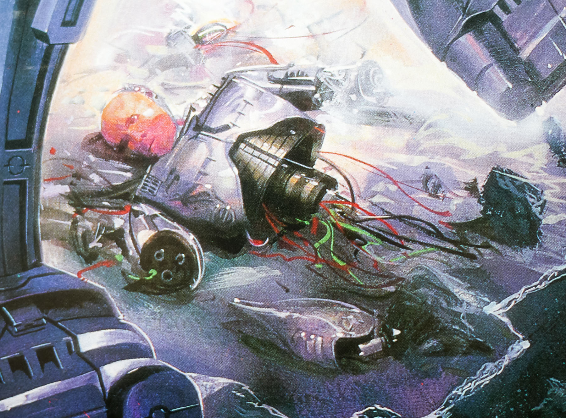
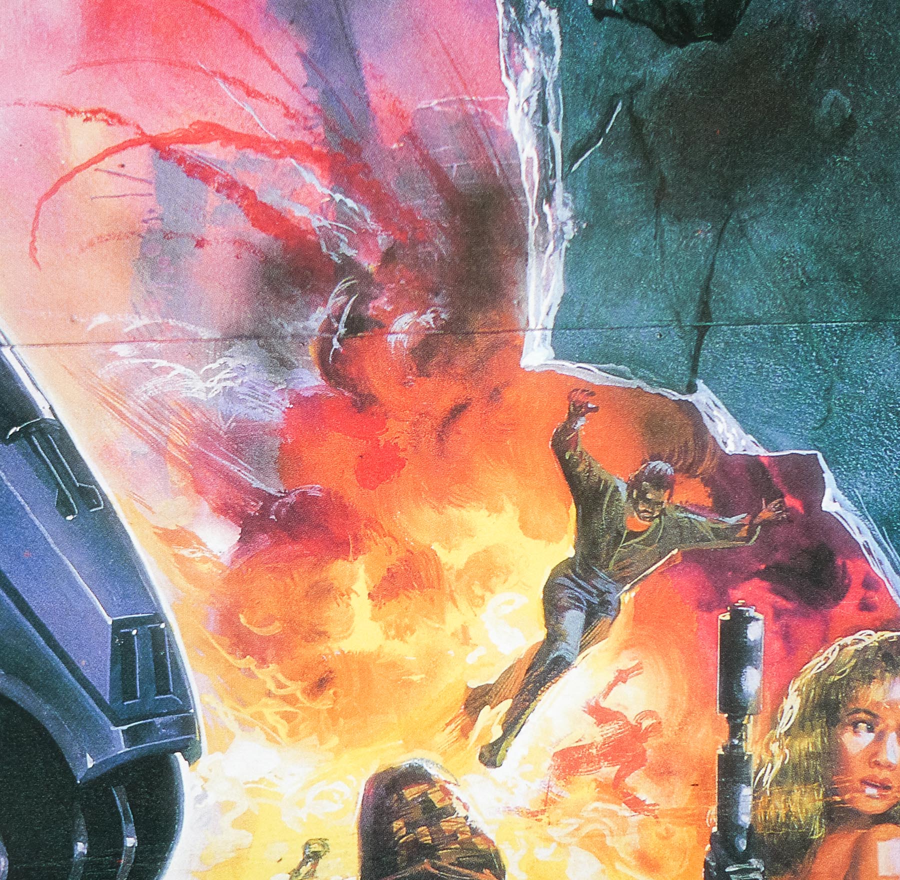
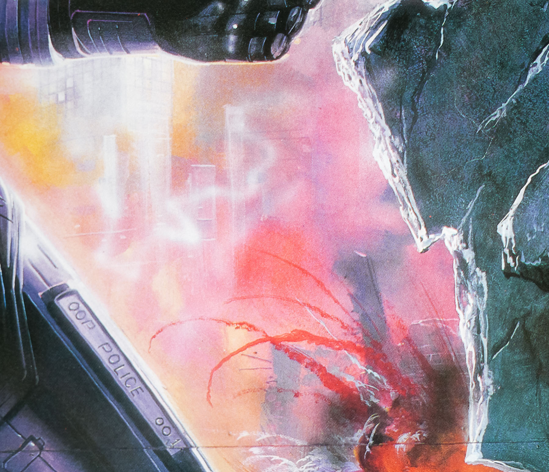
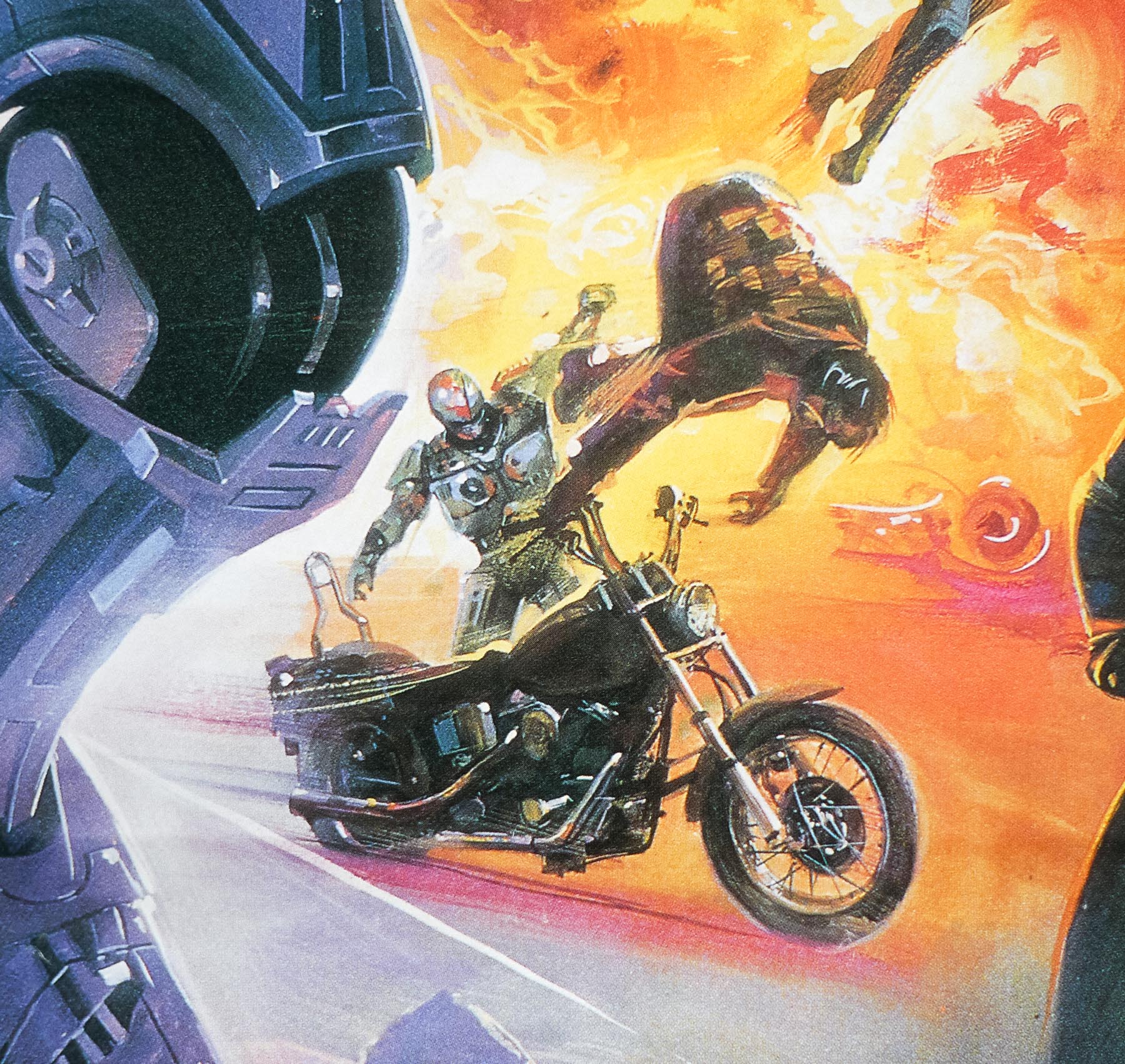
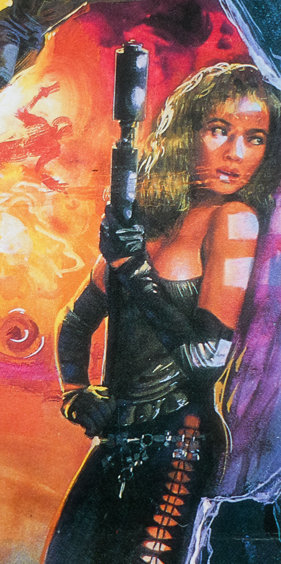
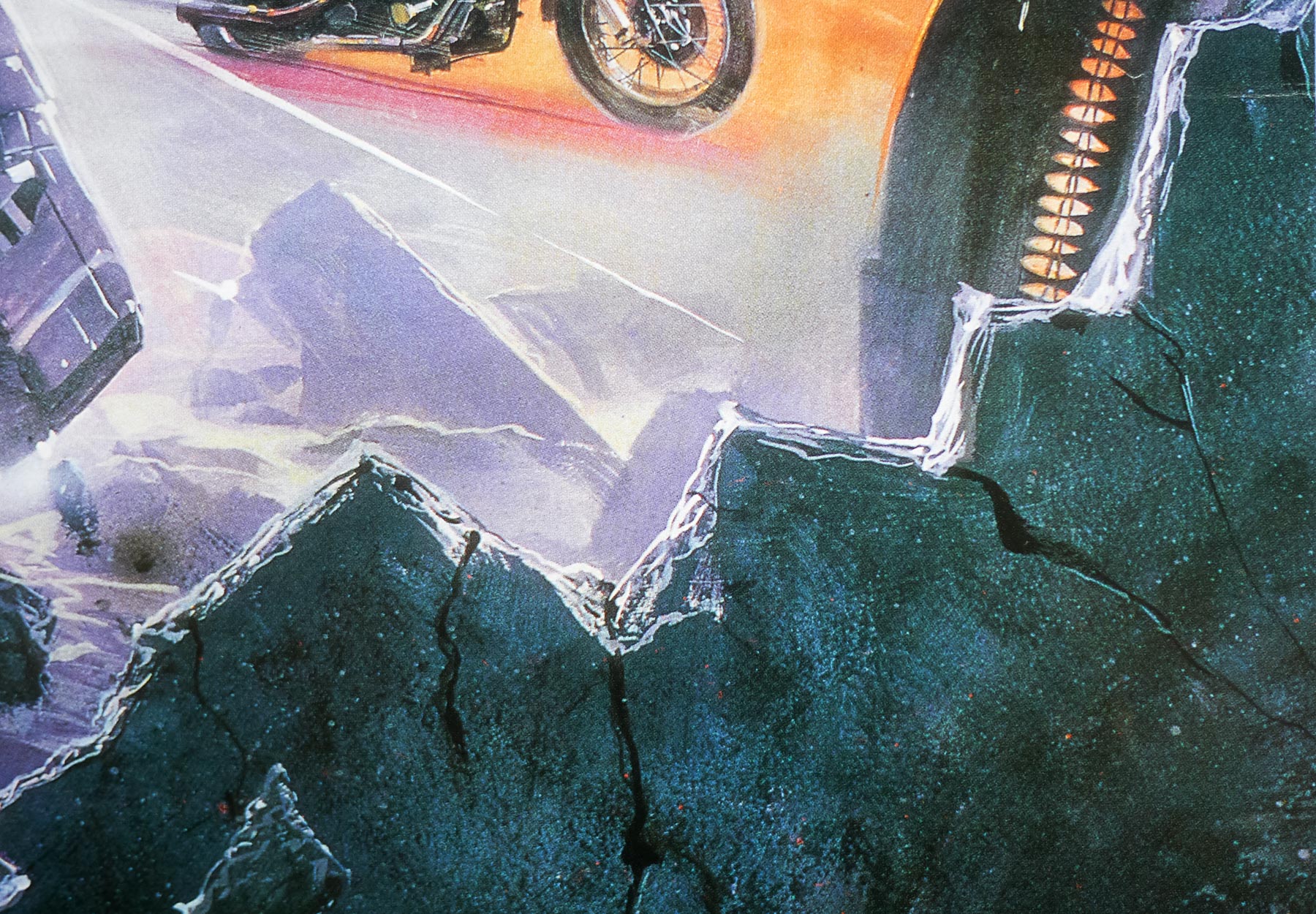
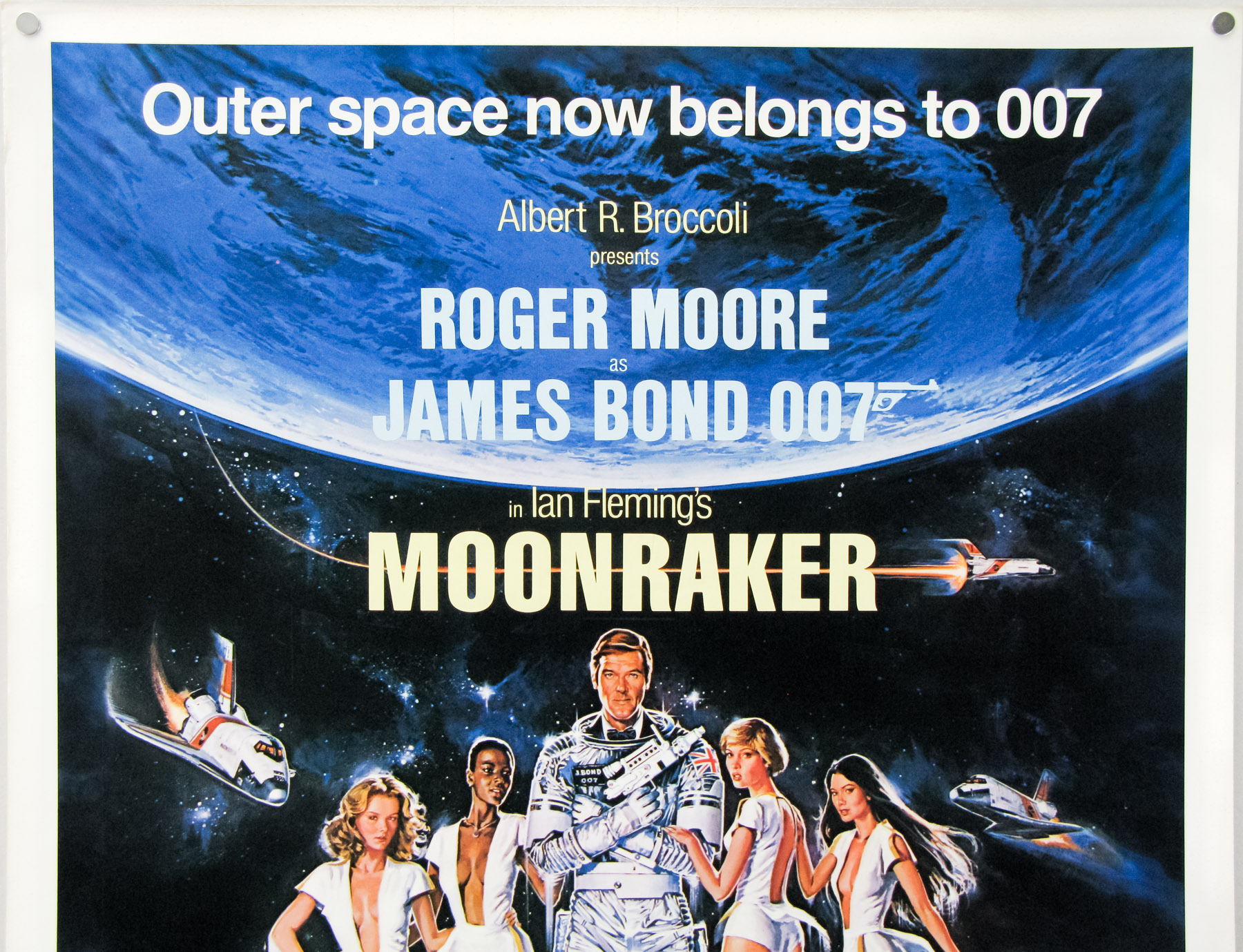
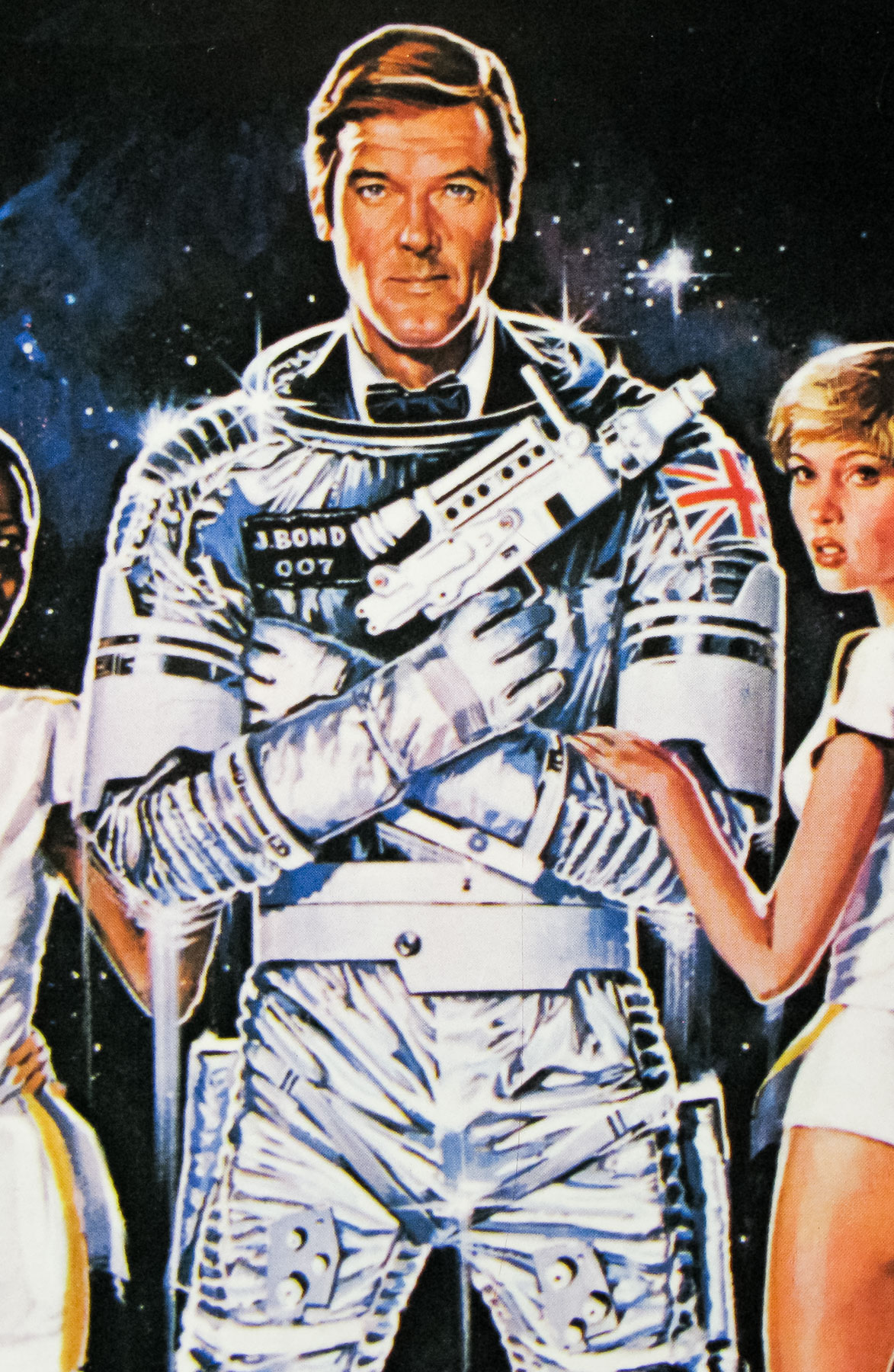
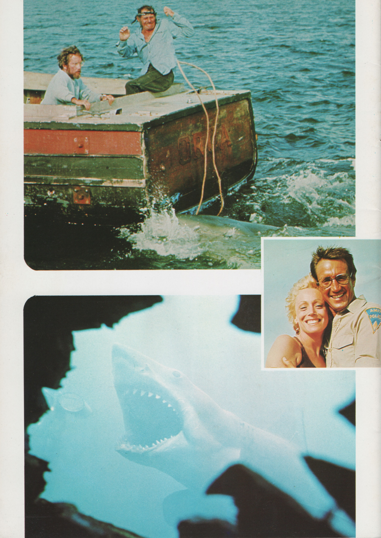
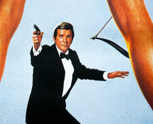
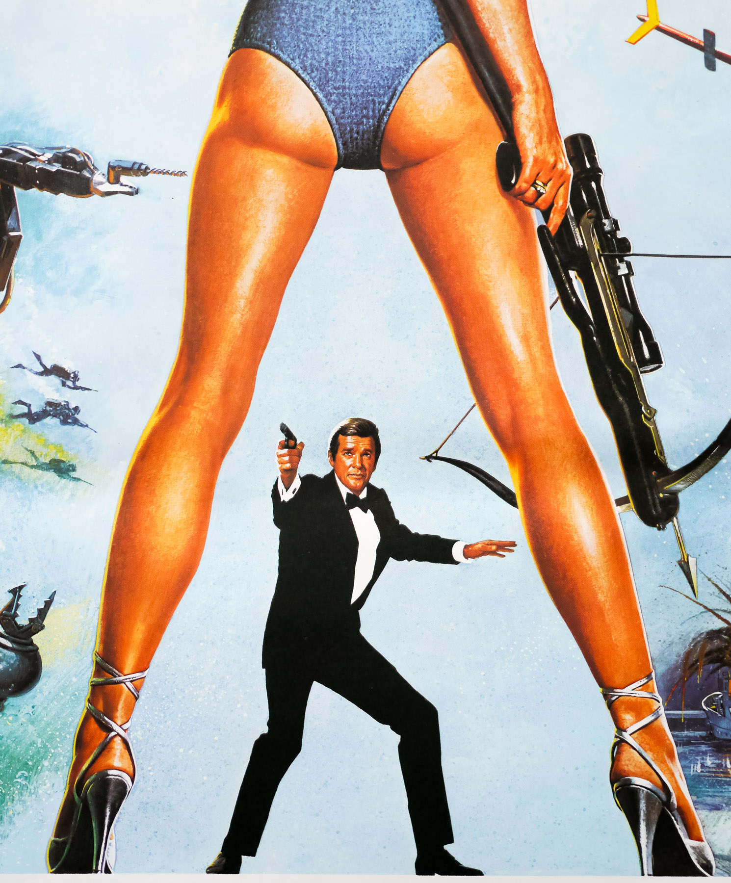
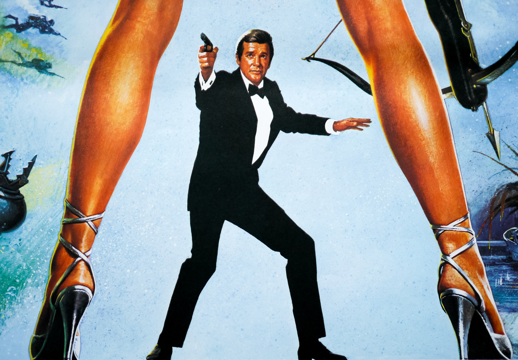
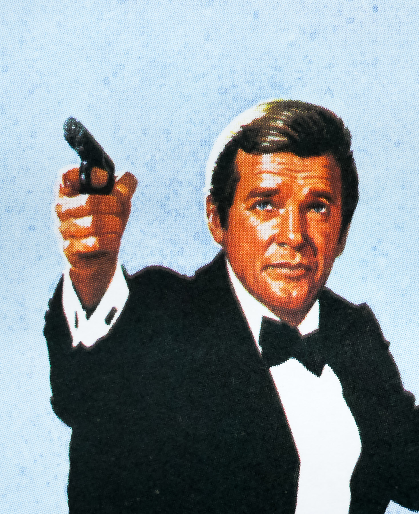
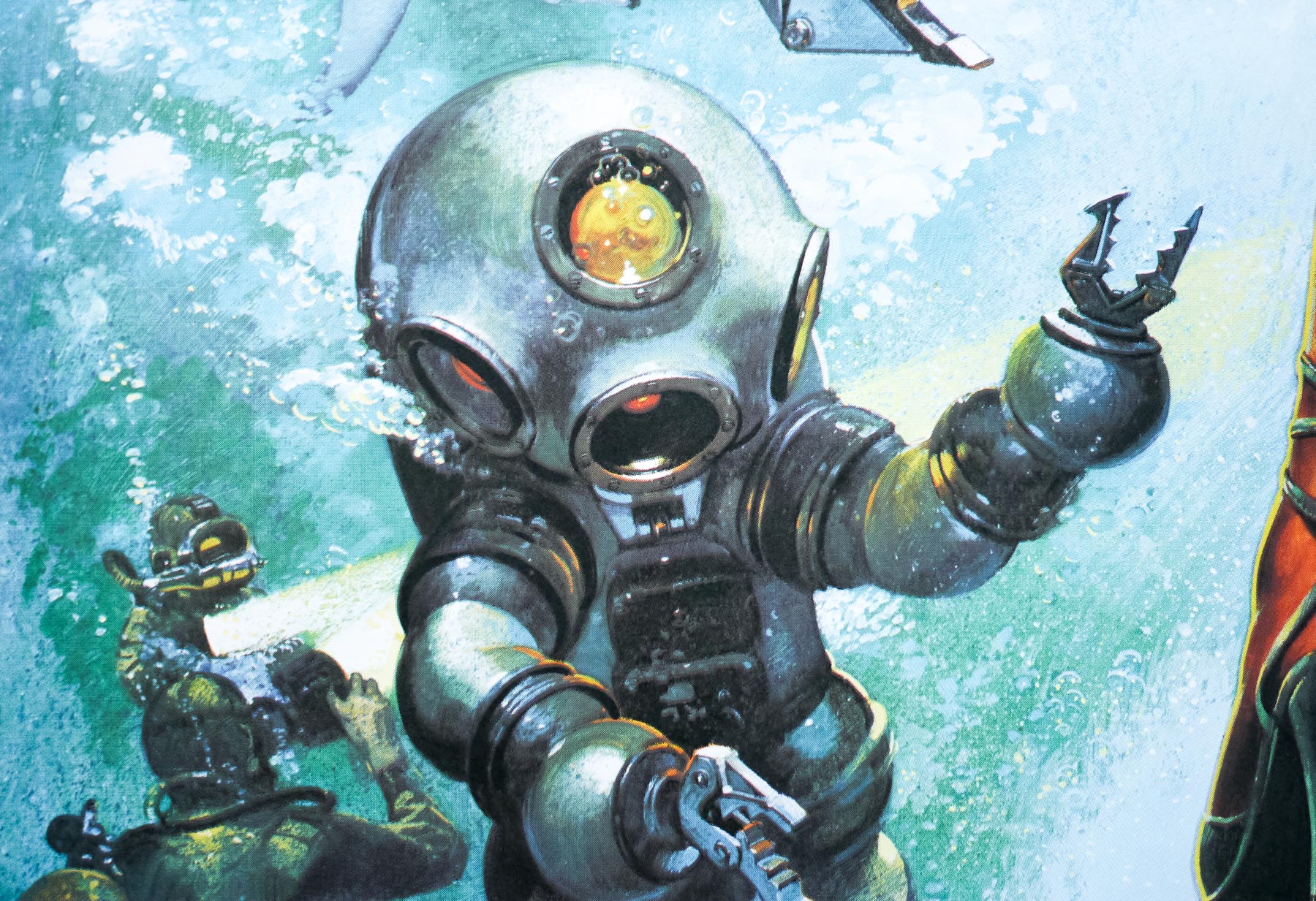
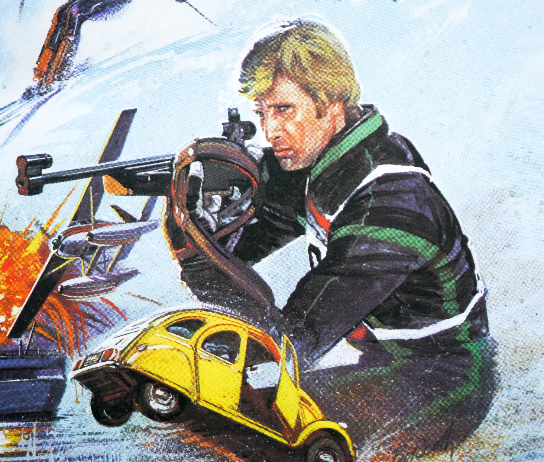
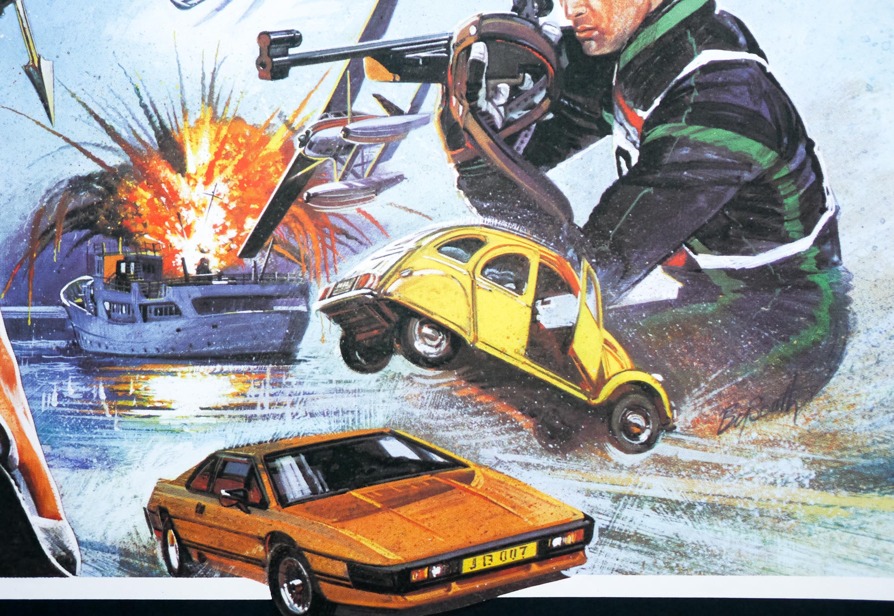
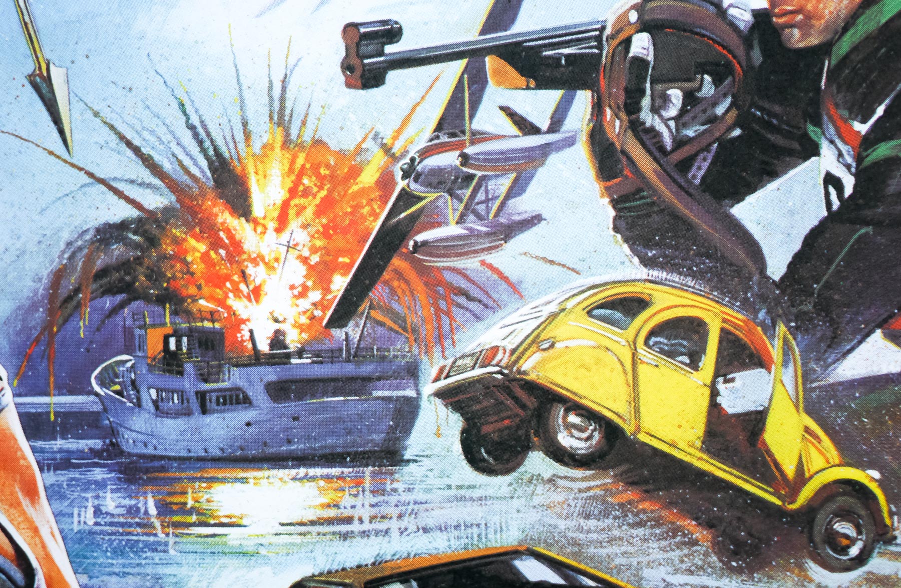
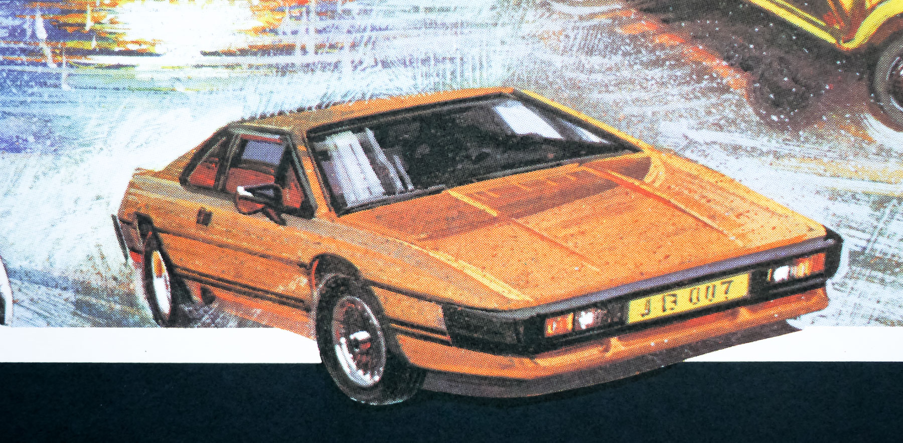
One of Roger Moore’s better outings as 007, For Your Eyes Only was intended to bring James Bond back down to earth with a more realistic and less sensational storyline following the lunacy of Moonraker. It marked the first time John Glen would helm a Bond film, having worked as an editor and second-unit director on three of the previous outings, and he would go on to direct the next four films in the series. The story sees the spy being sent to try and recover an ‘ATAC’ device capable of controlling the British Polaris submarine fleet, which is lost after a spy ship disguised as a trawler is sunk in neutral waters.
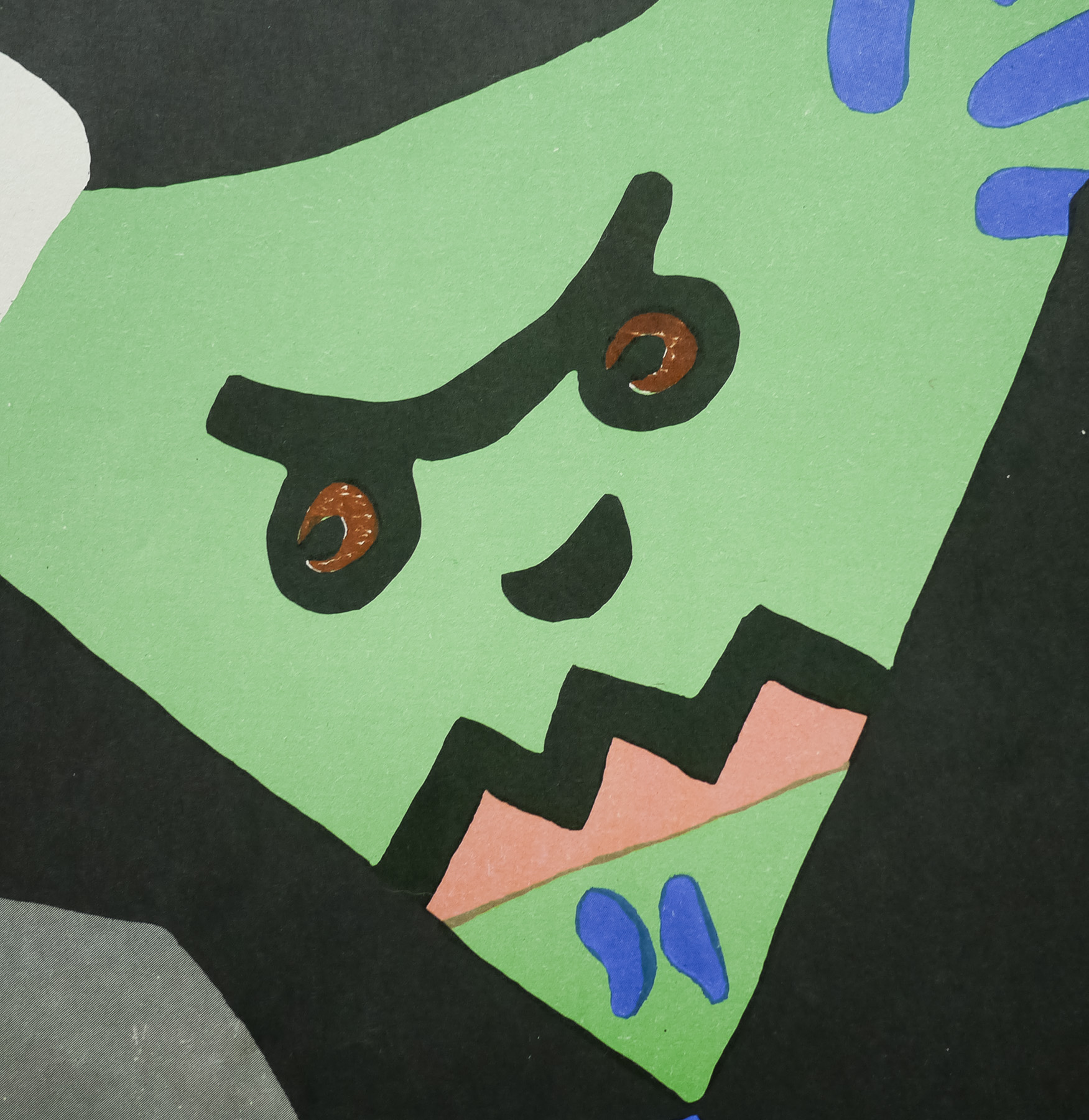
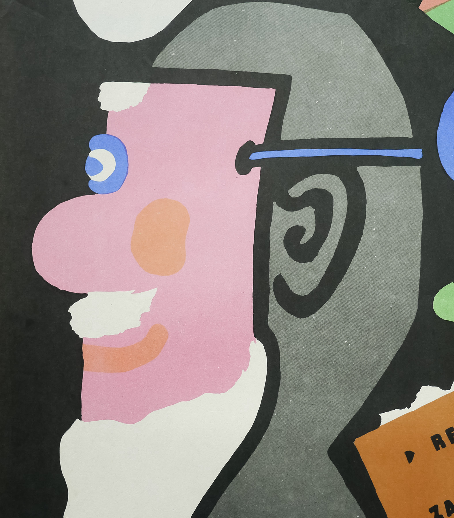
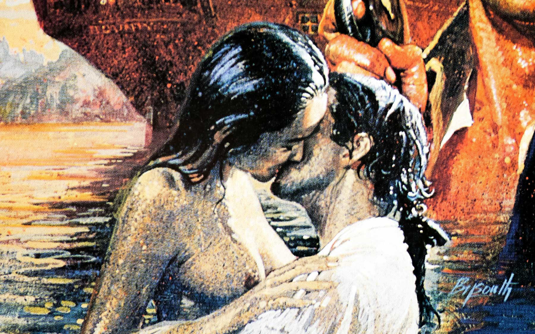
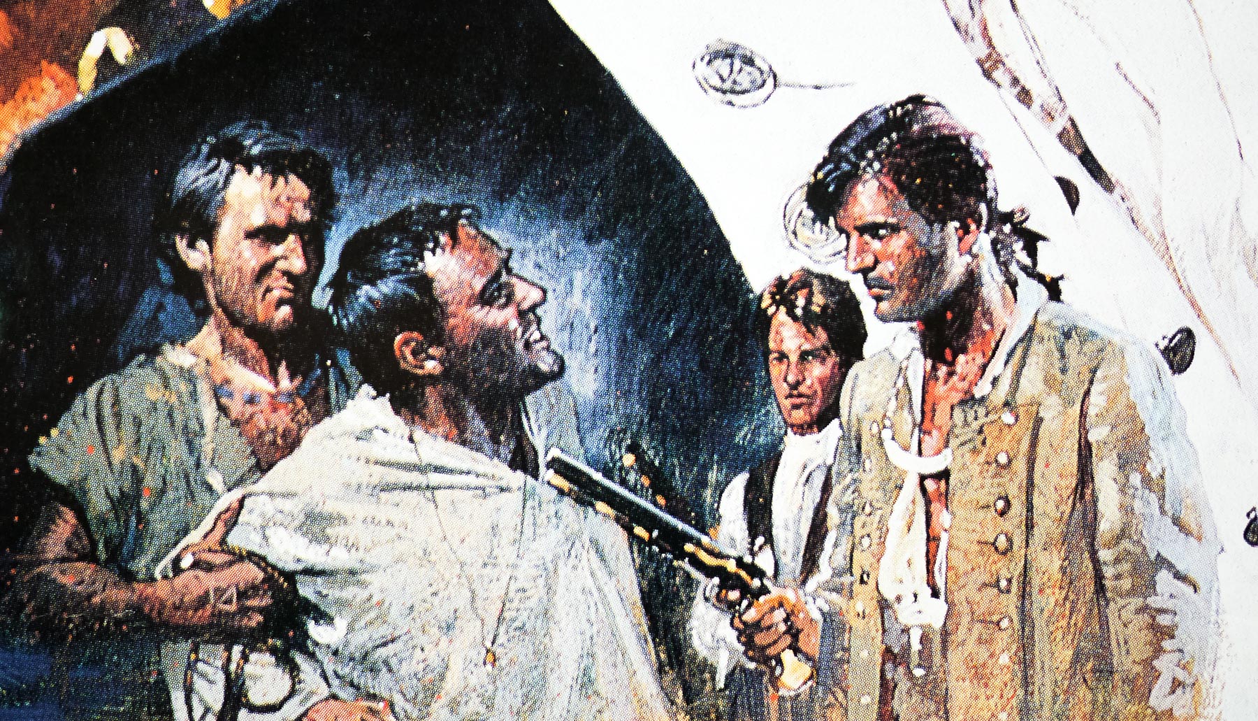
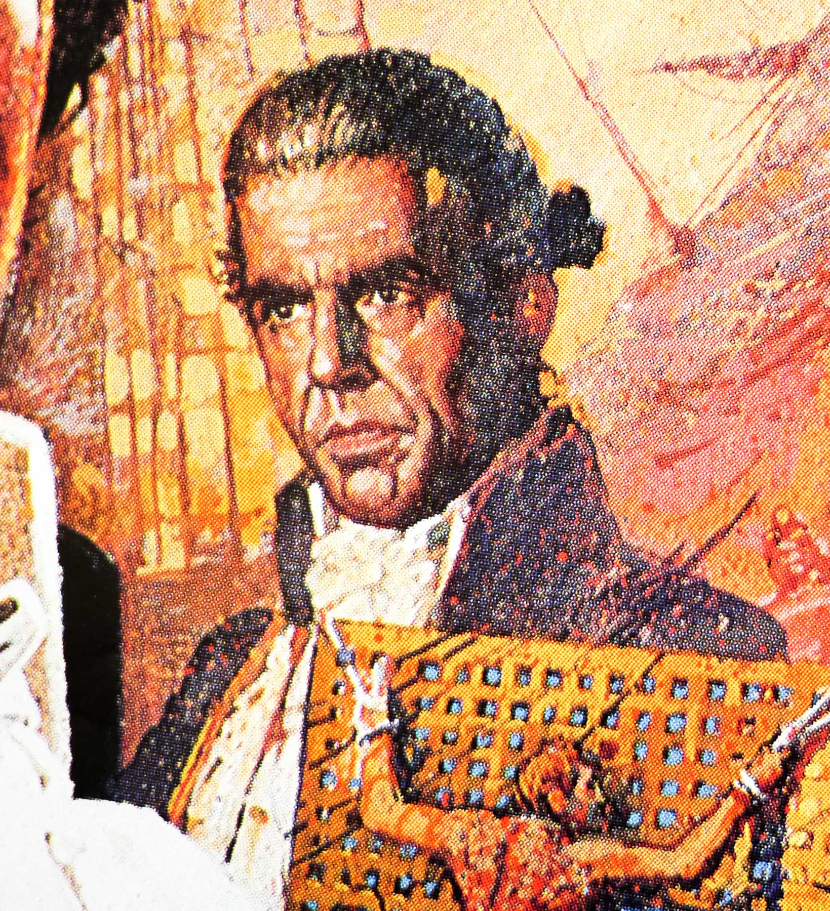
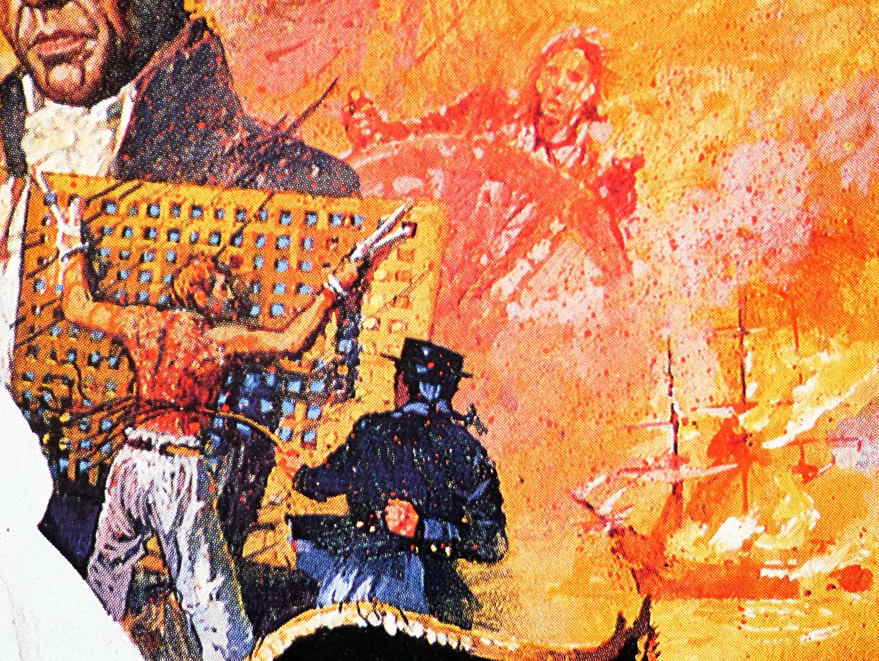
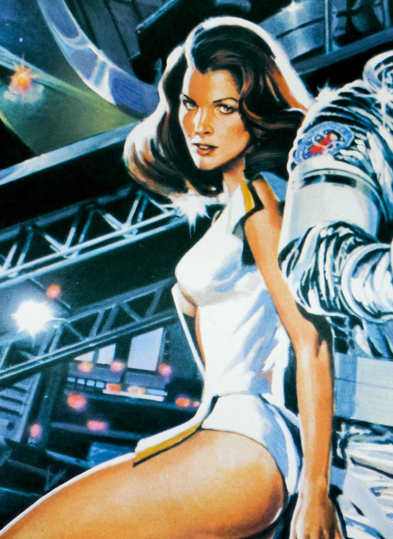
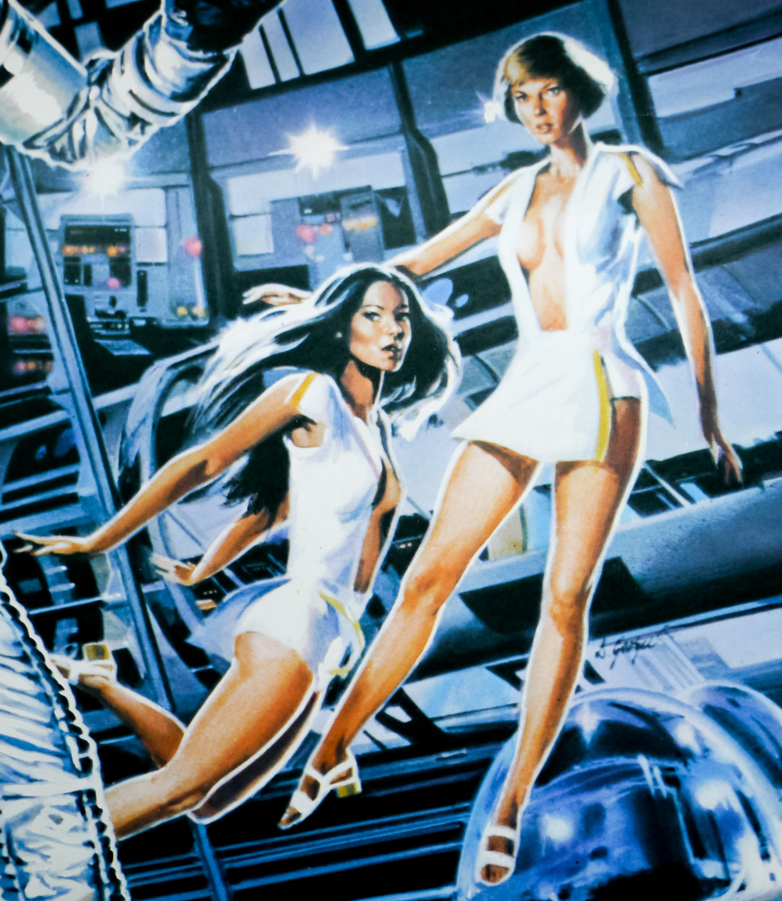
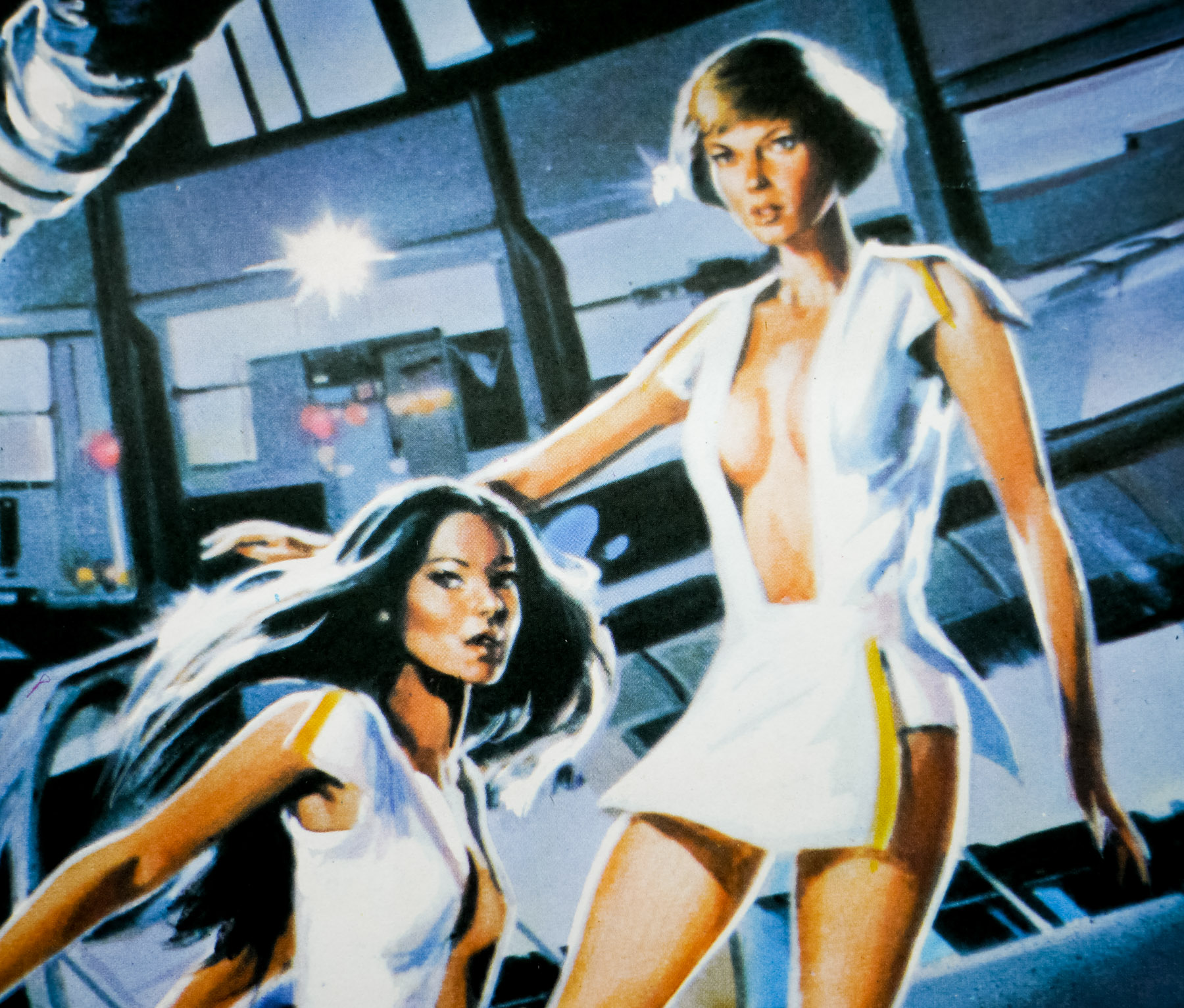
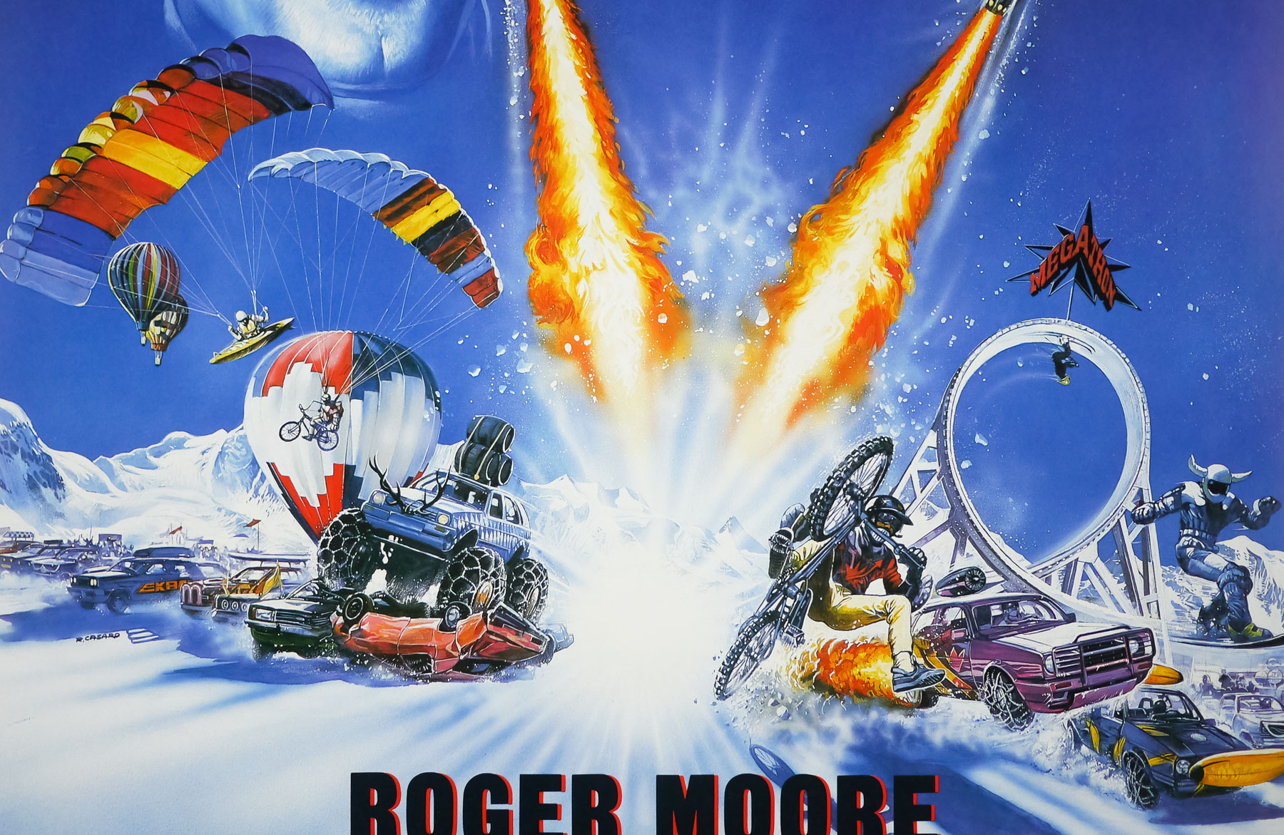
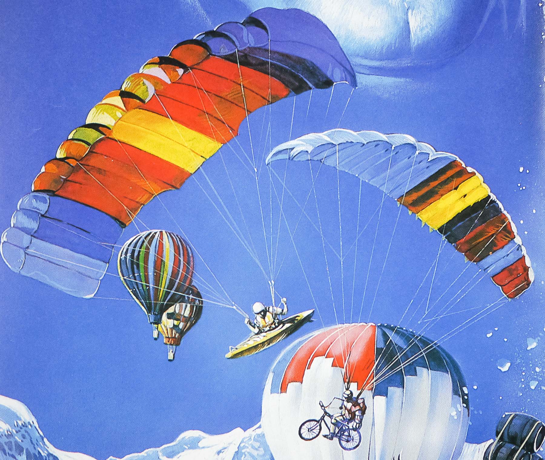
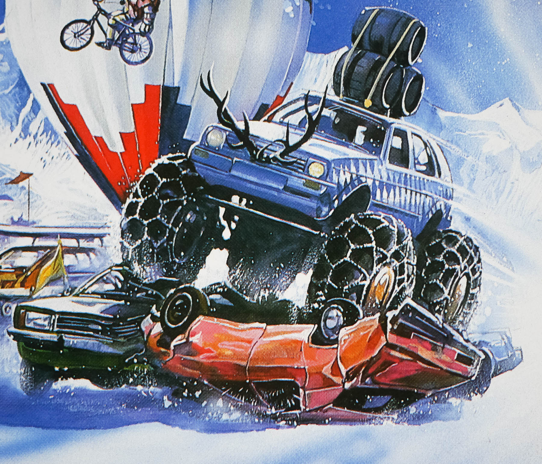
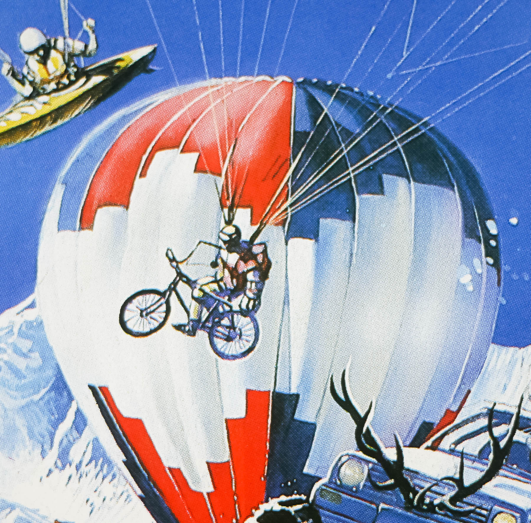
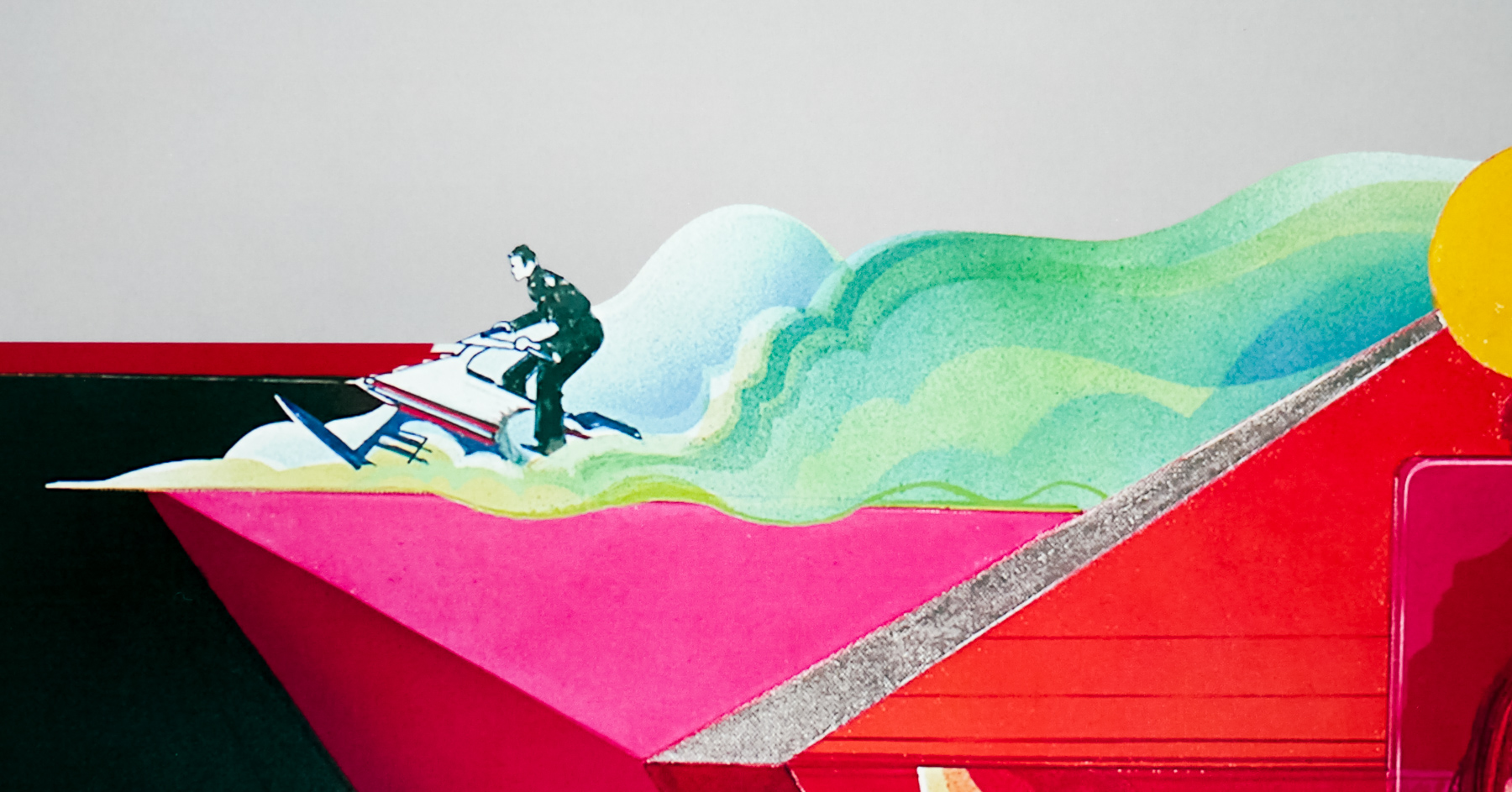
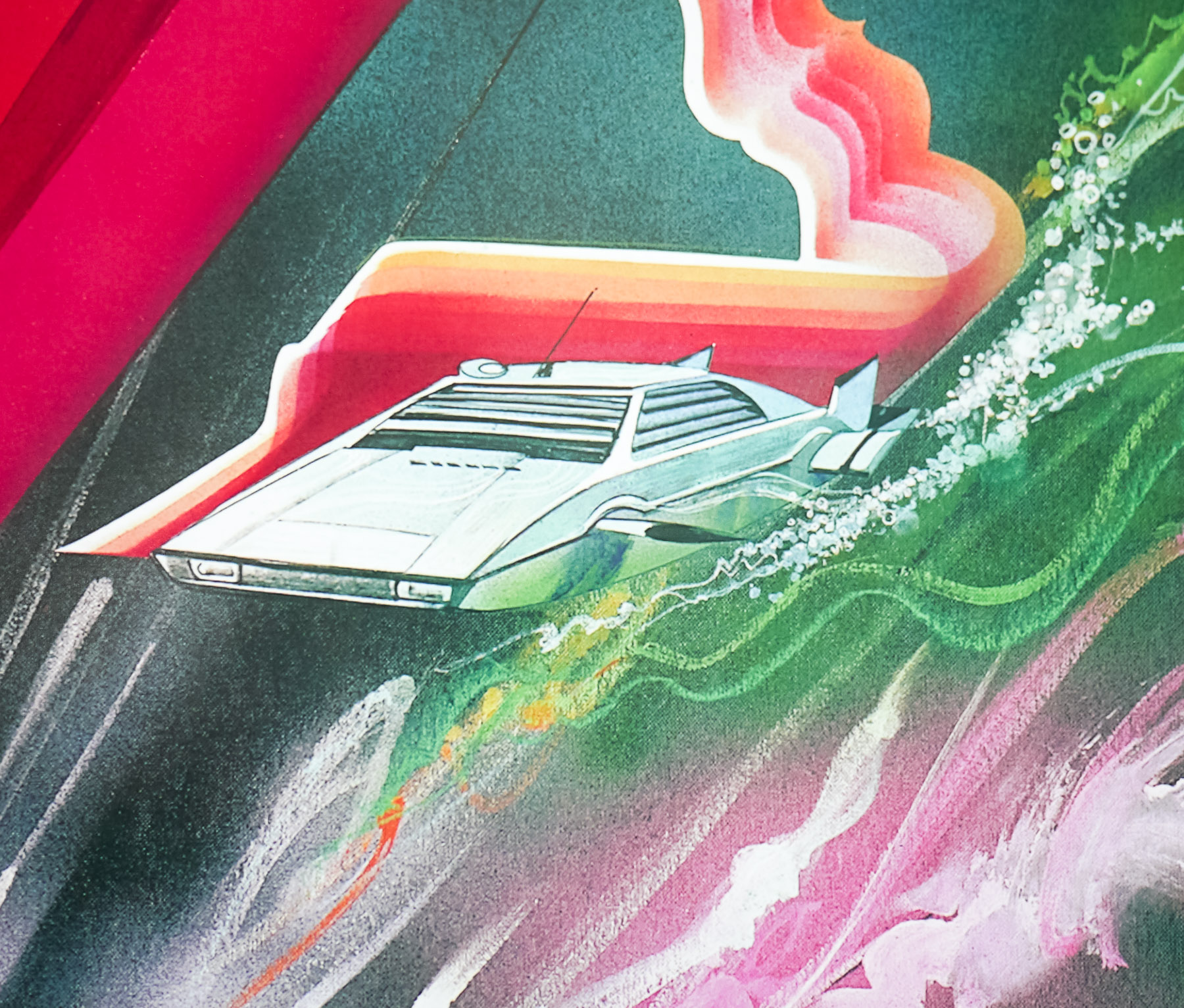
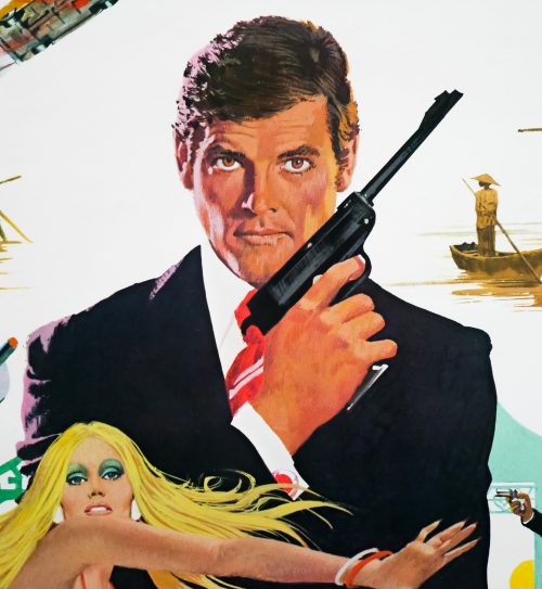
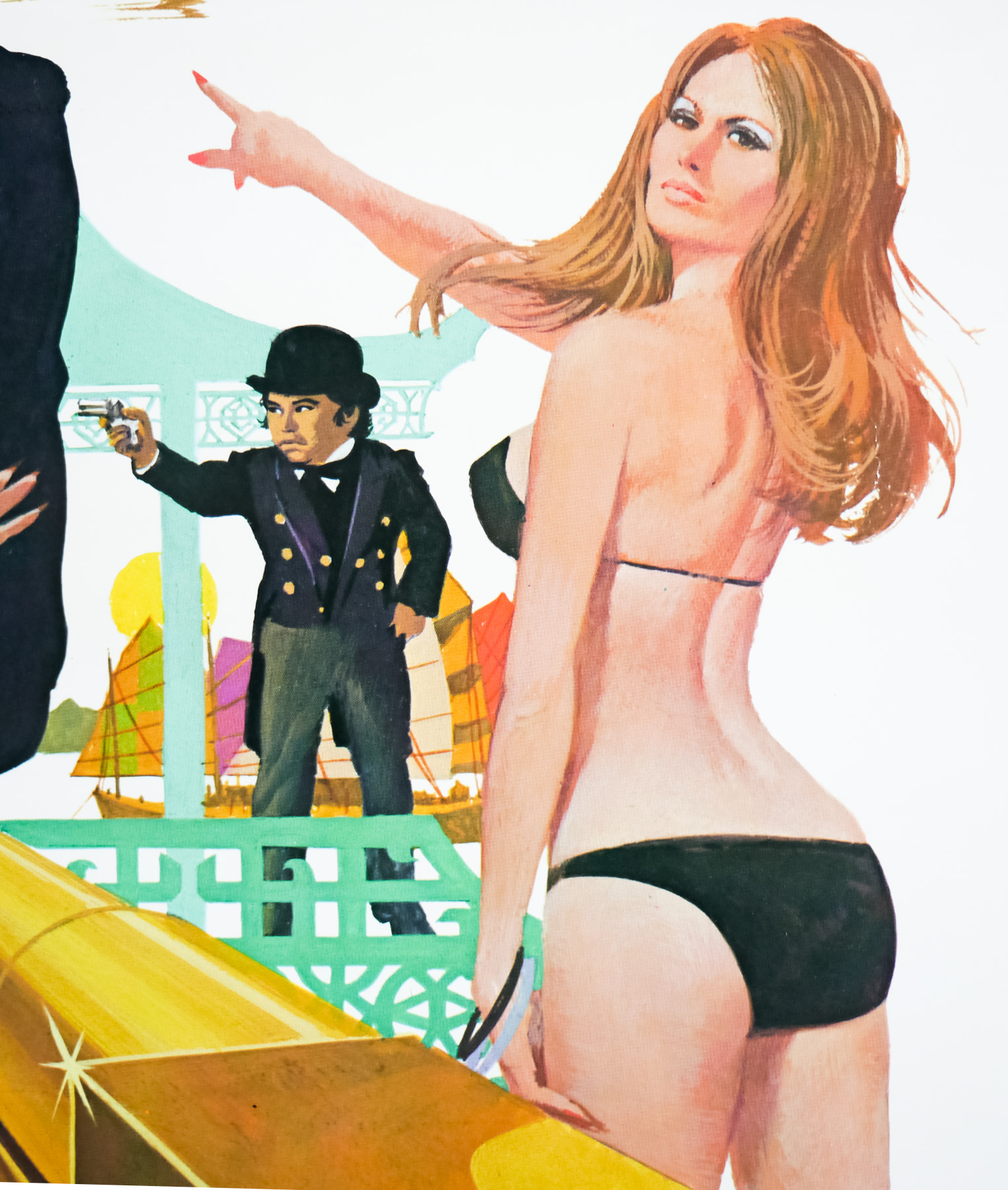
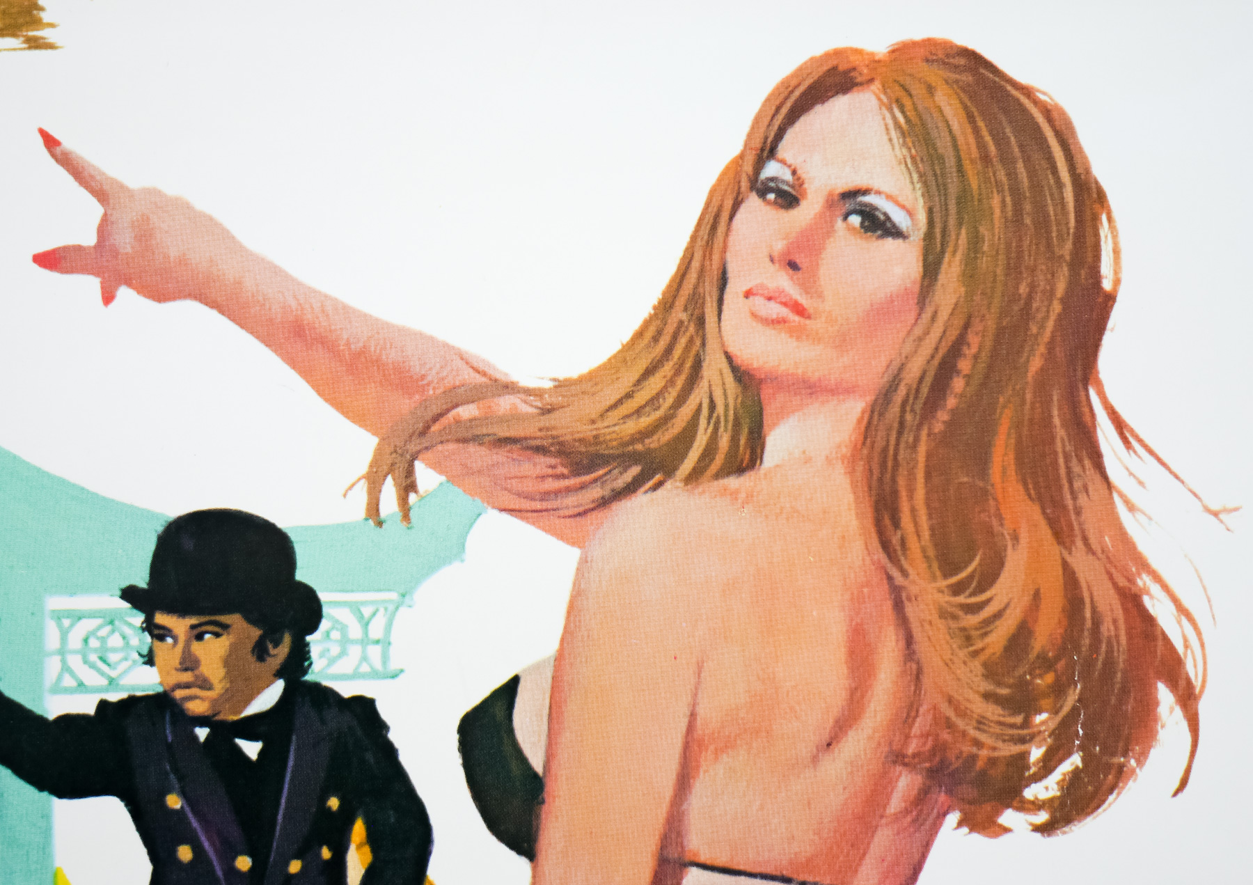
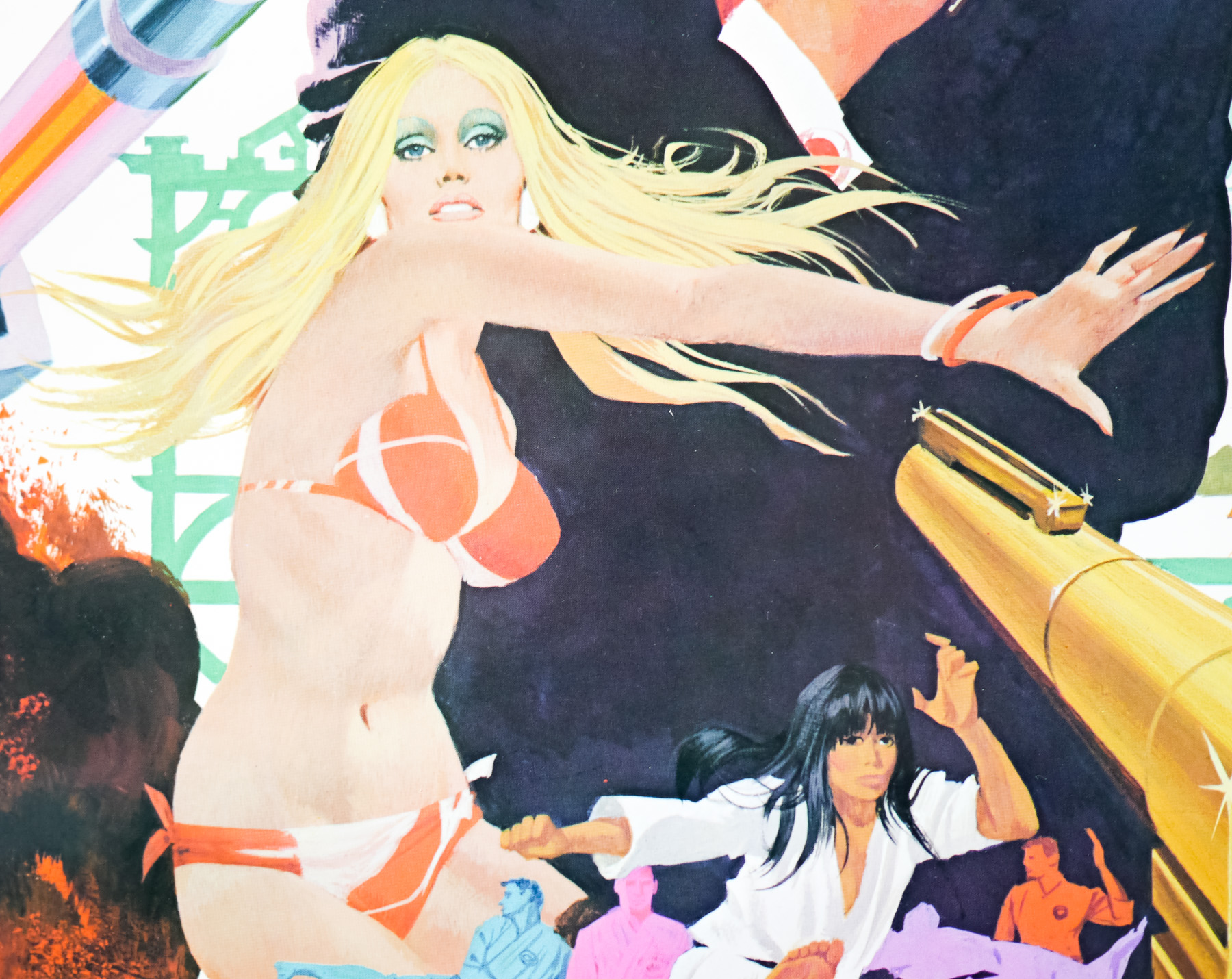
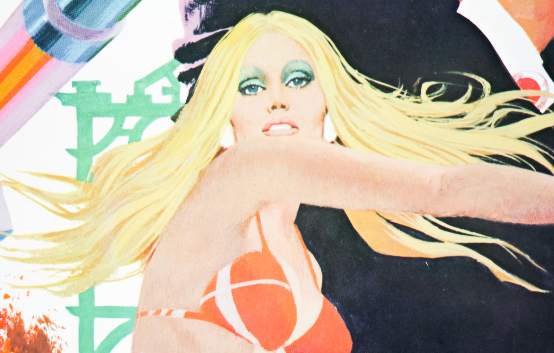
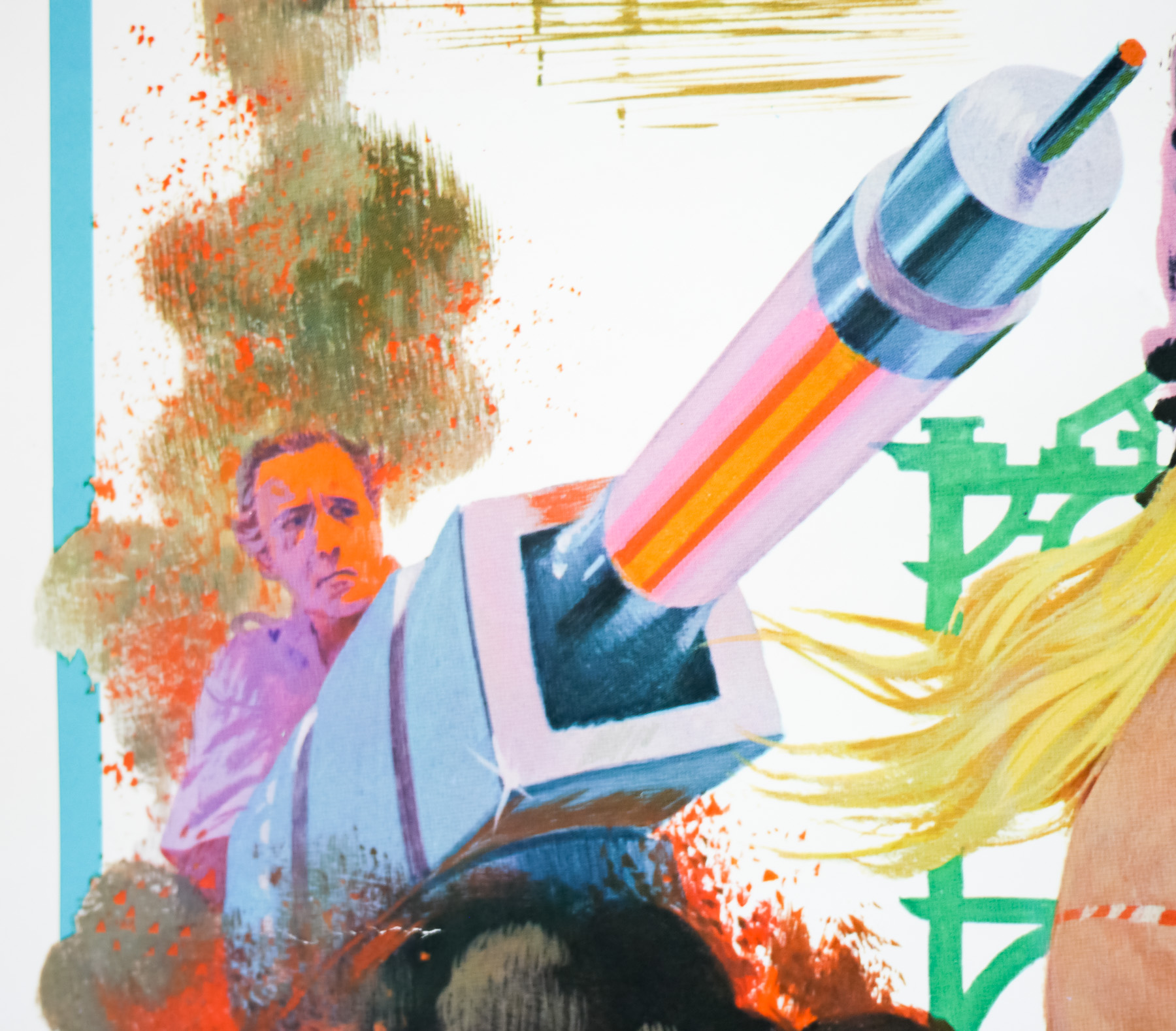
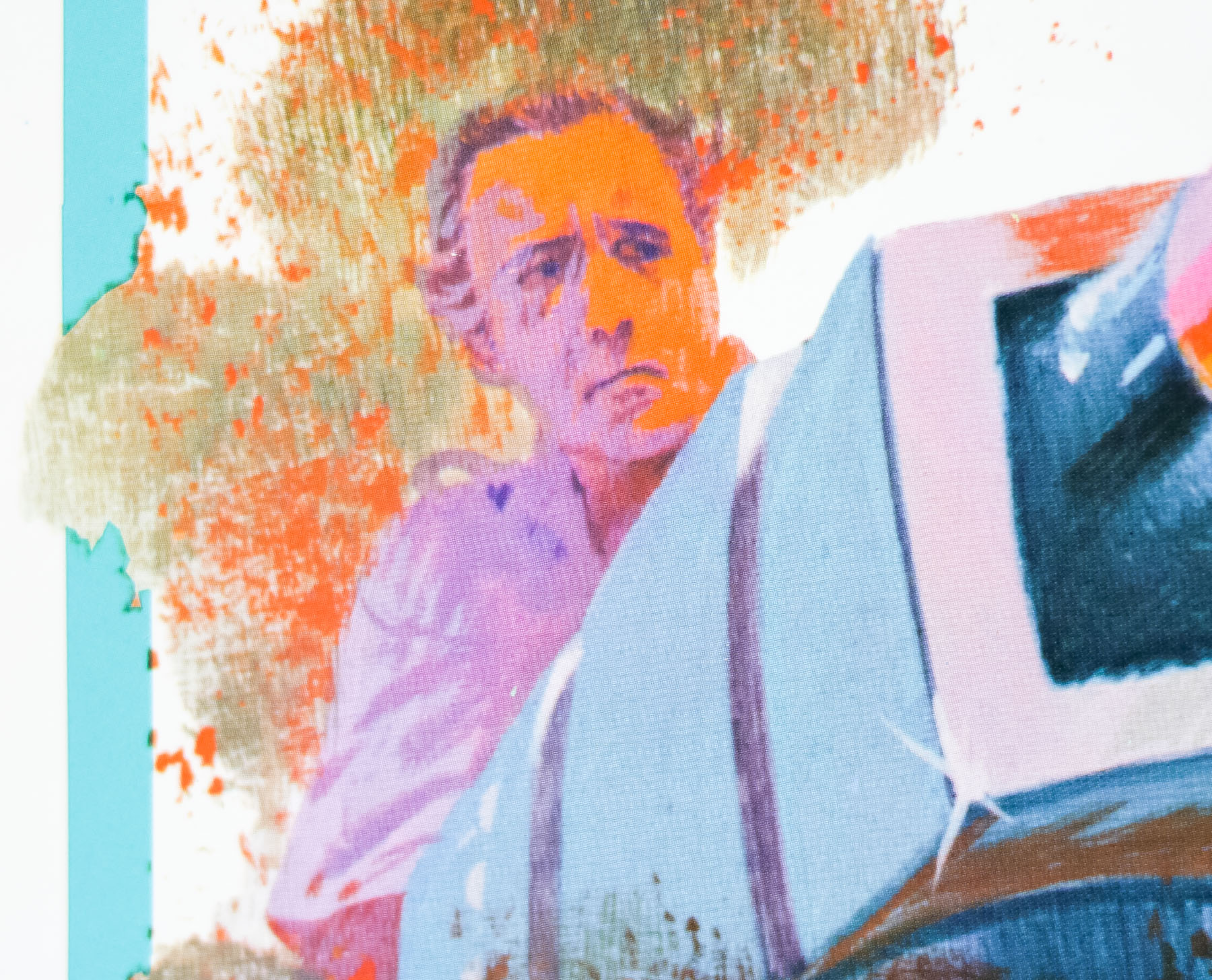
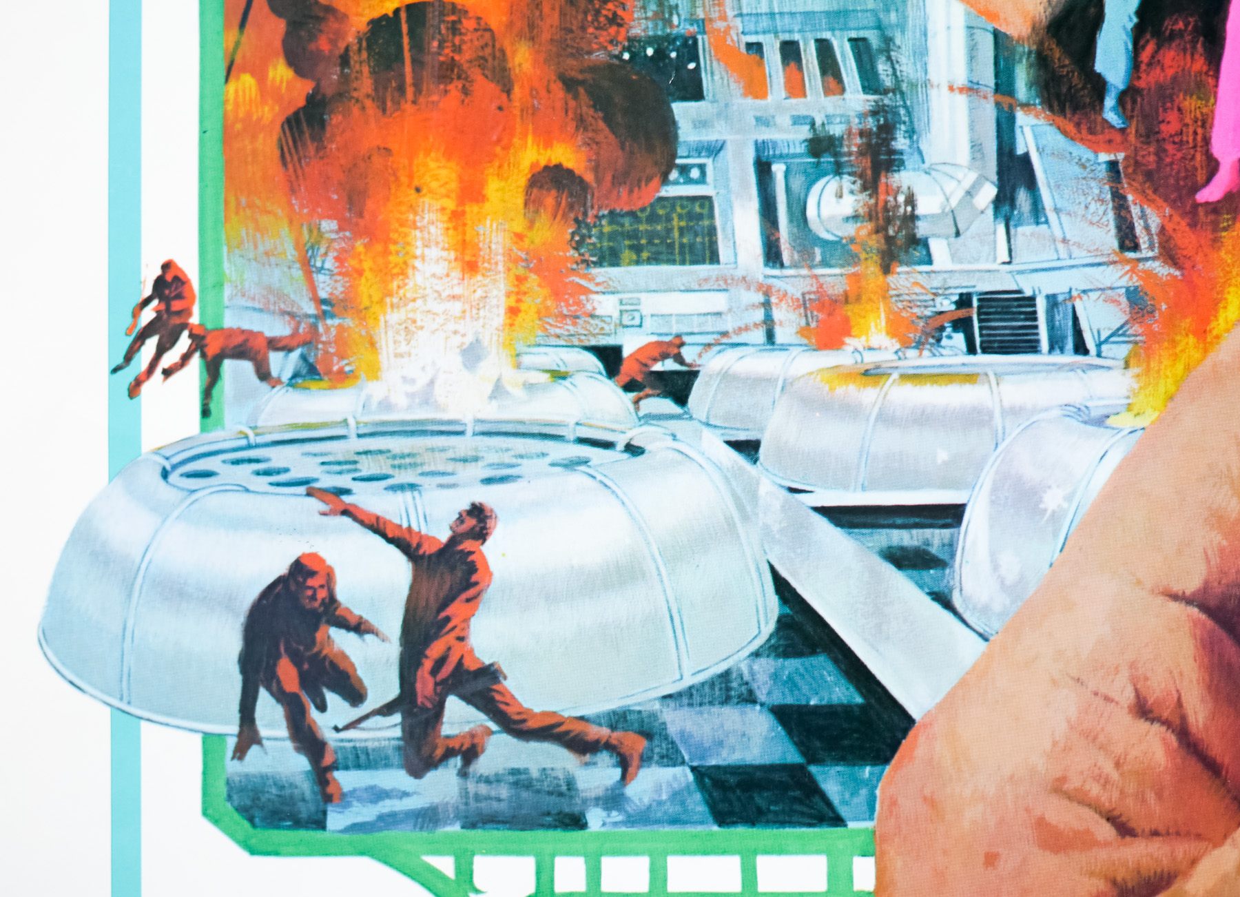
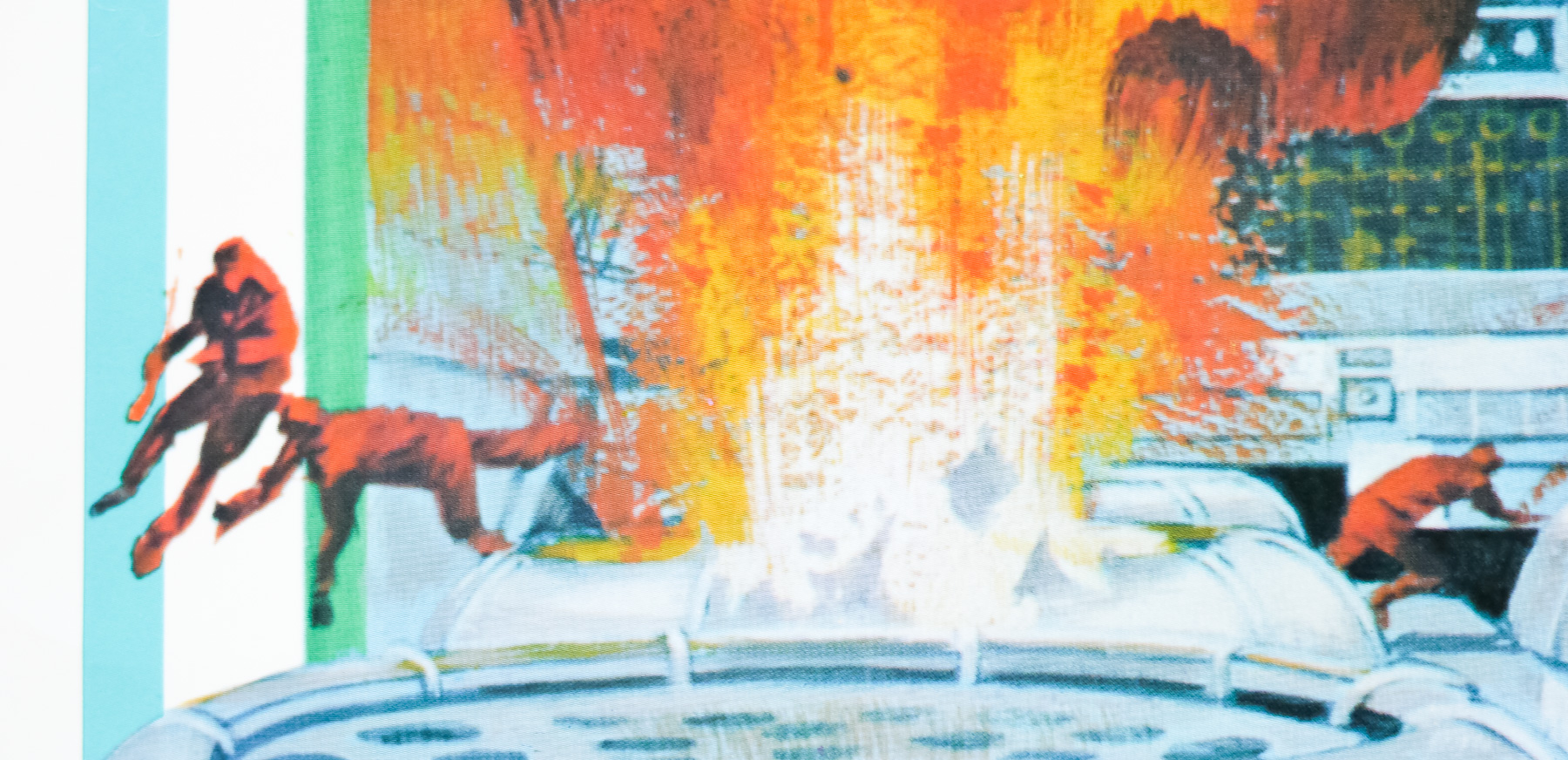
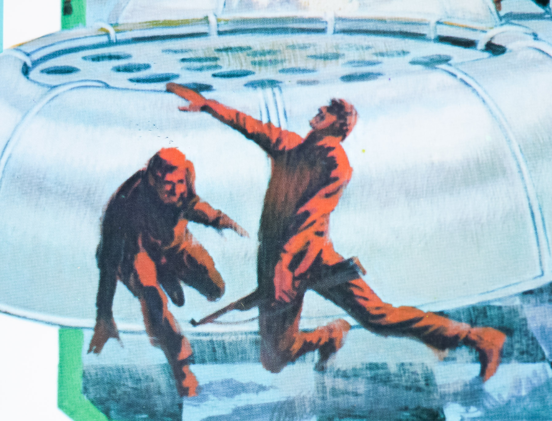
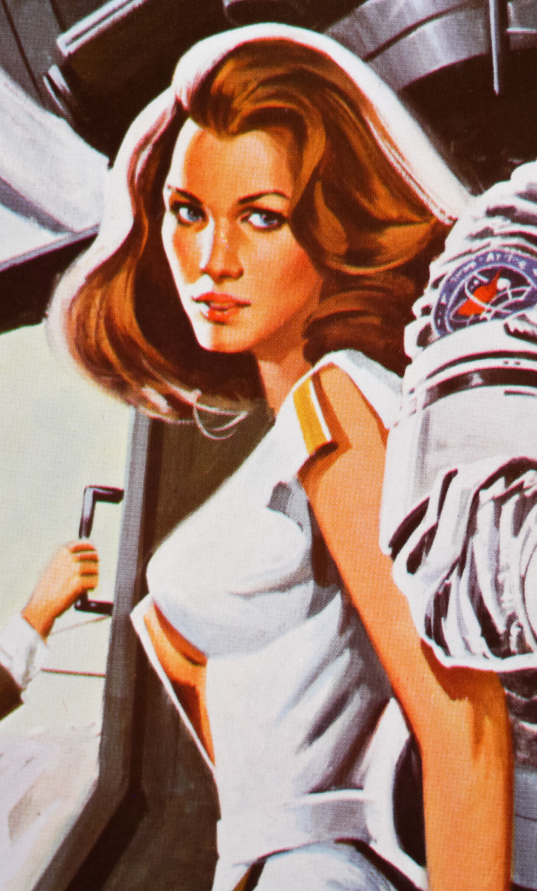
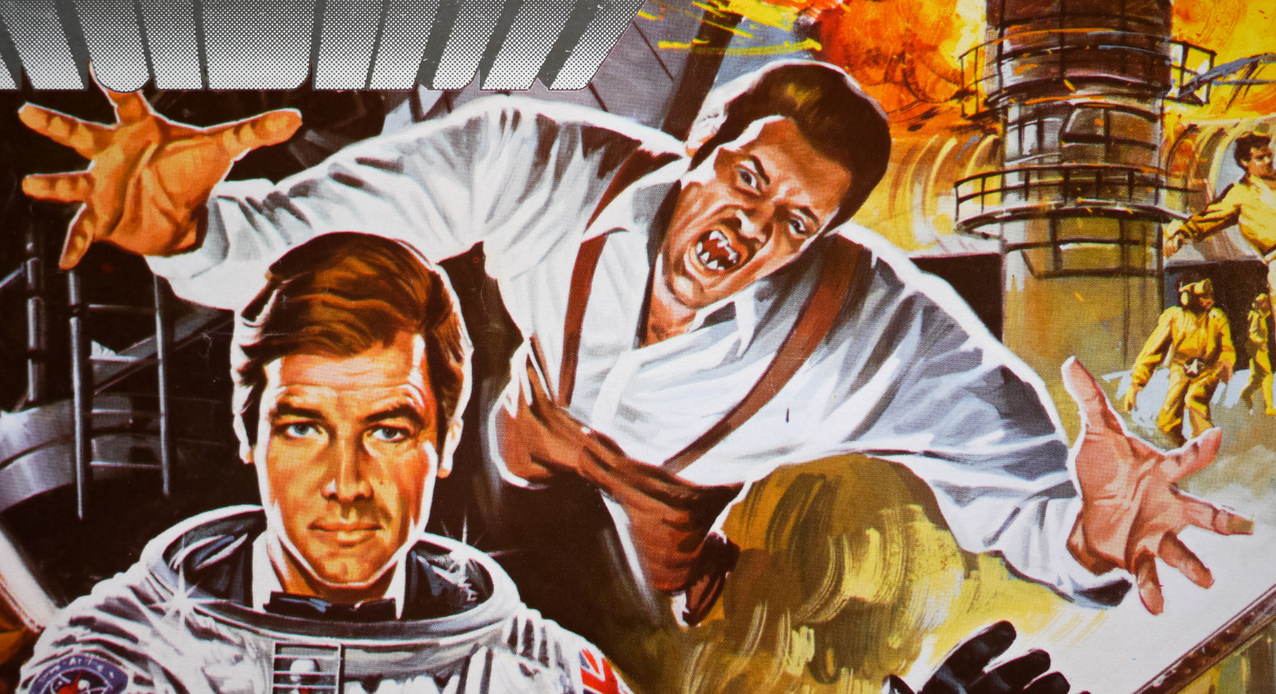
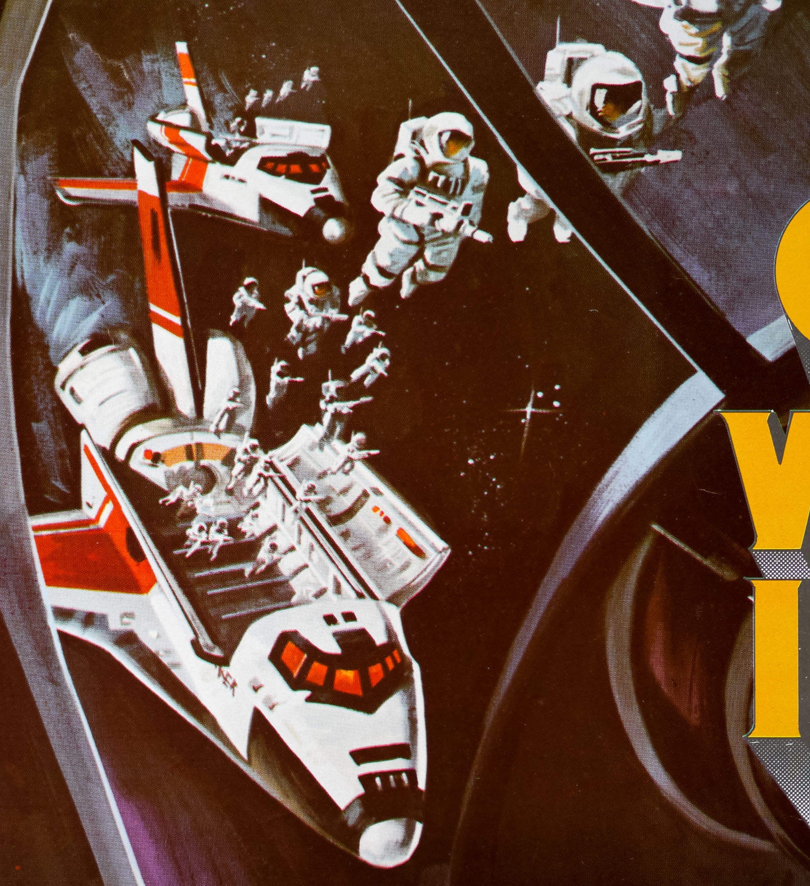
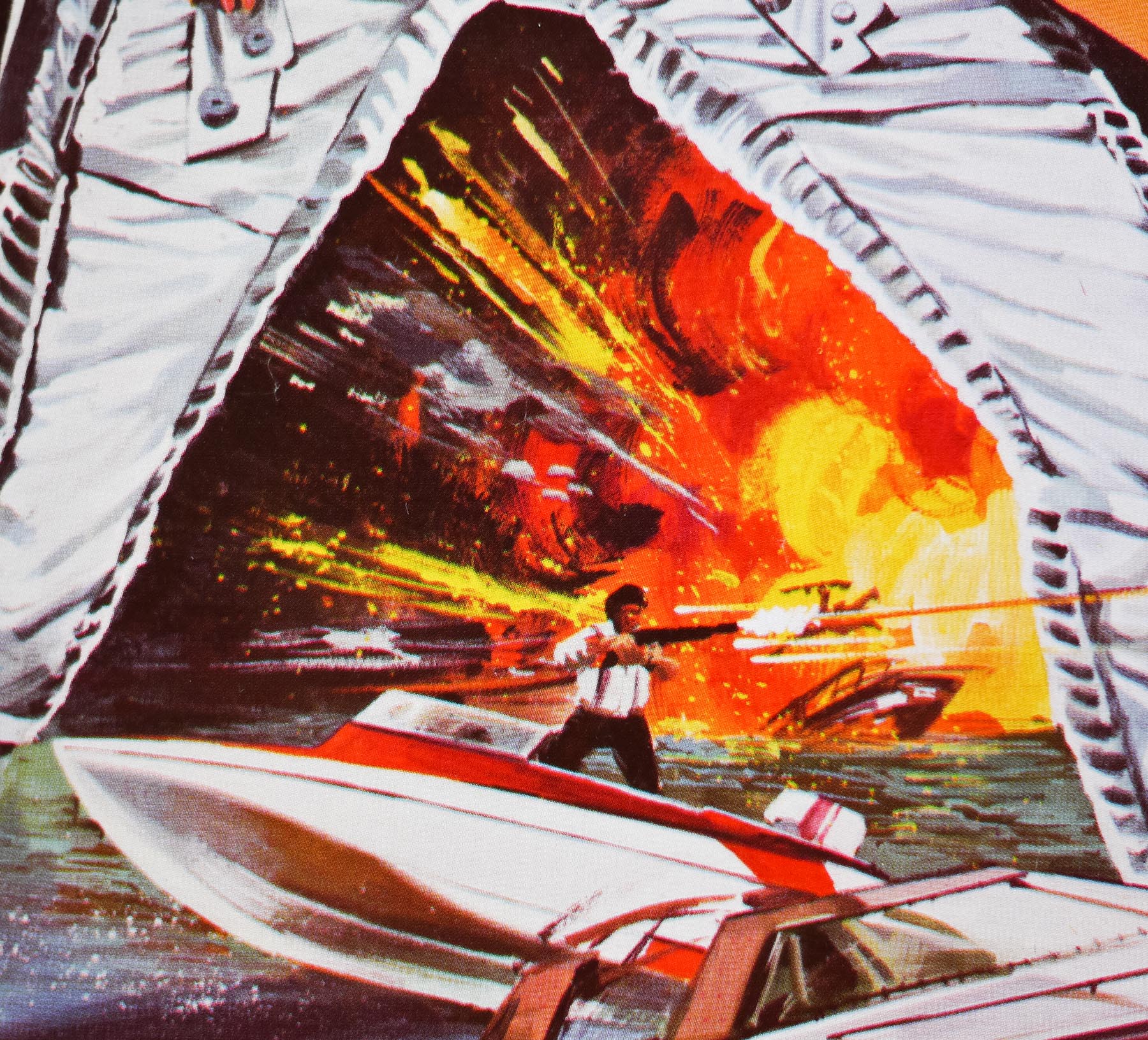
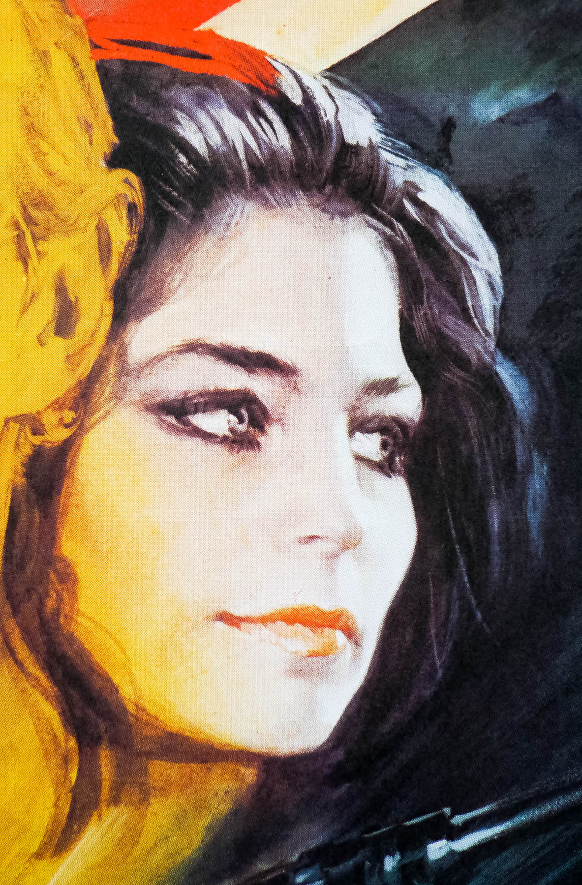
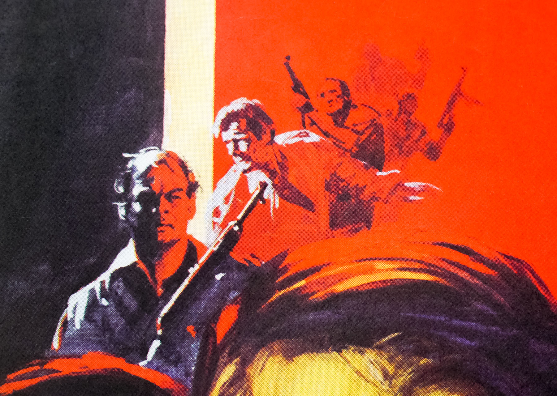
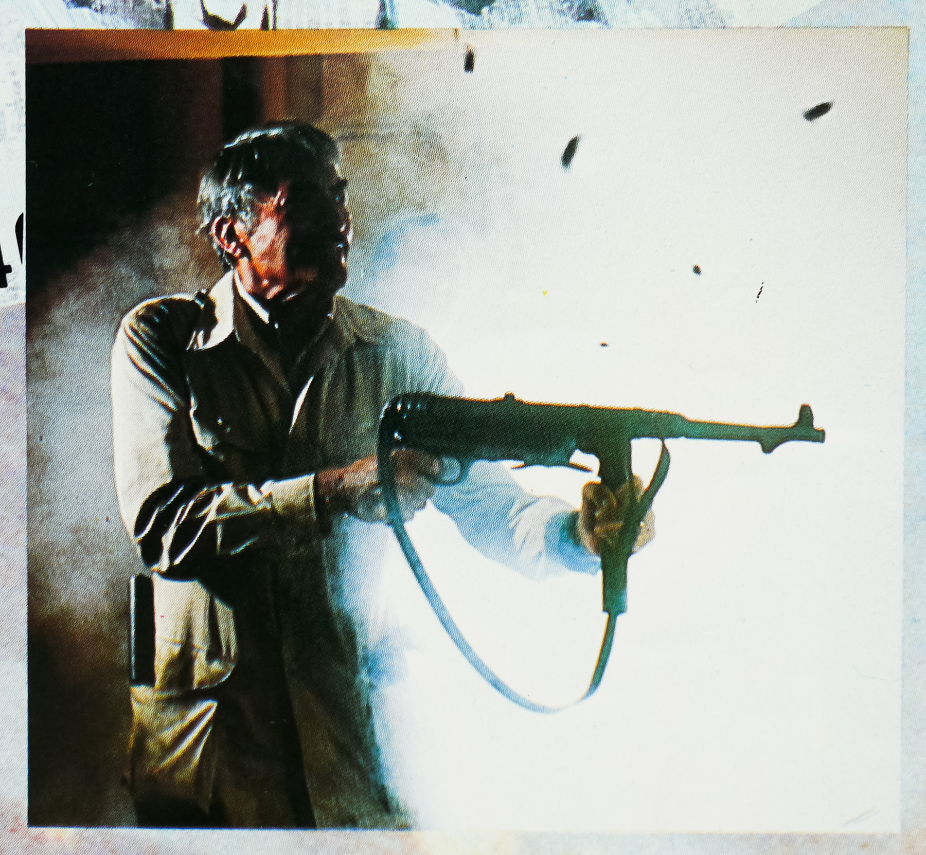
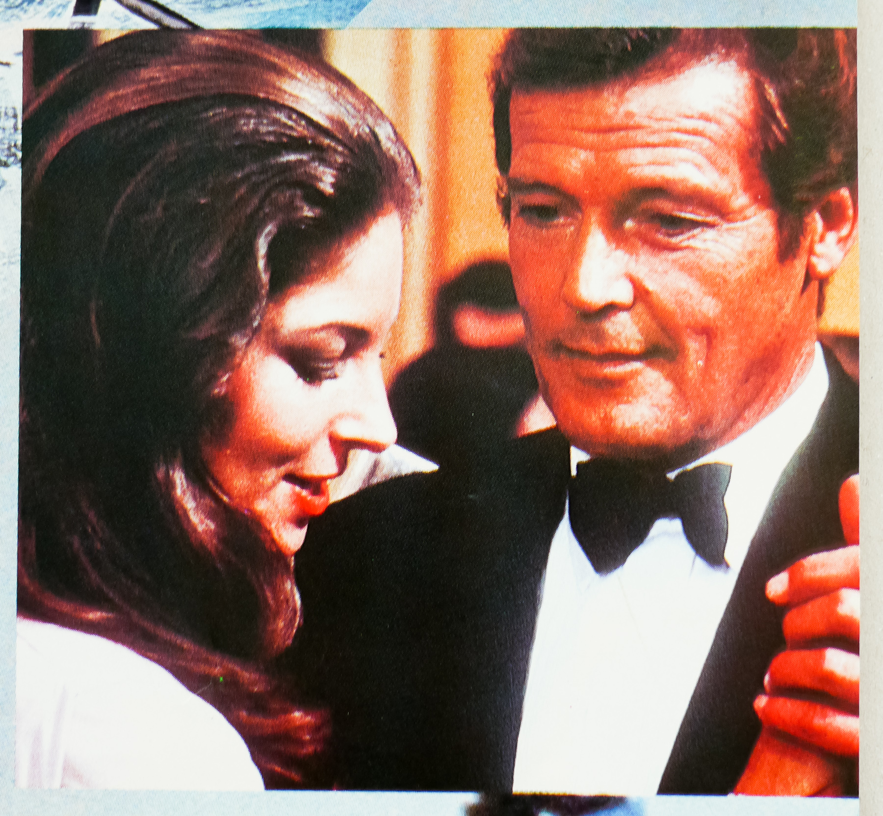
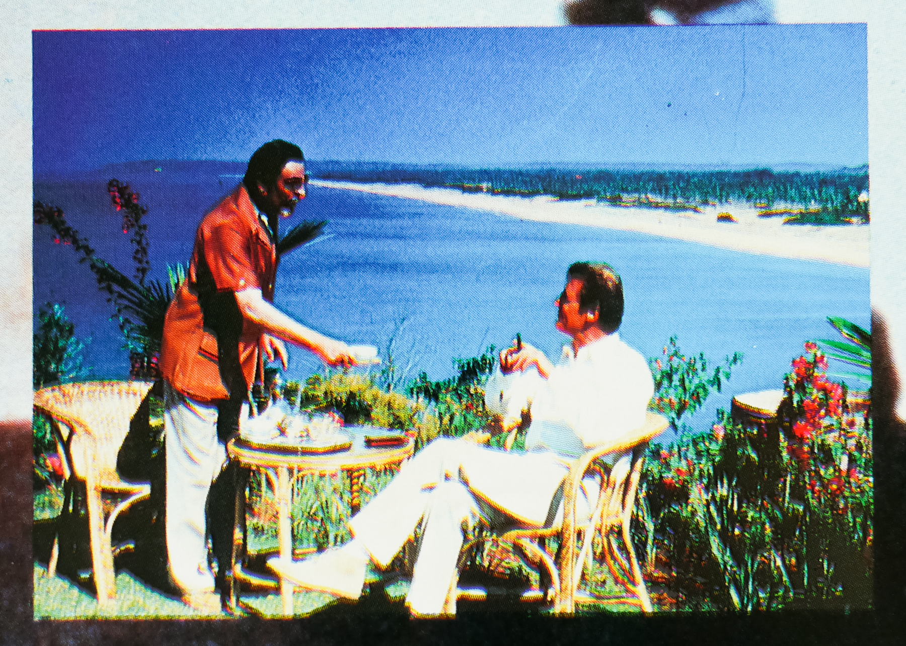
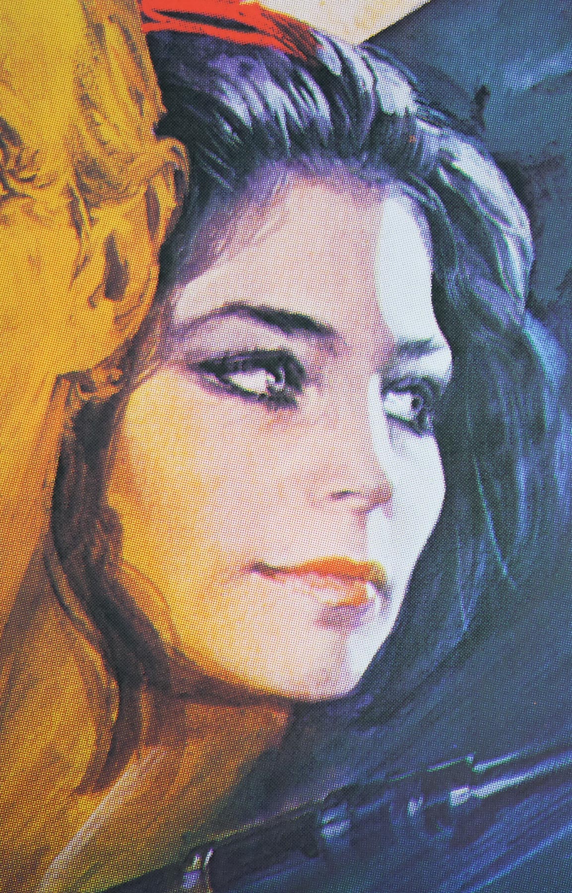
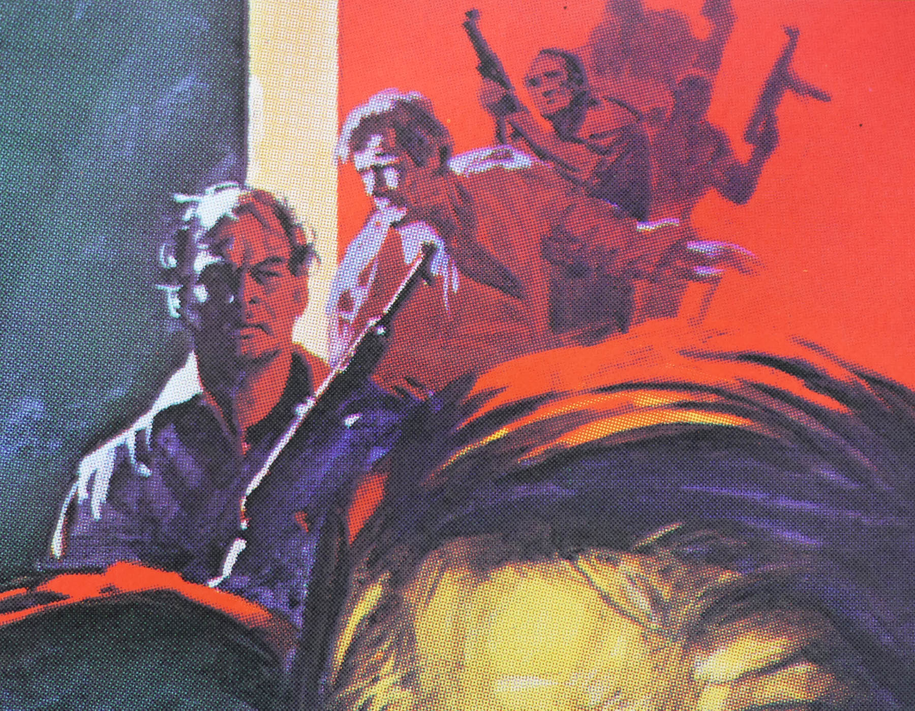
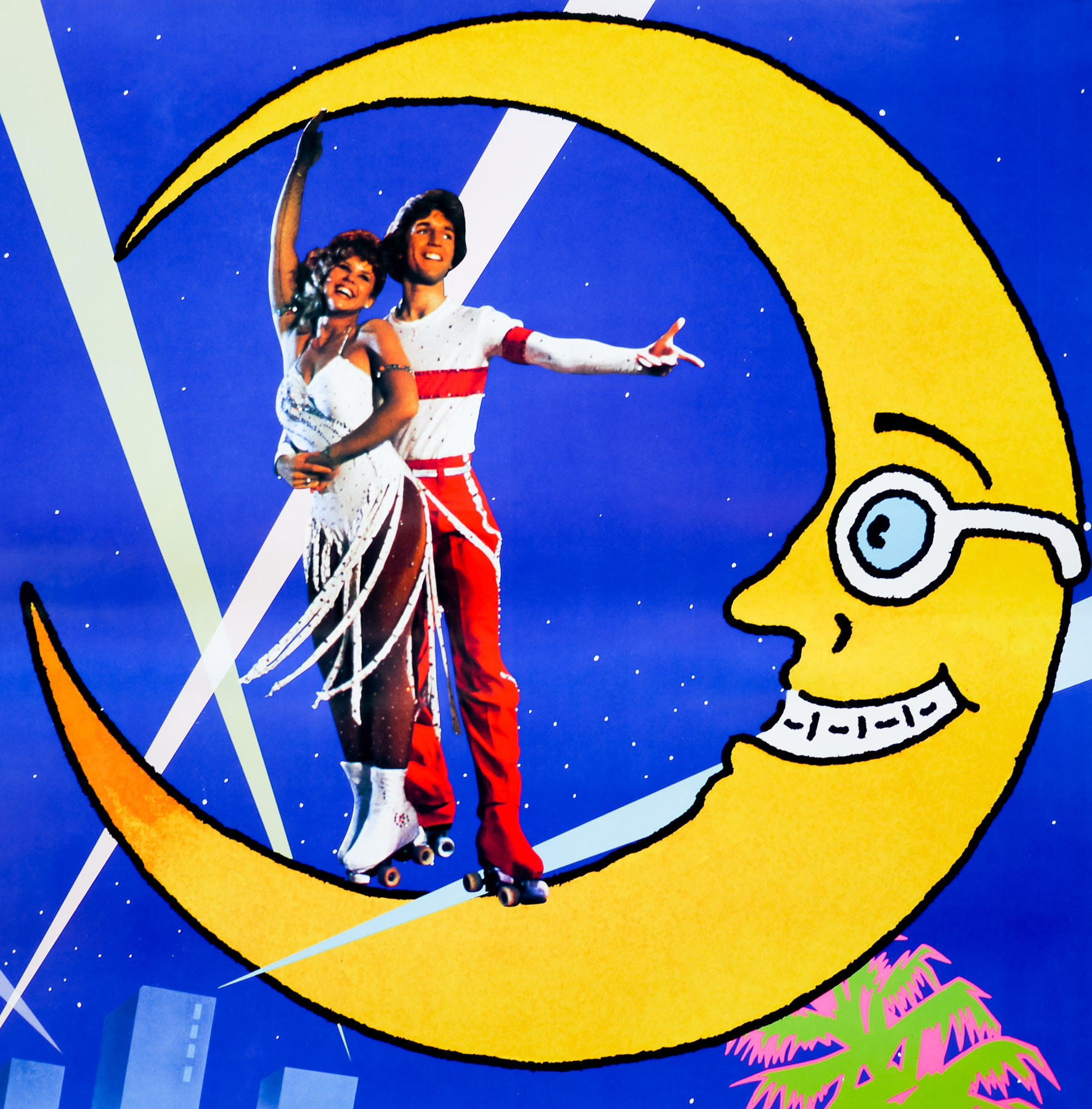
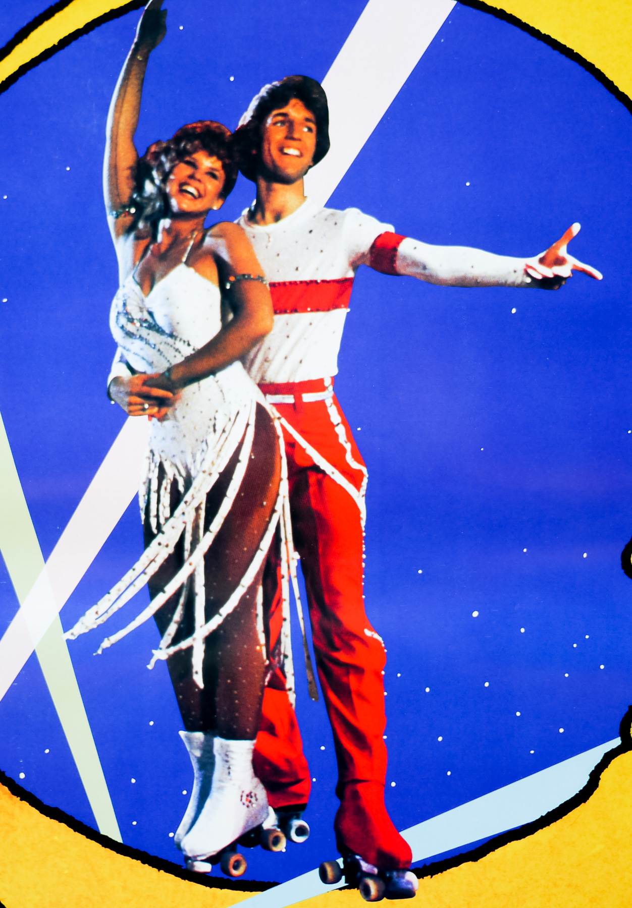
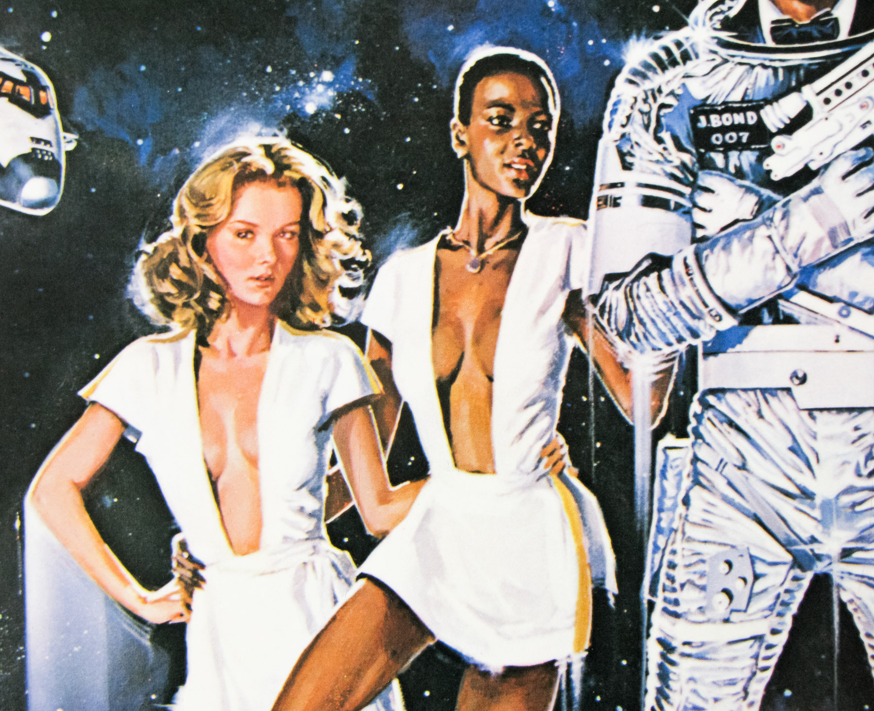
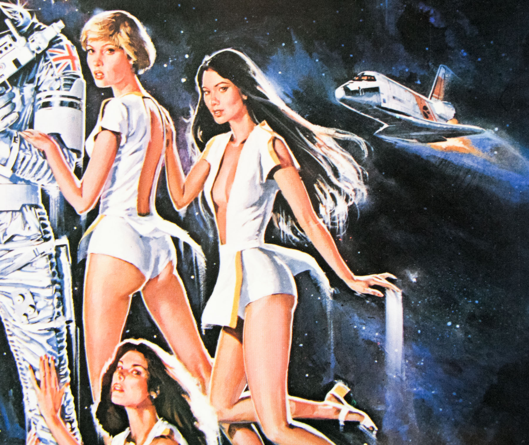
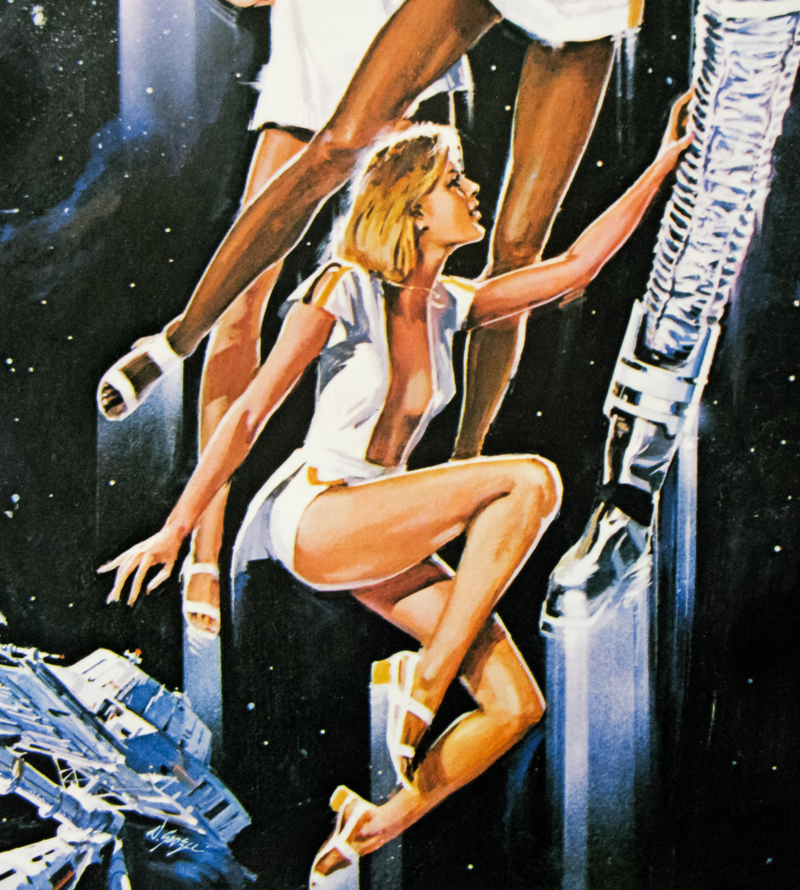
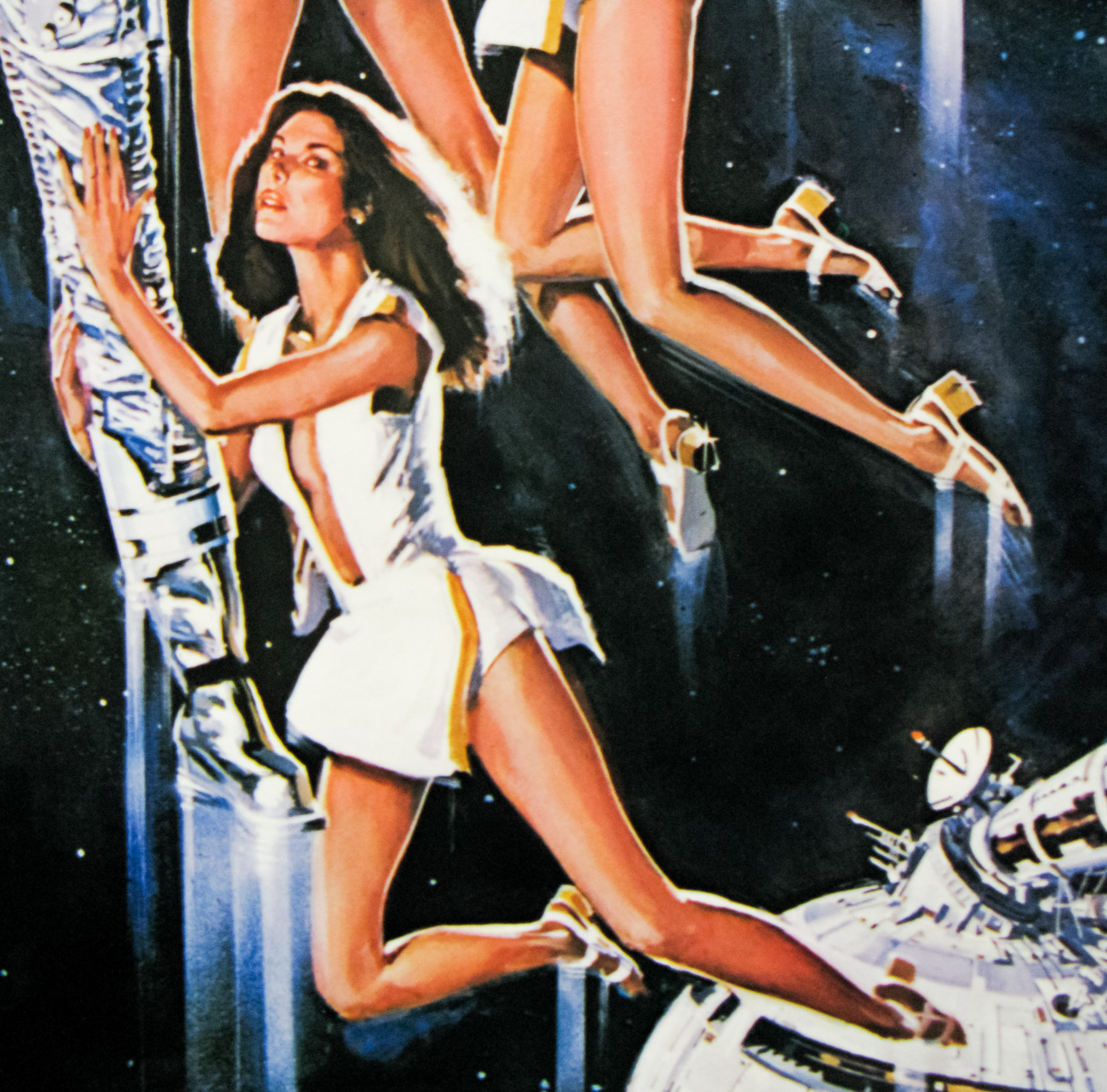
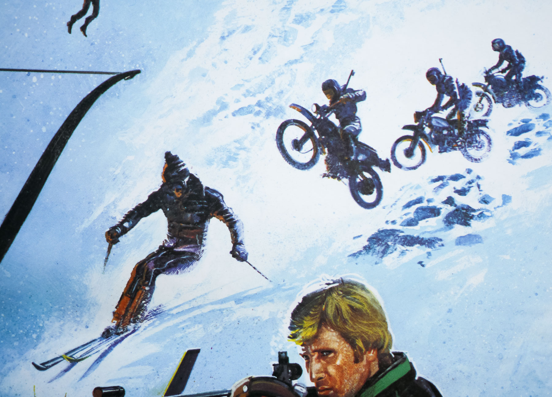
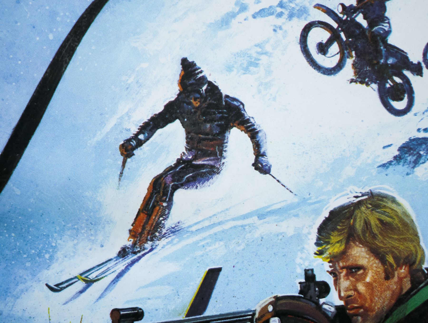
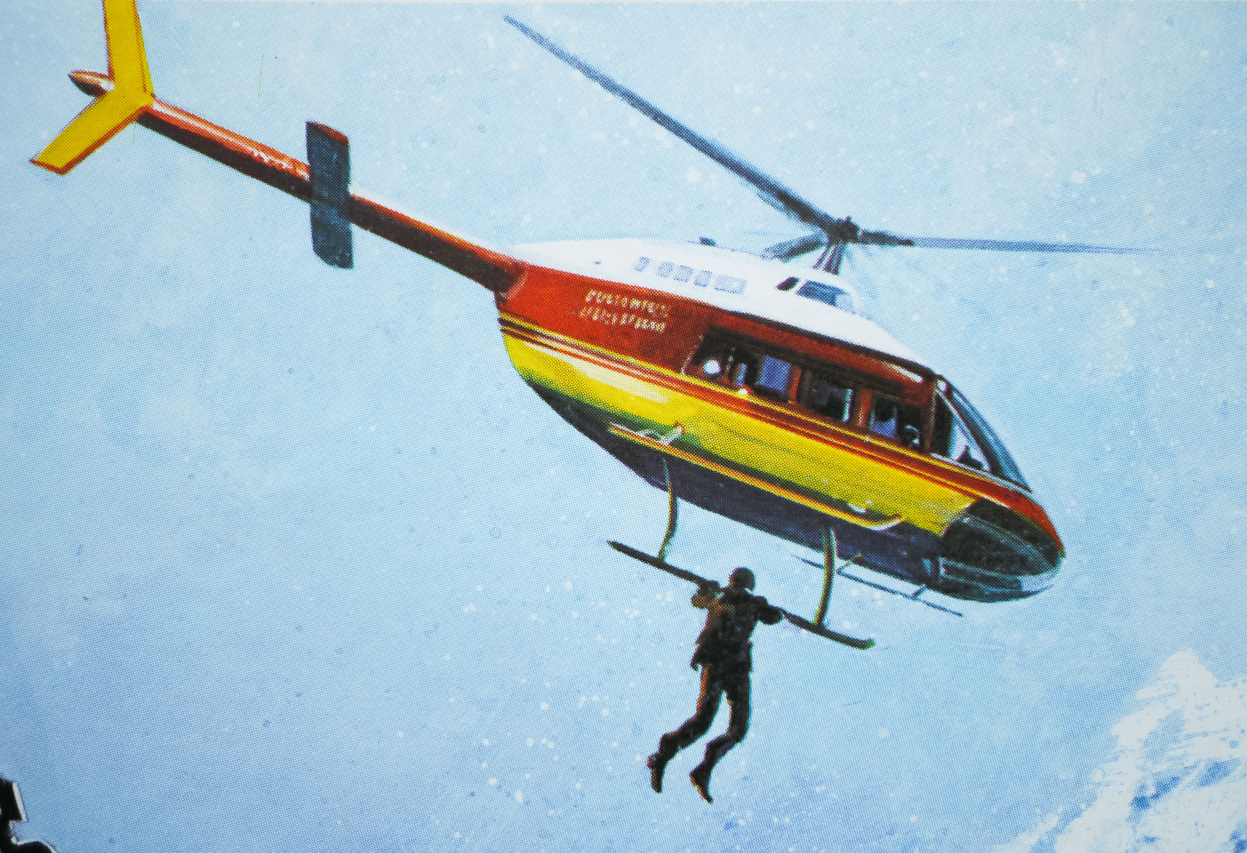
It becomes clear that the Soviets are also keen to get their hands on the device and Bond must discover who is aiding them, with suspicion falling on both Milos Columbo (Topol) and Aris Kristatos (Julian Glover). Bond also finds an ally in the form of Melina Havelock (the gorgeous Carole Bouquet) who is out for revenge after her parents are murdered by the same forces who retrieve the ATAC device. The film features several memorable chases and action sequences, including a climactic assault on a fortress on top of a sheer cliff. It also includes the infamous character of Bibi Dahl (Lynn-Holly Johnson) a gorgeous young ice-skating protégée who becomes infatuated with Bond, and in turn became the object of countless teenage boys’ fantasies, including yours truly.
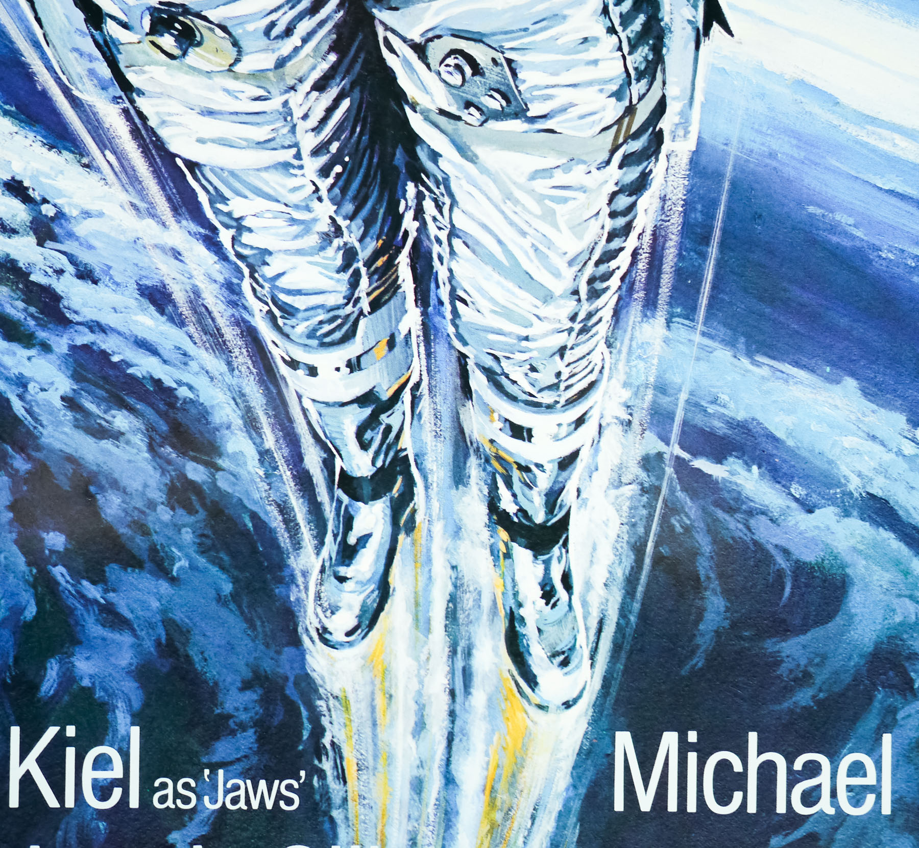
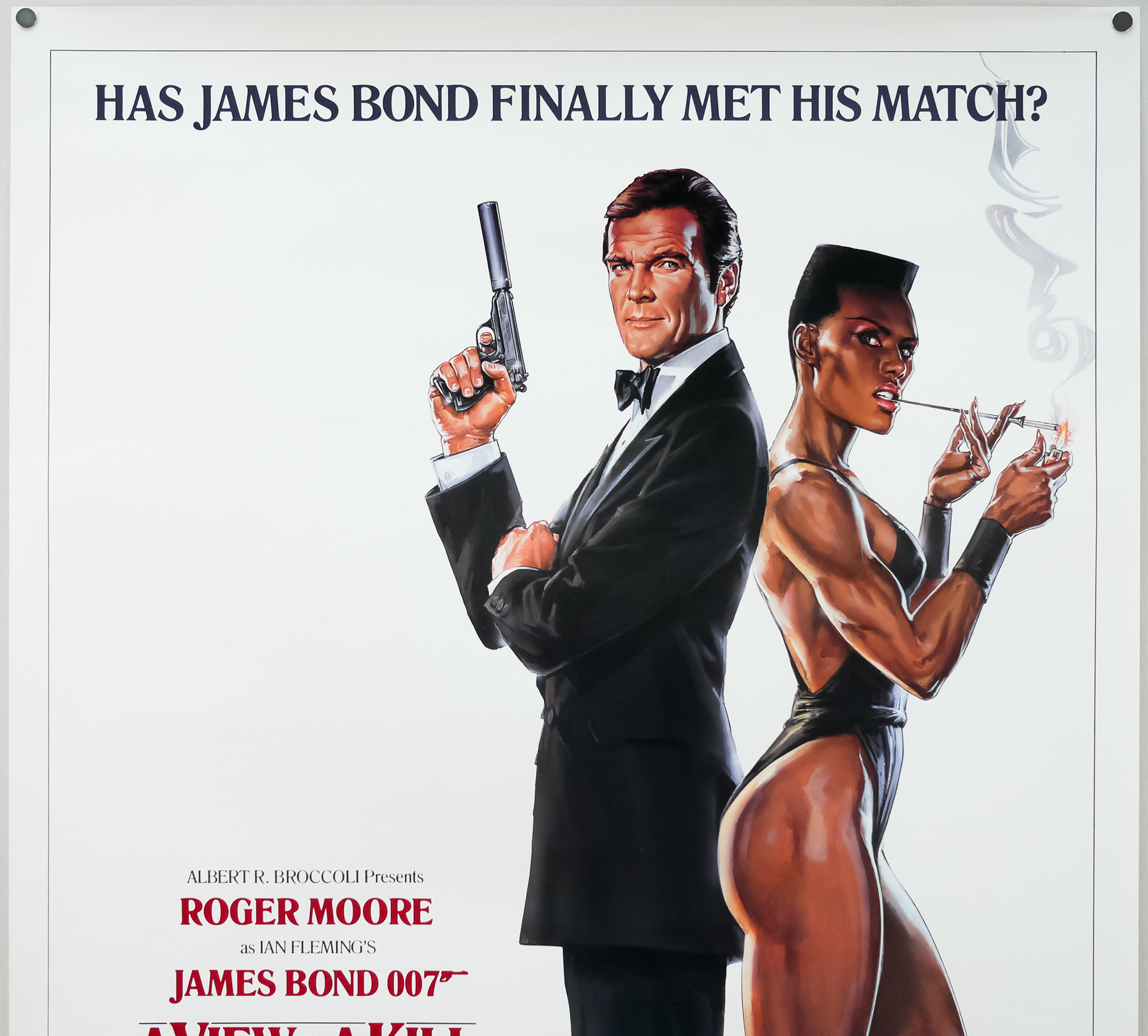
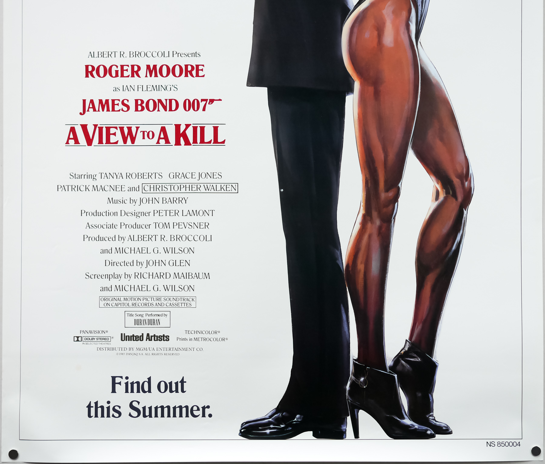
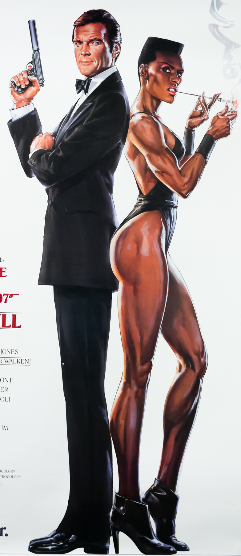
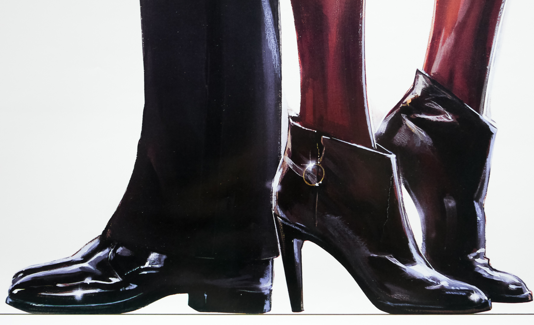
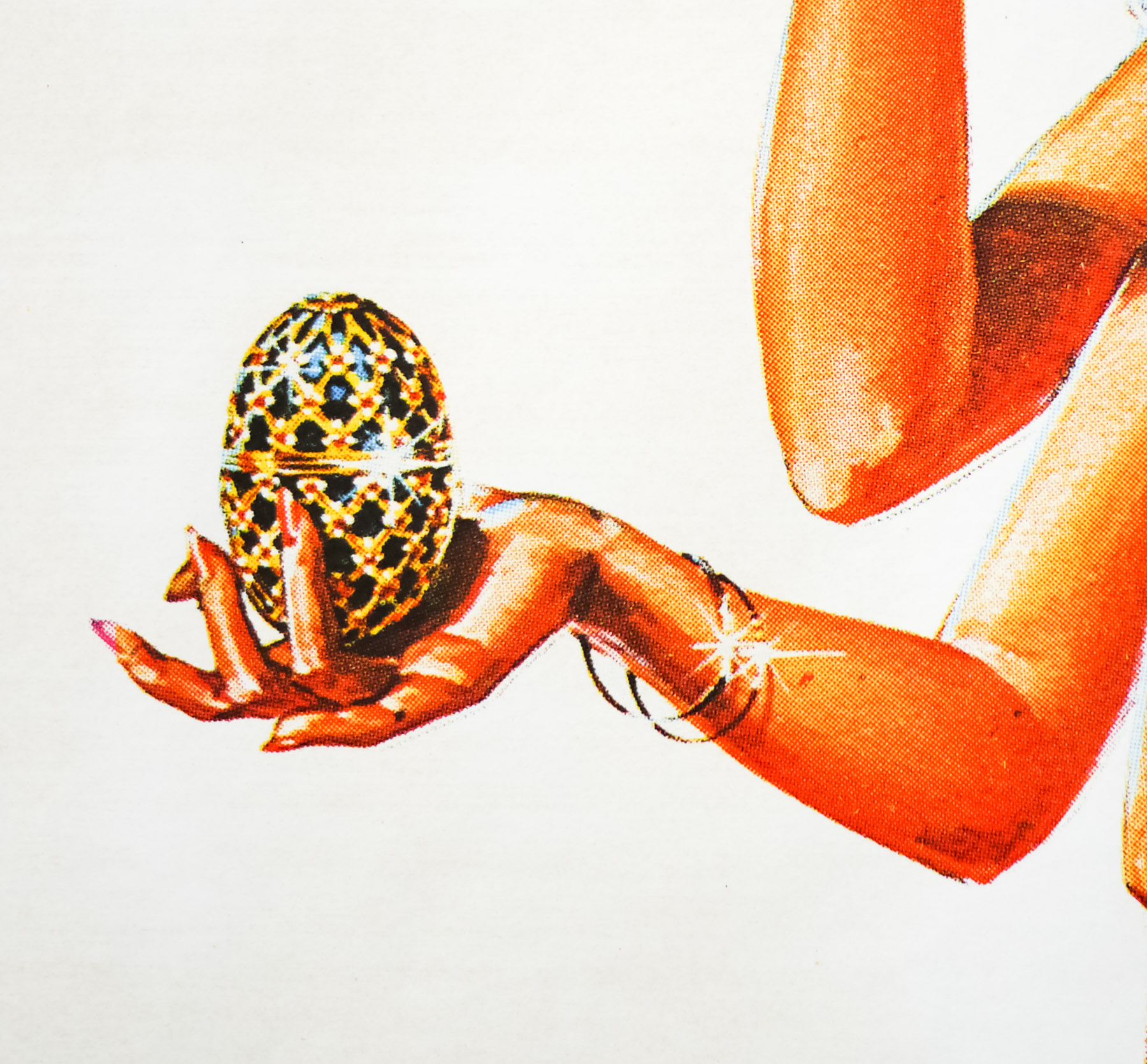
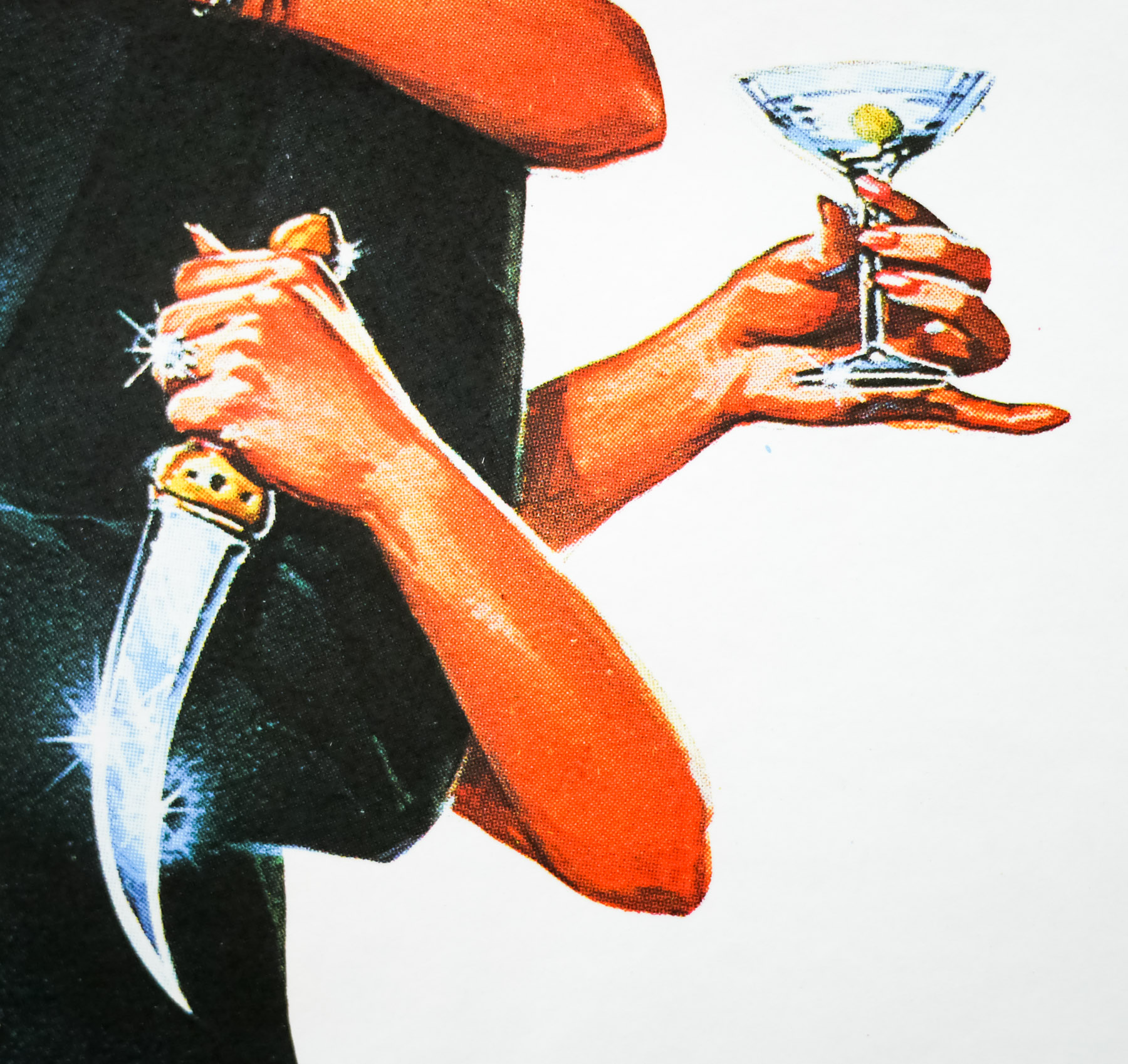
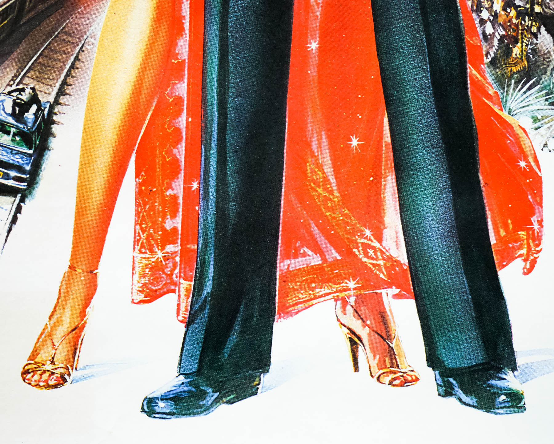
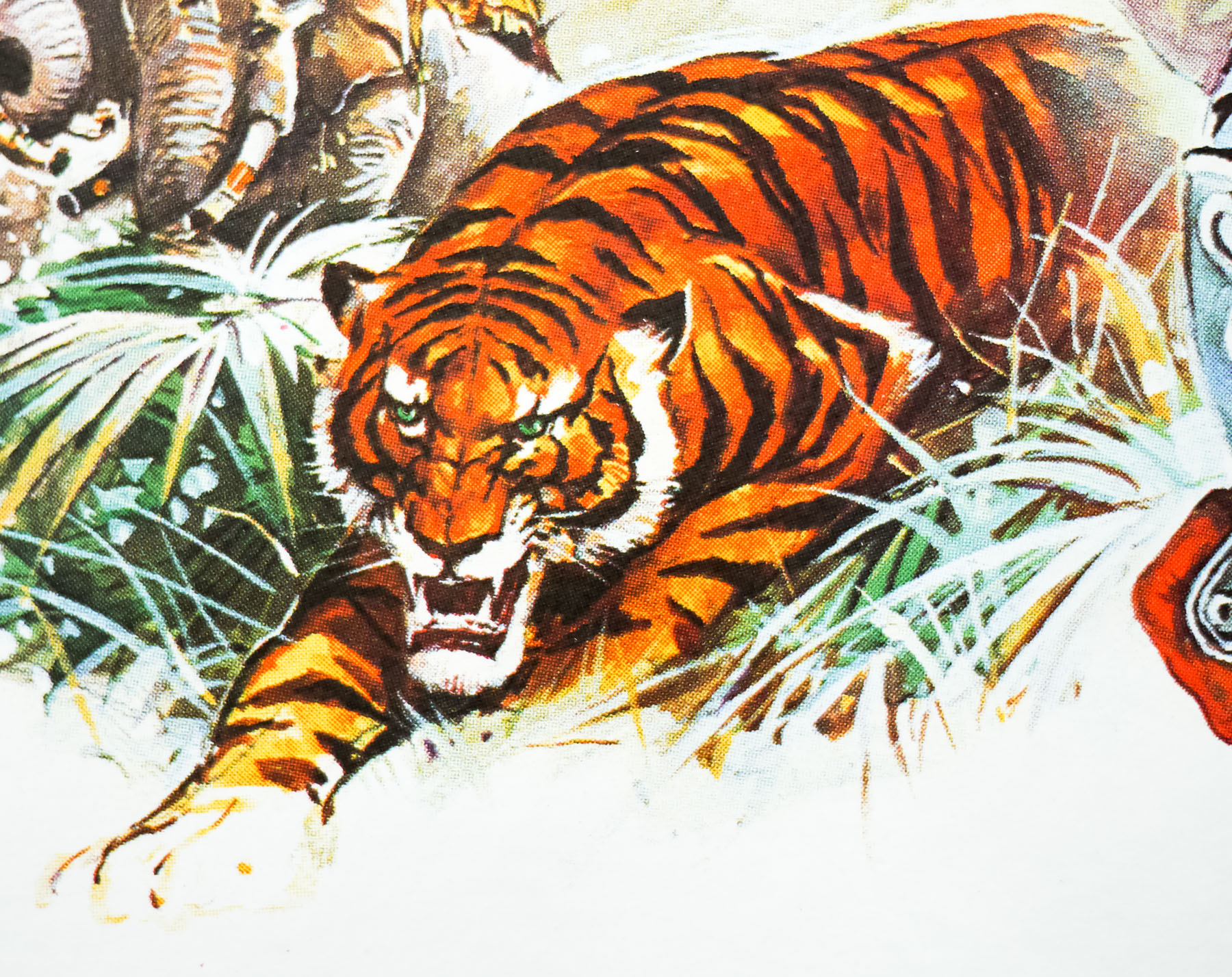
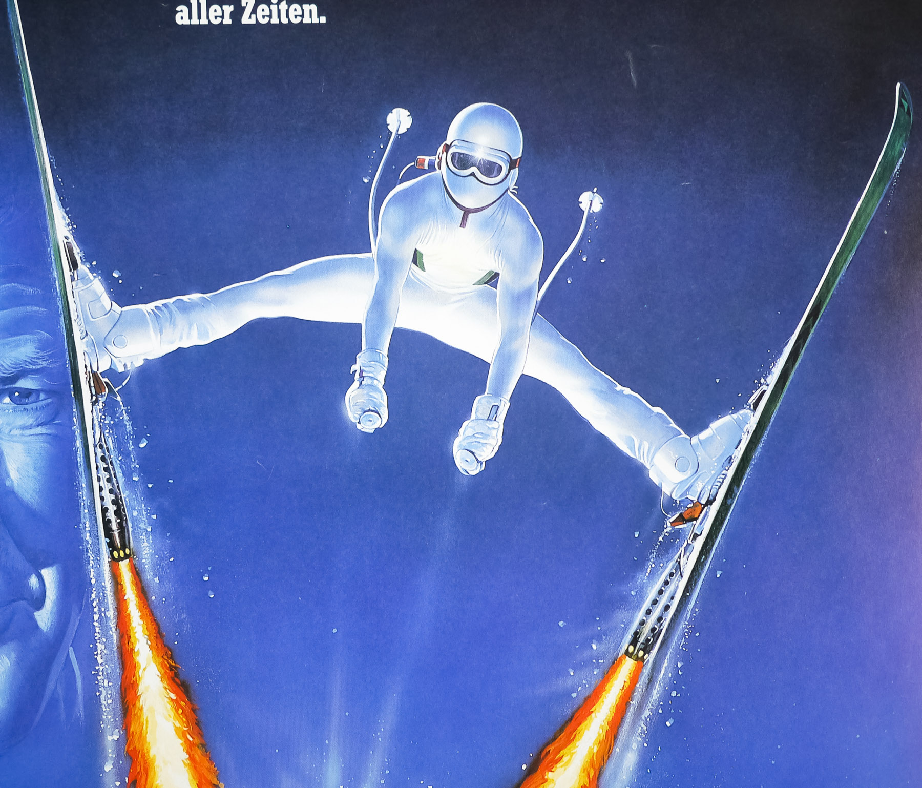
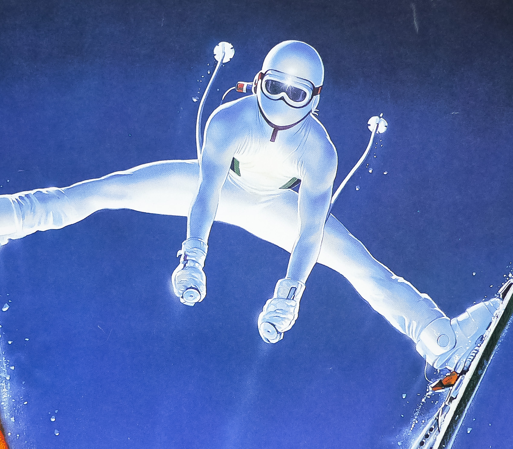
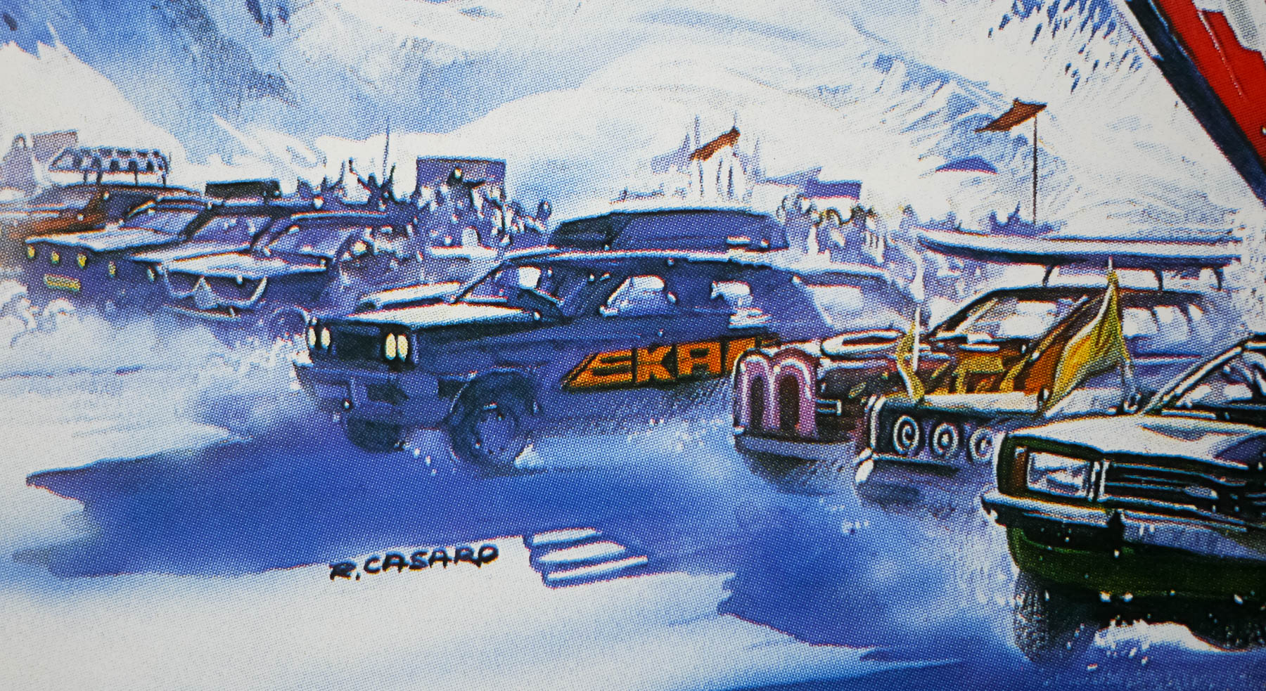
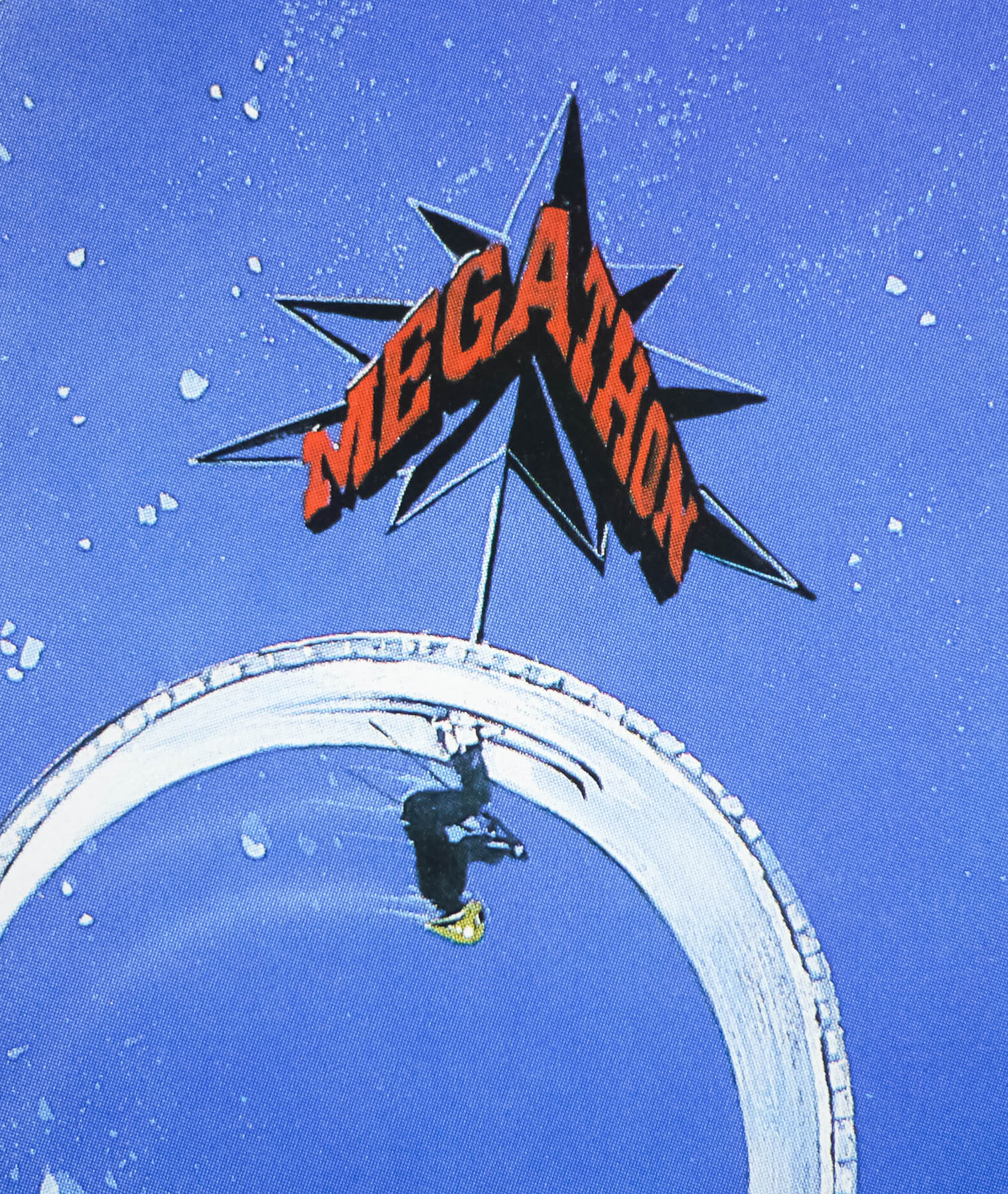
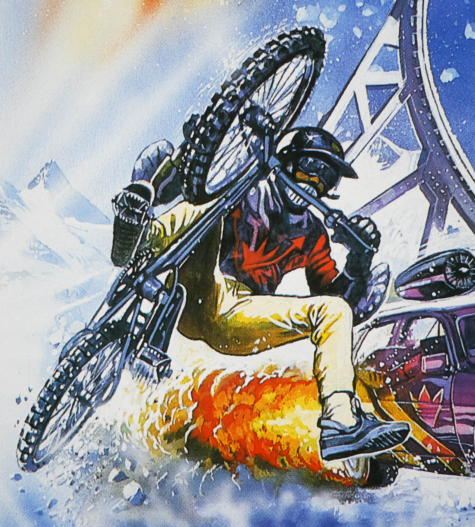
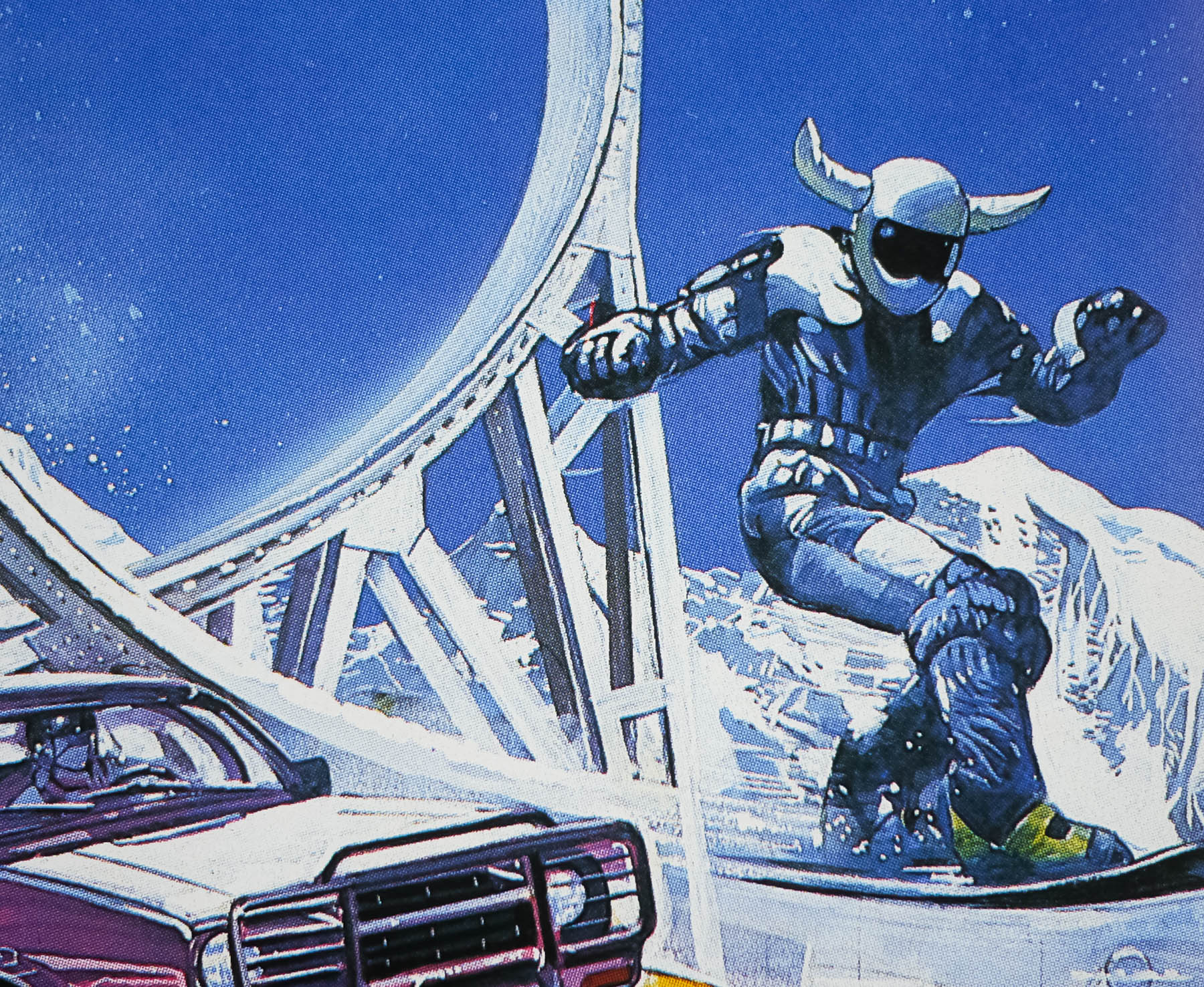
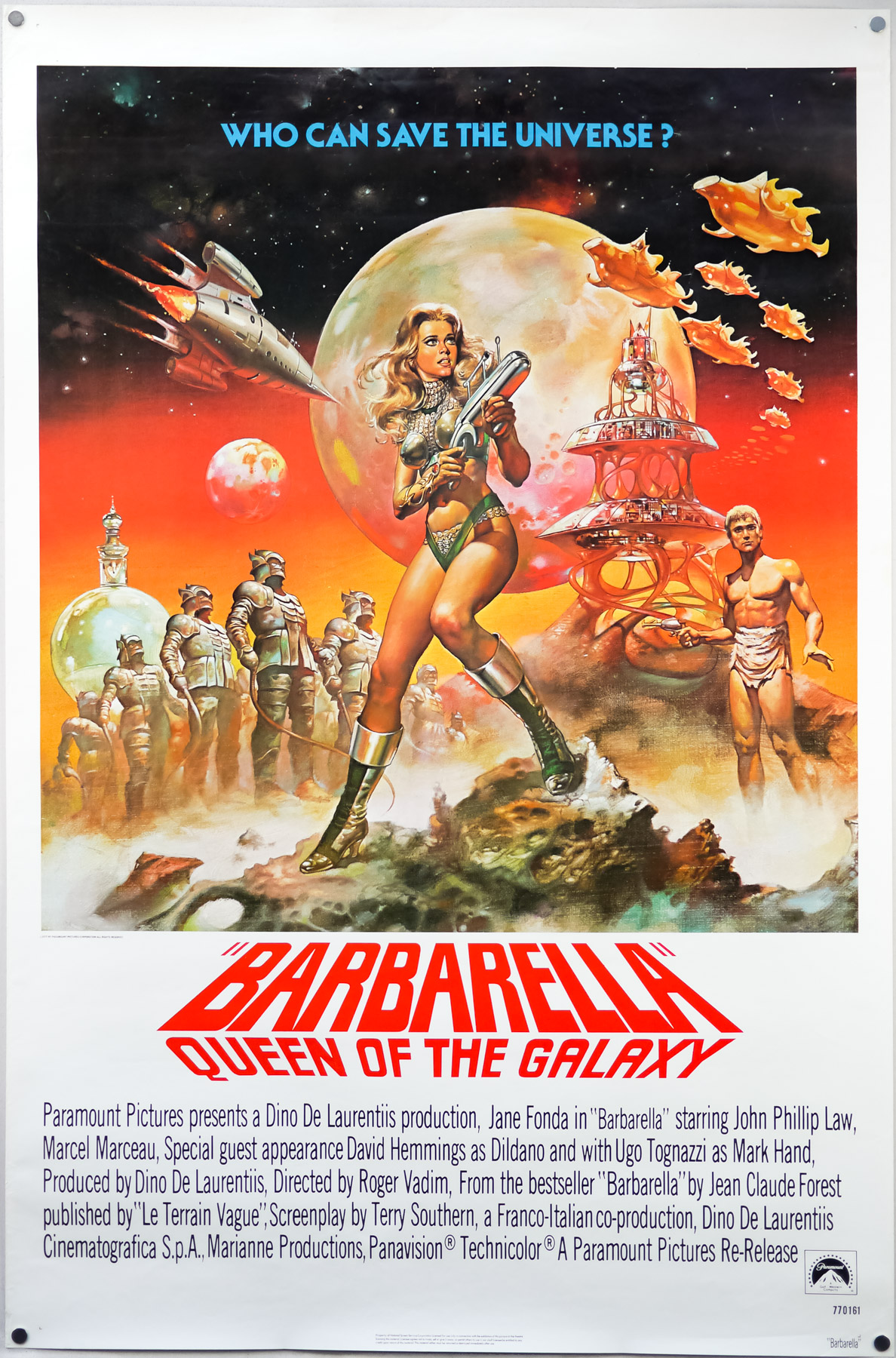
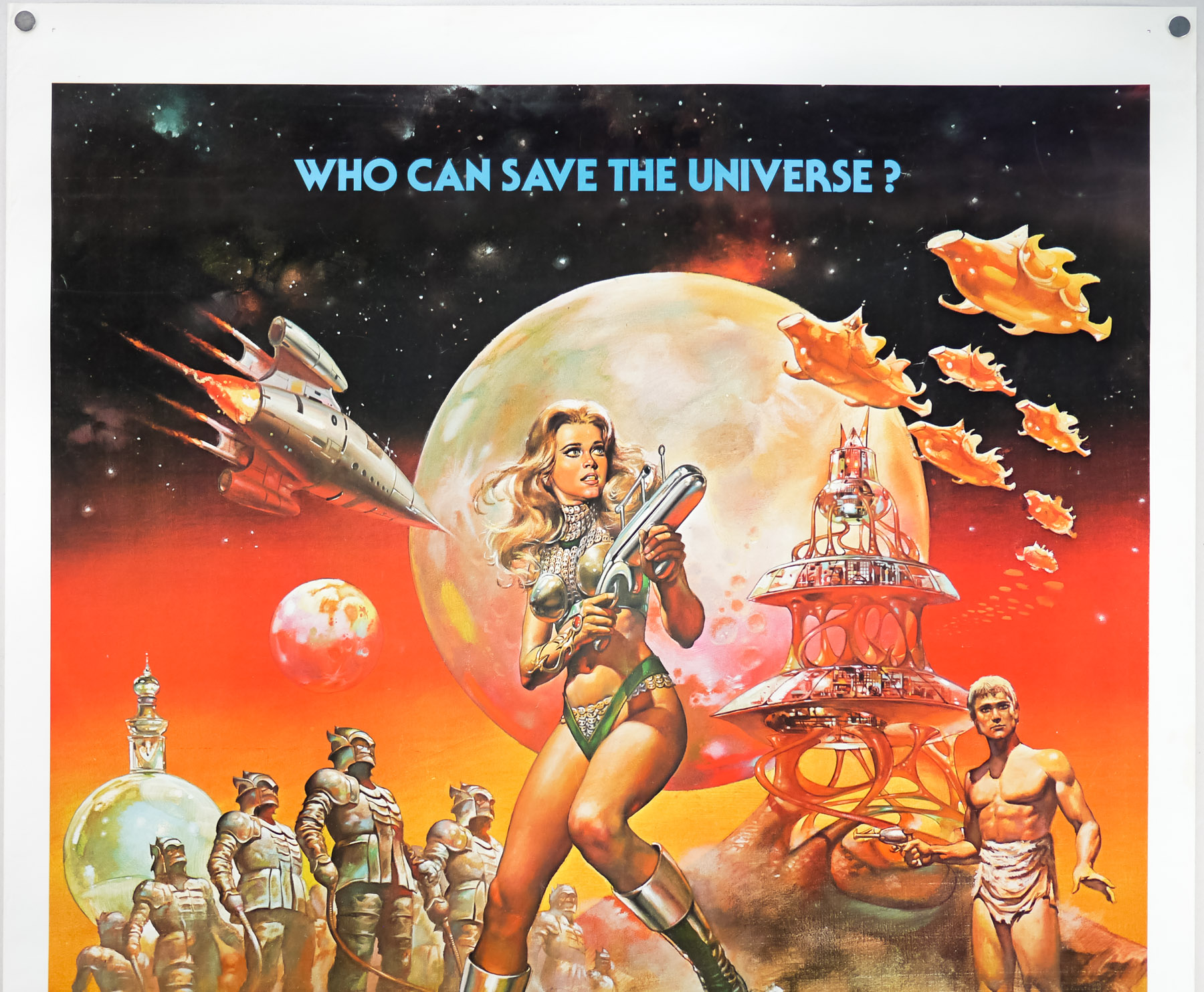
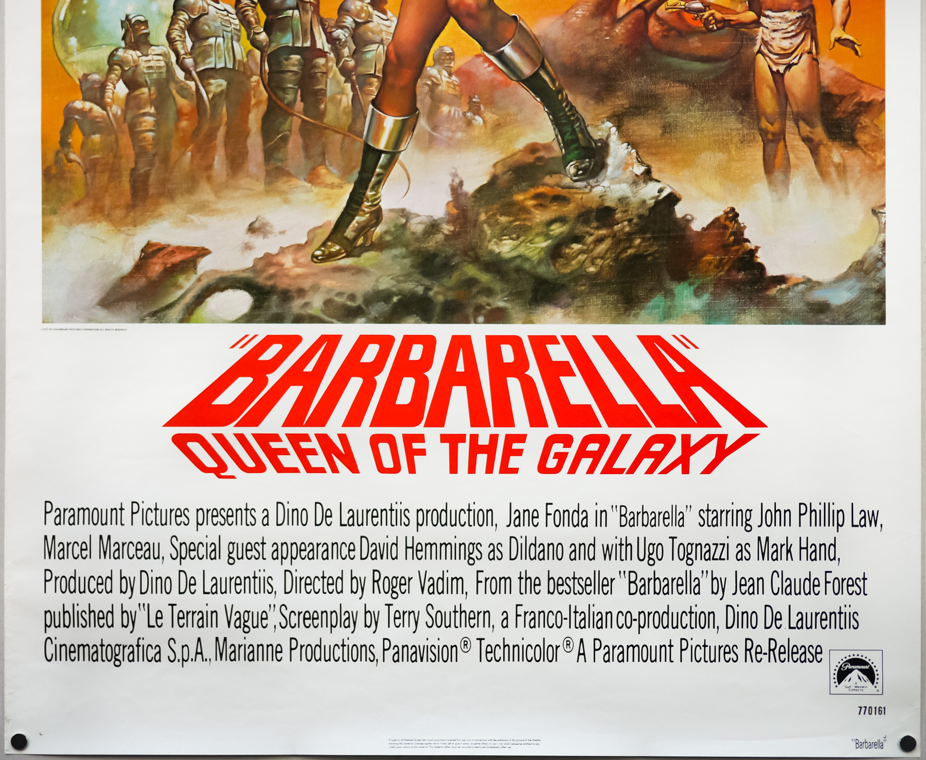
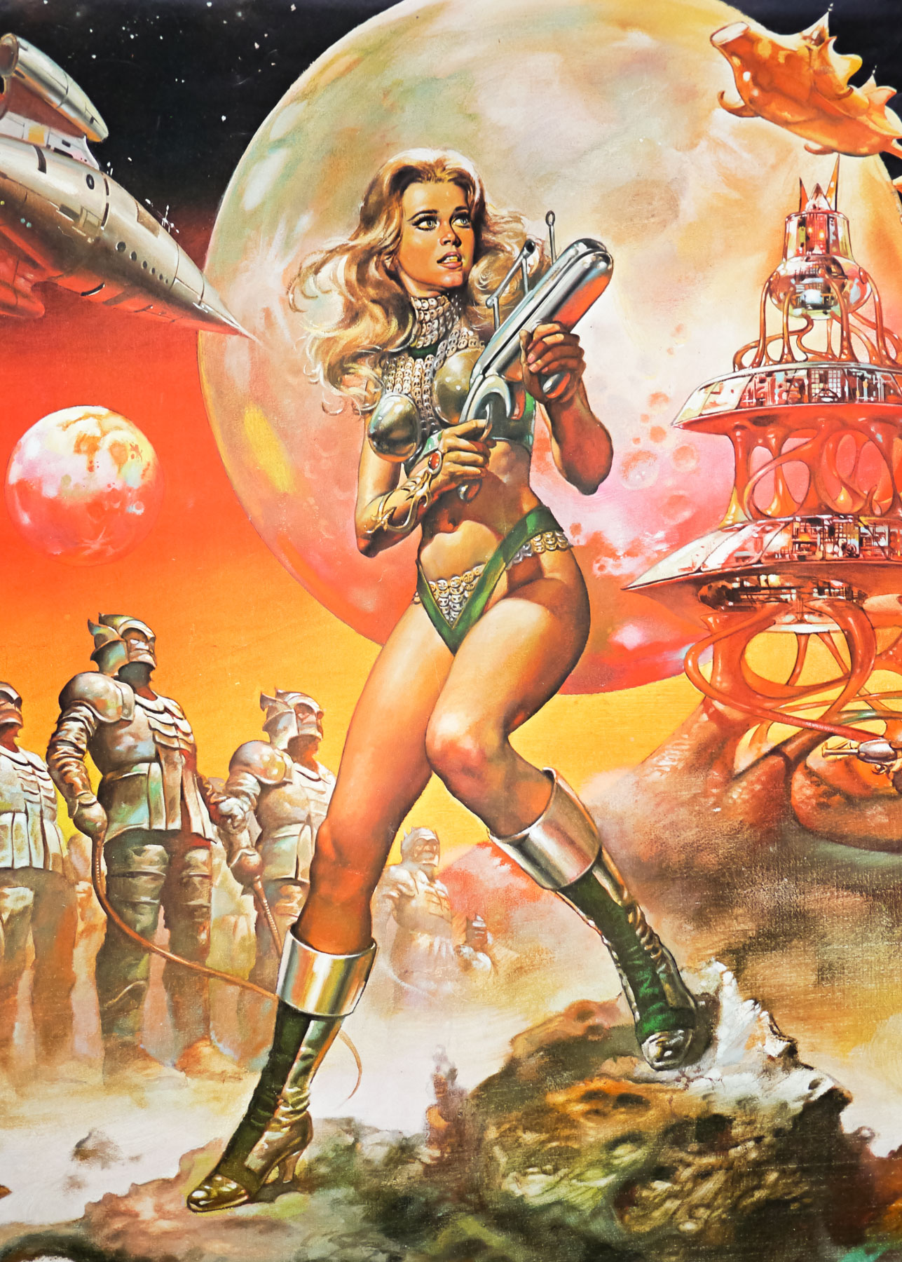
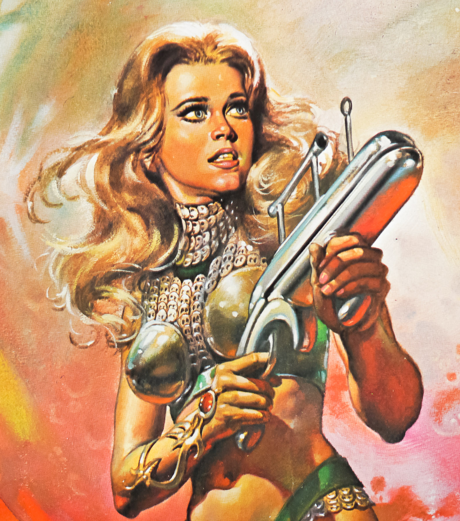
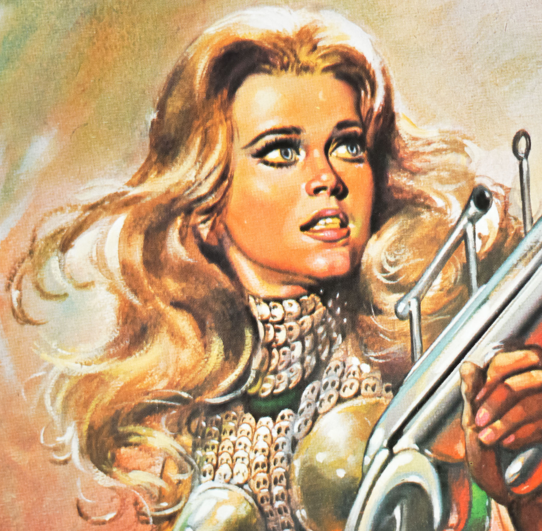
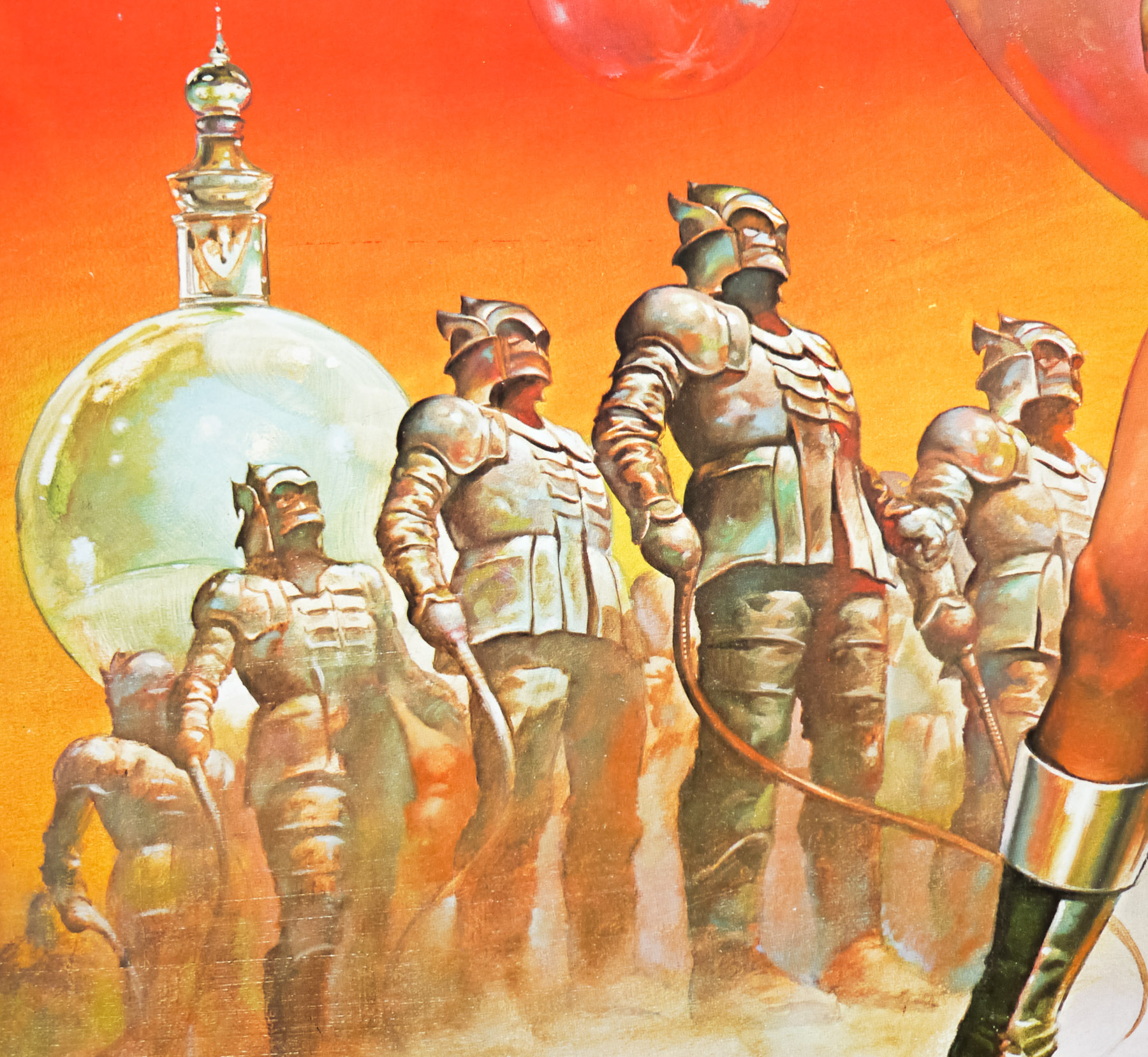
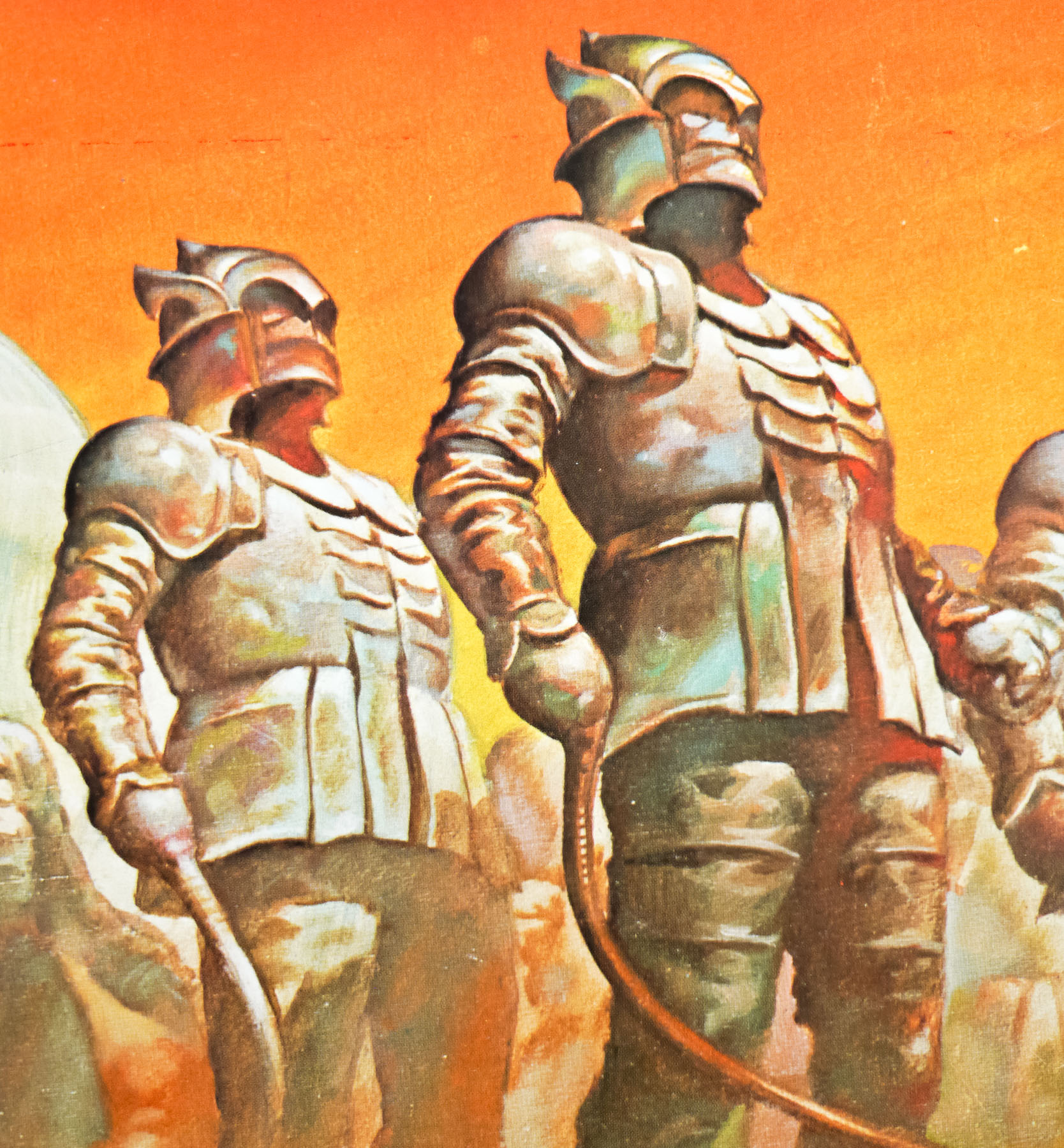
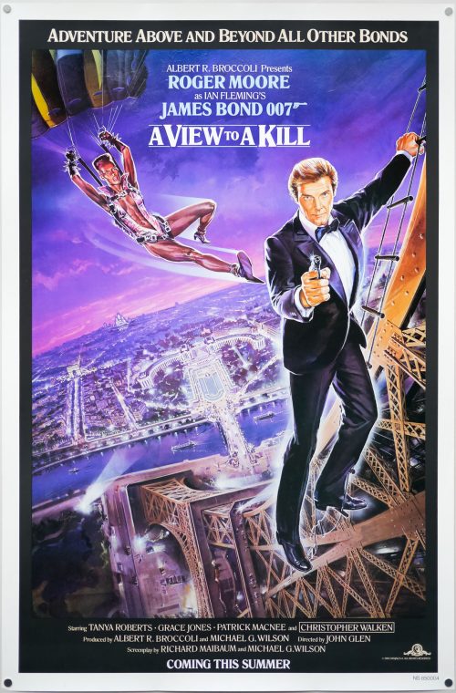
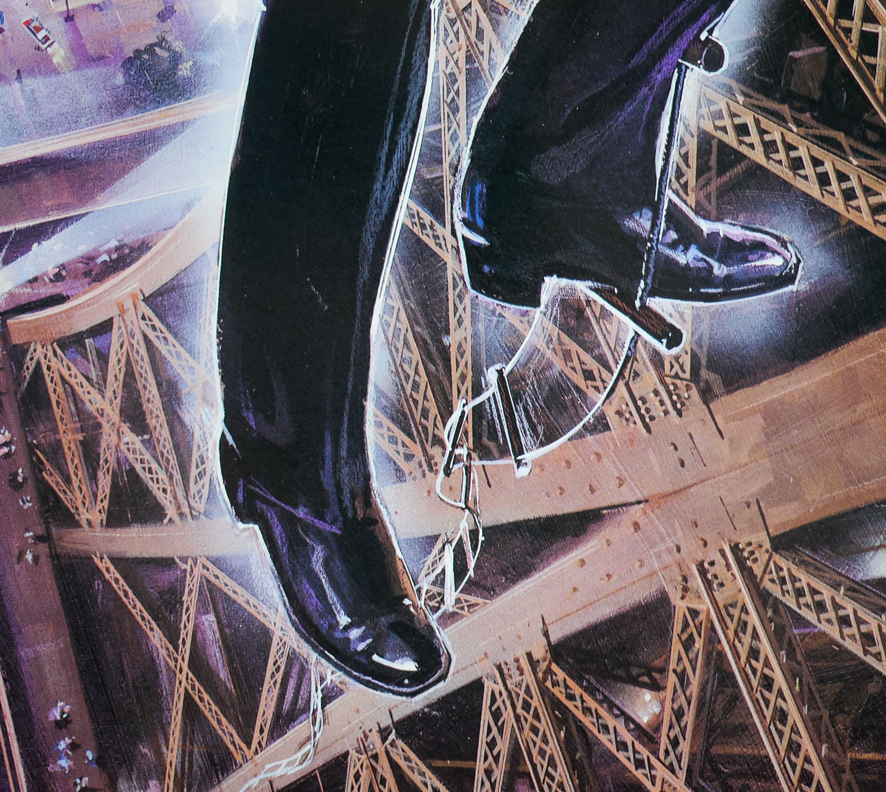
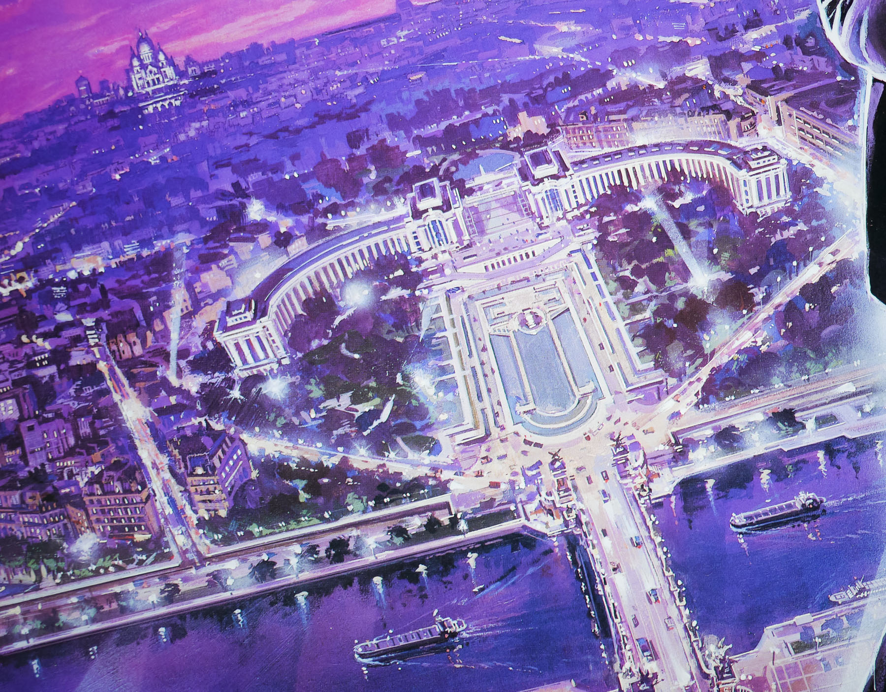
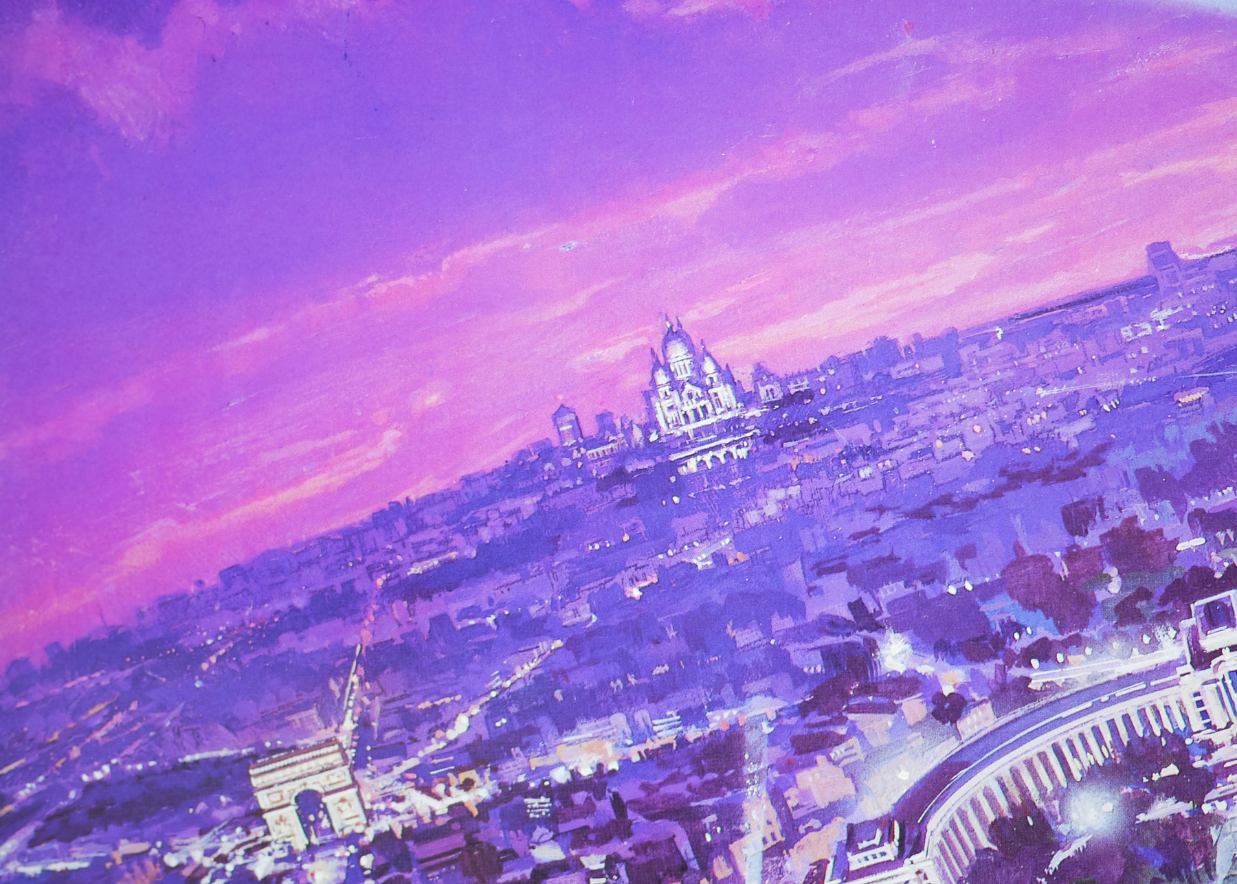
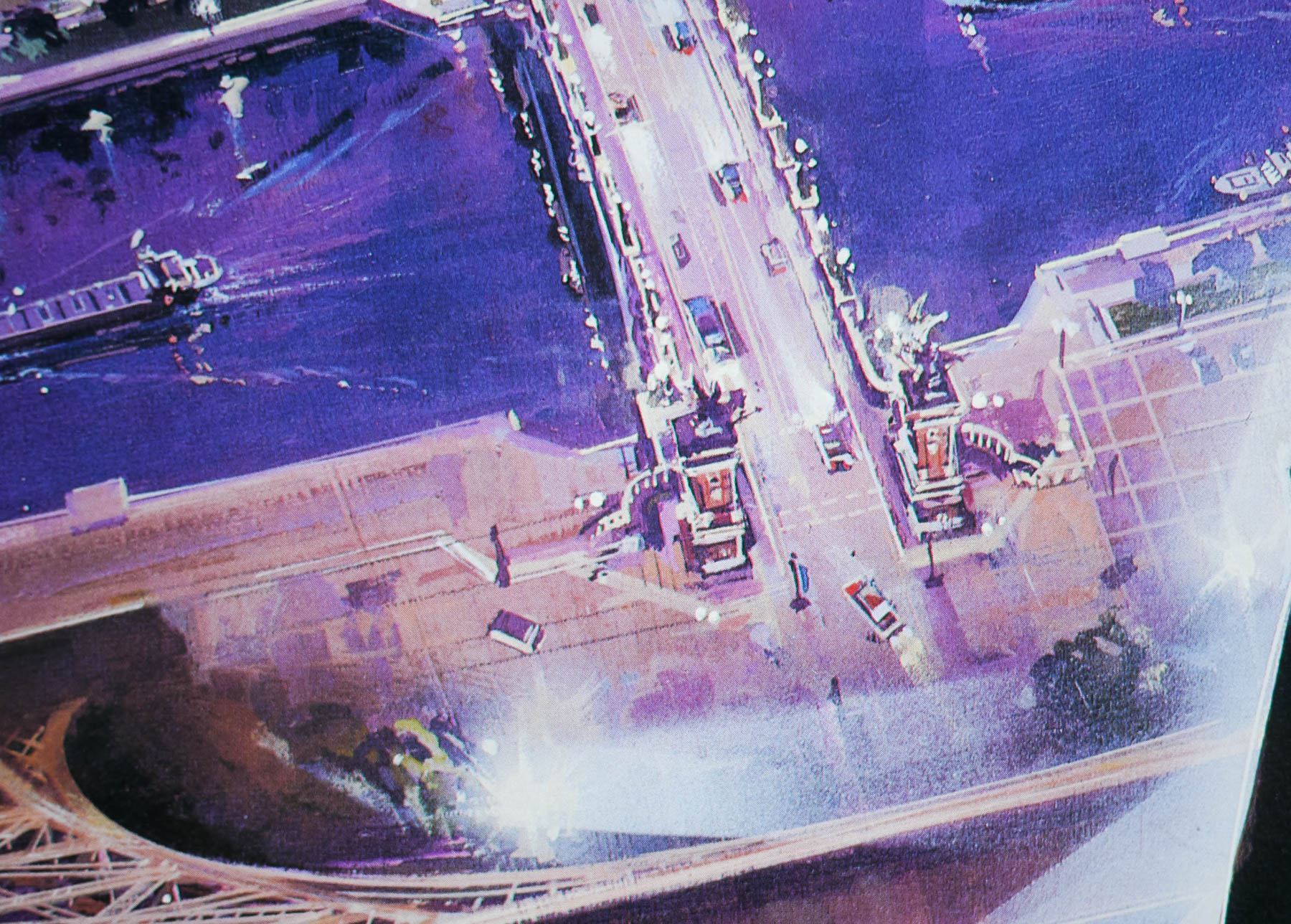
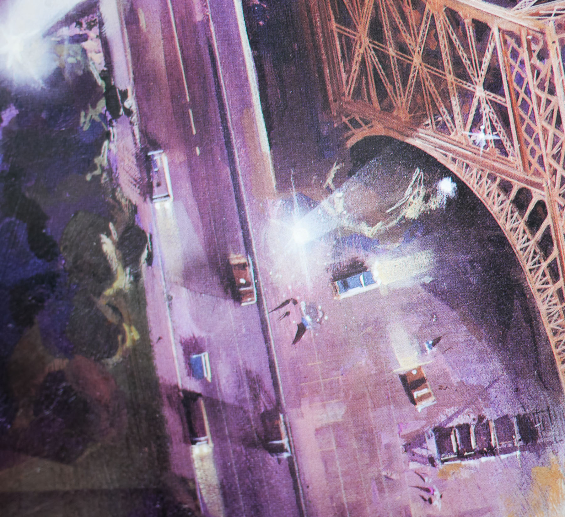
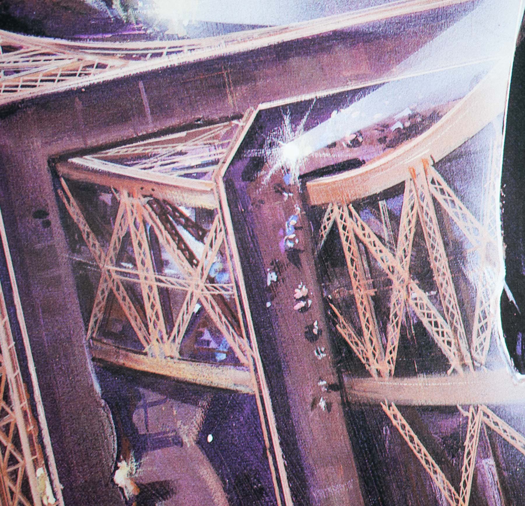
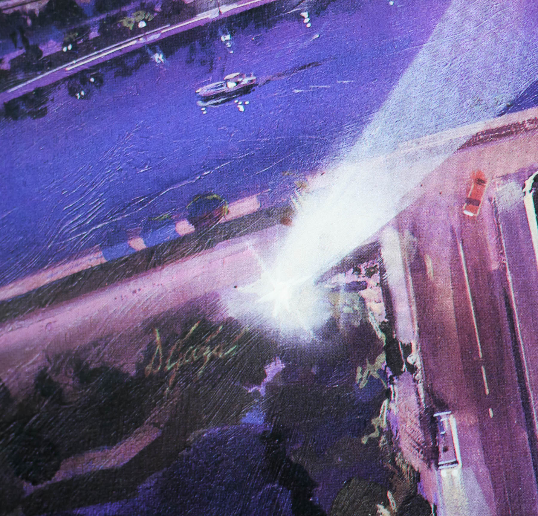
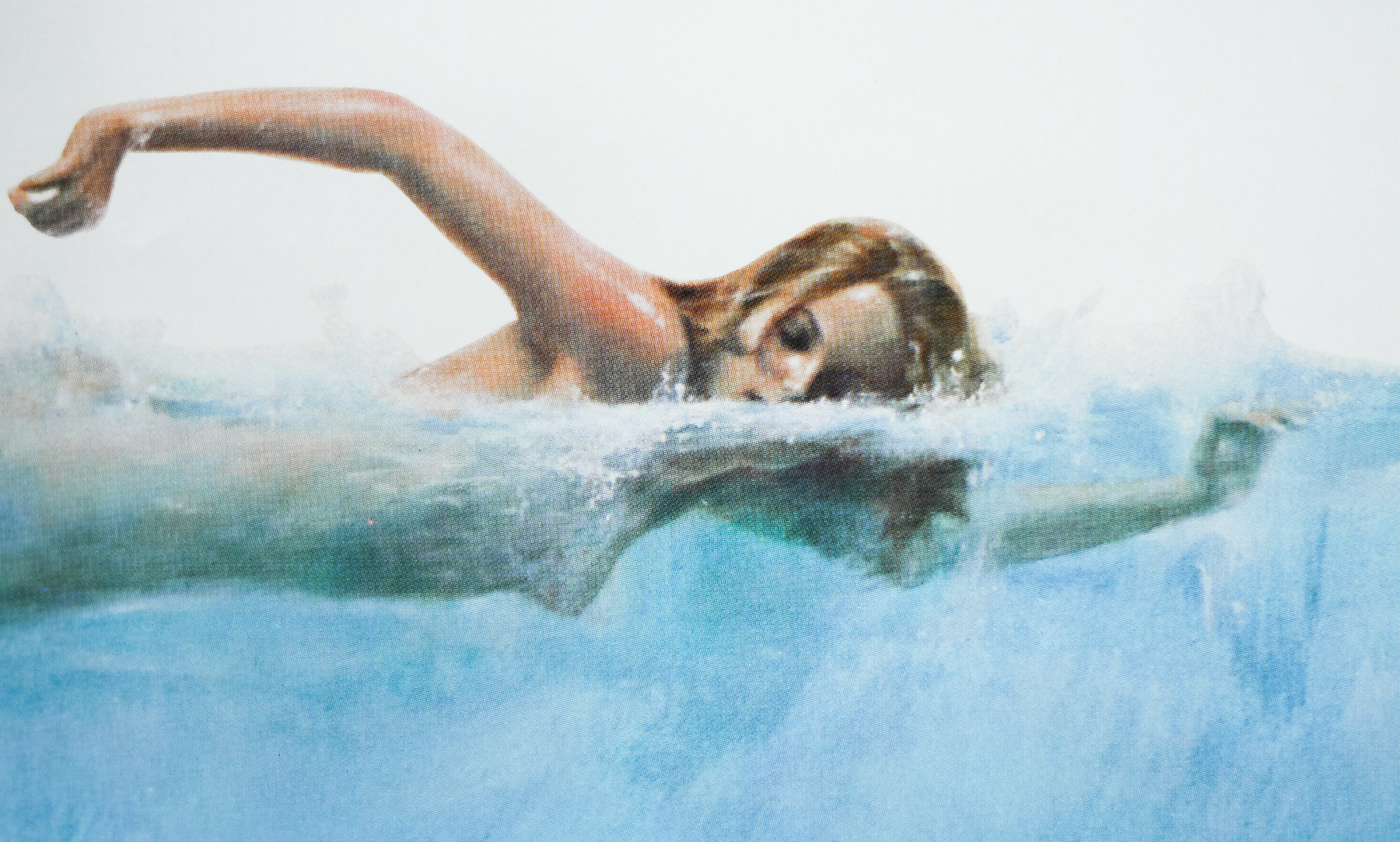
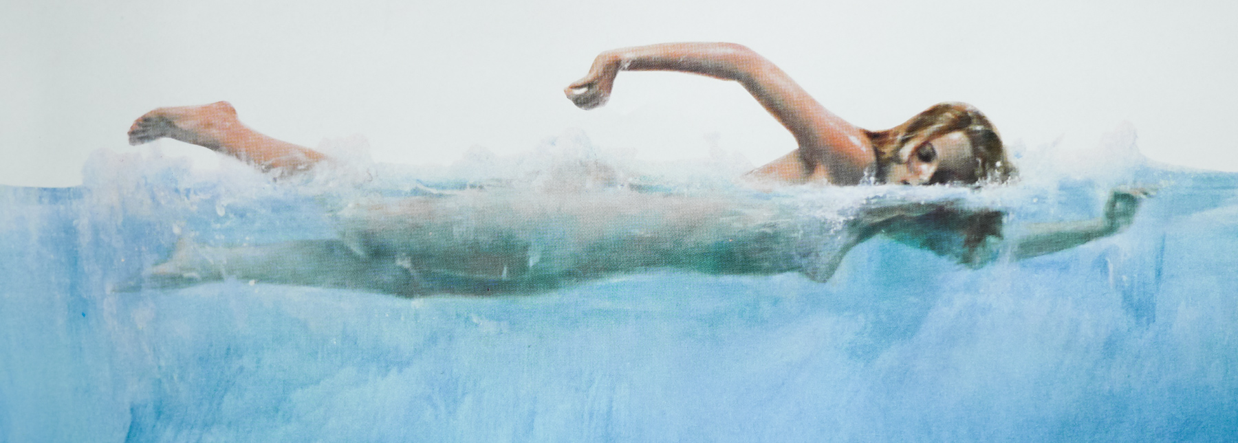
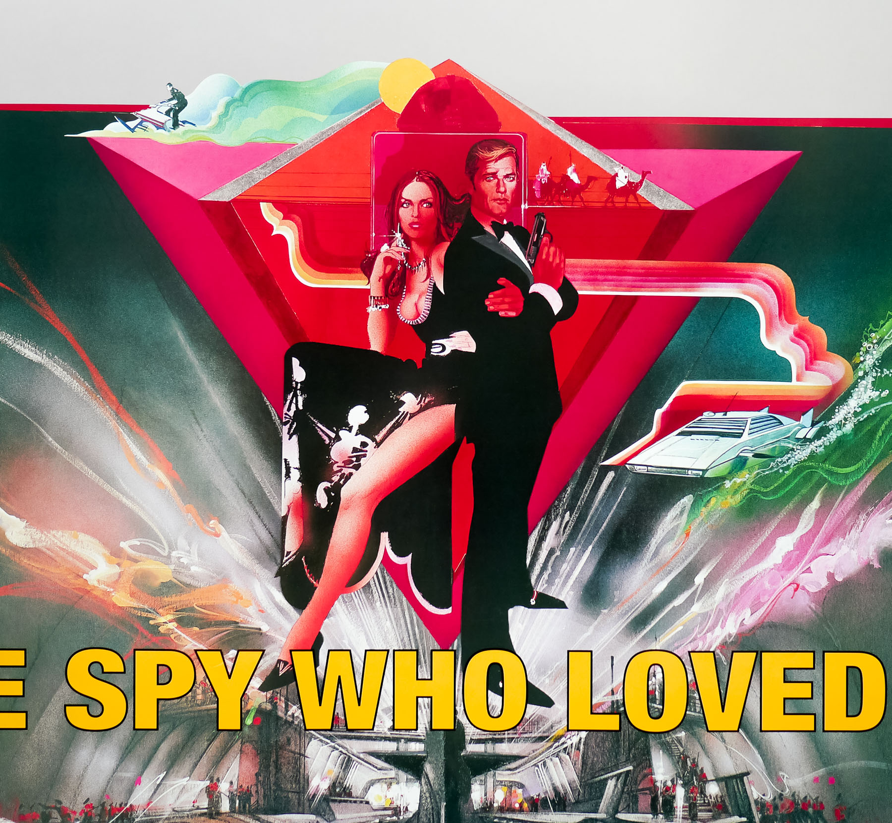
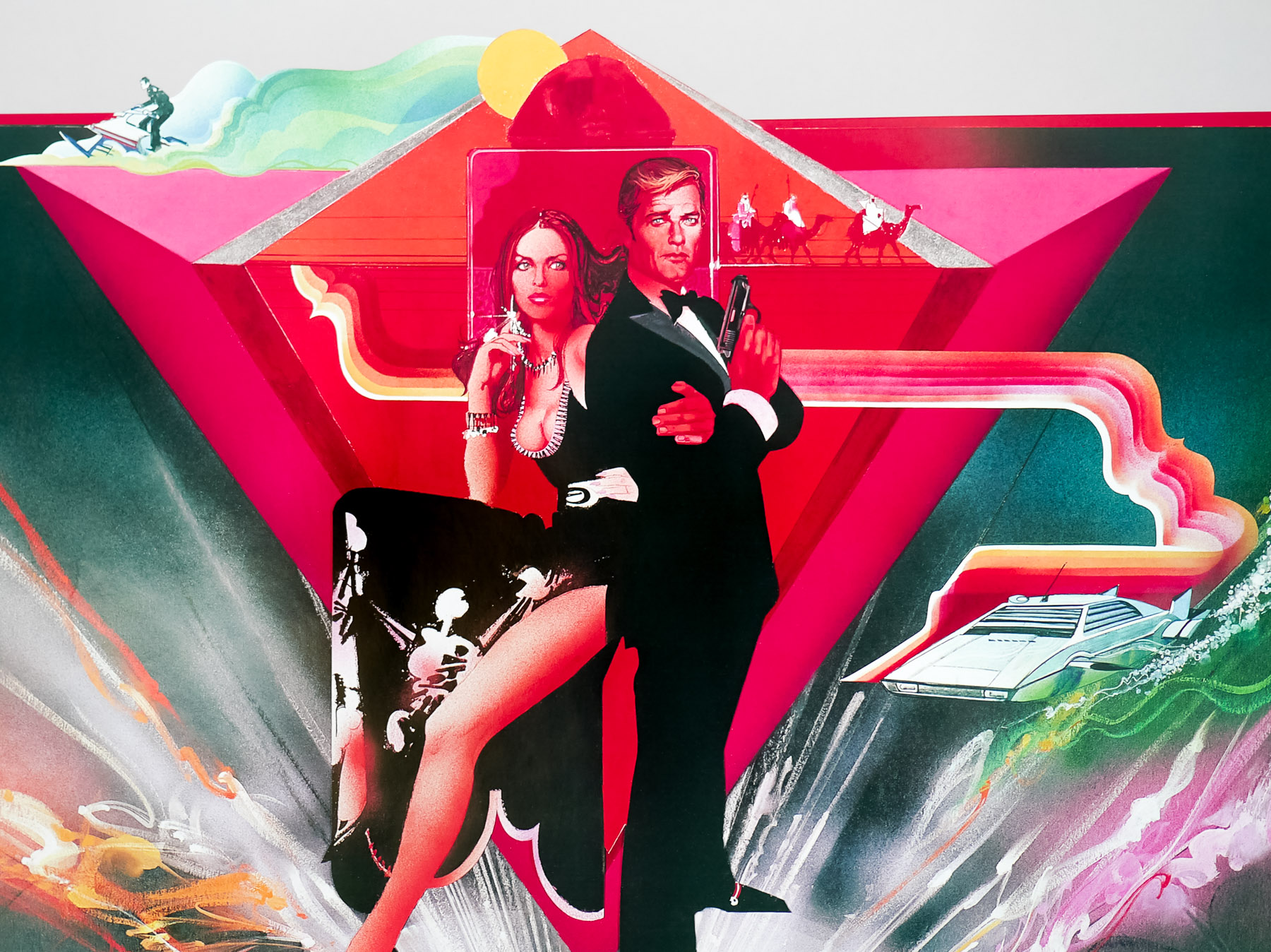
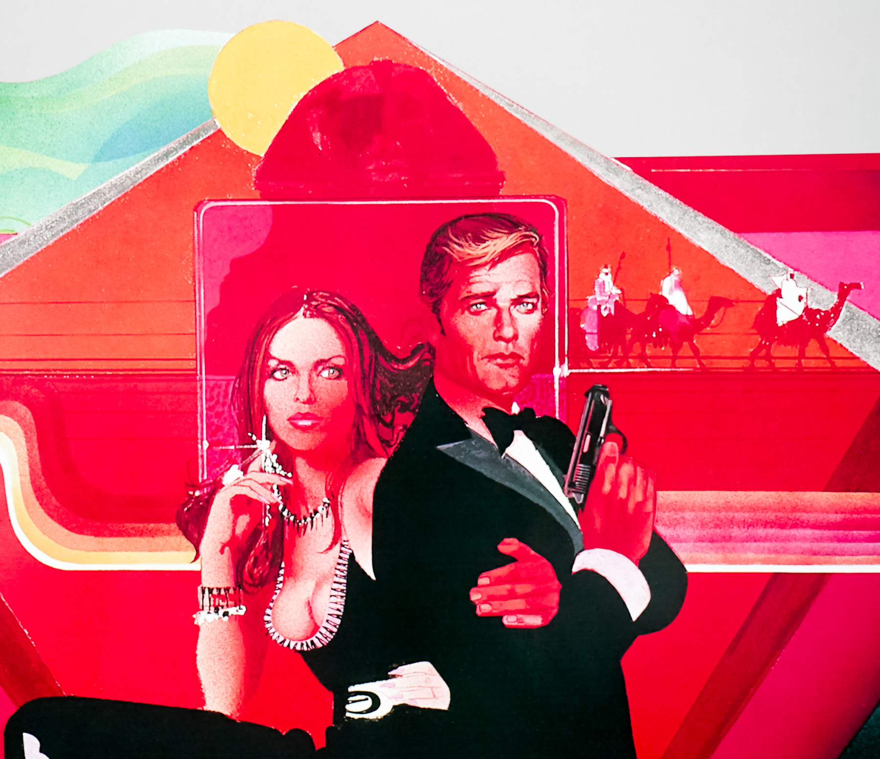
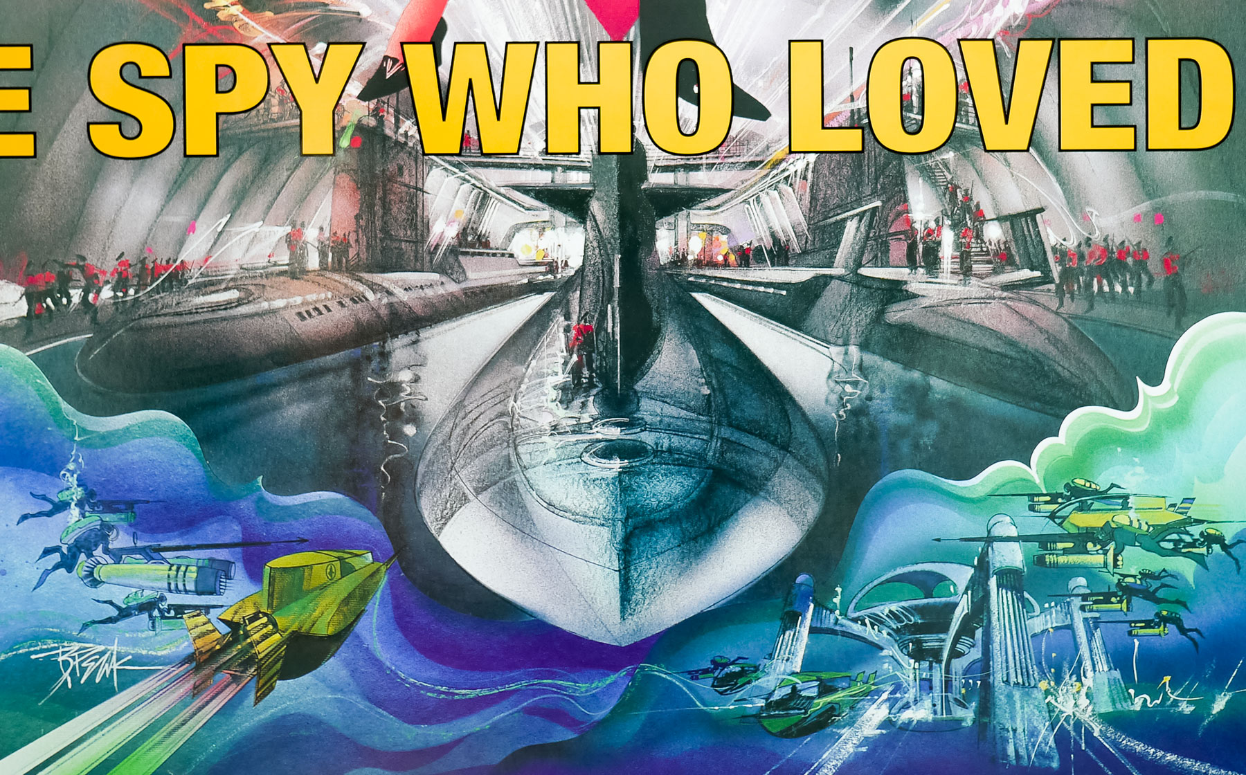
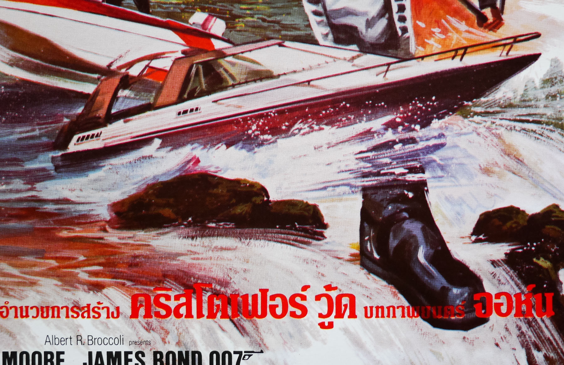
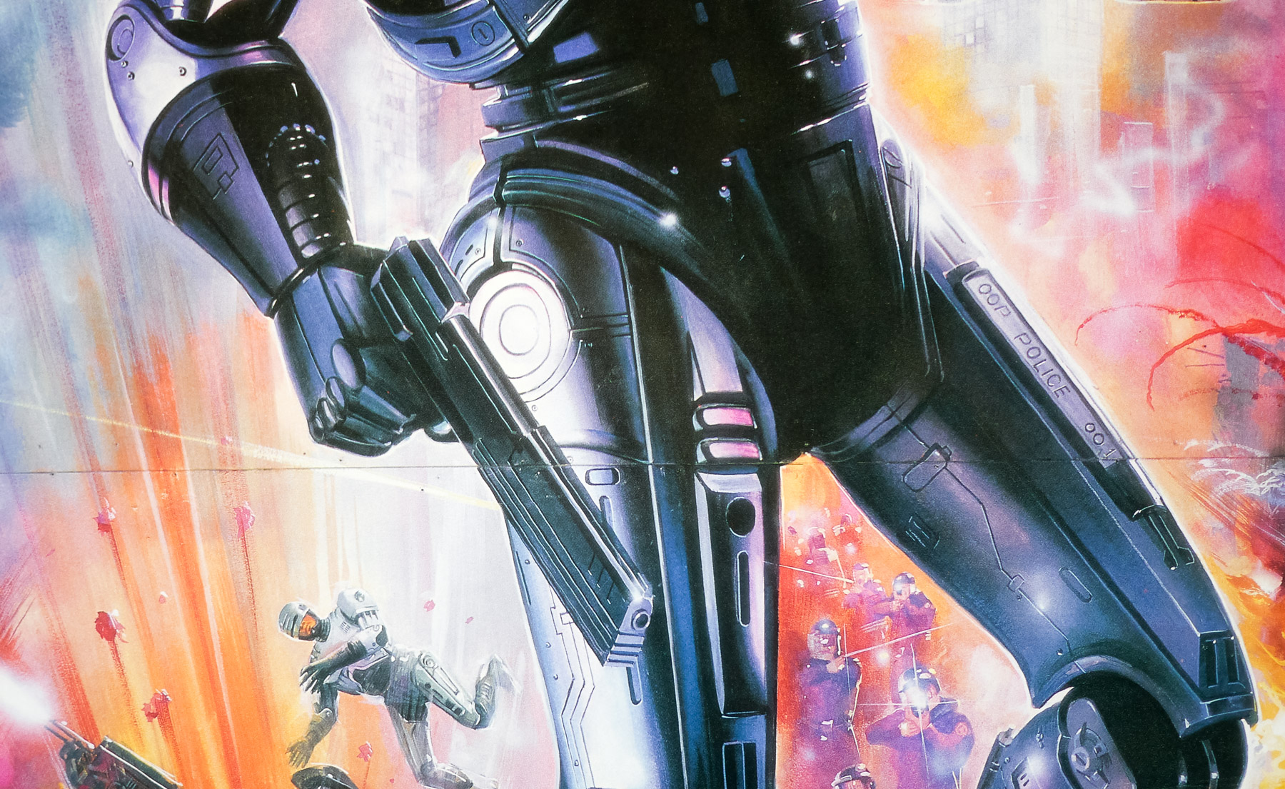
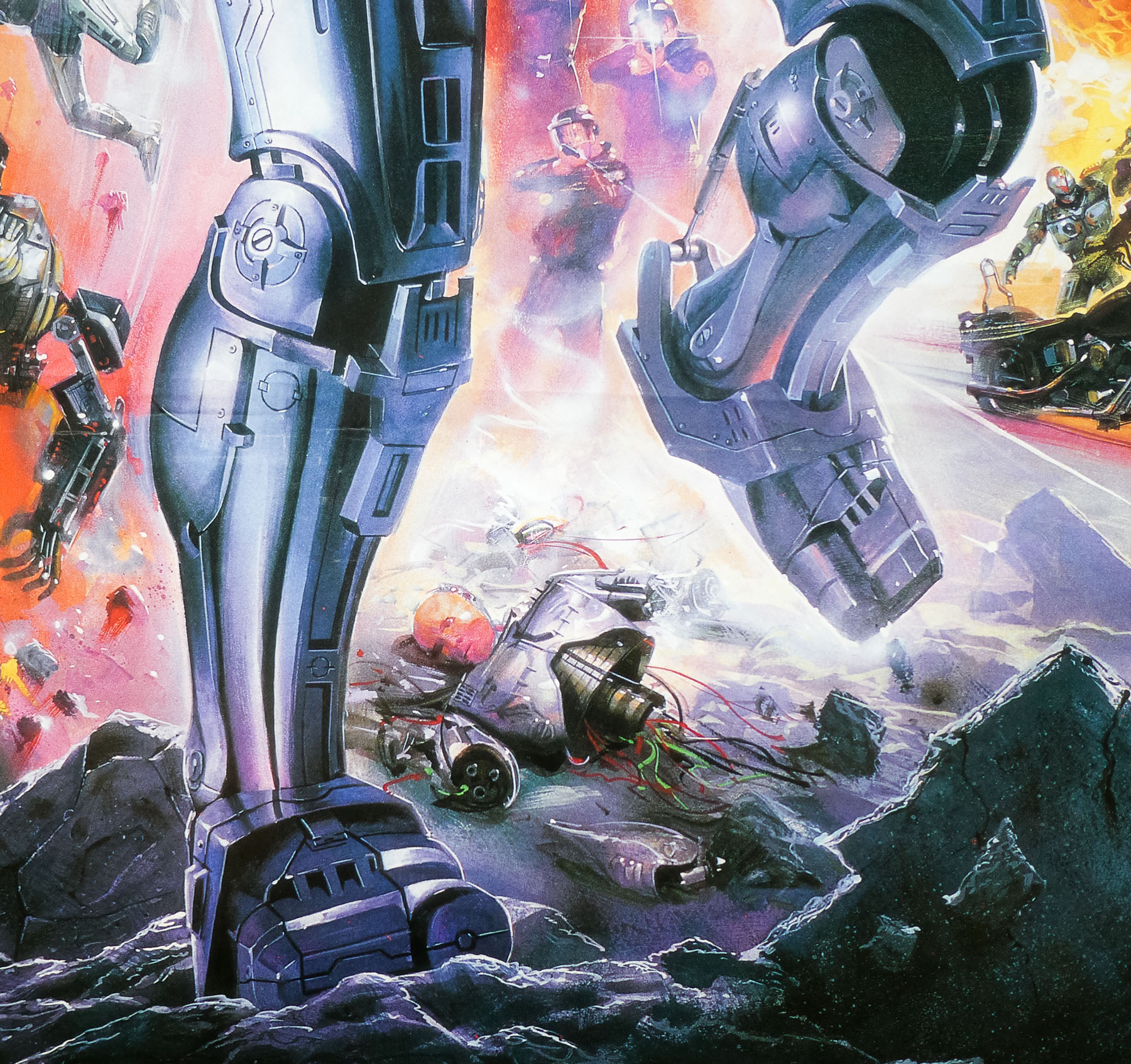
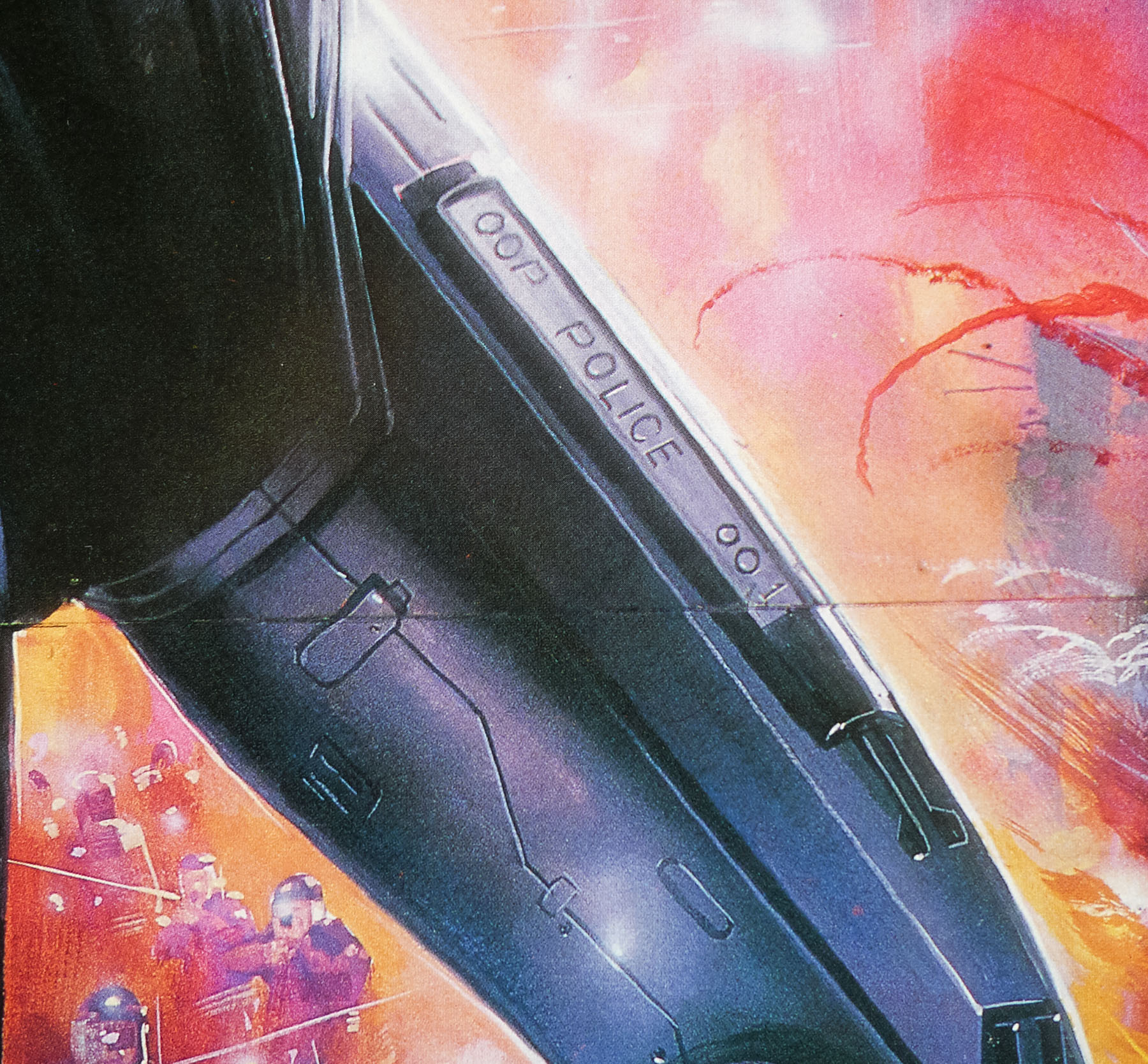
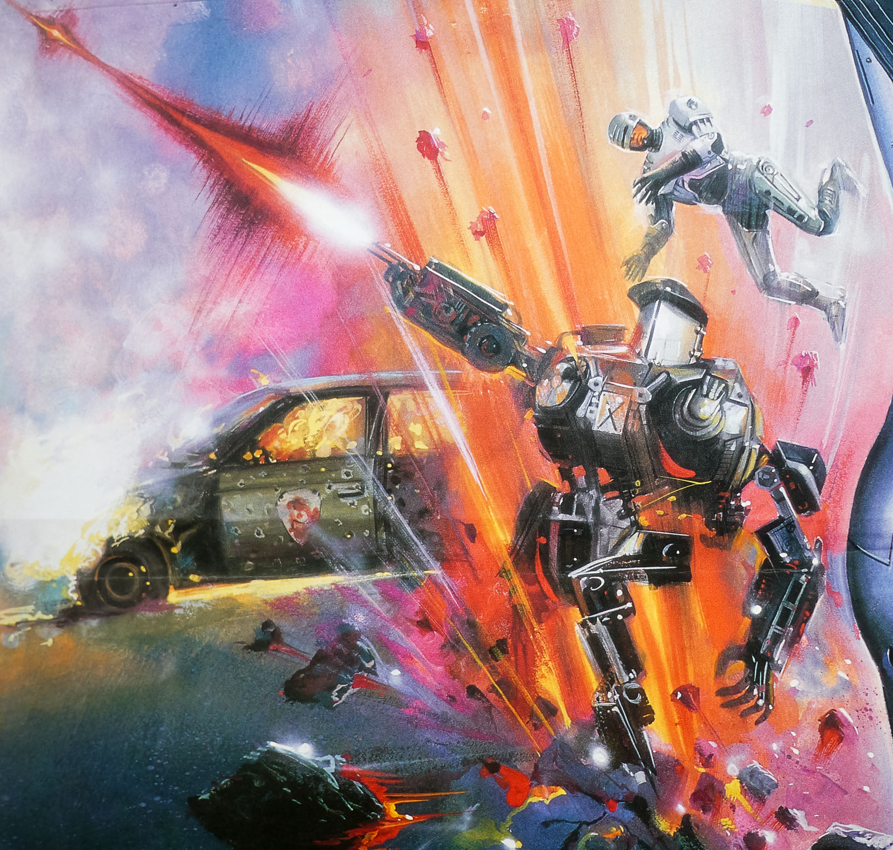
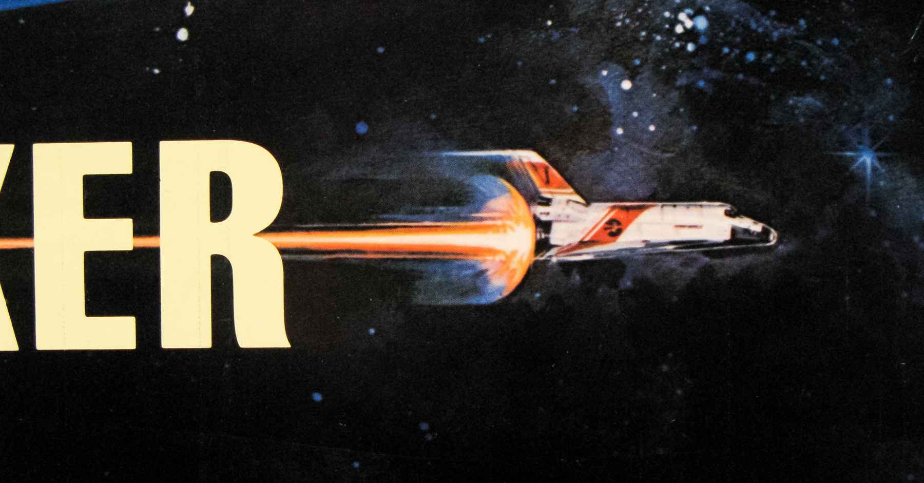
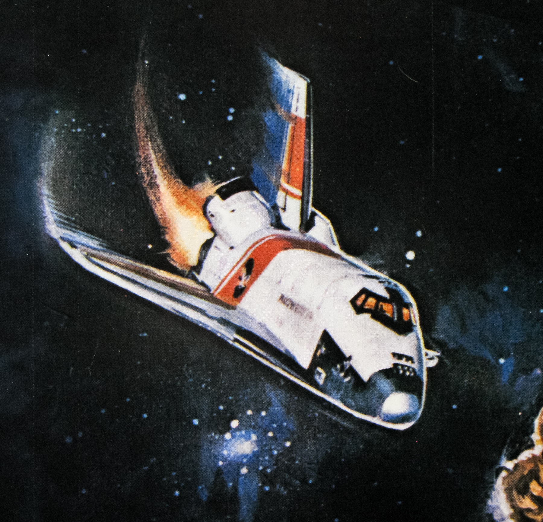
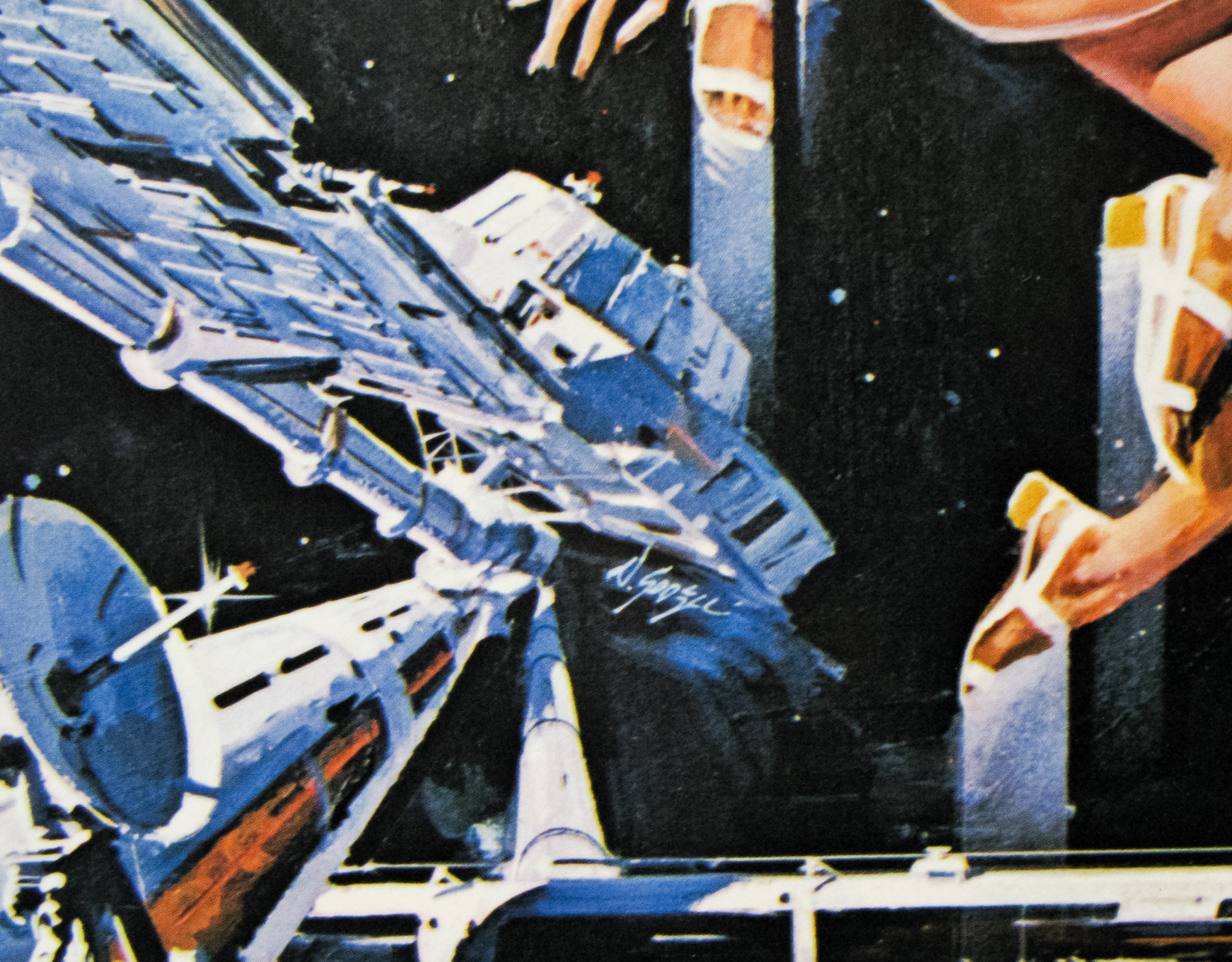
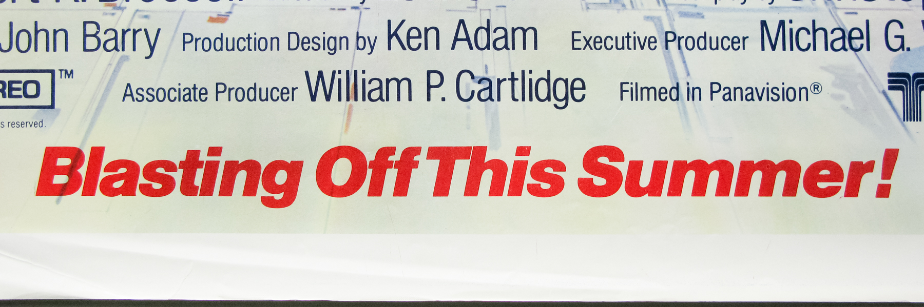
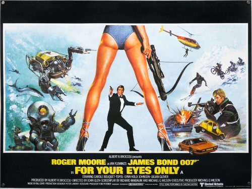
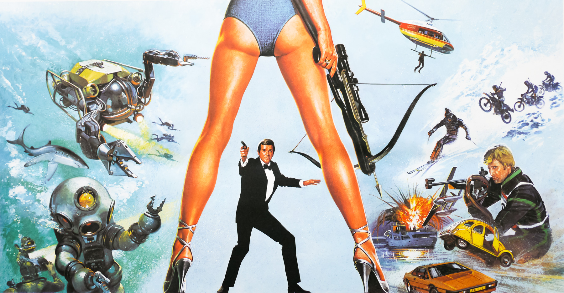
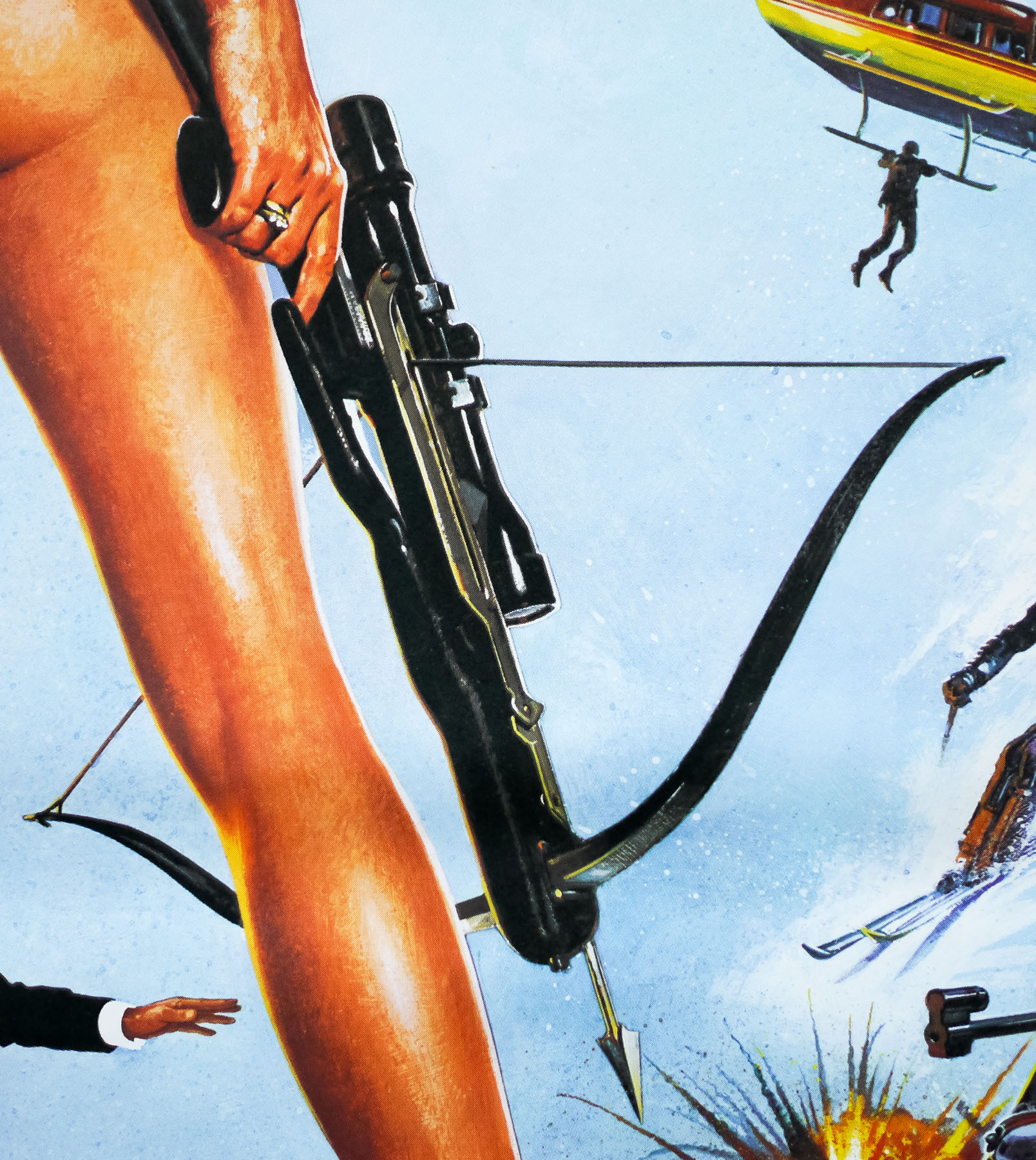
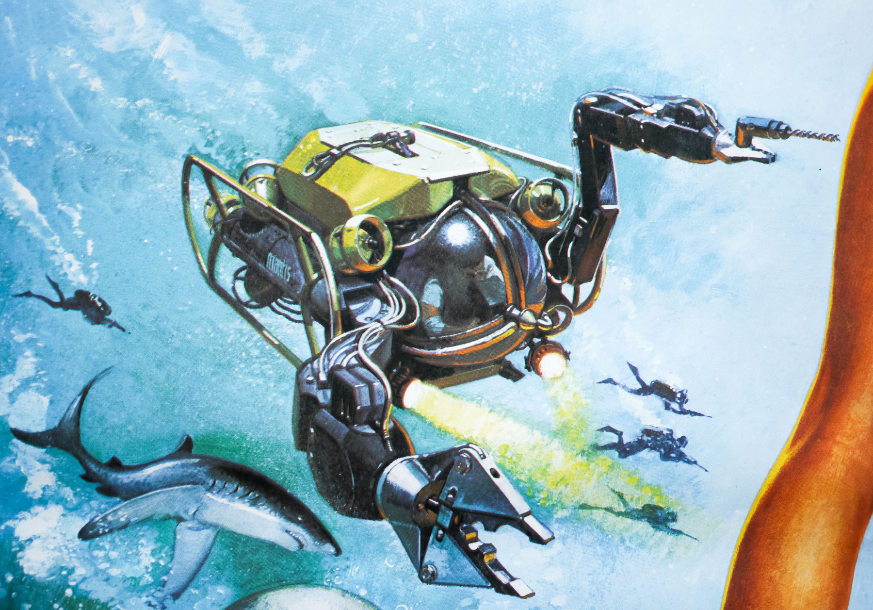
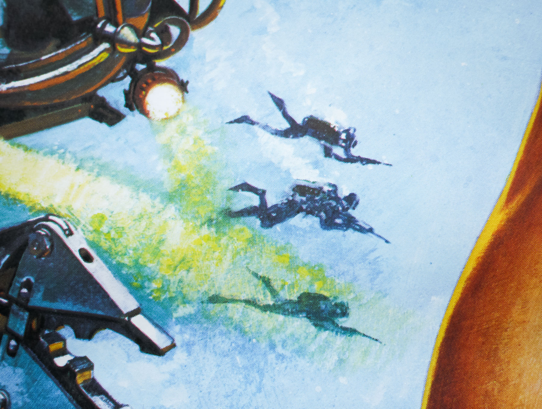
This British quad features the ‘legs’ concept that was created by the American designer Bill Gold and was subsequently used for the film’s marketing campaign across the globe, including the US one sheet. Owing to the landscape format of the quad poster it was decided that a montage of scenes from the film should be added either side of the legs. The montage was designed by Eddie Paul at the British film marketing agency FEREF and the painting job was given to the talented illustrator Brian Bysouth, whose skill at accurately depicting vehicles, characters and dynamic action scenes was the perfect compliment for the design. The montage was also adapted (and somewhat crammed) onto an international one sheet used to market the film in countries such as Australia.
In 2012 I met and interviewed Brian Bysouth and this poster was discussed during our meeting:
One Bond poster you worked on is the quad for For Your Eyes Only. It had the Bill Gold designed element of the long legs, but you modified the montage when doing the finished illustration?
Eric Pulford created the U.K. poster design that was approved. The inclusion of the very iconic Bill Gold legs concept was a must in any design that was submitted, so I suppose the scope for fresh designs was limited. In my opinion Eric’s original montage was not his best work and, although I tried to re-arrange some of the elements, the reference material supplied was not very exciting and I think the surrounding montage looks rather ordinary.
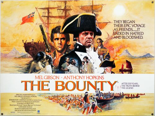
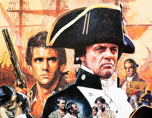
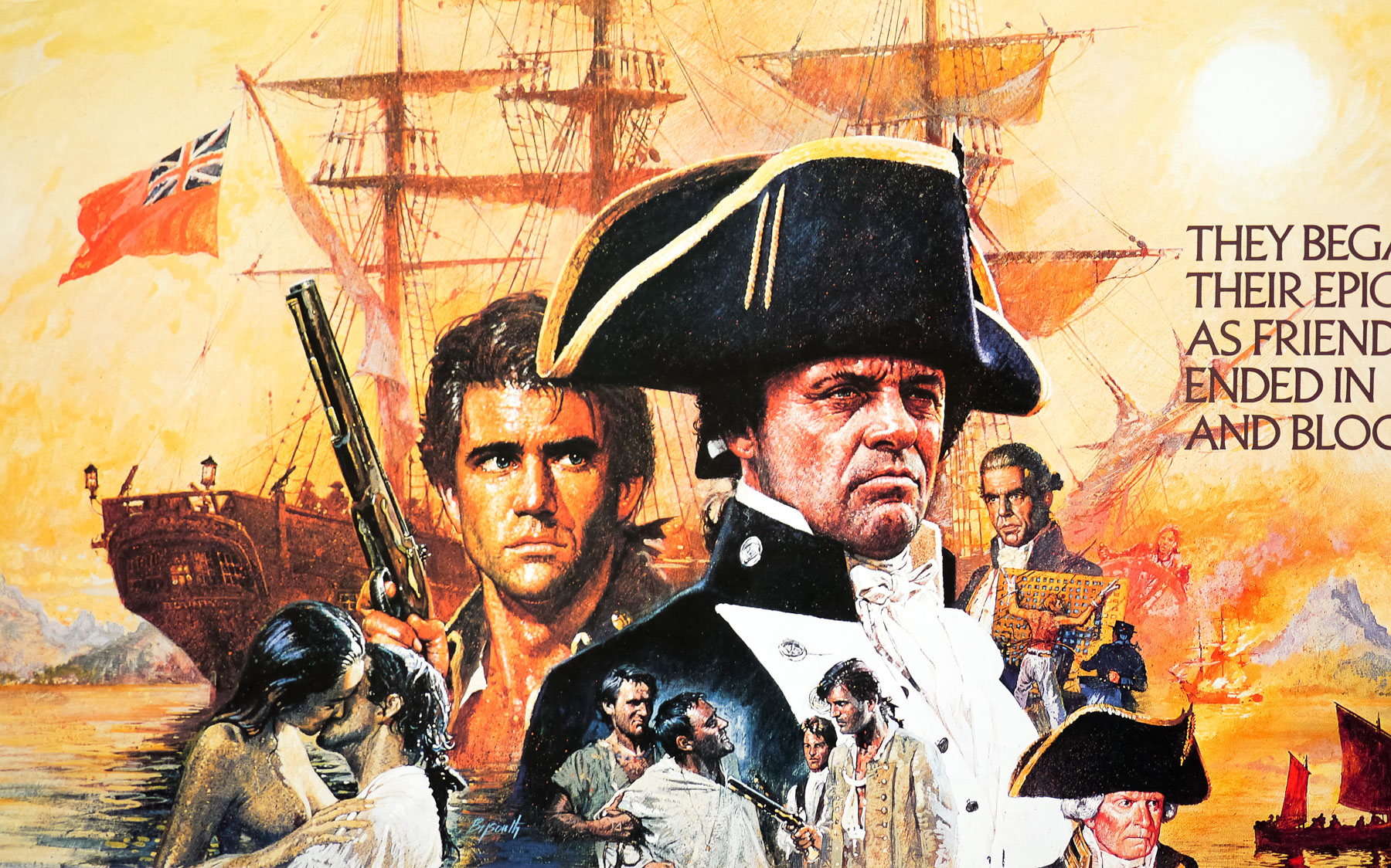
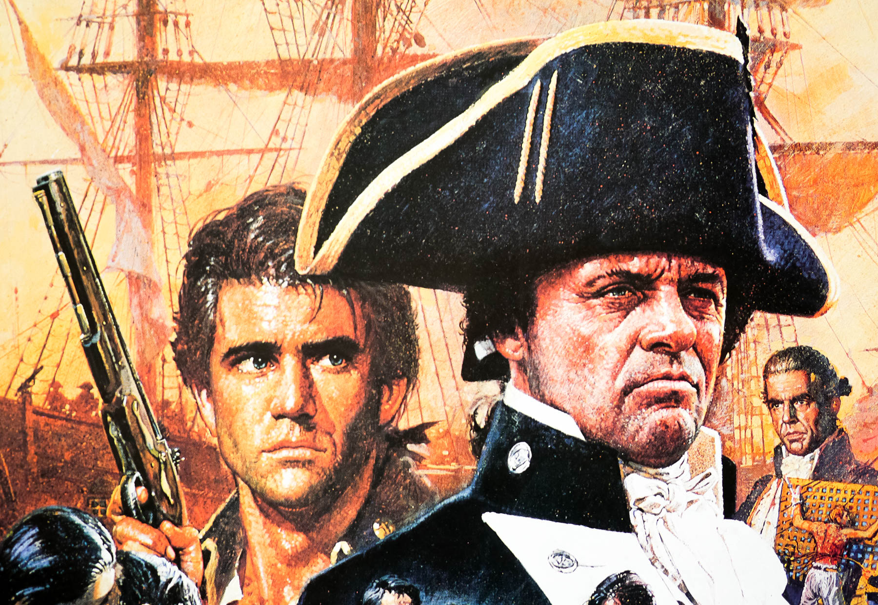
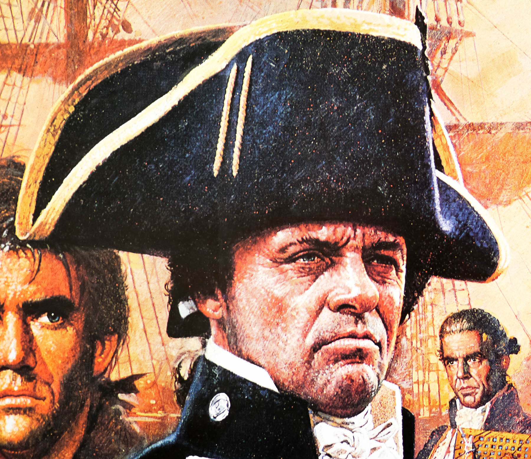
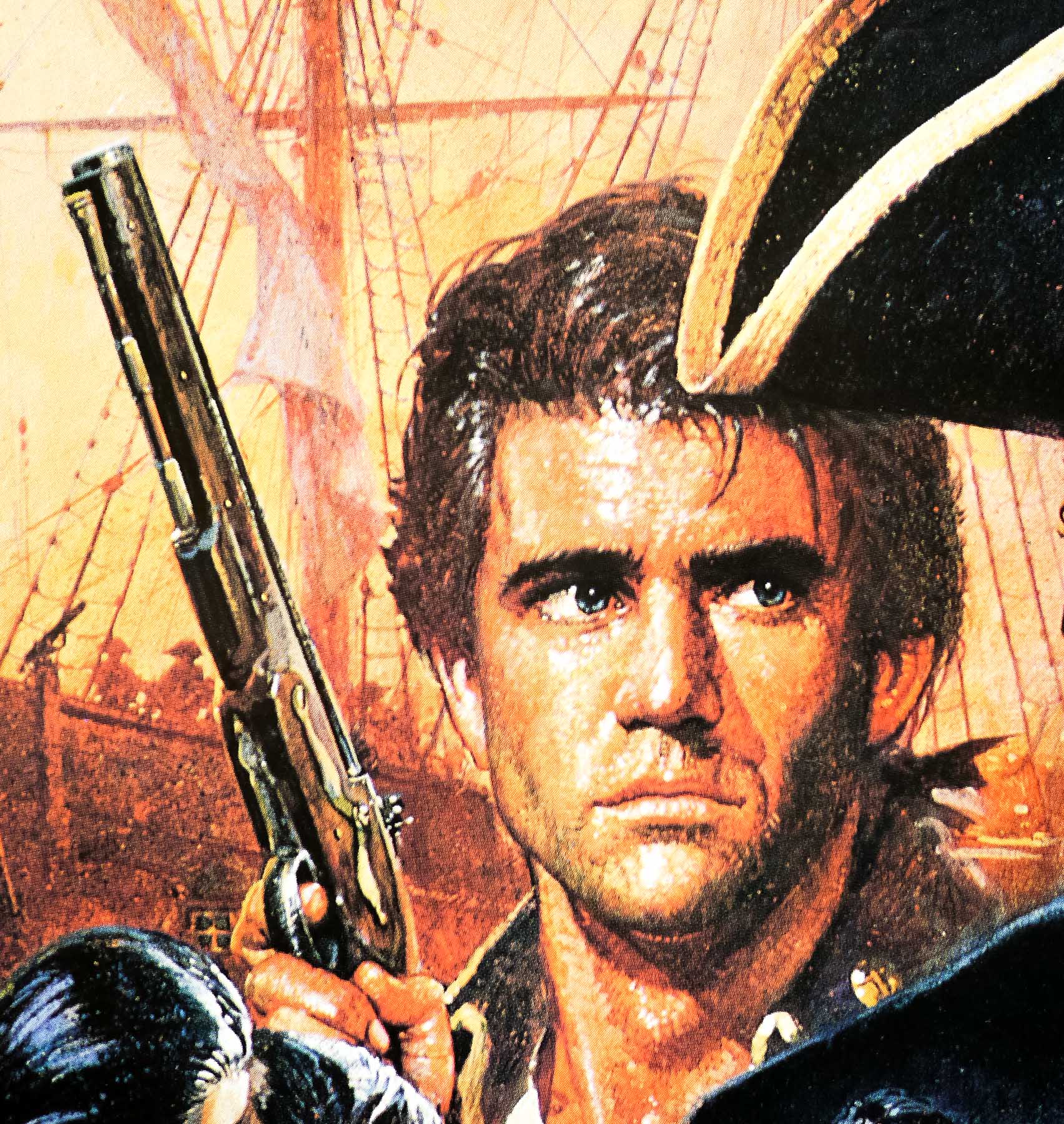
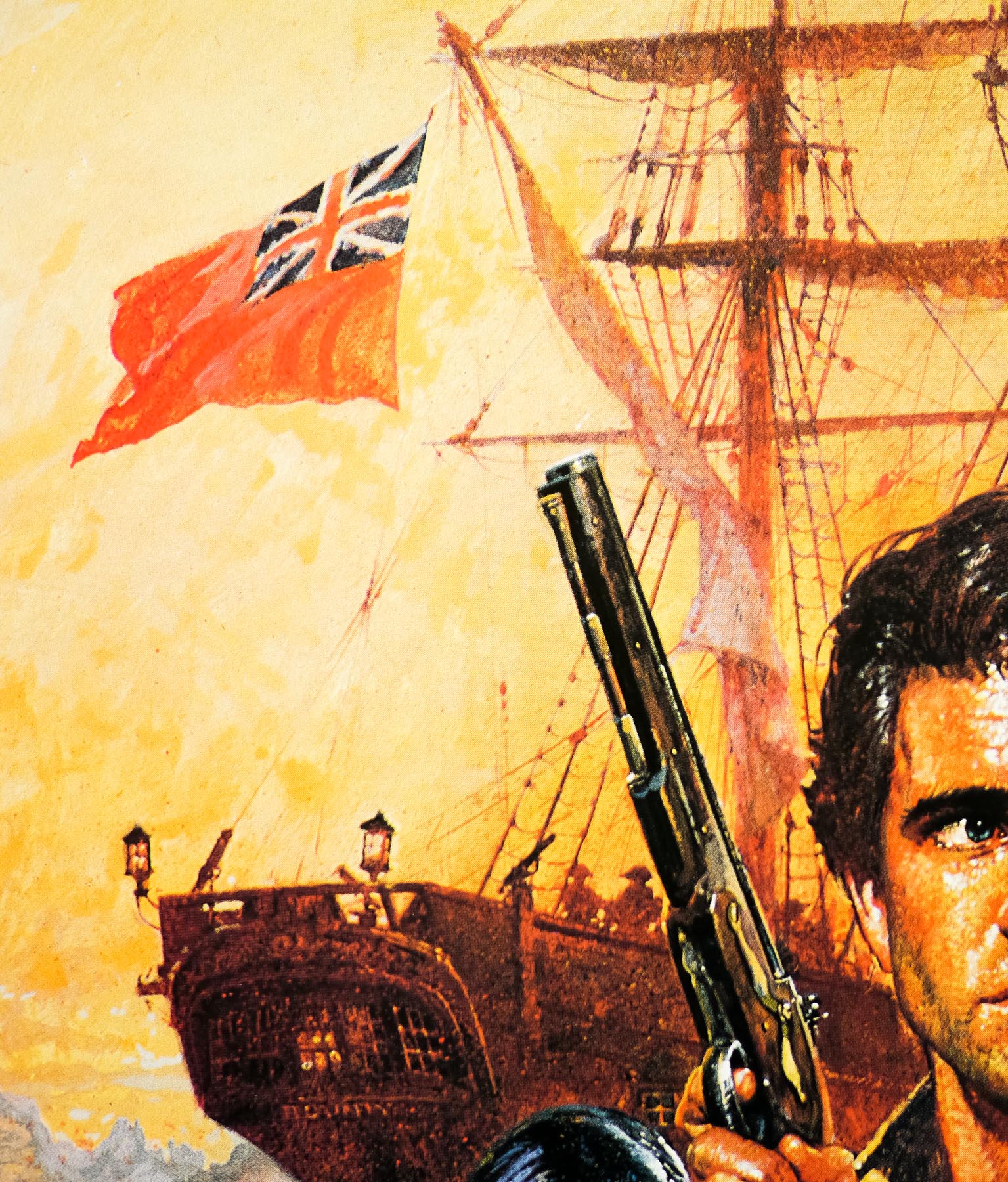
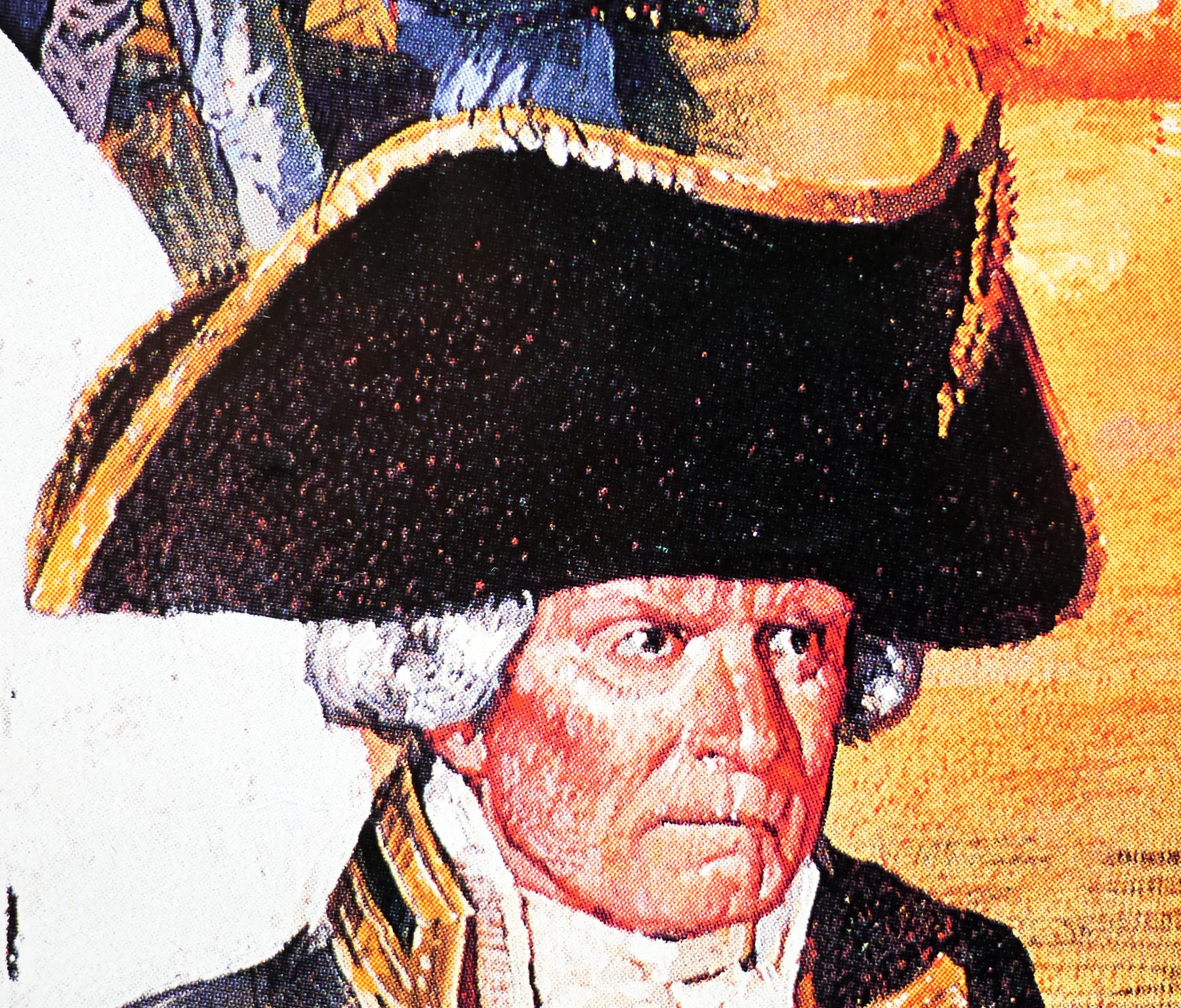
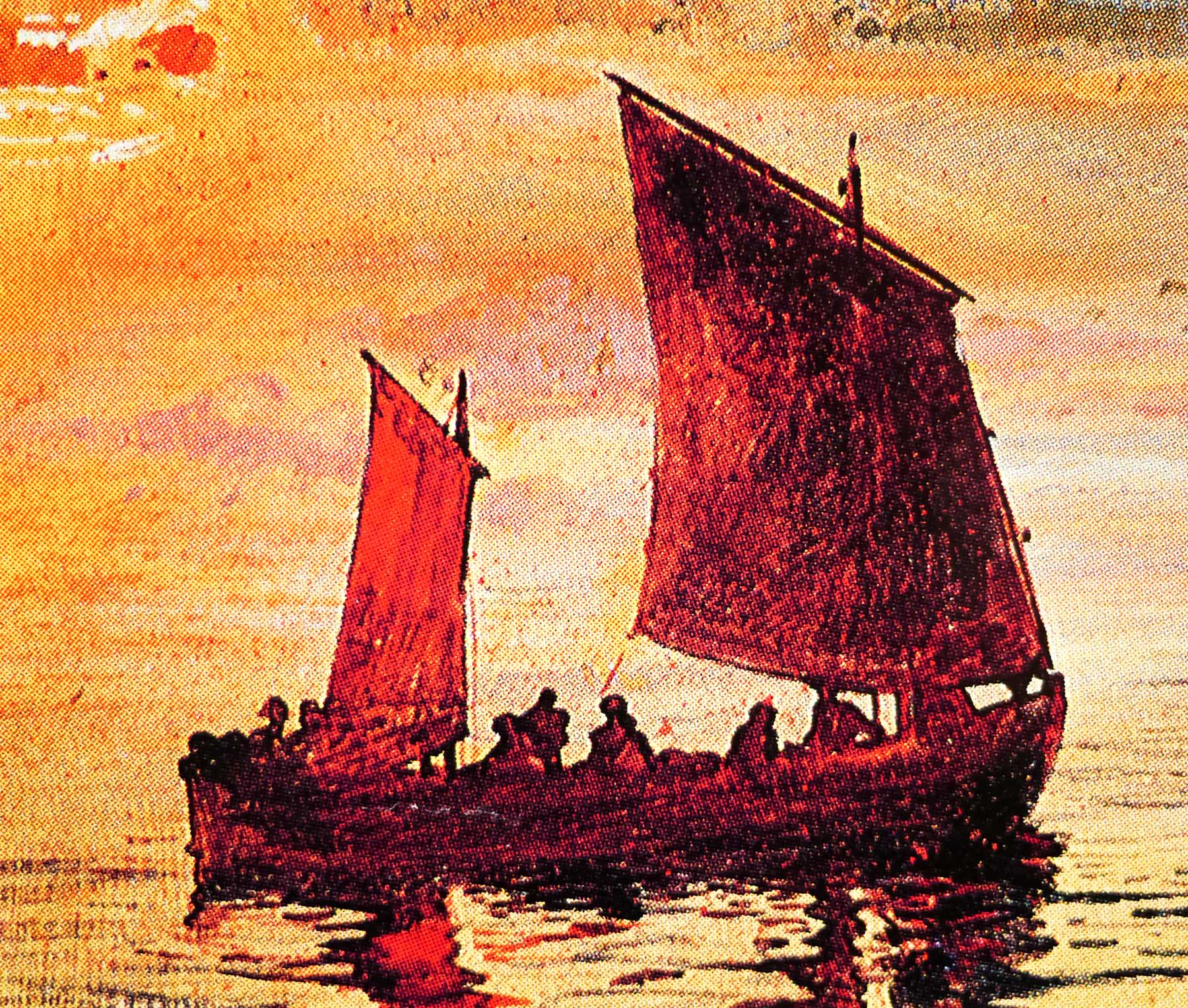
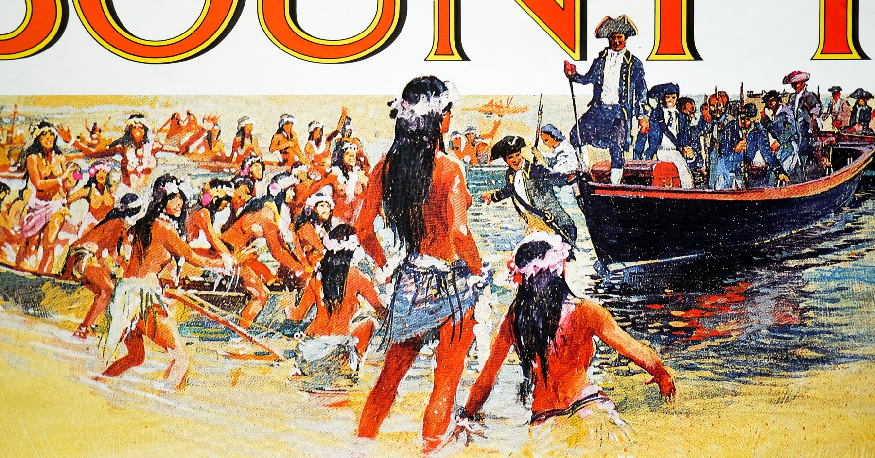
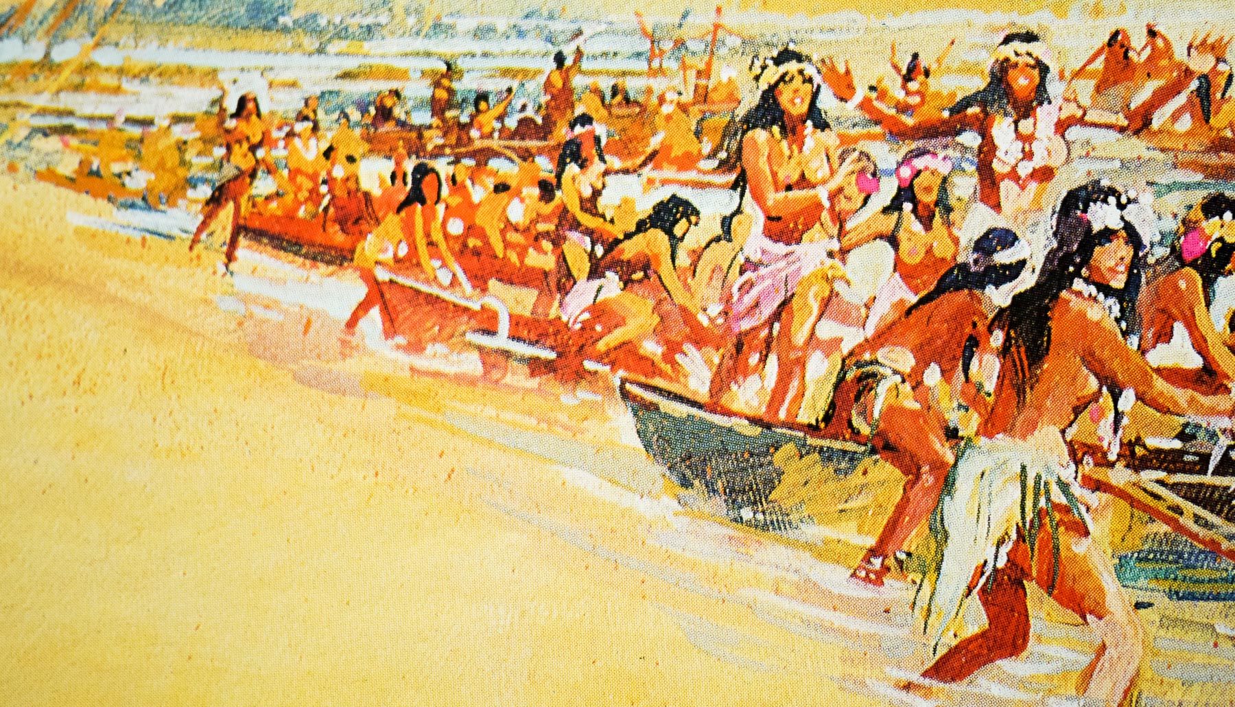
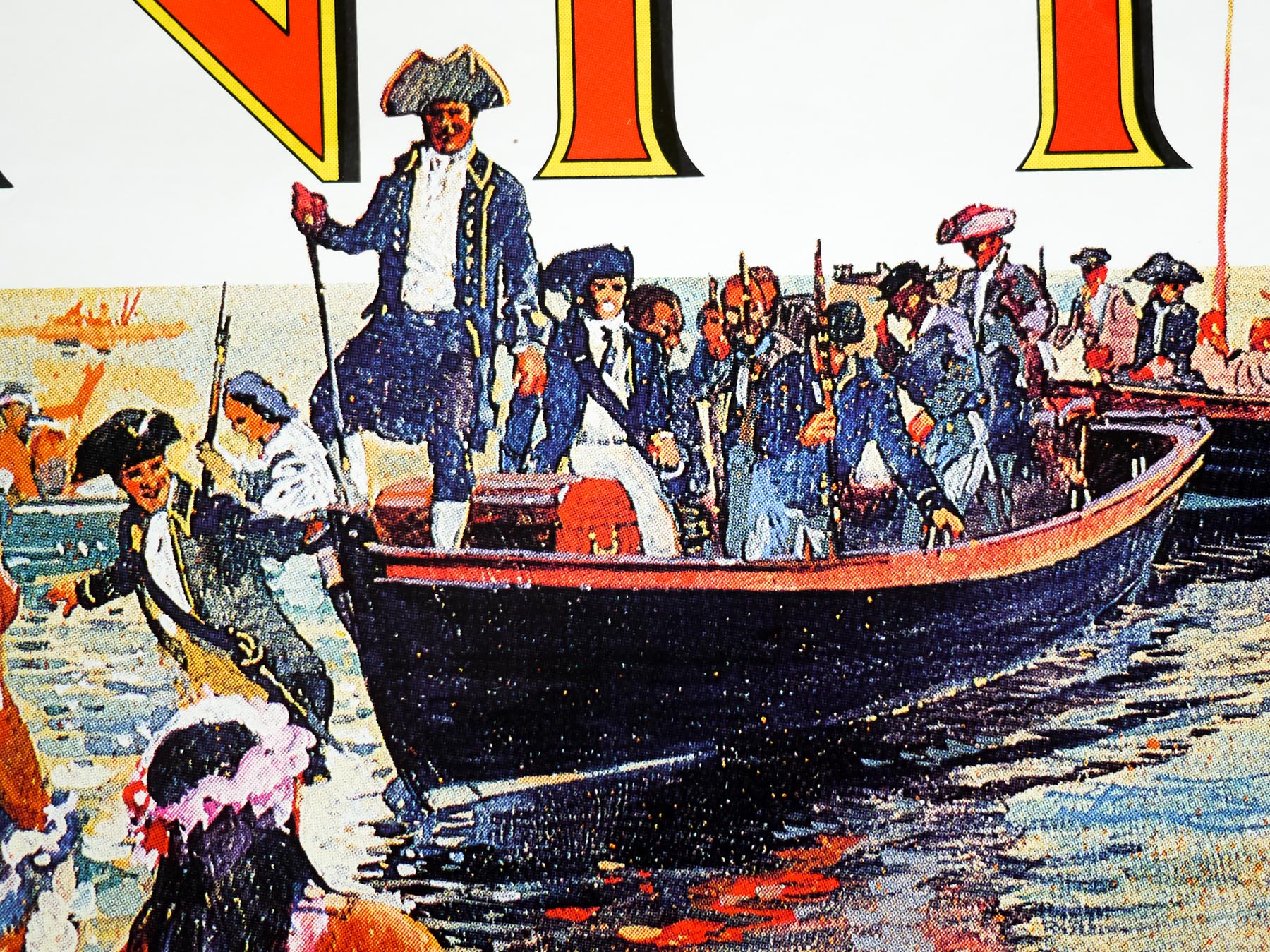
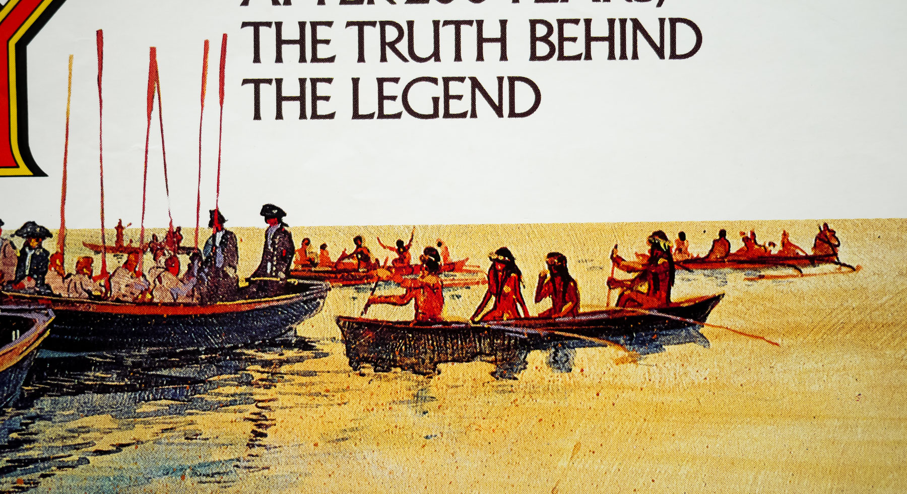
A similar difficulty arose with the design Eric had done for The Bounty (1984). His atmospheric colour rough was exciting, but when I began to sketch out the finished painting I realised the perspective of the ship was flawed. Eric’s exciting random montage of characters had initially disguised the shortcoming. I spent a day redrawing the ship and rigging to ensure it was reasonably correct, and then moved the characters to try to improve the composition. I was pleased with the final painting but was never happy with the montage, which I really thought needed recomposing. I didn’t think a confrontation with Eric was in my best interest.
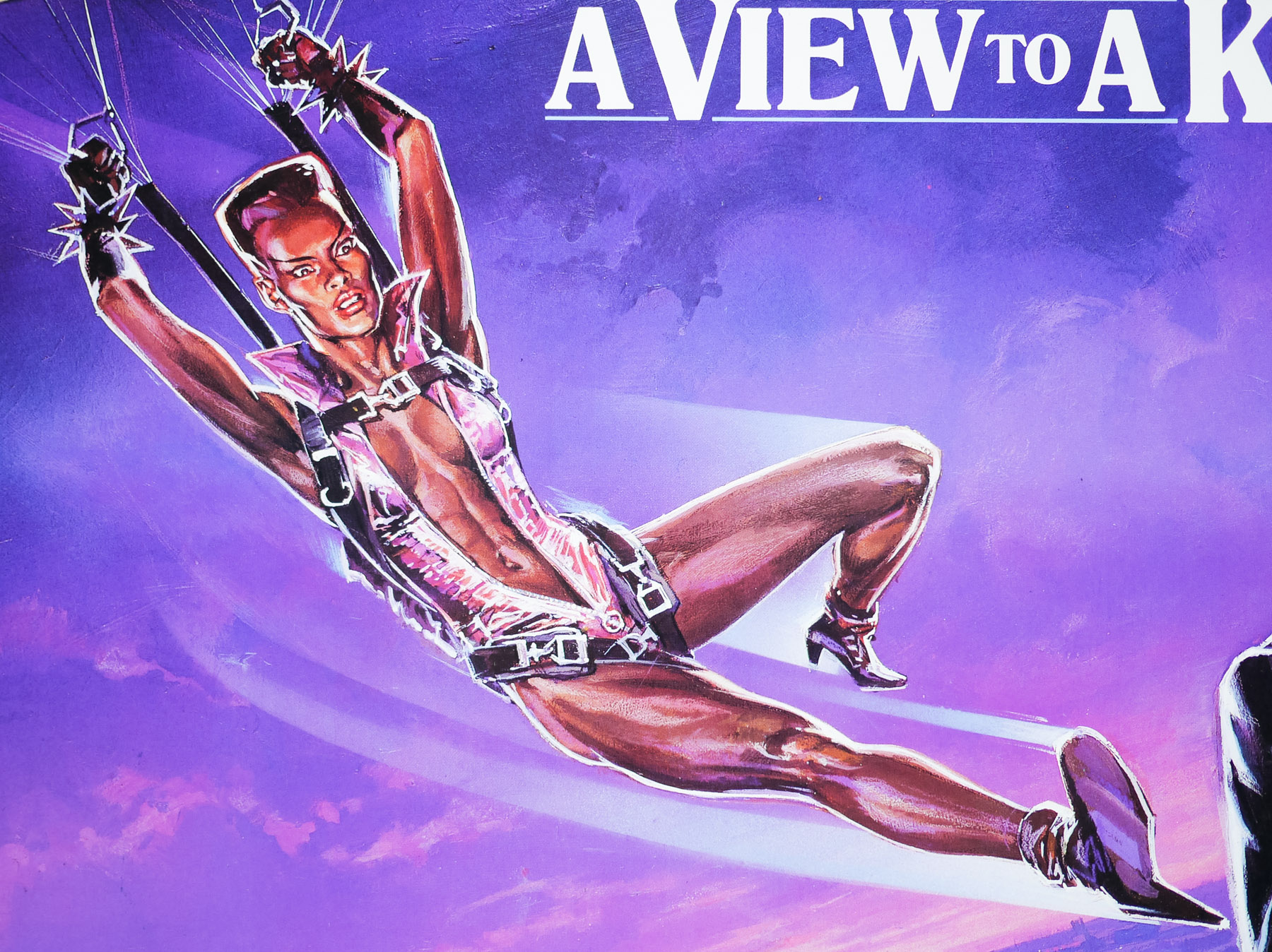
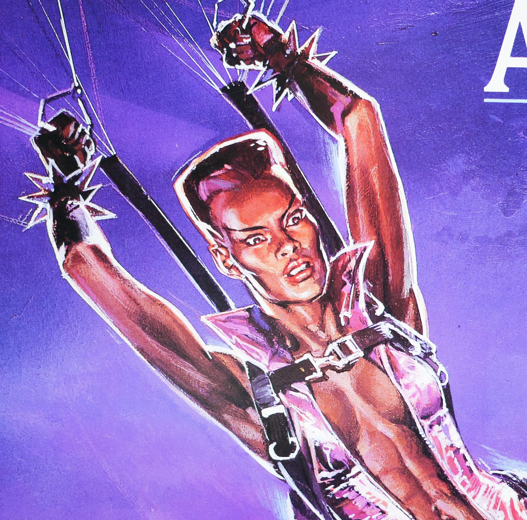
Some weeks later I asked for the return of my painting only to be told, ‘it could not be found’. Obviously, a light-fingered person took a fancy to it. Much of my work has been lost to me in that way, including my teaser art for A View to a Kill. Presently I am engaged in monitoring Film Memorabilia auction sales in order to reclaim art being offered for sale that legally belongs to me. I am glad to have been successful in recovering quite a number of paintings. One case involving poster art I did for 20th. Century Fox is still ongoing as I speak.
Note that the article also features an image of the original artwork that has differences in the layout and details in comparison to this final quad.