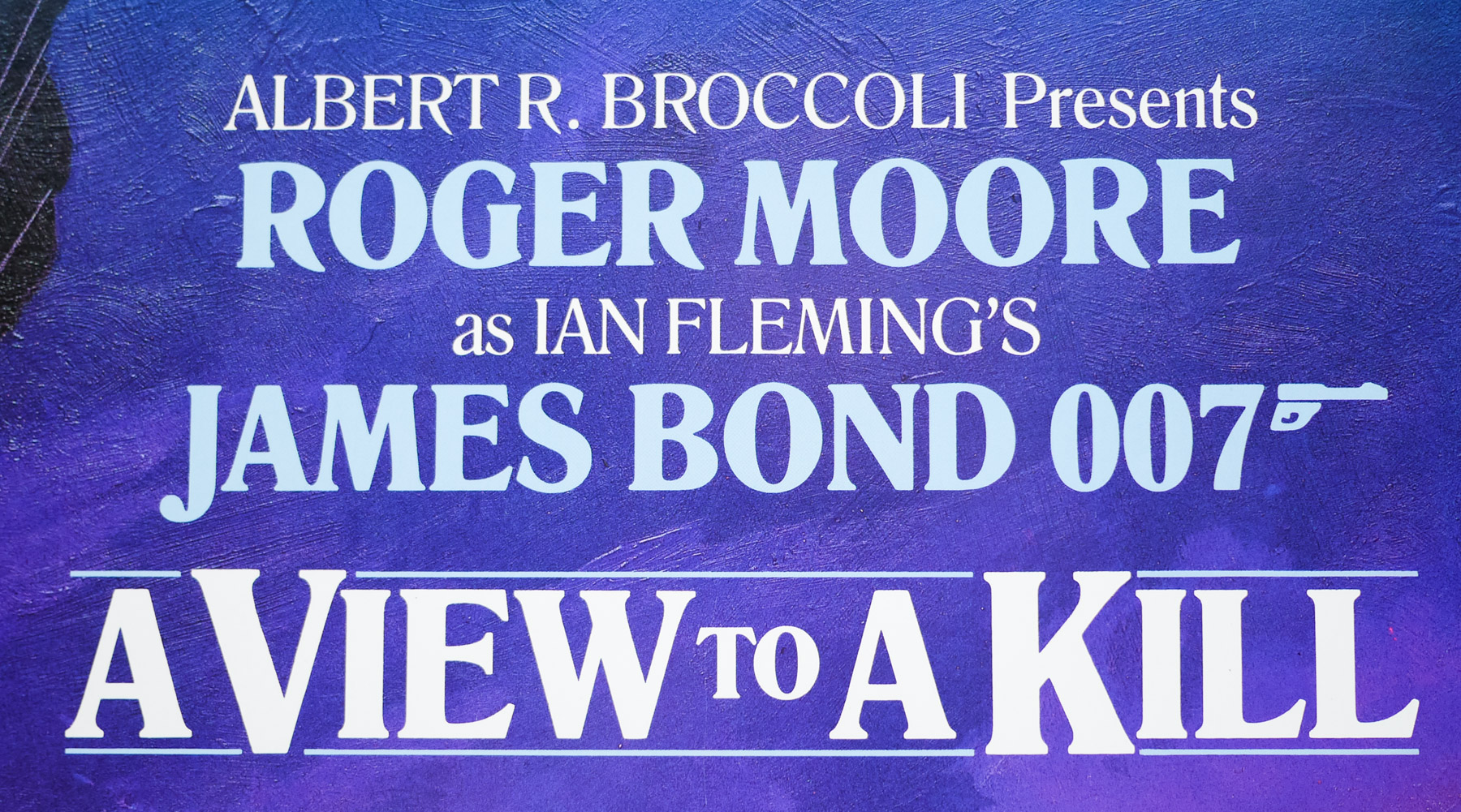
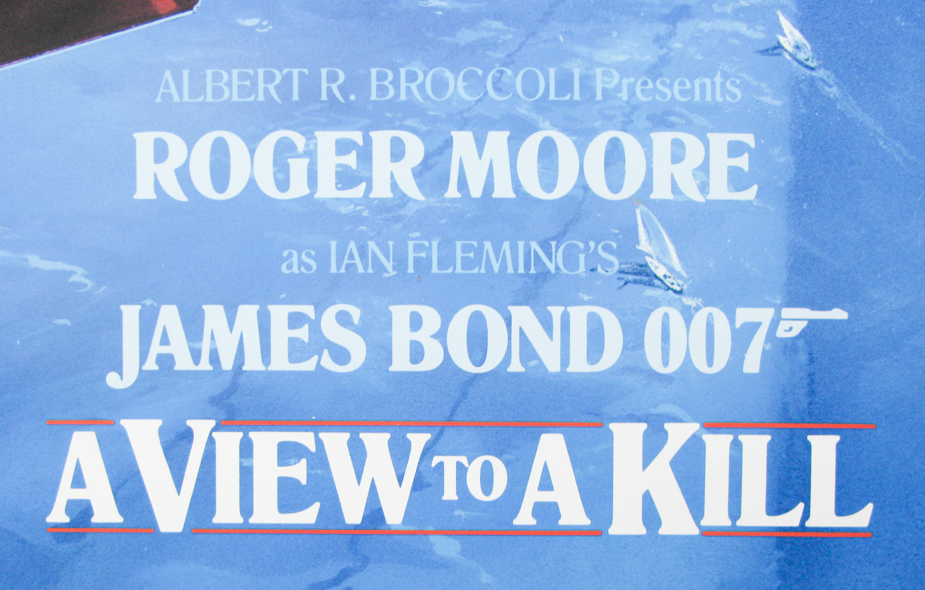
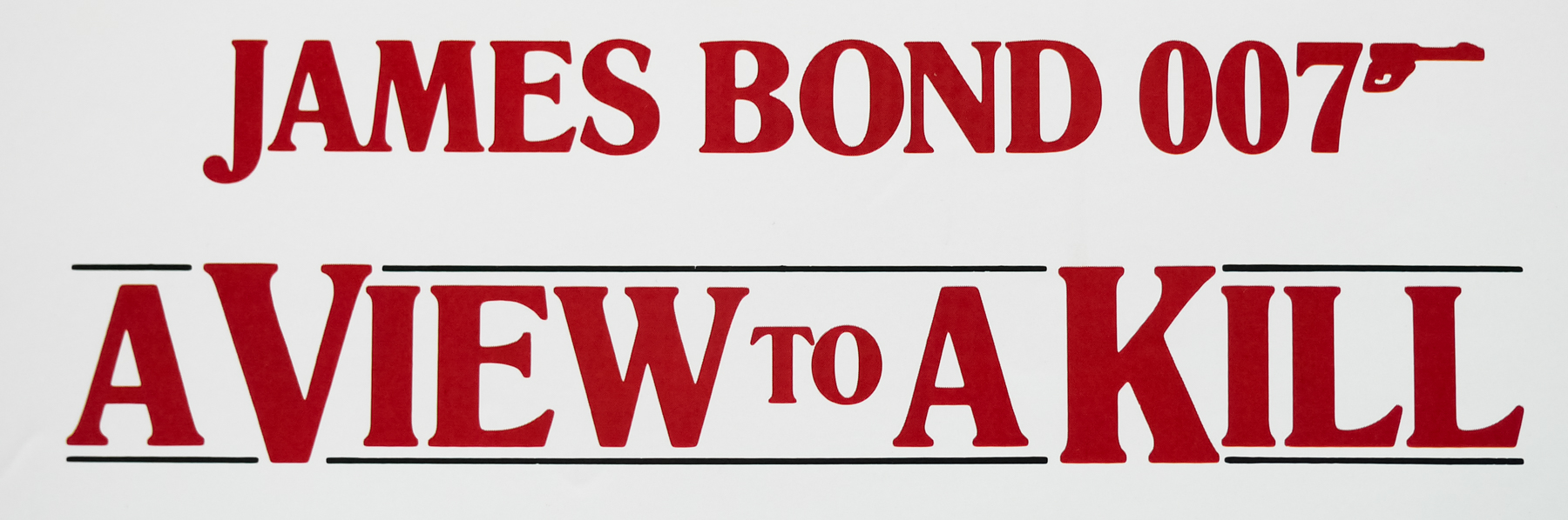
- Title
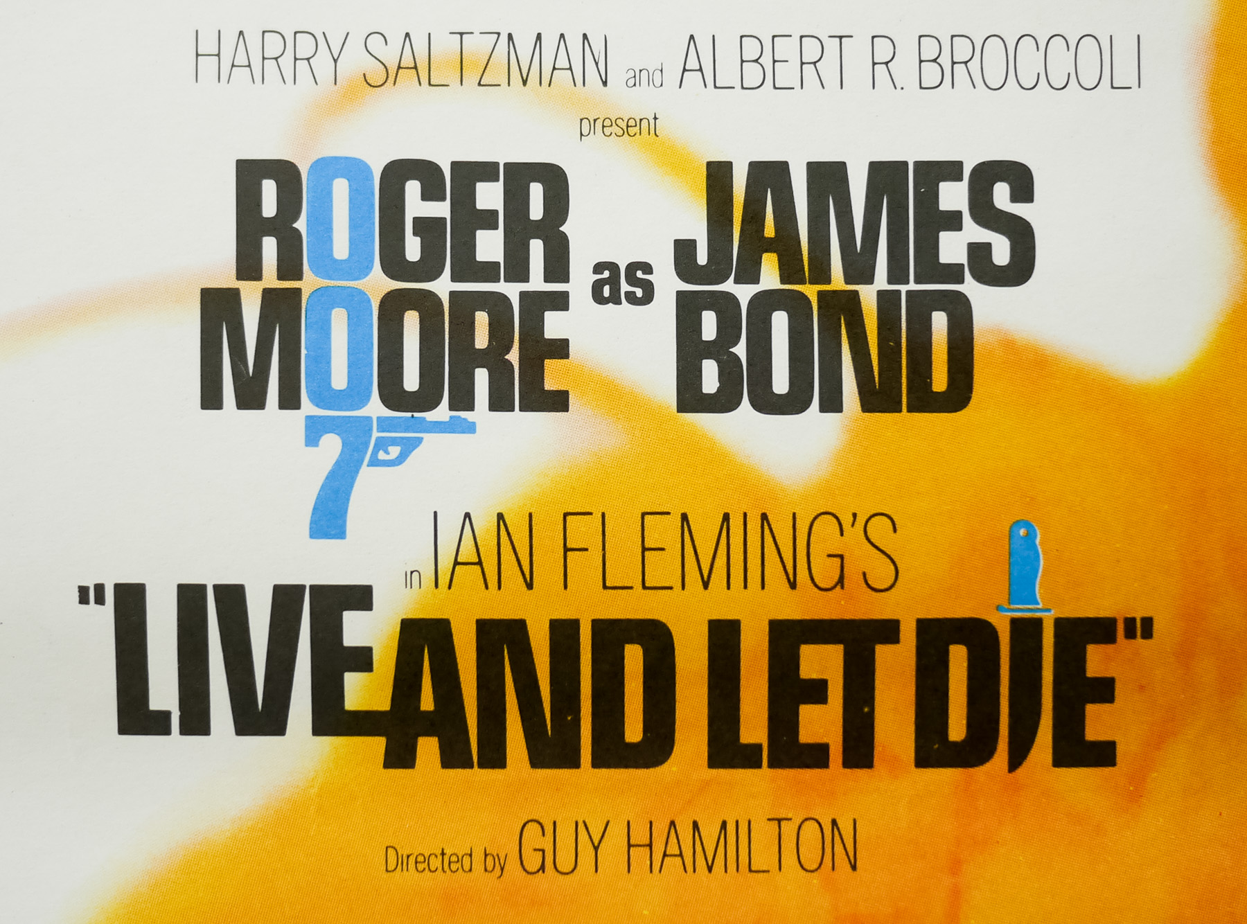
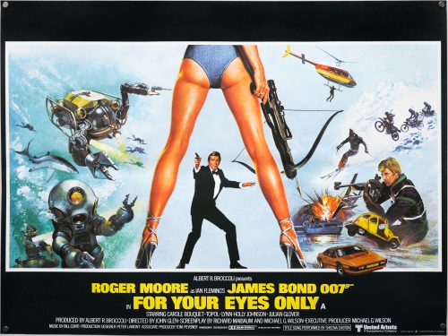
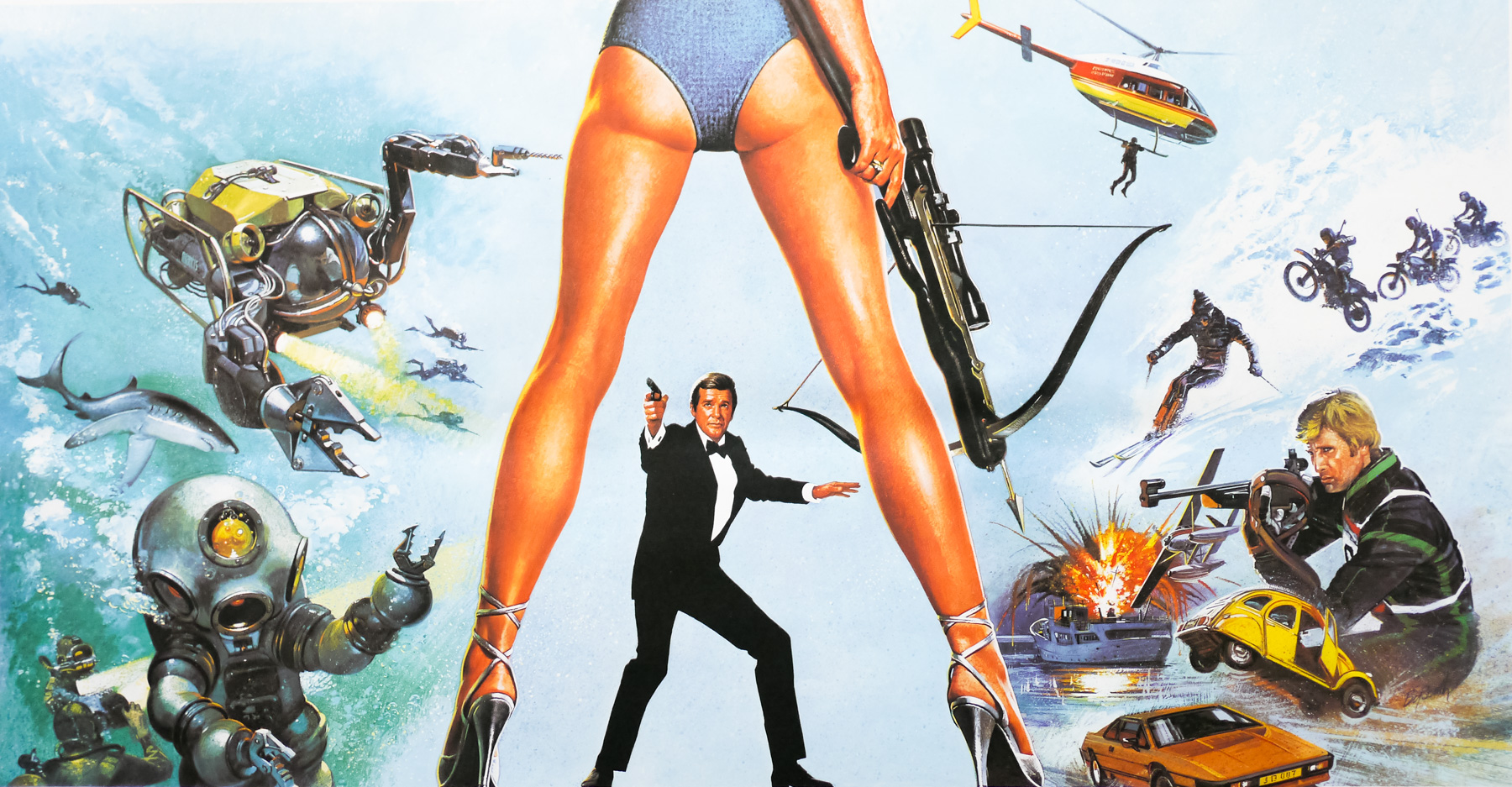
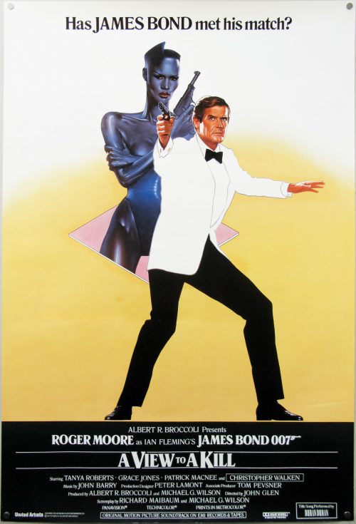
- A View To A Kill
- AKA
- The Beautiful Prey (Japan - English title)
- Year of Film
- 1985
- Director
- John Glen
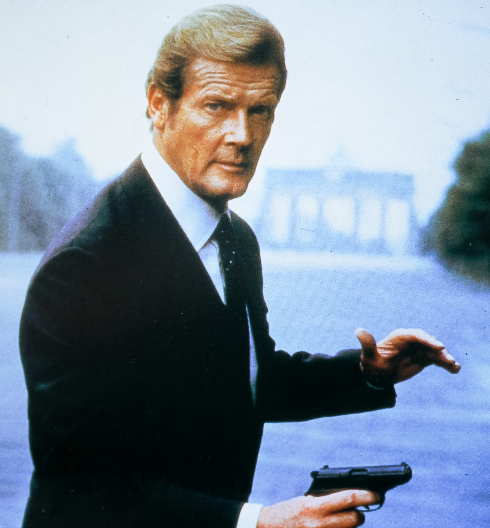
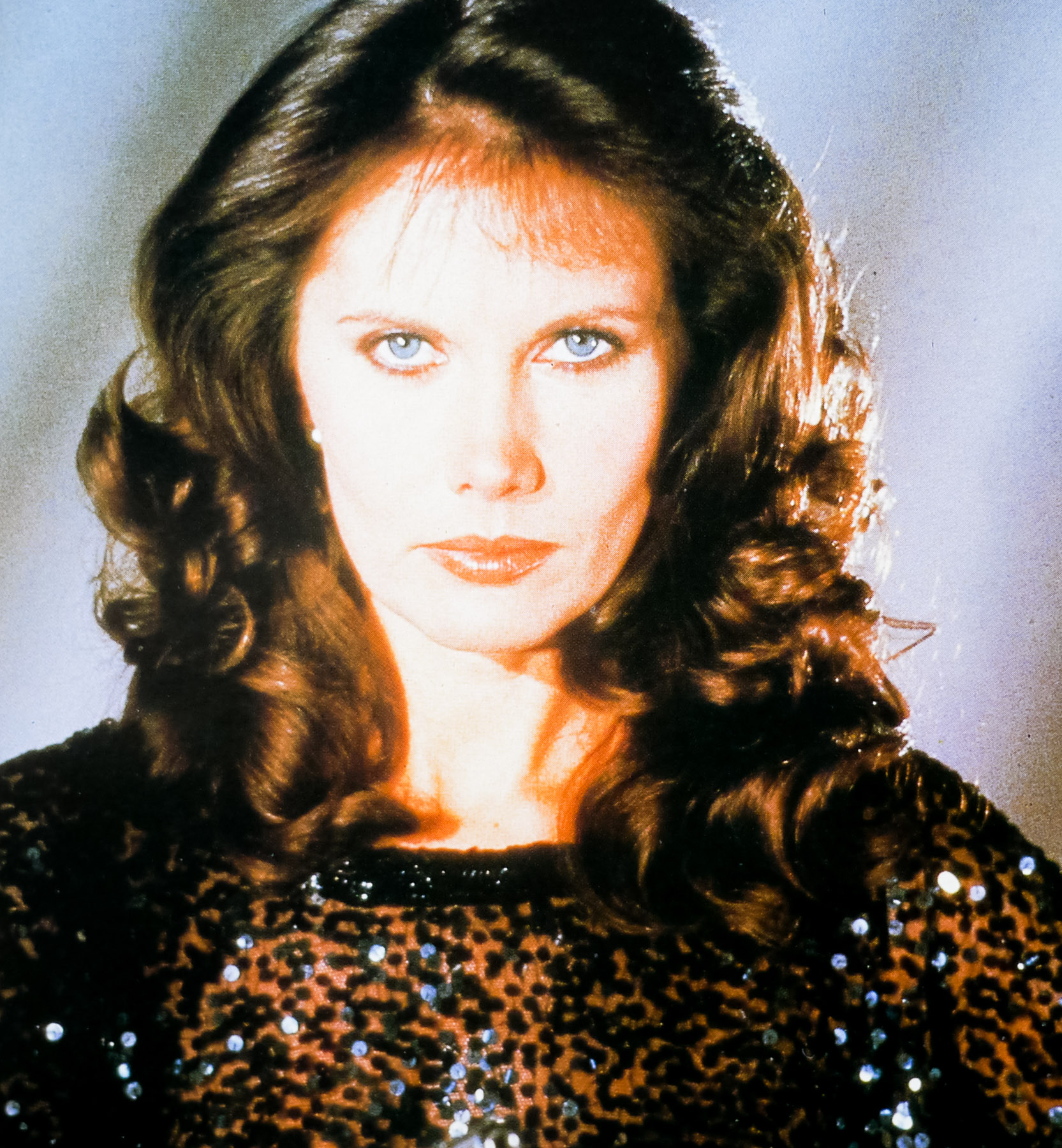
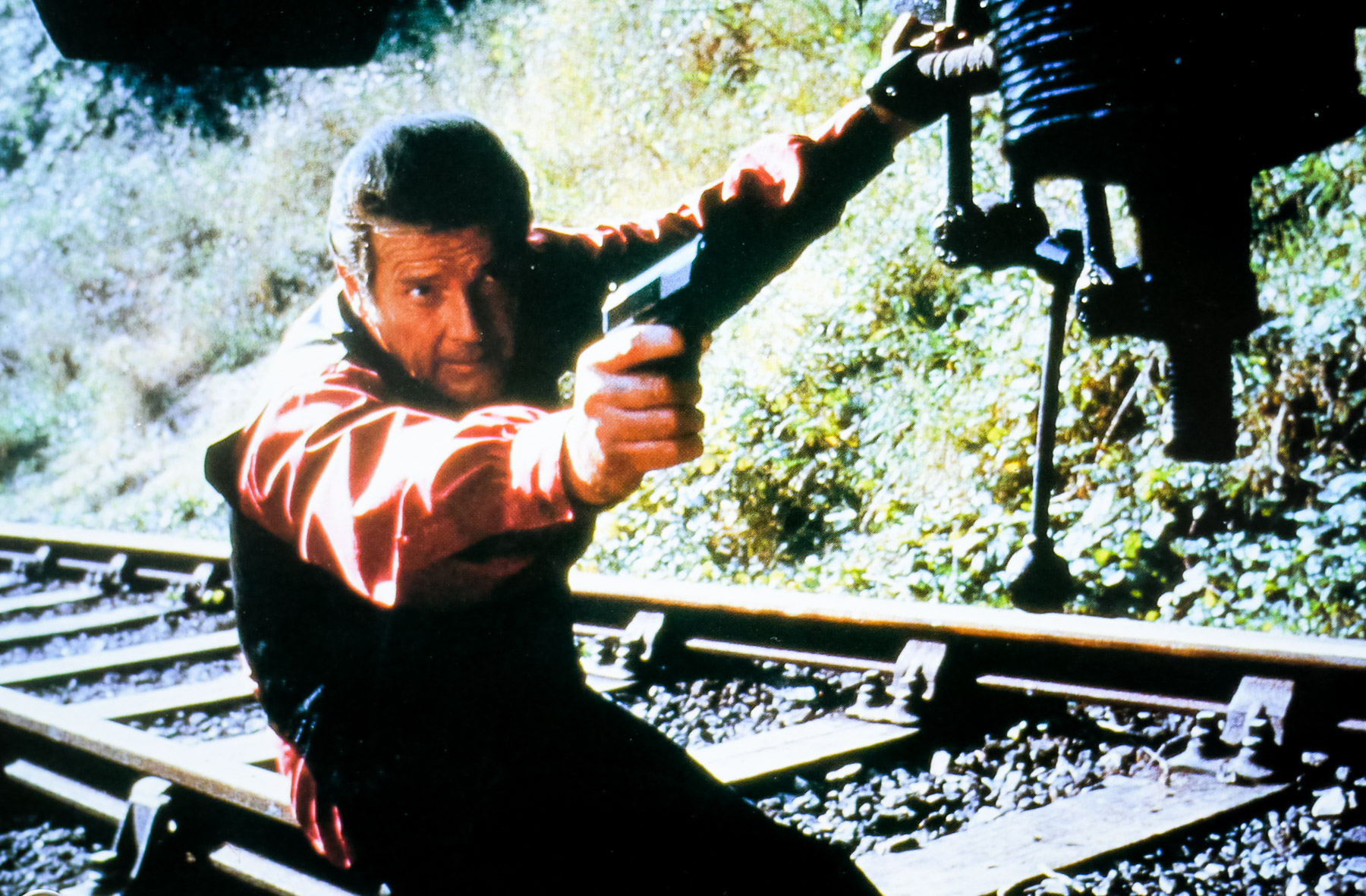
- Starring
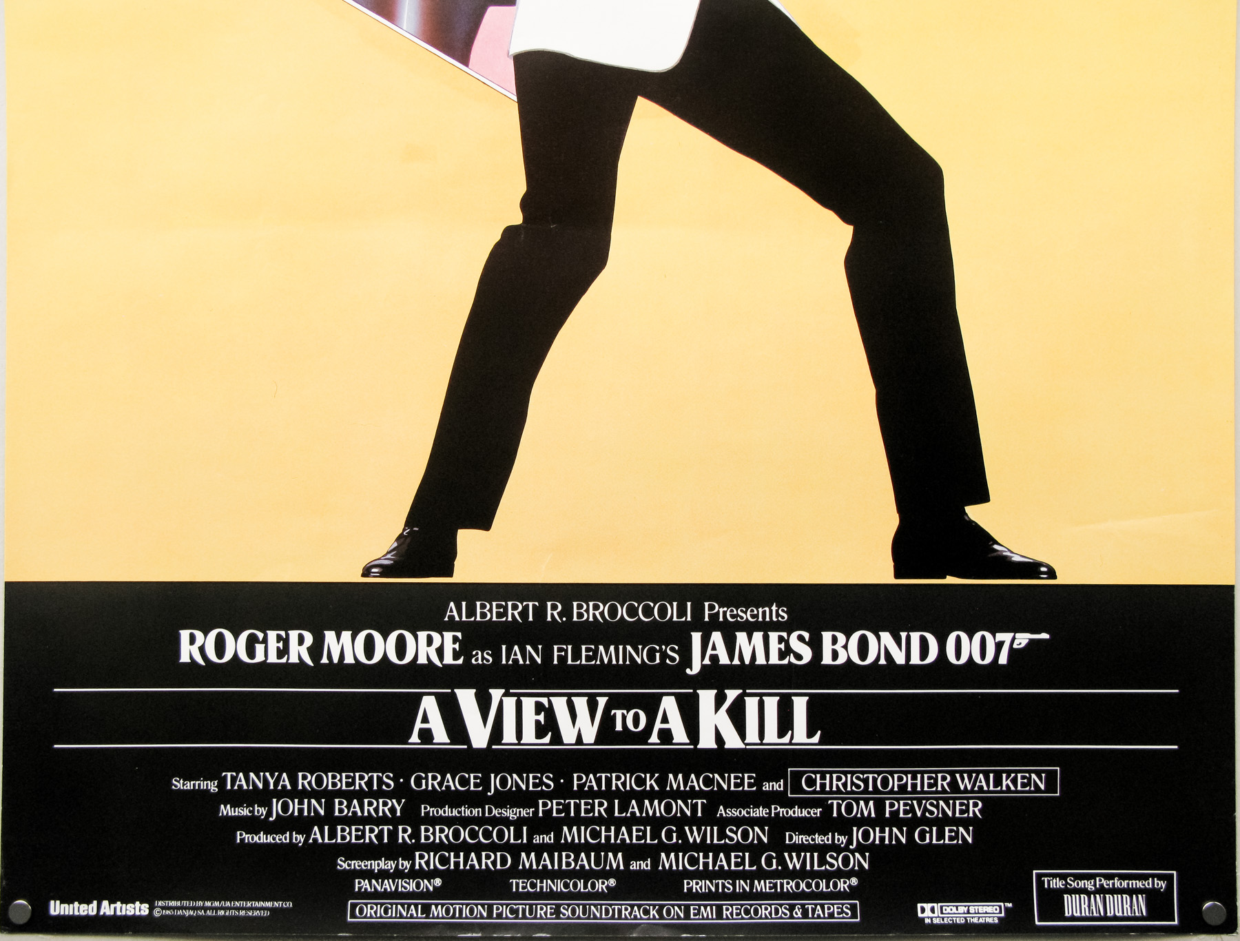
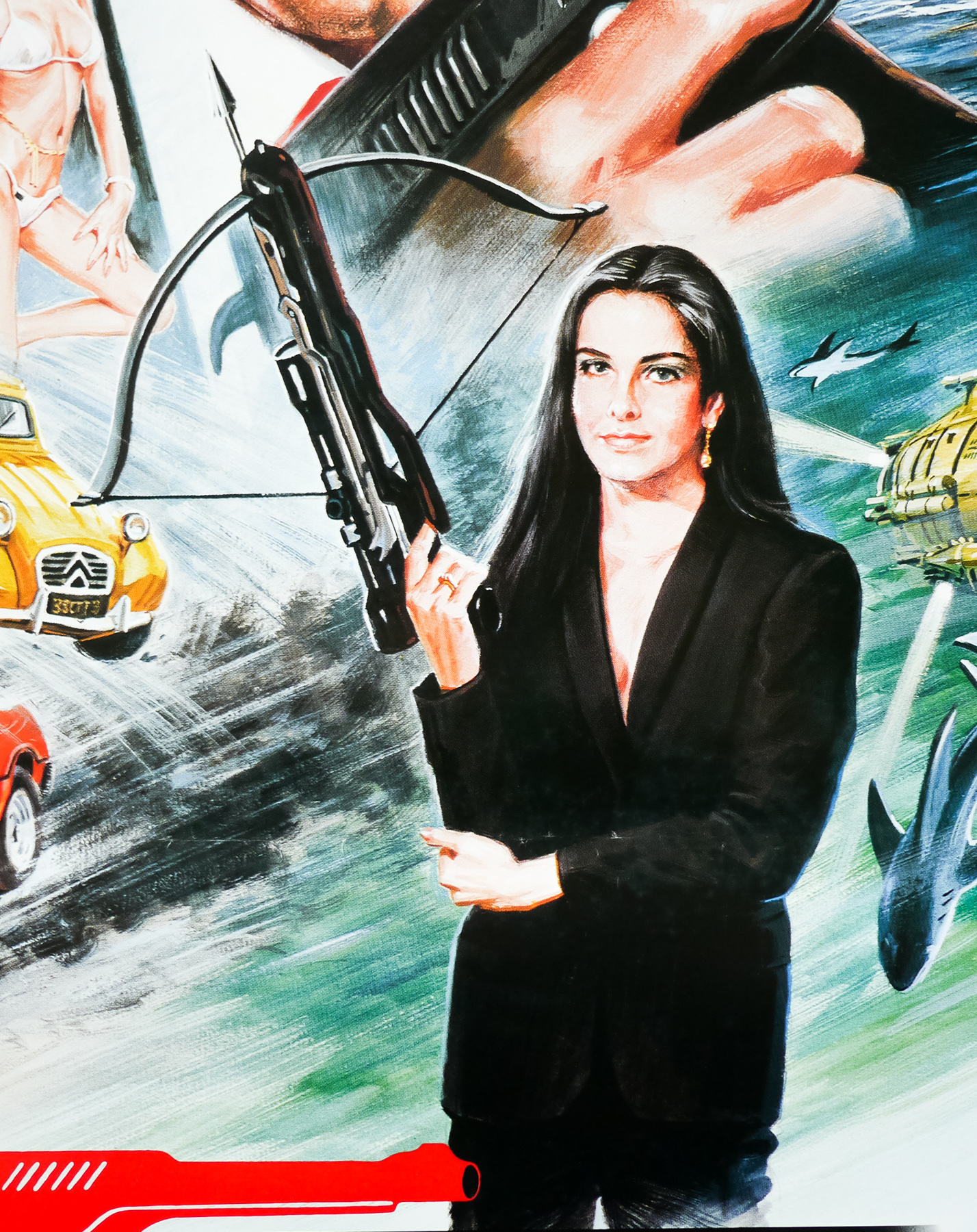
- Roger Moore, Christopher Walken, Tanya Roberts, Grace Jones, Patrick Macnee, Patrick Bauchau, David Yip, Fiona Fullerton, Manning Redwood, Alison Doody, Willoughby Gray, Desmond Llewelyn, Robert Brown, Lois Maxwell
- Origin of Film
- UK
- Genre(s) of Film
- Roger Moore, Christopher Walken, Tanya Roberts, Grace Jones, Patrick Macnee, Patrick Bauchau, David Yip, Fiona Fullerton, Manning Redwood, Alison Doody, Willoughby Gray, Desmond Llewelyn, Robert Brown, Lois Maxwell,
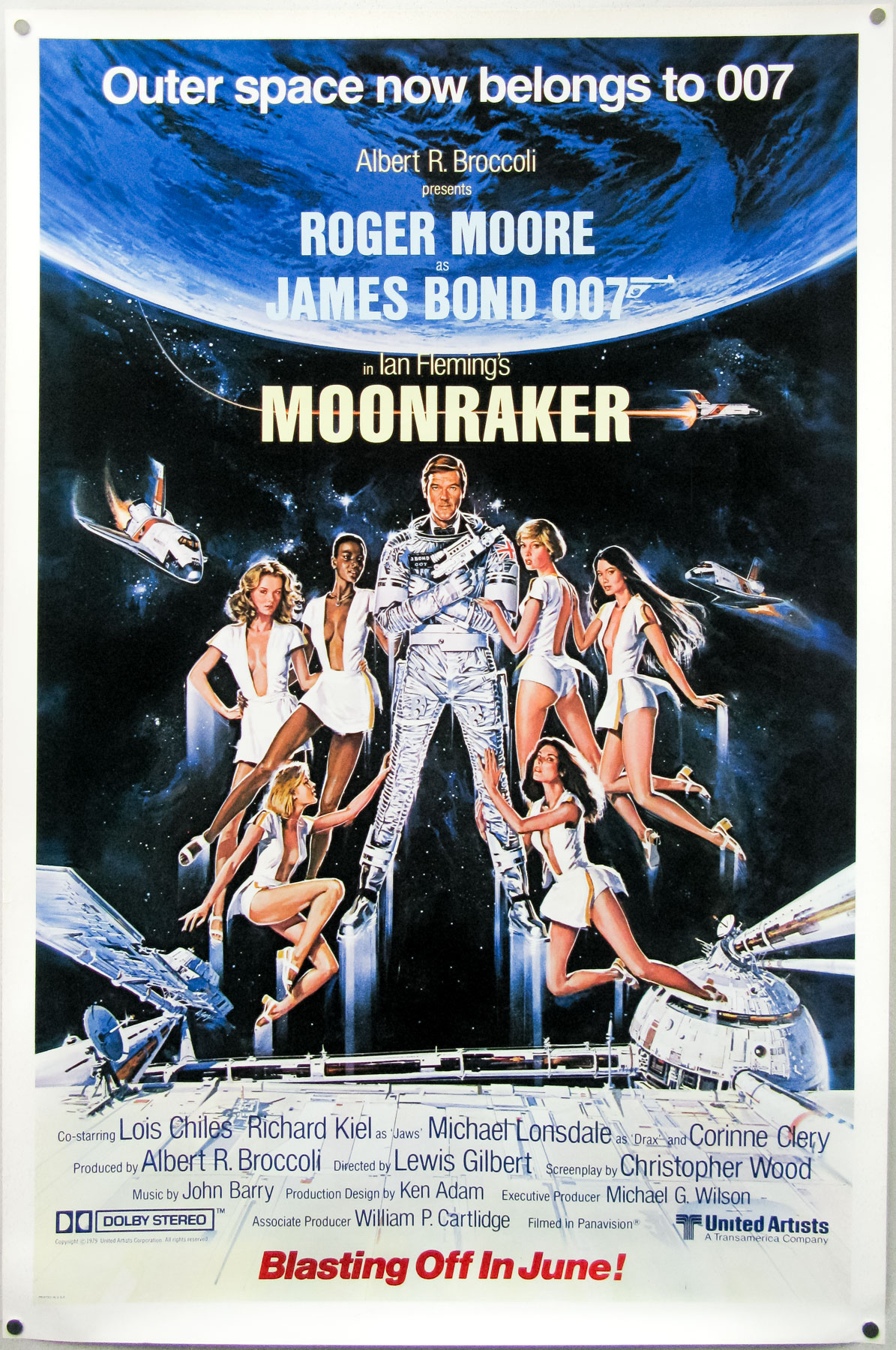
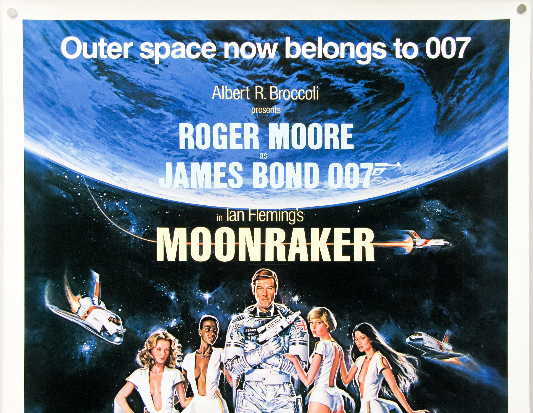
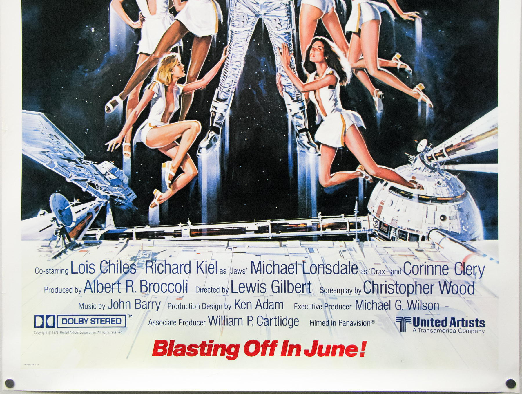
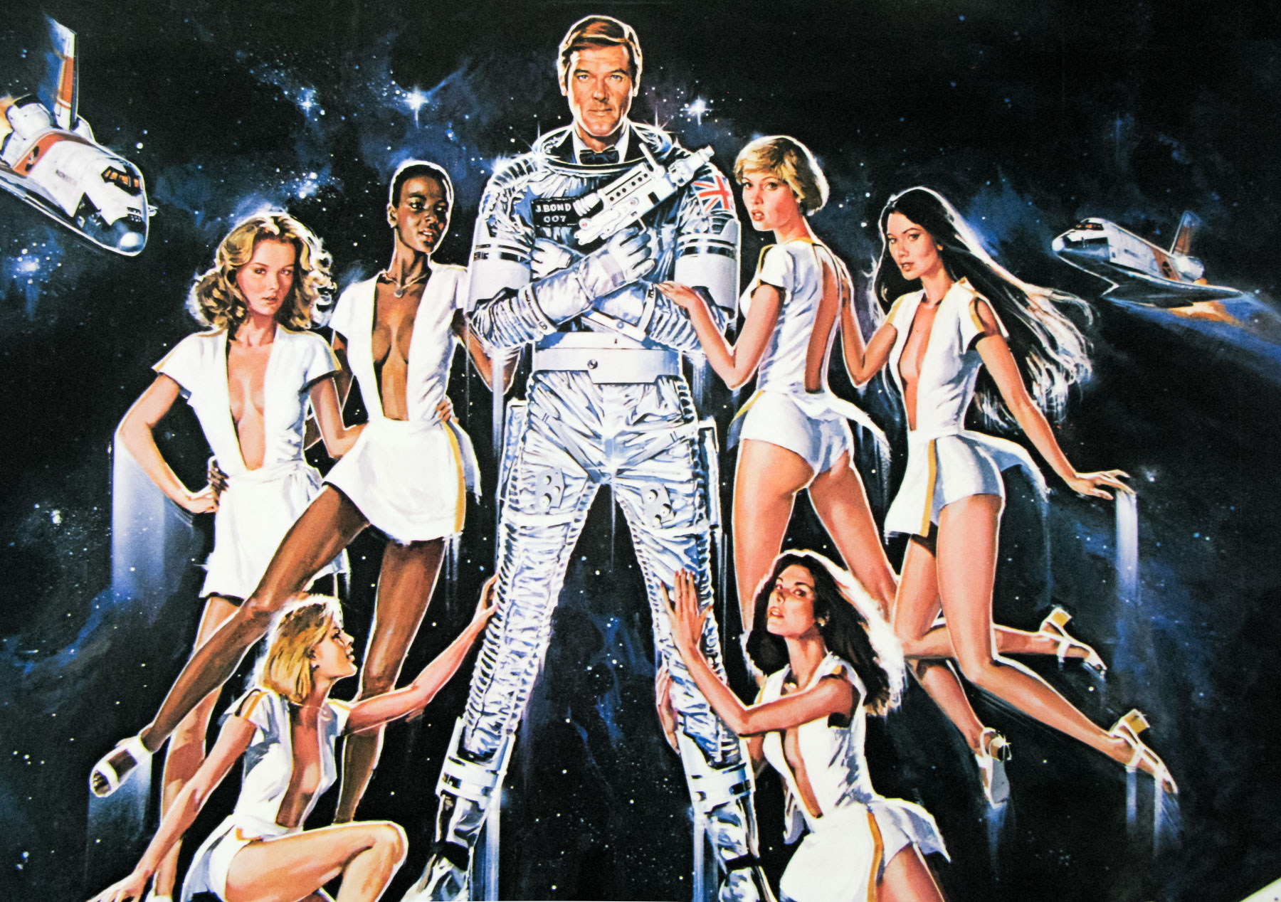
- Type of Poster
- One sheet
- Style of Poster
- recalled
- Origin of Poster
- UK
- Year of Poster
- 1985
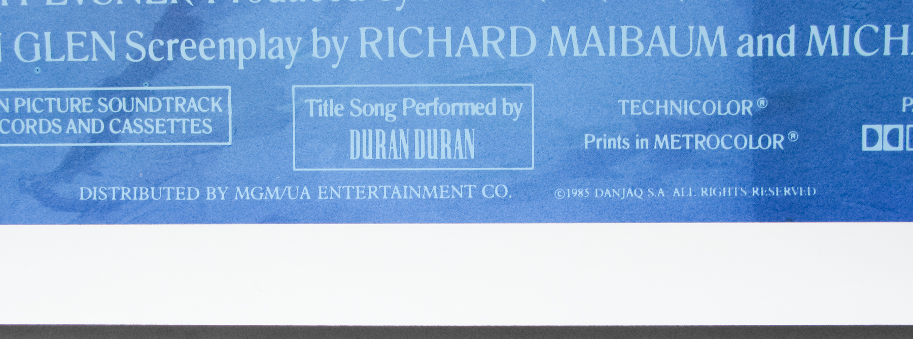
- Designer
- Vic Fair
- Artist
- Brian Bysouth
- Size (inches)
- 27" x 40"
- SS or DS
- SS
- NSS #
- --
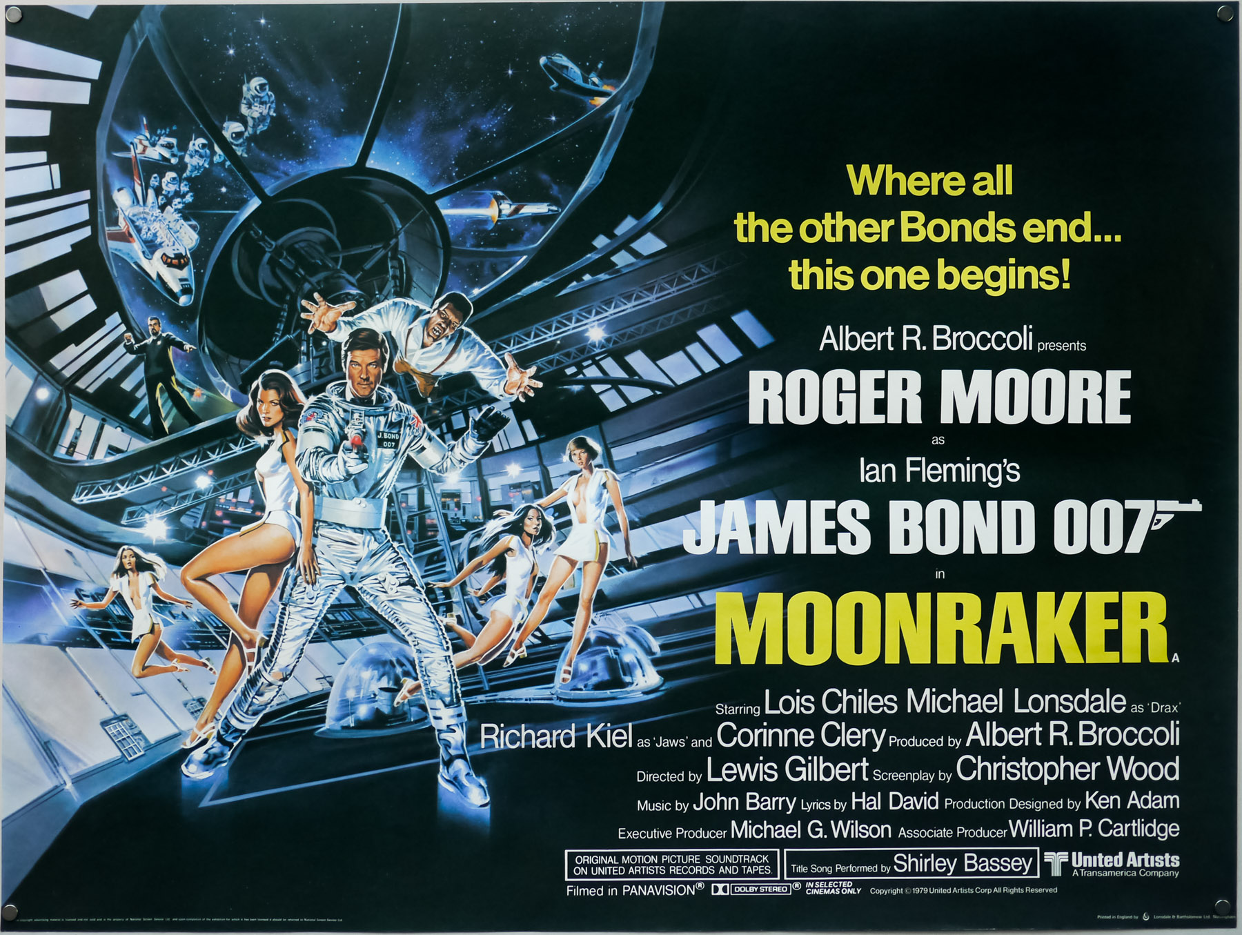
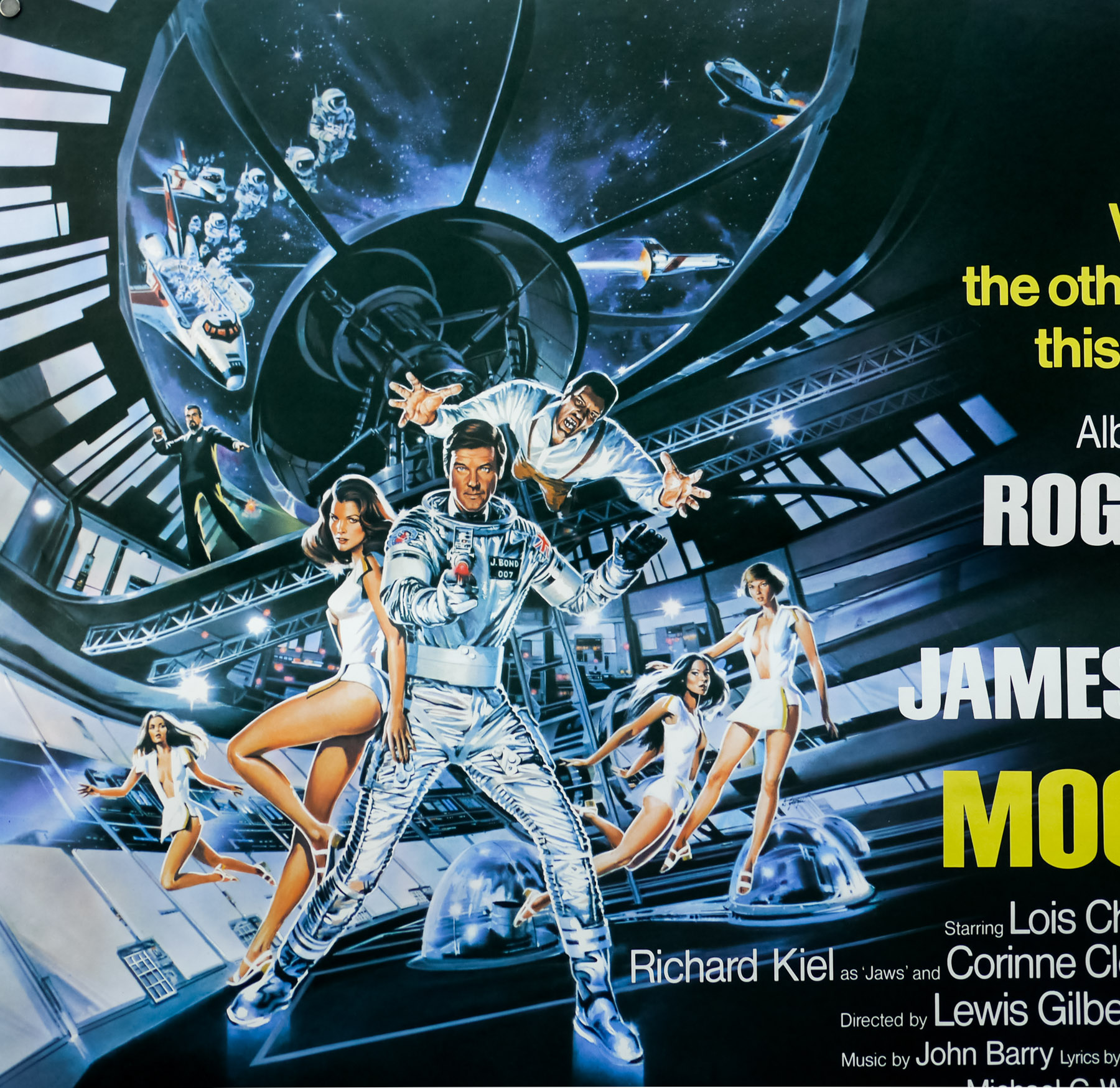
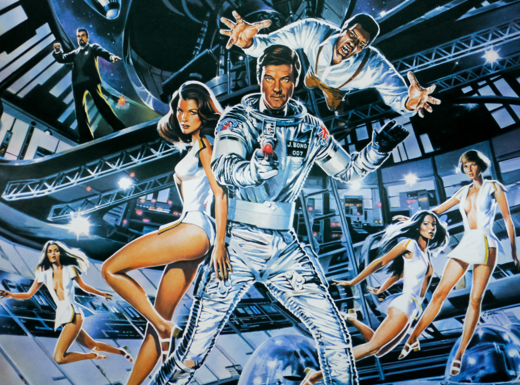
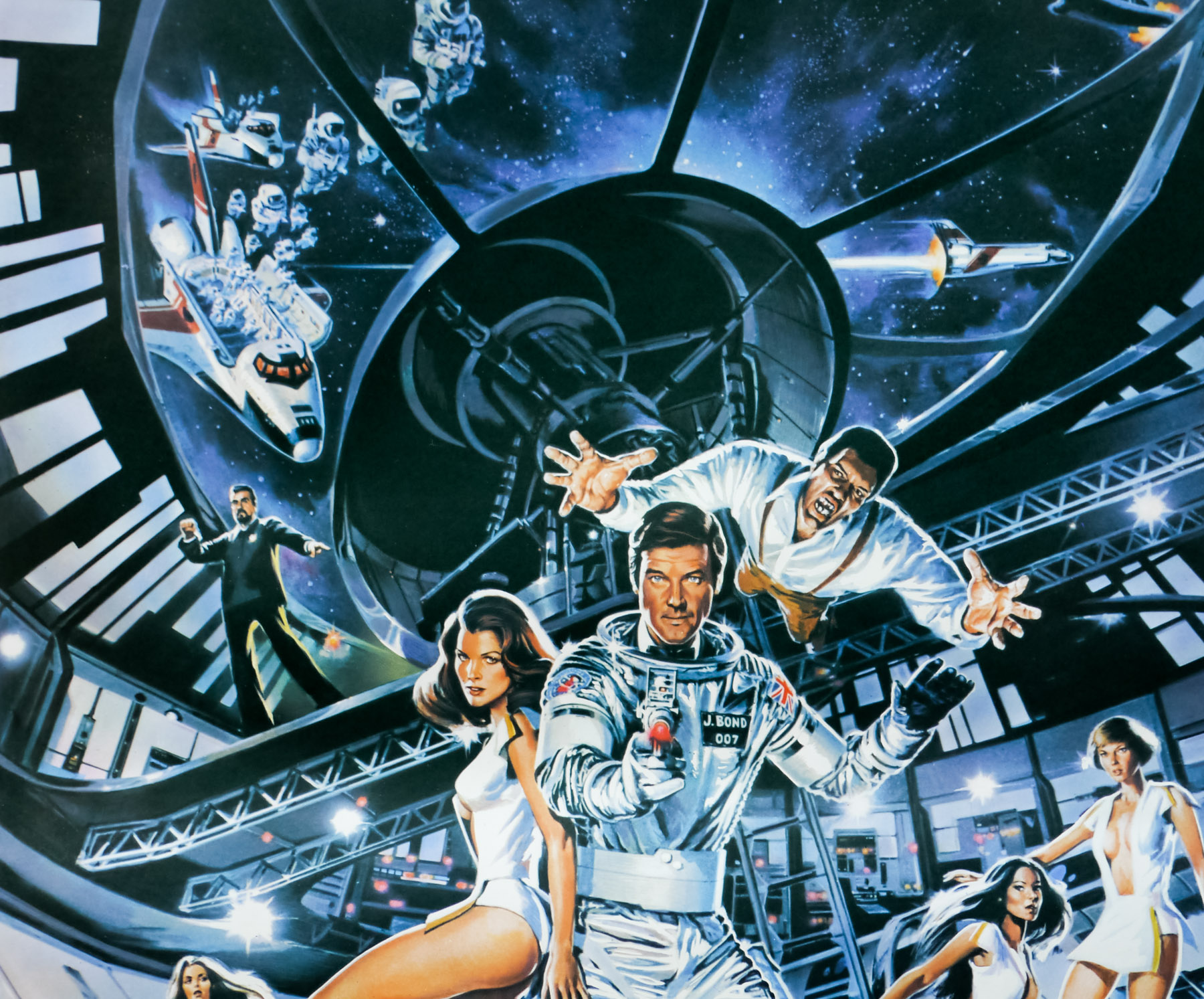
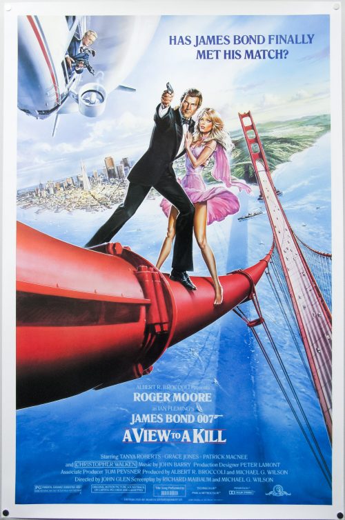
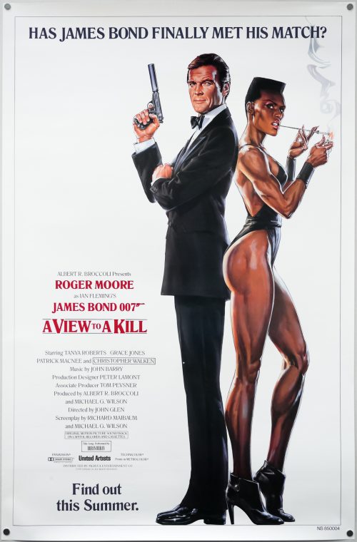
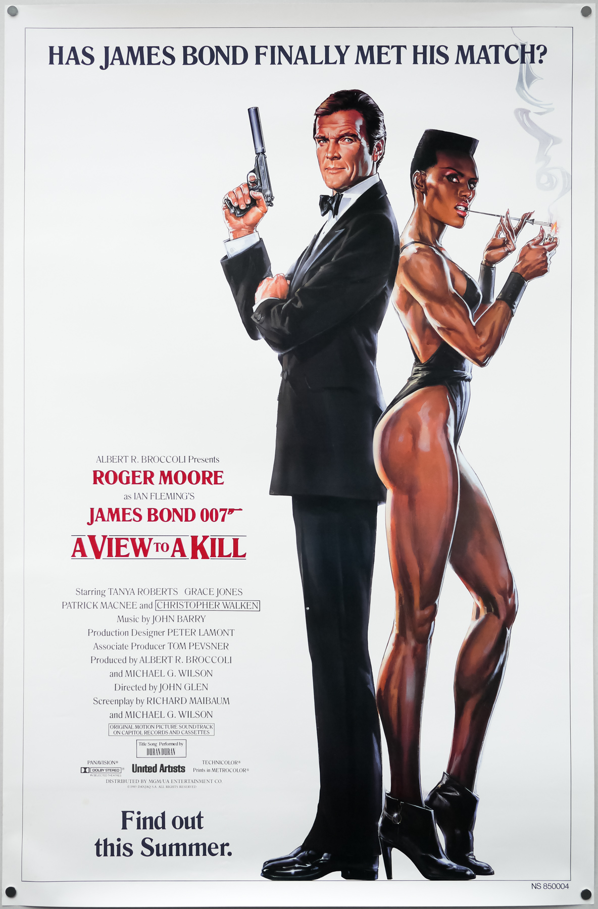
- Tagline
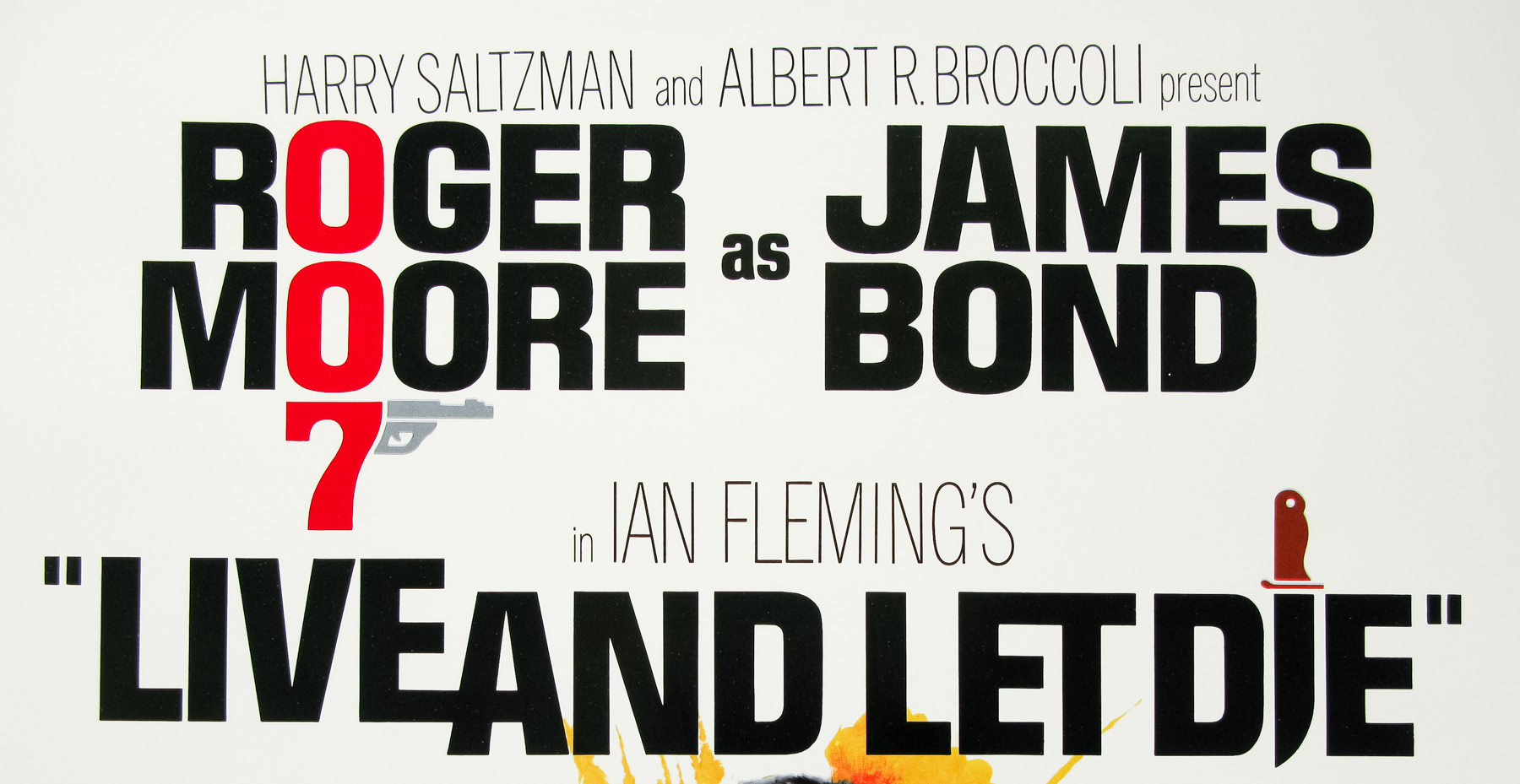
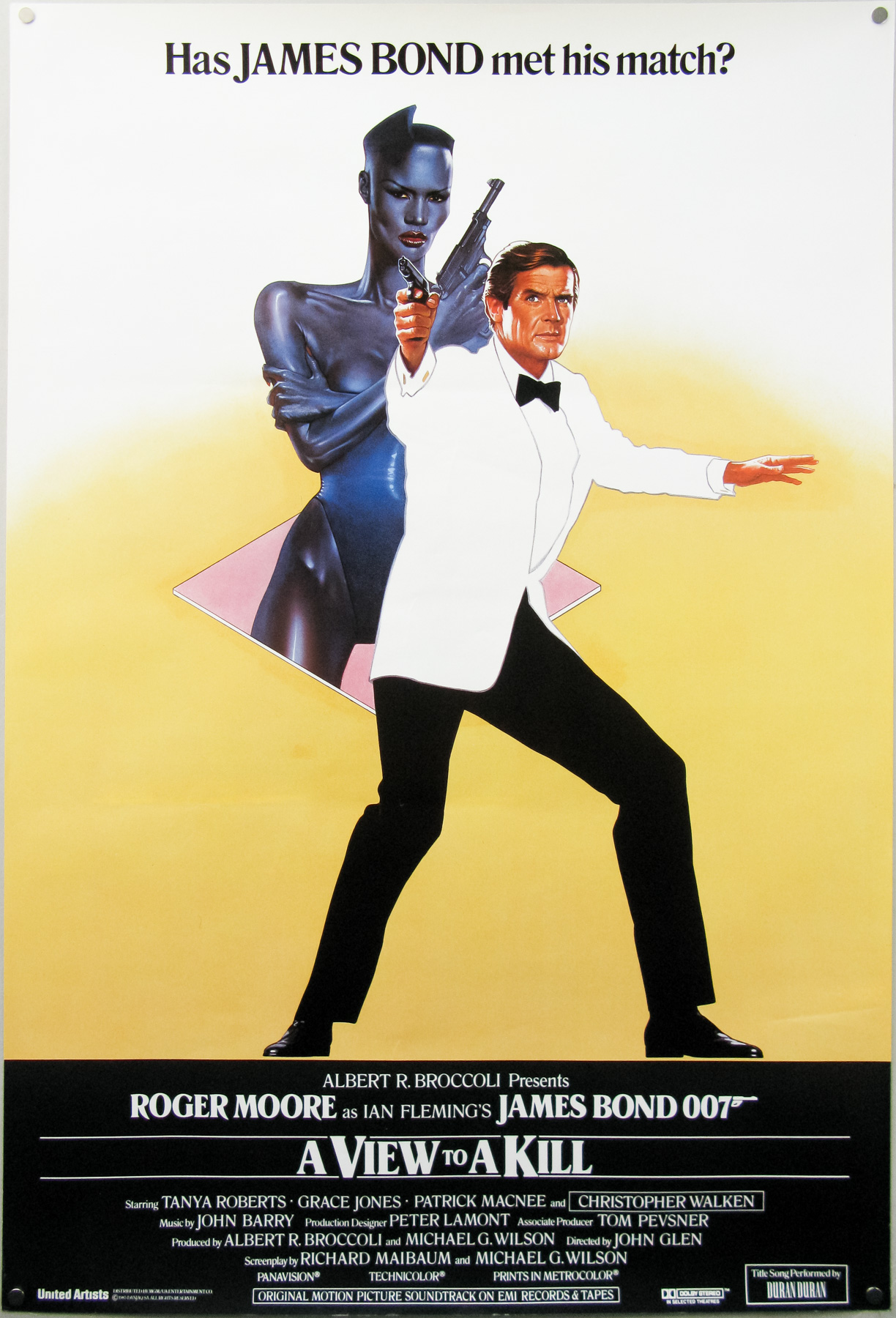
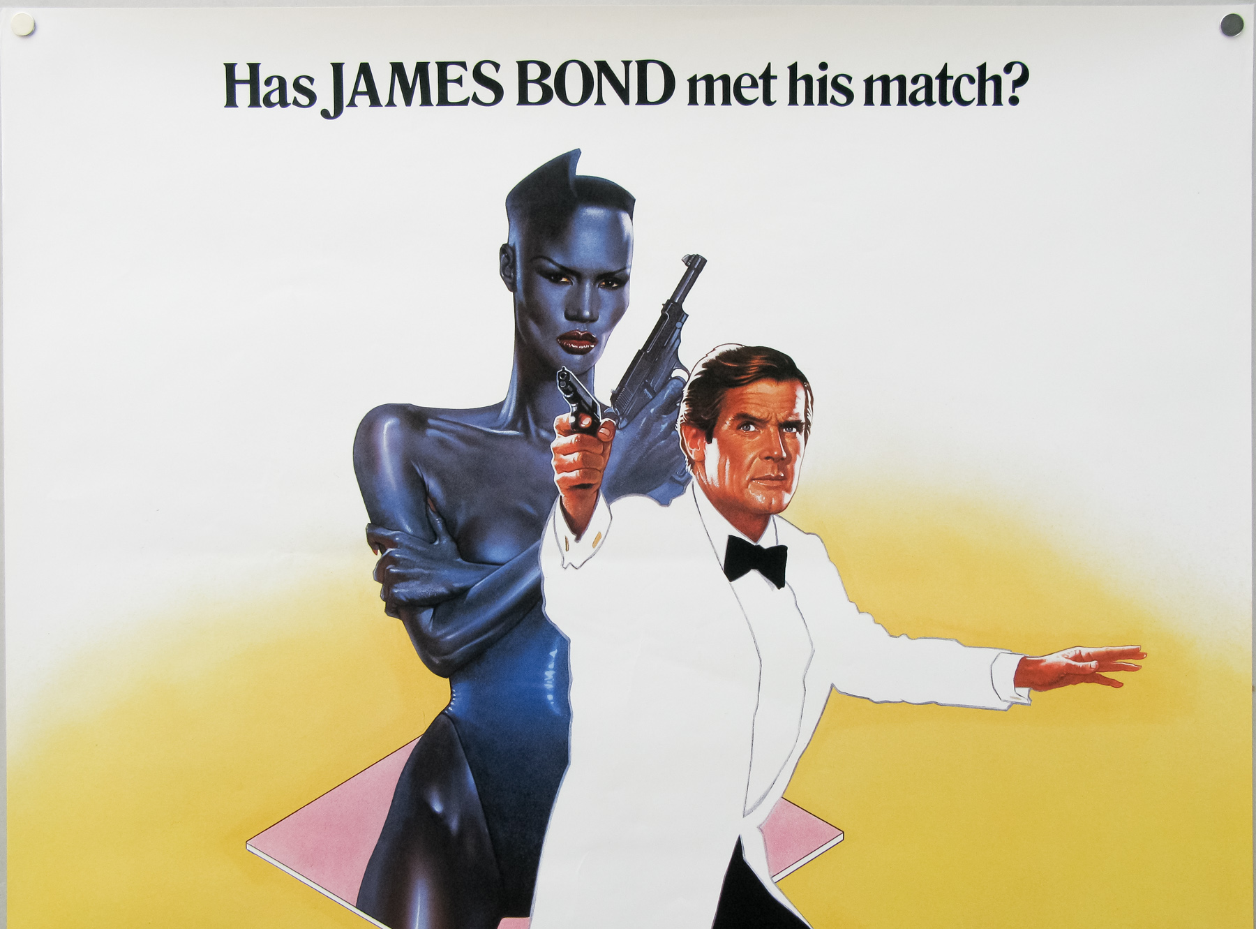
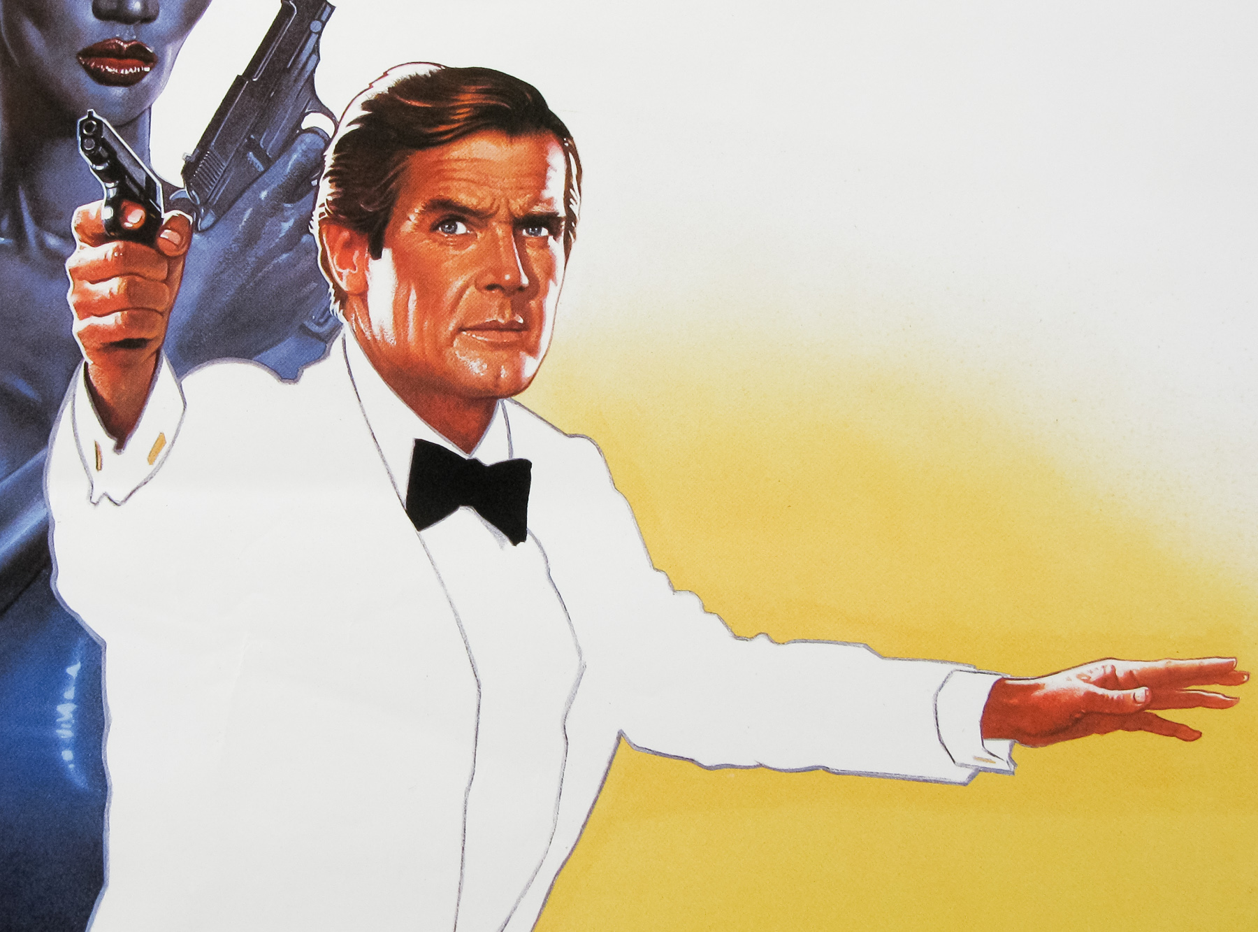
- Has JAMES BOND met his match?
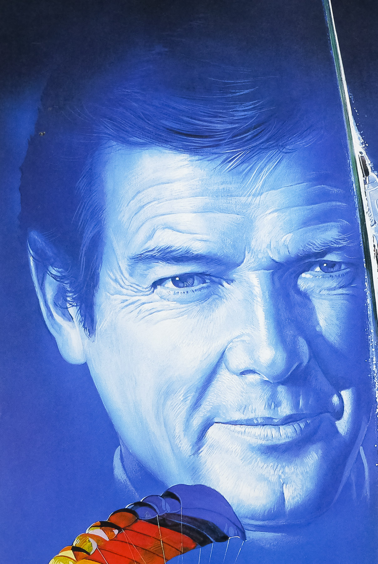
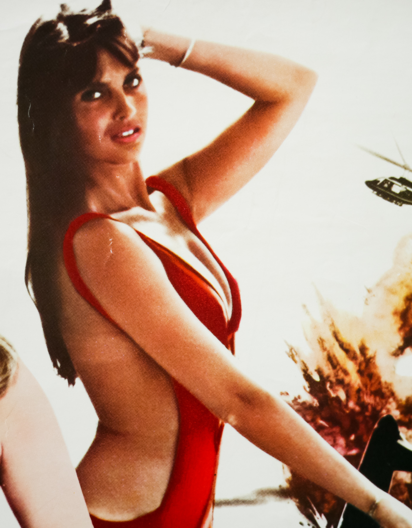
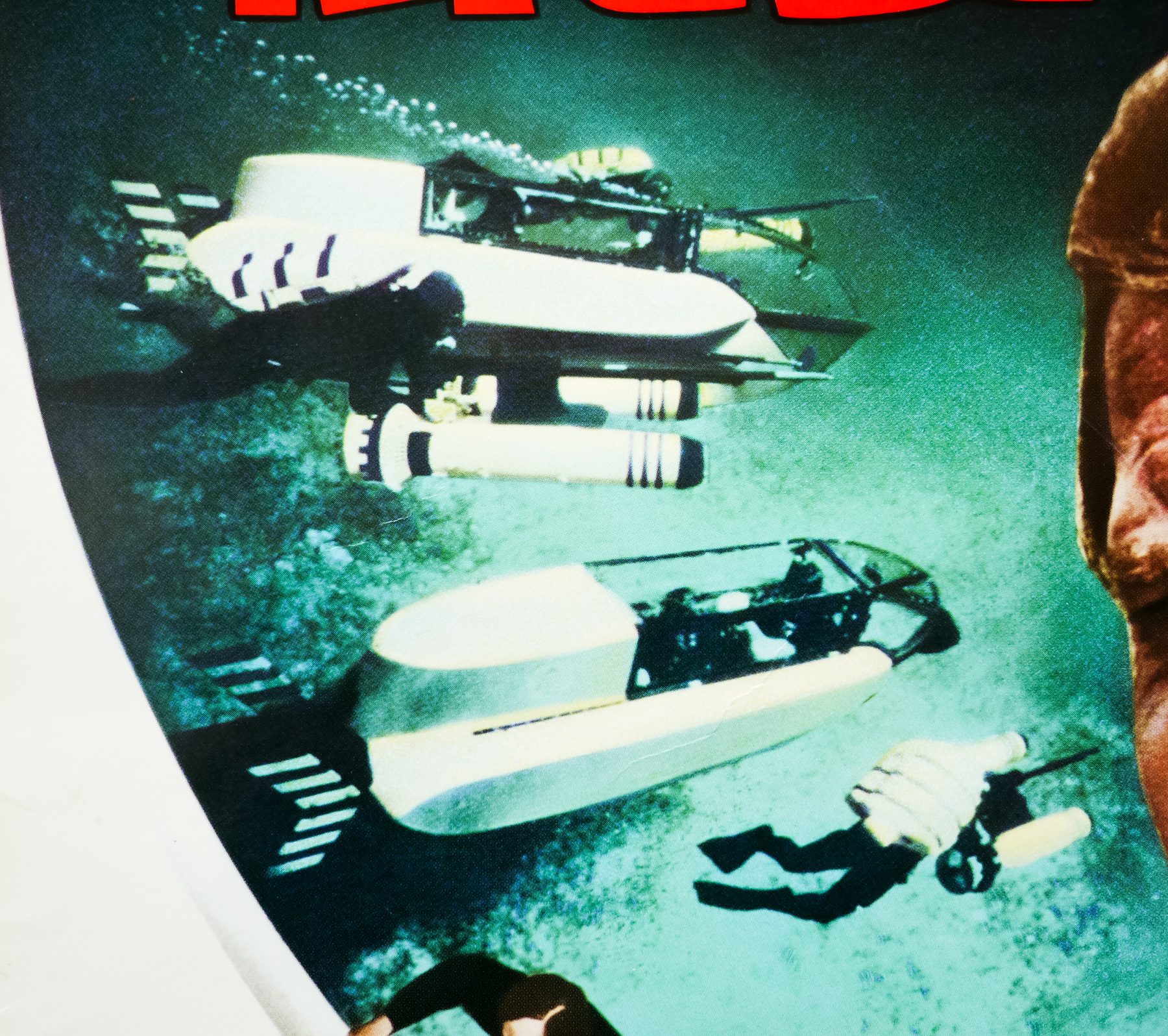
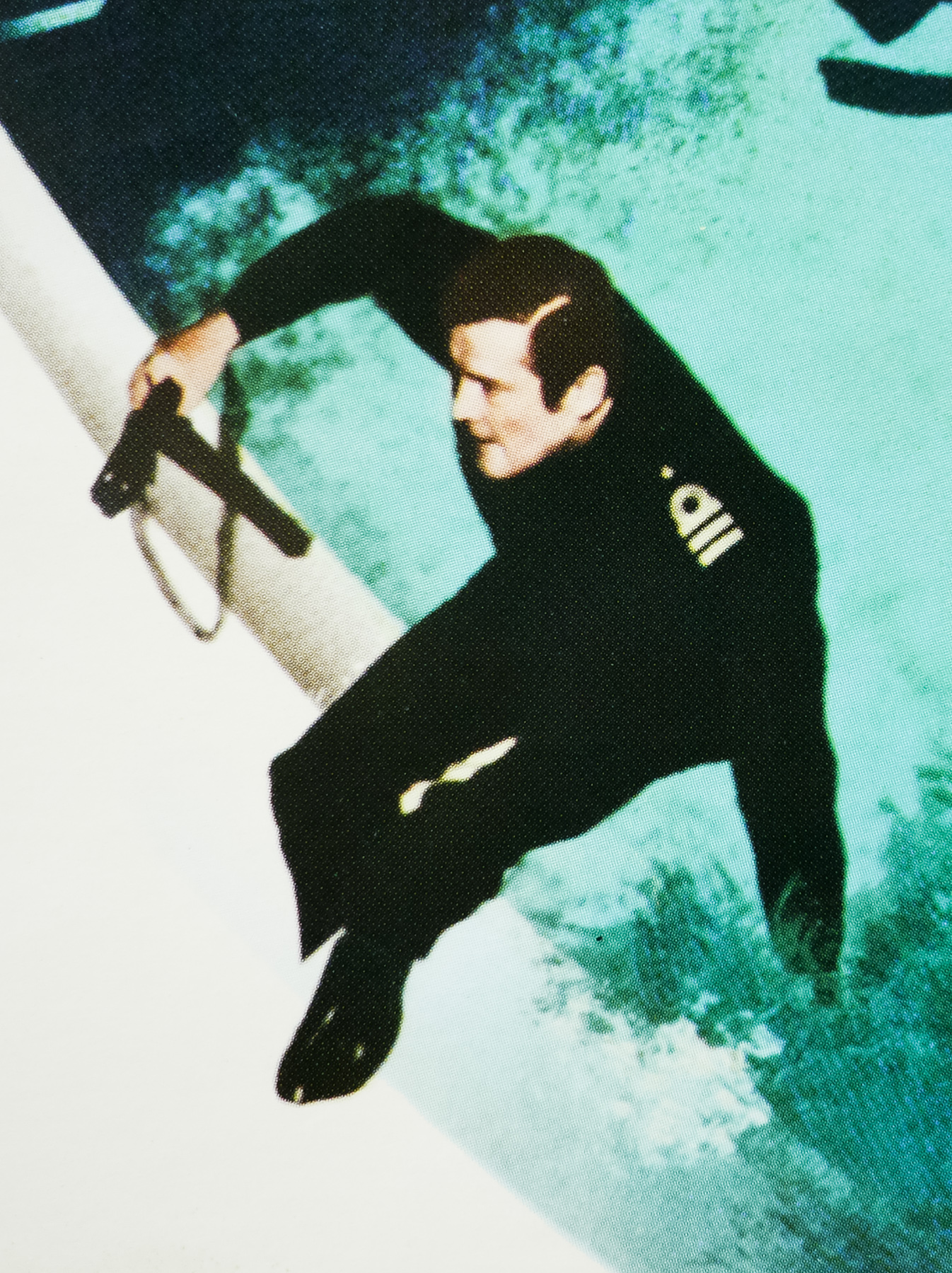
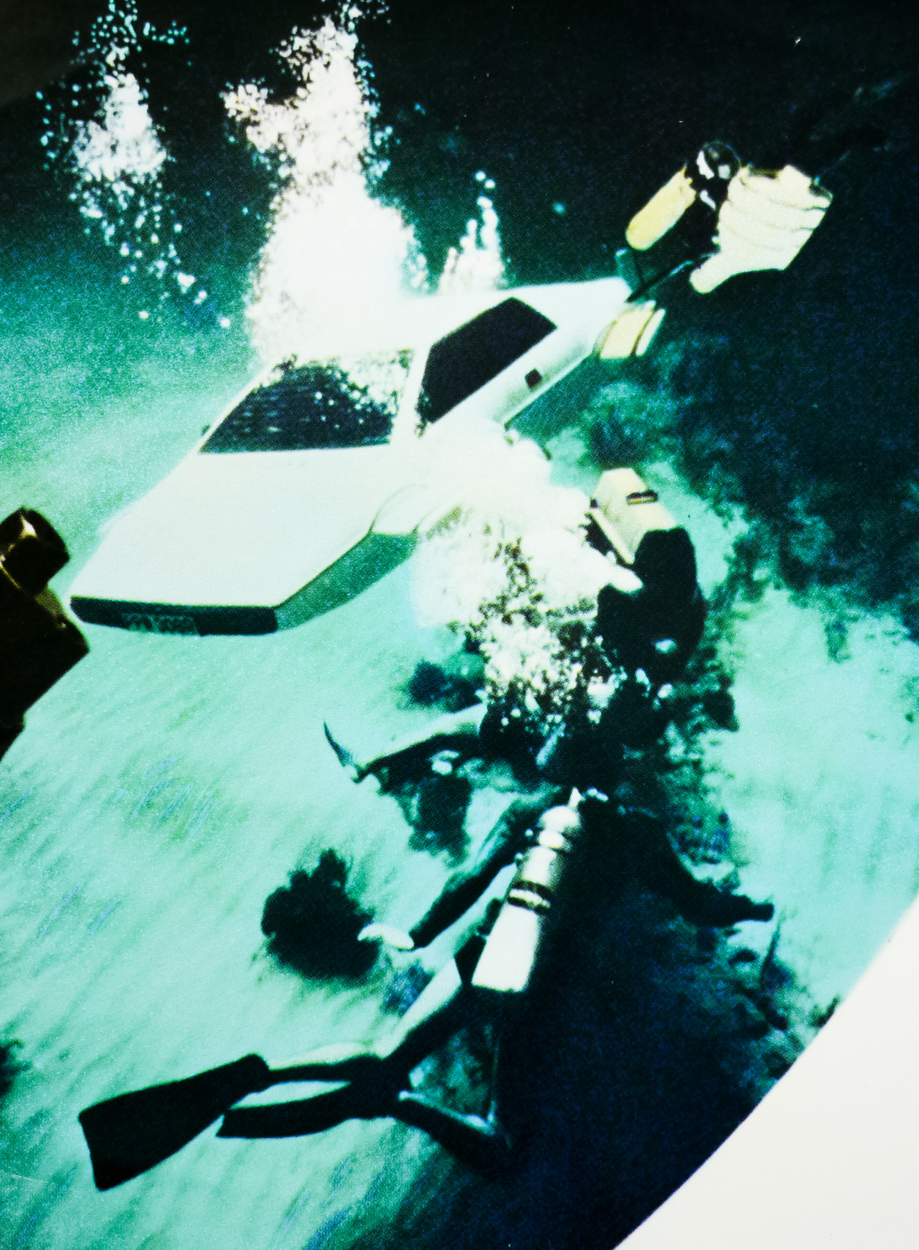
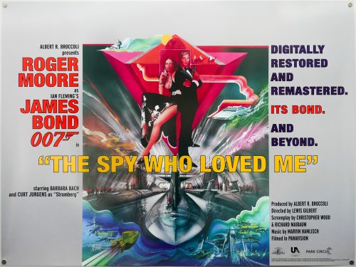
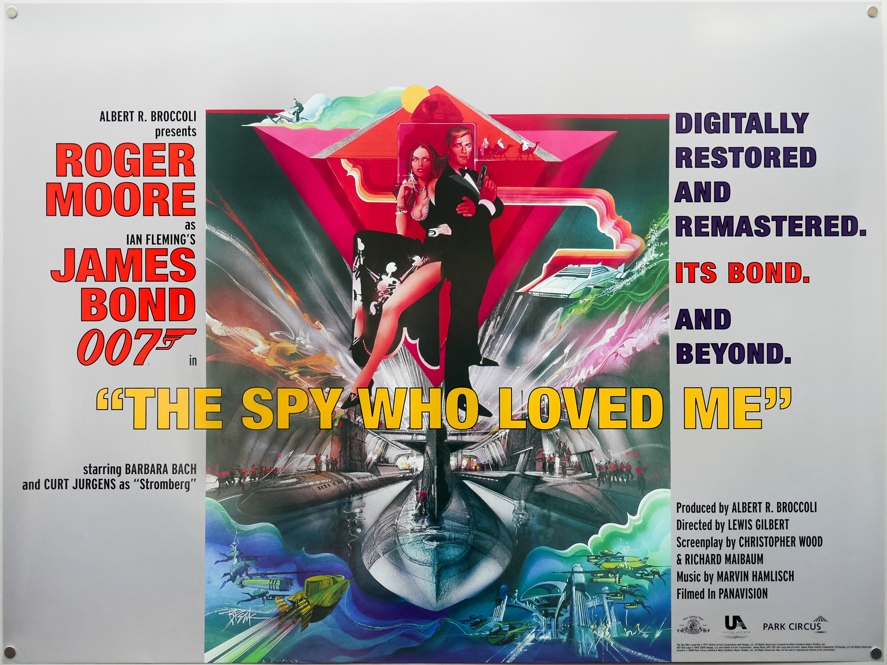
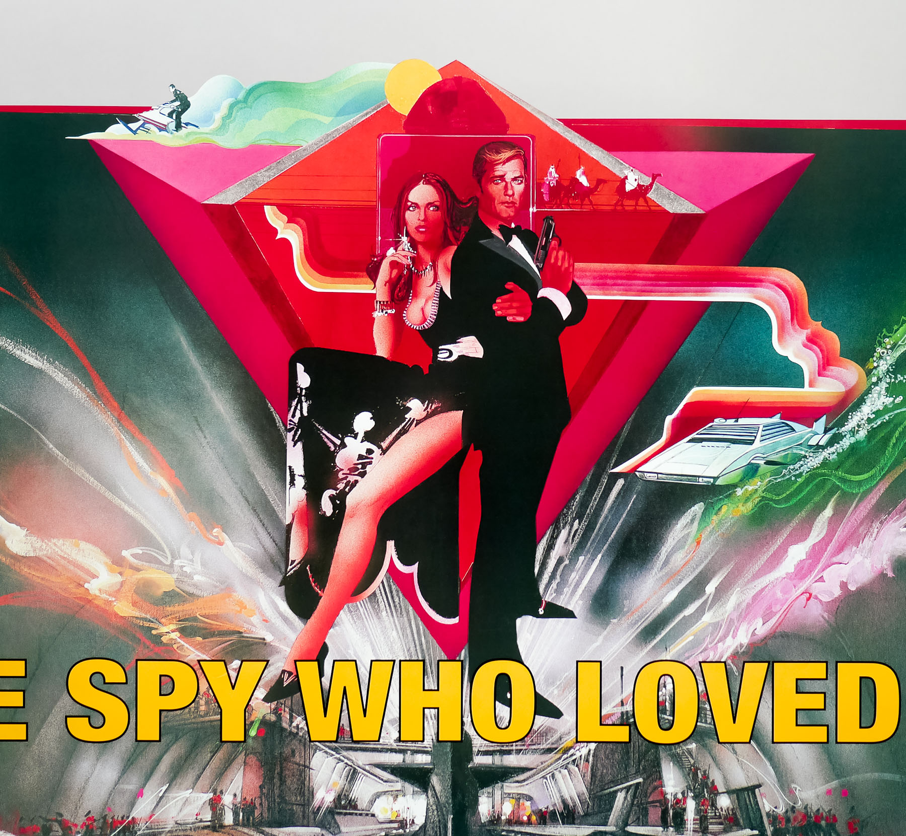
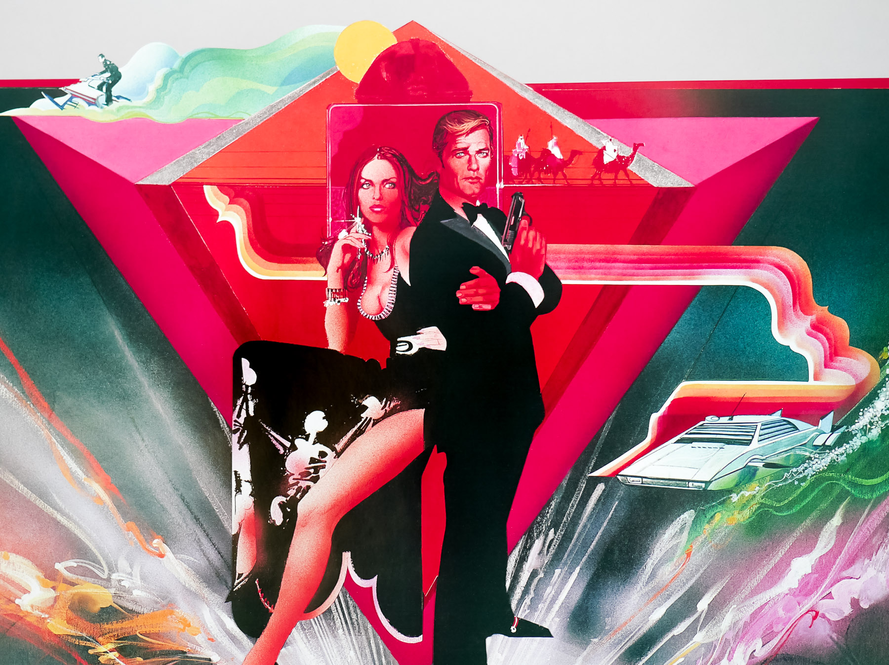
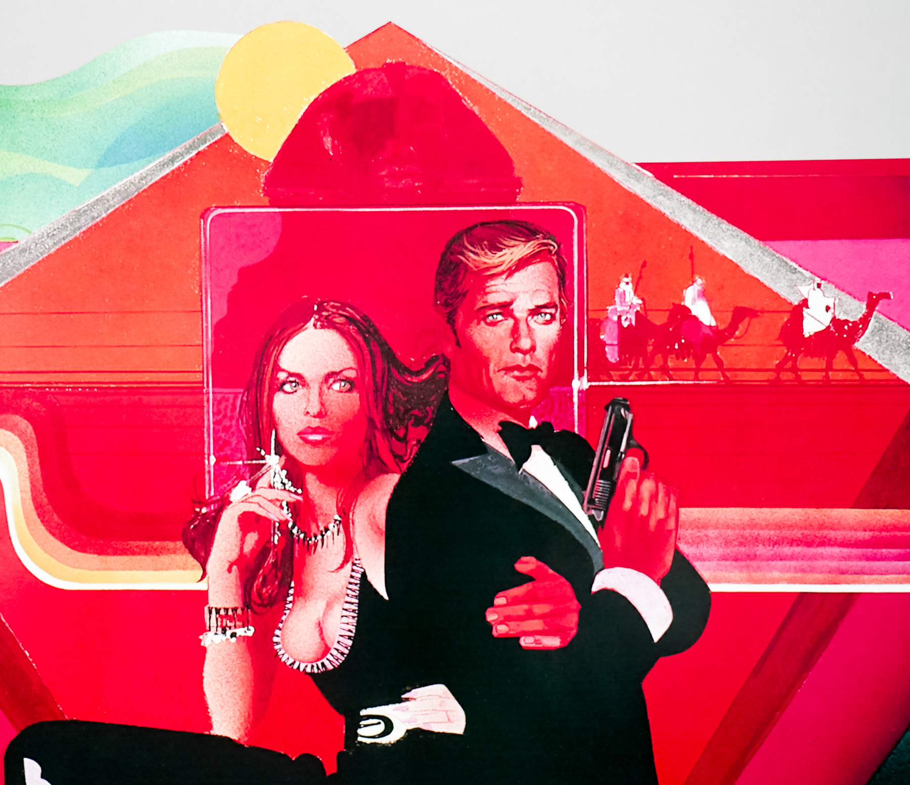
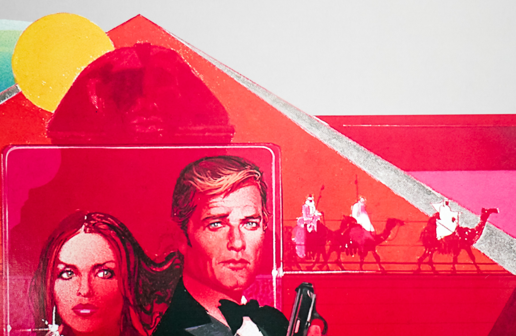
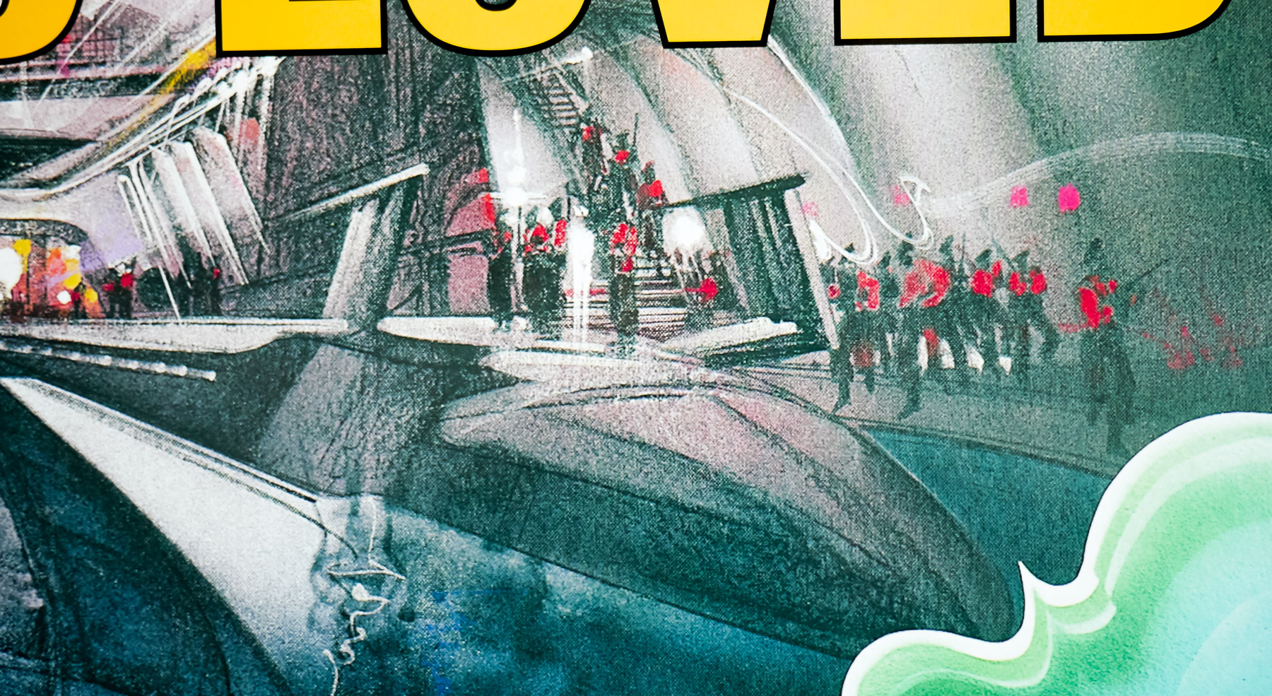
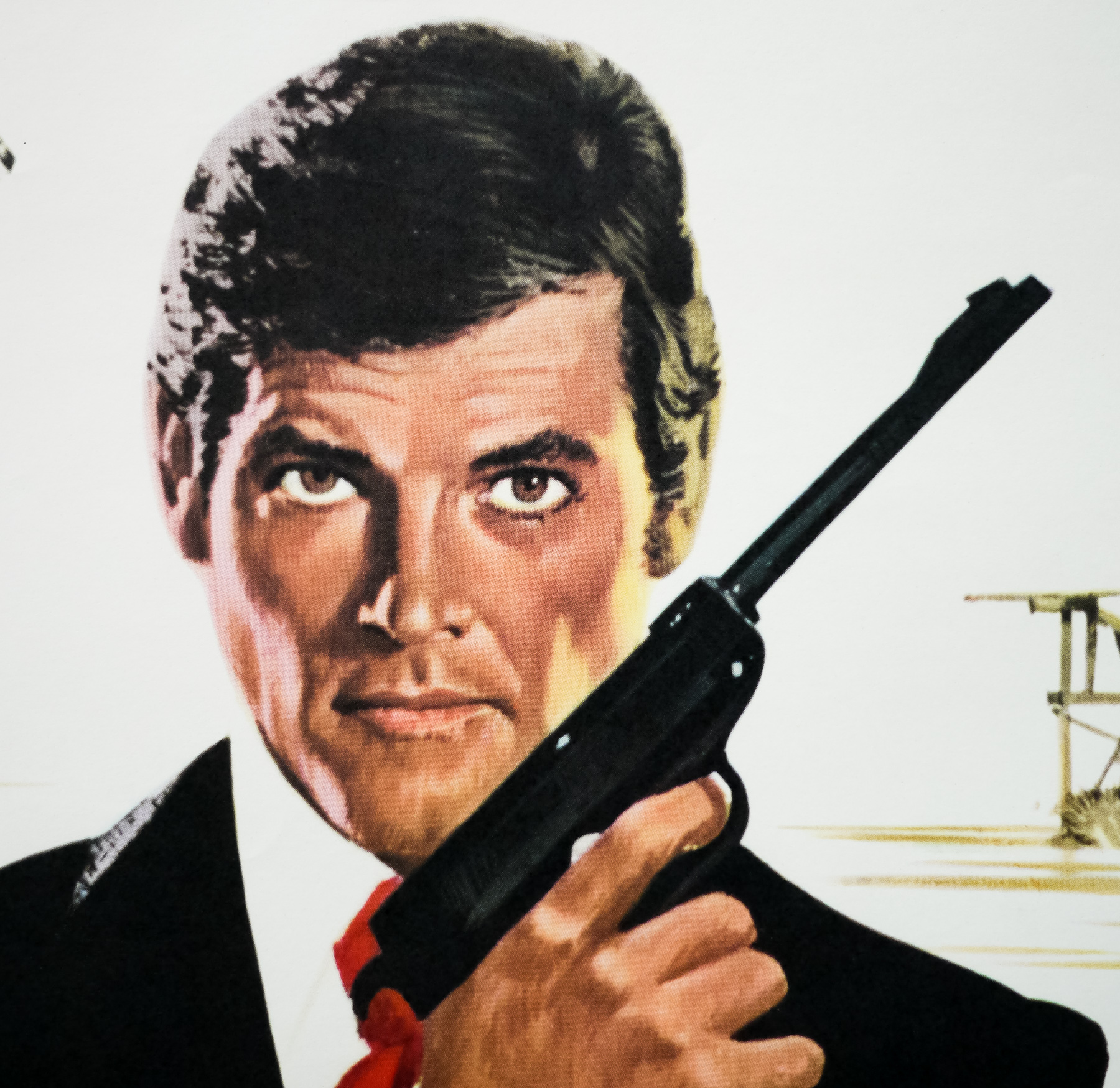
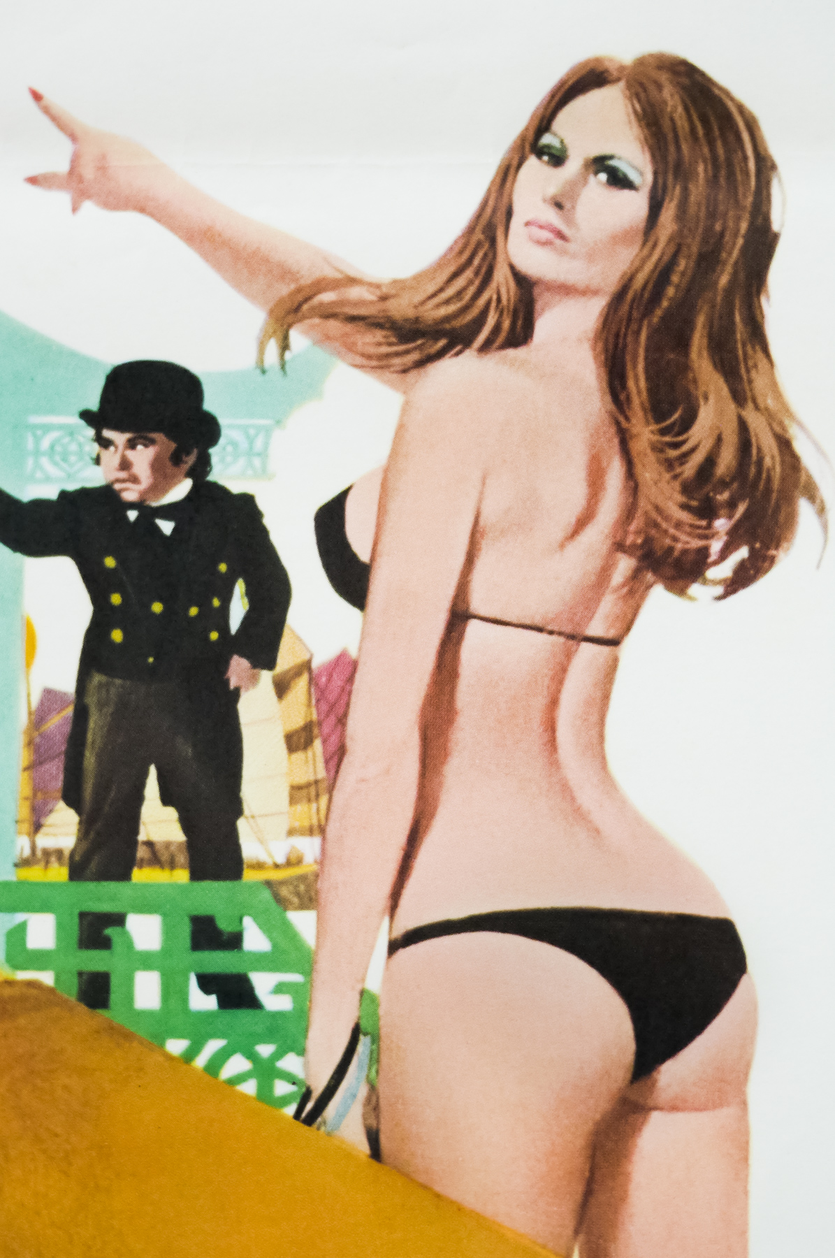
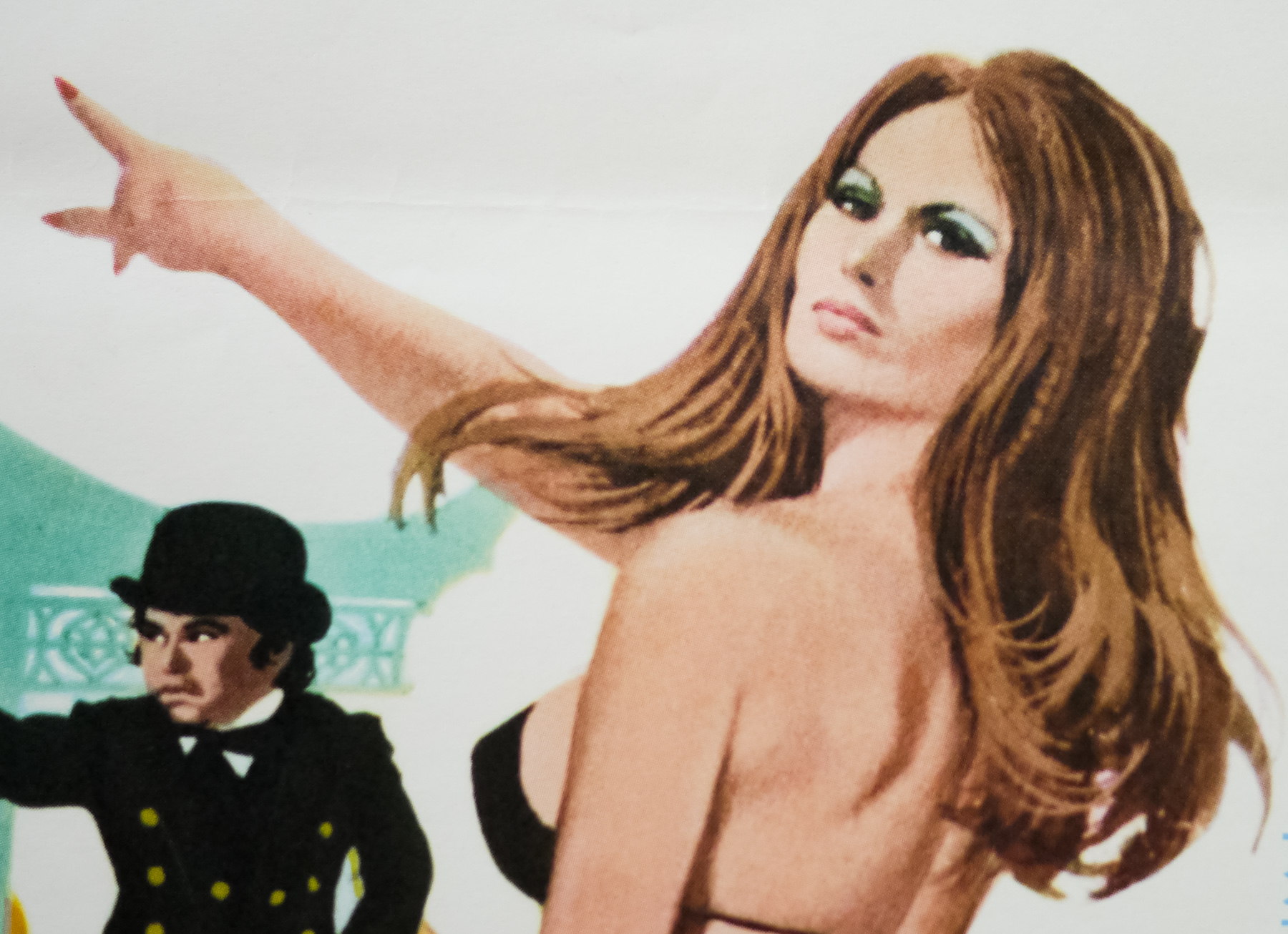
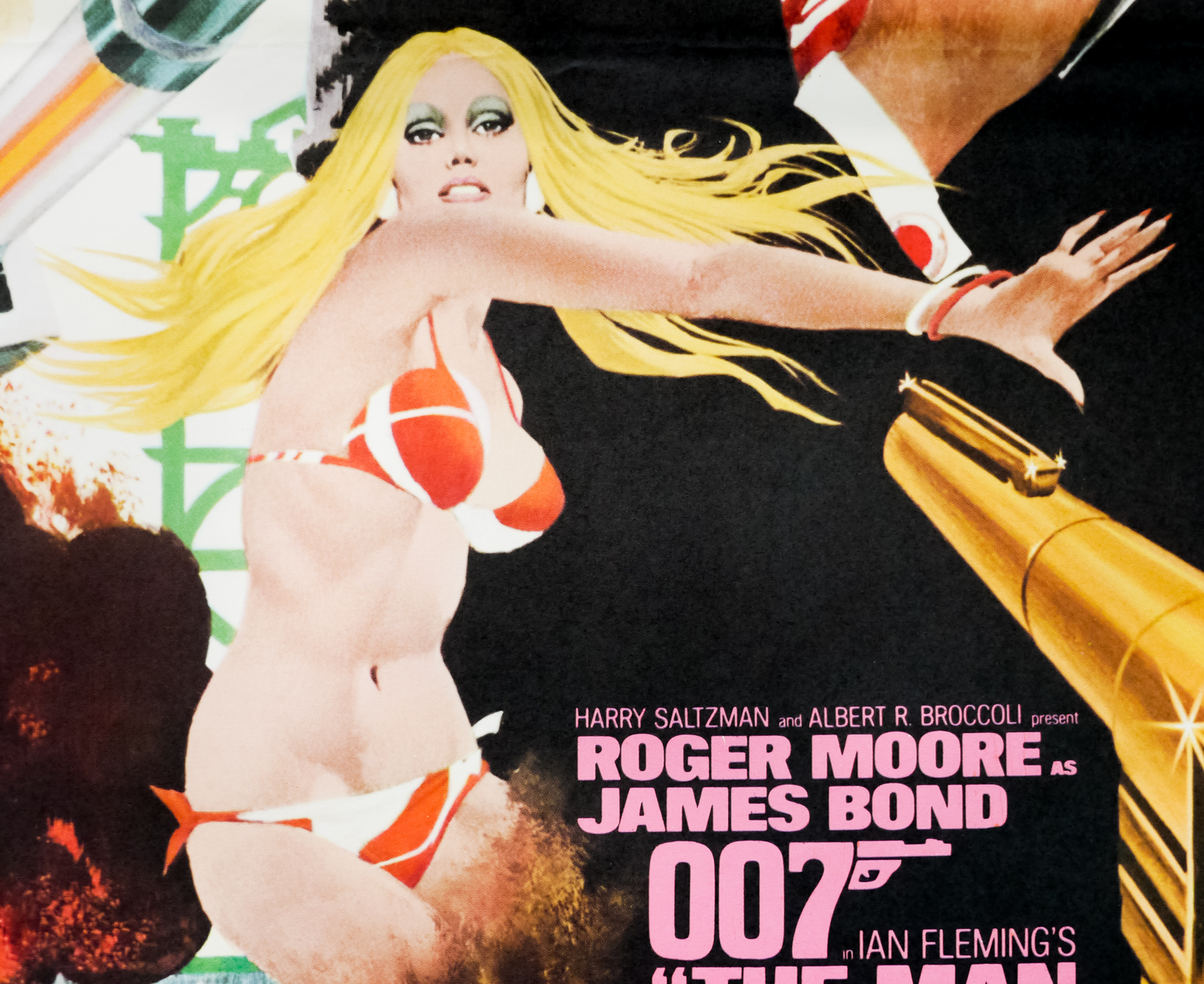
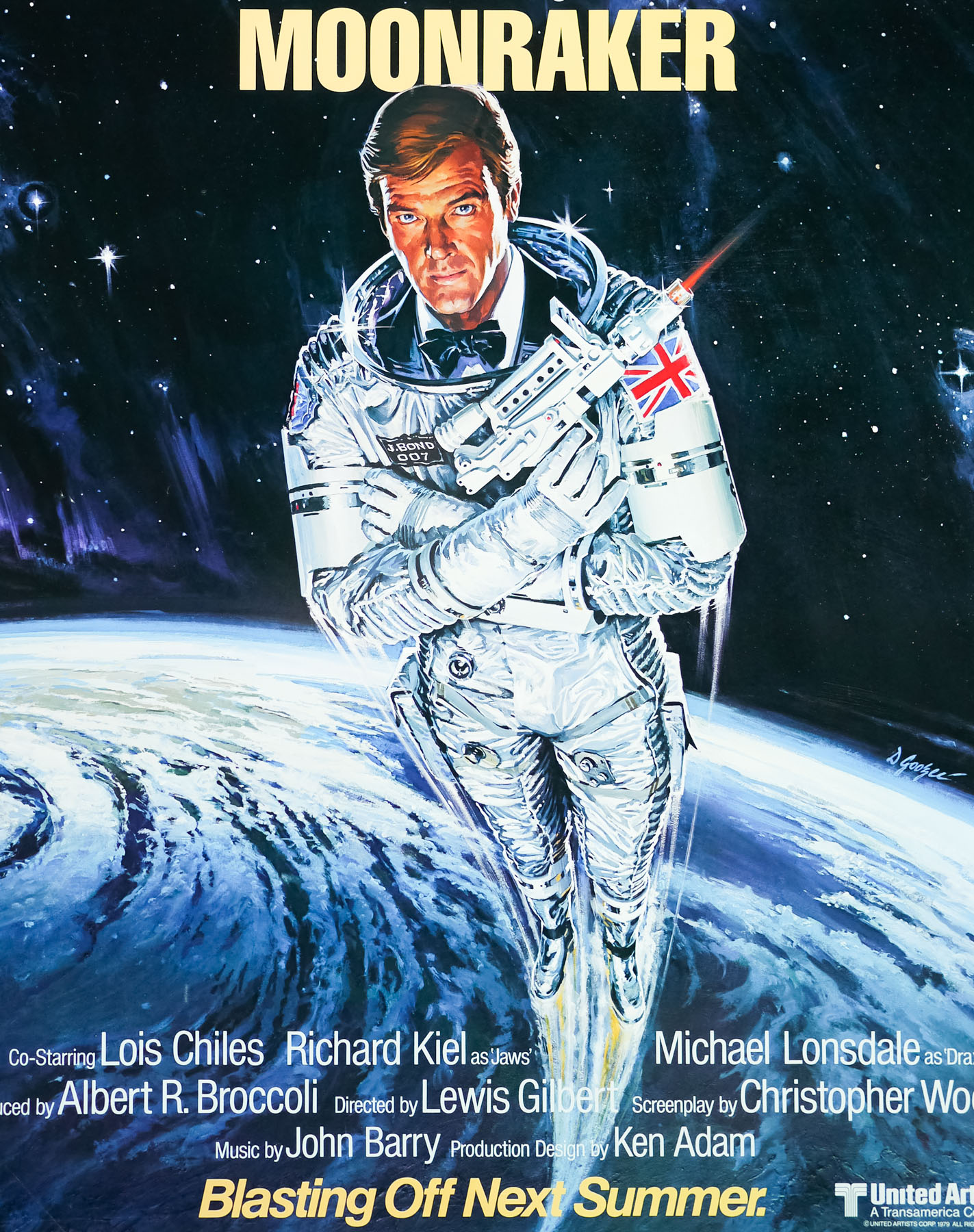
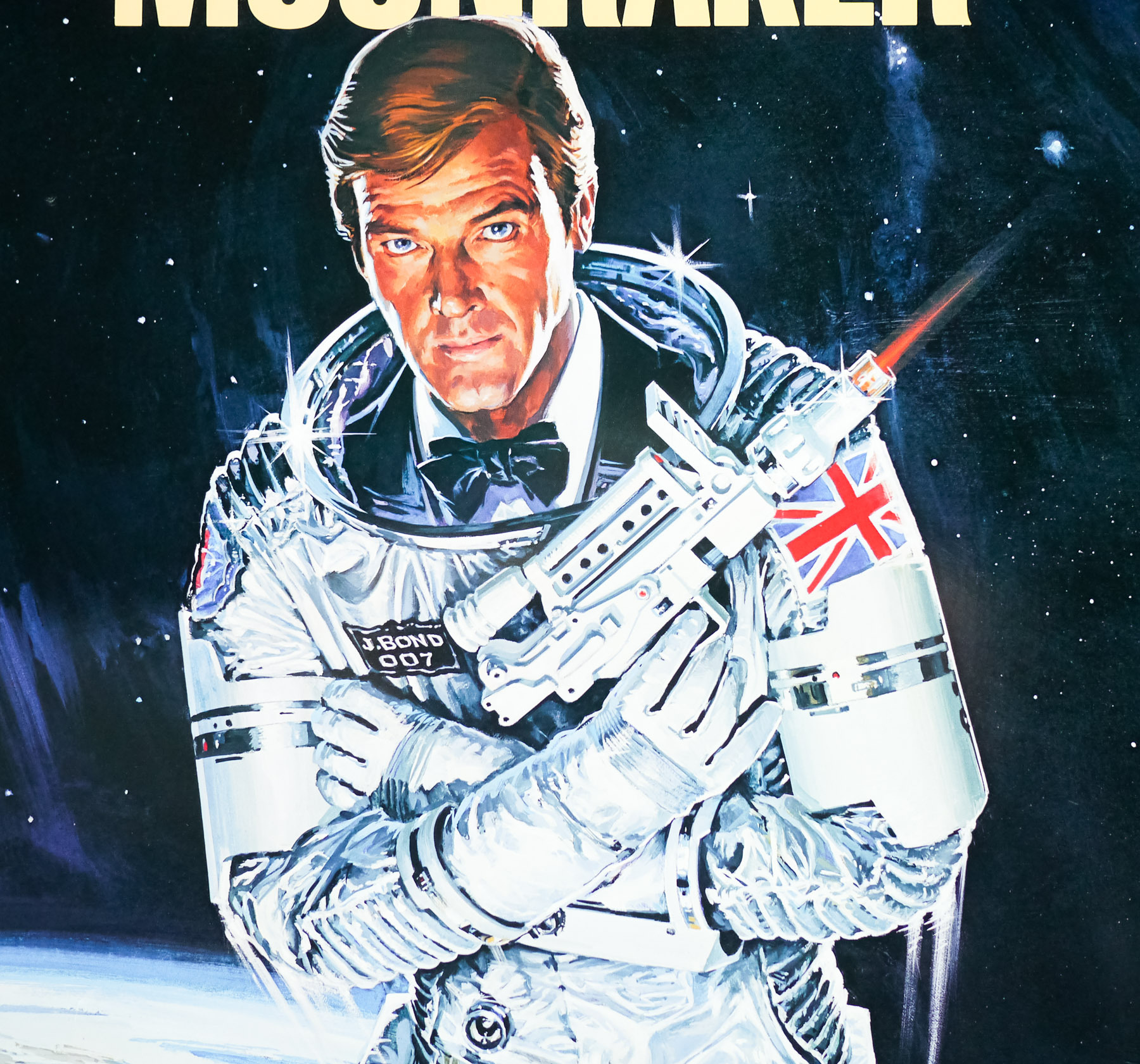
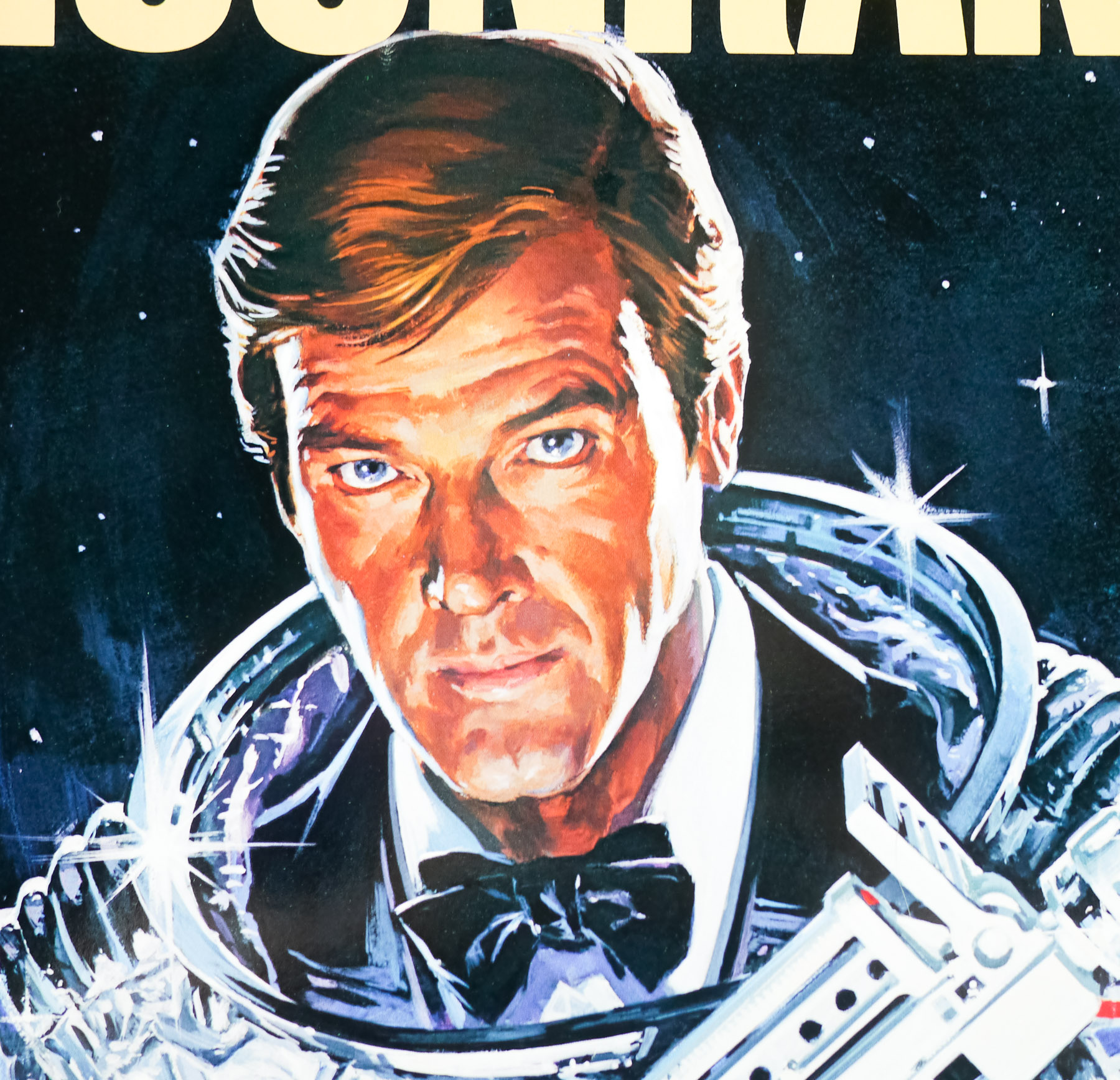
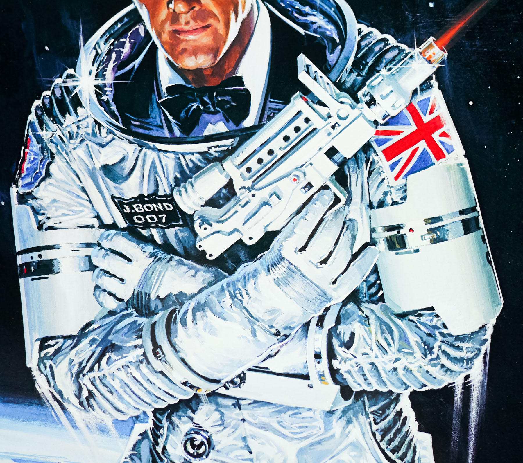
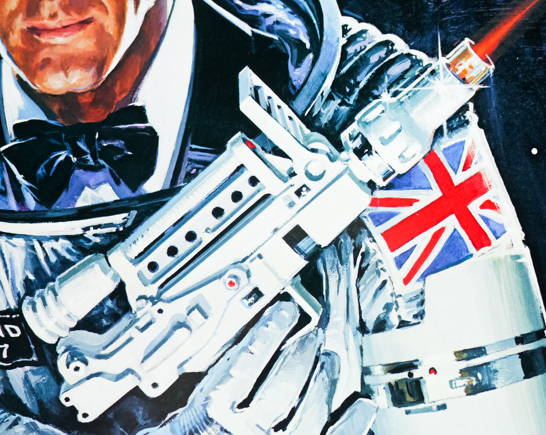
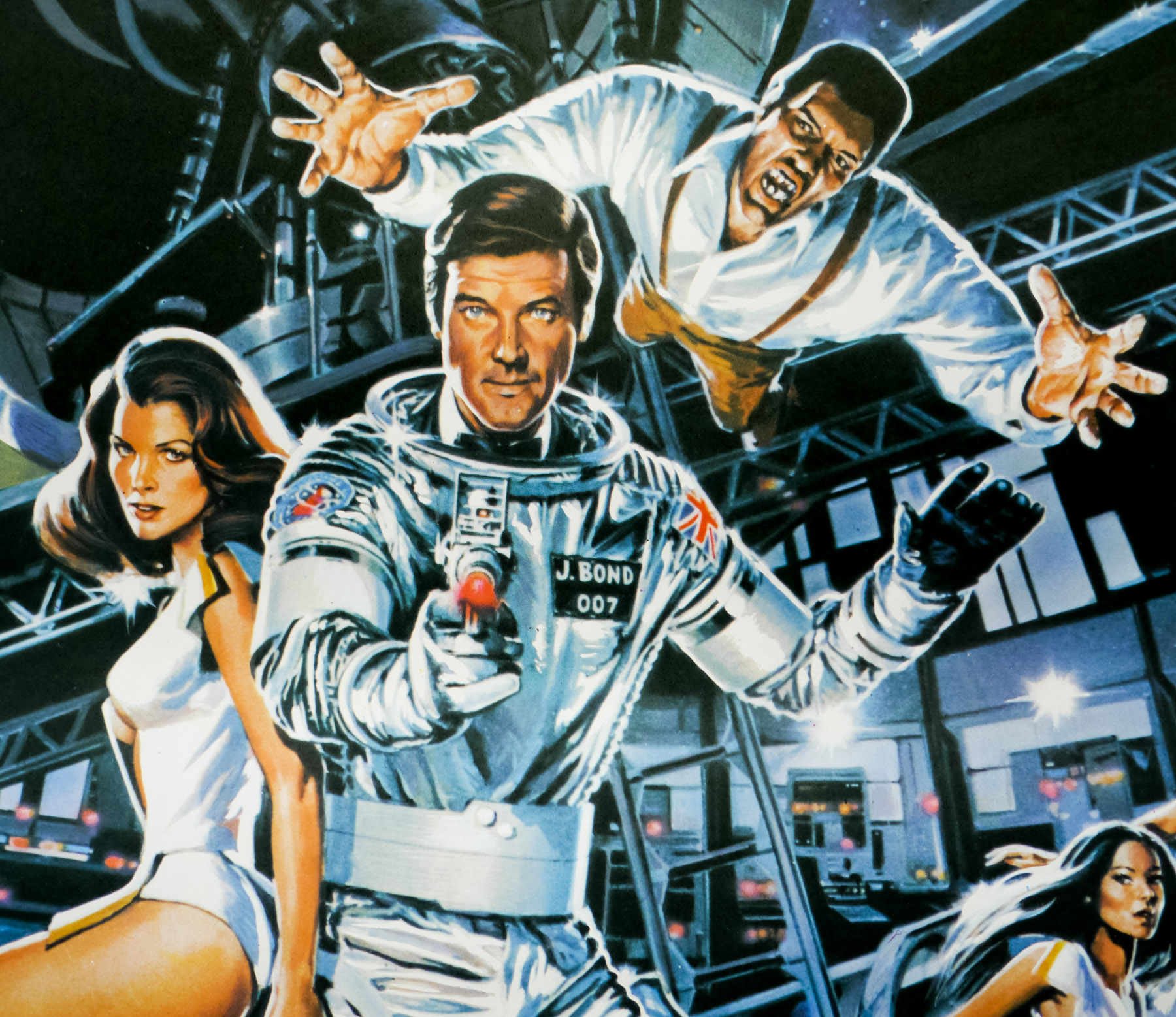
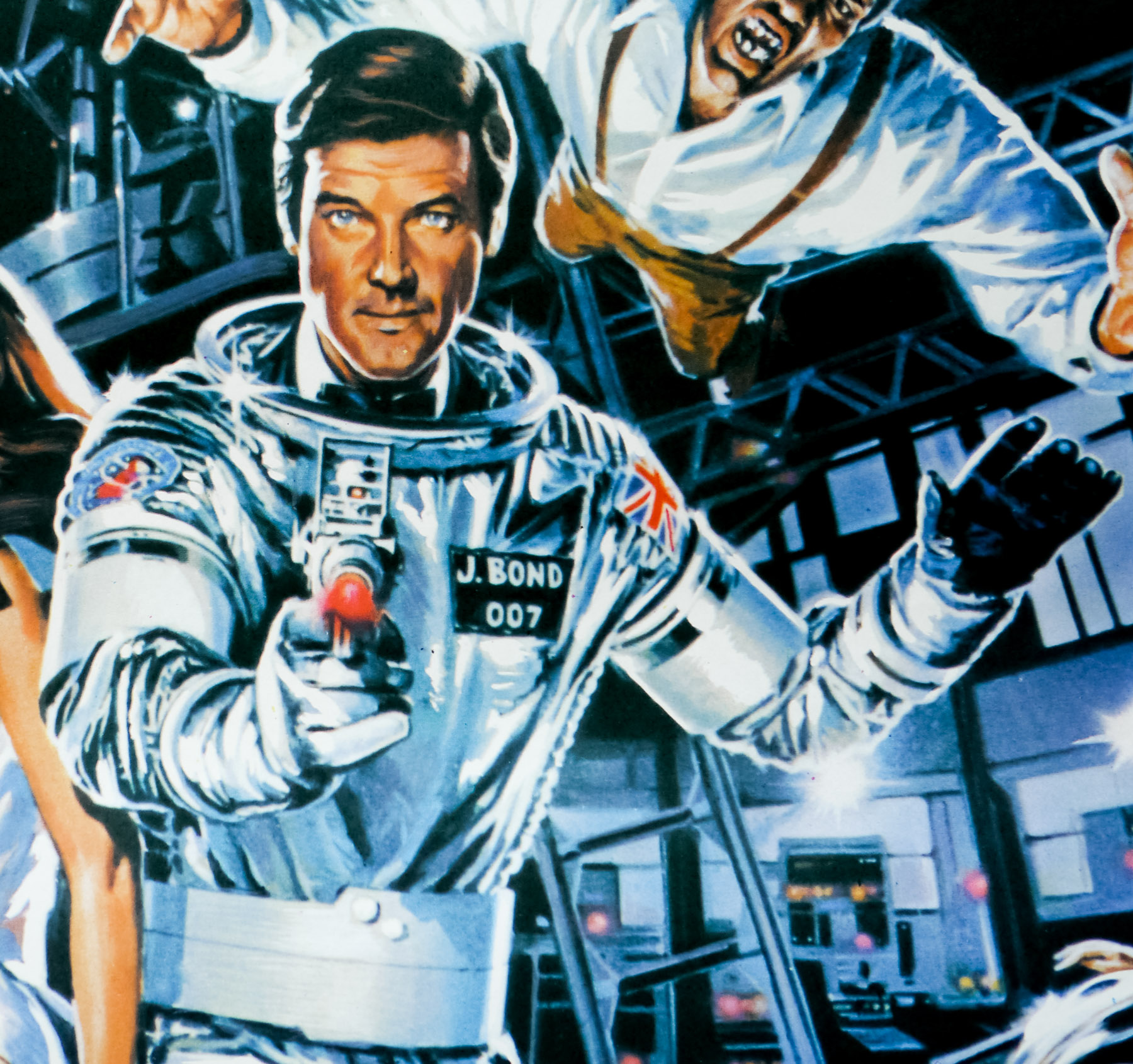
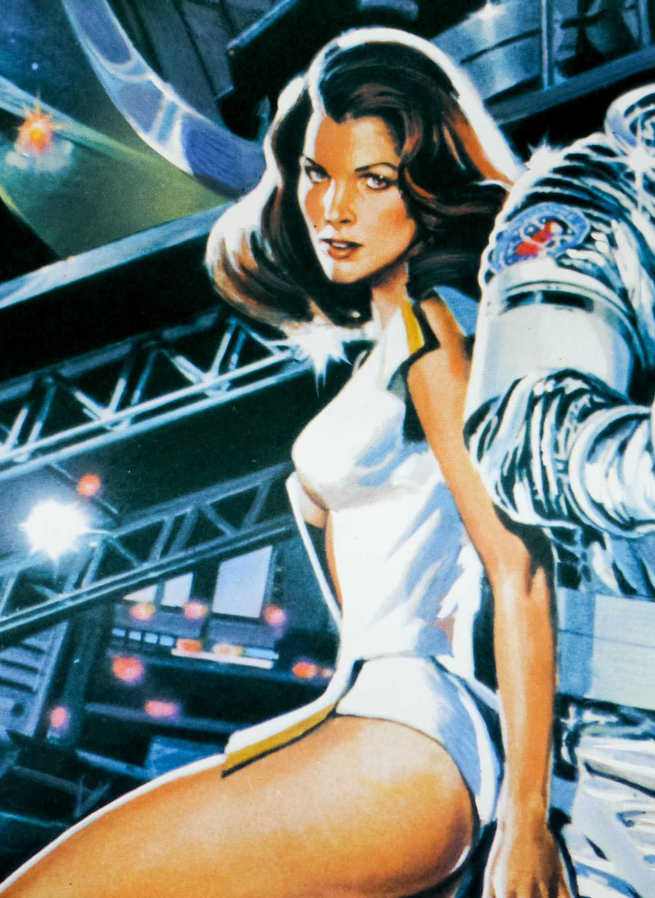
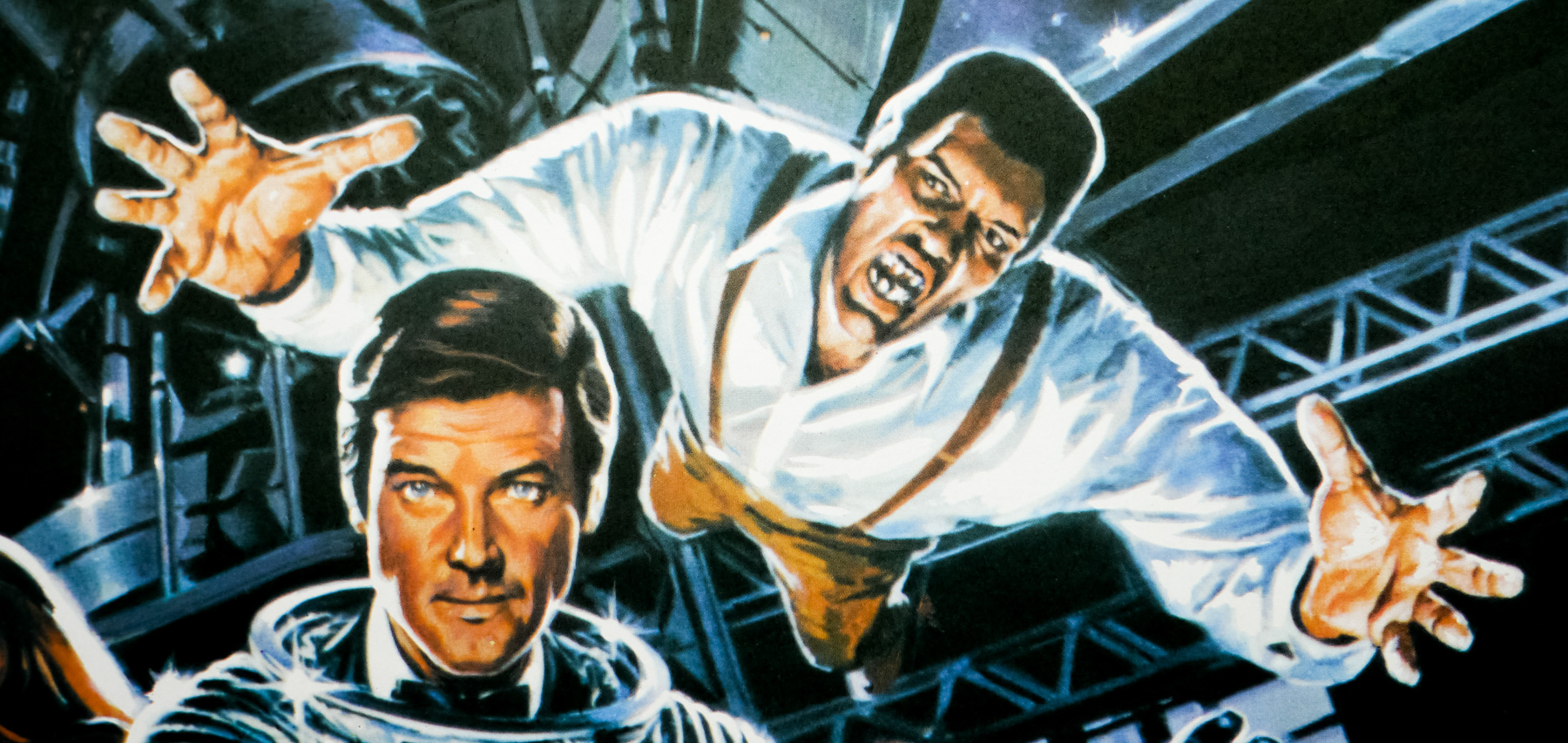
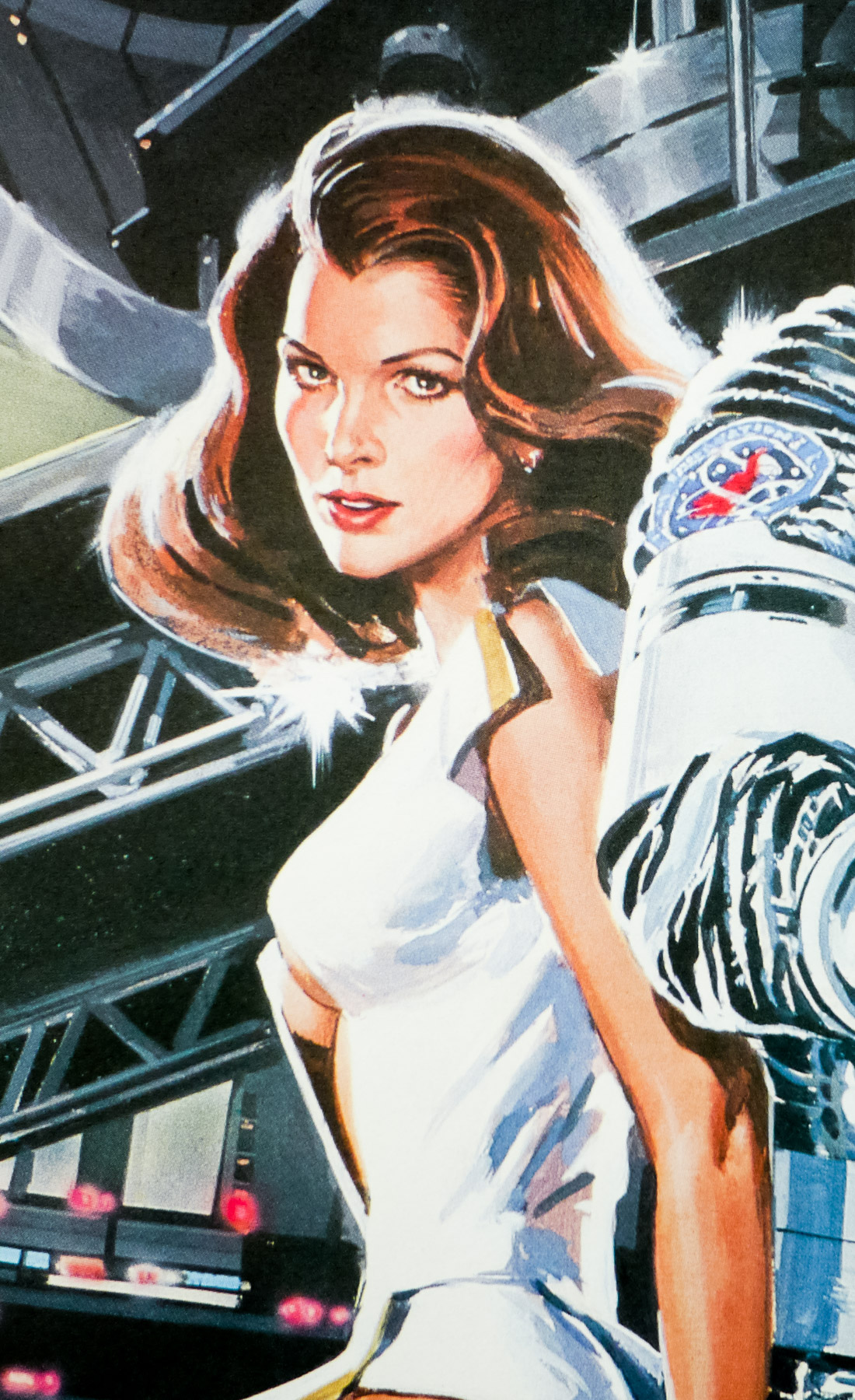
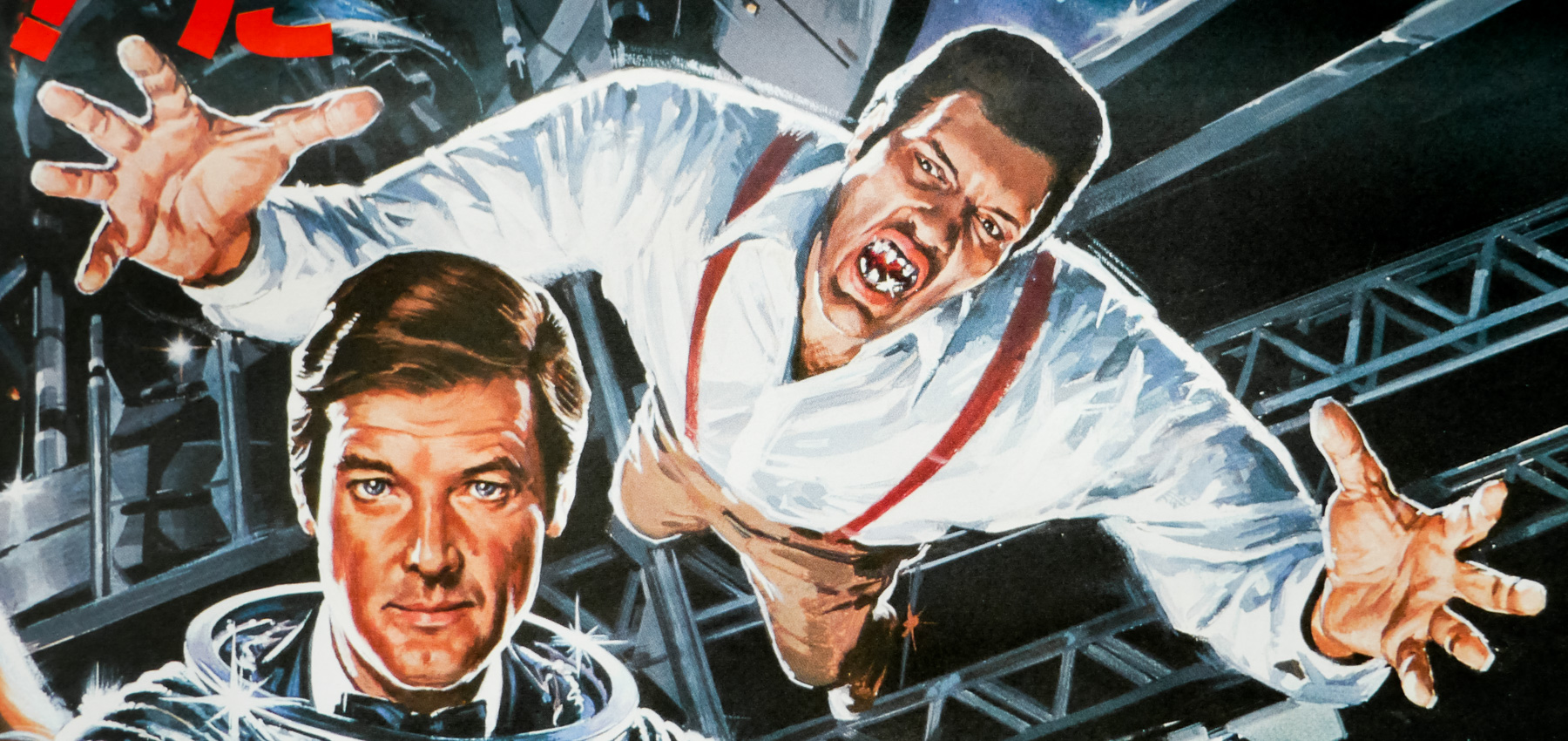
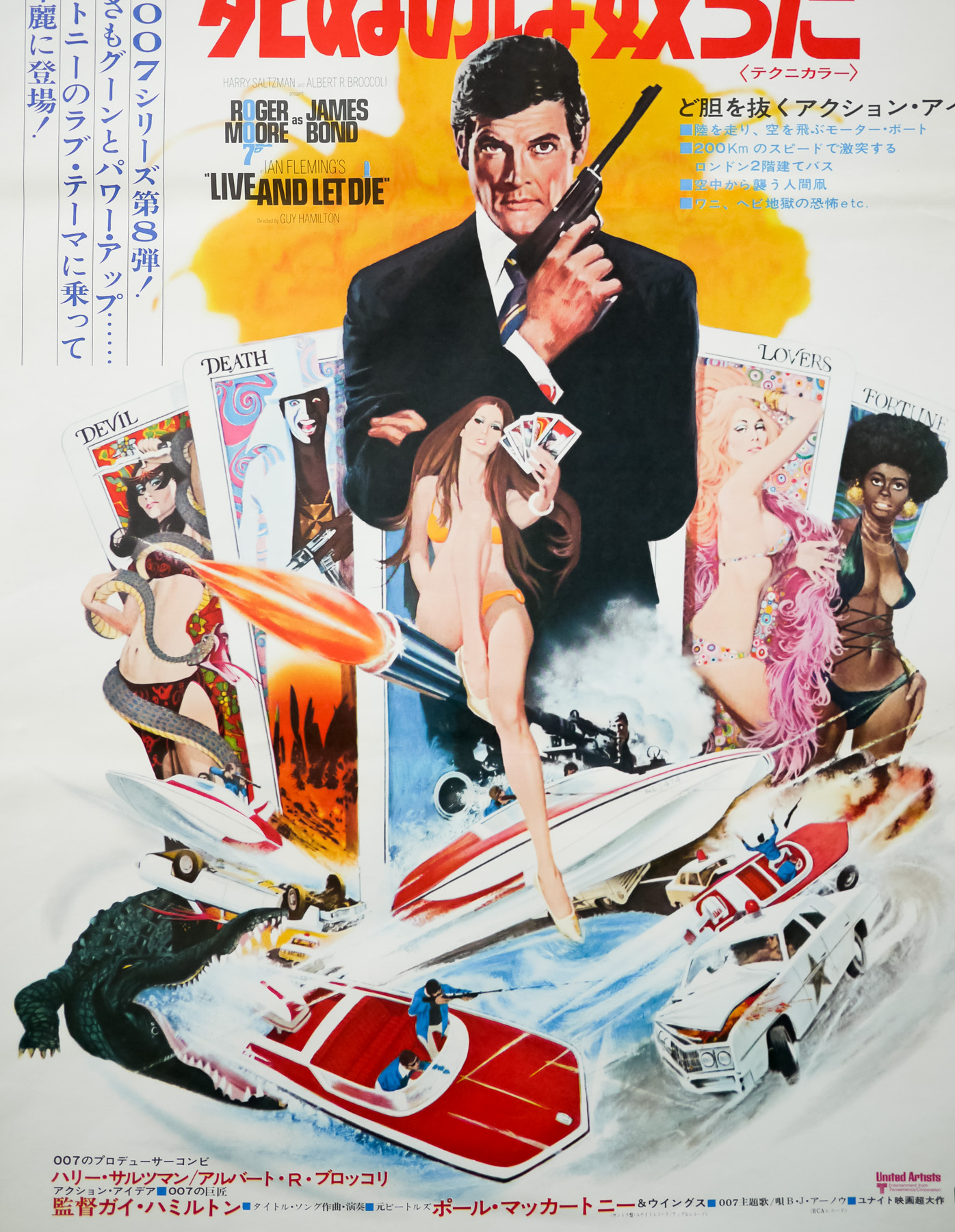
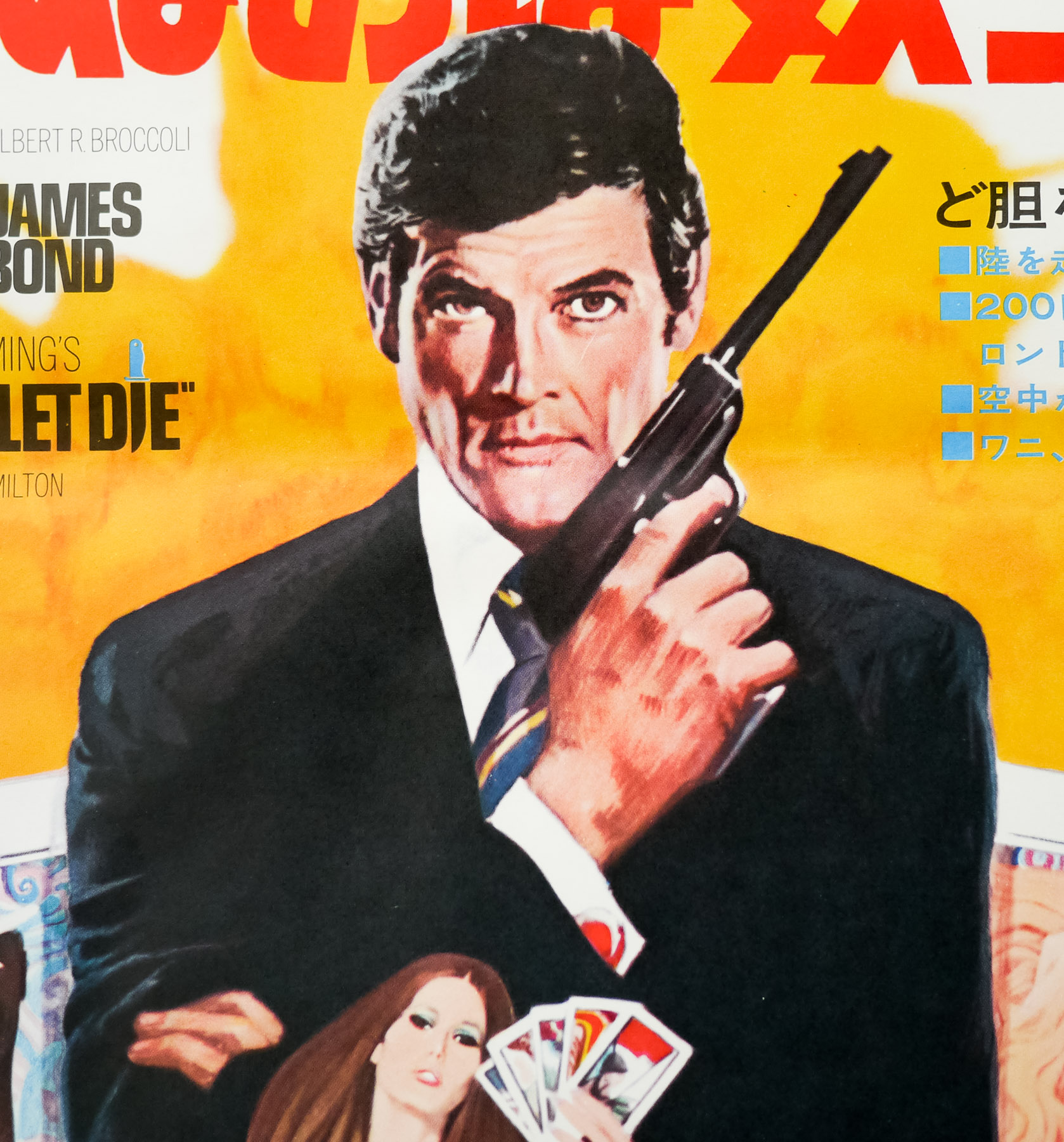
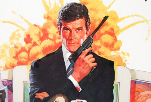
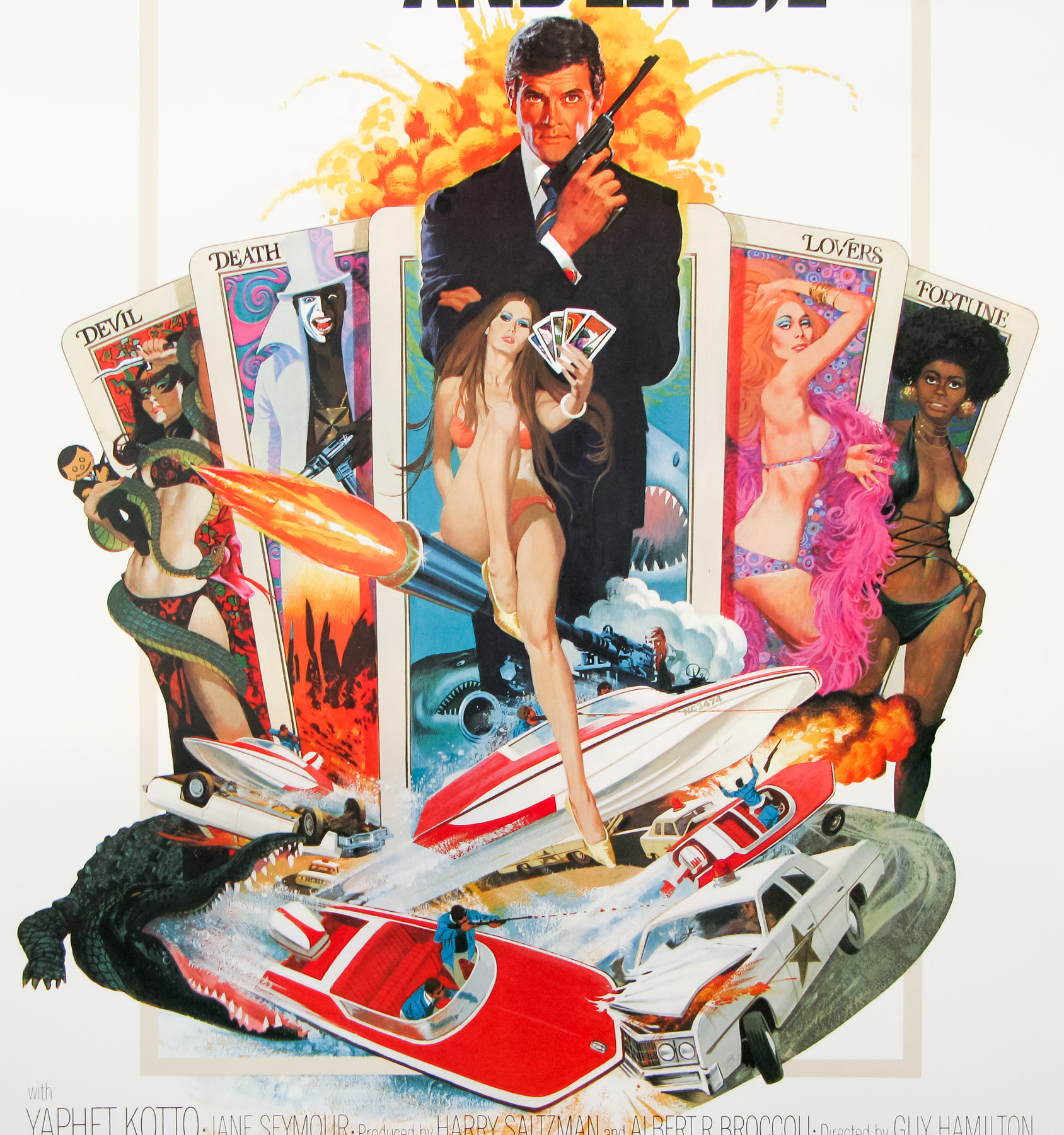
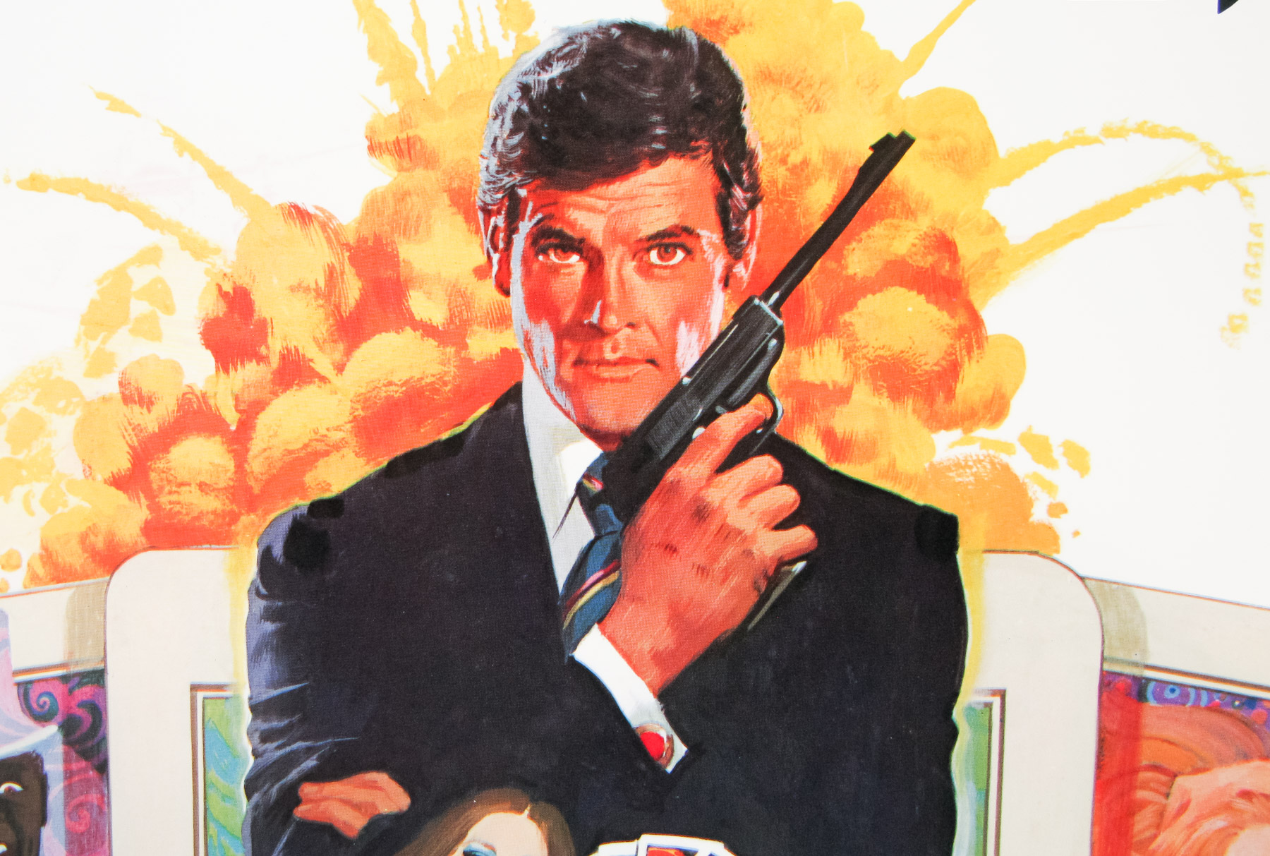
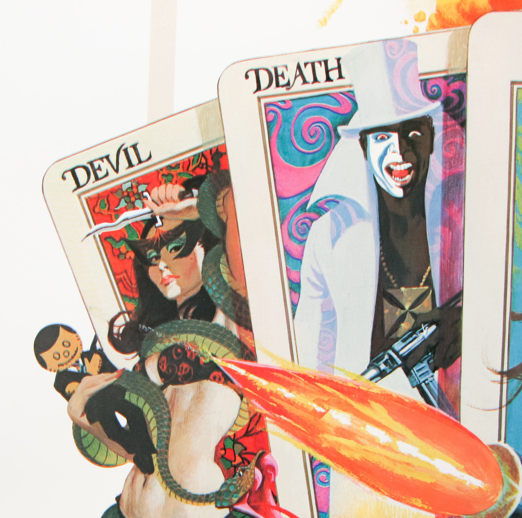
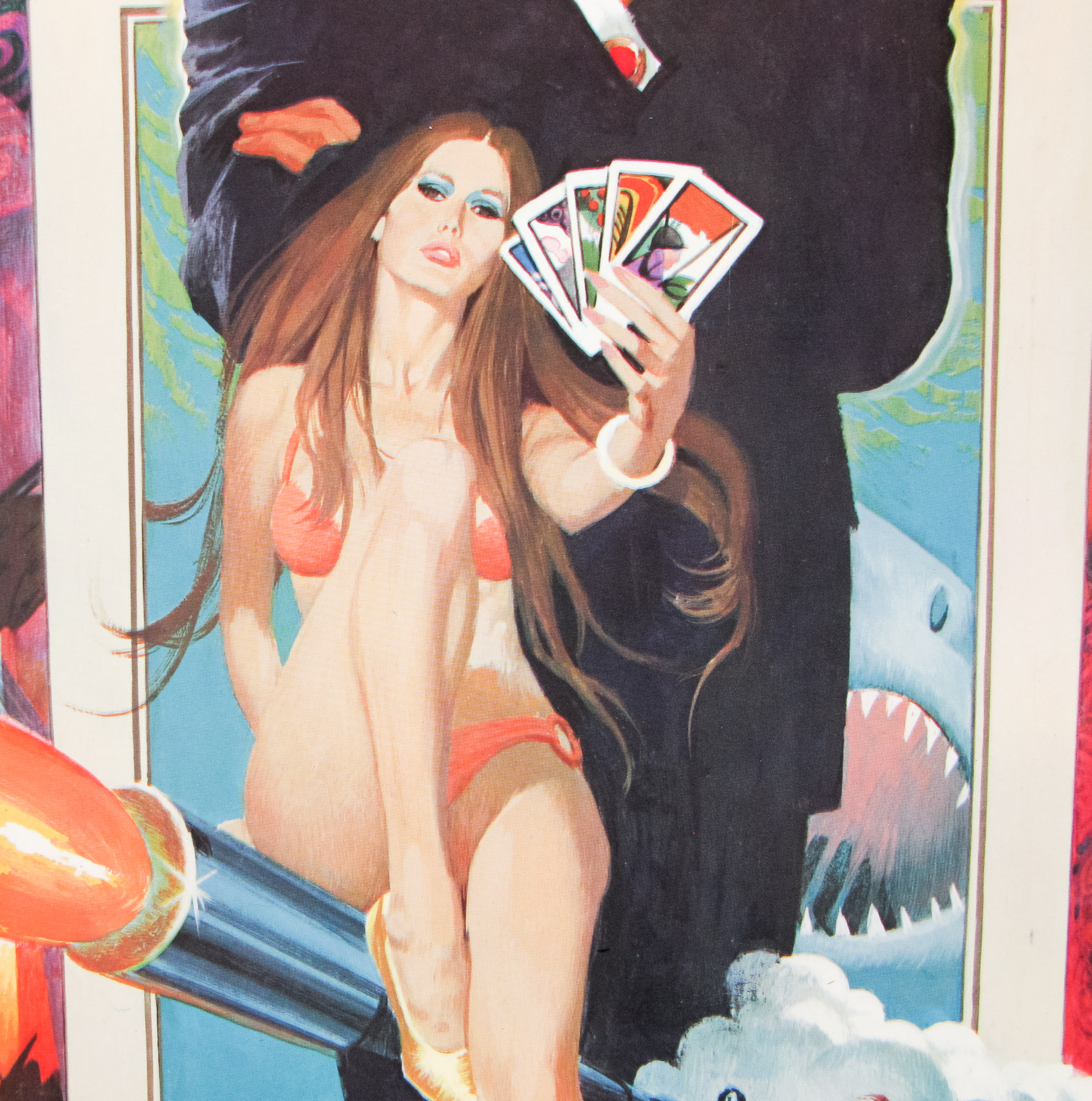
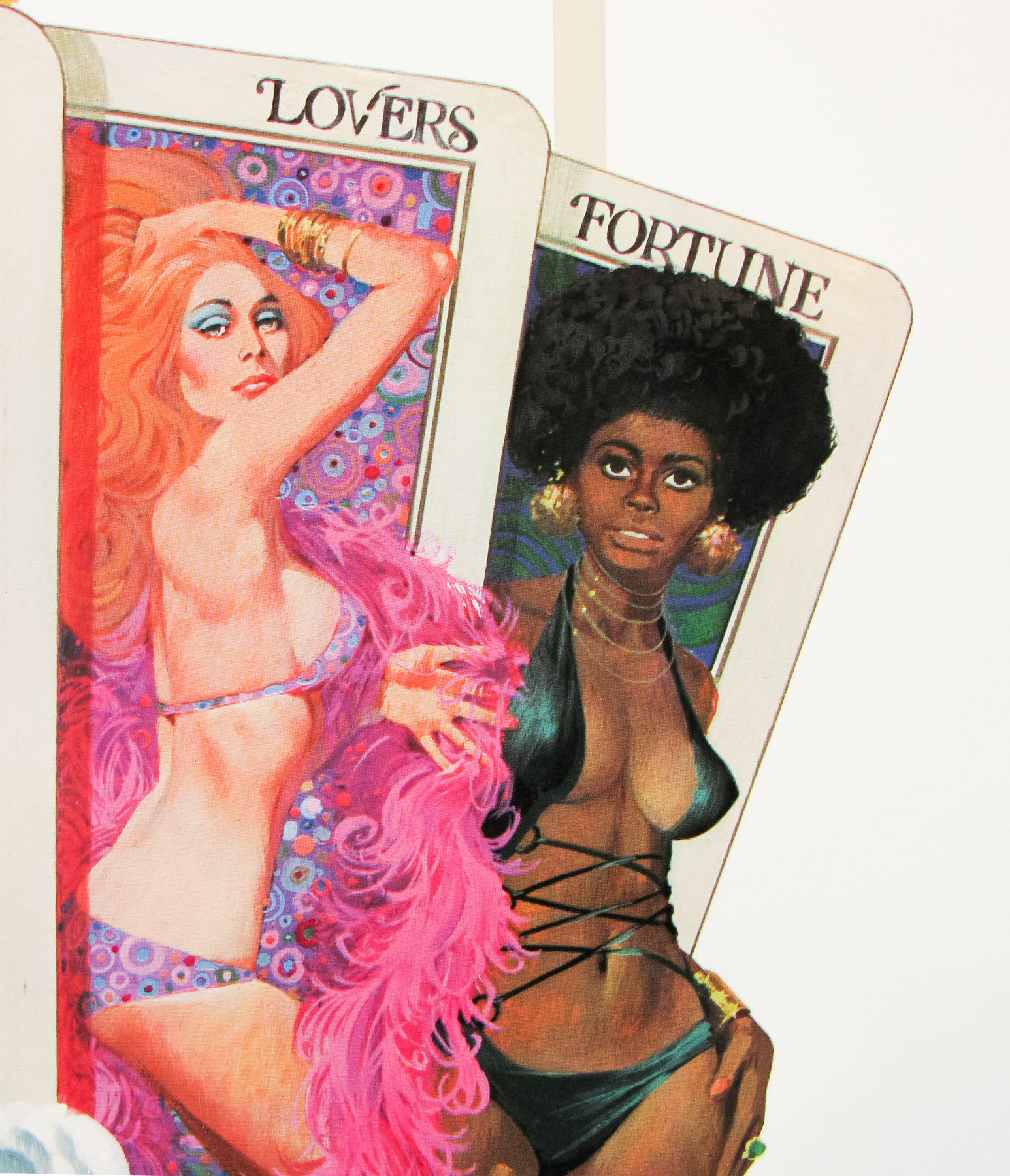
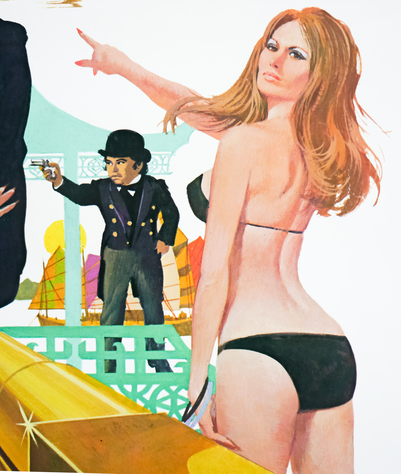
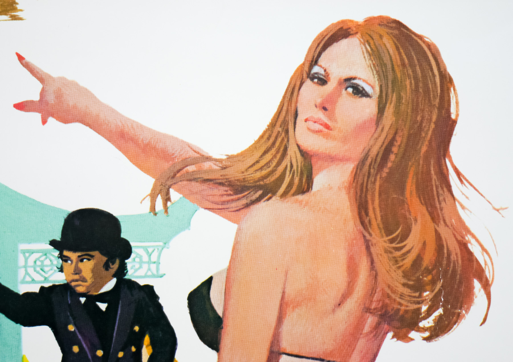
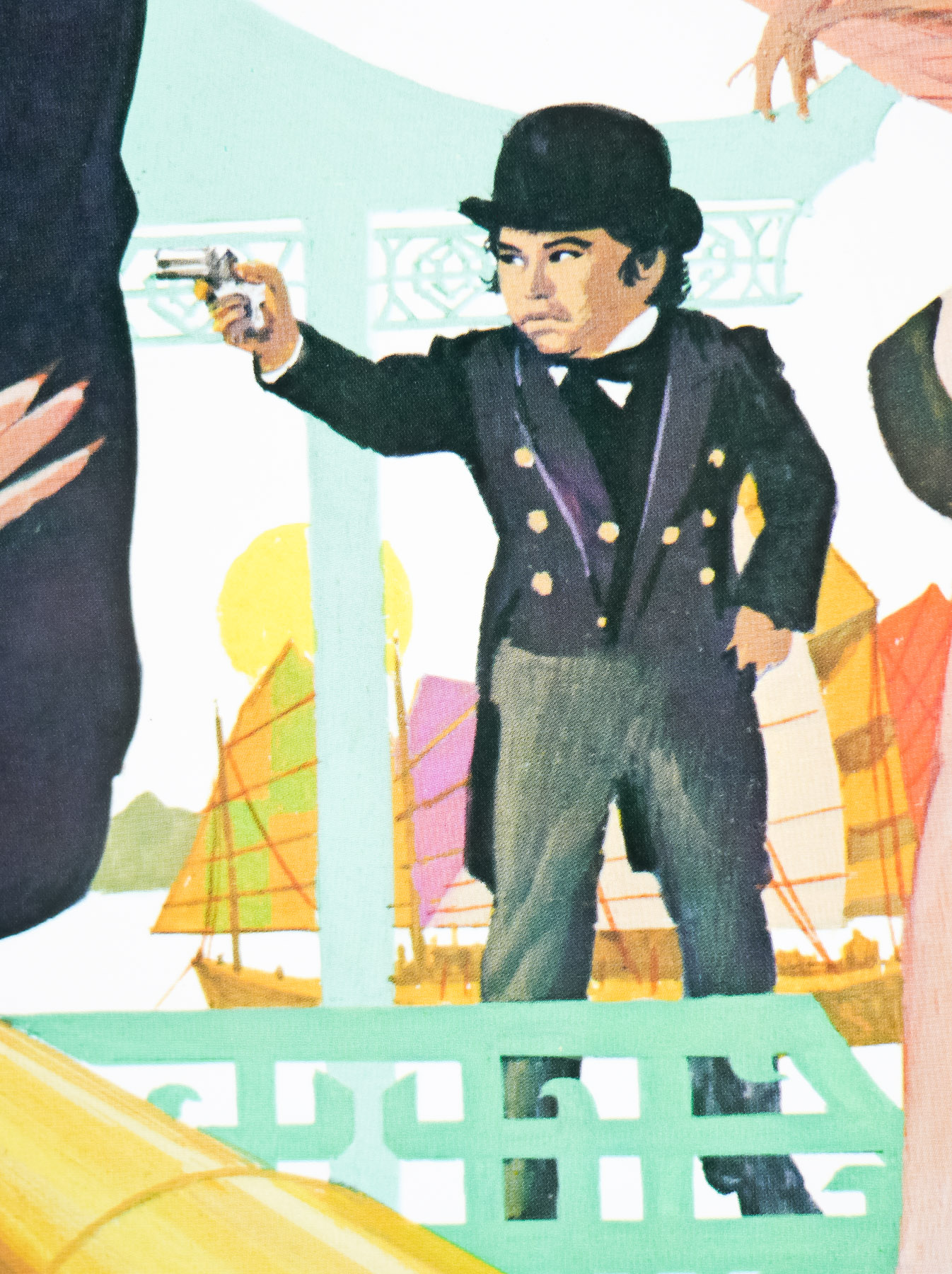
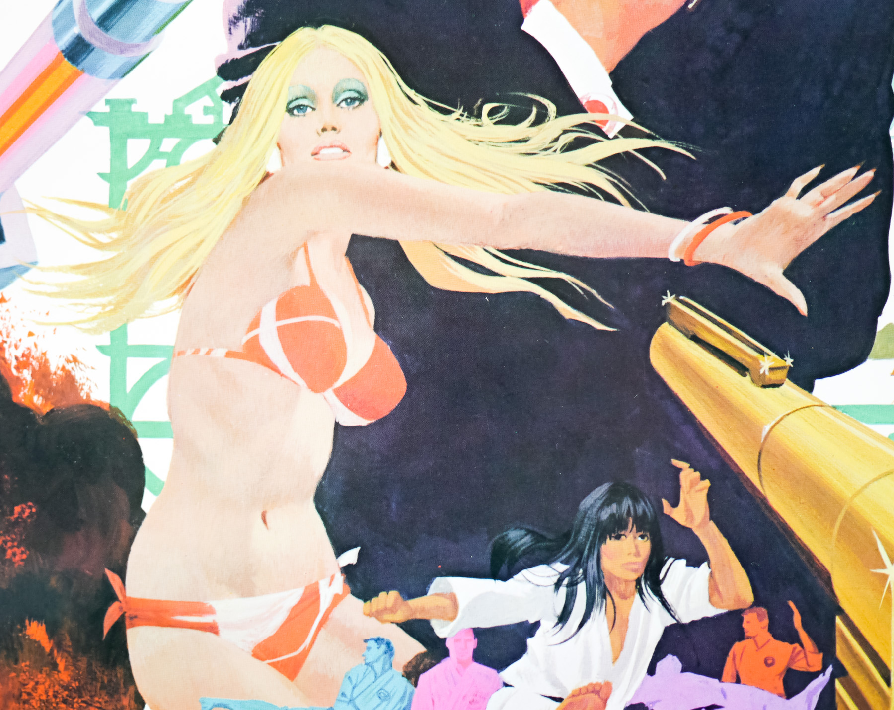
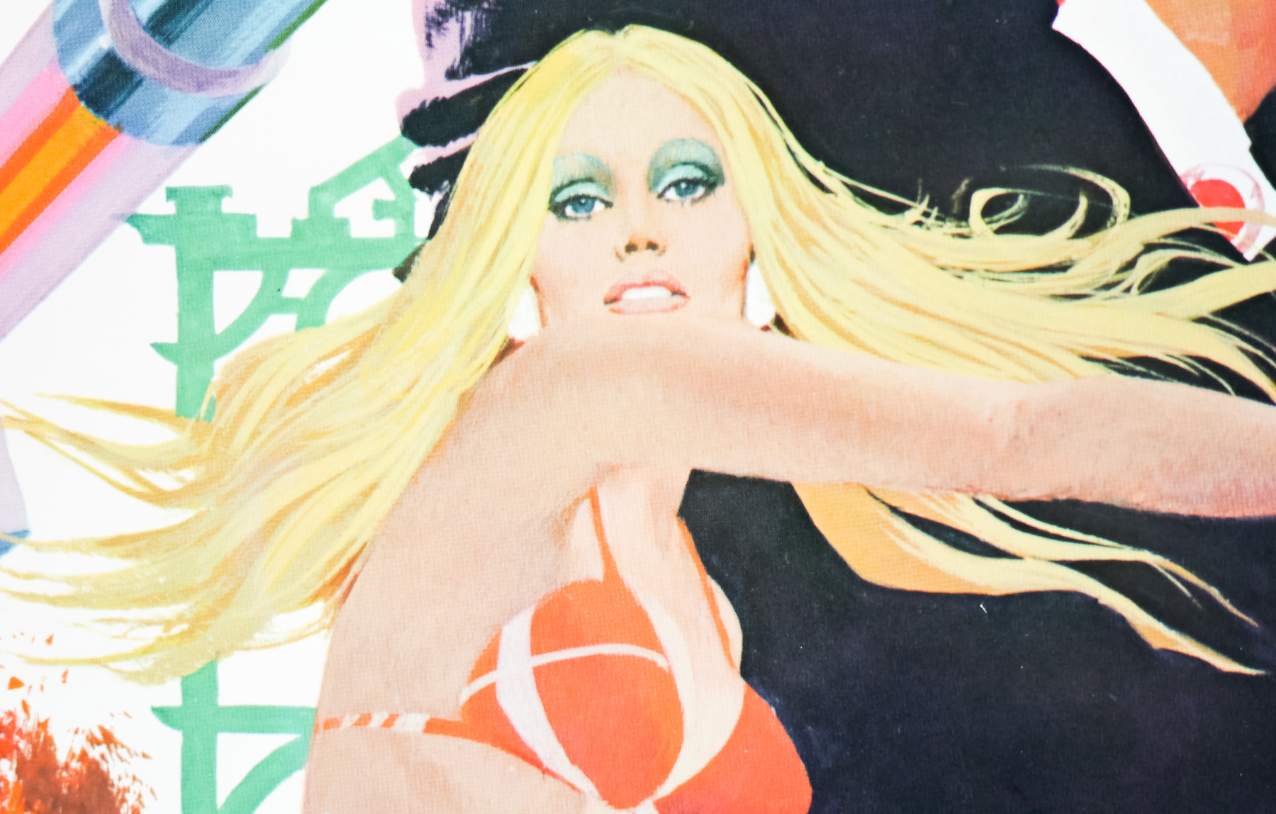
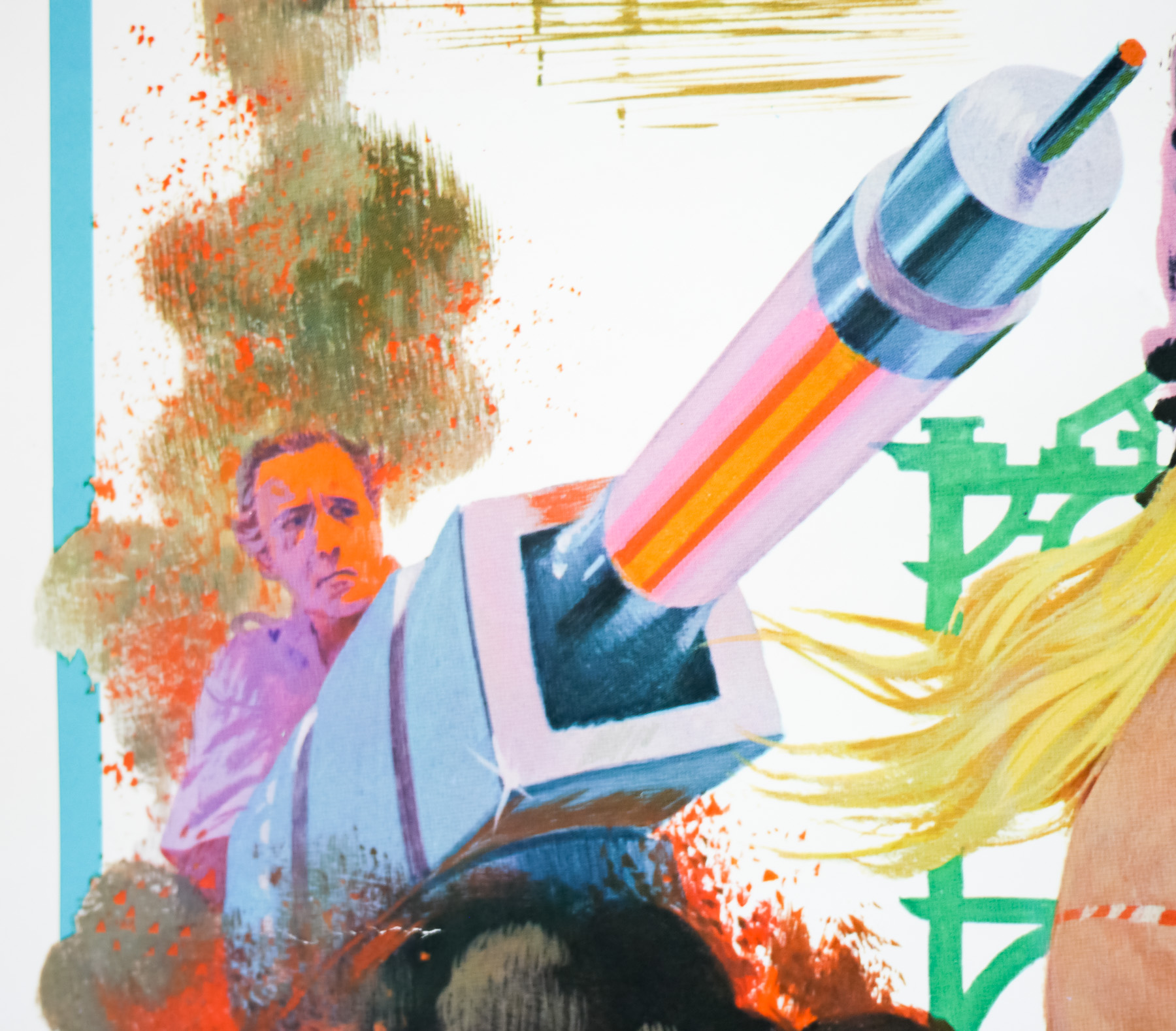
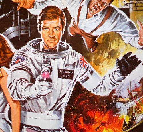
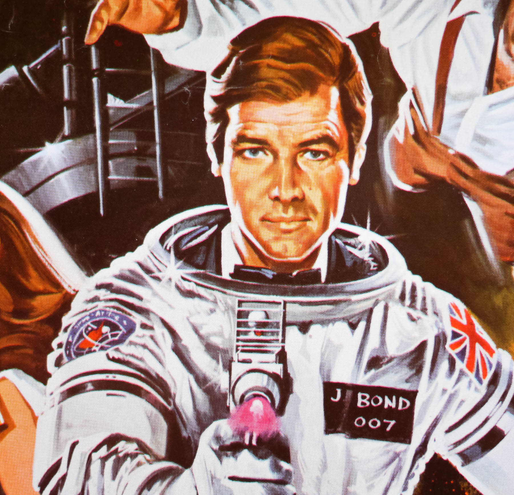
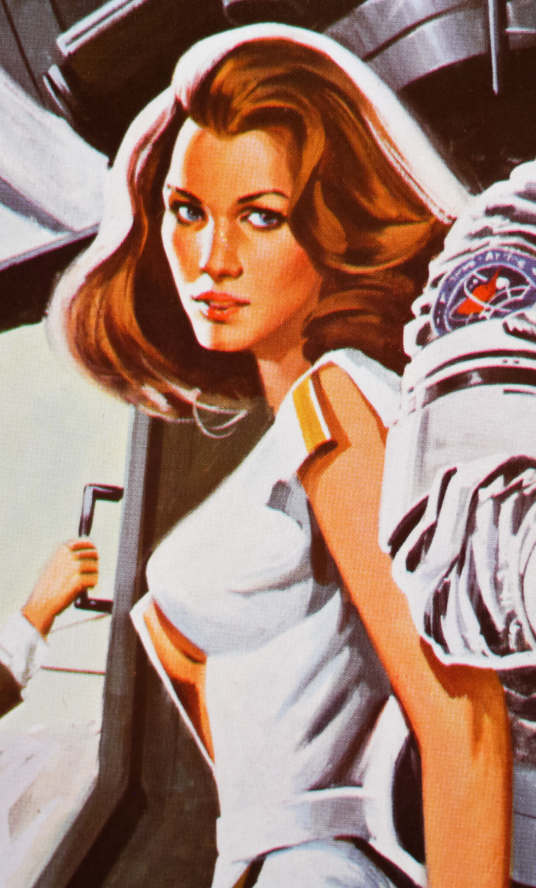
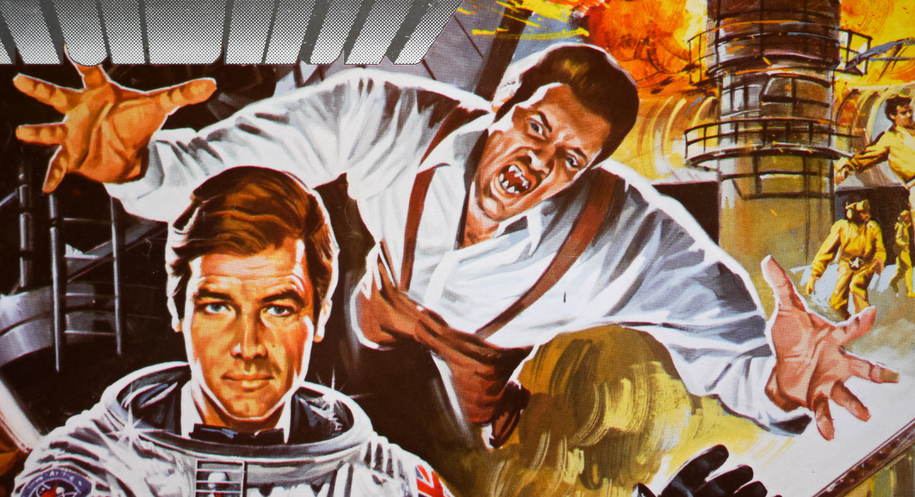
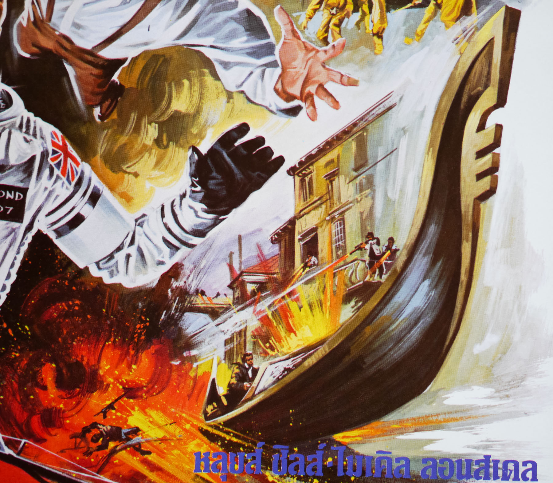
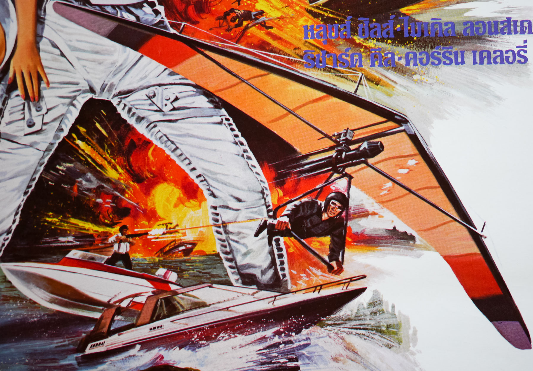
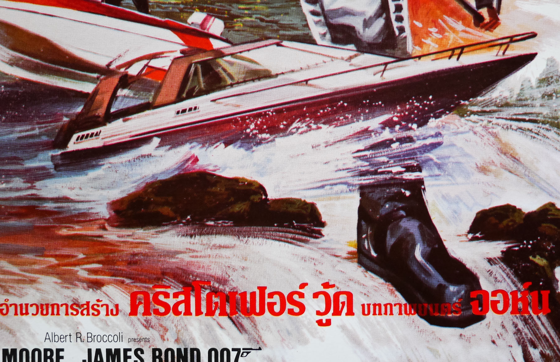
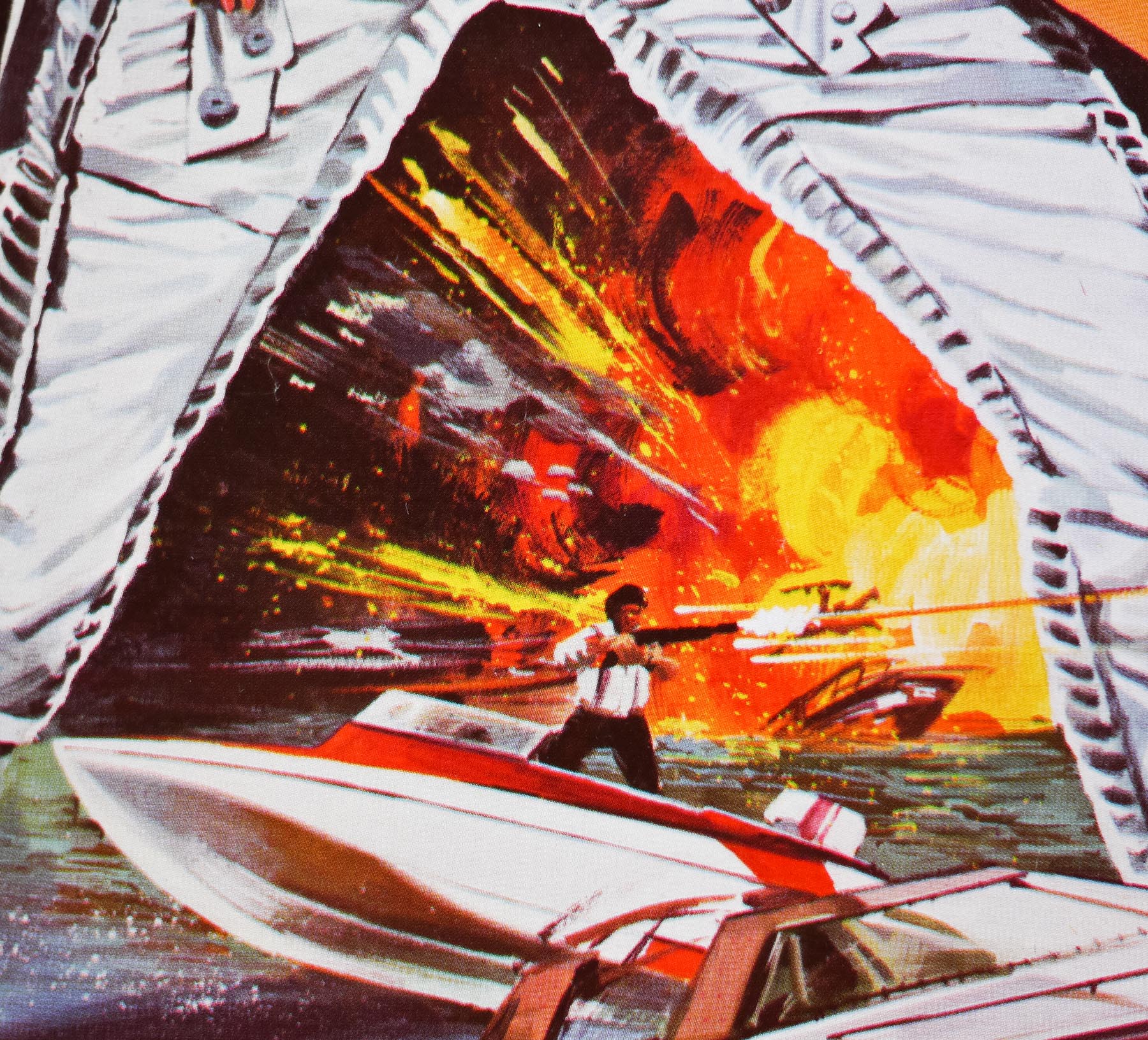
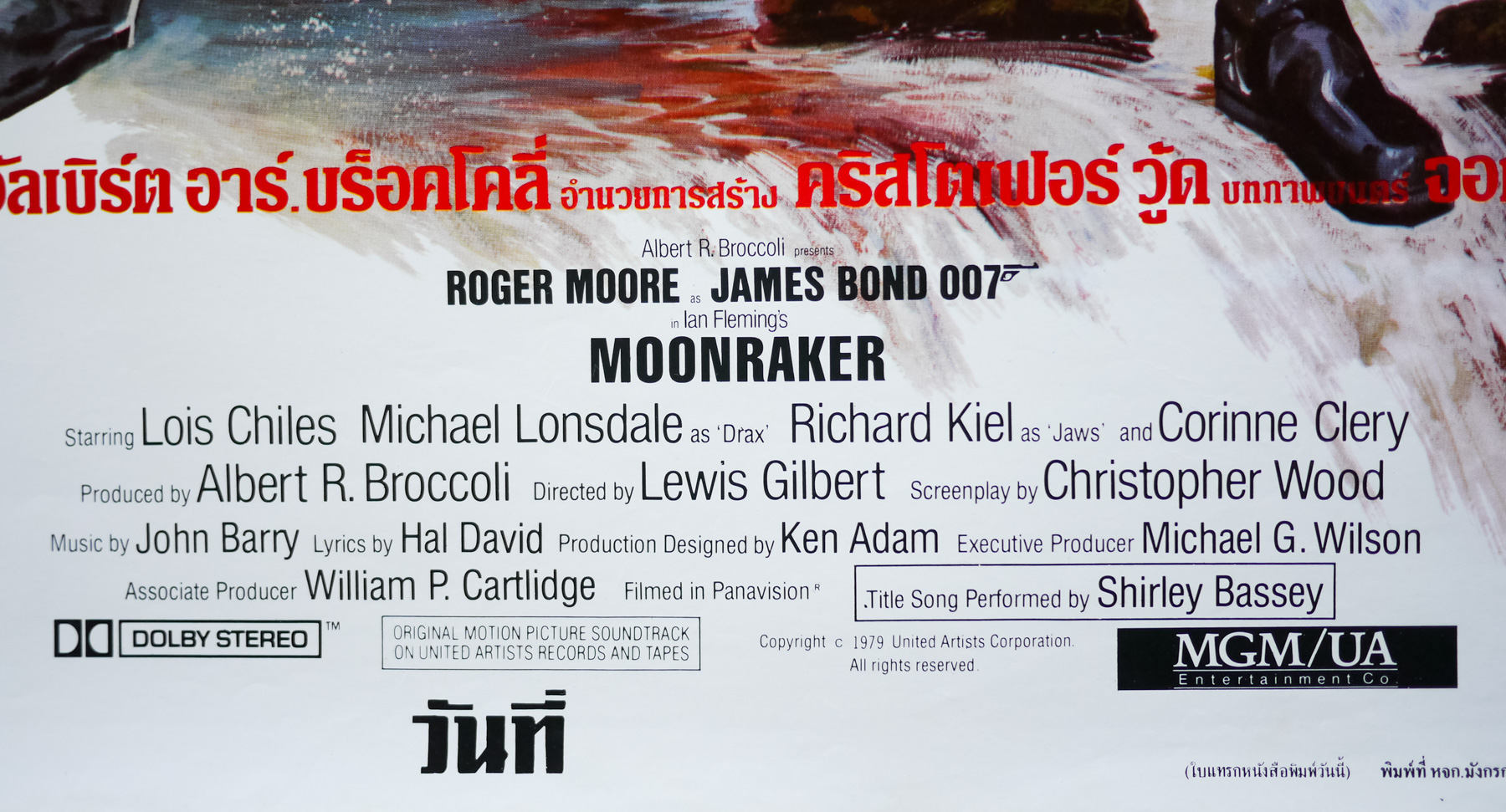
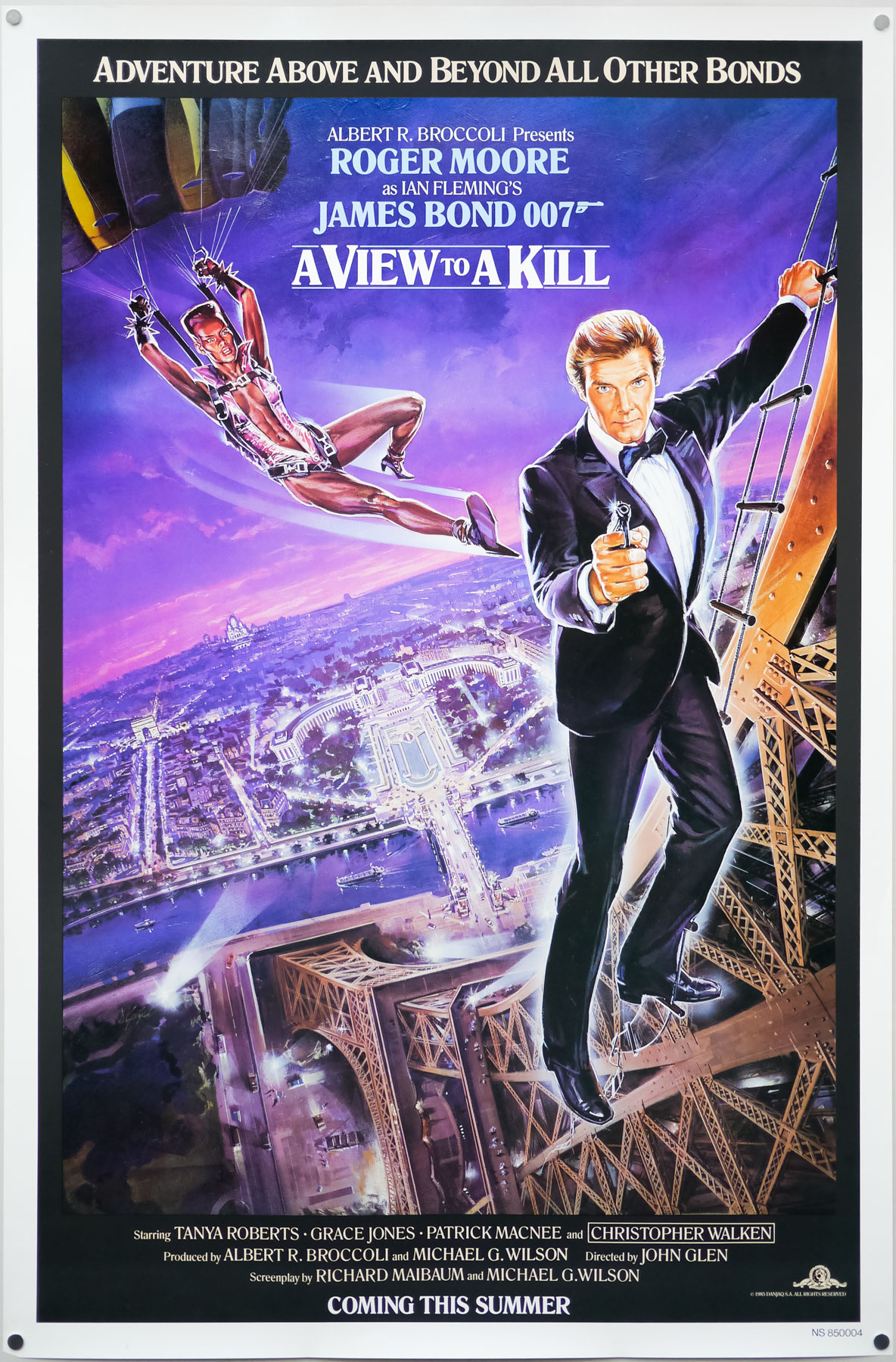
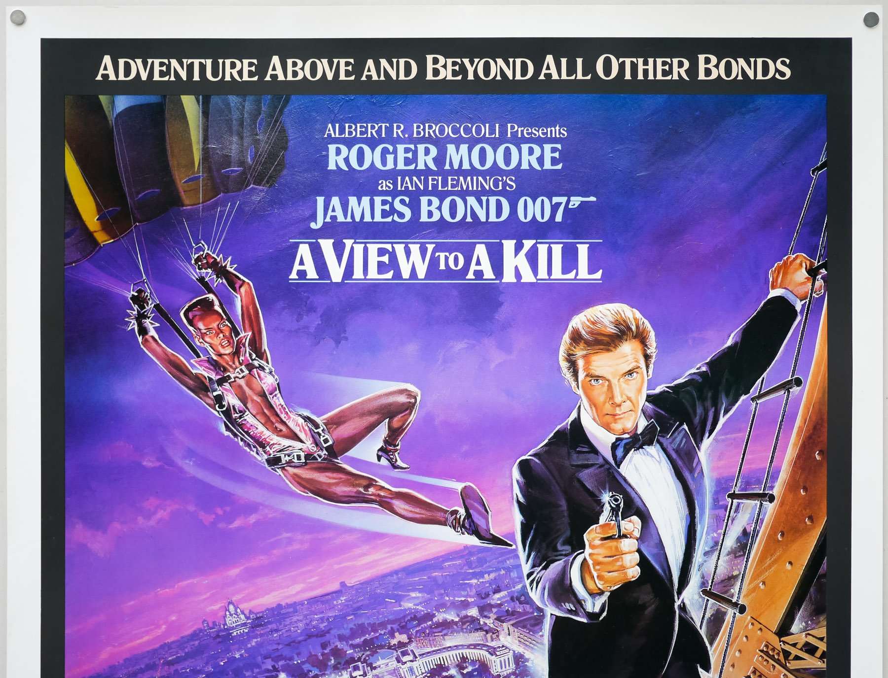
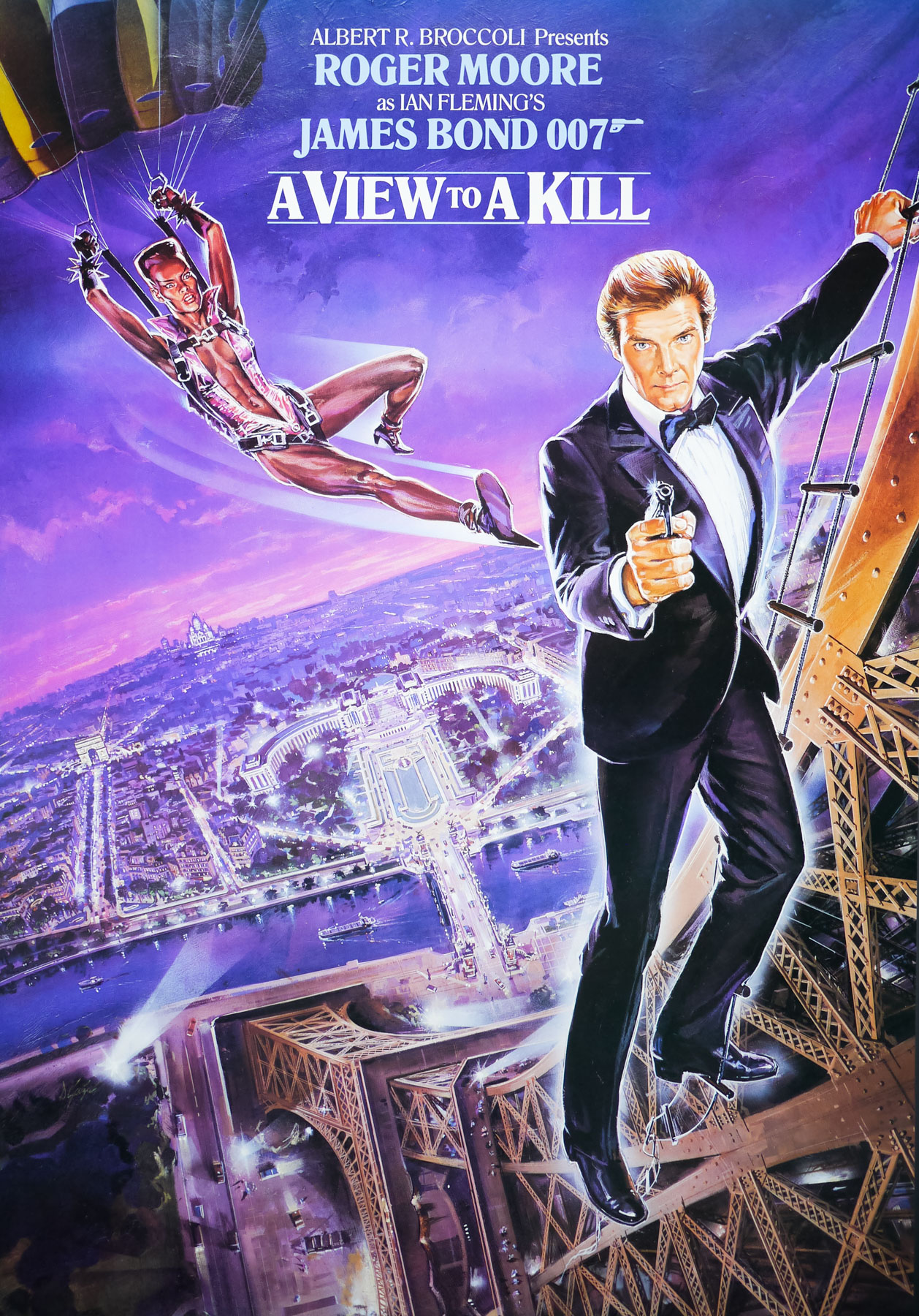
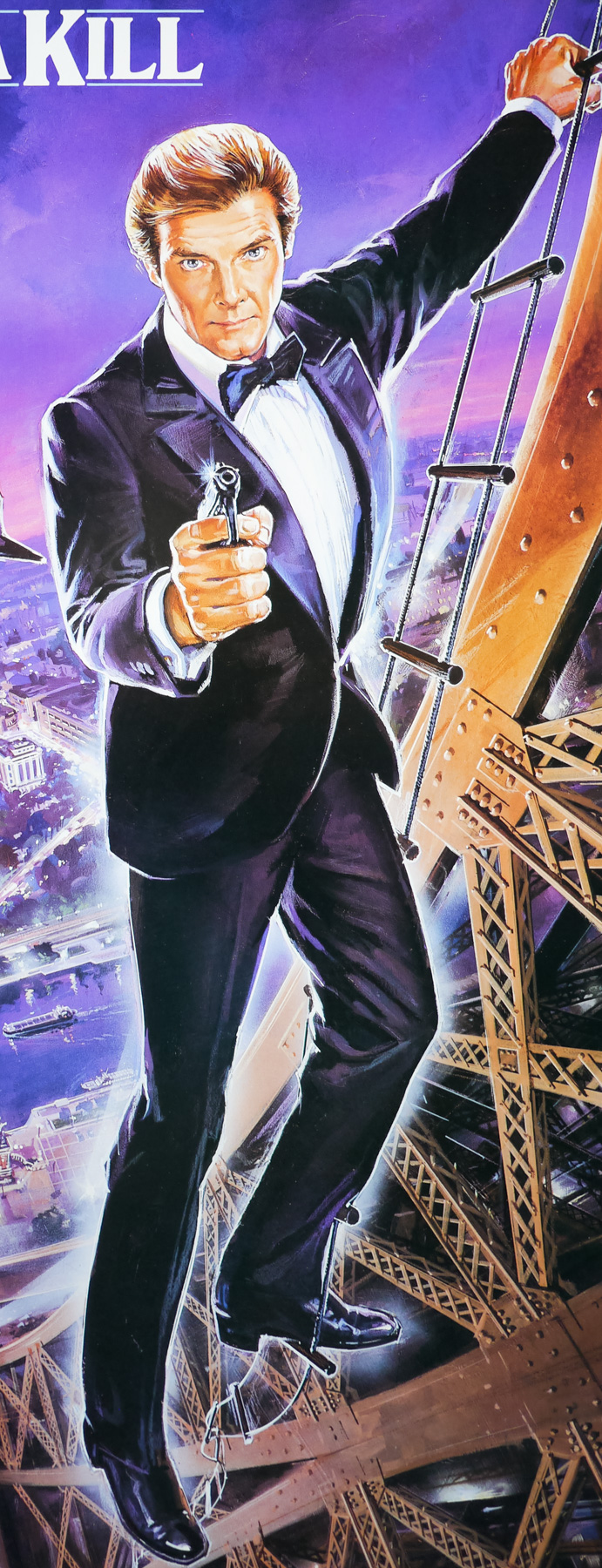
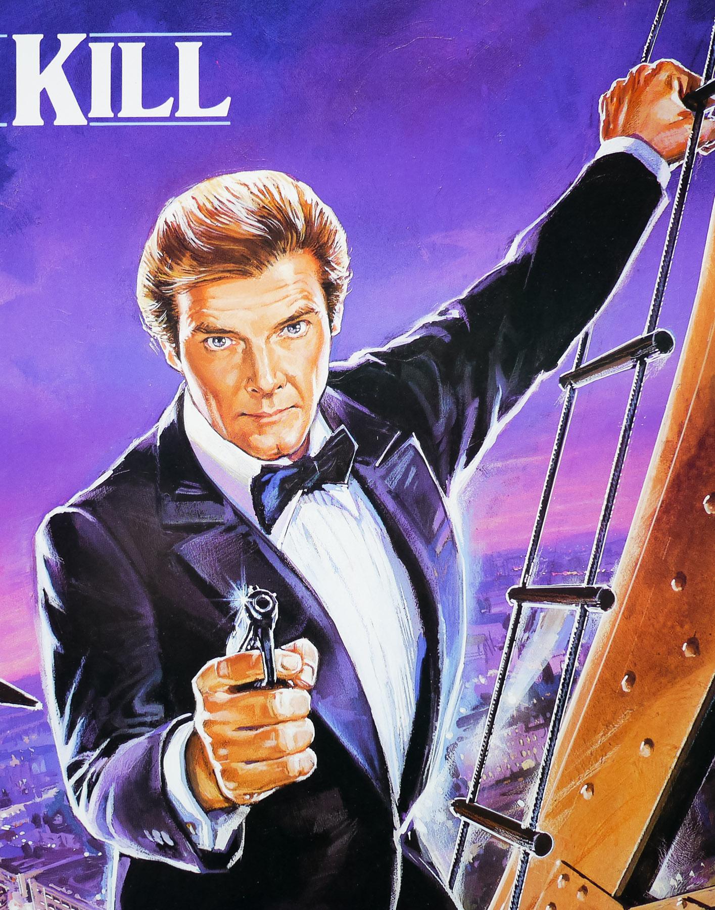
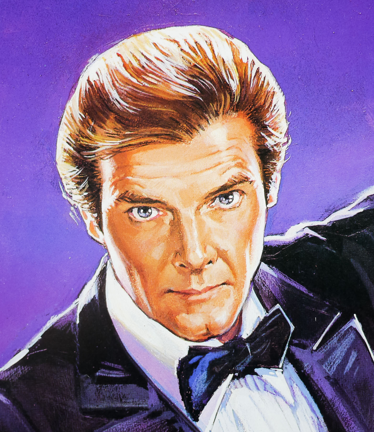
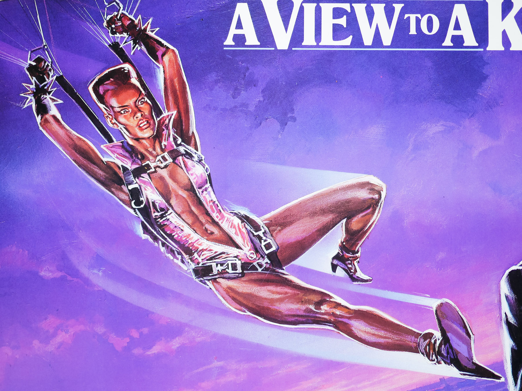
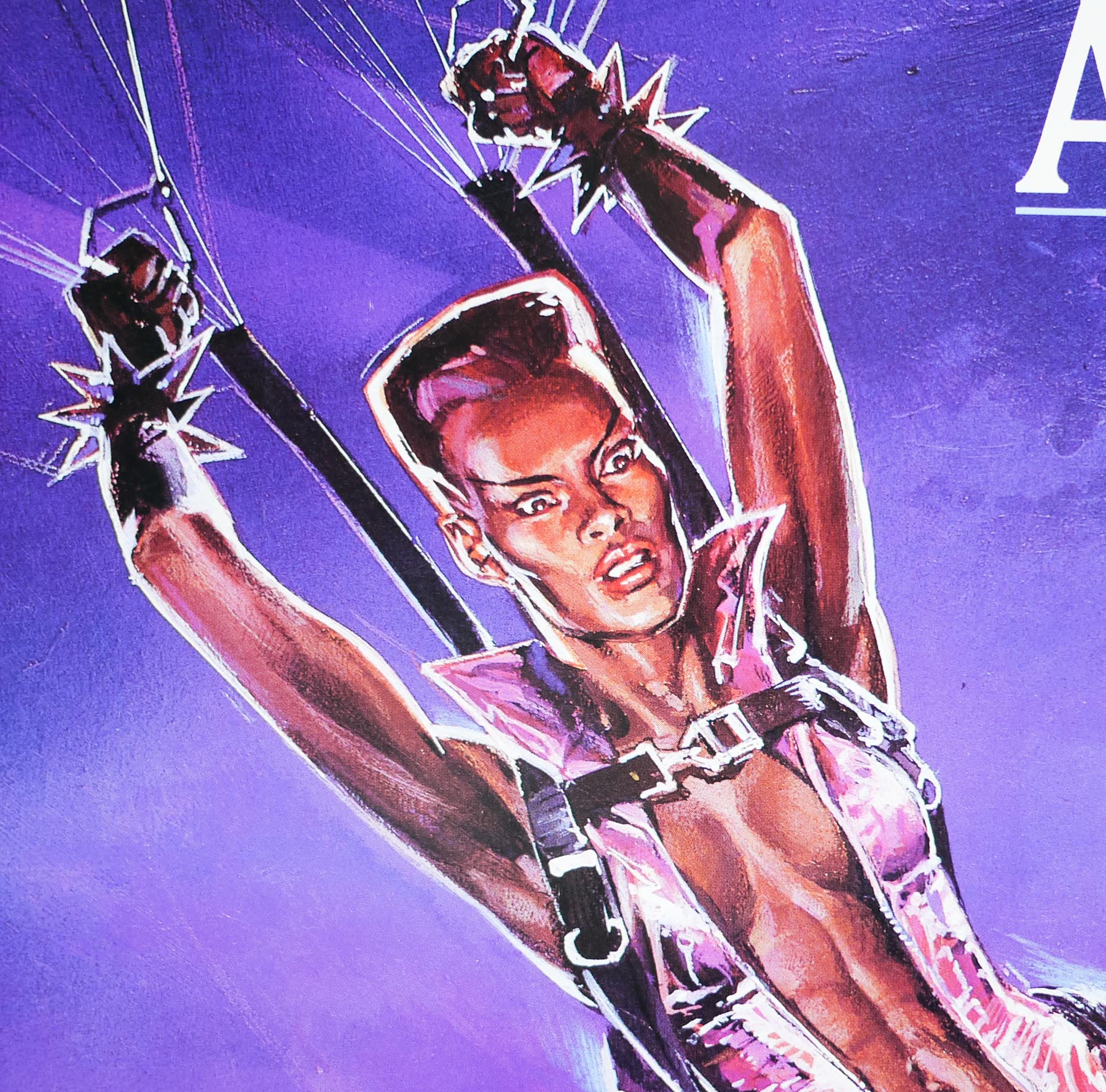
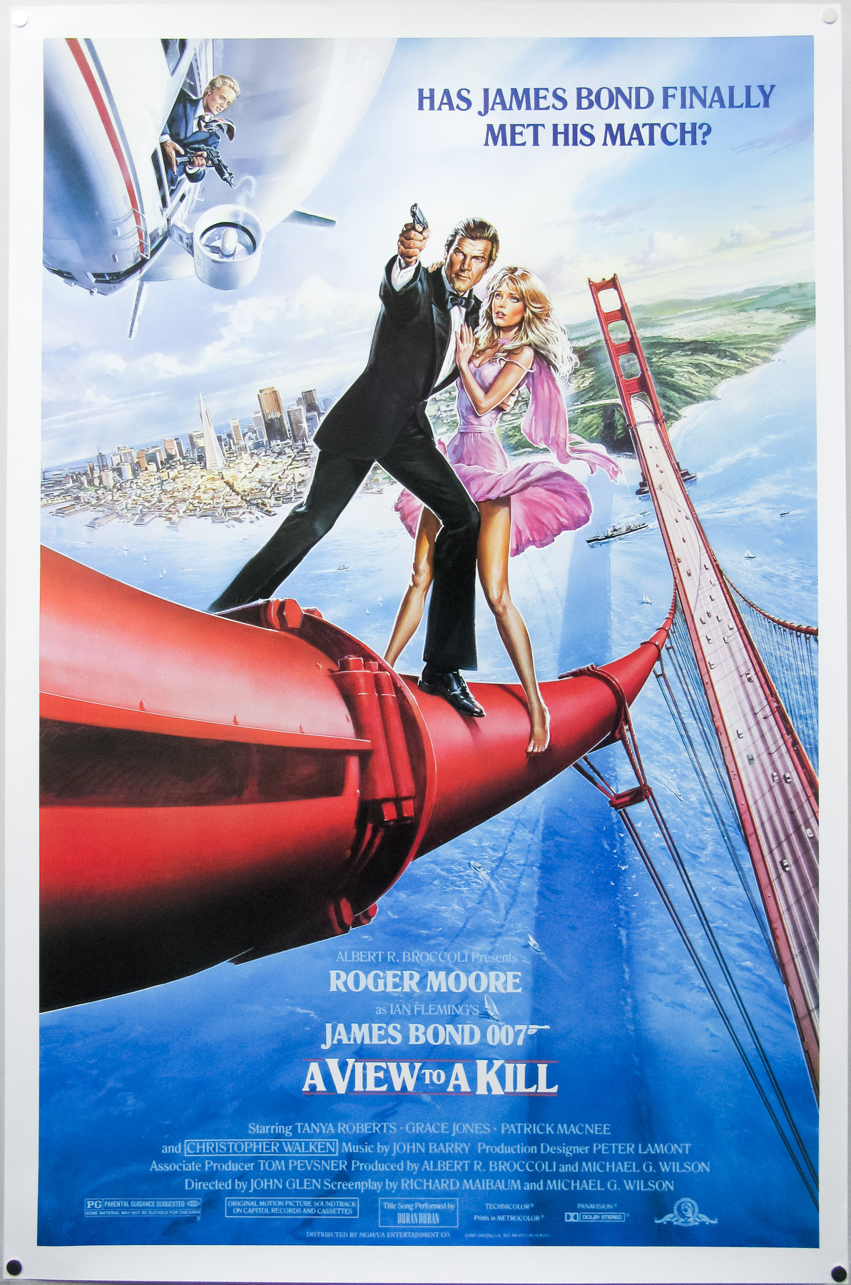
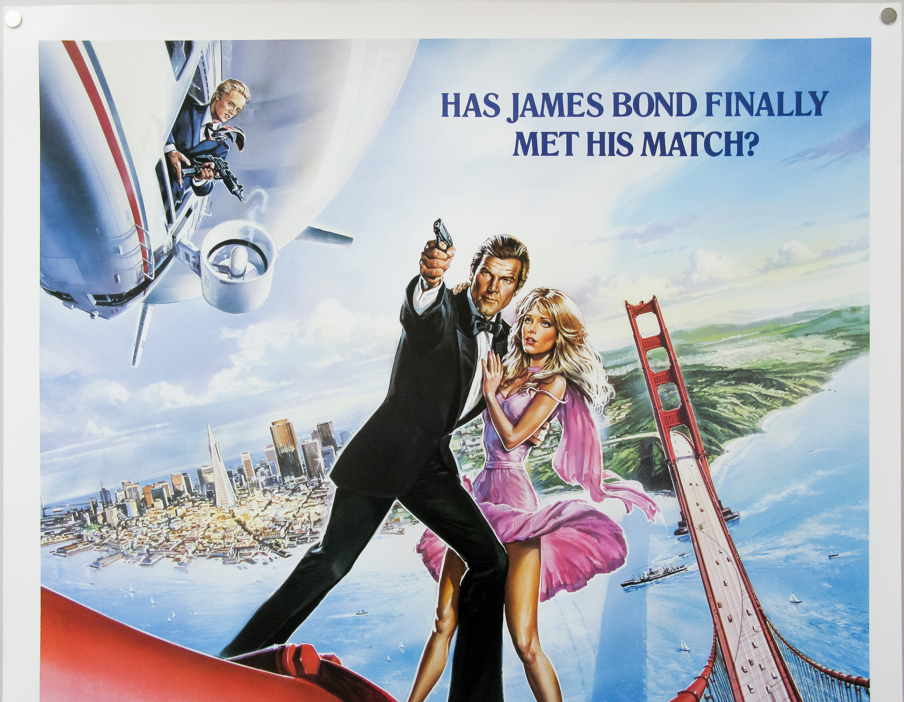
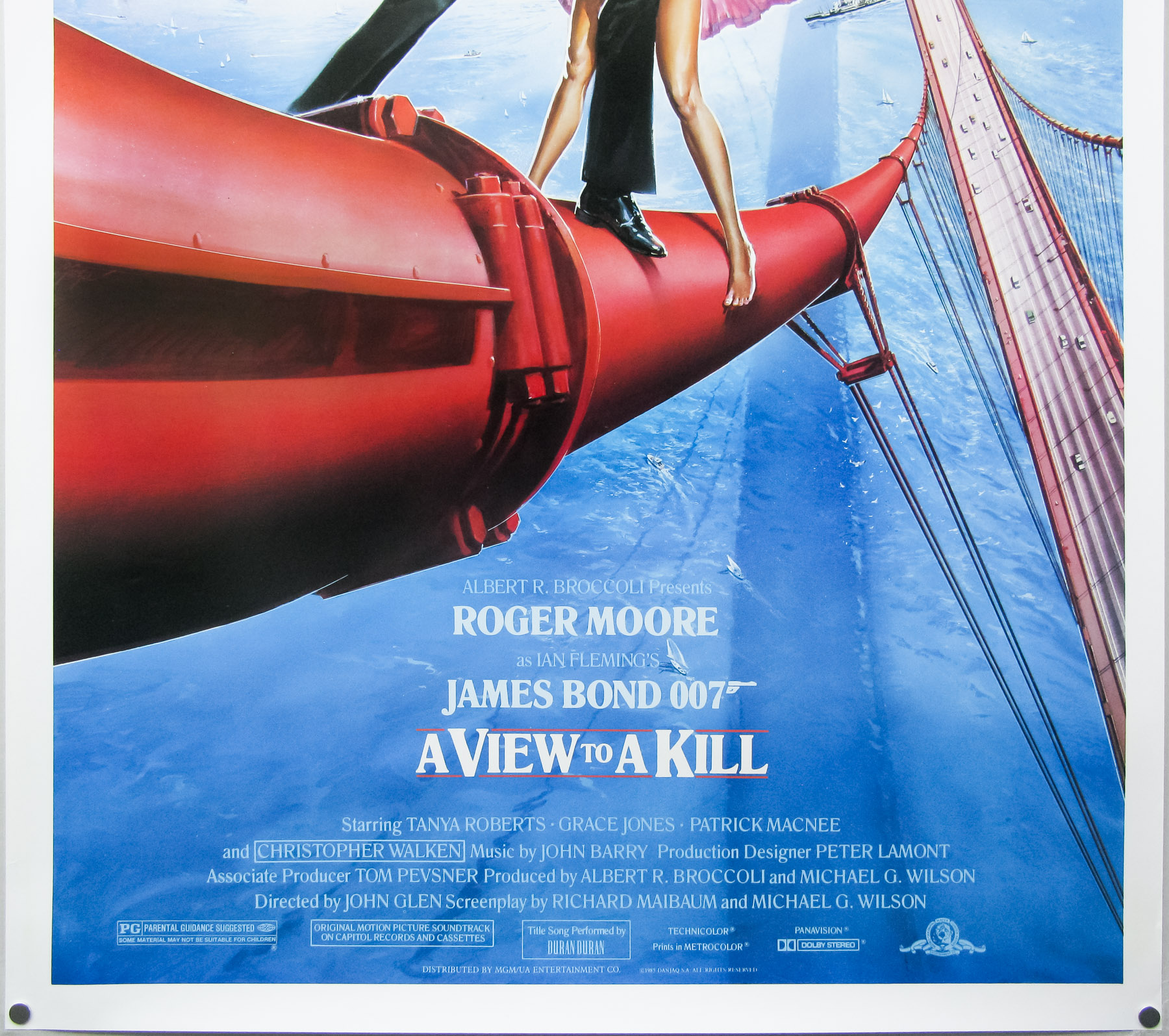
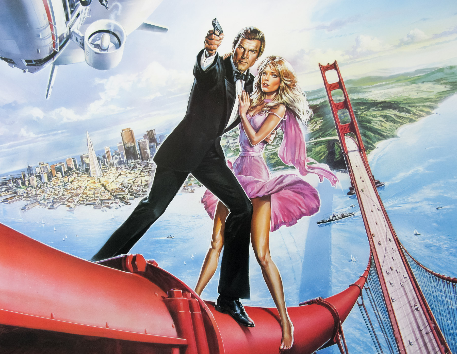
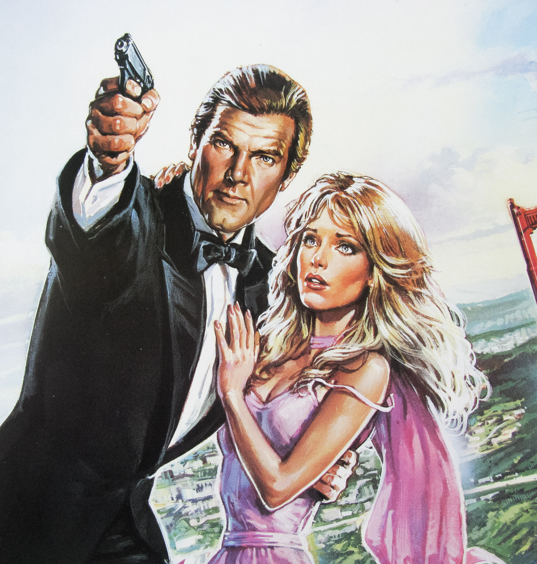
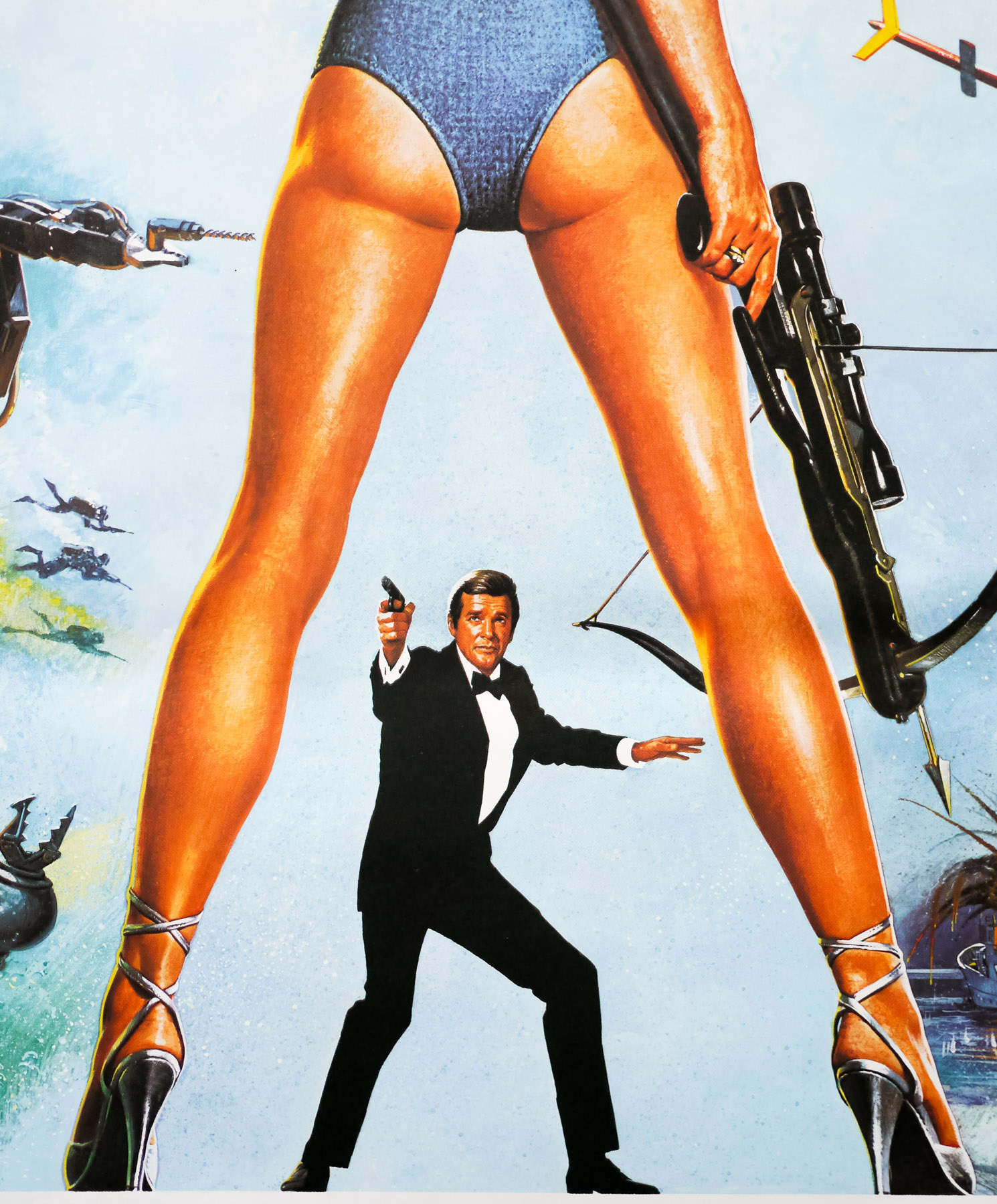
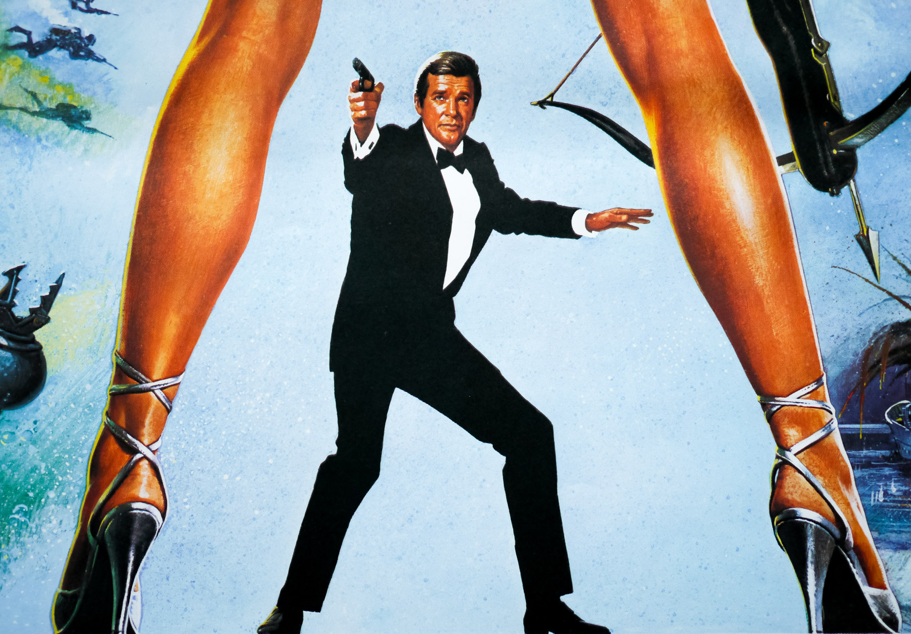
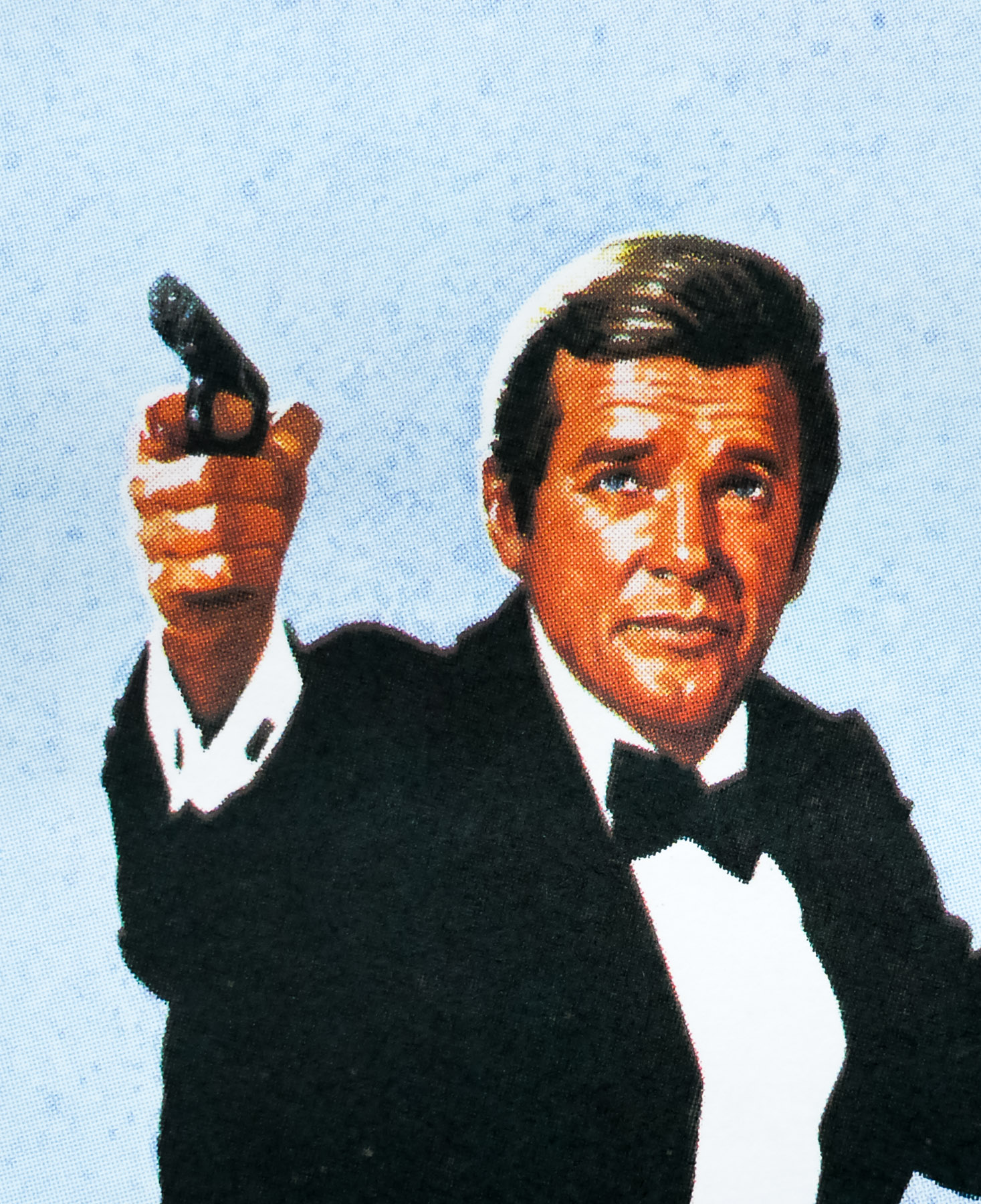
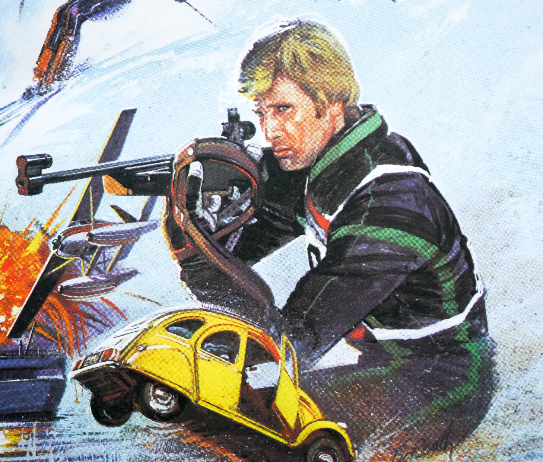
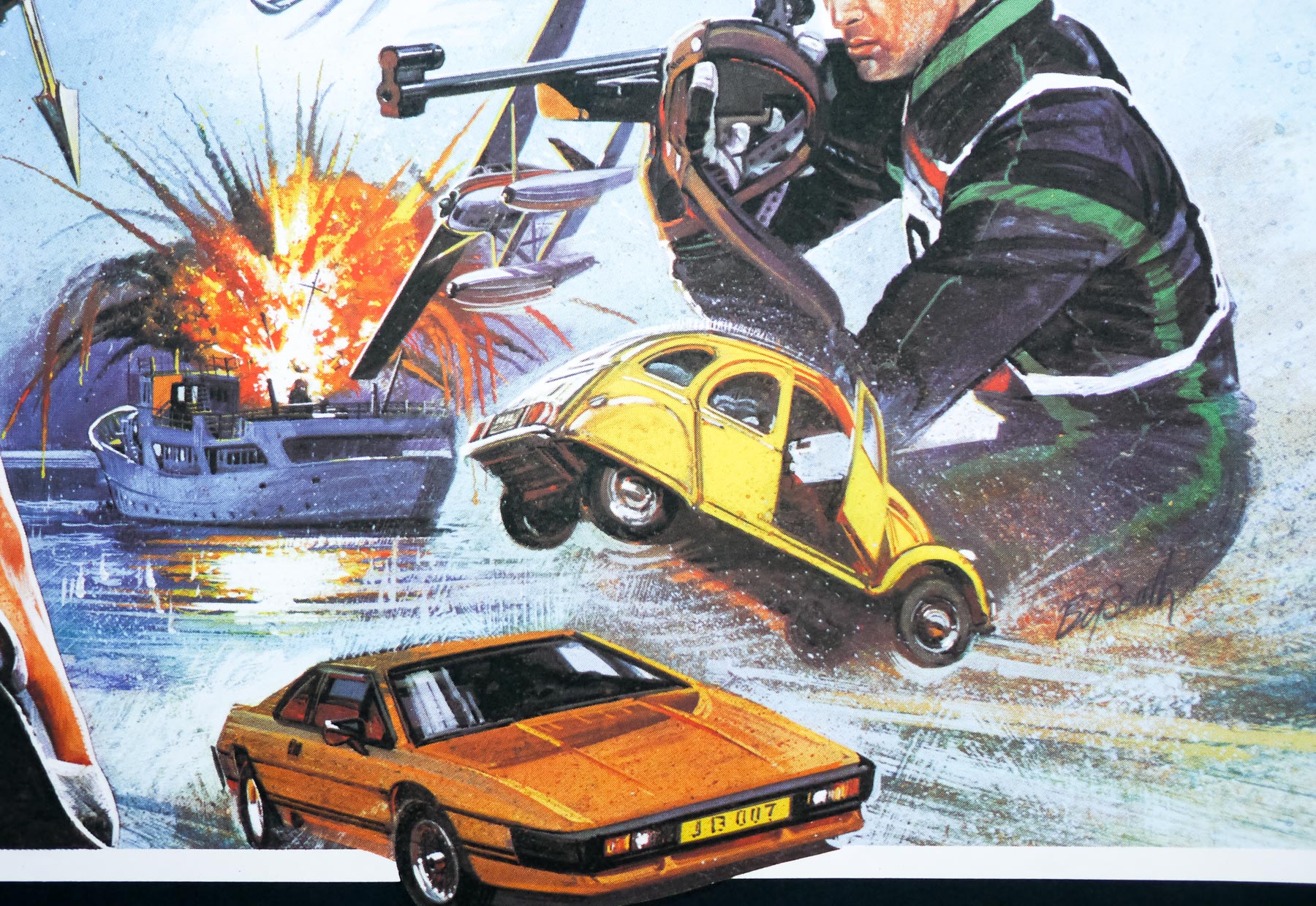
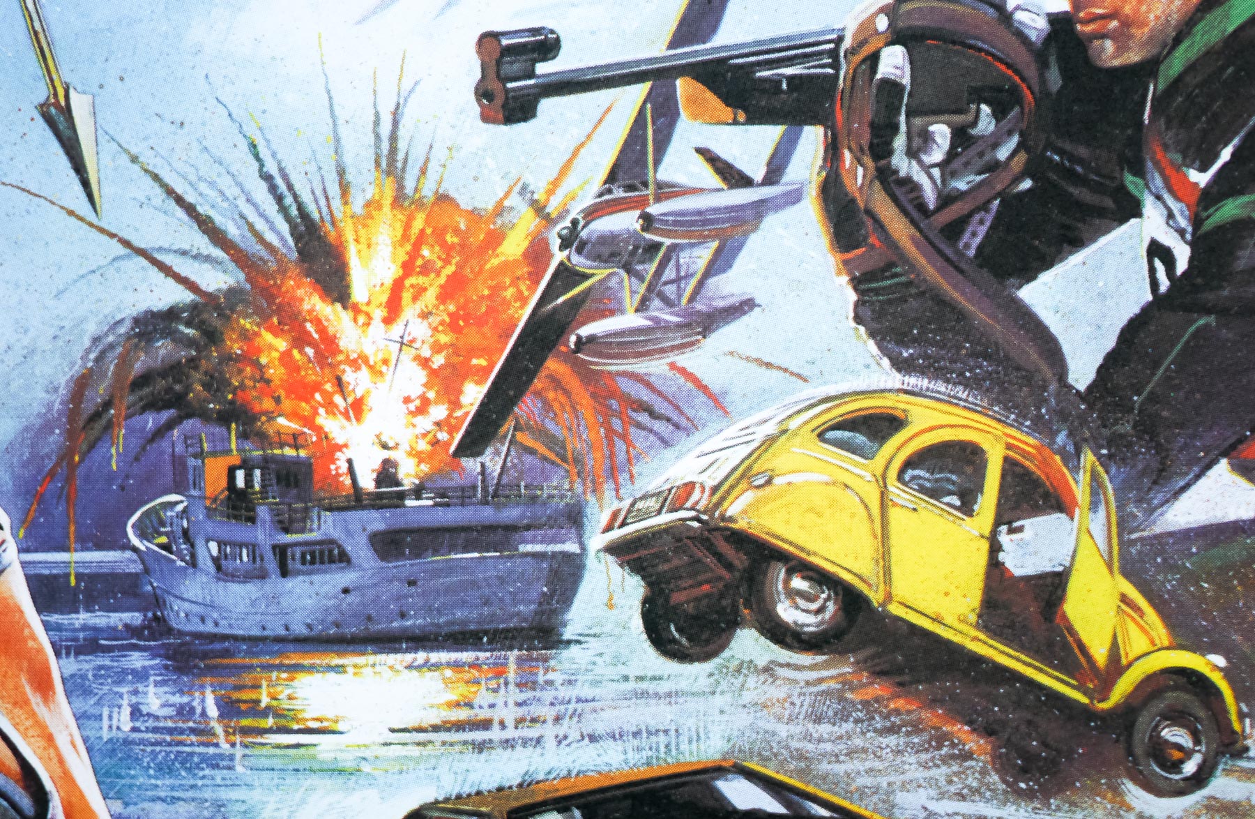
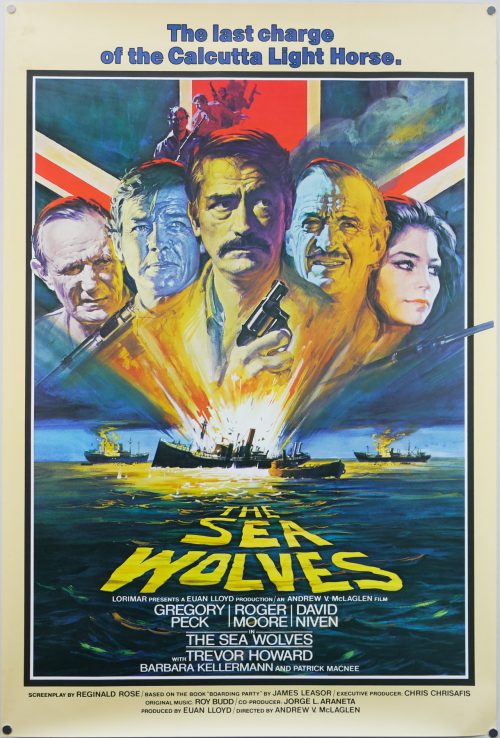
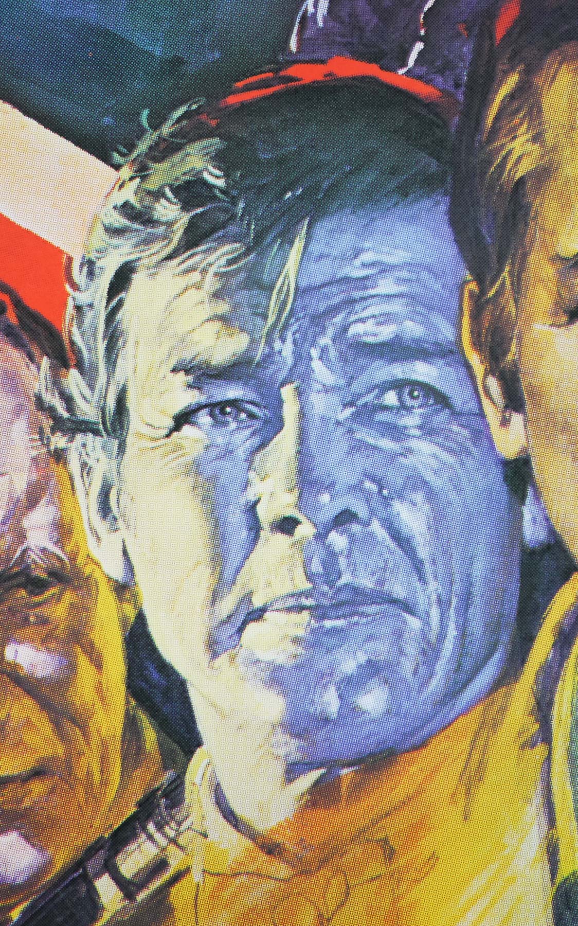
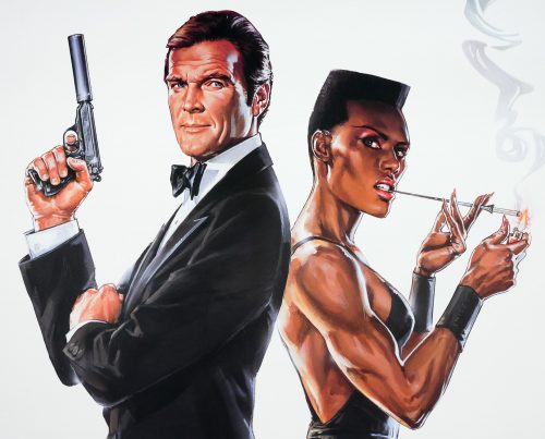
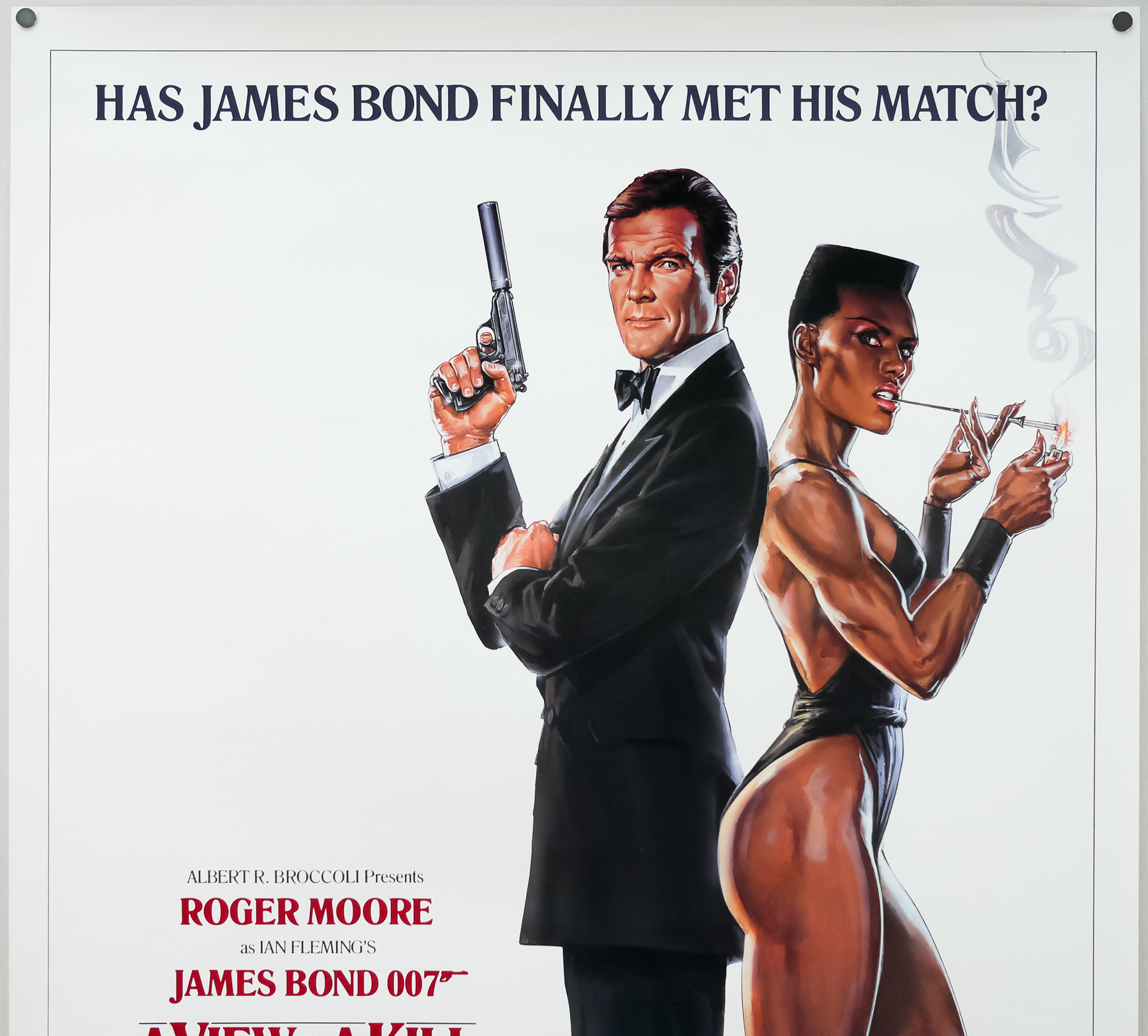
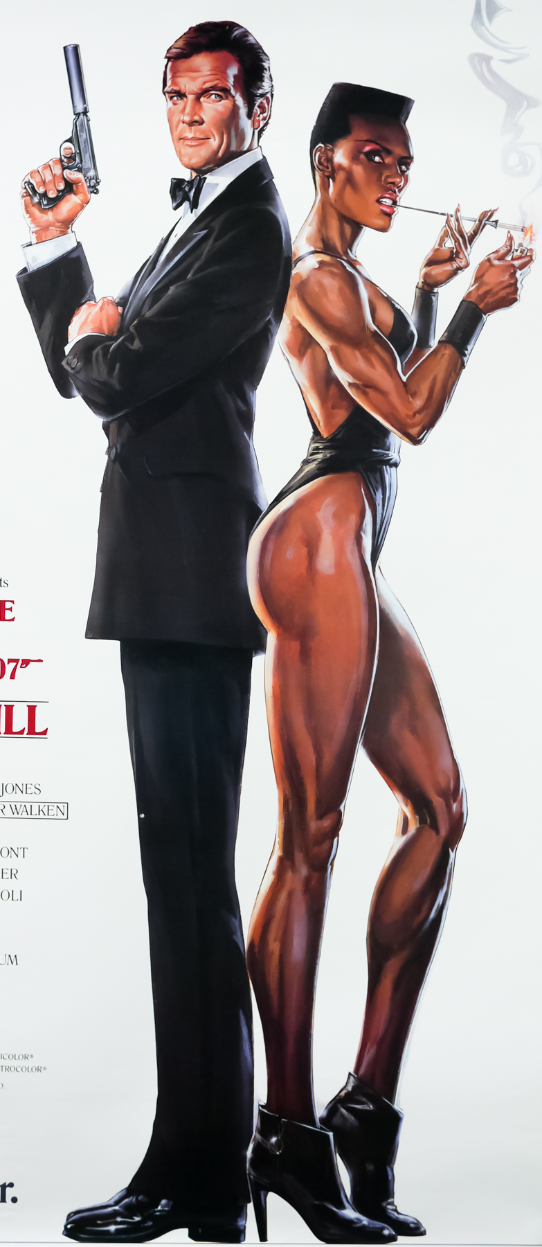
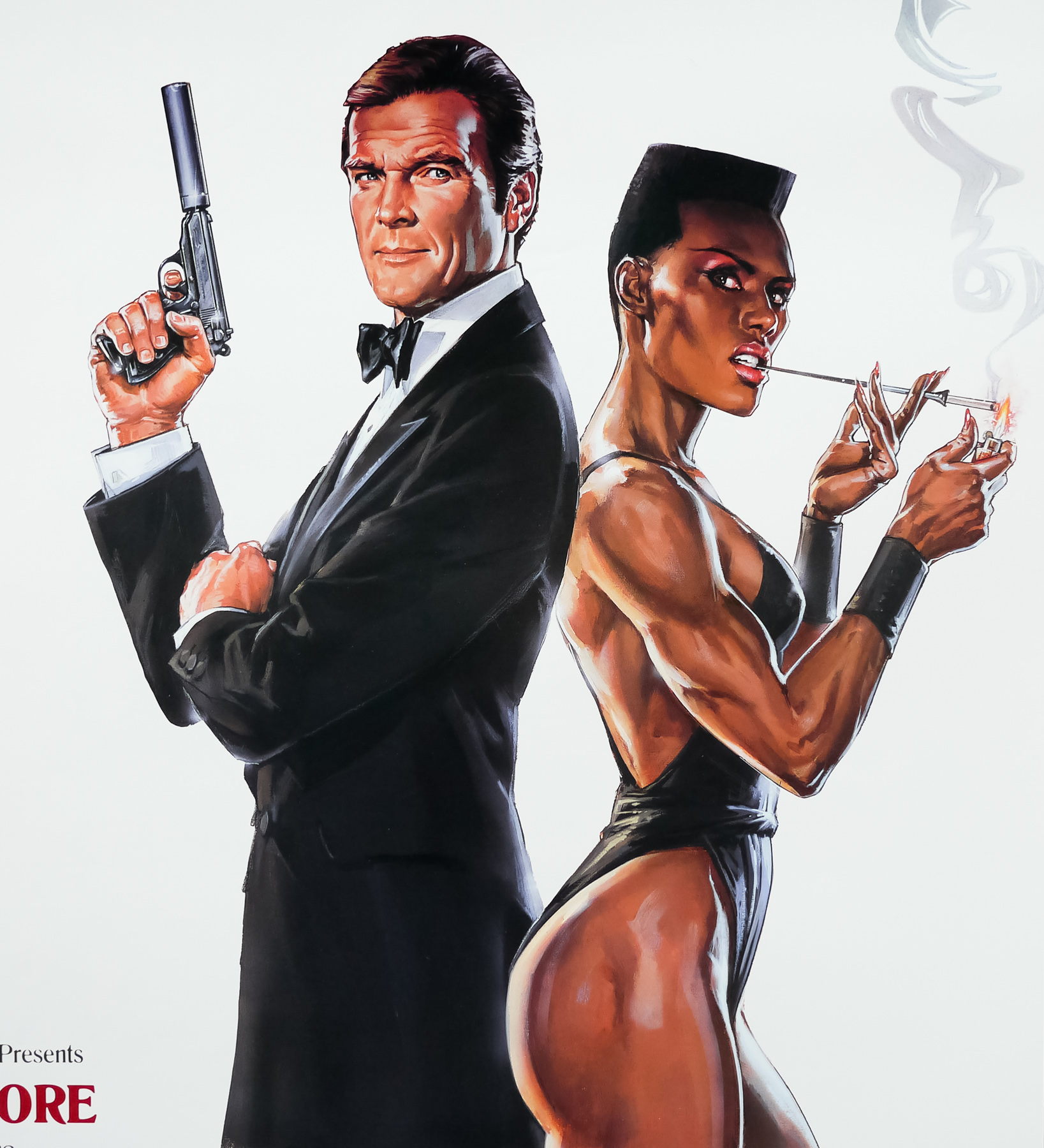
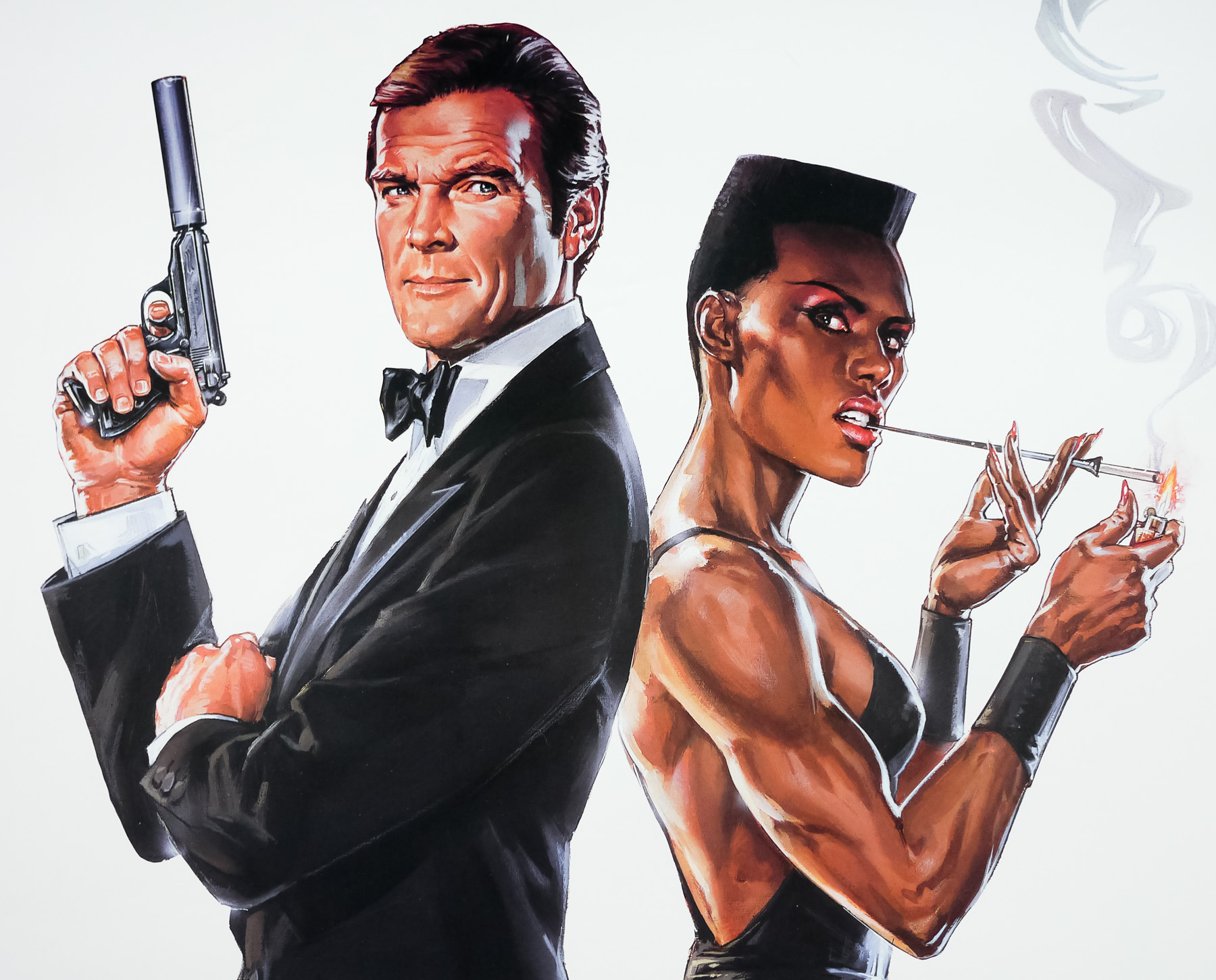
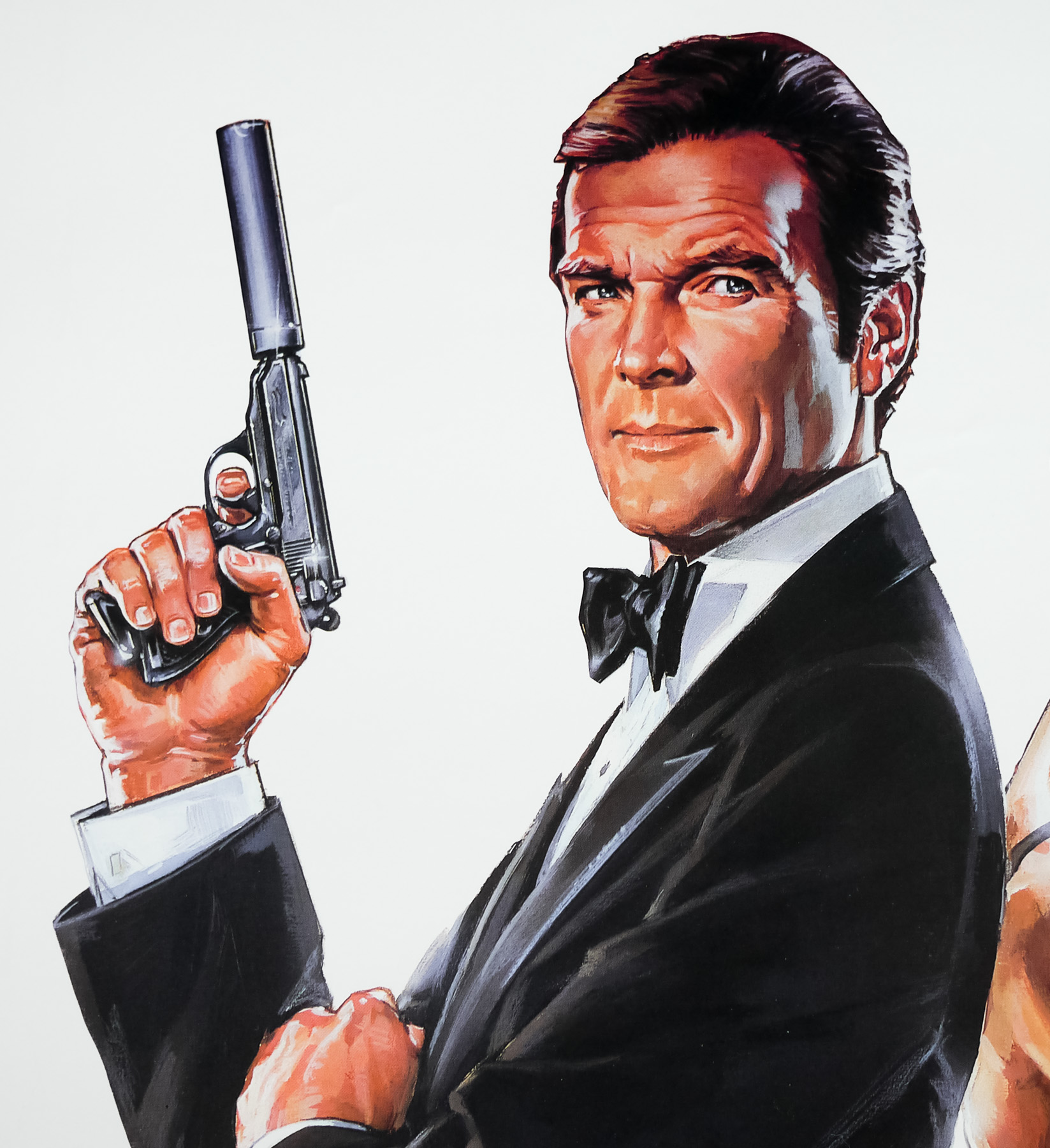
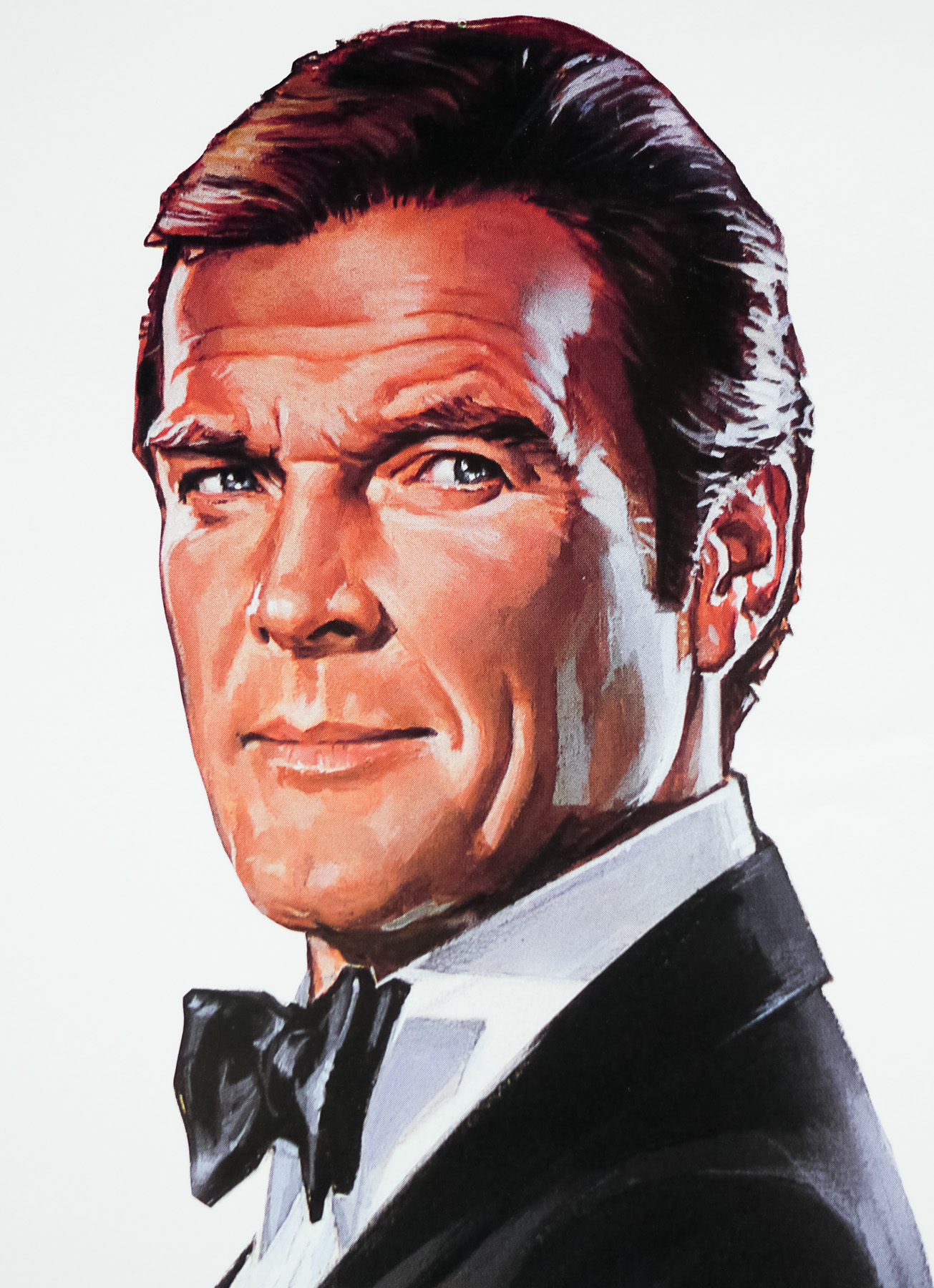
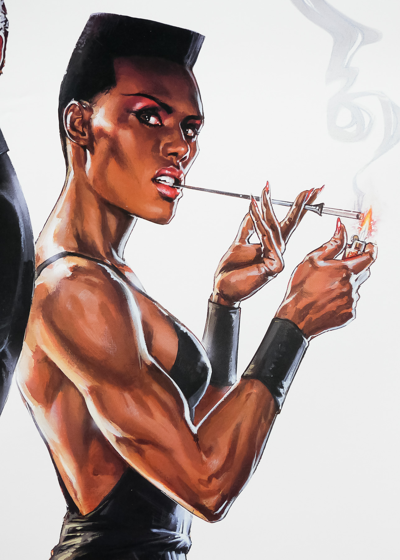
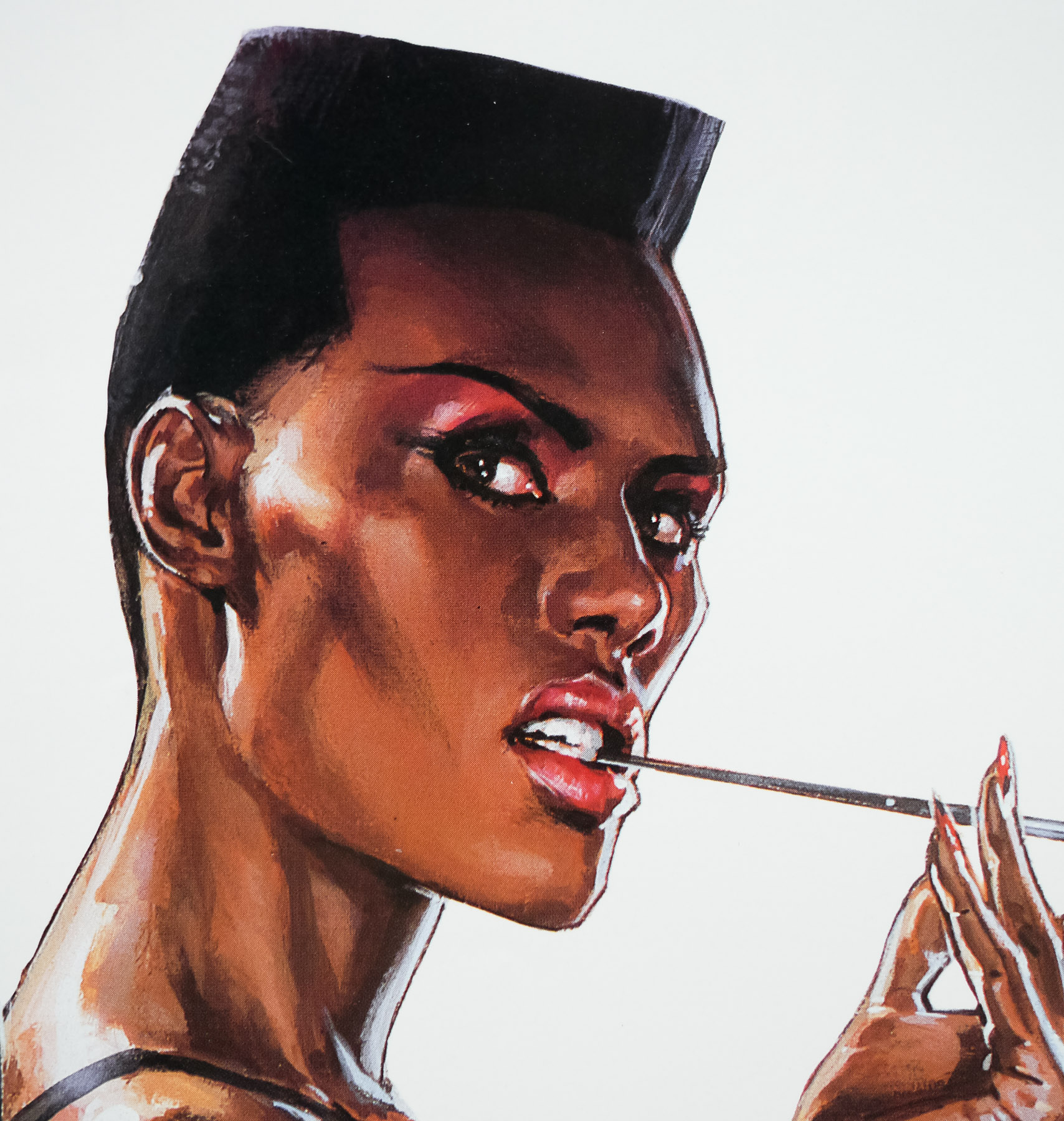
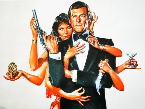
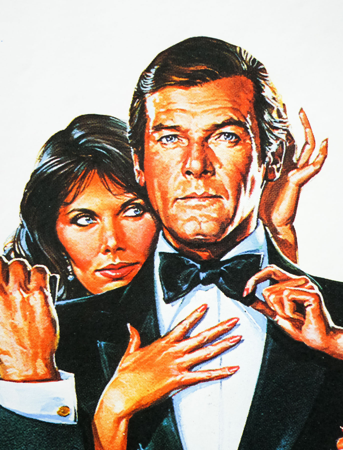
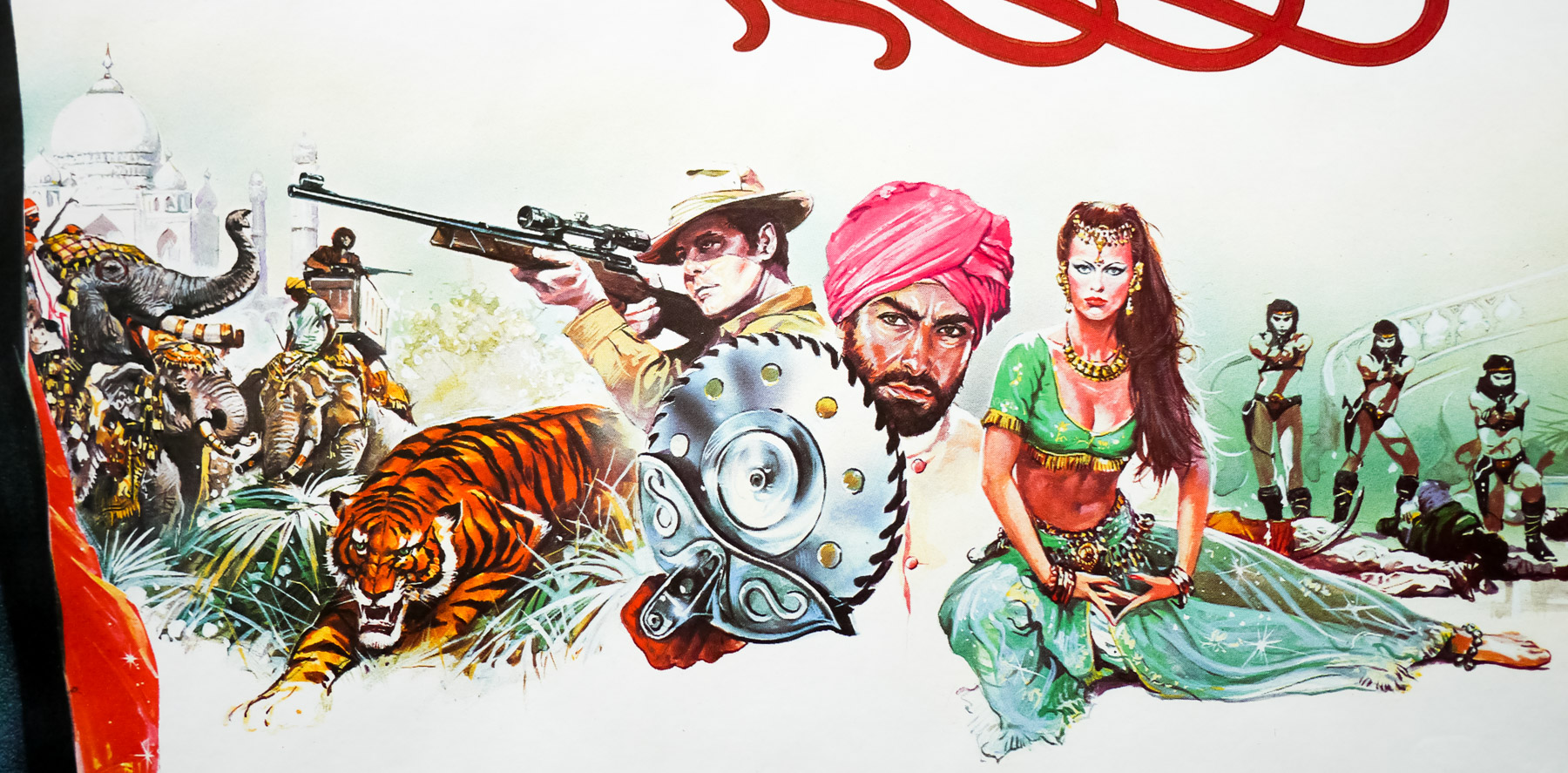
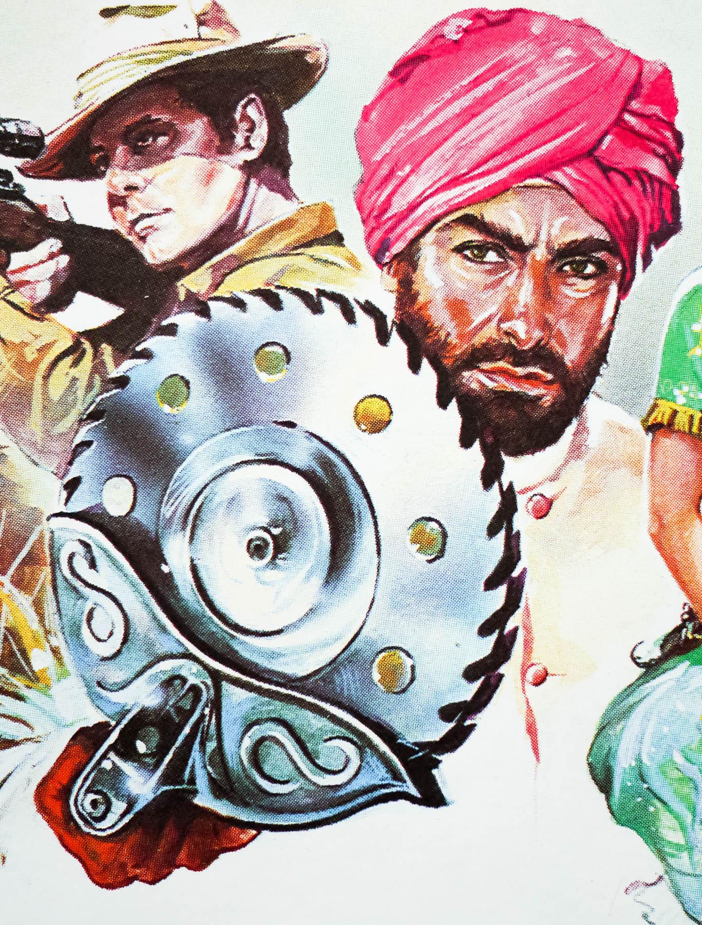
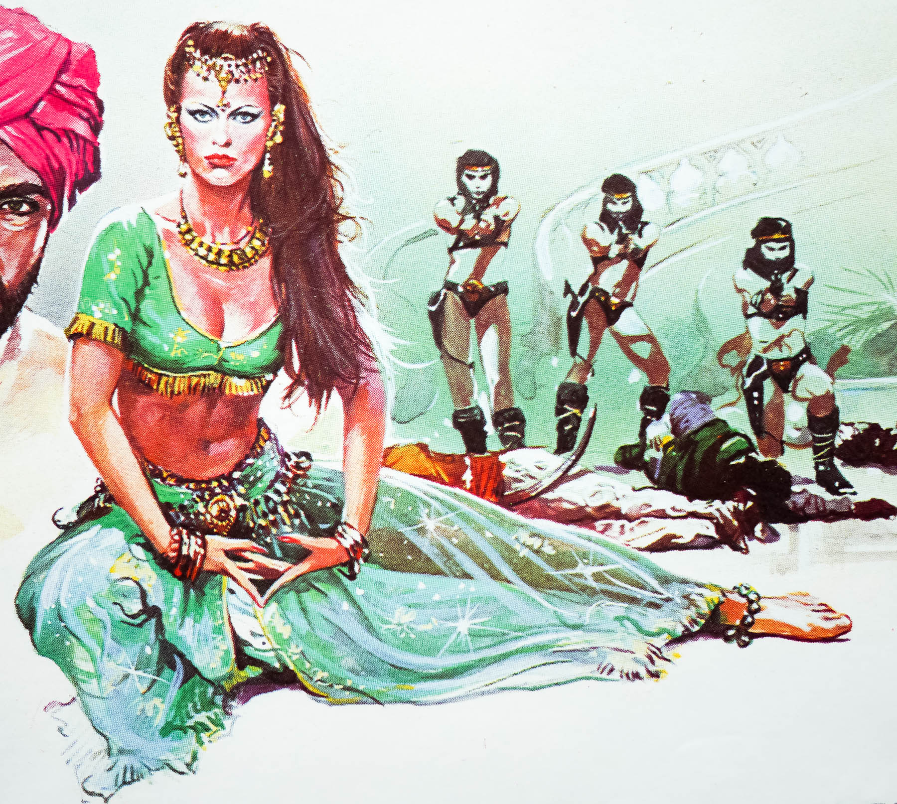
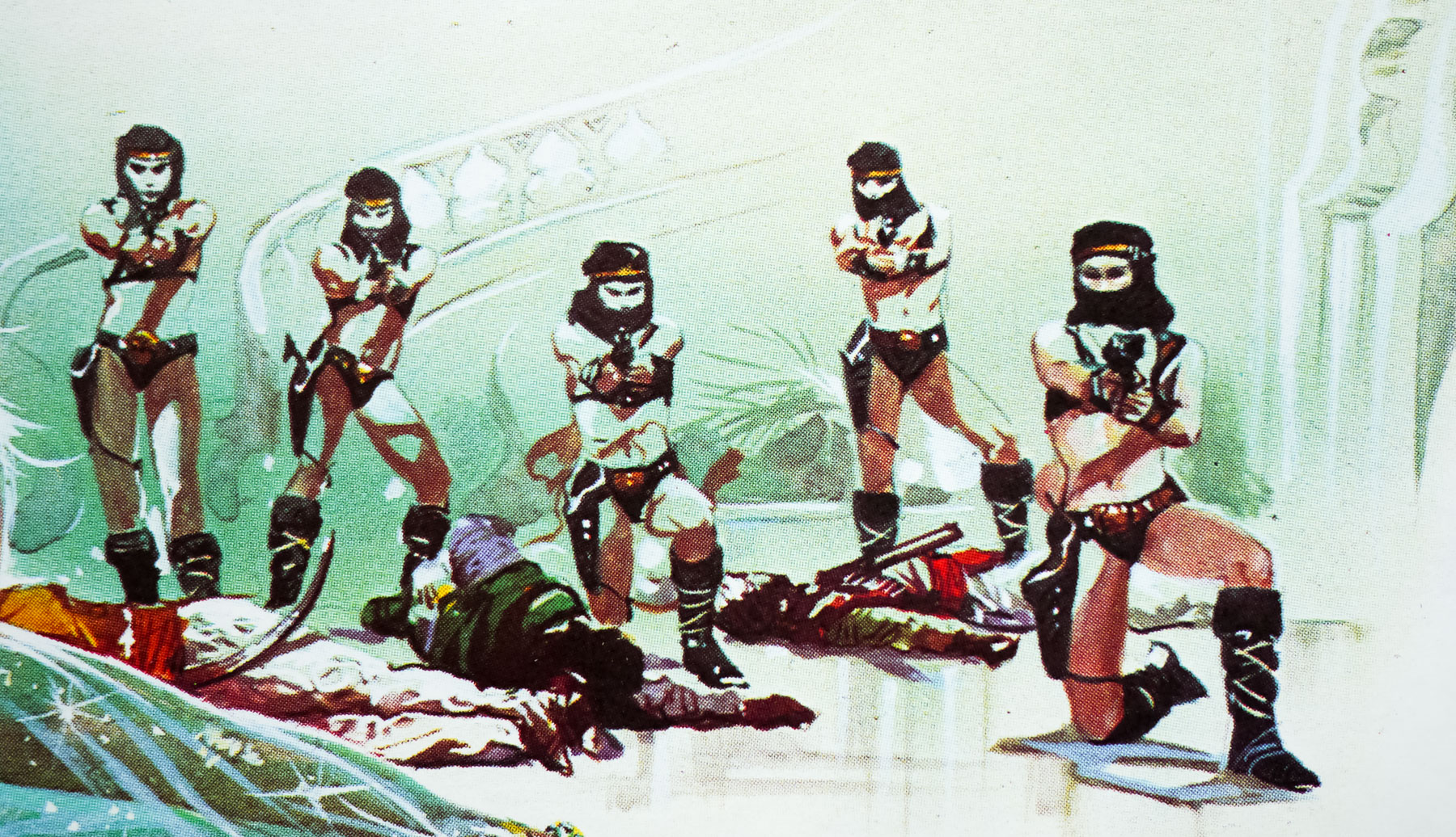
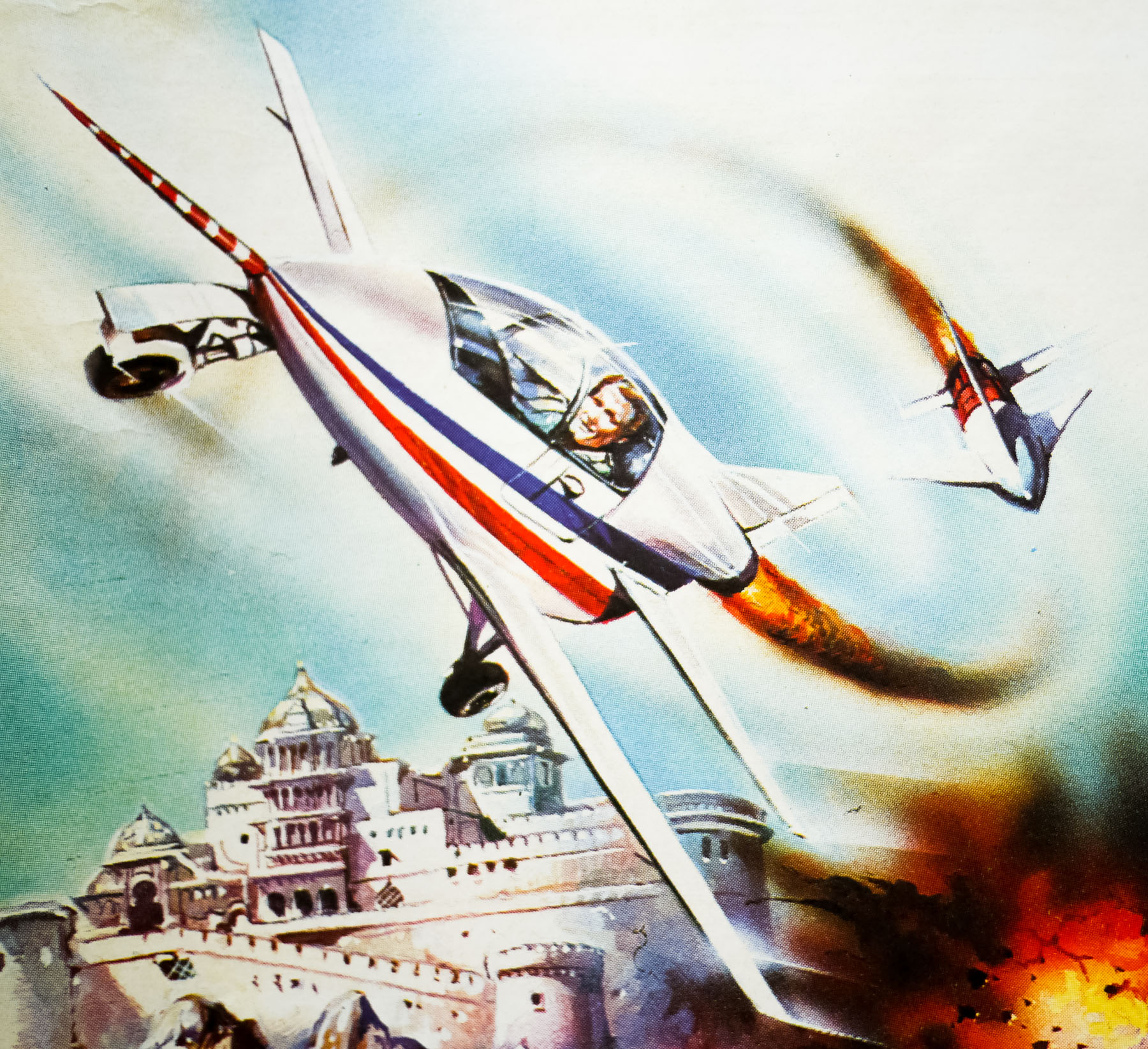
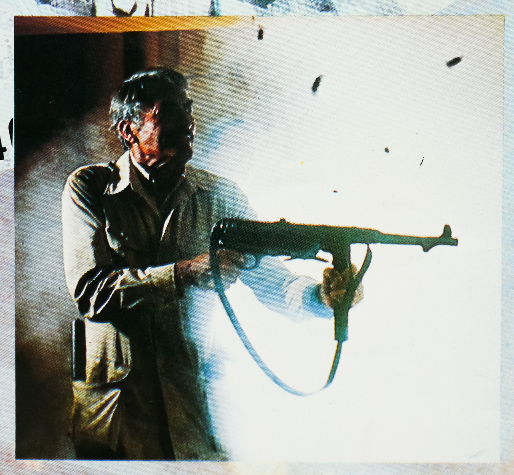
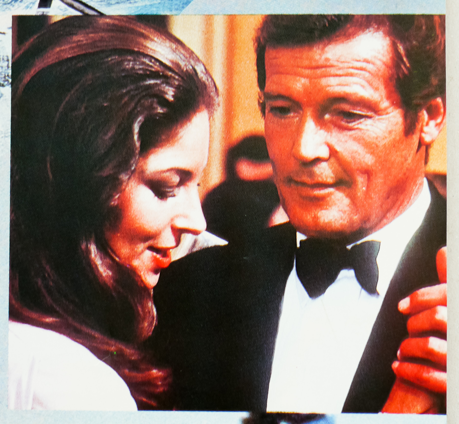
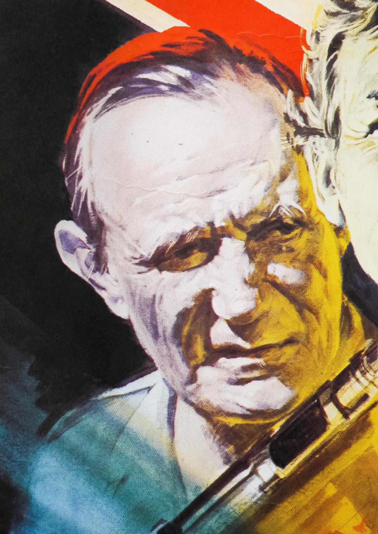
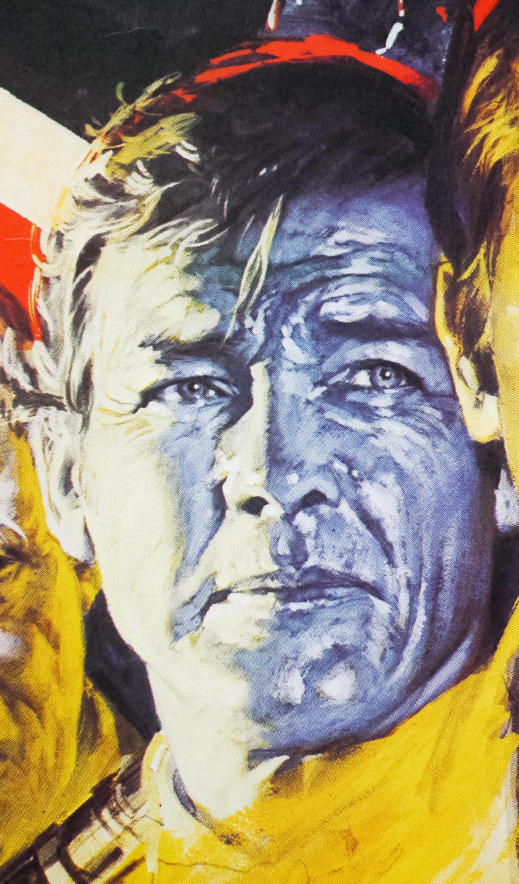
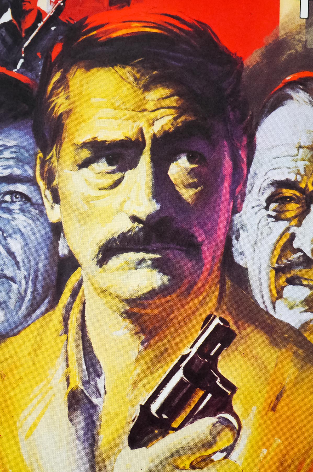
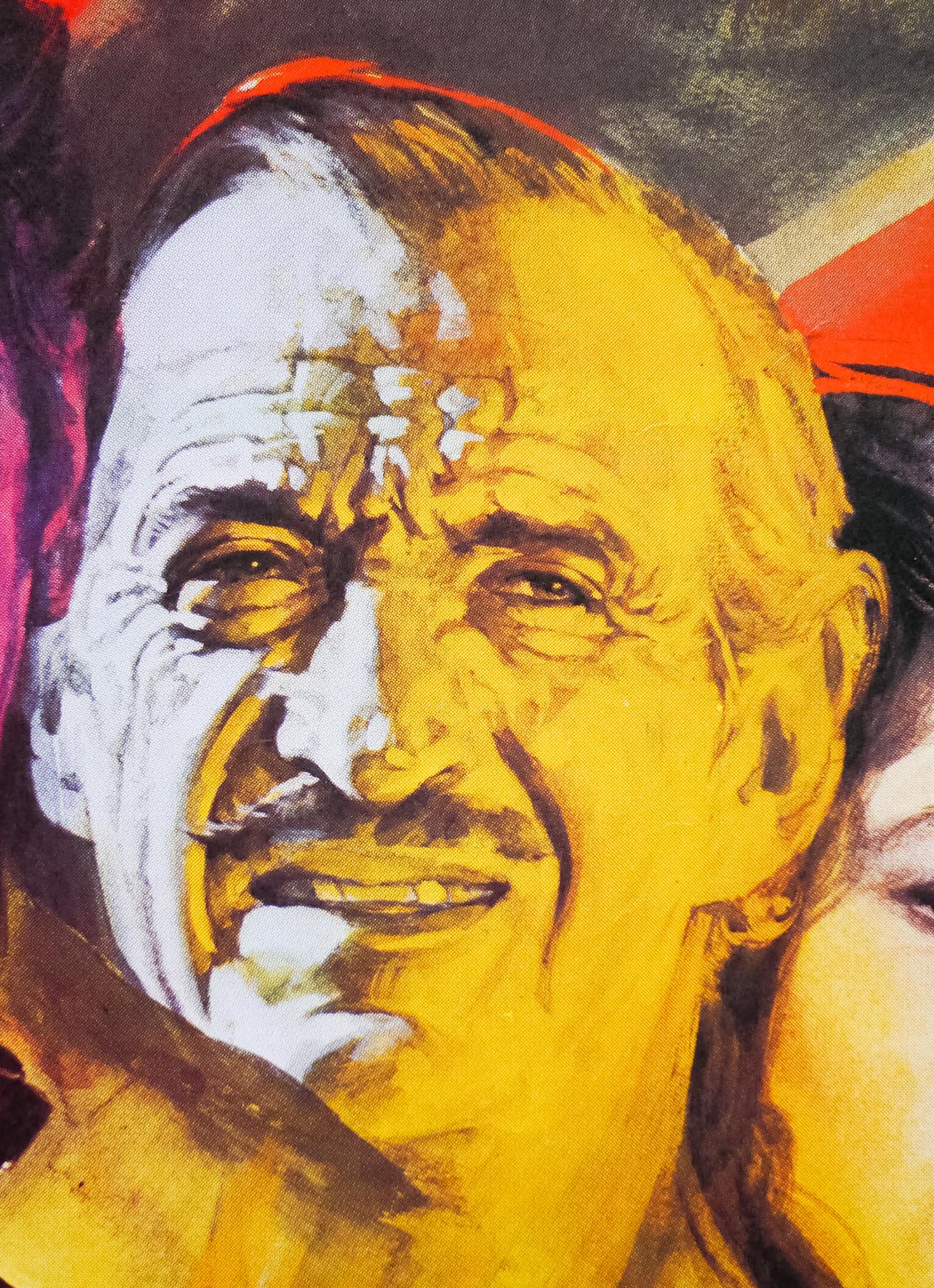
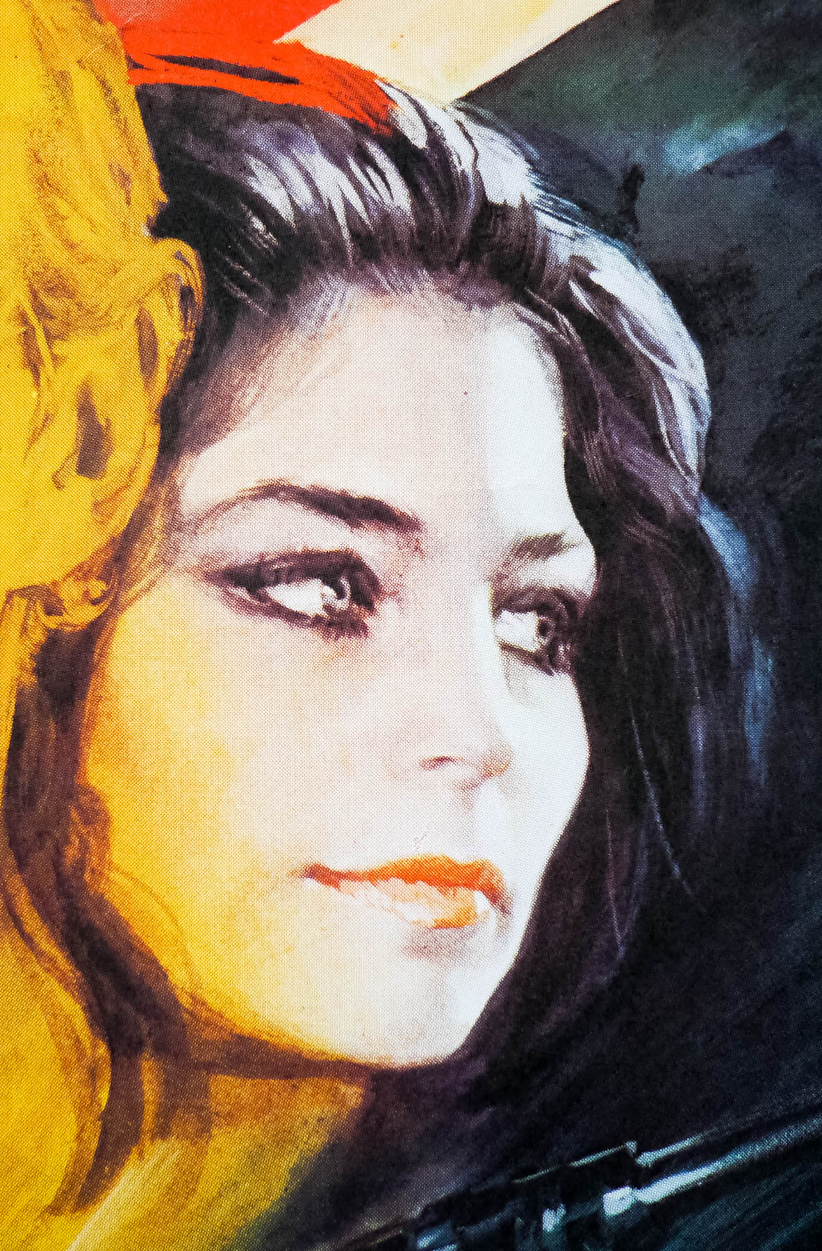
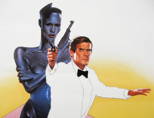
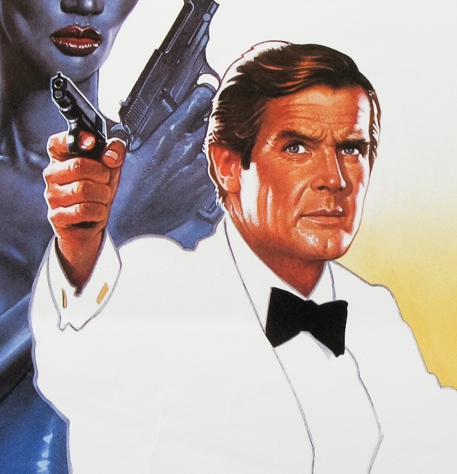
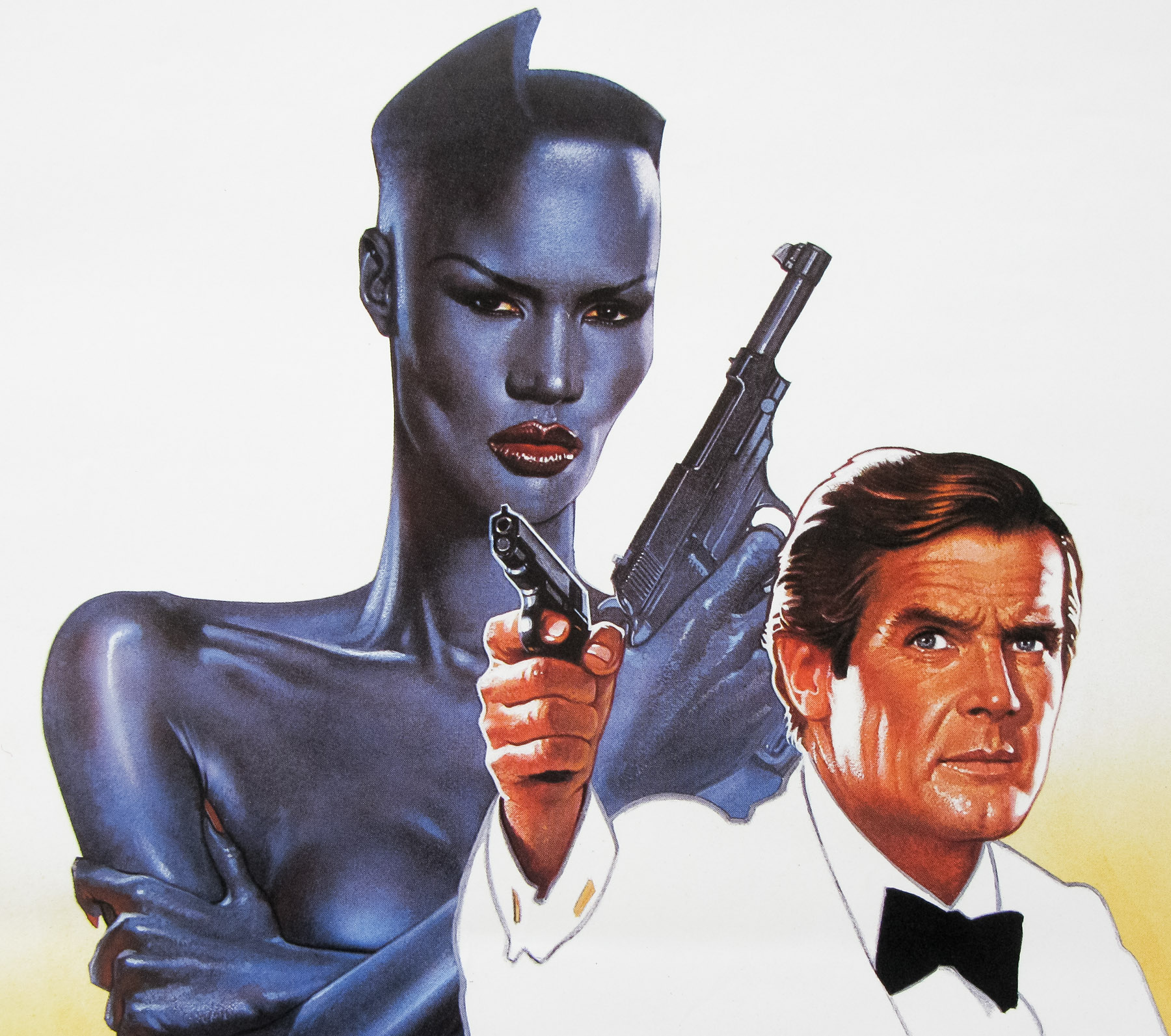
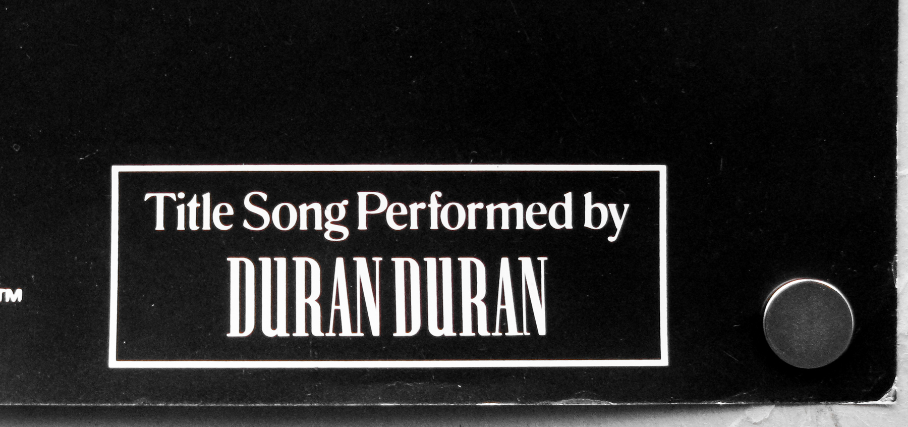
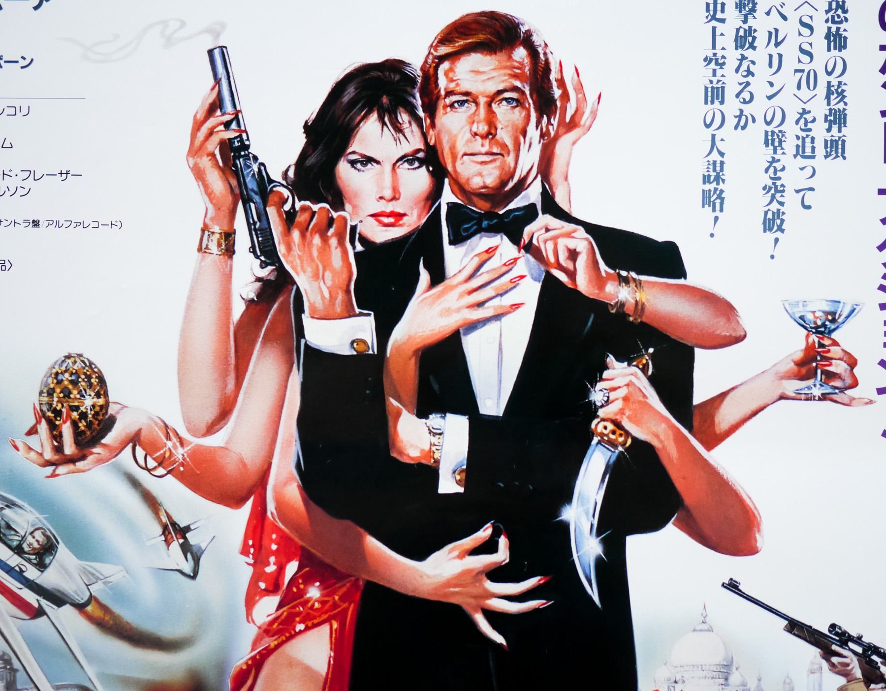
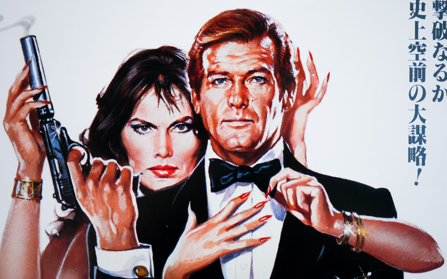
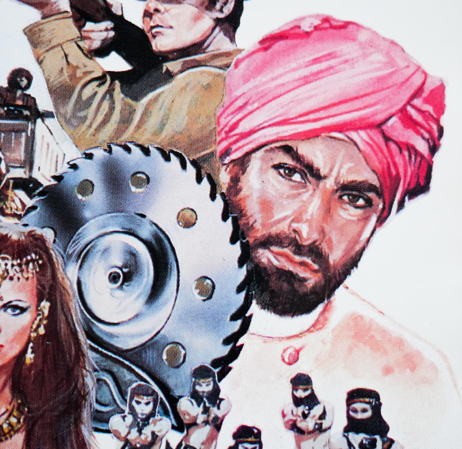
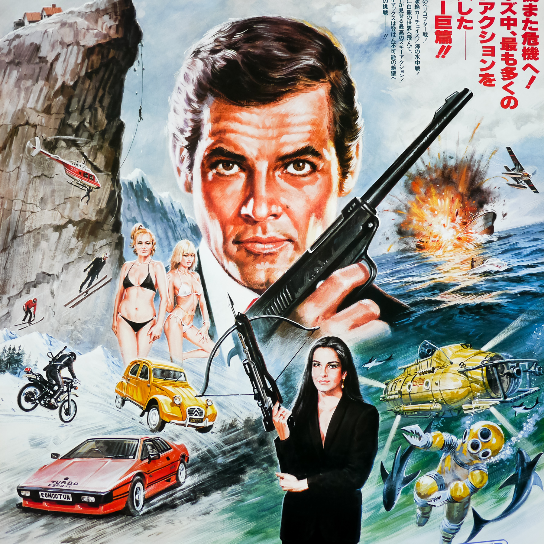
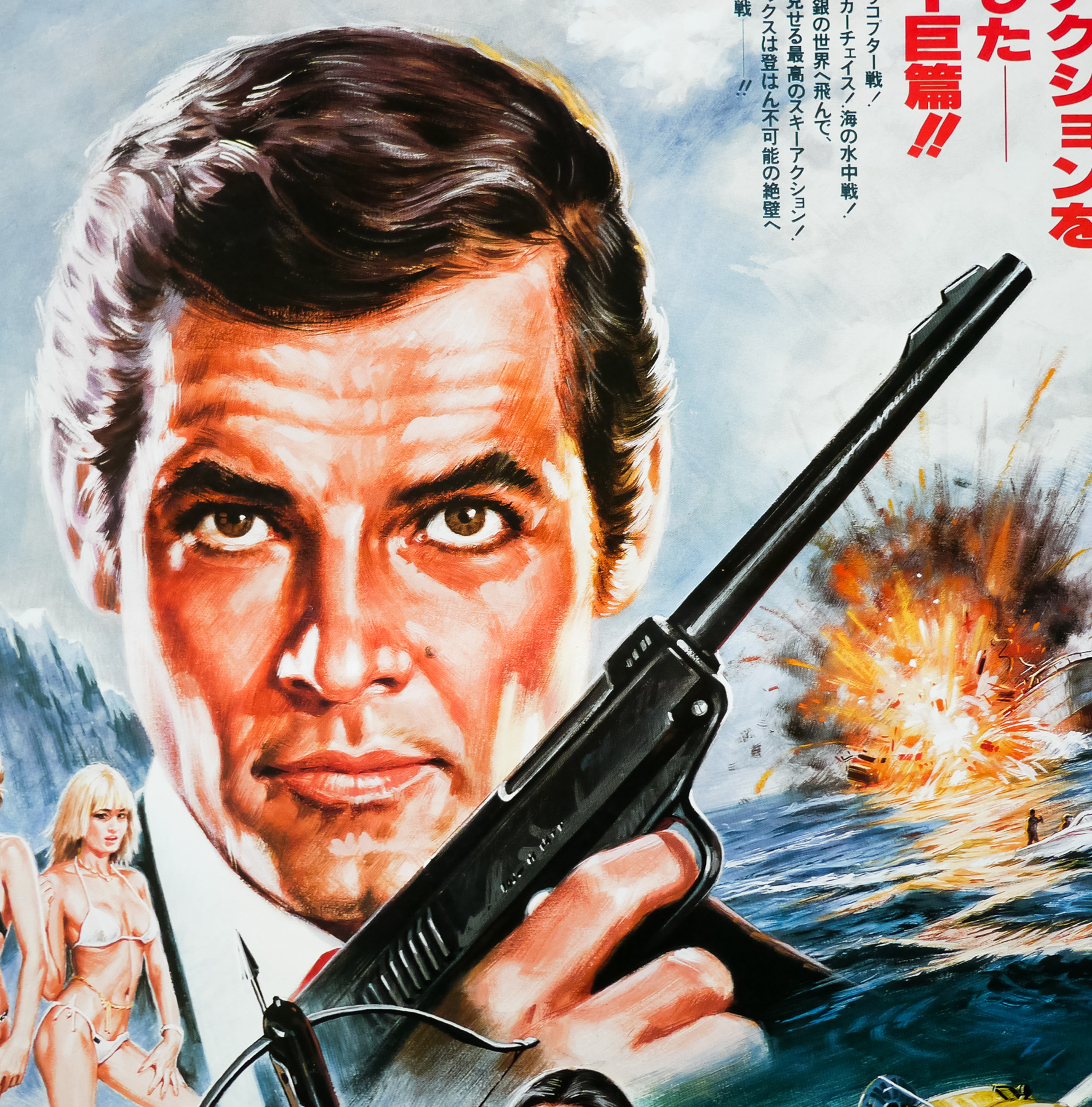
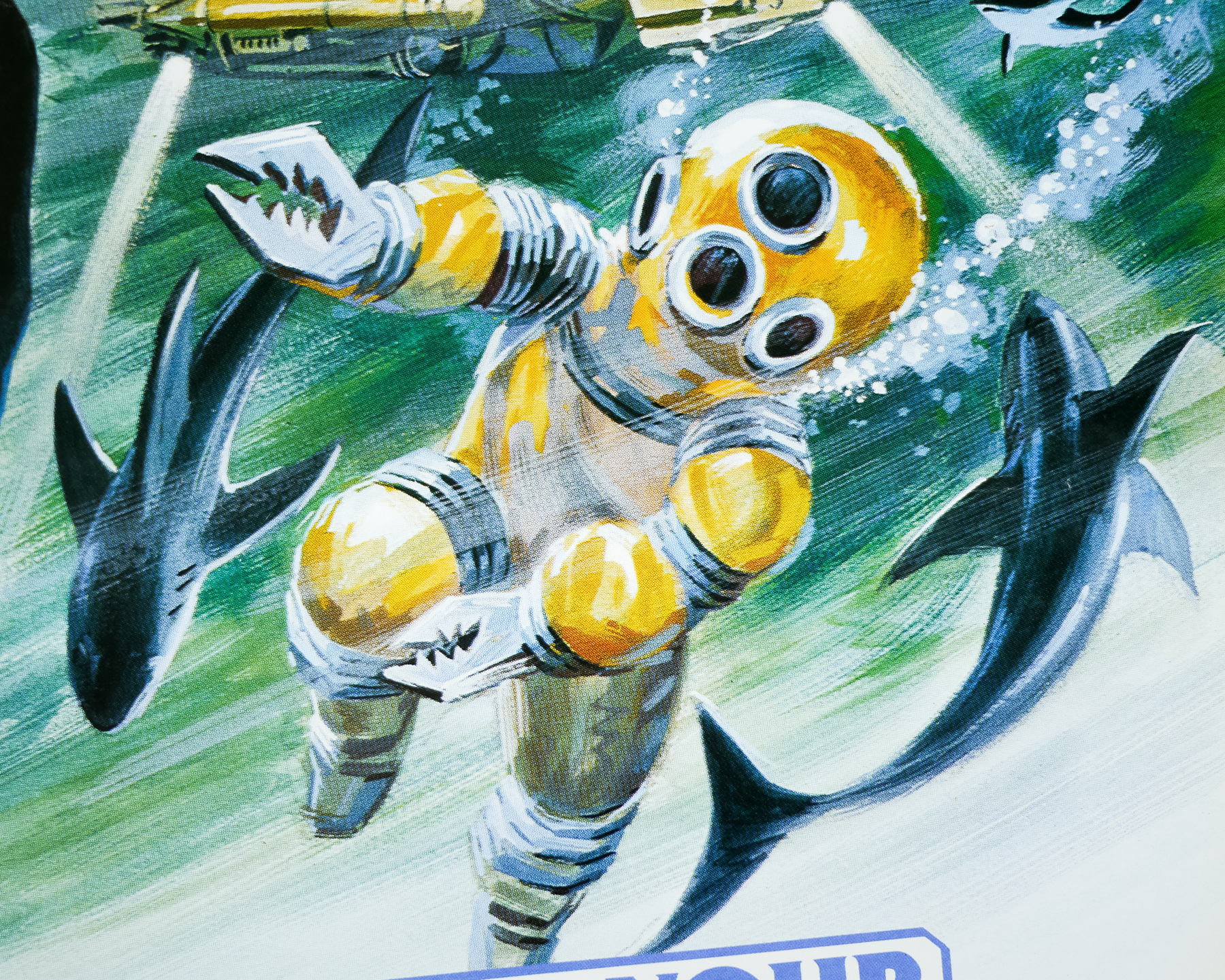
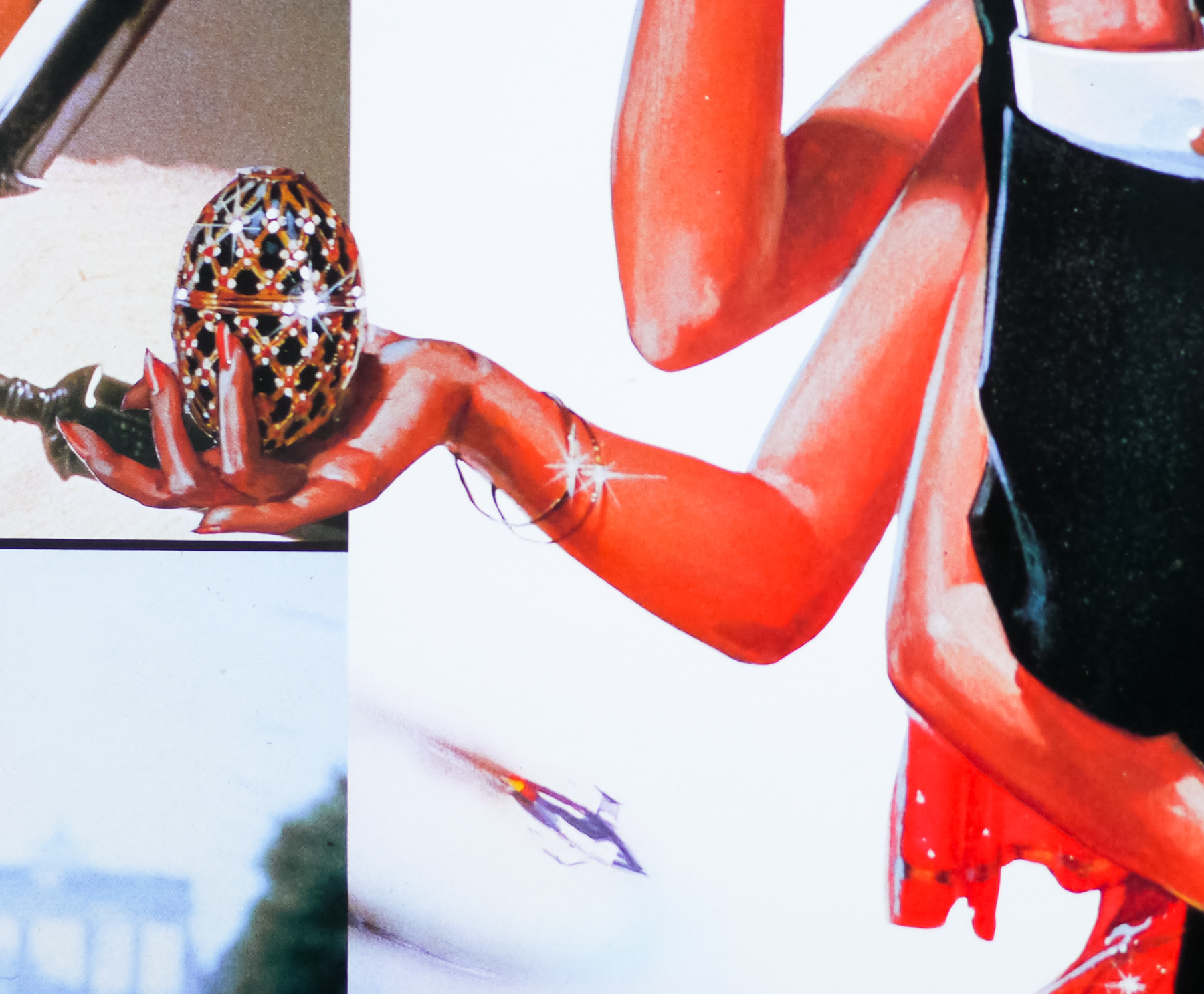
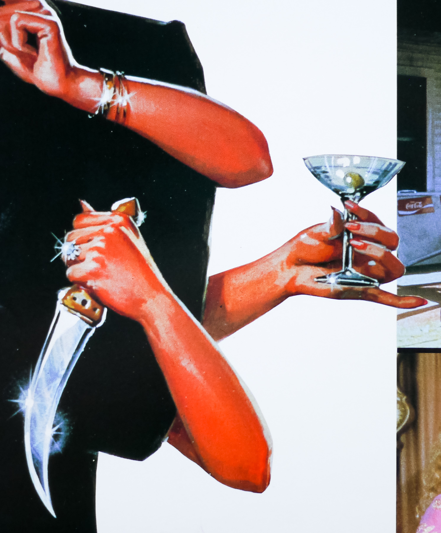
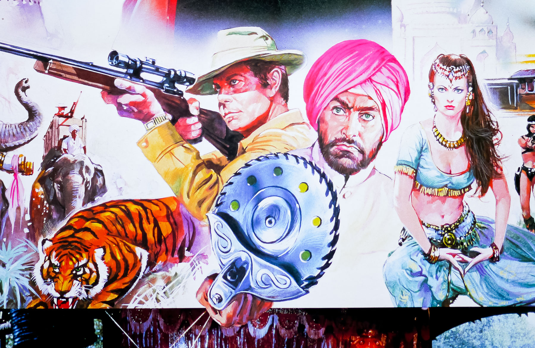
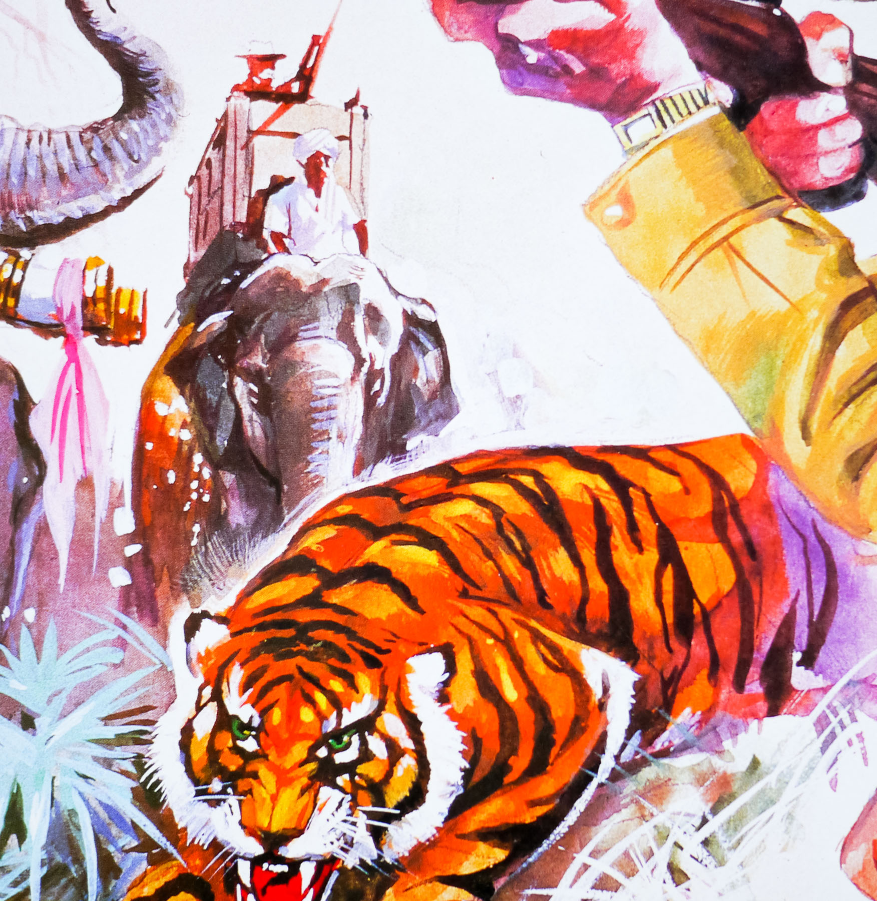
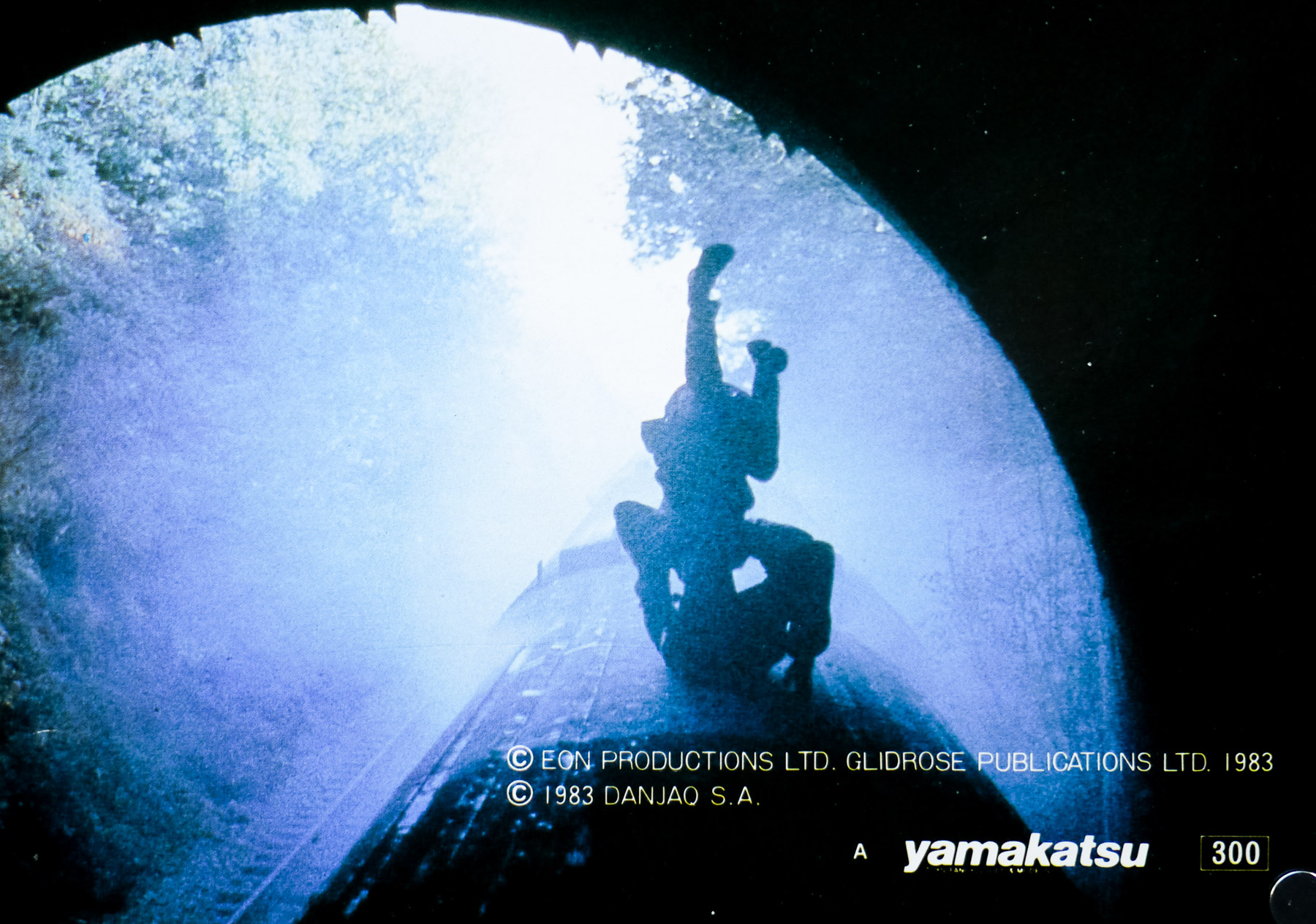
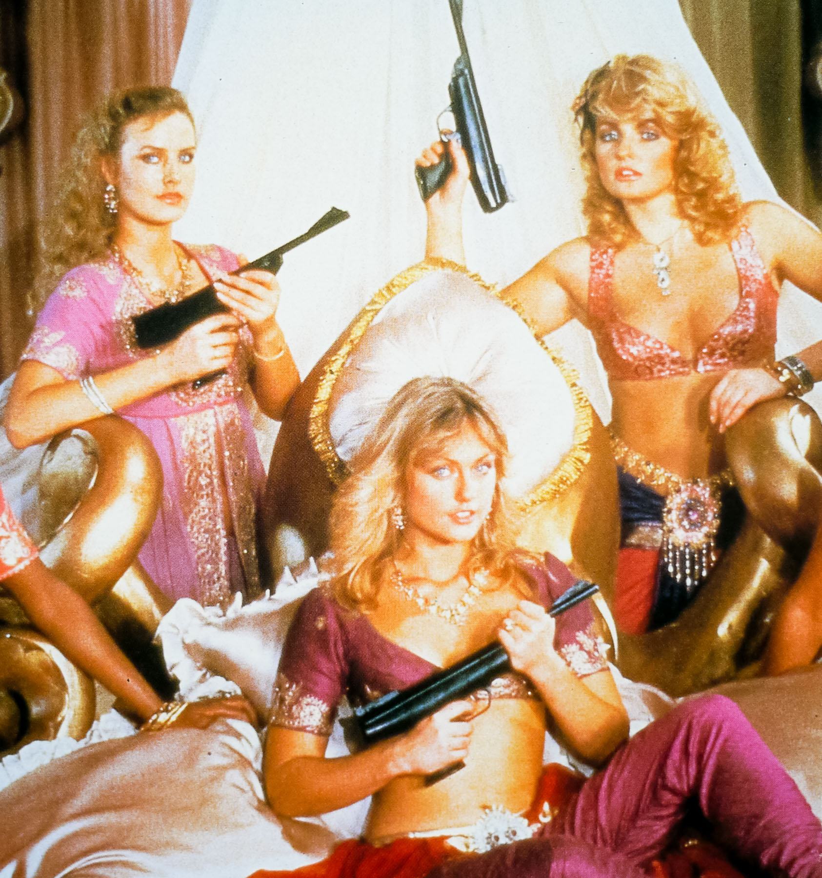
Sir Roger Moore‘s last outing as James Bond, A View to a Kill, was definitely not his finest hour, although it is memorable for a few reasons, including Christopher Walken‘s turn as the truly psychotic bad guy (Max Zorin), Duran Duran’s great title theme and the appearance of the incomparable Grace Jones as Mayday, Zorin’s accomplice. She may not be able to act very well but she’s never anything less than a striking presence and is definitely not a lady to mess with, as British chat show presenter Russell Harty infamously found out.
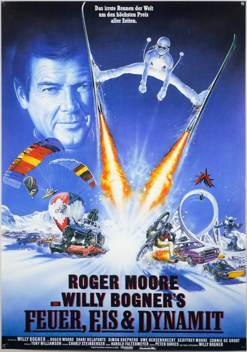
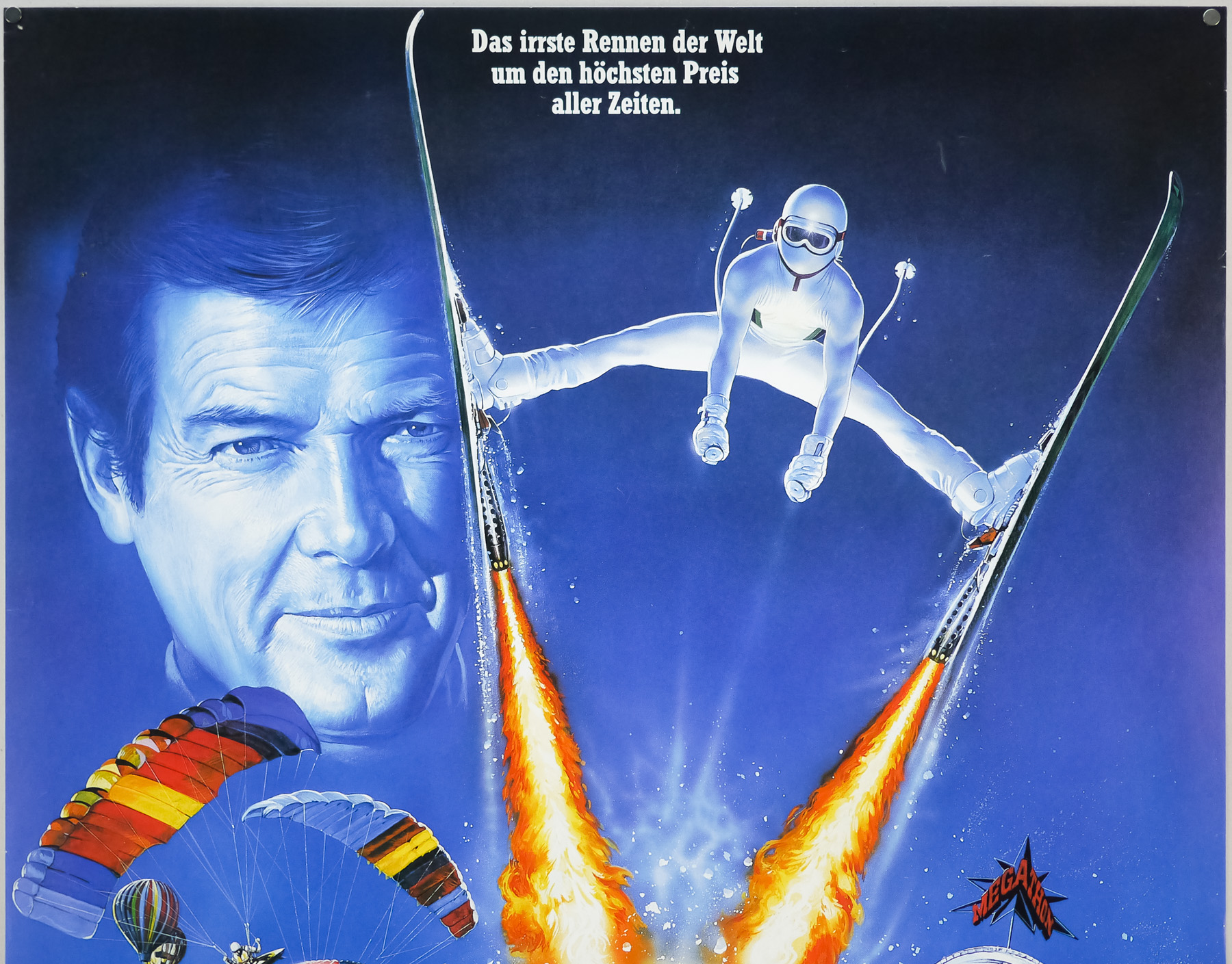
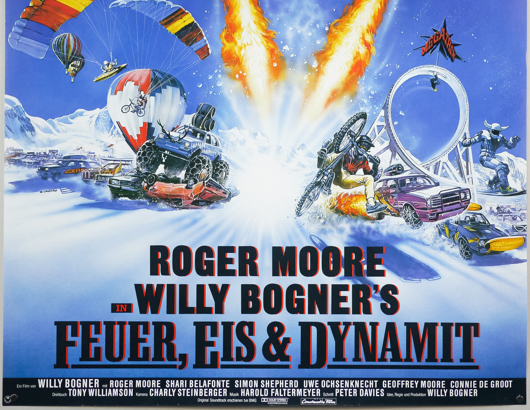
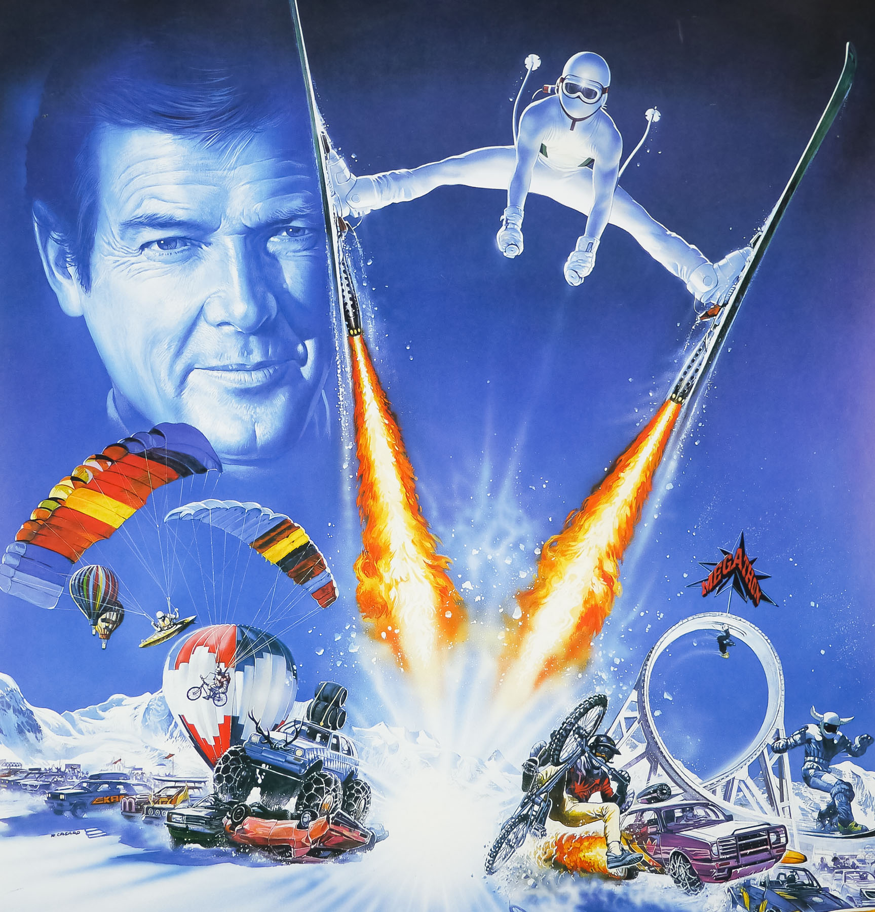
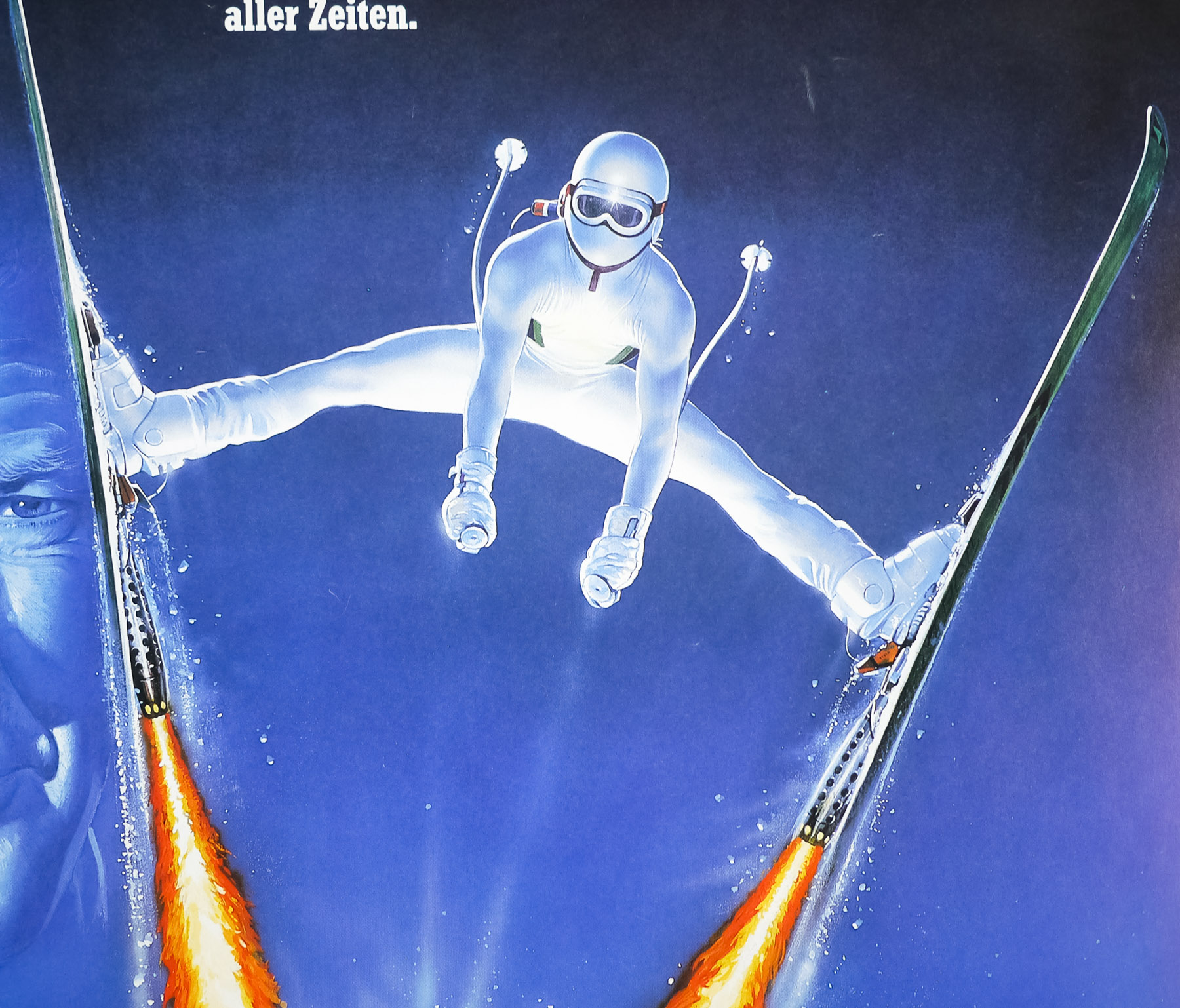
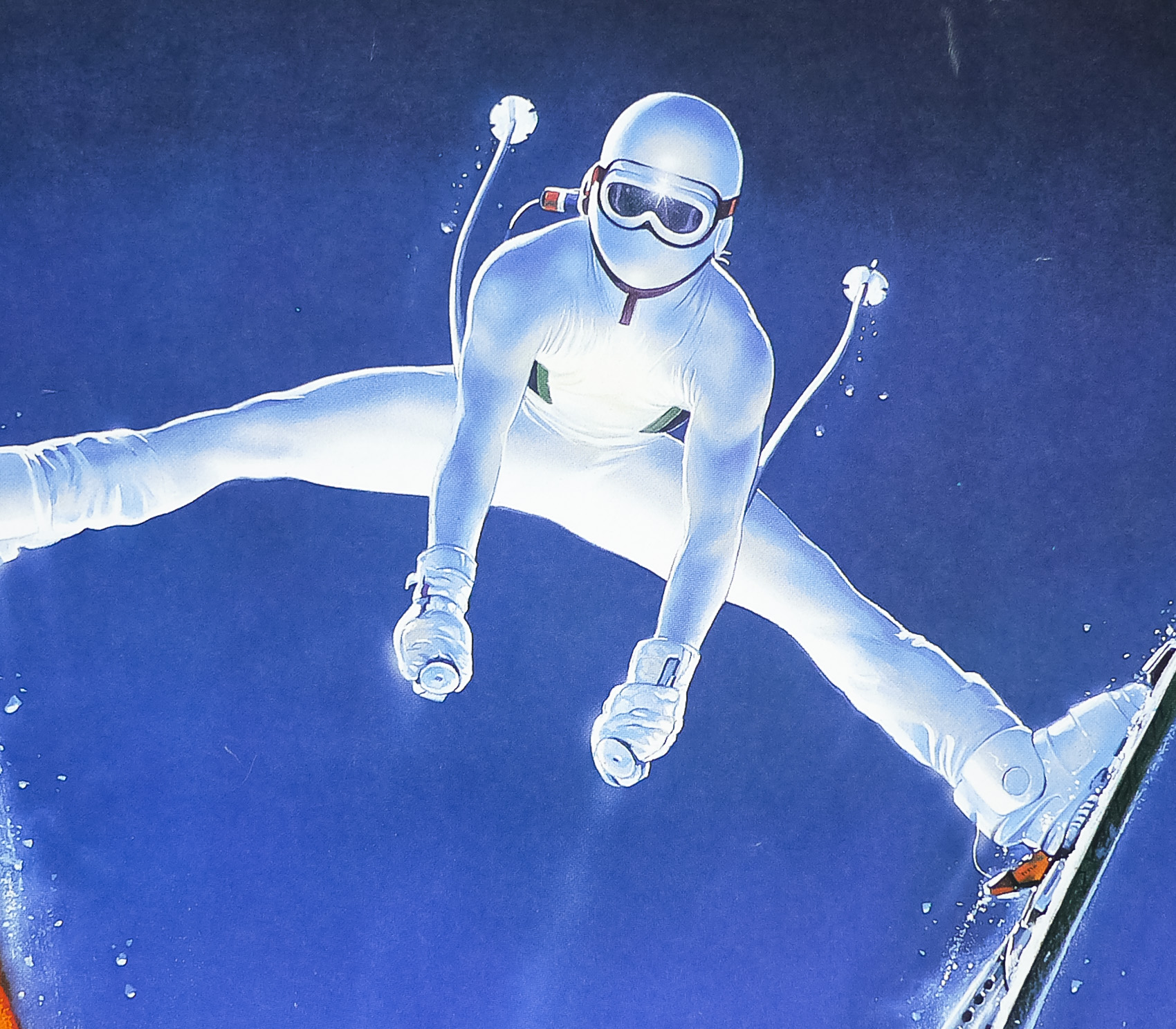
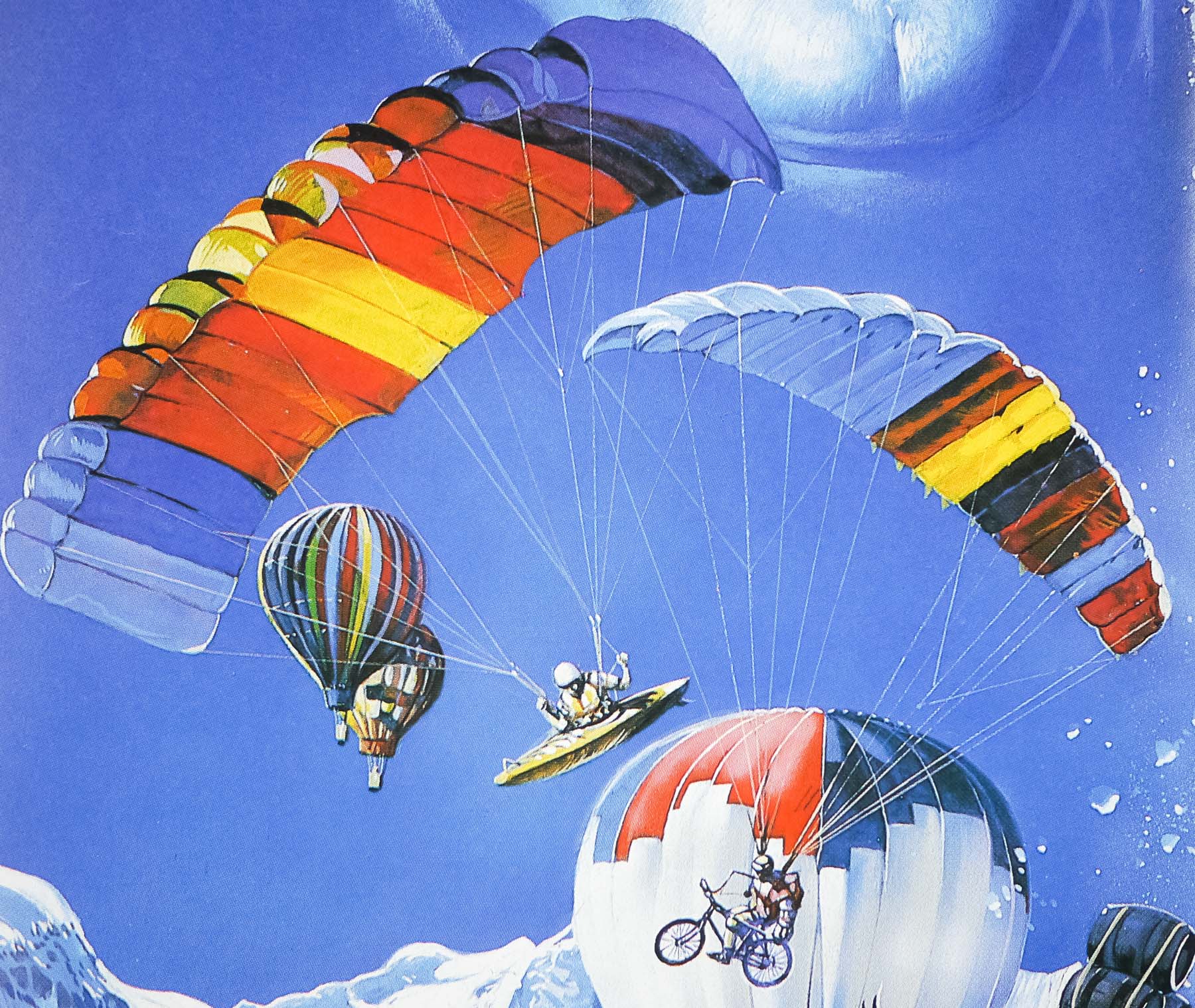
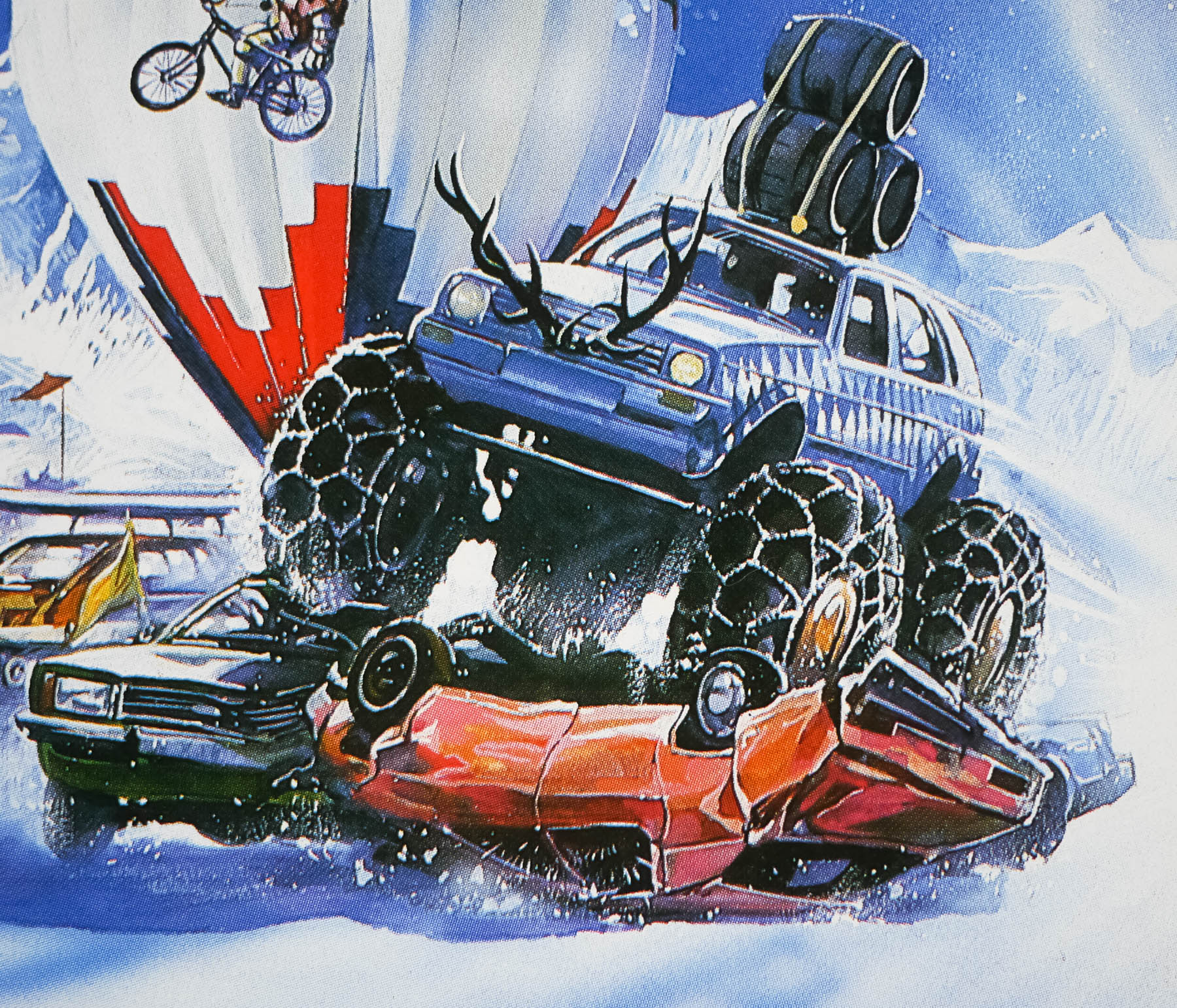
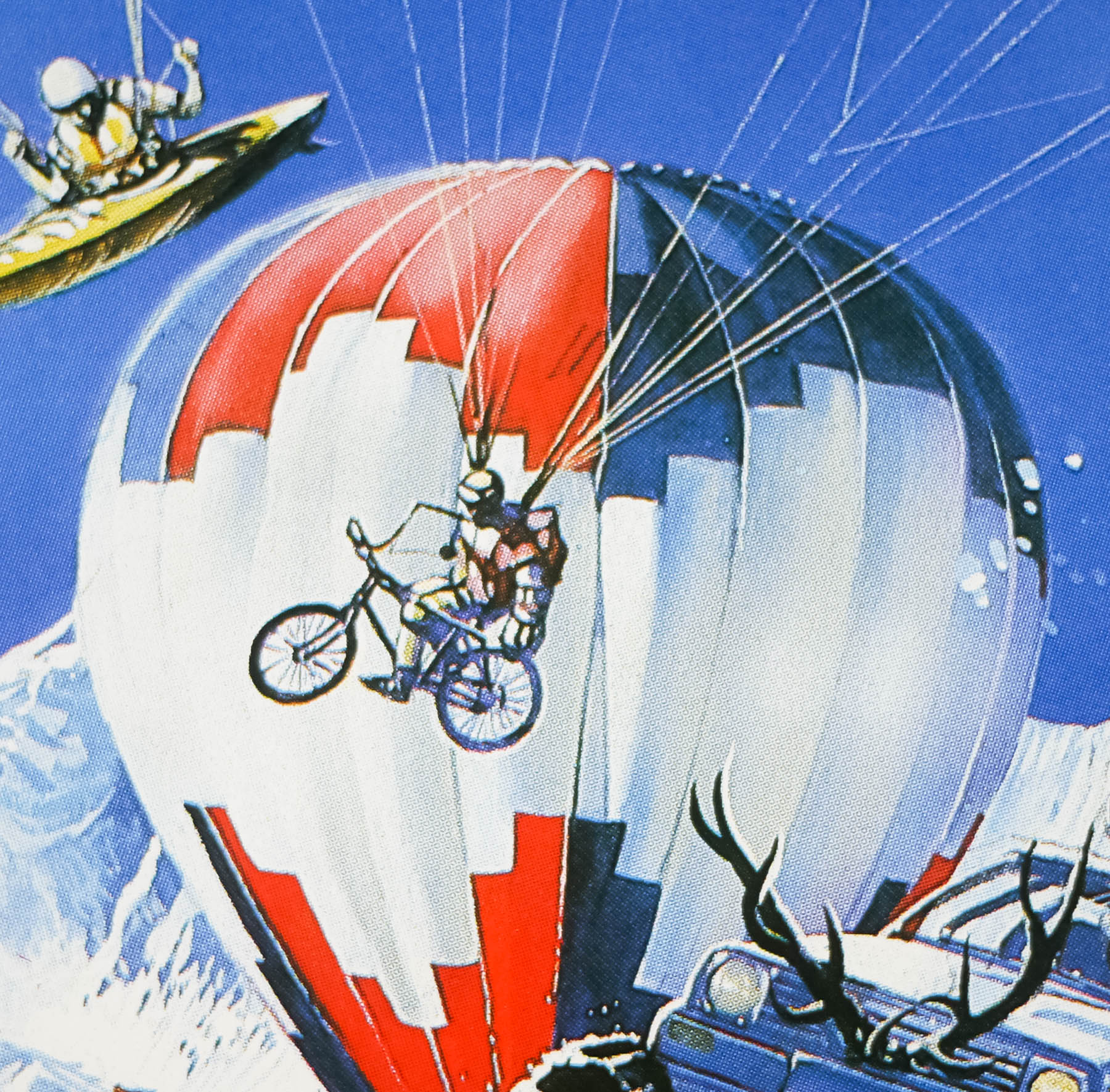
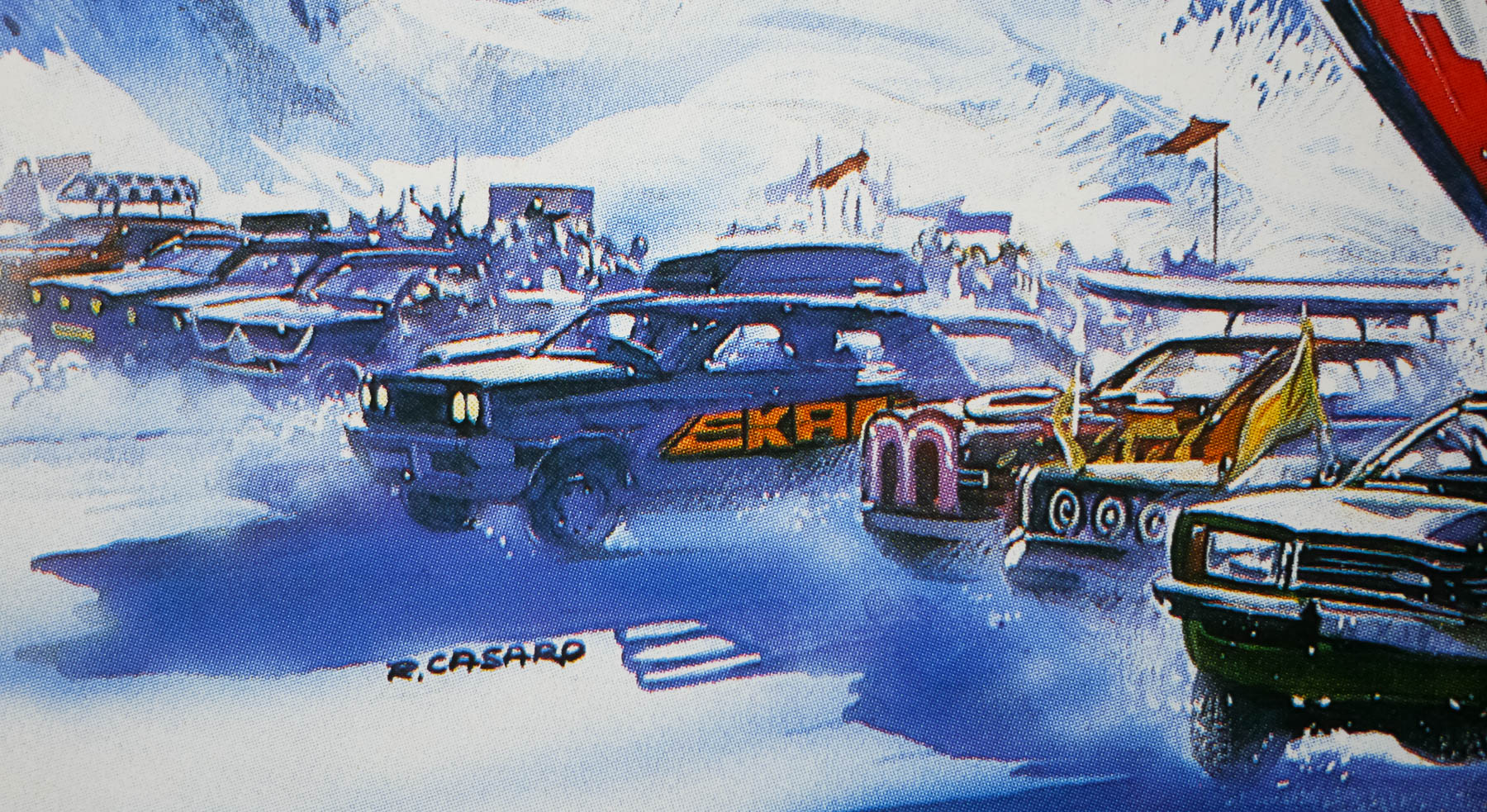
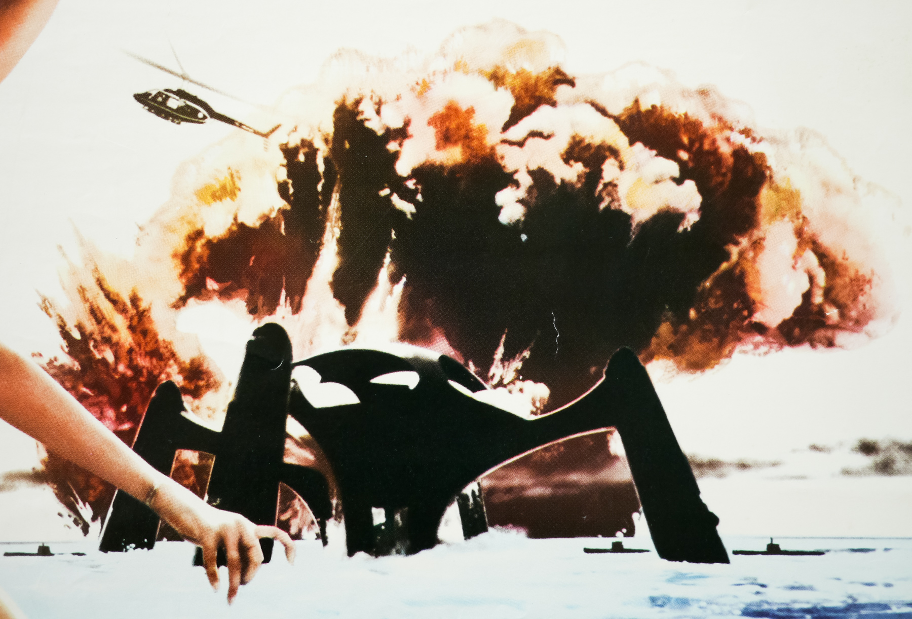
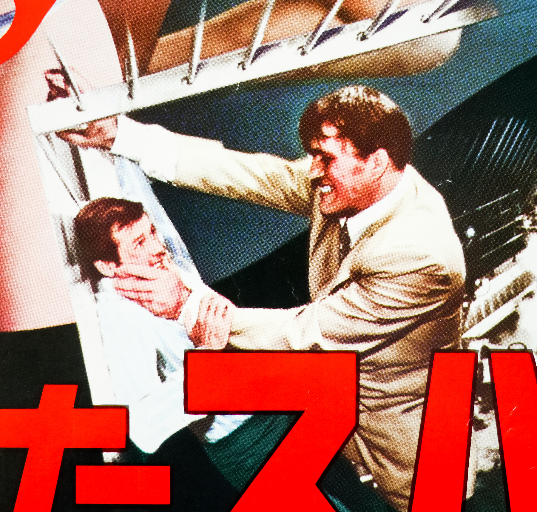
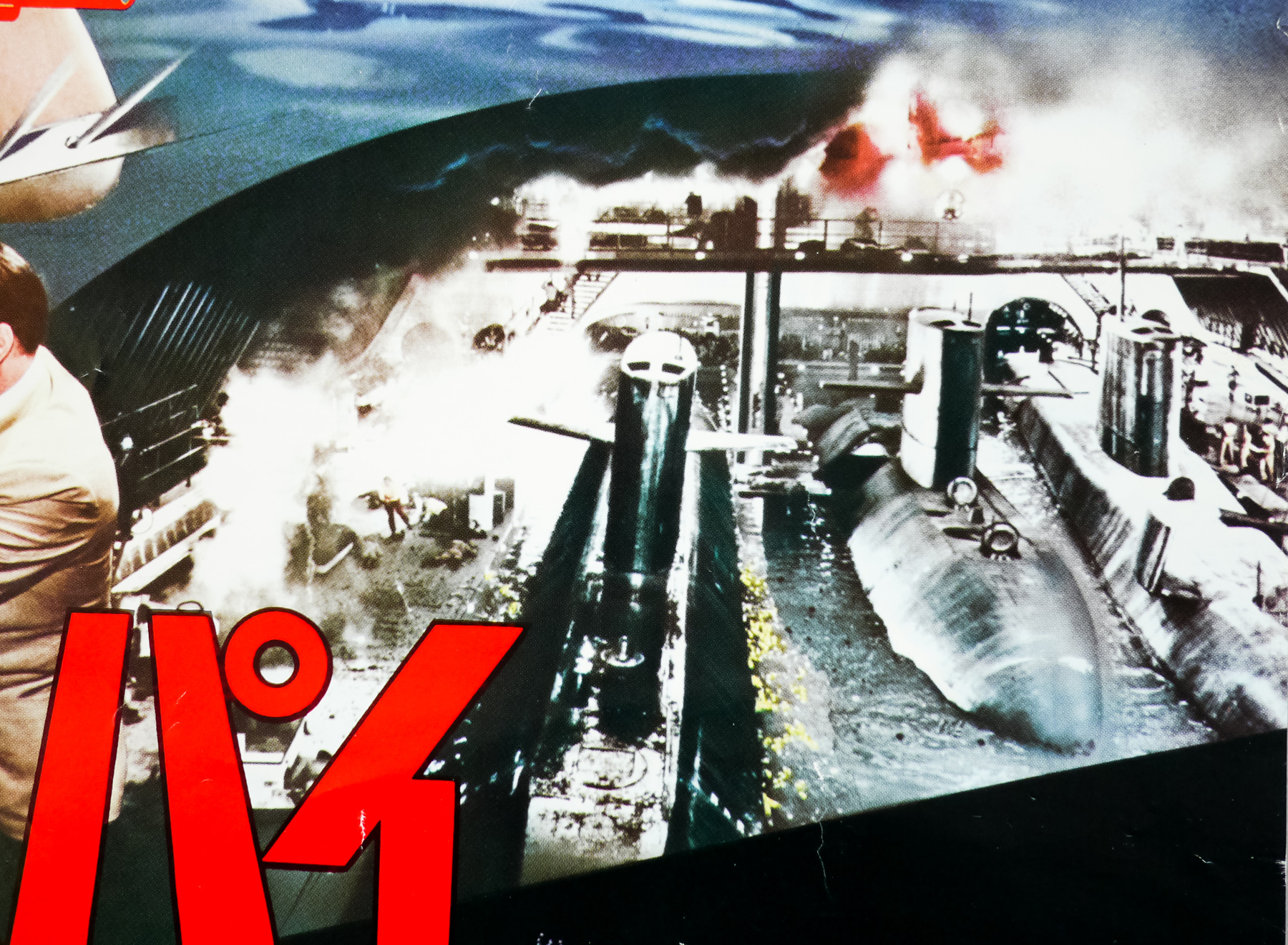
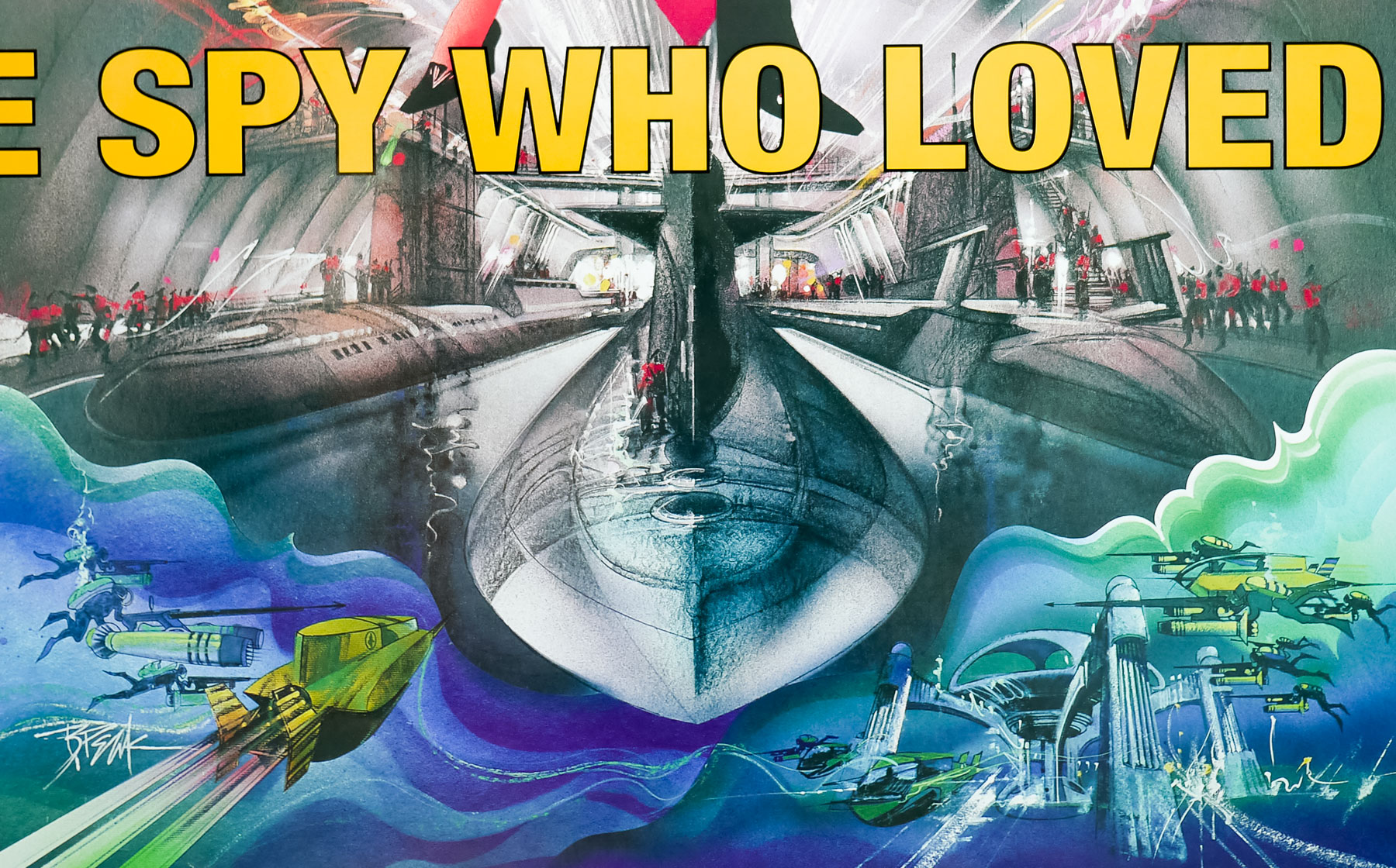
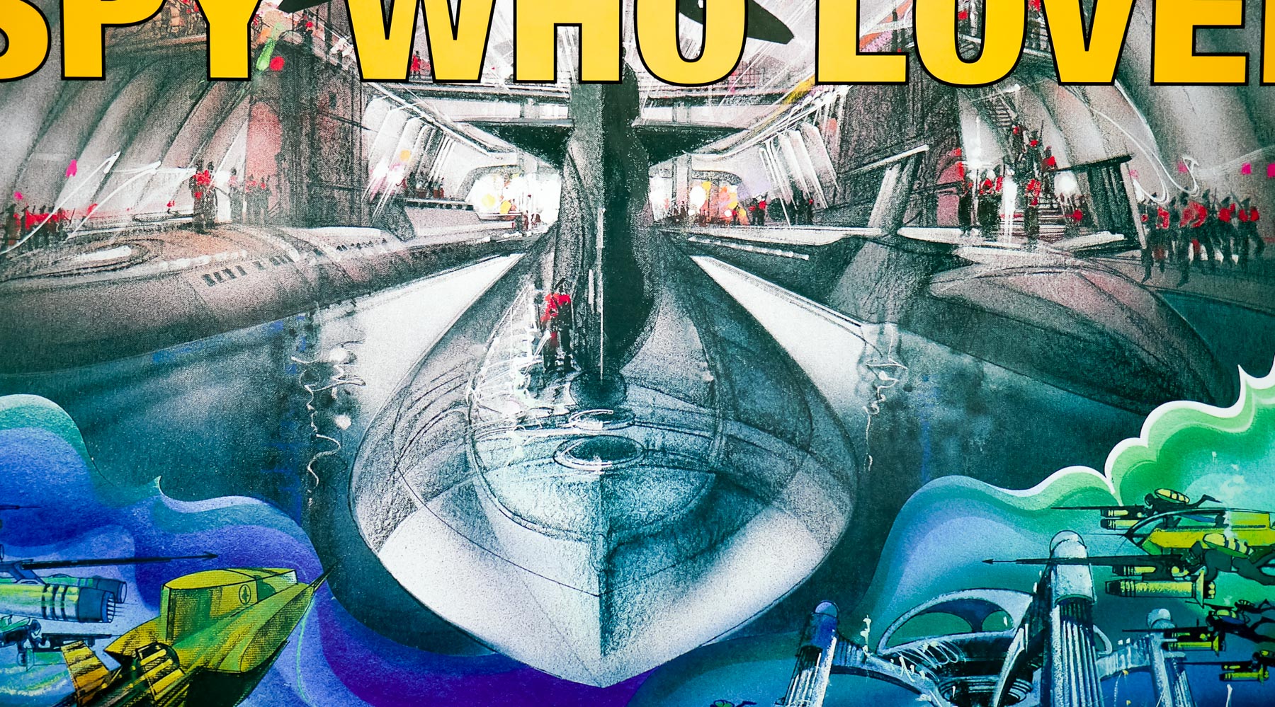
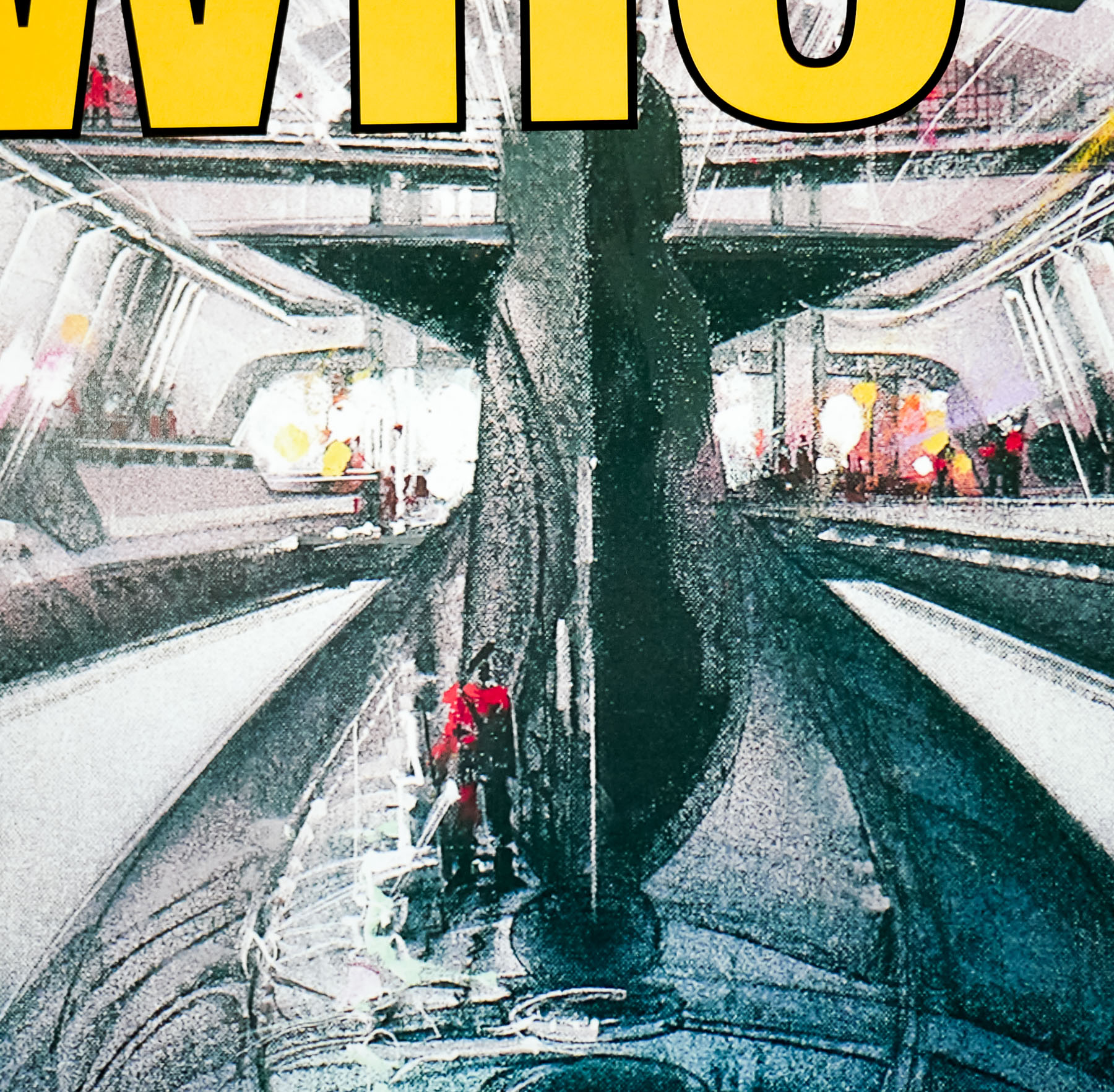
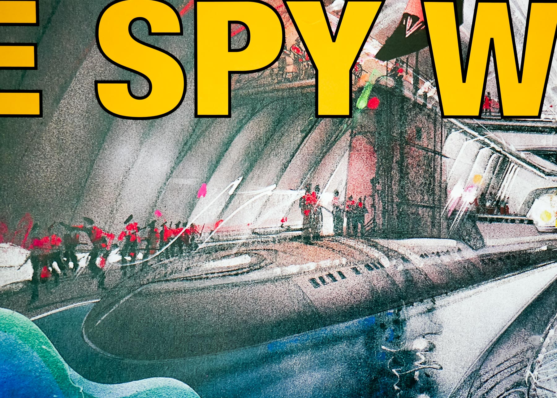
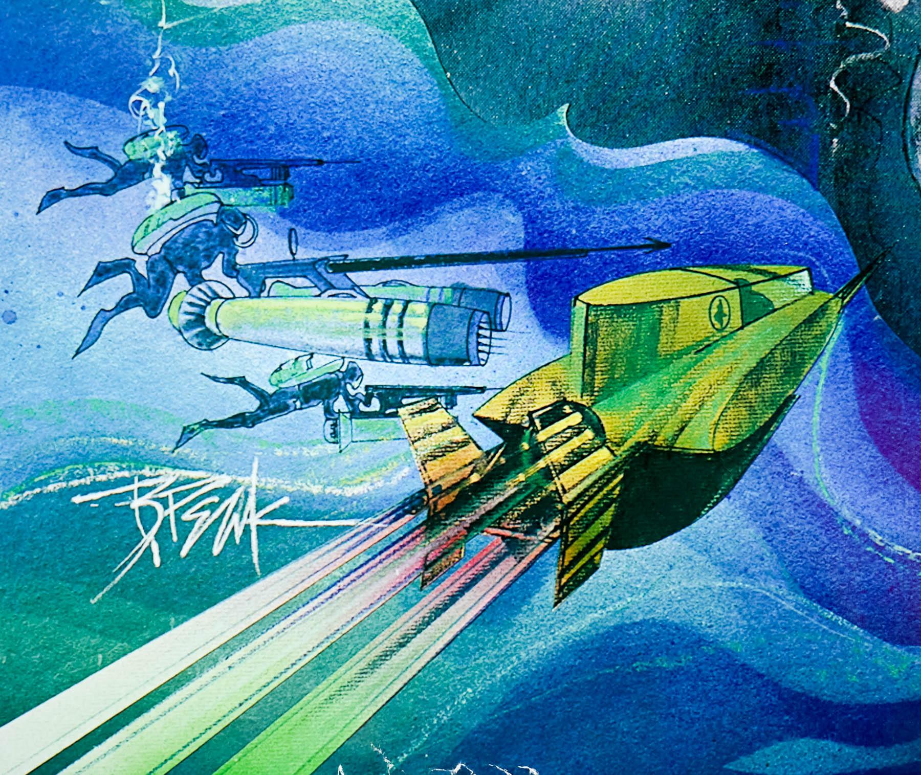
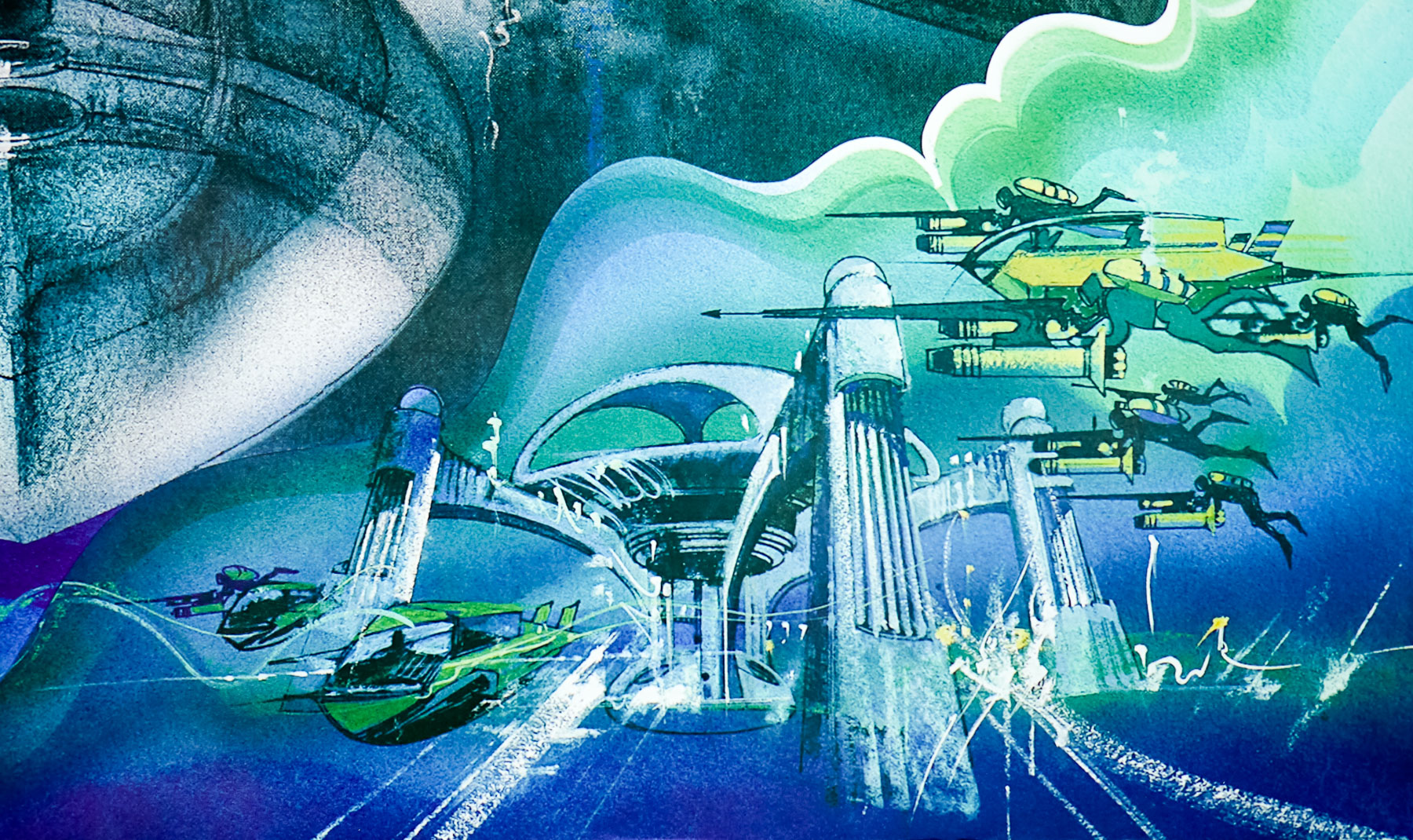
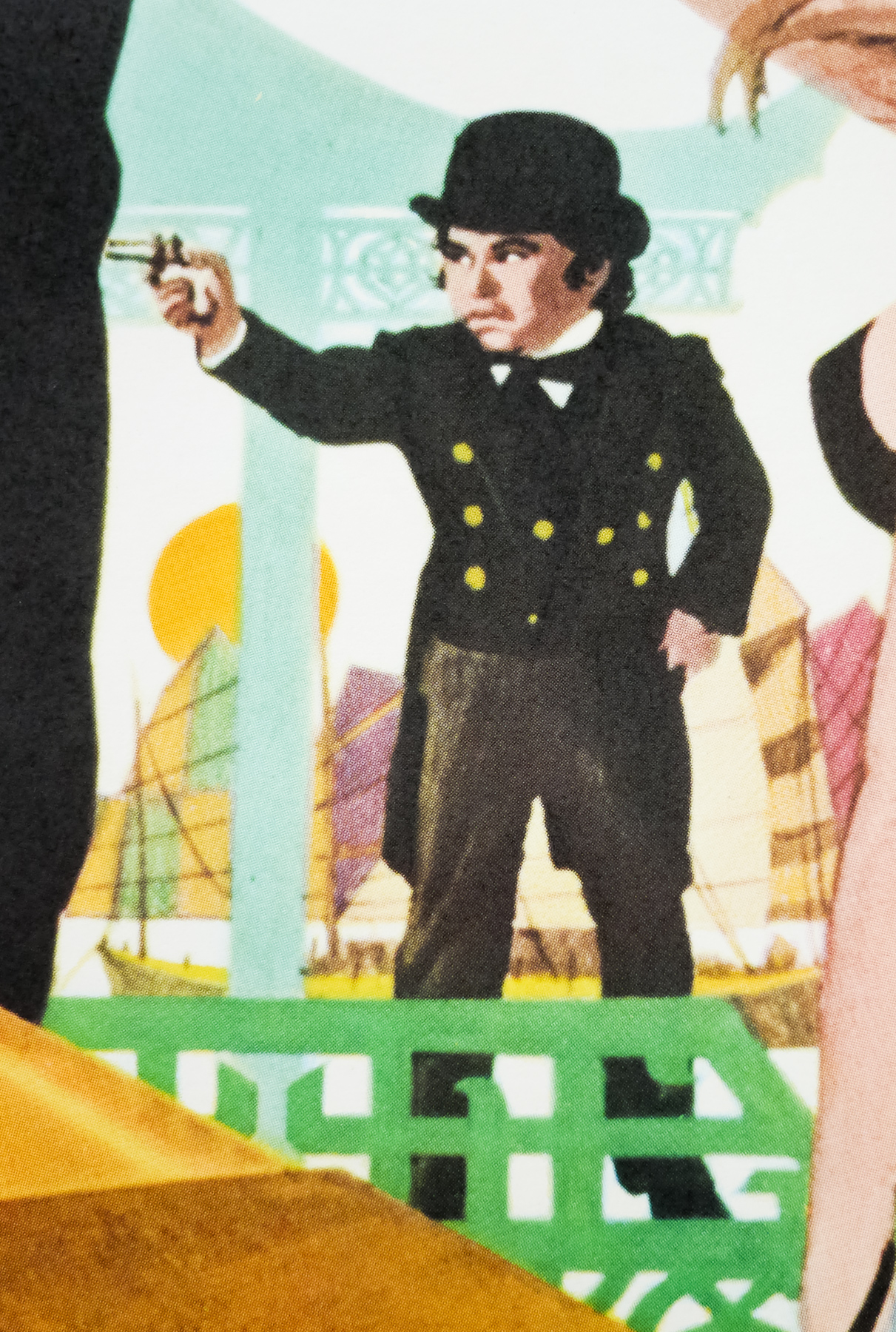
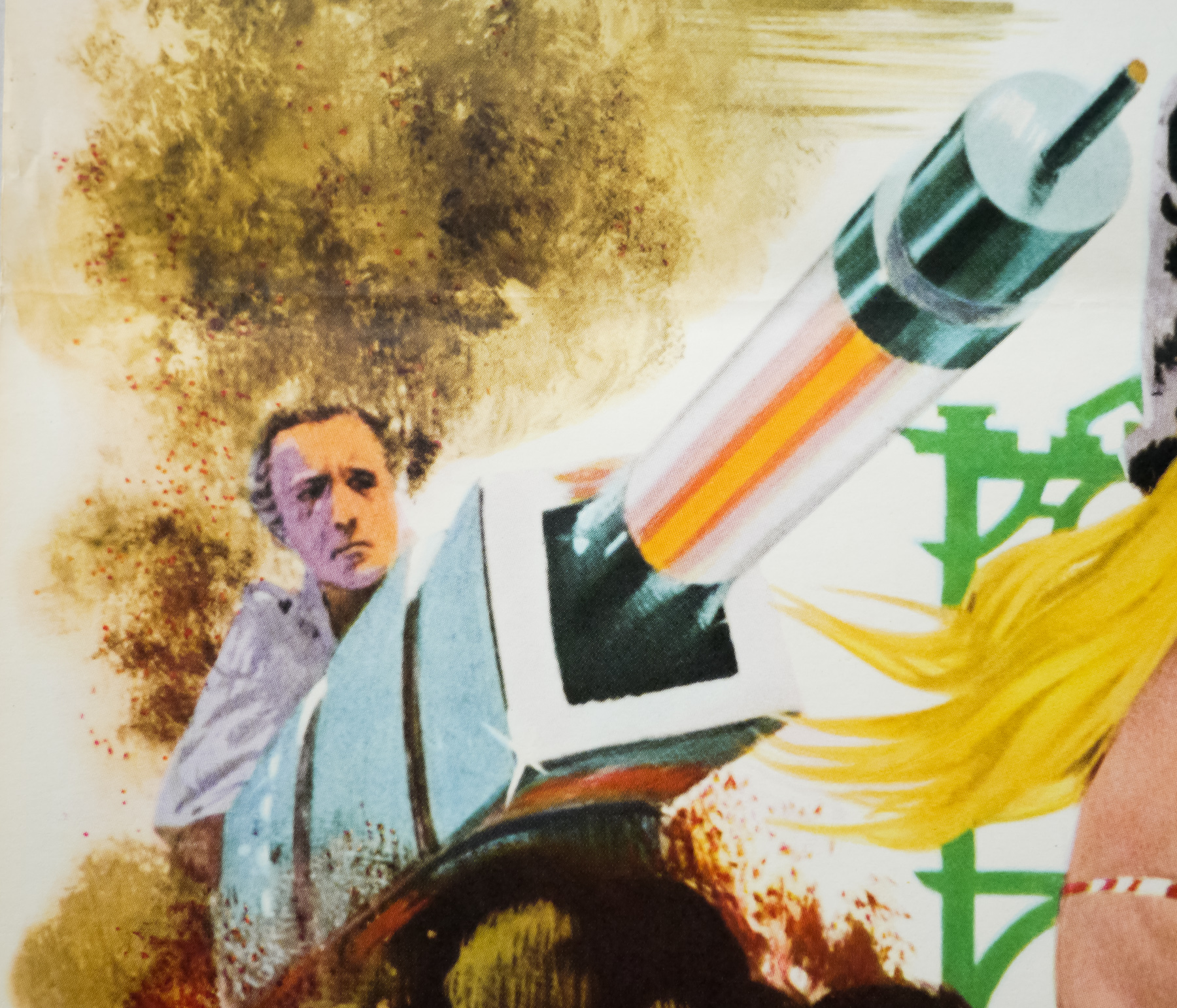
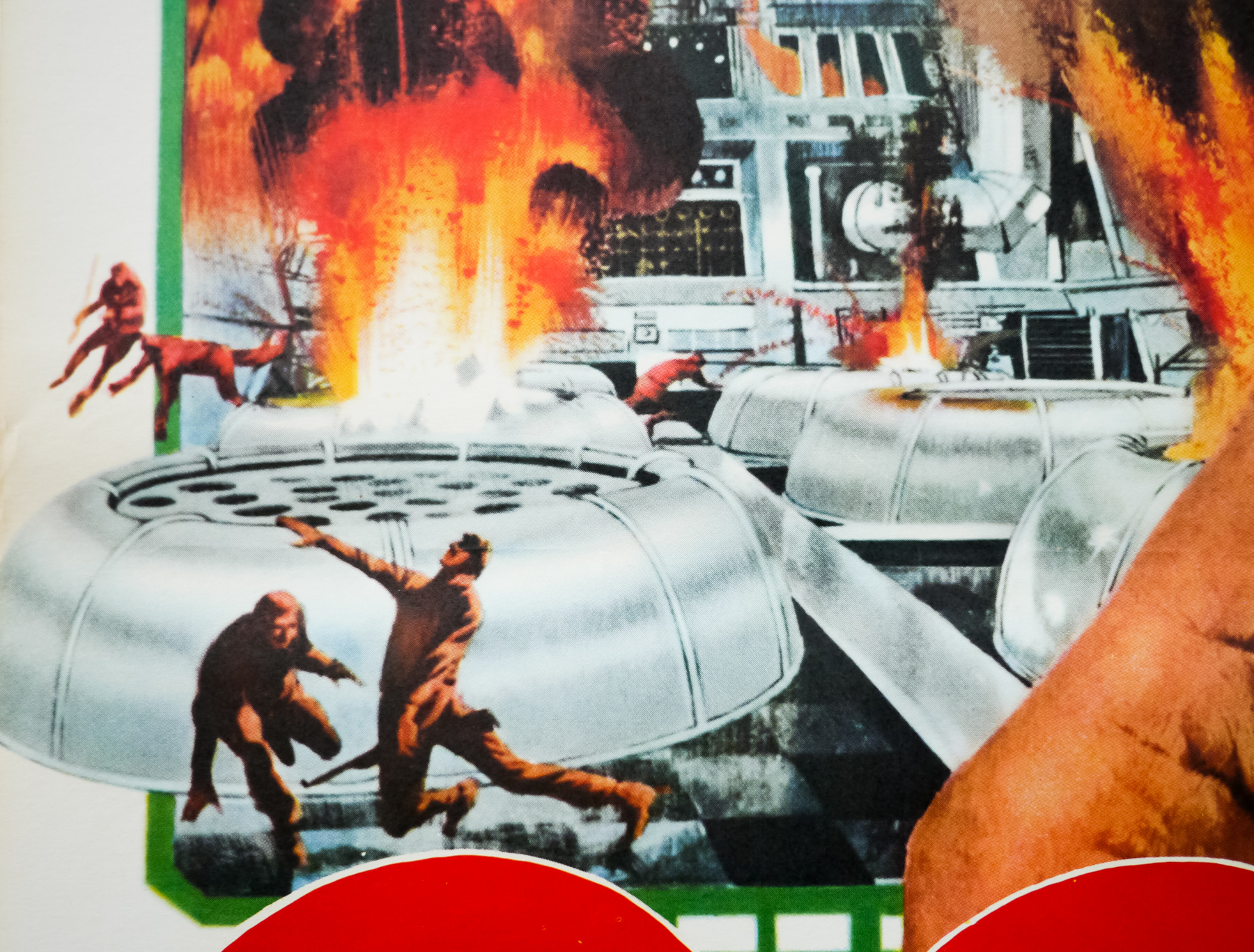
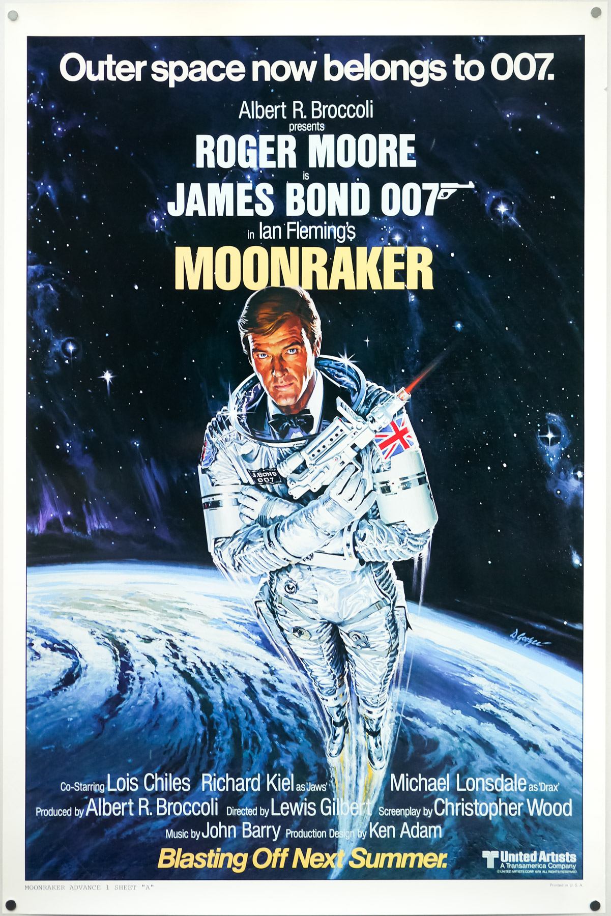
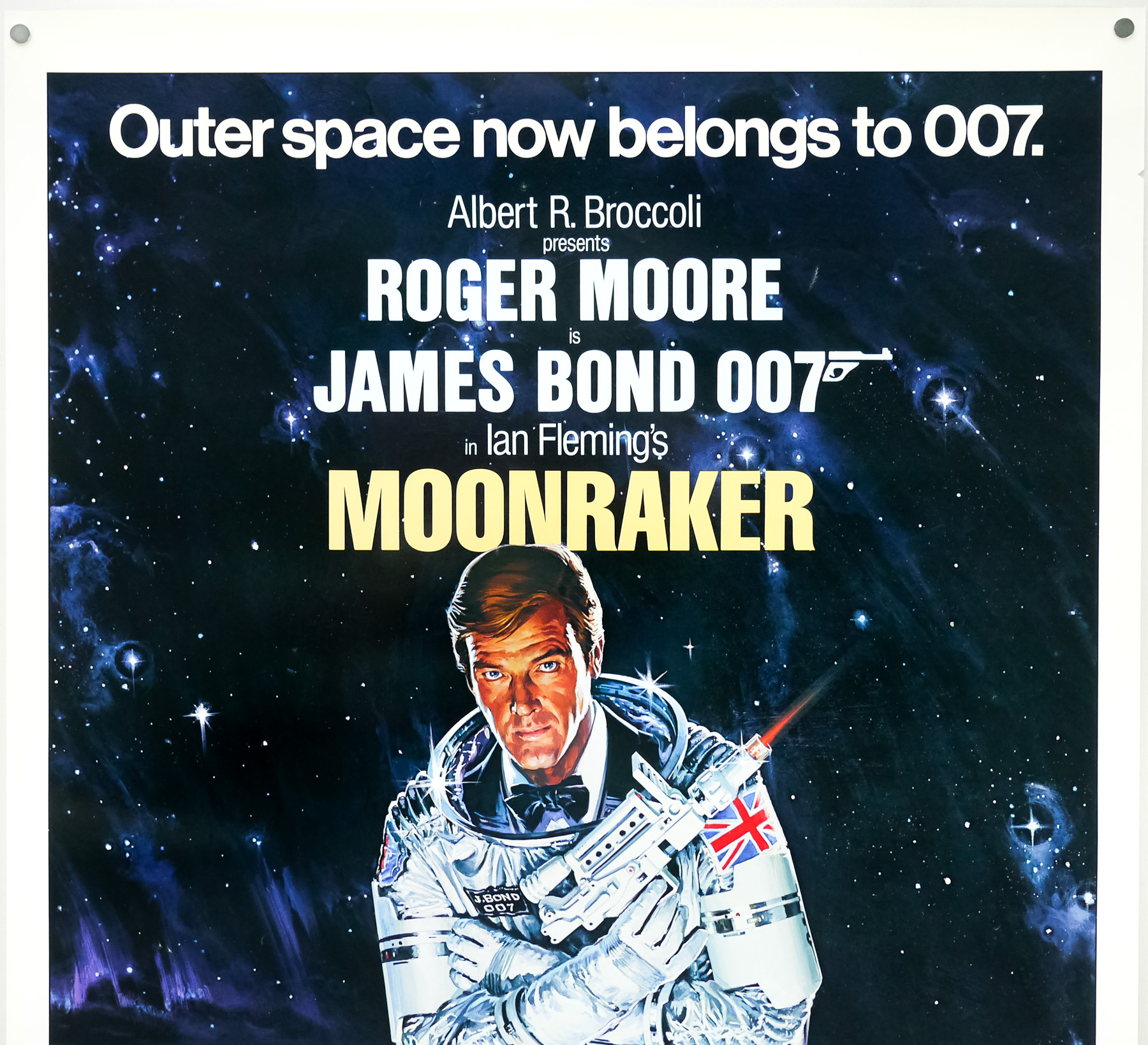
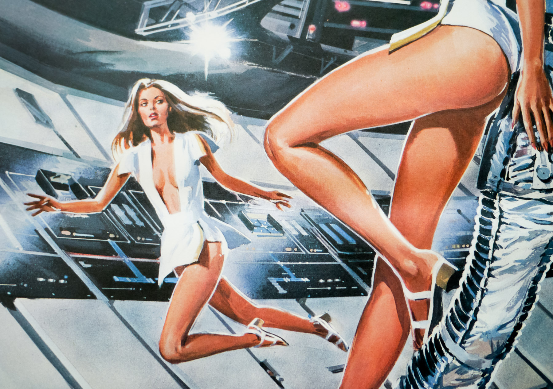
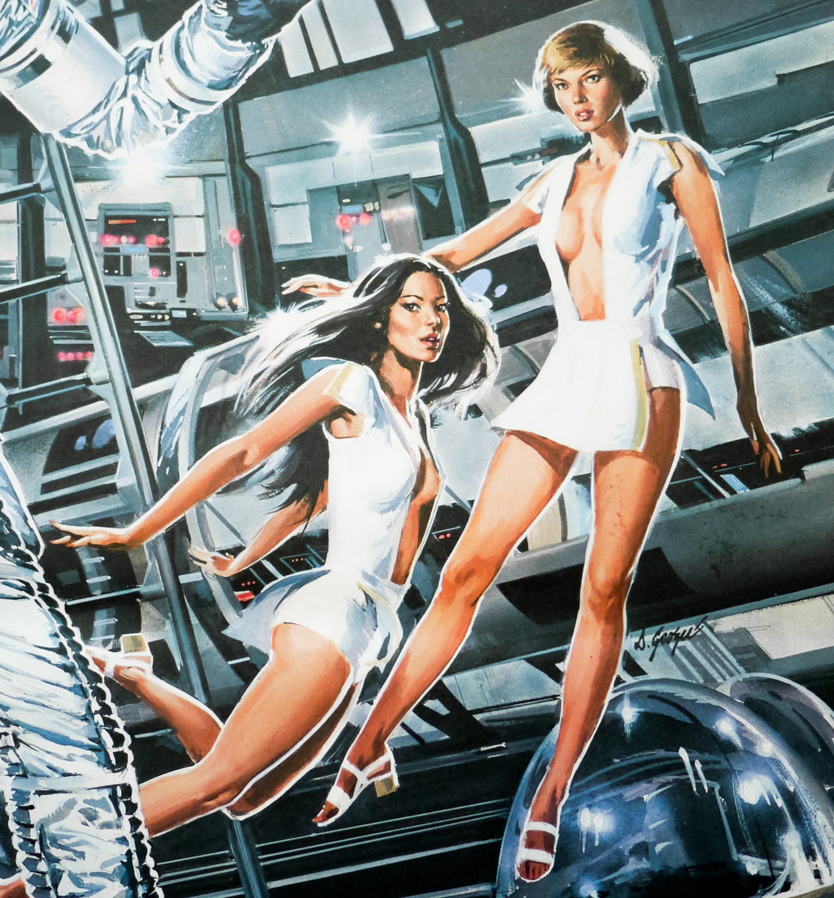
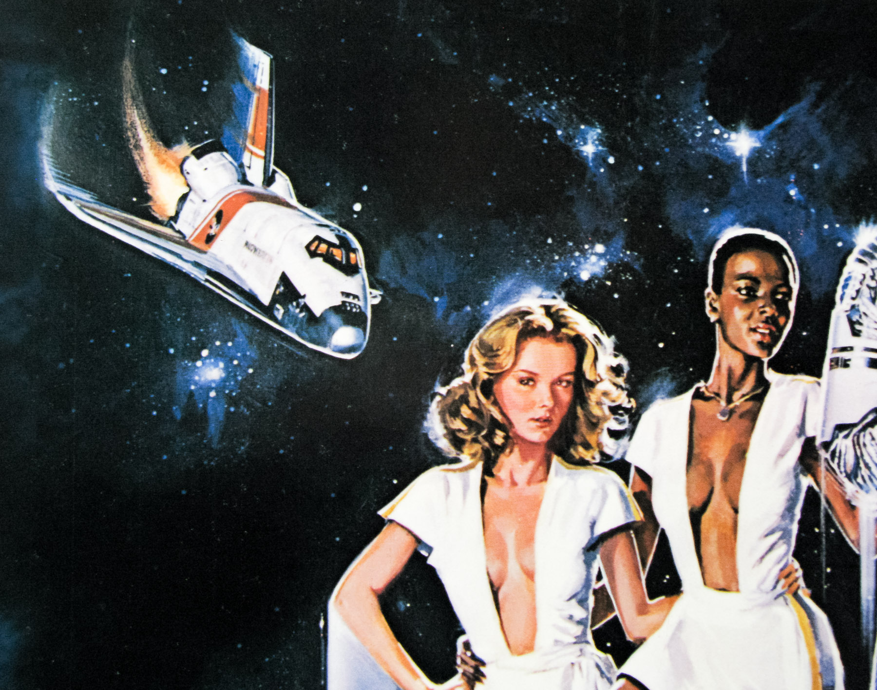
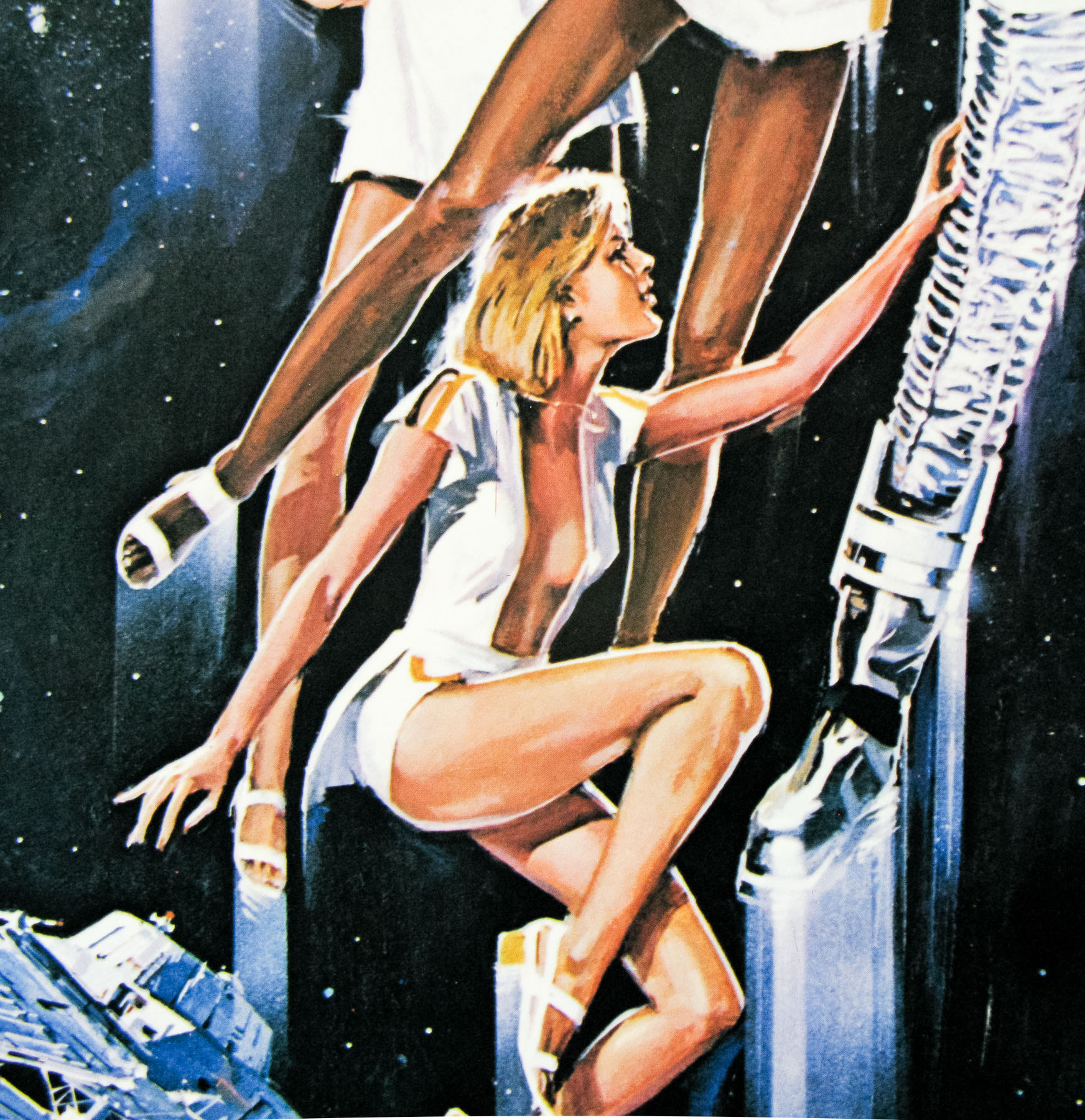
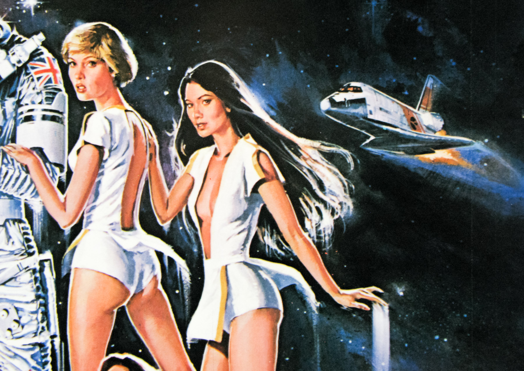
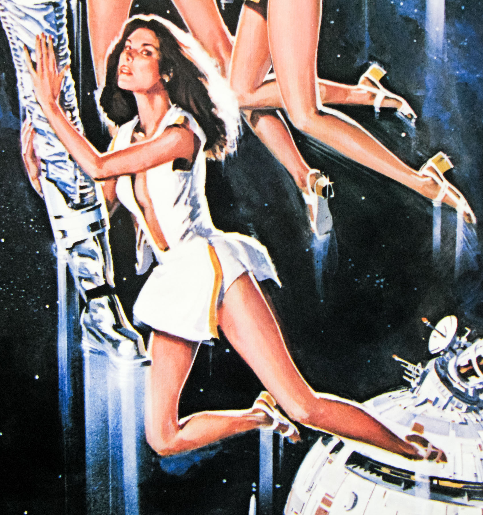
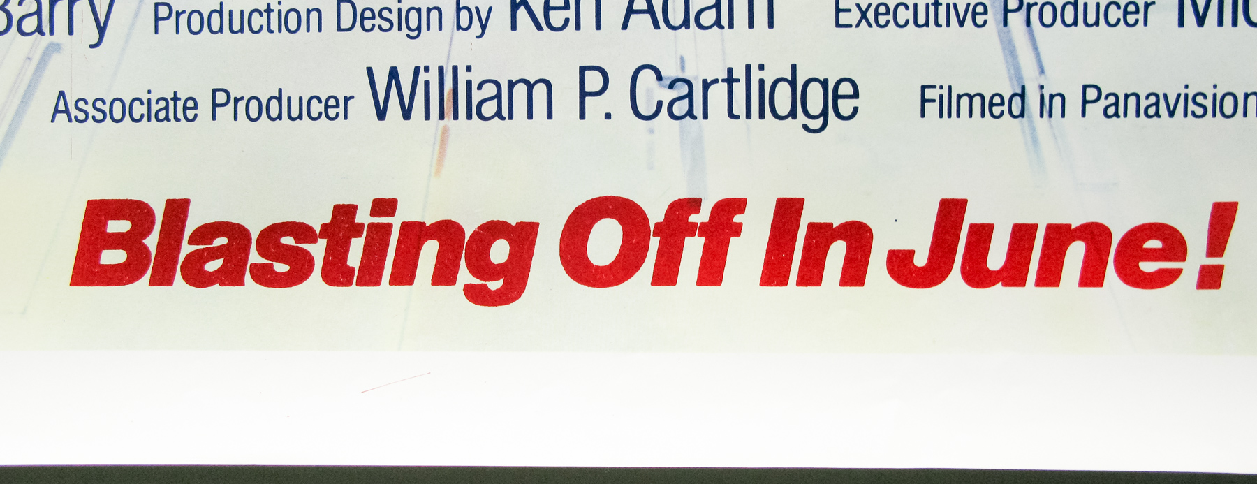
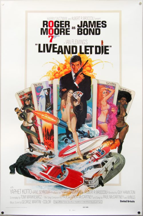
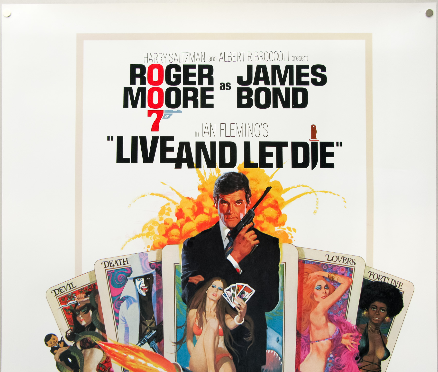
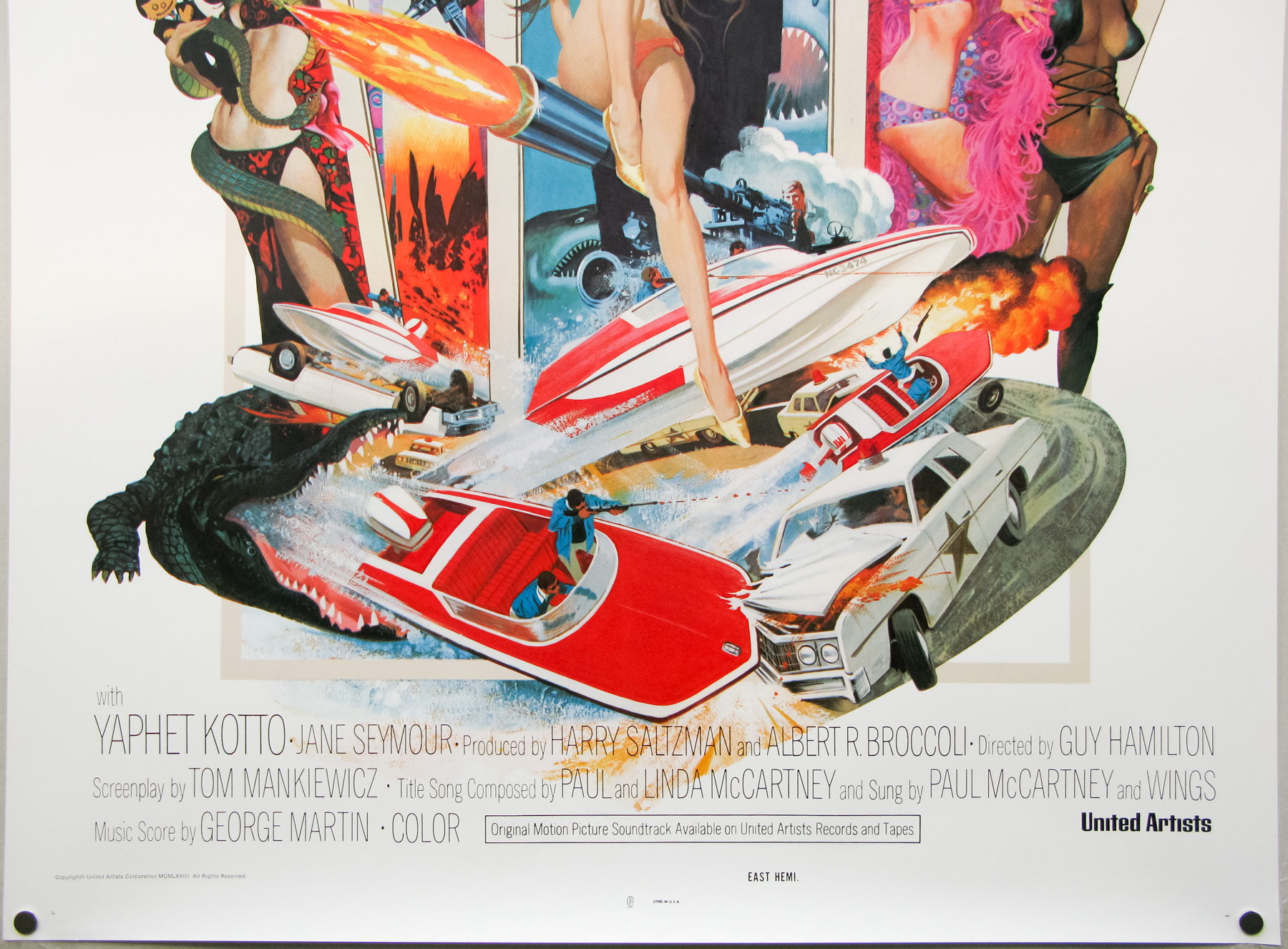
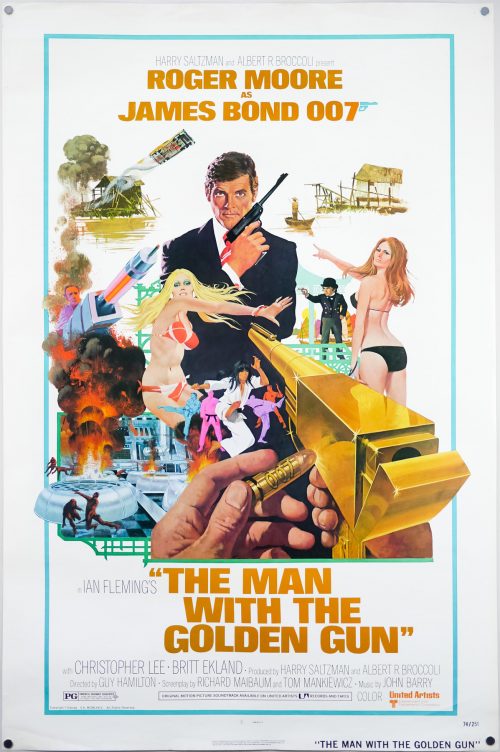
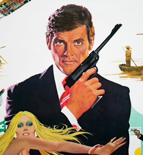
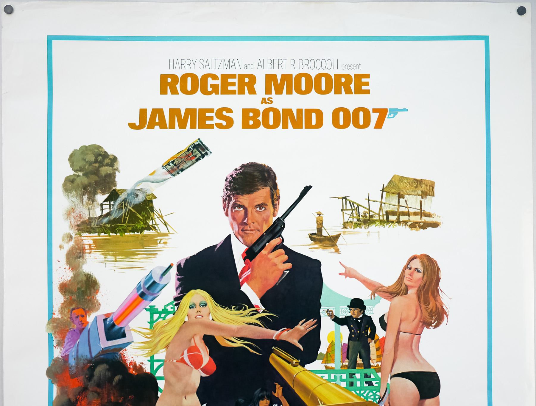
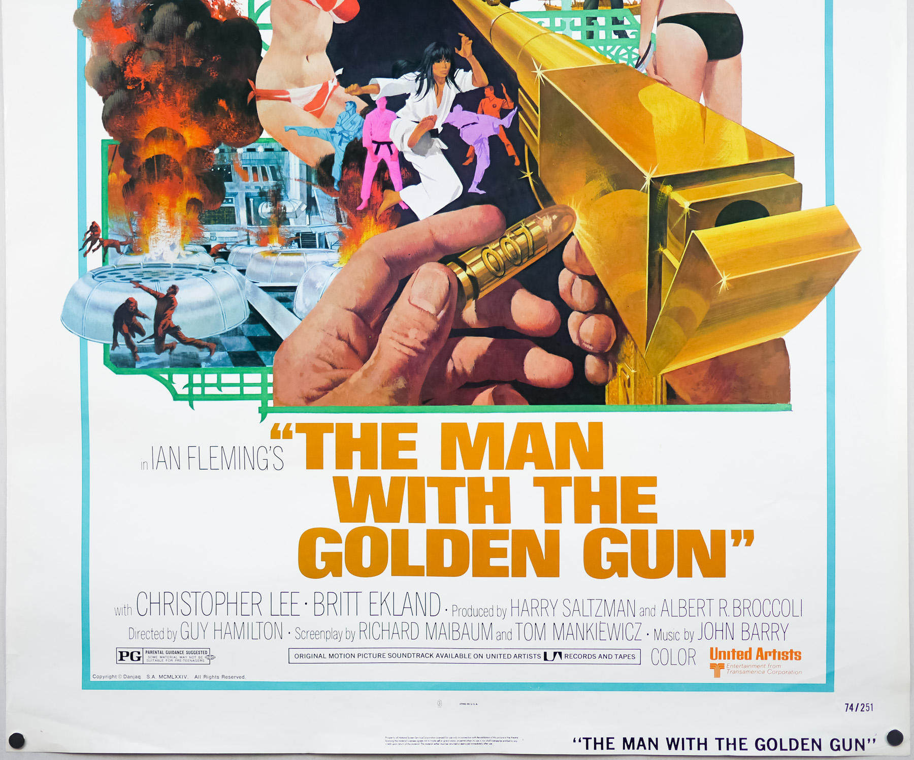
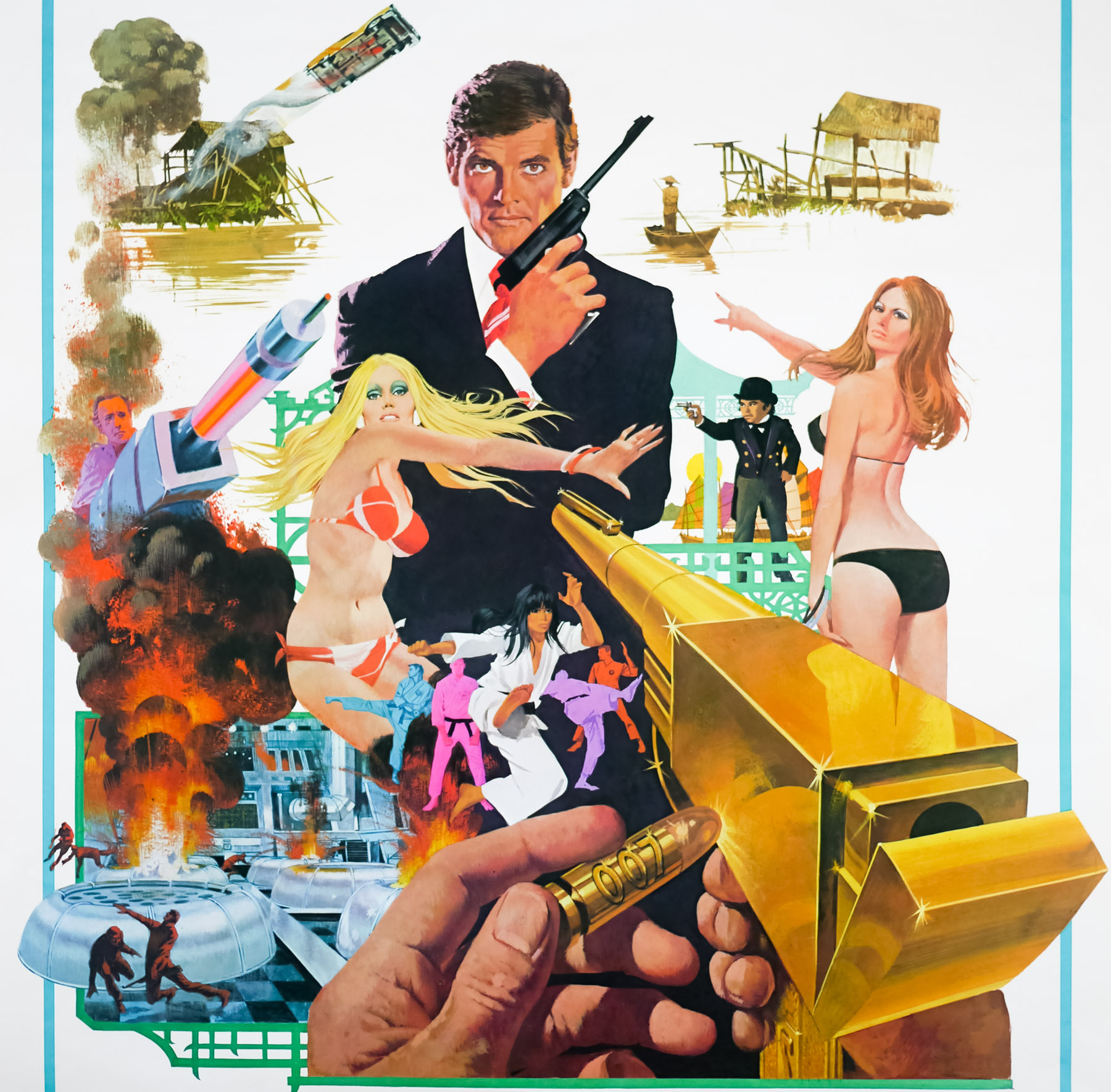
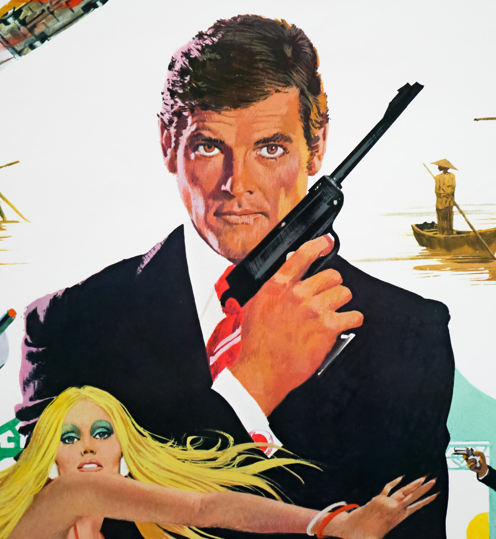
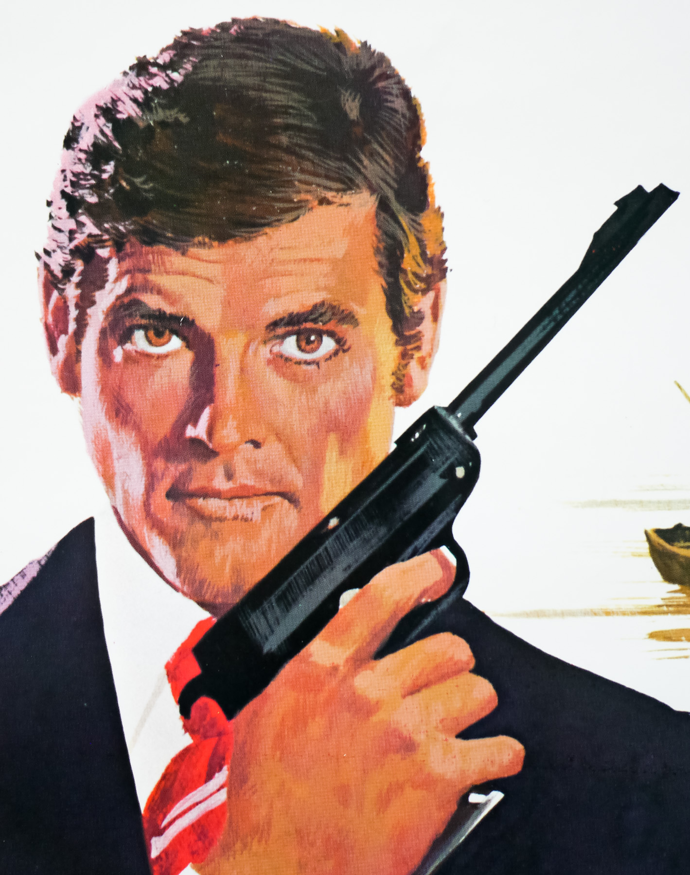
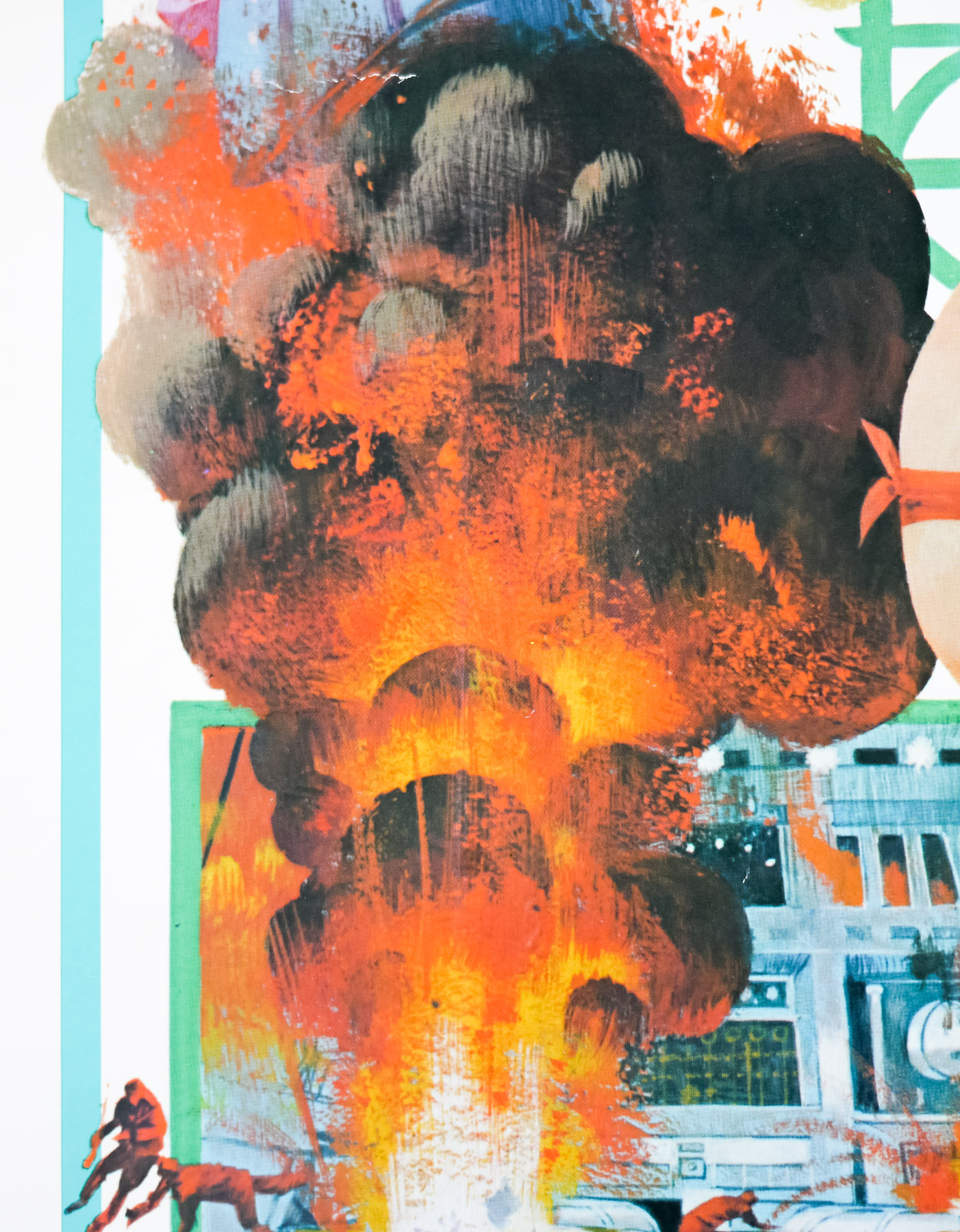
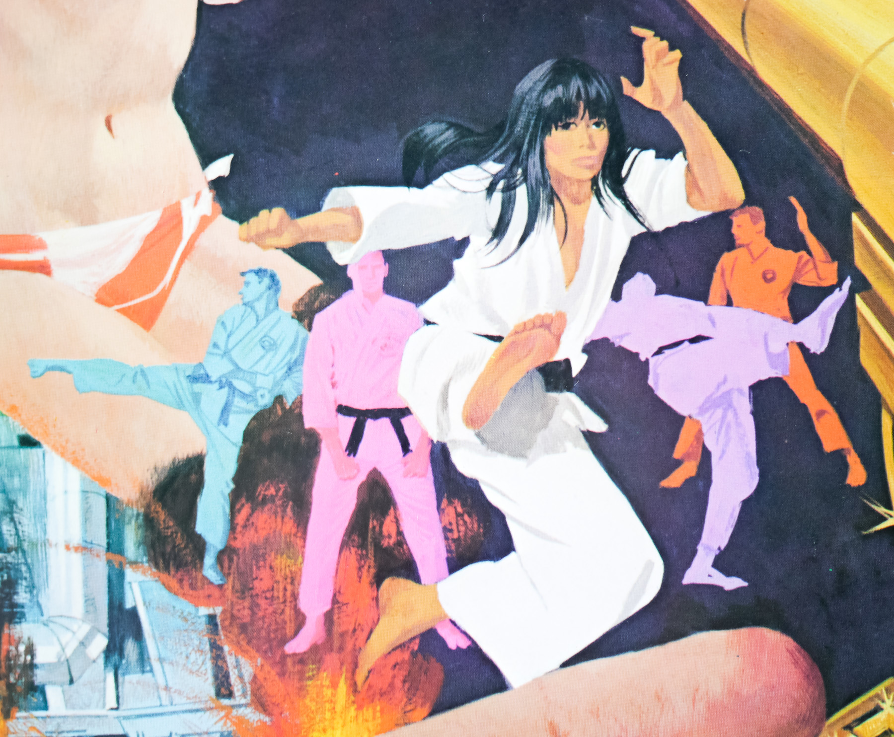
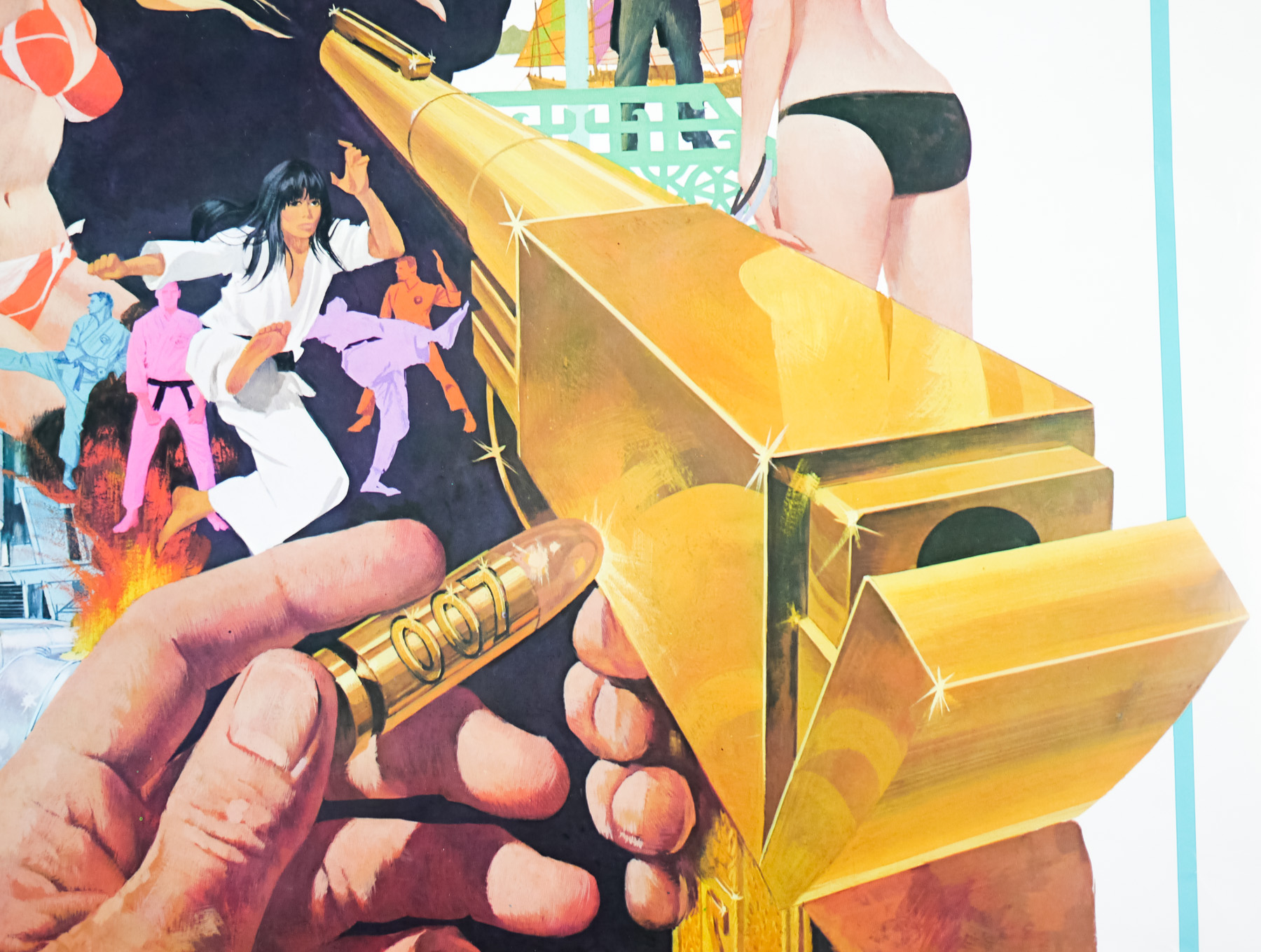
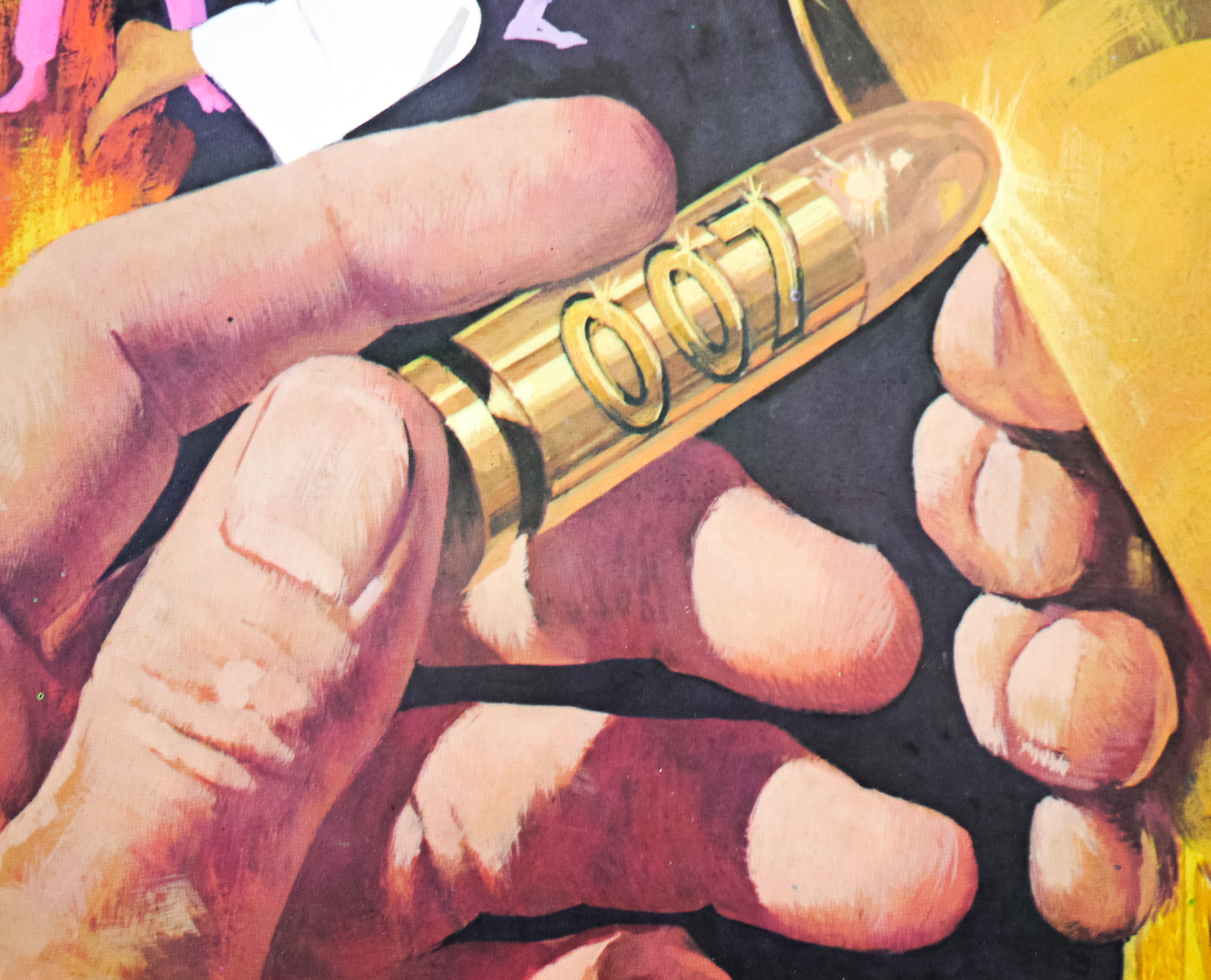
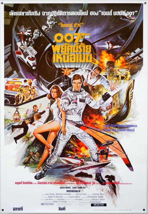
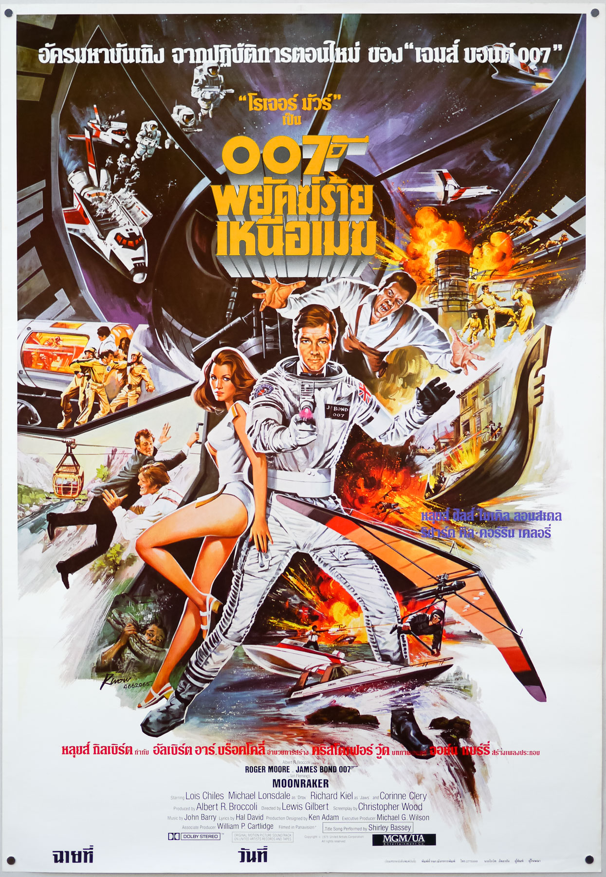
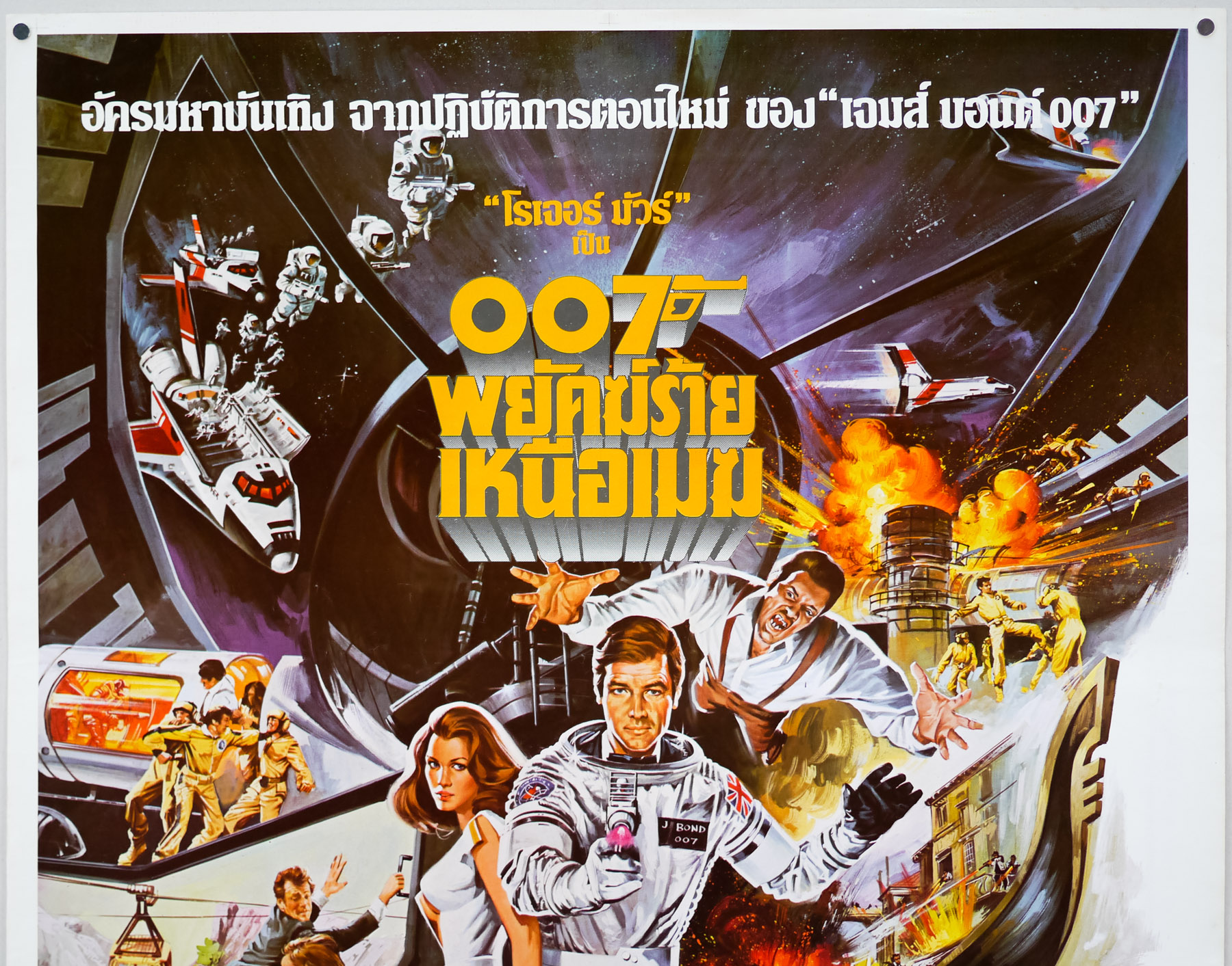
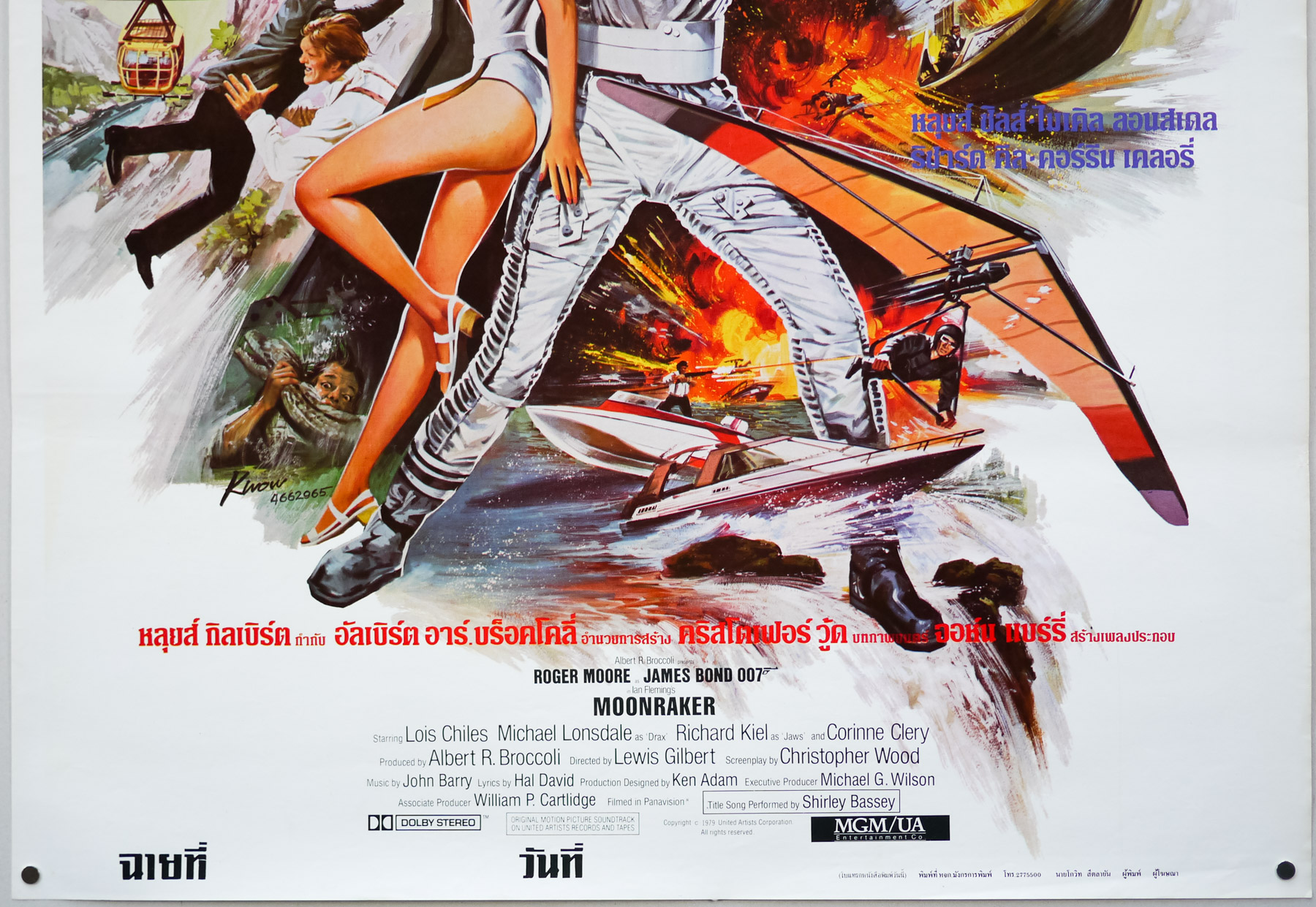
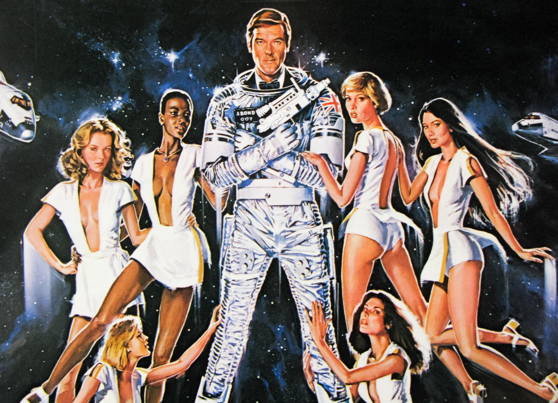
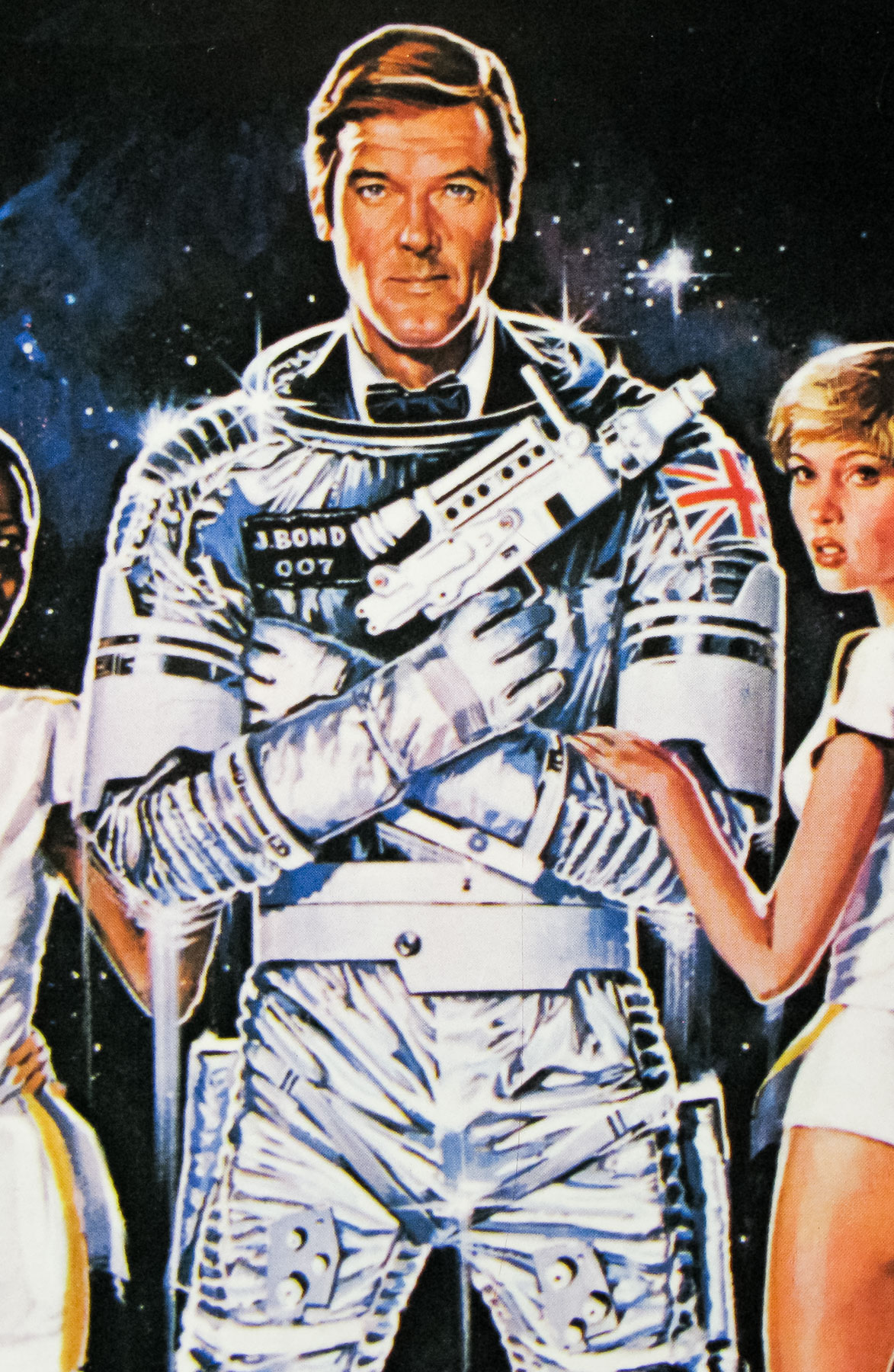
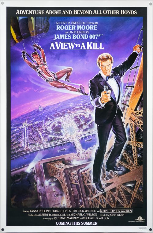
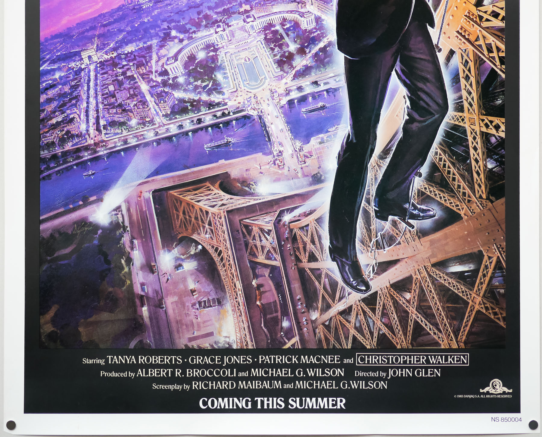
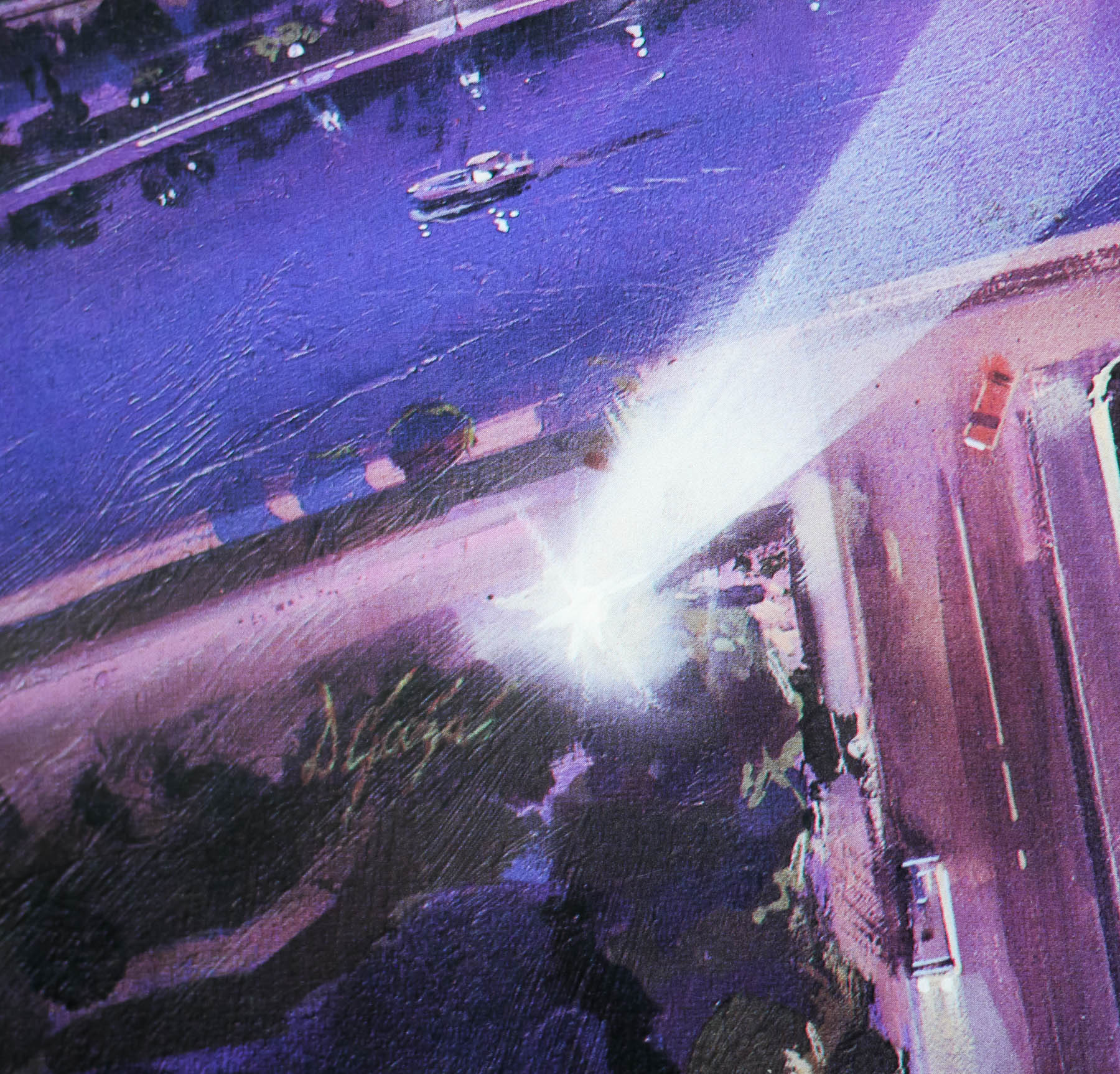
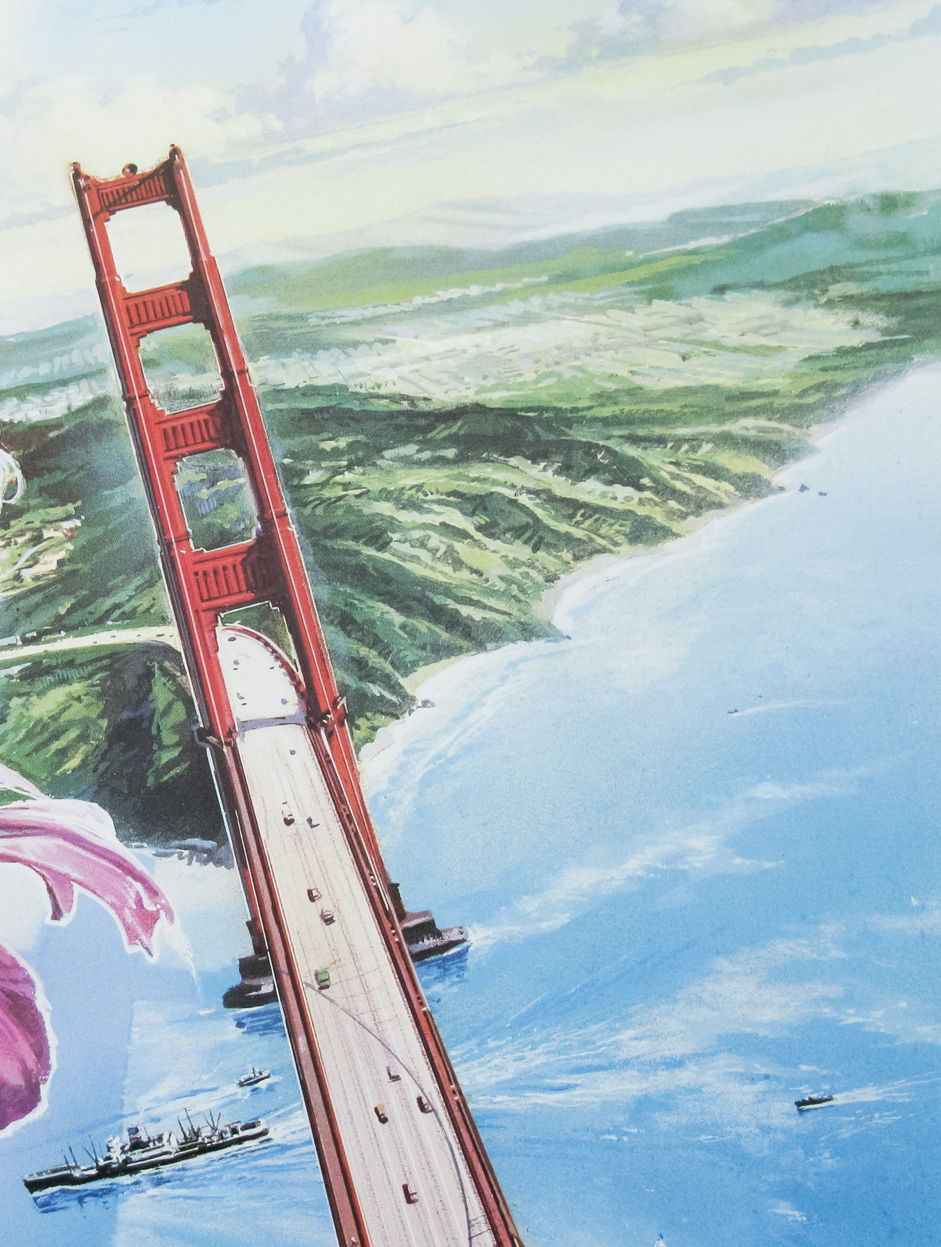
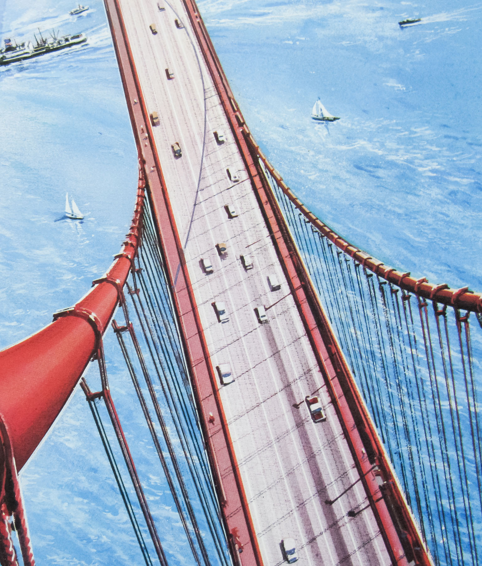
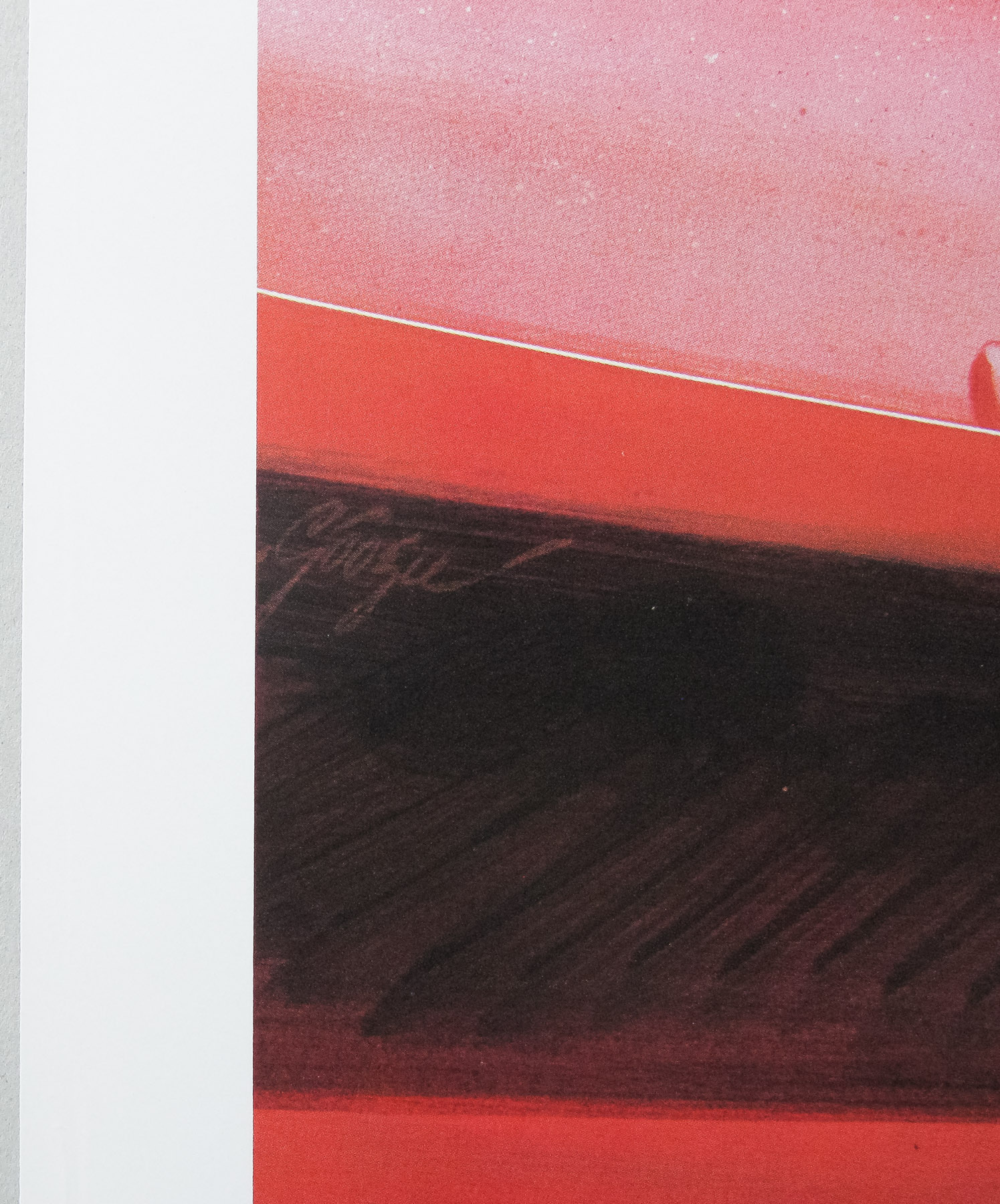
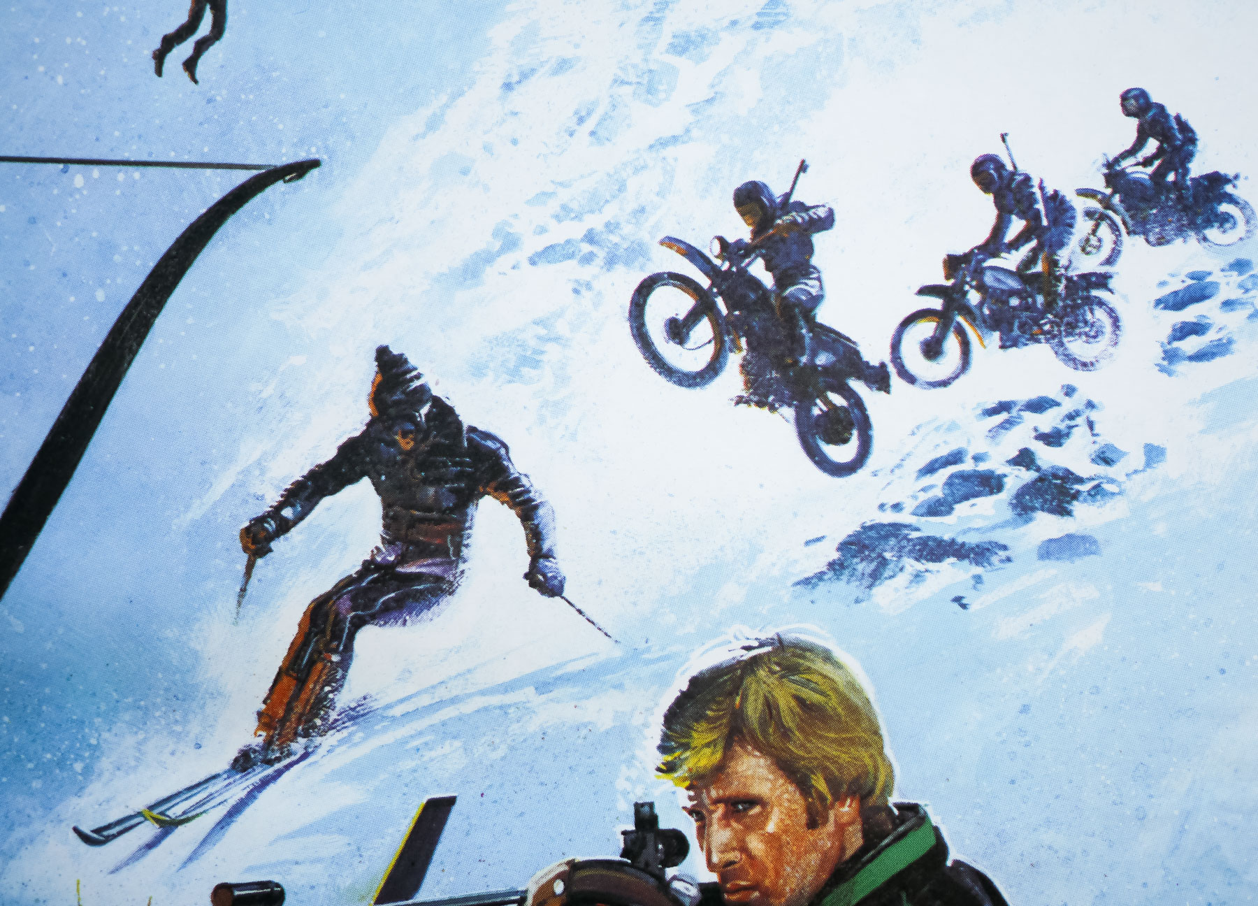
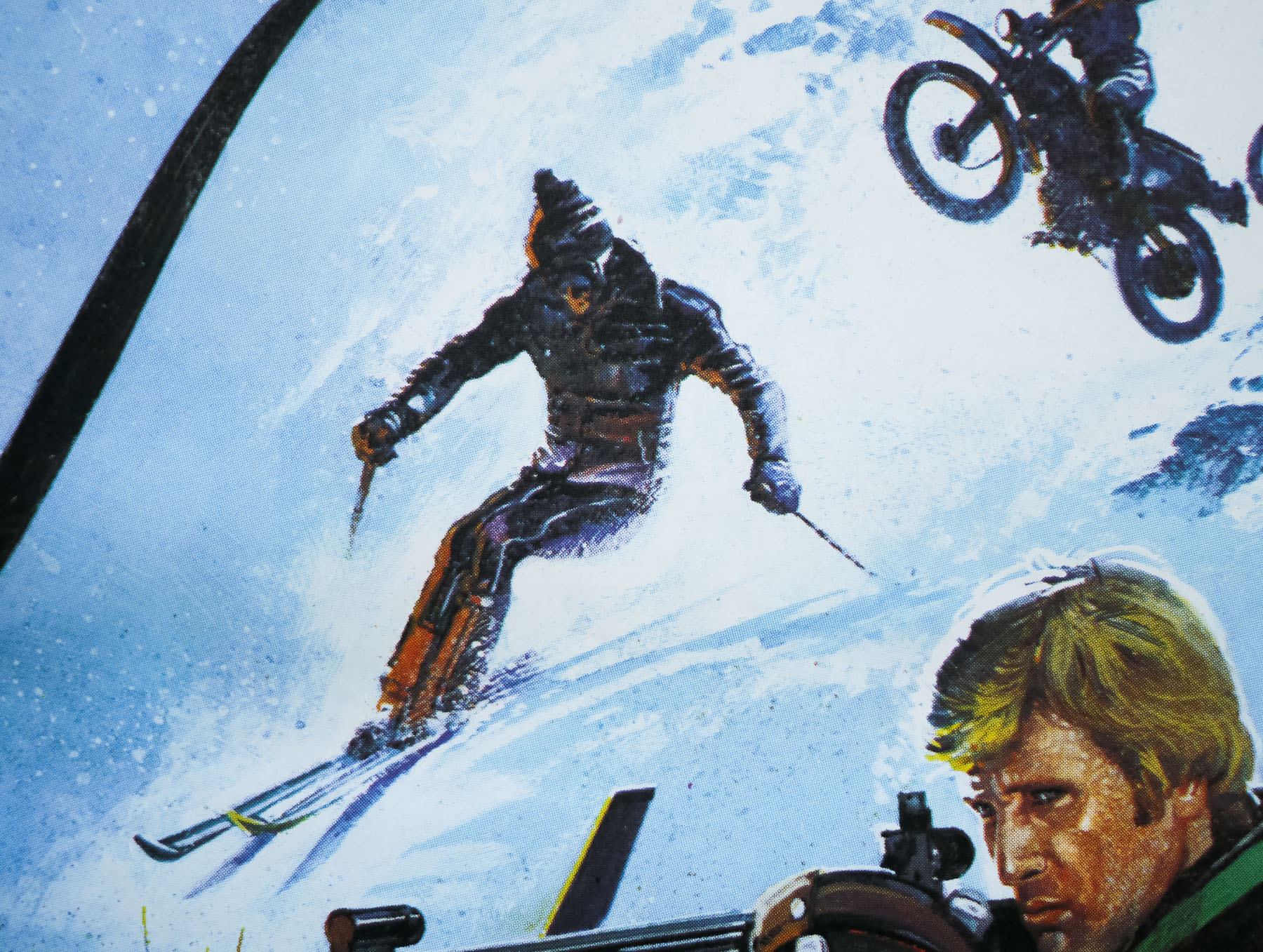
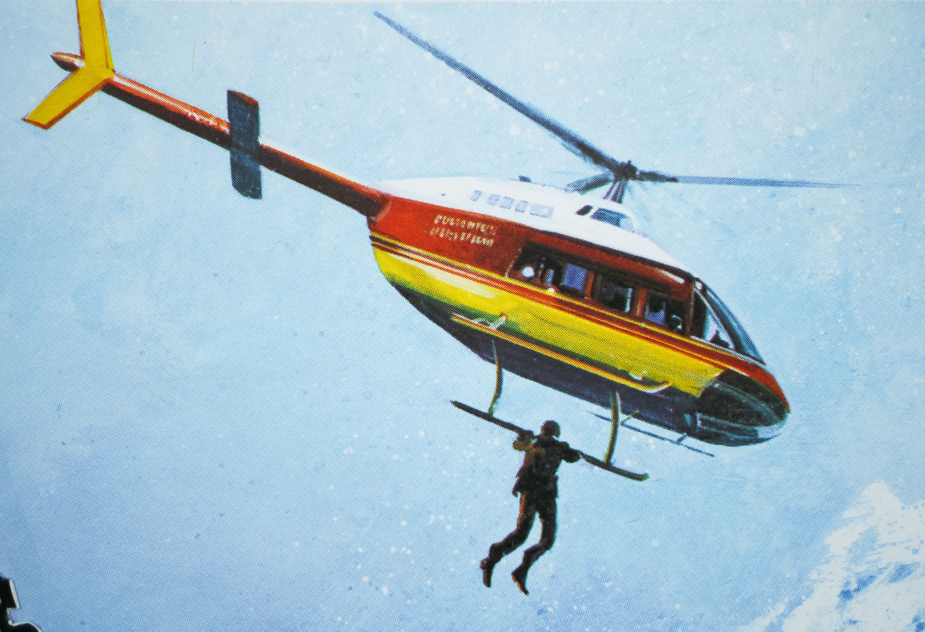
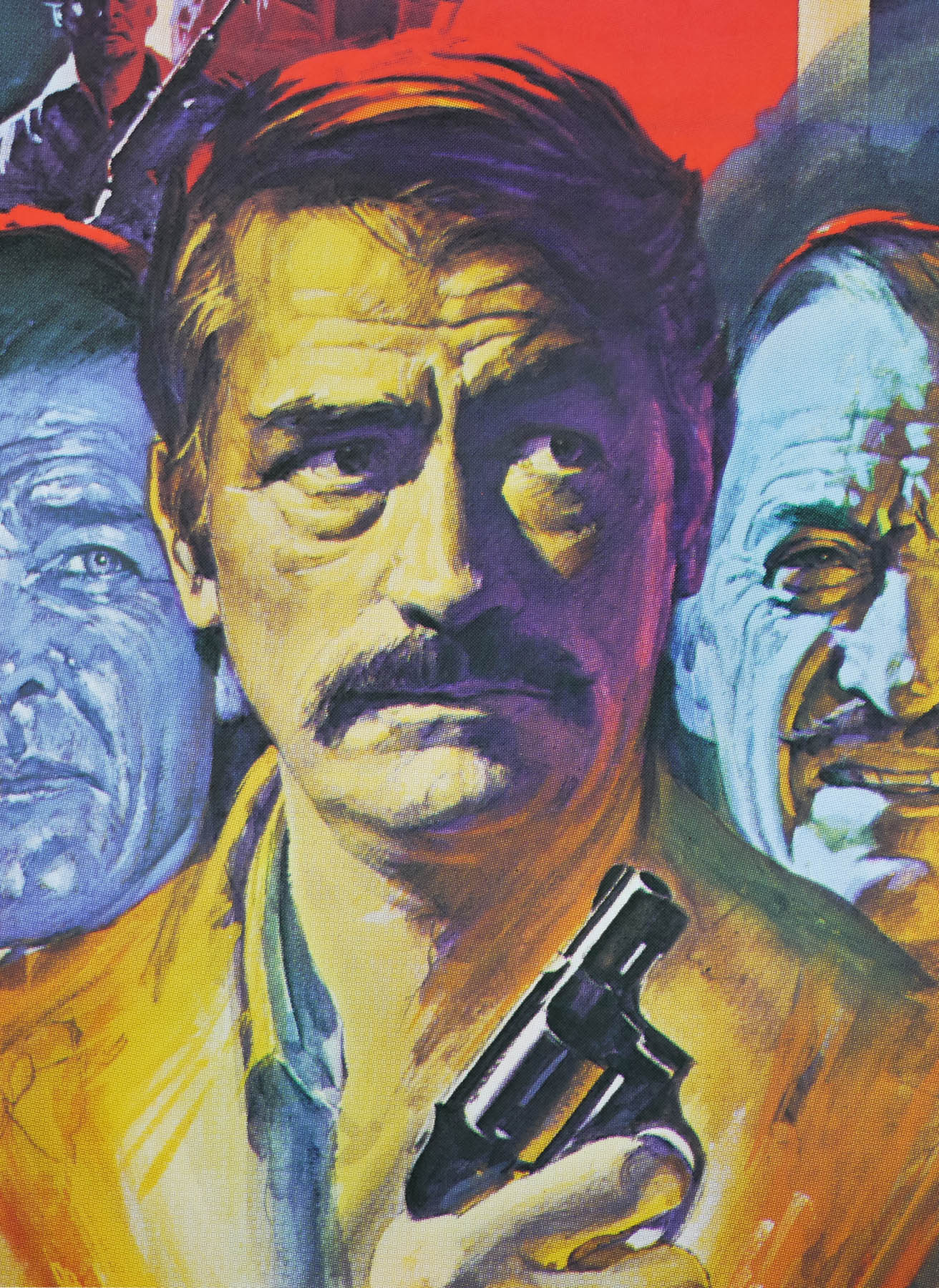
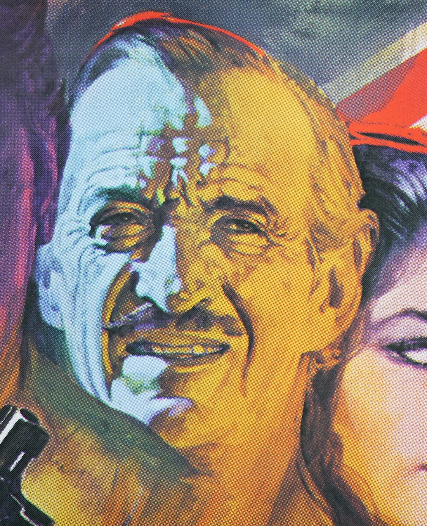
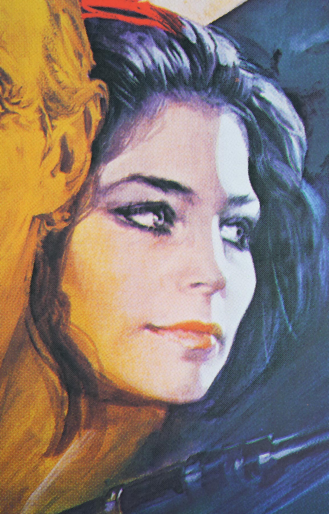
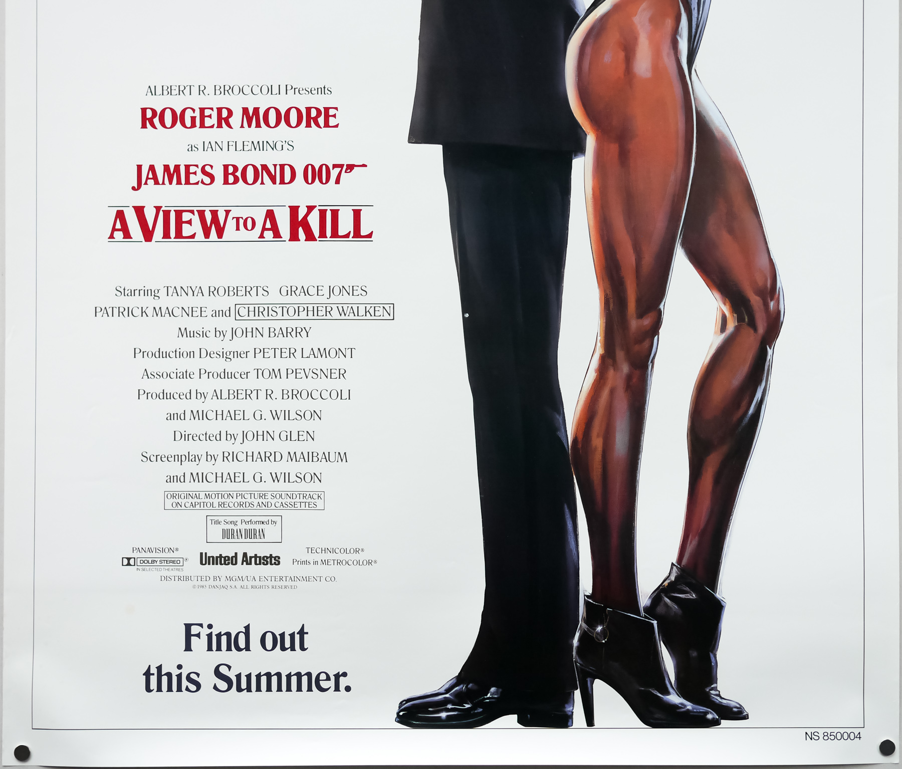
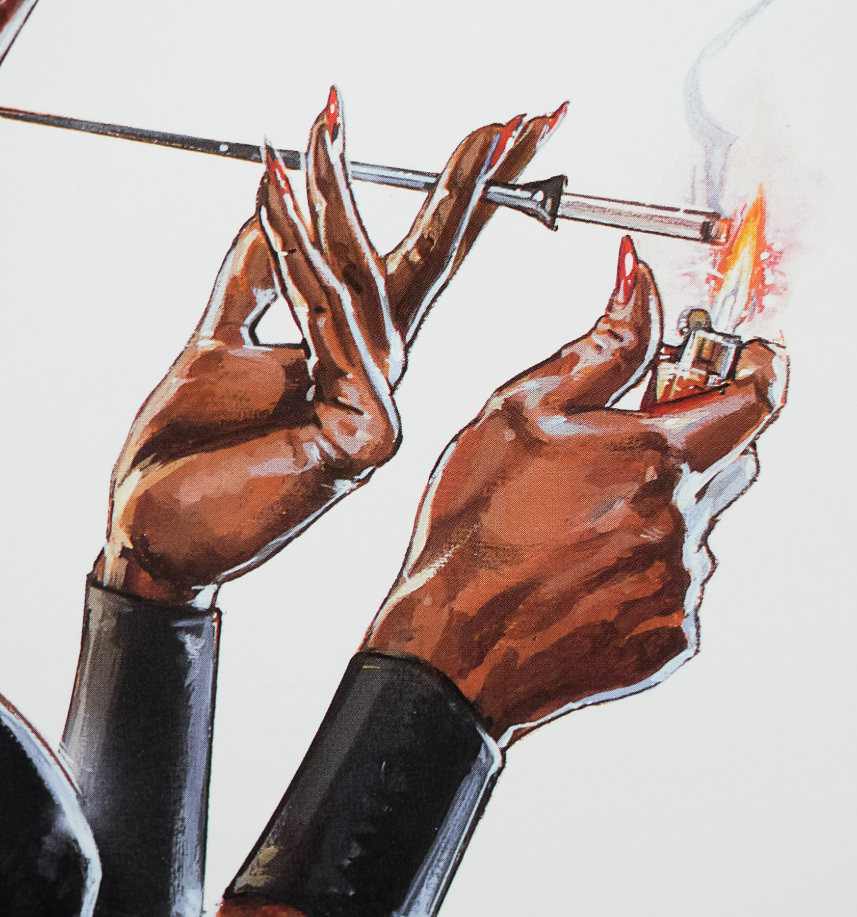
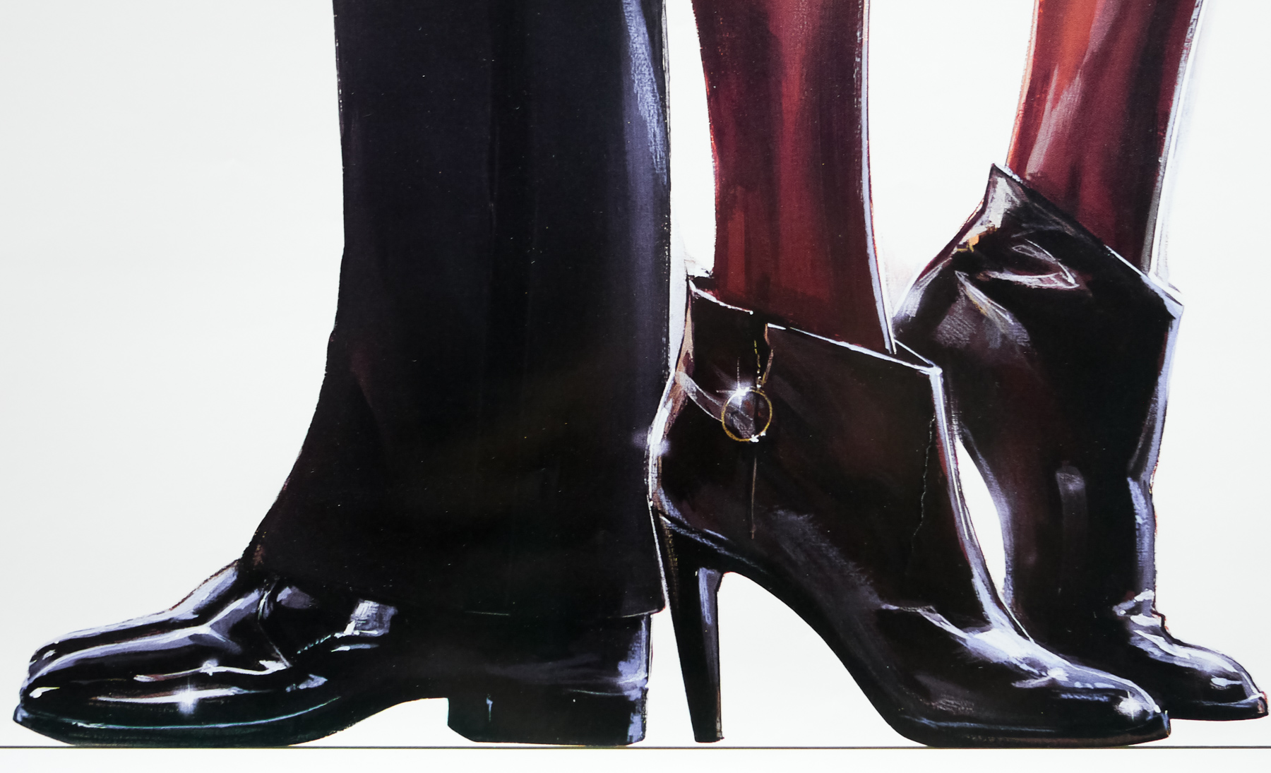
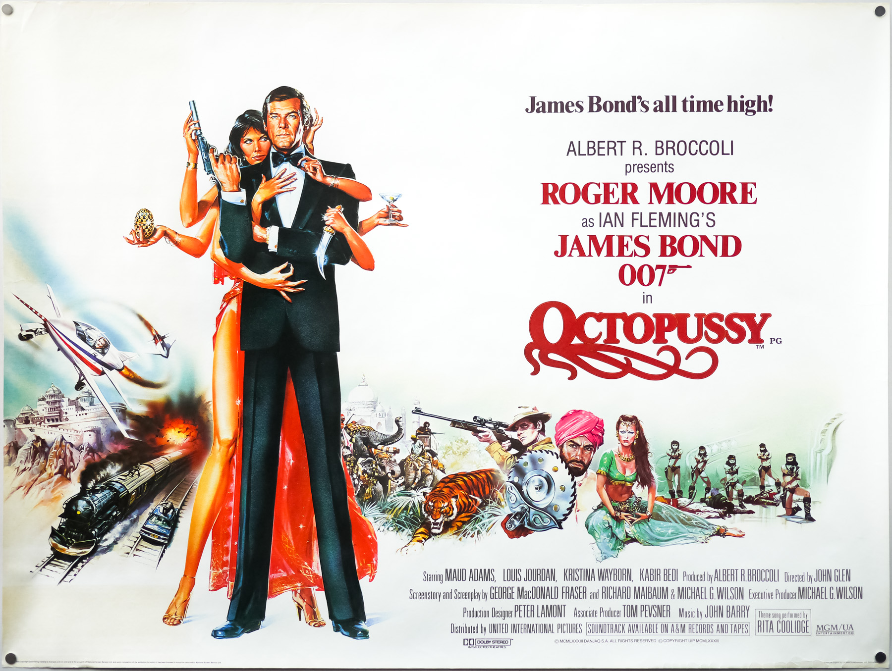
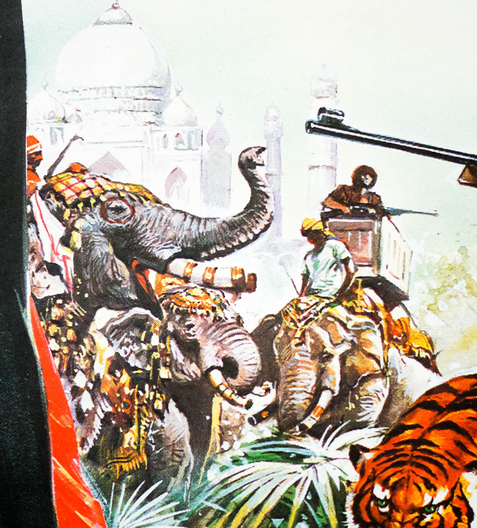
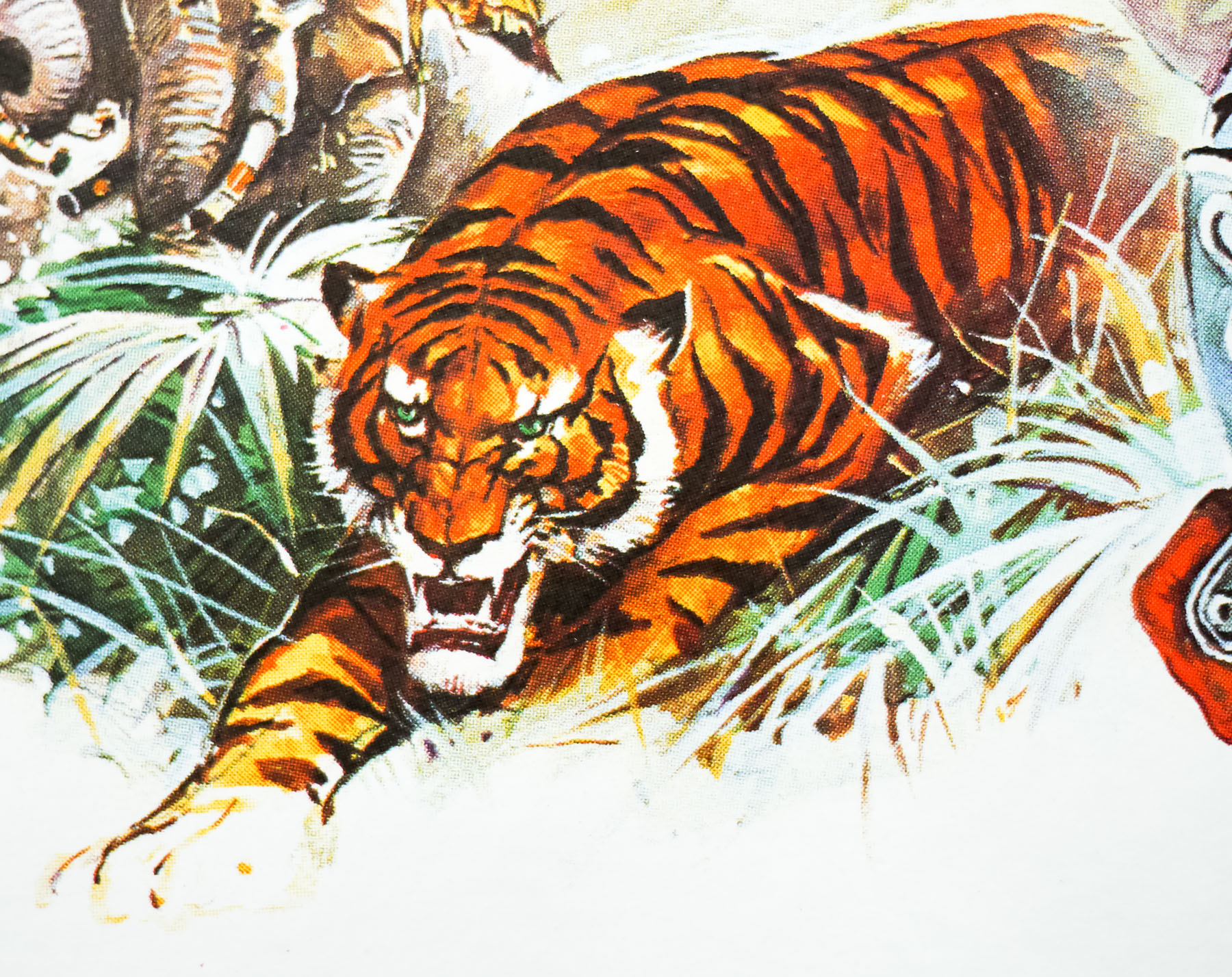
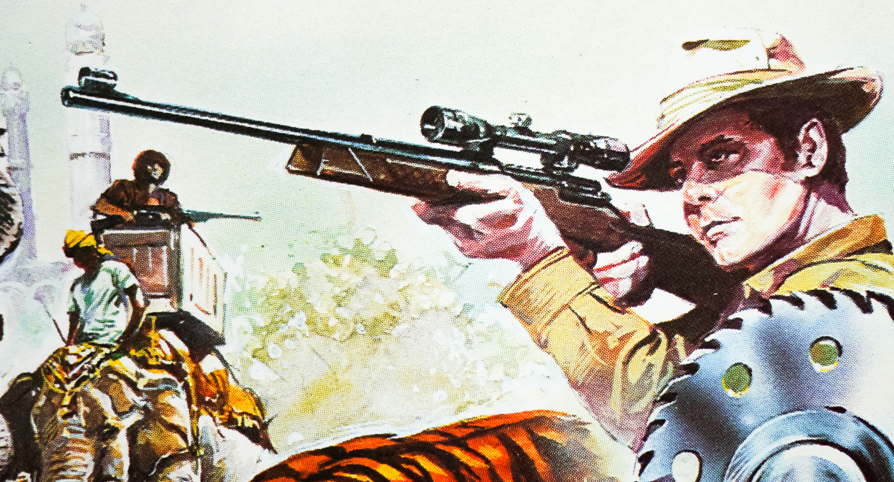
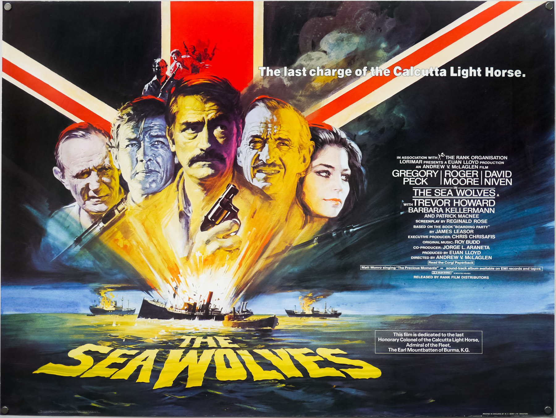
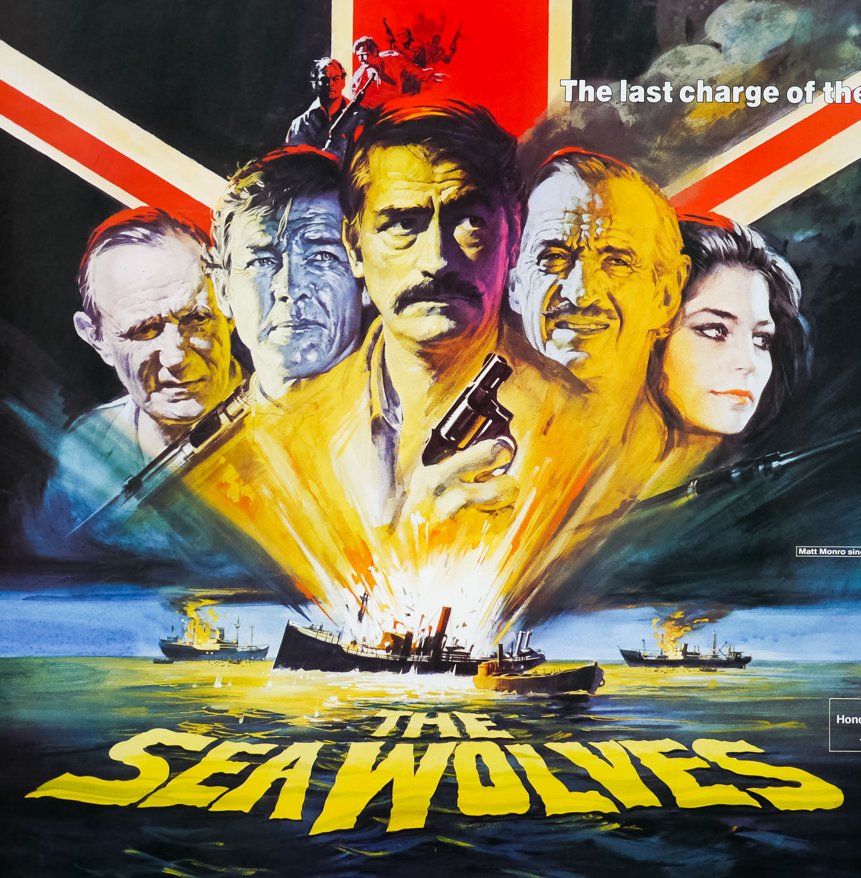
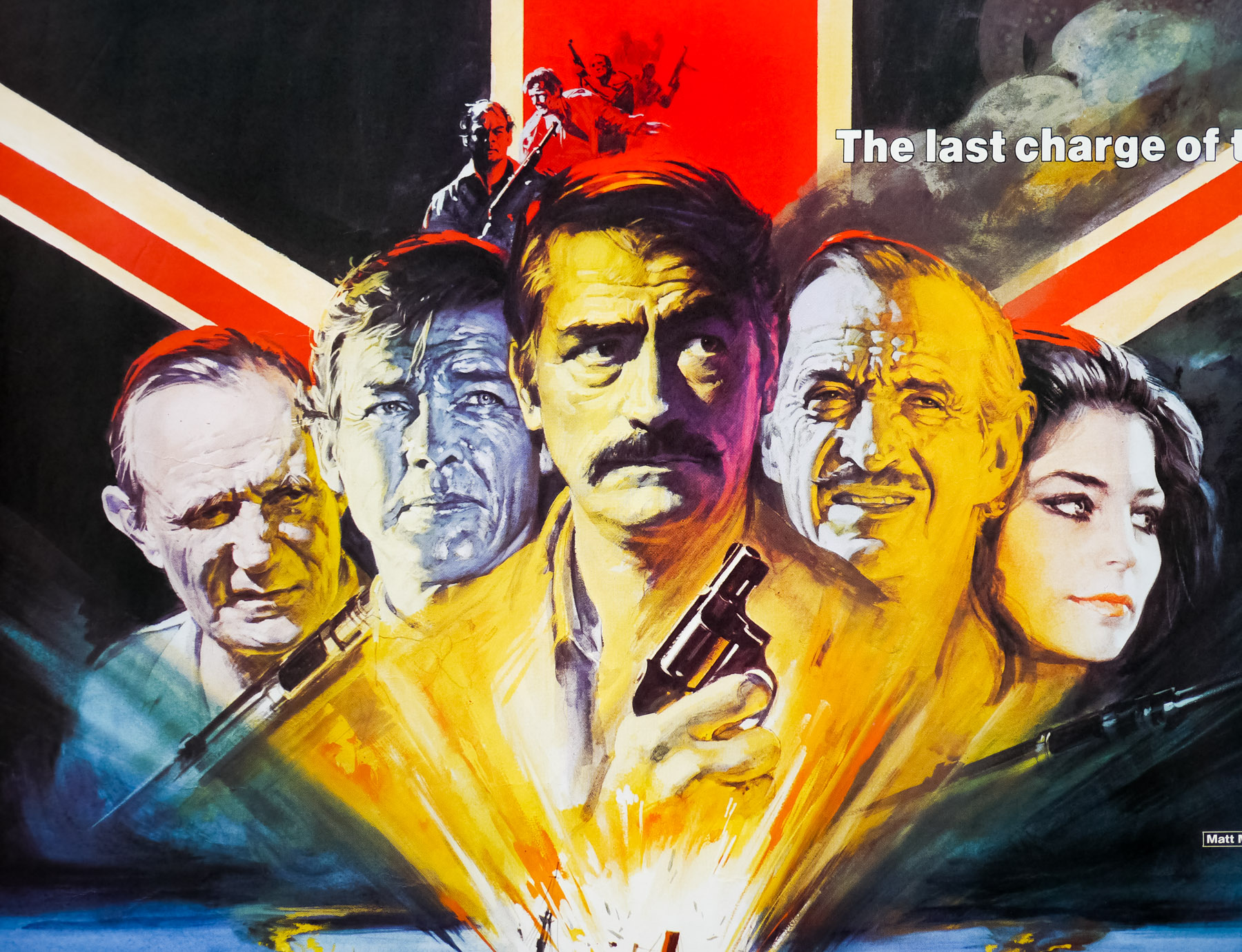
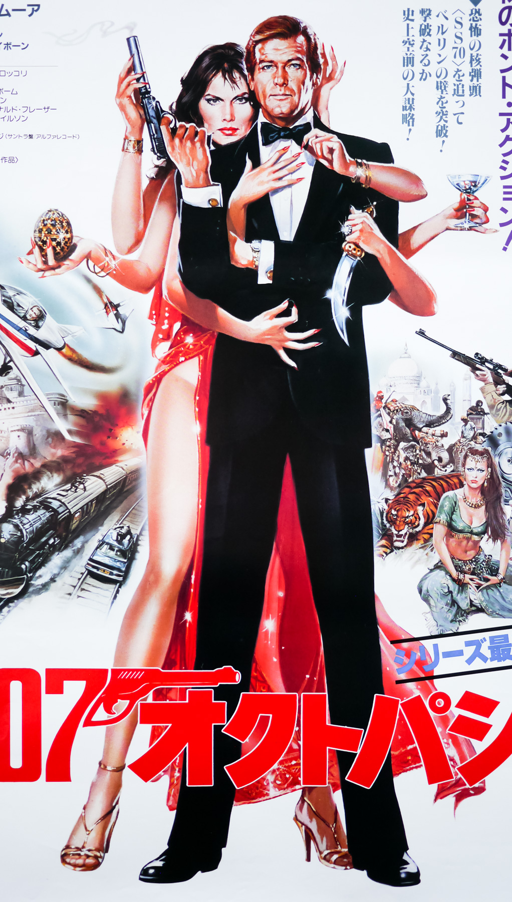
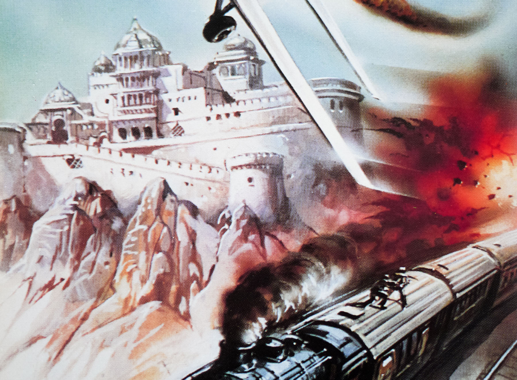
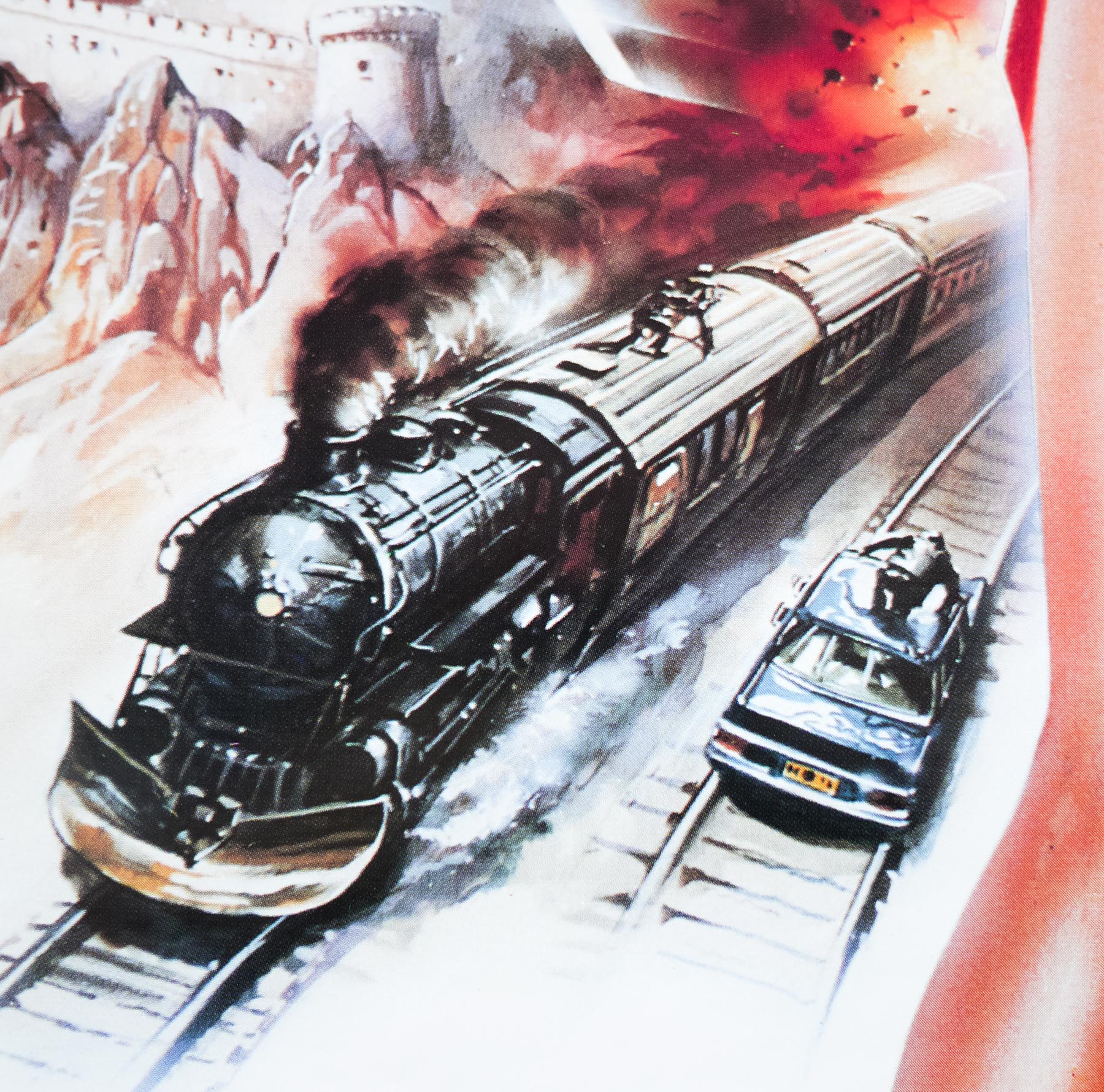
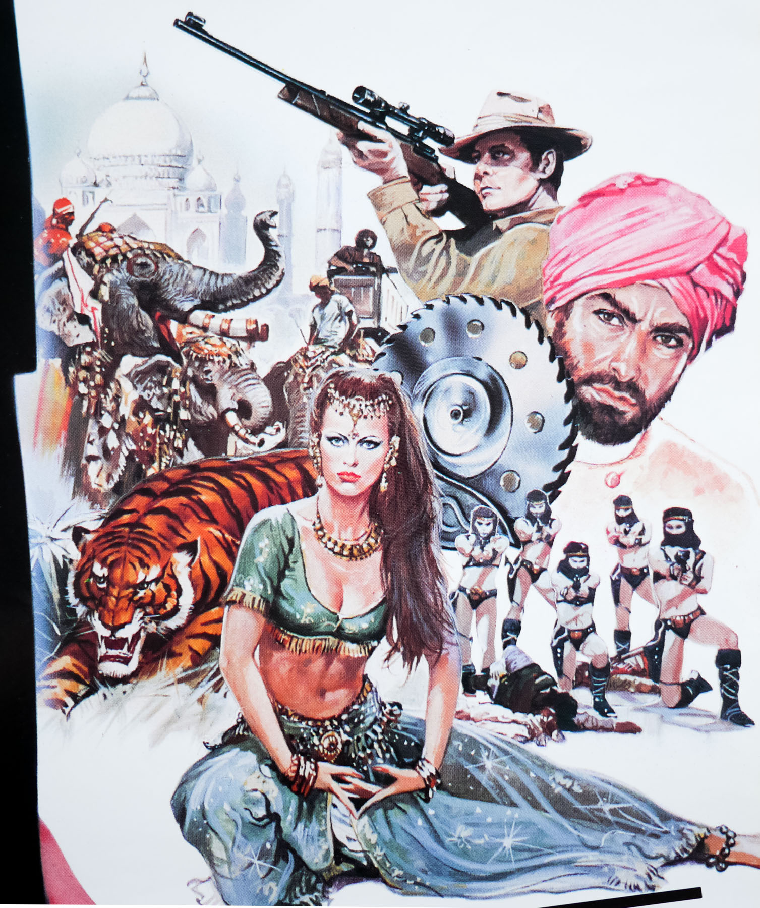
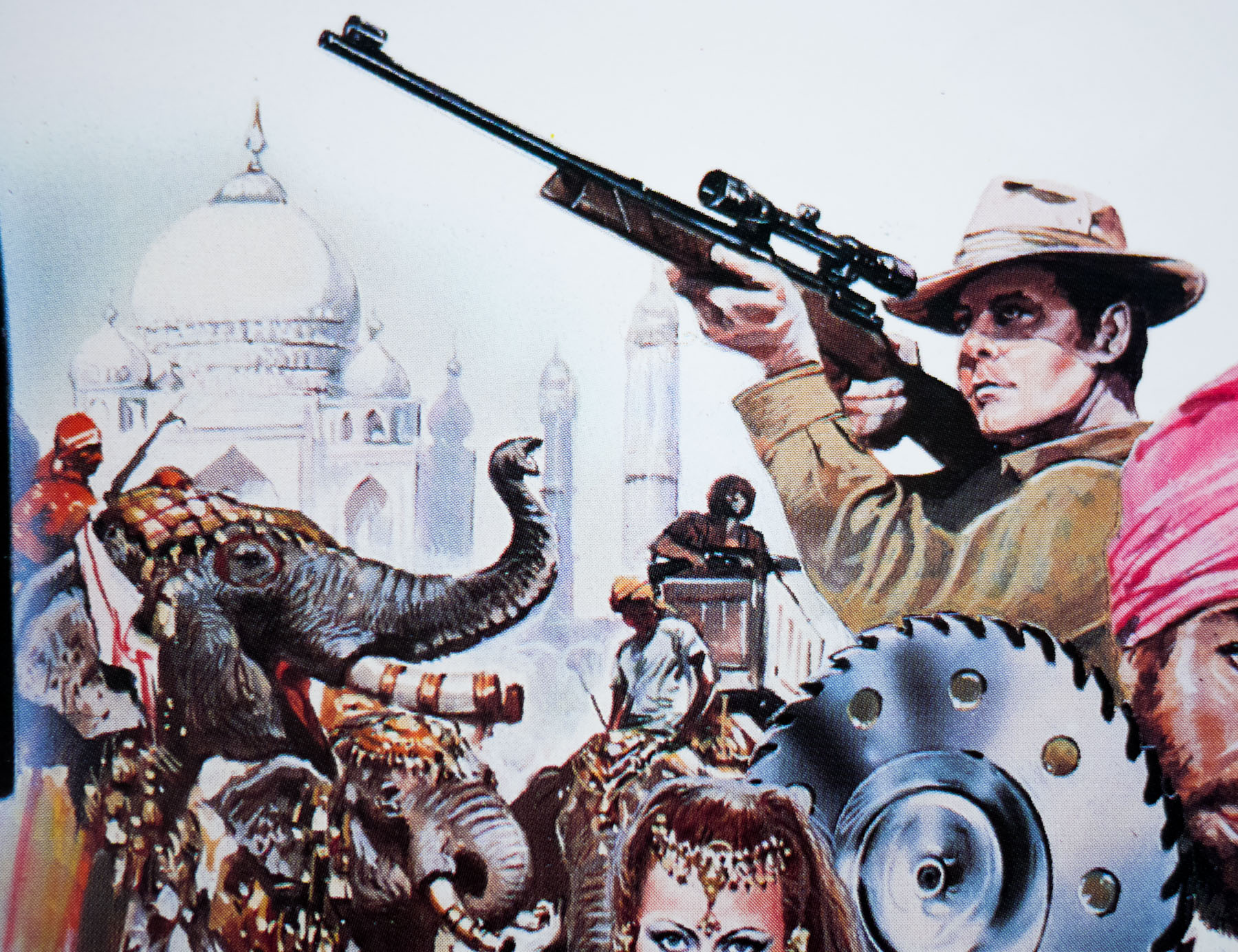
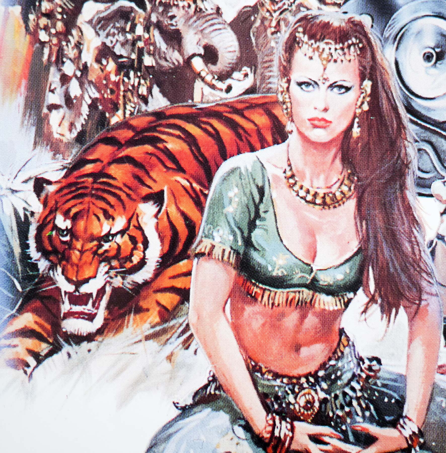
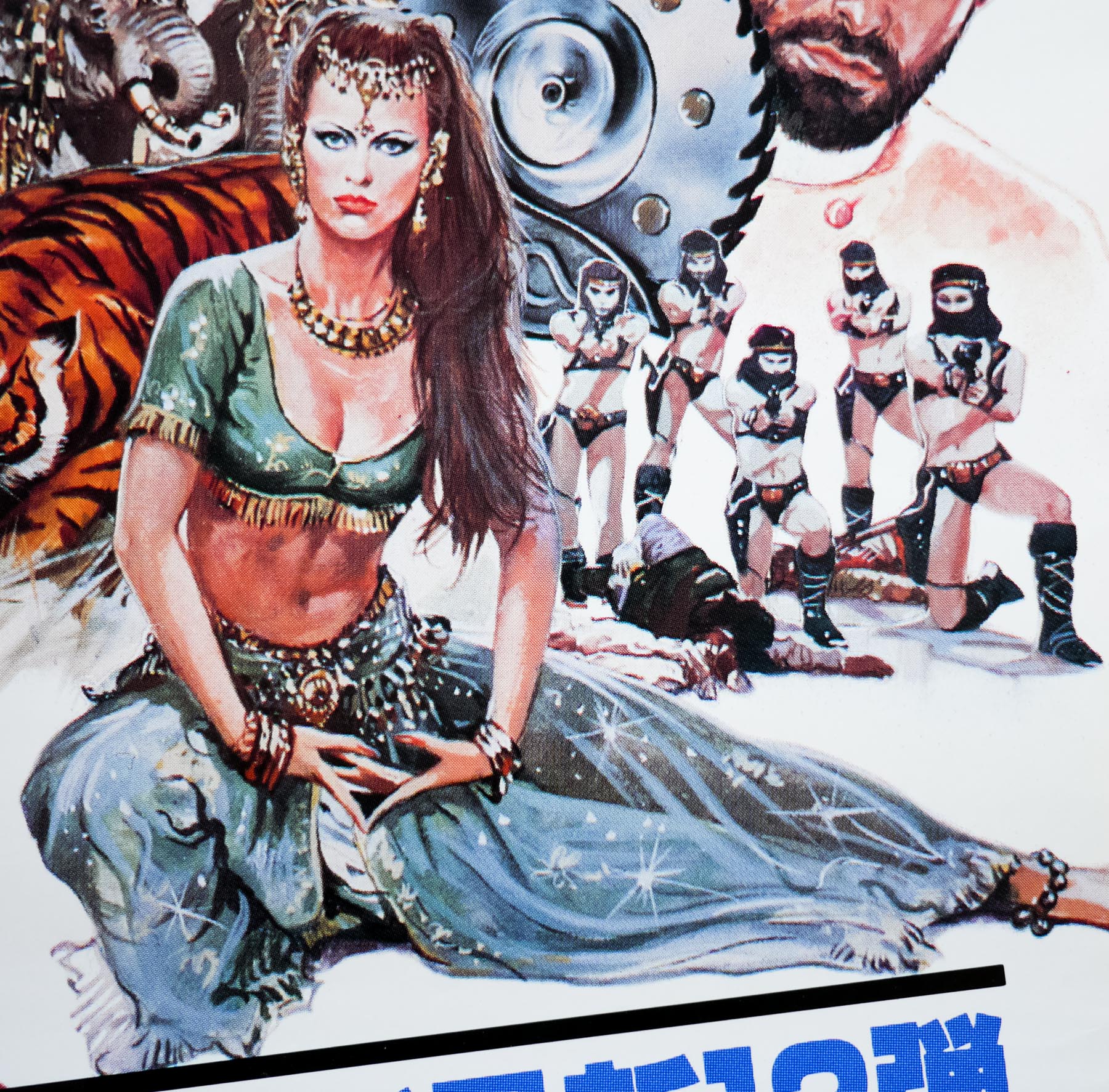
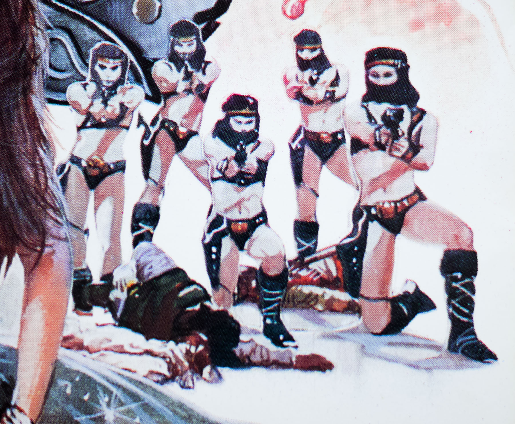
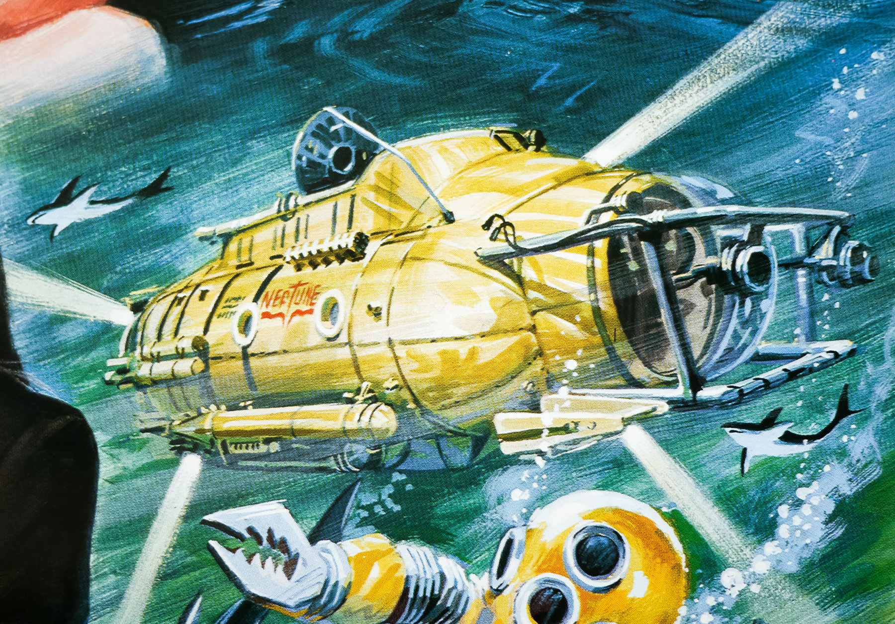
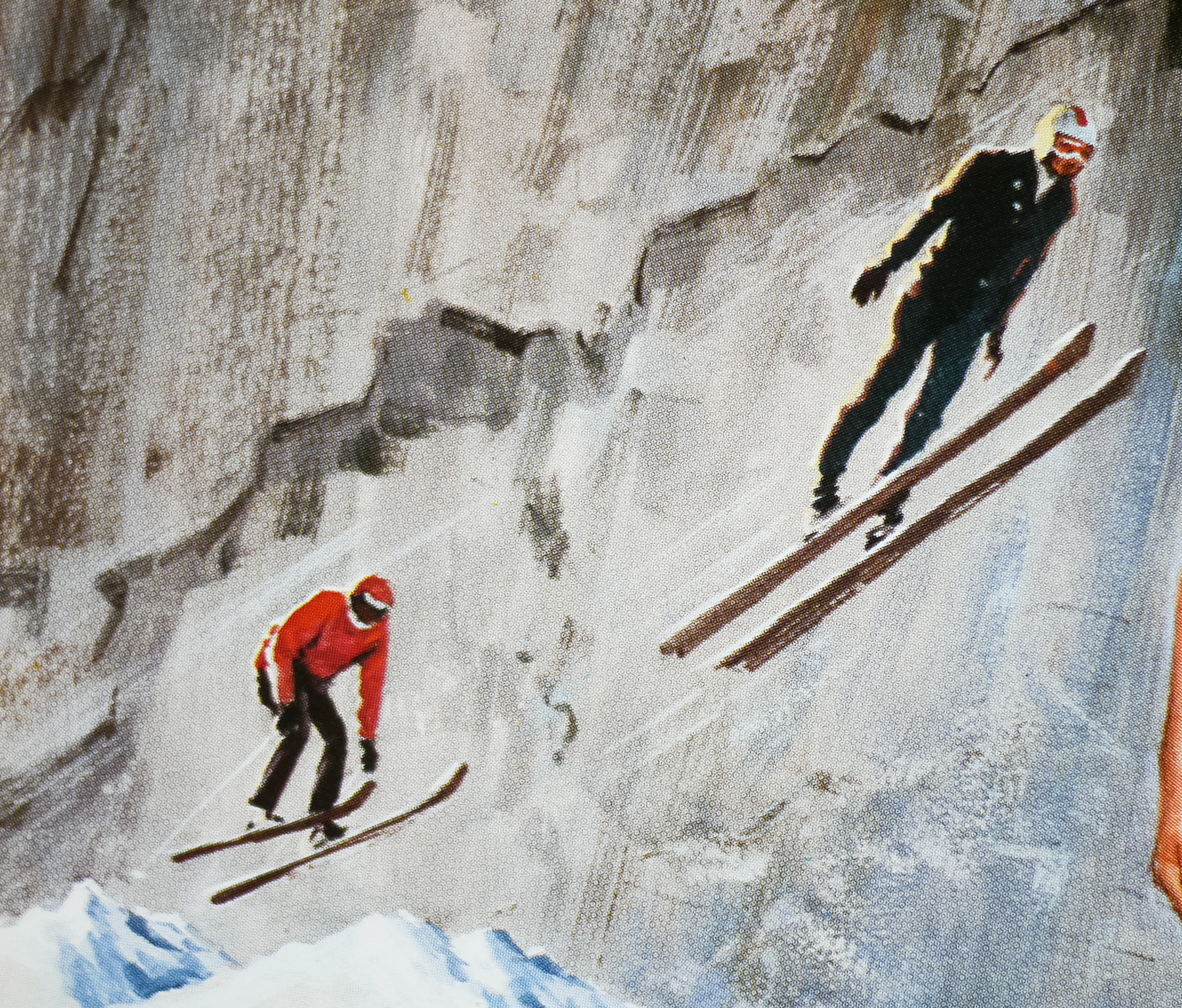
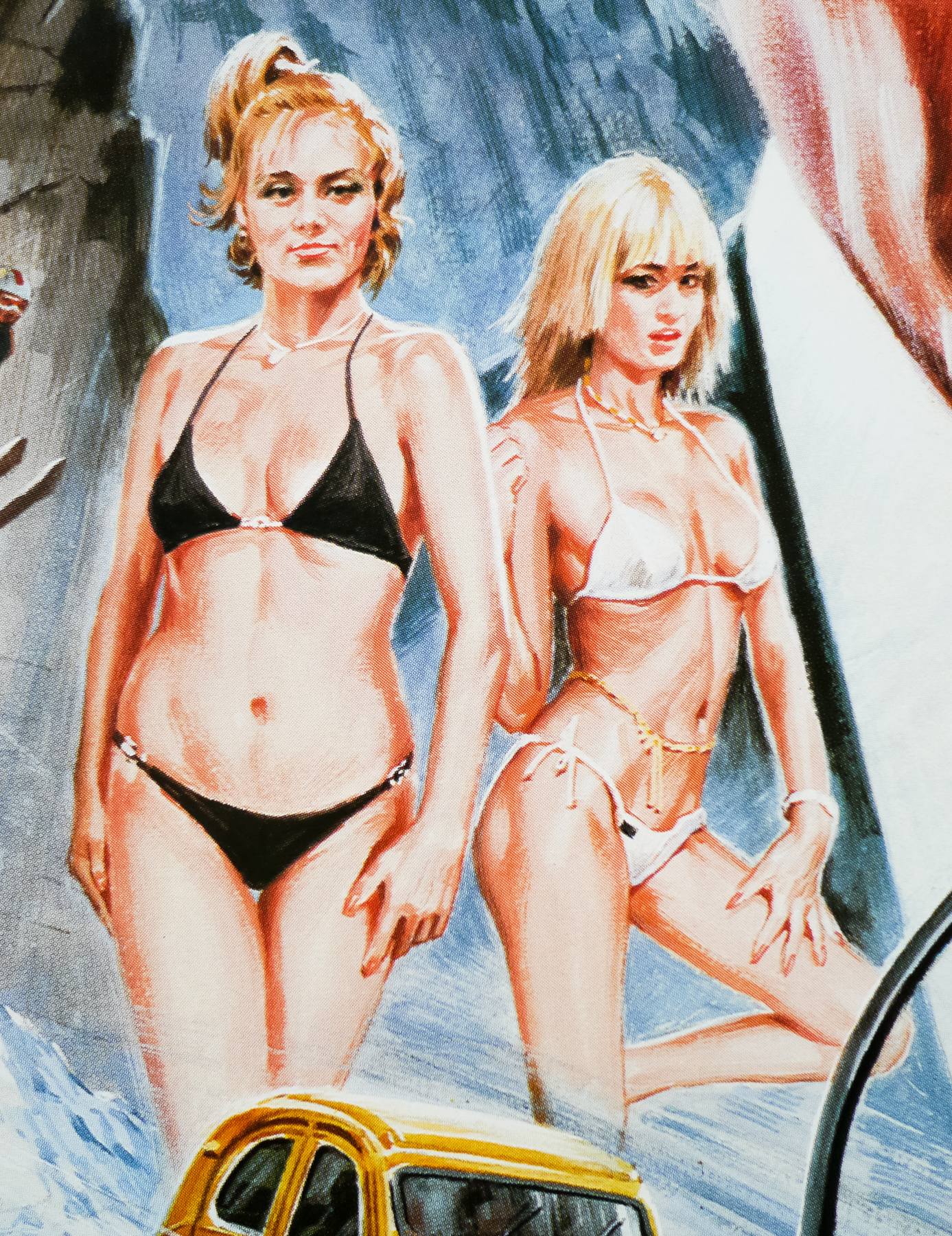
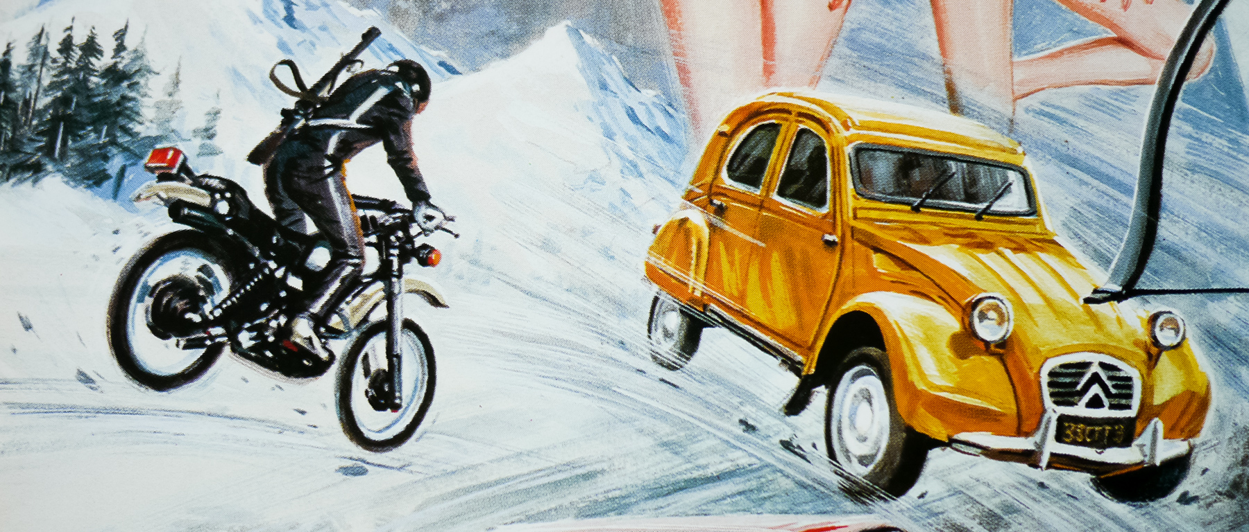
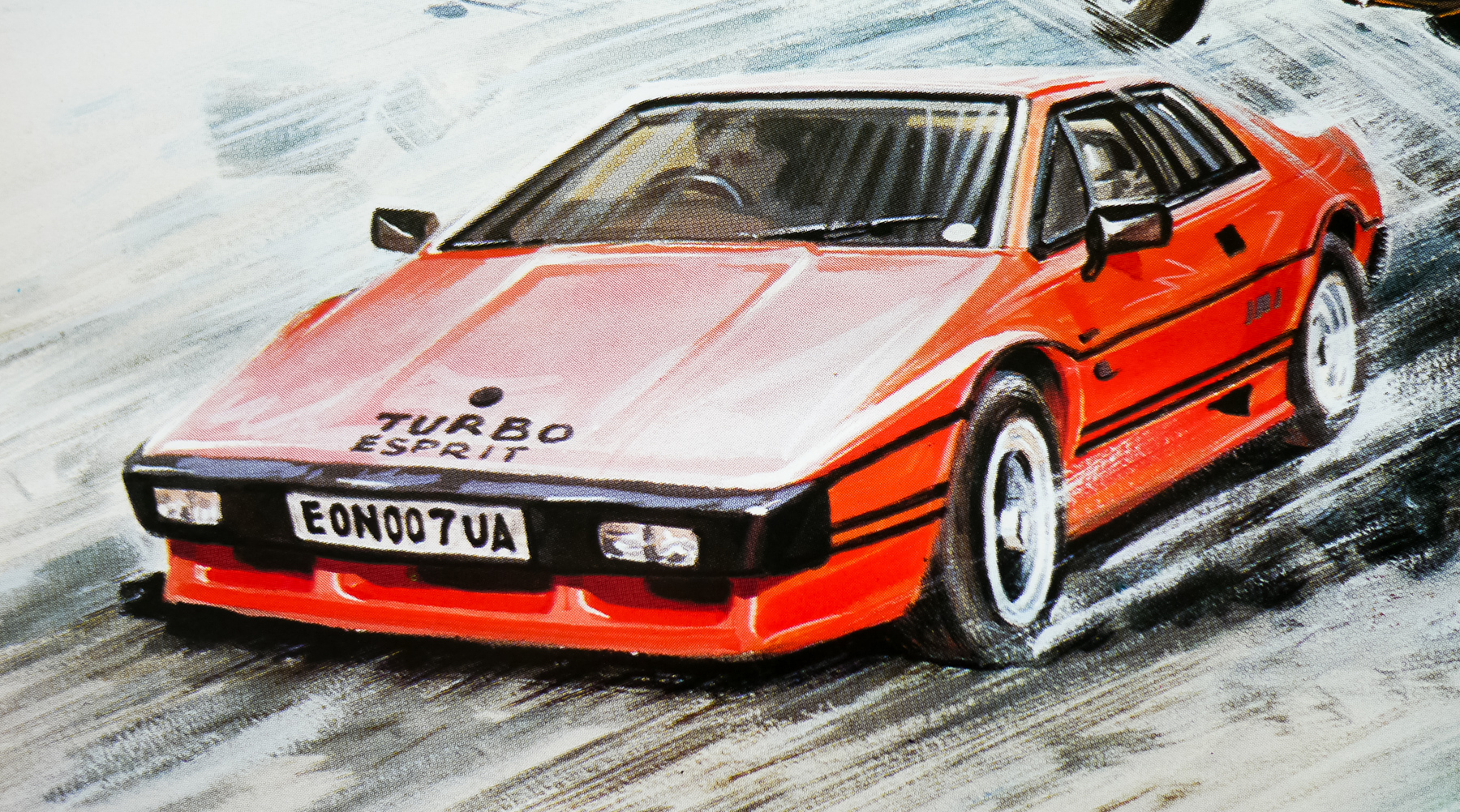
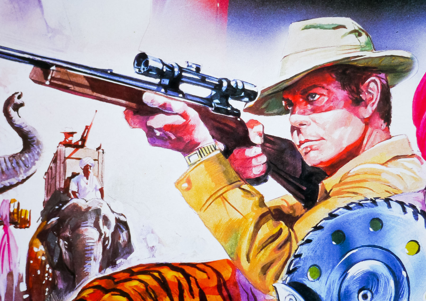
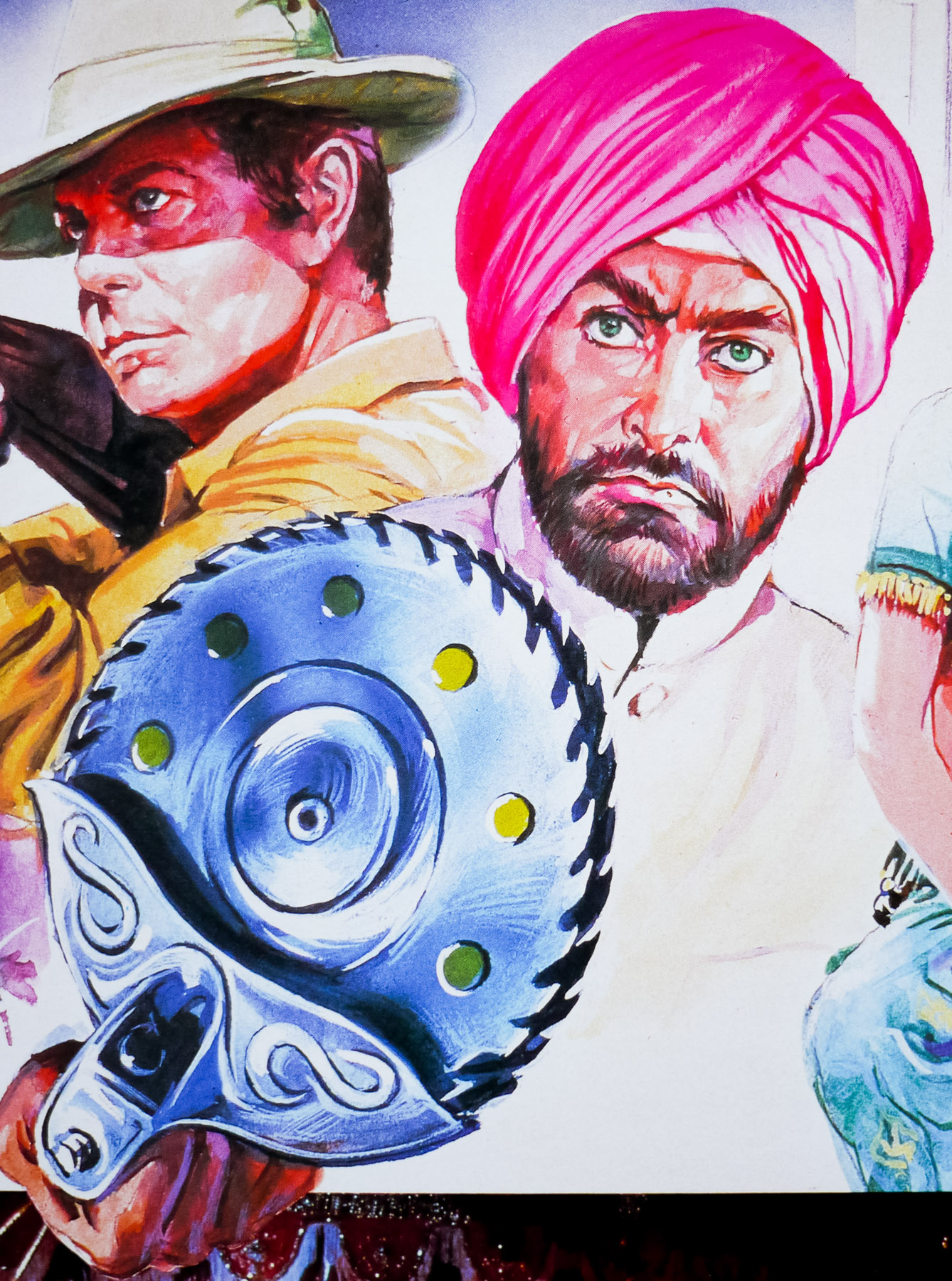
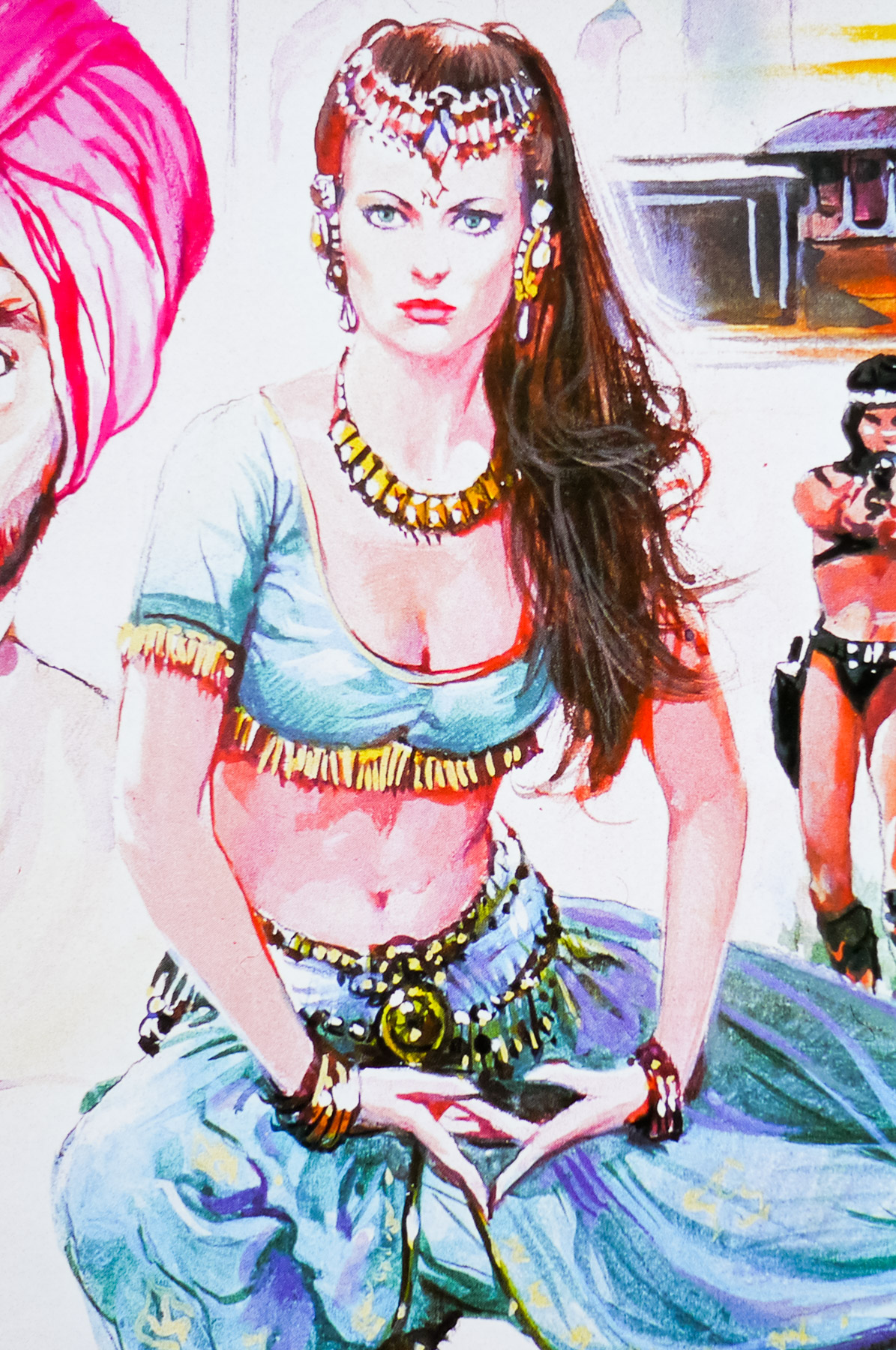
This poster is the UK one sheet that was designed by Vic Fair and illustrated by Brian Bysouth, a not insignificant pairing of two great English talents. Having been commissioned by the studio the poster was apparently then rejected and ultimately never used in cinemas to promote the film. Sim Branaghan, the man behind the must-own book ‘British Film Posters‘, interviewed Vic Fair who recalled that they were looking for a more conventional design, something that often frustrated the designer when working with clients:
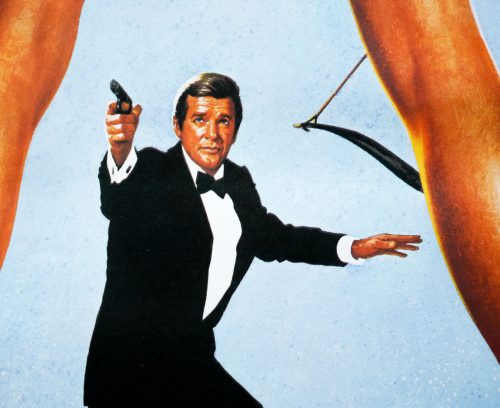
‘Not very exciting are they, the Bond posters … always the same thing. So I had this idea of putting him in a white jacket, but they just threw their arms up in horror – “Ooh no, we can’t have that”. It was ridiculous really’
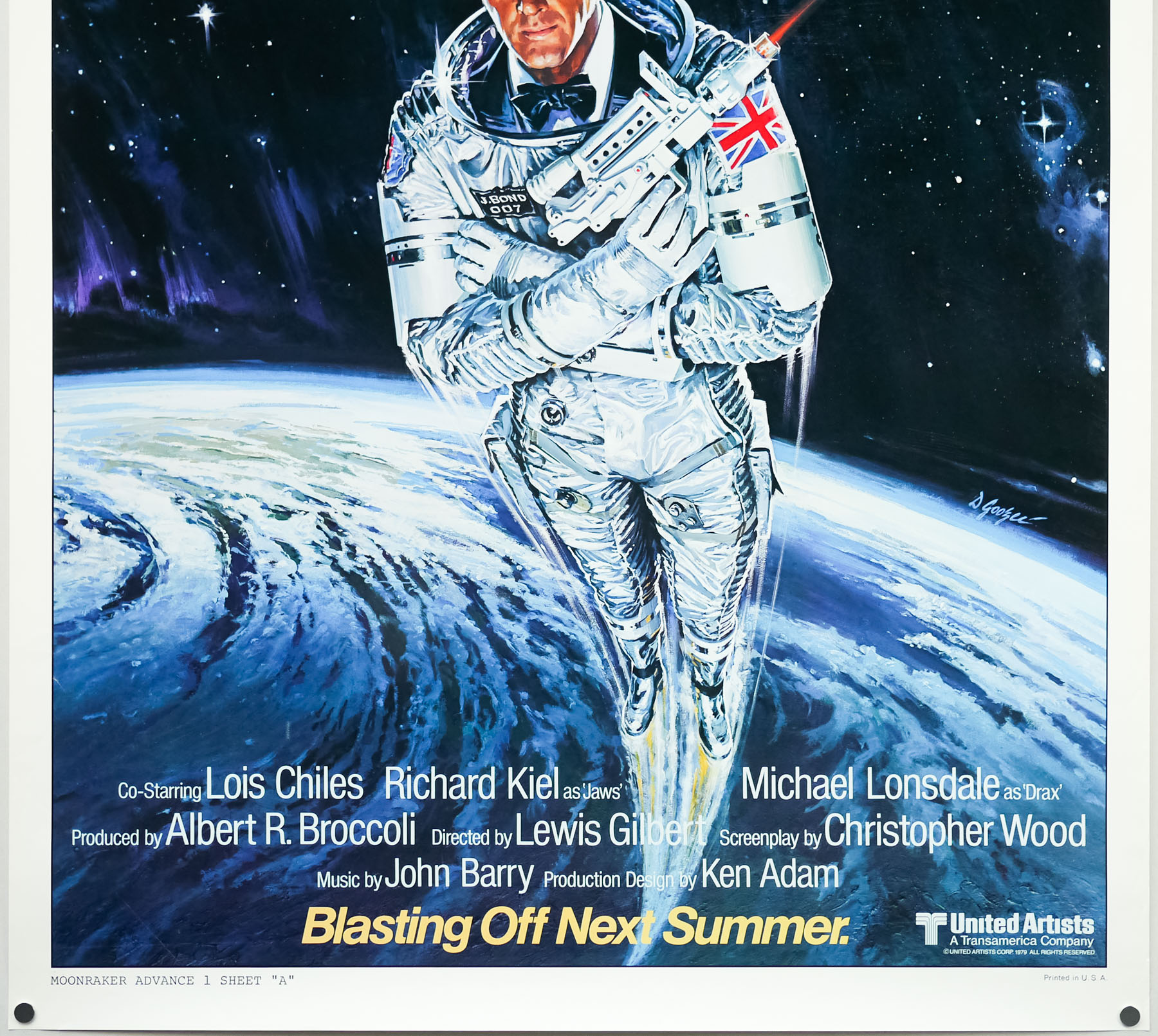
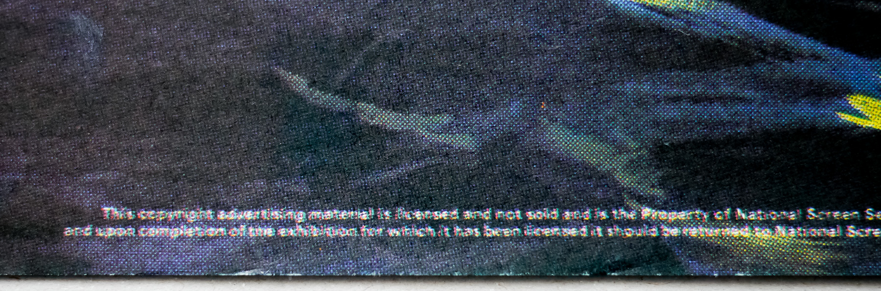
The poster is now known as the ‘recalled’ UK one sheet as, despite the poster having been printed, it was recalled by the studio and most copies were apparently pulped. Obviously, several did manage to escape destruction and made their way into the hands of poster dealers and collectors. I’d like to know a rough figure on how many did survive since it does show up at major auctions and on Ebay occasionally, so it’s certainly more than a tiny handful. If anyone has any more details on this please get in touch or leave a comment.
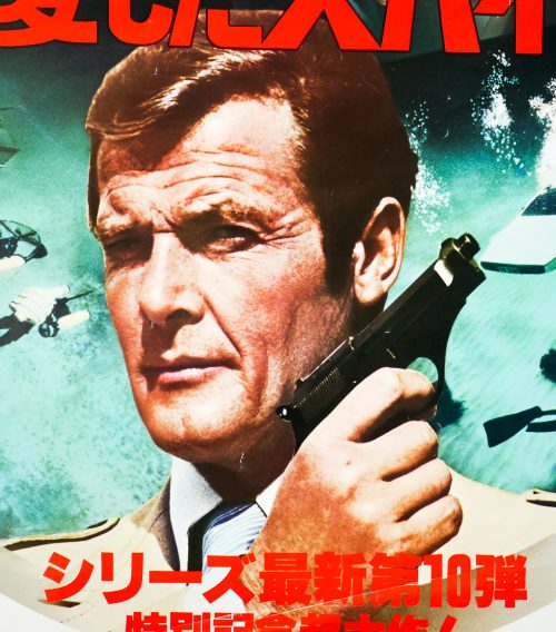
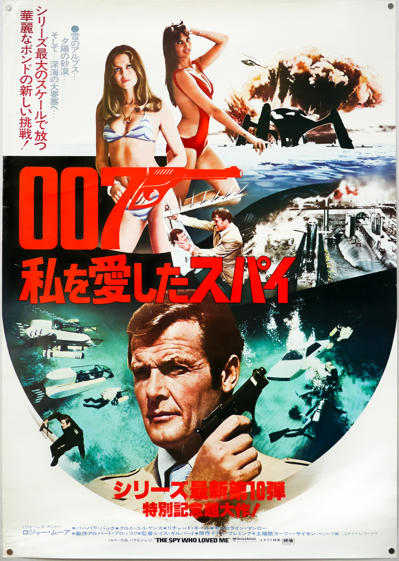
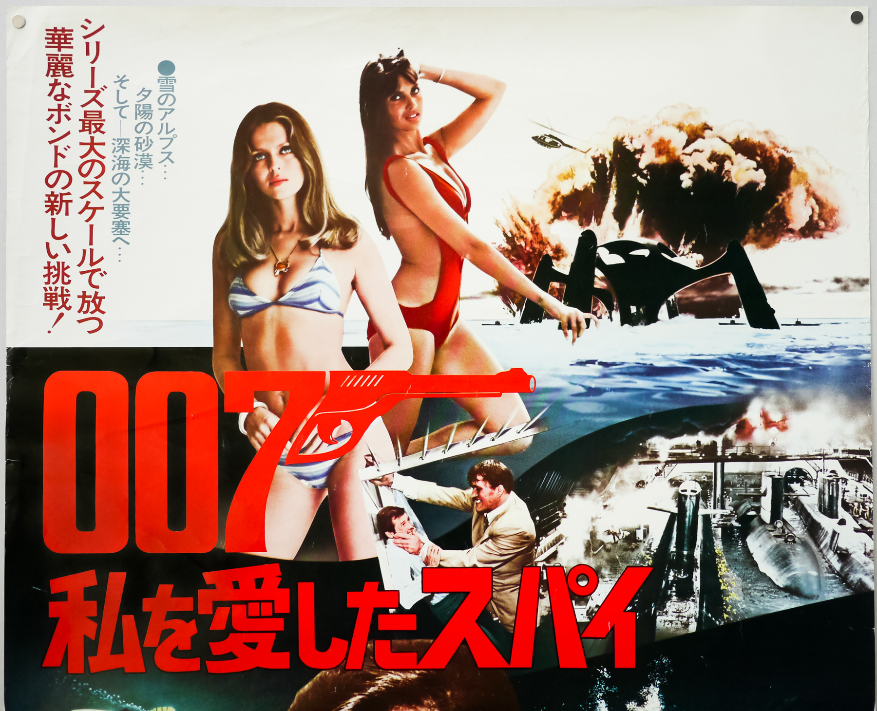
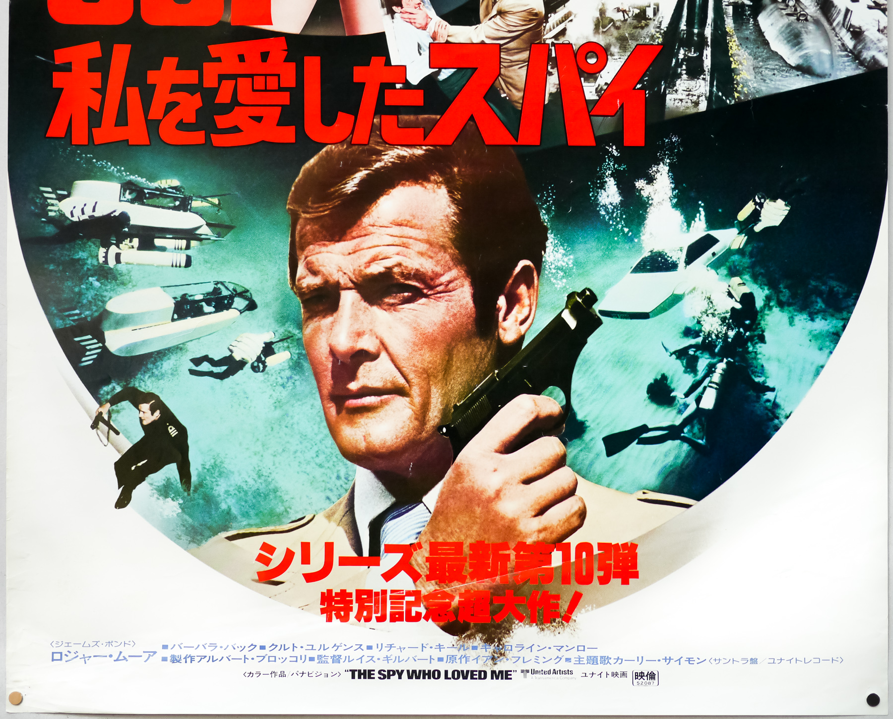
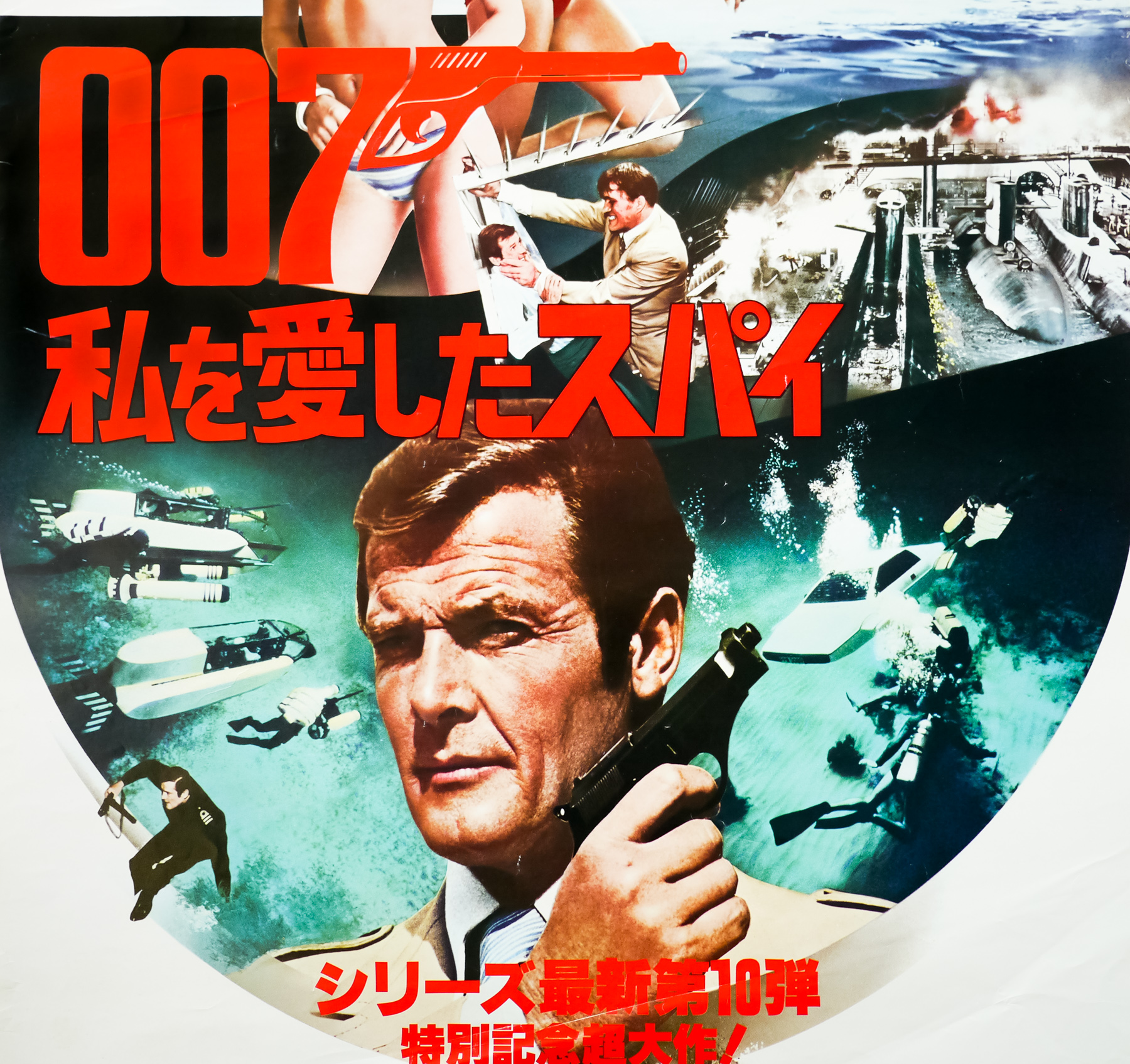
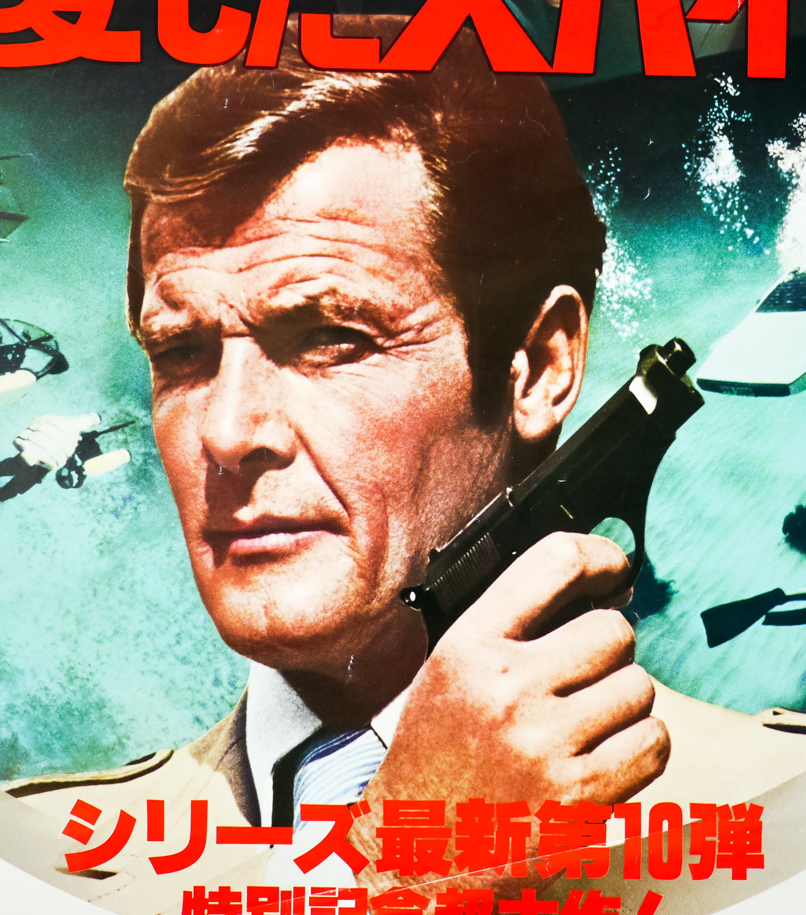
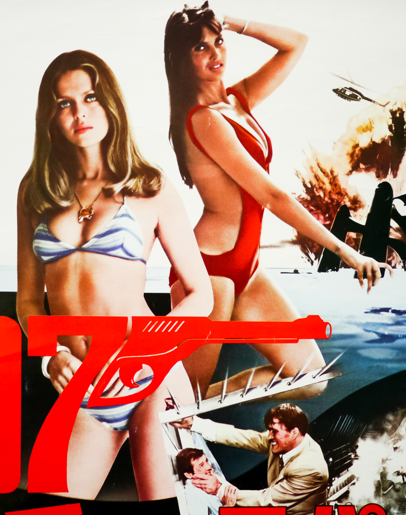
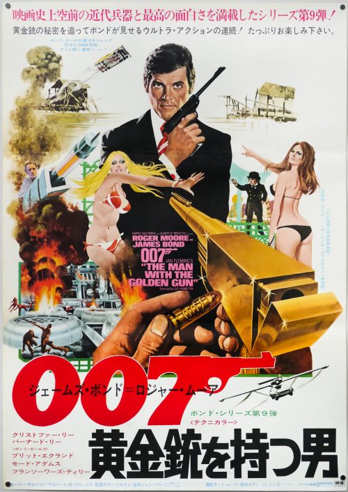
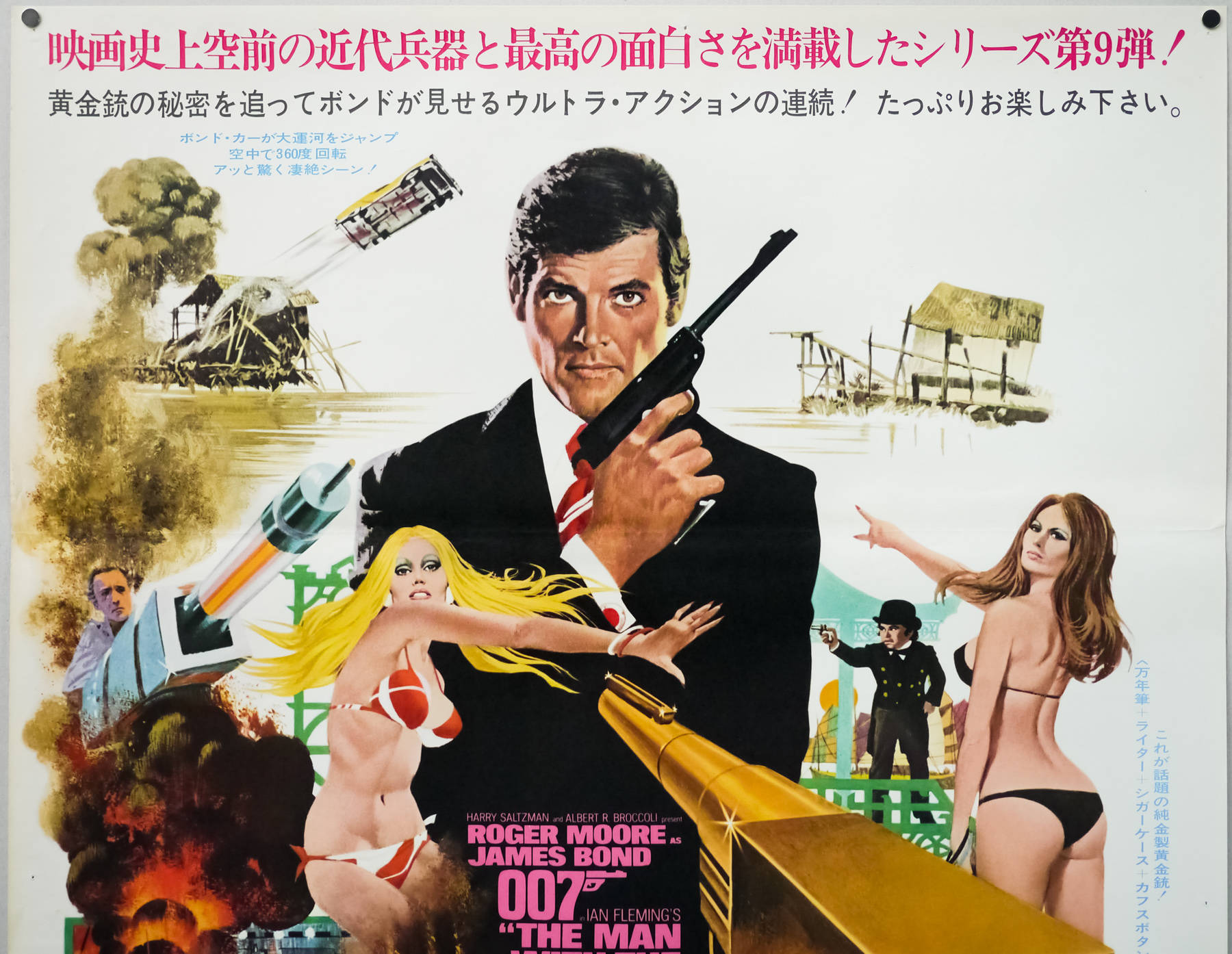
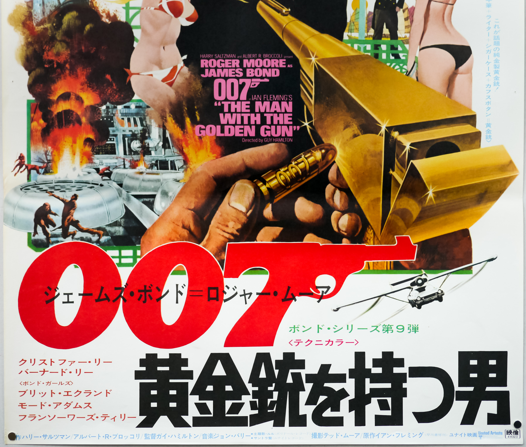
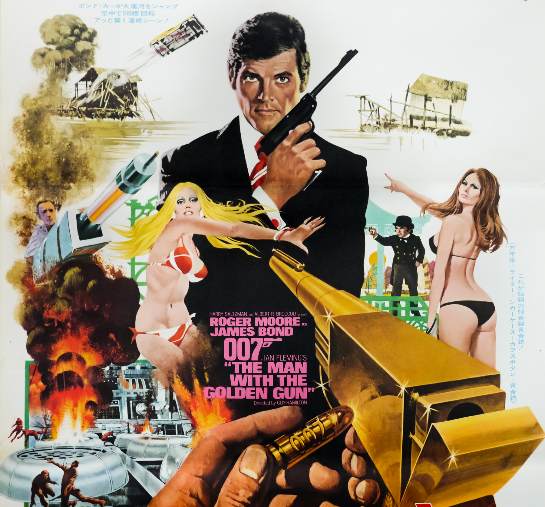
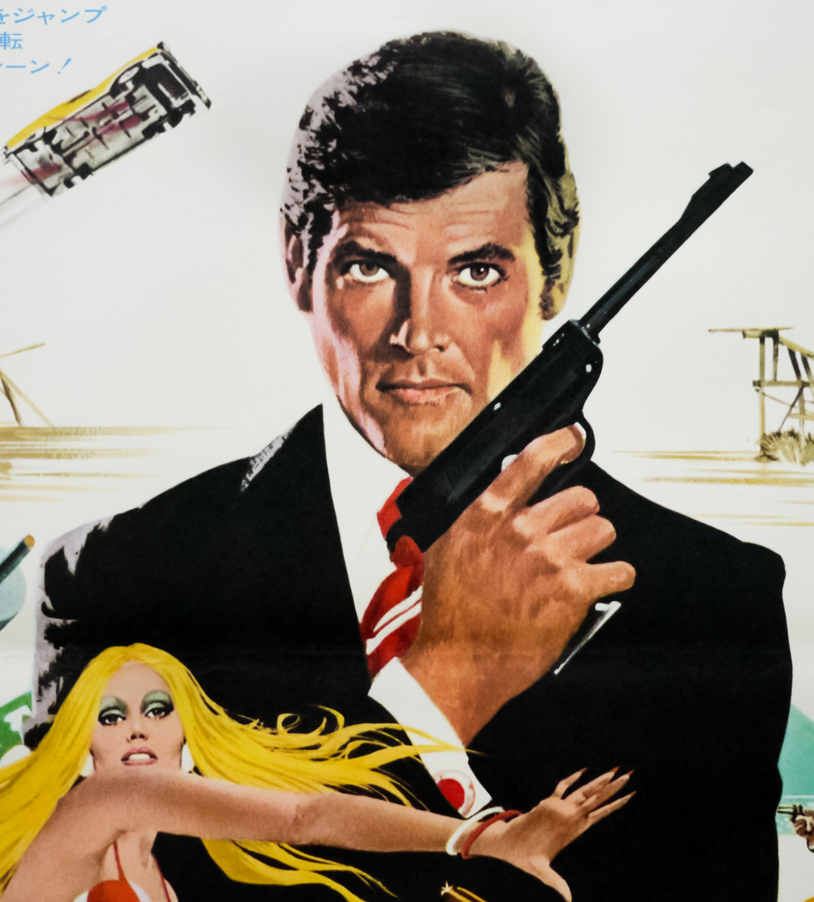
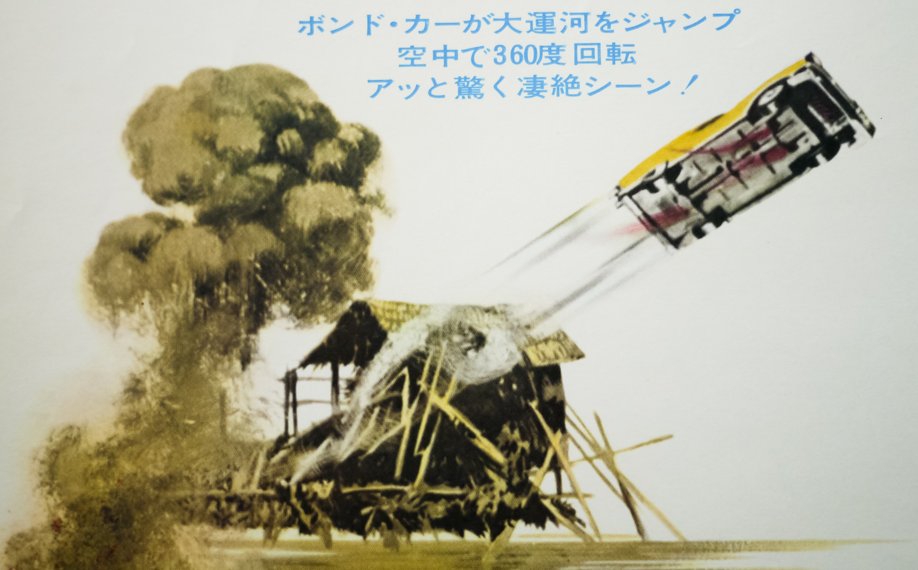
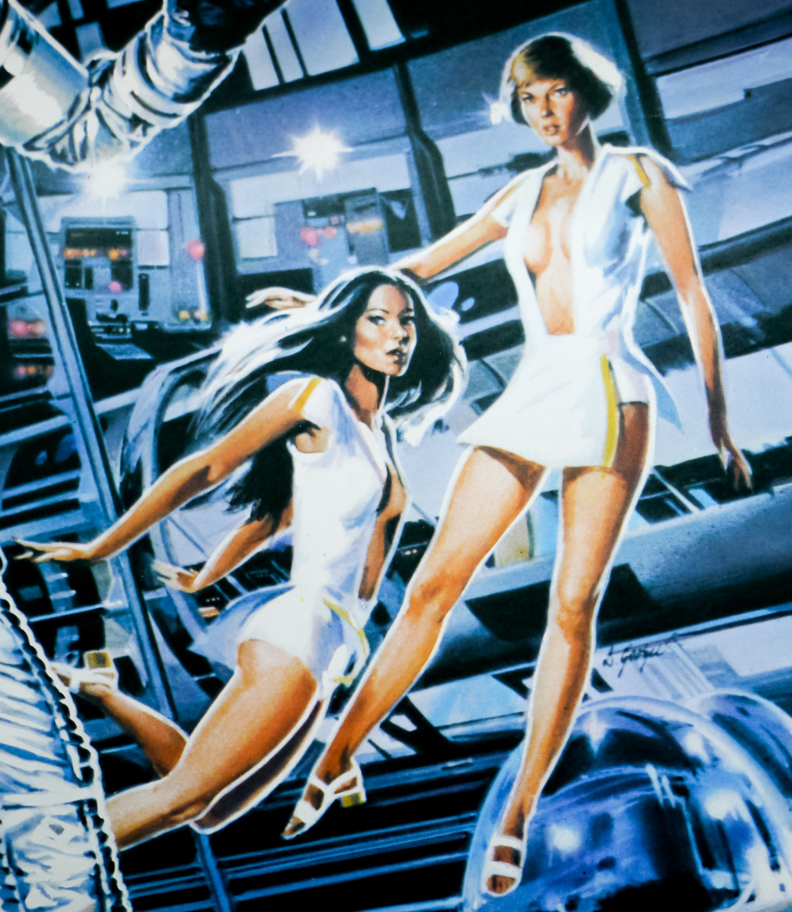
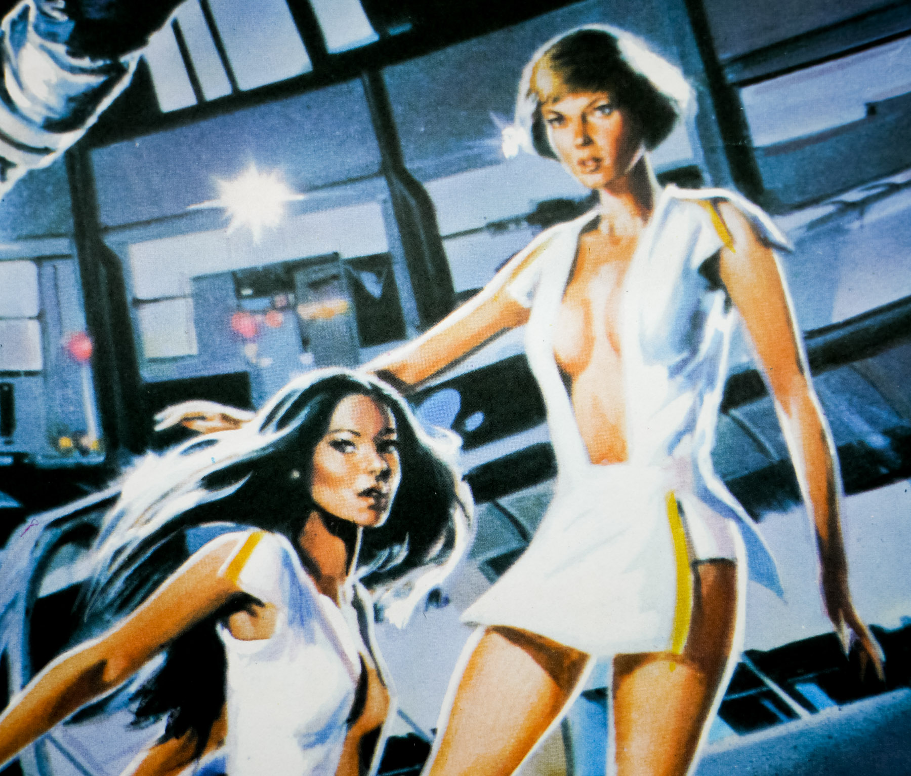
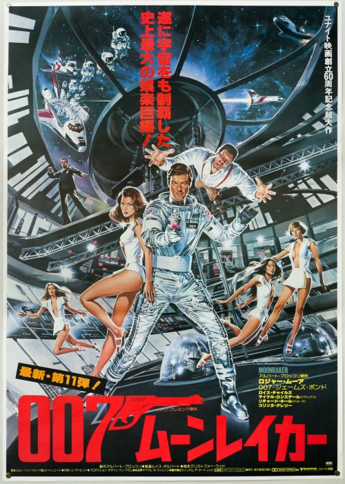
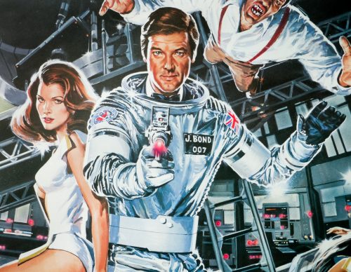
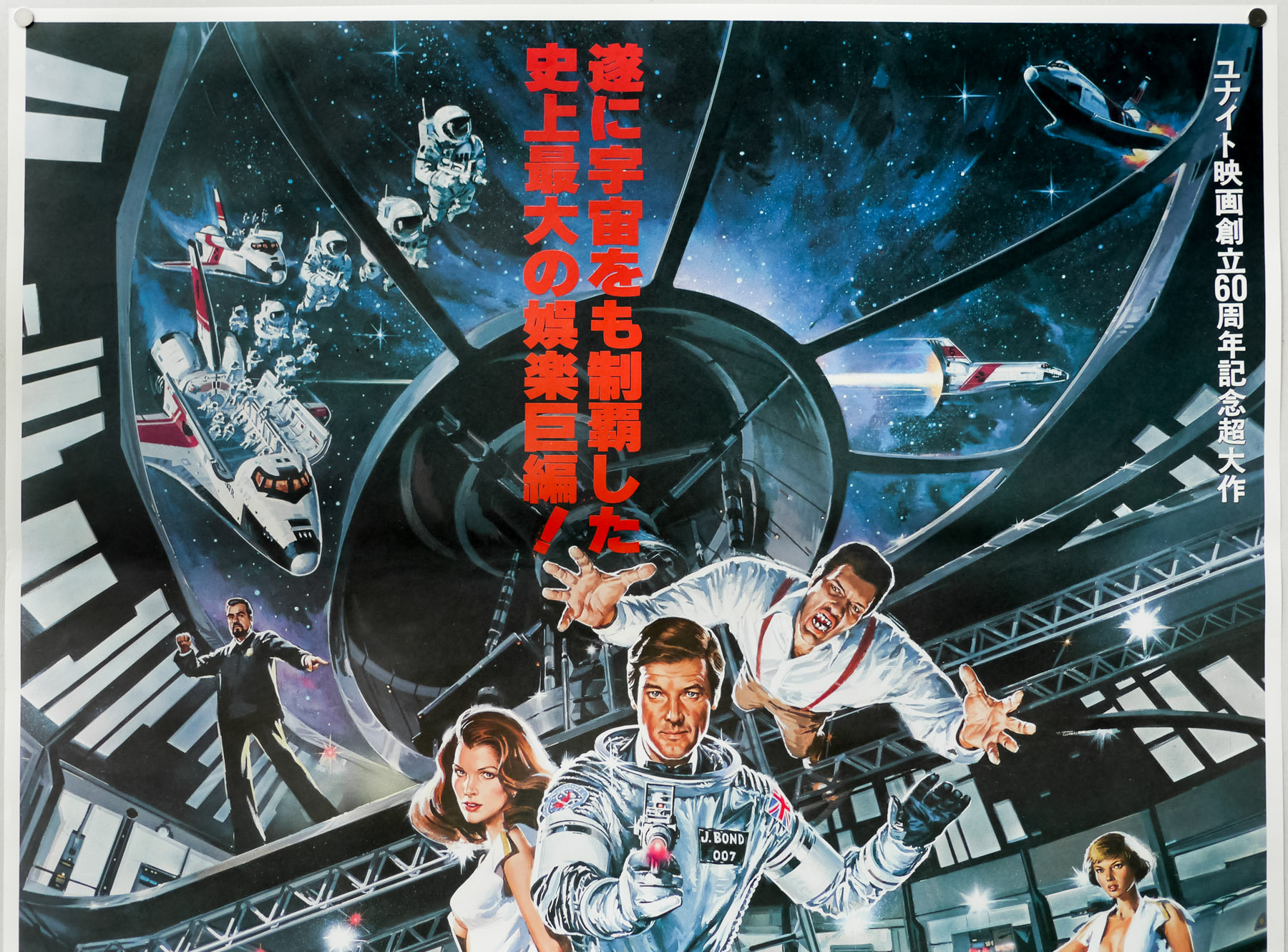
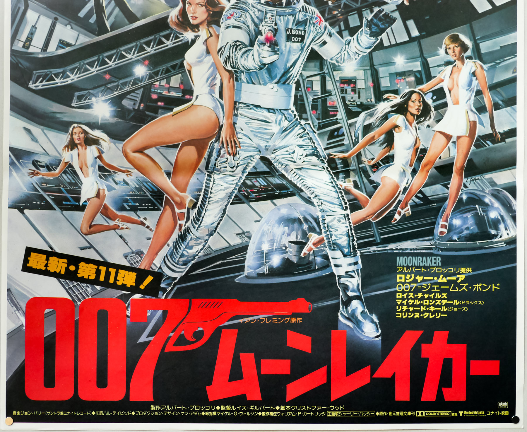
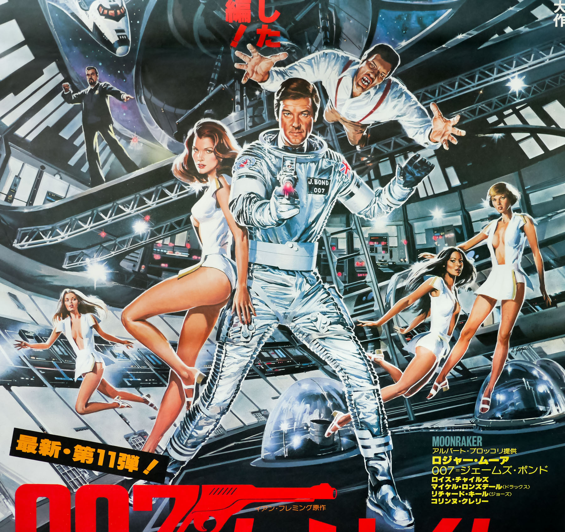
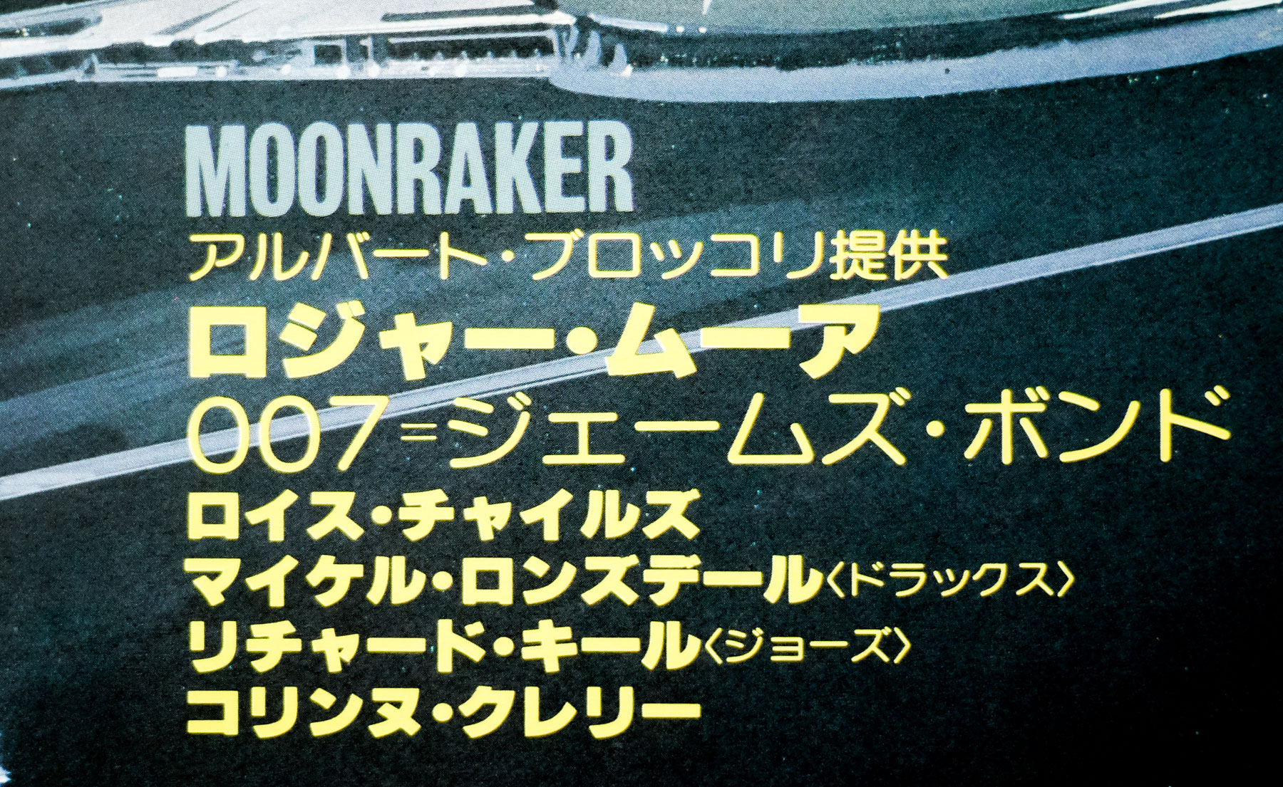
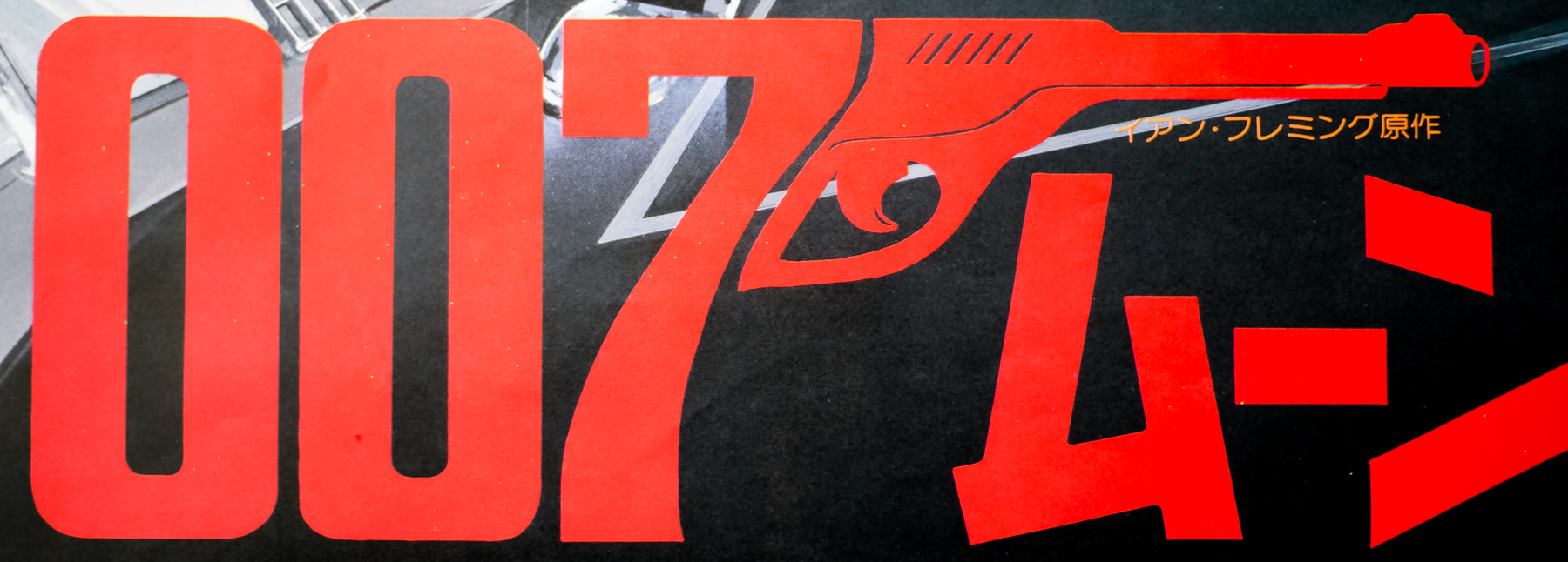
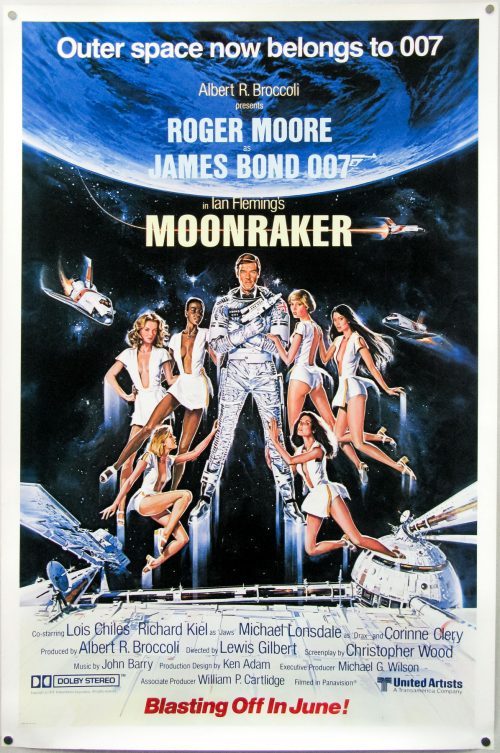
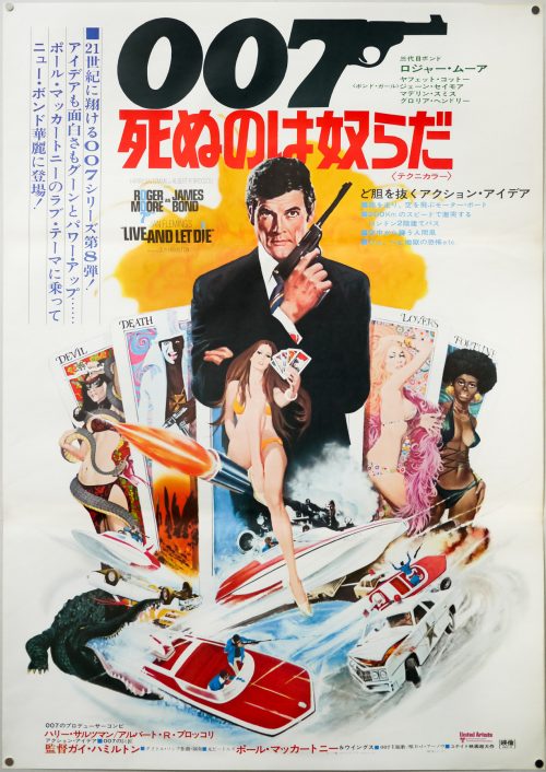
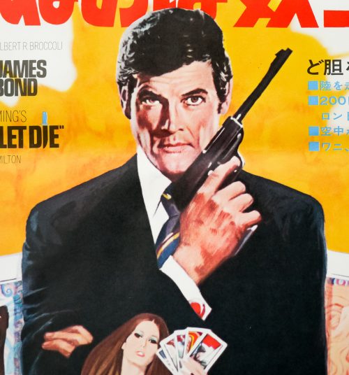
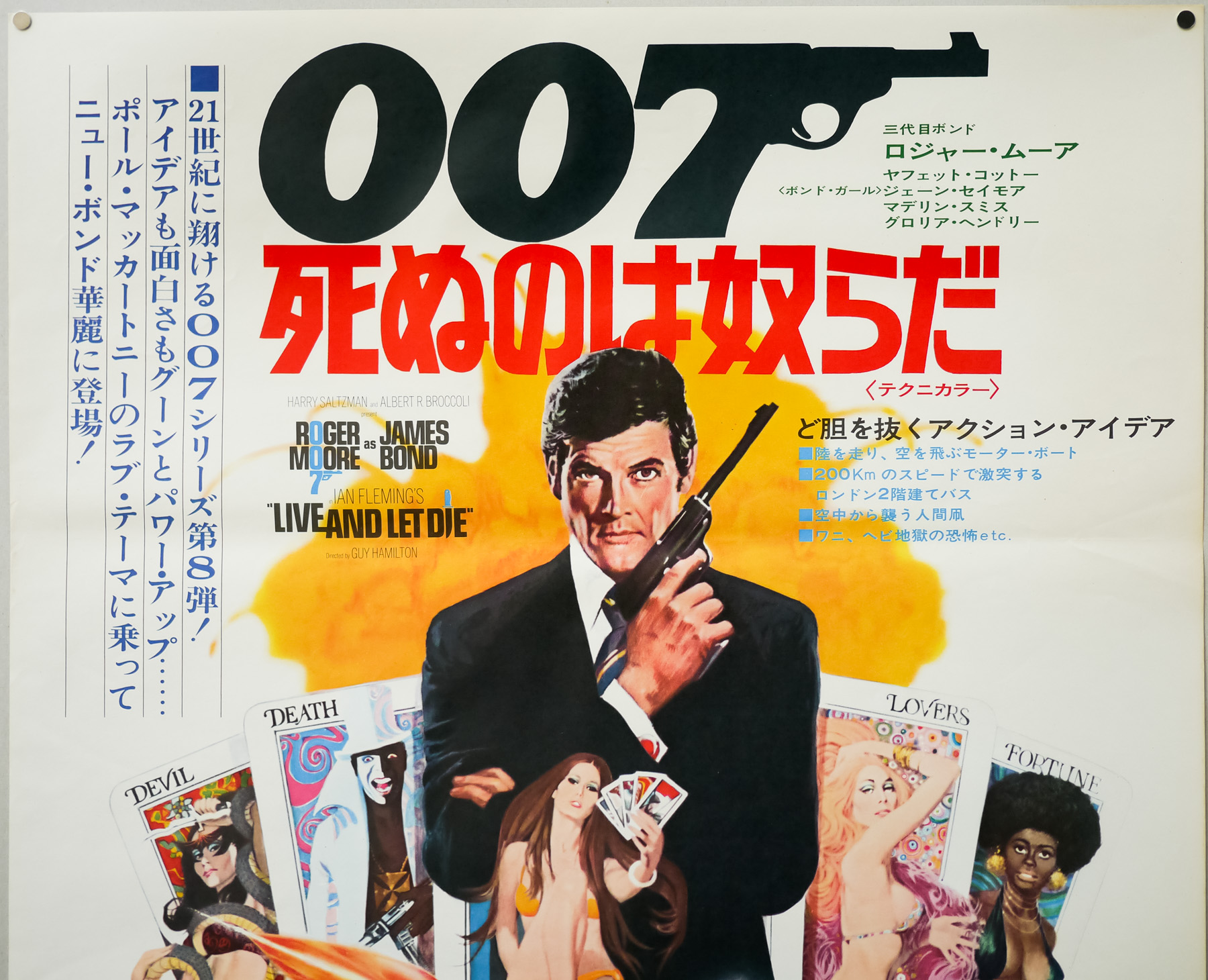
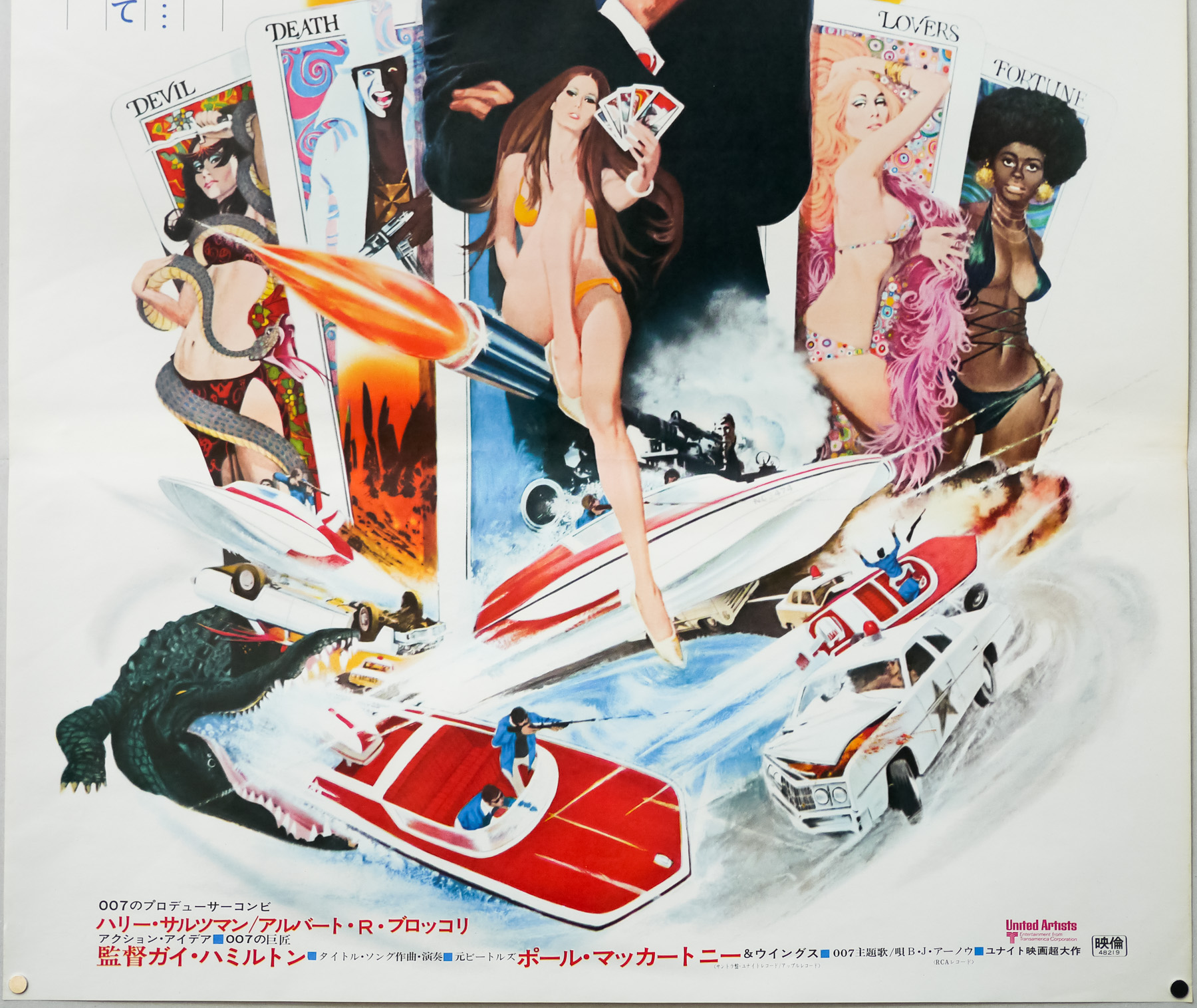
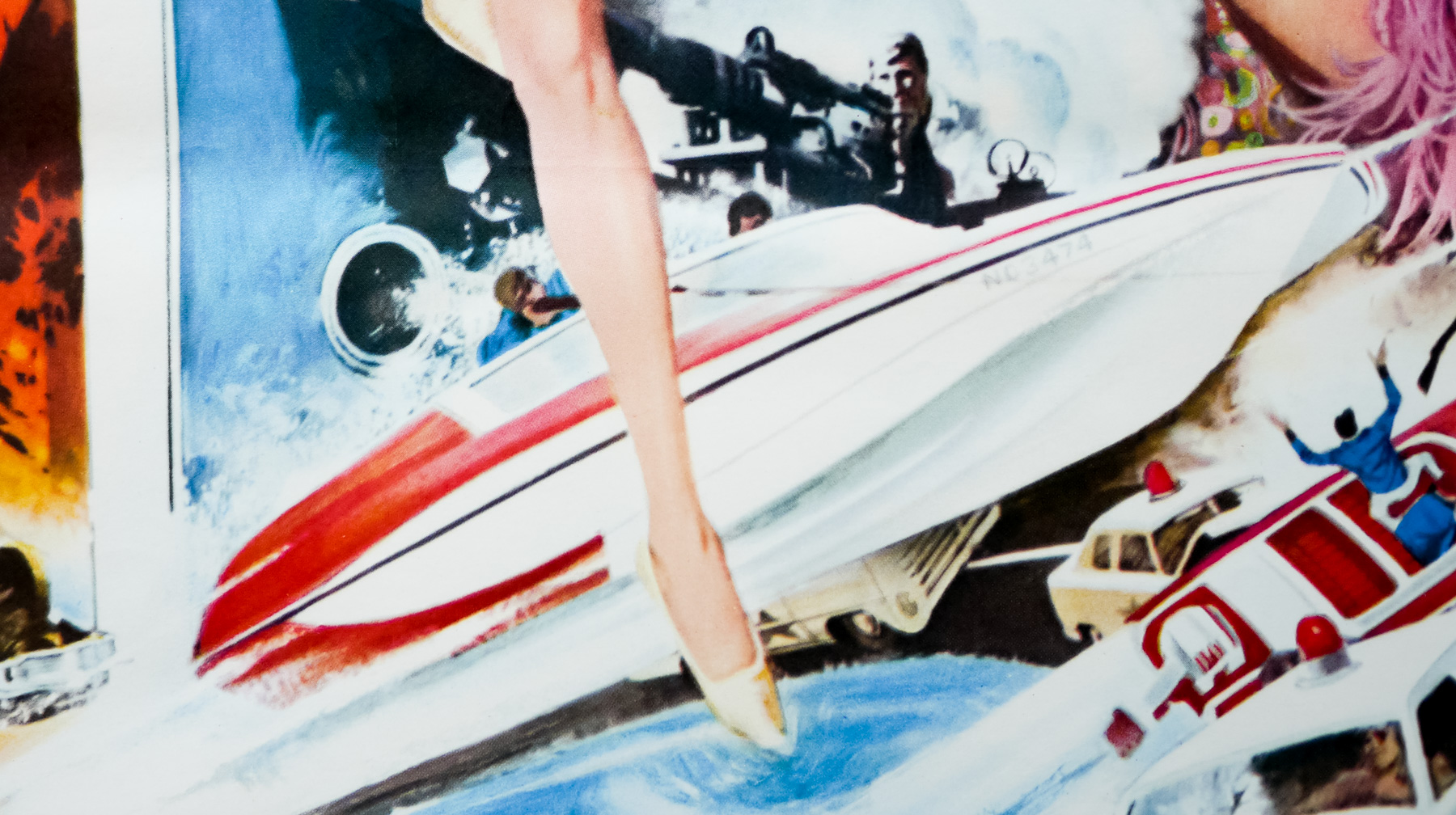
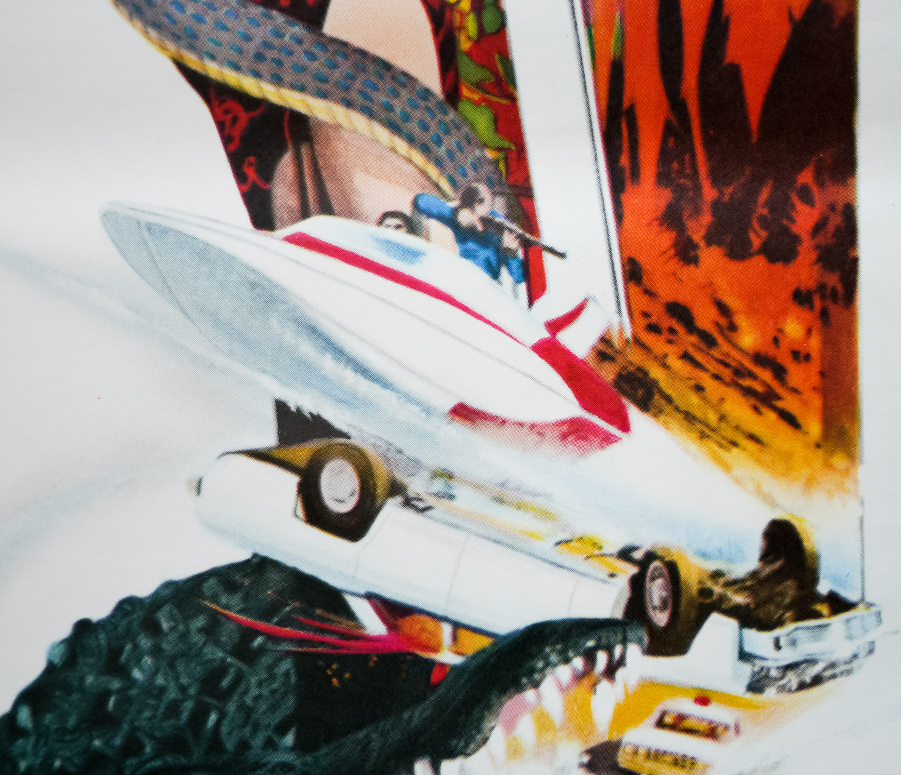
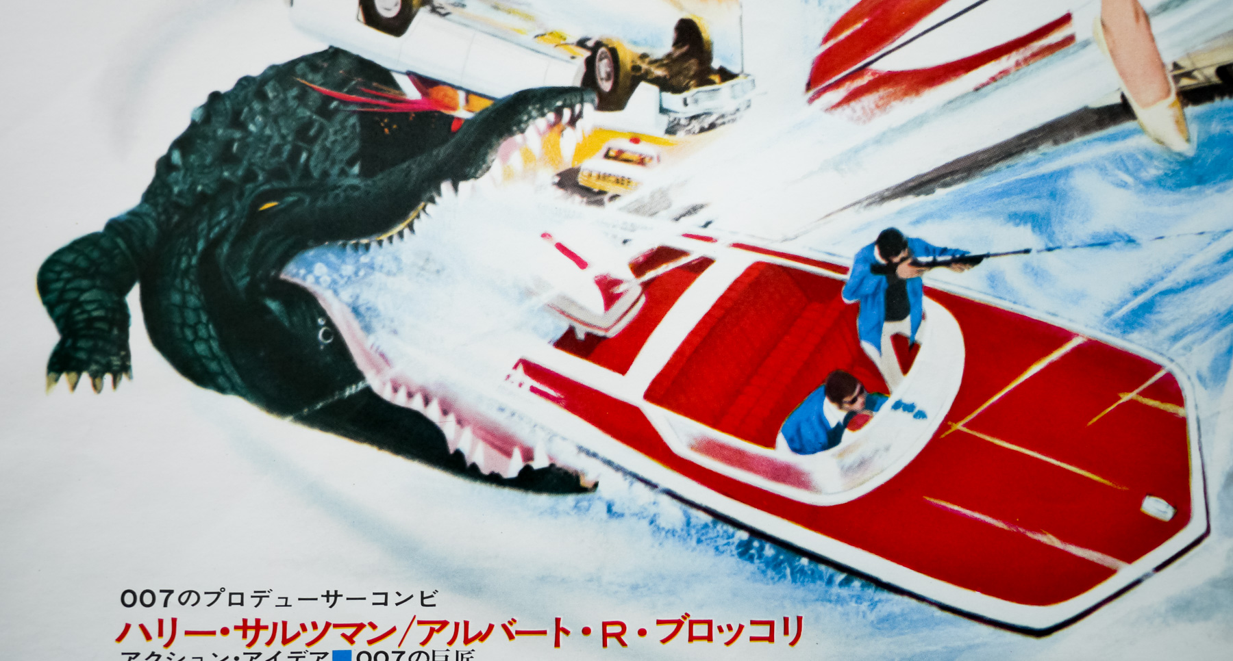
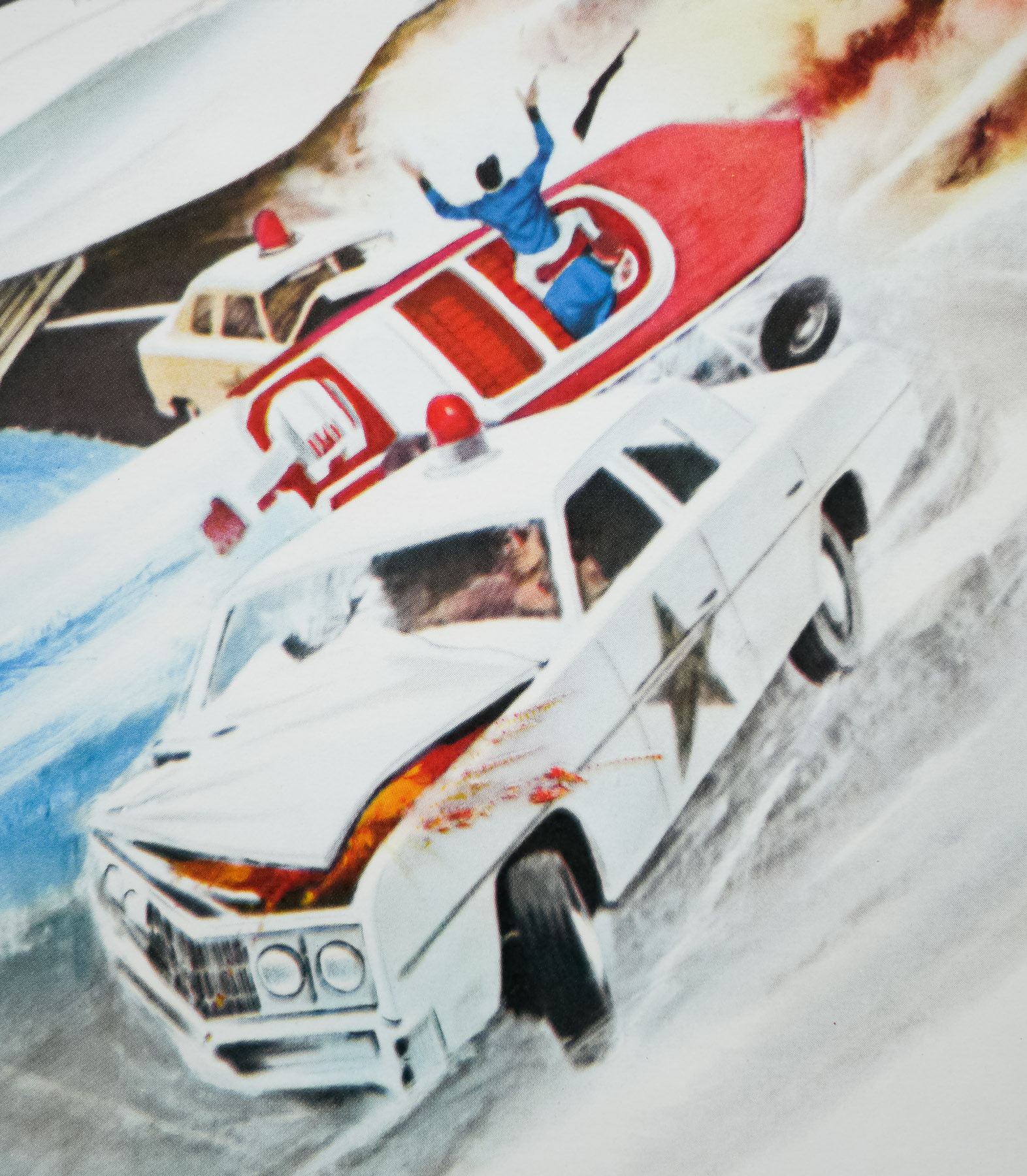
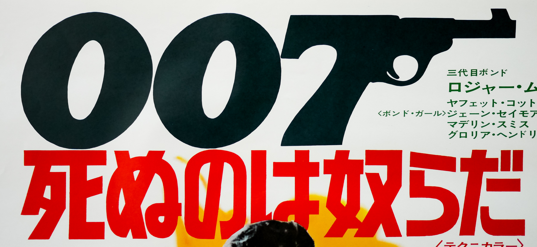
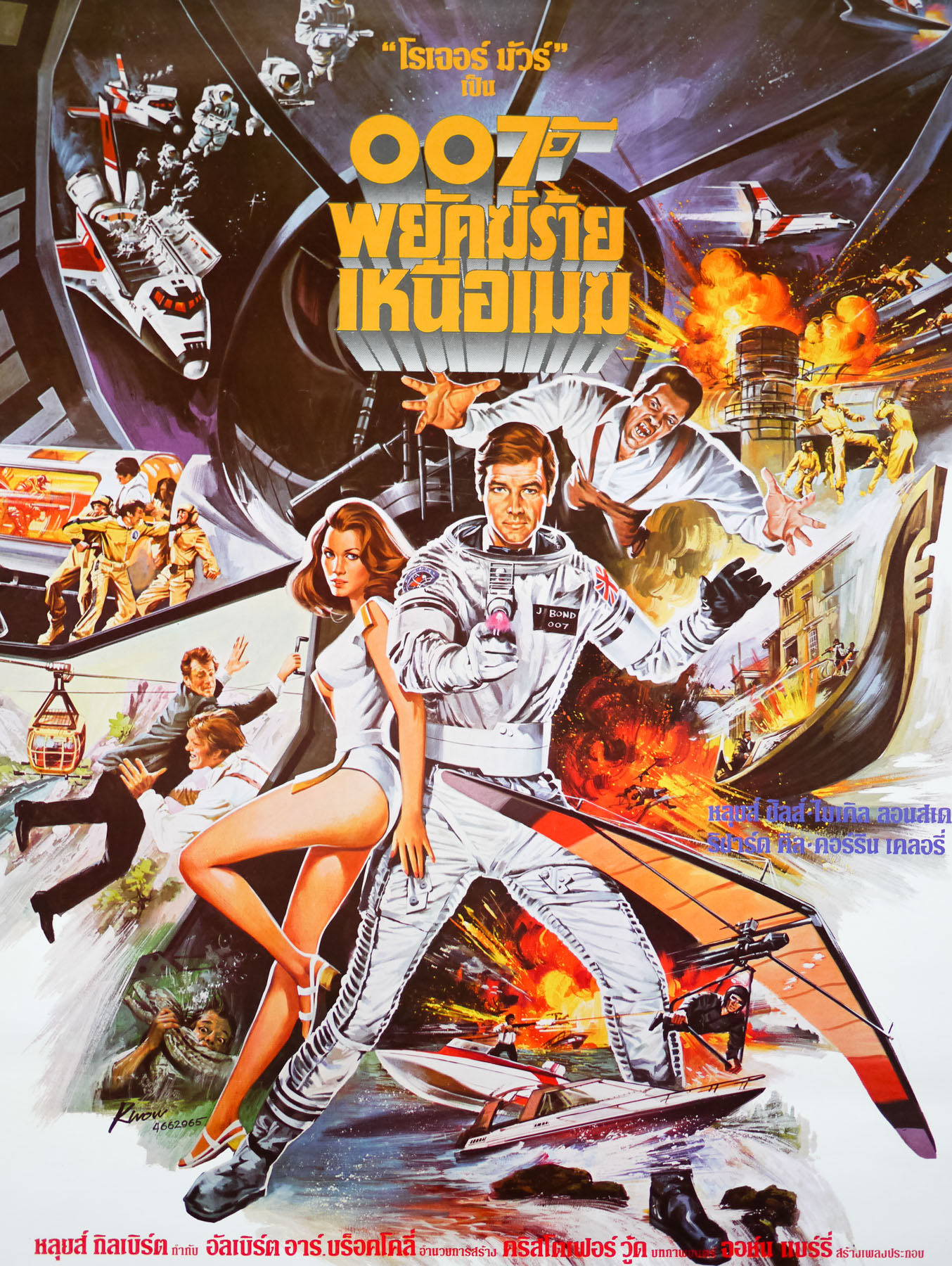
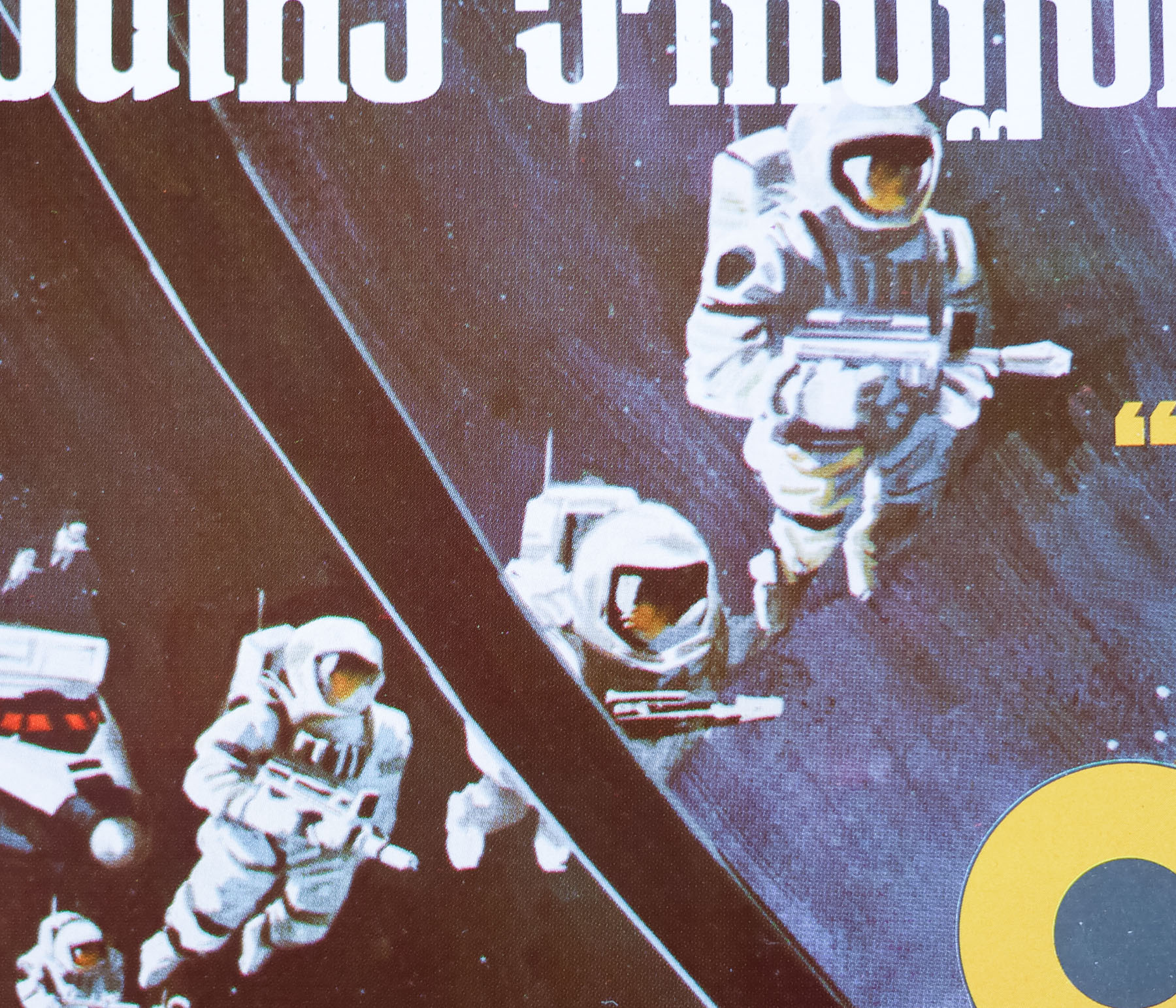
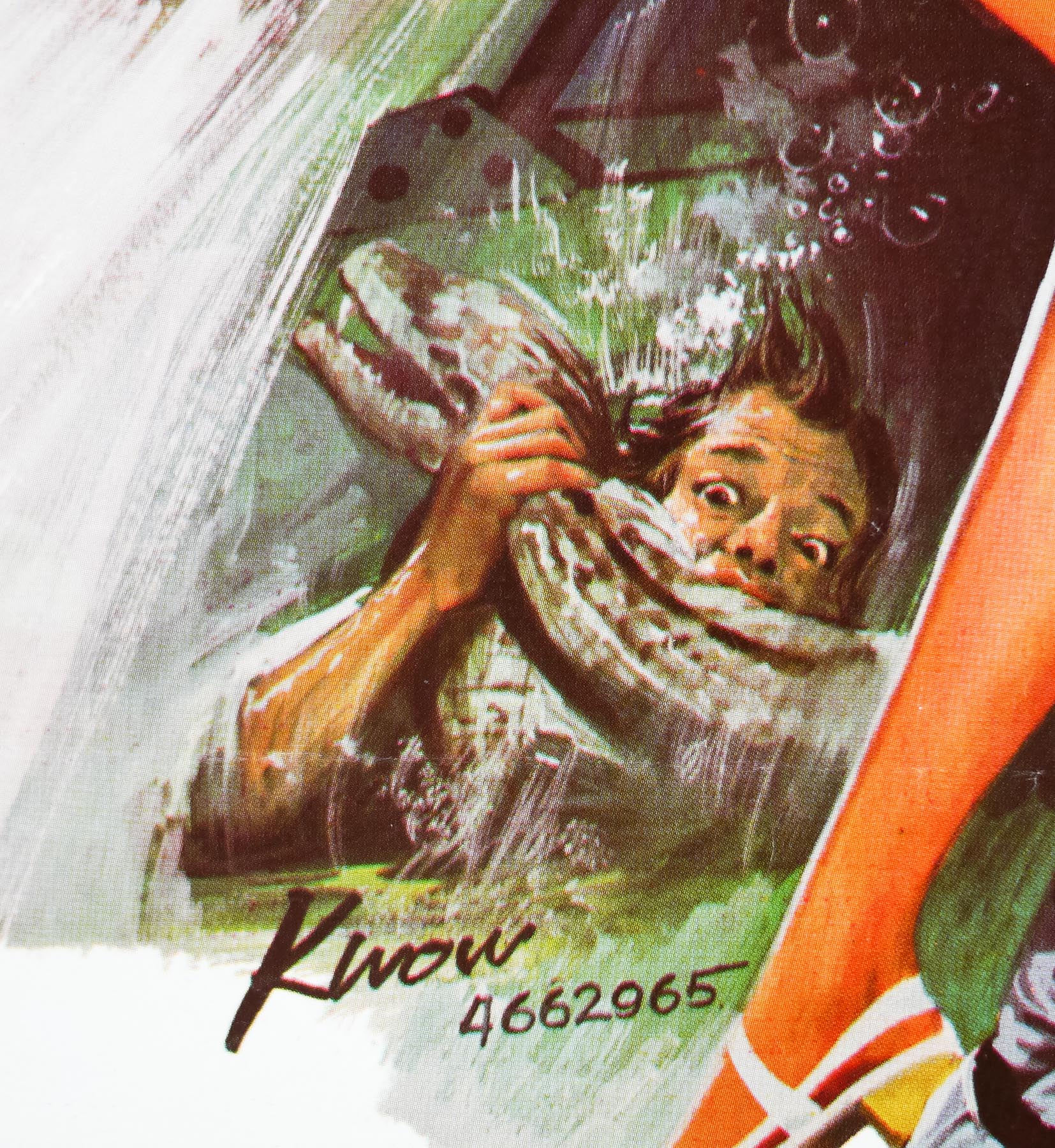
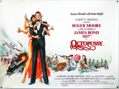
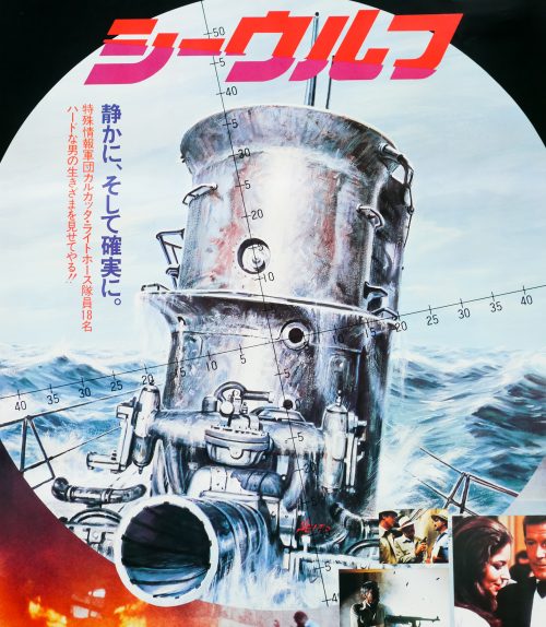
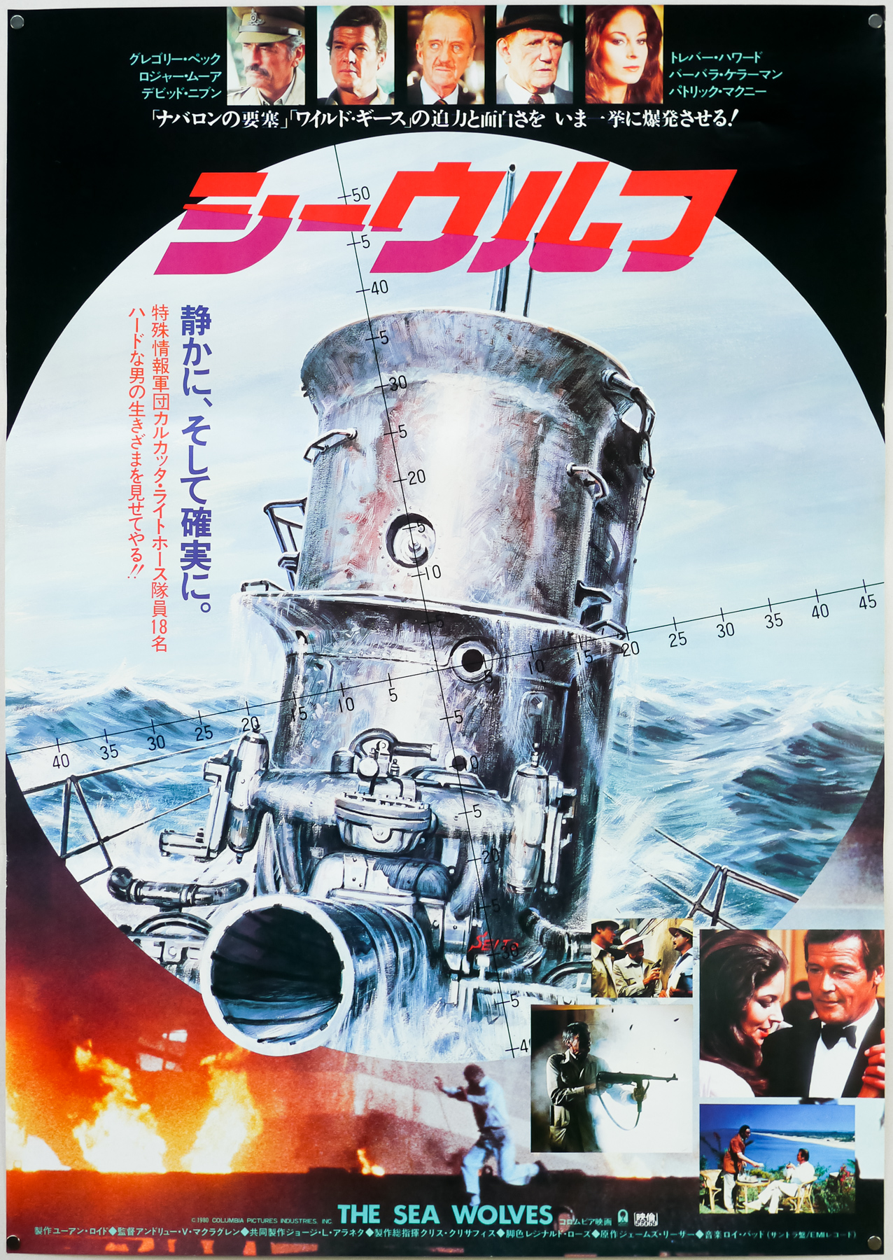
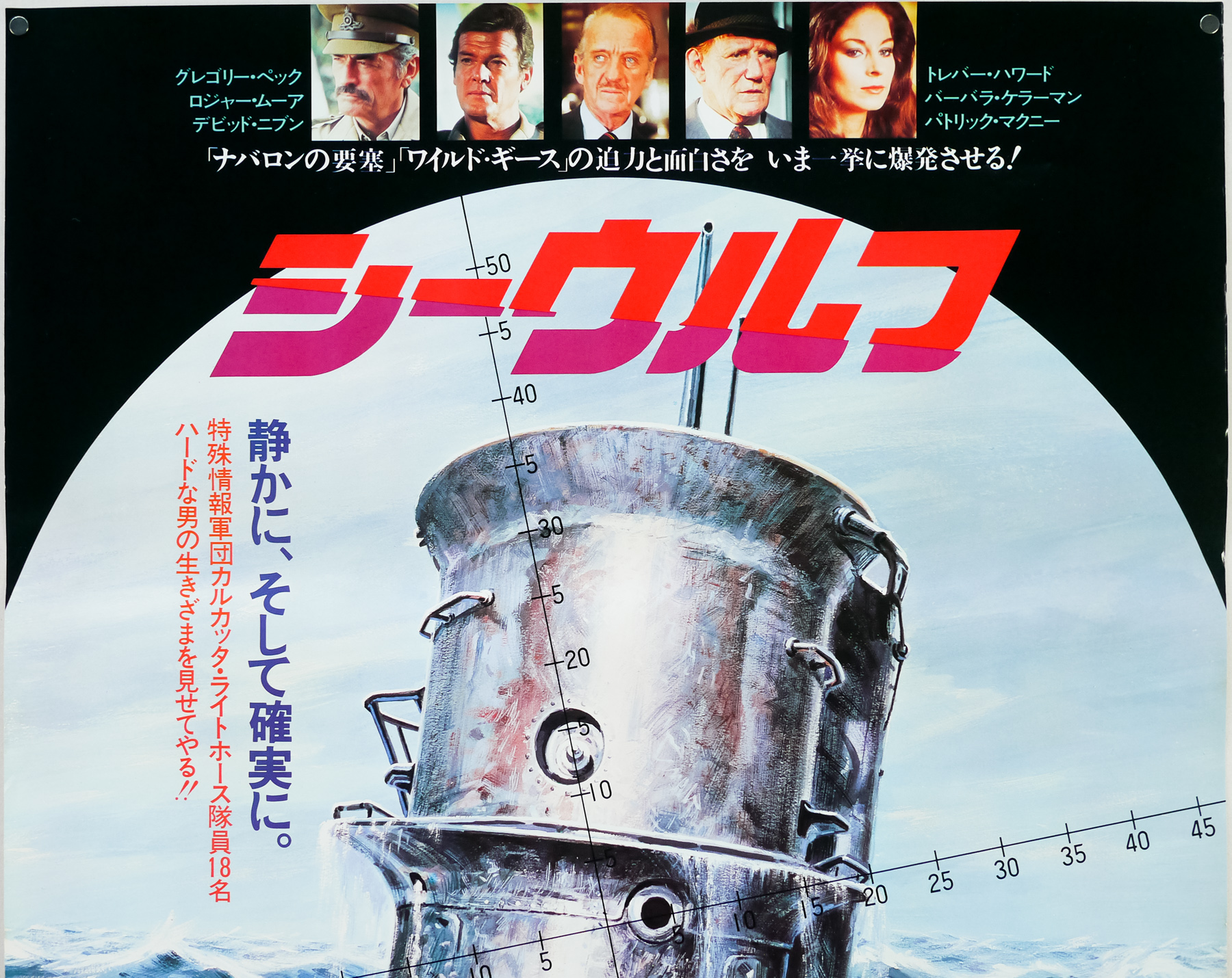
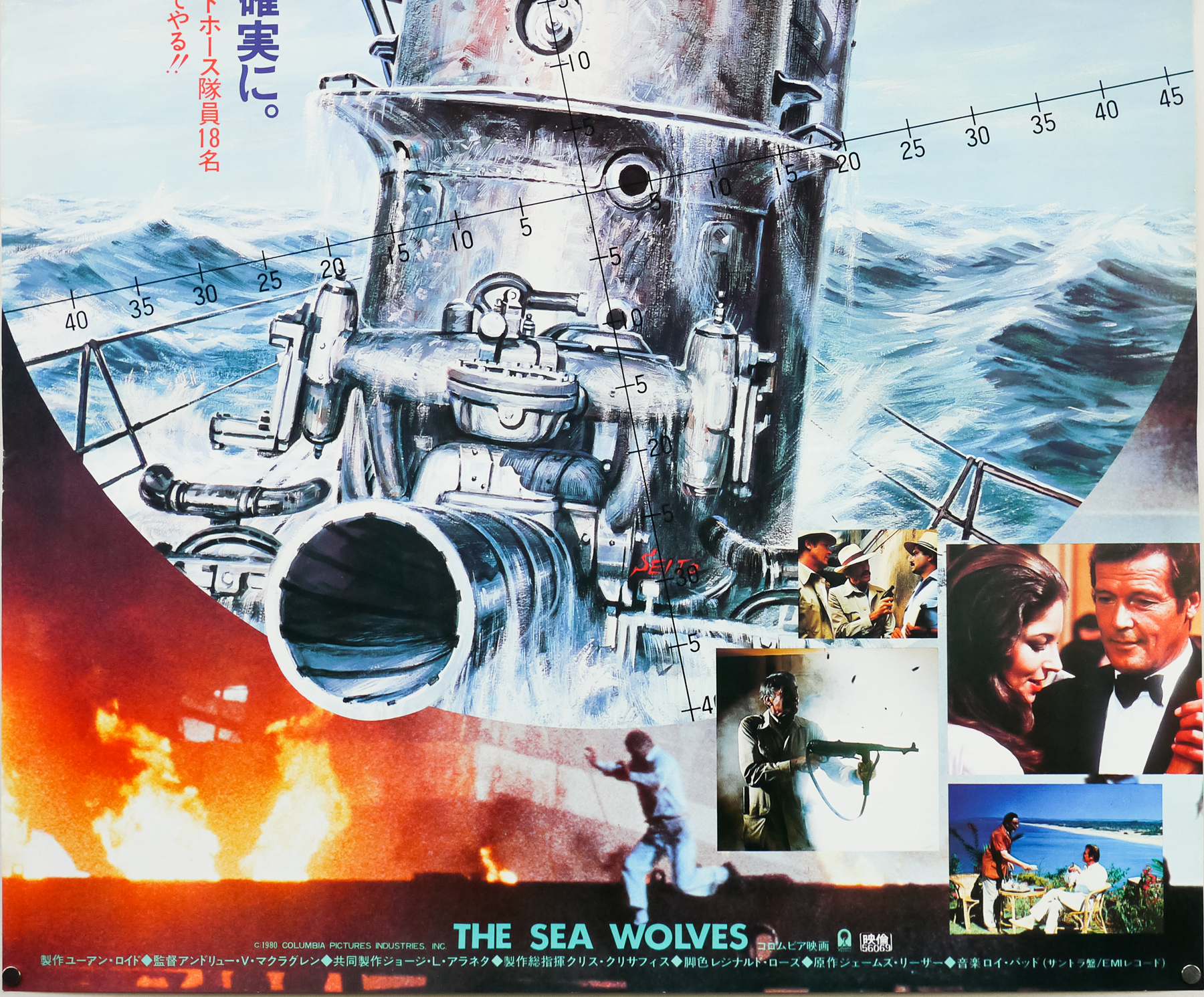
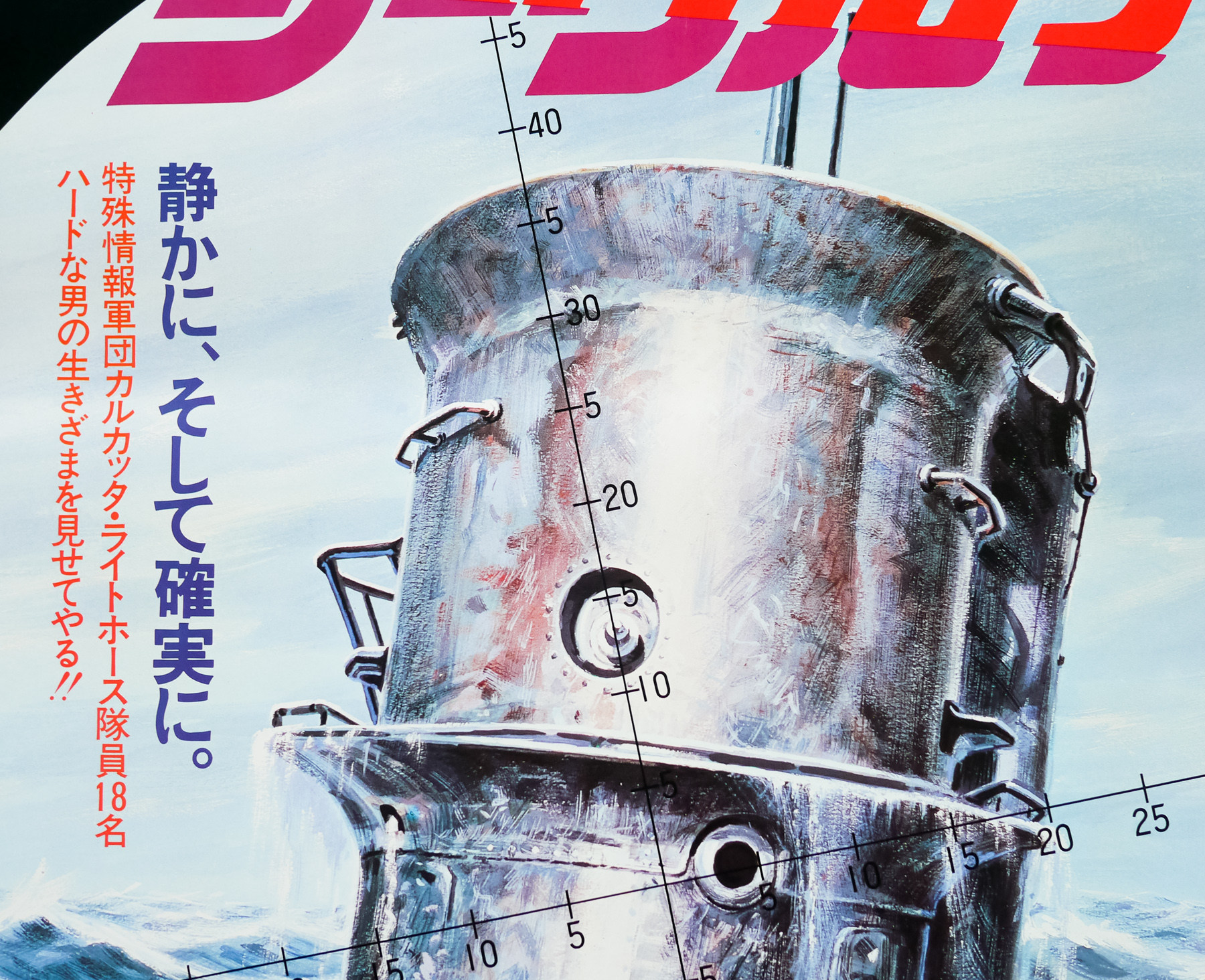
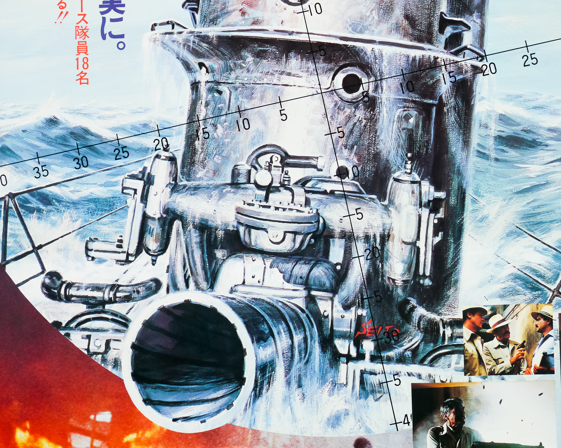
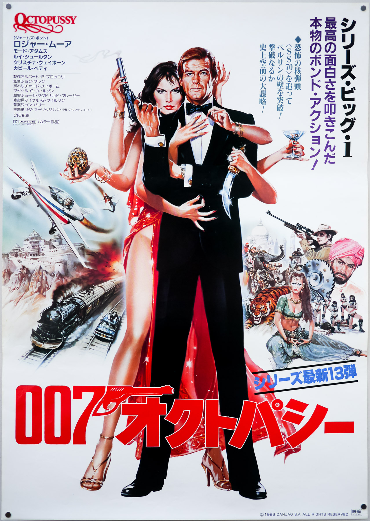
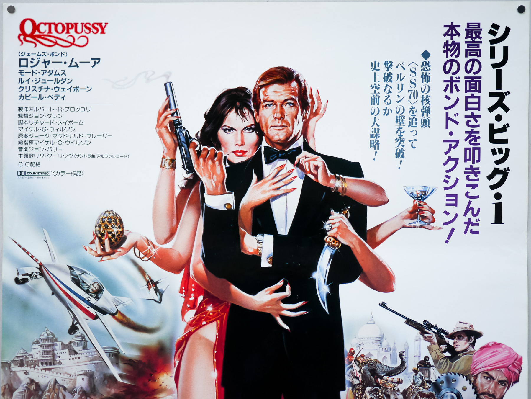
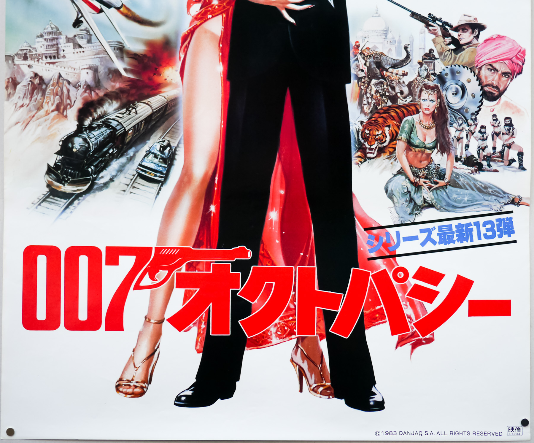
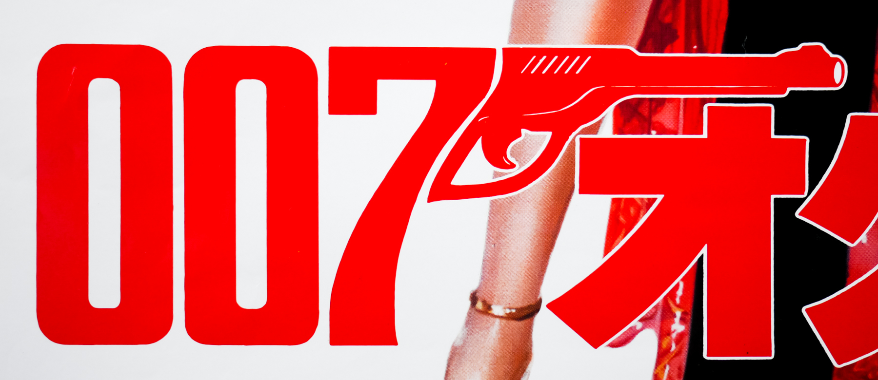
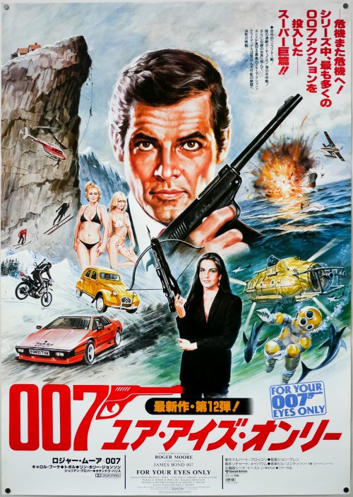
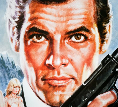
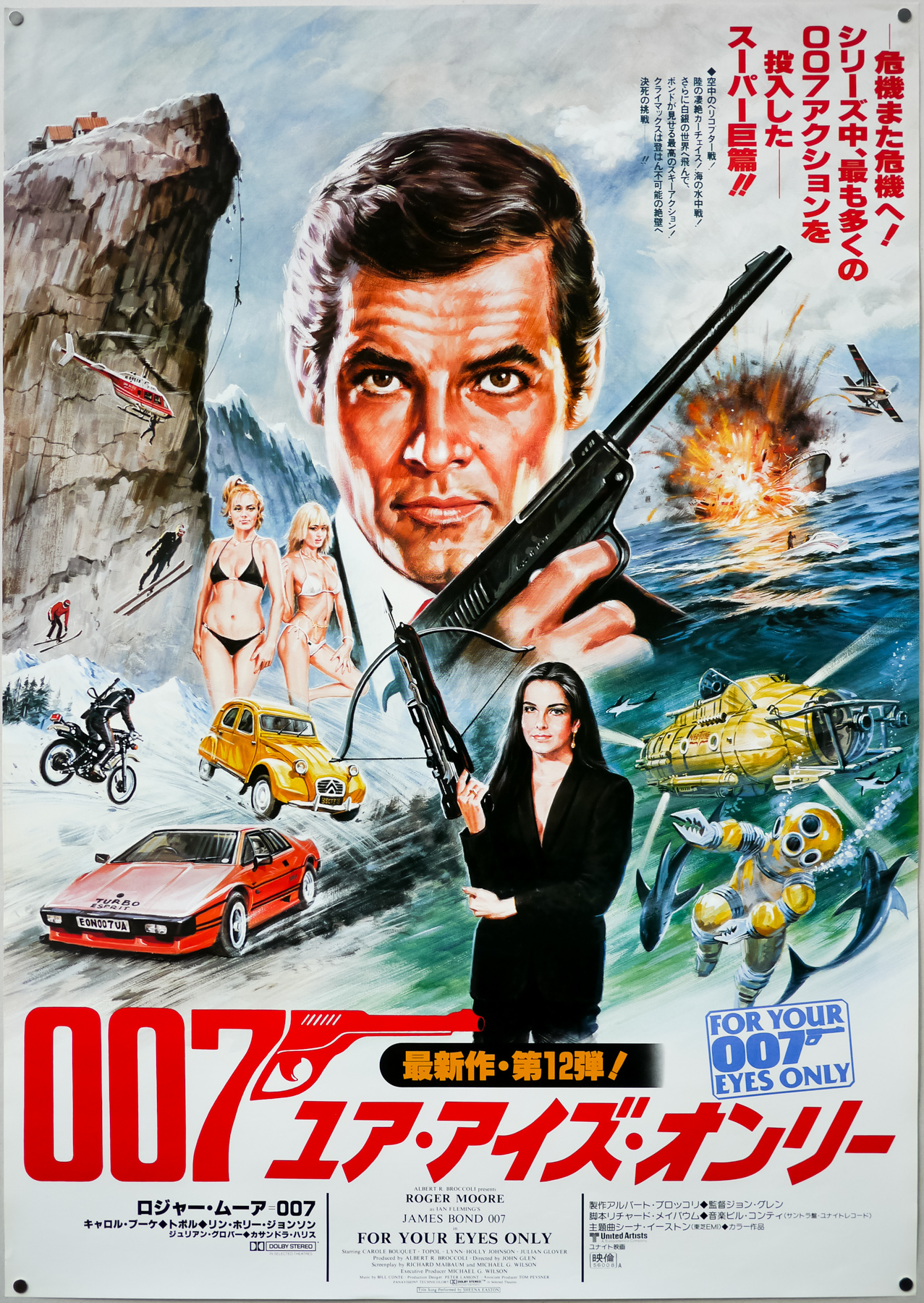
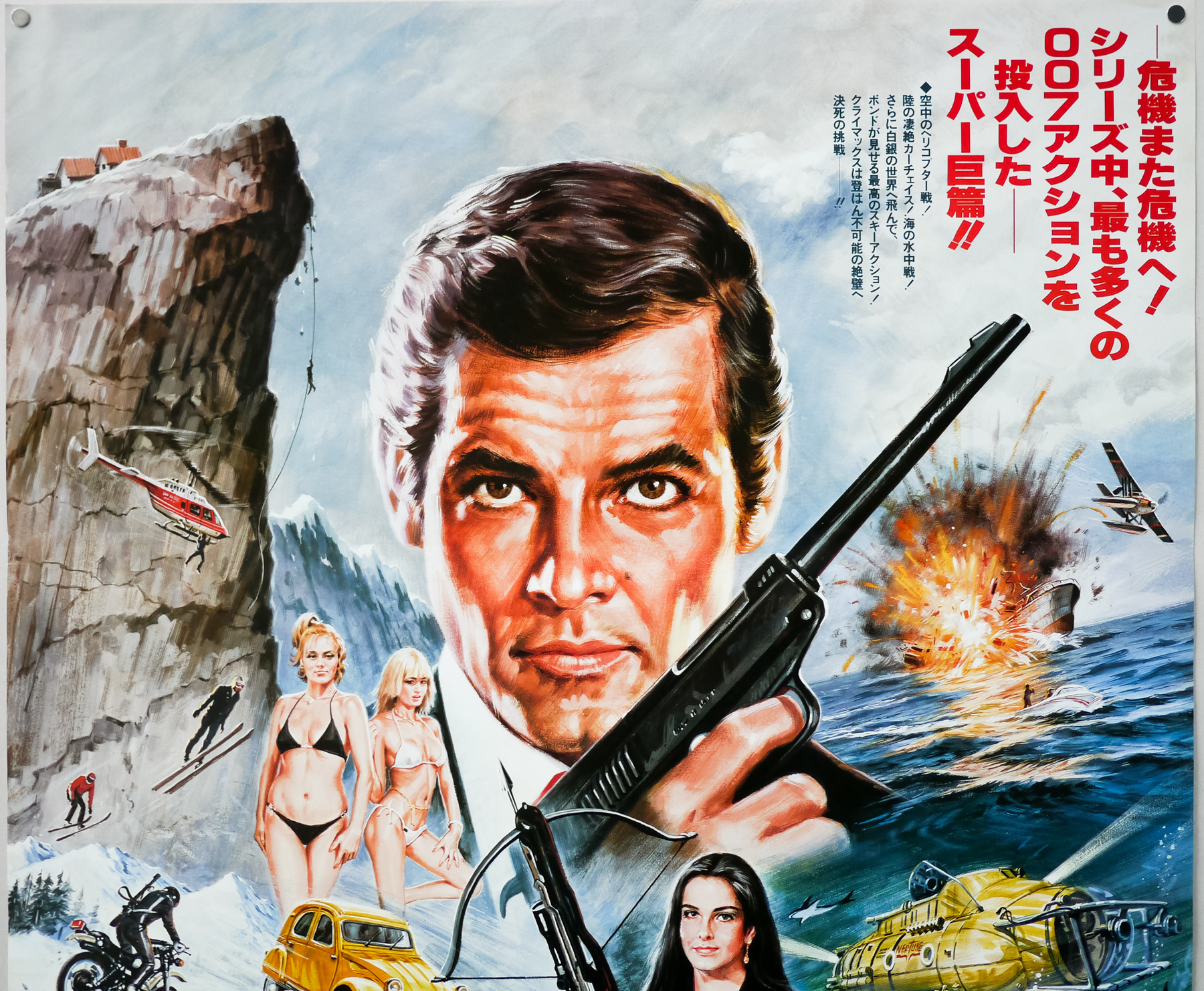
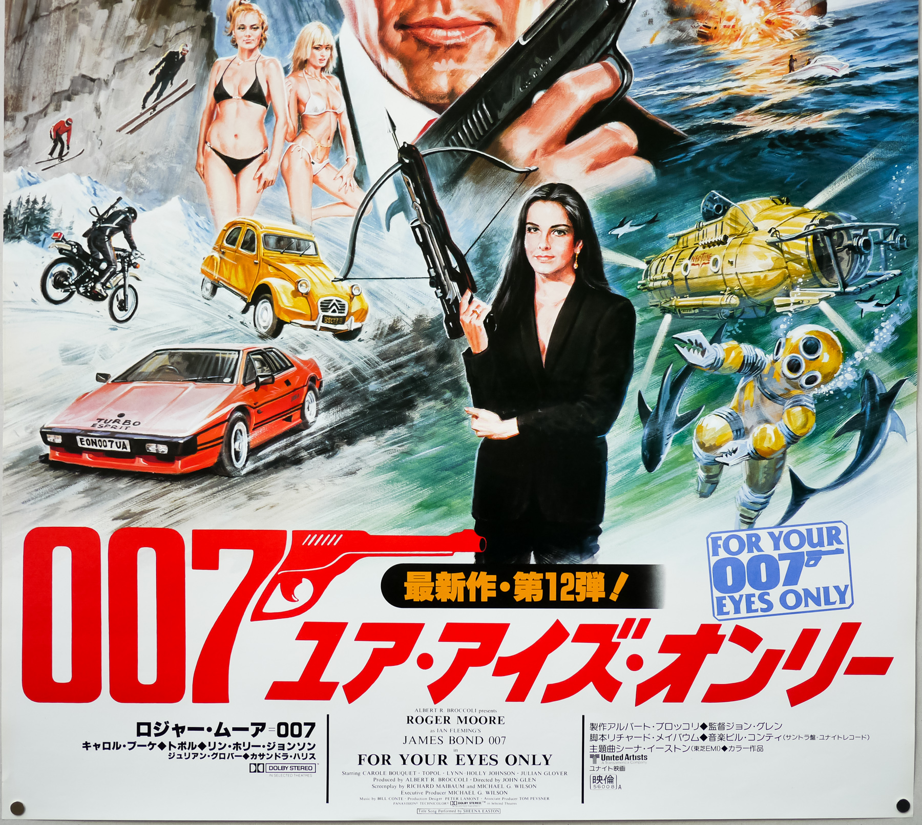
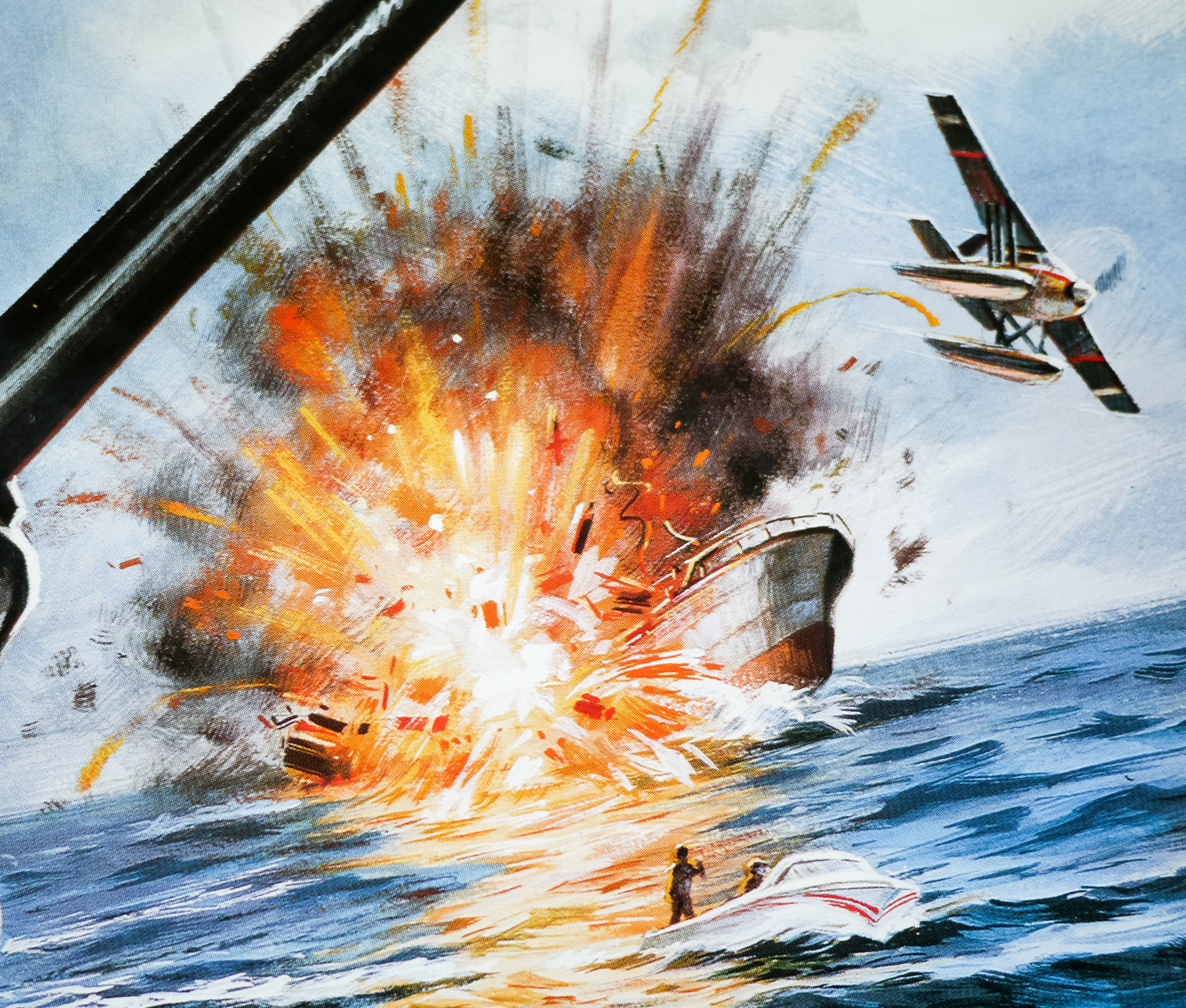
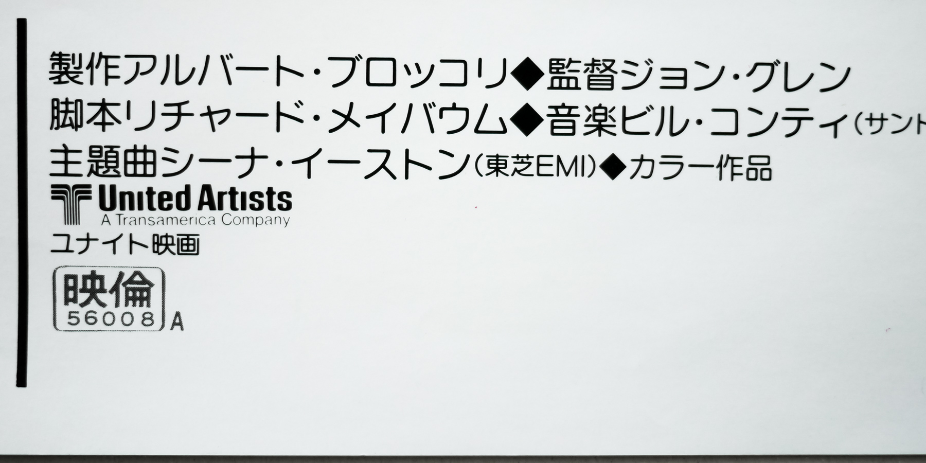
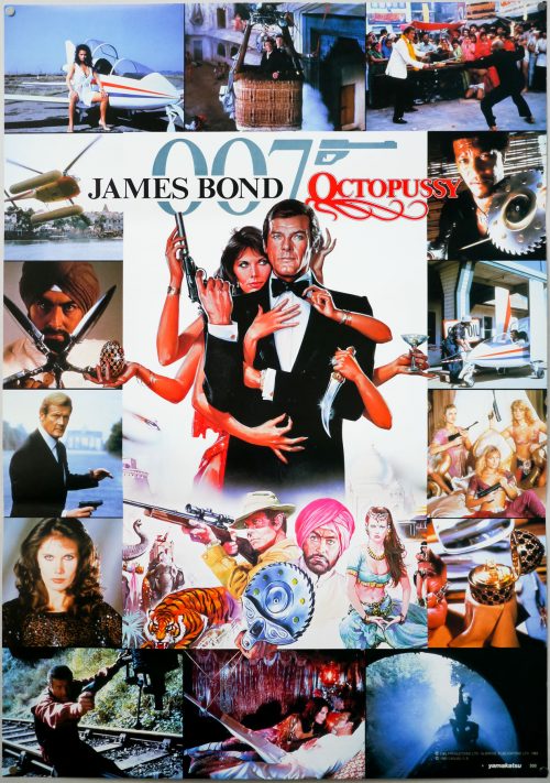
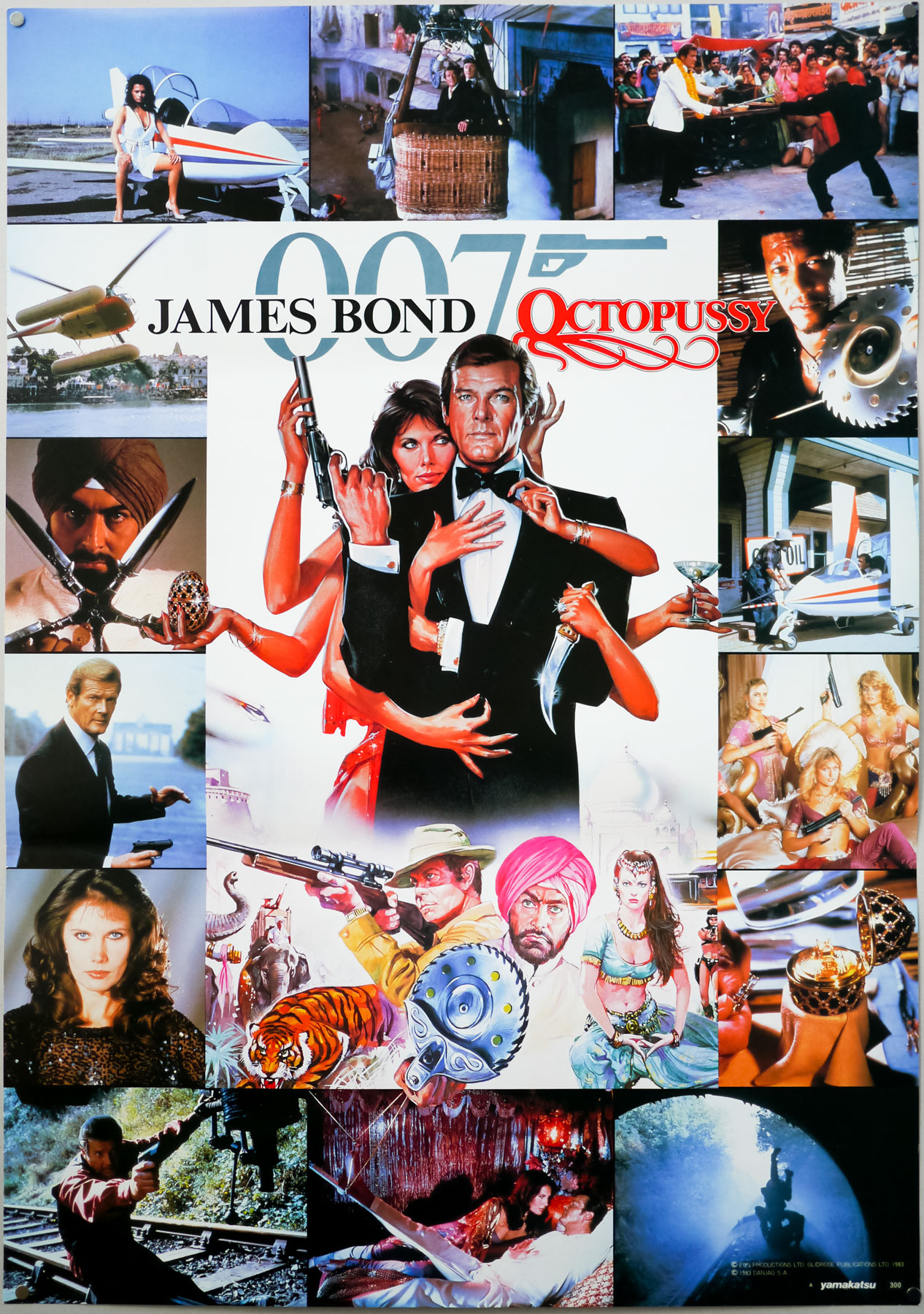
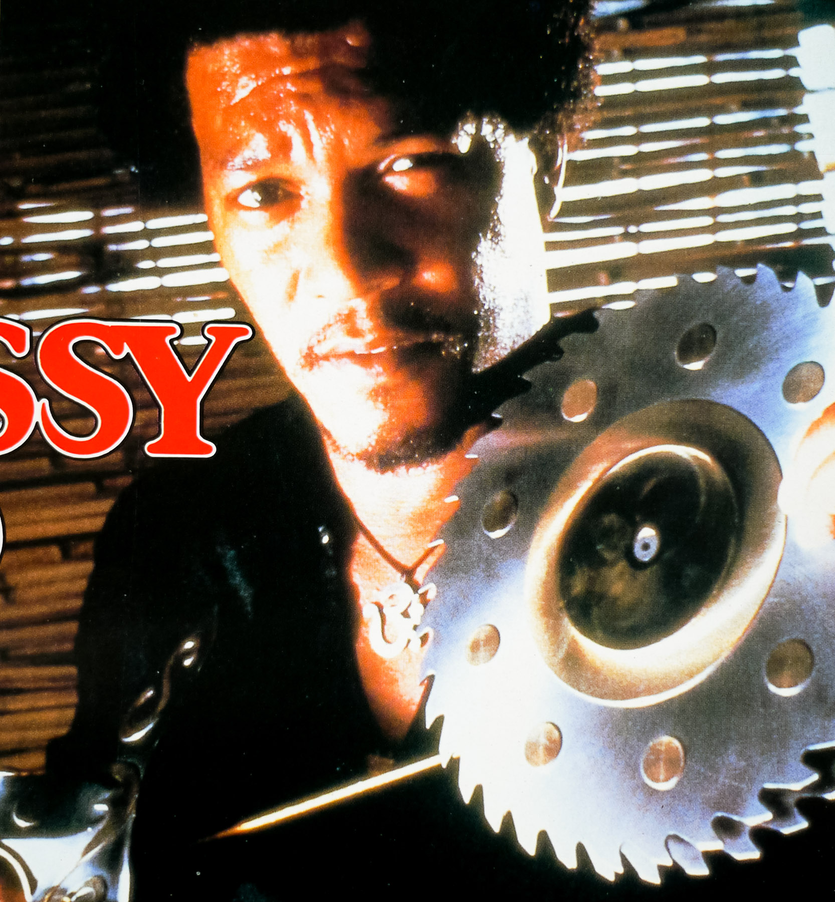
The artwork did end up being used for other countries, notably a Japanese B2 poster promoting the film.
For more information on Vic Fair and Brian Bysouth I highly recommend picking up a copy of ‘British Film Posters‘ as it features sections on both men. Here are the posters I’ve collected so far by Brian Bysouth and those by Vic Fair (with more to add over the coming months).
In 2012 I met and interviewed Brian Bysouth and this poster was discussed:
There are two specific collaborations you had with Vic Fair that I’d like to talk about. There was the UK one sheet for A View to a Kill, which you mentioned, and before I read Sim’s book I had no idea that it was one of yours. It’s quite different to others you’d worked on before then.
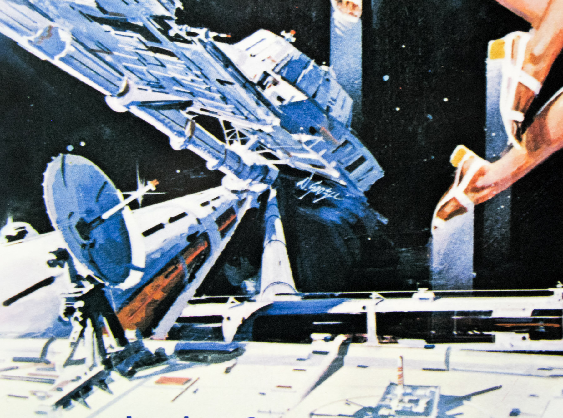
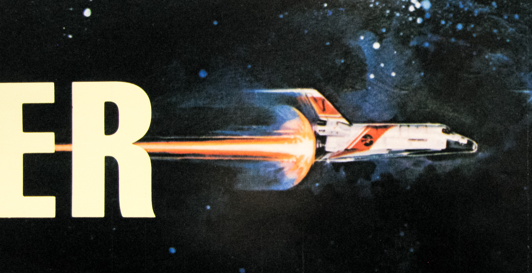
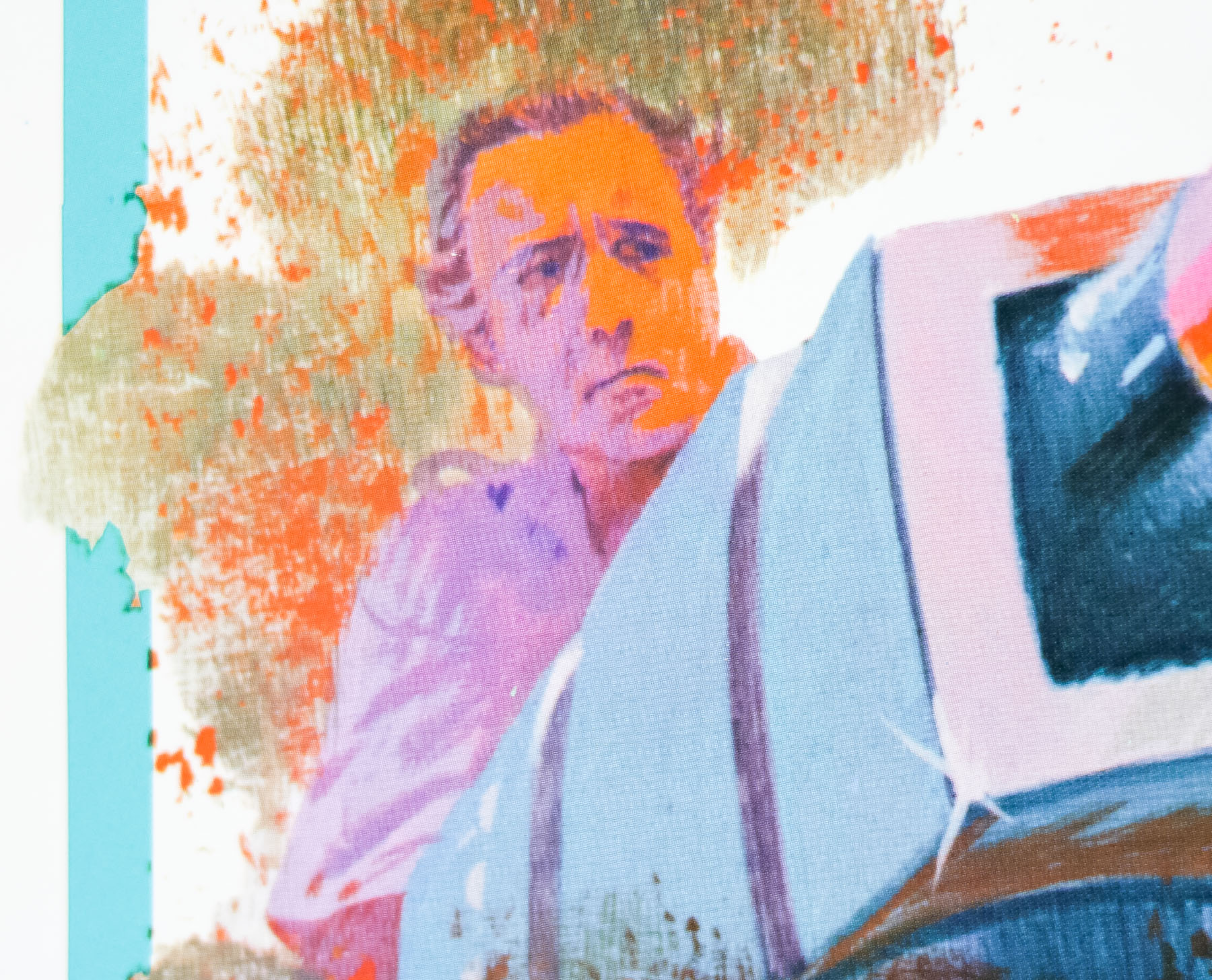
Ah yes, that poster was painted with a different technique than the one I’d typically work with. It has a very smooth look mostly done with an airbrush. The clients had started to require illustrations to have a less painted look and they were asking for much more photo-realistic illustrations. This requirement was because of falling sales in the video market. The clients had concluded that the paying public had become more discerning and distrustful of what was portrayed on the video sleeves, and to some extent on film posters. The public had begun to realise that an exciting illustration could flatter what in reality would be a truly awful film. So illustration had to take on a new, more highly-finished look, but this only worked for a short while before the use of photographs and the versatility of the computer took over completely.
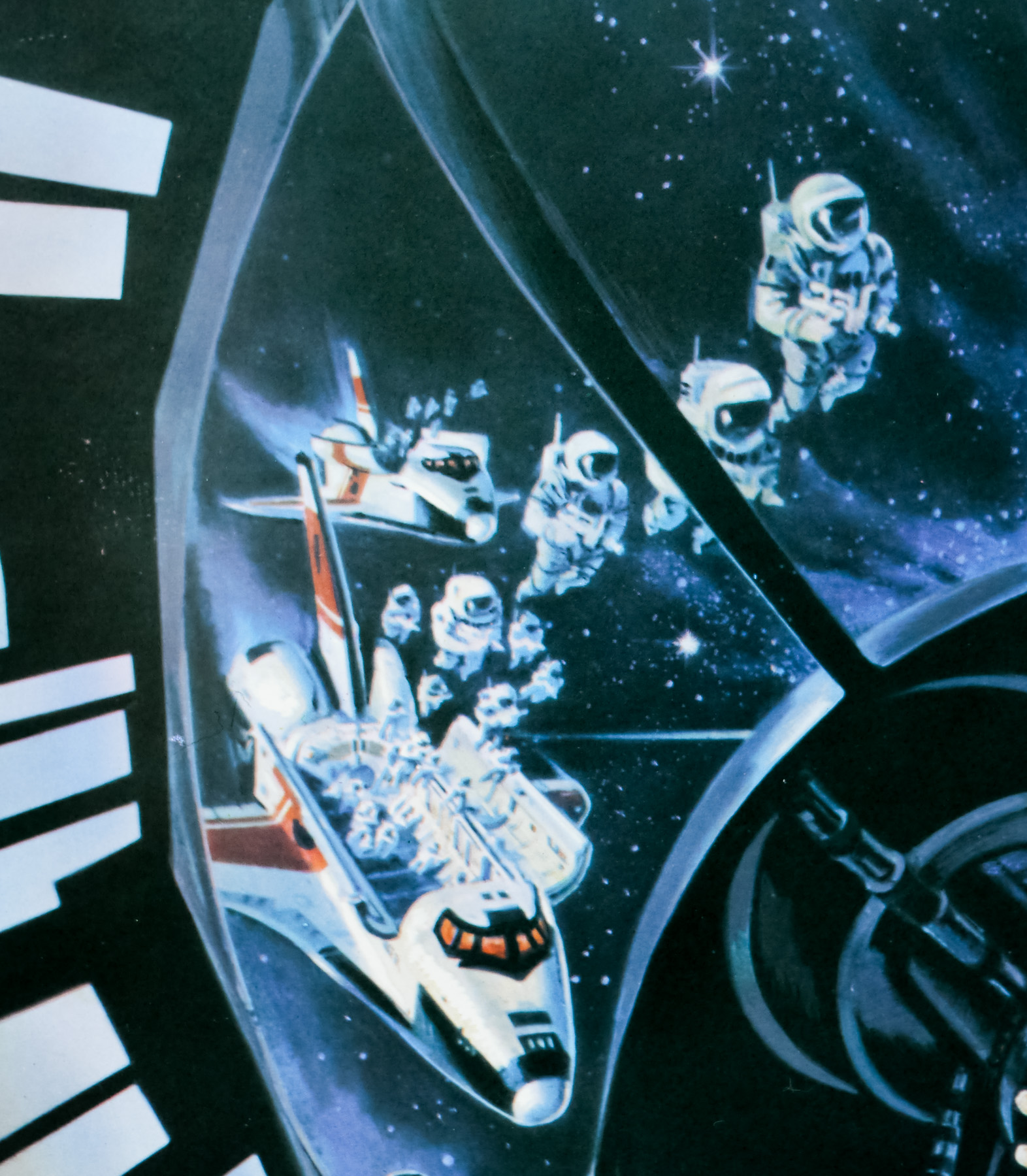
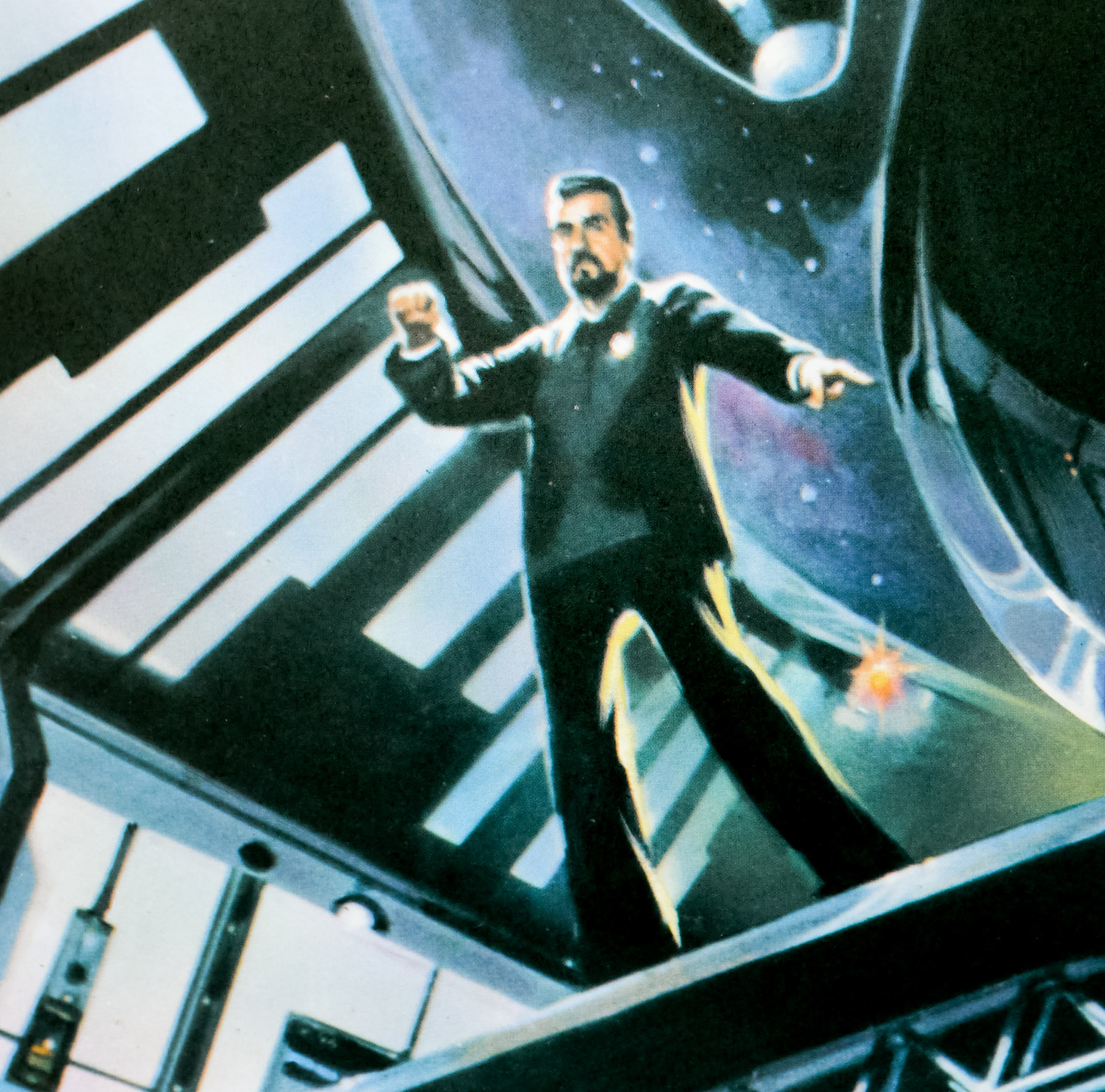
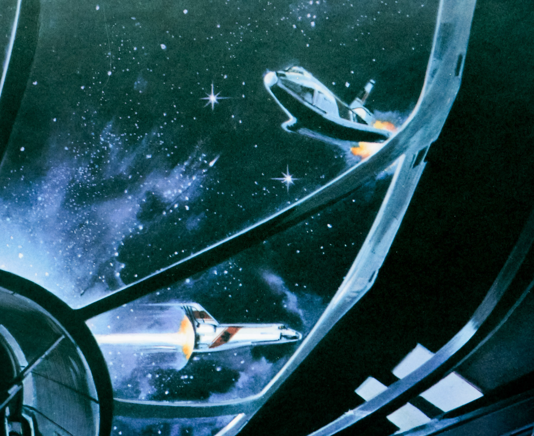
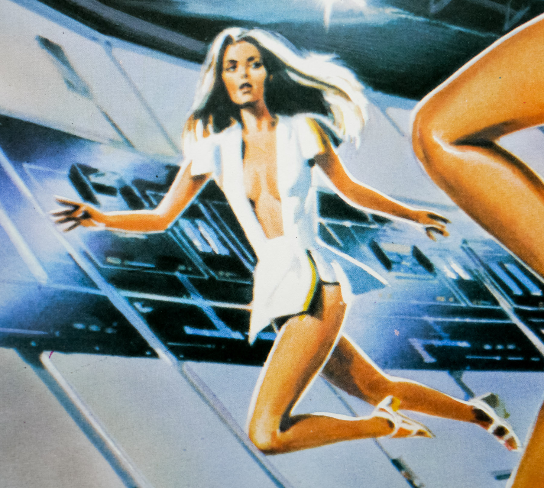
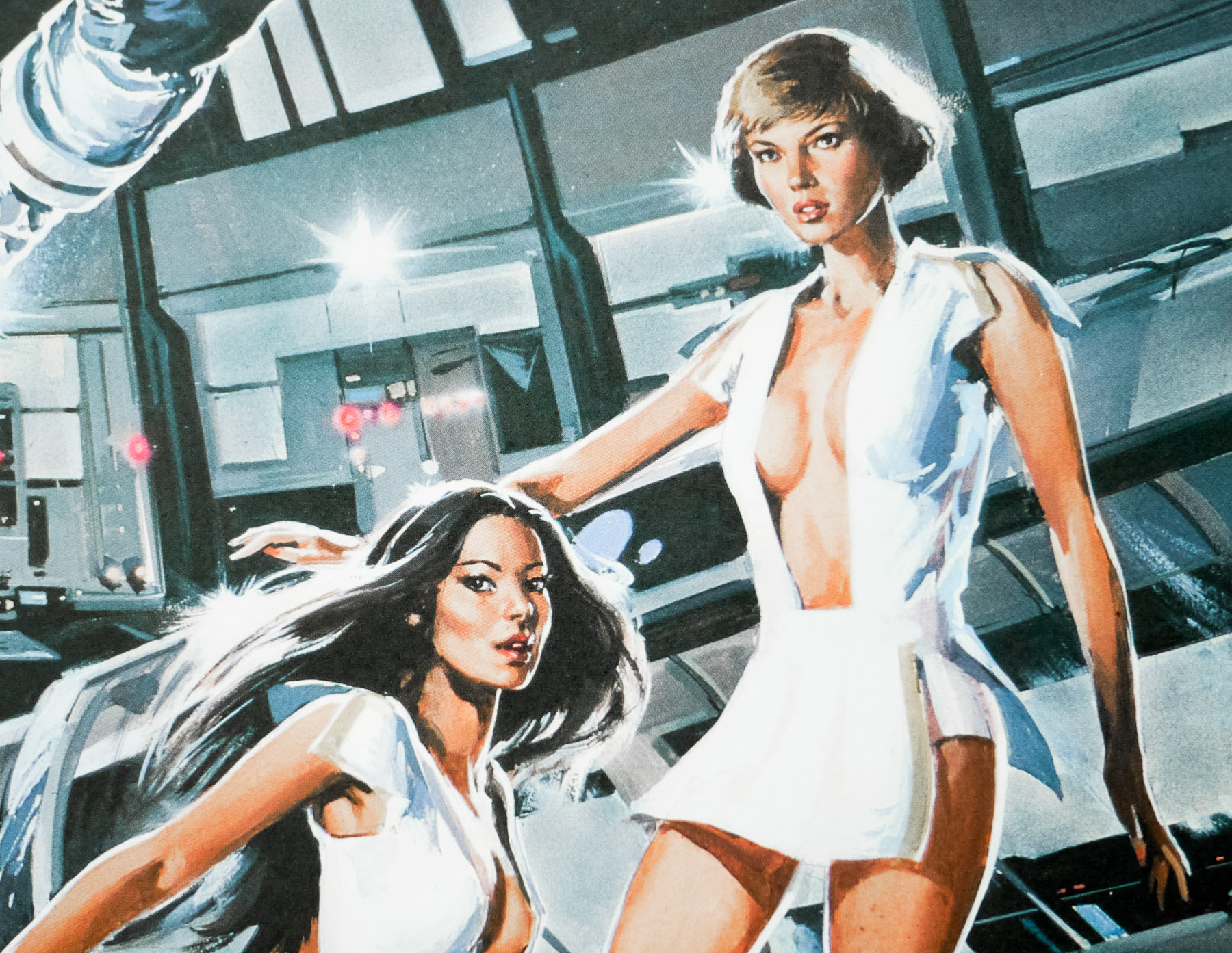
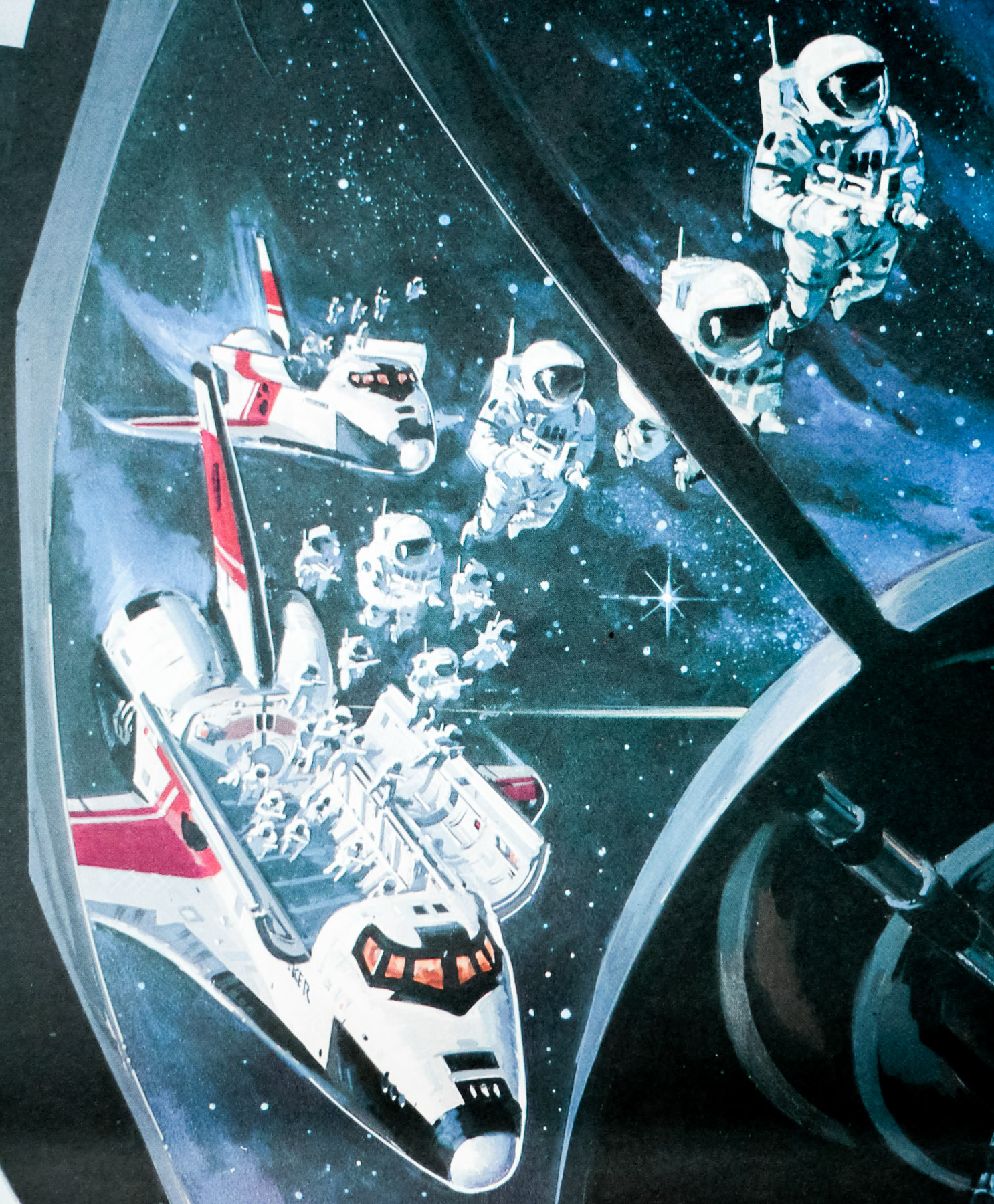
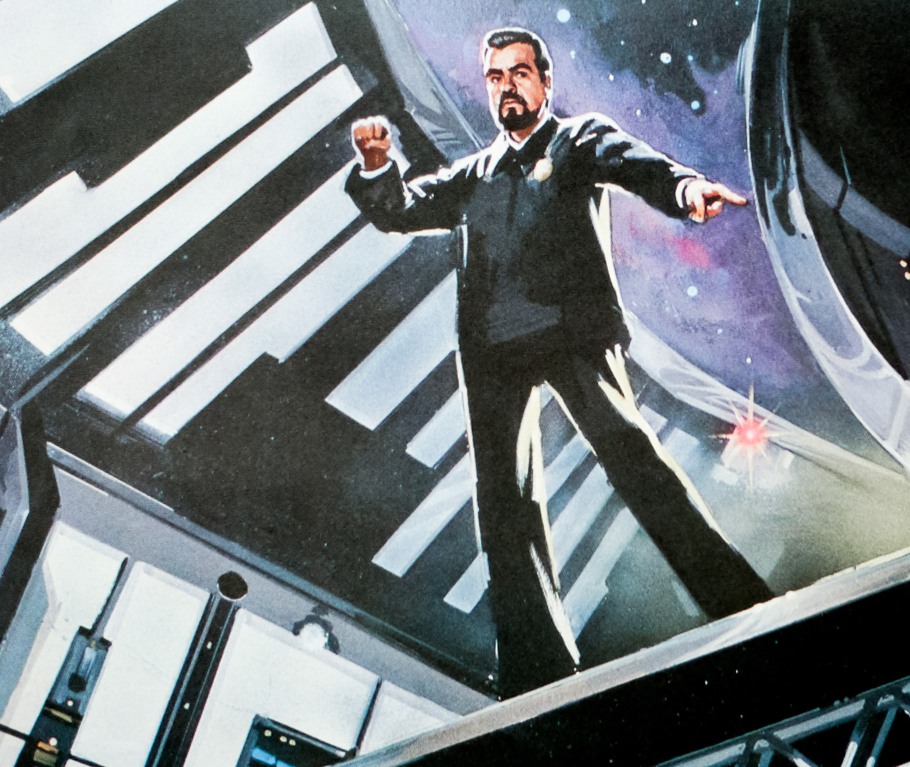
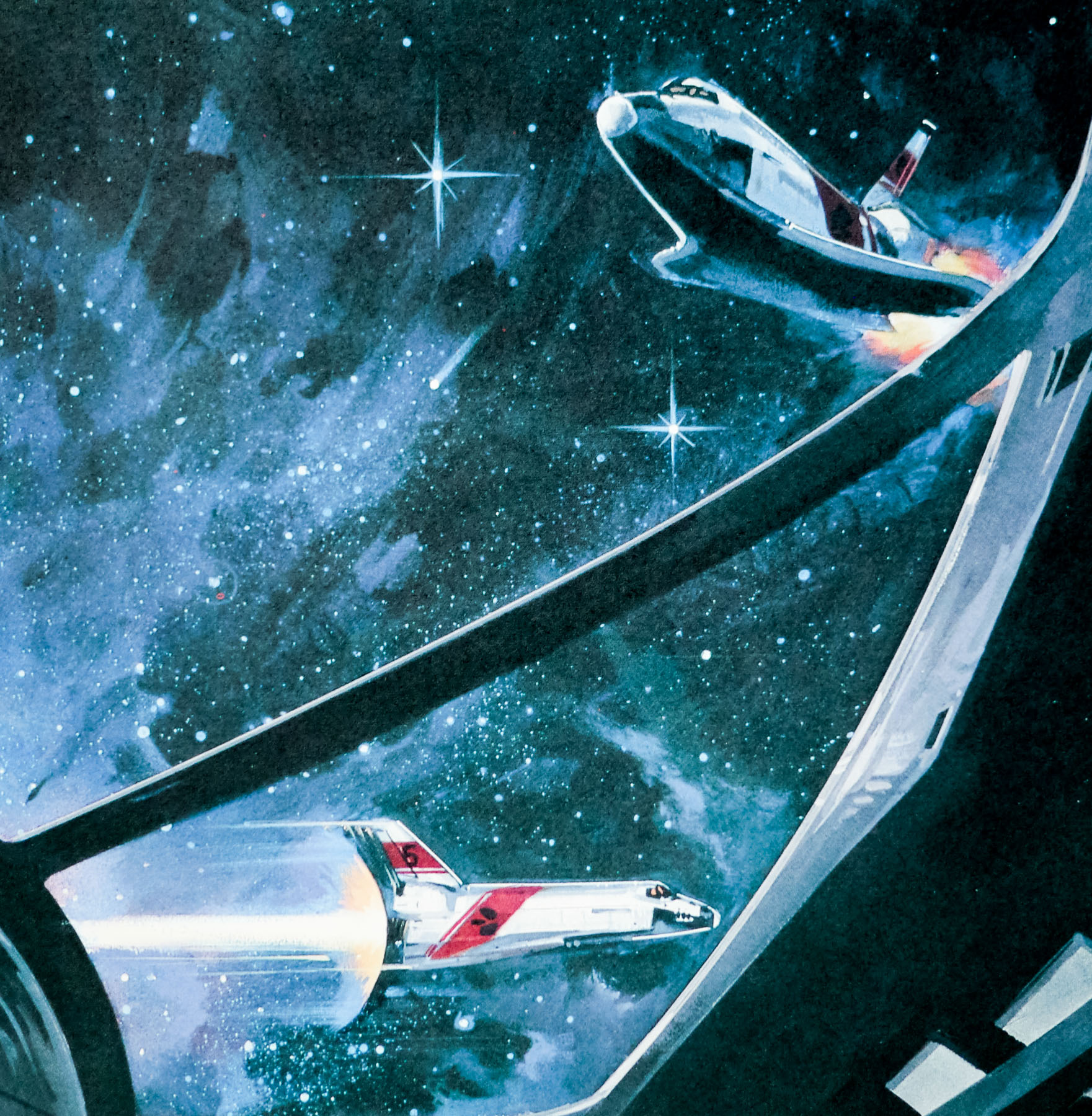
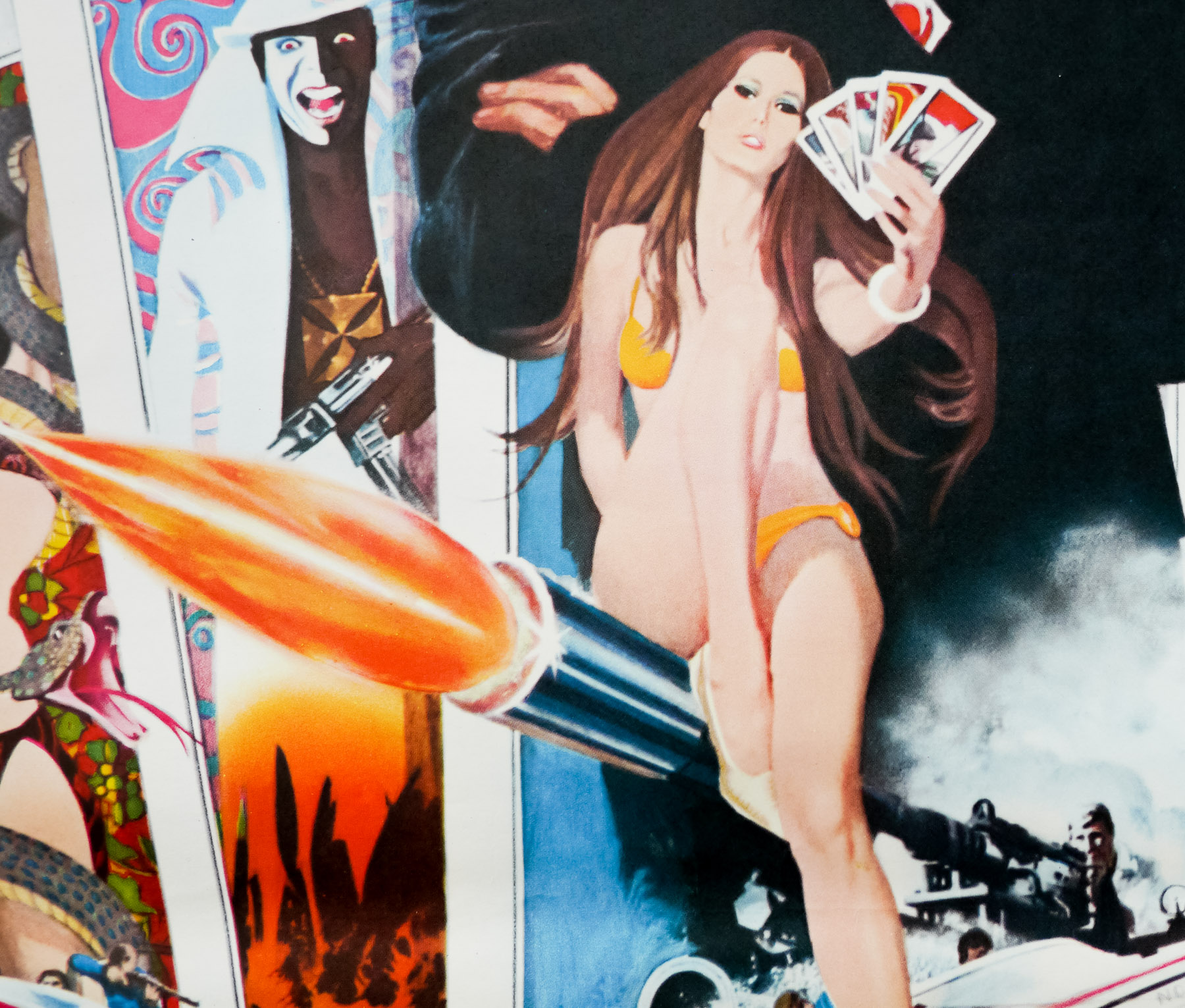
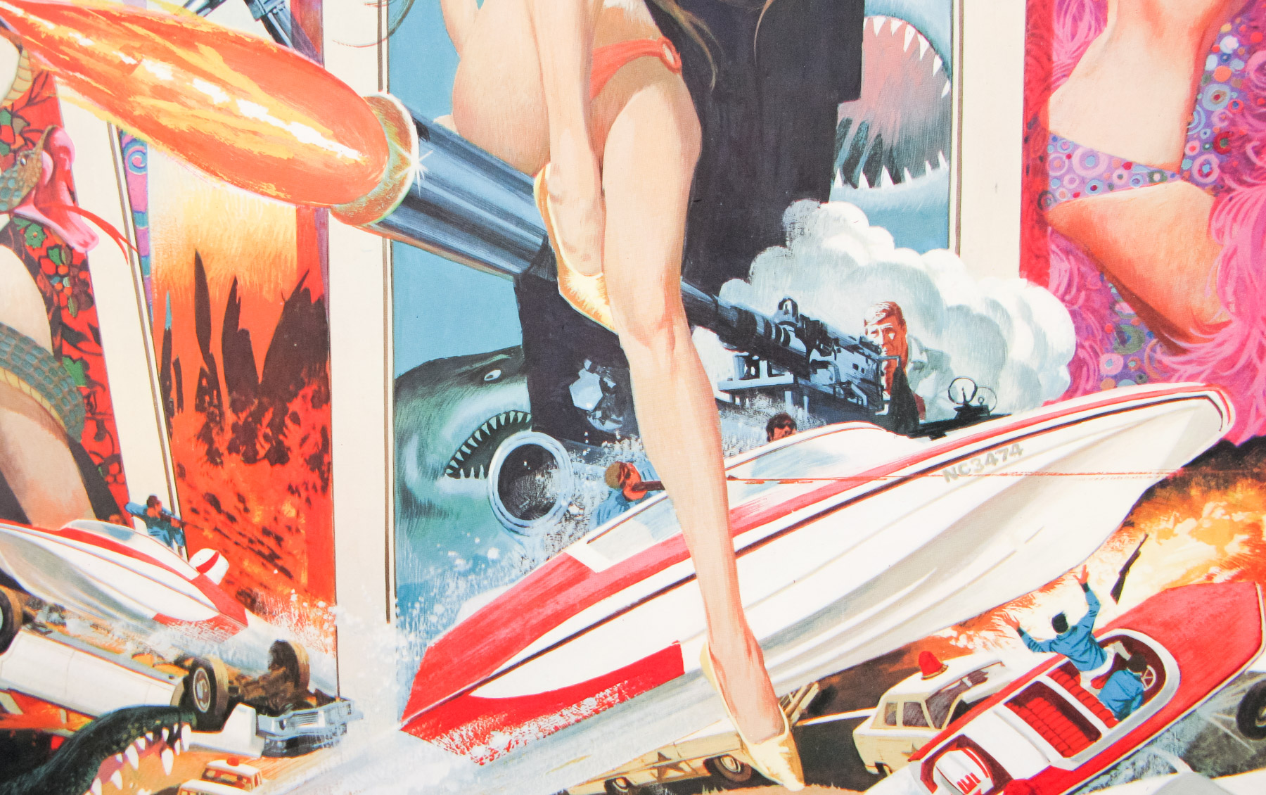
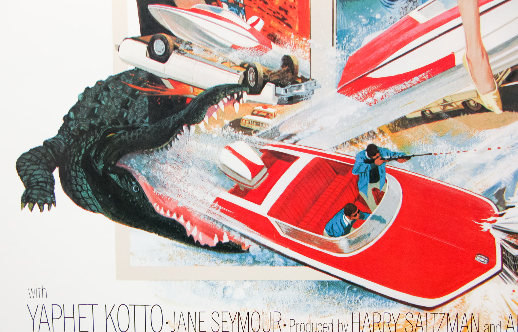
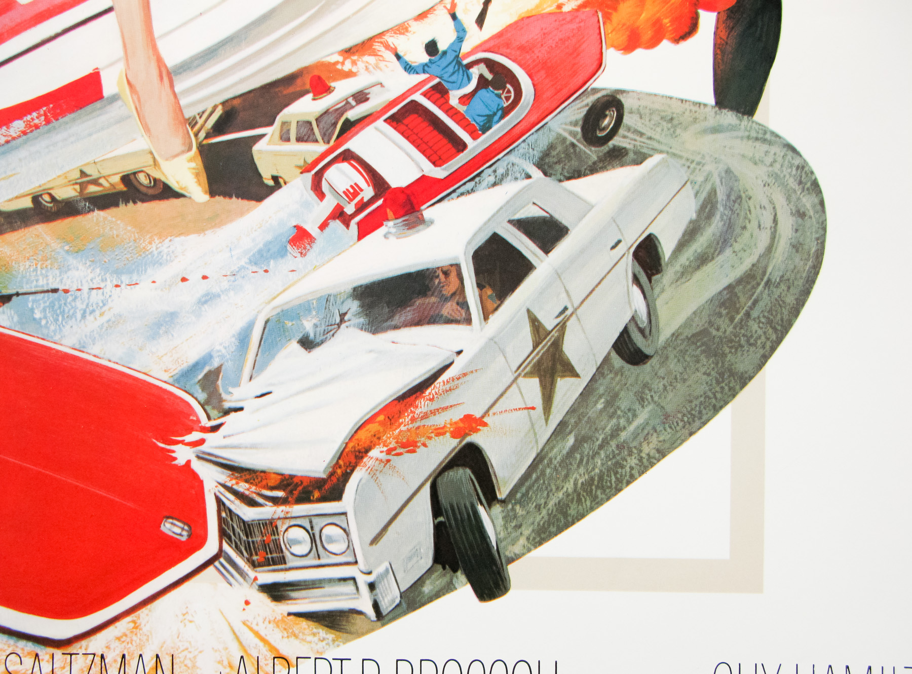
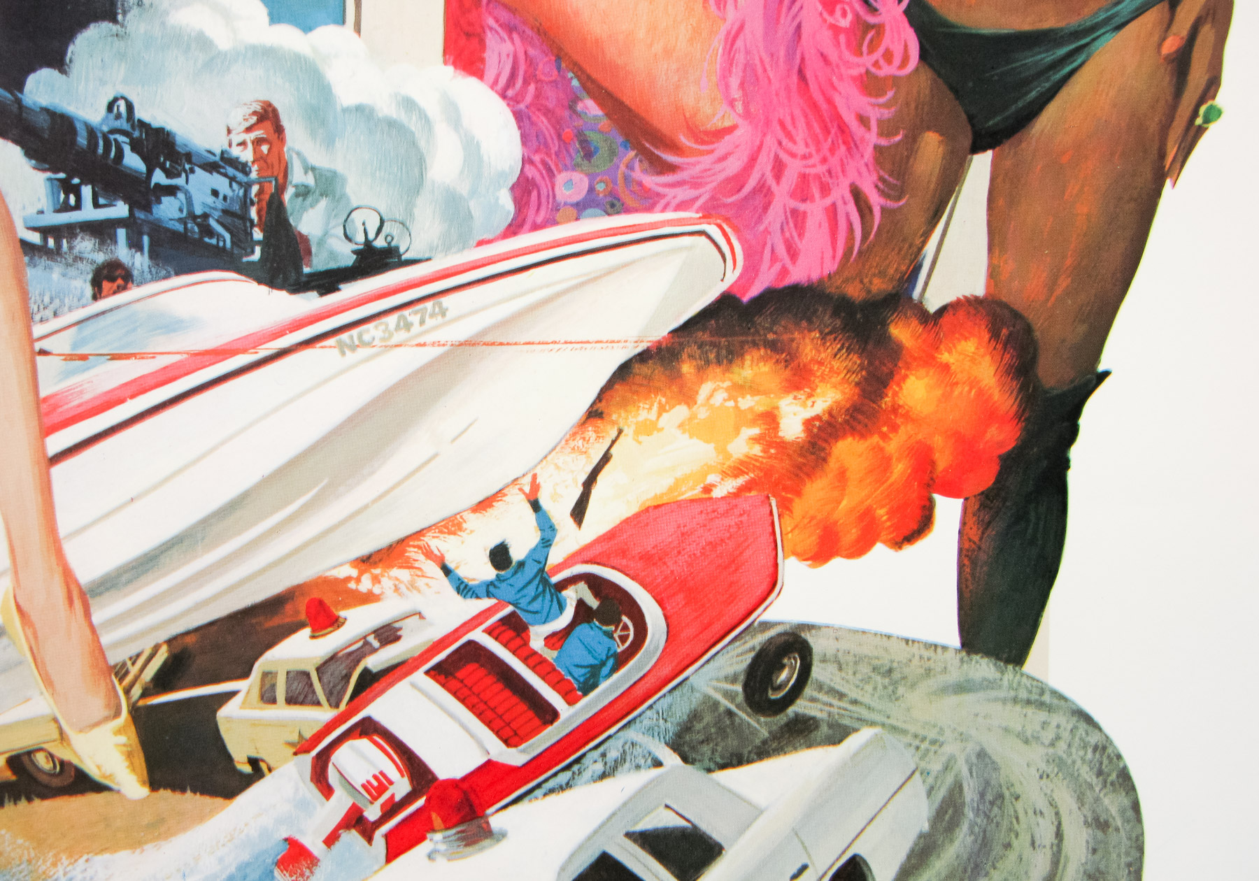
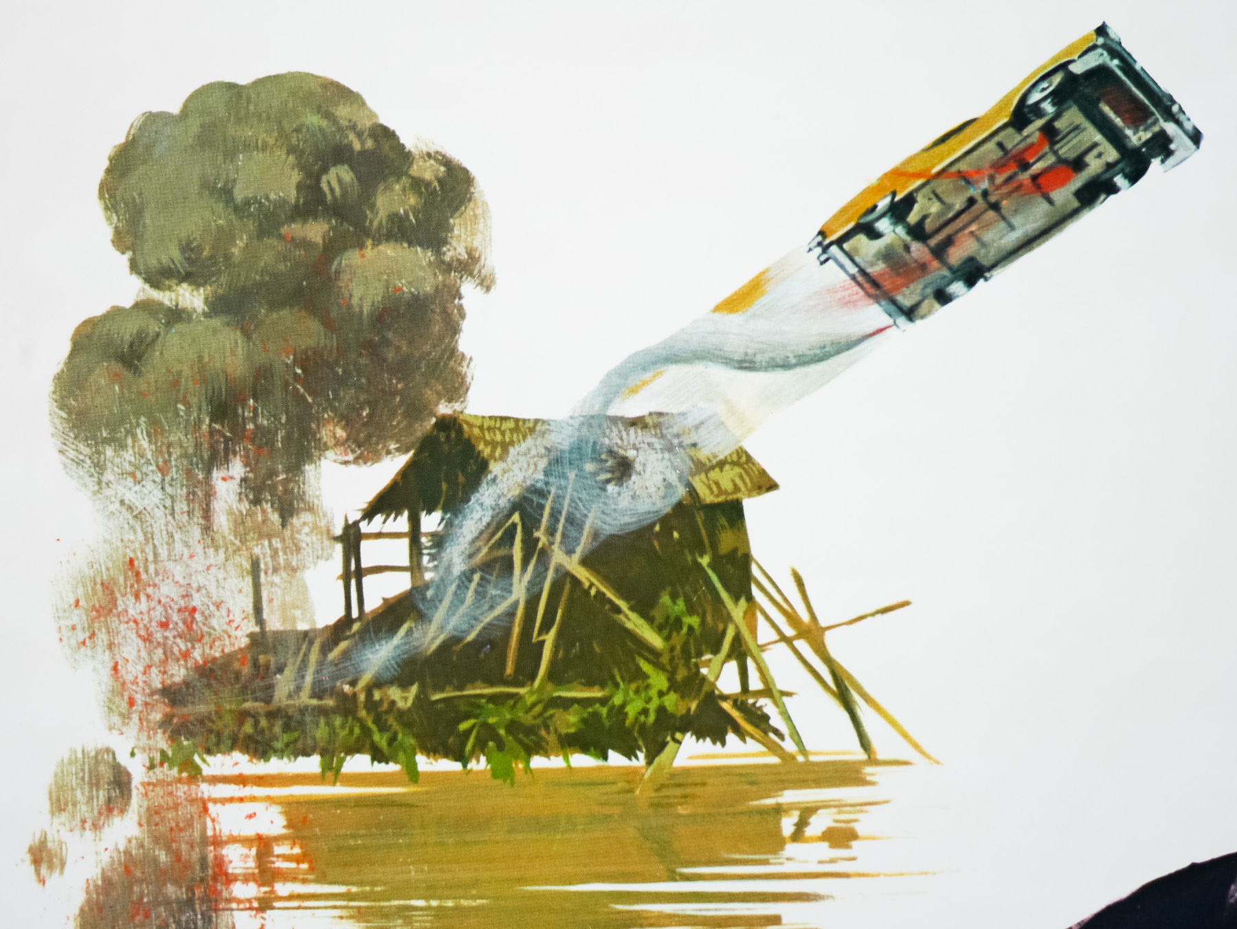
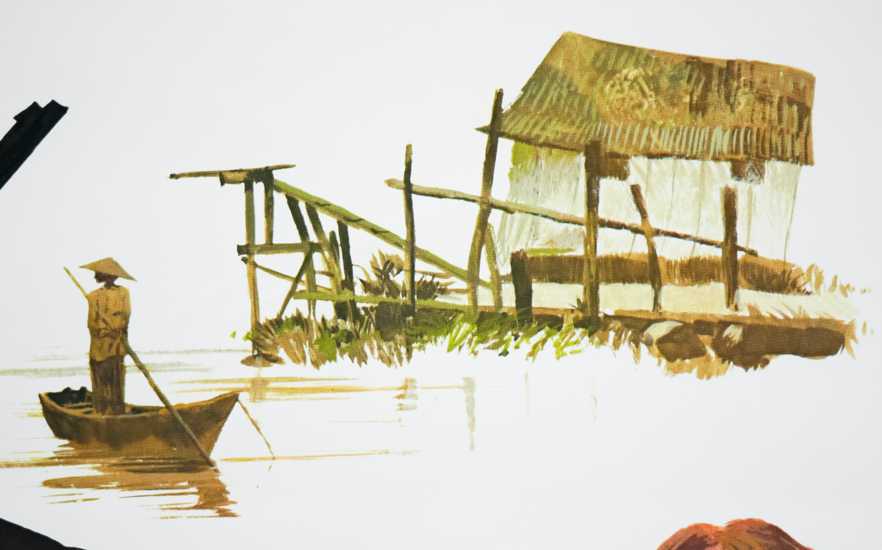
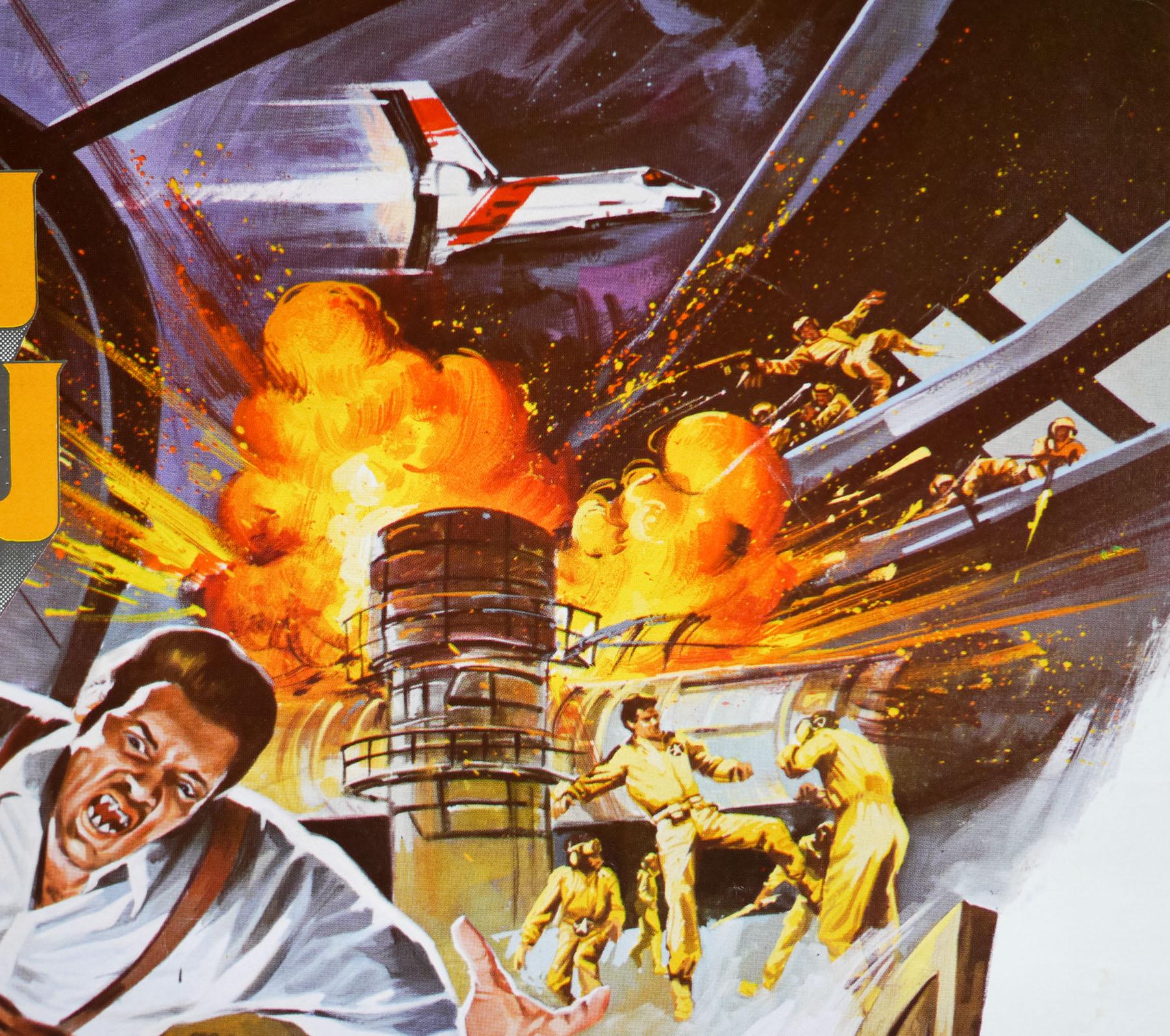
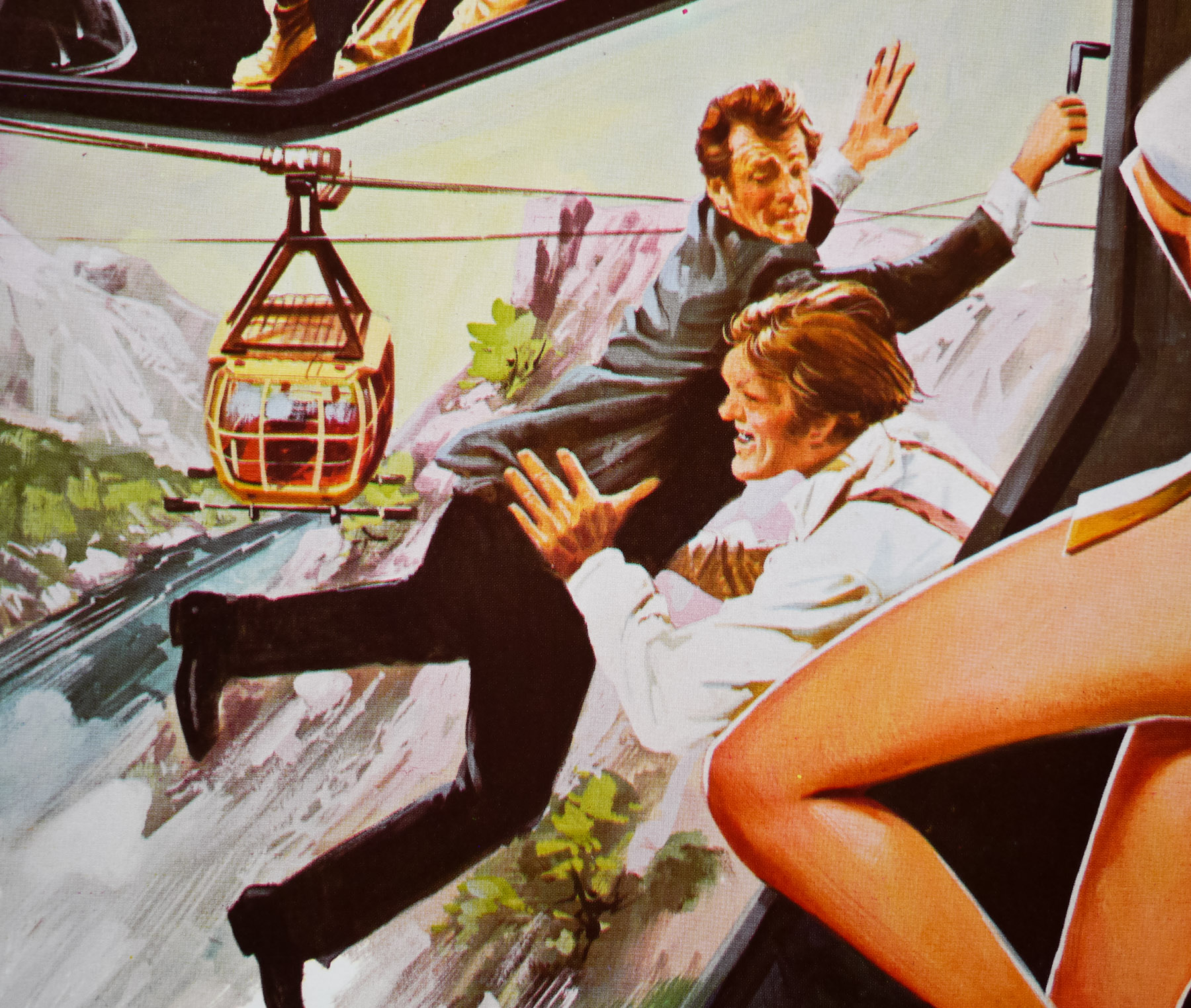
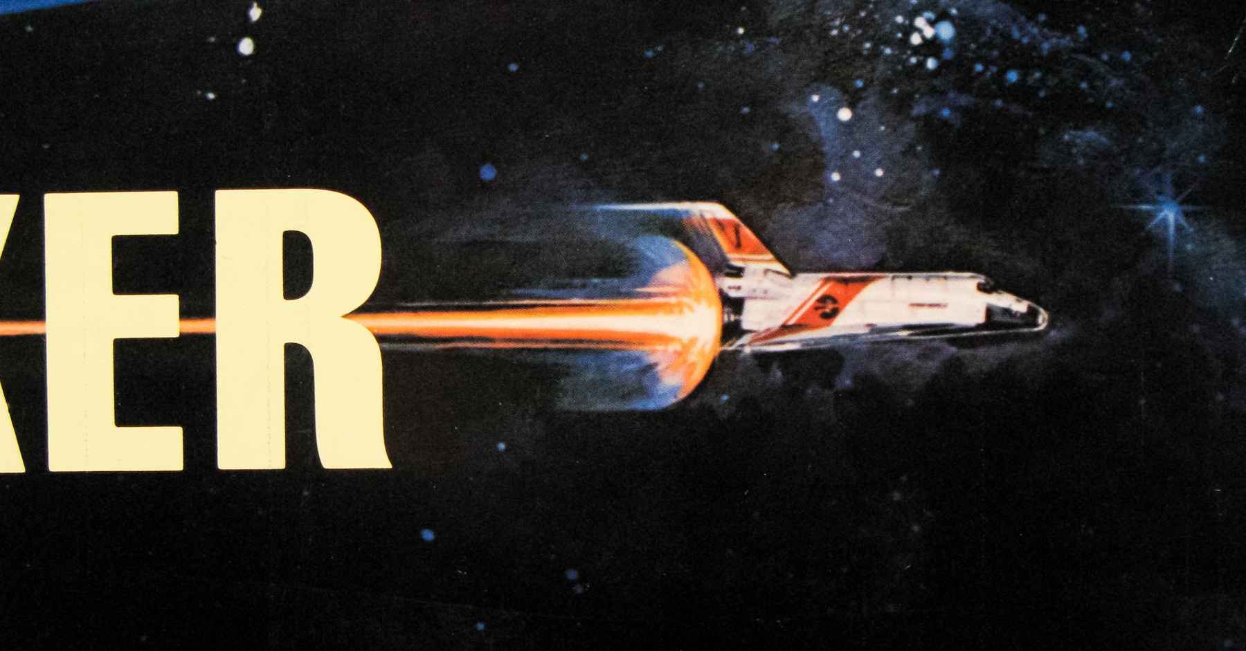
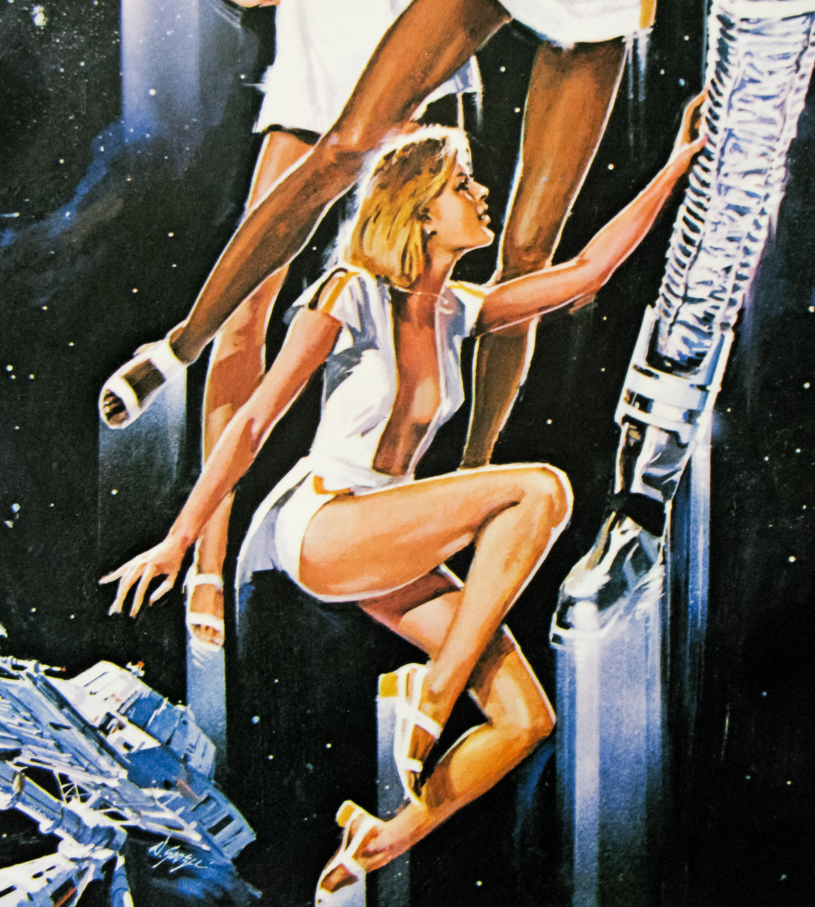
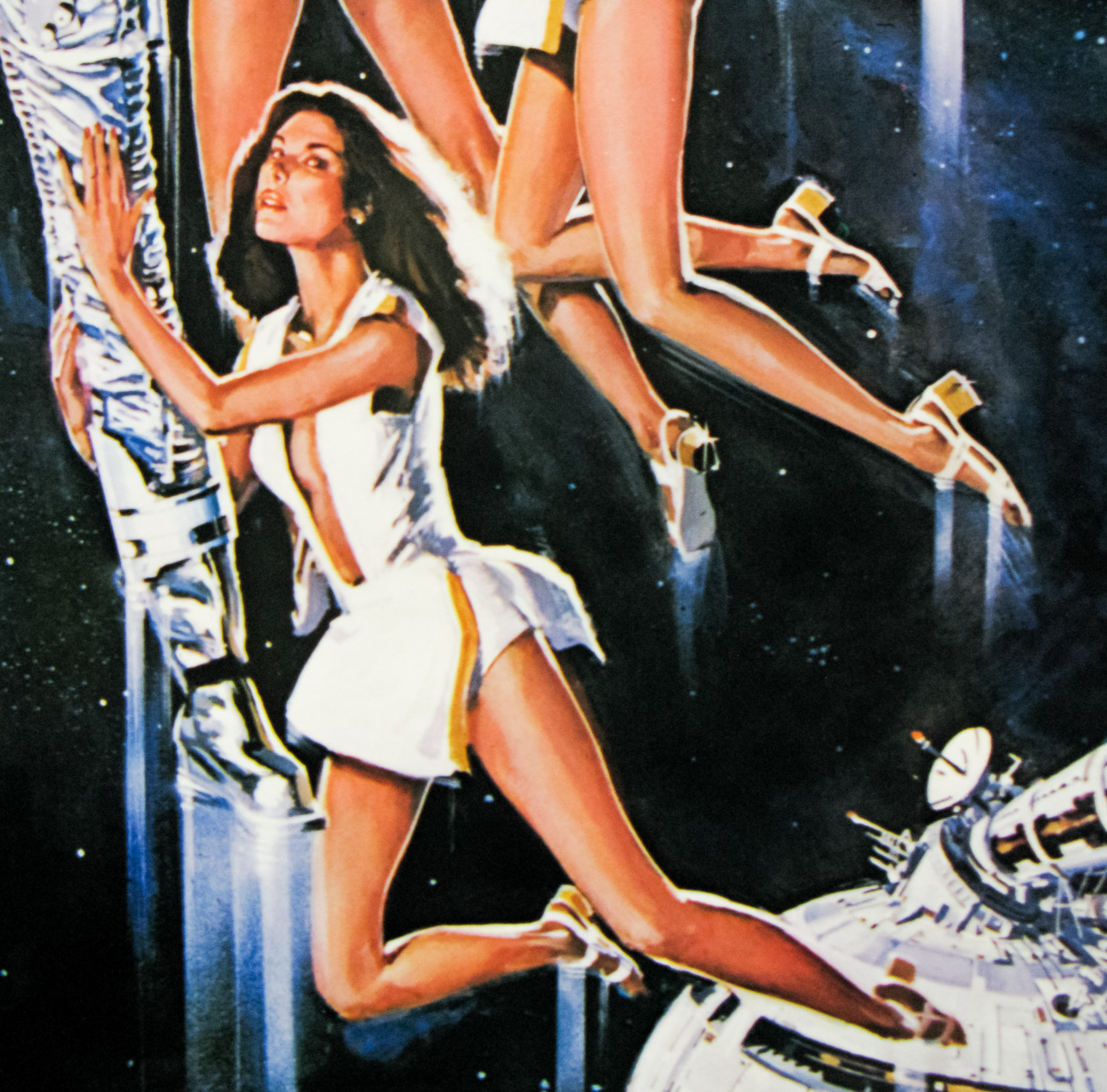
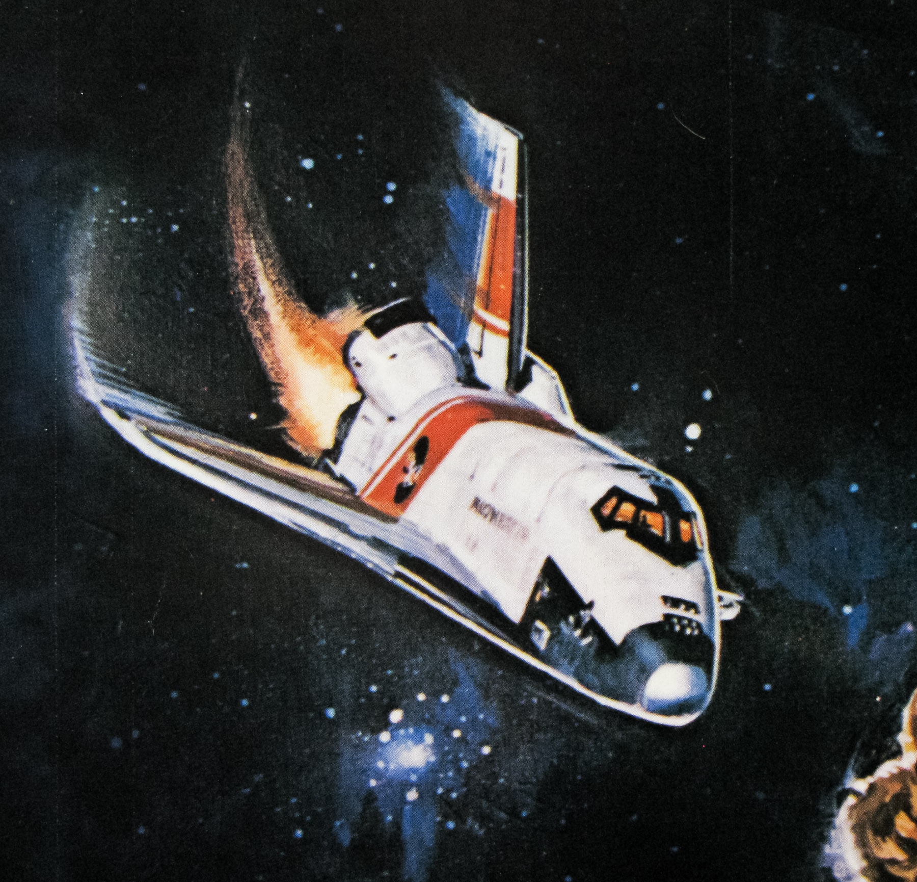
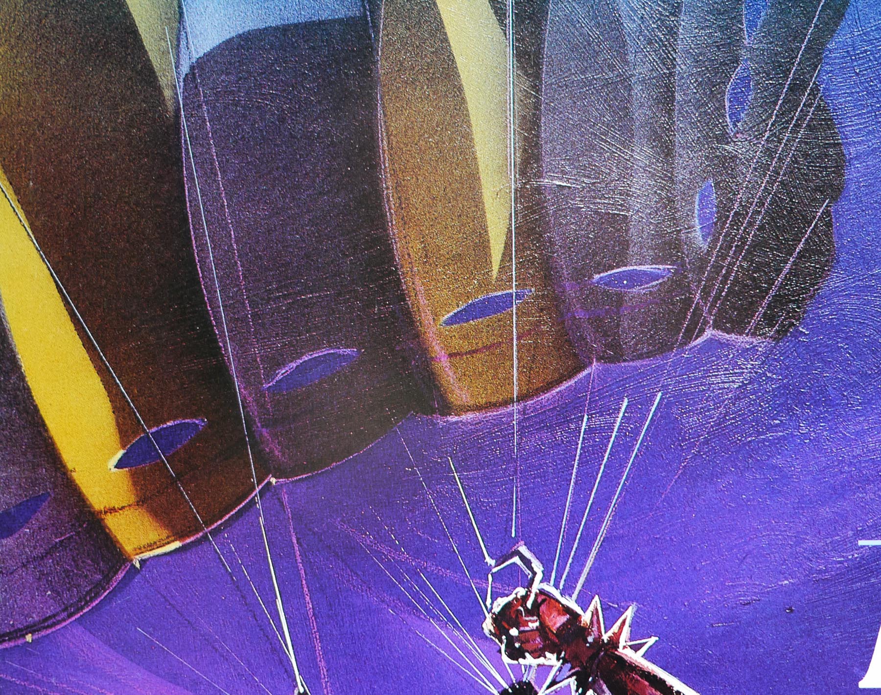
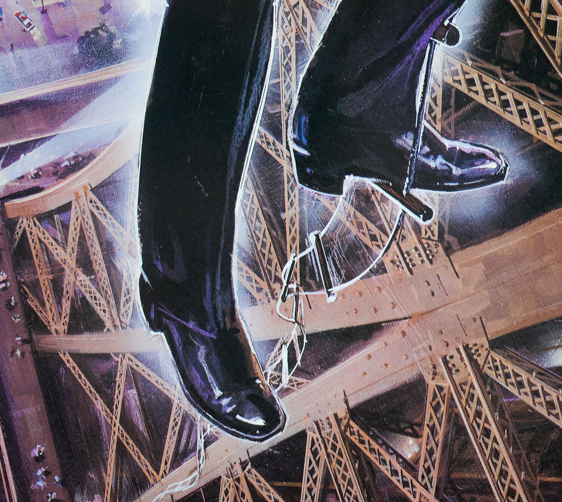
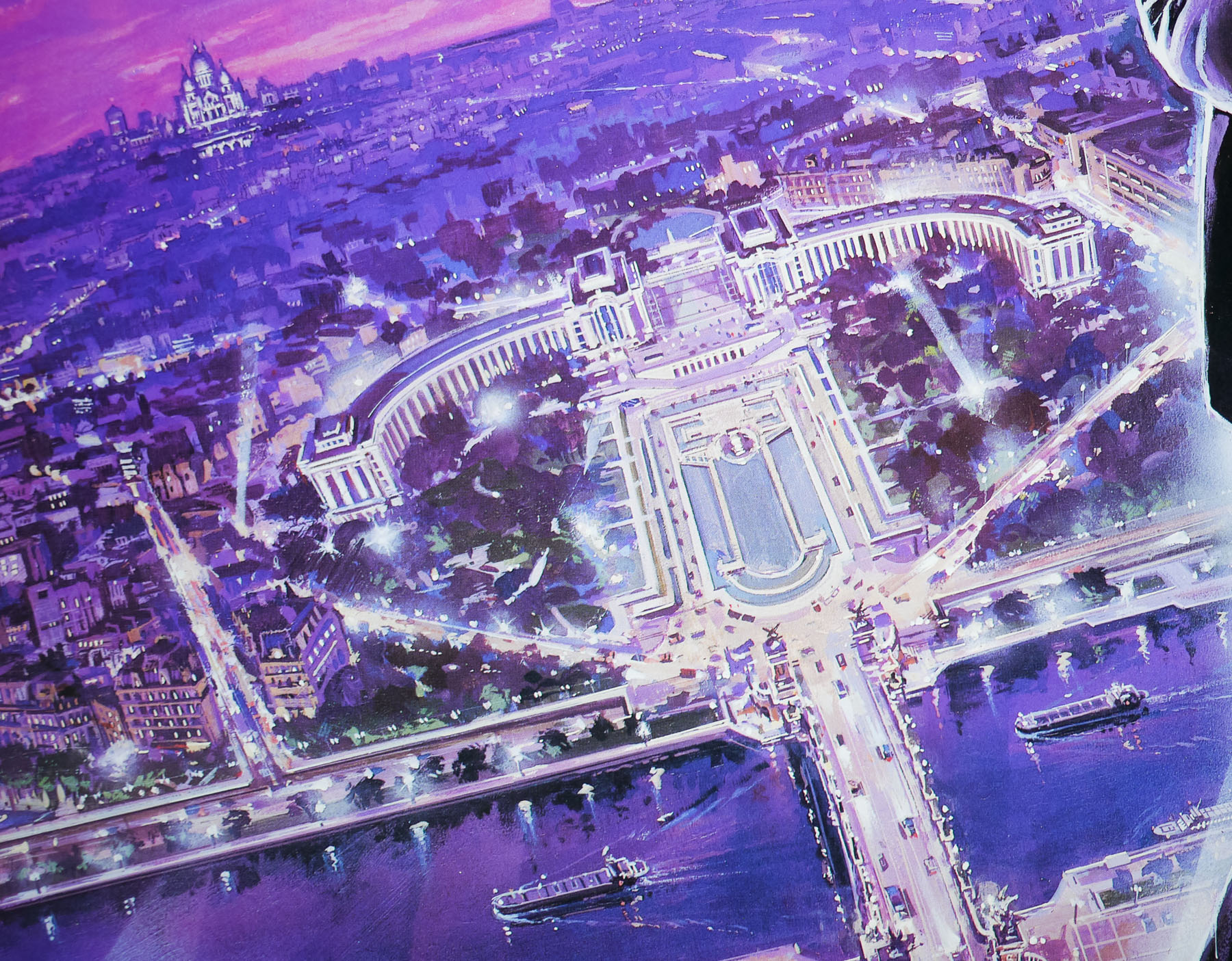
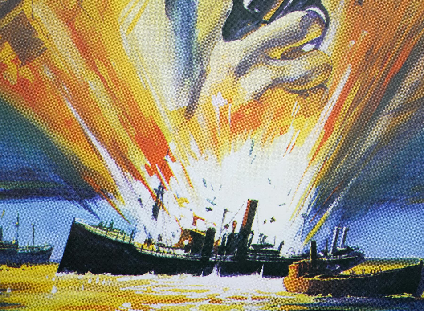
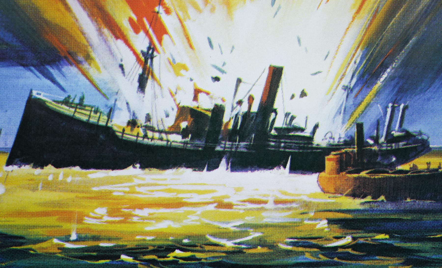
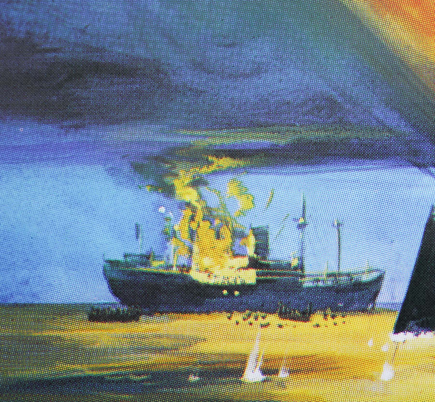
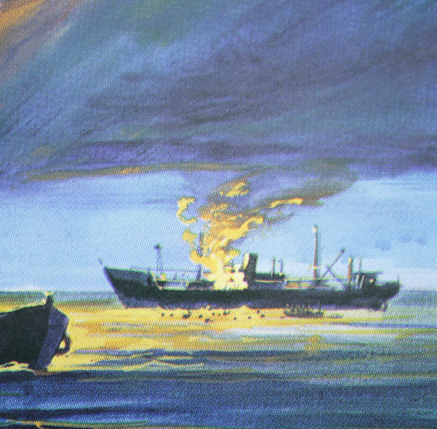
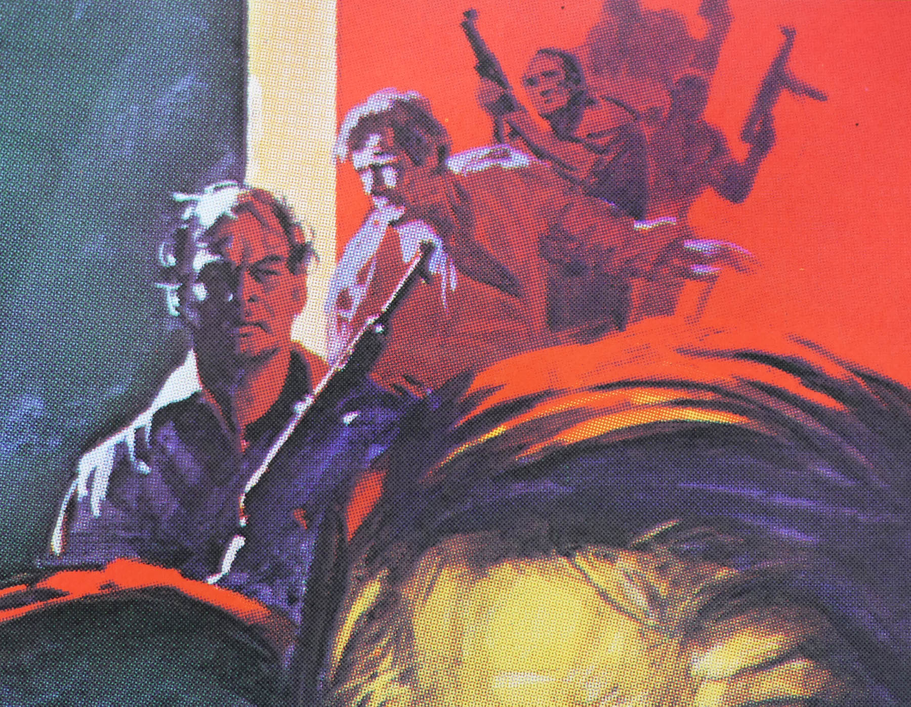
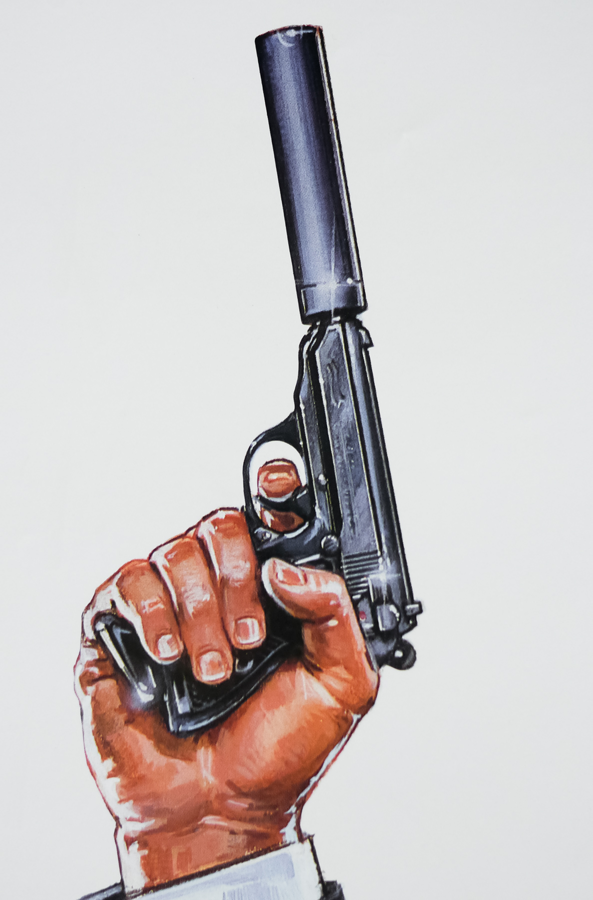
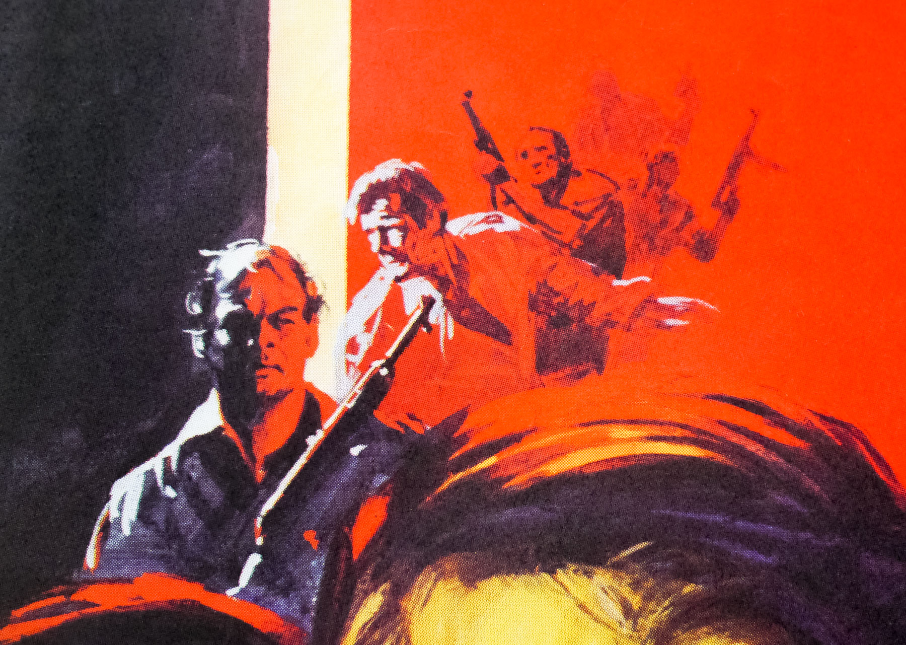
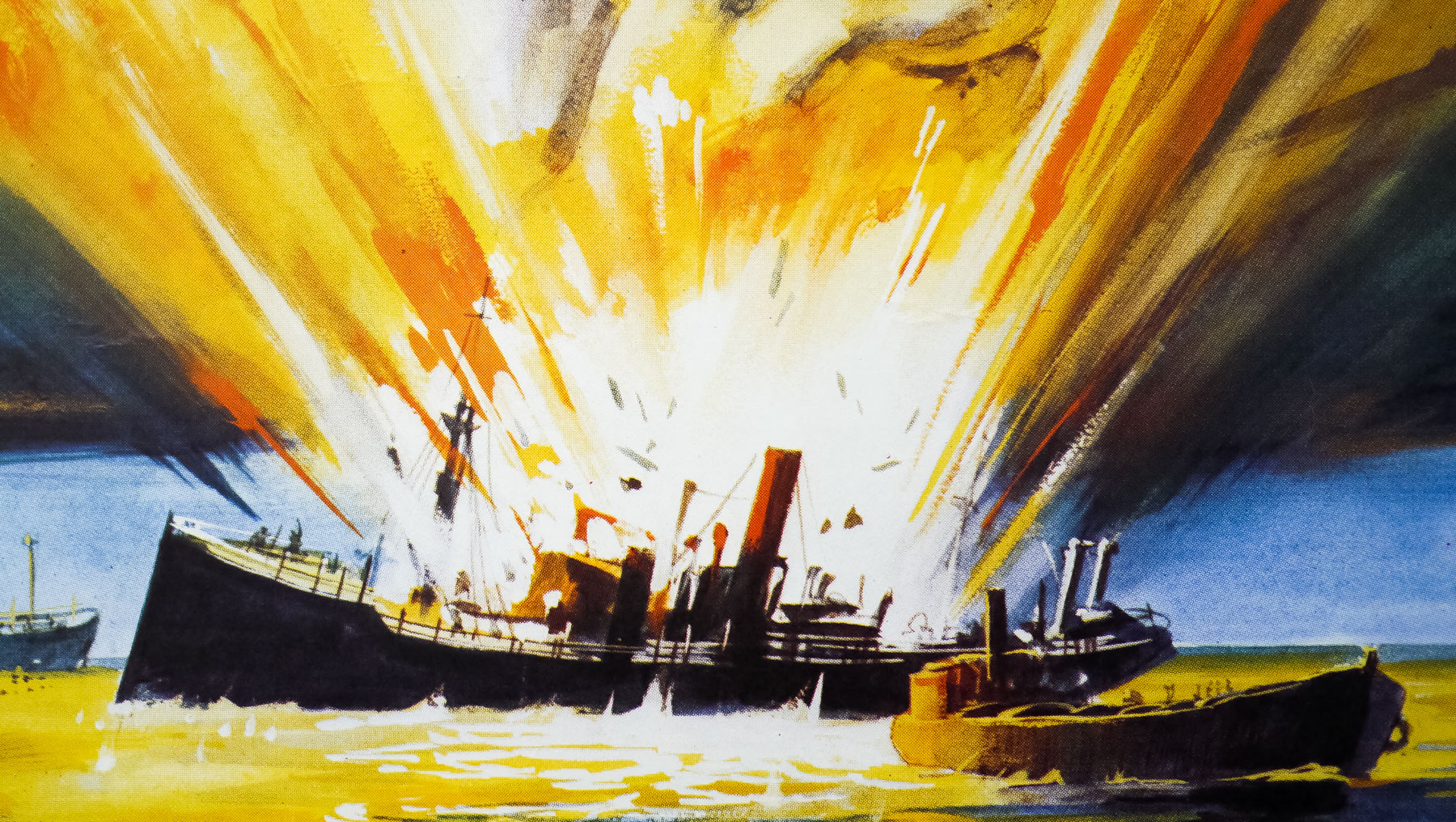
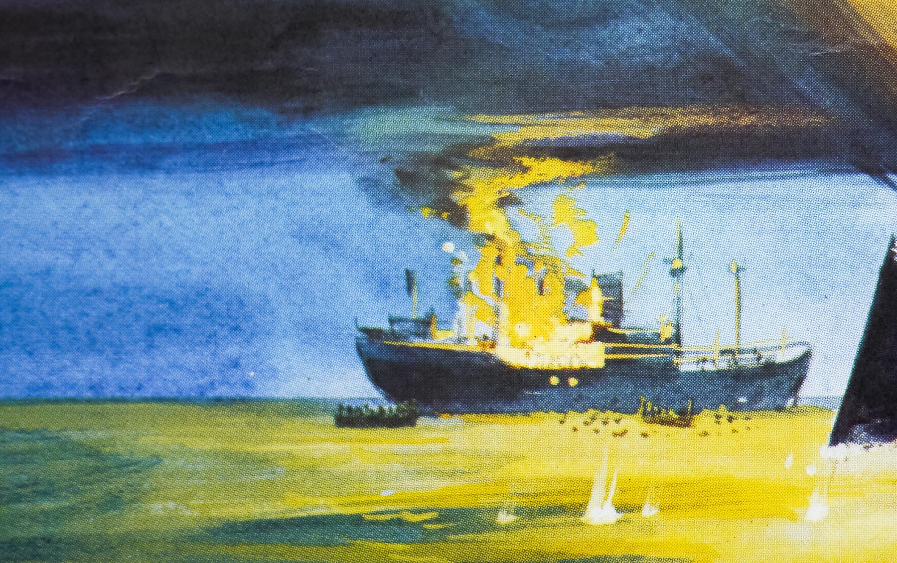
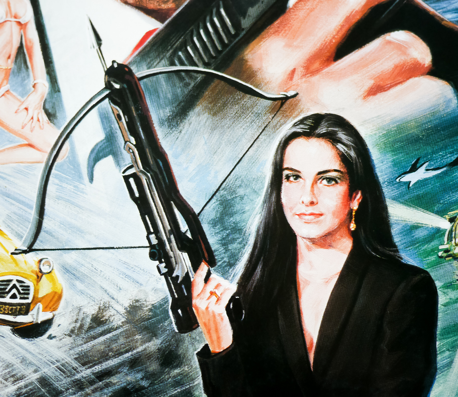
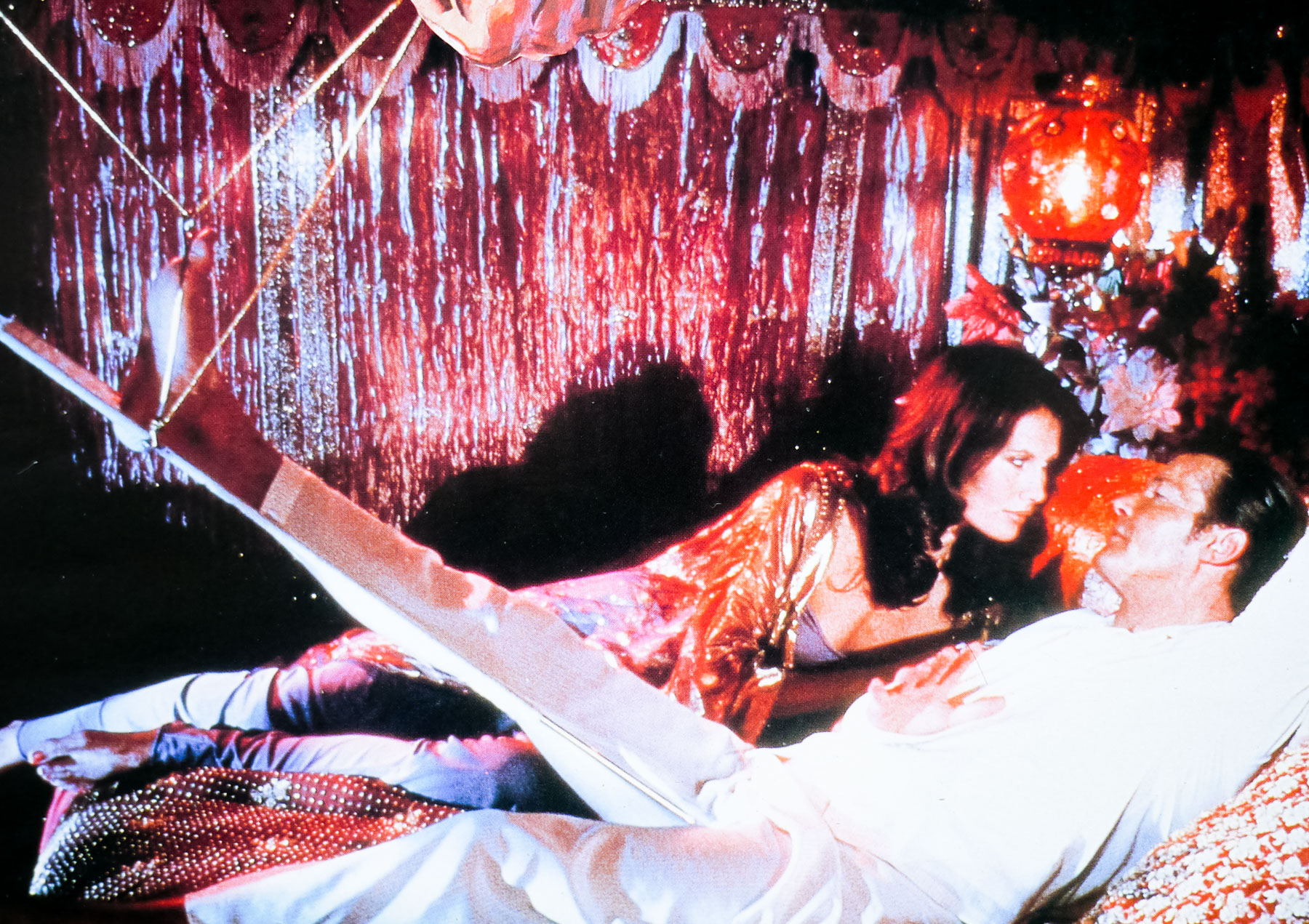
Anyway, to continue, Vic asked me if I’d like to do the finished painting based on his rough; it was a really excellent and novel design, which required me to execute the painting in two stages. The first stage would be used as a teaser poster and this was just the image ofGrace Jones and Bond contained within a diamond motif. All I had to do was get the airbrush out and work up his design. I remember spending a while on the Grace Jones image, polishing and improving her look, as well as the pose of Bond. It went away to be printed but later we were disappointed to learn that it was going to be withdrawn because the clients were not happy with the legendary spy being portrayed in a white tuxedo; that being considered not very Bond-like!
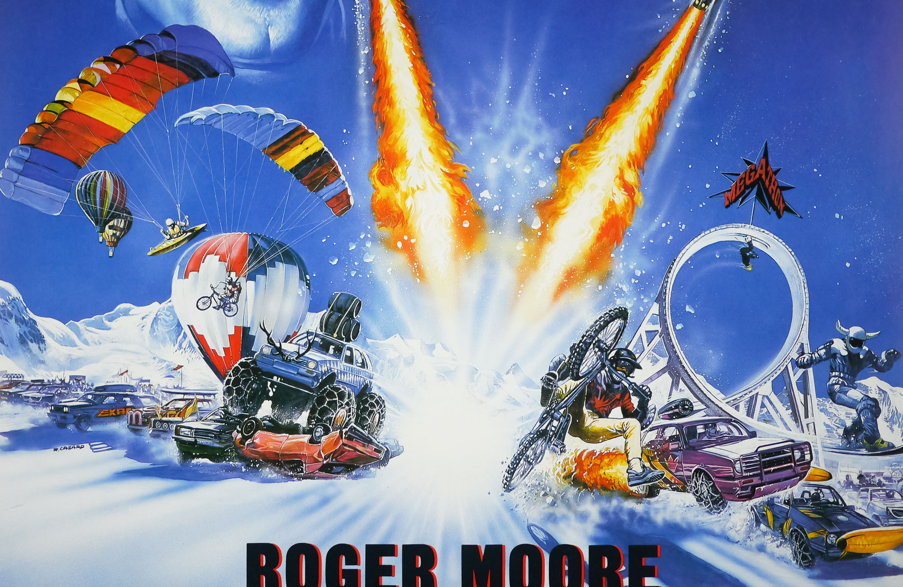
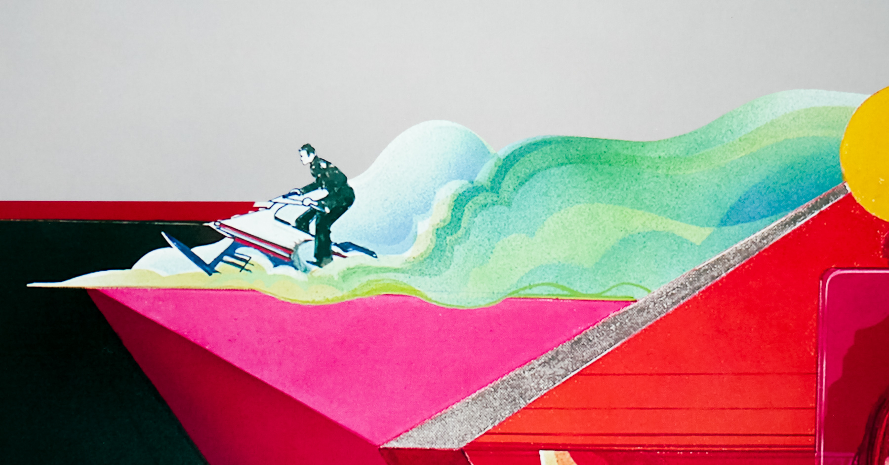
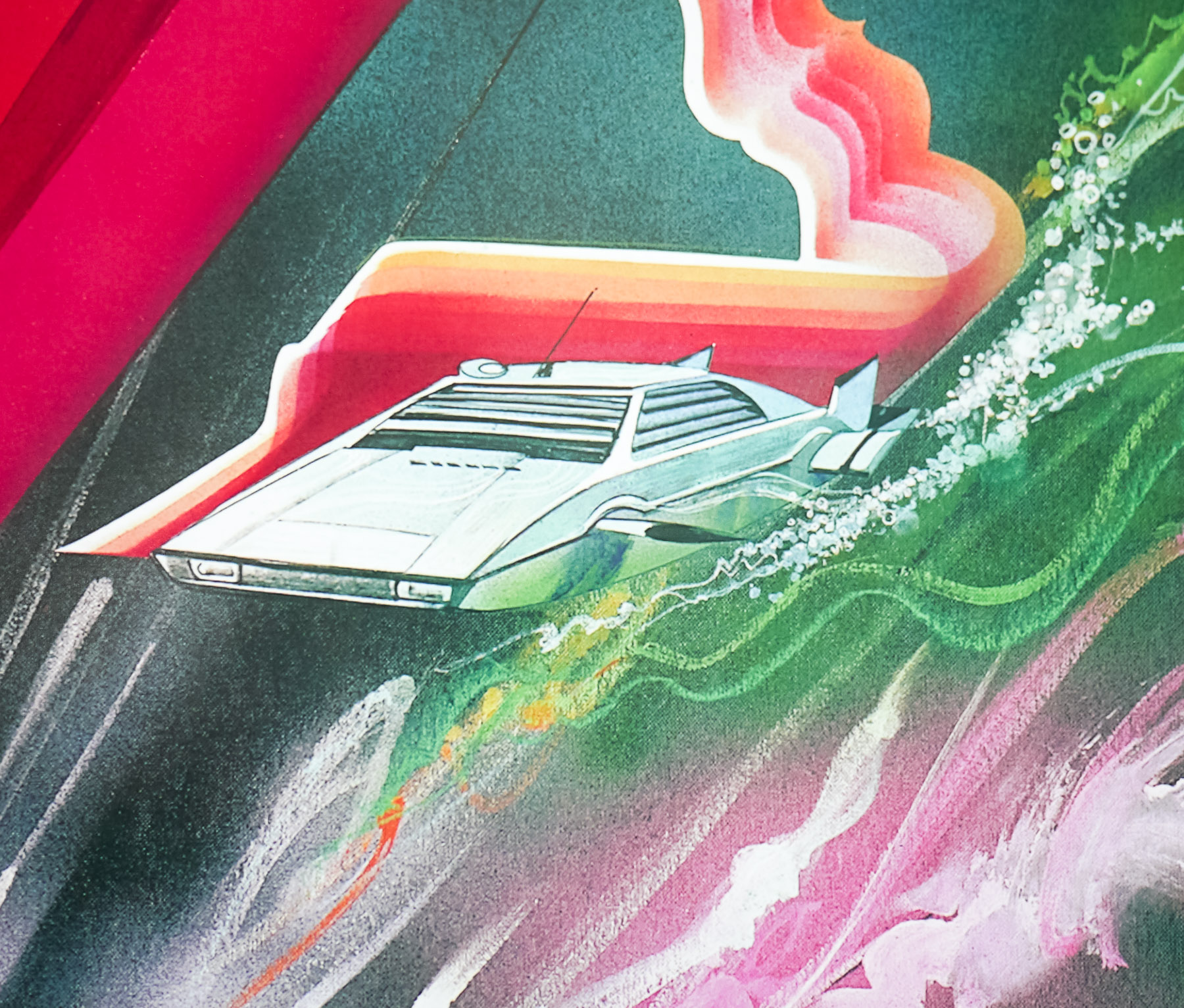
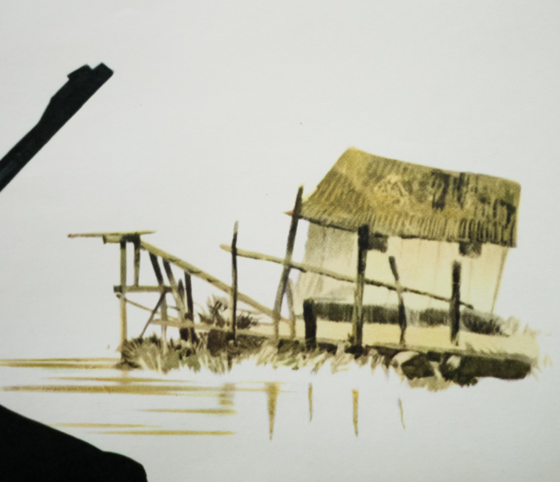
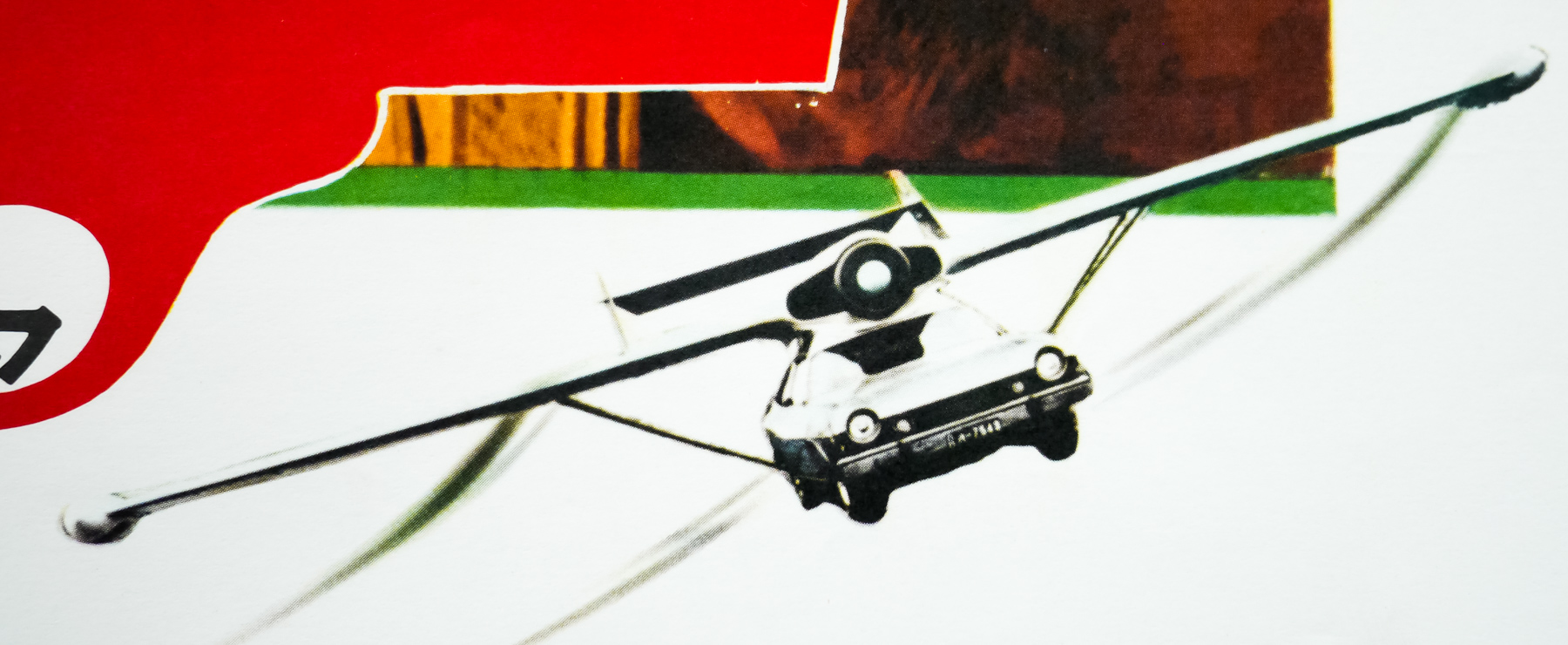
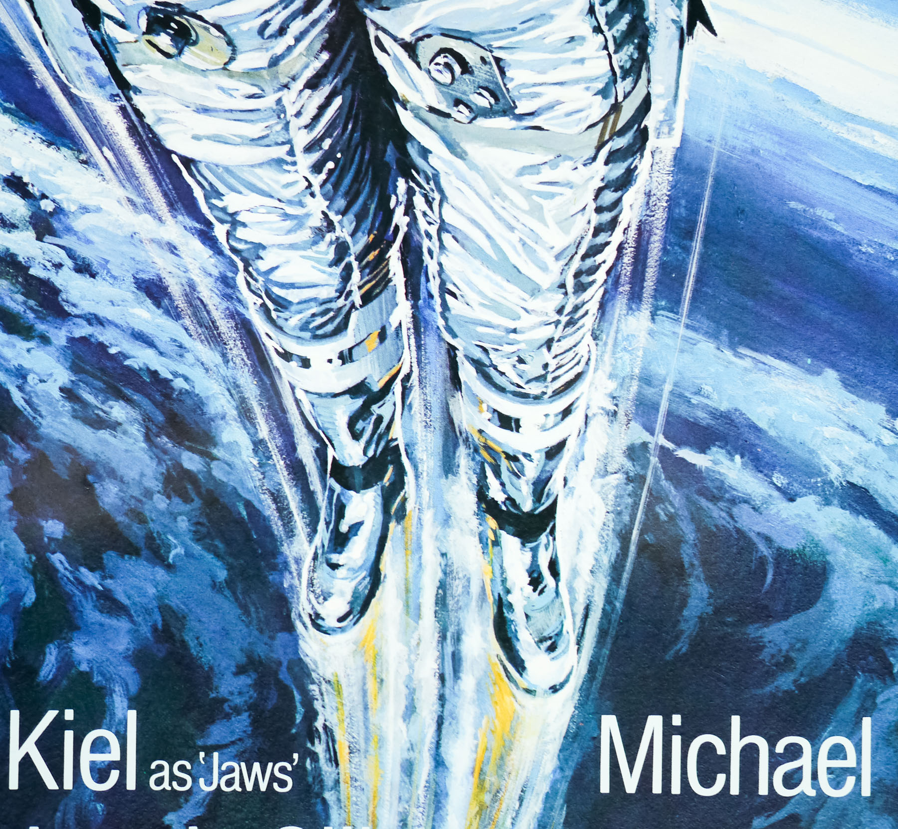
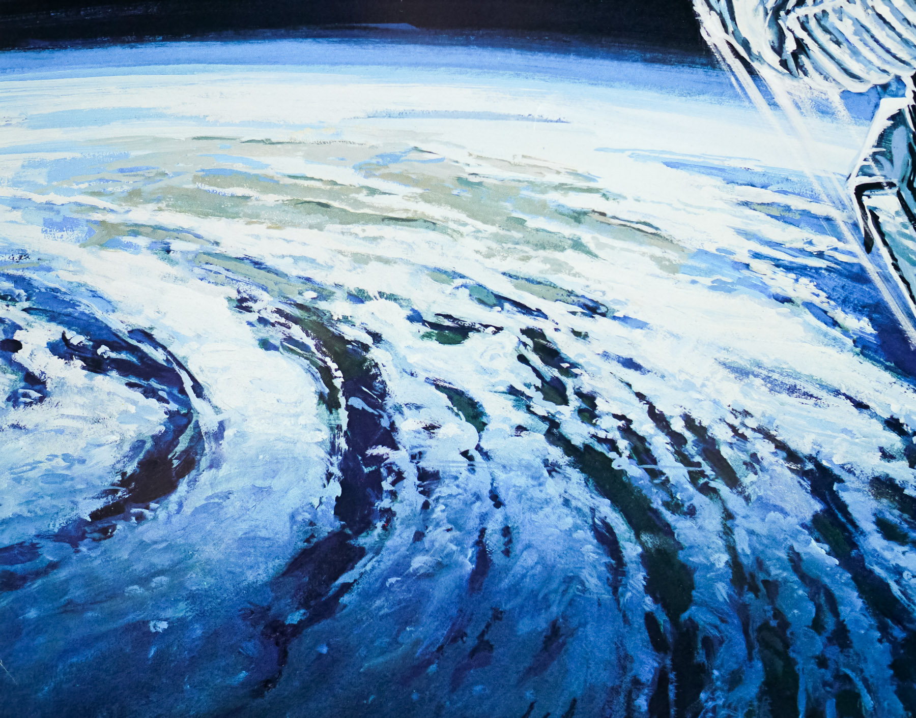
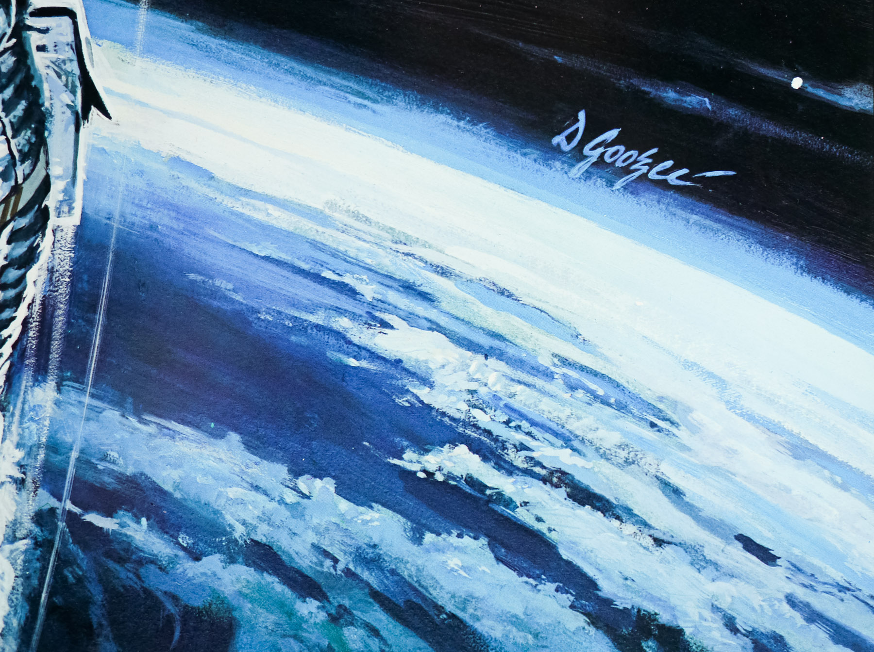
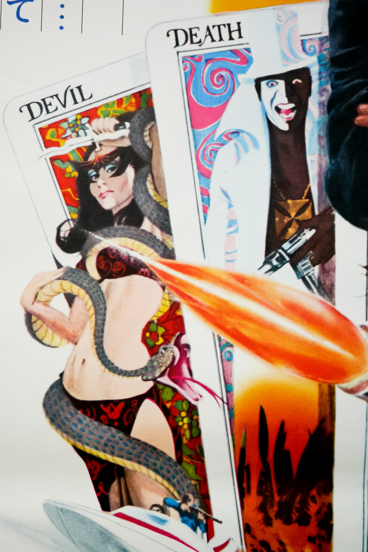
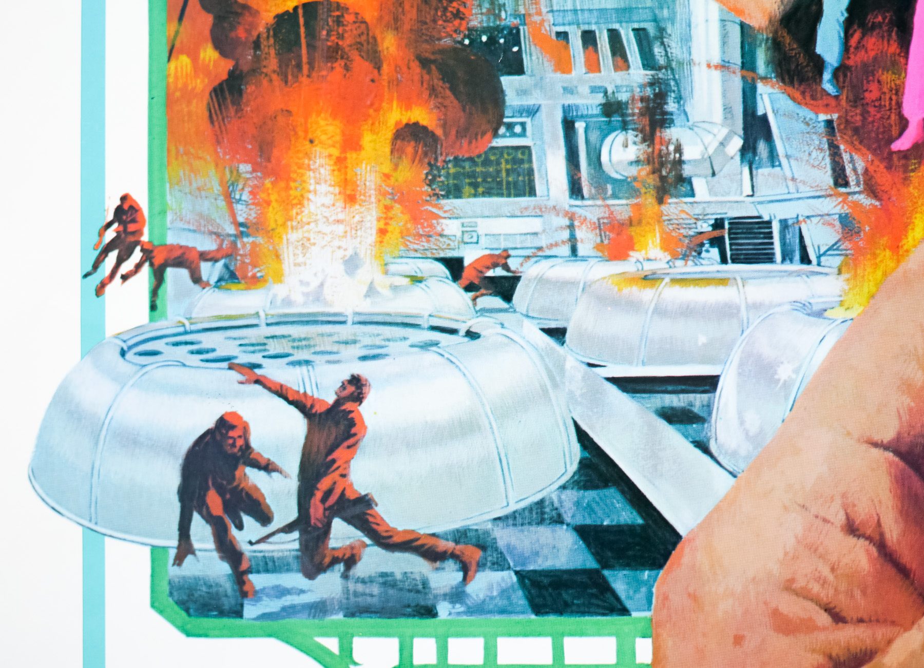
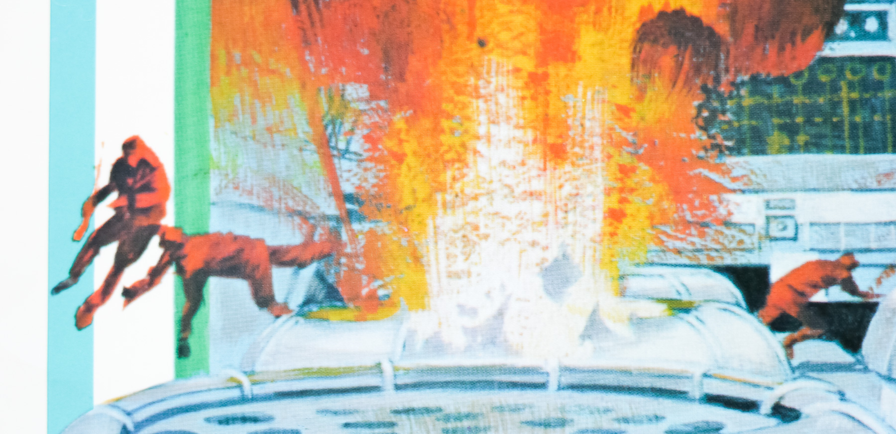
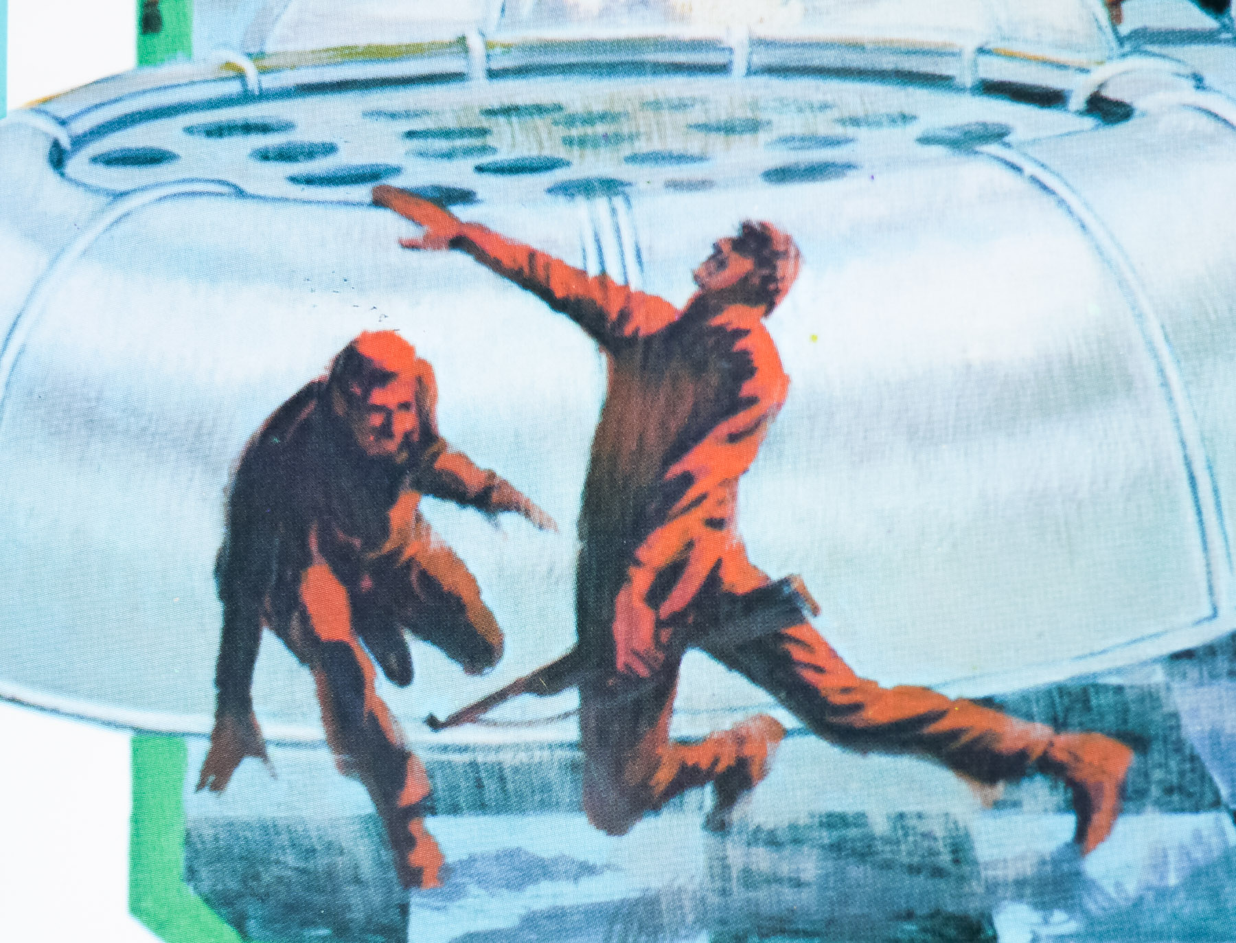
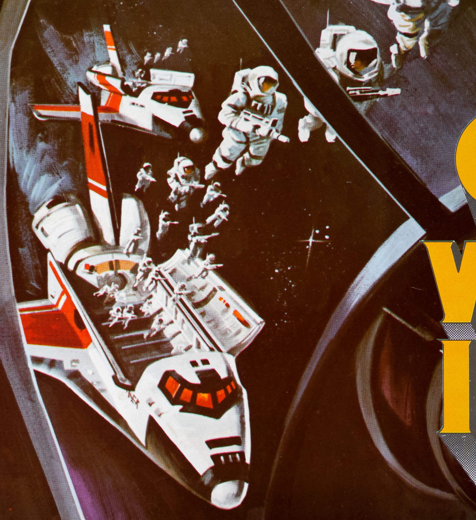
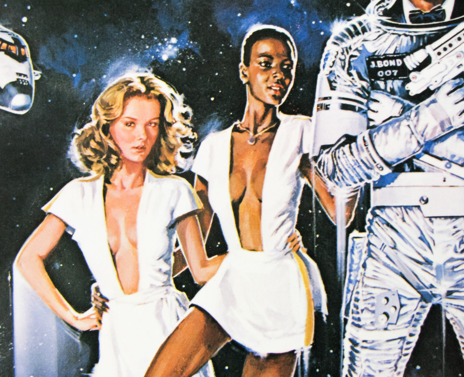
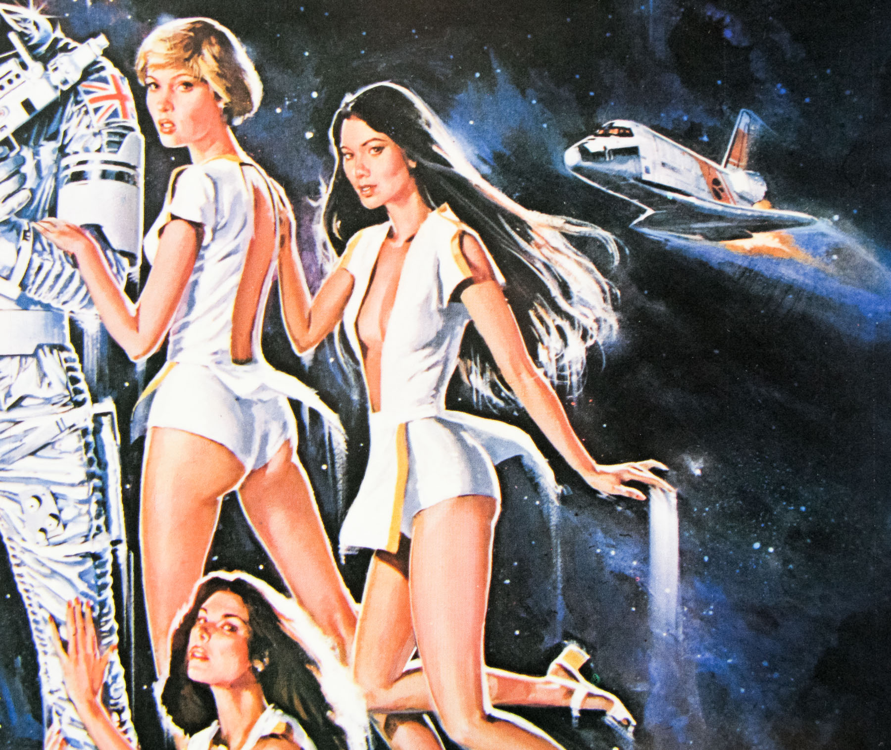
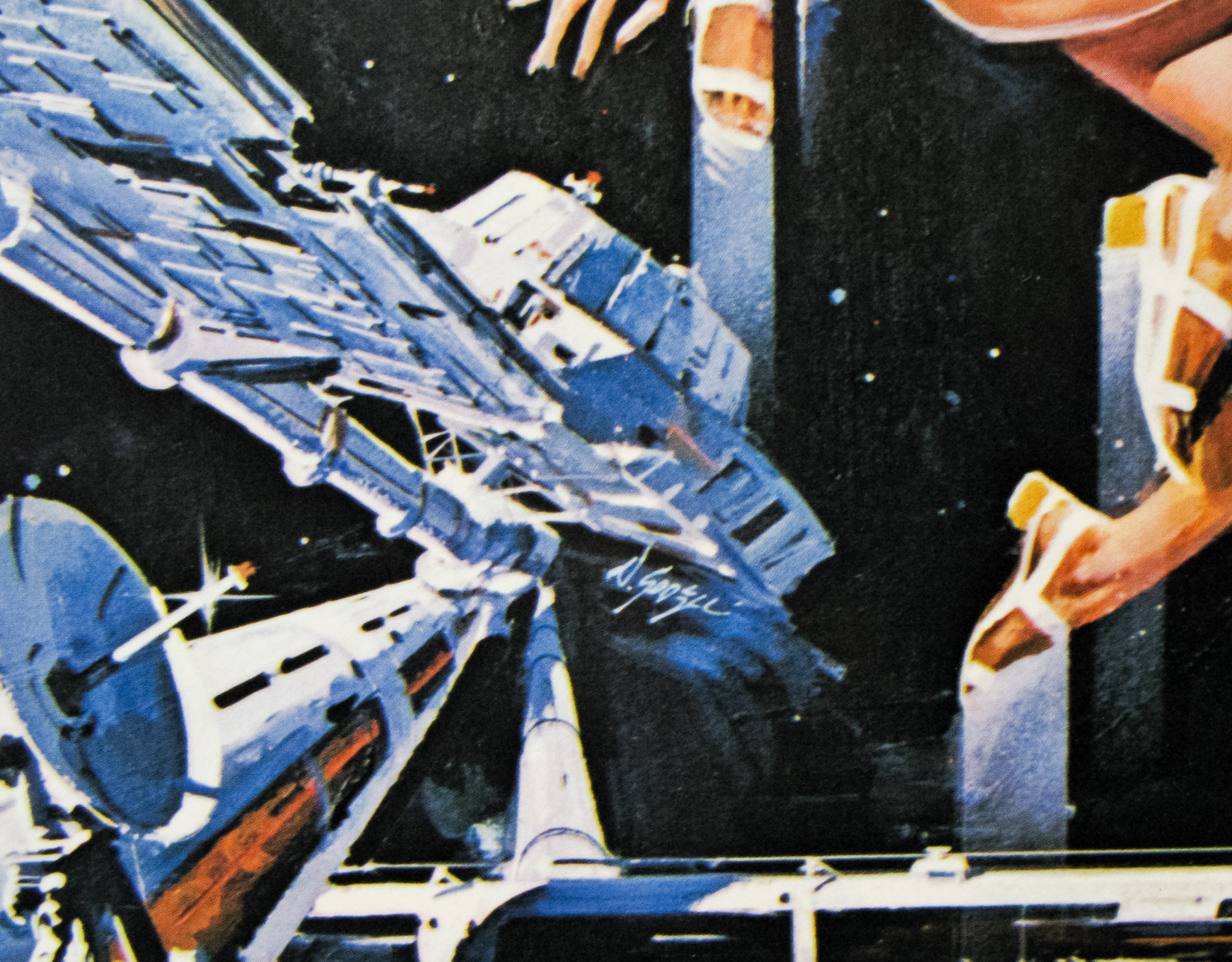
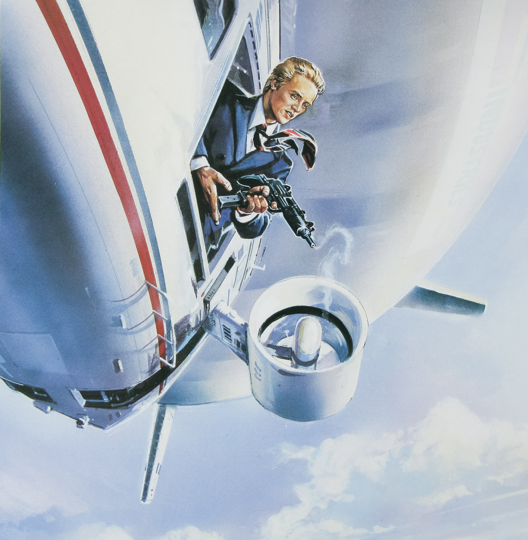
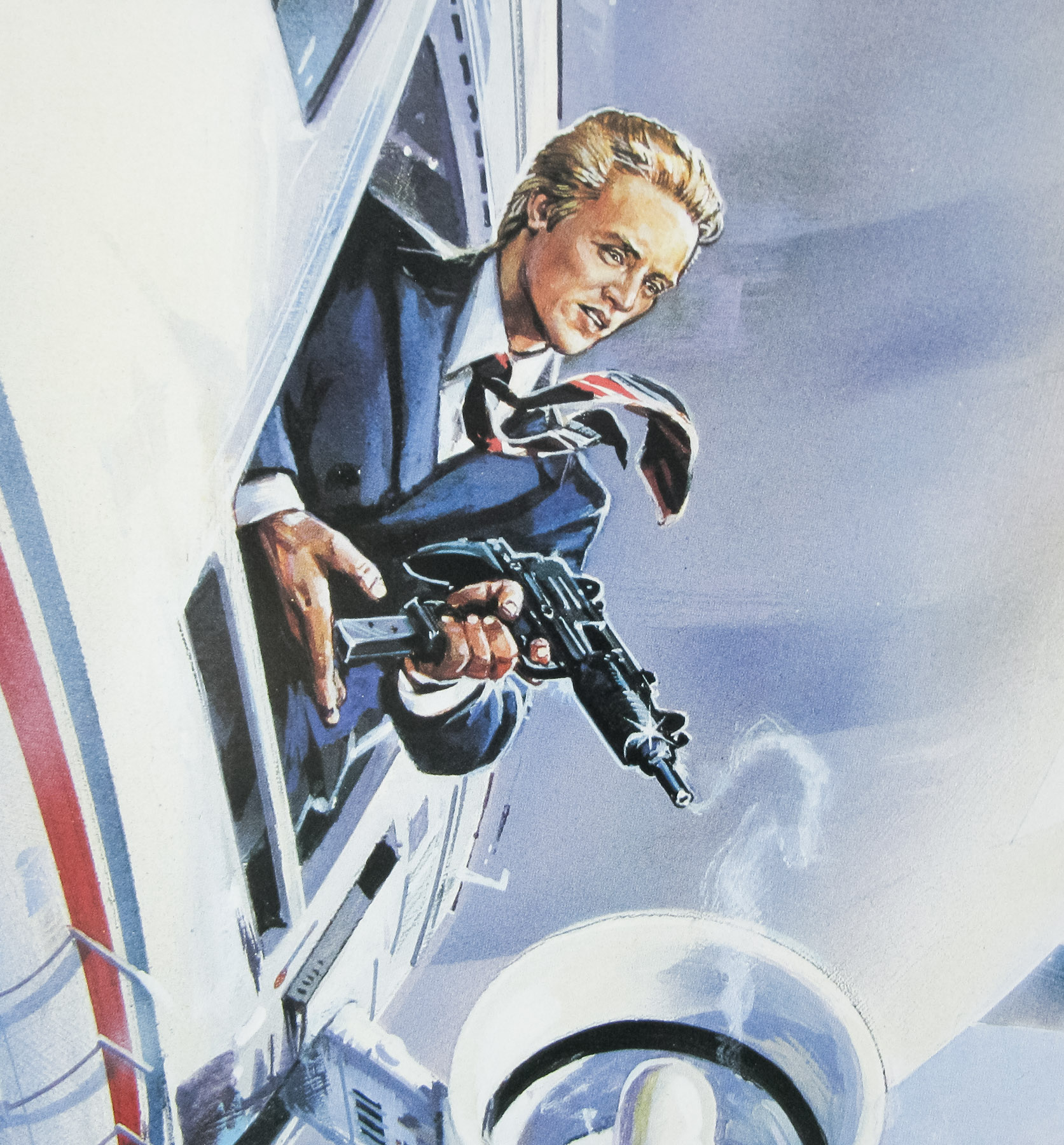
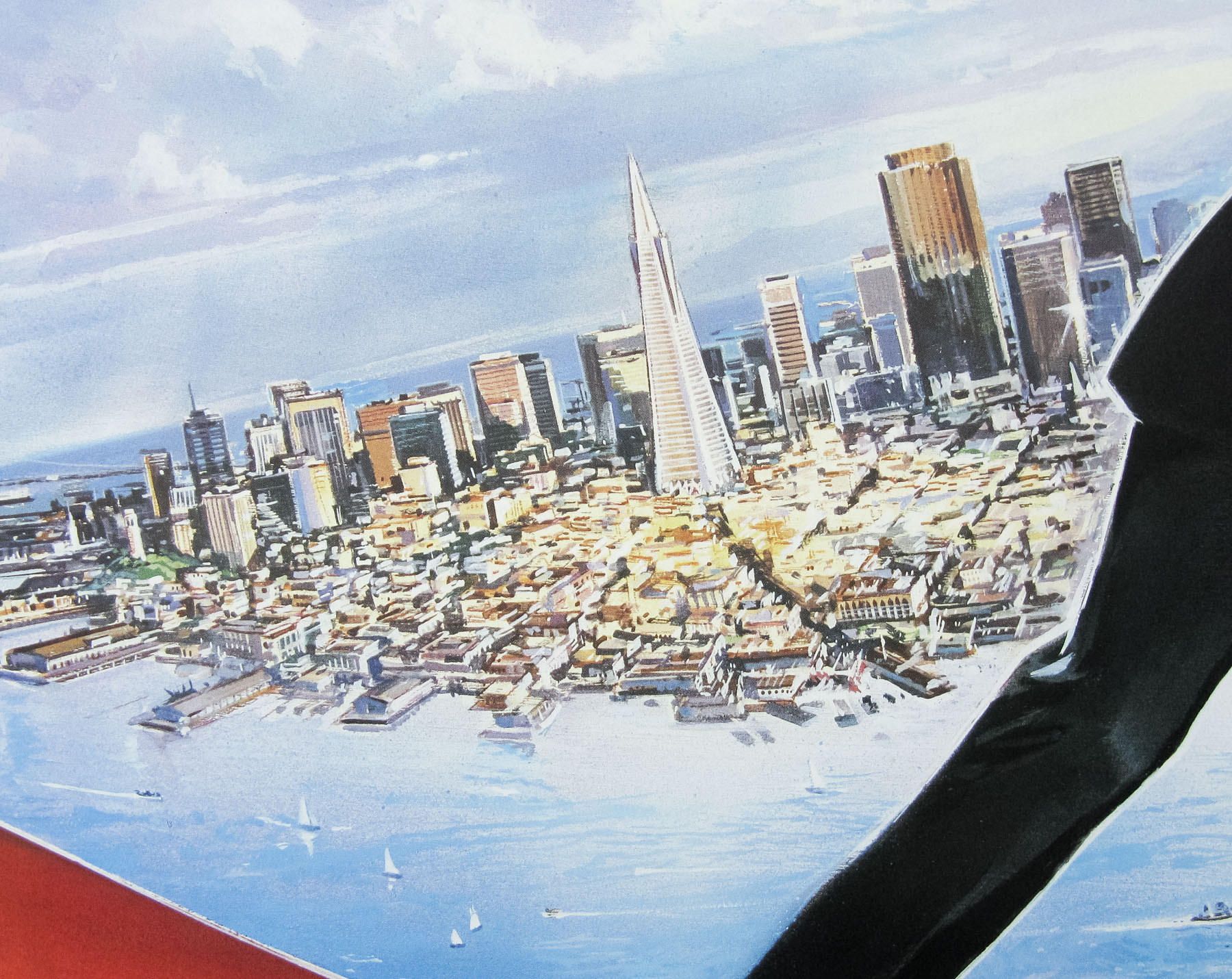
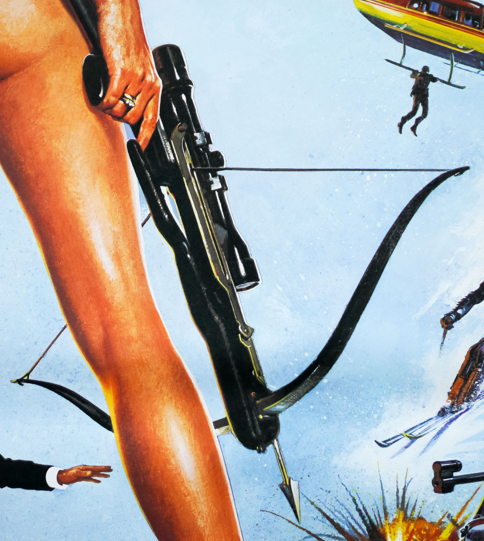
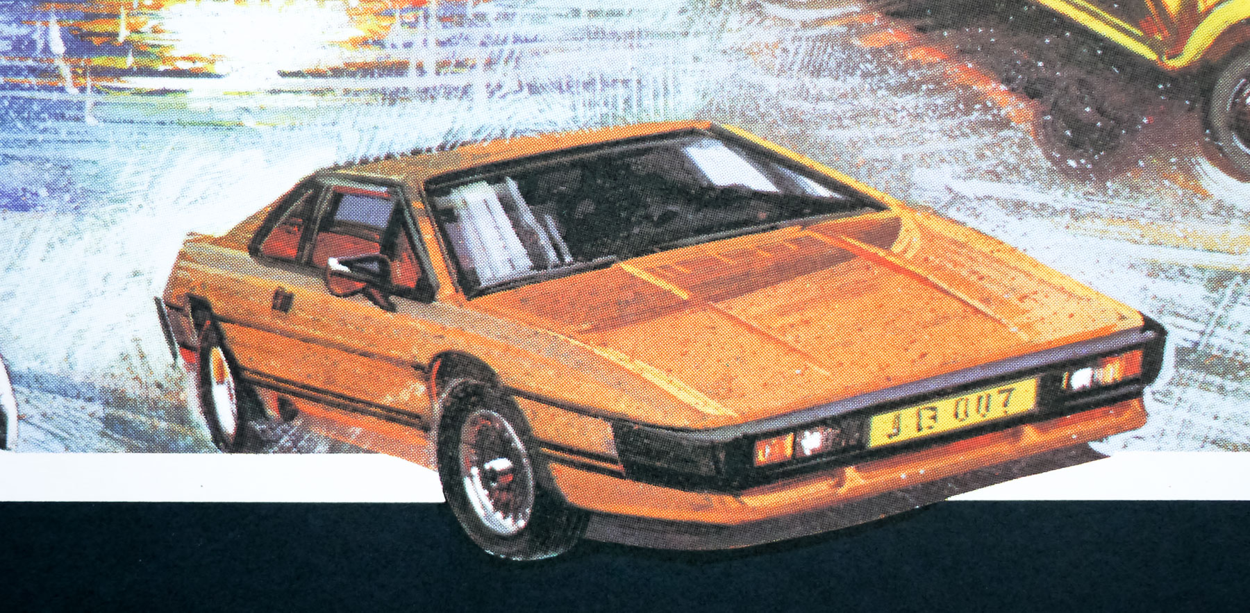
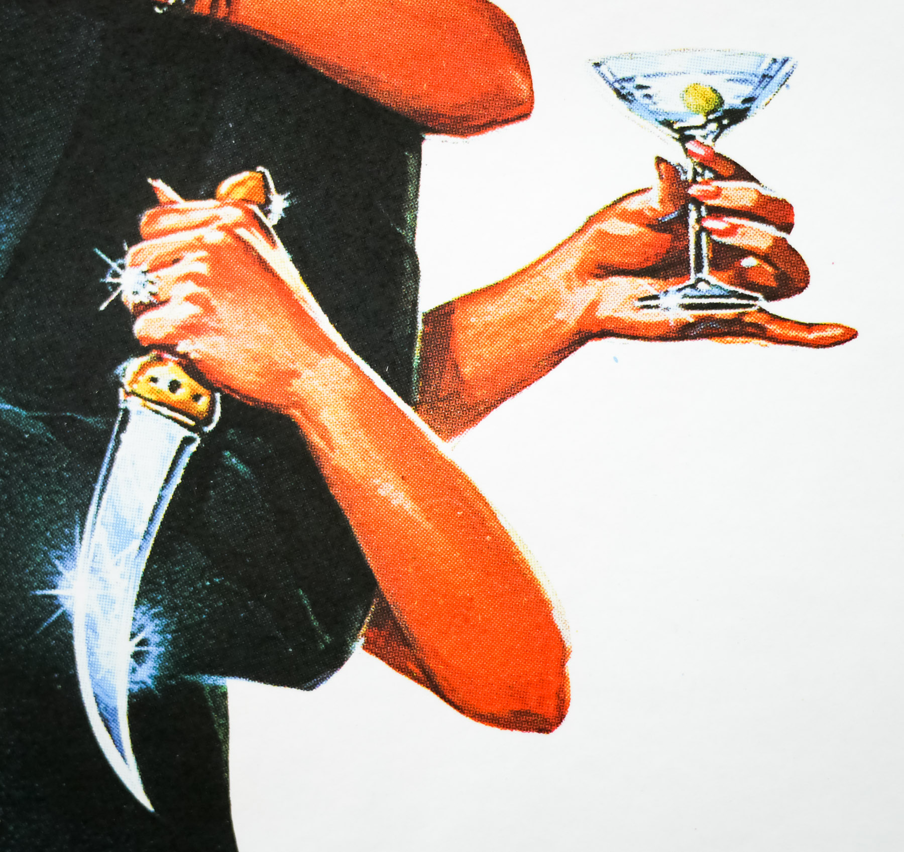
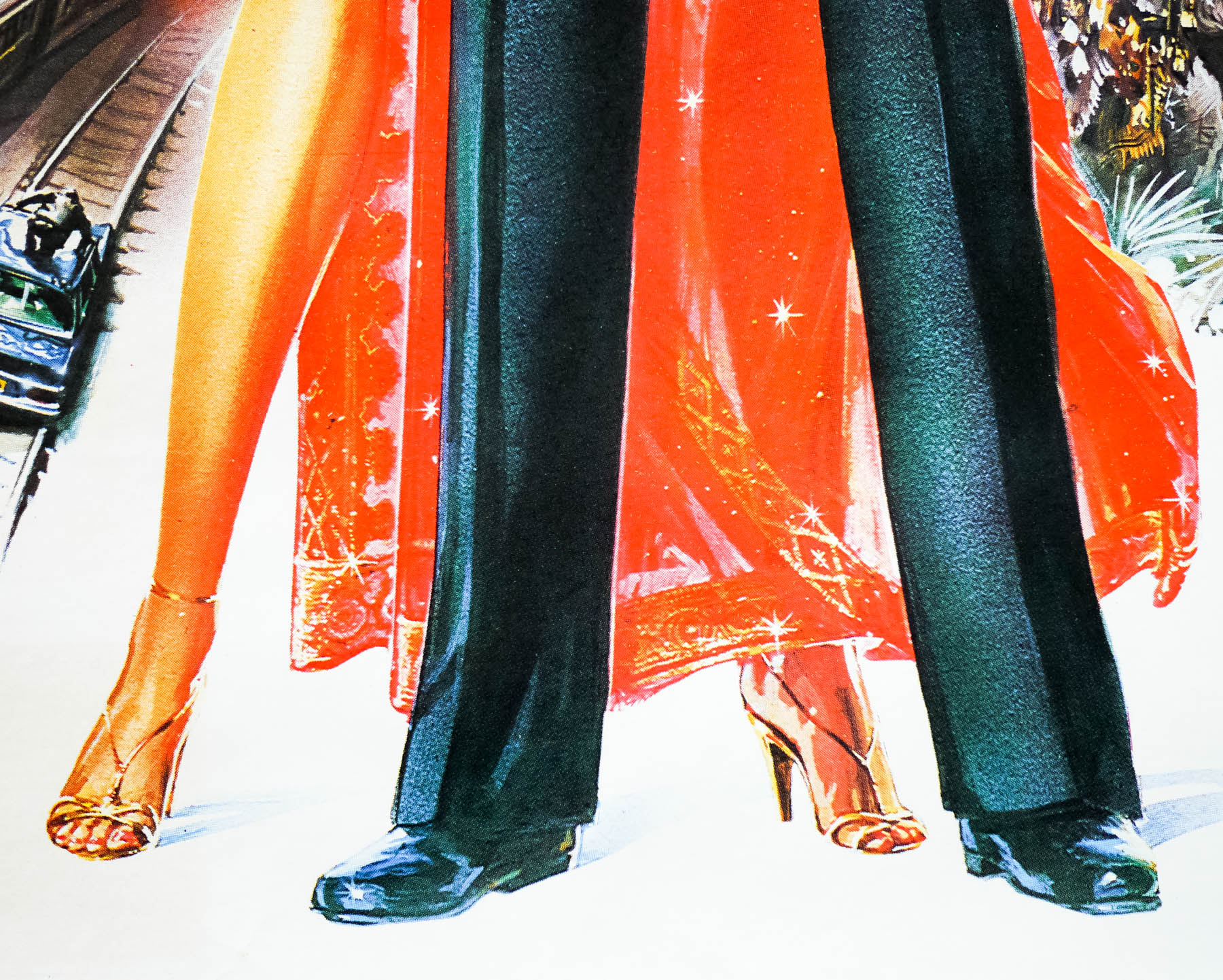
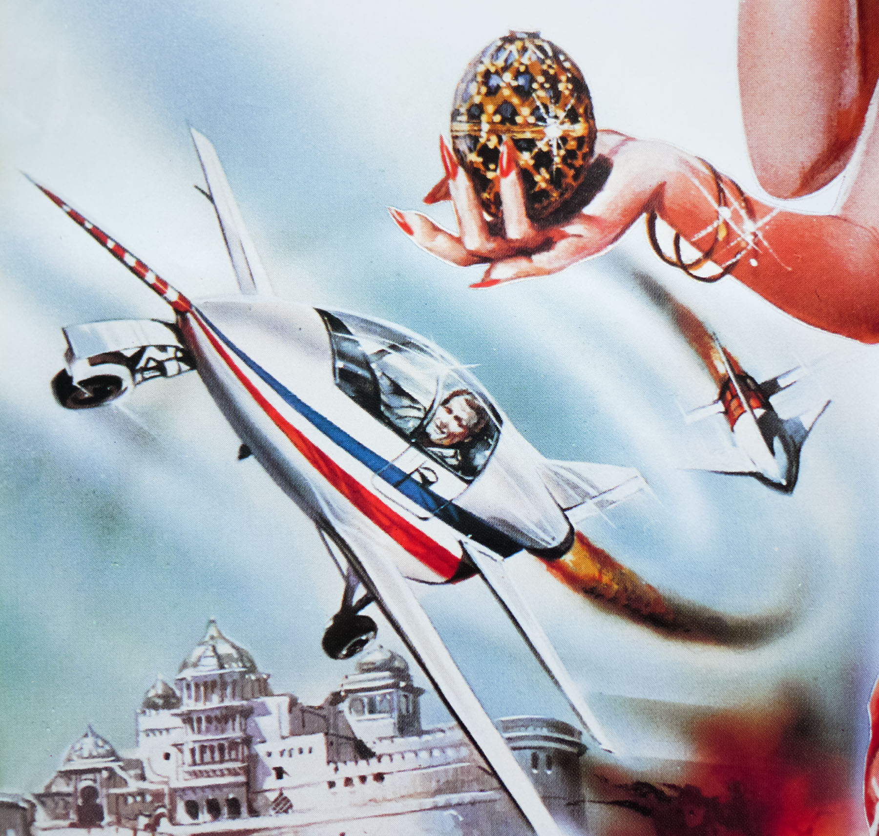
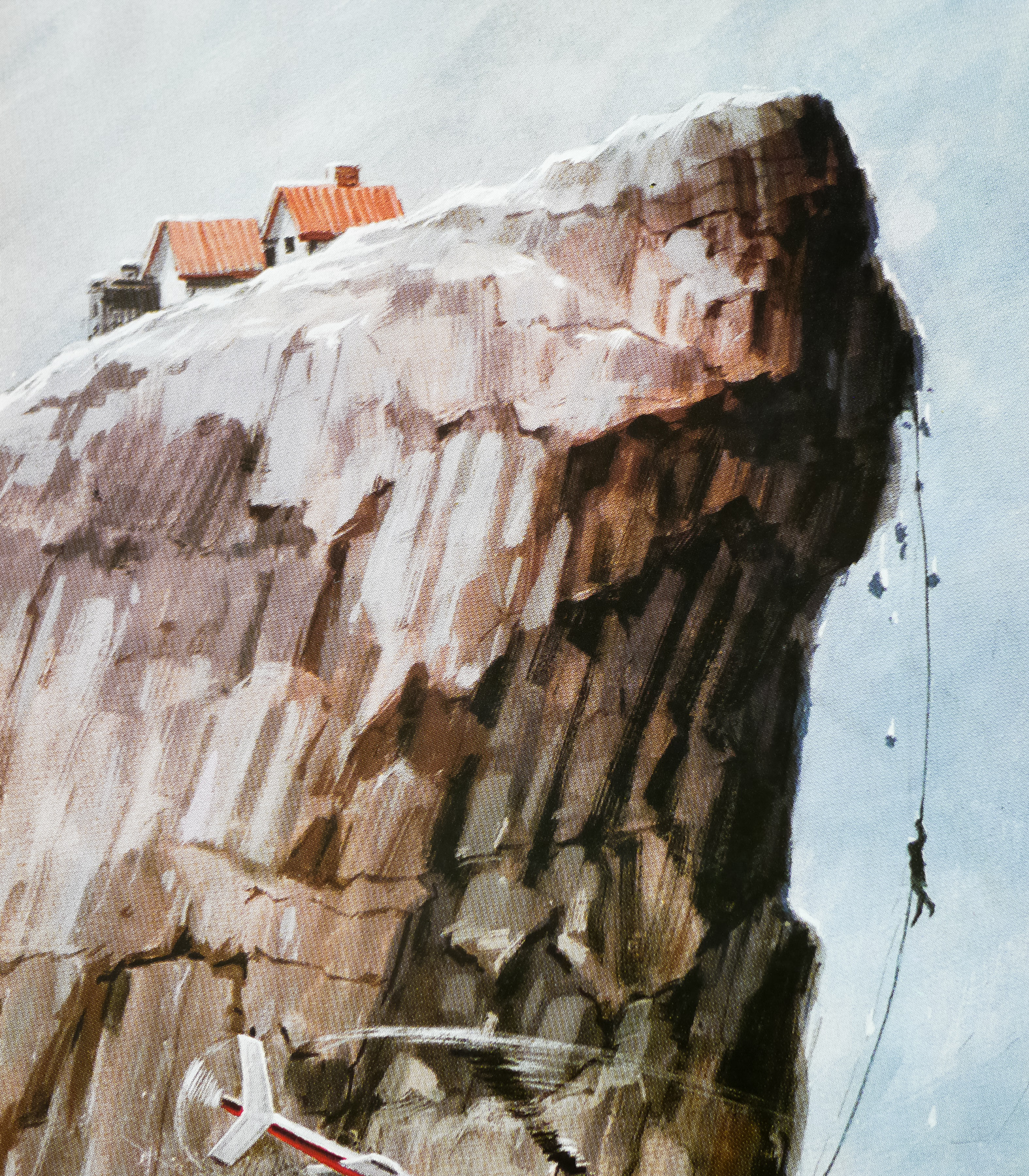
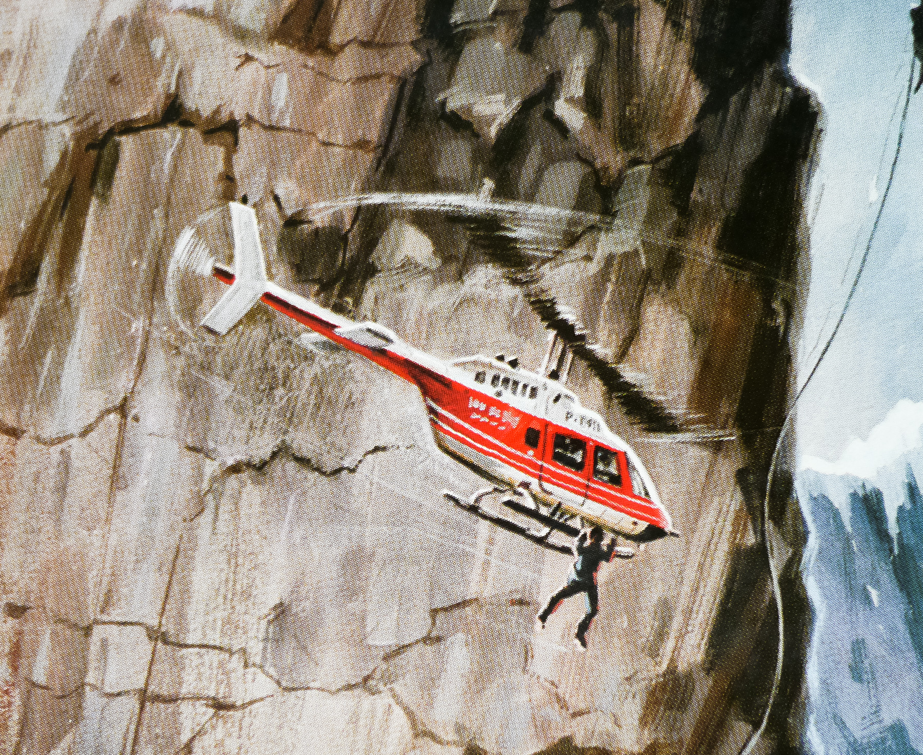
For the second stage, Vic’s design included an exciting montage to fit either side of the central icon of the two characters. The preliminary painting was returned to me for completion and I continued by adding the montage of scenes from the film onto the artwork in a semi-drawn style, which I was experimenting with at the time. I was very pleased with the final results and Vic liked it too. That went off for approval but, for reasons unknown to me, the printing didn’t go ahead. I never saw the artwork again and pathetically, because it was not approved, I don’t even think a transparency was made. I entertain hopes that one day it will eventually re-appear and I will be able to establish my claim to ownership.
Here’s the film’s original trailer.