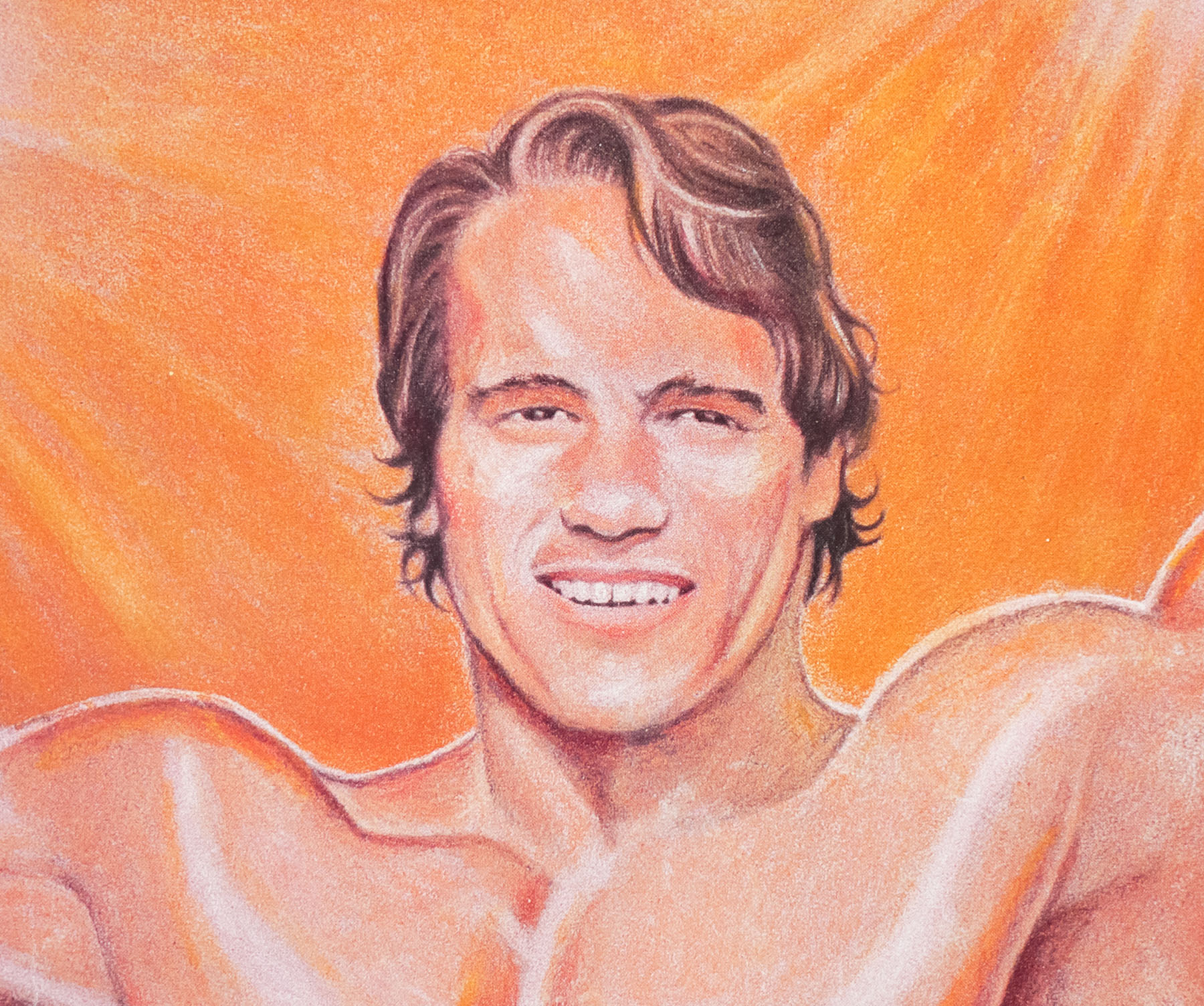
- Title
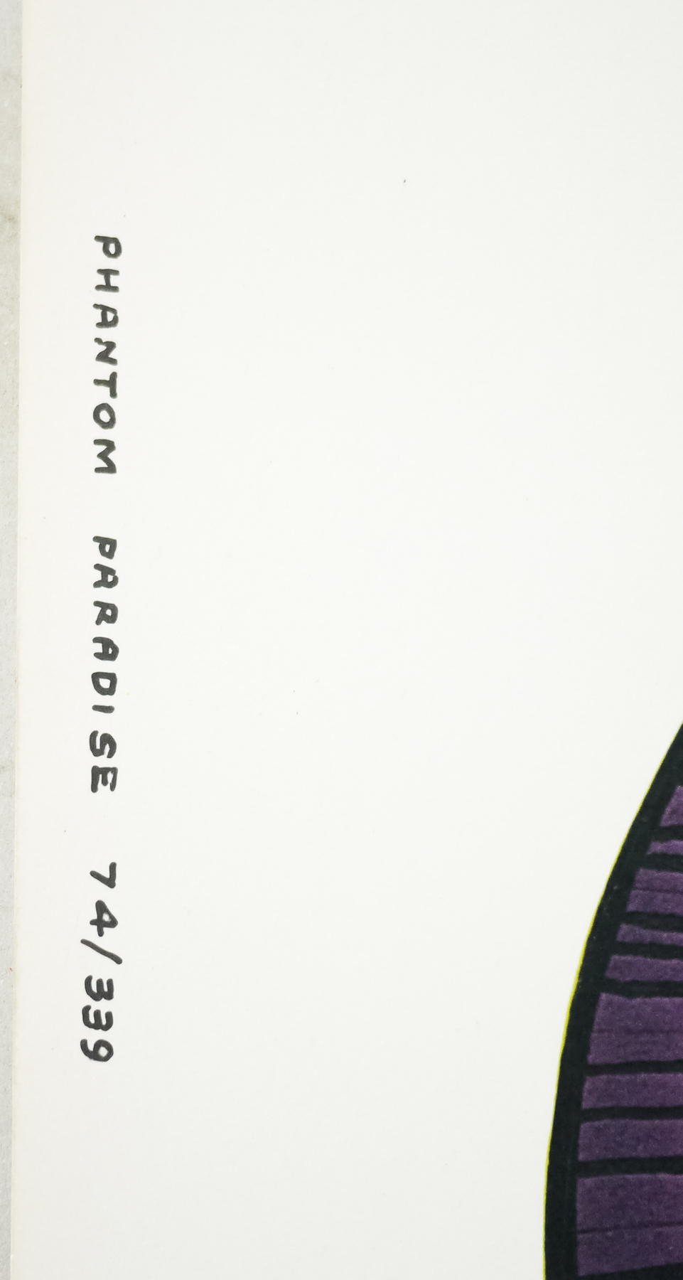
- Phantom of the Paradise
- AKA
- --
- Year of Film
- 1974
- Director
- Brian De Palma
- Starring
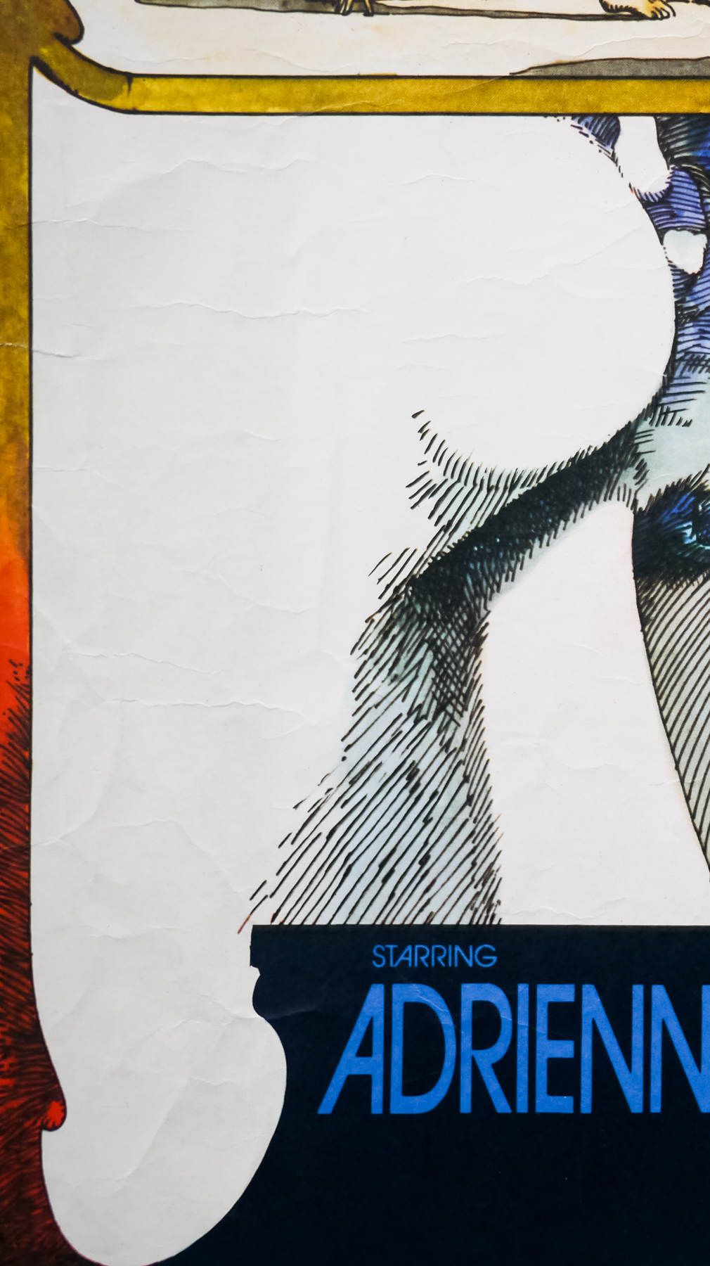
- William Finley, Paul Williams, Jessica Harper, Gerrit Graham, George Memmoli, Archie Hahn, Jeffrey Comanor, Peter Elbling
- Origin of Film
- USA
- Genre(s) of Film
- William Finley, Paul Williams, Jessica Harper, Gerrit Graham, George Memmoli, Archie Hahn, Jeffrey Comanor, Peter Elbling,
- Type of Poster
- 30x40
- Style of Poster
- Style C
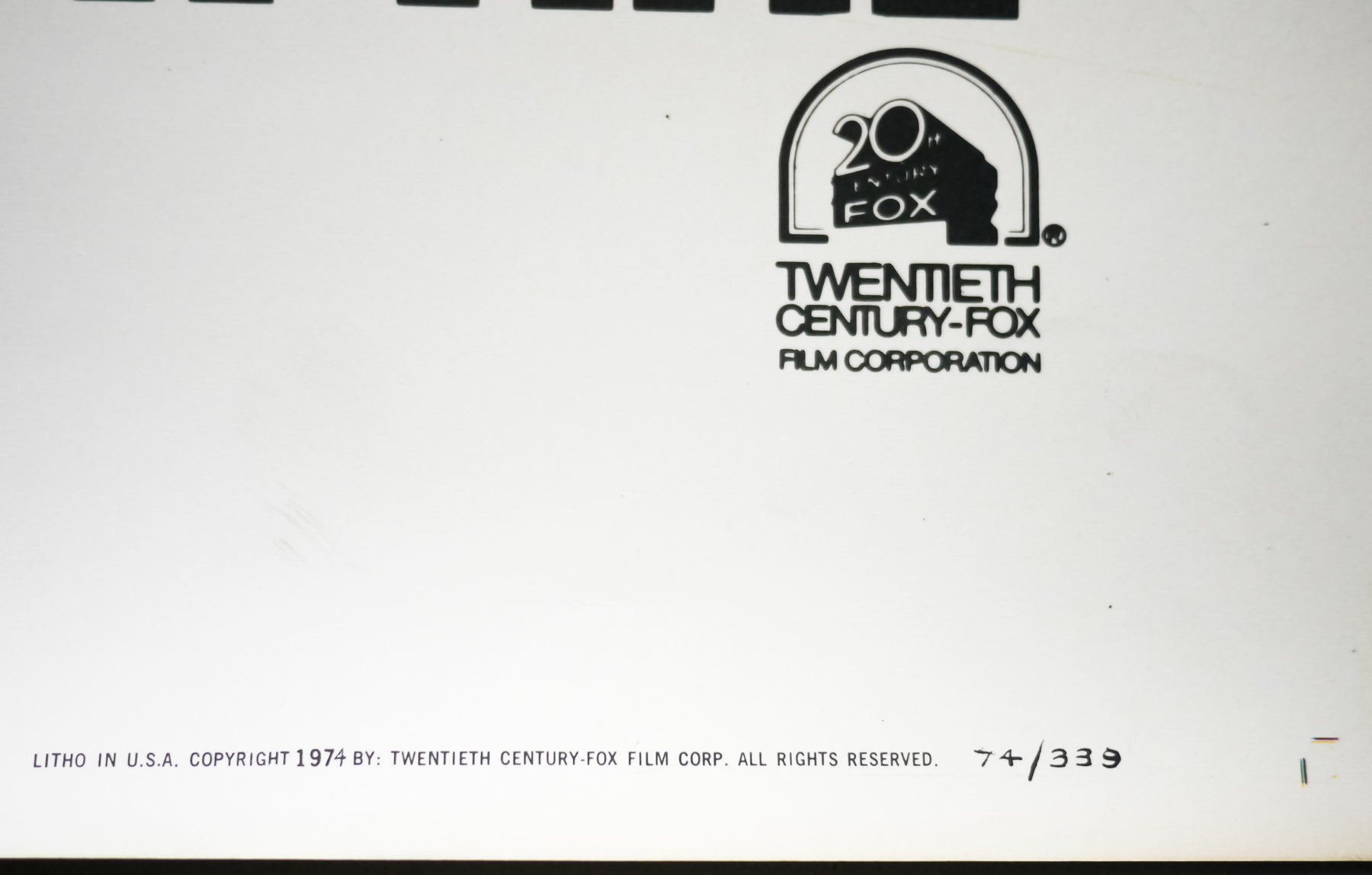
- Origin of Poster
- USA
- Year of Poster
- 1974
- Designer
- Neal Adams (original sketch)
- Artist
- Richard Corben
- Size (inches)
- 30" x 40"
- SS or DS
- SS
- NSS #
- 74/339
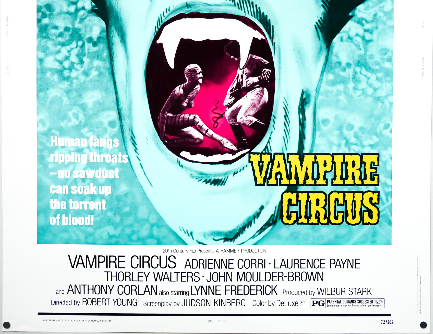
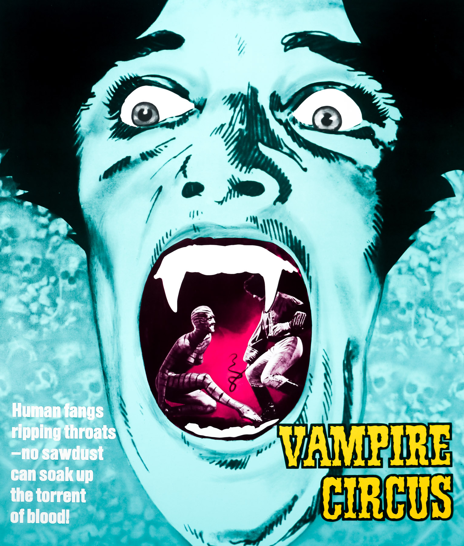
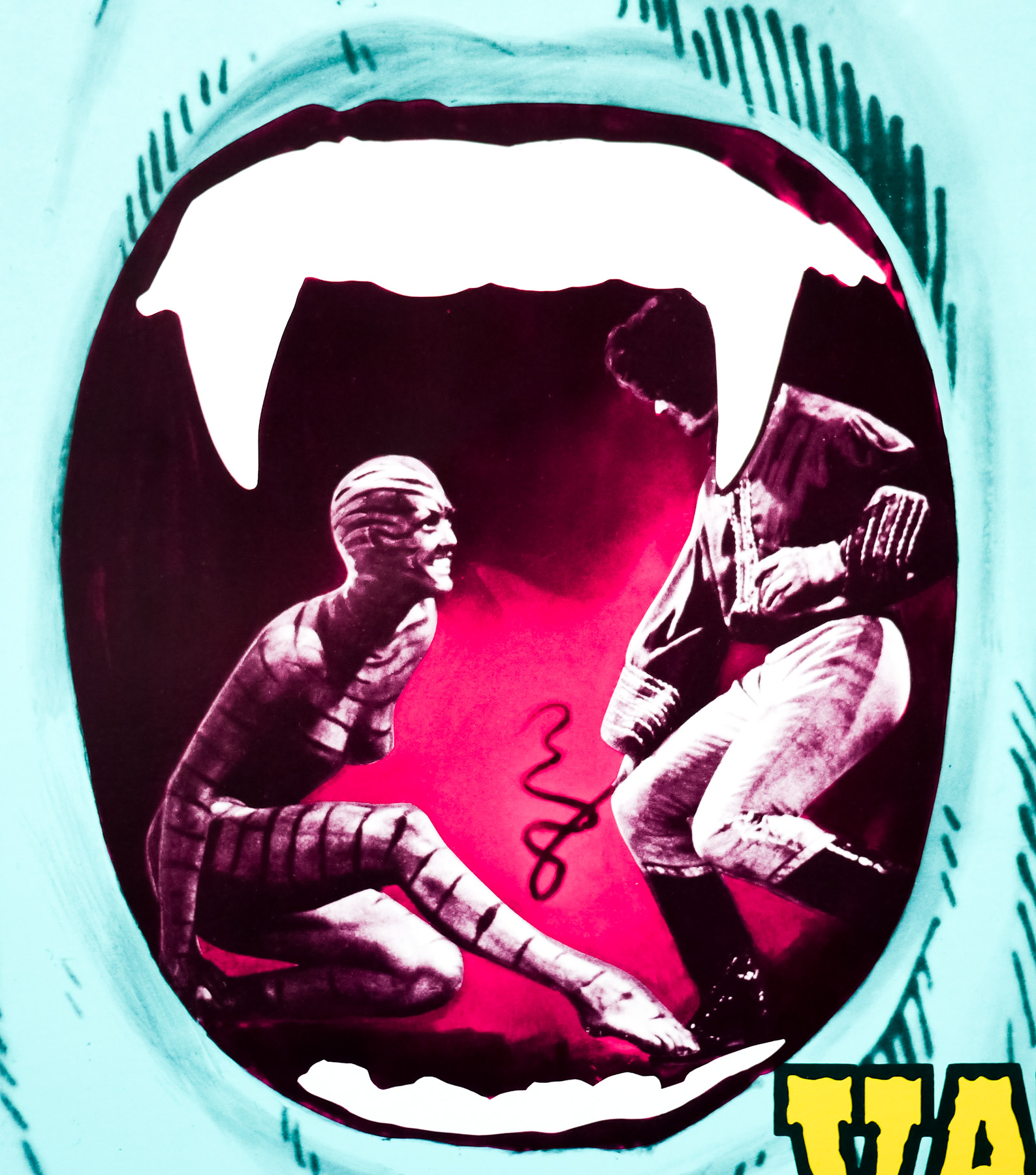
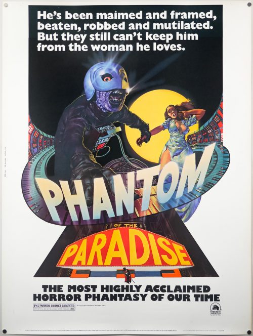
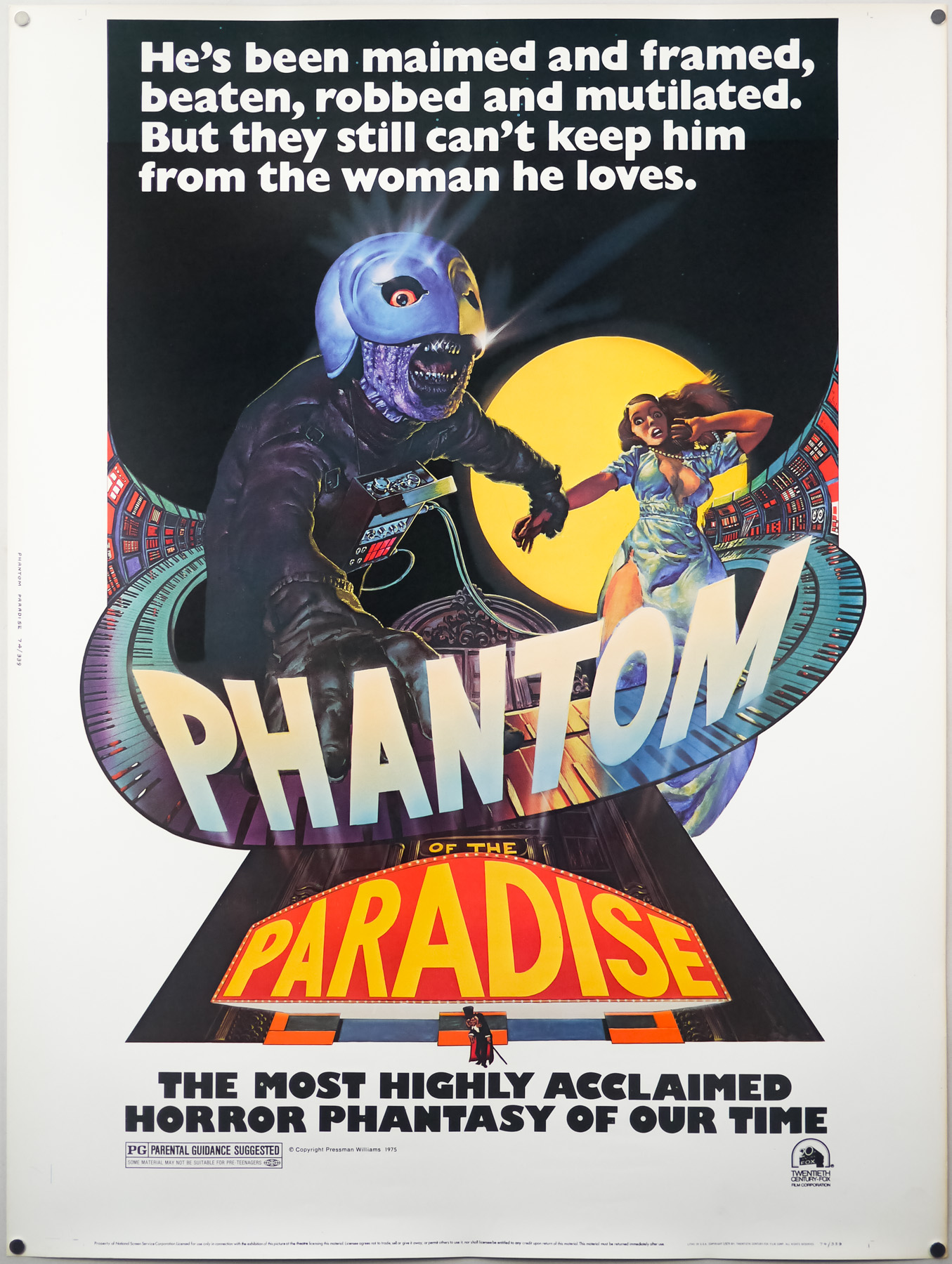
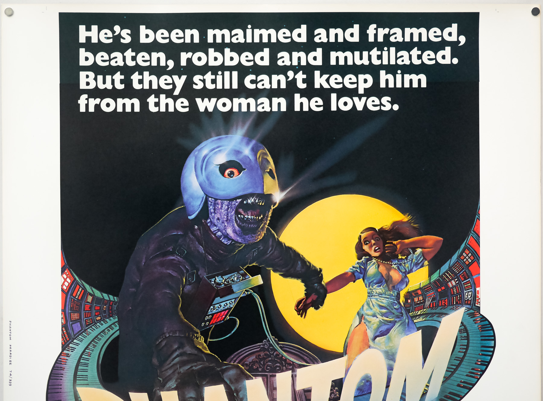
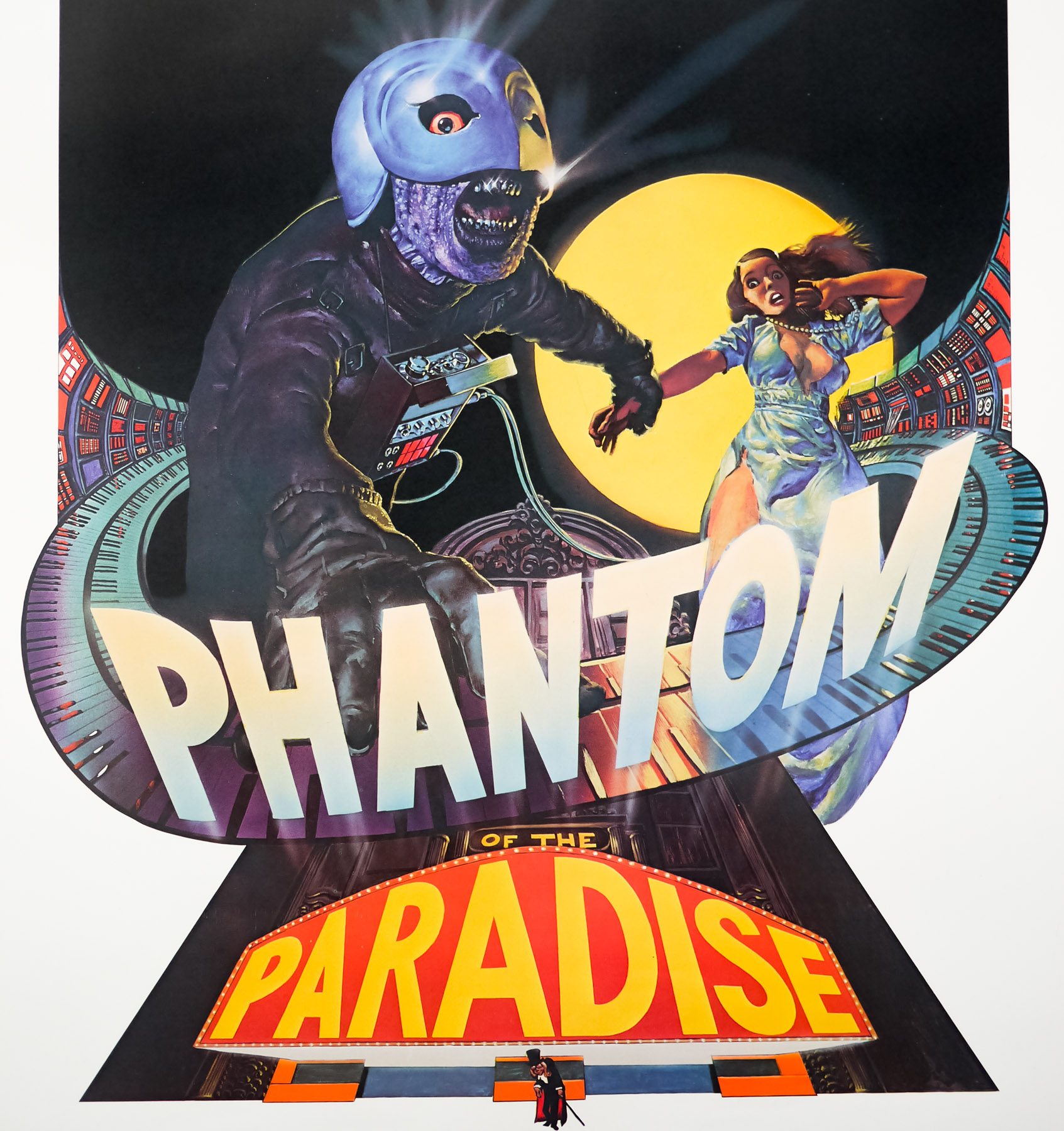
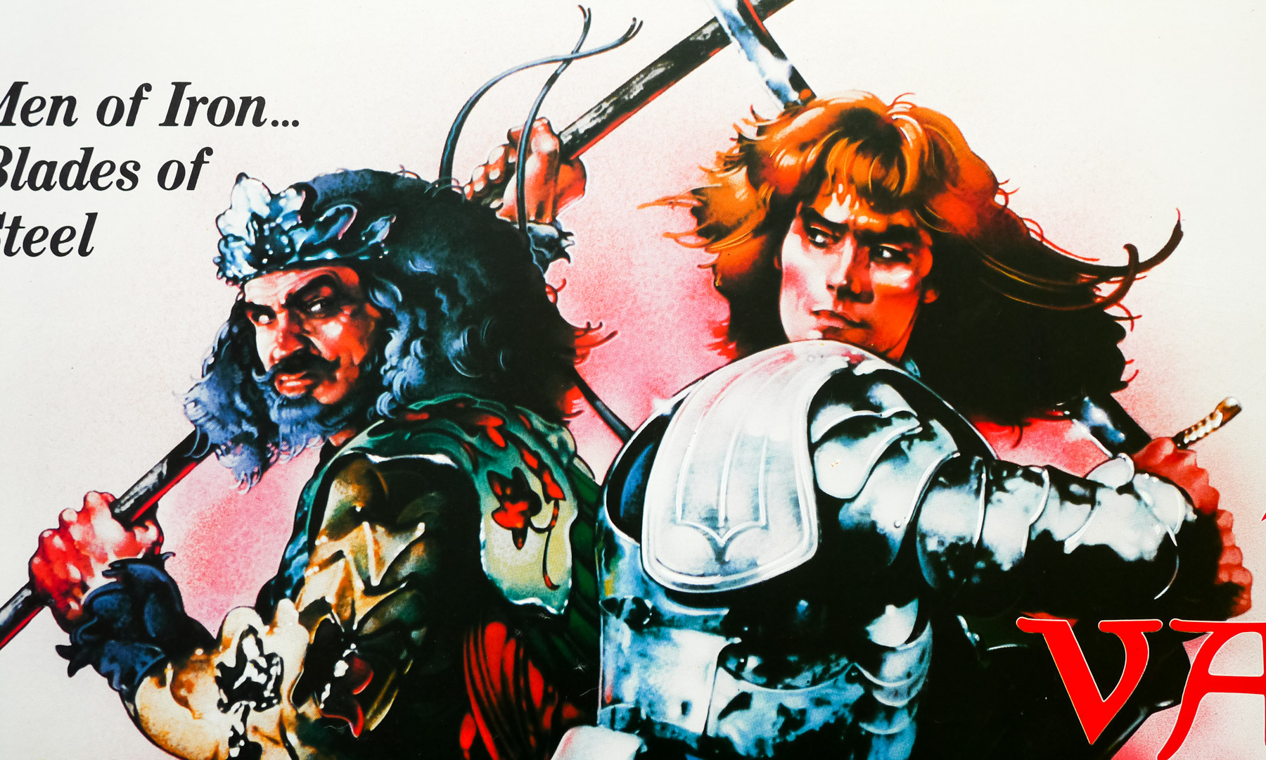
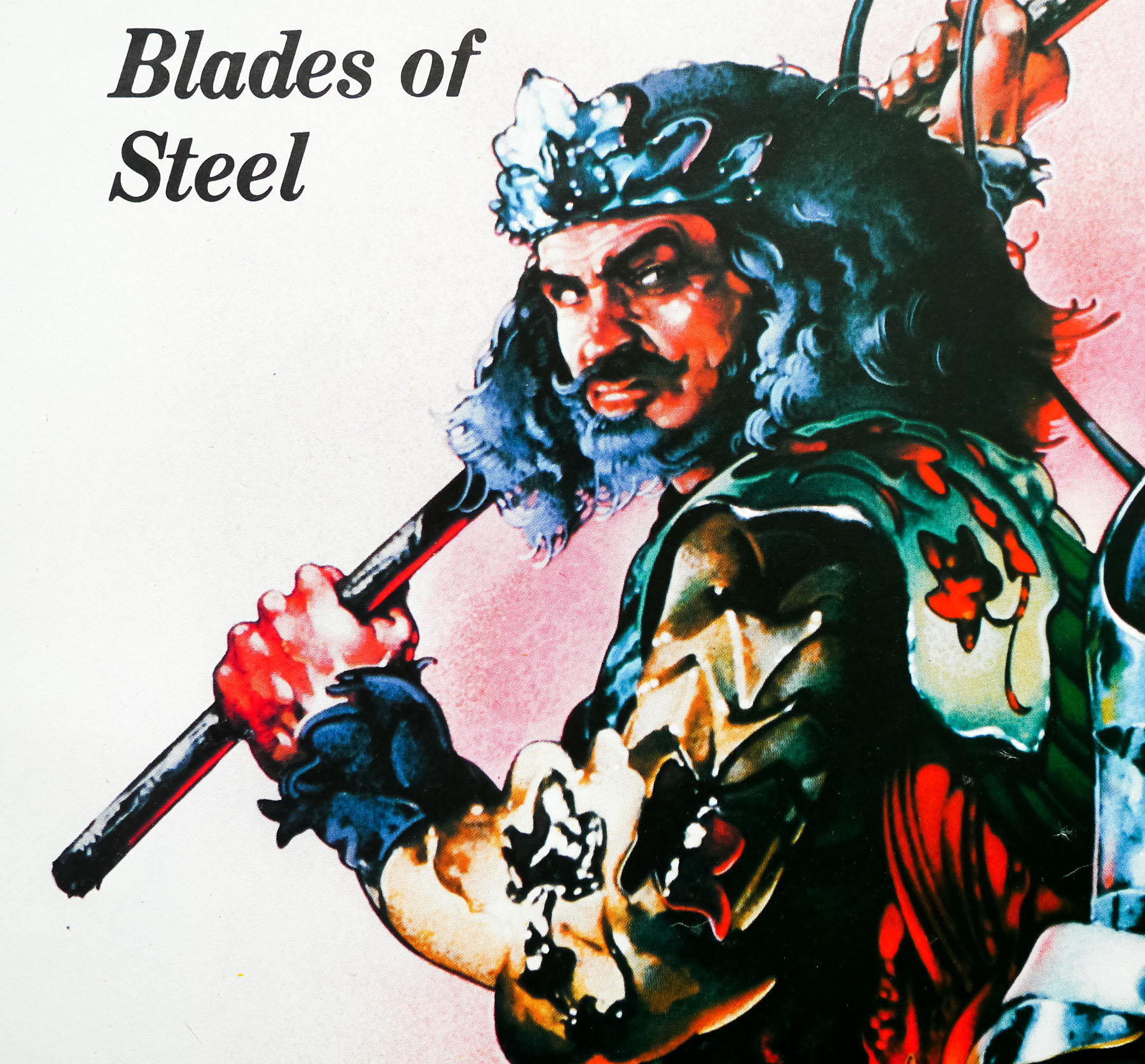
- Tagline
- He's been maimed and framed, beaten, robbed and mutilated. But they still can't keep him from the woman he loves. | The most highly acclaimed horror phantasy of our time.
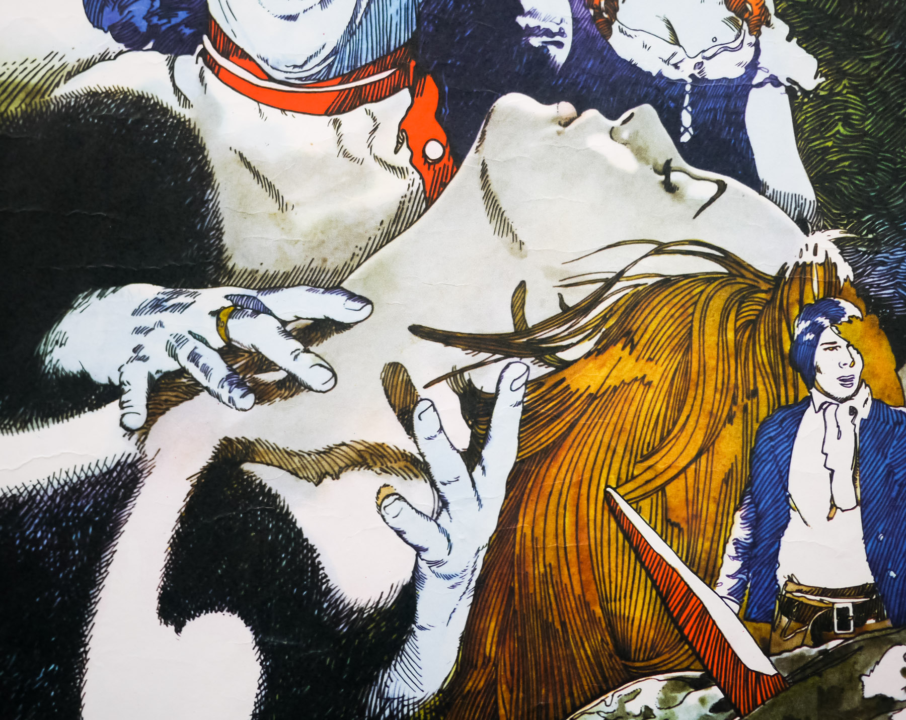
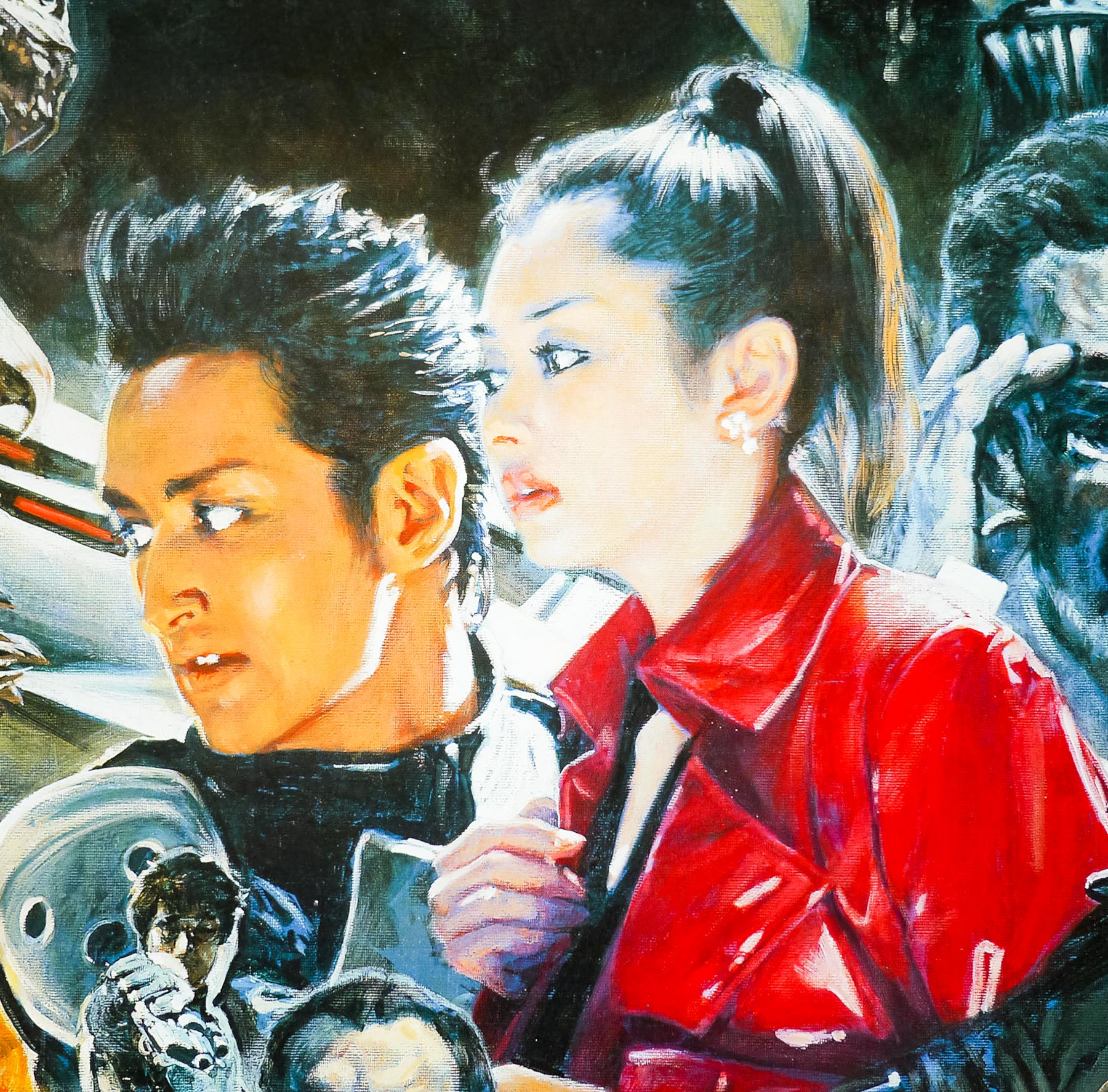
Brian De Palma’s Phantom of the Paradise is arguably one of cinema’s greatest cult oddities. Part musical, part horror and loosely based on Phantom of the Opera and the classic tale of Faust, the film has an electric atmosphere helped no end by the performance of the late William Finley as the unlucky music composer Winslow Leach who falls foul of the twisted producer Swan (Paul Williams, himself a noted musician and composer). A twisted satire of the state of the music business of the time, the film features a superb soundtrack written by Williams, which is a mix of surf pop, 70s glam rock and romantic ballads.
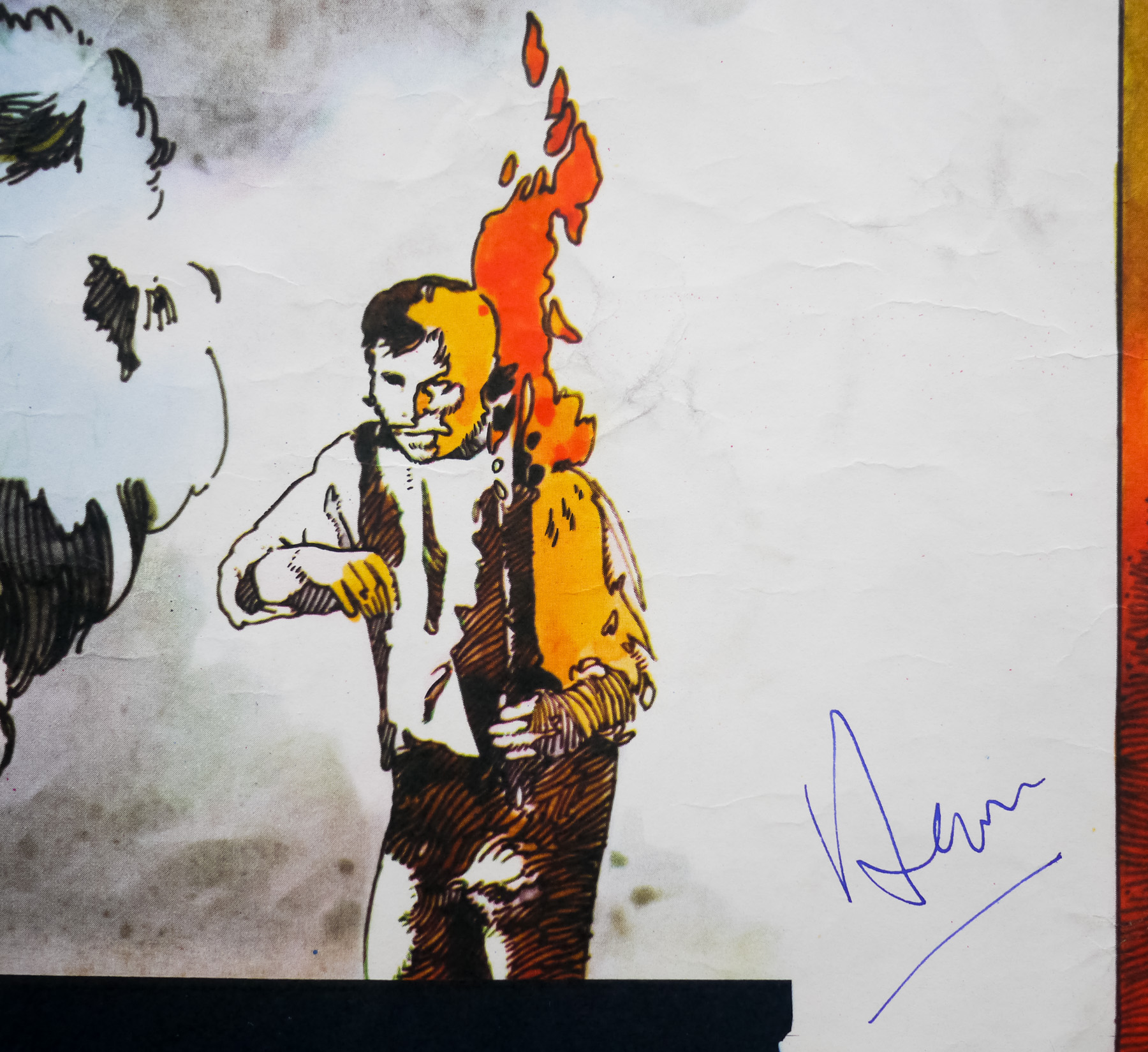
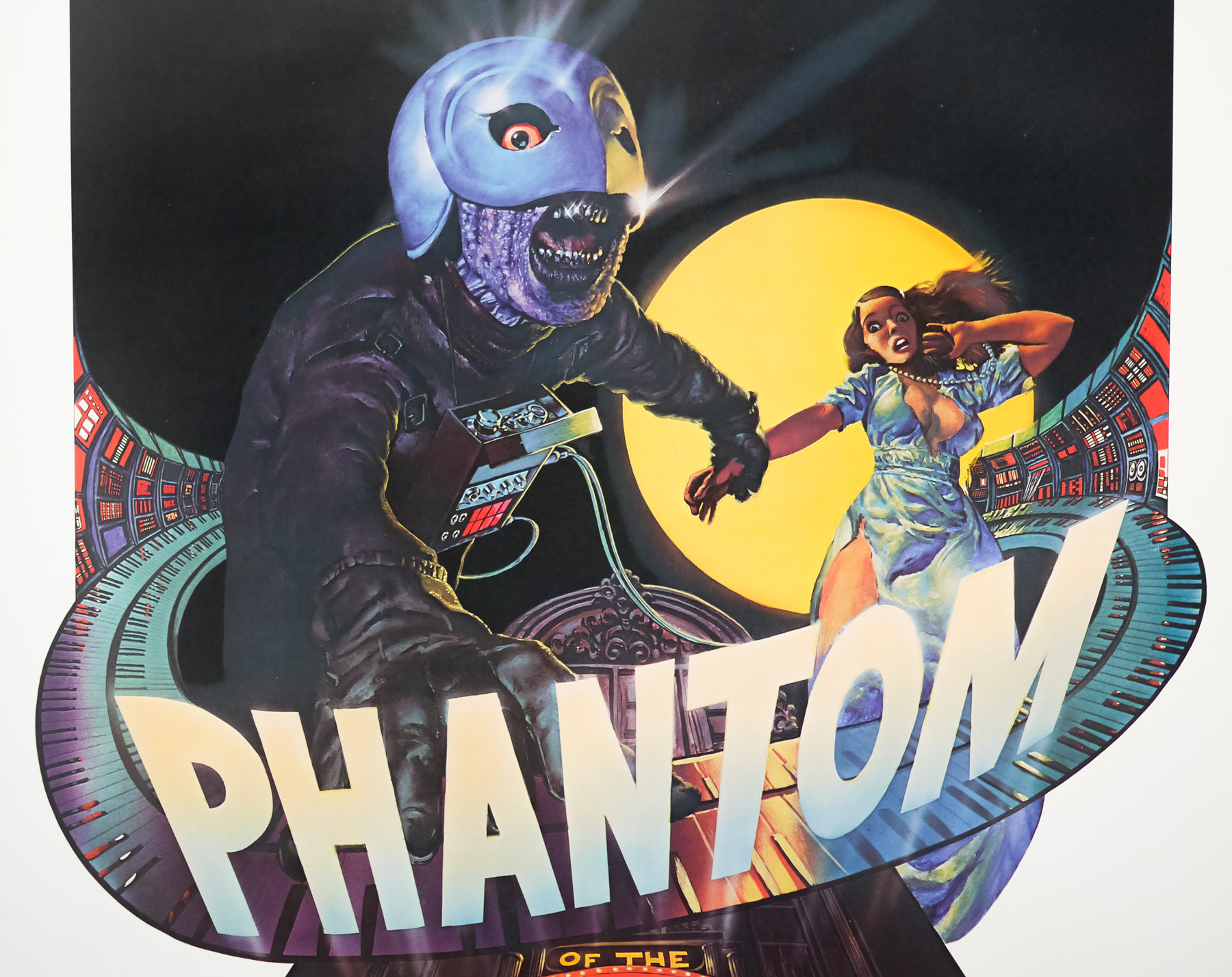
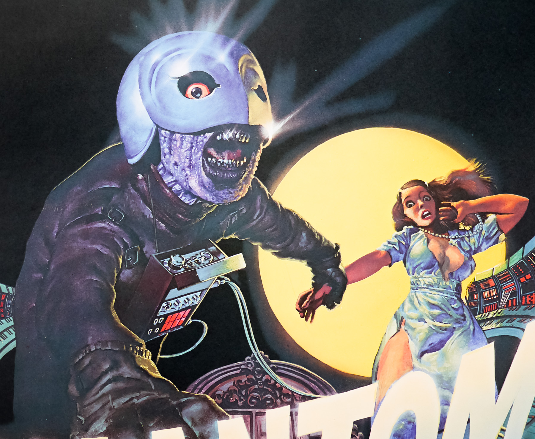
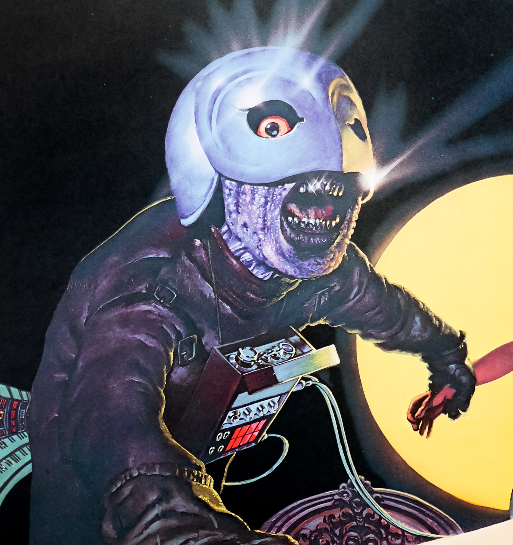
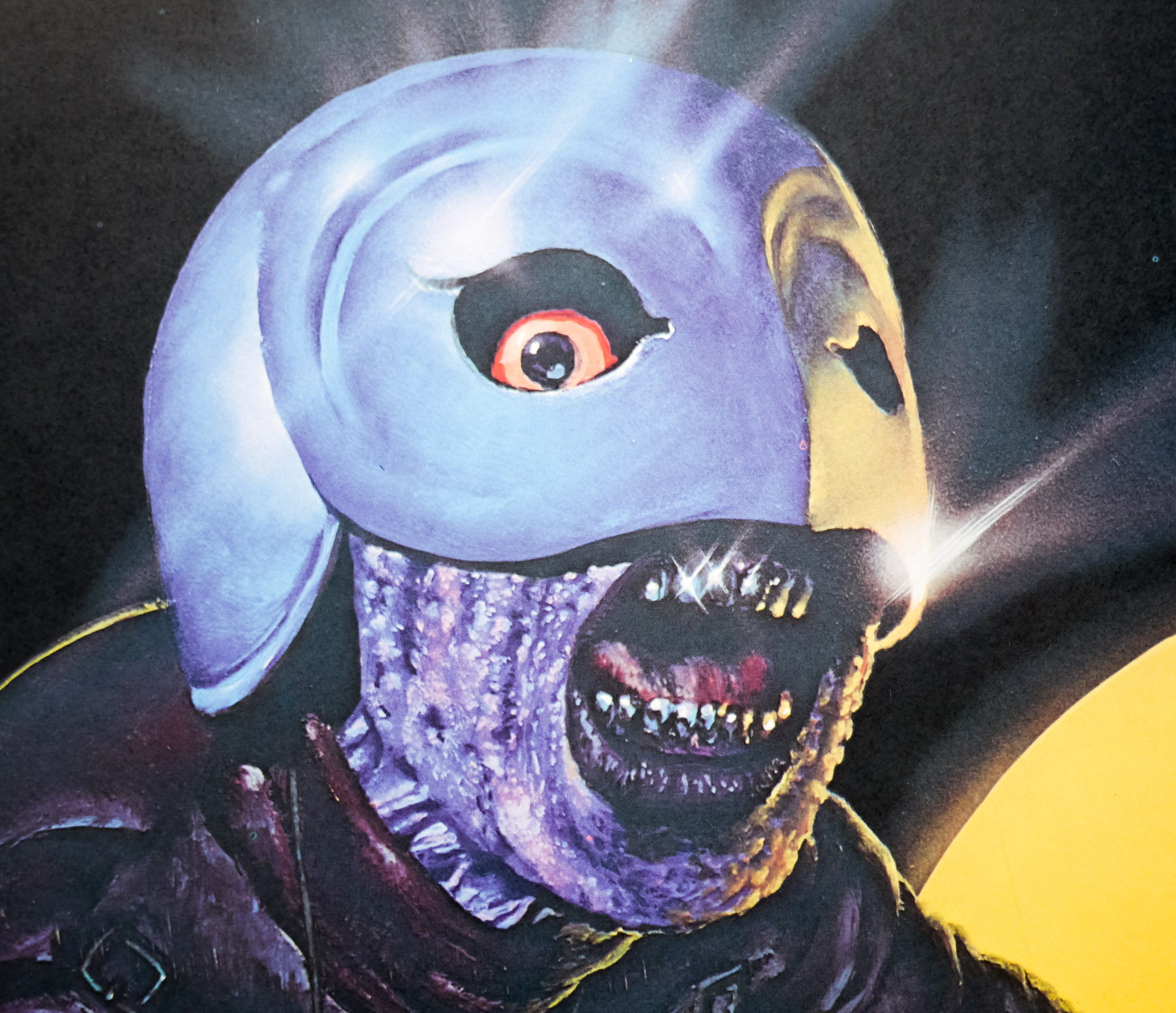
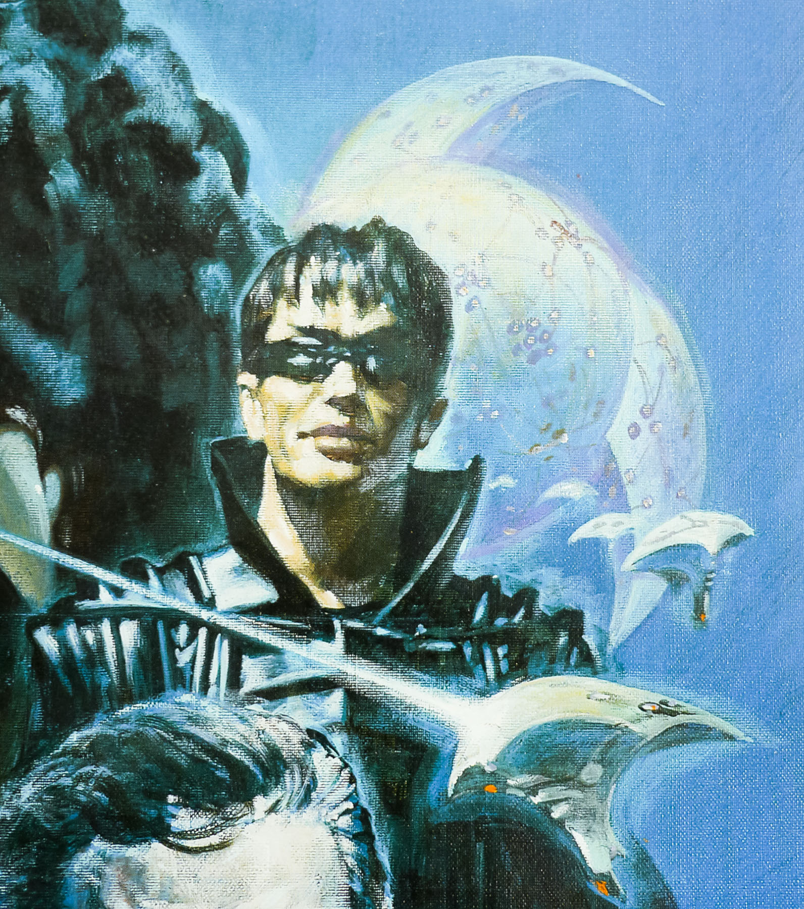
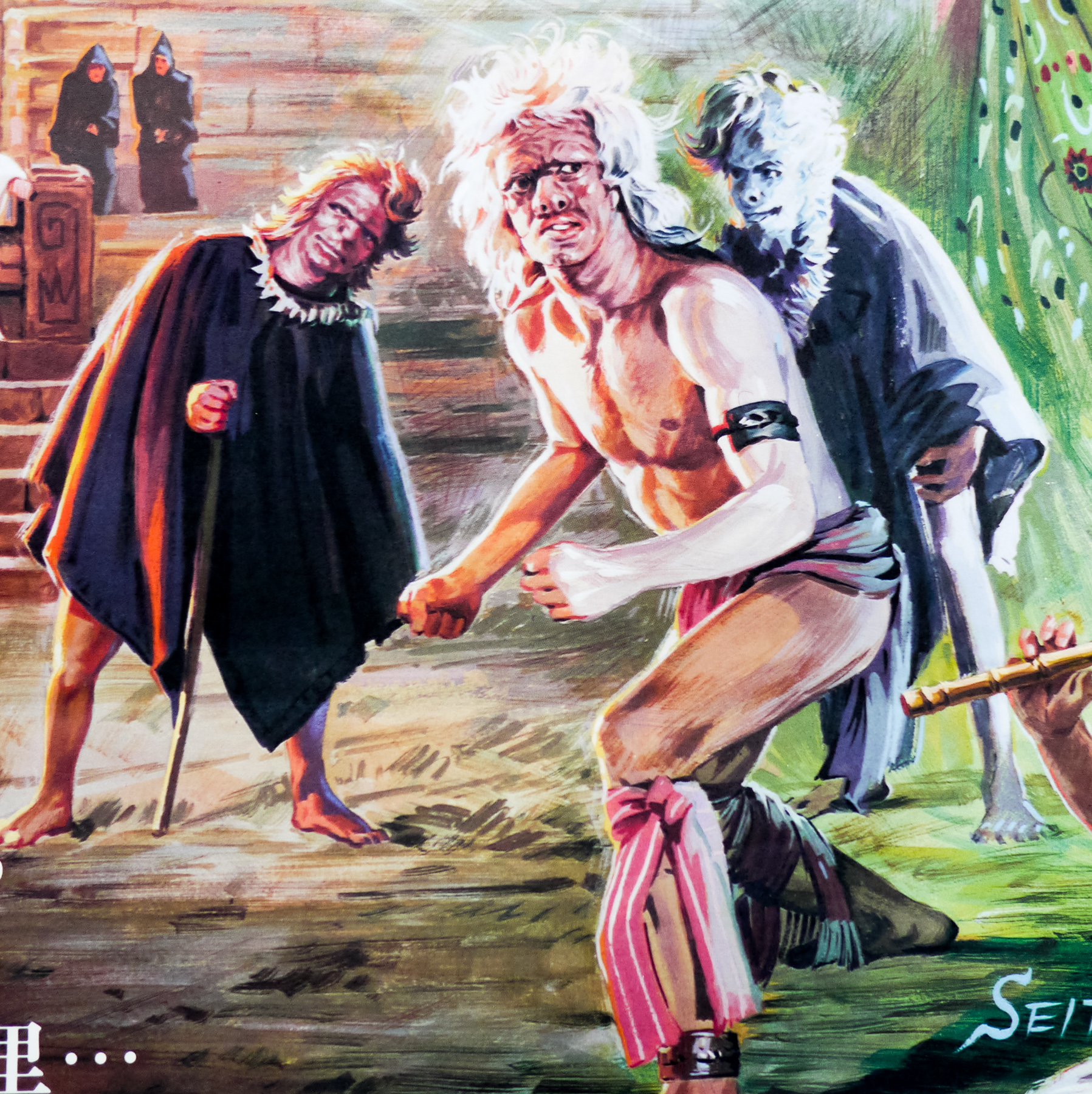
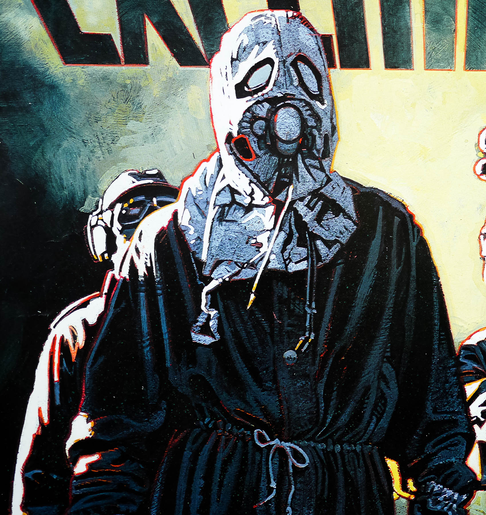
When Swan sees Winslow performing his music at a small concert he convinces the composer to sell his tunes to him to be used at the opening of his new club, The Paradise. Instead Swan has one of his henchmen steal the music, beat Winslow up and frame him for drug possession, sending the mild mannered musician to the brutal Sing Sing prison. Months later Winslow hears that one of Swan’s bands is to release a record based on his music and breaks out of the prison in a frenzied rage. After heading to Swan’s Death Records factory he tries to sabotage a record press but accidentally falls head-first into it, severely scarring his face and damaging his vocal chords. Escaping from the police, he makes his way to the Paradise where he dons a cape and a beaked mask and becomes the Phantom of The Paradise. Soon he discovers the secret behind Swan’s success and sets out to stop him at all costs.
The film was met with mixed critical reviews and was a worldwide box-office flop, with the only exceptions being in Japan and, bizarrely, Winnipeg in Canada where the film played at the same cinema for months. One of the key reasons for the film’s disastrous commercial performance was the way it had initially been marketed by studio Twentieth Century Fox who had created a campaign that emphasised the rock aspect of the film with the intention of drawing in teenage music fans. The plan backfired, however, when initial audiences realised how negative the portrayal of the music industry is in the film was and how it was effectively sending up the very thing they were fans of.
The brilliant fan site The Swan Archives, curated by Ari Kahan, features a thorough history of the promotion of the film and shows the initial two styles of poster, one of which was designed by Anthony Goldschmidt and illustrated by the late John Alvin and also featured on the album cover. As Kahan notes:
‘The involvement of A&M records (which issued the soundtrack, and which more or less owned the exclusive rights to Paul Williams’ life at the time) in the co-marketing campaign with 20th Century Fox meant that the film was initially pitched towards what A&M and Fox believed to be the teens-through-college “rock music demographic.” John Alvin’s beautiful painted graphics on the posters and soundtrack album emphasised guitars, keyboards, microphones, patch cords, and other musical ephemera, and a photorealistic depiction of songwriter/star Paul Williams, signalling the studio’s intention to rely heavily on Williams’ existing fame in its promotion of the film.’
The rest of the ill-conceived initial campaign is detailed on the Swan Archives page linked to above. After a disastrous few months at the box office, the film’s producer Ed Pressman convinced the studio to allow him to reposition the film with a revised marketing campaign. Kahan explains:
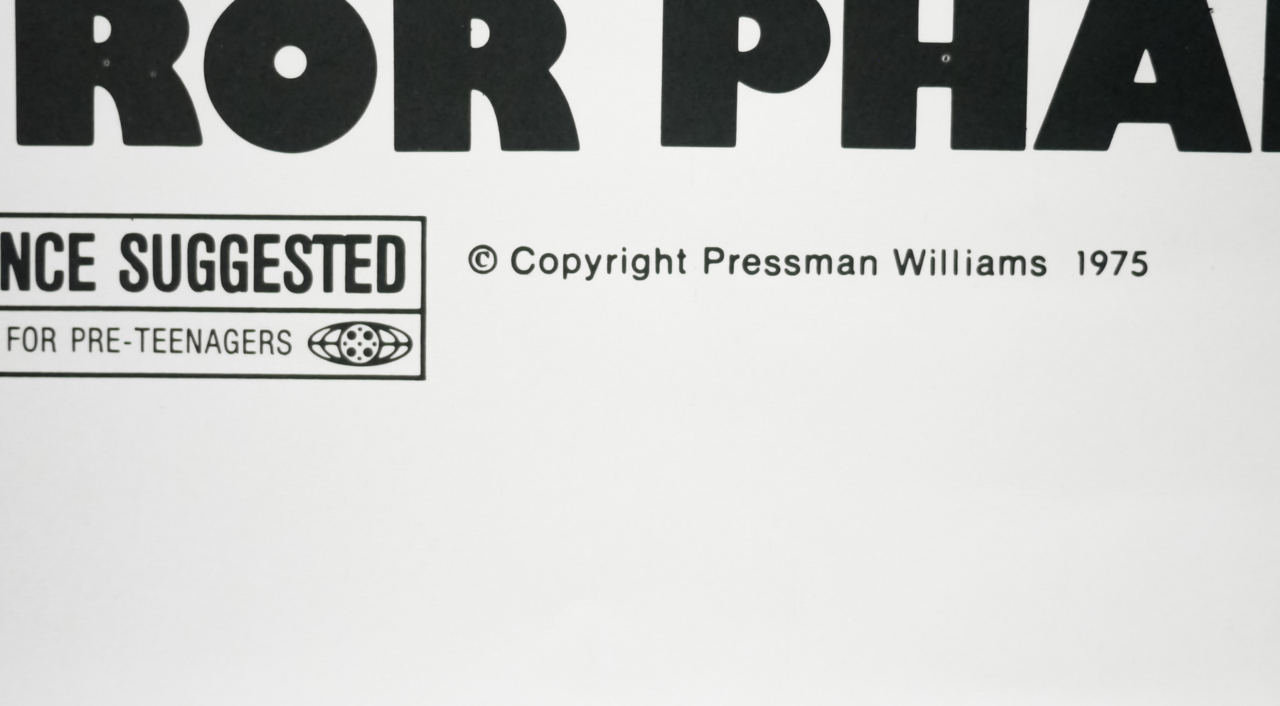
‘Pressman went into action by launching a second campaign, in mid-1975, which tagged the film as “The Most Highly Acclaimed Horror Phantasy of Our Time,” pushing the horror angle and perennial plot line, and downplaying the music. De Palma, Finley, and Graham were made extremely available to give interviews to Castle of Frankenstein, Monster World, and every other horror magazine that would make time for them’
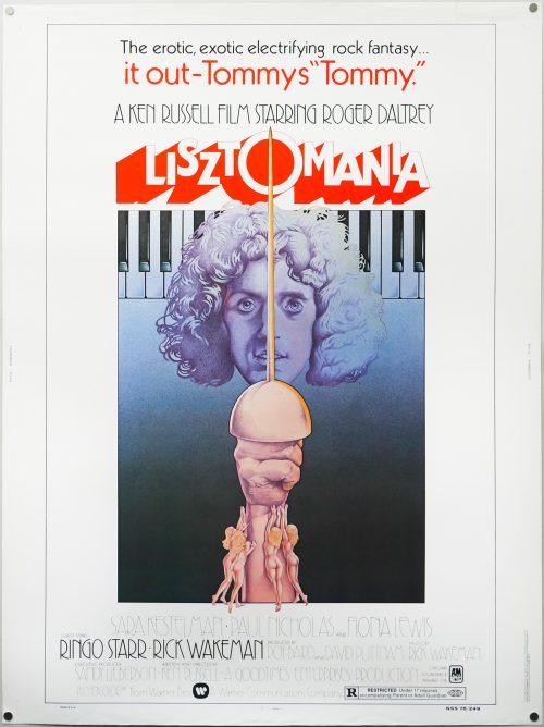
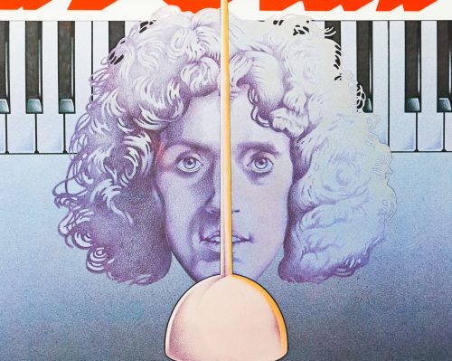
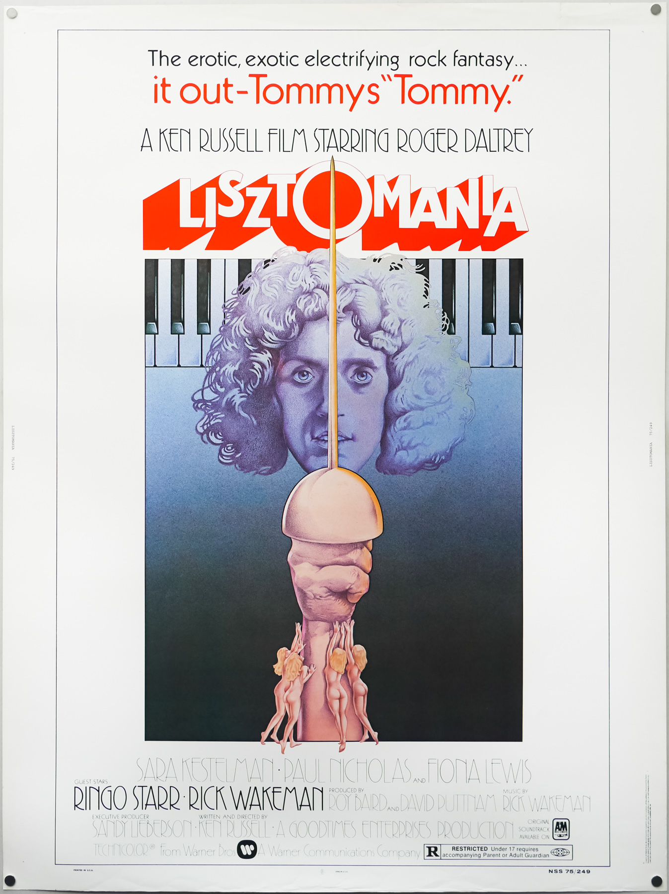
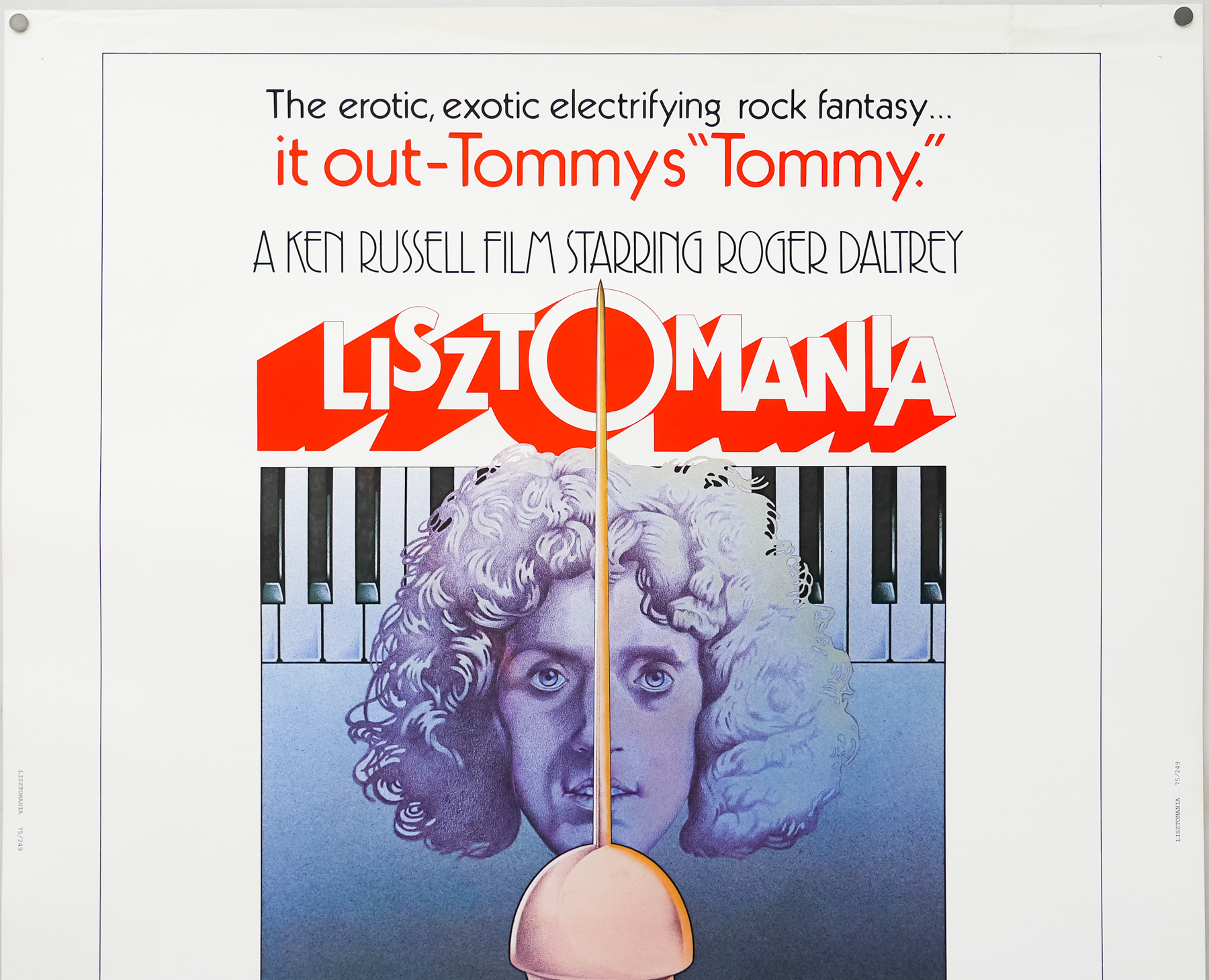
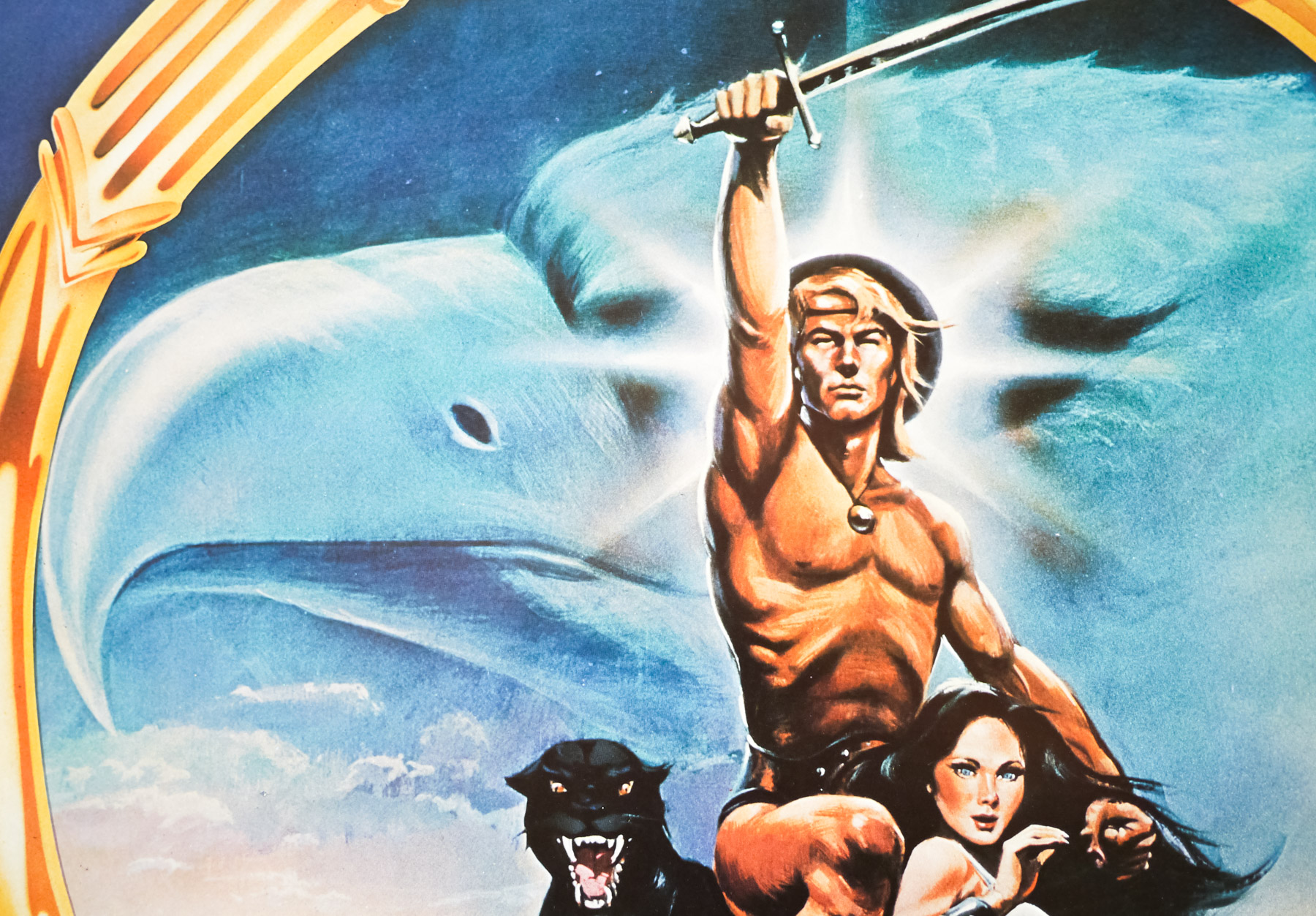
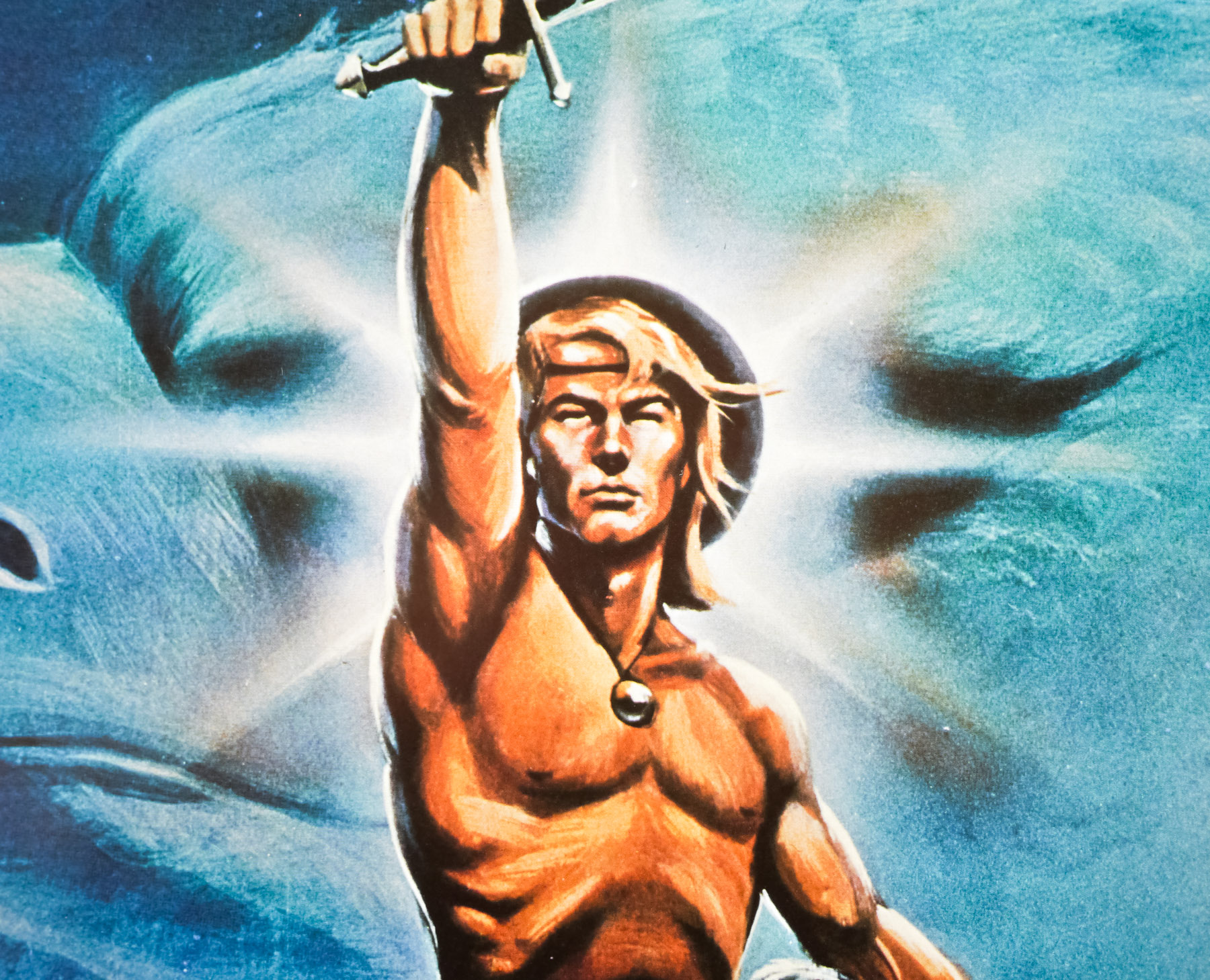
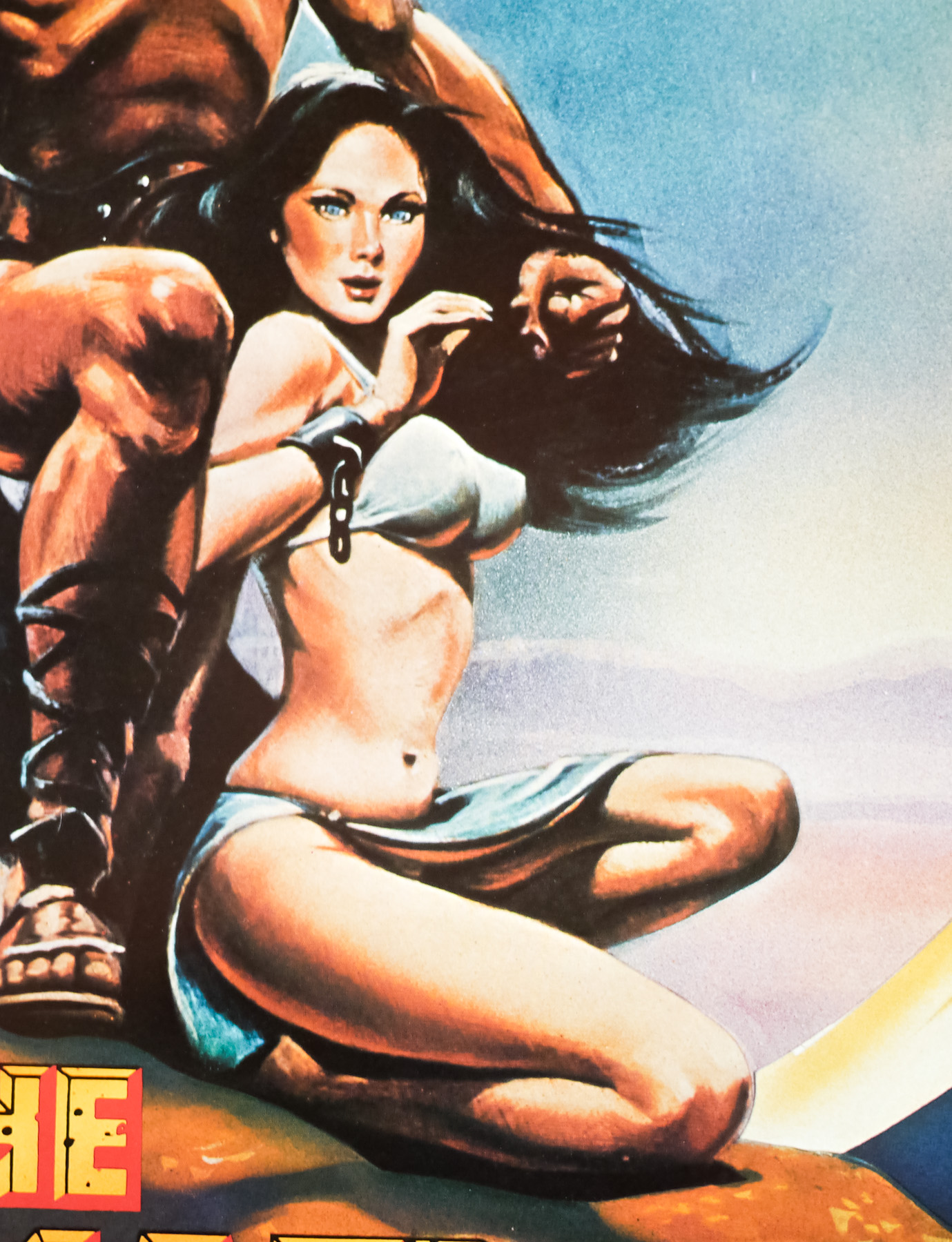
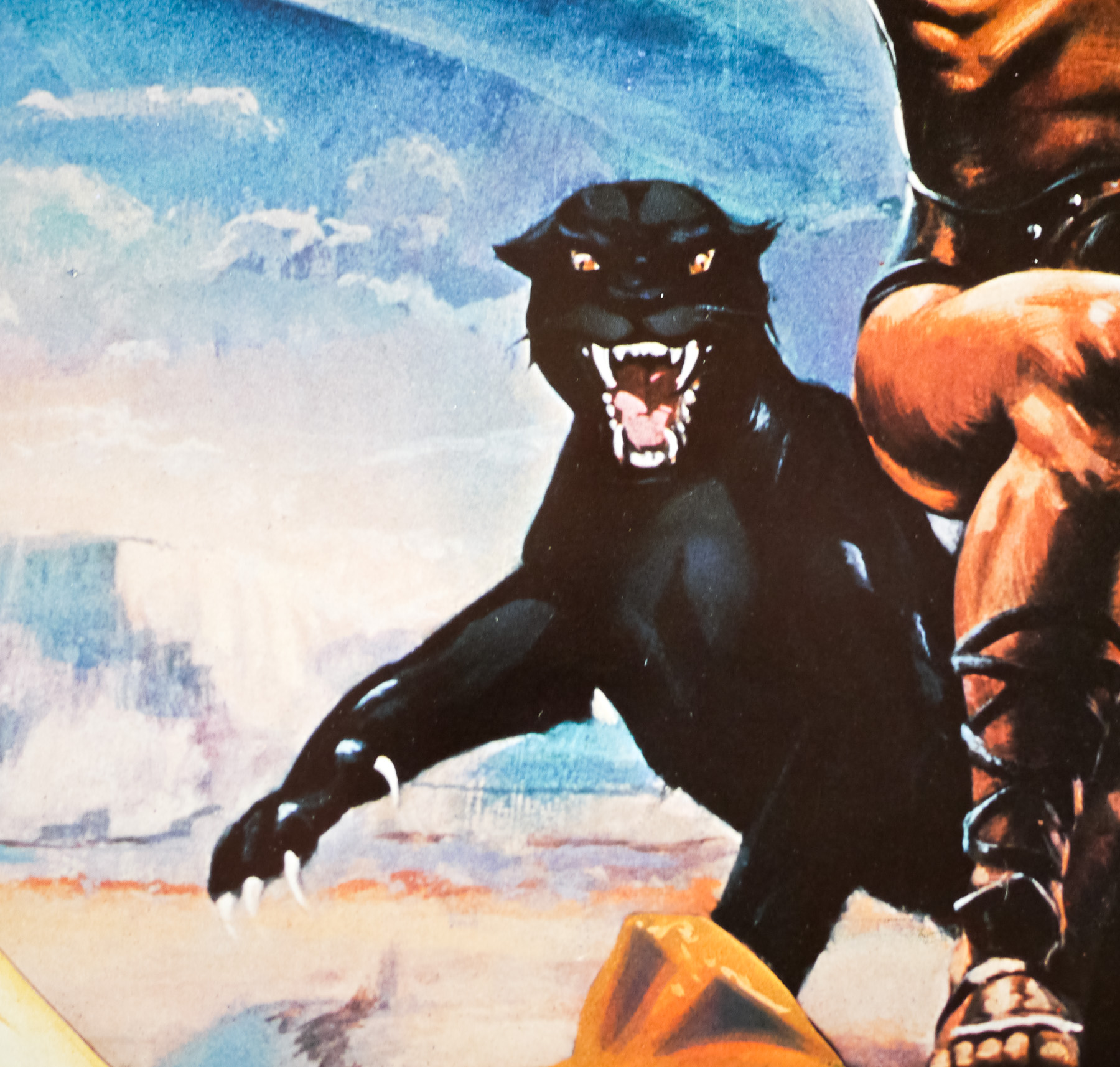
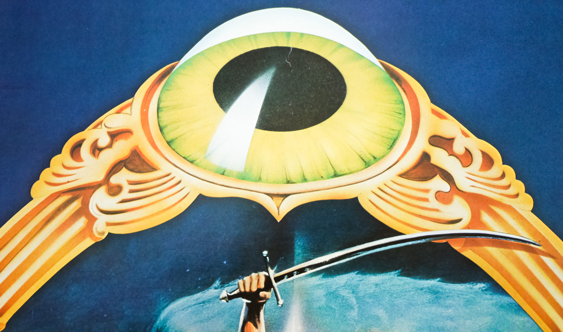
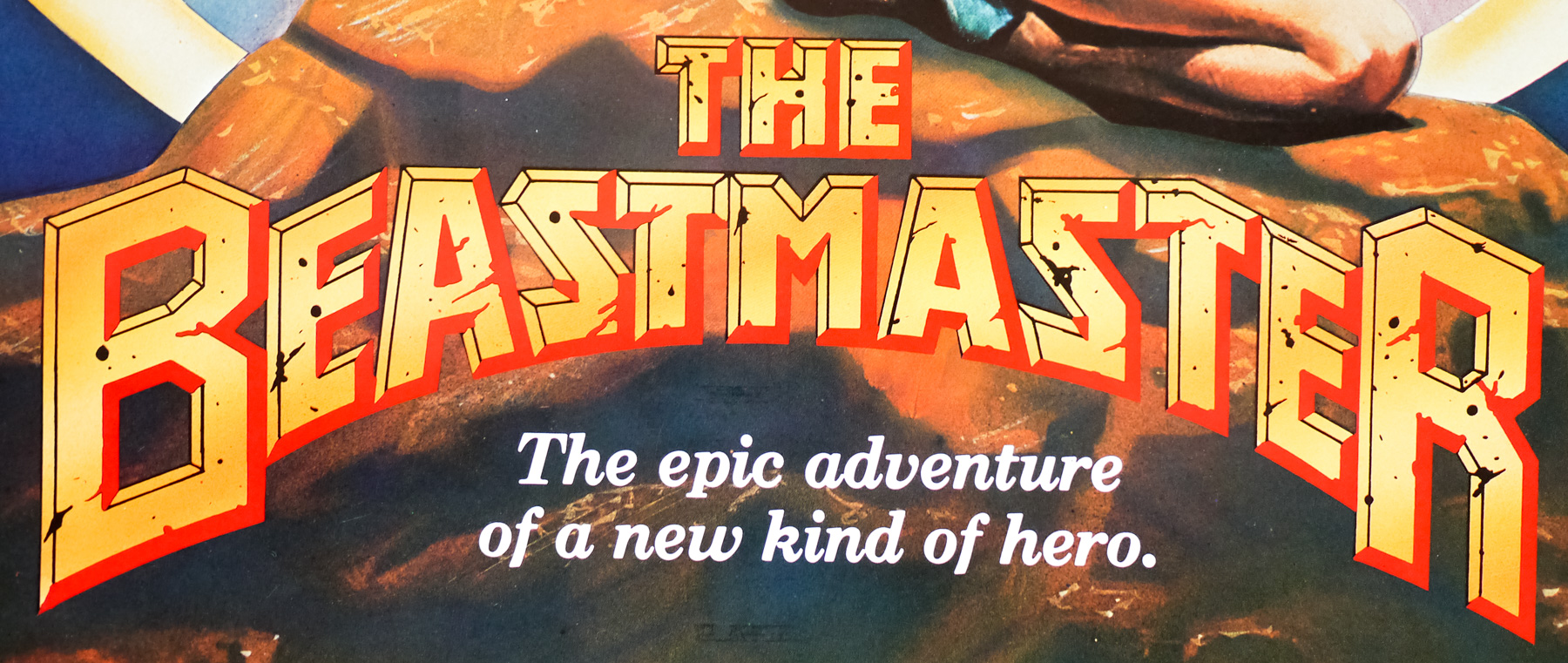
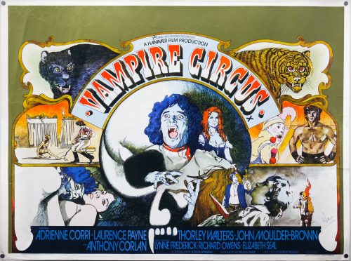
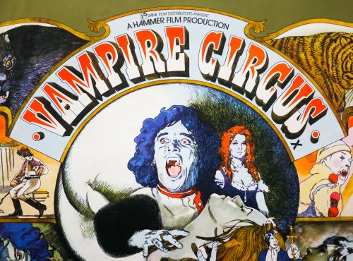
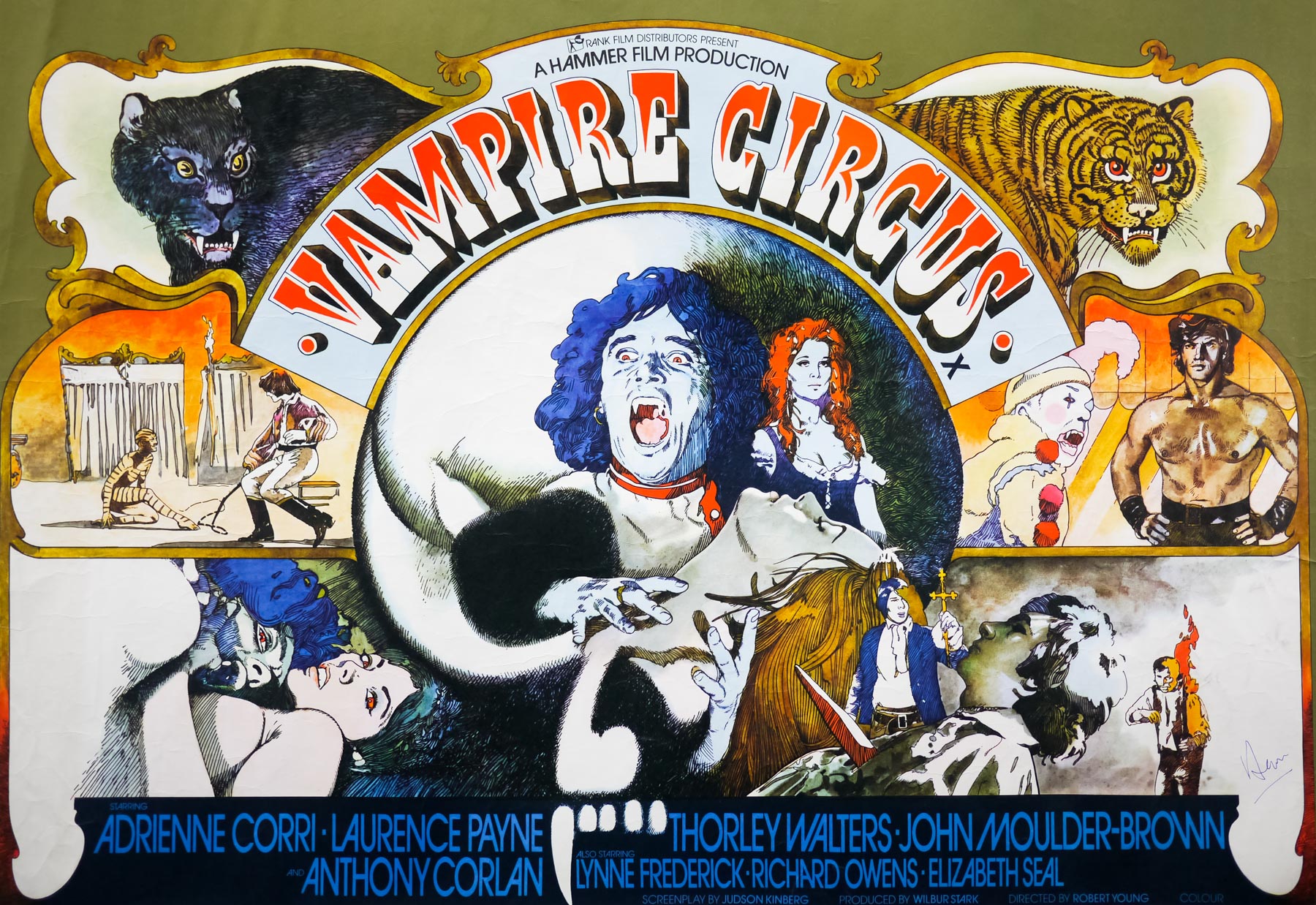
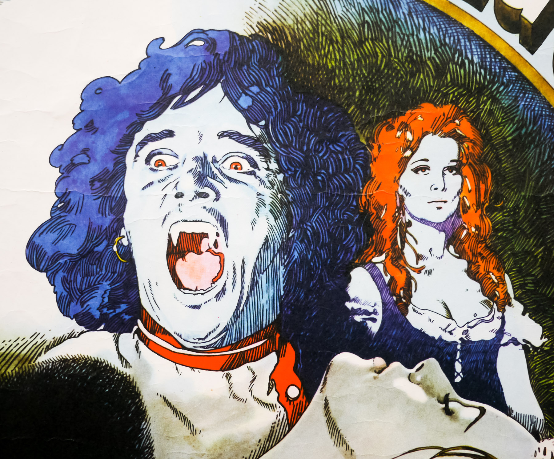
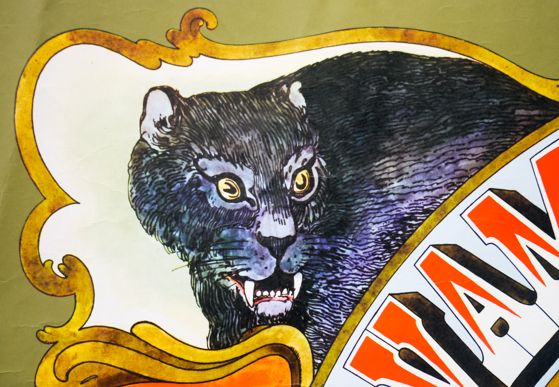
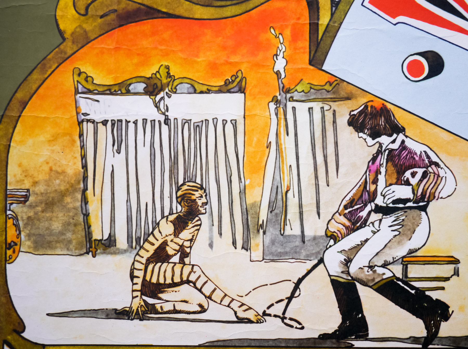
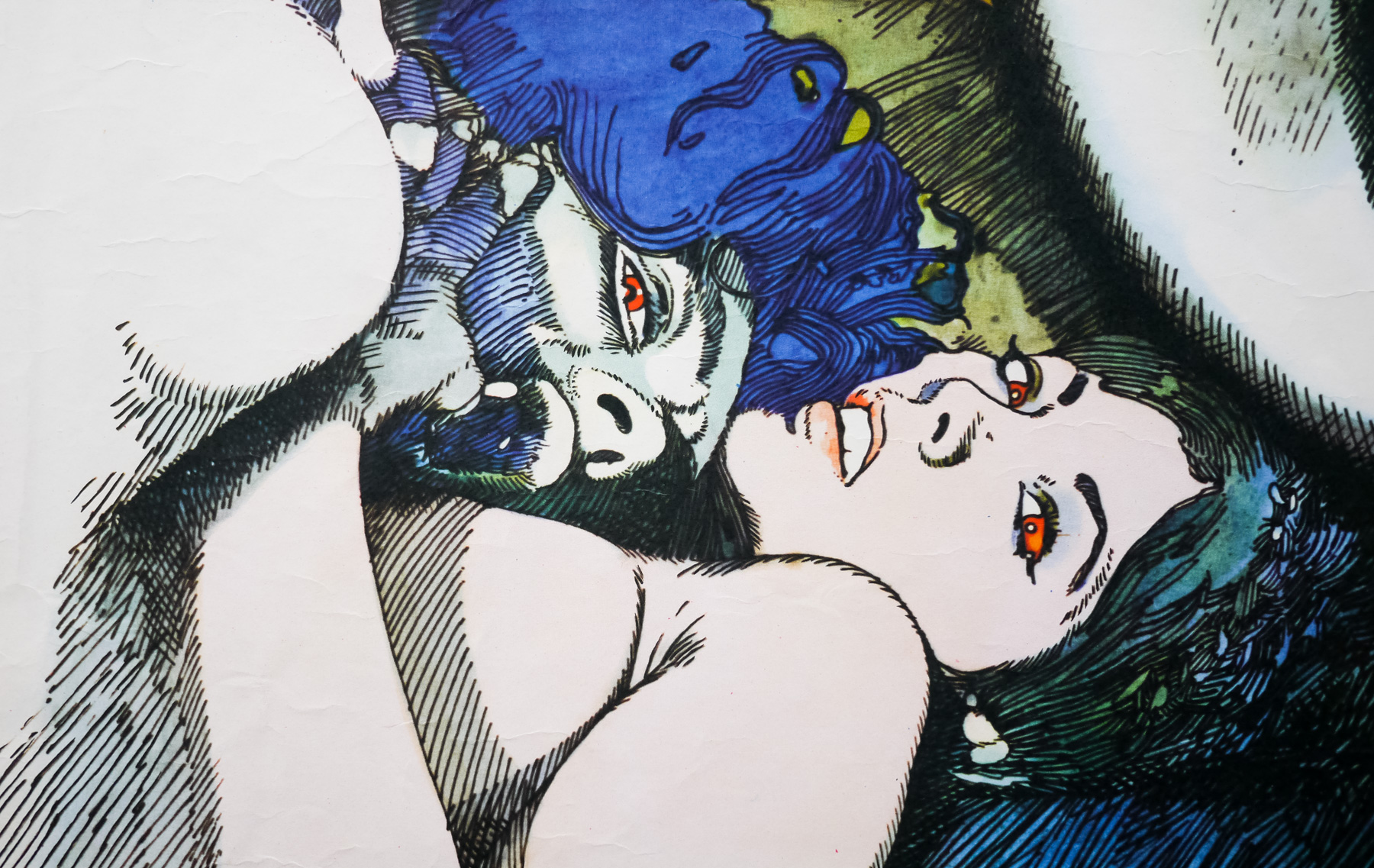
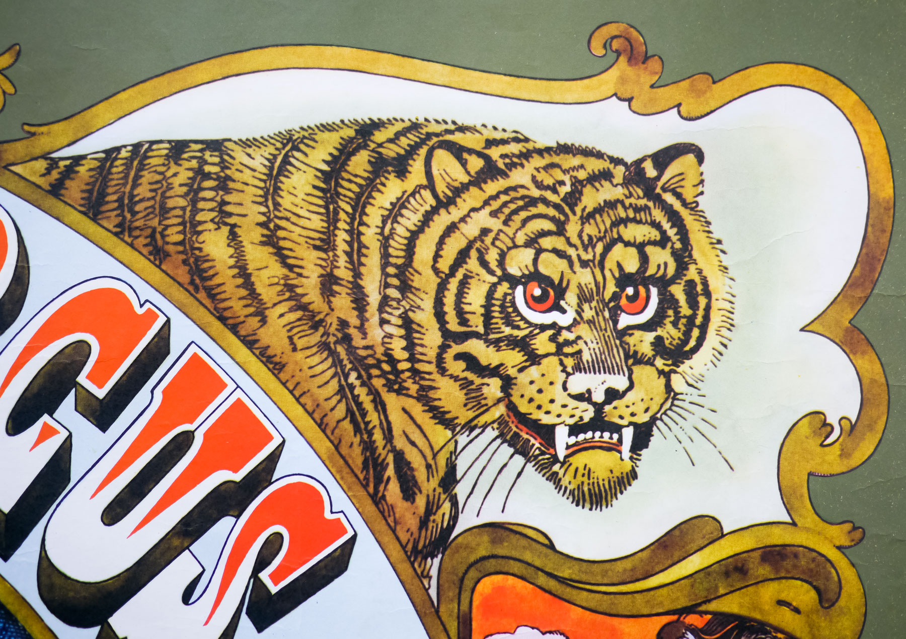
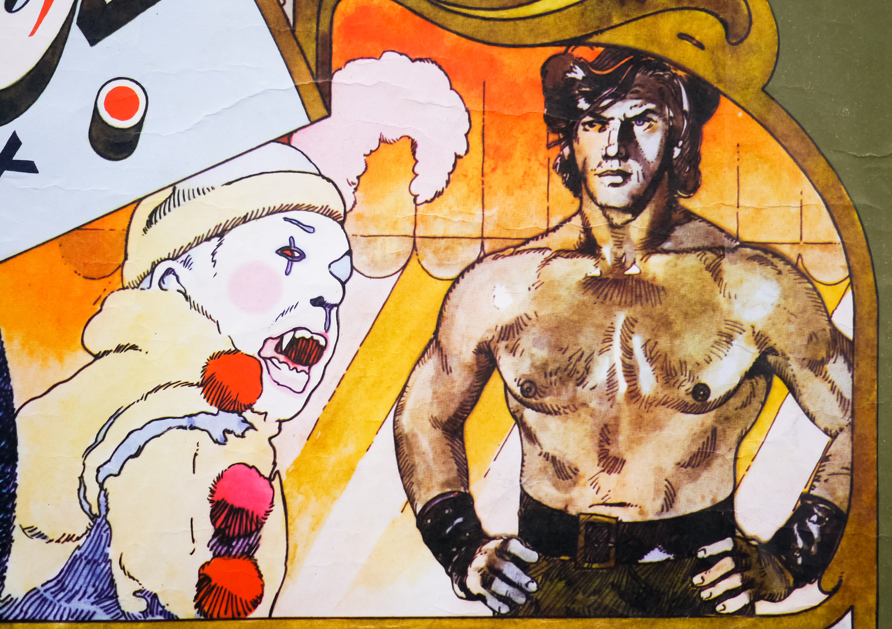
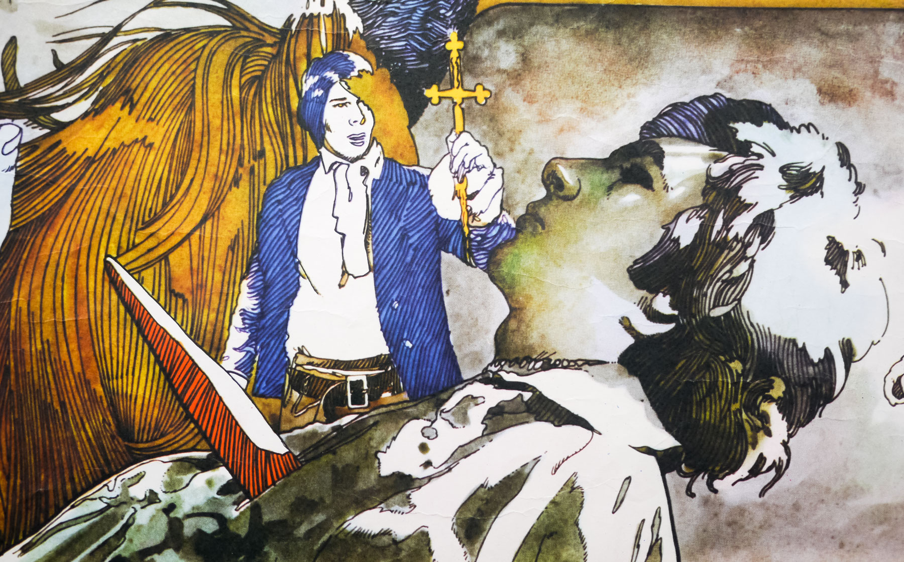
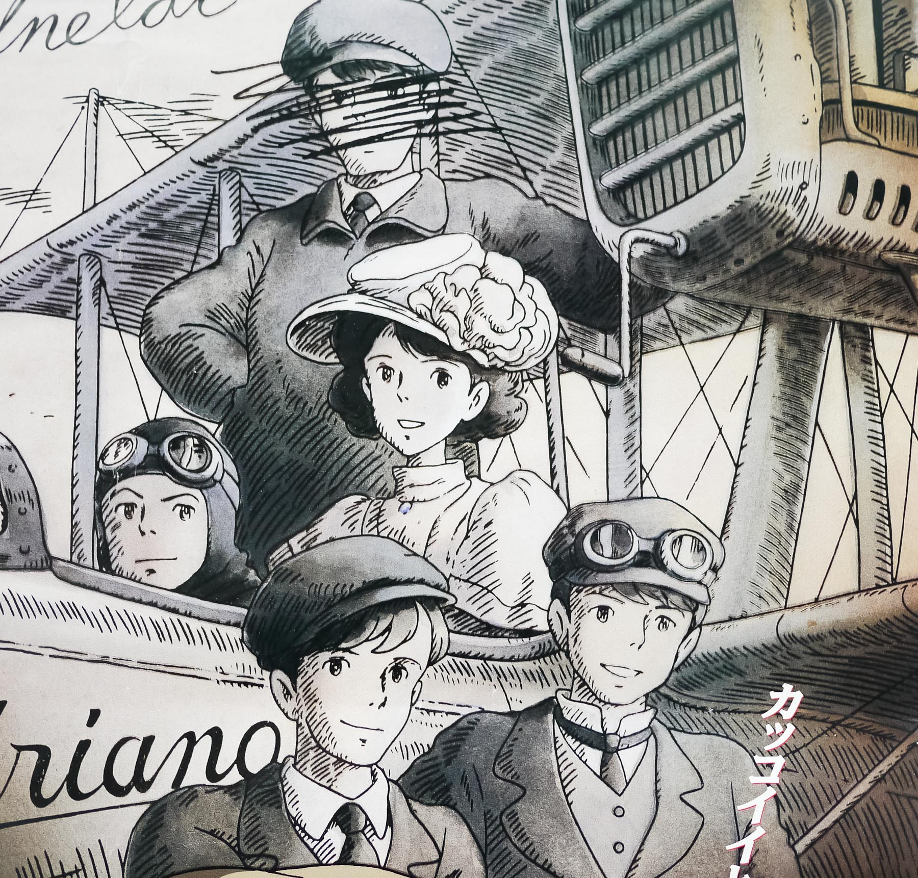
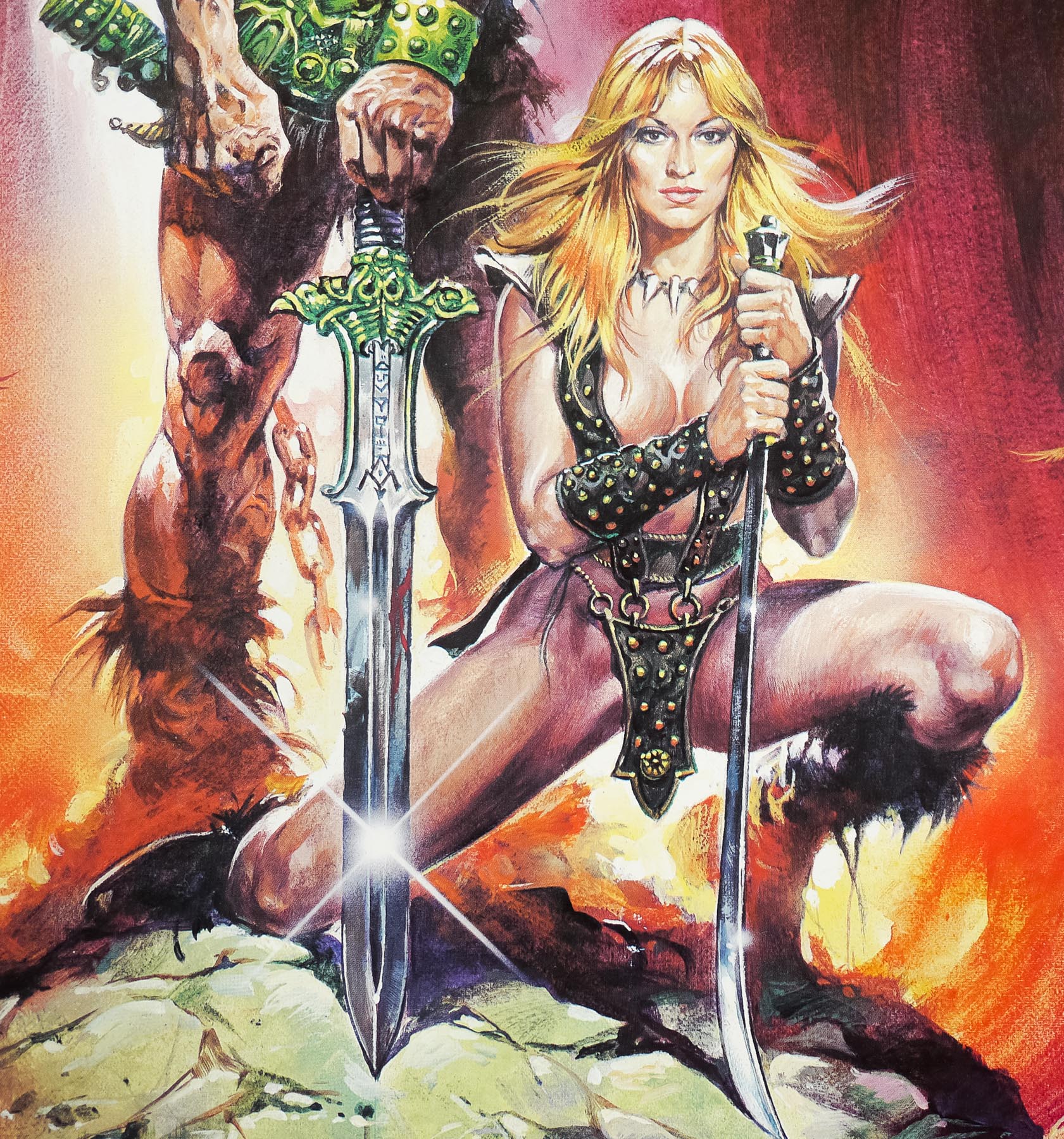
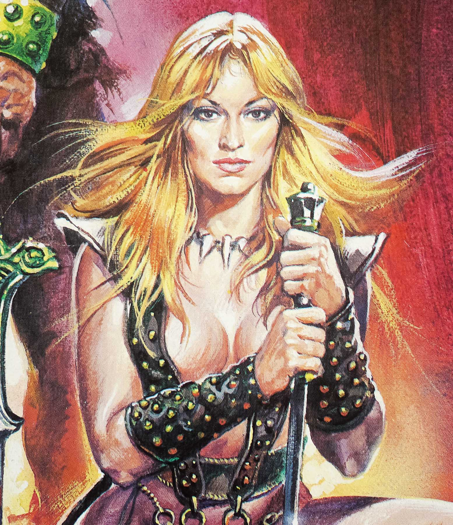
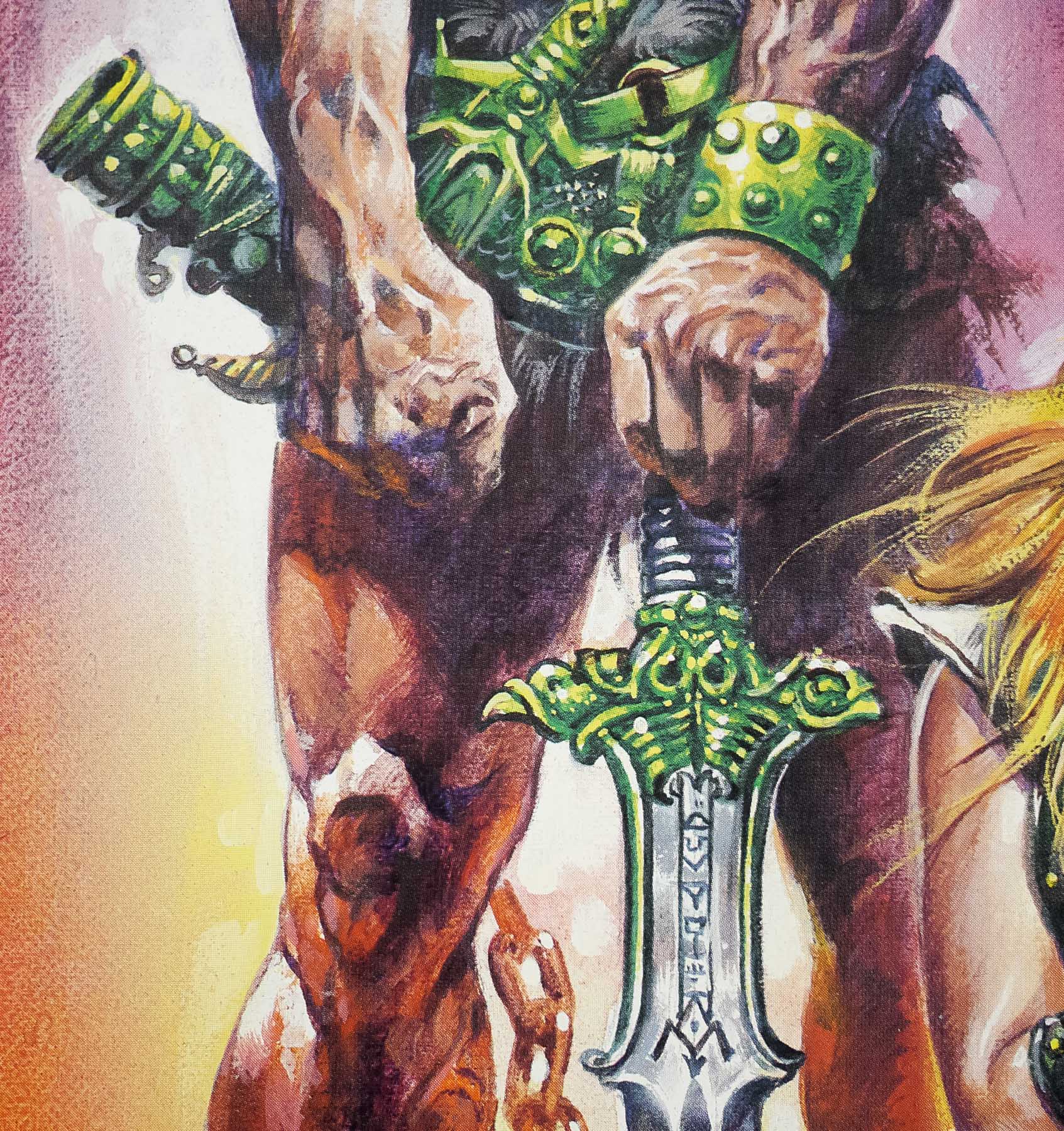
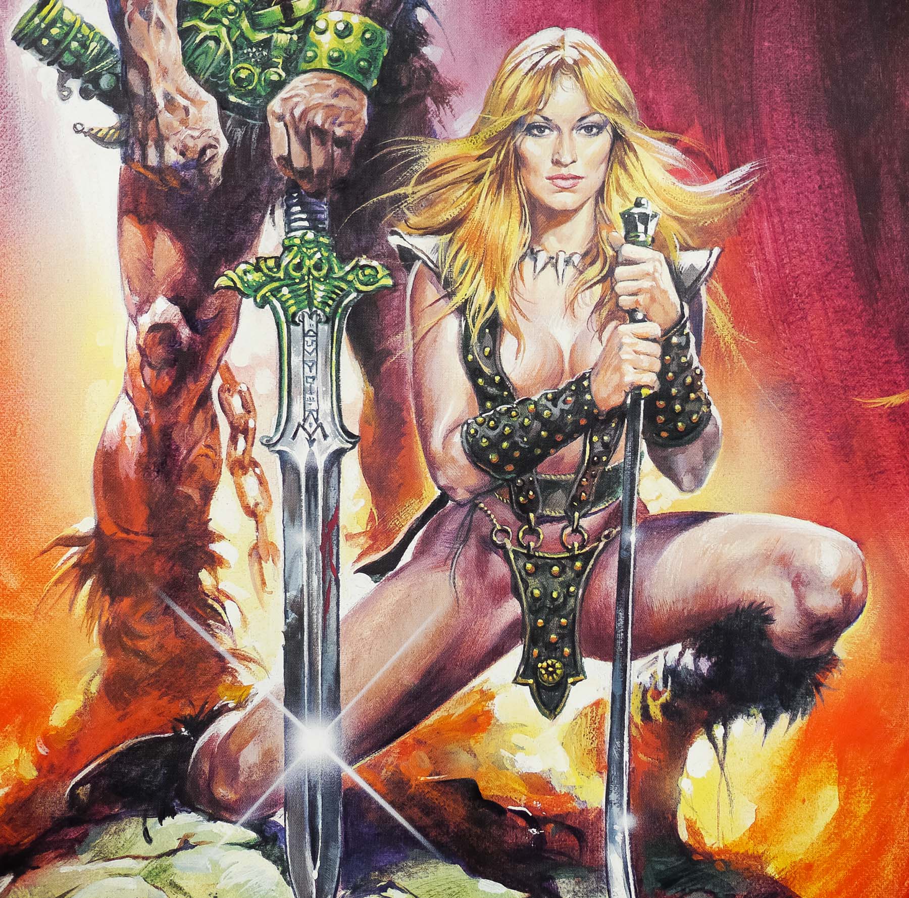
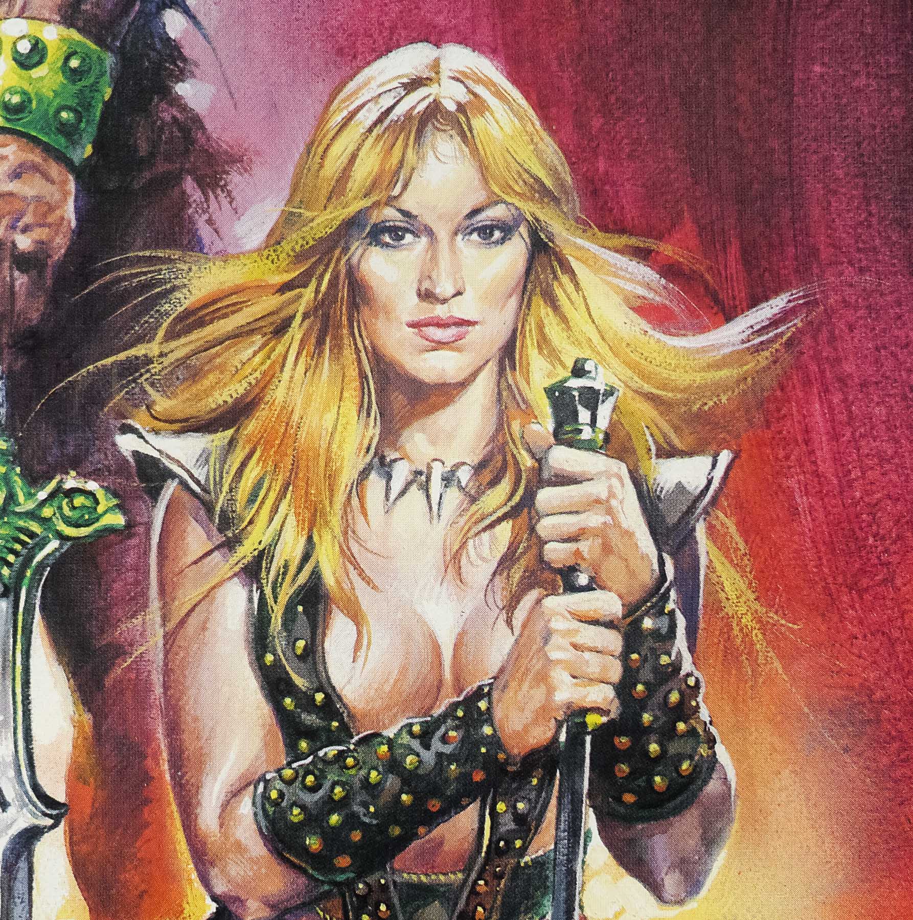
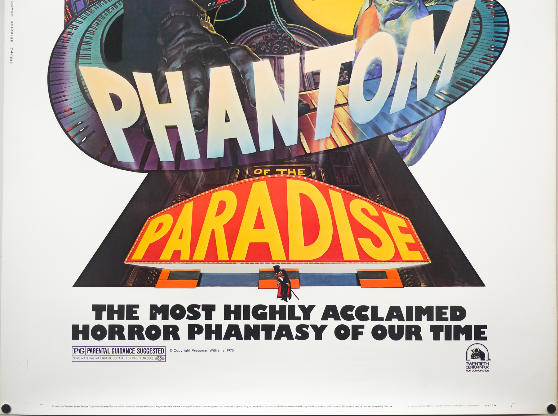
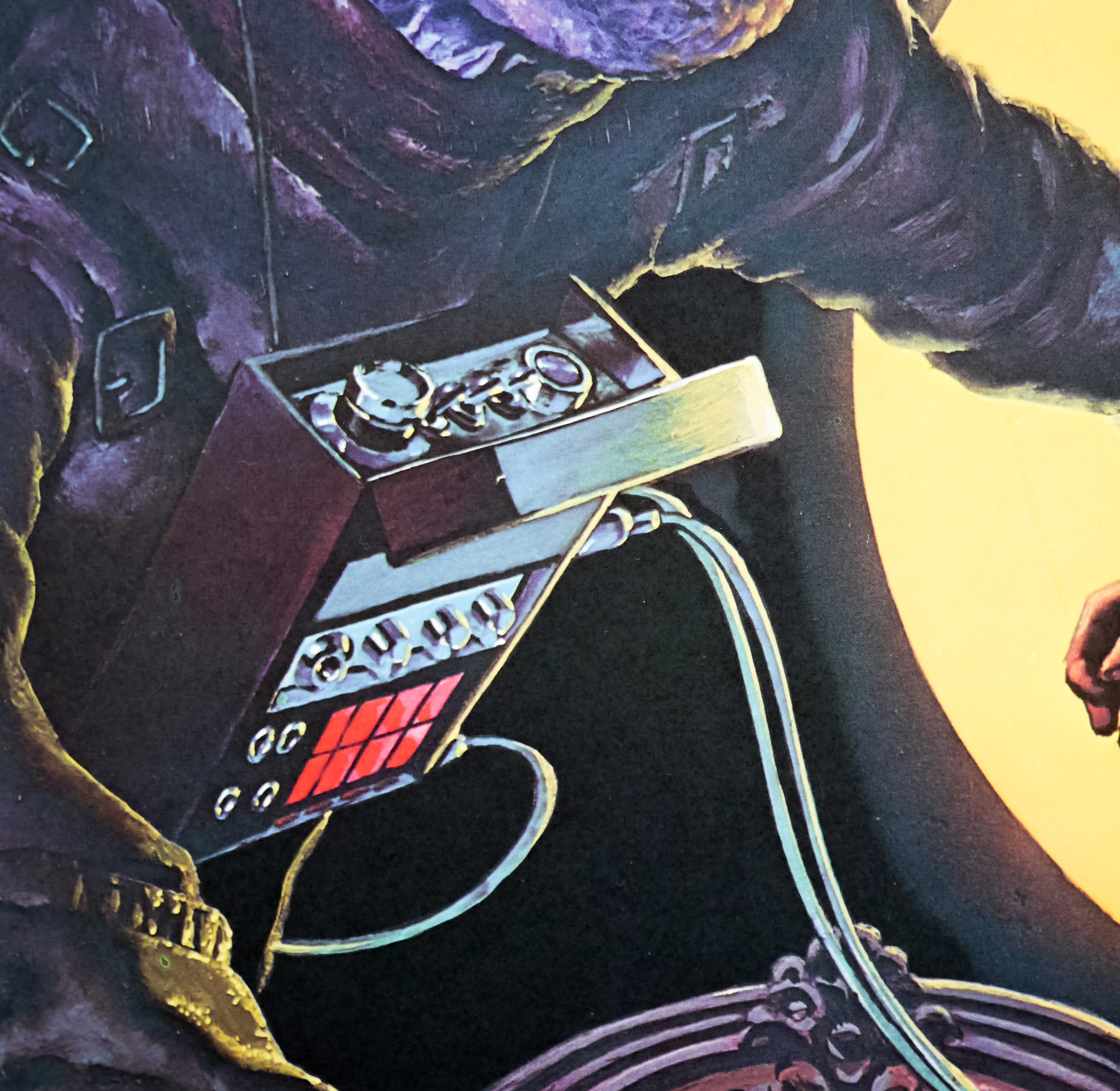
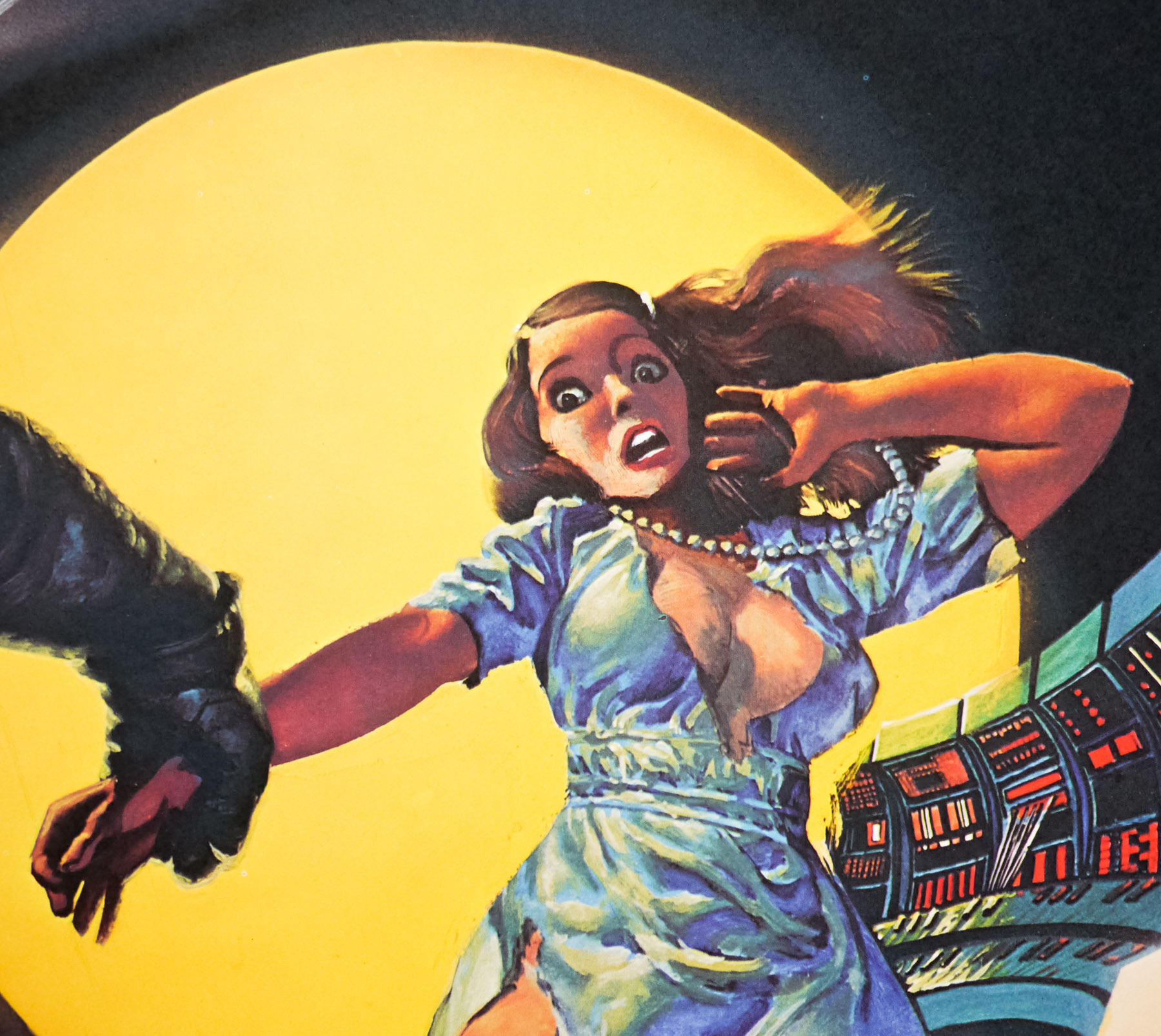
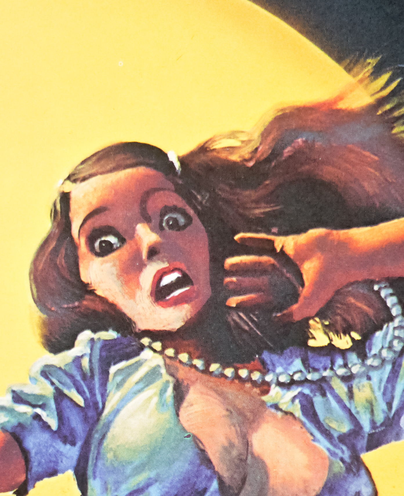
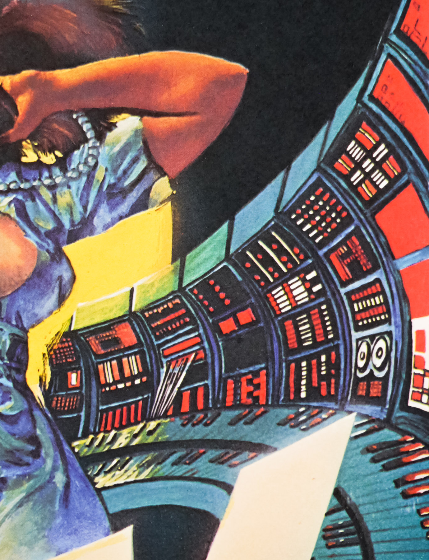
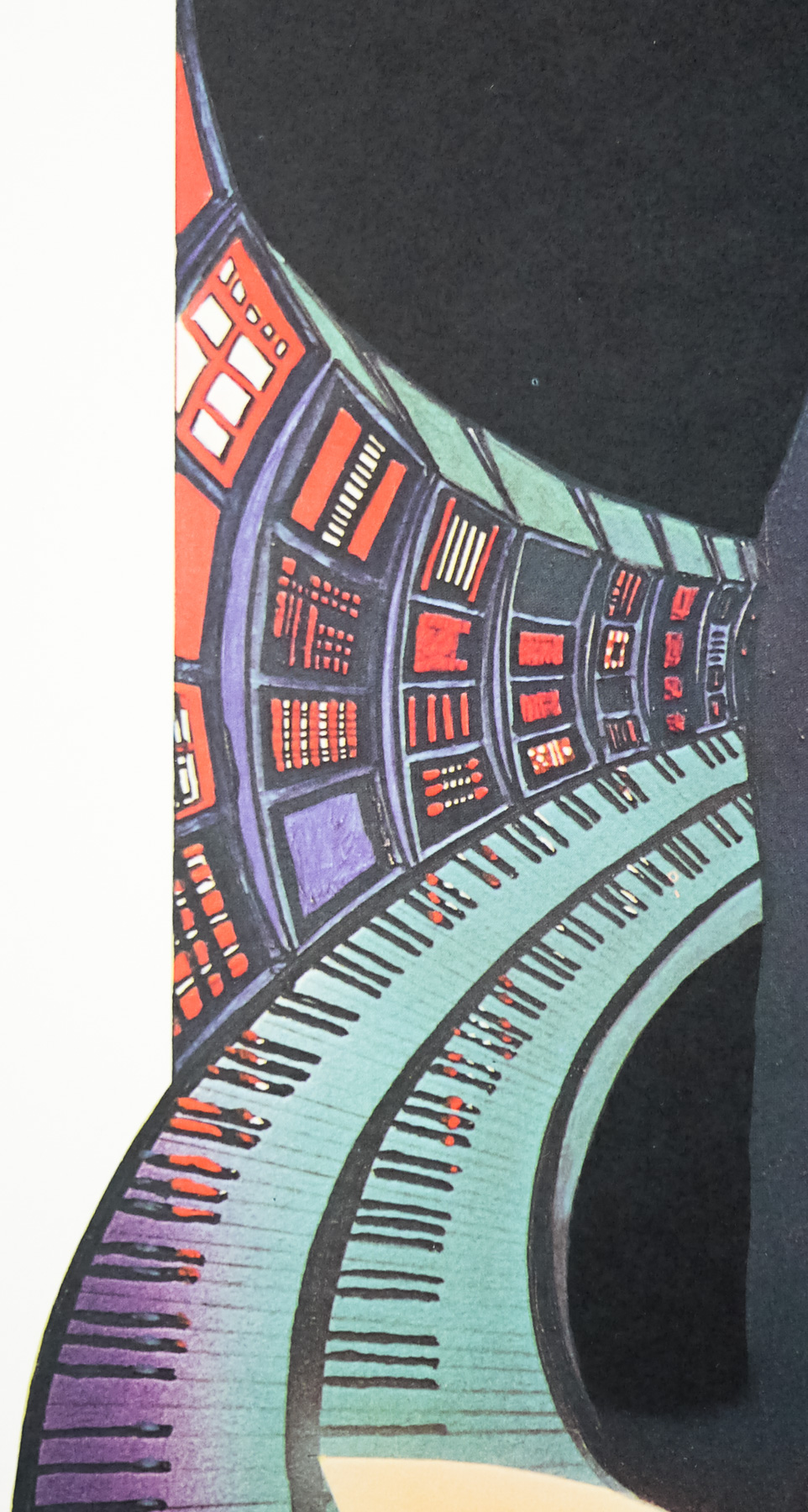
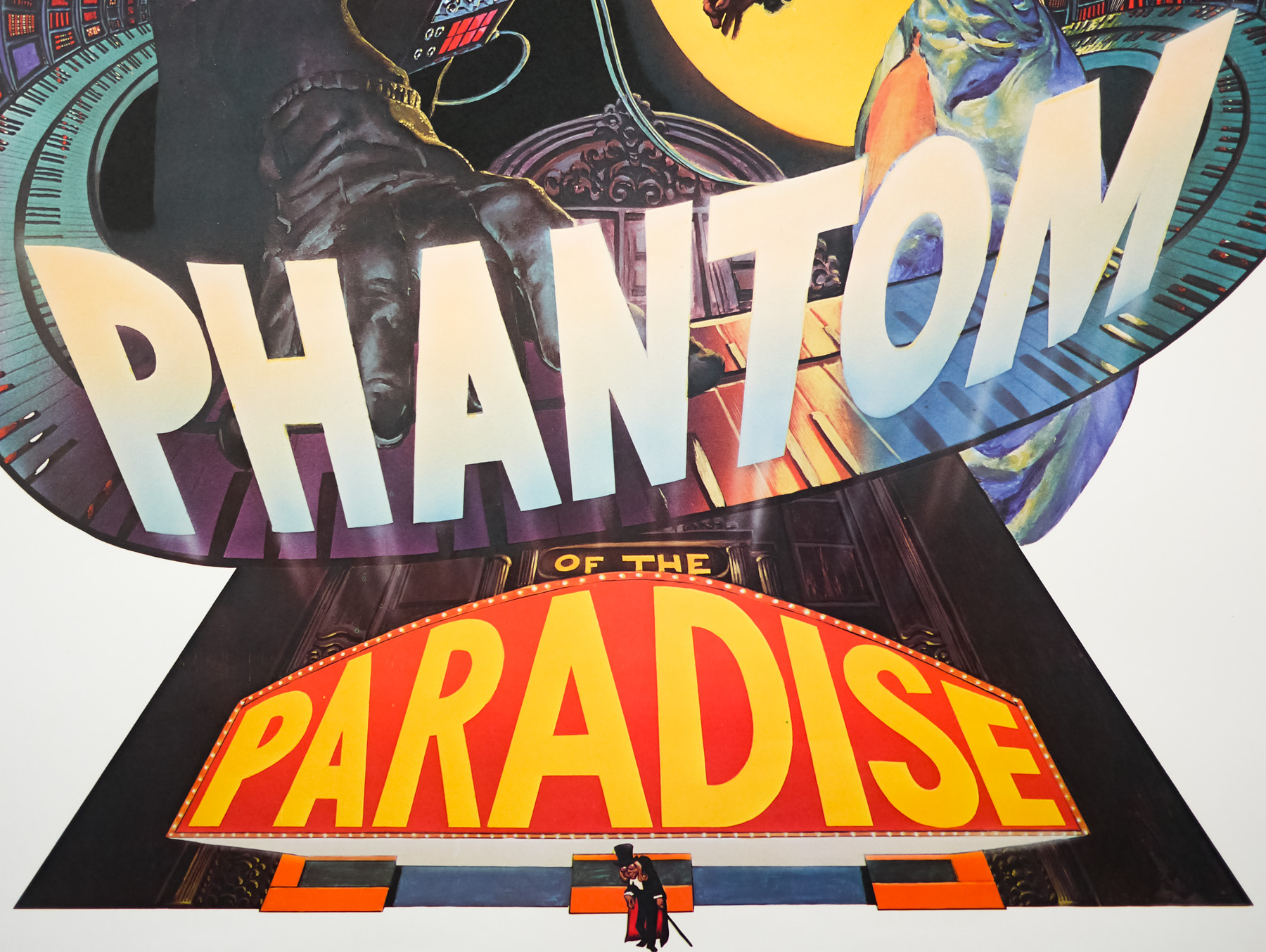
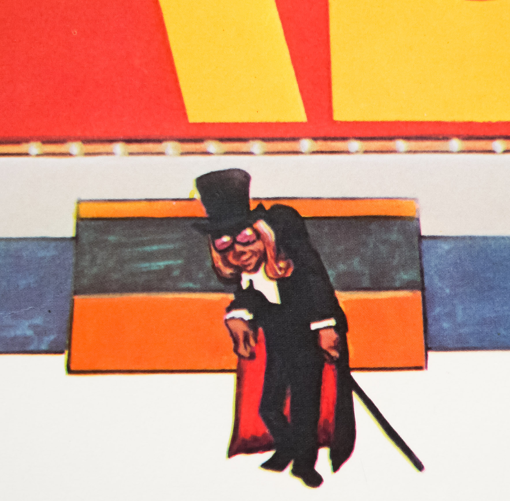
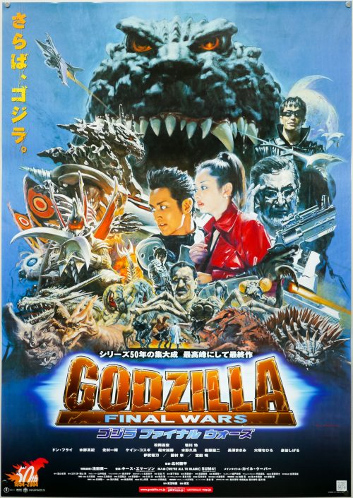
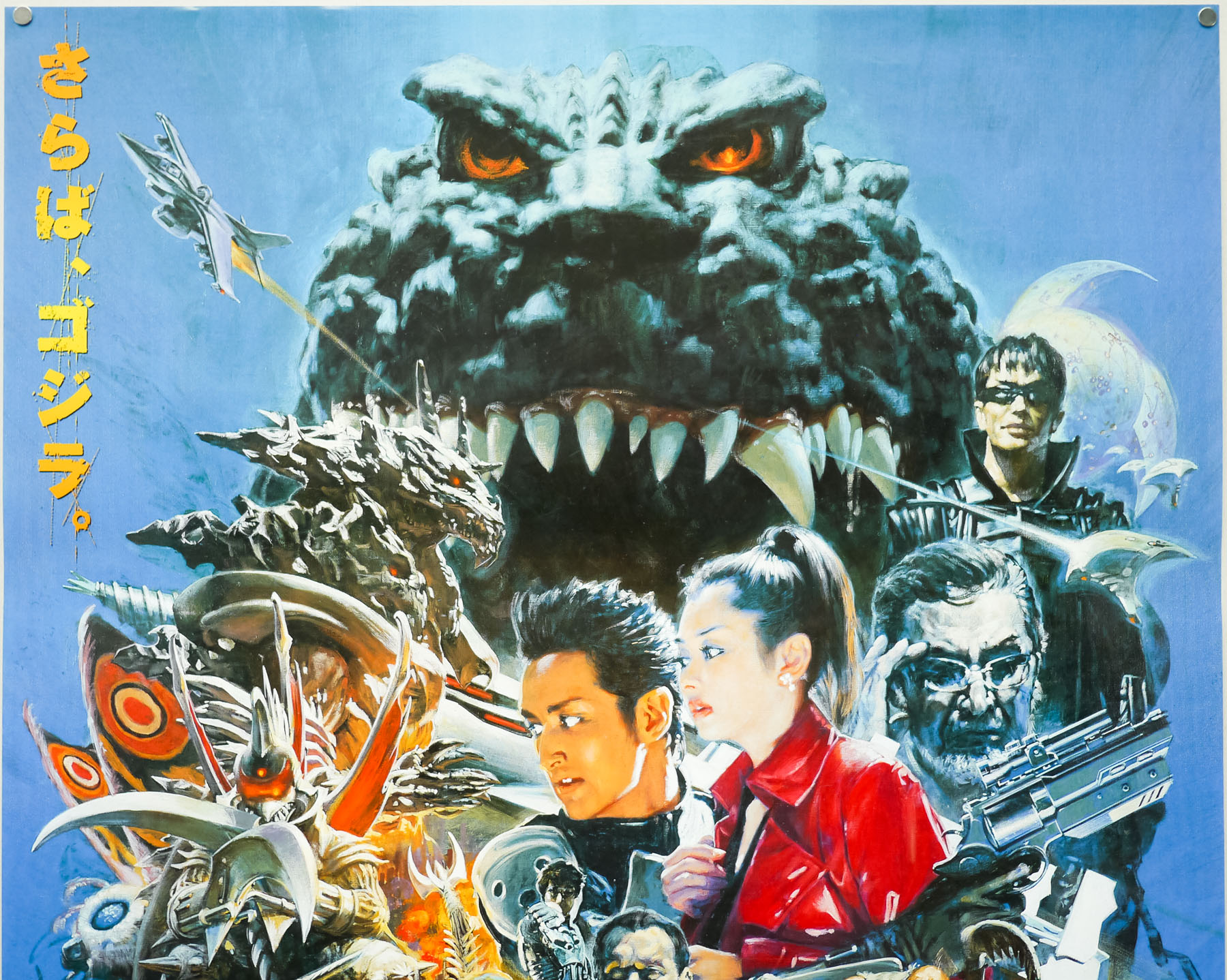
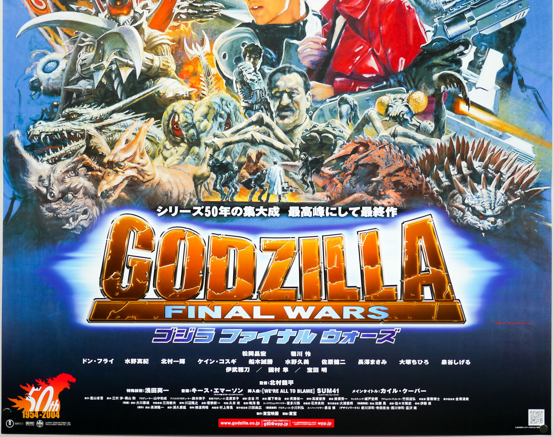
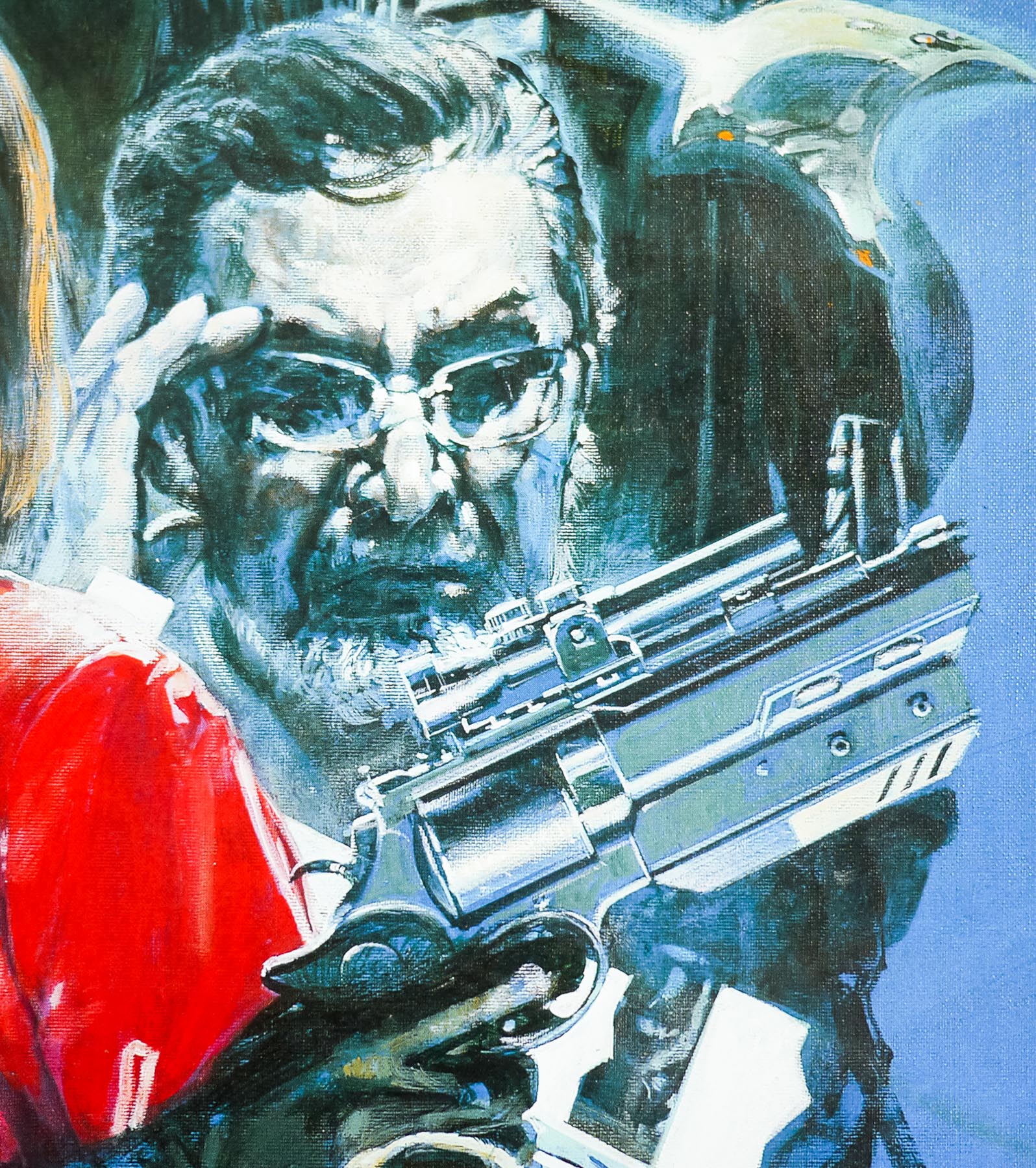
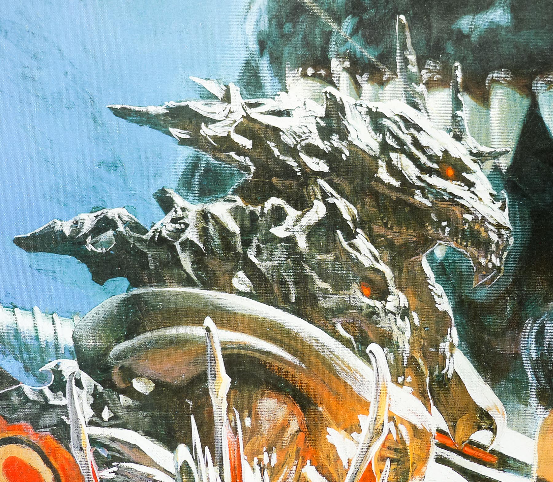
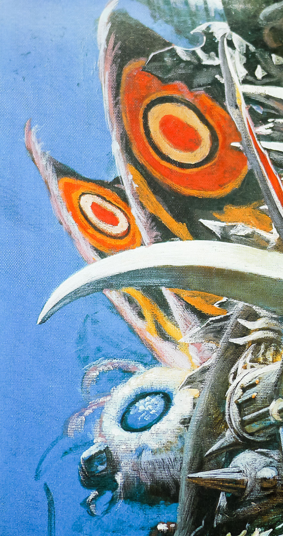
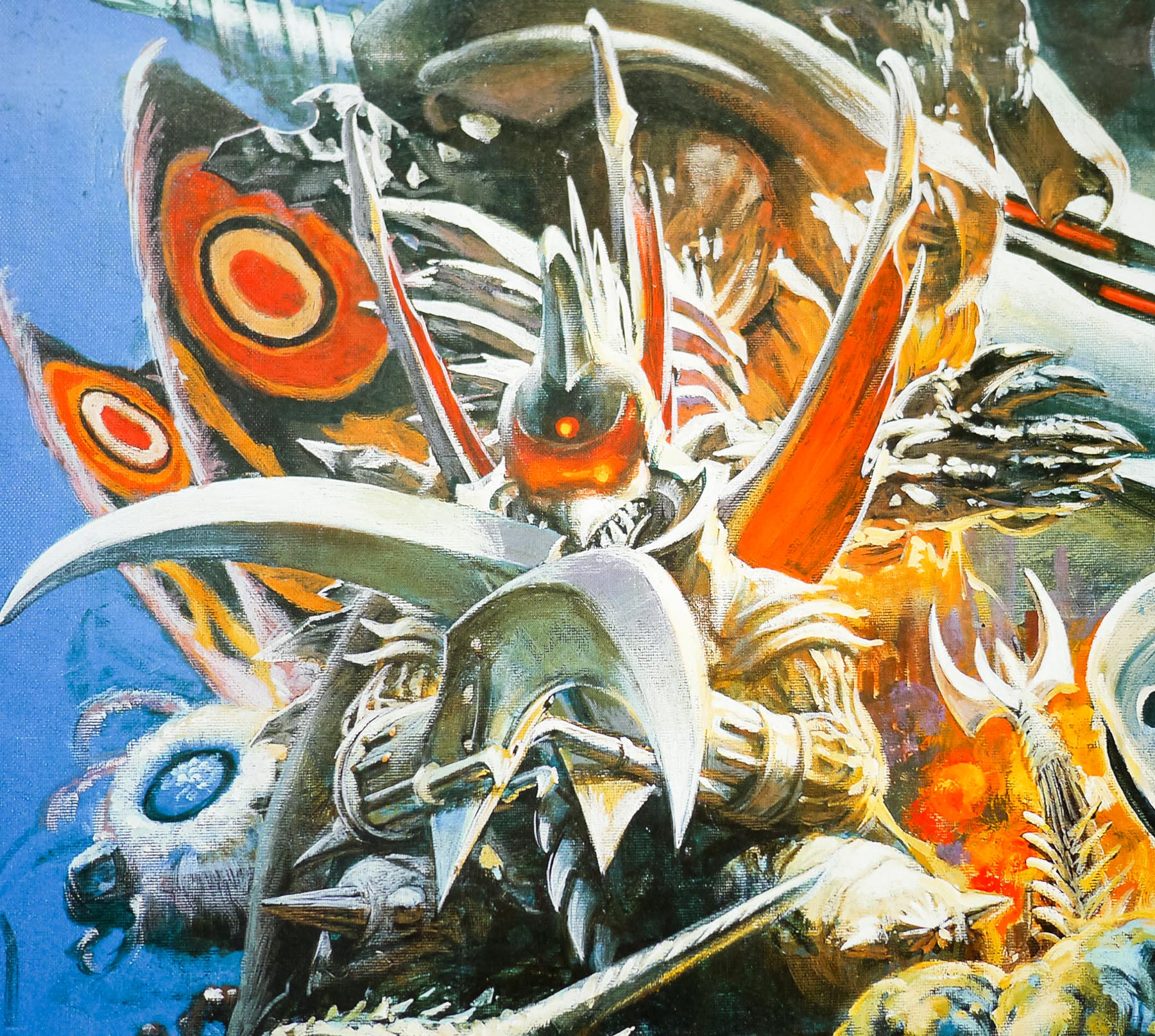
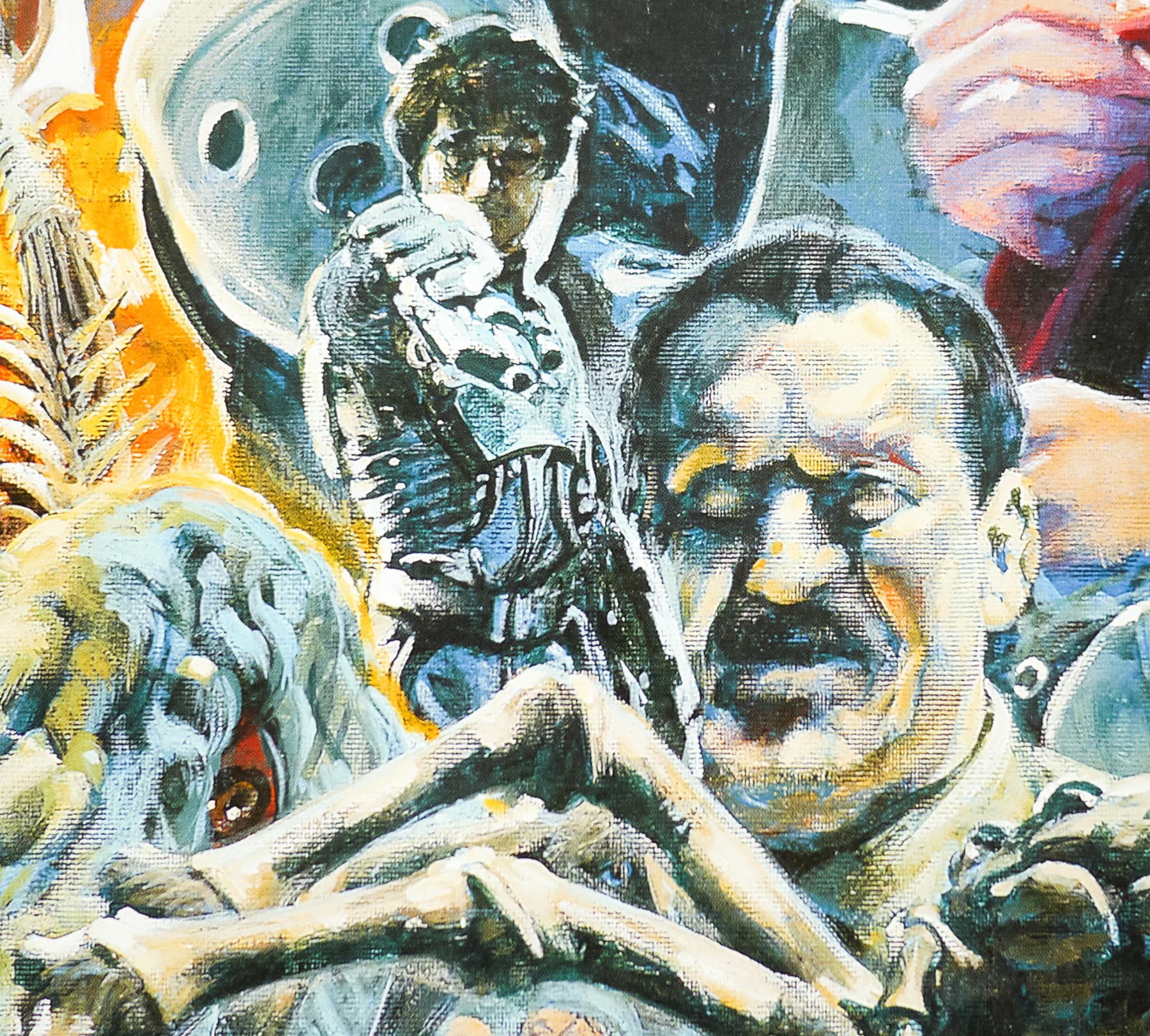
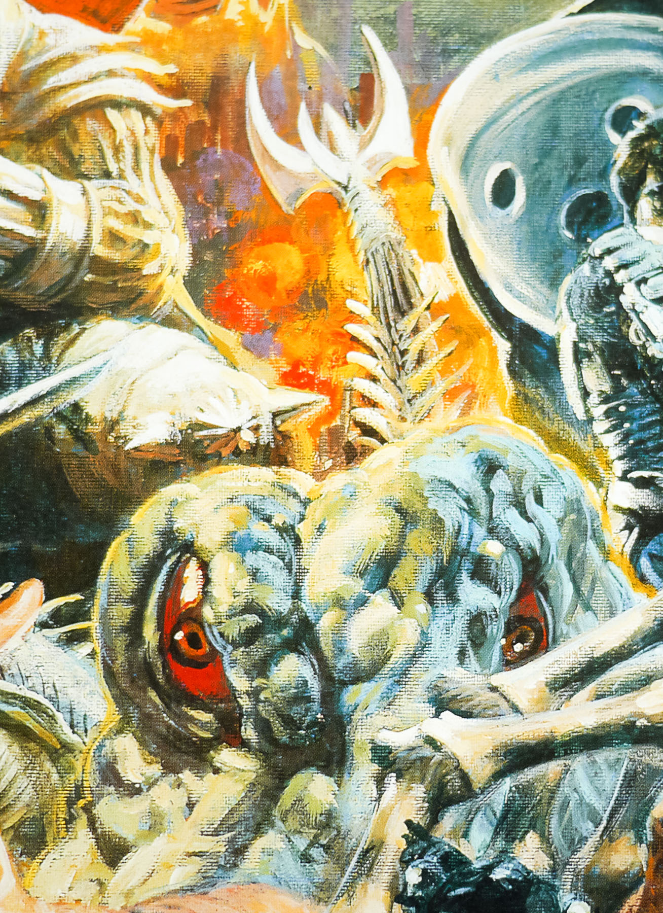
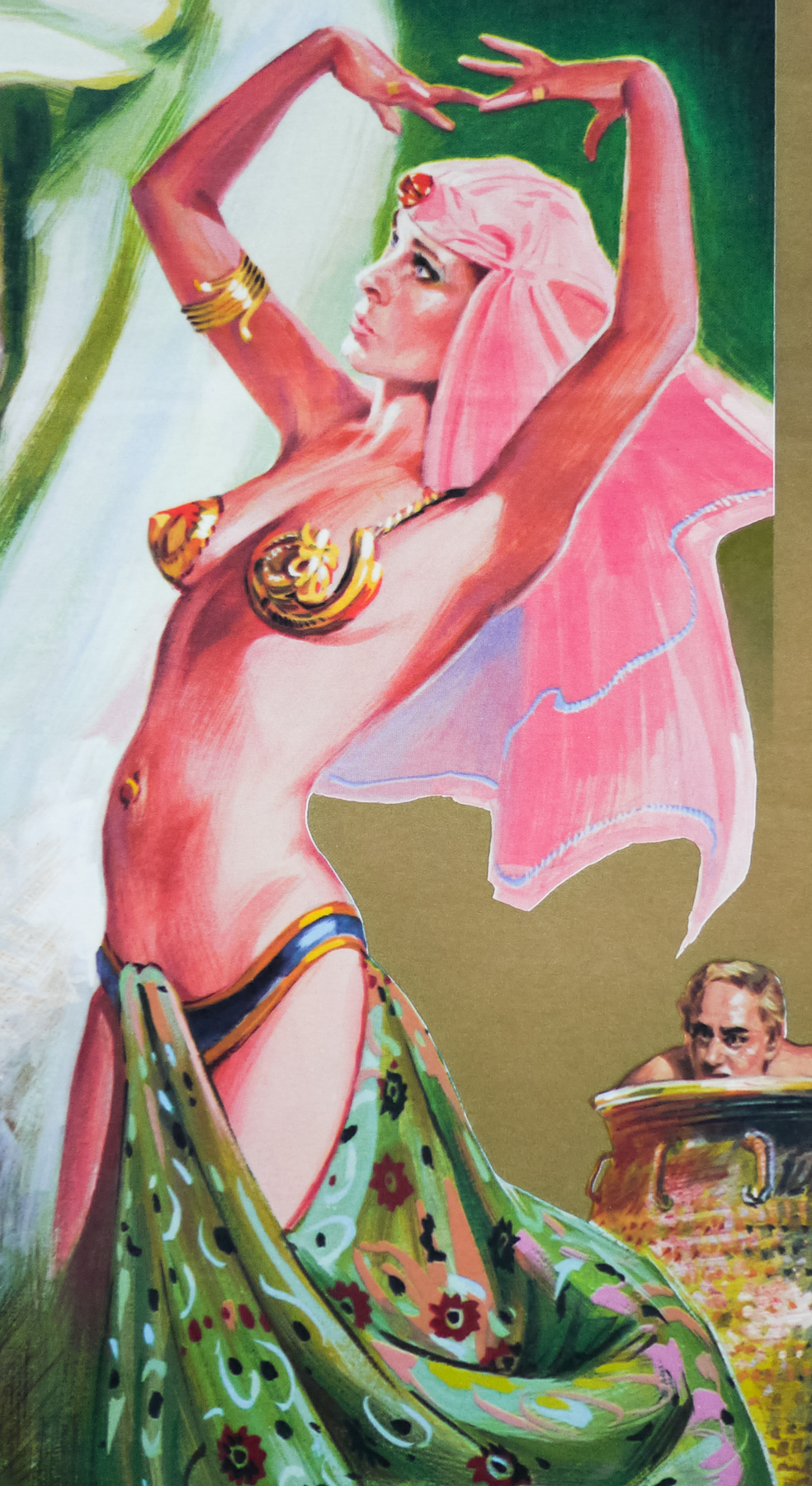
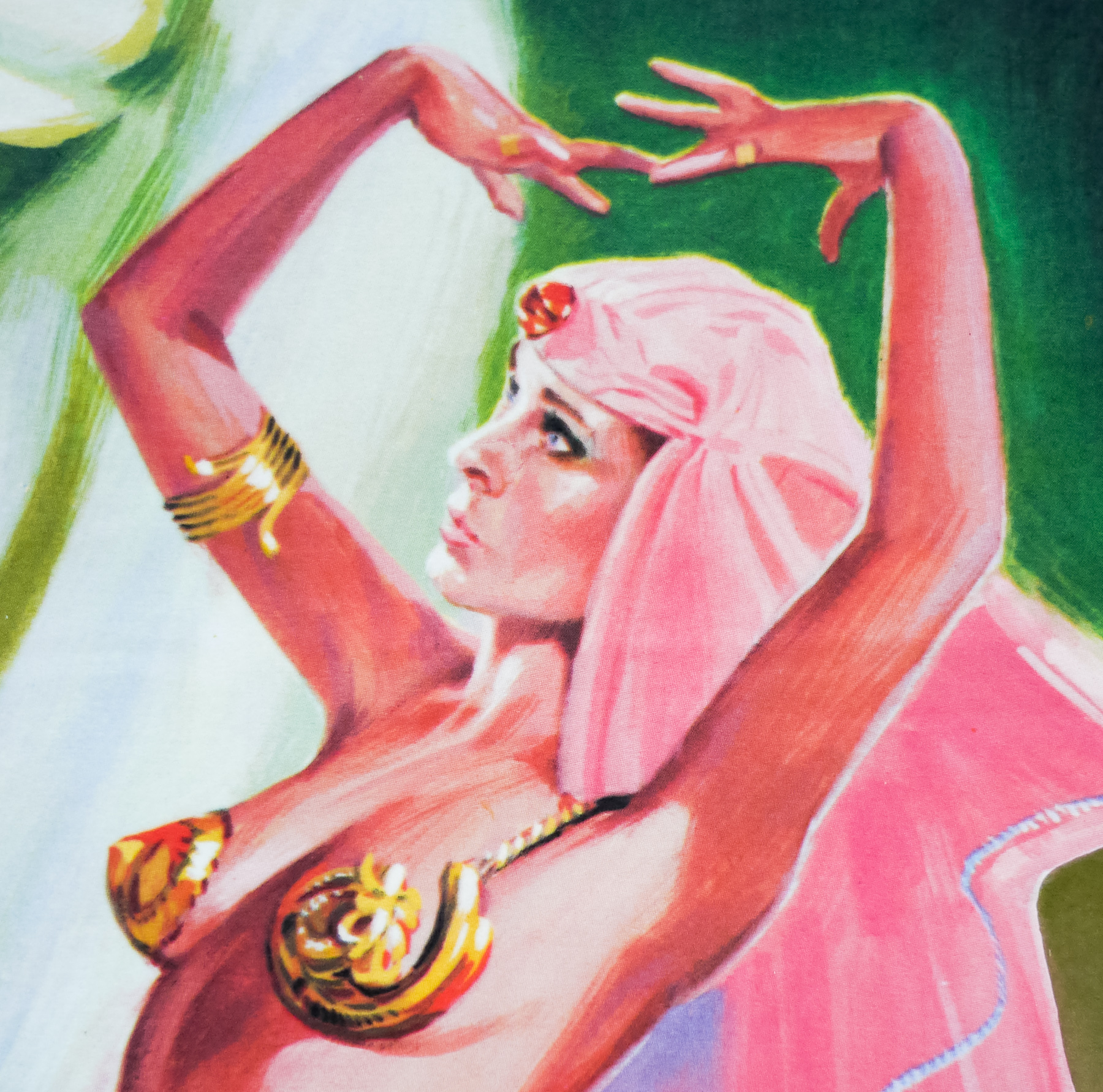
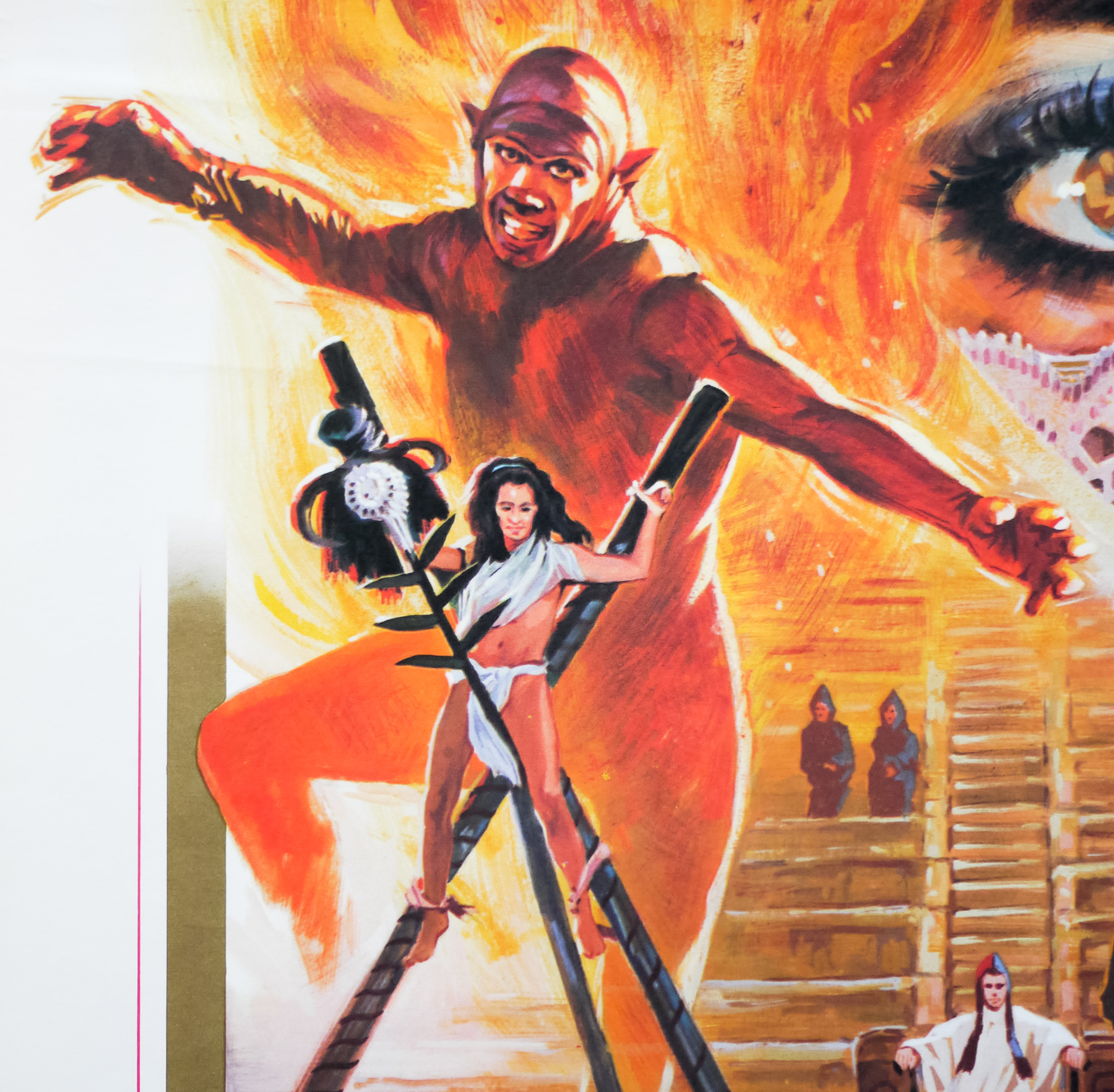
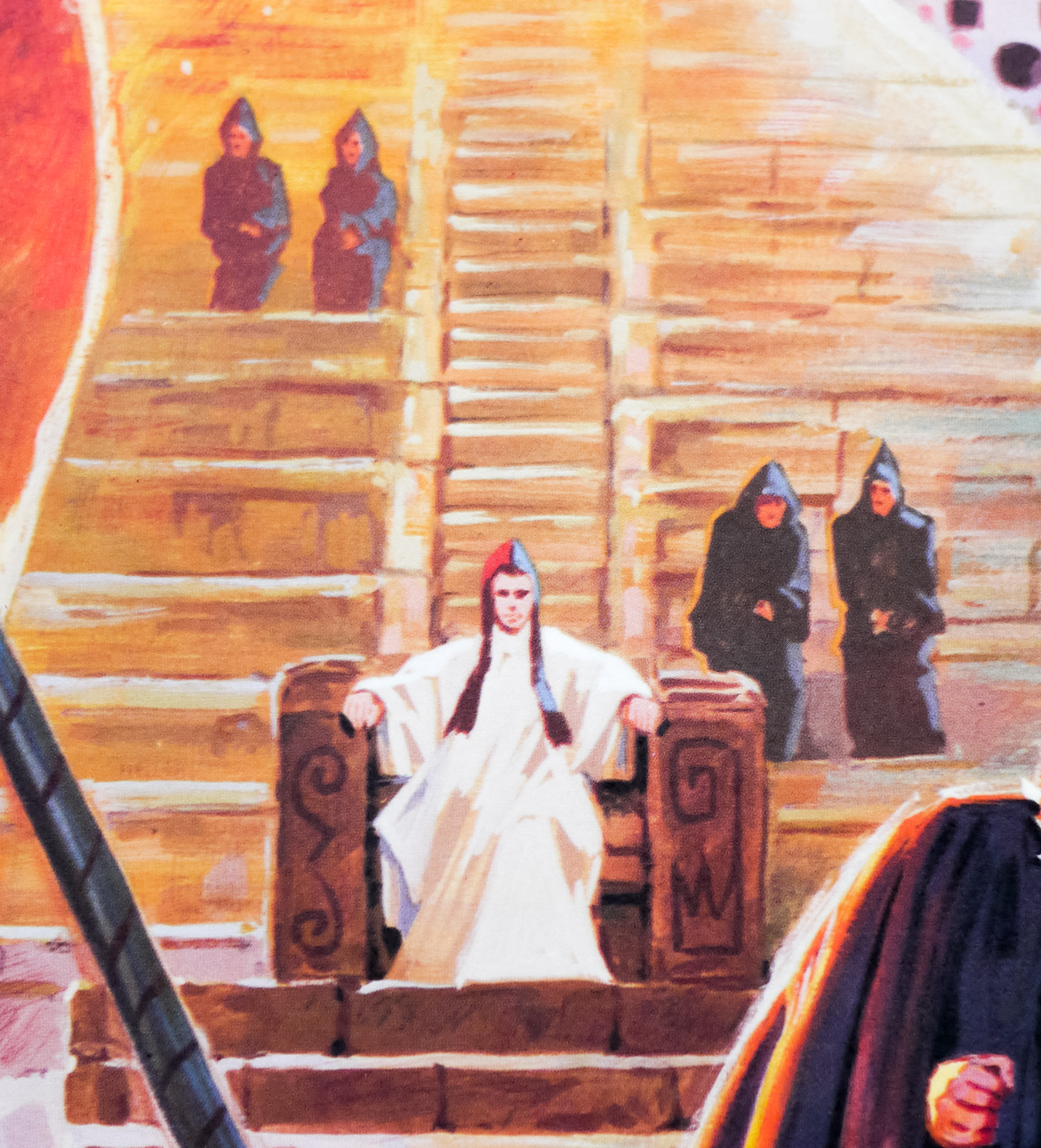
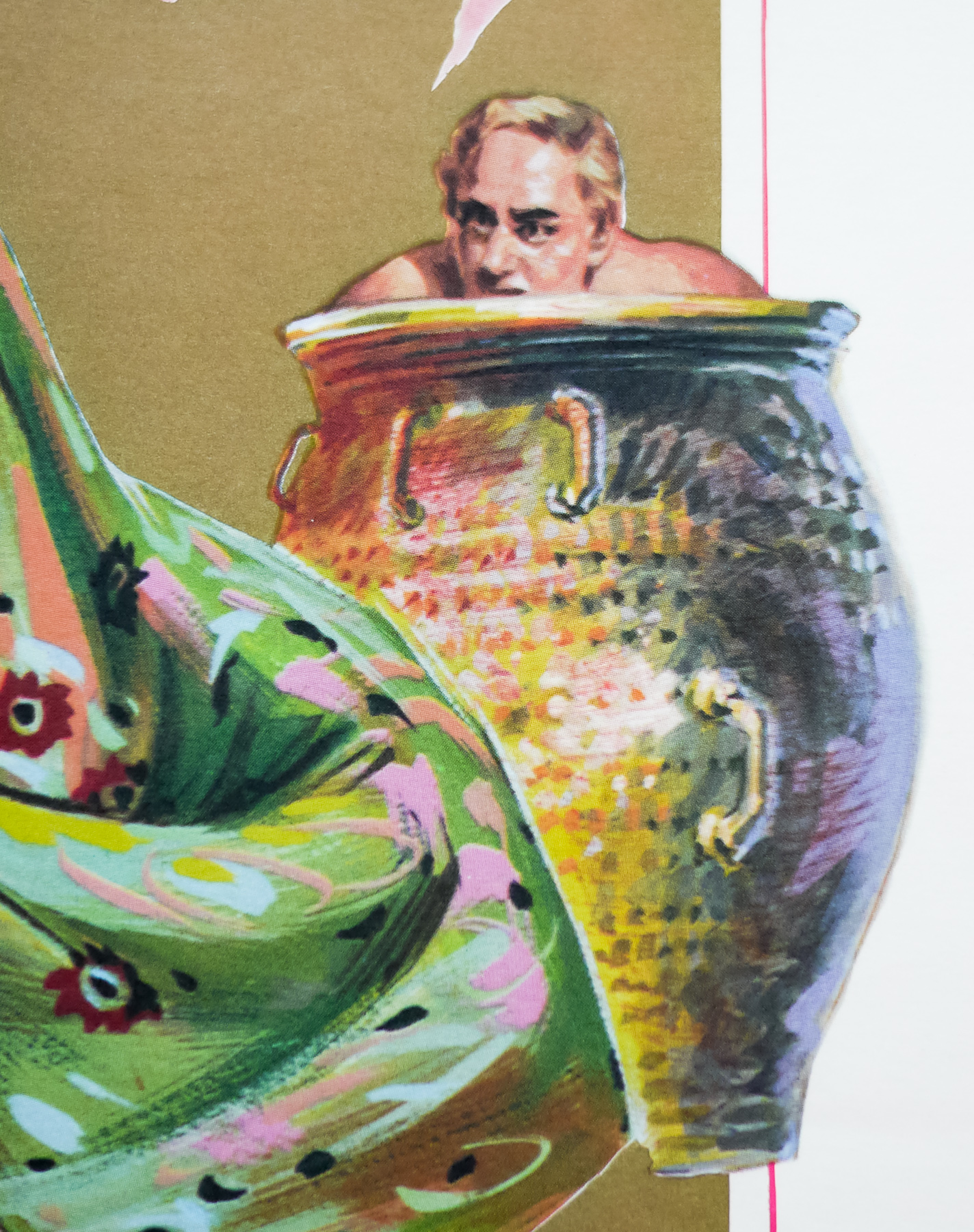
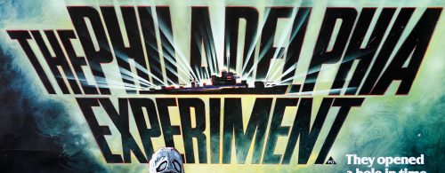
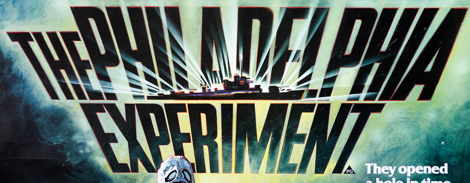
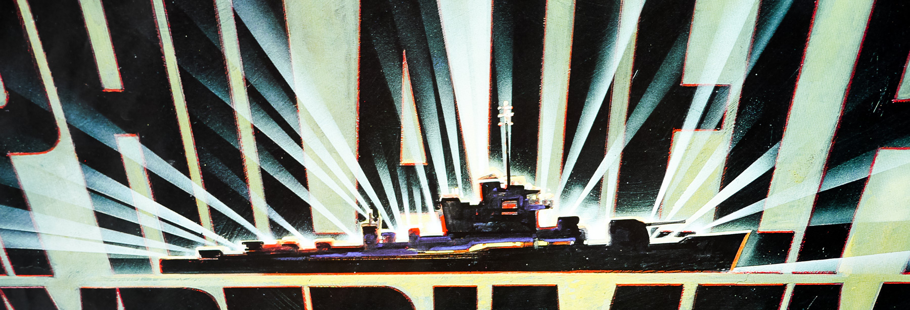
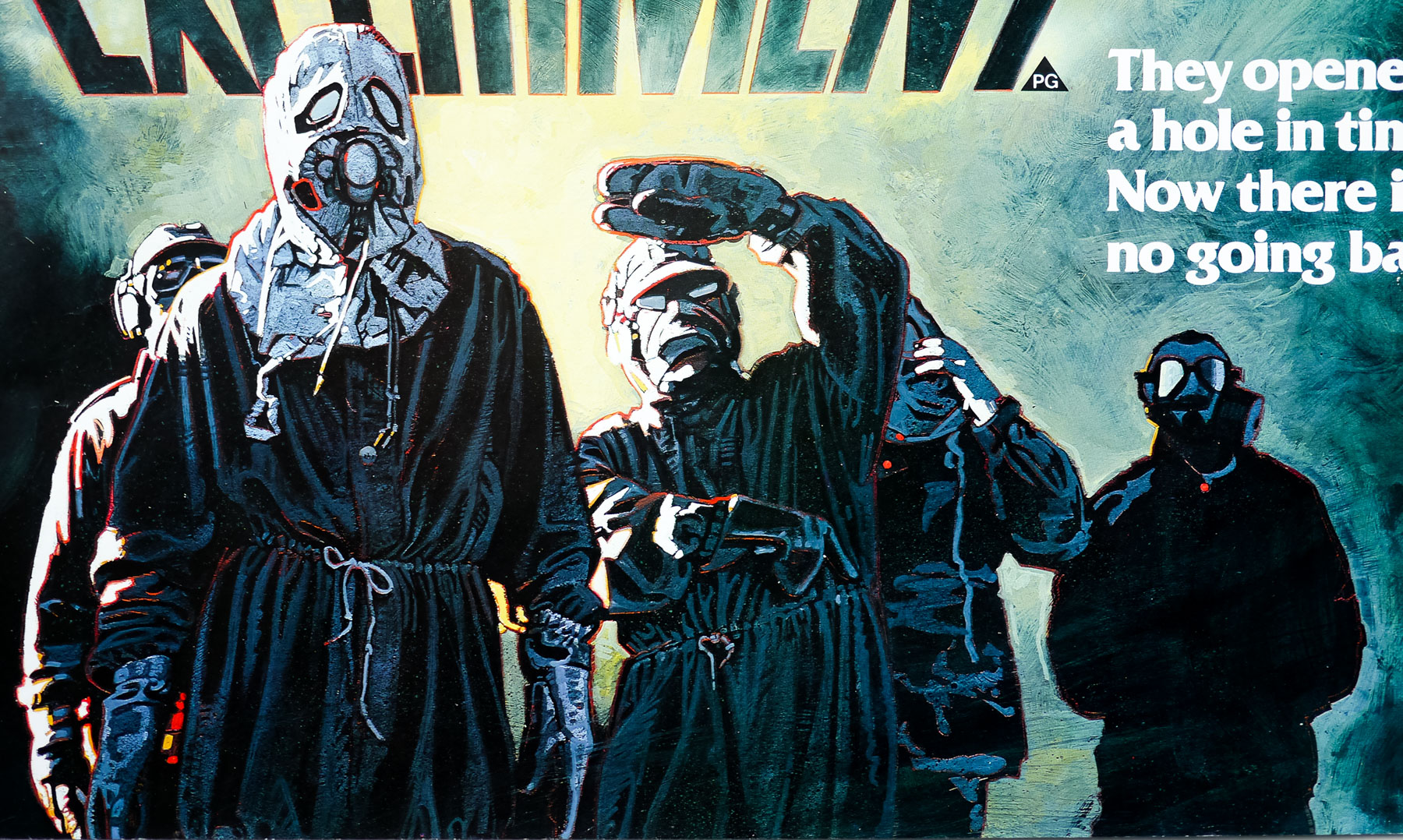
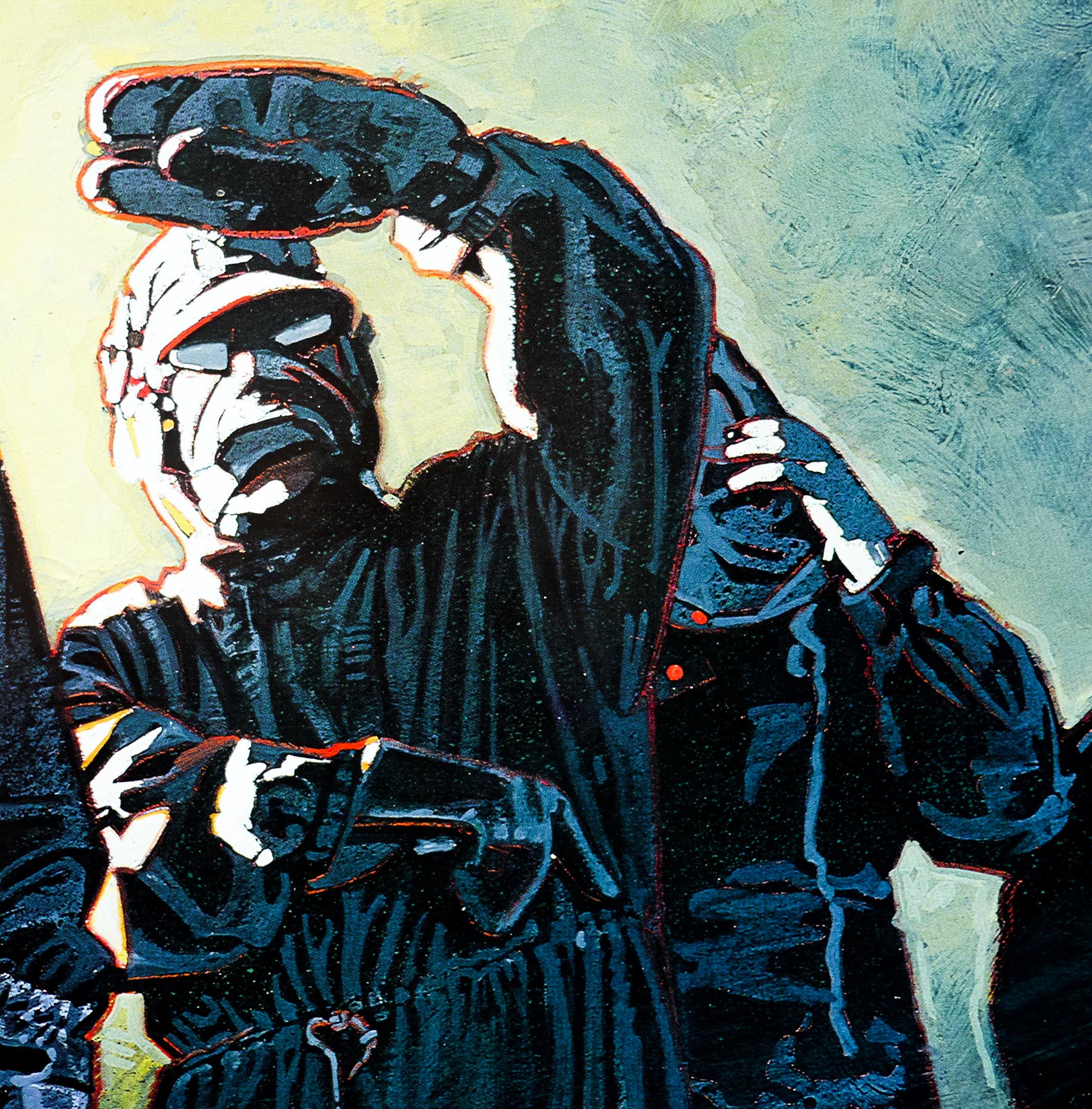
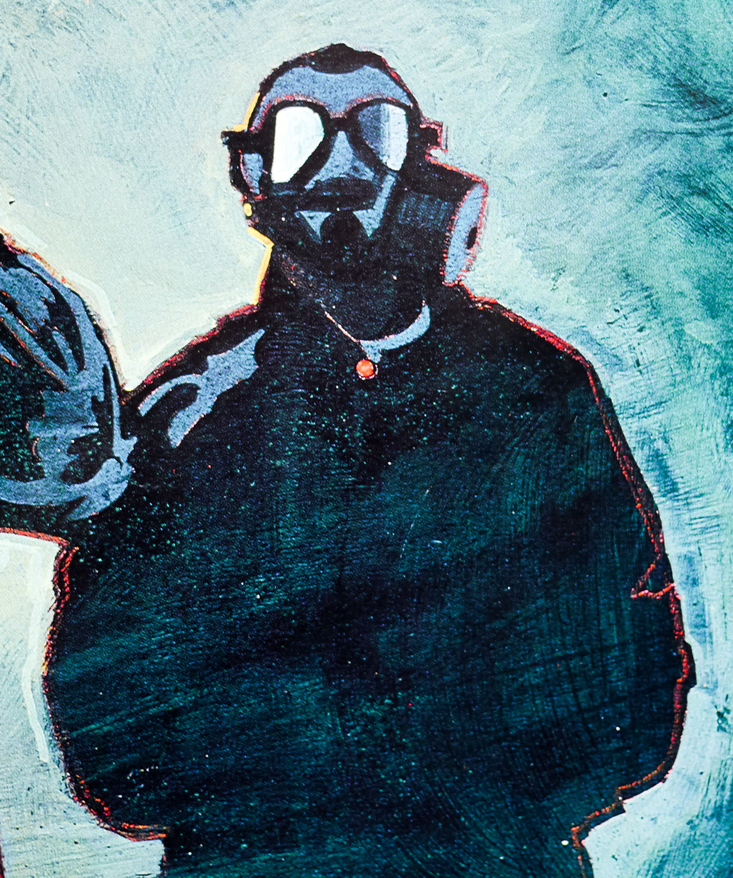
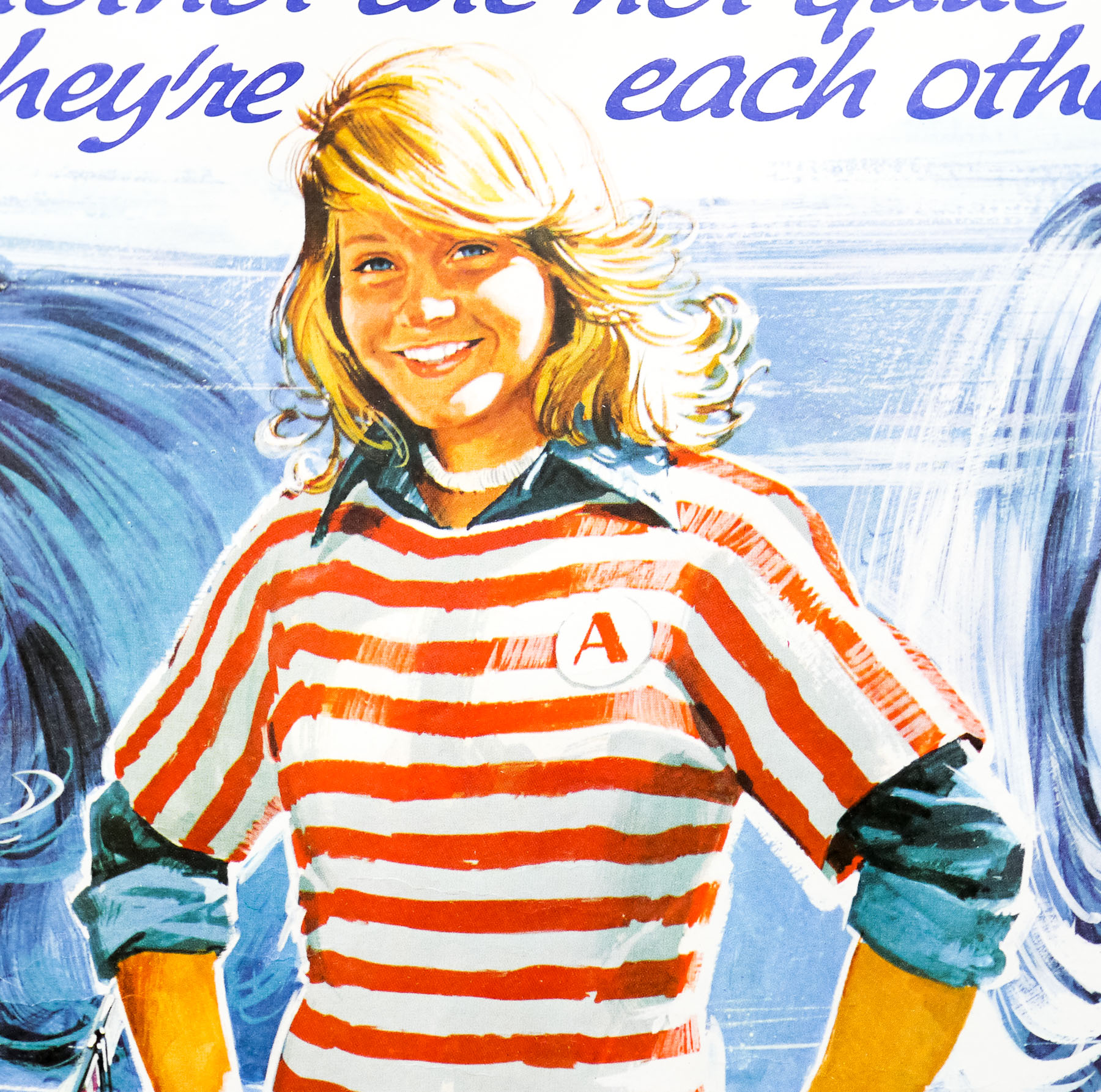
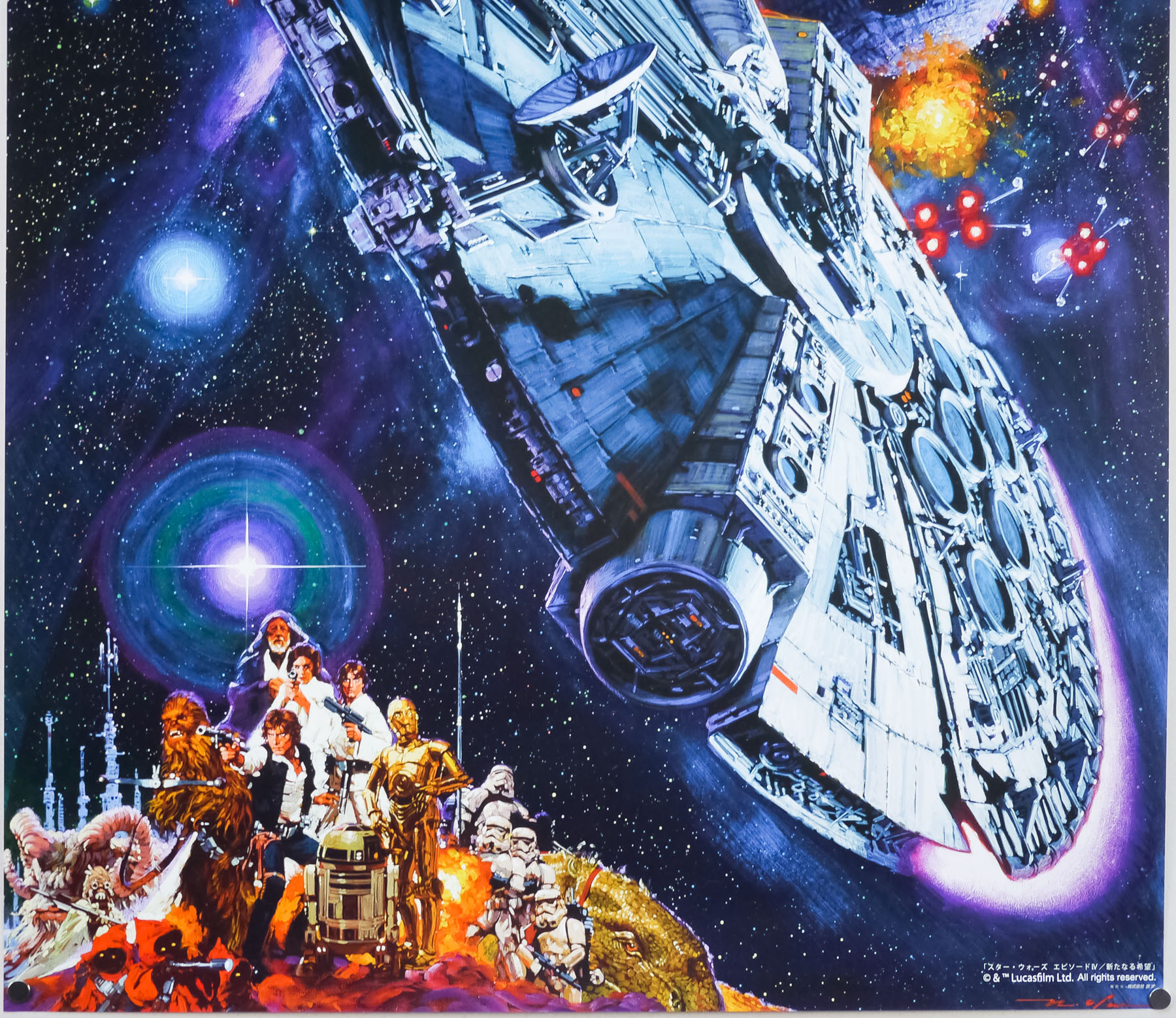
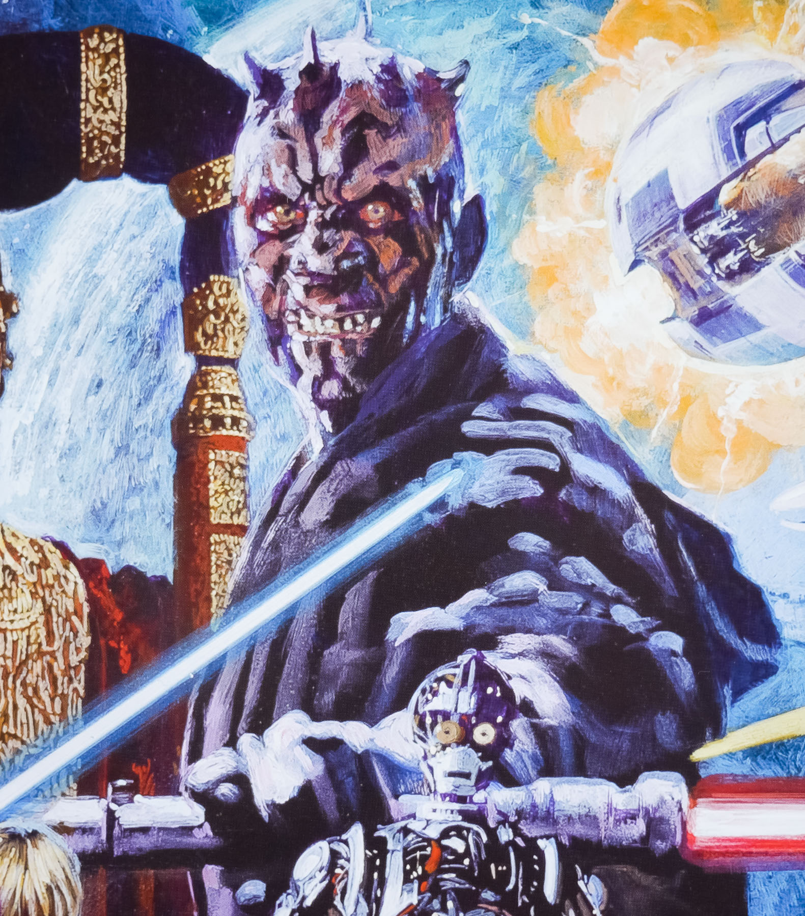
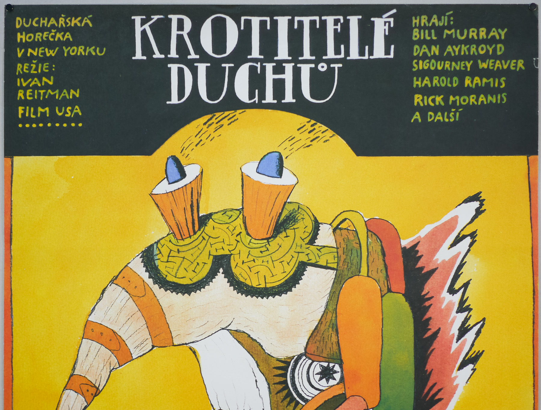
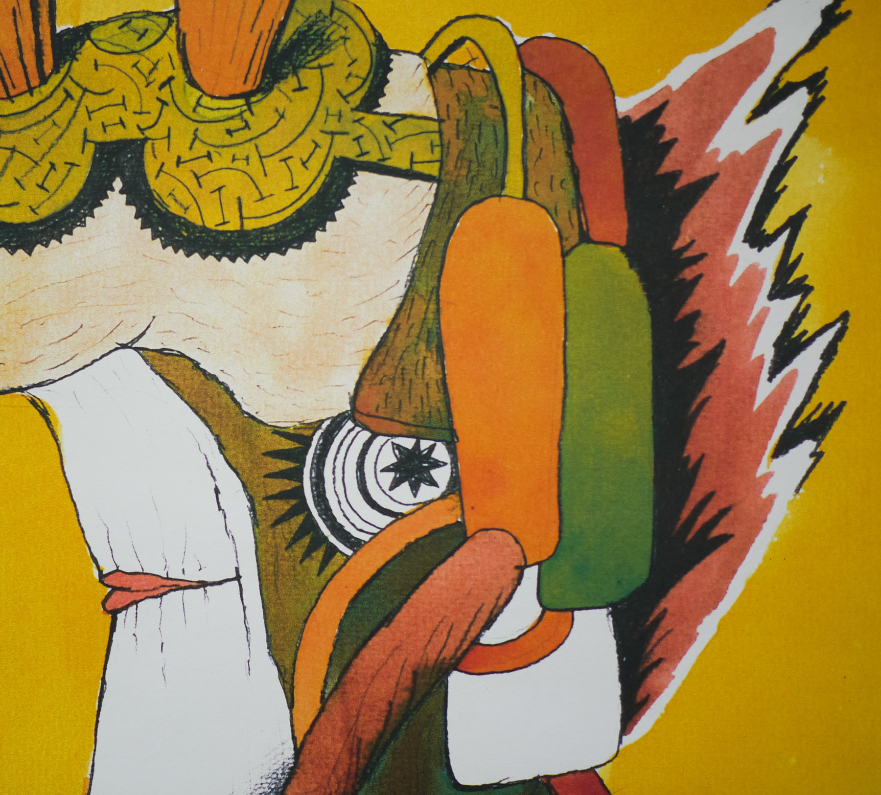
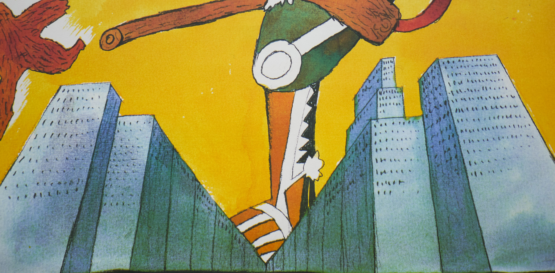
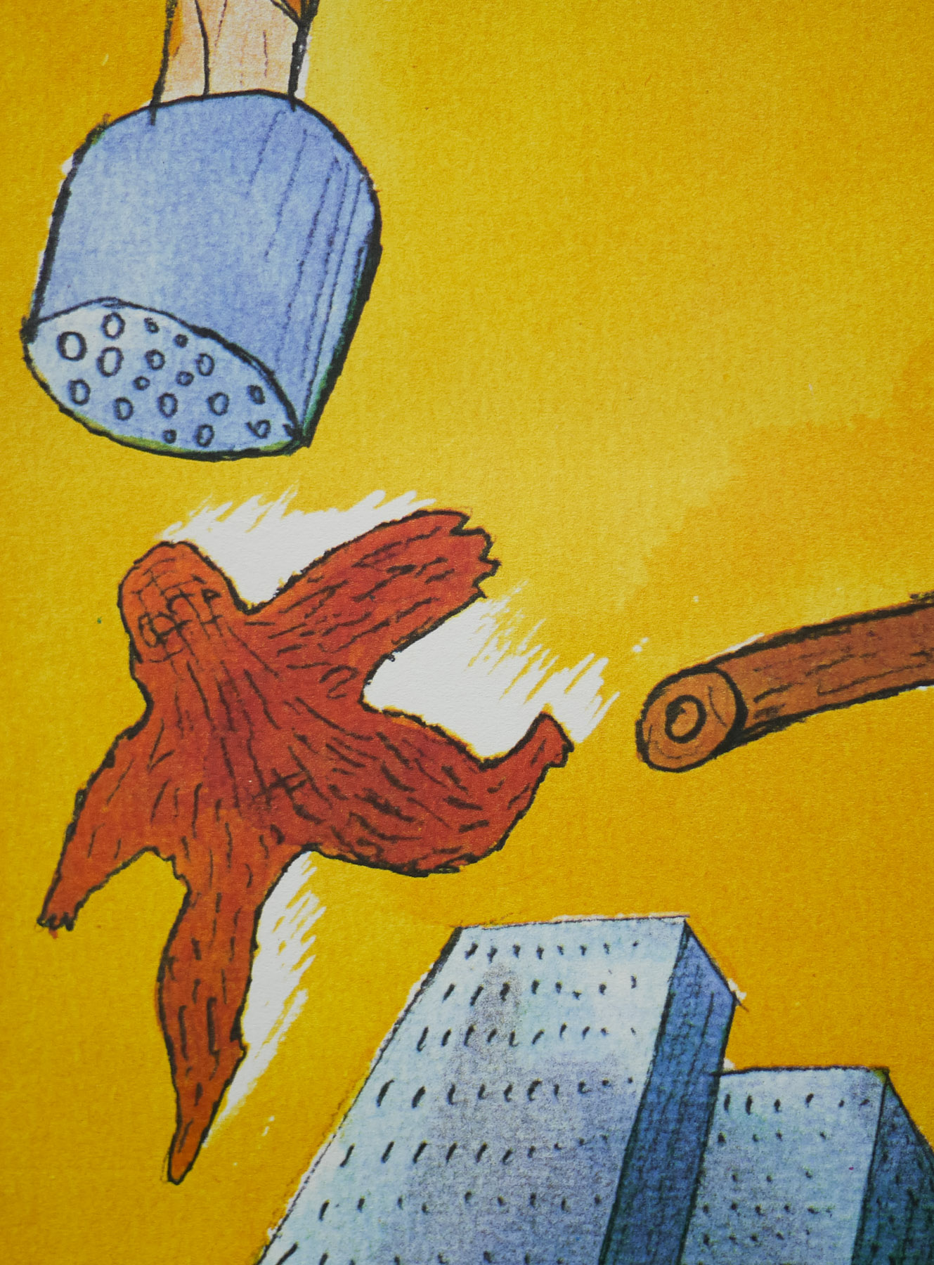
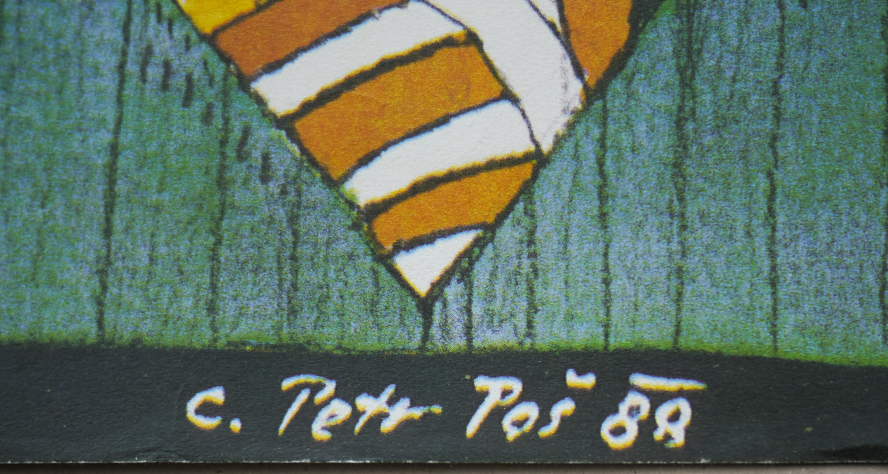
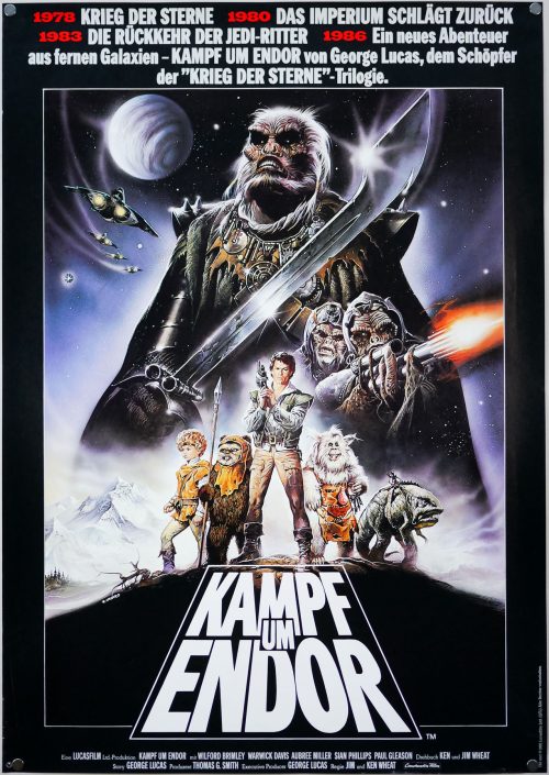
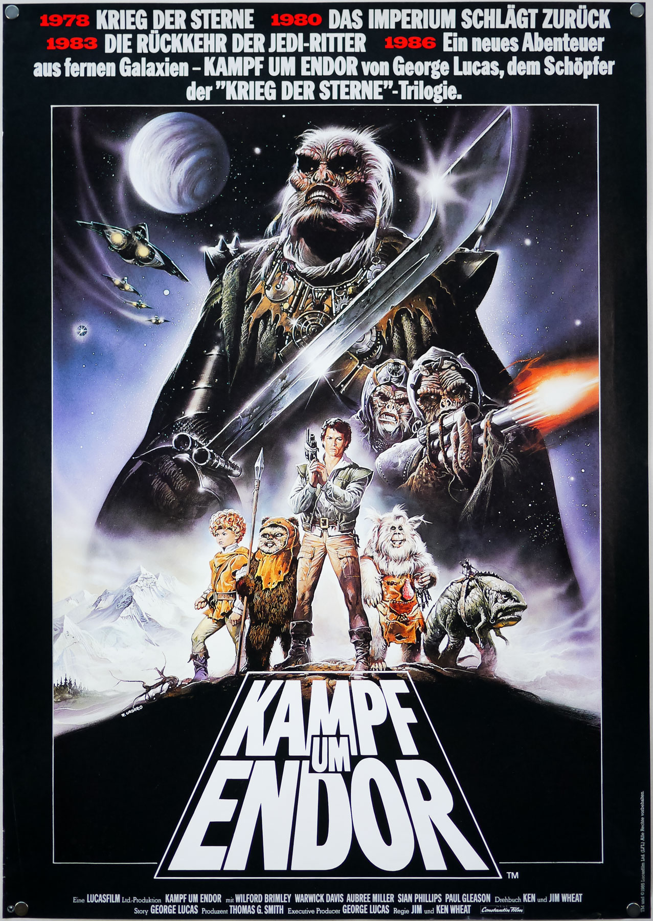
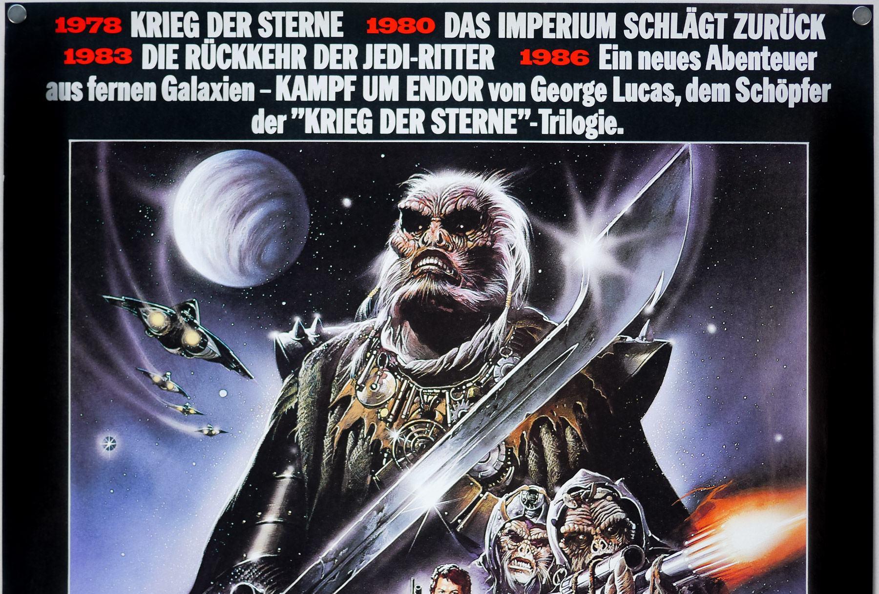
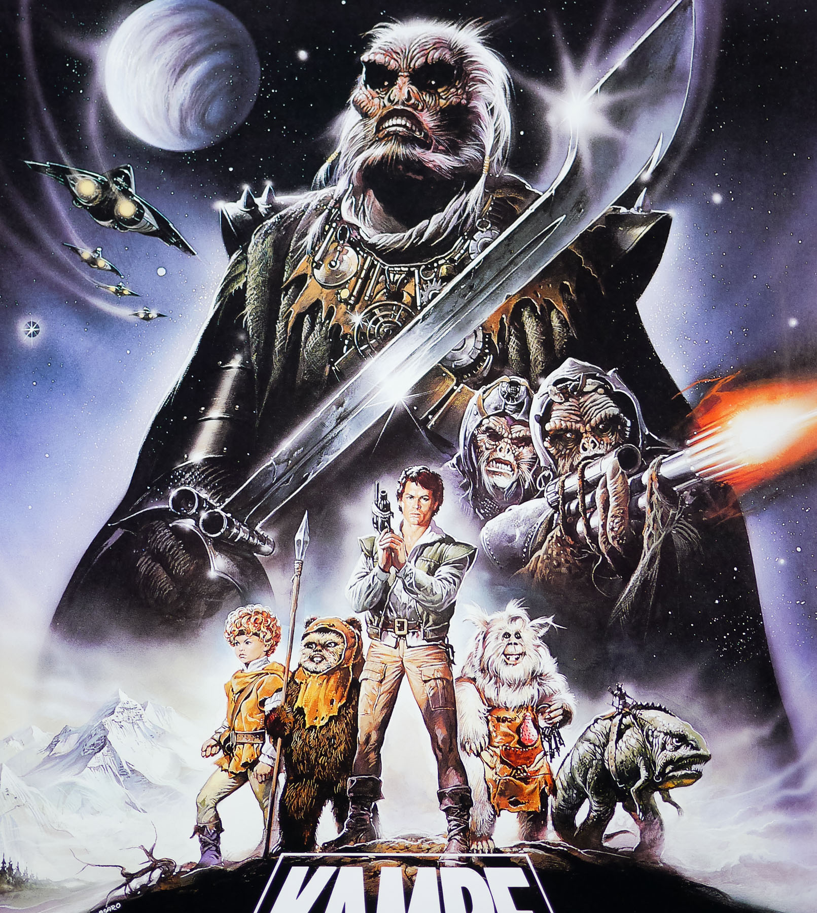
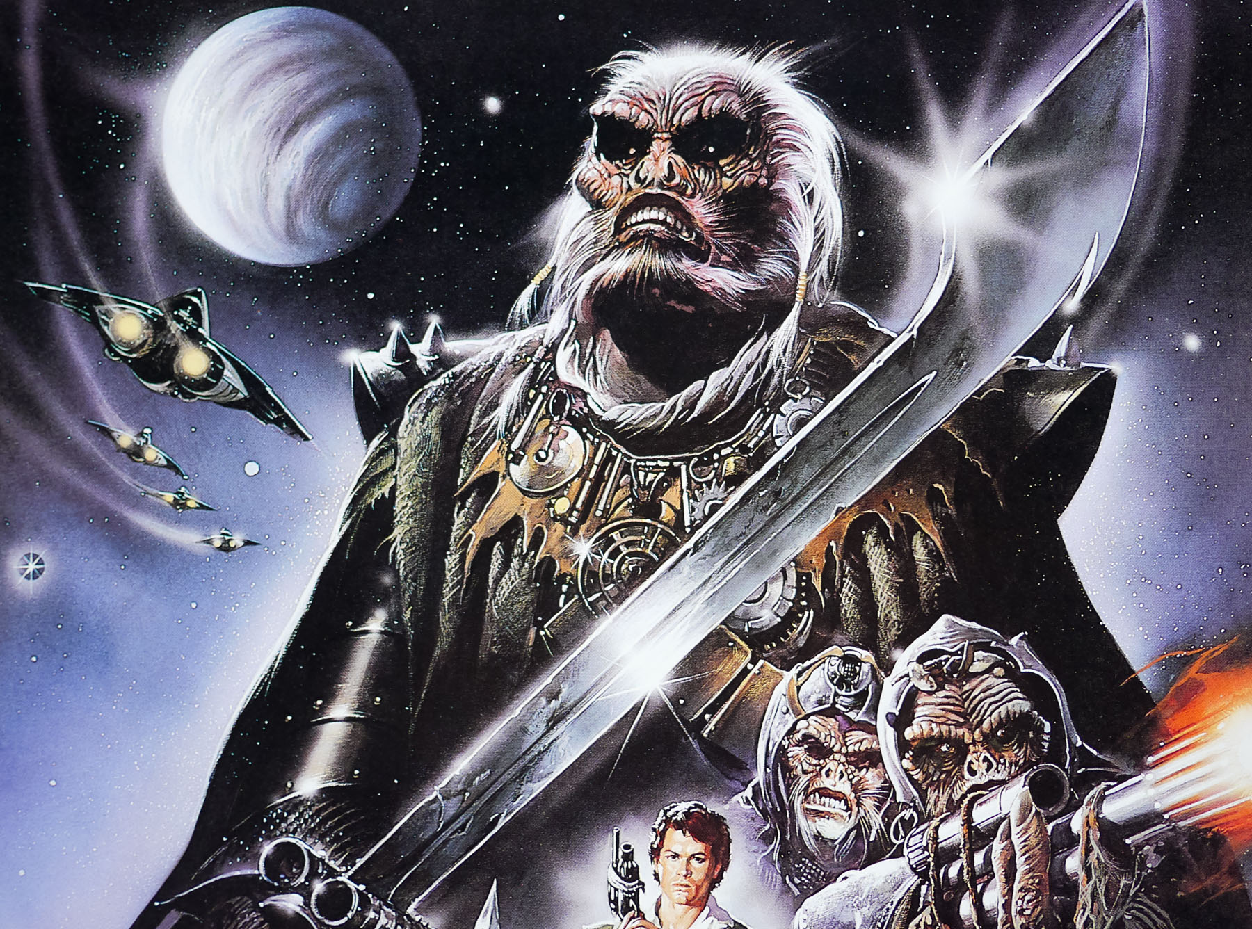
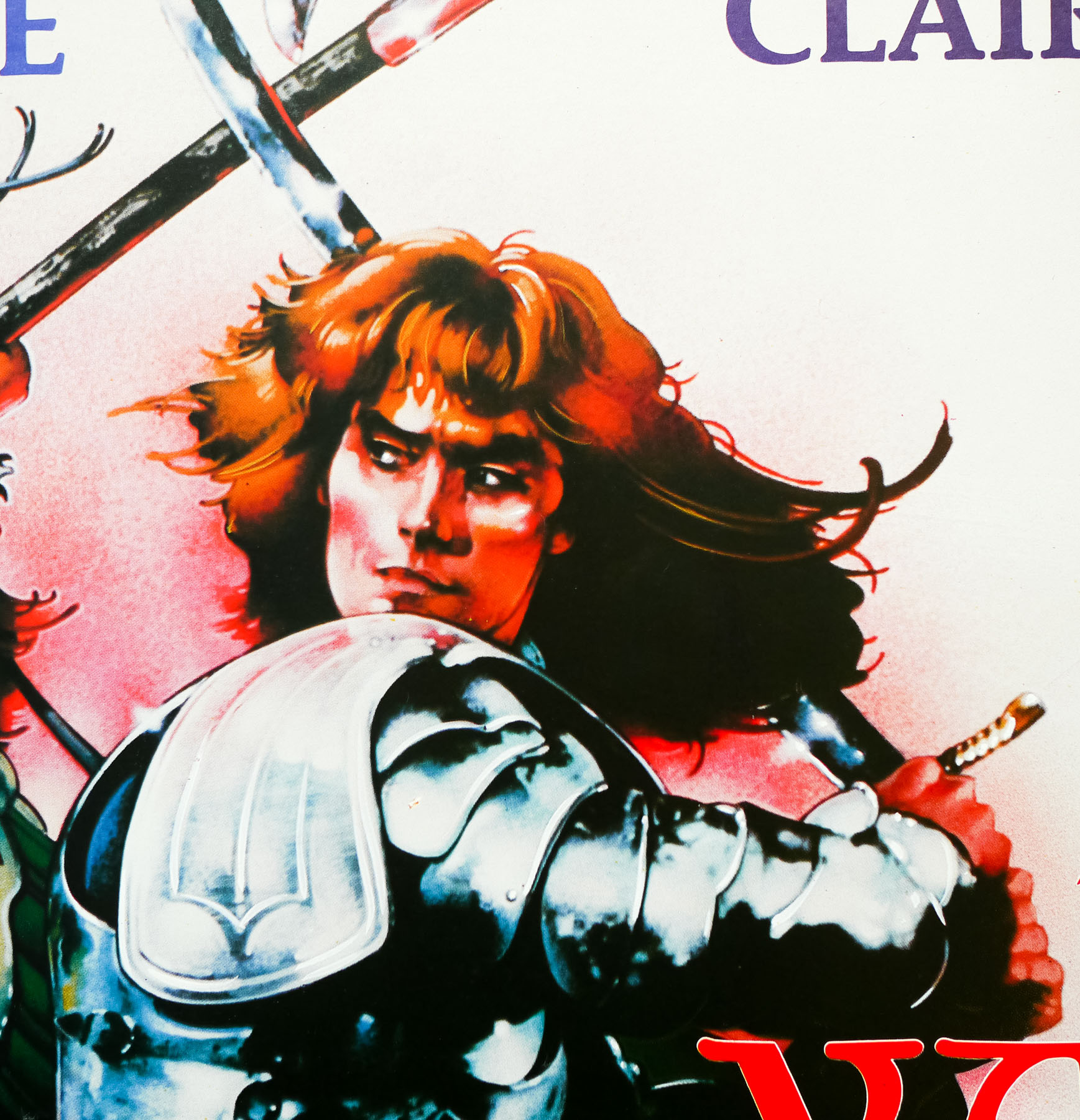
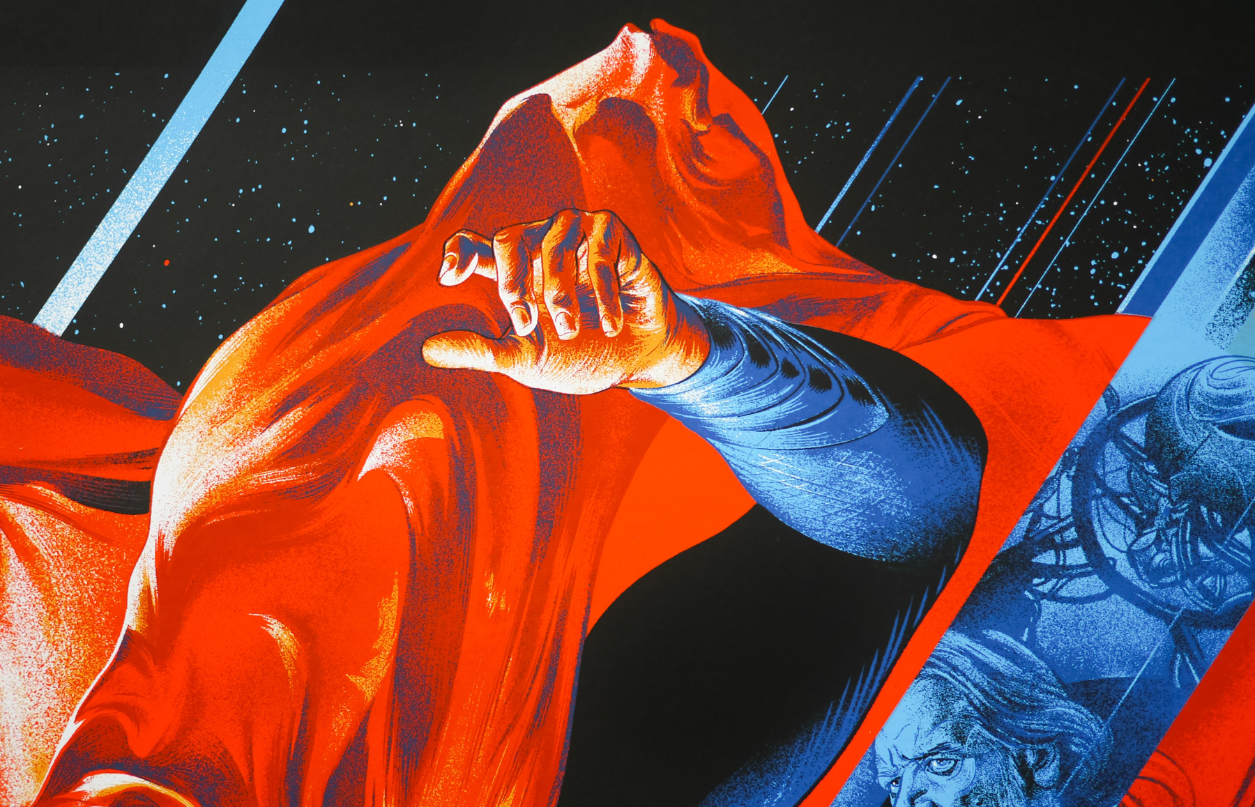
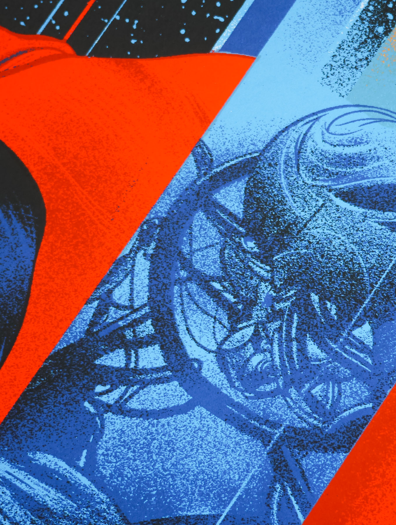
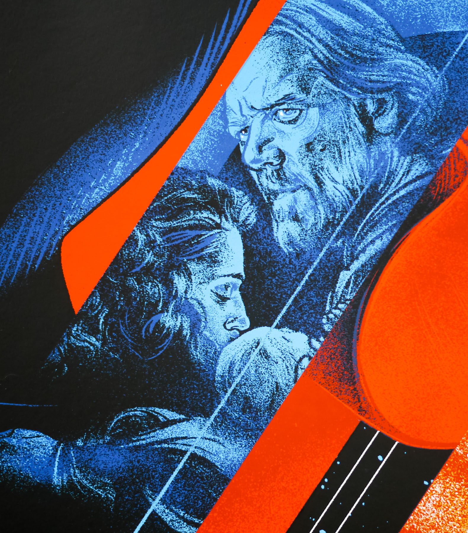
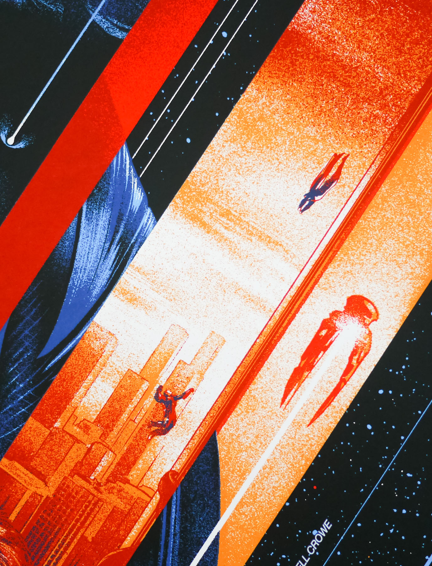
As part of this second campaign Pressman commissioned noted comic book artist Richard Corben to illustrate a new poster image and fellow comic book artist Neal Adams provided an initial concept sketch from which Corben worked (according to Kahan, ‘Adams drew the sketch for free, to aid Pressman in pitching a never-realised Phantom of the Paradise companion comic book, which he hoped might result in some paying work’) . The new painting emphasised the horror aspect and the Phantom’s mangled face and completely downplayed Williams’ presence – you can just spot him at the bottom of the marquee (see the close-up image). The new campaign proved to be more successful but as Kahan notes:
‘The film gradually took on life, bringing in decent (though never great) box office and some positive reviews. As De Palma put it, “When we revised the campaign in the U.S and made it seem more like The Phantom of the Opera than a horror/rock film, we got an entirely different response.”‘
For more on the film’s promotional travails, I again urge you to check out the excellent Swan Archives site. Corben also painted the style B one sheet for the Heavy Metal film, the magazine of which he’d been involved with for several years.